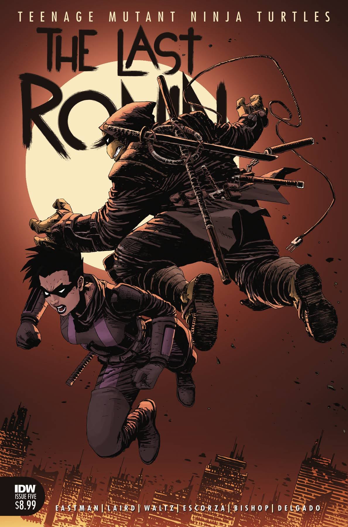
After lending Tuesday to the gargoyles for one week, the turtles are back on Turtle Tuesday and this time it’s for the latest (and final) issue in the The Last Ronin storyline. The Last Ronin is a concept for the final story of the Teenage Mutant Ninja Turtles dating back to the days of Eastman and Laird. It was decided in 2020, after issue #100 of the modern IDW series, that the time was right to tell this story. Despite being only five issues, it took awhile for the series to finish as multiple episodes were delayed with the final issue being the longest such delay. If it’s done to tell the best story though, then who cares? It’s here, and now I’m ready to talk about it.
The Last Ronin tells the tale of the last of the Ninja Turtles. The first issue introduced this dreary future where New York is controlled by a descendent of Oroku Saki and times are bad. We get to see the last turtle on a suicide mission that’s basically a failure, since the villain isn’t toppled and the turtle isn’t dead! Over the next three issues, the plot advances quite slowly as Ronin (yes, I’m still committed to not spoiling anything) acquires some allies, but we also see lengthy flashbacks detailing how each of the brothers fell and the present came to be. The violence is not gratuitous, so while seeing our beloved childhood heroes actually dying is uncomfortable, it wasn’t exploitive in any way. The flashbacks are over though, and the stage is set for the final confrontation.
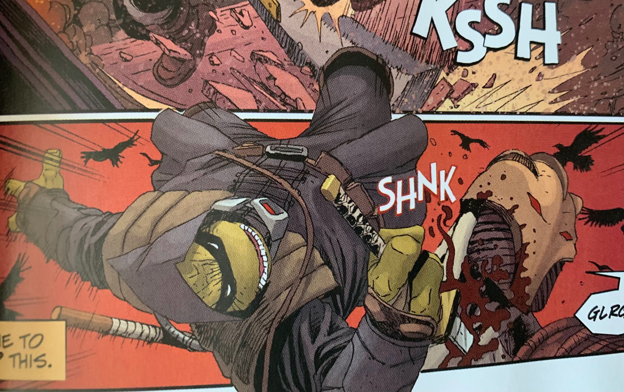
From that perspective, issue 5 delivers. We see Ronin go after the big, bad, guy of the series with the intent being to kill him or die trying. There is a B plot to the story as well, so it isn’t just straight action, but it’s not the most compelling of B plots. It’s merely a plot device to keep Ronin isolated from his allies. Otherwise, this is a brisk read as it reads almost like how a video game plays with Ronin dispatching of the fodder with minimal challenge before getting to the boss. Roughly half of the book is reserved for that battle and there is a wrinkle tossed in that Ronin needs to overcome in order to actually inflict damage upon his foe, but otherwise it’s pretty straight-forward.
Ronin being so sick of the guilt and grief associated with his past trauma that he wants to banish his brothers forever is an interesting plot device that could have been expanded upon.
And if that’s all you wanted, you’re probably happy. For me, I found the first issue very intriguing, but every following issue was less interesting. The gravitas of this story demanded something a bit more epic, but we don’t get that. We don’t really get much character development either, only finally getting a glimpse of such at the start of this issue as Ronin tries to banish the “ghosts” of his brothers once and for all. It’s assumed they’re a figment of his imagination, but it was interesting to see how Ronin feels each brother views him. It might be something more interesting for me as someone who has not read the IDW series as I don’t know if it’s a lot of re-tread, but for me, it was the best part of the finale. The ending was very predictable. That’s not necessarily a weakness as many stories have obvious outcomes, but there wasn’t anything special tacked-on to that end to earn it.
What largely remained a strength of the book for all five issues was the artwork within. The Escorza brothers brought it, and not just in a technical sense. I really enjoyed the look of a lot of the characters in this series. The flashback turtles had a neat construction about them that was a bit more modern, but also implied a grizzled lifestyle of battling crime. I love the look of Ronin, and the action in this was easy to follow. The only thing I didn’t care for was the battle armor of the ultimate foe, who looked like the Shredder crossed with a costume from Tron. Eastman gets an art credit as well, though this time it’s not obvious to me which section. It’s possible that credit is just there because some of the variant issues feature a cover by Eastman.
If you were just looking for some action from a cool looking turtle then you are probably quite content with The Last Ronin.
Were my expectations unreasonable? Perhaps. It’s possible they always intended for this to be a very straight-forward tale for how the turtles could end up. There are certainly a lot of similar stories in cinema and television that are much celebrated, but I think all of those do a better job of developing the characters. I’m just left feeling like this could have been one issue, and considering the impact that first issue had, maybe that would have been the way to go? It’s possible I’m in the minority as well. I just wanted this story to elevate itself above other TMNT stories similar to how Logan elevated itself above other X-Men films. It’s certainly not a bad read or anything, it just doesn’t leave a mark on the franchise or the main character. Hopefully for IDW I’m in the minority as the issue ends with a “To be continued…” The story of The Last Ronin is complete after this issue, so I’m left to assume any future stories will center on his allies. Personally, I’m not interested, but others might be.
The Last Ronin #5 is currently on-sale at your local comic book stores. If supplies have already been depleted, rest assured there will likely be a trade paperback collecting all five issues. It also looks like there may be future director’s cut styled issues to come as well. Needless to say, you shouldn’t have to pay 20 bucks or something on the secondary market to experience this issue.
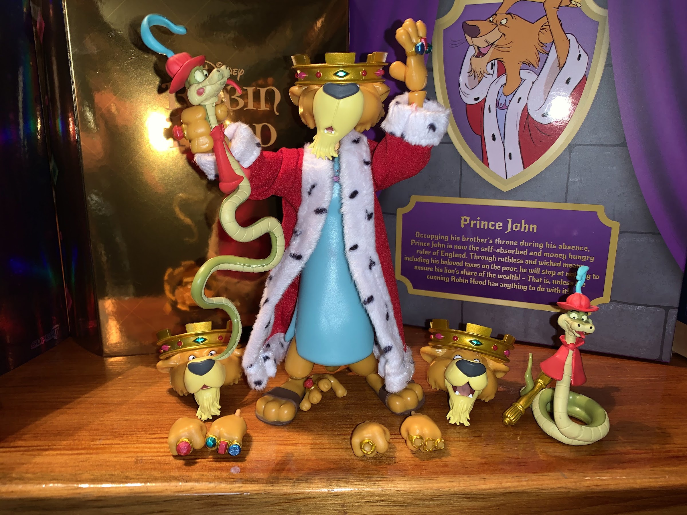
“Too late to be known as John the first, he’s sure to be known as John the worst!”
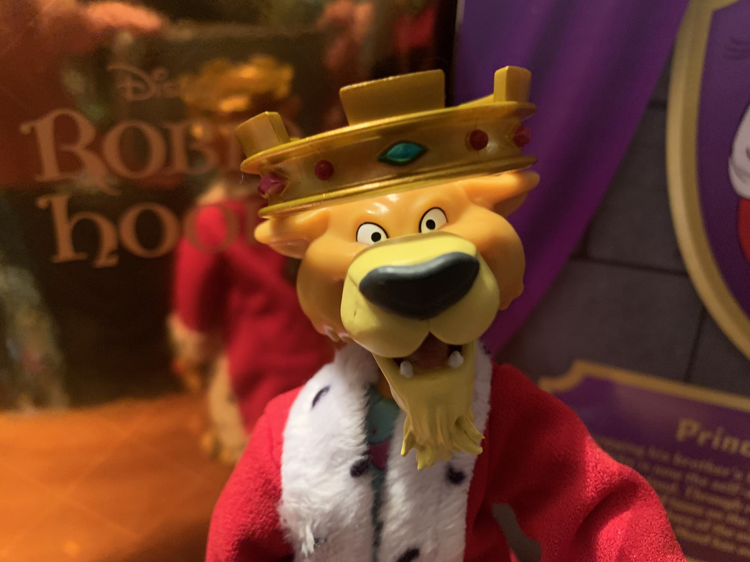
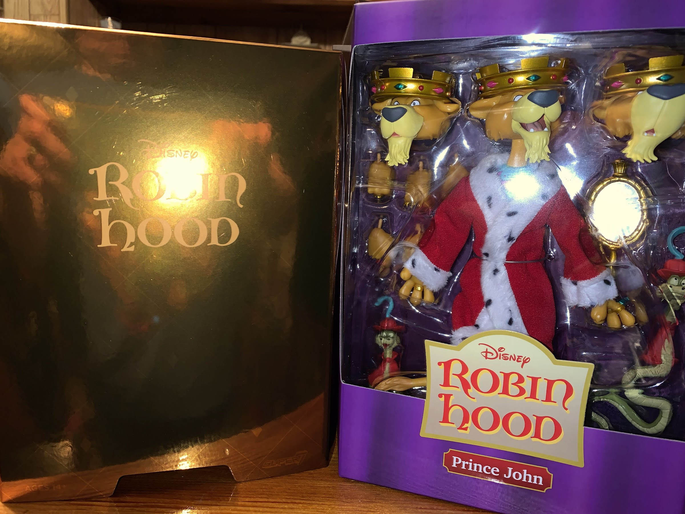
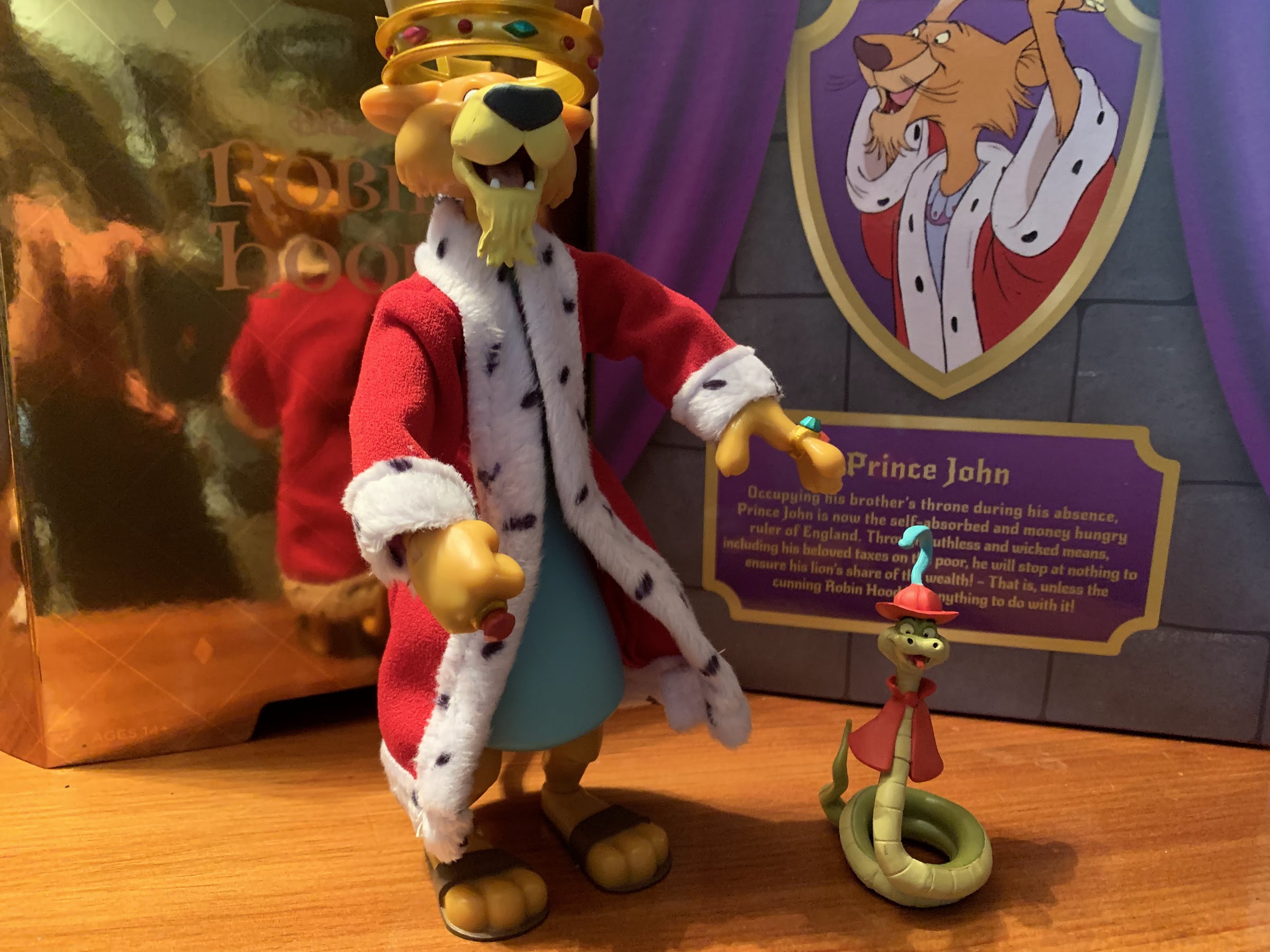
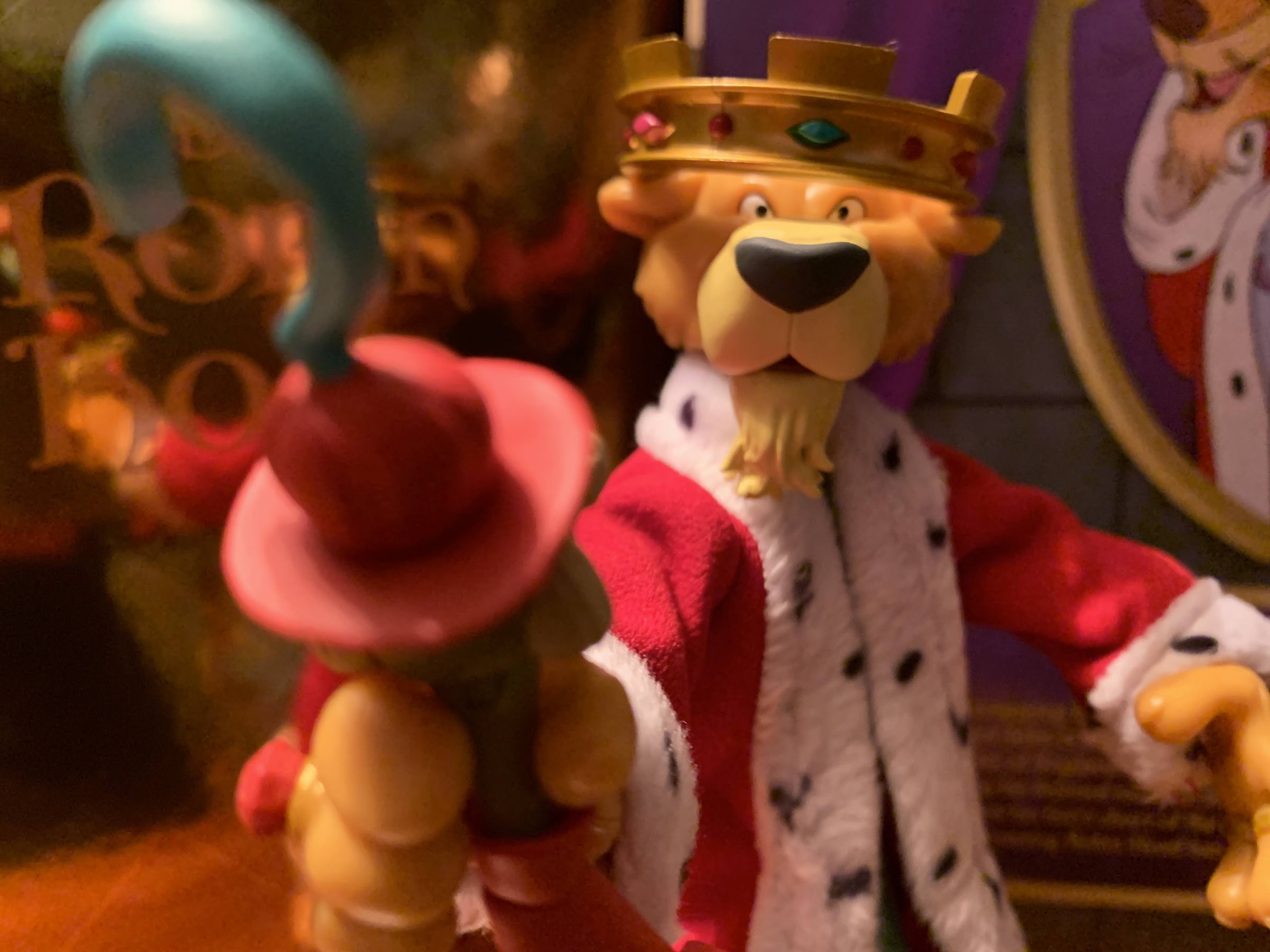
Our third and final figure of the inaugural wave of Disney Ultimates! from Super7 is the most surprising of the bunch: Prince John, the phony King of England! Super7 often surprises with its deep cuts, and Prince John certainly fits the bill. While it’s hard to argue much from Disney could be considered a true deep cut, it’s certainly surprising to see the villain of Robin Hood in the first wave of the line without the film’s protagonist. This supposedly caused some confusion in the Disney fanbase which had little familiarity with Super7 prompting founder Brian Flynn to take to the internet to assure the fans that Robin Hood himself was coming, he’s just not in Wave One. Prince John is apparently Flynn’s pick and it’s a character he has a lot of affection for and when you run your own toy company you get to do stuff like put Prince John into the first wave of Disney figures. As someone who grew up watching the film over and over, I can’t say I’m disappointed to see the prince so early.
He certainly fills out more of the window than Mickey and Pinocchio.
Prince John stands a full seven inches making him, by far, the largest figure in the first wave. He absolutely dwarfs Mickey and towers over Pinocchio. I suppose that’s appropriate considering he’s a lion and all, but it will be interesting to see how he scales with the upcoming Robin Hood. Prince John, or PJ, is not particularly big in the film. Robin is pretty close in size while Little Jon and the Sheriff look down on him. That’s an issue for another day, for now, he looks great at this scale and his big, soft goods, robe is particularly lovely. What’s not, and stop me if you’ve heard this criticism before, is the lack of paint. The body of PJ is cast in a yellowish plastic and with no shading or embellishments I can’t help but feel that it looks an awful lot like those Lion King toys from the 90s. Those things were probably five bucks at Toys R’ Us, but this is a $45 collectible and it just needs something more. Beyond that feeling, the head looks nice and his crown is painted well with gold paint and gems, but he’s missing his whiskers on all three heads. His hands feature the gemmed rings and his default expression is rather neutral. Beneath the robe is his soft, blue, gown (I guess that’s the proper term?) that’s all sculpted. Unfortunately, there’s already some color transfer from the robe to the gown and I don’t know if that’s likely to get worse or if it was mostly an issue of being confined to a box. Since the robe hides it, it’s not that great an issue, but hardly encouraging.
It’s a bit hard to photograph, but you can see some red on the under garment of John from the robe.
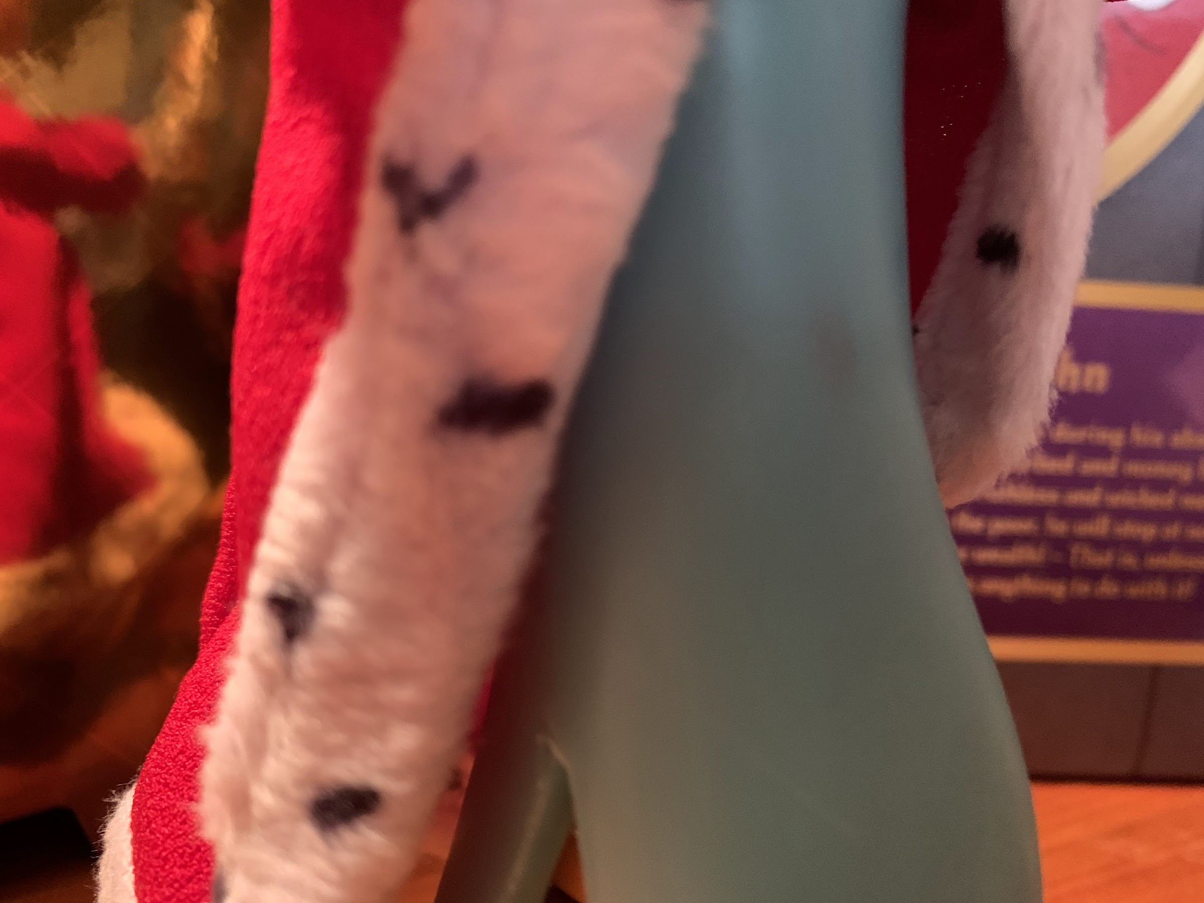
Excepting the feeling of a lack of paint, PJ really looks the part. That robe goes a long way in adding to that which is soft and just the right shade of red. The trim is more dense as the white is clean and the black dots within look nice. As was the case with Mickey, it’s also plenty big to allow the figure to move underneath it. Unlike Mickey, the robe doesn’t close with a belt, but it’s heavy enough that it basically closes on its own. Most importantly, it behaves as it does in the film and since it’s comically large on PJ it’s practically a character all on its own.
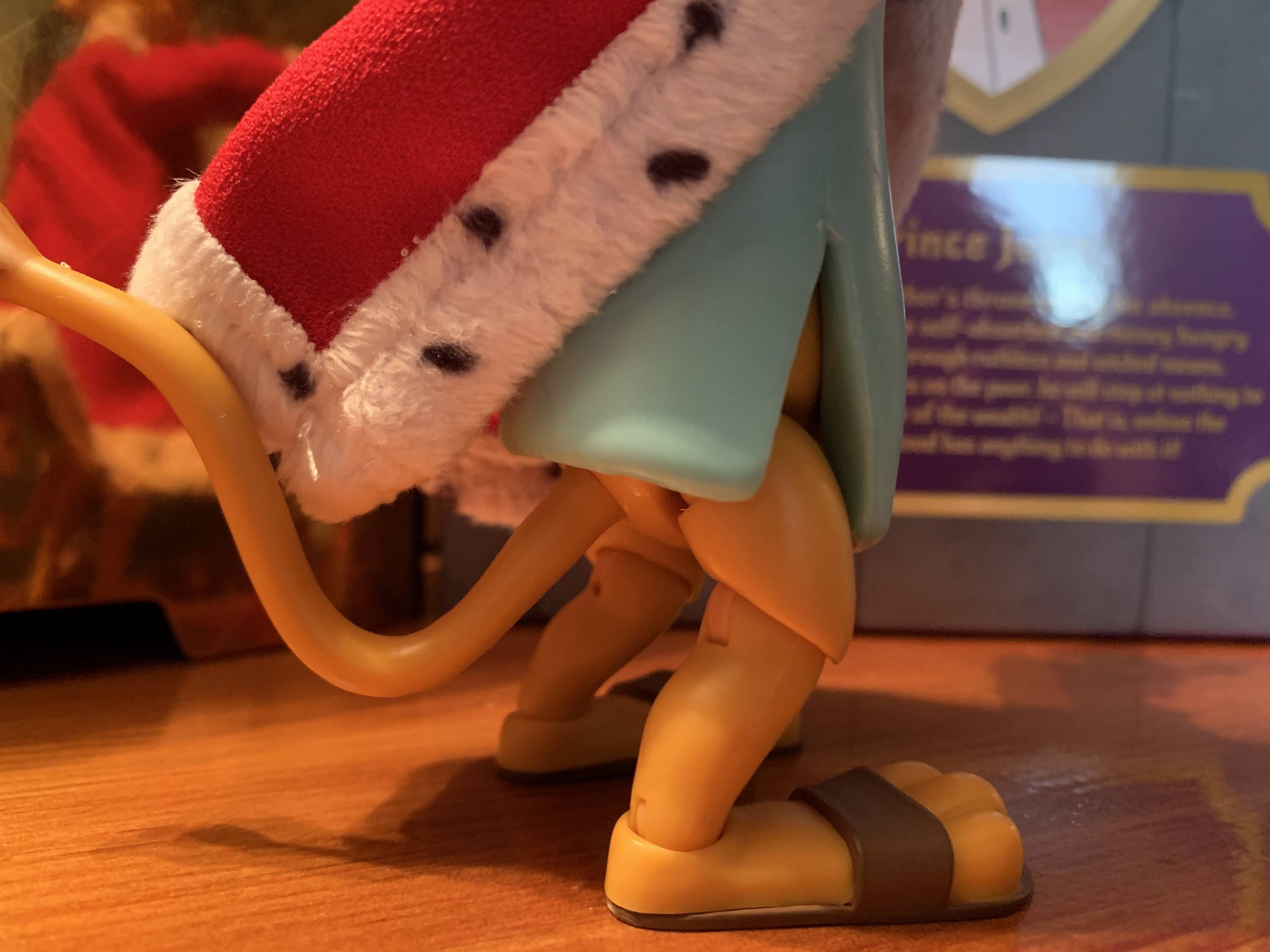
It is a bit odd how much of this character is just non-articulated torso. The hips begin way down at the bottom of the robe.
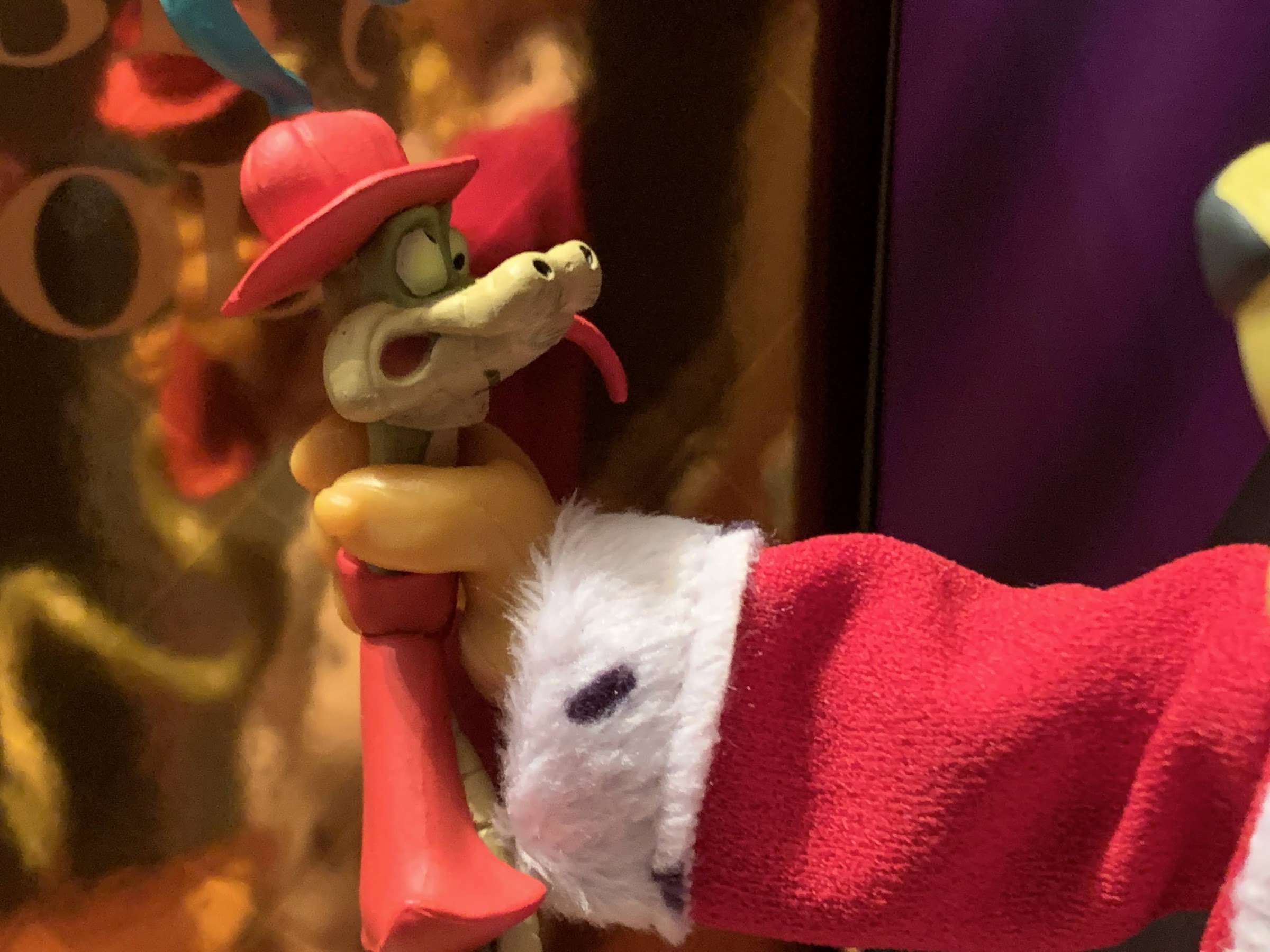
Where would John be without Sir Hiss?
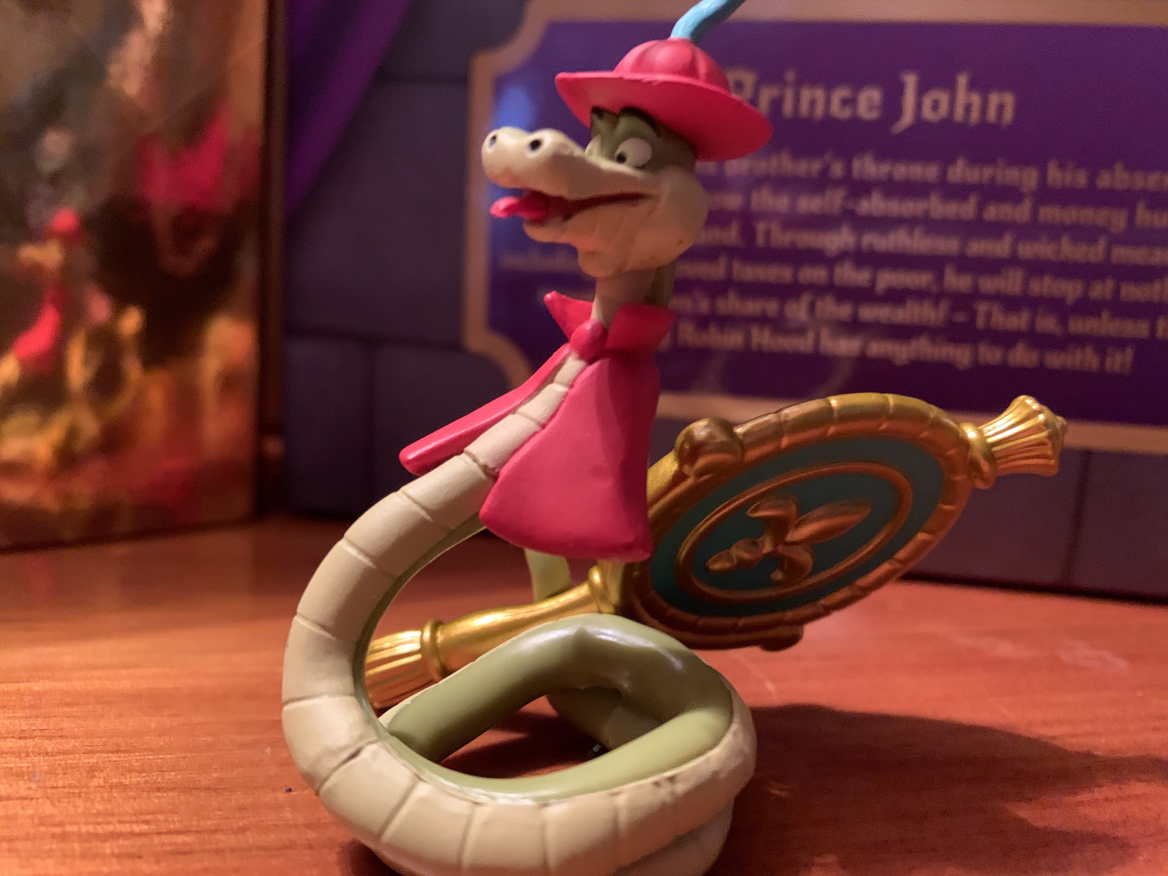
And speaking of characters all their own, we have Sir Hiss! And not just one Sir Hiss, but two! The first features a smiling Hiss partially coiled up that can sit on a surface. He has a ball-hinge at the base of his neck so he can swivel and look up and down, but is otherwise non-articulated. He’s very well painted, and the likeness is quite possibly the best of any character in this first wave. The same can be said for the second Sir Hiss which is elongated and features a strangulation expression. This is for John to grip and it’s pretty damn funny and also a little surprising that Disney let them do this, but since it’s from the film and the violence is bad guy on bad guy I guess that made it okay. As much as I love these additions, I feel like we need a Sir Hiss accessory pack! Or more versions with other characters from the film. Flying Sir Hiss, drunk Hiss, scared Hiss – the possibilities are nearly endless!
He’s rather fond of admiring himself.
Hiss can also hold the mirror for his lord.
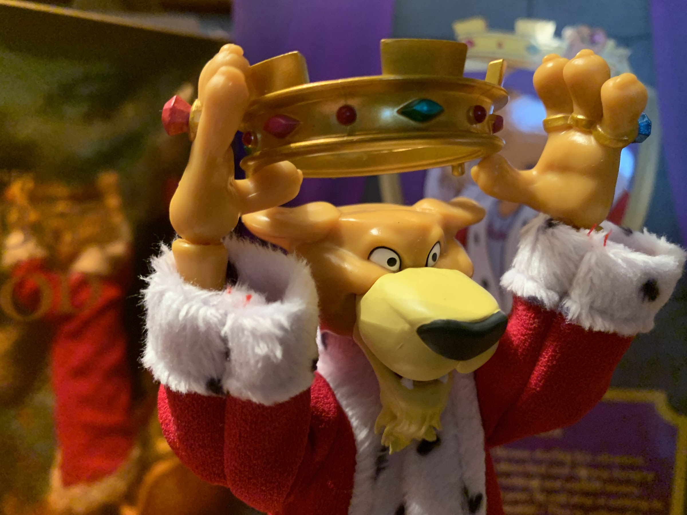
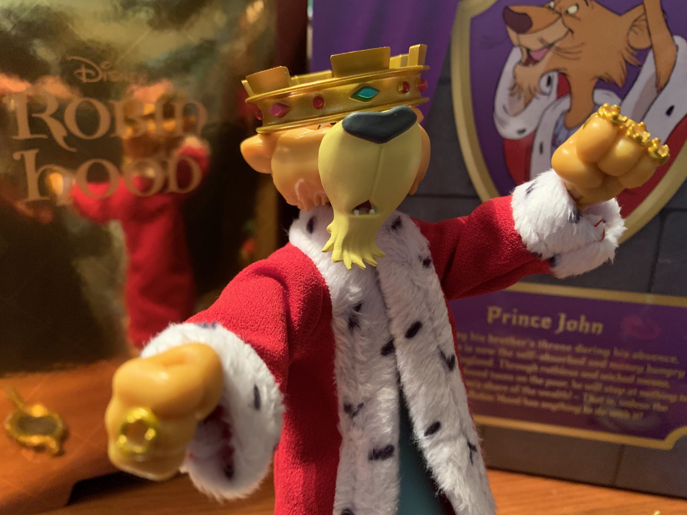
Aside from Hiss, PJ doesn’t come with much else. He does have his mother’s mirror, which has a slightly reflective, foil-like, sticker for the mirrored surface and the back of the mirror is well painted and sculpted. PJ can hold it with his lone, right, gripping hand or you can finagle it into the coils of Hiss. PJ has open hands in the package, but can swap to two different sets of fists: one with the gems in his rings, and one without from when Little Jon steals them. As for heads, we have two extra: angry John and a perplexed John where the crown is tipped forward covering his eyes. His neutral head has a removable crown which pegs into his ears, but the other two feature a permanently affixed crown. I do like the comedic one, but I feel like the angry one could have been embellished more. He gets really mad in the film where as this expression is more menacing than angry, and maybe that’s what they were going for? What’s missing though is plainly obvious: no thumb-sucking hand or expression! Considering how much Flynn seems to love the character, I am shocked that Super7 didn’t give us the pieces to recreate those scenes from the film. This line is called Ultimates because it’s supposed to represent the ultimate expression of the character, and how can you do Prince John without that?! Did they honestly prefer these portraits to that, or did they just find it too hard to get him to suck his thumb and tug his ear? Not only should we have gotten a proper thumb-sucking hand, but we should have got a second one with mud on it! It’s just baffling.
Don’t make him mad!
It feels like we won’t get many strangulation accessories in this line, so cherish this one.
The last thing we need to talk about with Prince John is also the least impressive: articulation. Same as it was with the other two figures in this line, PJ doesn’t move all that well. He has the same, bland, ball and socket for the head that lets him move in all directions, but without tremendous range. He can look up a bit as well as down, but there’s no reason for him not to have a double ball peg given the presence of the robe. The shoulders are ball-hinged and he can almost raise his arms out to the side, but more importantly, he can rotate just fine even with the robe. The elbows are tight and single-hinged with swivels and they’re somewhat buried in the sleeve of his undershirt or gown. They’re fine, and his hands rotate and hinge in-and-out. The torso features nothing, and bizarrely, Prince John is like a tube of plastic. His hips are way down there and I guess it makes sense considering he’s a lion. Though if he were to go on all fours his rear legs would be comically short. He can rotate at the waist at least with ball-hinge hips, single-hinged knees that swivel, and ankles that hinge and rock side-to-side. His knees are basically sculpted to always be bent so the range isn’t great and the ankles are definitely more loose than I’d like. He’s able to stand okay, though my kids running into the room where his shelf resides was enough to cause him to fall over so his ability to stand could be better. He also has a ball joint for his tail, but it doesn’t do much aside from just letting you control which side it trails off towards. It’s basically the same story though where there’s not a lot of articulation and some of what is there is just too loose. I really wish Super7 could at least figure out the loose issue as so many figures suffer from it.
This might be the most elaborate posing he can achieve.
This goofy head might be my favorite.
Overall, I do think Prince John turned out well enough when judged on what is actually there. The sculpt is solid, I like the robe, I just wish there was more paint and tighter joints. I don’t need him to do ninja kicks, but I do need him to stand. The color transfer issue is also concerning. Mostly, I can’t help but look at this guy and feel like Super7 really missed an opportunity to deliver a truly ultimate version of Prince John. Who else is going to make a Prince John figure? The lack of a thumb-sucking pose is a real bummer. Maybe they’ll come back to him when the cast of the film is a bit more fleshed out. They could do a throne that comes with the needed parts or maybe do a pajama version of the character or blue-robed variant. Do I want a variant of PJ? No, not really, but maybe I could do the throne. Considering they’ve already solicited thrones for other lines and they’re around $45 though, I’m a little less enthused about that prospect. Super7 tends to make things right when they get something so fundamentally wrong, and so I do feel like this may be one of those things. The fact that PJ is a favorite of Brian Flynn gives me a little more optimism. As released, Prince John is fine, but he could have been so much more.
Overall, PJ turned out pretty well, but he should have been better than that,
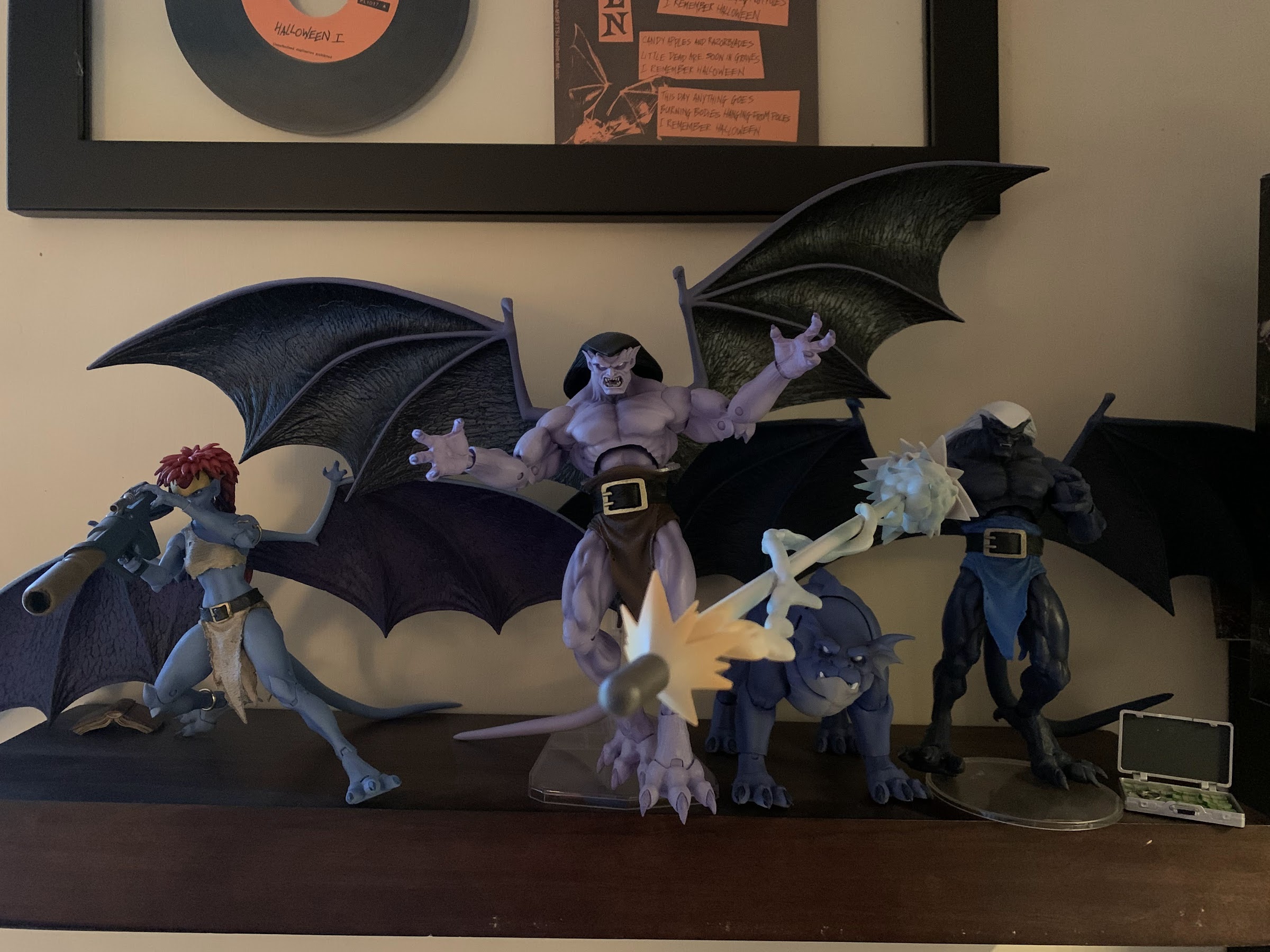
Demona is here to prove Tuesday isn’t just for turtles.
When NECA launched it’s line of action figures based on Disney’s Gargoyles, it seemed to imply that Demona would be figure number 2. She was not. That honor went to Thailog, the Goliath clone, and that might have had something to do with the many factory delays and shipping woes that were impacting the entire industry. It’s a lot easier to pivot from Goliath to a figure like Thailog at the factory when almost all of the molds are the same. The other promise from NECA was that none of the Gargoyles figures were slated to be sold as exclusives. They were all general release and collectors could expect to be able to preorder them from their preferred retailer. Well, that went out the window with NECA’s Haulathon event which was split between a website for Halloween costumes and Target stores. And as you could probably have guessed at this point, Demona ended up falling into that event.
Sadly, flight stand not included.
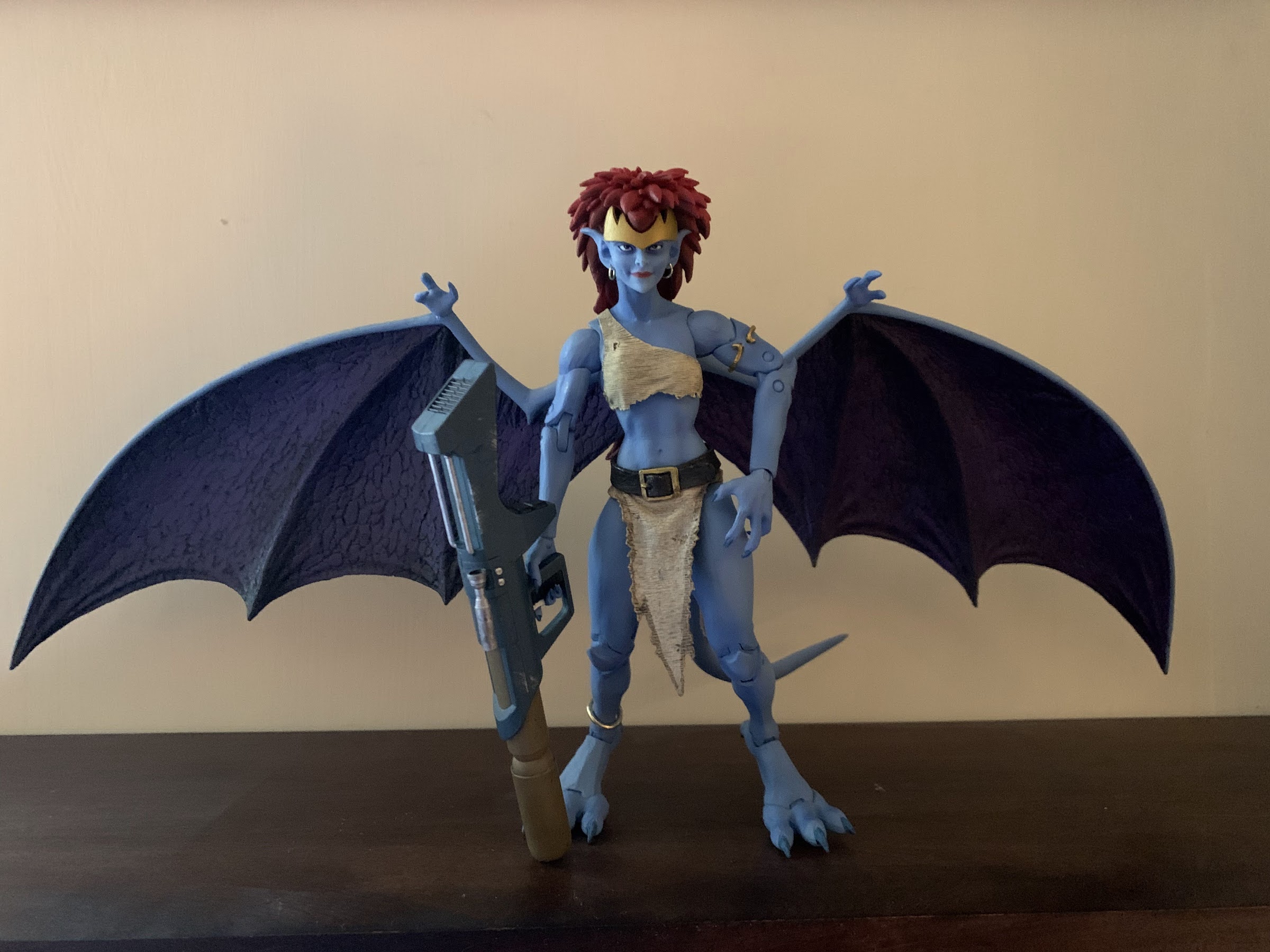
Demona is the rogue gargoyle from the show. Goliath’s former lover, she’s basically the Magneto of the series as she has a justifiable distrust of humans, but turns that mistrust into all-out hatred. She doesn’t want to live alongside humanity, she wants to crush it. Armed with advanced weaponry, magic, and a wealth of knowledge given her extreme lifespan, she’s a formidable foe for Goliath and company and a worthy third figure in the line. Since she’s not a Goliath repaint, she’s also just the second, unique, sculpt we get to experience. With Goliath and Thailog, I had some nitpicks, but was generally satisfied with the finished product. With Demona, that’s pretty much still true, but she does introduce a new problem that I really hope isn’t one going forward.
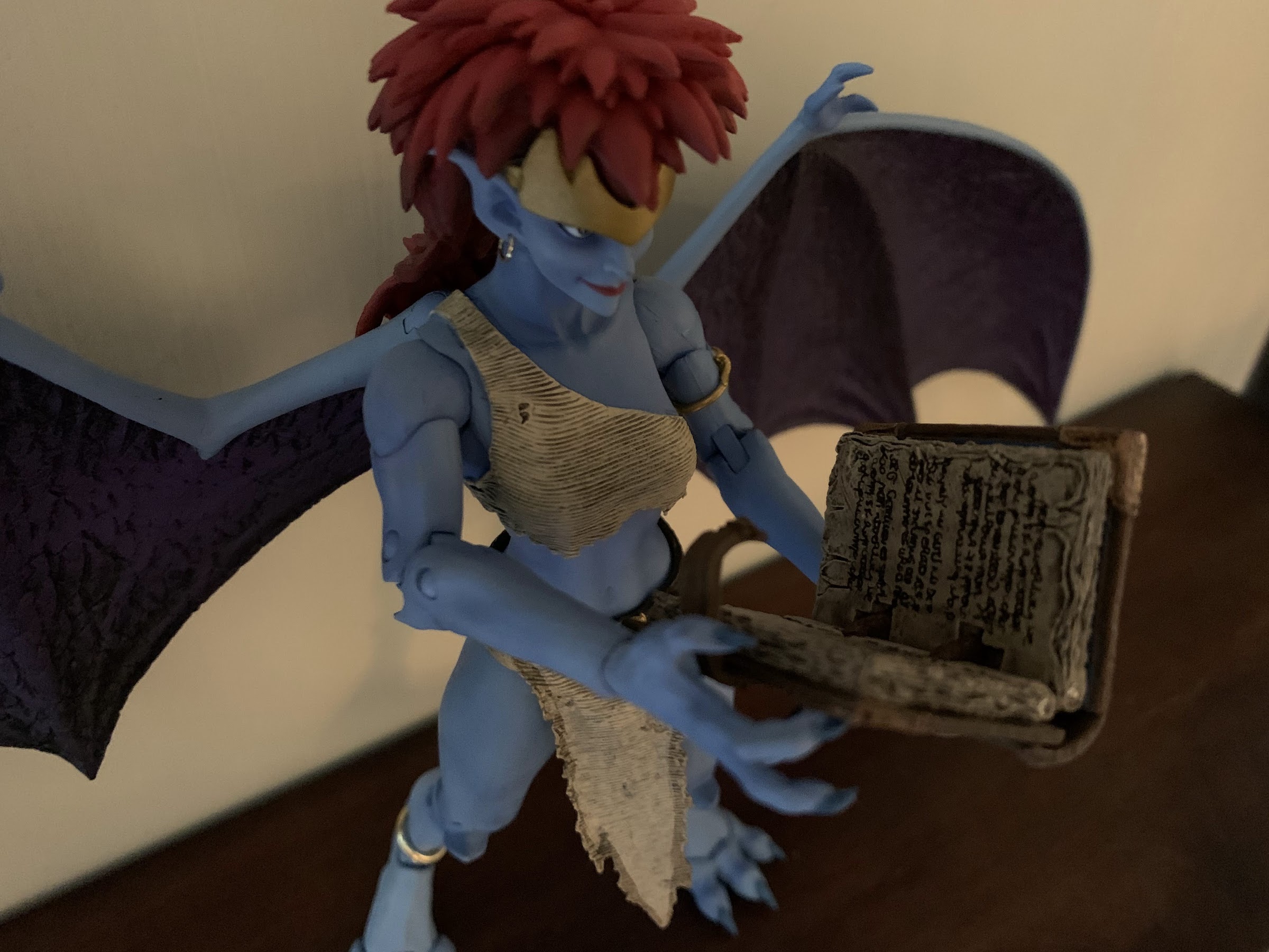
Like Goliath, she brought reading material. Unlike Goliath, her book can actually open and close.
Demona is sold in the standard NECA Ultimates five-panel window box. It’s a bit smaller than Goliath’s since Demona is a smaller character. Not only is she shorter than her former beau, she’s more slender as she has a very feminine physique that mixes with the gargoyle anatomy. She has a big tuft of red hair that looks quite nice and the pale blue-gray of her skin lines up well with her appearance in the cartoon. Like Goliath, she’s inspired by the cartoon, but has added detail to make her look a bit more “alive.” It’s a bit less pronounced as she doesn’t need giant, rippling, muscles and it’s mostly seen in the texture added to her clothing. She basically just has a top and loincloth with the bottom piece being separate while the top appears to be part of the mold. Either that, or the torso is cut-out to fit it so it can be glued down. It’s interesting as I suspect NECA will want to reuse much of this mold for Angela at some point, but her top is different. Maybe Disney just didn’t want people sneaking a peek under Demona’s top? Which does raise the question: why do female gargoyles have breasts? They’re an egg-laying species, most of which don’t nurse their young, but they are fantastic beasts so I guess they can follow different rules.
Good luck deciphering that.
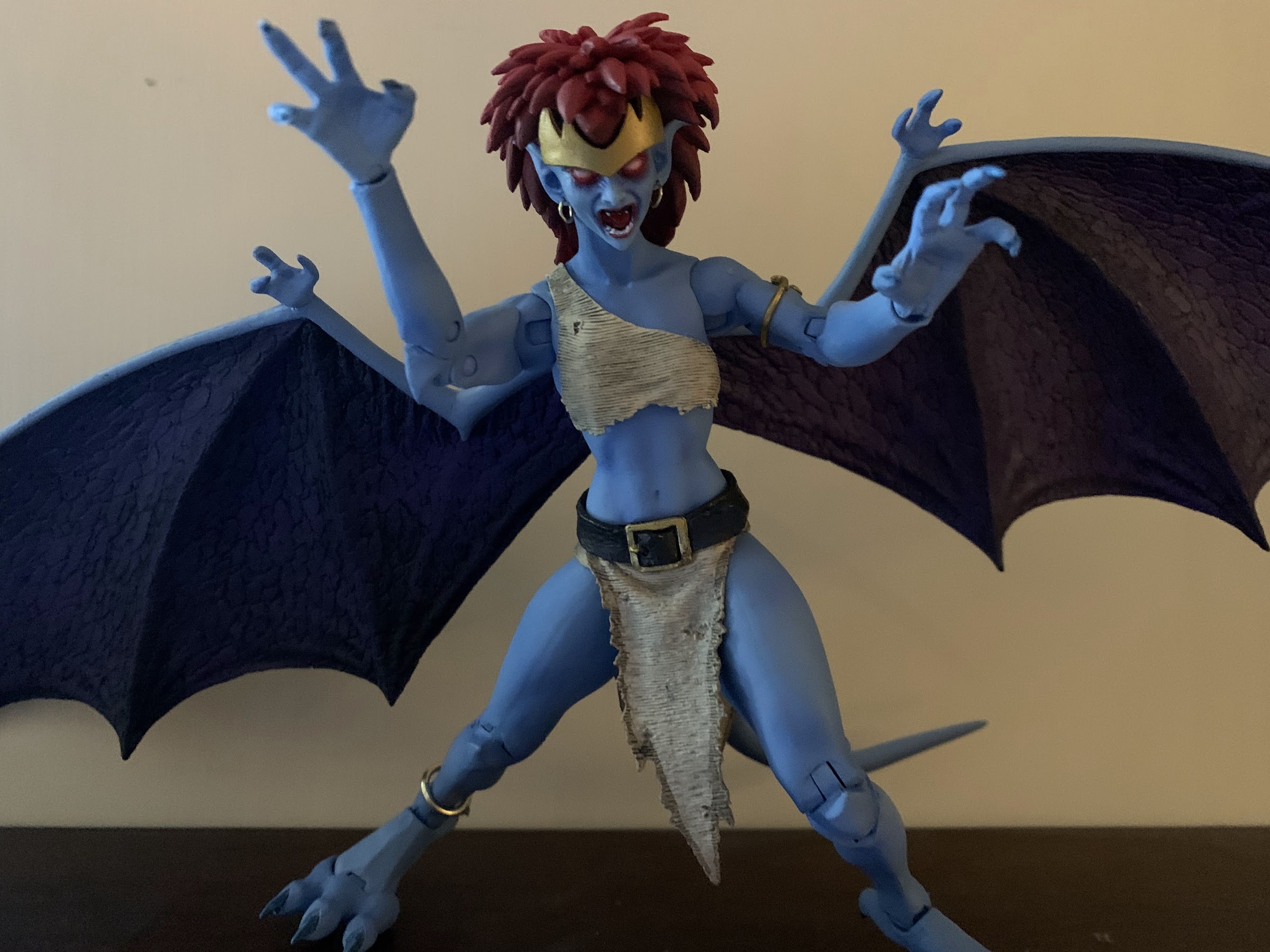
Demona has a very striking appearance, and one thing I rather like is that NECA used actual metal hoops for her earrings and her anklet. This could potentially make her more fragile, but they seem secure and fine. Her proportions look nice, and like Goliath, her wings are painted in a two-tone fashion with a purple shade used for the membrane. Also like Goliath, the wings are huge and made of ABS so there’s no give to them. They’re going to take up a lot space, and there’s nothing that can be done about it. Aside from that general complaint, my only other issue with her is that her face looks just a little off. I feel like her face should be longer and more narrow. Instead, it starts off rather wide and quickly comes to a point at her chin giving her a slightly scrunched appearance. It’s not terrible or anything, but I think she could look a little better.
Your kids probably won’t like this face.
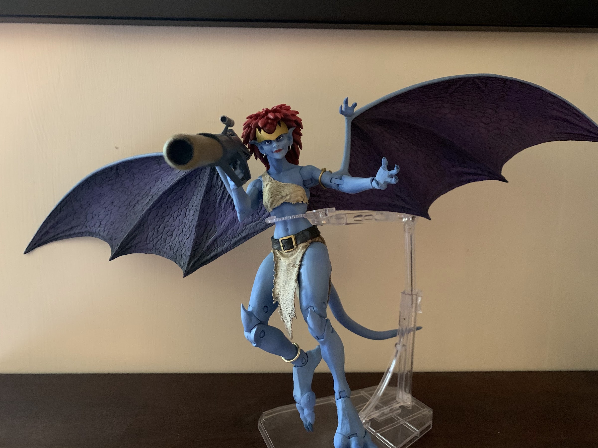
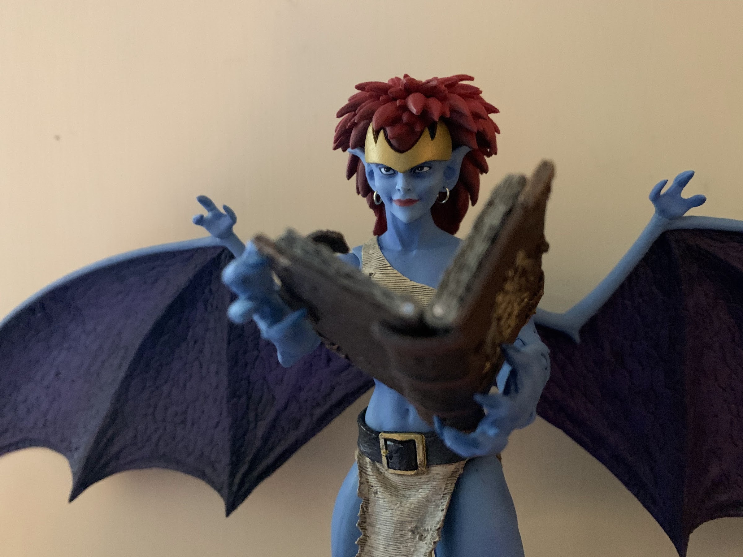
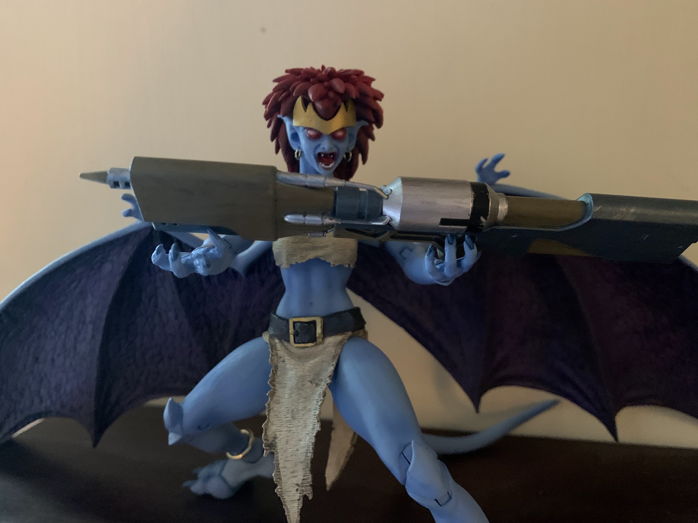
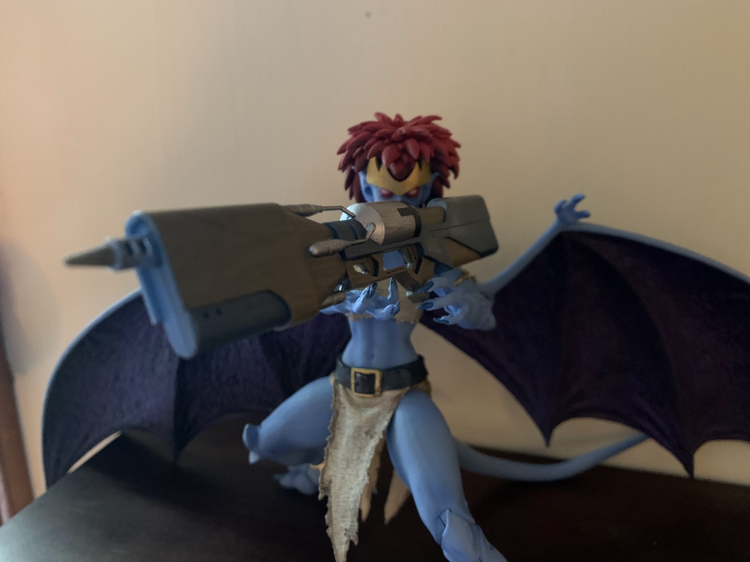
Demona comes with more stuff than we’re used to, and she even has a new feature that I wish Goliath had. And that feature is she uses faceplates instead of swapping an entire head. Bandai has been doing this for years with its figures, and I’m surprised it took NECA this long as it would have been easy to do with Goliath. Her face pops off easily and she has a screaming, red-eyed, face to go in its place. It’s appropriately unsettling, so much so that I almost don’t like looking at it, but it definitely works. Demona also has various hands including open, clawing hands, fists, a trigger-finger right hand, and a modified gripping left hand for her book or gun. She has two, giant, guns. One is a bazooka while the other is some kind of laser canon. The bazooka has a trigger and a more conventional design that’s easy to get the character to grip, while the other gun is more cumbersome with no actual trigger. I’m assuming it appeared that way in the show so I’m not faulting the toy here, just pointing it out for review. She also has her Grimorum Arcanorum which is really cool. It’s well-sculpted and the paint looks awesome as it has this distressed look to it and it can even open. It’s also sculpted to have a page torn out and that missing page will come with a future figure – a nice attention to detail.
The laser canon is a bit awkward with no actual trigger leaving Demona to wonder how she’s supposed to hold it?
The accessories are certainly appropriate, and the only thing missing is what’s missing from all of the figures so far and that’s a flight stand and additional wings. The wide open wings are essentially gliding wings so a flight stand is almost a necessity, but obviously would add cost to the figure. I’d happily take an increased cost if it meant alternate wings though. I know I sound like a broken record, but these things are too much to manage now that we have three figures.
That’s the best I could do.
Demona may be smaller than Goliath, but she essentially articulates the same. The head is on a double ball-peg, but her hair keeps her from being able to look up which is unfortunate for flying poses. NECA could have fixed that with either a second hairpiece or with a hinge in it, but chose not to. She can look down, tilt, and swivel. There’s no lower neck joint and her shoulders are ball-hinges. She can raise her arms out to the side without much trouble and has a biceps swivel, double elbows, and wrists that swivel and hinge. All of the hinges are horizontal, which is unfortunate for the trigger hand. Demona has a ball joint in the torso below her bust and a waist twist below that. Her hips are the standard ball joints and she can kick forward and back, since she doesn’t technically have an ass. There’s a twist there as well and she has single-jointed knees since the gargoyle anatomy only requires that much. The ankles are hinged and can rock a bit with another hinge at the toe that also has a rocker. The tail pegs into the rear of the figure and is bendy plus there’s a hinge at the peg. At the wings, she has hinges and they’re on pegs so they can rotate up and down and also swing out.
The rocket launcher, on the other hand, is quite easy to work with.
It’s with the wings that a new problem emerges for Demona. In many respects, I think she articulates better than Goliath as there’s less bulk to maneuver around, but what kills her is the tolerance of the wing joints. They are far too loose and are downright floppy. Her wings immediately slump to the table and posing them on their own is impossible. I’ve had to prop them up on Goliath and Thailog or just let them hit the shelf to pose her. She’s a challenge to stand, so I guess the wings help in that regard, but it’s a problem and it seems to be rather widespread. I’m going to have to try to remedy this somehow, either with super glue, tape, or something that can be added to that peg to tighten things up. It’s a problem that the figure really can’t have since the wings are so huge and it’s something NECA needs to tighten up now. I’ve refrained on trying to remedy it for the time being so that my images with this review are true to what the figure is out of the box.
I think three, winged, gargoyles is the most this shelf can handle.
Demona is a figure that is largely as expected. She looks the part well enough and has essentially the same articulation as Goliath, just with a new problem in the form of the wings. If not for that, I think I’d find her a little more entertaining than Goliath, but instead I find this figure to be rather frustrating as I try to pose it on my shelf. That’s also true of the other releases in this line as they’re so cumbersome that they’re really not a lot of fun to handle. They look pretty great when placed in a pose that looks nice, but they make you work to get there. NECA plans to include extra wings with the non-winged characters in the line, but that’s not going to do it. We really need options right out of the box, or else I think a lot of people will drop this line after a figure or two. Maybe I’m wrong, but despite this figure being overall a solid release, I’m finding my enthusiasm for this line waning which is hard to believe given how excited I was a year ago when the line was announced.
Demona was part of the Haulathon event and some stores are still receiving stock of her and she should set you back around $36. The distribution appeared poor to start, with some stores only getting one unit or none at all, but Target did make her available online so hopefully those who wanted her got her. I never found this figure in stores, so a special shout-out to @JoePoppingOn who helped me in tracking her down and the next figure in the line. The figure is also now up at various online retailers, some with a mark-up so it pays to shop around. Those figures are presently slated for a June release so hopefully that holds true and everyone who wants it can get one.
Do bad things always happen when the mouse puts on the hat?
The first figure from this line of Super7 action figures based on characters from Disney’s treasure trove of animated characters was Pinocchio. In that review, I mentioned how Disney wanted to outdo itself with Pinocchio and sunk a lot of money into that film’s production. Well, the only other film from that era that might compare is 1940’s other feature: Fantasia. Fantasia was Walt’s passion project as he saw the marriage of animation with classical compositions as high art. I think he was mostly happy with how it turned out, but not happy with the reception as audiences didn’t seem to appreciate it the way the company figurehead did.
How come Mickey gets a special sticker, but Pinocchio doesn’t, when both films were released in 1940?!
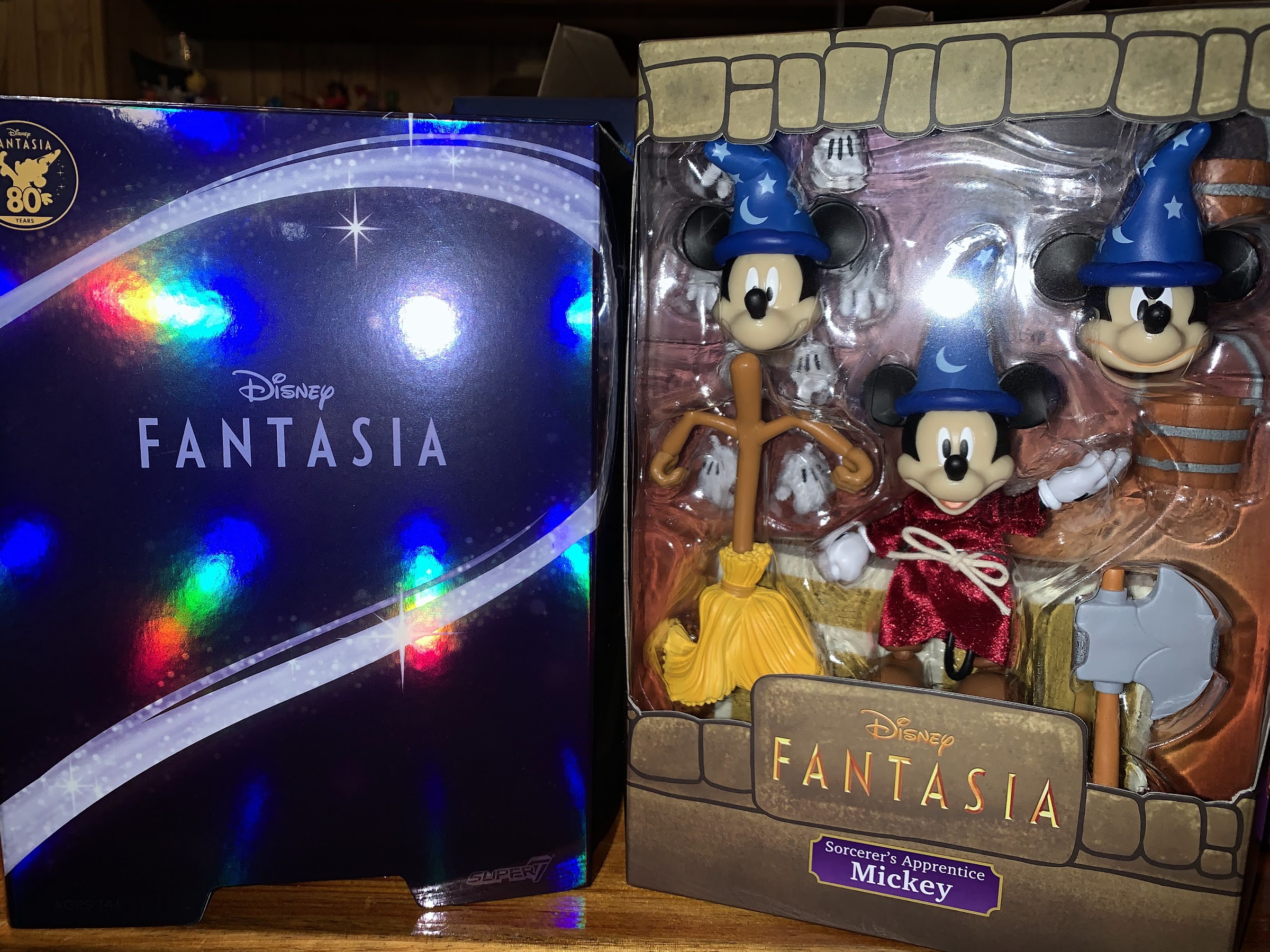
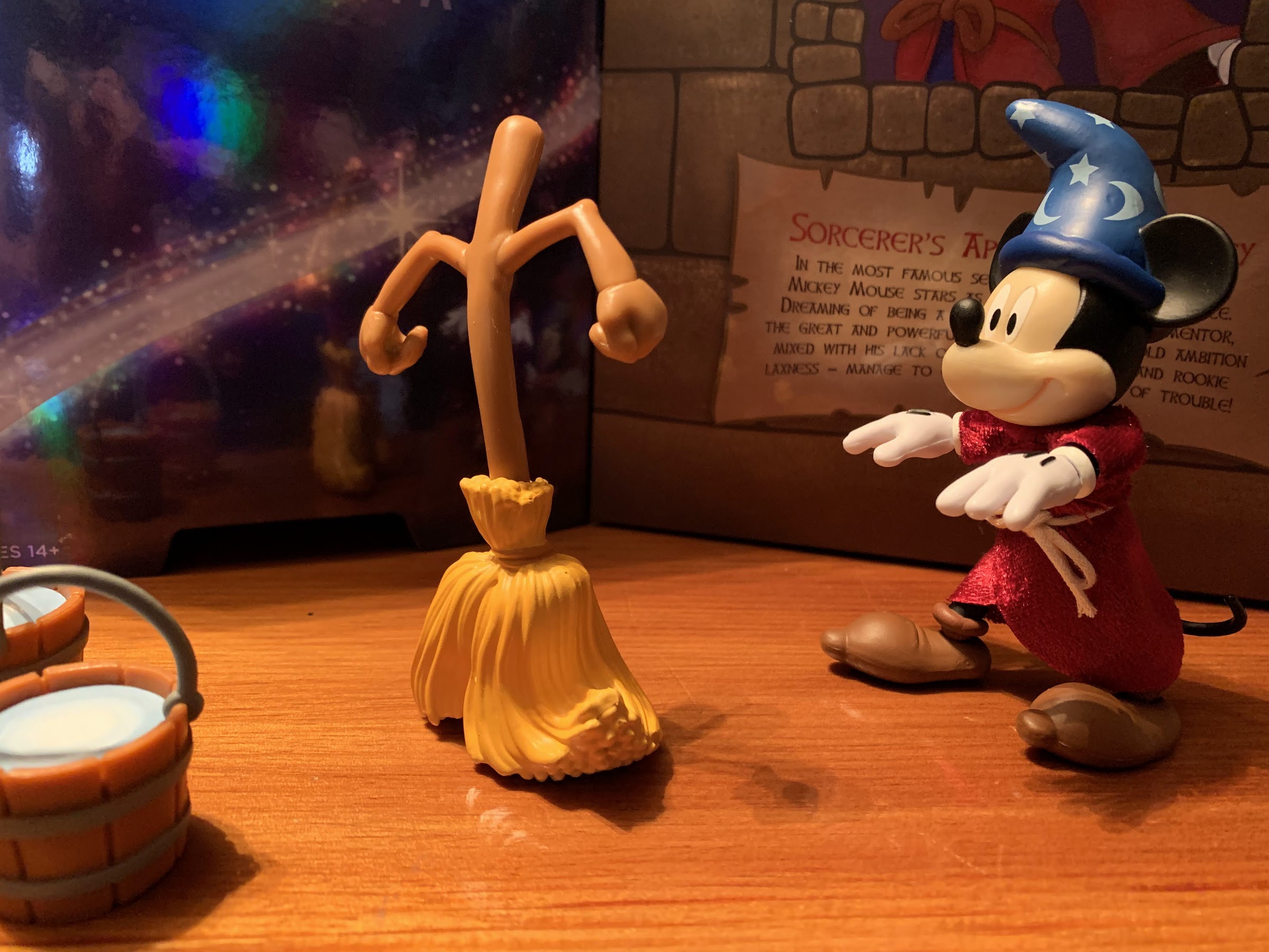
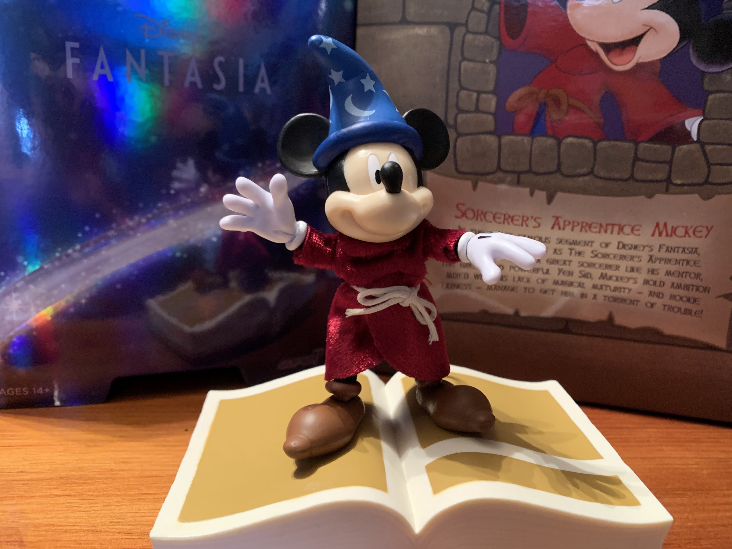
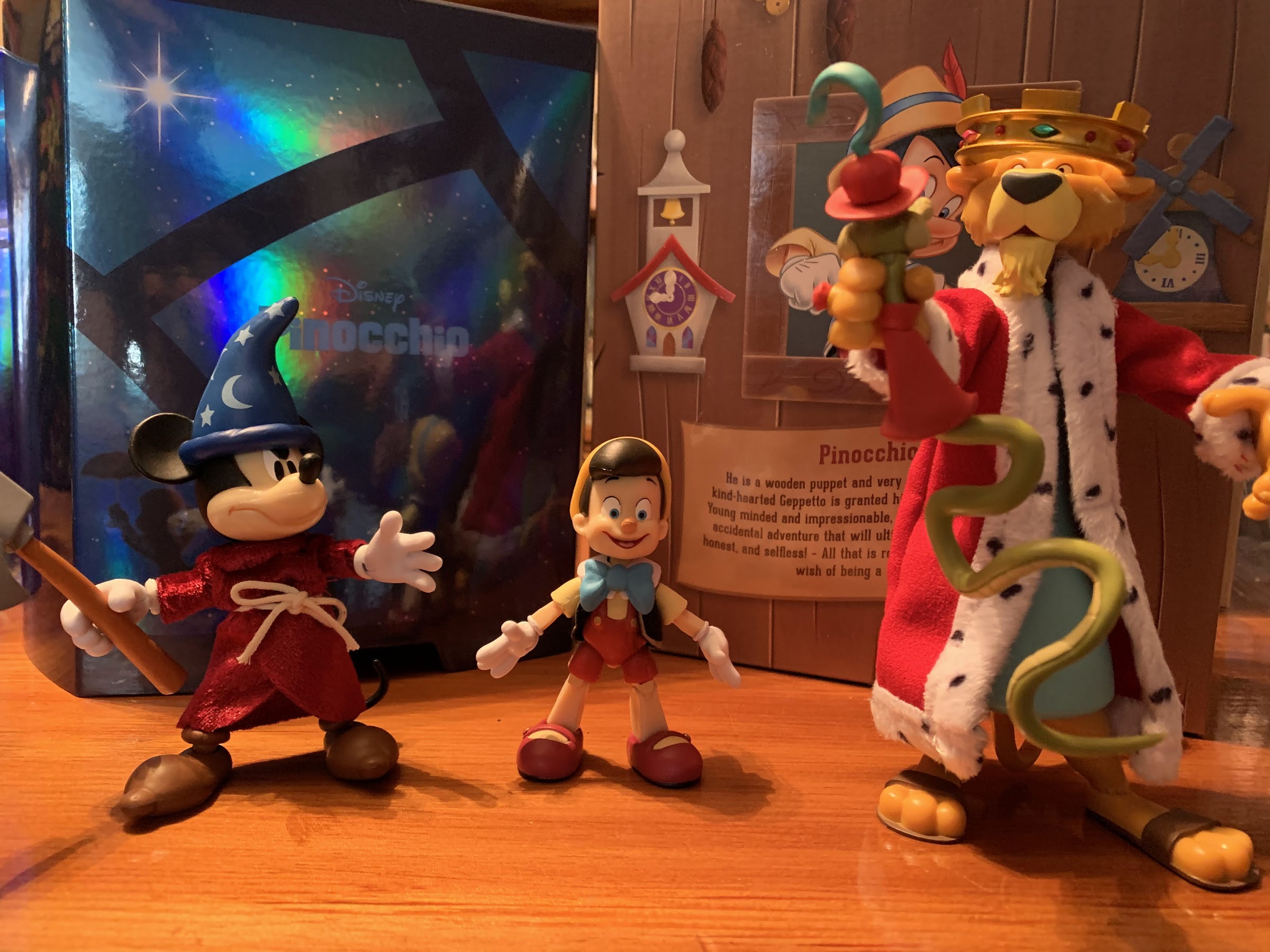
Even so, there’s no denying that at least one segment from Fantasia has impressed and delighted movie goers for generations and that’s The Sorcerer’s Apprentice. That segment starred Mickey, who was still a pretty big deal in 1940. He was voiceless in the film, but was arguably never as expressive as he is in the short segment because no Mickey cartoon before (or likely since) had the budget of Fantasia. It truly is a delight and one of the best cartoons of all time and it’s no surprise that Super7 turned to Fantasia, and Mickey, with its first wave of Disney Ultimates!
Doesn’t get much more iconic than this.
The direction of Super7 founder Brain Flynn with this Disney line is to not simply do characters from Disney in their most recognizable forms. For Mickey, that would be classic red trunks and yellow shoes. The thinking from Flynn is that you can get that Mickey anywhere so Super7 should do something else. Now, doing Mickey as the Sorcerer’s Apprentice isn’t exactly breaking new ground either, but it’s apparently enough for Flynn who basically conceded that they needed to do something a bit more expected and generic for this first wave as Disney collectors are probably pretty new to Super7. And since the figure did sort of coincide with Fantasia’s 80th anniversary (curiously, so did Pinocchio but that one didn’t get a fancy sticker on the box), it makes perfect sense to have this Mickey in Wave One.
Careful, he doesn’t like it when you call him short.
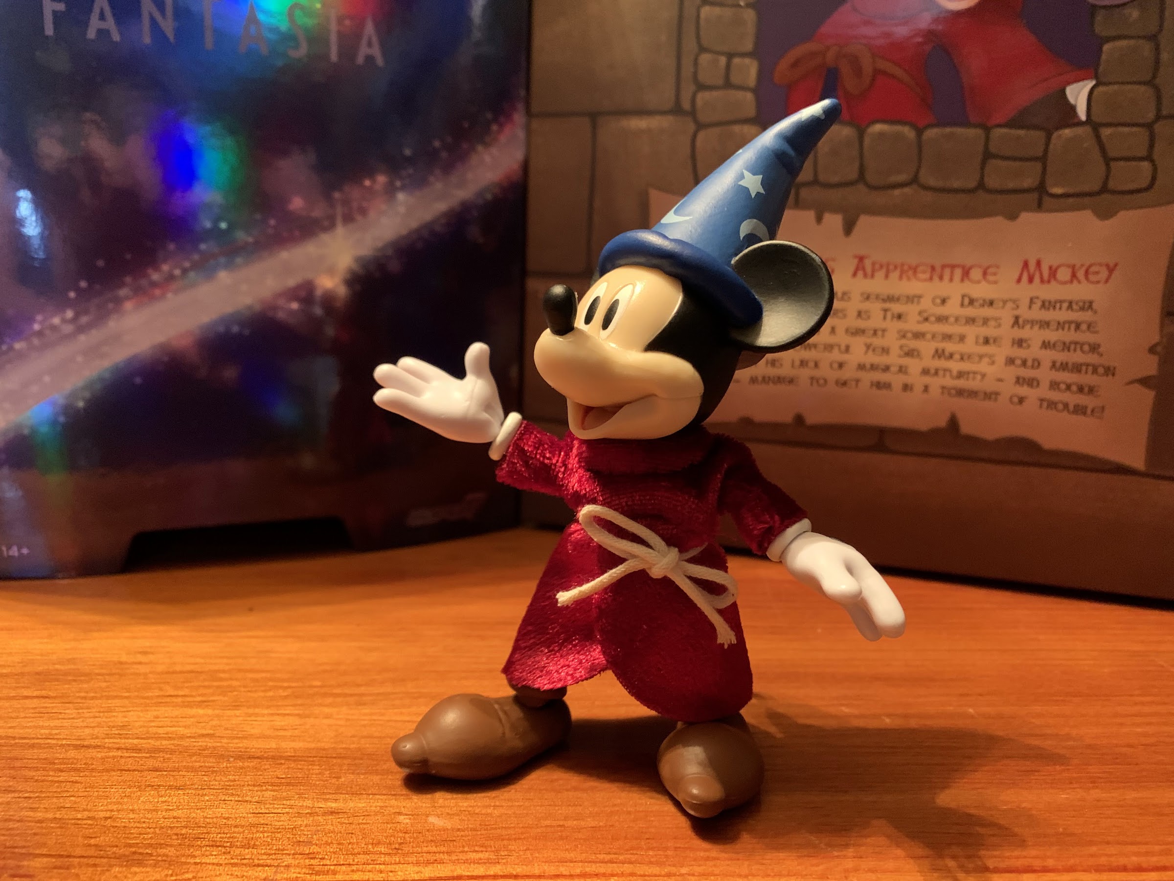
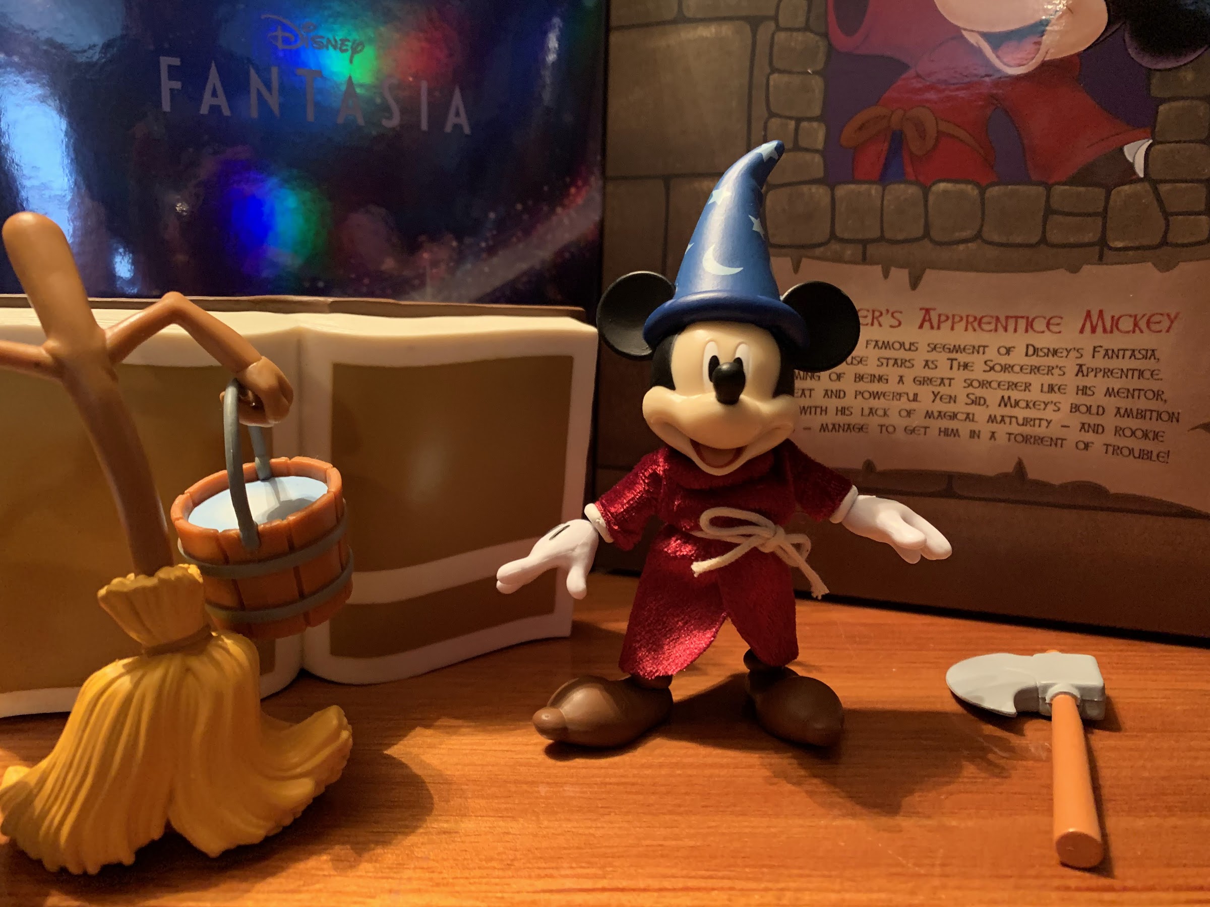
Being a 7″ scale line, Mickey comes in on the small side for an action figure. He is not, however, as small as Pinocchio and I think most collectors are likely going to be pretty happy with the sizing of the mouse. To the top of where his head would be he’s nearly 4″, and once you factor in the hat he’s basically a 5″ figure. His proportions are fairly small, though more substantial than Pinocchio, and he does feature the trademarked oversized gloves and shoes. This is a figure that largely features no paint. There’s the blue on the hat with the painted silver runes, Mickey’s eyes and mouth, and the black lines on the back of his gloves. Under the robe, he does have blue trunks which are a mix of colored pieces and painted ones and the brown boots are colored plastic. It’s largely fine, as his entire body is covered by the robe, but where paint is sorely needed is on his face. The flesh-tone plastic is just not saturated or warm enough for the character and it has a glossy characteristic that is off-putting. Some have gone so far as to say it ruins the look of the figure, but I’m not willing to go there. Instead, it’s just an unfortunate shortcoming. Simply painting that area of the face would do wonders for the look of this guy.
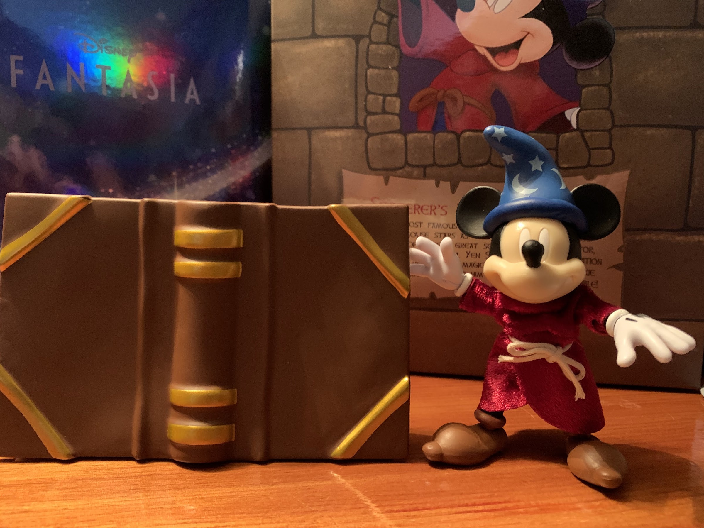
Mickey’s feeling pretty good in that snazzy robe.
I mentioned in the Pinocchio review that one of Super7’s goals with this line is to incorporate soft goods into each release. For Pinocchio, the inclusion was a minor one, but for Mickey the soft goods needed to be something special and I’m happy to say Super7 pulled it off. Mickey’s robe is a touch darker than it is onscreen, but it has a shimmery quality to it that really imparts a sense of quality into the release. It’s cinched with a simply knotted rope, and it’s appropriately sized for the figure. It doesn’t look overly baggy, and the roominess of the design allows Mickey’s articulation to function as intended. Like a lot of collectors out there, I’m not often partial to soft goods, but here they work and they work well.
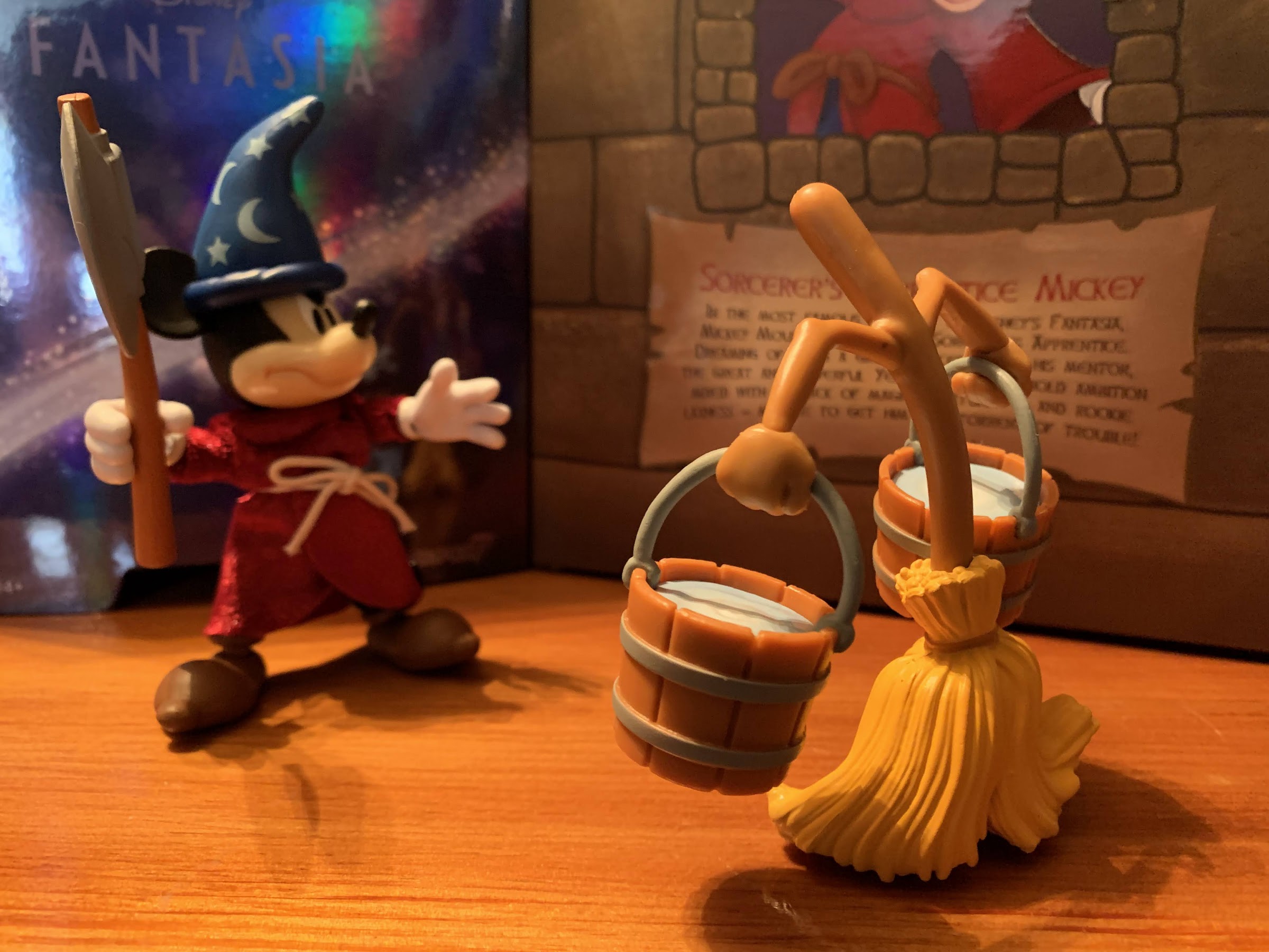
Things always start off well enough when tossing magic at a broom.
As for that articulation, I’m happy to say it’s better than what we got with Pinocchio, though it’s still hardly a strong point. Mickey’s head sits on the same ball peg design as Pinocchio so there’s no neck articulation and what you get out of his head just depends on the amount of range on that single ball. It’s sufficient as Mickey can look up an okay amount, but there’s really no reason why they couldn’t a double ball peg. The shoulders are ball-hinged and Mickey can raise his arms out to the side just fine and he can even rotate around with the robe on. He has single-hinged elbows with swivel and his hands rotate and feature horizontal hinges. Once again though, we have no torso articulation. Not even a waist cut, which is a shame because, again, the robe would hide everything! Maybe it’s a size issue – I don’t know, but NECA’s done figures at this size with more articulation so I’m not willing to allow that as an excuse. At the hips, we have the usual Super7 ball-peg hips and they’re fine. The knees hinge and swivel and Mickey can at least bend 90 degrees. The ankles are, once again, rather floppy and the oversized shoe means the ankle rocker isn’t as useful as it could be. The right ankle on mine isn’t as bad, but the hinge is pretty tight. I actually have a hard time getting both legs to appear the same length as the knee hinge is loose on the left leg. There’s also a ball-hinge at his tail giving that some movement. He can hold a pose at least, and hasn’t fallen down like my Pinocchio, but there’s room for improvement.
Eventually though, things take a turn and it’s time to break out the axe!
There’s certainly a nice assortment of stuff here, and I didn’t even place all of the extra hands into the shot.
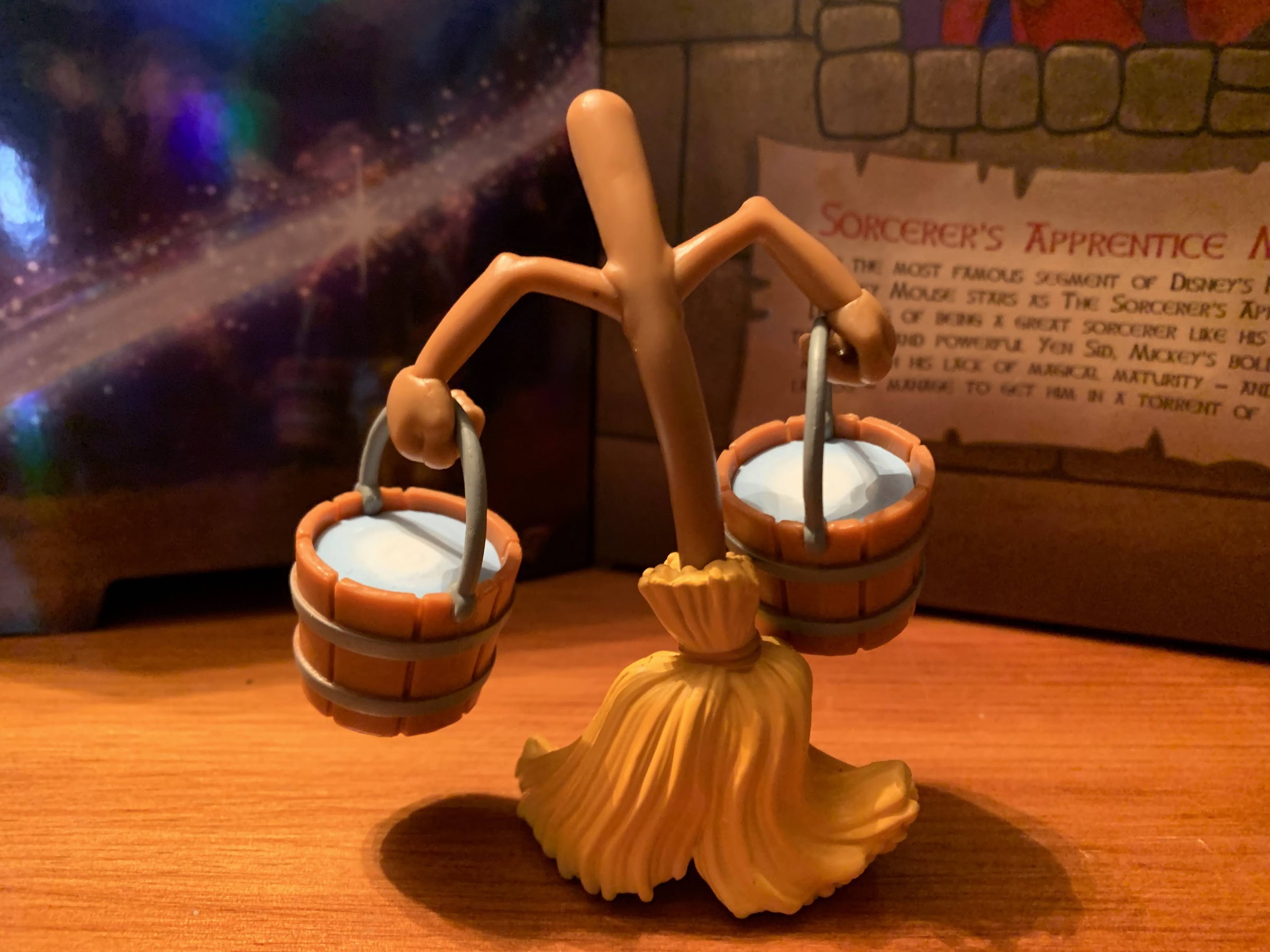
On the accessory front, we pretty much get all that we need. The default head is an open mouthed smile and Mickey can swap to an angry head or a standard smile. Both extra heads feature a bend in the cap which is nice for a little added personality. I probably could do without the smile though in favor of a scared expression because it feels redundant with the open smile. All of the heads also feature the ears sculpted into the hat, and I feel like Super7 missed an opportunity to change the ear position so we could have a screen accurate way to present Mickey from the side as he is on the back of his box or as he was in the often seen tag before every Walt Disney VHS release in the 80s and early 90s. A scared expression would have been really nice for the giant book accessory that Mickey floats on towards the end of the segment. The book is just a big slab of plastic, and it’s cool, but without a scared head I really don’t know what to do with it. There’s also a single, animated, broom with a pair of water buckets it can hold. There’s no articulation on the broom, but both it and the buckets are very well-painted. And for when Mickey gets angry with said broom, he has an axe to chop it up. To go along with all of that, are numerous hands. Mickey has open hands in the package to go with fists, gripping hands, pointing hands, and a more relaxed open set of hands. With the hands, the only criticism I can make is the hinge on the gripping hands isn’t going the right way, but otherwise this is a fine set of expressions.
There’s probably a lot of people wondering how they can get more of these guys.
The book is neat, but this would work so much better with a scared expression.
Objectively, and subjectively, Mickey succeeds far more than Pinocchio did at making the jump to plastic. The articulation could be better, but that’s often true of every Super7 release. My main critique is in the lack of paint on the face, and if not for that, I’d consider this a homerun. As released, it’s a solid line drive for a double and I think it will please both action figure fans and Disney collectors. It’s very on-model, and the soft goods robe adds a touch of class. Plus, it’s an iconic version of an iconic character. Personally, I would have loved to have seen Super7 roll with The Band Concert or The Brave Little Tailor version of Mickey, but at least we’re getting that with the ReAction line and I can’t fault them for doing this version. It’s both safe and pleasing for the audience and an easy recommend for Disney enthusiasts.
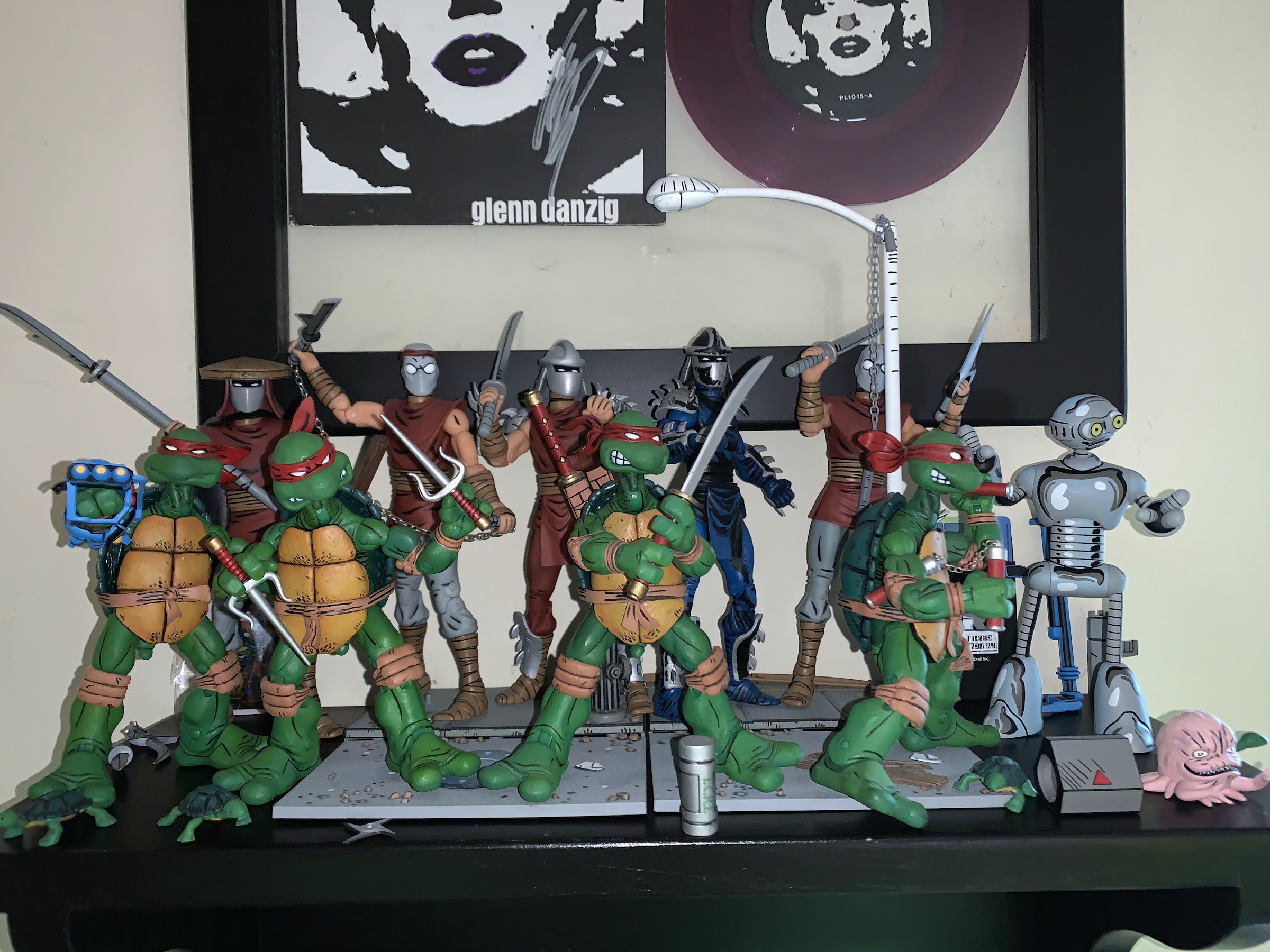
I’m having a hard time coming up with an action figure line that has had retail releases separated by more than a decade. I don’t mean long-running lines of figures like G.I. Joe or Marvel Legends which have been around for decades, I mean a line that was started, ended, then re-started like NECA’s line of Teenage Mutant Ninja Turtles action figures based on the work of Mirage Studios. That source is the original incarnation of the green machine made famous in the late 80s by a cartoon, video games, toys and movies. The Eastman and Laird turtles were of a different mold: more violent, less polished, and with less color. If you’ve ever been into TMNT then you likely know all of that already as it’s pretty well-covered at this point.
It’s pretty cool to see Kevin Eastman’s art on an action figure box in 2022.
When NECA first got permission to do figures based on Teenage Mutant Ninja Turtles, it was via a deal they struck with Peter Laird and Mirage Studios to bring the original turtles from issue #1 to comic book shops. It was in 2008 when those figures hit stores, and they would be followed-up with a black and white variant as well as an April O’Neil. After that, things came to a halt. NECA unveiled a Shredder, but it was cancelled. It’s unclear if the line was ended because the sales weren’t there (NECA’s Randy Falk has indicated in the past that consumers aren’t that interested in pre-toon TMNT) or if Playmates had something to do with it being that they held the master toy license and had really never been challenged on it. Playmates definitely wasn’t happy, and would remain a challenge to getting non-Playmates TMNT toys to retail for awhile longer, but I suppose it doesn’t matter as the line did indeed come to an end.
This paint job is amazing.
Since then, things have obviously become better for NECA where TMNT is concerned. The company has been able to branch out while turtle nostalgia has taken off. Once Laird sold the property to Viacom, it seemed to open the door for non-Playmates action figures, likely because Viacom is big enough to toss its weight around if Playmates starts threatening legal action or something. NECA was able to find a loophole that allowed it to produce TMNT action figures as convention exclusives, and in 2016 the company finally got that Shredder out they had unveiled nearly a decade earlier. And he came with a trio of henchmen too making the Mirage subline feel relatively complete. As things progressed and NECA brought TMNT to retail, there wasn’t room for more Mirage Studios figures, until now.
And unlike some companies, NECA doesn’t cheap out on the paint when it comes to the rear of the figure.
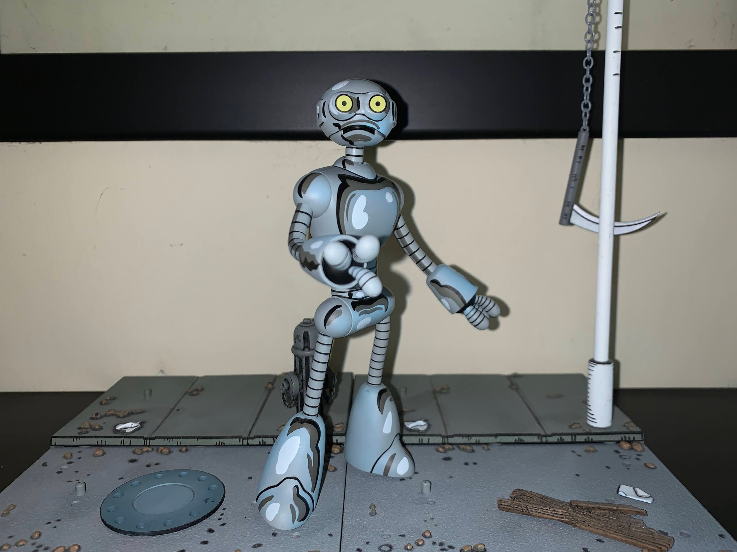
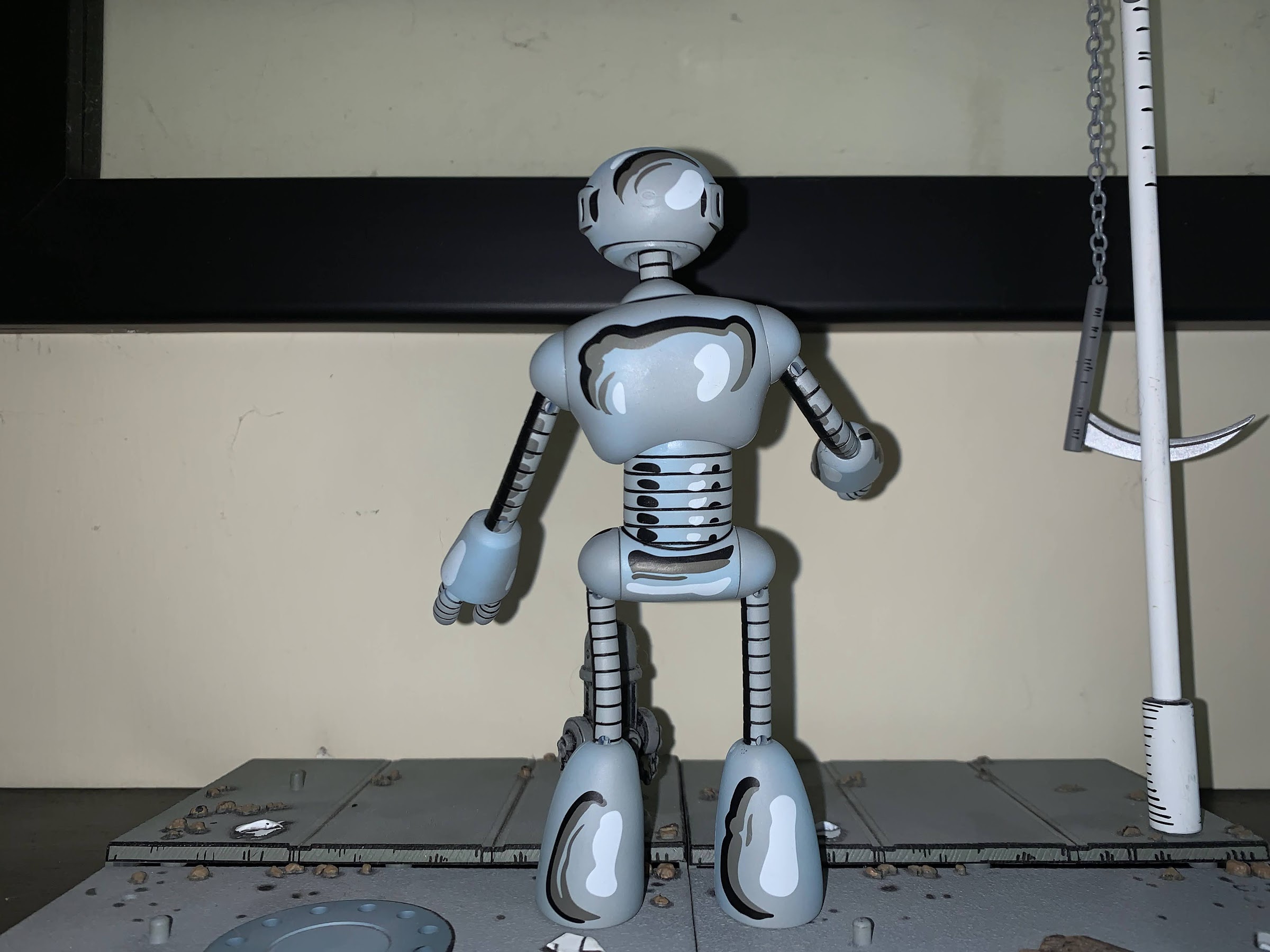
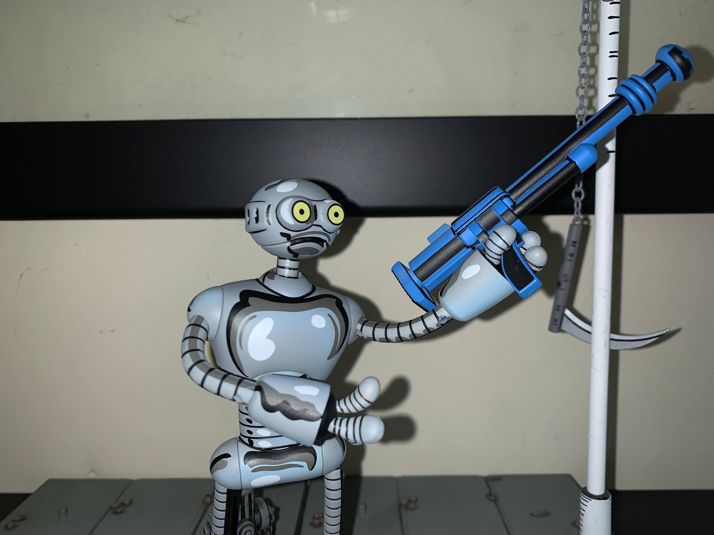
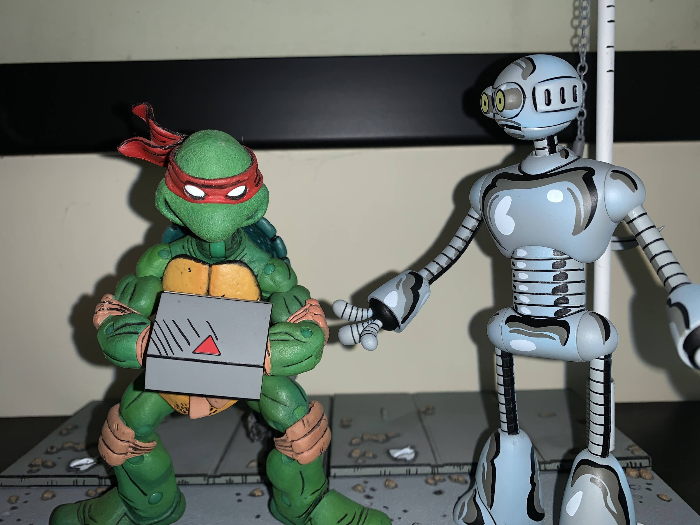
Relaunching the Mirage Studios line in 2022 is Fugitoid, a character arguably made famous by Teenage Mutant Ninja Turtles, but who actually came first. Fugitoid is an interesting character when you factor in that the Mirage version of the TMNT are often associated with violence as Fugitoid is a noted pacifist. Not that it stopped NECA from including a small arsenal with their figure. He’s the displaced Professor Honeycutt who after an accident found his mind transferred to the body of his loyal, robot, sidekick. He never made the jump to animation in the original cartoon series, but still received an action figure from Playmates. He would show up in later iterations, and in future toy-lines, but the Mirage original has been waiting on the sidelines (like just about every Mirage version of a classic character).
The articulation on this guy is a bit weird. That’s probably as steep an angle you’re going to get for an “elbow.”
Looks like he’s giving up on pacificism.
Despite all of my talk about Fugitoid being the next figure in a long dead line, he is numbered 1 for this relaunch. While there are likely more fan-favorite characters out there, and there’s certainly a lot of collectors out there that missed out on the previously released figures, I would say Fugitoid is a worthy figure to kick things off. He’s certainly an interesting one and I’m curious how much of a reflection this figure is of what’s to come. From a packaging standpoint, I’m guessing he’s very indicative as he comes in a window box adorned with artwork by co-creator Kevin Eastman. It’s an attractive box, but not so attractive that I am tempted to keep it (the best kind of packaging). There are three editions of the figure released to retail : standard with black font, signature edition with blue font, and signature edition with black font. The standard edition is self-explanatory, while both signature editions come with a little piece of card art signed by Eastman. The black font variant is either an error or was originally planned to be a surprise. Fugitoid is being released via NECA’s Haulathon event which was originally advertised as featuring surprise variants at retail. Perhaps that was nixed in favor of just charging extra as the standard version is $32 while the signature version is $100. Even though the black version of the signature variant looks like the standard version, the UPC is correct if you find it at Target which has probably caused some confusion at the register. I also saw more than one confused collector who received a black version via Target.com and thought they were sent the wrong one. You can see the art card behind Fugitoid in the box, in case you’re confused about which version you may be staring at.
I do not have a specific memory for the pistols, but I know this one comes from the Triceratons.
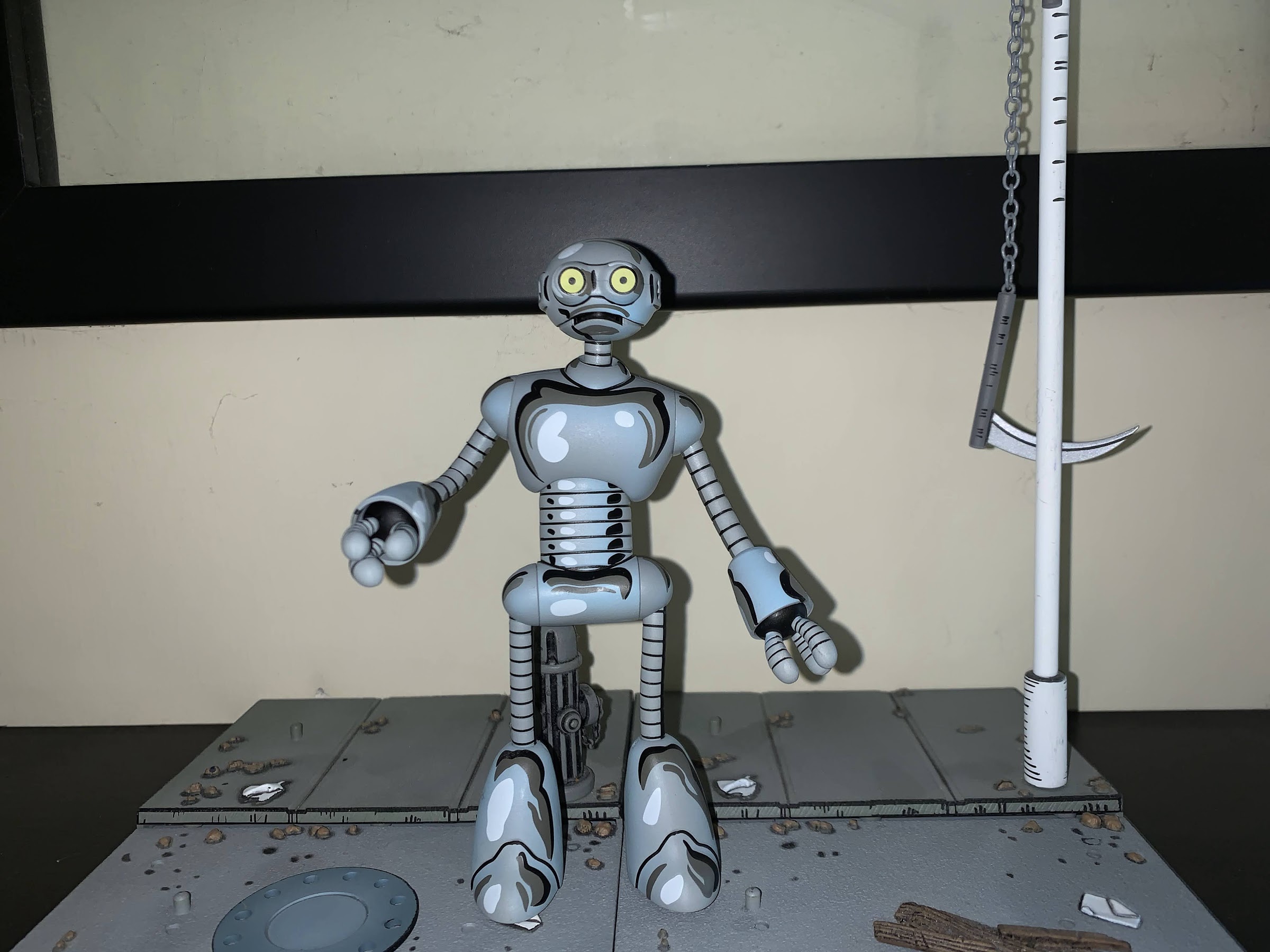
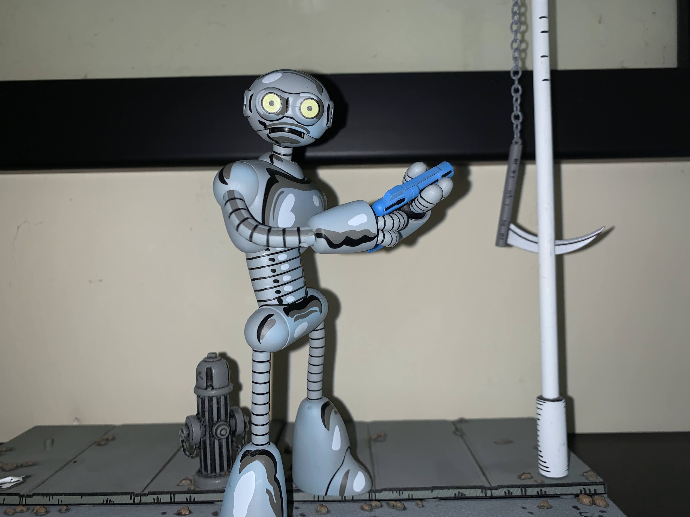
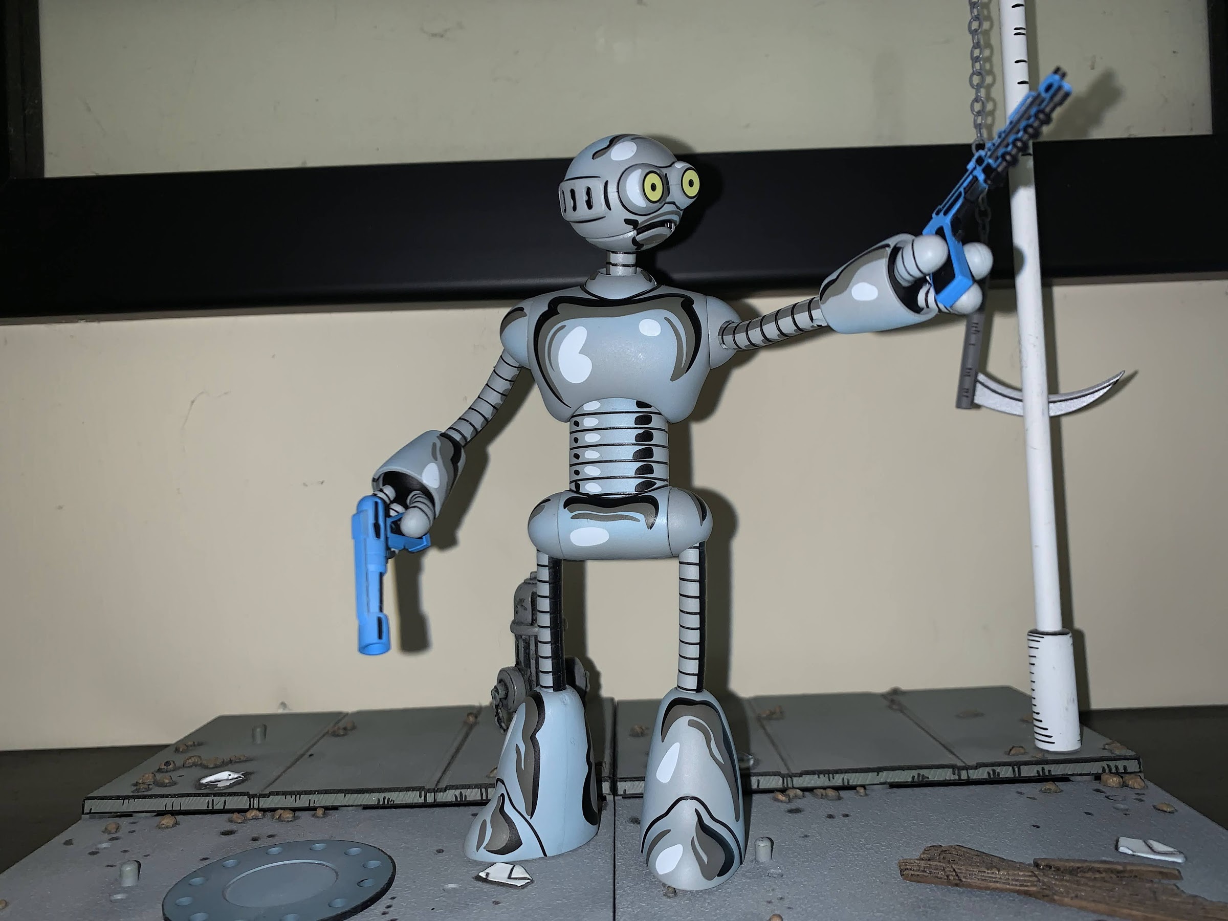
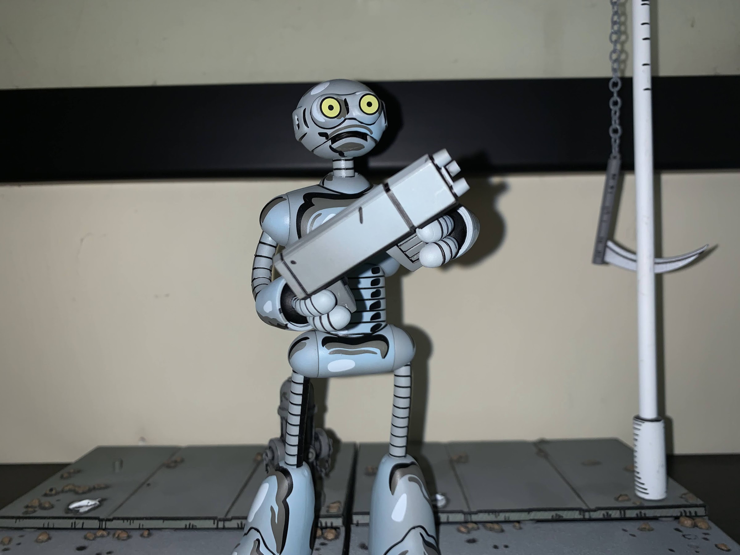
I, being an opener and not really interested in Kevin Eastman’s signature (no offense, Kev), went with the standard version. Fugitoid is a very unique entry in this line, or any NECA TMNT line, because of his design and construction. First of all, he’s cast in gray plastic and stands around 5.5″, but the deco designed by Geoffrey Trapp and Mike Puzzo aims to recreate the character’s look in the comic. It’s a very aggressive approach, and I have seen some turn up their nose at it, but I for one love it. He looks like he stepped out of a comic book and the shading really matches the unique look of the Mirage books, something natural lighting just can’t reproduce. He looks perfect and while Fugitoid is not my favorite design from the world of TMNT, it wouldn’t be hard to make the argument that his likeness is the best yet from any TMNT line by NECA.
The little guy doesn’t even know what to do with this one.
Where things might change for people is how the figure is constructed and articulated. Fugitoid is basically a head, body, hands, and feet, joined by cables. He reminds me a lot of Blinky from Bucky O’Hare, and like the Blinky figure released by Hasbro in 1991, Fugitoid features bendy wires for his limbs. There’s no elbow or knee articulation, just bendy wire coated in plastic. It looks good, but you’re never going to get the same kind of posing out of this approach as you would plastic joints. Aesthetically though, it’s hard to imagine NECA finding a better solution. Where things are a bit more confusing is in the choice to go with just swivels at the shoulders and hips. NECA probably opted for that approach to preserve the aesthetic as much as possible, or perhaps there were issues with having the wired limb end at a ball hinge. Whatever the reason, it’s disappointing as I think a ball hinge in both spots would have been fine from a visual perspective, and it would have given the figure much better range. At the head you have what is likely a ball joint that works just fine to let the character look up, down, and all around. The feet feel like they have a joint in there as they turn just fine and the hands can rotate. The upper torso can tilt and move forward and back slightly as well. Fugitoid is not going to be very dynamic, but it’s obvious that NECA opted for aesthetics over articulation and it’s hard to disagree with their choices here (excepting the lack of ball joints at the hips and shoulders).
Always remember to secure your turtles.
Fugitoid does come with a lot of stuff, most of which isn’t really for him. He almost feels like an accessory pack as a result. He does have three sets of hands which just plug into the ends of his arms rather easily. He has just three fingers composed of coils that just sort of pop out of the ends of his arms. He has two sets of gripping hands, one tighter than the other, and a set of “open” hands. They’re more of a style pose hand, I guess, but quite suitable for the character. He also comes with four different guns all sourced from the comics: two blue pistols, one Triceraton pistol, and a blue, long, rifle. I don’t know exactly what issue each comes from, but they all look great as they have a similar deco to the figure. If guns aren’t your thing, he also has a set of Triceraton “handcuffs.” It’s a big lump of plastic that the hands are designed to go into. It can fit on Fugitoid, but is likely intended to be worn by a turtle. The other gun is definitely for the turtles as it’s from the Donatello one-shot. It’s a forearm canon that fits over the forearm and it’s really cool. I put it on my Donnie immediately and I don’t plan on taking it off. As for the other guns, I don’t know what I’ll do with them. It feels wrong to have Fugitoid posed with a weapon, but also equally wrong to put a gun in the hands of the turtles. I like the look of all of them, but I don’t know what to do with them.
Best accessory in the set? This one!
NECA’s return to Mirage Studios is a welcomed thing and Fugitoid is a character worthy of getting things restarted. I wish he wasn’t exclusive to Target as the line had been billed as something for comic shops and specialty retail, but I suspect that’s where he’s headed once this Haulathon nonsense is over. He doesn’t seem terribly hard to find as I was able to get mine online, but also came upon sets at physical locations too. I think he looks great and his price-point is on the low end (provided you’re not talking about the signature version) for stand-alone NECA releases these days. Especially considering the tooling for this guy is unlikely to bare fruit elsewhere. The articulation is not great, and while the accessories are plentiful, they’re not all particularly useful. At the same time, what else is there to include for a Fugitoid? He’s not missing anything, so I’m fine with the accessory loadout. And more importantly, I love how the figure is presented. That deco is fantastic and I’m excited to see the line move forward. We’ve seen two of the next three releases: an Utrom body and Renet. The third is probably the one people are most excited for, Casey Jones, who has yet to have a full reveal. And it’s a given that the turtles are coming back too and it sounds like in a new form. Those old figures are great, but would merit updates in 2022. Plus they’ve been bootlegged to hell and back and it’s been rumored that the tools were actually stolen so it’s unclear if NECA could re-release them if they wanted to. My guess is we’ll see the new ones around San Diego Comic Con time. For now, I’m going to enjoy what we have and wonder about what other exciting plans are in-store for this line. It’s great to be a TMNT fan!
The days of this shelf being able to hold all of my Mirage figures may be coming to an end.
The little wooden boy is now a little plastic boy.
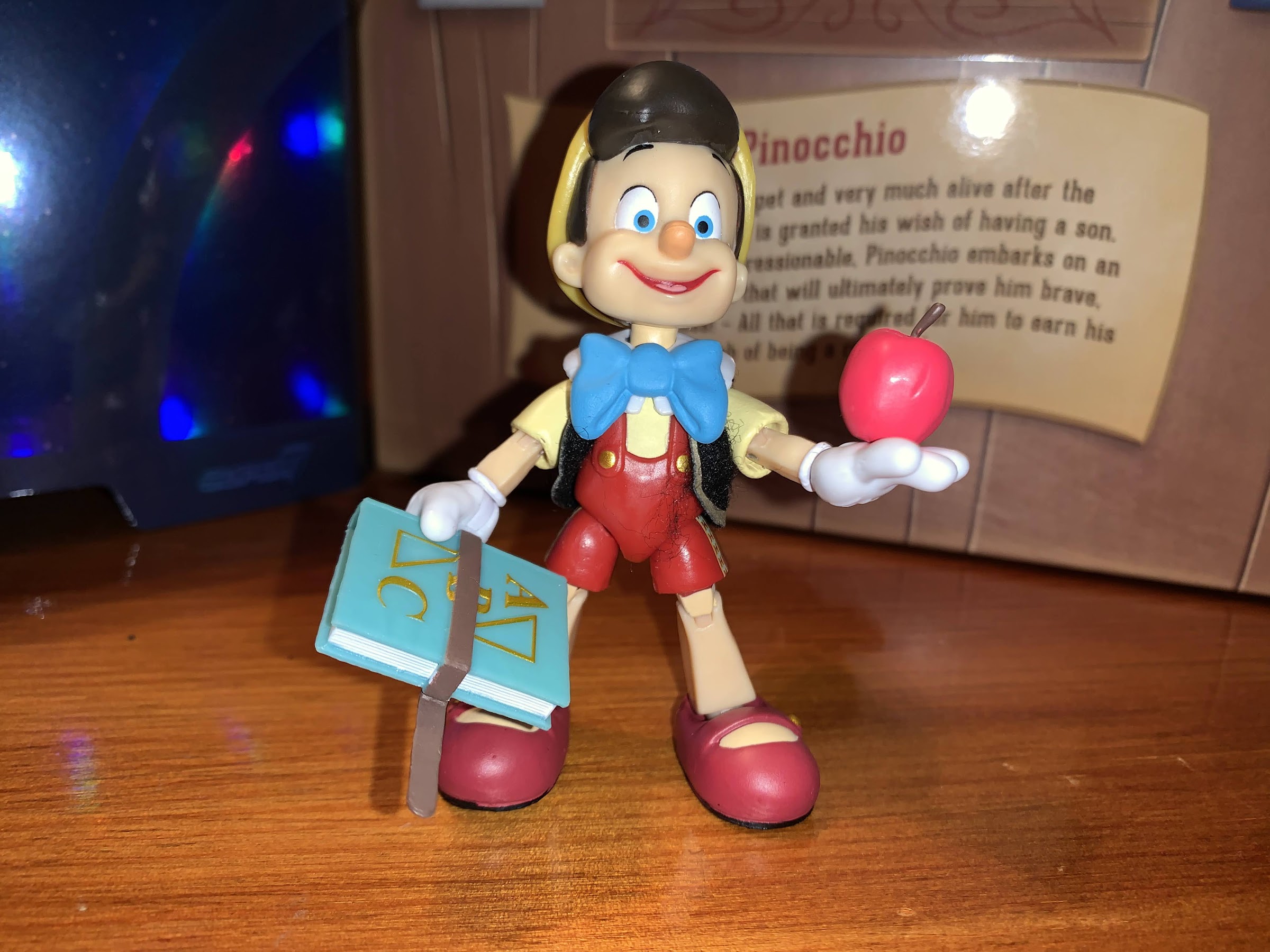
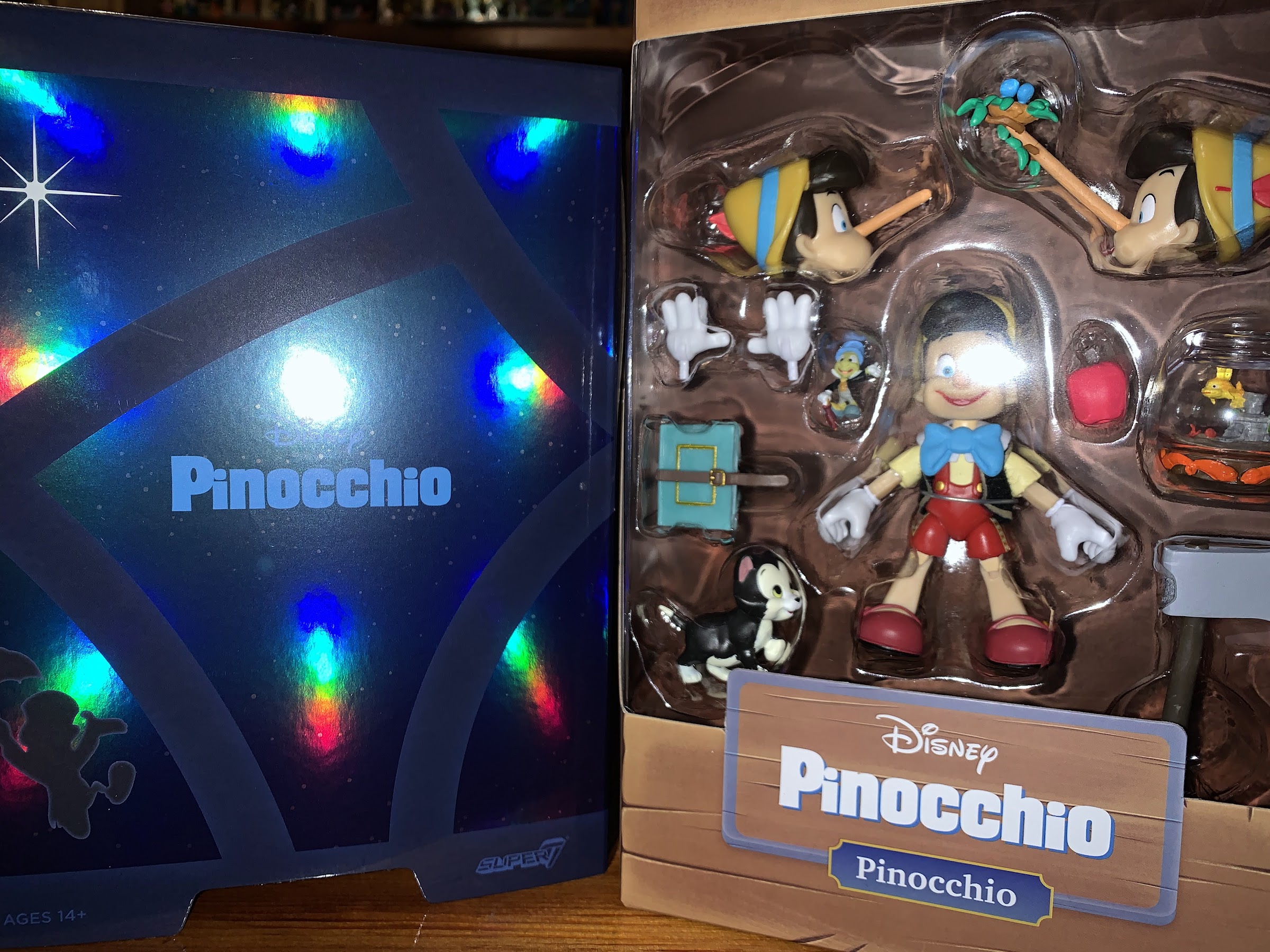
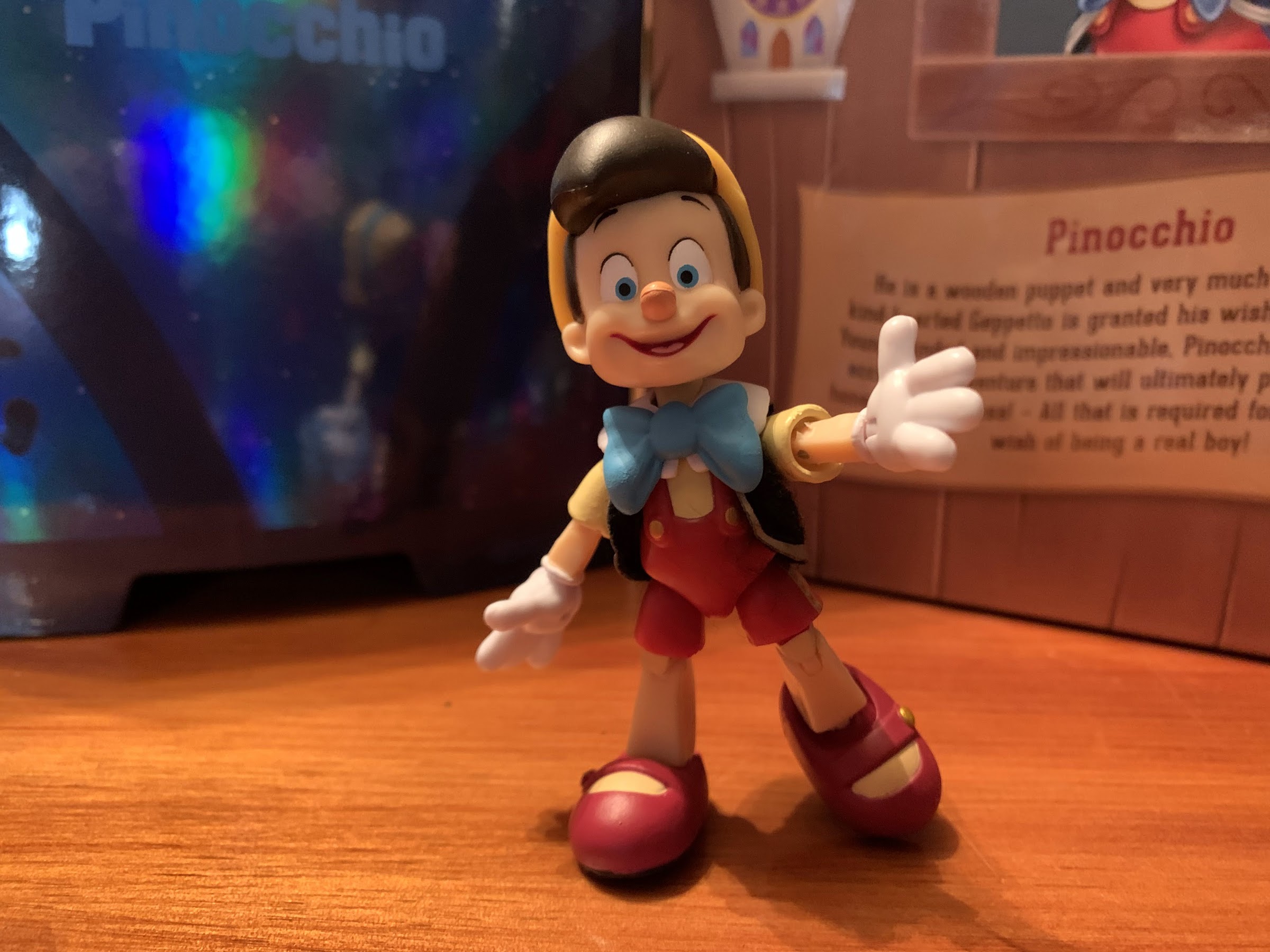
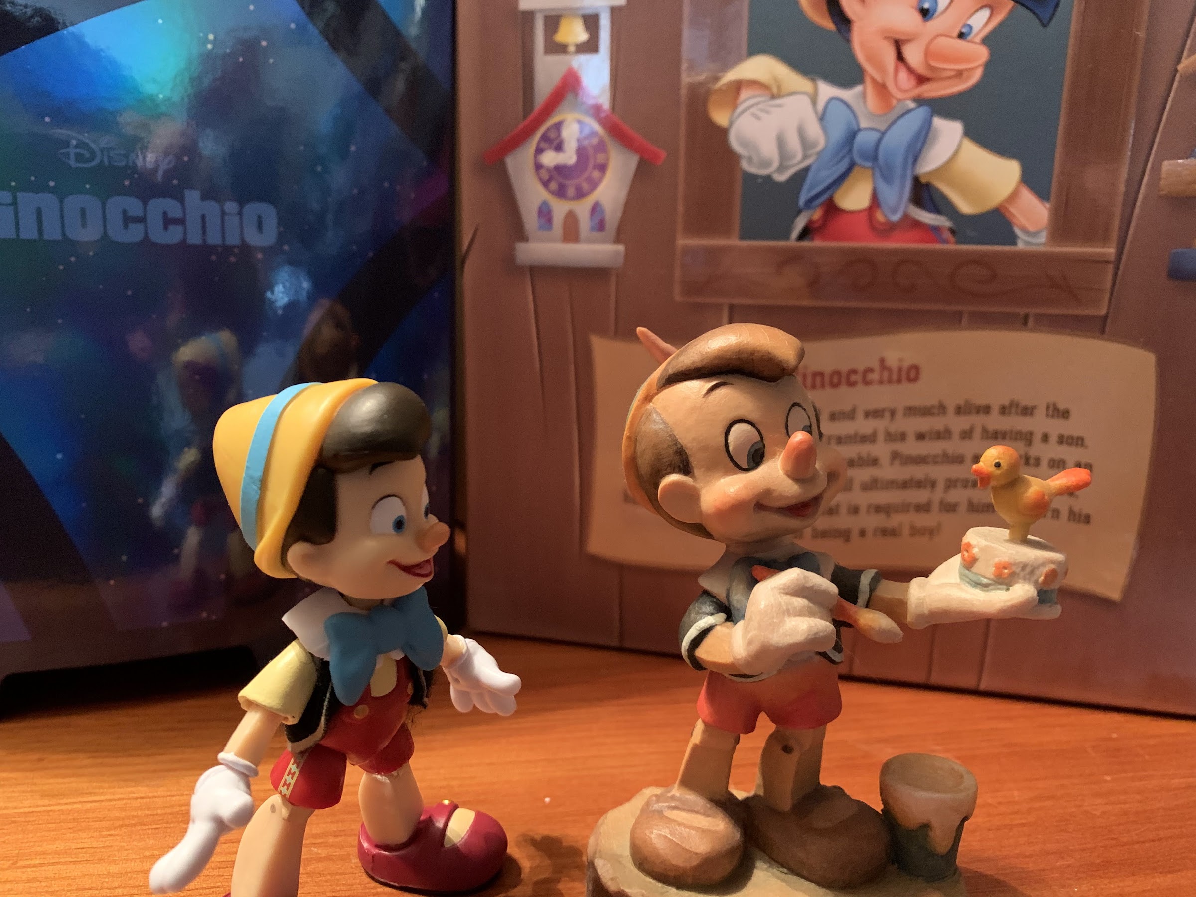
It seems I keep setting personal records this year for longest duration of a preorder and the new champion is Super7’s first wave of Disney Ultimates! These figures went up for preorder in August of 2020 likely closing sometime in September. At the time, the expected release was somewhere around June 2021, but a lot happened in-between. Super7’s relationship with Disney was just starting so perhaps there was a feeling out process between the two. I know for a fact that Disney had some revisions in mind for the packaging (they wanted the three figures to be unique in that regard) and it’s clear the figures underwent changes between the initial renders and final release. And then, of course, there were the shipping delays and factory closures to deal with all stemming from the COVID-19 pandemic. It feels like a perfect storm struck and thus the figures were delayed all the way until April of 2022! The wait is over though, and the first one we’re going to take a look at is Pinocchio!
Disney apparently had some mandates on the packaging and I’m left to assume one of them was “Make it shiny!”
Ask me what I think the highwater mark for Disney animation is and I won’t hesitate to say it’s 1940’s Pinocchio. Disney was riding high following the success of Snow White and the Seven Dwarfs and seemingly in a bid to top that picture, a lot of money was sunk into Pinocchio and it shows. Every scene looks like it was meticulously crafted to be the best it can be and for a medium such as hand drawn animation, it’s possible we’ve never seen that kind of dedication since. In terms of plot and performance, other animated films from Disney certainly compare and likely exceed what Pinocchio, but visually? It would take a convincing argument from someone to make me change my mind.
Pinocchio and his animal buddies.
For that reason, it probably comes as no surprise that I pretty much adore Pinocchio, and when Super7 made the title character part of its first wave I was over the moon! A collector line of Disney animated characters was a grail line for me, and to see Super7 embarking on that path and kicking things off with a beloved character was almost too good to be true. The initial renders did leave something to be desired (look these figures up on most retail sites and you can still see them) as Pinocchio’s head looked off-model, but I preordered with the hope that it would turn out better in person and it’s nice to see my faith has been rewarded.
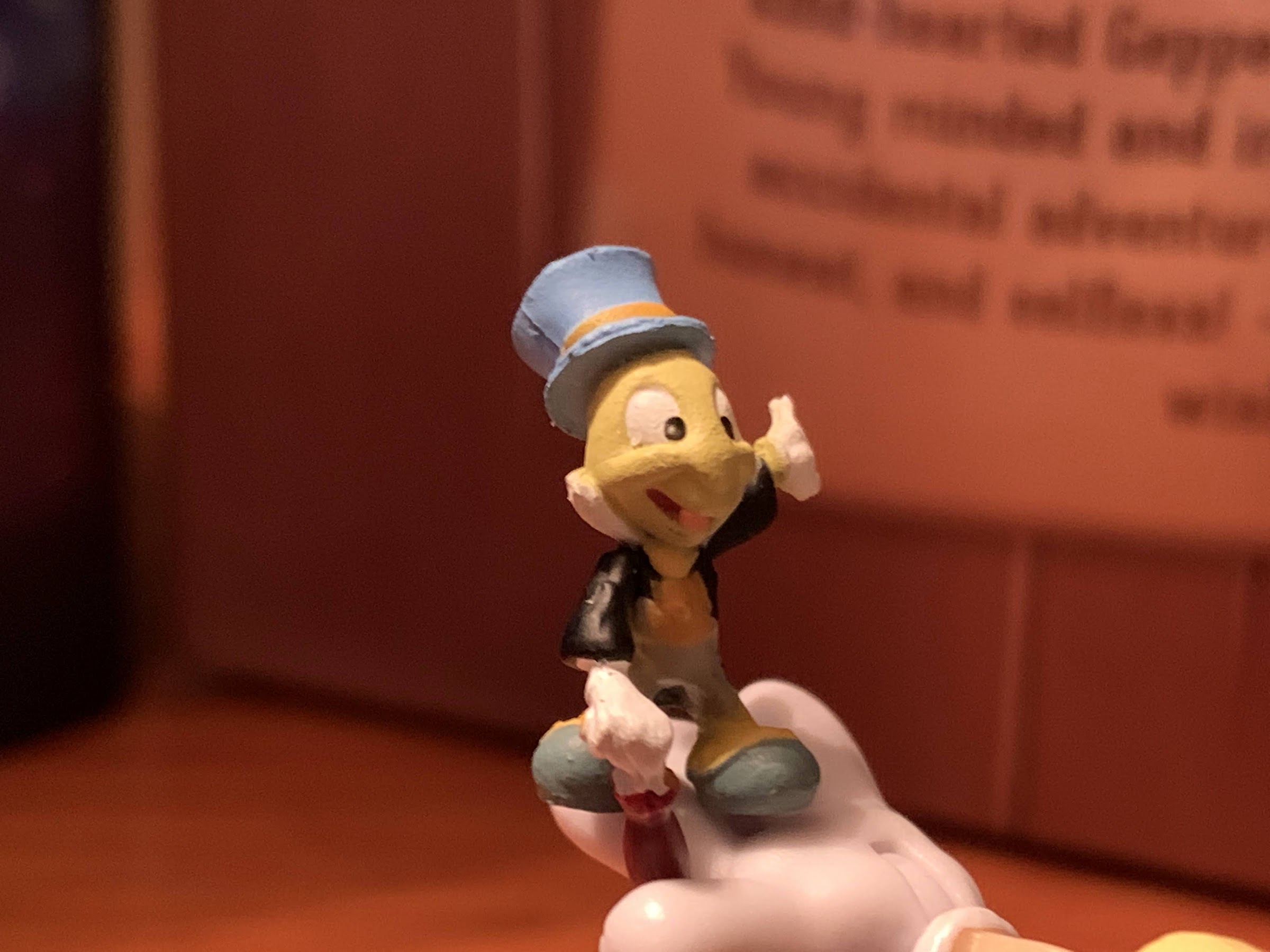
And who could forget Jiminy?
Pinocchio comes in the standard Ultimates! box Super7 is known for, only the outer box is very glossy depicting a starry night with a silhouette of Jiminy Cricket descending from the clouds. The inner box is themed to fit the film and reminds me of the Pinocchio restaurant in Disney World in terms of color palette. There’s a write-up on the back with character art and the figure and all of the accessories can be seen through the window. Pinocchio comes with a quite a bit of stuff, but in a first for me with an Ultimates! release, he only requires one insert to properly store everything. And there’s a pretty obvious reason for that: Pinocchio is small!
He’s a little fella.
Super7’s Ultimates! are a seven inch scale line, but it tends to be rather fungible across lines. They seem to prioritize certain lines to fit that scale, lines that collectors might display together or in close proximity of one another. Other, more stand-alone lines, seem to inhabit their own scale which is the case with Super7’s Ren and Stimpy. For Disney, they appear to be in the 7″ scale, though since we’re dealing with characters from different movies, there is a subjective element at play. Pinocchio himself is barely 3.5″, and since he’s a little, wooden, kid, I suppose that’s fine. It’s still odd to see him so much smaller than Mickey, and the third figure in the wave, Prince John, towers over him. And it’s not just the height, everything about him is just small. His arms, in particular, feel almost delicate as a result. And to Super7’s credit, he seems to scale well with the contents of his box. Should the company ever return to the film to produce a Geppetto or Honest John then I suppose we’d be able to evaluate the size further, but on his own I think he’s fine. Some will likely balk at the concept of paying $45 before tax and shipping for such a tiny figure, but if the scale is fine then I’m okay with it on principle. Especially since there’s still a lot of unique tooling here that likely will never benefit Super7 again and that’s where the biggest costs lay.
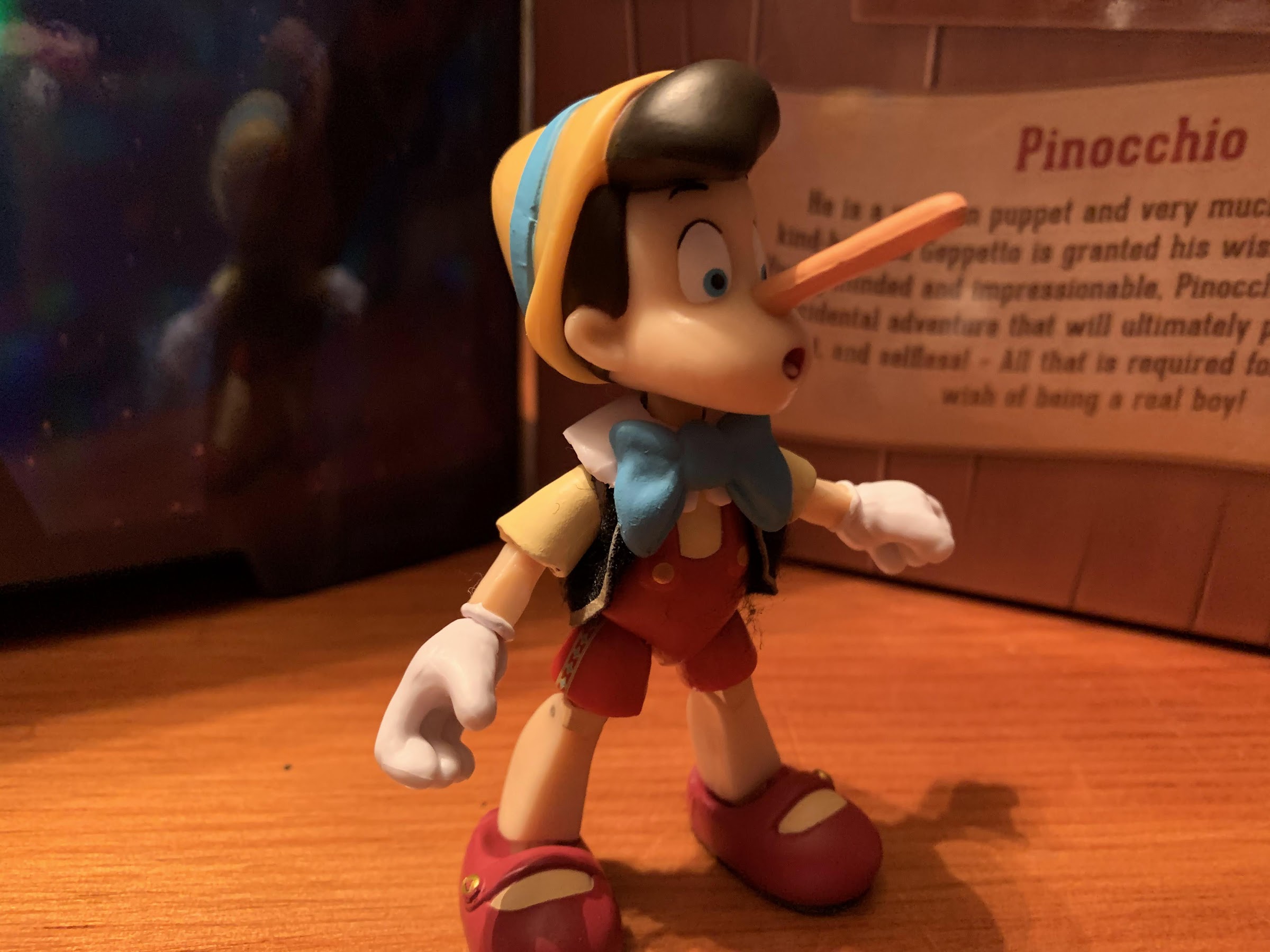
Naturally, he has portraits for his longer nose.
And then there’s the super long version, which mine unfortunately has an ugly, red, dot on the side of Pinocchio’s hat where one should not be.
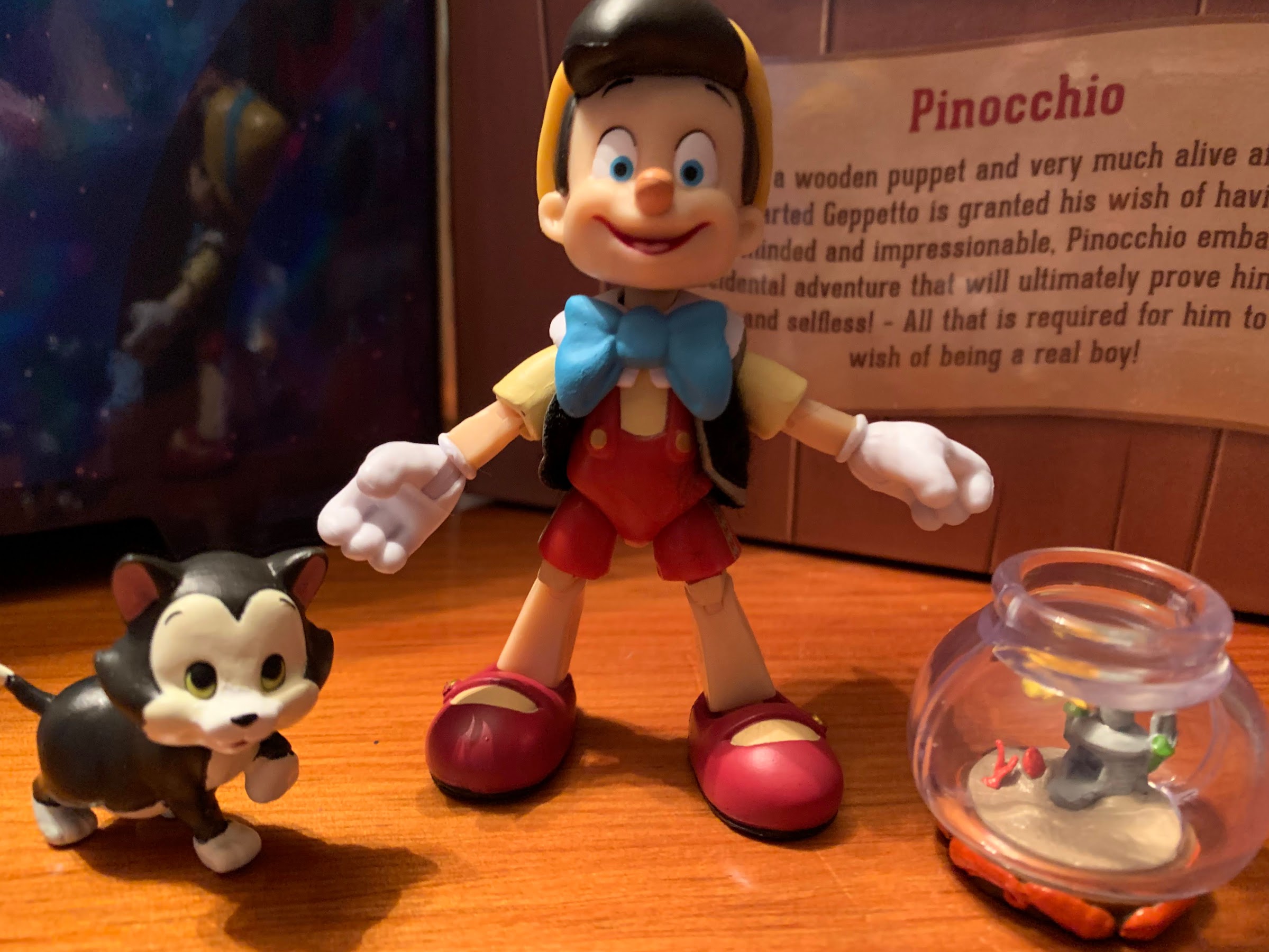
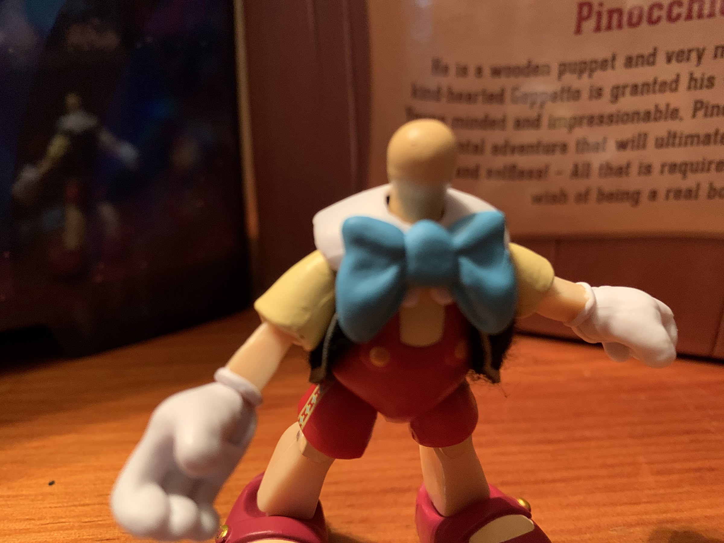
Aside from the diminutive nature of the figure, the overall look is pretty good. His default expression is a smile, and Super7 did a great job of translating the head into 3D. It would be easy to go overboard on the cheeks as Pinocchio is often drawn to get wider in that area, but as we saw with the original renders, that can just make him look like a fat head. Most of the features on his head are painted like the hat and the inside of his mouth and the only criticism I have is the shape of his nose seems off. It could be straighter and a touch more elongated, but he looks pleasant enough. The rest of the figure is mostly colored plastic. We have red on the torso with a big, blue, bowtie and red-brown down on the shoes. His hands are cast in white with sculpted lines on the back that Super7 declined to paint black. Part of the goal with this line is to incorporate soft goods into the figures and for Pinocchio that takes on the form of his black vest. It looks nice and it doesn’t hinder anything, though the faux velvet texture is sure to accumulate dust. It’s also not removable by nature. If one were to pop off the arms then it could come off, but I’m not willing to try. I do wish Super7 did something with the bare portions of the arms and legs to give them a less plastic look. It’s a bit tricky since the film didn’t exactly go for wood grain, but some shading might have done the trick. They did paint little, silver, nail heads into the joints which is a nice touch, but took it no further.
This might be the most elaborate pose I can get him into.
This is all that’s providing the head articulation.
Where Pinocchio is not likely to impress at all is with his articulation. We know Super7 prioritizes neutral posing with its figures and shuns complicated joints, but even this is pretty underwhelming for a Super7 release. Pinocchio’s head just sits on a rounded ball peg. There’s no hinge or secondary ball below it so the head just kind of rotates there and can tilt a little. There’s very little range looking up or down, and given that the bowtie provided an easy way to hide a double ball peg, it’s a shame Super7 didn’t go for it. The shoulders are ball-hinged, but he can barely raise his arms out to the side. Inside the sleeve is an elbow joint that can swivel, but the plastic is thin and kind of gummy so bending the elbow really seems to stress it. The first time I tried to work the joint I couldn’t tell if it was working as intended or if the plastic was just bending. The fact that little, rough, pieces of plastic started to protrude from it gives me little confidence in utilizing it for much. At the hands, we have rotation and horizontal hinges. There’s no torso articulation, and the hip joints just rotate a little so that his legs can go out a bit, but not really forward or back. They feel pretty useless. Because of the odd shape of his knees, Pinocchio gets very little range there, maybe 45 degrees, and the ankles are very loose. I think if not for the fact that his shoes are rather large I’d have a hard time standing him. He’s really only good for the most basic posing. I’m assuming his small size is partly to blame, but other aspects just feel poorly engineered. With Super7, I always get the impression that when they run into a tricky spot they just choose to not address it rather than figure out a more creative solution.
Jiminy looks okay, but obviously it’s hard to paint something so small and have it look clean. Also, I don’t know why they positioned his umbrella in such a fashion as it makes him impossible to stand.
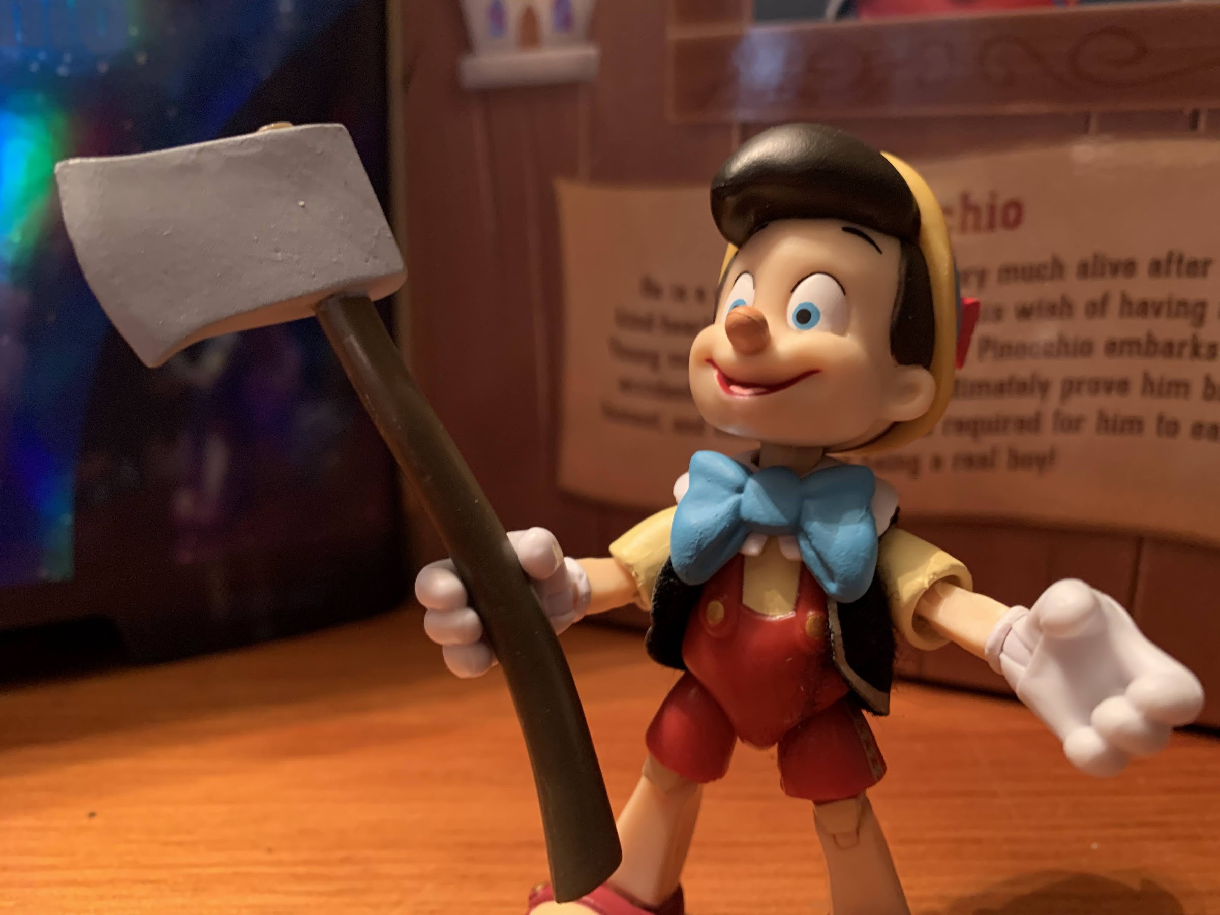
In terms of stuff, Pinocchio comes with a lot, but also a little. He has two additional heads he can swap to: elongated nose, and super elongated nose with bird’s nest and birds. Neither head is a surprise, though he doesn’t have the cage to be placed in to truly do the iconic scene justice, but at least they look nice. He has a shocked expression on his face, and there is a subtle difference between the two so Super7 didn’t just sculpt one head and two noses (though that might have been a better approach). He also has one set of extra hands. He comes with gripping hands attached and can swap to open ones. He also has a trio of mini figures: Figaro, Jiminy, and Cleo the goldfish. Of the three, Jiminy is the most on-model, but being a tiny figure, Super7 had to use a lot of paint on him and it’s pretty messy. They also positioned him with his umbrella poking out below his feet so he’s pretty much impossible to stand on his own. He’s a soft plastic, so I found I have to hook that umbrella onto something in order for him to stand. Cleo is placed in her fish bowl and Super7 filled it with transparent plastic. I do wish they added a touch of blue to the water somewhere, but she looks fine. Figaro is the most off-model as his head is just too big. It’s the one thing I wanted to see changed from the prototype that didn’t happen. His head can rotate and he looks okay, but he could be better. Pinocchio also comes with his school book and an apple for his teacher and both look fine. Lastly, there’s an axe, which I initially thought was Stromboli’s, but it’s actually the axe Pinocchio is seen holding for all of 3 seconds on Pleasure Island. Are people really going to pose Pinocchio wielding an axe? It’s also just plain, brown, plastic for the handle with no sculpted wood grain. I could definitely do without.
He comes with an axe. Cool?
That’s a fair amount of stuff, but it feels like Super7 just could have done better. Why not more hand options? Fists, or maybe a pointing finger on fire and the candle to go with it? That would have been nice to have and I definitely would have traded that axe for such. I’m guessing Disney wouldn’t let them do a smoking head or a drunk one, which is too bad as both would have been visually amusing. What I think most though are surprised to not see included is a donkey head. Pinocchio with big donkey ears and an optional tail would make sense and even encourage a second purchase. Maybe Super7 will do Lampwick and figure out a way to get those accessories for Pinocchio into the release, but he lacks a hole for the tail to go into so that would certainly be a challenge. Also, it’s highly unlikely that Disney lets Super7 do a proper Lampwick as he definitely needs a cigar and a mug of beer. I also would have loved a second Jiminy that featured a frowning face so he could admonish Pinocchio. The hand waving and smiling one we got feels more like licensing art Jiminy as opposed to the character from the film.
He’s flawed in more ways than one, and I think this image does a good job of showcasing my nitpicks with the nose, but I’m still happy to have an action figure of Disney’s version of Pinocchio.
I do have a lot of nitpicks with Super7’s Pinocchio and part of that is certainly coming from a place where I’ve seen this movie a lot, I love it, and I have a lot of opinions on what the best scenes are for the character in it. It’s likely that Super7 could not have totally satisfied me with the accessories, but that doesn’t mean they couldn’t have done better. The issues with the articulation are less nitpicky though as this figure is pretty poor from that aspect. There aren’t a lot of points of articulation here, and what is here isn’t of the best quality as we have floppy joints or joints that don’t seem to work as intended. As a result, I don’t know that I can give this figure as strong of a recommendation as my heart wants to. As a Pinocchio lover, I am happy to have this, but if I allow myself to be objective I have to acknowledge that this figure does have problems and it doesn’t feel like a premium, collector, figure. The quality doesn’t feel far removed from a Jakks figure you can find at Target for 10-12 bucks, except this one costs $45. The soft goods vest is nice, and the packaging is flashy, but the figure doesn’t really measure up. Only get this one if you’re a big fan of Pinocchio and are willing to accept its flaws.
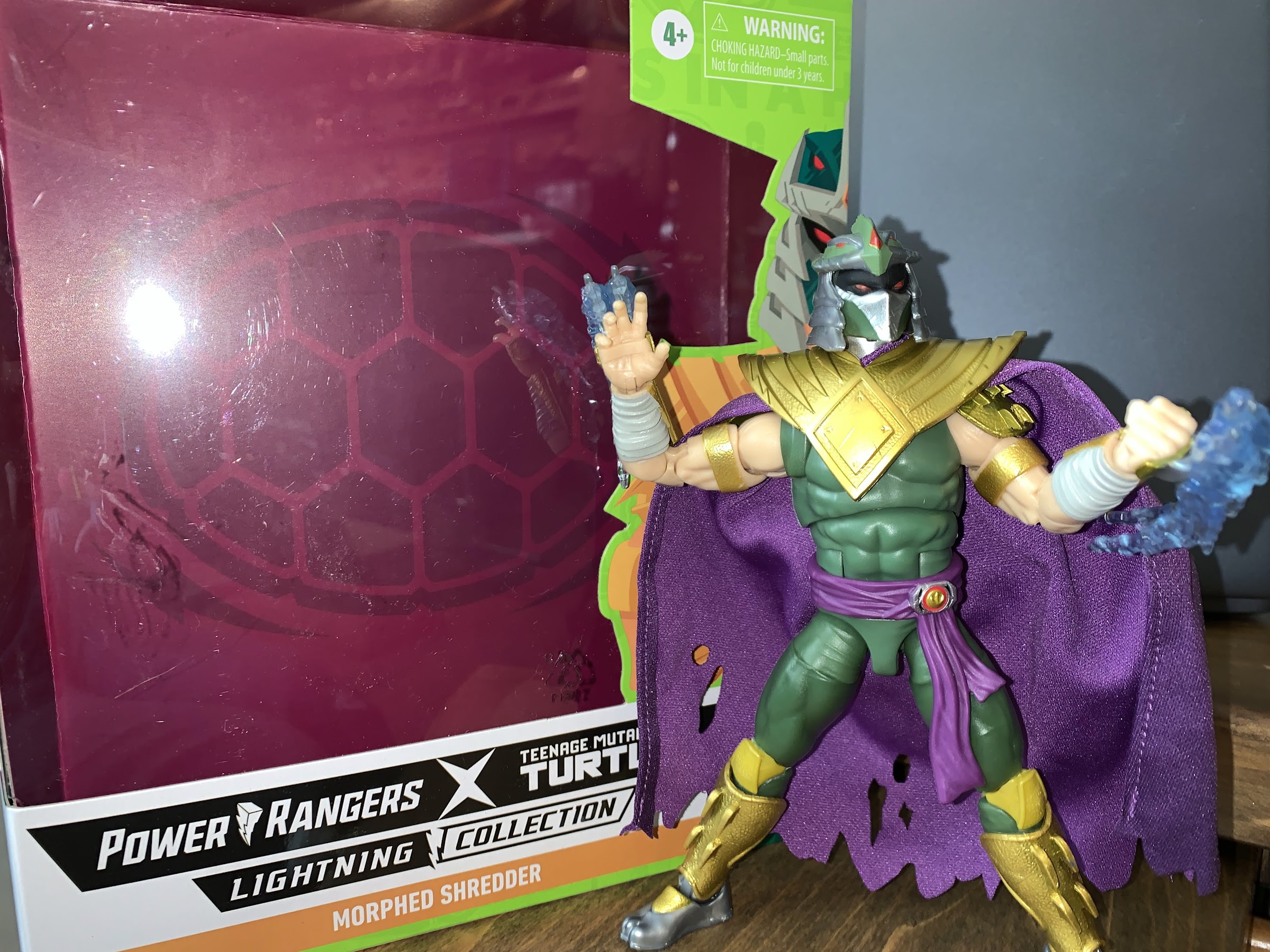
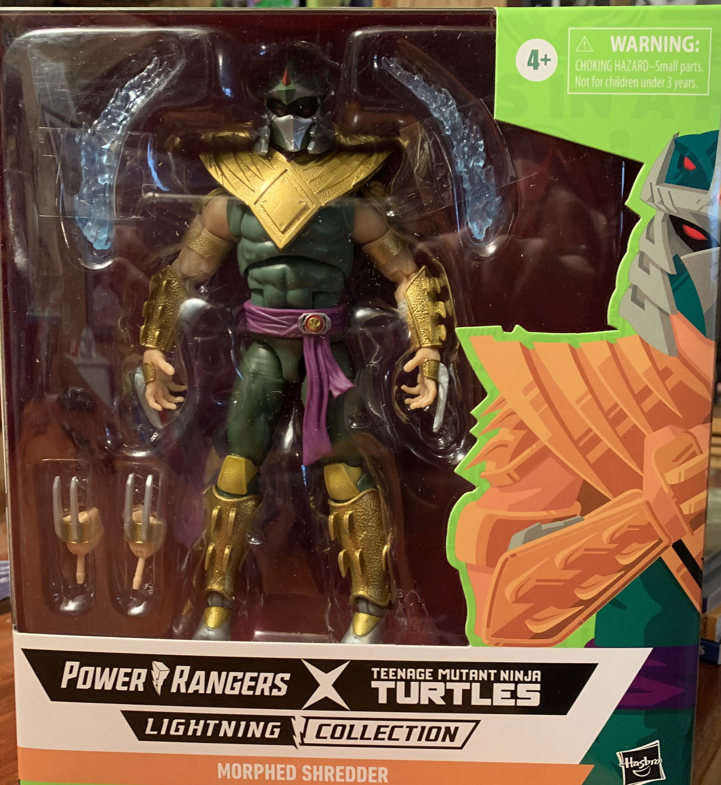
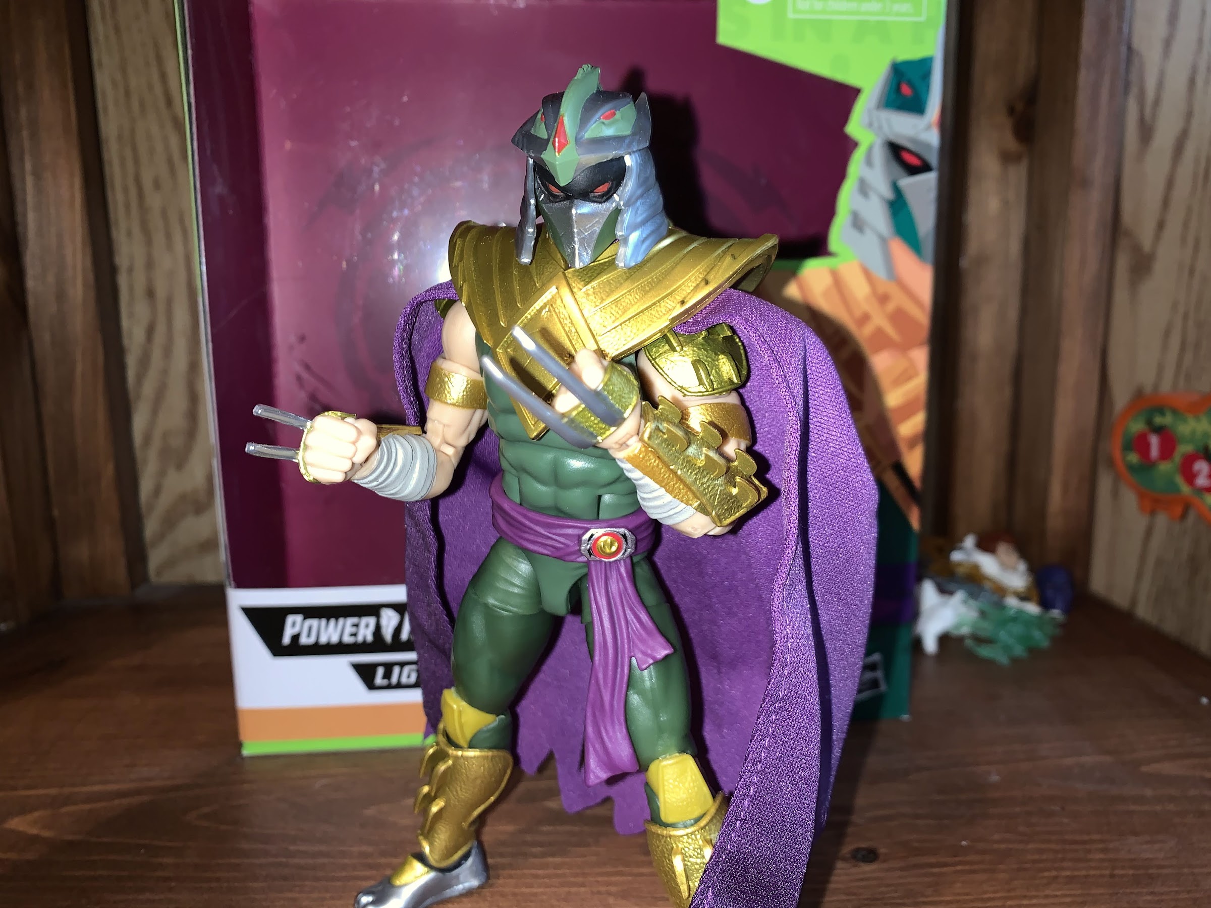
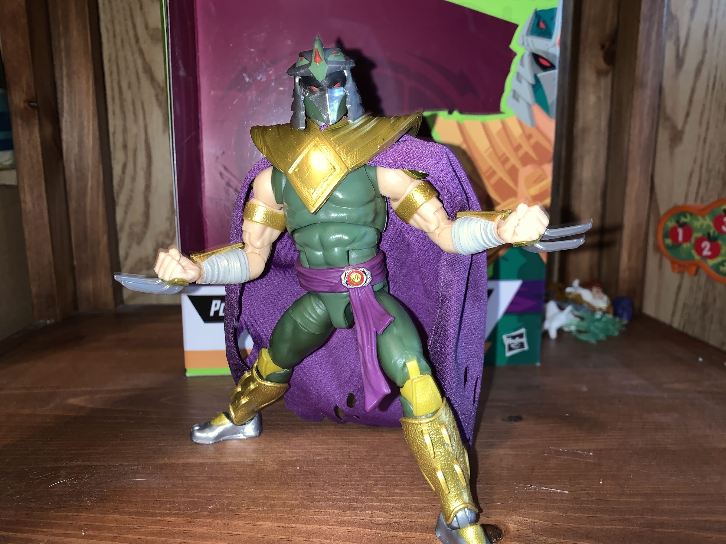
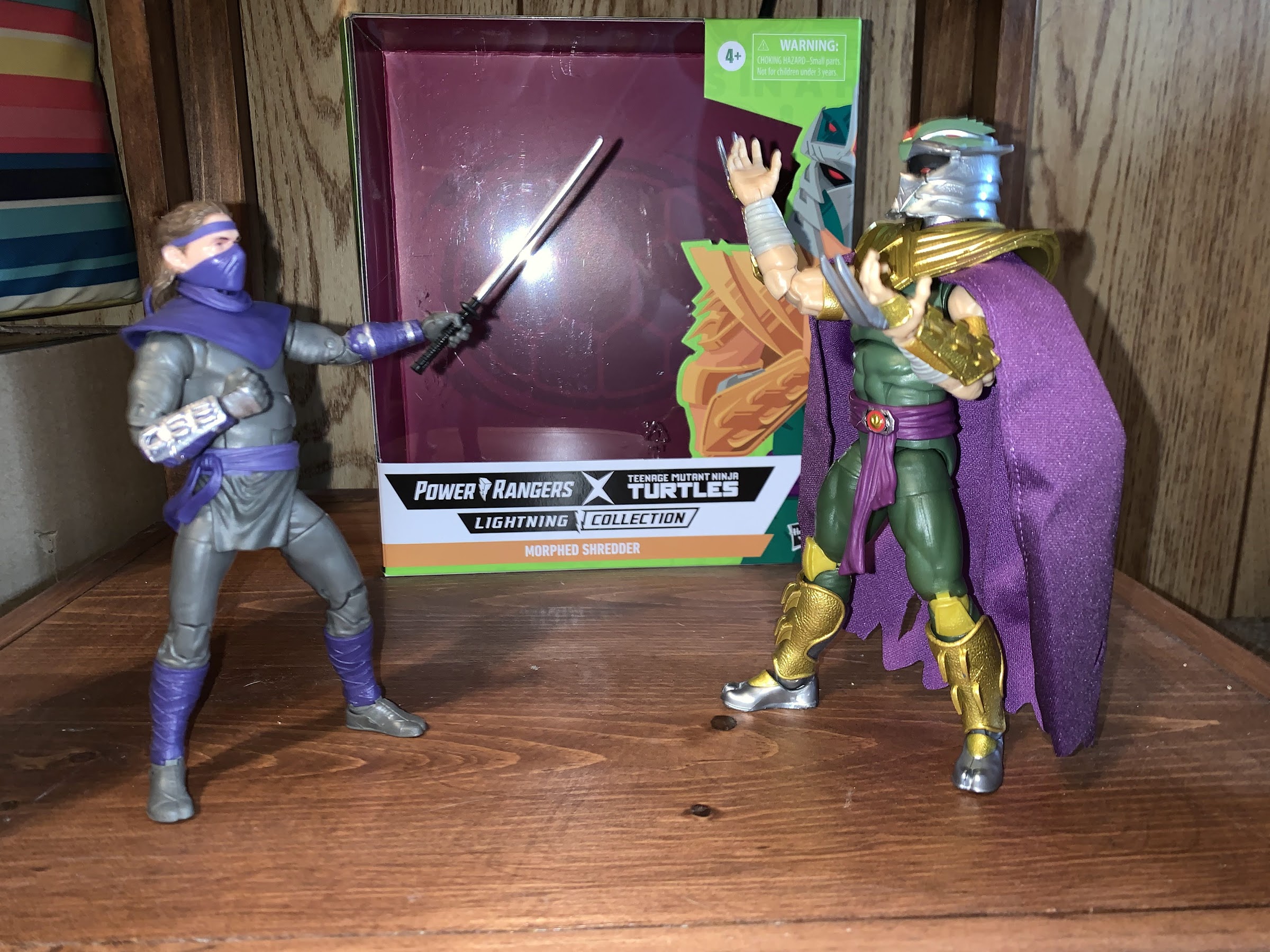
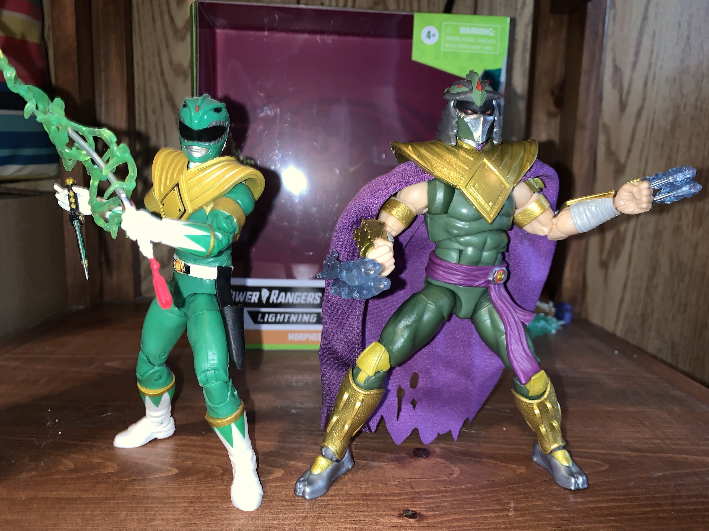
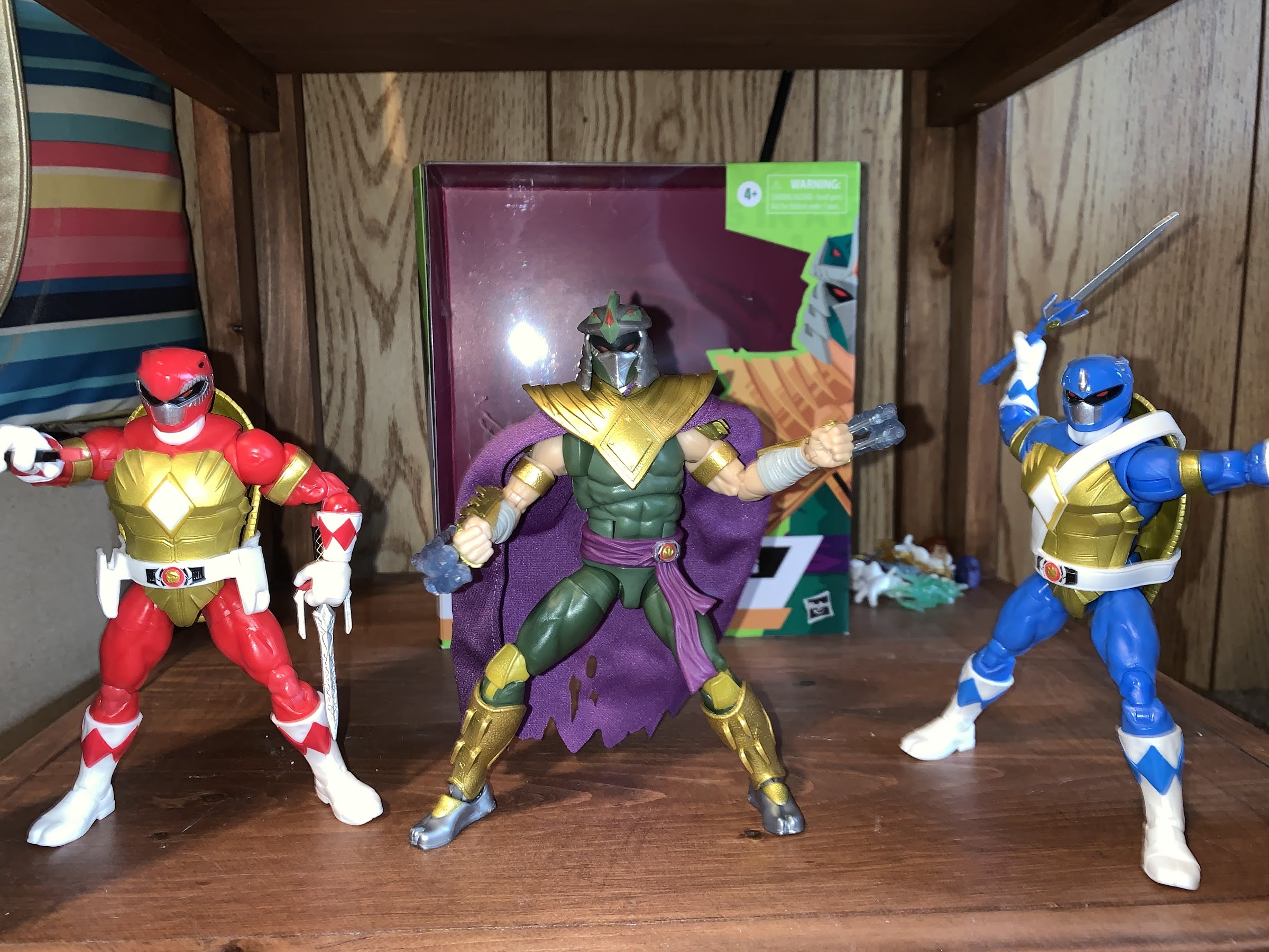
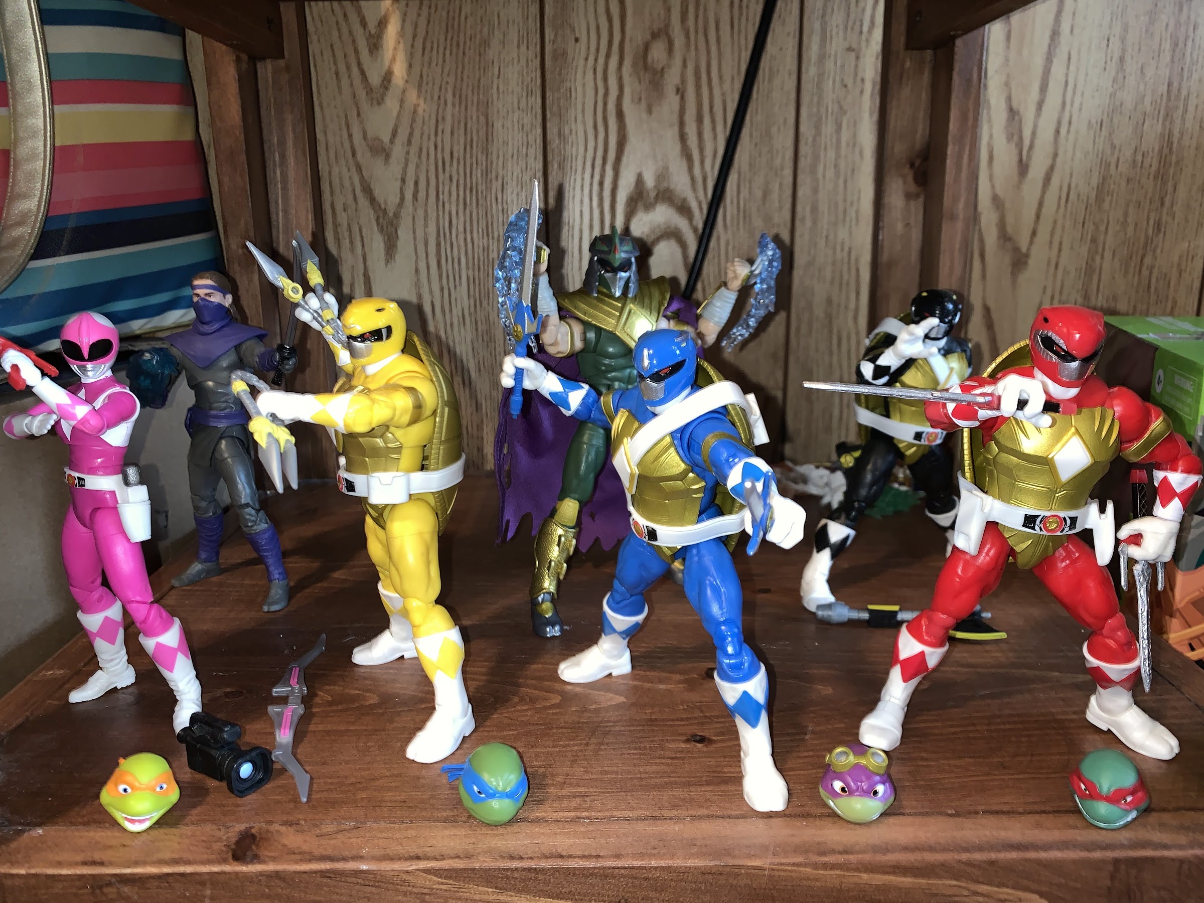
We’ve looked at the two-packs from Hasbro’s Mighty Morphin Power Rangers x Teenage Mutant Ninja Turtles line of action figures based on the comic book crossover, but have we saved the best for last? Coming in on his own is the arch nemesis for the turtles: The Shredder! And since this is a line specializing in combining the two properties, he can’t just be regular old Shredder, he needs to be something more! Now, maybe there was a thought to having Shredder somehow acquire Lord Zed’s staff or even Rita Repulsa’s magic (imagine Shredder in a Rita costume), but rather than do that they just gave him the powers of the former evil Power Ranger, Tommy, and his Dragonzord coin.
Is it just me or does he look huge in the box?
Shredder as the Green Ranger is a design unique to him. There’s obviously elements of both the traditional Power Ranger costume and Shredder’s, and the design is involved enough that he couldn’t be directly lifted from an existing figure. That is likely why this figure did not arrive in a two-pack but as a single carded figure with the MSRP of around $30. He comes in an oversized Lightning Collection box with new art and he looks sort of massive from the outside, though he’s not demonstrably larger than other figures in the line standing right around seven inches. Some of the body here is likely recycled from other figures in the line, or from other Hasbro lines in general, but there is quite a bit that’s new for us to dig into.
There’s a lot of good here, but some not so good.
First off is the head sculpt. Shredder comes with his helmet permanently affixed to his head, which is often the right way to do a proper Shredder. The base look of this Shredder gives me strong 2003 vibes as his face is all black with red pupils and the mouth guard is painted silver. It makes him look pretty bad ass, but also accomplishes the task of merging the helmet with the Green Ranger helmet since having his exposed flesh painted black conforms to there being a visor there. Atop the helmet is the Green Ranger’s dragon theme with the red eyes and ridge in the center. The center diamond is there as well and then it’s rimmed with the silver “tines” customary to Shredder helmets. The sides are silver and they’re staggered in the design resembling blades one after the other. It’s a very striking Shredder design and I think the artists involved did a great job blending it with that of the Green Ranger. Unfortunately, the same can’t be said of the factory as the main head and the top of the helmet are separate pieces glued together. The top of the helmet is on crooked and set back too far on my figure and looks terrible. He should look like the box art with the center of the top piece lining up with the center of the mouthguard and the two should nearly touch. It’s not terrible enough for me to attempt an exchange or try to order from somewhere else, but terrible enough to drive me nuts. I’m very tempted to try to pry it off and re-attach it because it really does ruin what is otherwise a solid sculpt.
That mis-aligned helmet is driving me nuts. Even more so than the yellow knees.
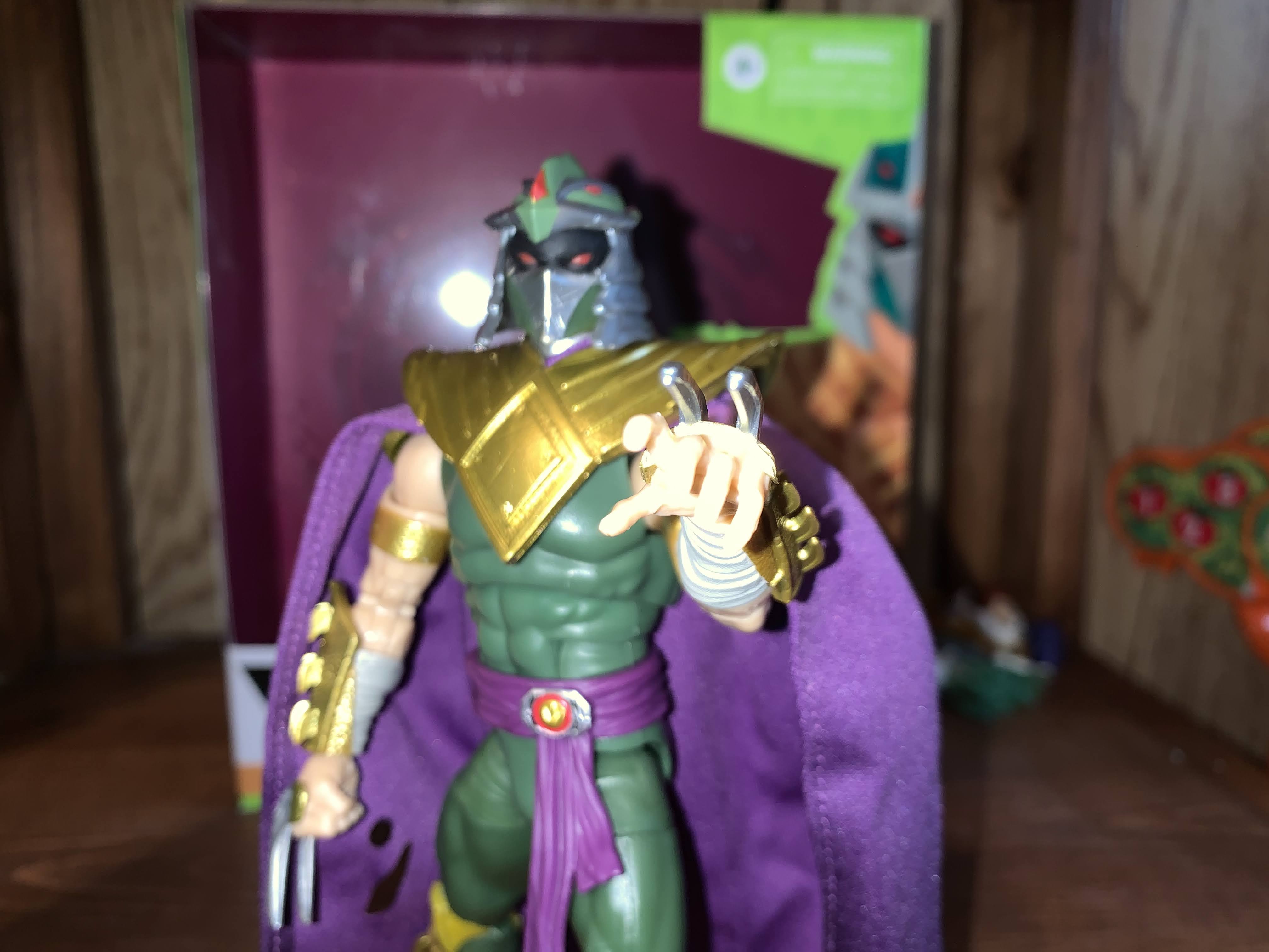
Below the head we have the customary Dragon Shield. Shredder’s version of it is a bit weathered looking with sculpted spikes near the shoulders. They’re less pronounced than the comic art, but it’s still cool that Hasbro sculpted a new Dragon Shield. His arms are bare and end with his Shredder gauntlets, only now they’re gold with the actual blades on the back of his hands in silver. His belt is a purple sash and the Power Morpher is off-center, which is a nice touch to differentiate Shredder from the others, and he’s sporting a soft goods, purple, tattered, cape. It would have been cool if it was a wired cape, but it has some personality by virtue of the holes cut into. The only thing, design wise, I’m not crazy about with this figure is below the waist. He has the same gold and silver combo for the greaves on his shins, but the knee portion is a separate piece so there’s visible green in-between the knee and boot. From what I can tell, this isn’t the case in the book either and it’s supposed to be one piece. I’m not sure why Hasbro did it this way as they didn’t have to and it wouldn’t have cost any more money. And they also sculpted the kneepad in gold which creates unsightly gold lumps of plastic above the knee on the joint. The better move would be to simply paint the kneepad, especially since it’s actually the top of the boot, but Hasbro likes to cut paints apps wherever possible.
I always like open hands with Shredder, even going back to the Playmates original.
The boots and misaligned helmet are the only true eyesore to be found on this guy from a design point of view. The straps on his forearm gauntlets aren’t painted, so on the open hands he has “flesh-colored” straps that look kind of dumb, but not as bad as the knees or helmet. Those looking for true comic accuracy will likely be a little disappointed that the blades aren’t more pronounced, but this is a toy intended for a mass market release so some safety measures likely play a role. Aside from that though, the only other issue from a presentation is one also found on the standard Green Ranger and it’s the omission of the white diamonds on the shirt. On the Green Ranger, Hasbro kept the white pieces for the butterfly joint so he had a hint of the side diamonds, but with Shredder they just ignored them all together. This is fairly common with Hasbro and the manner in which they cut costs as they often eliminate painted details. It’s been acceptable for the company when their prices made them perhaps the best bargain in the hobby, but with their prices creeping up into NECA territory it’s becoming a problem. I’ll have more to say on that subject in the not-too-distant-future. Here, it’s relatively minor though I do think a little dash of white on the torso would have done the figure well.
Go ahead, Tommy, try and take back your Dragon coin.
This guy commanding a premium price might have lead you to believe he’d come with a bunch of stuff, but that’s really not the case. He comes with open hands in the box and a set of fist hands. The claws were straight on 3 of the 4 hands I got, with the open right hand being bent in the package. It’s nothing a little hot water can’t remedy though. He also has a pair of effects pieces. I guess they’re an energy effect or something? The claws slide into them and they’re a translucent blue. They actually can poke all the way through as there are slits on both sides so you can adjust the effect as you see fit. You could also have them shooting forward from the blade, but I think they’re intended to be more of a slashing effect and that’s how it’s depicted on the box. They’re fine, though personally I would have gone with more of a lightning look as the flame look Hasbro appears to be going for makes them look like water. One of mine also has some black flakes of plastic within it, which is a bit of a bummer, but honestly only noticeable from up close. That’s it though. No sword, no alternate head, just two sets of hands and two effects parts. It’s not terrible, but not exactly overwhelming either.
Shredder triumphant!
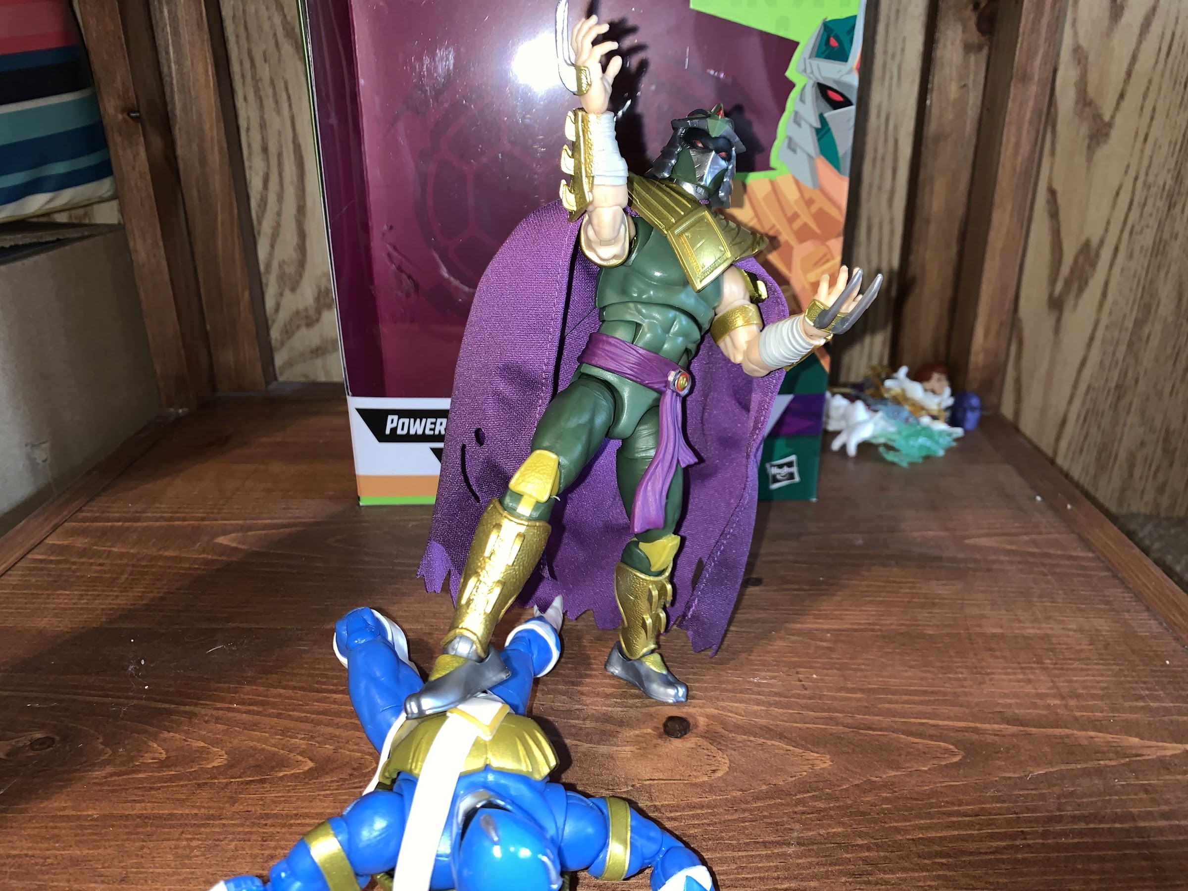
The articulation on Shredder is mostly as expected. If you’ve handled a Lightning Collection Ranger or a Marvel Legend then you should know what to expect. He has a ball hinged-head and probably some articulation at the base of the neck, but if so, it’s useless given the cape and Dragon Shield. He’s able to rotate and look up and down fairly well with basically no tilt due to the size of the helmet. His shoulders are ball-hinges with a butterfly joint. The spiked pauldron is pinned above the actual shoulder so it moves with the butterfly joint and doesn’t really interfere all that much with the range. It’s quite good and the cape and shield help hide any gaps left behind when the butterfly joint is fully extended. The left shoulder on my figure is really tight and hard to rotate, but I don’t feel like I’m going to break it, it just needs more breaking in. He has a biceps swivel and double-jointed elbows that give you about a 90 degree bend. No forearm swivel which stinks because the gauntlets are frozen in place which makes posing a bit annoying at times. The hands peg in, per usual, and can rotate and also feature a horizontal hinge.
There are some out there who wish the green on Shredder was a bit more like the Green Ranger, but I enjoy the muted shade.
In the torso, we have a diaphragm joint that’s pretty floppy. I don’t really like it as a result, but you can swivel there and get Shredder to bend forward and back an acceptable amount. He has an ab crunch below that, but the sash gets in the way so it doesn’t offer a ton. It’s a floating belt, but it’s way too tight. There also appears to be a seem underneath it that might be a waist twist, but I can’t get him to go. At the hips we have the standard ball pegs with thigh cuts below them. He can kick forward to about horizontal, but his cheeks prevent his leg from going back. The knees are double-jointed and work fine, which is good since I already mentioned they’re ugly. He does have a boot cut and at the ankle we have hinges and a rocker. The rocker works fine, though it’s a little loose while the hinges appear to be ratcheted. They’re annoying though because I can’t quite get the feet into a neutral position. The toe seems to always be pointed up a little, or down. I guess it’s not a huge problem as it just makes the most vanilla of posing difficult, but it is odd. I don’t have too much trouble getting him to stand even with the loose rockers. The only hindrance, really, is the floppy upper torso as he tends to bend back after being set down.
I think they scale pretty well. Shredder is taller and leaner, but still pretty damn beefy.
What we have with Shredder is what should be the best figure in this line if not for a few errors. I genuinely like the color palette on this guy as the muted green contrasts well with the bright Turtle Rangers and original Green Ranger. The gold paint and texture of the metallic parts of the armor look awesome, which is why the gold plastic knees really stand out as an eye sore. That torso really could stand to be tightened up though as I don’t like it. I’m more forgiving when it comes to the ankle hinges as I’m sure they had to use that ratcheted design for a reason and a standard one probably would have been too loose. The low accessory count is a bit of a bummer, but he does look great just armed with his claws and, even though it isn’t wired, I think the cape turned out very well. He’s a striking figure, but he is sold at what is a premium price for a Hasbro figure so I do think some of the flaws should not be readily overlooked. At the same time, he looks a million times better than the monsters released in the Lightning Collection so at least he has that going for him.
Group shot!
Shredder is the final figure in this line and is currently still available for preorder at various online stores. Gamestop is stocking this line as well and they can be found both online and in-store while supplies last. I would say normally if a line like this is a success then it will likely get reissued, but I have no idea what kind of arrangement Hasbro made with Viacom when it comes to the TMNT license so it’s possible they’ll be one and done. I wouldn’t wait on it if you’re interested. Given how terrible the helmet turned out on my figure, I would say take a look locally if you can to make sure the one you’re buying looks okay, but I suspect most will have to resort to online orders and hope for the best.
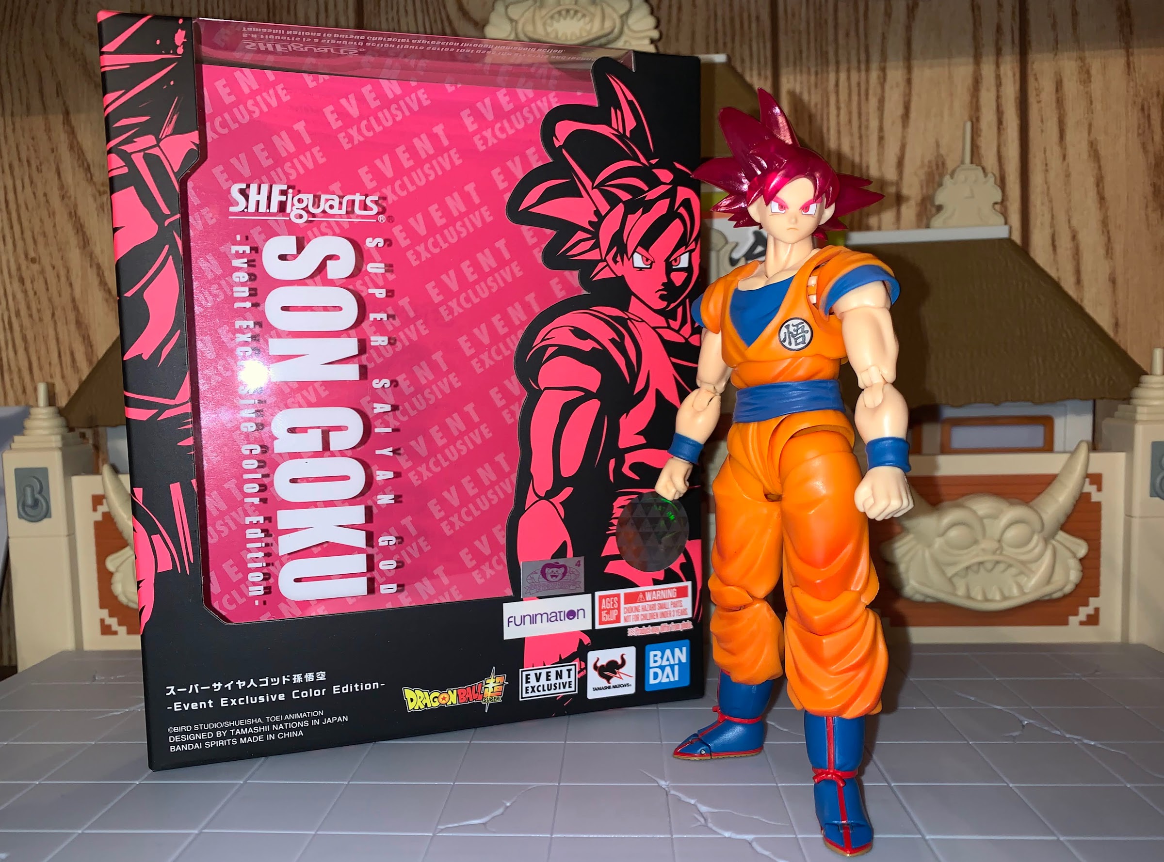
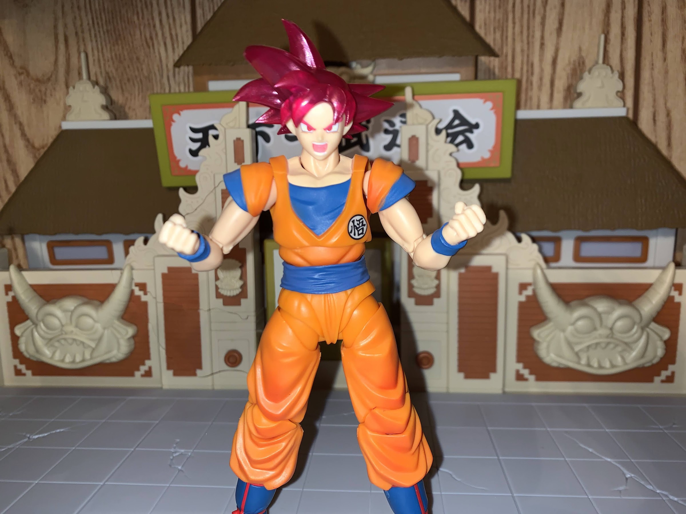
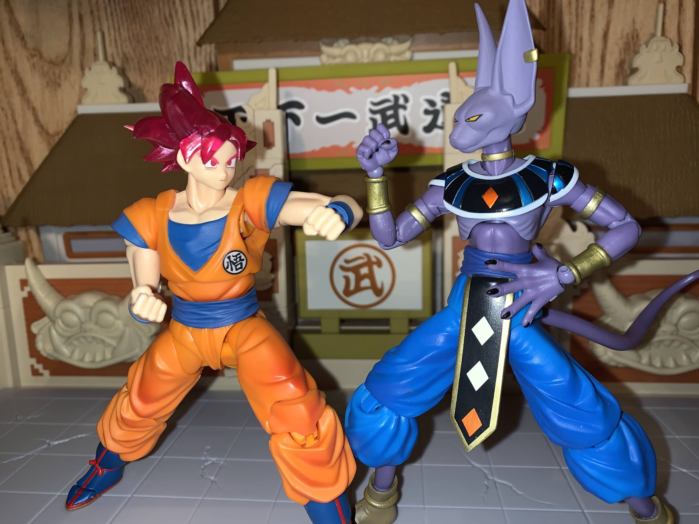
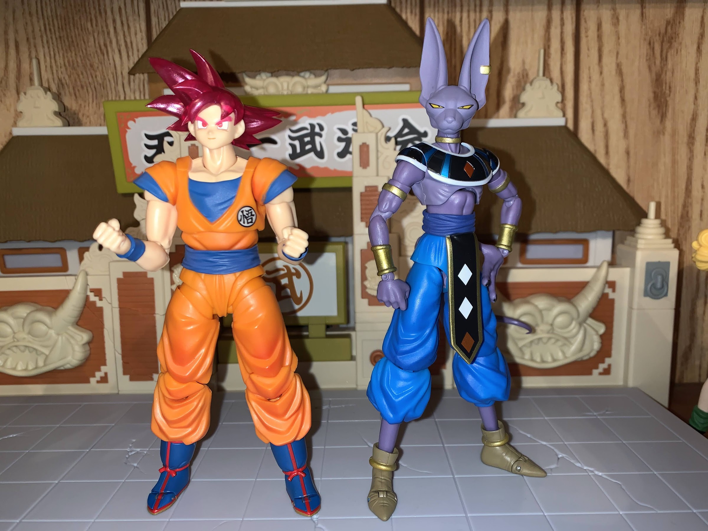
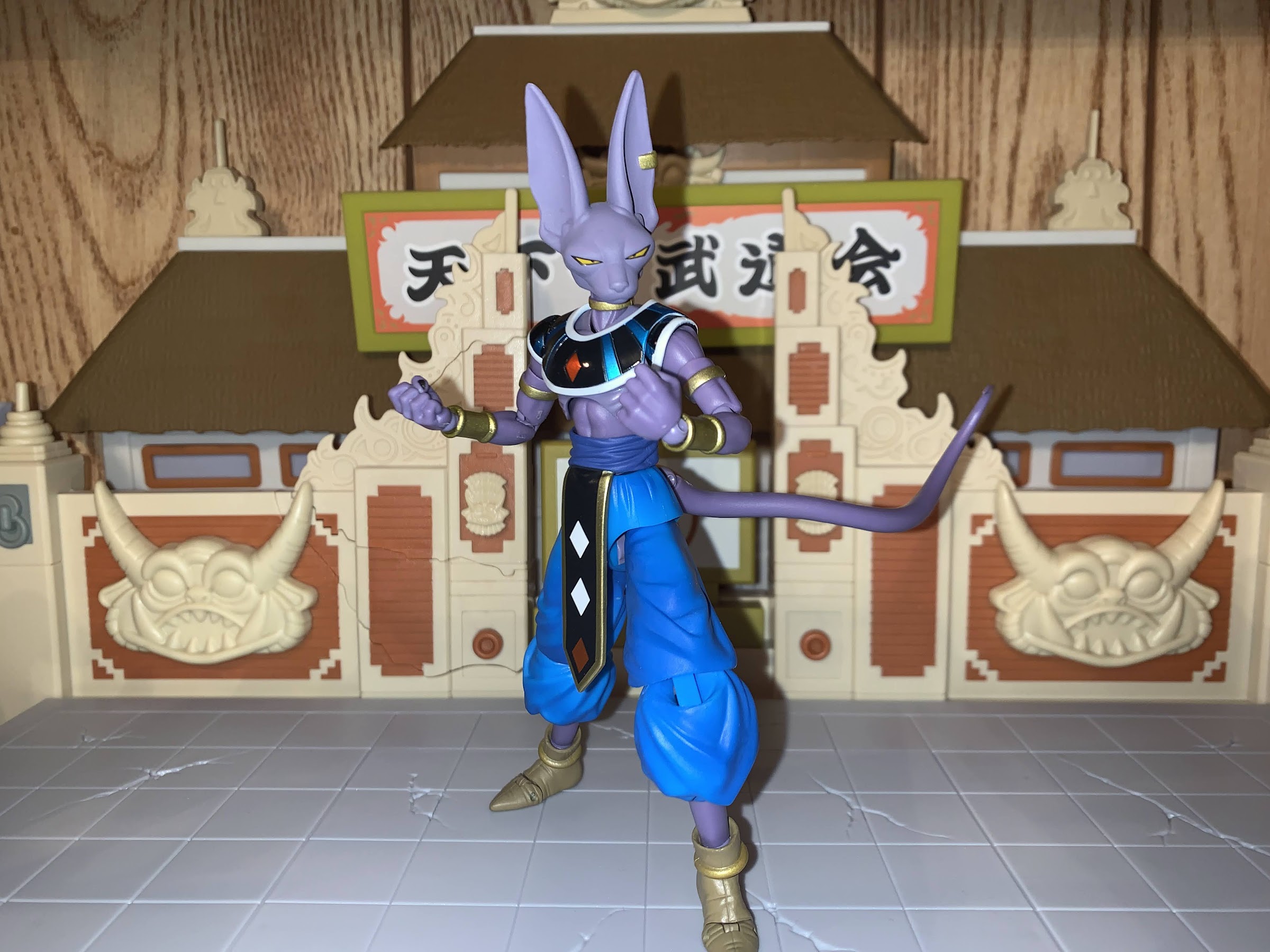
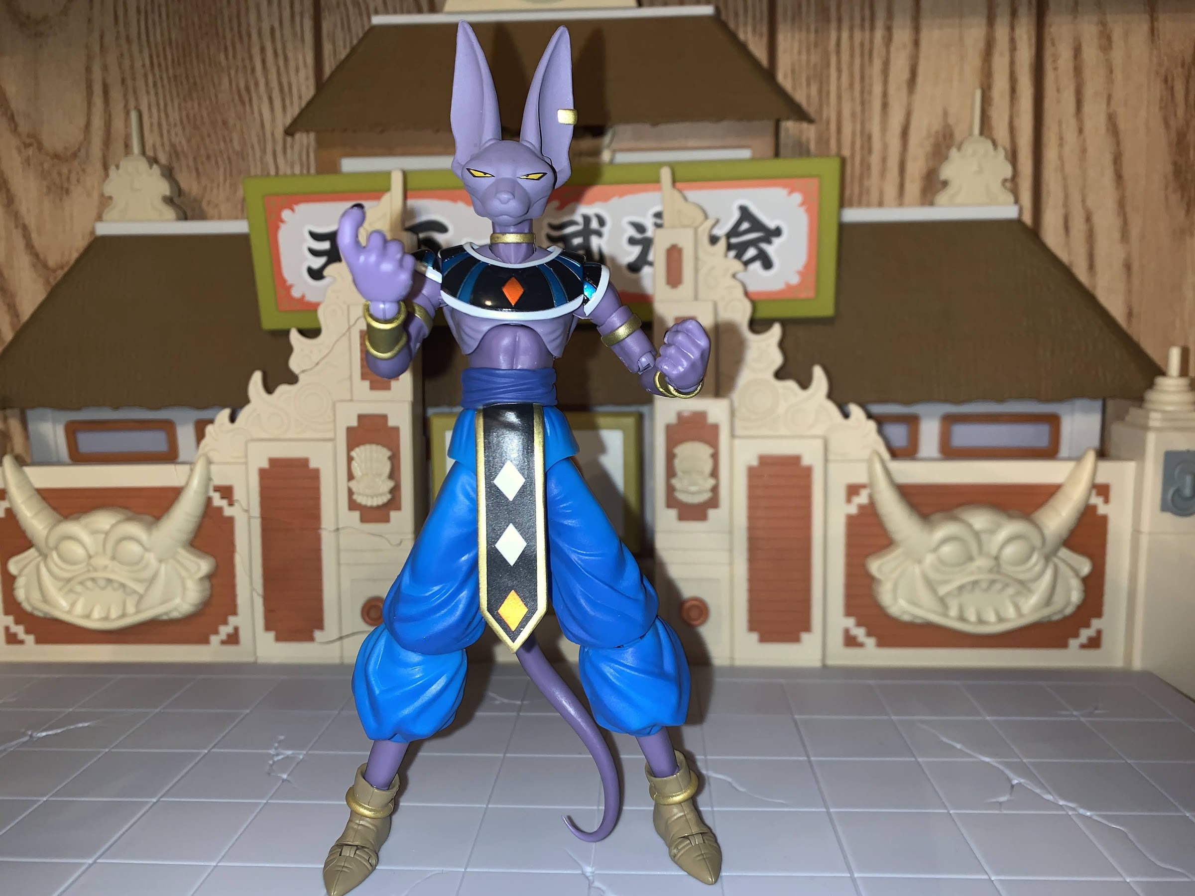
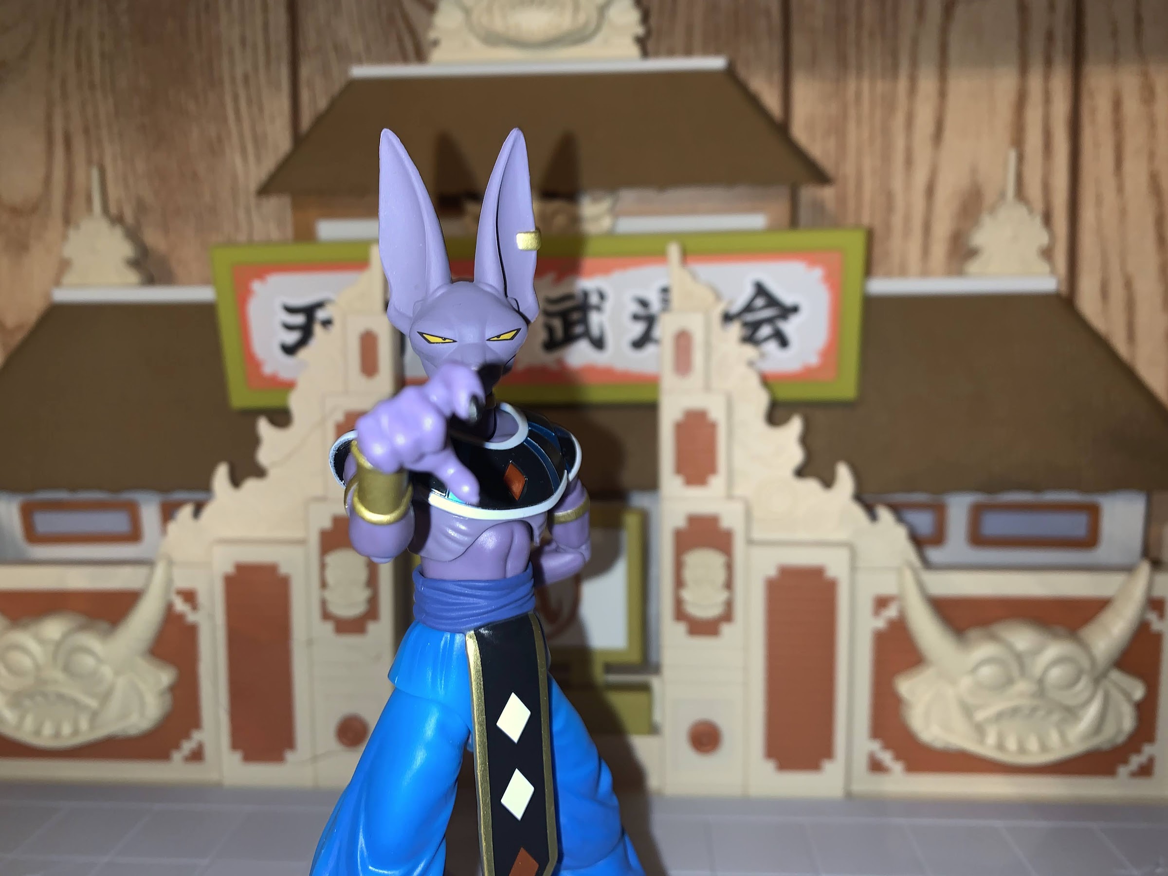
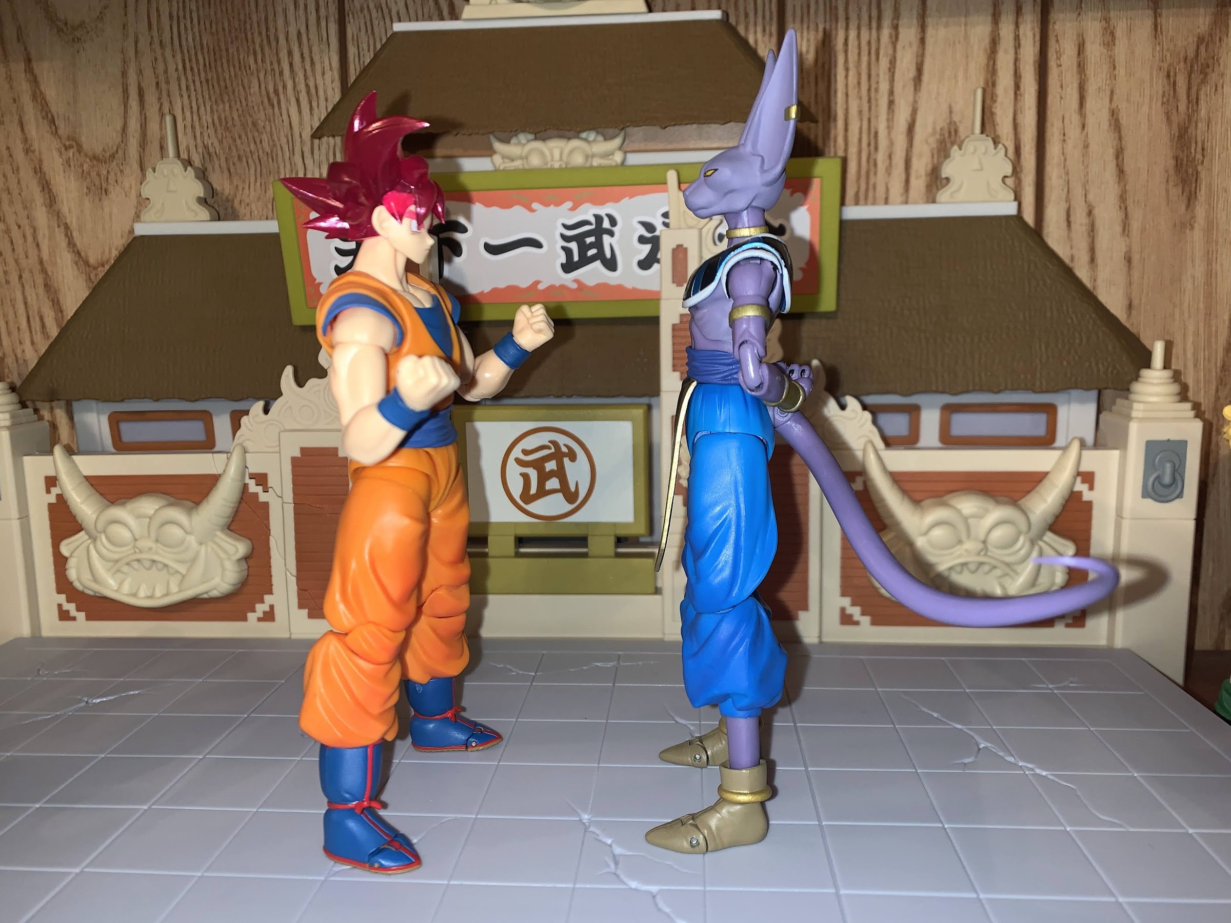
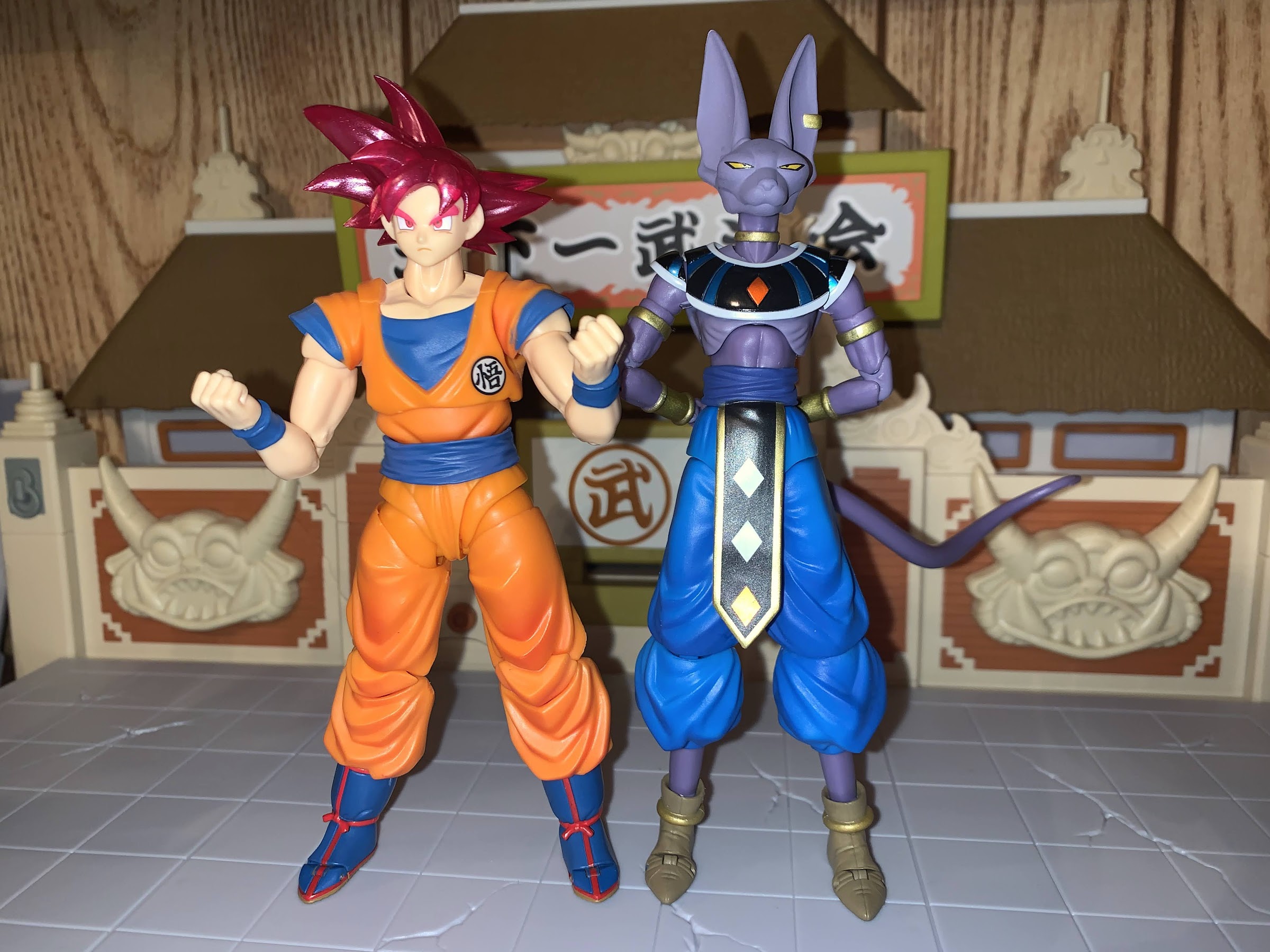
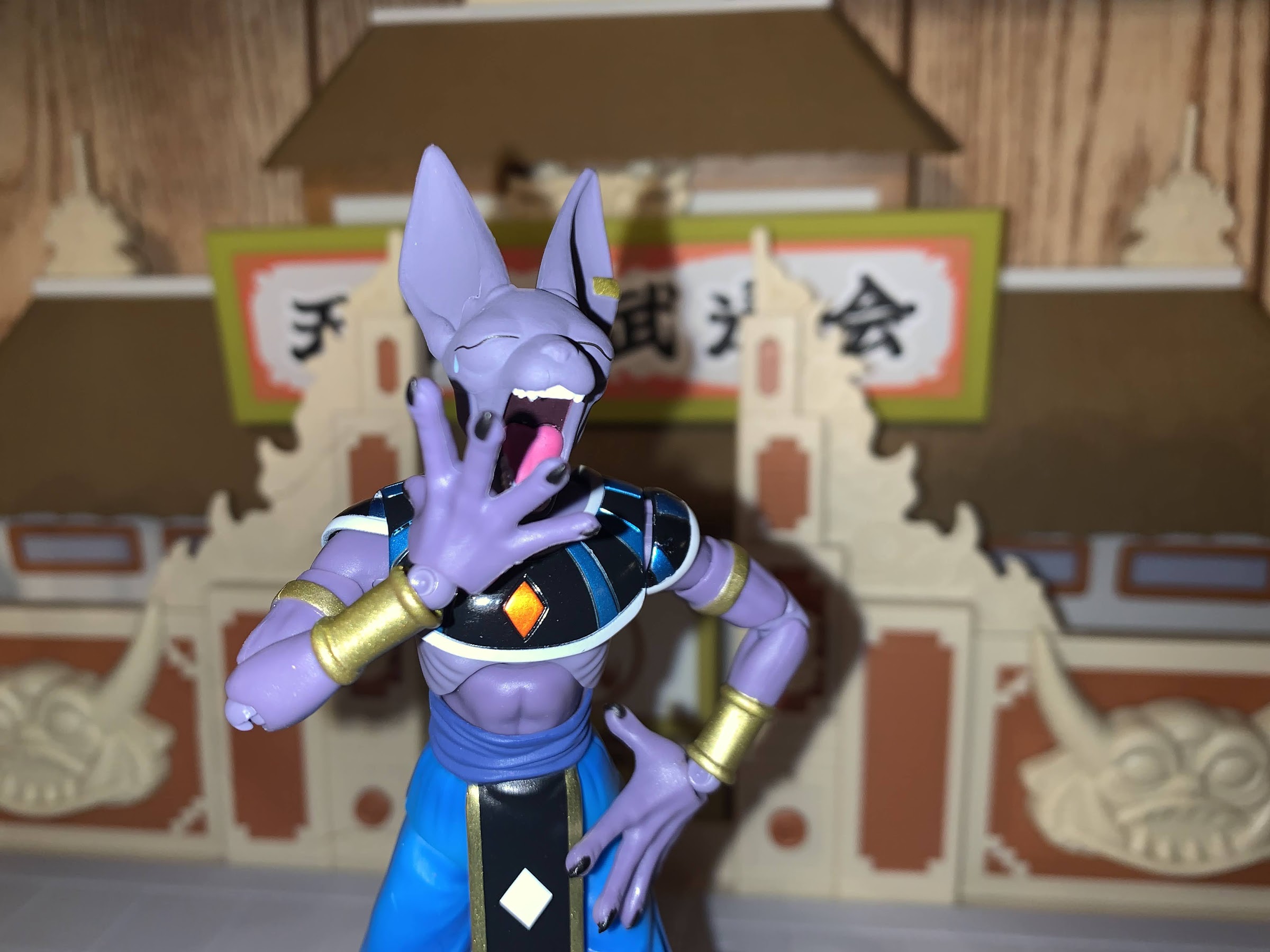
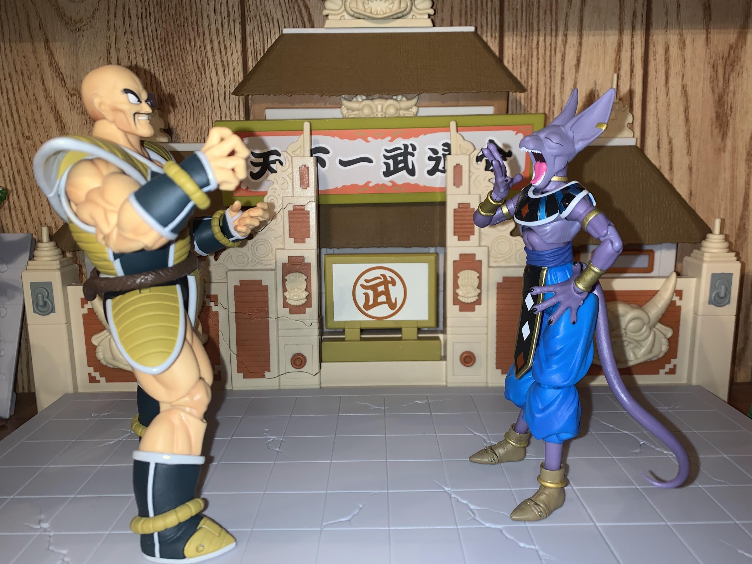
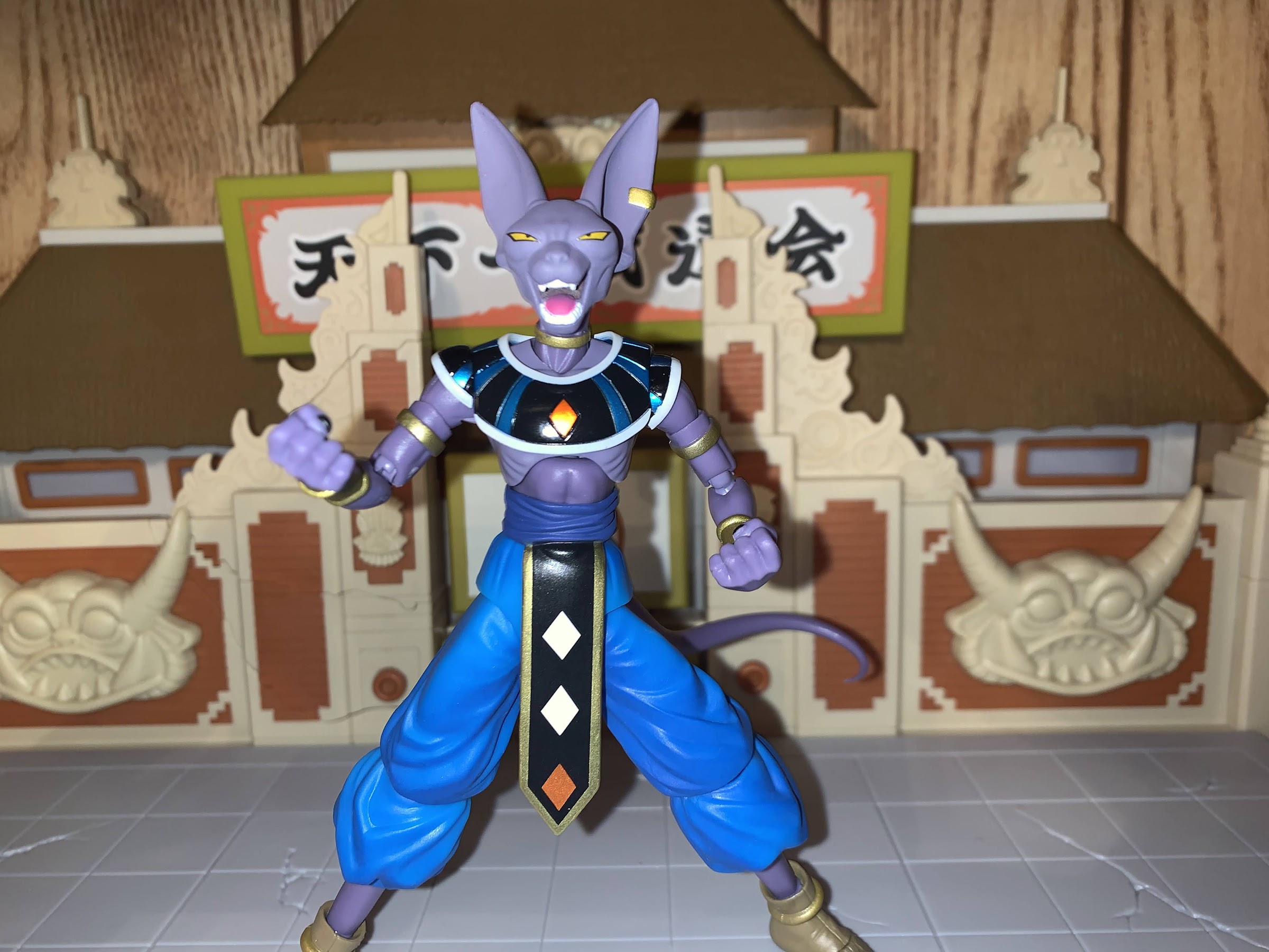
The last of my San Diego Comic Con 2021 exclusives has finally arrived and it’s the event exclusive version of the Bandai/Tamashii Nations Super Saiyan God Goku. Now, Dragon Ball fans might quibble with my title for this article as I called it Dragon Ball Super when this form technically debuted in a Dragon Ball Z film, Battle of Gods, which would then be adapted into the anime series Dragon Ball Super. I’m just going with what’s on the packaging, folks, but if I had to place a label on this version of Goku I would say it does feel more like a Dragon Ball Super thing. At any rate, it’s the same film that featured the debut of Lord Beerus, who we looked at last week and it was my desire to add Beerus to my collection that prompted me to just get Goku too. The two clash in that film, and this figure felt like a good one to pair with Beerus. I’m not actually too keen on the Super Saiyan God transformation, but maybe this figure will change my mind.
Super Saiyan God is characterized by Goku getting reddish-pink hair and remaining rather lean. Not quite early DBZ lean, but certainly leaner than Buu Saga Goku.
Super Saiyan God was the latest power-up introduced in Battle of Gods and it would be quickly eclipsed by the Super Saiyan version of that, the mouthful Super Saiyan God Super Saiyan. Or, Super Saiyan Blue for short. I don’t really understand the specifics of the whole thing, but basically, in order for a Saiyan to attain this form, he needs to have five other Saiyans lend them their energy which somehow becomes divine and leads to this transformation. The actual transformation gives the Saiyan a firey red aura, turns their hair a red-pink, and actually causes them to slim down as opposed to bulk up. Since the shape of the hair remains the same, they don’t necessarily look like a Super Saiyan, which is this form can then go Super Saiyan and become the blue version. How Goku (and later Vegeta) learn how to use this form without the added step of having other Saiyans lend them energy is either not explained or not explained well. Either way, it wouldn’t be Dragon Ball if there wasn’t some element of things being made up as they go along, would it?
You do have to fiddly with angles and those damn sleeves to get the best look. Here I failed as you can see the flesh colored piece inside the joint, which should be orange.
This version of Goku should feel pretty familiar to anyone who has handled one of the many recent Goku figures that Bandai has released. It’s the same body as the Super Saiyan Blue Goku I’ve already reviewed and Bandai has been able to get a lot of use out of this buck. The only difference I can see with that figure is the arms are actually smaller and leaner, which is appropriate for this form. I’m not sure if they’re the same as the Saiyan Raised on Earth Son Goku figure, since I don’t have that one, but it is nice to see a subtle difference between the two godly Goku figures since it makes sense. Outside of the biceps and forearms, the other difference really is just in the paint job and belt. This figure has a lighter orange to the gi likely to account for the aura and because it’s the event exclusive color edition. The belt is the Cell Saga era belt too which doesn’t feature a knot and the boots are a much brighter shade of blue. The laces are also painted red like the piping as opposed to brown. The choice of colors, combined with the translucent, pink, hair, does really help to create the illusion that Goku is glowing. It’s neat, and I think it works well for this form.
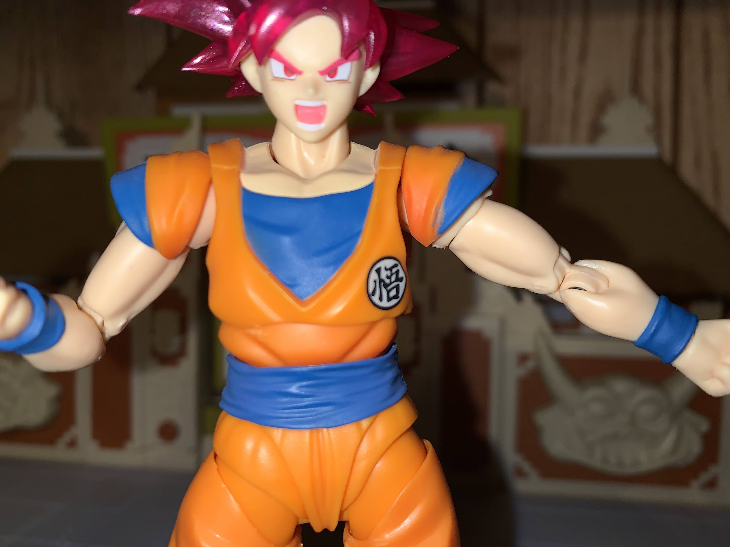
The paint flaw on Goku’s left sleeve might seem like a minor thing to someone reading this, but for a figure with very little paint on it, it’s a bit ridiculous they can’t get it right. This is also the best pic for seeing how the vest and crotch are a different shade of orange.
Beyond those changes, a lot of the figure feels the same. There’s some shading on the front of the pants and abdomen, but that’s basically it. The other painted areas are the flesh color on the chest and the blue trim on the sleeves. Unfortunately, the left sleeve on mine was not painted particularly cleanly. The plastic on the face also doesn’t match the neck and chest as well as it could, otherwise, the painted details on the face look good. The plastic inside the butterfly joint is also cast in the proper color, orange, as opposed to flesh colored like my previous Goku figure so that’s a plus. There is no shading on the crotch area though, or on the upper torso, which will probably irritate some. I get their reluctance to shade the crotch because if it goes too heavy he might look like he pissed himself, but more shading would have been nice. It seems to be something the original release of this figure has over this one, as just looking up images of that reveals a more vibrant release.
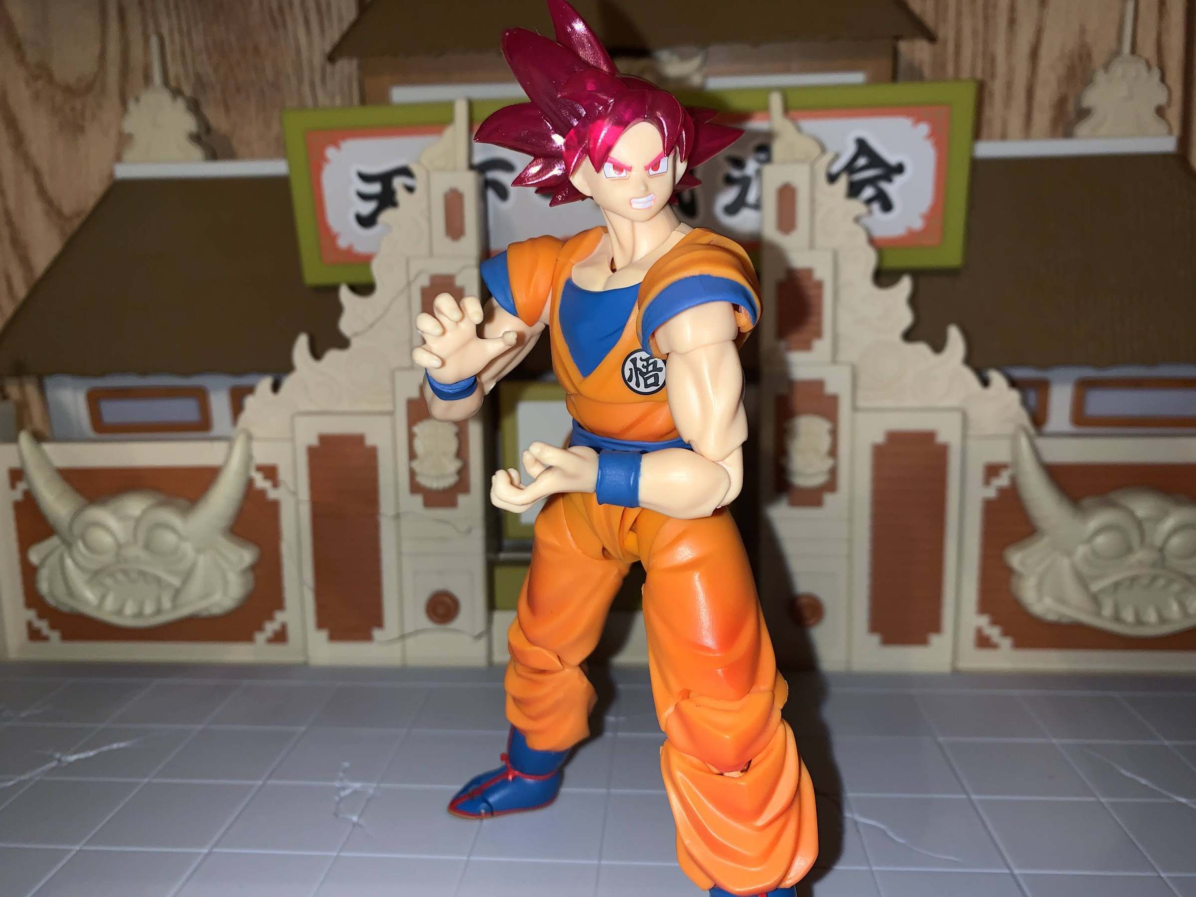
He can assume the position, but the lack of energy parts is a bummer.
The figure also feels the same because the accessories are pretty much the same. You get four faces with this guy: stoic, smiling, teeth grit, and yelling. They all look fine, though I’m kind of partial to the stoic face for this form. As far as hands go, you get the fisted hands in the box plus flat palms, martial arts pose, Kamehameha, and wide open hands. Pretty much the only hand you don’t get is an instant transmission hand, but we have plenty of those in other sets so I don’t think it’s a loss. There’s no effects part though, which is always a bummer. Being an event exclusive, I wish Bandai had added an aura effect since this guy did retail for $50, but that’s how it goes.
Look! It’s the battle of the gods we were promised!
The articulation for Goku is, stop me if you heard me say it already, the same as past Goku releases. He has the floaty pieces in his hips to cover up the joint and the sleeves which peg into the shoulders that I’ve never really liked. He can look up and down no problem and the butterfly joints in the shoulders allow Goku to do his signature energy blast poses. His head is on the old ball-hinge the original release had, and not the updated ball peg which is much better. It works, but sometimes you have to fight it to get it to bend where you want it to. At least it works better on Goku than it did on Beerus since his entire head swaps and you can accidentally get that hinge facing in a direction you don’t want. The hips don’t go out very far to the side, but he can kick forward and back because has those floating pieces instead of a sculpted butt. The knees and elbows will get you better than 90 degrees while the ball-peg ankles are just okay. The toe hinge is bad. Most of the joints are nice and smooth, with the lone exception being the right thigh twist on my figure. This is a first for me, but that thing is stuck. I have never had this issue with a Figuarts release before, but one twist caused the leg to pop off. Thankfully, it’s just a ball and socket connection so no damage was done, but it is a bummer.
IS Beerus too tall or Goku too short? Considering one of these guys is the main character for the series from which all other figures should be compared to for scaling purposes, I’m going to say it’s the cat that is too tall.
Does this figure make me a fan of Super Saiyan God? Yes and no. I think the translucent effect with the hair and the brighter approach to the color palette work really well, and it’s essentially what you’re paying for if you get this exclusive. I think that approach to the hair is an improvement over the standard release from a few years back, but probably not enough of one to warrant an upgrade if you already have it. Otherwise, he’s a Figuarts Goku. It’s a good figure, I wish mine didn’t have that paint error on one sleeve, but aside from that it feels like a quality figure. I don’t regret my purchase, but I’m also not doing backflips. If you’re at all familiar with this line, then you should probably know if you want this figure or not. And if you do, and you have yet to purchase one, well you’re in trouble because the secondary market is essentially all that remains. The prices I’m seeing aren’t terrible, but they’re obviously more than the $50 it would have cost you last summer.
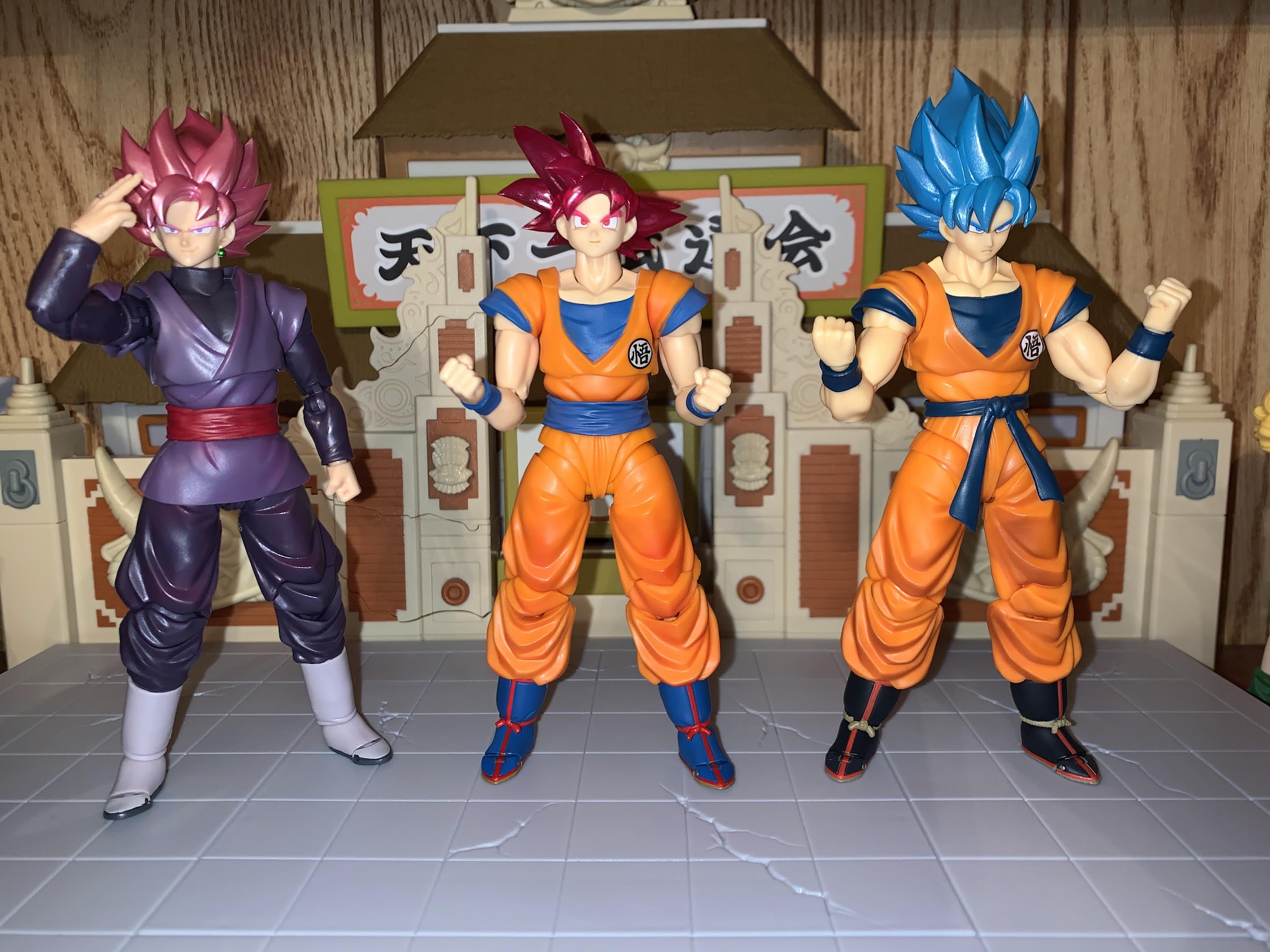
To close this out, will end with the gathering of the Gokus. You can see the different approach in color when comparing him to SSB Goku, and the leaner proportions. Goku Black is really an all-together different figure, but we’ll let him stand here anyway.
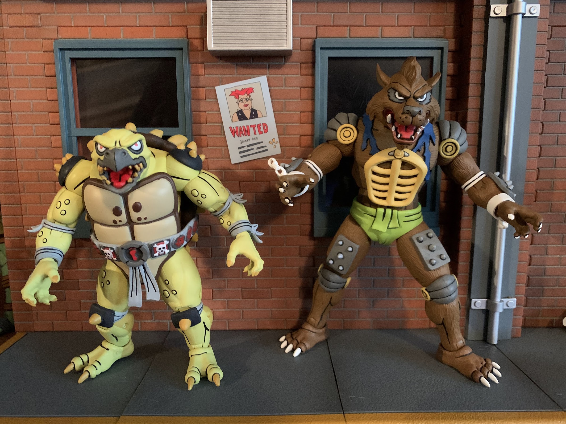
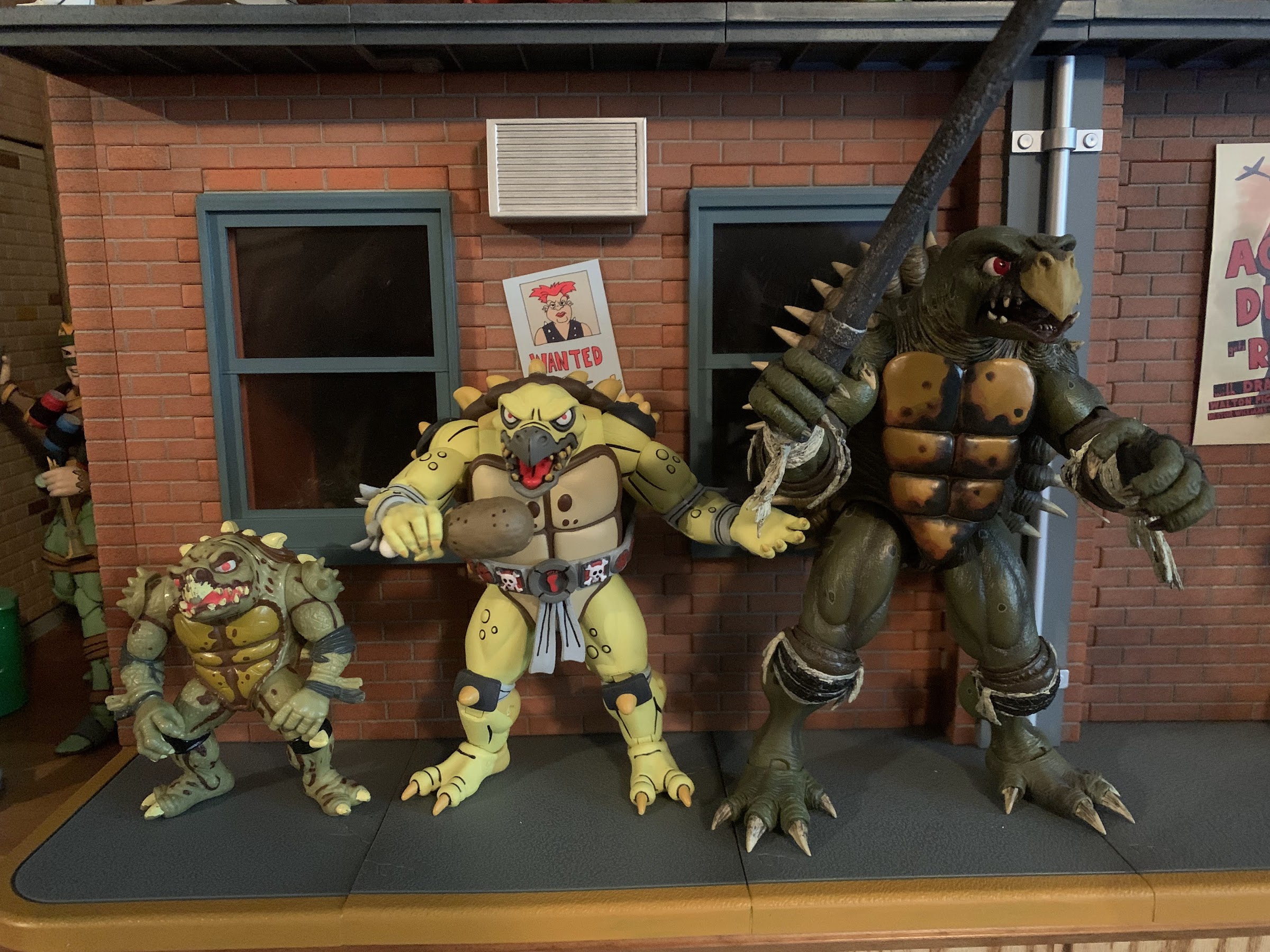
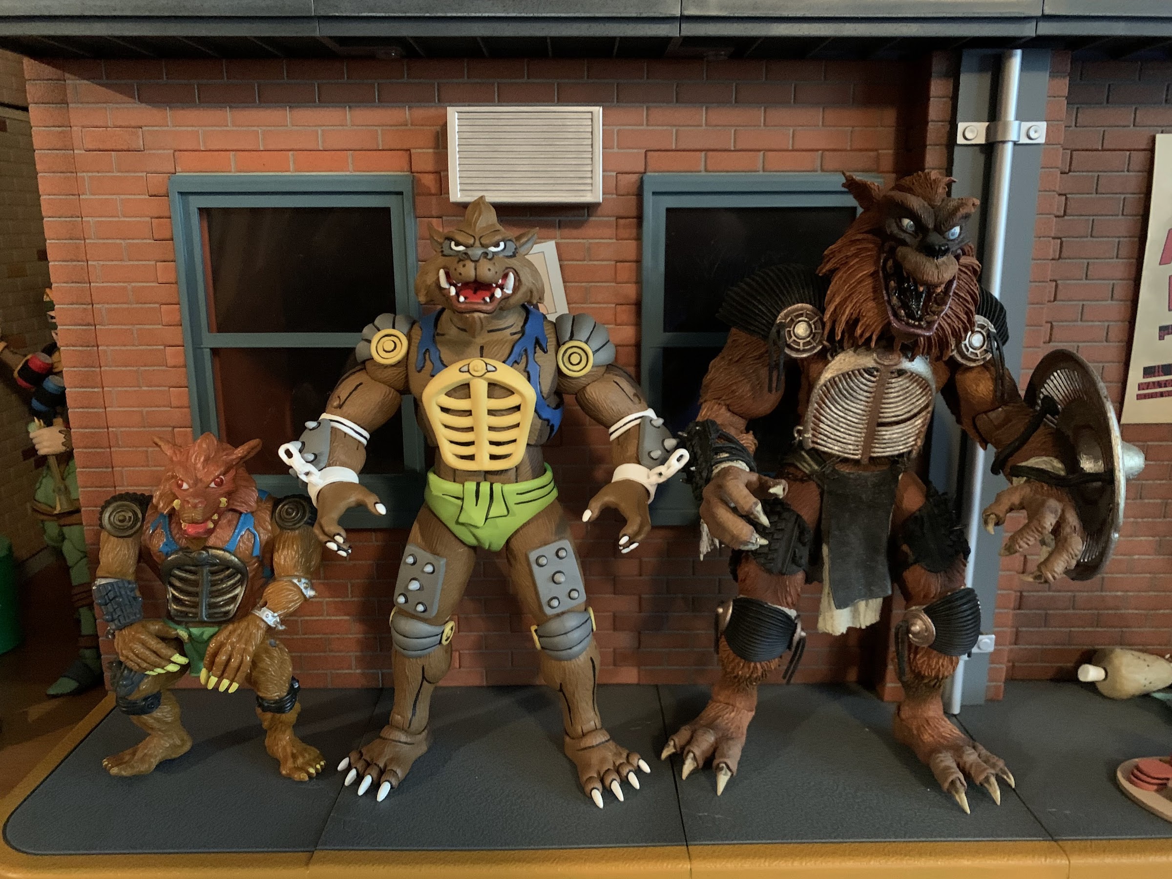
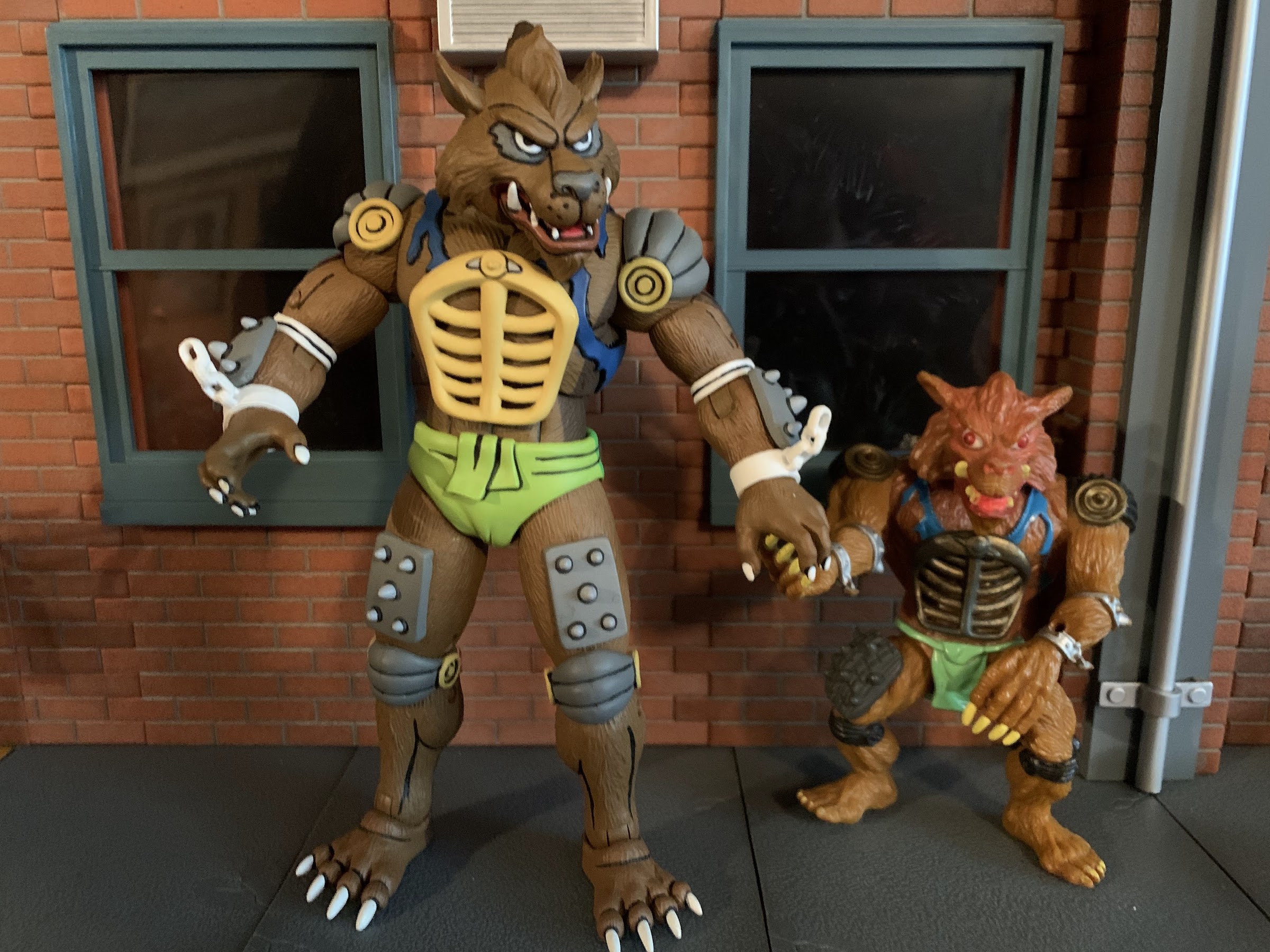
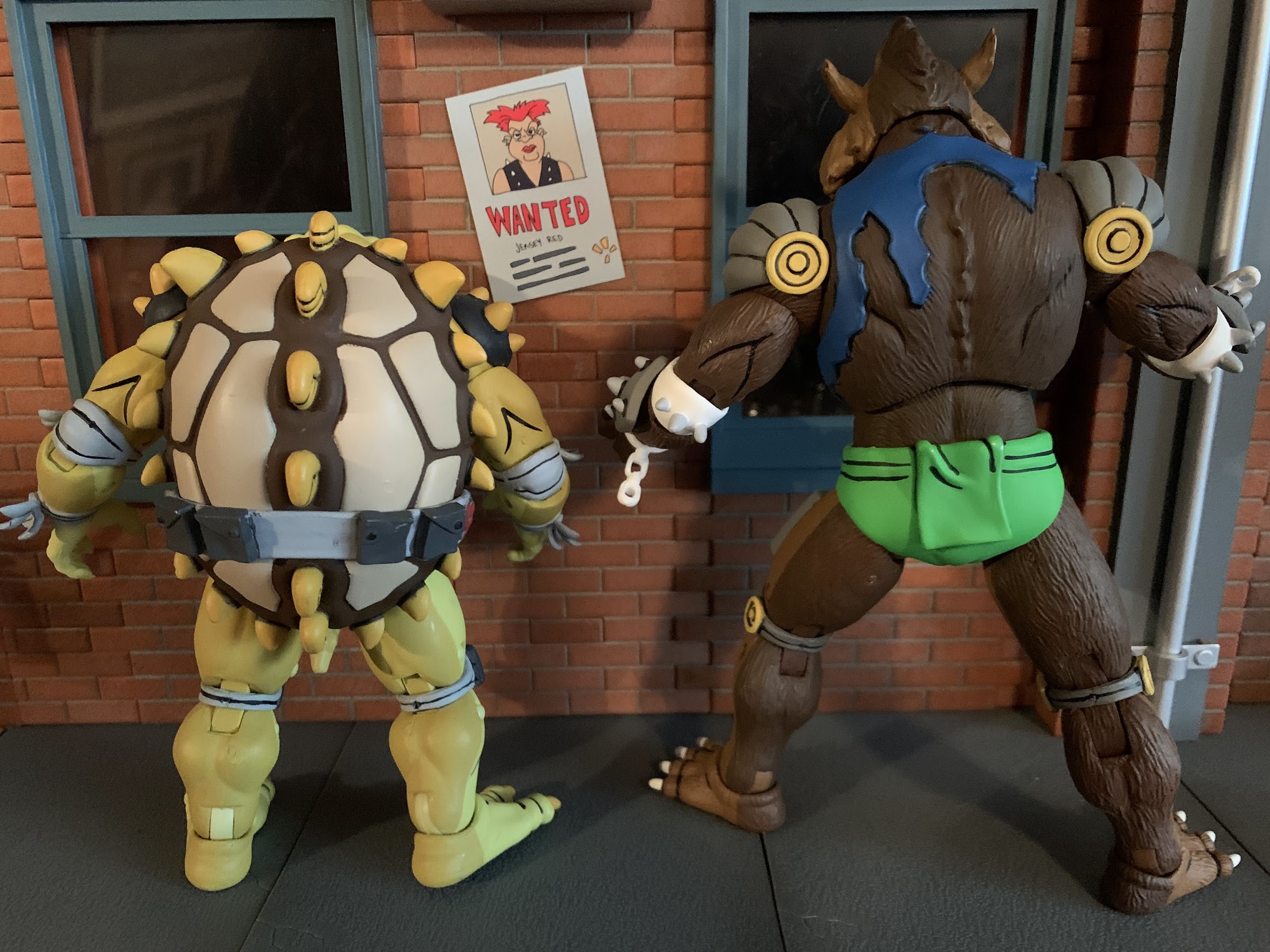
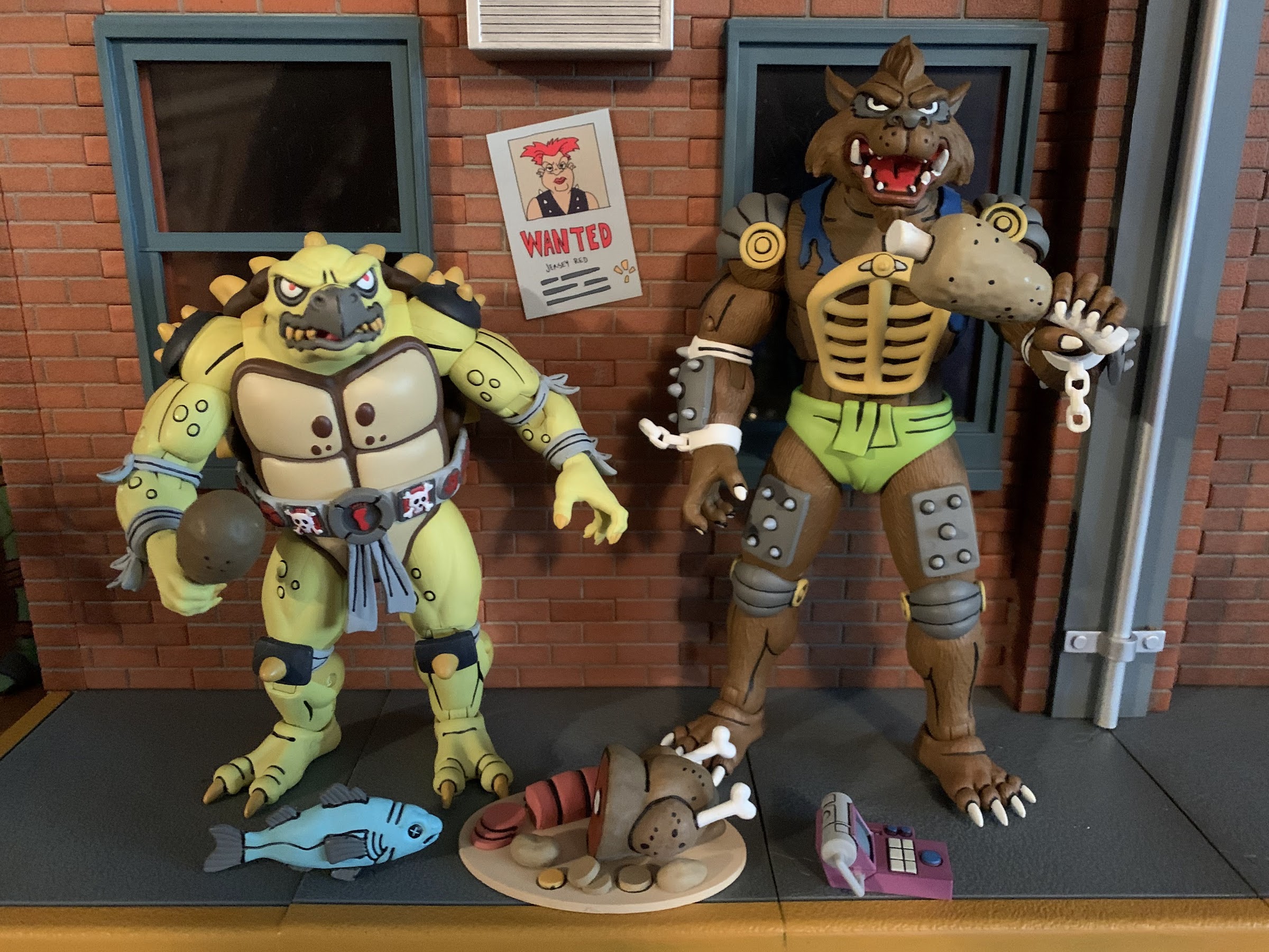
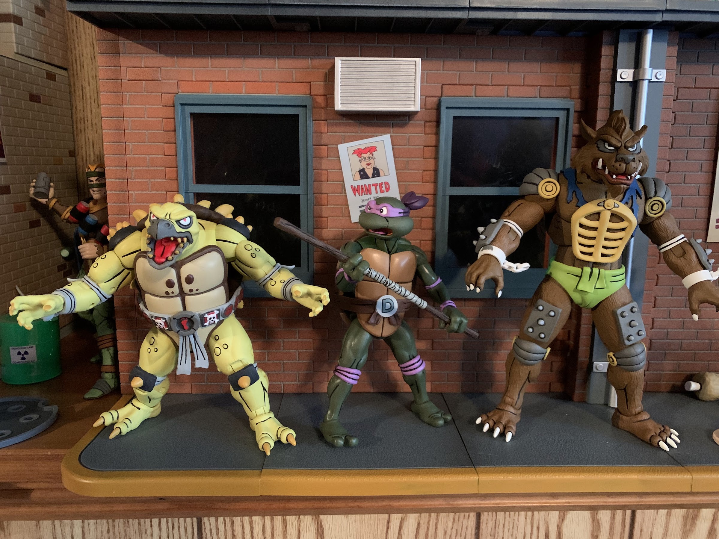
Memorable mutants from their not so memorable role.
There is certainly a lot of Teenage Mutant Ninja Turtles product flying around these days, but I would guess collectors and fans of the property are paying the most attention to two toy makers in particular: NECA and Super7. One search for “NECA” on this blog will reveal that the company has produced a ton of TMNT action figures based on various iterations of the characters be it movies, television, or comics. As for Super7, their output is much slower and more specific, though they still have released 16 figures thus far and a handful of variants and have three additional waves already solicited. Super7’s approach is to essentially reproduce what Playmates made 30 years ago at a new scale and with modern technology. Both NECA and Super7 basically received permission to go full tilt on TMNT at the same time, and both have said they basically sat down at Toy Fair, explained the direction they were each going in, and basically have a handshake agreement to not step on each other’s toes which has held up just fine.
Sometimes though, multiple iterations of the property intersect. Playmates very much did its own thing when it came to characters and designs, and for awhile, the cartoon did as well. As the show went on though, the writers, artists, and so on started to just lift more from existing sources probably because it gets hard to keep coming up with new ideas for a show that’s pretty formulaic and largely exists just to sell toys. And since it’s a glorified commercial, why not just include the toys in the show directly?
Stop me if you’ve heard this before about this line, but these guys look like they jumped right off of the screen.
When it came time to make a sequel to the Teenage Mutant Ninja Turtles 1990 film, the writers wanted to include some mutant henchmen for Shredder. When Kevin Eastman and Peter Laird balked at including the cartoony Bebop and Rocksteady, new mutants were created in Tokka and Rahzar. Playmates foolishly felt the first movie would be a massive flop and did not support it with toys, but after it was a success, they were ready for the sequel and produced figures on several characters including the newly created mutants. Playmates wasn’t going to match the look of the costumes in the film, and it’s likely things were being worked on simultaneously, so their take on Tokka and Rahzar turned out a little different from how they appeared in the film. The film was another hit and the characters proved popular, so to no one’s surprise, Tokka and Rahzar made the jump to television. And since it was likely far easier to model them on the toys, that’s what the show did. All of this is to say I feel a little bad for Super7 since NECA has essentially provided us a set of figures that are based on the cartoon, which was based on the toys. It’s basically the same deal as what we saw with Antrax and Scumbug earlier this year.
Let’s just jump right to the comparisons! Left to right: Playmates Tokka (first run), NECA toon, and NECA movie.
Tokka and Rahzar come in the standard window box packaging we’re all used to at this point. They were initially offered as part of NECA’s Haulathon event and in a confusing fashion as they were sold on costumes.com. Apparently, it would have cost too much to create a new website. That website was also supposed to be for international customers only, but no one configured the site to actually lock out US residents so it ended up being a free-for-all when everything went up on March 18th. This set was said to be open to all in some places, but it was all terribly communicated and a lot of confusion was out there. I placed an order on that site, and a set arrived less than 2 weeks later even though product wasn’t supposed to ship until April (I’m not complaining). These guys are going to Target, and maybe online too, and it’s possible by the time this post actually goes live that all of this has been sorted out. For now, it’s a mess, but I got some toys out of it.
And now for the wolf. Same arrangement as before. I think my vintage Rahzar is the first run which had red paint around the eyes in error. Later releases featured black like the toon version.
As mentioned before, Tokka and Rahzar are based on their appearance in the episode of Teenage Mutant Ninja Turtles “Dirk Savage: Mutant Hunter!” and the designs for the characters are clearly based on their action figure counterparts from Playmates. It came pretty late in the cartoon’s life, episode 166 out of 193, so several people collecting this line barely remember their appearance. I personally was still watching, but I’d drop off the following season when the “Red Sky” era began and the show underwent a soft reboot of sorts. I remember being quite surprised to see this pair show up though, and even more surprised when they were intelligent creatures. Aside from resembling the movie characters to a certain degree, the pair are pretty damn different. They’re a bit morally ambiguous and largely out to satisfy their stomachs. Rahzar makes it very clear to Tokka that he’s his only friend in the world, which is about the only character development they really get. Rahzar seems to dislike everyone, but Tokka, and he does make some comment about no one being able to stop them so I guess they’re villains? Tokka is mostly useless though as he’s easily subdued and just exists to make Rahzar mad when something unfortunate befalls him. He gets captured by the mutant racist Dirk Savage, leading to a showdown between Savage and Rahzar that’s just a set piece for the turtles to save Savage and have him realize the errors of his ways. That’s the cure for racism in Hollywood, you just need to have the party the individual is racist towards save them. Problem solved! Tokka and Rahzar’s story just sort of ends there and they never show up again.
“All right son, I’ll take you to the dog park.”
Rahzar is obviously the larger of the two standing at around 7.25″ to the top of his hair. Tokka, is much shorter and chunkier coming in at around 5.25″. Both were sculpted by Paul Harding who has already made a mark on this line with expressive sculpts of Dirtbag and Groundchuck and it looks like NECA was so pleased with Tokka that they’re prepping the figure for a re-release as an Archie Slash, which makes sense since the Playmates Slash was repurposed into Tokka! Both figures are impressively sculpted. Rahzar has a lot of extra parts added to him like the broken shackles, forearm and thigh pads, and that grill on his chest. Tokka has various warts and similar blemishes on his body to go with a spiked shell that’s a dead-ringer for the old toy. He has elbow and knee pads plus those spiked shoulder pauldrons. I love the detail on both and the paint is what is expected of this line. The black linework is clean and really causes the pair to “pop” and we get that bisected shading as well with light on the front and dark on the back. The only overlay in use here is the green “diaper” on Rahzar so it’s hard to say if NECA expects to get much reuse out of his mold. If not, I love to see the commitment on display here from NECA to make the best possible versions of these characters uncompromised by cost-cutting measures.
Tokka’s shell features the same arrangement as the old toy for the spikes. There’s even the same linework on the center nubs.
When it comes to shortcomings from a presentation perspective, there’s very little to complain about here. We’re basically down to nitpicks as the paint around the spikes on Tokka’s shell is a little sloppy around the edges, but it’s pretty minor. The shurikens on his belt also have a soft appearance in the paint department, but again, it’s a nitpick. The only real blemish on either figure is with Rahzar’s right shackle. There’s a sizable blob of gray paint on it from the forearm guard that’s a bit of a bummer. The shackle is a separate piece that can come right off once the hand is popped off so, if I want to, I could easily take it off and try to touch it up. It’s tough to paint white over a dark color though so I don’t know that I’ll bother, but that really is it as far as issues. This is a very clean set.
These guys just want to eat and hang out, and honestly, I can relate.
Since our boys here only showed up in one episode, they didn’t really get to do much aside from eat and get captured by Savage. Given that, NECA included a bunch of food! There’s a turkey platter with about half of a bird on it, some sliced potatoes, and a big slab of salami, I think. There’s also a turkey leg and some bone-in-meat plus a whole fish which was something actually used as a weapon against Rahzar. There’s also yet another handheld, control, device that looks like a fancy adding machine. It’s the controller to the control cuff that actually came with the Mondo Gecko figure so, little by little, we’re building the arsenal of Dirk Savage (the foot trap that came with the Punk Frogs also belongs to Savage). Each figure also comes with a set of gripping hands and a set of open hands. I’m a little surprised there are no fists, but I don’t know that I actually miss them. The accessories are all painted very nicely, and even though I’m not sure what I’ll do with a big turkey platter, I’m happy to have it.
“Hey, gimme a bit of that.” “No.”
This line is certainly an appearance first, articulation second, sort of line, but these two boys move pretty well. We’ll start with Rahzar first who has a ball-jointed head. It feels like it might be a double-ball peg as he can look up very well, and bury his chin with rotation and tilt. There’s also a hinged jaw to add personality and it works very well. He’s most limited at the shoulders where traditional ball-hinges are hampered by the shoulder pads. The pads can slide a little, but he can’t really lift his arms out to the side much. He can rotate just fine though, and he has a biceps swivel, double-jointed elbows that get you 90 degrees or better, and wrist swivels with horizontal hinges. In the diaphragm is a ball joint that will mostly let the figure rotate, but you get some tilt and he can arch back and crunch forward a little bit. The hips are on ball-sockets and are nice and firm. You get a thigh twist there to go with double-jointed knees and the standard hinge and rocker combo at the ankles. All of those joints work quite well and I love that he has big feet because he’s easy to pose and stand. There were no stuck joints and they’re all cast in the most appropriate color of plastic too.
They seem to scale just fine with the turtles.
Tokka is similar, but being another turtle character, he has some limitations of his own. His head basically sits forward on the sculpt so he’s more limited in the up and down department, but he does have a really nice jaw hinge to make up for it. This dude can open wide! Like Rahzar, he has shoulder pads too that prevent him from bringing his arms out to the side, but he gets good range out of the double-elbows despite the elbow pads (why can’t we get these on the hero turtles?) and has a biceps swivel and standard wrist articulation. Like the turtles, he appears to have some joints in the torso, but unlike the turtles, it’s pretty useless. I can’t get any twist out of them, but braver folks than me might be more willing to really crank on that joint. The hips are ball and socket joints and he has the same thigh twist, double knees, and ankle articulation as Rahzar. Tokka’s feet are really impressive as he can bend each one back all the way so the foot lines up with the leg and he can bend it really far forward. It gives the figure a great base and I’ll definitely be happy to have a Slash with this kind of articulation later this year.
“Tokka, you and I are all we got!” “Have you been watching those Fast and Furious movies again?”
I feel like I’ve been saying this with a lot of the two-packs of late, but this set is another contender for best in the line. I’m partial to the bugs from a design standpoint, but I can’t imagine these two turning out any better than they did. These guys are picture perfect recreations of their animated look and the sculpt, paint, and articulation really comes together nicely. I suppose the accessories aren’t the most exciting we’ve seen, but it’s not as if there was much in the show associated with them. I guess we should be mad at the designers of the toon for not giving them some of their action figure accessories.
Tokka and Rahzar have started off as another Haulathon exclusive, but I suspect NECA will make every effort to get these figures into as many hands as possible so if you missed the initial drop keep your eyes open. Basically every set these days to hit Target brick and mortar has been relatively easy to get ahold of, excepting maybe the turtles themselves. I’m willing to bet Tokka and Rahzar will follow a similar pattern and hang around for a bit. Maybe I’m underestimating their popularity due to their appearance in The Secret of the Ooze, but that remains to be seen. If you can’t tell, I definitely give these guys a strong recommend so get out there and hunt these bad boys down like you’re Dirk Savage himself, just don’t be a racist!
Let’s take a break from the Goku and Goku-adjacent figures and talk about a totally different character: Beerus. Or should I say Lord Beerus: God of Destruction! Beerus made his debut in the film Battle of Gods which essentially became the premiere of Dragon Ball Super. He’s some sort of cat creature who happens to be charged with destroying worlds within his assigned universe. Being a god, he’s only sort of a villain. I guess if he were a Dungeons & Dragons character he might be considered Chaotic Neutral, or maybe Lawful Evil? I honestly can’t remember if there’s a rhyme or reason to his destruction. When we’re introduced to him, he is seeking out the Super Saiyan God and has come to Earth in search of, who else, Goku. If Goku can’t impress him and show him the power of a Super Saiyan God, then he has no use for Earth and will destroy it, so I guess he’s lawful? Anyway, he’s one of the best new characters to come to the show so I’m happy to add this event exclusive edition to my collection.
Like many a Dragon Ball villain there’s a lot of power packed into a somewhat unassuming frame with Beerus.
Beerus embodies the power of a god and Dragon Ball villain, while also displaying the traits of a cat. He gets sleepy, can be petulant, impatient, and certainly carries himself in a regal manner. And like many characters in this universe, an easy way to please him is via his stomach. He loves food and it’s the food on planet Earth that initially spares the world from his destruction. He’s quite threatening, but easily slips into a comedic performance as the scene demands. He’s terrific. And this figure is actually an old one from 2016. It was part of Bandai’s San Diego Comic Con collection of exclusives from last year. Premium Bandai’s website basically couldn’t handle the volume of people interested when the item went up for sale, so they offered a make-up sale a couple of days later that was for a second batch. I really wanted the Nappa they released, so I just went for that because the site was so slow and buggy that trying to add multiple items to my cart felt like a risk I just couldn’t take. However, when the second sale went up I gave in and grabbed both Beerus and the Super Saiyan God version of Goku.
“Come at me, if you dare.”
Unlike Nappa, this version of Beerus is a better use of an event exclusive. I loved that Nappa, but he was a re-release of a figure done in his proper animated colors. That’s something most fans probably wanted from the original release, and making him an event exclusive kind of sucks. Since it ended up being easy to get, I guess little harm was done other than some folks felt compelled to get two versions of the same figure. With Beerus, his change is subtle. I don’t have the original release, but from what I can tell, the main difference is just in the collar-like shirt he wears. I don’t know the proper name for the garment, but it’s the blue and black item he wears over his shoulders. The original was a standard matte look, while this one is done with a shiny, chrome-like, finish. It looks cools, and it’s the type of thing that owners of the previous figure probably don’t feel compelled to buy, while those looking to fill a hole in their collection aren’t settling for some glow-in-the-dark variant or something.
The dreaded Finger Poke of Doom!
Being that Beerus is an older release, there’s going to be some dated things on him. Let’s start with the aesthetics. He looks like Beerus from the show/movie. His default, stoic, look captures that of the character and a cat as he appears content, but those narrow eyes have a menacing quality to him like his mood could change at the drop of a hat. His skin is a pale gray-violet which works well with the blues and blacks of his attire. The only shading on the figure is on the front of the pants while the other painted flourishes are rather clean. The sculpt is rather nice as it captures how thin the character is and Bandai did a great job at the hips which don’t jut out like the Goku Black I looked at recently.
These two literally do not see eye-to-eye.
As nice as Beerus looks, there are a few nitpicks to find. His neck gets a bit gappy where it meets the upper chest, and I wish his face had a wash or something on it as it looks rather plain. His nose should probably be darker than the rest and just some subtle paint touches on some of the lines, as we saw with the Super Saiyan 4 Goku, would really bring out the features. His feet appear to be cast in blue plastic, which is rather odd. I only know this because some blue is peaking out of the seems and at the pins in the toe. And lastly, he also seems a bit too tall. Beerus stands at about 5.75″ to the top of his head, 6.625″ to the top of his ears. Goku is about 5.625″ to the top of his head, so his eye level is lower than that of Beerus which doesn’t look right. It’s been a few years since I watched Dragon Ball Super and it wouldn’t surprise me if Beerus was drawn shorter in that than he was in his debut feature, sort of like how Vegeta was suddenly taller when he became more of a good guy, but I don’t think even this is accurate to Battle of Gods.
Yeah, that doesn’t look right.
Aside from the paint, this release is the same as the older one so the accessories included are also the same. They’re just appearance accessories, so optional heads and hands. In addition to the neutral expression, Beerus also has a yell and a yawn. Both look terrific and I think all three portraits have worth in a display as the more comedic yawn is still a spot-on depiction of the character. With the hands, things are less interesting as Beerus comes packaged with fists and can swap to gripping hands, open hands, and he has a right, sort of clawing, hand. It’s a gesture he uses when firing some of his attacks and could also be used as a “Come here” gesture. What’s curious though are the gripping hands as he has nothing to grip. Was there a short-lived directive at Bandai to make sure all of their figures came with gripping hands? It’s bizarre, as Beerus doesn’t wield any weapons in the film or show so they really are useless. I would have preferred more style posed hands, or maybe one with chopsticks and a bowl of ramen or something. There are no effects parts either, which is always bummer. It does help that Beerus doesn’t really have a signature attack, but he could still have something.
Those knees aren’t pretty. On the plus side, these yawning head is great!
Where the figure really feels dated is with the articulation, which also factors into the appearance somewhat. The head is on a ball hinge, like what Bandai uses for the wrists. It’s okay, but once the head is on you don’t really know where the hinge is so it doesn’t function super well. Also like the hands, it’s something you have to battle with just to get those heads on. There’s a ball joint in the base of the neck so he can bury his chin and also look up a bit with the usual rotation and tilt. The shoulders have part of that collared garment pinned to them, like most of the Goku figures do with the his sleeves. It’s a bit unsightly, and you need to be careful with those pieces as they will slide under the chest part and could get scratched. It’s a ball hinge so the shoulder can move up and down a bit, but the butterfly joint is useless due to the chest piece getting in the way. There’s a biceps swivel and double-jointed elbows and a ball-hinge wrist. In the torso, there’s a diaphragm cut but it’s pretty tight. It feels like a ball-hinge so if you pull up on it you can get him to crunch back. Leave it low and the figure makes some uncomfortable noises when rotating there, and he doesn’t get much forward crunch either way. The ball-joint at the waist is a bit better and that’s where you’ll get rotation and a little tilt.
Note the single tear squirting out of his right eye.
At the hips, Beerus has hinged ball-joints that drop down. Leaving them in the up position results in a nice looking joint that is reasonably functional out to the side and kicking forward and back. Dropping the leg doesn’t add a ton, just a little extra clearance on the kick, which is probably why we don’t see this joint too much anymore. The knee is where things really get poor though as Beerus has just a single joint with no cap on the front. When you bend that knee, you just see the joint at the kneecap and it’s ugly. It’s unfortunate because that yawning expression would lend itself well to certain sitting, bent knee, posing that will expose this shortcoming. This is simply just an outdated joint, as some of the early SHF releases featured the same, and has been retired in favor of what we see on other poufy pants characters like Goku. It’s too bad they couldn’t fix that for this release. At the ankle, we also have the old ball-peg system. You get good movement back, little forward, and the rocker is just mediocre. There is a toe hinge, but I don’t have much use for toe hinges. Beerus, being a cat, also has a tail and that’s connected via a ball-hinge. You get some decent posing out of it, but the tail itself doesn’t articulate further. It’s soft and pliable, but does not have a wire in it so it’s fairly static. It’s a thin tail, though, so I’m fine with it not being segmented for articulation.
Beerus is right to yawn in Nappa’s direction.
Beerus is an old figure with a shiny coat of paint added to go along with a fancy box. The sculpt has aged well so he should still look the part on your shelf. I have some nitpicks with his size, but I largely think he looks good. He just shows his age primarily with those knees and it’s the one thing I would definitely change. This isn’t a budget release, after all, as he retailed for $50 so it would have been nice to see an upgrade made there. Even factoring that in, I still think he’s worth the price tag and I do find myself quite charmed by this release. He’s very much an essential character if you’re collecting Dragon Ball Super. Since this figure was an event exclusive, you’ll need to seek him out on the secondary market. Big Bad Toy Store is carrying this edition, but at a significant markup (more than 100%) so you might be better off on eBay or Mercari. I like the figure, but I don’t $100 like the figure so I guess it will come down to how important it is for you personally to add Beerus to your display.