You probably heard, but Hollywood is essentially on strike right now. Two large unions are fighting for better pay, benefits, and assurances that they won’t be replaced by artificial intelligence while major studio heads like Bob Iger are tossing stones from their golden mansions. I am firmly on the side of labor when it comes to most strikes, but this isn’t a strike post. It’s a comic con one as the just recently wrapped San Diego Comic Con of 2023 had a decidedly different feel to it in light of the work stoppage. Unions frown upon any of their members even promoting their projects right now, and with good reason. Without the glitz of Hollywood, it meant Comic Con could go back to being about comics for at least one year. Though for me, every year is all about the toys!
I don’t know when it started, but Comic Con has become a huge spot for toy producers to show off what’s coming in the next few months to a year and 2023 was no exception. I sat glued to my phone once preview night started and fought with myself to put it down all weekend since I couldn’t be there in person. Now that it’s over, I’m going to tell you what I think because my opinions are very, very, important and the fate of the companies involved, nigh the entire industry, is dependent upon securing my approval.
NECA TMNT
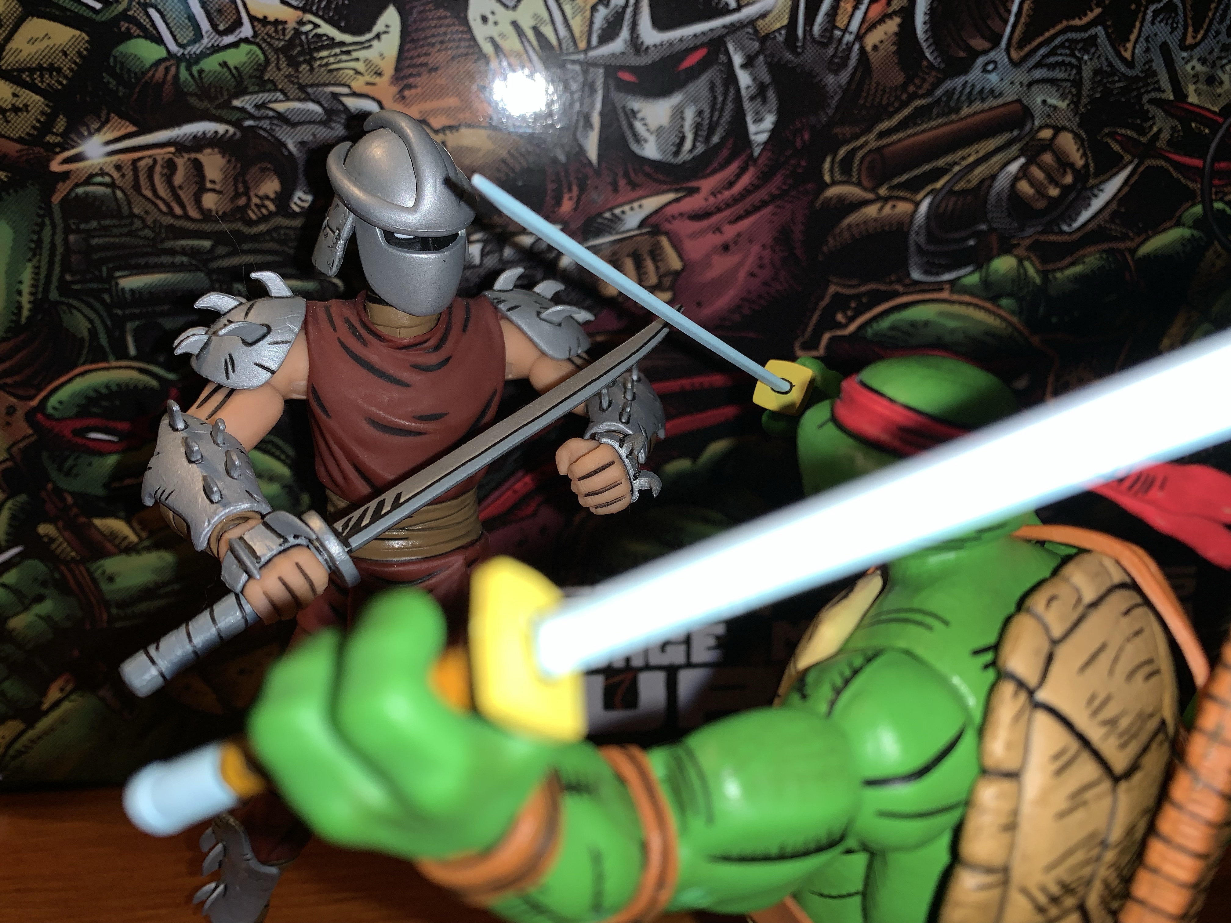
That is one big ass Krang! Photo: Pixel Dan
Let’s start with the old standby – NECA and their many versions of Teenage Mutant Ninja Turtles. In some respects, this year’s display felt slightly subdued, but I think that’s because NECA has really branched out beyond just the cartoon and movies. They basically showed off a little bit of everything and undoubtedly they’ve held stuff back for the conventions to come. And that’s fine by me, I was kind of happy that I took one look at the new TMNT toon stuff and didn’t feel like I necessarily needed any of it. And some of that is tempered by the fact that I know I have a major expense in the sewer lair diorama to look forward to. On the toon side though, I’m definitely in for the street turtles. While I prefer the season one street looks to these, I’m still happy to have what they showed. That’s it though. I’m probably going to get more, and the giant Krang was certainly the show-stealer, but I’m definitely in more of a wait and see how I feel mode when some of this stuff starts becoming available.
These wrestling turtles so perfectly nail that Archie aesthetic I love. Photo: The Fwoosh
On the movie end, we just had some new Secret of the Ooze figures to look at. There was kick-boxing Keno, some new Foot, and two versions of Professor Jordan Perry. Is that too much of the professor? For me, yeah, and I can probably ignore all of these. Oh, and there was a pretty neat Shredder throne on display, but that’s another thing I don’t need. The comics end was far more exciting with a bunch of new figures based on The Last Ronin shown. They all look pretty damn good, but I may be out on that subline for the simple reason that I can’t buy, and display, everything TMNT from NECA. The Mirage line is getting some new figures as well, with the big one being Rat King who looked fantastic. That is definitely going on the “must buy” list. As for Archie, that may have stolen the show with a brand new Mondo Gecko unveiled and the much demanded Wrestling Turtles! Even if the models shown for the turtles were so early that they didn’t feature any articulation, I couldn’t have been more excited! I’ve wanted that black suit Raph ever since I was a kid and my dad bought me TMNT Adventures #10. I must have read that thing cover-to-cover at least a dozen times.
As for disappointments, there wasn’t much to be found. All of the new stuff looked good, so any disappointment was likely just the result of something not being shown. And the big one, for me, is Tempestra. I thought there was a very good chance we would see her from the toon line, especially after the profile boost given to the character thanks to Shredder’s Revenge, but she remains the elusive final member from the Night of the Rogues. I feel confident she’s coming though, so I’m not that broken up about it. I’d also like to see a new toon Shredder, or an Archie one, but again that’s probably coming, we just don’t know when. And hey, that Turtle Van is looking pretty sweet!
Super7
All right, when can I have them?! Photo: The Fwoosh
Super7 has cast such a wide net these days that maybe I should break their display up, but then again, there wasn’t a ton for me. The biggest though, by far, was the official unveiling of the new line of Misfits figures. These are being done in a retro, Masters of the Universe, style which is pretty cool. It means they won’t be as expensive as Ultimates, but definitely better than ReAction. I’ve felt for awhile that Super7 needed something in between those two lines, and maybe this is it. Would I like an Ultimate Glenn Danzig some day? Sure, as long as it’s good, and some of the figures Super7 has done of real people haven’t turned out so hot. This line, which features Skeleton Danzig, Jerry Only, The Fiend (aka Crimson Ghost), Samhain Danzig, and early 90s Danzig, already has hit on some great designs. We just need a Doyle to round things out. I’m also amused by how Super7 is basically just following the Medicom blueprint when it comes to Glenn Danzig.
On the disappointing side, well, there just wasn’t anything from the other lines I care about at Super7. Well, they did have TMNT Wave 8 on display and that’s looking fine, but there was nothing from the Disney or Simpsons Ultimates or even any new ReAction that I saw for either. Super7 usually doesn’t unveil new Ultimates at Comic Con, and they also don’t always go with a robust display. If they have something anticipated that they just got from the factory or something, they may bring that, but not always. I’m just concerned for both of those lines. The most recent Disney wave based on The Rescuers failed to secure enough preorders to go into production. Is the line in jeopardy? Sort of similar is that The Simpsons Wave 4 is still listed with an ambiguous “TBD” on the pre-order status page. It could be an oversight and they just haven’t updated it, or it could mean that no progress is being made and until it goes into production it should be considered as “in jeopardy,” as far as I’m concerned. It’s not exactly a star-studded wave and features two figures at $65 so nothing would surprise me.
Hasbro
Now that’s a figure worthy of the Master of Magnetism. Photo: The Fwoosh
I am certainly not the biggest Hasbro fan, but the company had my attention going into the convention because we knew that Marvel Legends based on the highly-anticipated X-Men ’97 were likely to be shown. And they were! Coming in Wave 1 is Wolverine, Rogue, Gambit, Storm, Bishop, and Magneto all with new sculpting to make them better resemble the upcoming show. For me, someone who collected the VHS line of X-Men based on the 1992 cartoon, I wanted to see if some of these could be fudged into that line. We have no assurances that Hasbro intends to come back and finish that team, so plucking Gambit and Rogue from this one might be our best option. And, for the most part, they look okay. Rogue has her green jacket and black headband and Gambit has a more “toon” appearance to his face. Neither face-sculpt looks truly like the ’92 show, but Hasbro was unlikely to give us that in the VHS line anyway. There is no cel-shading though, so that might throw off the display a bit, but given how half-assed Hasbro’s approach to that style was maybe it’s for the best? Wolverine is essentially the same as that release too, just now he has an unmasked portrait and pin-less limbs, so collectors waiting on a non-cel-shaded version of that figure should be happy. I personally don’t need it. And with Storm and Bishop featuring new hairstyles, I can pass on them as well. That Magneto though is a must have and I’m happy to see that Hasbro shaded his face. He could use some accessories, but this is Hasbro we’re talking about so that’s hardly a surprise.
I don’t know if I’m as happy as Pixel Dan is about this Crystar, but I’m definitely in “gimme gimme gimme” mode! Photo: Pixel Dan
Hasbro also gets credit for one of the biggest surprises as they showed off a figure of Crystar! Yes, Crystar The Crystal Warrior is coming to Marvel Legends and the figure looks pretty sweet. It’s all done in translucent plastic with a blue hue and he has his sword and shield to round things out. The comic he hails from is pretty forgettable, except for the fact that the iconic Danzig skull was lifted from the cover of issue 8. Naturally, this is one I need for the Danzig collection more than anything.
And that’s pretty much it for me. I did see other great stuff like Jada’s Mega Man line and NECA had some new Gargoyles to show, but the above stuff is what really stood out for me and got me excited. Mondo also unveiled an Omega Red in their sixth scale line based on the X-Men animated series and he looks unsurprisingly spectacular, I just wish they’d slow down a bit as that line is killing me financially. Special shout out to all of those working hard during the convention covering this stuff for people like me who can’t go. I’m talking about The Fwoosh,Pixel Dan, Toy Shiz, Toy Bro, and loads of others. The excitement is now over, we have lots to look forward to, and the next convention or show lurks on the horizon. This golden age of toy collecting appears to be going strong, weap for my wallet!
In the late 1980s the arcade scene in the US was still going strong. Classic style arcade games like Donkey Kong and Pac-Man were being overtaken by a new genre of quarter-munching pain: the brawler. Or the beat-em-up. If you’ve played one, then you can picture what I’m talking about. It was usually a one…
There’s been a hole in my Danzig collection for quite some time. It was a hole that was easy to fill and actually quite cheap considering most Danzig records fetch well over $100 these days, but an important piece was missing. And that piece is not what one would necessarily expect, but I would assume…
Wednesday, August 18th, ended up being quite an eventful little day in the world of toy collecting. There were some reveals from major toy companies, leaks, and even those long neglected Street Sharks fans got something to get excited about late in the day. Personally, it was a good day for me too as I…
If you’re into collecting action figures then you’re likely familiar with the concept of a variant. Tooling action figures, the process of cutting steel into molds in which plastic is inserted to create the figure, is the most expensive part of creating an action figure. That’s why it’s in the manufacturer’s best interest to get as much use out of those tools as possible. Many action figure lines are dependent upon sales of variants, usually identical action figures with minor differences, to help keep the costs down as a whole. Sometimes these variants are used to poor results. Anyone who walked into a Kay Bee Toys in the 90s may remember the X-Men and Marvel Comics exclusive figures which were just bad repaints. There was a savage Wolverine that was just a repainted Sabretooth, for instance. Those are bad variants, but a good variant can be plenty fun and when it comes to Super7 you can basically bank on the company having an assortment of color-changing and glow-in-the-dark variants ready to go at any moment.
For you in-box collectors, the packaging is pretty cool. And with the window box, I suppose you could make the figure glow without taking it out.
That’s what the Mutagen Ooze series is from Super7. It’s the four turtle figures they’ve already done, but cast in glow-in-the-dark plastic. They aren’t the first, nor are they the last, of Super7’s glow variants for TMNT. The first wave included a glow-in-the-dark Baxter Stockman as a convention exclusive and they have also done Mutagen Man, the Foot Soldier, Muckman, and have Slash on the way. Super7 loves glow-in-the-dark figures, and it’s easy to see why. They have their own, unique, aesthetic with the translucent plastic and often a different finish from a traditionally painted figure. And then, of course, there’s the glow which has been delighting kids and adults for decades. It’s silly, stupid, fun.
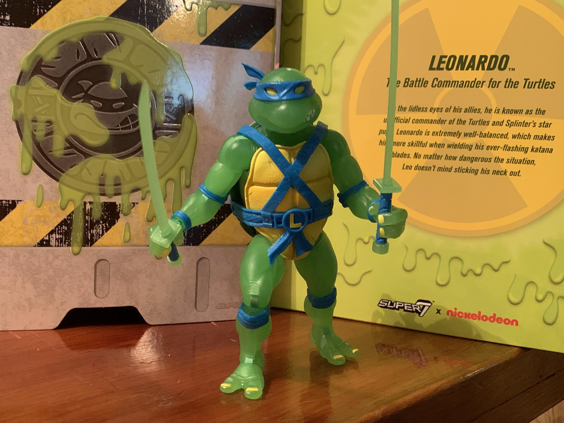
How do you prefer your Leonardo?
We probably shouldn’t forget about the samurai option.
Unfortunately, that fun comes with the downside of added cost. It wasn’t always the case as the first few glow variants were the same price as the non-glow options, but with the Mutagen Ooze series there came a hike. Where the turtles cost $45 a piece in their first run, the glow versions were $65 and exclusive to Super7’s webstore which meant payment upfront and no free shipping. I took a look at that solicitation and liked what I saw, but there was no way I was going to pony up that kind of dough for a fun, but also silly, gimmick. I considered getting just one, my favorite turtle Leonardo, but after shipping that was going to total over 80 bucks for one figure! Sorry, Super7, it just wasn’t worth it. The reason offered up by Super7 co-founder Brian Flynn was that the cost for the glow additive for the plastic had gone way up and so they had to up the price significantly. I’m not going to call the man a liar, I do believe what he said is true, but it’s still hard for me to wrap my head around how a figure that’s already been tooled can warrant such a markup just for the cost of materials. And if this glow situation was only temporary, maybe just don’t do it? Wait it out. See if the price comes down. Maybe the factory will want the business later on and be willing to negotiate. I don’t know, but at the end of the day it’s not my problem. As a consumer, we see the product and the price and have to decide on the subjective worth of it all and, for me, it just wasn’t working.
I love the use of blue with this figure.
Obviously, something had to change or else this post wouldn’t even exist. And that something was a sale. Super7 ran a Father’s Day sale that, for some reason, included the Mutagen Ooze Leonardo. Maybe they wanted to feature a glow-in-the-dark figure from this line, but since they have yet to do Splinter, they figured Leonardo made the next most sense for such a sale? I don’t know, but I was happy to see him included and happy to see him discounted to a little over 50 bucks. Throw in shipping, and he was still under the $65 MSRP. Perhaps still more than I wanted to pay, but at least at this level I could talk myself into it. And I’m glad I did because this figure is wonderful! It’s a real shame the wave wasn’t more affordable as I wouldn’t mind adding the rest, but not at the current asking price.
“Uhh, Leonardo, are you feeling all right?”
If you have the original Wave 2 Leonardo then you essentially have this figure. The sculpt is exactly the same which is a Playmates inspired mold, but with a modern approach. The default portrait is an almost exact recreation of the vintage figure except for the angle of Leo’s eyes. Where he once had a look of concern on his face he now has something a bit more intimidating. The same hands and the same swords are present and all of the same engineering is still in place. I’ll link to the original review at the bottom of this, but I’ll add that this figure is better engineered. The joints aren’t as loose, but nothing is overly tight either. What little paint was needed is applied well, and anything your old Leo can do this one can as well. The only new issue this figure presented for me was that swapping the heads is way harder than it should be. I couldn’t get the secondary head onto my figure, and since I didn’t plan on displaying him that way anyway, I gave up. If you get this figure and want to make use of the alternate portrait then I suggest heating it up first.
And glow he does.
The obvious selling point here is the glow and the minor deco changes made to accommodate that. The entire figure is cast in a slightly translucent, green, plastic. Even without the “glow” in effect, the figure has an almost glow quality about it because the green is practically neon. Stick him under some lights and then move to a dark area and the glow works without issue. The plastron is painted yellow and it’s a bright yellow which accommodates the green well. The pads and belt are all in Leo’s signature blue and I love the choice to make the belt blue. It’s an homage, intentional or not, to the storage shell series from Playmates and I always liked that aspect of the line. The blue just looks so good and it’s probably my favorite aspect of the figure. The eyes and nails are painted yellow and I think it works since they play off of the plastron. The shell is still painted a fairly dark green, but the rim around it is painted in a lighter shade of green and I really like that contrast to the point where I wouldn’t mind seeing it in use on the standard figures. This is a really fun looking figure and if you like glow stuff then you’ll probably fall in love with it.
“Two heads! I got two heads here!”
The accessories are mostly rehash from the prior release, but with a couple of differences. Leo has the following sets of hands: gripping with vertical hinge, gripping with horizontal hinge, style posed open hands, and fists. There’s an open and closed communicator and the pizza slice also returns. He has his trusty katanas, and the handles are painted blue to match his belt which looks nice, though do be careful not to scratch the paint when inserting them into his hands. He also has the same alternate portrait which is a very similar expression to his default one, but done in a more realistic style. The new accessories are an unmutated turtle which is from the Splinter release and a leaking canister of ooze. All of the accessories are cast in the same glow-in-the-dark green plastic as the figure with little in the way of paint hits. You basically just have the eyes of the baby turtle, the caution stripes on the canister, and the screen and buttons of the open communicator for paint apps. All of the paint apps are done in yellow.
Aww, look at the cute, baby, irradiated turtle!
This is a short post because this figure is what it is: the same figure released before, only now it glows in the dark! For what it is, I love it. I also like the Super7 turtles in this line so it should go without saying that if you do not then you won’t like this release. It’s just a shame that the MSRP had to be so high since Super7 is essentially asking us to pay 20 bucks a figure to make it glow-in-the-dark. Is that gimmick worth 20 bucks to you? It sure isn’t for me, but with a discount it was for at least my favorite turtle. Even if I could get the other 3 for the approximately $52 a piece price this one cost, I’m not sure if I’d jump in. That’s still over $150 to complete the set. If I could get them for $45 each then, yeah, I’d probably do it, but I don’t know if we’ll see such a steep discount.
“Hi, Donnie? You there? It’s going to cost me 65 bucks to get you here?! Never mind.”
If you would like to add this Leonardo to your collection, or any of the other glow-in-the-dark turtles, then you can head on over to Super7’s website where they’re still available. Big Bad Toy Store also has them on-hand, but they’re asking for $70 a turtle and I cannot recommend them at this price. BBTS does offer $4 shipping so it’s possible, maybe even likely, that a set from them would cost less in the end than a set from Super7 direct, but both are bad deals. My advice is to wait it out because if this is something you absolutely had to have then you probably already bought them when they went up for sale last year.
Four, glowing, brothers together at last!
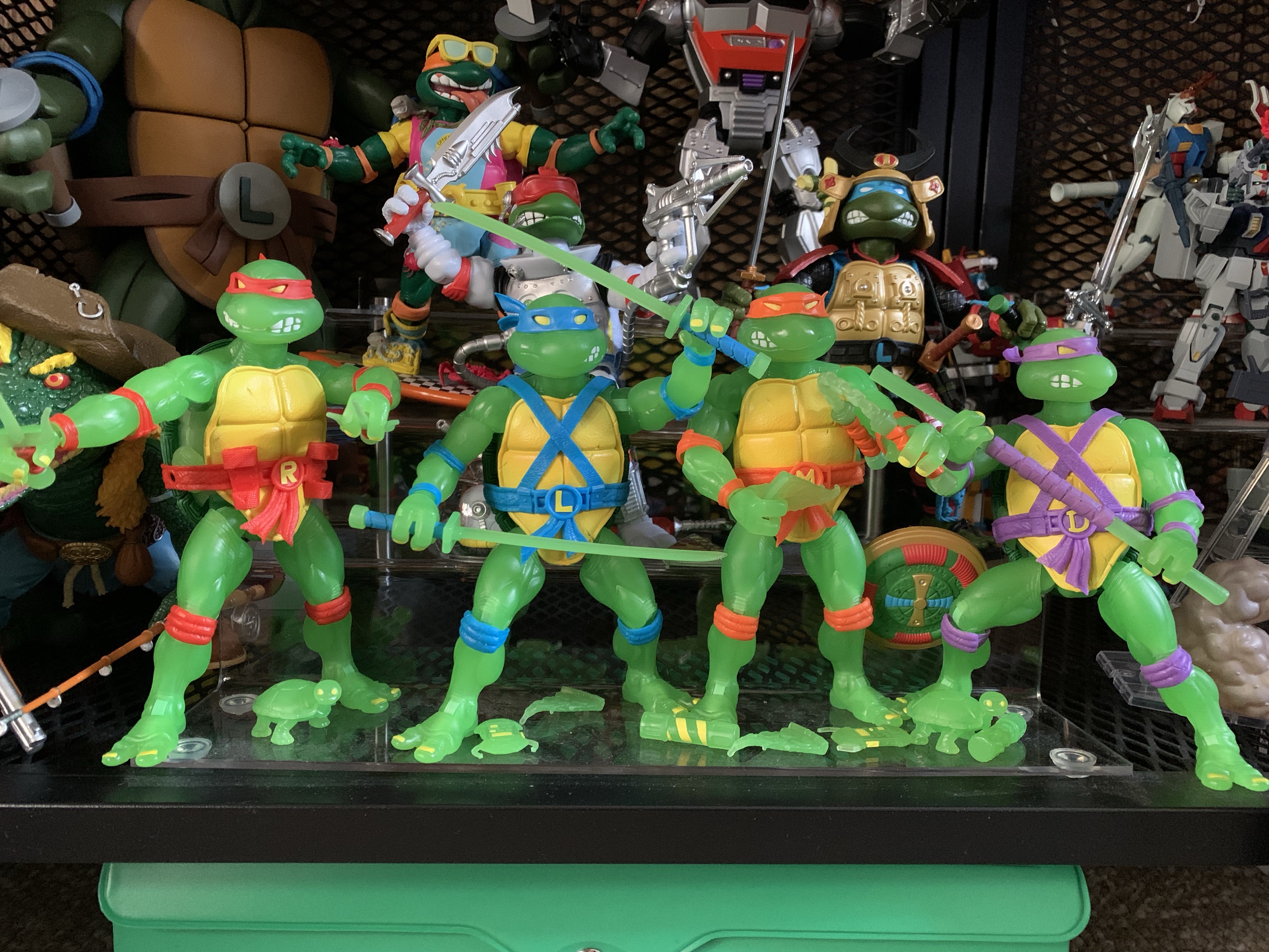
UPDATE – Due to a combination of store credits and clearance events, I was able to complete my set of Mutagen Ooze Turtles by adding Donatello, Raphael, and Michelangelo. I considered doing a review for each, but since each figure is essentially the same (and is already just a variant of figures I already reviewed) I figured a simple update was warranted. In short, if you like one of these then you’ll like all four. They come with the same accessories and hands and the only thing separating the figures is the unique weapon, head sculpts, and colored belts and pads. Pretty standard stuff.
Let it glow!
Worth noting, all of my figures have tight heads and getting the secondary heads on will likely require heat. My Raphael has a stuck, left, knee joint as well which is interesting since my Wave 1 Raphael had the exact same issue. Michelangelo only comes with his plastic nunchaku, not the ones with real chain links, which I get, but is a bummer. Maybe they could have done a plastic chain in glow-in-the-dark plastic instead? The plastic ones are very rigid and don’t pose well. That’s really the only differences worth pointing out though. My only other gripe with these would be that Raph’s accents look more red-orange than red to me, but also see what they were going for with the shades used. At $75, these aren’t worth it, but absent the cost they do look pretty cool. If you can find some on-sale (I scored two of them at Macy’s, of all places) and you think they look cool then I say go for it. Big Bad Toy Store still has these and did not make them part of a huge clearance event in November 2023, but maybe that will happen eventually? Some other smaller shops (like ecollectibles) also were allowed to stock these and have them discounted so shop around, see what you can find, and grab ’em if you want ’em.
If you ask me what my most cherished childhood toy was I won’t hesitate to answer Leonardo. My original Playmates Leonardo was a figure I adored and played with for years. I would get other Leonardo action figures, but they were always a temporary joy. When I sat down to act out and play with…
Well, after looking at the Wave 6 Slash a couple of weeks ago we can now finally turn our attention to a Wave 5 release from Super7’s line of Teenage Mutant Ninja Turtles Ultimates! series of figures: Sewer Samurai Leonardo. The thing with TMNT is, you have the four good guys, a few core allies,…
It’s been over 9 months since I last reviewed a figure from Super7’s line of Teenage Mutant Ninja Turtles action figures. That figure was Muckman, and I actually waited on that one a little while because I ordered through Big Bad Toy Store and wanted my pile of loot to fill up a bit. Had…
When NECA started down the path of Teenage Mutant Ninja Turtles with the 2008 release of the four titular characters, it didn’t go very far. After the turtles came April, but as a convention exclusive, and then nothing else. It would be years before their Shredder, which was shown off at the very same convention April was released at, was released as a con exclusive himself along with three of his henchmen. And it seemed to take the success of the eventual cartoon and movie lines that pushed NECA to go back to the original comics. It’s been an interesting line as it started with perhaps less-requested characters with the Fugitoid and Renet, but now we’re getting to those heavy hitters fans were dreaming of fifteen years ago. And some of those heavy hitters come in pint-sized packages like the beloved Master Splinter.
He’s a little guy.
Splinter sets the bar as shortest figure in the line. Coming in at a tidy 3.5″, he’s very much a little guy. Especially when placed with the recently released turtle four-pack who are taller and bulkier than the 2008 figures. I said he comes in a pint-sized package, but that was an embelleshment on my part as the actual box he’s in is the same as most of the other single releases. It features new art by Kevin Eastman which matches the look of the figure pretty well. My memory is a bit fuzzy, but I do believe first appearance Splinter in the books was a bit more fuzzy and frayed looking than the figure here, but that would be very hard to pull-off in plastic.
If you prefer your Splinter with the 08 versions.
He apparently got a boost in size when making the leap to animation.“You have got to be kidding me.”
I noted Splinter is 3.5″ tall, but I should add that is in his neutral stance which features bent knees. It’s basically how he came out of the box and how he likely should be posed, but someone who wanted him to be taller for the sake of being taller could get a little more out of him. He’s sculpted all in brown plastic with a lot of black dry brushing over him. The black is heaviest on the top of his snout and extends to around his eyes which creates a striking portrait. It’s a solid approximation of the comic art and if there’s anything I think could have been done better with the sculpt and paint it’s the claws on Splinter’s hands and feet. They’re a bit soft in sculpt and all brown so they just blend into the fingers and toes. It matches the art on the box so I can’t knock the figure for its accuracy, it’s just one of those design choices that works better in print than sculpt.
This is probably a better foe for the sensei.
The shading on the figure covers the entire body, but it’s almost irrelevant since Splinter features a soft goods robe. Just like his cartoon and movie counterpart, the robe is wrapped around him and fastened with a brown ribbon. It’s a maroon color and it looks fine. It’s a lot of material and a little frumpy looking. It might have been neat to see it look a little more worn since this is a rat who lives in the sewer. I don’t like the ribbon used for the belt as it just doesn’t look like any belt one would expect a robe to fastened with. It’s a criticism I had for the movie and cartoon Splinter. A piece of stretchy material, like the additional belt on the Foot and Shredder movie figures, with a knot glued onto it would have been my preference, but it’s fine.
Since he doesn’t have much, Splinter gets all of the pre-mutated guys and some ooze too.
The figure, despite being small, has most of the same articulation one would expect of a NECA figure. The head feels like it’s on a double ball peg and it has great range in all directions. The shoulders are ball-hinged and can raise out to the side fine, but rotation is going to be limited by the robe. It’s something that can be worked around though as that’s the benefit of the robe being slightly oversized. The elbows are single-hinged with a swivel and will bend to 90 degrees. The wrists swivel and hinge horizontally as well. In the torso is a diaphragm joint that feels like a ball-joint, it could be a double, but you get rotation, a little forward “crunch,” and some tilt. The hips are ball-jointed and can go out to the side for splits. They kick back rather far, but not really forward a whole lot. There’s a little thigh pivot and the knees are single-hinged and swivel. You do get about a 90 degree bend at the knee, but again, he’s meant to stand with his knees bent to about 45 degrees so the practical range is limited. The ankles hinge and pivot with the ankle rocker being a bit flat, but functional. The tail is connected via a hinged ball peg so you get rotation and the hinge can direct it a bit. The tail itself is also bendy, though the wire only goes about halfway through it so it’s a bit limited.
And he also comes with this guy.
Splinter has decent articulation, though it’s hard to argue that he’s not meant to mostly just stand there on your shelf. He can hit a few battle ready poses and also stand on one foot if you want to place him in a side-kicking pose. I’m a little surprised that NECA did not include an articulated jaw as they did with the cartoon Splinter, but I don’t hate the exclusion. The profile looks good so if they felt they couldn’t get that joint in there without harming the presentation then that’s a decision I support. I only mention it as some may have expected it based on past versions of the character and may miss it.
The old and the new. The Utrom on the left came in the Foot four-pack and the turtle on the far right came with the 08 figures.
Since Splinter is such a small figure, he does come with a pretty robust assortment of accessories to justify his price tag. Big figures cost more money for both NECA and the consumer, but that rarely applies to small figures. To get more plastic into this, Splinter comes with three sets of hands: relaxed, gripping, and pointing. The gripping hands have the less desireable horizontal hinge. I’m surprised we didn’t get flat, chop, styled hands as well. Splinter also has his walking stick and that he can grasp with the gripping hands or the relaxed hands. The relaxed hands can also rest on top of the stick too so you have some options when posing him with it. There’s a small tea kettle with articulated handle and a little cup to go with it. The kettle has some nice black linework on it while the cup is blank. Splinter can hold the kettle by the handle and palm the cup well and it’s a nice little pair of accessories. I do wish NECA had ripped-off Super7 and included a steaming effect for the cup, but it’s fine as-is.
Cartoon Splinter is bigger than comic Splinter, but the opposite is true for the Mouser.
Those are the accessories for Splinter, the rest are basically extra characters. Up first is a brand new Mouser. It’s painted all in gray with some light blue shading on it to create a metallic effect that looks really nice. It’s also covered in the usual black linework and looks rather sharp. As far as I know, the entire sculpt is brand new as it doesn’t share any parts with the cartoon Mouser. If it shares any parts with the Mouser released back in 2008 I’m not sure as I don’t have any of those. It functions just like the toon one with an articulated jaw that features a fully-sculpted interior, hinge at the base of the head, ball-jointed neck which allows for a lot of rotation and tilt, leg swivel, hinged knee, and hinged ankle. The hinged joints in the legs are plenty tight so the figure has no trouble standing and overall it’s a nice addition that I’m sure collectors will want more of.
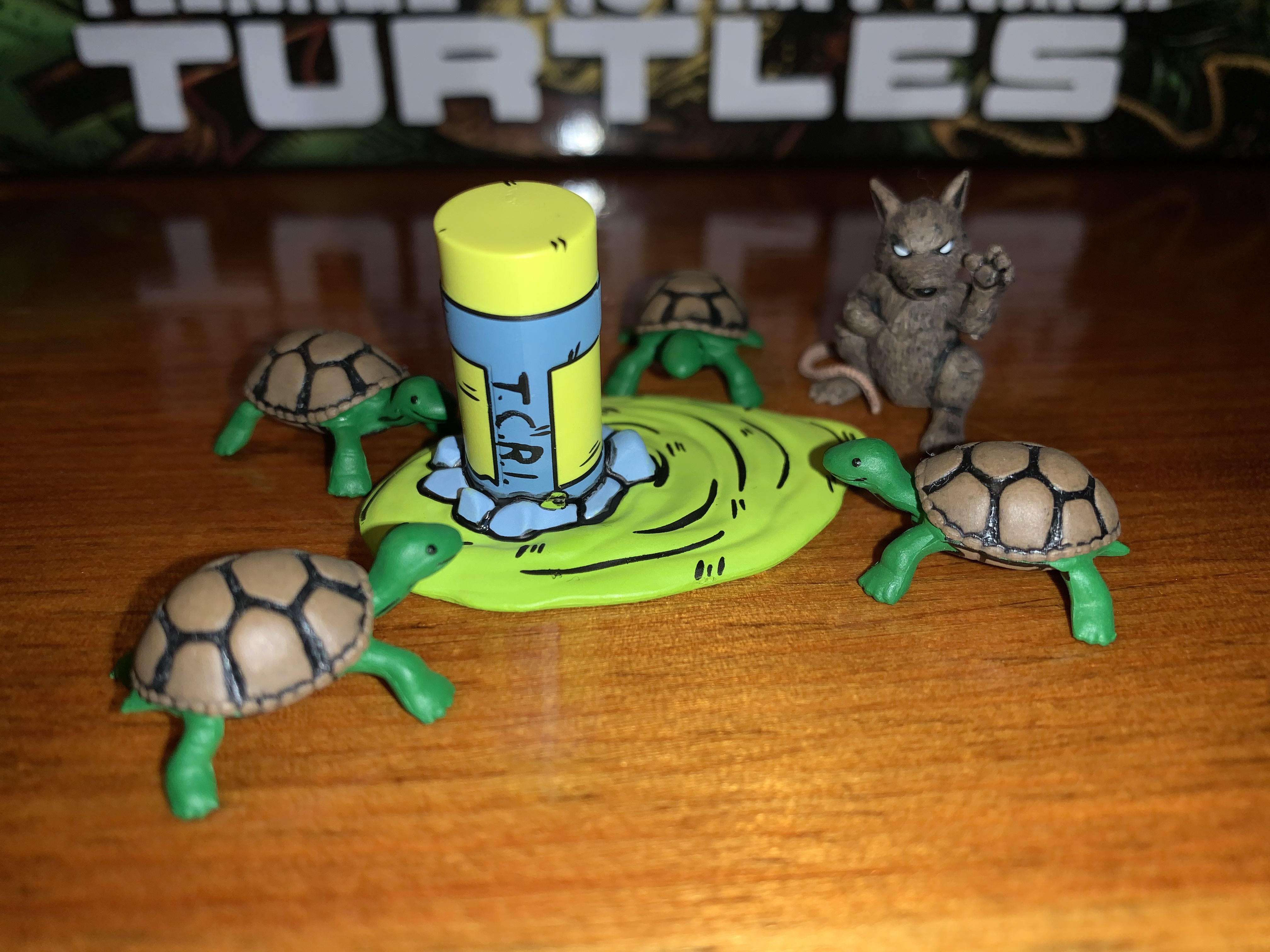
Who’s for tea?
Splinter also comes with an assortment of slug figures for accessories. We get a new Utrom that has more of a surprised expression on its face. It’s very close in size to the previously released stand-alone Utrom that came in the Shredder convention set, it just drops the articulation entirely. It’s well-painted with a lot of dry-brushing that makes it look dirty and gross. We also get a pre-mutated Splinter that’s in sort of a martial arts pose. To go with him are four, baby, turtles. Stylistically, they’re very similar to the pre-mutated turtles the 2008 figures came with, but they’re all new sculpts and noticeably smaller. They’re nicely painted and they almost look like they’re smiling so they bring a cute factor to the package. The last item is the broken cannister of ooze. It’s a new sculpt and it’s basically upside down with a big puddle of the stuff spreading out from it. It serves to create a nice little display with the other slug characters and I prefer it to just a plain cannister.
“Michelangelo! You have neglected your training for too long!”
And that’s NECA’s take on Splinter. It’s a small figure with a bunch of stuff that NECA hopes will offset the price of the figure. I got my figure at Target where it retails for $37 which is about the same price as figures like Jagwar and Dreadmon, but less than Zog and the Shredder clones. Is $37 too much? It’s hard to blame folks who feel like it is. The added accessories are nice, but would I trade some of them to knock this release down to $30? Sure. As for the figure itself, I think it gets the job done. I think it could have more hands and a better belt, but this Splinter will look nice on your Mirage Studios shelf which is rapidly becoming shelves in many collections. It’s an essential release if you’re a TMNT Mirage collector, and if you can stomach the price I think you’ll be happy enough.
Fancy yourself a collector of NECA’s TMNT Mirage line? Here’s some more reviews to take a look at:
Haulathon 2023 has brought some pretty big releases to NECA’s line of Teenage Mutant Ninja Turtles action figures. And I mean big in a literal sense. REX-1 was tall and hefty and the multi-armed clone of Shredder was no slouch either. Those two seem to pale in comparison to Zog, the Triceraton warrior from NECA’s…
NECA and Target’s Haulathon event which has seen a vast assortment of product dumped onto shelves recently was not content to limit the products to just the cartoon Teenage Mutant Ninja Turtles. Far from it, as an assortment of comic book based characters were also released and today we’re going to look at the first…
Where there be turtles, there be Casey Jones – the bad ass vigilante of New York City! Casey was an early addition to the comics and he’s basically been included with every iteration of Teenage Mutant Ninja Turtles since. And in all of them he tends to wear a hockey mask and bludgeons bad guys…
When it comes to the popularity of Teenage Mutant Ninja Turtles a lot of the credit goes to Playmates Toys. Kevin Eastman and Peter Laird created the characters born out of a joke. Credit them for having the vision to think this joke had appeal beyond their small circle as they self-published Teenage Mutant Ninja Turtles in 1984. It was basically perfect timing from there as the product quickly got the attention of Mark Freedman and his Surge Licensing brand which, much like Mirage Studios, existed largely in name only. He saw the property’s potential as a kid’s product and was able to get Eastman and Laird to grant him permission to shop the IP to toy companies. Aside from a prototype created for Mattel, no major producer bit, except for Playmates. Known more as a doll company, Playmates wanted to get into the action figure business and took a chance on the franchise. They co-developed a television mini series with Fred Wolf to help sell the toys, and the rest is history.
New artwork from TMNT co-creator Kevin Eastman!
A nice window box to show you what’s inside.
Because of that early involvement and ridiculous level of success, Playmates has been intertwined with the TMNT franchise ever since. And for a long time, they were the only ones to make action figures based on the property. Then, in 2008, NECA Toys released it’s own version of the brothers. Marketed to collectors and sold outside the usual avenues occupied by Playmates, NECA sent to market a version of the turtles that had never really been done before in toy form. Based on their original appearance in Teenage Mutant Ninja Turtles #1, the turtles hit retail with hopes of more Mirage inspired characters to follow. Then, it stopped. Details are murky, but some have blamed Playmates for stepping in and essentially squashing the toy line by exercising its contractual rights as the master toy license holder. It also could have just been poor sales. NECA’s Randy Falk indicated years ago that the comic turtles weren’t big sellers. Anecdotal evidence suggests he may be correct as I personally can recall seeing both the standard issue and black and white variants hanging around comic shops for years and only finally vanishing after hitting clearance. It’s possible NECA was just a little too early and TMNT nostalgia just wasn’t ready to take off in 2008. Only a select few know for sure why the line was ultimately cancelled.
The biggest weakness of this set is the amount of stuff in the box.
Flash-forward 15 years later and NECA is back with a new iteration of the Mirage Studios Teenage Mutant Ninja Turtles. If fans weren’t ready for turtle nostalgia in 2008, they certainly are now. The property is now owned by Viacom who has wielded its mighty powers to loosen the toy license and we’re basically swimming in TMNT action figures from various companies. And since then, those 2008 figures have become far more sought after. Where once they could be had for clearance prices, they now command over 100 dollars a piece on the secondary market. This helped turn them into a magnet for bootleggers and some have even suggested that the physical molds were swiped from whatever factory NECA had been using. If NECA felt their dance with TMNT was over, it’s possible they let them go. Either way, because of a desire to do something different or because the figures have been bootlegged to hell and back, NECA decided to forego ever reissuing them. Instead, they opted to do new turtles based on later issues and for fans who have been dying to get ahold of some affordable Mirage turtles their wait is finally over.
If you’re wondering the answer is “No,” the arm, blaster, thing does not fit on the new turtles.
These old figures have some outdated engineering, but still look pretty damn cool.
The original 2008 figures have commonly been referred to as the Peter Laird turtles by fans. That’s likely due to Laird being the one who worked with NECA at the time when they were in development. They also seem to clearly be based on a singular image from the first issue which has been credited to Laird over the years. I have no idea how much of that is true as Eastman and Laird had a unique drawing style in which the two literally drew the same issue switching off in an unconventional manner as they passed papers back and forth. That’s why it’s just easier to consider them first appearance turtles. As the franchise took off, Eastman and Laird moved to the business side and away from doing the actual art which allowed for other artists to come into the fold. One such artist was Jim Lawson, who would go on to do pencils for a number of TMNT books. Initially, his take on the turtles was to emulate what Eastman and Laird had settled on when he stepped in while adding a little of his own influence. Eastman and Laird both loved Lawson’s work and have heaped praise upon it over the years. With their encouragement, he brought more of his own style into the books which can easily be seen during the City at War arc. His turtles were rather blocky, their heads almost resembling inverted mushrooms, and it’s that style that I think most comic book fans associate with the name Jim Lawson.
My attempt at recreating the TMNT #4 cover. Most know that as the cover to the first NES game.
For this release, NECA hired Paul Harding as the sculptor and directed him to design the turtles based on Lawson’s art, but not his later work as seen with City at War, but his earlier stuff when he first started on the book. Because of that, this set is being marketed as the Return to New York Turtles, though Harding clarified on Twitter that he didn’t expressly design them based on that story. It’s an appropriate shorthand though to place these figures into an era of the original comics. NECA’s approach to comic figures, unlike some companies, is to be very stylized and to try and emulate a certain artist’s approach rather than adapt a character from a generic model sheet or reference material. American comics have almost always allowed for an artist to imprint their own style onto established characters and such can be seen across basically all of the major comic books published by the likes of Marvel and DC. It’s both a cool approach for fans and a wise one for a toy producer since it opens up the possibility to re-release popular characters like the turtles over and over with slightly different looks.
I love how NECA handled the deco on Leo’s swords.
With all of that background out of the way, lets finally talk toys! This long-awaited NECA four-pack has recently started showing up at Target and was even sold online via Target’s website on June 25th. It seems like Target may have actually purchased stock from NECA for this release in contrast with the usual vendor-driven system they usually have in place for NECA. That’s likely due to this being timed with the drop of new toys by Playmates for the upcoming Mutant Mayhem film and because this release is the actual turtles, not some obscure side character that could possibly shelf-warm. This set will sell, even at the steep price of $150. The real question is – is this worth that steep price? If you’ve been waiting years to get a set of official Mirage turtles, that answer might be an easy “Yes” regardless of how this set turned out. If you are like me and have those 08 figures, or maybe even bootlegs you’re happy with, do you need to drop a bunch of money on yet another set of turtles? Read on.
Don’t mess with this pair.
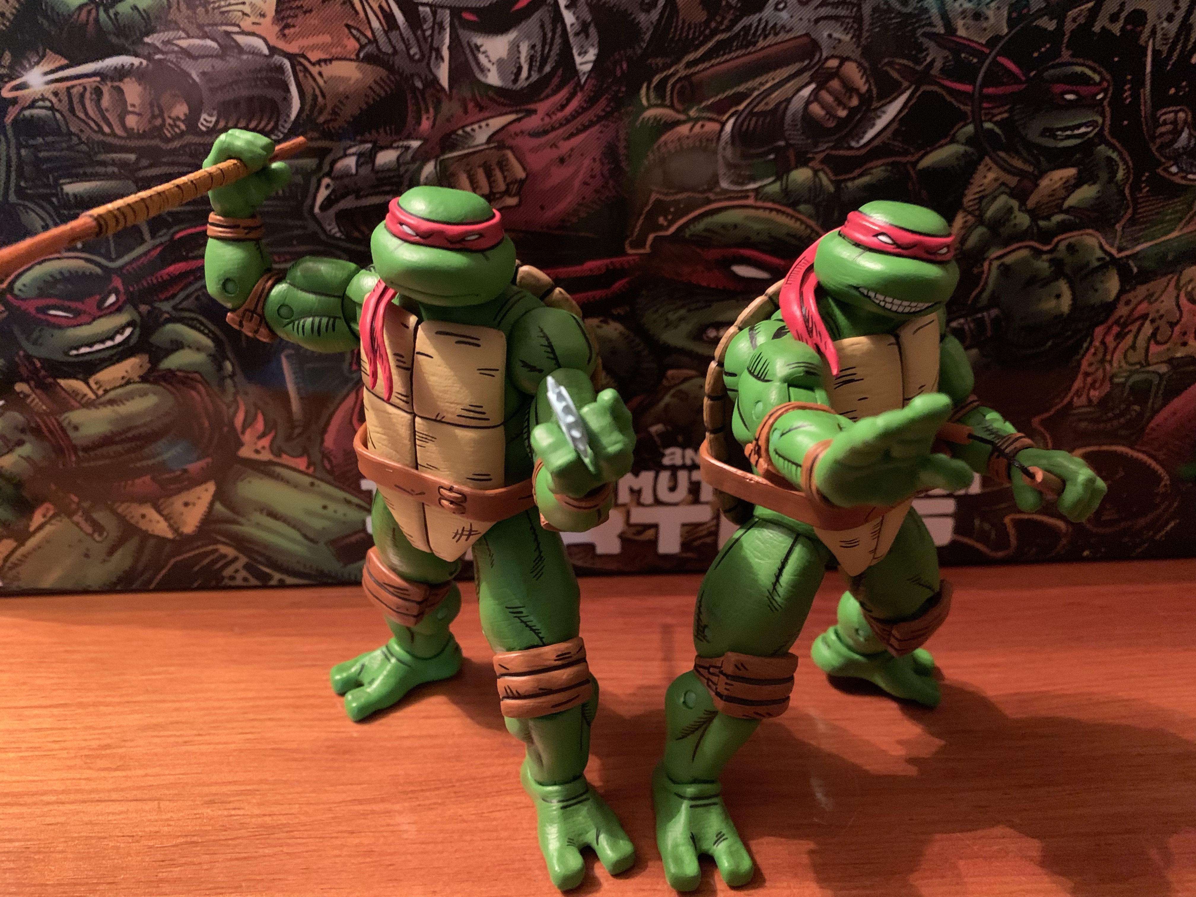
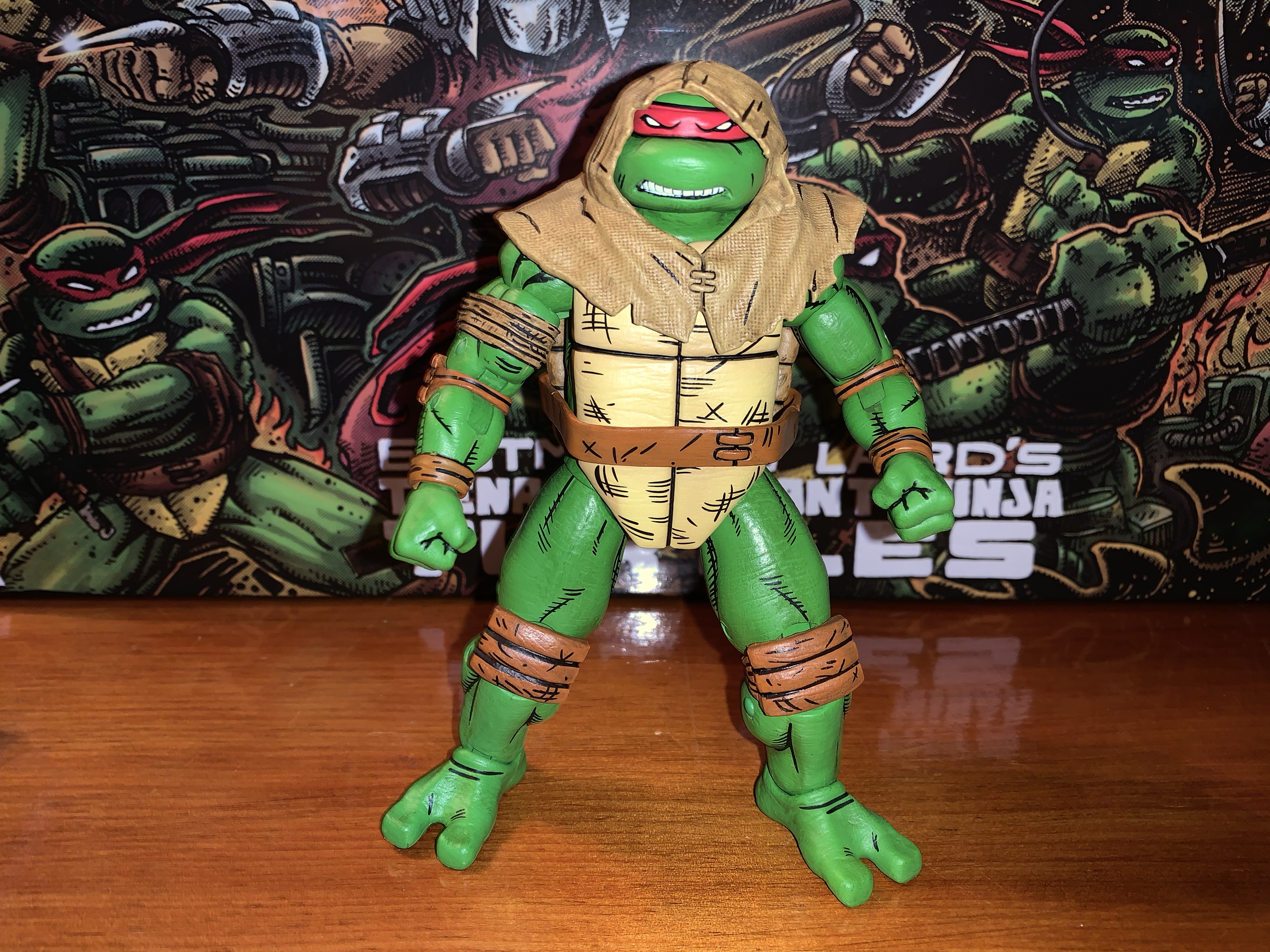
The turtles come packaged in what is essentially NECA’s standard four-pack box. It’s an oversized version of the Ultimates, or Deluxe, releases with a front flap and window on the package. It’s adorned with new artwork by Kevin Eastman which looks great. This is the type of box that will display well for you in-box collectors. For the rest of you, you probably only care about the contents. Each turtle is on the same buck so you basically have four nearly identical figures inside. The main difference between each is the headsculpt which just features a different expression for each turtle. Since this is a Mirage set, they’re all in red bandanas with brown straps and pads giving them a very uniform look. There’s also a different deco applied to the plastron of each figure with Raph’s featuring the most “scuffs” than the other three. They’re done with black lines as opposed to being sculpted in.
The Mirage line has been rapidly expanding over the past year.
The turtles stand at approximately 5.875″ in height. They’re quite chunky in appearance and fully-painted in a fairly neutral shade of green with lots of black linework to emulate the comic art. The linework is present on the pads, bandana, and belt and really sells the look well. It’s all relatively clean and consistent across the board. The only area I see as being a bit uneven is the linework around the bandanas. On a shelf, it’s fine, but up close there are some parts where there’s a smidge of green in-between the black line and the start of the red mask. My Michelangelo also has what looks like a scuff behind his right eye so there’s a little green showing. My Leonardo also has a speck of brown on his right bicep, but in general, I don’t see much in the way of color transfer throughout the four figures.
The paint is acceptable as is the level of quality control present throughout my set. Harding did a really good job of honing in on a design style for the turtles and capturing that with his sculpt. The only thing I personally would have changed are the legs which look really chunky. I think they could have been shrunk as the calf muscles basically extend outside the profile of the thigh muscles. That’s more of a subjective critique though than an objective one as these look quite close to the source material from what I can tell.
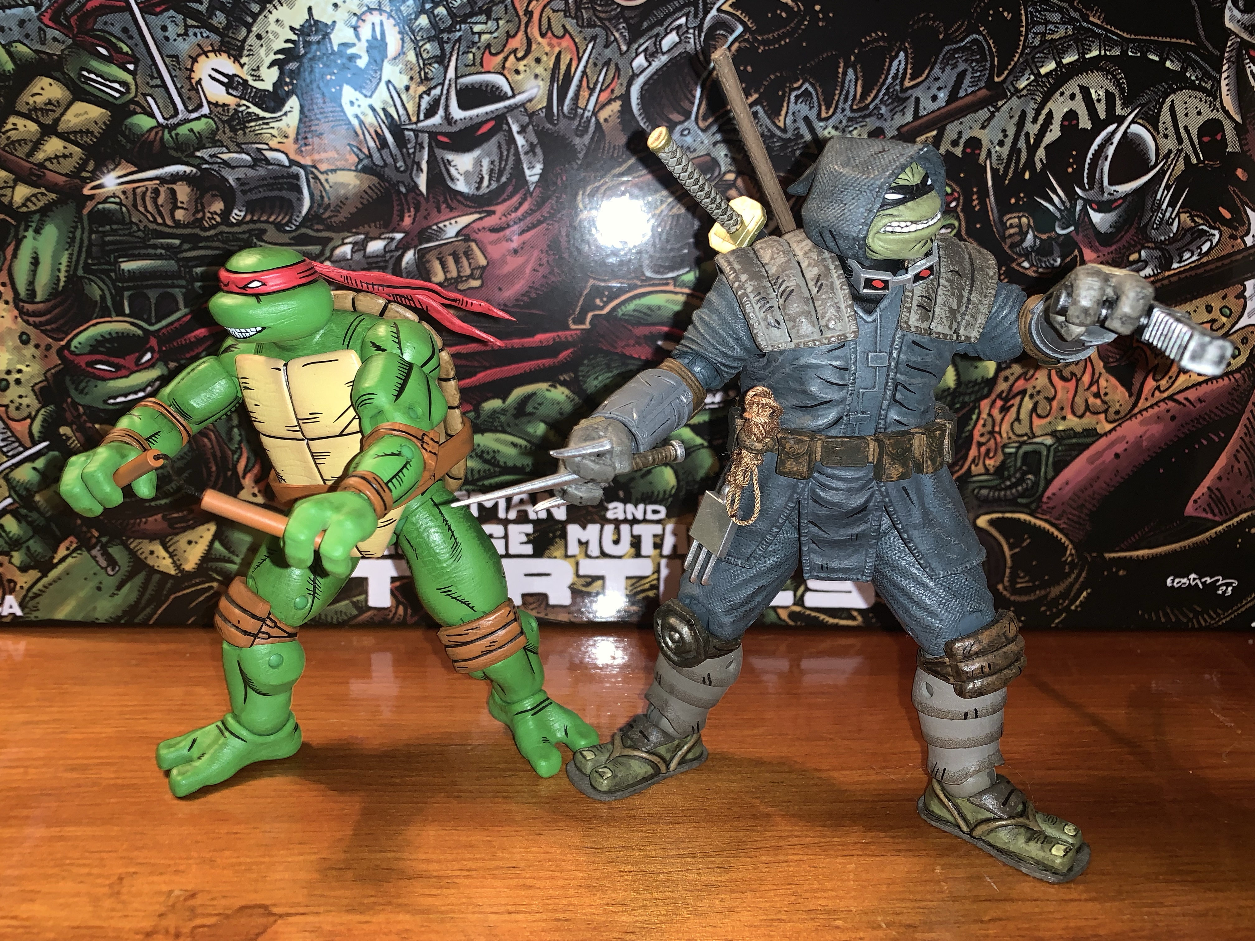
Shredder is looking a bit dated by comparison.
I think these figures are pretty much a homerun from a presentation point-of-view and that’s definitely where NECA’s strong suit lies. Where it often does not is with articulation, and these guys aren’t necessarily bad, but they’re not likely to wow anyone. Since the figures are essentially the same, they articulate the same as well. The heads are on a double ball peg (and in case you ever mix-up the heads, they’re stamped with the character’s initial inside) and the range is solid looking up, down, and all around. The shoulders are hinged-ball pegs and they can’t quite raise out to the side all the way. They rotate fine until they hit the shell, and past that is a biceps swivel. This joint was the only joint I had any issues with as 7 out of the 9 biceps joints in my set were stuck. I used the hot water to cold water method to get all of them working. The peg for the joint is pretty snug so I also pulled out a little before twisting and it required a pretty forceful twist. The peg is rather thick, so it should be pretty durable, but if you leave the joint in a hot water bath for too long and then try to twist it you could shear it off, so be careful. Once I essentially broke the seal on the joint it was fine.
Despite that, he still looks pretty good opposite these figures.
With that out of the way, the elbows are the next spot and NECA opted for double-joints this time. This is a welcomed addition as the cartoon turtles feature hinged pegs for the elbows and I wasn’t sure what to expect with these. The addition is worthwhile too as they can bend past 90 degrees at the joint. The wrists swivel and feature horizontal hinges. There are no vertical hinged hands in this set at all. That’s disappointing as the toon turtles had vertical hinges for the hands. The Turtles in Disguise set I believe came with two sets of vertical gripping hands, and this continues to be a problem with NECA. Where they once did a decent job of including the proper hinge, they seem to have essentially abandoned it for TMNT. Gargoyles characters get it, so I don’t understand the oversight. This is a set where essentially one set of tools creates four figures and it’s also something they’re likely to reissue many times so the fact that they couldn’t find it in the budget is absurd to me. It’s my biggest pet peeve with NECA of late.
For those who would like a more direct comparison.
At least at the waist we get an improvement over the 2008 turtles. NECA included a waist twist which they set fairly high behind the plastron to conceal it. It’s not going to provide the same amount of range a waist twist would with a non-shelled character, but it works all right. NECA added a “diaper” over the hips as well, but it doesn’t seem to get in the way. It does have the tendency to shift a bit though and my Leonardo has more of the part visible on his right leg than his left by quite a bit. The legs can kick forward past 90 degrees before the leg wants to go off to the side while the shell keeps them from kicking back. They also can hit a split. After that it’s pretty typical as we get a pivot point for the thighs where the ball connects with double-jointed knees past that which bend just a touch beyond 90 degrees. The ankles have the hinge and rocker setup, though the chunky nature of the ankles does restrict some of the range, but there should be enough to keep your figures flat-footed in most stances. These guys also have tails and there is a swivel point there if you want it. The bandana tassel also pegs in, and while it doesn’t really spin freely, you can reposition it if you want by removing it and re-inserting it even if you can’t get it to swivel.
Nothing is stopping you from swapping heads, but the default is (Clockwise from top left): Leonardo, Donatello, Michelangelo, Raphael.
The level of articulation is acceptable, aside from the lack of proper hinges for the gripping hands. Where this set surprises in the wrong way is with the accessories. If you have the Turtles in Disguise set or most of the other four-packs NECA has done over the past few years then you’re accustomed to getting a bunch of stuff in these boxes. With these turtles, despite the amount of tooling needed to produce these guys, we don’t really have much. Each turtle comes with a set of gripping hands out of the box, and then there is one set of fists, open hands, style pose hands, and gripping hands with more space between the fingers. Those hands are intended for use with Raphael when he grips his sai with the middle blade going through his fingers. Since it’s four sets the boys have to share, you can’t have all four turtles with their hands in a style pose or chop. There’s at least an entire set of four alternate bandana tassels that can be swapped in and out. The figures come with the bandana draped over their right shoulder and each one has a straight bandana piece to swap to.
There may not be a ton in the box, but at least they didn’t screw up the weapons.
Of course, the main accessories are the weapons. Each turtle has his signature weapons and they all appear to be new sculpts. For Leo and Raph, the metal portions of their weapons are painted the way I’ve wanted metal to be done for a long time now: white with light blue shading. It looks so good and is much better than the flat gray so many companies use. Even the very expensive Mondo sixth scale Wolverine has flat gray claws. I attribute it to the idea of metal being white as “wrong” since we know it isn’t white in real life, but that’s how it often looks in print or in animation. With Leo, the effect is perfect, though with Raph the blue shading is basically all over. I think if they did it exactly how they did Leo’s katana it would have turned out better, but it’s minor. Mikey’s nunchaku are done similar to the movie figures with brown, plastic, handles connected via black thread. Donnie’s bo is done in an orange-brown with a slightly lighter brown wrap, which is an interesting choice. Perhaps an off-white would have contrasted more, but basically every Donatello figure does that with his signature weapon so I don’t mind the difference. There’s also three gear-like throwing weapons included painted in the same light blue as Raph’s sai and the shading on Leo’s katana. Why three instead of four? It’s an odd choice, but one I can’t get too worked up over since I’m not going to use these anyway.
You get three of these buzz saw things, if that’s something that interests you.
Lastly, we get a couple of accessories that are specific to Raph from the comics. His bandaged right arm is included as a swappable piece, but since all four turtles are the same mold, it can actually work with any turtle. The right arm pops off easily (the left does not) to facilitate swapping. The bicep was stuck on this arm as well, but I was able to free it up. Also included is Raph’s hood which is done in a soft plastic. It slides over his head easily after you remove the bandana piece and it’s a cool look for him. There’s a texture to the hood that helps sell the illusion it’s made from a rough fabric and it has some black linework as well. It looks good enough that I think I’m going to use this for my display since it does break things up a bit.
Raph’s sneaking outfit is the most substantial accessory. Since all four turtles are essentially the same, they can all wear this thing and the right arm on all four pops off with ease.
That’s it though. Four extra sets of hands for four figures, an extra set of bandana pieces, three throwing weapons, and Raph’s hood and arm. The melee weapons are a given because every set of turtles needs to include those, but why so skimpy on the hands? How about an extra head for each turtle? Especially since they’d function as an extra head for any turtle given they all look the same. With so many shared parts and the high price tag of $150, it feels light. It’s like we’re paying an undisclosed “Turtle Tax” since this is a set NECA knows will be in high demand and can make a larger profit on. Maybe I’m completely wrong and the profit margin is unchanged from past four-packs. And maybe I’m just still salty about the lack of vertically hinged hands.
“All right, Round Head, let’s go bust some skulls!”
Basically, what I said several paragraphs ago is what applies most here: if you’ve been waiting years for a set of Mirage turtles then you’re going to get this set. And you’re probably going to be relatively happy with the outcome. The figures are fun to handle and pose and look great together. I think they pair well with most of the other Mirage releases, though placing them with Shredder does make me wish we had a beefier Shredder for them to fight. They’ll look great with Zog though or the Shredder clones or even just off on their own. In spite of the inflated price point, I do think they’re worth getting even for those who have the original Mirage turtles given the difference in style.
I figured I’d end on a pic of these two, for no particular reason…
If you’re on the hunt for these boys you can keep an eye on Target’s website. Set alerts for if they come back in stock as you never know. They also have shipped in waves to Target stores so keep checking there. If your store is like mine, they’re being stocked on an endcap in the toys section rather than in the usual NECA section. Since these are a Mirage release, it also stands to reason they’ll be sold in other places after this initial Target run is over. NECA hasn’t come out and said that, but it would be crazy for them not to make the actual turtles available to as many customers as possible.
A dozen years ago, toy company NECA dipped its toe into the world of Teenage Mutant Ninja Turtles for the first time, and shockingly it failed to stick around. That’s incredible to hear for collectors currently chasing down Bebop and Rocksteady at Target, but it’s the truth. There are a lot of folks at NECA…
Haulathon 2023 has brought some pretty big releases to NECA’s line of Teenage Mutant Ninja Turtles action figures. And I mean big in a literal sense. REX-1 was tall and hefty and the multi-armed clone of Shredder was no slouch either. Those two seem to pale in comparison to Zog, the Triceraton warrior from NECA’s…
NECA and Target’s Haulathon event which has seen a vast assortment of product dumped onto shelves recently was not content to limit the products to just the cartoon Teenage Mutant Ninja Turtles. Far from it, as an assortment of comic book based characters were also released and today we’re going to look at the first…
Is this it? Have I finally hit the point where my Teenage Mutant Ninja Turtle toy collecting is out of control? It just might be, for today we have Donatello’s Portable Portal Generator, the latest piece from NECA’s line of toys based on the vintage cartoon series. And it’s not that this is a bad release or anything, it’s just the sort of thing that I don’t think I would have ever asked for when this line was in its infancy, but here we are.
NECA’s Teenage Mutant Ninja Turtles action figure lines have been hugely successful, especially the one based on the cartoon. TMNT is hot right now and it’s fixing to get even hotter with a new movie on the way. NECA has released basically all of the major characters from the show and now we’re onto the obscure like Bugman and Jersey Red. More are expected to follow, but as the roster of characters fills out even further the company has started to turn its attention towards releases that enhance the display of the collection. We first saw NECA re-release its street diorama, but with a new paint job to accentuate the cartoon world these characters inhabit. The company also last year solicited a Turtle Van which is due out later this year and we also got a peek at a multi-part sewer lair diorama. That was expected to go on-sale last fall, but did not. We’re likely in for an update at San Diego Comic Con on that item, if not sooner.
This is what comes in the box: 3 lenticular images and the frame.
An item that would seemingly exist to complement that diorama release is Donatello’s portable portal generator. If you recall from the show, Donatello was able to reverse engineer the portal Krang possessed and make it smaller leading to various confrontations with extra-dimensional beings. It was probably a pretty easy thing to rely on for story pitches since a number of stories could begin with the premise “Donatello’s portal generator goes haywire and this weird mutant enters their world.” NECA first unveiled this item in promotional shots for other figures and it wasn’t long before collectors were asking how they could get one of their own. Some may have expected it to be a pack-in with a lair set, or maybe even something to include in the recently released accessory set, but for NECA it apparently made more sense to go the stand-alone route. Since it is a bit of an odd item, NECA sold it as a preorder on their website last winter and it’s now arriving in the hands of collectors, so just what is this thing and is it something every TMNT collection needs?
“Donatello! What have you done?!”
The portal (it’s just easier to call it that than by it’s official, very long, name) is really just a lump of sculpted plastic with room for a lenticular insert. It’s roughly 7.5″ tall and nearly a foot long. The maximum depth on the unit is only 2.5″ though so it’s not the space hog it could be. It comes in its own special packaging with artwork from Daniel Elson and Merle Mustard which is evocative of the old VHS releases. The actual piece is well-sculpted and painted all over. It looks just as I remember it from the show. It just doesn’t do anything. There’s a handle on the far side of it that is articulated, but the wheel near the opening for the portal image is non-functioning. It’s just basically a plastic frame with a spot for an insert.
Here is your articulation.
And those inserts number 3. They are lenticular so there’s two images per insert and I assume they’re taken directly from the show. There’s some samurai pigs, sentient vending machines, some odd looking aliens, a tropical setting with Technodrome, Japanese house, and a foreign planet. They all have a third layer on-top that’s the wavy lines the portal would generate before an image of another dimension would appear. I’m surprised we don’t have the option for a screen that’s just those waves. I’m also surprised that there’s only three. It seems like there was a lot of room to create some fun cameos here, but NECA opted not to.
There is no detail on the rear of the unit. I don’t know that there needs to be, but it might matter to some.
That’s it though. One plastic frame and three pieces of lenticular cardstock. The price for this set was $45 plus NECA’s $15 flat-rate shipping. And since this is a NECA store exclusive, you might as well consider the price of the item $60. Ouch. For what it is, it’s nice. It looks the part and will enhance Donatello’s sewer lab should it ever see release. It’s just pretty pricey and there’s no added incentive to get it. I’m surprised NECA didn’t toss-in any trinkets or just something fun into the set or even another Mouser. There’s really no creativity here like an insert with a hand coming through or something more interactive. This is really a case of what you see is what you get and if it’s too much for you then so be it. It’s also admittedly an odd thing to have without the sewer lair as it feels like it has no home. I will do something with it until then, but I don’t know what just yet.
Yeah, that’s not going to work. It’s a shame that NECA wasn’t able to come up with a way for collectors to display figures in the portal.
Since this was solicited quite awhile ago, there’s no option to buy-in any longer. I don’t know if NECA made extra to sell on their website or at conventions, but if you want your very own portable portal generator you’re going to have to head to the secondary market. I have no idea what this will be like there, but I bet some people bought two with the hope of flipping one. There may be an initial surge in price, but I could see this being a losing investment for those hoping to do such a thing as it’s extremely niche. At the same time, it wouldn’t shock me if this is the oddball thing that does end up being pricey a year from now. I definitely don’t expect multiple production runs unless NECA wants to pair it with Donatello’s eventual laboratory so don’t wait too long if you think this is something you need.
Can’t get enough NECA TMNT or think this would work well with other releases then maybe check these out:
We’re well into the cold of winter and spring feels like it’s just around the corner which means it must be time for another NECA Haulathon. Haulathon, if you don’t recall from last year, is basically a tandem promotion between NECA and Target which was just an excuse to get NECA some more visibility in…
It was early last September that NECA made available for pre-order a redesigned version of their Street Scene diorama tailored specifically to fit-in with the company’s growing assortment of action figures based on the animated series Teenage Mutant Ninja Turtles. Fans had been asking for this set for even longer as NECA had been featuring…
It’s been a little while since we had a Turtle Tuesday around here. NECA was keeping me quite busy in March with release after release and really putting a hurting on my wallet. Not only were sets hitting stores, but items were going up on NECA’s website for preorder, all of which require payment upfront.…
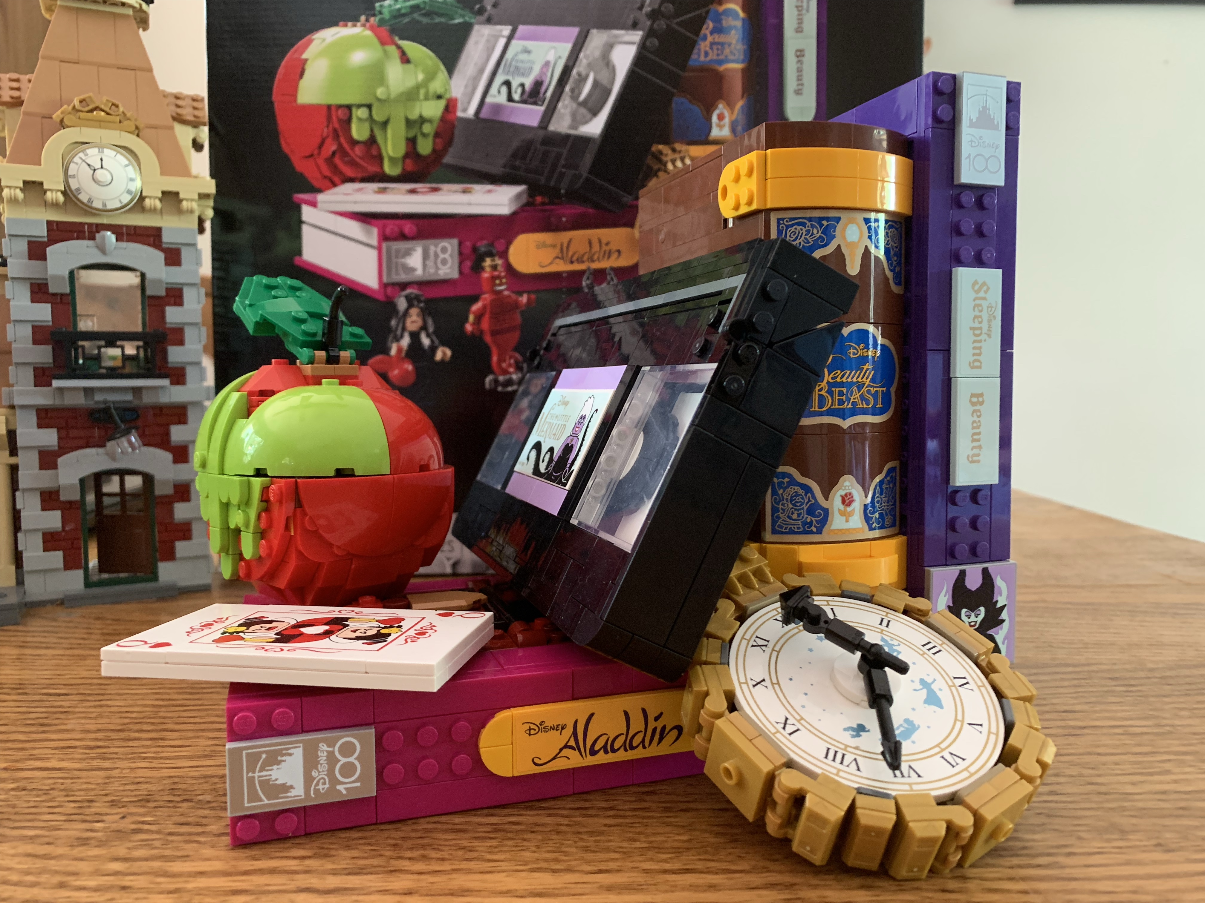
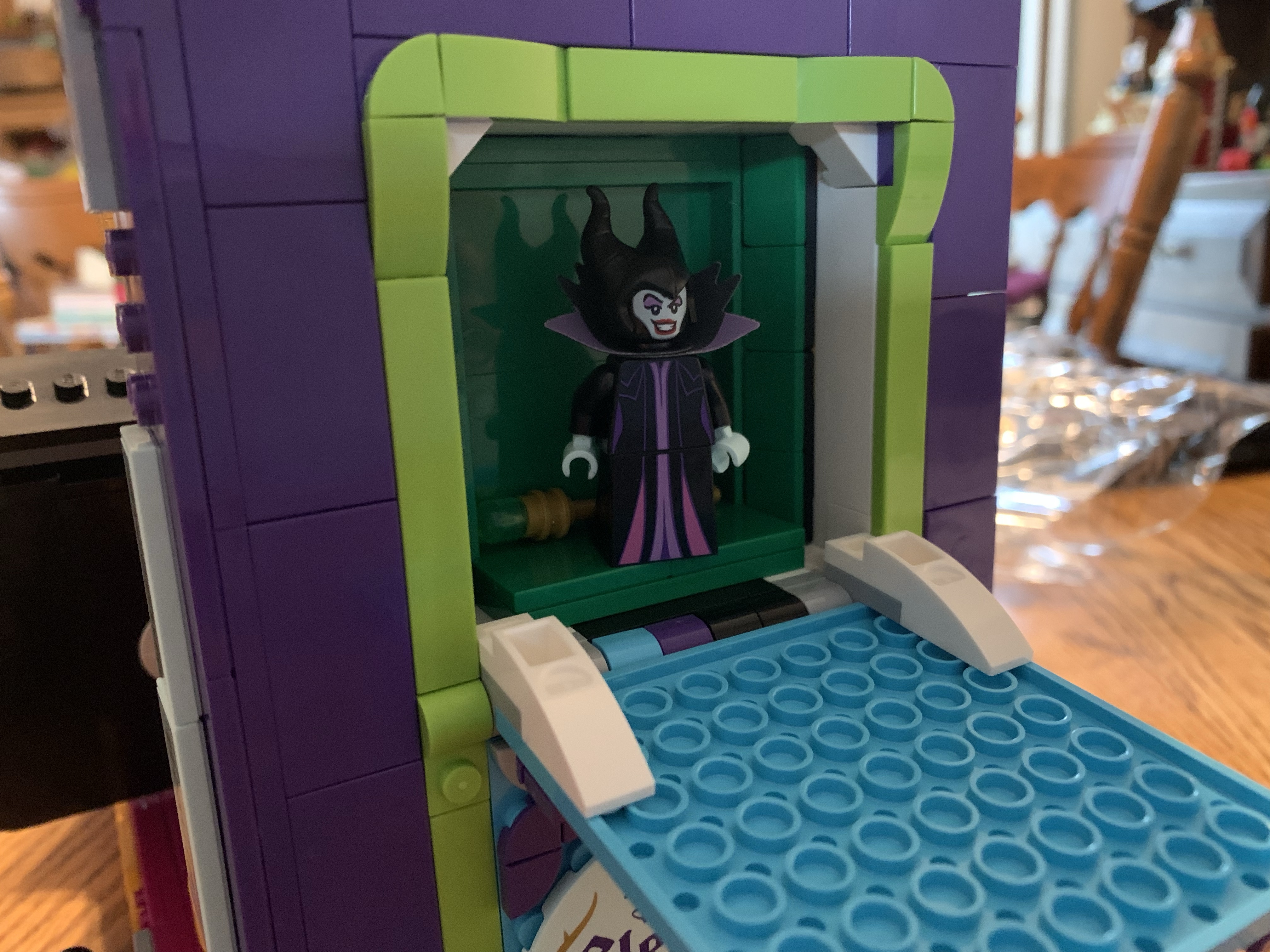
I do love a good Lego set. The problem is, I really don’t have much room for them when I’m done building them. For that reason, I have to be really choosey about what sets I invest in. It basically can’t be just for me, at this point, it has to be something my family likes. That basically narrows things down to Disney and occasional one-offs that everyone loves. And even with Disney, there is stuff I’ve passed on because, again, space! I’ll prioritize anything from the parks, or things that I can find a place for. And that’s what made the new villains set appealing because it’s not that big. At just 1,540 pieces, it’s a modest sized set and it’s designed to be a decorative piece when completed. And since it’s celebrating the villains it had instant appeal.
That tape pretty much steals the show.
Lego 43227 is basically a set of Lego books designed to resemble classic movies from the company with a few other pieces. It comes with 4 mini figures: Maleficent, Gaston, Jafar as a genie, and the Evil Queen as the old hag. Of the four, Maleficent is the only repeat from the mini figure waves. A standard Jafar was in wave two and wave three includes the Evil Queen so this does work with some other figures rather well. The films represented by the structures are the films associated with those characters plus Peter Pan, Alice in Wonderland, and The Little Mermaid (animated).
“I sleep in a drawer.”
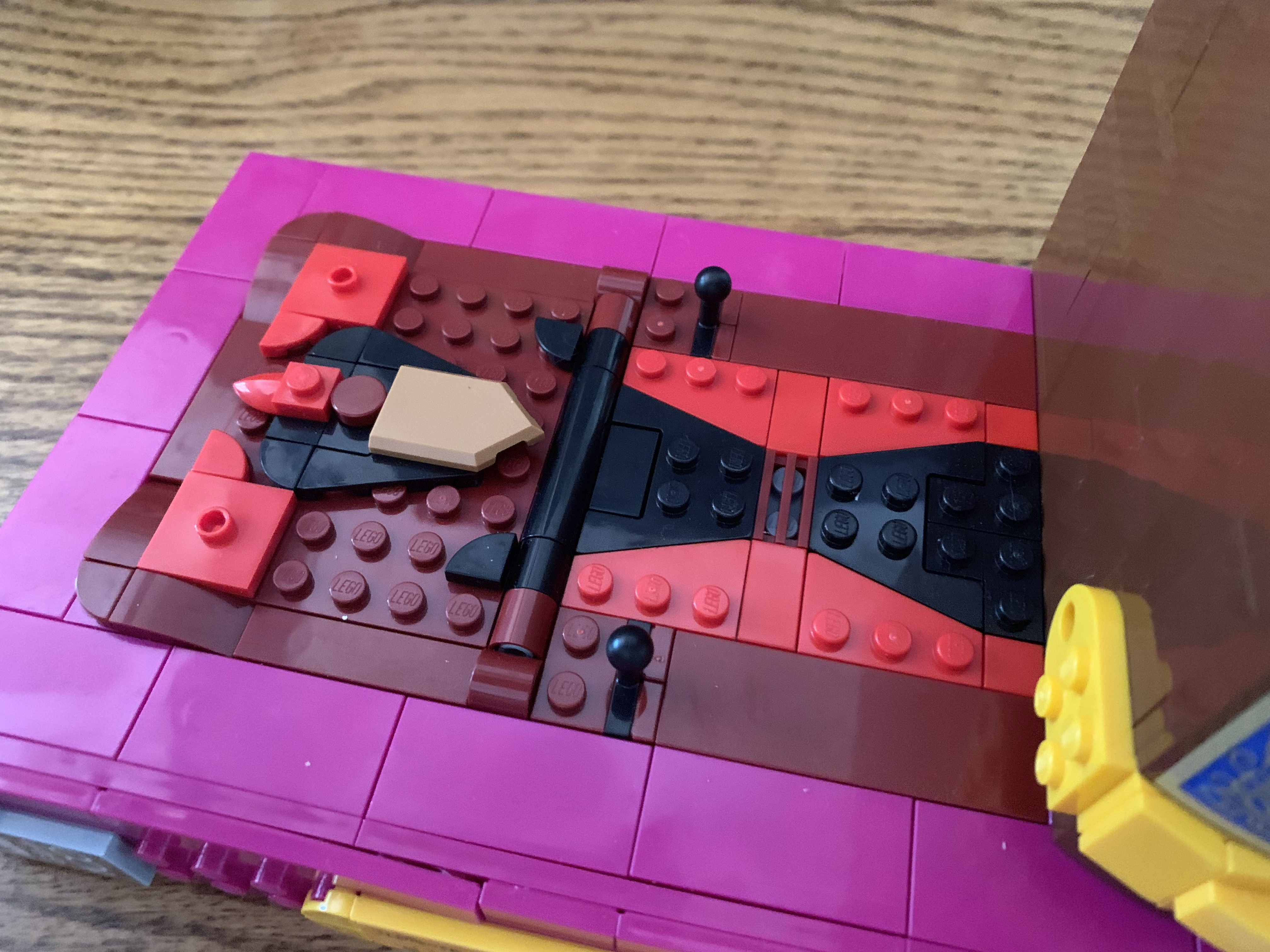
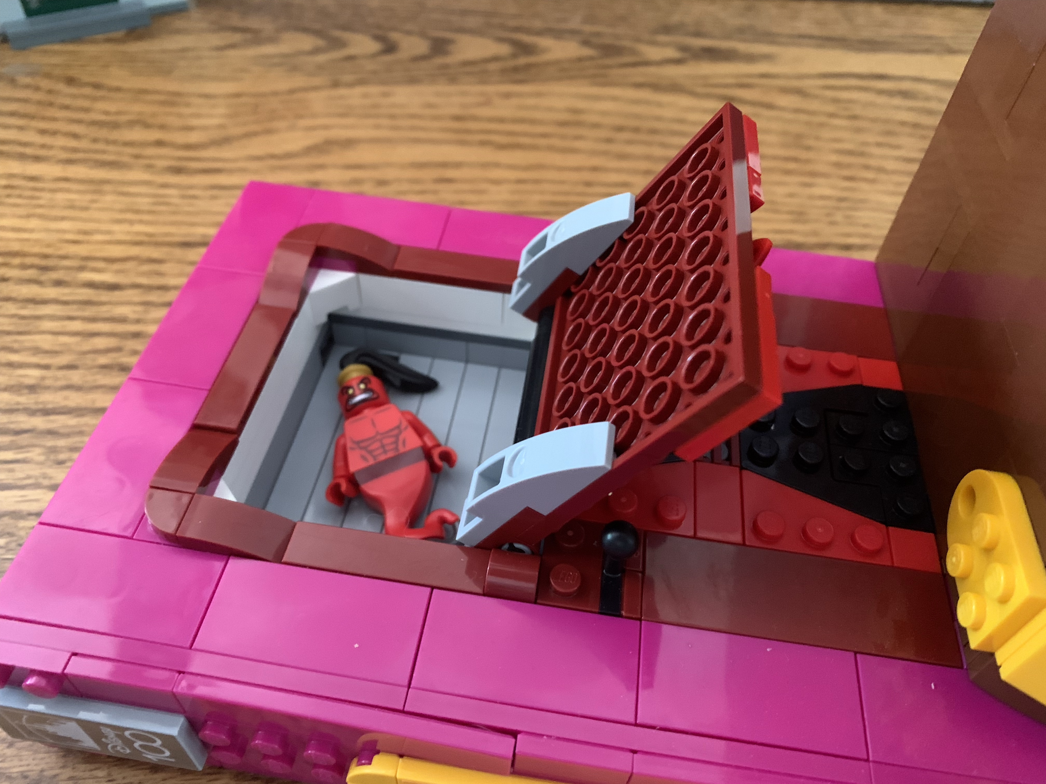
The premise of this set is essentially this: you have a small assortment of books and they’re on a shelf in a somewhat haphazard manner. There’s Aladdin, which is on its side with Beauty and the Beast and Sleeping Beauty beside it on their end. Each one of these books is designed to celebrate its villain in both color and appearance. On the Aladdin book, there’s a Jafar (sorcerer) that you construct out of Lego. It somewhat resembles stained glass to me, but not only is it decorative, but it’s also a door that allows you to store the mini figure inside. For Sleeping Beauty, the same approach is taken on the side of the book as you construct a profile view of the villainess that also opens to reveal a slot of the figure. Gaston doesn’t get the same treatment as there’s no relief of him created in Lego. Instead, he gets a drawer to sleep in. On the top of the book, is a flip-up piece for the enchanted rose from the film. A fun touch, but not as cool as a Gaston relief.
The rose is a hidden feature in the top of the Beauty and the Beast book.
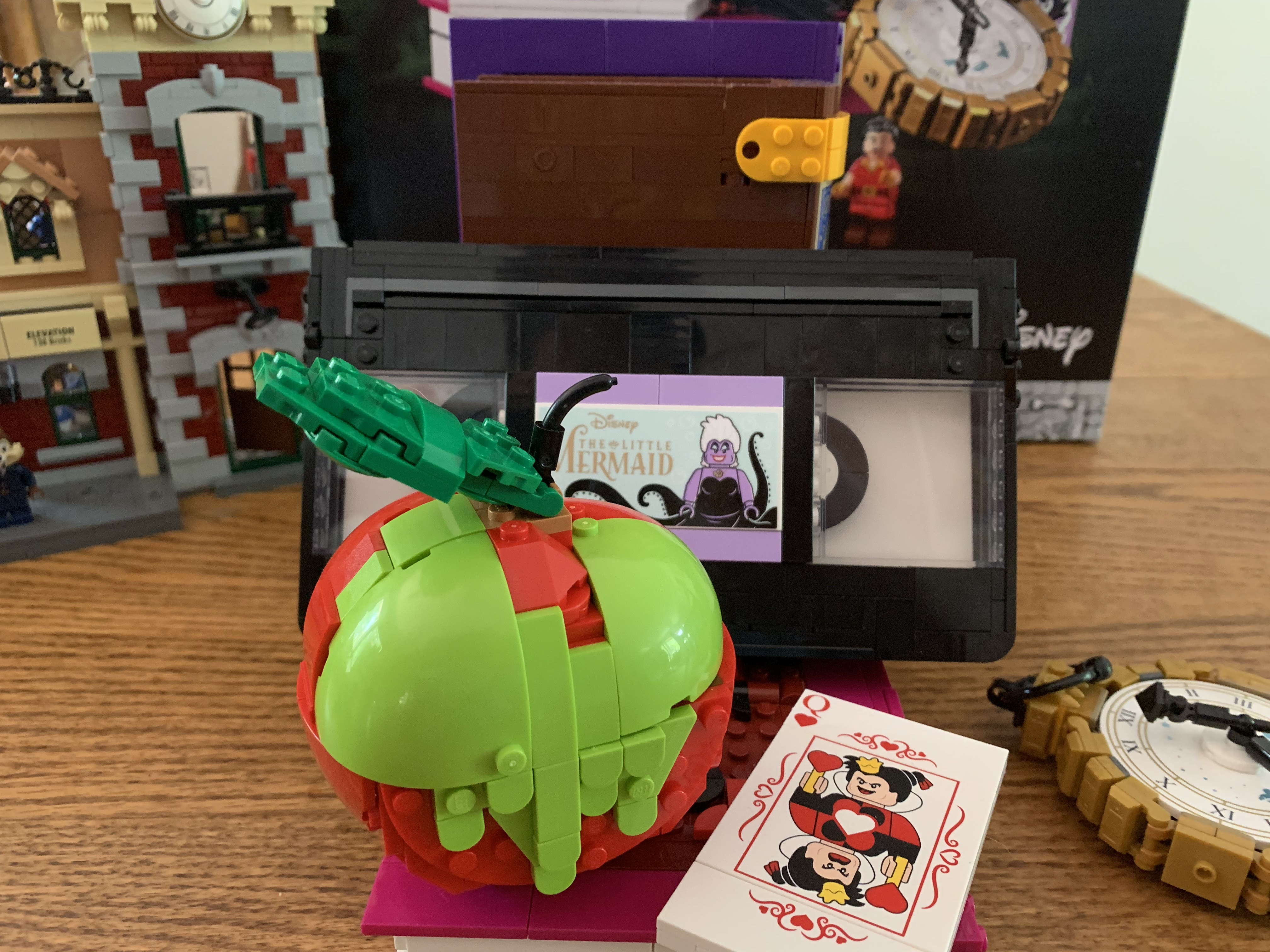
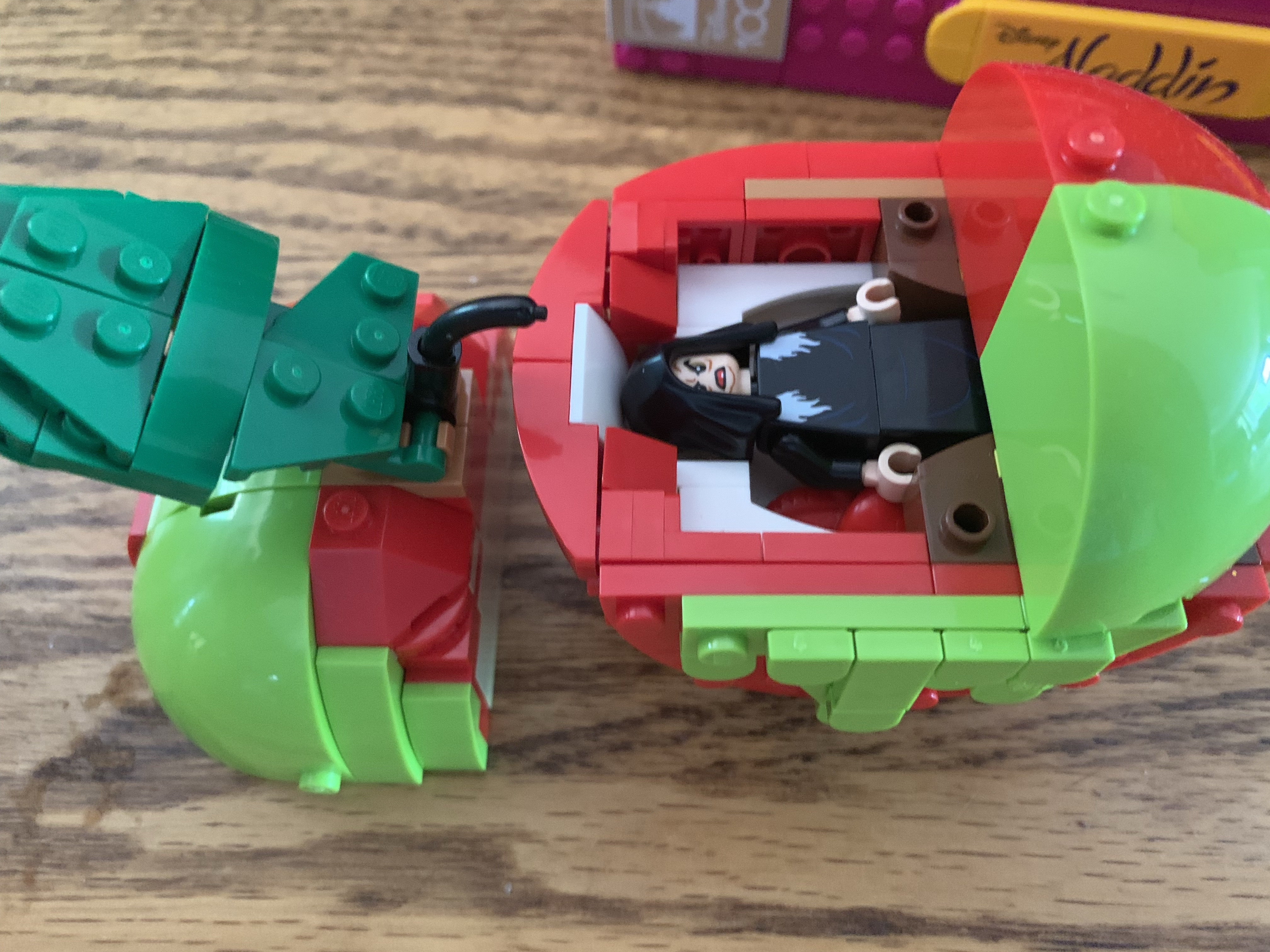
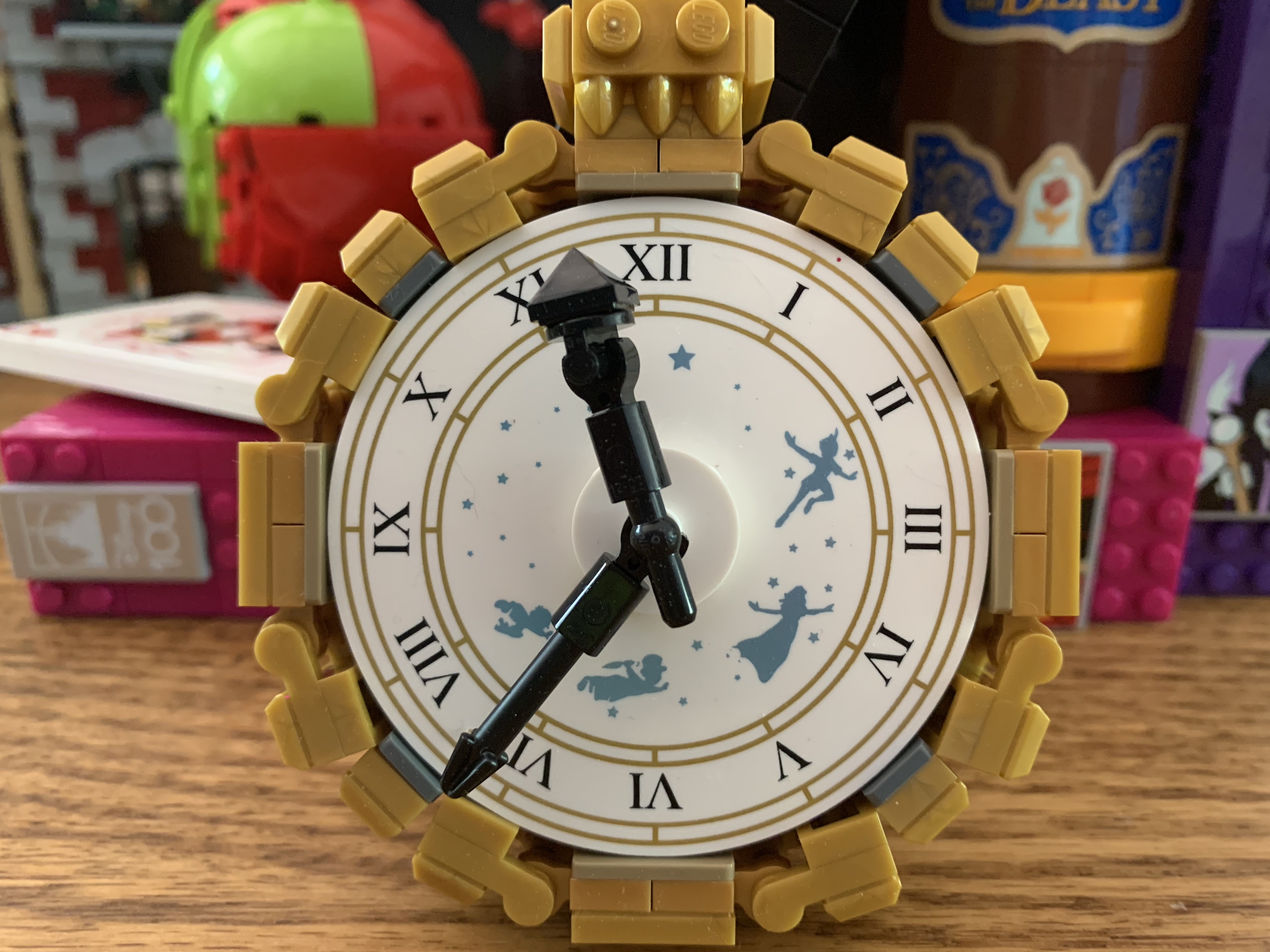
Those are just the books, there are also a couple of other items to construct as well. For the hag, we have her poisoned apple. It’s well-designed as it’s coated in green poison and it’s all done with Lego brick. It opens up to reveal a little compartment for the queen to inhabit and I really get a Star Wars/Emperor Palpatine vibe out of this one. It’s cool though. The apple can connect to the Aladdin book so it’s not just free-floating, unlike the watch. That’s just a free-floating element that’s a quick build, but looks nice when complete. It has silhouettes of Peter Pan, Wendy, and her brothers on it from when they fly past Big Ben in the film. Lego opted to play it straight with the silhouettes too and not do Lego versions of the characters. It is a bit of an odd inclusion for a villains set though. I guess this could be considered Hook’s watch? Then why does it have Peter and the kids on it?!
My favorite part of this set.Ursula sold separately.
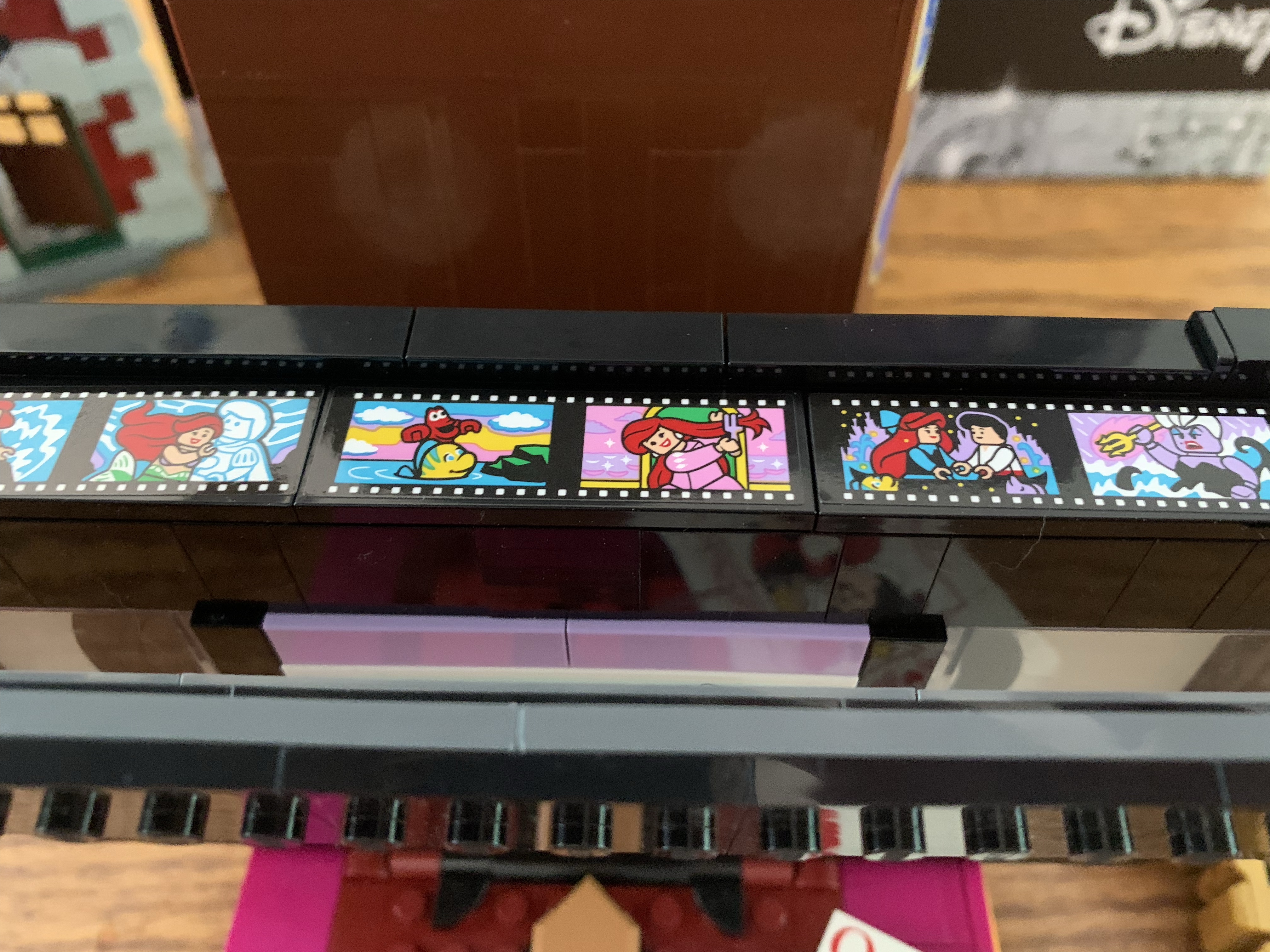
The other two villains represented in this set are Ursula and the Queen of Hearts. For the queen, she gets a playing card constructed out of Lego that’s pretty much the size of an actual playing card, just obviously thicker. It looks nice though as the image on the front is done with prints instead of stickers. It would be nice to get the actual queen mini figure in the set, but I guess that was just too much. The same is true for Ursula who also doesn’t get to see inclusion here, but she does have the coolest representation. For that film, there’s a Lego VHS cassette for you to build. It’s really cool when done and the top flap is articulated to reveal a fake strip of tape underneath it. Lego included some stickers of famous scenes from the film with the characters depicted as Lego figures. Definitely, my favorite part of the set. It clips onto the Aladdin book and is designed to then be tilted, but you could have it on its side if you wanted.
For some characters, this isn’t their first go at a mini figure. New Maleficent is on the right with the old on the left.
The build for this one is rather breezy. It’s 13 bags and a determined person could probably bang it out in an evening, but I spread it out doing 2-3 bags at a time. Some take longer than others, but most of them are pretty similar. There are stickers, which I do hate, but thankfully not a ton of them. Basically, aside from the playing card and the watch, everything you see on this set in pictures that could be a sticker, is. The only exception is the Disney 100 logo which is a printed piece. The movie titles and character images are all stickers though.
The figures included. They’re pretty well done, though I feel like Gaston could be better.
The mini figures are pretty typical of Lego. Jafar is essentially the Genie colored red and he does come with a black version of the magic lamp. Gaston is a standard mini figure with a hair piece and two faces: smug and yelling. I kind of wish they used the Hulk mini figure base to make Gaston impressively large or did something to alter his physique, but alas. The old hag uses a large brick for her lower half instead of legs. It’s the same approach Lego took with Maleficent, Jafar, and other robed characters. She has two portraits as well, angry and smiling, and comes with a little apple. Maleficent is basically the same figure we got before, but with a smiling face and different print job. They also dropped the cape and changed-up the staff a bit. I like the new staff and the smile, but I do miss the cape. At least it’s not a straight re-release though.
If you’ve been collecting the mini figures up until now then you should have a solid assortment afer adding this.
The last important piece to touch on with this release is the price. It’s a Target exclusive (presently sold out online, but maybe in stock at a store near you) and retails for $130. For a 1,500 piece set, that feels a little steep. I’m thinking we’re dealing with a Disney tax here and a set that would normally be 90-100 bucks is getting up-charged. I don’t love the price, I don’t hate it either as I’m used to paying hundreds of dollars for Lego just because of the sets I’m drawn to. I do think they should have just given us at least the two extra mini figures in Ursula and the Queen of Hearts. Plus, Gaston doesn’t get any items? He should at least get a sword or bow and arrow or something. I was definitely disappointed with his execution. Aside from that, I really didn’t have any other issues though. I suppose there’s a debate to be had on if Lego picked the best films for representation, but that’s pretty subjective. All of the films they did choose to represent are very popular and beloved by many so I don’t see much fault there.
If you like Lego and you love Disney then you’ve probably already made up your mind on this one. It’s a solid build experience and boasts some unique characters which is probably enough by itself to get people interested. It displays really well too and I’m left hoping that this isn’t the only set like this we get for the Disney 100 celebration. Why not a heroes version that’s essentially the same concept, but highlights different films? Pinocchio, The Hunchback of Notre Dame, Fantasia, Robin Hood – all would make for fun concepts along with several others. As long as it’s not the exact same format in different colors I’d be almost guaranteed to grab it.
If you want to add this one to your collection, keep an eye on Target’s website. I’m guessing there will be a re-stock at some point so set those notifications if you can’t find it local. These Disney celebrations tend to go on for awhile so if you missed it up until now don’t go running to eBay right away. And if a sister set does get released, I guarantee you can come back here and read my thoughts on that one too.
If you like Lego and Disney then you have some options:
Earlier this year I did a post wondering what happened to the Lego/Disney relationship that seemed so fruitful just three years prior. It was a post born out of some frustration, but mostly just disappointment. Following the release of an entire line of minifigures devoted to the Disney brand as well as the massive Cinderella’s…
Lego is one of the most popular toy manufacturers on the planet. They’ve become known for their building block style toys that come in various shapes, sizes, and colors and can be combined to form castles, pirate ships, space crafts, and other fantastic designs. They also have struck gold with their mini figures, simplistic action…
This past spring Lego released its third line of mini figures to be based on an official license. Following two straight years of The Simpsons, Lego turned to Disney and its cast of classic characters. Going with a mix of old school, Pixar, and movie characters not touched by the existing Lego Disney Princess line,…
Come for the Bugman and Electrozapper review, stay for the frog butt photo bombs.
No, that is not a typo in the subject line as this latest two-pack from NECA Toys features the incomparable Bugman, defender of justice, and Electrozapper. Not versus, but an and. I don’t know why since a lot of these hero and villain two-packs from NECA have gone with a versus in the middle, but this time they chose not to. Whatever, it’s just a box. What’s inside the box is what matters most as we have two characters who many may not even remember from the old cartoon, but for me, I’ve been hoping for this set for a long time.
When I reflect back on the original cartoon series Teenage Mutant Ninja Turtles, I find I mostly remember the characters that also appeared in the toy line. A majority of the time I watched that show I think I just shut my brain off and stared at the TV like a zombie. When the show was over, I’d go play with my figures and if nothing I saw on TV made it into my roleplay then it faded away pretty quickly. Bugman, on the other hand, did not. He was not featured in the toyline at all which is a bit of a surprise because he has a very “toyetic” design. He’s basically the show’s version of Spider-Man, but with the body horror element of The Fly (he also transforms via anger, so toss in a dash of Hulk too). I think it’s that body horror part that made him memorable for me as the sounds his body made when his antennae popped out of his head and his mouth elongated into the pincers of an ant just stuck with me. They were kind of gross, a bit unsettling, but also cool?
This is looking like it’s going to be quite the set.
It certainly made an impression, and I made sure to go rewatch the episode “Michaelangelo meets Bugman” before doing this review to re-familiarize myself with the character and his foil, Electrozapper. It’s actually a pretty entertaining episode of the show. Bugman is clearly a parody of many superheroes. To drive that point home, the show even got Dan Gilvezan to voice the character. Gilvezan was best know to kids of the era as the voice of Spider-Man himself on Spider-Man and his Amazing Friends. Meanwhile, Electrozapper is a fairly straight parody of Spider-Man’s villain Electro, but with some elements of The Shocker tossed-in too via the design of his gloves. He looks like a cheesy 60s comic book villain and was a suitable choice for the episode. In it, the two are characters in a comic book series Michelangelo enjoys, but the book was apparently based on real people or something (it’s not explained). It’s worth a look even if you, like me, mostly think of the old cartoon as pretty bad.
The hero you want, right?
This two-pack comes way of Target once again and is currently showing up in stores in fairly substantial quantities. Most stores seem to be getting anywhere between 4 and 6 units, and for two obscure characters, those numbers are probably pretty healthy. In other words, I don’t think this one will be too hard to come by once the initial mad rush to get anything new dies down. And unlike some of the other recent releases, the price tag isn’t too bad at $55, pretty much the new standard for two-packs. That’s cheaper than some of the other two-packs we’ve received over the past year and these figures feature a lot of new sculpting and plenty of accessories.
The tail looks fine, but I wish it had more function.
We’ll talk Bugman first. He’s in his heroic form which means he looks like a bug…man. Sculpted by Josh Sutton, Bugman stands at around 6.75″ to the top of his head and a full 7″ to the top of his hair (and even taller if you factor in the antennae). His face is appropriately hideous with the elongated mandibles and giant, red, eyes. His hair is blond and streaked with brown which is quite similar to how it was shaded in the cartoon. His wings are new and painted a very light brown. He has his large, extra, legs poking out of his shoulders and the big, red, scorpion tail protruding from his back. He has a green bodysuit with his bug logo painted onto the chest. The toon shading NECA often relies upon is in place with a darker green on the rear of the figure. That’s the only shading though which is a bit odd. The boots and flesh bits lack the same approach. This one relies on the linework to help give it that “pop” and the linework in place is pretty clean.
Time to fly.
Bugman looks the part, and he mostly looks pretty good. His bracers around his forearms feature spikes on them which may get warped in the package. The left arm on my figure is fine, but the right arm does have a bent, middle, spike. I’m guessing some hot water can cure that though. NECA also chose to paint them gray when they look pretty white to me in the show, but it’s a minor inaccuracy as far as I’m concerned. Visually, I only have one real issue with Bugman and it’s that bulbous tail coming off his back. It plays into the articulation, but I’ll just mention it now that I feel like it needs more range. It looks like it just pegs into the figure’s back so it really only swivels. I’m surprised it’s not a hinged peg to move it off of his back or even a ball peg would get a little more range. Instead, it’s kind of stuck against his back. You can move it off to the side, or have it dangle between his legs, and neither option is great.
“Oh, wow, thanks for the save, Bugman.” “Don’t mention, Ms. O’Neil. By the way, would you like to have dinner sometime.” “Umm…no.”
We might as well go into that articulation now. The tail just swivels all the way around. A bendy tail would have been neat, but it’s just solid plastic. His head is on a ball peg as is the base of the neck so he gets great range in basically all directions. This also allows him to look forward when in a flying pose, something a lot of figures struggle with. The shoulders are standard hinged ball-pegs, but the shoulder pads plus the leg things protruding from the shoulders limit what they can do. He can rotate his arm as long as it’s out to the side enough to clear the shoulder pad, but the antennae or whatever won’t let him raise his arms out to the side. Those leg-things can rotate, maybe a hinge would have helped, but would have hurt the aesthetics, I think. There is a biceps swivel and the double-jointed elbows will bend past 90 degrees.
“Oh no! These…chain…coated in…leestanite…my one weakness!”
In the torso, Bugman has a diaphragm joint that lets him rotate, tilt, and bend forward and back a bit. More forward than back, which is good. He also has a waist twist that works, but is a little unsightly once you rotate too far. The hips are the standard ball-socket hips and Bugman gets great range there. He can do full splits and kick forward past horizontal. He can’t really kick back because of the diaper piece, but I’ll take it. The thighs pivot a bit and the double-jointed knees go past 90 degrees without issue. The ankles are the typical hinge and rocker and they work fine. The wings are hinged ball-pegs so they rotate and move in and out. All of the joints are nice and tight, not stuck, but comfortably tight and secure. This torso, with the diaphragm joint added, has me dreaming of a Shredder 2.0 with the same.
“Muahahahaha! There’s more where that came from, Bugman!”
For accessories, it can sometimes be hard to figure out with two-packs, but Bugman appears to have two plus the usual assortment of hands. And for hands, he has fists which come on him in the box, trigger hands, and gripping hands. His hands all appear to be reuse from Dirk Savage which might be why he gets trigger finger hands despite not using a gun. There’s also a lump of blue plastic that may confound a few, it certainly confused me, but it’s meant to be a lump of “Leestanite” which is his Kryptonite, if you couldn’t figure that out on your own. It looks exactly like it did in the show, so it’s not exciting, but suitable. He also has the leestanite coated chains that Michelangelo finds him in during the episode. It’s a plastic chain cast in transparent, green, plastic. It’s fine, though the chain in the show was gray. Maybe some wires got crossed or NECA just thought this was cooler. If so, I can’t disagree. It’s not an exciting array of accessories, but there’s not much else he could have. I suppose I would have preferred some style posed hands instead of trigger ones that will never see use. A flight stand would be cool too, but I don’t really like NECA’s flight stands so I suppose I don’t need another one of those.
Here comes the zapper!
And now for the villain, Electrozapper! Sculpted by Tomasz Rozejowski, Electrozapper stands at about 6.25″ to the top of his head and is featured in his show-accurate battery suit. This thing is goofy as hell and I love it. He’s got the emblem of a battery on his chest and then what look like D batteries strapped to his belt and biceps. It’s something I thought was funny as a kid that I kind of forgot about until I held this figure in my hands. He has a rather unique physique in the show and this figure captures that. His shoulders are just massive relative to his body which has a figure 8 shape to the torso. The legs are long and skinny and he’s got some pretty beefy arms as well. The look and shape of his head is dead-on with that almost beak-like mouth. If anything, I would have liked a little more size to his head as it’s pretty big in the show, but that’s a minor quibble on my part. I love the silly lightning bolts on his head.
This guy is all about stuff.
Like Bugman, Electrozapper has a lot of new parts. I don’t see any obvious reuse with him except whatever is under the shirt. The shirt is a soft plastic overlay so there’s probably just a skeleton of sorts beneath it. It looks good, but will limit articulation. The paint is very clean on my figure and basically every inch of this guy is indeed painted. The linework is crisp and I’m very impressed with the yellow piping on the thigh high boots he’s rocking. Yellow can go bad when applied in such a fashion, but it’s done very well here. The toon shading is featured fairly prominently. The only surfaces not shaded is the flesh of his arms, the gray of his thighs, belt, and his gloves. They also didn’t bother to shade the yellow piping, which I think is fine. Really, the only thing I don’t care for is the cape. It’s a very plain, gray, cape. It at least features the ties in the front, but the texture and feel is cheap and not like most NECA capes. And after getting that really nice, wired, cape with Dark Turtle I was hoping that would be the standard for capes going forward, but this is probably the worst NECA cape I own.
The fist blast might be my favorite of the bunch.
Electrozapper isn’t as well-articulated as Bugman, but he’s pretty much par for the course with this line. The head is on a double-ball peg and he can look up, down, rotate, and gets some nice tilt. The shoulders are ball-hinged and he can raise his arms out to the side to a horizontal position and rotate. The biceps swivel and the double-jointed elbows can sneak past 90 degrees. The gloves do rotate and the wrists swivel and hinge. In the torso, I can’t seem to find anything in the diaphragm, though the overlay probably would render anything there moot anyway. The waist feels like a ball peg so he can rotate and tilt and bend forward and back a bit. The ball-socket hips can nearly achieve a full split, but kicking forward they tend to go off to the side. There’s some twist at the thigh, and the double-jointed knees are fine. The ankle hinge is really nice though as his foot can go all the way back and forward quite a bit with a solid ankle rocker.
It’s a pretty standard assortment of articulation on Electrozapper and I think it’s fine for the figure. The only omissions for me are the wired cape and no diaphragm joint. After seeing NECA more open to that approach with the likes of Dirk Savage and this guy’s box-mate, it’s a bit of a bummer to see a step back here. Especially because his shape lends itself well to such a joint and the only complication is the chest logo, but oh well. If someone were to make a custom, wired, cape for this guy I’d have to seriously consider it as he’d likely be a homerun with such a simple addition.
“Come on, Bugman, let’s teach this jerk a lesson!”
Articulation may be ho-hum, but Electrozapper absolutely brings it when it comes to the accessories. He has a secondary head with an angry, open-mouthed expression which I think is much more appropriate than the neutral one he comes equipped with. It’s so much more appropriate to me that I don’t know why they bothered with the neutral one. For hands, Elextrozapper has a set of fists, pointing hands, open hands, and gripping hands. Two of those hands have peg holes in the rings he wears on his fingers: the open left hand and the right fist. They can accept his effect parts which are really neat. They’re done in a semi-transparent pink, plastic. He has a small, blast, effect which I believe is to simulate his hand glowing. It’s for the open hand and slots onto it with ease. The long, lightning bolt effect clips into the fist and looks great. I absolutely love this type of effect. There’s a skinny lightning bolt which clips onto the pointing fingers and that looks great too. Lastly, he he has two orbs with crackling lightning on them that peg onto the index fingers as well. I suppose you could also slot them onto the fingers of the open hands if you wanted, or have him palm them. I kind of wish the hole for the finger was on the bottom though, or at least in both places. Instead it’s on the back so they look best when he’s pointing his finger forward as opposed to up.
“Thank you for your assist, Michelangelo.” “Like, are you looking for a sidekick?”
These effect parts really make the figure for me. It’s wonderful to get a figure like this where there’s almost too much to do. I like all of these, so which do I actually display?! It makes Electrozapper a very fun figure to just mess around with because you can keep changing things up. I almost wish we had more! I would have scrapped that neutral head to just double-up on the two lightning bolt effects. I may have even traded the gripping hands for the same because I’m always going to have him posed with the effects, what need of gripping hands do I have? As is, it’s still a great spread and much better than some recent releases from NECA so I’m pretty happy with what we have here.
It’s a gathering of bug people!
The Bugman and Electrozapper two-pack is low key one of the strongest two-packs in the line. It’s up there with the likes of Antrax and Scumbug and the Groundchuck and Dirtbag set. I really like how these guys turned out. Bugman is pretty much spot-on with the show and looks great. The only gripe I really had with him is the tail articulation. Electrozapper is right there with him and the only thing really bugging me about him is the cheap looking cape. It’s a shame that cape prevents this set from being an all-timer, but it’s still damn good and I think anyone who gets it will have a lot of fun with it. Perhaps best of all, the price feels right so while I haven’t been crazy about the price creep with other TMNT releases from NECA, at least we still have sets like this one that just leave us feeling pretty damn good about it when all is said and done.
If you like bugs and TMNT, there’s plenty more to see:
I’ve been looking forward to this one for awhile. Antrax and Scumbug only appeared in the cartoon series Teenage Mutant Ninja Turtles once, but like last week’s figure review, they were present in the toy line long before their animated debut. And these later period episodes, such as “Night of the Rogues,” tended to just…
When NECA finally received access to the Teenage Mutant Ninja Turtles license to release product at retail, the company decided to focus on three pillars: cartoon, movie, video game. The cartoon product, being the most sought after, was exclusively sold at Target stores in the United States. The movie line, probably nearly as desirable as…
I didn’t intend for so many TMNT reviews to hit one after the other, but Christmas pushed a bunch of stuff into the final week of December and then some surprise difficulties with another review has moved this one up. So be it. 2020 had a final surprise in store for collectors of Teenage Mutant…
When it comes to the world of more high end action figure collectibles, I’ve been able to get my hands on a few. Some rather prominent companies have yet to cross my path though, and it’s not really for any reason other than they either don’t make what I like or I don’t really like what they make. Mezco is more of the latter as their approach to superhero characters with soft goods come out looking like Mego to me. There’s nothing wrong with that aesthetic, if you like it that’s fine, but me personally? Not really. And it’s definitely not something I have any interest in spending upwards of 90 to 100 dollars on. The company seems to have a really dedicated following though so there’s obviously a market for what they do. As for the company itself, I’ve heard mixed things. I’ve read too many horror stories from people trying to get a replacement for a defective product and having their concerns go unanswered. The company is known for its lengthy delays on product with zero communication about where any of it is. And they do the thing that a lot of companies do where they launch something with rendered images and the waiting to actually see what the figure will look like usually lasts until release.
This body takes some getting used to.
The Bat Ass.
Needless to say, I’ve approached the company with some degree of trepidation. I’ve been able to ignore most releases from Mezco because I just don’t like the product, but the one that did catch my eye was their reveal of Batman from the 1989 film of the same name released on this day 34 years ago. The Michael Keaton version of the dark knight has always been a favorite of mine. It fits right in with the theme of this blog as Keaton’s Batman was my introduction to a more grim version of the character. Prior to the Tim Burton-directed film showing up on my television (my family rarely saw films in the theater when I was a kid) my only point of reference for Batman was the Adam West version. No disrespect to Mr. West and his show, which I adore for different reasons, but this Batman was an all together different animal. I had lots of the Toy Biz and Kenner releases that tied-in with that film and its sequel and Batman was a pretty big deal following the release of that film for basically the rest of time. The funny thing with that film though is that most attempts at action figures have failed to “wow” me. I’ve basically disliked them all for one reason or another and the best ones have all been in larger scales that I’d rather not collect. When Mezco showed off their version, it was the first time where I saw that depiction of Batman in a 1:12 scale that I felt matched up the 1:4 or 1:6 scale figures out there. Once I was able to get over the price, I did commit to buying one. And then the wait began. And it went on and on and on….
He moves reasonably well, but there’s a fear element that comes into play every time.
That’s about as far as I dare go with a kick.
Three years! That’s how long it took for this product to go from flashy internet pictures to reality. No excuse has been given as to why it took so long. Mezco would just put up a release window, and when that came and went they’d bump it to the next quarter and we did that dance for years. Did they have issues with the license? Maybe, but a lot of companies have their hands in Batman so that seems unlikely. Was it this new-fangled seamless body they had been working on? Very possible, but it’s not something they haven’t attempted before. Maybe they were forced to time it to the release of The Flash which features Keaton’s Batman? Again, maybe, but probably not from the start. If such a mandate came down it was probably pretty late in the game. Did Mezco have cash issues? I don’t know, but I suppose you can never rule it out. For whatever reason, it took a long time for this figure to get to me. I had honestly given up on ever seeing it. I wasn’t that worried about it since I ordered through Big Bad Toy Store so I didn’t pay upfront. Those who had through Mezco certainly had more to worry about and more to be angry about, at that. They all got their figure a couple of months ago, as they should. I had to wait a little while longer and in the interim I’ve often found myself not really knowing how to feel about this one. I normally avoid reviews of anything I plan to review myself, but my curiosity got the better of me with this release. Now that I have my own figure in-hand, I’m still sorting out my feelings on this one.
The white residue is annoying and seems to have accumulated the most under the arms.
Batman arrives in a plain, but somewhat flashy, box. It’s all black with the film’s logo on it which is honestly how it should be. Inside, the figure and its many accessories are housed on a tray and everything is packaged rather well which is obviously a good thing. If you’re going to charge as much as Mezco does, then you damn well better make sure the product gets to people in good shape. Out of his packaging, Batman stands at right around 6.25″ to the top of his head. Michael Keaton is not an especially tall man meaning this figure isn’t true 1:12 scale, but it’s fine. The film often did its best to try and shoot Keaton from angles that kind of hid how short he is. Low angles and isolated shots were relied on with the one scene that really broke from that being Batman’s run from the Joker with Ms. Vale in tow. And wouldn’t you know, he kind of looks goofy in some of those shots. Mezco took some liberties with his height, but also with the cowl. I may prefer the 1989 movie, but when it comes to costumes I much prefer his look from Batman Returns. Well, the cowl anyway. I could take or leave the armored torso of that film, but the cowl was more stream-lined and appeared to be made of a thinner material. In the first film, it’s more rounded on the sides and quite thick. It did help it to cast more shadows around his mouth and eyes, but at the cost of almost looking squished. Mezco’s take on the cowl strikes me as somewhere in-between the 89 version and the one we see in Returns. And it looks pretty good. I see the Keaton likeness in the opening of the cowl as well as in the eyes. And the details of the suit itself also look pretty nice, save for one thing.
This setup sucks. Big time.
All of that white stuff. Batman is basically coated in powder as part of the shipping process. The body, being seamless, is basically rubber with a metal skeleton underneath it. It’s like a high-end version of those rubber, bendy, figures that were pretty common once upon a time. To prevent it from cracking or sticking to things during transportation, the suit is coated in a powdery substance that looks terrible, but should gradually ware off. Handling this figure is honestly the best thing you can do for it. Some have turned to vinyl coatings and such, but I don’t know if that’s recommended for long-term use. At least I know I’m not willing to try it, but I will concede that I’ve seen some sharp looking results from those who have taken that route. This rubber body does create a disconnect between the hard plastic of the hands and cowl and the rest. It’s more muted and not as dark. It’s also hard not to shake the feeling that the head is a bit oversized for this body. In the movie, it kind of was due to the cowl, but perhaps not to this extent. He’s also not meant to be displayed like this as just a body with a head so I don’t want to be too critical, but it is a $100 action figure so I don’t know that it’s really possible to be too critical.
This is the best I could do with the cape, and as you can, it’s still not flush. I’m not OCD, but this drives me nuts.
It also fits him like a poncho so you’re going to want to take advantage of those wires to pose some of that away.
With a cape added, the figure starts to look more like its big screen counterpart. That is, if you can get the damn thing on. Mezco included two capes with this figure: a wired one and a non-wired one. Both capes are fairly large and feel like a faux leather material on the outside and plush on the inside. There’s a lot of material here that basically covers the entirety of the figure, but it’s quite wide giving Batman a bell shape. This is what I don’t like about soft goods at this scale. They just don’t have the proper weight to behave like a larger cape would. It should, at some point, start to come back towards the body instead of just continuing to fan out. It’s why I much prefer the wired cape as that can be controlled some, but it has its own problems. Both capes affix to a ring under the head and it’s supposed to snap-in to the collar on the figure. The problem is, the squishy body doesn’t provide enough resistance and working it in becomes an extremely frustrating process. Plus, Mezco decided to make the heads connect via a magnet. It’s honestly not a bad idea as this costume prevented Batman from being able to move his head so why bother with a ball joint? The issue this creates though is if you can’t get that cape to snap-in properly, the magnets in the head and body are not strong enough to just hold it in place. There’s a gap that’s left behind and it looks stupid. Part of the problem is the cape is sewn to the ring around its entirety leaving very little room for the chest. There are product shots on the back of the box that are clearly using a different cape because of how it comes out of the bat logo on the chest. There’s just way too much cape here. And even with the wires, the cape is still a chore to maneuver. I’ve seen many people just clip it behind the figure to get that more tapered look, but that hardly seems acceptable to me for a figure in this price range. They also did the same thing Medicom did with its Hush Batman in not using enough wires. Mezco included a wire in basically every other seem rather than all. Why cheap out there?
My pictures aren’t going to do these faces justice, but trust me when I tell you they look great including bloody-faced Batman.
There’s another magnet in the belt which works with the grapnel gun accessories, but unfortunately not the Batarangs.
The rubber body is essentially confined to the torso, hips, and the limbs. It ends just past the elbows on the arms where the gauntlet begins which is a standard, harder, plastic. The same is true at the legs where the body ends just past the knee and the boots are done in plastic. The belt is floaty and also plastic and there isn’t much holding it in place. There’s a groove sculpted into the waist for it, but it’s going to move around constantly. The squishy texture of the body is definitely an unusual sensation with an action figure. It feels more springy than a stress ball, almost like handling a water balloon. The legs and arms have a nice shape though, while the torso is sculpted well from the front. From the side, he loses a bit of shape. Poor Batman has no ass, but at least Mezco gave him some nice, large, shoulders that tape well at the bicep. Someone should show Hasbro that this is how you sculpt a shoulder in relation to the bicep. There is some sculpting on the back and I have to assume it’s accurate to the film. I don’t recall ever seeing Batman’s back without a cape. There’s even a sculpted seam on the rear of the cowl that, again, I’m willing to just concede is accurate to the film as I can’t recall a good shot of the back of Batman’s head.
“Joker’s robbing the bank, better summon the Batmobile!”
“I remember you being a lot bigger.”
Where this figure is going to shine brightest is with the heads. The figure comes with an articulated head which is by far the worst in the set, but even it looks okay. The eyes articulate on it, so they’re very large in relation to the rest giving him a real surprised look. I don’t care for it personally, but I get why Mezco did it as the figure can’t turn his head so this gives people at least some ability to allow Batman to look to his left and right. The neutral head without the eye gimmick is plenty fantastic. The Keaton likeness is damn near perfect and I love how the eyes came out. He looks confident like he’s about to knock some sense into some hoodlums and all of the cowls have this nice, satin, finish to them that really captures the look of the film. The one drawback that’s basically present on every headsculpt is that the Batman logo is not painted as cleanly as it could be. All seem to feature at least a little yellow on the bat logo, and that’s really not excusable at his price range. Especially on a figure with very little paint. The other portraits include one with a slightly open mouth like he’s talking and a battle-damaged one from after he wrecks the Batwing. The mouth is open on it like he’s taunting the Joker with his own catchphrase (“You ever dance with the devil in the pale moonlight?”) and there’s even a touch of scuffing applied to the ridge over his left eye. It looks great and while I think the vast majority of people who get this figure will just stick with the neutral head, these other ones are totally viable for a display as well.
The head with the moving eyes helps a little bit when trying to sell an action pose, but it only goes so far.
I do like the wired accessories to the point where I think I’m going to have to display him with at least one.
That basically concludes the aesthetics portion of this review. Now, considering all of the attention this unique body construction has received, I think we’ll just jump right into articulation. As stated previously, this figure is basically a metal skeleton with rubber coated over it. I expected it to be a bit stiff out of the box, but was surprised at how smoothly it moves, for the most part. Mezco does include a brief instruction sheet with this release that basically cautions against moving any of the joints past 90 degrees. Doing so will risk taring a hole in the body itself and you don’t want to do that to your $100 toy. I wish they had included an image of the body itself without the suit over it as I think it would be helpful to know how the figure is truly constructed. I found that moving the arms out to the side was a piece of cake, but sometimes they don’t really want to rotate forward at the shoulder and I have to assume something is getting in the way. I was able to bring the arm out, and then forward, and that usually worked. For whatever reason, it’s more of an issue with the right shoulder than the left and the hips seem to function the same. Out to the side is no problem and Batman can do some splits, but going forward can be finicky.
He’s also got this big ass thing if you find the grapnel gun too understated.
It also articulates, though it doesn’t have any wired accessories.
In addition to that basic movement, we also get rotation at the biceps, a bend at the elbow, a twist at the glove, and little ball-hinges at the wrists. The legs can rotate a bit at the thigh and bend at the knee. The boots also swivel and at the ankle we get a little range going back, almost nothing forward, and a little bit of range at the ankle rocker. The knees and elbows both have no issue hitting a 90 degree bend. I think they could go further, but I’m not pushing it. There is some rotation at the waist, which Mezco doesn’t draw attention to, and even an ab crunch. Engaging such is kind of scary though, but it appears to work pretty well. It at least allows for some adjustments when posing the figure if you want it to be as tall as possible or maybe rotate a little to work with the accessories. Mezco recommends not leaving the figure in anything extreme for too long. I’m not sure what passes for extreme. Can he be left on the shelf with a bent elbow or his arms out to the side? I don’t know. It doesn’t seem particularly stressful for the arms to be out to the side, but I can totally see a bent elbow perhaps doing so. It feels like there’s enough material over the skeleton to prevent issues of the steel becoming exposed in most places. With this figure, it’s really going to be a case of “time will tell” as what happens if it starts to dry out? Will this body become brittle after awhile and split in places? I don’t know, and I don’t know if Mezco could honestly answer that or not. It’s a risky everyone is taking who purchases this figure.
Remember his bomb? It’s okay if you don’t.
And I think this tiny, little, thing is his smoke bomb.
If you like accessories, Mezco certainly has you covered. Batman is known for an assortment of wonderful toys and we get just about all of them in this set. For starters, he has four sets of hands: fists, gripping, a wider set of gripping hands, a trigger right hand, and a more open left hand. For the tighter gripping hands, he has four Bataranges. They’re sculpted well and have a touch of silver paint at the tips and look like the real deal from the film. He also has a fifth Batarang connected to a thin, bendy, wire for him to use like a grappling hook or an offensive weapon. There’s also a tiny vile of his smoke bomb stuff (at least, I think that’s what it is) which he can hold and he also has the little remote for the Batmobile. There’s a silver shuriken, which I don’t remember at all from the movie, and he has his time bomb which is this little steel-colored gadget. It has a really intricate sculpt and I’m surprised at how far they took it for something that’s largely obscured by the gripping hand.
You also get an action stand, which I think is pretty typical of Mezco releases.
For the trigger hand, we get the grapnel, or spear, gun. Batman can hold it effortlessly and it also features a magnet of its own so that it can attach to the right side of his utility belt. There’s a hook attached to a bendy wire that can also peg into it like it’s being fired or you could extend it entirely. He also has a second hook with no wire. It’s supposed to slot into the end of the gun like it’s loaded, but mine doesn’t seem to fit. I don’t know if it’s defective, but I’ve seen plenty of images of others who got it to work properly. We also get the collapsed version of the grapnel gun. This is what he has attached to his belt in the getaway scene that he has Vicki grab onto. It also can attach via a magnet to his belt and it can accept the bendy wire hook. There’s also that gigantic, double-grapnel hook gun which Batman uses to escape from the museum. It slides over the figure’s forearm and the two firing mechanisms are articulated so it can spread out like it’s going to fire a line to either side. It feels a little delicate, but it looks really cool and it’s well-painted, just be sure to go easy with it. Especially since the gauntlet portion is painted silver and it would be a shame if that rubbed off on the figure. Lastly, Mezco includes a stand that features either a peg for the foot to slot into or you can slot in a transparent arm which is also included. It’s a solid stand and a pretty conventional one at that. The base is the Batman logo, though like the movie poster, it’s a traditional Batman logo and not the one on the figure’s chest with the two added points at the base of the bat. It’s fine, though this figure doesn’t need much help standing and the metal skeleton makes it heavier than a typical figure. It’s also a little strange since Mezco doesn’t recommend leaving the figure in any crazy poses, though if you just want him with his arms out it can work for that. I’m still happy to have it, even if I end up using it for a different figure.
It’s only a matter of time until Batman gets his own “Bat-verse” film or special.
There’s a lot going on with Mezco’s take on this version of Batman. There’s also some baggage too considering the long wait, especially if you were one of those individuals who paid upfront and had Mezco just hanging onto your money with no communication for three years. There are certainly issues with this figure, and some of them should not be. The biggest offender for me is the cape, which is just not well-engineered and poorly designed. It has me considering a third party cape, which is pretty absurd for an action figure in this price range. The seamless body is also something I’m still not entirely sold on. It looks okay, and the white residue is not as bad in person as I thought it would be. I still wonder if it was necessary though. Do we really care if we see joints in our action figures? Plus, with the cape you can hide a lot of that if you want to. It seems to pose okay, but I’m also afraid to pose it. It’s not a fun way to make a toy.
At least we can all feel a little safer now knowing Batman is out there.
At the same time though, the likeness is fantastic. This is the best looking Michael Keaton Batman I’ve seen. I think it rivals the figures in a larger scale. NECA did one in a 1:12 scale a few years back that was okay. It was almost too accurate to the film though and he had kind of a frumpy look. Mezco took some creative licensing with their adaptation and I think the figure benefits from that. It has me really wondering what I would do if they announced a Batman Returns version with the same approach. Would I be down for another one of these seamless bodies? Ehh, it’s a tough call. I know I wouldn’t be if it had the same cape and I definitely wouldn’t pay upfront and order through Mezco. I’m almost left hoping I don’t even have to make that decision. Considering the price of this figure and the unknowns surrounding how this body will hold up long-term, I have a hard time recommending it. I definitely don’t at the current aftermarket/post release price which is around $170-$185. It’s just not worth that kind of money. It’s barely worth considering at the MSRP which was $110, if I’m not mistaken. What it comes down to, for me, is how much you value having a little Michael Keaton on your shelf. If that’s worth a lot to you, then I think you’ll ultimately be satisfied with this figure. Excepting the cape, it looks great and it has a lot of accessories. If you don’t have much of an attachment to the Keaton Batman and you just thought it might be fun to have this version of the character with your other Batmen, then it’s probably a luxury you can do without.
If that’s not enough Batman for you, I have a few more toy reviews you can check out:
If you’re a repeat visitor here at The Nostalgia Spot, then you’ve probably noticed that around here there is a high opinion of the television show Batman – The Animated Series. I did a re-watch of the series that spanned more than two years and also checked out the various films based on the property.…
I’m not much of a car collector, but when I was a kid I went through a Hot Wheels and Matchbox phase. My favorite car was a small, black, one that I only barely remember. I have no idea what make or model the car was, but what I liked about it was that it…
You may have been wondering why I decided to devote an entry earlier this week to a nearly twenty year old action figure of mediocre quality, and if so, now you know why. I wanted to take a look at the DC Direct Batman based on his appearance in the Jeph Loeb written, Jim Lee…
NECA’s line of Teenage Mutant Ninja Turtles action figures based on the animated series which debuted in 1987 has had some big figures. Most of these are what NECA terms “deluxe” releases and have included the likes of Krang in his android body, Chrome Dome, and the more recently released REX-1. The latest addition to this cast of characters is the one that caught me by surprise the most. Napoleon Bonafrog had the misfortune of getting mutated into a rampaging beast in a one-off episode of the show. A version of this character was unveiled last year at San Diego Comic Con. I saw the images, but for whatever reason I didn’t truly process his size. Then my lovely wife, who found this figure along with the other latest toon releases, handed me the box and I was aghast at how heavy it was and at just how much real estate the figure took up inside it.
That’s one big frog.
Napoleon is not the tallest figure in the line, but I think he’s the new heaviest. And prior to him, that honor probably went to REX-1 who was released earlier in the spring, but Napoleon is like a brick. This is a figure you can keep by your bedside and use to scare prowlers in the night who are foolish enough to invade your home. I don’t have a scale suitable for weighing this guy, but height-wise he stands at 8.25″. This makes him rather close in height to REX-1, but a lot shorter than Chrome Dome who gets to continue its reign as tallest in the line. That weight though is something, and the circumference of the shoulders is quite massive. Picking him up, he feels most similar to one of the quarter scale figures in the line as opposed to any of the standard or deluxe figures. It’s certainly an experience and adds an undeniable “fun” factor to the package.
“Looks like frog legs are on the menu tonight!”
And that package comes at a cost. Napoleon rang-up a shocking $55 at Target. I had not given it much thought prior to release, but with REX-1 being $50 I certainly wouldn’t have been surprised at that, but another 5 bucks? That was unexpected. And sure, 5 bucks isn’t exactly a lot in a vacuum, but it does suck to keep seeing the price go up with this line. And this one may not even be the worst offender, but we’ll get to that when we do. At any rate, is this guy really worth it? That’s a tall ask especially for a very obscure version of an already reasonably obscure character. If it weren’t for the fact that Napoleon did get a figure in the Playmates line (albeit, a totally different interpretation of the character) few would likely remember him by name.
“WHAT?! You’re just in time – looks like I’m makin’ my mama a new luggage set!”
We already covered the size, but the sculpt overall for this one is also pretty damn fun. Even though he’s a hell of a lot bigger than his previous figure, he actually has the same basic construction and outfit. The skin is a very dark green with some freckles done in black outlines in places. He still has the toon shading so his skin is lighter on the front, and darker on the back. The shirt is a soft plastic overlay that basically floats on him. If you were to pull out his arms from the socket, you could easily remove it as it’s not glued down anywhere. It’s yellow on the front, and an ever so more saturated yellow on the back that’s barely noticeable. The single orange strip runs around the shirt and it’s painted fairly well. Rather than make it a darker orange on the rear of the figure, NECA painted it red which looks a bit off. Dark orange and bright red aren’t exactly interchangeable. The necklace is glued in place and the shorts are painted a light purple on the front, dark on the rear. The edges are tattered and I wonder if Napoleon was chosen by the show for this mutation because he wore shorts that reminded the writers of the Hulk? Where the shorts separate at the fly is painted purple, which looks a bit odd. Even the smaller figure got that detail right as it’s painted green. There’s some sloppy paint on the left bracelet as well, and a smudge or scuff on the back of the shirt on my figure. Nothing that will show on a shelf, but worth mentioning.
“Rocksteady! Use that muta ray to make me a colossal frog!”
There’s not a whole lot of room with this guy for the paint to truly “wow” the holder, so it’s going to have to do that with the overall sculpt. And in that respect, it’s got a good argument as being a “wow” piece for the shelf. The default portrait is this angry, snarling, expression. The eyes are set a bit deep in his skull with black rings around them to give off an enraged vibe. He’s got this massive underbite with his teeth jutting out. They’re huge, chunky, blocky, cartoon teeth and they’re outlined in black and it all came out very clean. NECA sculpted and painted a pink tongue within the mouth and it’s a head with a lot of personality. The biceps on Napoleon are just plain massive and I love the exaggerated proportions of his upper body vs his abdomen. Sculptor Brodie Perkins did a tremendous job here. He’s going to command attention no matter where he’s placed in your collection and I think that’s what most want out of these deluxe releases.
“Put me down you idiot!”
Because the figure’s anatomy is essentially the same as his smaller counterpart, so is the articulation. There’s really only one difference between the two. The head is on a double-ball peg which lets the figure look up and rotate. Because it sits so deep in his shoulders, he can’t really look down and there’s little room for tilt. He also has a hinged jaw, but it’s range is very limited. It basically goes from closed to just open enough to see his tongue. The shoulders are standard hinged ball-pegs and the figure can raise its arms out just past horizontal. Rotation is fine and there’s a biceps swivel past that. The big change from the smaller frogs is the introduction of double-jointed elbows. Because his biceps are so massive, he can only bend there a little past 90 degrees. The wrists swivel and hinge horizontally.
“Gee Napoleon, what happened to you?!”
In the diaphragm we get a ball joint of some kind. It’s probably a double as he can lean back a solid amount, forward a little, and he gets good tilt to either side plus rotation. There is a standard waist twist below that and then the hips are connected via the ball and socket setup so many NECA figures utilize. There is a little bit of pivot action at the joint, but mostly it’s for kicking forward and back which he can do very well. The leg will go out to the front all the way and back pretty far. They also go out to the side almost to the point of full splits. Plus, they’re not loose which is definitely important for such a large figure. My regular Napoleon’s hips were so loose that he couldn’t even stand without sliding into a split. I had to apply super glue to the joints to finally fix that. The knees on this guy are double-jointed and will bend past 90 degrees. The ankles feature a hinge and rocker combo. The range forward and back on the hinge isn’t great, but it should be enough. The rocker works fine. And also, it’s very snug which is, again, super important for such a heavy figure.
He’s also capable of being a gentle soul.
So far so good, but where this figure does start to come up short rests with the accessories. There just isn’t much a colossal frog needs so there isn’t much he gets. For hands, he comes with a set of fists in the box plus a set of open hands and a set of gripping hands. He also has a second head which features a calm, almost befuddled, expression. It’s sort of cute, I suppose, but I’m guessing most will want their giant, hulking, frog to look a little more angry. The second head also drops the articulated jaw.
He has a gun, but it isn’t really for him, or anyone for that matter.
And that’s it! Well, that’s it for the main figure. NECA did throw a couple of other items into the box to try and sweeten the package. There’s the included muta-shooter which is the weapon that did this to Napoleon. It’s mostly gray with some linework and darker bits painted on, but the most striking aspect is the green “liquid” inside the barrel. It’s basically transparent plastic with a semi-transparent green insert. It looks fine, but only from certain angles because the green piece inside isn’t solid. From the top, the illusion of it being an actual liquid is ruined and it’s kind of crummy looking. I don’t know why they didn’t just make it a solid piece of green plastic, but oh well. It’s also not really conducive to being properly held. It’s a very weird shape and I couldn’t really get anyone with a trigger hand to properly hold it. I was able to basically balance it in Rocksteady’s hands to fake it for a pic, but it’s probably getting the bin treatment after this is done.
I do like these extra heads for Napoleon and Genghis. The Napoleon head has a shape more representative of how the frogs were actually drawn for the show while the Genghis head is just outrageous.
The last accessories are two new heads for the previously released Napoleon and Genghis figures. The new Napoleon head features a scared, or concerned, expression like he’s about to shit a brick. It’s very similar to the box art expression and I like it well enough. The Genghis head is a more exagerrated, screaming in terror expression that makes me think of the video game Battletoads. It’s pretty silly looking, but I confess that I do love it. Mostly, it’s nice to be able to break up the expressions of the Punk Frogs as they all had the same two expressions to choose from. Now they can all have a different expression, so I do like that.
“We just love our new, giant, brother!”
That’s all though. It definitely doesn’t feel as substantial as past deluxe releases. We just looked at April who came with a ton of stuff and REX-1 before this release also had quite a bit. One could argue that this figure didn’t need anymore than what it comes with, but for added cost it’s a bit of a tough pill to swallow. If he came with additional heads for the other two frogs that would have gone a long way to sweetening the package. I also wish he had another set of gripping hands, something wider, for grabbing other figures around the waist. His existing ones are too tight for that, and they’re way too big to handle really any of the weapons in the whole line. I’m surprised NECA didn’t toss-in the rhin-bug that was featured in the episode as a gag and also appears on the back of the box. Napoleon also shot his tongue out in the episode and that could have been a fun extra head or accessory. I definitely feel a bit short-changed as is which isn’t typical of NECA.
Is Napoleon “The Colossus of the Swamps” Bonafrog worth the pretty steep asking price of $55? It’s hard to say. It’s definitely a case where I look at the figure, then consider the price, and my immediate reaction is, “No.” On the other hand, now that I have him and that money is gone, I do like him. He’s a really cool figure and I like that his existence makes my Genghis and smaller Napoleon a little more interesting, but I do hate that I gave NECA $55 for it as I’m endorsing the price at that point. He’s an obscure character, and if you never cared about getting this version of Napoleon in figure from then maybe continue living your Napoleon-free life. On the other hand, I never really desired this character in figure from, but it does make me happy so it’s not the end of the world that I overpaid for it. I would suggest finding this one in store and seeing what your reaction to holding it in hand is. If it makes you giddy like a little kid and losing $55 won’t hurt you, then go for it. If it doesn’t stir anything within you and you’d only be buying it because it’s new, then don’t be afraid to put it back on the shelf. Chances are, if you reconsider you’ll see it again.
Want some more frog content or are you just into big action figures?
It took almost five months, but the Punk Frogs are now complete. NECA, recognizing that they were about to release the same sculpt four times, decided to space out the frog two-packs in its Teenage Mutant Ninja Turtles line of cartoon action figures. Genghis and Rasputin arrived back in May, while Napoleon and Attila started…
During Season Two of the classic cartoon, Teenage Mutant Ninja Turtles, the world was introduced to the Punk Frogs. Despite their name, there was nothing particularly punk about these mutated amphibians as they all dressed like they were going to a Jimmy Buffett concert. They make a few return appearances in the show, and given…
When you’re doing a syndicated cartoon expected to air basically every day, you need to pull story ideas from anywhere you can. I think that’s why parodies are so popular in the cartoons of the 80s to the point where it didn’t matter if the show was parodying something kids would actually know. Take REX-1,…
I’m back with another Star Wars action figure review! Actually, I don’t do these very often. This is only the third such review out of me because I usually don’t collect Star Wars. Sure, I think the franchise is fine and I did collect figures as a kid, but it’s not something I’m drawn to in the same way I am other properties. And that’s worked fine for me since there’s tons of Star Wars content and reviewers out there. And when it comes to Star Wars, I’m basically just an original trilogy fan, but the recent output of television from Disney has actually been pretty solid so it’s no surprise that this is yet another review of a character featured on The Mandalorian.
The Mandalorian is basically Star Wars as a spaghetti western. It’s easy to digest, but has some overarching plots (especially Season 3), and the characters are plenty likable. One of my favorite designs from the show came from the Season 2 finale which featured the Dark Troopers. These robotic replacements for Storm Troopers are these big, hulking, glossy, black instruments of death, though I don’t think they actually kill anyone in the show (it’s been awhile). The design was great though and it was only a matter of time until action figures arrived. The emphasis being on the word “time” there as Disney apparently didn’t give Star Wars license holder Hasbro any advance notice of what was coming in that season so even though it aired over two years ago we’re just now getting to the figures.
So…he looks a bit different on the box, no?
If you are a collector of Star Wars action figures from Hasbro then you probably know that the company has three styles of releases: The Black Series, The Vintage Collection, and the Retro Collection. The Black Series is the roughly 1:12, 6″ scale characters that Hasbro has made a focus of its action figures division ever since it brought back Marvel Legends. The Retro Collection is basically a 5 points of articulation line that harkens back to the original Star Wars line from Kenner. It’s a style that’s basically been resurrected by Super7 and it’s ReAction series and Hasbro wanted to tap into that themselves. The Vintage Collection, which is where the figure we’re talking about hails from, is like a combination of the two. It’s a 3.75″ scale line, but it features modern sculpting, paint, and articulation. It’s the only line from Hasbro that has much appeal for me. I’m not a scale snob when it comes to my collecting and I appreciate a variety, it just so happens that most of the properties I enjoy most either come in 1:12 or 1:10 scales. The smaller 1:18 stuff is a scale I’ve always found really charming and it’s a scale that’s perfect for Star Wars given the presence of vehicles. The one figure I did review from the line (I did also purchase a Koska Reeves figure, but never reviewed it) was a release I really enjoyed so adding to that has always been a possibility.
And I probably would have added more to it by now if not for one thing. Hasbro, for awhile, seemed to resist raising prices during the pandemic and was holding strong for awhile. However, it being a publicly traded company, eventually caved to shareholder demands and we’ve seen price hikes across the board from Hasbro over the past year. And it’s like they’ve been playing catch-up as the increases have been rather extreme. The Vintage Collection was basically Hasbro’s best bargain just a couple of years ago. I want to say the Koska figure I bought was only $12. Recently, I was at my local Target and saw the new, Kenner-inspired, Boba Fett and I was fixing to add him to my tiny collection, but he rang-up at $23! Yeah, no way. And the figure I knew I wanted when I first saw the episode was this Dark Trooper, but Hasbro wanted $26 for this one and I had to pass. Then, somewhat out of the blue, the figure hit clearance at the more palpable price of $17.50. Still higher than I think it should be, but I had wanted this for over two years so I gave in. And since the order pick-up option I selected actually sold out before the unit could be secured for me, I got free shipping out of it so let’s take a look and see if this thing is even worth the discounted price I got it for.
This guy is a bit of a nightmare to try to photograph. He’s so dark the camera often doesn’t want to focus on him.
The Dark Trooper comes in Hasbro’s plastic-free packaging which I think they’ve already backtracked on. It’s just a cardboard box with an image of the figure on the front and a hanger affixed to the back. Inside the box is a cardboard tray that the figure is slotted into plus a brown paper pouch with the accessories. I buy most of my toys online so I have not cared one bit about the loss of the plastic bubble on the packaging. This hobby I and many others enjoy unfortunately is a big polluter since they’re primarily all plastic so I was in favor of Hasbro’s move to plastic-free, regardless of the company’s true motives (which I’m not speculating on). It seems to be going away though, so be it.
Bang!
The Dark Trooper stands at just about 4″ tall and at first glance, wow, this thing does not look like the figure on the box. It’s cast in all black plastic with almost no paint. The paint is limited to the metallic portions of the elbows, wrists, and knees plus some patches on the biceps. There’s also some red dots on the chest, but that’s it. In the helmet, is red, transparent, plastic to create a light-piping effect that really doesn’t work very well at this scale. You have to basically hold a light to the back of the head (where the rear of the plastic is present in the form of a red square) to get anything out of it. They may have been better off just trying to paint glowing red eyes, or better yet, they could have done both and given us some options. As it stands, the eyes mostly get lost in the face.
“And now I squish your little friend!”
That is unfortunate, but what is really disappointing for me is the lack of a chrome-like finish. The image on the box is either a render or placed under some very harsh light. Even blasting white light on my figure at close range I can’t get it to resemble that finish even a little bit. It’s a glossy plastic, but not overly so, and it very much looks like plastic. There is no illusion here that this guy could be made of the same material as the actual character. The black plastic almost seems to suck in the light more than throw it back. And that could be due to its composition as it’s a soft plastic, there’s a gummy-ness to it, and not something harder. I think a harder plastic would have thrown more light back at the viewer and helped sell the figure. Or maybe it just needed some paint. The face, especially, just doesn’t translate because of the all black plastic. The sculpt is there, but you have to get in close to appreciate it.
“Whoa! How did you do that?!”
And that’s an issue with the whole figure. Granted, this scale is not the best choice to celebrate a sculpt, but it still can if the finish is done properly. And the sculpt looks pretty nice. There’s a lot of detail in the abdomen and the limbs, and really, all throughout the figure. There is a floating crotch piece that has these little pistons on them, at least I think that’s what they are, that can get a little messed up. It’s a softer plastic and one of the four pistons on mine is warped a bit, but at least it’s on the rear of the figure. The left shoulder is also a little jacked-up, it probably didn’t come out of the mold clean, but otherwise I don’t have any issues with the sculpt. At first glance I thought the hands might be a little on the small side, but after a little research, that seems to be a case with the design and not the figure.
::Muffled screams::
The Dark Trooper does come with a handful of accessories. For extra parts we get two fists. I don’t see myself using them, but I guess it’s always useful to have some fists. The default hands are a trigger finger right hand and a gripping left which work well for two-handed weapon poses. And the main weapon is a blaster rifle of some kind. It’s all black plastic and it can be either held by the Dark Trooper or it can be slotted into the right thigh. There are thrust effects that peg into the feet. They’re a semi-transparent orange plastic and look okay, but without a flight stand they’re kind of useless. The Dark Trooper also comes with its own, personal, hangar. It has to be assembled as it comes in three pieces and it was a little harder than I expected it would be. It’s black plastic with some red paint in places and it’s fine. It perhaps creates some desire for people to army build these guys so you can have some inactive units in your display, but at these prices I don’t know if many collectors want to do that. The hangar also has two cables that plug into it that I guess are supposed to curl under the arms. I guess they’re like charging cables? I don’t know. They don’t really hold the figure in place so they’re rather perfunctory.
Go to bed, Dark Trooper, I’m sick of looking at you!
One of the hallmarks of this line is you get small, retro-inspired, action figures that move like modern toys. The Dark Trooper mostly comes as advertised in that regard, but it’s not without its flaws. The head feels like it’s on a ball peg of some kind with another joint at the base of the neck. You get your rotation and the figure looks down well enough. The range going up is minimal and you only get a little bit of tilt out of the joint. The shoulders are ball-hinged and the trooper can just about raise its arms out to a horizontal position. Rotating forward and back is fine, though the shoulder pad will prevent full rotation there. At the elbow there’s a swivel point which is basically your biceps swivel and the hinge will allow for a 90 degree bend. The wrists swivel and feature a large hinge as well that moves in a horizontal fashion. There is, sadly, no vertical hinge on the trigger hand. In the diaphragm, there’s a ball joint that’s mostly for rotation. There’s a little tilt and a tiny amount of forward and back, but not much. The hips can kick forward about 90 degrees and they go back a little bit as well. Out to the side, you basically get to a full split so that’s good. There is a thigh swivel that’s pretty well hidden and at the knee we get a swivel and a hinge that will go about 90 degrees. The ankles feature a hinge, but it’s very clicky. You basically have a neutral position, one click forward, and two clicks back. And really, all of the hinges are like that including the knees and elbows. It can make it a challenge to stand this guy to not have something more nuanced. There is an ankle rocker that too is a bit on the clicky side. It will move a little, then just jumps to a full tilt, which makes its usefulness limited.
Issues aside, I think the Dark Trooper will move well enough to get it into Dark Trooper poses. It basically just stomps around blasting foes and shrugging off the weapons of others. It’s not much of a melee fighter, because it doesn’t have to be, and when it does get in close it just swats away its prey. It also comes with enough stuff and the only thing missing is a flight stand to better take advantage of the thruster effects. I suppose a blast effect might have been preferred, but oh well. What’s going to determine if you like this figure or not is just how good do you think it looks? And for 25 bucks I don’t think it’s good enough. I didn’t seek out any reviews on this figure before buying it, so silly me for thinking the image on Hasbro’s packaging was indicative of what this figure looked like. Even at the discounted price I got this one at, I don’t think it’s really there. This should be a $12 line, and the fact that it’s double that is crazy and unfortunate as I think Hasbro is going to kill The Vintage Collection with these prices. I don’t hate that I have this figure, but it’s also not something I can whole-heartedly recommend.
If you want to read all of my Star Wars coverage you don’t have much to catch up on, but if you just like laser fodder, I’ve got plenty of reviews of such characters:
Today we are celebrating ten years of The Nostalgia Spot! It’s not ten years to the day, the actual anniversary was about a week ago, but it’s close enough. In those 10 years, there have been 750 posts here on a variety of subjects, pretty much all of which could be labeled as nostalgic to…
We’re getting to Christmas coverage at The Nostalgia Spot one day early this year with this look at one of the latest in the Holiday Collection from Hasbro’s Star Wars line of action figures referred to as The Black Series. I have previously looked at a figure from the very popular streaming show The Mandalorian…
It’s been a long time between releases by Bucky O’Hare license holder Boss Fight Studio. The last figure released by the company was 2018’s Storm Toad Trooper, a figure that arrived at my doorstep on Boxing Day 2018. Since that time, Boss Fight Studio has had sculpts and specs to show off, most notablyBruiser, but…