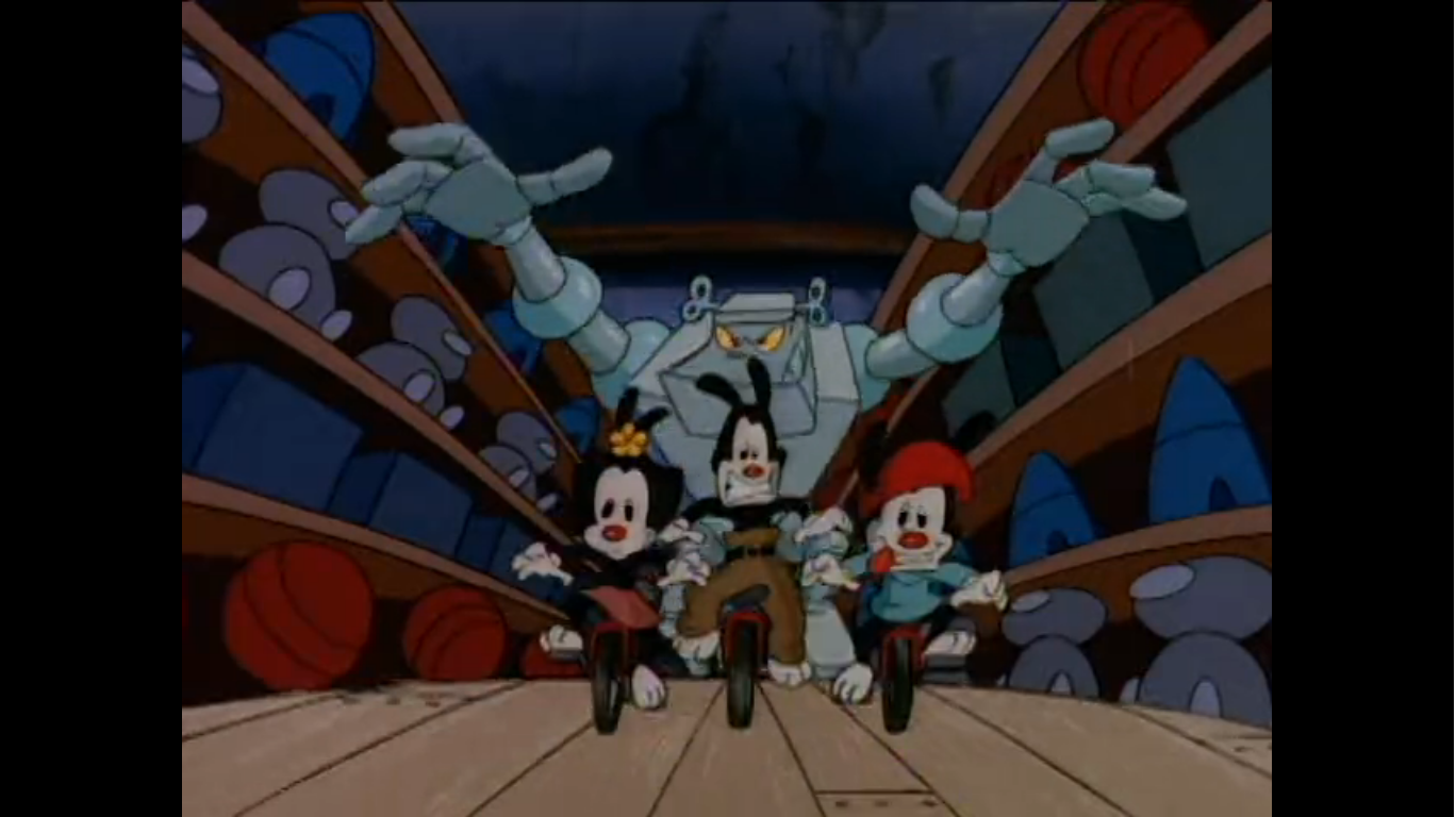
It’s the fifth of December so that means we are returning to one of the 25 Greatest Christmas Specials (as decided by me because it’s my blog) to take a deeper look than what was done some 8 years ago. When I re-evaluated my Top 25, one of the biggest fallers was A Flintstone Christmas. It dropped from number 9 all the way down to 25! I attribute that drop to some of the shine waring off. When I did that countdown in 2015, I had probably only had the DVD for A Flintstone Christmas a short while. Prior to that, it was a thing I felt like I had to get lucky to catch on TV as a kid. It was the sort of special I only saw once a year, if that, so it never had a chance to ware out its welcome. Now that I own it, I’ve easily more than doubled my viewings over the years from when I was a kid, and while I still enjoy it, I do see more of the flaws. And at approximately 48 minutes, it gets a bit long. Had I known I was going to revisit all of these specials in the future in more detail, maybe I would have dropped it all together? Doing these write-ups for a broadcast hour-long special is pretty tiresome. I could have saved myself a whole lot of time if I just kept Morel Orel, but that would also be cheating! I think this one still belongs, even if just barely, so lets get to it.
A Flintstone Christmas was released in 1977 by Hanna-Barbera as one of the first post The Flintstones television specials. For all of the comparisons that we used to see between The Flintstones and The Simpsons, The Flintstones never had nearly the kind of run The Simpsons is still having. That’s true of a lot of shows, but I can still recall when passing The Flintstones was an important milestone for The Simpsons so it’s always a bit surprising to be reminded that The Flintstones aired from 1960 to 1966. This special came out more than ten years after the show had ceased production. It obviously aired seemingly endlessly in re-runs and there were spin-offs, but the show proper had a somewhat short existence. This special was apparently pretty successful though and the franchise gained new life via a series of specials in the early 80s. These cave people refused to die, though now they’re mostly cereal and vitamin pitchmen.
During the show’s run, there was the episode “Christmas Flintstone.” We’ve already covered that one extensively here, but to summarize, Fred ends up taking on the role of Santa Claus to basically save Christmas. For A Flintstone Christmas, the same plot is recycled and expanded upon with some differences. Perhaps most notably, Barney is now along for the ride. And since this was a television special, the running time is doubled and we get some songs tossed in. Perhaps most notably these days, is the circumstances for Fred taking on the Santa role have been altered. In “Christmas Flintstone,” Santa has a cold and has his elves track down the guy he thinks is best at playing him which turns out to be Fred. In this special, Santa falls off of Fred’s roof and gets hurt so he needs Fred to take over. It’s a plot that’s pretty damn close to a certain movie starring Tim Allen. Of course, in The Santa Clause old Saint Nick actually kicks the bucket. That movie was more interested in showing how some jerk can basically turn into Santa Claus and assume that identity permanently. A Flintstone Christmas just wants to put Fred in a sled.

Something I did not talk about when first covering A Flintstone Christmas was its relation to another Hanna-Barbera Christmas special: A Christmas Story. That special about a mouse and a dog trying to deliver a letter to Santa doesn’t share any plot details with this one. It doesn’t even feature any popular characters. The only thing it does share with this special is the music. Multiple songs from the 1972 special are recycled and repurposed for this one. It’s pretty odd, and I can’t find any account for why that took place, but I have some thoughts. A Christmas Story, not featuring any recognizable Hanna-Barbera characters, may have been viewed as a dud. It’s a lot easier to market Fred and Scooby-Doo than it is Goober and Gumdrop. That special was also written by Ken Spears and Jack Ruby, the former top duo at Hanna-Barbera who would leave to form Ruby-Spears animation. That duo is credited with creating Scooby-Doo and they left Hanna-Barbera in 1977. Ruby-Spears was created to compete directly with Hanna-Barbera, so maybe burying their Christmas special and using some of the assets to create this new one was a shot at them? Considering the timing, that seems unlikely, but it is more juicy to think of this one as born out of a grudge between the aging duo of Hanna and Barbera waging war with their former proteges.
I suppose it’s time we just dive into this one since this is going to be a rather lengthy write-up. For A Flintstone Christmas, most of the case of The Flintstones was able to return. One person who was not was Alan Reed, the original voice of Fred Flintstone. He passed away in 1977 opening the door for Henry Corden to assume the role. This was not Corden’s first time voicing Fred, but it was probably the most exposure his Fred voice had received as previously he was doing things like records and wrap-arounds on package shows as the character. He had also already been Fred’s singing voice in The Man Called Flintstone as singing was something Reed either couldn’t do or disliked doing. As for the rest of the cast, both Mel Blanc and Jean Vander Pyl were back as Barney and Wilma. Gay Hartwig voices Betty Rubble and she had been doing the character since 1970, though she had never voiced Betty on the actual series. Also returning is John Stephenson as Mr. Slate and Hal Smith as Santa Claus. Smith was basically the Hanna-Barbera Santa. Making her debut as Bamm-Bamm Rubble, is Lucille Bliss, a prolific voice actor who, to my surprise, didn’t voice Bamm-Bamm much. He and Pebbles (voiced by Vander Pyl) are basically kids in this one and I don’t think there is a ton of Flintstones productions where they are at this age so that might explain things.
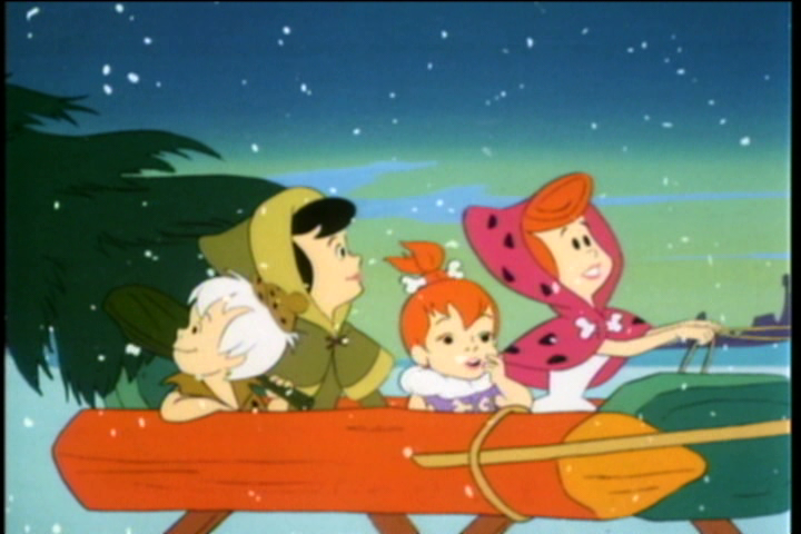
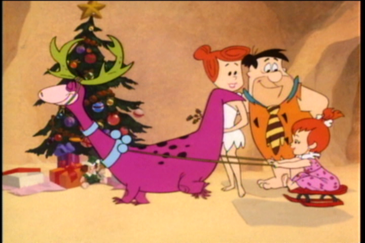
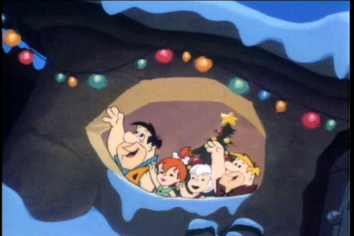
The special begins with a snowy setting. Dinosaurs are peering around and some serene music fills the air. The song is “Sounds of Christmas Day,” our first piece of recycled music from A Christmas Story. After we’re shown the title, a sleigh comes into frame. It’s being driven by Wilma and she’s joined by her daughter Pebbles, friend Betty, and her son Bamm-Bamm. The sleigh is being pulled by a blue mastodon and they’ve just picked out their tree for Christmas. Curiously, only Wilma and Pebbles have selected a tree and it would seem the Rubbles are just along for the ride. They’re rather content with their selection though as they head towards Bedrock.

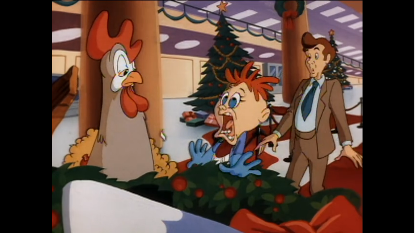
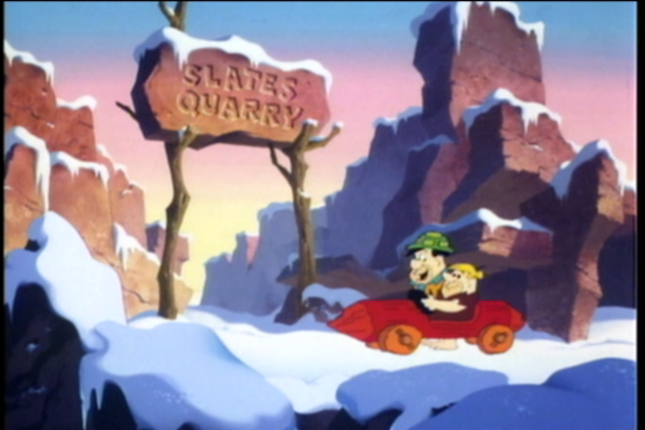
In the snowy town below, Fred and Barney are roaming the streets. They’re dressed as they always are, but they’ve added a scarf to fight the cold. They still have not invented shoes, apparently, so they’re just walking through the snow in bare feet. Barney remarks how another Christmas is upon them which allows the two to reminisce a bit as they look at toys through a shop window. Already, the special has committed a sin against The Flintstones brand by depicting a toy train that’s just moving on its own without any explanation for how it could be powered. I’ll overlook the lighting in the street, but come on, at least have it being pulled by a mouse or something!

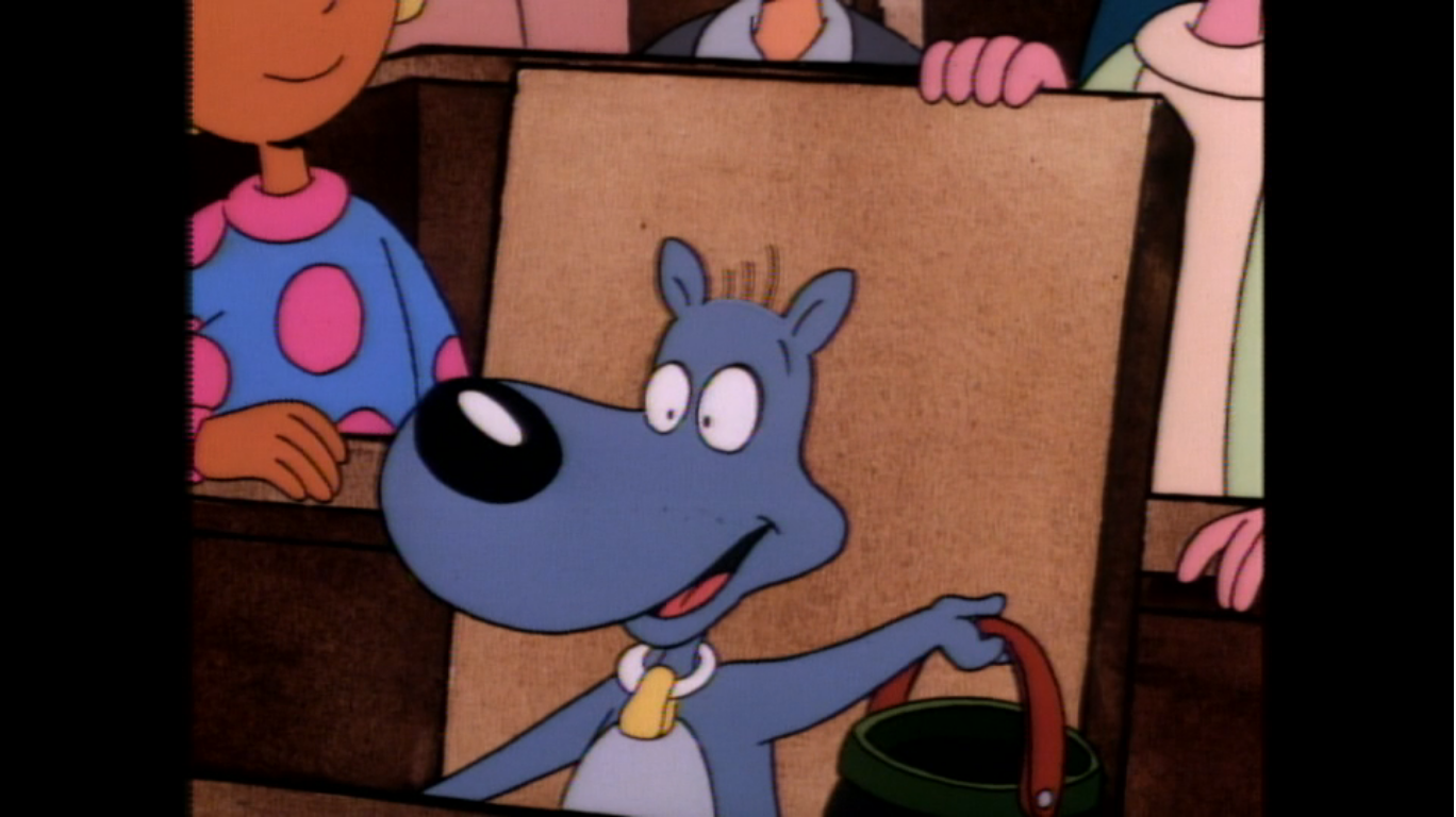
As the two walk through town, Barney keeps casually tossing coins into the collection buckets manned by bell-ringing Santas all about town. Fred makes a crack about Barney going Bro-bro-broke this holiday season if he keeps this up, but Barney confesses he has a weakness for Santa. And since there are so many, he has to keep donating just in case one of them happens to be the real Santa! This leads us into our first song break of the special, “Which One is the Real Santa Claus?” This is another of the recycled songs from A Christmas Story and it’s basically the same, only now Fred and Barney get to interject here and there as they look over these Santas. The premise of the song is just to show us a bunch of different people playing Santa, and Fred and Barney get to point out the inaccuracies like the one with his whiskers tied to his head or the one with a belly full of straw. The recording sounds like its exactly the same from A Christmas Story, and even Fred and Barney’s comments are the same as Gumdrop’s remarks. It’s amusing to me that they apparently didn’t bother to re-record it, but I guess they liked it as-is. I will say, the animation is more lively for A Flintstone Christmas and not as repetitive. And it’s a good observation for a Christmas special to base a song on.
When the song is finished, Fred and Barney resume this town crawl they’re on. I assume they’re Christmas shopping since Fred does have a gift under his arm. Their meandering leads them to a pet shop where the two look at a bunch of little dinosaurs that look in Dino. Fred thinks one looks like his boss, I guess because it’s small? Barney ponders the thought of getting Bamm-Bamm a pet for Christmas (I thought they had Hoppy?) and theorizes that one could double as a guard dog. When Fred laughs and points out how little the pup is, he gets bitten on the finger for underestimating the runt.

The next morning, the Rubbles approach the Flintstone’s house. Barney is apparently giving Fred a ride to work while inside Fred is decorating the tree Wilma and Pebbles picked out the night before. It seems an odd time to decorate a tree, but maybe it’s an ancient cave man custom? Barney yanks the door bell, which is a monkey’s tail. He’s alerted to ding some bells which are colored red and green for the holidays. When done, he just goes back to sleep. What? No sarcastic remark?!

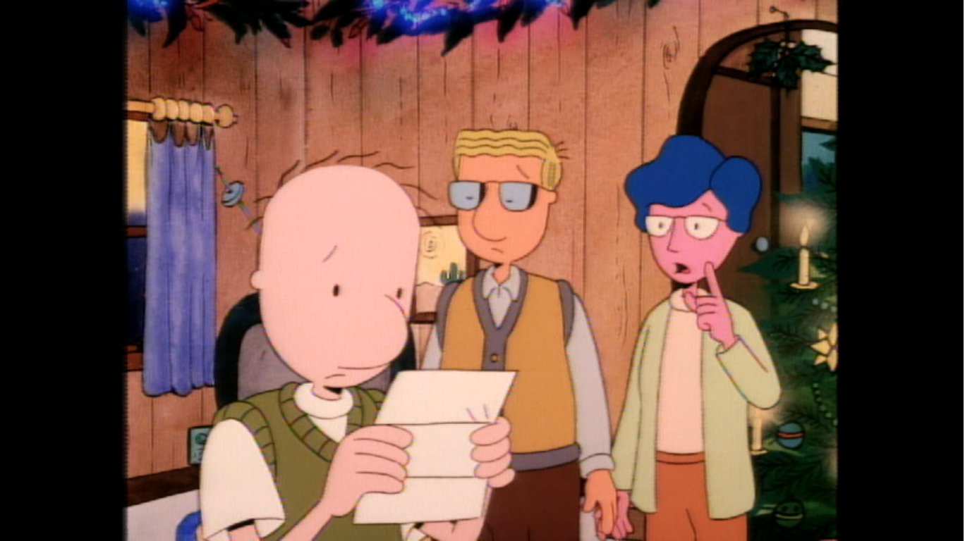
Fred, who is on top of a ladder in a precarious position, seems excited that Barney is here to take him to work. Dino is excited too and his running by caused Fred to teeter. Eventually, the ladder will fall leaving Fred dangling from the tree like an oversized, grumpy, ornament. As the Rubbles enter and admire the tree, Betty quietly asks Wilma if she had a chance to ask Fred about something. She has, twice, and he’s said “No” to whatever this secret request is. Barney and Fred need to have a contest of ornament placement for some reason, with Barney selecting a spot for the final one (they all look like painted rocks) that Fred disagrees with just because they’re men and everything has to be a competition. He then places it in the spot he declares is perfect with predictable results. The tree falls on him pinning him to the floor, but good thing Barney is here to remind us that Bamm-Bamm is the strongest kid in the world and he effortlessly picks the tree up with one hand to free his Uncle Fred.

Wilma thanks the lad for his assistance then tells Pebbles to take Bamm-Bamm to go listen to some records because she needs to talk to her father. When the kids are gone, Wilma and Betty try to bring up the topic again. It seems that a local women’s group is hosting a gathering tonight, on Christmas Eve, for the town kids and they want Fred to play Santa. Fred refuses on account of the guys at work will poke fun at him and right on cue Barney wonders where they could find a suit big enough to fit Fred. Fred uses that as proof of what he’s talking about and refuses to discuss it further. Barney kisses his wife goodbye while Fred storms off. He then pops back into frame to give Wilma a kiss as well (on the cheek, these guys are still prudes) which softens her demeanor. They don’t seem too discouraged by Fred’s refusal, likely because they have an ace up their sleeves. Or they would if they wore sleeves.
We next find Barney dropping Fred off for work. Barney’s car appears to be a hollowed out log on wheels. We only see it from the side, but it sure doesn’t look like a two-seater. That must have been a very uncomfortable ride (or perhaps extremely comfortable, depending on how they feel about each other). Fred heads into work and is immediately told by the foreman, Ed (Don Messick), that Mr. Slate wants to see him. This immediately unnerves Fred, but Ed doesn’t care and cheerfully tells him that he’ll help Fred look for a new job. Nice guy.

Fred heads inside to the elevator and pulls the lever to take it down. As he does so, he’s just muttering to himself trying to reason why Mr. Slate would want to see him. It’s a reassuring exercise as he’s trying to convince himself there’s no way he should be fired. Once the elevator is engaged, we see it’s operated by a brontosaurus like dinosaur. He’s green and he operates the elevator via a rope in his mouth. When Fred pulls the lever, the guy on his back (voiced by Hal Smith) gives the command to start moving which lets the elevator go down. He then complains the dinosaur is moving too slow and that this is supposed to be an express elevator (it’s only one, maybe two stories at most). The dinosaur just looks at the guy and says “Huh?” and as he does he lets go of the rope causing the elevator to plummet to the bottom. Fred is in such a daze though that he doesn’t even notice and continues walking like nothing happened.

Outside Mr. Slate’s office, Fred tells the secretary he’s here. She speaks into an intercom telling Mr. Slate that Flintstone has arrived and a little purple bird makes a stereotypical parrot sound and flies off. It lands in another intercom box in Mr. Slate’s office and repeats what the secretary said. Mr. Slate calls for Fred to enter, and the bird flies off and relays the message. After doing so, he mugs for the camera and remarks, “Eh, it’s a living.” I feel like anytime someone makes a joke about The Flintstones in such a way that’s the line they always parrot, pun intended. Family Guy has definitely done this, right? I wonder how many times that line has been delivered by a creature on the show in a similar manner?

Fred enters the office and asks Mr. Slate what he wanted to see him about. Mr. Slate starts talking about a new job for Fred which immediately causes him to start groveling. He dives under Mr. Slate’s desk so he can grab his ankles and beg which just annoys the guy. He requests Fred to grovel standing up and Fred does as he’s told. This is so pathetic, Fred. Mr. Slate then tells him that the Women’s Auxiliary Club is hosting an event for underprivileged children and that Mrs. Slate wants Fred to play Santa Claus. This is the exact same gig Wilma and Betty were trying to get him to take, but since it’s now coming from his boss, Fred is more than happy to accept. He shakes Mr. Slate’s hand so hard that it won’t stop shaking. Fred happily scoops up the box containing the Santa suit and assures Mr. Slate he won’t regret this. As he heads out, he exits through a door that is clearly not the one he entered through. He closes it behind him, but then reemerges to wish Mr. Slate a “Merry Christmas!” Slate then orders Fred to get out of his closet and he sheepishly pokes his head out and apologizes referring to him as “Boss” in the process. Pathetic.

With that settled, Fred can now merrily exit the office. He punches in, and we see a tired, worn out, little bird has to chisel the time cards each time someone punches in and out. He’s too tired to offer a quip of any kind. There’s then a time skip and Fred is leaving work much happier than he entered. He tosses a coin to the first Santa he sees before going into his solo song – “It’s My Favorite Time of the Year.” This is Fred just galivanting about town telling us how Christmas is his favorite time of the year. Similar to “Which One is the Real Santa Claus?” Fred will sing a part then interject a comment of some kind like “Every house wears a blanket of snow!” This breaks up the melody, which is a bit jarring and an odd choice. We also get another shot of a toy train, different from before, and for some reason Fred indicates it will soon be his? I may have missed a detail in the song. It ends with him putting his turtle shell helmet on a snowman some kids made before stepping on a sleigh that sends him hurtling towards the neighborhood.

When Fred arrives, his helmet has returned to his head and he eagerly heads into the house calling for Wilma. Dino (Blanc) has other plans as the dinosaur practically mauls his beloved master and Wilma has to get him off. She points out that Dino just loves him, and as Fred stands and tells Wilma the now good news Dino has a hand on his shoulder like a supportive lover. It’s both adorable and a little weird. Fred then tells Wilma how Mrs. Slate wants him to play Santa Claus at the party tonight. When Wilma asks what changed his mind, Fred starts to go over the events from earlier, but he retells them in a very different manner. In his version, Mr. Slate called him into the office and started buttering him up and told him he was selected for his fantastic acting ability (Fred already asked Mr. Slate if that was the reason, and the bird from the office confirmed it was because he’s fat). He’s excited now though and Wilma, who likely sees through her husband’s ruse, just lets him have this small victory.
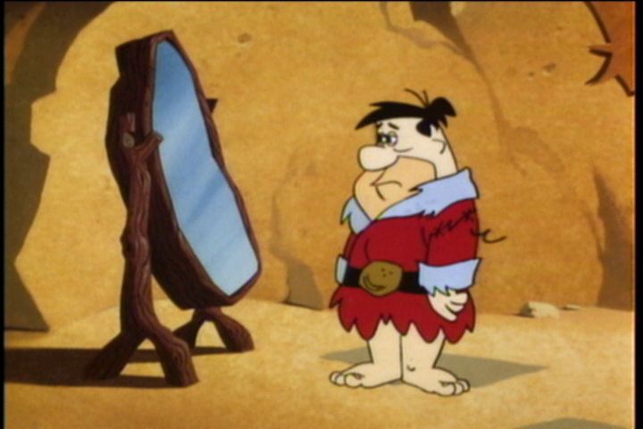
With Pebbles across the street at the Rubbles’ house, Fred is free to try on the suit Mr. Slate gave him. He’s a bit dismayed to see it’s pretty rugged looking. Wilma assures him he’ll look better with the hat on which seems to work to cheer him up once he places it upon his head. Strangely, there’s no beard with this suit which seems like a pretty serious omission. Barney then arrives and he’s able to get in a bunch of fat jokes at Fred’s expense. Seriously, is Fred really that big? He looks pretty normal for a character on this show. Anyway, Fred even tries to just go along with him this time claiming he’s dedicated to the role, but Barney just keeps going and Fred has to basically threaten him with violence, in a subtle manner, to get him to stop. Fred’s actually a decent guy for not going low with return insults. Barney is both short and also struggled with infertility, those are some easy targets. Wilma then announces she’s leaving to help set up for the party. She blows her husband a kiss and heaps a ton of praise on him for doing what he’s doing. It’s actually really sweet.
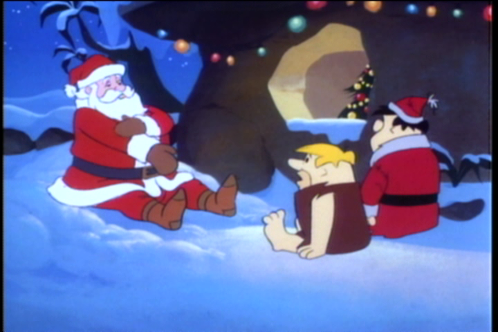
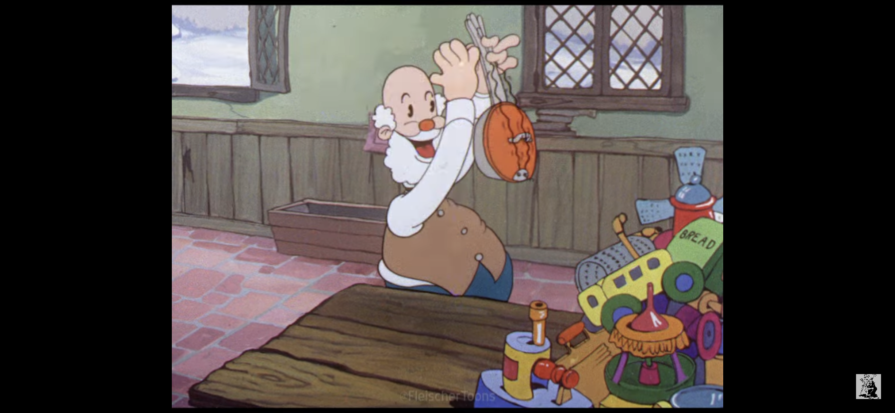
As Fred and Barney muse about what a great “gal” Wilma is, they hear a crashing sound coming from the roof. They race outside and see what should be two unfamiliar objects poking out of a snow bank. They’re boots, and apparently they do know what boots are despite never wearing any. Fred and Barney both give a tug which just causes the boots to come off. When they wonder who they belong to, a voice from offscreen says “They’re mine!” It’s Santa, and he has completely emerged from the snow bank with not a flake upon him. He’s been redesigned since “Christmas Flintstone” and looks far less ragged. Fred is wondering what this guy is doing so far from his street corner while Barney immediately recognizes the guy for who he is. He then complains to Fred about his roof and describes it as an obstacle course up there. The guy’s hurt too, so Fred decides they better bring him inside.

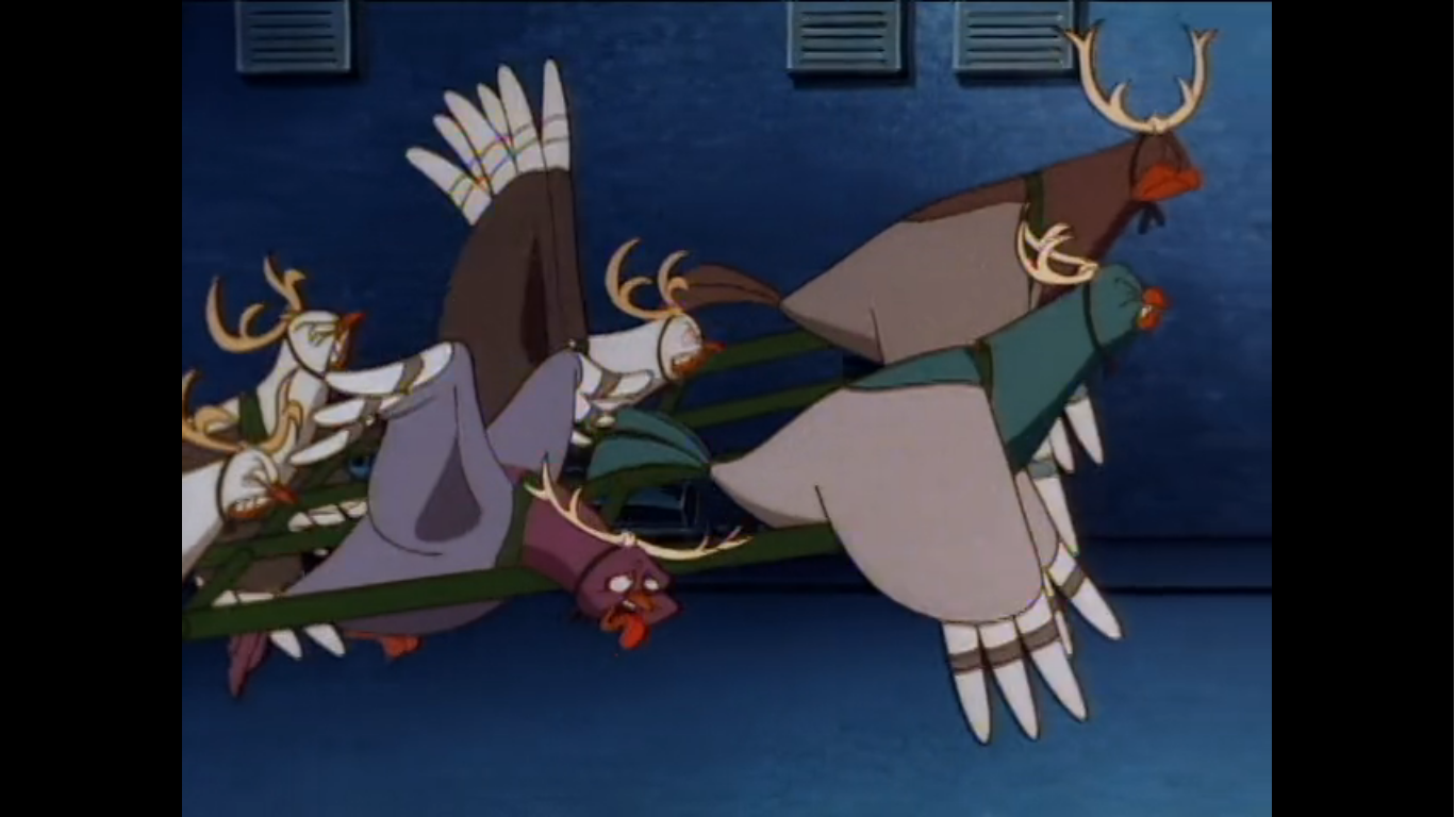
Once in the house, Santa requests the use of Fred’s telephone. Fred says okay, but tells him no long distance calls! Santa then flops on the surely comfortable stone couch and asks the operator to connect him with The North Pole. Hey, he said no long distance! Fred hears this and surprisingly doesn’t get mad, instead he tells Barney to go alert the asylum that one of their boys got out. Barney reluctantly does as he’s told, but once outside he hears something which directs his gaze to the roof. Sure enough, upon that roof sits Santa’s sleigh and eight reindeer. Surprisingly, we’re playing it straight with the reindeer and not going with some sort of dinosaur hybrid. Barney shouts out for Fred to come and see this and initially Fred tries to silence him so as not to alarm the neighbors. Fred then finally looks at the roof and sees what Barney sees. Finally, he’s convinced this is the real Santa which excites the crap out of him! He jumps up and does his running in place gag and yanks Barney backs inside the house.

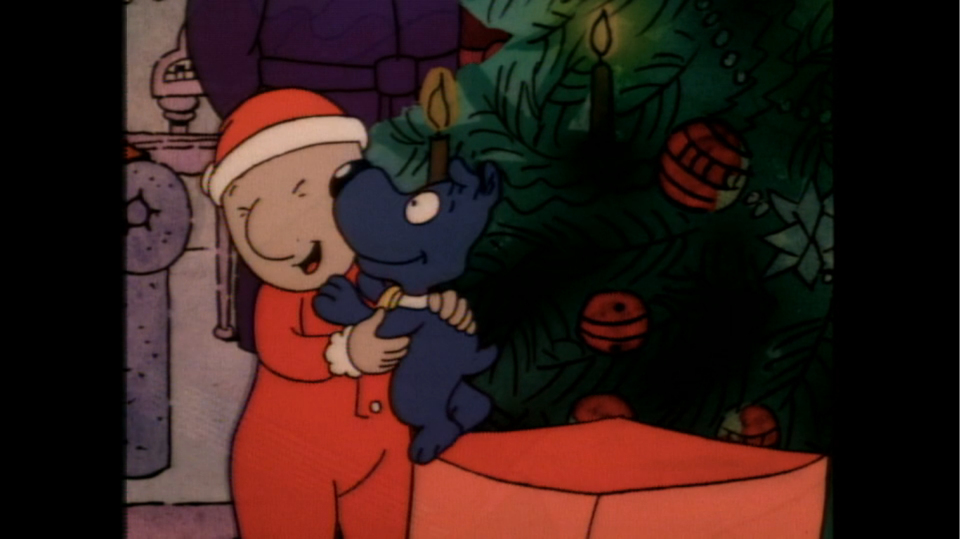
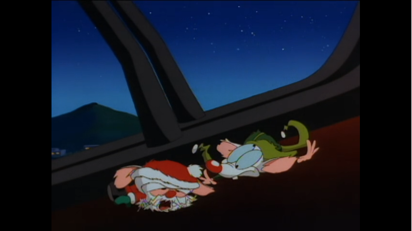
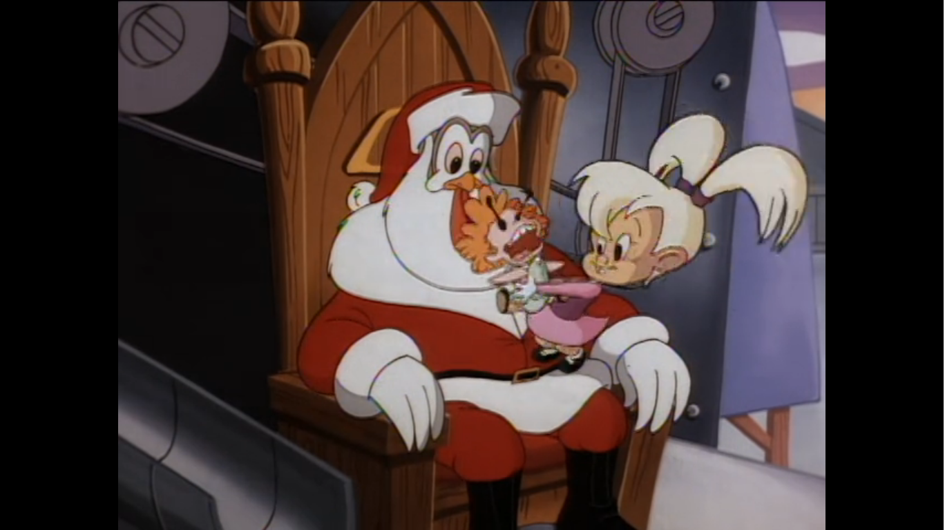
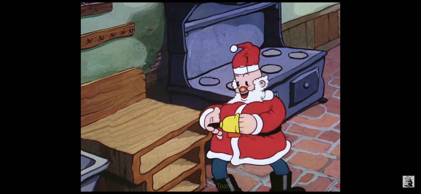
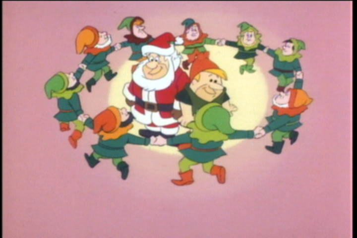
Now that Fred has been made a believer, the three of them can get down to the matter at hand. Not only is Santa injured, he’s also caught a cold. Fred points out the obvious that Santa is in no condition to deliver presents tonight and Santa is forced to admit that sad truth. He can’t take a day off though, not on Christmas Eve! He then wonders how he could possibly find someone jolly enough, and fat enough, to replace him. Barney is happy to point out that his chubby friend is the perfect fill-in and even volunteers to be Fred’s elf helper. Santa thinks this is a great idea and uses some Christmas magic to outfit Barney with a green tunic with orange stockings and a hat. Fred, in his rather sad excuse for a Santa suit, can’t be seen in public like that so Santa uses his magic to bestow his suit on Fred instead complete with a big, white, beard. Fred is pretty smitten with his new threads, and after Santa thoroughly confuses him with instructions for piloting the sleigh, Fred vows to not let Santa down! He then immediately trips over Santa’s legs and falls flat on his face. Santa seems less than confident about what’s about to take place, but I say cut the guy some slack. This is likely his first time ever wearing boots!

Up on the roof, Fred tries to remember how to start the sleigh. Barney reminds him that he has to call out the reindeer by name and we soon find out that Fred has no idea what their names are. As he embarrasses himself, Barney is left to chuckle and then correct him. He calls out the reindeer’s names and as he does we pan to each one like the animators are showing off that they did indeed draw eight of them. The sleigh rockets into the sky and Fred congratulates himself for remembering. The animation of the flying sleigh isn’t super ambitious, but it is nice looking as there’s a lot of sparkle effects added like it’s running atop a glittering road.

Fred and Barney arrive at the first house and Fred dives into the chimney with his customary “Yabba dabba do!” and has a fairly harsh landing. At least the fireplace wasn’t lit. Barney calls down to see if he’s okay and Fred sarcastically tells him he loves falling down chimneys. He then calls for the presents and Barney just dumps them down the chimney burying his friend below. Some helper. We then cut quickly to the party that Fred is supposed to show up at. Mr. Slate is wondering where Fred is while Wilma is there to assure him that Fred will be along soon. We’ll be checking in on this situation a lot tonight. Back at the house, Barney asks Fred if he’s done yet only for Fred to reply that he’s been done for awhile, he just can’t get back up the chimney. Barney suggests the front door and Fred agrees that’s a sensible solution to his problem. He quietly exits the house, but as he does he fails to notice the “Beware of Dog” sign. A little triceratops style dinosaur sneaks up on Fred and bites his foot. He howls, but the pain caused him to jump up onto the roof so I’d say mission accomplished!

At the next house, Fred has decided that it’s Barney who should go down the chimney instead. He has Barney standing on the chimney with a rope around his waist that Fred is holding onto at ground level. He’s wrapped it around the mailbox for added security. Barney has to ask why it’s he who is going down the chimney now and I assume he just wants to hear Fred admit that he’s too fat. With a chuckle, Barney jumps down the chimney, but he does so before Fred can yell “Go!” His descent catches Fred by surprise pulling him up onto the roof and into the chimney as well where he gets stuck with his feet sticking out. I wonder how many more fat jokes we have to endure?
It’s now time for a montage! Clearly, if we were to follow Fred and Barney to every house this thing would last way longer than 48 minutes so instead we just see them fly past obvious, global, landmarks while presents rain down from the sky. It’s set to the main theme of the special in an instrumental fashion, but soon some lyrics come in. “Sounds of Christmas Day” is performed as we see kids receive their presents which fall from the sky. They celebrate Christmas by ice skating, sledding, and doing what kids love to do most on Christmas Day – open presents!

When the song is over we check in with Fred and Barney. They’re feeling mighty good about the job they’ve done and Fred informs us they’re halfway through. Unfortunately, we have about 20 minutes left in this thing still to go so we need some conflict. Enter: The Storm! Turbulence causes things to get pretty bumpy in the sleigh. Fred tries to fly over it, but it’s no good. We see the pair bounce around and then cut to a close-up shot of the sleigh to see that there are no presents in the sleigh! This is a true Christmas emergency, but we back out for a longer shot and see the presents are returned. Phew, it was just an animation error. Wait a minute! They’re bouncing around again, and now the presents have bounced out! Oh, woe be to Christmas, presents for half of the kids in the world just fell out of the sleigh to land who knows where. This is a problem.

Barney soon takes note of a CB radio in the sleigh. He suggests they see if they can contact Santa via that device and Fred jumps onto it calling out for Santa. Barney tells him he can’t talk like that on a CB radio, you have to use CB talk! Barney takes over and calls out “Sky Sled to Big Red, do you have a copy?” which allows Fred to ask “A copy of what?” I’ve definitely never heard that one before. Eventually, Santa does answer and we see him back at Fred’s house where he just pulls the radio out of…lets not speculate. He doesn’t even let Barney explain and tells him he knows that they blew it. Fred then jumps on and tells Santa about the storm and, to Santa’s credit, he sounds concerned for their well-being upon hearing that detail. Fred tells him what happened, and Santa declares there’s only one thing they can do: head back to the work shop for more toys.
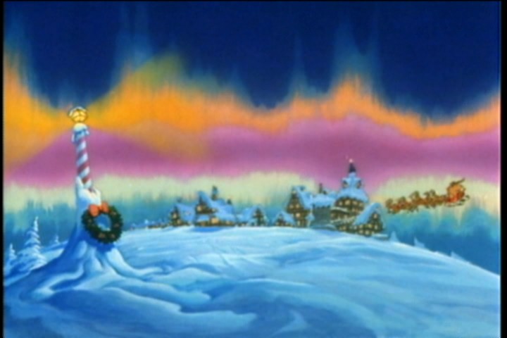
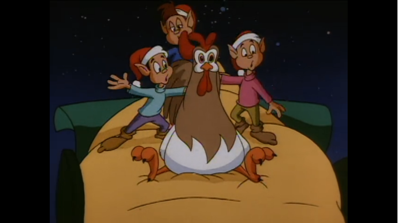
This is the point of the special where things start to feel a little long. This is clearly a detour that exists to just pad this one out, but it is what it is. Santa phones ahead to alert the shop to expect the two and we soon see Fred and Barney arrive. The exterior of Santa’s place is lovingly painted with the northern lights hovering in the sky overhead. The two head inside and are greeted by Mrs. Claus (Virginia Gregg) who tells the two the work shop is already working hard to fill the order. Barney and Fred take some time to admire the toys and when Mrs. Claus remarks they have the biggest Christmas list in the world, Fred gives her a “Yeah” that sounds so unimpressed, but I think it’s unintentional.

The two offer to assist in the work shop and Mrs. Claus, either humoring them or admitting they need all the help they can get, leads the pair in. They have to take a tram of sorts to get there and in no time at all Fred and Barney find themselves accidentally on the assembly line. Fred gets painted blue and the two get stuffed in a box by an automatic wrapper. They poke their heads out to take in the sights and see the elves hard at work. At this point, another song has kicked in and it’s called “A Brand New Kind of Christmas Song,” which sounds like the type of song one would write when padding out a Christmas special. It’s fairly unremarkable, but also not offensive or anything, and it has this horn gimmick it returns to frequently. Fred and Barney, predictably, are of no help as they act like kids might if they happened upon a magic toy shop. About the most help they provide is singing the final verse of the song.
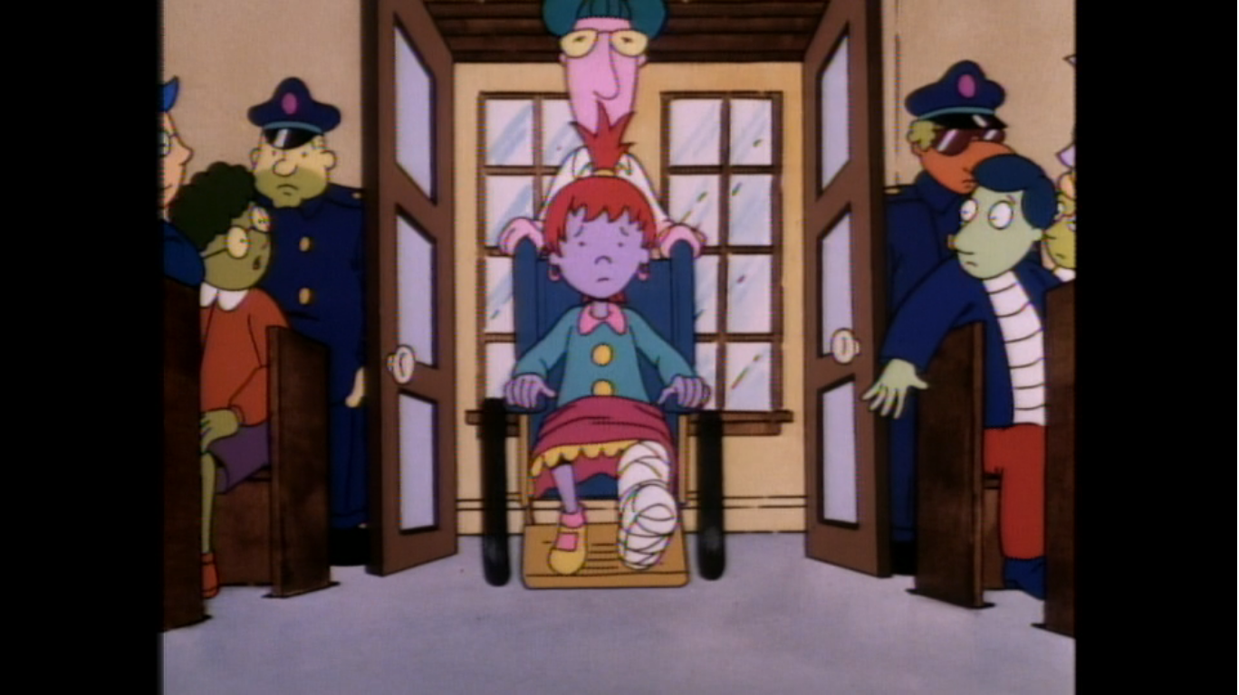
When the song is over the pair thank the elves and Mrs. Claus and say their goodbyes. Fred tries to recall the names of the reindeer, but can’t get past Dasher without the aid of Barney. He only calls out four names, but the reindeer get the idea and take off anyway. As the two remark what a great lady Mrs. Claus is, we cut back to the Bedrock Hall where Fred is supposed to make an appearance as Santa Claus. At this point the kids are all loudly demanding that Santa show his face and the adults don’t know what to do. Mr. Slate is more than a little irritated and threats of someone getting fired have begun. Wilma wonders where they could be and checks her watch. It’s digital, but it displays time in Roman numerals so…eh? Betty tries to reassure her that they’re probably planning a dramatic entrance, but Wilma is unconvinced and walks off wondering if Fred will lose his job. This leaves Betty to break the fourth wall by telling us that will be a great Christmas present – a pink slip. It’s a common style of delivery for jokes on The Flintstones, but it feels weird without a laugh track.

We then rejoin Fred and Barney as they deliver toys. They’ve solved their chimney problem by having Fred just drop presents from the sleigh down the chimney -that’s convenient! Barney remarks this is like having a party which causes Fred to remember the actual party. He immediately gets knocked off his game since he is sure that Mr. Slate will fire him for being a no-show tonight. With no other thing they can do, they call Santa once again. This time we’re not privy to the conversation and instead we jump forward in time so Fred can tell us that Santa told them to push the super speed button in the sleigh. Now that we’ve deus ex machina’d this little problem it’s time to return to Bedrock Hall.
And at the hall, the kids have not let up and Mr. Slate is implying there will be violence the next time he sees Fred. If you thought that meant he and Barney were about to show up then you’d be wrong. The special instead feels it’s important that we jump back to Fred and Barney just to see them make the last delivery. The super speed button is the biggest cheat code in any Christmas special as it allows them to zoom over a village and the presents just fall from the sky like homing missiles. They know where to go apparently, and so does Fred as he commands the reindeer to head for Bedrock!
In Bedrock Hall, Mr. Slate is now apparently hiding from this agitated mob of children behind a curtain. He tells Wilma that if Fred doesn’t show up in one minute he need not show up at all – here or at work! Wilma looks rather concerned, understandably, but has to put on a happy face as Pebbles approaches and declares that Santa isn’t coming. Wilma tells her she needs to have hope, which is when another recycled song from A Christmas Story enters – “Hope.” It’s a melancholy little song and it’s really not bad if you’re into that sort of thing. As it’s played, we see images of Pebbles waking up on Christmas morning and heading for the tree. We see Fred and Wilma looking on and exchanging gifts as well. I like the closing line of “Hope believes in Santa Claus,” and it’s a sequence I really want to love, but at this point in the special it’s arriving when we’re firmly in “Get to the fireworks!” mode.

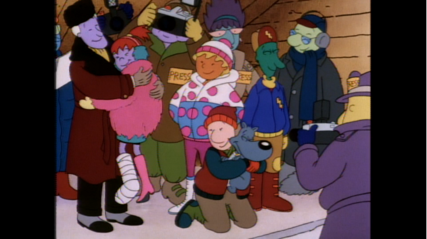
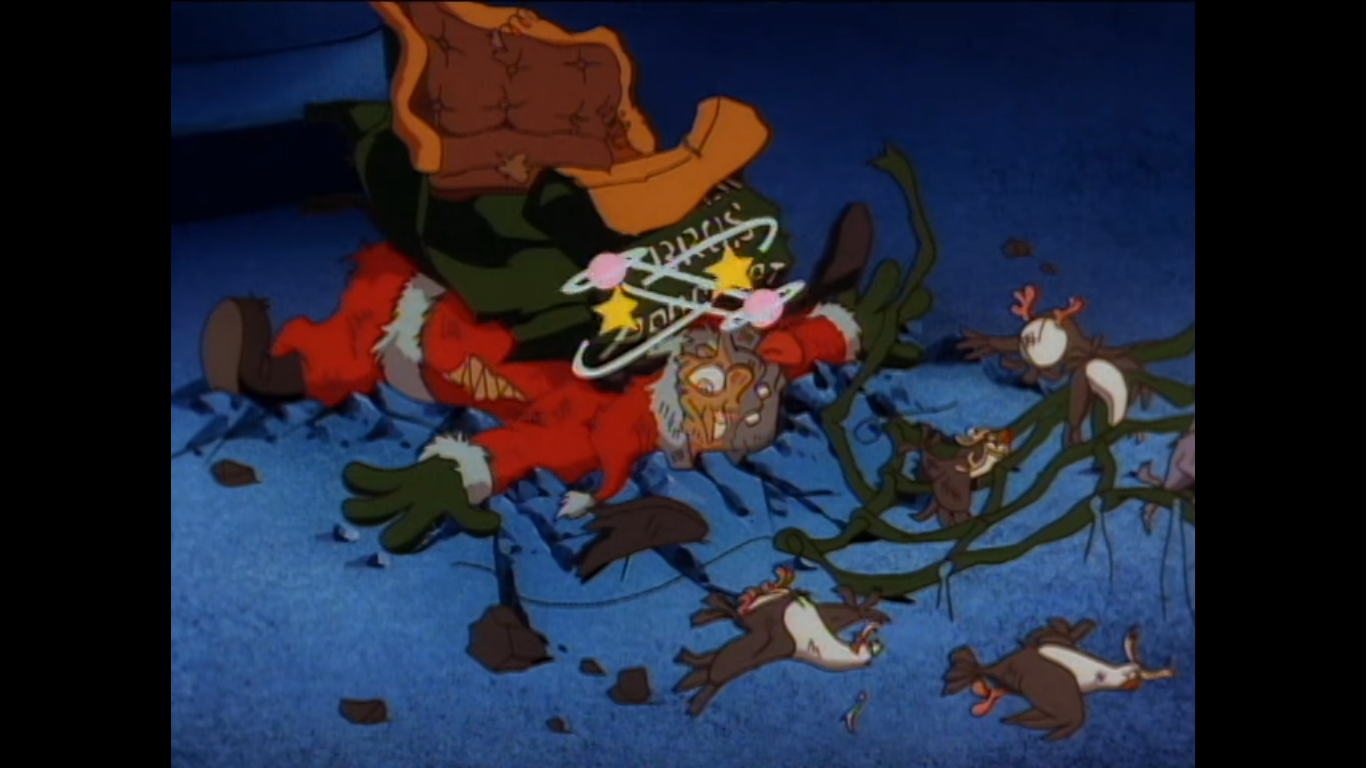
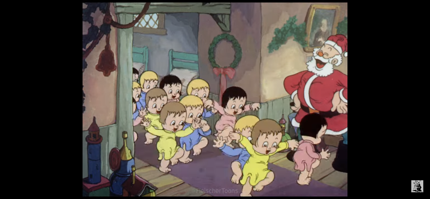
And we are finally there as we cut to Fred and Barney flying over Bedrock. They basically crash land on the roof of the hall which throws them from the sleigh and down the chimney. They land on their butts, but the kids don’t care about style points tonight as they immediately start cheering for Santa! Mr. Slate looks rather bewildered at the entrance, maybe he’s a bit shocked to see how well the ratty old suit he gave Fred earlier looks on him, and he soon approaches the pair. Betty and Wilma embrace in relief that the two arrived while Mr. Slate angrily gets in Fred’s face. “Ten seconds more and you would have been fired Flintstone!” His face then immediately switches to a smile as he adds, “But not after an entrance like that! Welcome Santa Claus, welcome to Bedrock!”
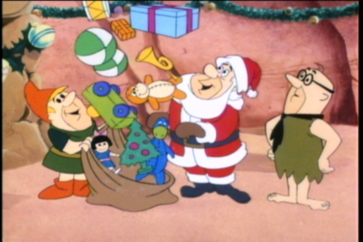
Unfortunately for Fred, he doesn’t have time to bask in the praise he just received from his boss because these kids are demanding presents. Fred reaches into his sack to retrieve them, only to find it empty. It’s at this point he realizes they got rid of all the presents in the sleigh and have none left. The kids are practically frothing at the mouth as Barney encourages Fred to try and see if he has any of that Christmas magic in him. He concedes that he can try, while Mr. Slate is thoroughly confused at what they’re talking about and demands they produce presents! Fred points his mittens at the bag and it explodes with presents! They land on the floor around them and the kids stampede on over. In yet another sign that we’re stalling for time, the animation cycles twice of the kids running so we see Pebbles and Bamm-Bamm, along with the other random kids, run past the camera twice despite said camera remaining in a fixed spot.

Fred and Barney bask in the glow of a job well done, but only for a moment as they soon realize they left Santa back at the house. They run out of there and race back to Fred’s house where the jolly old elf has apparently made a full recovery. He thanks the boys for a job well done and even offers that, should he ever find himself in another pinch, he’ll be calling. Santa then takes back his suit and he needs to get out of there because Wilma, Betty, and the kids are approaching. The women are also pretty salty at Fred and Barney for not staying to help clean up so they will have some explaining to do. Before Santa can leave though, Fred has to ask him one thing: how to get back up the chimney? Santa gives a chuckle and apologizes for not telling him how. He then demonstrates by placing a finger beside his nose, and then up the chimney he goes in a cloud of sparkles.

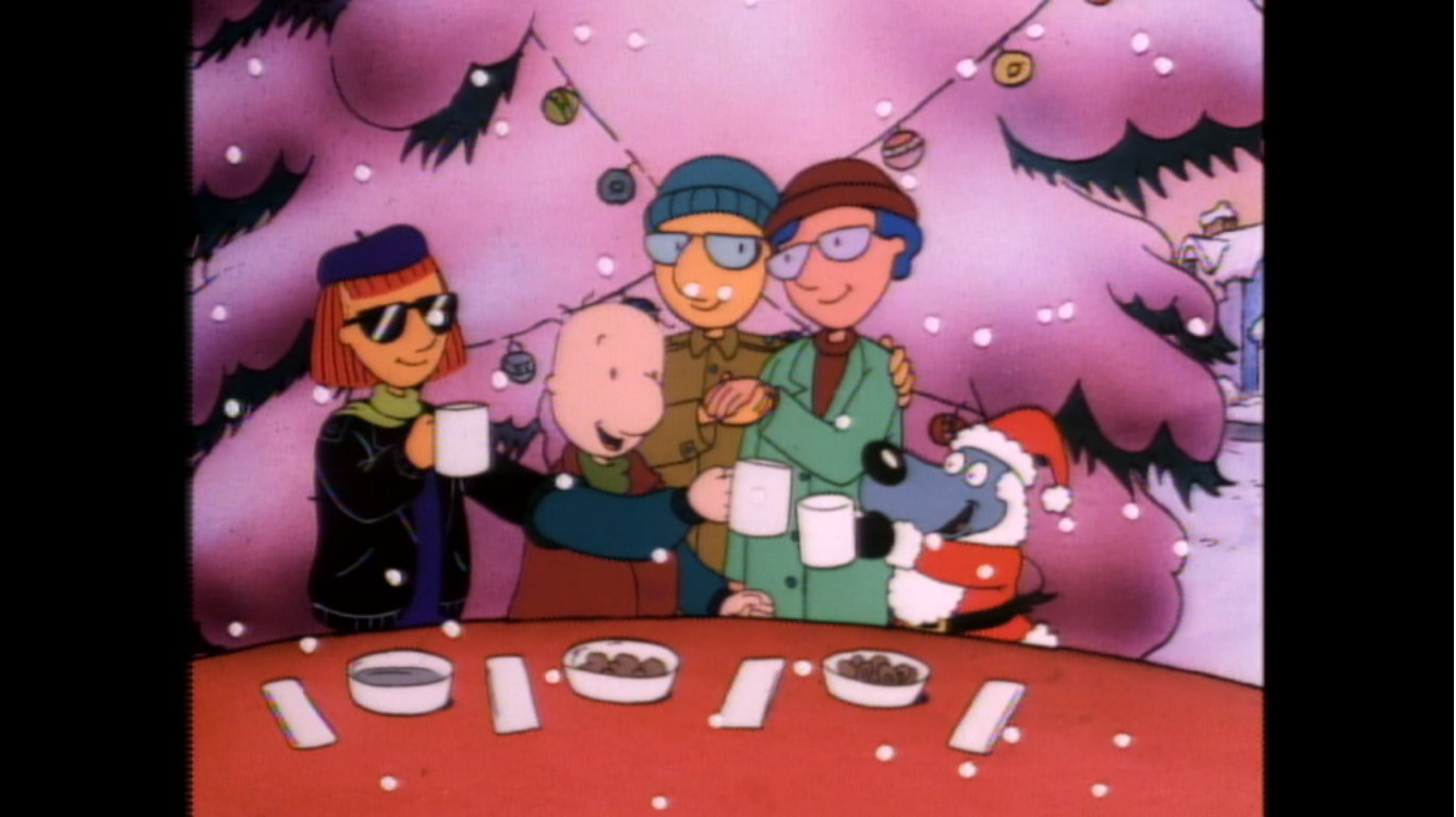
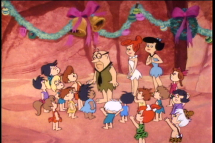
The gang then enters and Pebbles and Bamm-Bamm are still excited from their visit from Santa Claus and his elf. Fred and Barney give a little chuckle as Wilma and Betty storm over and demand to know what happened with them tonight. There’s no sense in hiding it, so they tell the truth: Santa fell off the roof and they had to pitch in and help with the presents. Wilma and Betty laugh and when Fred suggests they don’t believe them Wilma adds “Of course I don’t!” However, they’re still pretty smitten as well following that grand entrance and just can’t stay mad at their boys.
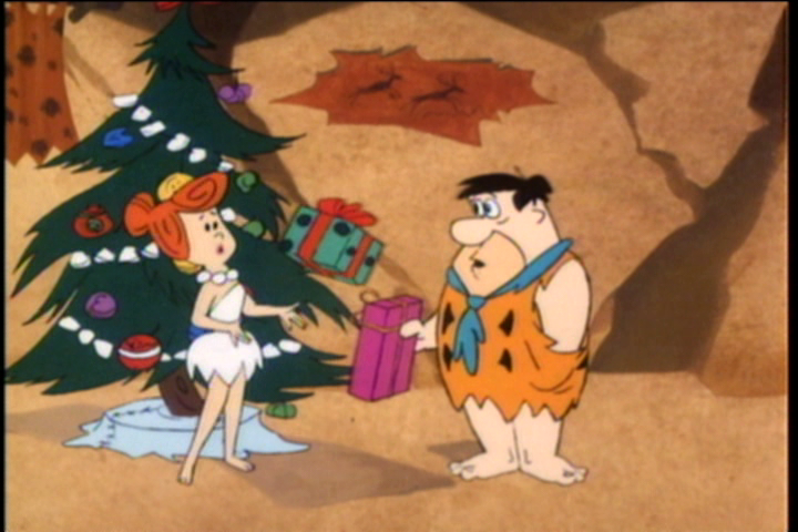
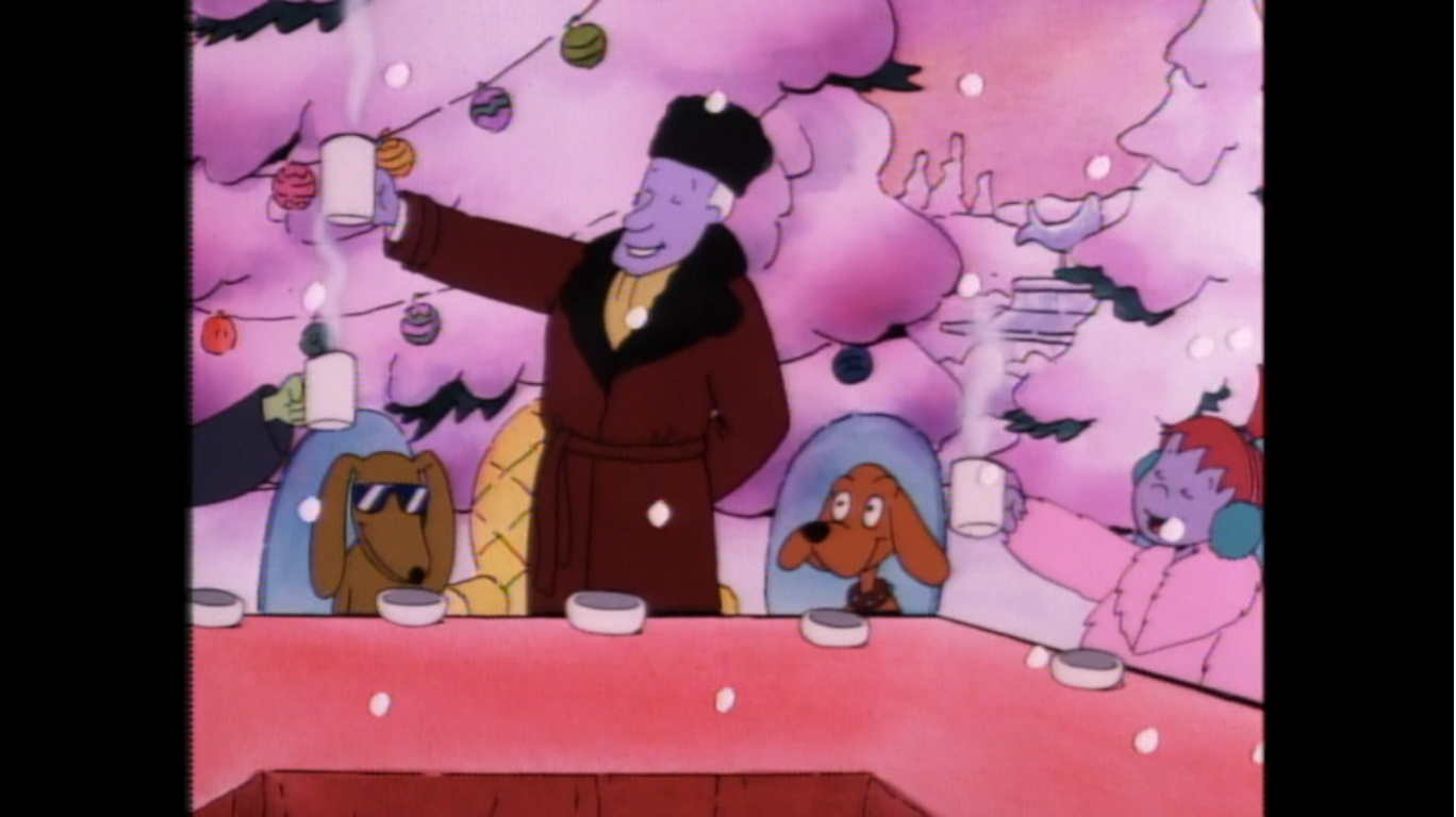
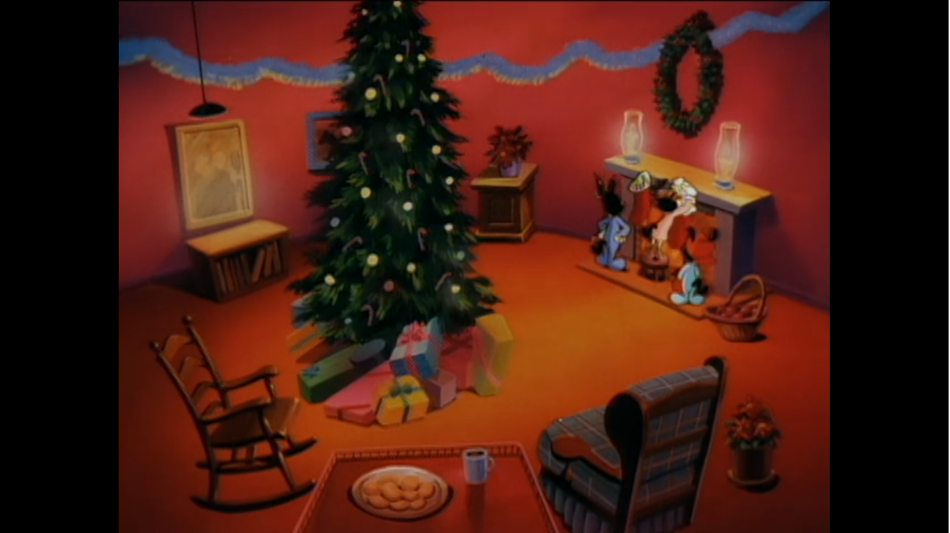
It’s then proposed that they exchange presents. Betty starts off by giving Barney his and he, in turn, pulls a present out from behind his back. Just where was he hiding that thing? Wilma hands Fred his and Fred reaches into his pocket to find…a hole. It’s implied he forgot, but lucky for him a certain magic man in a red suit owes him a favor. A wrapped present comes floating out of the fireplace and lands in Wilma’s hands. She laughs and remarks what a thoughtful way to deliver her gift completely ignoring the implausible nature of it all. She then does exactly what parents tell their children not to do -she openly speculates that it’s the present she wants most as she opens it. Seriously Wilma? That’s a real dick move! Fred can only cross his fingers that Santa got her the earrings she apparently wanted, but since this is Santa we’re talking about, Fred has nothing to fear. The gaudy sabretooth earrings are indeed in the box and both Betty and Wilma admire them. We don’t get to see what anyone else got.
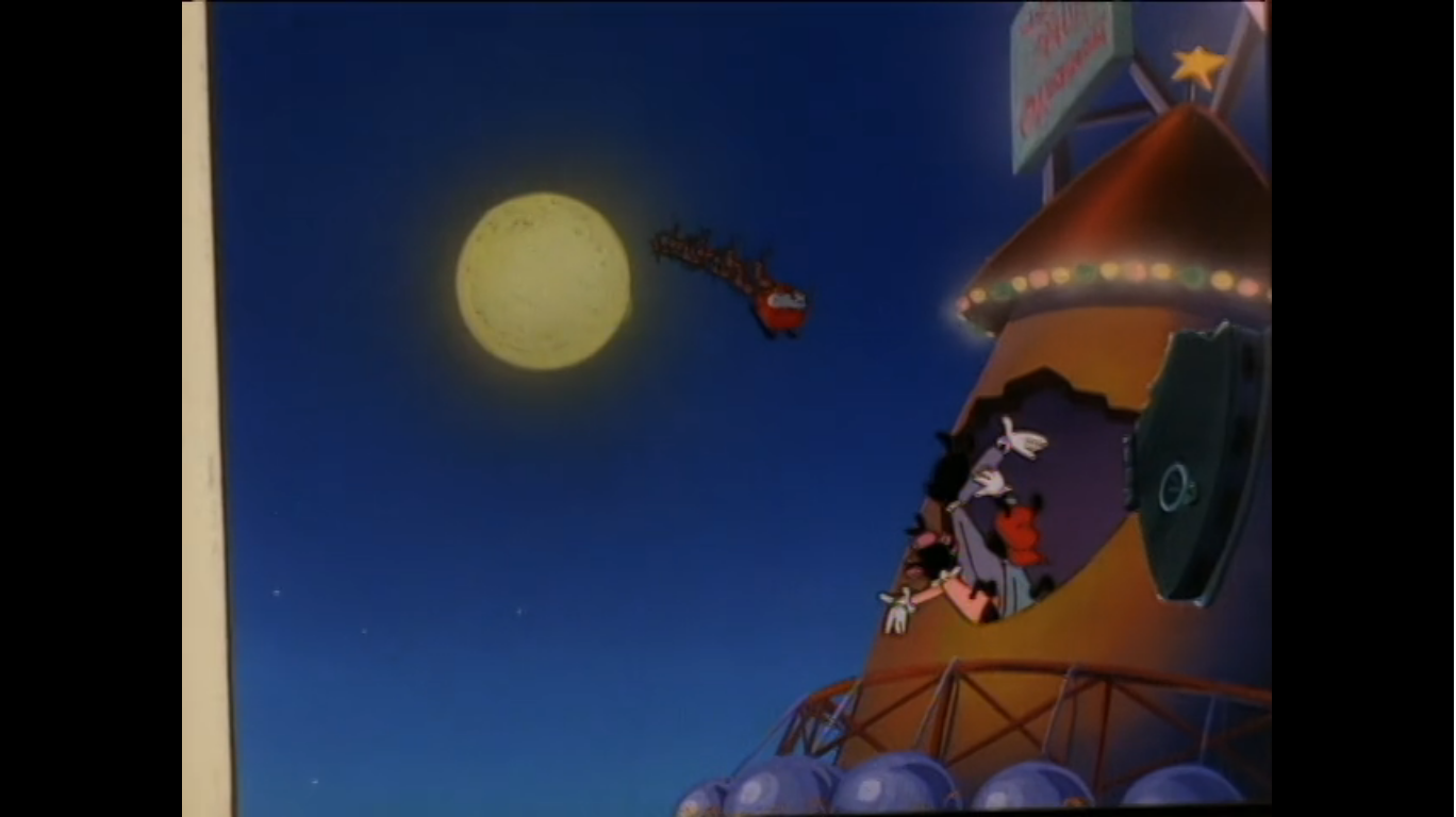
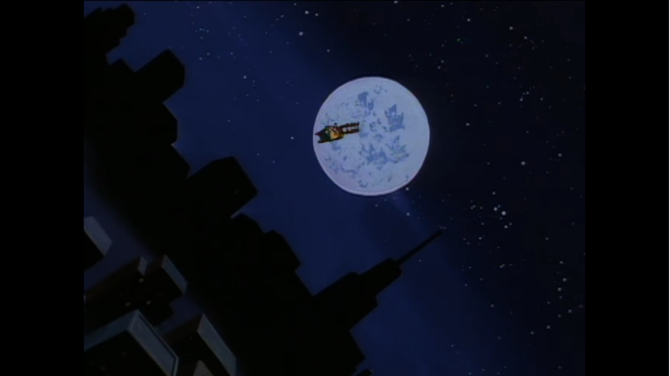
Wilma thanks Fred, and he apparently learned something tonight to not take credit for other people’s work (like he did with Barney all night) and tells Wilma she should really be thanking Santa. The kids then start calling out that they see Santa flying in the sky from the window. Wilma and Betty have a giggle at the imaginations of children while Fred and Barney race over to the window and start waving bye themselves. The women seem stunned a moment, but then laugh again. Wilma remarks that they certainly have the Christmas Spirit and Fred and Barney confirm to her that they sure do. We cut to the sky and are treated to a moon shot as Santa flies by. It’s he who gets the customary last line as he calls out “Merry Christmas to all!” and we close on a shot of Bedrock from sky level.

That is definitely a long one, but a charming one. I wasn’t shy about sharing my thoughts on when things started to feel like they were overstaying their welcome, but I enjoy the final pay-off at Bedrock Hall. Mr. Slate essentially does a Scrooge routine where he acts like he’s about to make life miserable for the protagonist, only to turn the tables on him. It’s effective and I love it here. The overall plot is also a good one. It’s easy to lose sight of that since it is so similar to “Christmas Flintstone,” but having your main characters take over for Santa on Christmas Eve is a good premise. Certainly far better than a parody, which The Flintstones will resort to in the future.
This being Hanna-Barbera, the animation isn’t anything to write home about. It’s better than a typical TV show and at least we get new character models with Fred and Barney in their Santa and elf costumes. They did do all eight reindeer, so I’ll give credit there since so many shows skimp on that detail, and the shots from the sleigh look rather nice. There’s just little to no attempt at special effect shots. Dino tackles Fred offscreen, Santa emerges from the snowbank offscreen, shortcuts like that permeate this one. There’s also a liberal use of recycled animation throughout. The train set from the beginning of the special is the same train set we see at Santa’s work shop, for example. It adds to the padded nature of this one. It definitely didn’t need to be 48 minutes, though I do think having a little extra than a typical episode of The Flintstones helps. A recut would certainly benefit the special. Or, if instead of making it shorter we just got to see more Fred and Barney delivering presents hijinks instead of the North Pole that might have been better. We basically see them deliver gifts at just two houses.

The music is rather pleasant throughout. “Sounds of Christmas Day” is essentially the theme of the special and it’s lovely as an instrumental. The special didn’t rely on public domain music, though it did recycle songs from that other Christmas special. It’s kind of funny that they did because those songs weren’t remarkable by any means, but again, it’s probably better than hearing “Jingle Bells” once again. The only song I could have done without is the one from the work shop, but that whole sequence could be dropped, as far as I’m concerned. And even though I said it was weird for Betty’s joke to lack a laugh track, that doesn’t mean I miss one. It’s actually really refreshing to watch The Flintstones and not have to hear one every 10 seconds.
Is A Flintstone Christmas one of the top 25 Christmas Specials of all time? For me it is. I’m not really a fan of The Flintstones, but I did watch the show a fair amount growing up. I’ve always liked the premise more than the execution when it comes to the show. I can’t really remember any specific episodes in great detail from my youth as it was one of those shows that was just on. As such, I don’t think nostalgia is playing a huge role in my enjoyment here. I suppose it is in the sense that I did get a little excited when I would come across this special as a kid just because it was something I didn’t see a lot. As someone who watched the same specials over and over year in and year out you can probably see how anything that felt “new” to me could be appealing. And yet, aside from the over reliance on fat jokes, this one charms the hell out of me. If it was just a little tidier it would be better, but as is, I still enjoy it quite a bit and I think you will too.
If you would like to make A Flintstone Christmas part of your Christmas viewing this year, it’s both easy and a little difficult. The DVD is one of those burn-on-demand releases and can still be found for fairly cheap and it comes with A Flintstone Family Christmas, a decent 90s addition to The Flintstone world. The special is available to rent on Prime video and Vudu, but is not presently on a streaming service. It is available for free on The Internet Archive and in great quality at that. It’s also available in other corners of the internet for free, but maybe at a lesser quality and likely with a Cartoon Network or Boomerang logo in the corner.
Can’t wait until tomorrow for more Christmas? Check out what we had to say on this day last year and beyond:

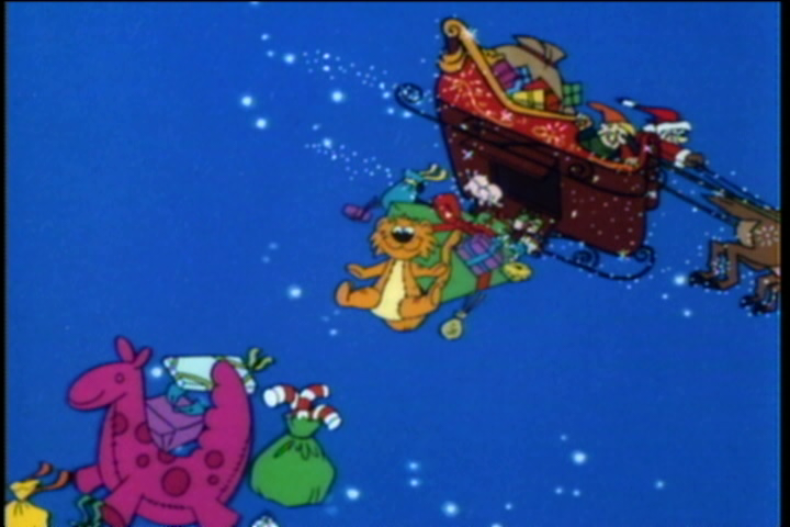
Dec. 5 – A Garfield Christmas
This year, I’m bringing back a feature from last year where I take another look at, what I consider to be, the greatest Christmas specials ever made. I explained my reasoning for doing this in prior posts, but in short, the first time I looked at some of these specials I did just a short…
Keep reading
Dec. 5 – Pluto’s Christmas Tree
Today we’re doing the second look-back to one of the best Christmas specials ever conceived, as chosen by yours truly, and it’s one of my all-time favorites: Pluto’s Christmas Tree. Despite being titled Pluto’s Christmas Tree, this Jack Hannah-directed cartoon short from 1952 is actually considered a Mickey Mouse cartoon. Mickey apparently had it written…
Keep reading
Dec. 5 – The Captain’s Christmas
Did you ever wonder where those speech balloons in comic books came from? Maybe you just assumed they were always there, but they actually originate from a comic strip titled The Katzenjammer Kids. The strip was created by cartoonist Rudolph Dirks and it debuted in newspapers in December of 1897. It was incredibly popular for…
Keep reading