When I was a kid, I didn’t really get a lot of comic books. I most often would encounter them at the grocery store and I always hoped my mom would end up in the check-out aisle with the comics instead of candy so I could maybe convince her to get me one. And when I was a kid, we also had an old hunting camp in my family for hunting and fishing. It was purchased by my great grandfather in the 1940s and it was basically a two-room dwelling not much better than a shack, but I was a kid and liked smelly, dirty, places where I could pee off the porch so it was awesome! My dad would take me up on occasion and when he would it often meant stopping at a convenience store where I was allowed to pick out snacks and such. On one occasion, my dad let me get a comic book too and I selected TMNT Adventures #10. Being that I wasn’t a comic reader, I was really confused when I opened it up and saw Raph in an all black costume. It would be years later that I would find out this costume was a wrestling costume the character just chose to keep wearing. It was cool though and something I wanted in toy form almost immediately.

Last summer, NECA unveiled their take on the Stump Wrestling turtles from the pages of Teenage Mutant Ninja Turtles Adventures. They looked great even though they were just early paint masters. No articulation, just sculpts and paint. At the time of showing, I wanted them and figured it wouldn’t be too long, but that wait turned into 13 months. Now hitting Targets, this four-pack features all four turtles from issue 7 in their wrestling attire. No surprise, they look great, but they also feature some surprises too.
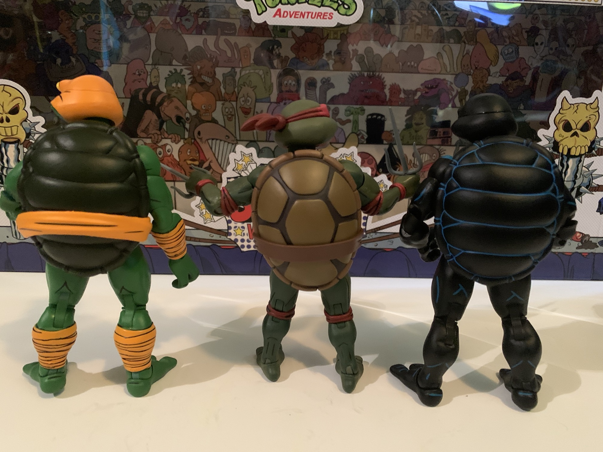
I think when NECA started wading into the Archie universe most assumed the turtles would come and when they did they would feature some similarities with the cartoon turtles. We were wrong. These first Archie turtles are entirely new sculpts. Nothing has been recycled from those cartoon turtles which are coming up on being ten years old going back to their original release. They have featured some modifications along the way, but it’s always fun to get new stuff. Especially as NECA seems more interested in wading into more stylized interpretations of the licenses they hold. These turtles, which are based on the artwork of Ken Mitchroney (who also supplied art for the box), look like they stepped right off the page. Assuming, of course, that page was illustrated by Mitchroney. Other artists worked on the book and while they all went for a toon aesthetic, they also all had their own signature look. I love Mitchroney’s work so these look terrific to me and the paint applications (credited to Geoff Trapp and Mike Puzzo) really bring them to life.

For these new Archie turtles, NECA turned to the team of Tony Cipriano, Tomasz Rozejowski, and Kushwara Studios to craft the sculpt. That’s a pretty big deal for all involved because these figures will likely be repeated again and again for other versions of the characters. In comparing them to the toon figures, these Archie ones are noticeably chunkier. They stand right around 5.75″ which makes them just a hair taller than the original toon figures. What stands out more is that the proportions are different as they have bigger hands and feet than the toon figures. The headshape is different and the shell is very different. There is more of a horizontal approach to the panels on the shell where the toon guys have a shell composed around a center hexagon. The plastron doesn’t have that little, center, diamond and the limbs are also thicker. I like the toon turtles, but these new Archie figures probably do a better job of really capturing the style of the source material. They’re just fun to look at, and it doesn’t hurt that they have some pretty interesting attire.

But wait! There’s more! This may be a detail more interesting for characters going forward, but NECA is making some engineering changes on their end in a lot of the waves they work on. And as far as I know, these new turtles are just the start. These figures are pin-less at the elbows and knees which also means these turtles also feature double-jointed elbows, something the toon turtles lack. Pin-less joints have become something that toy collectors pay a lot more attention to these days as Hasbro made it a selling point of their Marvel Legends line. Most import companies have been doing them a lot longer. They’re technically not pin-less, the pins just aren’t visible which is the whole point. For me personally, I don’t care that much as long as the visible portion of the pin doesn’t create an eyesore. For Hasbro, that happened a lot with Spider-Man as the outer arm and inner arm are different colors which meant the pin was often red giving him a red dot in the middle of a sea of blue. With the turtles, it’s never been an issue since they’re green so the pin could be green. Pin-less joints can also create an eyesore all their own because the joining piece for the knees and elbows is often cast in a firmer plastic which can lead to discoloration. With these figures, it’s fine and this may be less an issue with NECA since they paint everything. Hasbro does not, so it’s not uncommon to end up with shiny knees or elbows that are a different color from the rest of the arm.

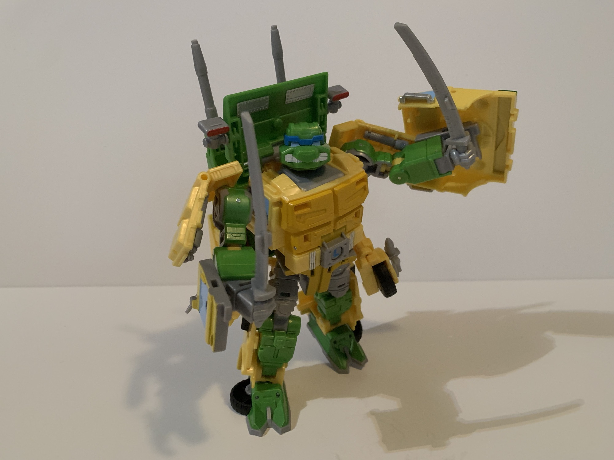
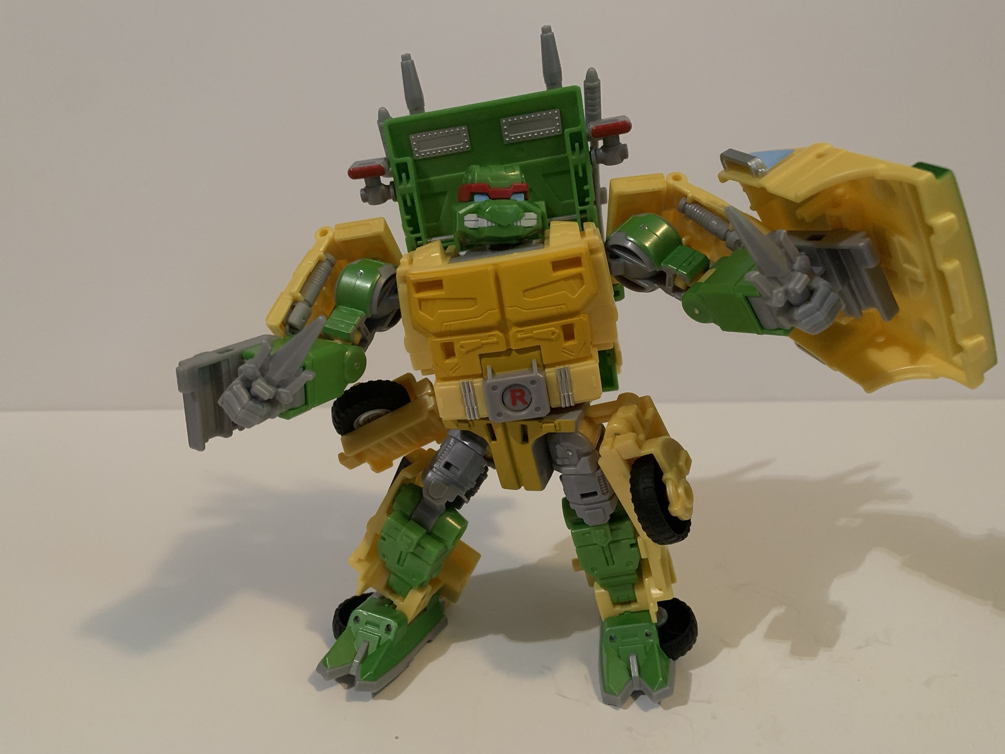
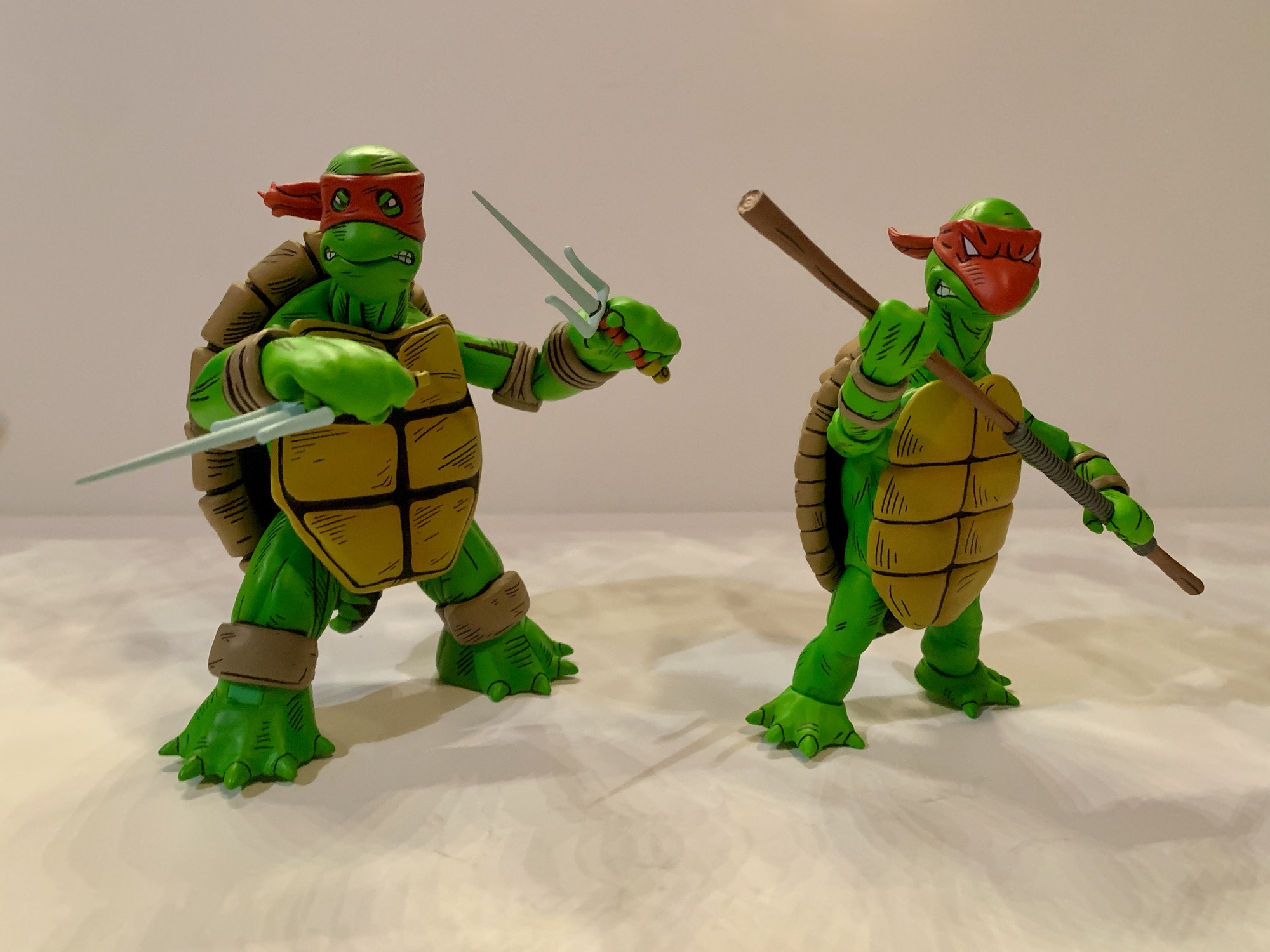
This post is already getting long so let’s get into it since we have four figures to talk about. To no one’s surprise, the base figure is essentially the same across all four turtles with only minor differences. They have different overlays and heads and share most of the accessories as well. It’s also a fun set to show someone who is not familiar with this version of the turtles because they may have a hard time figuring out who is who. Donatello is especially confusing since he’s wearing a mask that’s mostly red with some yellow. His knee pads and elbow pads are also yellow and if you were playing arcade games in the 80s then you know Michelangelo often ended up being yellow for some reason. Leonardo and Michelangelo feature their signature colors while Raph is in his all-black. The all-black looks really cool as it’s a matte finish with blue highlights. The paint across all four is really clean. The only issues I have is Michelangelo has a green dot on the wraps of his right forearm and there’s a little bit of paint rub/stick around Leonardo’s knees related to the kneepads he has on.

We’ll talk articulation now and my demo figure for this is going to be Raph because he’s essentially a blank body. The others have some impediments, but stuff like Leo’s shoulder pads is designed to move out of the way, but there’s no denying that Raph is going to have the absolute most range because he’s basically naked. The head is on a double ball peg with a ball joint at the base of neck. This gives you basically all of the range you could want at the head. Going back, the head will eventually hit the shell, but they’re still capable of looking up. The shoulders and hips are the same as the toons and have about the same range as well. The new double-jointed elbows look solid and will bend past 90 degrees. Not way past, but it’s an improvement. There is a diaphragm joint and the plastron is glued in around the pectoral region so the bottom will move out of the way. This mostly allows for rotation, but there is a little crunch forward and back. The other joints work as expected. Some of the knees and elbows will probably be stuck at one hinge or another, but I was able to free them all up without heat. The figures feel sturdy.

A box set of turtles styled around pro wrestling should lend itself well to accessories. For starters, we get some hands. All of the turtles come with gripping hands by default which, unfortunately, have horizontal hinges. For the brothers in green, we get a set of pointing hands, thumb’s up hands, flat hands, and wider gripping hands. For Raph, he has some open, style posed hands and a set of fists. We also get some things for the characters to wield. Up first is a sledgehammer which looks like a sledgehammer. There’s a fire extinguisher that appears to be a new sculpt when compared with past fire extinguishers (we’ve had a few at this point across various lines). The nozzle is hard plastic so it sadly can’t be articulated, but it looks fine. There’s also an ice cream cone, a can of not Pepsi, and a red cup with a straw. I guess this is stuff for the audience to throw at the boys in displeasure?

Two items that are very much in the world of pro wrestling include the ring bell and a chair. The ring bell features a little dinosaur guy who I assume is the one who strikes the bell in the comic. It’s a very Flintstones-esque design. He doesn’t move or anything so it’s more for show. The folding chair is definitely more of a true weapon. It can open and close if your turtles need a seat, but it’s better utilized as a weapon. It’s a worthy addition and by far the best accessory of the bunch. Of note is what’s not included which would be the signature weapons of the turtles themselves. The larger hands mean that the older weapons from the toon line won’t work quite as well here, but I assume NECA is just delaying a set of Archie weapons until they do more generic turtles. I really only miss them with Raph since he would wear this costume for several issues so a set of sai would have been nice. An alternate portrait for each turtle would have been nice too.

Which takes us to probably the only major negative here – the price. This set retails for $150 at Target. Based on how last year’s Mirage Turtles were sold, it’s entirely possible these guys get broken up into single releases for a wider distribution. Though given that they’re variants, maybe they won’t? I’ve often said that NECA puts a “Turtle Tax” on all of their actual turtle figures. Two-packs typically cost between $55-$60 and single, “ultimate,” releases are hovering around $36 now. The Pizza Club single toon turtles were priced at $38 and included less stuff than a typical ultimate figure. This is now the fourth or fifth four-pack to go for $150 so it’s not a surprise anymore, but it’s a bit of a bummer that these things seem to be coming with less and less.

If the price doesn’t bother you then I can give these figures a hearty recommend. I am having a lot of fun with them in a way I never did with the toon ones. They’re just fun to hold and pose. NECA is also really building out this Stump Wrestling setting with a lot of characters so these guys figure to occupy a space in one’s collection all their own. If you like turtles and have ever been amused by the world of pro wrestling then you’ll probably like these whether you read the comics or not. I’m pretty much all-in and this Archie subline is becoming my new favorite so expect plenty more from me.
Here’s more from the world of NECA and TMNT Adventures:

NECA TMNT Adventures Jagwar
The next figure in NECA’s line based on the Teenage Mutant Ninja Turtles Adventures comic series is a much anticipated one for fans of those books and its spin-off The Mighty Mutanimals. And that’s because this character is making his debut in plastic. Previously, we looked at Slash who has been pretty well-represented in some…
Keep reading
NECA TMNT Adventures Man Ray
Back when Teenage Mutant Ninja Turtles ruled the world, there was a lot of brand synergy between all of the various media being generated by this one mega popular piece of intellectual property. The comics came first followed by a toyline which necessitated the creation of an animated mini series to basically serve as a…
Keep reading
NECA TMNT Adventures Dreadmon
We’re almost done with all of these NECA Haulathon drops from March and up today is the last of the single-packed figures, the Mighty Mutanimal Dreadmon! Technically, he’s the third figure in NECA’s line of figures from the pages of Teenage Mutant Ninja Turtles Adventures since he’s listed as number 3 on the box. However,…
Keep reading