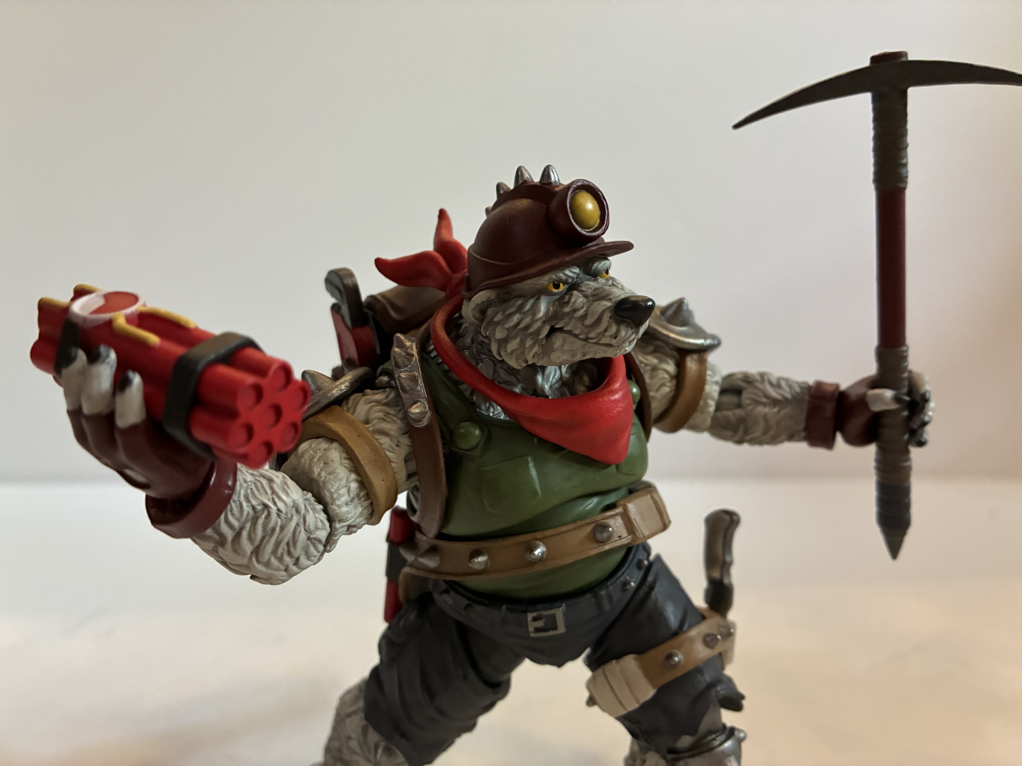
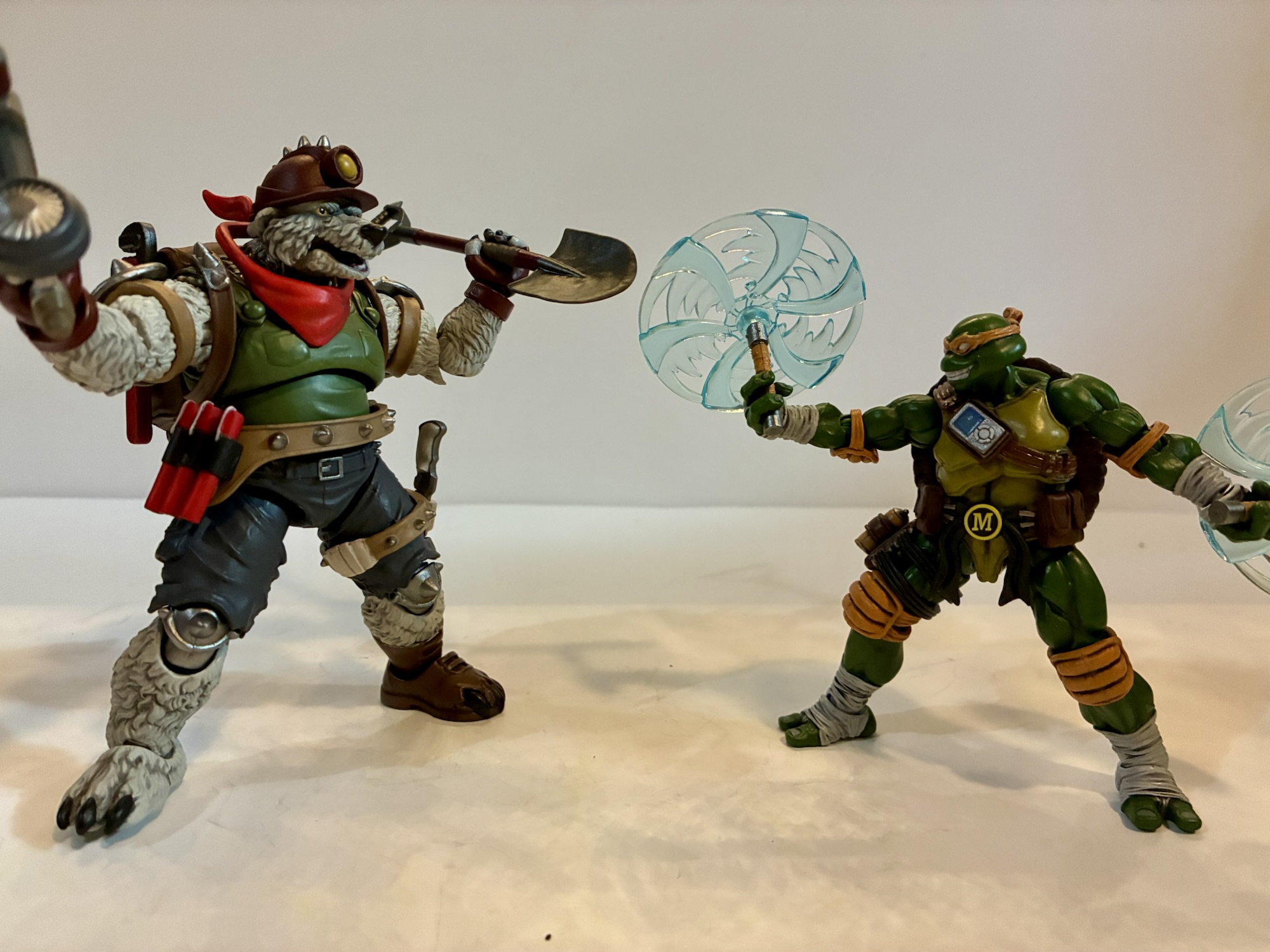
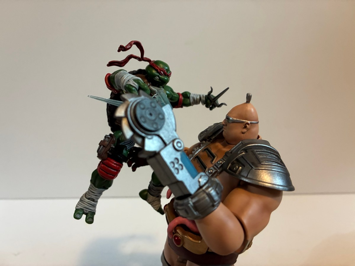
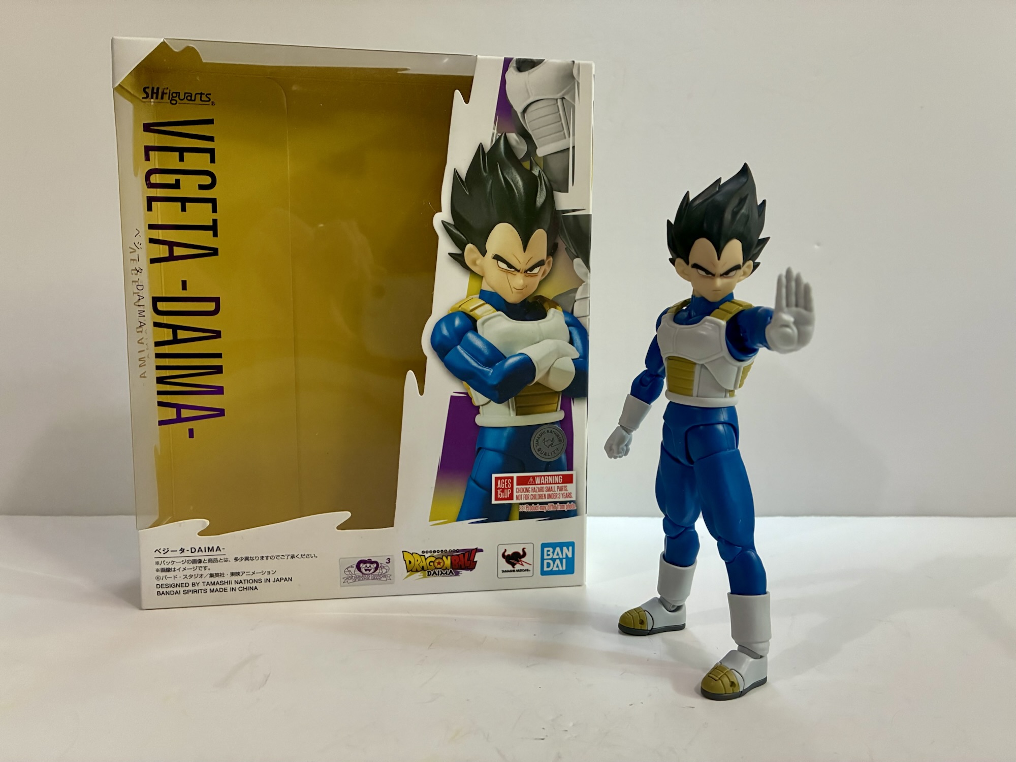
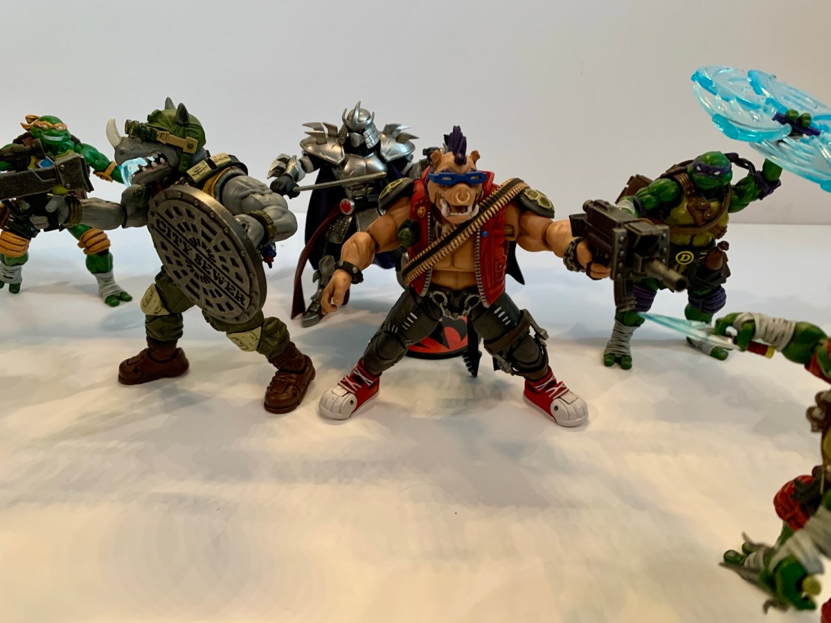
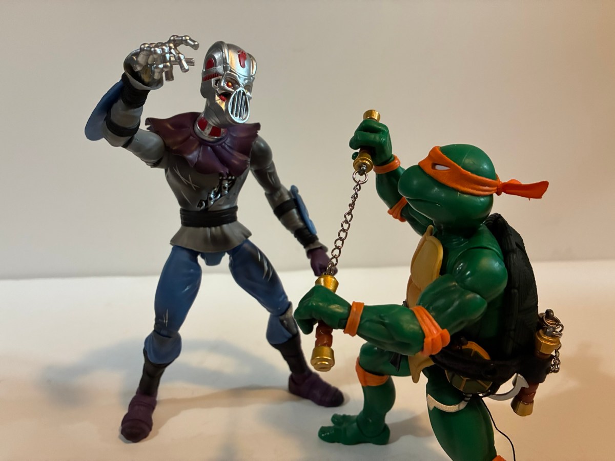
NECA has gradually built out the ranks for Shredder’s Foot Clan via its line of action figures based on the pages of Teenage Mutant Ninja Turtles as published by Mirage Studios. The clan got started way back in 2016 with a box set released in conjunction with New York Comic Con. That set featured Shredder, two Foot ninja, and a Foot Elite ninja. The sculpts were based on the original Eastman and Laird intended one-shot that became anything but. As the comic went on, the look of just about every character changed. Kevin Eastman and Peter Laird grew as artists and refined some of the looks they had devised initially. Once TMNT became a marketing juggernaut, the pair stepped back allowed other artists such as Jim Lawson to work on the books which further moved the characters away from their initial looks. NECA has marked that with its re-release of the turtles which emulate the work of Lawson and now we’ve moved onto other characters like the Foot Elite Assassin.
He’s far more intimidating than the old Foot Elite.
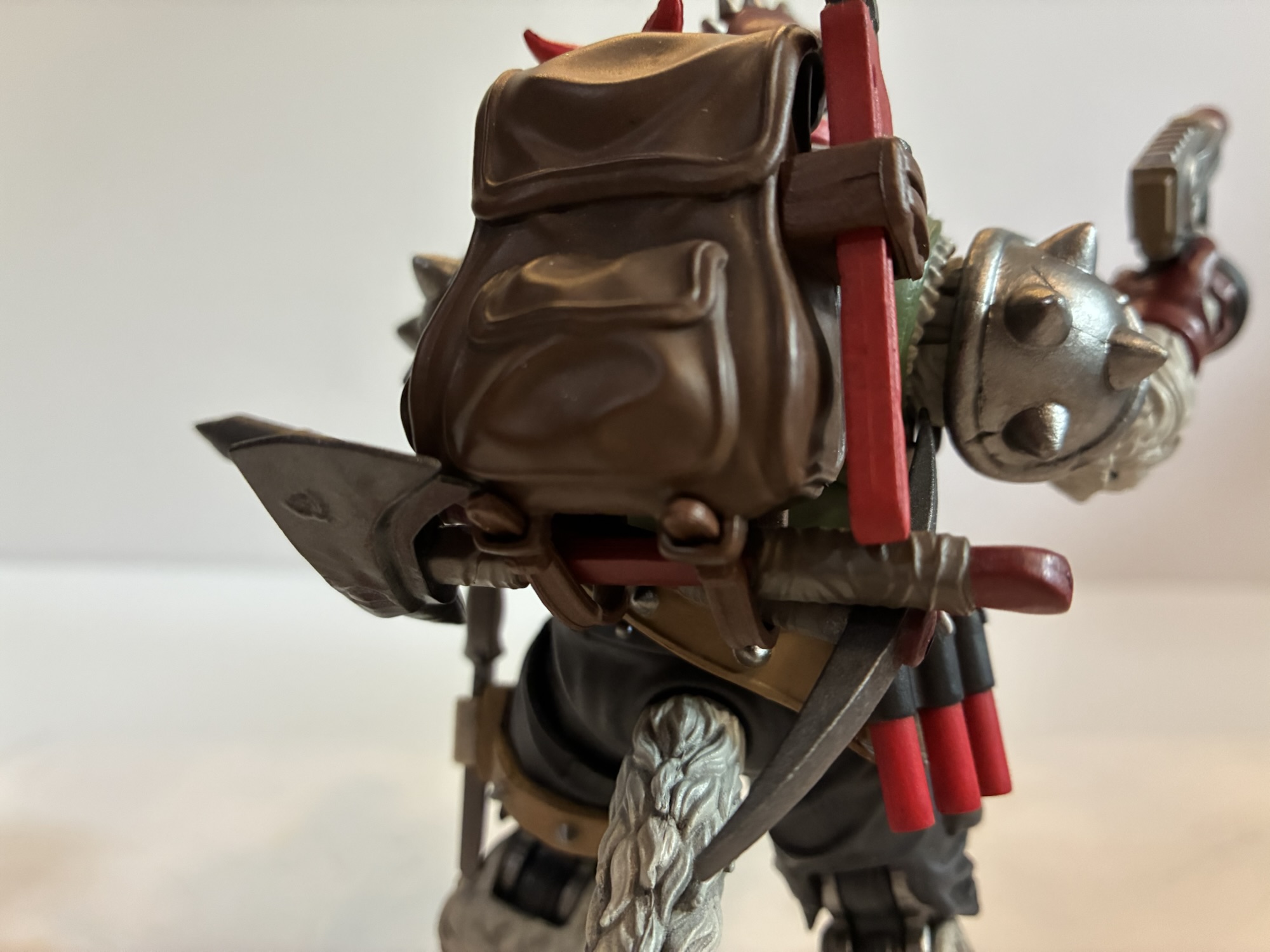
I’m not sure if the Elite Assassin was ever intended to be different from the old Foot Elite. With Shredder dead, these guys basically assumed leadership of the Foot Clan and they were depicted as bigger and badder than what NECA gave us back in 2016. The design is more or less the same though as a regular Foot ninja with a faceguard like Shredder, a round hat resembling a conical sedge hat, and the remnants of a cape or cloak. Where this guy differs from the old look is in the proportions and overall size. He comes in at just about a full 7″ to the top of his head. His chest is much broader and there’s more meat front to back as well. His arms and legs are equally beefy, though not on the same level as the Foot Enforcer. He’s overall just way more imposing and shares none of his parts with the old figure.
He also has some size on the turtles.
The version of the figure I’m looking at today is the standard colors one. We already have seen two other colorways with the first one being an all red and black edition. I think that one is based on the IDW reissues, but there’s also a black and white one which was released around the same time as this standard one. The standard one follows the basic Foot coloring with a brownish-red tunic, gray pants, and brown wraps on the forearms and shins. There’s a big brown sash across the midsection and from the hat drapes a red hood of sorts that leaves the face visible. For the face, we have the faceguard which is done in silver and the flesh is painted all in shadow with two, beady, white eyes peering through. The hat can be removed and the red hood is attached to it. Doing so reveals a somewhat comically small head, but if the head was made any bigger it would probably look a little too big with the added hood. Plus, it’s not meant to be displayed without the hat since it leaves a big peg hole in the top of the head sort of like a Lego mini figure.
If you don’t like the cape it can easily be removed.
The paint is fairly simple, but clean, and has the usual NECA comic embellishments. There’s a lot of linework the emphasize the muscles and to outline all of the wraps. There it’s remarkably clean though if you get in close you’re likely to find some places where the linework doesn’t precisely match the carved-out groove. The faceguard is a nice, metallic, silver and the forearm armor contains a hit of light blue shading at the edges to create the illusion of a metallic surface. It’s a nice effect and so simple which makes it a shame that other companies don’t do the same with their figures often opting to just use bare, gray, plastic for metal parts. I do very much like the proportions on this guy so a tip of the hat to sculptor Gurjeet Singh. Nicole Falk is also credited, though I see her name most often credited with “fabrication” which makes me think she handled the cloak, which is also well-tailored and looks fabulous. Geoffrey Trapp and Mike Puzzo handled the paint for this guy.
OopsTime’s up, turtles!
The Elite Assassin comes with a fair amount of weapons and other assorted parts to do some assassinating. The hands available include sets of fists, gripping, chop, and open/style-posed hands. He also has an alternate portrait with no faceguard. According to the box, the face is supposed to be a clean-shaven face and there’s some shading applied to the lips, but some wires were crossed at the factory and the lip shading turned into a mustache. I’ll never use it so I don’t care, but it is kind of funny. For weapons, we have a short sword, a handheld sickle, a longer sword with a ball and chain attached to the hilt, and everyone’s favorite weapon, a pair of gray sticks. These guys may have been drawn with such weapons in a comic somewhere, but I don’t think it’s something we really need. He also has a time bomb which I’m sure is from the comics and it’s well sculpted and painted. The bladed weapons are all silver with some blue applied and it looks nice, though different from how they do metal with the turtles. For some reason the Foot get silver and the turtles get white. Makes sense to me!
“I’m not exactly feeling intimidated here, dude.”
Articulation is where these NECA figures often come up short and the Elite Assassin is no different. He does some things well, and some things not so well. The head is the unusual setup of a ball peg because the head is so small. This is the type of joint a lot of import companies utilize for wrists, too bad NECA doesn’t do the same. As a joint for a head, it’s fine, but the hood is going to limit rotation quite a bit. Shoulders are conventional hinged ball joints and we have bicep swivels, double elbows, and swivel and hinge wrists. The bicep swivels on mine are tight and when they do move they feel like they’re binding more than rotating as the bicep wants to kick back to where it was. Definitely something to be careful with. The hands all have a horizontal hinge, including the gripping hands, which is unfortunate and honestly quite annoying at this point. I’m thinking of just boycotting NECA figures that don’t come with the proper wrist articulation at this point because they’re so, maddeningly, inconsistent with it.
He’s not a total stiff, but some waist articulation would have really helped out.
The only articulation in the torso is a ball-joint in the upper diaphragm. It kicks forward and back a suitable amount and will rotate some as well. It’s not going to provide a true ab crunch though, but it would have with a ball-jointed waist. Given the large sash around the waist I don’t know why NECA didn’t just do this. A ball joint there would give him some nice forward and back and provide for more natural rotation. Hips are the typical ball and socket with a thigh swivel built in. There’s double-jointed knees and ankle hinges and rockers that work fine. Missing is a boot swivel and forearm swivel, even though there are natural places for such to exist. It’s annoying with the forearms since the armor continues onto the back of the hands so rotating the hands breaks that up. Lastly, we have a nice wire going through the cape which does allow for some dynamic posing of that.
I guess if he doesn’t want to get up close, this ball and chain thing will have to do as a ranged attack.
This is a solid figure that’s so close to being a great figure. The missing waist articulation is more of an annoyance for me than the wrists and I don’t know why NECA didn’t put that in. If he had that he’d move pretty damn well. I think much of this figure is utilized for the new Shredder currently available in a two-pack. I don’t know if that one has waist articulation and I don’t plan on finding out until it’s available as a single-packed figure (or it hits deep discount). And for an assassin, I do think this guy should have some kind of a ranged weapon. The sword with the ball and chain is pretty cool, but doesn’t seem very practical for an assassin. He looks cool though and isn’t a total stiff so if this is something you’re interested in based on the look of it you’ll probably be content. I found this guy at Target where it only set me back $35. He’ll probably be available in various other places eventually if he’s not already, though probably at a small markup.
If you feel like your Foot Elite Assassin needs some companions then these might interest you:
Back in 2008, when NECA was planning out a line of Teenage Mutant Ninja Turtles action figures that they hoped would run for a long time, they turned to the turtles’ most trusted ally when it came time to do a fifth figure. The line wasn’t long for this world, and that figure of April…
Where do you take your heroic comic book franchise when you kill your main villain in the first issue? Well, you first undo that rash decision by bringing him back! Teenage Mutant Ninja Turtles co-creators Kevin Eastman and Peter Laird famously killed The Shredder in the first issue of their comic. They never intended to…
When a regular Foot Ninja just won’t cut it, The Shredder has to turn to the Foot Enforcer. This brute of a specimen is bigger, stronger, and comes packed to the gills with an assortment of weapons designed to reduce the turtles into a pile of flesh and shell. And they’re needed, because how often…
Does bustin’ still make me feel good 40 years later? Let’s find out!
I didn’t do a big 2024 wrap-up type of post like I sometimes do, but if I did I would have awarded toy producer Mondo with the biggest reveal of the year when they debuted their line of action figures based on The Real Ghostbusters. The Real Ghostbusters was one of many 80s properties to have its moment in the sun when it came to toys, but ever since the original Kenner line ended in 1991 little has been produced based on the property. Diamond Select gave it a shot, Mego did as well, and current license holder Hasbro has dabbled in re-releases of the old Kenner toyline. What has alluded collectors and fans of the old cartoon and toyline is a truly dedicated, collector-friendly, line of modern action figures that better match the style of the show. Not to be denied, action figure sculptor and designer Alex Brewer made his own digital mock-ups of what he thought a modern line would look like and shared his work on social media. The response was pretty big and it helped get his employer, Mondo, to kick the tires on bringing his vision to life.
Mondo likes to go all out on packaging.
I have a pretty good memory, but I can’t reliably recall my life before The Real Ghostbusters. It was my first love when it came to action figures. I liked Matchbox and Tonka products prior to, but no figure line captivated me like The Real Ghostbusters. I have no idea how I was introduced to the property or what my first toy was from the series. I can’t remember getting the iconic firehouse playset or the Ecto-1, my memory basically starts with them in my possession. I can remember getting excited for the Ecto-3 and the tie-in products with the release of Ghostbusters II. I had some roleplay items including the trap, and in general I just had an awesome time playing with my Ghostbusters toys and watching the cartoon every afternoon.
Mondo also threw-in some cardboard standees of popular ghosts from the Kenner line.
Then came the Teenage Mutant Ninja Turtles. For a little while, the two co-existed, but eventually The Real Ghostbusters were phased out by the turtles, Bucky O’Hare, and eventually X-Men. Most of my toys would be sold in yard sales, though somehow my fright features Peter Venkman survived. I don’t think it was for any particular reason even though he was always my favorite, I think he just got misplaced. As an adult collector, I have wanted to reconnect with my former love, but no one was offering up the right product. Sure, I enjoy the theatrical version of these characters, but I don’t associate it with toys so I’ve never felt much of a compulsion to collect any of those outside of a pair of Venkmans. The Kenner reissues also don’t really do anything for me and I’m actually much happier with the Lego stuff I have, but The Real Ghostbusters? That’s the stuff I really want, so I was pretty damn excited when Mondo unveiled Peter and the best ghost from the show, Samhain. What I was not happy about was the price, and we’ll get to that, but as far as what Mondo was doing I was more than pleased and pretty damn excited to get my hands on them.
A gathering of Peters.The 80s were awesome.
The first set has taken awhile to get here, but it’s finally here. Originally expected to arrive in May, the circus that is the current United States government messed things up with its tariff policy and the elimination of the de minimis shipping exemption. Mondo used to ship directly from the factory to your door, but the cost to do so increased overnight and made that impossible. They had to scuttle their whole operation and the result is a delay of about 3 months. The good news is we still received Pete and Samhain before the fall season hits as I suspect a lot of folks would like to have them on display for Halloween. The set was sold exclusively last fall on Mondo’s website as a two-pack while Peter was sold individually in all of the usual places. It came packaged in a huge box that recreates the front door of the firehouse and there’s artwork on the back which lists out all of the people responsible for the set’s creation. The front opens in the middle and is held fast by magnets revealing a window display behind it, though there’s so much tissue paper over the figures to protect them that it’s not very useful. My box also arrived pretty banged-up, but since it’s intended purpose is to protect the figures inside I can say it at least accomplished its goal.
It’s so beautiful.Convenient trap storage on the side.
Mondo typically lives in the scale of 1:6, but this line is its first foray into 1:12. Peter stands at around 6.5″ tall so I’m not entirely sure if its true 1:12 scale or not. That would make Pete 6.5′ tall and while he might be, I can’t say I ever thought of him as especially tall. The only thing he has to scale with is Samhain, Slimer, and the other Ghostbusters so I can’t say I’m all that concerned by it. Out of the box, he’s sporting a bit of a smirk with a raised left eyebrow which captures Peter’s personality well. He’s in his classic brown jumpsuit with teal color, black boots, and gray belt. There are some sculpted accessories attached to his belt that jump right off the screen. I have no idea what this yellow hook is or this thing that looks like a tape measure is or does, but I recognize them from the show. The paint is super crisp and matte. This figure has all of the detail work one would expect from Mondo’s sixth scale figures, but at a smaller scale.
Neutrona wand holster on Pete’s right. The tab is very rigid and kind of scary, but it works.
What really stands out is Peter’s proton pack. Brewer and painter Mark Bristow must have studied countless frames of animation to make sure everything is just right. It has all of the little details one would expect and yet there’s a simplicity to it which reflects the animation. The paint is pristine with little or no slop anywhere on the pack itself and the wand. The neutrona wand is connected via a very pliable, plastic, hose that does not detach from either the wand or the pack so there’s nothing to fiddle with. It’s plenty long so it won’t get stressed by placing it in the figure’s hands or when it’s holstered. Equally detailed is the included trap accessory. It looks fantastic and has a bendy wire that connects to the plastic foot pedal. The trap can be hung from the side of the pack just like it was on the show and there’s another hook for the bendy wire to be wrapped around. I was mildly concerned with the durability of the wire, but it seems strong and I don’t see any cracking of the plastic around it. The pack itself is a fairly light, but hard, plastic including the holster for the wand. That part is a little scary as it takes some mild effort to click the handle of the wand into place. It’s the part to be most mindful of as it doesn’t feel like it would take much to snap it. The pack goes on over Peter’s head pretty easily and the belt tabs into the back of the pack. It’s not the easiest thing to snap into place, but it also doesn’t really need to be secured for it to stay in place either (because it’s reenforced with a magnet, which I didn’t realize until after this review went live) so don’t stress yourself out if it doesn’t seem like it’s pushed in all the way.
At least he can kind of hang onto Peter, if you want.
Peter’s other accessories include a set of black hands for the few times he wore gloves in the show. There are cuffs for the gloves that slide over his forearms to complete the look. He also has an alternate, angry, expression which is appropriate for when he’s busting ghosts or annoyed with Slimer. Speaking of, we get a Slimer! He looks to be 100% on-model to the point where the resemblance is borderline mystifying. This is one of the most fun characters I’ve ever had the privilege of just holding in my hand and looking at – he looks that good. He has his own translucent, green, stand and if I have one complaint it’s that he doesn’t have a taller stand. This one puts the top of his head at Peter’s mid-thigh level when it would be great to get him up to eye level. Slimer is minimally articulated with swivels at the shoulders. There’s also a simple disc stand for Peter, but he doesn’t seem to need it. It’s not decorative or anything so it’s likely to stay in the box. Mondo also tossed in some cardboard ghosts and standees which was an unadvertised bonus item. It’s kind of fun, but I don’t see myself ever punching them out of the cardboard.
Who doesn’t like a good blast effect?
Even though Slimer is more of the friendly ghost variety, Peter does need to but ghosts from time to time. To do so he has a blast effect for his proton pack. It’s a clear plastic with just a hint of blue in it. It’s subtle, some would probably argue too subtle, but it’s a reasonable facsimile of what we used to see in the show. It slides onto the wand’s tip and doesn’t disrupt the weight of the figure any. He also has an accessory for the trap. The inner yellow doors of the trap are separate piece – a brick of plastic than can slide out. You can replace it with a set of open doors with lightning streaking out and the ghost, Samhain, getting pulled in. It’s a really fun idea and is also included with the standard version of Peter so those who skipped the ghost still have something they can bust.
Samhain comes with three portraits and four hands.
And speaking of, we get Samhain! He’s much taller than Peter coming it at around 9″ tall. He’s a pretty simple design with a purplish robe and a jack-o-lantern head. Since he doesn’t have feet, he’s very easy to stand and is unlikely to ever tumble off your shelf. His default portait features narrow, black, eyes and a menacing grin. He also has two additional portraits both featuring his yellow eyes which I think we saw more of in his second appearance in the show. One alternate portrait features a toothy grin while the other an angry howl. He’s appropriately creepy, and like Slimer, really on-model. He also has an extra set of hands. His default ones are these curling, gesture, hands and he has an optional open right hand and a clawing left hand.
This trap effect is pretty awesome.
Where both figures are going to come up short is in the articulation department. Samhain is extremely limited as he just has head, diaphragm, shoulder, elbow, and wrist articulation. He’s basically all about presence, but at least what’s there works fine. Peter has a double ball joint at the head, hinged-ball shoulders, single elbows, ball-hinge wrists, waist cut, ball-socket hips, single knees, and ankles that hinge and rock. There’s an attempt at something of a butterfly joint at the shoulders, but it really doesn’t do anything. The elbows will bend 90 degrees, but the knees come up short. You do get a little rotation at both the knee and elbow, and the ankles and wrists work fine. The head really can’t look up or down and the tilt is pretty minimal. The hips are a bit tight and probably only go out to the side 45 degrees or so and do not kick forward and back effortlessly or with much range. He can get both hands onto his wand, and the hands are soft and pliable to minimize paint rub, but he can’t point it out straight from his body with two hands on it. Basically, when you want him to look like he’s shooting at a ghost, he needs to hold the wand across his belly or chest. It’s certainly not the most convincing thing and to really, properly, wield his proton pack he probably needs a more effective butterfly joint, but Mondo was clearly prioritizing the sculpt over articulation.
“Your time’s up, Samhain!”
Which brings us to the final negative we need to talk about: the price. This set retailed for $202 with free shipping in the US. If you want just Peter, the price is $101. Why so high? Well, some of that is due to Hasbro. They hold the master toy license for Ghostbusters which Mondo had to work around with the licensee, Sony. Unlike a Paramount and Playmates situation with TMNT, Hasbro is a toy giant and not likely to get pushed around. Mondo hasn’t gone into the specifics, but they did cite that as an issue and expressed that this isn’t the price they wanted. It is assumed that in order for them to be compliant with the license, any 1:12 scale Ghostbusters toy had to be more than $100 and probably had some restrictions on where it could be sold and that sucks for us collectors. On the other hand, Mondo may not have been able to dictate the price as freely as it wanted to, but the company could have made the set feel a bit more value-friendly. One extra portrait and one extra set of hands (which is basically duplicative since they’re more gripping hands) is pretty slight. Peter, at a minimum, should have another portrait that’s probably a scared one or a slimed one. Some expressive hands, maybe emulating their dance during the ending credits, would have also been welcomed. If he’s not holding something his hands look silly. They may not have wanted to give Slimer more articulation and break-up his sculpt, but he could have had another set of arms. And for Samhain, maybe an effect part of his own? Something like the aura effects Bandai does for its Dragon Ball figures would have looked cool.
With only one Ghostbuster, Slimer is going to have to pitch in.
What I’m basically getting to is that this set isn’t really worth the asking price. It wasn’t going to be and I knew that when I placed my order. It’s also why I’ve passed on the other ghosts and am just getting the remaining Ghostbusters to round out my collection. That doesn’t mean I’m unhappy to have this. One can dislike the price and feel like they’re being overcharged while still enjoying the finished product. I’ve certainly paid for plenty of meals, drinks, and entertainment and felt like I was getting a bad deal, but still enjoyed what I paid for. I mean, I have been to Disney World many times. These figures aren’t perfect, but they look great. I’ll likely never have need of another set of figures based on The Real Ghostbusters when all is said and done. And considering how long I’ve had to wait for them, I’m okay with paying a little extra. If you loved the show and the old toyline, chances are you’ll be okay with it too.
Yeah, bustin’ still makes me feel good.
Interested in more Ghostbusters posts? Check these out including a very festive version of gang:
Bill Murray is the greatest actor of all time. If you want to disagree with me, that’s fine, just know that you’re wrong. Because of my love of toys and Mr. Murray, I’ve always wanted a Bill Murray action figure. It might sound like a weird want to most people, but to a toy enthusiast…
The 1980s sometimes feel like they belonged to the Ghostbusters. That’s because, for me, the Ghostbusters were always around. The film came out when I was but a wee baby, but by the time I had a real interest in television The Real Ghostbusters (not to be confused with the Filmation series) was airing…
For many years, one of the most talked about subjects in the world of movie sequels was the prospect of a Ghostbusters 3. The original film was released back in 1984 and a cultural phenomenon was born. It was a huge hit for both its comedic acting and for the (at the time) incredible special…
Another figure from last summer’s blockbuster. We like to stay current here.
It feels like a theme this summer for me is buying action figures I previously deemed unworthy of my money as they go on clearance. Sometimes that’s a dumb thing to do. If I didn’t want something six months ago why should I want it now just because it’s cheaper? In the case of today’s review, the answer is because I think it’s a good figure. The S.H.Figuarts Wolverine from the movie Deadpool & Wolverine is probably the best figure yet of the character from that film, with the caveat it’s the most expensive and technically isn’t from the film. Both of those aspects of the figure is why I cancelled my original preorder, but when I saw I could get the figure for 40% off I decided that was good enough to get this imperfect representation of Wolverine.
Probably the best figure from the movie so far, even if he never looked like this in the movie.
Let’s cut to the chase – this figure is not really from the movie. It depicts Wolverine in full costume which includes the mask and the sleeves. At no point in the movie did we see Wolverine look like this. By the time he put the mask on he had ditched the sleeves. Unfortunately, Bandai didn’t base their figure on this look nor did they include an unmasked head like the Marvel Legends release. There could be reasons for that which are perfectly valid. Bandai may have been going off of concept art released to them by Disney which is probably the most likely reason. They may have also not wanted to pay for the actor likeness to include a Hugh Jackman head which would make them cheap. It would have been nice if such could be included, or if there were bare arms also included (or just made the default look), but we can only judge the figure on what is present and what it’s trying to achieve. It just meant that it wasn’t worth $85 to me. As imperfect as the Legends release is, I was mostly sated in having it, but the lure of a better price has brought me here today.
And for those wondering, no, you can’t use the Legends unmasked head with this one.
Wolverine stands at approximately 6″ to the top of his head, or just a little taller. Hugh Jackman is 6′ 2″ so that little tick over the 6″ mark basically puts him at an accurate 1:12 scale, assuming the boots he wore in the film didn’t add an inch or two. He is shorter than the Legends version which I had at 6.5″, but that’s pretty consistent for Legends which tends to run a little bigger than true 1:12 scale. He seems a little shorter than the SHF Deadpool though that seems to mostly be in the head. That Deadpool has an oversized melon that becomes more apparent when placed with this figure (for the record, Jackman and Reynolds are both listed as being 6’2″). The costume is textured all over like the one from the film and it’s comprised mostly of colored plastic. The yellow is a pale yellow, especially compared with the more saturated Legends release that is more like honey colored. This shade looks more accurate to my eye. The blue and black is what’s painted, as well as the tiny silver buttons, and everything is pretty clean. The finish is nice and on the blue of the gloves, boots, and shoulder pads there’s a bit of a glossy finish which reflects the look of the film as well. The claws are a nice, metallic, silver and quite pointy. Be careful swapping hands as those claws are rigid and will hurt if you’re not careful.
Deadpool is actually a little taller this time.It works.They don’t like each other.
What stands out the most with this release vs the Legends ones are the proportions. The head size, shoulder width, and leg length all look pretty accurate to the film. The Legends one was pretty stumpy despite being a taller figure and it was my main peeve with that release. There’s a solid amount of mass as well in the torso, legs, and arms, though I would have liked the chest to be pumped out just a little more, but that’s more of a nitpick. The details of the costume are all captured well and I like how they did the folds of the neck portion. The Jackman likeness also looks fine to me. Granted, it’s just the area around his mouth, but the paint is clean where it could have easily gone off the rails with all of the facial hair. The fins on the head are also a rigid plastic which likely helped keep their shape in transit whereas the Legends one is a little warped.
He comes with three sets of non-clawed hands, but I bet most will never use them.
Wolverine is much lighter than his co-star when it comes to accessories, but he also doesn’t demand the sort of weaponry that Deadpool does. For portraits we get two: neutral and teeth gritting. I like the personality of the teeth gritting head more, but both are fine. For hands, we get fists, open, and relaxed hands. For clawed hands, there are fists and open and that ends the accessories. It’s light, but in terms of hands I’d say we’re set. Yes, we should have bare arms and an unmasked head and that’s a shortcoming of the figure. If they couldn’t give us an unmasked head they could have given us a yelling one. It was five dollars cheaper than Deadpool so at least that appears to be reflected in the price, but it’s still an $85 figure so if you wanted more from it then I think you’re entitled to such feelings.
If you find fists boring there’s these hands.
Since this is a SHF release it should also make this Wolverine the best articulated figure of this version of the character and for the most part it is. The head and neck work together allowing Wolverine to look up and down, but maybe not down as much as some would want. It has all of the rotation and nuance you would expect of a SHF setup. The butterfly at the shoulders doesn’t allow for much, but the figure can do the claws across the chest pose. The shoulder pads are pegged into the front of the shoulder and can be moved out of the way. The shoulder can raise a little past 90 degrees and it rotates fine. The double-jointed elbows and knees bend past 90, and the wrists, thigh swivels, and toe hinge do what they’re supposed to.
The articulation isn’t amazing, but is probably good enough for this version of Wolverine.
The torso is a little more mixed. There’s a ball joint in the center which allows for some forward and back. In conjunction with the ball-jointed waist, the figure can bend forward a decent amount, but it adds nothing going back. There’s no rotation in that upper torso joint, but there is tilt. The waist is where the rotation comes from and even more side-to-side tilt. The hips go out to the side almost to full splits, but kick forward a tick shy of 90 degrees and have no range going back. The ankles can go back a little ways, but have little to no forward movement. The ankle rocker works fine at least, but there’s no boot swivel or swivel at the glove. In terms of visuals, none of the joints are ugly. The thigh swivel is pretty apparent, but not to the degree it has been on some of Bandai’s Dragon Ball figures. The elbow joints stand out a little because they are a slightly brighter yellow and bending them all the way will produce small gaps. The same is true of the knees.
It’s not the Wolverine I want, but it is pretty fun to have.
This Wolverine from the film is basically what I expected of the figure. It’s articulated reasonably well and for the look it’s going for it pretty much nails it. It’s just not the look I wanted and wasn’t willing to buy for full price. And that was my mind set when I cancelled my original preorder: why buy something I really don’t want? I want a sleeveless Wolverine. If he was that way and still lacked the unmasked portrait I would have paid full price. Ideally, we’d get a figure that comes with both. In a way, I place almost no value on the sleeved look. I’d happily ditch those arms in favor of the bare arms look and that’s how I felt with the Legends figure as well. I just think the costume looks better that way. At a reduced price though, this is fine. It’s very functional and I’ve had him on my desk for about a month and I mess around with him when I have some downtime. He’ll look good with my Deadpool, and if Bandai comes back with the version I want I’ll have to consider that one was as well. Since they’ve apparently had trouble moving this one though I’m not holding my breath. If this is the look you want for Wolverine on your shelf, then you’ll probably be satisfied with this release provided you feel it’s worth it vs the cheaper Legends release. And since basically everyone seems to have this one on sale, you probably won’t have to pay full price for the pleasure of finding out for yourself.
Here are all of the other Deadpool & Wolverine reviews we’ve done up to now:
Despite the fact that I own dozens of them, I don’t really consider myself a fan of Hasbro’s Marvel Legends series of action figures. They largely are able to get a purchase out of me thanks to Hasbro’s exclusivity agreement with Marvel/Disney which basically makes them the only game in town. Despite that, I will…
It might be hard for the young folk to believe, but once upon a time movies based on comic book characters were treated like box office poison. Unless you were Superman or Batman, you just didn’t belong in cinema. Even those characters weren’t bulletproof. Superman had a nice run, but fizzled out with the fourth…
Despite the amount of reviews presents on this blog, I still do not consider myself a Marvel Legends collector. That’s because my interests are somewhat narrow when it comes to the Marvel brand. Over the years I’ve developed a fondness for Deadpool as depicted on film by Ryan Reynolds. I think the comic book character…
For the second time, we’ve got a set of convention exclusive toon turtles with art by Ken Mitchroney!
2025 was almost an end of an era for me. After being a regular buyer of NECA’s convention exclusive Teenage Mutant Ninja Turtles action figures since 2017, I found myself passing on such a set. If you’re new to the exclusive game, each year for San Diego Comic Con NECA makes an exclusive set of TMNT figures to sell at the convention, but also online before the event takes place. Usually the sale is spread over three days and sell-outs are guaranteed to happen, you just don’t know how fast. Some years it’s practically instantaneous, other years it may take a half hour to an hour, it depends on the set. This used to be the only way NECA was allowed to sell TMNT action figures, but ever since the license was freed up some by Paramount it’s been less essential for collectors to snag every last exclusive NECA comes up with.
That’s a lot of box.
This year’s exclusive came from the toon subline based on the old Fred Wolf cartoon. It depicted the four brothers in beach attire which was all taken from different episodes of the show and paired them up with surfboards and a giant wave accessory. The sculpts looked to be new and more in-line with what we’ve seen from the Archie subline, but aside from that detail there wasn’t much to get excited about. It’s a fine looking set, I just never had beach turtles on my wants list when it came to the property. Four packs start at $150 and I was curious if this one would go higher since it was an exclusive. It can only be bought by non-attendees on NECA’s store and they did away with their flat-rate shipping a year or two ago so the price was expected to be substantial when all things were considered. When the item went up for sale, I took a look and found it would cost about $190 for me and I just wasn’t feeling it. Maybe I’m finally growing up, but I was able to walk away and break my streak of TMNT exclusives from NECA.
The main event with new sculpts by Tomasz Rozejowski.
Apparently, I wasn’t the only one. The set hung around for an hour, then another, and it became clear that this wasn’t the most sought after exclusive NECA ever came up with. This was day one of a three day sale, mind you, so it certainly looked like NECA was going to have more than enough product to meet demand this go-around. Perhaps that made the company nervous? How else can one explain NECA out of no where sending a coupon out that evening for forty bucks off the set? They’ve never done that before and called it a loyalty deal. Supposedly, if you had bought a lot of TMNT product from them you got the email with the coupon code. I have bought a ton of TMNT stuff from NECA over the years, but not everything, and I didn’t get it. It didn’t matter though since it was a simple coupon code that was quickly shared online. Everyone who had already ordered had the code automatically applied to their order and for me it brought my total down almost to MSRP at $154 after shipping and all fees (yes, there is a tariff fee). It was enough to get me to pull the trigger and the set eventually sold out that day. I don’t know how it did the following days or what NECA charged at their booth, but it ended up being slightly less than what I would have paid at a retail store for a NECA four-pack.
There’s quite a bit of stuff in the box.
The price may have been right, but it was still a set that I wasn’t exactly jazzed about getting and my hope was that once in-hand I’d sing a different tune. The box it comes in is pretty massive as it’s basically a four-pack that you would find at Target, but it also goes deeper because of the giant wave accessory. The wave is in its own box that has the same colorway as everything else NECA does for this line, but doesn’t feature any graphics. Coincidentally, it’s one of two NECA convention exclusives this year to feature a wave effect and NECA also revealed a beach Slash that should pair nicely with this set. The figures themselves are all new sculpts that resemble the pin-less, Archie sculpts. Per Trevor Zammit at NECA, these are pretty much the new default turtles going forward so if you didn’t want this set don’t fret, I would expect more evergreen turtles to follow at some point on these bodies. Each turtle is in beach clothing taken from the show, though not all the same episode. It’s also a mix of materials as Leo, Raph, and Donatello have plastic shirts and soft goods shorts while Mikey just has soft goods shorts. Donatello and Leonardo also have ridiculous top hats while Raph has a more conventional baseball style hat. Mikey is hat-less and can easily be converted to a base Michelangelo if you so desire while the other three can’t without considerable work.
A new take on an old design.
When I first took these boys out of the box I expected to find some mix of old and new. I took Michelangelo, being the most basic of the four, and compared him with the Stump Wrestling Raph since he’s practically a naked sculpt. To my surprise, these figures do not appear to share any parts. They may share some internals, basically what’s hidden by the shell and plastron, but that’s it. I figured the hands would be the same and the new ones even have that same, rounded, quality to them the Archie figures possess, but they’re all new as well. The Archie turtles appear to be just a touch bigger than these new toon bodies which in turn are bulkier than the old toon turtle body, but not really any taller. I’m not sure how I feel about this new look. There’s certainly a pleasing, toon, quality to these sculpts, but if anything I’ve felt the turtles were a little oversized for the line. They look too big mixed with the human characters, in particular. NECA basically fixed this with Shredder at least by giving us a new, bulkier, version of the villain. Do they intend to do more new sculpts of Casey, April, and others? Maybe. I guess these new ones help make Zach seem smaller.
With Archie RaphThe shell sits a tad lower now.I guess this works?
The figures also feature a much darker green for the skin. It’s definitely a lot closer to the Pizza Club reissues we saw a year ago or the Punk Turtles from that four-pack, but perhaps darker than both. We did just establish these are new sculpts, but if you were still hoping to mix and match with the old figures that’s not going to work. The colors will be off, plus the old hands are too small and the heads are as well even though they feature the same expression swapping tech. It’s an odd choice as I think the color of the turtles has always been pretty screen accurate. I know there are episodes where they’re darker, that’s just what happens with multiple studios working a show that’s trying to pump out as many episodes as it can in a short amount of time, but this does feel less accurate. I’m left to assume there is more of a subjective element at play here and NECA feels that these just look better with this shade of green. I did see someone speculate that maybe they’re darker since they’re at the beach and I suppose that’s possible too. Whenever new base turtles arrive we’ll dive into this more then, but for now I’m a little conflicted on where NECA is going with the turtles.
This gap is something I’ve never noticed before.It’s far more severe on the new figures.
We’ll continue with the body talk here and just jump to articulation. If you have those Stump turtles then you know what to expect as the setup is basically the same. There’s a ball joint at the head and neck, hinged-ball shoulders, waist twist, diaphragm, bicep swivel, double-jointed elbows, wrists, ball-socket hips with thigh twist, double-jointed knees, and ankles that hinge and pivot. Because they’re turtles, the diaphragm joint is pretty useless. They also have elbow pads and knee pads which hinder the range at the elbows and knees. They go past 90 in both spots, but not to the degree you may expect. The hinge on the gripping hands is a horizontal one and not the preferred vertical, weapon-wielding orientation. Since these guys don’t come with any weapons, it’s not that big of a deal at the moment, but I hope it’s not indicative of what’s to come. There’s also a noticeable gap between the top of the thigh and the sidewall, if you will, on the shell with Michelangelo. The same gap is present on the old toon bodies as well as the Archie ones, but not to this degree. I wonder if there’s going to be a filler piece here like the plastic “diaper” on the Mirage Jim Lawson turtles? NECA may have skipped it since Michelangelo’s shorts hide it, but if so that’s kind of a cheap tactic. It probably does give him better range at the hips where full splits and high kicks are possible so I guess that could be their excuse. I do think most would have preferred this to just be a standard Mikey with soft goods pants though.
The shirts look good, but I do wish they were removable. The same is true of the hats and glasses.
For Leo, Raph, and Don, we have a soft plastic overlay in place of the shell and plastron. The shoulder is also a different piece as it’s a sculpted sleeve. The arm plugs into that and you get your bicep swivel inside the sleeve so the articulation is essentially the same as it is with Michelangelo. The shirts are designed to seem big like they’re hiding a shell underneath. There’s even some of the plastron sculpted into the piece at the collar. Because it’s soft and there is no hard plastic underneath, these guys do move a little better at the waist as they can actually pivot some in addition to rotating. I still can’t get the diaphragm joint to do anything though even though I can see it at least. The hats are also pegged onto the head and appear to be further secured with glue as they don’t want to spin. They’re soft and it’s easy to peel them back some to see there’s a big peg sticking out of the top of the head so even if you could get them off it would look hideous. It sure would have been nice if NECA just made them separate. Leonardo also has sunglasses and they’re glued to his head like the ones with the Punk Turtles. While the plastic shirts help give a more toon appearance, I do find they clash a bit with the soft goods shorts. And I probably speak for most when I say I wish they went with soft goods all over so we could convert this whole group into a standard look, but then we wouldn’t buy the eventual four-pack release that’s sure to come, right?
I can’t tell if Raph is happy.
The paint across all four is mostly good. The cel-shading is gone as that appears to be a thing of the past now and instead they’re the same shade of green all over. The patterns on the shirts are handled very well and there’s some black linework painted onto the sculpts. Basically, NECA is taking the same approach now with this line as it does the Archie one when it comes to paint. These turtles do have massive pupils now and it’s a bit weird looking. Their eyes almost look dialated. Raph also seems kind of pissed, but maybe he didn’t pick the outfit? He also has some black linework on his hat that basically just goes from one “ear” (I realize they don’t have any, I just mean where an ear would be) over the top of the hat to the other. There’s a sculpted shape to the top of the hat though and I almost wonder if the line was supposed to follow that because it looks weird to see that left unpainted. I do have a couple of paint dots on the forearms of all but Leonardo. They’re very small and in the color of the turtle’s elbow pads. I’m not sure if it will come off, or if it would just be easier to go over it with a little dab of green paint.
The only picture I took of my original set: Mikey’s broken bicep.
Unfortunately, I do have a quality control issue right out of the box. Michelangelo’s left arm is barely hanging on at the bicep. The peg looks to have split as I can see right into it. It was obvious to my eye just looking at him. Had it not been I probably would have twisted the arm right off. In addition to that, Raph’s left shoulder won’t budge at the hinge and his arm has some wiggle at the bicep as well. It’s possible it just isn’t seated perfectly in the joint or it could also be defective, but just not to the extent of Michelangelo’s arm. Some hot water would likely free up that shoulder, but with Michelangelo basically broken I didn’t want to try without first reaching out to NECA. I emailed them after 5 PM on a Thursday and they got back to me before 9 AM the next day with a shipping label for me to return the entire package. Thankfully, I had only removed the turtles from the box so it was pretty easy to put everything back in its place and ship it out. NECA did say they would send me a replacement if one was available. Since it is a Comic Con exclusive, it’s possible they don’t have any to replace it with and if that’s the case they’ll refund me. It’s kind of annoying that they couldn’t commit as maybe I’d elect to keep it if I couldn’t get a replacement? At any rate, I’m writing this in between shipping the set back and receiving a new one from NECA so if it all went according to plan then you’ve seen a bunch of pictures and the review can continue on from here. And if not…
After just over a week after receiving the first set from NECA I had a new one. Michelangelo is now fine and the Raphael appears to be an improvement as well. The only new issue is my Raph has a little blemish on his nose. It’s not really visible because of the darkness of the skin, but can be felt. All in all though, a good customer service experience and no complaints from me. Now we can move onto the other stuff in the box.
Mikey drew the short straw and got the bad stand.
For hands, these turtles each have a set of gripping hands, fists, open, and thumbs up hands. We also get one extra set of open hands for good measure, I guess. Every hand as a horizontal hinge which is unfortunate for both the gripping and thumbs up gesture. Hopefully this doesn’t mean the eventual standard turtles aren’t missing the vertical gripping hand. Each turtle also comes with a surfboard. They’re not really color-coded to the turtles as we get a purple one with shell pattern, orange with a shell tamp, pink with red stripe, and a solid purple board with an attachable orange sail. These are all almost certainly taken from the cartoon, but it was still surprising to see we don’t have a simple blue, red, orange, purple pattern. The sail plugs into the purple board rather snugly. It won’t even rotate once inserted so maybe make sure it goes in the way you want it to because getting it out could be tricky. It’s hard plastic and probably would be easy to snap. The boards also need their fins attached to the underside and each comes with a clear, acrylic, stand like the old Turtles in Time figures NECA put out. Three of my stands work fine while the fourth is too loose. I’ll have to modify it so the boards can fit snug onto it. Right now, the board just tilts all the way back until the fin hits the surface it’s on.
That sure is a wave.
The big accessory, and what is probably the selling point, is the wave and fifth surfboard. The wave is done in translucent, blue, plastic, with white paint for the crest. There’s a black ball peg towards the front and that’s for the yellow board to plug into. The wave is about 8″ long and the board 11″ (the other boards are close to 9″) and once plugged in it will get your turtles about 4″ off of the surface it’s placed on. There’s some nice weight to the accessory and it does what it’s supposed to do. The board has no pegs on it for added stability, but does feature a rough surface which may help with grip. You can fit all four turtles onto it, though it gets pretty crowded. It completes the look and when all is said and done I’m guessing this thing is the only aspect of this set that will remain exclusive to it, but who knows? Maybe it will even show up in another line?
It is indeed possible to get all four brothers standing on this board.
The only other accessories in the box are three pizzas and two pizza boxes that just say “Pizza” on them. They are the hinged style, so I guess that’s good. Is that enough? Considering it’s a convention exclusive and the figures are all new (though destined to be reused many times over) sculpts I think it feels about right. The only real negative for me is that the figures can’t just be converted to regular turtles. Michelangelo might be, but the rest aren’t and none of the old expressions work here. Considering the change in skin-tone it’s not as big of a loss as it would have been, but it’s still annoying to go from a solid assortment of expressions to just what we have here. I’ll withhold final judgement on the sculpts as far as their appropriateness for the source and as replacements of the old ones. I have felt for awhile that the turtles have fallen behind some of the more on-model sculpts we’ve seen in the line over the past few years so I wanted new ones, I just don’t know how much of an improvement these are.
What day at the beach would be complete without pizza?
That’s a discussion for another day, as for this one, should you get it? Only if you love the concept. If you never wanted and still don’t want beach turtles after reading this then feel free to skip it. Yes, it’s a little exciting to get your hands on new turtle sculpts a bit early, but we’ll get the real thing eventually. If on the other hand you really like the look of this one then, sure, go for it. Assuming it’s not now overpriced. I have a feeling demand was soft and that NECA still has a bunch of these. Will they put them back up for sale? Probably, though with these things they usually first do it as booth exclusives at later shows. If they go up on a website it probably won’t be for a little while and without fanfare. Costumes.com was the website that would get that stuff in the past and it might in the future. Convention goers looking to flip this for a quick buck probably won’t find many takers so if you play the waiting game on eBay you may eventually find people looking to just offload this one at cost, especially if they were able to take advantage of the $40 off promotion. We also know these figures are going to get two-pack releases in a different colorway eventually so, as I said before, the only real exclusive here may just be the wave. As for me, I’ll probably make these guys a summer time decoration and that’s all. It will help make them kind of fun, but it’s not a set I’ll likely do much playing with. Hopefully, I can get them back into the box without too much fuss, though I also kind of want to get rid of it since it’s so damn big. Ultimately, it’s a good convention exclusive because it has a theme, it’s executed pretty well, and it’s not something everyone needs.
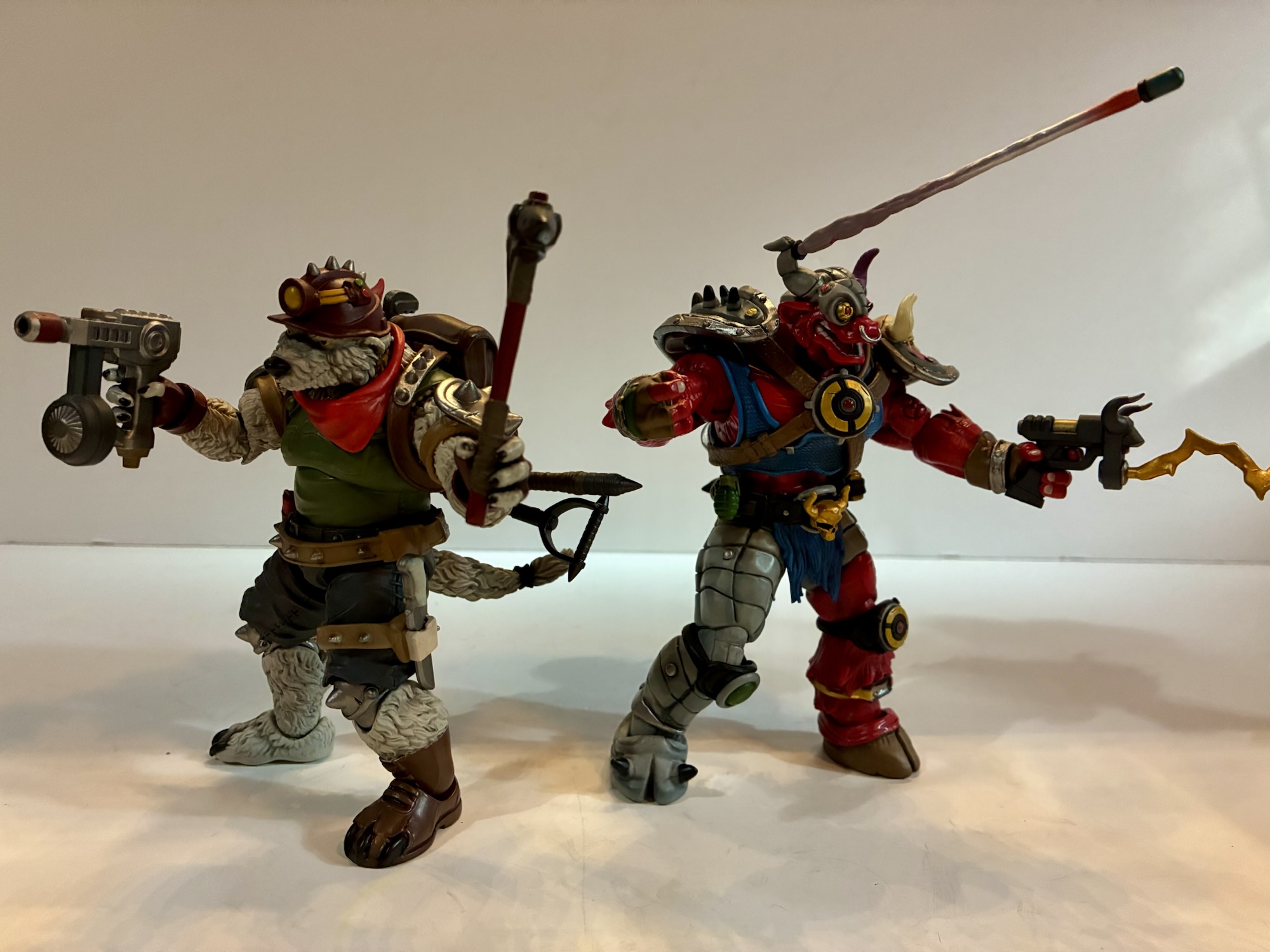
The Bodacious Beach Bros. are just the latest in a long line of NECA convention exclusives:
As the story goes, one night Kevin Eastman was drawing with his friend and partner-in-comics Peter Laird when the idea to doodle a ninja, anthropomorphized, turtle entered his brain. Laird was so amused by this drawing that he too drew his own take on it. What was done just to amuse each other eventually turned…
2023 marked the 30th anniversary of the much maligned third entrant in the Teenage Mutant Ninja Turtles film franchise and you just had to know that NECA Toys would mark the occasion. It was almost too obvious that I thought maybe the company would zig when everyone was expecting a zag, but they didn’t and…
It was a little over a month ago that San Diego Comic Con occurred, in person, for the first time since 2019. This was cause for a celebration, even if for those of us who take in the convention from the comfort of our homes saw little change. Even without the event taking place the…
As a kid, I did a lot of my comic reading in the early 90s and as a kid in the early 90s that largely meant X-Men. The X-Men were the “it” team of the moment and seemed so far and above the rest of the pack in terms of coolness. Batman was still in style on the strength of the Burton films and the animated series and Spider-Man (and Venom) was also pretty hot. When it came to comic and comic card trading with friends, those all commanded top dollar. One franchise that did not was The Fantastic Four.
It could have just been my little corner of the world, but The Fantastic Four were regarded as your dad’s comic book franchise. They were pretty lame. If you went to Toys R Us hoping to score a Venom, Spider-Man, or Punisher action figure there was a decent chance you would have to settle for the Fantastic Four instead. I personally never settled, though I was a little interested in The Human Torch. Even though I didn’t particularly care about the franchise, my earliest Cartoon Network memory is becoming aware of the channel by seeing a listing for a Fantastic Four cartoon in TV Guide airing on the network. We didn’t have access to the channel in my market, but it was about a year later that we did and I wanted to check out that damn cartoon. Too bad it was pretty bad, but not as bad as those lone cartoons based on The Thing where the character was a kid who activated his Thing power via a magic ring: Thing Ring do your thing!
I will say they have a good tailor.
Despite my feelings on The Fantastic Four growing up, it’s hard to argue that they’re not Marvel royalty. Created by Jack Kirby and Stan Lee, the group is one of the oldest superhero teams with a memorable rogues gallery headlined by Dr. Doom. When comic book movies exploded in popularity, 20th Century Fox threw The Fantastic Four into the mix with a pair of films in the 2000s that made money, but didn’t seem to make a huge cultural impact. Fox decided a reboot was necessary and the franchise returned in 2015. Again, it made money, but not the kind of money that gets studio executives excited. Fox was reportedly still kicking the tires on more movies, but the acquisition of 20th Century Fox by Disney in 2019 put an end to that. Now, Marvel and Disney are back with what it hopes will be the definitive take on the franchise in film. Ever since Avengers: Endgame basically put a bow on the massive story begun with 2007’s Iron Man, Marvel has been searching for that massive hit that catapults them into the next big event film. Attempts via Disney+ and other films have been met with mixed results, but can The Fantastic Four get audiences as hyped as Avengers did back in 2012?
The setting is practically a character on its own.
The Fantastic Four: First Steps is a film that has been in the works basically ever since Disney acquired 20th Century Fox. It took some time to get right, but once it did we ended up with a picture helmed by Matt Shakman with a screenplay by Josh Friedman, Eric Pearson, Jeff Kaplan, and Ian Springer. The film stars Pedro Pascal as Reed Richards/Mr. Fantastic, Vanessa Kirby as Sue Storm/The Invisible Woman, Joseph Quinn as Johnny Storm/The Human Torch, and Ebon Moss-Bachrach as Ben Grimm/The Thing. The film is set in 1964, but a futuristic take on the era. This is a world where technology has advanced by leaps and bounds thanks to incredibly smart people like Richards. When we find him early in the film he’s working on teleportation just to give you an idea where we are as a society. As such, it doesn’t look like 1964 other than some design cues and the setting is really it’s own character. The closest example I can think of is Batman (1989) and it’s not 1940s setting that also kind of looks like 1940s America.
She does not bring tidings of great joy.
When we meet The Fantastic Four we’re informed right away that this film starts with their fourth anniversary as a team. Their origin is relayed via montage delivered by an in-universe television special and includes some cameos of their more famous adversaries though with one notable omission. When we actually meet the team, we learn right away that Sue and Reed are expecting a child, something they had been trying for with little success for years. This also sets off massive amounts of anxiety for the father-to-be who can’t help but wonder what effect their cosmic-induced mutations will have on his unborn child. Concerns have to be dismissed for an unusual individual soon reveals themself to the world: Shalla-Bal (Julia Garner), aka The Silver Surfer. She comes baring the unfortunate news that Galactus (Ralph Ineson) has marked Earth for consumption. This naturally comes as a surprise to all involved and it falls on The Fantastic Four to journey into space and barter with the world-devouring entity in hopes of sparing the Earth. They do manage to make it all the way to where Galactus dwells for a face-to-face with the massive entity and find a being who actually is willing to make a deal. The only problem is Galactus desires but one thing: the unborn son of Reed and Sue.
The shadow of Galactus looms large.
That becomes the central conflict of the film: would a parent give away their own child to save the world? It’s a pretty unfair question to ask, but I’m sure you can guess what Reed and Sue want to do and also guess that the rest of the world has a different opinion. The film mostly keeps its focus on that, but also finds time to show Ben trying to find his place in the world and Johnny’s obsession with trying to uncover more information on Shalla-Bal. The film is a tidy 114 minutes and never loses sight of the fact that this is The Fantastic Four’s film. It sounds cliche, but they do a great job of maintaining that family element without resorting to terrible sitcom tropes. This isn’t Full House, but it’s also not some anti-Full House either. There’s conflict between members of the family, but it’s organic. These characters know each other extremely well and love each other. They can annoy each other, but they also rely on each other. And I like that the film remembers that these are all super smart astronauts. Johnny isn’t some dumb jock spending all of his time trying to pick up chicks and The Thing isn’t a big grump who just wants to smash stuff. There’s nuance to all of them and I found it really gratifying to see them rally around a young Franklin Richards (Ada Scott and what Wikipedia refers to as “several other babies”) because that’s what The Fantastic Four should do.
Putting young Franklin at the center of the plot works well for a film emphasizing the family element.
When you have a cast that includes a rock man, a silver woman, and a planet devouring god-being you’re going to need some special effects. Marvel Studios does a solid job bringing characters like The Thing to life. You’re not going to forget that he’s a CGi being, but he doesn’t look out of place. Silver Surfer is also handled rather well and the film is pretty confident about placing this ridiculous being into the film and not making a big deal out of it. Galactus hews pretty close to his classic design with some modern embellishments, but the film definitely doesn’t shy away from showing the being. The colors are muted, but not removed or replaced and I suppose he looks as good as he probably could. The sets look like real sets in many places which is a nice touch over the green screen sets the MCU traditionally relies upon. H.E.R.B.I.E., the resident helper robot, looks like a mix of practical and CG elements and will likely be a crowd pleaser. Maybe not on the same level as Krypto, but kids will enjoy the little robot.
Your kids are going to want one of these.
The film does move fast which may have some questioning if it should have been longer. It’s a bit of a double-edged sword as I think audiences have superhero fatigue and the two and a half hour movies have become exhausting. I very much like how the film gives you the cliff notes version of the origin, though I can also understand some people wondering just what exactly Sue Storm’s powers are? Mr. Fantastic doesn’t get to show off his powers much and the crew really doesn’t get to engage with villains for much of the film. It’s a more procedural film with most of the action reserved for the last act. For action buffs, that’s a bad thing. For me personally, I wasn’t bothered by it. I think it helps set The Fantastic Four apart from more action-heavy franchises. I’m interested in these characters more as characters than as superheroes. It’s an approach that I think will serve the X-Men well whenever they finally get to run wild over the MCU.
The film decided to go the CG route for The Thing and the results are mostly fine.
One final point of criticism I have for the film resides with the ending. If you want zero spoilers about that ending (i.e. when we can expect to see The Fantastic Four again) then skip the rest of this paragraph as I’m going to talk about the mid-credits stinger. Yes, this film has a scene during the credits meant to hype the next adventure. Throughout the film I was quite content with how contained it was. There wasn’t any homework and I didn’t feel like Marvel was setting up another movie. Nothing felt sacrificed or incomplete for the sake of a larger narrative. Then came that mid-credits scene. I won’t actually spoil wht happens in the scene, but it concludes with “The Fantastic Four will return in Avengers: Dooms Day.” I don’t know if I let out an audible groan, but I felt like it. This film did such a good job of making me care about these characters that I don’t want to see them quickly thrust into an even larger ensemble. Now, the scene did follow a “Four years later,” message so it gives Marvel Studios a chunk of unexplored time they can go back to for later films, if they want, but I’d much rather see another Fantastic Four film before seeing them integrated with the Avengers. I know this Dooms Day thing is what the studio is hoping will do Infinity War/Endgame dollars, but I think Marvel and Disney are chasing a dragon there.
Hopefully we get to see a lot more from this group. There are always issues for The Fantastic Four to deal with.
Such concerns could be all for nothing. We’ll see. It also doesn’t really harm First Steps as a movie experience which is one I had a lot of fun with. I don’t think it’s in contention for best comic book adaptation or anything, but it’s a solid B+ theater experience. For the first time in my life I actually care about The Fantastic Four. I want to see more of these characters, this cast, and this really fun setting. Hopefully we do get more of that and hopefully this movie kicks off a new era for The Fantastic Four. The devoted fans have certainly waited a long time for this.
To my surprise, I don’t have any MCU reviews on this blog so here’s the best I can do for related posts:
James Gunn’s highly anticipated Superman has finally arrived in theaters. Is this the film Superman fans have been waiting for? The start of a mega franchise executives are hoping for? Or is it just a nice movie about a super guy and his super dog? Read on to find out!
What is it with the X-Men film franchise and its aversion to simple titles? We couldn’t just have X-Men 2, we had to have X2. The third film was billed as X-Men: The Last Stand in some places, but the theatrical poster seemed to imply it was X3: The Last Stand. At least the reboot…
Over the years, the comic book movie has changed immeasurably. Prior to the year 2000, you could basically count the successful superhero movies on one hand and the only heroes able to really break through were Superman and Batman. This meant Marvel was completely shut out despite feeling like the hotter publication for a long…
You can’t wear a business suit for every occasion.
It feels like lately I’ve been getting swayed by clearance and discounts when it comes to my action figure purchases. Such is the case for today’s post on Professor X from the Marvel Legends line of action figures. Target had an exclusive version of Xavier featuring the character in his jumpsuit which showed up in the spring. Having recently purchased a different, more traditional version of the professor it wasn’t something I felt I needed. I wasn’t entirely satisfied with that figure though, so I was a little interested in this new one. Plus, the jumpsuit look feels like it’s pulled straight from the old animated series as this was the look Xavier sported for the entirety of the second season. And in that season, he and Magneto found themselves stranded in the Savage Land where a device Mr. Sinister had negated mutant powers, but somehow managed to cure a paraplegic like Charles Xavier. Of course, the X-Men destroy the machine to get their powers back thus dooming the world’s paraplegics to a life of paralysis. Seriously guys, you probably should have thought that one through a little better. I know this outfit showed up in the comics as well, but the combination of the look plus Hasbro’s decision to release it on a retro card definitely has me thinking X-Men ’92.
This is definitely a more 90s interpretation of Charles vs the older figure.Xavier definitely has some size to him.
When I buy one version of a character that I’m not crazy about I hate to compound the issue by buying another version of the same character. Especially when I don’t love that other version either. And with this Xavier it’s the face I don’t love. Xavier is often illustrated with pronounced cheek bones, but in three dimensions that makes for a bit of a lumpy appearance. Hasbro has also introduced more detailed face printing in recent years and sometimes they overdo it. That strikes me as the case here with Chuck as his eyes are rimmed with black and his lips are painted. The shade is almost like a slightly metallic peach and doesn’t look like a natural lip shade to me. It actually reminds me of a shade of lipstick my grandmother used to wear. I feel like he’s a wig away from being able to cosplay as a Golden Girl. This is in contrast to what I would want him to look like which is the animated series which took a very plain look to its character designs with mostly smooth features and no shading for the lips.
Some like this face, some don’t, but all can agree that Chuck has some crazy eyebrows.
Basically what I’m saying is that, apart from the bald head and the pronounced eyebrows, this portrait doesn’t scream Xavier to me. As for the rest of the sculpt – it’s fine. I think this body is reused from a past release, but I can’t be certain. The legs may be from Wonder Man though I’m not sure about the arms and torso. I don’t have enough Legends figures to know. Whether they are or are not, it doesn’t matter so long as they work for this figure and in this case I would say that they do. Most of the figure is colored plastic with paint reserved for the black undershirt and the belt. There are some black buttons painted onto the shirt and the rolled up sleeves were painted a lighter shade of green from the rest which is a nice touch. And we get some X logos printed on the shoulders. The greens are mostly consistent, but the legs and arms appear to have a touch more yellow to them than the torso. The knees and elbows are also a little off which is typical of these pin-less joints from Hasbro. This figure is not the worst offender in that regard and the difference is pretty subtle.
He’s got the helmet, even though he’s not supposed to have his powers in this state.
Xavier comes with just a few accessories, which is often the case for Legends these days. He has two sets of hands: fists and trigger hands. I have no idea why Professor X would come with trigger finger hands, but I guess if you want him to wield a gun he can. He also has a fifth hand which is a two-finger pointing left hand for doing mental power poses. It actually has some sculpted in lines to make it look like an actual glove which is surprising. It may be the same hand that came with the Age of Apocalypse Gambit so that may be how they justified the tooling cost. Chuck also comes with a new Cerebro helmet. At least, I think it’s new. It’s different from the one that came with hoverchair Charlie and it’s fine. It’s that swirly, gray, plastic Hasbro favors over shiny paint for metallic objects and it fits on his head just fine. There’s a hole on the back which had me thinking that was for X-Men ’97 Jean’s ponytail, but the helmet really doesn’t fit on her head because of her hair.
“We must fend them off, Magnus!”So much for pacifism.It’s a tight fit, but he can get into this chair and wear the former helmet.“So we meet again, old friend.”
Xavier’s articulation is pretty standard Legends fair, though it has its own quirks. The head is a double ball peg and it’s actually the best double ball peg setup I’ve seen from Hasbro. The lower ball isn’t as deep as it normally is in the neck and he gets good range looking up, down, and tilt thanks to another joint at the base of the neck. Of course, the lack of any hair to work around is playing a role, but good is good. From there we have typical shoulder ball pegs, bicep swivel, double-jointed elbows, wrists, ab crunch, waist twist, hip, thigh, double-jointed knees, boot cut, and ankle hinges and rockers. The range on the ab crunch is pretty poor going forward and back, but aside from that the other joints are fine. The two-finger pointing hand and the trigger hands all have vertical hinges which is interesting. Not so much the trigger hands, but the two-finger gesture is an odd choice. I’m not sure which direction I’d want the hinge to go in this case. The waist twist being above the sculpted belt is a bit unfortunate because it’s ugly. If they could have set it inside the belt it would have looked better, but also cost more.
In the chair where he belongs.
The articulation is fine and it’s probably plenty for Charles Xavier, a guy who traditionally doesn’t walk. The figure also can fit into the hoverchair if you wish and he did sport that look in the show as well. This is a pretty fine Marvel Legends figure. If I liked the portrait sculpt then I’d be pretty happy here and probably would have paid full price. Since I don’t, I still question my decision to buy it as I don’t think it’s an improvement over the other Xavier I have. At any rate, he’s another addition to the animated shelf and he won’t look awful. And if I display him with the helmet I’ll probably barely notice the face. Plus, the new X-Men ’97 Morph is coming with a head for Henry Gyrich and even the Legends team had that head on the hoverchair Xavier body. Perhaps I’ll do the same eventually leaving this as my default Xavier. Even though this has been discounted for a couple of weeks now, I still see this one at Target so you may be able to find it if you’re interested. I paid $17 for it, but if they keep lingering maybe they’ll go even lower? That might be a gamble worth taking.
Professor X isn’t much on his own, so here’s some other figures that might catch your fancy:
Most view superheroes as idealized versions of people. Superman has all the power he needs to mete out justice as he sees fit. He’s a man who is super fast, super strong, basically invulnerable, and he even has laser eyes for good measure. Not every character can be Superman though and as the stable of…
It was two years ago that Hasbro made the announcement that it was wading into the weeds of X-Men, the cartoon series that aired on the Fox Kids Network from 1992-1997. The line was released across eight installments in 2022 (plus a ninth if you include the obviously animated-inspired Apocalypse released on a retro card)…
This week, the long wait for an in-person San Diego Comic Con comes to an end. For the first time since 2019, attendees, creators, and the like will be invited back into the city of San Diego for a celebration of all things comics, movies, and general “nerd” culture. One of the many panels this…
Recently on #TurtleTuesday, I talked about a set of figures from JoyToy that lured me in just by being good toys. This week, it’s a two-pack that got me in spite of my feelings on the product in part via that annoying drive to have a complete collection and by retail’s favorite trick to lure in extra purchases: the discount. Target recently had a promotion on toys that meant consumers could get ten bucks off any toy purchase over $40. What’s a toy that is over $40 and in my line of sight? NECA Teenage Mutant Ninja Turtles two-packs!
This past spring, Haulathon returned to Target which meant more NECA TMNT figures based on the original cartoon series. Among those was a two-pack featuring the classic characters Tattoo and Wyrm. Yes, that “classic” is meant to be sarcastic as neither character fits that descriptor. Both were featured in the original toy line by Playmates, but I don’t recall either being a fan-favorite. Tattoo was perhaps one of the most boring releases in the entire line. He was simply a sumo wrestler who came with a bunch of stick-on tattoos you could apply in any which way you wanted to the actual figure. Wyrm was more typical of the line and a gross-out, mutated, worm. If any of these two were more beloved than the other it was probably Wyrm. For me, I owned neither as a kid. Tattoo didn’t interest me and Wyrm may have been a little too gross. Truth be told, I don’t remember ever passing him up at the store so had I been given a chance to buy Wyrm maybe I would have done so, but just because I can’t remember it doesn’t mean it never happened. Plus, he’s a mutant earth worm. That’s definitely not as cool as a wolf or a snapping turtle.
Not a ton in the box for this set.
Tattoo made his small screen debut in “Planet of the Turtleoids Part 1,” which was the closest thing to an event moment the cartoon series had. He’s a bit of a throw-away villain who opens act 1 and is dealt with pretty quickly. As for Wyrm, he actually never appeared in the show so why is NECA able to include him in the toy line? In addition to NECA embarking on more “What If?” type releases as seen with Panda Kahn, Wyrm did appear in animated form during the 90s, it just wasn’t the show. He was featured as an animated character in a commercial for the action figure alongside Chrome Dome, Dirtbag, and Groundchuck. The other three made their television debut during the Planet of the Turtleoids arc which makes one wonder if Playmates thought the same would be true for Wyrm? Or maybe it’s just coincidence? Wyrm would finally get to appear in the 2012 series, but he never did officially appear in the 1987 one.
Tattoo is more round than tall.
We might as well start by talking about Tattoo since his name comes first on the box and he’s the least interesting of the two. Tattoo is a big, chunky, figure and what you see is pretty much what you get. He stands about 6.25″ to the top of his head and he’s literally a big guy in sumo gear. The show did adopt some of his tattoos for animation like a black widow on his stomach and a lightning bolt on his leg, but they kept it pretty simple for animation. As is typical of the line, everything is painted on Tattoo even if the bare plastic underneath is the same color. You do have to watch out for the joints as they are painted over and that type of plastic won’t hold the paint. That means the elbows, especially, will flake off after repeating use. As has been the case for a few releases now, the old bisected shading with the dark on back and light on front is no longer in use here. Paint is mostly clean, though the right shoulder on my figure has some weird scuffing. It looks similar to a situation I had with the Neutrino Zak and I was able to get that off with a Magic Eraser. Hopefully it works here.
This blemish above the shoulder is a bit of a bummer.
Tattoo looks fine, it’s just that he’s not a very interesting design. I didn’t really want him, but if I wanted Wyrm I had to buy him. For accessories, he just comes with a set of clenching hands and a set of gripping hands. He also has a really large hamster which is technically himself. That’s because in the show this hamster, or gerbil, somehow was mutated into Tattoo. Yeah, it was pretty bizarre and is easily his most noteworthy fact. The articulation for Tattoo is poor. His head, being set forward and not on top of a neck, just pivots. His has articulation at the ponytail, shoulder ball hinges, bicep swivels, double-jointed elbows, swivel and hinged wrists, a diaphragm joint, a waist swivel, ball-socket hips, single hinged knees, and ankle hinges with rockers. The range of motion everywhere is pretty limited save for maybe the diaphragm, though even that just rotates. The elbows are pin-less, but also pretty ugly once bent. The left one is fused on my figure, but I don’t know if I’ll even bother to heat it up. He stands in a semi crouch which means his hips and knees do almost nothing. The range at the knees is probably less than 45 degrees, and since the joints will flake it makes this the sort of figure that is just begging you not to mess with it.
Not the nicest looking elbow joint.
Wyrm, by contrast, is far more of a typical design for the old Playmates line. NECA adapting him for this toon line actually means he’s a little more striking than a lot of the figures in the line since so many of those toy designs had to be toned down for animation. With Wyrm, you’re really just getting an updated version of that old toy as there isn’t much separating the two. He has some size to him as he’s about 6.25″ from the bottom of his booted foot to roughly the top of his head. He’s another character with a head that slopes forward and he has hair and a hat on top of his head to make it a bit more subjective just how tall this one is. He’s very bright though as the flesh is this royal blue while his outfit is basically a neon green onesie. In looking over my toon collection, I can say there isn’t much of either shade within it so this guy should pop. There’s obviously a lot of green in the display, but nothing as bright as this shade with the closest being Zork. The blue also stands out as it’s more saturated than Chakahachi or Rex-1. If you want to slot him in with the Night of the Rogues grouping, he’ll stand out amongst them. He feels like he belongs with the likes of Scumbug and Antrax.
Wyrm fits the aesthetic of the line much better than Tattoo.
Wyrm, as the name implies, is a mutated worm. And since he’s from the old toy line, he contains a lot of hallmarks one remembers from the line. The designers (who were mostly Mirage Studios artists) loved asymmetry with their mutants and that shows up here with Wyrm sporting a blue glove on his left hand and a red one on his right. It also shows up where it most often did: the feet. Or rather in this case, a foot and a tentacle. Wyrm’s left leg is fairly humanoid. It ends in a red boot with the toe ripped open exposing his digits of which he has only four to go with five digits on his hands. The right leg is basically a tentacle or worm tail. It’s blue on the outside and yellow on the inner part with little green and black suckers. It’s the most memorable aspect of the character’s design and I’m surprised he doesn’t have a tentacle left arm, though this is probably more manageable from a play point of view.
Donatello is right to be scared.
The design plus NECA’s ability to execute when it comes to the sculpt and the paint is what is going to sell Wyrm to most people. I suppose now is as good a time as any to list the credits which include Tony Cipriano and Kushwara Studios for the sculpt and the duo of Geoff Trapp and Mike Puzzo on paint. The detail work is all nice, but not overdone since this is supposed to be Wyrm as a cartoon. Still, animators would have hated this guy with his tattered clothes and this pattern of suckers on the inner, right, leg. He has a few bumps on his flesh and also what appear to be leaches in certain places. I think he’s supposed to be an earth worm, but he’s more like a tentacle monster. The eyes are bulgey and veiny and rimmed with dark green slime (I guess?) which helps make them stand out. The teeth and the green sludge in his mouth are all painted well and there’s a suitable abundance of black linework and detailing throughout. Like Tattoo, the toon shading is not in effect here and the approach is basically no different from what we’ve seen out of NECA’s Archie line. My assumption is that’s the approach we can expect going forward and I don’t hate it.
This mallet has been used to commit crimes.
Wyrm comes with a lot more stuff than Tattoo. He does equal the big guy in the hand department as he has just two sets: gripping and open. The right gripping hand is much tighter and I think it’s so he can get a solid grip on the included monkey wrench. The wrench is a salmon color with tape around the handle. It doesn’t articulate or anything and it’s just a wrench. The vintage toy came with the same, but it had some kind of rodent attached to it as well. The other weapon is a big old mallet and it fits into the slightly wider left gripping hand rather well. It has a wood grain texture and sculpted worms throughout it, or just one really long worm. Both ends of the head are covered in red slime. I guess it’s supposed to be blood? The shade of red is a little light, but what else could it be? It’s certainly one of the most gruesome accessories in the line up to this point.
NECA came up with a genius idea to replicate the original toy’s action feature.
That’s not all though, as Wyrm has a couple more extra parts he can utilize. The old toy had an action feature which was bug-out eyes and these little worms in his mouth that would pop out. NECA isn’t going to include an action figure on a line aimed at adults, but it can simulate the effect with optional parts. Wyrm comes with a second set of eyes which are elongated. To use them, you simply pop out the stock ones and pop these ones in. They’re keyed in such a way that you can’t mix them up and that green goop behind his eyes doubles as an easy way to find some leverage to pop them out. For the worms, NECA included a bonus tongue. You open Wyrm’s mouth as far as it will go and just lay this one over the sculpted tongue inside his mouth. This new one has the worms sculpted onto it and they’re done in a soft plastic so they feel similar to bristles on a toothbrush, just much thicker. It’s a clever way to simulate the effects on the old figure and I’m left surprised NECA was able to get away with reproducing it here when Super7 has run into so many issues with their Playmates homage line. I guess you get more leeway from the licensor when you’re bringing in more money for them.
“Dude, you are one big rodent.”
It’s a good thing that Wyrm comes with so much stuff and looks so good, because he articulates about as poorly as the worst of this line. There’s not much he can do as we have articulation at the head, jaw, neck, shoulders, elbows, wrists, waist, hips, thighs, knee, and ankle. The elbows are single-jointed so that also serves as the bicep swivel. The gripping hands at least have a vertical hinge so that’s okay. The head is fairly restricted by the placement and shape and there’s no articulation in the torso aside from what ends up being a basic waist twist despite the fact that it’s a double ball peg (it’s way too deep in the chest and the base of it is in a sculpted out cone of plastic so it can’t go anywhere – I took it apart to see). The knee is double-jointed, but that left leg isn’t very useful because we have to contend with the right one. For that, NECA went with a rubber tentacle over a heavy gauge wire. It will bend, but getting Wyrm to stand is a chore. I can get him standing, but it never seems to last long. This is a figure that ever since I got him I find toppled over every morning. The old figure went with a plastic, pre-posed, right leg which actually made him fairly easy to stand. NECA’s approach here is fun, but what good is the bendy wire? It’s just kind of a pain in the ass. I’ll probably bust out a disc stand for this guy and see if that helps keep him standing.
Also scary is Tattoo.
Wyrm’s articulation is obviously better than the old figure, but it’s so limited that functionally it’s not that much different. The range at his elbows is mediocre so you’re mostly going to post his arms with his shoulders and the swivel point. The legs need to be in a specific position to keep him standing if you’re not using a stand so he almost feels like a 5 POA style figure. We’re used to articulation in this line taking a back seat to the aesthetics, but in the case of Wyrm it’s more noticeable than most. He also will have the same paint-flaking issues as Tattoo, though it’s only really noticeable on the back of the left knee.
This is a set of what you see is what you get. If you like the look of Tattoo and Wyrm and want them in your collection then that should be the motivating factor. The accessories for Wyrm do make things a bit more interesting and I definitely enjoy his look far more than I do Tattoo’s. The real problem here is the asking price of $65. That’s at the high end for NECA two-packs (though there’s the threat of price increases looming meaning this could be the new floor) and thus a harder sell. This set isn’t nearly as good as the similarly priced Antrax and Scumbug or even some of the cheaper sets like Space Don and Samurai Mikey. This may be the first two-pack where I really notice the budget as it feels like Tattoo was only bundled with Wyrm because he could be done a bit cheaper. Just one extra set of hands and a slug figure so Wyrm could get extra stuff and a unique bendy wire leg. There’s also nothing unifying the two characters aside from the fact that both were featured in the vintage toy line. In the circles I frequent, I found most people were only interested in one half of this set with most favoring Wyrm but there were a few only interested in Tattoo. Maybe that can create some opportunities for folks to split a set? They’d almost have to be local though with the cost of shipping these days.
If you think these guys look cool and you’re okay with the price, go for it. This stuff almost never hits clearance as it is.
If you want this set your only option right now is Target. They’ve been in-stock on the website for some time, but may be gone by the time this goes live. They should be sold in stores as well, though I personally have yet to see either Haulathon two-pack show up on shelves. International buyers should be able to get these on the Haulathon website. The set gets a tepid endorsement by me. The quality is there relative to the rest of the line and I do genuinely like the look of Wyrm. Tattoo may be boring, but he looks the part of the character from the show, he’s just severely lacking in the accessory department. He should have slapping hands and a yelling portrait, at least. Wyrm looks great, it’s just a problem of cost. Even at the discounted price I got this set at, I still feel like I paid $55 for Wyrm and that’s a terrible deal. I definitely envy those who look at this set and see two characters they need in their collection.
We have plenty more thoughts on NECA’s line of TMNT Toon figures for you:
I’ve been looking forward to this one for awhile. Antrax and Scumbug only appeared in the cartoon series Teenage Mutant Ninja Turtles once, but like last week’s figure review, they were present in the toy line long before their animated debut. And these later period episodes, such as “Night of the Rogues,” tended to just…
I encounter the sentiment often that the majority of Teenage Mutant Ninja Turtles fans in my age group (the over 40 club) associate the property with the vintage toyline first and foremost. The cartoon was a big hit, but it could only appear for a half an hour at a time where as the toys…
When it comes to character selection in NECA’s line of action figures based on the 1987 cartoon Teenage Mutant Ninja Turtles I think it’s safe to say we’re well into the weeds. This latest batch to arrive at Target as part of the company’s branded Haulathon have certainly illustrated that. Aside from heroic versions of…
San Diego Comic Con is always an exciting time of year for toy collectors. Even for someone like me who has never considered actually going to the event, I get up for it because I know the coverage is going to be coming fast and furious. Some years are bigger than others, but for me I think I can say that the 2025 edition has been the most surprising. I went into it with certain expectations some of which were met, but some were not and that’s not unusual. What was unusual for me is that some of the things I basically considered a “lock” did not come to pass and I left the event being perhaps most excited about a company and a product line I definitely didn’t see coming. Let’s start with the familiar though and my bread and butter franchise: Teenage Mutant Ninja Turtles
TMNT
NECA is heading down the 2012 TMNT rabbit hole this fall.
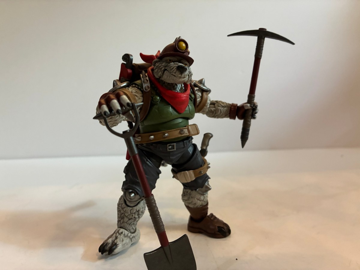
As has been the case most years, the Teenage Mutant Ninja Turtles had no shortage of coverage this year at the convention. There was even a dedicated brand panel that covered releases from several companies. We still have Playmates for vintage re-releases and some modern takes, NECA is hitting on the toon, Archie, and Mirage, Super7 has the 2003 edition of the show, and now we have Mondo doing sixth scale stuff. Mondo’s line is their own take on a post 1990 film franchise and it looks interesting, but isn’t really on my radar for the time being. I don’t have the space or funds for another Mondo sixth scale franchise. Super7 also reaffirmed its commitment to 2k3 by unveiling silhouettes for the next wave which will include Hun, April, and a motorcycle Raphael and Shell Cycle. This would seem to be the nail in the coffin for the vintage inspired figures Super7 started off with which is really frustrating considering the figures missing (topped by Heavy Metal Raph). I’m done with the 2k3 series after Shredder, and possibly done with Super7 after that as well.
NECA has been the company at the forefront for TMNT the past several years, but their showing was surprisingly light. They did announce a line of turtles based on their appearance in the game Fortnite, but that might have been the most noteworthy. There was a leak the week before SDCC of one of their reveals for the toon line, granny Bebop and baby Rocksteady, though that release wasn’t going to blow anyone away (even if it is entertaining). The only new figure shown for the toon line otherwise was a beach Slash. There was also no big display with dioramas and such, just figures in a case. It’s pretty clear that NECA wasn’t going all out for SDCC. Is that a shift in strategy? It certainly costs money to put these big displays up and staff a booth plus rental space isn’t cheap. Are they going to pivot more to social media for reveals? Is New York Comic Con considered their flagship event? Or did the reappearance of Toy Fair earlier this year just mean all of the stuff that would have been revealed at SDCC was instead shown there?
NECA didn’t have a lot of surprised in their booth, but this certainly was the most standout one.
I don’t know the answer to any of those questions, but I was very surprised at the lack of Tempestra. She has become the biggest missing piece for the toon line, even if she is very much a B-tier character in her own right. I’m not sure why they’re slow-walking that one. They mocked up an arcade cabinet accessory for a still unreleased movie April variant more than two years ago that most assumed was really made for a Tempestra. What I did like, even though none of the figures shown were new reveals, was how the 2012 TMNT line is shaping up. The sculpts look fantastic and they’re all dated for this year and will be sold as single releases so no four or two packs. I don’t think it’s been confirmed where we’ll be able to buy them, but they’re among my most anticipated releases for the second half of 2025. The only other showing that excited me was Garfello, i.e. Garfied cos-playing as a ninja turtle, which was unexpected. It looks great and comes with Odie and is the sort of silly release I’m very likely to get.
As for the rest, there wasn’t much to be excited by. Playmates is re-releasing its remastered turtles minus the bumpy texture a lot of people didn’t like. We actually knew about that going into SDCC, but that was basically the official launch. Mezco also showed off 1990 movie turtles for its One:12 line. They look worse than the NECA releases (which are coincidentally being re-released in single packs this year), but will probably cost more than twice as much.
Mondo
No one does animated X-Men better than Mondo.
We’ll pivot from an IP to a company here as Mondo had a lot to show off. Perhaps more than any other company, though I confess I’m not interested in everything they do (like Masters of the Universe and ThunderCats). What gets my attention first and foremost when it comes to Mondo are their plans for their X-Men animated line of sixth scale figures. It’s a line that is becoming much harder to collect because of the tariff situation in the country, but I’m in too deep to dump it. Heading into the event, we knew the next figure to be solicited was likely to be Mr. Sinister who had already been shown. There was also the reveal of an event exclusive Savage Land Rogue which went up for preorder before the show. They were both at the event along with the next figure: Storm. She looks awesome and was my guess for next up. It didn’t end there though as we also got to see concept art for the next figure and it’s Beast! I’m glad he’s a little ways off since he might be an expensive one. Perhaps things can improve economically before going up for order, though there’s always the chance things get worse. Little is likely to change before Sinister goes up though which is happening in August. I love the look of the figure and he’s an A-list villain from the show, but I do not look forward to the sticker with that one.
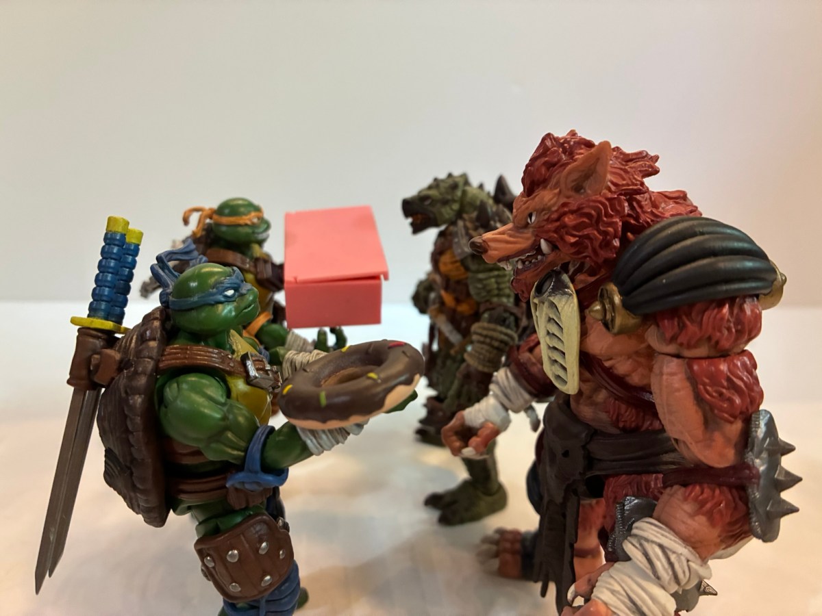
That was a hoot!
That’s the only sixth scale line I’m in, but Mondo did reveal more Marvel and DC figures (Superman, Two-Face, Dr. Doom, Lizard) in their other lines which all seemed solid. What really caught my eye though were their Mondo Squads which are more statuesque figures with swappable parts and sold in bundles of characters. Previously, they had done a set of characters from the Nicktoon Aaahh!!! Real Monsters and now they’re moving onto Rocko’s Modern Life. I love Rocko and this set of the titular character plus his mates Heffer and Filbert is pretty much an automatic buy from me. We don’t have a lot of Rocko merch out there so the scarcity will help. Also shown is a squad of Beavis and Butt-Head with their couch and the four fellows from King of the Hill (Hank, Bill, Dale, Boomhauer). Similar to Rocko, I may have to get King of the Hill since there’s so little out there for the franchise that I have really grown to love in recent years after previously dropping off around Season 5. Mondo also teased future squads based on Rugrats and The Ren & Stimpy Show.
The last of the real Ghostbusters makes his debut in Ray.
Mondo is also heavily invested in The Real Ghostbusters, which was probably the biggest reveal of the 2024 show. We’re still waiting on the first release to drop (once again, thank you tariffs), but we have now seen all four of the busters and their companion ghosts. And, to no one’s surprise, everything looks great. I still have reservations about the price, but it is what it is and we’ll talk more about that when Peter finally arrives (hopefully sometime in August). Mondo also revealed that Janine will follow the boys and she’ll be in her more traditional secretary attire. To sweeten the package, she’ll come with her desk and an alternate lower half for a clean cross-legged sitting position. I’m guessing all of this extra stuff means she’s going to retail for $202 like the Ghostbuster + Ghost package we’ve seen up until now, but maybe that won’t be the case. That will be a tall ask and is probably something I won’t be interested in.
Marvel Legends
It’s all X-Men ’97!
I knew Hasbro would have some X-Men ’97 stuff for us, but I wasn’t prepared for just how much and how much I’d like it. We learned what wave three will be and those figures were all on-hand for folks to gawk at: Morph, Jubilee (final suit), Sunspot (final suit), Emma Frost, Cable (first outfit), Wolverine (classic civilian clothes). All of them looked pretty damn good. I’m mostly looking to supplement my ’92 display with these so Cable and Wolverine were locks. My dissatisfaction with the ’92 Jubilee puts the ’97 one on my radar, though I’m disappointed she’s in her black jumpsuit. Maybe I’ll swap heads with the ’92 one? Maybe even arms and coat? Emma just looks great though a classic take on the White Queen was enough to get me to put in a preorder and I love Morph so I’m in for the ’97 version. The only one I didn’t preorder was Sunspot. Nothing against the figure, I just don’t really care about Sunspot.
Gambit, what did they do to you?!
That wasn’t all though as we got a nice look at the made-to-order Sentinel which went up last year and there were some two-packs announced. We can look forward to a finale Cyclops and Jean (Marvel Girl), finale Wolverine and Storm, and a pairing of Rogue and Gambit from their basketball scene in the first episode. None are essentials for me and I don’t think I’ll be getting any, but I love to see how all-in Hasbro is with X-Men ’97. The one set that I would have had the most interest in is the basketball two-pack, but it is unfortunately the worst looking set of the two. That’s because it looks like Hasbro repurposed its Starting Lineup body of NBA players for its shirtless Gambit. That sculpt has a very unpleasant looking ab crunch in the middle of it. It worked okay for Starting Lineup because all of those figures had a jersey. Gambit doesn’t have that luxury and it looks terrible. It’s honestly one of those “How did this get approved?” moments that comes along once in awhile.
Aside from that, I had little to be critical of with Hasbro’s panel. They also revealed their next made-to-order figure: Mephisto. Mephisto was previously released many moons ago by Diamond in their Diamond Select line. Marvel Legends has not touched him though because he’s basically Marvel Satan and not afraid to show it. There was going to be one attached to the Engine of Vengeance HasLab if it hit a certain number of orders, but that product didn’t even fund. The Legends team had previously stated Mephisto could not be released any other way, but there was almost certainly some gamesmanship in those statements. Something obviously changed and now Mephisto is on the way, though he won’t be showing up at Walmart or Target. He is coming with his own throne and this thing sure looks familiar.
Hey! I know that skull!
Crystar fans can probably spot where this thing is from and the Legends team was not shy about stating it’s based on the cover of issue 8 by artist Michael Golden. We’ve covered that issue here and that’s because it’s also the cover musician Glenn Danzig stole from to come up with a logo for his band Samhain which then became the logo for the band Danzig. The Legends team, once again, was not at all shy about pointing that out and might even be hoping for some cross-sale appeal with that fanbase. As for Danzig, no comment has been made. The item was shared in the official Danzig fan group on Facebook and has since been removed so either he’s not happy or the moderators for that group think he would not be happy to see it. Fans have frequently traded and sold issues of Crystar there so it’s not like the group hides from the connection, but maybe he’s salty that he won’t get a cut? He probably thinks he made the image famous, and he probably did, but he has also made a lot of money off of art he never owned so I think we can call it square on this one, Mr. Danzig. Especially if Marvel never came looking for a cut of those t-shirts. Either way, the throne looks awesome and yes, I’m buying it. I don’t even care about Mephisto, but this thing looks too good to pass up. It’s an open preorder that closes August 26th and will set you back $80 when it ships next year.
As for other odds and ends, I continue to be impressed with the offerings from Jada Toys, even if the IPs they traffic in have little or no appeal to me. Except for Frosty the Snowman, I will get that. Big Bad Workshop had a variant of its upcoming action figure of The Tick on display and he might already be my most anticipated for next year. I love The Tick and it’s been at the top of my most wanted for a few years now and I hope the line is a success. We also know who will be the next character: Chairface Chippendale. The Naughty or Nice collection is also continuing and we’re finally getting a Mrs. Claus. I assume she will go up for preorder around Christmas time and hopefully will fund. She’s not the design I would have gone with, but I’ll be happy to have a Mrs. Claus join Santa on my shelf some day.
And that’s a wrap! Thanks to all of the people who cover this event every year and whose videos I snipped screen grabs from: Pixel Dan, Toy Anxiety, Robo Don’t Know. Toyark.com also has some great coverage if you prefer still shots. All of the folks involved help people like me who can’t make it to the con enjoy from my home or wherever I happen to be.
If you liked reading this here’s some related content you may enjoy:
Mondo has been absolutely killing it with its sixth scale line of action figures based on the now classic animated series X-Men. The company also really ramped up production in 2023 on the line by soliciting five new figures during the year. At over 200 bucks a pop, it was quite the hit to the…
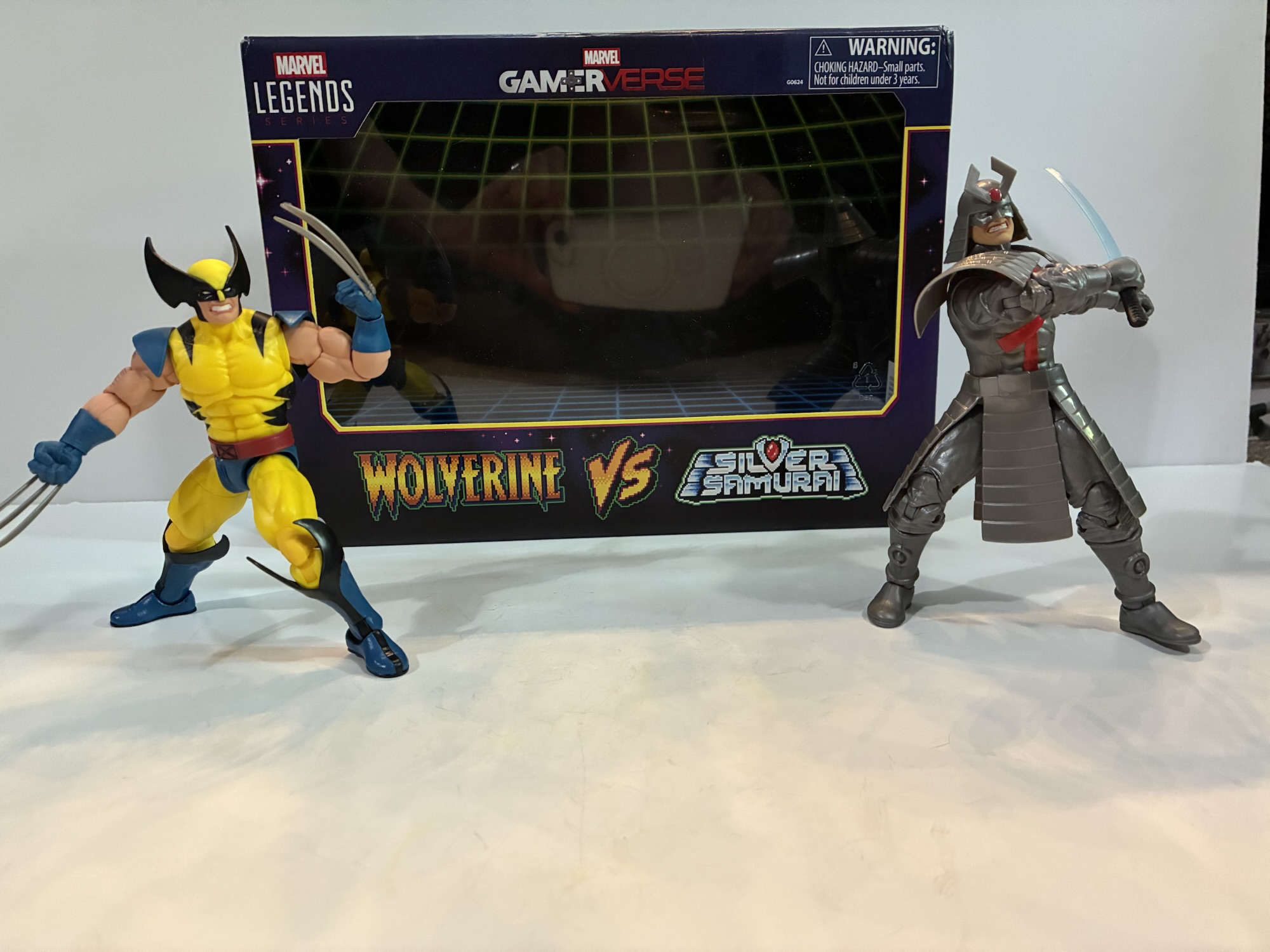
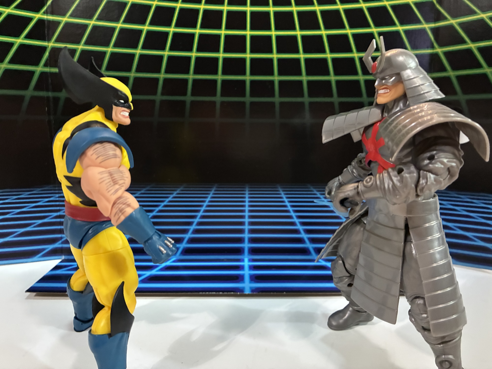
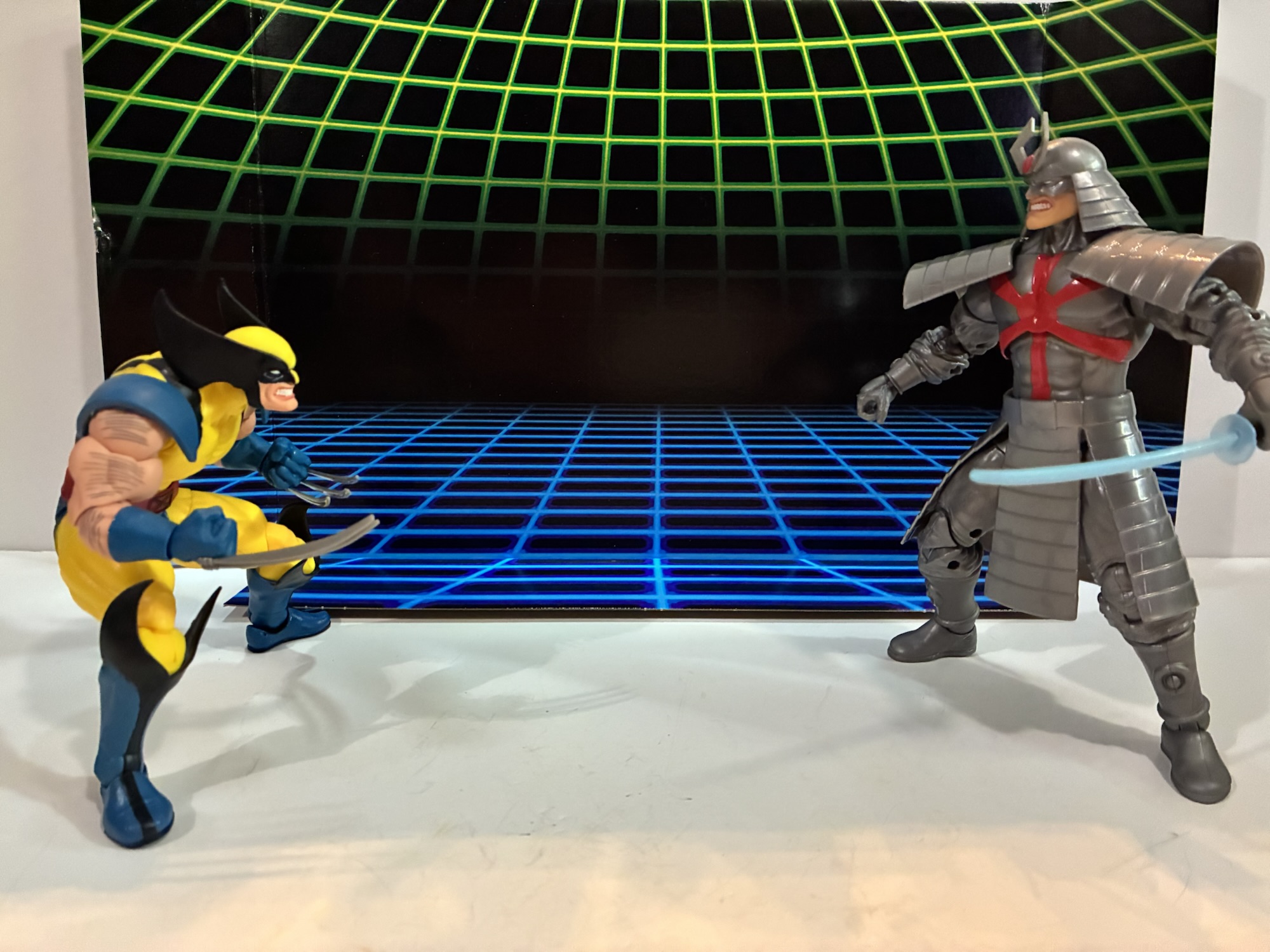
After taking a trip to the past with Rocko’s Modern Life during the spring, it seems only fitting that I also take a look at the Rocko’s Modern Life movie from 2019: Static Cling. To be fair, the term “movie” is definitely used loosely when applied to this piece of media. Static Cling was originally…
There’s been a hole in my Danzig collection for quite some time. It was a hole that was easy to fill and actually quite cheap considering most Danzig records fetch well over $100 these days, but an important piece was missing. And that piece is not what one would necessarily expect, but I would assume…
It has been just over 10 years since I last posted about a Lego set featuring The Simpsons. That last set, the Kwik-E-Mart, came out in 2015 and was preceded by the home of the Simpson family the year prior. Those sets along with two waves of mini figures seemed to sell pretty well, but for whatever reason Lego decided that was enough Springfield for now. I don’t know why they’re suddenly back ten years later with a new set, but I’m not complaining. I was hoping for at least one more set plus another wave of mini figures since we were missing so many iconic characters from the show: Principal Skinner, Superintendent Chalmers, Lenny, Carl, Barney, Jimbo, and many more. It was unlikely that we’d ever get every character we wanted, but it felt like a third wave would have really filled in the most crucial gaps.
That didn’t happen. Is a third wave now on the table since we have a new set to talk about? I don’t know, but for now we do have Krusty Burger. When I was left to ponder new sets for Lego, I’m a little surprised at myself for not having Krusty Burger pretty high on my list. If I had to make a wager on what was most likely, I was going to go with The Android’s Dungeon the local comic book store run by Jeff Albertson better known simply as Comic Book Guy. It’s small, has some nerd appeal, and works well with existing figures. Maybe it could have led to us getting a Lego Stan Lee? Instead, we have Krusty Burger, the local fast food establishment run by the clown of the same name. Many episodes (and even the movie) have scenes set at Krusty Burger and some are quite memorable. It’s a perfectly cromulent selection by Lego so let’s see how it turned out.
This set comes with a total of 7 mini figures, though some are repeat customers.
The Krusty Burger set contains 1,635 pieces and seven mini figures. Of the mini figures, four are repeat characters: Homer, Bart, Lisa, and Krusty. Bart and Lisa are exactly the same as some past releases. They have neutral expressions and Bart comes with a slingshot while Lisa has her saxophone. Homer also has a neutral expression, but he at least gets some grease stains added to his shirt. Krusty is all new and he’s in his farmer Krusty attire from the episode “Coming to Homerica” complete with hat. It’s a bit interesting to me because Jakks Pacific recently released a Krusty Burger in their toy line featuring a Krusty in the exact same outfit except theirs omitted the hat.
The character selections were made for their ties to the restaurant and Krusty and with some headswaps with old figures we can almost make Grandpa from his time at the restaurant (though he wore the old uniform in his time there).
The rest of the figures are of new characters. Working at the Krusty Burger is the squeaky-voiced teen. He is a teen of many names in the show and also many jobs. He’s in a green and gray uniform which is a color combo seen in more recent seasons of the show. In the old days the workers often had purple shirts. He looks the part and also has his hat on which is non-removable. Also there to enjoy a Krusty burger is officer Lou. I assume he’s included because of the scene from “22 Short Films About Springfield” where he discusses visiting a McDonald’s in Shelbyville which confuses fellow officers Wiggum and Eddie. We also already have a Chief Wiggum (two, actually) so he pairs well with him. Lastly, we have Sideshow Bob. He’s featured in a green shirt and blue pants which would appear to be the default style guide for Bob these days. He’s here I guess because of his connection to Krusty and he is a pretty big name character. He unfortunately doesn’t look the best as Lego really went conservative with his outlandish hair.
Homer’s Krusty-fied car turned out fine, but I wish we had a Homer as Krusty to go with it.
Just like the previous two Simpsons sets, The Krusty Burger also comes with a vehicle. This time it’s Homer’s sedan, but redone to match the episode “Homie the Clown” when Homer became a Krusty impersonator. It has the Krusty visage on the front and also comes complete with speed hole decals for the hood. The build is pretty much exactly the same as the standard version of Homer’s car which includes no roof. I guess this is so Marge could fit inside, but I really hate the no roof look. Why not give us an optional one? It also has exposed studs on the hood like the original which is also something I don’t care for. I would have preferred a smooth exterior there. And while I think this is a solid inclusion, it does make me wonder why we didn’t just get a Homer as Krusty mini figure? That obviously would have cost more money because they would need to cast a new head, but they could have made up for it by just having Krusty come with his default head instead of the one with the hat. Or drop Bart or Lisa from the set – I don’t know. I want a Homer as Krusty!
This little living room set that was a throw-in for people who ordered from Lego is a nice little item, especially for those unable to get the Simpson’s house.
If you ordered this set from Lego directly then you also get a mini set of the Simpson living room. It’s the couch, TV, and end table, and a lamp and it’s basically a cut-away. The TV is the same as the one included with the house only this one comes with a screen featuring a Krusty Burger commercial. A mini figure can easily fit on the couch if you want, but it’s not a couch that is to scale with the house. It can really only accommodate two figures so no family couch gag is happening here. Still, it’s a fun little throw-in and considering the Simpson house set is 11 years old there may be a lot of people buying this set who don’t already have it. This isn’t exactly a substitute for the whole house, but it’s better than nothing.
The Krusty Burger is by far the smallest Simpsons set from Lego so far.
As for the Krusty Burger itself, it’s the smallest of the three sets and by a noticeable margin. It’s pretty self-contained with nothing surrounding it aside from the buildable sign. The layout is a bit odd as the front door is right next to the drive-through window, but that’s how it’s depicted in modern episodes. The right side of the building has a lot of windows while the backside features a rear door and an overflowing grease container. It’s done well with translucent yellow bricks and feels like the sort of thing one would likely find behind an actual Krusty Burger. The left side of the building features the drive-through menu and intercom which pretty much matches the depiction of the same from “Lisa vs Malibu Stacy.” You get to see what everything costs which depicts this restaurant as frozen in time back to the early 90s. My one critique as a fan of the show is that it lists milkshakes on the menu. Krusty Burger doesn’t sell shakes, it sells partially gelatinated, non-dairy, gum-based beverages.
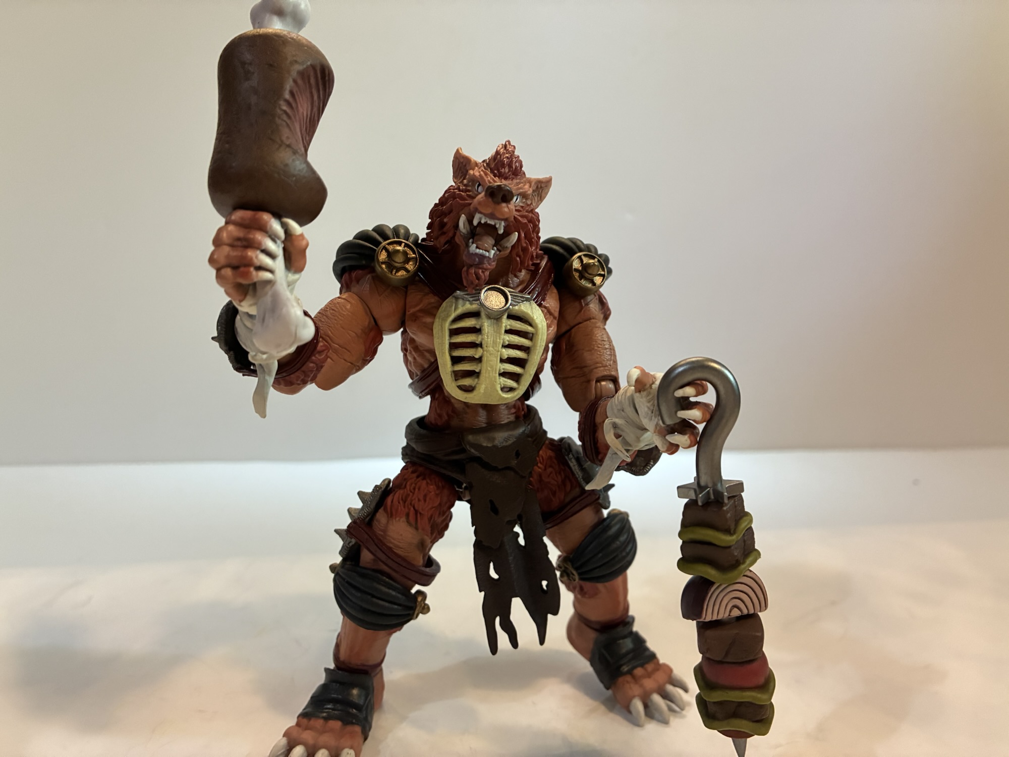
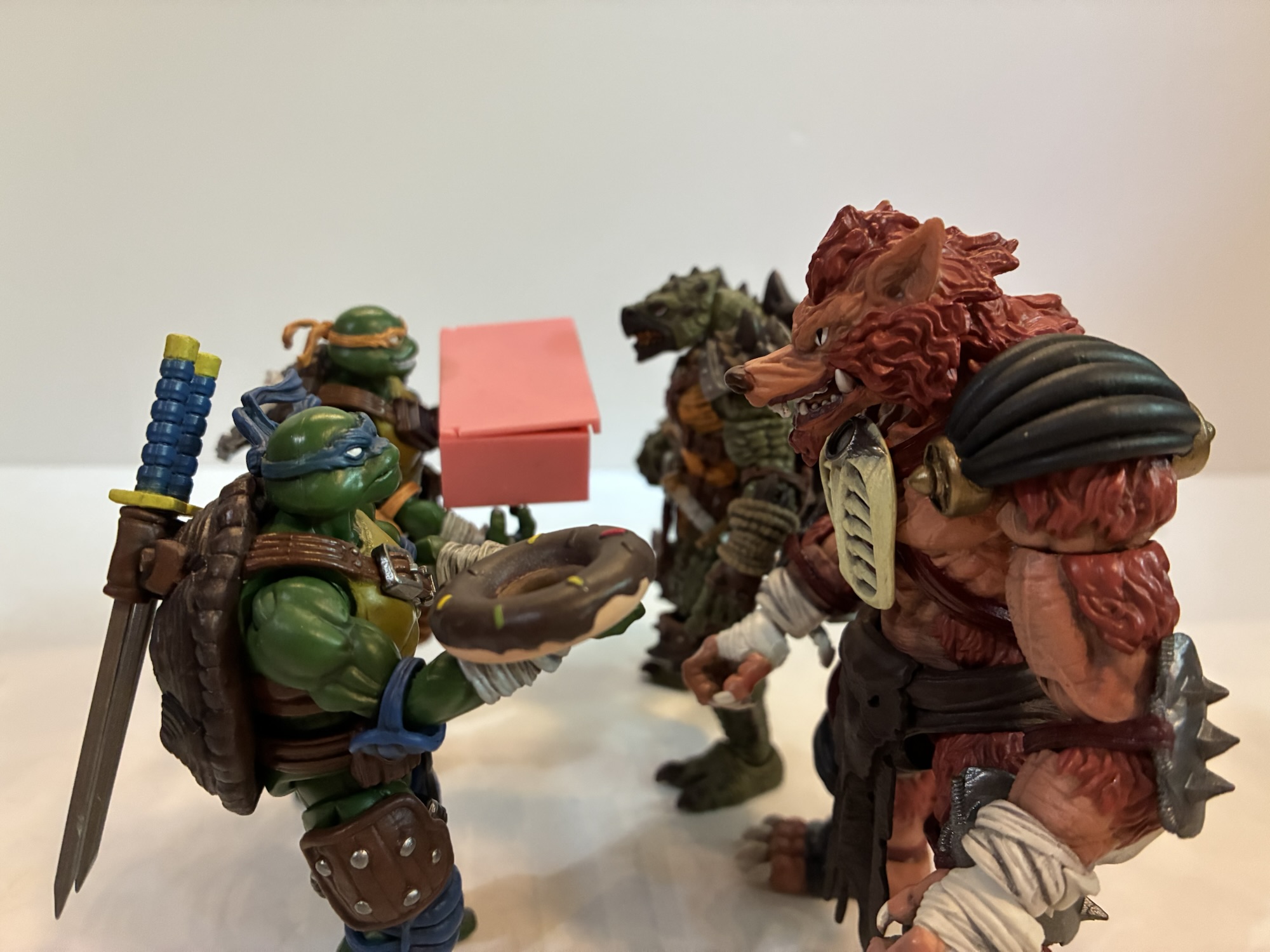
To access the interior, you have to first remove the roof. It just rests on top of the set and there’s a big fan on it that doubles as a handle. There’s also roof access for your mini figures via a little trap door. Once removed, one side of the building can open up which basically breaks the kitchen in half and isolates the dining room in the center. If facing this open set, the left part is the counter and kitchen. There’s a large menu over the counter and two registers. Behind the registers is a small area to fit a mini figure with a prep table behind it that contains some massive burgers. The burger build is creative, but does lead to comically large sandwiches. The deep fryer can be found here as well which has a removable fry basket. For the french fries, Lego is using Wolverine’s claws, but in gold. I’ve seen them do some funny stuff with their hot dog shape, but I wasn’t expecting Wolverine claws for fries here. Also back here you’ll find some storage and an ice cream machine that’s forever out of order. The contents are basically just water which is a nice touch.
It takes up considerable more space when opened to access the various rooms inside.
The center of the build contains the dining area. It’s pretty cramped as it contains one booth and two tables each of which has two stools. Tucked into the corner is Krusty’s Kidz Zone which is a small ball pit. It’s cute, though I would have probably preferred more seating to fit as many figures into this thing as I wanted. Having the Simpson family at one table and the cops at the other would have made sense. Some food is intended to go into this area including Krusty’s version of the Ribwich. It’s made with those tiny Lego cars which is pretty amusing. I had previously seen those in a Christmas tree set.
The right side of the build contains the bathroom and the rest of the kitchen. The bathroom is pretty small and walled-in. For the image on the box, Lego even removed the side wall to make it present better which you could also do if you chose to display the set open. The bathroom is in a pretty sorry state as the sink appears to be overflowing, the toilet is leaking, and there’s no toilet paper left on the roll. It’s what one would expect of a Krusty Burger. The part of the kitchen that’s behind it is the drive-through window. There’s a nice little in-joke on the order screen and there’s also a drink machine in this area.
There are a lot of references throughout the set which is what we’ve come to expect as Simpsons fans with basically anything like this. Lego did a good job with the past sets and they do an adequate job here. This set did begin life as a Lego Ideas design and the pitch was pretty similar to what we got. One of the main differences though was that it was going to come with Marge’s station wagon instead of Homer’s Krusty-fied sedan. It is surprising to me that we have now had three sets from Lego that all came with vehicles, but we still don’t have Marge’s car. And with this set in-hand, a Simpson fan is likely to immediately wonder what could be next? I’m not holding my breath, but now that we have a Krusty Burger I would so love a Skinner house so we could recreate the Steamed Hams sketch in Lego form. The house could be pretty small as we only need the dining room, kitchen, and then they can do whatever with the upstairs. Just having that setup would surely be unforgettable.
If you were curious, the answer is “Yes, you can fit both cops into the previously released cop car.”
The Krusty Burger is a pretty quick and enjoyable build. It’s not very big, but I’m also not surprised that it didn’t get the same love as the Kwik-E-Mart given that ten years have past and costs have changed. The set will set you back $210 making it the most expensive Simpsons set so far, especially per brick. Given the cost, I do wish there were more printed bricks and less stickers. This one came with two sticker sheets and if I have one major complaint with Lego it’s stickers. My Kwik-E-Mart’s stickers are curling on the front and it’s become an eyesore. I don’t have the same issue with other Lego sets that I have, but a lot of them also don’t have exterior stickers like that one. The Krusty Burger does though, and I hope it doesn’t end up in a similar state one day.
As a Simpsons fan, I almost can’t not recommend this Lego Krusty Burger. Sure, I would have packed in more references to the show, probably would have preferred some different characters for mini figures, and definitely would have done things differently with the car, but everything that’s here is still done pretty well. It looks good and there are certainly a lot of memorable scenes from the show one could stage here. It may be small, but it doesn’t look drastically out of place with the other sets. Hopefully, this isn’t the last we see of The Simpsons and Lego and hopefully the next collaboration isn’t ten years away. There’s a lot more Lego could do with Springfield even if there are aspects of it they’d never touch, and I am certainly ready for whatever comes next.
If you missed my other Lego Simpsons reviews or want to see what else is out there check below:
Last year, Lego released its first set and series of mini figures styled after The Simpsons, the animated institution that has anchored Fox’s Sunday Night lineup longer than Justin Bieber’s been alive. Debate the merits of the program’s more recent seasons all you want, but it couldn’t diminish my curiosity for a set of Legos…
When I was a kid, the coolest and most colossal Lego sets were often pirate ships or castles. These things required hours upon hours to assemble and cost a lot of money. My parents, when looking to spend money on me at Christmas or for a birthday, opted for video games or a bicycle as…
Back in October, we took a look at the very first wave of action figures from Jakks Pacific based on The Simpsons. At the time, I only had two figures from that inaugural wave: Homer and Bart. It was a series of great interest to myself and other Simpsons fans since it’s existence basically meant…
I would wager that when it comes to the Teenage Mutant Ninja Turtles character Ace Duck most fans will immediately go to the Playmates figure as their first frame of reference. His creation is credited to the trio of Jim Lawson, Steve Murphy, and Ryan Brown, but I don’t know if any had a hand in his original look. That version of Ace, who was an anthropomorphic duck dressed like an old fighter pilot, made one appearance in the 1987 cartoon series as basically a show within a show. He flashed across the screen of the TV in the sewer lair in the episode “Attack of Big MACC.” That was it for old Ace as he never got to be a featured guest like many other characters who first appeared in the toy line. The character wouldn’t get a substantial look until he showed in the pages of Teenage Mutant Ninja Turtles Adventures published by Archie, only there he wasn’t a fighter pilot, but a pro wrestler.
He’s one big duck.
NECA’s TMNT Adventures line of action figures has been committed to giving fans basically everyone associated with the fictional Stump Wrestling. We have the turtles, Leatherhead, and Cryin’ Houn’, and now we have Ace Duck. This version of Ace is quite different from his Playmates counterpart. The only things the two share are the fact that they’re both ducks and they both have wings. While the original Ace is of average build for a human, this duck is massive. The phrase beefcake comes to mind, but also feels inappropriate for the massive mallard since he’s not a mammal. He’s a big boy and would have fit right in with the WWF of the early 90s. Even the whole duck thing probably could have worked in the promotion that introduced the Gobbledy Gooker. He also has a bit of a Buddy Rogers thing going on as he’s kind of a pretty boy. Part of me wonders if this design was influenced by Daffy Duck’s foil in the short Muscle Tussle because even the trunks are the same to go along with the physique. As a character, he’s neither friend nor foe to the turtles and even though he’s depicted as champion, he sure seems to lose a lot.
Ace Duck with the Ace Duck most know him as.
Ace Duck from NECA comes in the usual packaging with new artwork by Ken Mitchroney. He’s a big figure and comes courtesy of Walmart Collector Con which actually took place several months ago where he was available as a preorder. NECA is now finally shipping the figure and it’s expected that he’s just first run at Walmart and will eventually be available from other outlets. This chiseled sculpt was handled by Tomasz Rozejowski with paint by Geoff Trapp and Mike Puzzo.
It might take two turtles to topple this guy.
Ace Duck stands right around the 7″ mark and as high as 7.25″ to the top of the curl of feathers on his head. I’m pretty sure the first impression most are likely to have when looking at this figure is that he sure is bulgy, in more ways than one. He is jacked as his shoulders are quite broad and his chest is puffed out like a man (or duck) of such musculature would be. He’s also quite bulgy down…there. It’s quite the comical look when compared with the old Ace and borders on ridiculous, but I mean that in a good way. Since this is just a big duck in a Speedo, there’s not much being asked of the paint department. He’s a pale yellow all over save for his beak and his feet, which are a light orange. There’s plenty of black linework on the figure to highlight the musculature and some of the feathers. He has a set of tiny wings on his back which are barely visible from the front. I guess he skips wing day when in the gym. The only other embellishments on the sculpt are the little feathers on his forearms.
I love this cocky expression.Itty, bitty, wings.
Ace is just a big muscle duck, but what helps sell the character in plastic form are the expressions. By default, Ace looks pretty angry and ready to get down to business in the ring. His teeth are showing and he’s got a legitimately intimidating glare. The head most (including me) are likely to find more enjoyable though is the cocky grin. For that, Ace’s eyes are partly closed and looking to his right and his beak is shaped in the form of a wry smile. This is him preening for the audience or just looking in a mirror. It just goes so well with the vibe of this figure. The third portrait features a squawking Ace. His mouth is open in a cartoonish shape with a big, red, tongue flopping out. His eyes are also all red with black circles in them indicating he’s dizzy. This is pulled straight from a panel in the comics where Leatherhead is swinging him around by the feet. This one also works for a punch drunk look or an impact which is definitely a worthwhile inclusion for a pro wrestler action figure.
This right hand is basically included just for this.
The rest of the items are in the box are reserved for hands and one accessory. For hands, Ace has a set of fists, relaxed, and gripping hands. He also has a left hand that’s somewhere in between a pointing gesture and a relaxed look and a right hand that’s puzzling to me. It’s almost like the start of a thumb’s up gesture or a guitar picking form. It looks so specific that I’m guessing it’s lifted from a panel, and sure enough, it is. There’s a panel where he’s basically posing after slamming Leatherhead and saying “later gator” where he’s making this gesture with his hand. The last item in the box is a folding chair. It’s the exact same accessory that came with the turtles and even the colors are the same. It’s a solid accessory to have for a wrestling figure and I like that we now have two in the collection instead of one.
He’s not above getting dirty.
The approach to articulation with Ace is pretty basic. While the turtles were used to show off NECA’s first attempts at traditional pinless double-joints, Ace is going more old school. There’s articulation at the head, shoulders, elbows, wrists, diaphragm, hips, knees, ankles, and wings. Both the elbows and knees are single-jointed, but they will swivel at the point of entry as well. There is a thigh swivel, but it’s pretty limited and I was surprised by the lack of a waist twist. You will need to use the diaphragm joint for that and it’s pretty limited. Mostly, the figure is just so bulky that the range in a lot of places is hampered. The shoulders aren’t going to get much use out of the hinge and the elbow swivel isn’t as good as a proper bicep swivel. The hinge for the gripping hands is of the horizontal variety which is unfortunate. The legs have very little range kicking forward, though they actually kick backwards a decent amount.
You’re gonna need a bigger chair, Leo.
Ace isn’t going to do a whole lot on your shelf. In that, he’s a lot like Leatherhead and Cryin’ Houn’ who I also felt were really limited in the articulation department. Ace is probably a littler better than the hound, but a little worse than Leatherhead. None of them are going to be celebrated for their articulation and the best articulated figures in this line so far are probably the turtles. With Ace it’s just a little disappointing because there’s not much that NECA had to work around. He’s practically naked and it’s just the bulk of the sculpt that impedes things. And while I do like the sculpt, I do think there was a happy medium some where to make this guy more articulated without having to jeopardize the aesthetics. The hips, in particular, stand out as an area where there’s no real reason for why they’re as limited as they are.
Or not.
Ace Duck is another solid entry in NECA’s Archie Comics inspired toy line. The articulation shortcomings are basically a feature of the line at this point and collectors likely know what they’re in for with that. The sculpt is on point and this is a figure that just puts a smile on my face because he’s so damn fun to look at. The accessory count is suitable with three portraits and a folding chair to go along with 8 hands. The only other thing I failed to mention so far is the price. Ace Duck will set you back $50 if you can find him at Walmart (currently available for order as I type this) and may cost a little more when he makes his way to specialty retailers. That’s certainly a steep price and I guess it’s owing to his size and potential for reuse. The sculpt is such that maybe NECA can reuse it for other muscle guys though none in this particular line come to mind. He’s the same price as Cryin’ Houn’ who was a little bigger, but came with less stuff, so he doesn’t feel like a lesser release. I just wasn’t crazy about the price tag with that figure either. I do like this figure a bit more and if you’re okay with the price and its shortcomings then I can safely recommend it. It has a premium feel in-hand and it’s a musclebound space duck in trunks – what’s there not to like?
That duck has a family!
If you missed our look at the other Stump Wrestling figures from NECA then check these out:
I’ve said it before and I’ll probably say it again, but no toy collector enjoys hearing the phrase “Walmart Exclusive.” Such was the case for today’s figure, and many others, around the time of San Diego Comic Con. Walmart had their own collector con which is just a marketing way to say that a bunch…
We are rolling right along with more reviews of NECA’s TMNT Adventures line of action figures and we’re also staying within the realm of Stump Wrestling. When the turtles wound up in the intergalactic wrestling federation, they didn’t just encounter aliens, they also encountered an old foe. I don’t know how Leatherhead wound up as…
When I was a kid, I didn’t really get a lot of comic books. I most often would encounter them at the grocery store and I always hoped my mom would end up in the check-out aisle with the comics instead of candy so I could maybe convince her to get me one. And when…