One of my most anticipated releases of 2025 came out of no where. I was a kid during the early 90s and into video games so I know a thing or two about Street Fighter. Street Fighter II was everywhere and is pretty much the reason why the one-on-one fighting game became a huge genre for arcades and home consoles. I actually never owned a copy of that game which kind of surprises me to this day, but it’s mostly because I always had access to it via cousins and friends. Plus, not long after the game took off the copycats started showing up and I found myself lured in by the violence on display in Mortal Kombat. That ended up being my fighting game franchise of choice until later in the decade when I found myself the unexpected owner of a Sony PlayStation. A lot of the franchises I had grown up with in gaming just weren’t available on Sony’s machine early on, but Street Fighter was. Street Fighter Alpha ended up being the third game I’d get for my PlayStation (after Doom and Twisted Metal) and thus it became my most played game in the franchise so these character designs stand out for me the most. Still, I didn’t think I’d be all that interested in an action figure line should one surface.

The past couple of years, Jada has been making waves with its figures based on Ultra Street Fighter II. I’ve basically admired them from afar, but otherwise haven’t been that tempted to dive-in because I just don’t need that kind of collection in my life. Then along came Storm Collectibles and its Storm Arena line. Storm was known to me for its many video game-based toy lines, but they were always in a weird scale and pretty damn expensive. Still, they looked so good that I’ve considered getting one just to basically try them out, but I’ve never pulled the trigger. The Arena line is a new one for them and it’s more of a true 1:12 scale line. Their own lines were always billed as 1:12, but they were way bigger. For the Arena line, Storm secured the Street Fighter license from Capcom and went with looks based on Street Fighter Alpha 3, which was pretty much the same as the first Alpha game. And the best part of all was the price of $26. I may not have benefitted directly in buying a Jada figure, but I have to believer their line and pricing are huge reasons why this line from Storm is being priced so low.
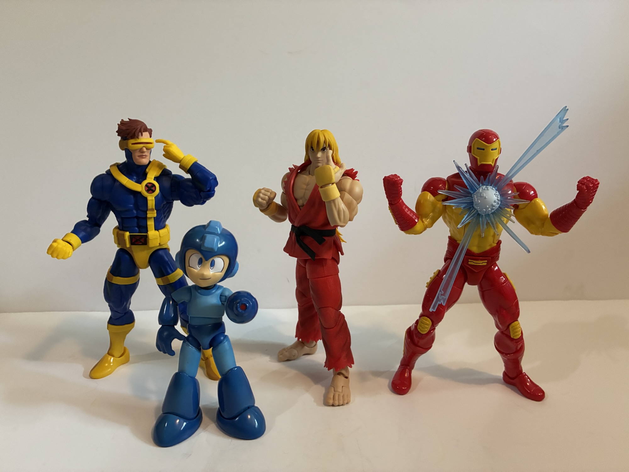
Ken is the first release in the line which works for me as I always preferred him to Ryu. At least stylistically, Ryu’s hyper Hadoken super move was definitely way easier to pull-off than Ken’s Shoryuken based super, but not without its uses. Packaging for the line is very similar to most import offerings like S.H.Figuarts and MAFEX as it’s a window box with some game art. There is a lot of plastic used to protect the figure inside so the window is obscured, but I’ll take it over a figure with smeared paint. Ken stands at about 6.125″ to the top of his head which is a pretty decent height for what is probably the most basic sized character in the line. I’m fairly certain this same body is used for Ryu and it might be in use for the upcoming Dan.

Ken is very true to his appearance in the Alpha series. There is more an anime look to the design and he has his long hair which is tied off with a red ribbon. The gi is pretty much the same as his look in other games as it’s red with a black belt. It’s also sleeveless and he wears some yellow gloves. The basic design for these figures is colored plastic throughout, a soft, rubber, overlay for the torso, a soft rubber overlay for the upper part of the gi, and soft, rubbery, hands and hair. Paint is mostly reserved for the face and gloves, but there’s also some light shading all throughout the red. The gi is also textured and Storm did a nice job of matching the shades of red between the mixed media. The figure absorbs light well despite not having a real painted finish. It doesn’t have a plastic look and does have a more premium look than something like Marvel Legends despite basically being the same price.

The price of admission may be relatively cheap, but that doesn’t mean Storm is skimping on accessories. Ken comes with two portraits – neutral and a smirk. The neutral expression has almost a hint of a smile and exudes cockiness, which feels appropriate for Ken. The smirk is a nice companion, though mine had a black dot on the chin. I normally leave my set as-is for my reviews, but I was so annoyed by it that I’ve already fixed it (a Magic Eraser sheet did the job). For hands, Ken has a set of fists, Hadoken posed, a right peace gesture, and a left “come here” gesture. There’s also an effect piece for his Shoryuken attack. It’s an acrylic piece that fits over his fist and has a nice yellow to orange to red gradient. If you want the Hadoken you have to get Ryu. I wouldn’t be surprised if alternate colorways crop up with different effect parts. There’s also an included stand, though it’s not a great one. It’s a disc with a post that plugs in and on that post is a sliding piece that’s ratcheted. The sliding piece can accept an acrylic clamp that’s similar to a doll stand. It works off of pressure as the further you slide it into the holster the tighter the clamp. There’s also a black, metal, version included though I’m not sure what advantage that offers over the plastic one. Mine also has a rubber piece over one side of the clamp, but not the other. I’ve hear some people didn’t get the black piece at all. The stand works, but it can be a challenge to balance. I’ve had Ken take a couple of tumbles because the weight wasn’t distributed properly. The base could stand to be heavier or bigger.

Criticisms of the stand aside, it is still a stand that works and it’s included along with an alternate portrait, two extra sets of hands, and an effect part all for $26. Most Marvel Legends only come with an extra set of hands and maybe another head. This is a nice spread for the price and Storm is giving collectors pretty much all that they need for a Ken display. A Hadoken would have been nice, but that would also mean we would need another stand for that. They did opt to make the hair non-removable from the heads so if there’s one critique it could be that one of the heads could have had a different shape to the hair and if they were interchangeable it would add to the display options.


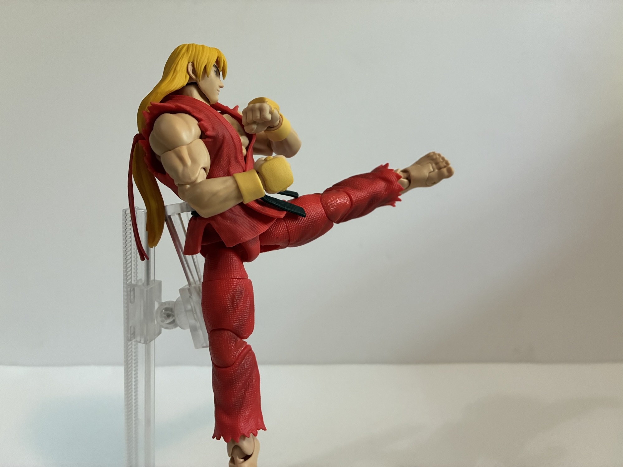

The look and accessories are great, but the real selling point of a Storm figure for me is the articulation. Storm has a good reputation in this area and it’s what I was most excited to test out with this figure. The articulation points are even more than what one would expect of a super articulated line: double ball peg head, ball neck, hinged ball shoulders, butterfly, bicep swivel, double-elbows, ball-hinged wrists, diaphragm ball joint, waist ball, ab crunch, ball and socket drop-down hips, thigh swivel, double knees, ankle swivel, ankle hinge, ankle rocker, toe hinge. Range everywhere is pretty damn good. The head can’t look up as well as maybe some would want, but it’s because of the long hair. Storm took advantage of the character to design to get as much articulation into the figure as possible. The ab crunch is an example as it would be pretty ugly on a shirt-less figure, but with Ken it’s a non-issue. They actually were going to use it on the famously shirtless Sagat, but scrapped it because fans thought it was ugly. The gi is removable on Ken which will allow you to really push some of the joints to the extreme, but again, Storm took advantage of the design to make it work as best as it could with the gi on. Taking it off reveals an odd sculpt that tapers in dramatically at the waist to make sure the figure isn’t overly bulky with it on. You can do it, but it will look kind of stupid. I had a tough time with it so I didn’t end up taking any shirtless pics of Ken, but you can certainly find them in other reviews if you wish.

The articulation is as advertised. Ken can hit all of his signature poses without much of an issue. The classic Hadoken pose does require some fiddling, but it is doable. He can also kick super high and hit the splits. The drop-down hips are on a big hinge and there’s no looseness. I don’t know that it adds much, but it’s not as annoying as other drop-down hips nor does it feel fragile like some other figures in my collection. This guy feels very sturdy and the joints are all smooth. There’s no looseness anywhere and nothing was even remotely stuck on mine. The aesthetics of the joints are all plus with perhaps the only thing close to an eyesore being the feet. There’s a little gap between the ankle and feet which provides for excellent range on the hinge, but might be too much of a gap for some. I’m personally okay with it, but the cut-up look of the bare feet in general might turn some off.

I find it hard to believe though that the feet would be a dealbreaker for anyone. I can’t think of anything with this figure that would be a deal breaker for an action figure collector. If you don’t care about Ken or Street Fighter Alpha then, yeah, you probably won’t feel compelled to buy this. Or maybe you will? I thought I didn’t care enough to take a look, but the allure of this one was too strong. This is a really well-constructed action figure at an incredible price. The price has ticked up since it was originally announced, but not substantially. I think Big Bad Toy Store has it for $28 now because of rising costs associated with tariffs and other such nonsense. Hopefully it doesn’t get worse and hopefully this isn’t some introductory price to lure us in. Sagat is more expensive, but he’s substantially larger and that’s the same sort of thing Jada does with its line too. This figure really is a contender for figure of the year. I don’t think Storm could have done much better, or any other company. I’m not all-in on this line, but I’m definitely getting Ryu and Sagat and I’ll keep my eyes on it. I’d love to see Akuma, Blanka, and some others and I’m sure they’ll be announced at some point. Dan is currently up for preorder and we’ve seen Charlie and Chun-Li as well. If Storm can deliver on this level of quality at this price with the rest I don’t see many other toy lines beating it.
This Ken figure may be from Street Fighter Alpha 3, but I think Marvel vs Capcom fans will be very interested as well:

Jada Toys Mega Man
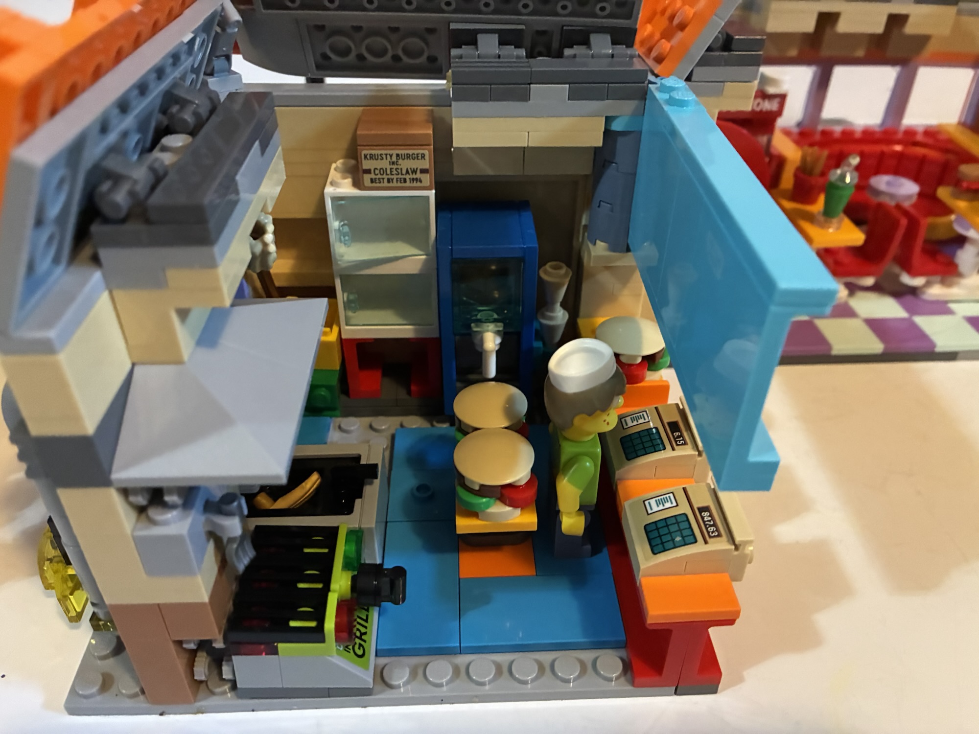
We just had 11 consecutive weeks of action figure reviews on Super7’s line of figures based on The Simpsons. Things were getting pretty negative in that sphere as that line went out with a whimper. I don’t like reviewing bad figures and it’s mostly because everything I review here I buy for my own collection.…

Marvel Legends Retro Iron Man and Plasma Canon
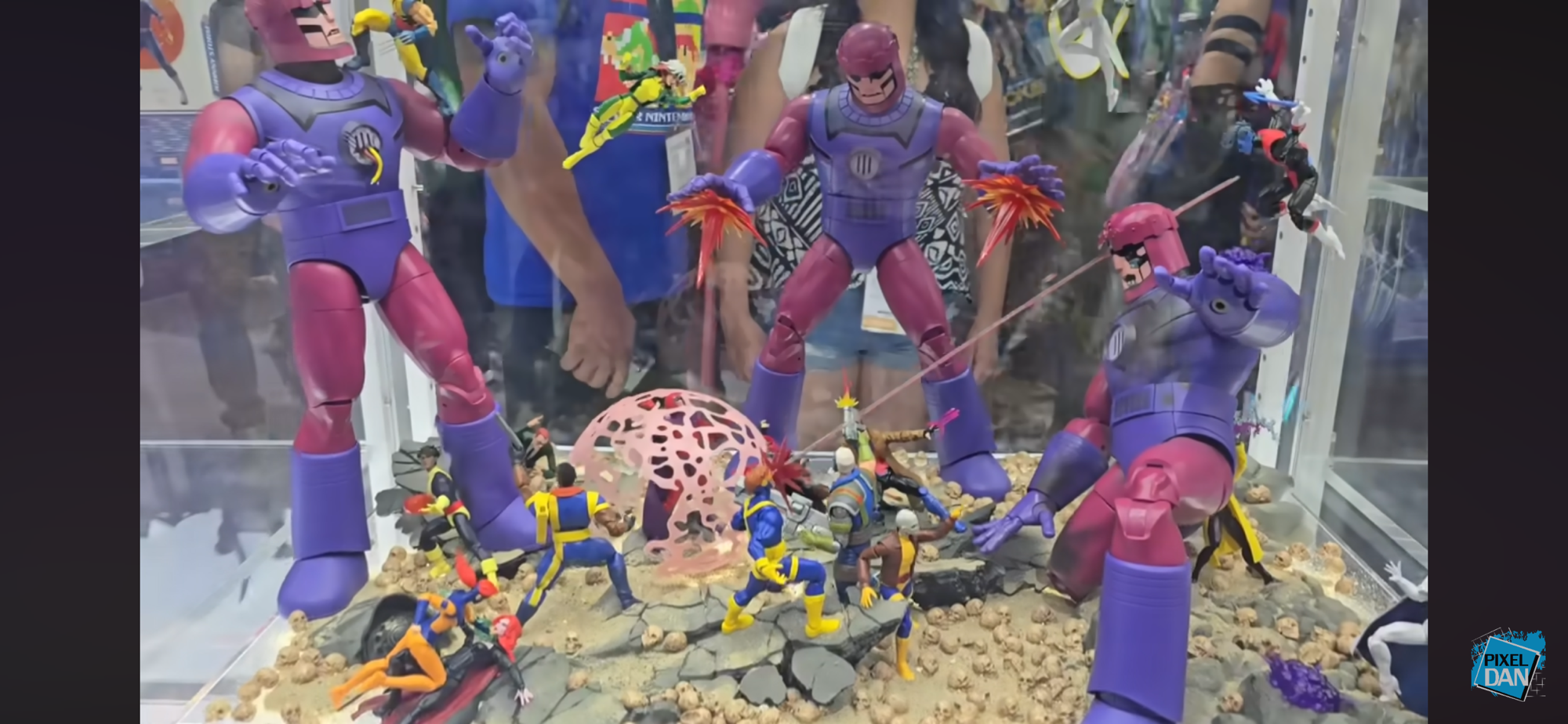
90’s nostalgia has taken me on a ride of late. I could blame X-Men ’97, but it could just be me getting older and having more fondness for the decades that have come and gone. It’s not a bad thing, but it can be bad for the wallet. Lately, I started looking at my somewhat…

Arcade 1Up Marvel Super Heroes Counter-Cade
Arcade 1Up has been around for a few years now selling arcade cabinets at a reduced size and also a reduced price. The cabinets are significantly smaller than an actual arcade cabinet, but still plenty large enough to take up a lot of floor space in your home. And while they’re cheaper than the “real…