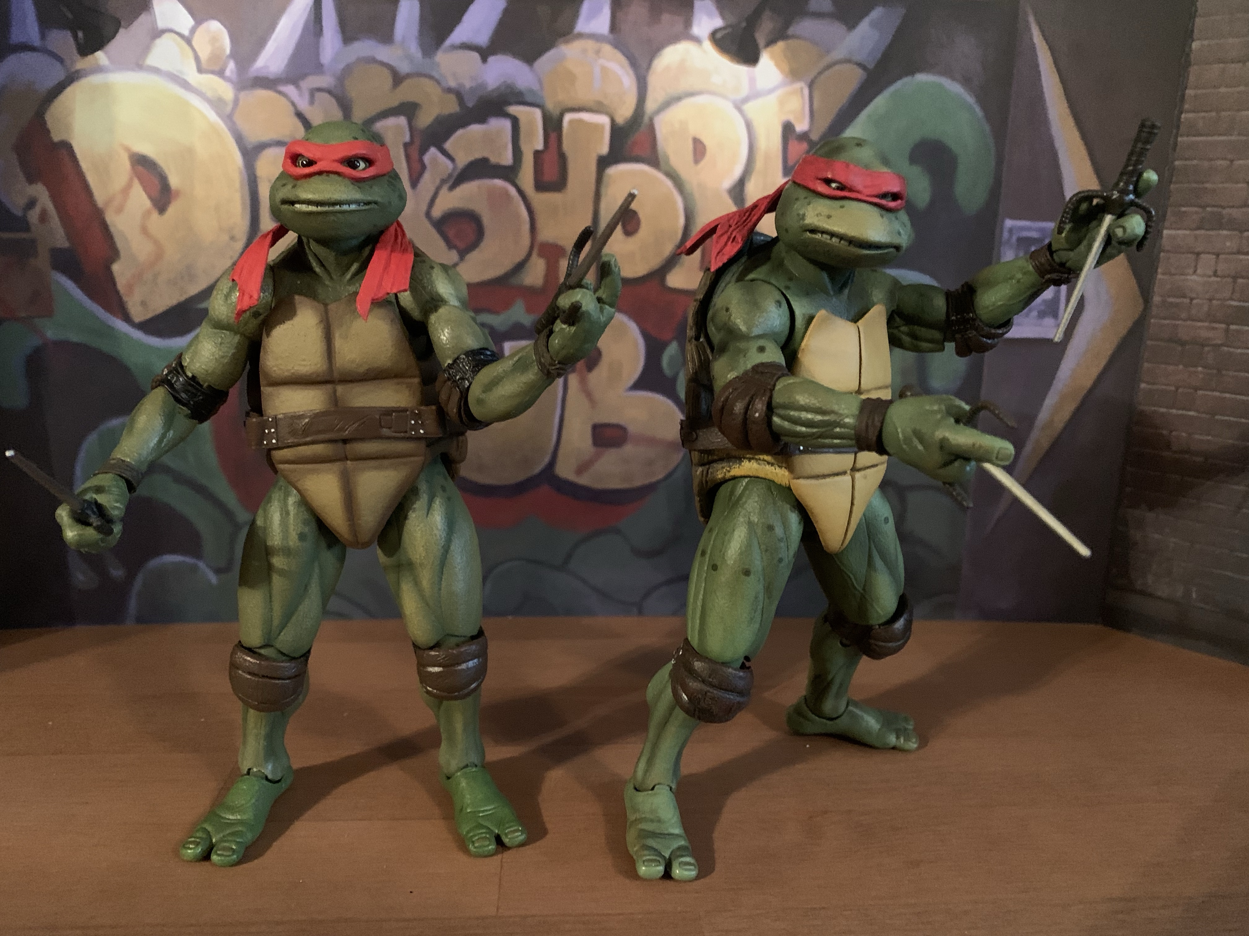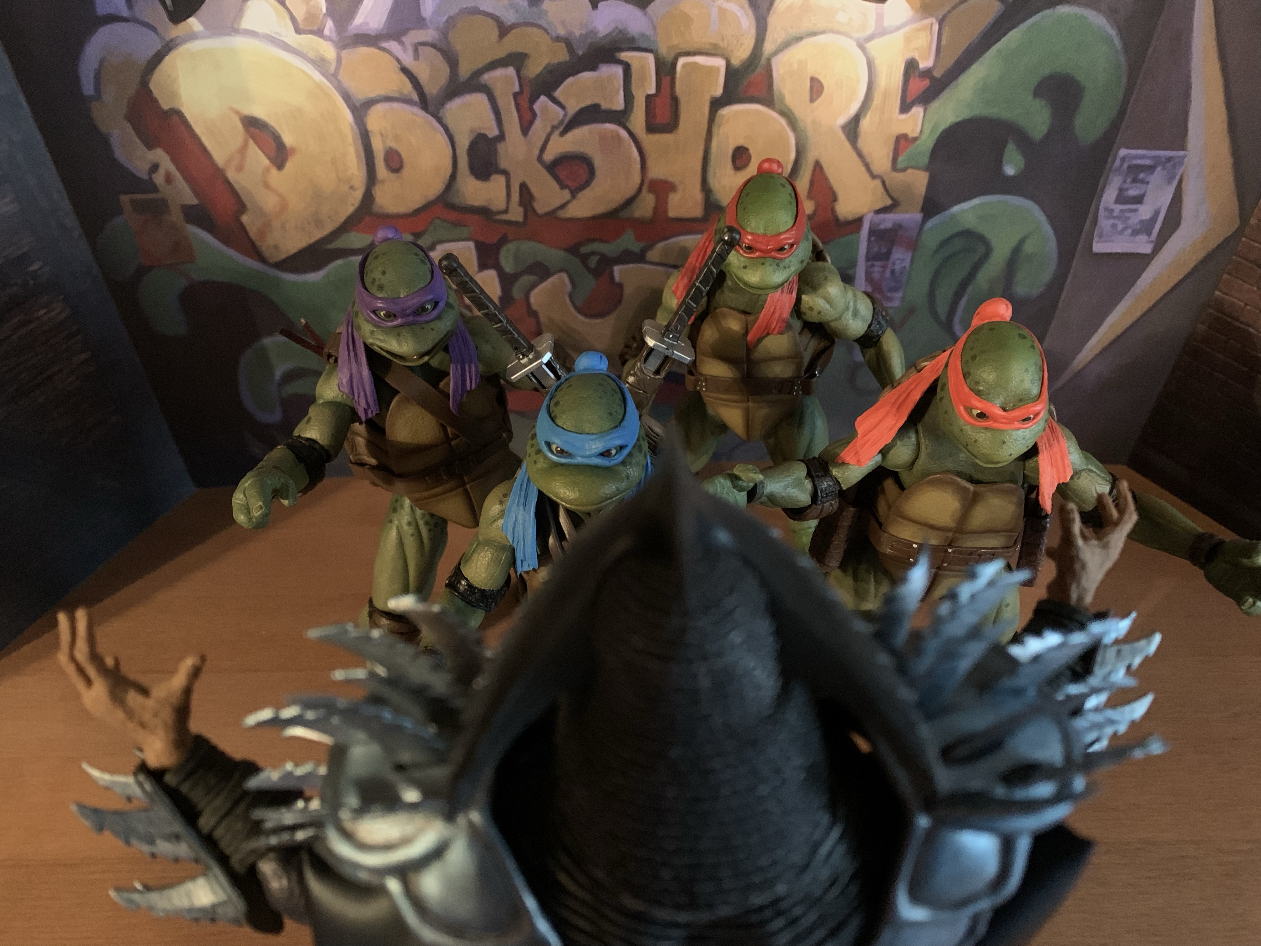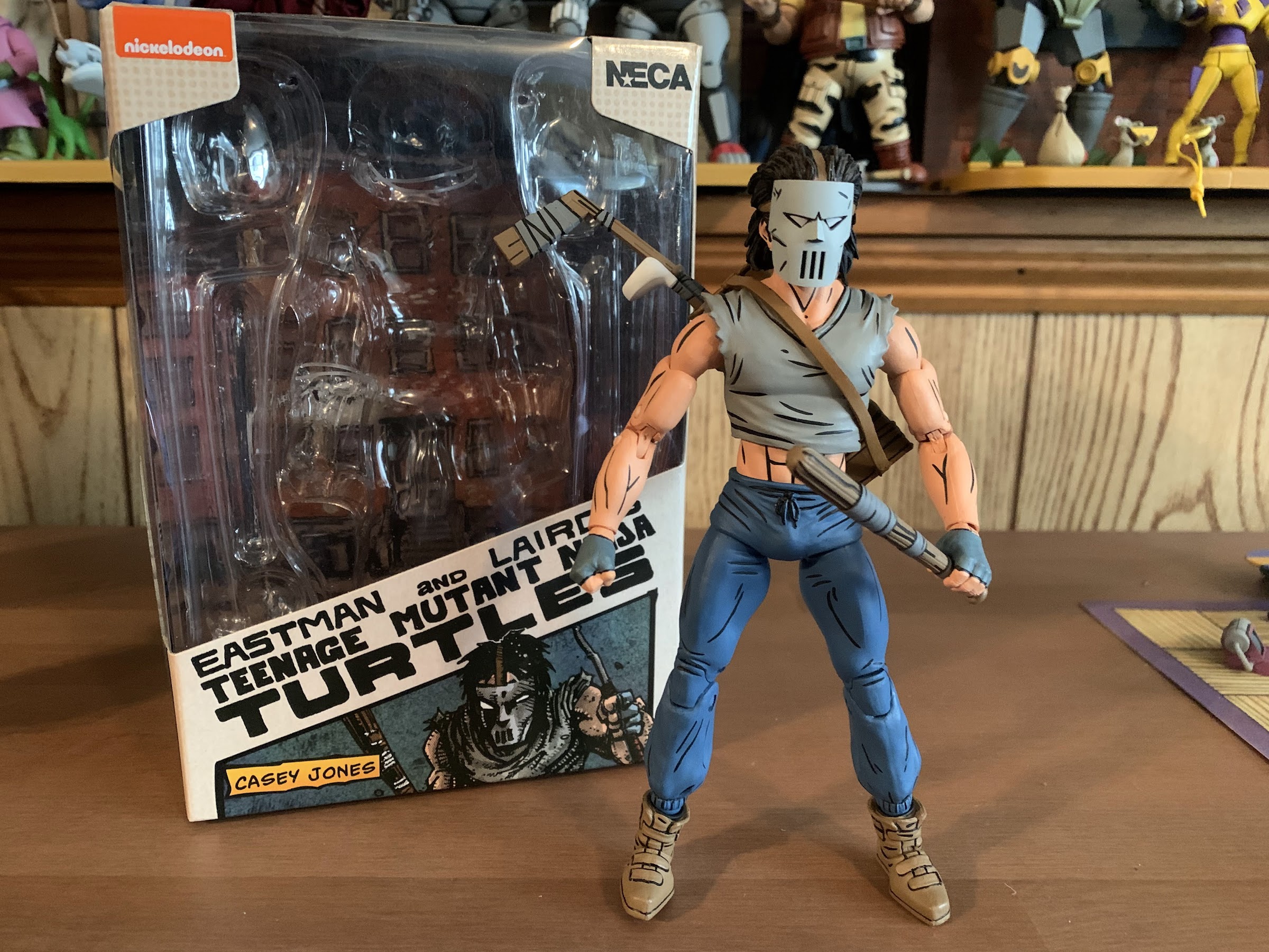
Where there be turtles, there be Casey Jones – the bad ass vigilante of New York City! Casey was an early addition to the comics and he’s basically been included with every iteration of Teenage Mutant Ninja Turtles since. And in all of them he tends to wear a hockey mask and bludgeons bad guys with sports equipment. It’s a pretty simple design, but it has stood the test of time. When NECA Toys started dipping its toe into TMNT back in 2008 it was probably assumed that Casey was on the short list of figures the company was likely to put out. Unfortunately, the line only extended one figure past the turtles (April) and fans never got their favorite vigilante in plastic. Things have changed since then and Casey Jones is no stranger to NECA or plastic. He’s been released as part of the toon line and received three separate releases in the movie line. And now, at long last, he finds himself released as part of NECA’s line of action figures based on the artwork of Mirage Studios.
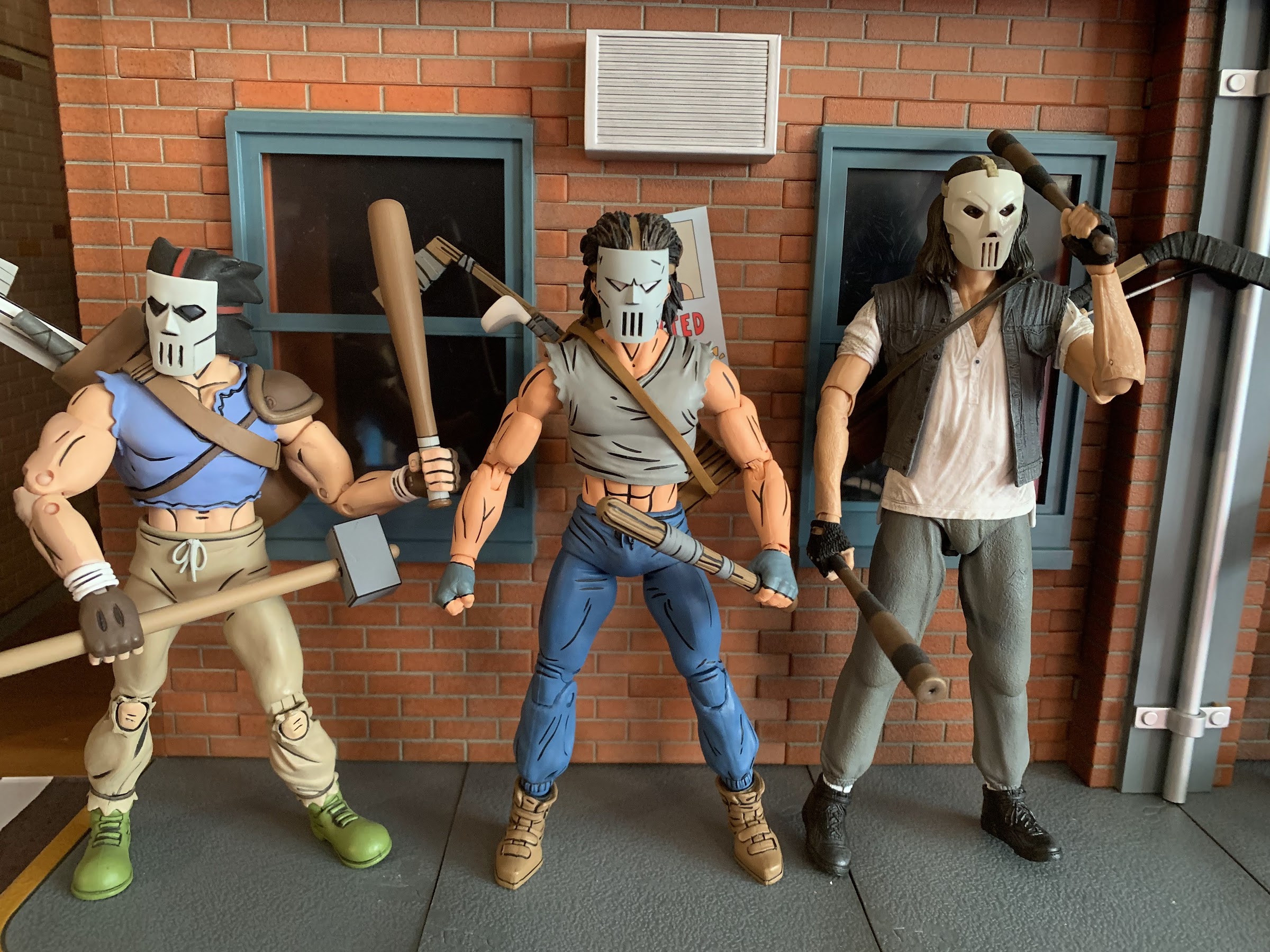
Casey Jones comes in the now standard single pack release. It’s a trapezoidal window box emblazoned with original artwork by TMNT co-creator Kevin Eastman. There’s product shots on the rear and a little cross-sell on the bottom. I’ll say upfront that this release from NECA is slightly controversial among some of the more hardcore members of the TMNT collector community. Like Renet before him, Casey comes in his reinterpreted IDW colors. That means a gray shirt instead of a red one and brown shoes in place of his black ones. I don’t know why NECA is doing things this way, but it looks like a red variant is coming too. Will it be stuck behind that Auto T bullshit the Mirage-accurate blue Renet was? Probably, but that hasn’t been confirmed. One would think the standard colors would be the standard release with the modern variant the slightly more expensive specialty option, but then that would make too much sense, now wouldn’t it? For all I know, this is the preferred look of the character by someone like Kevin Eastman. Personally, I don’t care that much because I’m used to seeing these books in black and white. Mirage Casey Jones is black and white in my head even though he had a red shirt on the cover of the Raphael one-shot. And unlike Renet, where I most definitely preferred the blue outfit to the red one, with Casey I’m less definitive. Red, gray, – it’s just a shirt. He at least stands out on my shelf a bit more considering the Foot all wear red and there’s Renet as well, but I certainly wouldn’t complain if he had a red shirt either. I guess if it’s that important to you then wait and find out how the red version is getting released. Or paint the damn thing yourself.
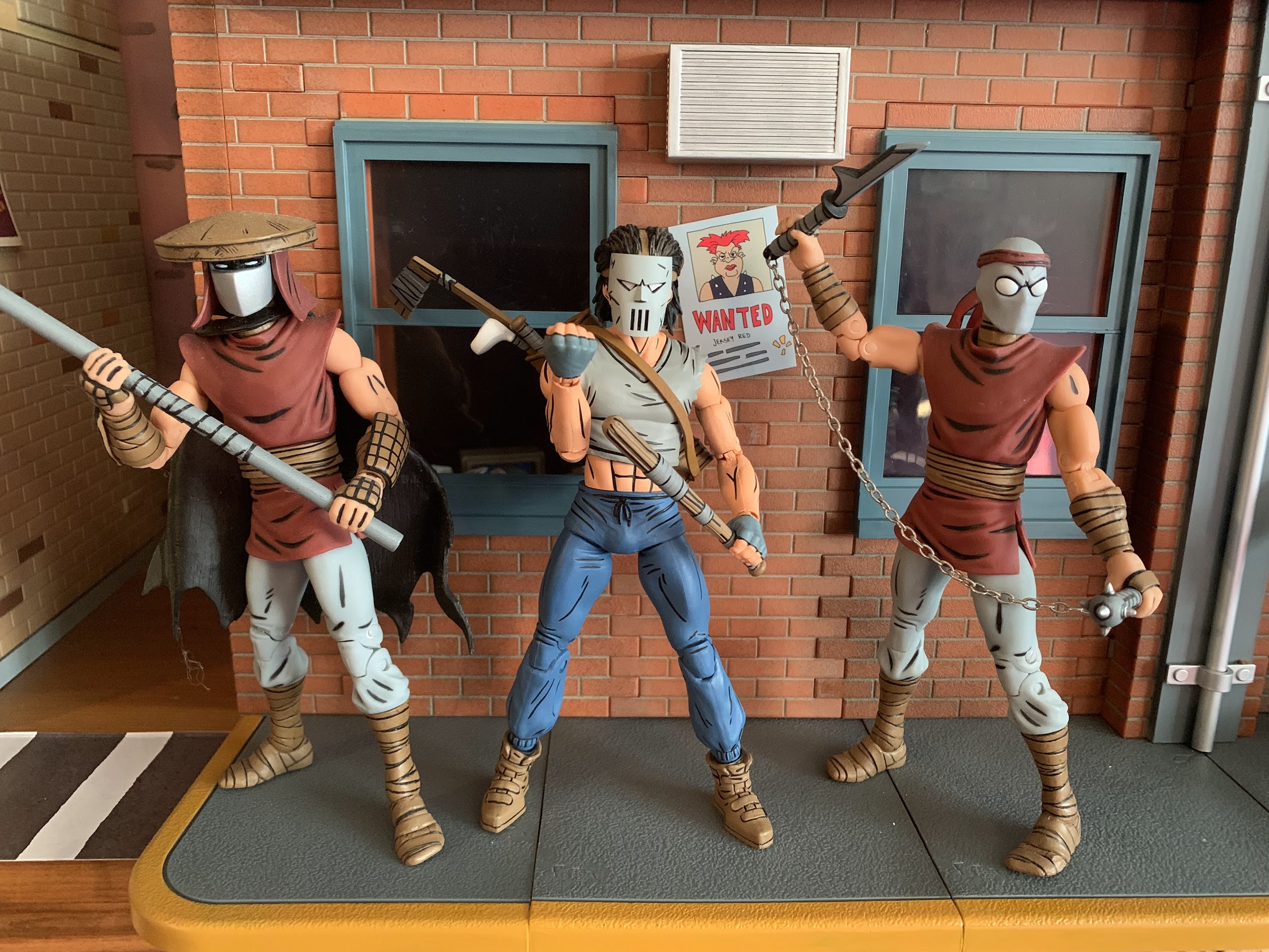
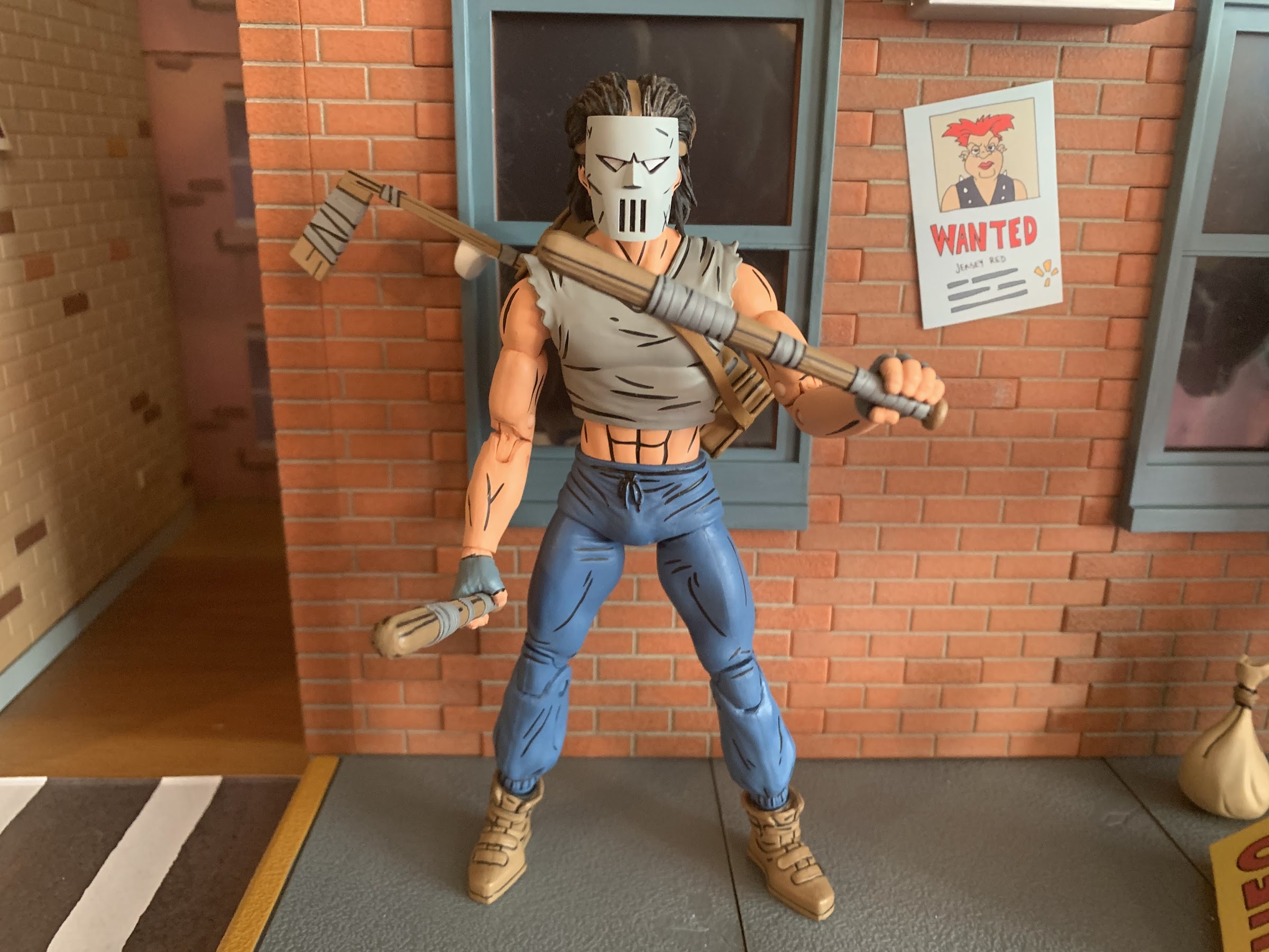
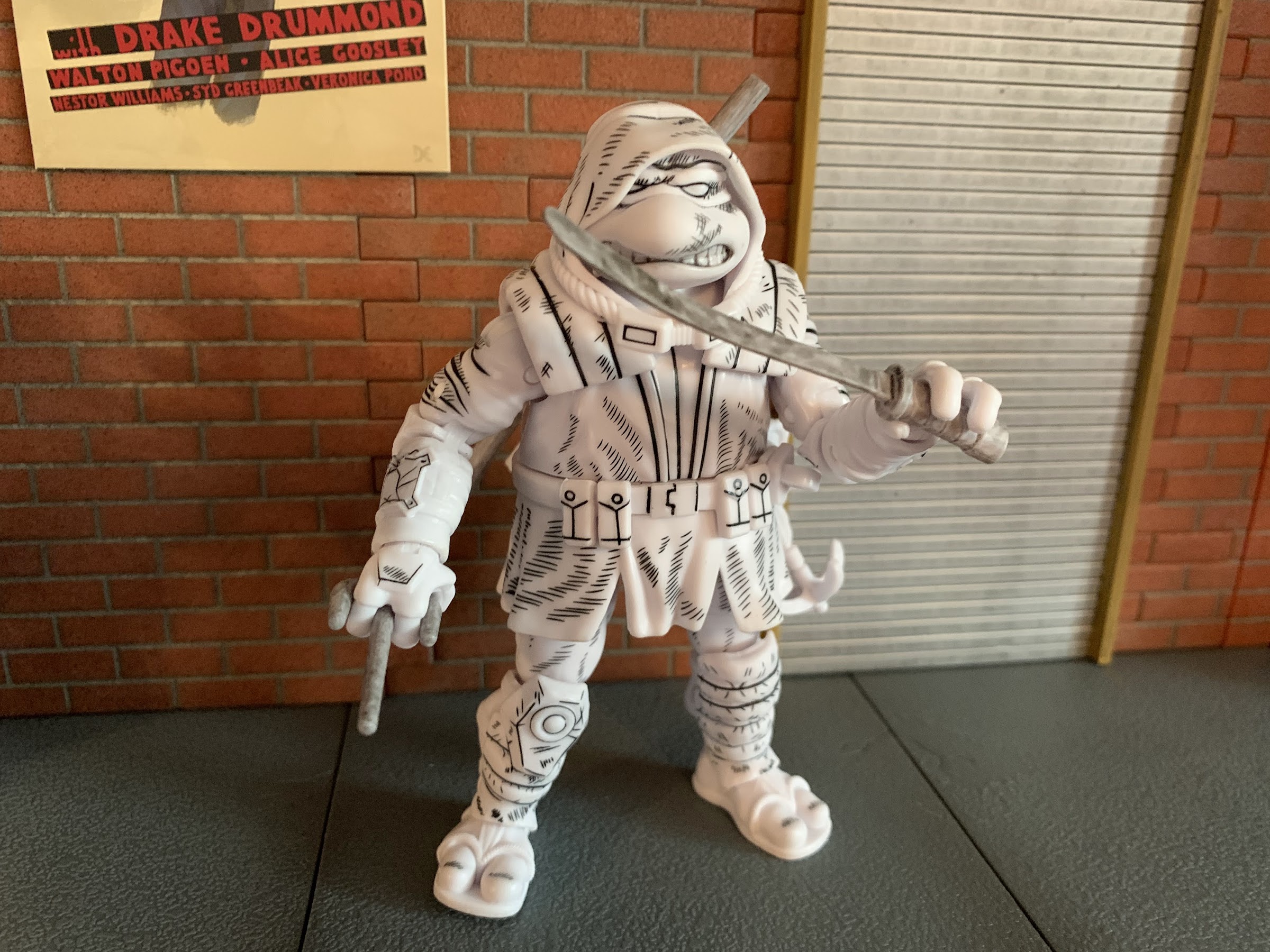
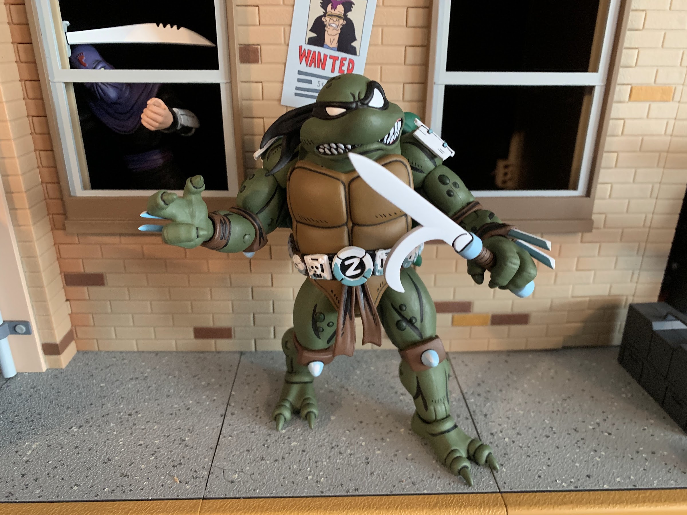
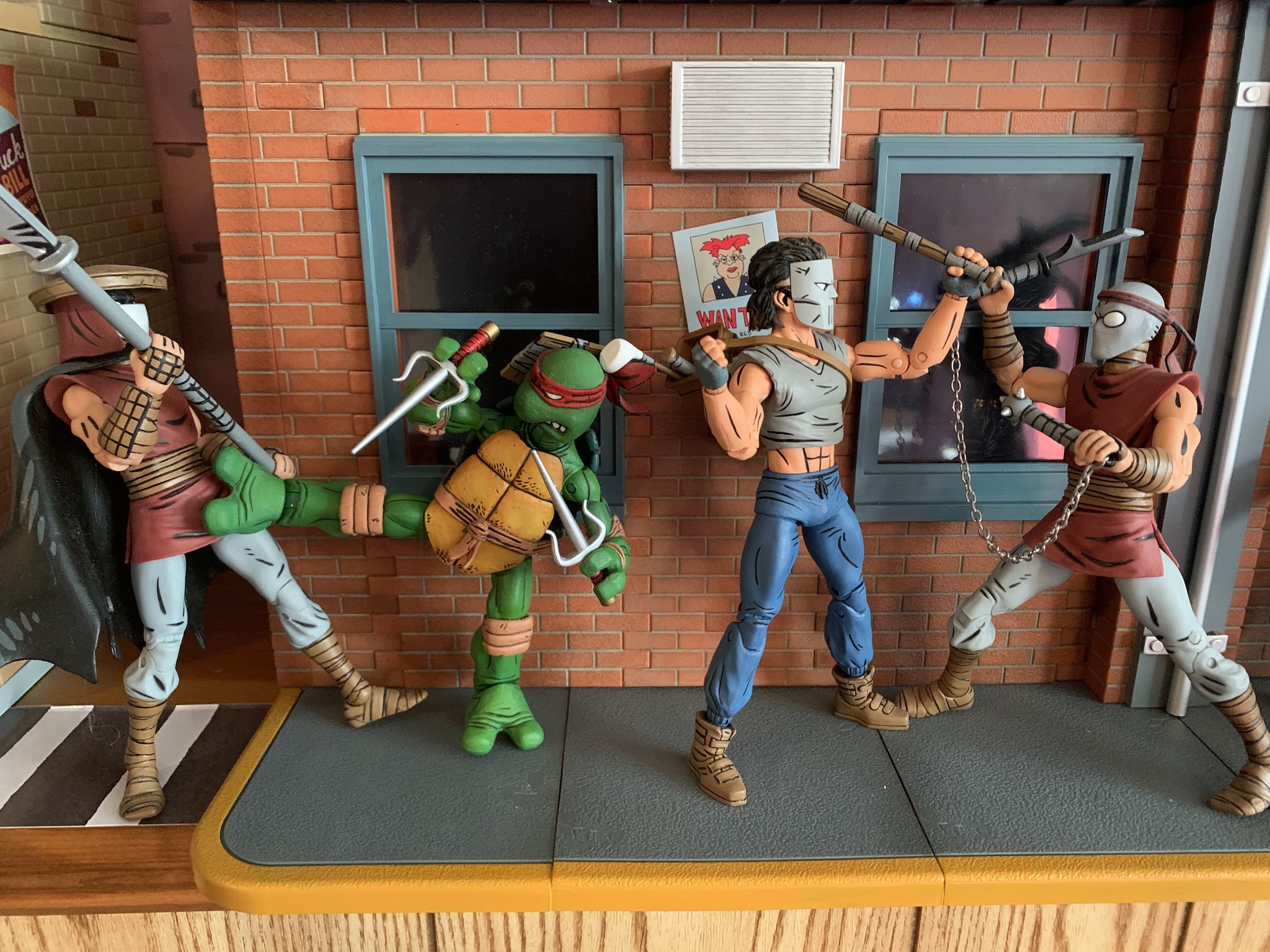
With that out of the way, lets look at the figure for what it is. Casey Jones stands approximately 6.5″ tall which feels right for the line. He’s comprised largely of parts reused from Shredder and the Foot as he has the same upper arms, thighs, and probably torso as those releases. What’s new is the shirt overlay for the torso, the hands, calves, shoes, forearms, and namely the head. His default portrait is masked and I like that the mask is a separate piece that’s glued down to the face. It gives it some nice depth, even though the eye slits are painted and we don’t need to see his eyes underneath it. It’s very similar to the cartoon figure’s mask, but it is different and looks just as cool as it always does. There’s paint basically everywhere on this guy with a lot of black linework throughout which really helps it to pop on a shelf. He’s depicted in sweat pants and they have some sculpted wrinkles in them and the lower leg is a bit baggy which looks nice. This is a very lean Casey, which does match-up with how he was drawn in the comics. He’s not as bulky as the toon version, but he’s menacing enough in appearance. Despite that, I do wish he had a little extra bulk in the midsection as there’s a lot of plastic for the hips, especially on the rear of the figure, which is a little unsightly. Overall, he looks good, it’s just a character design that’s not made to impress so he’s a bit less exciting than someone like Renet or the Utrom.
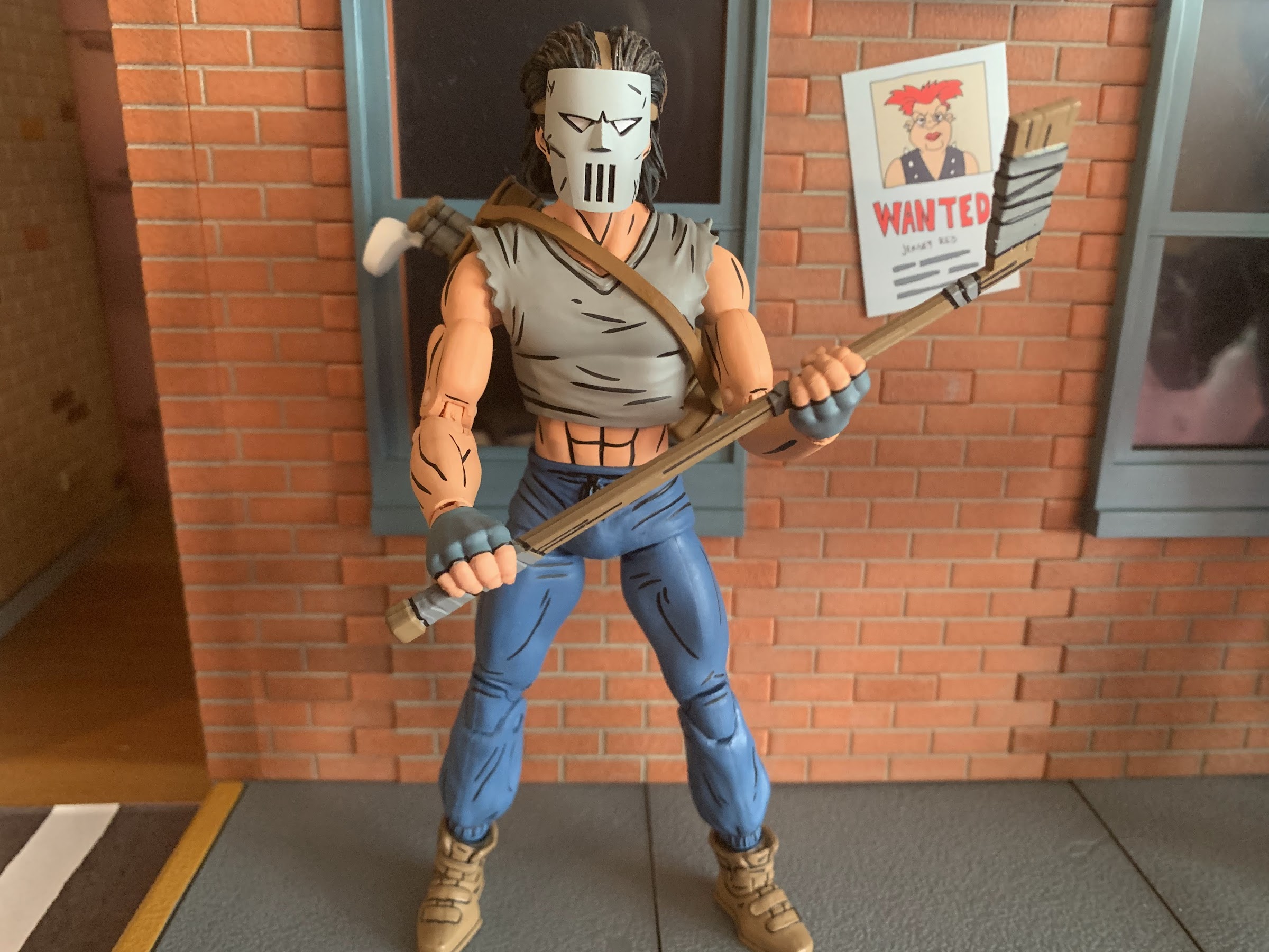
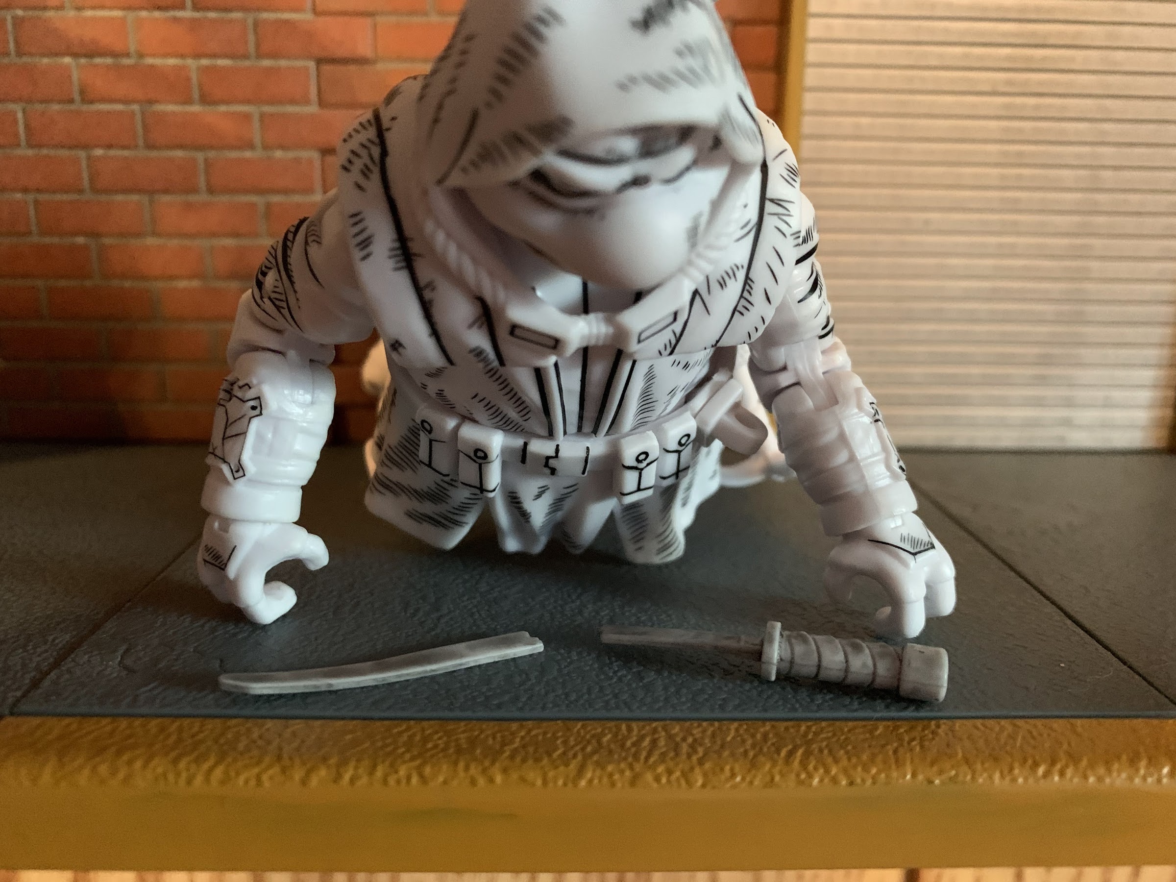
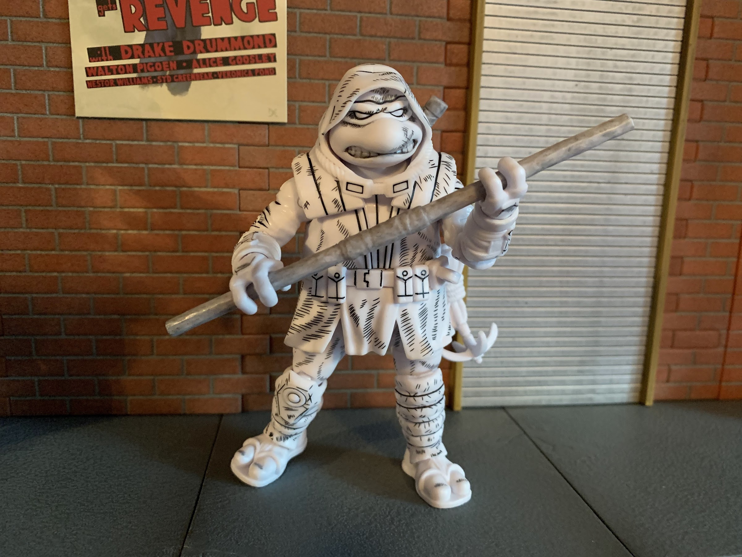
In terms of accessories, NECA outfitted Casey with a decent allotment. He’s basically known for having a bunch of weapons at his disposal, so NECA gave him his customary hockey stick, a pair of baseball bats, and a golf club. The stick and bats all feature sculpted tape around portions of them and are well-painted. The two bats are identical, which is a bit of a bummer, but I get why NECA wouldn’t want to sculpt two different ones for this release. At the same time, we’ve seen bats in other lines so it feels like they could have pulled from there. The club is a white wood style club and it looks fine, though it’s comically small. I’m not a big golfer or anything, but I have played the game and own a set of a clubs so I know how big they’re supposed to be. This club barely comes up past Casey’s knee so he must have found a youth model or something. It’s also very thin so he doesn’t grip it that well with two of his gripping hands. All of the weapons can be stored in his equipment bag. It has a square design to it so I’m not entirely sure what it’s supposed to be. It doesn’t look like a normal sports equipment bag or a golf bag, but it works. It’s easy to get onto the figure and looks fine. It’s brown and features the same black line work as the figure so it has a nice appearance.
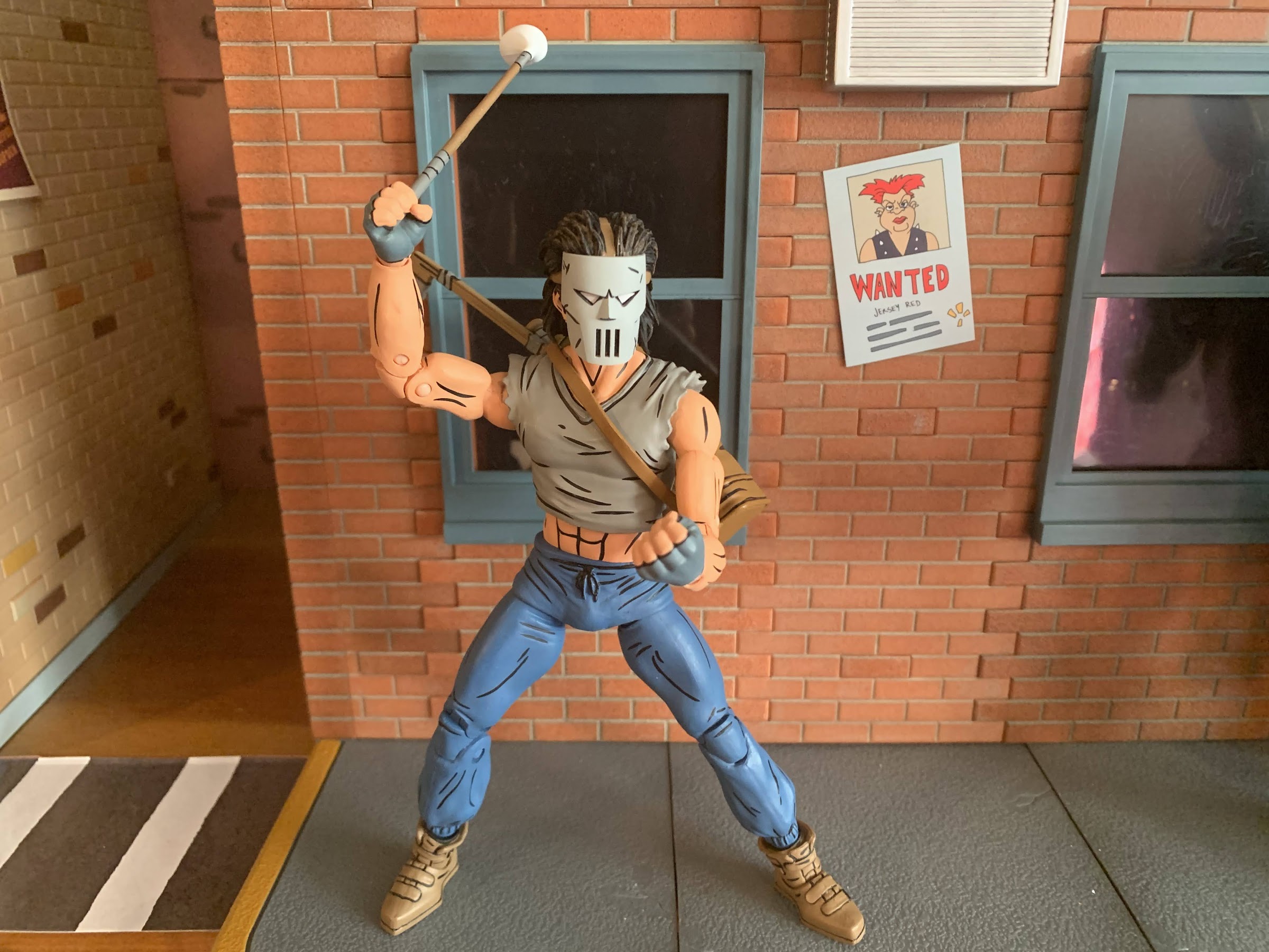
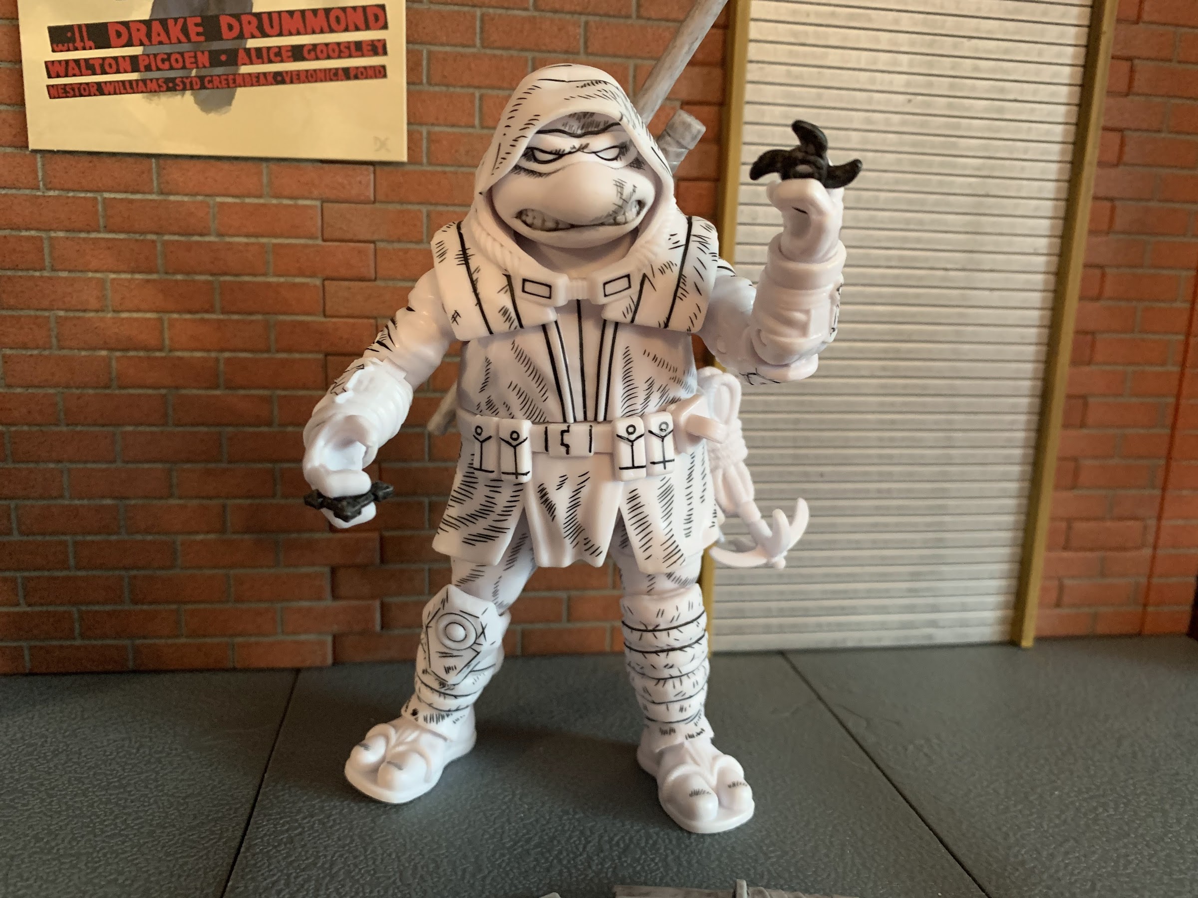
Casey also has a few extra parts he can make use of. For one, he has a set of fists and a set of gripping hands. He wears fingerless gloves and those details are painted on. The gloves begin just past the hinge so that doesn’t get in the way and I can’t tell just which part of the hand is painted. Is it the gray glove portion or the fingers? Either way, the colors look fine and I’m not seeing any paint rub on the weapons so that’s a good thing. I do wish he had a different set of hands than the fists though. His gripping hands basically look like fists when he’s not holding anything so they feel redundant. Maybe some open hands, a finger pointing hand, or just different degrees of gripping hands would have been a better use of the budget. And this figure does commit the sin of not having the proper hinge on the gripping hands. Casey should have a vertical hinge, but instead he gets the mostly useless horizontal design. He has one extra, right, gripping hand as well and I think it’s meant for the golf club as it’s the only hand that gets a decent hold on that item. He does get an extra head and this one is unmasked. He’s a pretty ugly dude though so you might prefer to leave the mask on. He looks as he should, so that’s not a criticism of the figure, just the reality of the character design. Lastly, just like the movie version, he comes with a mask that can either be held or hung from the handle of one of his weapons stored in his bag. It looks quite nice and it’s a different mold from the mask on the default head as the eye slits are open. The straps are a soft plastic and, if you really want to, it can fit over the unmasked head, but you’re far better off just displaying him with the masked head than going this route unless you really like the look of the eyes from behind the mask.


That takes us to articulation and if you have Shredder or the Foot from this line then you know what you’re in for. The head is on a double-ball peg and he can look down okay and rotate, but looking up is blocked some by the hair. He can look up, it’s just only a little. He does have some nuance posing there, so overall I like it. The shoulders are your typical ball hinges. He has a hard time getting his arms up to a horizontal position, but the shirt is cut back enough that rotation isn’t a problem. I do wish NECA would improve these shoulders though as it’s a consistent issue. There’s a biceps swivel and double-jointed elbows that bend past 90 degrees with ease. He is fully painted so you may need to heat some of the joints, but for me, my figure was fine out of the box. We already mentioned the wrists and in the torso he has some kind of diaphragm joint that isn’t usable because of the shirt overlay. It feels like a ball joint and you get the tiniest amount of range there, so little that it’s not worth counting. The waist twist is fine, but not the prettiest due to how slender his abdomen is in relation to the pants. A ball joint probably would have looked nice and might have also functioned better. At the hips we have the standard ball and socket. Even with the “diaper” piece, Casey can damn near hit a full split so that’s good. They’re also not loose which is even better. There is a thigh twist there that works quite well and the knees are double-jointed and go past 90. There is a boot swivel at the top of the shoe and at the ankle we have a hinge and rocker. The range on the hinge is pretty poor as it only goes back a little and barely any forward. The ankle rocker also isn’t the best as it’s pretty steep and limited, plus it also feels a bit gummy so I’m worried that I’m stressing the peg more than spinning it on the joint.
The articulation is rather basic. It’s par for the course for this mold and this line in general as NECA definitely does not prioritize making super-articulated figures. They want it to look like the comic first and foremost and then add a suitable amount of articulation where it makes the most sense. As a result, we have a figure that doesn’t really feature any eyesores brought on by the articulation, but it also isn’t very dynamic. The wrist hinges and the ankles are my biggest areas for critique, and to a lesser extent, the waist and shoulders. The limited ankle articulation makes him harder to stand than expected, and it’s not helped by the added weight on the figure’s back brought on by the bag. He’s not as tipsy as the movie Casey, but I do feel like NECA could have done better at the ankles. The wrists are what they are and it’s something NECA has lately been overlooking, unfortunately. I would like them to make it a point of emphasis going forward. I also do think they could have done the shirt overlay a little differently to give us some added range in the diaphragm. It shouldn’t be that hard to at least give us some twist there and I don’t think much sacrifice in the sculpt would have been needed, if any. I think it’s something just brought on by the desire to reuse parts for the torso from figures that had a full shirt and were never going to move there anyway so there was no reason to engineer it differently. Considering they’re planning on two releases, at least, for this figure, maybe a little extra tooling could have been done?

At the end of the day, if you want a Casey Jones for your Mirage Studios TMNT display you’re going to get this figure. Or you’re going to get the red one. Or you’re going to get both! And I think, for the most part, those who do pick this figure up will be content with the end product. He looks pretty nice, there’s a decent amount of articulation, and he has the weapons most expected. I have some nitpicks with the figure and those nitpicks combined with the character having a less than impressive design result in me viewing this one as the weakest in the Mirage line, but that doesn’t him bad or anything. He’s pretty average for a NECA release, and at least for NECA, that’s still a good product. The paint is clean, I had no stuck joints, and perhaps most importantly, the price isn’t too bad. You should be able to find this figure at specialty shops and even Walmart where he’ll range from $35-$38 and that’s not bad in today’s climate. If the red version does end up being an Auto T release, expect to have to shell out $40 for that one. For some, the character has to have a red shirt and I get that, but for me, I’ll pocket the five bucks and go gray.
More from NECA and Casey Jones!

NECA TMNT Mirage Studios Renet
Welcome to the first Turtle Tuesday of 2023! 2022 is the year that NECA returned to the Mirage Studios subline of Teenage Mutant Ninja Turtles action figures it started way back in 2008. When the line was announced to return, it was essentially taking the place of the Turtles in Time figures that had been…
Keep reading
NECA TMNT Movie Ultimate Casey Jones
I swear this blog is not just a NECA Teenage Mutant Ninja Turtles blog, even though that’s what it has looked like lately. I’ve just been getting crushed with new releases lately, but it looks like a drought of some length will be incoming soon. Before that can happen though we need to talk about…
Keep reading
NECA TMNT Cartoon Casey Jones and Slashed Foot Soldier
Something that is likely common to most of humanity is a desire to be successful. We all measure success differently, be it professional, financial, or something else, but we all strive for it. And sometimes success can feel like a burden. Take NECA’s line of action figures based on the Teenage Mutant Ninja Turtles property.…
Keep reading