When two billion dollar organizations butt heads, it can be hard to know who to root for. Take Disney, somewhat of an “evil” overlord when it comes to content, which seemingly owns everything these days and likes to throw its weight around when it comes to copyright claims. And then there’s Fox, owned by the legitimately evil Rupert Murdoch, which bares responsibility for a lot of the political discourse and genuine cesspool that is right-wing media. Back in the late 80s though, perceptions were a little different. Disney had been scorned by years of bad box office returns on its animation only recently dusting itself off with the likes of The Little Mermaid. And Fox, that was the plucky, underdog, network trying to compete in an arena that was seemingly built only for three, but they were determined to make it one built for four! Few gave them a chance, but the Fox network carved out a niche for itself by targeting a younger demographic than the likes of CBS and NBC and they weren’t afraid to try new things or get a little blue.
We know today that Fox was pretty successful in creating a fourth major network for broadcast television. A lot of that success is attributed to The Simpsons and the teen dramas that followed like Beverly Hills 90210 and Fox Sports, which is still a titan in the sports world thanks to its contracts with the NFL and Major League Baseball. I would argue another important part of the rise of Fox was cornering the younger demographic via the Fox Kids Network. In some respects, it’s said the Fox Kids brand was born out of Disney pulling back DuckTales, a popular show for Fox affiliates to carry, in order to sell its new syndicated Disney Afternoon programming block. Rather than shell out a bunch of money to Disney for the right to air its shows, Fox went out and sought other programs. Some it would simply license, others it would fund, and the Fox Kids Network would eventually become the must see block of programming in the kid world every Saturday morning and week day afternoon. Why would I, an adolescent boy, want to spend my afternoons with the cutesy Disney characters when I could be watching Batman?! Fox definitely got my eyeballs and I basically only tuned to what Disney had to offer if Fox had nothing on which made it hard to keep up with shows like Darkwing Duck and Gargoyles, shows I admittedly liked, but not always enough to ignore what Fox was showing.

One of Fox’s earliest cartoons was Fox’s Peter Pan & the Pirates. The show was originally going to be a CBS program, but once Disney got wind that another network was preparing a show based on Peter Pan they got litigious. Or at least, they threatened litigation since they had previously made the film Peter Pan and seemed to view the character as Disney property, despite never actually buying the work of author J.M. Barrie who purposely made sure to never sell the rights to a major corporation like Disney. Still, the mere threat of the House of Mouse lawyering up gave CBS pause ultimately deciding it wasn’t worth the effort to pursue. Enter Fox, who was still stinging by the removal of DuckTales from its networks and seemed to welcome Disney’s wrath. Oh they still tried to convince Fox it was a bad idea to pursue, but Fox essentially told them to pound sand. They would file suit, but eventually they withdrew it. Part of the suit was the accusation that Fox wasn’t allowing its affiliates to purchase the Disney Afternoon for air and was having the Fox Kids Network forced upon them. To try and save face, Disney would claim when withdrawing the suit that the Disney Afternoon had worked out fine for them and Fox had found similar success with its programming so both parties needn’t feel animosity towards the other. In reality, Peter Pan had fallen into the public domain and Disney didn’t have a leg to stand on. Just because many people associated the character with Disney and it’s 1953 film didn’t mean they owned it. And since the Fox cartoon contained characters that bore no resemblance to their counterparts in the Disney film, they were pretty safe.
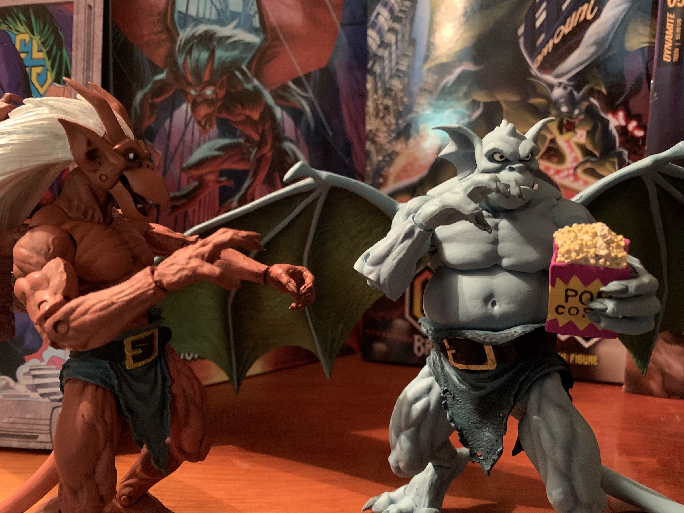
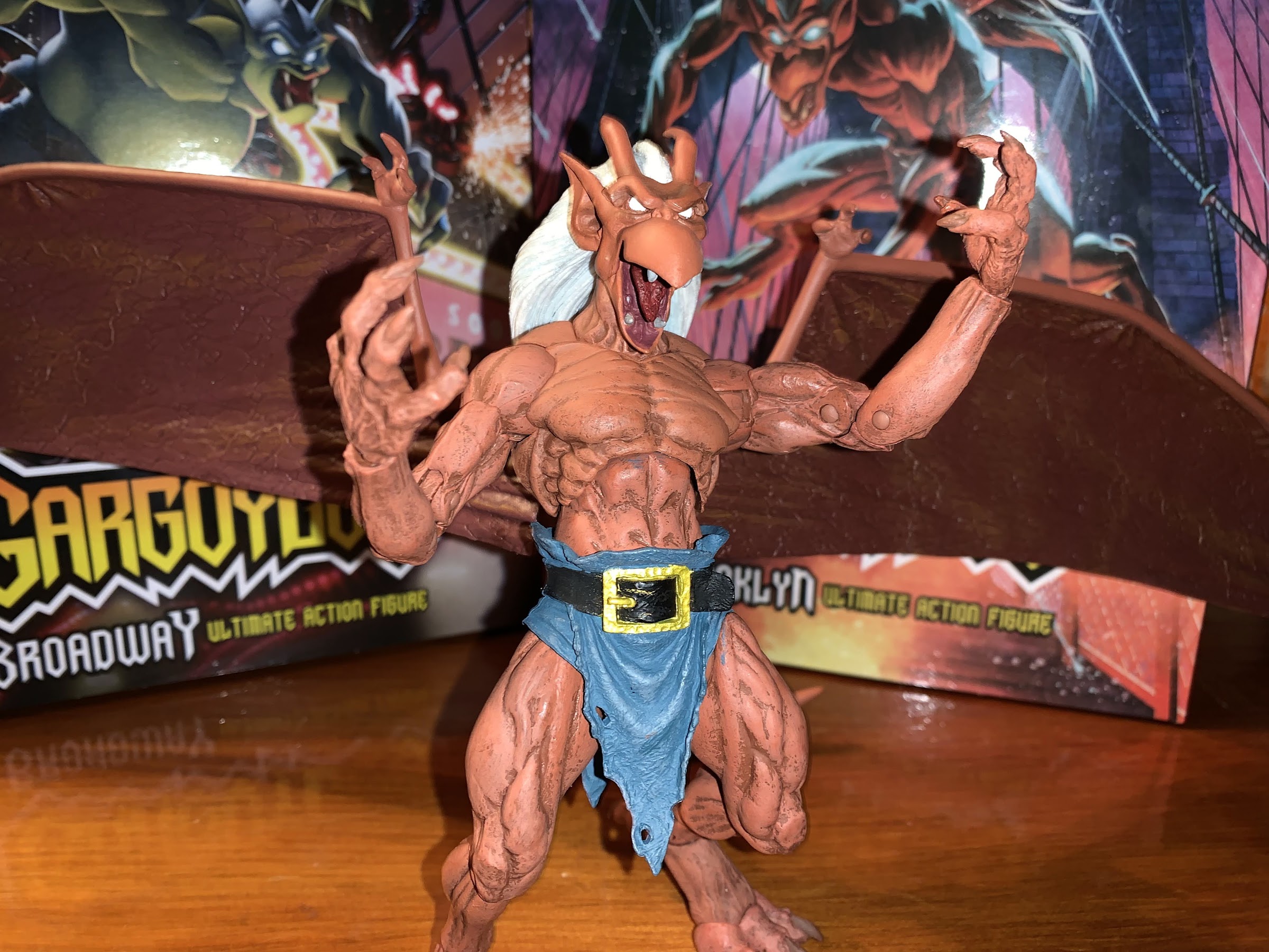
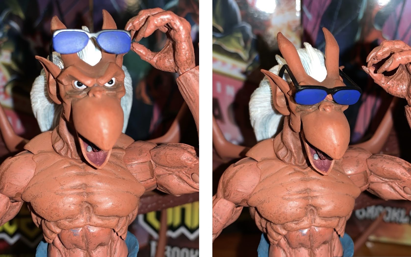
Fox added it’s name to the title of the show either to exert its own dominance or to further make sure no one would think this show was a work of Disney’s. The Pan of this program (voiced by Jason Marsden) was decked out in earthy browns and sported a cape. Tinker Bell (Debi Derryberry) had butterfly wings and wasn’t a blond jerk like the Disney version and the Darling characters were different enough. Also sporting a much different look was the villainous Captain James Hook, voiced by the incomparable Tim Curry. Hook’s design was quite different from the slender, mustached, villain from the Disney film as he was now a barrel-chested, clean-shaven, powdered wig wearing behemoth of an antagonist for Pan. And just to keep things even more different, his hook was moved from his left hand to his right. As far as tellings of the same story go, the show couldn’t have been more different from Disney’s film and it received a 65 episode order and was a foundational piece for the Fox Kids Network.
I had little interaction with the show in my youth. Something about Peter Pan struck me as a bit lame and not something I had much interest in seeking out. It’s entirely possible the show ran up against a show I was already invested in, and while I was firmly in camp Fox Kids come the fall of 1992, I wasn’t quite there in 1990. I was definitely watching the Disney Afternoon and Peter Pan wasn’t going to pull me away at that point. I also have memories of the show airing weekday mornings when I didn’t watch television as I had to get ready for school, and since I wasn’t much of a morning person, I couldn’t even flirt with the idea of watching cartoons while eating breakfast. Most of my memories of this show are just ads for it. I likely also saw it as an imposter version of Peter Pan since Disney had convinced me and millions of other kids that their Pan was the real Pan. It was also around the same time that my parents had me watch a stage play re-telling of the story that aired on television and was just dreadful and something I hated every moment of. I had given Pan a shot outside of Disney once and felt burned, I wasn’t going to do it again. Well, not until the likes of Robin Williams and Steven Spielberg, anyway.
In the quest for more Christmas though, I was reminded that this show existed. During that lone run of 65 episodes was the episode “Hook’s Christmas.” Generally speaking, direct-to-syndication shows like this try to avoid holiday episodes since networks like to be able to just throw them on at anytime without consideration for something as annoying as a season. Fox apparently didn’t care though as many of their shows would delight in doing Halloween and Christmas episodes. I feel like I’ve looked at almost all of them at this point. A show that’s all about kids wanting to remain kids seems like a show that could do Christmas. Then again, I don’t know that Peter and his fellow lost boys are necessarily “Nice List” candidates, and there are no parents to play Santa in Neverland. I guess the staff on the show agreed since this episode centers on Captain Hook and is an adaptation of A Christmas Carol. I tend to avoid such fare like the plague, but my curiosity for this show outweighed my hatred for the trope. Did I miss out on a hidden gem? The possibility was there given the voice cast and the fact that TMS contributed animation to this show. It was not a cheap cartoon and I suppose that makes sense since Fox likely wanted to impress out of the gate. Plus, Disney was spending a lot of money on its animated programs and no one at Fox wanted to look inferior next to Disney, so let’s see what Fox’s Peter Pan & the Pirates has to offer.

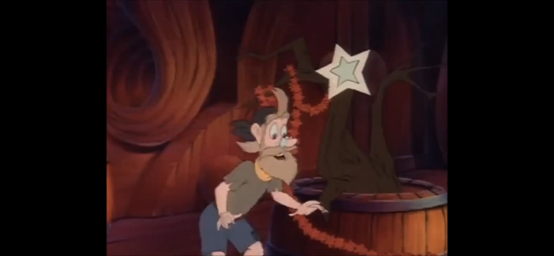
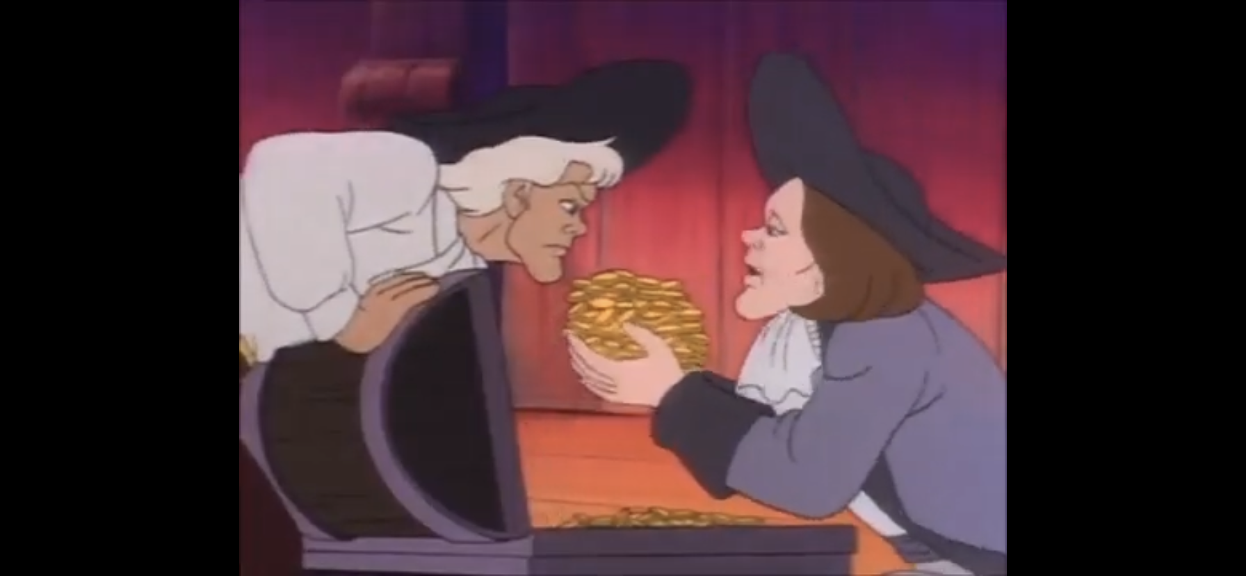
The opening title for this one is a lyric-less piece set to clips from the show, the most boring of intros a cartoon can have, but the score isn’t bad. It sounds like a poor man’s John Williams. When the episode begins, we’re on the ship of one Captain Hook and the pirates are making merry. It’s Christmas Eve so there’s cause to be jolly. Unfortunately, they’re singing a rendition of the worst Christmas song ever written: “The Twelve Days of Christmas.” Now, since I didn’t watch this show growing up, I have to try to figure out who’s who among the gang of pirates. It would seem Gentlemen Ignatious P. Starkey (David Shaughnessy) is the one leading the crew in song. He has repurposed the song to make the captain the generous one handing out gifts on Christmas. It would seem he wants a new ship that’s bilge free? All of the versions of this episode that exist online have some audio degradation and deciphering song lyrics is not easy. Eucrates Cookson (Jack Angel) is playing an accordian while Smee (Ed Gilbert) is decorating a rather pathetic looking tree. They’re all chiming in with gifts for the other days, but they only manage to get to day 4 before Starkey has trouble remembering the lines.

It’s at that point Captain Hook makes his entrance. He towers over the lot as he heads down into the brig to reprimand his men for their joyful demeanors. Tim Curry practically snarls his lines, but maintains his rather dignified accent, making for a rather compelling character. His vocabulary is also impeccable and I rather like this depiction of the famed captain quite a bit. Starkey is literally shaking in his boots as Hook enters demanding to know why an irredeemable twit like him would have reason to be merry. When it’s suggested to him by the men that Christmas is the reason, Hook rejects the notion that the holiday is an excuse to behave like fools. I would say he’s angered by the suggestion, but he just seems plain angry all of the time so it’s hard to say just what ticks him off the most. He’s definitely channeling his inner Scrooge as he refers to Christmas as a “humbug,” which causes Smee to reply with, “But I thought it was a holiday?” He further illustrates his feelings on the matter by suggesting those who celebrate should be boiled in their own pudding and have a stake of holly shoved through their heart! This dude is vicious.
Smee can’t take a hint as he asks if this means they won’t be exchanging gifts. Scrooge, I mean Hook, looks almost pained by this question, but rather than respond verbally he kicks over their makeshift tree and stomps on the reindeer ornament one of the pirates made. Hook storms off into his own quarters still seething at the fact that his men are just trying to use Christmas as a way to get out of a dishonest day’s work! He takes a seat at his harpsichord and goes to play something, apparently this is how he settles down when the world angers him, only the instrument begins to play by itself! And it’s playing “The Twelve Days of Christmas,” which has Hook looking all kinds of angry (it’s basically his only facial expression). A voice then calls out to him using his first name. It’s a woman’s voice, and Hook looks startled as he whirls around and even asks “Mother?” How sweet? An apparition comes floating in baring the resemblance of Wendy Darling (Christina Lange) which actually excites Hook. He declares he’ll capture her which is surely to rile up that Peter Pan fellow. Unfortunately for Hook, this is basically not-Wendy, but the Ghost of Christmas Past. You know how this is going to go from here. Hook tries to dismiss her as some sort of product of indigestion and even declares he doesn’t believe in her, like that will make her go away.
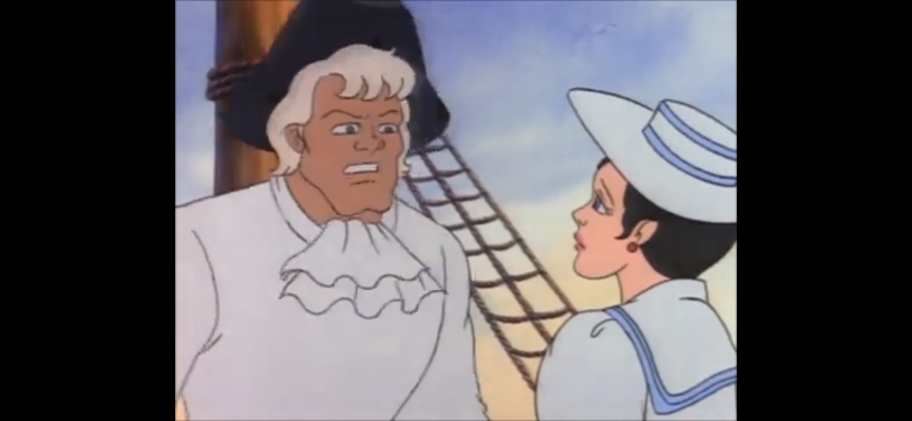
It won’t. The Wendy ghost takes Hook back in time to another version of the Jolly Roger. Or maybe just a ship that looks like it. A gang of pirates has recently overtaken this UK vessel and hoisted their own flag. Their leader? A pirate named Jasper – Jasper Hook! A voice calls out to him from offscreen and we see it belongs to a young James Hook. The two brothers clasp hands to draw attention to the lack of a hook as Jasper pulls him aboard and they’re positively giddy about this score. At least that is, until James sees who this ship belonged to. It’s a woman named Cecilia (sounds like Lange) whom James is betrothed to. Present Hook seems a bit wary of watching how this plays out. Through their conversation we find out she was under the impression that James was a merchant, but it’s the life of a buccaneer that he’s chosen instead. He thinks this changes nothing between the two, but Cecilia begs to differ with tears in her eyes. James can’t be bothered and has the men haul her away like a prisoner. Captain James Hook, who has been watching alongside the Ghost of Christmas Past, questions why she means to torment him so? He demands she take him back to his ship, but she informs him they have one more “shadow” to visit first.
Past snaps her fingers and we’re whisked away to the interior of a pirate ship. If it’s the same one, I don’t know, but it is following a score as Jasper is handing out gold from a chest to each crew member. When he goes to give James his cut, the younger Hook balks for his brother is giving him the same as everyone else. Jasper reminds him who the captain is, but James declares that maybe it’s time for a new captain. Drawing his sword, with his right hand mind you, he challenges his brother who seems angered by this disloyalty. The two start clanging swords and end up back on the deck. The elder Hook, fighting with sword and dagger, disarms his brother and his sword winds up stuck near the top of the mast. He tells James to surrender and he’ll spare his life, but James refuses and instead climbs up the mast to retrieve his sword.

Now the two brothers are battling atop the sail, which seems like the most dangerous place to have a sword fight on a pirate ship. It looks cool though, and now it’s James’ turn to disarm his brother. He informs the captain that, unfortunately, he does not believe in taking prisoners and declines to extend the same offer to his brother that he just made him. Jasper isn’t about to let himself be cut down and instead makes a jump for it by grabbing on one of the ropes affixed to the sail. He is able to get down to the deck and retrieve his sword, but James is in hot pursuit. He takes a mighty cut at his brother which shatters his sword. Jasper, backpedaling, gets his feet tangled in some rope left on the deck and falls onto his rear. As James approaches, he has a wicked grin upon his face and his sword held high as his brother looks up at him with a terrified expression.

Before we can see the gruesome aftermath of this confrontation, Hook demands the spirit cease this vision. He then wakes up in his chair in a sweat with a look of distress upon his face that is soon replaced with his usual, grumpy, demeanor. He apparently believes that he did indeed see the past via the magic of some sort of spectre for he calls out to her in defiance. He taunts her by asking aloud if she thought she could really stir feelings of guilt and remorse within him over, as he terms it, relieving his brother of his eye. Apparently, he did not kill his brother that day, only maimed him. He takes a seat at his desk and begins to question if he really did see what he saw. As he settles down to read from a book, the voice of Smee calls out to him. This only further irritates Hook, who turns his head and sees a ghost version of his first mate. He correctly deduces that this is not really Smee, but another apparition, and the ghost confirms that he is indeed the Ghost of Christmas Present causing Hook to question if he is forever to be bedeviled by Christmas. Smee, which we’ll just refer to the ghost as such to make it easier, tells Hook that Christmas normally doesn’t concern itself with a villain such as he which enrages Hook for some reason as he shouts “blast your incorporeal hide!” The writing for Hook is just phenomenol. I normally am far too charmed by old VHS recordings to care much for quality, but in this case, I wish the audio quality were better on my source so I could properly make out every word this show has Tim Curry spit out. He is fantastic.

Smee informs the captain that he’ll be coming with him and blows a whistle of some kind to whisk the pair away. They’re in a lovely glen and in the center of which is an enormous Christmas tree. Children are singing “Deck the Halls” and it’s quickly revealed that this tree belongs to Peter Pan and the Lost Boys. The children finish their song and we see Tinker Bell come flying in to apparently take on the role of a star atop the tree which will surely get old fast for the fairy. Smee and Hook then come into view and Hook seems more than a little irritated to have been brought here by this “woebegone wraith.” Smee tells him that he just wanted to show Hook how the Neverland-lubbers celebrate Christmas. Hook is positively annoyed and basically calls Smee an idiot declaring he has no appetite for seeing how the unwashed celebrate the holiday. His utter disdain for everything is truly impressive.

Hook expresses his irritations with ghost Smee, and while the two converse I noticed a curiosity. I watched multiple versions of this episode, and in some the background changes to what’s coming in the next scene while in others it remains consistent. It would seem they had an issue and must have actually paid to have it fixed for rebroadcast. Anyway, we pivot to Wendy and Peter having a conversation about the decor. She thinks something is missing and Peter soon realizes it’s snow, but he also seems to have forgotten what snow is (this forgetfulness is foreshadowing something to come). Tinker Bell (Debi Derryberry) remarks how humans have such short memories before tossing some pixie dust all over the place which makes it snow. The top of the tree also still features a glowing orb so maybe Tink just cast some sort of spell to create a makeshift star? Snow soon collects on the tree and the kids are happy. Pan even nails John with a snowball who is happy to fight back. Hook has seen enough and demands that Smee evacuate him from the area, but not before he gets his bearings so that he may return to the lair of Pan and raze it to the ground! Smee informs him he will be doing no such thing and instead toots his whistle again.

Now we’re in the lair of Pan and The Lost Boys and they’re all preparing for a Christmas feast. A platter appears via Tinker Bell’s magic upon the table and the kids are all excited. It looks like they eat real food and not junk food as seen in the film Hook. When Wendy lifts the lid on the dish the kids are dismayed to find a single acorn. If you think this is a Tiny Tim situation you would be mistaken as Tinker Bell informs them it was just a little holiday jest and quickly magics up a turkey. Before the kids can dig in though, Wendy says they should offer up a toast. Peter is in agreement and toasts to…himself. He quickly adds “And everyone else,” rather awkwardly, but the others seem to pay it no mind. I’m guessing they’re used to this sort of thing out of Pan. Michael (Whit Hertford) then questions if he really means everyone and specifically mentions Captain Hook. Wendy comes over to confirm that even Hook is deserving of such a toast. Pan snorts and remarks that if Hook were there he’d cut off his other hand and give it to him as a Christmas present. How violent! Wendy scolds him for his boast and Pan reluctantly concedes that she’s right. He stands up and gives a somewhat half-hearted toast to Captain Hook which the other kids share in.

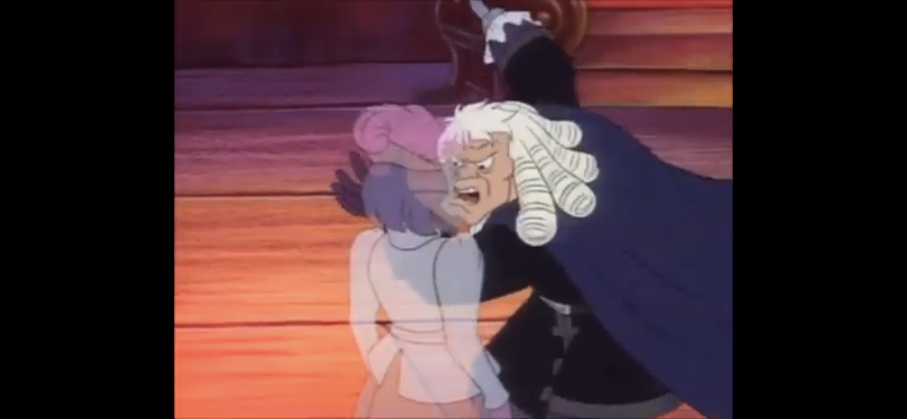
Hook then questions what’s the point of all this? Smee informs him that he just wants to show him that even bitter enemies lay down their arms on Christmas. Hook indicates he has no stomach for this “sentimental tripe,” which Smee says is unfortunate because he has more to show him. We’re then taken to the bowels of the Jolly Roger where the rest of the crew resides. The pirates are still sore from how Hook treated them and they seem to be ready to mutiny over it. As they draw their weapons, it’s Smee who pops in to declare they’ll be doing it over his dead body. He starts clashing swords with Mullins (Jack Angel) and tries to defend his captain’s honor. Hook remarks to the ghost Smee that he intends to put these jackanapes in their place, but the ghost tells him that’s not why he chose to show him this. Suddenly, the material version of Hook comes swaddling in demanding to know what’s going on. Smee informs him it’s a mutiny and Hook misunderstands him and seemingly thinks that Smee is declaring a mutiny, not trying to stop one. He picks Smee up by his shirt utilizing his hook while the little guy tries to tell him he had his best interests at heart. Hook puts him down seemingly understanding, only to double-down on his accusations by demanding Mullins chain Smee and toss him in the brig. As the first mate is hauled away he tells him this will be his last Christmas! This is really clumsy considering this is supposed to be the present, but it features Hook! Why didn’t we see this earlier?

Hook, the viewing Hook, is politely reprimanded by ghost Smee for his misjudgement. Hook seems unphased and remarks that Smee should basically be killed on principal anyway. The ghost, seemingly admitting defeat, informs Hook he’ll be returning him to his ship now. Hook then materializes outside his cabin door and is immediately sent into a rage for he can hear someone playing his harpsichord inside his chambers! He smashes down the door, which was a really lovely piece that will now have to be replaced, and barges in demanding to know who possesses the temerity to play the harpsichord of Captain James Hook! Why, it’s his brother Jasper now acting as the Spirit of Christmas Yet to Come. Hook has apparently still not grasped the situation for he mistakes the ghost for his actual brother and attempts to cut him down with his blade only for it to pass harmlessly right through him. The ghost, sporting an eye patch as the real Jasper must, smiles wickedly at Hook and informs him who he really is, and isn’t. Hook sarcastically asks him of what concern is all of this to him only for the spirit to float above him and angrily call out his misdeeds. He’s lied to his loved ones, betrayed his own flesh and blood, and condemned the one man who showed him loyalty. Flipping up the patch over his eye, the spirit promises to show Hook the bitter harvest yet to come.
We’re taken to the wreckage of a ship I assume to be Hook’s Jolly Roger. It is indeed his as he immediately starts ranting and raving about the condition of his ship. We then see Mullins stealing food from Cookson as the two emerge from a cave with the captain nowhere to be found. Hook is displeased by this showing, but the spirit has more to share. He flips up his patch and we’re transported to a swampy lagoon. A disheveled and seemingly delirious Smee is walking through the ankle deep water carrying something under his arm and shouting out to his captain not to worry for he’s coming. He approaches a large, hollowed out tree and declares “There ya be captain, a fresh covering of moss for yee,” revealing that the garbage under his arm is apparently a bunch of moss. The ghostly Hook is confused by this and declares he’d retire to Bedlam before he’d let someone like Smee take care of him. Still refusing to realize what story he’s in, we watch as Smee goes to enter the tree only for the shadow of Peter Pan to pass over him. He runs calling out a warning to his captain as he disappears into the tree, but the somewhat sullen Pan doesn’t seem like he’s here for a fight.

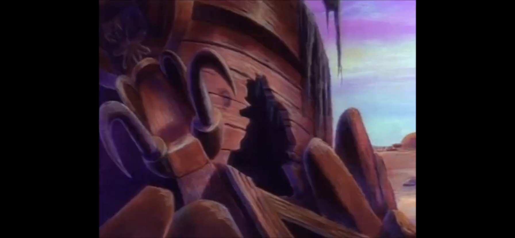
It’s at this point that Hook utters a version of the famous line asking the spirit “Are these the shadows of the things that will be, or are they the shadows of the things that maybe?” The spirit ignores the question and instead points out to Hook to gaze upon his final resting place. The captain looks a tad frightened as he beholds his unmarked grave which Peter Pan has knelt beside. The spirit refers to it as unmarked, but the grave is indeed marked by the presence of his famous hook on a stick of some sort, he just doesn’t get a tombstone. Peter then pulls out his dagger and remarks he has no need of it now. He seems a bit sad as he’s clearly lost his purpose in life without his adversary and ponders if he should finally grow up and leave Neverland. Now this puts a smile on Hook’s face as he declares this perfect! He laughs heartily and declares that in death he has finally defeated Peter Pan! The spirit then cautions him not to act so hastily and flips up his eyepatch once again.

Now we’re transported to a more colorful and bright setting. The Lost Boys are seated by the edge of some trees until Peter Pan comes soaring in. He excitedly calls out to them to “Look what I found!” It’s the hook of one Captain Hook, and Peter acts like he has no idea where it came from, but now they can play pirates! The boys fly off with Peter Pan declaring that he’ll be the pirate leader: Captain Claw! Hook is bewildered at the sight and the spirit is happily able to inform him that the kids quickly forgot all about him once he was dead. This basically destroys Hook who falls to his knees and starts raking the earth with his hook hand. Crying out, “Hear me brother: I am not the man I was! I will change! I swear it! I swear it!”

As he cries out, we transition back to Hook’s quarters and find him raking his hook hand over his mattress essentially destroying it in the process. He soon realizes that he’s back in his room, and even his door is intact! He calls out for Mullins who enters immediately for the captain to ask him to confirm what day is it? “Why, it’s Christmas, sir!” he replies on cue. Hook declares this excellent and orders him to assemble the men on the deck immediately. This also comes with an order to release Smee from the brig. Once everyone is gathered on the deck, Hook informs the men that he’s changed his mind that they will observe the Christmas holiday after all. The men are dumbstruck with Starkey remarking the captain has lost his senses. Hook corrects him to say he has not lost his senses, but rather found them. He then orders the men to arm themselves as he dumps a pile of weapons on the deck and informs them that they will be going ashore to celebrate Christmas with a raid on Peter Pan!

Hook, with his arms outstretched, then clarifies what has taken place. He says he swore he’d change, and he will, for the worse! “I’ll redouble my attacks on Pan. I’ll triple them!” It’s hard to make out precisely what he says following that, but he basically declares that Peter Pan will never forget the name of Captain James Hook! He then cries out “Merry Christmas, Peter Pan,” as his cape bellows menacingly in the wind, “and prepare to meet thy doom!” He then walks off laughing his evil laugh which is the lasting image for this holiday affair.
“Hook’s Christmas” is not a very interesting episode as it relates to Christmas. It adapts what some may call a tried-and-true Christmas staple, but what many would also just call a tired plot. A Christmas Carol is beyond overdone and it was in the early 90s just as it was today. This one does have a bit of a wrinkle in that it’s Scrooge character, one Captain James Hook, is truly irredeemable. There’s no changing who he is. Sure, many a villainous character have had their Christmases interrupted by a gang of spirits and it was enough for them to at least do one nice thing, but not Hook! It has the opposite effect, which is really the only outcome that could have come of this since he’s quite clearly an evil man and there are many more episodes to follow. They could have had him just be a little nice to his crew and let that be it, but I do like that the writers on this one wanted none of that and fully held onto this characterization of Hook.

That’s not enough to rescue the plot from this droll retelling, but the depiction of Captain Hook just might be. I was totally smitten with this take on the character by Tim Curry. He is wonderfully written with just a delicious vocabulary. This is not some rough and tough pirate covered in grime and ill-spoken. This Hook is dignified and above everyone else in his mind. He carries himself like royalty and he’s clearly well-educated. He’s just vile and despicable and he loves that about himself. Curry is just absolutely wonderful in the role and I hung on every word he said. Adapting A Christmas Carol may not have been the soundest decision this show made, but putting an entire episode on Hook’s shoulders absolutely was. Combining the performance with the twist ending basically does the impossible: I was entertained by A Christmas Carol. I mean, the classic story is fine and entertaining on its own, but I can’t think of many episodes of television that went in this direction and actually succeeded. Years ago, I somewhat praised The Real Ghostbusters for putting their own spin on the tale, but I still wouldn’t call that episode good and it’s not something I ever return to. And I’m not saying I’m ever going to return to “Hook’s Christmas” either, but I may consider it. If I had any nostalgic attachment to the show it’s from then I probably would, but lacking that, it’s more just a fun little diamond in the rough one discovers when doing such an exercise as this and I’m feeling satisfied. Usually, most of the uncovered Christmas episodes I come across leave me feeling the opposite.

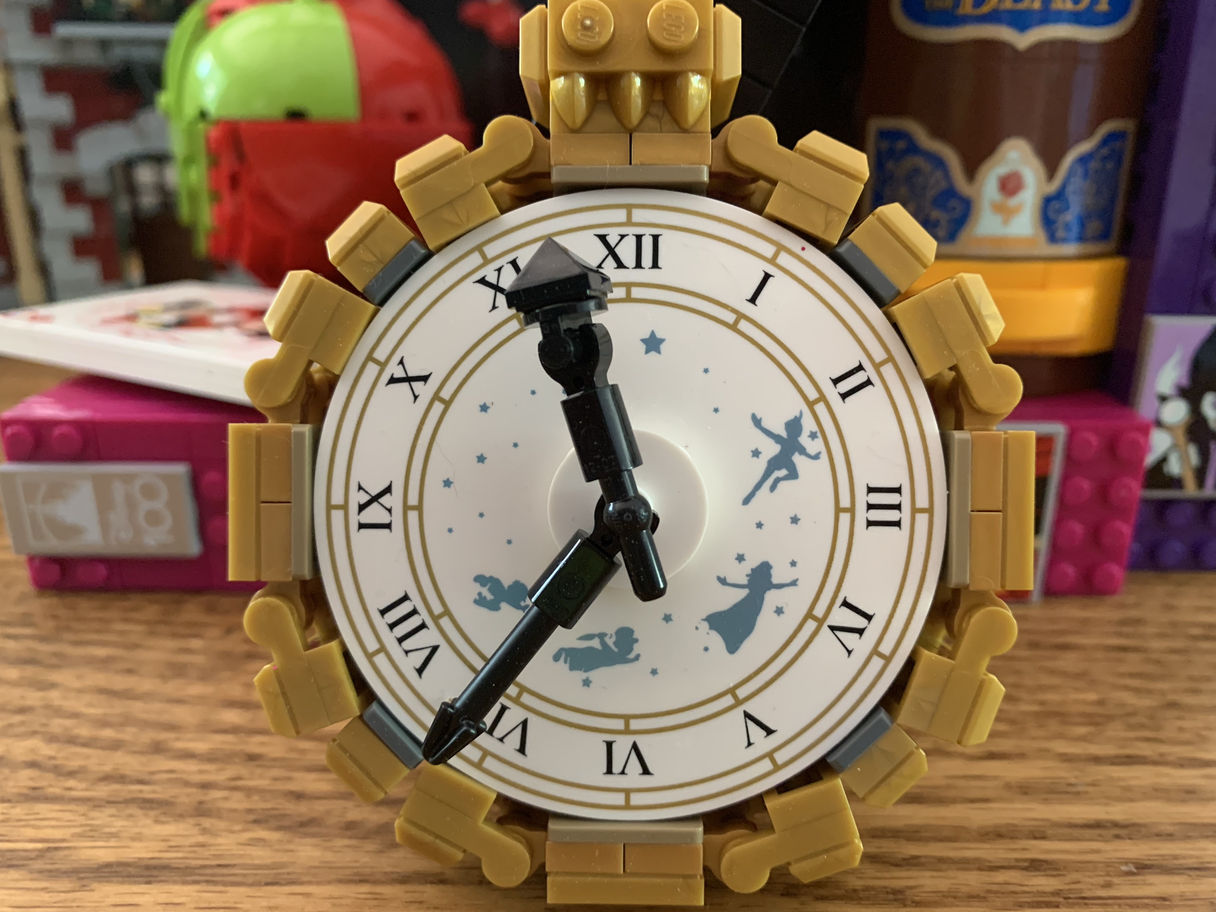
If you wish to view Fox’s Peter Pan & the Pirates you sadly have few options. Remember that whole story to begin this about Disney not wanting this show to exist? Yeah, well, now they own it. Disney acquired this alongside a whole bunch of other Fox properties years ago with the acquisition of Fox Kids Worldwide. Disney has released some of those shows on DVD and licensed others for streaming, but not this one (aside from a select few episodes in the UK) and they likely never will. They would fear that consumers would think this ties into their own take on Peter Pan even with the title being what it is. And it’s a shame, because if nothing else the show appears to have some solid animation. This particular episode wasn’t impressive in that regard, but other clips I’ve seen look quite nice. And people are missing out on this fantastic version of Captain Hook. I don’t know if the show itself is really worth watching, but it would be nice if it were available for those who did grow up watching it or who are just curious. The only good thing is that Disney doesn’t seem at all interested in enforcing its trademark here so the show can be found scattered across the internet in varying states of quality. You don’t have to look hard, though you will if you want to find the best quality version possible. As you can tell by the images in this post, I had trouble doing just that (the best I found was on the channel Cartoon Archive), but what I did find was certainly watchable. It’s just a shame most cut out the commercials.
Can’t wait until tomorrow for more Christmas? Check out what we had to say on this day last year and beyond:

Dec. 7 – Santa Claus is Comin’ to Town (1970)
In 1964, Arthur Rankin and Jules Bass unleashed a Christmas Classic upon the world in the form of Rudolph the Red-Nosed Reindeer. The special basically put the company on the map and put it on the path to holiday domination for decades to come. Despite that, few of the specials that followed Rudolph truly hit…
Keep reading
Dec. 7 – Bedtime for Sniffles
Not every Looney Tunes or Merrie Melodies star had to be inherently funny. Sure, most of them were and that’s often what many cartoon enthusiasts will point to the Warner catalog of cartoons as having over Disney, but it wasn’t some hard and fast rule. That’s why when a guy by the name of Chuck…
Keep reading
Dec. 7 – SuperTed Meets Father Christmas
When it comes to British imports and the subject of bears is brought up, most probably immediately think of Paddington or Winnie the Pooh. Few probably recall SuperTed, the Welsh teddy bear brought to life by a spotted alien and given super powers by Mother Nature. SuperTed is similar to Mighty Mouse in that he…
Keep reading