It was a couple of years ago we looked at the first Aqua Teen Hunger Force Christmas episode because it contained Danzig. I was basically required to talk about it! This year we’re coming back to it, and wouldn’t you know, there is a musical component to this one as well.
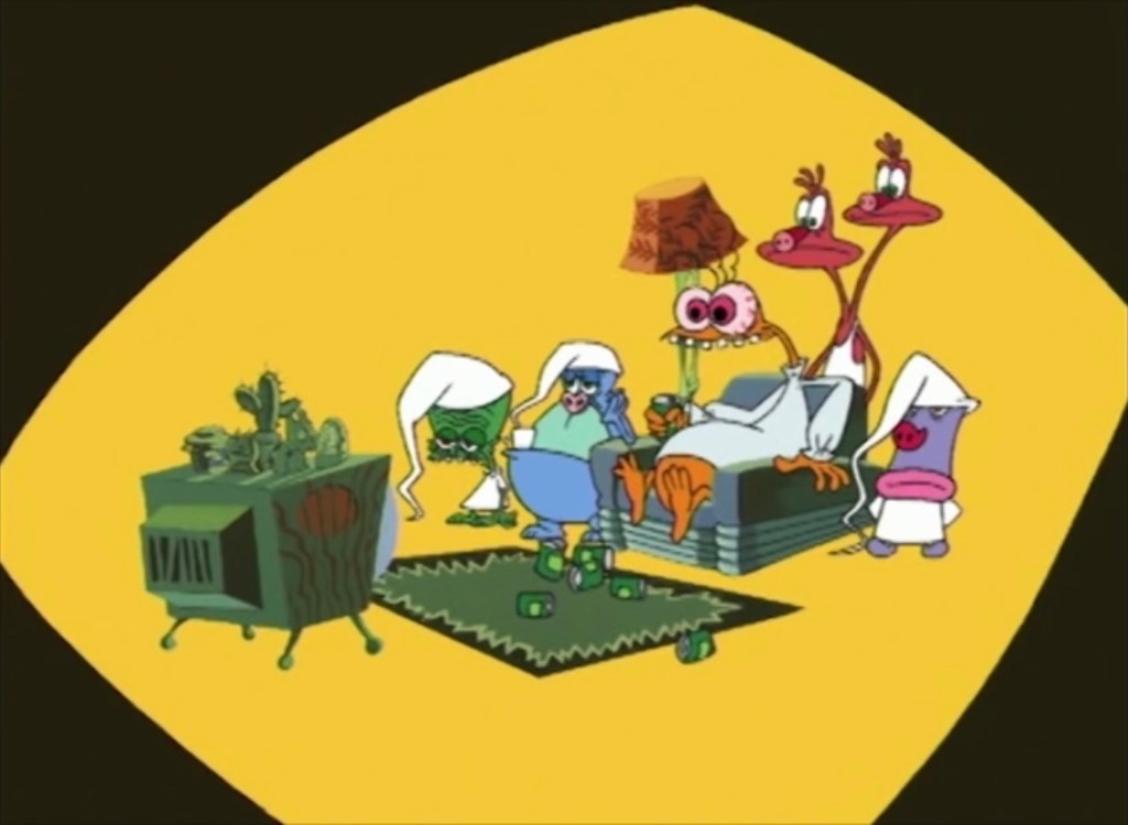
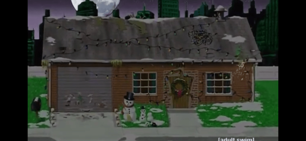
If you’re unfamiliar with the show, Aqua Teen Hunger Force was one of the first Adult Swim cartoons to really break-out as a full-fledged hit for the network. It was crudely animated and quite absurd as it detailed three characters based on food items: Master Shake (Dana Snyder), Frylock (Carey Means), and Meatwad (Dave Willis). They are literally a giant shake cup, box of french fries, and a meatball all with a face. Shake has the bonus feature of containing hands too while Frylock is forced to use his “fries” as limbs and Meatwad can basically contort his body into different shapes. The show was created by Dave Willis and Matt Maiellaro with the concept being these three would solve mysteries, only the mysteries would be relatively stupid and the characters would be rather bad at their job. That premise was dropped pretty quickly and it more or less became a show about misadventures. Master Shake would style himself the alpha of the group despite the fact that he’s mean, stupid, and self-centered. Meatwad is more child-like, but also pretty dumb and quite impressionable. Frylock is the only one with any sense of reason and it’s amazing he wasn’t driven insane by those he lives with.

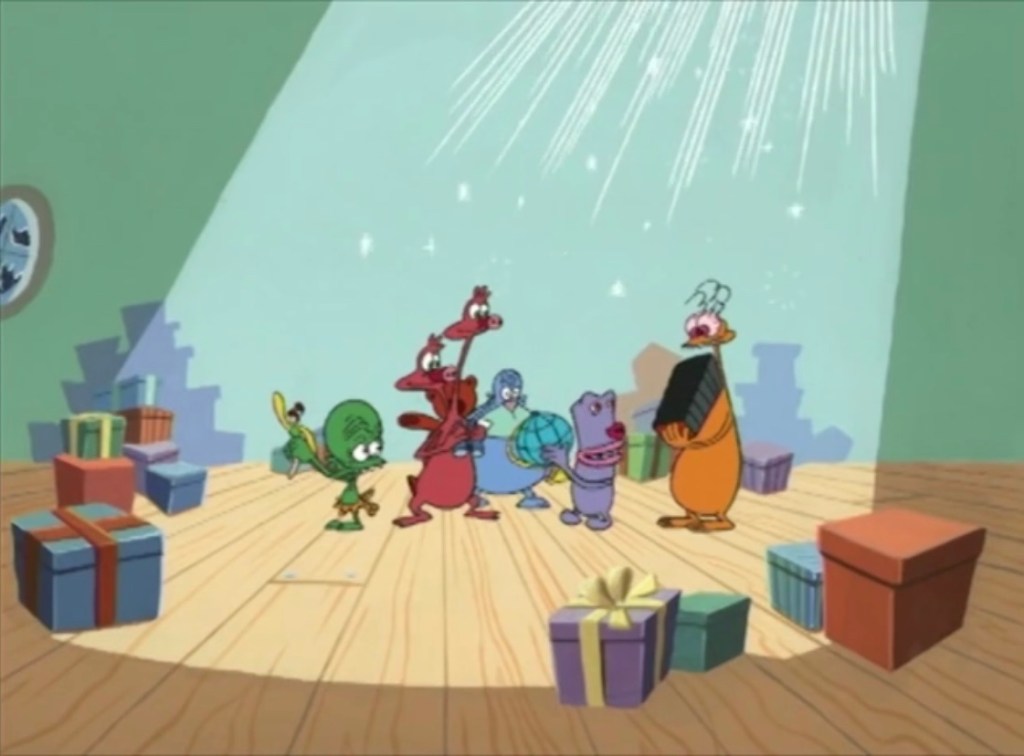
The show takes place in New Jersey and the cast of characters would gradually fill out. Neighbor Carl (Willis) was featured the most and frequently found his life being completely upended and sometimes just plain ended by his weird neighbors. It’s funny when misfortune befalls him though as he’s a pretty terrible person as well. Various denizens of space would be added and all manner of just weird would cross paths with the main characters. Each episode was only around 11 minutes and most didn’t have much continuity from one to another. Sometimes characters would re-appear and reference past exploits on the show, but also many episodes end with a main character getting killed only to be returned the next week.
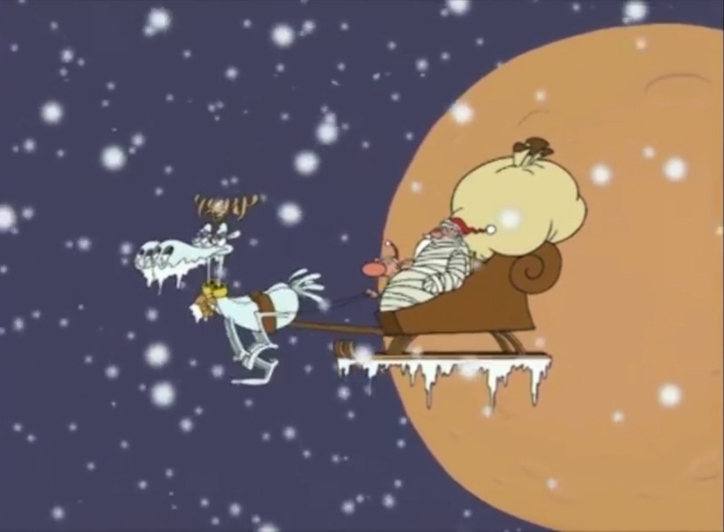
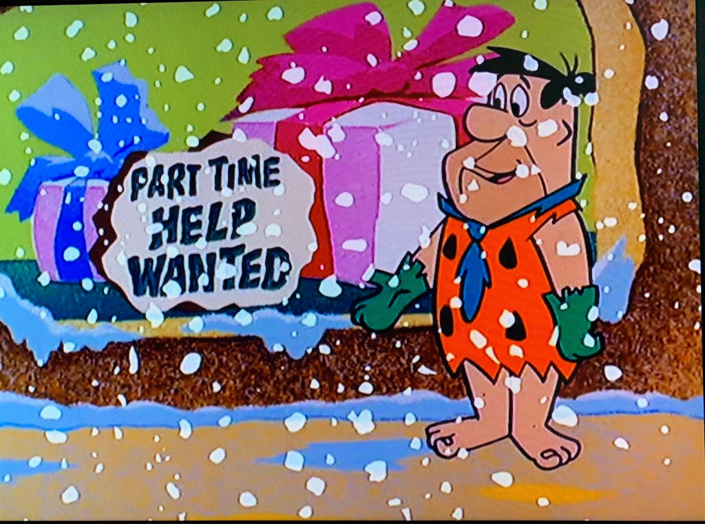
The show returned to Christmas for the Season 7 episode “A PE Christmas.” This episode will see Shake try to once again execute what he considers a brilliant, money-making scheme, that’s really foolish and misguided and destined to fail. Despite being a weird and rather ugly show, Aqua Teen Hunger Force was pretty successful at landing guest spots and this episode features some celebrity cameos like that first Christmas episode we looked at.

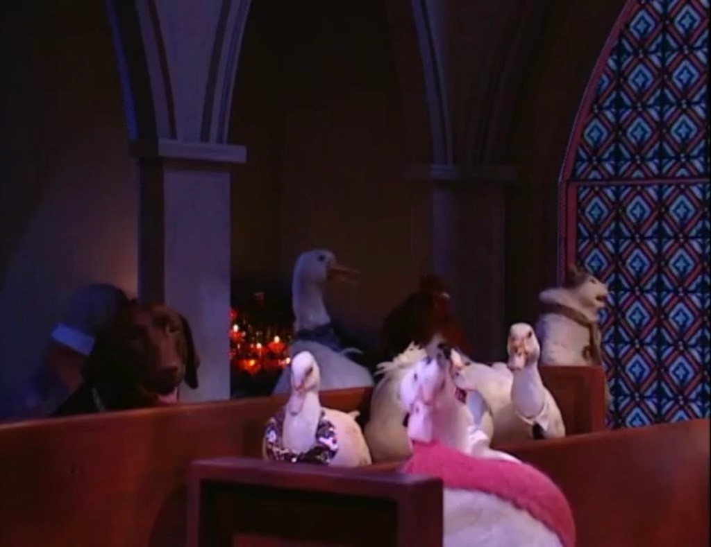
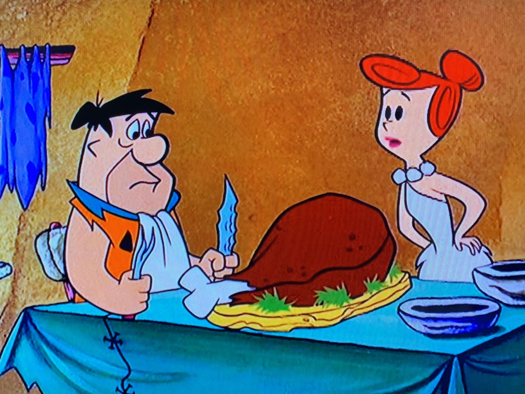
The episode begins at, of all places, church. Frylock is apparently taking his faith and the role it plays in the Christmas holiday quite seriously, while Shake is not. Meatwad, for his part, is basically just along for the ride. Shake is irritated that there’s no food, pointing out they have bread, but no meat. He needs protein to bulk up for next Halloween (he says, as he mimes a Hulk Hogan pose). Frylock is embarrassed for them as people keep turning and shooting glances their way. Surprisingly, most of the people featured look normal and apparently some are even based on the creative staff on the show (Willis is for sure present in the audience). Shake then tries to get Meatwad to assist him in swiping the donation hat, but is denied by Frylock who actually happens to have money to donate. He tells the two they need to learn about how good it feels to give, while Meatwad notes it feels pretty good to receive as well.
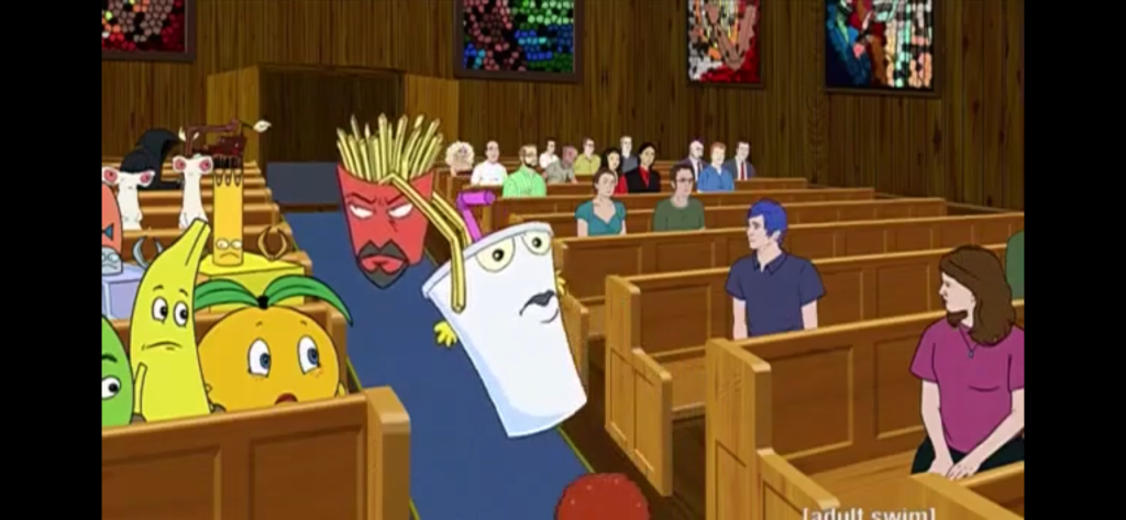
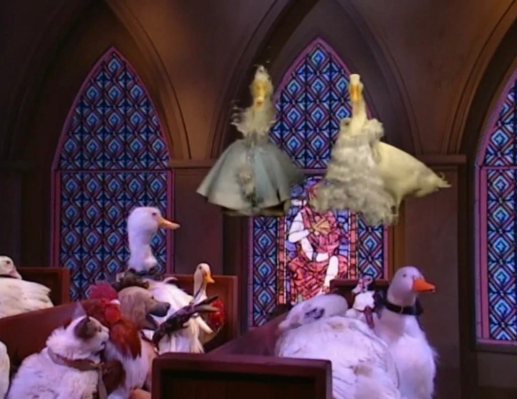
Shake continues his rant as it’s evident he wants no part of this. Meatwad just wants to sit on Santa’s lap and it’s soon revealed he has mistaken Jesus for Santa. Frylock corrects him, but Meatwad still seems a bit attached to his theory considering Jesus has a beard, but he notes the stab wound from the spear and the shredded abs as a strike against his theory. Frylock ends up shouting in frustration that “Santa didn’t die for our sins!” which just confuses Meatwad further as now he thinks Frylock is telling him Santa is dead. Shake, who often behaves like an older brother towards Meatwad, sees this as an opening to tease him further by telling him Santa is indeed dead. Meatwad continues to get upset, while Shake keeps going, and Frylock decides enough is enough as he drags Shake out of the church. The whole time Shake is shouting about Jesus the failure wondering aloud how a guy gets himself nailed to a cross, “We’re supposed to revere him for his slow reaction time?!” We also see some inhuman cameos as Frylock drags Shake out so there’s the weird I was looking for.

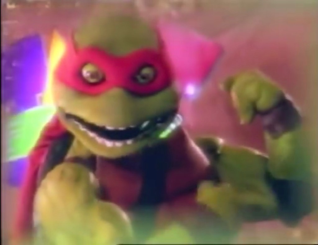
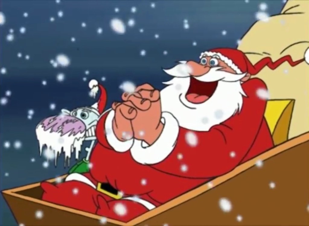
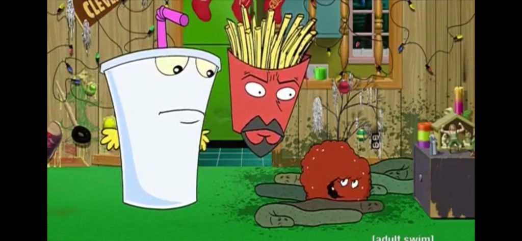
Back at their house, we see the “Christmas tree” from the last episode has returned. It’s basically just green crayon on the wall with some stuff glued on. They’ve also added some lights and even a little Charlie Brown tree. There’s a manger in the background and it looks like a wrestling figure is playing the role of Jesus, possibly a WCW Giant or maybe Hillbilly Jim. Frylock is preparing Meatwad for a shitty Christmas, though Meatwad still seems to think he has a shot at a new Super Soaker. This is where Shake reveals he has a money-making plan up his…sleeve? He’s apparently stolen some financial documents from Chuck D and Flavor Flav of Public Enemy. Meatwad notes the print-out for Chuck D is his 401k. Shake seems to think this is enough material to declare that he has stolen their identities and that he intends to record a Christmas album under the Public Enemy heading and call it “Bring Tha Toyz.” He then demands Frylock take him to a recording studio right this very moment on Christmas Eve to record so that he may have it in stores for Christmas Day.

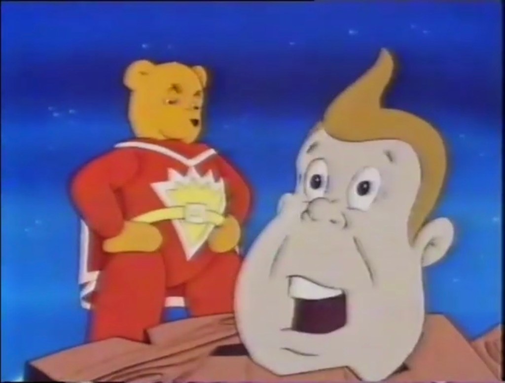
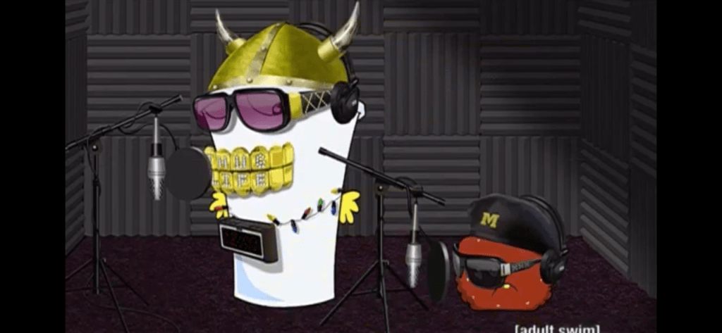
We then cut to Shake and Meatwad in a recording studio. Shake is decked out in outlandish hip-hop attire including a massive grill he’s trying to talk through. He eventually spits it out and complains openly about Frylock needing to reimburse him for the hour and a half of studio time they missed out on due to him refusing to drive them. Their technician for the evening is Michael (Michael Kohler) and he is about as excited to be there as one would expect. Meatwad is hoping to slip in some Christmas classics on Shake’s album, but Shake doesn’t seem too receptive. He’s also worried about listeners being able to tell that they are not Public Enemy, but Shake reminds them they’ll be modulating his voice. Plus, it won’t matter since they’ll have already bought the record!
The tape starts rolling and Shake starts spitting his rhymes, “Happy birthday Jesus, you are the one, coming down to Earth from the planet Krypton!” It doesn’t go on much longer than that totaling about 12 seconds. They head into the booth for Michael to play it back. Michael asks somewhat hopefully if they’re done and Shake seems to think they are, despite it being one 12 second track. Meatwad points out that most albums have at least six songs and Shake angrily concedes. He tosses a bottle of soda at Michael and makes a mess as he heads back into the recording booth.

Shake then raps a bunch of nonsense about what he’s looking at “Stapler on the desk,” and the lack of lumbar support on his chair. He declares it done after only a few seconds. Meatwad sees this as an opportunity to get one of his songs onto the record, but Shake insists that Jesus doesn’t want him to sing on his record. Meatwad continues to press Shake, only for him to relent because he has to go take a dump, though he orders Michael not to roll on this take that is about to take place. As Meatwad sings “Silent Night,” we can hear the sounds of Shake’s “movement” over Meatwad’s vocals. Meatwad asks of Michael to close the bathroom door, but he tells Meatwad it is as Shake continues to shout something about eels. He eventually emerges with a plunger and informs Michael someone from his entourage must have plugged up the toilet as water starts filling the studio.
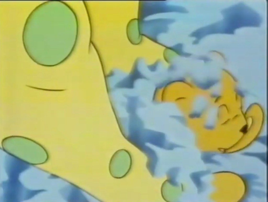
The next morning, at the house the guys wake up to find a bunch of eels in the living room by their tree. Meatwad thinks Santa brought them for him and asks Frylock if he can keep them while Shake informs us these came out of him. They look like big worms and they have this weird expression on their “faces” that looks kind of tired, but also is possibly hiding an existence of constant pain. Shake then declares they need to go see how his record is selling.

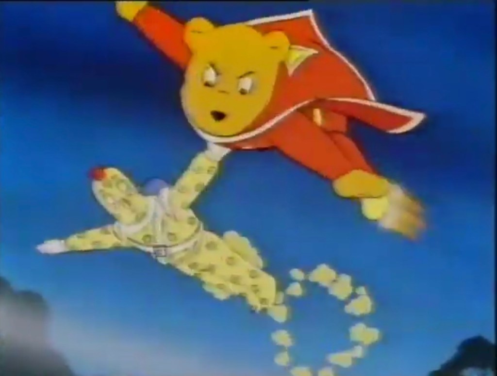
Outside a store called Better Buy, Shake is trying to get through the doors, but they’re locked. Frylock gets in an “I told you so,” since it’s Christmas Day so of course the store is closed. It’s also likely the record isn’t in there anyway since they recorded it last night. Shake is a being devoid of logic though, so he starts trying to pry open the door with a monkey wrench. Meatwad and Frylock bail as an alarm blares, and Shake gets fed up and just tosses a garbage can through the door and goes in.
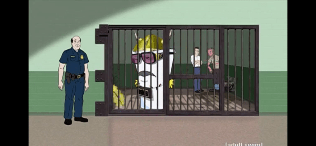
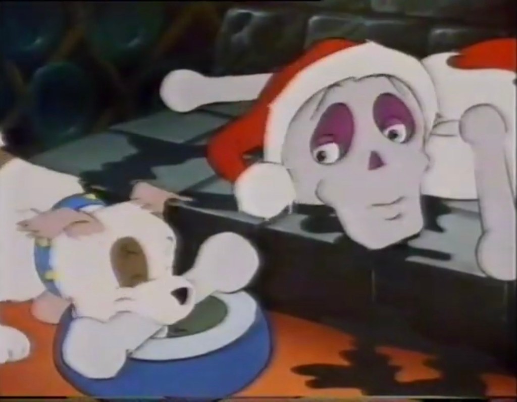
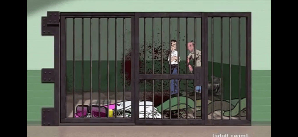
We cut to Shake in a holding cell back in his hip hop attire demanding to be let out because he is Flavor Flav. There are two guys behind in the corner, one being a reoccurring homeless man character model, who seem to ignore his ranting. He then wonders aloud just what he ate in Chuck D’s dumpster as more eels explode out of his backside. Since he’s a paper cup, he just collapses in a crumpled heap on the floor while the two guys behind him get sprayed with shit-blood to no reaction.
We then get to see an additional scene in which Meatwad meets Chuck D (himself) disguised as Flavor Flav. Chuck D is rather confused by Flav’s appearance, but Meatwad assures him he just lost some weight. He also returns to him all of the stuff Shake had stolen, which apparently included a lot more than he had revealed earlier in the episode. He also compliments Chuck on his credit score. He then advises him to lock his dumpster, and Chuck D corrects him that it’s not a dumpster, but actually a lair for his space eels. Meatwad then demos the song he recorded, “Silent Night” with Shake’s farting and groaning over it, and Chuck D actually likes it and declares, “It’s gonna be huge.” We hard-cut to the ending credits which feature Shake’s Christmas rap, “Twas the Night Before Jesus,” only sung by Schoolly D, the regular performer for the opening credits.
This episode is pretty ridiculous, but what is somewhat surprising is it actually contains more Christmas than the previous episode we looked at. It does a good job of finding a use for the holiday within the world that is Aqua Teen Hunger Force and any episode involving some ridiculous Shake scheme to make money is often pretty entertaining. There’s some great lines from Shake and his exchanges with Meatwad are humorous, but the real scene-stealer is probably the engineer, Michael, who deadpans all of his lines. Kohler does a great job of just capturing the mood of an employee who wants nothing to do with his job at the moment without outwardly stating that.

Interestingly, the episode must not have been finished for its original airing in December, 2009. It originally ended with Shake’s back exploding and the eels emerging. The scene with Chuck D wasn’t added until it aired in March of 2010. I’m guessing the episode was rushed before they could get Chuck D’s audio recorded so it could air during the Christmas season, unless Chuck D happened to see it and liked it and thus an opportunity was presented to tack on a guest appearance. Either way, I actually think both endings work because the show is often so surreal and absurd that something like eel diarrhea doesn’t necessarily need an explanation. It’s certainly nice to have one though, and as a final dig towards Shake it turns out Chuck D likes Meatwad’s song instead of his.
This is a Christmas episode that is not likely to provide the usual dose of Christmas “feels,” but you’ll probably get some laughs. If you’re real passionate about the Christian side of the holiday then maybe some of the church scene will turn you off, but this was never meant to appeal to devout Christians looking to celebrate Jesus. And for what it’s worth, Shake does get his comeuppance by the end. If you wish to view it, it’s been released as part of Season 7 of Aqua Teen Hunger Force both on physical media formats and digitally. For some reason, it’s listed as part of Season 9 in some places so check first if you’re looking to buy a whole season. The entire series is also streaming on HBO Max. It’s also likely that Adult Swim will rebroadcast it this month as the network is pretty good about re-airing its Christmas episodes every year, though some of the older ones can get lost in the shuffle since there are just so many at this point. At just over 11 minutes long, it’s certainly worth a look this Christmas if this show’s humor appeals to you.
Can’t wait until tomorrow for more Christmas? Check out what we had to say on this day last year and beyond:

Dec. 14 – Heathcliff – “North Pole Cat”
Heathcliff, despite being a cat, shares a similarity to a certain cookie. And that cookie is Hydrox, the chocolate and cream sandwhich style cookie often mistaken for an Oreo. When I was a kid, Hydrox was the inferior Oreo, the knock-off, and I suspect that was true for a lot of people. The funny…
Keep reading
Dec. 14 – Olaf’s Frozen Adventure
Just past the halfway point is where our most controversial Christmas special appears: Olaf’s Frozen Adventure. It’s not controversial for anything fun. No alluring scenes or hints of violence or anything like that. It’s controversial because of how poorly received it was when it was paired last year with the Pixar film Coco for it’s…
Keep reading
Dec. 14 – Bonkers: Miracle at the 34th Precinct
Bonkers was a late inclusion in the Disney Afternoon, a post DuckTales/TailSpin/Rescue Rangers program and contemporary to Goof Troop and Gargoyles. It’s a show about a bobcat named Bonkers who serves in the Toon Police alongside his partner Lucky Piquel (pronounced Pickle by most characters, but it’s supposed to be Pee-kell, making it a running…
Keep reading