Super7 Transformers Ultimates! Optimus Prime

Super7’s take on the classic 80’s toyline has finally arrived, but is it any good?

I think we’re over discussing the merits of non-transforming Transformers, right? It’s been done for a long time, but was really pushed to the forefront with the Hasbro RED series in 2020 and while there will always be a section of the fanbase that wants nothing to do with such a concept, it’s still an easy thing to justify. When the Transformers arrived on television sets in the early 1980s, they were giant robots that generally went from some kind of automobile to a humanoid robot. And those transformations were pretty unrealistic when compared with the toy. The character models needed to be kept neat and tidy for animation’s sake and if something looked a bit janky on the toy the cartoon could remedy that. As long as a kid could at least tell the character and the toy were one-in-the-same it was fine. And now there are collectors who want their Transformers to look, and move, like the characters from the show and what’s wrong with that? There will always be transforming toys to please the masses and these sublines can go off and do their own thing.

This should be a familiar sight for anyone used to Super7’s Ultimates! line of action figures.

When Super7 announced it had grabbed the Transformers license many people were shocked. Transformers is basically an in-house property for Hasbro, so what benefit is there to Hasbro licensing it out to a company that is just going to make something it can already supply? Well, money, for one. Hasbro clearly doesn’t view Super7’s offerings as direct competition with their own stuff. And Hasbro, being much bigger, was able to pump out the RED series before Super7 was able to announce they’d be doing something similar (and apparently the RED series kind of caught Super7 off-guard). And they are different, to a degree. While both seek to replicate the Generation 1 look for its characters, they operate in a completely different scale and at a completely different price. Time will tell if Transformers collectors need both, but for now both seem to be doing all right.

Optimus certainly knows how to fill out a window box.

I’ve mentioned before that I’m not big on Transformers. I basically missed it by about a year or two, so my first love when it came to a toyline was The Real Ghostbusters, while my cousin who was two years older loved Transformers and G.I. Joe. I had a toy here and there, but nothing I can even cleanly remember (I think it was a yellow car, but memories can be funny). I did get into the Generation 2 re-releases briefly. I thought Grimlock looked cool in blue, and I saved up some money to get Optimus Prime. I’d also add the tank version of Megatron, but I kind of stopped there since Transformers were way more expensive than an X-Men figure. It was basically a 3:1 ratio with basic Transformers, while that Optimus cost me 30 bucks in 1992 money! All that is to say that Super7’s line of Transformers really shouldn’t be my thing, but I have a nephew that really likes the brand and when he got setup in a new bedroom I decided to make him a clock in the shape of Optimus Prime because my grandfather had done the same for me and my sister (his mother) when we were kids. My clock was Leonardo and my grandfather modeled it after my giant sized action figure of the same. I wanted to do something similar with my nephew’s clock and the reference that worked best was Super7’s art for their figure. Now, he’s too young for this type of toyline, but I still thought it would be cool if I also got him the toy. And since I was buying one for my nephew, well, uncle needs one too! I don’t know when I’ll give him his figure, or if he’ll even care about Transformers come then, but these are the specific circumstances that lead me to owning this figure so I’m going to tell you all about it.

The figure certainly looks similar to past incarnations of Optimus Prime, but it has a decidedly different flavor.

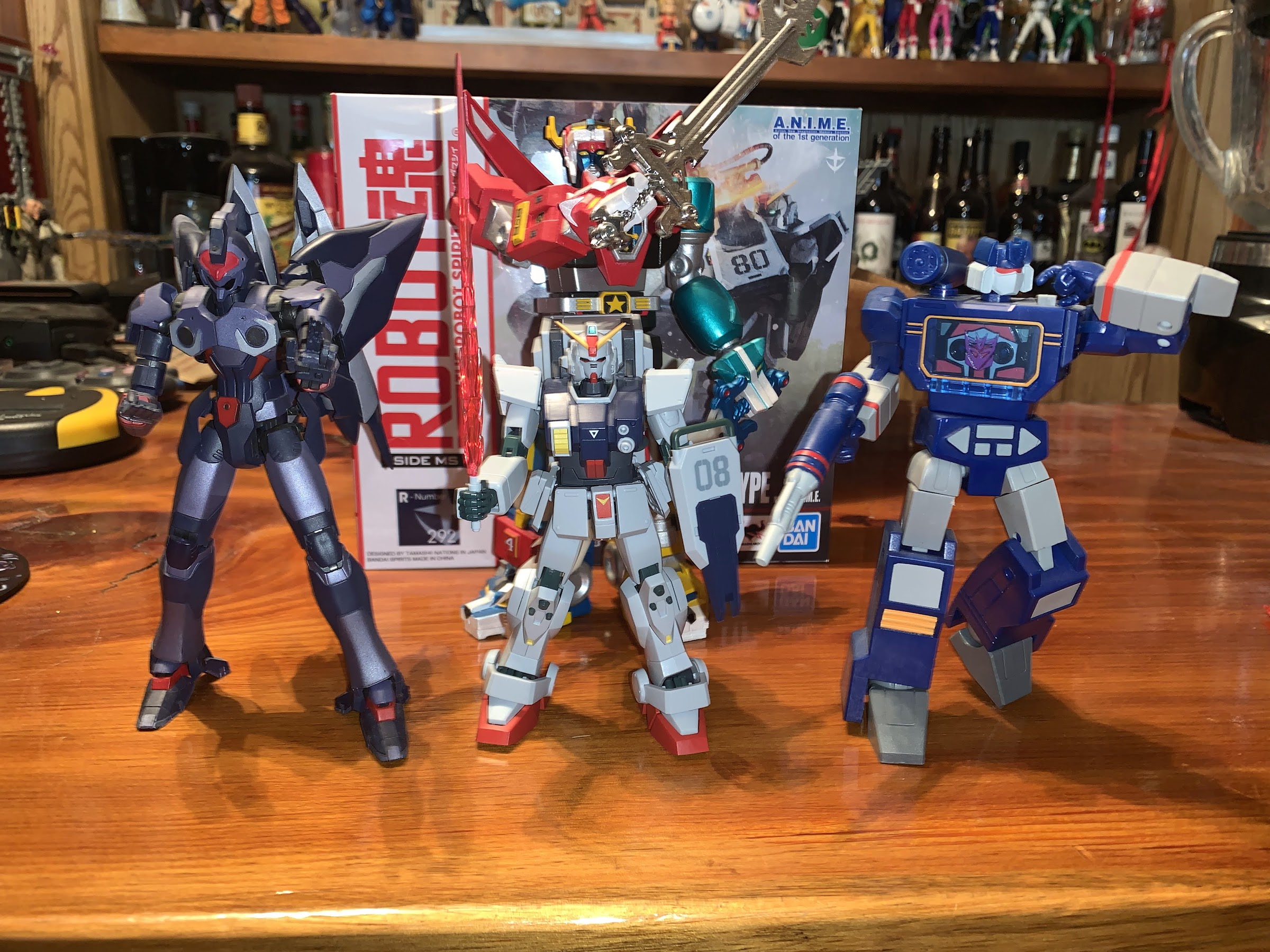
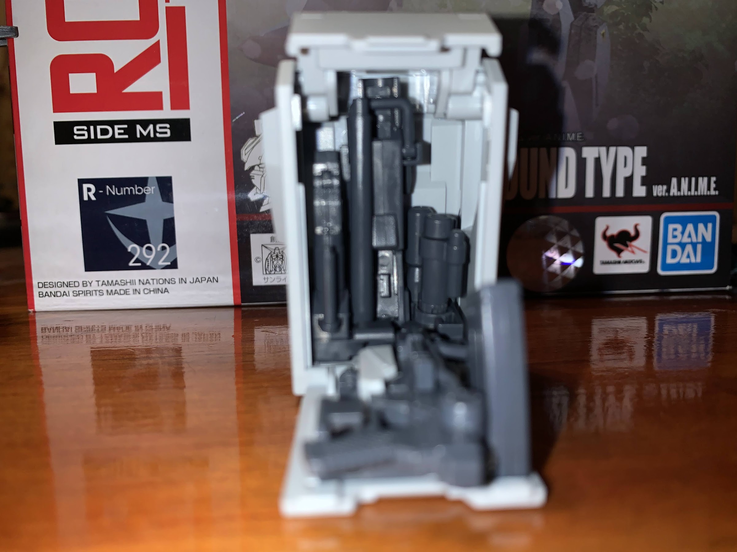
Optimus Prime is one of four figures in the inaugural wave of Super7 Transformers and he’s the only Autobot in the lineup. Super7 appears to want to go a bit deep, or obscure, with its choices while also recognizing it needed to include the Autobot leader in the first wave. This line is a 7″ scale line that seeks to emulate the look from the original cartoon. There’s going to be a lot of solid colors, less detail, and a bunch of stuff included as accessories pulled from the show. It’s a good approach as even the RED line from Hasbro deviates from the look of the show with its figures as both Soundwave and Optimus featured clear “glass” on their body when the toon would use a solid color. I believe this wave is also the first one released under the new pricing model of $55 a figure. Previously, Ultimates were $45, but then COVID happened. These went up for order in March of 2021, so a turn-around of 14 months actually isn’t that bad given the state of things.

Sick of working for Michael Bay, Optimus is looking to audition for Quentin Tarrantino.

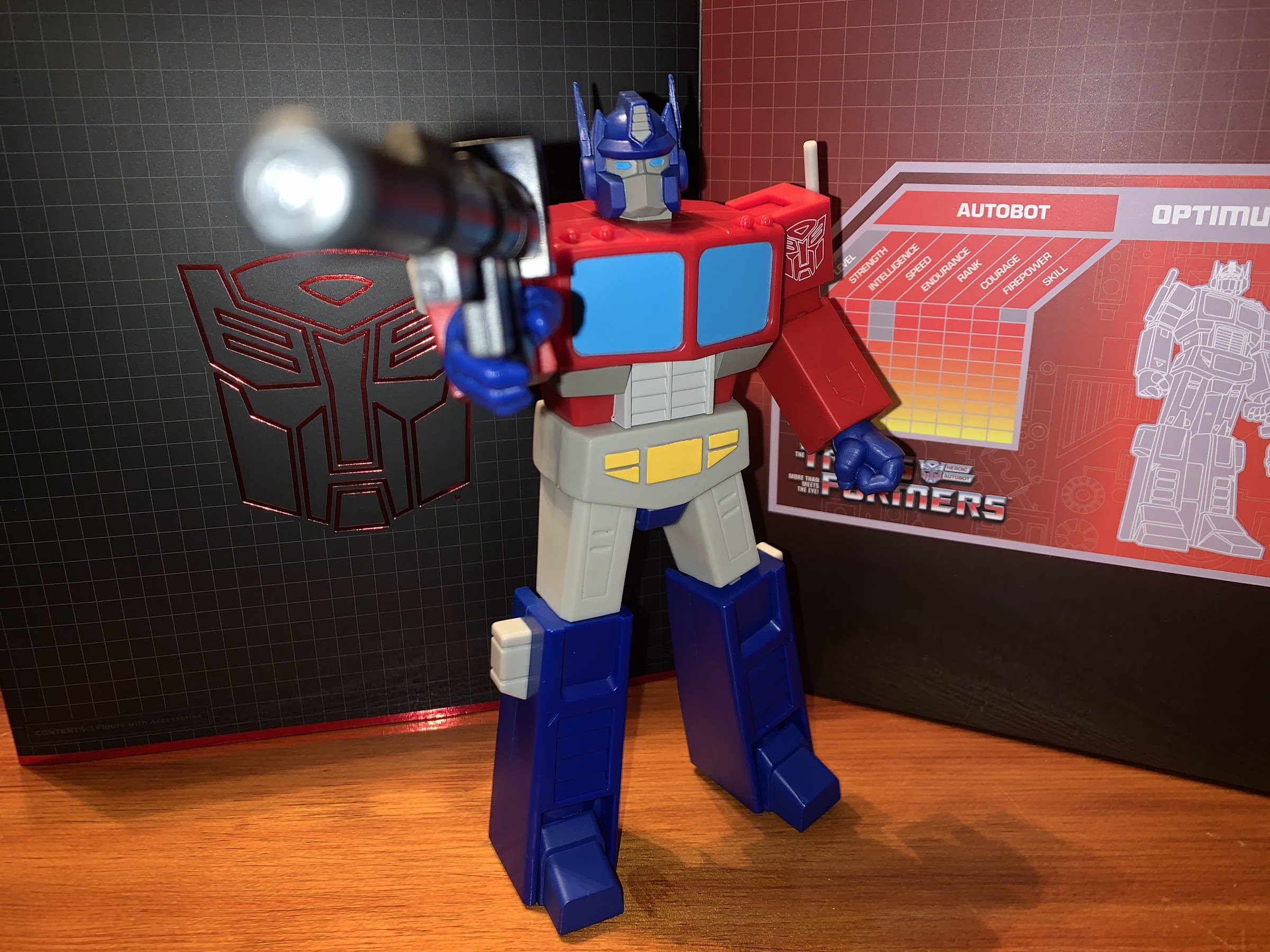
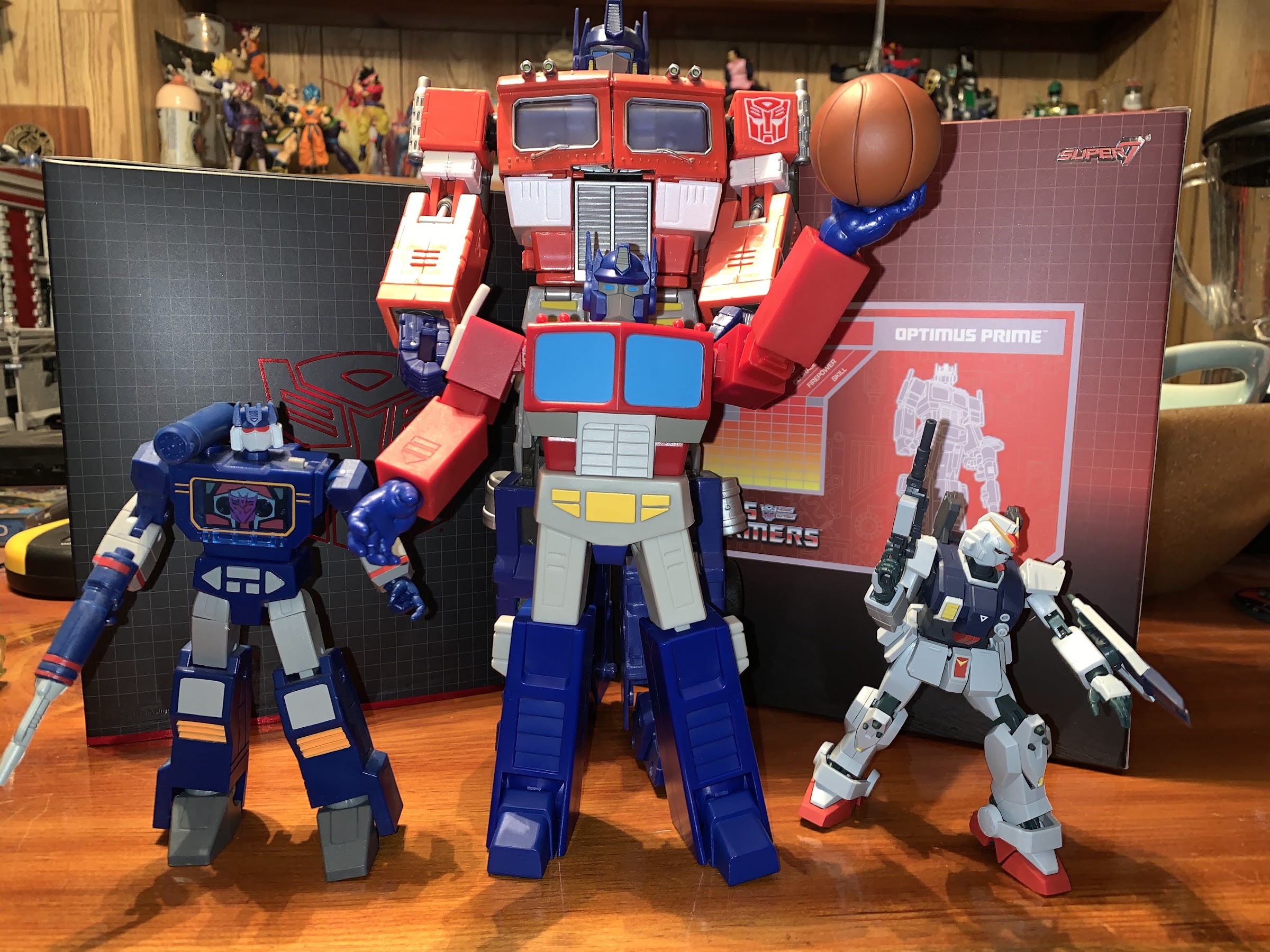
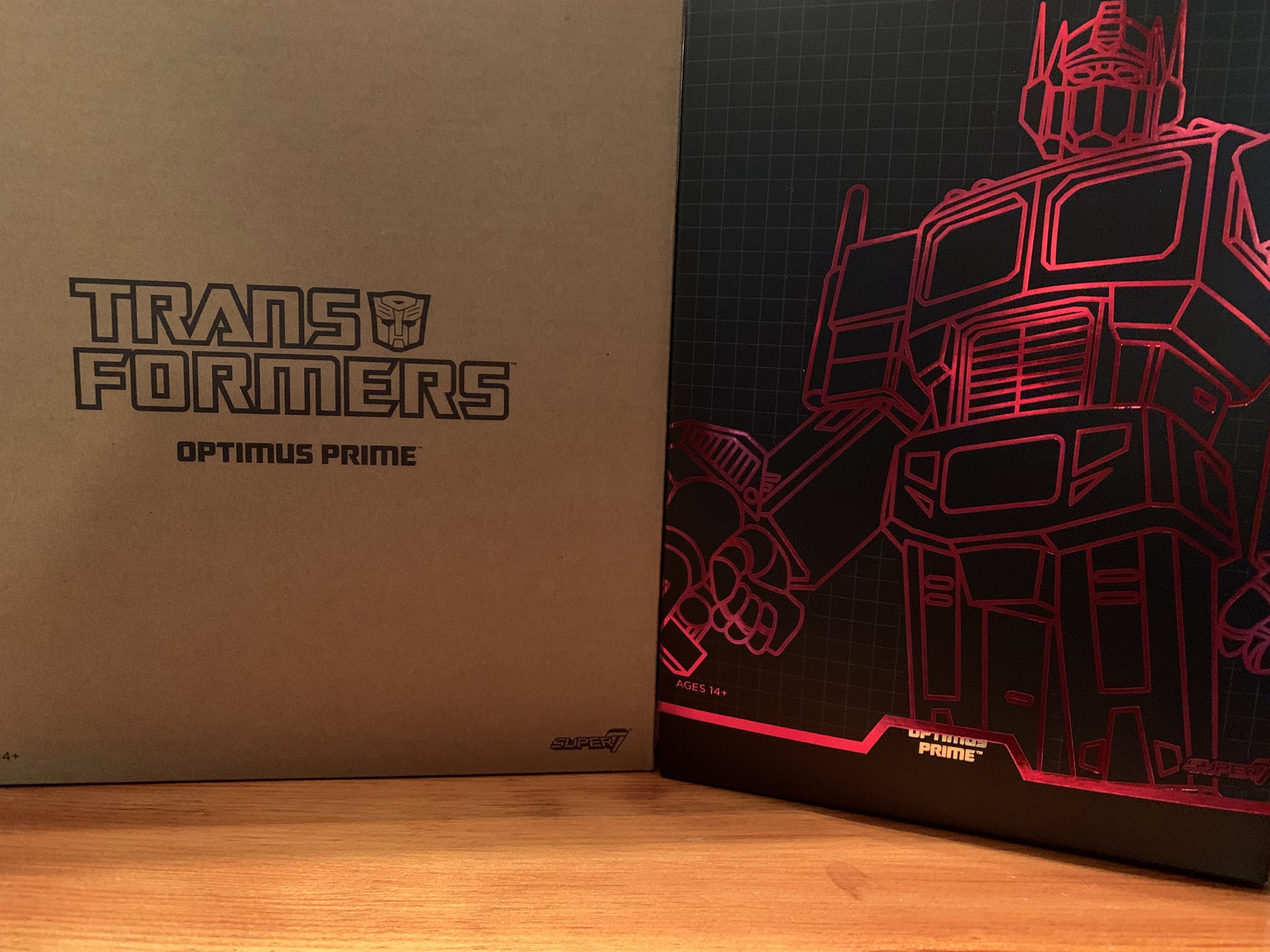
Optimus comes in the familiar Super7 Ultimates! packaging. The box is a bit beefier than some of the other figures I’ve purchased from them, but it’s still the same slip-cover over window box. The outer slip-cover is rather nice as it has a reflective outline of the character and the window box has the familiar red and black grid pattern with an old school character power level grid on the back. Optimus takes up quite a bit of real estate in the box and the inner cardboard is mirrored, but the figure (and accessories) are so big that it doesn’t really add anything. I didn’t even notice it until I pulled him out.

This is pretty much as best he can do when it comes to a gun grip. Why not just straighten out the handle so he can actually grip it properly? The first in many questionably decisions to come.

Out of the box, Optimus stands at about 8″ in height, maybe a tick over. He’s a very blocky, chunky, figure and at first blush I’d say that, yeah, he looks like the cartoon character. He does not, however, give off that “Just walked out of the television set,” vibe as there’s almost no paint on this guy. Most of what you’re looking at is molded plastic. It’s not super shiny, which is good, but definitely lacks pop. It’s most apparent on the windshield panels on his chest which are just a light, flat, blue. Pull-up almost any image from the cartoon of Optimus Prime and you’ll see some white accents on the glass part. Why not paint that on? Super7 used decals with that effect for their vinyl version of this character, but decided against it here. I wouldn’t expect cel-shading out of Super7, but a little flourish would have been nice. Aside from that, most of the paint is found on the crotch because they used a plastic overlay (affectionately referred to as a “diaper” in most collecting circles) that’s quite soft and requires paint. The gray band in the torso is also painted and there’s the Autobot logo painted, or printed, onto the left shoulder. I wish the logo was raised or stamped in, but it’s clean so I guess it’s fine. The smaller details on the face are well-painted too.

I’m not sure how obvious it is on camera, but the fist hands have this nice, matte, coating applied while the rest are just bare, glossy, plastic.

The low detail approach just makes Optimus a little plain looking. I think the figure would have benefitted from at least some panel lining which would be in-line with the cartoon’s presentation. Obviously, Super7 tends to think less is more, so I’m not shocked by their choices, but a little let-down. For $55 this could have been better. I also find it interesting they opted for an off-white or light gray shade for the crotch, thigh, smokestacks, and fuel tanks when the cartoon was pretty consistent about making those parts white. I associate the gray coloring more with the toys so it’s a bit of an odd choice. It just looks a bit dingey, so I would have preferred white, but it’s more of a nitpick than anything. Worth pointing out is that the right smokestack on mine came rather warped. It’s nothing I don’t think a little hot water or blast from a hairdryer can’t remedy, but I review these things as they come out of the box to give you the best idea of what to expect.

But hey! He comes with a surf board! Also, that’s as far as his elbows can bend. Yeah, not good.

Where the design is going to cause further problems is with the articulation. Now, I have the Voltron from Super7 so I had an idea of what to expect here. Plus I know from experience and just from what the company has told us that they prioritize the look over the articulation. Super7 believes articulation is fine, but that most collectors are going to put their toys on a shelf in a fairly basic, or neutral, pose. I don’t really agree as I think that’s what five-point figures and vinyl toys are for, but I’m not the one running the company. As far as I’m concerned, Super7 can take whatever approach it wants so long as it’s consistent which is why you won’t hear me complain about the lack of double-jointed knees and elbows. Super7 just doesn’t do them. This toy is, however, still an action figure so it should be judged as one and in doing so there’s some good stuff here, and some very not so good stuff.

If you don’t like the toony head you can switch to a toy-inspired one.

For starters, Optimus has a head that sits on a double ball-peg. This is a welcomed sight as the last Super7 figures I looked at featured a single ball-peg. Since he basically has no neck though, his range is going to be limited. He can look up and swivel with a little tilt, looking down is basically impossible. Once you introduce the ab crunch can the figure look down a bit. And that ab crunch is well-hidden and feels smooth. I’m not too worried about paint rub on the grill piece, though the figure doesn’t get any reverse crunch movement out of it. It strictly allows him to bend forward a bit. At the shoulders, we have an interesting setup. There’s a hinge inside the housing for the shoulder, with a pivot point just outside that, and a hinge just beyond that. This allows the bulky shoulders to swing out and come over the top of the torso allowing Prime to raise his arms out to the side past the usual 180 degrees. He can basically be the “Y” in a performance of “YMCA”. Unfortunately, Super7 apparently used up all of their creativity here because the elbow is a different story. There’s a biceps swivel above it, but the actual hinge bends maybe 45 degrees, if I’m being generous. The general accepted range on an elbow is 90 degrees, and that’s considered passable. My Hasbro RED Soundwave can do full curls and touch his shoulder with his hand to illustrate how big a difference this is. The comparably bulky Voltron could nearly get to 90, which I felt was satisfactory given the character. Not even getting close with Prime though is really unacceptable for a premium action figure, and at $55 a pop, that’s what this is. All Super7 had to do was cut out some relief on the forearm or elongate the piece where the elbow exists. It wouldn’t cost anymore to have done it right, nor is it going to ruin the look of the figure. It just feels like they hit a mild trouble point and decided not to address it at all thinking this amount of range was acceptable, but it’s not.

“Good thing you don’t have an eject button you need to be able to press!”
I think this is how I’m supposed to use this thing.

Moving past that unfortunate piece we have hands that peg into the arms and feature a single hinge which is fine. The waist has standard rotation so I’m assuming it’s a peg joint and not a ball. At the hips, we have the usual ball-pegs that Super7 likes and they’re fine. They’re pretty big so they don’t look as scary as some of the pegs on the TMNT figures and you get a swivel and range out to the front, back, and side. If you read my Voltron review, it was this spot that I deemed unacceptable on that figure as it just had pegs with no ball so that figure only kicks forward and back which is terrible. Optimus thankfully has normal leg function, though that diaper piece limits how far his legs can move. It will flex, but I wouldn’t want to leave the figure posed with too much stress on it. The knees are single-hinged and can achieve a 90 degree bend with no problem, it’s the ankles where we hit another roadblock. Optimus has rigid plastic alongside the lower legs so the ankles are effectively in splints. They hinge up and down and there is an ankle rocker, but it’s functionally useless because there’s just no room. Again, this could have been solved without cutting into the sculpt much. They could have brought the toe portion of the foot out a little further and it actually might have been more screen accurate. Doing so would have allowed them to just put a swivel point there. They also could have done what Hasbro did and do a drop-down ankle joint. That’s probably the better way to go, but there’s a number of things that could have been done, but Super7 opted for none. While Optimus can actually widen its stance, unlike Voltron, it can’t be widened much because eventually the figure can’t stand on its feet because there’s no rocker. It’s just a bummer.

He’s got a jet pack, if you think he needs one.
Check out my Matrix!

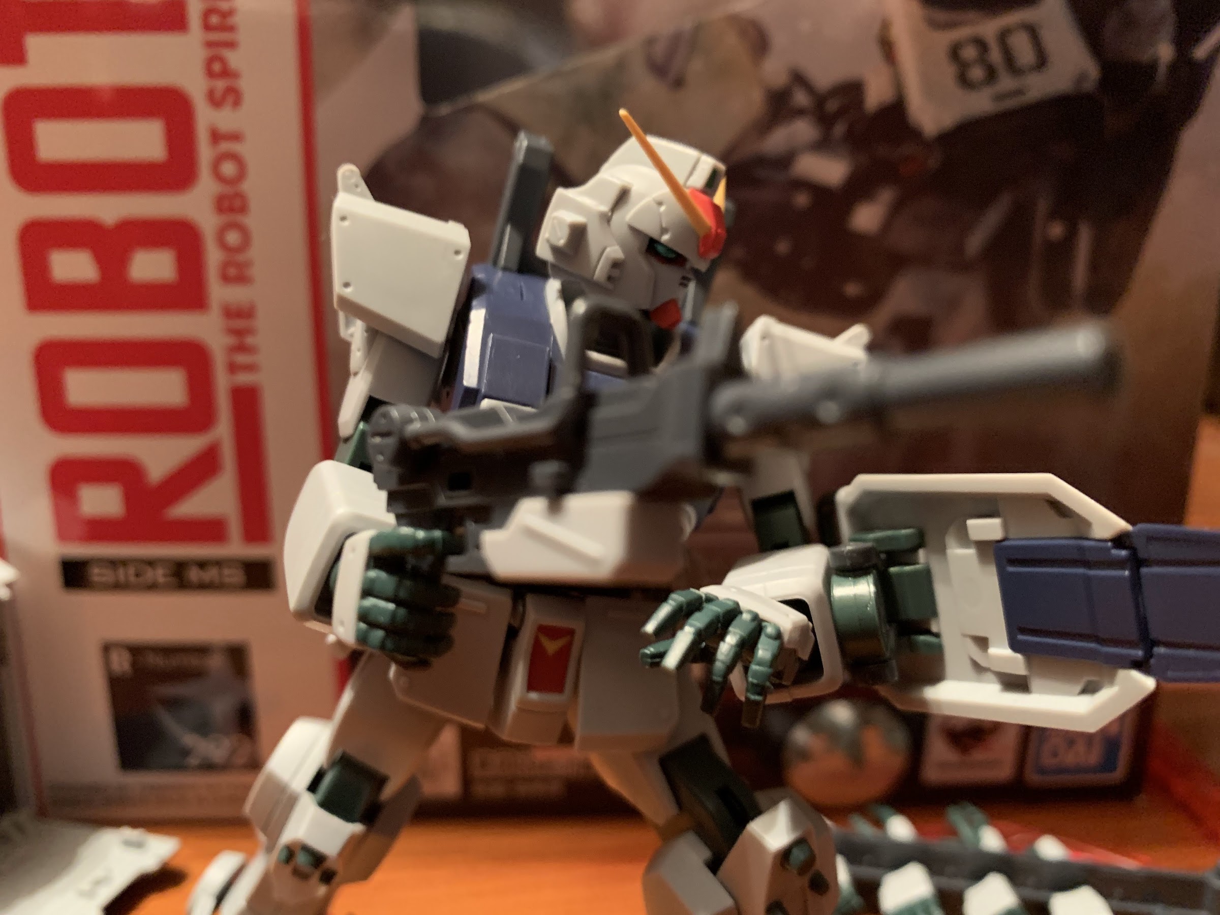
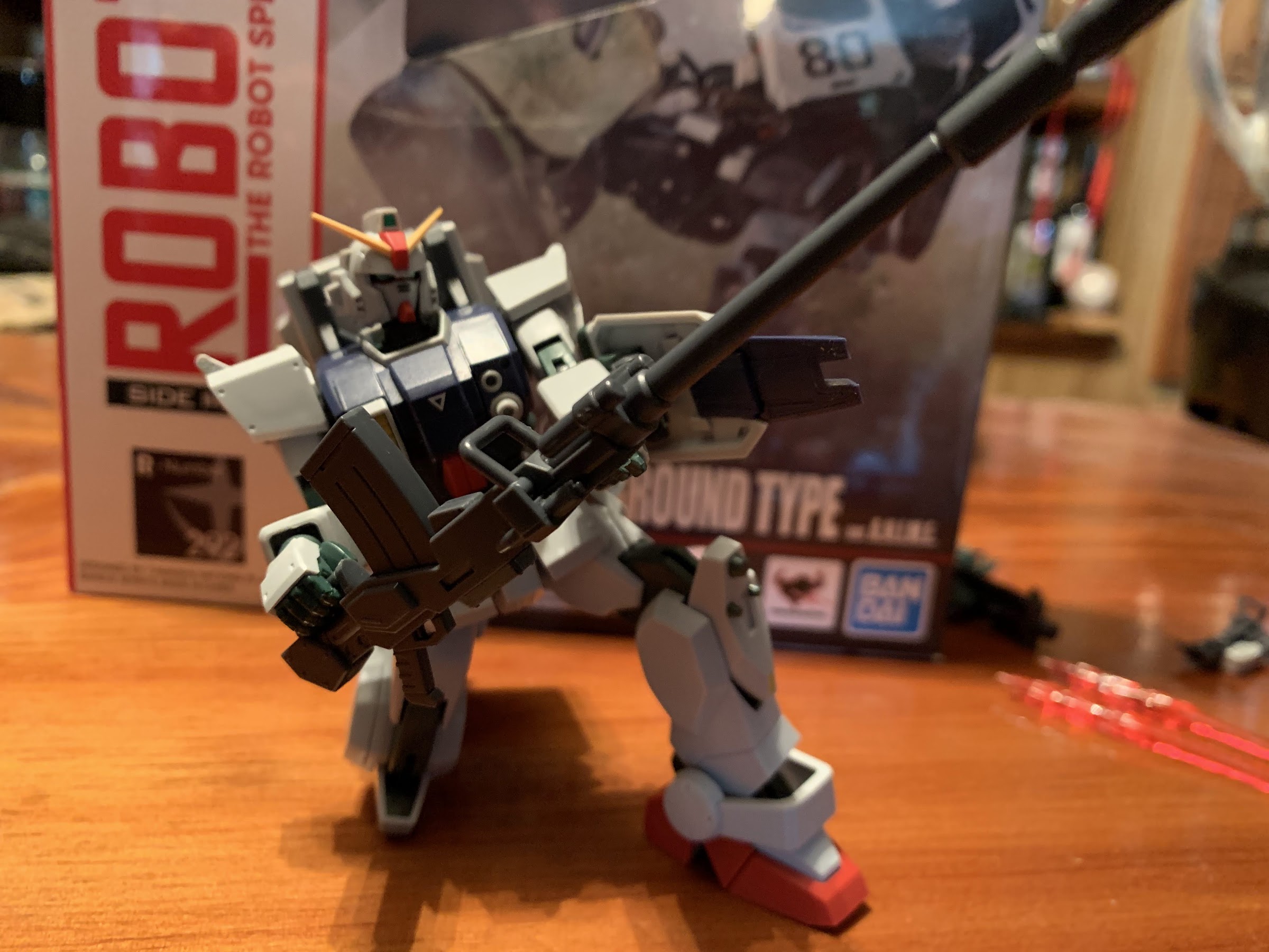
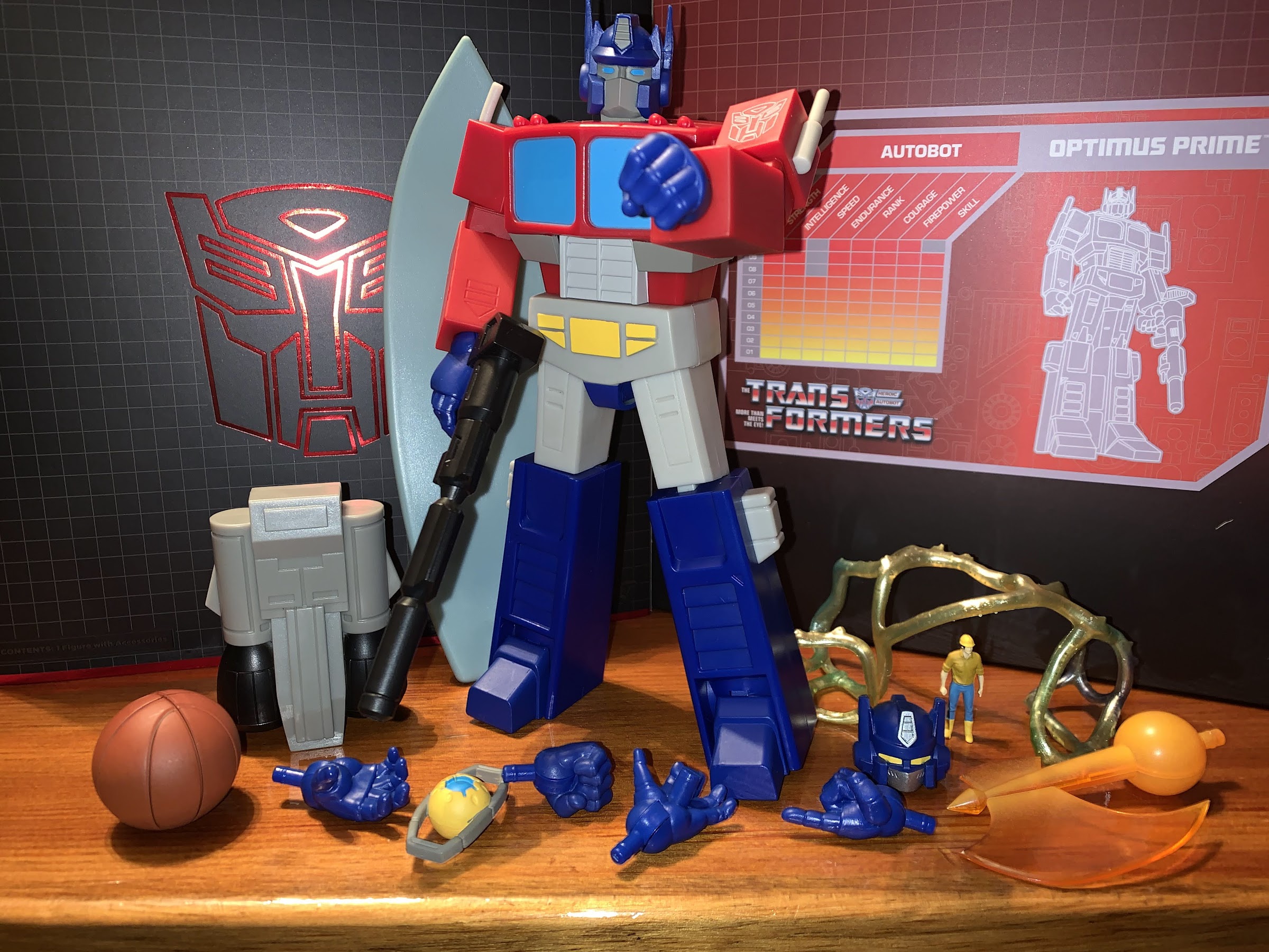
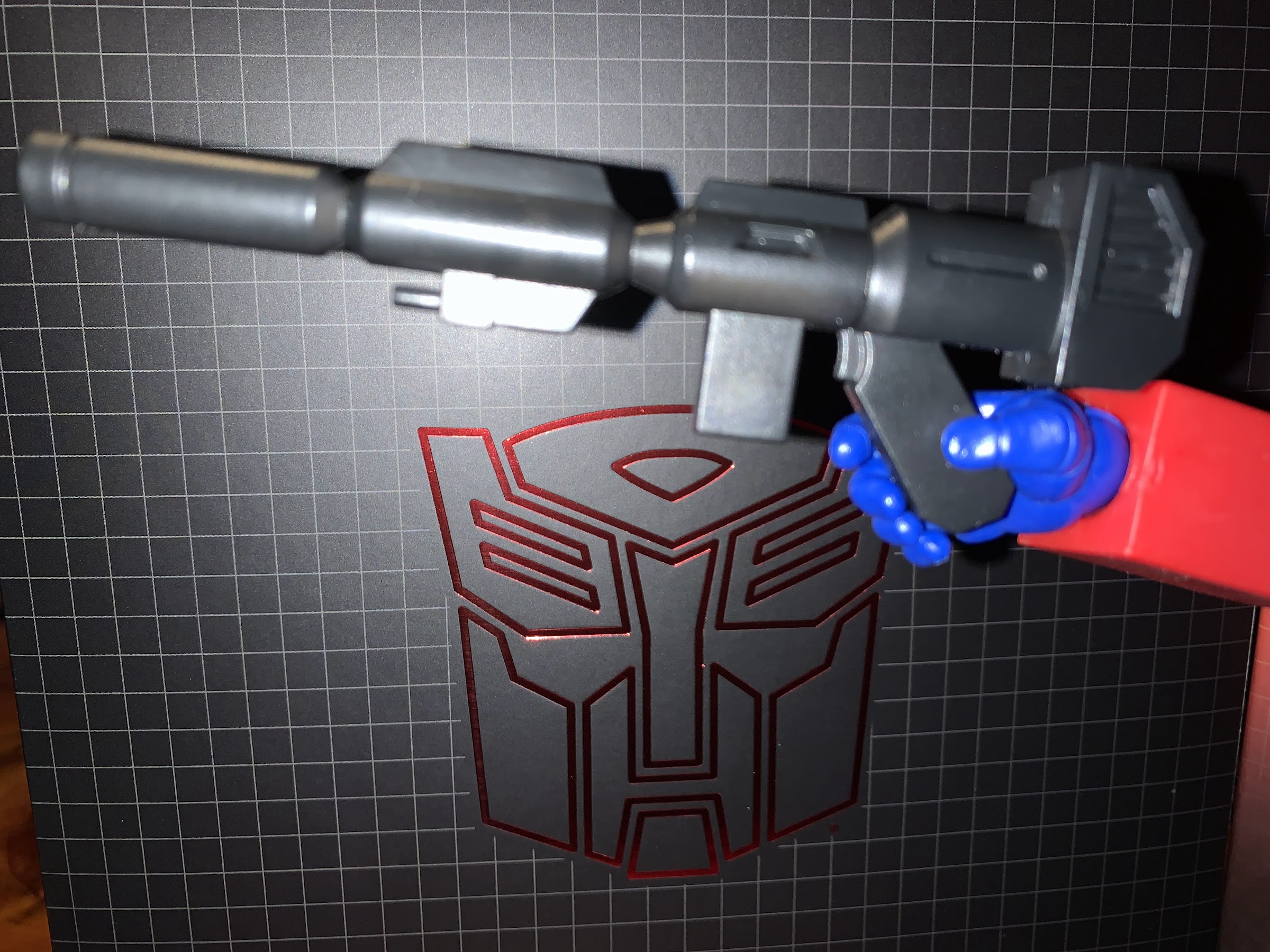
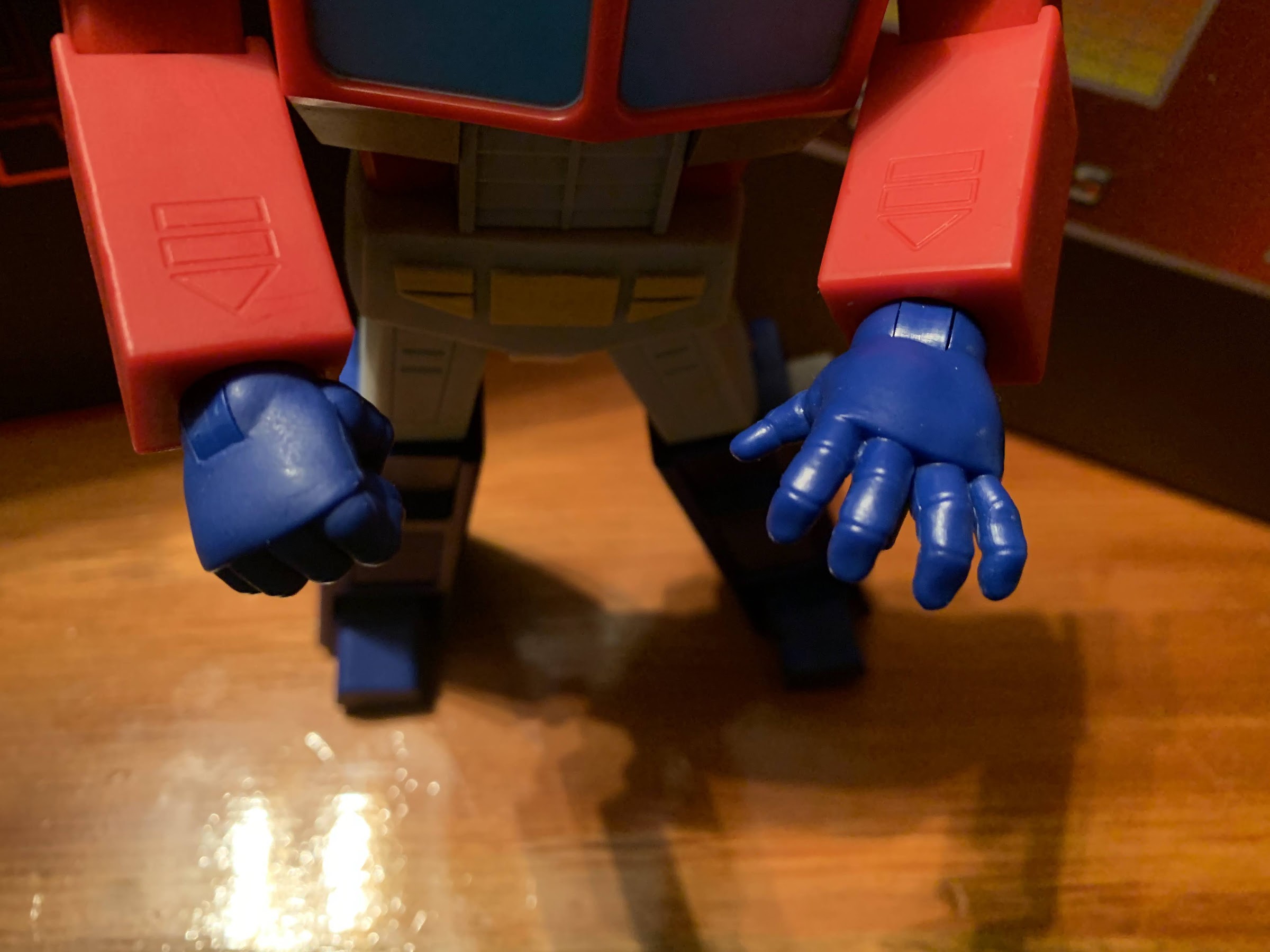
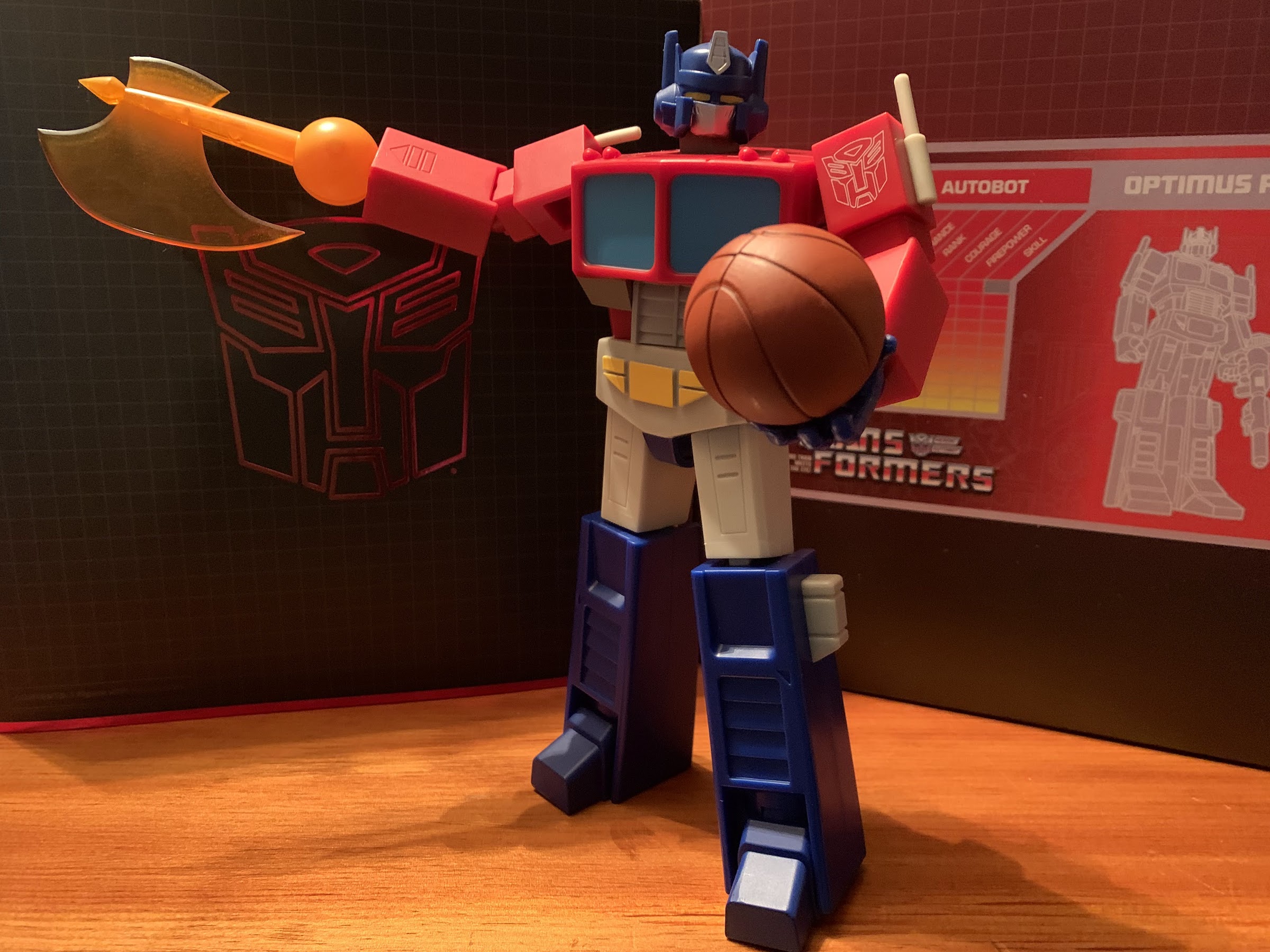
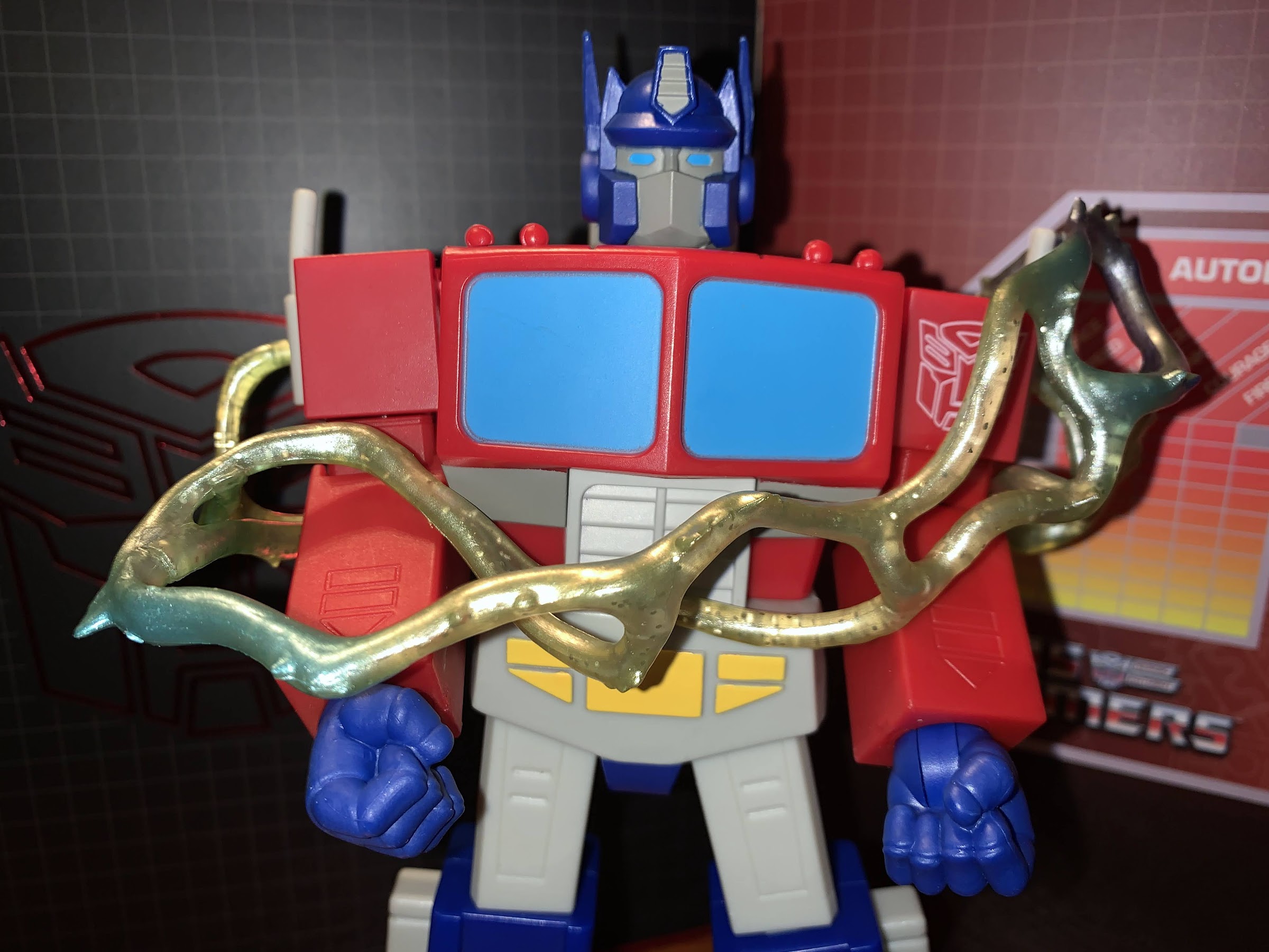
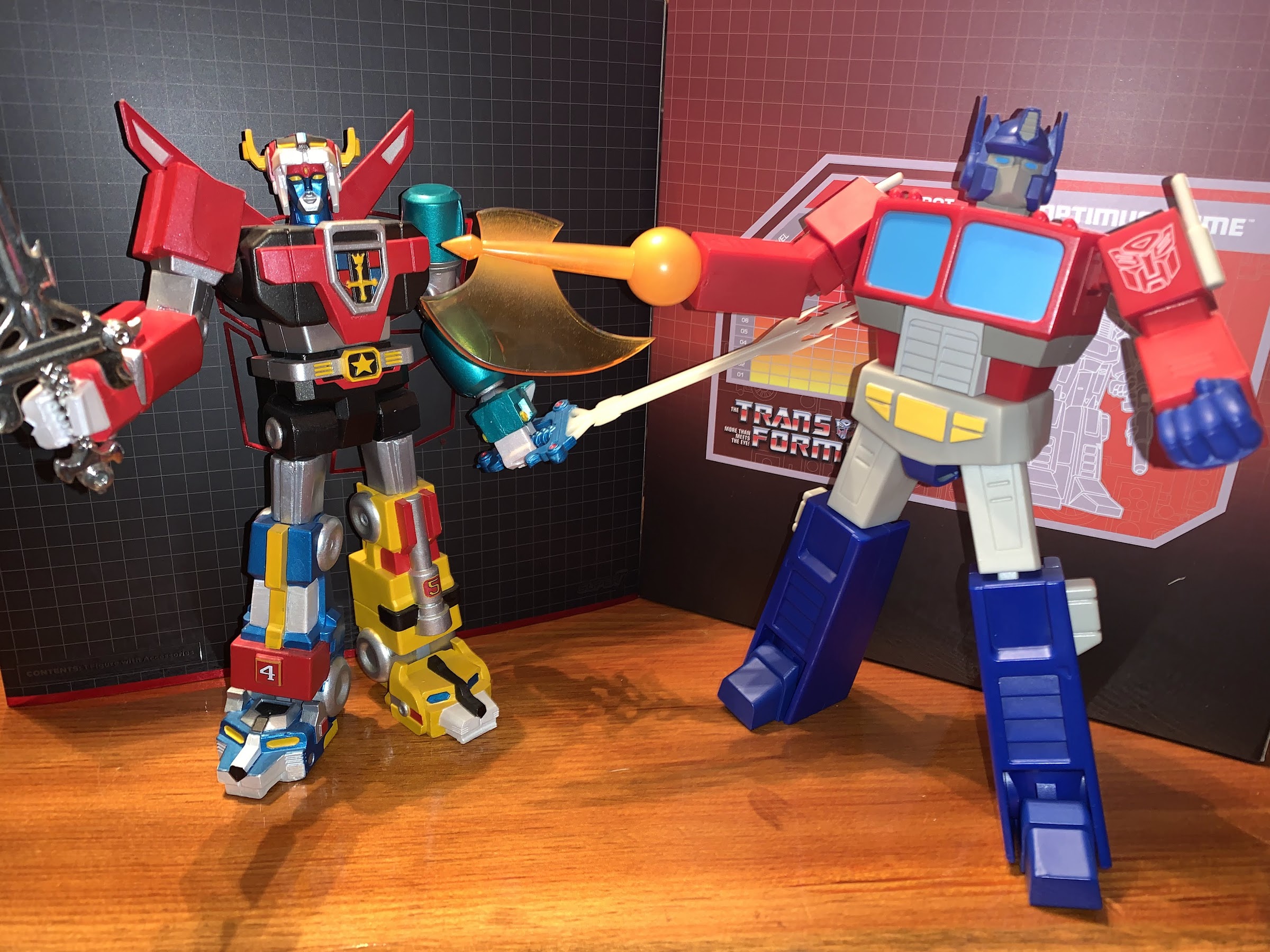
Super7 is certainly not known for articulation, but what it’s Ultimates! line is known for are accessories, and Optimus does okay in that regard. We get two heads with this figure, the toon accurate one that comes on the figure and a toy accurate one for those who prefer that look. I had that toy and loved it, but I really have no use for the alternate head. For what it is, it’s fine. Optimus comes with fist hands in the box and the figure can swap to a trigger right hand, pointing left, open right hand, and an open left hand with a peg on it. What’s missing are just normal gripping hands, which is a problem I’ll get to in a second. Interestingly, the fist hands have a matte coating on them and you can see where it ends near the peg. The other hands don’t have this and as a result are a bit glossy. It’s not something everyone is going to notice, but given the choice, I would have liked all of the hands to have this matte finish. For the trigger hand we have Optimus’ gun which matches the old toy and the show. The handle is at an angle though and I can’t get the trigger finger onto the actual trigger. If the angle wasn’t so steep it would be fine, but it looks kind of dumb as a result. The gun is also just molded, black, plastic with an ever so subtle graphite finish. For a more melee approach, Optimus has his orange, Energon, axe. It pegs into the forearm in place of a hand and it’s done in orange, translucent, plastic with a frosting on the shaft portion and it looks pretty damn cool. It’s just tough to find a natural axe-swinging pose given the figure’s articulation limits. There’s also this energy net thing (Energon binder, per the listing) that’s sparkly and made of soft plastic. I guess you can wrap it around a figure. It’s fine for what it is.

Spike isn’t really meant for close-up shots.
He’s probably not going to make it as a Globetrotter.

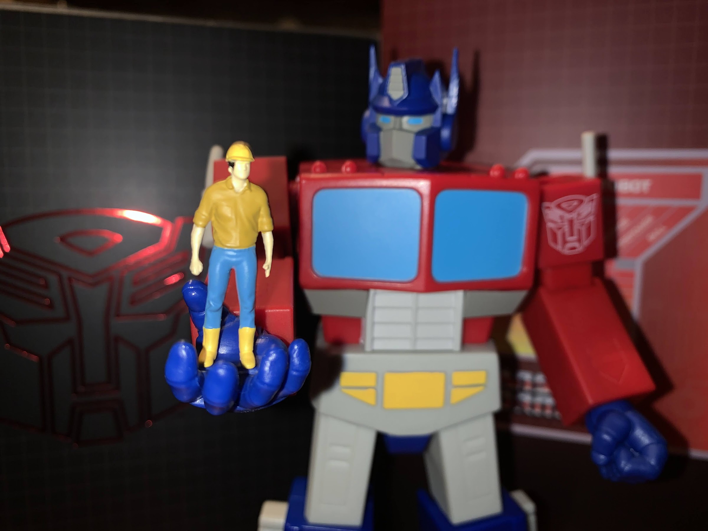
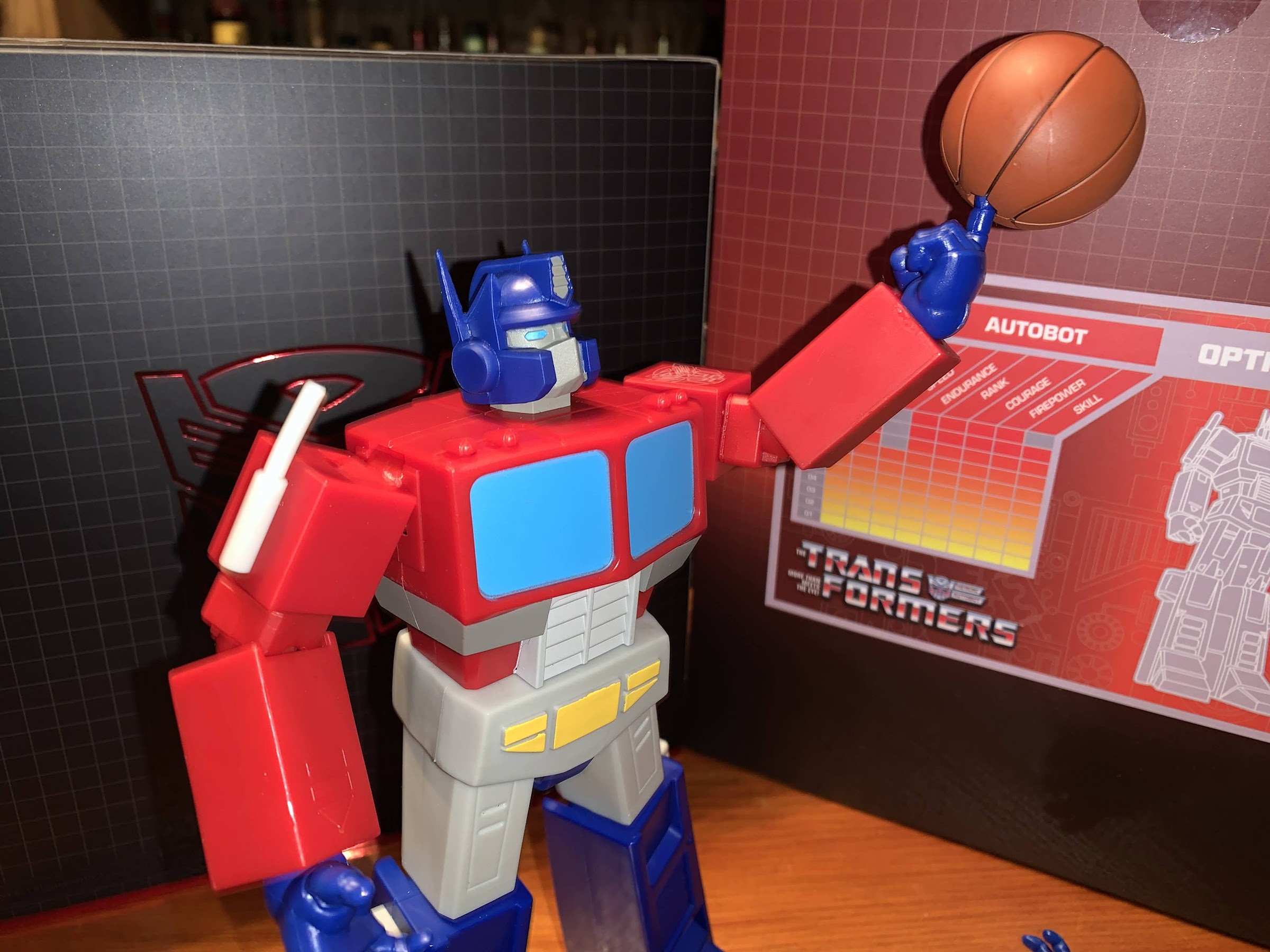
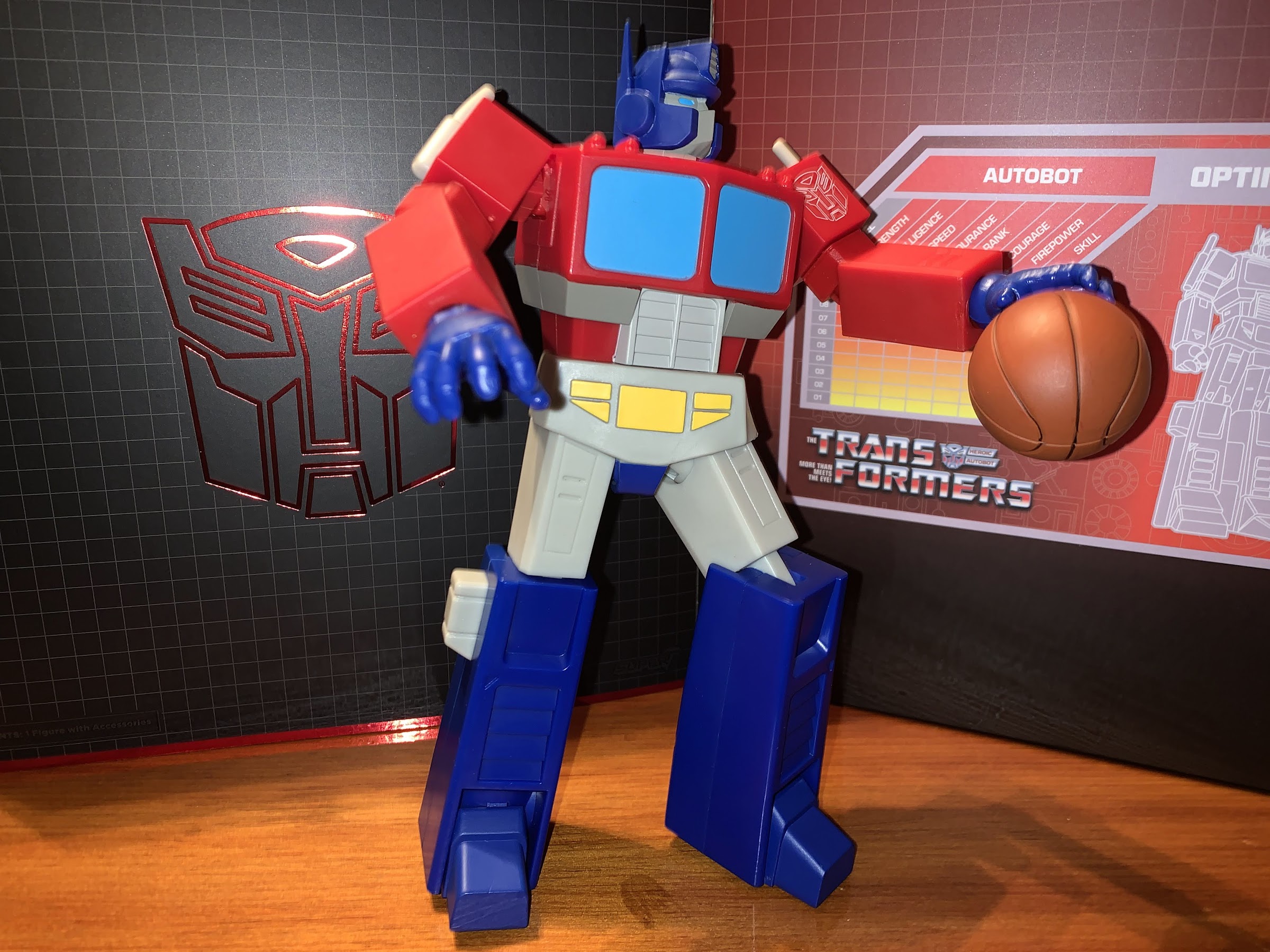
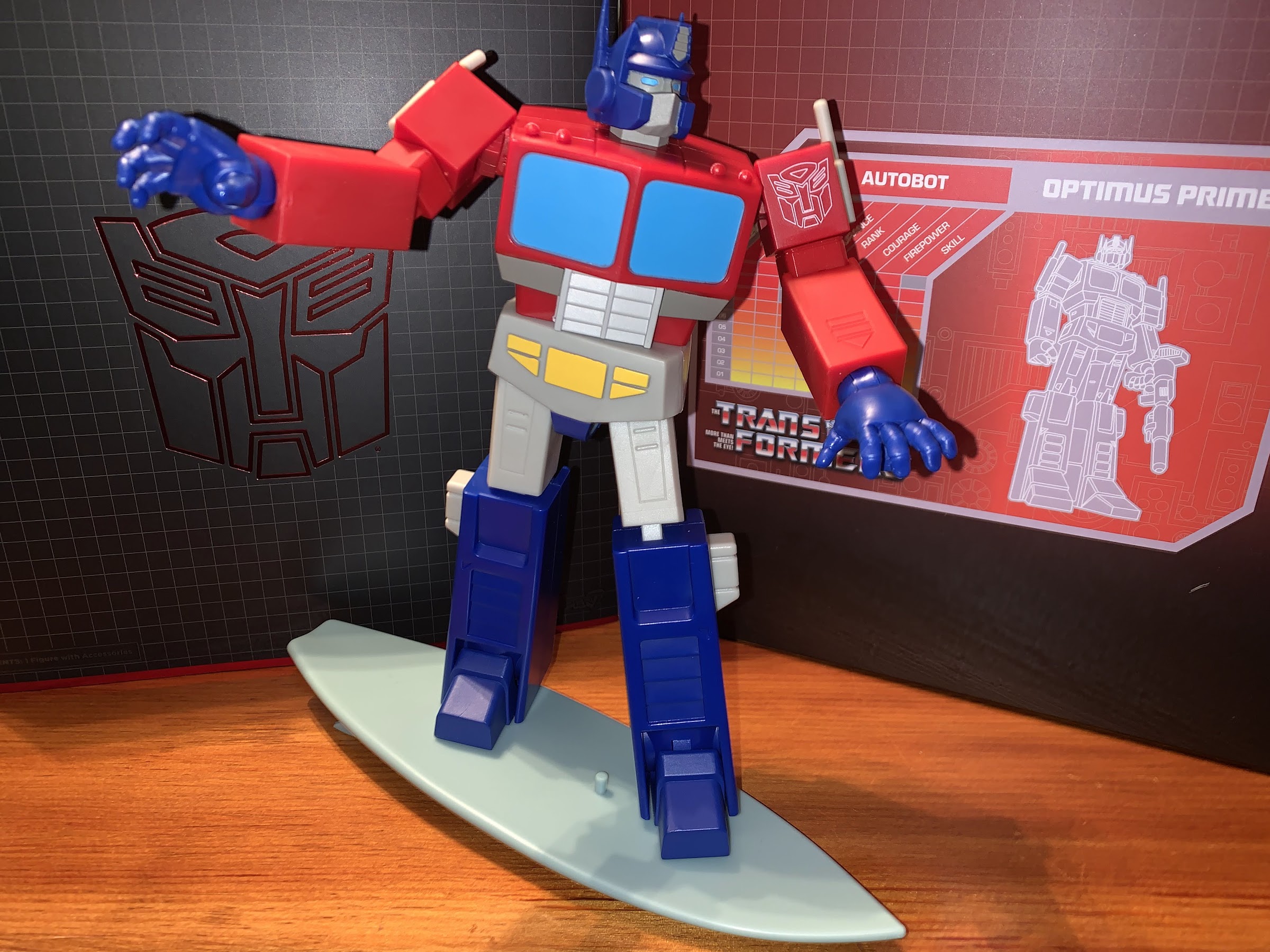
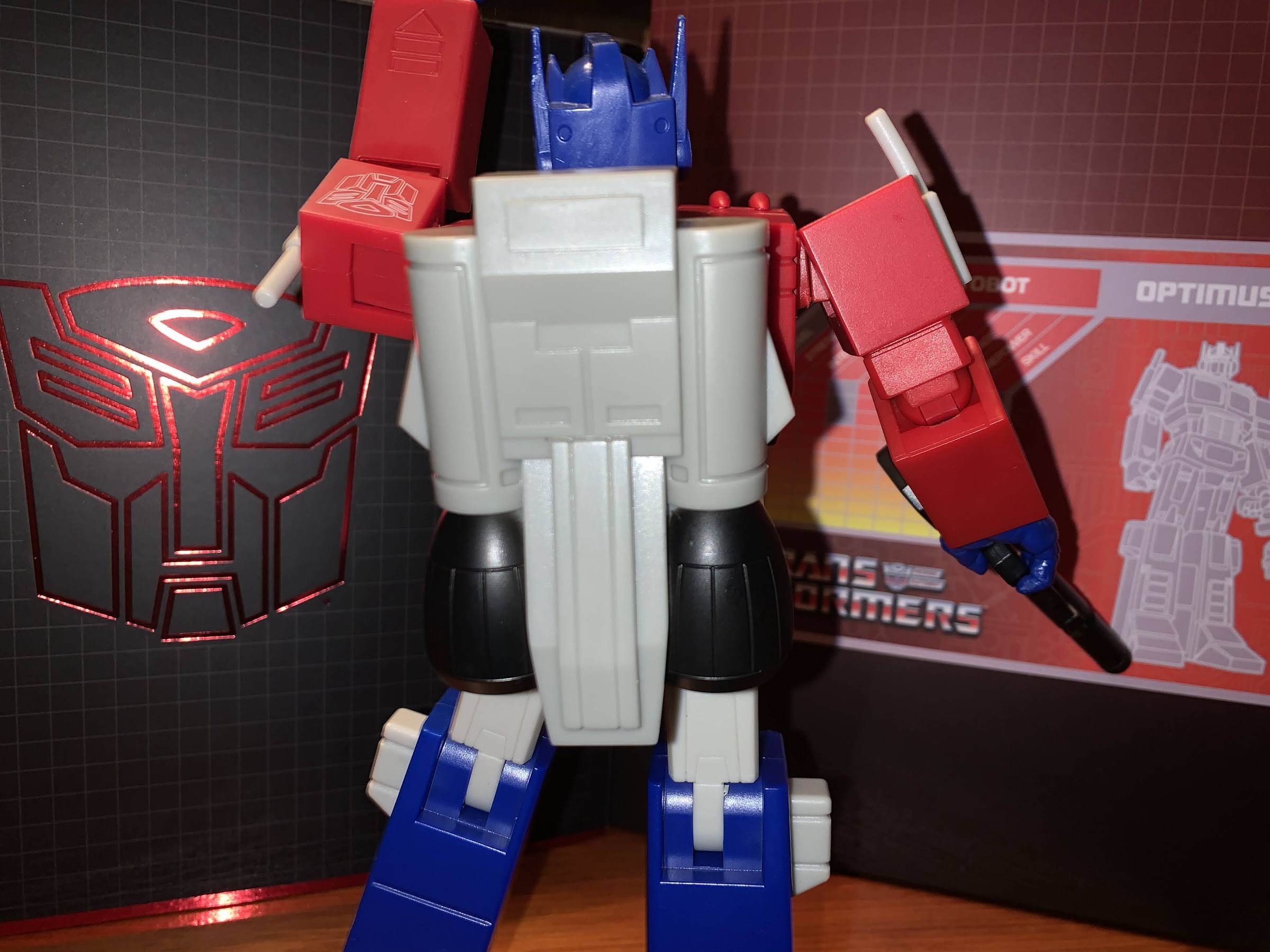
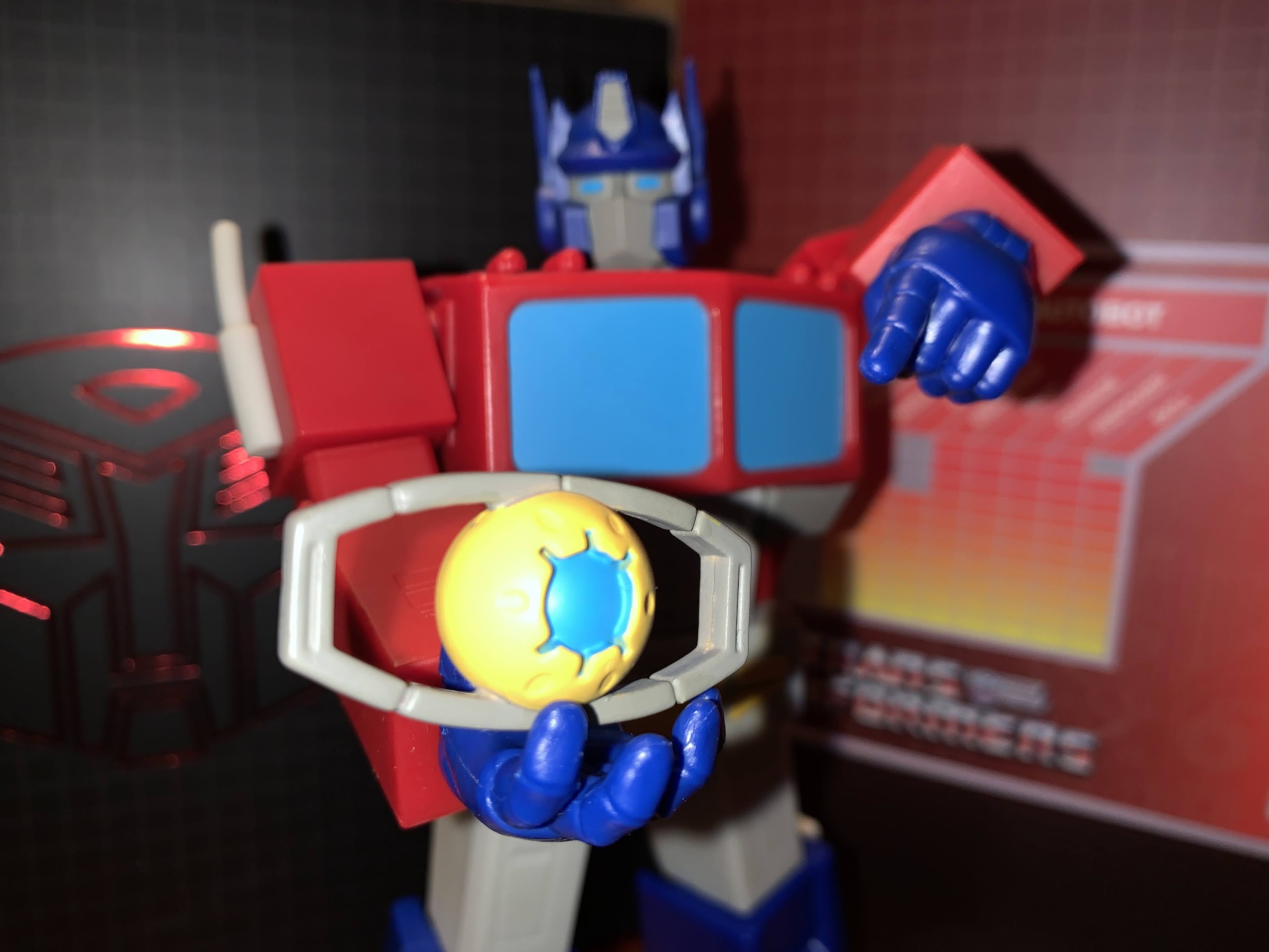
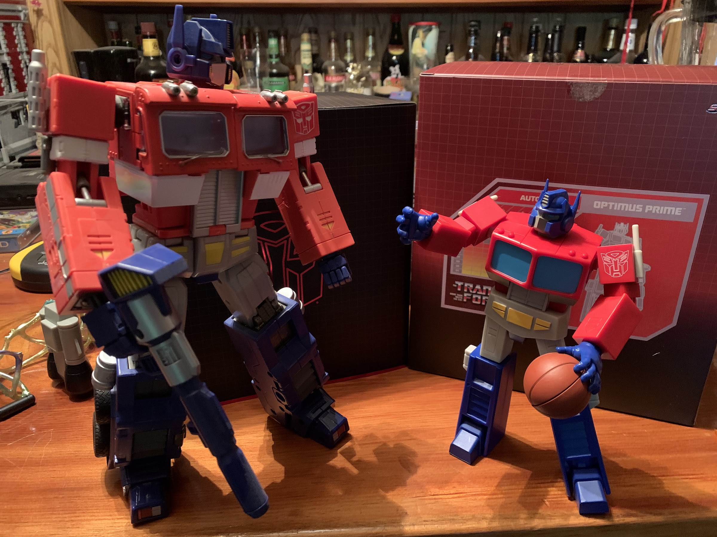
For the peg hand, there’s a basketball. The lines on it are sculpted in, but the black paint in those lines isn’t well done. I’ve seen images of people with pretty nice looking basketballs so mine might be worse than most (the second Prime I bought looks to have a better basketball). The ball fits nicely into the peg, and it’s this sort of goofy accessory that people may find charming about the figure. It would be nice if the peg hole was smaller though so it could better fit on the end of the pointing finger hand. It’s do-able, but the ball sits so low that it doesn’t convincingly create the illusion that Optimus is spinning the ball on his finger. There’s also the Matrix of Leadership thing that would normally go in Optimus Prime’s chest, but without gripping hands he can’t really hold it so it feels rather perfunctory since he doesn’t have a chest cavity to place it in. There’s a little, painted, Spike Witwicky that’s mostly in scale with Optimus which is kind of neat. There’s a big surfboard for Optimus as well which is pulled from an episode of the show. It’s rather plain looking as it’s just a gray-blue shade of plastic and it could really use a stand of some kind. There are peg holes on it and it’s pretty easy to get Optimus onto the thing, but I don’t know if I’ll ever use it. Lastly, we have a jetpack which is just a big old hunk of plastic that snaps into the rear of the figure. I like that Super7 was able to make it removable without a peg hole, but it’s rather boring looking. It’s at least really light so it doesn’t throw off the figure’s balance, but again, I’m not sure if it’s something I’ll ever use.

“I bet you wish you could ball like me!”
“I bet you wish you could hold a gun like me.” “Aww, that hurt”

In many ways, this figure is largely what I expected. I knew the blocky design would present issues with the articulation, as it had with Voltron, and I expected Super7 to keep it simple. With the shoulders and even the ab crunch, Super7 actually surprised me in a good way. They also surprised me in a bad way with the very limited elbows and ankles. I do strongly believe that for a figure to be considered articulated in this day and age we need elbows that hit 90 degrees (or near enough) and ankle joints that provide for better stances on the shelf. The ankle is hugely important for a figure because that’s the joint closest to the surface. Bad ankles limit posing or cause figures to fall over. Optimus Prime doesn’t have the falling problem, but that’s because he pretty much has to keep things vanilla. Which is a real bummer because I was hoping to be able to pose this more dynamically than my Masterpiece Optimus which is really too heavy to attempt much out of fear of it falling over. And if the figure isn’t going to move great, it needs to make up for that with the paint and this figure doesn’t really try to do that. I don’t think the included accessories make up for that either.

Some of the figure’s shortcomings when it comes to articulation could be more easily overlooked with a paint job as exciting as what Voltron received.

I’m not a huge Transformers fan so it’s hard to say if my reaction is more forgiving than the average fan or more harsh. If you’ve been on the fence about this one then there’s a good reason for that. At least the solicitation images paint a fairly accurate portrait of what you’re getting. If you want a more toon accurate Optimus in a much bigger scale than the Hasbro RED series, then this might do it for you. If you were expecting a dynamic posing figure that looked like it stepped right out of the TV then I don’t think this figure is for you. A subpar action figure in 2022 is also not without value. There is certainly a “fun” aspect to this figure just in the size and the some of the silly accessories, mostly the basketball. On a subjective level, I can be okay with this thing and not regret my purchasing decision. Objectively though, this is a real tough ask at $55 and it’s not something I can give a blanket recommendation for. If you know what you’re in for and like what you see, you may feel differently.

He’s here. He’s flawed, but you can probably still have some fun with him.

Chip ‘n Dale: Rescue Rangers (2022)

The Rescue Rangers are back, but maybe not as expected.

Nostalgia is an easy thing to market and sell, so when a piece of media comes around that’s really going hard after the nostalgia market I feel like it’s my duty to weigh-in. And when it comes to 90’s nostalgia, I am as qualified as anybody to talk about it and such is the case with the new Disney+ movie Chip ‘n Dale: Rescue Rangers.

If you’re reading this, I can probably go ahead and assume that you’re familiar with the television show of the same name which premiered in the late 80s and ran into the 90s. Just in case though, Chip ‘n Dale Rescue Rangers was one of the inaugural Disney Afternoon cartoons and it starred the characters Chip and Dale from Disney’s classic collection of shorts and paired them up with some newcomers in Gadget, Monterey Jack, and Zipper. As the theme song informed us, they basically solve the crimes and help those who are not being helped by the usual law enforcement operations out there. It didn’t really make much sense for the characters of Chip and Dale to star in such a program, but the same is easily said of the classic characters utilized in most Disney Afternoon shows. It was just a way for Disney to leverage its own intellectual property and sell shows that at least had some familiar faces in them. And it seemed to work rather well. While I will say the show Rescue Rangers doesn’t really hold-up when viewed as an adult in 2022, it’s at least quite gorgeous for a TV show and no one would question the production values. Plus that theme song is still a banger.

In this universe, Rescue Rangers was an actual show like it is in “the real world” and all of the characters were played by living, toon, actors.

It was announced some time ago that Disney wanted to bring the show to the big screen as a live-action/animation hybrid which is all the rage these days. It turned out, Disney was actually aiming a little smaller as the film was ticketed for its streaming platform Disney+ pretty early in the reveal. Unlike a lot of recent films, I do not believe this was kicked to the streaming service because of COVID. The film was written by the team of Dan McGregor and Doug Mand, two guys mostly known for their work in television. With Akiva Schaffer as director and Andy Samberg onboard as the voice of Dale, the title basically started being referred to as The Lonely Island Rescue Rangers. The third member of The Lonely Island, Jorma Taccone, is also here doing some small voice roles too. Given their presence, I found myself quite curious how this movie would turn out. It was obviously going to be a comedy, but the initial trailer also revealed it was going to set its characters in a world inhabited by toons and real people like a certain famous 80s film about a rabbit. Inviting such a comparison is almost a death sentence because how is a film in 2022 with a streaming budget going to measure up to the classic Who Framed Roger Rabbit? It’s a fool’s game to try to match that film, Disney can only hope this one proves it’s worth existing.

Chip ‘n Dale: Rescue Rangers is neither a reboot nor a sequel to the television show. It actually views the characters from the show as actors who played those roles. Early in the film we’re shown how a young Dale (Juliet Donenfield) met a young Chip (Mason Blomberg) at school and instantly became friends. From there, they became a comedy act that was eventually given its own show making these versions of the famous chipmunks quite different from the characters in the theatrical shorts. Much of the movie is set in the present and centers on Dale (Andy Samberg) as he tries to recapture his glory days after a falling out with Chip when the Rescue Rangers show came to an end.

The setting established by this film is one in which humans live side-by-side with animated characters from various mediums (and owners beyond Disney) with seemingly little in the way of conflict between the two.

It’s when we catch-up with Dale and eventually Chip (John Mulaney) that we see how this world sort of works. This isn’t a lore-heavy film like Who Framed Roger Rabbit? Toons exist alongside humans and over the years toons have changed. Dale at some point got surgery to make himself look like a CG generated character, while his co-stars did not so they’re presented in a more traditional manner. Cartoon stars are basically all real and much of the film relies on that. The general plot is that Monterey Jack (Eric Bana) has gone missing and Chip and Dale fear he’s been caught in a bootlegging ring. For a toon in this world, that means he’s going to be modified surgically so that he only resembles his old self and shipped off to somewhere in Asia to star in bootleg films against his will, which sounds pretty horrifying. The rodents will work with a human police officer in Ellie (Kiki Lang) to try and find their friend before he’s presumably sent out on a boat which is expected to take roughly 48 hours making this the Chip ‘n Dale version of The Frist 48.

An older, less cute, Peter Pan is one of the film’s villains. Some feel his portrayal is in poor taste given the real world tragedy that was Bobby Driscoll who voiced Pan in the Disney film. I personally don’t think any malice was intended and feel the character works as an imagined future Peter Pan that aged out of a role not unlike many child actors.

The plot is surprisingly high stakes if you place any sort of value on the life of Monterey Jack, but despite that the film is squarely a comedy. Chip and Dale play-off of each other with Chip being the straight ‘munk and Dale the more carefree. It’s admittedly odd to hear the two voiced by actors who aren’t being pitched way up to do the squeaky voice. That is canonically revealed to be an act from the old show and just a funny voice they did. Their interplay is fine and mostly amusing, but things slow way down whenever the plot has to involve Ellie. There it becomes a poor man’s cop show where little of value takes place. Working against is the performance of Lang as Ellie because she comes off as wooden and distant. Working with actors who aren’t physically present is a skill, and maybe that’s the reason for it. The script also isn’t very interested in making her into much of a character so that’s not helping matters. Aside from the pair, the movie relies quite heavily on references to generate laughs. This means the film is a case of diminishing returns from the start as most viewers will likely be charmed by the cameos at first, but come the second hour the novelty has largely worn off. The film is definitely intended for an adult audience that grew up on the Disney Afternoon, so if you loved Rescue Rangers there’s a bit of payoff towards the film’s climax, but this film is largely a riff on that show which might rub some the wrong way.

This is the type of film that wants you to pause it frequently to try and catch all of the easter eggs in the background.

The entertainment value derived from the humor and references can only take the film so far. Unfortunately, what doesn’t add a whole lot are the visual effects. The CG characters, like Dale, look fine. Dale’s model is not on par with Disney or Pixar feature films, but I suppose he looks no better or worse than the chipmunks from the Alvin and the Chipmunks films. The 2D characters, on the other hand, mostly look pretty unimpressive. There’s no attempt at shading them to make them plausible as 3D beings, but they’re also clearly not hand-drawn. For some characters, like Gadget oddly enough, the model is too obvious and the character ends up looking like a cel-shaded model from a PlayStation 2 game. I got some real Sly Cooper vibes from Gadget and I’m not sure why it is that her model suffered the most. Maybe it’s the hair? Either way, the 2D characters just don’t impress, but we are talking about a film with a streaming budget so it’s not surprising to see. I am left to wonder if the film would be appreciably better with more money attached to it. The other aspect of the film’s production that might rub some the wrong way is the inconsistent casting choices. Tress MacNeille was allowed to reprise her role as Gadget, but few others were granted the same opportunity. Jim Cummings is in this film voicing some cameos, but for some reason was recast as Monterey Jack. Zipper was also recast to Dennis Haysbert basically for a gag, but I can’t say that bothered me too much since it fit with the choice for Chip and Dale. And I suppose there are folks out there who would have preferred them to have their chipmunk voices and I don’t know if I’m one of them. I definitely would have been fine with that approach, but I didn’t hate Mulaney and Samberg in the roles and I actually adjusted to them much easier than I expected.

The film has its moments when it comes to the brand of humor it’s going for, but mostly I found myself wishing it had a bigger budget so that it would look better than it does.

Chip ‘n Dale: Rescue Rangers is the sort of vapid, of the moment, streaming movie designed to be digested, meme’d for a weekend, and then mostly forgotten. It doesn’t really do anything unexpected and is mostly smart to keep the running time under 2 hours and to lean heavily into nostalgia-laden jokes and cameos. How much you’re amused by the cameos and references will influence how entertained by the film you are. I would even go so far as to say, for adult viewers, you need to be familiar with the era the original Chip ‘n Dale Rescue Rangers aired during to get much out of this. For kids, that’s probably not necessary if my own children are a reasonable barometer as they seemed to like the film quite a bit. As for me, the film was fine. It was no better or worse than I expected, though actually if I’m being fair it was better than I initially expected when I heard a Rescue Rangers movie was in development. I definitely do not want or need a sequel or reboot following this, nor do I really want to see other Disney Afternoon properties get the same treatment (unless it’s with a much bigger budget). If you go into it wanting a poor man’s Who Framed Roger Rabbit? that’s more interested in meme culture than celebrating classic era animation then you’ll likely not regret the hour and a half spent. If you’re expecting something more sincere or on the same technical level as Who Framed Roger Rabbit? then prepare to be disappointed.


Masters of the Universe: Revelation (Part 2)

So I’m 6 months late – sue me!

Well, I sat on this one for awhile. Last summer saw the return of the Masters of the Universe to television in the form of Revelation. In somewhat typical Netflix fashion, the show arrived in “parts” rather than seasons though unlike many Netflix shows they’re at least not trying to trick us by calling either part a season. The first five episodes were not without some controversy and fans had to wait until the fall to find out what Kevin Smith had planned for the likes of He-Man, Teela, and Skeletor. Not personally being a massive fan of the franchise meant that I wasn’t waiting with bated breath for the second part to arrive despite mostly enjoying the first five episodes. I got to it though, eventually, and since I reviewed the first five episodes I felt I should probably do the same for the last five.

Part One of this inaugural season saw Skeletor (Mark Hamill) triumphant over He-Man (Chris Wood) for basically the first time and magic was removed from Eternia. After a period of time, the former Man-at-Arms for Eternia, Teela (Sarah Michelle Gellar), set out with a rag-tag gang of misfits to return magic to the world. And they basically succeed, but in doing so bring back Skeletor in the form of Skele-God as he now wields the power of Grayskull. And despite Teela and the sorceress Evil-Lyn (Lena Headey) seeming to bond throughout the events of the episodes, she quickly turns her back on the gang and rejoins her man, Skeletor. As for He-Man, he spent most of the five-parter dead only to abandon a Heaven of sorts to return to life only to get stabbed by the newly powered-up Skeletor.

Skeletor found himself in the unfamiliar role of victor at the end of Part One, is that a role he’s suited for? Probably not.

It was a downer of an ending, but knowing that a second batch of episodes was on the way certainly left room for optimism. Revelation Part Two is largely a contrast to Part One. It focuses the early bits on Prince Adam (spoiler, he didn’t die!) as his identity as He-Man has to be reconciled with those who never knew, while a lot of attention is put on the pairing of Evil-Lyn and Skeletor. In fact, I would say Evil-Lyn gets the most character development out of all the characters in the show. Her and Skeletor are presented very much like Joker and Harley Quinn (hardly a surprise with Kevin Smith at the helm) with the dominant personality of the pair being abusive and taking the submissive individual for granted. Skeletor’s absence for much of Part One means that Evil-Lyn has experienced life without her man and perhaps it is that which gives her the confidence to strike back. While audiences are probably rooting for her to knock Skeletor down and take up arms against him alongside the likes of He-Man, she actually doubles-down on the villainess aspect (she has the word “evil” in her name, after all) of her personality to pursue ultimate power. It’s a bit messy as the show wants to make her more sympathetic, but rather than make the audience frustrated with her out of a longing to see her reform, she mostly just stumbles around until we grow tired of her.

If Part One was the Teela show, then Part Two definitely feels like the Evil-Lyn show.

Pushed aside in all of this is Teela. She was the de-facto main character of the first chunk of episodes, but mostly hangs around on the sidelines for much of the second part only to resurface for a climactic battle in the end. Or it would be climactic if the show knew what to do with her during the other four episodes. She basically just plays audience surrogate as she learns secrets about her past and the nature of magic none of which is especially interesting. A lot of it feels like a shortcut to undo the audience’s perception of the magic in this world and basically ex machina some stuff for the end. It’s clumsy, and what should be a triumphant final battle ends up feeling unearned which is a shame because the first five episodes handled the character rather well.

Any project of Kevin Smith’s is going to feature some comedic moments.

What the show does still do well is humor. It’s pretty important than even a mature take on Masters of the Universe be allowed to have some fun because a lot of it is absurd. The show gets quite a bit out of Skeletor who is often amusing, and sometimes menacing. Mark Hamill’s performance continues to be a bright spot and if I return for another batch of episodes it will largely be due to his presence. There’s also some good moments with Cringer and some of the villains, some of which I’d rather not get into for fear of spoilers, but if the trailers have convinced you this is some grim story then worry not, or be disappointed if that’s what you wanted.

Regardless of what you think of the plot, know that you are getting something that’s pretty damn fun to look at.

Animation is provided by Powerhouse Animation Studios while the soundtrack was done by Bear McCreary. The production values are the most consistent thing about this show whether we’re talking the look, sound, or voice acting performance – it’s all well done. This second batch of episodes provides the chance for it to show off a bit more and the show mostly rises to the occasion. There’s a massive battle taking place at one point with a lot of characters onscreen which is rather impressive. The only drawback is the backgrounds in that space are rather sparse, but some of that goes back to what Filmation presented. I suppose the show could have elected to do more, but Filmation gave them an “out” and I don’t blame them for taking it.

Don’t worry, this guy still gets to do plenty of hero shit.

Masters of the Universe: Revelation mostly achieves what it set out to do. It takes a bunch of characters from a bad, old, cartoon and gives them a new coat of paint for the kids of the 80s who are the middle-aged adults of today. And it does more than just make the show look better, it finds direction, motivation, and just more depth for the characters even if most still retain their awful, on-the-nose, names. As for both parts of the first season, I definitely found more to enjoy with the first part. The character development was better and the moments looking for an emotional pay-off largely landed. Part Two is more action-focused, which isn’t always a bad thing, but it’s moments of character development and exposition fall flat more often than land. I like some of what the show does with the Evil-Lyn character, but am left feeling like there was more to do there that the show just didn’t find. There’s some fan-servicey bits in here that’s fun for what it is, and for those who wanted more of that in Part One, they may find this one more enjoyable. It’s mostly fine, a decent binge that doesn’t require more than that. When it was over though I was more than ready for it and I probably don’t need to see anymore out of this series.


Warcraft III: Reign of Chaos

It’s hard to think of a game developer that has seen its image in the industry falter as much as Blizzard has over the past 20 years. Blizzard was once the developer known for quality. The games would be announced with no release date, they’re done when they’re done, and once delivered they were met with almost universal praise. A buyout and a series of accusations about the company’s work environment dominate the news around the company now, but even before some of those allegations came to light, the company’s reputation regarding its actual software had already taken a hit. There was the muddled launch of the much-anticipated StarCraft II, poorly engineered remasters, and news of a mobile Diablo that caused gamers to question just what the company’s direction is these days.

That was certainly not the case twenty years ago. The year 2002 was a big one for Blizzard. The company had established itself as perhaps the premier developer of real-time strategy games thanks to Warcraft, Warcraft II, and StarCraft. The company had also successfully branched out to dungeon crawlers with Diablo and was even eyeing the role-playing genre and stealth gameplay on home consoles, despite Blizzard largely being known as a PC developer. And arriving during this height of popularity was Warcraft III.

Where it all began.

Warcraft was the game largely responsible for Blizzard’s success. It was the game that proved that Blizzard could make its own products in-house and make a living off of it. Heavily inspired by Westwood’s Dune II, Warcraft arrived in 1994 and was at the forefront of the RTS boom in the 90’s and the company found itself in a friendly rivalry with Westwood and its Command & Conquer series. A sequel arrived the following year and was even bigger, in more ways than one, than the original. Warcraft II was supported with an expansion by Blizzard as well as third party additions and was popular both for its story-driven campaign and for its player vs player appeal.

Following Warcraft II was StarCraft in 1998. StarCraft, which took the basic gameplay of Warcraft and turned into a space opera, was seen as bigger and better than its predecessor by many. It also had the advantage of arriving after the launch of Blizzard’s own Battle.Net service which made it easy for players to find opponents over the internet, a fairly new concept for RTS gameplay. Warcraft II had been re-released with Battle.Net support, but the shine had worn off by then. Following StarCraft’s success, it was no longer a foregone conclusion that a Warcraft III was on the way. Blizzard had announced a sequel in the form of a point-and-click game called Warcraft Adventures. It was to tell the story of Thrall, a young orc seeking to unify his people and restore the orcs to their former glory following their defeat in Warcraft II. It wasn’t to be as the game was cancelled before launch. Warcraft III was officially announced in 1999, but it wasn’t going to be a real-time strategy game. Instead, Blizzard envisioned it as closer to a true RPG where players would control a hero character and a small, supporting, cast. Either due to problems with the gameplay or fan backlash, that version of Warcraft III would be scrapped, but the engine and assets created for it could be applied to what would eventually be called Warcraft III: Reign of Chaos, which arrived on PC in July 2002.

The only downside to Warcraft III having four playable factions is we lost the head-to-head packaging of the first two games.

In my younger days, I didn’t play a lot of PC games, but I did play Warcraft and Warcraft II was one of my personal favorites. While I thought StarCraft was fine, it was the medieval fantasy setting of Warcraft that appealed to me more and I followed the development of Warcraft III as best I could. I was certainly wary when it looked like it was going to be a radical departure for the series initially, but when it finally arrived that summer I was more than a little impressed. The game was released in four versions with each of the game’s factions getting its own box art. I went with the undead, and eventually the orc cover would become the standard one. I feel the need to take a moment and reminisce on PC game packaging in the 90s and early 2000s. The games seemed to always come in oversized boxes with lavish instruction manuals. It was something I loved about Warcraft II. While Warcraft III arrived in a much smaller box (7.5″ x 5.125″ x 1.25″ approximately) which was fast becoming the standard, it still had a robust manual. This thing is basically a manga-sized trade paperback. Not only does it detail practical descriptions of every unit in the game, as well as game modes, it also has a second set of profiles for each unit from a lore perspective. There’s a detailed write-up on the history and events that lead to the present game from the perspective of each of the game’s four main factions which introduces many of the game’s characters. While one didn’t have to read it in order to enjoy the game’s story, doing so meant having a greater understanding of a character like Illidan Stormrage when he’s introduced beyond what’s shown.

Warcraft III seemed to be influenced greatly by not just the game’s in the series that came before it, but StarCraft as well. When StarCraft arrived, Blizzard upped the playable factions from two to three, so naturally Warcraft III makes it an even four. Returning are the Orcs and Humans and joining them is the Undead Scourge and the Night Elves. The game refers to them as playable “races,” though the term faction seems more appropriate because they’re made up of multiple species. The Humans include elves, dwarves, and gnomes while the Orcs have trolls and the minotaur-like Tauren amongst their ranks. There are actually no depictions of race as we would call it amongst the humans as all are white.

I went with the Undead packaging for my copy 20 years ago. Check out the well-worn book, and the handy cardstock flow chart that was included. You have to pay a hefty premium to get packaging anywhere close to this these days, but back then it was the norm.

In what was a first for Blizzard, Warcraft III is presented entirely with three-dimensional character models and scenery. The camera is positioned overhead at a slight angle which can be modified in-game to zoom in or out as the player prefers. Almost all cutscenes are depicted utilizing the game’s own engine, which resulted in a mixed presentation even back in 2002. The models just weren’t created with the intention of showing them up close, though some (such as Furion who was created solely for the campaign mode) are better than others. All of the dialogue is fully voiced and the acting is more than capable. The world of Warcraft III is presented with lush, Earthy, colors when appropriate, and murky and dark ones when needed. Textures are quite good, and the game does have a touch of style to it which gives some characters (like the lowly Peasant) a cartoony quality to their appearance and animation. It’s in contrast to the more Dungeons & Dragons art style of the past games and it gives Warcraft a style all its own.

The game includes multiple modes of play including one-off custom games, a level editor, and competitive play, but the meat and potatoes is found in the game’s campaign mode. It’s here that the game’s story is presented and it does so by having the player engage with each of the game’s four factions starting with the Humans, followed by the Undead, Orcs, and concluding with the Night Elves. The story for each will tie-in with the rest, but each faction also has its own tale to tell and lessons to learn. The Humans begin the game in a state of hubris oblivious to the rising threat posed by a plague sweeping the land and they all but laugh at a mystical prophet foretelling of doom (granted, most don’t take doom-sayers too seriously, though most also can’t morph into a raven). The Undead are basically the bad guys as the demonic Burning Legion has turned its attention to the scourge following its repeated failures via the Orcs. And speaking of the Orcs, they found themselves defeated and enslaved following the events of Warcraft II and the young War Chief Thrall (remember him?) hopes to restore honor to the horde. The Night Elves are the most mysterious of the new characters. They were the ancient victors over the Burning Legion once before and have largely lived an immortal life of peace since, but when war between the other three arrives on their shores they’re forced to intervene and overcome their own prejudices towards outlanders.

Some of the mechanics have changed, but the game is largely still about creating a base, training an army, and kicking some butt.

The campaign is quite dense and gives the player a taste of each of the playable factions. Of the four, the Humans are the most “vanilla” in that they’re largely as before. Their alliance with the elves has mostly ended which means swapping out the old Elven Archer unit for a Dwarven Rifleman, but the change is basically cosmetic. They really only gained the ability to convert the Peasants to a militia when needed. They’re still fundamentally weak, but I’ll admit that the militia function has saved my ass on more than one occasion. Otherwise, the basic mechanics of Warcraft remain unchanged. The player has a town hall where their base begins and the worker units are tasked with harvesting resources and building additional buildings which are then utilized to train an army. Warcraft III dropped the naval battles of its predecessor so the only resources to manage are gold, lumber, and food, which is supplied via the buildable farms up to a maximum of 90. The Peasants still harvest gold via a mine and chop down lumber for wood. When building a new building, the Peasant charged with the task is tied down to it until done, but others can join-in and help which speeds up the process.

Blizzard included a handful of CGi rendered cut scenes to advance the story. In 2002 these looked incredible, but show their age in 2022.

For their part, the Orcs received only minimal changes. The ability to have multiple workers speed-up production on a building is now exclusive to the Humans, so they can no longer do that. Instead, their farms are now burrows which the Peons, the workers of the Orcs, can now inhabit turning them into defensive structures as they toss spears from within. Their buildings can also be upgraded to spiked buildings which damage other melee units when struck and their watchtowers can no longer be upgraded to canon towers. On the unit front, the Orcs are no longer allied with goblins and ogres, but still retain a few troll units in the ranged attacking Headhunter and the Witch Doctor, who provides a way for the Orcs to heal their units, another thing previously available only to the Humans. They also no longer hold dominion over dragons, instead trading down for Wyverns. They’re fundamentally still a powerful faction as, one on one, the Orc Grunt is the most powerful base melee unit and the Tauren pack the most punch out of all ground-based melee fighters.

The Undead borrow heavily from Blizzard’s other RTS game, StarCraft, as they feel like a combination of that game’s Protoss and Zerg. All Undead buildings must be constructed on diseased land known as blight, except for their main town hall. Gold is harvested by haunting a gold mine where Acolytes simply chant the gold into their coffers via some magical means. The Acolytes are unique in that the only resource they can harvest is gold as lumber is chopped down by the Ghouls, which double as the Undead’s base melee unit. The Ghouls are weak on their own, but fast, and a swarm of them can wreak havoc on opponents. They also can feast on corpses to regain health, and the Undead’s siege weapon, the Meat Wagon, can even store unused corpses for later consumption or reanimation. Buildings for the Undead are also summoned into existence and the Undead’s “farm,” the Ziggurat, can be upgraded into a defensive structure. As for the units, the Undead is where necromancy came to roost as the Necromancer can reanimate corpses as skeletons while the Banshee can possess other units so if you want a mighty Tauren on your side you need only send a Banshee at one.

For the most part though, the game relies on its gameplay engine for cut scenes to advance the story. It’s an okay approach and some character models translate better than others.

The other new faction, the Night Elves, are perhaps the game’s most unique. From a durability perspective, they’re probably the weakest of the four as their strength lies in ranged attacking and their females can even turn invisible at night. They also share a power over nature which takes the form of their buildings being living trees. When a gold mine runs out, the Night Elves need only uproot their Tree of Life and send it onto the next mine. There it will entangle it allowing the Wisps, the workers of the Night Elves, to inhabit and harvest gold sending it back through the roots of the tree. Each Wisp can also harvest lumber without damaging a tree simply by attaching itself to one. The trade-off here is the Wisp can’t attack, and in order to build one of the living trees a Wisp must use itself as a seed thus turning itself into the building the player desires. The base unit for the Night Elves is the Archer requiring a more tactical approach. It’s champion melee unit is the Druid of the Claw, which doubles as a spell-caster. In Night Elf form, the Druid of the Claw can cast regeneration and roar, which is similar to the Orc’s bloodlust, but it’s not a particularly powerful fighter. In order to realize that potential, the druid must transform into a bear. It gains a potent melee attack in doing so, but also loses its ability to cast spells. This element of trade-off is also seen in the Night Elves’ air unit, the Hippogryph. By itself, a Hippogryph can only attack other airborne units, but if it picks up an Archer it gains the ability to attack ground-based units as well. The trade-off is they can’t be separated once combined.

The campaign mode presents its story quite well, but from a gameplay perspective it almost feels like an introduction. By virtue of being up first, the higher points of the tech tree for the Humans is barely scratched. And even though the Night Elves come last, the campaign doesn’t even introduce their most powerful air unit, the Chimaera, reserving that for custom games only. The campaign also tends to grant a lot of access to one Hero unit per faction, while relegating others to a much smaller role, or in the case of the Undead Dreadlord, no player control at all.

Hero units are super-powered units with special abilities, many of which allow heroes to summon other units like the Archmage and its Water Elemental. NPCs, like the ogres here, are a valuable source of experience which is used to power-up a hero.

And speaking of Hero Units, that’s the biggest change of all! The Hero is basically a holdover from Warcraft III’s original vision. The Hero is a powerful and durable unit capable of earning experience as it battles through enemies which allow it to level up. Some past units have essentially been turned into heroes, such as the Paladin and Death Knight, and even their abilities are familiar to seasoned players. Heroes can also carry up to six items which can apply buffs to the hero or take the form of consumables. Most of these items are found by defeating powerful non-player characters which now dot most maps. Some of these NPCs are also familiar, like the Ogres and Troll Berserkers, and their presence is often needed to give players easy access to experience points in one-off games. During the campaigns, the story is told via these heroes and they’ll have level caps for each scenario and some of their abilities won’t be available until certain story conditions are met. In a non-campaign setting, players are free to choose from any of each faction’s three available heroes and even add a second and third, if they wish, though there is often a finite amount of experience available making a multi-hero approach sometimes counterproductive. Heroes are also effectively immortal as if they fall in battle the player can resurrect them, for a price, at a building specific to hero creation.

It’s the addition of the Hero that does give Warcraft III it’s unique flavor. Rather than depend on amassing a giant army composed of heavy-hitters, the game would prefer the player surround their hero with a small band of attackers and support units. Numerous quality of life improvements were made as well to the game over its predecessor. When selecting a group now, the player can tab between the units within that grouping providing easy access to spells and abilities. Some are also able to be set to auto-cast, so if you want your Necromancers continually raising skeletons it can be done. Mostly though, there’s a lot of variety in the play styles afforded by the player options. Previously, it felt like Blizzard tried to keep the two competing sides essentially even. Aside from an ability here and there, there wasn’t much distinguishing the Orcs and Humans before. Now, there’s quite a bit. The Orcs and Humans still feel like the most straight-forward. You can basically just grab a bunch of either group’s units and send them at the opponent with decent results. For Night Elves, that often leads to death as more micro-managing is involved. Especially early in the campaign when only Archers are available, it’s important to make sure all units are targeting the same enemy. Some micro-managing is beneficial for the Undead as well, but given that they’re designed to be able to cheaply overwhelm opponents with numbers, it’s not as crucial. Their mid-tier attacker, the spider-like Crypt Fiend, even can auto-cast web which brings down air units which makes it really easy to just send them at anyone. The Orcs have a similar unit in the Raider which can cast a net on flying units, but can’t be set to auto-cast. If you’re not paying attention, one Gryphon or Gargoyle can wipe out a group of Grunts and Raiders.

Warcraft III certainly shows its age in places, but on the whole, I still think it’s quite pleasant to look at.

Twenty years after its release, Warcraft III remains an engaging play even today, albeit a harder to access one. Blizzard supported the original release for years through Battle.Net, but shut down those servers when a remastered version of the game was released in 2020. It was not well-received as many features that were promised ended up getting cut and the performance was suspect. The original game was released in the era of Windows XP, which is how I recently replayed through the entire campaign. I happen to have an old laptop with XP that still works and I’m glad I hung onto it. It does mean I can’t play through Battle.Net any longer, which is something I did a lot in the summer of ’02. I never got good enough to consider myself great at it, but I won more than I lost. It could be a challenge to find a good game though as the Hero unit, with its might available right from the start, seemed to popularize the “Rush” technique even more in comparison to StarCraft. Rushing meant selling out to build as many low level units as possible to pair with a hero and win quickly, which was never the way I liked to play. It was far more fun to find a group that allowed players to mix and match strengths and weaknesses across factions or just in Hero usage, but the best way to do that was just to find a group of friends rather than toss the dice with randos online.

If you happen to disagree with my assessment of the game’s visuals, there is Warcraft III: Reforged which is essentially the same game with a new coat of paint. The reception has been mixed, but I haven’t played it so I can only recommend that anyone interested do their research first.

Sadly, Warcraft III marked the end for the franchise as an RTS experience. Announced before Warcraft III was released was World of Warcraft which took the franchise to the world of RPGs as Blizzard had intended, only now via the Massively Multiplier Online variety. WoW was, and still is, a huge success for Blizzard and the RTS version of Warcraft has seemingly become a victim of WoW‘s success. Blizzard now appears to view the brand as an MMO with StarCraft as the RTS brand and Diablo the dungeon-crawler. That said, it’s been ten years since the release of StarCraft II so maybe the RTS is just no longer a major part of what Blizzard wants to do. Now under the ownership of Microsoft, maybe there will be a push from Blizzard’s new boss to go back to its roots. Or maybe not, who can say? For me, Warcraft III: Reign of Chaos is the pinnacle for both the franchise and for Blizzard. None of the developer’s games have appealed to me like Warcraft III has since. It’s incredible to think that 20 years has nearly gone by since the game’s original release and just how much has changed since then. It’s also incredible to see how well this game holds up. Maybe we never got a Warcraft IV because this one simply can’t be topped? Even if that were true, it would still please me to see someone try. I have to believe even a subpar Warcraft IV would be worth playing, but for now, I’m glad I hung onto my copy of Warcraft III and a PC that can still run it.


S.H.Figuarts Dragon Ball Super Event Exclusive Color Edition Super Saiyan God Super Saiyan Son Goku Kaio-Ken

He’s ready to rumble.

My isn’t that title a mouthful? This version of the classic character Goku comes to you from Bandai via New York Comic Con. If I were to simplify that title, I’d call it shiny Super Saiyan Blue Kaio-Ken Goku, which is still pretty wordy. I guess blame Dragon Ball creator Akira Toriyama for the obsession of stacking different power-ups in what I feel is an intentional bit of word play that he likely finds amusing. And I do too! At any rate, this is the last of the convention exclusives I ordered in 2021. All of the other ones, including other Dragon Ball related figures in Nappa, Goku, and Beerus, came from the world famous San Diego Comic Con. Well, that con didn’t actually happen in 2021 as it was virtual due to COVID once again. One of the few big cons to actually take place ended up being New York Comic Con, and while that one tends to be smaller than San Diego, some companies still like to issue event exclusives for it and that’s where this figure comes from. Bandai, in partnership with Bluefin Brands, made this version of Goku available at the event, but also made it available online for folks like me who weren’t going to journey to New York just to get a Goku. It meant a longer wait, but all things considered, this is one of the shorter waits I’ve have to endure in recent memory.

This box feels gigantic relative to other figures in the line, and with good reason.

This version of Goku hails from Dragon Ball Super and one of its first, major, arcs. The first two arcs of the show were adaptations of Dragon Ball Z movies, so this era is where Super really felt like its own thing to me. And it was just some tournament that was a bit of a friendly organized by two gods who happen to be brothers and share a rivalry. It introduced some new characters, most notably Hit, and it was during a fight with Hit that Goku dusted off his old Kaio-Ken technique. You remember that one, right? Kaio-Ken was all the rage for about five minutes when Goku took on Vegeta, but it was basically dropped after that. Yeah, technically, Goku used it against Frieza later on, but it was basically as a means to dismiss the technique which would essentially be replaced with the Super Saiyan transformation. It made Kaio-Ken one of those things fans had fun speculating on, “What would using Kaio-Ken as a Super Saiyan do for Goku?!” but the show was done with it.

Pissed off Goku.

If you need a primer on the form, it’s basically a technique that temporarily heightens Goku’s speed and power as a multiplier. He did it multiples of 2 and 3 against Vegeta, but would go up to 10 later. In Super, Goku turns to it after his Super Saiyan Blue transformation as the ultimate showing of his power at that moment in the series, though it’s not referenced much after. It does look cool though as Kaio-Ken by itself has a red aura, and combine that with the Blue transformation and you get a blue-purple look. It certainly made sense to explore the mode in figure form, and that’s what Bandai and Tamashii Nations did. And this being an event exclusive, they added some shine as well.

I love that shade of blue used for the eyebrows, so much so that I’d like to see other versions of Super Saiyan Blue Goku (and Vegeta) just go with that for all of the hair.

This version of Goku is obviously similar to other versions of Goku in the SHF line. He stands at about 5.5″ to the top of his forehead and roughly 6.75″ to the top of the hair when at his tallest. He’s basically in-line with my Super Saiyan Blue Goku, but this is actually mostly a differently sculpt. I don’t have it, but if I had to guess, this figure shares most of its parts with the Ultra Instinct Sign Goku which depicted Goku from his battle with Jiren. His gi is rather tattered so it needed its own sculpt to capture that. The only pieces this figure can share with the other blue Goku is the head, neck, and arms, though even some of that needed modification. I don’t have either version of Ultra Instinct Goku so this figure has more of a “new” feeling to me than it would others. It was honestly something I hadn’t thought much about until I had the figure in-hand.

The paint is rather lively on this guy and you can see the almost glitter quality in the shirt here.

What’s going to sell this guy beyond the sculpt is the paint job. The sculpt is fairly nice and I like the rips in the pants and shirt. The finish on the paint is of a pearl quality. The navy shirt takes on a metallic purple as a result and it’s pretty cool to handle and see how the light plays on it. The hair is a semi-translucent plastic with a touch of purple air-brushing, by the looks of it, which gives it a nice effect. The flesh is more saturated than we’re used to seeing due to trying to emulate the Kaio-Ken red effect. Bandai did have to do a lot more color-matching than usual though because of all of the rips in the clothing. The results are a tad mixed. The exposed portion of the chest could stand to be a touch more saturated as I feel like some of the navy color is showing through. The left knee is colored plastic, but the upper and lower portions of the leg surrounding it are painted and it’s not a perfect match. It probably won’t bother most on a shelf, but in-hand it’s pretty noticeable especially when the knee is bent all the way. This finish is also very glossy and gives the figure almost an enamel finish. It also has a different feel than most figures in the line. The plastic feels thicker and since almost everything has this finish applied it has a slippery feeling. That’s not a criticism, just an observation. Aside from the color-matching issues, my only real criticism for the paint is that I wish there was something applied to the torn parts such as a darkening to the interior parts of his pants. I just think it would help that part “pop” a bit more.

I can’t really complain because we get the aura effect with this figure, but we’ll never have enough Kamehameha effects.

The sculpt for this guy is overall pretty good. I already mentioned how the torn pieces of the gi look nice, and we get the usual musculature for Goku that other figures have. This one changes things up with some battle damage in the form of scuffs sculpted into portions of the arms, legs, and chest. I’m torn on if I think Bandai should have added some black linework to those scuffs to bring them out more as they’re not going to show from the shelf. This figure is going for a glowing aura look, so perhaps it would not have made as much sense, though I feel like in those moments Goku’s battle damage becomes even more noticeable in the anime. I could be wrong, I haven’t watched any of these episodes in years. One thing that did surprise me a little is there’s more evidence of mold release on this figure than usual. That’s those rough portions of the figure where it was removed from the actual tools used to create it. There’s basically a full tab on the underside of my figure’s right shoulder that makes it look like it was from a model kit no one bothered to snip. This figure also has those sleeves that peg into the shoulder which I really don’t like. Almost every Goku has that so it’s nothing new, but I’ll continue to complain until they find a better solution. Another common complaint is Goku also could be beefier. From the front, he looks okay. I’d probably widen the chest a little, but it’s mostly a nitpick. From the side though he looks thin. His chest doesn’t push out at all. It’s odd and almost comical. It’s also more pronounced because he doesn’t have the vest to add a little bulk, but this is something all of the figures in this line could stand to improve on. Goku, especially a powered-up Goku, should be thick and buff.

My lingering piece of criticism for this line is that nearly every character could stand to have some added girth. Goku should have a more pronounced chest when viewing him from the side.

There was a lot of new for me to take-in with the sculpt and paint of this figure, but articulation? That’s pretty much standard. His head is on a tiny, double-ball peg with another ball in the base of the neck. Despite that, he can’t really look up, but can look down. His head feels a little loose, but it seems to be holding a pose all right. The shoulders are on the peg and hinge system with a butterfly joint. The butterfly is really limited, but they at least colored it properly so it’s not ugly, just not particularly functional. There’s a biceps swivel and double-jointed elbow which bends past 90 degrees. The hands are on the usual ball pegs. In the diaphragm, we have the ball-hinge system so you can pull up on the figure if need be. It doesn’t really do a lot though as the figure can’t really crunch forward no matter what you do with the hinge, but he can bend back a little. Mostly, this joint just gives you some swivel and a little tilt, but you have to be mindful of paint rub. At the waist, you can swivel and the belt and rags is a floating piece. At the hips, Goku can almost do a split, kick forward, and kick backwards because he doesn’t have sculpted buns. There’s a little twist there too, and then your usual double-jointed knees below. The knee on the right has a bit more range backwards because it’s a standard, clothed, joint while the exposed left knee has reduced range, but still goes beyond 90 degrees. The ankles are on ball pegs and have the usual range for Goku’s boot design. It goes forward a little, back a fair amount, decent ankle rocker, and a lousy toe hinge. All of the joints are fairly smooth and required no break-in period, so that is always appreciated.

I can see people being against translucent plastic for Super Saiyan hair, but I do think this figure draws attention to how bland the approach to the hair was for the standard release. Granted, the figure on the left retails for only 30 bucks.

The other unique aspect to this release comes with the accessories and packaging. The optional hands and expressions are fairly standard. We get a stern look, scream, smirk, and a teeth-gritting expression. All of the faces are well painted and I love the shade of blue used for the eyebrows. I wish that was the standard shade of blue for this form of Goku. For hands, we get a set of fists, martial arts pose hands, Kamehameha hands, and wide open “Solar Flare” hands. For a box, he comes in this oversized standard box with the usual event exclusive coloring. It’s oversized because this Goku comes with an aura effect! That’s certainly unusual, and also why this guy cost $60 instead of $50, but it’s worth it. I love effect pieces and for this particular form it’s needed. It’s the standard aura piece, of which I have a yellow version already, and it comes in three pieces: a rear blast and two side pieces. It’s cast in translucent plastic with red at the edge and blue on the inside. The plastic is soft and and partially hollow. The only thing I don’t like is the translucent nature of the plastic means more of the seems are visible, especially towards the bottom of the center piece. It’ll get the job done though, and I hope it doesn’t get that sticky residue my other aura piece has acquired over the years.

If you like what you see then this figure is a worthy addition to the Super collection. If you’re someone who never cared about this version of Goku then you’ll probably be content to skip it.

This version of Goku is another good selection by Bandai when it comes to event exclusives. Not everyone needs a version of Goku so specific to one look from the show that doesn’t show up much, and the paint application is something that will appeal to some more than others. I thought this figure looked great in the promotional shots, so when Bandai made it available online I said “Why not?” The actual figure in hand pretty much lives up to my expectations. It’s eye-catching and fun and I love adding another aura, even if this one is really specific to this version of Goku. My guess is that most people who bought this are happy with it. I don’t think it’s good enough to win anybody over who didn’t see a spot for this in their collection, but those who want it should be content. Since it was an event exclusive, it’s currently sold out at MSRP so only secondary options are available. This strikes me as the type of release that might be high right now, but could come down in time as it is a bit niche. If you missed out and are having second thoughts, just keep an eye out. Who knows? Maybe a good deal will come around sooner or later.


The Robot Spirits RX-79 (G) Gundam Ground Type Ver. A.N.I.M.E.

We are entering the world of Robot Spirits!

When it comes to Mobile Suit Gundam I am a casual fan, at best. Like a lot of people my age, it wasn’t really something that was on my radar until Cartoon Network started airing Gundam Wing in the late 90s, and once it did, I would pretty much watch whatever Gundam series Cartoon Network chose to air. It was around the same time that Bandai started bringing some of its Gundam model kits state-side. I had my opinions on the shows, but I always loved the look of the mobile suits, and in particular, the ones featured in Wing. I would pick up a few 1/144 scale and 1/100 scale kits over the years, but mostly dropped off in the early 2000s. I only had so much room for toys, and money, and the kits were pushed aside in favor of other things.

A standard box with a teeny, tiny, window.

When it comes to the actual anime series, I am most definitely a fan of The 08th MS Team. It’s my favorite of the Gundam shows I’ve engaged with, so when I saw that the main Gundam from that series was slated for release this year, I decided to give The Robot Spirits a shot. The Robot Spirits strikes me as the mecha version of the Tamashii Nations S.H.Figuarts line of action figures that I am most definitely familiar with. Just like how Bandai has Dragon Stars and SHF for its Dragon Ball figures, there’s basically a Target version of Gundam and Robot Spirits with the Robot Spirits being more high end, and thus, more expensive. I had never seen nor held or even sought out information on the line and when I saw this version go up for pre-order I decided to keep myself in the dark and just react to it when it finally shipped.

Let’s rock!

And obviously it has for I now have my figure in-hand after 6 or 8 months since I placed the pre-order. My first reaction upon getting this thing is, “Wow, this thing is small!” The box is larger than a SHF release, though it’s still a resealable cardboard box with a window and a blister inside. Only the window here is tiny so you basically can just see the head and a portion of the torso of the figure inside. As for the figure, it is indeed small. This mobile suit, which is hundreds of feet tall in the show, is a mere five inches and actually a tick under that officially. That’s not necessarily a bad thing on its own, but it did surprise me. I know a lot of Transformers fans were a bit surprised at how small the RED subline turned out, but my RED Soundwave looks like a giant beside this thing. Again, not really a bad thing assuming the line scales well from figure to figure, but I emphasize it because some people might be surprised and not in a good way. Me personally, I’ve always found smallish figures to be kind of charming, which is at odds with my also loving big, chunky, figures. I just see it as a quirk of a line and it’s fun, but that’s just me.

None of these figures are made by the same company so no expectation of scale exists, but this Gundam is quite the little guy. Left to right: Banpresto Weltall, Gundam Ground Type, Hasbro RED Soundwave. and Super 7 Voltron (rear).

Size out of the way, the figure is largely as expected. It certainly feels similar to a SHF release. The plastic is fairly light and the figure is comprised of numerous small pieces. In that respect, it also reminds a lot of the old model kits that I used to assemble, only more durable and more refined. There’s lots of detail in the sculpt, especially on the head. I’ve always liked this unique shade of gray this suit is presented in and Bandai pretty much nailed that aspect. Also like SHF, there’s not a ton of paint to speak of, but there’s probably more here than on some of the Dragon Ball figures I have. There’s a metallic green applied to the eyes and a line of red beneath them that looks quite sharp. There’s some smaller details done in black and some red and yellow paint applied to certain areas. And what is there is remarkably clean. I don’t see one smudge or soft edge on any of the painted parts. It’s also possible some of the applications are decals, like the green at the top of the “crown,” which looks good too. I think the only criticism I could levy on the presentation of this figure is that it doesn’t look like something made of metal. And it’s not, but the suit in the anime is. That would take a more elaborate paint job to add cel-shading. They could have tried to give it a glossy finish, but I’m partial to matte when it comes to my figures so I won’t go that far. That’s a matter of taste though, what’s here is done quite well.

Does it make sense for a giant robot to sneak around like this? Probably not, but it looks cool!
Now that’s what I call a gun!

Aesthetics are one thing, but what a lot of people buy these high-end imports for is the articulation and a Gundam presents some challenges, and some opportunities, given it’s unique look. There’s definitely a lot here and I think Bandai did a pretty good job of balancing out the aesthetic and the articulation. The head sits on a ball peg and it has range up, down, tilt, and the usual swivel. There’s a fair amount of space carved out for the head too so while you always have to be mindful of parts rubbing, the head is fairly protected. The shoulders are on ball pegs and the shoulder pad, or pauldron, has some wiggle. There’s actually two butterfly joints, one in the shoulder and then another in the chest. Neither offers much range, but neither one also takes away from the sculpt so I suppose it’s fine. The shoulder can swivel on that ball peg, so it’s basically your biceps swivel, and the double-jointed elbow has terrific range. The hands are on ball joints and sit rather deep in the wrist and provide ample range in all directions.

When guns won’t do, you reach for the beam saber.
There’s an optional “flash” piece for the base of the blade that I think is supposed to represent the blade being first fired-up.

The torso is where Bandai can’t really do much. There is an ab crunch, but it just tilts forward a small amount. I was always terrible at geometry, but it looks like it’s maybe 30 degrees. There’s even less backwards. There is a swivel at the waist, but it’s more like a pivot as it doesn’t move much in either direction. That’s basically it for the bad articulation, as below the waist is fine. The hips are just ball joints, but the figure can kick as far forward as the “skirt” pieces will allow. Those are also on ball joints and can be manipulated or even popped off entirely, if you wish. The thigh twists, or pivots, at that ball joint and the knees are double-jointed and can be bent all the way back. The ankles are on more ball pegs and they’re a bit more limited than other spots, but you still get some forward and back as well as tilt. The piece going over the feet is attached to a ball peg on one side so it can be moved out of the way to a certain degree. The center piece of the foot is also articulated and can be bent forward, which just mostly gets it out of the way so that the toe hinge can be used. I say toe hinge, but the joint is basically in the middle of the foot. It’s a bit unusual, but it works to make the feet more dynamic and to get the figure into certain poses, like a kneel-down. And because the figure is pretty light and the feet large, it’s pretty easy to pose and position.

The “swoosh” blade is pretty damn fun.
If it’s your preference, the beam saber blades can be turned into thruster effects.

The articulation is rather good, bordering on great, which is nice because this figure also comes with a ton of stuff. For starters, there’s 5 sets of hands: Open, tight grip, looser grip, trigger, and a relaxed set. Bandai includes a plastic “tree” to store them on too, which is pretty cool. There’s also the classic 08 shield which pegs onto the left forearm. It’s on a double-hinged piece so it can sit flush to the arm or be raised out and in front. The figure comes with two beam sabers and there’s a compartment on each “calf” that can open for storage of the beam saber hilt. There’s also five, translucent, red, attachments for the beam sabers: a burst, two thin blades, one thicker blade, and a swoosh effect. The burst can be placed at the base of any of the blades to add to the illusion, or you can go without. They look great, though the swoosh and thick blade are a tad heavy and I find the hilt prone to spinning in the hand of the figure when trying to pose it. The figure basically needs to grip the upper portion of the hilt to keep it in place.

Check the shield, baby!
Even the Joker might find this gun excessive.

The rest of the accessories kind of work together. There’s a frame that attaches to the figure’s back via peg holes. Putting it on removes the rear ab crunch range entirely, but since there wasn’t much to begin with, it’s hardly a loss. There are prongs on the top and bottom that are on hinges and can be folded out or against the frame. There’s also two thrusters on ball joints, and if you wish, the skinny beam saber effects can be inserted into them to simulate the figure blasting off. The frame is mainly for the large, gray, backpack which exists to store the firearms. The figure comes with two guns, a small, 100mm, machinegun a really big, 180mm, one. The guns can be broken down and attached to additional frames that can then slide into the backpack for total weapon storage. The clips for the smaller gun are stored on the side of the figure’s hips while the banana clip of the larger weapon just goes into the backpack. I’ll likely refer to the instructions for awhile when trying to assemble and disassemble the guns, but the frame for the larger one does have different sized holes to make it somewhat idiot proof. The actual guns, when assembled, are just colored plastic and I do wish there was some paint. I also wish we didn’t have to buy the options accessory pack to get some muzzle flash effects. Just one would have been nice because that pack is 50 bucks and I’m not sure if I’ll bite on it. It’s possible to use a beam saber effect for the guns, but it looks kind of silly and adds more weight to the 180mm gun which is already a hefty weapon.

Packed everything except lunch.

The backpack itself just slides onto the frame when the prongs are open. It’s fairly light, but so is the figure so adding it to the figure will throw off the balance. It’s not impossible to work with though and I still found the figure easy enough to pose even with a full backpack. I do find the beam sabers to be a bit more fun to pose the figure with, but the guns are cool too. The larger one is cumbersome, but it’s supposed to be. Usually in the show, the suit would drop to one knee and aim off of the shield (something you can replicate with the accessory pack) while the smaller gun is more of a run and gun style of armament. The way the guns break down can also make them a bit of a chore to pose as they’ll come apart at times when you’re not trying to do that, but that can also help in posing, so it’s a good and bad feature. The 180mm gun also has multiple methods when it comes to holding it, so there’s a lot of variety available when it comes to posing. I love the overall concept of the weapon storage. My only nitpick is the compartment for the beam saber hilts is surprisingly tricky to open. Every time I do it I think I’m going to break something. Lastly, there is one other accessory and it’s a second yellow “crown” piece for the figure’s head. I’m pretty sure it’s only included because it’s a small, rigid, piece of thin plastic that could easily break so it’s a good piece of foresight for Bandai to just give everyone a replacement.

The large gun breaks down into several pieces, while the smaller one just has a removable clip (the grey piece) and the shoulder support articulates.
They then go onto two base pieces which I’m actually getting the hang of doing without referencing the instructions. It helps that each piece is a different shape so you basically can’t put something where it doesn’t belong.
It then all fits neatly into the backpack. It’s snug, but it works.

This figure is pretty damn impressive, but one thing we haven’t touched on is price. This guy did not come cheap. You will be hard pressed to find this priced below 60 bucks, and the places that have it that low probably have a fairly substantial shipping charge. Most places seem to price it at 70, which is what I paid at Big Bad Toy Store where it’s presently on backorder. That’s a lot of money for a figure that’s technically less than 5″ in height, and really it’s a lot of money for any figure. I was able to justify it because this is going to be the only Gundam line I collect and I presently have the desert variant ordered through Premium Bandai as well as the Zaku, Gouf custom Zaku, and the second option parts set which comes with the hover truck. I think once I have all of those together I’ll have myself a nice, tidy, display and I’ll be set on 08th MS Team figures. Basically, the only figure from the show I’m not interested in is the RGM mobile suit and I’m still on the fence when it comes to the option parts set (I wish they were like 30 bucks instead of 50). It’s great to see the 08th MS Team get some love from Bandai in this line and I’m certainly happy to dip my toe into it, even if I feel like I need to sell a kidney or something to get a full set.


NECA Gargoyles – Ultimate Bronx

The good doggo has arrived!

Well, here’s something different. Bronx, the good gargoyle dog, is NECA’s fourth entry in its relatively young line of action figures based on the beloved Disney Afternoon series Gargoyles. And not only is Bronx here all on his own, he’s also got something for his buddy Goliath that collectors of this line have been begging for. Unfortunately, he also arrives as part of NECA’s Haulathon event, a gimmicky collector event taking place at Target that should be over by now. Unlike his line-mate, Demona, Bronx appears to have shipped in rather large numbers. Also unlike Demona, he was never put up for order on Target’s website so those who want him have been forced to trek to the store in hopes of catching him on a shelf. Or, you get a friend like I did in @JoePoppingOn who came through for me again with a Bronx! That’s three figures he helped me acquire so a very, hearty, “Thanks” are in order for him. Give him a follow on Twitter, especially if you’re located in the US north east.

Articulated jaws are cool.

Bronx comes in NECA’s standard Ultimates styled packaging with artwork on the front and product shots throughout. The front flap opens to reveal the figure inside and showcase the accessories, with one accessory displayed about as prominently as the actual figure. We’ll get to that, but first we need to talk about Bronx. Bronx, being more like a dog than human, is a quadruped who gets around on all fours. He’s also wingless, so at last he’s a release in this line that’s relatively easy to fit onto a shelf. He scales well with Goliath and the others when placed beside them, and because his form doesn’t showcase giant pectorals, he’s probably the most on-model release when compared with the show. NECA is obviously not going for a true on-model look with this line, so for Bronx, it’s more like a bonus for those out there who wish the company was aiming to do just that.

Yup, that’s Bronx all right.

The sculpt for Bronx is essentially what one would expect of NECA where the character is concerned. He’s a lovely shade of blue with a pale gray on his underside reserved for his lower jaw and belly. His eyes are all white and always displayed in that fashion, unlike the other gargoyles who only go all-white when trying to intimidate others. I like how the paint is applied to give them an almost glowing appearance as the white is soft on the edges and more stark in the center. His body has the usual gargoyle anatomy with spikes here and there. Not only does Bronx lack wings, he also features a far shorter tail giving him a really compact appearance. He’s all front end too with a smaller backside. He looks awesome, and even though the Bronx design from the show was never a particular favorite of mine, I find myself really liking the look of this figure because NECA just plain nailed it.

He’s a big boy.

Even though Bronx stands on all fours, he’s articulated in a very similar manner to his line-mates in some ways, but he’s also different in others. For one, Bronx has articulation at the jaw so he can open and close his mouth and look a bit more fearsome, if need be. His head is on a double ball-peg and it’s reinforced with another ball peg at the base of his massive neck so he gets terrific range looking to the side as well as up and down. He also has plenty of tilt and he’s very expressive in that area. His front legs are joined to the body via ball-hinges and he has “elbow” joints, ankle joints, and toe joints. His legs can spread out wide and kick forward and back. The torso has a rubbery overlay, indicating that NECA intends to do more figures in this style down the road, which does kill whatever torso articulation is hidden underneath that. His rear legs are affixed via ball joints just like the other gargoyles and he has knee joints that move very little as they’re always intended to be bent. Past that, his feet are done in the same fashion as the front ones with ankle hinges, rockers, and toe hinge and rocker. Because of his design, Bronx isn’t going to be super dynamic, but I think NECA did a good job here of getting articulation into this figure without sacrificing really any of the aesthetic. And I wish they’d add neck articulation to the other figures.

Check out the range on that neck!

Bronx doesn’t fly, or use weapons, or even have hands, so he doesn’t have much in the way of accessories. For Bronx, there’s really just two: a second head and a hunk of meat. The second head features a wide open mouth and is a touch more fearsome looking than the standard one. It would still feel a bit unnecessary if not for the big slab of meat he also comes with. I don’t know that I’ll really incorporate it into my own display, but the meat can fit into the mouth of the second head so he can hold it, or it can be placed at his feet. The meat looks fine and it’s painted, but at the end of the day it’s just a piece of meat.

The alternate head features a jaw that’s sculpted open.
He deserves a treat.

What collectors are really intrigued by is the last accessory: Goliath’s closed wings. Also referred to as caped wings by the fandom, these are for the Goliath figure and are posed as the character often did in the show by hooking them below his chin like a cape. This is a casual, walking around, look for Goliath and has the bonus of reducing the amount of space he takes up on a shelf. To put them on, you need to pop off the head and wings from the Goliath figure and then just drape it over the shoulders. They’re a soft, flexible, material, but still feature the same paint and detailing as the open wings. There are two pegs on the rear to slot into the figure and these basically just keep things together. Once the head is replaced, the look is complete and it’s…okay. Goliath’s body was sculpted to be in attack mode, so his head isn’t really positioned in a casual manner making it look a bit awkward. If he had a joint at the base of the neck, this could be worked with, but alas he does not. The head is also even more locked-down than before as his hair keeps him from really being able to turn his head. He can look down a little, but that’s it. Still, now that the display is four figures, the extra room is welcomed so I’m probably going to stick with this look, but what I really want are just relaxed wings.

A more studious look for the clan leader.
They do go well together.

Bronx is a terrific entry in this young line, and he might be my favorite. I’ve mentioned how the other figures are so cumbersome that they’re not very fun to mess around with, but Bronx doesn’t suffer from that at all. He’s a joy to play with and pose, and while his accessories do nothing for me, the actual figure is great. The caped wings for Goliath are certainly a welcomed addition, but I am lukewarm on the end result. It’s okay, and maybe I’ll like the look more with an Elisa to pair him with, but it seems clear to me that the figure wasn’t really sculpted with this look in mind. I think NECA is generally very good at balancing aesthetic with articulation and function, but with this line I don’t think they’ve been as successful. Hopefully we see some improvement going forward and that these extra wings which are sorely needed aren’t few and far between.

Even with Goliath’s new wings, I still feel this shelf is maxed out. Good thing the next release isn’t slated until the fall.

As mentioned before, Bronx was part of Haulathon at Target. He was up briefly on the Haulathon website, but I literally know of no one actually receiving the figure via that site as seemingly all, or most, of the orders ended up cancelled. He seems to still be shipping, so check your local stores if you’re after this one. He has since gone up for pre-order in the usual places with an expected June delivery, so while you may have to wait, you shouldn’t have to go to the secondary market to add to the clan.


Teenage Mutant Ninja Turtles – The Last Ronin #5

After lending Tuesday to the gargoyles for one week, the turtles are back on Turtle Tuesday and this time it’s for the latest (and final) issue in the The Last Ronin storyline. The Last Ronin is a concept for the final story of the Teenage Mutant Ninja Turtles dating back to the days of Eastman and Laird. It was decided in 2020, after issue #100 of the modern IDW series, that the time was right to tell this story. Despite being only five issues, it took awhile for the series to finish as multiple episodes were delayed with the final issue being the longest such delay. If it’s done to tell the best story though, then who cares? It’s here, and now I’m ready to talk about it.

The Last Ronin tells the tale of the last of the Ninja Turtles. The first issue introduced this dreary future where New York is controlled by a descendent of Oroku Saki and times are bad. We get to see the last turtle on a suicide mission that’s basically a failure, since the villain isn’t toppled and the turtle isn’t dead! Over the next three issues, the plot advances quite slowly as Ronin (yes, I’m still committed to not spoiling anything) acquires some allies, but we also see lengthy flashbacks detailing how each of the brothers fell and the present came to be. The violence is not gratuitous, so while seeing our beloved childhood heroes actually dying is uncomfortable, it wasn’t exploitive in any way. The flashbacks are over though, and the stage is set for the final confrontation.

From that perspective, issue 5 delivers. We see Ronin go after the big, bad, guy of the series with the intent being to kill him or die trying. There is a B plot to the story as well, so it isn’t just straight action, but it’s not the most compelling of B plots. It’s merely a plot device to keep Ronin isolated from his allies. Otherwise, this is a brisk read as it reads almost like how a video game plays with Ronin dispatching of the fodder with minimal challenge before getting to the boss. Roughly half of the book is reserved for that battle and there is a wrinkle tossed in that Ronin needs to overcome in order to actually inflict damage upon his foe, but otherwise it’s pretty straight-forward.

Ronin being so sick of the guilt and grief associated with his past trauma that he wants to banish his brothers forever is an interesting plot device that could have been expanded upon.

And if that’s all you wanted, you’re probably happy. For me, I found the first issue very intriguing, but every following issue was less interesting. The gravitas of this story demanded something a bit more epic, but we don’t get that. We don’t really get much character development either, only finally getting a glimpse of such at the start of this issue as Ronin tries to banish the “ghosts” of his brothers once and for all. It’s assumed they’re a figment of his imagination, but it was interesting to see how Ronin feels each brother views him. It might be something more interesting for me as someone who has not read the IDW series as I don’t know if it’s a lot of re-tread, but for me, it was the best part of the finale. The ending was very predictable. That’s not necessarily a weakness as many stories have obvious outcomes, but there wasn’t anything special tacked-on to that end to earn it.

What largely remained a strength of the book for all five issues was the artwork within. The Escorza brothers brought it, and not just in a technical sense. I really enjoyed the look of a lot of the characters in this series. The flashback turtles had a neat construction about them that was a bit more modern, but also implied a grizzled lifestyle of battling crime. I love the look of Ronin, and the action in this was easy to follow. The only thing I didn’t care for was the battle armor of the ultimate foe, who looked like the Shredder crossed with a costume from Tron. Eastman gets an art credit as well, though this time it’s not obvious to me which section. It’s possible that credit is just there because some of the variant issues feature a cover by Eastman.

If you were just looking for some action from a cool looking turtle then you are probably quite content with The Last Ronin.

Were my expectations unreasonable? Perhaps. It’s possible they always intended for this to be a very straight-forward tale for how the turtles could end up. There are certainly a lot of similar stories in cinema and television that are much celebrated, but I think all of those do a better job of developing the characters. I’m just left feeling like this could have been one issue, and considering the impact that first issue had, maybe that would have been the way to go? It’s possible I’m in the minority as well. I just wanted this story to elevate itself above other TMNT stories similar to how Logan elevated itself above other X-Men films. It’s certainly not a bad read or anything, it just doesn’t leave a mark on the franchise or the main character. Hopefully for IDW I’m in the minority as the issue ends with a “To be continued…” The story of The Last Ronin is complete after this issue, so I’m left to assume any future stories will center on his allies. Personally, I’m not interested, but others might be.

The Last Ronin #5 is currently on-sale at your local comic book stores. If supplies have already been depleted, rest assured there will likely be a trade paperback collecting all five issues. It also looks like there may be future director’s cut styled issues to come as well. Needless to say, you shouldn’t have to pay 20 bucks or something on the secondary market to experience this issue.


Super7 Disney Ultimates! Prince John

“Too late to be known as John the first, he’s sure to be known as John the worst!”

Our third and final figure of the inaugural wave of Disney Ultimates! from Super7 is the most surprising of the bunch: Prince John, the phony King of England! Super7 often surprises with its deep cuts, and Prince John certainly fits the bill. While it’s hard to argue much from Disney could be considered a true deep cut, it’s certainly surprising to see the villain of Robin Hood in the first wave of the line without the film’s protagonist. This supposedly caused some confusion in the Disney fanbase which had little familiarity with Super7 prompting founder Brian Flynn to take to the internet to assure the fans that Robin Hood himself was coming, he’s just not in Wave One. Prince John is apparently Flynn’s pick and it’s a character he has a lot of affection for and when you run your own toy company you get to do stuff like put Prince John into the first wave of Disney figures. As someone who grew up watching the film over and over, I can’t say I’m disappointed to see the prince so early.

He certainly fills out more of the window than Mickey and Pinocchio.

Prince John stands a full seven inches making him, by far, the largest figure in the first wave. He absolutely dwarfs Mickey and towers over Pinocchio. I suppose that’s appropriate considering he’s a lion and all, but it will be interesting to see how he scales with the upcoming Robin Hood. Prince John, or PJ, is not particularly big in the film. Robin is pretty close in size while Little Jon and the Sheriff look down on him. That’s an issue for another day, for now, he looks great at this scale and his big, soft goods, robe is particularly lovely. What’s not, and stop me if you’ve heard this criticism before, is the lack of paint. The body of PJ is cast in a yellowish plastic and with no shading or embellishments I can’t help but feel that it looks an awful lot like those Lion King toys from the 90s. Those things were probably five bucks at Toys R’ Us, but this is a $45 collectible and it just needs something more. Beyond that feeling, the head looks nice and his crown is painted well with gold paint and gems, but he’s missing his whiskers on all three heads. His hands feature the gemmed rings and his default expression is rather neutral. Beneath the robe is his soft, blue, gown (I guess that’s the proper term?) that’s all sculpted. Unfortunately, there’s already some color transfer from the robe to the gown and I don’t know if that’s likely to get worse or if it was mostly an issue of being confined to a box. Since the robe hides it, it’s not that great an issue, but hardly encouraging.

It’s a bit hard to photograph, but you can see some red on the under garment of John from the robe.

Excepting the feeling of a lack of paint, PJ really looks the part. That robe goes a long way in adding to that which is soft and just the right shade of red. The trim is more dense as the white is clean and the black dots within look nice. As was the case with Mickey, it’s also plenty big to allow the figure to move underneath it. Unlike Mickey, the robe doesn’t close with a belt, but it’s heavy enough that it basically closes on its own. Most importantly, it behaves as it does in the film and since it’s comically large on PJ it’s practically a character all on its own.

It is a bit odd how much of this character is just non-articulated torso. The hips begin way down at the bottom of the robe.
Where would John be without Sir Hiss?

And speaking of characters all their own, we have Sir Hiss! And not just one Sir Hiss, but two! The first features a smiling Hiss partially coiled up that can sit on a surface. He has a ball-hinge at the base of his neck so he can swivel and look up and down, but is otherwise non-articulated. He’s very well painted, and the likeness is quite possibly the best of any character in this first wave. The same can be said for the second Sir Hiss which is elongated and features a strangulation expression. This is for John to grip and it’s pretty damn funny and also a little surprising that Disney let them do this, but since it’s from the film and the violence is bad guy on bad guy I guess that made it okay. As much as I love these additions, I feel like we need a Sir Hiss accessory pack! Or more versions with other characters from the film. Flying Sir Hiss, drunk Hiss, scared Hiss – the possibilities are nearly endless!

He’s rather fond of admiring himself.
Hiss can also hold the mirror for his lord.

Aside from Hiss, PJ doesn’t come with much else. He does have his mother’s mirror, which has a slightly reflective, foil-like, sticker for the mirrored surface and the back of the mirror is well painted and sculpted. PJ can hold it with his lone, right, gripping hand or you can finagle it into the coils of Hiss. PJ has open hands in the package, but can swap to two different sets of fists: one with the gems in his rings, and one without from when Little Jon steals them. As for heads, we have two extra: angry John and a perplexed John where the crown is tipped forward covering his eyes. His neutral head has a removable crown which pegs into his ears, but the other two feature a permanently affixed crown. I do like the comedic one, but I feel like the angry one could have been embellished more. He gets really mad in the film where as this expression is more menacing than angry, and maybe that’s what they were going for? What’s missing though is plainly obvious: no thumb-sucking hand or expression! Considering how much Flynn seems to love the character, I am shocked that Super7 didn’t give us the pieces to recreate those scenes from the film. This line is called Ultimates because it’s supposed to represent the ultimate expression of the character, and how can you do Prince John without that?! Did they honestly prefer these portraits to that, or did they just find it too hard to get him to suck his thumb and tug his ear? Not only should we have gotten a proper thumb-sucking hand, but we should have got a second one with mud on it! It’s just baffling.

Don’t make him mad!
It feels like we won’t get many strangulation accessories in this line, so cherish this one.

The last thing we need to talk about with Prince John is also the least impressive: articulation. Same as it was with the other two figures in this line, PJ doesn’t move all that well. He has the same, bland, ball and socket for the head that lets him move in all directions, but without tremendous range. He can look up a bit as well as down, but there’s no reason for him not to have a double ball peg given the presence of the robe. The shoulders are ball-hinged and he can almost raise his arms out to the side, but more importantly, he can rotate just fine even with the robe. The elbows are tight and single-hinged with swivels and they’re somewhat buried in the sleeve of his undershirt or gown. They’re fine, and his hands rotate and hinge in-and-out. The torso features nothing, and bizarrely, Prince John is like a tube of plastic. His hips are way down there and I guess it makes sense considering he’s a lion. Though if he were to go on all fours his rear legs would be comically short. He can rotate at the waist at least with ball-hinge hips, single-hinged knees that swivel, and ankles that hinge and rock side-to-side. His knees are basically sculpted to always be bent so the range isn’t great and the ankles are definitely more loose than I’d like. He’s able to stand okay, though my kids running into the room where his shelf resides was enough to cause him to fall over so his ability to stand could be better. He also has a ball joint for his tail, but it doesn’t do much aside from just letting you control which side it trails off towards. It’s basically the same story though where there’s not a lot of articulation and some of what is there is just too loose. I really wish Super7 could at least figure out the loose issue as so many figures suffer from it.

This might be the most elaborate posing he can achieve.
This goofy head might be my favorite.

Overall, I do think Prince John turned out well enough when judged on what is actually there. The sculpt is solid, I like the robe, I just wish there was more paint and tighter joints. I don’t need him to do ninja kicks, but I do need him to stand. The color transfer issue is also concerning. Mostly, I can’t help but look at this guy and feel like Super7 really missed an opportunity to deliver a truly ultimate version of Prince John. Who else is going to make a Prince John figure? The lack of a thumb-sucking pose is a real bummer. Maybe they’ll come back to him when the cast of the film is a bit more fleshed out. They could do a throne that comes with the needed parts or maybe do a pajama version of the character or blue-robed variant. Do I want a variant of PJ? No, not really, but maybe I could do the throne. Considering they’ve already solicited thrones for other lines and they’re around $45 though, I’m a little less enthused about that prospect. Super7 tends to make things right when they get something so fundamentally wrong, and so I do feel like this may be one of those things. The fact that PJ is a favorite of Brian Flynn gives me a little more optimism. As released, Prince John is fine, but he could have been so much more.

Overall, PJ turned out pretty well, but he should have been better than that,

NECA Gargoyles – Ultimate Demona

Demona is here to prove Tuesday isn’t just for turtles.

When NECA launched it’s line of action figures based on Disney’s Gargoyles, it seemed to imply that Demona would be figure number 2. She was not. That honor went to Thailog, the Goliath clone, and that might have had something to do with the many factory delays and shipping woes that were impacting the entire industry. It’s a lot easier to pivot from Goliath to a figure like Thailog at the factory when almost all of the molds are the same. The other promise from NECA was that none of the Gargoyles figures were slated to be sold as exclusives. They were all general release and collectors could expect to be able to preorder them from their preferred retailer. Well, that went out the window with NECA’s Haulathon event which was split between a website for Halloween costumes and Target stores. And as you could probably have guessed at this point, Demona ended up falling into that event.

Sadly, flight stand not included.

Demona is the rogue gargoyle from the show. Goliath’s former lover, she’s basically the Magneto of the series as she has a justifiable distrust of humans, but turns that mistrust into all-out hatred. She doesn’t want to live alongside humanity, she wants to crush it. Armed with advanced weaponry, magic, and a wealth of knowledge given her extreme lifespan, she’s a formidable foe for Goliath and company and a worthy third figure in the line. Since she’s not a Goliath repaint, she’s also just the second, unique, sculpt we get to experience. With Goliath and Thailog, I had some nitpicks, but was generally satisfied with the finished product. With Demona, that’s pretty much still true, but she does introduce a new problem that I really hope isn’t one going forward.

Like Goliath, she brought reading material. Unlike Goliath, her book can actually open and close.

Demona is sold in the standard NECA Ultimates five-panel window box. It’s a bit smaller than Goliath’s since Demona is a smaller character. Not only is she shorter than her former beau, she’s more slender as she has a very feminine physique that mixes with the gargoyle anatomy. She has a big tuft of red hair that looks quite nice and the pale blue-gray of her skin lines up well with her appearance in the cartoon. Like Goliath, she’s inspired by the cartoon, but has added detail to make her look a bit more “alive.” It’s a bit less pronounced as she doesn’t need giant, rippling, muscles and it’s mostly seen in the texture added to her clothing. She basically just has a top and loincloth with the bottom piece being separate while the top appears to be part of the mold. Either that, or the torso is cut-out to fit it so it can be glued down. It’s interesting as I suspect NECA will want to reuse much of this mold for Angela at some point, but her top is different. Maybe Disney just didn’t want people sneaking a peek under Demona’s top? Which does raise the question: why do female gargoyles have breasts? They’re an egg-laying species, most of which don’t nurse their young, but they are fantastic beasts so I guess they can follow different rules.

Good luck deciphering that.

Demona has a very striking appearance, and one thing I rather like is that NECA used actual metal hoops for her earrings and her anklet. This could potentially make her more fragile, but they seem secure and fine. Her proportions look nice, and like Goliath, her wings are painted in a two-tone fashion with a purple shade used for the membrane. Also like Goliath, the wings are huge and made of ABS so there’s no give to them. They’re going to take up a lot space, and there’s nothing that can be done about it. Aside from that general complaint, my only other issue with her is that her face looks just a little off. I feel like her face should be longer and more narrow. Instead, it starts off rather wide and quickly comes to a point at her chin giving her a slightly scrunched appearance. It’s not terrible or anything, but I think she could look a little better.

Your kids probably won’t like this face.

Demona comes with more stuff than we’re used to, and she even has a new feature that I wish Goliath had. And that feature is she uses faceplates instead of swapping an entire head. Bandai has been doing this for years with its figures, and I’m surprised it took NECA this long as it would have been easy to do with Goliath. Her face pops off easily and she has a screaming, red-eyed, face to go in its place. It’s appropriately unsettling, so much so that I almost don’t like looking at it, but it definitely works. Demona also has various hands including open, clawing hands, fists, a trigger-finger right hand, and a modified gripping left hand for her book or gun. She has two, giant, guns. One is a bazooka while the other is some kind of laser canon. The bazooka has a trigger and a more conventional design that’s easy to get the character to grip, while the other gun is more cumbersome with no actual trigger. I’m assuming it appeared that way in the show so I’m not faulting the toy here, just pointing it out for review. She also has her Grimorum Arcanorum which is really cool. It’s well-sculpted and the paint looks awesome as it has this distressed look to it and it can even open. It’s also sculpted to have a page torn out and that missing page will come with a future figure – a nice attention to detail.

The laser canon is a bit awkward with no actual trigger leaving Demona to wonder how she’s supposed to hold it?

The accessories are certainly appropriate, and the only thing missing is what’s missing from all of the figures so far and that’s a flight stand and additional wings. The wide open wings are essentially gliding wings so a flight stand is almost a necessity, but obviously would add cost to the figure. I’d happily take an increased cost if it meant alternate wings though. I know I sound like a broken record, but these things are too much to manage now that we have three figures.

That’s the best I could do.

Demona may be smaller than Goliath, but she essentially articulates the same. The head is on a double ball-peg, but her hair keeps her from being able to look up which is unfortunate for flying poses. NECA could have fixed that with either a second hairpiece or with a hinge in it, but chose not to. She can look down, tilt, and swivel. There’s no lower neck joint and her shoulders are ball-hinges. She can raise her arms out to the side without much trouble and has a biceps swivel, double elbows, and wrists that swivel and hinge. All of the hinges are horizontal, which is unfortunate for the trigger hand. Demona has a ball joint in the torso below her bust and a waist twist below that. Her hips are the standard ball joints and she can kick forward and back, since she doesn’t technically have an ass. There’s a twist there as well and she has single-jointed knees since the gargoyle anatomy only requires that much. The ankles are hinged and can rock a bit with another hinge at the toe that also has a rocker. The tail pegs into the rear of the figure and is bendy plus there’s a hinge at the peg. At the wings, she has hinges and they’re on pegs so they can rotate up and down and also swing out.

The rocket launcher, on the other hand, is quite easy to work with.

It’s with the wings that a new problem emerges for Demona. In many respects, I think she articulates better than Goliath as there’s less bulk to maneuver around, but what kills her is the tolerance of the wing joints. They are far too loose and are downright floppy. Her wings immediately slump to the table and posing them on their own is impossible. I’ve had to prop them up on Goliath and Thailog or just let them hit the shelf to pose her. She’s a challenge to stand, so I guess the wings help in that regard, but it’s a problem and it seems to be rather widespread. I’m going to have to try to remedy this somehow, either with super glue, tape, or something that can be added to that peg to tighten things up. It’s a problem that the figure really can’t have since the wings are so huge and it’s something NECA needs to tighten up now. I’ve refrained on trying to remedy it for the time being so that my images with this review are true to what the figure is out of the box.

I think three, winged, gargoyles is the most this shelf can handle.

Demona is a figure that is largely as expected. She looks the part well enough and has essentially the same articulation as Goliath, just with a new problem in the form of the wings. If not for that, I think I’d find her a little more entertaining than Goliath, but instead I find this figure to be rather frustrating as I try to pose it on my shelf. That’s also true of the other releases in this line as they’re so cumbersome that they’re really not a lot of fun to handle. They look pretty great when placed in a pose that looks nice, but they make you work to get there. NECA plans to include extra wings with the non-winged characters in the line, but that’s not going to do it. We really need options right out of the box, or else I think a lot of people will drop this line after a figure or two. Maybe I’m wrong, but despite this figure being overall a solid release, I’m finding my enthusiasm for this line waning which is hard to believe given how excited I was a year ago when the line was announced.

Demona was part of the Haulathon event and some stores are still receiving stock of her and she should set you back around $36. The distribution appeared poor to start, with some stores only getting one unit or none at all, but Target did make her available online so hopefully those who wanted her got her. I never found this figure in stores, so a special shout-out to @JoePoppingOn who helped me in tracking her down and the next figure in the line. The figure is also now up at various online retailers, some with a mark-up so it pays to shop around. Those figures are presently slated for a June release so hopefully that holds true and everyone who wants it can get one.