It was a little over a month ago that San Diego Comic Con occurred, in person, for the first time since 2019. This was cause for a celebration, even if for those of us who take in the convention from the comfort of our homes saw little change. Even without the event taking place the past two years, it didn’t stop most companies from saving announcements for the summer time to get all of those who are into the sort of subject matter featured at the convention worked up into a frenzy. It also didn’t stop those same companies from making convention exclusives.
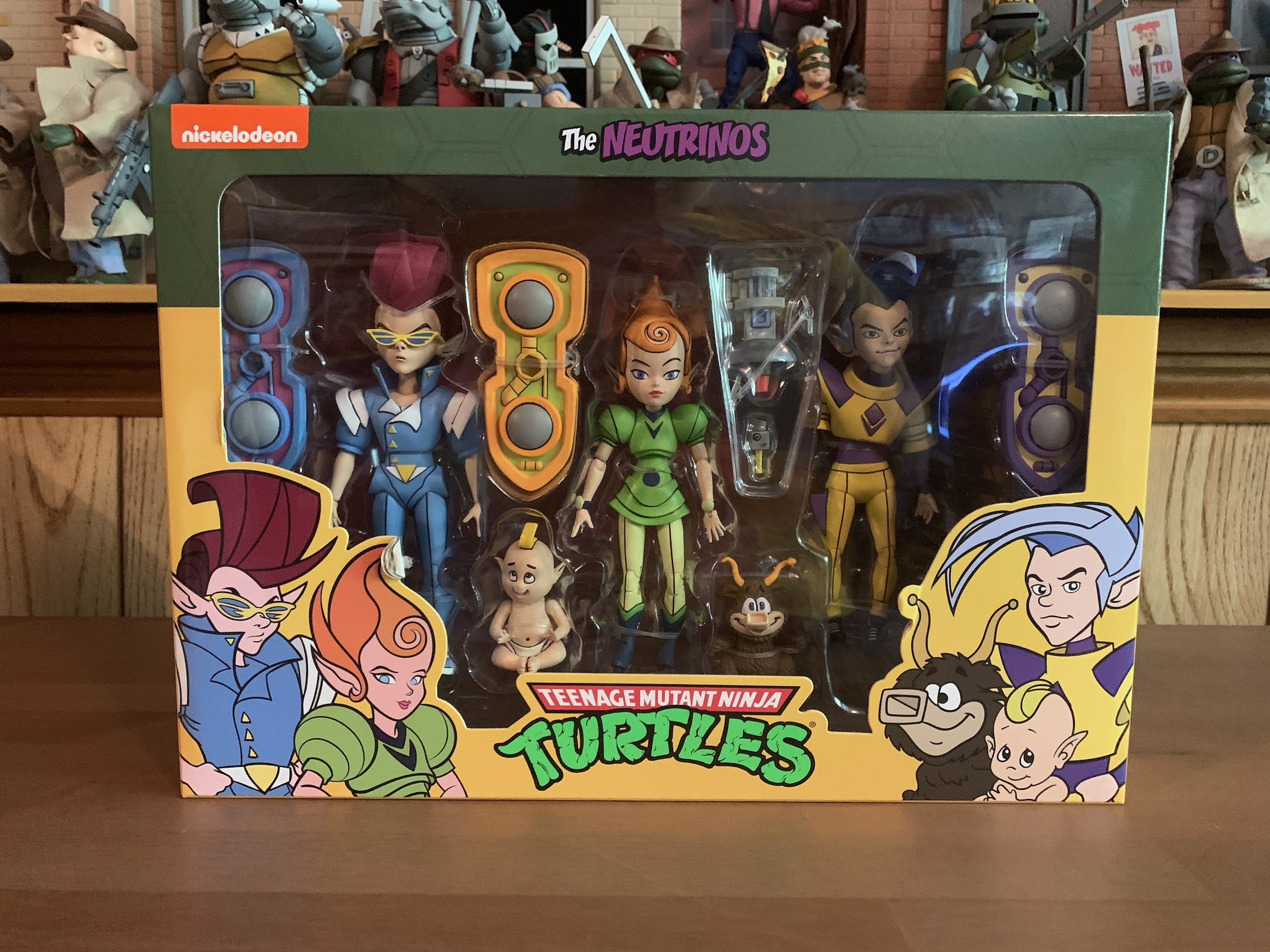
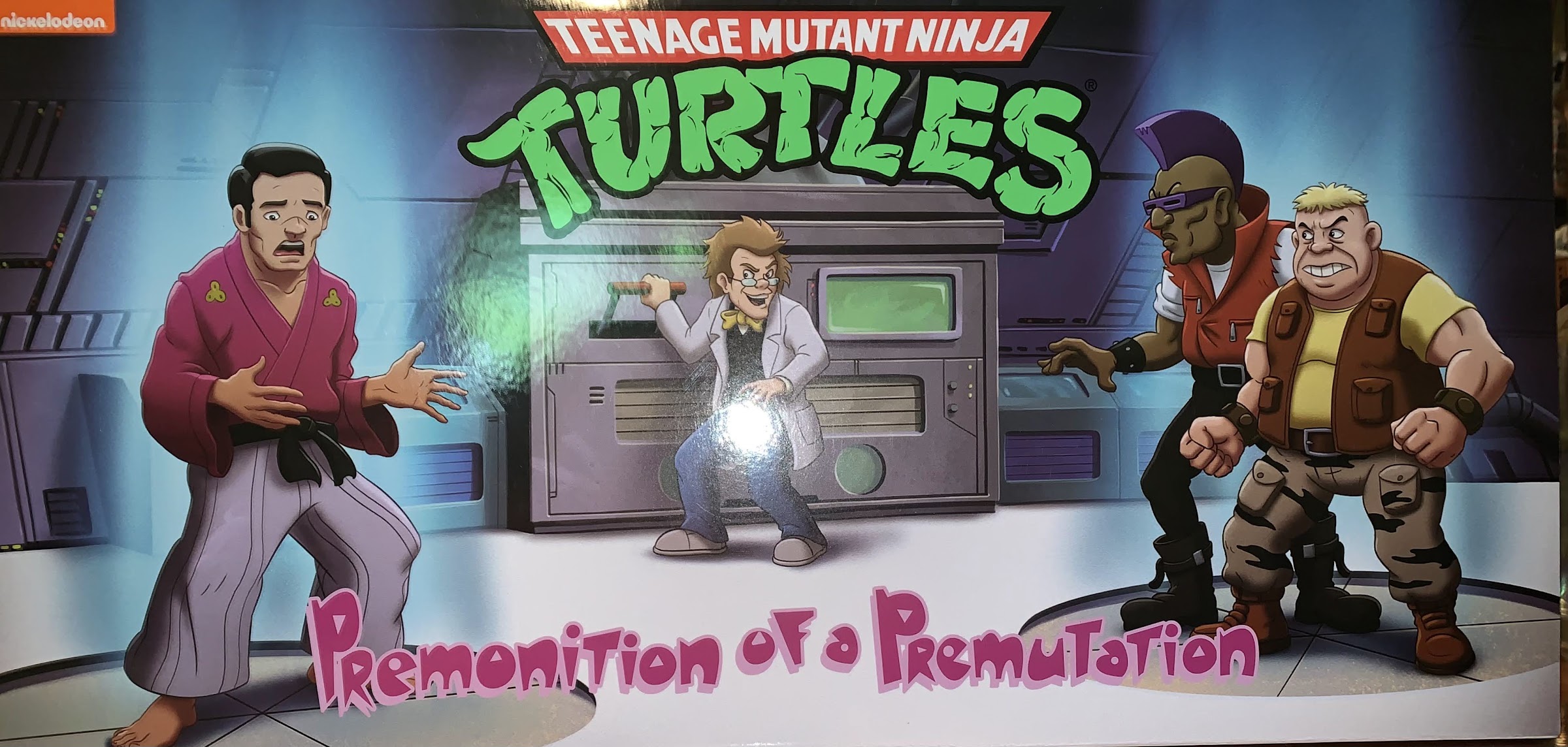
NECA has been in the business of making con exclusive sets for years now. And unlike some companies, they have always made sure to include those who couldn’t make it in on the fun. This would often mean selling the exclusives on their website during the convention, or shortly before, which was often quite successful, but also lead to sell-outs and some hurt feelings along the way. With the convention getting cancelled, the exclusives were shifted to retail, but this year marked the return of the NECA webstore sale. And going back several years now, one of the pillars of con season for NECA has been Teenage Mutant Ninja Turtles. With the brand becoming the most popular thing NECA makes product for, the company has made sure to make a lot of stock available when it comes to these exclusives. And just like with 2021, NECA has turned to its toon subline of TMNT for another convention four-pack: Premonition of a Premutation.

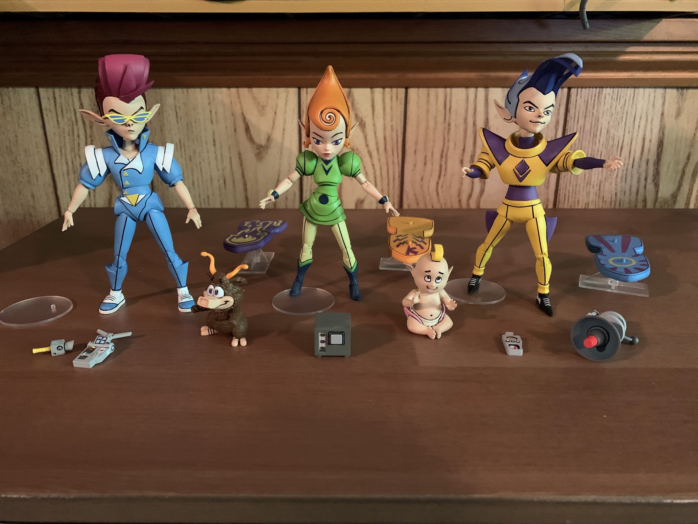
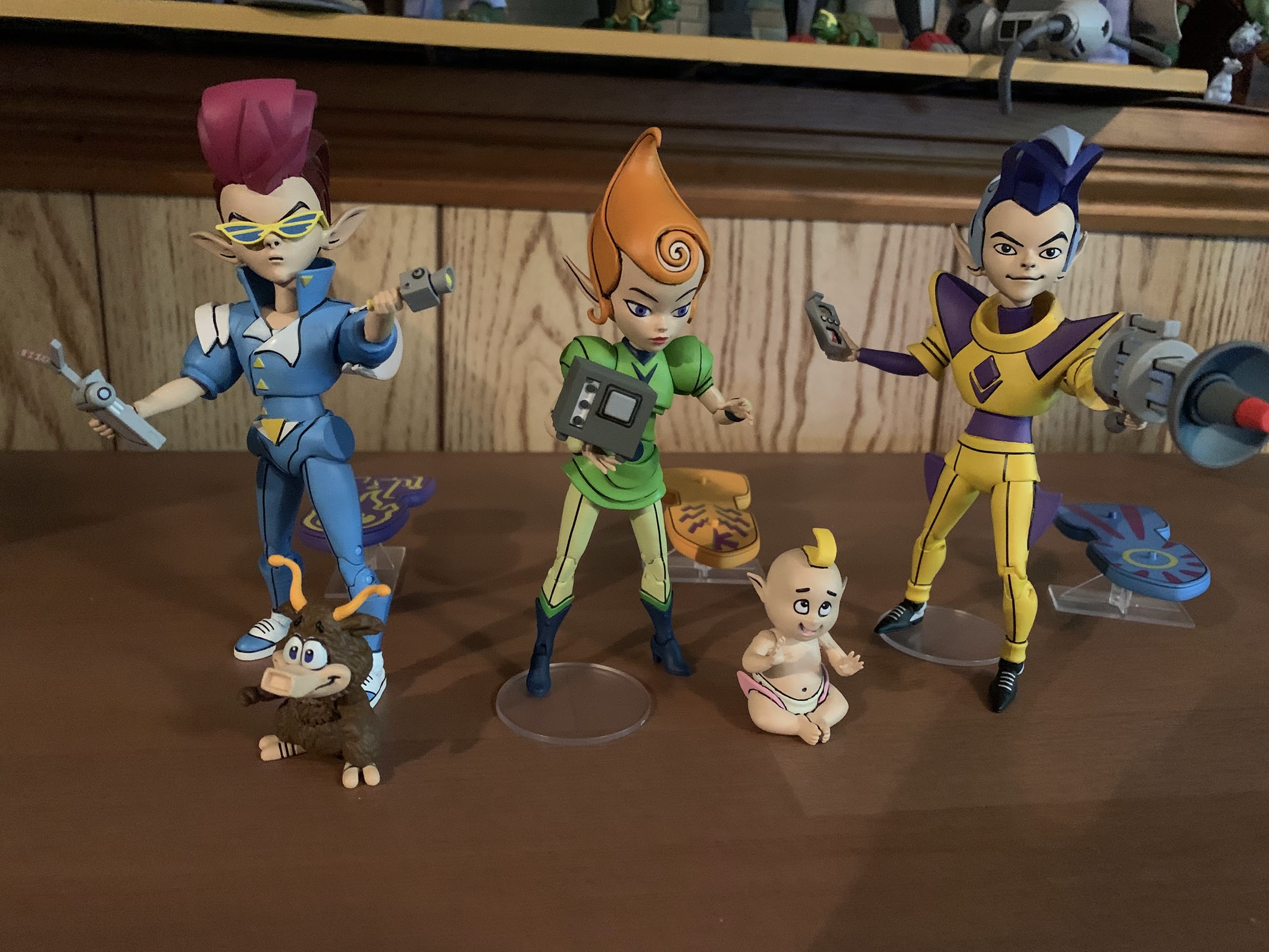
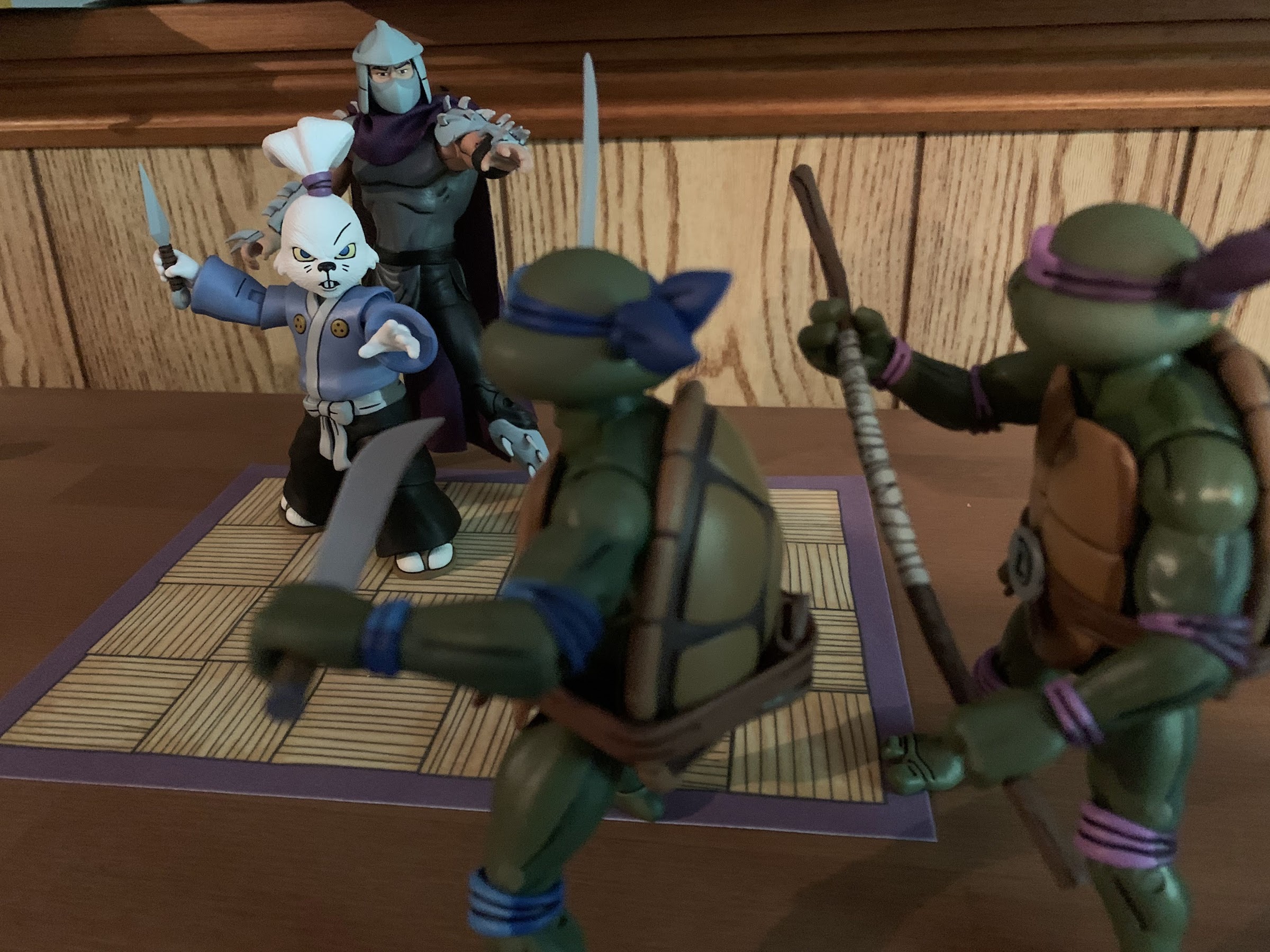
As the name implies, this is a four-pack of popular characters from the show in their less celebrated pre-mutation forms. They are: Baxter Stockman, Hamato Yoshi, Bebop, and Rocksteady. Fans have been asking for these versions of the characters for years now and most knew it was only a matter of time given how popular the line is. Plus, the company already unveiled Scrag, one of the seldom seen gang members associated with Bebop and Rocksteady in the show’s earliest days, as a figure for Loot Crate that NECA swears will see the light of day some day. Obviously, even as a limited release item, NECA isn’t going to make Scrag and not the more popular punkers. Hamato Yoshi also felt like a given and we saw Baxter teased via the packaging on the Turtles in Disguise set last year. The only real surprise is that they were reserved for a convention exclusive four-pack, but given how easy it was to secure a set, this doesn’t seem like a bad thing. It only stinks for those who were only interested in one or two figures in the set and not all four since it wasn’t exactly cheap at $150 plus shipping. We also had to pay upfront and wait awhile if ordering online. I paid for this item on June 3rd and it was supposed to ship after the convention concluded on July 24th and I didn’t end up receiving it until August 24th. That was definitely a longer wait than usual for these convention exclusives, but it’s here now so let’s talk about it.
The set comes housed in the now standard NECA four-pack setup. It’s a long box with a front flap that’s secured by Velcro. All around the box is new artwork based on the cartoon featuring the characters and likely a few hints here and there about what could possibly be on the way. There are product shots on the rear, and the front flap lifts up to reveal the figures inside. They’re packaged all in a row with some of their accessories visible, and more behind them (basically just the optional hands). My box arrived in good shape and would have been suitable as a mint-in-box item, thought I did have one issue which we’ll get to momentarily.
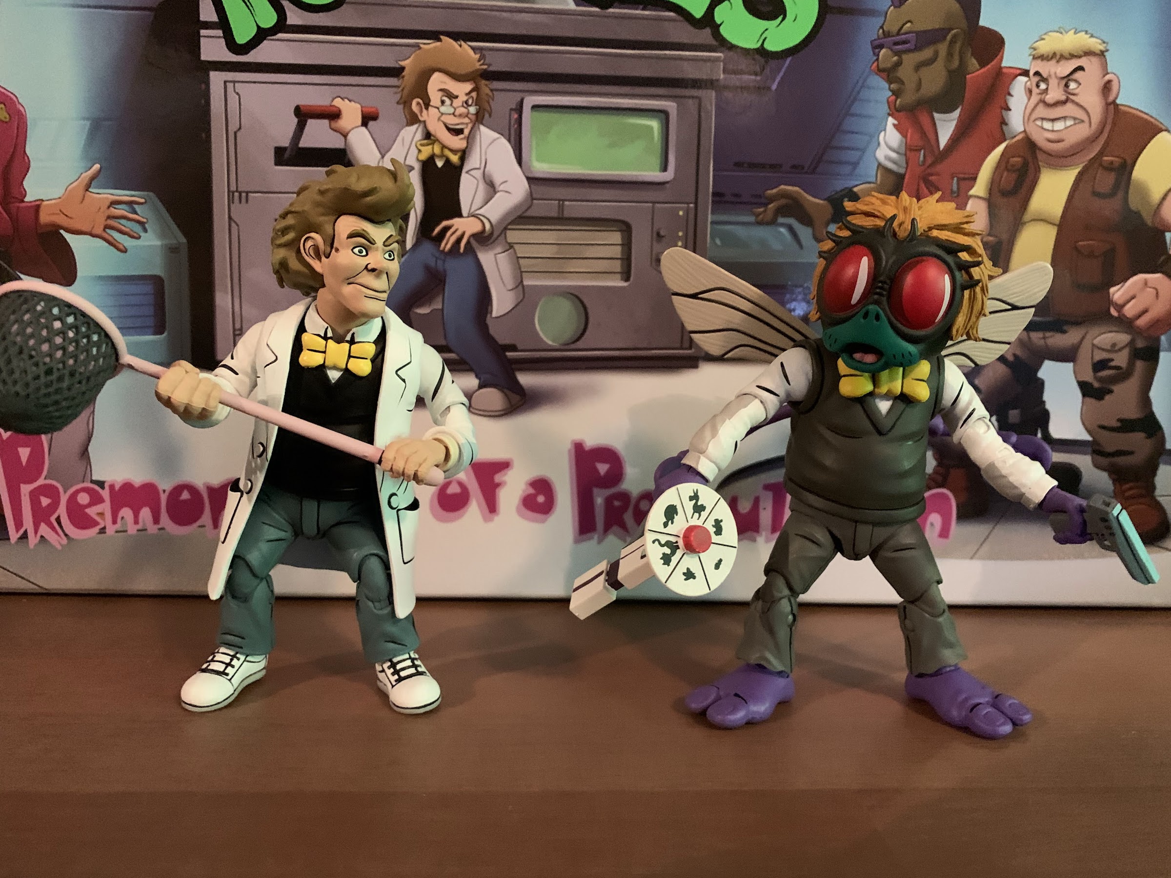
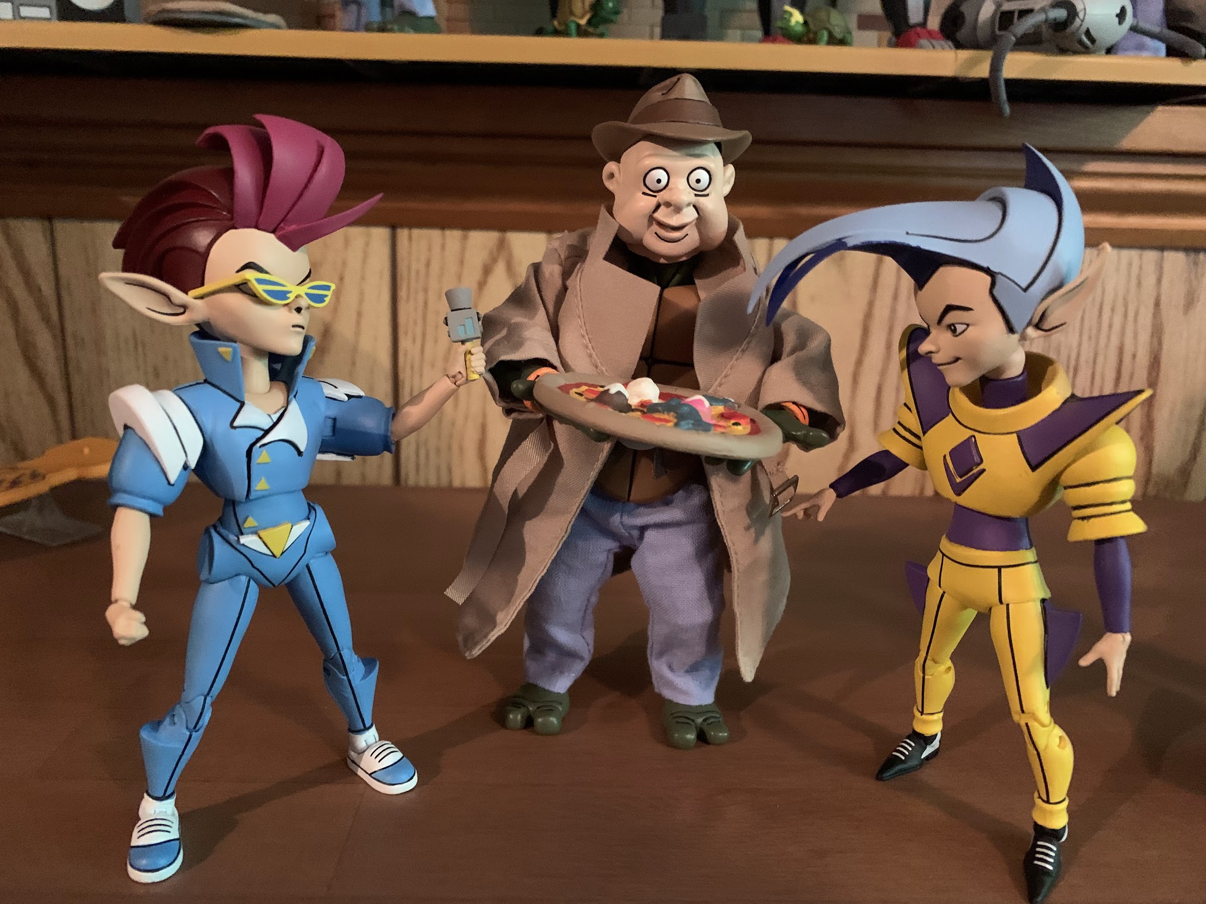
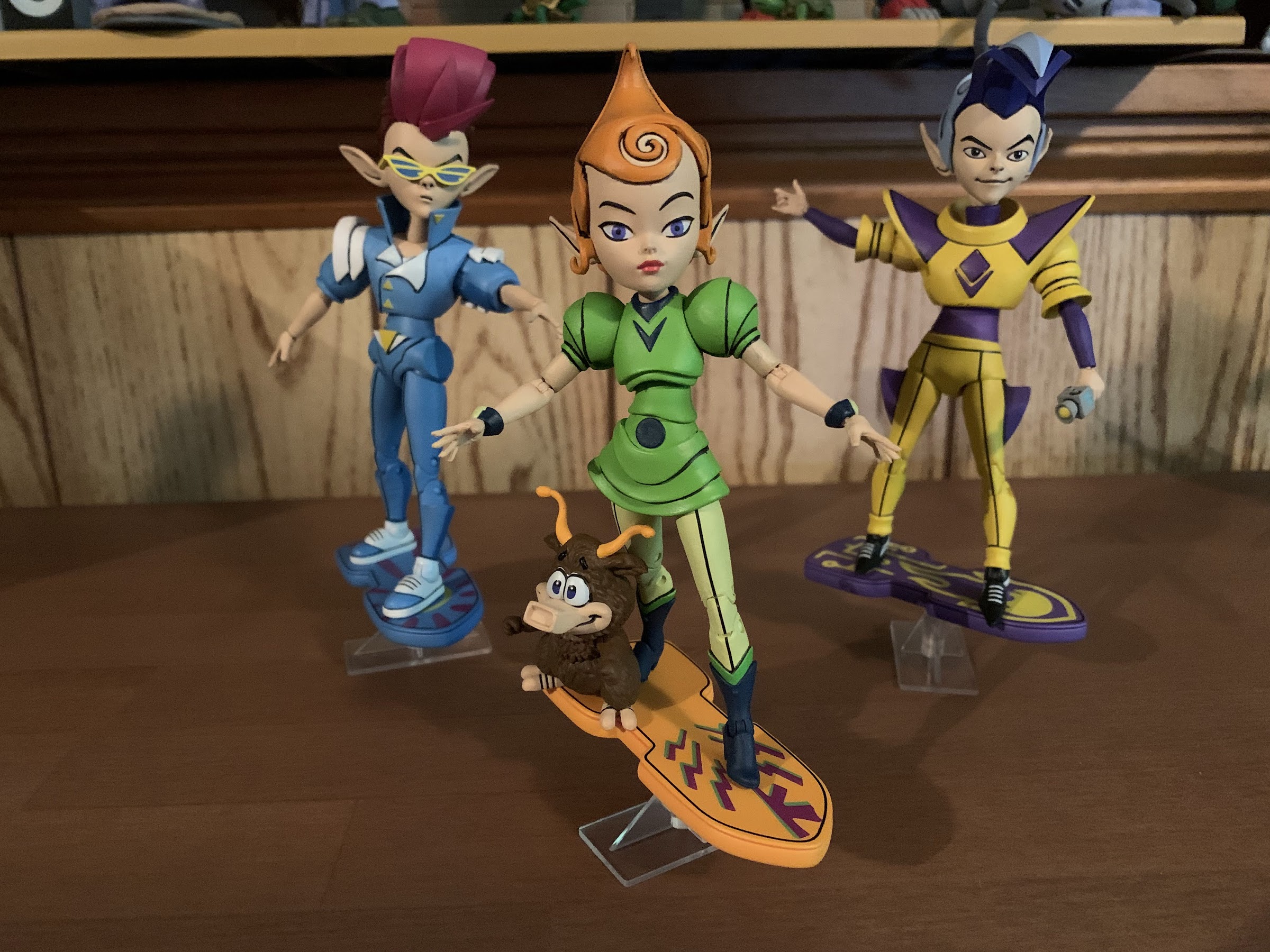
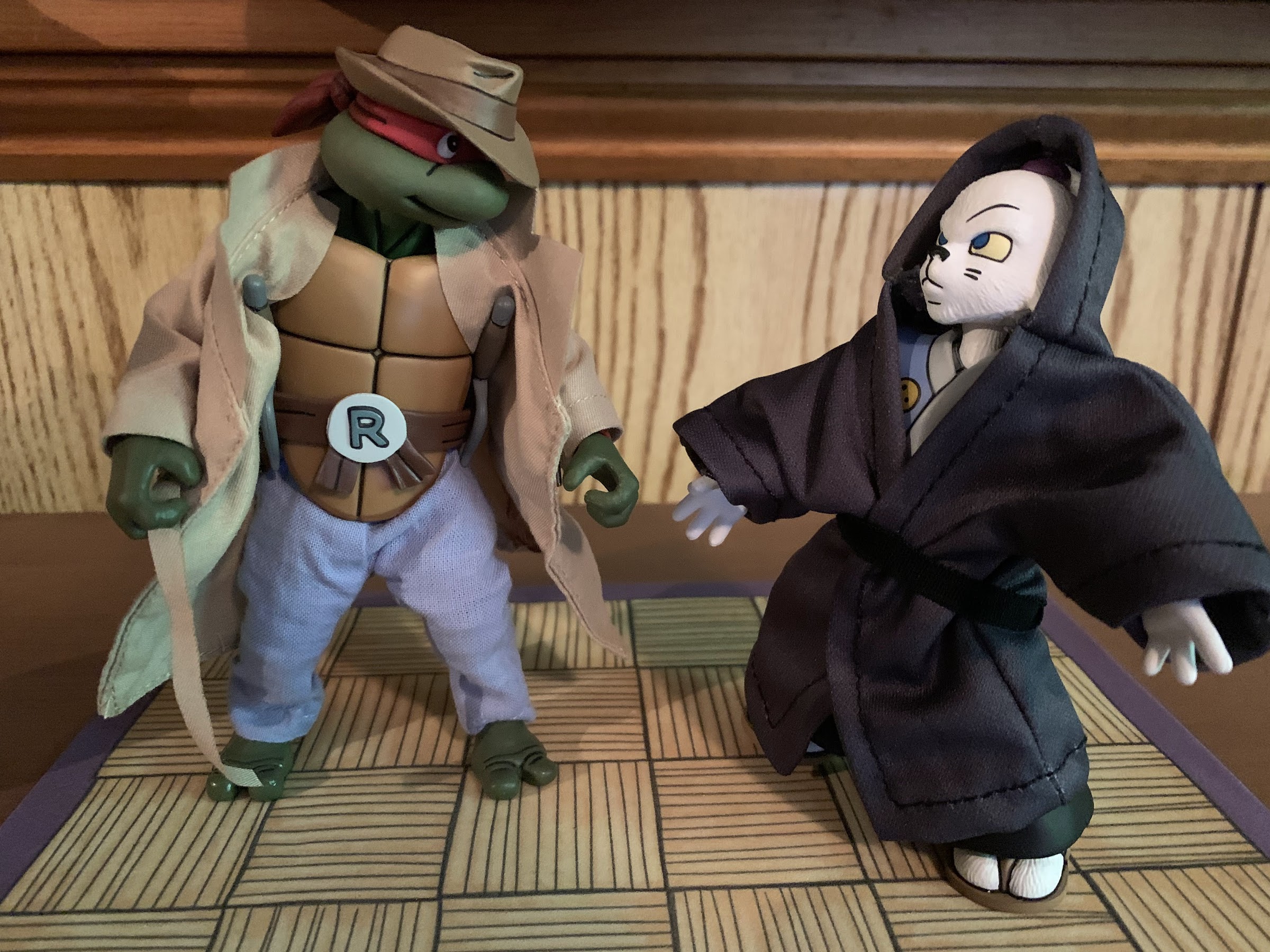
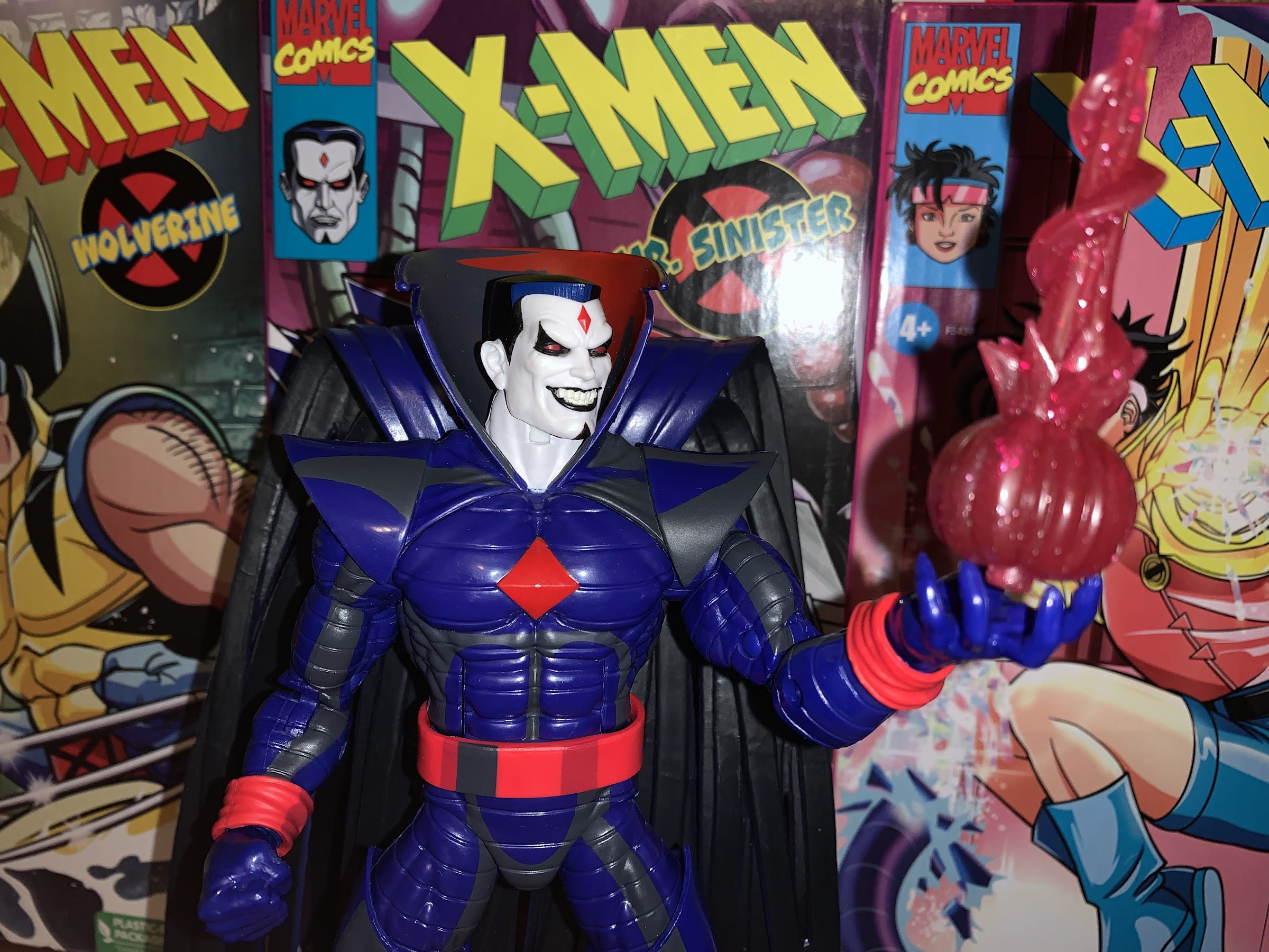
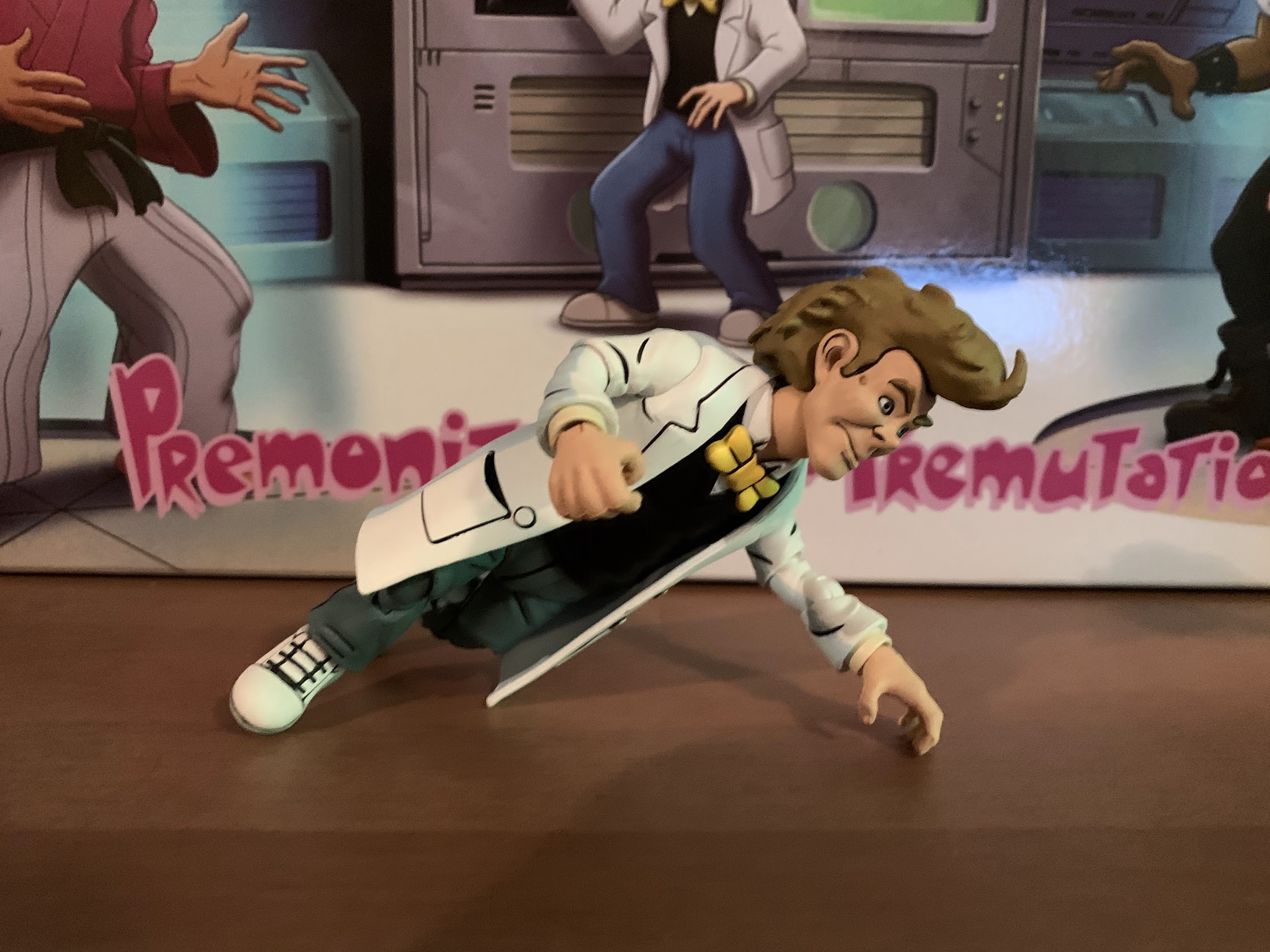
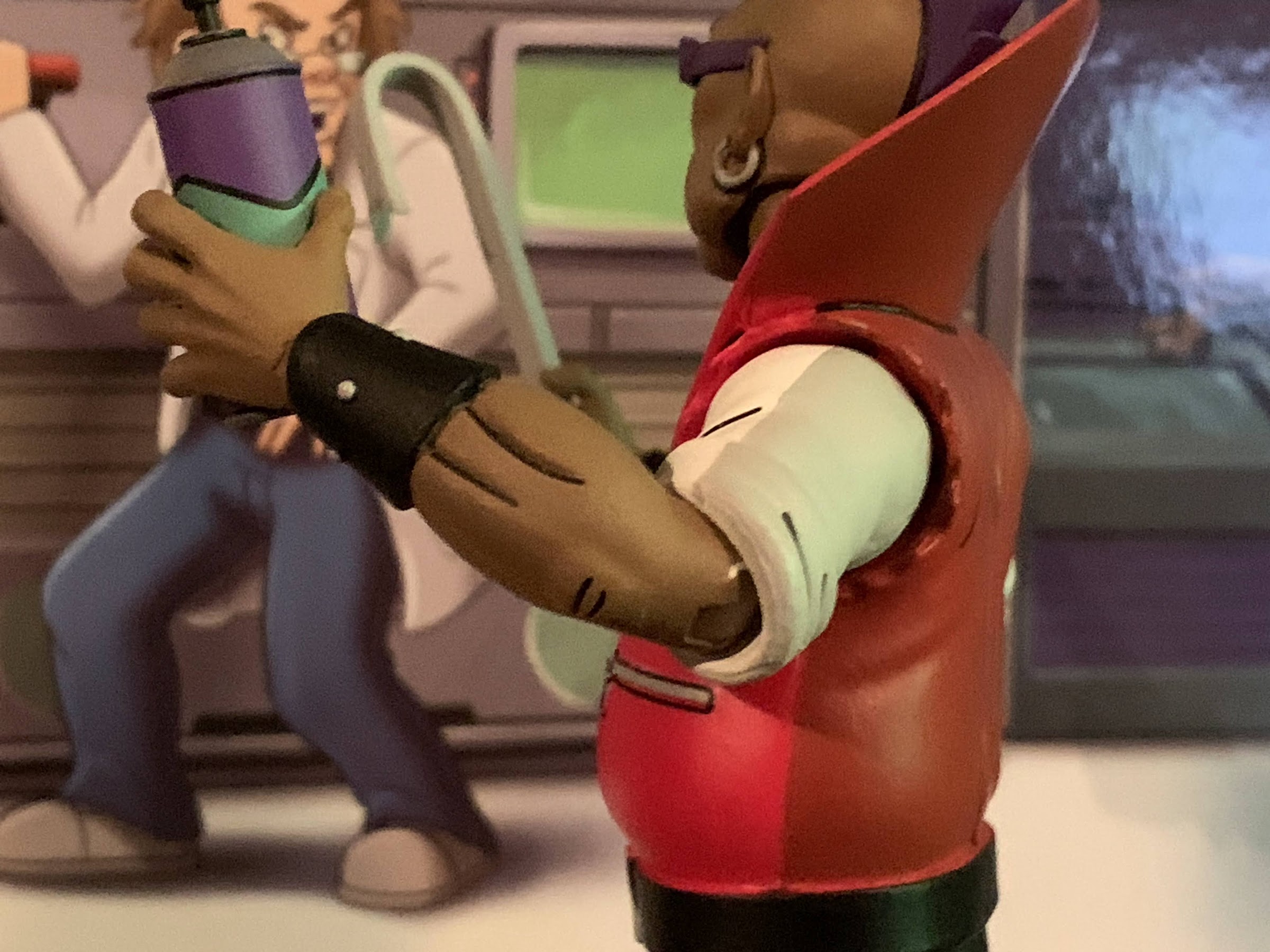
For me, and I think most collectors, the character I most wanted from this set has been Baxter Stockman so I’m going to start with him. Baxter made his debut in the show’s second episode as the inventor of the Mousers which would soon terrorize the turtles and especially their master, Splinter. It was fitting he debuted in the show’s second episode since he made his original debut in the second issue of the comic, though he looked much different. Baxter would become a lackey for Shredder, sort of a right-hand man, and he remained in that role into the show’s second season where he underwent his mutation into a fly at about the midpoint of that season. As a kid, I remember waiting for that to happen since I knew there was a mutant fly toy with the same name as the character I was seeing on television and I was pretty excited when that day finally arrived. NECA delivered the fly version of the character awhile ago now, which is kind of funny when one considers that the human version of Baxter appeared in the show more often than the fly one, but we all remember and love the old toy so it’s easily the dominant image when one conjures up the name Baxter Stockman. Baxter is also the only figure in this set to not get a figure in his human form back in the old Playmates days. The other 3 were all featured in the Mutations subline, so while not stand-alone figures, their human forms were at least represented in some fashion.
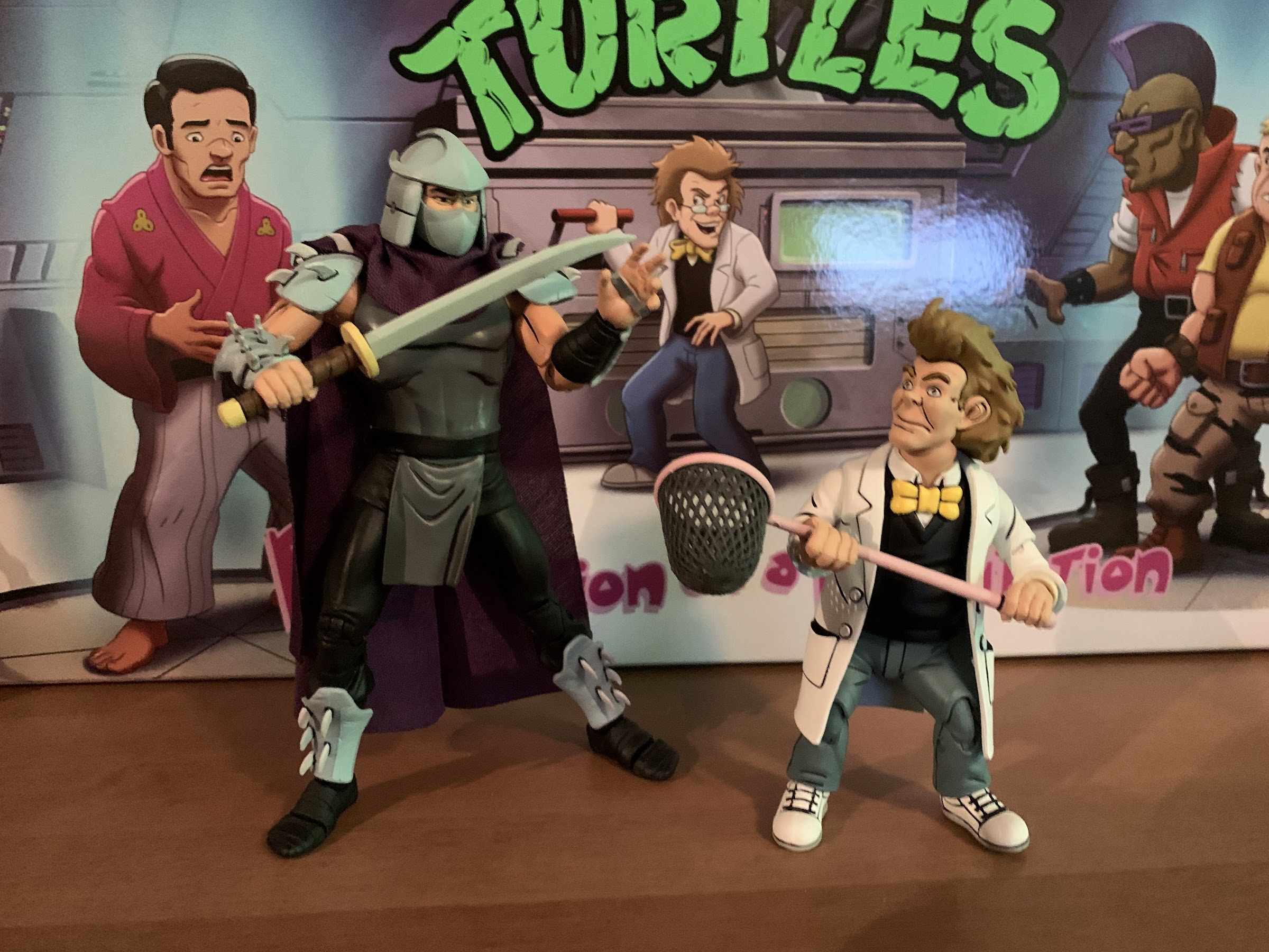
Let’s get it out of the way upfront: this figure is too short. A lot of this set contains reused parts from previously released figures to keep costs down. That’s fine when the reuse makes sense, but in the case of Baxter it really doesn’t. NECA reused most of the parts from the fly version, but when Baxter was mutated he also shrunk. In the show, he was shorter than Shredder, but about as tall as the turtles. Scale was not the show’s strong point, but it was fairly accurate in those first five episodes where Baxter debuted and I maintain that, whenever possible, that original mini series should be the go-to when it comes to character designs and scaling. Unfortunately, Baxter is about 4.25″ tall to the top of his head, a little taller when factoring in the hair, and when placed beside Shredder he looks ridiculous. He looks like some sort of goblin or something. He barely looks human because the scale is just so goofy and it really does drive me nuts. It’s probably not something that will bother everyone, but it does me. My figure also has another big problem: no glasses! They’re supposed to be attached to his head in the box and when I got my set I was surprised to see them missing, but figured they must have fallen off during transport and were in there somewhere. Nope, no glasses to be found. I emailed NECA right away and around 24 hours later received a response that said a replacement head will be shipped to me as soon as possible. We shall see, but I’ll certainly update this post should that happen.
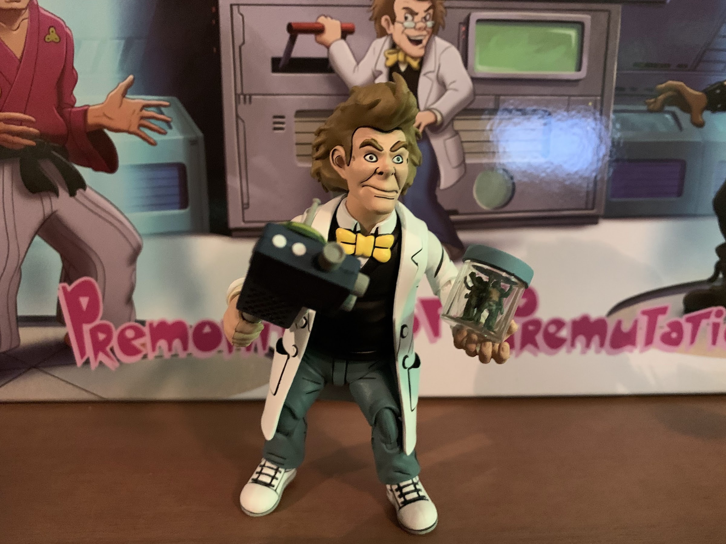
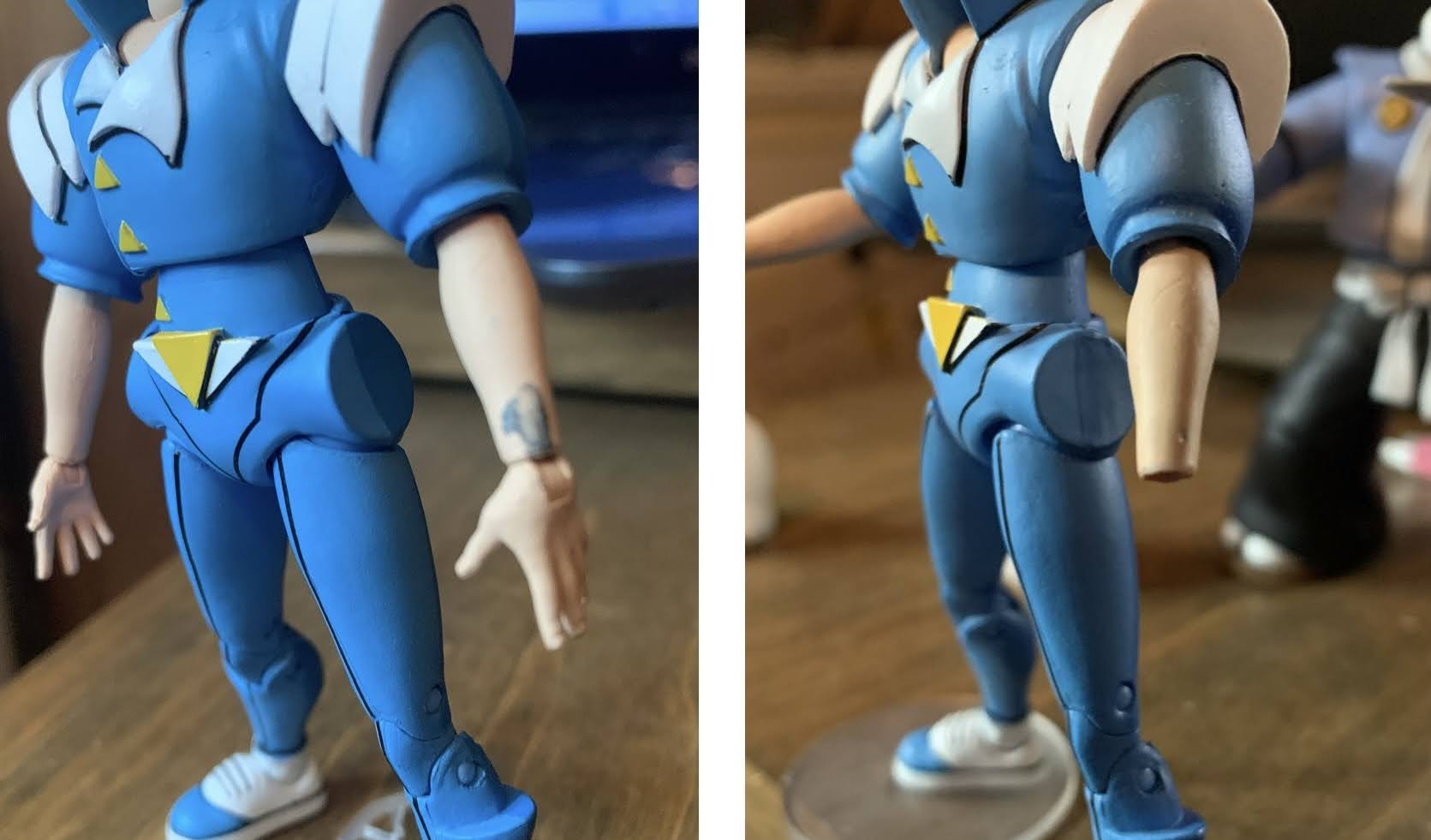
Aside from the height and glasses issues, the figure does do a decent job of recreating Baxter’s look. He has the same torso as the fly version which features the now black vest and yellow bowtie. The lab coat has been added and is fairly flexible and he has his sneakers instead of ugly, purple, feet. The head is okay, though a little oversized for the body in some respects. He has a somewhat neutral expression though his mouth is contorted in such a way that maybe he’s a little angry or in thought? He has his wild hair and it’s well-painted and fits the character. The face looks off-model from certain angles and might be due to how his nose angles up a bit. I think he looks better from the side than the front, but it’s not as-if he’s unrecognizable. It’s a decent depiction of the character, just not the homerun some of other figures in this line have been. Of course, mine has some ugly holes in the temples where his glasses should plug-in, but hopefully that’s only temporary.
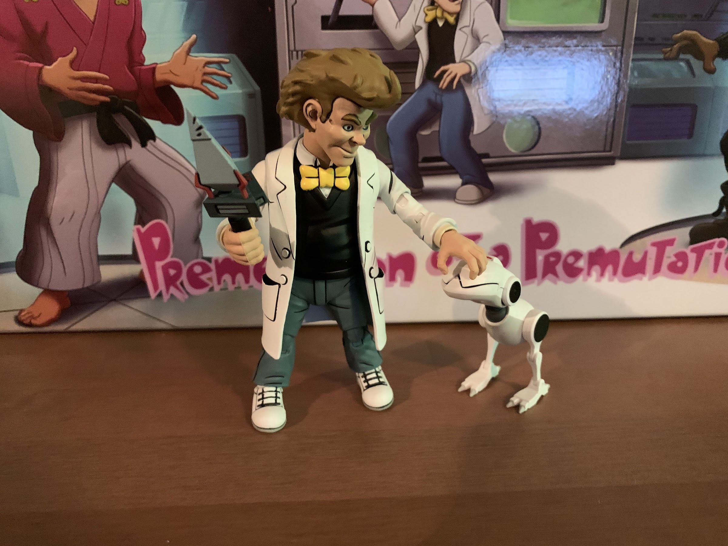
As for his articulation, it’s about what one would expect. His head is surprisingly not impacted much by the hair. He basically can look in all directions and the only one that’s limited is looking up. The shoulders are standard ball-hinges and they raise out to the side almost horizontal and rotate. NECA used their controversial double-elbow with this guy which they do a lot for human characters in jackets or sleeves so you get rotation above and below the elbow and the bend goes past 90 degrees, it just looks weird because the piece in the middle is fairly long so rather than the elbow coming to a point when bent, it’s squared-off. The hands rotate and feature a horizontal hinge. The waist is connected via a ball-peg, but it basically only offers rotation as the torso is covered up by the plastic overlay for the shirt. The legs are ball-sockets and come out to about 45 degrees and he can kick forward enough and kick back just a little before the “diaper” piece gets in the way. The knees are double-jointed and work fine while the ankles feature the standard hinge and rocker combo. The cuffs of the pants get in the way a bit, but this isn’t a guy who will be doing much posing and what we have here is fine. The left foot on mine falls off frequently as I think they missed some glue at the factory, but that’s probably not a common occurrence.
As for the paint, Baxter looks pretty good. The lab coat is a mix of white on the front and a light blue on the read and inside. There’s a lot of black linework and I really like how the front pockets turned out. The line work on his face is very clean, as is the black on the shoes. There’s a very light scuff on part of the jacket and some parts where the paint came out a touch thick, but that’s only noticeable upon really close inspection. Some of the joints will flake, but they all appear to be painted in the appropriate color so it’s just a mild annoyance. Overall, the paint application is easily the strong point of the figure and I have no complaints with it.
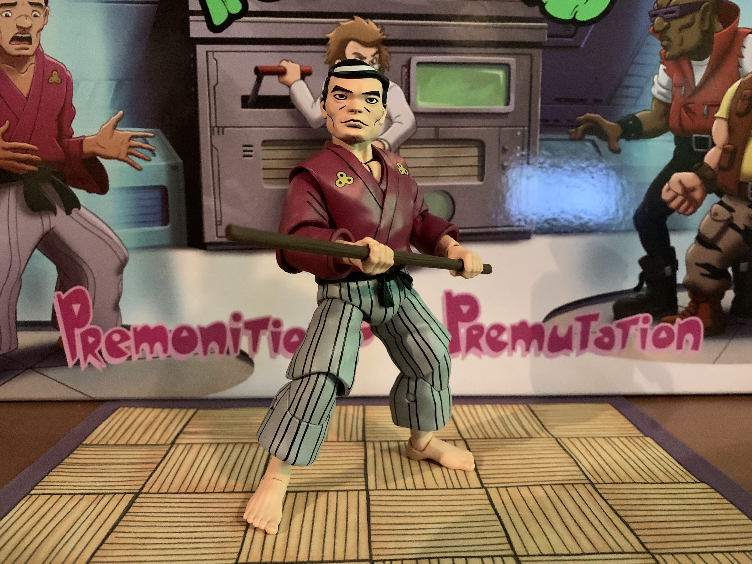
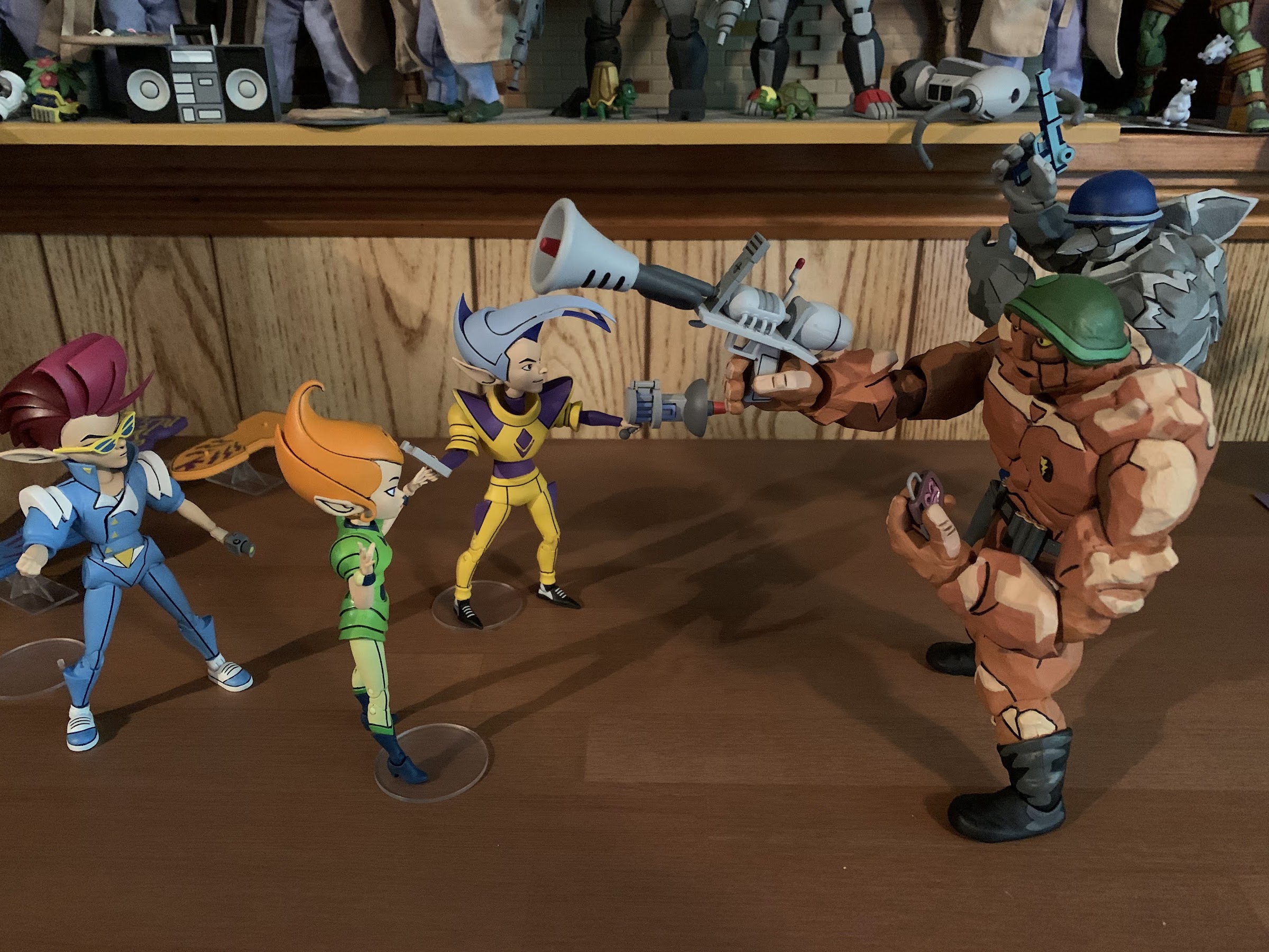
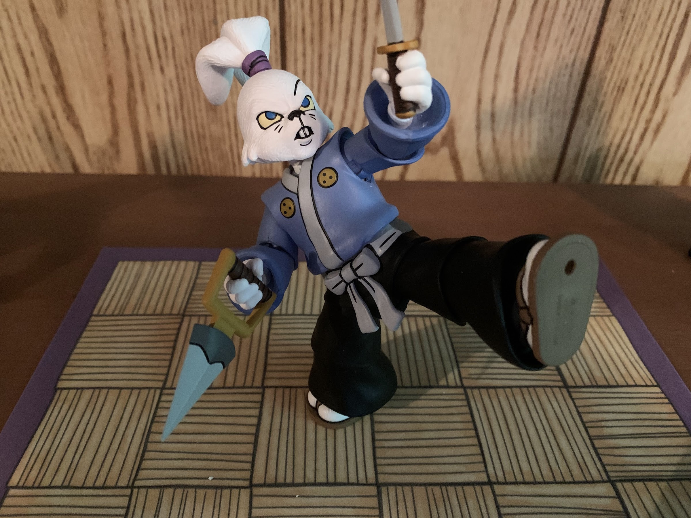
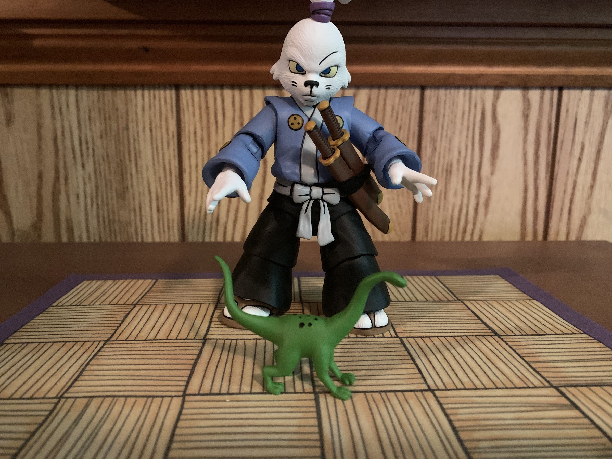
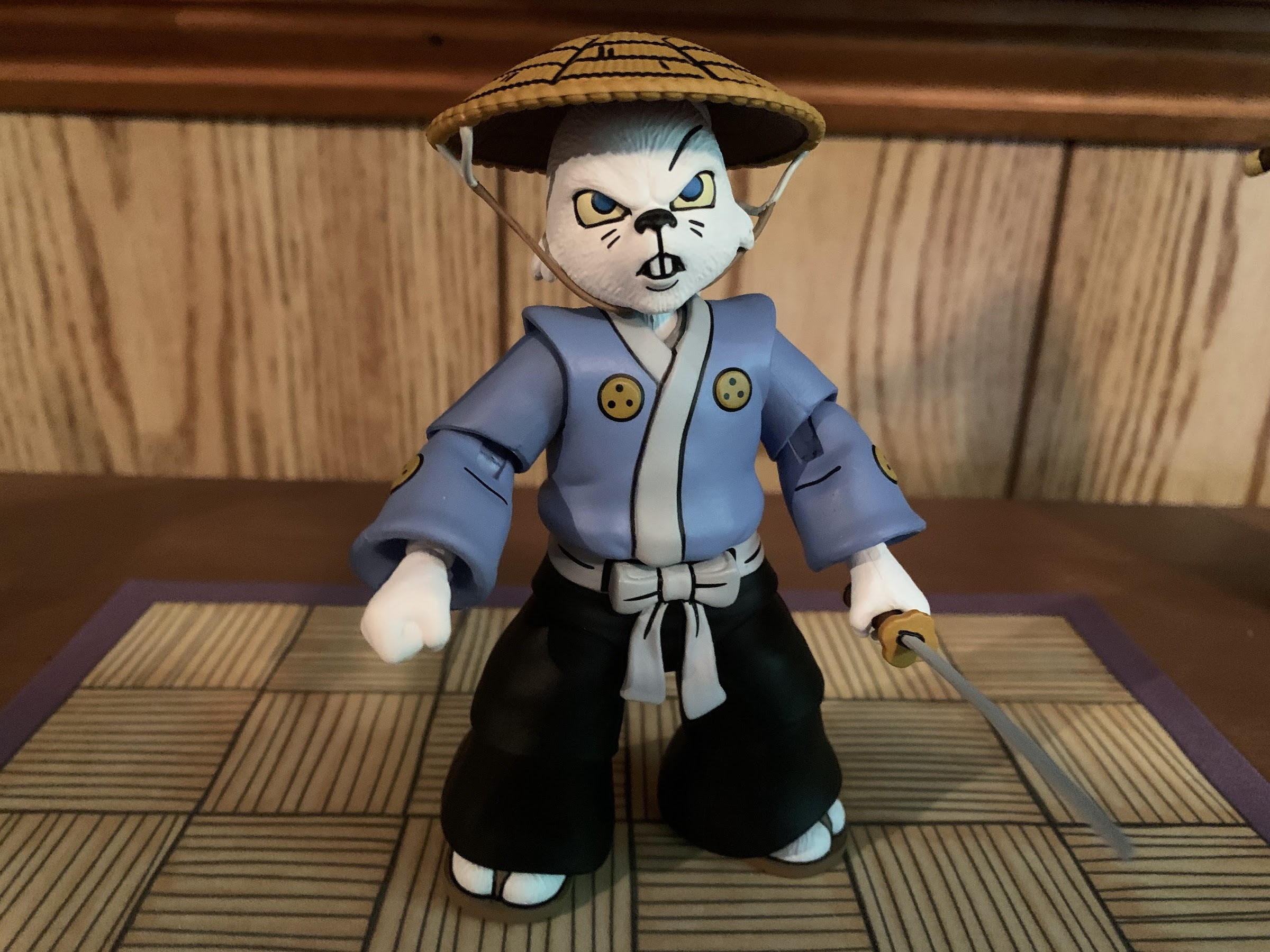
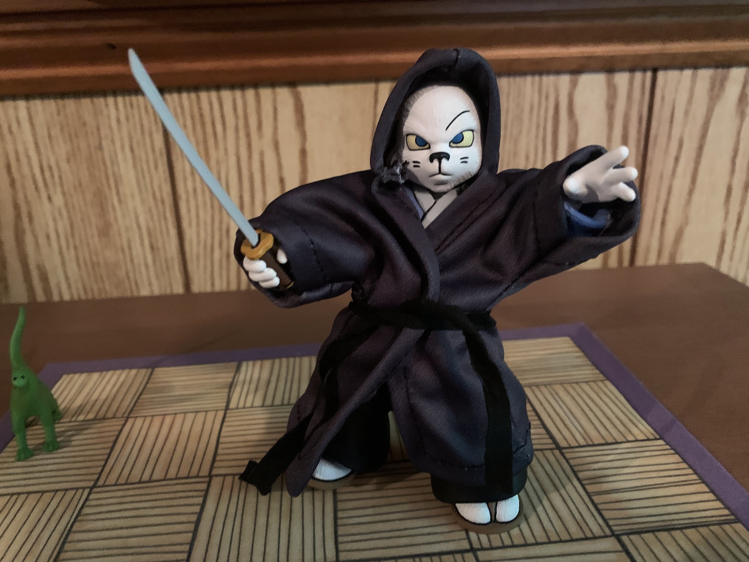
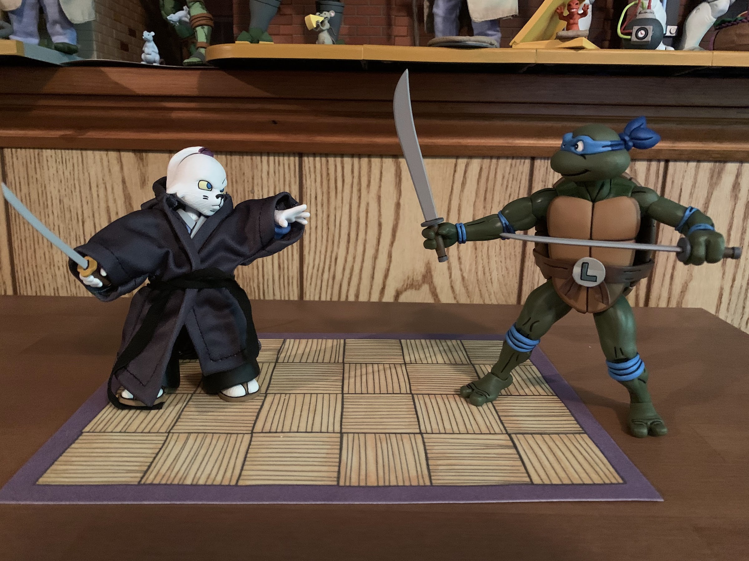
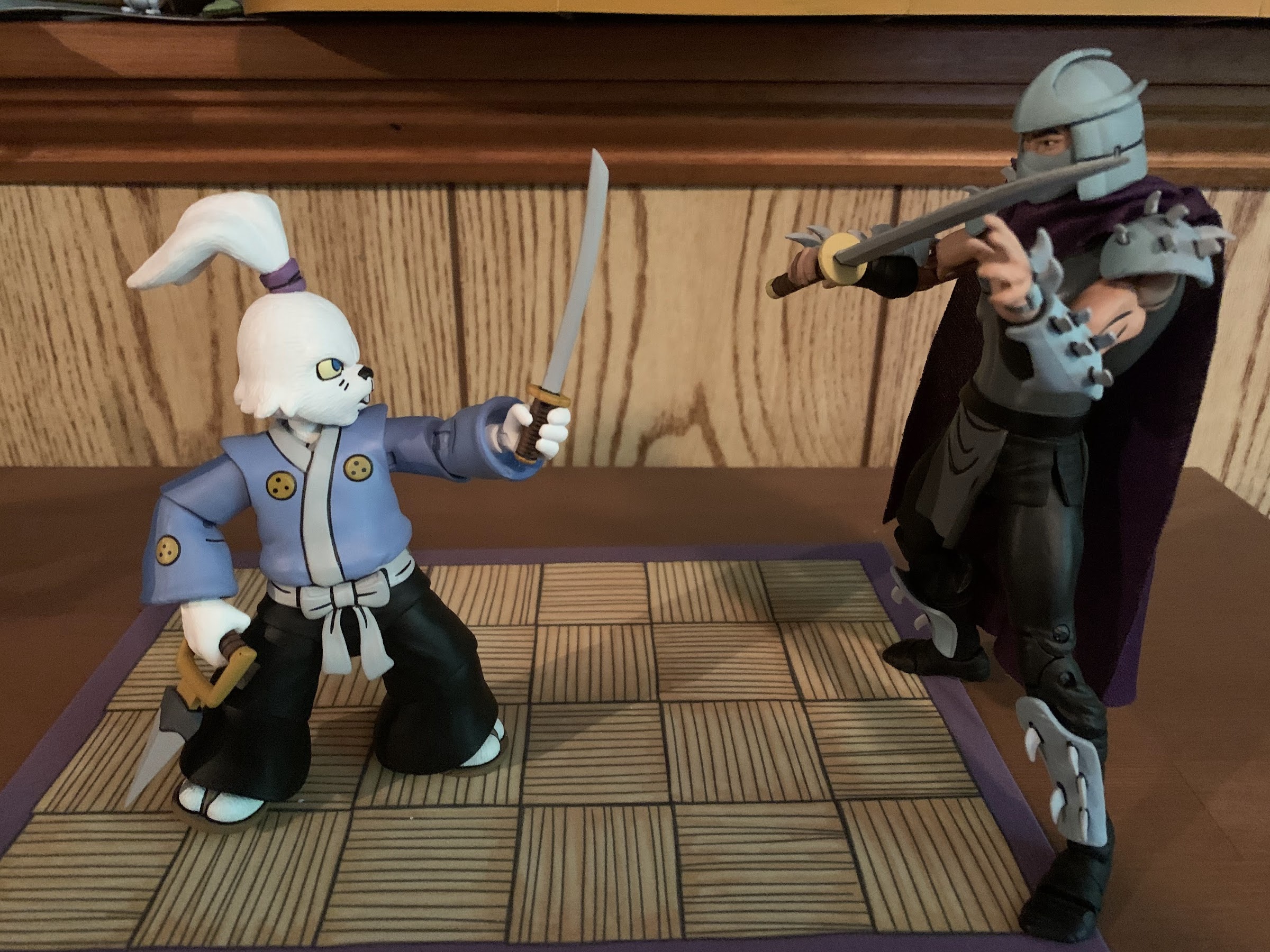
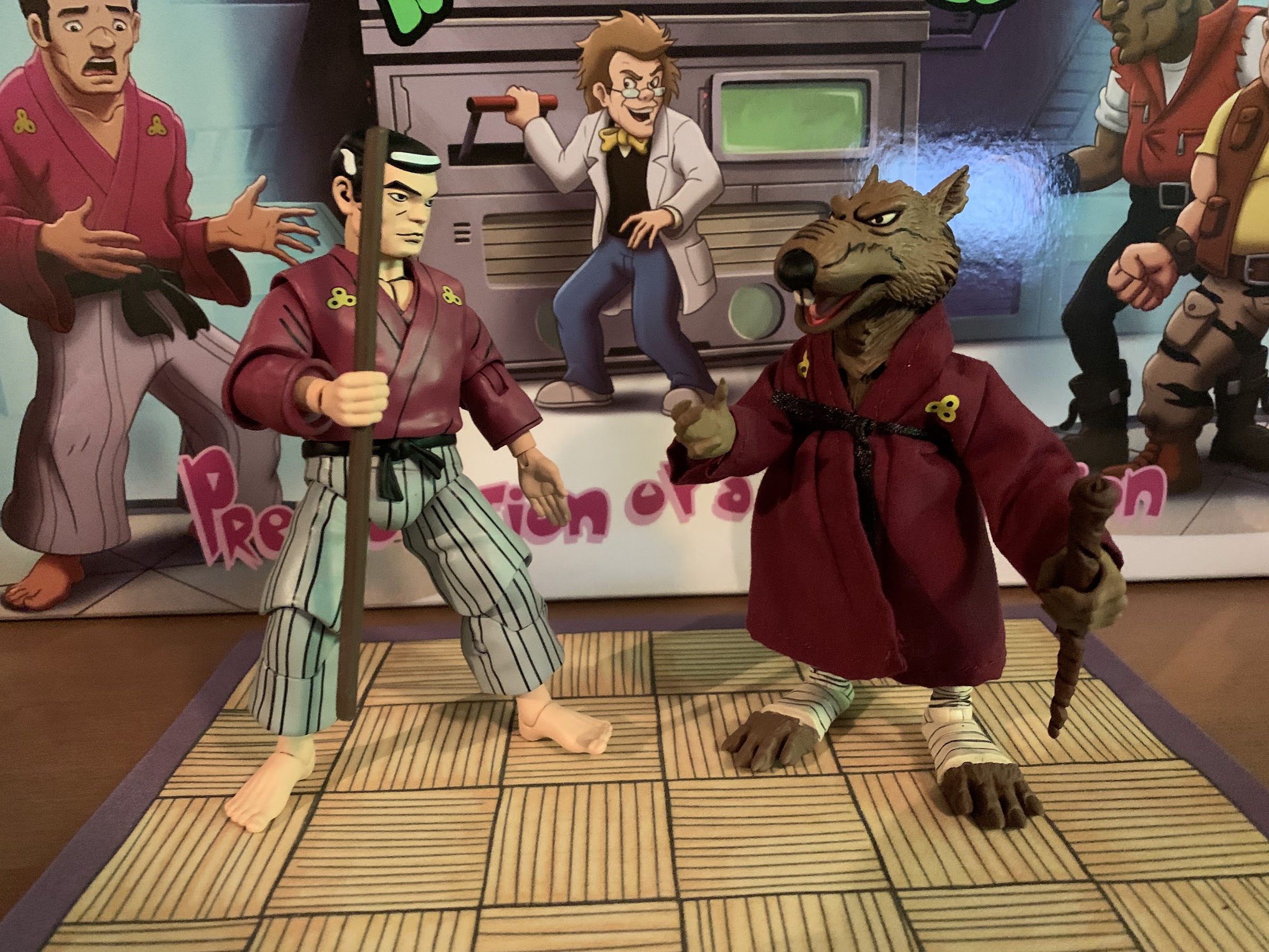
Our next figure is Hamato Yoshi, the man who would one day become Splinter the rat and mentor to the Teenage Mutant Ninja Turtles (he seriously calls them that in the first episode, it’s so silly). Unlike Baxter, Yoshi does not reuse any parts from his previously released mutated form. Even the kimono is new as NECA chose to sculpt it rather than utilize soft goods. He stands a tick under 5.5″ to the top of his hair and basically looks the part. NECA did a good job with the facial likeness as Yoshi had a fairly unique look to him in the show. He wears his kimono more like a shirt in his human form with it tucked into some striped pants and fixed in place with a black belt. Curiously, there’s no shading on the pants, but the black lines are painted very well. There’s still shading on the top, but that’s it aside from the shading in the hair (which looks really good). I’ll just say the paint is well done with him, rather than devote an entire paragraph to it, and he definitely looks more on-model than Baxter.
As for articulation, we would like a ninja master such as Hamato Yoshi to move better than Baxter and he does in some respects, but not in others. His head is on a double-ball-peg and gets good range of motion. There’s no joint at the base of the neck so he doesn’t look down super far, but far enough. The shoulders are ball-hinged and he can raise his arms out to the side okay while the shoulders of the kimono piece need to be worked around when rotating. It’s at the elbow where NECA made an odd choice to go with a single hinge and swivel. The biceps piece is cut at an angle and it makes it look like his arms are slightly bent all of the time. The puffy nature of the sleeves must have convinced NECA to do it this way, but he can just barely hit 90 degrees at the hinge and the swivel only works a little bit as it throws off the sculpt in most, non-neutral, positions. The wrists rotate and feature horizontal hinges and he has the same limited ball-joint at the waist as Baxter. At the hips, he can almost do full splits. He can’t really kick back though and kicking forward only goes so far until the legs want to shoot out to the side. The knees are double-jointed and NECA continued the paint on the top piece so they don’t look bad when bent, not on the bottom. He can bend his knees past 90 though and it looks okay. Above the ankle is a swivel point and below that we get the usual hinge and rock combo which works fine. One thing I wish he could do better than he does is sit, but otherwise he moves around fine.
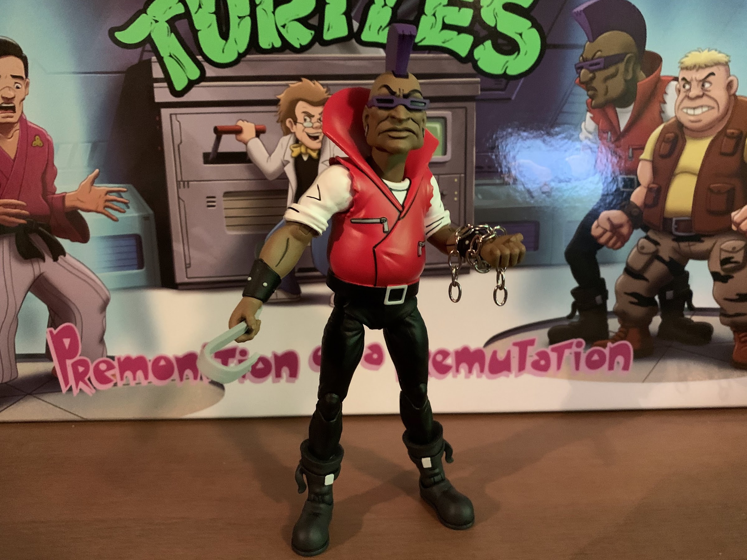
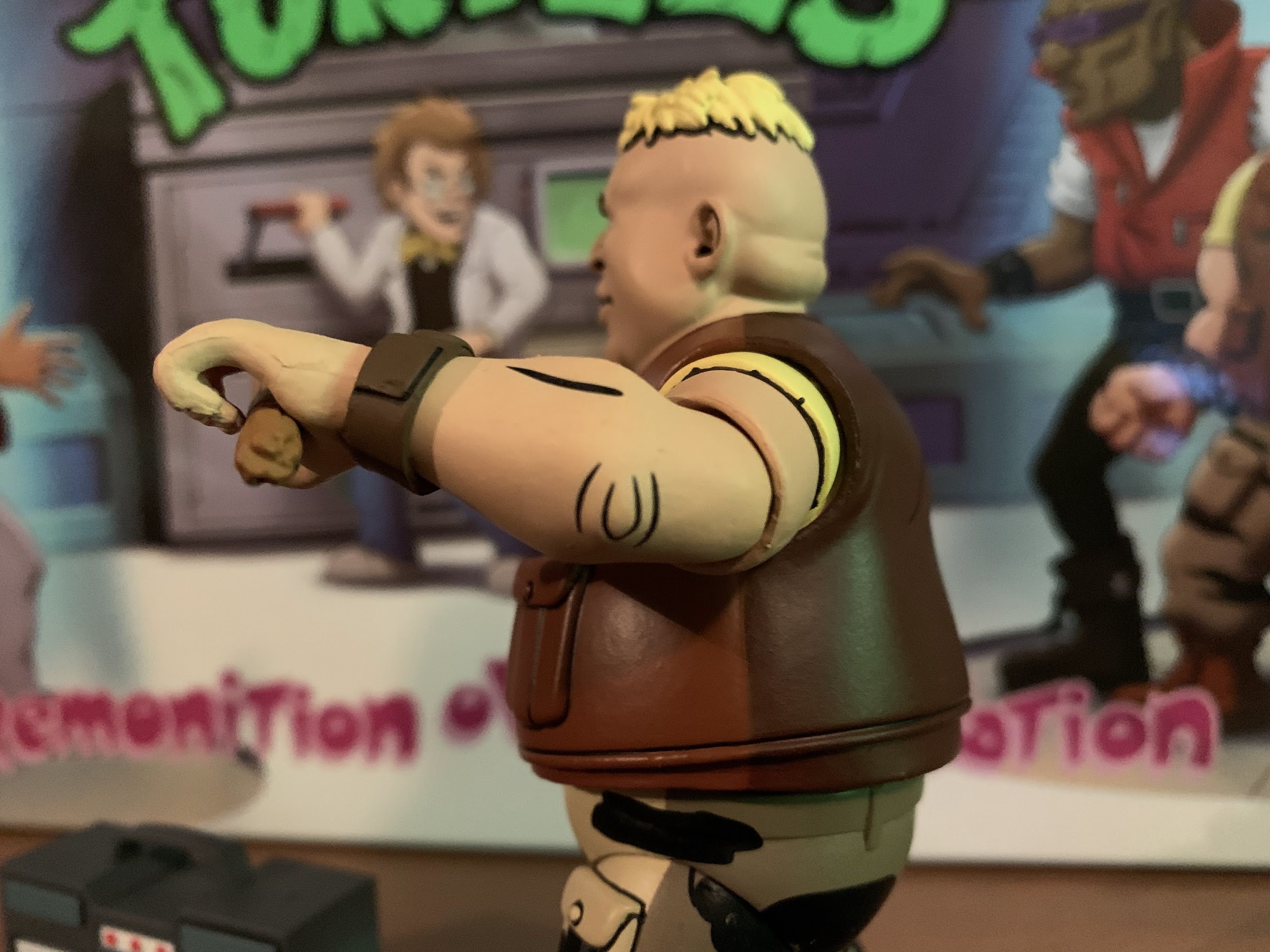
Next up is the tallest figure in the box and it’s Bebop. Bebop is also the first black character in the line and might end up being the only one as I can’t recall many others from the old show. He too also doesn’t reuse anything from his mutated counterpart, but he does appear to share some parts with Vernon. He stands around 6.25″ to the top of his head, and nearly a full 7″ when you factor in the mohawk. He’s pretty lanky looking, which seems close enough to the source material. He has the big red jacket and purple mohawk and matching glasses and the paint is all really well done. There’s shading on the torso, but not on the pants as they’re all black. I think I like the facial likeness on this guy the best out of all of the figures in the set and he may be my favorite overall.
The articulation with Bebop is a bit similar to Yoshi in that I’m not crazy about the elbows. The head and neck are articulation via ball pegs and they work very well. He can even look up quite far with that mohawk of his so long as you turn the head first to avoid his giant collar. The ball-hinges at the shoulders allow the arms to be raised out to the side, but again NECA went with a simple hinge and swivel for the elbows. Bebop’s arms basically can’t be positioned straight and will always have a slight bend to them. When bent, you basically get 90 degrees out of it, but it looks odd because the actual hinge is above the elbow, which is sculpted and painted. They don’t make visual sense when bent and I wish I could say it was less noticeable than it really is, but he basically always looks “off” to a certain degree unless his arms are left in a neutral position. He has the same waist joint as the others and the hips are fine as he has the most range of anyone kicking forward and back in this set. He can almost do splits too, not that he needs to. This is also as good a time as any to say the hips are all nice and snug in this set, which is a noted improvement over some past releases. The knees are double-jointed and they work fine while the ankles are hinged and rock. There’s no boot swivel so don’t try to crank on those parts.
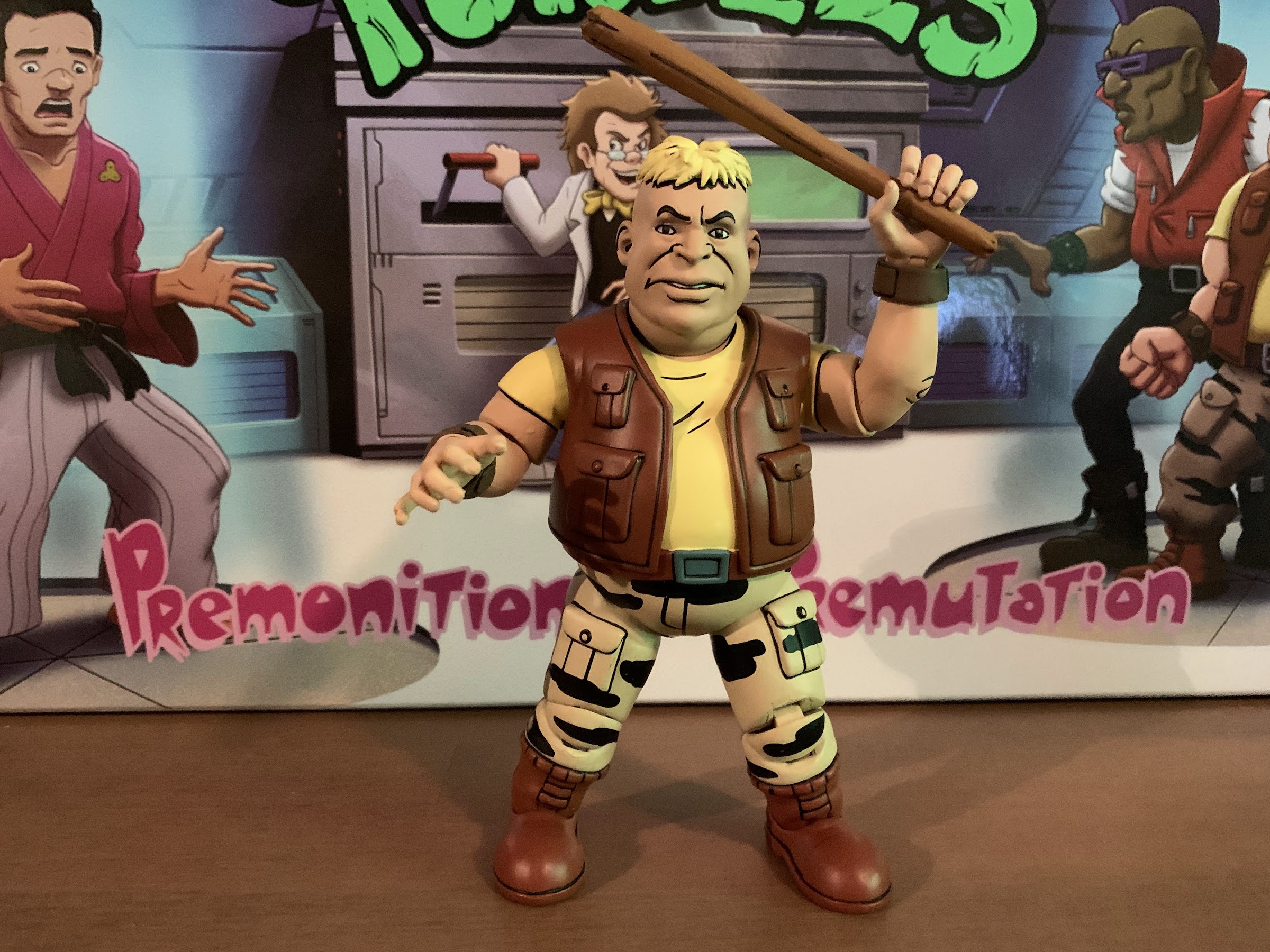
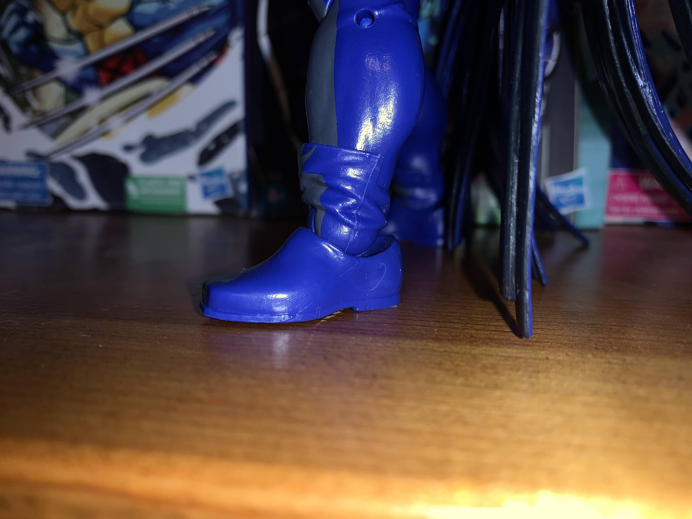
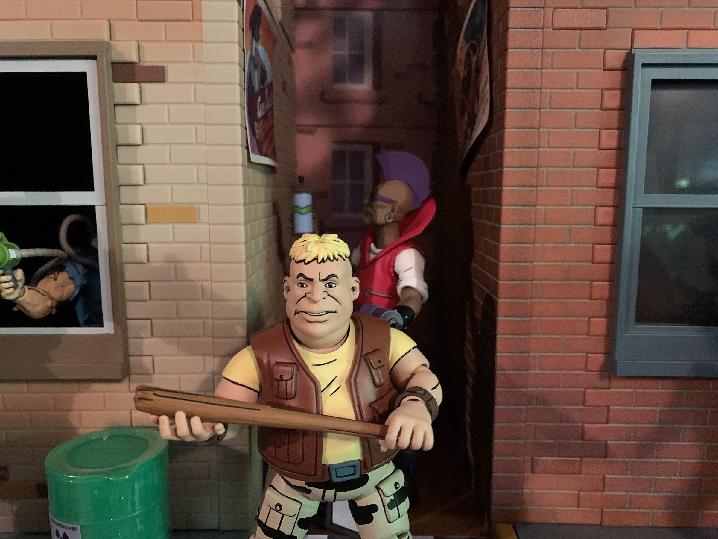
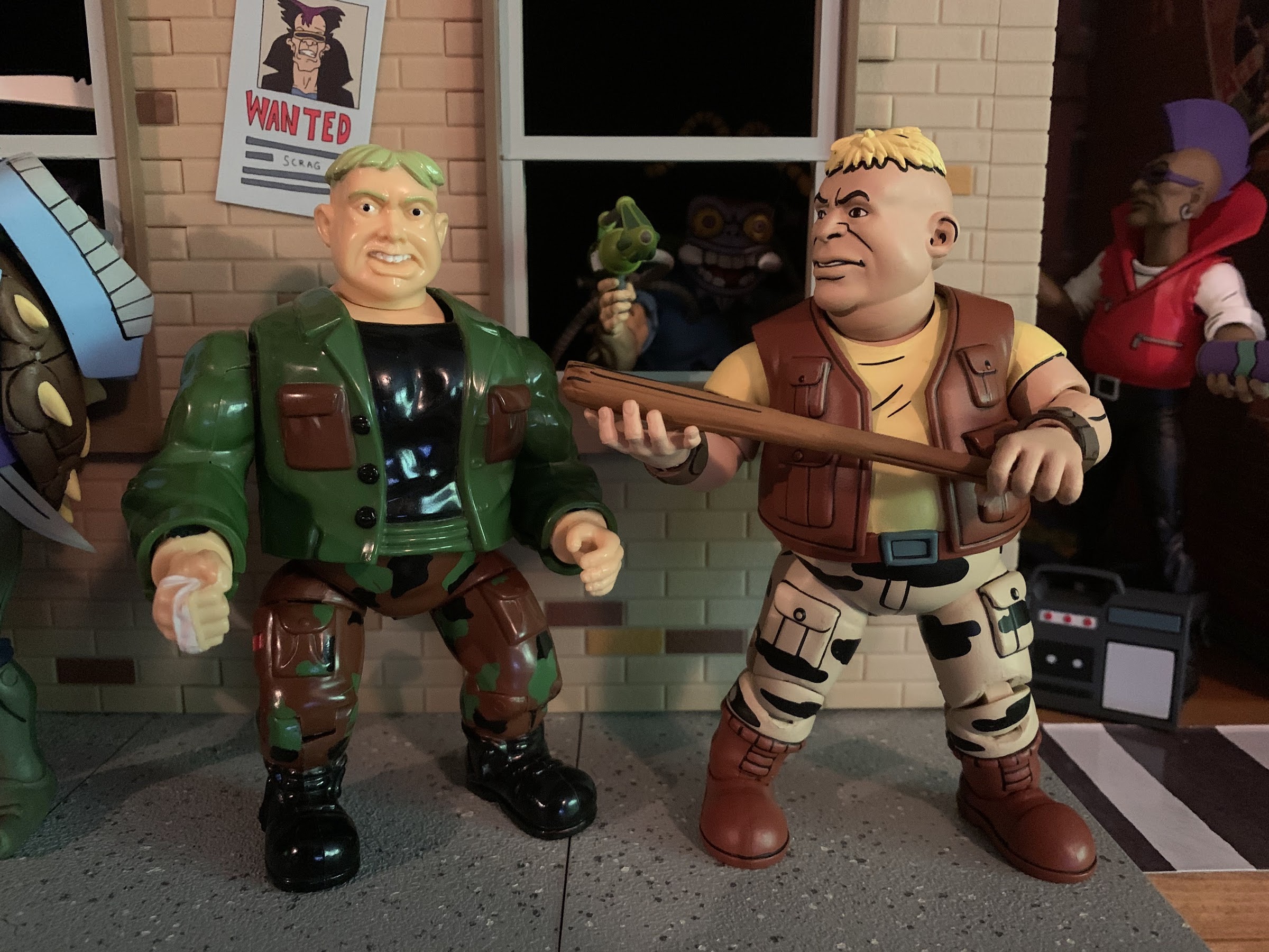
Lastly, we have Rocksteady who features a lot of parts reuse, but not from the rhino version of the character. Like Bebop, Rocksteady gets his parts from a member of the Channel 6 News Crew, in his case it’s Burne. This means Rocksteady is pretty short coming in at 5.5″. He’s probably a bit undersized compared with his character model, but not as severely as Baxter. His proportions are also a little odd as Burne featured a pretty big melon so Rocksteady does as well. His head was not this massive compared with his body in the show, but he’s at least still clearly Rocksteady and wouldn’t be mistaken for someone else. And since he’s based on Burne, he has another oddity in that he has two belts. The overlay on his torso features a belt sculpted onto the bottom while the pants on Burne featured a sculpted belt on the hips piece. It’s only noticeable if you’re looking for it, but it is odd. The paint on him is pretty good though with the pants and vest both featuring the usual shading, though the sleeves of his t-shirt are not shaded. There are some scuff marks on the rear my figure concerning the pants, but the front looks fine. The linework is all done really well, but overall I think he might be the weakest of the set. The giant head just bothers me more than Baxter’s shortness (I’m disregarding the missing glasses since that’s likely a me issue) and he’s another one I’d consider acceptable, but definitely not a strength of the line.

Burne is possibly the worst articulated figure in the line so unfortunately that’s going to extend to Rocksteady as well. The head is on a ball-peg and that’s fine as he’s not restricted by the sculpt at all and can look in all directions. The shoulders are ball-hinged and they can get out to the side, but his elbows are terrible. They’re always bent a little bit, and more-so than we saw with Bebop. There’s just one hinge and when bent fully gets to about 90 degrees, but since the neutral pose is already bent you’re only getting a range of motion here of about 45 degrees. He also has the same issue as Bebop where the elbows are painted and shaped to be below the hinge and it just looks really weird. The hands rotate and hinge horizontally and the waist joint is a ball-peg that just basically allows for a twist with very little forward and back or side-to-side. The legs do not kick out very far, but he can almost do a split. The knees are double-jointed, but very tight. I can get the top hinge to work okay, but the bottom is fairly stubborn. Ideally, if only one worked you’d prefer it be the bottom so the kneecap stays in place. He can bend past 90 degrees though. There’s no boot cut and the ankles do the same thing all of the others do. Overall, he might be the worst articulated, though Baxter does have the long coat to contend with, but the only part I’m really disappointed with are those elbows.
Okay, that was a lot of words on some figures so now lets spend some more on accessories! Each character comes with a set of fist hands in the package and some additional ones to swap to. Baxter has a set of gripping hands with the left hand being looser than the right. He also has a more open, but still clenching, left hand and a right pointing hand. Hamato Yoshi has a set of gripping hands, karate chop hands, and a loose gripping left hand. Bebop has a gripping right hand, an open, but clenchy right hand, and two left loose gripping hands. Those two look almost the same, but I think one is slightly more closed than the other. Functionally, they’re almost the same though and I don’t understand why he doesn’t have a tight, gripping, left hand to pair with the right one. Rocksteady has a set of gripping hands and a set of open hands. The open hands are the same ones that Burne came with and they’re oddly shaped like maybe to be used as typing hands with the computer he came with? They’re weird and probably useless with Rocksteady.

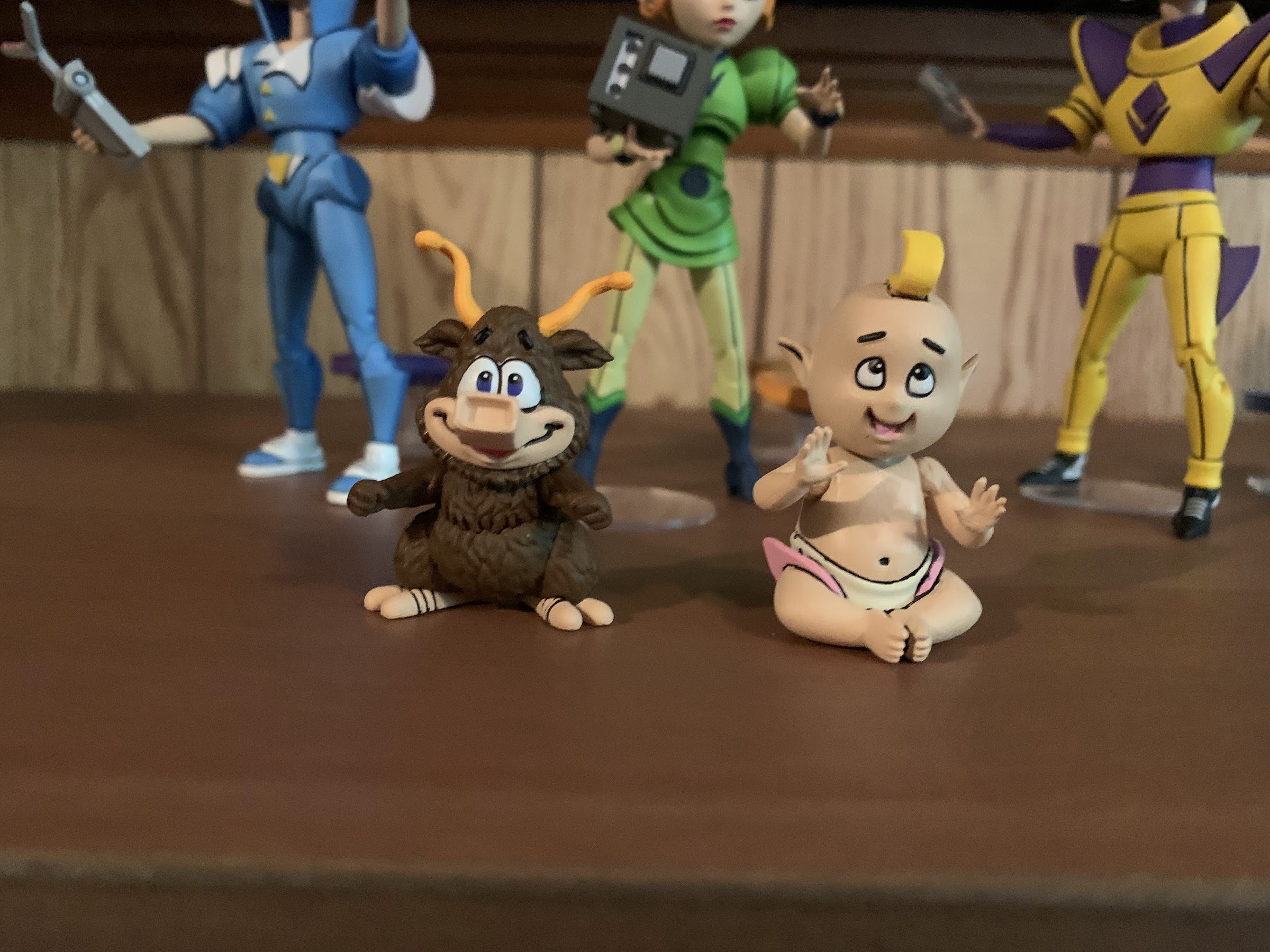
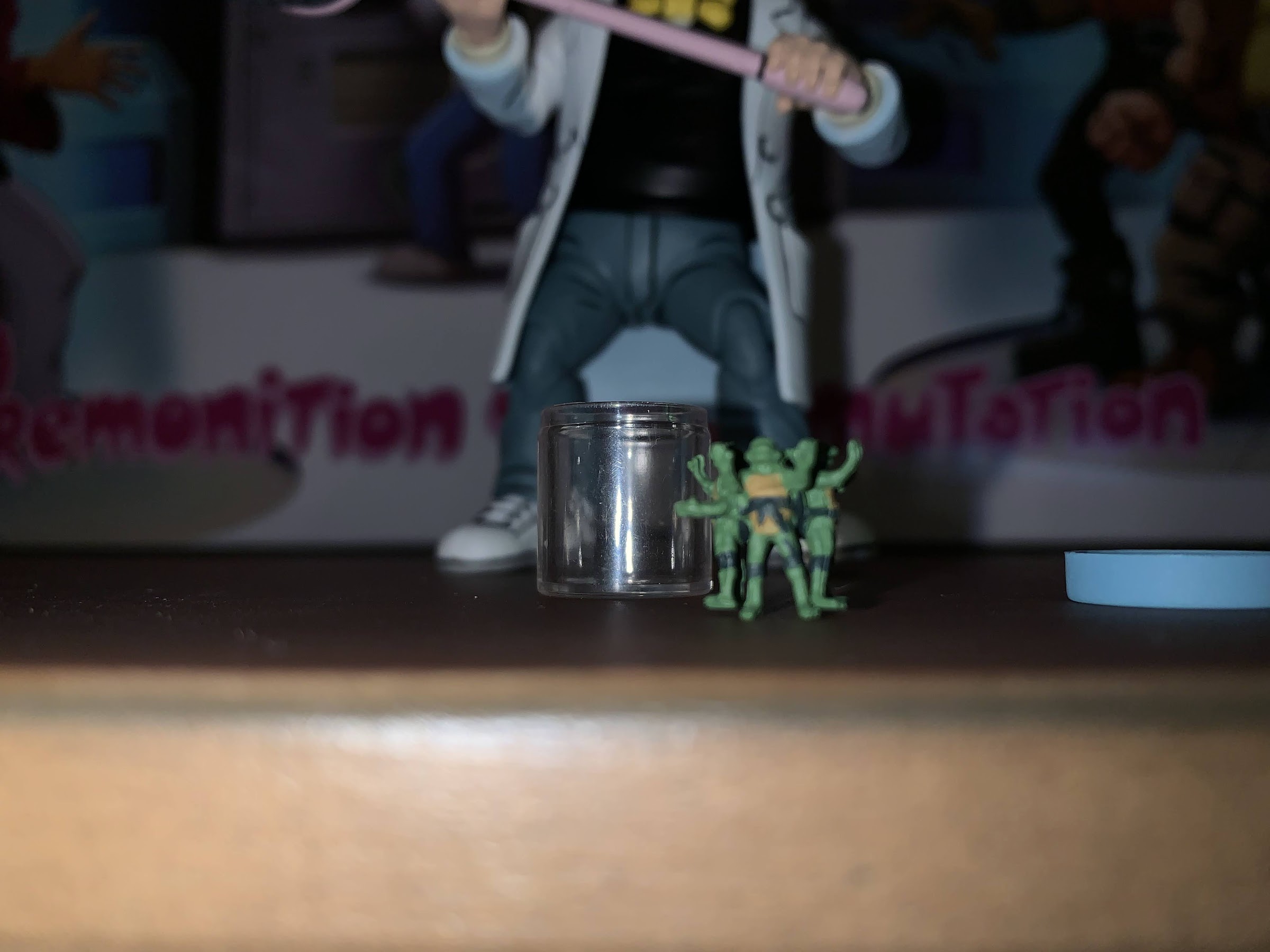
In addition to hands, we have a whole bunch of other stuff too. Baxter comes with another Mouser and its the same as the one from the set released earlier this year. He also has the jeweled tracking device for some special crystal from a Season Two episode and there’s another tracking device that almost looks like it has a turtle shell in the center. They’re both painted very well and give Baxter something to hold onto. He also comes with a net for catching tiny turtles which are also here and come housed in a jar. The turtles are removable, but they’re one piece sculpted together and the only paint is green and yellow. They still look pretty neat and it’s certainly a fun accessory. The sculpt on the tiny turtles is also pretty damn impressive, as far as I can tell. The net is fairly basic and the actual net portion is soft plastic. I’m surprised they didn’t go for the real thing, but maybe that would have cost too much. Baxter Stockman is definitely well-stocked, pun intended, though and about the only thing missing is the remote for the Mousers. I’m seriously shocked that hasn’t been included with something yet.
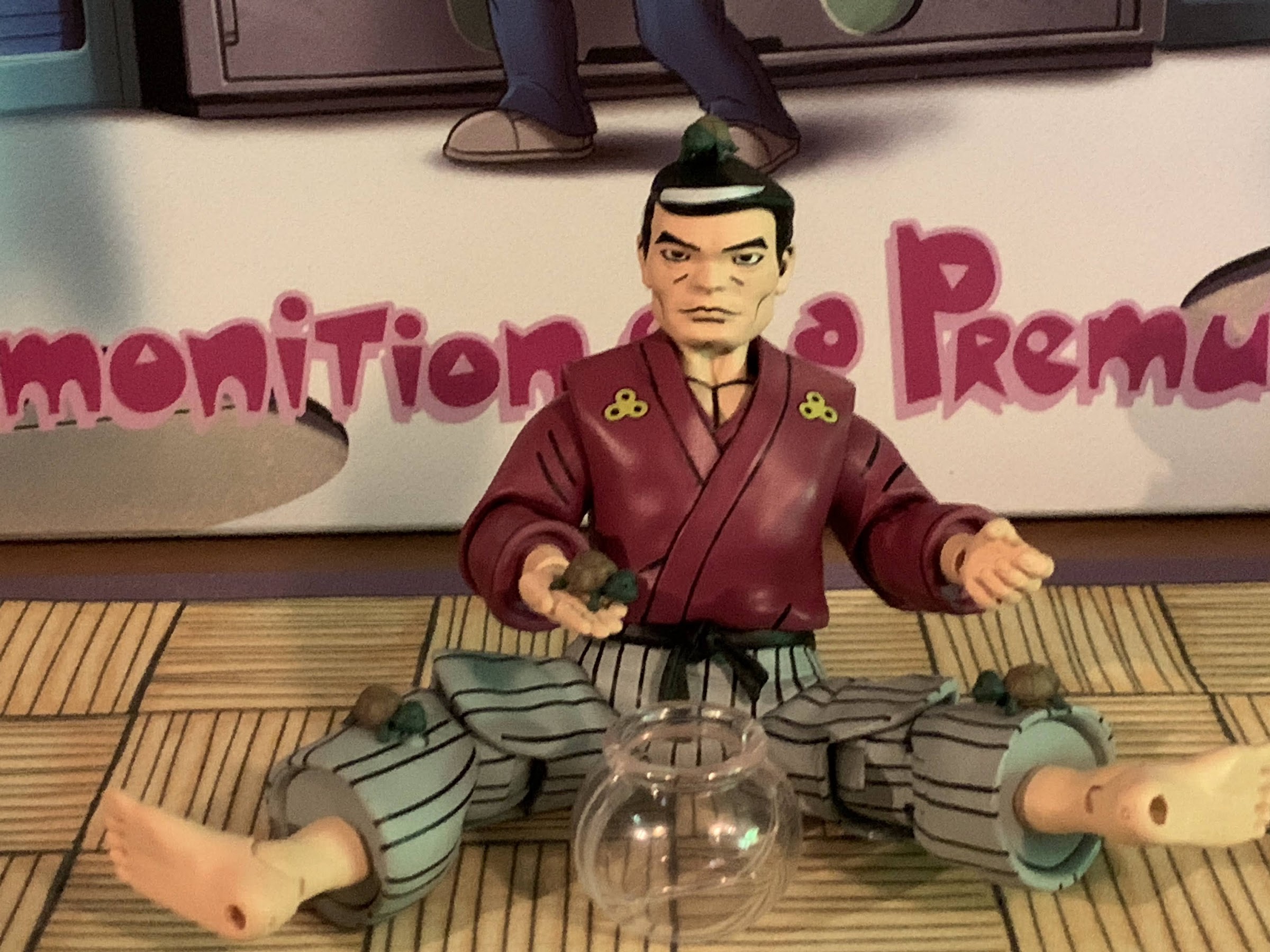
Hamato Yoshi is comparably much lighter in the accessory department than Baxter, but he has a few things. For one, he has a bo staff to arm himself with. It has some sculpted lines to simulate wood grain, but is otherwise very basic and just painted brown. He also comes with a translucent fishbowl and four baby turtles. They’re pretty damn cute and painted rather well considering how small they are. The only thing that stinks about them is it’s really hard to get them to stand on all fours inside the bowl. I’d probably have to get tweezers to do it properly. It would have been nice to get just a blob of mutagen for them to stand on outside of the bowl, and maybe one to go on the back of a shell, but this is fine.
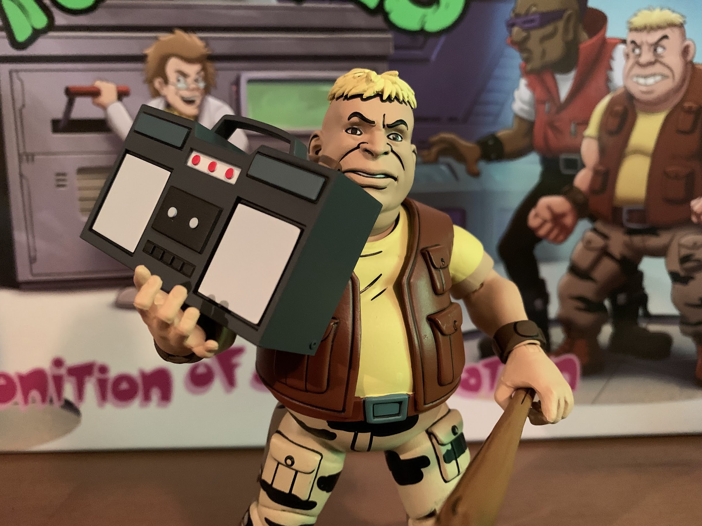
Bebop and Rocksteady essentially have a bunch of stuff they can share. Rocksteady has his stick that sort of resembles a baseball bat, but not quite. It’s a light brown with some black linework and certainly looks the part. There’s also a baseball bat if you prefer the real thing and it’s a very light brown with white tape painted onto the handle, but surprisingly no wood grain. It’s also not the same bat included with Casey Jones as this one is slightly smaller, so that’s also a surprise. There’s also a gray crowbar and an actual chain since I think it was Bebop who did sport one in the show. They also come with two cans of spray paint and the sculpt on these is really fun. It would have been cool if they could have attached the nozzles via small ball-pegs similar to the controls in Krang’s body, but they look cool. One is painted blue with a green, wavy, line across the center while the other is purple with the same green line. Rocksteady really can’t hold them though, but Bebop’s slightly wider clenched hand holds them well. Lastly, we get a new boom box which is different from the one included with the Turtles in Disguise set. It has a fairly simple design, but it’s painted well enough. The accessories are often a strong point with these four-packs, and with this set, that’s pretty much the case. What’s missing amounts to nitpicks, and it’s great to be able to add yet another Mouser to the family.
Overall, this a solid release from NECA. Compared with last year’s convention exclusive, I might like this one just a little bit more because we’re getting four, distinct, characters where as last year’s included another Vernon and Cat April wasn’t particularly high on my wants list. Plus, I can only get so excited for the news crew, even if I did want all of those characters on my shelf. With these four, I did want to add them all. The one I was probably least interested in is Hamato Yoshi, but a TMNT collection should include him so it’s not like I’m disappointed. He also arguably turned out the best out of all of the figures in this set. It’s really between him and Bebop, who would be perfect if not for the elbows. Baxter and Rocksteady are the two most off-model, and my Baxter obviously has the missing glasses which is a real bummer. I’m not one to complain as everyone makes mistakes and all products have a fail rate, but it does irritate me that two out of the past five shipments I’ve received from NECA featured an obvious defect readily apparently to anyone who would have looked at it. A missing accessory stored under the tray would be one thing, but the glasses are supposed to be right on the figure’s face! Does anyone inspect the product before shipping it?
Frustrations aside, if you wanted human versions of these characters in your collection then this set should scratch that itch. Yes, two out of the four figures could have been better from a likeness point-of-view, but they’re not hideous or anything. They just aren’t as good as some of the other releases we’ve seen of late. None are threatening April for worst in the line, but none are challenging the likes of Chrome Dome for the top spot either. They’re merely adequate, but they didn’t really need to do much more than that. If you missed out on the web sales or the convention itself then you may be out of luck when it comes to this set. The after-market will definitely have some and it might not be the type of set that’s super sought after. There is no retail release planned though, but convention exclusives from NECA’s past have shown up recently on costumes.com so maybe keep an eye out there. It’s entirely possible that NECA didn’t sell every set and the extra will show up there or maybe even at Target? In other words, it might pay off to be patient, but it could also mean missing out completely. If this is a set you think your collection will be incomplete without, then it might make more sense to act now rather than chance it. Hopefully, your Baxter will have glasses.

UPDATE: NECA did indeed come through for me, albeit, it took awhile and repeated emails, but I did finally receive a replacement Baxter head on May 20th. That’s about 9 months from when the set was shipped to me. I had “played it cool” and didn’t even follow-up with my initial request until October and, despite politely asking if there was an estimated timeframe for when the replacement might be sent out, I was basically scolded for not being patient. Lovely. I wouldn’t follow-up again until February and I didn’t receive a response. A similar follow-up in April yielded the same, but maybe that one put me back on their radar since it wasn’t that much longer until the replacement was sent out from NECA’s headquarters in New Jersey. I was irritated by the experience as NECA has continued to sell this four-pack at other conventions. They had sets on-hand they could have exchanged mine out with, but chose not to. I don’t think they’ve done another production run and my guess is someone was told to just pull a head out of an existing set or maybe they had already opened one to replace another part/figure for someone else. Either way, they did come through and to some that’s all that matters, but NECA could stand to do better. Hopefully, the other orders I have with them go much smoother.
NECA and TMNT are no strangers to Comic Con as you can see here:

NECA TMNT Cartoon Channel 6 Newsroom SDCC Exclusive Set
Remember San Diego Comic Con? You would be forgiven if you did not since, like last year’s edition, the event was a virtual one once again. Only unlike the 2020 version, this one came with the expectation it would be virtual. It also coincided with a global shipping crisis, so combine that with the expectation…
Keep reading
NECA TMNT Musical Mutagen Tour SDCC Set
Awhile back, I decided to rank the various incarnations of the Teenage Mutant Ninja Turtles from worst to best. Occupying that dubious last place spot were the Turtles featured in The Coming Out of Their Shells tour. That may sound like the title of a TMNT sex tape, but it was something else entirely. If…
Keep reading
NECA 1990 TMNT Movie SDCC Set
For the past several years, the folks over at NECA have been making San Diego Comic Con an annual event for fans of the Teenage Mutant Ninja Turtles. I mean, it’s always an event, but it’s been especially fun for TMNT fans because NECA has been able to release limited action figure sets based on…
Keep reading