Category Archives: Television

S.H.Figuarts Dragon Ball Z Vegeta 24,000 Power Level

Way over 9,000

When a toy line is as long in the tooth as Bandai’s S.H.Figuarts Dragon Ball Z line, producers tend to start looking in all of the various crevices of the property for new material. We recently looked at a figure that did just that in Mecha Frieza, a version of the chief villain of the series that appears briefly in the series and gets summarily dispatched with relative ease. Today’s figure appeared in more episodes of the show, but is still a fairly nuanced look at a popular character.

Assemble The Vegeta Squad!

Depending on who you ask, Vegeta is either the most popular character from Dragon Ball Z or just one of them. Everyone likes the bad boy and Vegeta fits the bill as he started off as a brutal antagonist of Goku before becoming more like a rival with a conscience. When Vegeta first showed up, he was a little guy with outrageous hair and big shoulder pads. He also sported a tail and what was basically a skirt of armor. Following his defeat by the Earthlings, Vegeta winds up on Planet Namek in search of the Dragon Balls so he can have his wish for eternal life granted. And when he showed up on that planet, he was basically in the same attire as he featured on Earth minus the tail and also minus the skirt. And that’s what we have here in Vegeta 24,000 Power Level, the latest delivery from Premium Bandai.

He’s a little guy.

First of all, before we get into the figure do we really think this Vegeta needed to be a Premium Bandai release? Vegeta is immensely popular and this version has never seen release before. The Scouter Vegeta is old at this point and it’s the most similar to this release. I think this should have been a general release. There’s enough new stuff here that I get why it wasn’t one of the $35 Target releases, but if the recent Super Saiyan Gohan (Cell Saga) can be a general release then surely this could have been as well. It being released as part of the web store means it was $65 and required a shipping charge of $10.

I’m not sure how I feel about the off-white armor, but at least the hands will match to past releases.

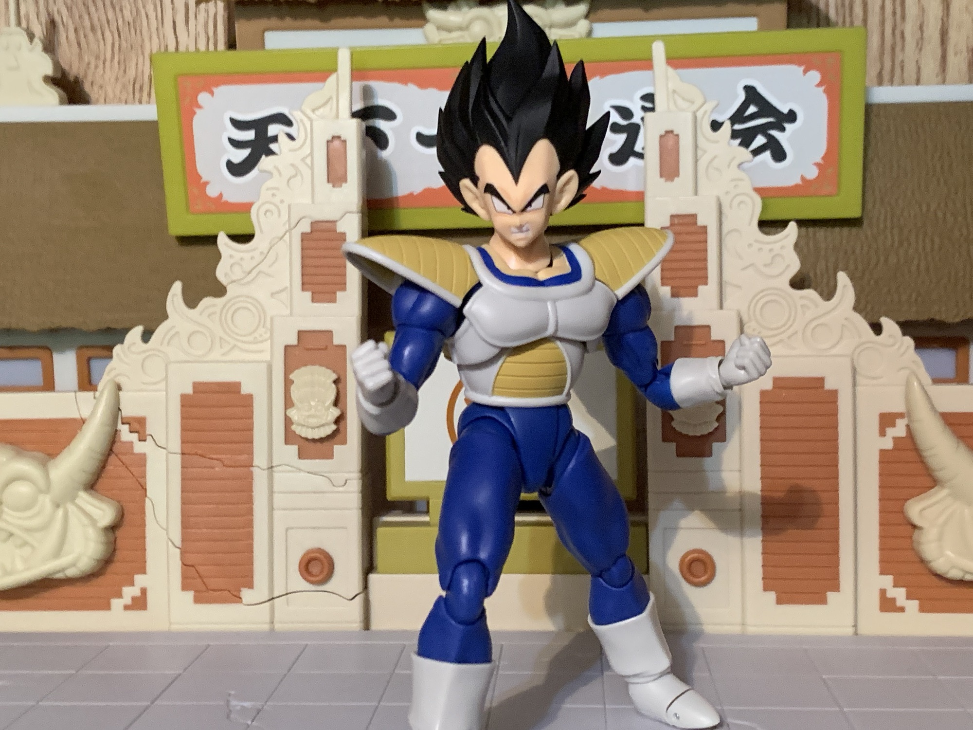
That out of the way, let’s talk about the figure. This Vegeta is mostly new and it takes some old problems and attempts to rectify them. In some ways, Bandai and Tamashii Nations are successful, but in others not so much. Let’s start with the good and it’s that this Vegeta is short. To the top of the exposed flesh of his famous widow’s peak, Vegeta is just a tick over 5″. To the tip of the hair he’s more like 6.25″, but either way it’s shorter than Goku and noticeably so and that’s the way I like my Vegeta. When he became a good guy he basically had height creep as the show and manga went on. He never got as tall as Goku, but he definitely got much closer. And since he is shorter in stature it means he’s mostly new parts. The engineering is the same, but the muscle definition when compared to the Super Saiyan Vegeta release is a touch softer which is a nice detail. It’s very true to the look of the series at this point as this is before the characters became more defined and Toriyama incorporated more straight lines into his art.

You may opt to use this hand with other Vegeta figures.

And speaking of, the thing that will likely stand out most are the included portraits. Bandai took care to make sure Vegeta’s facial features reflect the artwork of this era, something I don’t think the old Scouter Vegeta attempted. It’s ultimately a subtle thing, but likely anyone who has spent a lot of time with DBZ can spot a face from this era vs a later one. The lines around the eyes are rounded off and the chin is less angular. He has more pronounced cheeks and overall the faces look terrific. The rest of the body is true to the show with the broad chest, yellow shoulder pads, and all-white boots. As is often the case with this line, paint is minimal. The white portions are more off-white and it almost looks like there’s a wash, but I don’t see any difference between the exterior whites and the interior so I’m guessing there’s nothing here. The yellow paint for the armor looks fine and the faces look great, but more shading would have helped.

“How is his power level so high?!”

One thing that has plagued characters from this era of the show when making the move to plastic has been these damn shoulder pads. Bandai’s solution over the years has been to make them hinged which allows access to the full range of shoulder articulation, but the trade-off is the shoulder pads look bad when the arms aren’t in a neutral spot. For this figure, Bandai opted to ditch the center hinge and instead use a hinge and peg system located at the base of the rear of the shoulder pad. This allows the shoulder pad to rotate back in addition to hinge up. It’s better, I suppose, but still not ideal and the most annoying aspect of the figure is that the shoulder pads just won’t sit flush against the chest no matter what position the arms are in. It’s worse on the figure’s right side, but it drives me nuts. I don’t like the old hinges, but they at least didn’t have this problem. Really, we should have multiple shoulder pads that peg in so we have a neutral one and one for when the arms are raised. They did this with Jeice of the Ginyu Force, but I don’t know why they’ve never done it again.

“This time, Kakarot, I shall be the victor!”

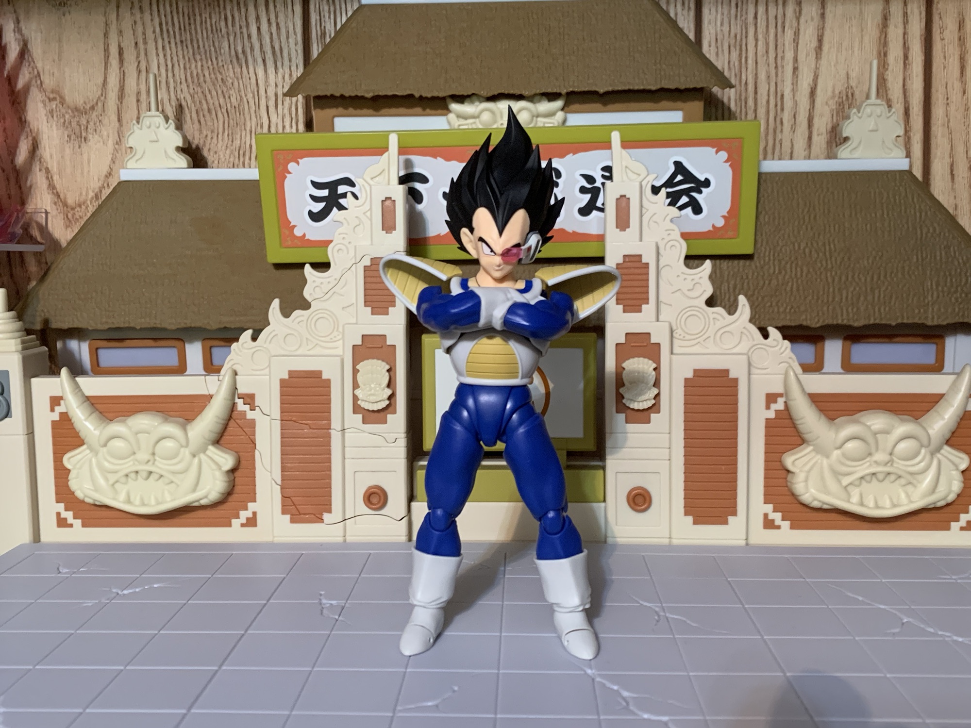
The accessory loadout with this Vegeta isn’t great, but it’s not terrible either. We get four different portraits: neutral, smirk, teeth-showing, and really angry. The really angry expression is nicely stretched and looks really expressive. It’s very much of the era. For hands, we get fists, clenching, splayed open, and chop with the thumb in front, otherwise known as Big Bang Attack posed hands. Even though this era of the character didn’t feature that move, he still held his hand up in such a pose to fire energy blasts. And since the Super Saiyan Vegeta and Super Saiyan Blue Vegeta lacked this hand, it’s nice to get it here and the whites match well enough. We also get a scouter and a left ear for when he’s not wearing the scouter. It looks great, though going without means there will be a seem in front of the ear. It doesn’t really bother me, but I also plan to always go with the scouter anyway.

With the arms sitting high, you will need to rotate the shoulder pads back which also exposes gaps between the shoulders and body.

Lastly, we get a new crossed-arms piece. Previous figures have had this feature and it’s always been done as one piece that connects at the bicep swivel. With this figure, Bandai made the piece the entire arms so they plug into the shoulder, ball, joint. It’s a little harder to work with, and there’s a floating shoulder cap that might go flying when you first pull the arm out, but it does work. The left arm and right arm also separate where the blue sleeve meets the glove of the left arm. This makes it a lot easier to focus on getting the shoulders in place before moving onto adjustment. At first, I couldn’t get the arms to fit on the figure in a way that would allow the shoulder pads to sit in a neutral pose. Even the image on the back of the box couldn’t pull it off and the shoulder pads are up. After more fiddling, I did get it to work better. If you want the arms towards the bottom of the chest, it’s do-able. If you want them higher, you’ll have to rotate the shoulder pads back or up. Either way, while I don’t know if I’m sold on this piece attaching at the shoulder vs the bicep, I do like how it’s two pieces instead of one and it works well enough. Much better than the same for Raditz, anyway.

Pulled back for a more “shelf look,” which honestly doesn’t look terrible.

Articulation for this release is both familiar and yet not. Some of it is pretty good, and some not so good. We already talked about the shoulder pads so we’ll start at the head where Bandai is, once again, using a hinged ball peg. It’s not great, especially if you lose track of what direction the hinge is facing. It’s also tight, which means the much looser lower neck joint will do the heavy lifting when moving the head. The problem there is that the piece sits really high and gets very gappy. It’s ugly, and I can’t think of a figure in this line with a neck joint this unpleasant. The shoulders are on ball pegs with a hinge in the shoulder itself so you get a butterfly joint, but it doesn’t work that great. You basically pull the arm out first to bring it around the front, but the chest is so broad that it would need to move out much farther. Biceps swivel, double-jointed elbows, and wrist ball-hinges are all fine.

The torso features a joint in the diaphragm that feels like a single ball peg. It does very little. The upper torso will rotate and shift side to side, but it gets almost nothing forward and back. The waist joint is just a ball and socket that only swivels so you don’t get to leverage the joint for more forward and back. The legs kick forward and back nicely, but splits aren’t possible as the legs only go out to the side about 45 degrees. The thigh twist is fine and the double-jointed knees as well. The ankles are back to the old ball pegs which are very limited in all facets aside from rotation. There is a toe hinge, but it doesn’t have much range.

With the arms lower, the shoulder pads won’t need to be rotated back, but damn those persistent gaps!

For an S.H.Figuarts release, the articulation is pretty mediocre. We’re used to that when it comes to figures with this style of armor, but there’s no excuse for the lower half being as poor as it is. I’m surprised they didn’t go with a hinged peg in the diaphragm to get more crunch as his articulation there is worse than older figures in armor. This type of thing should be getting better, not worse.

When it comes to this edition of Vegeta, I’m a bit torn. Visually, it works for me as a representation of the character. The shoulder pads drive me nuts and the neck is pretty ugly, though I can at least pose around that to some degree. And the new crossed-arms piece works well enough. As for the rest, the articulation is lackluster and the paint is minimal. We get a nice array of faces and hands, but no effect part. He breaks one shoulder pad pretty quickly in the show so why not a swap-able piece for that? It also would have been nice if they made this figure convertible to a Saiyan Saga one with an included skirt and tail, but oh well. With a little more love, this could have been exceptional, but instead it’s merely passable.

We have plenty more Saiyans to look at:

S.H.Figuarts Nappa – Event Exclusive Color Edition

When it comes to my S.H.Figuarts collection, I’ve been able to largely keep to just Dragon Ball. And by Dragon Ball, I mean the original anime and manga that centered on a young boy named Goku. Even though that’s my favorite edition of the venerable series, it doesn’t mean my favorite is the one shared…

Keep reading

S.H.Figuarts Dragon Ball Z Event Exclusive Raditz and Son Gohan

I’ve been getting a little taste of July of late in the dead of winter as not one, not two, but three action figure exclusives from San Diego Comic Con have arrived at my door. That’s because the nature of the exclusive has changed over the years. Why make a limited number of something and…

Keep reading

Super Saiyan God Super Saiyan Vegeta – S.H.Figuarts 15th Anniversary Ver.

To celebrate the 15th anniversary of the Bandai/Tamashii Nations action figure line, S.H.Figuarts, Bandai turned to the fans. There was a large roster of releases eligible for re-release to mark the occasion, and anyone who wanted to could cast a vote for their five favorites. The winner was, not surprisingly, Vegeta. And in particular, it…

Keep reading

S.H.Figuarts Dragon Ball Z – Mecha Frieza

Talk about your makeovers.

When you have an action figure line as long in the tooth as the Bandai/Tamashii Nations Dragon Ball Z line from S.H.Figuarts, you tend to find some pretty obscure characters making the jump to plastic. Characters that may have existed for a blink and you miss it kind of moment, but when one’s collection already has most of the heavy hitters, the company needs to find ways to keep things fresh. That should be how we think of today’s figure, Mecha Frieza, a version of the villain that basically showed up for an episode and got murdered by Trunks, but since this is a variation on the long-running manga/anime’s chief villain, it doesn’t exactly feel like a deep cut.

I’m surprised that he didn’t view this as an opportunity to get taller.

Mecha Frieza is the end result of Frieza’s battle with Goku on the doomed planet Namek. After getting walloped by his own buzz saw-like attack, Frieza takes an energy blast from Goku right in the face and seems to be left for dead. Missing an arm, a chunk of his face, and all of his lower half, Frieza seemed like a goner, but apparently his race is able to survive even when blown apart. His father, King Cold (snicker), and the various minions at his disposal are able to fashion new, mechanical, parts to rebuild the villain and once completed he immediately sets course for Earth to exact revenge upon Goku. Only, Goku is no where to be found and instead he comes face to face with the Saiyan from the future – Trunks. From there, Frieza is dispatched effortlessly as he was just there to show how powerful a Super Saiyan really is. In other words, Mecha Frieza is a chump.

Frieza! Number one!

He’s a cool looking chump though! Mecha Frieza is a fun design as it takes the villain and covers him in odd junk. It’s a very Akira Toriyama-like design and seems rather out of place in this era of Dragon Ball. It’s a fun juxtaposition with the otherwise sleek and clean look of Frieza’s fourth form and the different textures and finishes just cry out to be captured in plastic. Years ago when Irwin Toys had the license to make Dragon Ball figures, Mecha Frieza was basically their crowning achievement. I should dig it out some day to see how it’s aged, but in my mind’s eye it was basically perfect from a sculpt presentation. Because of that, this version of Frieza has long been on my short list as a want when it comes to the S.H.Figuarts line. It just seemed like a character design that would display well. It would require more paint, more texture, than the average character in this line allowing it to occupy a prominent spot in any display. Last year, Bandai decided to make it happen and put Mecha Frieza up for preorder through the Premium Bandai website. Premium Bandai is essentially a made-to-order model for action figure production and since this figure is a bit more involved than most, it didn’t feel misplaced (where as, releasing any Vegeta through this model seems absurd, but whatever). I’ve had this figure for a little while now, but I finally have found the time to let you know how I think it turned out.

All of these new components did nothing for his bedside manner.

Mecha Frieza comes in the standard SHF packaging with product shots all around and a window on the front. The figure itself stands approximately 4.75″ to the highest point of its head. As expected, there’s a lot going on here and in some respects this may be the best work of Tamashii Nations. There’s a lot of white plastic for the remaining fleshy bits of Frieza with a slight blueish tone that looks rather nice. The black portions are mostly painted and they have this satin finish that looks really good in person and in photographs while the metallic bits are nice and shiny. The brown panels are painted cleanly as are the facial details. There’s some great sculpt work, especially in the robotic hand, and there’s a clever mix of parts that are either fitted together tightly or glued. It looks like the silver portion of the head and chest is separately molded and it’s a very involved sculpt that actually earns the “premium” designation.

These shoulder “caps” are unnecessary and feel like a case of over-engineering.

It’s not all perfect though. Bandai did do a couple of things with this figure that I don’t care for. One is the shoulders. I guess it’s for articulation purposes, but the outer shoulders are basically plastic caps connected via a hinge. It seems completely unnecessary to me and it’s not something done on the standard fourth form Frieza and I don’t think they’re doing this with the upcoming full power edition. It’s a harder, thinner, plastic too which looks cheap. The left shoulder which is painted black and brown looks fine, but the white shoulder with the purple cap does not look good as the white isn’t the same shade of white as the rest of the arm.

I’m also not a fan of the articulated tail. Just make it one, continuous, piece, please.

Another visual aspect I don’t care for is the tail. It’s well-sculpted and appropriately shiny, but Bandai decided it needed an articulation point in the middle that does next to nothing and looks bad. It’s also hard to attach to the figure and is cumbersome to deal with. Lastly, and the issue that bugs me the most, is the head on this figure is just too big. I’m guessing they enlarged it to better capture the detail, but he’s a real egghead. It’s really apparent when placing him beside the previous version of Frieza, and while I do think the head should be bigger than it is with that figure, not to this degree. They took it too far. And while the painted details they did add look great, there are still some slashes and such on the figure left unpainted which is a shame. I think a little color, or even just a wash, over those would have helped enhance this figure even further.

Flight stands aren’t a bad idea with this guy as the tail can make him difficult to stand.

Mecha Frieza comes with a fair amount of accessories. For hands, we get four sets: fists, open, clenching, and pointing. The figure also comes with four portraits: smiling, toothy smile, teeth-clenching, and yelling. The choice of expressions is done pretty well, but the quality control is a bit iffy. The heads are basically two sculpts fitted together where the white parts are out of one mold and the cybernetic parts out of another. On two of my heads, the parts aren’t seated properly. The angry, teeth-gritting head looks the worst as there’s a gap near the chin. The brown panel and the blue, transistor, things on the right side of the head are removable and intended to swap between the heads. I guess this was done to cut down on the paint hits?

This head isn’t quite assembled properly. It may seem like a small detail, but for the price point this shouldn’t happen.

The most attention-grabbing accessory though is definitely the sliced-in-half body. Mecha Frieza is best known for dying, so it makes sense that his figure should capture that. And since he got anime-sliced down the middle, it presented a real challenge for Bandai if they wanted to capture that in figure form. In order to do that, Bandai supplied a whole, separate, torso. It’s of Frieza with a horrified expression on his face. It’s basically cut in half, but glued together askew like his body is sliding apart. It is completely unarticulated, but there are no arms, legs, or tail. Instead, you’re supposed to disconnect the arms and legs from the main figure and affix them here. Same goes for the tail. There’s a circular, acrylic, base with a question mark-shaped post that plugs into it and then into the back of this bust. Because Frieza is hunched over, it’s a little more challenging to display than I’d like has he’s listing forward. It basically has to go as far back as the tail will allow to look its best. It’s also kind of annoying because it means you have to disconnect parts from the actual figure. Would it have cost that much more to just go all the way and put sculpted arms and legs onto this thing? It looks cool, but I don’t want to sacrifice the main figure to this thing.

“Hmm, it’s a bit grotesque, but what can I say? I do like it.”

Since this is an SHF release it’s obviously going to have quite a bit of articulation. Mecha Frieza does some good, and some not so good, when it comes to posing. The head is on the very annoying hinged ball peg. It means if you want to use the hinge you need to be mindful of which direction it’s facing since it rotates at the base. The neck is also on a ball peg and it has a habit of raising up a bit and creating a gap, but it can be reseated. I mentioned the hinged shoulder caps and they don’t do a whole lot, but if they pop off on you (one of mine arrived disconnected) they’ll be a bear to get back on. The biceps swivel is fine and the double-jointed elbows will go a bit past 90. I find the top joint in the elbow to be pretty tight and hard to work with. Hinged ball pegs at the wrist are fine.

“Looks like you will be the first of Goku’s friends to die, boy!”
“WHAT?! I thought I destroyed all of those monkeys and their offspring!”

The torso is a bit of another trouble spot because Frieza has this purple shield-like plate right in the middle of his body. It’s a separate piece of plastic that can pop off, but it will restrict Frieza from crunching forward much. Going back is okay, and there’s a ball peg at the waist that will add more range going in both directions, but it’s nothing crazy. The hips are the annoying drop-down style which have a tendency to be loose. Frieza’s are right at the edge of being too loose. He can’t do splits even with them, but at least he can kick fairly high. The thigh swivel works and looks pretty nice since it works with the sculpt. The double-jointed knees are fine and the ball-hinged ankles are okay. The ankle rocker is pretty steep. The tail articulation is pretty bad though. Hinged pegs at the rear and the midpoint function more like swivels. The midpoint joint is especially useless.

“No! I am still Frieza! The mightiest in all the known universe! I will not be felled by a blond-haired swordsman!”
“Gah!”

Mecha Frieza is an interesting release and in some ways a frustrating one. It’s not frustrating in the sense that it drives me nuts when in-hand like Super Saiyan Trunks, but frustrating in that it’s so close to being one of the best figures in the line. The sculpt and paint are terrific and well-executed. The oversized head is my main critique and I absolutely hate the tail. If the sliced accessory could display on its own without having to sacrifice the figure proper then it would be all the better. I think this figure was $85 plus shipping and at that price point it shouldn’t feel incomplete. Even with the imperfections, this is a figure I do think is worth having for your DBZ collection. Frieza is arguably the best villain the series has produced and he’s certainly become the most enduring and this form is perhaps the most interesting from a visual perspective. Sure, he showed up to die, but at least it was memorable. Certainly far more memorable than King Cold, and a great deal cheaper too.

“No…how could this…be..?!”

If you liked reading about this one then maybe you’ll enjoy one of these other Dragon Ball figure reviews:


Super 7 The Simpsons Ultimates! King-Size Homer

Homer is large and, more or less, in charge.

Well, we’ve done it. We’ve reached the last figure in Super7’s line of Ultimates! action figures based on The Simpsons. Did we save the best for last? No, not really, but I am happy to say today’s figure is definitely not the worst. And this fourth and final wave has featured multiple contenders for worst in the line. I don’t wish to beat a dead horse, but for whatever reason this fourth wave was pretty terrible. Even the figures that look fine, like last week’s Drederick Tatum, suffer from inexcusable levels of quality control. How hard is it to make sure an arm or a leg fits properly? I don’t know. A lot of toy companies seem to have no issues with such things, but Super7 has certainly made it look challenging with this line.

A much wider Homer than we’re used to.

King-Size Homer comes from the episode of the same name from the show’s seventh season. It is our second Homer Simpson in this short-lived line of action figures which normally wouldn’t seem like something that stood out, but here it does considering we never got a Marge or a Lisa in the line. The company that made it a point to include a female character in each wave of its Mighty Morphin Power Rangers line didn’t seem to find any value in doing the Simpson women before double-dipping on Homer. Cool. At least this Homer is a little more of a popular variant than wave one’s Deep Space Homer. Not that Homer going to space wasn’t a memorable episode, it’s just that there are a lot of Homer variants I would have gone with over that one. I still would have chosen several over this version as well, but I concede that of all the various Homer Simpson looks he’s had in the show, this is among the most memorable. And it’s way better than Dancing Homer or Homer the Vigilante, though it’s no Mr. Plow.

Oh look, he’s monologuing again.

King-Size Homer comes in the standard box with no slipcover, as has been true of every figure in this wave. If you’re unfamiliar with the episode, this gargantuan Homer is the result of him trying to gain a bunch of weight to be declared medically obese and thus eligible to work from home. As evidenced by his appearance here, Homer was pretty successful in packing on the pounds (thank you Play-Doh doughnut) and achieved his dream. Homer stands at right around the 7″ mark which is more or less in-line with the wave one figure, only now he possesses far more girth. He’s in his floral moo-moo and comes packaged with his “fat guy hat” and has an optional soft goods cape. Since this Homer is far bigger than the last, everything here is new sculpt and it looks pretty good. Homer has his much girthier neck and even his hands have been enlarged to match the show.

This sort of thing drives me nuts.

As for the paint, well it’s again another mixed bag. Unlike that first wave Homer, this one is done in yellow plastic and not painted over. There is a matte coat to cut down on the shininess of the plastic, but he has a cheaper look than that first Homer as a result, but it also puts him in-line with Devil Flanders, Burns, and Ralph. The strands of hair atop his head are done with soft plastic and with Homer it works far better than it does with Ralph. Unfortunately, he’s packaged wearing his hat and the default head on my figure has some warped hair as a result. It also has a blob of white paint on the back of the head too. The garment he’s wearing looks okay and the flowers are painted cleanly, but they did a thing that really annoys me. Since Homer has a cut for articulation in the torso, some of the floral pattern gets broken up and if you line-up one flower it doesn’t line up all of them. The cape looks nice at least and it’s well-tailored. It might be a tad on the small side, but it’s not as if it gets lost when he’s wearing it. It just slips over the head and it completes the look. The paint on the shoes and eyes is hit or miss. Some portraits look good, while others have a sloppy edge to the eyes. My Homer’s right shoe has a chunk of white missing around the sole.

Reaching broom included.

For accessories, Homer comes with various items from the episode that should look pretty familiar. For heads, we get one with a slight smile, a side-eyed angry expression, and one where he’s making his “Ooo” mouth. It’s basically the same expression that Deep Space Homer came with, which is one I like, but it feels a little redundant. For hands, Homer has fists and that’s really the only “set” he has as the rest are specialized hands. He has a gripping left hand which seems intended to work with his ice cream cone (Ooo, raspberry). The cone looks fine and comes close to matching Ralph’s alternate head which I suppose is nice for symmetry. There’s a different-shaped gripping right hand and that’s intended to work with Homer’s “reaching broom.” In the episode, Homer sits on the couch watching TV and utilizes the broom to just whack the keyboard of his work computer so it seems like he’s doing something. The broom-head has sculpted indentations for his fingers and thumb to slot into and he gets a pretty good grip on it. Sadly, his articulation is lacking so he can’t really use it as intended, but we’ll get to that. There’s also an open left hand and that one works well with the famous drinking bird. This is the bird Homer got from his brother Herb in the season three episode “Brother Can You Spare Two Dimes” and it’s a novelty toy. It returns as Homer’s assistant in the episode. The bird is articulated so you can simulate the pendulum effect it’s supposed to have. The sculpt and paint are fine, and this is an accessory Homer had to come with. Lastly, Homer has a pointing right hand and his medal which he is awarded at the end of the episode for using his ass to prevent the release of deadly, poison, gas.

At least they got this guy in.

It’s a solid spread of accessories and I think Super7 keyed in on the right objects from the episode to give Homer. They could have given him a computer, but as we saw with Ralph, without something to put the PC on it serves little purpose. I would have preferred an expression that could work with the ice cream cone, but I suspect that didn’t happen because he can’t reach his face. There is absolutely one thing missing though and it’s Homer’s sign from the episode that reads “Give Me Ride or Everybody Dies.” Really, that scene should have been priority for Super7. Cut the pointing hand and replace it with a hitchhiker’s thumb. Cut either alternate portrait and give us exasperated Homer with his hair limp. When you’re going to do these episode specific action figures you really need to hit on the episode’s best jokes and Super7 certainly whiffed on that one.

They’ve been staring at this bird for hours.

As for the articulation I’ve been teasing, what is there really to say? It’s terrible. Just look at this guy. It was going to be bad and it is as expected. He is basically a statue with arms that swivel. The head is the only aspect of the figure that has moderate range, because the rest does not. The elbows are poor, the diaphragm twist adds little, and the garment renders the leg articulation absolutely useless. They could have done absolutely nothing with his legs and the figure probably would not have suffered for it. I’m not going to kill Super7 for the articulation here because there isn’t much that can be done with a comically obese Homer Simpson. Maybe if they had done all of the clothes with soft goods it would have allowed for the legs to have some utility, but to do what, really? I guess it would be cool if he could sit down, but the line didn’t last long enough for Super7 to deliver a couch. The only thing that sucks is the lack of a vertical wrist hinge so he could properly wield his reaching broom. The cape at least has a wire, so you can add some dramatic flair to your Homer, but this is a figure that is just going to stand there.

You’re probably not getting that cone much closer to his face.

King-Size Homer isn’t exactly a homerun Homer, but he’s a cromulent one. The look, aside from my nitpick with the floral pattern, is on-model and while I bemoan the lack of yellow paint at least the finish is a matte one. The accessories are also pretty solid and the figure looks good with or without the costume accessories in the form of the hat and cape. I’d be a lot higher on the figure if Super7 had nailed the “Give Me Ride or Everybody Dies” scene and if this figure carried the standard MSRP of $55. It does not and instead will set you back $65. I guess because there is a minor uptick in plastic versus some of the other figures? Hell if I know why it’s more money since one would assume Homer is going to sell the best out of all of the figures in the wave. I can kind of see charging more for an obscure character like Drederick Tatum, but a popular version of Homer? The pricing is absurd, but is functionally moot since this line is dead. This figure is all but guaranteed to hit the clearance rack before long so you need only wait it out if you want a better deal.

The only award this line will ever receive.

And that’s a wrap on Super7’s journey with The Simpsons. It got off to an odd start given the confusing character selection and long wait for wave one. Plus the thing with Moe’s apron wasn’t great, but remedied in a fairly painless fashion. I felt the quality of the first two waves was pretty damn good though and the figures were about as good as I think could be expected of Super7. The issues with those figures were just the choice of characters and I suppose disagreements over accessories. Starting with the third wave though, the quality took a hit in particular with Burns and Ralph and this fourth wave was practically a disaster. King-Size Homer is the only figure in the wave without blatantly obvious quality control issues. I suppose the only good thing for Super7 is that waves 2, 3, and 4 basically all arrived at the same time so the line didn’t experience a gradual decline, it just went off a cliff.

“Way to lower the quality of the line, Flanders!”

It leaves me wondering what will be the legacy of Super7’s take on The Simpsons? I’m guessing it will be viewed as a failure considering a great many fans were unhappy about the character selection and we know the intent was to pivot away from this approach with the canceled fifth wave. It should have a “missed opportunity” vibe, but did we really miss out on much? If the fourth wave is any indication then no, because it can be assumed the fifth would have sucked just as hard. The majority of this line was just flat-out not worth the money and yet the price kept going up while the figures were getting worse. That’s a pretty bad combination. The figures also lack an attention to detail that would have made it feel like truly hardcore Simpsons fans were in charge at Super7. Lacking that charm, there’s no pull. I don’t see these figures appreciating in value and becoming something fans who missed out on chase down ten years from now. Maybe they will the ReAction figures which were actually pretty well done. Perhaps I should make a post on them because they were certainly more deserving of your money than the Ultimates! line and they actually form a cohesive display, premature death and all. In the end, The Simpsons and Super7 is just a thing that happened. If the line has any sort of lasting ramifications it may be something we look back on as the beginning of the end for Super7’s Ultimates! because the company’s reputation certainly didn’t get better by producing this line.

Here it is, for better or worse, the entire assortment of Simpsons Ultimates! by Super7.

Missed any of our Simpsons Ultimates! coverage?

Super7 The Simpsons Ultimates! Drederick Tatum

We have looked at 15 figures from Super7’s line of Ultimates! action figures based on The Simpsons and we’re about to look at the 16th. What I’m wondering at this stage is do I need to keep talking about the baffling character selection? Yes, yes I do. Drederick Tatum is today’s figure, the show’s Mike…

Keep reading

Super7 The Simpsons Ultimates! Radioactive Man

Last week, we started on our journey through the fourth and final wave of Ultimates! from Super7 based on The Simpsons. It did not start well. Devil Flanders represented a new low point for the line and maybe for Super7 as a whole. I know I certainly do not own a worse Super7 figure than…

Keep reading

Super7 The Simpsons Ultimates! Devil Flanders

Last week, we concluded our look at the third wave of Super7’s line of figures based on The Simpsons and now we embark on the fourth and final wave. That’s right, Disney pulled the rug out from under Super7 and handed The Simpsons license over to Jakks. Their products will start rolling out this fall.…

Keep reading

Mondo X-Men TAS 1/6 Scale Rogue – Limited Edition

Rogue is here to add a little drama to your shelf.

The conclusion of X-Men ’97‘s first season has left behind a void. For 9 consecutive Wednesdays, we had something awesome to get up for. Now the long wait for a second season has begun, but here to help fill the void while we wait is Mondo. Mondo has been dishing out some very impressive sixth scale action figures based on X-Men, the ’92 version. I’ve been waiting since that show debuted for action figures dedicated to that show that match the quality and accuracy that I want from a figure line. I probably wouldn’t have selected this scale for such a line, but basically everything else has been great. And now here to bolster the ranks of the X-Men is the best female member of the team: Rogue.

The only surprise with the packaging is that they didn’t use the storyboard from the Apocalypse episode. You know the image I’m thinking of.

X-Men was my formal introduction to the character Rogue. I had seen her on the cover of comics, but always in her 80s look. When the cartoon debuted I only knew the two characters were the same because of her unique hair color. Rogue, despite looking like a super model, is the muscle of the team. She can knock a Sentinel’s head clear off with a punch and look good while doing it, but like all good characters her powers come with a price. And for her, it’s that she can’t touch another living person without sucking the life from them. This allows her to steal other powers from her fellow mutants which is pretty cool, but not being able to physically touch or kiss another human is a trade-off she often wrestles with. Her inability to touch makes her one of the most empathetic members of the team and someone that’s easy to sympathize with. Despite that personal torment, she is often able to maintain an upbeat personality, can dish out puns with the best of them, and doesn’t mind getting her hands dirty when the situation calls for such.

There’s a lot to like about this figure, but I don’t think they quite nailed it with this default portrait.

Rogue from Mondo is a lot like the other figures released so far. She’s designed and sculpted by Alex Brewer and comes in a box featuring original artwork by storyboard artist for the show Dan Veesenmeyer. Tom Rozejowski handled the paint master and the rest of the packaging is adorned with recreations of original storyboards from the show from the episode “Till Death Do Us Part.” Original series showrunner and writers Eric Lewald and Julia Lewald provide the character bio which is situated on the inner flap of the box. Behind that is a window box showcasing Rogue and her array of accessories. This version of the figure is the limited variant which sold out much faster than any other limited edition to come before it in this line. Is that the popularity of Rogue or did she get an X-Men ’97 aided boost since anticipation was building to a fever pitch when she went up for sale?

That’s more like it!

Per Mondo, Rogue stands at approximately 11.75″ and I’m willing to take them at their word. She’s taller than Wolverine and Jubilee, but shorter than Gambit, Magneto, and the rest. That seems suitable and she seems much closer to true sixth scale than some of the other characters. She is wearing her show accurate yellow and green bodysuit with olive drab coat. She sports a variation on thigh-high boots in the show and Mondo’s approach for that was to make the green straps at the top of the boot as well as the yellow cuff separate, floating, pieces. Perhaps going this route made the figure easier to paint? Or maybe it was to allow these legs to be repurposed for a Storm down the road? Either way, the moving parts on a figure with so much paint are a little worrisome, but they can be seated in such a way that they’ll seldom move. Just do be careful when positioning them to not create a paint rub situation.

And if you want to get cheeky.

The head on the figure has received some criticism and it’s not unwarranted. The default portrait is basically a neutral expression. Rogue’s face has always been tough to duplicate in plastic for some reason. I think it’s because the female characters tend to not have hard facial features so there’s not a lot to key-in on. For the figure, Rogue features a very glammed-up look. Her eyes are narrow with long lashes and her lips are full and pouty. The paint is applied well as are the eyes (Mondo sent out a warning before the figure shipped that some heads featured poor eye placement. If your figure looks off just email their customer service and they’ll replace it), but it doesn’t really resemble Rogue. More like an artist’s interpretation of what a more sultry Rogue might look like. Or Rogue if she were in a Barbie line.

It might not be show accurate, but this power absorption hand is pretty neat.
Sorry Logan, not this time.

Thankfully, we have other, better, heads to choose from and the limited edition has far more than the standard. The alternate head for the standard edition is an angry expression and this works just fine. The right eye on mine features a dot of skin tone, but otherwise looks great. I think a lot of people will go with this for their display, whether they bought the limited edition or standard. If you did grab the limited version then you have some harder decisions to make. First up is the winking smile. The smile is very wide so this head doesn’t quite resemble the character from the show, but damn if it isn’t cute. I really like this one, though it does make me wish we had a non-winking smile portrait as well. Or perhaps a more subtle smile.

This is just fantastic.

Our next portrait is pulled directly from the show. In the episode “Deadly Reunions,” Cyclops gets knocked unconscious and stops breathing momentarily. Rogue, in an effort to save him, gives him mouth-to-mouth (C.P.R. back then called for this) and it works, but it also causes Rogue to absorb his powers. Rogue’s eyes start blasting red energy until Cyclops is able to instruct her to just shut her eyes. The included portrait is a screaming Rogue with those lasers streaking from her eyes. They’re done with translucent, red, plastic and it looks awesome. In some ways, I think this head most looks like Rogue from the show, probably because we can’t see her eyes and she looks kind of angry. The last head in the box is a bit of a gimmick one as it’s Rogue from X-Men: Evolution. Like the fairy Jubilee or unmasked Sabretooth, this head doesn’t work with the body since that Rogue had a very different look. It’s more of a fun inclusion. It looks fine, but I do think they should have added a touch of shading to the brim of her nose since that was something always present in the show.

I guess this one is for the younger fans.

That’s a whole bunch of looks for Rogue and one, if not more, are sure to please those who pick this one up. Also included are a whole bunch of hands. Rogue comes packaged with open hands, but she also has a set of fists, a right trigger hand, a left gripping hand, a more casual gripping right hand, and a bare left hand. When the left hand is removed, the yellow cuff is a separate piece which slides off to sell the look of her going ungloved. There’s also a removed glove accessory which slips into the casual gripping hand quite well. I do wish we got two bare hands since she did grab enemies with both hands at times, but one is better than none. If you want her to look like she is actually draining someone’s energy, she has yet another open left hand, but this one is encircled in translucent blue plastic. I don’t think her power absorption abilities were ever depicted like this in the show, her hand usually just glowed white and the light sometimes traveled up her arm, but I can’t deny that this hand looks pretty cool. Another included effect part of sorts is a gripping right hand that’s crushing a small gun. I don’t recall this gun or scene, I remember her crushing Bishop’s armband, but it’s an effective accessory at showing her strength.

This thing is all kinds of rad.
And the base works pretty damn well as a stand too.

The last major accessory included in the limited edition version is a base. Rogue is the first figure to get a base and Mondo stated they felt it was important to include something that hinted at her power. To do that, Mondo decided a decimated Sentinel head made the most sense. It’s well sculpted and really well painted and resembles a Sentinel from the show. There are two foot indentations, one towards the front and one towards the back, that the figure slides into rather effortlessly. It does a pretty good job of holding Rogue up too, though she has tumbled to the side on me once already. It’s not super heavy, so the figure took the base with it in falling over. I’ve resituated the figure on the base amongst my other figures in the line and hopefully she holds true. She also comes with a standard Mondo stand and I could potentially use that in conjunction with the base for added stability. One of the stands from a past release (Magneto?) that I have also has worked well to hold her off the ground just a little bit. That particular one has a very strong, telescoping, arm to it and can support the figure’s weight while some of the others feel too loose. I’m sure there will be folks in search of a proper flight stand for this figure and if I come across any that work I’ll be sure to update this.

Magneto has something to show you, Rogue.
A little X-Men ’97 preview, I suppose.

The visual aesthetics are what this line goes for, but this is an action figure so it does articulate. Rogue moves about as well as the rest of the line, and in some respects, perhaps a bit better. The head, shoulders, elbows, and wrists are all standard for the line. We’re talking a double ball peg at the head, single-hinges and swivels at the elbow, ball-jointed wrists, and ball-hinged shoulders. The head is limited by her big hair, but they did a decent job of sculpting out some room so the head can turn a bit and tilt. The shoulders and elbows are the most limiting. She can’t bring her arms across her chest or her hands to her face and it’s just something you’ll have to work around. Rogue does not have a waist twist, but does have a ball-jointed diaphragm. Mondo used a curved cut for it and I’m a tad surprised they didn’t try to conceal the cut under her bust or perhaps along the rib cage. It at least works well enough as a rotation point and it allows for a little forward and back. The hips are big ‘ole ball sockets and have probably the best range of any joint on the figure. They’re almost loose and I’m curious if they’ll get to the point where I do consider them loose, but for now they hold their pose fine. The knees are double-jointed and work okay while the ankles feature a hinge and an ankle rocker.

“Hey Remy, you got any plans tonight?!”
“I didn’t know you could read minds, ‘cherie.”

Since Rogue does wear high heels, she is a bit of a challenge to stand. It’s not as bad as I was expecting though. If you’re just looking to place her in a vanilla pose, she’ll stand okay. It might take a bit of adjusting, but it’s do-able. If you want her to do anything more dynamic then you’re better off with a stand. Even lunging positions are a challenge because she’s so top heavy, and I’m not talking about her chest. That hair adds a lot of weight, but since she doesn’t feature a trench coat or a cape, the Mondo stands actually can help out with this figure when normally I consider it useless. And if you have the limited version then you also have the base to rely on.

Cyclops and Jean kind of dominate the conversation, but this was the couple I was always rooting for.

Rogue is perhaps not a perfect, 1:1, encapsulation of the character model from the show, but she’s still a damn fine addition to the Mondo roster. The paint on this release is incredible. Not in the sense that it’s perfect and free from blemishes, but in that it just pops and really nails the cel-shading from the show. Yeah, you will likely find a dab of paint here and there where it shouldn’t be or even a slight smudge, but that’s the nature of hand-painted items. On the whole, the figure looks terrific and I’m very happy with the limited edition. With the Sabretooth figure, I wasn’t sure if the limited version was really worth it, but I feel completely different about this one. I love the base and the extra heads are probably the best heads in the box. The articulation may not be on par with figures in the 1:12 scale, but I haven’t had any real challenges in finding a display pose and I doubt many will.

We’re about halfway through the main roster and Cyclops is soon to be on deck.

Unfortunately, if you do want this version of the figure with extra stuff then you’ll have to score it secondhand. As I mentioned earlier, it sold out surprisingly fast leaving just the standard version as an option. Mondo sold out of the standard version as well, but has another preorder open right now on their website for $210. Other retailers may have open preorders as well that could be fulfilled sooner than Mondo’s estimate of September 2024. Even if I could only get the standard version, I’d consider it well worth it. She has the angry portrait and comes with all of the same hands as the limited edition version so you’re just missing out on the three extra heads and base. Rogue is an essential character for any X-Men display and she will certainly look good in your collection.

Now, nobody fall!

Interested in seeing more from Mondo’s X-Men line of sixth scale action figures:

Mondo X-Men TAS 1/6 Scale Gambit

It is my belief that when it comes to X-Men, the animated series which debuted in 1992, the breakout star of the show was Gambit. Wolverine was the closest thing we had to a household name going into the show and was the de-facto pick for favorite character of many. And while the whole roster…

Keep reading

Mondo X-Men TAS 1/6 Scale SDCC Exclusive Logan

Mondo has been absolutely killing it with its sixth scale line of action figures based on the now classic animated series X-Men. The company also really ramped up production in 2023 on the line by soliciting five new figures during the year. At over 200 bucks a pop, it was quite the hit to the…

Keep reading

Mondo X-Men TAS 1/6 Scale Magneto

If you showed a random individual this blog and asked them what my favorite cartoon was as a kid I’m guessing they would go with Teenage Mutant Ninja Turtles. And they wouldn’t be wrong as that was my favorite for a time, but come 1992 I was starting to drift away from that show. Batman:…

Keep reading


Super7 The Simpsons Ultimates! Drederick Tatum

He’s here to make orphans of your children.

We have looked at 15 figures from Super7’s line of Ultimates! action figures based on The Simpsons and we’re about to look at the 16th. What I’m wondering at this stage is do I need to keep talking about the baffling character selection? Yes, yes I do. Drederick Tatum is today’s figure, the show’s Mike Tyson parody, and he’s about as warranted as last week’s figure, Radioactive Man. I don’t know that any, named, character on The Simpsons who has spoken lines could be called a deep cut or anything, but there’s tons of minor characters in the show who show up for a joke here and there and then fade away. Sometimes for years at a time. Tatum isn’t unique in that sense, and yeah, those minor characters are certainly part of the charm of The Simpsons, but I don’t think I’m alone in saying that fans would prefer dozens of characters ahead of Drederick Tatum. Characters like Principal Skinner, Edna Krabapple, or how about freakin’ Marge Simpson?!

“I do not appreciate the way you are looking at me, Homer.”

We all know the case against Drederick Tatum, but what’s the argument for the character getting immortalized in plastic? I don’t think he had a figure in the Playmates line back in the day so that’s one. That line actually was super expansive and probably should have done a Tatum, but maybe they were afraid of a lawsuit? He is a minority character in a line that’s been all yellow dudes and the occasional alien, dog, or robot. And he has a pretty unique build in the show relative to the existing characters so it’s a different sort of figure.

“D’oh!”

The existence of this figure is probably pleasing to some. I know at least one person who is a Mike Tyson fan that is getting just this figure from the line. And that’s good for him since this figure won’t pair with anything else in the line. I don’t think it changes the fact that it’s still a bizarre choice in a line rife with them. Perhaps more concerning though would be is the figure any good? I have not had a very good time with the fourth wave of this line. It’s featured sloppy paint, a low accessory count, and limbs that just fall off. The bad news is those were the “cheap” figures of the wave at $55. The last two figures come with an inflated MSRP of $65 and that includes Mr. Tatum. What about this figure warranted the extra ten bucks? I have no idea. Maybe Super7 expected lower orders for this character and thus decided to tack on an extra Hamilton. Sure, he’s bigger than Flanders and Radioactive Man, but not to the degree one would think warranted more money. There’s not a ton of paint here and the accessory count is just okay. Basically every figure in this line has been all unique tooling and most have featured soft goods. What separates him from Krusty or Duffman? Again, I have no idea.

Duffman seems to be the figure most similar to Tatum.

This figure has to impress a bit more as a result of that price, and at least at first glance, it’s off to a solid start. Tatum stands around 7.5″ to the top of his head. This sets him a little taller than he probably should be if we’re going off of his appearance in “The Homer They Fall” as he was really no taller than Homer there. He’s a chunky figure with a good feel in-hand as there’s some heft to him, not the overly hollow, plastic, feel some of the other figures possess. He has a very neutral expression, but that’s suitable for the character. The paint on the face is okay. The top of the eyebrows aren’t painted and if you get in close the black lines around his stubble aren’t perfect. The eyes look nice and it’s amusing how this character has such small eyes compared with the usual Simpsons design.

“Don’t make me hurt you, Duffman.”

The body of the figure requires far less detail. He’s a boxer so he’s just a guy in trunks and boots. The body is molded in brown plastic and has a nice, matte, finish. The forearms appear to be molded in white plastic and painted brown, but they match the rest of the arms perfectly. Why? Because Super7 painted brown over brown! They had started to do that with the second wave in places, but abandoned the practice with the third wave. It looks so much better and it’s basically what NECA does with all of its toon figures. The trunks are just plastic though, as are the boots. They’re a really dark, almost black, navy and the exposed portions of the legs are painted brown and look fine.

This right shoulder just has no room to really move properly and leads to scuffing.

The paint is not perfect, but few figures can claim to have a perfect paint app. The brown paint doesn’t quite reach the white cuffs where the boxing gloves begin and there is some chipping around the elbow of the right arm of my figure which leaves behind white marks. What is more the fault of the figure and Super7 is how tight the shoulders are. Clearly, they’re not used to painting this much of their figures because the shoulders were close to stuck out of the box. The left arm was easier to free than the right and it’s fine, but the right arm is all chewed up on the underside of the shoulder joint. That sucks, and the elbows are also very hard to work with and I think it’s a combination of paint and how far recessed the hinge is in the arm. I basically have to take the hands off to work the elbows otherwise they’ll just pop off. They, and the heads, come off easily. Maybe too easily for the hands, but they’re not falling out so I’m not bothered by that. I am, once again, bothered by the hips though. Just like Radioactive Man, the right leg loves to come off when posing the figure. The left is a little better, but I even had that pop off on me when I was setting up for pictures.

Good luck getting him into any sort of “boxing” pose.

The rest of the articulation is pretty mediocre. The shoulders suck and so do the elbows. He has a diaphragm joint that pivots and can go back a bit, but not much forward. The waist twist doesn’t want to work on mine. It moves, but snaps right back into a neutral position so I think plastic is bending as opposed to rotating. The hips have good range, but the knees do not. Ankles are fine, but this is a design with stubby legs and small feet relative to the body so posing options are going to be pretty limited. He can’t really get into a “ready” position for a boxing match, but he can sort of deliver a punch at least. He, like most of the figures in this line, is best equipped to just stand on your shelf in a fairly neutral pose. And as a blunt, understated, sort of tough guy in the show, that’s at least a look that works better with Tatum than others.

Not enough is made of his nickname in the show.

Tatum does have some accessories to speak of, most notably the soft goods “Mr. Armageddon” robe. It’s very well done and looks nice. There’s no wire this time, but this isn’t the sort of garment calling for one. It looks so good though that I doubt many will display the figure with it off. For alternate heads we have a teeth gritting expression which is meaner than the normal one and an eyes closed one with a smile. They’re painted well enough, though I can’t see myself ever using the smiling portrait. Since Tatum wears boxing gloves, there isn’t much need for alternate hands, but we do get one extra set. They’re open hands with peg holes in them and they’re to be used with his championship belt. The belt is really thick and done on a rubbery plastic. It has pegs on the reverse side so he can hold the belt over his head. It does not fit around his waist nor does it look good draped over a shoulder because it’s just too thick to hang naturally. Completing the look is a white, preposed, towel to be draped over Tatum’s shoulders and it looks good whether he’s robed or not. The last accessory is his “butt-ugly shoe” which is from the episode “Large Marge.” Tatum was paid to endorse them, but wasn’t up to the task. Or just too honest for his own good.

“Please purchase this shoddy action figure butt-ugly shoe which I have been paid millions of dollars to endorse.”

Drederick Tatum is another somewhat subpar release for this line. He looks better than some of the other figures in the line, but the quality control isn’t up to par. Especially for the money Super7 is charging. It’s still hard to shake the feeling that the company blew off a lot of the review process in order to get these out faster (it was rumored that Super7’s slow release pace was a problem for Disney) because it’s very basic, tolerance, checks that these figures are failing at. The hips are still an issue and so are the shoulders. They both required more fine-tuning, which is indicative of a rush job since that fine-tuning may have been scrapped. Super7’s Brian Flynn acknowledged the issues with Devil Flanders, but said nothing of the rest of the wave other than to sell it as “So good,” like it’s a tragedy the line is ending. And to be clear, Devil Flanders is the lone figure I think was absolutely not fit for release in its present state. The rest are more flawed than outright disasters.

The champion of Wave 4?

Even with its problems, the Drederick Tatum figure is the best of The Simpsons Ultimates! Wave Four. That’s an admittedly low bar since one figure wasn’t fit for release while the other had plenty of issues on its own. The real question is does this figure do anything to warrant the price tag? No, not really. I mean, if you want a figure of Drederick Tatum this at least looks good. It’s going to satisfy that need, it’s just overpriced at $65. It’s possible not a ton of these figures were produced so waiting for a discount might come back to haunt the person who needs this figure to complete their collection, but I still have a hard time seeing this guy sell out at the current price. If you’re asking me it’s probably worth the gamble, but perhaps be ready to pounce if it drops below 40 bucks. Next week, we’ll see if this line’s final figure can redeem this awful wave or if the line is fated to end like Homer’s attempt at jumping the gorge.

Want to see more from Super7’s take on The Simpsons (you masochist):

Super7 The Simpsons Ultimates! Radioactive Man

Last week, we started on our journey through the fourth and final wave of Ultimates! from Super7 based on The Simpsons. It did not start well. Devil Flanders represented a new low point for the line and maybe for Super7 as a whole. I know I certainly do not own a worse Super7 figure than…

Keep reading

Super7 The Simpsons Ultimates! Devil Flanders

Last week, we concluded our look at the third wave of Super7’s line of figures based on The Simpsons and now we embark on the fourth and final wave. That’s right, Disney pulled the rug out from under Super7 and handed The Simpsons license over to Jakks. Their products will start rolling out this fall.…

Keep reading

Super7 The Simpsons Ultimates! C. Montgomery Burns

We wrap-up our look at Wave 3 of Super7’s Ultimates! line of action figures based on The Simpsons today with the main villain of the series: Charles Montgomery Burns. Mr. Burns has been around since the beginning and, like Ralph, is a worthy inclusion in the line at this stage and it’s only odd that…

Keep reading

Super7 The Simpsons Ultimates! Radioactive Man

He’s not just Springfield’s hero, he’s America’s hero.

Last week, we started on our journey through the fourth and final wave of Ultimates! from Super7 based on The Simpsons. It did not start well. Devil Flanders represented a new low point for the line and maybe for Super7 as a whole. I know I certainly do not own a worse Super7 figure than that one. This week, we’re going to rely on a man, a radioactive man, to right the ship.

Pardon some of the poor quality, but here we have the three Radioactive Men from left to right: comics, Richter, Wolfcastle. This figure seems to clearly be of Richter, though it’s not perfect. Note, the comic Radioactive Man usually has his nose uncovered unlike how he’s depicted here.

Radioactive Man is, and stop me if you’ve heard me say this already, a curious choice for a toy line’s fourth wave. He’s recognizable to fans of The Simpsons, but likely not high on anyone’s list of wants that would warrant inclusion at this stage. And it’s even more perplexing because, in the show, there are basically three versions of Radioactive Man. There’s the comic book hero whom we’re lightly introduced to in the show’s second episode. His proper introduction occurs in “Three Men and a Comic Book” which we talked about before since it’s the main inspiration for the Bartman figure from the second wave. Comic book Radioactive Man is a comic book superhero like any other. He’s big and musclebound and wears a cape and cowl. The second Radioactive Man is portrayed on TV by the late actor Dirk Richter. The show, in the world of The Simpsons, is a lot like the 60’s Batman show (even though that existed as well in the show’s canon). It’s campy, and Richter doesn’t exactly feature a body with “heroic” proportions. The final Radioactive Man is played by Springfield regular Rainier Wolfcastle for the Radioactive Man movie which was the subject of one episode. He is basically like the comic book version, but with a different profile.

“Is that supposed to be me?”

So which Radioactive Man did Super7 produce? I don’t know. This figure references the comic book hero on the box and the accessories seem to indicate that, but he doesn’t look like the heroic Radioactive Man from the show. He looks more like Richter’s Radioactive Man, at least his body, with a comic book head. I can definitely say this is not the Wolfcastle version, and even though that’s only from one episode, I would argue that version is the most memorable. This Radioactive Man is rather frumpy in appearance. There’s no muscle definition to the sculpt. The arms and legs are sculpted in such a way as to make the costume appear baggy. The hands and feet are fairly large like a hero might possess, but that’s it. It’s cosplay Radioactive Man.

It’s a guy in red and yellow pajamas – isn’t that what you wanted?

The approach is unfortunate because the figure just looks very bland. It’s mostly yellow and red plastic with just a touch of paint here and there. The paint applications are just okay to mediocre. There’s a little bleeding around the muzzle of my angry portrait while the eyes feature the same on the stern face. The atomic logo on the stern face is also off-center and there are little, red, blemishes on the yellow, plastic, gloves. The red is at least coated with a matte spray and looks pretty good. It’s probably on the yellow as well, but it doesn’t do much to take-away from the cheap look it has. The lower legs are sculpted to appear baggy, which I don’t care for and it makes for a bit of an ugly knee joint. The thing I dislike most though is how they did the cape. It features a big, cavernous, carve-out for the head and that’s because the cape needs to loop over the ball-joint inside. It takes away from the figure’s neck and makes the cape look like it’s just emerging from inside the chest? I wish they had done it the same way they did Duffman’s cape, which is how the licensing art on the box does it as well, because this just doesn’t look good.

Beware of stuck joints that strip away paint.

The look of the figure may be a bit more on the subjective end, but the quality is definitely more objective. Like Flanders, this is a figure that doesn’t have a premium look or feel to it despite the $55 asking price. The shoulders are really tight and the red paint on them chips and flakes off with relative ease. I have a large, yellow, blemish, behind the right shoulder on mine. I’m afraid to move him much as a result because I don’t want any more paint to chip-away. The head appears to be misshapen when it comes to the socket. It’s extremely wide at the base, and then deeper in the head where the ball should snap-in which is quite narrow. The end result is that the stern head just barely pops on while the angry one fits a little better. It takes minimal effort to knock it off and will likely drive anyone nuts who is trying to pose this thing. The hips, like Flanders, are also unnaturally loose. They’re not as bad as Devil Flanders as they will mostly stay where you position them, but while moving and posing the figure expect them to fall off unintentionally. In particular, the right leg on mine is prone to coming off.

Not the best logo placement on the right.
This is about as good a flying pose as the articulation will allow. Granted, I’m using a pretty bad flight stand here.

I suppose the head and hips are less of an issue with a figure that you either won’t want to pose or really just can’t pose well. Like many figures in this line, Radioactive Man does not prioritize articulation. He’s just going to stand on your shelf, desk, whatever in a pretty neutral pose. His head doesn’t look up well enough for a head-on flying pose as seen on the cover of Radioactive Man #1, and the range of the arms and such aren’t going to lend to anything dynamic. The shoulders are super tight and can’t reach a horizontal position anyway and elbows and knees won’t reach 90 degrees. The hip range is quite good at least while the waist twist is surprisingly limited. The cape is wired and I will say that while I may have not always liked the soft goods in this line, at least the capes have always been wired which is a good thing.

“Hey, ma! It happened again!” I don’t know why he’s talking like Cletus.

If you’re hoping for the accessories to help sell this one, well, you may be let down. This is a very light release as we get just the two portraits and a small assortment of hands: fists, a single gripping right hand, a pointing left hand, a relaxed right hand, and a thumb’s up left. It’s weird to have only one gripping hand. It’s also weird we get the one relaxed hand as two of them would make for okay flying hands, but since he can’t look forward anyway I suppose it’s not necessary. For his gripping hand, he has an American flag. It looks pretty good, it’s not accurate to an actual flag, but I’m guessing that’s on purpose. For the relaxed hand, he has a comic book that can slot between the thumb and index finger. It’s Radioactive Man introducing Neutrino. Not a particularly memorable sight gag from the show. It’s also very flimsy and warped out of the box, but the printing is nice and sharp.

He’s got a comic. Cool?
He’s just a big Hacksaw fan.

That is all though. It seems like a very uninspired set of accessories. Maybe they wanted to do a gag smoking head and hands accessory, but after the Krusty issue it had to be cut? If this is indeed Dirk Richter, why not include some punching effects to really drive that home? The flag is about as sterile as it gets. I get it that Radioactive Man is sort of like the show’s Superman in imagery, but it doesn’t really make for a fun, or funny, release. This is a comedy series, after all, but I’m left wondering where’s the comedy? If they had gone with Wolfcastle, we could have had a goggles portrait which is really the character’s most iconic moment from the show. And if it had been a more comic look for the body, a Wolfcastle alternate head would have worked just fine. Anything referencing the show within a show could have been funny, but instead I’ve got this frumpy looking Radioactive Man in a Hacksaw Jim Duggan pose. Neat?

I guess these guys go together?

When it comes to Radioactive Man I just don’t see what reason Super7 is putting forth for Simpsons fans to buy this. It really is a figure for the completists or for that one hardcore Radioactive Man fan out there, but then again, the odd approach might annoy that person more than me. I don’t know who this figure is for and I don’t see anything here that is making a strong argument for your money. What is becoming an all too common refrain with this line is the recommendation to not buy it, but wait it out. It’s unlikely to sell out and will probably be heavily discounted as soon as this summer. Perhaps next week we’ll look at a figure that can turn things around for Simpsons Wave Four, otherwise this line is going to go out with a whimper.

Here’s a look at more stuff from Super7’s take on the World of Springfield:

Super7 The Simpsons Ultimates! Devil Flanders

Last week, we concluded our look at the third wave of Super7’s line of figures based on The Simpsons and now we embark on the fourth and final wave. That’s right, Disney pulled the rug out from under Super7 and handed The Simpsons license over to Jakks. Their products will start rolling out this fall.…

Keep reading

Super7 The Simpsons Ultimates! C. Montgomery Burns

We wrap-up our look at Wave 3 of Super7’s Ultimates! line of action figures based on The Simpsons today with the main villain of the series: Charles Montgomery Burns. Mr. Burns has been around since the beginning and, like Ralph, is a worthy inclusion in the line at this stage and it’s only odd that…

Keep reading

Super7 The Simpsons Ultimates! Ralph Wiggum

Last week, we talked about two out of left field choices by Super7 for its line of action figures based on The Simpsons. This week, we’re discussing a fan favorite character that belongs and his inclusion is only perplexing given that there is no member of the Simpson family in the wave. Ralph Wiggum was…

Keep reading

Super7 The Simpsons Ultimates! Devil Flanders

I guess being left-handed is the mark of the devil after all.

Last week, we concluded our look at the third wave of Super7’s line of figures based on The Simpsons and now we embark on the fourth and final wave. That’s right, Disney pulled the rug out from under Super7 and handed The Simpsons license over to Jakks. Their products will start rolling out this fall. Super7 had shown a potential fifth wave for this line that contained Marge, Lisa, and Groundskeeper Willie, but it shall never see the light of day. The character selection was already a hot topic with this line, but now that we know the end point it has put those decisions in an even brighter spotlight making subjects like today’s figure all the more perplexing and irksome.

Ned has come to offer you a deal.

Devil Flanders appeared in one segment of the annual Treehouse of Horror titled “The Devil and Homer Simpson.” It’s a classic sketch where Homer sells his soul to the devil for a doughnut, and that devil happens to be Ned Flanders (It’s always the ones you least expect). Treehouse of Horror is very popular with fans of The Simpsons so selecting characters from those episodes is hardly controversial. It’s just puzzling when we get a character like Devil Flanders before a regular Ned Flanders. It’s also here at the expense of a Marge or Lisa and doesn’t really pair with any of the previously released figures aside from the Treehouse of Horror connection it shares with Kang and Kodos. We don’t have a standard Homer to pair him with, for example, and it’s not like astronaut Homer is an appropriate fill-in. It’s also the only Treehouse figure in the wave. Wouldn’t it make more sense to do a whole Treehouse of Horror themed wave instead like what Super7 did with ReAction? Time it with Halloween and it practically sells itself.

I guess he can just go with the Treehouse of Horror stuff?

Criticisms aside, Devil Flanders is at least an interesting take on Flanders and one of the better one-off pulls from the Treehouse of Horror anthology series. The only real concern I had going in was what would the quality be like? Wave 2 seemed to increase the quality of the line when it came to paint and accessory count, but Wave 3 represented a step back. Kang and Kodos had their size to rely on which gives them a great deal of shelf presence (at a terrible price), but Ralph and Mr. Burns? They disappointed. Bad paint or no paint, odd choices for accessories, and even the sculpts and choice of expressions felt lacking. Given that the line was axed before those waves were completed, it did not bode well for the fourth wave and Devil Flanders is certainly proof of that.

Devil Flanders arrives in the usual box, but without the slipcover. Wave 4 is the cut-off for slipcovers apparently as Super7 has begun phasing them out across the board to save money, presumably. I can’t imagine it’s much per figure, but over 2,000 figures I suppose it adds up. I don’t really care since I’m not an in-box guy, though I had been saving these boxes and keeping the unused accessories within. I guess it’s a bummer they won’t be uniform.

Who needs a flaming pen?

Devil Flanders stands at approximately 6.875″ to the top of his head and about 7.325″ to the tip of his horns. He is a satyr-like creature with a human torso and goat legs. He also marks the return of soft goods to the line as he has a soft goods robe. The glasses have actual lenses in them and what little paint is here is fairly clean. That’s just the problem though, there’s barely any paint. Super7 went with yellow plastic for his human parts and plainly painted brown for the goat legs. The yellow at least has a matte coating on it while the goat legs do not appear to. They’re quite shiny and cheap looking. The robe also didn’t turn out very well. It’s wrinkly and frumpy and just seems unnecessary. Why not just do it in plastic? I think it would have looked better. The Super7 of old would have given us both options like they did with Splinter in the TMNT line, but that’s apparently no longer in the budget. His tail is also present, but preposed in a U-shape. It’s disappointing he can’t twirl it like he did in the episode. Instead it’s just there. The body is also hollow and has a real cheap feel to it. This does not feel like a high quality collectible nor does it resemble one in any other way.

I got so frustrated swapping the heads just once that I didn’t bother with this one.

The presentation may be lackluster, but it’s nothing compared to the quality control. First of all, Ned comes with three expressions and they are a pain to swap. Don’t even bother trying to get one of the alternate heads on without first heating them up. You’ll just stab yourself on his horns or break his glasses. That’s an annoyance, but one that can be dealt with (especially if you’re just a set it and forget it sort), but what’s beyond that are the legs. Something went very wrong at the factory because the slots on his legs where they join the ball joint in the hip is way too big. His legs are floppy and just fall off. Constantly. If you’re able to get him to stand consider yourself lucky. They’ll go back on, but they’re terrible and it’s ridiculous something like this could see release. Did Super7 just not care since the line was dead? Did someone actually approve this shoddy factory output? It definitely feels like a case of cut corners all around because we know we’re going to have to clearance the line anyway. This is garbage.

“I think I’ll just stick with the potato chips.” “You are not smarter than me!”

Maybe the accessories can rescue this one? If such a thing as legs that won’t stay on can be overcome, I have to say the accessories are just ho-hum. Flanders has three portraits: neutral, an open-mouth smile, and an angry yell. They’re fine and I’m okay with them. For hands, he has a set of gripping hands, relaxed, a pointing right hand, and a tighter gripping left with his thumb up. The pointing right hand has a claw on the end of the finger which is a nice touch as that’s something that really only appears in the episode when he does indeed gesture towards Homer. The tighter gripping hand seems to be for his flaming pen. It’s a little, gray, stick, with a translucent flame coming off of it. He can hold it okay and it pairs with the unsigned contract for one doughnut that Homer is to sign. That’s on a thin piece of plastic with a crease in it. The handwriting is well-printed and it looks good. Lastly, Ned has his pitchfork which is ugly and misshapen like it is in the episode. It’s oddly cast on very soft, flimsy, plastic and I have no idea why. It doesn’t make it any easier to get it into his hands and it means it’s likely to arrive warped. It’s an odd call.

I guess the scale is fine whether you like the cut of his jib or not.

The array of accessories is fine, but I’m guessing most people will be left wondering one thing: where’s the forbidden doughnut?! That’s a layup of an accessory and probably one that would have been easy to make and even reuse. Had Super7 planned this line out better, there could have been a standard Homer already available so that Ned could come with a Doughnut-headed Homer accessory. That’s easy! Were they just hoping to double-dip somewhere down the line by doing a regular Homer and then a Doughnut Homer? Possibly, or maybe they just didn’t put much thought into it. You certainly are allowed to think that given it doesn’t look like much thought or care went into this line at all.

Should we talk about the articulation? It hasn’t been the strongest point of this line and Devil Flanders is no exception there. The head is on a double-ball peg and it’s the only point of articulation that’s any good. The shoulders are hindered by the soft goods as are the elbows, which probably wouldn’t bend 90 degrees anyway. All of the wrists are horizontal hinged and the diaphragm joint does almost nothing. It can’t even twist as it just binds and wants to return to a neutral position. The hips we’ve been over and they’re useless. If you can get him to stand it’s only going to be in a neutral position. There are knee joints, but they do nothing because of the shape of the leg and the ankles basically do nothing as well since he has hooves. He might as well be a statue from the waist down. Actually, the figure would be better if he was a statue from the waist down since that would mean the legs wouldn’t fall off and he’d likely be easier to stand. The robe is also wired so you can pose it a bit, but it’s not really large enough to do a whole lot with. I’ll concede that it’s better than nothing.

“Help me! I command you to help me!”

Devil Flanders is what the kids on social media call hot garbage. This is a bad action figure that would be overpriced at $35, but is sold for $55. I know the license got yanked away and Super7, for some reason, admitted to that before this wave arrived which likely set sales expectations way back. I think they cheeped-out, but the problem with that is whether the line is dead or not, the box still says Super7 on it. When you put your company’s name on something, there should be an element of pride associated with it. There should be an expectation of a certain level of quality and this figure comes up way short. This is a reputation-damaging release by Super7. Brian Flynn did acknowledge the problems with this figure in an interview on the Robo Don’t Know YouTube channel where he instructed listeners to reach out to Super7 if you’re having problems with Flanders. Well, I did, and guess what – there’s nothing they can do. If I had bought it off of them directly, they would have given me a credit, but all of the figures they have in their possession have this issue. They told me to go to the retailer and so I did. BBTS stepped up and refunded me for this thing when Super7 would not. I hope that gets charged back to them (they also shared with me they have fielded lots of complaints on this line). This figure should not have been released in this state. Cut corners on packaging and paint apps if you want, but if the figure can’t even stay together then what the hell are you doing? Don’t buy this. Don’t buy it at $55 and don’t buy it at $35. I wouldn’t even recommend buying it at $25. If after reading this you still think you might want a Devil Flanders in 1:10 scale at least wait until it’s under 20 bucks. It will happen, because consumers aren’t dumb enough to pay $55 for this trash. Do better, Super7.

Here are several other Super7 Simpsons figures of varying quality, though all are better than Devil Flanders:

Super7 The Simpsons Ultimates! C. Montgomery Burns

We wrap-up our look at Wave 3 of Super7’s Ultimates! line of action figures based on The Simpsons today with the main villain of the series: Charles Montgomery Burns. Mr. Burns has been around since the beginning and, like Ralph, is a worthy inclusion in the line at this stage and it’s only odd that…

Keep reading

Super7 The Simpsons Ultimates! Ralph Wiggum

Last week, we talked about two out of left field choices by Super7 for its line of action figures based on The Simpsons. This week, we’re discussing a fan favorite character that belongs and his inclusion is only perplexing given that there is no member of the Simpson family in the wave. Ralph Wiggum was…

Keep reading

Super7 The Simpsons Ultimates! Kang and Kodos

We are onto the third wave of Ultimates! from Super7 based on The Simpsons. Like past waves, plenty of questions abound when it comes to Super7’s character selection and they’re not unfounded. Perhaps the two most questionable inclusions in this third wave are the subject of today’s post: Kang and Kodos. These are two separate…

Keep reading

Super7 The Simpsons Ultimates! C. Montgomery Burns

It’s a bit odd seeing Burns just standing there all alone with no Smithers at his side.

We wrap-up our look at Wave 3 of Super7’s Ultimates! line of action figures based on The Simpsons today with the main villain of the series: Charles Montgomery Burns. Mr. Burns has been around since the beginning and, like Ralph, is a worthy inclusion in the line at this stage and it’s only odd that he’s arriving before the likes of Marge and Lisa. Burns is a Springfield regular as owner of the town’s nuclear power plant and boss to Homer Simpson. He starts off as just a mostly horrible boss type, but soon morphs into an almost cartoonishly evil character. He’s also a joke machine for old world references owing to the fact that he’s 109 years old. He’s a horrible man, but a powerful one, and all his power rests with his bank account. Take that away and he’s a pathetically weak old man who couldn’t even wrestle a lollipop from a baby.

He’s taller than a child, but not as tall as the show’s more classically trained super villain.

Burns has the usual Ultimates! packaging with slipcover which is soon to be the old style as you’ll see when we get to Wave 4. One thing I have not mentioned yet with this third wave is how terrible the plastic bubble that holds the figures in place has been. I don’t know what happened, but this is usually something Super7 does well and I should sing the praises of it more since they tend to package their figures in plastic bubbles with few tie-downs. I enjoy buying NECA figures, but I hate unboxing them because of those damn things. With this wave, some of the figures have been a real bastard to get out. It’s too tight, especially around the extra heads. I had to cut both Ralph and Burns’ heads out of the thing because I could not get them out. It sucks because I like to keep these boxes and store the accessories in them so I’d rather not mangle them, but oh well.

Look! He’s crowning!

Burns stands at approximately 6.75″ to the top of his head. He is famously of poor posture and if he was capable of standing fully upright he’d be a little taller. He’s sporting a dark green business suit with white undershirt and black tie. Right away, we have a problem. Modern Simpsons reference art places Burns in a green suit, but it’s very much a blue green while this figure has more of a forest green to his suit. Much of the classic era of the show would put Burns in a blue suit and I’m not sure how Super7 settled on this particular shade of green. The solicitation images have a more blue-green tone to the suit so I think this is just a case of the factory not producing the proper color. Did Super7 approve it? Probably.

At least they got the posture right.
“You there! How dare you make me look bad with that painted, yellow, head of yours!”

Continuing with the trend of the third wave, Burns does not feature much paint. He’s matte, but the head isn’t painted yellow like the figures that came before it. The body is pretty much all green and the white and black parts are painted over. The left side of my figure’s shirt is painted horribly with a ton of green showing through. The exposed portions of his white socks are also painted, but the ankle hinges are cast in a pale white. The paint will flake off when moving them, but that comes with the territory of painted hinges. What stinks is there’s a lot of transfer from the green plastic to these hinges and the paint that flakes off around the hinge will expose green plastic as well. For a $55 figure with what should be a simple paint application it doesn’t look great.

Burns has a right to be pissed given the shoddy nature of this paint job.

Aside from that, the overall sculpt is acceptable. His shoes have a funny shape to them, but it’s not necessarily wrong, just more noticeable in 3D. The portrait looks good which features the standard Burns look with exaggerated overbite, though I would have preferred a hint of an evil smile. The spots near his left temple are sculpted on, but not outlined so they look a bit weird. The nose appears to be a separate piece that had to be glued on which created an unnatural seam line. It’s not awful, but a little surprising that it was deemed necessary. The figure looks okay, but plain and the lack of paint on his head gives off a cheap appearance. He almost more resembles his character model from a PlayStation 2 era Simpsons game because of this lack of detail.

I guess it’s good he comes with this accessory since I do feel like he owes me money. Maybe not a trillion, but something.

The articulation on Mr. Burns is pretty limited and in some ways downright poor. He has good range at the neck, but that’s pretty much it. The shoulders are pretty standard and the elbows lack the ability to hit a 90 degree bend. This is more problematic with Burns as his default posture in the show features his elbows bent at 90 degrees and hands hanging like a T-Rex or something. He can’t quite do this, but does get probably close enough for most. His waist is ball jointed which is situated deep inside the torso because of his long coat. It’s basically just a pivot point as the coat is hard plastic. He can’t kick forward really at all, but it’s actually not because of the coat, the joint is just terrible as I pulled him apart to check it out. Knee range is terrible while the ankle hinges work fine. He has an ankle rocker, but it too is pretty limited.

Bobo is along for the ride, but should look way grosser.
There’s a lot of character packed into this evil laughing head, but I can’t see myself every displaying it.

This line is definitely not striving for articulation and instead prioritizing the sculpt and accessories to bring these characters to life. While Burns fares better than Ralph Wiggum from last week, he’s still not as well-thought out as he could be. Burns has his “hooked” hands by default, but he also has a set of relaxed hands, “Excellent” hands, and a set of gripping hands where his right hand is much wider than the left. He also has the more usual two alternate portraits: an evil laugh with side-eye, and an eyes closed contented face. The evil laugh, which also doubles as an angry yell, is pretty self-explanatory and capable of adding a dash dynamism to your display while the contented expression is pretty much only useful for when he’s holding his teddy bear Bobo. Bobo is displayed as he was post being frozen, though not with the same level of detail as he was in the show. This is rather perplexing since it’s far harder to capture detail in animation than it is on a 3D model, but it’s true of Bobo. He has one dangling eye and stuffing popping out, but there’s no texture. Bobo looks so gross and sponge-like in places in the show so this depiction feels very underwhelming. Burns can at least clutch him to his bosom fairly easily.

Good old Blinky.
Did anybody want this?

Burns also comes with a serving tray featuring Blinky, the famous three-eyed fish who debuted in Season Two and resurfaces on occasion. Like Bobo, there’s not much texture to the fish and the paint on his fins where the body meets the lettuce he’s being served on is not applied very well. It’s also a missed opportunity that the lid to the serving tray Kodos comes with doesn’t also fit over Blinky. Burns also has an issue of Burns Weekly. It’s a soft piece of red plastic with an image of Burns printed on it. It’s very flimsy and there’s no attempt at sculpting on the edges to make it resemble an actual magazine. Very lazy, and also not really welcomed. I’d much prefer a copy of Burns’ autobiography Will There Ever Be a Rainbow? Lastly, we also get Burns’ trillion dollar bill which is on another piece of soft plastic with printing on both side. It looks fine, but it’s unnaturally thick for a bill. I guess it’s fine though since it makes it easier for the figure to hold and more durable. He basically only has one hand that can hold it, the left “Excellent” hand has the thumb positioned under the palm so the bill (or magazine) can be slotted in between effectively enough.

Well, at least Mr. Burns got what he wanted.

Burns is only slightly better than Ralph and it comes on the strength of more accessories and overall a better sculpt, but in comparison to the first two waves of the line he’s pretty underwhelming. I’m assuming the paint on the front of mine is unique to my copy and not a reflection of every Burns figure Super7 puts out, but the paint apps have been spotty in general so who can say how uncommon it is? It definitely doesn’t look and feel like a premium collectible so it’s impossible to recommend at $55. Plus, without a Smithers to pair him with the figure feels almost incomplete, because what is Burns without his sycophantic righthand man? Only get this if you absolutely have to have a Mr. Burns figure in this scale, and even then you should probably wait for the eventual discounted price that is almost sure to come before the year is through. Next up is wave four of this line and if you thought wave 3 was a little disappointing, then you haven’t seen nothing yet.

Join me as I journey through Super7’s take on The Simpsons:

Super7 The Simpsons Ultimates! Ralph Wiggum

Last week, we talked about two out of left field choices by Super7 for its line of action figures based on The Simpsons. This week, we’re discussing a fan favorite character that belongs and his inclusion is only perplexing given that there is no member of the Simpson family in the wave. Ralph Wiggum was…

Keep reading

Super7 The Simpsons Ultimates! Kang and Kodos

We are onto the third wave of Ultimates! from Super7 based on The Simpsons. Like past waves, plenty of questions abound when it comes to Super7’s character selection and they’re not unfounded. Perhaps the two most questionable inclusions in this third wave are the subject of today’s post: Kang and Kodos. These are two separate…

Keep reading

Super7 The Simpsons Ultimates! Krusty the Clown

If you’ve been following along with my reviews on the second wave of Super7’s The Simpsons Ultimates!, then you will have noted that I’ve had a bit of a love/hate relationship with this wave. For the most part, the sculpts and deco have been on point, it’s some of the little things that have been…

Keep reading

X-Men ’97 – “Tolerance is Extinction – Part 3”

Written by Beau DeMayo and Anthony Sellitti.

Today, X-Men ’97 dropped the curtain on its first season and what a way to bring it to an end. Last week’s episode was a roller coaster of emotions for me. I couldn’t go into much detail of my review of “Tolerance is Extinction – Part 2” without wading into spoiler territory, so allow me to indulge myself before we get to this week’s episode. When one thinks of childhood trauma baked into media, the death of Bambi’s mom is probably the most often cited. If you’re an 80’s kid it might be the death of Optimus Prime in the first Transformers movie or the death of Littlefoot’s mother in The Land Before Time. The 90s kid has Mufasa while the comic book readers like me have X-Men #25. No one truly died in that issue, but it’s the infamous issue where Magneto decides he’s had enough of Wolverine and uses his magnetic powers to rip the metal off of his bones and force it through his pores and open wounds. It’s all anyone wanted to talk about concerning X-Men when it happened and it changed the character of Wolverine in a big way. Like basically all things in comics, Wolverine eventually regained his awesome adamantium skeleton, but it took a surprising amount of years for that to happen.

They did it. I can’t believe they did it.

Despite being one of the most singular, powerful, moments in X-Men history, that confrontation with Magneto has really just been confined to the page. The original X-Men animated series had just kicked-off its second season when it happened, but never touched it during the rest of its run. I remember feeling anxious during the Asteroid M episodes, “Sanctuary,” out of fear it might happen, but Wolverine escaped that arc unscathed. I remember my friend jumping in his seat when we saw the first X-Men movie in theaters when Magneto lifts Wolverine up on the train and asks “Does that remarkable metal run all through your body?” He thought, and I too, that Magneto might give a tug in that moment and I certainly thought it could be him laying the groundwork for a future confrontation that never arrived. Other animated efforts and movies that followed never did go to that well, but in its ninth episode X-Men ’97 did.

For a brief moment I thought we may be jumping straight to the mind wipe Xavier inflicted upon Magneto in response to his attack on Wolverine.

When Magneto emerged from Bastion’s imprisonment in the eighth episode and used his magnetic powers to attack the whole planet’s electrical grid is when I first felt X-Men #25 was on the table. It was similar to his attack to open that issue on the planet’s satellite defense system which knocked out power all across the globe. Even though much of the events of last week’s episode were mirroring the events of New X-Men from 2001, there was always the possibility of multiple plotlines converging. As I said in my review of last week’s episode, that “Greatest Hits” approach the original series and this one is able to take is part of what makes it so successful. When it was Wolverine who was tabbed to deliver the opening, “Previously…on X-Men,” line I pretty much knew what we were in for. It became even more obvious when Rogue basically assumed the role of Colossus from the Fatal Attractions plotline X-Men #25 is a part of by joining Magneto (along with Roberto) midway through the episode. It made it hard to enjoy all of the fan-service leading up to the final act with the return of the old costumes, the Hulk cameo, or Cyclops’ return dig at the film costumes as I was expecting the worst for old Wolverine. And even during the episode, my X-Men animated Wolverine figure decided to take a shelf dive. I’d love to say it was during that scene, but I don’t remember because I was engrossed in the show and only after it was over did I check to see who fell. He knew.

Wolverine’s claws covered in blood – something we never could see in the original series.

The final scene of the episode was done exceptionally well, though it still left a glimmer of hope that Wolverine would not be subjected to his worst injury to date. When he removes Magneto’s helmet to allow Xavier a chance to attack him with his telepathic powers, the imagery was evocative of Xavier’s answer to Magneto’s brutal assault on Logan from X-Men #25. For a brief moment, I thought he might be spared. Then Cyclops blasted his mentor, not because he was turning on him or anything, but because Gold Team had not yet taken down Bastion and they couldn’t risk Xavier, through Magneto, re-activating the Prime Sentinels.

“Been in a lot of wars, bub – the brave always die first.” A great callback to Magneto’s line from the season finale of the original show’s first season, “The Final Decision.”

That’s when Wolverine struck. In actually more graphic fashion compared with the comic from which the story was taken, we get to see a flash of his claws and then the ends protrude through Magneto’s torso. At that moment, I could only watch with both dread and awe since there was no going back now. The attack was brief. We got just a quick shot of each character’s reaction, friend and foe alike, at Wolverine’s attack. It was like all of the participants in the melee up to that point were just made aware that violence has consequences, like a bunch of kids play-fighting in the yard until someone gets really hurt. The final image of Wolverine in mid-air with the adamantium oozing out of his body was a near 1:1 recreation of Andy Kubert’s artwork. It was chilling and a hell of a way to end an episode of television. I was riding an exercise bike on my first viewing and I wish I had thought to check my heartrate readings on my fitness app when it was all said and done. I was covered in sweat, more than usual after a workout, and that same pit in my stomach I felt as a 9 year old in 1993 had returned.

The plot with Wolverine made me completely forget that we may have witnessed the death of Jean. Again.

The moment was so captivating that it practically erased everything that came before it. I had to watch it again to be reminded of the fact that Morph and Beast had been defeated and were at the mercy of Bastion last we saw them. Sinister had taken control over Cable like he did his mother before him unleashing his telekinetic powers on Jean. She was able to make psychic contact with Cyclops, and through her, he saw what was going down just long enough for her to tell him she loved him before Cable’s blast engulfed her. And at Asteroid M, Magneto is likely mortally wounded or damn close to it while Xavier had Magneto’s helmet basically crushed around his skull neutralizing his psychic powers. This concept is new to the show as when the original aired the idea that Magneto’s helmet was designed to protect him from Xavier had not been invented yet. You can even see in the show’s fourth episode Xavier attack him with the helmet on, but I don’t mind it being a new wrinkle for this show as basically every version of the X-Men has done the same.

We open on a flashback we’ve heard about before.

As a kid, I don’t know how many times I read X-Men #25 and its follow-up, Wolverine #75, so I had a good idea what was going to happen in this season finale (in case you forgot, that’s what we’re here to talk about today) in space. I was less certain about the Bastion plot, but I had some ideas. Given the nature of how the last episode ended, there isn’t much I can say about the plot of this one that doesn’t spoil something, but I’m sure I can find something to talk about. The “Previously…” line is delivered by Magneto and our opening credits contain few surprises. More Dark Phoenix, more Apocalypse, but also a new scene of Magneto and Xavier unleashing their powers for the first time in front of each other on some terrorists from “Enter Magneto.”

Wolverine will not be doing much this episode.

And we’re shown that flashback because that is essentially where the episode begins. A young Xavier and Magneto having some drinks in a bar in a war torn country chatting about the potential for mutants. The war setting is even established by the opening chords of the famous song by The Byrds “Turn! Turn! Turn!” which I thought we all agreed we were done with? That and Credence Clearwater Revival. It’s at least brief which probably saved Disney a few bucks. Outside of the flashback, the episode is going to pick-up right where we left off with Wolverine in bad shape and the Earth heading for catastrophe. The only one who can heal the Earth’s magnetic field is Magneto and he needs some convincing.

Gold Team! This is no time for a nap!

At ground level, we last saw Bastion essentially victorious. And he will be ready for his victory lap that villains are so fond of, but as is often the case, the celebration is premature. Again, I’m not here to spoil anything, but I don’t think it’s a spoiler to say that the X-Men will need to deal with this guy. If last episode was more of the Magneto conflict, then this one is definitely more on Bastion. He is pretty set on eradicating mutants, and once that is done, he intends to rule over humanity since they can’t exactly be trusted either. And if he can’t do either, well, let’s just say that’s something he won’t respond to very well. And if that weren’t enough, the world super powers are left mulling what to do about the Magneto Protocols. Should the grid get restored, not only will the Prime Sentinels be reactivated, but President Kelly will have access to the missile defense system crafted especially for targeting Asteroid M.

Okay, perverts, happy now?!

The X-Men had split into Blue and Gold teams last episode, but it’s going to take all able-bodied X-Men to stop Bastion. A large portion of the episode is devoted to the battle that you knew was going to happen and, as has been the case with this show, it’s quite satisfying and spectacular. The action direction continues to be a strong point and the animation staff is up to task. Since we’re dealing with a finale here, there is an effort to give everyone some time to shine, provided they were able to stand at the conclusion of the last episode. The episode also pays more than lip-service to actual character growth and this is the episode that is able to cash in on the smaller moments (and some big ones) that we saw throughout this first season.

Sunspot has been allowed to cut loose these past few episodes which has been fun to see.

Where this episode did stumble a bit for me is that it’s basically a small portion of fallout from the previous episode, then a whole bunch of action, and then setup for next season. It’s become routine in the streaming age for shows to be serialized and include a lot of cliffhangers and X-Men ’97 is no different. I received some Game of Thrones vibes from the show when watching this one as the penultimate episode was where a lot of the spectacle was while this one felt a bit more like clean-up followed by setup. They left no room for the characters to really respond to what happened last week. It’s mentioned only in passing and we see Wolverine’s banged up body a few times, but we get almost nothing from the characters. How is Jubilee processing this? She and Wolverine were tight. Is anyone mad at him for pushing Magneto as far as he did by getting all stabby on him? Again, we don’t know and the way the episode ends makes it seem like it’s a thing we’re just not going to address at all and that feels like a real missed opportunity for a show that loves the soapy drama.

At least Morph seems to care.

Like last week, expect to be tickled by several cameos. Some are repeat cameos, but many are all new. Sure, it can feel like stunt-casting or something akin to it, but considering the plot in this episode has worldwide ramifications it makes sense to get a look around the globe. It’s certainly interesting and makes me wonder if X-Men ’97 will turn into a launching pad for an animated universe set in the 90s. Nostalgia for the period will likely never be hotter than it is now so it wouldn’t be Marvel and Disney’s worst idea. As long as my X-Men show doesn’t become overrun by non-mutant superheroes I’m all for it. Even if I personally have little interest in revisiting the other 90s Marvel cartoons.

I love everything about this shot.

I may seem a little down on this episode, but that’s only because the prior two were so strong. This is indeed a good episode, and it’s a long one at that, and DeMayo and Sellitti do some great stuff with their dialogue. There are certain characters they write so well and it’s on display in this episode. There’s also more callback lines to the original series and its woven in effectively and with purpose. There’s some heavy stuff intermingled with the action concerning Xavier and Magneto and this episode is one of the first pieces of X-Men media that really convinces the audience that Xavier and Magneto care deeply for each other. They’re not just paying lip-service to the “old friend” label they like to toss around so casually.

This episode concludes what has inarguably been a successful first season for X-Men ’97. The second season is in production so the wait should not be as long as it was from announcement to premiere. I suspect we will hear more at San Diego Comic Con this summer. Series creator and showrunner Beau DeMayo was heavily involved in the second season and it can be assumed much of his vision will make it to air. Following that, we’ll be heading into some unchartered waters with the show. Disney and DeMayo have remained tight-lipped on why he was let go from the series just before the premiere which is unfortunate because it would be nice to know if fans should be advocating for Disney to reverse that decision. If he was fired because of an OnlyFans account or creative differences, then that was probably a stupid decision given how well this show has turned out (and for the record, the OnlyFans thing would be stupid if the show sucked too). If he was fired over workplace misconduct or something (and full disclosure – I have no idea why he was let go and I’m just tossing out examples) then all right, that’s not someone I’d want to go to bat for. This stuff has a way of getting out so it’s more probable than not we’ll know in time, but for now, I’m extremely satisfied with how X-Men ’97 turned out. I’m also extremely bummed about not having a new episode to look forward to next week. This is going to be an intolerable wait.

Previously…on X-Men ’97:

X-Men ’97 – “Tolerance is Extinction – Part 2”

Magneto was right. That was the realization many characters seemed to share at the end of last week’s episode of X-Men ’97. As we roll into the penultimate episode of the show’s first season, a lot is on the line and the show is drawing inspiration from several different sources related to the X-Men over…

Keep reading

X-Men ’97 – “Tolerance is Extinction – Part 1”

Ever since the episode list was released for X-Men ’97 I’ve been looking forward to what reads like an epic, three-part, season finale. In truth, given that X-Men ’97 is a serialized show you could basically call every episode “X-Men ’97 Season 1 Part 1” and so on, but the titles do add a dramatic…

Keep reading

X-Men ’97 – “Bright Eyes”

When we last saw our beloved X-Men, their world had just been destroyed. An idyllic place set to the soundtrack of the very on-the-nose choice of “Happy Nation” by Ace of Base in Genosha was laid to waste. Mutants of all backgrounds were slaughtered including our beloved Gambit and less beloved Magneto. In the aftermath…

Keep reading

Super7 The Simpsons Ultimates! Ralph Wiggum

This is the story about a boy who just wanted to be loved.

Last week, we talked about two out of left field choices by Super7 for its line of action figures based on The Simpsons. This week, we’re discussing a fan favorite character that belongs and his inclusion is only perplexing given that there is no member of the Simpson family in the wave. Ralph Wiggum was featured in the very first episode of The Simpsons, but as a character, he wasn’t really developed until Season Four’s “I Love Lisa.” Up until that point, he was just some kid who was a little heavy-set, but made little impression. “I Love Lisa” made Ralph the character he is today. He’s more than a little slow, but genuine, and very impressionable. Unfortunately, he gets bad advice from his dad, the chief of police, which basically sets him up to have his heart broken by Lisa, but it all turns out well in the end. It’s not my favorite episode of The Simpsons, but it is one I adore and there are few episodes I’ve watched more than that one.

He wants to be loved, but not touched.

As an action figure, Ralph is a bit of a hard sell. The character is certainly beloved and not particularly difficult to translate to 3D, but it’s not one that presents a lot of opportunity for articulation or flashy paints. And since Super7’s Ultimates! line carries a base price of $55, Ralph is especially tough to value as he’s the same price as Homer, Moe, Krusty, and up to this point basically everyone except the massive Kang and Kodos. Super7 is one of those companies that has no problems asking its consumers to pay more for bigger characters, but never do they charge less for the small. And with Ralph, it’s hard to argue that Super7 has done much of anything to alleviate that.

The height of Ralph seems fine when compared with Bartman, but the rest? Eh, no.

Ralph stands at approximately 4.25″, probably a tick under. He’s just a little shorter than Bartman, which is proper for true scale, though his larger proportions make him look odd beside Bart. Ralph’s height is fine, but the rest isn’t really in scale. Unfortunately for Super7, there’s an entire episode about Bart and Ralph being paired up so there’s no shortage of reference images. Ralph’s hands and feet are gargantuan in comparison to Bart’s and the two do not look good side-by-side. I think this is a case of Super7 just not wanting to go smaller on Ralph than they did because then the asking price would look even more foolish. A lot of action figure lines tend to add a little to the smallest characters, and take a little from the largest to try to find a happy medium and I do think that’s true here. How much it bothers collectors is likely to vary from person-to-person, it’s just a shame the line ended up being a brief one because there’s really no one to pair Ralph with on the shelf if not Bartman. I guess he always was a bit of a loner.

Even with the adults his proportions just seem too big. His feet are bigger than Moe’s.

Aside from the scale, the sculpt on Ralph is fine. He has his almost blank expression where he’s smiling and it’s captured. He has his blue shirt and brown pants and basically the only paint is reserved for the eyes, shirt, and belt. His head does not appear to be painted yellow and instead Super7 just went with a matte coat. It’s a step back from the paint jobs we saw in the second wave of the line and I’m curious if these final two waves (which shipped at the same time and only a few weeks after the second) were rushed or had cuts made to them since Disney was pulling the license. The paint on the blue shirt is applied all right, but there are some blemishes. It also chips and flakes around where the arms plug into the shoulders leaving behind ugly, yellow, spots. By far though, my least favorite thing about the presentation of the figure is how Super7 did Ralph’s hair. Ralph has this very thin, wispy, hair in the show and Super7 opted to sculpt it in soft, black, plastic and glue it to his head. The end result is it’s just far too thick and he almost looks like he has dreadlocks. I think the proper way to do the hair would have been to sculpt it into his head and just paint it. Or do it with with something thinner, like the bristles you might find on a brush. This choice doesn’t work very well. You can especially see it in the reference art on the box how the diameter of his hair should be smaller than his pupils, but with the figure it’s the opposite.

At least it covers up the awful hair.

There isn’t much to say about Ralph’s articulation. It’s terrible. He’s barely better than a ReAction figure. The head just rotates and so do the shoulders. His elbows have little range as do the hinges in his hands. He has a waist twist, and everything below that is essentially useless. I don’t know what they were trying to do with the ankles as there’s basically a brown post that goes into his feet. There is a hinge, but it does almost nothing. There’s a gap between the end of his pants and shoes as a result and it looks bad. Ralph was never going to have terrific range at these joints, but it’s like they didn’t even try.

The only accessory you need?

A little statue like Ralph is relying on accessories to create value. I often get the sense with Super7 that they start at the $55 price and then try to add enough stuff to hit their cost target. With Ralph, I don’t really get that sense and instead this figure feels like a cost-saving one. The most popular character in the line that will probably sell the best so let’s produce it cheaply and maximize profit! Ralph has no extra hands and one extra head. That head is exactly the same as the default one, except it has a melted ice cream cone glued to the forehead. That’s it. The heads are really hard to swap too and I can’t see myself ever wanting to use this reference from a later episode that’s also a dated joke that hasn’t aged well. Why no toothy grin? Or better yet, a grin with red crayon all over the teeth? This is just bad.

“Go banana!”

Ralph’s other accessories include a banana, jar of paste, Valentine, sign, and computer. The banana and jar of paste have hands sculpted to them which I guess is fine. The jar has a removable top with paste at the end of a brush inside it, but Ralph’s range of motion is so terrible he can’t hold it with the top on. The Valentine is what you would expect and features the “I Choo-Choo-Choose You” remark and there’s a picture of a train. It’s great for what it is and if it wasn’t included there would be riots. There is a “WARNING DO NOT HUG” sign that can be hung around Ralph’s neck which, again, is from a much later episode. I would have preferred his Idaho costume instead. The sign is all plastic so it doesn’t even hang properly and looks stupid. The computer is an old, boxy, design and Ralph is practicing spelling “CAT” on it and there’s a picture of a cat. It too is from a post golden age episode, but at least it’s the Super Nintendo Chalmers scene so I’ll allow it, but there isn’t really anything for Ralph to do with it. He can’t hold it and he doesn’t have a desk to put it on. It just sits there.

“Miss Hoover! I’m all out of ice cream!”

For such an iconic character, Ralph’s accessories are severely underwhelming. And considering how small he is and that he has just one alternate head, he should have more. Where is his key to the town? Where’s the leprechaun that tells him to start fires? He could have had soft goods and another head to recreate his George Washington costume. He could have had his TV dinner he needs someone to microwave for him or his box of Star Wars collectibles. What about the cat he likes talking about so much? A box of crayons with a missing red crayon? There’s just so much! Obviously, Super7 could not have given us everything, but it’s like they tried to impress us with deeper cuts from later in the show’s life when they would have been better served to just focus on “I Love Lisa” and deliver as much from that episode as possible like a facial expression from the exact moment his heart rips in two.

If you’re a fan of The Simpsons and collecting this line, should you get Ralph Wiggum? I mean, as a character, of course. He’s probably the most popular character in the wave. As an action figure that costs $55? Absolutely not. Super7 did not earn your money with this release. The paint is mediocre, the sculpt is too large, the articulation is practically non-existent and the accessories uninspired. This is a dud of a release. Yeah, mixed in on your shelf with the rest of the line (provided he’s not next to Bartman) Ralph will look okay, but no one is likely to see it and go “Oh wow! I love that Ralph!” If I wasn’t going all-in on this line as a show of support so it would go on for awhile (oops), I would have passed or at least cancelled my preorder when Super7 figures started routinely hitting the discount rack. I suggest anyone who does have an interest in Ralph to just wait for such an event.

We’ve got more from Super7 and The Simpsons:

Super7 The Simpsons Ultimates! Kang and Kodos

We are onto the third wave of Ultimates! from Super7 based on The Simpsons. Like past waves, plenty of questions abound when it comes to Super7’s character selection and they’re not unfounded. Perhaps the two most questionable inclusions in this third wave are the subject of today’s post: Kang and Kodos. These are two separate…

Keep reading

Super7 The Simpsons Ultimates! Krusty the Clown

If you’ve been following along with my reviews on the second wave of Super7’s The Simpsons Ultimates!, then you will have noted that I’ve had a bit of a love/hate relationship with this wave. For the most part, the sculpts and deco have been on point, it’s some of the little things that have been…

Keep reading

Super7 The Simpsons Ultimates! Hank Scorpio

If you’re going to market action figures to a fanbase as venerable as The Simpsons, you should probably go after what they love most. Simpsons fans love to make references to their favorite episodes and characters and one of the top episodes from the show is “You Only Move Twice” from the show’s seventh season.…

Keep reading