Category Archives: Television

McFarlane Toys BTAS Christmas With the Joker Action Figure

It’s time for your favorite holiday tradition: Christmas with the Joker!

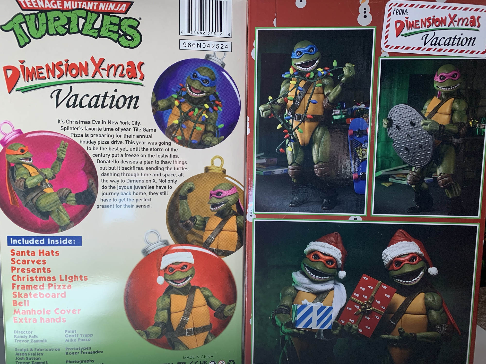
Yesterday, the United States celebrated the Thanksgiving holiday so you know what that means? The Christmas season is underway! And it’s one that feels like it could not have come any sooner. We need a little Christmas, right this very minute, and today it’s coming to us via an unexpected source: The Joker. Yes, the Clown Prince of Crime is getting into the Christmas spirit today for, what else, an action figure release. This is yet another old one from DC Collectibles re-released via McFarlane Toys. The first such set of figures we looked at released this way didn’t go that well. Will this Joker fare any better? Will the magic of Christmas help to elevate him above his brethren? Let’s find out together.

Joker, as seen in the episode from which this figure is based on.

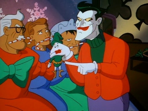
It was years ago (2017, if I’m not mistaken) that DC Collectibles released a Joker action figures based on the episode of Batman: The Animated Series “Christmas With the Joker.” In just the show’s second episode it not only introduced audiences to its version of the Joker, but also made it a Christmas special. Since the show was debuting in September, that meant it had to be held back a bit, but still managed to air in November. Nonetheless, it’s not one of the show’s better episodes, but the mere fact it features the Joker and it’s a Christmas episode helped it to remain memorable.

He certainly looks happy to be celebrating the holidays with us.

When this figure was first released, I considered getting it. I don’t know why I didn’t, I guess maybe I was trying to save money? I probably feared that getting even one action figure from this line of Batman figures would open the floodgates so I held off. When it went on clearance I still held off. When it got a re-release with a pearl finish? Oh yeah, I held off. And when that re-release also received the discount treatment? By then I had become a pro at ignoring this Christmas Joker so it was a piece of cake to do so yet again.

He’s definitely not going to scale with the McFarlane Batman Santa.

Now, it’s 2024 and McFarlane Toys has decided it needs to re-release this Christmas Joker. I don’t know why in 2024 that I feel like now is the time to jump in, but it’s what I’ve done. The wave one figures from McFarlane were borderline terrible. I like the sculpt of the Scarecrow and Freeze is okay, but the Batman and Robin figures were just plain bad. The paint jobs are pretty hideous and the toys feel cheaper than ever. These figures were fragile when originally released, but they didn’t feel cheap. I don’t know what McFarlane is doing, but these feel comparatively worse. Still, for a Christmas figure I just expect it to stand there and look festive. My demands of this figure are pretty minimal and should be easy to please. I’m not sure it’s capable of meeting even those unambitious demands.

“Now here’s a Santa I can really get behind!”

Joker comes in the normal packaging which is a big window box that’s entirely too large. There is no Christmas theming to the packaging which feels like a real missed opportunity. Make it look like a wrapped gift and you stand to sell two of these per person, Todd. Joker is depicted as he was for most of that episode, well, aside from the hat. He wears the hat for all two seconds, but this figure has one molded to its head. In another missed opportunity, McFarlane could have included a non-hatted head to switch to, but maybe this one was never designed for a removable head? Aside from the hat, Joker is sporting a Christmas sweater that’s a simple red with a green turtleneck underneath. From the waist down, he’s basically your standard Joker with purple pants and white and black shoes.

“Here Harvey, you look like you could use a little Christmas spirit.”

The sculpt is fine, but the paint is not. Joker isn’t as bad as the other figures, but the detail work is pretty awful. His mouth and teeth are sloppy and my figure had a big black smudge on his chin that I’ve mostly been able to remove with a Magic Eraser. His eyes are outlined in black, but he has no eyebrows to speak of. The edges of the white on the Santa hat aren’t particularly sharp, but what isn’t dreadful with this release is the cel-shading. McFarlane added some dark red to the right side of the figure and some dark purple to the pants. There’s also a hit of dark green on the inner sweater. It’s far more purposeful than some of the other figures and the color choices are fine. If all of the figures looked like this there probably wouldn’t be many complaints about the shading. There’s also still a lot of bare plastic here including basically all of the white parts and pants. The original release looks like it was almost all painted, by comparison, so if you can get that one instead for a decent price you may find it the better piece.

Yuck.

What’s not any different is the feel of this thing. It’s cheap and it’s pretty junky. The MSRP appears to be $30 though Target initially offered it for $25 (and it is a Target exclusive). Even at the lower end, it doesn’t feel great. This is more like a $15 figure and the articulation is befitting that price range as well. You get very little here as the head only rotates. If it’s supposed to look up or down mine won’t budge. The shoulder pins are fine and the elbows bend almost 90 degrees. The hips are those awful hinges that DC used to utilize and they both look and feel like absolute shit. He can do splits, but you won’t want him to. Kicking forward and back is minimal while the knees do what they’re supposed to. There’s basically nothing but swivels at the ankle. As an action figure, this thing is terrible for $25 and truly god-awful at $30.

He’s got a candy cane. Cool?

All that said, few are going to buy a Christmas themed Joker action figure to put him in crazy poses. Well, some might want to, but usually these holiday themed figures can get away with subpar articulation if the presentation is there. And aiding in the presentation are the accessories. Joker comes with an assortment of hands: fists, gripping, and what we’ll call candy cane hands. He has these candy cane holding hands because he comes with a candy cane – imagine that? It’s basically a tight trigger finger hand. It would have been nice if regular trigger hands could have worked, but I guess they didn’t want to make a really fat candy cane. As for the candy cane itself, it’s fine. It may not be fat, but it is a pretty big candy cane, but at least those custom hands hold it well.

Joker’s sad little tree.

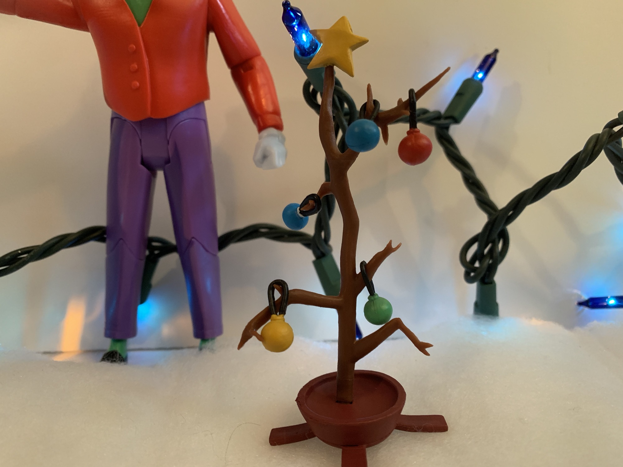
Joker one-ups the Teenage Mutant Ninja Turtles we looked at earlier this week by coming with his own Christmas tree. This tree makes Charlie Brown’s tree look robust by comparison as it’s really more of a stick. There isn’t a single needle left on this dead piece of pine and it has some twigs poking off of it from which ornaments can be hung. Joker comes with five ornaments: one red, yellow, and green and two blue. One of the blue ones should have a white star painted on the top, but McFarlane cut that from the budget. They’re all spherical with a plastic, black, loop molded onto them so they can be placed on the tree. I wish the loop was just a little bigger as it’s challenging to get them onto some of the smaller branches. Some aren’t angled well for an ornament and the plastic is kind of brittle. I had stress marks on one of the lower limbs as I tried to get a loop over it and had to abandon that idea. His candy cane hands can sort of pinch the hoops on these ornaments so he can hold them, which is a good design choice. There’s also a yellow-painted star molded to the top of the tree.

This little guy enjoys causing mayhem just as much as Joker.

Lastly, Joker comes with his little elf buddy, Laughy. He’s a hand puppet, but not the kind you stick your whole hand into. He’s literally Joker’s fist with a face painted onto the side with an elf costume molded to it. The paint is thick and flakey, but otherwise the hand looks pretty good. It plugs into Joker’s right arm and the fit is rather tight (compared with the incredibly loose alternate hands). There’s a standard, horizontal, hinge which is fine, but the limited range at the shoulder and Joker’s head make it hard for truly convincing posing. If his elbow could actually bend past 90 degrees that would have helped too. Even with the articulation limits, this is probably my favorite accessory of the bunch and I can’t see myself ever displaying Joker without it. Also included is the torso for Maxie Zeus as this is a build-a-figure wave. To complete Maxie you’ll need to also purchase Two-Face, Batgirl, and a Batman variant that’s an homage to an old Kenner toy. I did get Two-Face and if that Batman variant were at all desirable I might have convinced myself to get the rest to complete the figure, but there’s no way I’m spending 30 bucks on a terrible Batman figure.

“Wow Laughy, a shotgun? You shouldn’t have!”

This Christmas themed Joker figure is more or less what I expected. The articulation and overall feel of the figure is truly subpar, but in-line with the first wave of figures. I wish the paint on the Joker’s head was better, but at least the cel-shading is done reasonably well. I also wish he was cheaper, but considering I got the figure at a slight discount I guess I should feel a little better about it. For $30, I can only recommend this for the Christmas enthusiast who also happens to love Batman: The Animated Series. If a Christmas figure does nothing for you then the only reason to get this is for the build-a-figure part. From what I can tell based on the parts I have, the Maxie Zeus figure is going to be a lot like The Condiment King meaning the sculpt is above average, but the scale is way off. He’s a big boy, but hopefully he’s not as floppy in the hips as Condiment King for those who get him. I feel bad for those diehards who really want a Maxie Zeus (I personally did not care for that episode) because they have to get a Batman variant they probably don’t want as well as a holiday themed Joker they may or may not want. For those who don’t, hopefully there’s enough people like me out there willing to buy your unwanted Christmas Joker. At a reasonable discount, of course. That might be the best way to go about getting this guy.

For more Christmas figures or to see what inspired this release check out the below:

McFarlane Toys Gold Label Batman Santa (Blue Suit)

Ho! Ho! Ho! It’s the jolly one – Santa Claus! Oh, wait, no, it’s the somber, moody, one: Batman Santa! Yes, it’s our first Christmas themed post of 2023 and it’s an action figure review – shocking, I know. McFarlane Toys has held the DC license for several years now, but this is my first…

Keep reading

Batman: The Animated Series – “Christmas With The Joker”

Episode Number: 2 Original Air Date: November 13, 1992 Directed By: Kent Butterworth Written By: Eddie Gorodetsky First Appearance(s):  Robin, Joker, Summer Gleason, Arkham Asylum An interesting choice for a second episode of a series. It’s a Christmas episode, which feels kind of inline with Batman thanks to Batman Returns. It’s also the debut of…

Keep reading

Naughty or Nice Classic Santa and Cyborg Santa

It was looking like we were in for a photo finish this year. Last year, toymaker Fresh Monkey Fiction partnered with online retailer Big Bad Toy Store to launch the Naughty or Nice collection. Structured similar to a Kickstarter campaign, FMF posted several action figures for preorder with a minimum order quantity needed for the…

Keep reading

NECA TMNT Dimension X-Mas Vacation

Oh God, they’re back!

If you know anything about me then you probably know that I like collecting Teenage Mutant Ninja Turtles action figures and I like Christmas. Strangely, those two things have not come together all that often. Most of the television shows featuring the famed four opted not to feature the holiday in an episode. And without much Christmas stuff to go off of, the toys have not broached the subject all that often. There have been a few instances though and one infamous example is the 1994 release We Wish You a Turtle Christmas. Utilizing assets from the stage show that had been touring the country, the direct-to-video special saw the Teenage Mutant Ninja Turtles prepare for the holiday while seeking out a gift for Splinter. It was a musical event and one I never watched as a kid. Sure, I saw the tape available for rent, but those hideous costumes were a huge turn-off. Plus, by 1994 I had moved off of TMNT and onto Marvel and video games. There was no going back.

It’s a logical way to reuse these ugly, old, turtles.

In 2020, NECA Toys released a set of action figures based on the old stage show. They called the Musical Mutagen Tour and it brought those ugly ass turtles to the world of plastic in a rather convincing manner. It was a convention exclusive that was also made available at Target since it was the summer of 2020 and conventions weren’t happening. Ever since that release though I had wondered if a set of figures based on that terrible Christmas special were in the cards. NECA likes to do holiday themed releases and we’ve seen Gremlins get more than a couple. They’ve also done Misfits and Elvira and there’s probably more I’m forgetting or choosing not to remember. TMNT is their biggest seller these days and it was dying for a Christmas release of some kind and 2024 ended up being the time for it.

“Hey dudes! You wanna sing carols about pizza?!”

The Dimension X-Mas Vacation is that set. It may not say it on the box due to licensing, but this is basically We Wish You a Turtle Christmas the action figures. It’s NECA repurposing assets from its movie line of TMNT figures along with the heads of those Musical Mutagen Tour figures. Joining the package are some accessories pulled from that special and it’s all presented in a very lovely package meant to simulate a VHS release. There’s even a new story created for this non-existent special that’s summarized on the box itself and it sounds rather plausible for a TMNT release of that era. The set was kept under wraps until San Diego Comic Con of this year and has been made available through Walmart for the not so low price of $150. Because of that price and the niche appeal here, this is probably going to appeal to a smaller audience than usual, but I am most definitely that audience.

This set features figures of the turtles: Leonardo, Donatello, Raphael, and Michelangelo, as they were depicted in We Wish You a Turtle Christmas. It’s basically four identical figures where the only difference is the color of the bandanas. They’re all “naked” as compared with the tour turtles save for their usual belts, pads, and shoes. Yes, shoes, as these costumes decided making turtle feet was way too hard so they have black sneakers and leg warmers. It’s ridiculous. They also each come with a Santa hat which gently rests on the bandana knot on the back of their head. There are two styles of Santa hats between the four turtles and the only difference is which way the pom pom is going: 2 left and 2 right.

“Leo! You’re supposed to put the lights on the tree! On the tree!”

Most of the components of the bodies are reused from the prior tour set which means this is the dated 1990 movie body. The hips are the old pin joints, which is the main tell. The elbows are NECA’s own double-jointed setup and these ones were clearly cut to accommodate the much larger elbow pads of the Musical Mutagen Tour set. Here, they cut for the pad is too generous resulting in uglier looking elbows. The shell and plastron are new though and a better match for the source material compared with the other releases of these bodies. I’m not sure why we couldn’t get updated hips, but it is what it is. Paint across the board is mostly fine. The white of the Santa hats features numerous blemishes across the four while the bodies themselves are pretty clean. There is an overall harder plastic feel to these guys compared with other movie figures. Making use of the gripping hands is going to be harder than usual and there’s some flashing in the elbow joints. It gives the figures a slightly cheaper feel. These costumes are supposed to look cheap, but the figures don’t need to be. The paint around the teeth is at least an improvement over the tour turtles I have with less bleeding of the pink paint onto the teeth.

“Check it out – a tree stand!” “Donnie, this ain’t your best work.”

Articulation for these guys is essentially the same as the tour turtles, which is to say it’s basic. The articulated jaw is a welcomed edition and one of the aspects of these designs that stands out the most in my memory. They’re so ugly and NECA really captured that. Most of the joints are pretty stiff, some almost to a worrisome degree. These guys aren’t going to pose all that well to begin with so I’d advise not forcing anything if it’s fighting you. A hair dryer or hot water will be your friend. The shoulders and hips are especially tight for me while the elbows varied from figure to figure. The elbow joint almost looks like it wants to split which obviously isn’t good, but I haven’t had any breaks. I’ve also been pretty gentile. The ankles are also pretty useless so it’s too bad they didn’t figure out a better way to do the sneakers. The ankle joint really just needs to be visible with this design and it’s not the case. I’m sure the soft goods leg warmers aren’t helping.

“Come on, Mikey, no peeking!”

These turtles aren’t intended to mix it up with the Foot and instead are supposed to just look ugly and festive on your shelf. And to do so NECA included a bunch of Christmas themed accessories. In addition to the hats, each turtle also has a scarf. It’s a soft goods, white, fabric with a wire running through it so it can be posed rather well. One of the four in my set is frayed a bit, which sucks. There’s also a string of Christmas lights to drape over the head of one turtle. They’re sculpted in a soft plastic so it works reasonably well and makes your chosen turtle look like some sort of hideous Christmas tree. There’s also the framed pizza from the special which is just a plastic square with a pizza in the center. The lack of a glass pane means it’s also pretty easy to have a turtle hold it even with the really tight hands. There’s a little hand bell and also a manhole cover, because every TMNT universe needs one, I guess. There’s a skateboard with moving wheels and a nice deco on it and then we also get a whole bunch of presents. They all feature different wrapping paper and help fill out the display. To round out the release there’s also the customary set of optional hands. Each turtle comes with gripping hands, then we get a set of open, thumbs up, pointing, and loose gripping hands for the four to share. I wish we could get a full complement of at least the open and loose hands for the turtles, but this selection is pretty standard at this point.

“Check it out dude, the perfect gift for Splinter!”

Since these are the singing and dancing turtles from a Christmas special, we definitely did not need the usual weapons so NECA did not include them. What I think we definitely did need though is a tree! No Christmas tree in the set makes it feel pretty light. For my pics, I used the Figura Obscura tree, but since it’s not decorated it only works so well. And at $150, that’s unfortunate. There’s a lot of reuse here as well as some reuse potential with the gifts considering all of the Christmas stuff NECA does. For all I know, some of these gifts could even be from other sets, just not ones I have. I like the hats and I like the scarves. I’m a bit torn on if I would have preferred soft goods Santa hats to the molded ones we got. Normally, I’m for molded stuff, but since these were live action characters I think soft goods might have worked. We could have also got a stocking for each turtle. It feels like we should have got more and I question how well this thing will sell because it’s already pretty niche and the price won’t attract many impulse purchases.

“Whoa! No way! He does exist!”
“Huh? I thought I heard something…”

Criticisms aside, if you want some Christmas themed TMNT figures your options are pretty slim. It’s basically the ReAction figures Super7 did a few years back (which I have, but kept on card) or the Christmas plush of Raphael from back in the day. Maybe we’ll get a figure in the future from NECA based on the Michelangelo one-shot which took place at Christmas. And since Super7 is going down the 2k3 rabbit hole, maybe we can get Christmas turtles from the episode of the show based on that one-shot. What I’m saying is this set is fine, but we need more Christmas turtles! And while I think this set is too expensive for what it is, I am glad it exists. Figures based on an obscure and pretty terrible Christmas special is something I find fun and action figures should be fun. Now, if you’ll excuse me Christmas is coming and I need to deck the halls with pepperoni.

“Check it out Santa-dude, something way better than milk and cookies!”

Do ugly turtles and Christmas interest you? Perhaps you’ll enjoy reading these:

NECA TMNT Musical Mutagen Tour SDCC Set

Awhile back, I decided to rank the various incarnations of the Teenage Mutant Ninja Turtles from worst to best. Occupying that dubious last place spot were the Turtles featured in The Coming Out of Their Shells tour. That may sound like the title of a TMNT sex tape, but it was something else entirely. If…

Keep reading

Dec. 11 – We Wish You a Turtle Christmas

Several months ago, I reviewed a product called The Musical Mutagen Tour Action Figure Set. It was a set of toys based on the Teenage Mutant Ninja Turtles stage show, Coming Out of Their Shells, from 1990. Back then, the Turtles were so unbelievably hot that they could sell out a terrible stage show in…

Keep reading

Teenage Mutant Ninja Turtles (4Kids): The Christmas Aliens

In 2003, Fox and 4Kids Entertainment launched a brand new Teenage Mutant Ninja Turtles cartoon series.  This series was the first re-launch for the TMNT after a long hiatus from both film and television and was an attempt at introducing the Turtles to a whole new generation.  One of the consultants for the show was…

Keep reading

NECA TMNT Toon Vacation Bebop and Vacation Rocksteady

It’s vacation time, fellas!

Pack your bags and grab the sunscreen because today we’re heading to Florida! It’s vacation time folks, and even the bad guys deserve a little fun in the sun sometimes. Coming from NECA Toys we have another fun variant of the duo Bebop and Rocksteady. Always more comic relief than true threat, the boys come dressed for the theme park as they accompanied the boss man down to Florida in an episode of the classic cartoon series which resulted in the further mutation of the punk frog Napoleon. As this line has gone on, I’ve become more and more drawn to the silly offshoots and Bebop and Rocksteady have provided ample opportunities for such. We’ve had them as rabbits, robots, and superheroes and now we have them as tourists. The only question is does anyone need a couple of dimwitted mutants in floral patterns?

Seems like with each subsequent release, Bebop and Rocksteady shrink a little more.

Bebop and Rocksteady come courtesy of the duo Tony Cipriano and Tomasz Rozejowski with contributions from Kushwara Studios. Paint is handled by the frequent pairing of Geoff Trapp and Mike Puzzo. If there are any reused parts from past versions of these two, it’s not apparent. Even the hands look like they’re new. They do share parts between each other, but for the most part this is an all new set. Not that they don’t feel familiar as the construction of these two is pretty consistent. They’re more visual than poseable, but the very loud outfits will help to boost their shelf presence even if they aren’t the most dynamic figures in your collection.

This smaller scale for the duo probably is more accurate to the source material.

Rocksteady stands at around 6″ while Bebop is closer to 6.5″ which adheres to their presentation in the show. The two have similar, but different, outfits. Rocksteady is rocking the Hawaiin shirt in shades of purple and orange while Bebop went with a more bold choice with a yellow polo and red suspenders. Bebop brings in the floral print with the light blue shorts with orange flowers while Rocksteady seems to be wearing jeans with the cuffs rolled up. Bebop retains his usual style of kicks, opting for a matching yellow while Rocksteady has traded in his boots for flip flops. Bebop has more traditional sunglasses than his usual ones and Rocksteady has old man sunglasses with the strap going around his head. Neither are removable, nor is Bebops very fashionable “Not Donald Duck” hat with propeller. The propeller does not spin, unfortunately. Rocksteady actually has two hats: a blue visor or a yellow cabby hat which he switched to in the show.

“This is no vacation!”

These two look great for what they are. I feel like the Bebop and Rocksteady portraits keep getting better (well, except for Rhino-Man who was a little weird) and more aligned with how they looked in the show. There’s tons of paint and it’s pretty cleanly applied, but there will be some variation from figure to figure. My Bebop has an ugly spot near his suspenders on the back of his shirt, but it’s otherwise the only real paint defect. These figures are not pin-less, which is apparently something being rolled out by NECA slowly. It’s not that big of an issue on its own, but does create an eyesore with Bebop’s high socks. The factory went with a flesh colored pin even though the hole is cut through the socks. Gray would have been the more appropriate choice, or they could have painted them. There is also no cel-shading on these figures which continues to be something that NECA utilizes inconsistently. I’m not really bothered by it, but I would prefer NECA to just pick a lane with this stuff and stick to it.

These two come with an assortment of hands and vacation accessories. For both, we get a set of fists, gripping, and open hands. Rocksteady comes with a lei around his neck while Bebop has a satchel. Both also have a camera with a strap on it. Rocksteady’s features a large flash while Bebop’s is more compact. Unfortunately, neither can really be held as they’re too chunky for the gripping hands. You could heat them to wedge it in, but then you risk rubbing the paint. Plus, it’s unlikely they’d be able to hold the cameras in front of their face like they’re using it. There’s a large, blue, canister that looks like a water jug, but it might be some mutagen thing from the episode. I didn’t rewatch it. Unlike the cameras, the pair have no issues holding this thing by the handle. Lastly, we get a little rhino-fly. In the episode, a dragonfly has contact with Rocksteady and then contact with the mutagen to become this gross, little, abomination. It’s a fun little inclusion, though I wish he had a little acrylic stand or something because he really can’t do anything by himself. He basically needs to be held.

They can handle waving, but not much else.

Articulation for these guys is pretty basic stuff for a NECA figure. All of the cuts and joints you would expect are there, but they’re kind of limited. You have the ball joint at the head, but they mostly just rotate because there’s a lot of stuff in the way. The jaws are articulated, but the range is poor. The shoulders are ball-hinged and we get a bicep swivel as well. Double-jointed elbows are really limited by the fact that the neutral position for the arm is slightly bent. They’re also really tight and I can’t get better than a 90 degree bend out of them. Wrists rotate with a horizontal hinge. The shirts are basically overlays with not much inside them but a ball joint. They’ll rotate, but they won’t bend forward or back much. Ball-socket hips kick forward an okay amount but not back. They’ll go out to the side a solid amount though. There is a thigh swivel and double-jointed knees. Like the arms, the neutral pose is somewhat of a squat so the legs can’t go perfectly straight. Knee joints are tight, but even if you get both hinges working in tandem it won’t get you more than 90 degrees. The feet hinge forward and back a bit with an okay ankle rocker. Bebop’s is better than Rocksteady’s, but for the most part the pair move the same which is to say not very well.

“It’s more beautiful than I ever imagined!”

If you’re a collector of this line though from NECA Toys then that’s probably not a surprise. This line always favors aesthetics over articulation and Bebop and Rocksteady are no different. They are a little too far in one direction for my personal taste, but given that they’re goofy variants I’m more fine with it than normally. If these were the more evergreen interpretations of the characters I’d want more out of the torso and head, especially. And, come on, the propeller doesn’t whirl? Missed opportunity, NECA. A second one that’s sculpted like it’s spinning would have been fun too. And I’d be remiss if I didn’t mention that the box art features Rocksteady holding a little, red, flag from the episode which is not included. That’s just odd since that’s probably a pretty inexpensive accessory, but it’s also not some great loss.

“Do I know you?” “No, but I’m a big fan of your work!”

When it comes to variants of figures, I think more falls on how one perceives that look for the character. With Vacation Bebop and Rocksteady, that is very much the case. I can critique and praise aspects of these figures all I want, but at the end of the day the only people buying this set are those who are amused by these looks. I think they’re fun. I love the bright colors and I especially love how Bebop looks practically giddy to be heading out to an amusement park. Teenage Mutant Ninja Turtles was a silly, stupid, show and I want the toy line I’m collecting to reflet that so I didn’t hesitate to grab these. For $60, I can also understand how someone might look at these and conclude “I don’t need them.” If you’re not one of those folks though, then you can find this set at Target. It was part of the Cowabunga Collection released back in August, but it was stocked in generous quantities and is still pretty easy to track down well into November. It probably won’t last forever though and I wouldn’t guarantee on another production run so if it’s something you like you probably don’t want to wait too long.

If you like figures of Bebop and Rocksteady then you have no shortage of options these days:

NECA TMNT Cartoon Super Bebop and Mighty Rocksteady

2021 introduced a lot of good things for collectors of NECA’s Teenage Mutant Ninja Turtles line of action figures based on the classic cartoon. The toy maker still kept the line a Target exclusive when it came to brick and mortar, but it also started selling a lot of it online to coincide with each…

Keep reading

NECA TMNT Bebop and Rocksteady Target Exclusive Series

I have been rather fortunate when it comes to toy collecting in recent years. When I was a kid, toy collecting meant going to Toys R Us or a similar store and seeing what was on the shelf. Catalogs, commercials, and card backs were my main source of information. I assume there were newsletters and…

Keep reading

NECA Cartoon TMNT Mighty Hog and Rhino-Man

We did it! We finally made it to the end of the Haulathon releases from NECA Toys and we may have saved the best for last. Back in early 2020, I made a wish list for what I wanted from NECA and Teenage Mutant Ninja Turtles. It was only 10 deep, though there were some…

Keep reading

Super7 The Simpsons Treehouse of Horror ReAction

It just wouldn’t be Halloween without The Simpsons.

Happy Halloween fellow toy enthusiasts and fans of The Simpsons! Every year since 1990, there has been a Halloween edition of The Simpsons. The annual anthology style episode called Treehouse of Horror is basically appointment viewing each and every year. Sometimes it arrives before Halloween, sometimes on Halloween, and often times after Halloween (as it’s doing this year for some unknown reason). It would be nice if there could be some consistency when it comes to that aspect of the annual show, but at least with Halloween occurring on a Thursday this year it’s not a long wait until Sunday.

Here at The Nostalgia Spot, much time was spent on Simpsons action figures in 2024, and in particular, those from Super7. The company announced it had the license a few years ago to produce action figures based on the show, but it took a long time to get things moving along. As a result, Disney may or may not have grown impatient or they just didn’t like the returns they were getting from Super7 because the company yanked the license (along with all other Disney licenses) away and gave it to Jakks Pacific. That lead to three waves of Ultimates! figures getting released in a short window earlier this year with varying degrees of quality (most not great). I enjoyed some of those figures, but I also did not enjoy some and I was pretty harsh at times. This isn’t an apology though, the figures are what they are, and the criticism was warranted. When I finished that though I opined on if I should make a post about some Super7 figures based on The Simpsons that I did enjoy. Namely, the ReAction brand.

The ReAction figures are a little bigger than the new Jakks 2.5″ (Bart on skateboard) line, but a lot smaller than the Jakks 5″ line (far right).

Super7’s ReAction brand is its retro-style action figure. Loosely based on what Kenner started in the late 70s with Star Wars, these are approximately 3.75″ figures with five points of articulation: head, shoulders, hips. All of those points are simple swivels and Super7 has used this format for basically a whole bunch of licenses over the years. Personally, I don’t have any nostalgia for the original Star Wars line from Kenner so I typically am not interested in these intentionally ugly, limited articulation offerings from Super7. It also doesn’t help that they’re usually around 20 bucks (ouch). However, for some properties Super7 alters its approach slightly to basically sculpt and paint the figures to match the source material and that’s what it did with The Simpsons.

Each wave of Simpsons Treehouse of Horror ReAction consists of four figures.

Super7 did four waves of Simpsons ReAction. One was based on the movie within the show, McBane, while another was a series of Troy McClure two-packs (and they were great). The other two were devoted to Treehouse of Horror. Wave one consisted of Reaper Homer, Skeleton Marge, Inside Out Bart, and Kang as Bob Dole. The articulation across the board is terrible, but the sculpts are pretty nice and these figures are fully painted. What really helps sell them is the yellow paint for the skin, something the much larger and more expensive Ultimates! figures skimped on at times. The Marge sculpt, in particular, is very nice as she has a skeleton body with her normal head (in a horrified expression). Inside her rib cage is a trapped Snowball II and even the little kitty appears to be fully painted. She’s a bit tough to stand because the hips are a touch loose and her hair makes her top heavy, but overall she’s rather nice looking.

Finally! I have Bob Dole’s boneless face in plastic!

Homer also looks great. This take on the “Reaper Madness” segment where Homer became the Grim Reaper captures the likeness well. He has one skeletal arm and one normal one. Plus, he has two accessories: his scythe which he can hold okay with his left hand, and the scroll ordering him to kill Marge which he can hold with his right. He’s even more limited articulation wise, but these things are basically just little statues. Kang-Dole is depicted from the moment in the segment where Homer yanks the Bob Dole mask off of his head exposing the top of his eyeball. The Bob Dole mask is an accessory and it’s kind of creepy. The details on the figure are nice though and it’s certainly a memorable segment from the show. Inside Out Bart is perhaps the least interesting of the bunch. Even though the concept should lend itself well to figure form, there’s less paint since they were able to just mold him in pink and just paint a few veins here and there. His expression is also odd, but he has his cane and top hat and looks fine. It’s just the limited posing (even for this form as his legs do very little) of this form factor that lets the figure down since this character only exists for a dancing segment and he definitely can’t be posed in any dancing maneuvers.

Not the most creative character selection, Super7.

Wave two was surprisingly more of the same for Super7. It once again features a version of Homer, Marge, and Bart and then throws in a side character, which in this case is Groundskeeper Willie. Marge comes in her witch attire from “Easy-Bake Coven.” She has a laughing expression and comes with her broom. She, of course, can’t really ride the broom and even though she’s wearing a long skirt Super7 still gave her hip articulation by splitting the sculpt. I hate when they do that and it’s one reason why I’ve never been tempted by their Misfits ReAction figures. They left the robed Homer alone, but not Marge. It just looks stupid, and the limited articulation doesn’t add much. Still, she’s a good representation of this Marge, even if a little less exciting than the skeleton one.

Both Homers look pretty great.

Homer is in his Snake form from the segment “Hell Toupee.” That means he looks like regular Homer, only he has a gray shirt and hair. Somewhat to my surprise, Disney let Super7 sculpt his pack of cigarettes under his right sleeve. It’s a small detail, but they’re so averse to smoking in anything that I’m surprised they didn’t insist on removing it. He also comes with a corkscrew with Moe’s heart stuck on the end. It’s pretty gruesome for such a small item, but I appreciate his right hand being sculpted in such a way that he holds it properly. The Bart in this wave is technically not Bart, but Hugo from the segment “The Thing and I.” His shirt is a little darker than usual and his clothes are tattered. The remnants of his shackles are still on his ankles and he comes with a glass of milk and plate of fish heads. His grip on the glass is pretty loose and can get annoying as dropping that tiny accessory can lead to a long search for it. The plate of fish heads also just kind of rests on his right hand and can be precarious since it throws off his balance. Basically, once you get him right, don’t touch him! The sculpt looks nice though and he’s well painted, though the tattered bits of the hem of his shirt could have been done better. It’s basically seamless with his body so it looks odd upon close inspection.

Willie, with his Jakks counterpart.

The last figure in the wave is Groundskeeper Willie in his Freddy Krueger attire from “Nightmare on Evergreen Terrace.” He is perhaps the most preposed of the line (Hugo is as well) as his knees are bent and his arms are situated in such a fashion that he can hold his included rake with two hands. It basically just means he has one pose so the articulation on this guy is almost pointless. He looks great though and I’m definitely not upset about his inclusion or anything. I do think this line is open to criticism when it comes to character selection. We get two each of Bart, Marge, and Homer, but no Lisa? After the Ultimates! completely shut out her, Marge, and every female in Springfield it was disappointing to see the ReAction figures almost do the same. We could have easily received a witch Lisa instead of Marge, or maybe sorcerer Lisa, Einstein Lisa, snail Lisa, or a multitude of others. Hawk Lisa with a shrew Maggie (or whatever she was supposed to be in “The Island of Dr. Hibbert”) could have been a way to get both of the Simpson daughters into the line.

I love what Super7 gave us, but could we have sacrificed a Marge for a Lisa? I get that Homer and Bart are the most popular, but we needed a Lisa!

All other criticisms of character selection mostly stem from the line only lasting two waves. It’s a shame, because Treehouse of Horror is ripe for more figures. I might have preferred a fly Bart or werewolf Bart to the inside out one, but it’s not like Inside Out Bart is a bad pull or anything. Plus it comes from one of the best editions of Treehouse of Horror. With this line, Super7 had a great process. The sculpts were on model, they didn’t sacrifice on paint, and even the scale looks pretty good. I was certainly looking forward to more and it’s a shame this is it. If you want to collect what’s present here, you definitely won’t want to wait. Most places are sold out with figures only available on the aftermarket where folks are looking to get more for them now that the line is cancelled and no more are coming. At 20 bucks a piece, they were already too expensive for what they are. I could forgive it because at least they looked nice (and I got some of these on sale too), but at any more than that it becomes a really hard to sell. You have to be a hardcore fan of The Simpsons and Treehouse of Horror in particular to spend more than that, and if you are such a fan there’s a good chance you already have them. Happy Halloween!

For more Simpsons figures, and even some Treehouse ones, look no further:

Super7 The Simpsons Ultimates! Kang and Kodos

We are onto the third wave of Ultimates! from Super7 based on The Simpsons. Like past waves, plenty of questions abound when it comes to Super7’s character selection and they’re not unfounded. Perhaps the two most questionable inclusions in this third wave are the subject of today’s post: Kang and Kodos. These are two separate…

Keep reading

Super7 The Simpsons Ultimates! Devil Flanders

Last week, we concluded our look at the third wave of Super7’s line of figures based on The Simpsons and now we embark on the fourth and final wave. That’s right, Disney pulled the rug out from under Super7 and handed The Simpsons license over to Jakks. Their products will start rolling out this fall.…

Keep reading

Jakks Pacific The Simpsons Homer and Bart

I think it was early this year that we found out Super7’s line of ReAction and Ultimates! action figures based on The Simpsons was ending after just a couple of years. That meant Super7 was done after four waves of Ultimates! and four waves of ReAction figures. We had seen figures for a possible fifth…

Keep reading

McFarlane Toys Batman: The Animated Series Wave 1

The lineup for McFarlane’s first wave of dedicated Batman: The Animated Series action figures.

Years ago, perhaps as many as 10 or more, DC Direct was filling comic book stores around the country with action figures based on the classic cartoon series Batman: The Animated Series. The figures were stylized to resemble their onscreen counterparts and it was a line that included many of the characters from the show as well as multiple vehicles. Eventually, DC (or parent company Warner Bros.) decided it no longer wanted in on the action figure market. The branch of the company devoted to toys was dissolved and the license was sold to McFarlane Toys. Since then, Todd’s company has devoted many resources to its DC Multiverse line which is sold at big box retail as well as specialty. The 1:10 line features more variations of characters than I can count and it has its own distinct style. Early in the line, a Batman based on BTAS was even released, though it wasn’t something that I found particularly enticing.

Here is your comparison to what DC Direct was doing in its final days and what we’re getting from McFarlane.

When the DC Direct line was alive and well, I wasn’t really in the collecting game. By the time I got back into it, I was left a little underwhelmed by the offerings available to me. They weren’t cheap, were quite limited in terms of articulation, and it wasn’t an evergreen line where characters were easily attainable. Instead, it was more of a blink and you miss it kind of deal. Towards the end of the line, there were some reissues and I would end up getting the last standard Batman from the line which featured the new tagline of The Adventures Continue. That Batman is fine. The likeness is good enough even if the articulation is pretty poor. It was retooled to have better hips and the paint job was more ambitious and a marked improvement over the Batmen to come before it. I would also add a Gray Ghost, purely out of nostalgia, but any ideas I had on getting more of the figures was pretty much dashed by the absurd aftermarket prices that had emerged. Figures were selling for hundreds of dollars and I just wasn’t interested.

The big selling point for the McFarlane line is the build-a-figure inclusion.

Last year, McFarlane made the wise move to begin reissuing these long out of production figures. McFarlane apparently has access to the molds so this was a pretty low cost way to get some characters out into the wild that fans have been clamoring for. The first wave arrived about a year ago now, but I’m just getting to it for reasons that will become clear as we move along. That first wave consisted of Batman, Robin, Mr. Freeze, Scarecrow, with a build-a-figure of The Condiment King. All four of the retail figures are straight reissues of past DCD offerings with the only new sculpt being The Condiment King. To differentiate these from the other figures, and perhaps to not crater their aftermarket value and risk angering their fanbase, a new deco was applied to each figure and the packaging is all new. These come in oversized window boxes that are honestly way bigger than they need to be, but whatever. It’s just the trash that surrounds the figure. Is this return to stores what fans and collectors have been waiting for? Read on and find out, though you may not like the answer.

What do we think of McFarlane’s attempt at cel-shading?

Let’s start with Batman. This is a reissue of the Batman that came with the Batcycle. He has a soft goods cape and an ab crunch to help make getting him on the bike a little easier. It’s a less attractive figure as a result, but what are you going to do? The main thing that’s going to stick out is the paint job, and that’s going to be true for basically all of these figures. McFarlane decided to attempt cel-shading with these figures. The final Batman from DCD did the same thing to fantastic results. There was blue in the cape, a little gray under the pectorals, and hits of blue on the gloves and boots. It was subtle, but very evocative of the show. This Batman does none of that. He has this ugly brown smear along the side of his face, a dark gray that’s slapped on the side of his body without much regard for anything, and very little blue one the boots and gloves. It’s hideous. DCD gave you the blueprint, McFarlane, why couldn’t you just follow that?

Robin and Freeze get these goofy-ass hips.

Unfortunately, the same is mostly true for the rest. Robin looks almost as bad as Batman with the same brown on his face, but the red and green of his costume at least works better with the shading. They completely missed the yellow on the inside of the cape which is also plastic so he won’t work as well with vehicles as Batman. Mr. Freeze has some pretty atrocious cel-shading as well, though it doesn’t appear to be as heavy as it is with Batman. Scarecrow is the only one who doesn’t look awful, but that’s because his costume of brown and red works better with the shading. It’s barely visible on the red portions while the dark brown doesn’t clash all that poorly. This is also second appearance Scarecrow and, overall, he looks the best of the bunch in terms of being on-model. Mr. Freeze would place second if this were a competition, but he’s too small and his oxygen tank is the wrong color. I don’t think scale is a strength of the line. Robin looks more like a reinterpretation of his old Kenner figure with the big head and dopey grin while Batman just plain looks bad.

It’s a lot of stuff, but how much of it is useful?

Each character does come with accessories. For Batman, it’s a bunch of hands including one with a grapnel gun molded in. He also has a Batarang that’s all black. He has fists, gripping hands, and Batarang hands plus a stand-alone grapnel gun that’s all black. Robin has fists, relaxed hands, gripping hands, and a hand with a molded grapnel gun in it. He also has a bollo that’s just a long piece of plastic. It would have looked better with a whirling effect. Scarecrow has open hands, a gripping right hand, and a left fist, plus an unmasked portrait. The gripping hand is for his scythe which looks pretty good, though I wish he came with two gripping hands or that the one gripping hand actually worked better. Freeze has his freeze gun and then a whole bunch of hands: fists, trigger hands, gripping hands, clenching hands, and open hands. The clenching and gripping hands look specific, like maybe he was supposed to have more accessories (a snow globe, perhaps) that were cut. It’s a comical amount of hands though for a guy who is just going to stand there holding his gun.

That’s not impressive…

Which brings us to articulation, which was never this line’s strong suit and part of that is due to the character designs. We’re talking ball peg heads, ball-hinge shoulders, single elbows, and wrists that swivel and hinge horizontally. Nobody has good range anywhere, save for maybe the head, but it’s at the hips where things get weird. Batman has updated ball socket hips so he can kick forward a reasonable amount and almost do splits. Scarecrow does too, only his range is terrible, but he has a thigh swivel built-in (Batman does not). Freeze and Robin have these awful hinge and peg hips. The hinge leaves this T shape in the cut on the side of the thigh. It allows for full splits, but looks ridiculous and is one of the ugliest joints ever conceived. Neither character can kick forward worth a damn too. All of the figures have double-jointed knees except for Freeze and Robin. Even without the extra hinge, Freeze can still bend his knee 90 degrees. Robin cannot. All of the figures have a swivel and hinge at the ankle with only Batman and Robin having an ankle rocker. Everyone except Scarecrow has a boot cut. The combination of poor articulation and tiny feet make all but Freeze tough to stand. He has large, boxy, feet so it’s not an issue, but his arms are the most limited because of his design. I wasn’t sure if he even had elbow cuts. They’re there, but functionally useless. He’s also the only one without a waist twist.

I like Condiment King’s sculpt and the paint is acceptable, but why is he so big? And I have him lurched forward a bit here just to get him to stand. In other words, this picture makes him look smaller than he is.

Given that these are all old molds and exclusive to Target you would think they’d come at a friendly price. They do not as all of them retail for around $30. Of course, if you get all four then you get a bonus fifth figure in The Condiment King. He is all new and comes with his backpack and twin guns: ketchup and mustard. The guns connect via a thread to the backpack so it limits his posing, but at least they’re here. As for the sculpt, it looks fine. Great even. This is one of the show’s silliest characters and it’s a fun inclusion as a BAF. It might not be the type of character everyone needs, but the hardcore will enjoy building him. His light blue costume with white accents is done well enough. Yes, there’s cel-shading, but it’s not as bad as it is with some of the others. The only spot I hate is the brown smear on the side of his face. Articulation is satisfactory for the line as he has single elbows but double joints at the knee and ball-socket hips, it’s just that the hips are way too loose. Combine that with the backpack and this is one tough figure to stand. The build quality of the guns is also questionable as the handle of the ketchup gun came off when I tried inserting it into his hand. It looks like the guns were molded in two pieces to get the string inside so it’s nothing a little glue can’t remedy, but still annoying. By far though, the biggest issue I have with Condiment King is his size. He’s way too big. He stands around 6.75″ to Batman’s 6.25″. He’s just overall big when in the show he’s just some guy who went nuts. He looks like he’d be more than a match for Batman at this size. It’s almost like he’s from an entirely different toyline.

Is $120 for 5 figures of worth it? It could be, but not these figures. The paint is not only a bad fit, it’s sloppy too. Batman’s cape feels cheap and the articulation cuts for his torso and the hips on Freeze and Robin are truly hideous. Scarecrow is the only figure of the five that comes close to earning his value, but he still doesn’t feel like a 30 dollar toy. All of them feel very fragile and very cheap. Moving these thin limbs, swapping the hands, all feel terrible. I don’t like handling these figures so I guess it’s good that they don’t pose well since the temptation to change things up isn’t really there.

What drove me to make this post though was where I did find some deals: the vehicles. McFarlane has not only reissued the figures, it’s also reissued the Batcycle and Batmobile with the Batwing also on the way (there’s also a Jokermobile, which was supposed to be a part of the old DCD line, but was cancelled). Initially, these vehicles were pricy, but still enticing, but I got both on sale. For the Batcycle, I think MSRP was 40 or 50 bucks, but I got it down to $10. At full price, it’s not bad, but at ten bucks it’s a real steal. It’s a straight re-release of the old bike including the base. It has battery operated lights, though you have to hold in the button on the bottom of the bike for them to be on as opposed to a switch. The base is reversible and can either resemble the Batcave or just a street and it allows for the bike to be tilted and there’s a little swoosh effect too. Instead of being all black, it’s now cel-shaded, but it turned out great! There’s a nice use of blue on it that really makes it resemble the bike from the show. And if you want Batman to play it safe, it also comes with a new head for Batman that features a helmet. They should have tossed in the same for Robin, but I probably wouldn’t use it anyway. The head looks fine, though it features a pale complexion. The tires are rubber and the thing feels solid. For what it is, it’s terrific.

The Batmobile is quite similar in that regard. It’s not fully painted out like the bike, but the sides are black and the top is a dark blue which helps it to resemble the look of the car in the show better than the original all black edition. The canopy slides forward and there’s room for two figures inside. The steering wheel telescopes which makes it easier to get figures in and out. The dashboard is all transparent plastic because this has a light-up feature as well for headlights, interior, rear lights, and the thruster in the back. Oh, and did I mention it’s big? This thing is a shelf hog measuring about 25.5″ long and a little over 8.5″ at its widest. It is a mostly hollow, plastic, box so it doesn’t have as nice a feel as the Batcycle. It does have nice wheels though that are rubber and the front ones can turn, though they are not connected to the steering wheel. The MSRP for this thing is $80, but I got it on sale for $40. Some people have found it for as low as $23! At $80, it’s a luxury item for the Batman enthusiast that has the room for it. At $40, it’s a great deal for the Batman fan that maybe doesn’t know what to do with it, but will figure it out in time. At anything less than that it’s a simple no-brainer. I’m not one who buys toys as an investment, but if you get a Batmobile for under forty bucks and sit on it for a year you’ll probably make some money.

What do we make of McFarlane’s foray into this old BTAS toy line? On one hand, I think it’s great that these molds are back out in the wild. I got Freeze and Scarecrow last year because I love Mr. Freeze and I thought Scarecrow looked good. I only recently got Batman and Robin because I wanted them for the Batmobile. Target lured me in with a sweet deal on that Batmobile and in turn got me to spend another sixty bucks (clever girl) I wouldn’t have otherwise. I think Scarecrow is fine, he’s limited, but he looks the part and I think aesthetics are what collectors are after most with a BTAS line. The Condiment King, if he was packed as a stand-alone figure, would be okay as well though I wouldn’t feel good about spending 30 bucks on it. Freeze is imperfect and too expensive while Batman and Robin are pretty bad. Why did I convince myself I needed them just to stuff in a toy car? I don’t know. It was more of a need for Batman, and then with only one figure shy of a Condiment King I figured why not get Robin? My older DCD Batman could not fit in the Batmobile with his sturdy, plastic, cape, plus he actually looks good and I don’t want him hidden. I’m fine hiding these two.

The figures are overpriced and kind of blow, but the Batmobile is pretty cool.

All that is to say, try and track down an actual DC Direct Batman if you want a Batman from this line. This one and Robin just aren’t worth it and unlike the vehicles, they seem to never go on sale. Mr. Freeze and Scarecrow aren’t worth your 30 dollars either, but if you do get Scarecrow you at least may not regret it in time since he looks fine. The vehicles are great though. If you have a DCD collection and passed on them then I think you should reconsider. Especially the Batcycle which looks pretty cool and isn’t too hard to fit into a display. The Batmobile presents obvious space concerns and I still don’t know where it’s going to end up in my house, but it’s an okay problem to have and now I’m wondering if I should consider the gargantuan Batwing. I shouldn’t, but if it ends up at Target for 40 bucks then I can’t be held responsible for my actions. As for the line itself, I wish McFarlane would spend a little to improve these figures. Better hips, better ankles, and figure out how to do proper cel-shading or just give up. No one will be angry if it goes away. This line is fueled only by a love of the show because if there was a better option out there then surely most would get that. Unfortunately, there isn’t and there likely won’t be in this scale anytime soon.

There aren’t a ton of Batman toy reviews here, but we do have some:

Batman – The Adventures Continue #50: Batman

If you’re a repeat visitor here at The Nostalgia Spot, then you’ve probably noticed that around here there is a high opinion of the television show Batman – The Animated Series. I did a re-watch of the series that spanned more than two years and also checked out the various films based on the property.…

Keep reading

The Hot Wheels Batman Series

I’m not much of a car collector, but when I was a kid I went through a Hot Wheels and Matchbox phase. My favorite car was a small, black, one that I only barely remember. I have no idea what make or model the car was, but what I liked about it was that it…

Keep reading

DC Collectibles BTAS #42 – Gray Ghost

I have long maintained that the best episode of the now classic Batman: The Animated Series is the Mr. Freeze story, “Heart of Ice.” It is not, however, my favorite episode of the show as that honor belongs to “Beware the Gray Ghost.” That episode introduced the character Gray Ghost, a superhero from television who…

Keep reading

NECA TMNT Toon “Binky’s Day Out” Slash V2

Here comes Slash…again!

In the far off time of 2020, NECA Toys released the Slash and Leatherhead two-pack as part of its line of action figures based on the 1987 cartoon Teenage Mutant Ninja Turtles. That two-pack was just the third two-pack that I would review here at The Nostalgia Spot. It wasn’t the third two-pack released as the turtles, Shredder, Foot, and Krang were all released before it, but they were re-releases of the figures previously released at San Diego Comic Con. The first all new two-pack was Bebop and Rocksteady followed by variants of the turtles and a Foot two-pack for those who wanted to army build. Slash and Leatherhead were basically part of the first wave of all new figures as that set was released alongside the Casey Jones and Slashed Foot and April O’Neil and Bashed Foot. Coincidentally, or perhaps by design, almost all of those figures have received updates over the past calendar year. April was retooled and released solo while Casey got a new variant in his business attire. Leatherhead got a release in the Archie line (with a Mirage one to follow soon) and now it’s Slash’s turn with the deluxe release Binky’s Day Out.

A gathering of Slash.

A Slash redo is something fans have wanted basically ever since the first one came out. It wasn’t a terrible figure, but it was a compromised one. NECA opted to repurpose the same body it used for the turtles and just tool a new shell, hands, feet, and head to go along with the accessories it devised for the set. The result was a Slash that had a solid headsculpt and some fun weapons, but he was way too small. When we got the Archie version of the character years later that reused the Tokka sculpt it drove the point home how most really wanted to see a new toon Slash. Well, we now have what we wanted as that Tokka sculpt has been repurposed once again to create a brand new cartoon Slash.

Even his gun is bigger!

Slash comes in the deluxe style packaging featuring some wonderful artwork by Tim Lattie and Aaron Hazouri. Like past solo releases in this line, the box art is meant to mimic the old f.h.e. VHS releases of the cartoon from back in the day. The sculpt for this figure is credited to Paul Harding and Tony Cipriano. If I’m not mistaken, Harding sculpted Tokka so I’m assuming that’s his contribution to this release with Cipriano sculpting the new bits. Paint is once again handled by the dynamic duo of Geoff Trapp (who NECA sometimes credits as Geoffrey so apologies to him if that’s his preferred name) and Mike Puzzo.

Backpack too.

Slash, being largely composed of reuse, stands as tall as Tokka and the Archie Slash at about 5.75″. The old Slash is around 5.325″ so there is a little added size here, but mostly we’re talking about added bulk. Slash is much thicker and his head is wider and sits lower on his body as it did in the show. I was pretty happy with the old headsculpt, but this one is undeniably better to my eye. He has the same kind of stupid grin with ugly teeth poking out. It’s the width of the head that really makes it look more like Slash as the previous one was pretty narrow relative to the source material. What really stands out though about this new figure is the paint. Slash is a much brighter green than his previous figure and is thus much brighter than the turtles. I’m not really sure why as he was the same shade of green as the turtles in the show. Artistic choice? Or maybe a factory screw up? I’m not sure, but it might annoy some.

Slash with his “daddy” and Raph, because why not?

Aside from that, the sculpt and overall presentation is quite nice with this new Slash. I’m a big fan of this chunky sculpt so I’m not surprised to see that it works fine here as well. The paint is clean and applied liberally. Oddly, he doesn’t feature the toon shading on the rear of the figure which has become one of those things NECA is really inconsistent about. I’m not sure how they determine which figures get it and which don’t. The shell on the rear of the figure is new sculpt and it’s this lumpy shell that matches the source material rather well. Arms and legs are basically the same as the past Slash save for the fact that the elbow pads lack spikes with this version. The hands are all new and Slash wears fingerless gloves and the paint is applied well there. He has his shoulder pads which are done in a soft plastic which might arrive a little warped. All of the metallic parts are painted a light blue which I kind of like, but is something I have to point out as inaccurate once again as they’re all gray in the cartoon.

Guns and toys. Okay, it’s not a toy rocket ship, but it sure looks like one to me.

Slash comes loaded up with a sizable selection of accessories. For optional parts, we get three sets of hands: fists, gripping, and trigger finger. I am happy to report that, like the Mirage Karai, the gripping and trigger hands feature a vertical hinge. Hopefully that’s a trend that continues. For heads, we get the default smile and a second one where his tongue is poking out. I think he made this face right after he went back to being dumb in the smart Slash episode. It’s fun though and I like it, though I understand those who think the two portraits are too similar. The hands are easy enough to swap, but the heads were a pain for me. I couldn’t get the default head off without heating it first, and once I did it was the ball joint in the neck that came free and not the socket in the head. I basically had to just keep trying to only heat the head and not any part of the neck, but since he has one those heads that juts forward rather than up, it was quite the trying experience. I did get it off eventually, and I would suggest maybe not pushing the heads all the way down if you want to be able to swap easily.

And if you don’t like the weapons this one comes with, the swords from the old Slash look pretty nice.
The old pizza works fine too.

Slash also has some weapons and accessories to properly outfit his person. He comes with a larger version of the backpack the old Slash came with. It’s a little cumbersome, but works well enough if you want it on him. I did not have to remove his head to get it on and off. For weapons, Slash has a handheld gun that’s mostly white and looks nice. It’s not the same pistol the old Slash came with so it’s nice to get a new gun. He also has this massive, two-handed, double-barreled gun that rests against his abdomen. One of these guns is a freeze ray and one is an anti-gravitational beam. I have no idea which is which as I haven’t watched the cartoon in years. There’s also a little, handheld, missile that kind of looks like a toy rocket ship. I think it’s the shield projector which is listed on the box. He also has his trusty Binky, the little, green, palm tree which comes with a plastic bowl and a little unmutated Slash to go with it. These are all new too as the old Slash came with a slightly different Binky and a much larger pre-mutated Slash. And if you’re curious, the weapons from the first Slash work just fine with this one too so if you want him to wield swords he can do that or make use of the other guns.

Let’s not forget about Binky!
The comparison you’ve been waiting for: Binky and “baby” Slash. New on the left, old on the right.

Articulation for Slash is exactly the same as Tokka and Archie Slash, so I won’t do a full rundown here (those reviews are linked at the bottom of this entry). I will say that Slash is a little loose. The Archie one was too and it’s mostly in the hips. They’re not floppy, but they’re pretty close. The figure has stood fine for me ever since I got him and only when I pushed it did he fall over. He is a little rear heavy, but should stand okay. Some joints are also pretty tight, like the knees and elbows, and the bicep swivels were stuck on mine. I actually never got the left one to work, but the right came free without any help.

“I’m gonna pulverize you do-gooders!” “Hey Slash, I hear they’re giving out free pizza a few blocks away.”
“Pizza!”

Is this new Slash an improvement over the previous one? Without question the answer is “Yes.” Still, if you have been content with that Slash all this time then maybe you’ll be fine to stick with it. There are also plenty of fans who do not like the cartoon’s portrayal of Slash and this probably won’t change their mind. It is not without its problems. I wish the articulation was tighter at the hips and the head swapping thing is really annoying. The bright green skin tone is a bit off-putting. I presently have my Slash amongst the villains from the “Night of the Rogues” episode where it’s not much of a bother for me, but when beside the turtles he does look off. And if you want to nitpick this guy further, he’s also probably a little too big now compared to the turtles. The same is true of Tokka, Bebop, Rocksteady, and probably other villains that don’t immediately spring to mind. That’s not something I take issue with, but if we’re discussing this as a review then it needs to be said.

“I wuv you, son.”

If you want to add this Slash to your collection you will have to turn to Target. He’s been in stock on the website for a bit, but might not be when this goes live because of my adherence to Turtle Tuesdays. Target is charging $37 for the figure, which it lists as Ultimate Slash, which is pretty much the going rate for a NECA solo release in this line. Since this figure does come with a fair amount of accessories, I think it’s a better value than some of the other recent releases. It’s not a perfect Slash action figure, but I think most will be happy with it and we shouldn’t need a version 3 in the future.

As promised, here’s out look at the figures this Slash is built off of as well as NECA’s first attempt at the character:

NECA TMNT Cartoon Slash and Leatherhead

NECA’s incredibly popular and white hot action figure line based on the Teenage Mutant Ninja Turtles cartoon series of the late 80s/early 90s has slowly rolled out its third wave. The wave consists of three two-packs and a single-packed deluxe figure, but perhaps to increase the numbers of individual items it can ship at once,…

NECA Cartoon TMNT Tokka and Rahzar

There is certainly a lot of Teenage Mutant Ninja Turtles product flying around these days, but I would guess collectors and fans of the property are paying the most attention to two toy makers in particular: NECA and Super7. One search for “NECA” on this blog will reveal that the company has produced a ton…

NECA TMNT Adventures Series Slash

As NECA continues to find success with its Teenage Mutant Ninja Turtles lines of action figures, the company has sought to branch out beyond the usual source material in an effort to give collectors more of what they want and also likely to just keep the hype train rolling. NECA started first with doing figures…


Jakks Pacific The Simpsons Homer and Bart

Another company is taking a whack at The Simpsons.

I think it was early this year that we found out Super7’s line of ReAction and Ultimates! action figures based on The Simpsons was ending after just a couple of years. That meant Super7 was done after four waves of Ultimates! and four waves of ReAction figures. We had seen figures for a possible fifth wave and listings for another wave of ReAction figures, but they will never see the light of day. If you’re curious about my thoughts on that whole mess, check out my review of King Size Homer linked at the bottom of this entry. Safe to say, I was let down and really not surprised that Disney pulled the plug. Super7 took too long to bring figures to market and frustrated the fanbase with its character selection. And once the backlog was unleashed earlier this year, the quality took a nosedive as well which would have only further irritated Disney.

It is entirely my assumption that Disney ended the deal with Super7 largely over money in that they probably wanted more. They also apparently had another partner ready and willing to dive into The Simpsons in Jakks Pacific. Unlike Super7, Jakks is a company that specializes in low cost action figures and toys released at mass market retail. You have probably seen their figures based on various Super Mario Bros. licenses and Sonic the Hedgehog. The Simpsons is apparently their next mountain to climb and it’s possible that Jakks either wouldn’t do the deal with Disney or wasn’t willing to pay as much as Disney wanted without some kind of exclusivity over the license. For fans of the property, it basically just means we’ve swapped out one company for another. The approach of the two is very different and it remains to be seen what the finished product will look like for Jakks when it comes to selection, but for now we have a few figures we can look at and assess.

I don’t have any of the figures from Playmates, but I can show you how they scale with Super7 Ultimates!

The Jakks approach for The Simpsons is a lot like their video game figures in that there are basically two lines: a 2.5″ line and a 5″ line. I don’t actually know what the measurements of the smaller line are because I have yet to buy any. They are small though and minimally articulated. It looks like this line will be how Jakks gets play sets into market as there’s already a Homer and living room set. The 5″ line is the one I’m more interested in as it’s a more fully articulated line of figures. The 5″ scale also has the added benefit of fitting in with the old World of Springfield toy line from Playmates that existed in the early part of the century. There’s also a third tier, a deluxe line, that’s starting to come out. These figures will feature more paint and come with dioramas and special features. I’m not sure about that line at this time as the price is around $25 for those and I’m not seeing the value, but maybe I’ll change my mind. There’s also a talking Krusty doll (I have it, it’s great for what it is) and a roleplay item in the form of Moe’s telephone. I might have to get that too, but it’s very much a “toy” and something I don’t need (not like that ever stopped me).

And I can also show you how they scale with the Super7 ReAction line.

Wave One of the 5″ line contains four figures: Homer, Bart, Willie, and Otto. I have so far only managed to find the two Simpson boys, but I do hope to run into Willie and Otto at some point. The figures are sold in window boxes with the same licensing art across all of them. It’s fine and sturdy and if you’re an in-box collector the window is generous and provides for a good look at the figure inside. Each figure will retail for about $13 and it looks like the aim is to do a figure with at least one accessory. As a first wave, this seems like a solid approach to get two family members and two fairly prominent side characters. Otto was definitely more of a factor early in the show’s life, which I do kind of appreciate since it’s those long-time fans that are mostly likely to buy these. After Super7 failed to release any women in their main line though, I’m a little remiss that Jakks did the same. It looks like we won’t have to wait long though for such characters to arrive as Wave Two is set to include Lisa along with Krusty, Moe, and another Homer. I guess Marge will have to wait until the third wave.

The scale here is not great.

Homer and Bart follow a pretty similar approach. Homer is around 5″ tall while Bart is a tick under 4″. You will likely notice right away that the scale is pretty far off for the pair. Bart is way too big, but it’s basically the same scale as what Playmates did. Toy companies have a tendency to make the smallest characters in a property bigger than they should be while the largest characters tend to be smaller than they should be. In the case of Homer, I think his size is perfect. His proportions look pretty good and I really have no complaints there. Bart, in addition to being too big, also doesn’t look proportional to me. His head is huge relative to his body and his arms and legs are too long. The arms and legs I can excuse since it’s probably to help facilitate articulation, but he’s not a great looking figure. I pretty much bought him because he’s, well, Bart!

Homer actually scales pretty well with little Hugo here. I think I prefer the kids be just a little too small than too big.

Both figures feature minimal paint applications. There’s really almost none to speak of. On Homer, it’s possible the only paint is the black hair that zig zags around his head and the pupils of his eyes. His mouth and the white part of his eyes look like they may be separate pieces of colored plastic glued into place. It’s certainly the case with the eyes, while I’m less certain about the mouth. For Bart, his pupils are painted along with some of the parts of his shoes. And with the shoes, the only paint might actually be the white circles on the inside of his sneakers (something Super7 failed to paint) as the soles of his shoes are all white and there’s a little excess plastic around his socks which makes me think that too is a molded piece. It’s possible the blue is painted on and then the white circles over that.

Similarly, this new Bart doesn’t look too bad beside an Ultimates! Homer.

The lack of paint basically means these figures have a very glossy appearance. From a collector’s standpoint, it’s the thing that bothers me the most. Yes, I know, we’re talking about a very low price point here, but if just the heads were at least painted it would give these figures a much nicer aesthetic. The other issue that stands out for me are the portraits. Both characters have a hint of a smile that’s really only visible from the side or a 3/4 angle. From the front, there isn’t much personality to convey. The Simpsons are a pretty animated bunch and I would have liked some more personality. Something else that kind of bums me out is that the heads don’t feel like they’ll be easy to remove. If Jakks had planned it better, perhaps we could swap portraits with future Bart and Homer variants to create more expressive poses.

My favorite detail about Homer’s behavior at work is how he always just takes the box of donuts from the break room and heads into the bathroom.

This line is a fully articulated one and Homer and Bart probably have as much articulation as one would expect of a Simpsons line. It’s also the same setup for both. There’s a swivel head, ball-hinged shoulders, biceps swivel, single-jointed elbow, wrist swivel and hinge, ball-jointed waist, ball-socket hips, single-hinged knees, and ankle swivels. Bart’s thighs can also swivel where they meet his shorts, though it’s tight enough that I wonder if it’s intentional. I was also able to get his lower leg to rotate at the knee which I only did because his lower leg was inserted backwards out of the box. Again, I’m not sure if it’s supposed to do that, but it did. Homer’s elbow range is a little less than 90 degrees, while Bart’s is a little more. The waist joint is mostly a rotation point, but there’s a tiny bit of tilt all around on the ball joint there. It’s decent and probably enough for this brand. The arms are a little ugly since both characters are bare armed, but what are you going to do? I suppose a more collector focused line would do swappable arm parts instead of joints, but that clearly isn’t what Jakks is going for. The only joint that’s really worth criticizing is the lack of an ankle rocker. I suppose a simple ball joint for the head would also be superior to what we have.

Eating and skateboarding, that’s pretty much what both characters like to do most. Aside from maybe watch TV.

Both figures do feature a primary accessory. I suppose for Homer we technically have two. For Bart, it’s his skateboard which features a single peg at the rear of the board and purple wheels that really spin. The board itself is red plastic with stickers applied for the other colors. I always thought of Bart’s board as more orange than red, but it’s fine. Even though Bart’s right hand is a gripping hand, he doesn’t come with a slingshot or anything. For Homer, he has a pink box of donuts with an articulated lid. Inside the box, are eleven donuts which are non removable. There’s one missing because it’s separate and Homer can hold it. It has a big bite missing and it’s Homer’s favorite donut with the raspberry glaze. It too appears to be two pieces of different colored plastic glued together. That approach must be way cheaper than paint for Jakks to go through all of this trouble assembling tiny donuts.

Homer’s box of donuts turned out pretty well.

Overall, I would say these figures of Homer and Bart are pretty much as expected. They look cheap and they feel cheap because they are cheap. Now, they don’t feel fragile or anything and they have a nice weight to them, but they definitely don’t feel like a true “collectible.” I’m far more pleased with Homer than I am Bart and it has everything to do with the scale and proportions on Bart. I’m tempted to buy the 2.5″ Bart to see if I like how he fits with Homer and maybe making that my way of collecting the Springfield kids. I like how Homer looks with the ReAction Hugo so it gives me optimism that He’ll look good with the smaller Bart.

They might not be the figures we want, but maybe they’re what we deserve?

If you’re looking to start another collection of The Simpsons action figures, these are currently showing up at both Target and Walmart and have been for quite a few weeks now. It actually took me awhile to find a Bart that didn’t have misaligned pupils which is what took me so long to get to them. Amazon is also selling the first wave and they can be found at other online retailers. The figures should retail for about $13 so it’s definitely an affordable line, but you also get what you pay for. I’m largely interested in this line and I do plan to buy more, but I’m not excited about it. It’s mostly a feeling of acceptance that is driving me to buy these as more than anything they just remind me of what I want from the brand. And that’s 5″ scale figures with more paint and more accessories. Not so much accessories in the form of “stuff,” but just in extra expressions via portraits and hands. I can pose Homer with his donuts, but his mouth isn’t open to bite into one nor can he just drool over them. These figures are very sterile, but The Simpsons should be anything but.

If these figures from Jakks Pacific aren’t really doing it for you, maybe you’ll like the stuff Super7 did:

Super 7 The Simpsons Ultimates! King-Size Homer

Well, we’ve done it. We’ve reached the last figure in Super7’s line of Ultimates! action figures based on The Simpsons. Did we save the best for last? No, not really, but I am happy to say today’s figure is definitely not the worst. And this fourth and final wave has featured multiple contenders for worst…

Keep reading

Super7 The Simpsons Ultimates! Kang and Kodos

We are onto the third wave of Ultimates! from Super7 based on The Simpsons. Like past waves, plenty of questions abound when it comes to Super7’s character selection and they’re not unfounded. Perhaps the two most questionable inclusions in this third wave are the subject of today’s post: Kang and Kodos. These are two separate…

Keep reading

Super7 The Simpsons Ultimates! Bartman

When I concluded my review of wave 1 of The Simpsons Ultimates! from Super7 I was thinking that I’d be back with more reviews later in the year. That was in February of 2023. We are now in April of 2024 and finally wave two has arrived (my original order was place January 5th, 2022).…

Keep reading

S.H.Figuarts Super Saiyan Son Gohan – The Fighter Who Surpassed Goku

The son of Goku who dresses like Piccolo.

When Goku shattered his ceiling and became the Super Saiyan of legend to topple the seemingly unbeatable Frieza, the story could have come to an end. Where could the hero go after attaining this awesome power and vanquishing the ultimate evil? The being responsible for not just the death of his father, but the destruction of his entire race? It is said that Dragon Ball creator Akira Toriyama gave consideration to ending things there, but doing so would have meant not following through with Goku’s son, Gohan. Plus it would have meant giving up untold millions in future Dragon Ball related products.

They’re a posse.

The story did continue and is technically still continuing to this day, though that aspect is a bit more muddled than ever before with the passing of Toriyama. Goku would survive his encounter with Frieza and return to Earth to take on a new challenge: Cell. As for Gohan, he had been introduced at the start of Dragon Ball Z as a gentle child with an incredible power hidden within. It was the type of power that only surfaced when Gohan was driven to extreme bouts of anger usually as a result of his loved ones being put in a position of danger. Both Gohan and Goku are what one could describe as gentile souls, but both view fighting from very different perspectives. For Goku, fighting is a thrill and a challenge. He wants to be the best and always improve just for the sake of doing so. For Gohan, fighting is an obligation. It’s a tool and the sort of tool one only turns to when it’s needed. If Gohan did not have to fight in order to protect those he loved then he likely wouldn’t fight at all.

I don’t have a Cell Saga Goku so this will have to do.

During The Cell Saga of Dragon Ball Z, Goku decided to train Gohan in order to meet this new challenge head-on. And it was during that year long training session that Goku discovered that his son had the potential to become even stronger than he was. He kept this discovery to himself, but it manifested in an extreme feeling of confidence in his son’s abilities. He may have overestimated them a touch, because while Gohan may be even stronger than anyone he stands against, he lacks the polish of a seasoned fighter as well as the killer instinct to finish what’s been started.

To my surprise, these are two completely different figures.

This latest action figure from Bandai and Tamashii Nations depicts Gohan as he was when emerging from that training session with his pops. He’s attained the level of Super Saiyan and physically he’s matured quite a bit from the little kid he was on Namek. And even though he spent his time training with his dad, he opted to honor his first trainer in martial arts, Piccolo, by sporting his purple gi and white cape. This figure naturally lends itself to comparisons with the previously released Super Saiyan 2 Gohan from later in his battle with Cell. Bandai just re-released that figure last year with a new deco as one of its convention exclusives. If you expected this new figure to share parts with that one though you would be mistaken. Even though it doesn’t make a whole lot of sense, this new Gohan is actually a little smaller than that one standing at around a tick under 4″ to the top of his face. His legs are shorter as is his torso and he’s a little more slender too. None of the parts from that figure have been recycled for this one. That’s both a good thing and a bad one as it means we get updated articulation with this figure, but you can’t swap heads and hands between the two.

Team Shorties.

As you probably have surmised based on that description, this Gohan is a bit of a dainty figure. He’s short and slight and one of the smallest overall figures in the line. Bare in mind, I don’t have the past Kid Gohan figures to compare him with, though I do have Kid Goku and Krillin. He’s taller than those figures, though they’re practically a different scale on their own. He’s most similar to Fourth Form Frieza as that’s a short, slender, figure. Krillin is similar as well, though even he’s a bit chunkier. Plus that dome is massive. The presentation is pretty typical though. The hair is a soft yellow with just the tiniest hint of shading. The flesh is pale, as Super Saiyans are often drawn, and the gi is purple plastic and it too has just a touch of shading on the front of the shirt and pants. It’s so faint that it’s barely noticeable. The only other paint is reserved for the face while the belt, wrist bands, and boots all appear to just be colored plastic.

I like the expressiveness of this scared or worried look, though I don’t know if I’ll ever really use it.

For portraits, Gohan has a decent assortment. There’s the neutral expression he comes equipped with plus a similar one that just features large eyes. That one has almost a scowl for an expression and I’m puzzled why Bandai didn’t just go with a smile? It feels more appropriate for the larger pupils. There’s also a teeth gritting expression, a yelling face, and one where he looks alarmed. That last one features some battle damage and I think it’s supposed to represent the face he makes when the head of Android 16 winds up at his feet. It’s a solid assortment of faces, but it’s a bit surprising there isn’t a more exaggerated scream with his eyes closed and tears running down his face to capture the moment he transforms. There’s also two head sculpts for the hair: one that’s neutral and one that’s windswept. It looks nice, but part of me looks at it and thinks that if Bandai was going to give us two hairstyles, why not just give us Super Saiyan 2?

The cape is going to lock the head down, but it does make him look pretty cool…

Gohan also has an assortment of hands. For sets, we get fists, flat palm, wide open, clenching “Kamehameha,” and a more nuanced clenching set. I’m not really sure what that last set is going for, maybe a reaching out kind of expression? I like them though and subtle differences are nice for hands. Lastly, Gohan also comes with his shoulder pads and cape setup. Unlike Piccolo or the Super Hero Gohan version, this cape set uses soft goods in conjunction with plastic shoulder pads. The fit is a little snug, but manageable, and it mostly looks fine. It feels like it’s just cotton and there is a wire running all around the edge. It’s not a very large cape though so it won’t pose much. The difference in material is noticeable, but I suppose it’s better than the plated, articulated, capes, though I understand those who do not like mixing materials in their displays.

Come on, Gohan! Get mad!

Gohan is constructed in a manner similar to his adult counterpart from the Super Hero film. I guess this would be considered the 3.0 body? I don’t know, though it’s not entirely the same. The head is on a double ball peg, which is nice, though it’s a little floppy. He’ll hold his pose, but perhaps not as well as he should. The neck is on a ball joint as well and is slightly gappy, but not out of the ordinary for the line. Between the two joints, Gohan has solid range save for looking up which is typical of these figures. The shoulders are ball pegs and the setup is very much like adult Gohan and Krillin. It’s not a true butterfly, but the small nature of the figure means he has decent clearance coming across the chest, but not much going back. The sleeves are basically a floating piece. They get in the way sometimes, but it’s not too cumbersome. Bicep swivels, double elbows, and wrist ball-hinges all work as expected and do what they’re supposed to.

You’re going to have to provide your own energy effect or steal one from another figure.

At the waist is a ball and socket joint and that’s it for the torso. If there is anything under the gi I can’t tell. It rocks forward and back a bit, but Gohan is not going to move as well as some of your other SHF figures. He will kick forward extremely well and can also do splits out to the side. He does have the butt cheeks sculpted on so kicking back doesn’t work well. The thigh twist is setup like other recent figures such as Future Trunks and adult Gohan which isn’t a look I love. They stick out too far, though either it’s less an issue here or it’s just the smaller figure that hides it somewhat because it’s not as bad on Gohan as it is with Trunks. The double-jointed knee will bend a bit past 90 degrees and at the ankle is a twist, hinge, rocker, and toe hinge. The range on the hinge is pretty poor, again a repeated issue of the line, while the rocker is solid. The toe hinge is what it is.

If you’re a big time collector of DBZ figures then chances are your Cell Saga display is much larger than mine.

All of that is to say that this version of Gohan is a pretty solid figure, though maybe not the most impressive. It’s a simple approach of a character with a simple design. The accessory loadout is good, though it’s lacking an energy effect or a Super Saiyan 2 portrait (I know, they’re saving that for a likely future release). The only real issue I have with this figure is the asking price of $65. This is a general release item, not a P-Bandai release, and $65 feels a little steep. I even forgot that it cost that much and assumed it was $50 until I went back and checked it out before writing this up. I guess we’re paying for the soft goods? I don’t know, Bandai’s prices have been creeping up so maybe this is just their new, non-Target, release price. I guess if you like this version of Gohan you’ll probably get it just for that. Those looking to construct a smaller collection might prefer to wait for a new Super Saiyan 2 version.

We have more from Dragon Ball Z’s Cell Saga:

S.H.Figuarts Piccolo: The Proud Namekian

When the S.H.Figuarts line was launched years ago and Dragon Ball Z was at the forefront, it wasn’t Goku who got to be the first figure out of the gate. Nope, it was Piccolo. That figure caught my attention when it was announced even though I had not purchased a Dragon Ball figure in quite…

Keep reading

S.H.Figuarts Dragon Ball Z Krillin – Earth’s Strongest Man

My Dragon Ball collecting was once simply focused on the original series, Dragon Ball, but has been expanding over the years. I’ve definitely leaned more towards Dragon Ball Super of late, but one of my Dragon Ball Z purchases last year was the event exclusive Nappa. I don’t know why I like Nappa so much.…

Keep reading

S.H.Figuarts Dragon Ball Z Full Power Frieza

He’s a hard guy to get rid of.

Frieza is the villain from Dragon Ball who just refuses to die. His initial battle with the heroes of Dragon Ball Z spans a whopping 30 episodes! Thank goodness that DBZ was a weekday show or else it would have taken more than half a year to see Frieza get taken down. And that’s just talking about the actual fighting, he’s a presence prior to that with the show teasing that this diminutive, effeminate, character is the most powerful being in the universe. And if the confrontation wasn’t long on just a straight episode count, it felt even longer because Frieza has a series of transformations to undergo before reaching full power. I guess since his underling, Zarbon, had a transformation of his own Frieza couldn’t stop at just one. No, he had four distinct forms to cycle through and the one he spent the most time in is his ultimate form – his fourth form. It’s become the most recognizable form of Frieza ever since, and since DBZ action figure collectors want every version of every character, Bandai has cycled through all four for its S.H.Figuarts line.

My Frieza collection could easily be twice the size of this, but I think I’m good for now.

That is, all except for the unofficial fifth form. I say unofficial, but it’s very much official as he does this in both the manga and anime, it’s just not a transformation on the same level as the other forms. Frieza’s full power form is basically his final form during his battle with Goku and it’s a bulked-up version of his fourth form. The whole fight, Frieza keeps teasing his foes that he’s not even using the full might of his awesome power so this bulky version is basically meant to signify that, yes, Frieza is finally going all out. I don’t think it’s ever been retconned to be a suboptimal form similar to the super bulked out Trunks we’d see in later episodes, though when Frieza returns in Dragon Ball Super he’s rarely depicted in such a fashion. And he definitely fares better against the might of the newly transformed Super Saiyan Goku while fighting this way so he doesn’t appear to be sacrificing any speed, though he does ultimately fall.

“Oh Frieza, you’re so swole!”

Naturally, since Bandai has covered Frieza’s first four forms (and his golden one from later) it made sense to just do this Full Power Frieza and consider the villain complete. The figure was sold via the Premium Bandai website in 2023 and has recently started showing up for those who ordered it. This is the extremely buffed out Frieza that I suppose some have always wanted. There’s a part of me that finds this look for Frieza a bit ridiculous. I think the villain works best when he looks somewhat less imposing than most, but packs a lethal punch. I felt the sculpt on display in the renders looked pretty damn spot on though and I tend to like chunkier action figures. It also will pair well with the Legendary Super Saiyan Goku (and even includes an accessory for that figure) release from 2022 and as one of the most iconic confrontations in Dragon Ball Z it felt like a worthwhile addition to the collection.

Frieza has a terrific sculpt, but more shading and paint detail on the battle damage would enhance this figure so much.

Frieza in his full power form comes in the usual box which features a nice window and a bunch of product shots. This one comes courtesy of the Vietnam factory, which has had some hiccups in the past, but appears to be on-par with the stuff we see coming out of China at this point. Frieza stands a shade under 5.25″ which makes him taller than the Fourth Form Frieza, but not as tall as Goku. As promised, he is very bulky. The neck is wider than the head, the shoulders are massive spheres, and the upper body especially is huge. It’s an over-the-top character design that Bandai and Tamashii Nations have done a great job at bringing to life. The purple areas are very glossy, as one would expect, and the white areas have a hint of a blue wash for a little depth. There’s veins and battle damage sculpted all into the body in various places. The articulation is numerous, as is typical of the line, but this figure does as good a job as most in hiding it as best it can. There aren’t any weird spots or massive gaps. The base of the neck is perhaps the one area that could be a little less gappy, but it’s not as bad as the recently released Vegeta.

“Stand back, Goku! I’ll take care of this monster with my Destructo Disc!”

Aside from the blue wash, paint is fairly minimal. The faces are all printed on exceptionally well and nothing appears misaligned or sloppy. There’s black in the ears as well as the finger and toenails. The purple spots appear to mostly be inserts of colored plastic except for the shins. The right shin on my figure is perfect, while the purple on the left is a bit sloppy around the edges. It’s the only real blemish I can find across all of the parts. His tail has also been chopped off at the end and there’s paint on the stub. I like that there’s a slight wash applied, but I do wish Bandai would try painting the sculpted-in battle damage. In the show and manga, those hatch marks are always black or black and red. By leaving them unpainted in the sculpt they’re almost invisible from the shelf and only apparent in-hand. Their sculptors do such a nice job that it’s a shame to see such detail almost go unnoticed.

“What?! He…he…has two?!”

In typical fashion, we do get a large assortment of optional parts with Frieza. For hands, we have a set of fists, clenching, open, flat palm, and open hands with peg holes in the palms. The peg holes are for two, pink, disc effects that have a nice buzzsaw edge and are done on translucent plastic. They plug into the hands, though the posts on them are not glued in so don’t be surprised if the peg stays in the hands when removing them. It’s not really a big deal since those hands only exist to work the effects so as long as one end stays inserted in another it’s fine with me.

The pegs for the disc effects may start in the discs, but they’ll probably come to live in the extra hands.

For portraits, Frieza comes with his standard cocky smile as the default one. The other expressions include a grimace where one eye is more narrow than the other, a teeth-gritting expression, and a yelling head. I’m surprised the grimace doesn’t feature one eye closed entirely as I think that’s where he ended up during the course of battle. He also has a portrait for Legendary Super Saiyan Goku that’s meant to simulate him getting punched in the face. I wish we had the same for Frieza. There are also two clenching feet that can be swapped with his flat feet. The feet can be tough to remove and I had to heat them in water. Without that, the whole ankle assembly was popping out. The hands swap easy enough while the heads can be a little tricky. The factory went with a standard double ball post and it’s a bit of a snug fit for most of the heads. This means that when removing them you may find the neck comes off the figure instead. I’ve been able to manage by making sure I pinch the neck when pulling a head off, but it can be a little frustrating. If you’re having trouble, heating the head with some hot water first would probably do the trick.

Probably the only comparison that matters.

Articulation for Frieza is largely what one would expect, it was just always a question of how effective it would be given the design of the character. I mentioned the double ball for the head and the ball joint at the base of the neck. His neck is so thick that the joint at the base of it will do most of the heavy lifting. The joint at the head is mostly for rotation and a little nuance while the neck will provide your up and down. The ball joint in the torso is going to further help with getting the character to look up while also adding a little crunch, rotation, and tilt. The purple plate in the middle of his torso will limit the crunch a bit, but it is on a hinge so it can move out of the way to some degree while the ball joint at the waist allows for further crunch forward and back. The shoulders are on butterfly joints which have some decent range coming forward, but very little going back. More room could have been cut-out to do so, but I guess someone didn’t want to break-up the sculpt. There’s some play on the shoulders to move up and down and the hinge will bring them out about 90 degrees. Bicep swivel is fine and the double-jointed elbows go a little past 90 degrees before the bulkiness prevents more range. Standard ball hinges at the wrist work fine.

If you like seeing Goku get punched in the face then you’ll like this extra accessory for Goku.

The hips feel like the normal ball-hinge setup. They can just about hit full splits going out to the side while kicking forward is no problem. At about the 90 degree point, the leg will want to go out from the body a bit because the crotch piece, but it will keep going higher. Because of Frieza’s narrow butt, the legs can kick back, but out to the side. There is a thigh swivel and I think the sculptor did a very good job of keeping it tapered as much as possible. Some more recent figures have looked a little goofy in that area. It will pop out from under the crotch piece when manipulating it, but you can slide the top edge of the thigh swivel under that for a more streamlined appearance. The double-jointed knee, like the elbow, will only go a little past 90 because of the bulk. The ball hinges at the ankle work okay, but the shape of the ankle and feet can make the more nuanced stuff a little harder. The tail, which does not come on the figure, connects via the standard hinged ball. It will rotate and has some play on the hinge. It’s mostly for adjustment posing, but it can also function as a third support, if need be.

“I have finally triumphed over you, monkey!”

Frieza is probably going to pose well enough without knocking anyone’s socks off. The butterfly could have been done better, but I don’t know that I disagree with the approach. The accessories are pretty solid as well and it’s always a plus to get energy effects. I do think we needed at least one pointing gesture since that’s such a common way for Frieza to attack. I don’t remember the flat palm gesture playing a role in the fight, but I haven’t watched it in over a year. I do lament the missed opportunity to not include a stump for his left arm and a similar thing for the base of his torso. Frieza got all cut up while fighting Goku and it would have been pretty amusing to be able to display him as he was at the end of that confrontation. He would have required some kind of stand as well, but honestly, every Frieza should have a stand. He, more than most characters from DBZ, is often hovering or flying as opposed to standing.

If ordered last year, Full Power Frieza would have set you back $85 plus shipping (which is usually $10). That’s not a cheap price for an action figure, especially one with so little paint. It’s not grossly out of whack with S.H.Figuarts releases, though he’s definitely not one of the better values. Is it worth it? I like it enough, and it helps that I spent that money roughly 9 months ago so it’s been gone for awhile. What will suck is the cost to acquire the figure now that the sale has been closed. I guess if you just somehow missed this and really need a Full Power Frieza to complete your collection then you’ll pay what you have to. For anyone else, it might be better to admire from afar because I’m guessing the secondary market is going to want somewhere in the neighborhood of $125. If you can get it down closer to $100, it might just be worth it. It’s a fine figure. I love the sculpt, I like the articulation, and there’s some good display options here. With a little more effort and creativity it could have been a truly special release, but as-is it’s probably good enough.

If you want some figures to pair with Frieza, here are a few:

S.H.Figuarts Dragon Ball Z – Mecha Frieza

When you have an action figure line as long in the tooth as the Bandai/Tamashii Nations Dragon Ball Z line from S.H.Figuarts, you tend to find some pretty obscure characters making the jump to plastic. Characters that may have existed for a blink and you miss it kind of moment, but when one’s collection already…

Keep reading

S.H.Figuarts Dragon Ball Z Vegeta 24,000 Power Level

When a toy line is as long in the tooth as Bandai’s S.H.Figuarts Dragon Ball Z line, producers tend to start looking in all of the various crevices of the property for new material. We recently looked at a figure that did just that in Mecha Frieza, a version of the chief villain of the…

Keep reading


Batman: Caped Crusader

Batman: Caped Crusader (2024)

In the far off land of 2021 we received word that a new animated Batman series was in development and attached to it was none other than Bruce Timm. Timm was one of the main creative minds behind Batman: The Animated Series and the DC Animated Universe it spawned so this news was met quite enthusiastically. Then Warner stepped in and muddied things up. The series was originally pitched as an HBO Max/Cartoon Network joint affair, but corporate reshuffling nixed that idea. Still, Caped Crusader is actually here now in 2024 which some other projects can’t say the same. It was shopped around for much of 2022 eventually landing with Amazon. This past Friday, the entire first season was dropped all at once on the Prime service ensuring talk of it will likely be ancient history once this goes live, but we should talk about it, nonetheless.

Caped Crusader is said to have come about as a result of Timm not wanting to continue with the universe he helped create starting with Batman. That’s understandable since a lot of that cast has either retired or unfortunately passed on and trying to recreate the magic of that series seems like a fool’s game. Timm instead used the opportunity of a new animated Batman to do things he couldn’t do with the other shows. This was to be a younger Batman set in a distinctive noir setting, not some time-locked version of an otherwise contemporary Gotham. It would not be beholden to any past era of the character, but would also be free to draw from the classic comic run. It could be more mature with its action and plots since it wouldn’t be airing as part of a network television kid’s programming block.

One of the most dramatic redesigns is that of The Penguin, which I rather enjoyed.

Alongside Timm is a host of other executive producers: J.J. Abrams, Matt Reeves, Ed Brubaker, James Tucker, Daniel Pipski, Rachel Rusch Rich, and Sam Register. Brubaker was hired as the head writer and directors Christina Sotta, Matt Peters, and Christopher Berkeley split the 10 episode series (4, 3, 3 respectively). Abrams’ Bad Robot Productions would handle much of the animation with DC Studios and Warner Bros. Animation also credited. Amazon MGM Studios is also listed, though I don’t know if that’s more branding or if that studio did actual work on the show. Frederik Wiedmann was brought on as the composer for all ten episodes.

Wiedmann had some big shoes to fill taking over for Shirley Walker, but equally as large is the role of Batman himself. Kevin Conroy left one hell of a mark on the character, but he had essentially retired from the role when the show was announced and would sadly pass away before this show could be completed. Dawning the cape and cowl this time is Hamish Linklater. He is joined by Jason Watkins who serves as loyal butler Alfred Pennyworth. This is a story of a Batman just starting out. We can assume he has been at this whole crime fighting thing for a little while because he has the costume, the car, and the cave all in place. What he doesn’t have are connections just yet within Gotham’s police department and other legal institutions. Most of the citizens seem to regard him as a myth and over the course of this first season the Batman will become more established and will be known to people like Commissioner Gordon (Eric Morgan Stuart) and his daughter, Barbara Gordon (Krystal Joy Brown).

Two characters featured quite a bit in the first season are Barbara Gordon and Harvey Dent.

I will say upfront that I came away from the first season of Batman: Caped Crusader with mixed feelings on the show. The design is definitely one of the elements I took issue with the least. Batman resembles his original design of black and gray with those tall, wide-splayed, ears on the cowl. He does not have the purple gloves, which is probably a solid choice. Alfred has a younger, rounder, build while Jim Gordon seems noticeably younger than usual while Barbara is noticeably older. She’s a career woman who is a public defender in Gotham. I don’t know how that is supposed to work, her being a public defender for those whom her father essentially locked up, but I suppose it makes for good conflict in a TV show. I just know I wouldn’t want the police commissioner’s daughter representing me if I were to find myself in trouble with the law.

The desire for a noir atmosphere is captured in the setting quite well. Technology is of the 1940’s with old style vehicles, phones, and televisions. There isn’t much technology on display in the rogue’s gallery, possibly to keep the show firmly locked in its setting, though it does give way to more supernatural elements. Batman has always encountered such and the 90s show had villains like Clayface, the Man-Bat, and others, though I can’t recall him fighting an actual ghost at any point like he does here. There are still villains who are very much of the gangster type. The first we meet is The Penguin, who has been gender-swapped to a female crime boss voiced by Minnie Driver. The first screenshot I saw of this version of the character looked a bit silly, like it was just the classic Penguin in a wig and lipstick, but the character model is much better in the show. I actually liked this change and found that bird-influenced appearance suited a female quite well. Another villain, Clayface (Dan Donohue), was redesigned to more resemble a Dick Tracy villain while the eventual Two-Face (Diedrich Bader) appearance was surprisingly simple.

I was routinely disappointed in the lighting in the show.

I could take or leave certain character designs, but what I found myself most disappointed in consistently was the animation on display. Characters have very stiff, sometimes robotic, movements. Walking animations with a character in full frame are surprisingly ugly for a 2024 show. Did Warner really cut the budget on this once it was no longer going to appear on one of their platforms? The lighting also isn’t always up to task. The very first shot in the series is a classic police interrogation scene under a single light. It looks awful as there’s a real lack of shadows being cast by the light. It’s a huge downgrade as far as I’m concerned. There are a few shots where more effort was put into it, but also plenty where it doesn’t even feel like the episode is taking place at night. It was never going to come close to matching the efforts from the 90s, but compared to X-Men ’97 this one leaves a lot to be desired.

The voice cast is a mixture of recognizable names as well as talent that is new to me. Most of them are quite good in their role. The only one I was left disappointed by was, unfortunately, Linklater’s Batman. Like a great many to do it before him, Linklater plays Bruce Wayne and Batman differently. Bruce is more personable, more perky, while Batman is curt and speaks in a lower voice. There’s an art to voicing Batman and I think Linklater needs more time in the role to really get it. His Batman is stiff to the point of sounding robotic. It’s possible he was receiving direction to play a character still trying to figure out his tough guy persona. Linklater is a talented actor so I’m assuming he’ll grow into the role, but it’s a little disappointing since a perfectly good Batman, Diedrich Bader, is right here on the cast already.

I don’t mind some supernatural elements in my Batman stories, but this guy is a little too Scooby Doo for me.

The ten stories of the first season are mostly stand-alone, but with some connecting tissue between them. The final three episodes are more purposefully connected and I suppose it can be considered serialized, but you wouldn’t miss a whole lot by mixing up the first 7 episodes. One villain, Harley Quinn (Jamie Chung), is introduced as her therapist persona first before the villain shows up and that’s one of the few aspects of the early episodes that wouldn’t work out of order. Speaking of, Quinn appears here in an origin separate from The Joker which was a somewhat bold choice. She’s her own thing this time around and I thought the show did a solid job with her. The tone of these stories is also allowed to be more mature. We see lots of people get shot, though gratuitous violence isn’t present. Batman is also free to punch guys in the face and sometimes the show feels a little preoccupied in pointing this out. There’s alcohol and even some romance making the show feel like it’s something akin to a PG-13 rating.

Other episodes were just okay. Few felt like they had heavy stakes and I found it hard to establish an emotional connection to any of the villains of the day. The best Batman episodes found something interesting to say about their bad guys, but this show struggled there. There’s even a kid villain in one episode that I think the episode wants us to have a response to at the end, but it just didn’t do enough to earn it. It at least does a good job of getting us to hate its crooked cop characters, but I think it also mishandles the character of Harvey Dent. We all know what Dent’s fate is to be when he’s first introduced, but this is an unlikable Dent. He’s arrogant and far more consumed with making the jump from District Attorney to Mayor of Gotham than actually doing his job so when the thing we all know is coming does, there’s no emotion. Plus there’s no one close to him to be affected by his transformation that we can feel something for instead. The Bruce/Harvey friendship is shoehorned in too late to make much of an impact, but I will give the show credit for finding another angle to play that at least puts Batman and Alfred at odds with each other. That’s also probably the only real character development we get out of our lead. We spend a lot of time with Gotham’s finest, but not a whole lot of time with Bruce or Batman. The show needs to find a way to make its lead more interesting.

When the show really wants to look good, it can. It gives me hope that a second season will be stronger.

I went into Batman: Caped Crusader not expecting to find something on par with Batman: The Animated Series. That would be an unfair expectation. I did expect to find something good and the product I got was at least approaching that. Caped Crusader is not a bad television series, but is it exceptional? No, not really. It’s a pretty easily digestible 10 episode season that mostly just gets credit for existing. Most of its “bold” choices for the Batman universe are just doing gender and career swaps with its characters. A lot of the story beats felt too predictable, too ordinary. The best episodes of the season were the ones that felt like stories that hadn’t really been told before, but they were few. I don’t expect it to make much of a mark on pop culture and I don’t know if a second season is even a sure thing. The show definitely expects one and it does the predictable thing of teasing a major villain at the very end to try and drum up some excitement, but it all feels a bit played out. Amazon did order a second season back in 2023, but if the streaming numbers are bad then nothing is stopping them from going back on that and getting one of those highly coveted tax write-offs. If it does come back then I’ll probably watch it, and if it doesn’t I probably won’t even notice.

Here’s more Batman content if you’re in search of such:

Batman – The Adventures Continue #50: Batman

If you’re a repeat visitor here at The Nostalgia Spot, then you’ve probably noticed that around here there is a high opinion of the television show Batman – The Animated Series. I did a re-watch of the series that spanned more than two years and also checked out the various films based on the property.…

Keep reading

Batman: The Animated Series Wrap-Up

One-hundred and nine episodes plus three features leading to one-hundred and twelve blog entries have been devoted to the subject of Batman: The Animated Series. It started as a celebration of the show turning 25 and then as a curiosity piece. Since its premiere in 1992, the show had become much celebrated and praised all…

Keep reading