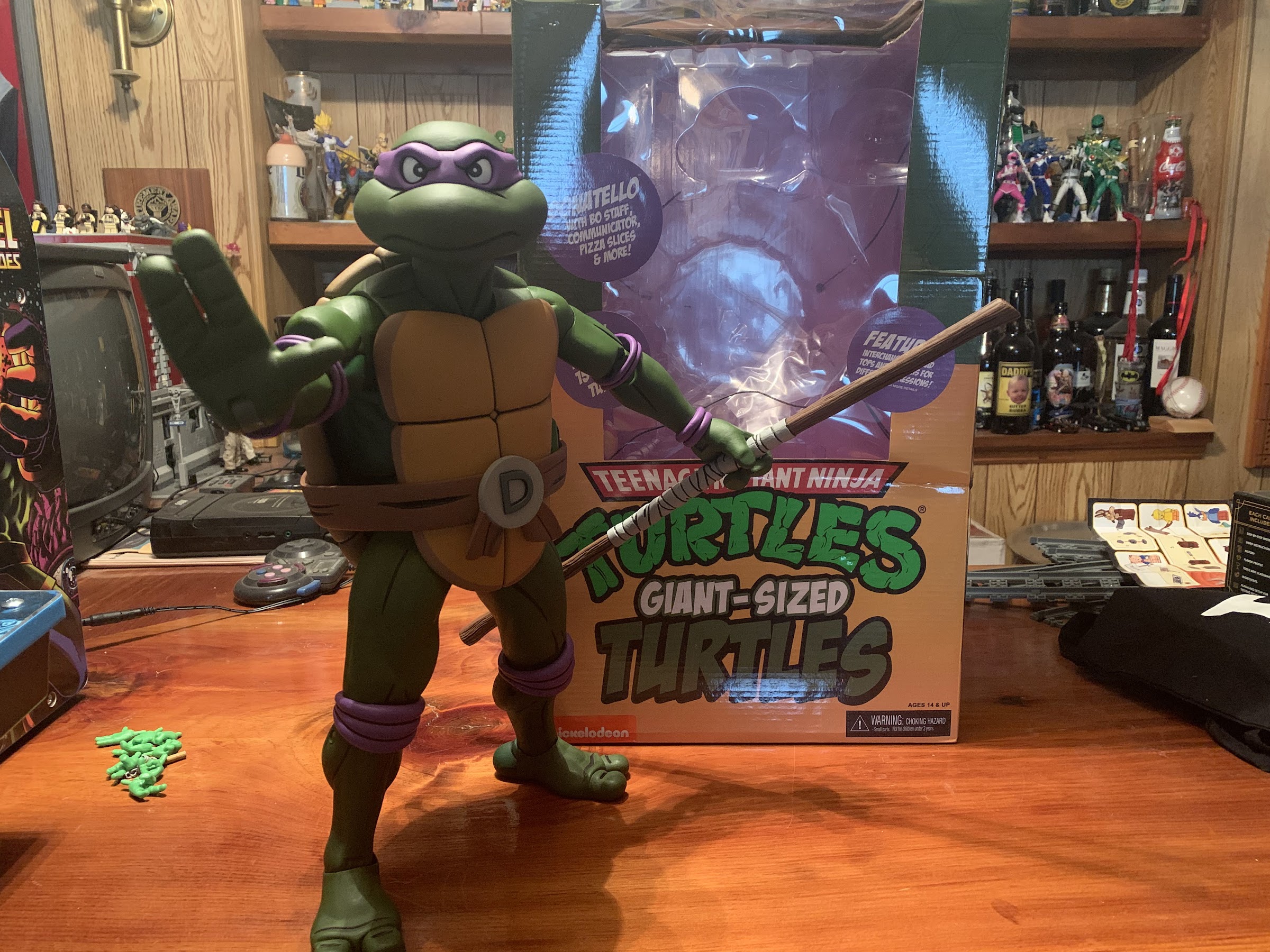
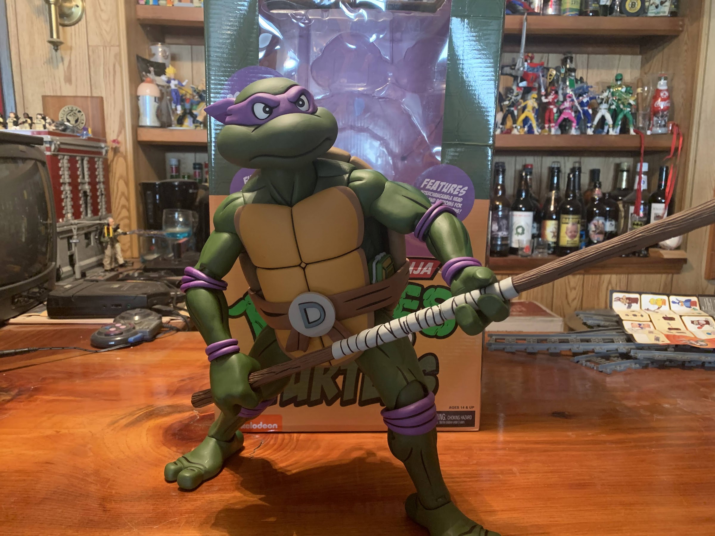
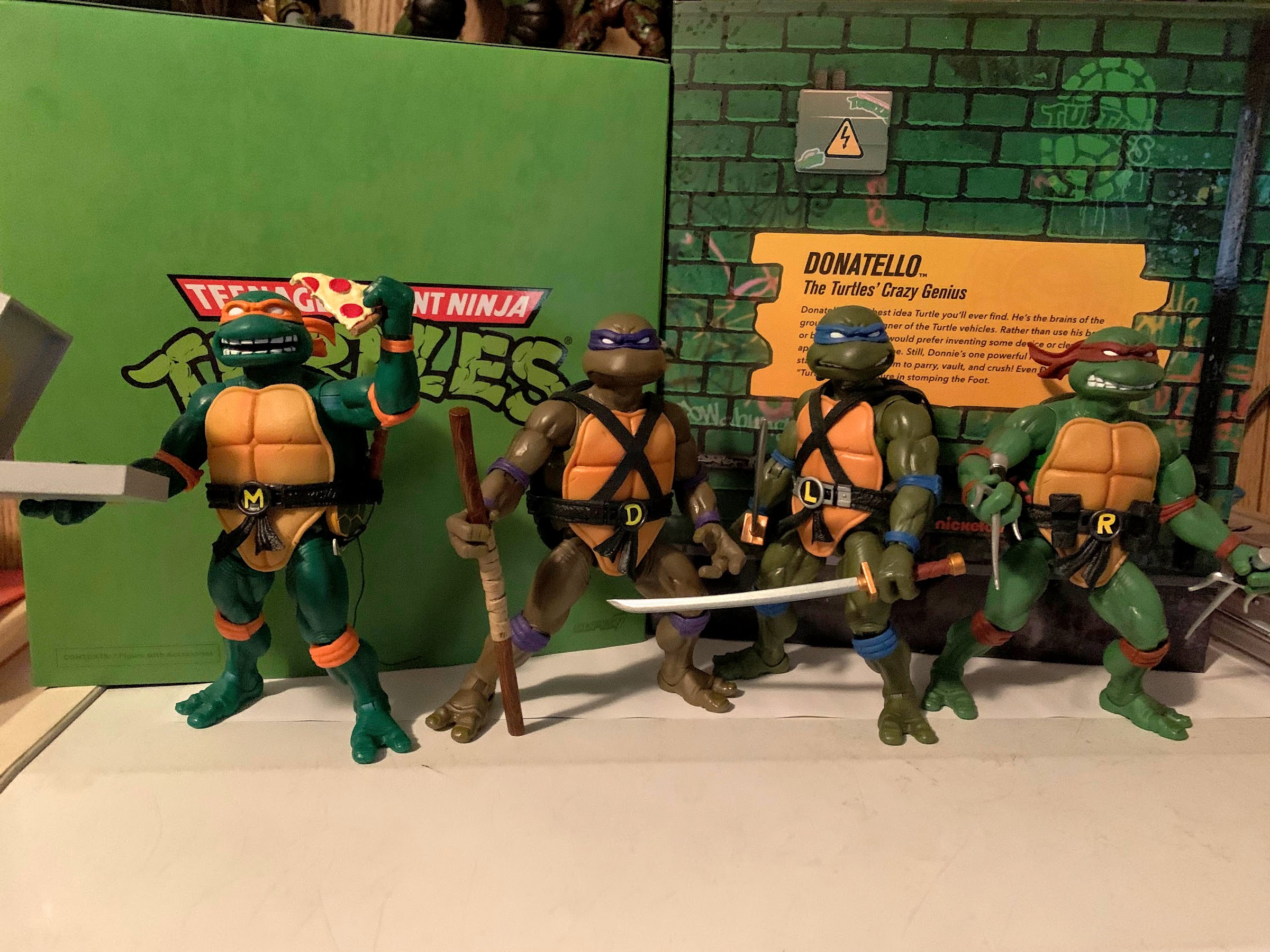
2022 has been a year of catch-up so far for me. A lot of stuff I preordered a year or more ago is finally coming due, and often without the actual preorder! The NECA quarter scale toon Donatello from the classic cartoon series Teenage Mutant Ninja Turtles is yet another preorder that just didn’t get fulfilled and was cancelled because I found another avenue. Though in this case, it was my buddy Mikey (@JehutyZero) who found this Donatello just hanging around a calendar store. And to make it sweeter, he was 50% off! Now, that was 50% off of an up-charged price to begin with, but I was still able to get him for well below the MSRP of $125. If waiting a few extra months saved me around 50 bucks every time then I’d be happy do it, so thanks again to Mike!
Where there was one, there is now two.
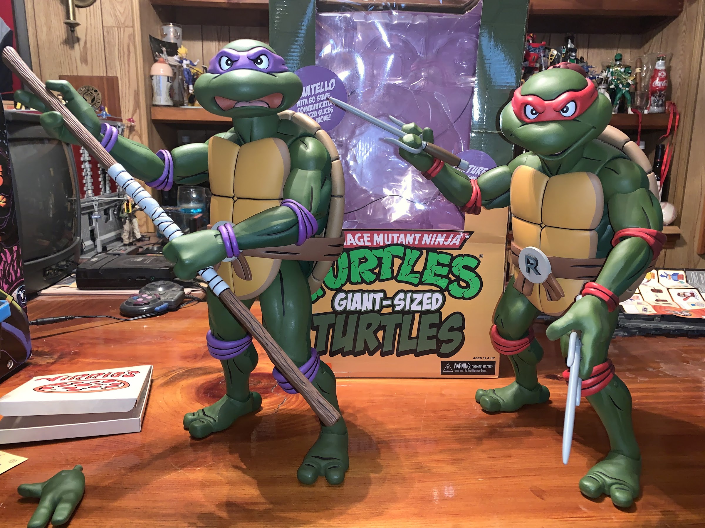
The quarter scale line was NECA’s reintroduction to the TMNT brand. That’s how we first got to experience the figures based on the 1990 movie and I loved those, and still do. I wasn’t sure about the cartoon line when it was announced, but the callback to the old Playmates Giant Size turtles and just how nice Raphael looked is what got me to bite. And If you get one, you kind of need all of them, right? When Raph dropped, he was our first taste of NECA’s retooled cartoon turtle with the mix and match expressions and updated articulation. Now, that’s old news since that’s been done in the smaller scale, but I’m still eager to see where this subline goes.
“It’s a little me!” “It’s a bigger me!”
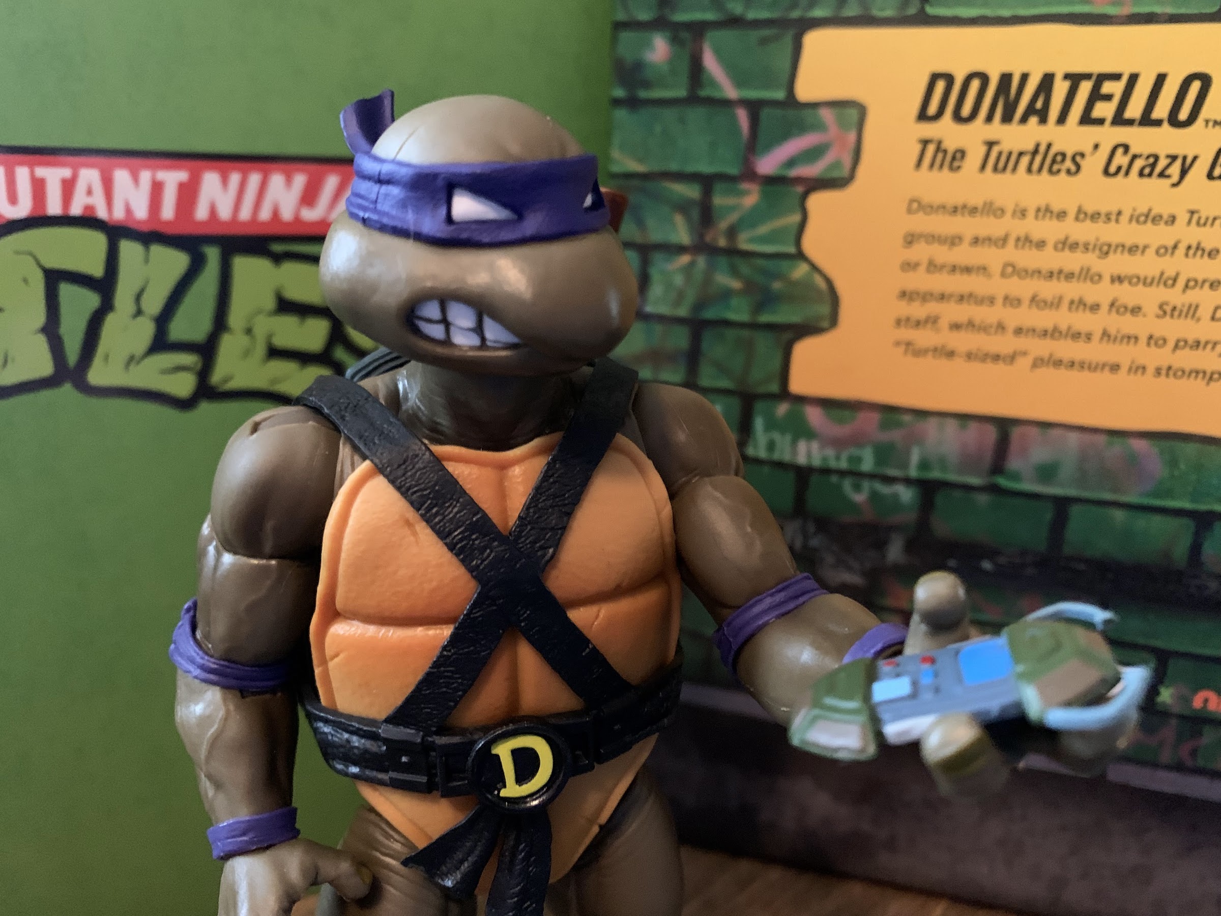
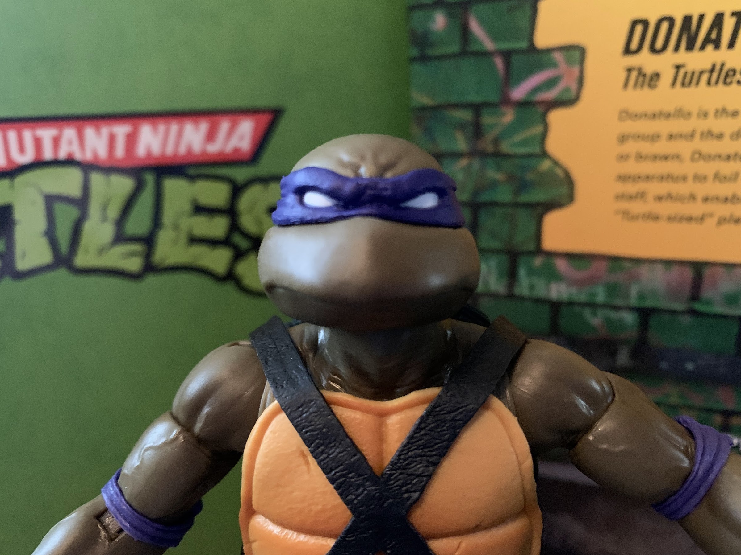
Like all of NECA’s TMNT figures, this one is pretty familiar because Donatello is essentially the same figure as Raphael. The only difference is the choice in color for the various pads and such and the belt which features a holster for his bo staff on the back and the big “D” belt buckle. And that’s fine, because the turtles all looked the same in the show. And it’s also fine, because that Raph figure is great! These guys weigh around three and a half pounds and stand pretty close to 15″ tall. They are impressive and demand attention no matter where they’re placed in a room. The paint apps are sharp and NECA does a great job of hiding the articulation so they have a very clean appearance. It’s a challenge to settle on a display pose and expression because no matter how you pose them, they look great.
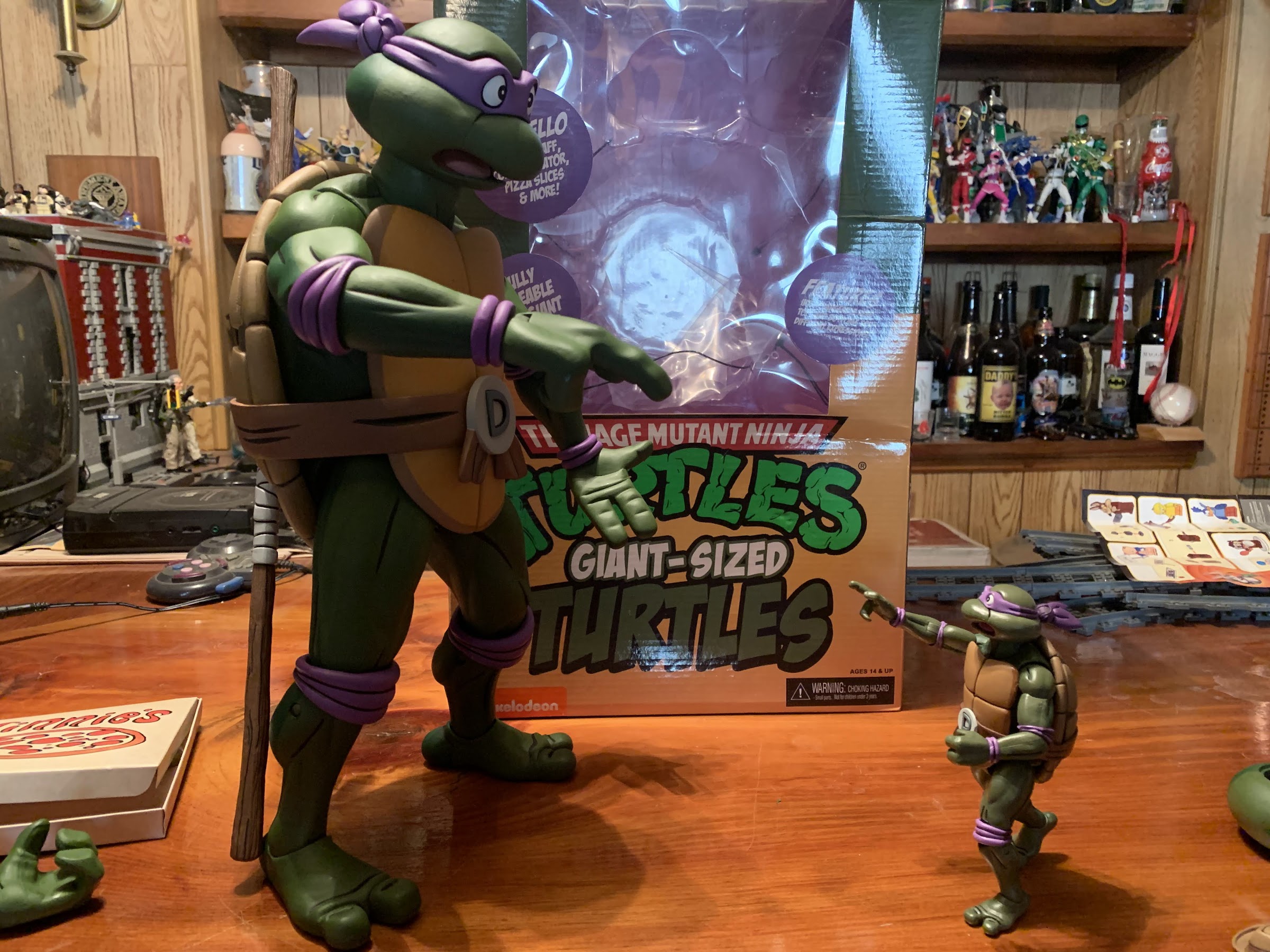
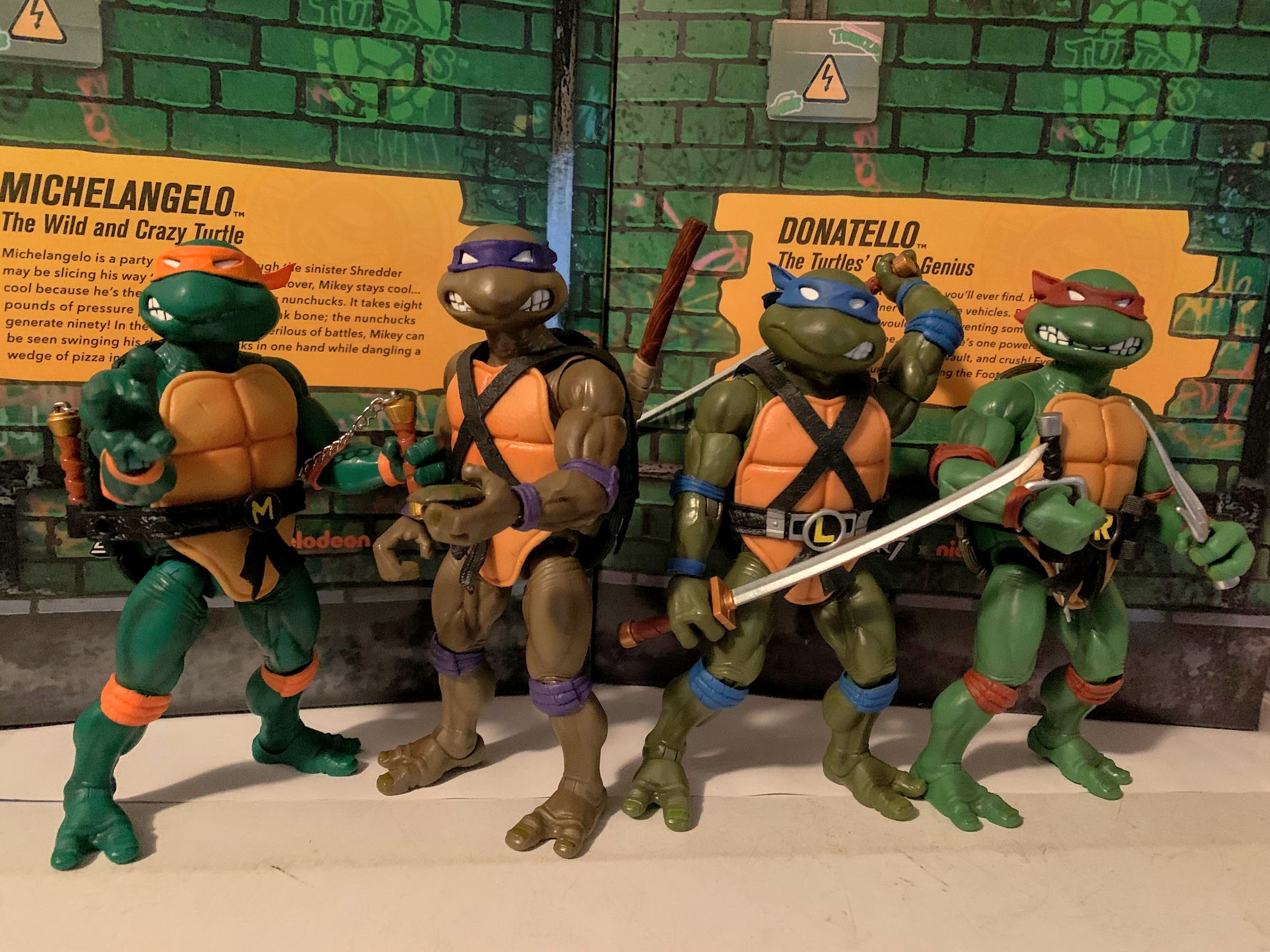
This is a picture I couldn’t do with Raph since he came out before the Turtles in Disguise set.
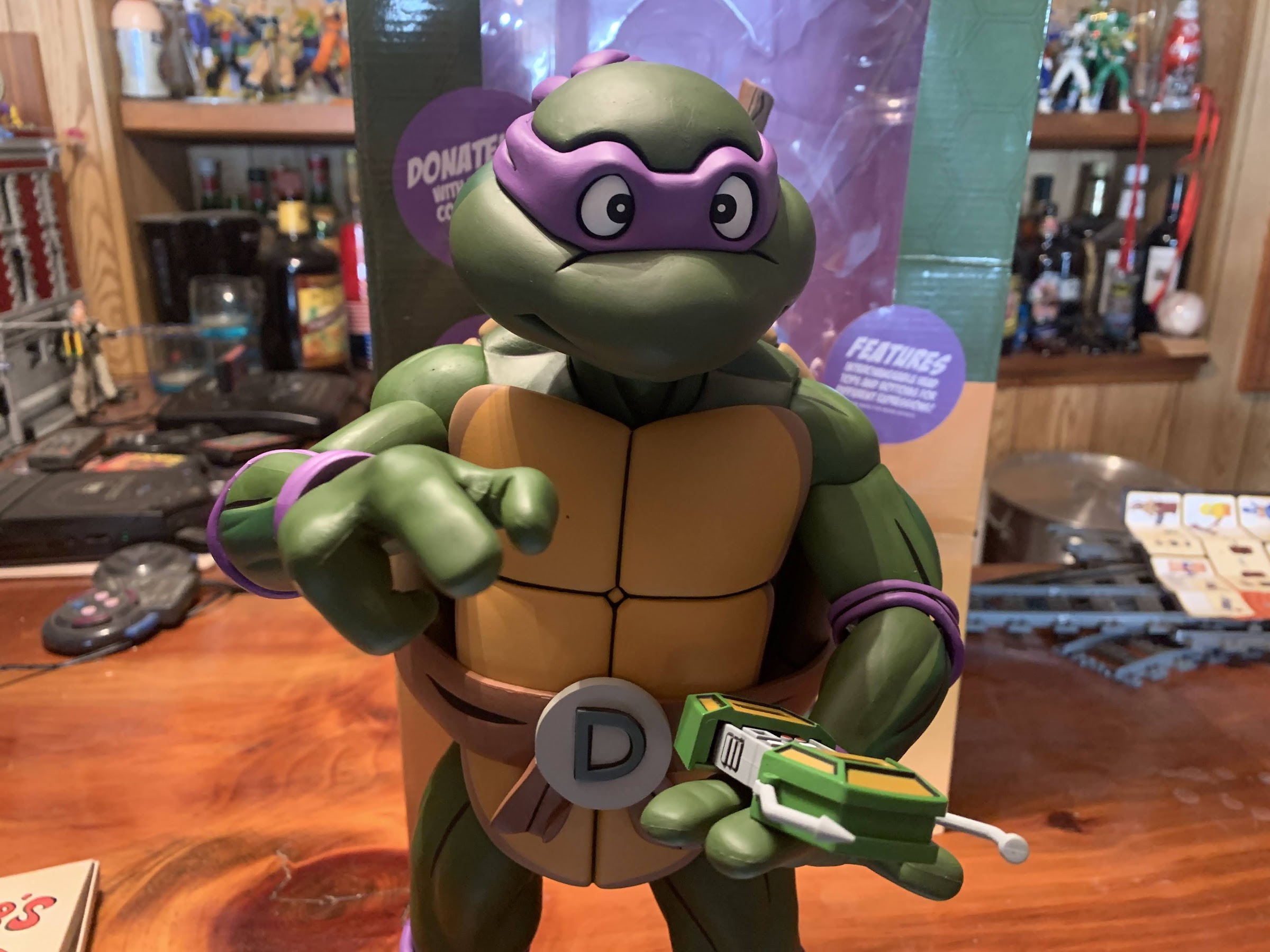
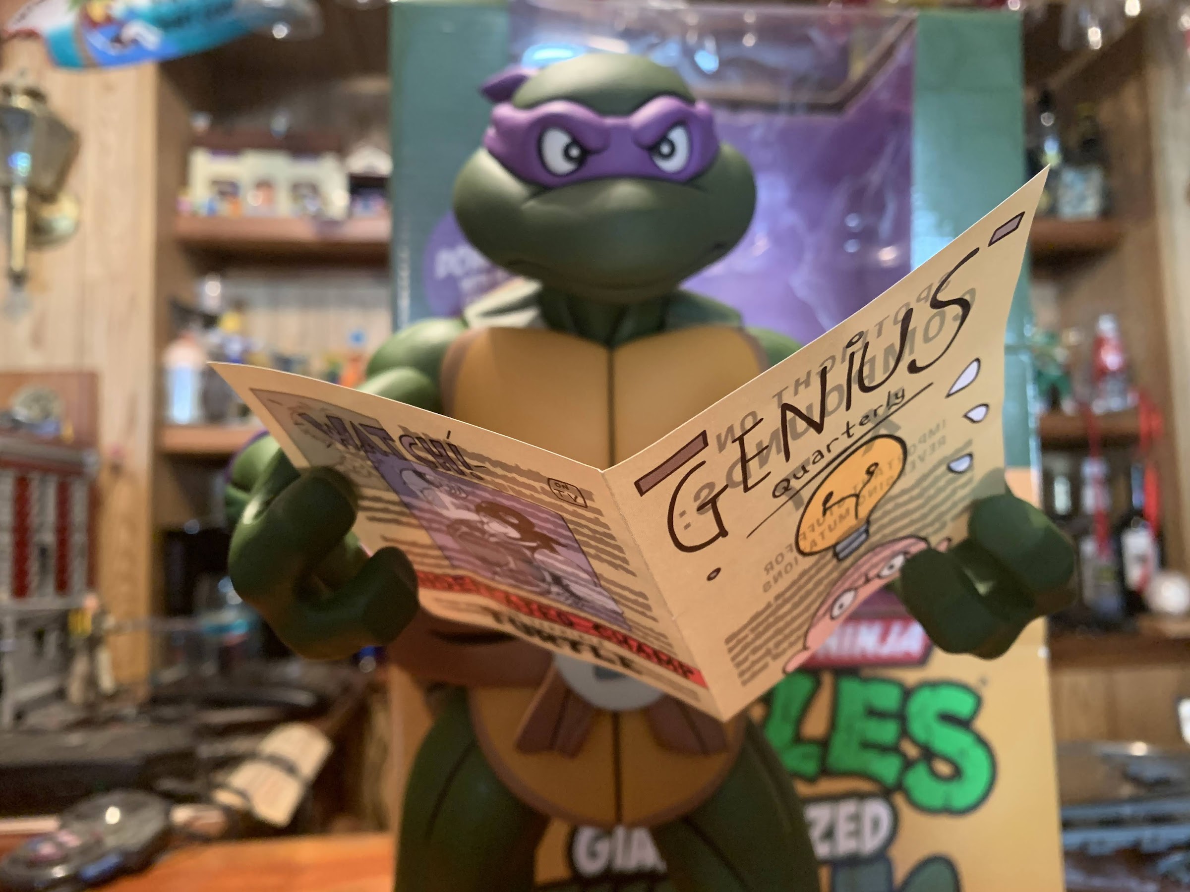
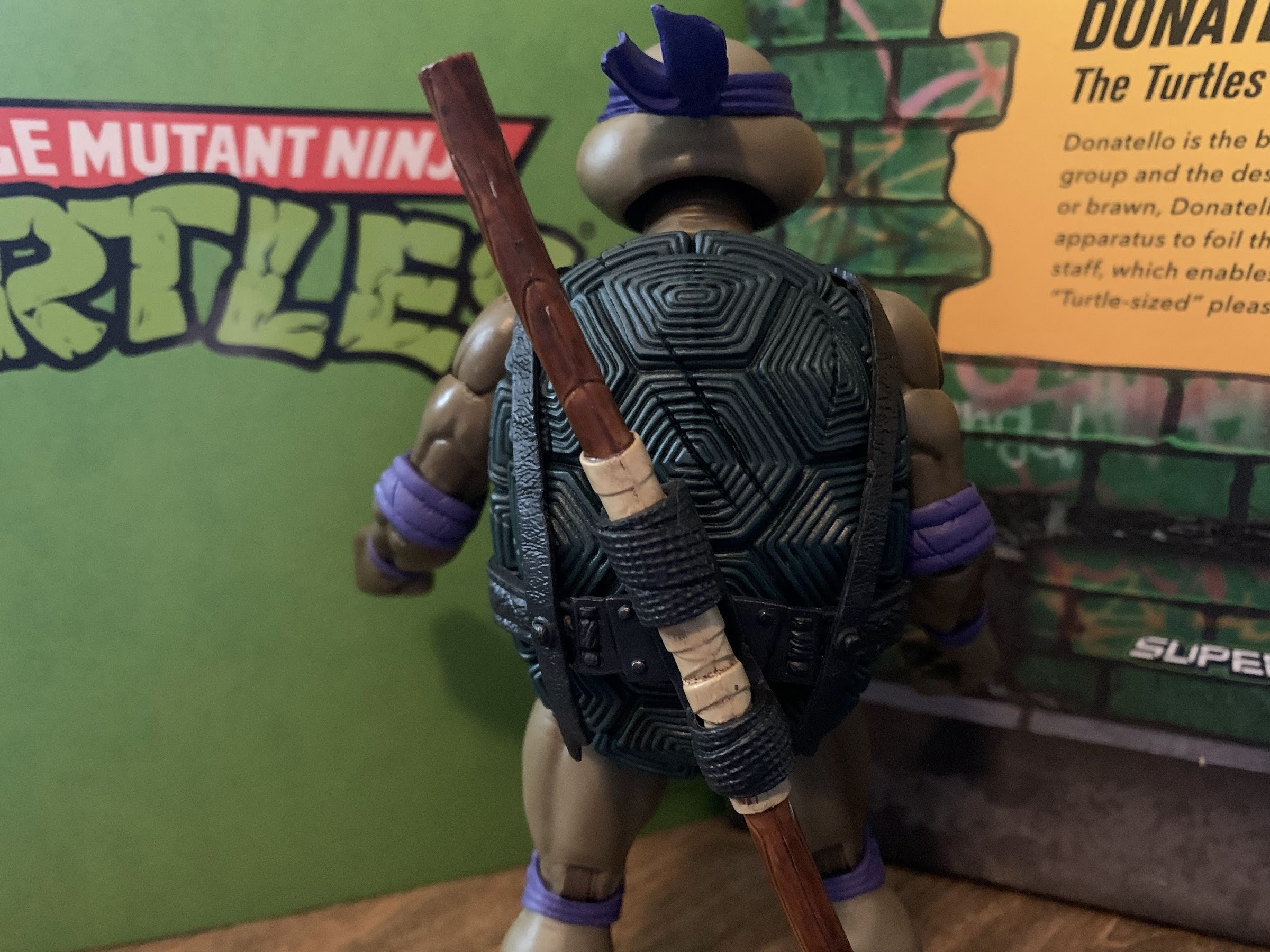
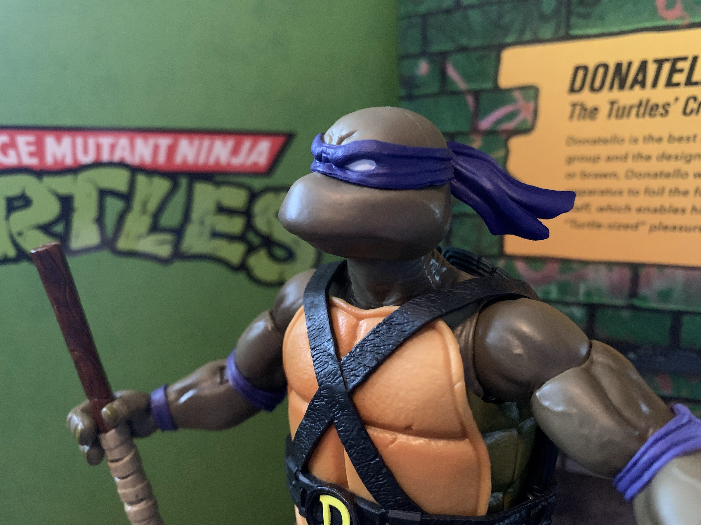
With Donatello being largely the same as Raphael, he really can only separate himself via his accessories. NECA is apparently going to include two slices of pizza with each turtle. They key-in to each other so eventually you’ll be able to form an entire pie if you so desire. And Donnie comes with the box to store it in. The Vinnie’s Pizza box is made of paper, but it’s laminated so it’s not pitifully durable, though it would have been cool if it was plastic. Then again, at this scale the paper goods box does look a bit more authentic than a plastic one would. Another paper good is Donatello’s issue of Genius Quarterly. It’s just a piece of glossy paper with a crease down the center. It’s fine, but it’s so thin that it doesn’t really look much like a magazine. Donatello also comes with the same Turtlecom as Raph, which really opens and closes and is a lot of fun to just mess around with. And for hands he has three sets: gripping, open, and pointing. Of note, the gripping hands are the same as Raph’s with the wider finger placement. All of the hinges are horizontal though, which is a bummer as some vertical ones would have been nice (I’m guessing Leo will at least have those). And then there’s the trusty bo, which just like the smaller version, can separate in the middle which can help make it easier to get in and out of the holster. It’s fully painted and looks about as good as a stick wrapped in tape can look.
Enjoy it before Mikey gets here, boys.
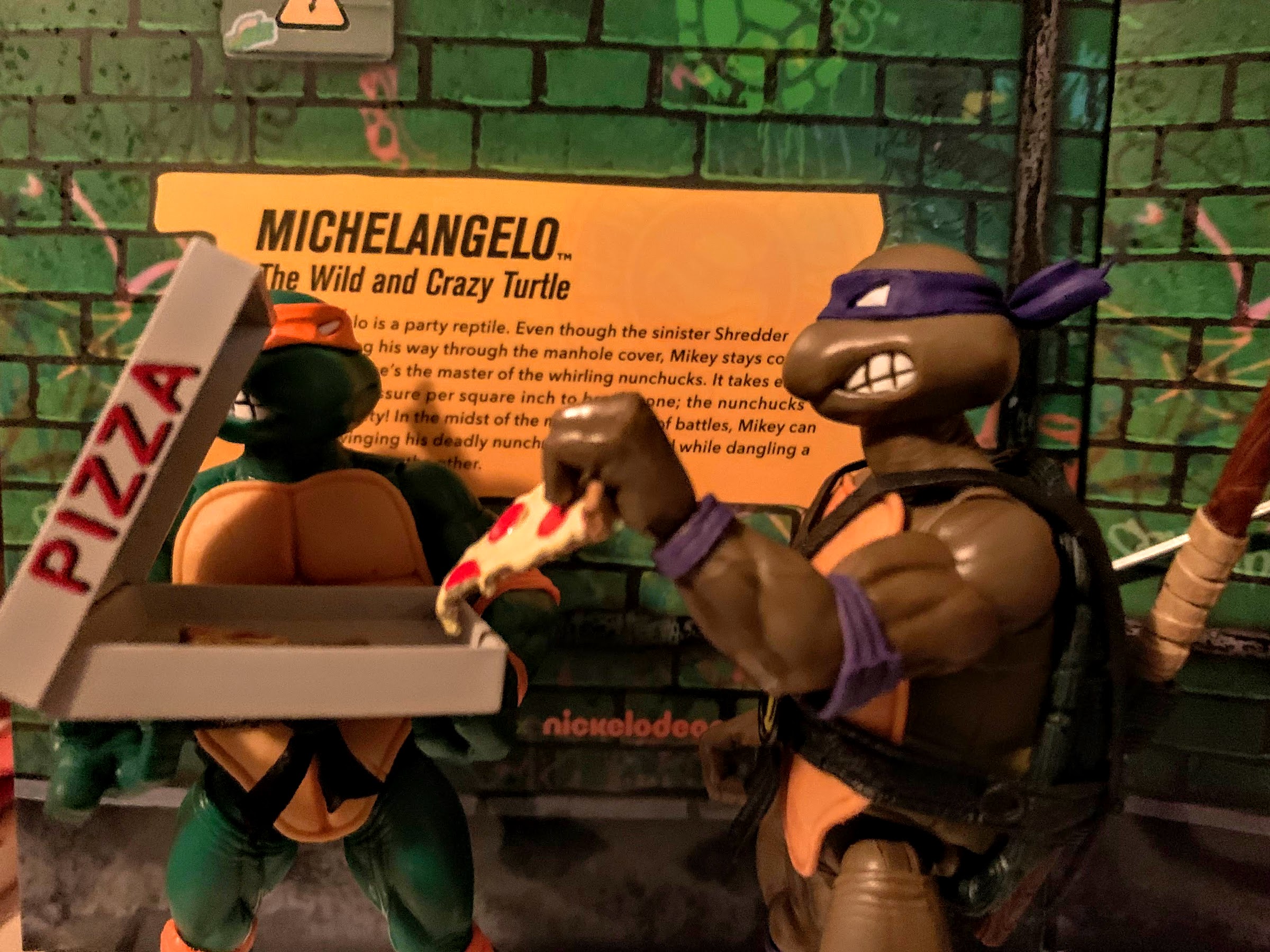
Donatello also gets to separate himself with his expressions. Like Raph, Donny has two sets of eyes: normal and angry. Unlike Raph, he comes with three mouth expressions to mix and match with: a smile, neutral, and yell. Donatello can look serious, grim, surprised, angry, and frightened. And these are all interchangeable so if you wish you can use any with Raph or use Raph’s open mouthed smile with Don. The act of mixing them up can be a shore as the fit is rather tight. I had to heat them up to get them together, but I suppose it’s better than the too loose issue I had with Raph. As I said earlier, it’s hard to pick a favorite expression. Right now I’m going with a battle pose and giving Donnie an angry yell, but I may switch it to something more light-hearted eventually, perhaps incorporating the pizza more.
He moves much better down there.
Being that Donatello is the same figure as Raphael, the articulation is also the same. Or is it?! Well, yeah, it is, but with Donatello it works a little better. In my review for Raph, I stated there wasn’t a thigh swivel, even though it looked like there was one. Other reviewers noted the same, but credit to YouTuber Anthony’s Customs for getting me to revisit the subject when he insisted there’s a thigh swivel, it’s just stuck. I was prepared to break out the hair dryer with Donatello, but I actually didn’t need to. It seems NECA applied some extra lubricant to the thigh area this go-around, and while there’s still some tightness, I can confirm that thigh does twist. I still haven’t accomplished the same with Raph, but I probably will apply some heat and see what happens. It definitely helps in getting him to stand to have as much flexibility in the legs as possible. Everything else works pretty well. A lot of the joints are tight, but that’s because the figure is so heavy. I also love the double-jointed elbows and I really wish NECA could get those to work at the smaller scale. You get a solid 90 degree bend and the elbow pad hides the joint nicely.
It’s a simple enough thing, but those facial expressions really bring these figures to life.
This is just a very aesthetically pleasing release from NECA. Donatello is large and commanding, despite that not really being his nature. I feel compelled to get all four turtles, but really, just one of these guys has enough presence to tie together any TMNT display or to just be a one-off. The only downside is it can be hard to find room for a toy this large and that MSRP of $125 isn’t insignificant. I do think the value is solid for what you get, and the extra stuff that comes with Donatello really helps in that regard. Up next in this line is Leonardo, the best turtle, but when he’s coming is anyone’s guess. I think COVID really hit this line hard as the goal was to release all four in 2021, but that clearly didn’t happen. Hopefully 2022 is the year, but I guess we’ll have to wait and see. I’m curious what else we’ll see for accessories. Leo, given that he has two swords and probably requires different hands, might not have any surprises, but will NECA do a quarter scale turtle hook with Michelangelo?! That could be a lot of fun. Until then, Donatello and Raphael will jut have to hold down the fort until their brothers arrive.
Donnie, I have a hard time believing that magazine is going to sustain you until Leo arrives.
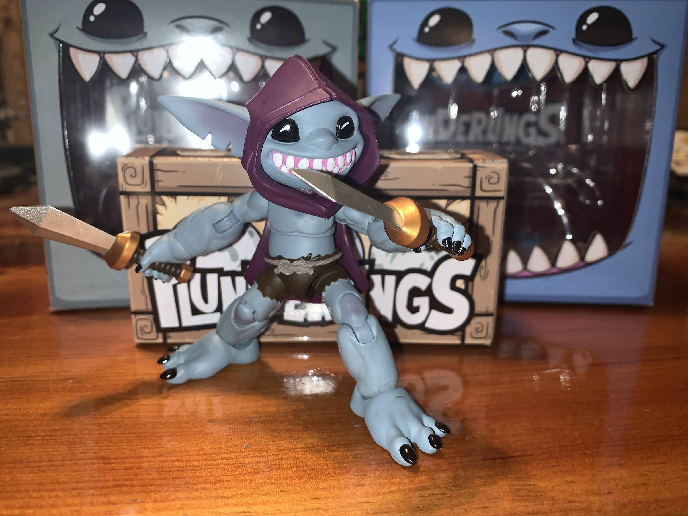
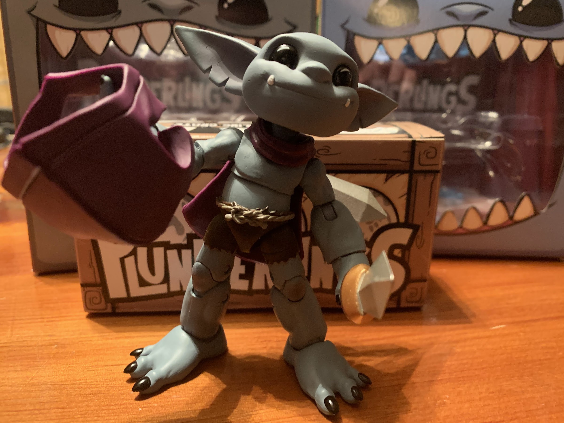
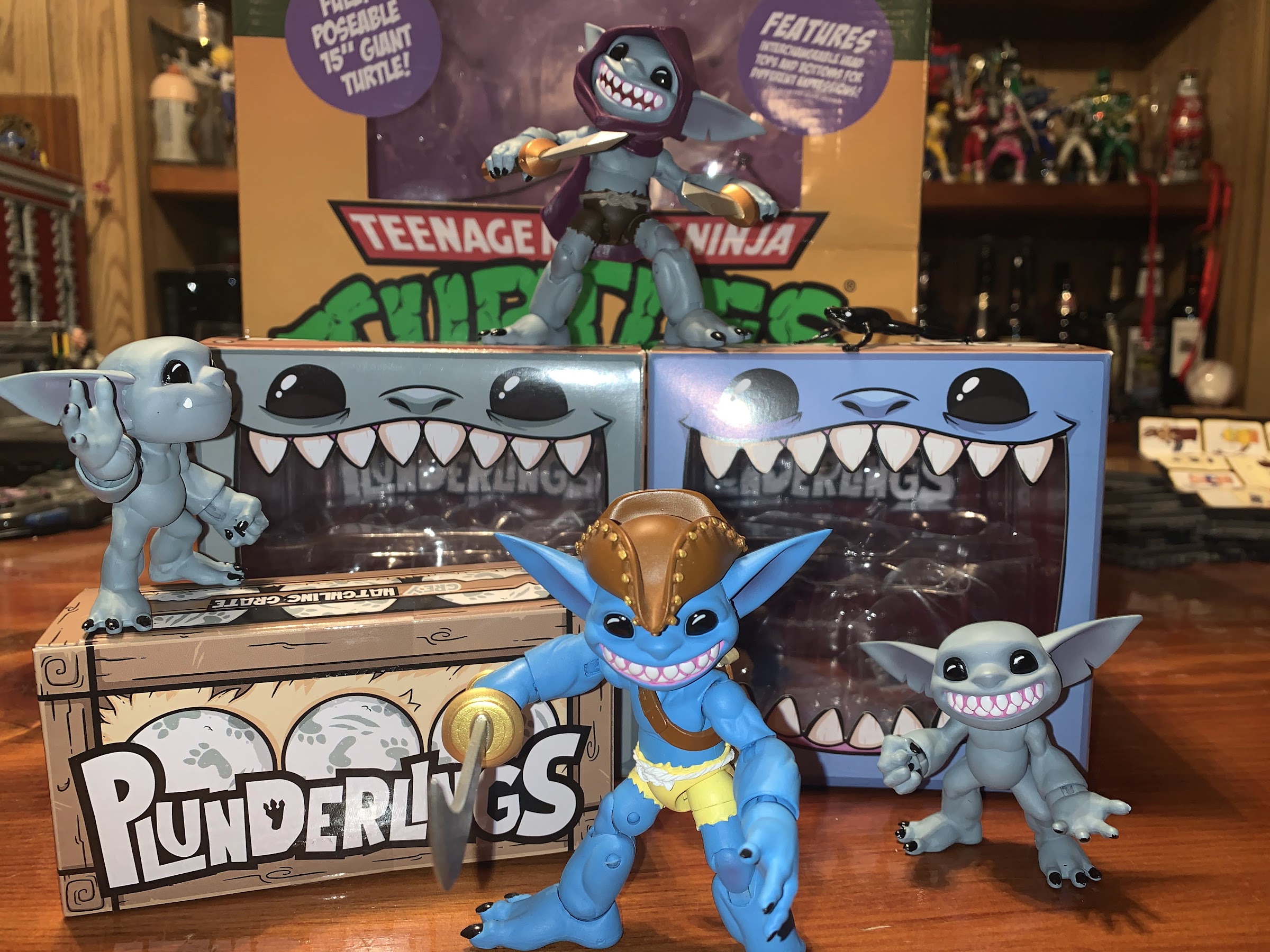
Last April I posted a review of the Plunderlings Raider Fwush from Lone Coconut. I was pretty charmed by the little goblin-like creature and found the action figure to be pretty fun. It’s also always a little rewarding to know that in buying such a toy I’m supporting a small shop like Lone Coconut. When I concluded that review, I wasn’t sure what my future with the brand would be. I was happy to have the little blue guy, but did I need anymore? Well, the answer is apparently “Yes” as I’m back with another Plunderlings review and this time it’s the nomadic Goyle.
The Plunderlings line originated as a Kickstarter that was popular enough to get the attention of online retailers like Big Bad Toy Store. When the initial backer amounts sold out, Lone Coconut went back to the factory to place another order for an assortment of characters and that’s when I decided to place an order for Goyle. If you’re new to the brand, all of the Plunderlings are essentially the same. They’re little goblin, or imp, creatures that stand a little over 4 inches tall and are mostly differentiated by the color of their skin. In terms of the two I have, there is no difference between the two in the sculpt aside from Goyle having some slits in his ears. Some have different pants, but that’s largely it. The characters are further differentiated by the accessories they’re outfitted with, and there is a mix and match element at play here, if that’s something you want to do. Some may cry fowl at the blatant reuse of molds which coincide with a fairly hefty price point of $40, but it’s basically what the Teenage Mutant Ninja Turtles have been doing for years and no one seems particularly bothered by that.
He’s got a hood and cape so he’s basically the Plunderling equivalent of Batman.
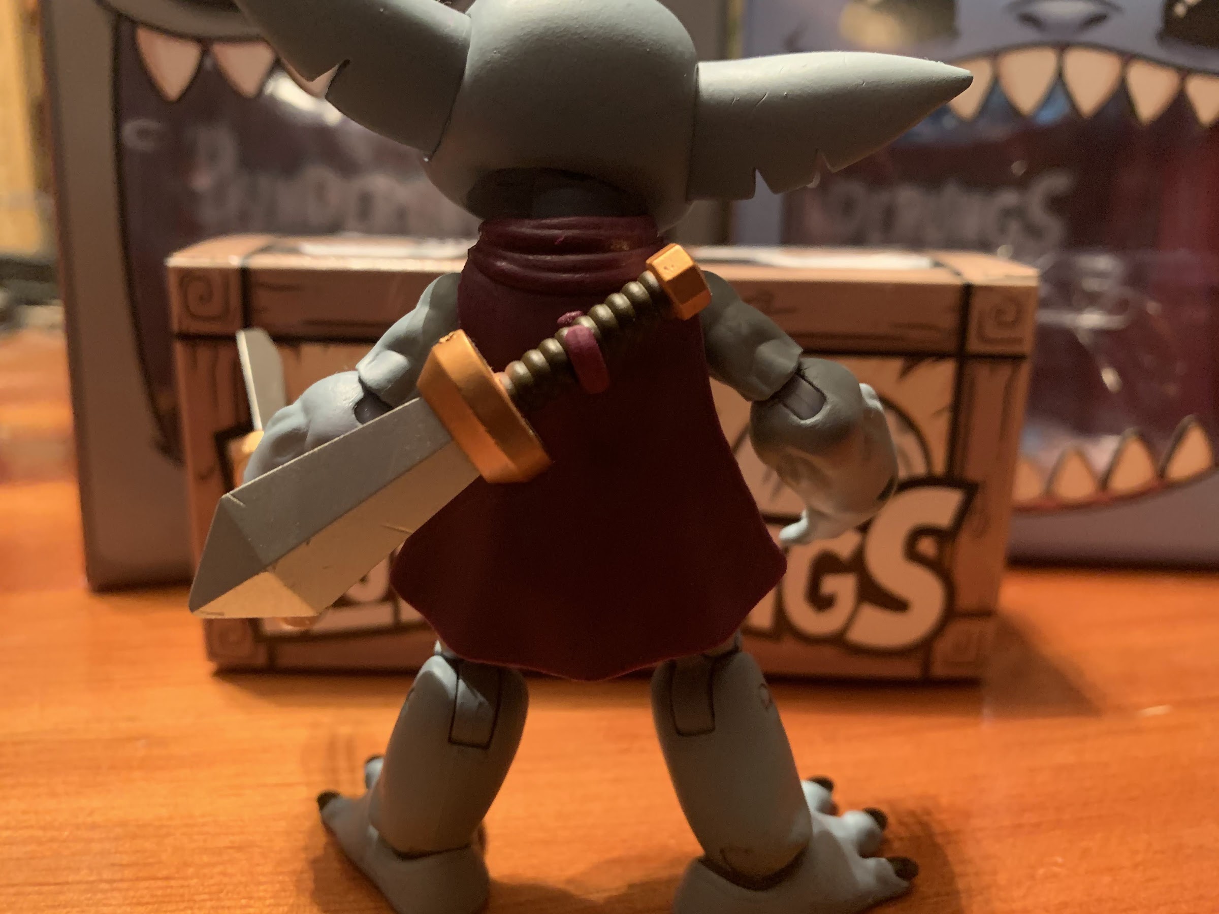
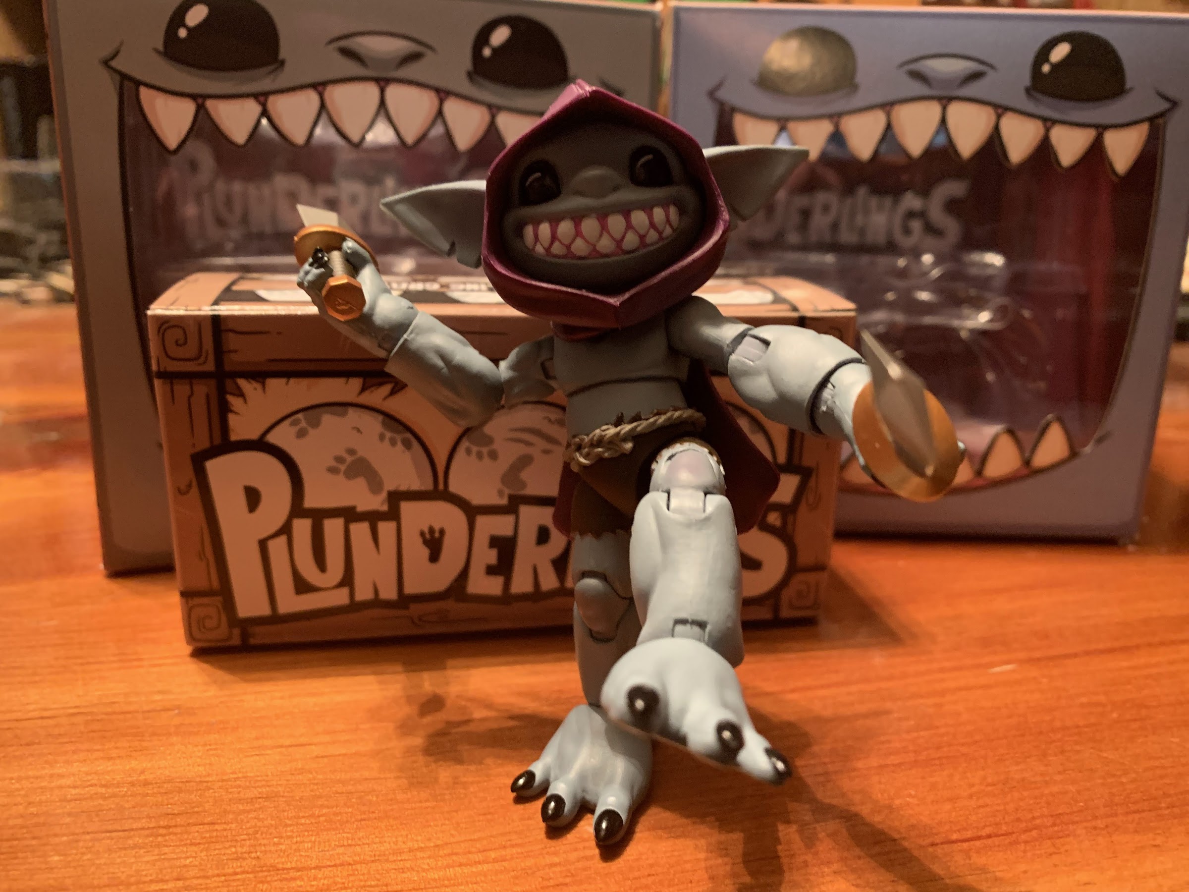
The theming for Goyle is that of a nomad, or rogue. Rogue is the word I keep coming back to with him as he has a removable hood and cape and he’s armed with a pair of short swords. His complexion is gray with some subtle purple shading in places to go with brown trunks and a purple cape and hood. His nails and eyes are painted a glossy black and there’s a little white added to the eyes to give them personality. He’s always sporting a smile no matter which portrait you opt to roll with and all imply a mischievous personality is at play here. He comes in his own themed window box that has optional cardstock ears inside if you like that sort of thing. It’s a cute package and is yet another box I find difficult to dispose of.
The weapon storage for Goyle works much better than it did for Fwush.
What I like about this line, aside from the overall aesthetic of the base figure, is that Lone Coconut opted for magnets when it comes to the clothing accessories. Rather than deal with pegs and clasps everything goes off and on rather painlessly. The cape is just a semi-pliable plastic with a hole to fit over the ball-peg in the neck, so it’s really only the hood that’s reinforced with a magnet here. With the hood, the magnet just adds a little extra stability as it slides over the ears and is a pretty snug fit. Unfortunately, the factory had some issues with the magnets this go-around and they all ended up getting flipped around. This means the magnets won’t work with the first run of figures and the same is true for those accessories with the second run. Apparently, Lone Coconut has posted a tutorial video on how to flip the magnets yourself, but I haven’t sought it out. I have no plans to put the hood on Fwush or the tri-corner hat he came with on Goyle so it’s not a big deal for me, but I can see it being an issue for others more interested in the mix-and-match aspect of the line. There’s also a little hook included in the box that can peg into the cape. Once inserted, this hook can accommodate one of the swords if you don’t want your Goyle to dual-wield.
The oversized feet help these guys to balance real well.
If you want a full rundown of the articulation, check out the Fwush review I did. I will say, these guys can be pretty tight out of the box, so take care breaking them in. Lone Coconut recommends using heat to get them going, but I never had to resort to that. The trickiest joints for me, with both figures, were the knees. Usually, only one hinge in the double-joint wants to go and getting the other one to work in tandem can be tricky, but not impossible with patience and gentle force. In addition to the hood and swords, Goyle also comes with a black frog or toad. It’s quite glossy and I’m not sure if it’s supposed to be alive or dead. It’s fine. He also has two gripping hands with vertical hinges and two open hands with horizontal hinges.
Aww, they’re so cute!
The reason why I felt I should do another Plunderlings review is not really because I like Goyle (and I do), but because this time I picked up some Hatchlings to go with him. Lone Coconut sells these direct, but they’re really an ingenious idea. The Hatchlings are essentially two, headless, bodies designed to be Plunderlings who just hatched (apparently they’re an egg-laying species). The little bodies are slightly crouched with ball-hinge joints at the shoulder and a big ball-peg in the neck. Aside from that, they’re non-articulated. They come with a set of fist hands that can be used with a regular Plunderling or with a Hatchling body and they’re color-coordinated to an existing Plunderling. The purpose of these little guys is to give you some place to put your extra heads and hands. Between one two-pack of Hatchlings and one Plunderling figure, you end up with three sets of hands and three heads. This way, each head and hand set have a place to go and it’s a fun way to make use of parts that otherwise end up in a box or drawer. The heads pop on easy enough and since it’s just a ball-peg you get a lot of range right there. The hands are a little tougher to get into the Hatchling mold for some reason, but not impossible. Now I have a trio of gray-colored Plunderlings on my desk! Currently, Lone Coconut is only selling Hatchlings that match the figures they recently made available again and each set costs 10 bucks.
Not so cute right out of the box.
Plunderlings are turning into quite the fun little line. I say “turning into,” but all of this stuff was already available to those who backed the project originally so it is old news for them. Currently, six varieties of Plunderlings are available to buy now, with a pair of new ones available for pre-order that have a sea monster thing going on. Lone Coconut has also shown off new models in the line, a tall skinny dude and a big beefy one, that I assume are supposed to release this year. The only drawback to this line is that price point of 40 bucks each. It’s not a price out of whack with some other smaller shops, but a little pricey for something that’s not being licensed from another party. If you like the aesthetic, I think these are fun, little, figures that any collector would enjoy. And if you do grab some, I definitely recommend the Hatchlings set (if available) as it’s modestly priced and makes for a nice addition.
Gross. That’s the word I hear all of the time associated with the vintage Playmates Teenage Mutant Ninja Turtles line of action figures. Back then, articulation was kept pretty simple and this allowed studios like Varner to go nuts with sculpting. They could include all kinds of details in their figures. Sure, much of it would go unpainted, but at least it was there. And for whatever reason, the aesthetic of the time was to be gross. Characters with boogers and slime were quite common, and the Teenage Mutant Ninja Turtles line soon embraced that. It wasn’t really from the start, but over time, characters that embodied an unpleasant aesthetic were introduced and none captured that more than Muckman.
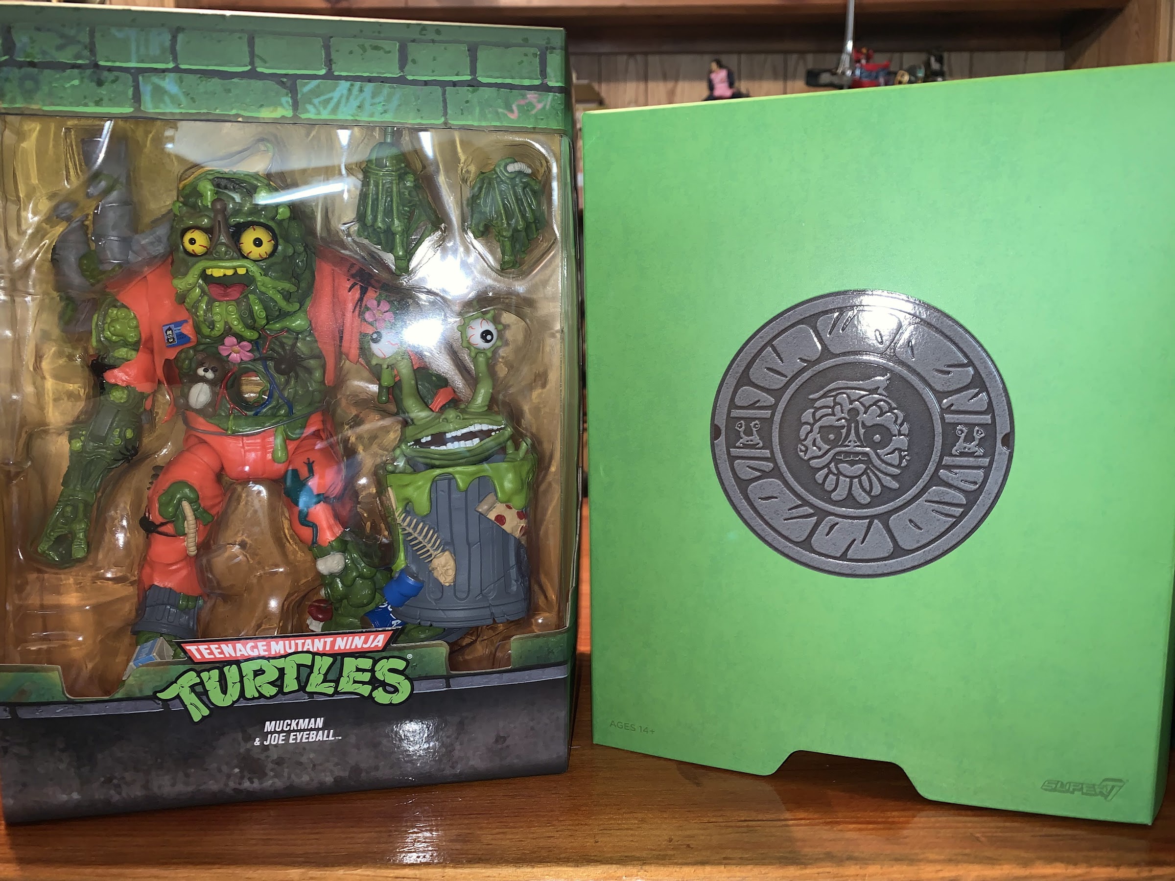
The standard Super7 box, only probably 20% bigger.
Muckman is literally supposed to be mutated garbage. A walking trash pile with a little eyeball buddy paling around in a bucket jammed in his back. If action figures could smell, then surely Muckman would smell horrible. He, along with Mutagen Man, stand out in my mind as characters so gross that I almost didn’t like to look at them. I played with them, but if I spent too much time thinking about these guys I’d start to get sick to my stomach. Now, I reflect on that Muckman figure with renewed appreciation for those sculpted details. It was pretty incredible what the artists got into that guy, and all just for some 4 dollar lump of plastic kids were going to toss around, lose, and cover in legitimate muck.
Has something so gross ever looked so beautiful?
Super7’s line of Ultimates! based on that vintage line is perfectly suited for a figure like Muckman. The upscaled nature of the line, combined with modern paint apps, is designed to bring figures like Muckman to life. When it comes to this line, I find myself wanting Super7 to take what’s old and improve upon it, but with Muckman little improvement is needed. Just make him bigger and paint him up while adding in some modern articulation. And guess what? That’s exactly what Super7 did.
There’s so much going on with this guy.
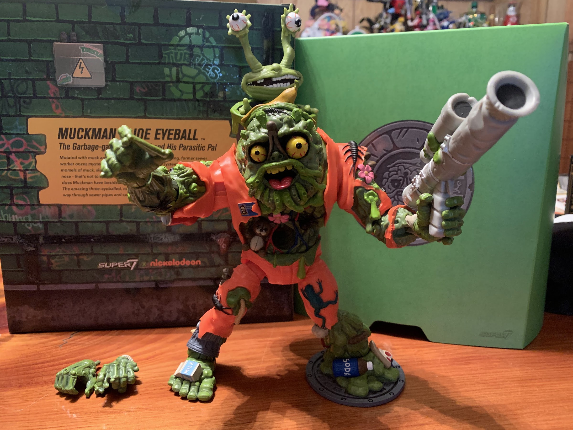
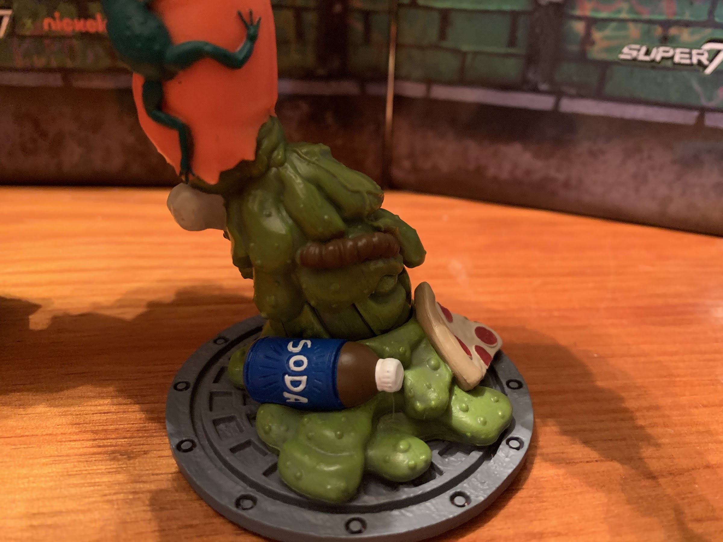
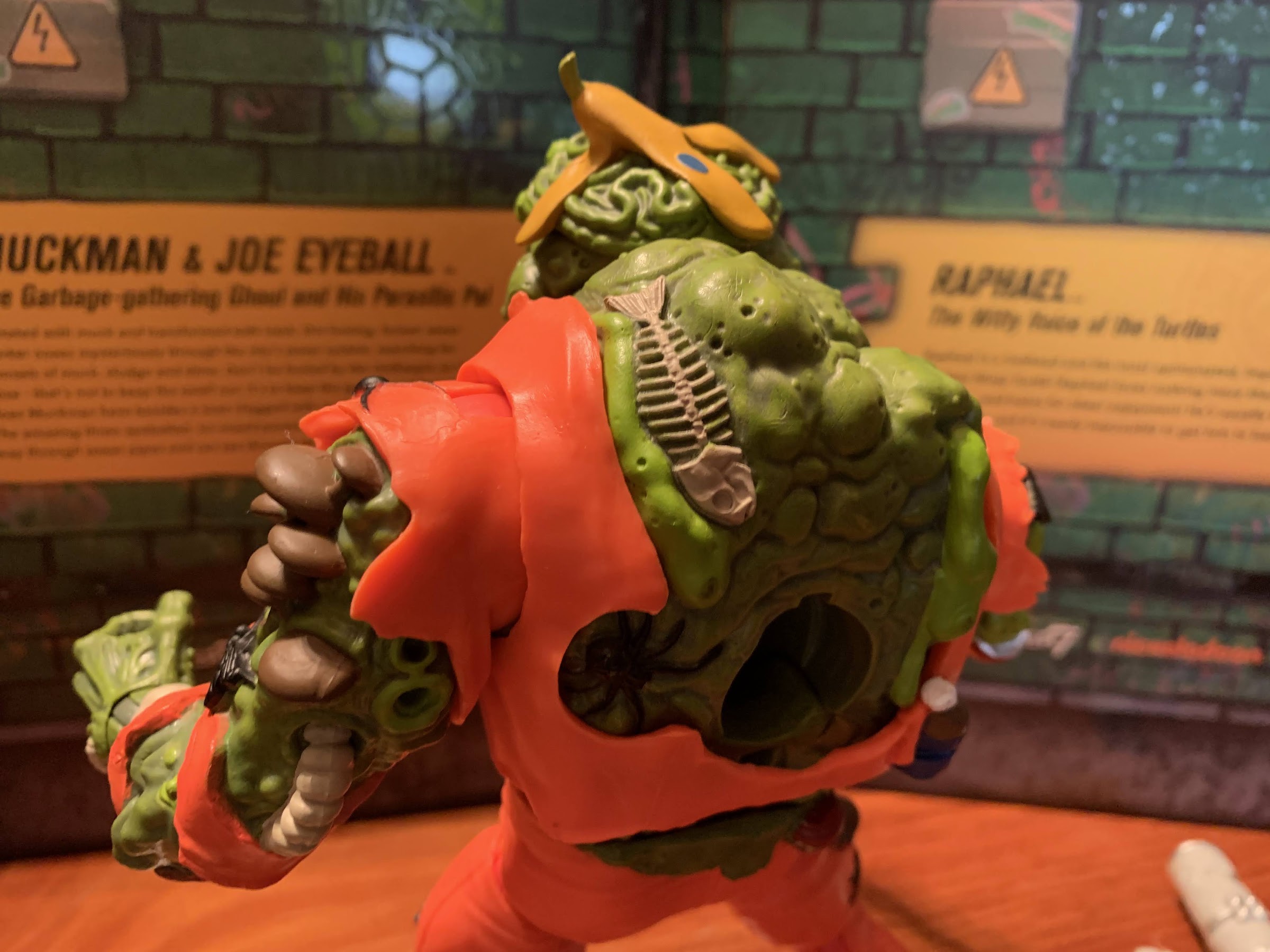
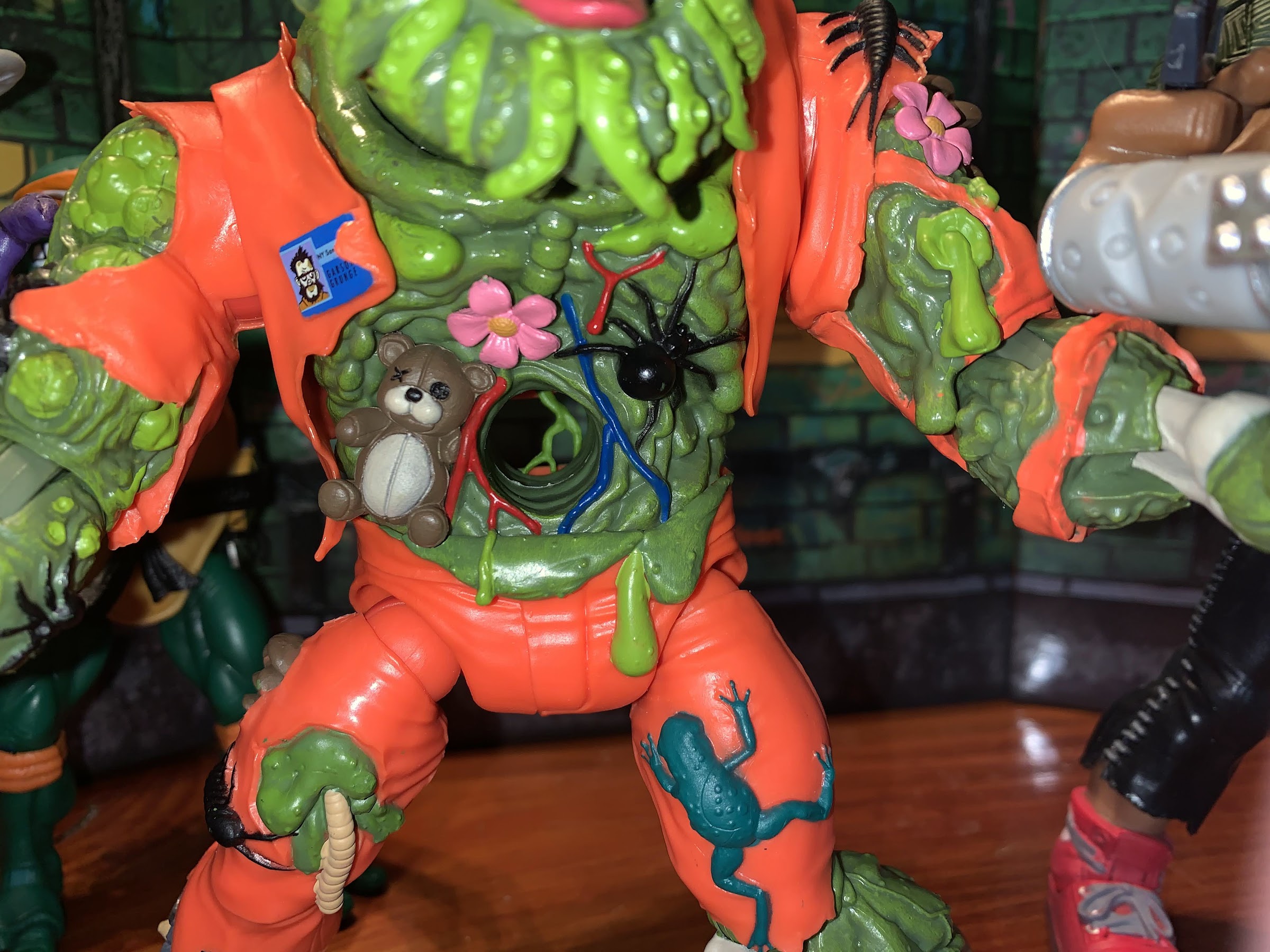
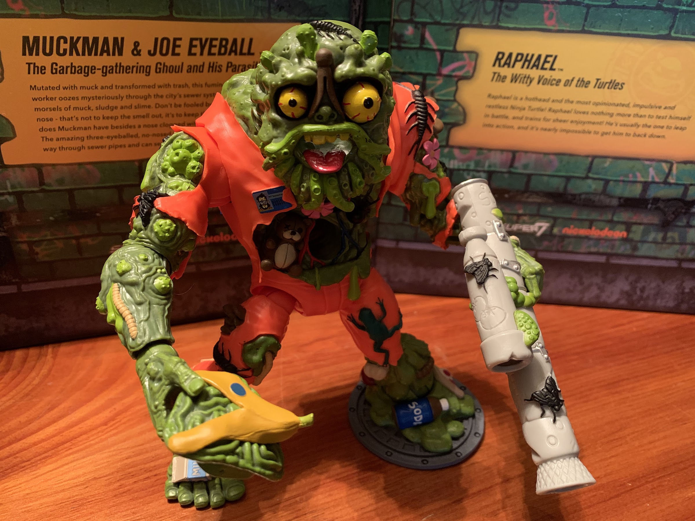
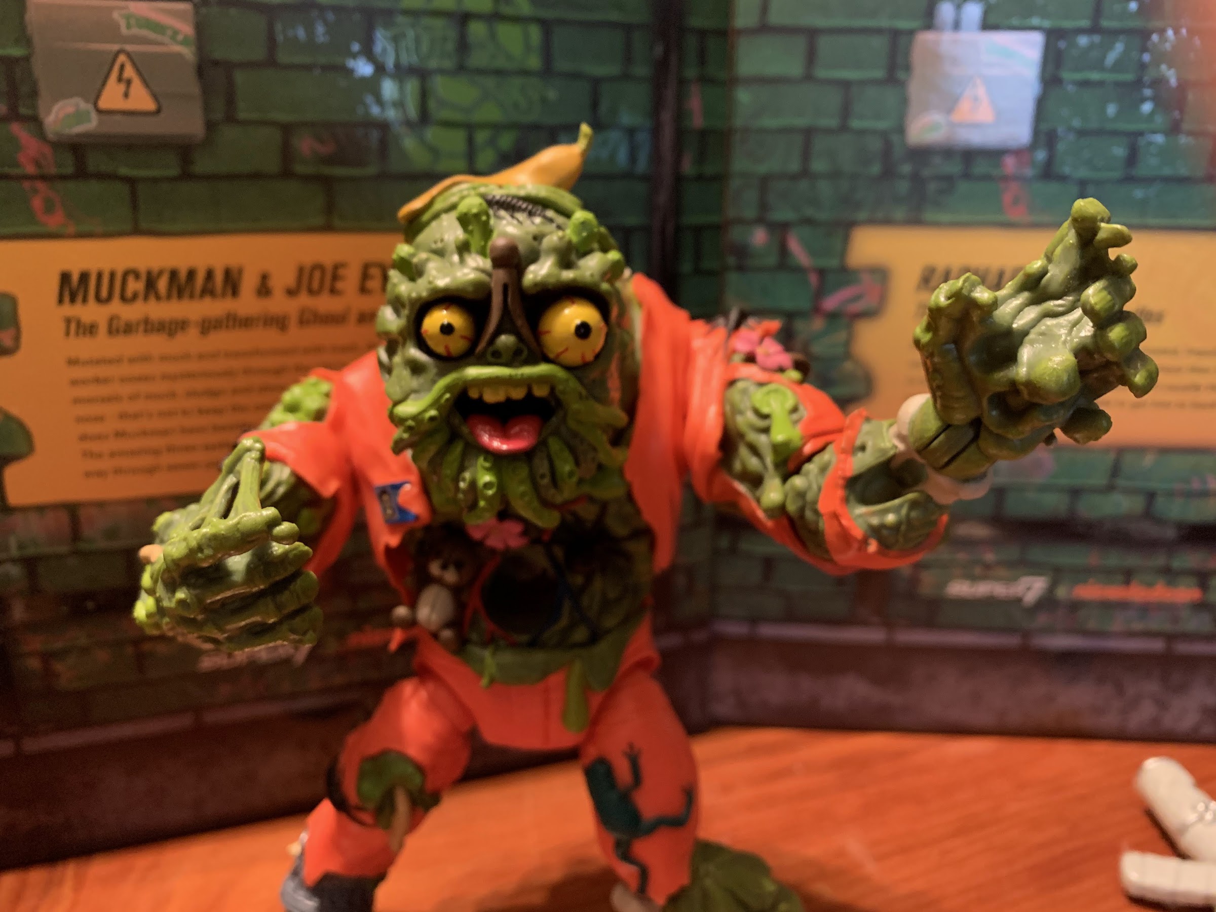
Muckman and Joe Eyeball are exactly what I want from this line. Muckman is huge, standing around 7.25″ to the top of his head, and 7.75″ to the top of that banana peel he has on his head. He’s shorter than Bebop and Rocksteady, though he’s also designed to be stooped with his head practically in the middle of his chest. He’s substantially thicker though and quite a heavy beast. I suppose his upper body isn’t much thicker than Bebop’s, but it feels more substantial because of all of the stuff going on. Almost every spot on this guy is sculpted to resemble something. Some of them are basically nondescript tendrils of green yuck that resemble tentacles to a degree. There’s lots of lumpy green stuff, bugs, refuse, and the like. Just about everything is painted now which helps bring him to life. It’s also amazing how some of the stuff looks so familiar, like the frog on his left thigh. I haven’t held the original Muckman in 30 years or so, but it’s amazing how some of the details came roaring back the second I got this figure in-hand.
He grows his own mushrooms.
The sculpt is the real star with this figure, but the paint is a close second. So much of it is applied in a clean manner. Apple cores, fish bones, soda cans – it all looks awesome. There’s one fishbone on the back of the figure’s right calf that they were able to sculpt and paint across two textures, his frayed pants and this trash bucket that’s wrapped around his ankle. It looks spectacular and there’s a nice gradient for the green that dominates the figure’s “flesh.” The only blemish on my figure is on his “moustache” where there’s a little scuff, but that’s basically it. It’s an unfortunate spot to have your own imperfection, but it’s not enough to take away from the overall presentation. This is one well done figure.
One of Muckman’s ooze holes.
Like the vintage figure, the other ooze holes are found on the head.
Now, this big, heaping, lump of garbage isn’t exactly friendly when it comes to articulation, but Super7 managed pretty well. His head, being in the center of his chest, can’t do much up and down, but he can look to the side really well because his neck is surprisingly long. It seems like not much, but it adds a lot of personality. The shoulders are simple ball hinges that can rotate fine, but he can’t raise his arms out to the side much. The elbows are single joints with a swivel and they work well and he can just about bend his elbows at a 90 degree angle. The swivel on his left arm is a bit more limited though because he has some sculpted ooze that hangs over it. At the right wrist, is the typical Super7 swivel and hinge, but because the bones of his left wrist are exposed, they had to do a ball joint there that pegs into his left hand as opposed to the hand normally pegging into the wrist. It’s a smart solution and I kind of prefer that joint to the usual. He has a waist twist, though it rubs against the soft plastic “diaper” he’s outfitted with so you may want to be careful. The hips are the standard ball-hinges that peg in. Their appearance is the one thing I don’t love because too much of that ball is visible, but they work all right. The knees are single hinges with swivels and the ankles hinge and pivot very well. It’s pretty damn fun to pivot that big manhole cover left foot because it just looks so ridiculous.
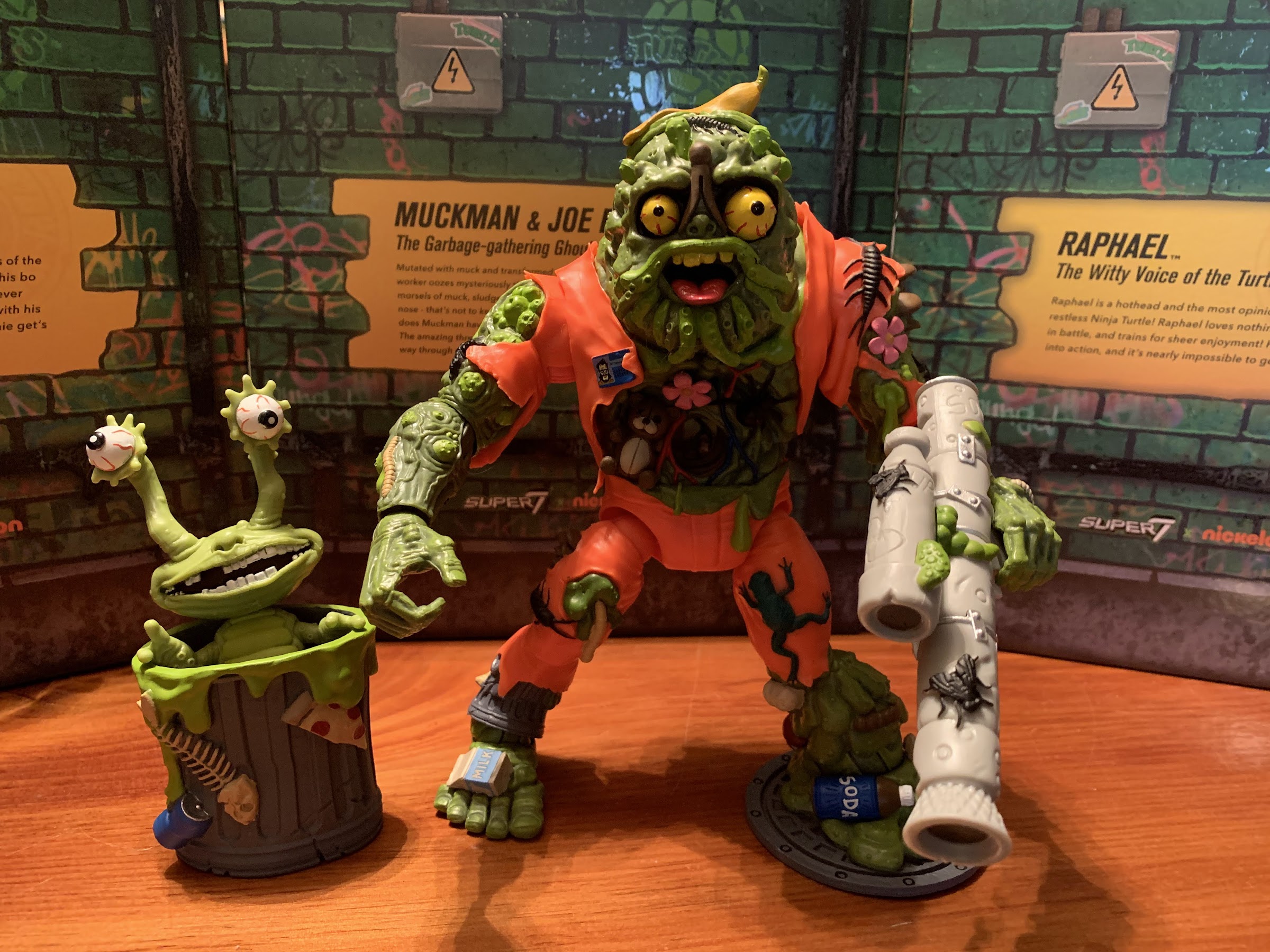
And with him, as always, is Joe Eyeball.
Muckman is probably a very costly figure for Super7 given the amount of plastic in him as well as the paint. For that reason, it’s probably not a big surprise that his accessory count is small, but at the same time, it’s pretty substantial. His main accessory is Joe Eyeball. Joe was a little slug character in the vintage line that’s been brought to life. Super7 upscaled him and he now stands close to 2.75″ to the top of his head, but 3.75″ to the top of his tallest eyeball. Super7 painted his eyeballs, mouth, and teeth and even squeezed in some articulation. His head is probably on a ball-peg, but it’s pretty tight and mostly just allows for some swivel. His two arms also swivel. I wish his eyeballs could swivel as well, and I’m a little surprised they didn’t give him ball-hinges at the arms, but it’s nice to have a little something here. Joe rides in the trash bucket that snaps into Muckman’s back, which is painted to appear like it’s full of green goop and has some garbage stuck to it as well. Super7 didn’t include it, but if you have slime you can even fill the bucket like the old toy and it will ooze out of the figure’s chest. The top of his head also still comes off so you can pour slime through there and have it come out of his mouth.
If you need just a bit more muck out of Muckman you’ve got these extra hands.
Lastly, we have a couple of hands and Muckman’s trash-zooka. His default hands are gripping ones, with the left hand having more of a trigger finger quality to it. The alternate hands are just designed to make him even more gross. The left hand has a handful of goop, while the alternate right hand has some garbage membrane between the index finger and thumb. My one disappointment with this figure is that this alternate right hand didn’t turn out quite as well as the prototype, which made the membrane portion a lighter green. It’s still pretty awesome though and I’m definitely keeping that on. Muckman’s gun is, like him, assembled from garbage and like many of the figures in this line Super7 did skimp on the paint here. I wish they’d fully paint the weapons like they do the rest of the figure because this barrel is clearly composed of various bottles and cans and would look really nice if fully painted. There is some green goop on it and some chrome fasteners, but the rest is just gray.
Mikey just can’t help himself when he sees pizza laying around.
I was fully prepared to be impressed by Muckman, but I wasn’t prepared for him to become my new favorite figure in this line. He just turned out damn near perfect and I can’t put him down. He’s a joy to mess around with because nothing is too tight or too loose and I feel like I’m always noticing something in that sculpt that I didn’t before. He’s easily the star of Wave 4, and other than Donatello, he’s the only one I got from this wave or intend to get. And if you’re going to get just one, non-turtle, make it Muckman! This dude is going to be on many “Best of 2022” lists and the only lists that don’t include him won’t because they were able to get him in 2021. Even if you have the NECA Muckman, this one is still worth having because they’re two different animals. That Muckman had to have its “muck” deemphasized to accommodate animation while this one is free to just go nuts. And it’s the rare figure in this line that feels like a steal at $45. If you’re even the slightest bit curious about this figure, get him now because he may never get re-released again and he’s sure to go up in value on the secondary market. And if Super7 ever does do another run, it’ll probably cost more than $45. Go on and get mucked!
Sorry Bebop, you’ve been dethroned. Mikey, leave that pizza where you found it! You’re gonna get worms!
It’s no secret my preferred take on the world of Dragon Ball created by author/artist Akira Toriyama is the original one: Dragon Ball. Of course, in the manga it’s just all Dragon Ball up until the more recent Dragon Ball Super, but for anime viewers there’s Dragon Ball, Dragon Ball Z, Dragon Ball GT, and Dragon Ball Super. Of the four, I feel comfortable declaring Z the most popular, and after that might actually be Super. Dragon Ball is the more adventure-focused of the anime. Being that these unfold chronologically (well, except GT, but we don’t need to talk about GT), Dragon Ball is the one that features a kid Goku before he becomes a super powerful Saiyan warrior. I like the more grounded action, even though it’s still not even remotely realistic, and there’s a ton of humor spread throughout. All of these shows have a formula, but with Dragon Ball, I feel it’s less obvious.
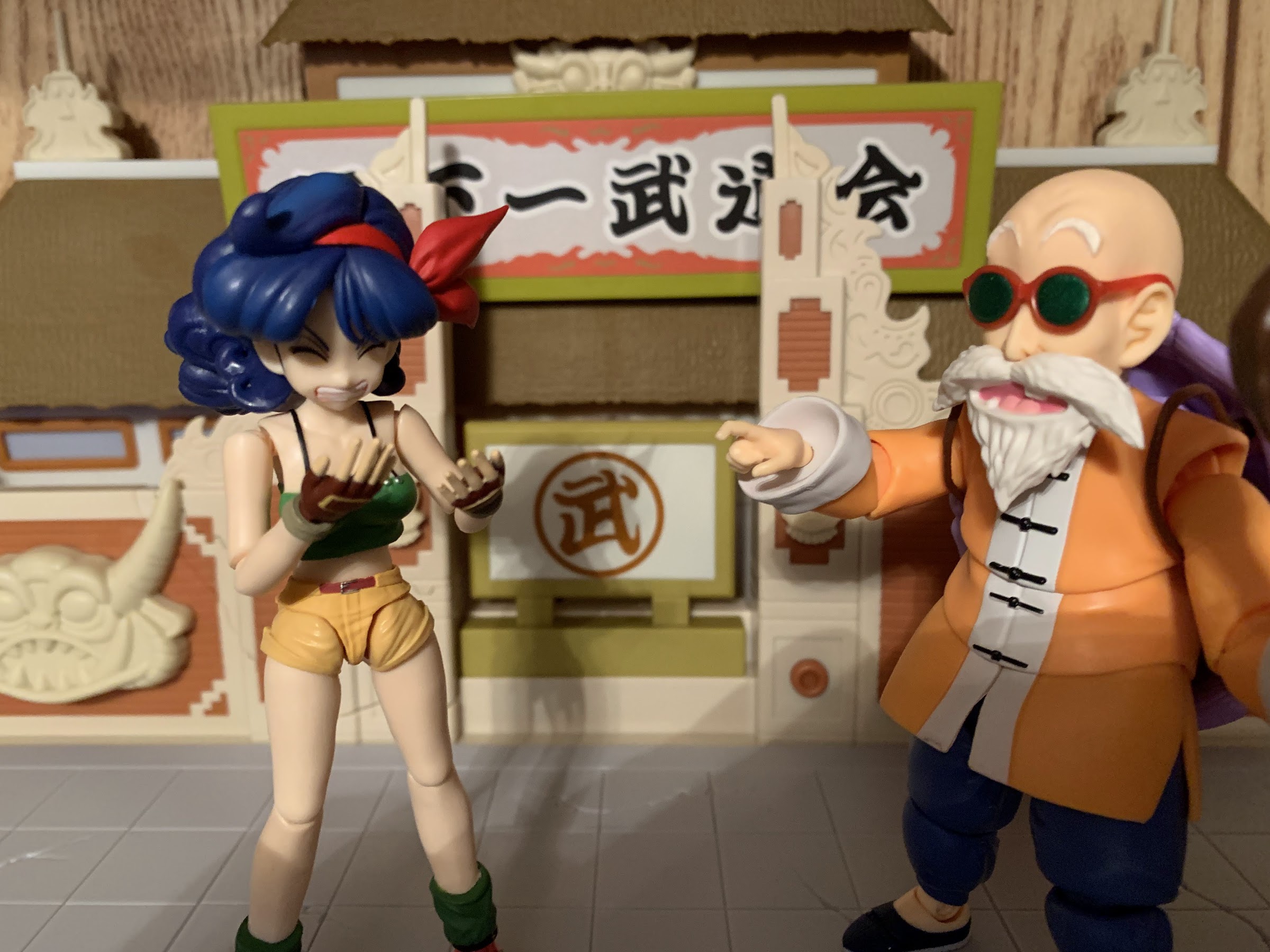
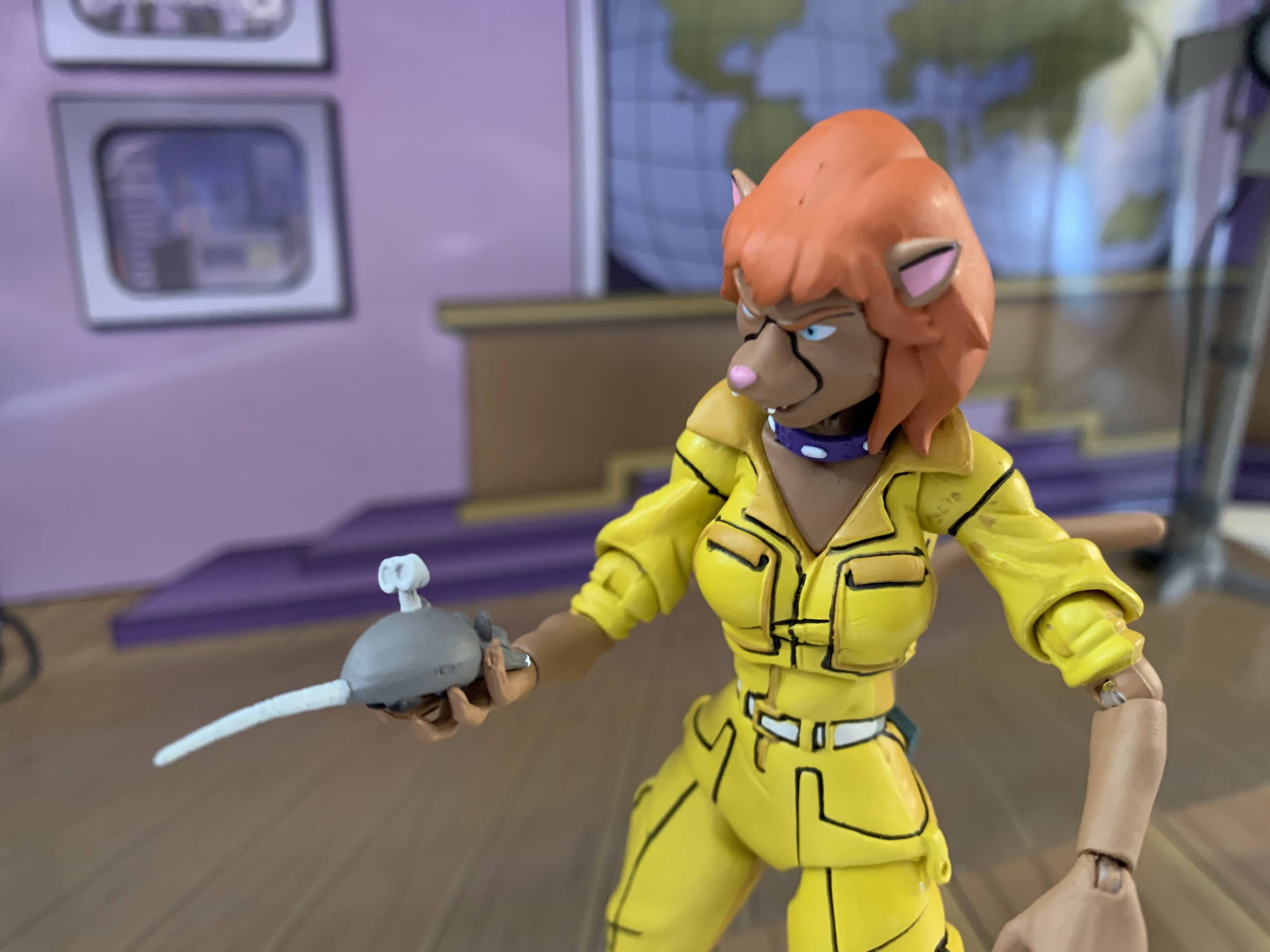
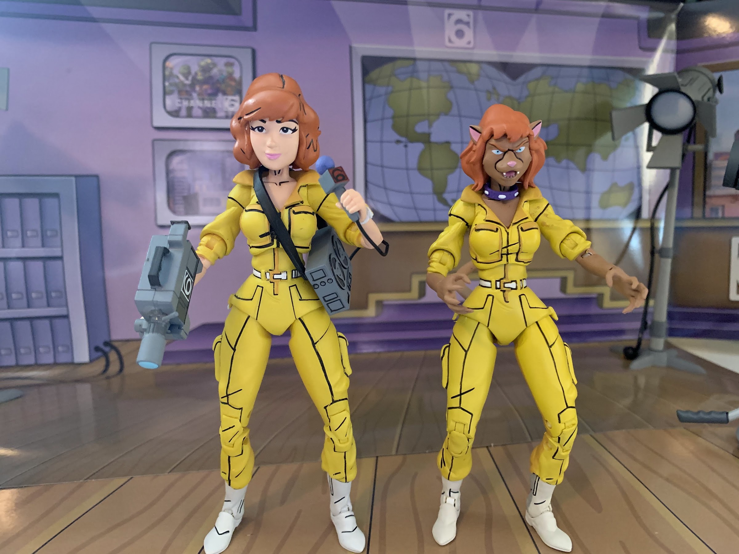
Dragon Ball has never been super popular in America. We got both it and Z in the mid 90’s, but with far more emphasis placed on the sequel series. That one famously bombed out of the gate too, with Ocean Group dubbing around 100 episodes and so much material was cut that the episode count differed from the Japanese version. One of those casualties was the character Lunch. She appeared in Dragon Ball fairly regularly, but her appearance in Z was more like a cameo. It was apparently deemed not necessary, and since she totes a gun perhaps it was also considered too violent. As a result, Lunch was a character I only ever read about for a long time. There was a long hiatus in dubbing the series so us American fans had to either buy bootleg tapes or just be content reading about the series online. I mostly read about it, and Lunch was always a character I wanted to see in action since she sounded quite unique.
She looks like a nice girl.
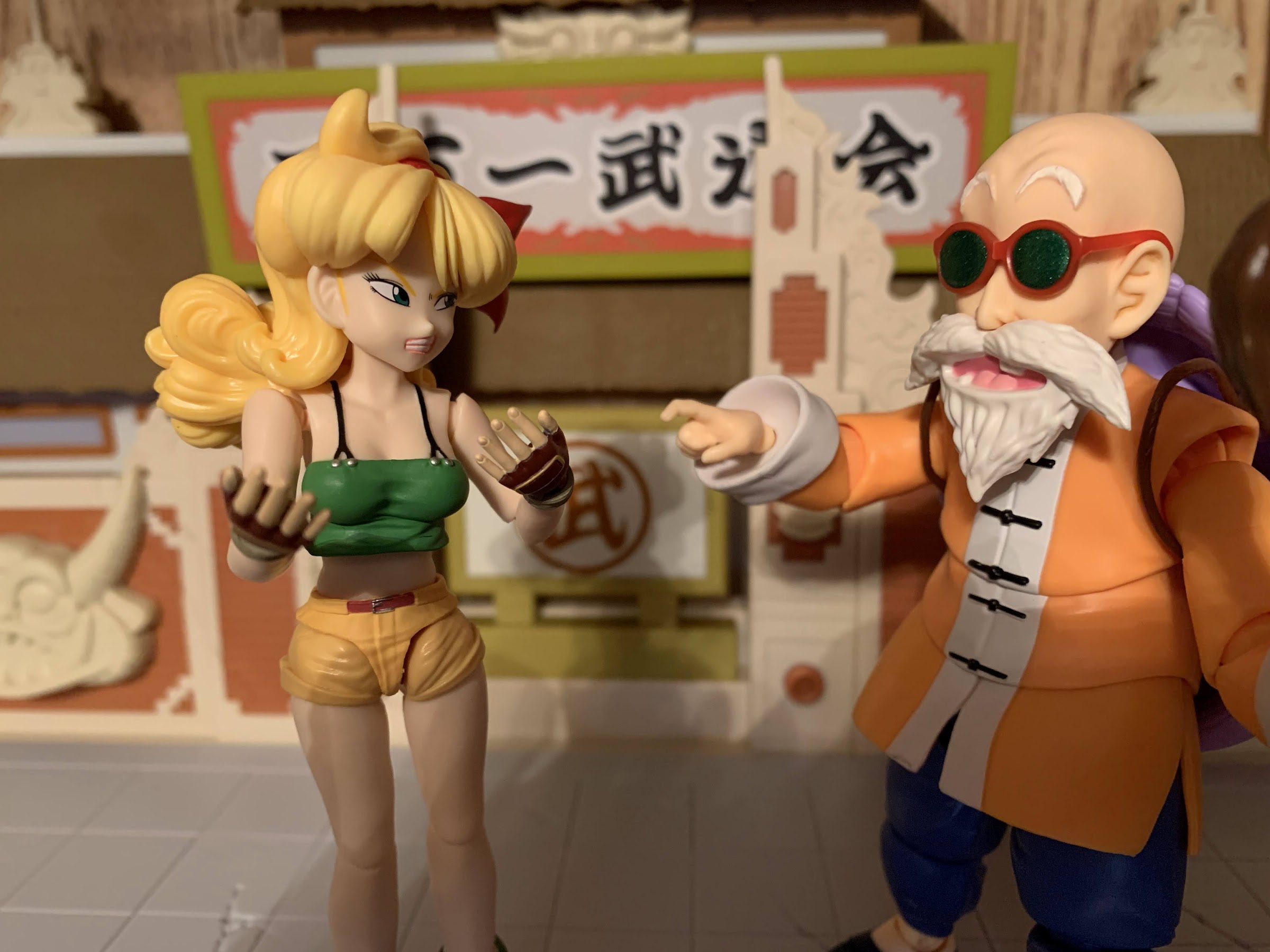
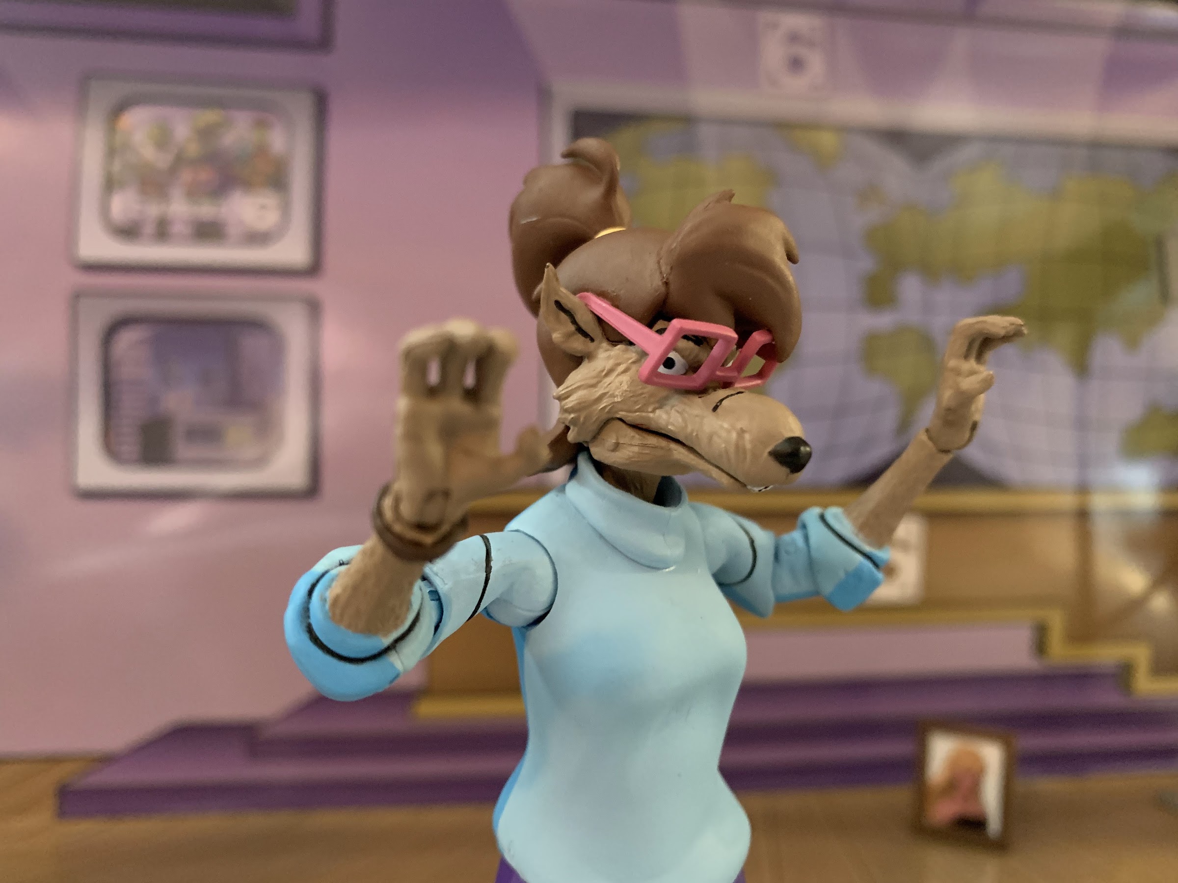
Because I read about her first, I’m still conditioned to refer to her as Lunch. When Dragon Ball was eventually dubbed and released in America, her name was changed to Launch. It’s actually a pretty clever update as her personality is centered around her “launching” into a fit of anger. Lunch, by default, is a kind, sweet, and rather meek young woman. She’s also quite shapely and a natural target for the perverted Master Roshi, and unlike Bulma, she takes his crude advances in stride. However, anytime she sneezes she transforms. Her hair changes color from blue to yellow (is Lunch the original Super Saiayn?!), but that’s not the most dramatic part of the change. Her personality also completely morphs turning her into an enraged, gun-toting, maniac! Seriously, where does she keep that gun normally? Once she goes blonde, she just whips it out from somewhere and just starts blasting. When her target is Roshi, it’s hard to argue the old man didn’t deserve it, but she’ll also perceive basically any male in her sight a threat and often poor Goku will bare some of the brunt as well.
Someone looks excited.
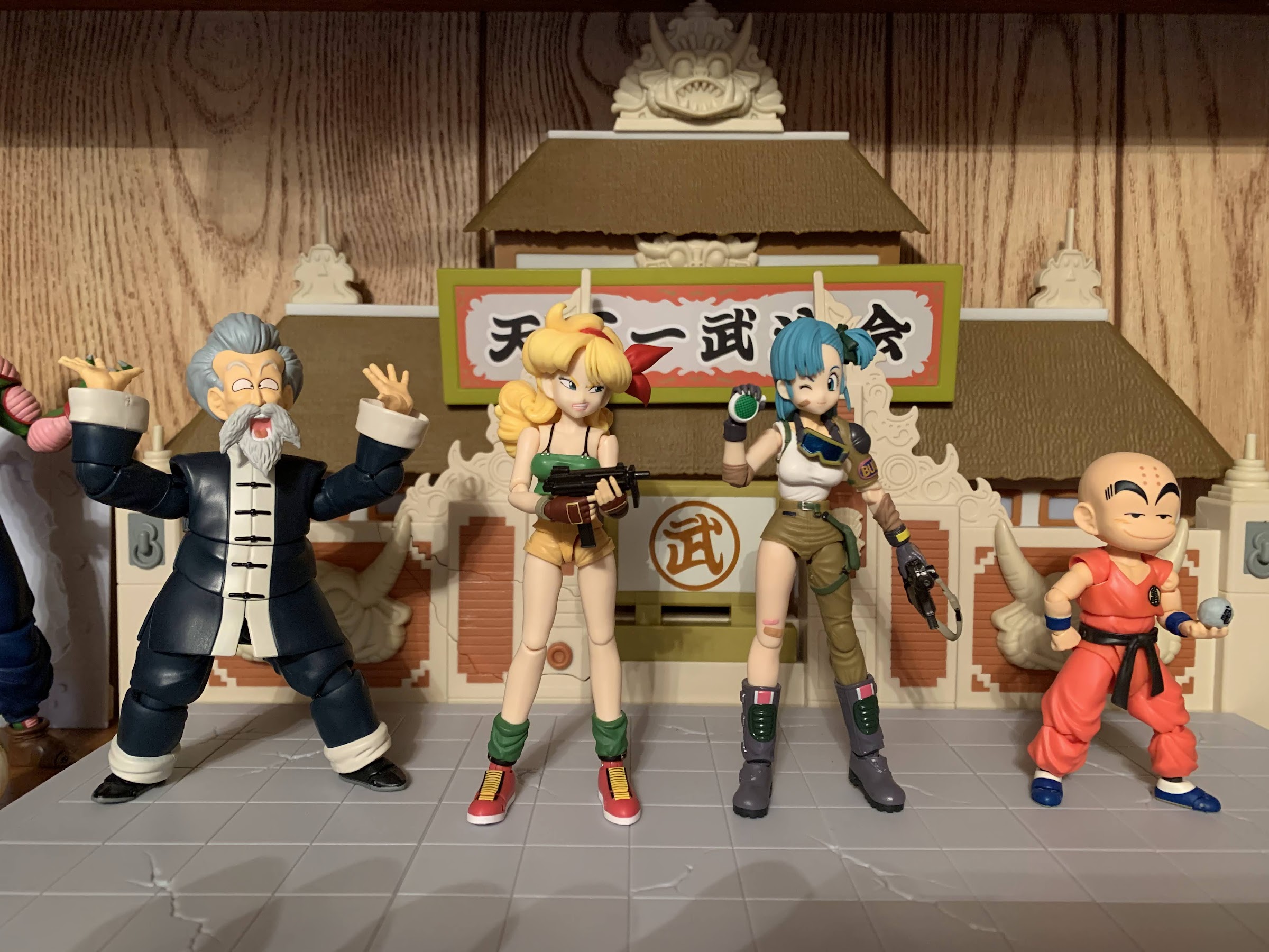
The Dragon Ball subline for Banda’s S.H.Figuarts line of collectibles has decided that Lunch is the only worthy entry for 2021. It hasn’t been a fast moving line like Z or even Super, but just one figure in 2021 is a little disappointing for Dragon Ball. I’m sure some are also disappointed that lone figure wasn’t a desert bandit Yamcha or a first appearance Tien, but for me, I like getting another female character into the display. The franchise is pretty short on them, and we can only have so many versions of Bulma, so Lunch feels like a solid inclusion. Unfortunately, she came with a decent price hike as the MSRP on this one is $65. Such a price is not unheard of for this line, but as we’ll get into, this isn’t one of the more over-stuffed releases we’ve received in the past. Costs went up like crazy last year, so this could be a symptom of that. Or, Lunch carries a small premium because Bandai doesn’t figure to sell a ton of figures of her. The Super Saiyan 4 Goku comes with more stuff and is five bucks cheaper and might even feature less parts reuse. The real answer is probably both, but given how small the Dragon Ball line is I wasn’t about to pass on Lunch just because she was 5-10 bucks more expensive than I would have predicted.
Uh oh. She sneezed…
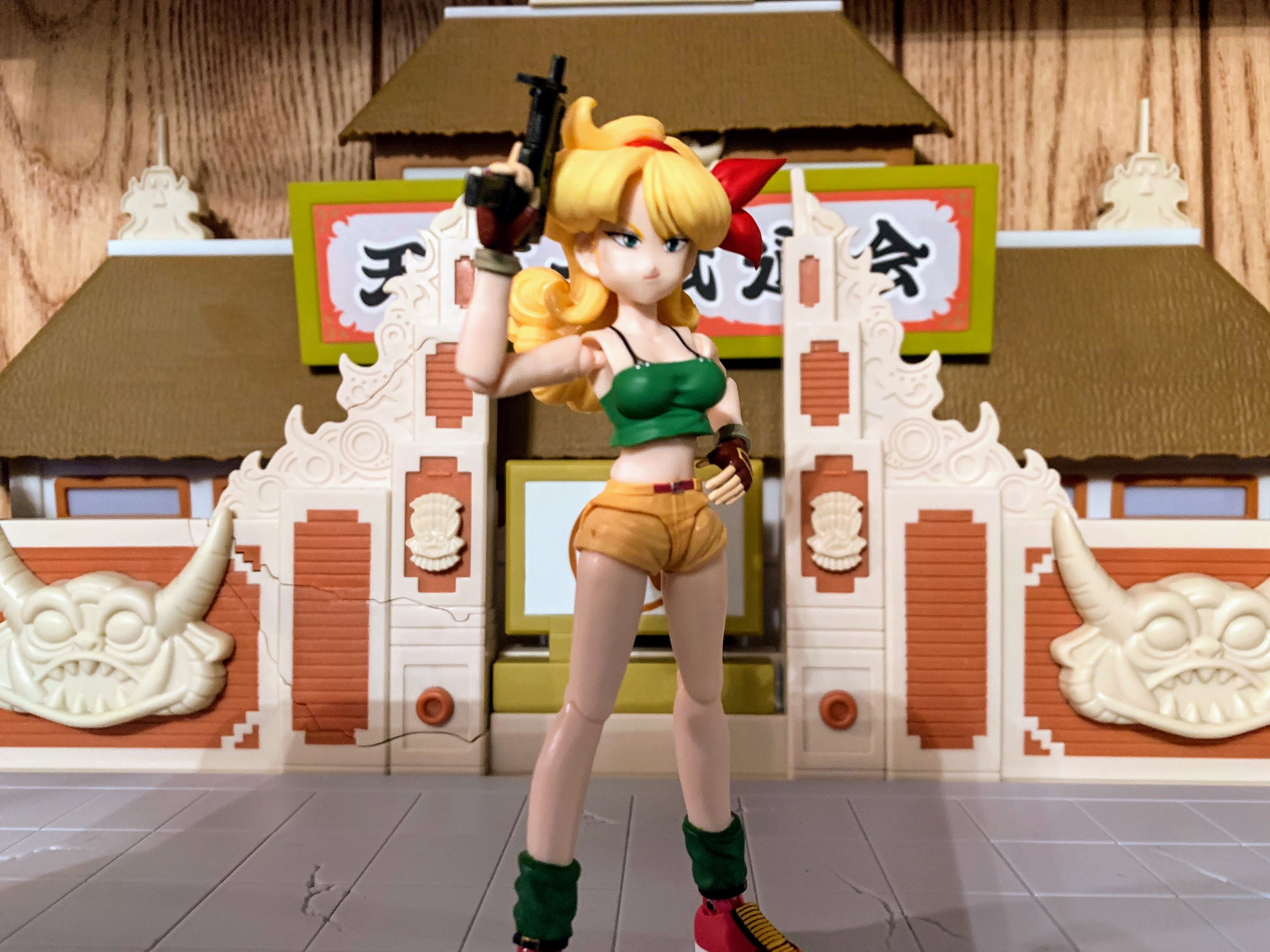
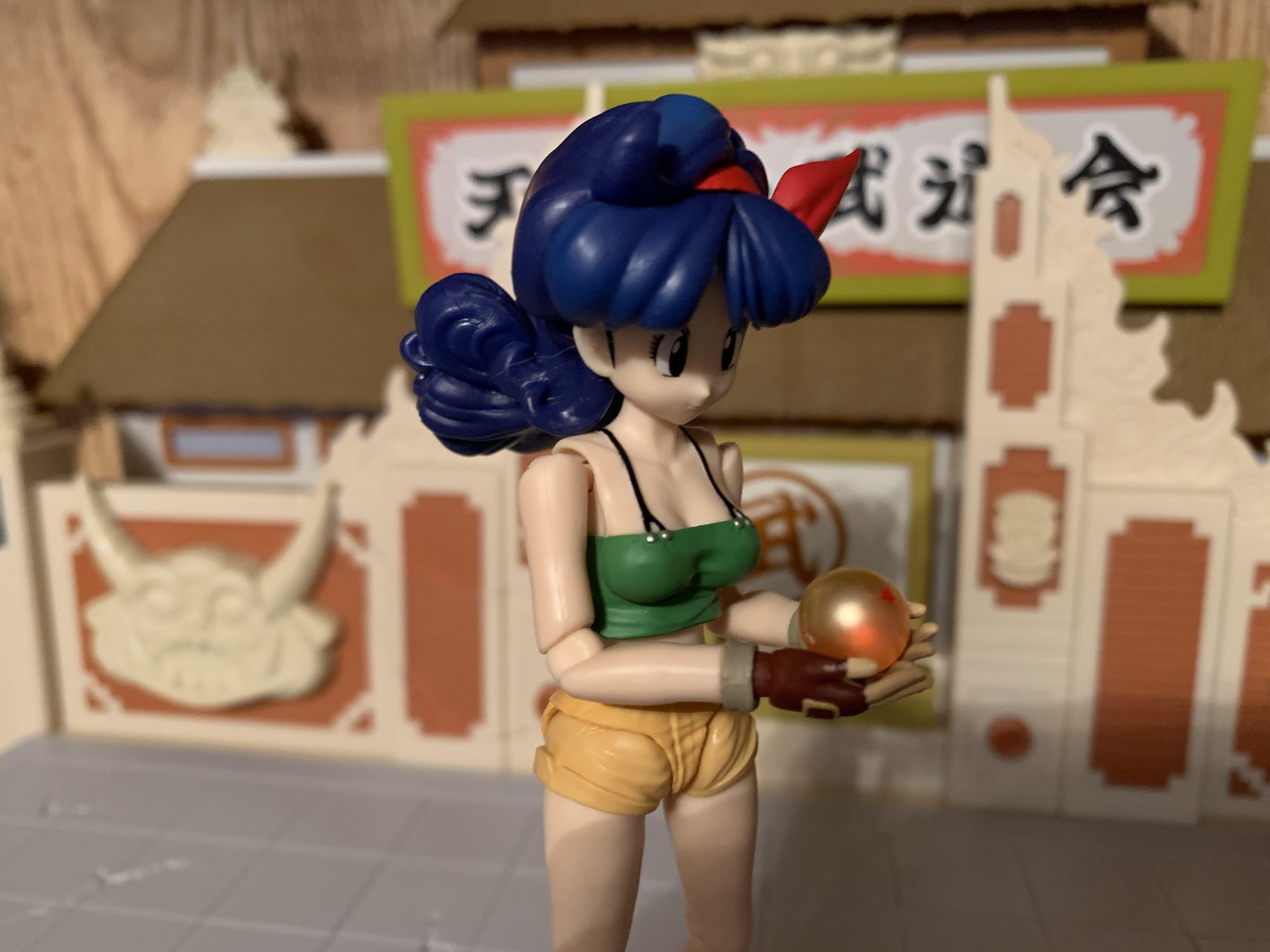
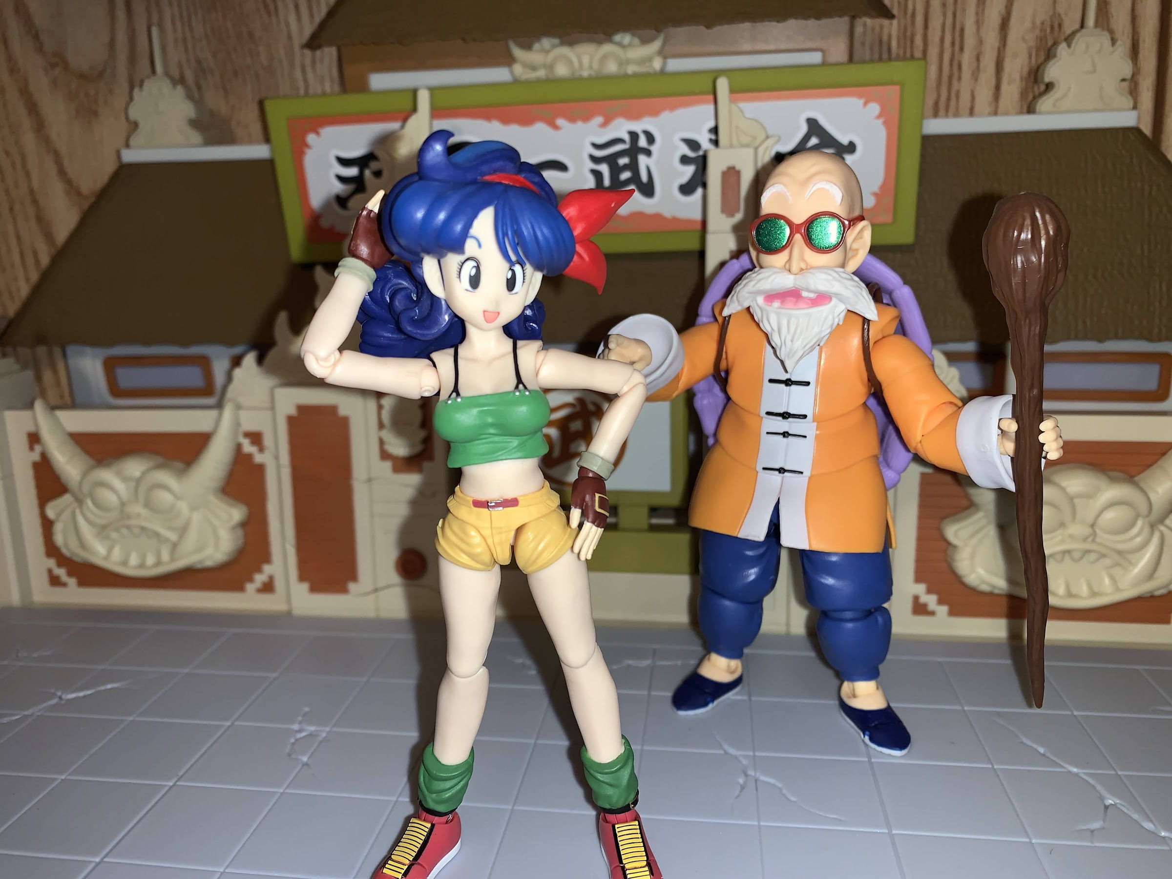
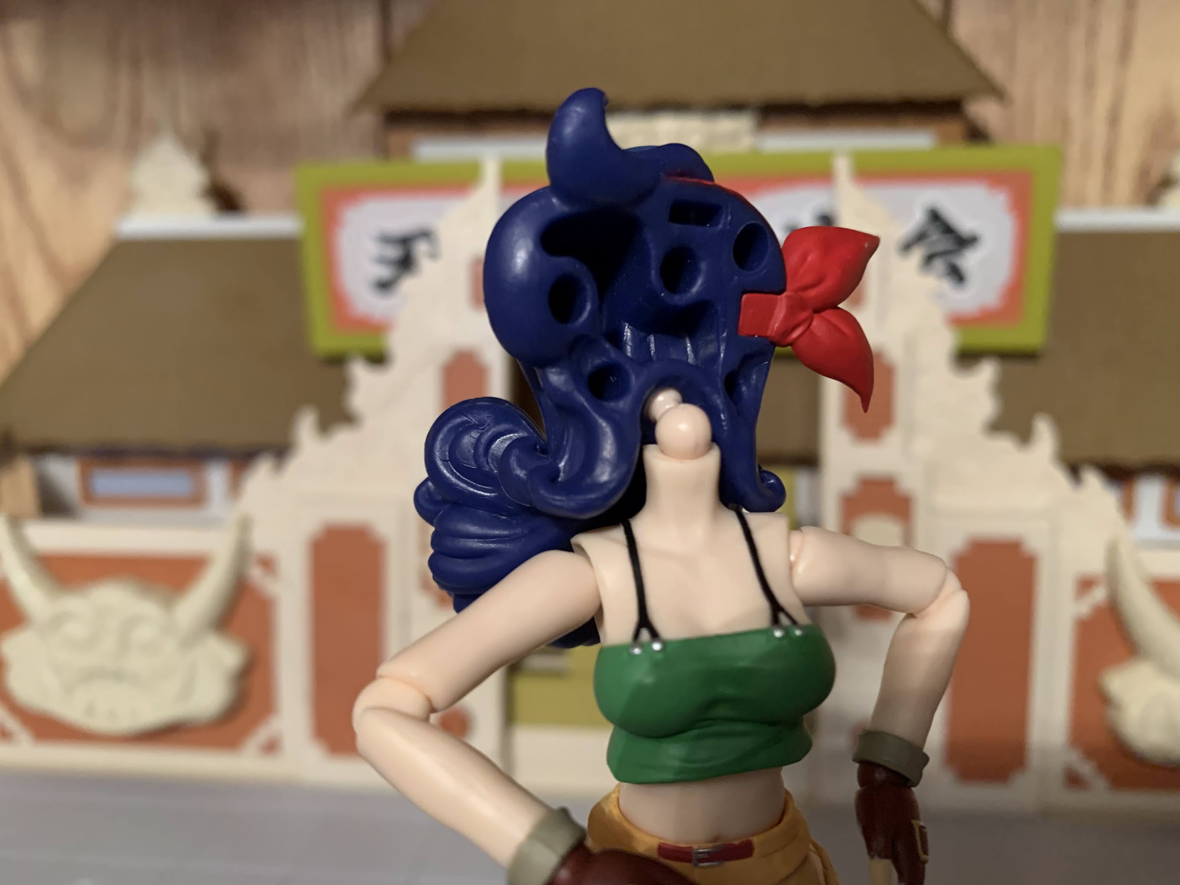
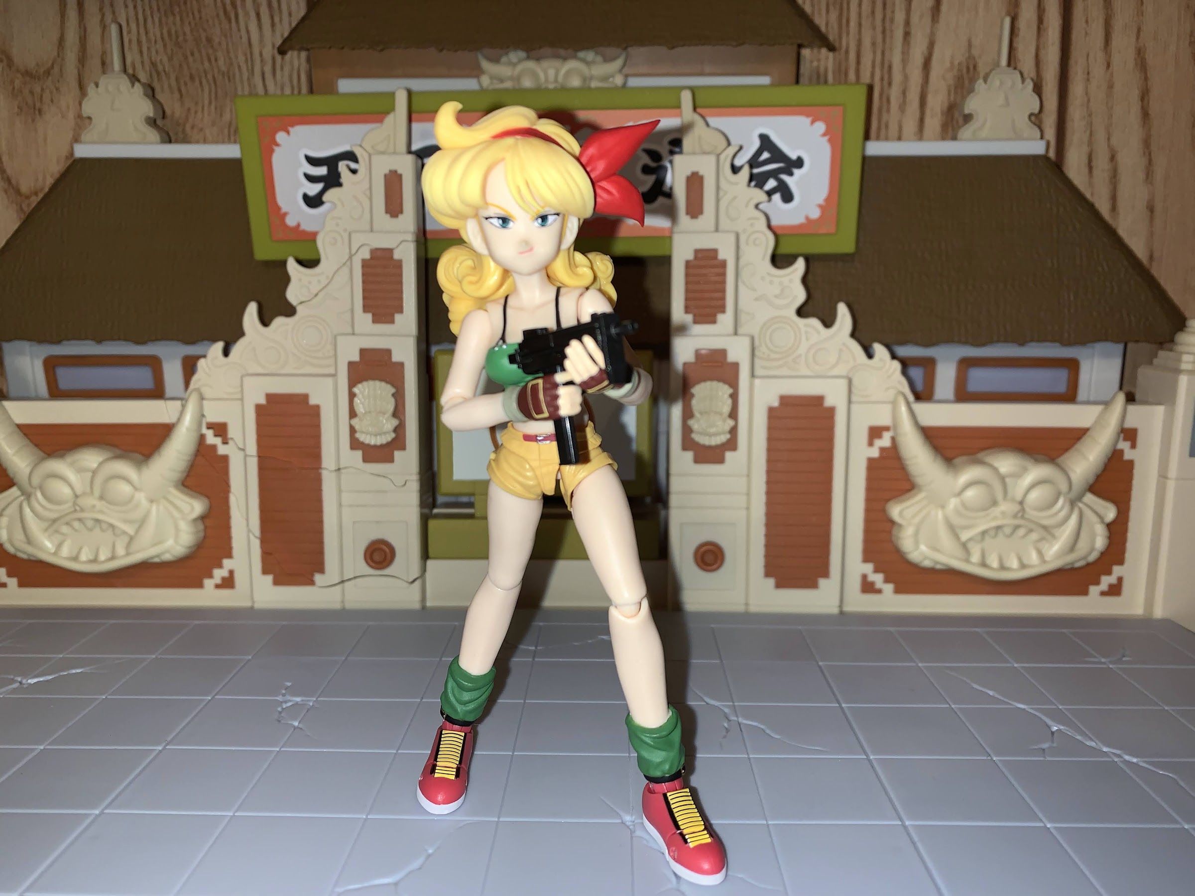
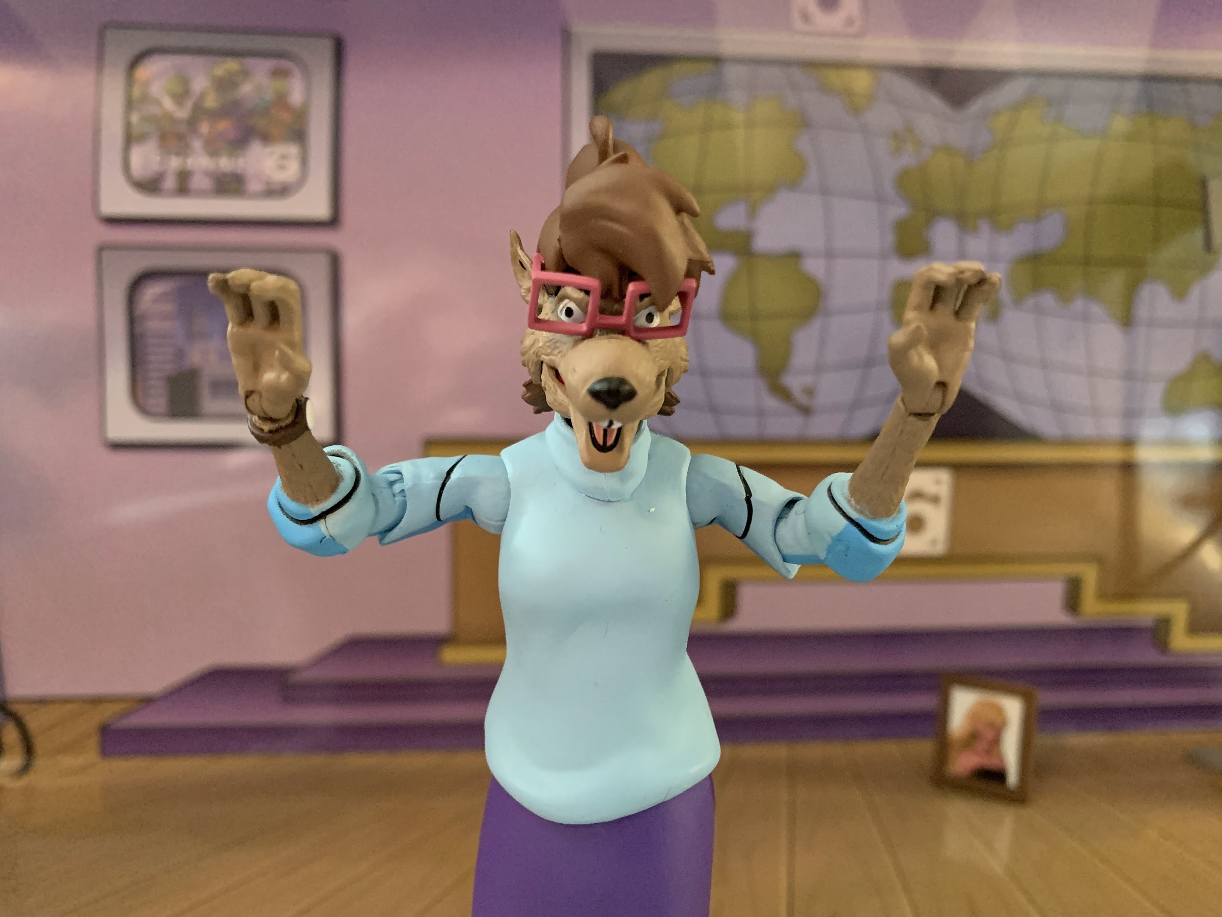
Lunch comes in the typical SHF window box and in her default persona. She stands a tick over 5″ to the top of her hair putting her right in-line with Bulma, whom she likely shares some parts with (most notably the legs). This means, like Bulma, she doesn’t scale well with Goku or even Roshi, but that’s because they seem to exist in their own scale as a means of keeping the kid characters from being tiny. She’s also sporting her traditional attire: green, spaghetti-strapped tanktop, yellow short-shorts, brown gloves, green ankle warmers, red sneakers, and a red ribbon in her hair. The tank top is just painted on, but it looks quite clean and the green matches the ankle warmers rather well. They have little buckles on them which are also painted cleanly and the yellow stripes on the shoes are also well done. The only issue with the paint is that crotch piece for the shorts is cast in yellow plastic, while the rest on her thighs is the same, but it’s likely PVC and the result is there’s a color variance. It’s subtle, but it’s also there and a disappointment. The blue hair appears to have a wash applied to the bangs area which looks nice, but is also the only shading to be found on the figure. That’s not a surprise given this is SHF and this figure features a lot of bare skin, but the blonde hair would have benefitted from the same.
Time to run, old man.
And she does come with both portraits because this is Lunch and that’s pretty central to her character. The default one is her smiling and it looks like the character. She can also swap to an excited look and to the all important sneezing face. For her blonde look, she has a smirk and a side-eyed glare. The only one I’m not sold on is the smirk as her cheeks look rather puffy for some reason. The glare is probably my preferred expression, but I do wish we got one more for the blonde version of her yelling and just looking really pissed off. Like I said, we needed both versions of Lunch in the box, but I’m slightly bummed the blue-haired look got three portraits to the blonde’s two because I think most will display her as a blonde.
Now he’s in trouble!
And most will likely opt for the blonde look because she only has two accessories and the favored one works with that look. And that’s her submachine gun. She comes with fists in the box, but has a right, trigger, grip for the gun and a loose gripping left hand to sort of cup it. The other optional hands are two open hands which are good for a sneezing pose or to hold the last accessory: the all important Dragon Ball. Lunch comes with the pearl painted ball which is what SHF has switched to after releasing 7 translucent balls already. There’s a lot of plastic here just in the two heads alone since her hair is so big, but there’s no covering up that this is an underwhelming assortment of accessories. Especially at that higher price point. Another portrait for her blonde look would have helped, and maybe a blast effect for her machinegun would have gone a long way.
This setup is definitely interesting.
The articulation for Lunch is familiar, but also introduces some new things. And that’s mainly at the head. Her head is connected via a double ball peg that actually pegs into her hair, and not her head. It has a bend in it so her head sits low enough, but it is a bit of a pain in the ass to swap heads on this figure because that peg wants to move when you’re trying to fit it into the hair. It’s a lot easier on the blue hair, because that’s how the figure shipped. It’s also definitely easier to swap with the face plate on it as that helps to prevent the peg from moving too much. At least it’s a sturdy ball peg so I never feared breaking it, but it was annoying. Swapping the faces requires pulling off the bangs first and it can be a challenge to get the face off without popping the hair off of the neck, which can be a touch frustrating. Once in place, it moves around okay. Her hair obviously is going to limit her range, but there is a hinge in the back of her hair to help alleviate some of that. She can look up and look down a bit with the usual rotation and some tilt. I think you get enough, but it is a bit weird to look at initially.
She can’t quite aim her gun convincingly two-handed, but she still poses all right with it.
Beyond the head, the rest is pretty much in-line with both versions of Bulma released in this line. The shoulders are on ball pegs so they rotate rather well. There’s no butterfly joint, but her bust would probably have impeded one anyway had it been installed. The elbows are single-jointed on these disc-like pieces that I’ve never liked that much. The range is great, but when the arms are extended they look kind of funky. The wrists are ball-joints and with the gloves there’s plenty to hide them so no complaints there. There’s a diaphragm joint that works in tandem with a ball joint at the waist. Lunch can tilt up there well and she can bend backwards probably farther than you need her to, but there will be some gapping issues under her shirt. Crunching forward is not great and it exposes a gap near her waistline on the back of the figure. It’s hard to imagine her needing to crunch forward more than she can, but it’s always a bit bizarre to see figures that can go back better than forward. At the hips we have standard ball joints, but the cuffs of her shorts limit their range. She can’t do a split, but can nearly reach a full horizontal kick. Her buttcheeks prevent her from kicking back really at all, but you do get a thigh twist. The cuffs on her shorts can be a bit finicky as sometimes they leave a gap in crotch area and I find myself tweaking the left leg, in particular, often to try to mitigate that. At the knees we have basically the same situation as the elbows, only here the disc piece is on the back of the figure and basically hidden. The ankles are ball-jointed so you get great range there and they also included a toe hinge, if you feel it’s needed.
This is definitely my favorite expression in the set.
I’m pretty happy with how Lunch can move around. The only thing she can’t do well that I wish she could is a two-handed firing pose with the gun. Her bust just gets in the way which is a character design issue more so than a figure one. I suppose it helps that her portraits aren’t really firing portraits which lend themselves better to casual stances as opposed to action ones, not that Lunch never fired her gun with nothing but a smirk in the show. Her hair does make her more top heavy than the Bulma figures we have so I’ve found her a little tougher to stand, but nothing dramatic. It’s just something you have to be aware of and take into account when posing her.
The scale is a bit wonky in this line, but she fits in with Bulma, at least.
I think Lunch turned out pretty well. I have come criticisms, but most of them are of the value nature and not direct criticisms of the figure itself. And where I do have them for the figure, I chalk them up mostly to me being nitpicky, but that’s what a review is for! She looks terrific on a shelf amongst my other Dragon Ball figures. She looks better when paired with Bulma than she does Krillin or Goku, but she can also handle being near Master Roshi too. She would look even better though with Tien, and I do hope there’s more in store for Dragon Ball as far as S.H.Figuarts is concerned. There’s still plenty to mine from that series, and a few characters that I would definitely deem essential, but time will tell what Bandai has planned.
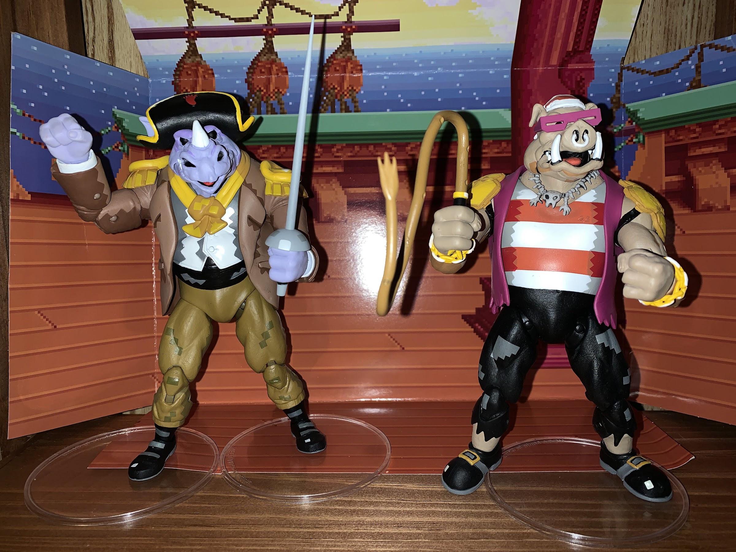
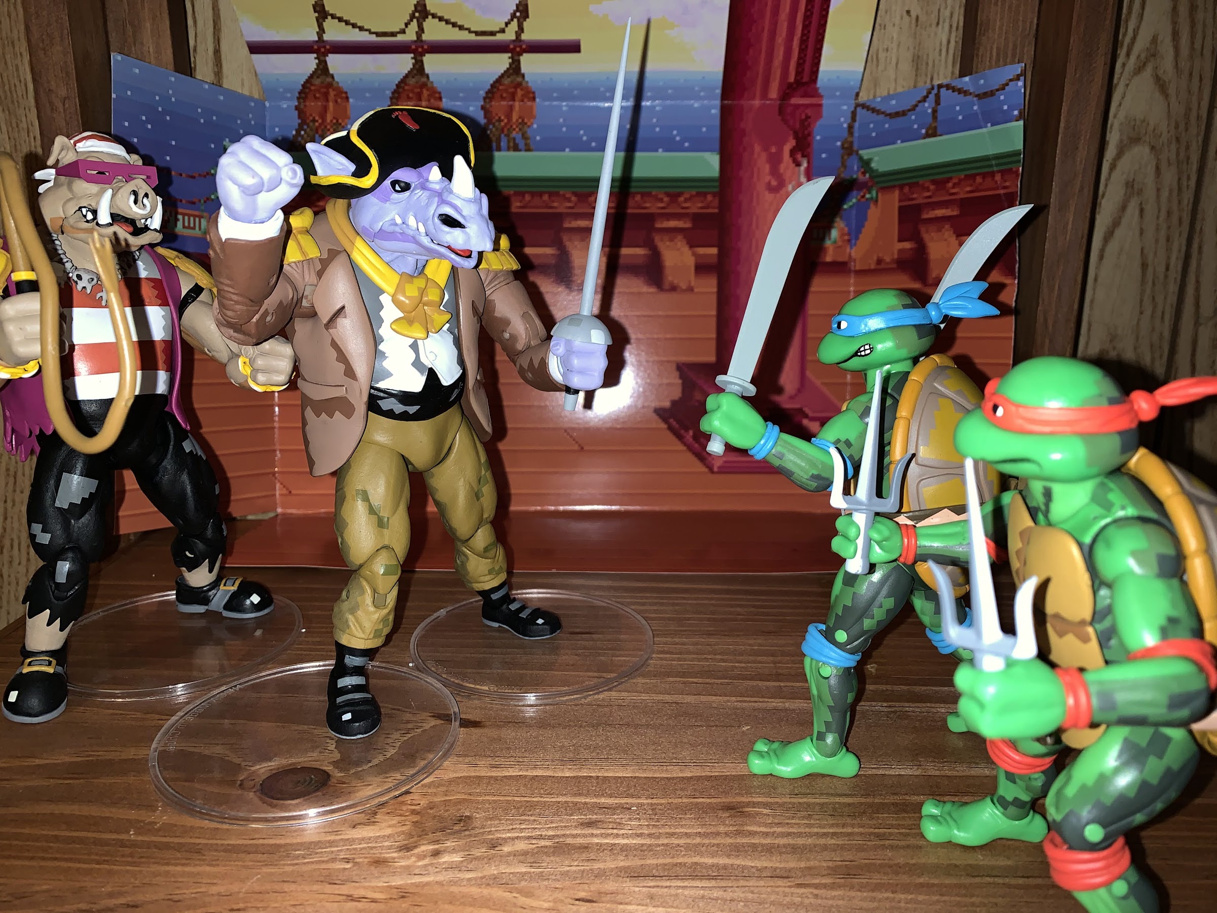
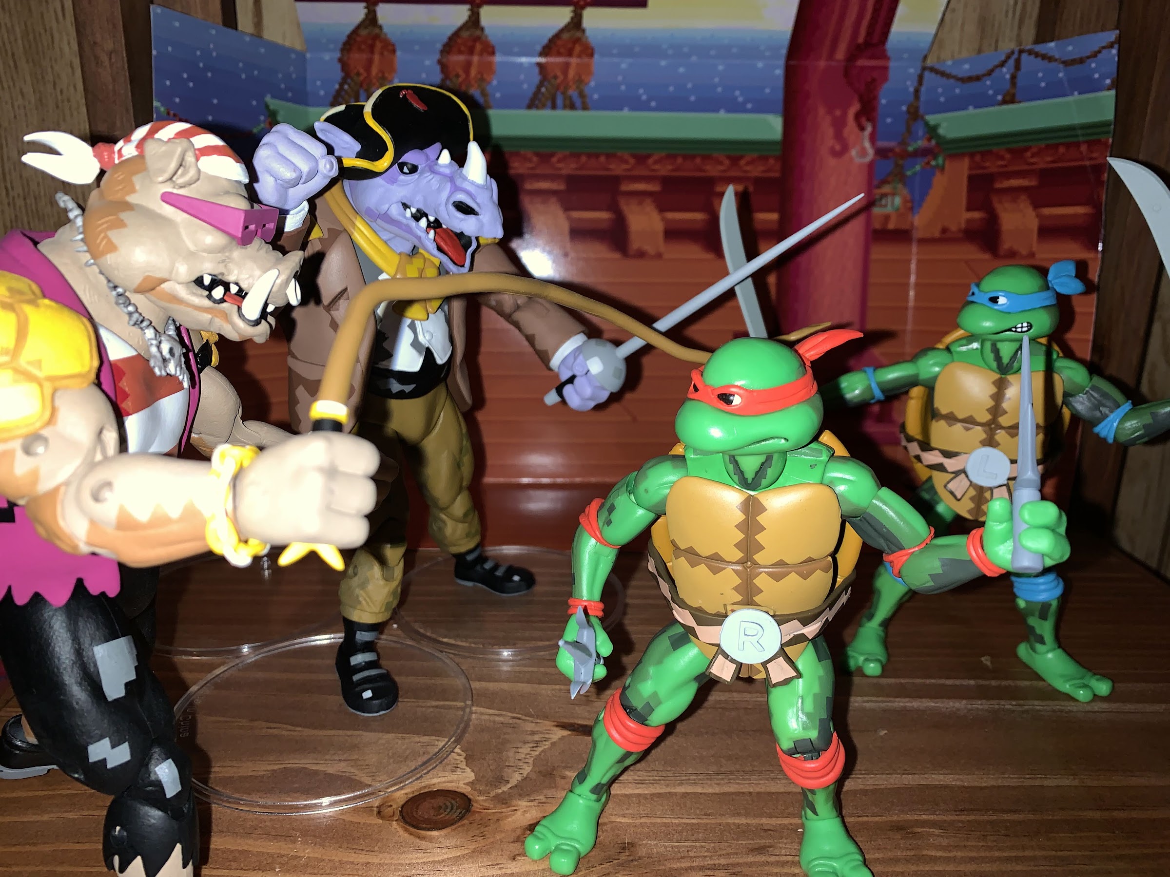
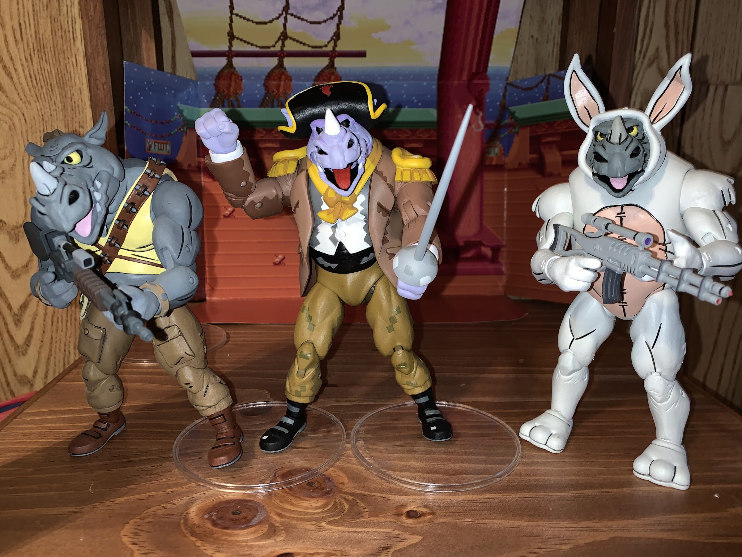
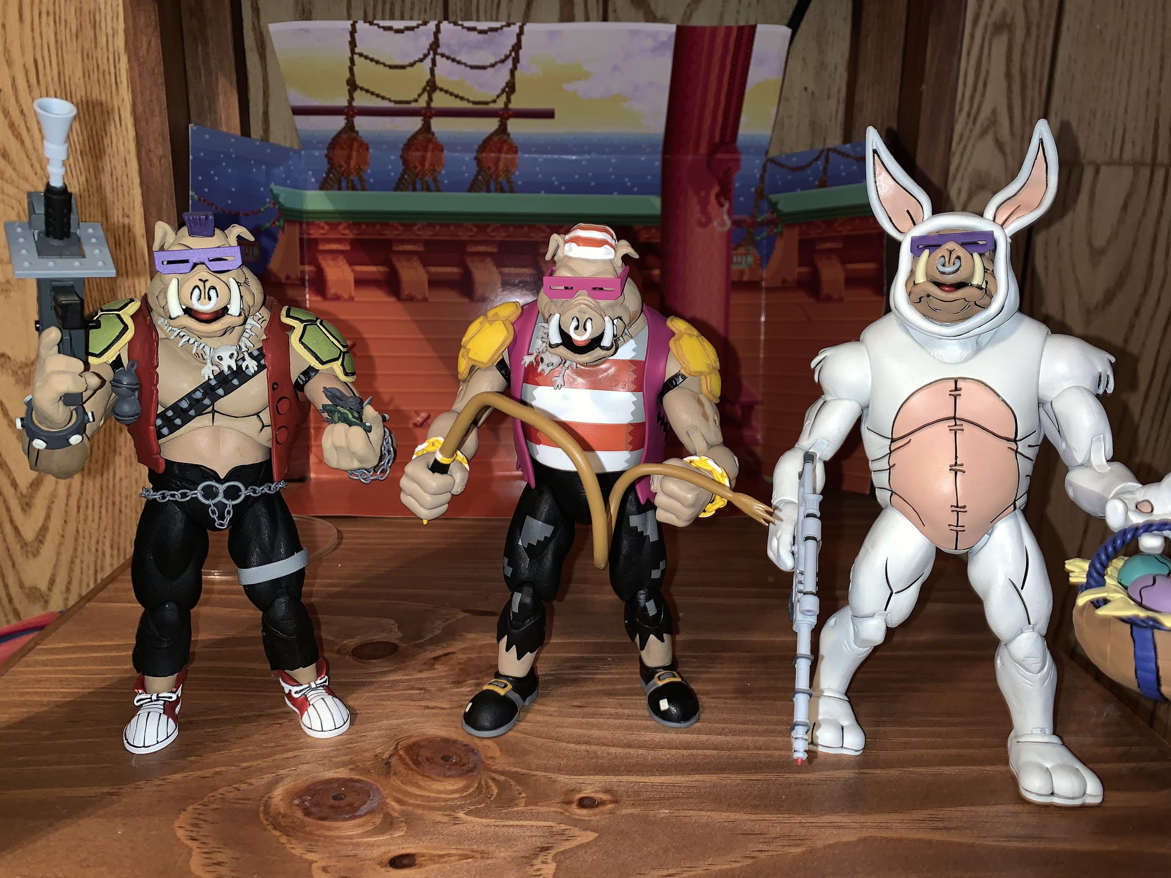
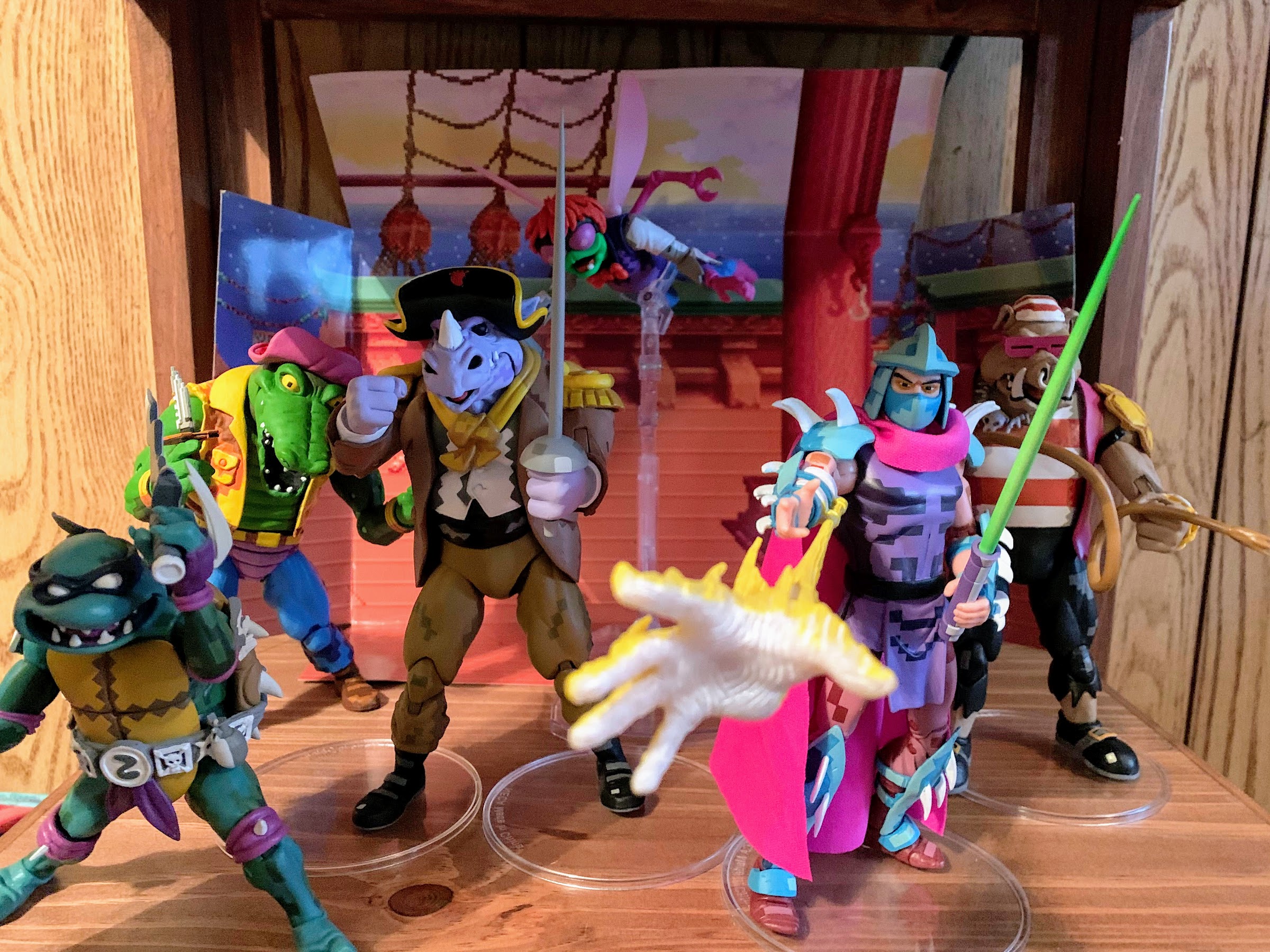
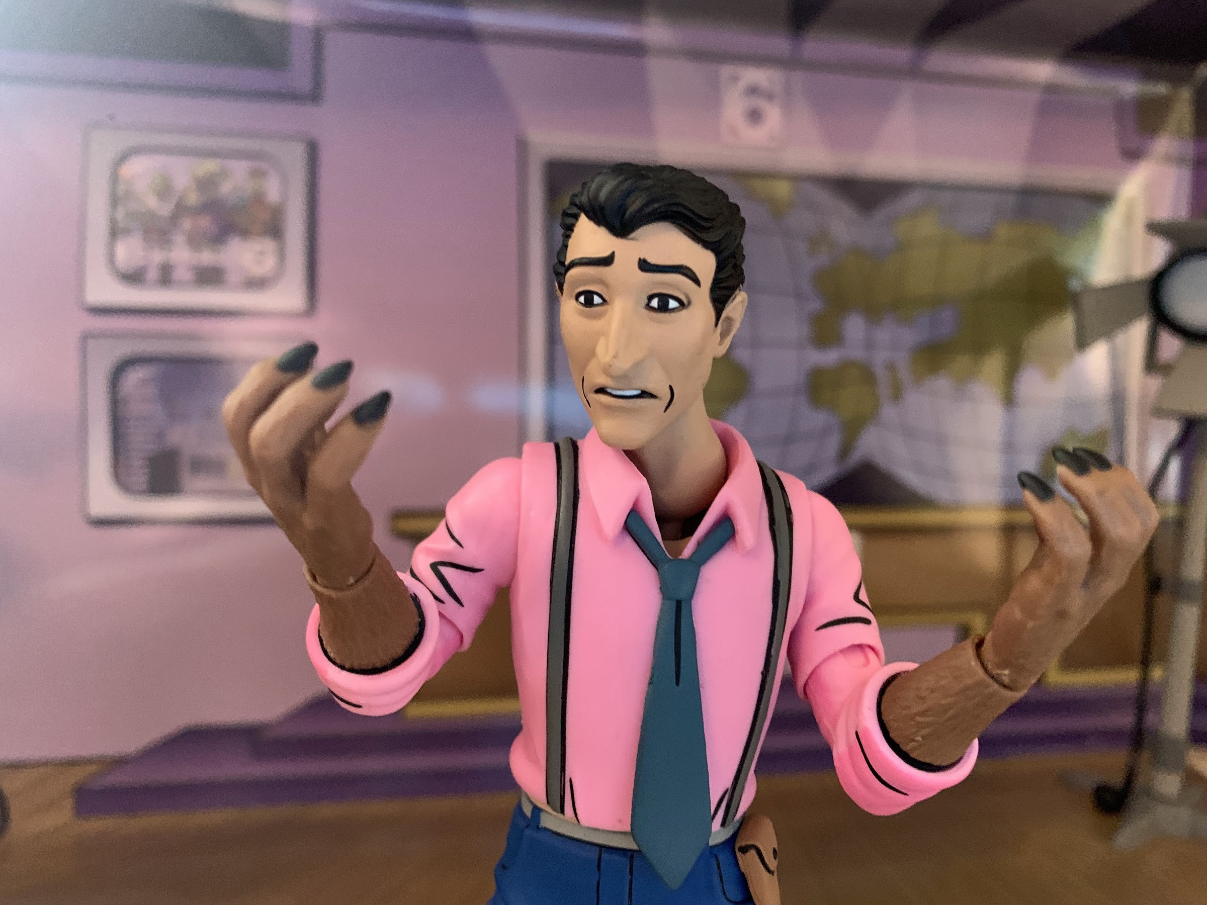
When I reviewed the Super7 Donatello last month, I noted how it was one of the longest waits I’ve ever had between the time I ordered something and the time I received it. Well, it’s already been topped. NECA’s Turtles in Time series of action figures based on the Teenage Mutant Ninja Turtles video game is the less celebrated wing of the company’s TMNT figure lines. It’s a specialty shop exclusive that largely consists of repaints of figures that have already appeared in the company’s cartoon line. There are some exceptions, like the Baxter Stockman figure, but largely it’s the most niche line based on the popular IP. The Bebop and Rocksteady set, based on their appearance in the Super Nintendo version of the game, is sort of the capper to the line. It’s the line’s only two-pack and it features two popular characters in amusing pirate attire. It went up for preorder in October of 2020, the same month as Super7’s wave 4 of Teenage Mutant Ninja Turtles, and if I didn’t cancel my preorder and grab this set elsewhere I’d still be waiting. For whatever reason, the online retailer Big Bad Toy Store has been slow to get some NECA product. I’m still waiting for the quarter scale Donatello to come in stock despite that, like this set, being available months ago in other places. When someone pointed out to me that Amazon, of all places, had this set in stock I jumped on it. Sorry BBTS, I’ve waited long enough.
“Say your prayers, toitles!
Bebop and Rocksteady are a bit unique for this line. They’re not just repaints, but they’re also not too far removed from the figures we’ve seen in the cartoon line (which came out back in 2019). The actual figures are largely the same and what’s been changed are the soft, plastic, overlays, that NECA uses to differentiate characters. It’s how they can basically use the same molds for Bebop, Rocksteady, and Leatherhead without it being really obvious. Of the two, Rocksteady is the most different. NECA had to add his pirate hat so he actually has new ears. His overlay on his torso is vastly different from the tank top the other figure features as it’s a dashing, captain’s, shirt and coat with ruffled shoulder pads. The arms had to be changed to accommodate this look since he’s now wearing sleeves. Everything else is the same which is a good and bad thing. Good, because the older Rocksteady is one of the best looking figures in this line still. Bad, because that figure used the old hips which are prone to breaking and difficult to pose. This guy is hard to stand and I’m currently using two NECA disc stands to keep him upright.
It’s still pure horror underneath those glasses.
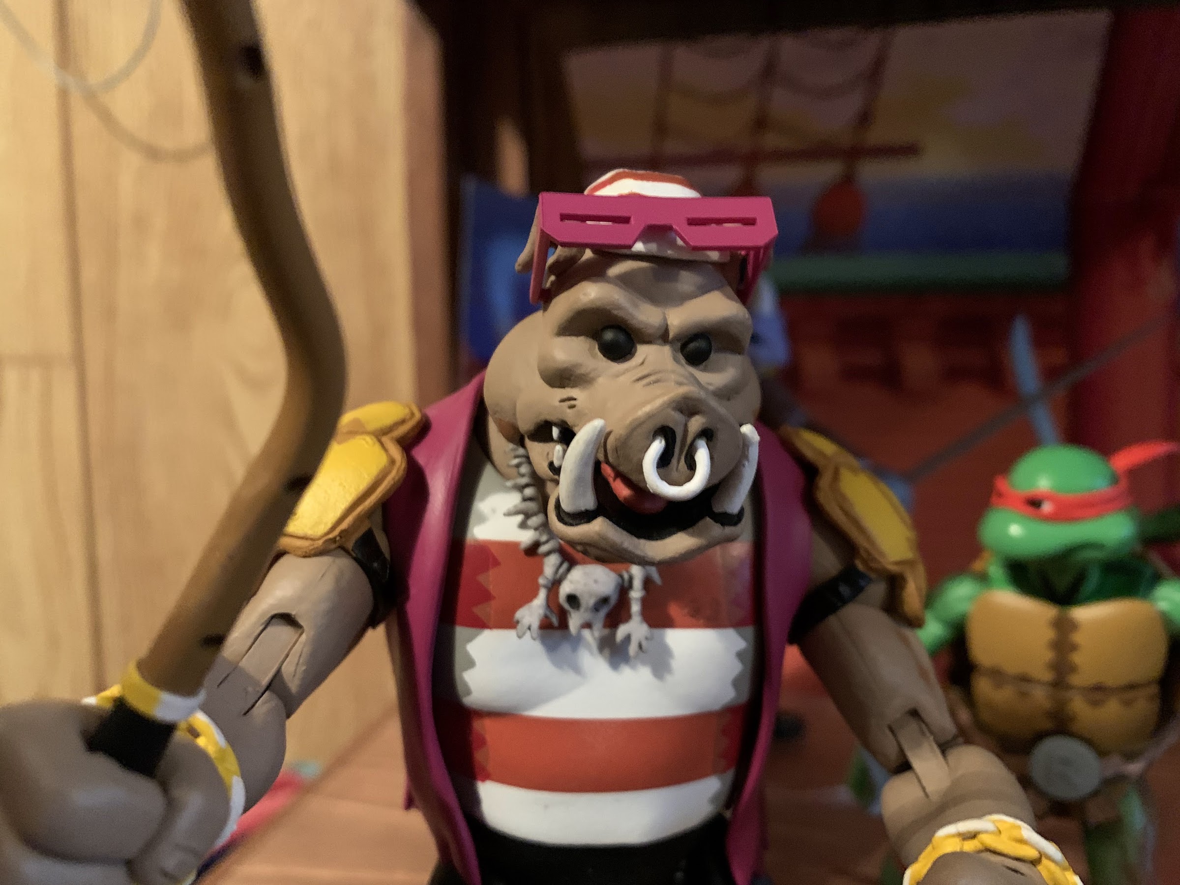
Bebop is also sporting a pirate look, but his look isn’t as drastic a departure as his buddy’s. It’s almost entirely limited to the overlays as he has a new bandana on his head in place of his hair and he’s wearing a striped shirt with a pink vest. The arms are the same, but NECA ditched the real chain-link bracelet in favor of sculpted ones on both wrists. The only real difference comes below the knee as Bebop’s pants end in tatters and his stylish high-tops have been replaced with what look like loafers with a big, yellow, buckle on each. He also doesn’t have a belt any longer, but still has his turtle shell shoulder pads and weird, skeletal, necklace. Unlike Rocksteady, Bebop is easier to stand as the new shoes actually work better than the old ones, though he too can still be a challenge as he’s very top heavy. I think with Rocksteady he’s just even more top heavy and his feet aren’t very large in relation to his body size. My only critique of this look is that Bebop’s shirt and glasses are more of a hot pink than the purple they appear to be in the game. You can also see his purple ponytail in the game, but NECA removed his hair to make room for the bandana on his head. And his eyes are still solid black under the glasses which is a bit of a bummer because his eyes become visible in the arcade game when hit and it would have been cool if we could simulate that as well.
The pixel deco isn’t too intrusive here and actually works pretty well from a distance.
Both figures feature NECA’s pixel deco and I think it looks okay here. With Rocksteady, the effect is played up rather well on his torso. I like how the gray and white on his vest turned out and there’s just enough on his arms and legs. His flesh is purple, which is in keeping with the game. His black hat is basically ignored when it comes to the pixel look which is accurate to the game as well. The paint is clean and sharp and if I have one criticism it’s that there should be some white near his eyes. As it stands, NECA basically painted them all black with a triangle of purple and it’s a bit freaky. Bebop is also well-painted, though his pixelization feels more understated. NECA could have done more with it on his chest, especially, but opted not to. If not for the gray patches on his legs he wouldn’t really appear pixelated at all when on a shelf. I suspect this bothers few though as, if anything, I see more people complaining about the pixel deco than praising it.
This isn’t the most dynamic pair of action figures around. Most will just set them and forget them.
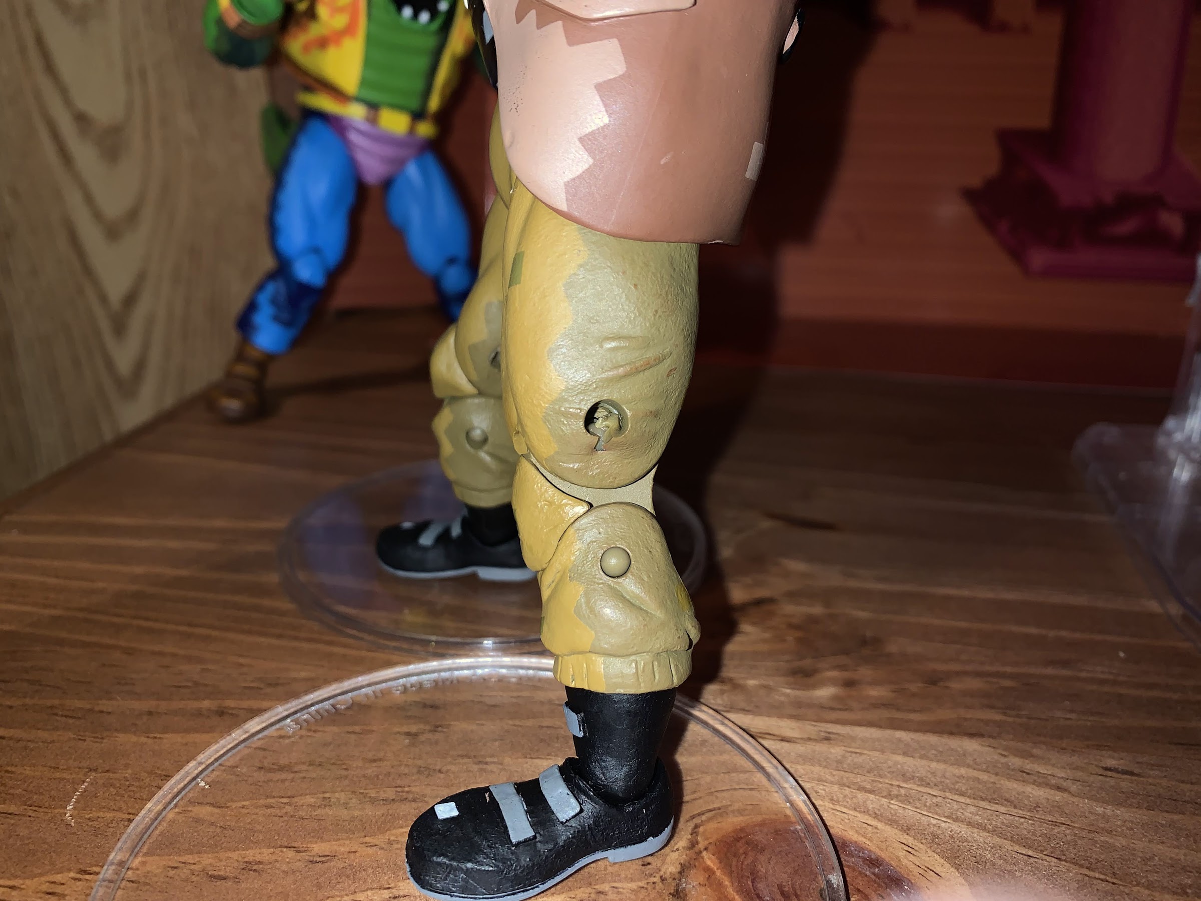
As far as articulation is concerned, these guys are exactly the same as the previous releases. They’re nearly the same base too so they articulate the same, which is to say, not very well. They’re not statues, but the articulation has always been something I’ve had to overlook with these guys. The head is on a ball or ball-hinge and doesn’t offer much range. The jaw on both is articulated and it offers a fair deal of personality, though Bebop can’t really close his mouth all the way. There’s a ball hinge at the shoulder that’s super tight on both figures. The shoulder pads both sport make it difficult to rotate the arms, and with Bebop, it’s basically impossible. There’s a biceps swivel on both and double-jointed elbows. The wrists swivel and hinge though the hinge isn’t very functional with Rocksteady due to the cuffs on his sleeves. There’s probably a diaphragm joint on both, but the overlays render it useless. You get a waist twist with some tilt, but nothing really in the way of an ab crunch. The hips are the old peg system where the peg on the right leg goes through the crotch piece into a cylinder in the left leg to join them. You get a thigh twist at that joint, which is a ball hinge in the top of the leg, with double-jointed knees below that. The feet have a hinge with limited range on both figures and it does rock side to side a bit, but not a whole lot.
That upper peg isn’t doing it’s job and, as a result, a lot of the joiner in between the thigh and calf is visible on Rocksteady.
These guys are a bit of a stressful pair when first opened. A lot of the joints on mine were pretty tight or stuck. I plunged both into a hot water bath before doing much of anything with those hips. It’s basically the same old story where the joints are painted, which causes them to lock-up in shipping, but this old leg system would be tight even without the paint. And there’s a lot of paint on these guys and it looks rather thick in places. You definitely want to exercise caution when breaking them in. And even being careful, I still popped Rocksteady’s arm off at the biceps joint due to the shoulder hinge being so tight, which isn’t typically an area of great concern. It thankfully popped right back on, but it’s become a chronic issue where anytime I try to move a shoulder it will pop off if I’m not mindful of how easy it is to do. I also have an issue with Rocksteady’s left knee. The peg that holds the leg together above the knee looks like it went in at an angle and doesn’t go straight through. There’s more separation there as a result and might be contributing to some of my issues with standing the figure since I need to put the leg perfectly straight in order to hide some of the gap created above his kneecap. It’s not super obvious, but it is obvious enough that it bothers me and I do worry about the joint eventually falling apart.
Obviously, the rabbit one is the best one.
Since these guys are based on one boss battle in the SNES game, it’s probably not a huge surprise that they don’t come with much in the way of accessories. Both only used a single weapon each in the game: a sword for Rocksteady and a whip for Bebop. The sword looks fine. It’s a long, skinny, thing with some pixel deco applied. Rocksteady though doesn’t have the right hinge in his hand to properly wield it, though it’s likely his sleeve would have interfered anyway. Bebop’s whip is very similar to the one that came with the Punk Frog Napolean. It’s soft plastic with a wire inside so you can bend and position it as you see fit. Because of that it doesn’t have much in the way of a deco on it, it’s just brown with a black handle, but it’s fine. In addition to the weapons, both figures come with three sets of hands: fists, gripping, and open “style pose” hands. These are the same as the other releases with the only difference being the lack of a trigger finger hand, which is understandable given the weapons loadout here.
Doing these comparisons has given me new appreciation for those oversized rabbit feet.
The Turtles in Time version of Bebop and Rocksteady is an okay release. NECA largely handled the look and presentation fine, which is what I assume most collectors are interested in. Anyone hoping for an improvement over the past figures will be let down and I do think NECA missed an opportunity to do just that. This is a fun, silly, version of the characters and the encounter in the game was one of the more memorable ones. It’s a big reason why the SNES version is superior to the arcade one which did not feature the two. Where the figures do come up short is in the articulation and some of the dated engineering. They’re just not fun toys to pose as a result. I suppose it’s a good thing they’re from a video game as most will probably set them in a pose similar to their default sprite and let it be. I do think it’s silly that NECA didn’t at least update the hips. They already have the upper leg pieces from the Triceratons, but they might have needed to do a new crotch piece since that figure was equipped for a tail. Still, Bebop and Rocksteady figure to be among the most popular characters in the line and are a candidate for a re-release so why not re-configure the hips for such?
That’s a lot for the turtles to deal with, but there could always be more.
This two-pack figures to be the last release in the Turtles in Time line for at least a little while. NECA is still planning on releasing a color variation on the Foot Soldier, but no solicitation has been made available and I’m not sure if that release is from Turtles in Time or the original arcade game (chances are, it works for both). There’s also a two-pack (I think) planned based on the first arcade game featuring Traag and Granitor. It was shown long ago at Toy Fair, but it was during NECA’s negotiations with Viacom to bring a cartoon line to retail and once that was secured they basically abandoned the idea of doing the rock soldiers. Since they’ve done them for the toon line, it’s not a huge surprise they’re going back to them in 2022. Like the Foot though, no solicitation has gone out yet so who knows if they’ll actually be released in 2022 (NECA is planning on doing more Mirage Studios inspired figures which is effectively taking the place of the Turtles in Time subline) or if there’s any room on the release calendar. If this is it for Turtles in Time, NECA has definitely given collectors enough for a worthwhile display. They could always come back with Krang or the duo Bebop and Rocksteady took the place of in the SNES version of the game, Tokka and Rahzar, or even Metalhead. It’s easy money to just repaint existing figures with a video game look, so it definitely wouldn’t surprise me to see the line make a comeback some day.
When NECA launched its line of Teenage Mutant Ninja Turtles action figures based on the classic cartoon series there was much rejoicing, followed by much consternation. The line was successful, some would say too successful. Product was hard to track down for collectors as only a handful of units were released to each store which meant collectors had to battle with each other and scalpers to secure the much coveted plastic. To combat this, or as a mea culpa of sorts, NECA released the much anticipated (and much celebrated) Tokka and Rahzar two-pack on its website as a made-to-order item. Collectors simply had to log on, pay up front, and then sit back and wait for NECA to deliver. The strategy must have worked well, because NECA came back in 2021 with more made-to-order items, and this time, they were for the toon line.
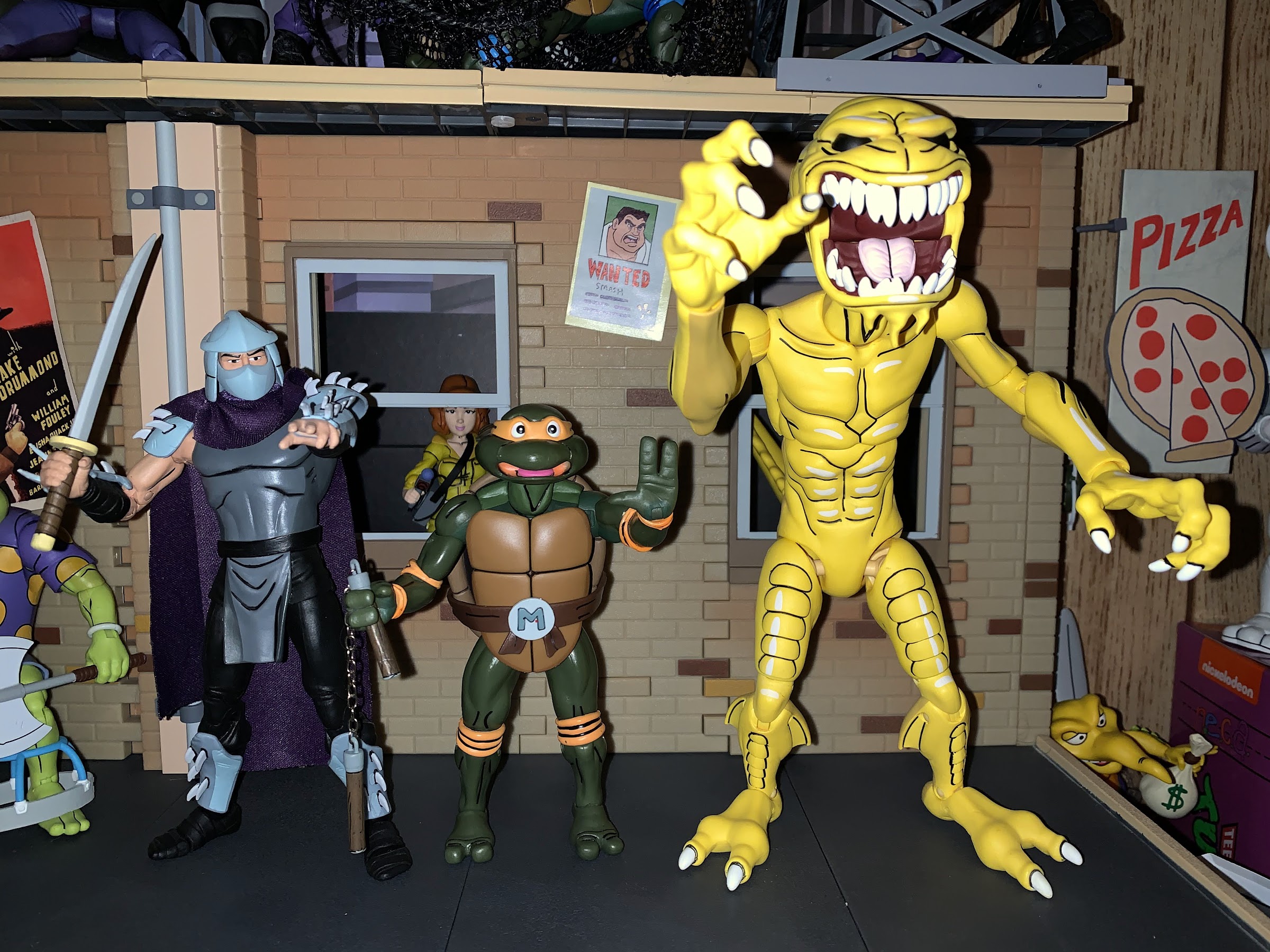
In the spring, NECA put up three sets of figures for pre-order. These weren’t technically made-to-order, but more like a traditional preorder. NECA let collectors pay upfront to have the company deliver later in the year, and the rest of the factory order would then go to Target like all of the other releases. Product was to be delivered in the fall, but 2021 being what it was, things got delayed. Still, two of the three solicitations made it to out in the calendar year so that isn’t too bad, and up first here is the very first solicitation from the batch: the Ultimate Pizza Monster!
I love the artwork created for this line. I hate that I’m being overrun with boxes I can’t bring myself to toss.
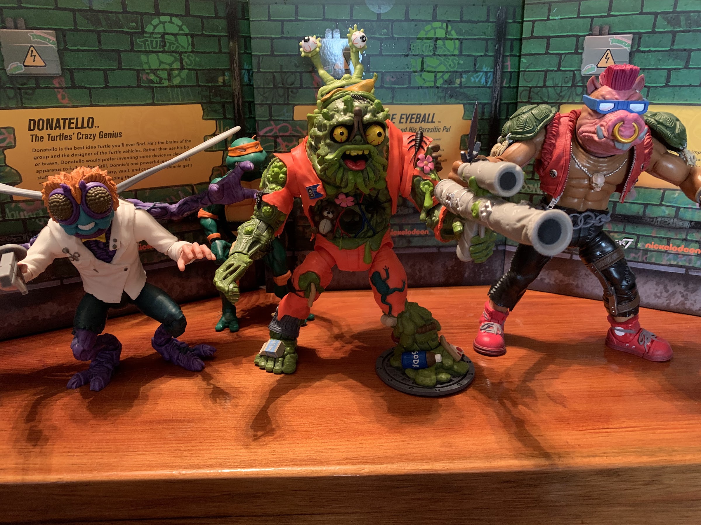
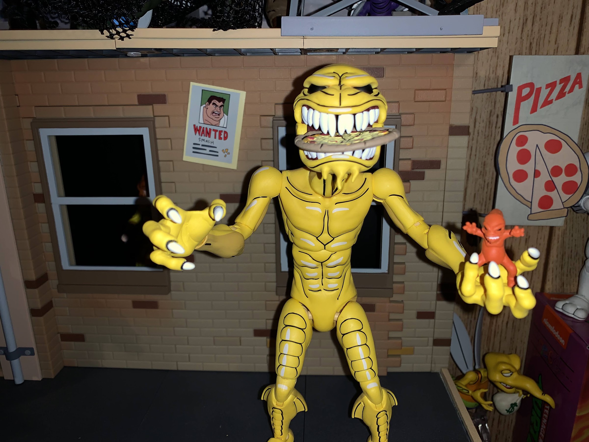
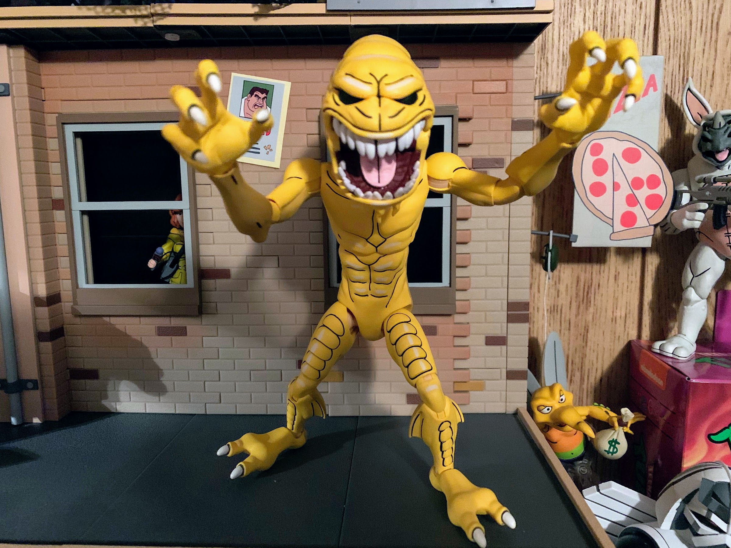
The Pizza Monster appeared in the season two episode “The Case of the Killer Pizzas.” It was a memorable episode for me, and I’m not particularly sure why. Maybe it was because the plot made plenty of sense: Shredder and his cohorts sneak attack the turtles via their biggest weakness – pizza. The monster eggs looked curiously like meatballs and could be smuggled on a pie with relative ease. Once exposed to enough heat, they would hatch into little, red, terrors that when further exposed to moisture would grow into titanic, yellow, Xenomorphs. Okay, not literally since that would require some licensing agreements, but these creatures look so much like the alien from Alien that NECA would one day release a yellow Xenomorph as an homage. The title, clearly B-movie inspired, stuck in my head and it was likely aided by the episode being released on VHS. No, I did not own it, but I definitely remember seeing it often at the rental store when browsing for a movie. I may have even rented it once or twice, though my memory isn’t quite that good. Also, being a part of season two meant it was airing when the episode count for the show was pretty low. This one was likely aired and re-aired several times in the run-up to season three when the show really exploded.
What a cutie!
Mostly though, the big, yellow, monstrosity was just a fun visual in the show and one that stuck with me over the years. When NECA’s toon line began to expand and included the larger figures in the deluxe, VHS, styled packaging I immediately began to wonder if the Pizza Monster would one day join the lineup. And sure enough, it has. Released in that same VHS box with artwork by the incredible Dan Elson, “Another One Bites the Crust” is a release I’ve been looking forward to all year.
Chrome Dome gets to hang onto his crown once again. I’m not sure anyone will knock him off the mountain when it comes to height in this line.
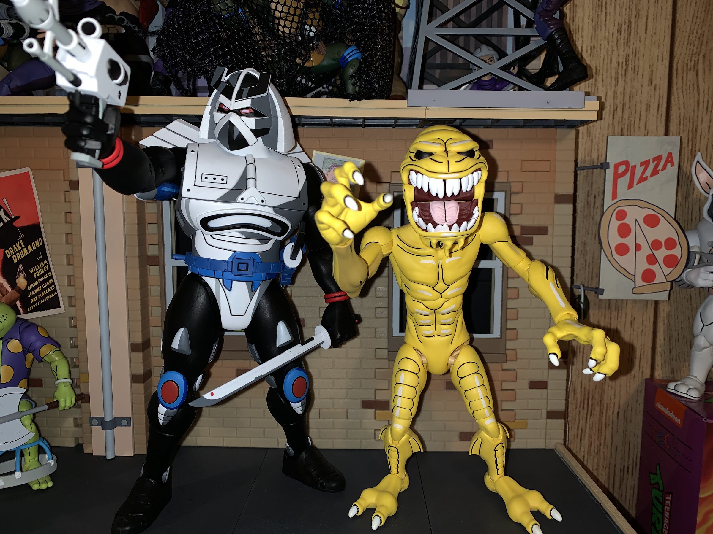
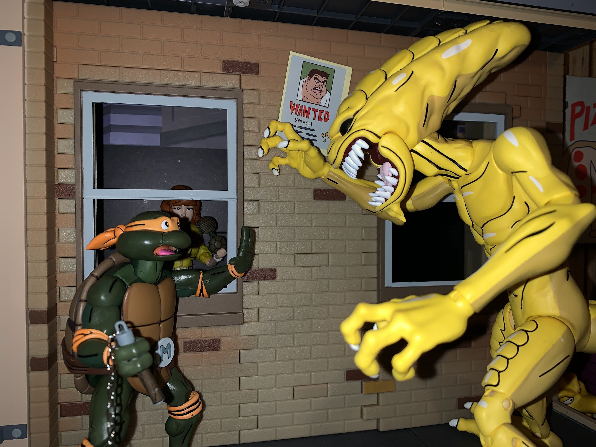
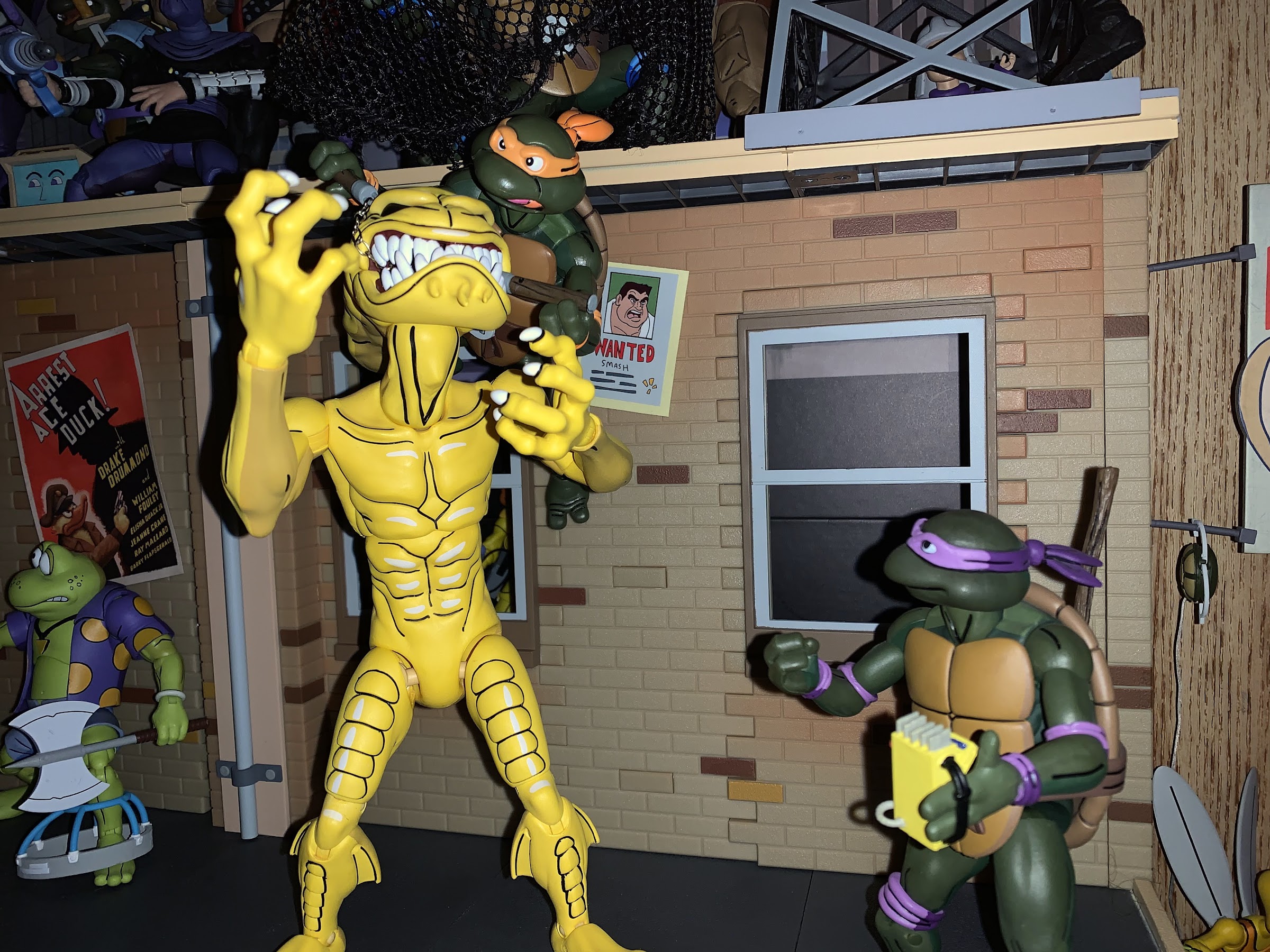
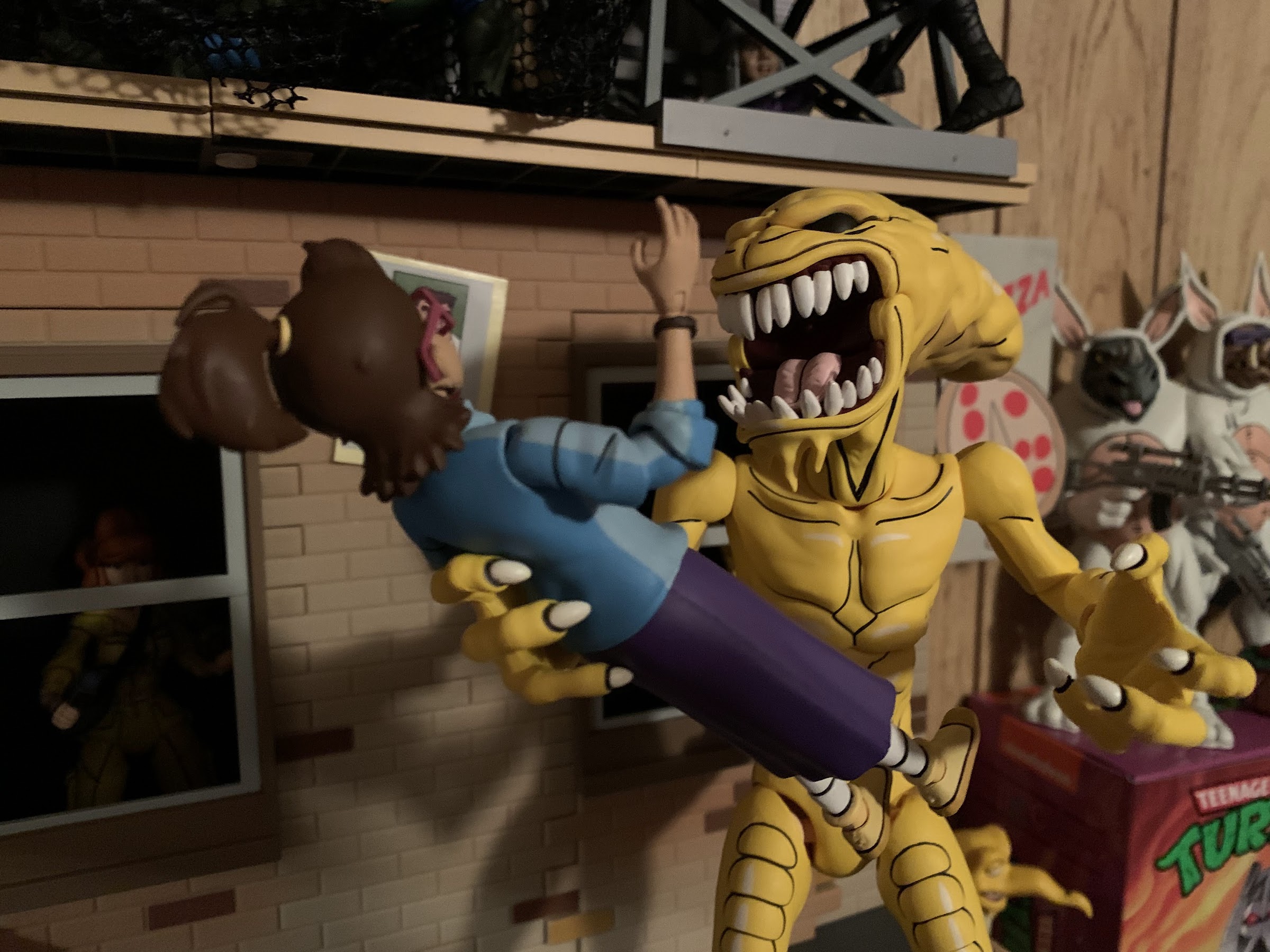
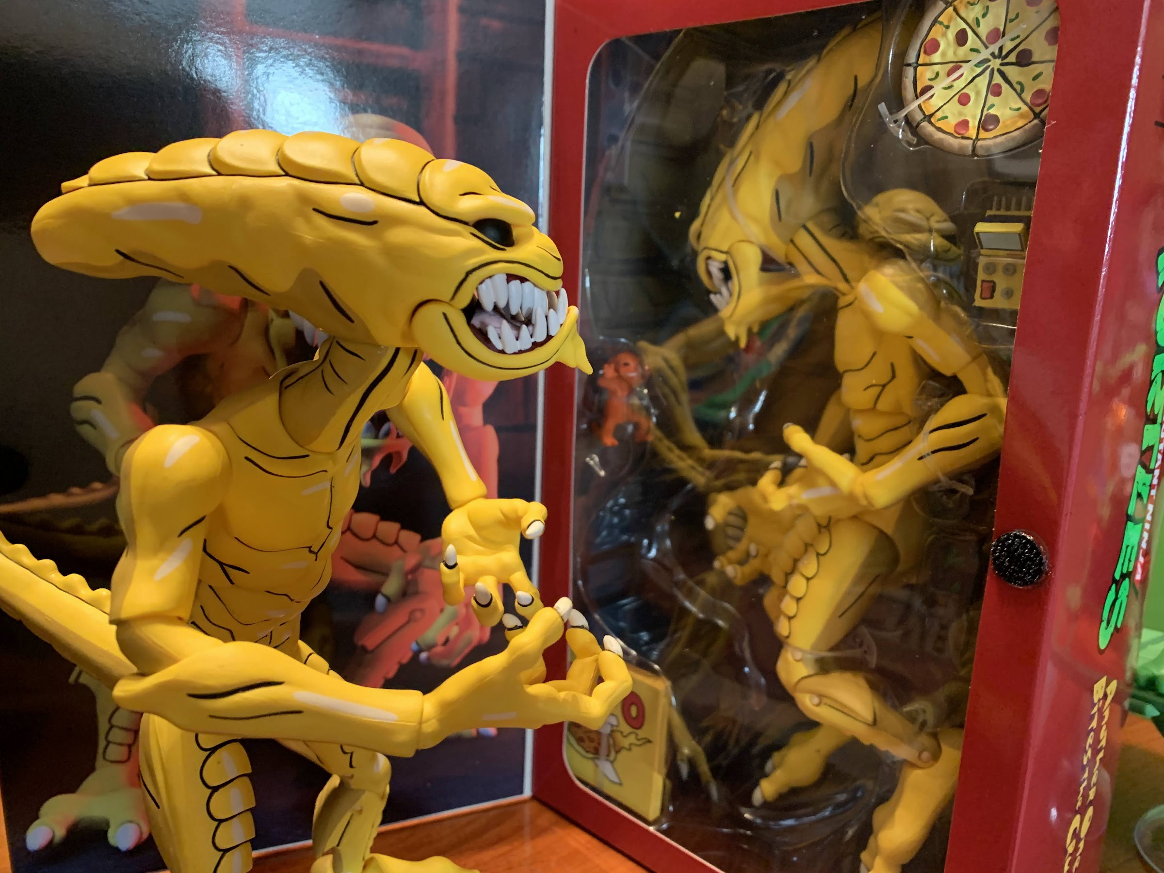
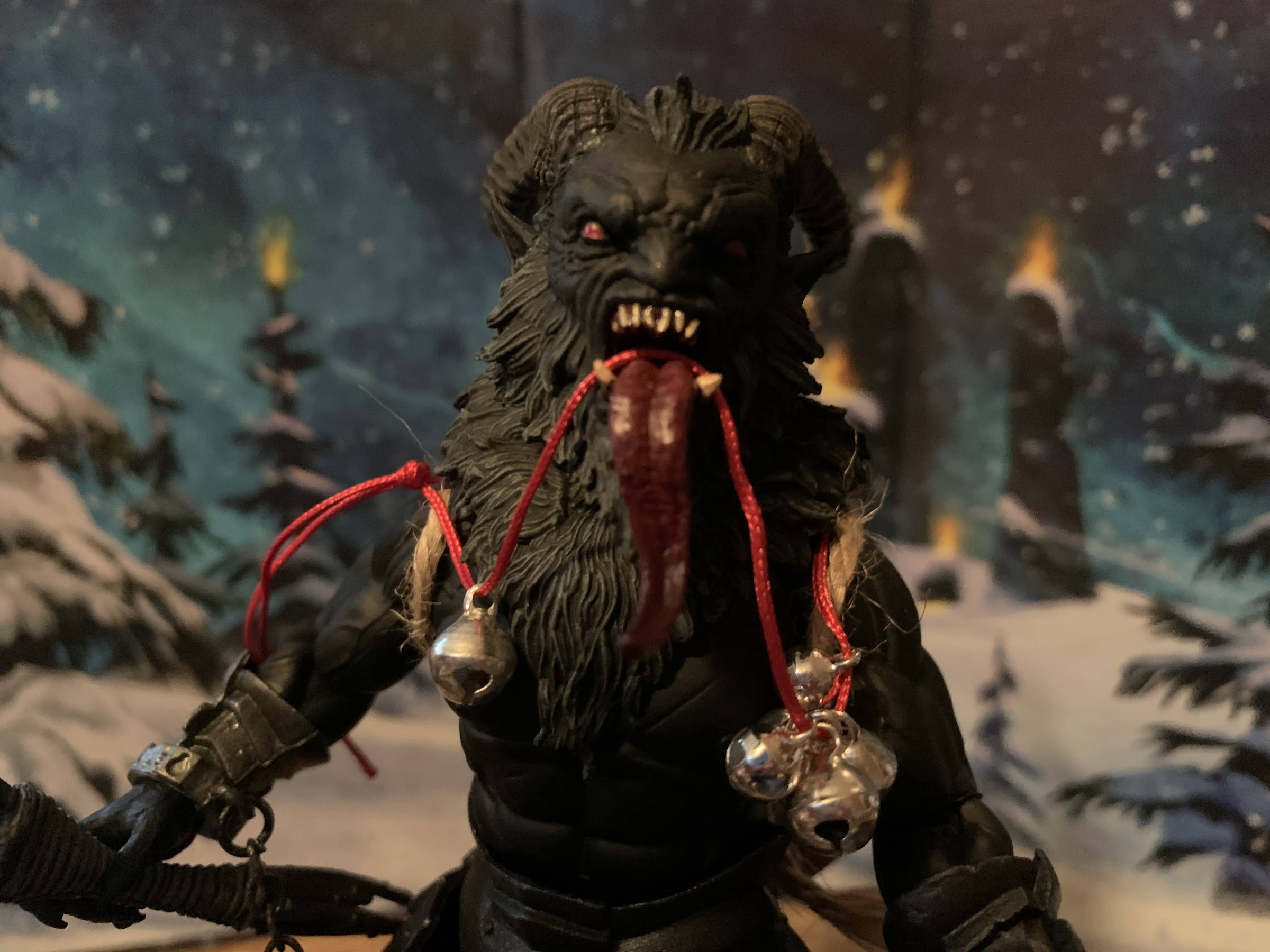
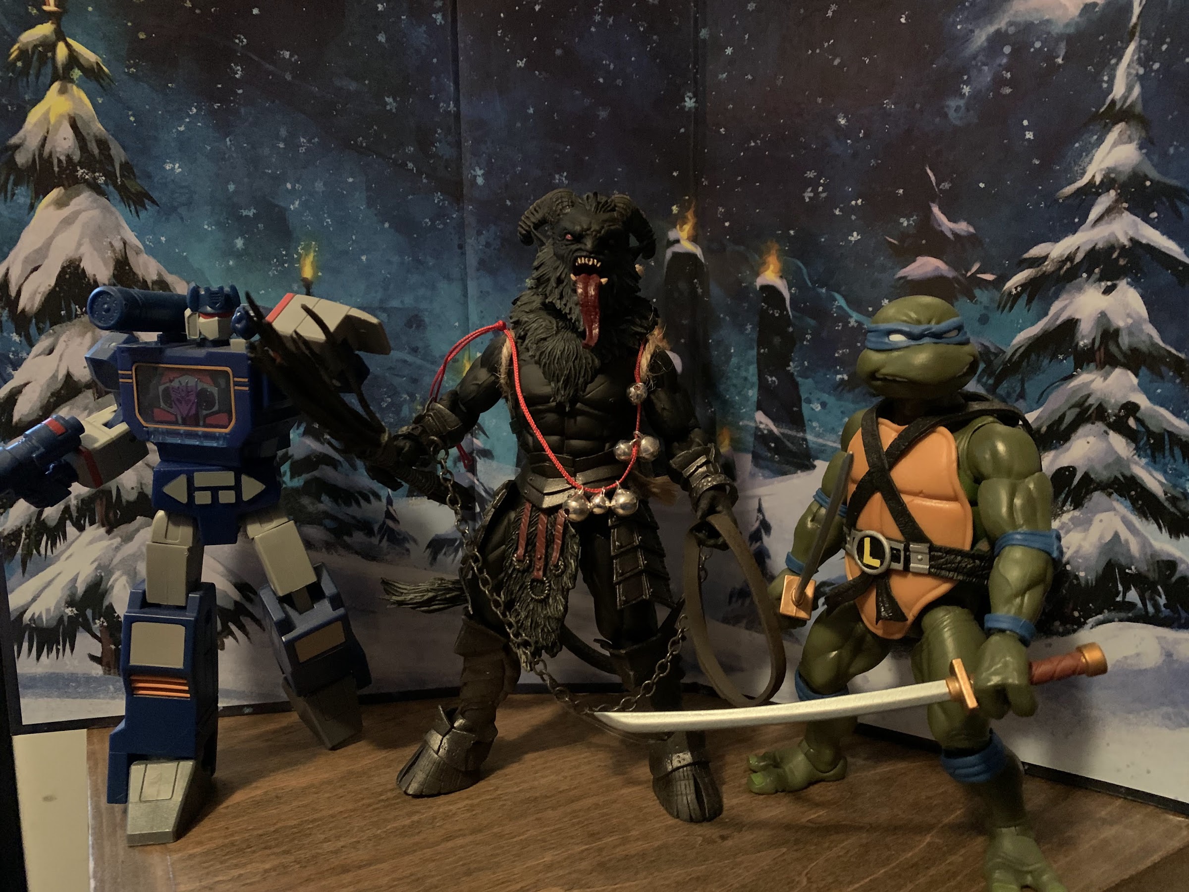
The Pizza Monster is an imposing creature. Standing around 9″ tall, he looks up to only Chrome Dome in this line. Being that he comes from an 80s cartoon that probably didn’t have a huge budget, NECA sculptor Jon Matthews did a fantastic job of nailing down a look for this guy. The presentation within the episode can be a bit erratic, but when I look at this sculpt I see the Pizza Monster as it was supposed to be presented in every frame. The creature is obviously Xenomorph inspired with its elongated head and slender frame. I have the figure at 9″, but it’s definitely designed to be hunched over. The arms and legs are quite long which are terrific for setting up a pose. I love the almost smile expression it sports which adds a sinister quality to what was basically a mindless, rampaging, beast in the show. There’s some nice texture as well giving this creature a bug quality with ridges on the thighs and bumps on the head.
When he’s not being paired up with Chrome Dome, the Pizza Monster is living large!
What really helps make the Pizza Monster stand out is the excellent paint job devised by the duo of Geoffrey Trapp and Mike Puzzo. Like most of the of the figures in the line, there’s a bisected quality to the paint with a bright yellow utilized as the dominant color on the front of the figure and more of a mustard on the back. That part works as well as it usually does, but what really makes this guy pop is the embellishments on the front. There’s the usual black line work to help bring out a lot of the details of the carapace and musculature, and NECA added swaths of white paint to the yellow. The inclusion of which, especially on the creature’s head, really brings out the “pizza” element of Pizza Monster. It’s not a connection I ever made with the source material, but the figure almost looks like it’s composed of melted cheese and it’s just a really neat approach. I don’t know if that’s what NECA was going for, but it’s my take-away.
The side of the head makes me think of melted cheese oozing over pizza crust.
The presentation of this figure is a homerun, where things are going to get a little dicey is in the articulation. First of all, this figure, despite being on the larger end, has all of the same points of articulation one would expect. It starts at the head, where the figure is on a ball peg with a second one at the base of the neck. This may be an odd thing to say, but this figure has the best head of any other figure in the line. It can look up, and way down which is crucial for a larger character, and he can swivel, tilt, and basically convey any emotion you want. The jaw is articulated so you can pose the creature screaming, biting, grinning, etc. I love it whenever NECA can get an articulated jaw into a figure and this is obviously one that benefits greatly from it. At the shoulders are the customary ball-hinges and past that are the unusual NECA double-jointed elbows with a swivel/hinge above and below the elbow and a long joiner in between. They’re very tight, but seem to work, and the unusual look of the joint works on a monster like this. At the wrists are the usual swivel and hinge combo and they too are tight. Painted joints obviously contribute to the tightness (and when the paint flakes off it leaves behind pale, yellow, plastic so that’s not an eyesore like it is with some other figures), but it also feels like they’re intentionally engineered to be tight considering this is a big figure. The diaphragm features a ball-joint that allows for some forward and back motion, but mostly works to give the character a swivel since there’s no waist twist.
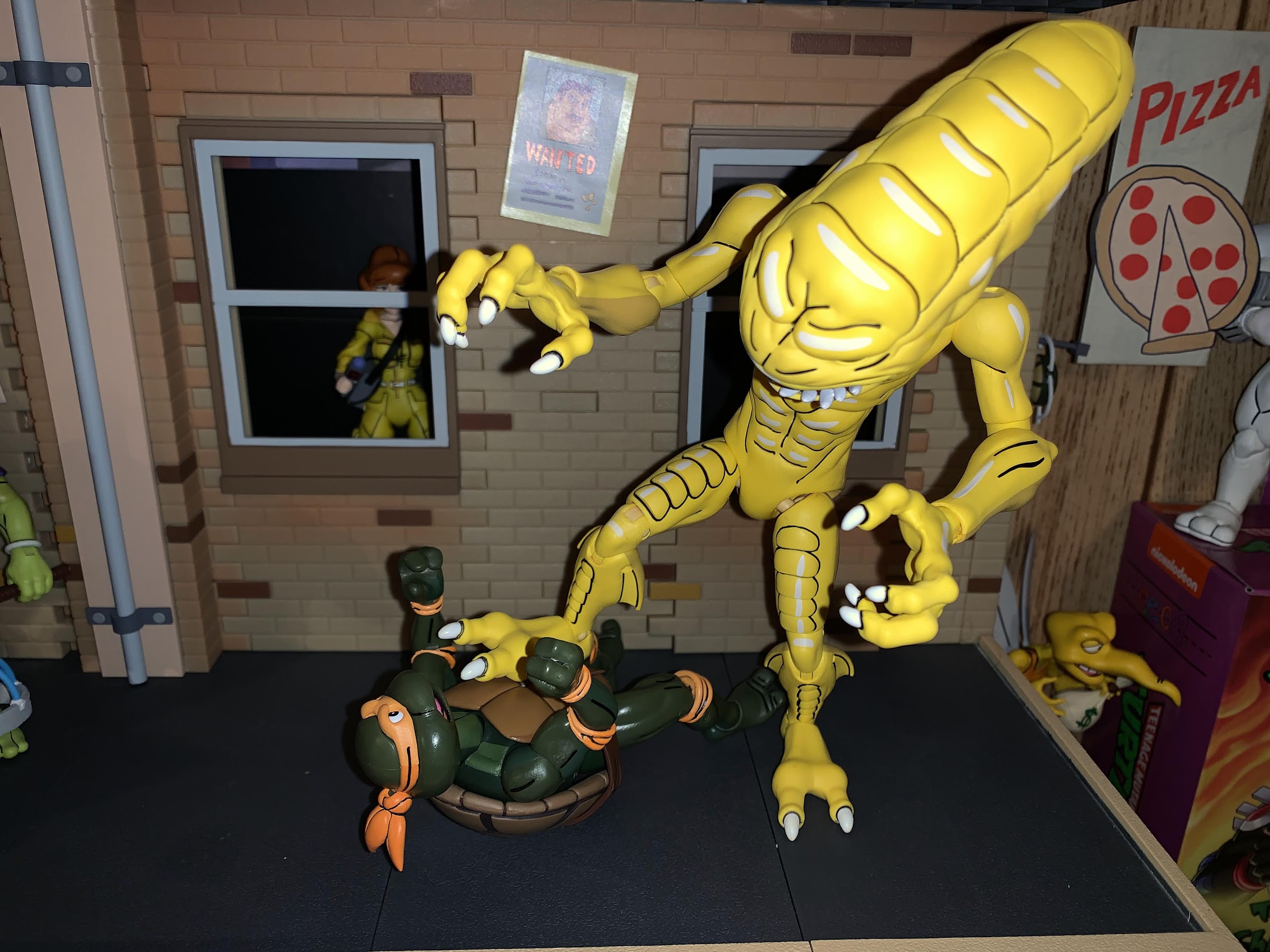
The joints really aren’t strong enough for this pose to last on a shelf.
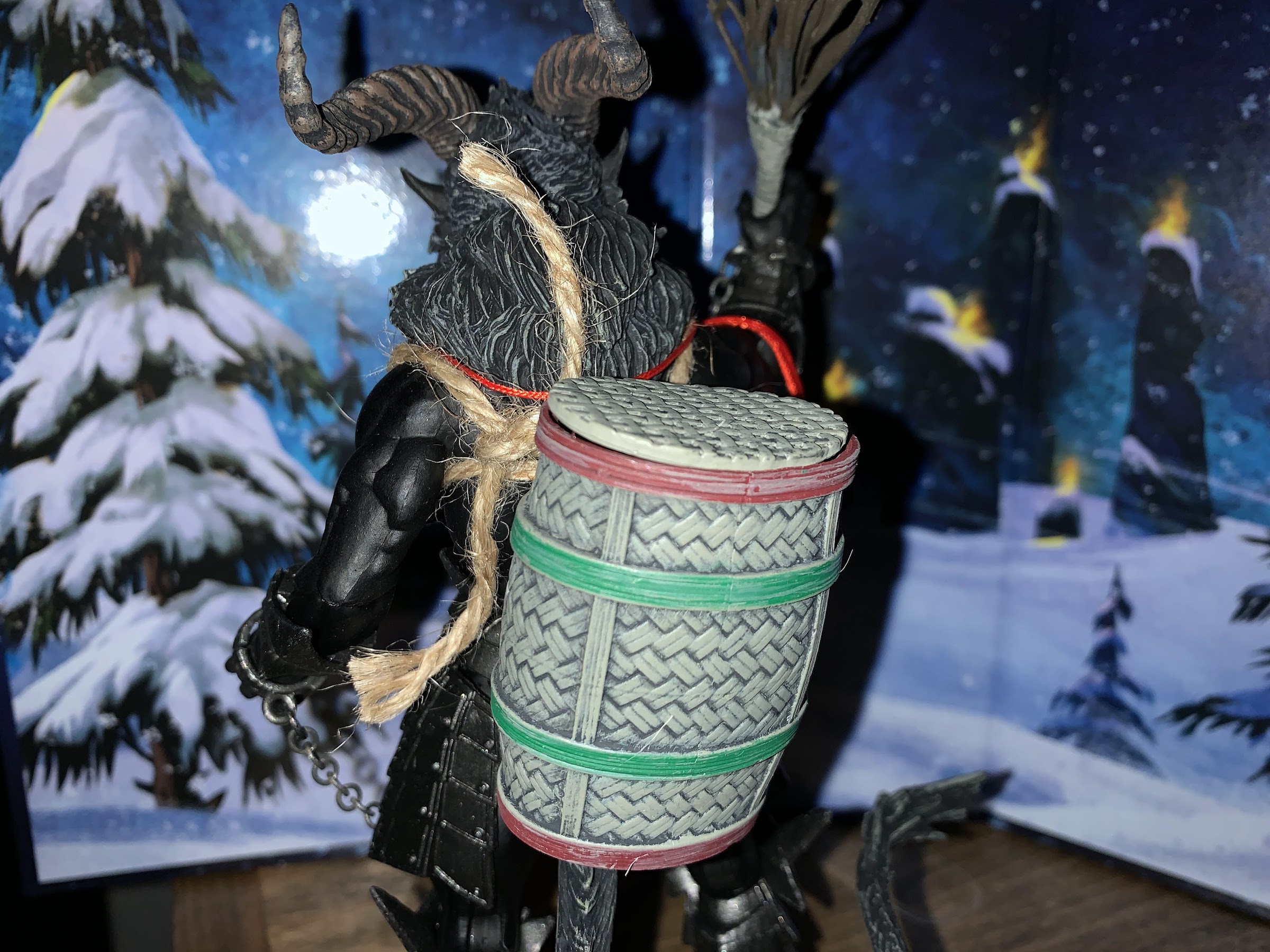
All of that is fine, where things go south is below the belt. First of all, we have a tail which, like many tailed figures in the line, comes unassembled in the box. Attaching the tail was fairly painless, and it’s probably the best tail we’ve seen in the line. It’s just a ball joint so the range isn’t tremendous, but NECA made the tail a wired one so you can bend it and position it as you deem fit. It’s much thicker than a rat tail or the whip accessory we saw with the Punk Frogs so there’s really no worry about the wire eventually breaking through. I wish Leatherhead had the same. At the hips are the now standard ball-joints we’ve been seeing for over a year now. These have a tendency to be loose on some figures, and on the Pizza Monster they’re okay. Not as bad as the frogs, but they could stand to be tighter as the figure can be a challenge to pose as the weight of it wants to force the figure to do a split. At the knee is a double-joint and it’s fine with appropriate tolerance.
At least he doesn’t need especially strong joints for this one.
The hips are a disappointment, but the real issue comes last: the ankles. These ankles have already acquired a bit of a reputation in collector circles. I know I’ve seen a few who broke the ankle on their figure trying to break the joint in. The joint itself is a hinge with ankle rocker or pivot. Twitter user Uncle J took the joint apart to have a look and see what was the issue if you’re interested, but what it boils down to is you have a painted joint, short peg, and there’s apparently a ratchet added as well. Ratchet joints are like regular joints, but with added grooves or teeth to improve tolerance. This is often used with large, heavy, figures so they can hold a pose without the weight of it dragging it down. The problem here is the ankle rocker is so tight that it’s not even obvious the figure has one. I personally sought out reviews, which I never do on a product I plan to review myself, to make sure the figure actually had them. And what I found is a lot of the same problems.
“Chew on this, dude!”
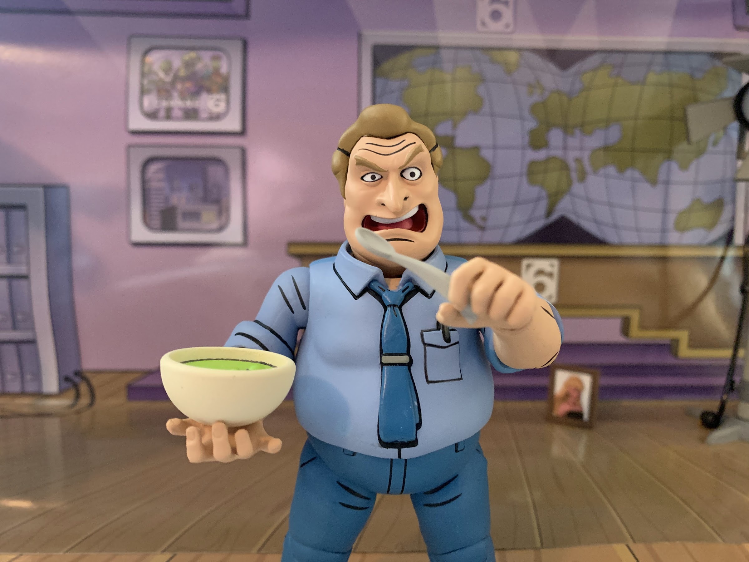
First of all, the hinge is fine. It’s tight, but I was able to get it moving without resorting to heat. For the rocker, I went to my standby which is hot water. The problem with heating a joint is it makes the plastic soft and malleable. With this particular joint, you can heat it up and move it, but you don’t know if you’re moving the joint as intended or just bending the plastic and it’s very easy to go too far and shear the peg off, with or without heat. I tried clamping down where the peg meets the ankle, but after a few attempts I only got the joint to work a little. I wasn’t willing to really push it because I don’t want a broken toy. Unfortunately, heating the feet up to get this amount of range had a drawback. With the joint loose, now the figure is even more likely to fall down. It starts with those hips, but now the ankles don’t make up for that at all as the hinge is looser than it was before. Prior to heating it up, I had a figure that stood easily, but just couldn’t do anything dynamic with the feet. Now I have a figure with more range, but the looseness in the legs limits how I can pose it. I could get a stand, and if you look at my pictures you may be able to tell I’m using the combination of the figure’s tail and the windows of the diorama to prop it up, but it’s a blemish on what was shaping up to be a contender for best figure in the line.
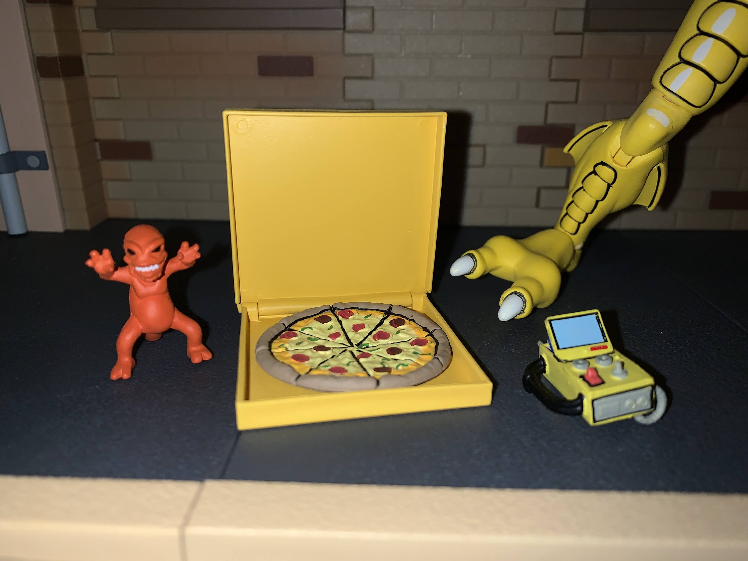
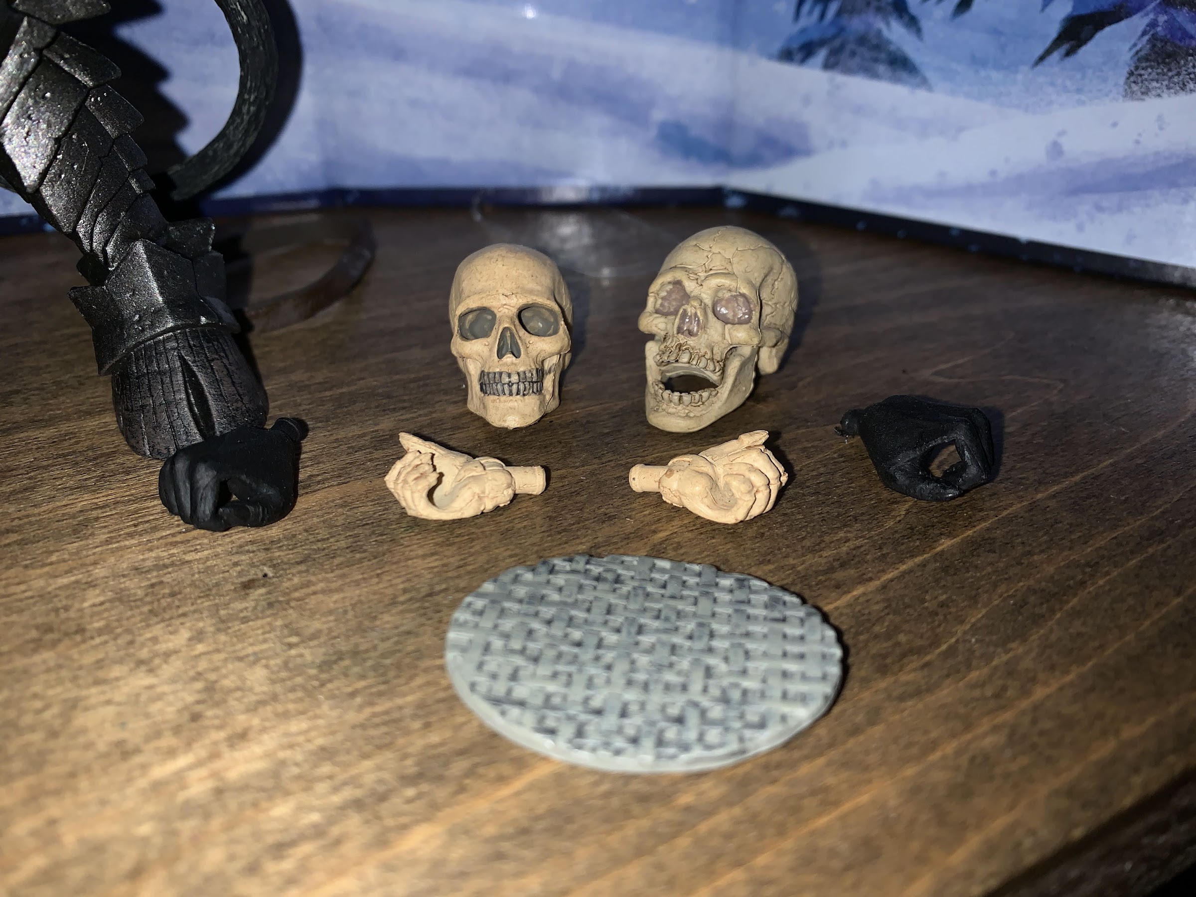
The stuff.
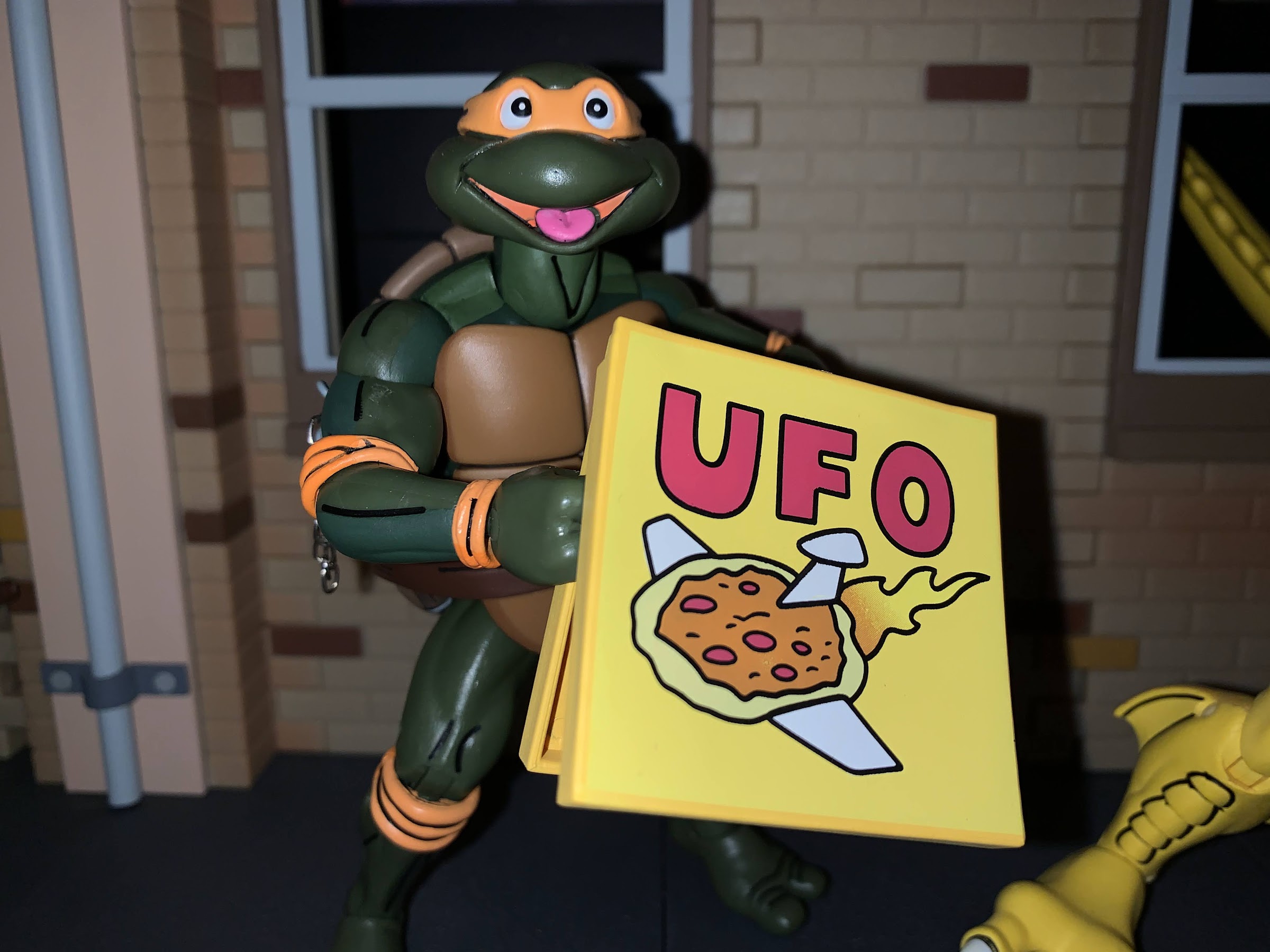
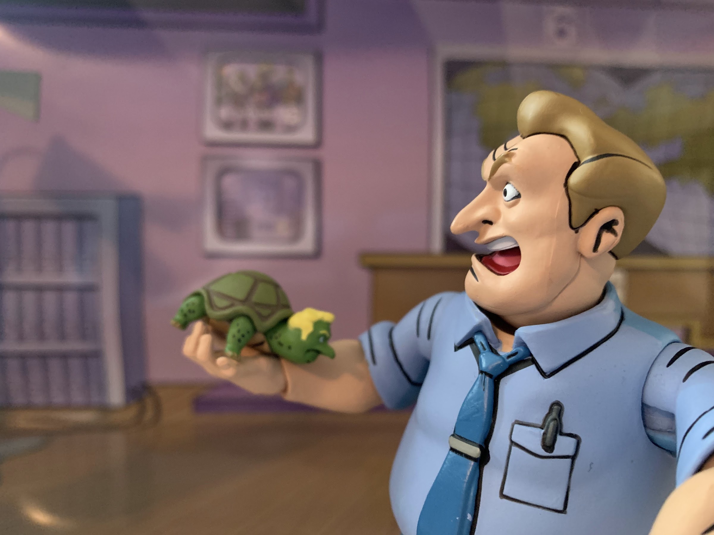
The Pizza Monster is an excellent looking figure let down by some flawed engineering. It’s also a figure that doesn’t really bring much to the table in terms of accessories. I suppose a monster doesn’t need much, but it’s a little uncharacteristic with these deluxe, or ultimate, releases to see so few accessories in the box. For starters, we have the hatching Pizza Monster which previously came with the April set. It’s small, red-orange, and looks fine. There’s very little paint on it and no articulation, but it doesn’t require much. It would have been fun to get a new pose, but NECA obviously had to factor in costs and the tooling on the figure itself probably has little or no reuse possibilities down the road. There’s also a pizza, because you can’t have a pizza monster without pizza! It’s a yellow, UFO, box and NECA finally added a hinge! This can actually open and close and the pizza inside is removable. It’s a fairly basic looking pizza so no peanut butter or jelly beans to be found. Lastly, we have some tracking device used by Donatello. NECA’s Trevor Zammit, who oversees this line, recently conducted an interview with The Fwoosh where he talked about how there are a million different such devices in the show and they basically try to squeeze them in whenever possible. I’m a bit surprised they went this route here, as Baxter uses a similar, handheld, device to control the Pizza Monsters which could have been included, but I definitely like how NECA tries to sneak Easter Eggs into their releases like this.
This is the line’s best pizza box to date, so I guess that’s worth something.
NECA’s take on the Pizza Monster is nearly a homerun. Call it a triple, I suppose. It looks awesome and is a lot of fun to mess around with (save for the scary ankles) and I definitely appreciate NECA making it so easy to obtain. There are issues though. It’s light on accessories (other than Kerma, I think this is the only figure without extra hands) and the ankles are a problem. They’re a big enough problem that some don’t even have the luxury of breaking out of the box. I actually ordered two of these figures, but you only see one in my pictures because the other one arrived with a foot already broken off in the package. I reached out to NECA and within a half hour I had a prepaid shipping label to send it back for an exchange. NECA received it on the 30th of December and I have yet to receive a shipping notice for the exchange. I’ll update this accordingly later on.
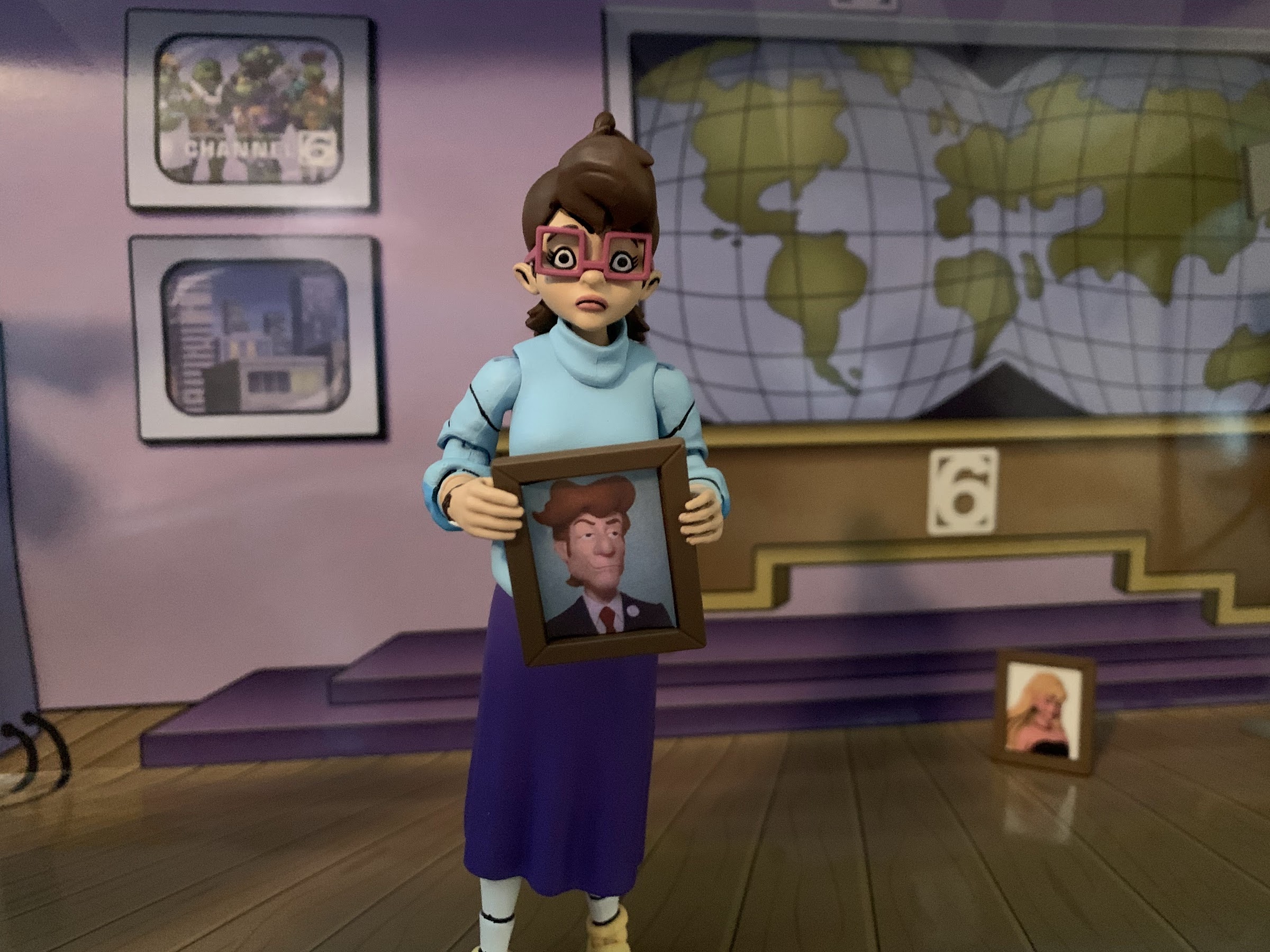
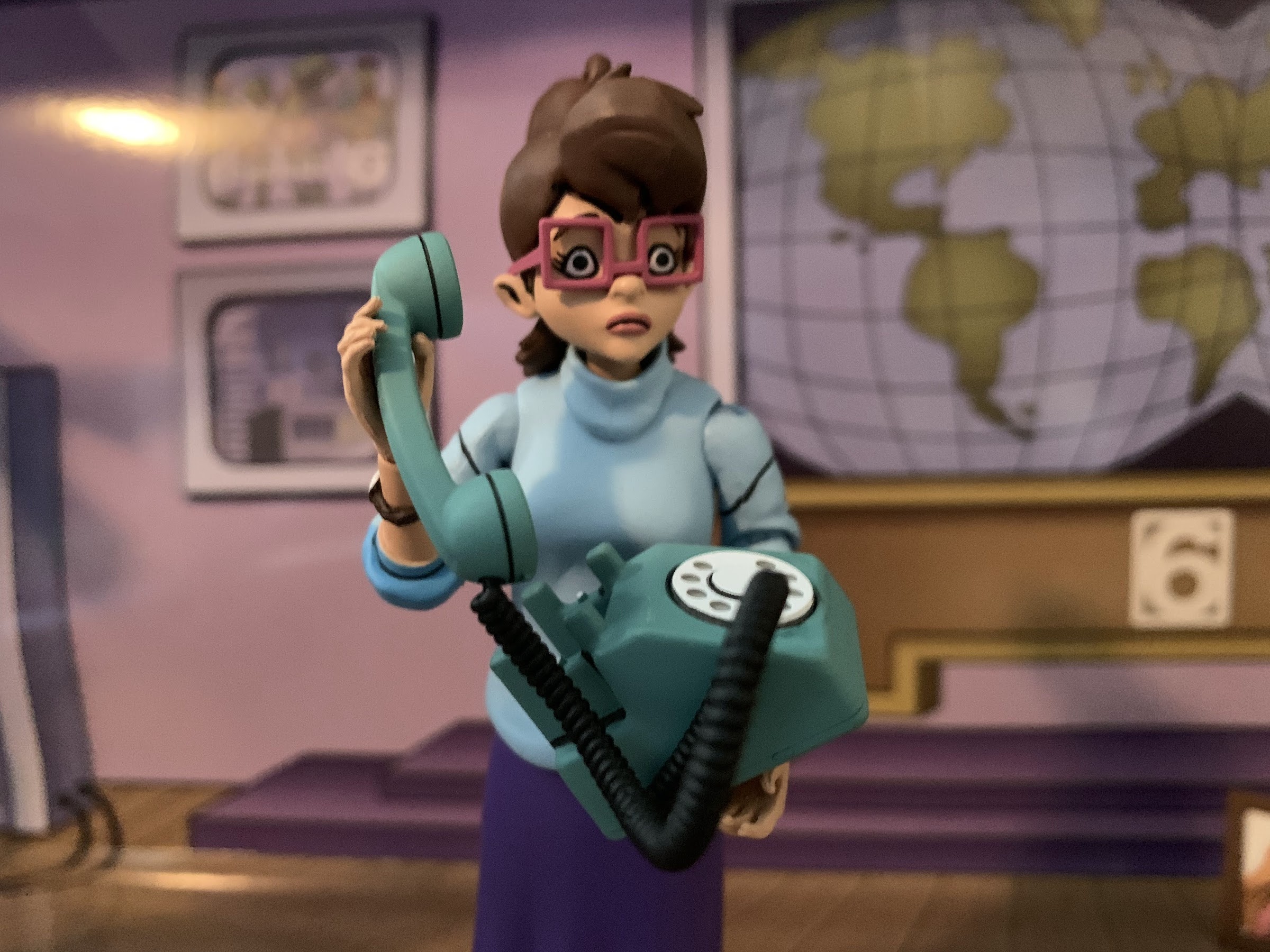
Irma never has good luck with men. Or bugs.
Even with the issues, I still think this is a figure worth owning, and if you’re really into screen accuracy I suppose you need two additional ones. I think I’ll be happy with two as it’s already challenging to find room for all of these releases. If you missed out on the preorder, the figure should be hitting Target in the coming weeks where I assume it won’t be a huge challenge to find given how the past few releases have gone. The price on NECA’s website was $35, but it’s possible it could retail a little above that as there have been price increases since April. Good luck to all who are on the hunt!
UPDATE: I received my replacement pizza monster, as promised, from NECA on the 13th of January, exactly 2 weeks after receiving the broken one. It took a little longer than promised, but it got here, and that’s all that matters. And to my surprise, it didn’t arrive alone. There must have been a mix-up at the warehouse, as rather than send me one replacement they re-sent my order of 2 so I got an extra pizza monster out of it. Now, I did alert NECA’s customer service to the error, but it’s been a week and they never responded so I guess I’m good to keep it. Now I’ll have a toon accurate trio of pizza monsters, so if all it took was an extra 2 week delay, then I’d say that’s more than a fair trade-off.
Two new babies to add to the display. Once I find the room!
When Mighty Morphin Power Rangers arrived on Fox Kids in 1993 it quickly became a ratings juggernaut. It was the hottest property around aimed at kids and seemingly everything got knocked down a peg as a result. By contrast, Teenage Mutant Ninja Turtles was embarking on its downturn. The third film wasn’t nearly as successful as the first two and the toyline was starting to show its age as it went into a lot of wacky offshoots. The Power Rangers formula became the new thing to imitate. Footage of martial arts shows from Japan edited into something American kids could identify with was both cheap and effective. And given that TMNT had already been successful in live-action before, it’s perhaps not surprising that Saban made one of the first attempts at reinvigorating the franchise with The Next Mutation.
The Next Mutation ended up being a flop. Either kids were sick of TMNT, disliked the cheap costumes, or failed to gravitate towards the new characters. No one can be certain, but during the show’s lone season it did cross over with Power Rangers. Of course, by then the Mighty Morphin era was over so kids who loved TMNT and then jumped to Mighty Morphin had little reason to enjoy the crossover. It wasn’t their preferred take on either franchise, and it seemingly failed to do much to boost either property.
Looks like we have ourselves a Foot Soldier, or do we?!
Eventually the turtles would come back to animation, and now more than 30 years removed form the cartoon’s debut it’s a supremely nostalgic, and profitable, property once again. Power Rangers, for its part, has never truly gone away though it has changed hands a few times. Now a Hasbro property, the Power Rangers can still be found on television and there’s always rumors of another movie. And in the pages of Boom! comics, the Mighty Morphin team can seemingly live forever! It was in those comics that the crossover fans wanted to happen finally did. The turtles, basically as seen in the pages of IDW, met-up with the Mighty Morphin Power Rangers. I don’t know why or what the big threat was that caused it to happen, but it did lead to some slick designs which are now being immortalized in toy form by Hasbro.
No way! It’s Tommy!
Hasbro has been around for ages, but it’s never been able to get its hands on Teenage Mutant Ninja Turtles. I’m not sure if the company has ever put forth a strong bid for the property when it has come up for sale. It seems most times this happens the franchise is in a dry spell which has probably made it easy for Playmates to retain ownership. That ownership has been tested over the years though as we’ve seen TMNT product from NECA, Super7, and even DC Collectibles. Now it’s Hasbro’s turn, but they’re giving us something pretty different.
Ninja Tommy!
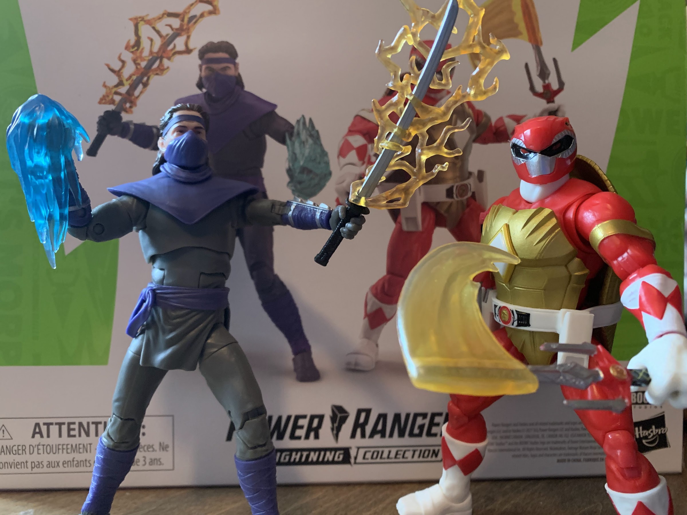
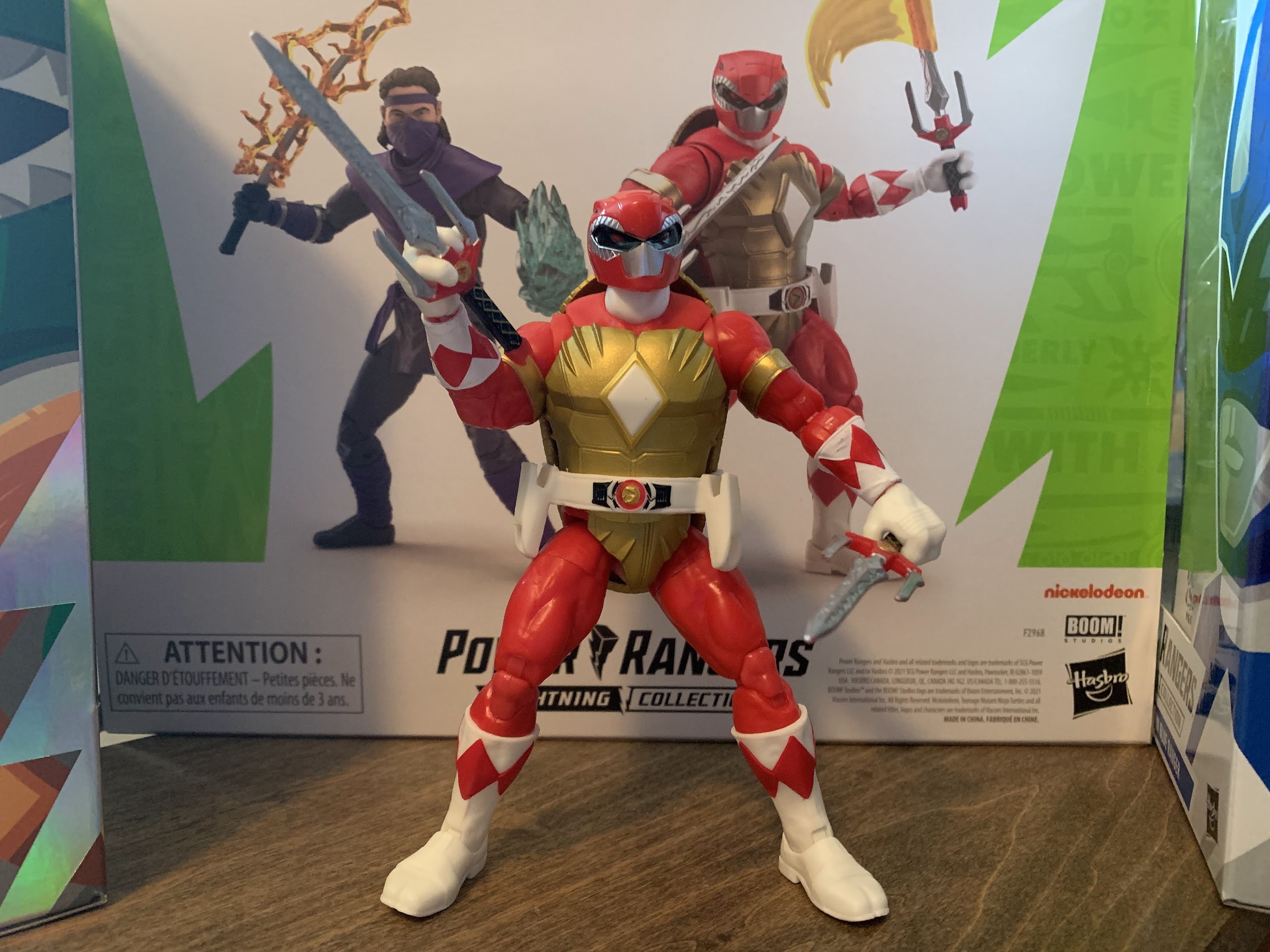
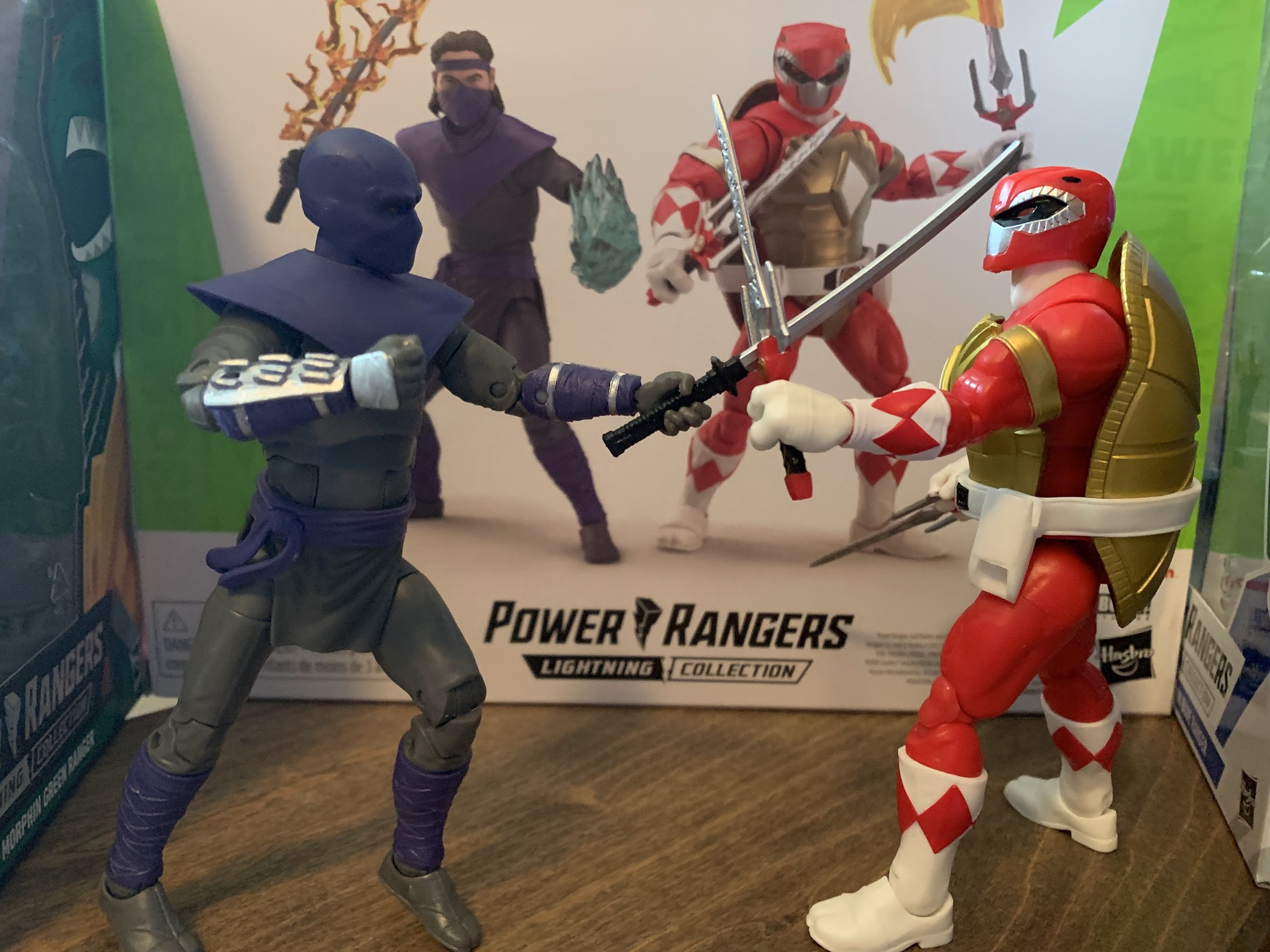
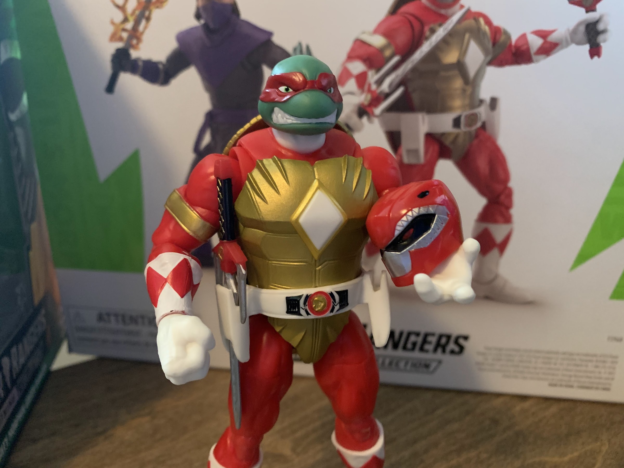
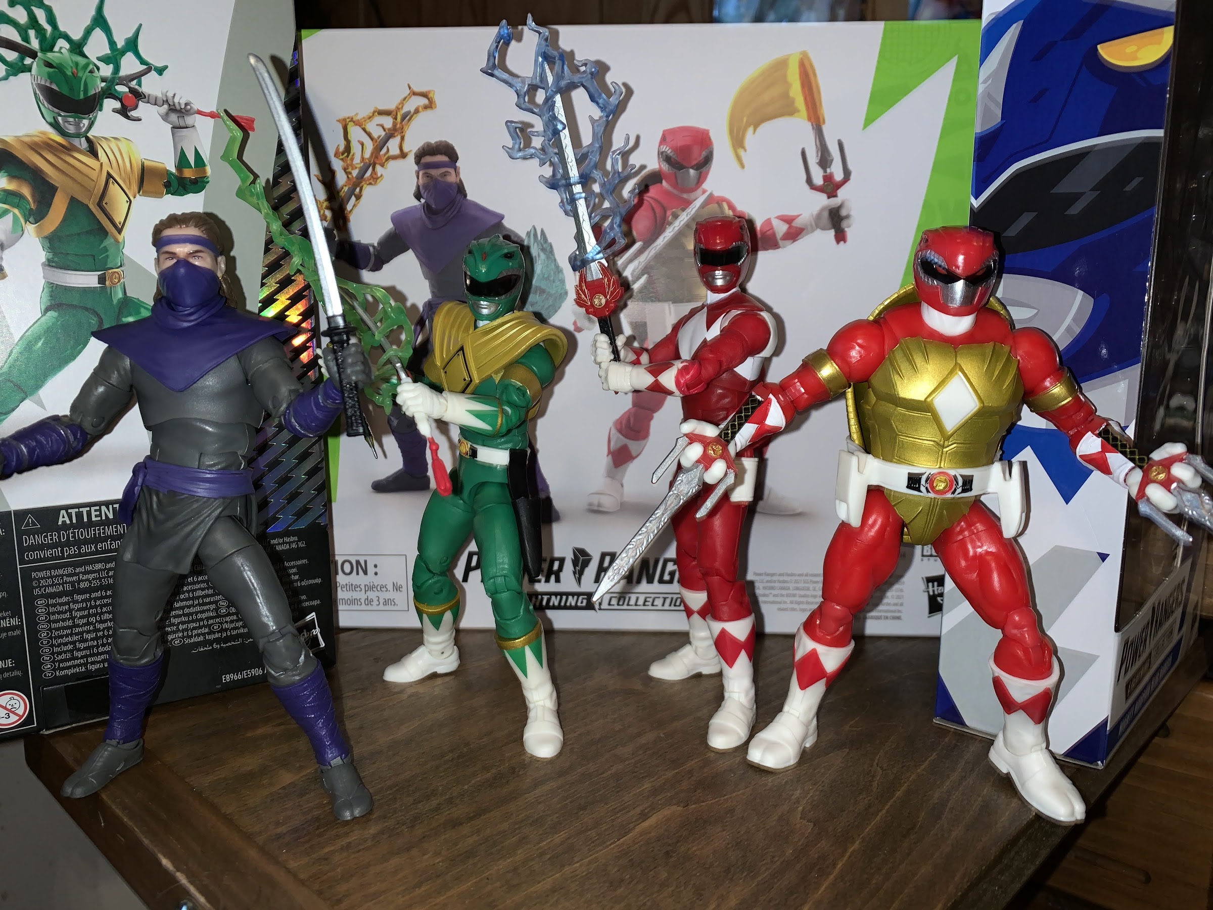
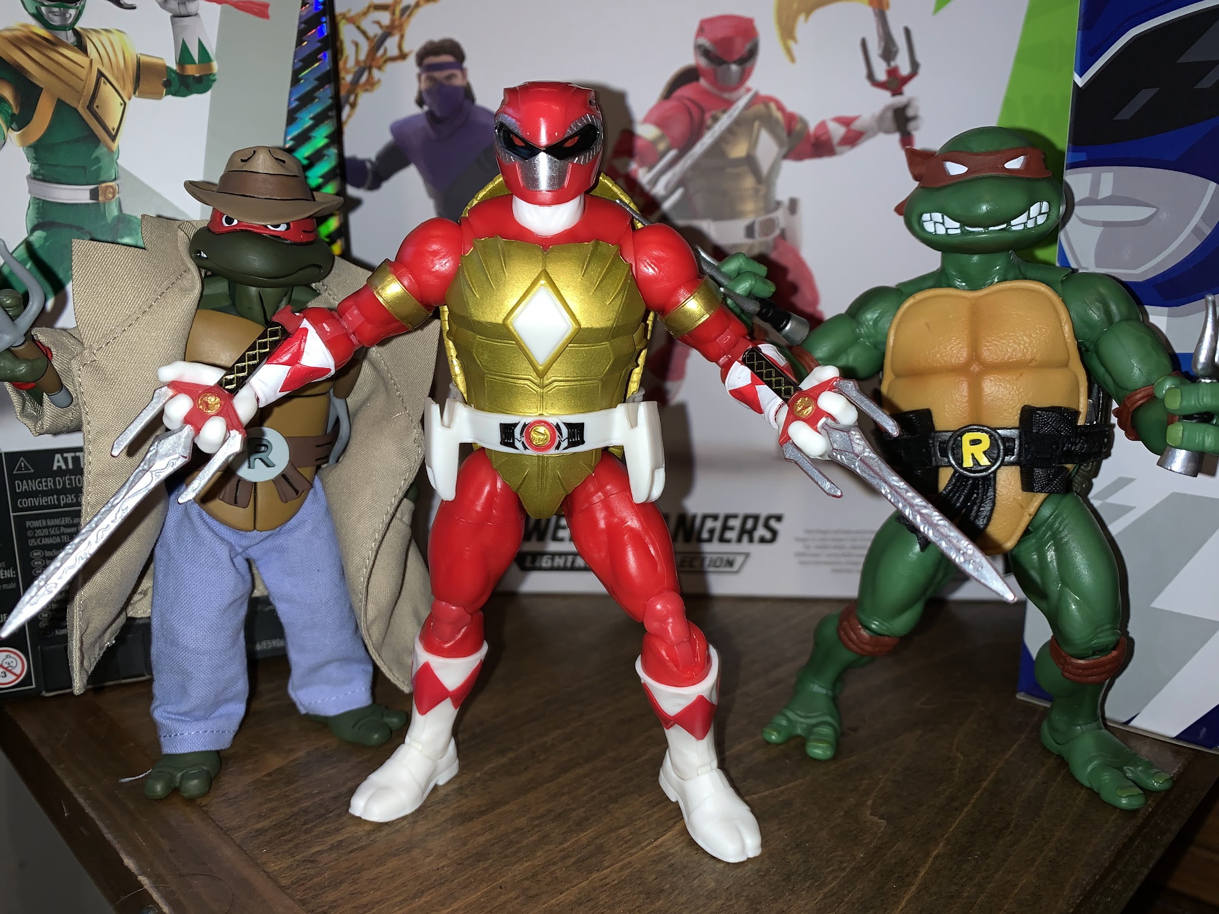
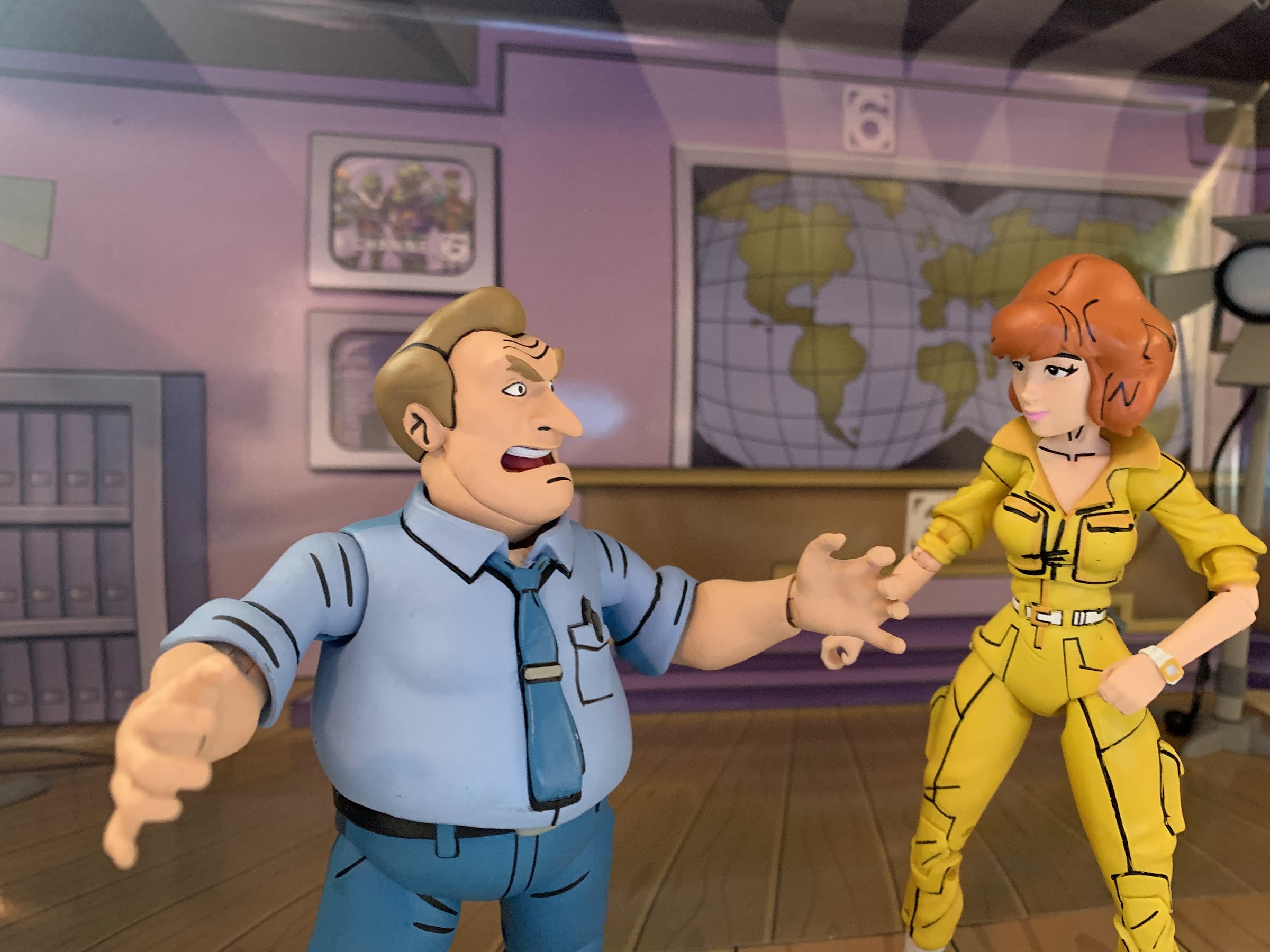
Released as part of its Lightning Collection, the new Power Rangers x Teenage Mutant Ninja Turtles line is being released as three two-packs and a single carded figure. Each two-pack contains one or two of the turtles as they appear in the comics when morphed. Yes, the turtles become Power Rangers and the end result is pretty cool. Their limbs are pretty much the same as the regular rangers, just beefier, but they seem to all gain the Dragon Shield in the form of a gold shell. The front of which contains the signature white diamond, while the rear looks almost like a sunburst. The helmets are largely the same though, just form-fitted for a turtle head. They also gain red eye-slits in the visors for some reason.
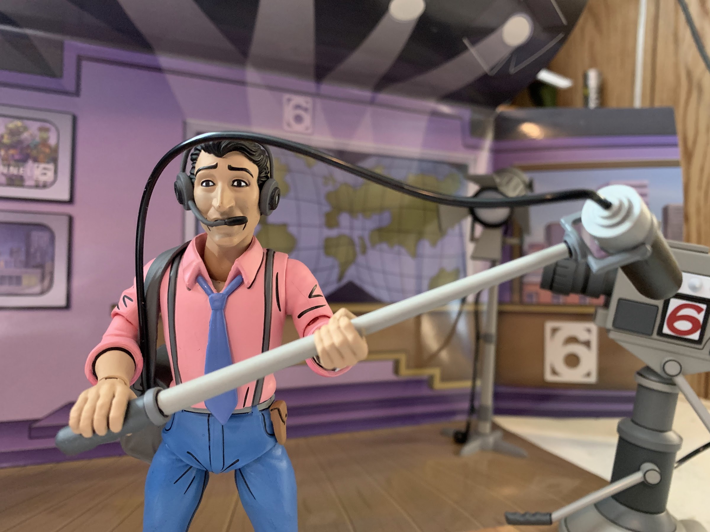
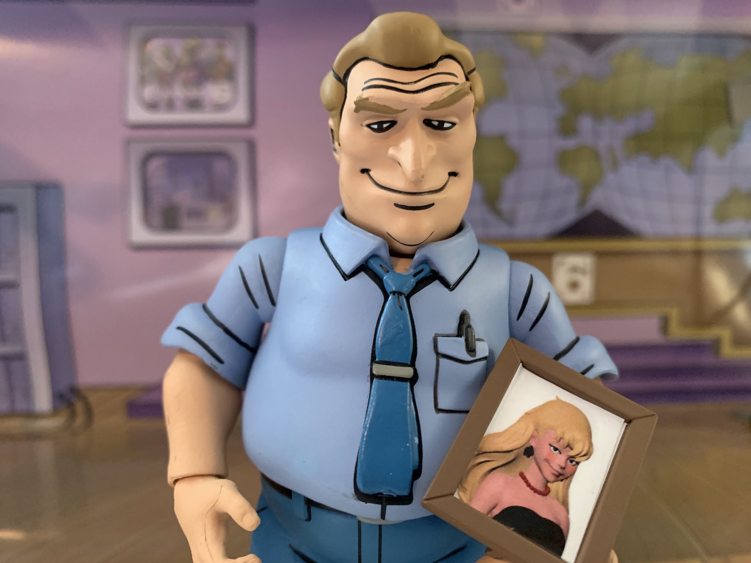
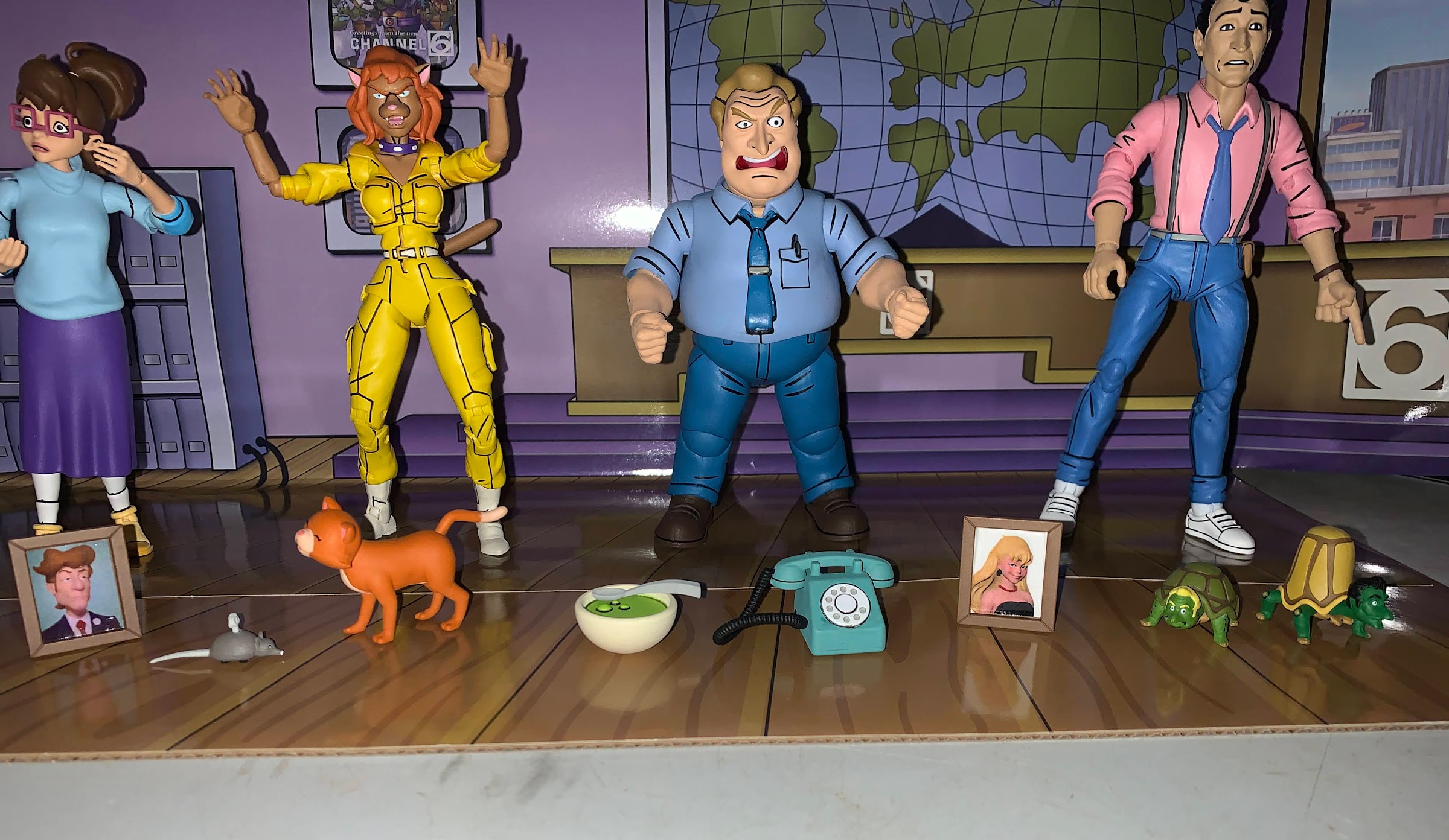
The first two-pack I was able to get my hands on is the Tommy Oliver as Foot Soldier with Raphael as the Red Ranger. When it came to crossing the two franchises, Boom! had to decide what was more important: color or weapon of choice. If going by weapon, Leonardo should have been the Red Ranger since both wield a sword and are the leader, but you can’t make Leonardo red. Instead, Raphael gets the nod here and his sai are just given a Power Sword makeover. As for Tommy, it’s my understanding he goes undercover as a Foot Soldier in the story, but the figure basically doubles as a generic Foot Soldier as well. It’s just a shame he’s sold in a two-pack since some collectors would likely buy multiples. Instead, it’s Shredder as the Green Ranger that gets the solo treatment.
Cool sword, bro.
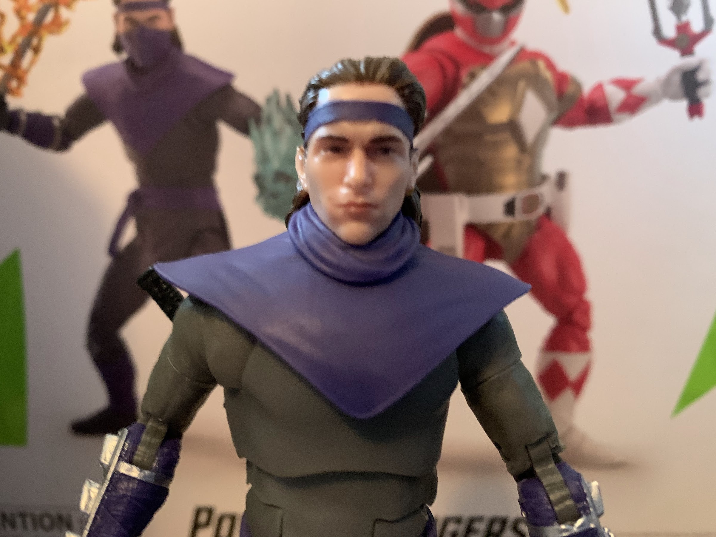
I think most are going to be interested in these sets for the turtles, but lets get Tommy out of the way. He’s basically a standard Lightning Collection release. I believe most of this body is reused from the Putty figure, but I don’t have that figure to say for certain. It’s fairly similar to the Ranger body from the Lightning Collection and contains all of the same articulation points. The Foot Soldier head is obviously new and contains some nice, subtle, details on it to show how the mask separates. I wish there was some dry brushing on it to bring it out, but Hasbro isn’t one for paint. Most of the figure is just cast in colored plastic: purple and gray, with some shiny, steel, bits on the forearms and rear of the hands. It’s a new look for the Foot Soldier, but it’s also pretty obviously a Foot Soldier to anyone familiar with TMNT. It’s solid, though a bit underwhelming. The alternate Tommy head appears to be the same one that came with the Green Ranger figure, but with the bandana tails coming straight off the back of the head and painted purple. There’s also very little paint on it so it doesn’t have the more matte appearance of the Green Ranger release.
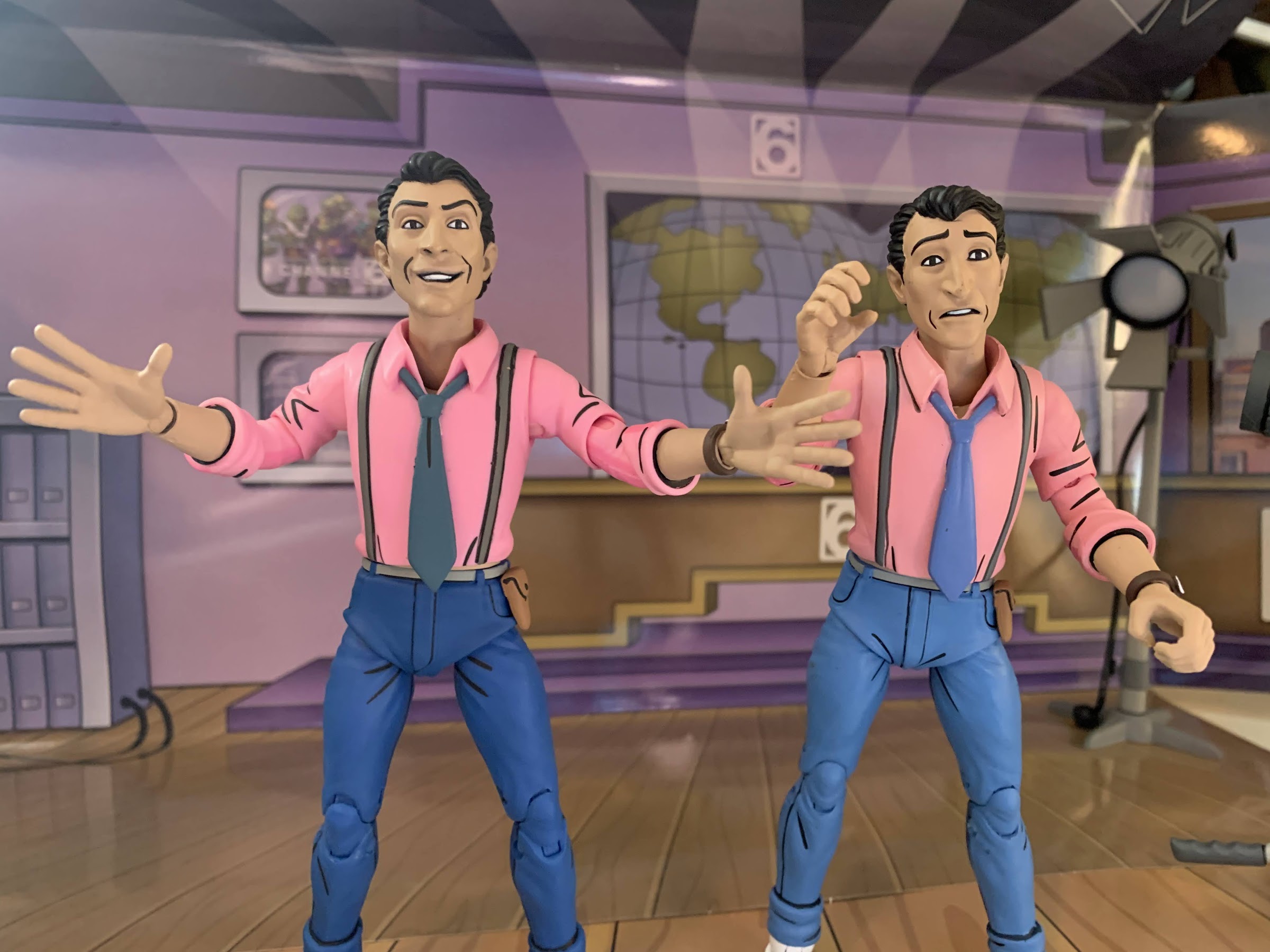
The man…turtle of the hour.
Raphael, on the other hand, is basically all new. His body is of the pinless variety, so no pins in the elbows or the knees which is definitely welcomed. The red is basically all colored plastic so there aren’t any harsh variances like there were with the Jason figure I looked at. The joining pieces for the elbows and knees do appear to be a slightly paler red. I don’t really notice it on the knees, but I can see it on the elbows when inspecting the figure closely. It’s no where near as bad as it was with the Jason figure, but still a bummer. The ends of the gloves are painted white with the red diamonds which are pretty clean, but there is some chipped paint near the wrist on mine. The hands, which are cast in white plastic, are also a touch more off-white than the paint which is a little annoying. There’s also some chipped paint on the gold armbands. It’s pretty standard stuff for a Hasbro figure, but still worth pointing out.
A Power Ranger that actually looks intimidating.
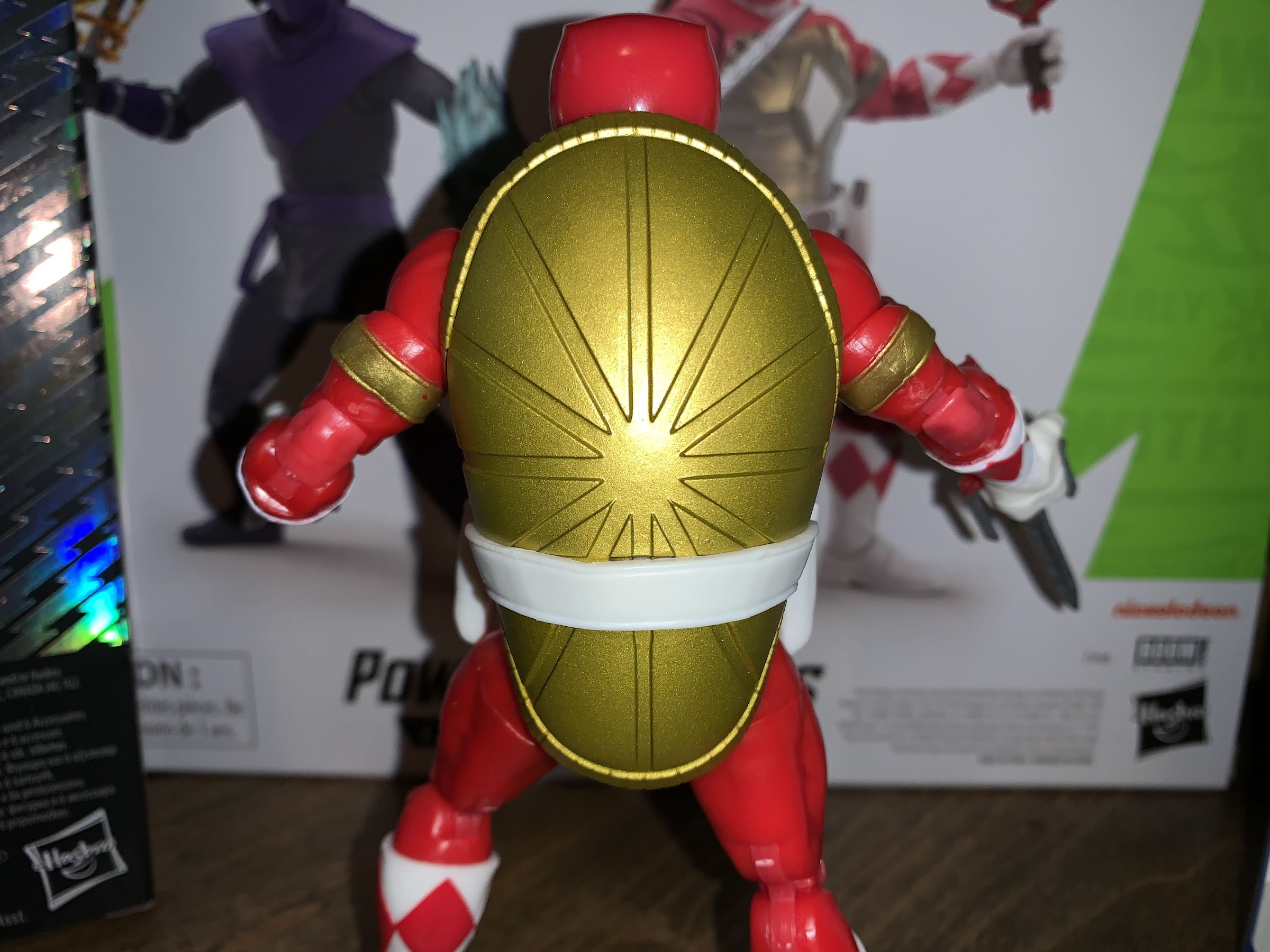
The rear of the shell is pretty neat.
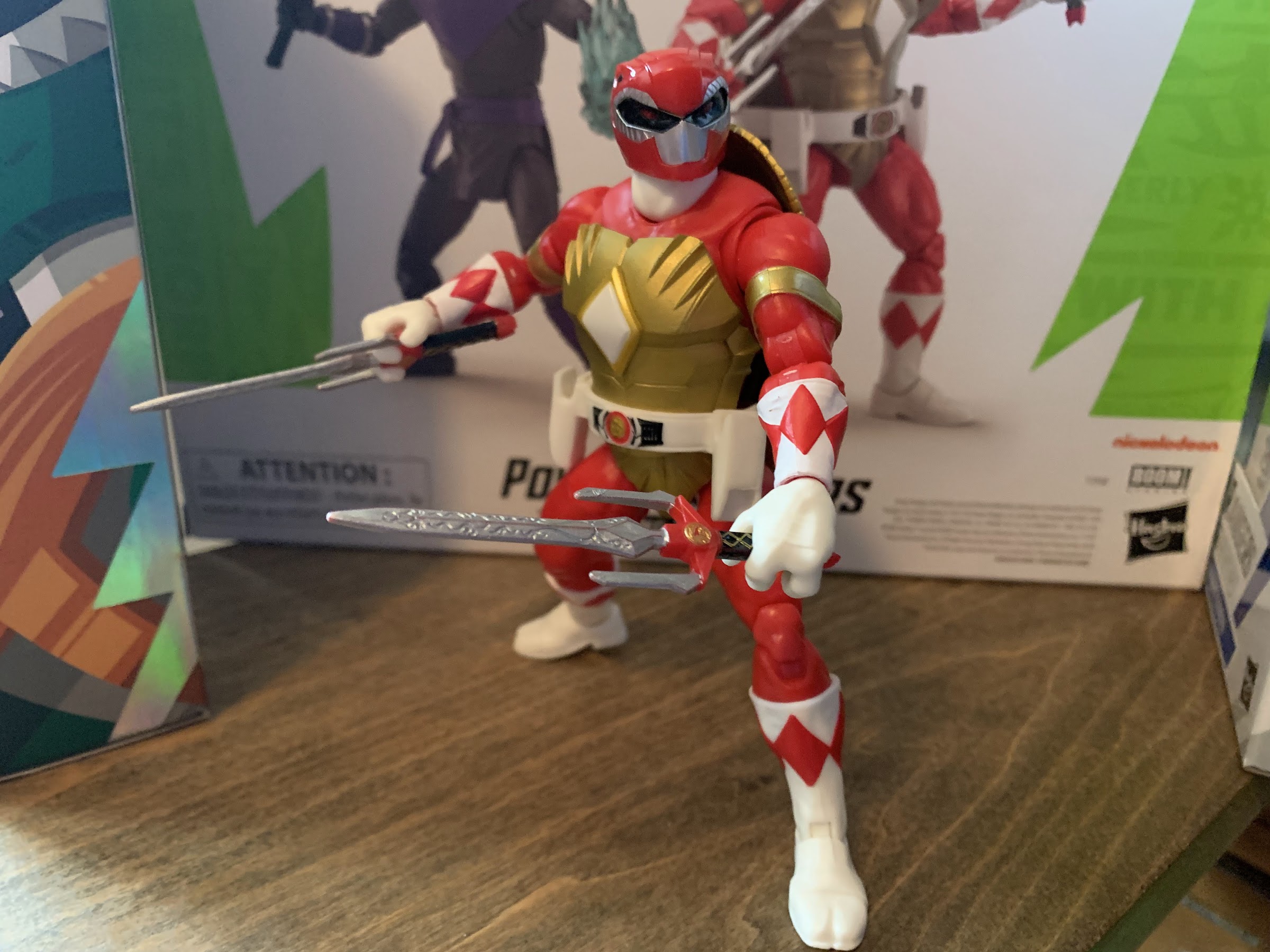
The sculpt on Raph is pretty cool though. He’s quite bulky and his limbs are longer than usual. He stands a full six inches putting him on par with Tommy so this is definitely a taller turtle than we’re used to seeing. The change in proportions does give him an undersized head as well. It doesn’t bother me with the helmeted look, but it stands out when swapped with the turtle head (which we’ll get to). I do like how the shell was designed, and since these proportions are more human, it probably shouldn’t come as a surprise that the rear of the shell is a bit more sleek than usual. The white belt is still a floating piece and it has the morpher on the front and a place to store his sai. He doesn’t have a power blaster, but I don’t know if they used them in the books.
Raph passes the old one foot test.
As for articulation, both figures are the same, but different. Tommy, as noted, is pretty basic Lightning Collection stuff. He’s got a ball peg in his neck that lets him look up, down, swivel, and tilt. The Tommy head has less range due to the hair, especially if you add in the cowl. The shoulders are ball-hinges with butterfly joints. They go back pretty far, but not forward much which is weird as one would prefer the range be reversed. The elbows are double-jointed and go past 90 degrees. There’s a biceps swivel and the wrists swivel and hinge. The hinges are vertical, which earns Hasbro a big thumb’s up! In the diaphragm is what’s probably a double ball peg. It doesn’t go back really at all, but it does allow the figure to crunch forward a bit, rotate, and tilt. Combine it with the ab crunch though, and you get a lot more forward and back. The legs are on ball pegs and allow the figure to almost do a full split. He can kick forward too, but not back because his buttcheeks get in the way. The thigh can swivel on that ball peg and also below it as there is a thigh cut. The knees are double-jointed and go past 90 there and there’s a boot cut and hinged ankles with good rockers.
Tommy can also serve as just a generic Foot Soldier for Raph to beat on.
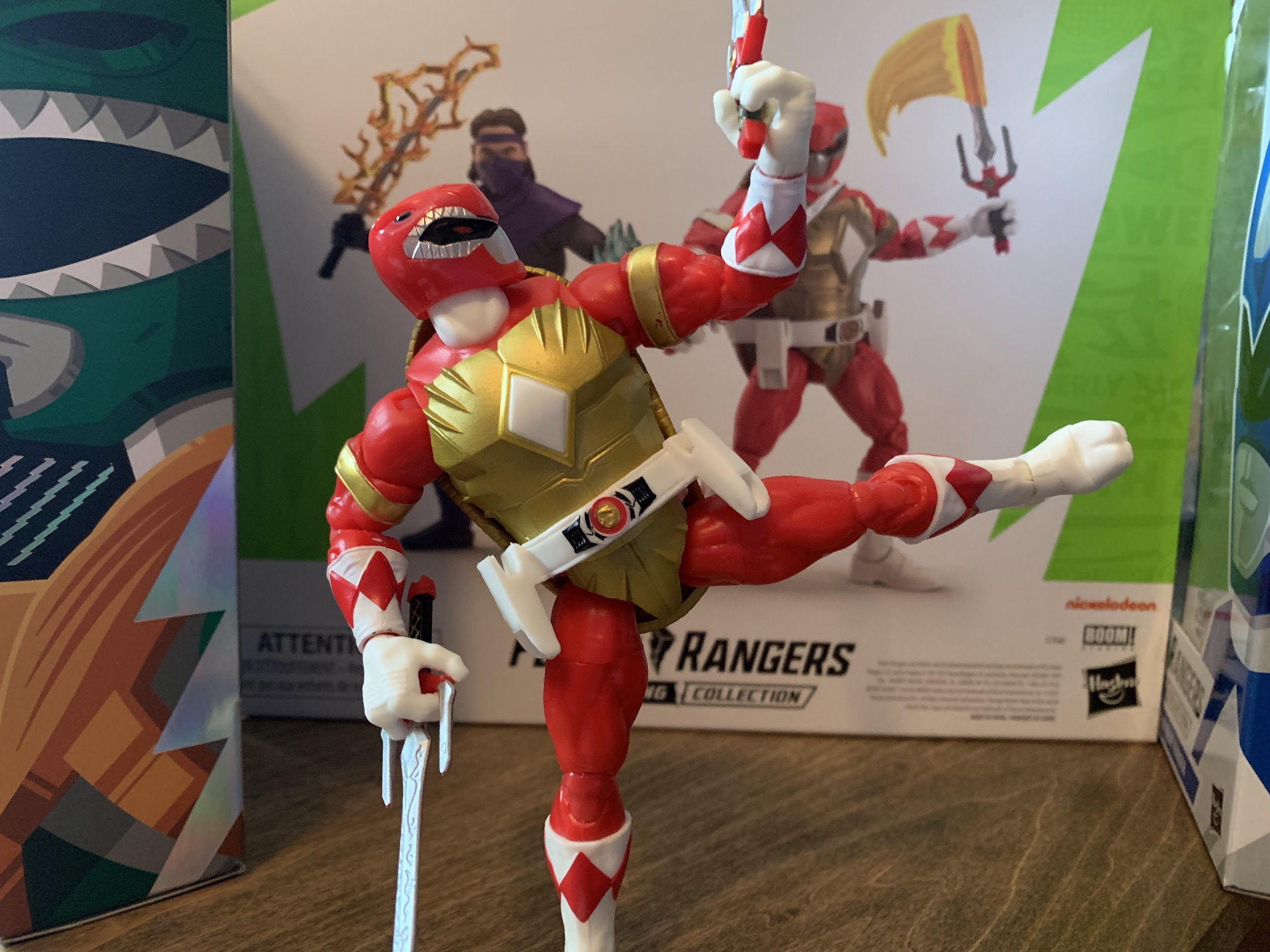
As for Raph, he has all of the same including the vertical hinges on his gripping hands. The only differences are his butterfly joints are basically useless and he has a joint in the base of the neck so his up and down range at the head is quite good. He also has no diaphragm joint given that he’s a turtle and all. Hasbro did give him a waist cut which splits the shell in the front. It’s basically just what you see below the belt, and while it does look a little funky to have a turtle in a pose that results in his shell not lining up, it’s worth it to have that extra articulation. Likely owing to his more bulky design, Raph also doesn’t get much out of his double-jointed elbows. He can basically just do 90, and go no farther whether you’re bending with the top hinge or the bottom one. On the plus side, nothing was stuck on my figures and they seem to pose reasonably well. Raph is a bit harder to stand, likely because of the shell, but with a little patience I’ve been able to get him into some dynamic stances.
Yes, they do come with weapons.
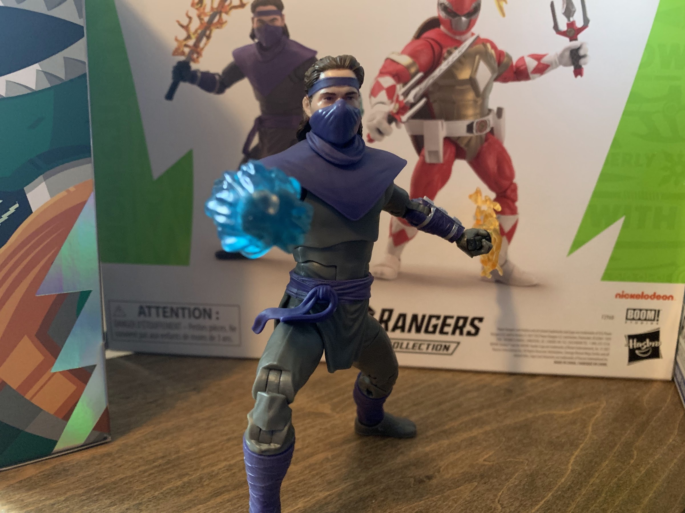
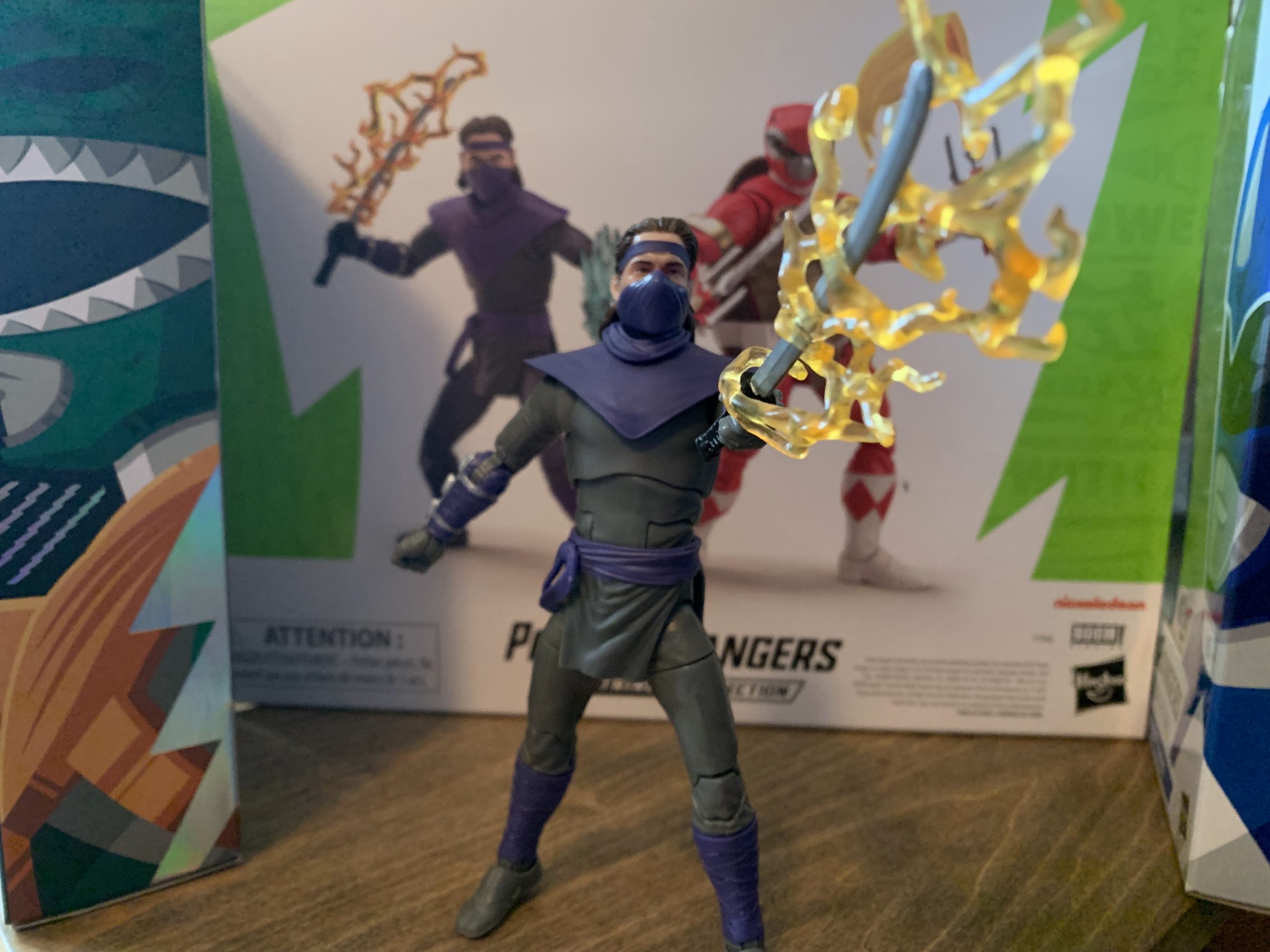
On the accessory front, things were a bit surprising. The few Hasbro figures I buy seem to be of the bare bones variety, but maybe since half of this release is an in-house brand it helped to get more accessories into the box. For Tommy, we get the Foot head and the Tommy head. The Tommy head also has two extra pieces, a cowl to go around his neck and a facemask that can slide over his chin and mouth creating a cool look. He has gripping hands equipped in the box and a set of fists to swap to. He has a katana which can slot into his belt or be gripped in either hand. There’s also not one, but two, effects pieces. A translucent, blue, punch effect and a translucent, yellow, lightning effect for the sword. You could give the lightning effect to Raph too, if you prefer, though the blue punch is tough to get on Raph’s hands.
I suppose you could display him like this if you want to.
As for Raph, he has three sets of hands: gripping, fists, and open. The open hands are great for posing or for holding his helmet and I do wish Tommy had a set as well. The gripping hands have the correct hinges, as noted before, and are also just barely wide enough for Raph to grip his sai with the center blade through his fingers. If you’re worried about paint rub, warming Raph’s hand first makes it even easier to achieve such a pose. As for the sai, they’re pretty cool and look just like mini Power Swords, but with extra blades. They slot into his belt just fine and the sculpt and paint look pretty terrific. There’s a yellow slashing effect piece that can fit onto the center blade of one which looks decent. If you wish, you could give that to Tommy, but it looks a little silly on his much longer blade. Lastly, we have the unmasked head which features a battle ready expression from Raph. On its own, it looks fine, but on the figure it creates a real pinhead situation. It’s not as bad looking as the promo images made it seem, but I’m still never going to use it. I want to display these guys in morphed mode so even if I loved the alternate head I likely still would never use it.
Group shot! I used the flash to accentuate the contrast between Raph and Jason’s chosen shade of red.
Overall, this is a pretty solid two-pack. Admittedly, I don’t care that much about Tommy and if Hasbro had just paired the turtles up across two two-packs then I’d probably skip Tommy (and April, who comes with Michelangelo). Having him in hand though takes away some of that sting as he’s a solid release. It would have been awesome if he could have been given pin-less arms and legs, as the elbow joints are my lone sore spot with the figure, but it’s not a big deal to me. Raph is the real star though and I’m pretty happy with how he turned out, which is definitely a good thing since the other turtles figure to be the same figure just in different colors. Better yet, I got these guys from GameStop where they were on sale for $42, which is a very nice price in 2021 for an action figure two-pack. Now my real problem is figuring out where the hell I’m going to put these guys until the rest show up.
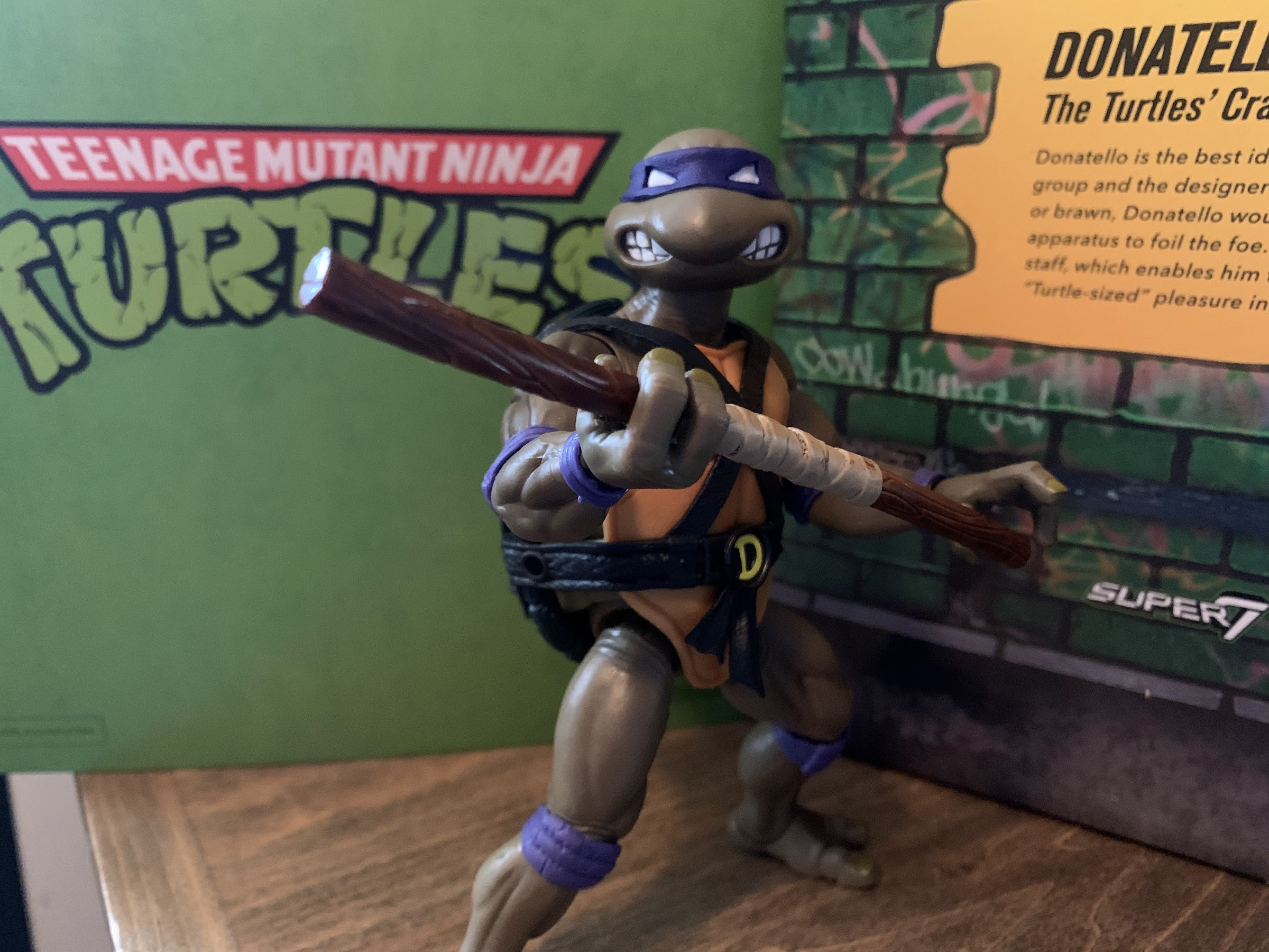
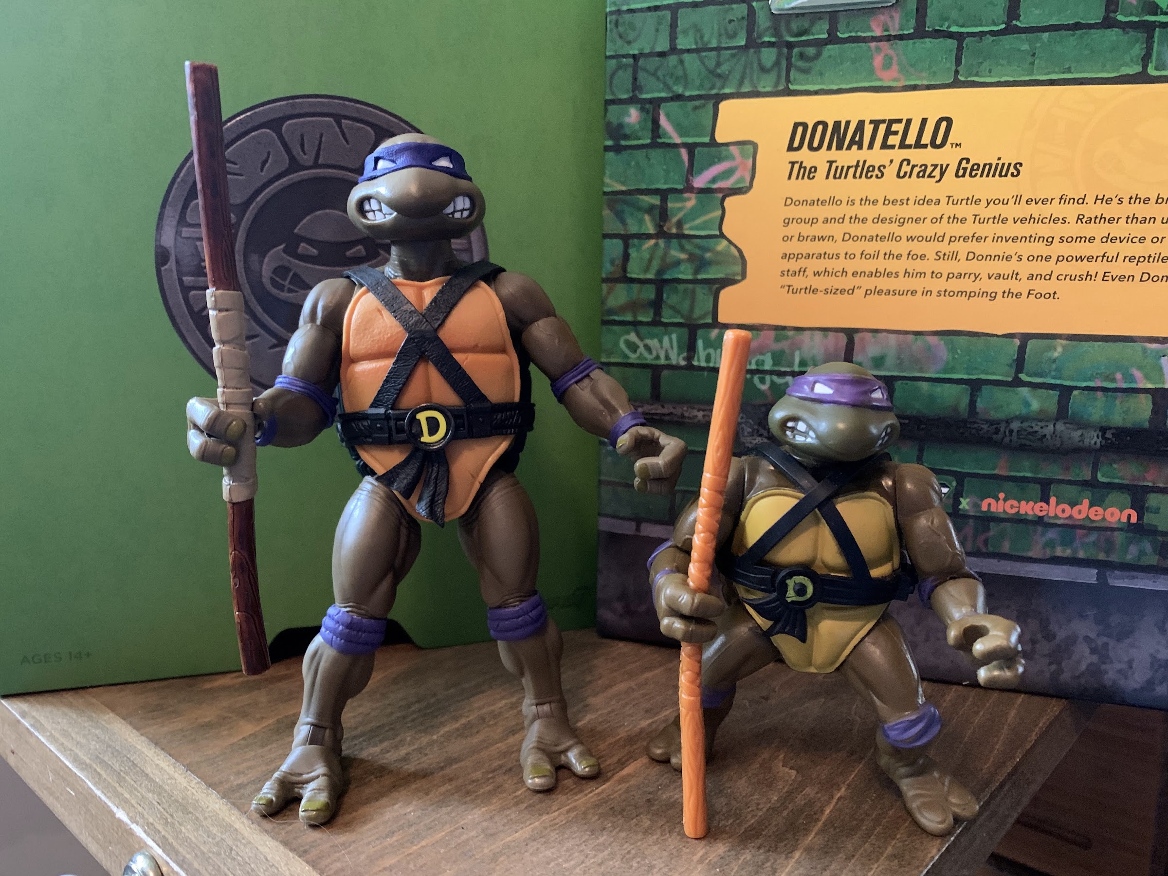
It’s a Christmas miracle! After more than 14 months of waiting, I finally received the fourth and final turtle to complete my Teenage Mutant Ninja Turtles in glorious 7″ scale – Donatello! It was October of 2020 that Donatello and the rest of wave four went up for preorder and, at the time, we were looking at a 9-10 month wait. That meant by the end of 2021 we were basically assured of having all four turtles together at last. Then 2021 happened and factories closed by COVID re-opened with skeleton crews, docks were shuttered, truck drivers were in short supply, and bottlenecks at every step of the manufacturing and shipping process were interrupted. It soon became apparent that getting the last turtle in-hand by the end of 2021 was no sure thing, but sneaking in right at the end was my order for Donatello.
The only is jealous of the height of this new version, but the Super7 Donnie definitely has some staff envy.
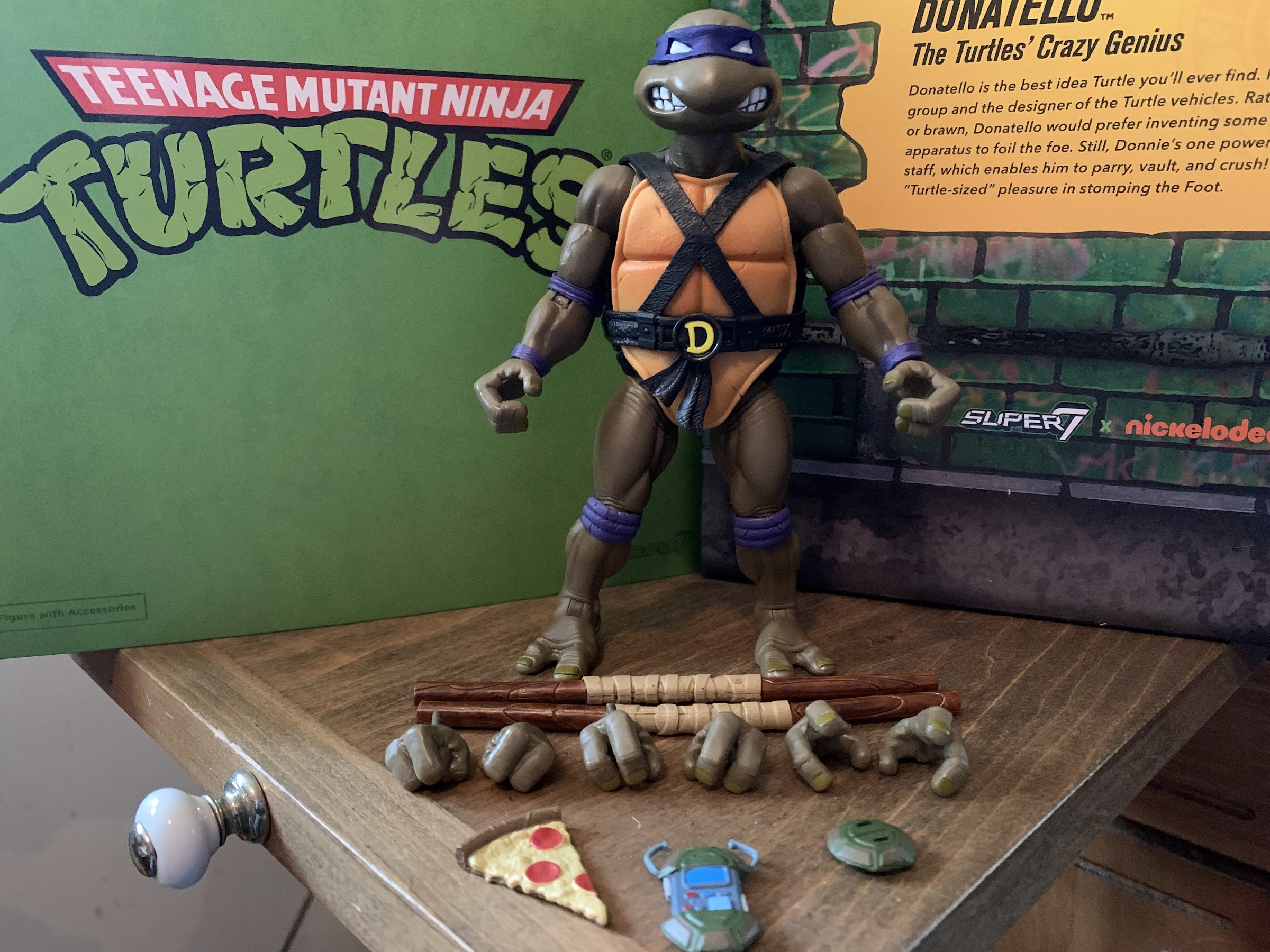
If you’re new to the line, the Super7 Ultimates! are 7″ scale action figures modeled after the vintage Playmates toyline. Each of the first three waves was anchored by one turtle with Donatello reserved for the fourth wave. And since Super7’s products are made-to-order, each wave takes awhile to arrive after first going on sale. That meant collectors had to wait more than a year to assemble all four turtles, but that’s how it goes. And considering that each turtle is essentially the same figure, it’s not the worst thing to have them spaced out.
Not pictured: all of the generic “ninja” weapons you’ll never use.
And since this figure is basically the same as the one I’ve now handled three times, Donatello arrives with considerably less fanfare than the others. By this point, I pretty much knew what I was in for and Donatello was further harmed by the fact that his only unique accessory is his bo staff. Still, if you’re a fan of the one who does machines then this was probably a really long wait, but at least it’s over. Because Donatello is so familiar, this will probably be one of my breezier reviews, because everything about him has basically been done. He comes in the same window box as the others with the green slipcover and a little bio on the back. It looks nice, but it’s also a lot of paper and plastic that can feel excessive when you have a figure that doesn’t need to fill out that packaging. It is convenient if you want to reseal it though, and it looks nice if you’re a mint-in-box collector.
Something else the vintage version has over the modern one.
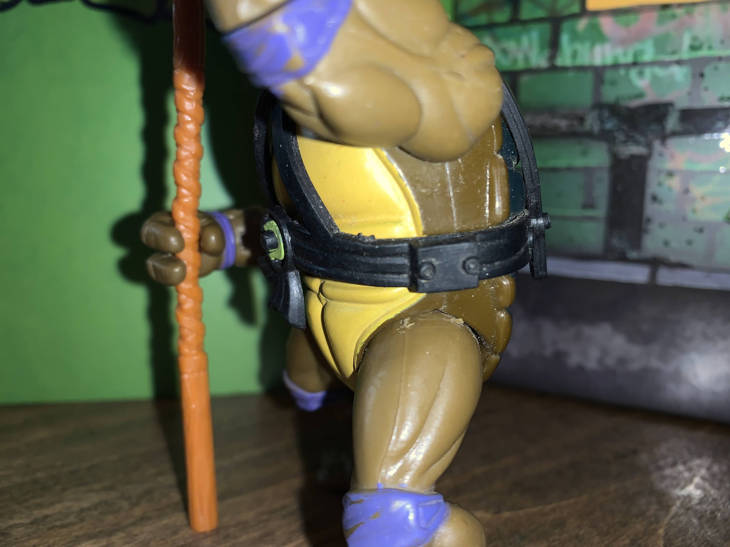
Donatello stands about 6″ tall making he and his brothers rather short for the line, which is appropriate. He’s basically brown in color, in keeping with the classic toy, and features a vintage inspired headsculpt. The belt crosses his chest, like the old toy, and features a holster on the rear for his bo which is likely more durable than the old toy. His belt is all black, save for the yellow D on the buckle, so Donnie’s attire more matches Michelangelo’s than it does Leo and Raph, which is more in-line with the vintage figure as well. Unlike Mikey, his finger and toenails are painted a yellow-green indicating that’s likely what was supposed to happen with the Michelangelo figure. Donatello basically looks the part of an up-scaled, modern, Playmates figure with one exception. Super7 failed to include his belt pouch. If you had the vintage Donatello, then you may remember he was unique amongst his brothers in having this little, sculpted, pouch on the left side of his belt. It had a slit in the top so you could fit a throwing star or one of those little, three-pointed, bladed, weapons they all came with. I was legitimately looking forward to that being included as I was hoping his Turtlecom accessory would fit in it, but it’s not here. Bummer.
Other turtles have come with the classic communication device, but it feels more at home with Donatello.
Donatello comes with basically the same assortment of stuff as Leonardo and Raph. He has vertically hinged gripping hands equipped upon arrival, with horizontal ones in the box. He also has fists and open hands which work well with the pizza and Turtlcom. And yes, he has a slice of pepperoni pizza which is colored more in-line with Raph’s (Leo’s looked dirty), and he also has the two Turtlecoms: one opened and one closed. His Turtlecom is plain looking, like Leo’s, so apparently only Raph gets a personalized one with red piping. Beyond that, he has the generic ninja weapons all of the Playmates figures had. He also has a classic weapons rack of brown, unpainted, weapons. His are fairly light in color in keeping with Super7’s releases having slight variations either purposely or not.
He can still look fearsome, even if his weapon is basically a glorified stick.
Weapon storage is a must!
The items unique to Donatello are what you would expect. He has his bo, and he gets two for good measure, and they come on the rack and in painted varieties as well. There’s some nice dry brushing on the bo which brings out the faux wood grain and makes the tape in the center look a little dingy. The bo does seem rather short though. It’s only about 4 3/4″ which is nearly the same size as the vintage one, which came with a considerably smaller figure. It looks a bit puny in his hands and I’m puzzled why Super7 wouldn’t have maintained the original scale. Was it in response to Leo’s swords being too long? I don’t know. One staff is also “bowed” a bit and I’ll have to try to straighten it out with hot water or a heat gun. His other unique accessory is the alternate portrait. This one is fairly understated, which suits Donatello. His mouth is entirely closed and it has a very “Mirage” look to me. I like it, which is good as I’ve been displaying my other turtles with the alternate head, though I do really like the default one with him too. It’s probably my favorite of the four. Raph still has the best alternate portrait.
Donnie’s alternate portrait adds a touch of class to the wise turtle.
Especially from the side.
The articulation for Donatello is exactly the same as his brothers, so I’m not going to repeat myself again. It’s suitable, but flawed. These turtles would look good with a proper neck joint at the base and the elbows are done poorly. The hips are the worst part though as they continue to be too loose. Donatello isn’t the worst offender of the four, but he’s still too loose for my liking. Aside from that, I will say this turtle had the best, overall, joint situation out of the box. The only joint stuck was the left thigh twist, which was solved with a quick, firm, jerk. Everything else though was free and easy with suitable tolerance as well.
Time for a group shot! I’m still torn on which heads to roll with.
What has become clearer to me over the years is that Donatello had the best facial expression in the vintage line.
Donatello may not be the most exciting action figure release of 2021, but he is one of the more satisfying by virtue of the fact that he completes the gang of four. He’s exactly as expected, no better or worse than his predecessors. There are flaws in this design, and I’m bummed at the missing belt pouch and staff situation, but not enough to cause me to regret my purchase. I like having a set of vintage inspired turtles, and Donatello gets the job done. Being that he’s part of wave four means this is the last turtle we’ll get at the original price of $45, so that’s a bit bittersweet. It’s also a reality we’ve been living with basically all year. As for me, I ordered this guy direct from Super7, but later added an order for Muckman from a retailer. If you want to know how he turned out, I’ll have a review eventually in 2022 whenever the figure gets to me. If you want to know how Casey Jones and Mondo Gecko turned out, well you’ll have to go elsewhere as I passed on those ones with nary a drop of FOMO so far.
We’re all glad you could join the party, Donnie.
Super7 action figures are made-to-order, but if wave 3 is any indication, Donatello should be plenty easy to get even if you didn’t preorder. Several outlets still have the figure available for preorder and they should have the figure in-stock now, or soon, too. Super7 has also made all four turtles available again multiple times so there should be plenty of them out there at retail or with only a minor mark-up.
Over the years, I’ve acquired quite a few action figures designed by the good people over at Four Horsemen LLC. They’ve been designing figures for companies for awhile now. My first exposure to the company was via NECA’s inaugural line of Teenage Mutant Ninja Turtles based on their appearance in the Mirage Studios comics. Lately, I’ve been enjoying their work with Super7 as they have designed most (all?) of the figures in that company’s Ultimates series of Teenage Mutant Ninja Turtles. The company has become well known as a result in the action figure community, and while sculpting work for other companies is probably satisfying work, 4H always wanted to do its own thing, so it did. The company launched an in-house line of toys called Mythic Legions. As the name implies, most of these characters are taken from myth and given a new design which is then turned into a rather impressive looking piece of plastic. Just how impressive they are I can’t say because I’ve never gotten into the line.
He even comes with a Christmas card!
My exposure to Four Horsemen changed this month, when the company did a surprise drop in a new, subline, of figures called Figura Obscura. And the chosen character to kick things off is the infamous Krampus, the demon of Christmas! Krampus has long been a character associated with Christmas largely in European countries. In the US, he’s not particularly well known, but he has seen his profile rise somewhat recently. I knew of the character as a kid, though I don’t recall ever seeing him in any pop culture setting until The Venture Brothers included in him in their Christmas special. That was back in 2003 and since then the character has shown up in American Dad! and has had his own movie. In the US, it definitely feels like some companies focus on his appearance and draw from that making him some kind of horror monster when the traditional Krampus is really just someone who punishes bad kids at Christmas. It makes sense that Santa Claus would reward the good and that there would be an entity that punishes the wicked. In many settings, Santa and Krampus are like a team, but over the years that seems to be less the case.
The 4H version of Krampus defined.
Either way, I personally think Krampus is pretty neat and his design (often fawn-like) lends itself well to toys. Obviously, I’m pretty into Christmas and I’ve always wanted to do more with Christmas action figures and when I saw this Krampus go up for sale on December 5th of this year I pounced. It was a surprise drop that I don’t think anyone was aware was coming outside of the people at Four Horsemen. The figure was offered through 4H’s Mythic Legions website twice that day, once in the morning and once in the evening. It was smart on their part as it kept the figure from selling out quickly before most people knew it even existed. I personally found out about it in between drops so I was able to grab one in the evening timeslot. It didn’t sell out super fast, which was nice, and it was an in-stock sale which is unusual for 4H as they usually follow more of a made-to-order model with their releases. The company must have felt secure that this particular figure would sell out without much issue given the seasonal nature. I also understand there’s a lot of parts reuse at play here which obviously reduces costs. Just how much, I can’t say, since this my first dip into 4H’s catalog.
Pardon my flash.
Krampus arrived about two weeks after I ordered it in resplendent packaging. He comes in a window box made of very thick cardstock that’s wrapped with a magnetic, cardboard, outer sleeve. It’s well constructed and durable, more durable than a normal box as it’s laminated. The front of which has a neat Krampus logo of sorts with a story about him on the rear and the rest is covered in blue and white and it’s a snowy scene. When you take it off, the reverse side features the artwork that also adorns the box. It’s a snowy setting at night in the wilderness where a lone cottage sits rather perilously on a cliffside. You can use this wrap as a backdrop for your figure which is a really neat idea and should serve me well as I accumulate Christmas figures.
To flash or not to flash? I’ll be mixing in photos with and without, to try and present this figure as fairly as possible.
Krampus himself sits in the window box and once removed he has immediate presence on any surface he’s placed. He stands about 7″ tall with skin featuring this deep, satin, black, paint that is really rich and cool to look at. He’s covered in it too and it’s applied cleanly. His head is quite ferocious looking as he has what I consider the traditional Krampus facial expression of an open mouth with a giant tongue flicking out. He’s quite angry looking and has two gnarly horns coming off of the back of his head. There’s a lot of sculpted fur on and around the head basically forming a mane that runs down the middle of his back. The only clothing he wears is a skirt with a leathery texture to it and some greaves and gauntlets. The armor bits have a nice, worn, metallic, texture with sharp ridges sculpted into them. His feet end in hooves and they’re fringed with fur and look terrific. Some assembly is required as he has a tail that needs to peg into his rear. It’s a bit of a pain in the ass (pun intended) to insert it as the hole is really tight (I should have bought him dinner first). I had to heat up both ends with hot water to finally get it in and when I was done I was actually surprised to see the sculpted fur on the tail cut into my thumb. Damn!
Gene Simmons wishes he had a tongue like the one on Krampus.
The look of Krampus is going to be this figure’s main attraction and 4H did a great job. I think of Krampus being covered in fur, but I like the look of the bare chest here, probably owing to the fact that I love that black paint that’s in use. His fingers are clawed, but not dramatically so, and the details on his face are incredible. Each tooth is sculpted individually and the paint is remarkably clean. The only issue I’ve run into with this figure from a presentation aspect is some paint chipping. To my surprise, it looks like the figure is cast in a white plastic and then painted, because there are some spots where the paint chipped off. Most of which is in the inner thigh by the joint so it’s not noticeable when the figure is displayed. There’s also a small one near the armor on the left leg that’s probably only noticeable when handling the figure. I don’t know why the figure wasn’t just cast in black plastic and then painted, but I’m ignorant on the costs of figure production when it comes to color choices. Obviously, white can be used for anything and then easily painted over so it could be as simple as that. Other than that one small flaw, I’m pretty pleased with how he turned out.
I guess he kept those kids in his basket too long.
Krampus needs stuff, and if you’re familiar with the legend, you know he has some specific needs at that. This figure comes with a set of loose gripping hands attached in the box, and tighter gripping hands he can swap to. The loose hands work fine with his weapon of choice, a bundle of sticks or switches, as they just rest in place. They look pretty awesome and are well-painted as they’re wrapped with sculpted tape to hold them together. I don’t know if the tighter hands are for anything specific, or just for down the road if you want to give him a weapon from something else, but they won’t hold the sticks unless you heat them up to make them more pliable. He has a pair of cuffs that can fit around his wrists and are attached via real chain. The plastic is softer so it’s not too difficult to slip them around the wrists, but if you’re concerned about breaking them you can also just pop his hands off first.
This is one demon who is going to keep his trusty basket!
Krampus also has his trusty basket. The character is supposed to wear this on his back and some versions of the character toss bad kids in there. It’s sculpted to resemble a woven basket and it has some muted green and red accents. The top is removable, and 4H loaded it with other stuff. There’s a pair of skulls, one with an articulated jaw and one without, two skeletal hands, and a leather strap. The strap seems to serve no purpose on its own and I was advised by fans of the Mythic Legions line that it’s likely included for customizers. If cut and then glued, it could be used as a belt or a shoulder strap for the basket. By default, 4H included a piece of rope with the consistency of hemp. It can be used to string the basket and then hang it off of Krampus. I ran the rope through the included slot on the basket, around each arm of Krampus, and then back through the slit. This made it tight enough to hang just fine, while also leaving room for adjustment without the need of a knot. Krampus, despite being hooved, stands fine on his own and continues to stand well even with a loaded basket on his back. The last accessory 4H included is a loop of red thread with some miniature bells strung on it. You can drape this over the head of Krampus, put them on the basket, around his waist, or even through his teeth! And they really jingle, plus the red thread adds a dash of color and is a really nice touch.
Oh you silly boy!
With all of that stuff in the box, you may be wondering how Krampus moves around. I was rather curious, myself, as I’ve wondered what 4H’s approach to articulation was. With the figures the company does for Super7, there are certain joints some consider standard that Super7 disagrees on. Namely, double joints at the knees and elbows. 4H might share the same philosophy as Krampus has single hinges at both places with swivels, but he does do something many Super7 figures don’t and that’s include a ball-joint at the waist. This gives the figure the twisting motion many want while also providing for some forward and back and a little tilt. And it’s well-engineered, as those who got the recently released Casey Jones from Super7 were treated to such a joint, but it turned out rather unsightly as the figure doesn’t sit deep enough on the ball-peg. Aside from that, Krampus is fairly typical with a ball joint at the head, ball-hinges at the shoulders, horizontal hinges at the hands, ball-jointed hips, and hinges with rocking action down at the ankles. Lastly, he has a ball-hinge at the tail. The tail is sculpted and rigid, so there’s not a lot it can do, but it has enough range to get it out of the way when posing. The amount of fur around the figure’s neck limits his head movements a bit, but he can look up and down a little and twist. The ankle rockers are also a little limited, likely owing to the fact that he has hooves, but there’s enough to support his weight and give him a wider stance, if desired. The only true shortcoming is the lack of vertically hinged wrists. I would have preferred that to horizontal, if I could only have one, though both would have been preferable. Krampus isn’t as dynamic as some figures in my collection, but I find what’s there is enough and it at least works well.
Some comparisons. First up, we have a RED Soundwave and a Super7 Leonardo, another 4H design.
Krampus is a pretty wicked design that’s going to look good whether you display him with Christmas stuff, monsters, or your Mythic Legions. He poses well enough, and best of all, he can hold his accessories without toppling over. The backdrop is an awesome little bonus too, and the only drawback I have with him is that returning him to his box would be a challenge. I really have no desire to unthread the basket nor do I want to remove that tail to get him back in his bubble. With my seasonal figures, I usually put them away after the holidays, but Krampus will likely find a new home on a shelf somewhere. And that’s not really a bad problem to have as this is a figure I want to look at year round. And if my kids start acting up, maybe I should just convince them Krampus operates like that cursed Elf on a Shelf and start moving him every morning. That will probably give them nightmares though, so maybe it’s best that I don’t.
And here he is with another fantasy character in Drizz’t from Hasbro’s very short-lived D&D line and a fellow hooved character in NECA’s Groundchuck.
If you wish to get a Krampus figure of your very own, well, I’m afraid it’s sold out. Four Horsemen made it sound like this is just the first Krampus they’re doing, so maybe he comes back next year in another form. If this is the Krampus you need then you’re going to have to pony up some extra money on the secondary market or hope someone that got one decides they don’t need it. The figure retailed for $50 which is already pricey for a 7″ action figure. While I like it, I definitely wouldn’t have much of an appetite to pay much more than that. Good luck if you’re in the market. As for the rest of you, hopefully this is the only Krampus that visits your house this Christmas!
BREAKING NEWS: San Diego Comic Con exclusives are now shipping! Full story at 10.
Remember San Diego Comic Con? You would be forgiven if you did not since, like last year’s edition, the event was a virtual one once again. Only unlike the 2020 version, this one came with the expectation it would be virtual. It also coincided with a global shipping crisis, so combine that with the expectation that no one would be in attendance, the various companies who were on-hand for the virtual event had little reason to have actual product ready for distribution. Because as many know, SDCC isn’t about just unveiling new things, it’s about selling exclusive merchandise and for toy producers this is usually a pretty big deal.
When it comes to NECA, the company has had a Teenage Mutant Ninja Turtles themed item for several years now. With the lines expanding to retail just a couple of years ago, NECA is now in a position where it can make its SDCC sets a little more off-beat. Last year, we saw the company release The Musical Mutagen Tour 4-pack of turtles based on their appearance in the so bad it’s good Coming Out of Their Shells tour from the early 90s. That set definitely fit the bill of one that likely would appeal to a small portion of the TMNT fanbase and not create the sort of intense demand we had seen in the past. As a result, some were disappointed to see NECA devote this year’s set to the Channel 6 news crew from the cartoon.
It’s a NECA four-pack, so expect fancy packaging!
Even though the members of Channel 6 were not mutants, or fighters, they were an integral part of the classic cartoon series simply by virtue of being there. April and her co-workers Irma, Burne, and Vernon were in more episodes than they weren’t so the now adults who watched the show have a pretty strong attachment to them. So far, we’ve seen April and Vernon receive a retail release in the toon line, but Irma and Burne have been shut out. Now, they find themselves in an exclusive set and some were a little irritated about it since they’re definitely characters deserving of a wider release. Those concerns seem to be a bit of a stretch though, as the set went up for sale in July and remained in stock for most of the day. And that was just the initial sale as more are headed to Target in the coming weeks minus some additional swag that was part of the online sale (and had to be paid for).
Even though San Diego Comic Con was in July, and this set was sold in July, it’s just now arriving at the homes of those who purchased it likely due to the shipping issues faced by everyone. When the set went up for sale, it wasn’t clear when it would be released or that it was even a pre-sale thing. It was then speculated by NECA that it might show up in October, but apparently even that was wishful thinking. It is what it is, but after the extended wait I’m here to tell you if this one was worth it, or not.
There’s some familiar faces.
The Channel 6 Newsroom set is a four-pack of action figures based on the cartoon Teenage Mutant Ninja Turtles: April (as a mutated cat), Irma, Burne, and Vernon. Two of those figures will be familiar to collectors of this line as April is essentially a repaint with a new head and forearms while Vernon is a re-release of the same figure from the two-pack released back in January. He does have two new portraits, frightened and blindfolded, and the coloring on his clothing is slightly different, but otherwise he’s old news. The new figures are the long requested Irma and the less requested Burne. Irma is the secretary at Channel 6 and someone seemingly always in the orbit of April. She has several starring moments on the show, but despite that this is only the character’s second figure. And the first was this weird yellow and green thing put out by Playmates. Burne is the resident blowhard of Channel 6, a J. Jonah Jameson type who hates the turtles with little reason why. He’s an unlikable sort and not featured as prominently as the other members of the crew, but he’s a pretty essential character too. And like Irma, he only had the one release in the Playmates line, though his was actually pretty good for that line aside from the sculpted hamburger permanently in his hand. And like most of NECA’s four-packs, this one includes a bevy of accessories which, at the end of the day, are likely to be the only exclusive items in here when all is said and done. Well, that and maybe Cat April.
They’re free and ready to…report?
As has been standard with past NECA four-packs, this one comes in a highly decorative package. There’s a slipcase with artwork depicting The Catwoman of Channel 6 that has April in her cat form superimposed over a more scenic pic of the Channel 6 building. Slide that off and you get a five-panel window box that has April on the front as-if she’s broadcasting through a television. The flap is secured via Velcro and once opened the figures are present via the window along with all of their stuff. Mine arrived slightly damaged, which is a bit of a bummer since this is a box I actually intend to keep. The inner box has a puncture in it, though the slipcover is fine. Inside is a backdrop featuring the Channel 6 studio which should actually make for a decent display for the figures when removed. It’s pretty standard packaging at this point, though this one is a bit deeper than the other four-packs and will thus occupy more real estate on your shelf.
April looks fine, though for once I think NECA went too far with the added linework, particularly around her muzzle.
She can strike a good pouncing pose.
Before we get to the new figures, we should probably talk about the familiar figures and we’ll start with Cat April. This is from the episode “The Catwoman of Channel 6” where April is accidentally mutated and then put under Shredder’s control via a collar. It’s a fairly memorable episode, and a worthwhile variant to explore. The figure’s body is the same as the much maligned April we got before. That April is probably the worst figure in the line so far owing to the fact that it’s not in scale with the turtles and the head-sculpt is just not particularly good. This figure repeats the scale issue since it uses the same body, but it at least is able to rectify the head issue by giving April an all new cat sculpt. It looks quite nice and the collar is also present and removable if you pop her head off. The chest and forearms had to be altered as well by painting them to match the fur of her face and to give her claws. Because of that, it wouldn’t be a simple thing to include a standard April head to switch to as NECA would have needed to basically swap out the whole upper torso. And there’s also the matter of the tail which removing such would leave a hole in the figure’s rear. I’m not going to run down the articulation on this one again, but know that it’s fine and you now have a bendy tail to add to it.
Vernon’s back and he has lots of stuff this time.
Old Vernon left, new Vernon right.
Just like April, Vernon is essentially the same figure as before so I don’t feel the need to go over everything again. The only difference with this Vernon is his tie is a different color and his facial portraits are new. The tie thing is cartoon accurate as he had multiple looks. The other colors of his clothing have also been lightened a bit so his shirt is a paler pink and his jeans a lighter blue. That’s not likely to excite anyone, but what I think will please most is the new frightened expression he comes with. Vernon is a character with barely more than two emotions, smug and scared, and this captures that second one very well. It’s the expression I think of first with the character as it seemed to become his dominant trait as the show went along. The first release gave us smug, so it was nice to get this one. The second portrait is a blindfolded one, which looks fine, but has limited uses. Honestly, after taking a few pictures here I probably won’t use it again. I would have much preferred an agitated Vernon giving us a good trifecta of expressions of smug, scared, and angry to go along with the mutant rat parts released previously. I was tempted to grab a second Rat King/Vernon set just so I could have mutant Vernon on my shelf at all times, and now I can!
Irma! Nice of you to join us!
She can’t do much, but at least she can answer a phone.
All right, lets talk about the new characters and first up is Irma. I don’t think it’s a hot take to call Irma a fan favorite. Maybe kids watching the show didn’t think much of her, but I definitely find her as a source of entertainment in the show when I go back to it. Not much about this show holds up on adult viewings, but Irma might hold up the best. She’s depicted in her standard attire: blue sweater, red glasses, long skirt, yellow shoes. For her facial expression, NECA went with a concerned, or worried, look. I think they were aiming for neutral, but it comes off a little awkward. It’s not a bad look for the character as her eyebrows had a tendency to always be in that concerned position, but I wish we got a second portrait for a little variety.
This isn’t going to help her get a date.
She picks up an extra point of articulation with the jaw on the rat head.
Her unique attire makes her articulation a bit lacking. Her head is on a ball peg and she has sufficient range there though her hair keeps her from looking up. Her shoulders are ball-hinges and she has the same style of double elbows as April. Her forearms rotate where they meet her sleeve and her wrists are swivel/hinges. The torso doesn’t feature any articulation, but her waist is joined to the hip with a ball-peg so she can pivot and rotate. Unfortunately, the long skirt kills most of her leg articulation. I think she has ball joints at the hips and double knees below, but you won’t be getting much out of them. At the ankles are hinges and rocker joints.
Shredder always used turtle soup as a threat, but only Burne followed through.
Burne is our other new figure this time around and he’s quite different from his box-mates. Short and squat, Burne is definitely the heaviest figure in the box and the chunkyness of the sculpt makes me think of the vintage toy line. He’s depicted in his standard, very blue, attire of light blue work shirt, dark blue tie, and blue slacks. His default look out of the box is this angry expression where he’s almost twisting his head in rage. The other is a smug look. I’m not sure which I prefer. I think angry when I think of the character, but the smug one looks more on-model to me, though both have their charms. He’s painted cleanly and really looks the part so if you’ve been waiting 30 years for a toon accurate Burne this should do the trick.
“Is this some kind of sick joke?!”
Even though Burne is rather chunky, he’s still expected to be able to move well since he is, after all, an action figure. He’s got a ball-peg at the head with solid range, shoulder hinges, and single-jointed elbows. I thought they might use the same double elbows the other characters possess, but NECA opted for something that’s definitely cleaner. It’s just not super functional as I can’t get his arms to go straight, nor can he really bend past 90 degrees.. He’s got swivels and hinges at the wrist and a ball-joint in the waist that lets him move around pretty well, though he lacks torso articulation. The ball joints at the hips work well considering the roundness of this area of the figure, and NECA did include double-jointed knees that let Burne kick all the way back to his own ass. I can’t seem to engage both joints though no matter how much heat I apply, which is a bit frustrating. The ankles are hinged and pivot, but they’re very stiff and the hinges were painted a dark brown over blue plastic which looks bad once the paint flakes.
“Yeah, that’s MY girl.”
On the quality control front, this set is a bit of a step back from more recent releases. I had a lot of stuck and fused joints out of the box, in particular with Burne and April. Burne’s left knee just didn’t want to do anything, and after heating only the top hinge works. With April, her knees are also a pain point as the top hinge won’t go into a default pose. As you can see in my pictures, her knees are always slightly bent. She arrived that way, and heating them and then plunging them into cold water hasn’t done the trick. Just straight heat makes them rather gummy and are more likely to warp or damage them further if I persist. I’ll just keep her in a pouncing position, I guess. April also has paint-flaking issues on her arms with white or clear plastic beneath. Irma runs into the same thing as do the flesh portions on Vernon. It can lead to an eyesore which just makes me want to leave these figures alone once I find a pose I like and call it a day.
Check out all of the stuff!
These giant cameras are arguably the real stars here.
NECA included a fair amount of accessories with this set, and the big ones are the two studio cameras and lights. They look terrific and the paint on these is excellent. The lights can pivot and rotate and the cameras do the same. They all have plugs too which makes me want outlets that can accommodate them. There’s also a cat with a toy mouse and the cat’s head is on a ball peg so it can move a bit, but nothing special. There’s also a pair of turtle versions of Burne and Vernon that are pretty fun to look at and can be hidden in a display as the cowardly pair try to avoid getting squashed. There’s also a boom mic which is affixed via a non-removable cord to a messenger bag. The bag is similar to Dirtbag’s backpack in that it’s a soft plastic that can actually open.
Now we have a duo of rat people!
I guess the toy mouse is an April accessory?
As for more character specific accessories, we have a few. Irma has a pair of open hands and a wider gripping hand to go with the more relaxed gripping hands attached to her by default. And like the first release of Vernon, she has swappable rat parts to duplicate her mutant rat form. The only nitpick with her though is she should have visible non-mutated flesh by her ankles, but NECA “cheated” and instead made her leggings extend to her shoes rather than make her shins swap. There’s also a rotary phone that’s either for her or Burne, but either one can use it. It’s fun and in the same fashion as the Sam and Max phone from Boss Fight Studio pair I looked at earlier this year. For Burne, he comes with fists, but also has a pair of gripping hands and open hands that look like they should be typing. It makes me wish I had a desk to pair with him to set him up with the phone and Chrome Dome’s PC. He also has a bowl of turtle soup and a spoon to consume it with. There’s also a framed photo of his girlfriend, Tiffany, and the image is a rendered one that makes her kind of look like an action figure. Maybe an actual figure will be crafted in the future, though she definitely feels like a Loot Crate release. There’s also a framed photo of a “hunky reporter,” as the box refers to it, that I think was someone Irma lusted over. Vernon also has gripping hands and a pointing hand plus one more wider gripping hand. April has no extra parts.
In case you prefer your Vernon blindfolded.
Swag!
If you bought this set from NECA direct, then you also got some extra swag. If you’ve purchased a Loot Crate since NECA took over, then this basically feel like that. You get a t-shirt, pin, patch, badge, and poster. The shirt contains original, toon-inspired art, of the figures present in this set plus a few other characters from the show. It’s printed on blue and it’s okay, but the art is way off model when compared to the toon and some of the designs (like Burne) I do not care for. The patch is a Channel patch while the badge is a replica of April’s press badge. Unlike the badge we just saw with the movie April, this one is a nice, thick, plastic and feels like a badge should, I just really dislike the picture of April used for it. It’s the same one from the box of the April and Foot two-pack from last year. The pin is an enamel one of the news van and its fine if you’re into pins. The poster is an 11″ by 7″ print of the Channel 6 building. It comes rolled up so it’s a bit of a pain to flatten out. It might make for a decent backdrop though for your figures. The retail version of this box set released at Target won’t include any of these items, but it will also be cheaper as a result and the trade-off is probably better for those who find this in stores.
That new April can’t come soon enough.
“APRIL! WHY AM I ALWAYS SHOUTING?!”
The Channel 6 set from NECA is a solid release, it’s just not as fun or as exciting as some of the other four packs NECA has done. Irma is a great character, but her figure is so limited due to her design which really saps a lot of the fun out of her. I’m left wishing that NECA went the Super7 route and gave collectors the option of a sculpted skirt or a soft goods one. It’s really needed for her rat mutation as she just looks so static posed with Vernon in his mutated form. On the plus side, I don’t feel a desire to get a second Irma as a result to display both versions, I’ll probably just keep her unmutated. Burne is a solid representation of the character, he’s just also limited by his design. And he’s Burne, the least entertaining character from this assortment. As for Vernon and April, well, I don’t mind having a second Vernon so I can display the rat one too and he’s fine. April is still a bit off as far as scale goes, but I’d like this figure a lot if the joints weren’t so stuck and flaky. It’s a memorable version of the character at least and one I’m happy to have. NECA is allegedly prepping a deluxe April for the toon line to release in 2022, and I hope it’s just an all new figure to properly correct the scale issues.
“Oh no! April’s turned into a cat!” “Hey Leo, you remember your laser point?!”
The new characters scale pretty well. April is still off.
If you missed out on the NECA sale and want to add this set to your collection it should show up in Target sometime in December. I’m not sure what it’s going to retail for once there though as I believe it’s going to be more expensive than the Turtles in Disguise set, which was $125. It’s not cheap, but for now, this is the only way to add Irma and Burne to your collection. I suspect Irma will get a two-pack release eventually, but I’m less confident when it comes to Burne. We’ll see. Even though this set didn’t “wow” me, I’m still happy to have it as these are characters I want in my display. Hopefully, everyone that wants one has a chance to buy one and happy hunting to all who are braving the stores this holiday season!