Category Archives: toys

Beast Kingdom Disney Dynamic 8ction Heroes Classic Donald Duck

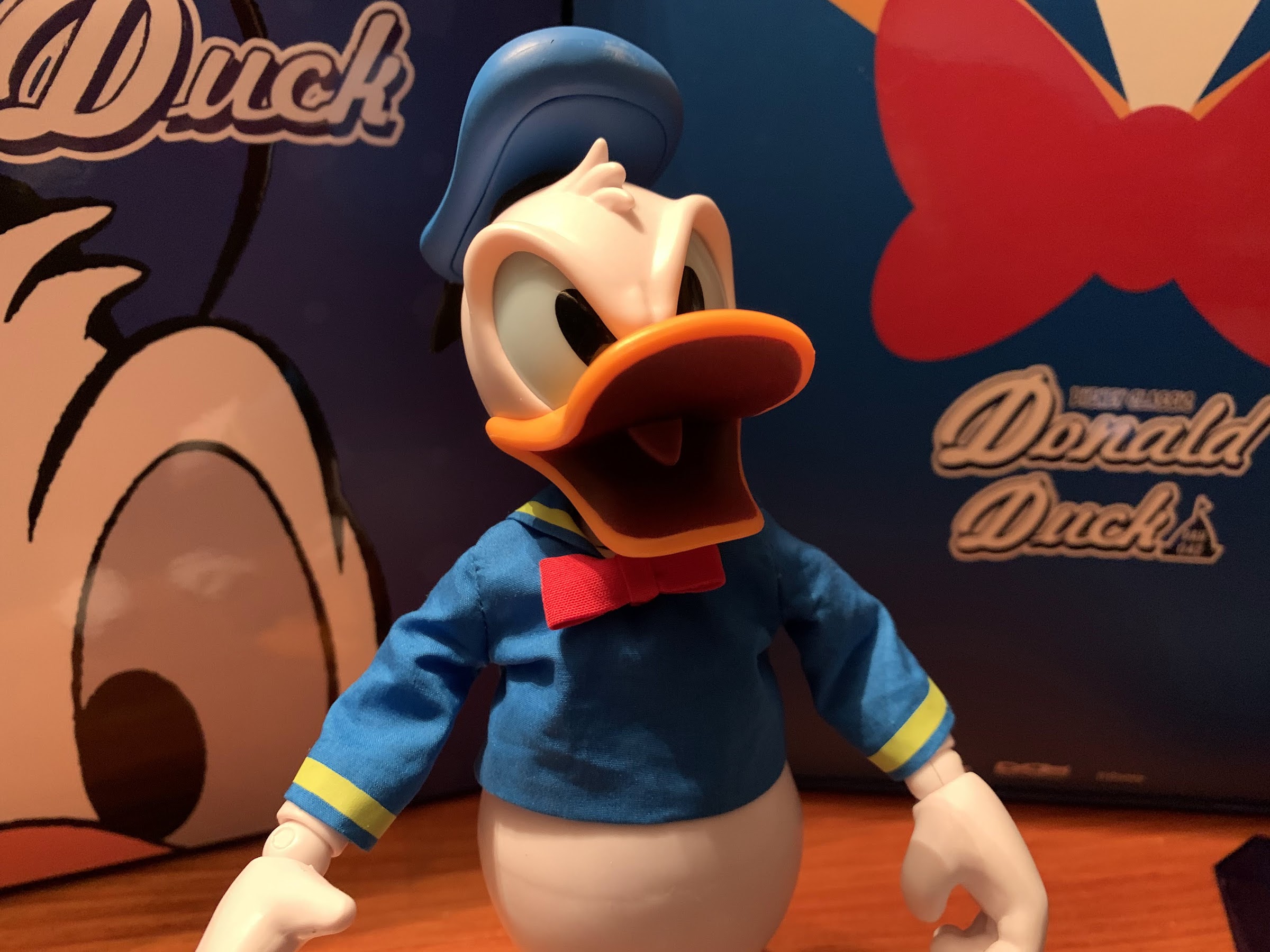
Here’s Donnie!

Few brands are as immensely popular as Disney, which is why it’s a bit surprising that the company’s presence in the world of action figures has always felt a little lacking. It’s thought (and maybe even confirmed by the company) that Disney’s interest in properties like Marvel and Star Wars stemmed from them being unable to internally develop IPs that better aligned with what boys enjoy. Disney has never had trouble selling princess dolls to little girls, but action figures? It’s always been a tougher sell. They’ve tried and managed to craft a wonderful IP in Gargoyles, but apparently it didn’t have the sort of commercial success that Disney was looking for. Even so, it’s a shame their classic characters haven’t always been well-represented in plastic. Maybe they just think kids don’t want a Mickey figure? With the collector market amongst adults really exploding over the last decade or so I suppose it’s no surprise that we’re finally seeing some change in this area.
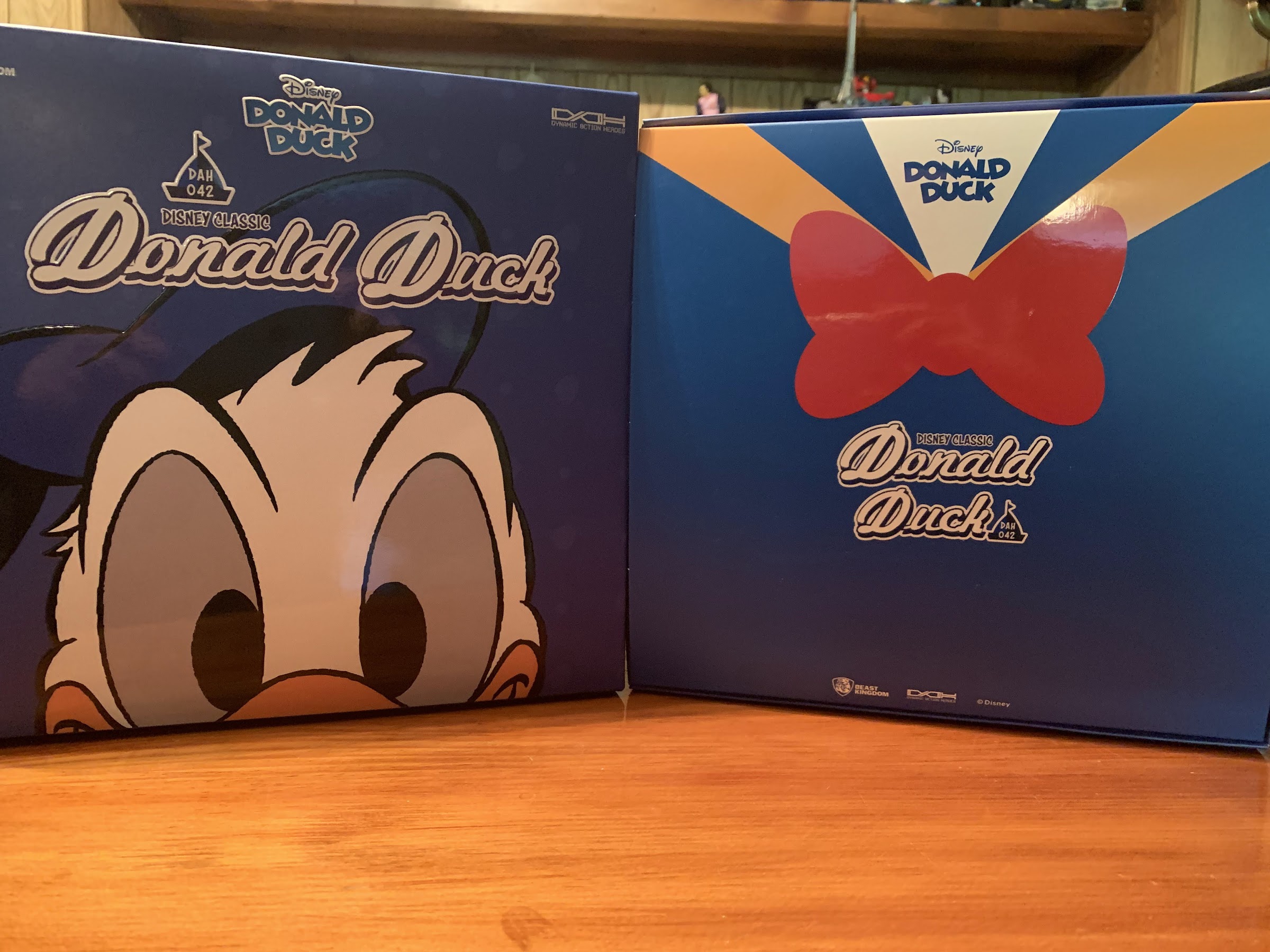
Donald comes in a heavy cardstock box that reminds me of a board game. The left is the outer lid, and the right is the inner box with the insert over it.

It was a little over a year ago that I took a look at the Hero Cross HMF Donald Duck. At the time, that figure was one of the few collector grade figures of Donald Duck out there. Since then, we’ve seen other companies show interest in Disney figures like Super7, McFarlane, and now Beast Kingdom. Beast Kingdom has actually been at it for a little while doing some collectible statues and also dipping its toe into the action figure game with it’s line Dynamic 8ction Heroes. The first figure I saw from Beast Kingdom and had interest in was a Jack Skellington. Since there isn’t a review of that figure on this blog I obviously didn’t buy it, but I sure was tempted. Beast Kingdom has since released a Mickey, Darkwing Duck, and Scrooge McDuck, but it was Donald Duck that I decided would be my entry point into the world of Beast Kingdom. And today, on Donald Duck’s 88th birthday, I’m going to tell you all about it!
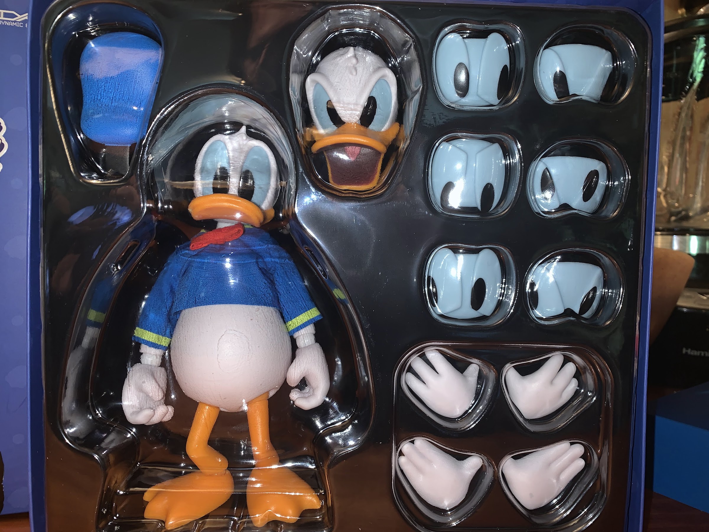
And there’s our boy and all of his “parts.”

Donald Duck has long been one of, if not my absolute, favorite cartoon characters so when a new product featuring him comes along I immediately take notice. I liked the figure from Hero Cross last year, but the cost of that line left me content to just make Donald my one and only. Beast Kingdom has a similar issue in that these figures are not cheap. And like everything the past year, the price seems to only be going up. I paid just over 70 bucks for this guy at Big Bad Toy Store and that’s certainly a lot for an action figure. It’s a hard price to live up to, but if I was going to have any interest in adding to my collection beyond Donald, I needed this figure to win me over.
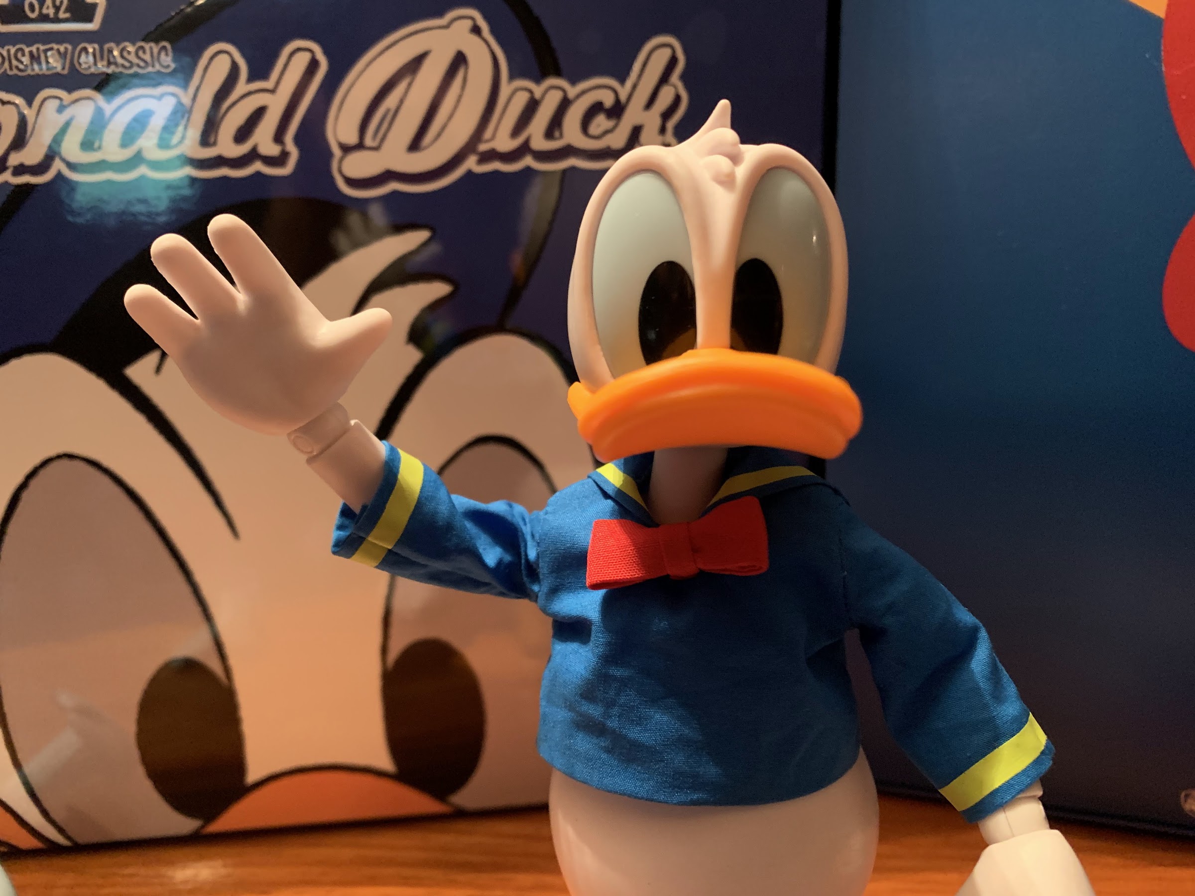
Such a nice looking, well-mannered duck.

Donald Duck arrives in a pretty hefty package. It’s a square box and the top slides off like the box to a board game would. There’s an insert featuring Donald’s shirt pattern over a plastic tray which contains the actual figure. There’s a transparent plastic overlay on that tray, but otherwise everything is loose with no tie-downs or anything. It’s also worth pointing out that this seems designed for internet sales because you can’t see the figure at all without opening the box which is taped closed. There are some product renders on the rear of the box, none of which showcase the entire figure’s body. It’s a bit odd, but again, this isn’t the type of product destined to sit on a shelf at a brick and mortar location.
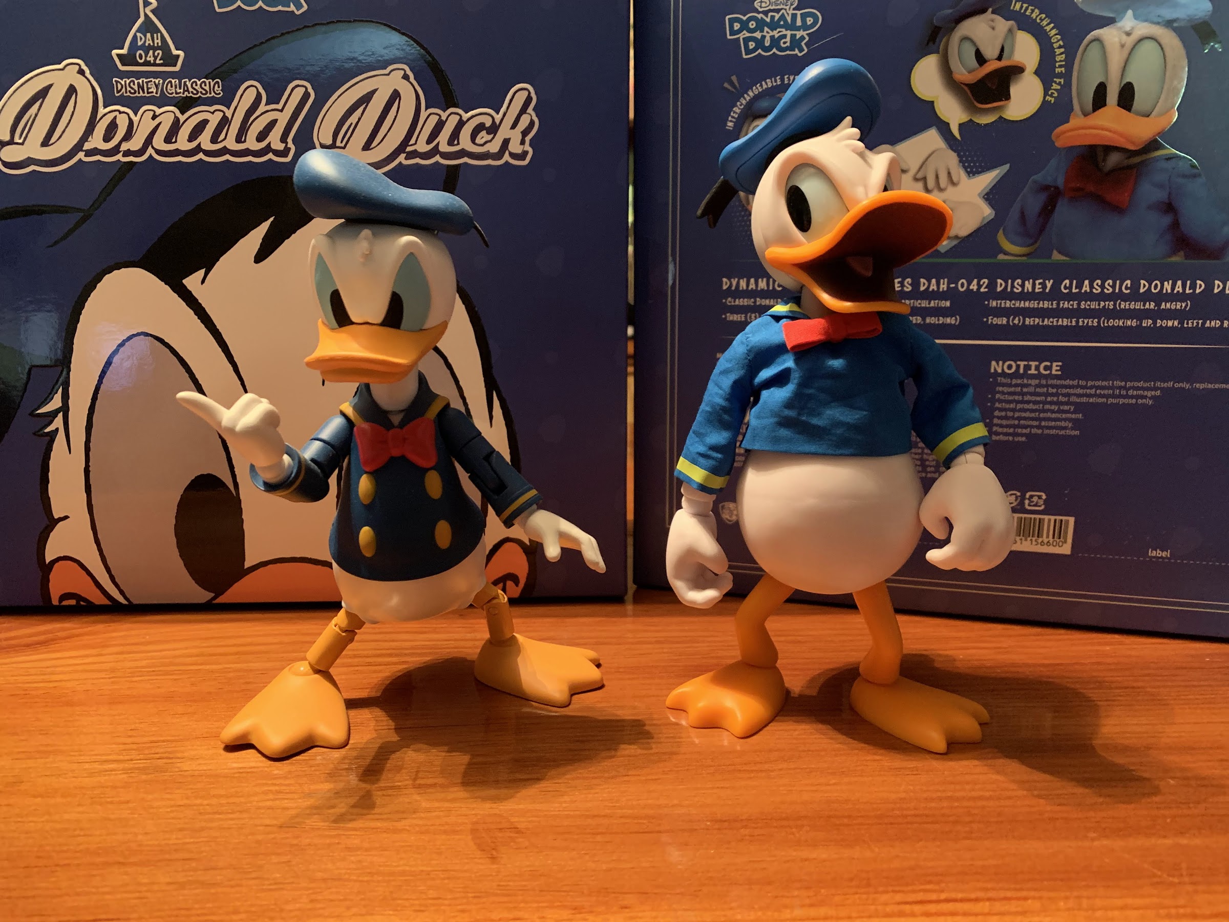
I’ll just give you the comparison you want right out of the gate.

Donald stands at approximately 6.3″ per Beast Kingdom’s product solicitation. He’s quite big and might catch some folks off-guard as a result. He’s bigger than even the Hero Cross Donald and if there’s a scale to this line I’m not sure what it is. Donald obviously doesn’t exist in the real world, but when animated into live-action he looks like he could be around 3.5′ tall which would make this something close to 1/6th scale. Either way, he’s likely not going to scale with anything else out there except for other Beast Kingdom figures from this line. And by “line” I mean the Disney ducks, and maybe Mickey, because the Jack figure from Beast Kingdom is 8″ tall. As I said before though, I don’t have any other figures from this line to compare him to, but I’m assuming he shares some parts with the likes of Scrooge and Darkwing and they’re probably all comparable in size.
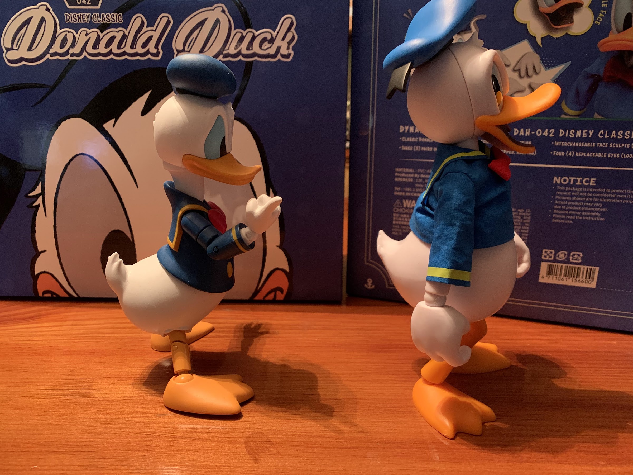
We should probably compare duck butts too. One thing Hero Cross has over this one is no seem for the faceplates on the head.

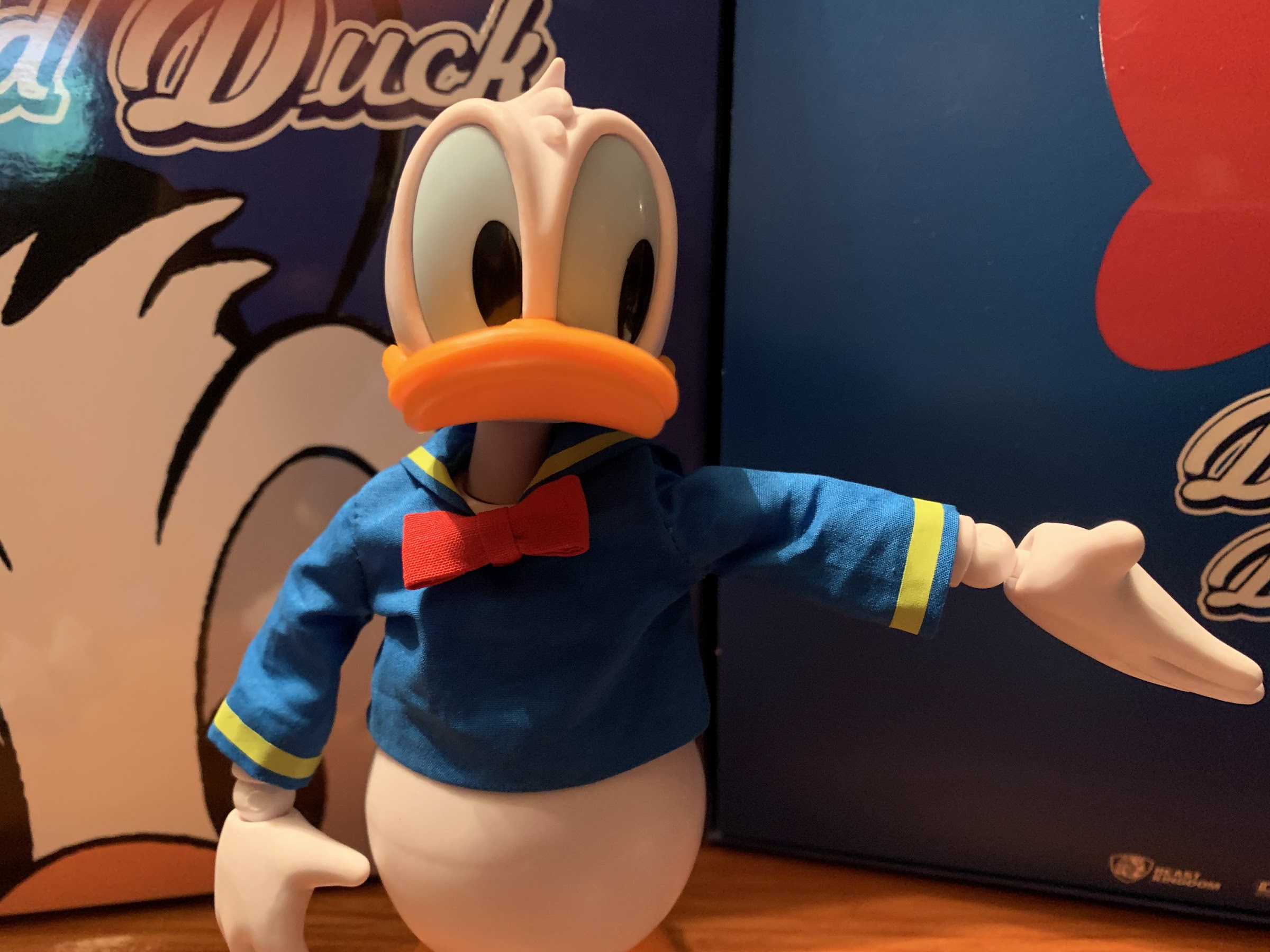
Donald is presented in his licensing art attire. That means he has a light blue hat and shirt with yellow trim on the shirt and a red bowtie. It’s not my preferred Donald, but it’s not unexpected. Since Beast Kingdom lists him as “Classic” Donald maybe they intend to do other versions later. Out of the box, Donald has a fairly neutral expression with gripping hands. The white areas of his body are appropriately white and the only other color really is the orange of his bill and legs. There’s very little paint on this guy, especially because his eyes are a separate piece of very light blue plastic. The only paint you’ll find on him really are the black pupils of his eyes, which are printed I’m guessing, and his inner mouth on the alternate portrait. The white plastic has a nice matte appearance, while the orange is a bit more glossy and “plasticy” in nature. It stands in contrast to the more saturated and richer presentation of the Hero Cross figure and I wish they had painted those parts. This is a figure meant to represent a classic cartoon character and that saturated look would serve it better in replicating the ink and paint origins. The bill looks okay, but the feet have a cheap look to them as a result that I wish wasn’t present in a $70 figure.
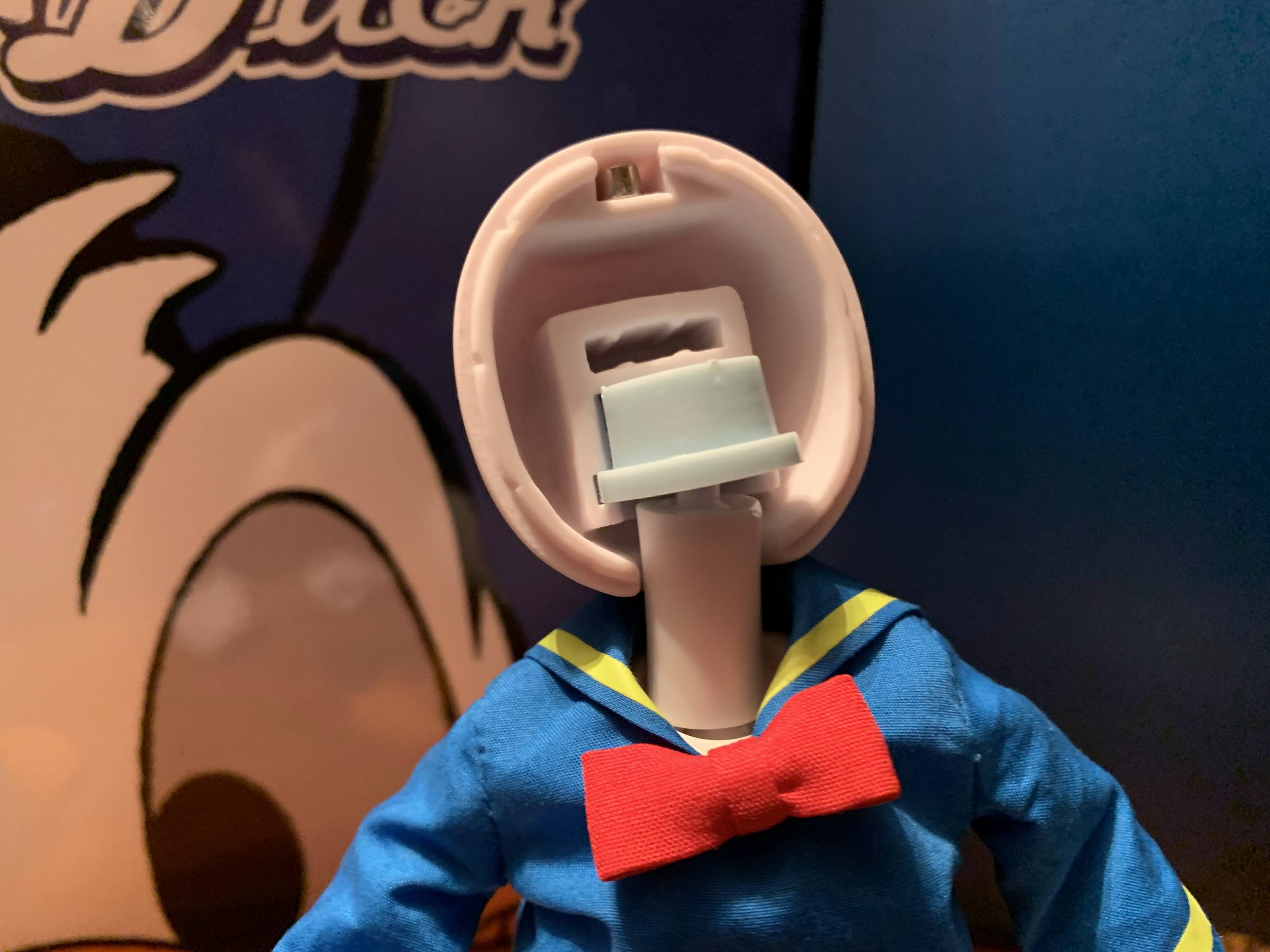
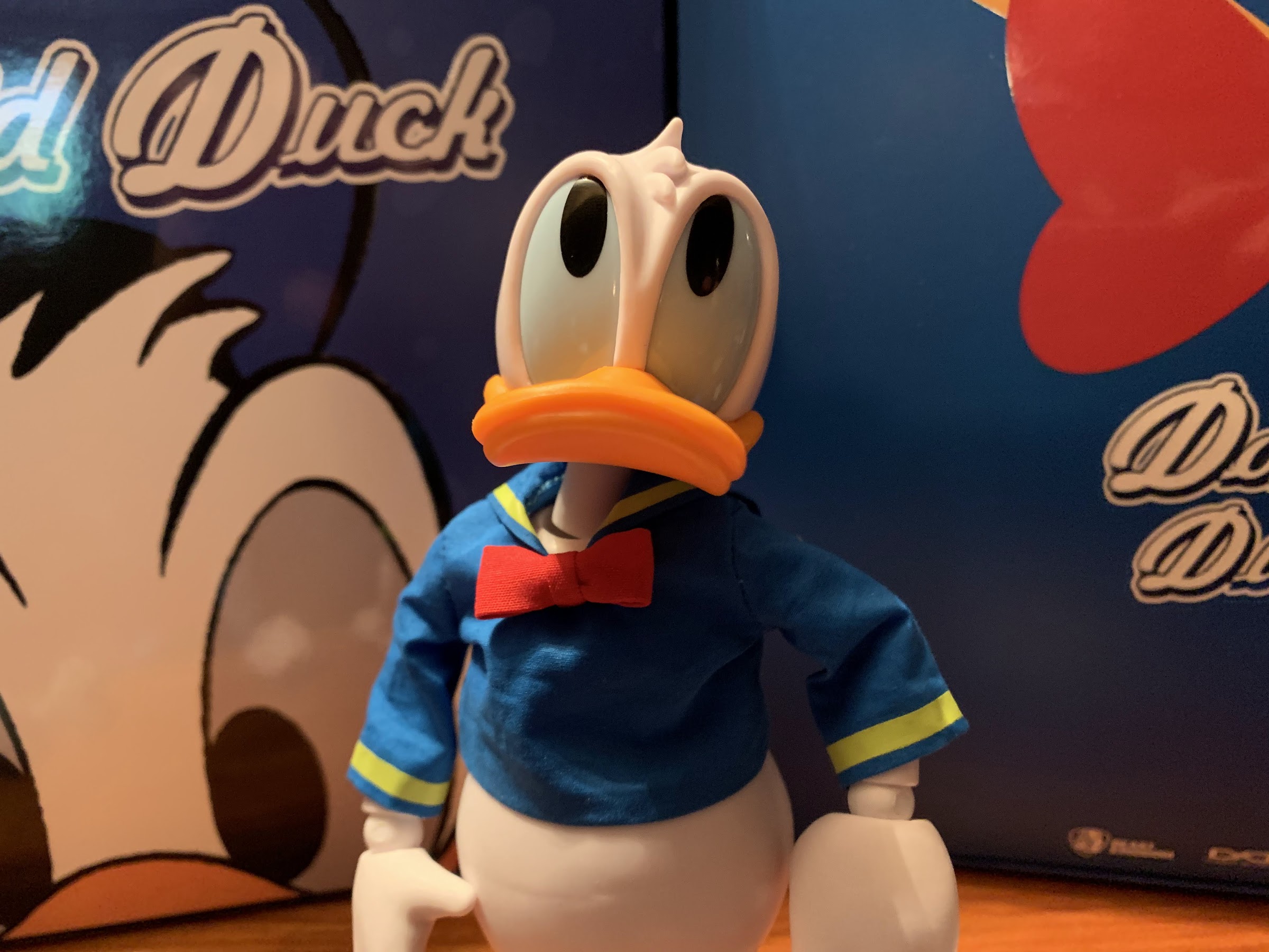
Behold the horror that is faceless Donald! The tab for the eyes slides into that open slow and you can see the magnet at the top of the head which doesn’t appear prone to falling out.
And those eye plates will allow the figure to do things like look up…
…and put some movies on Daisy, if there ever is a Daisy.

Also contributing to the figure’s appearance is the use of soft goods for the shirt. It’s a design choice by Beast Kingdom probably to differentiate their product from others out there, and as far as I can tell, all of the figures in this line come with soft goods attire. The quality of the shirt seems okay. It has the thickness of a Barbie shirt and the printing of the yellow parts looks nice. I like how the rear “flap” is sewn into the collar and the bowtie is also handled well. The issues I have it with though are that mine is fairly wrinkled out of the box and I’m not sure there’s much I can do about that. I wouldn’t dare iron it, and if I wanted to I’d have to figure out how to get it off to do so which would likely require me to remove the figure’s arms. I suppose I could hit it with some wrinkle release spray and see if that helps. I also find the fit of the shirt just looks a little off. It sits very high on Donald’s shoulders and basically erases his neck. I find myself tugging on it a lot to try to bring it as low as possible, even though it isn’t accomplishing much. I think there’s just not enough weight to the material which is often the issue of soft goods and why some people hate them. I don’t think it looks terrible by any means, but it’s easy to see why Hero Cross went with a vinyl body instead of soft goods.
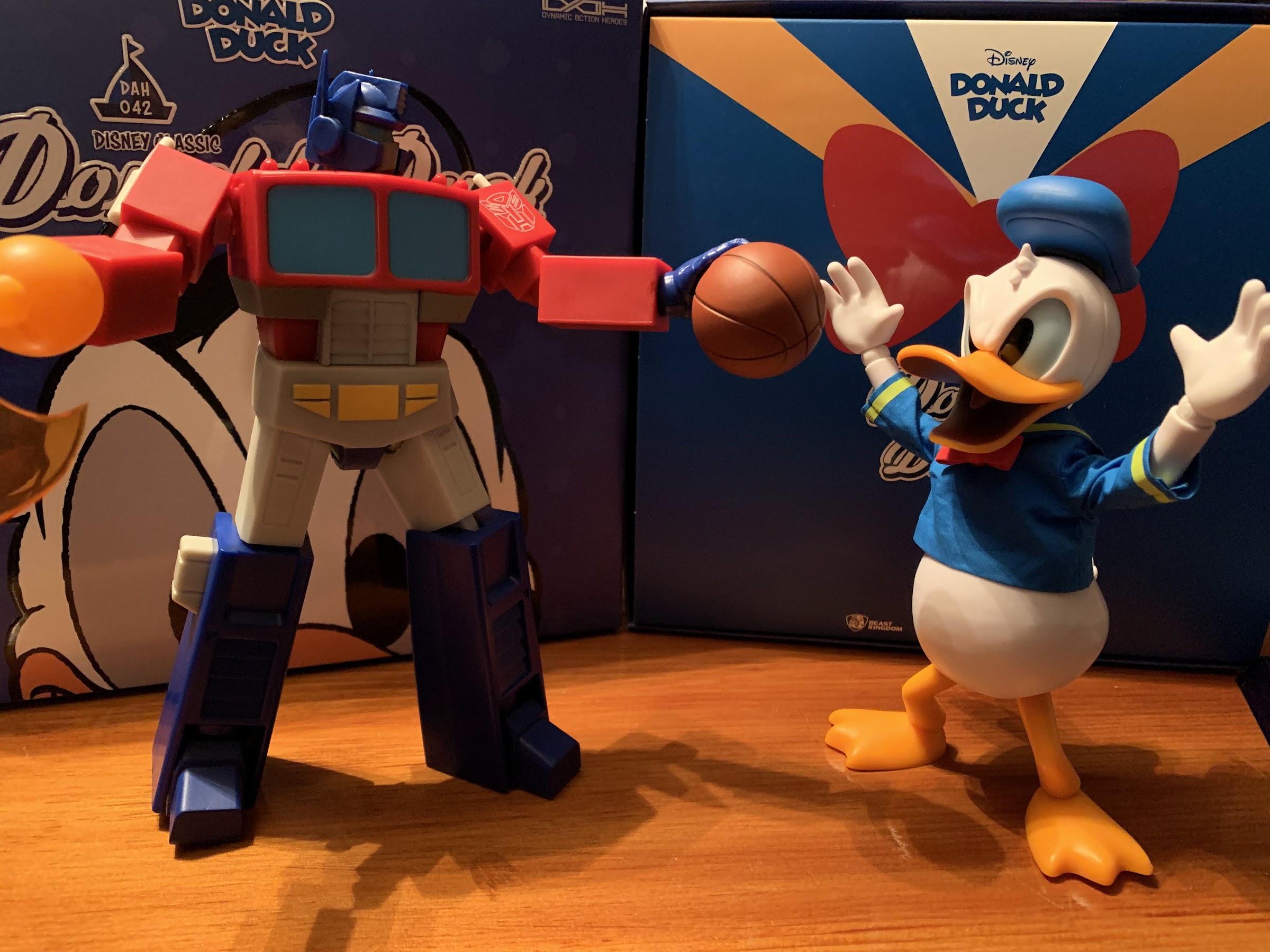
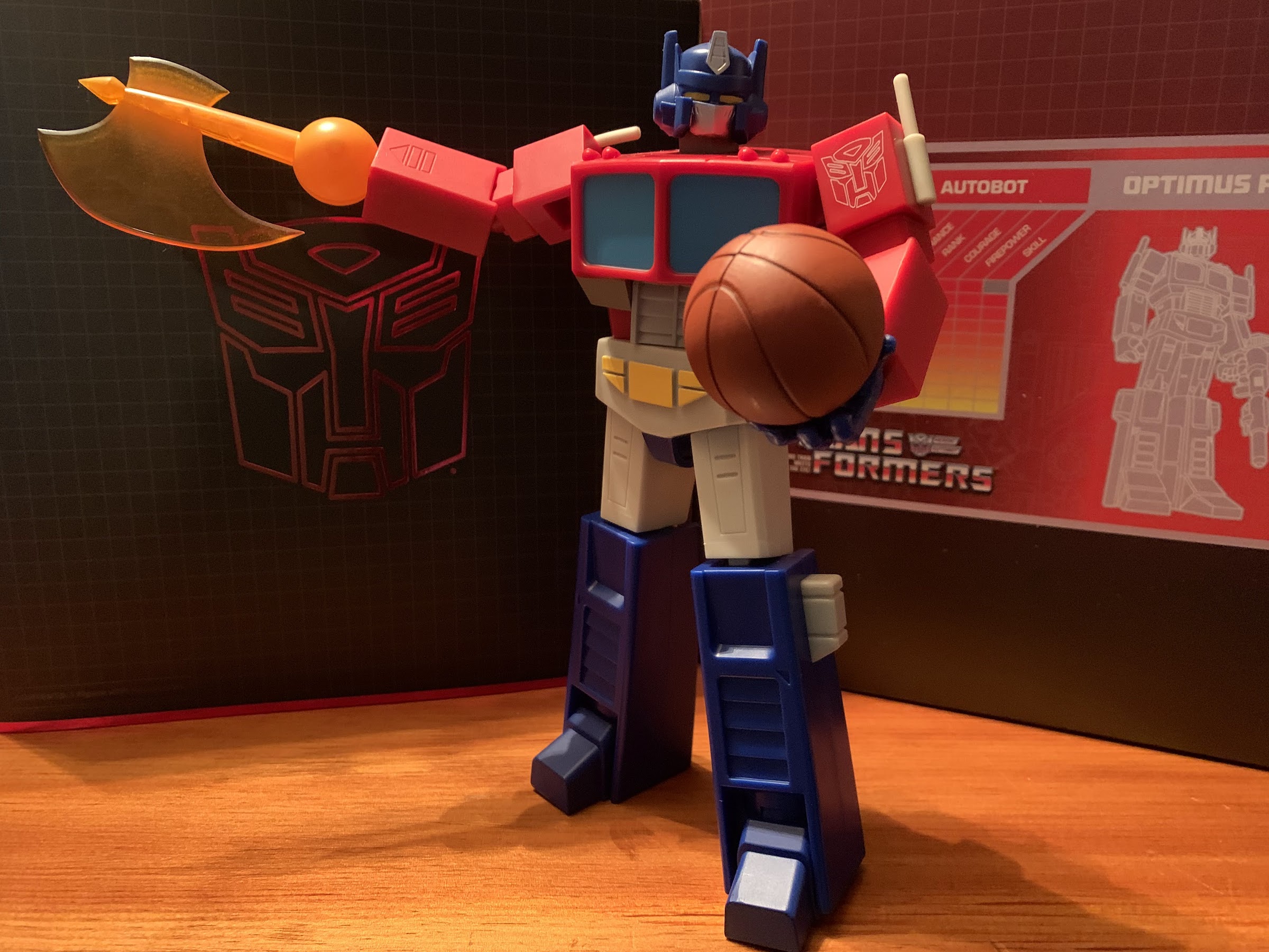
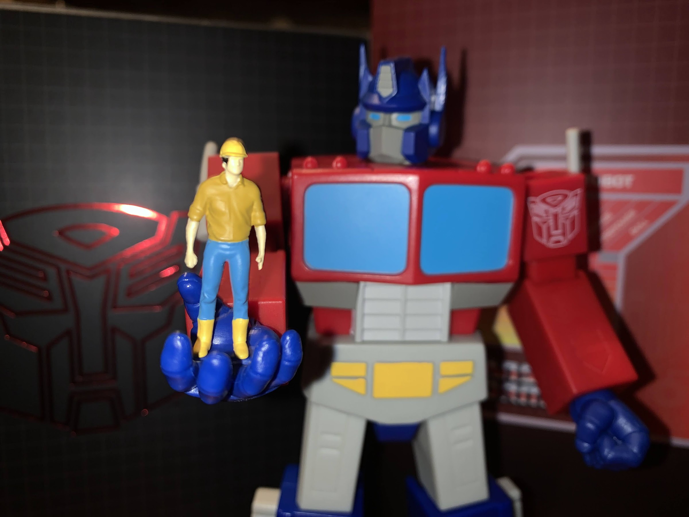
Posing won’t be this figure’s strongest point, but at least he can guard Optimus in a game of one-on-one.
Beast Kingdom includes a stand if you want to attempt more dramatic poses, but I have found the figure just works best in simple ones.

Beast Kingdom does refer to this line as its Dynamic 8tion line. Why they use an “8” I don’t know, but nitpick aside you would expect some dynamic posing out of a line with such a name. That’s going to be a challenge for a duck, but Beast Kingdom does list 12 points of articulation for this figure. Donald’s head sits on a double ball-peg with another ball-peg at the base of the neck. This means he has no trouble looking in basically all directions. The shoulders are on standard ball-hinges and he gets good rotation there even with the soft goods shirt. At the elbow is a single hinge with a swivel and the sleeve of the shirt slides up past the elbow pretty effortlessly to facilitate movement of the joint. The wrists are on ball-hinges so he gets a full range of motion at that point as well. In the torso, we have what feels like a ball joint of some kind. It mostly allows Donald to rotate as trying to use it as an ab crunch causes the figure to just snap back into place when released. The legs are where things are most limited as he has a ball and socket joint at the hips and ball joints at the ankle. There’s no knee joint which is odd so Donald’s knees are permanently bent. His shape being what it is, there isn’t a lot one can do with the legs and the plastic for them is too light to handle one-legged poses and some walking positions, but I suppose that’s why there is a stand included. He moves about as well as I expected and the only knock I’d give the figure are the lack of knee joints and it’s worth pointing out that Beast Kingdom’s Darkwing has knee joints, while Scrooge does not. Most of the articulation is well-hidden at least which is a nice bonus.
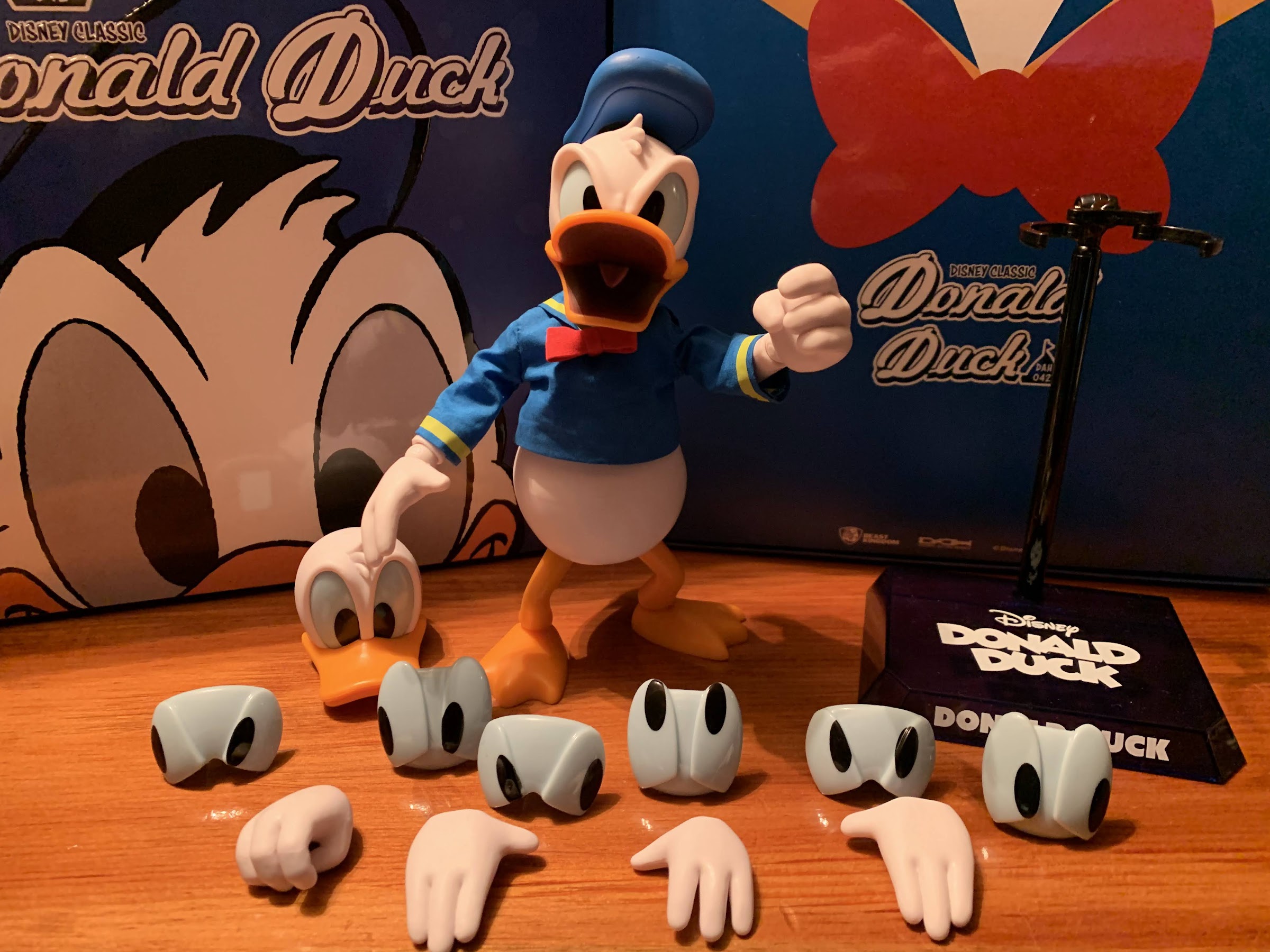
They really made sure he could look in just about any direction.

In terms of accessories, Donald has a lot and a little. All of his accessories are just optional display parts so there’s no props or anything. Given he’s a generic Donald Duck, there isn’t exactly a prop that jumps to mind so I suppose it’s not a big deal, it’s just odd to have gripping hands on a figure that has nothing to grip. Donald also has a set of relaxed, open, hands and a set of waving hands. No fists is a bummer so you can’t even really try to replicate his classic hopping mad pose. Donald also comes with a second head, but I think it’s just included either as an extra or to help pack the other faceplate because it’s not needed. Donald’s face system works in that there’s a plate that comes off and behind that you have a plate for the eyes which are removable. The back of his head works with both faceplates, which is good because when I tried popping the head off the neck came with it and I could not get that off. And thankfully I don’t need to because I can just swap the faceplates. Donald’s other expression is an open mouth with frowning eyes which required a different shape for the eyes. You get four sets of eyes for each faceplate: straight-ahead, looking up, left, and right. Swapping them is fairly painless, and swapping the hands out is also easy, which is great considering I had issues with my Hero Cross Donald. Lastly, the hat is removable and attaches via a magnet. Beast Kingdom also includes a stand which is made of translucent, blue, plastic and features a black arm that is designed to grab the figure around the neck. It’s a bit unusual, but it works and it looks okay since it has Donald’s name printed on the front. I just wish it wasn’t hollow and had more weight to it so I felt like it was really anchoring the figure down, but he doesn’t have issues standing so I likely won’t even utilize the stand.
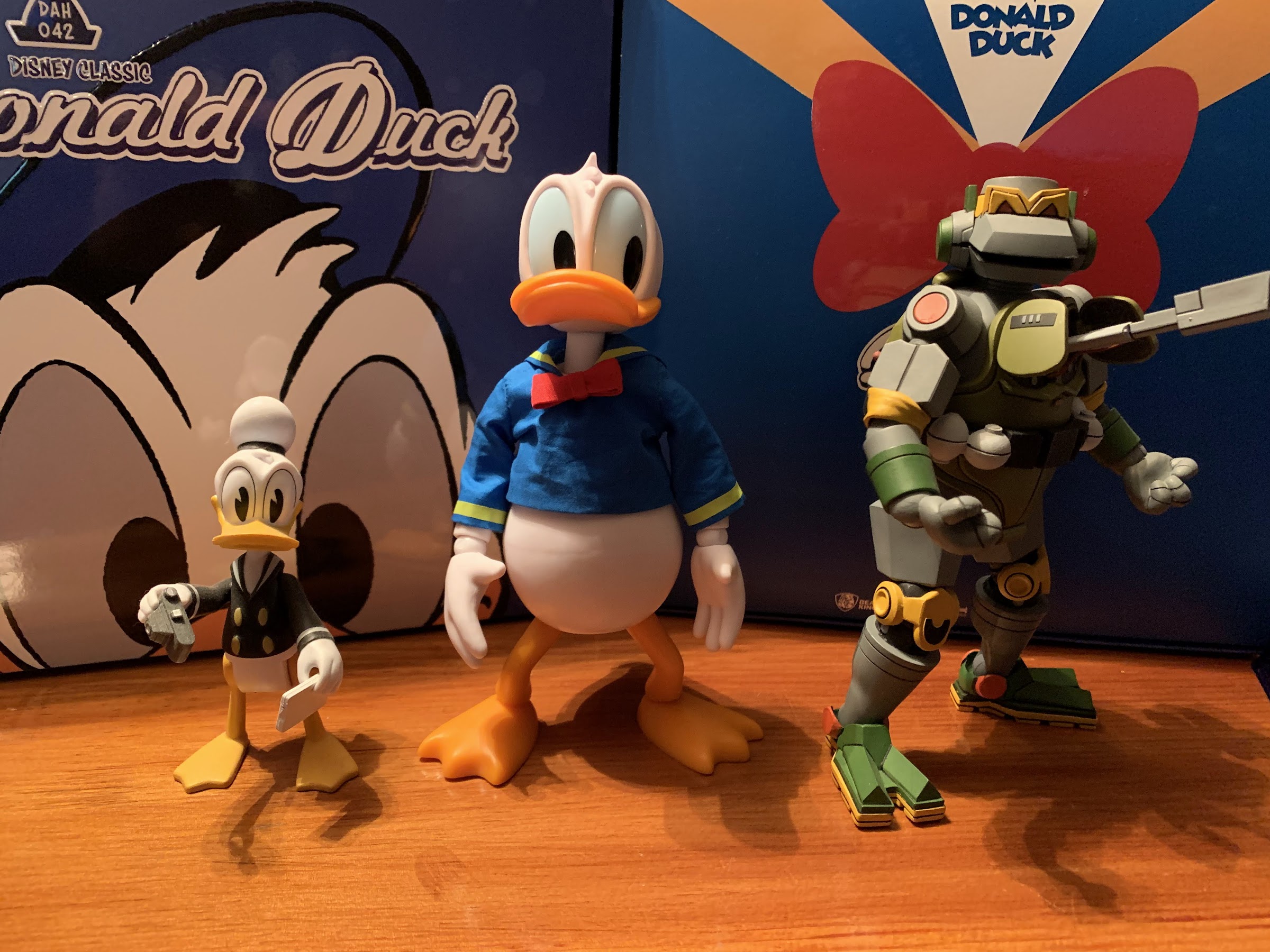
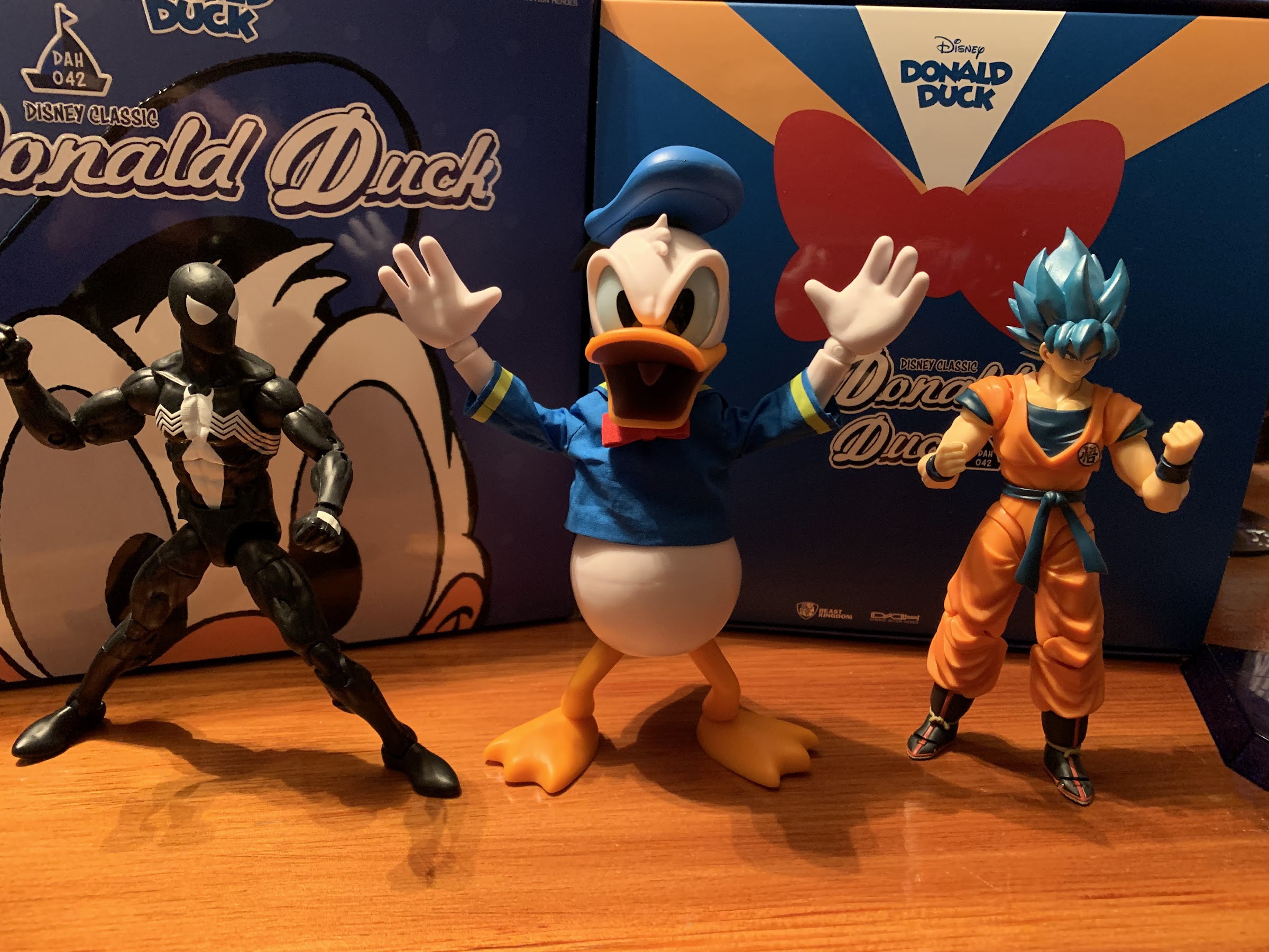
For those who don’t have an expensive import Donald, here’s some comparisons to the short-lived DuckTales 2017 toy line and a NECA TMNT figure.
Perhaps more useful, a comparison to a Marvel Legends Spider-Man and a Figuarts Goku.

Beast Kingdom’s take on Donald Duck arrived largely as expected. The product shots online paint an accurate picture of what you’re getting, so if you’re a Donald fan and you’re okay with the price, then you should be satisfied. I have some nitpicks with the soft goods, but they look as advertised so it’s not like Beast Kingdom delivered a product that was misleading. My only real issue is with those legs as a digital render isn’t going to reveal just how cheap they look in person. If I’m paying a premium for a collectible, cheap is the last thing I want to enter my mind when I look at it. And the lack of fist hands too kind of sucks as I find the options I have in posing the figure aren’t “wowing” me. It would have also have been nice if the beaks were removable. I like the angry expression quite a bit, but the neutral one is almost too plain. It looks like Donald, but when am I ever going to choose to display Donald with an expressionless face? This is a character that’s usually displaying some pretty extreme emotions be they happy, mad, frustrated, scared, etc. I definitely don’t picture Donald Duck in my head with a blank expression on his face.
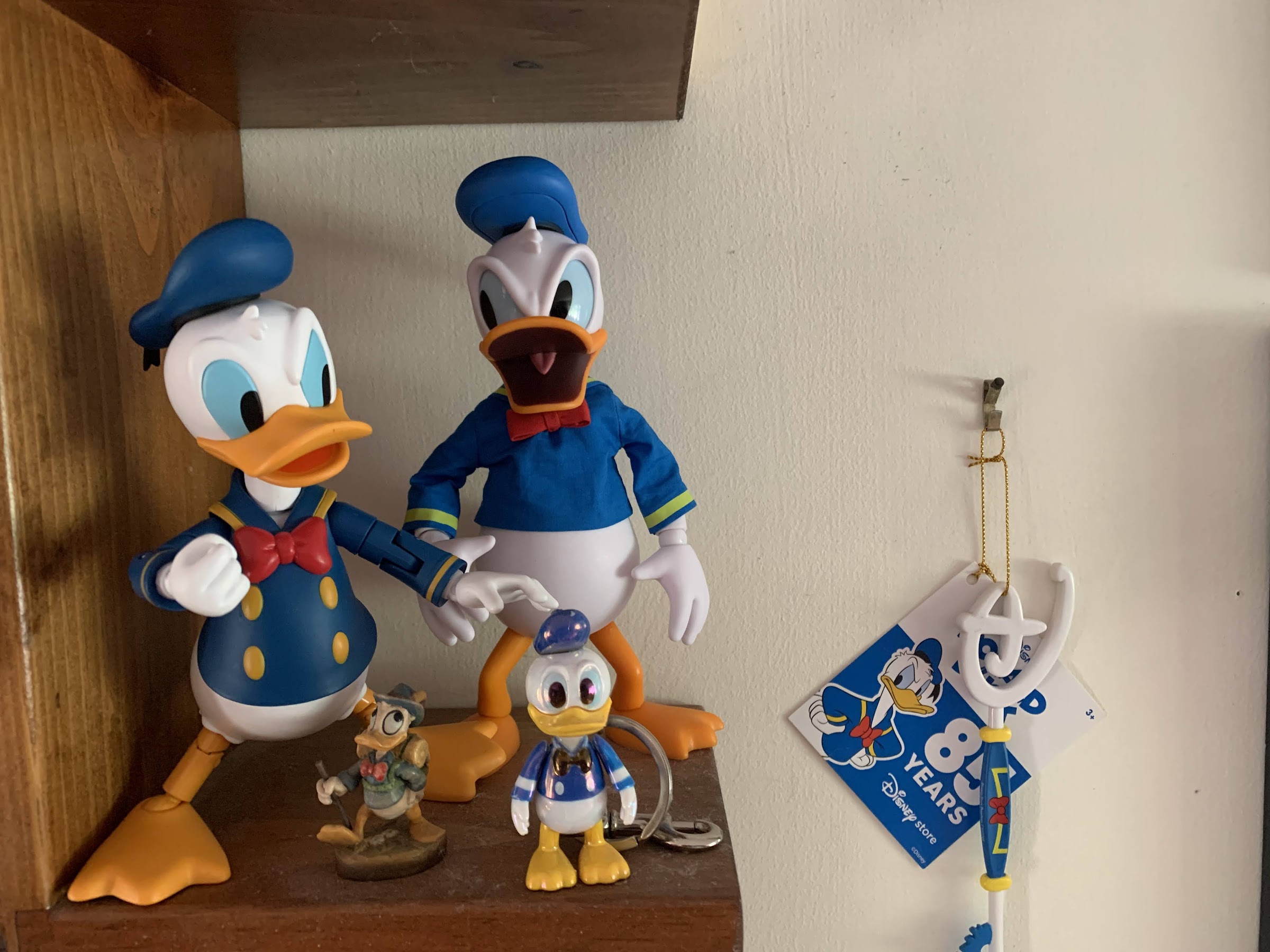
Looks like they’re getting along just fine!

Ultimately, your perception of value is going to define how you feel about this figure. It mostly looks the part, the articulation is acceptable, and there’s some options available for display purposes. It just all comes at a pretty steep cost and I don’t know if it truly earns it. There’s no feeling of “extra” with this guy: no reference items or just fun add-ons like you might see from other companies or even from Beast Kingdom as they included Scrooge’s number one dime in his set (among other things, and to be fair, he’s being sold for $85). I’m fine with this figure though and I’m happy to add it to my Donald display, but it didn’t leave me wanting more figures from the line. I feel pretty comfortable now in passing on Scrooge and the nephews. Maybe Beast Kingdom can convince me to buy another Donald down the road if an update comes along based on a favorite short or something, but for now, I’m content to let this be it and I enjoy it for what it is. And on a personal note, I’m also happy to devote this blog’s 900th entry to a Donald Duck toy! Now I have 99 entries to think of an appropriate 1000th one. Will it be Donald? Will it be a toy? Check back, I suppose, in a year and half or so.
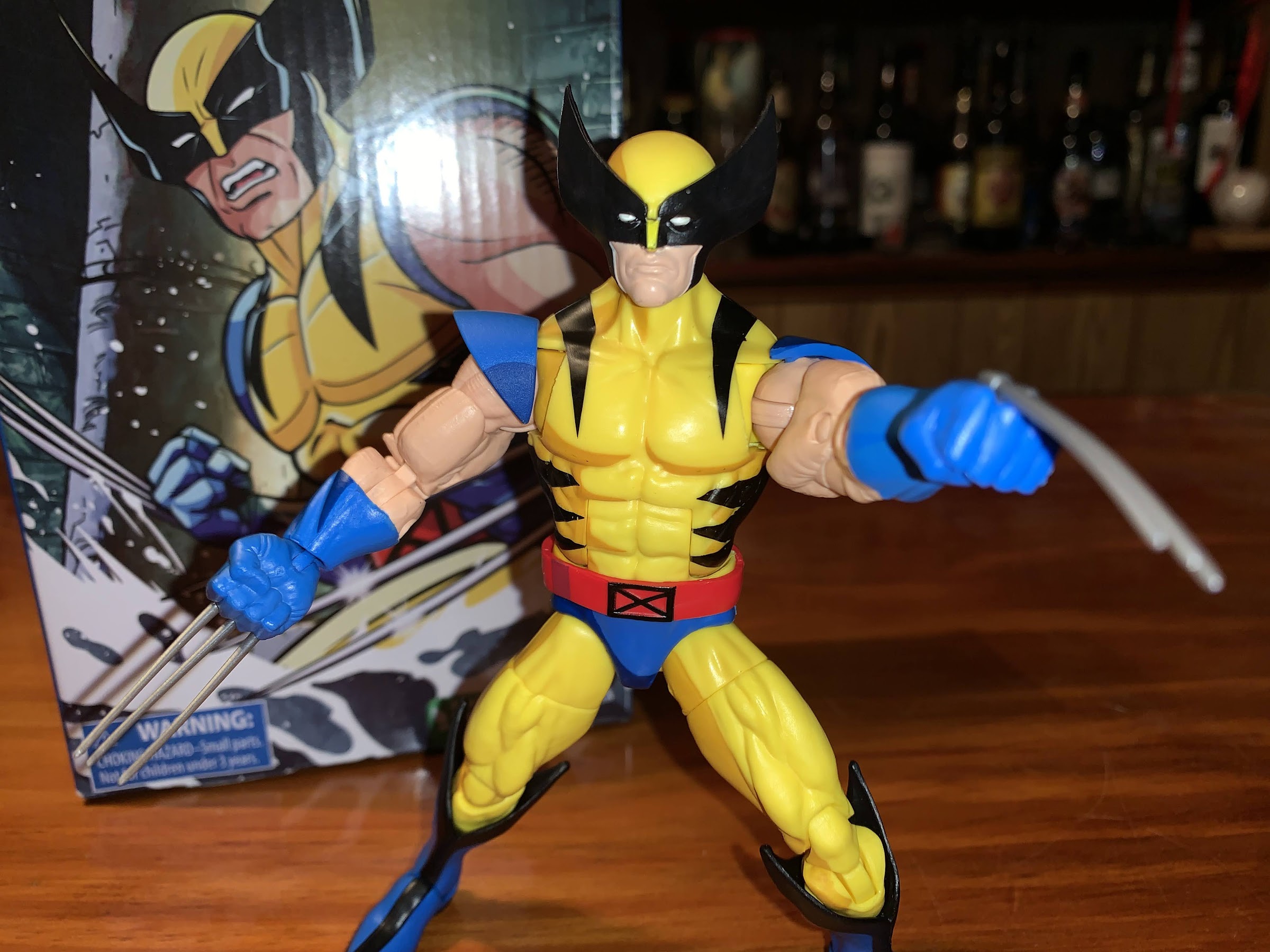

Marvel Legends X-Men Animated Series Wolverine

Ah! There you are, Wolverine!

The toyline of my dreams was announced last October. In celebration of the 30th anniversary of the television series X-Men, Hasbro is doing a dedicated line of Marvel Legends with figures based on the look of the show. The show was obviously inspired by the designs of Jim Lee, but there are differences in the look of a character made for print and one made for television and it was something I always wanted for my favorite, childhood, TV show. Batman got his own line based on his show, the Ninja Turtles are receiving the same from NECA, now it’s time for the X-Men. And who is leading things off for Hasbro? None other than Wolverine, so lets make this a Wolverine Wednesday!

This should be a time of joy. The toyline I’ve wanted for years now finally happening? Of course, nothing is guaranteed. Since the announcement of the line, Hasbro has really underwhelmed when it comes to figure reveals. It even started off right away. While I think most were pleased with how Wolverine was shaping up, Jubilee was announced the same day and looked decidedly unlike her animated counterpart. Mr. Sinister would follow not long after, and while he looks solid, he comes with zero accessories. No extra hands, no extra head, no show-specific gizmo, nothing. I don’t need to go into it further, since I already did, but 2022 has really sucked some of the life out of this line before the first figure arrived in the hands of collectors. That’s a discussion for another day though, as today I get to talk about Wolverine.

I love that box!

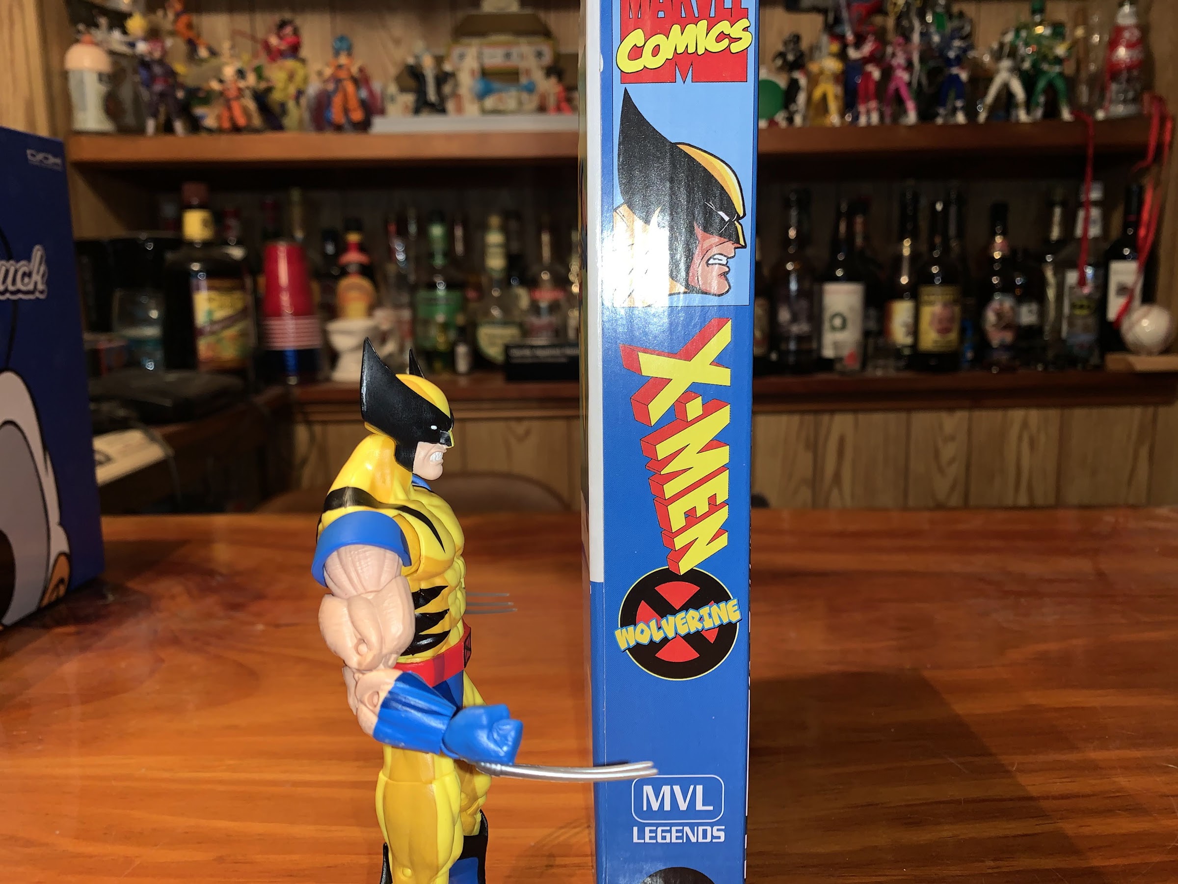
Wolverine was already a popular character to comic fans, but it also feels appropriate to call him the break-out star of the cartoon. Voiced by Cal Dodd, this iteration of the character is still the first that comes to mind when I hear the name Wolverine. Wolverine arrives in the new, plastic-free, VHS-inspired, box created for this line. Artwork of Wolverine adorns the box which was done by artist Dan Veesenmeyer who was a storyboard artist for the show and was responsible for the artwork featured on the actual VHS releases of the show back in the 90s. I love this approach by Hasbro as it’s creative, nostalgic, and just plain fun. Did they get the idea from NECA with their VHS-styled packaging for TMNT? I don’t know, but Hasbro still deserves praise for at least nailing this aspect of the line.

I appreciate the commitment to preserving the VHS aesthetic all around the box.

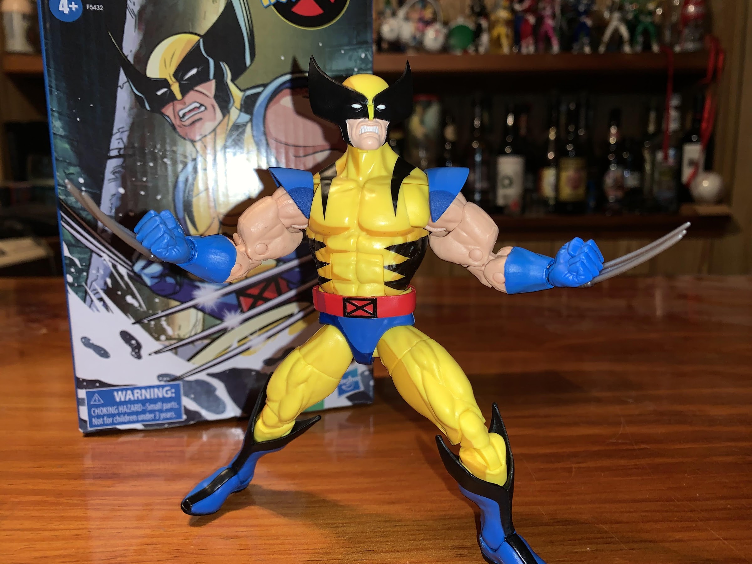
The figure itself comes in a little baggie and the accessories are packaged in a separate bag. Collectors have rightly pointed out that this style of packaging prevents potential buyers from actually seeing the figure they’re buying, but that is mitigated by the fact that this line is presently sold only online. Once removed from his little baggie, Wolverine will stand approximately 5.75″ on whatever shelf you deem worthy of his feet. Much of this figure is reused from past Wolverines, but that was to be expected. And the base figure works well enough for what this is. If I have any nitpicks about the appropriateness of this body for Wolverine it’s really just in that his arms are probably too big and too detailed, but that’s minor. Helping me to look past that is the fact that Hasbro gave Wolvie a brand, new, head. It looks terrific with the ears of the mask accurately representing what we would see in the show. The quality of the animation wasn’t fantastic so Wolverine’s head shape had a tendency to be all over the place, but this is how I feel he was supposed to look in every frame and Hasbro did a good job.

How do we feel about cel-shading? I personally like it, though I admit it’s been done better with other figures.

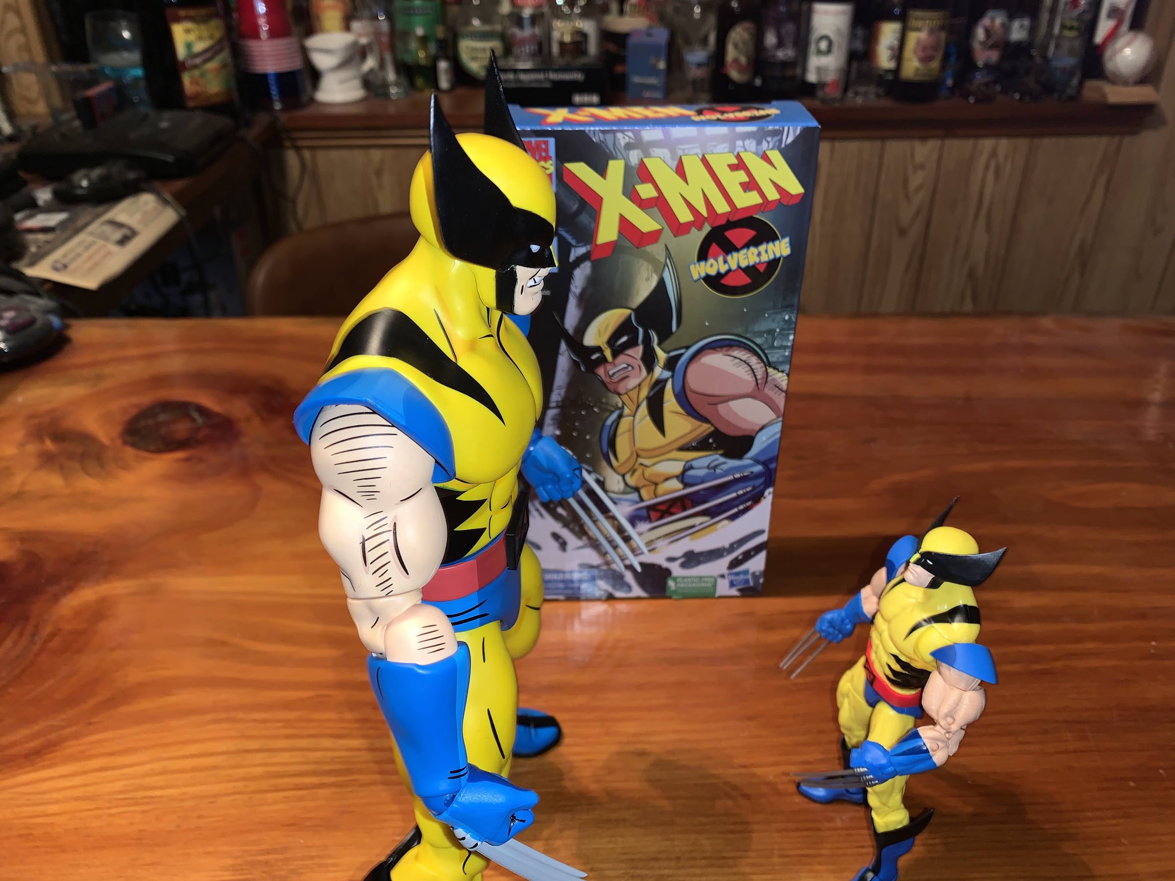
The most talked about aspect of this line though seems to be the paint job. Hasbro, wanting to properly emulate the look of the show, has opted for a cel-shaded approach. I, for one, like that decision. If you’re going to make an action figure from a cartoon, why not try to make that figure look like it came out of that cartoon? The argument against that is always “these figures exist in the real world, let natural lighting provide shading” but that misses the point. What shading in cartoons (or comics, for that matter) resembles real-world shading? The shading with this figure looks good. I like how it’s applied as it was done in a consistent manner. My only issue with it is the choice of color for the shaded yellow portions. Hasbro went with a mustard color, which is not at all in-line with the show. For an example of a better, more appropriate, shade of yellow one need only look at the only other X-Men animated action figure out there: Mondo’s Wolverine. That Wolverine is obviously much bigger and much more expensive, but that doesn’t excuse Hasbro just plain whiffing on the choice of colored paint. The other thing I don’t like is that Hasbro didn’t use this as an opportunity to engineer some pin-less joints for Wolverine. Wolverine is a character who will see numerous re-releases over the years so the cost to do so seems immaterial as Hasbro will make it back. The pin-less approach is just far more appropriate for a figure with this style of paint job as the yellow pegs poking through the shaded portion of the knee looks stupid. It’s the same problem Hasbro has been running into for years with its Spider-Man figures.

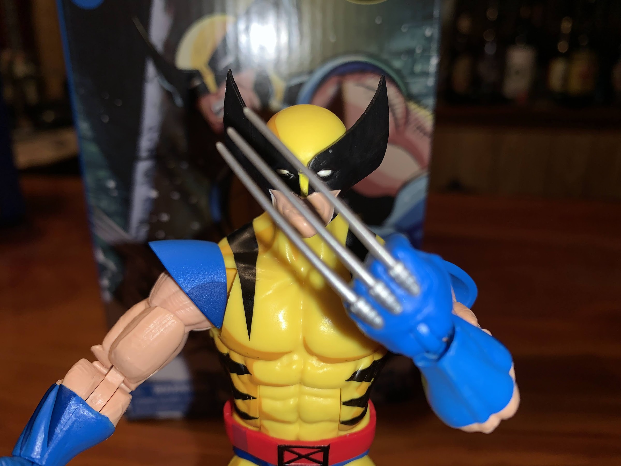
The claws look pretty good.

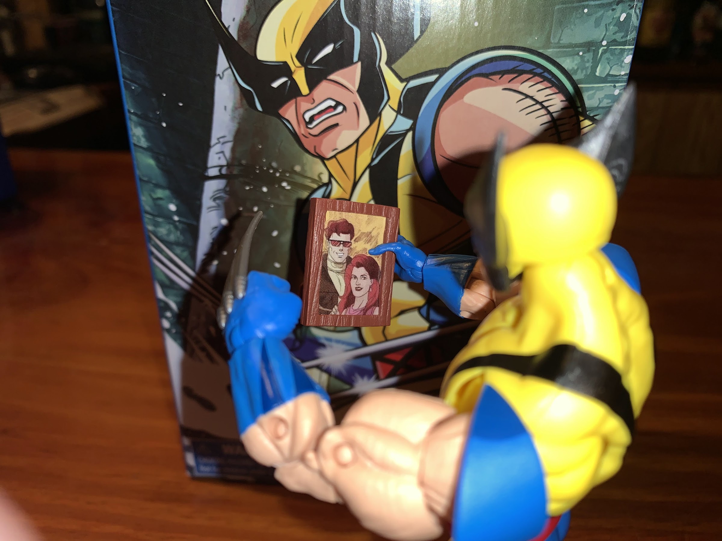
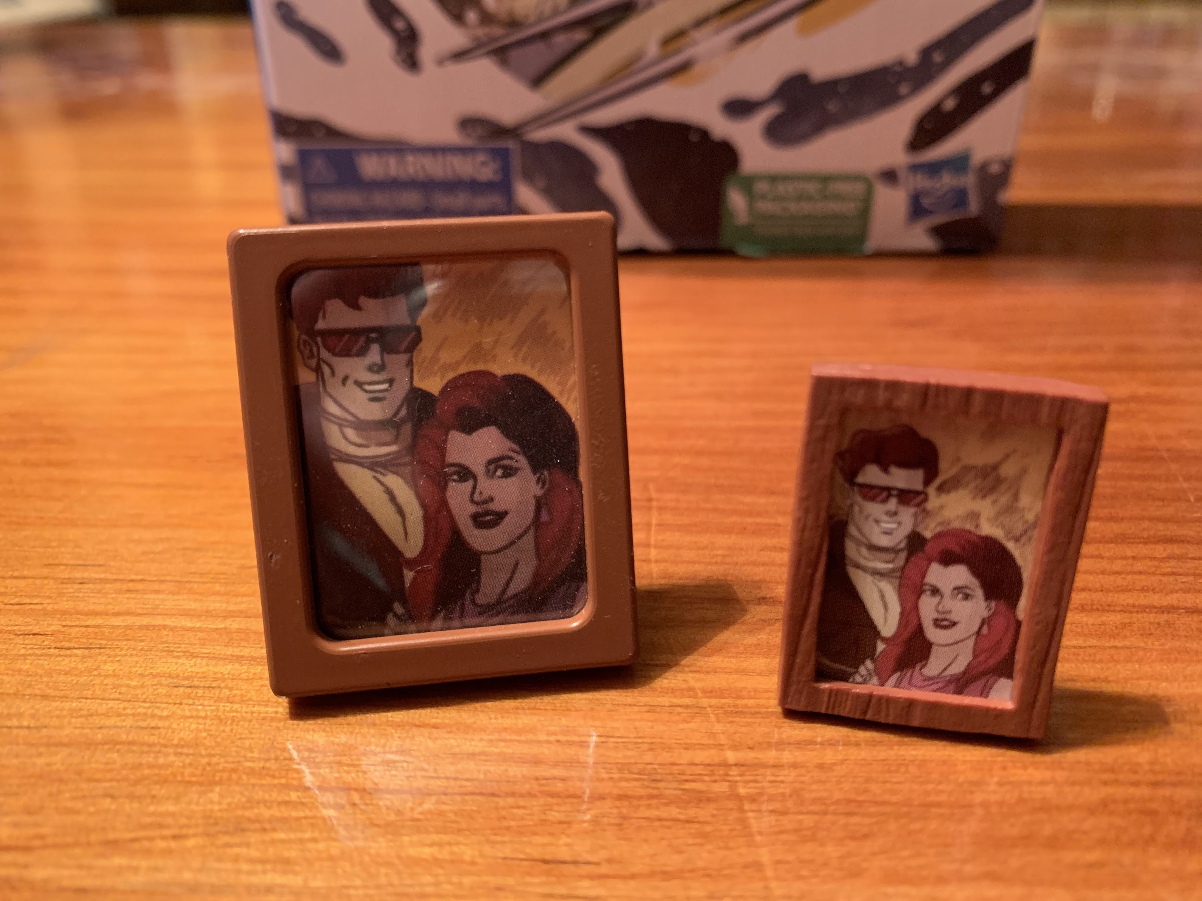
Joining Wolverine in his box are a handful of accessories. Wolverine comes with his clawed hands deployed, but he can also swap to a set of non-clawed gripping hands. Unfortunately, these are some generic hands Hasbro must be recycling from another figure because they’re missing the channels on the back of Wolverine’s gloves. I’m surprised Hasbro didn’t have proper Wolverine gloved gripping hands available for this figure to utilize, but apparently not. The hands are noticeably undersized and look a bit ridiculous on the figure. There’s even sculpted finger nails on them to drive home that these are repurposed from somewhere else. There’s also a second head which features Wolverine with teeth-gritting and it looks good. My only critique here is that they probably shouldn’t have bothered sculpting the teeth since they’re rarely drawn-in for the show. Lastly, we have a show specific accessory in the form of the picture frame containing an image of Scott and Jean. It’s a great idea for an accessory, and the image is removable, though it’s a shame Mondo beat them to it. Since I have that figure, part of me wishes they went for another meme-worthy accessory like a big slab of salami, but I can’t deny that this is a fun thing to include for an animated Wolverine. Plus, they can always do a civilian Wolverine later that comes with salami.

The non-clawed hands, unfortunately, look like they’re meant for a different figure. And that’s because they probably are.

The articulation for Wolverine should be pretty familiar to anyone who has purchased a Marvel Legends figure over the past few years. It’s certainly a familiar sight if you have one of the prior Wolverines using this sculpt, but in case you don’t (like me), let me run down everything for you. Wolverine’s head is on a big ball hinge. He looks up, down, and all around with a little wiggle too. The shoulders are ball-hinged and work okay, but they have to work around the shoulder pads which peg into the meat of the shoulder. It’s a bit of a pain, but it does at least let the arms go all the way around. There’s a butterfly joint, but the shoulder pads get in the way when bringing the arms forward, but work okay going back. There’s a biceps swivel and the elbows are double-jointed though Wolverine’s beefiness limits his range to about 90 degrees. The wrists peg in and are hinged horizontally. There’s an ab crunch in the torso that works well enough, and the waist swivels. The legs connect via ball pegs and they don’t go out to the side very far or kick back, but they do kick forward. There’s a thigh cut past that, double-jointed knee, boot cut, and ankle hinge that pivots side-to-side. It’s a suitable batch of articulation, pretty standard for a Legends release, and my only complaint really is one of the pegs on the left knee doesn’t go all the way through and it’s exposing the hinge there more than it should. I don’t love what Hasbro did with the shoulder pads, but I don’t know that there’s a better solution.

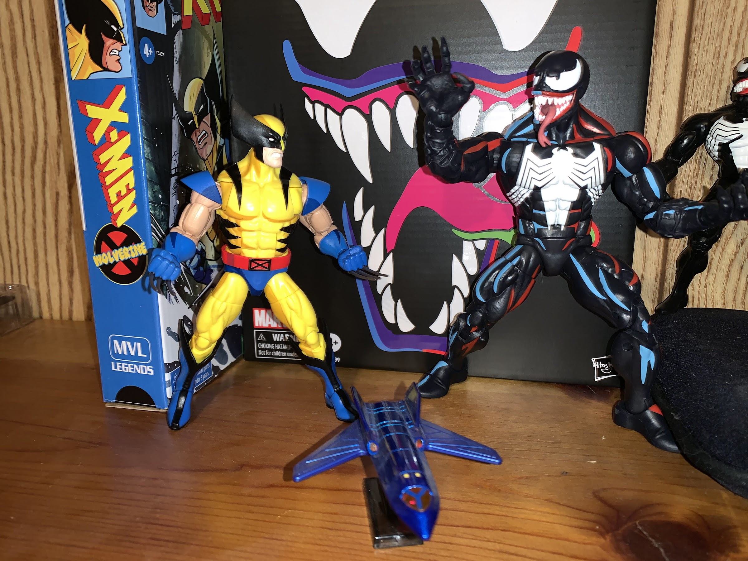
Don’t do it, Wolverine!
It’s amusing to me that two different companies decided this accessory was essential for an animated Wolverine.

This Wolverine presents a solid template for how this line of figures should be handled. We get some re-tooled parts to match with some reused ones plus a unique paint job, which isn’t something Hasbro is known for. Yes, I have some issues with it. I think the color choice for the shading is off, and I think some added black linework would have really made this guy pop. And those extra hands are garbage, but how likely am I to display Wolverine without his claws? Not very, but he does come with an episode specific item to hold so the non-claw hands shouldn’t have been the afterthought they clearly were. A final nitpick is a similar one I had with the Mondo figure and that’s the claws should have been painted. They were usually white in the show with a little blue added, but both figures just went with a flat gray. At least they arrived in good shape and only my figure’s right hand may take a trip to the faucet and that’s a first for me with a Wolverine Marvel Legends figure. Granted, the last one I bought was probably made by Toy Biz.

“Hello, son.”
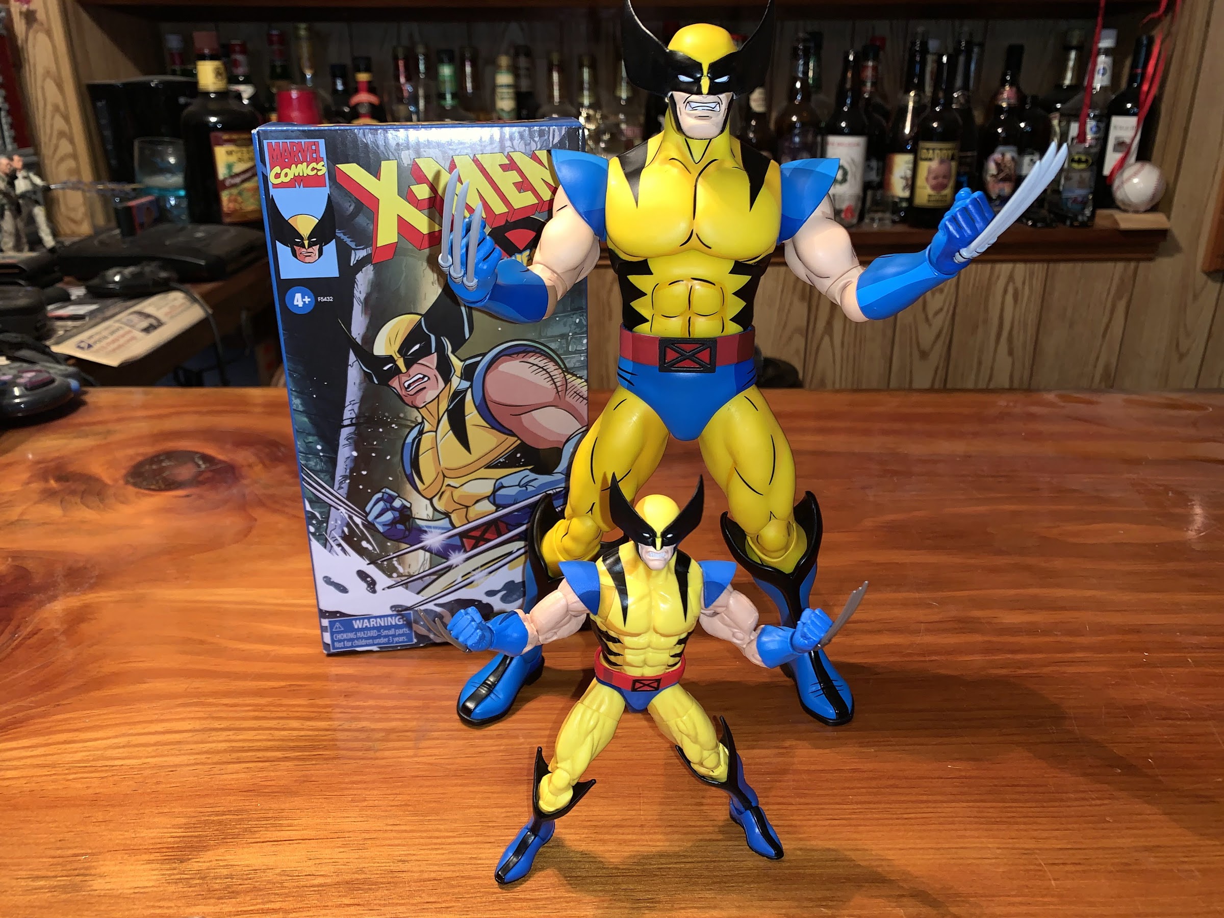
The bigger, more expensive, one obviously looks better, but I think it would be a lot closer if Hasbro matched the colors Mondo used and added some linework to their figure.

If this Wolverine was a perfect representation of what to expect from this line then I think most everyone would be happy. And maybe it is. I don’t have any other figures yet, but with Jubilee set to arrive tomorrow I’ll have a better idea soon. This figure is largely what I would expect of Hasbro and it’s plenty good. It’s fun to have a new 6″ Wolverine after so many years and it’s especially fun to see my favorite TV show from my youth get celebrated. It already seems clear to me that if you only get one figure from this line make it this one. Now lets hope that Hasbro spends the money to do a proper animated Sabretooth to pair him up with.

I suppose I should include a comparison between this figure and the only other, dedicated, animated version of a character Hasbro has done (not including the Spider-Verse figures).

Wolverine is presently available to order at Hasbro Pulse (www.hasbropulse.com) and the other figures in the line are up for preorder there as well with Jubilee being the only other one in-stock. It’s expected that all of these figures will also be sold at http://www.shopdisney.com at some point (Jubilee is already there). Each figure retails for $28 and a Pulse membership is required to get free shipping. They’re not exactly cheap compared to other Marvel Legends releases, but for now, Hasbro is really the only company doing a dedicated line based on the animated series. Maybe that will change one day, but for now I’m all-in and I hope we get the full team and select villains. Hopefully this is just the beginning of a fun display.


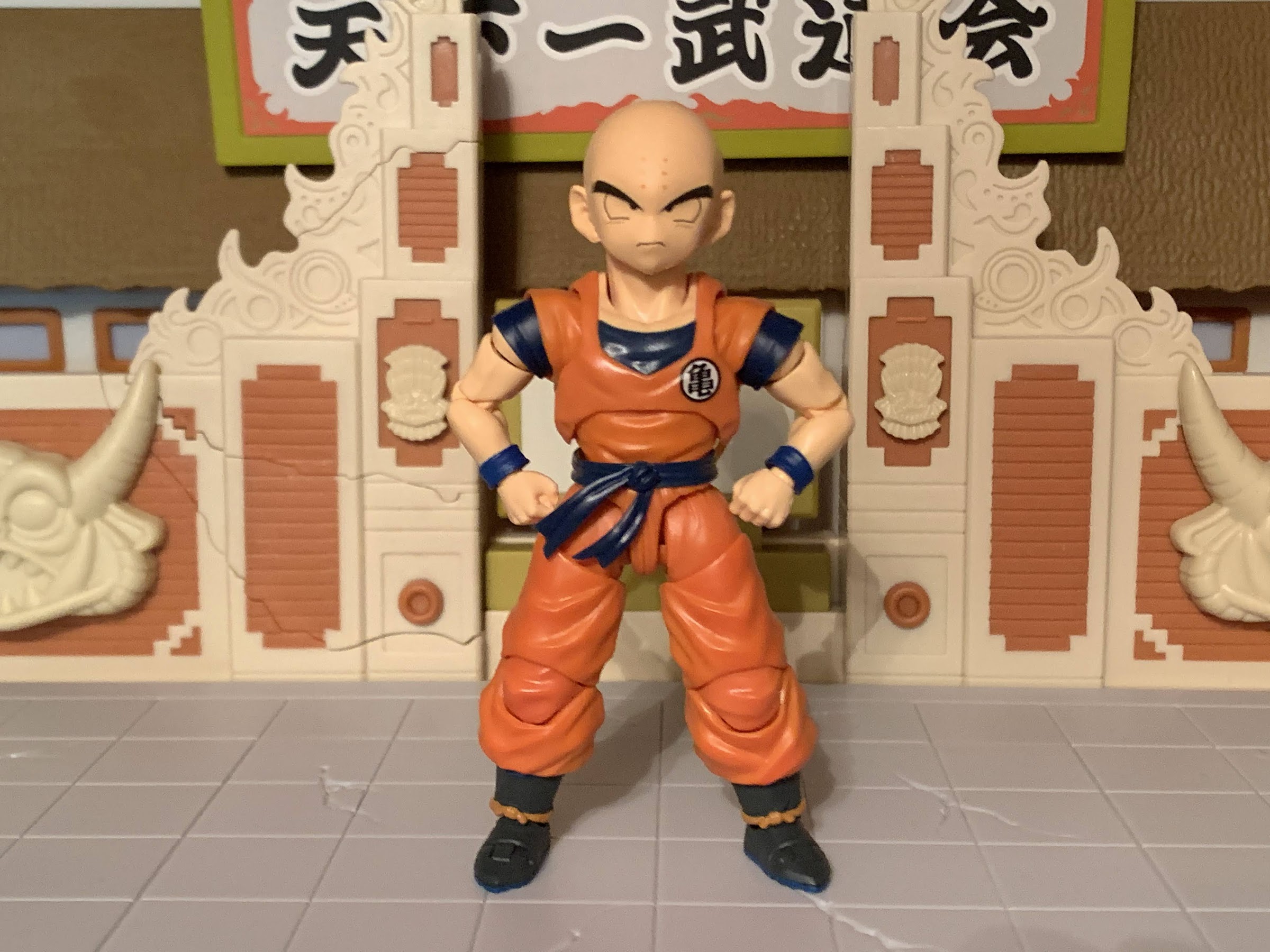
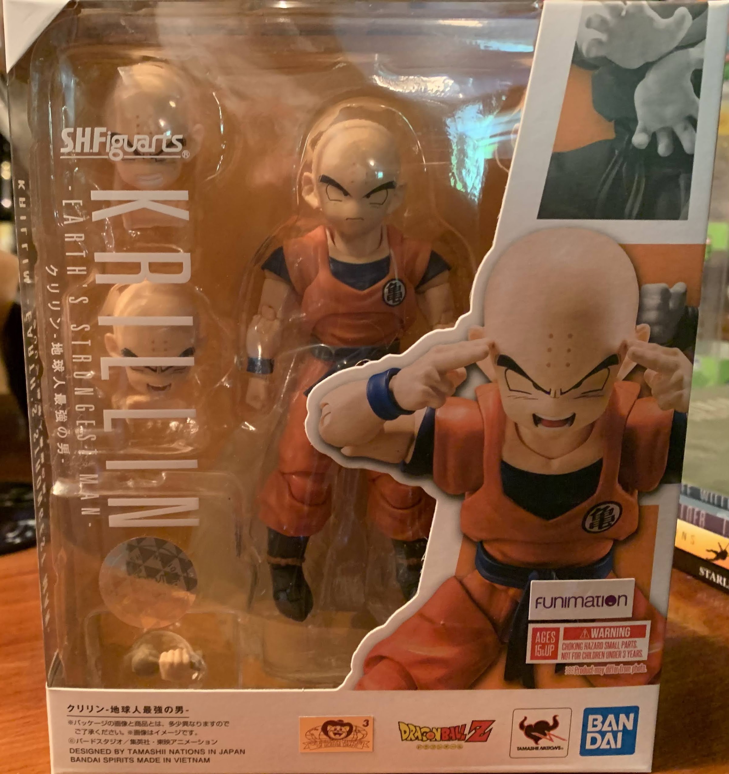
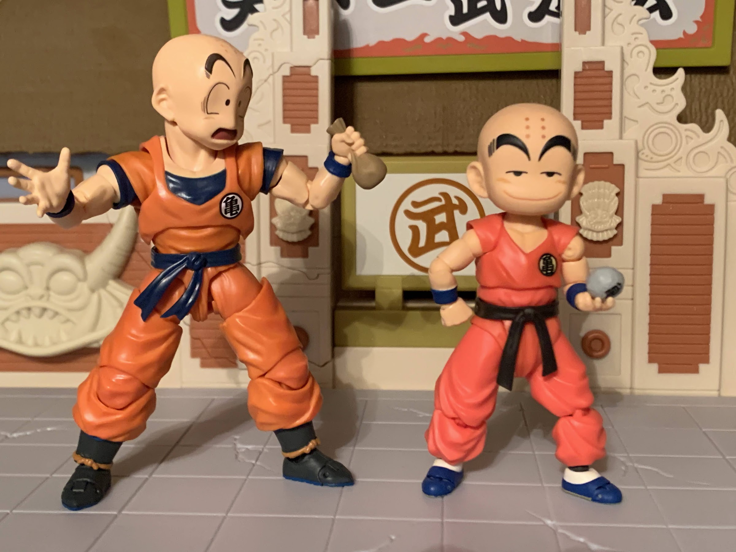
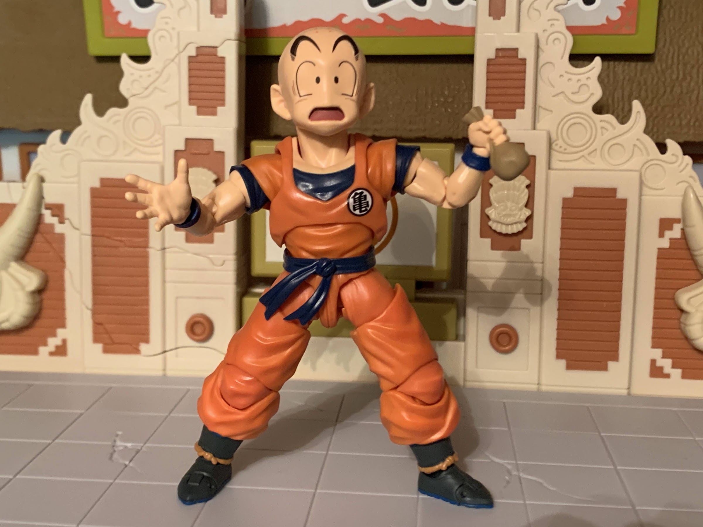
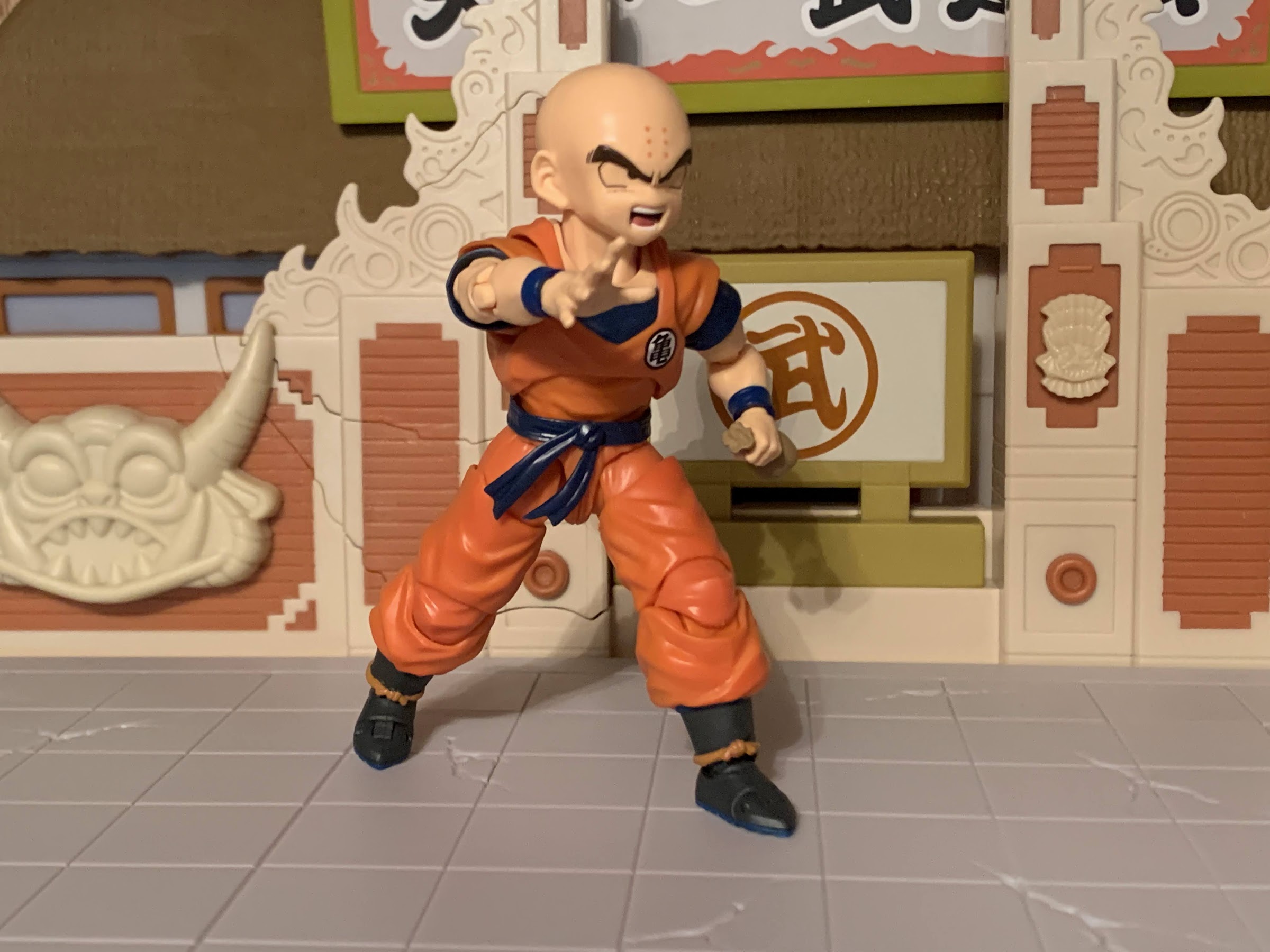
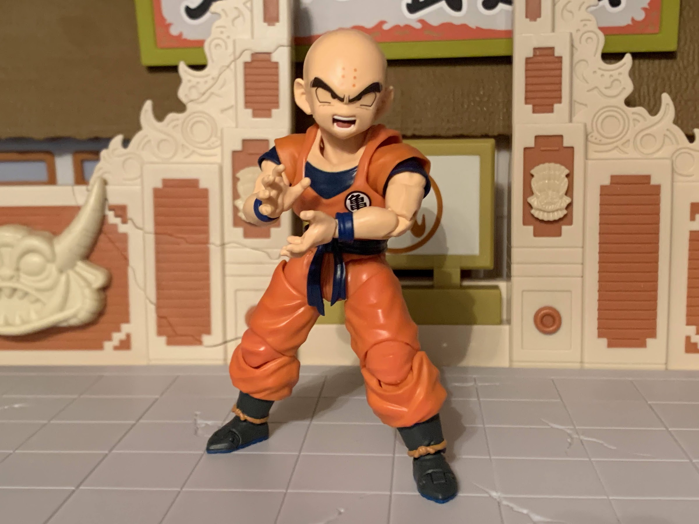
S.H.Figuarts Dragon Ball Z Krillin – Earth’s Strongest Man

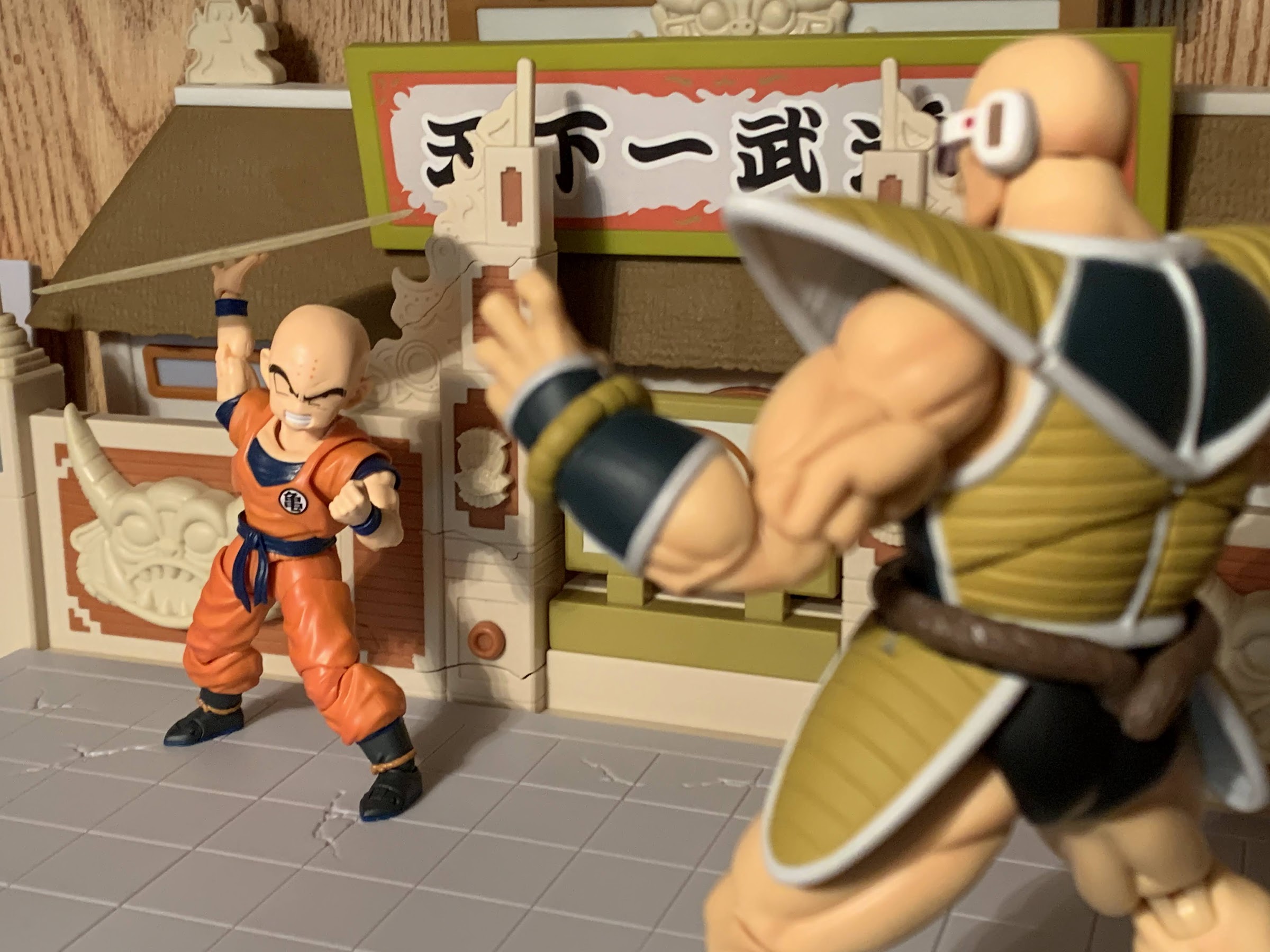
The Earth’s Strongest Man!

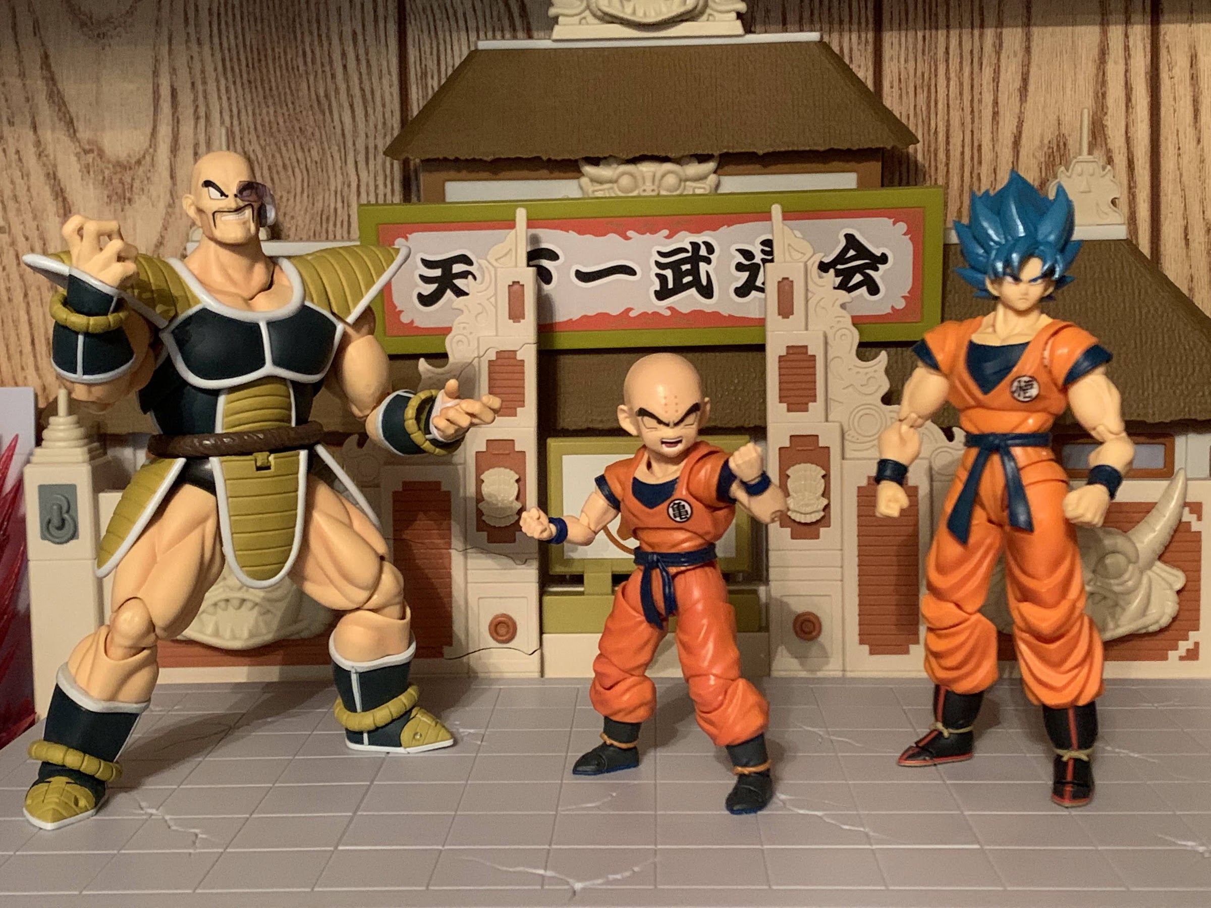
My Dragon Ball collecting was once simply focused on the original series, Dragon Ball, but has been expanding over the years. I’ve definitely leaned more towards Dragon Ball Super of late, but one of my Dragon Ball Z purchases last year was the event exclusive Nappa. I don’t know why I like Nappa so much. Maybe it’s because I, and many others, watched the Saiyan Saga of DBZ over and over because, for a long time, it was all we had. Well, we had the Namek Saga too, but that was far less interesting. When I got Nappa it became apparent right away that I had little to pair him with. I would add Piccolo, but presently I have him displayed with his arm missing as it was in the Raditz fight (I suppose I should get Raditz, but that’s not happening given his price on the secondary market). Then along came Krillin. Who better than Krillin to position facing off against Nappa? If I had liked the Kid Gohan that Bandai did I might have grabbed that, but Krillin seems appropriate and he’s a likable character too.

That whole “Earth’s Strongest Man” title would be more impressive if the Earth wasn’t full of Saiyans, Namekians, Androids, etc.

Now, when you get really into figure collecting, other, perhaps strange, things influence your purchases. I didn’t just want Krillin to pair with Nappa, I also found myself both curious and a little excited about some of the changes Bandai made with the figure. This is Krillin 2.0 essentially replacing an earlier figure released in the line. I never liked the aesthetic of that figure, but this one looked good based on the solicitation images. What also jumped out at me were the sleeves and abdomen. Yes, sleeves can influence my purchasing decision. Rather than have those little, blue, cuffs pegged into his shoulders, this figure appeared to have free-standing sleeves like an actual shirt. Is it dumb that I paid over 50 bucks for a toy based on how the sleeves looked? Maybe, but that’s toy collecting!

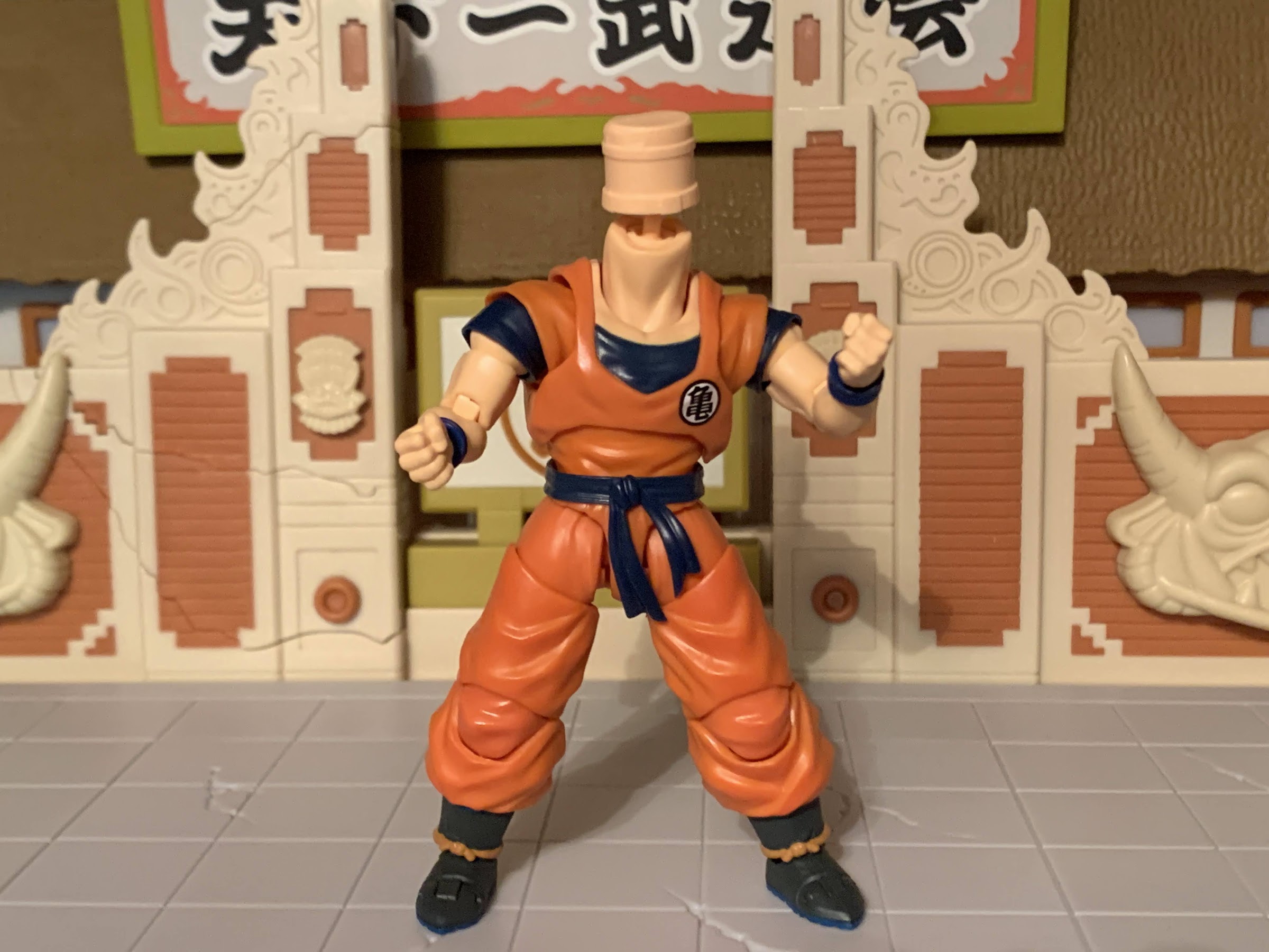
Things are a little strange looking under Krillin’s head, but this actually works pretty great.

Right now, someone is probably reading this and shouting to themselves, “This is the wrong Krillin!” And yes, I know, and I knew that when I bought it. This Krillin is based on his look during the Cell Saga where he has a blue undershirt and boots like Goku’s. The musculature is also more defined and less rounded, though I don’t know that Tamashii Nations would do that any different if this were a proper Saiyan Saga version of the character. I’m fine with the slight inaccuracy when it comes to my display and if a Saiyan Saga Krillin were to follow without the shirt and in the martial arts slippers I likely would not seek to “upgrade.” This is fine.

He’s small, but fierce!

Krillin, being one of the shortest characters from Dragon Ball Z, stands just a little over 4.5″ when you get him out of the standard window box. This figure comes out of the Vietnam factory which is still relatively new to action figure production for this line. Krillin certainly looks like a Figuarts release. There’s a lot of colored plastic and little that required painting. This edition of Krillin is also meant to be anime accurate so there’s no white on his eyes. There’s a lot of little, painted, details on his face that look nice. Aside from that, the paint is limited to his wrist bands, chest, belt and boots where a solid job of matching plastic to paint is on display. Where things look less great is on the legs. It looks like some shading was applied to the front of the pants, and that’s good, but it was only done on the lower pieces. The upper thigh is not shaded so it looks like mis-colored plastic and the shirt isn’t either. This has become a trend with the line and it’s a bit baffling. Why shade from the mid-thigh down, but no where else? It just makes it look like his gi is two different shades of orange and it’s unbecoming. Shade it all, please! The kneecap piece also appears to be shaded, but for some reason it came out glossier than the rest of the leg. It could be a different type of plastic was used there. It’s especially noticeable with the right knee on my figure.

What is going on here?!

Even with the iffy shading, the figure looks like Krillin and it’s shortcomings won’t be picked up by most when it’s on a shelf. And how good it looks on that shelf will depend on how well the figure is articulated and able to hold a pose. This is where the Vietnam factory has show its inexperience as sometimes the joints don’t feel quite up to par for this line. And with this figure, we have some new stuff to talk about. Krillin’s head is unique in that it basically sits on a drum, or barrel, instead of a ball-peg. There’s a double ball-peg within that, but it’s certainly odd to see. I can only assume this was done to close some of that emtpy space that would exist without it. Since Krillin is bald, Bandai doesn’t go with faceplates since those are usually hidden by a character’s hair. The drum approach looks a bit odd when the figure is head-less, but it works just fine. It’s just very squeeky when rotating the head, but the range of motion is there. The only thing Krillin can’t do well is look up unless you’re using the ab crunch too. It looks like the base of the neck should be able to move, but mine won’t budge so perhaps I’m mistaken.

He does make that face a lot.

In the abdomen, that new style of ab crunch works fine as he can bend back a little and forward a lot. There’s a ball joint in the waist that also adds to the range of motion and provides rotation and tilt and I like how it looks. These shoulders though, they’re pretty interesting. So what we have is a ball-hinge that pegs into a socket in the chest, which pegs into another below it. The orange and blue pieces you see are just floating bits and the actual joint is cast in blue. The upper shoulder is also just a piece that fits inside the blue shirt cuff and over the blue joint in there which the arm pegs into at the biceps. All of your up, down, and in and out movement at the shoulder comes from that ball and socket joint inside the figure. It works okay, but you have to fight with that orange piece at times which will pop off it’s peg and create some ugly gaps. The left shoulder on my figure is also especially stubborn and I had the whole thing come apart at one point. I should have stopped and taken a picture for this review, but I was afraid I would forget how the whole thing went together. The setup for this joint makes it surprisingly difficult to just raise and lower the arm on the shoulder hinge as it’s tough to get the needed leverage. My arm came apart because the biceps joint was taking on too much of that so the peg popped out. Bandai uses shallow pegs, likely to prevent snapping of the joint, so it doesn’t take much to cause it to pop out. The butterfly joint also doesn’t function too well. I found if I forced the orange cuff to rotate back I could get Krillin’s arm across his chest, but I don’t think it’s designed to do that and it created unsightly gaps. The butterfly joint is rarely a strong suit of these figures so I don’t consider it a great loss, but it’s something that has to be mentioned. At least the shirt cuff looks better though! The rest of the arm is a standard double-hinged elbow and ball-hinged wrists which work fine.

“Goku! Senzu bean!”

The shoulders are a bit sloppy, but below the waist things are just fine. Krillin can do full splits and he has his double-jointed knees. He does have sculpted buns so he can’t kick back all of the way, but can kick forward. There’s a thigh twist and the ankles are on ball-hinges. The way the boots are sculpted though limits the range, especially out on the ankle rocker. He also gets almost no range going up on the foot, but he can go back a decent amount. There’s also a toe hinge which works fine, but doesn’t really add anything of value. Lastly, the knot in his belt is articulated so if you want the ends to appear like they’re blowing in the wind you can do so.
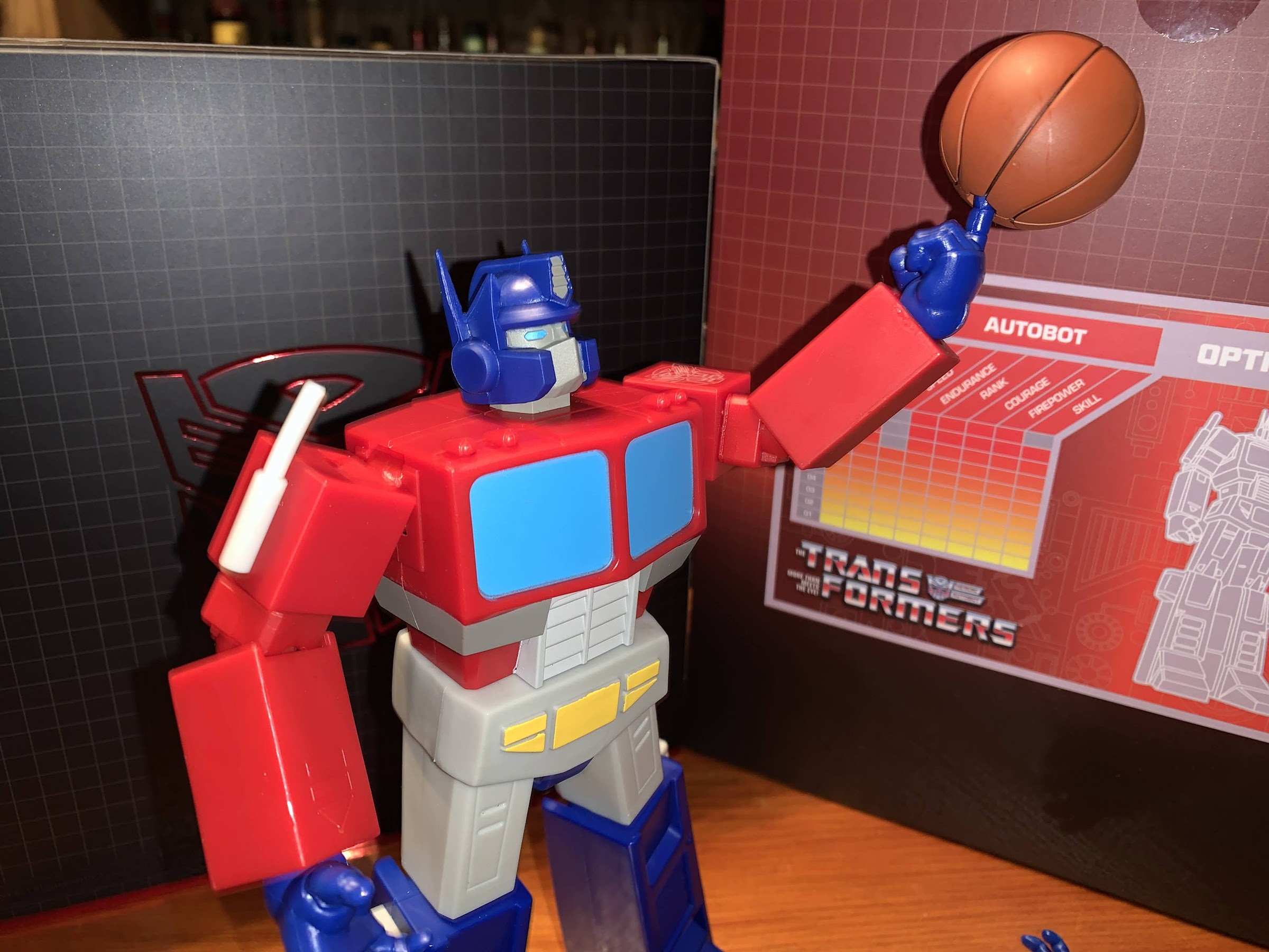
Not the best Kamehameha pose, but it’s not like the Goku figures are that much better.

Krillin moves okay, I think the shoulders need some more work, but I like that they’re exploring other solutions for that joint that isn’t just pegging a chunk of blue plastic into the figure’s shoulder. And when it comes to accessories, Bandai took care of the little cue-ball. Krillin comes with four portraits: stoic, yelling, teeth-gritting (with a side-eye), and scared. I like getting four, but we are definitely missing a smiling portrait. Oddly, such a head isn’t being included in the Battle Armor Krillin that was recently up for order (not that I would have bought a second figure just to make this one smile). What’s here is done well though, and as I mentioned before, the subtle paint work on the expressions is all clean and applied well. In addition to the heads, we get six sets of hands: fists, open, martial arts pose, Kamehameha hands, two-finger pose hands, and open palms with peg holes. There’s also a bonus 13th hand that’s grasping a bag of senzu beans. The peg holes on the open hands are for Krillin’s blast effect: the Destructo Disc! It’s cast in translucent, frosted, yellow, plastic and has a buzzsaw design. The peg is pretty short, but it fits in the hand and looks okay. Because it pegs into Krillin’s hand, it can’t be used with the stands that peg into a blast effect so it can only be positioned above Krillin’s hand. There might be stands I’m not aware of that could work with this to depict the Destructo Disc in flight, but you won’t be able to do that out of the box.

I love all of the headsculpts, and the bean bag hand is fun, but who is really going to display him doing something other than this?!

The one additional drawback with this figure is becoming a common one out of the Vietnam factory and that’s in the joint tolerance. And it’s at those shoulders again. The right shoulder on my Krillin is pretty loose, so it’s easy to move and position, but the weight of the Destructo Disc makes it want to sag. The left shoulder has the opposite problem as it’s quite tight and getting his arm straight up for the proper pose was trickier than it should be. Plus, Krillin rarely uses his left arm for the Destructo Disc so I’d prefer to pose him with the left. Hopefully as the factory releases more figures these details get cleaned up, but for now, it feels like a roll of the dice when a figure shows up with the “Made in Vietnam” language on the front.

Nappa! Don’t touch it!

Krillin 2.0 is a solid entry in the S.H.Figuarts line of Dragon Ball Z action figures. Yes, I was a bit hard on some aspects of the figure, but that’s because this is a $55 release and we should have high standards for a figure at that price point. If this were a $30 Target release then some of these would be easier to overlook. Even with the warts, the figure displays well enough as long as you don’t get one with a shoulder so loose that it can’t use the energy effect. Mine is a touch finicky, but it’s holding up so far and at least I can swap the effect to the left arm if I absolutely have to. I like that they’re trying new things, and giving us updates to the older figures that are dated at this point. I just think maybe they over-engineered these shoulders and they could accomplished the same look, with something simpler. This figure is definitely worth getting if you like Krillin, want to upgrade from the old one, or are rounding out your DBZ display. And as a general release item, there should be plenty in stock at MSRP if you still need one.


Super7 Transformers Ultimates! Optimus Prime

Super7’s take on the classic 80’s toyline has finally arrived, but is it any good?

I think we’re over discussing the merits of non-transforming Transformers, right? It’s been done for a long time, but was really pushed to the forefront with the Hasbro RED series in 2020 and while there will always be a section of the fanbase that wants nothing to do with such a concept, it’s still an easy thing to justify. When the Transformers arrived on television sets in the early 1980s, they were giant robots that generally went from some kind of automobile to a humanoid robot. And those transformations were pretty unrealistic when compared with the toy. The character models needed to be kept neat and tidy for animation’s sake and if something looked a bit janky on the toy the cartoon could remedy that. As long as a kid could at least tell the character and the toy were one-in-the-same it was fine. And now there are collectors who want their Transformers to look, and move, like the characters from the show and what’s wrong with that? There will always be transforming toys to please the masses and these sublines can go off and do their own thing.

This should be a familiar sight for anyone used to Super7’s Ultimates! line of action figures.

When Super7 announced it had grabbed the Transformers license many people were shocked. Transformers is basically an in-house property for Hasbro, so what benefit is there to Hasbro licensing it out to a company that is just going to make something it can already supply? Well, money, for one. Hasbro clearly doesn’t view Super7’s offerings as direct competition with their own stuff. And Hasbro, being much bigger, was able to pump out the RED series before Super7 was able to announce they’d be doing something similar (and apparently the RED series kind of caught Super7 off-guard). And they are different, to a degree. While both seek to replicate the Generation 1 look for its characters, they operate in a completely different scale and at a completely different price. Time will tell if Transformers collectors need both, but for now both seem to be doing all right.

Optimus certainly knows how to fill out a window box.

I’ve mentioned before that I’m not big on Transformers. I basically missed it by about a year or two, so my first love when it came to a toyline was The Real Ghostbusters, while my cousin who was two years older loved Transformers and G.I. Joe. I had a toy here and there, but nothing I can even cleanly remember (I think it was a yellow car, but memories can be funny). I did get into the Generation 2 re-releases briefly. I thought Grimlock looked cool in blue, and I saved up some money to get Optimus Prime. I’d also add the tank version of Megatron, but I kind of stopped there since Transformers were way more expensive than an X-Men figure. It was basically a 3:1 ratio with basic Transformers, while that Optimus cost me 30 bucks in 1992 money! All that is to say that Super7’s line of Transformers really shouldn’t be my thing, but I have a nephew that really likes the brand and when he got setup in a new bedroom I decided to make him a clock in the shape of Optimus Prime because my grandfather had done the same for me and my sister (his mother) when we were kids. My clock was Leonardo and my grandfather modeled it after my giant sized action figure of the same. I wanted to do something similar with my nephew’s clock and the reference that worked best was Super7’s art for their figure. Now, he’s too young for this type of toyline, but I still thought it would be cool if I also got him the toy. And since I was buying one for my nephew, well, uncle needs one too! I don’t know when I’ll give him his figure, or if he’ll even care about Transformers come then, but these are the specific circumstances that lead me to owning this figure so I’m going to tell you all about it.

The figure certainly looks similar to past incarnations of Optimus Prime, but it has a decidedly different flavor.

Optimus Prime is one of four figures in the inaugural wave of Super7 Transformers and he’s the only Autobot in the lineup. Super7 appears to want to go a bit deep, or obscure, with its choices while also recognizing it needed to include the Autobot leader in the first wave. This line is a 7″ scale line that seeks to emulate the look from the original cartoon. There’s going to be a lot of solid colors, less detail, and a bunch of stuff included as accessories pulled from the show. It’s a good approach as even the RED line from Hasbro deviates from the look of the show with its figures as both Soundwave and Optimus featured clear “glass” on their body when the toon would use a solid color. I believe this wave is also the first one released under the new pricing model of $55 a figure. Previously, Ultimates were $45, but then COVID happened. These went up for order in March of 2021, so a turn-around of 14 months actually isn’t that bad given the state of things.

Sick of working for Michael Bay, Optimus is looking to audition for Quentin Tarrantino.

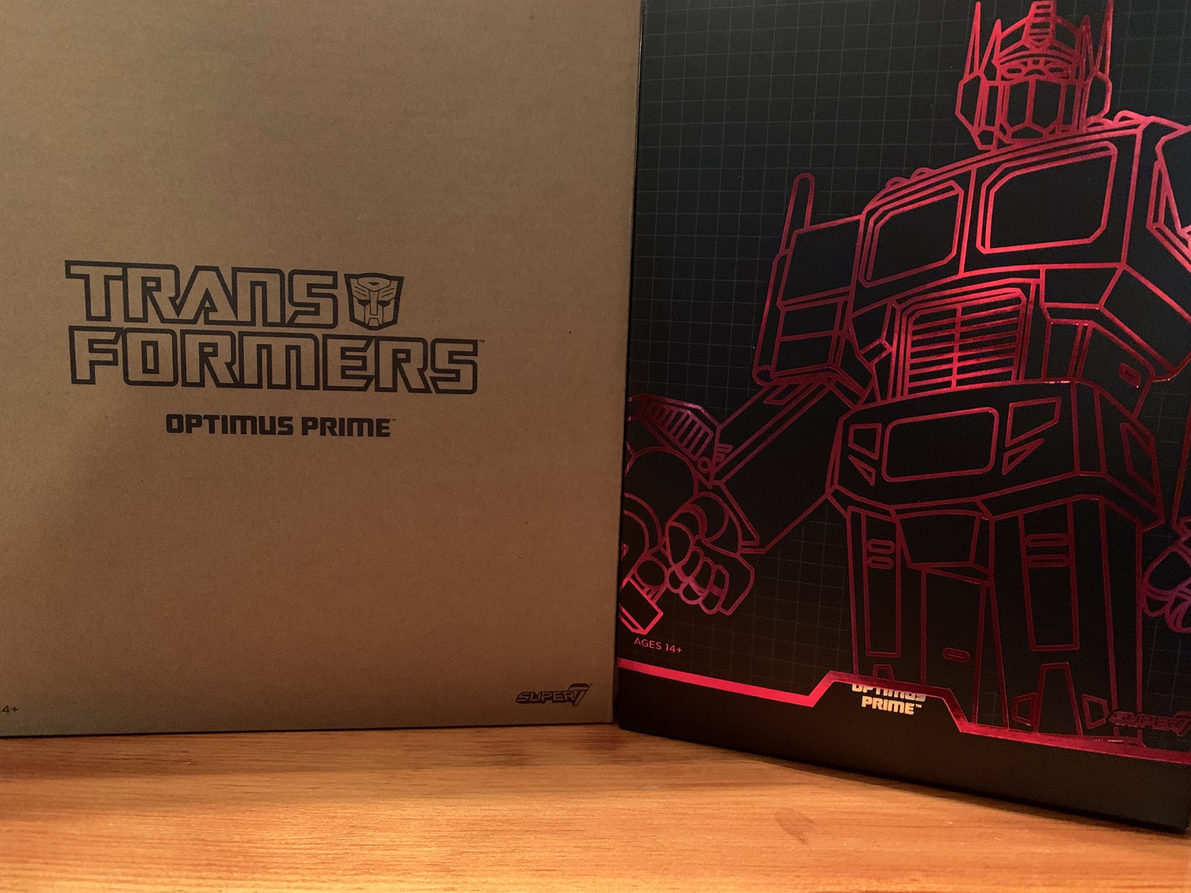
Optimus comes in the familiar Super7 Ultimates! packaging. The box is a bit beefier than some of the other figures I’ve purchased from them, but it’s still the same slip-cover over window box. The outer slip-cover is rather nice as it has a reflective outline of the character and the window box has the familiar red and black grid pattern with an old school character power level grid on the back. Optimus takes up quite a bit of real estate in the box and the inner cardboard is mirrored, but the figure (and accessories) are so big that it doesn’t really add anything. I didn’t even notice it until I pulled him out.

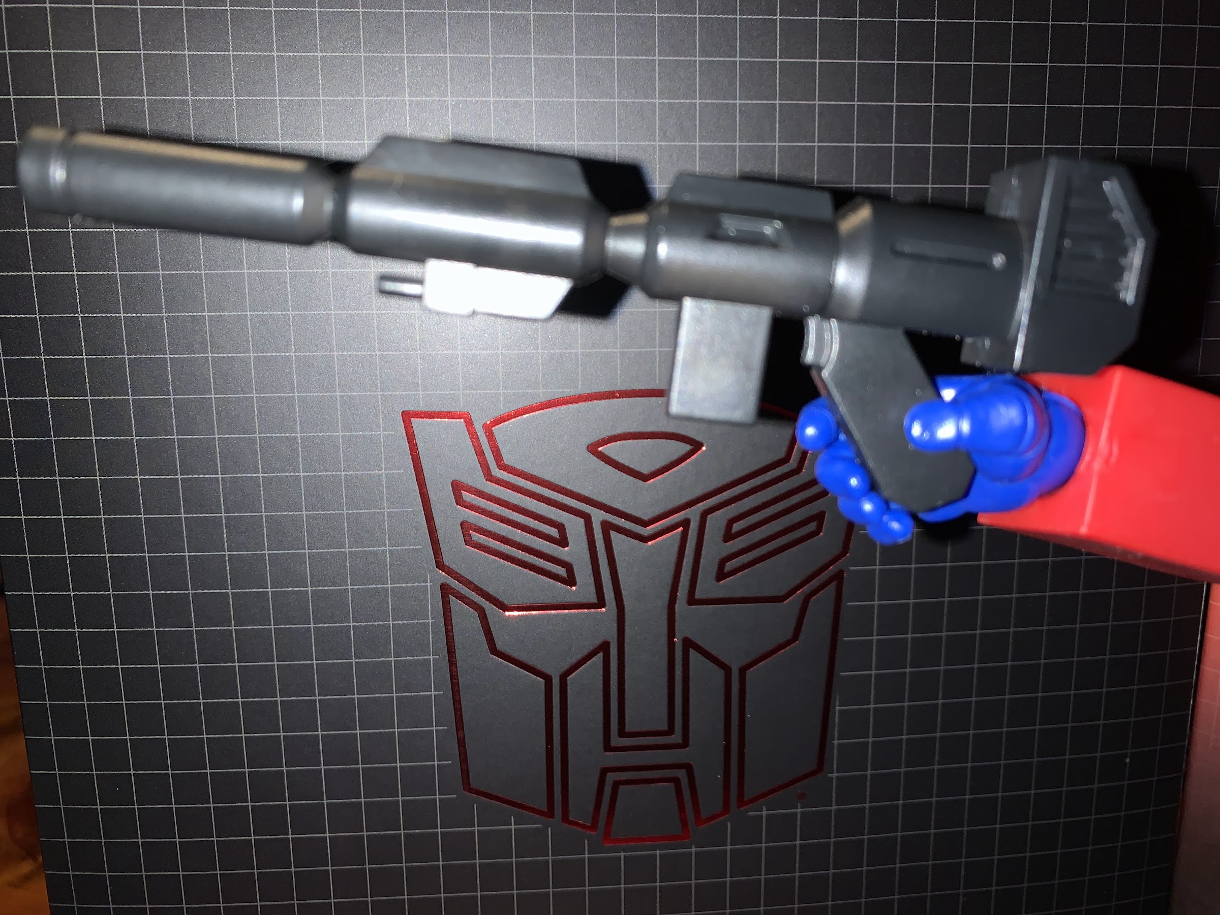
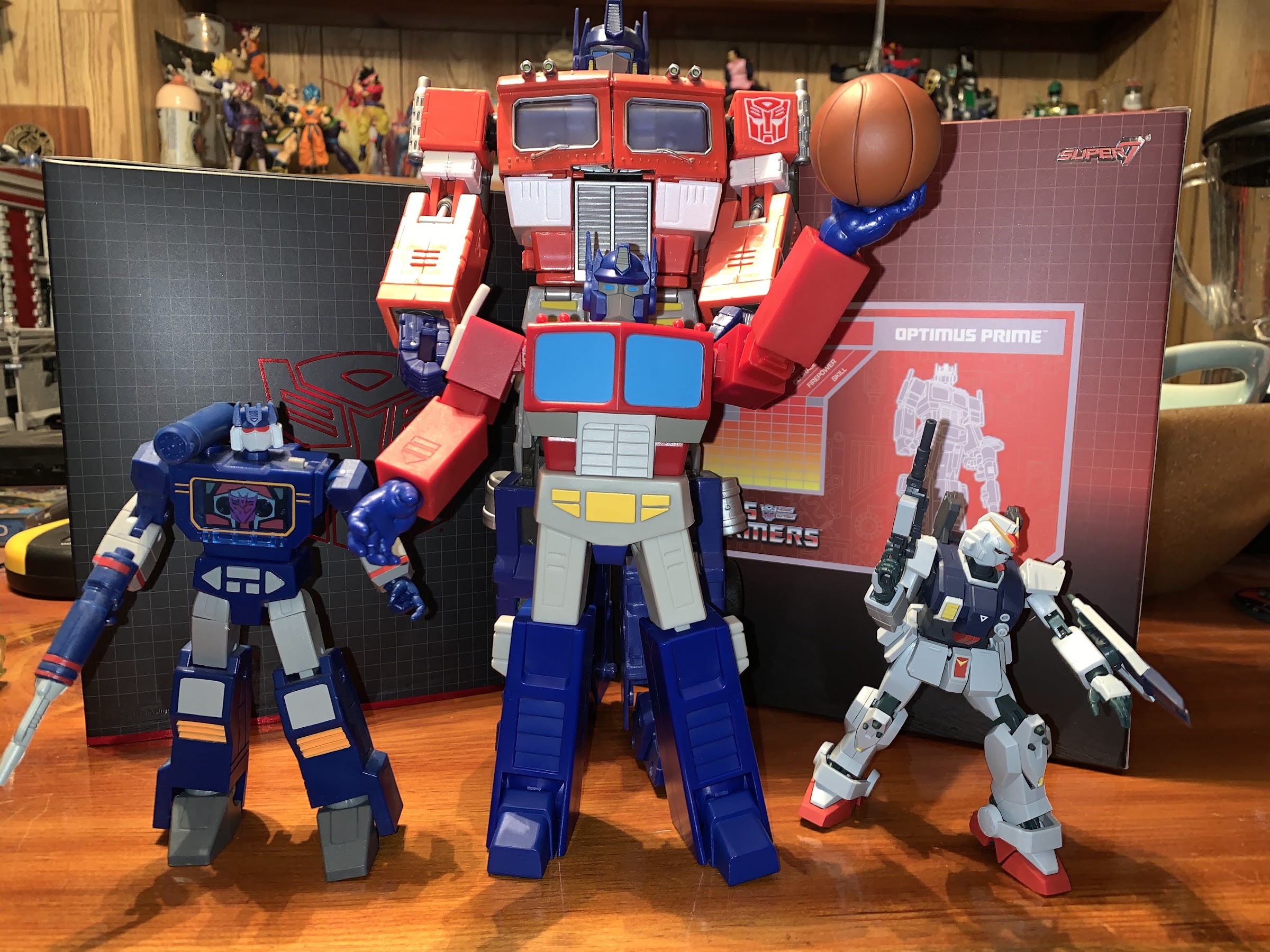
This is pretty much as best he can do when it comes to a gun grip. Why not just straighten out the handle so he can actually grip it properly? The first in many questionably decisions to come.

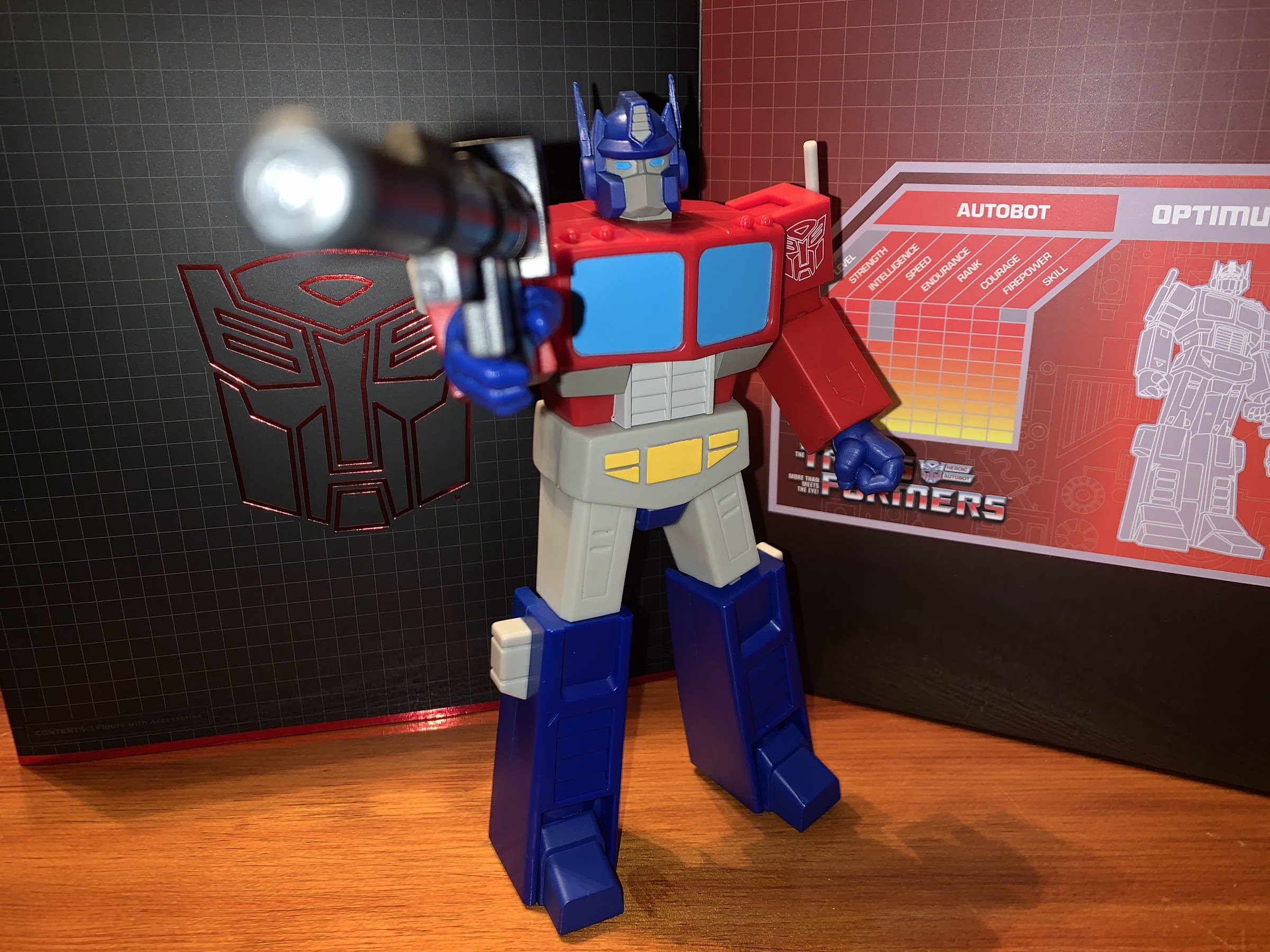
Out of the box, Optimus stands at about 8″ in height, maybe a tick over. He’s a very blocky, chunky, figure and at first blush I’d say that, yeah, he looks like the cartoon character. He does not, however, give off that “Just walked out of the television set,” vibe as there’s almost no paint on this guy. Most of what you’re looking at is molded plastic. It’s not super shiny, which is good, but definitely lacks pop. It’s most apparent on the windshield panels on his chest which are just a light, flat, blue. Pull-up almost any image from the cartoon of Optimus Prime and you’ll see some white accents on the glass part. Why not paint that on? Super7 used decals with that effect for their vinyl version of this character, but decided against it here. I wouldn’t expect cel-shading out of Super7, but a little flourish would have been nice. Aside from that, most of the paint is found on the crotch because they used a plastic overlay (affectionately referred to as a “diaper” in most collecting circles) that’s quite soft and requires paint. The gray band in the torso is also painted and there’s the Autobot logo painted, or printed, onto the left shoulder. I wish the logo was raised or stamped in, but it’s clean so I guess it’s fine. The smaller details on the face are well-painted too.

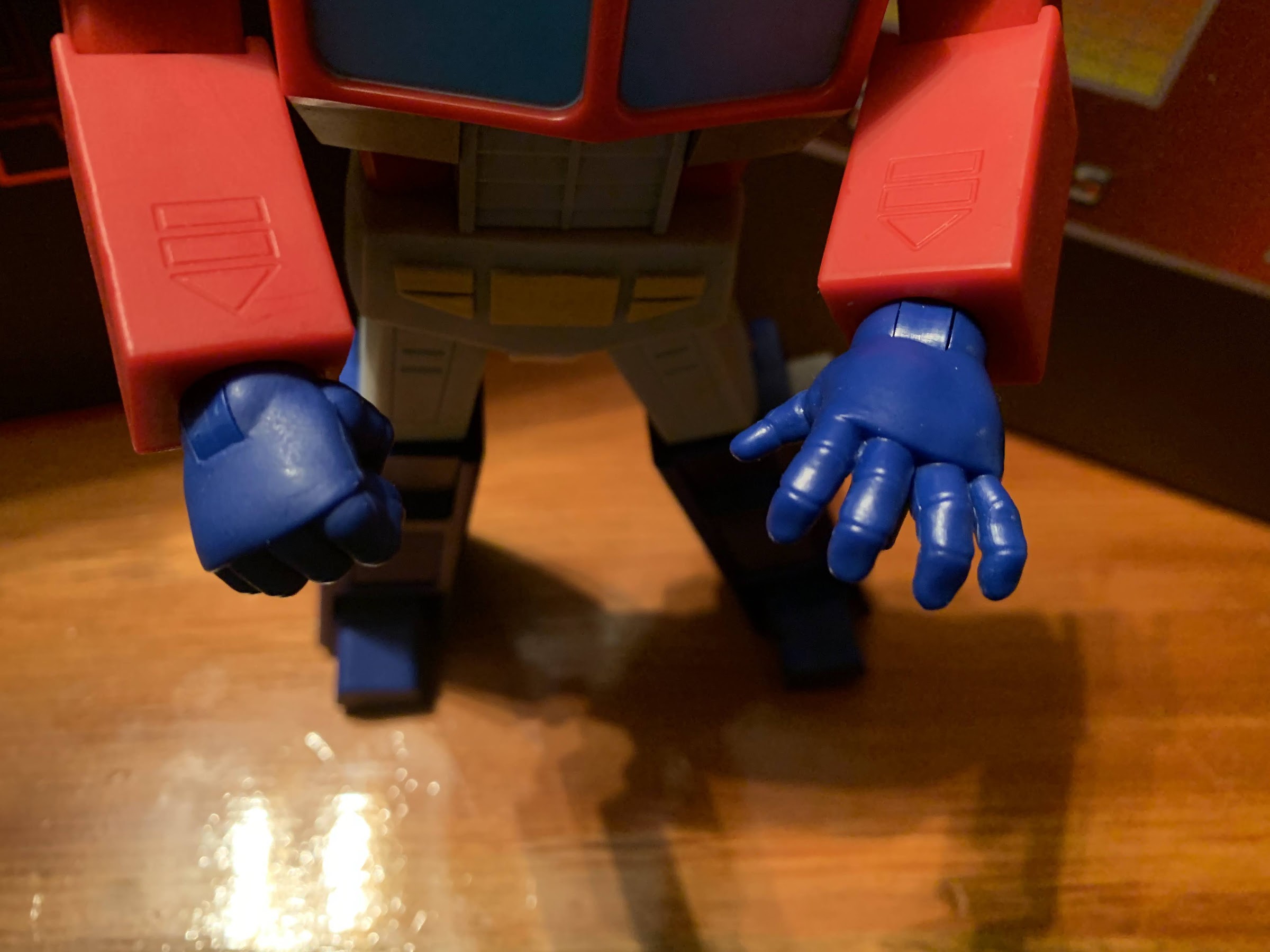
I’m not sure how obvious it is on camera, but the fist hands have this nice, matte, coating applied while the rest are just bare, glossy, plastic.

The low detail approach just makes Optimus a little plain looking. I think the figure would have benefitted from at least some panel lining which would be in-line with the cartoon’s presentation. Obviously, Super7 tends to think less is more, so I’m not shocked by their choices, but a little let-down. For $55 this could have been better. I also find it interesting they opted for an off-white or light gray shade for the crotch, thigh, smokestacks, and fuel tanks when the cartoon was pretty consistent about making those parts white. I associate the gray coloring more with the toys so it’s a bit of an odd choice. It just looks a bit dingey, so I would have preferred white, but it’s more of a nitpick than anything. Worth pointing out is that the right smokestack on mine came rather warped. It’s nothing I don’t think a little hot water or blast from a hairdryer can’t remedy, but I review these things as they come out of the box to give you the best idea of what to expect.

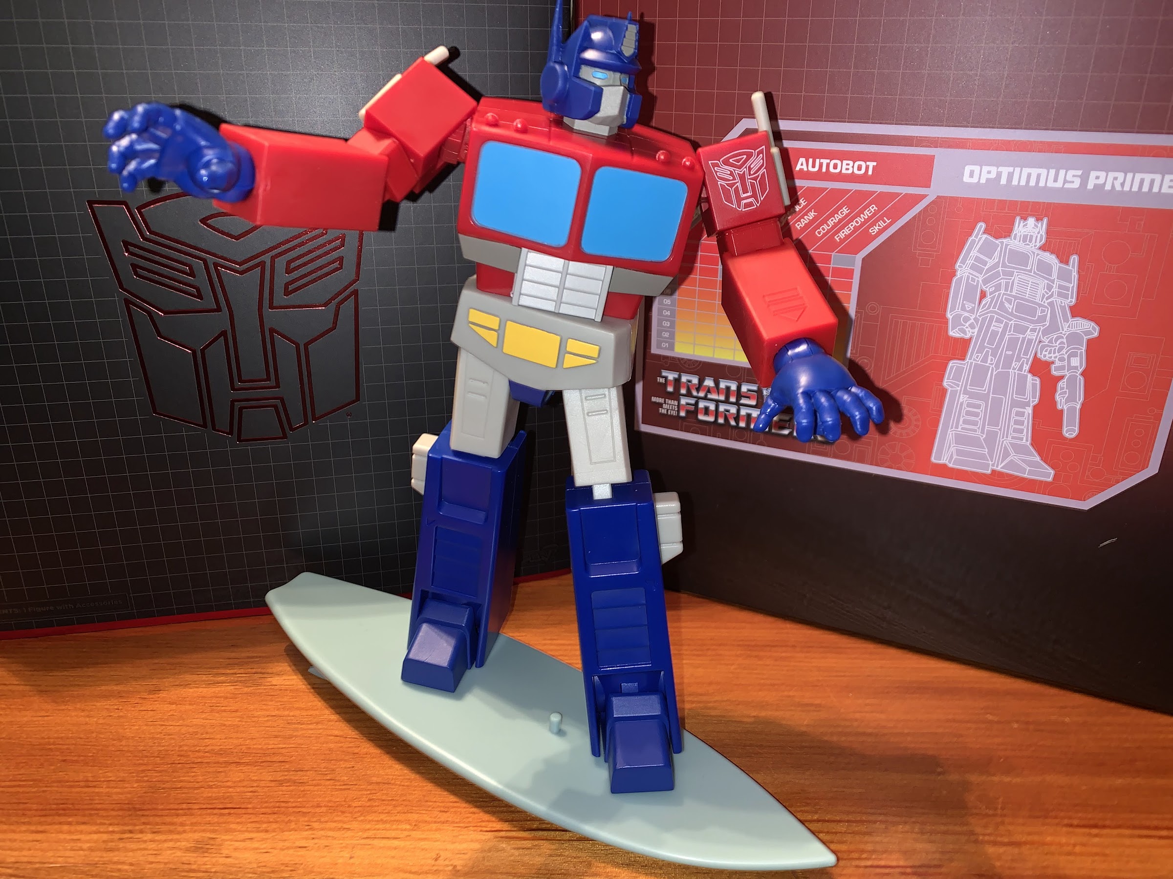
But hey! He comes with a surf board! Also, that’s as far as his elbows can bend. Yeah, not good.

Where the design is going to cause further problems is with the articulation. Now, I have the Voltron from Super7 so I had an idea of what to expect here. Plus I know from experience and just from what the company has told us that they prioritize the look over the articulation. Super7 believes articulation is fine, but that most collectors are going to put their toys on a shelf in a fairly basic, or neutral, pose. I don’t really agree as I think that’s what five-point figures and vinyl toys are for, but I’m not the one running the company. As far as I’m concerned, Super7 can take whatever approach it wants so long as it’s consistent which is why you won’t hear me complain about the lack of double-jointed knees and elbows. Super7 just doesn’t do them. This toy is, however, still an action figure so it should be judged as one and in doing so there’s some good stuff here, and some very not so good stuff.

If you don’t like the toony head you can switch to a toy-inspired one.

For starters, Optimus has a head that sits on a double ball-peg. This is a welcomed sight as the last Super7 figures I looked at featured a single ball-peg. Since he basically has no neck though, his range is going to be limited. He can look up and swivel with a little tilt, looking down is basically impossible. Once you introduce the ab crunch can the figure look down a bit. And that ab crunch is well-hidden and feels smooth. I’m not too worried about paint rub on the grill piece, though the figure doesn’t get any reverse crunch movement out of it. It strictly allows him to bend forward a bit. At the shoulders, we have an interesting setup. There’s a hinge inside the housing for the shoulder, with a pivot point just outside that, and a hinge just beyond that. This allows the bulky shoulders to swing out and come over the top of the torso allowing Prime to raise his arms out to the side past the usual 180 degrees. He can basically be the “Y” in a performance of “YMCA”. Unfortunately, Super7 apparently used up all of their creativity here because the elbow is a different story. There’s a biceps swivel above it, but the actual hinge bends maybe 45 degrees, if I’m being generous. The general accepted range on an elbow is 90 degrees, and that’s considered passable. My Hasbro RED Soundwave can do full curls and touch his shoulder with his hand to illustrate how big a difference this is. The comparably bulky Voltron could nearly get to 90, which I felt was satisfactory given the character. Not even getting close with Prime though is really unacceptable for a premium action figure, and at $55 a pop, that’s what this is. All Super7 had to do was cut out some relief on the forearm or elongate the piece where the elbow exists. It wouldn’t cost anymore to have done it right, nor is it going to ruin the look of the figure. It just feels like they hit a mild trouble point and decided not to address it at all thinking this amount of range was acceptable, but it’s not.

“Good thing you don’t have an eject button you need to be able to press!”
I think this is how I’m supposed to use this thing.

Moving past that unfortunate piece we have hands that peg into the arms and feature a single hinge which is fine. The waist has standard rotation so I’m assuming it’s a peg joint and not a ball. At the hips, we have the usual ball-pegs that Super7 likes and they’re fine. They’re pretty big so they don’t look as scary as some of the pegs on the TMNT figures and you get a swivel and range out to the front, back, and side. If you read my Voltron review, it was this spot that I deemed unacceptable on that figure as it just had pegs with no ball so that figure only kicks forward and back which is terrible. Optimus thankfully has normal leg function, though that diaper piece limits how far his legs can move. It will flex, but I wouldn’t want to leave the figure posed with too much stress on it. The knees are single-hinged and can achieve a 90 degree bend with no problem, it’s the ankles where we hit another roadblock. Optimus has rigid plastic alongside the lower legs so the ankles are effectively in splints. They hinge up and down and there is an ankle rocker, but it’s functionally useless because there’s just no room. Again, this could have been solved without cutting into the sculpt much. They could have brought the toe portion of the foot out a little further and it actually might have been more screen accurate. Doing so would have allowed them to just put a swivel point there. They also could have done what Hasbro did and do a drop-down ankle joint. That’s probably the better way to go, but there’s a number of things that could have been done, but Super7 opted for none. While Optimus can actually widen its stance, unlike Voltron, it can’t be widened much because eventually the figure can’t stand on its feet because there’s no rocker. It’s just a bummer.

He’s got a jet pack, if you think he needs one.
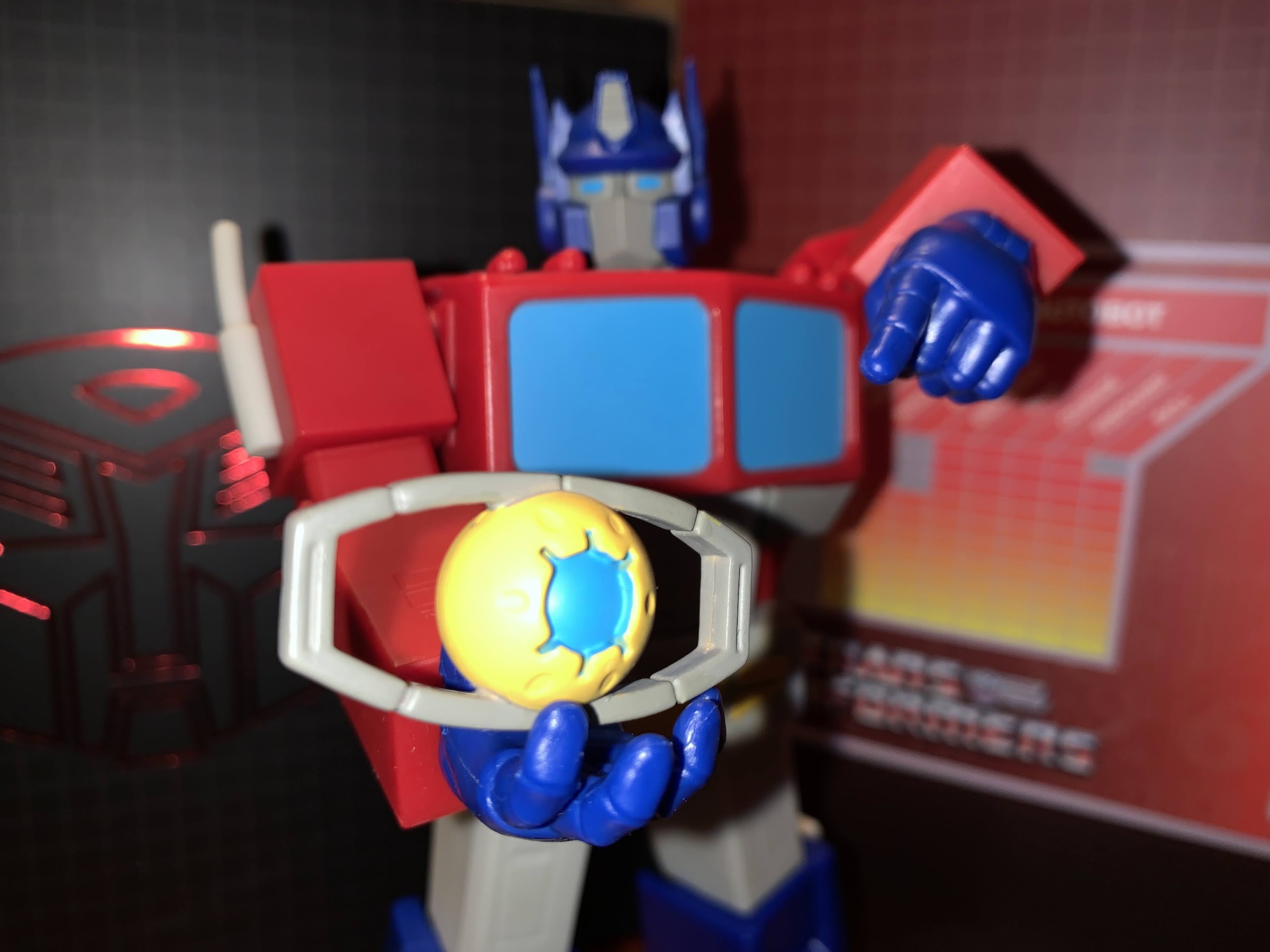
Check out my Matrix!

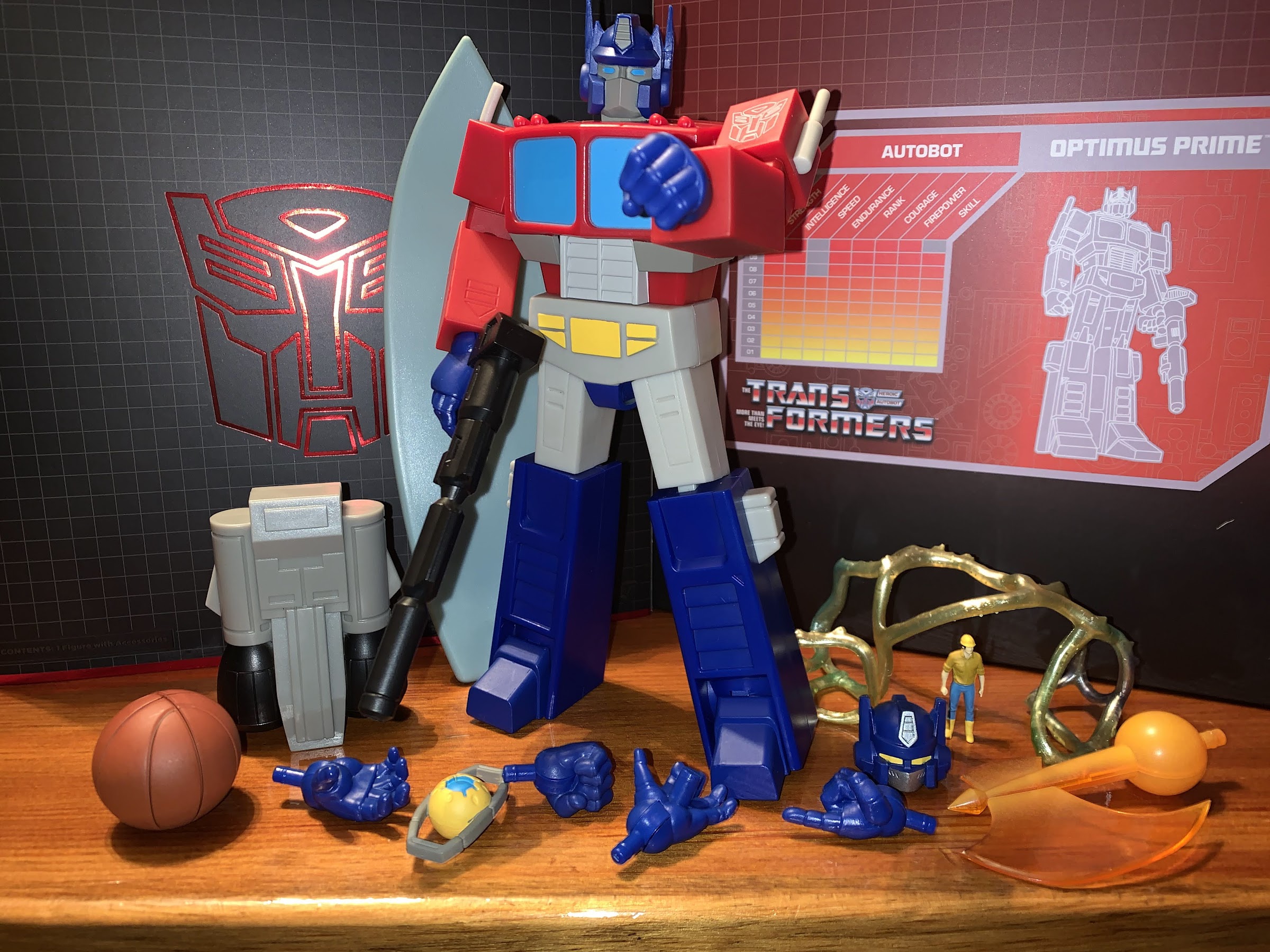
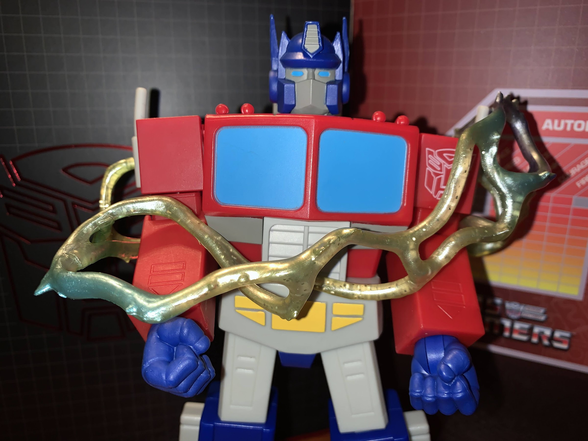
Super7 is certainly not known for articulation, but what it’s Ultimates! line is known for are accessories, and Optimus does okay in that regard. We get two heads with this figure, the toon accurate one that comes on the figure and a toy accurate one for those who prefer that look. I had that toy and loved it, but I really have no use for the alternate head. For what it is, it’s fine. Optimus comes with fist hands in the box and the figure can swap to a trigger right hand, pointing left, open right hand, and an open left hand with a peg on it. What’s missing are just normal gripping hands, which is a problem I’ll get to in a second. Interestingly, the fist hands have a matte coating on them and you can see where it ends near the peg. The other hands don’t have this and as a result are a bit glossy. It’s not something everyone is going to notice, but given the choice, I would have liked all of the hands to have this matte finish. For the trigger hand we have Optimus’ gun which matches the old toy and the show. The handle is at an angle though and I can’t get the trigger finger onto the actual trigger. If the angle wasn’t so steep it would be fine, but it looks kind of dumb as a result. The gun is also just molded, black, plastic with an ever so subtle graphite finish. For a more melee approach, Optimus has his orange, Energon, axe. It pegs into the forearm in place of a hand and it’s done in orange, translucent, plastic with a frosting on the shaft portion and it looks pretty damn cool. It’s just tough to find a natural axe-swinging pose given the figure’s articulation limits. There’s also this energy net thing (Energon binder, per the listing) that’s sparkly and made of soft plastic. I guess you can wrap it around a figure. It’s fine for what it is.

Spike isn’t really meant for close-up shots.
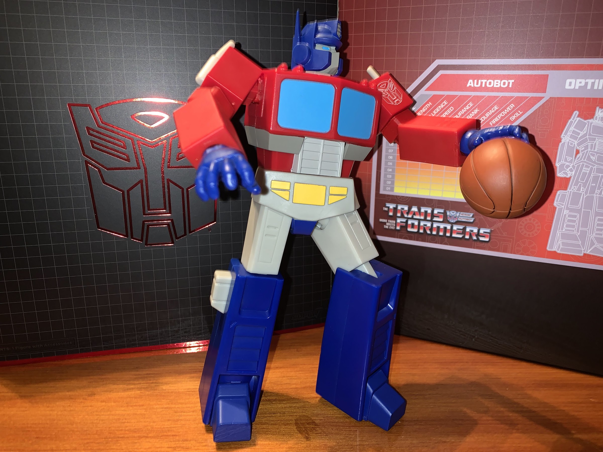
He’s probably not going to make it as a Globetrotter.

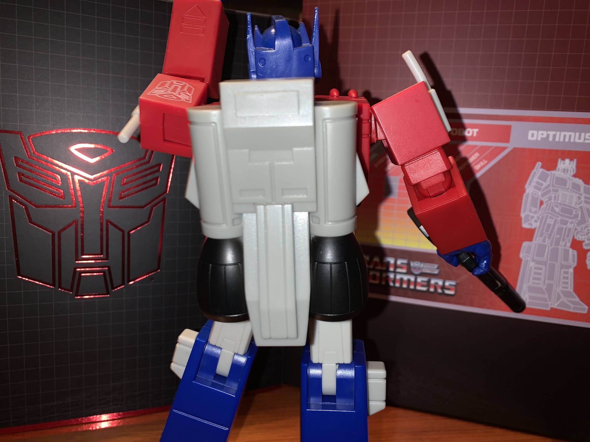
For the peg hand, there’s a basketball. The lines on it are sculpted in, but the black paint in those lines isn’t well done. I’ve seen images of people with pretty nice looking basketballs so mine might be worse than most (the second Prime I bought looks to have a better basketball). The ball fits nicely into the peg, and it’s this sort of goofy accessory that people may find charming about the figure. It would be nice if the peg hole was smaller though so it could better fit on the end of the pointing finger hand. It’s do-able, but the ball sits so low that it doesn’t convincingly create the illusion that Optimus is spinning the ball on his finger. There’s also the Matrix of Leadership thing that would normally go in Optimus Prime’s chest, but without gripping hands he can’t really hold it so it feels rather perfunctory since he doesn’t have a chest cavity to place it in. There’s a little, painted, Spike Witwicky that’s mostly in scale with Optimus which is kind of neat. There’s a big surfboard for Optimus as well which is pulled from an episode of the show. It’s rather plain looking as it’s just a gray-blue shade of plastic and it could really use a stand of some kind. There are peg holes on it and it’s pretty easy to get Optimus onto the thing, but I don’t know if I’ll ever use it. Lastly, we have a jetpack which is just a big old hunk of plastic that snaps into the rear of the figure. I like that Super7 was able to make it removable without a peg hole, but it’s rather boring looking. It’s at least really light so it doesn’t throw off the figure’s balance, but again, I’m not sure if it’s something I’ll ever use.

“I bet you wish you could ball like me!”
“I bet you wish you could hold a gun like me.” “Aww, that hurt”

In many ways, this figure is largely what I expected. I knew the blocky design would present issues with the articulation, as it had with Voltron, and I expected Super7 to keep it simple. With the shoulders and even the ab crunch, Super7 actually surprised me in a good way. They also surprised me in a bad way with the very limited elbows and ankles. I do strongly believe that for a figure to be considered articulated in this day and age we need elbows that hit 90 degrees (or near enough) and ankle joints that provide for better stances on the shelf. The ankle is hugely important for a figure because that’s the joint closest to the surface. Bad ankles limit posing or cause figures to fall over. Optimus Prime doesn’t have the falling problem, but that’s because he pretty much has to keep things vanilla. Which is a real bummer because I was hoping to be able to pose this more dynamically than my Masterpiece Optimus which is really too heavy to attempt much out of fear of it falling over. And if the figure isn’t going to move great, it needs to make up for that with the paint and this figure doesn’t really try to do that. I don’t think the included accessories make up for that either.

Some of the figure’s shortcomings when it comes to articulation could be more easily overlooked with a paint job as exciting as what Voltron received.

I’m not a huge Transformers fan so it’s hard to say if my reaction is more forgiving than the average fan or more harsh. If you’ve been on the fence about this one then there’s a good reason for that. At least the solicitation images paint a fairly accurate portrait of what you’re getting. If you want a more toon accurate Optimus in a much bigger scale than the Hasbro RED series, then this might do it for you. If you were expecting a dynamic posing figure that looked like it stepped right out of the TV then I don’t think this figure is for you. A subpar action figure in 2022 is also not without value. There is certainly a “fun” aspect to this figure just in the size and the some of the silly accessories, mostly the basketball. On a subjective level, I can be okay with this thing and not regret my purchasing decision. Objectively though, this is a real tough ask at $55 and it’s not something I can give a blanket recommendation for. If you know what you’re in for and like what you see, you may feel differently.

He’s here. He’s flawed, but you can probably still have some fun with him.

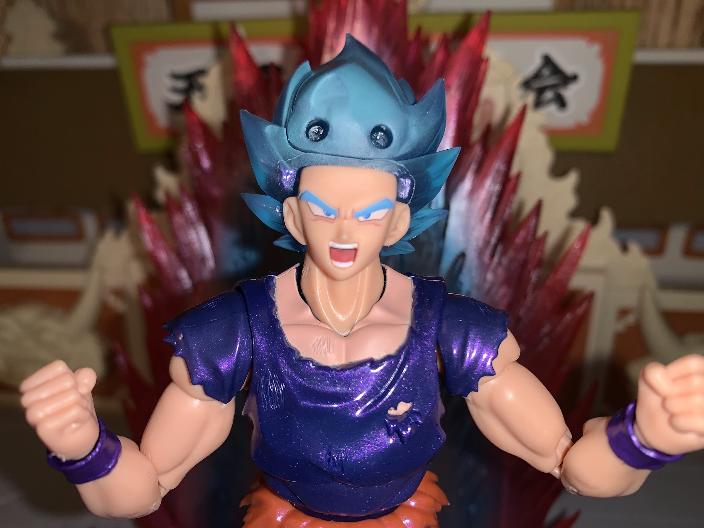
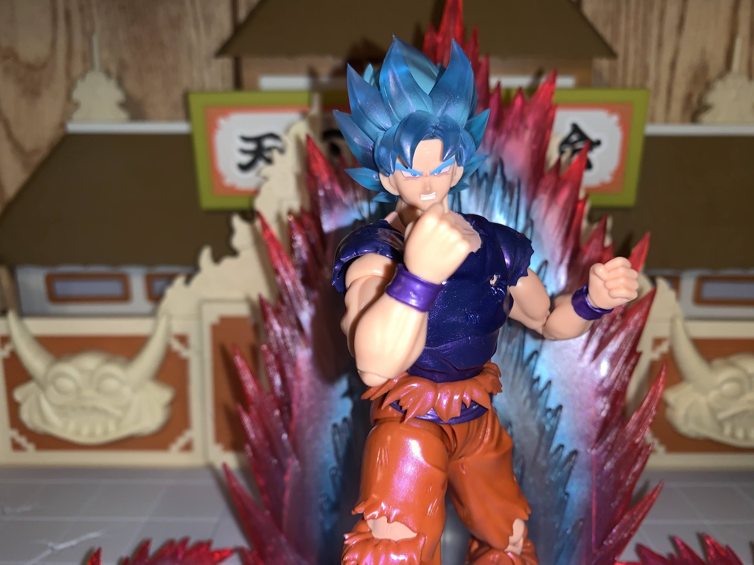
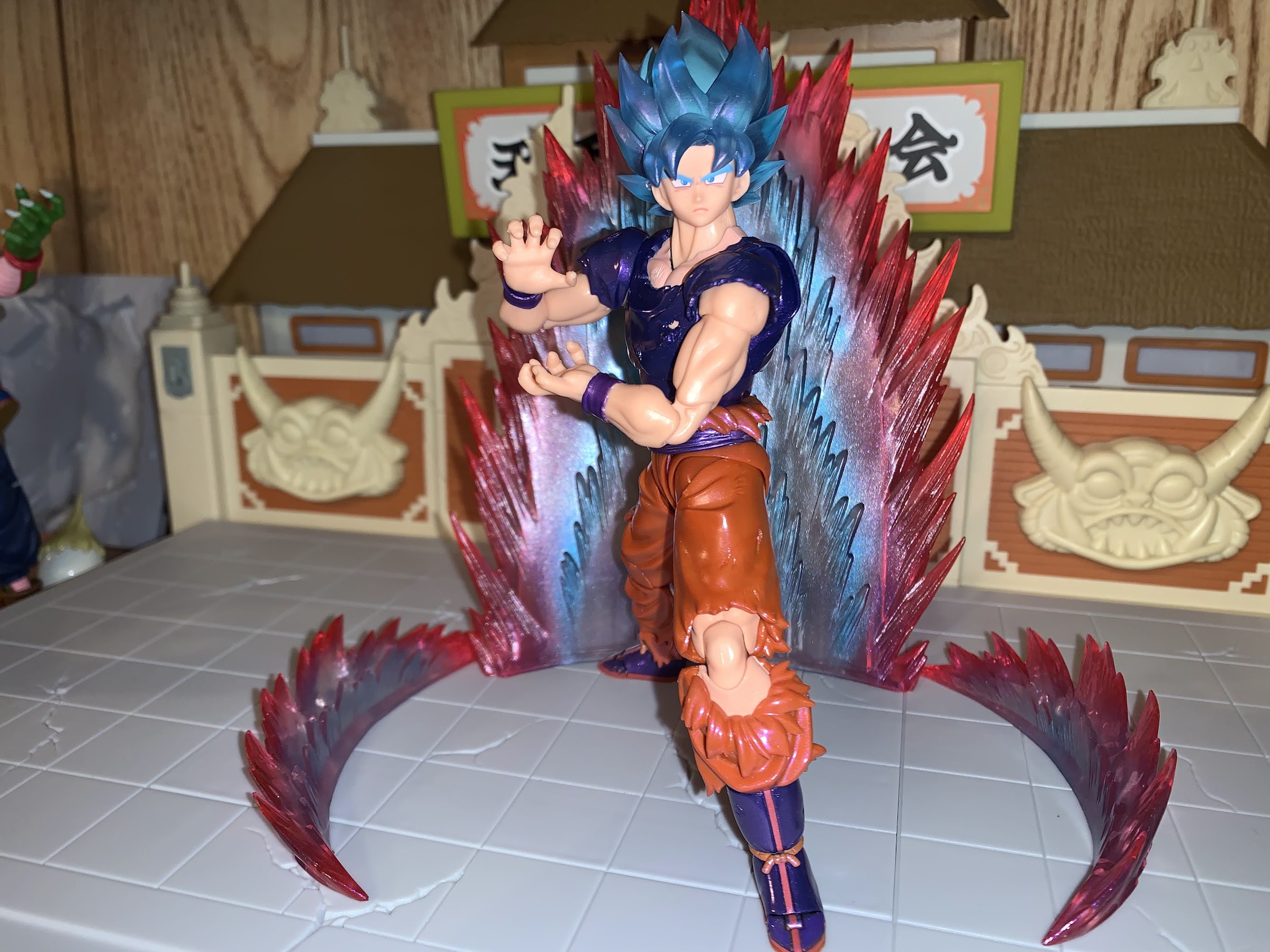
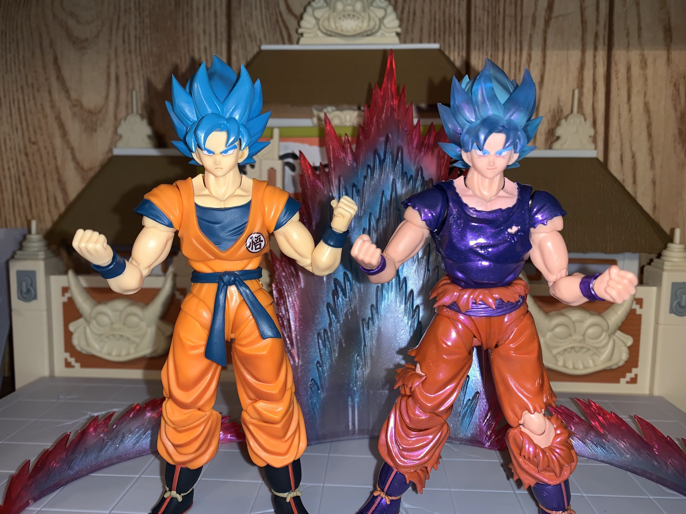
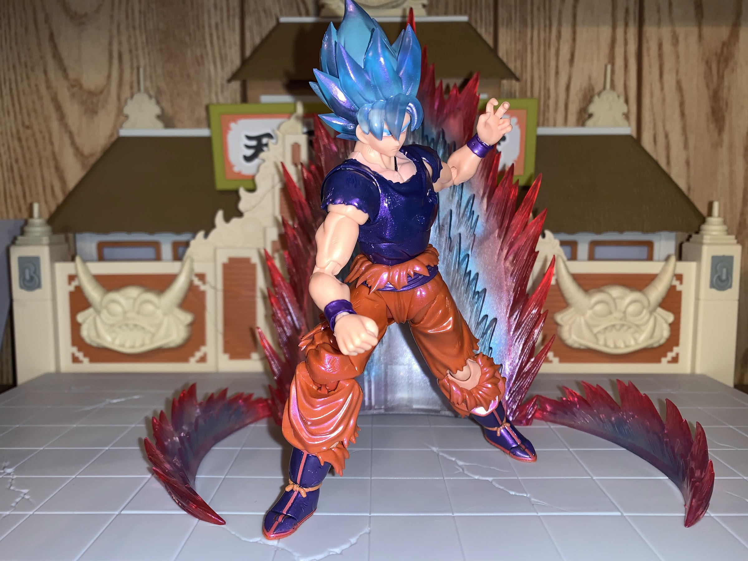
S.H.Figuarts Dragon Ball Super Event Exclusive Color Edition Super Saiyan God Super Saiyan Son Goku Kaio-Ken

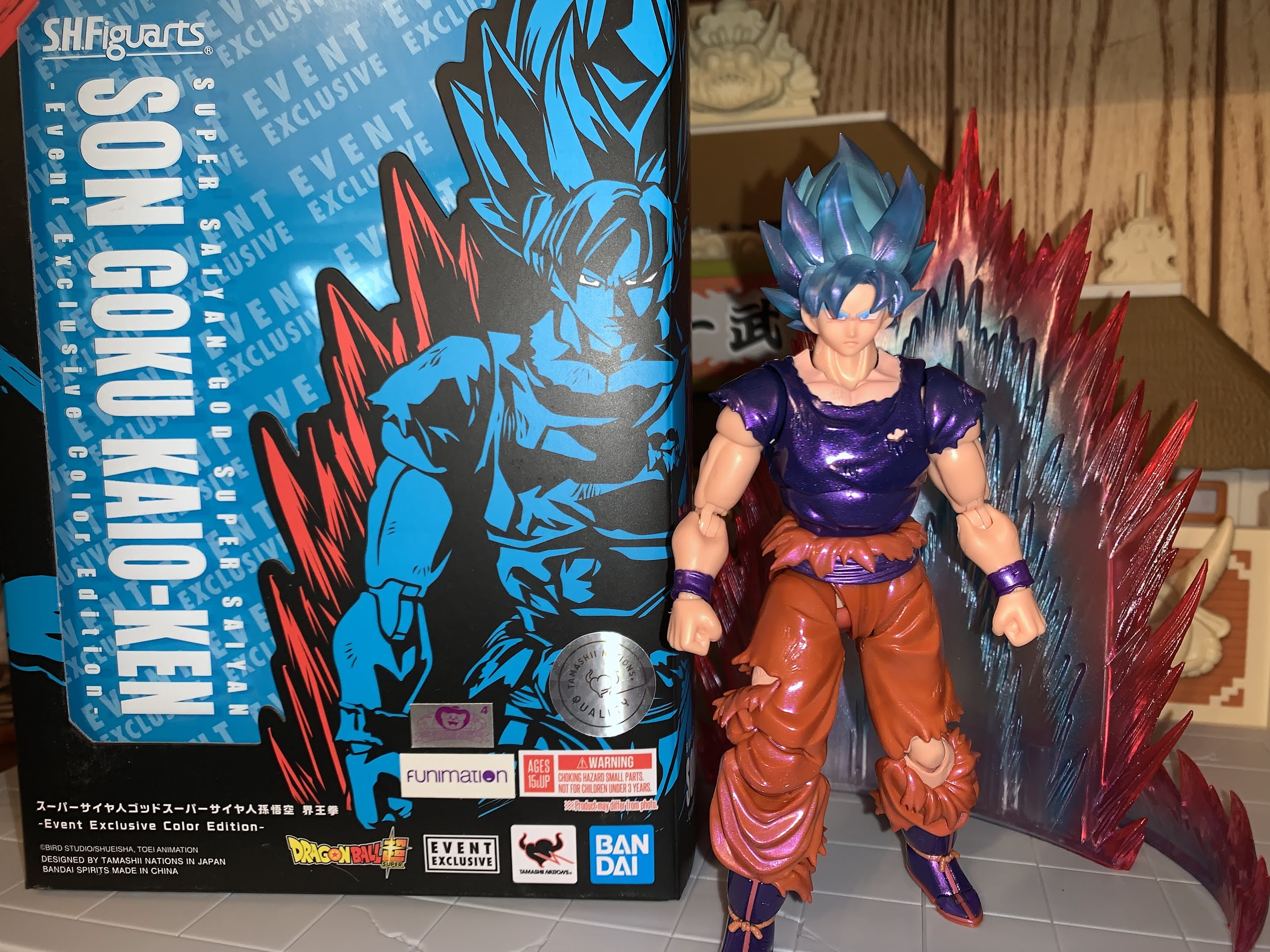
He’s ready to rumble.

My isn’t that title a mouthful? This version of the classic character Goku comes to you from Bandai via New York Comic Con. If I were to simplify that title, I’d call it shiny Super Saiyan Blue Kaio-Ken Goku, which is still pretty wordy. I guess blame Dragon Ball creator Akira Toriyama for the obsession of stacking different power-ups in what I feel is an intentional bit of word play that he likely finds amusing. And I do too! At any rate, this is the last of the convention exclusives I ordered in 2021. All of the other ones, including other Dragon Ball related figures in Nappa, Goku, and Beerus, came from the world famous San Diego Comic Con. Well, that con didn’t actually happen in 2021 as it was virtual due to COVID once again. One of the few big cons to actually take place ended up being New York Comic Con, and while that one tends to be smaller than San Diego, some companies still like to issue event exclusives for it and that’s where this figure comes from. Bandai, in partnership with Bluefin Brands, made this version of Goku available at the event, but also made it available online for folks like me who weren’t going to journey to New York just to get a Goku. It meant a longer wait, but all things considered, this is one of the shorter waits I’ve have to endure in recent memory.

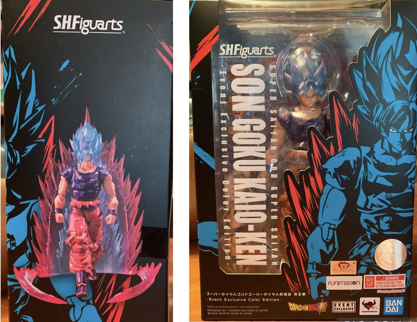
This box feels gigantic relative to other figures in the line, and with good reason.

This version of Goku hails from Dragon Ball Super and one of its first, major, arcs. The first two arcs of the show were adaptations of Dragon Ball Z movies, so this era is where Super really felt like its own thing to me. And it was just some tournament that was a bit of a friendly organized by two gods who happen to be brothers and share a rivalry. It introduced some new characters, most notably Hit, and it was during a fight with Hit that Goku dusted off his old Kaio-Ken technique. You remember that one, right? Kaio-Ken was all the rage for about five minutes when Goku took on Vegeta, but it was basically dropped after that. Yeah, technically, Goku used it against Frieza later on, but it was basically as a means to dismiss the technique which would essentially be replaced with the Super Saiyan transformation. It made Kaio-Ken one of those things fans had fun speculating on, “What would using Kaio-Ken as a Super Saiyan do for Goku?!” but the show was done with it.

Pissed off Goku.

If you need a primer on the form, it’s basically a technique that temporarily heightens Goku’s speed and power as a multiplier. He did it multiples of 2 and 3 against Vegeta, but would go up to 10 later. In Super, Goku turns to it after his Super Saiyan Blue transformation as the ultimate showing of his power at that moment in the series, though it’s not referenced much after. It does look cool though as Kaio-Ken by itself has a red aura, and combine that with the Blue transformation and you get a blue-purple look. It certainly made sense to explore the mode in figure form, and that’s what Bandai and Tamashii Nations did. And this being an event exclusive, they added some shine as well.

I love that shade of blue used for the eyebrows, so much so that I’d like to see other versions of Super Saiyan Blue Goku (and Vegeta) just go with that for all of the hair.

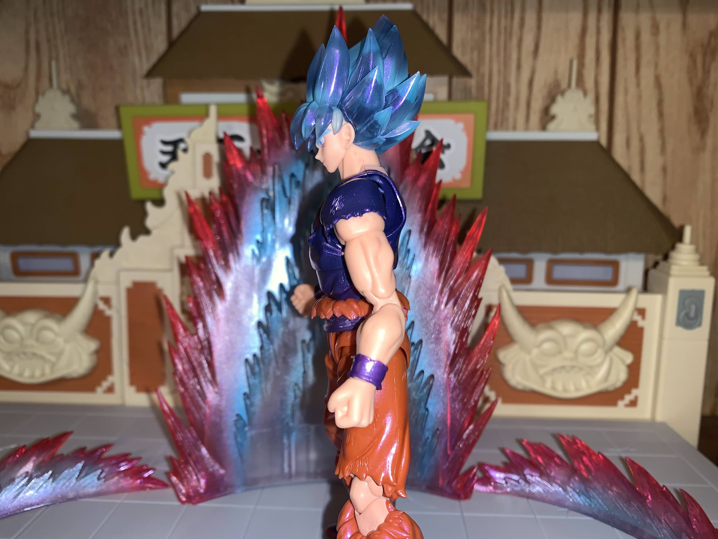
This version of Goku is obviously similar to other versions of Goku in the SHF line. He stands at about 5.5″ to the top of his forehead and roughly 6.75″ to the top of the hair when at his tallest. He’s basically in-line with my Super Saiyan Blue Goku, but this is actually mostly a differently sculpt. I don’t have it, but if I had to guess, this figure shares most of its parts with the Ultra Instinct Sign Goku which depicted Goku from his battle with Jiren. His gi is rather tattered so it needed its own sculpt to capture that. The only pieces this figure can share with the other blue Goku is the head, neck, and arms, though even some of that needed modification. I don’t have either version of Ultra Instinct Goku so this figure has more of a “new” feeling to me than it would others. It was honestly something I hadn’t thought much about until I had the figure in-hand.

The paint is rather lively on this guy and you can see the almost glitter quality in the shirt here.

What’s going to sell this guy beyond the sculpt is the paint job. The sculpt is fairly nice and I like the rips in the pants and shirt. The finish on the paint is of a pearl quality. The navy shirt takes on a metallic purple as a result and it’s pretty cool to handle and see how the light plays on it. The hair is a semi-translucent plastic with a touch of purple air-brushing, by the looks of it, which gives it a nice effect. The flesh is more saturated than we’re used to seeing due to trying to emulate the Kaio-Ken red effect. Bandai did have to do a lot more color-matching than usual though because of all of the rips in the clothing. The results are a tad mixed. The exposed portion of the chest could stand to be a touch more saturated as I feel like some of the navy color is showing through. The left knee is colored plastic, but the upper and lower portions of the leg surrounding it are painted and it’s not a perfect match. It probably won’t bother most on a shelf, but in-hand it’s pretty noticeable especially when the knee is bent all the way. This finish is also very glossy and gives the figure almost an enamel finish. It also has a different feel than most figures in the line. The plastic feels thicker and since almost everything has this finish applied it has a slippery feeling. That’s not a criticism, just an observation. Aside from the color-matching issues, my only real criticism for the paint is that I wish there was something applied to the torn parts such as a darkening to the interior parts of his pants. I just think it would help that part “pop” a bit more.

I can’t really complain because we get the aura effect with this figure, but we’ll never have enough Kamehameha effects.

The sculpt for this guy is overall pretty good. I already mentioned how the torn pieces of the gi look nice, and we get the usual musculature for Goku that other figures have. This one changes things up with some battle damage in the form of scuffs sculpted into portions of the arms, legs, and chest. I’m torn on if I think Bandai should have added some black linework to those scuffs to bring them out more as they’re not going to show from the shelf. This figure is going for a glowing aura look, so perhaps it would not have made as much sense, though I feel like in those moments Goku’s battle damage becomes even more noticeable in the anime. I could be wrong, I haven’t watched any of these episodes in years. One thing that did surprise me a little is there’s more evidence of mold release on this figure than usual. That’s those rough portions of the figure where it was removed from the actual tools used to create it. There’s basically a full tab on the underside of my figure’s right shoulder that makes it look like it was from a model kit no one bothered to snip. This figure also has those sleeves that peg into the shoulder which I really don’t like. Almost every Goku has that so it’s nothing new, but I’ll continue to complain until they find a better solution. Another common complaint is Goku also could be beefier. From the front, he looks okay. I’d probably widen the chest a little, but it’s mostly a nitpick. From the side though he looks thin. His chest doesn’t push out at all. It’s odd and almost comical. It’s also more pronounced because he doesn’t have the vest to add a little bulk, but this is something all of the figures in this line could stand to improve on. Goku, especially a powered-up Goku, should be thick and buff.

My lingering piece of criticism for this line is that nearly every character could stand to have some added girth. Goku should have a more pronounced chest when viewing him from the side.

There was a lot of new for me to take-in with the sculpt and paint of this figure, but articulation? That’s pretty much standard. His head is on a tiny, double-ball peg with another ball in the base of the neck. Despite that, he can’t really look up, but can look down. His head feels a little loose, but it seems to be holding a pose all right. The shoulders are on the peg and hinge system with a butterfly joint. The butterfly is really limited, but they at least colored it properly so it’s not ugly, just not particularly functional. There’s a biceps swivel and double-jointed elbow which bends past 90 degrees. The hands are on the usual ball pegs. In the diaphragm, we have the ball-hinge system so you can pull up on the figure if need be. It doesn’t really do a lot though as the figure can’t really crunch forward no matter what you do with the hinge, but he can bend back a little. Mostly, this joint just gives you some swivel and a little tilt, but you have to be mindful of paint rub. At the waist, you can swivel and the belt and rags is a floating piece. At the hips, Goku can almost do a split, kick forward, and kick backwards because he doesn’t have sculpted buns. There’s a little twist there too, and then your usual double-jointed knees below. The knee on the right has a bit more range backwards because it’s a standard, clothed, joint while the exposed left knee has reduced range, but still goes beyond 90 degrees. The ankles are on ball pegs and have the usual range for Goku’s boot design. It goes forward a little, back a fair amount, decent ankle rocker, and a lousy toe hinge. All of the joints are fairly smooth and required no break-in period, so that is always appreciated.

I can see people being against translucent plastic for Super Saiyan hair, but I do think this figure draws attention to how bland the approach to the hair was for the standard release. Granted, the figure on the left retails for only 30 bucks.

The other unique aspect to this release comes with the accessories and packaging. The optional hands and expressions are fairly standard. We get a stern look, scream, smirk, and a teeth-gritting expression. All of the faces are well painted and I love the shade of blue used for the eyebrows. I wish that was the standard shade of blue for this form of Goku. For hands, we get a set of fists, martial arts pose hands, Kamehameha hands, and wide open “Solar Flare” hands. For a box, he comes in this oversized standard box with the usual event exclusive coloring. It’s oversized because this Goku comes with an aura effect! That’s certainly unusual, and also why this guy cost $60 instead of $50, but it’s worth it. I love effect pieces and for this particular form it’s needed. It’s the standard aura piece, of which I have a yellow version already, and it comes in three pieces: a rear blast and two side pieces. It’s cast in translucent plastic with red at the edge and blue on the inside. The plastic is soft and and partially hollow. The only thing I don’t like is the translucent nature of the plastic means more of the seems are visible, especially towards the bottom of the center piece. It’ll get the job done though, and I hope it doesn’t get that sticky residue my other aura piece has acquired over the years.

If you like what you see then this figure is a worthy addition to the Super collection. If you’re someone who never cared about this version of Goku then you’ll probably be content to skip it.

This version of Goku is another good selection by Bandai when it comes to event exclusives. Not everyone needs a version of Goku so specific to one look from the show that doesn’t show up much, and the paint application is something that will appeal to some more than others. I thought this figure looked great in the promotional shots, so when Bandai made it available online I said “Why not?” The actual figure in hand pretty much lives up to my expectations. It’s eye-catching and fun and I love adding another aura, even if this one is really specific to this version of Goku. My guess is that most people who bought this are happy with it. I don’t think it’s good enough to win anybody over who didn’t see a spot for this in their collection, but those who want it should be content. Since it was an event exclusive, it’s currently sold out at MSRP so only secondary options are available. This strikes me as the type of release that might be high right now, but could come down in time as it is a bit niche. If you missed out and are having second thoughts, just keep an eye out. Who knows? Maybe a good deal will come around sooner or later.


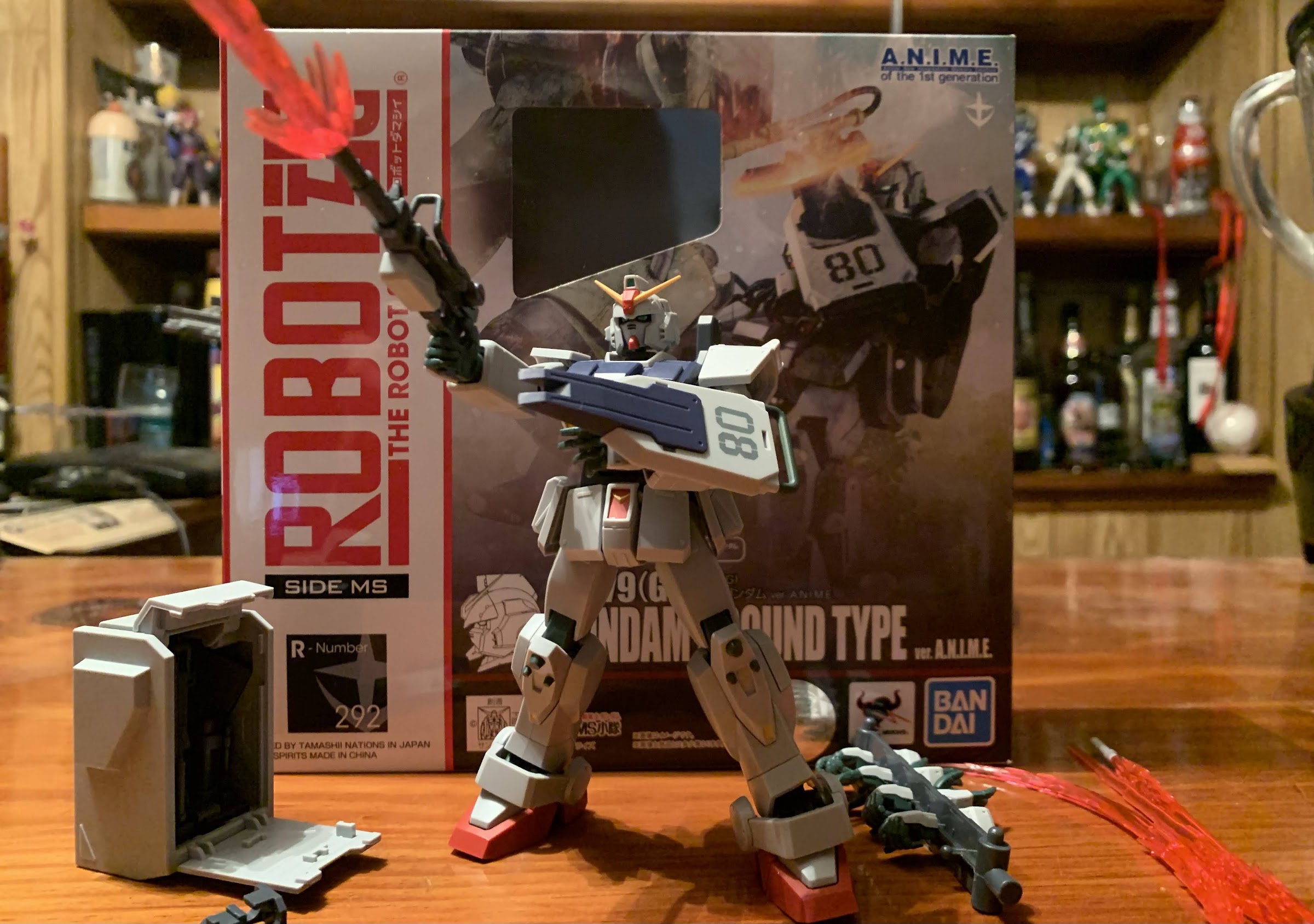
The Robot Spirits RX-79 (G) Gundam Ground Type Ver. A.N.I.M.E.

We are entering the world of Robot Spirits!

When it comes to Mobile Suit Gundam I am a casual fan, at best. Like a lot of people my age, it wasn’t really something that was on my radar until Cartoon Network started airing Gundam Wing in the late 90s, and once it did, I would pretty much watch whatever Gundam series Cartoon Network chose to air. It was around the same time that Bandai started bringing some of its Gundam model kits state-side. I had my opinions on the shows, but I always loved the look of the mobile suits, and in particular, the ones featured in Wing. I would pick up a few 1/144 scale and 1/100 scale kits over the years, but mostly dropped off in the early 2000s. I only had so much room for toys, and money, and the kits were pushed aside in favor of other things.

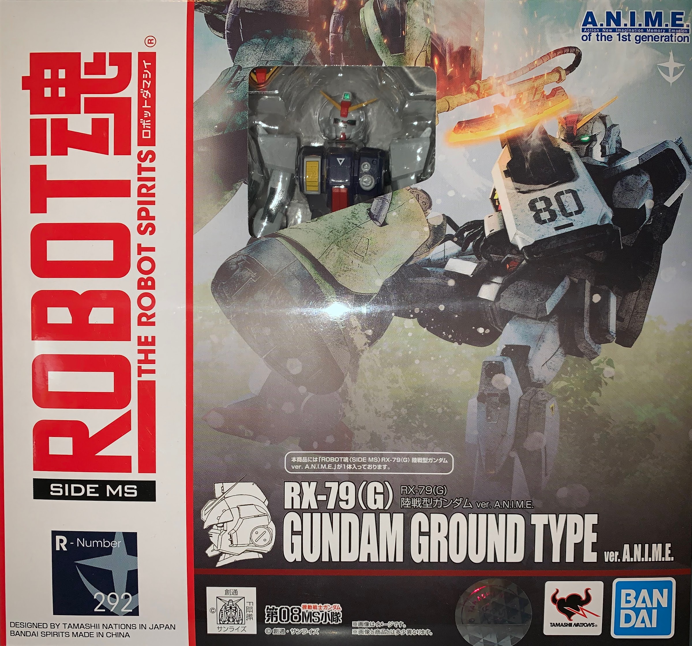
A standard box with a teeny, tiny, window.

When it comes to the actual anime series, I am most definitely a fan of The 08th MS Team. It’s my favorite of the Gundam shows I’ve engaged with, so when I saw that the main Gundam from that series was slated for release this year, I decided to give The Robot Spirits a shot. The Robot Spirits strikes me as the mecha version of the Tamashii Nations S.H.Figuarts line of action figures that I am most definitely familiar with. Just like how Bandai has Dragon Stars and SHF for its Dragon Ball figures, there’s basically a Target version of Gundam and Robot Spirits with the Robot Spirits being more high end, and thus, more expensive. I had never seen nor held or even sought out information on the line and when I saw this version go up for pre-order I decided to keep myself in the dark and just react to it when it finally shipped.

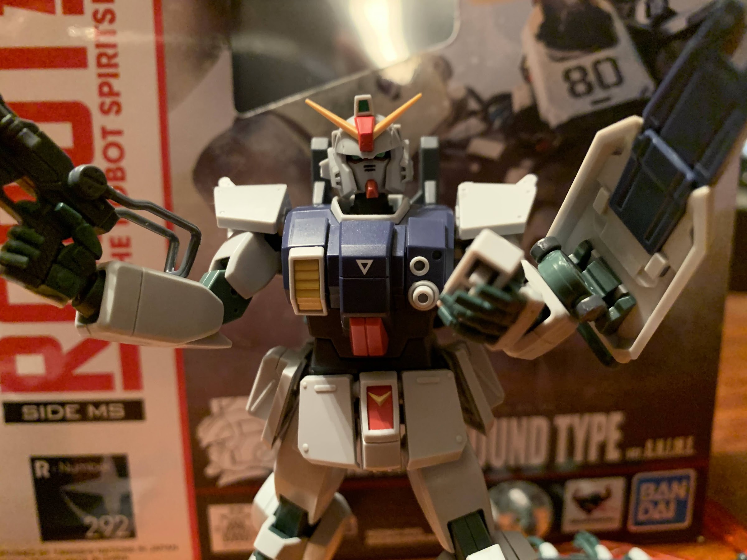
Let’s rock!

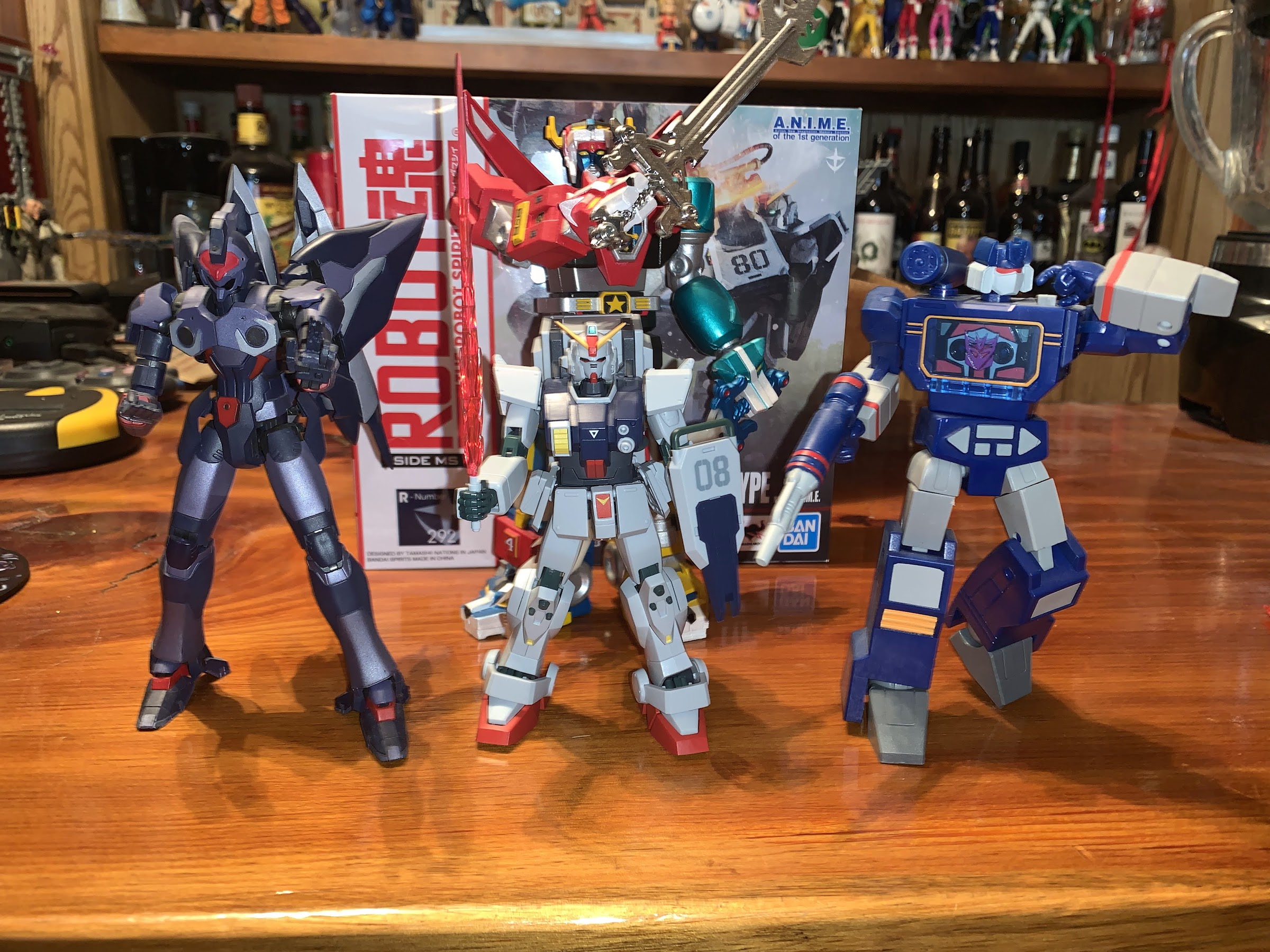
And obviously it has for I now have my figure in-hand after 6 or 8 months since I placed the pre-order. My first reaction upon getting this thing is, “Wow, this thing is small!” The box is larger than a SHF release, though it’s still a resealable cardboard box with a window and a blister inside. Only the window here is tiny so you basically can just see the head and a portion of the torso of the figure inside. As for the figure, it is indeed small. This mobile suit, which is hundreds of feet tall in the show, is a mere five inches and actually a tick under that officially. That’s not necessarily a bad thing on its own, but it did surprise me. I know a lot of Transformers fans were a bit surprised at how small the RED subline turned out, but my RED Soundwave looks like a giant beside this thing. Again, not really a bad thing assuming the line scales well from figure to figure, but I emphasize it because some people might be surprised and not in a good way. Me personally, I’ve always found smallish figures to be kind of charming, which is at odds with my also loving big, chunky, figures. I just see it as a quirk of a line and it’s fun, but that’s just me.

None of these figures are made by the same company so no expectation of scale exists, but this Gundam is quite the little guy. Left to right: Banpresto Weltall, Gundam Ground Type, Hasbro RED Soundwave. and Super 7 Voltron (rear).

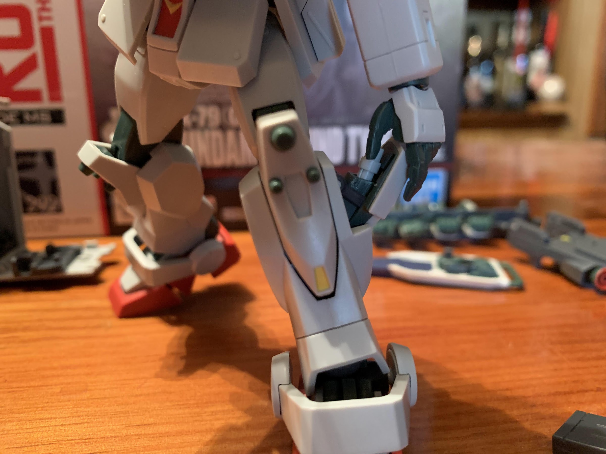
Size out of the way, the figure is largely as expected. It certainly feels similar to a SHF release. The plastic is fairly light and the figure is comprised of numerous small pieces. In that respect, it also reminds a lot of the old model kits that I used to assemble, only more durable and more refined. There’s lots of detail in the sculpt, especially on the head. I’ve always liked this unique shade of gray this suit is presented in and Bandai pretty much nailed that aspect. Also like SHF, there’s not a ton of paint to speak of, but there’s probably more here than on some of the Dragon Ball figures I have. There’s a metallic green applied to the eyes and a line of red beneath them that looks quite sharp. There’s some smaller details done in black and some red and yellow paint applied to certain areas. And what is there is remarkably clean. I don’t see one smudge or soft edge on any of the painted parts. It’s also possible some of the applications are decals, like the green at the top of the “crown,” which looks good too. I think the only criticism I could levy on the presentation of this figure is that it doesn’t look like something made of metal. And it’s not, but the suit in the anime is. That would take a more elaborate paint job to add cel-shading. They could have tried to give it a glossy finish, but I’m partial to matte when it comes to my figures so I won’t go that far. That’s a matter of taste though, what’s here is done quite well.

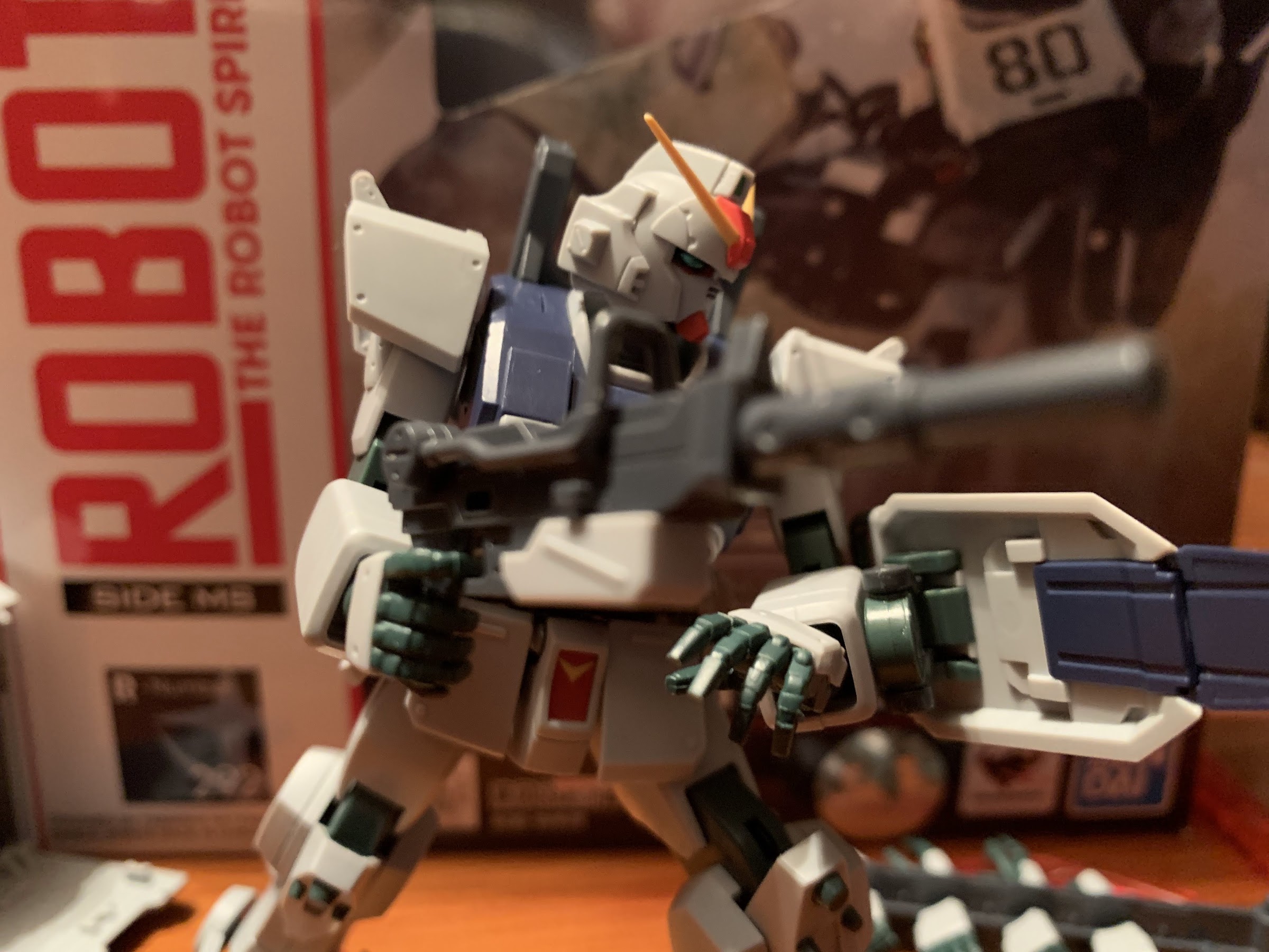
Does it make sense for a giant robot to sneak around like this? Probably not, but it looks cool!
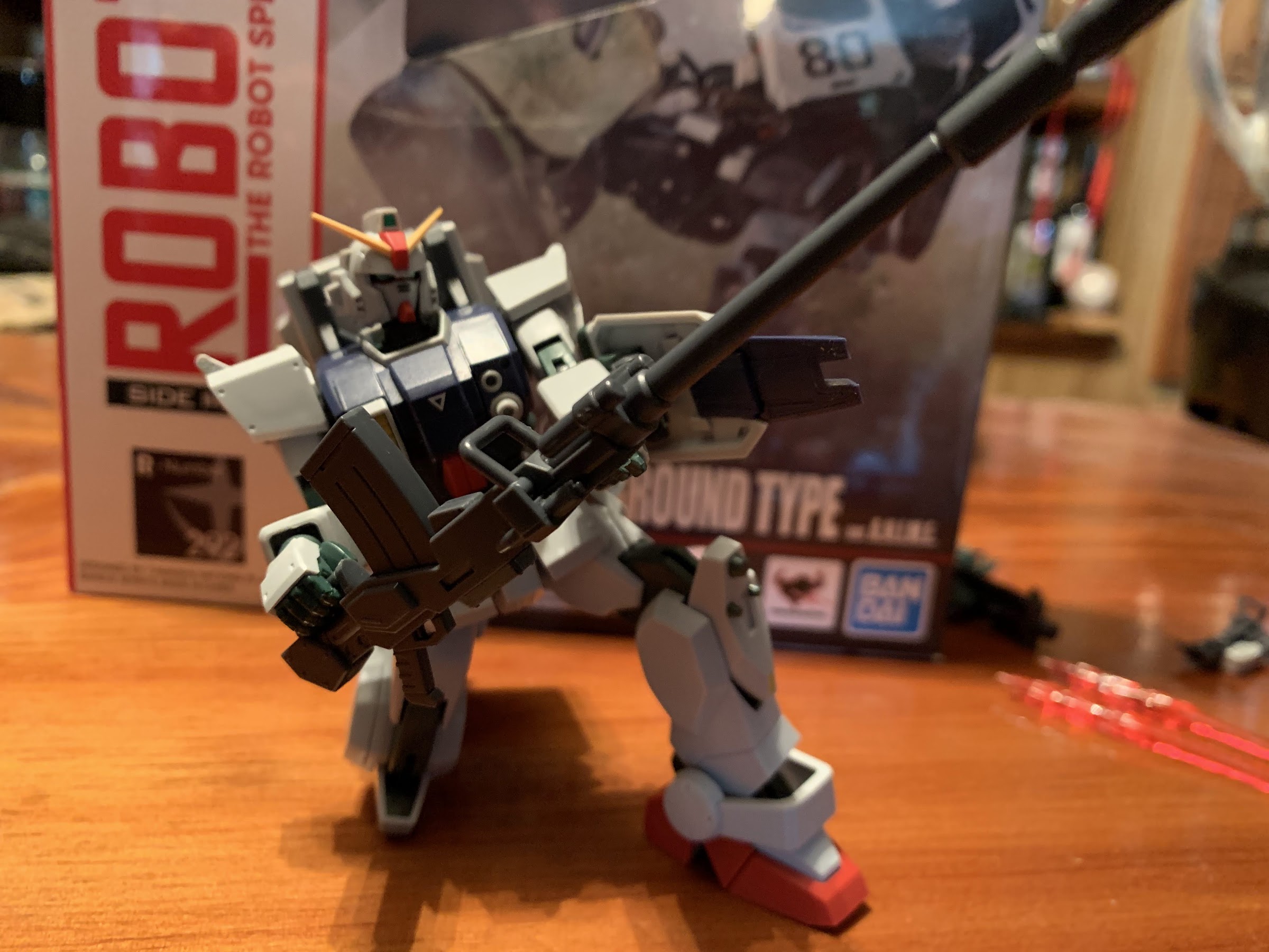
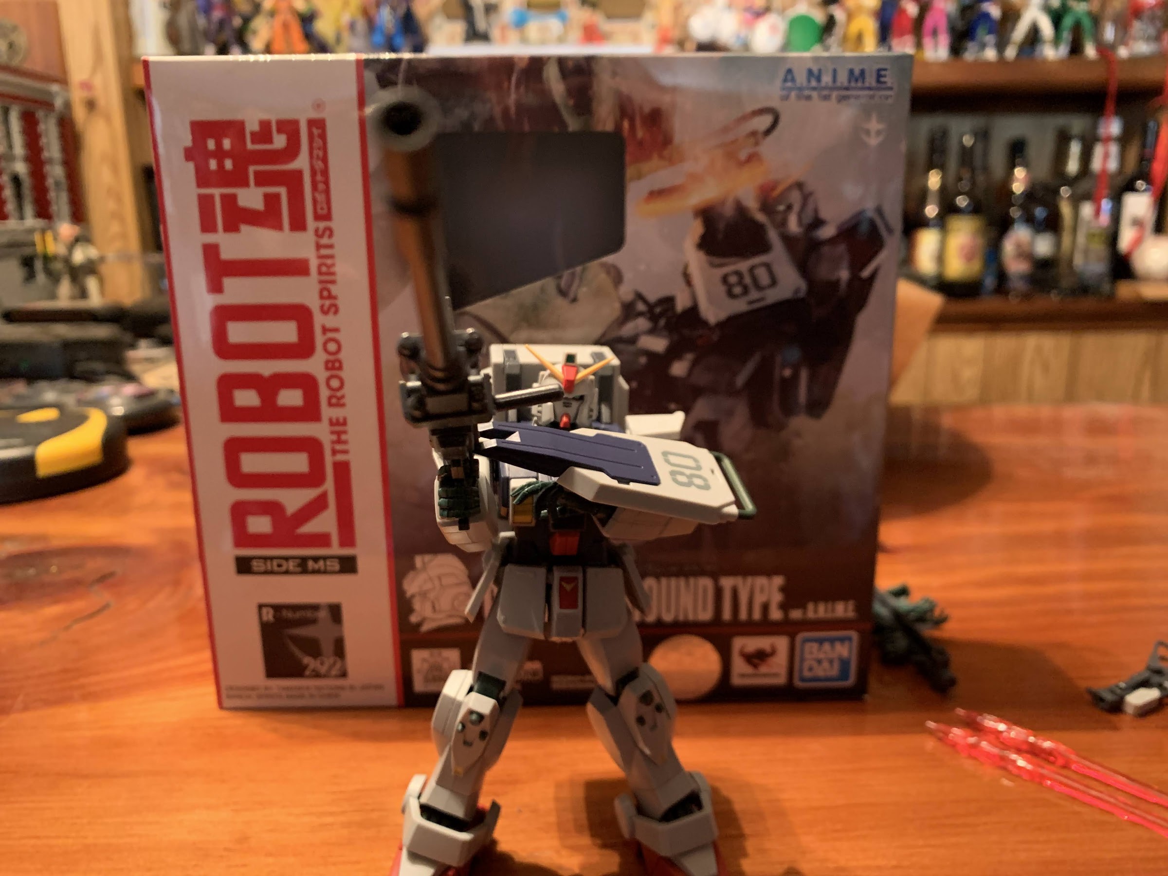
Now that’s what I call a gun!

Aesthetics are one thing, but what a lot of people buy these high-end imports for is the articulation and a Gundam presents some challenges, and some opportunities, given it’s unique look. There’s definitely a lot here and I think Bandai did a pretty good job of balancing out the aesthetic and the articulation. The head sits on a ball peg and it has range up, down, tilt, and the usual swivel. There’s a fair amount of space carved out for the head too so while you always have to be mindful of parts rubbing, the head is fairly protected. The shoulders are on ball pegs and the shoulder pad, or pauldron, has some wiggle. There’s actually two butterfly joints, one in the shoulder and then another in the chest. Neither offers much range, but neither one also takes away from the sculpt so I suppose it’s fine. The shoulder can swivel on that ball peg, so it’s basically your biceps swivel, and the double-jointed elbow has terrific range. The hands are on ball joints and sit rather deep in the wrist and provide ample range in all directions.

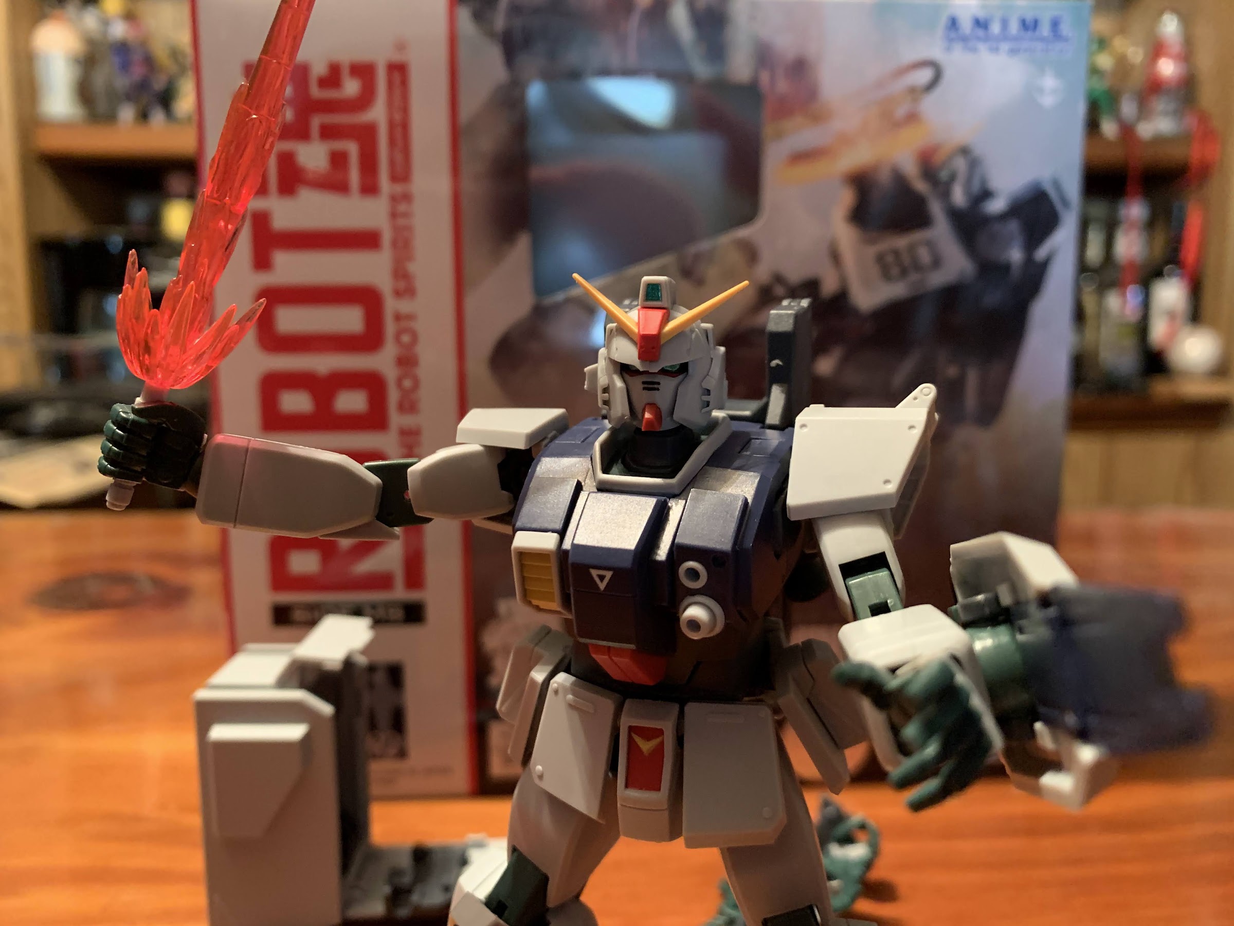
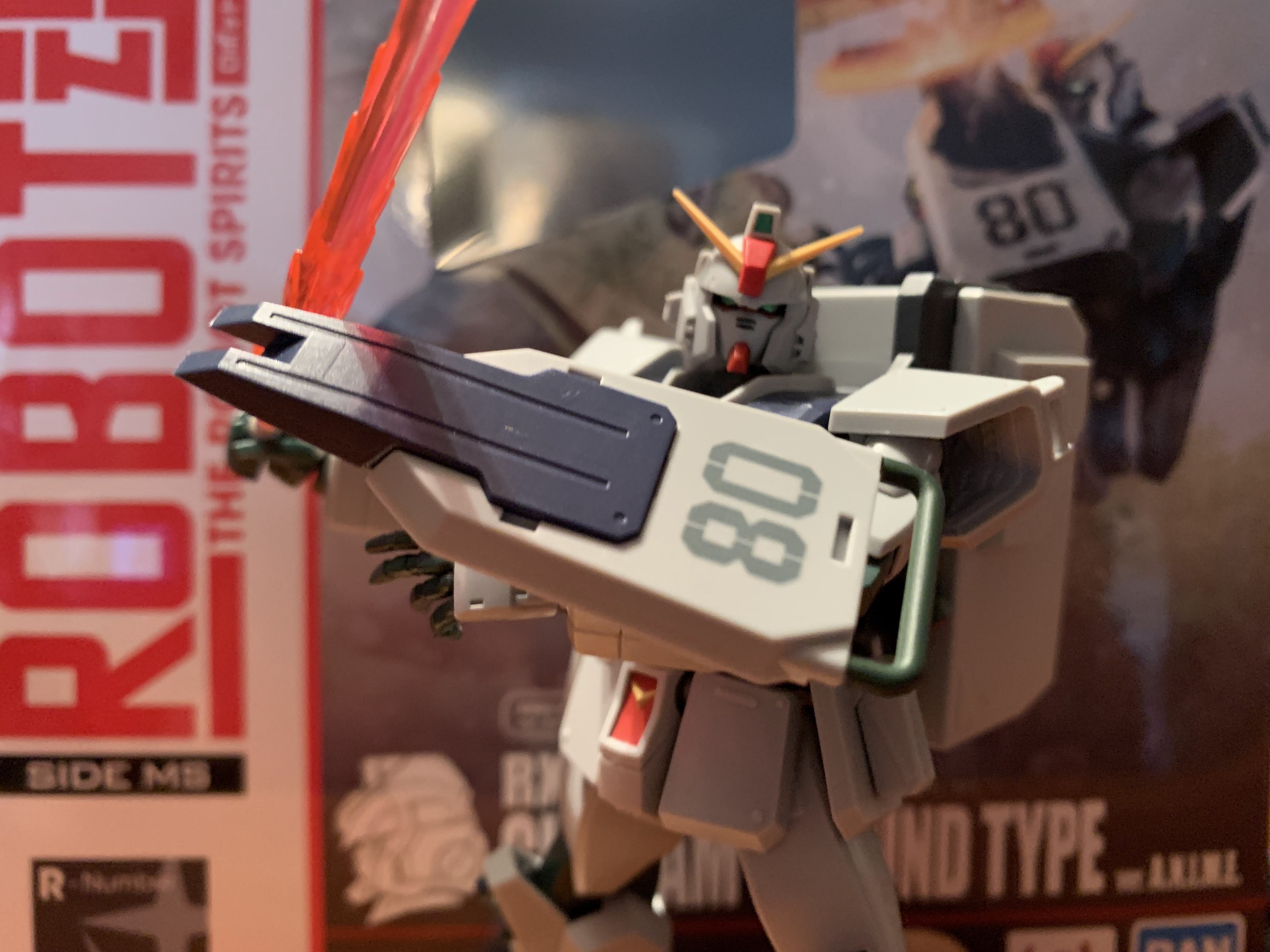
When guns won’t do, you reach for the beam saber.
There’s an optional “flash” piece for the base of the blade that I think is supposed to represent the blade being first fired-up.

The torso is where Bandai can’t really do much. There is an ab crunch, but it just tilts forward a small amount. I was always terrible at geometry, but it looks like it’s maybe 30 degrees. There’s even less backwards. There is a swivel at the waist, but it’s more like a pivot as it doesn’t move much in either direction. That’s basically it for the bad articulation, as below the waist is fine. The hips are just ball joints, but the figure can kick as far forward as the “skirt” pieces will allow. Those are also on ball joints and can be manipulated or even popped off entirely, if you wish. The thigh twists, or pivots, at that ball joint and the knees are double-jointed and can be bent all the way back. The ankles are on more ball pegs and they’re a bit more limited than other spots, but you still get some forward and back as well as tilt. The piece going over the feet is attached to a ball peg on one side so it can be moved out of the way to a certain degree. The center piece of the foot is also articulated and can be bent forward, which just mostly gets it out of the way so that the toe hinge can be used. I say toe hinge, but the joint is basically in the middle of the foot. It’s a bit unusual, but it works to make the feet more dynamic and to get the figure into certain poses, like a kneel-down. And because the figure is pretty light and the feet large, it’s pretty easy to pose and position.

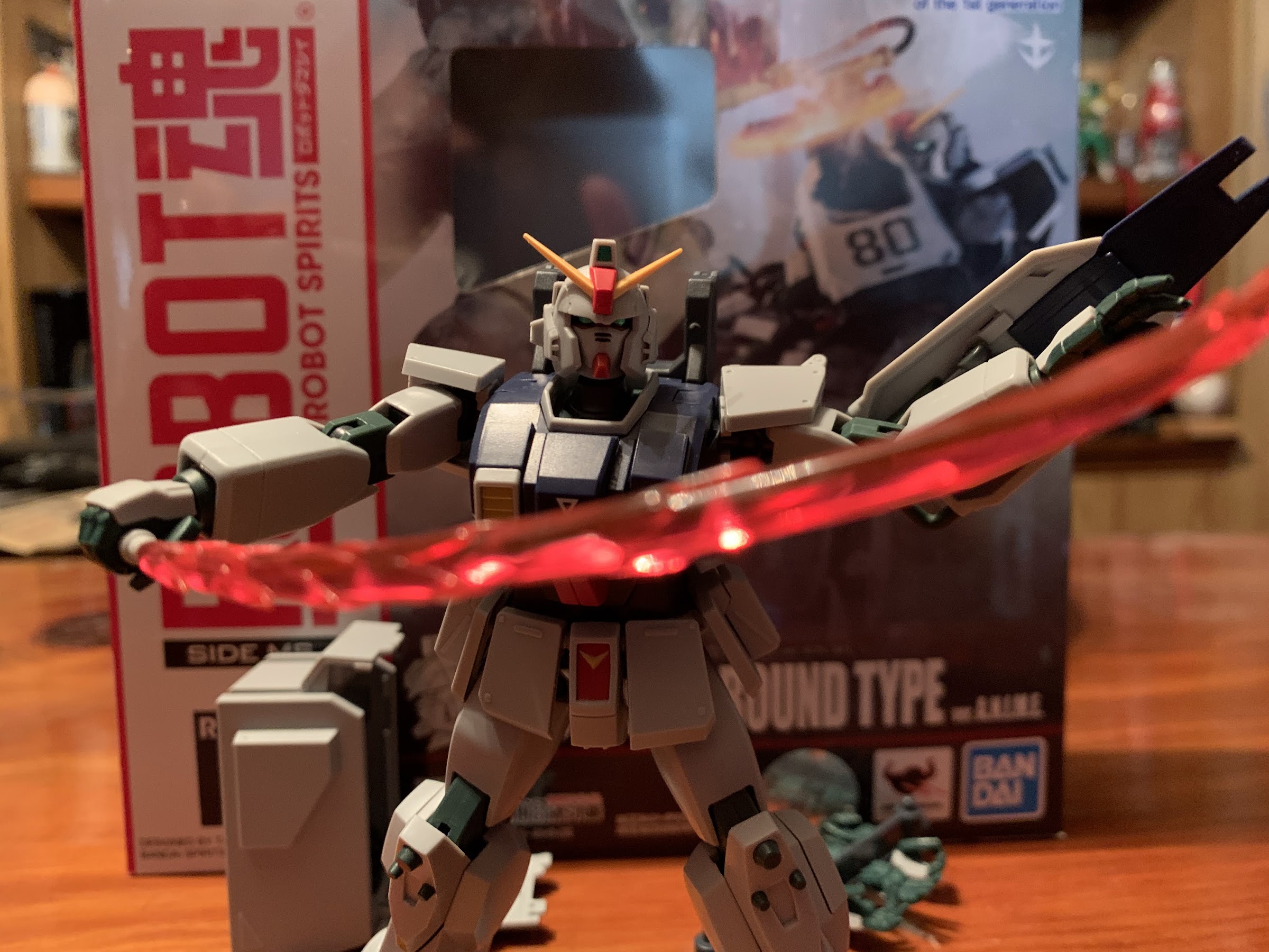
The “swoosh” blade is pretty damn fun.
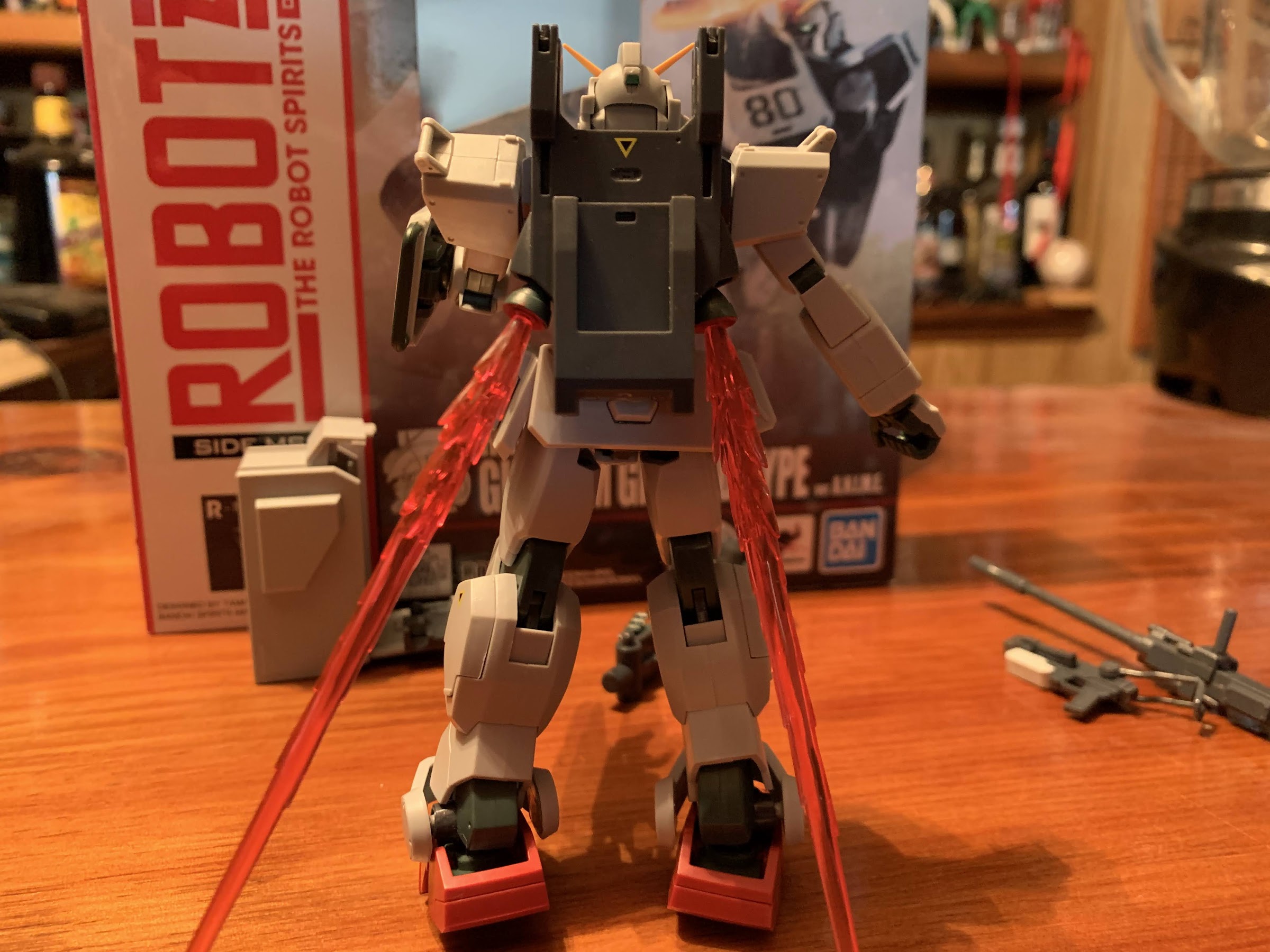
If it’s your preference, the beam saber blades can be turned into thruster effects.

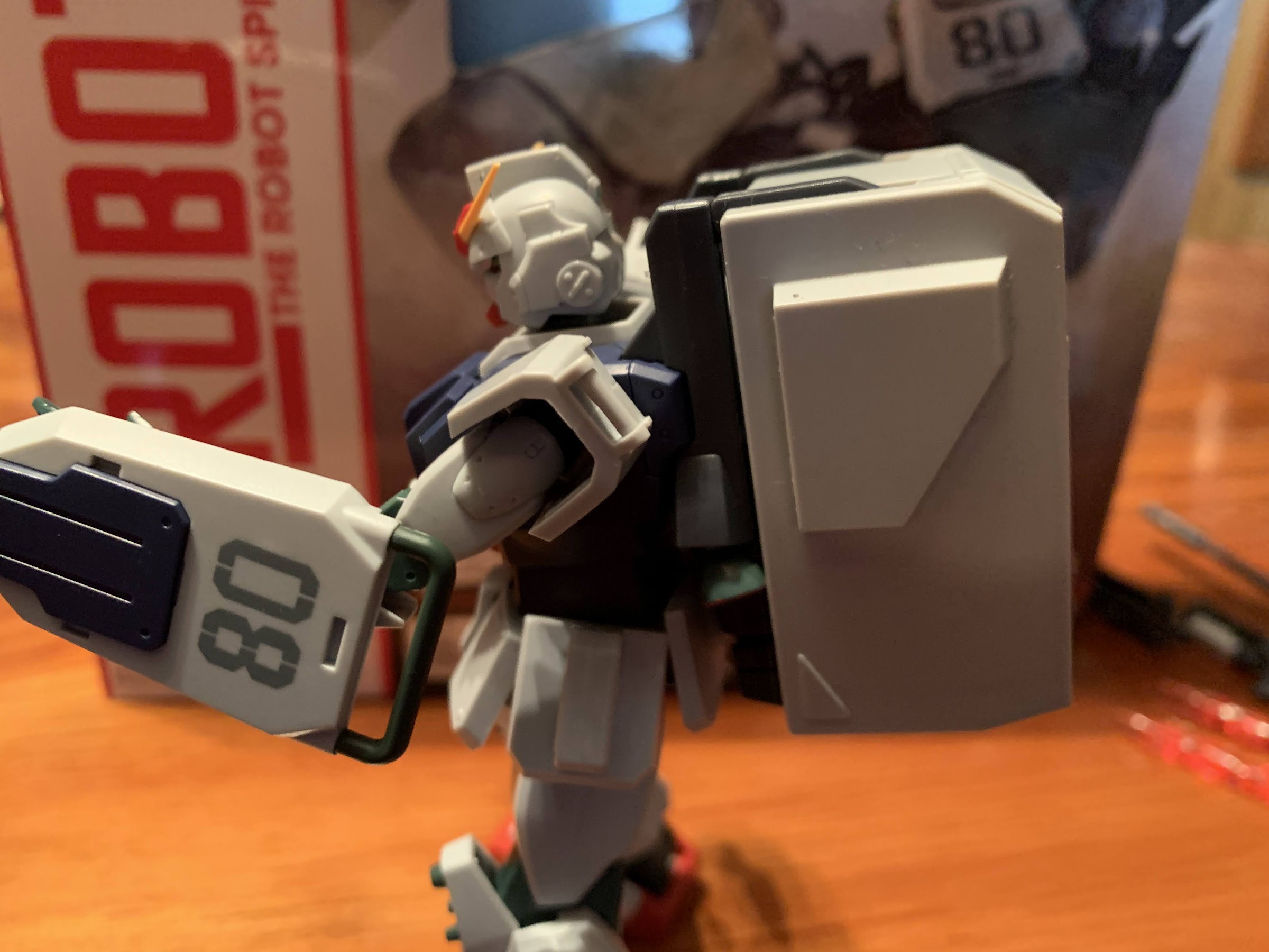
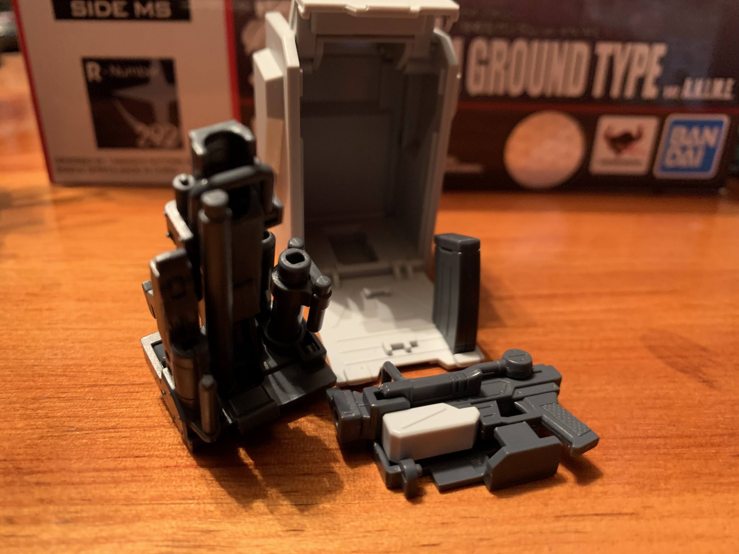
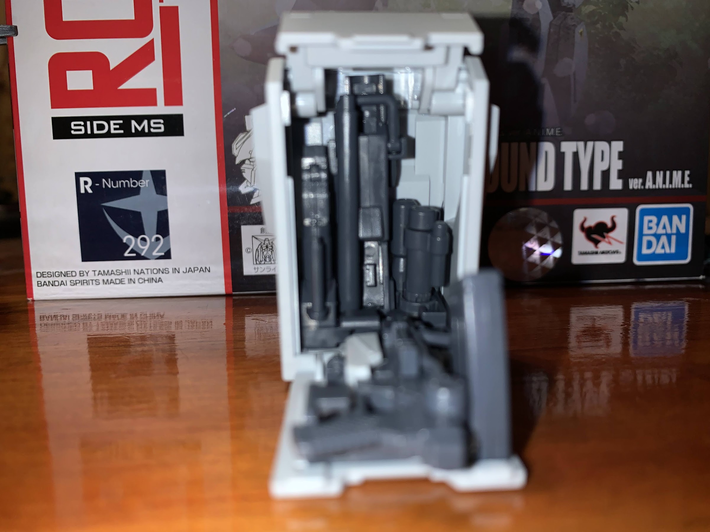
The articulation is rather good, bordering on great, which is nice because this figure also comes with a ton of stuff. For starters, there’s 5 sets of hands: Open, tight grip, looser grip, trigger, and a relaxed set. Bandai includes a plastic “tree” to store them on too, which is pretty cool. There’s also the classic 08 shield which pegs onto the left forearm. It’s on a double-hinged piece so it can sit flush to the arm or be raised out and in front. The figure comes with two beam sabers and there’s a compartment on each “calf” that can open for storage of the beam saber hilt. There’s also five, translucent, red, attachments for the beam sabers: a burst, two thin blades, one thicker blade, and a swoosh effect. The burst can be placed at the base of any of the blades to add to the illusion, or you can go without. They look great, though the swoosh and thick blade are a tad heavy and I find the hilt prone to spinning in the hand of the figure when trying to pose it. The figure basically needs to grip the upper portion of the hilt to keep it in place.

Check the shield, baby!
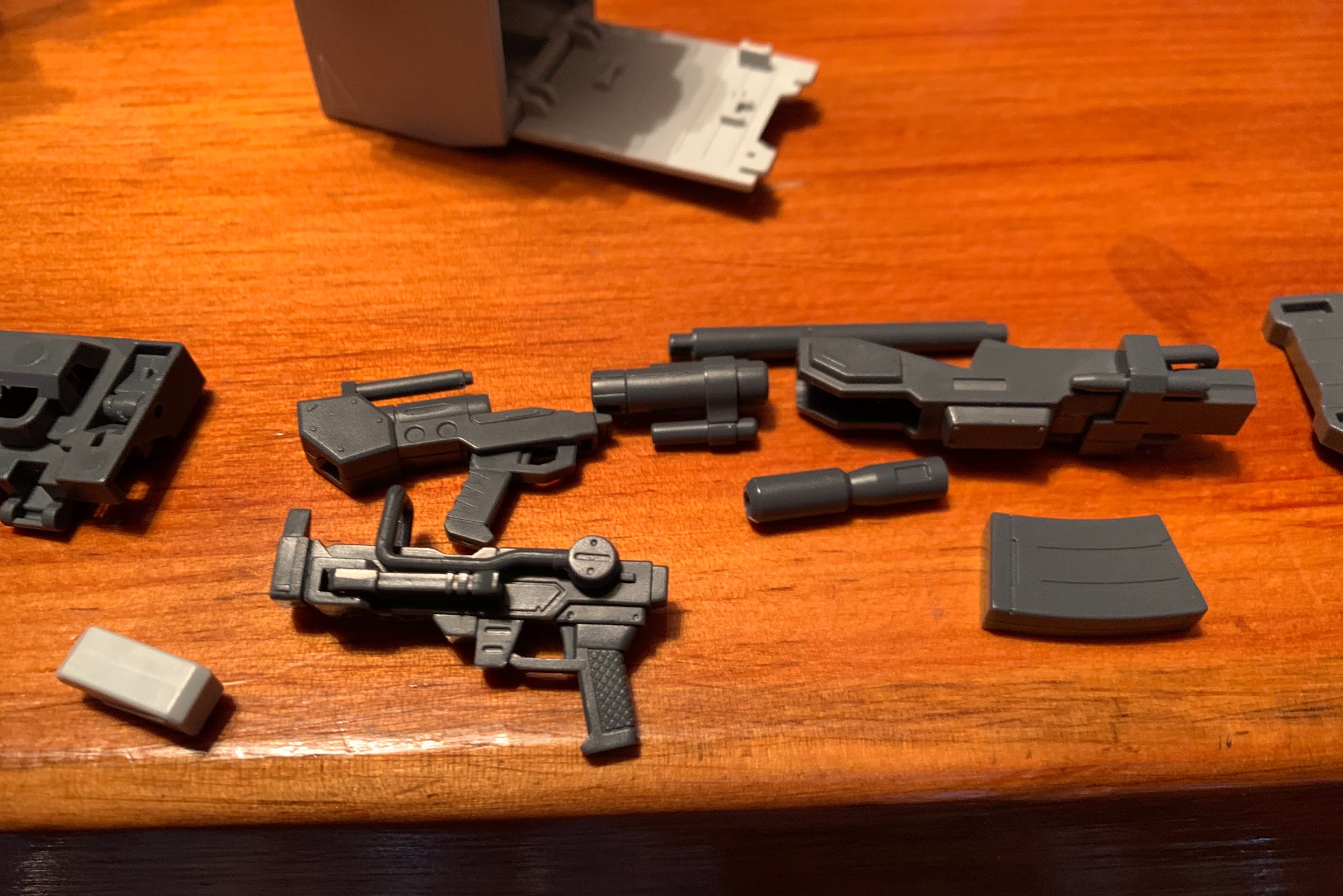
Even the Joker might find this gun excessive.

The rest of the accessories kind of work together. There’s a frame that attaches to the figure’s back via peg holes. Putting it on removes the rear ab crunch range entirely, but since there wasn’t much to begin with, it’s hardly a loss. There are prongs on the top and bottom that are on hinges and can be folded out or against the frame. There’s also two thrusters on ball joints, and if you wish, the skinny beam saber effects can be inserted into them to simulate the figure blasting off. The frame is mainly for the large, gray, backpack which exists to store the firearms. The figure comes with two guns, a small, 100mm, machinegun a really big, 180mm, one. The guns can be broken down and attached to additional frames that can then slide into the backpack for total weapon storage. The clips for the smaller gun are stored on the side of the figure’s hips while the banana clip of the larger weapon just goes into the backpack. I’ll likely refer to the instructions for awhile when trying to assemble and disassemble the guns, but the frame for the larger one does have different sized holes to make it somewhat idiot proof. The actual guns, when assembled, are just colored plastic and I do wish there was some paint. I also wish we didn’t have to buy the options accessory pack to get some muzzle flash effects. Just one would have been nice because that pack is 50 bucks and I’m not sure if I’ll bite on it. It’s possible to use a beam saber effect for the guns, but it looks kind of silly and adds more weight to the 180mm gun which is already a hefty weapon.

Packed everything except lunch.

The backpack itself just slides onto the frame when the prongs are open. It’s fairly light, but so is the figure so adding it to the figure will throw off the balance. It’s not impossible to work with though and I still found the figure easy enough to pose even with a full backpack. I do find the beam sabers to be a bit more fun to pose the figure with, but the guns are cool too. The larger one is cumbersome, but it’s supposed to be. Usually in the show, the suit would drop to one knee and aim off of the shield (something you can replicate with the accessory pack) while the smaller gun is more of a run and gun style of armament. The way the guns break down can also make them a bit of a chore to pose as they’ll come apart at times when you’re not trying to do that, but that can also help in posing, so it’s a good and bad feature. The 180mm gun also has multiple methods when it comes to holding it, so there’s a lot of variety available when it comes to posing. I love the overall concept of the weapon storage. My only nitpick is the compartment for the beam saber hilts is surprisingly tricky to open. Every time I do it I think I’m going to break something. Lastly, there is one other accessory and it’s a second yellow “crown” piece for the figure’s head. I’m pretty sure it’s only included because it’s a small, rigid, piece of thin plastic that could easily break so it’s a good piece of foresight for Bandai to just give everyone a replacement.

The large gun breaks down into several pieces, while the smaller one just has a removable clip (the grey piece) and the shoulder support articulates.
They then go onto two base pieces which I’m actually getting the hang of doing without referencing the instructions. It helps that each piece is a different shape so you basically can’t put something where it doesn’t belong.
It then all fits neatly into the backpack. It’s snug, but it works.

This figure is pretty damn impressive, but one thing we haven’t touched on is price. This guy did not come cheap. You will be hard pressed to find this priced below 60 bucks, and the places that have it that low probably have a fairly substantial shipping charge. Most places seem to price it at 70, which is what I paid at Big Bad Toy Store where it’s presently on backorder. That’s a lot of money for a figure that’s technically less than 5″ in height, and really it’s a lot of money for any figure. I was able to justify it because this is going to be the only Gundam line I collect and I presently have the desert variant ordered through Premium Bandai as well as the Zaku, Gouf custom Zaku, and the second option parts set which comes with the hover truck. I think once I have all of those together I’ll have myself a nice, tidy, display and I’ll be set on 08th MS Team figures. Basically, the only figure from the show I’m not interested in is the RGM mobile suit and I’m still on the fence when it comes to the option parts set (I wish they were like 30 bucks instead of 50). It’s great to see the 08th MS Team get some love from Bandai in this line and I’m certainly happy to dip my toe into it, even if I feel like I need to sell a kidney or something to get a full set.


NECA Gargoyles – Ultimate Bronx

The good doggo has arrived!

Well, here’s something different. Bronx, the good gargoyle dog, is NECA’s fourth entry in its relatively young line of action figures based on the beloved Disney Afternoon series Gargoyles. And not only is Bronx here all on his own, he’s also got something for his buddy Goliath that collectors of this line have been begging for. Unfortunately, he also arrives as part of NECA’s Haulathon event, a gimmicky collector event taking place at Target that should be over by now. Unlike his line-mate, Demona, Bronx appears to have shipped in rather large numbers. Also unlike Demona, he was never put up for order on Target’s website so those who want him have been forced to trek to the store in hopes of catching him on a shelf. Or, you get a friend like I did in @JoePoppingOn who came through for me again with a Bronx! That’s three figures he helped me acquire so a very, hearty, “Thanks” are in order for him. Give him a follow on Twitter, especially if you’re located in the US north east.

Articulated jaws are cool.

Bronx comes in NECA’s standard Ultimates styled packaging with artwork on the front and product shots throughout. The front flap opens to reveal the figure inside and showcase the accessories, with one accessory displayed about as prominently as the actual figure. We’ll get to that, but first we need to talk about Bronx. Bronx, being more like a dog than human, is a quadruped who gets around on all fours. He’s also wingless, so at last he’s a release in this line that’s relatively easy to fit onto a shelf. He scales well with Goliath and the others when placed beside them, and because his form doesn’t showcase giant pectorals, he’s probably the most on-model release when compared with the show. NECA is obviously not going for a true on-model look with this line, so for Bronx, it’s more like a bonus for those out there who wish the company was aiming to do just that.

Yup, that’s Bronx all right.

The sculpt for Bronx is essentially what one would expect of NECA where the character is concerned. He’s a lovely shade of blue with a pale gray on his underside reserved for his lower jaw and belly. His eyes are all white and always displayed in that fashion, unlike the other gargoyles who only go all-white when trying to intimidate others. I like how the paint is applied to give them an almost glowing appearance as the white is soft on the edges and more stark in the center. His body has the usual gargoyle anatomy with spikes here and there. Not only does Bronx lack wings, he also features a far shorter tail giving him a really compact appearance. He’s all front end too with a smaller backside. He looks awesome, and even though the Bronx design from the show was never a particular favorite of mine, I find myself really liking the look of this figure because NECA just plain nailed it.

He’s a big boy.

Even though Bronx stands on all fours, he’s articulated in a very similar manner to his line-mates in some ways, but he’s also different in others. For one, Bronx has articulation at the jaw so he can open and close his mouth and look a bit more fearsome, if need be. His head is on a double ball-peg and it’s reinforced with another ball peg at the base of his massive neck so he gets terrific range looking to the side as well as up and down. He also has plenty of tilt and he’s very expressive in that area. His front legs are joined to the body via ball-hinges and he has “elbow” joints, ankle joints, and toe joints. His legs can spread out wide and kick forward and back. The torso has a rubbery overlay, indicating that NECA intends to do more figures in this style down the road, which does kill whatever torso articulation is hidden underneath that. His rear legs are affixed via ball joints just like the other gargoyles and he has knee joints that move very little as they’re always intended to be bent. Past that, his feet are done in the same fashion as the front ones with ankle hinges, rockers, and toe hinge and rocker. Because of his design, Bronx isn’t going to be super dynamic, but I think NECA did a good job here of getting articulation into this figure without sacrificing really any of the aesthetic. And I wish they’d add neck articulation to the other figures.

Check out the range on that neck!

Bronx doesn’t fly, or use weapons, or even have hands, so he doesn’t have much in the way of accessories. For Bronx, there’s really just two: a second head and a hunk of meat. The second head features a wide open mouth and is a touch more fearsome looking than the standard one. It would still feel a bit unnecessary if not for the big slab of meat he also comes with. I don’t know that I’ll really incorporate it into my own display, but the meat can fit into the mouth of the second head so he can hold it, or it can be placed at his feet. The meat looks fine and it’s painted, but at the end of the day it’s just a piece of meat.

The alternate head features a jaw that’s sculpted open.
He deserves a treat.

What collectors are really intrigued by is the last accessory: Goliath’s closed wings. Also referred to as caped wings by the fandom, these are for the Goliath figure and are posed as the character often did in the show by hooking them below his chin like a cape. This is a casual, walking around, look for Goliath and has the bonus of reducing the amount of space he takes up on a shelf. To put them on, you need to pop off the head and wings from the Goliath figure and then just drape it over the shoulders. They’re a soft, flexible, material, but still feature the same paint and detailing as the open wings. There are two pegs on the rear to slot into the figure and these basically just keep things together. Once the head is replaced, the look is complete and it’s…okay. Goliath’s body was sculpted to be in attack mode, so his head isn’t really positioned in a casual manner making it look a bit awkward. If he had a joint at the base of the neck, this could be worked with, but alas he does not. The head is also even more locked-down than before as his hair keeps him from really being able to turn his head. He can look down a little, but that’s it. Still, now that the display is four figures, the extra room is welcomed so I’m probably going to stick with this look, but what I really want are just relaxed wings.

A more studious look for the clan leader.
They do go well together.

Bronx is a terrific entry in this young line, and he might be my favorite. I’ve mentioned how the other figures are so cumbersome that they’re not very fun to mess around with, but Bronx doesn’t suffer from that at all. He’s a joy to play with and pose, and while his accessories do nothing for me, the actual figure is great. The caped wings for Goliath are certainly a welcomed addition, but I am lukewarm on the end result. It’s okay, and maybe I’ll like the look more with an Elisa to pair him with, but it seems clear to me that the figure wasn’t really sculpted with this look in mind. I think NECA is generally very good at balancing aesthetic with articulation and function, but with this line I don’t think they’ve been as successful. Hopefully we see some improvement going forward and that these extra wings which are sorely needed aren’t few and far between.

Even with Goliath’s new wings, I still feel this shelf is maxed out. Good thing the next release isn’t slated until the fall.

As mentioned before, Bronx was part of Haulathon at Target. He was up briefly on the Haulathon website, but I literally know of no one actually receiving the figure via that site as seemingly all, or most, of the orders ended up cancelled. He seems to still be shipping, so check your local stores if you’re after this one. He has since gone up for pre-order in the usual places with an expected June delivery, so while you may have to wait, you shouldn’t have to go to the secondary market to add to the clan.


Super7 Disney Ultimates! Prince John

“Too late to be known as John the first, he’s sure to be known as John the worst!”

Our third and final figure of the inaugural wave of Disney Ultimates! from Super7 is the most surprising of the bunch: Prince John, the phony King of England! Super7 often surprises with its deep cuts, and Prince John certainly fits the bill. While it’s hard to argue much from Disney could be considered a true deep cut, it’s certainly surprising to see the villain of Robin Hood in the first wave of the line without the film’s protagonist. This supposedly caused some confusion in the Disney fanbase which had little familiarity with Super7 prompting founder Brian Flynn to take to the internet to assure the fans that Robin Hood himself was coming, he’s just not in Wave One. Prince John is apparently Flynn’s pick and it’s a character he has a lot of affection for and when you run your own toy company you get to do stuff like put Prince John into the first wave of Disney figures. As someone who grew up watching the film over and over, I can’t say I’m disappointed to see the prince so early.

He certainly fills out more of the window than Mickey and Pinocchio.

Prince John stands a full seven inches making him, by far, the largest figure in the first wave. He absolutely dwarfs Mickey and towers over Pinocchio. I suppose that’s appropriate considering he’s a lion and all, but it will be interesting to see how he scales with the upcoming Robin Hood. Prince John, or PJ, is not particularly big in the film. Robin is pretty close in size while Little Jon and the Sheriff look down on him. That’s an issue for another day, for now, he looks great at this scale and his big, soft goods, robe is particularly lovely. What’s not, and stop me if you’ve heard this criticism before, is the lack of paint. The body of PJ is cast in a yellowish plastic and with no shading or embellishments I can’t help but feel that it looks an awful lot like those Lion King toys from the 90s. Those things were probably five bucks at Toys R’ Us, but this is a $45 collectible and it just needs something more. Beyond that feeling, the head looks nice and his crown is painted well with gold paint and gems, but he’s missing his whiskers on all three heads. His hands feature the gemmed rings and his default expression is rather neutral. Beneath the robe is his soft, blue, gown (I guess that’s the proper term?) that’s all sculpted. Unfortunately, there’s already some color transfer from the robe to the gown and I don’t know if that’s likely to get worse or if it was mostly an issue of being confined to a box. Since the robe hides it, it’s not that great an issue, but hardly encouraging.

It’s a bit hard to photograph, but you can see some red on the under garment of John from the robe.

Excepting the feeling of a lack of paint, PJ really looks the part. That robe goes a long way in adding to that which is soft and just the right shade of red. The trim is more dense as the white is clean and the black dots within look nice. As was the case with Mickey, it’s also plenty big to allow the figure to move underneath it. Unlike Mickey, the robe doesn’t close with a belt, but it’s heavy enough that it basically closes on its own. Most importantly, it behaves as it does in the film and since it’s comically large on PJ it’s practically a character all on its own.

It is a bit odd how much of this character is just non-articulated torso. The hips begin way down at the bottom of the robe.
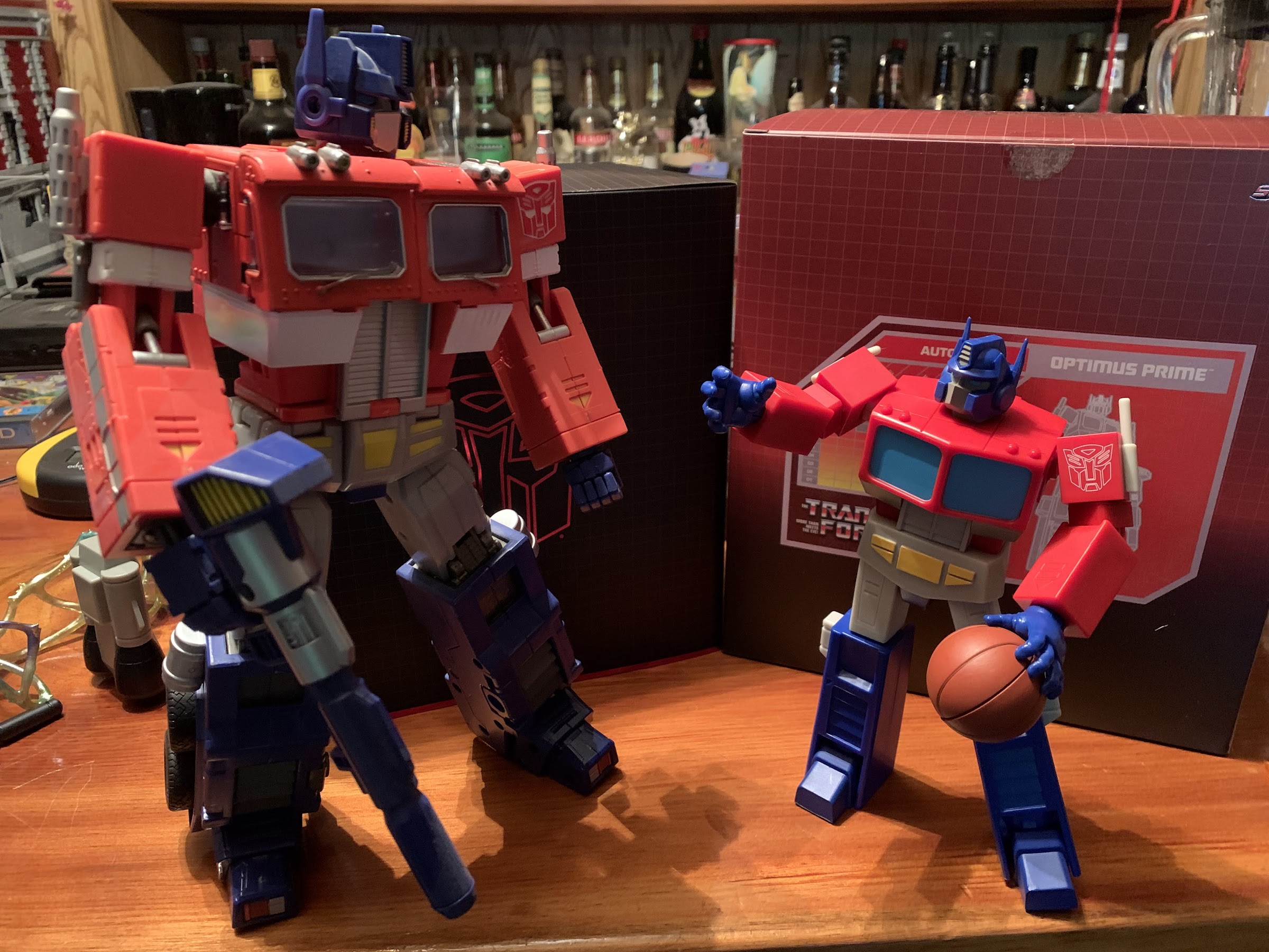
Where would John be without Sir Hiss?

And speaking of characters all their own, we have Sir Hiss! And not just one Sir Hiss, but two! The first features a smiling Hiss partially coiled up that can sit on a surface. He has a ball-hinge at the base of his neck so he can swivel and look up and down, but is otherwise non-articulated. He’s very well painted, and the likeness is quite possibly the best of any character in this first wave. The same can be said for the second Sir Hiss which is elongated and features a strangulation expression. This is for John to grip and it’s pretty damn funny and also a little surprising that Disney let them do this, but since it’s from the film and the violence is bad guy on bad guy I guess that made it okay. As much as I love these additions, I feel like we need a Sir Hiss accessory pack! Or more versions with other characters from the film. Flying Sir Hiss, drunk Hiss, scared Hiss – the possibilities are nearly endless!

He’s rather fond of admiring himself.
Hiss can also hold the mirror for his lord.

Aside from Hiss, PJ doesn’t come with much else. He does have his mother’s mirror, which has a slightly reflective, foil-like, sticker for the mirrored surface and the back of the mirror is well painted and sculpted. PJ can hold it with his lone, right, gripping hand or you can finagle it into the coils of Hiss. PJ has open hands in the package, but can swap to two different sets of fists: one with the gems in his rings, and one without from when Little Jon steals them. As for heads, we have two extra: angry John and a perplexed John where the crown is tipped forward covering his eyes. His neutral head has a removable crown which pegs into his ears, but the other two feature a permanently affixed crown. I do like the comedic one, but I feel like the angry one could have been embellished more. He gets really mad in the film where as this expression is more menacing than angry, and maybe that’s what they were going for? What’s missing though is plainly obvious: no thumb-sucking hand or expression! Considering how much Flynn seems to love the character, I am shocked that Super7 didn’t give us the pieces to recreate those scenes from the film. This line is called Ultimates because it’s supposed to represent the ultimate expression of the character, and how can you do Prince John without that?! Did they honestly prefer these portraits to that, or did they just find it too hard to get him to suck his thumb and tug his ear? Not only should we have gotten a proper thumb-sucking hand, but we should have got a second one with mud on it! It’s just baffling.

Don’t make him mad!
It feels like we won’t get many strangulation accessories in this line, so cherish this one.

The last thing we need to talk about with Prince John is also the least impressive: articulation. Same as it was with the other two figures in this line, PJ doesn’t move all that well. He has the same, bland, ball and socket for the head that lets him move in all directions, but without tremendous range. He can look up a bit as well as down, but there’s no reason for him not to have a double ball peg given the presence of the robe. The shoulders are ball-hinged and he can almost raise his arms out to the side, but more importantly, he can rotate just fine even with the robe. The elbows are tight and single-hinged with swivels and they’re somewhat buried in the sleeve of his undershirt or gown. They’re fine, and his hands rotate and hinge in-and-out. The torso features nothing, and bizarrely, Prince John is like a tube of plastic. His hips are way down there and I guess it makes sense considering he’s a lion. Though if he were to go on all fours his rear legs would be comically short. He can rotate at the waist at least with ball-hinge hips, single-hinged knees that swivel, and ankles that hinge and rock side-to-side. His knees are basically sculpted to always be bent so the range isn’t great and the ankles are definitely more loose than I’d like. He’s able to stand okay, though my kids running into the room where his shelf resides was enough to cause him to fall over so his ability to stand could be better. He also has a ball joint for his tail, but it doesn’t do much aside from just letting you control which side it trails off towards. It’s basically the same story though where there’s not a lot of articulation and some of what is there is just too loose. I really wish Super7 could at least figure out the loose issue as so many figures suffer from it.

This might be the most elaborate posing he can achieve.
This goofy head might be my favorite.

Overall, I do think Prince John turned out well enough when judged on what is actually there. The sculpt is solid, I like the robe, I just wish there was more paint and tighter joints. I don’t need him to do ninja kicks, but I do need him to stand. The color transfer issue is also concerning. Mostly, I can’t help but look at this guy and feel like Super7 really missed an opportunity to deliver a truly ultimate version of Prince John. Who else is going to make a Prince John figure? The lack of a thumb-sucking pose is a real bummer. Maybe they’ll come back to him when the cast of the film is a bit more fleshed out. They could do a throne that comes with the needed parts or maybe do a pajama version of the character or blue-robed variant. Do I want a variant of PJ? No, not really, but maybe I could do the throne. Considering they’ve already solicited thrones for other lines and they’re around $45 though, I’m a little less enthused about that prospect. Super7 tends to make things right when they get something so fundamentally wrong, and so I do feel like this may be one of those things. The fact that PJ is a favorite of Brian Flynn gives me a little more optimism. As released, Prince John is fine, but he could have been so much more.

Overall, PJ turned out pretty well, but he should have been better than that,

NECA Gargoyles – Ultimate Demona

Demona is here to prove Tuesday isn’t just for turtles.

When NECA launched it’s line of action figures based on Disney’s Gargoyles, it seemed to imply that Demona would be figure number 2. She was not. That honor went to Thailog, the Goliath clone, and that might have had something to do with the many factory delays and shipping woes that were impacting the entire industry. It’s a lot easier to pivot from Goliath to a figure like Thailog at the factory when almost all of the molds are the same. The other promise from NECA was that none of the Gargoyles figures were slated to be sold as exclusives. They were all general release and collectors could expect to be able to preorder them from their preferred retailer. Well, that went out the window with NECA’s Haulathon event which was split between a website for Halloween costumes and Target stores. And as you could probably have guessed at this point, Demona ended up falling into that event.

Sadly, flight stand not included.

Demona is the rogue gargoyle from the show. Goliath’s former lover, she’s basically the Magneto of the series as she has a justifiable distrust of humans, but turns that mistrust into all-out hatred. She doesn’t want to live alongside humanity, she wants to crush it. Armed with advanced weaponry, magic, and a wealth of knowledge given her extreme lifespan, she’s a formidable foe for Goliath and company and a worthy third figure in the line. Since she’s not a Goliath repaint, she’s also just the second, unique, sculpt we get to experience. With Goliath and Thailog, I had some nitpicks, but was generally satisfied with the finished product. With Demona, that’s pretty much still true, but she does introduce a new problem that I really hope isn’t one going forward.

Like Goliath, she brought reading material. Unlike Goliath, her book can actually open and close.

Demona is sold in the standard NECA Ultimates five-panel window box. It’s a bit smaller than Goliath’s since Demona is a smaller character. Not only is she shorter than her former beau, she’s more slender as she has a very feminine physique that mixes with the gargoyle anatomy. She has a big tuft of red hair that looks quite nice and the pale blue-gray of her skin lines up well with her appearance in the cartoon. Like Goliath, she’s inspired by the cartoon, but has added detail to make her look a bit more “alive.” It’s a bit less pronounced as she doesn’t need giant, rippling, muscles and it’s mostly seen in the texture added to her clothing. She basically just has a top and loincloth with the bottom piece being separate while the top appears to be part of the mold. Either that, or the torso is cut-out to fit it so it can be glued down. It’s interesting as I suspect NECA will want to reuse much of this mold for Angela at some point, but her top is different. Maybe Disney just didn’t want people sneaking a peek under Demona’s top? Which does raise the question: why do female gargoyles have breasts? They’re an egg-laying species, most of which don’t nurse their young, but they are fantastic beasts so I guess they can follow different rules.

Good luck deciphering that.

Demona has a very striking appearance, and one thing I rather like is that NECA used actual metal hoops for her earrings and her anklet. This could potentially make her more fragile, but they seem secure and fine. Her proportions look nice, and like Goliath, her wings are painted in a two-tone fashion with a purple shade used for the membrane. Also like Goliath, the wings are huge and made of ABS so there’s no give to them. They’re going to take up a lot space, and there’s nothing that can be done about it. Aside from that general complaint, my only other issue with her is that her face looks just a little off. I feel like her face should be longer and more narrow. Instead, it starts off rather wide and quickly comes to a point at her chin giving her a slightly scrunched appearance. It’s not terrible or anything, but I think she could look a little better.

Your kids probably won’t like this face.

Demona comes with more stuff than we’re used to, and she even has a new feature that I wish Goliath had. And that feature is she uses faceplates instead of swapping an entire head. Bandai has been doing this for years with its figures, and I’m surprised it took NECA this long as it would have been easy to do with Goliath. Her face pops off easily and she has a screaming, red-eyed, face to go in its place. It’s appropriately unsettling, so much so that I almost don’t like looking at it, but it definitely works. Demona also has various hands including open, clawing hands, fists, a trigger-finger right hand, and a modified gripping left hand for her book or gun. She has two, giant, guns. One is a bazooka while the other is some kind of laser canon. The bazooka has a trigger and a more conventional design that’s easy to get the character to grip, while the other gun is more cumbersome with no actual trigger. I’m assuming it appeared that way in the show so I’m not faulting the toy here, just pointing it out for review. She also has her Grimorum Arcanorum which is really cool. It’s well-sculpted and the paint looks awesome as it has this distressed look to it and it can even open. It’s also sculpted to have a page torn out and that missing page will come with a future figure – a nice attention to detail.

The laser canon is a bit awkward with no actual trigger leaving Demona to wonder how she’s supposed to hold it?

The accessories are certainly appropriate, and the only thing missing is what’s missing from all of the figures so far and that’s a flight stand and additional wings. The wide open wings are essentially gliding wings so a flight stand is almost a necessity, but obviously would add cost to the figure. I’d happily take an increased cost if it meant alternate wings though. I know I sound like a broken record, but these things are too much to manage now that we have three figures.

That’s the best I could do.

Demona may be smaller than Goliath, but she essentially articulates the same. The head is on a double ball-peg, but her hair keeps her from being able to look up which is unfortunate for flying poses. NECA could have fixed that with either a second hairpiece or with a hinge in it, but chose not to. She can look down, tilt, and swivel. There’s no lower neck joint and her shoulders are ball-hinges. She can raise her arms out to the side without much trouble and has a biceps swivel, double elbows, and wrists that swivel and hinge. All of the hinges are horizontal, which is unfortunate for the trigger hand. Demona has a ball joint in the torso below her bust and a waist twist below that. Her hips are the standard ball joints and she can kick forward and back, since she doesn’t technically have an ass. There’s a twist there as well and she has single-jointed knees since the gargoyle anatomy only requires that much. The ankles are hinged and can rock a bit with another hinge at the toe that also has a rocker. The tail pegs into the rear of the figure and is bendy plus there’s a hinge at the peg. At the wings, she has hinges and they’re on pegs so they can rotate up and down and also swing out.
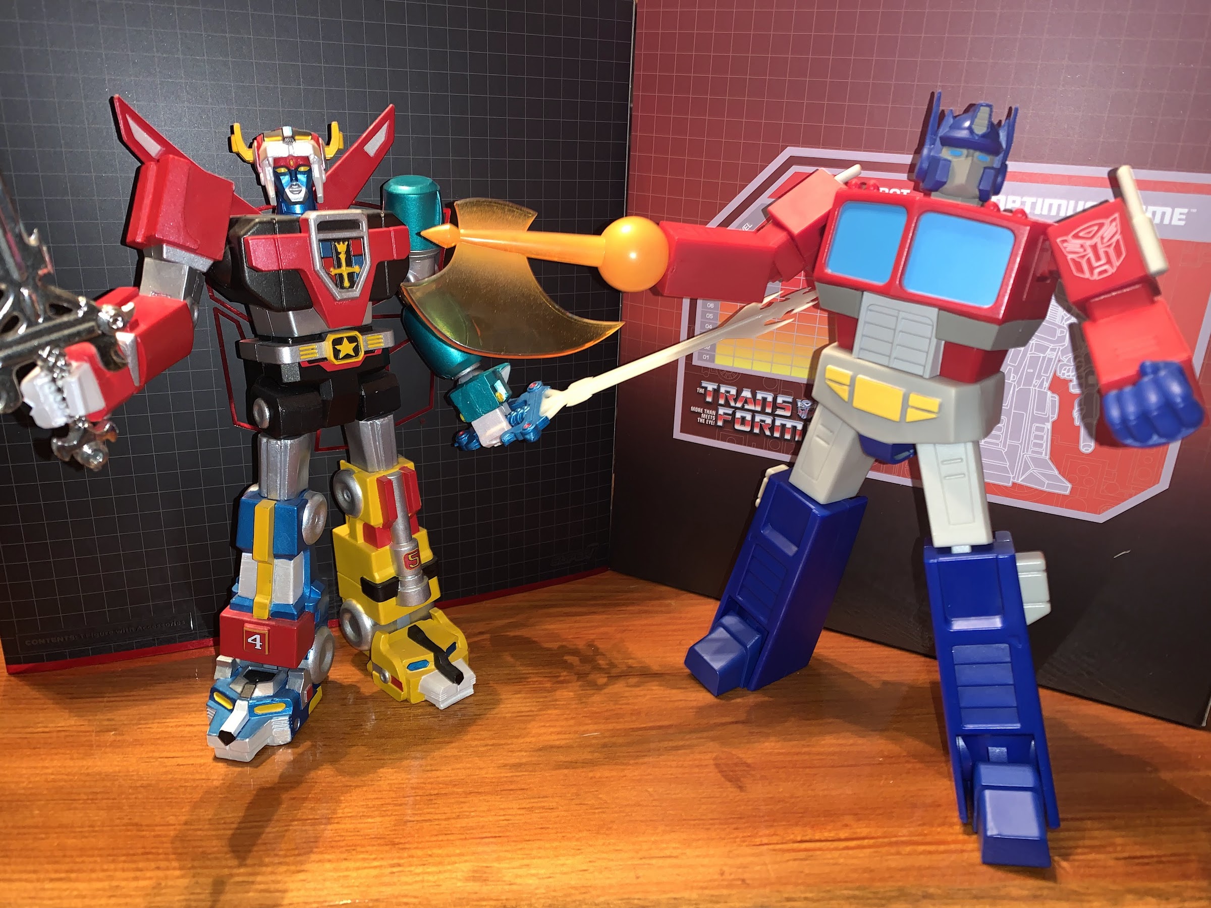
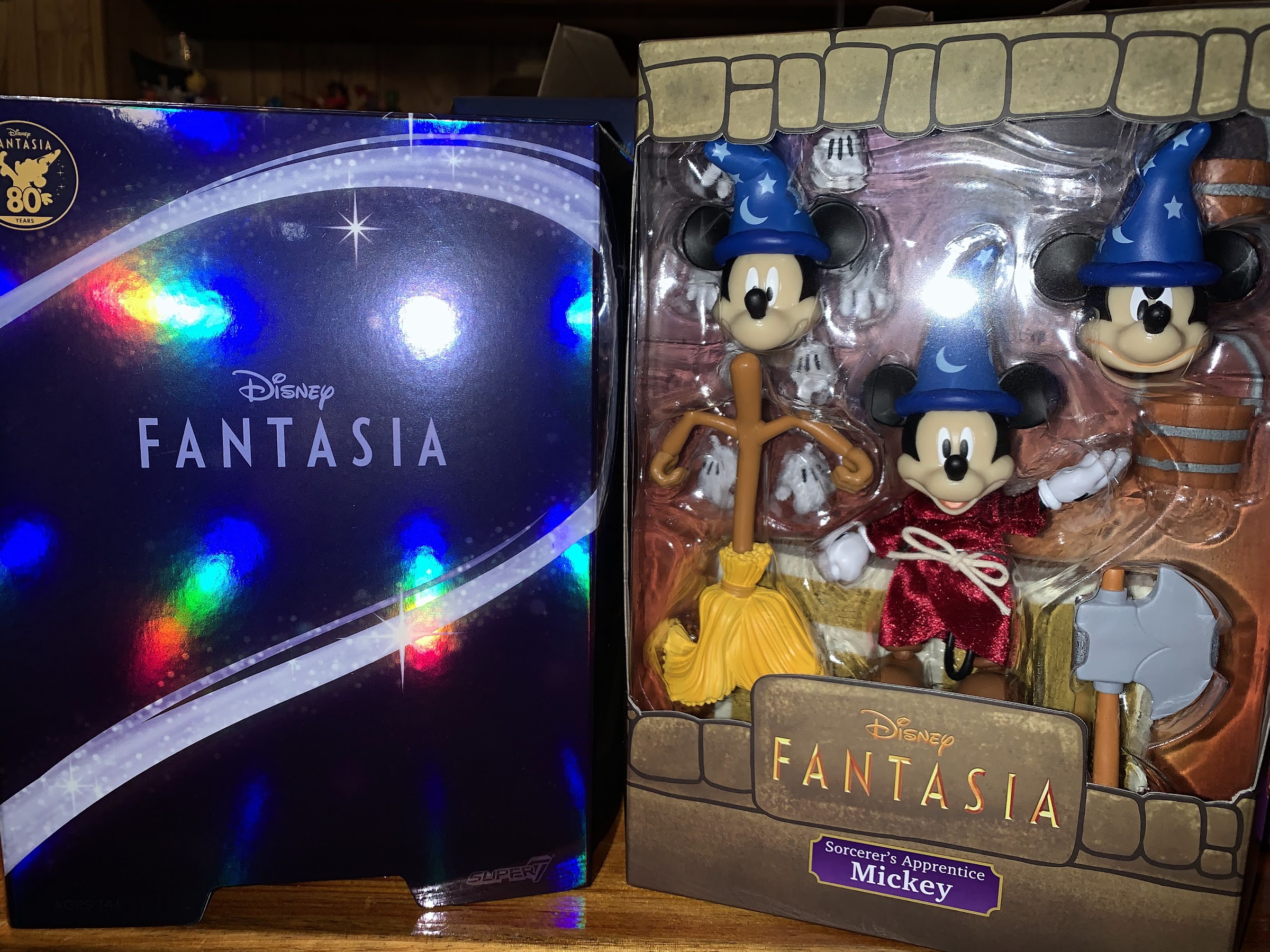
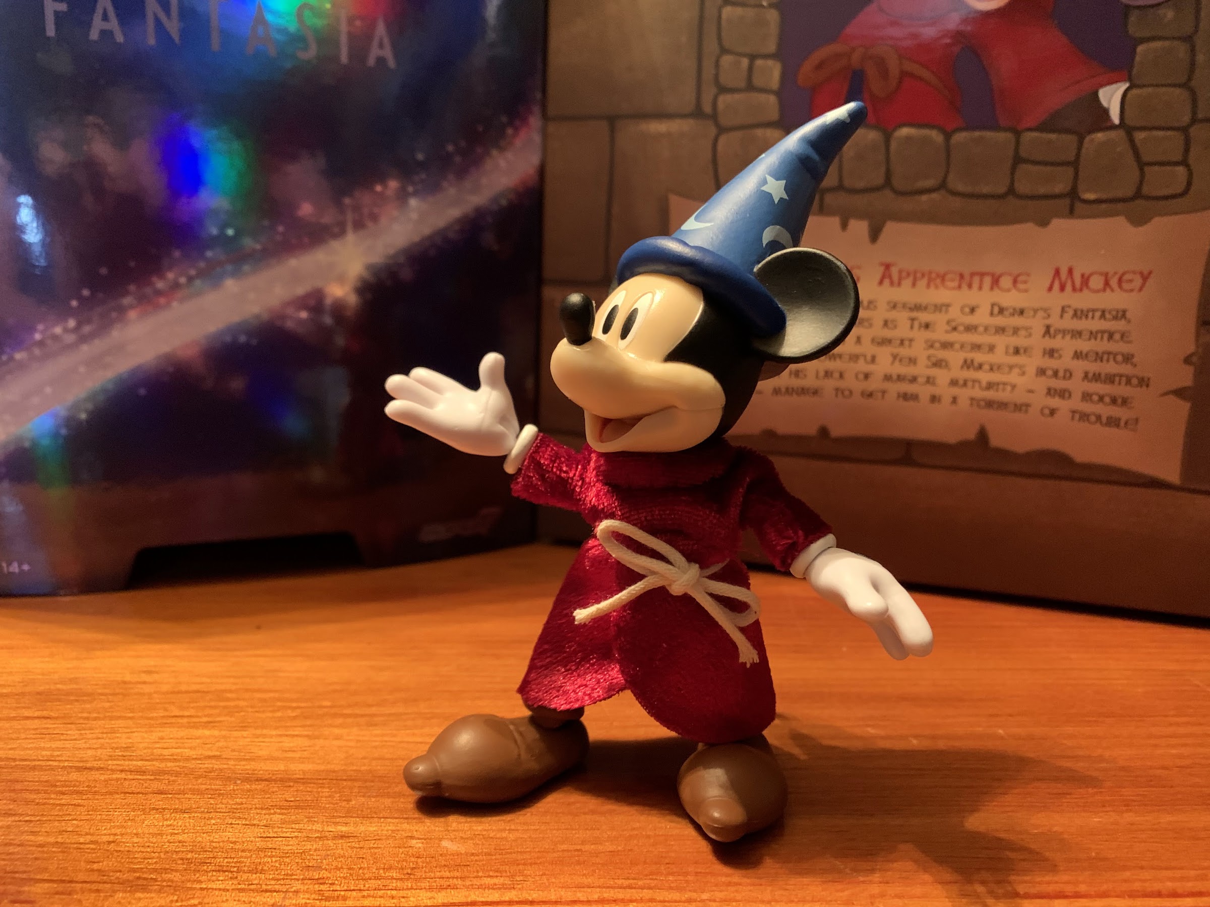
The rocket launcher, on the other hand, is quite easy to work with.

It’s with the wings that a new problem emerges for Demona. In many respects, I think she articulates better than Goliath as there’s less bulk to maneuver around, but what kills her is the tolerance of the wing joints. They are far too loose and are downright floppy. Her wings immediately slump to the table and posing them on their own is impossible. I’ve had to prop them up on Goliath and Thailog or just let them hit the shelf to pose her. She’s a challenge to stand, so I guess the wings help in that regard, but it’s a problem and it seems to be rather widespread. I’m going to have to try to remedy this somehow, either with super glue, tape, or something that can be added to that peg to tighten things up. It’s a problem that the figure really can’t have since the wings are so huge and it’s something NECA needs to tighten up now. I’ve refrained on trying to remedy it for the time being so that my images with this review are true to what the figure is out of the box.

I think three, winged, gargoyles is the most this shelf can handle.

Demona is a figure that is largely as expected. She looks the part well enough and has essentially the same articulation as Goliath, just with a new problem in the form of the wings. If not for that, I think I’d find her a little more entertaining than Goliath, but instead I find this figure to be rather frustrating as I try to pose it on my shelf. That’s also true of the other releases in this line as they’re so cumbersome that they’re really not a lot of fun to handle. They look pretty great when placed in a pose that looks nice, but they make you work to get there. NECA plans to include extra wings with the non-winged characters in the line, but that’s not going to do it. We really need options right out of the box, or else I think a lot of people will drop this line after a figure or two. Maybe I’m wrong, but despite this figure being overall a solid release, I’m finding my enthusiasm for this line waning which is hard to believe given how excited I was a year ago when the line was announced.

Demona was part of the Haulathon event and some stores are still receiving stock of her and she should set you back around $36. The distribution appeared poor to start, with some stores only getting one unit or none at all, but Target did make her available online so hopefully those who wanted her got her. I never found this figure in stores, so a special shout-out to @JoePoppingOn who helped me in tracking her down and the next figure in the line. The figure is also now up at various online retailers, some with a mark-up so it pays to shop around. Those figures are presently slated for a June release so hopefully that holds true and everyone who wants it can get one.


Super7 Disney Ultimates! Mickey Mouse as The Sorcerer’s Apprentice

Do bad things always happen when the mouse puts on the hat?

The first figure from this line of Super7 action figures based on characters from Disney’s treasure trove of animated characters was Pinocchio. In that review, I mentioned how Disney wanted to outdo itself with Pinocchio and sunk a lot of money into that film’s production. Well, the only other film from that era that might compare is 1940’s other feature: Fantasia. Fantasia was Walt’s passion project as he saw the marriage of animation with classical compositions as high art. I think he was mostly happy with how it turned out, but not happy with the reception as audiences didn’t seem to appreciate it the way the company figurehead did.

How come Mickey gets a special sticker, but Pinocchio doesn’t, when both films were released in 1940?!

Even so, there’s no denying that at least one segment from Fantasia has impressed and delighted movie goers for generations and that’s The Sorcerer’s Apprentice. That segment starred Mickey, who was still a pretty big deal in 1940. He was voiceless in the film, but was arguably never as expressive as he is in the short segment because no Mickey cartoon before (or likely since) had the budget of Fantasia. It truly is a delight and one of the best cartoons of all time and it’s no surprise that Super7 turned to Fantasia, and Mickey, with its first wave of Disney Ultimates!

Doesn’t get much more iconic than this.

The direction of Super7 founder Brain Flynn with this Disney line is to not simply do characters from Disney in their most recognizable forms. For Mickey, that would be classic red trunks and yellow shoes. The thinking from Flynn is that you can get that Mickey anywhere so Super7 should do something else. Now, doing Mickey as the Sorcerer’s Apprentice isn’t exactly breaking new ground either, but it’s apparently enough for Flynn who basically conceded that they needed to do something a bit more expected and generic for this first wave as Disney collectors are probably pretty new to Super7. And since the figure did sort of coincide with Fantasia’s 80th anniversary (curiously, so did Pinocchio but that one didn’t get a fancy sticker on the box), it makes perfect sense to have this Mickey in Wave One.

Careful, he doesn’t like it when you call him short.

Being a 7″ scale line, Mickey comes in on the small side for an action figure. He is not, however, as small as Pinocchio and I think most collectors are likely going to be pretty happy with the sizing of the mouse. To the top of where his head would be he’s nearly 4″, and once you factor in the hat he’s basically a 5″ figure. His proportions are fairly small, though more substantial than Pinocchio, and he does feature the trademarked oversized gloves and shoes. This is a figure that largely features no paint. There’s the blue on the hat with the painted silver runes, Mickey’s eyes and mouth, and the black lines on the back of his gloves. Under the robe, he does have blue trunks which are a mix of colored pieces and painted ones and the brown boots are colored plastic. It’s largely fine, as his entire body is covered by the robe, but where paint is sorely needed is on his face. The flesh-tone plastic is just not saturated or warm enough for the character and it has a glossy characteristic that is off-putting. Some have gone so far as to say it ruins the look of the figure, but I’m not willing to go there. Instead, it’s just an unfortunate shortcoming. Simply painting that area of the face would do wonders for the look of this guy.

Mickey’s feeling pretty good in that snazzy robe.

I mentioned in the Pinocchio review that one of Super7’s goals with this line is to incorporate soft goods into each release. For Pinocchio, the inclusion was a minor one, but for Mickey the soft goods needed to be something special and I’m happy to say Super7 pulled it off. Mickey’s robe is a touch darker than it is onscreen, but it has a shimmery quality to it that really imparts a sense of quality into the release. It’s cinched with a simply knotted rope, and it’s appropriately sized for the figure. It doesn’t look overly baggy, and the roominess of the design allows Mickey’s articulation to function as intended. Like a lot of collectors out there, I’m not often partial to soft goods, but here they work and they work well.

Things always start off well enough when tossing magic at a broom.

As for that articulation, I’m happy to say it’s better than what we got with Pinocchio, though it’s still hardly a strong point. Mickey’s head sits on the same ball peg design as Pinocchio so there’s no neck articulation and what you get out of his head just depends on the amount of range on that single ball. It’s sufficient as Mickey can look up an okay amount, but there’s really no reason why they couldn’t a double ball peg. The shoulders are ball-hinged and Mickey can raise his arms out to the side just fine and he can even rotate around with the robe on. He has single-hinged elbows with swivel and his hands rotate and feature horizontal hinges. Once again though, we have no torso articulation. Not even a waist cut, which is a shame because, again, the robe would hide everything! Maybe it’s a size issue – I don’t know, but NECA’s done figures at this size with more articulation so I’m not willing to allow that as an excuse. At the hips, we have the usual Super7 ball-peg hips and they’re fine. The knees hinge and swivel and Mickey can at least bend 90 degrees. The ankles are, once again, rather floppy and the oversized shoe means the ankle rocker isn’t as useful as it could be. The right ankle on mine isn’t as bad, but the hinge is pretty tight. I actually have a hard time getting both legs to appear the same length as the knee hinge is loose on the left leg. There’s also a ball-hinge at his tail giving that some movement. He can hold a pose at least, and hasn’t fallen down like my Pinocchio, but there’s room for improvement.

Eventually though, things take a turn and it’s time to break out the axe!
There’s certainly a nice assortment of stuff here, and I didn’t even place all of the extra hands into the shot.

On the accessory front, we pretty much get all that we need. The default head is an open mouthed smile and Mickey can swap to an angry head or a standard smile. Both extra heads feature a bend in the cap which is nice for a little added personality. I probably could do without the smile though in favor of a scared expression because it feels redundant with the open smile. All of the heads also feature the ears sculpted into the hat, and I feel like Super7 missed an opportunity to change the ear position so we could have a screen accurate way to present Mickey from the side as he is on the back of his box or as he was in the often seen tag before every Walt Disney VHS release in the 80s and early 90s. A scared expression would have been really nice for the giant book accessory that Mickey floats on towards the end of the segment. The book is just a big slab of plastic, and it’s cool, but without a scared head I really don’t know what to do with it. There’s also a single, animated, broom with a pair of water buckets it can hold. There’s no articulation on the broom, but both it and the buckets are very well-painted. And for when Mickey gets angry with said broom, he has an axe to chop it up. To go along with all of that, are numerous hands. Mickey has open hands in the package to go with fists, gripping hands, pointing hands, and a more relaxed open set of hands. With the hands, the only criticism I can make is the hinge on the gripping hands isn’t going the right way, but otherwise this is a fine set of expressions.

There’s probably a lot of people wondering how they can get more of these guys.
The book is neat, but this would work so much better with a scared expression.

Objectively, and subjectively, Mickey succeeds far more than Pinocchio did at making the jump to plastic. The articulation could be better, but that’s often true of every Super7 release. My main critique is in the lack of paint on the face, and if not for that, I’d consider this a homerun. As released, it’s a solid line drive for a double and I think it will please both action figure fans and Disney collectors. It’s very on-model, and the soft goods robe adds a touch of class. Plus, it’s an iconic version of an iconic character. Personally, I would have loved to have seen Super7 roll with The Band Concert or The Brave Little Tailor version of Mickey, but at least we’re getting that with the ReAction line and I can’t fault them for doing this version. It’s both safe and pleasing for the audience and an easy recommend for Disney enthusiasts.