Category Archives: Television

S.H.Figuarts Juckie-Chun/Jackie Chun

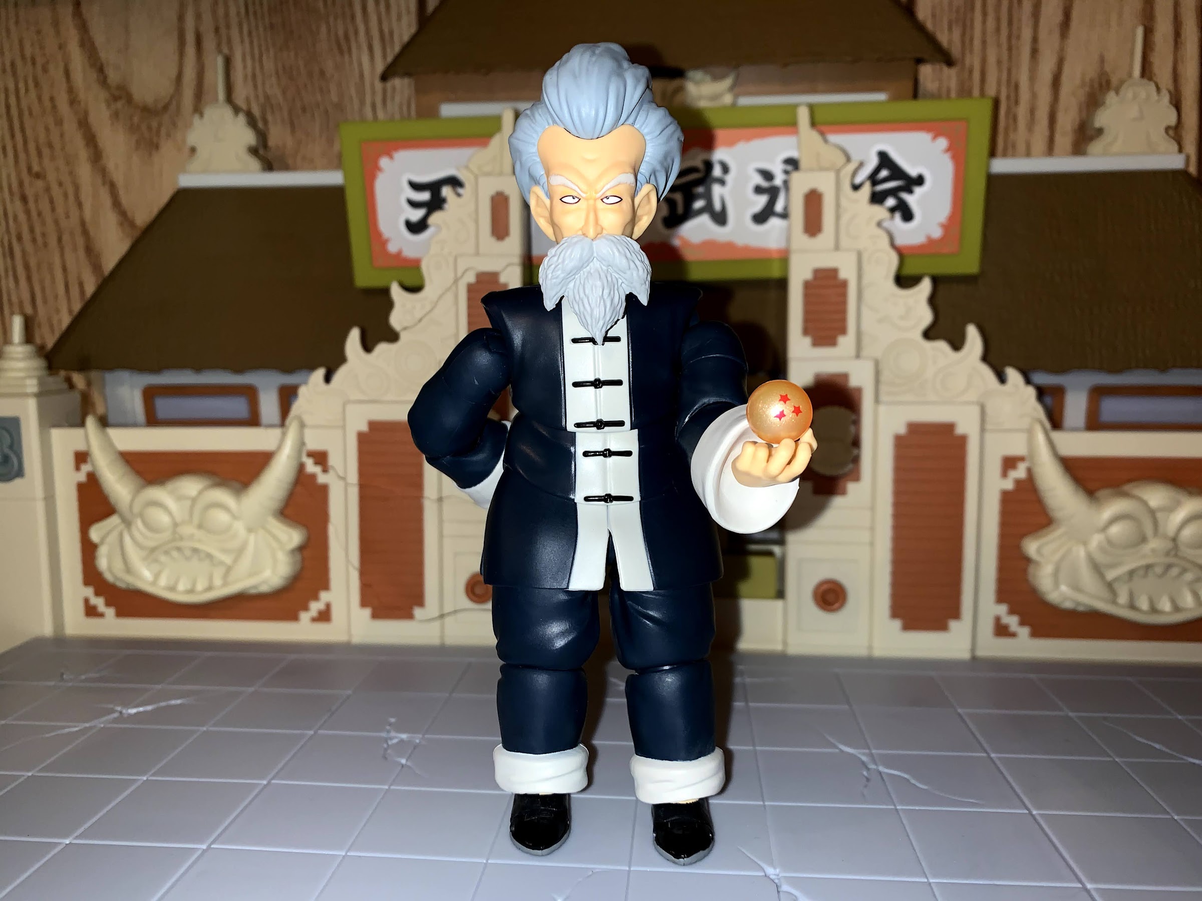
It was about a week ago in my write-up on the Dragon Stars World Martial Arts playset that I bemoaned my decision to pass on the S.H.Figuarts release of Jackie Chun and I hypothesized I might rectify that. Well, it didn’t take me long to make up my mind as here I am to tell you all about Jackie Chun! The martial arts master and winner of the 21st World Martial Arts Tournament has been cast in plastic and is ready to join my humble Dragon Ball collection. What motivated me to finally pull the trigger on this guy was largely my completist nature. The Dragon Ball set from Bandai is pretty small when compared with the assortment of Dragon Ball Z figures, so why not get them all? I have the first Bulma Bandai released in my Pile of Loot at Big Bad Toy Store so the only one I’m missing now is kid Chi-Chi. I can’t get past her costume though, so I don’t know if I’ll ever pickup that particular figure.

“Boy, you sure do look familiar!”

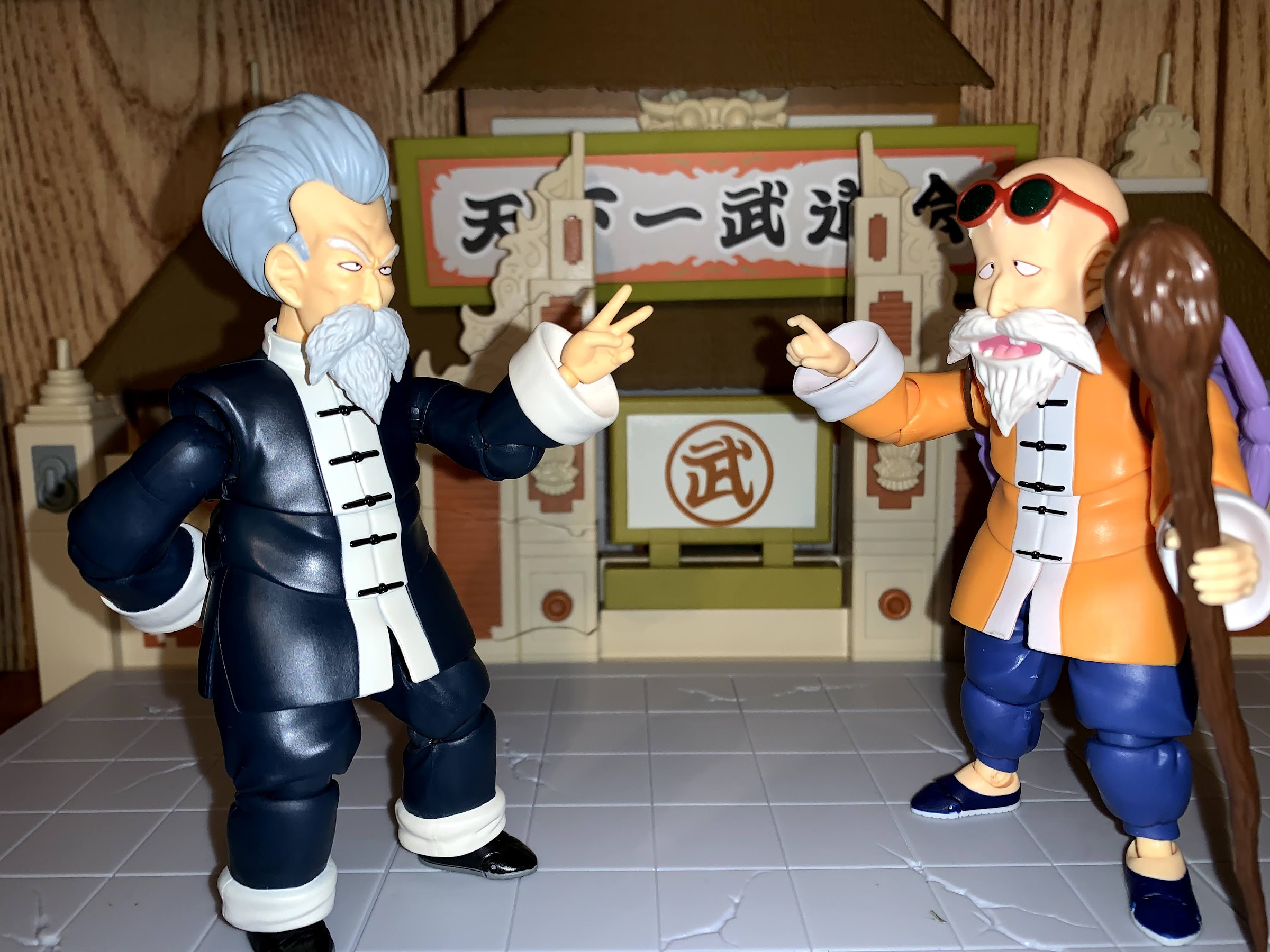
The reason I initially passed on Jackie is because he’s very similar to Master Roshi. Not only do they look strikingly similar, they’re literally the same figure. For the most part. The only difference in terms of sculpting is the head and lower leg area, but the torso is the same. Jackie just dresses all in a deep navy blue, almost black, as opposed to Master Roshi’s much more colorful attire. And if you didn’t notice right away that they’re essentially the same, the give away rests on the back of the figure where Bandai just glued in the plug piece intended to seal the peg hole for Master Roshi’s turtle shell accessory. It’s a minor eyesore on Jackie, but the figure is helped out by the fact that we’re dealing in dark colors here and it is on the back of the shirt. At the same time, it’s a bit annoying since the shirt is in three separate pieces and one has to wonder how much money was really saved by not redoing it. At least he has a peg hole if you want to utilize a more dynamic stand.

He can pose.

Being that he’s essentially the same figure as Roshi, the articulation is also the same. That figure had some good and bad to him, and a lot that has to do with the clothing. The shoulders flare out and the wrist area is surrounded by large cuffs so it all limits the articulation a bit. The shirt is also intended to be a long martial arts uniform, and since Bandai doesn’t utilize cloth goods, the only way to properly articulate that is to “scallop” the sculpt and insert a series of ball-pegs into the torso. It’s not the cleanest sculpt in the torso as a result, but it’s not truly an eyesore either. Again, the dark color of Jackie works to the figure’s advantage in hiding this somewhat, but I do wonder how he’d have come out with a cloth robe.

He can siiiiiiiiing!

Bandai doesn’t use much paint with its S.H.Figuarts line, and it is a common complaint I hear from other collectors. Jackie is no except as he’s mostly just colored plastic. The only paint on the body of the figure is the white stripe and black fasteners down the center of the shirt and the gray soles of the shoes. The rest is reserved for the head and face where the eyes and eyebrows are well-painted. There may be a touch of a wash in the hair and beard as well which helps bring out the sculpted details and looks pretty sharp. His hair color has a gray to it, unlike Master Roshi’s all-white beard, which helps distinguish him further. The choice of doing the figure in a very dark blue as opposed to black is a little curious. As far as I can tell, his outfit is sheer black in the anime. And unlike many comic books, there’s no blue shading to speak of. I don’t know if this was based on information from Toei, or if Bandai just made an artistic decision not to go full black. As a result, under some light he looks a little blue and others a little gray, but always pretty dark. It’s not something that bothers me, I just find it curious. The finish is at least fairly matte which cuts down on the plastic sheen some figures in this line feature. Ultimately, the likeness is pretty on point and the sacrifices the figure makes in the sculpt to accommodate the articulation are worth it in the end.

“Ka…”

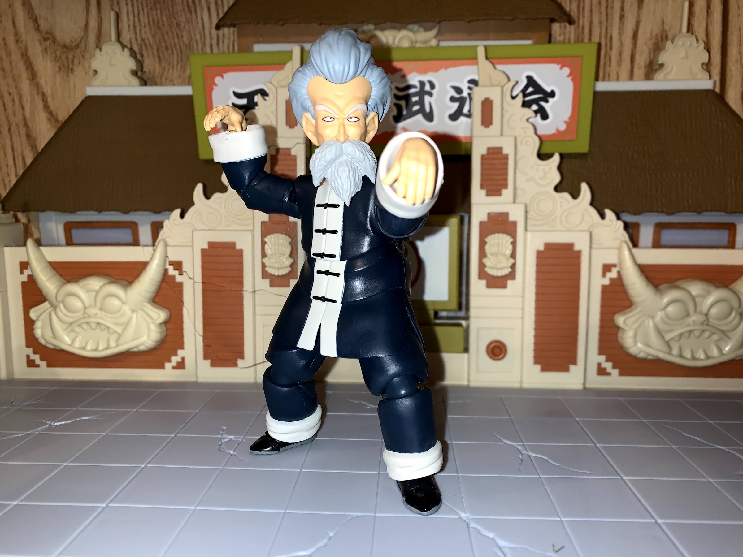
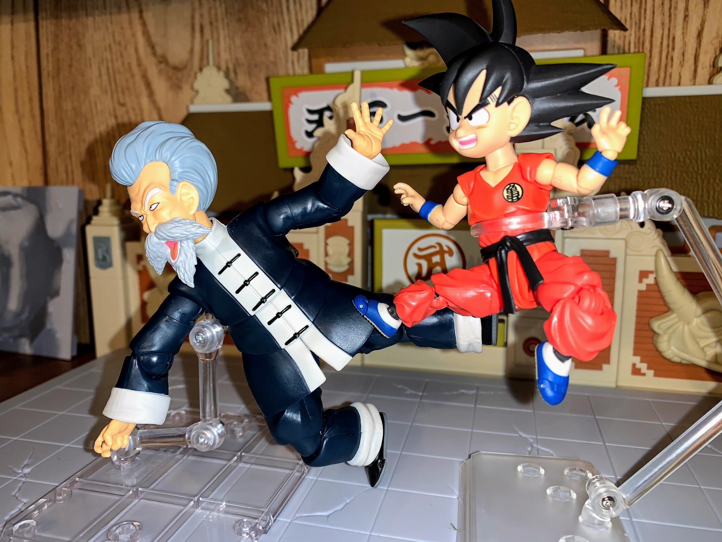
If you wish to know precisely how he’s articulated, I’ll run it down for you here. If you’re familiar with the Master Roshi figure, then skip ahead. Jackie has a ball peg at the head and base of the neck and he has some pretty solid range. Surprisingly, he can look down quite well despite the presence of the beard, it’s looking up that he’s not great at. At the shoulders we have ball-hinges with a butterfly joint. He can raise his arms out to the side better than expected and the butterfly joint allows him to achieve his Kamehameha pose fairly convincingly. There’s a biceps swivel below that and single-hinged elbows. The elbow is probably the least impressive part of this figure as they’re on these big ball-hinges that look funny from some angles. They also can’t achieve a 90 degree bend due to the way the sleeves flare out. It’s close, but not quite there. At the wrist are ball-joints which is a good choice since the sleeve works to conceal the ball-hinge which can be unsightly on other figures. In the diaphragm is a ball-hinge mechanism that mostly affords tilt and twist. Twist too far though and you end up with some ugly gapping. The hinge allows the upper body to lift up and crunch forward, but the shirt doesn’t seem to want to cooperate. A lot of rubbing occurs and I worry about smudging if utilized too much. Below that is another ball-peg at the waist allowing him to rotate and tilt. At the hips he can kick forward about 90 degrees and spread his legs out to the side almost into a split. He kicks back a little bit and the double-hinged knees basically give him 90 at the knee. There are thigh swivels and the feet are on ball-pegs. They’re not great, but the cuffs at the end of the pants were going to limit him anyway. There is a toe hinge as well.

“…ha!”

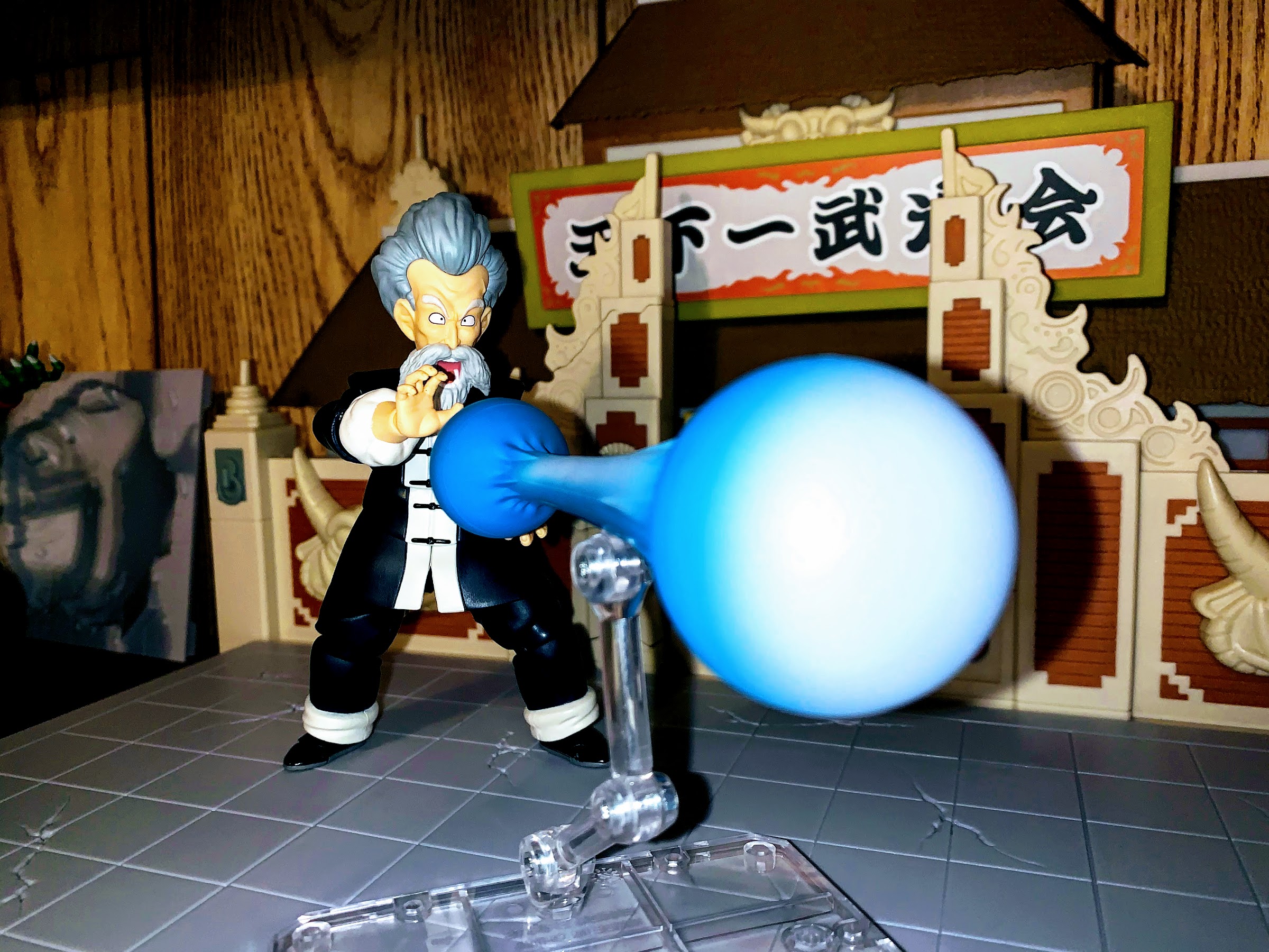
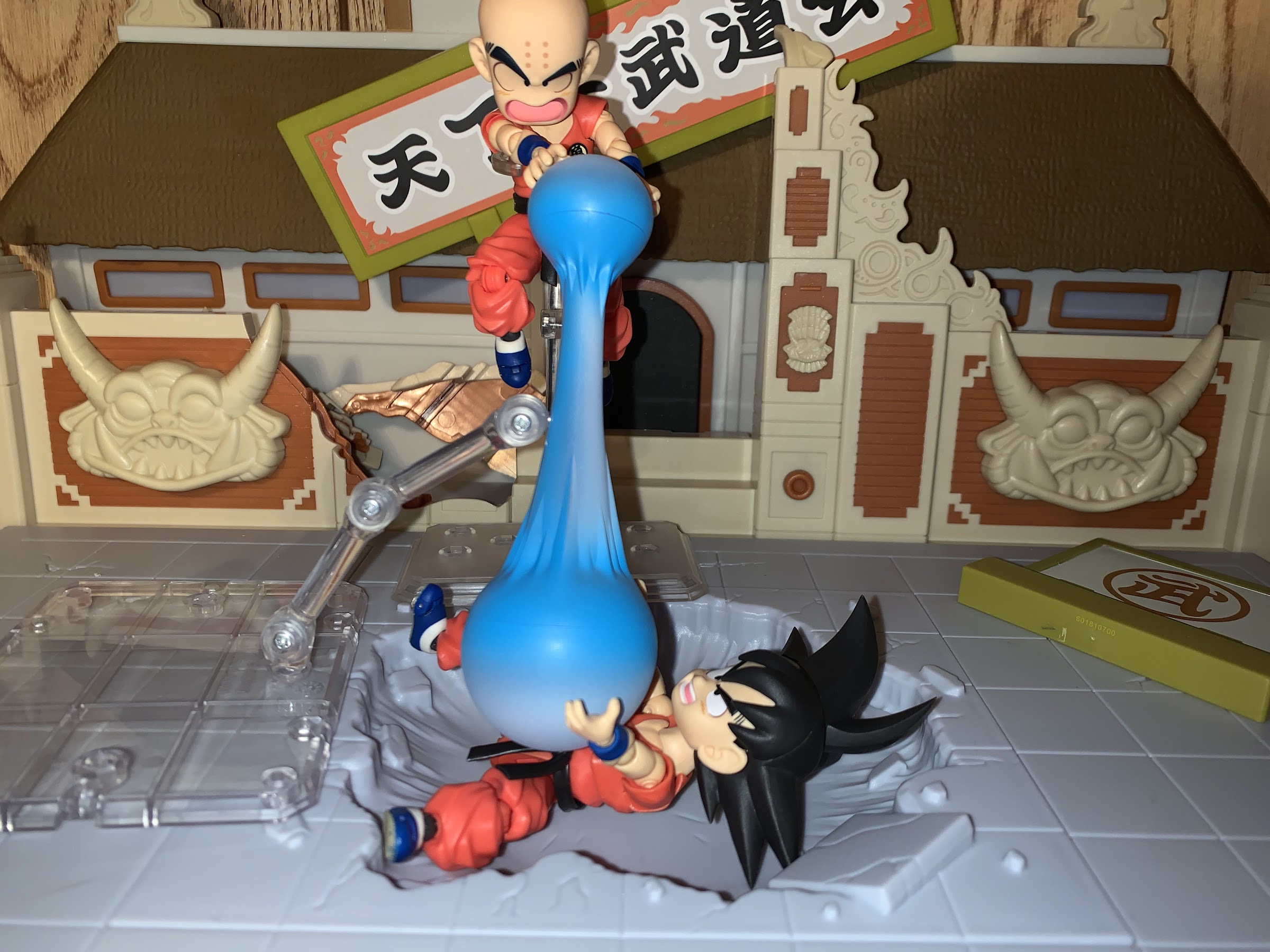
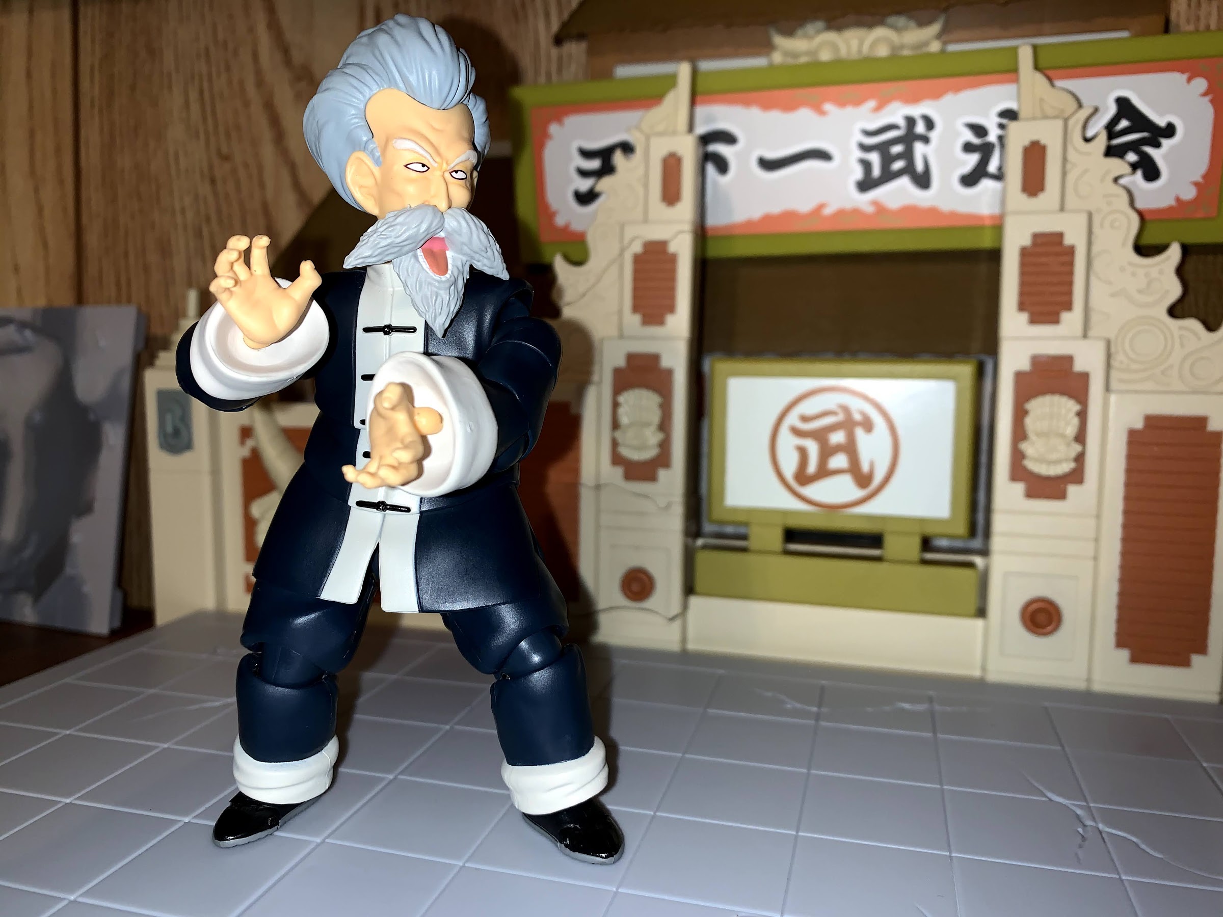
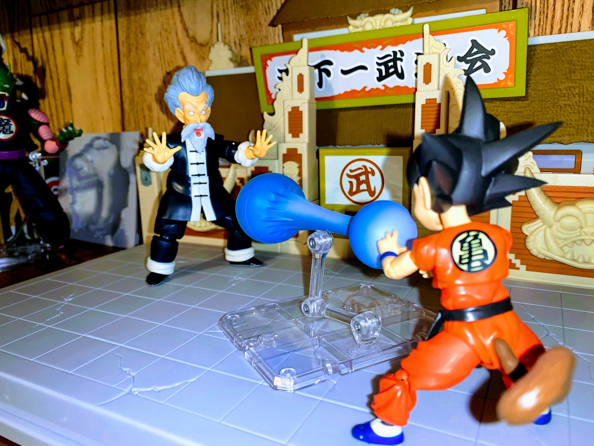
Jackie-Chun should be able to get into the poses he needs to be able to get into. Martial arts posing and energy blasting all are achievable. Helping him to do all of that are the loads of extra parts Bandai tossed in. Probably as a make-up for him containing a ton of parts reuse, Bandai made sure to give him an array of hands and facial expressions. He has the one head, but three separate faces. And like Master Roshi, you can swap the mouth and beard piece between the faces to mix and match expressions. You basically get angry eyes, serious eyes, and excited eyes to go along with a closed mouth, an angry yell, and a surprising, or singing, open mouth. That last one pairs with a microphone stick, as is the case with many Dragon Ball characters, there’s a serious side and a playful side to Jackie which this figure seeks to capture. As far as hands go, he comes with two crane pose hands which are unique as the peg basically goes into the underside of them to achieve the proper the shape. He also has two Kamehameha hands which are essentially the opposite as they peg into what I would call the top of the hands. He also has a set of peace sign hands, some chop hands, fists, martial arts pose hands, splayed open hands, and one gripping, right, hand for the microphone. Unique to Jackie are also swappable forearms. These are present so that he can roll up his sleeves. The arms separate below the elbow and the new ones just peg in. They don’t appear to be designated as left or right so either side works. They allow for more freedom with the hand articulation since this eliminates the cuffs from play, though another point of the figure that can come apart means there will be times you pull the arm off when you don’t intend to. A minor annoyance for an interesting feature. Lastly, there’s a 3 star Dragon Ball. This one has a pearl finish to it as I believe Bandai has already released seven standard balls so this new finish is being applied to the line going forward.

“No, Goku!”

Posing and utilizing these parts is all pretty painless. The hands pop on and off with minimal fuss, though the left arm of mine features a loose forearm connection so often the whole thing comes off when I’m just trying to swap the hand. The extra forearm doesn’t seem to peg in snug either so it becomes a balancing act posing him with the sleeves up. Unlike with Master Roshi, I don’t feel like we’re missing any expressions as far as the hands go, though a “drunken master” face would have been excellent. What’s really missing though is an energy effect. A charging one would have been nice, or just a Kamehameha attack since this guy is the master of that technique. I am guessing Bandai wants to do a Kamehameha Master Roshi that’s all bulked up and that’s why we don’t have that here. At least this time we have the hands.

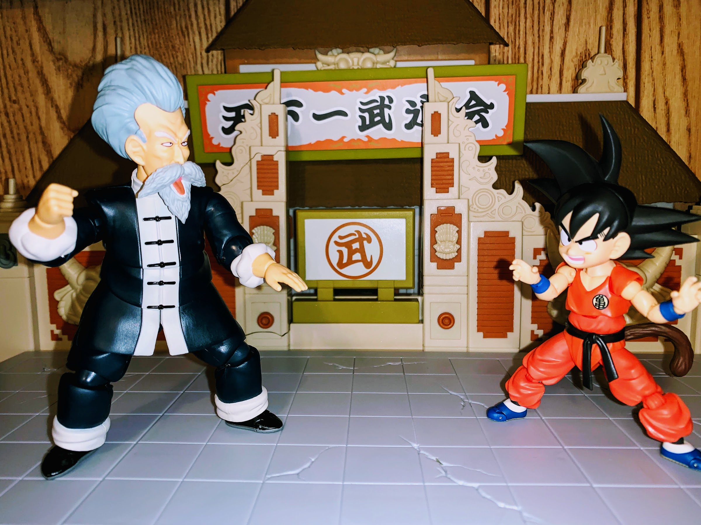
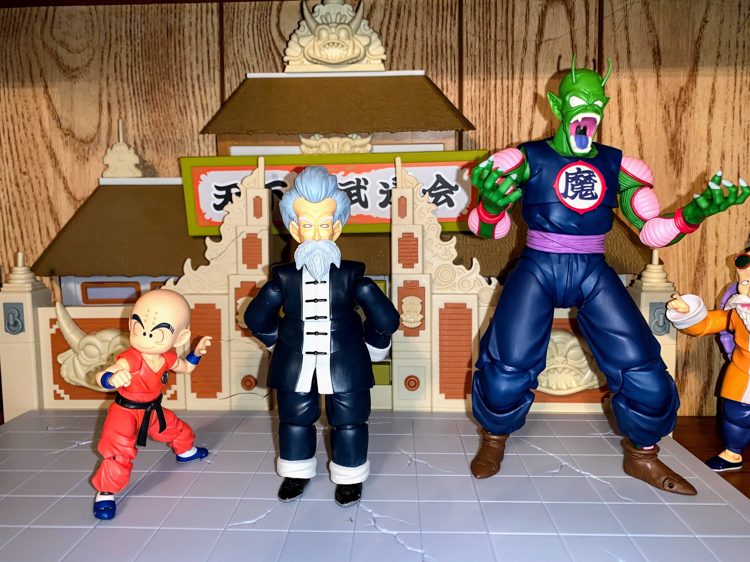
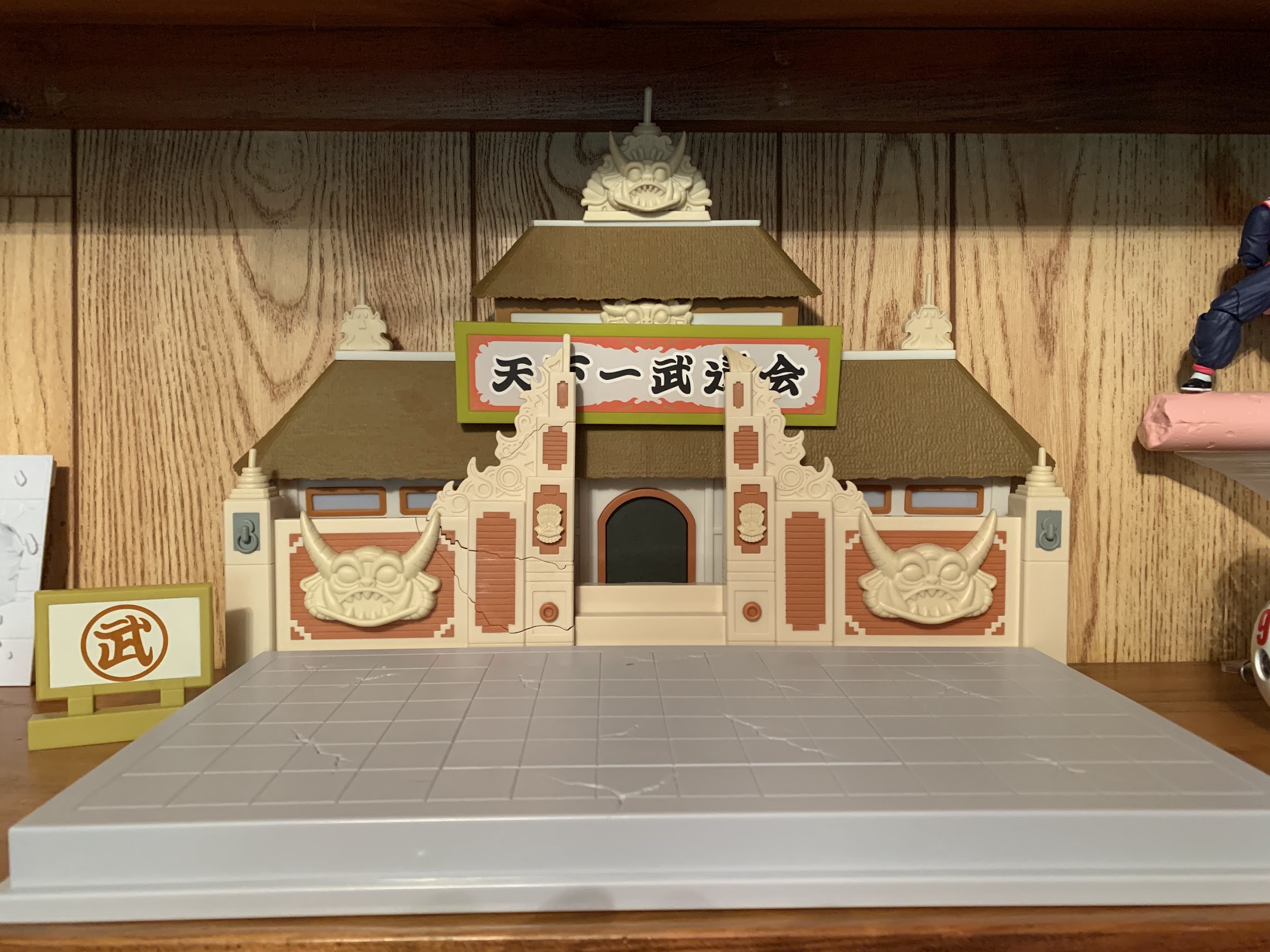
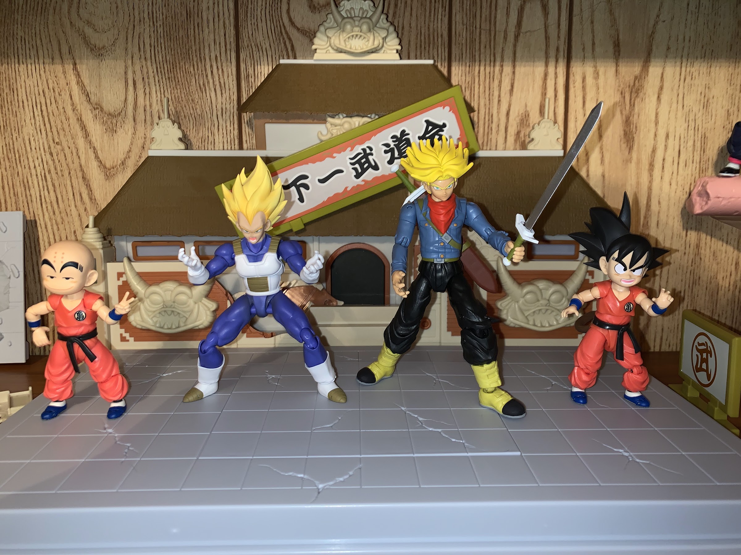
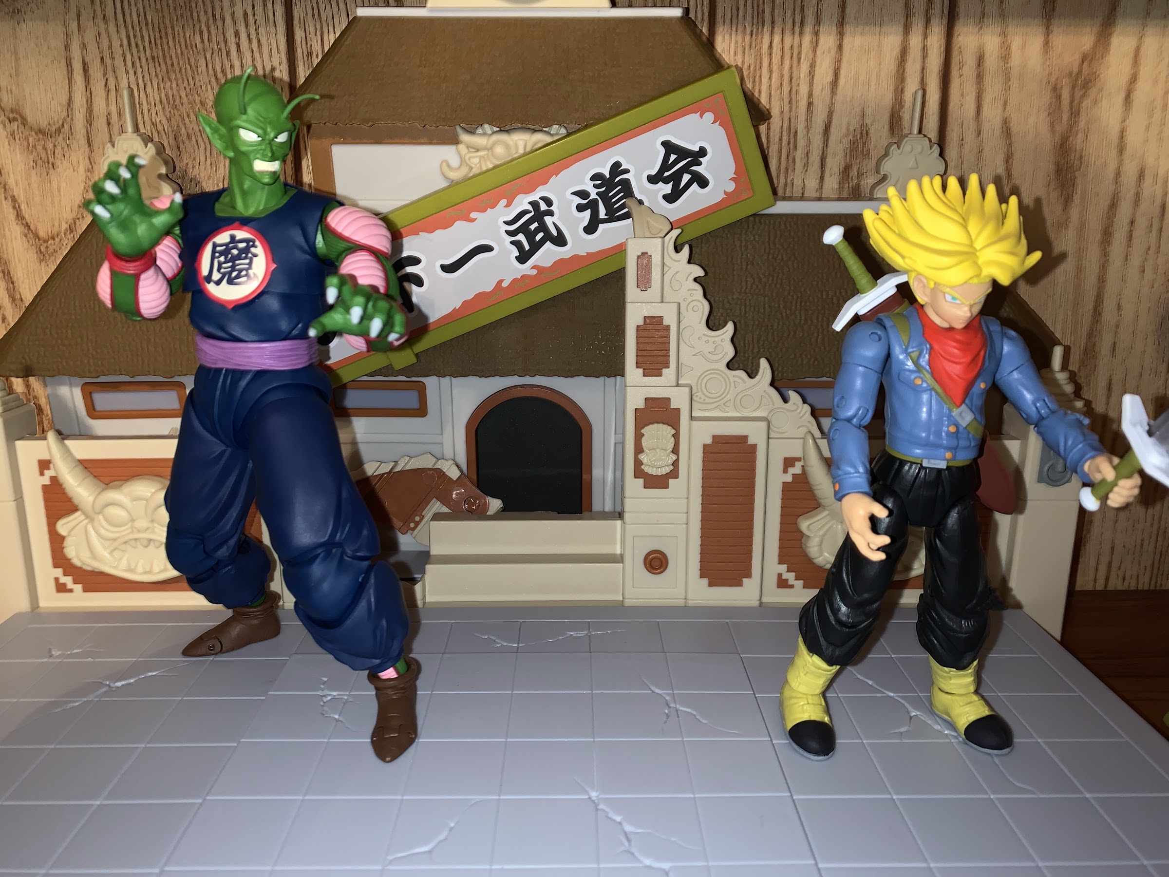
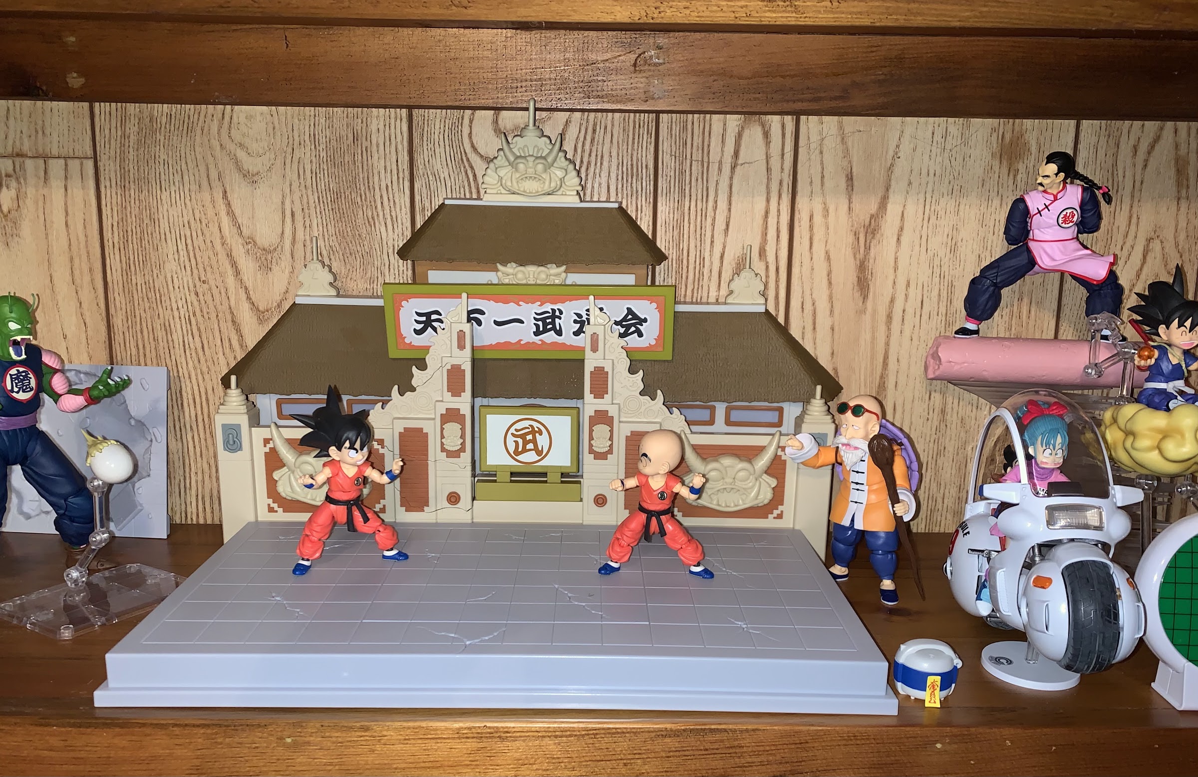
Jackie Chun looks pretty good opposite the kid figures when placed on the World Martial Arts Tournament set. He is, more or less, in scale with them. It’s not perfect, but that’s more of a critique of the kid characters which were sized-up for the figure release. Bandai seemed to prioritize scaling Master Roshi, and Jackie Chun as a result, with Kid Goku and Krillin so he looks kind of silly next to Bulma, who is just way too small. King Piccolo towers over him well enough, though that figure should probably be bigger than he actually is. Scale is a limitation of this line in general and Bandai just seems to approximate it as opposed to trying to make it totally accurate.

I couldn’t quite get them into the double kick pose from the anime.

Adding Jackie Chun to my collection allows for me to pose him opposite Goku or Krillin, leaving Master Roshi to be more of a goof off to the side. I like that Jackie has the singing face and microphone for when I don’t want him on the battlefield, or I could just let him be the stern, wise, old, master watching silently. I liked the Master Roshi figure so it stands to reason I like this one. Is he essential for a Dragon Ball collection? Probably not, but it’s not as-if the character isn’t memorable. I hope Bandai continues to release more dedicated Dragon Ball figures so my display can continue to grow. They have Lunch/Launch coming this summer, but nothing has been announced beyond her. There’s still Pilaf and his gang, end of Dragon Ball Goku and Chi-Chi, Tien, and plenty more. I’d be interested in basically all of them, so hopefully Bandai comes through. Right now though, I have a fun little collection that’s pretty nice to have all on its own.

Yes, this’ll do nicely.

Dragon Stars World Martial Arts Tournament Play Set

One of the main draws for me in getting the NECA Teenage Mutant Ninja Turtles diorama was that it was going to open up some more space for me. The diorama allowed me to move my TMNT collection from a shelf to a new place since now my display had a vertical component. This was necessary since that prior shelf featured my TMNT collection basically jammed together with my Bandai SH Figuarts Dragon Ball collection. I know some people out there like mixing their collections, but I am not some people. I prefer to keep my intellectual property separate and only display different IPs beside each other when I just have no other alternative or my collection in a certain IP is relatively small (which is why D&D’s Drizzt is standing next to Batman on a shelf).

The Dragon Stars line has certainly grown over the years.

It was several months ago that I grabbed a Bandai Dragon Stars World Martial Arts Tournament play set from a sale at GameStop. It was so long ago, that it was in the same order as the Capsule Corp motorcycle I reviewed. I had been eyeing this particular play set for a couple of months because it looked like something that would work well as a backdrop for my modest Dragon Ball collection. Normally, this isn’t the type of thing I buy since this is really more of a true toy intended for kids as they act out battles from the show and take advantage of the built-in play features the set comes with. However, I liked how it looked and when the price came down to a point that made sense to me, I jumped on it.

I’d say it looks the part. Could use a ring announcer though.

If you’re not into Dragon Ball collecting, basically what you need to know is Bandai has two, distinct, main, figure lines: SH Figuarts and Dragon Stars. SH Figuarts is the collector line and figures range from around $50 to over $100. Dragon Stars is the more general audience line aimed at kids and casual fans. That doesn’t mean collectors don’t or can’t collect the line, it’s just a line not specifically courting that market. The Dragon Stars figures are usually around $25, so not exactly cheap, but a far cry from the SHF product. Bandai is also able to pump them out quicker and the character roster is quite robust at this point. It started as a line focused on the latest iteration of Dragon Ball, Dragon Ball Super, but it also includes most, if not all, of the main characters from Dragon Ball Z at this point. And it’s that line that this play set is from.

The scaling is a bit wonky, especially when you introduce an actual Dragon Stars figure like Future Trunks.

Now, even though this is a Dragon Stars release, I would say the play set is not exactly to scale with that figure line. It would have to be positively massive to properly scale with any line, but I don’t know that it would appeal to collectors looking to pit Goku vs Piccolo or whatever. I only have one Dragon Star figure, Future Trunks, and he looks a bit silly standing on it. However, I grabbed this for my Dragon Ball display specifically eyeing it for Kid Goku and Krillin. It’s still not perfect, but as a backdrop and platform to draw attention it gets the job done. The set itself measures about 12 1/2 inches tall and 11 1/2 inches deep. The platform is about 15 1/4″ wide, and the backdrop extends about a half inch off either side. It’s not small, but not as big as it should be. How small is too small will be a bit subjective, but for what I want to do with it I think it works fine.

Introduce a figure like King Piccolo and the set really starts to look silly.

The set is essentially three parts: the ring surface, the rear wall, and the rear building. There’s a small gap between the rear wall and building, but not big enough to do much of anything with. If you had some paper cut outs of characters I suppose you could try slipping them in as spectators, but you’re not going to fit any figures in there. The main attraction of the set is its play features. Just as the ring and building tended to get beat up over the course of a tournament, so too can your set. The wall comes apart, mostly on its right side (the left side if you’re standing in front of it) to simulate damage as if something was thrown into it or a wayward energy blast smashed into it. The marquee is removable so you can display it ajar in a dilapidated state and a center panel in the ring can be lifted out. In its place you have a crater formation to swap-in which is pretty fun. These are all features I’m not going to get much use out of, but it’s cool to have should I want to change-up my display at all and that gap between the wall and backdrop can at least accommodate the wall fragments. There’s sadly no real way to store the optional crater though. I thought maybe I could get away with storing it underneath the platform, since it’s hollow, but there’s just enough stuff on the underside to make that problematic. I suppose the flat panel is easily stored though.

With these guys? It looks pretty good!
“Take that, Goku!”

The set itself is just largely comprised of molded plastic. There’s some nice detail on the various ugly heads that adorn the structure, but no added paint effects to bring them out. A confident collector would take this and probably dry brush it to bring out some of that detail, but I am not confident in my abilities in that regard. In terms of accessories, there isn’t much to speak of. There’s just the bits of wall, the marquee or sign that goes over the entry way, and another sign that you can position wherever to go along with the crater piece. It would have been nice if Bandai tossed in an exclusive figure like the ring announcer, who likely would never see a retail release as a stand-alone figure, but not having one at least keeps the cost down. The only letdown for me is the tine, or point, alongside the entryway on my set is warped and bent. It’s made of a flexible material, maybe as a safety measure since it’s pointy, and I was able to fix it with some hot water.

Let’s turn up the intensity!
That crafty Krillin.

In short, this set does what I need it to do. I think it looks great as a little battleground for Kid Goku and Krillin. Should Bandai ever do a Dragon Ball Tien then that could get interesting. Would he look too silly being that he’d be a bigger character? Possibly, but maybe not enough to bother me. I passed on the Jackie Chun release, and now I’m kind of rethinking that as I think he would look okay battling Goku. Should Bandai ever get to end of Dragon Ball Goku and Piccolo Jr. then I probably would keep them off of this thing, but since Bandai doesn’t have any plans to release either of those figures I’m not going to worry about it. For now, this is a solid, eye-catching, item that adds a little prestige to my humble Dragon Ball display. Hopefully, it’s a display that will continue to grow!

The new display! More figures coming soon too!

Super7 Ultimates! Voltron – Defender of the Universe

What have I gotten myself into?

My children are unknowingly a terrible influence on my spending habits. It was last summer they started watching Mighty Morphin Power Rangers awakening within me a long lost desire to acquire Power Rangers toys from back in 93/94. Recently, it’s my son discovering the Netflix Voltron series. Voltron was a show I paid little attention to as a kid. It was on early in the morning on week days and that was just a terrible time for me. I was not a morning person so I slept as late as I could and moved slowly through my morning routine. There was no TV watching for me as a result, but when some of my friends started insisting I check out Voltron I did take a peek. Years later, the show would return on Cartoon Network on week day afternoons and at that point I did give it an extended look, though it wasn’t particularly good.

What was undeniably good about Voltron though were the toys. My friend had a vintage, combining, Voltron toy. It should have predated he and I by a few years so I don’t know if he got it secondhand or what, but it was undeniably cool to have five toys that combined into one, bigger, better, toy. It was my first experience with the concept as I wasn’t a Transformers kid and Power Rangers were years away. The concept was better than the reality to some degree as Voltron was rather cumbersome. He articulated rather poorly, but back then, five points of articulation were pretty standard still so he wasn’t that bad. He was just a bit bland with a sword in hand since he couldn’t hold it in a natural way, at least in a natural way for a being made up of five robot lions.

Super7 had one goal with this packaging: shiny!

Over the years, I have resisted the temptation to go after a Voltron. When the Netflix series showed up, Voltron returned to toy stores and comic shops in classic and updated versions. The lions were available individually and I think there were deluxe versions that put everything in one box. There have also been mega expensive Soul of Chogokin versions of the character for those who really wanted to take Voltron to the next level. I resisted those calls though, and I was probably most tempted by the Lego Voltron of a few years ago because that just seemed really cool to me, though I wondered how durable a Lego Voltron would be and ultimately passed. Now, watching the show with my son, I found myself wanting a Voltron all over again, but now the options are severely limited. Those lions that once retailed for 20 bucks or so are near 100 on the secondary market as they’re no longer in production. Suddenly, the Toynami Ultimate EX Voltron is looking like a bargain at $400! I tossed around the idea of getting a Mini-Pla model kit Voltron since it was a combining Voltron, but like the Lego Voltron, I had durability concerns. Especially since that’s another figure that’s going to run close to $100 now since it’s no longer being manufactured. I was left thinking I’ve gone this long without a Voltron, so maybe it’s not something I need.

I found myself at a comic shop over the weekend and there on the shelf was a brand new Super7 Ultimates! Voltron staring me in the face. This edition of Voltron is a pure action figure, so there’s no breaking him down into five individual lions. Part of the appeal of Voltron is definitely the combing element, but there’s also the practical reality that I would never display the character in lion mode. I felt like I couldn’t pass it up, and maybe the shiny, chrome, packaging had something to do with that so I bought it and brought my little robot buddy home.

It’s important to note that this is actually the second version of Voltron Super7 has released. The first one was referred to as a deluxe release and I’m not entirely sure it was considered a true “Ultimates” release. This new one is largely the same as both present the classic interpretation of the character, but it has a different deco and a minor change to the articulation. The first release featured a matte finish aiming to approximate the cartoon aesthetic. This edition swaps the matte out for a glossy approach as this is a very shiny figure. The blue and green especially possess a pearl quality in the paint and the silver bits do a nice job of faking metal. And to emphasize this new approach, the figure comes in a shiny, chrome, box that basically has a mirror finish. This is a snazzy figure, and it’s almost a shame the packaging comes with a slipcase which hides much of the shininess.

Here’s our boy…robot…whatever.

Packaging is cool and all, but the real star is the figure inside. Voltron stands around 7″ in height and he’s one chunky boy. There’s a lot of plastic on this guy which gives him a nice, heavy, feel in the hand. He’s very similar to the Hasbro RED Transformers, only bigger. Part of my reasoning in buying this guy was just to get a sense of how Super7 is going to handle these robot characters as the company has already solicited Transformers Ultimates! and is about to do the same for Power Rangers. It’s potentially going to be a neat, unofficial, line from the company as they build out a fleet of robot figures. The glossy paint job is what stands out the most about this guy and it’s largely applied well. There are a few nicks and small amounts of paint overrun here and there, but overall it’s pretty clean. The only spot I’m not happy with is the nose of the yellow lion which is scratched. I’m tempted to fill it in with a black marker. This Voltron is at the old price point of $45, so he’s in that odd space where he’s more expensive than your average retail figure, but not quite at premium figure pricing. And for what he is, the paint job is fair as they did a very good job with the finer details like the face and the shield logo on the chest.

Admit it, you wish your hands could roar.

The sculpt, on the other hand, is done quite well. This definitely resembles a transformed Voltron so the lion “feet” are a bit stretched and rectangular as that is how they looked on TV. There’s a lot of layers to the sculpt in the chest which is nice to see and really adds depth and character to the figure. The lion head hands look great and remain one of the coolest aspects of the character design. The wings on the back of the figure are a softer plastic so there’s little chance of them breaking. And I can’t stress enough just how good this figure feels in the hand. There’s a lot of different textures to the sculpt and the heaviness is perfect.

A shiny sword demands a shiny shield.

Such a chunky and oddly designed character is going to be a challenge when it comes to articulation. Since this is a non-combining Voltron though, it’s pretty important that Super7 do a great job on that part as we’re giving up an important play feature in order to improve the sculpt and articulation. And with this figure, there’s some good, and there’s some not-so-good. For starters, the head is on a ball hinge, but the boxy nature of the upper torso means he can’t do much more than turn his head. You get a little up and down, but it’s minimal. At the shoulders, Super7 did get a little creative as they used two, big, ball-hinges to increase his range at the joint. You can slide the arm up and down a great deal and even get him to reach across his body as a result. Beyond that, you also get the usual rotation. Below the should is a biceps swivel and single hinge, followed by a “wrist” swivel and horizontal hinge. Elbows remain a disappointment with Super7 as he can’t do 90 degrees. It’s also odd they didn’t give him vertical hinges at the hand given he’s a sword wielder, they’re usually really good about getting that part right. In the torso, we have a ball hinge in the diaphragm (I guess) that lets him rotate mostly, but there’s a tiny bit of tilt and crunch. There’s a waist twist below that as well. At the legs, he can kick forward to 90 degrees and kick back a bit. Below that is a thigh swivel, which is new for this edition of Voltron, followed by a single-jointed knee hinge that does achieve a 90 degree bend. At the ankle, we have a hinge and rocker, but both are fairly limited due to the blocky nature of the feet.

This is about as dynamic as he gets.

It’s an okay assortment of articulation, but there definitely is stuff missing. The lack of double elbows is to be expected of Super7, they have an aversion to them for aesthetic reasons, so I’m not that broken up about it. What is borderline unforgivable though of a modern collectible is for the legs to not be able to lift out to the sides. There’s a part of me that thinks it’s unacceptable for an action figure in this price range to lack such a basic point of articulation. Even the cheap, Hasbro Megazord is able to widen its stance, and that adds a lot to the figure’s posing. It speaks to a larger issue I have with Super7 where it seems that when they run into a part of a figure that gets a little tricky they just punt on the articulation. I like their emphasis on sculpting and not marring that with too much articulation, but sometimes they get too timid. I think they could have done a ball joint here without really harming the sculpt, but they opted to do something different. At any rate, it was something I was aware of before I bought the figure and I did really consider passing largely because it’s so disappointing a feature to not have. I’m glad I was aware of it though because I would have been pretty bummed if I found out about it when I opened the thing.

If you prefer glow-in-the-dark to shiny, Super7 has you covered.

Articulation is useless without some fun accessories to pose Voltron with and Super7’s Ultimates! are known for including a fair assortment of those things. For starters, Super7 included an extra pair of “hands.” It was a bit weird to see that the jaws on the lion head hands were static, but that’s probably to make the grip tighter. The open hands basically replace a jaw hinge and also allow Voltron to act out his dramatic posing following the combining animation in the show, though the feet can’t roar (and I’m fine with that). In addition to the hands, Voltron also comes with not one, but two, swords! The default option is an all chrome, vac-metal, blade that really shines. It’s a throwback to the old toy and it looks especially great when the light hits it just right. He also has a matching shield that’s just as vibrant as the blade. The only downside to vac-metal accessories is the substance can be brittle. My shield has a little chip on it which is a bummer, because otherwise it looks rather glorious. If you think the sheen is overpowering though, there’s a second sword with a pearl blue hilt and glow-in-the-dark blade. The glow-in-the-dark plastic gives the sword a laser quality in natural light, and of course in the dark it glows with a greenish hue. It’s a fun accessory, though I suspect most will opt for the vac-metal blade. As for me, I might just go with a dual-wield display because I really like both. The accessories are also easy to work with. The gripping hand-heads have soft plastic teeth so it’s easy to pop the swords and shield in and out. Swapping hands is also pretty much effortless as they pop out with ease.

Yeah, lets ditch the shield and dual-wield!

The end result is a pretty good Voltron action figure. Yes, it’s not without its problems, number one being articulation, but it makes up for those shortcomings with a good sculpt and truly eye-catching paint job. The weapons are fun, and there’s just enough articulation that I can find some decent poses. And what really works in the figure’s favor is availability and affordability. Super7’s Ultimates! is famously a made-to-order affair, but retailers typically order more than they pre-sell so he should be easy to find as long as you don’t wait too long. And at $45, he’s far cheaper than basically every other Voltron on the market right now. Sometimes, that’s all it takes.

Lets get in a quick robot comparison before wrapping: (left to right) Banpresto Weltall, Voltron, RED Soundwave

NECA TMNT Cartoon Street Scene Diorama

The long-awaited diorama has arrived!

It was early last September that NECA made available for pre-order a redesigned version of their Street Scene diorama tailored specifically to fit-in with the company’s growing assortment of action figures based on the animated series Teenage Mutant Ninja Turtles. Fans had been asking for this set for even longer as NECA had been featuring it in its own displays at trade shows for about a year and fans were eager for one of their own. The orders for the diorama were open for two weeks on NECA’s own webstore which meant they were all made to order. A large item such as this wasn’t attractive to a big box retailer like Target where NECA’s toon line of figures is sold exclusively in the United States. Initially, there wasn’t a release date attached to the orders, but NECA would clarify not long after that the company hoped to ship product sometime in Q1 2021. The state of shipping in the world being what it is, Q1 turned to April, to May, to now as the diorama has arrived, though not entirely as expected.

When the diorama was made available to order there was a bit of sticker shock felt by the collecting community. An item like this is always going to be fairly expensive, but fans had a decent gauge of what to expect as this was mostly a re-deco of an existing product that retails for around a hundred bucks. This set, however, was listed at $150 and included a $20 shipping charge meaning it was going to cost collectors roughly $170 to bring this baby home. The increase in price appears mostly to be attributed to the inclusion of a plastic tower on the roof of the diorama as well as some additional paper goods. It was also suggested by NECA that part of the cost increase was attributed to the packaging design which would feature new artwork and photography to distinguish it from the standard diorama sold at retail.

Heeeeeere’s Casey! (and Metalhead)

Well, some things apparently were changed between September and May as the diorama arrived in a plain, brown, box. It’s possible the art didn’t cost out after the orders were placed, or maybe the company scrapped the idea to either get the item to consumers faster or because it just didn’t make much sense. Packaging is nice and all, but how many mint-in-box diorama collectors are out there? There probably are some, but this is an item intended to be opened and displayed alongside the action figures from the line (or any action figures, I suppose) and it’s not really something that will necessarily be attractive to mint-in-box collectors. On the other hand, NECA said one thing, and delivered something else, so anyone angry about it has a right to be. I was always planning on tossing whatever box this came in so I’m not particularly broken up about it. And I sincerely doubt fancy packaging was expected to account for the price difference. It should also be noted, the company previously did a one-off TMNT themed diorama for the movie figures that was priced at $125 which is a better comparison. This is basically that set with more stuff. Is it 25 dollars worth of new stuff? That’s for the consumer to decide. My entirely speculative take on the whole packaging thing though is that NECA had to trim costs on the units and the packaging was the first to go. They only sold around 2,000 of these so the margins are likely small. That doesn’t excuse NECA not informing its customers of the change to the packaging. It’s basically always better to be upfront rather than surprise people with something that isn’t exactly a good surprise. At the end of the day though, a product was listed at a price and consumers were free to ignore it or toss a stack of bills at NECA. I, obviously, enjoy throwing money at NECA.

I hope Foot Soldiers don’t feel pain.

This diorama has been something I’ve really been looking forward to. That’s not because it’s particularly impressive or amazing. It’s just a fancy stand. I was looking forward to it though because my current display needs more room. I have been finagling a display out of my collection on a shelf behind a bar. I had to clear out a bunch of drinkware and liquor bottles to make room for the initial release of 8 figures, which has only grown over the months since the line was launched at retail. I had a hard time sliding the Rat King and Vernon set into it, and the recently released sets were non-starters. I needed to find a new spot for my display, and this set was my excuse to do some re-arranging.

Hiding in plain sight.

The actual diorama is fairly basic. It’s a bunch of plastic panels that snap together to form a stand and backdrop for your action figure display. It’s a three-level display once completed: street, balcony, roof. It’s colored and styled to evoke images of the classic 1980s cartoon series with an almost cream colored brick pattern and a cardboard backdrop featuring the iconic Channel 6 building. The included tower is intended to go on the roof and it was featured in an episode of the cartoon and is the unique item expected to get the most attention. There’s also a manhole cover, fire hydrant, and numerous paper goods dotted with familiar faces and references for anyone who grew up watching the show. It’s also not just a façade as there is room behind the windows to place figures and objects so that you can have a villain lurking in the shadows or maybe place a cowardly camera man to shoot the violence on the streets.

The billboard also serves as an excellent way to cover a flight stand.

The controversial brown box comes in a an outer shipping box. It’s about 27″x14″x6″ so it’s a pretty sizable package. The diorama is designed to be assembled starting from the ground up. The walls basically tab into each other, but forcibly so they’re not going to fall apart. Each front-facing wall features removable components as this is a modular set. There are two blank walls, five windows, and one shutter and you’re free to arrange those however you want. The shutter is non-functional, but the windows are open and there are included window panes that snap into place. The window panes are fingerprint magnets though as well as dust and hair or pet dander and installing them means you can’t have figures reaching out or into the windows, so I didn’t use them. There are also several holes that bricks can peg into. NECA did it this way so you could peg additional accessories basically anywhere.

This corner will haunt me.

I didn’t run into any construction issues until I reached the top. Getting the top level to slide into the roof of the bottom was rather cumbersome and it seems to want to bow out. I was able to get it to a place I was happy with, but the following step was far more annoying. NECA included six support pieces intended to snap under the roof. I don’t see how these add a ton of support, but it didn’t matter since I could not get the pieces to actually fit the peg holes. I wrestled with it for far too long before just ditching them and it seems fine. The rear of the unit also is designed to have the backdrop peg in. You line it up and NECA included some push pins that are meant to hold it on, but all it did was fall for me. And I definitely should have done this on a large surface or floor, and not the shelf, because my backdrop fell and the corner dented which left me momentarily irate. I ditched the pegs and am just relying on good old gravity for the backdrop as my diorama is against a wall so it doesn’t really need to peg in.

A familiar poster.
Ace Duck is apparently far more popular than I realized.

Once the diorama is together there are quite a few accessories that can be added to the display. NECA included a pizza billboard that pegs into either side of the unit and looks pretty cool. There’s a second billboard that is modular in that NECA provided multiple cardboard art pieces so yo can customize your look (I went with Slash for Cash for now), most of which feature a pizza advertisement. There are little lamps that can plug into it too and NECA included a stand so you can either position it on the roof or it can tab into the side of the building. There’s an air conditioner that can peg into virtually anywhere you want it and a bunch of paper goods. There are three wanted posters and four Ace Duck themed posters. The wanted posters should look familiar to anyone who got the cartoon themed Loot Crate as stickers of them were featured there. These ones are a little larger and they feature Mad Dog McMutt, Jersey Red, and Scrag who were all featured in the actual show. I stuck all of them on with some blue sticky tack and they hold fine. I do wish there was a bit more variety though as I don’t think we need four Ace Duck posters. The last two accessories are a fire hydrant and manhole cover. They don’t tab into anything and are just meant to be placed wherever you wish. The manhole cover is a little weird since the street-level portion looks like a sidewalk, but whatever. It also doubles as something a figure could wield so that’s cool.

Sigh…

The main attraction is the large antenna tower that sits on the roof. It’s made of plastic and painted in a two-tone black and gray and looks sharp. There are two pieces that tab into it in the form of an extended antenna on top and a satellite dish that can go on any side. Unfortunately, my dish arrived broken as the center antenna was snapped off. I don’t know why they didn’t make it two pieces that snapped together to prevent damage in shipping, but it is what it is. I know a few other people had the same problem and I reached out to NECA’s customer service about a replacement and received a response that was essentially “we’ll see what we can do.” I don’t really expect anything as this was made to order and I don’t know if they had the foresight to make extras for such an issue. With past made-to-order sets, like Tokka and Rahzar, customers have basically been shit out of luck when running into problems.

One loaded diorama.

The finished diorama accomplishes two goals: it looks great and it provides a lot of room for toys. The unit itself is pretty large measuring around 19″ tall, 13″ deep, and 25″ wide. Factoring in the backdrop brings it to around 27″ tall so you need a fairly large area to display this thing properly. I was able to incorporate every figure I have in the toon line, though the posing had to be kept a bit vanilla to fit them all on. I also positioned the triceratons on either side of the unit and Metalhead, Casey, April, and Vernon are inside the unit. The bottom piece does result in a lot of wasted space as the building has a ton of room inside it. It’s at least a good spot to store extra hands, weapons, heads, and so on and keep them out of sight. It would have been cool if NECA found a way to better utilize that space, maybe with a panel that looks like a smashed wall so you could make it look like a figure is busting out or something. I can see some people adding lighting to make the figures placed behind a window stand out better, though it’s not something I plan to do.

Finally, a play pen for the juvenile Shredder.

The NECA Teenage Mutant Ninja Turtles Street Scene Diorama largely accomplishes its goal. It’s not without some minor disappointment with the packaging and a broken accessory. I was at least able to glue my piece together so even if NECA doesn’t come through with a replacement (and I will update this entry if they do) I can at least display it and likely only I’ll notice that it’s been glued. I’m actually far more bothered by the damaged corner of the backdrop as that sticks out more to me. The only other real negative is my diorama is basically full! Whatever figure comes next is going to be a challenge to incorporate into the display, but I suppose that’s a good problem to have. I’m sure there will be those who wish they could buy a second, or even third, especially since the non-licensed version doesn’t really fit the look. NECA might one day put this set up for order again, or maybe they’ll re-color the standard version to match the color of this one, just without the accessories. Unfortunately, if you didn’t grab this last year it’s to the secondary market you must go where $150 probably seems pretty cheap now.


Lego 71030 Looney Tunes Minifigures

Finally, some Looney Tunes toys!

When it comes to classic cartoons, few would argue against the merits of Warner Bros Studios’ Looney Tunes. Pretty much all of the major studios were invested in cartoon shorts in the 1930s into the 1960s and Warner was a gold mine for hilarious content. The Leon Schlesinger produced Merrie Melodies and Looney Tunes churned out characters like Bugs Bunny, Daffy Duck and Porky Pig like a well-oiled machine. Visionaries such as Tex Avery, Friz Freleng, Chuck Jones, Robert McKimson, and many more helped shape these characters and define cartoon comedy for generations. Everything that followed in animated comedy owes something to the Looney Tunes and the influence of those shorts cannot be overstated.

Despite their popularity, the characters of Looney Tunes have teetered on the brink of obscurity for years now. In the 80s and 90s, it was easy to find these characters and shorts on many networks in various packages. I would watch Nickelodeon’s Looney Tunes almost every night when I was a little kid as it was the last piece of programming on the network before Nick at Nite kicked in. And I loved pretty much all of the characters featured, yes, even Bosko, though I was always partial to the Road Runner shorts. The characters remained in the public eye through other shows and a fairly popular apparel line with the franchise probably peaking with 1996’s Space Jam, a bad movie with some decent jokes sprinkled throughout, but one that is definitely a source for millennial nostalgia. Following that, there was a bit of a decline. Networks like Nick and Cartoon Network invested more of their resources into original programming and stopped licensing the shorts from Warner, while that company also sank money into new properties and kind of left Bugs and his pals behind. There was a movie in 2003 titled Looney Tunes: Back in Action and attempts to create new cartoons and rehabilitate old ones, but nothing really made much of an impact or had much staying power.

Now, the Looney Tunes are primed for a resurgence. New shorts are airing as part of HBO Maxx and they at least look good. I have yet to watch any since I’m not a subscriber, and I think that has hurt the property’s growth as I really don’t encounter much chatter online about these new shorts. There’s a new Space Jam film starring LeBron James set for release this year, and that could certainly help catapult these characters into the public conscious as nostalgia seekers who enjoyed the original movie as kids might use it as a vehicle to introduce their own children to these characters.

Perhaps we owe the new Space Jam for the Looney Tunes merchandise that is on the way. We certainly do for the line of Space Jam themed action figures now popping up at retail, but perhaps we also owe Space Jam a thanks for this new line of Minifigures from Lego featuring the Looney Tunes. There definitely is a shortage of Looney Tunes toys in the market. Before 2021, there wasn’t much to speak of at all in both the kid demographic and the collector market. With Disney now getting love from the likes of Super7 and Beast Kingdom, it would be nice to see the Looney Tunes experience the same. For now, we’ll have to take what Lego is providing and be happy that at least someone is making Looney Tunes toys in 2021.

The wave of 12 figures features some heavy hitters, and some not-so-heavy hitters. As far as I know, this wave of figures is the only Looney Tunes product Lego has unveiled, so if you were hoping they arrived with an actual set you may be disappointed. That could partly be due to the fact that there are no obvious locales to spotlight in a set. Bugs Bunny lives in a hole and many cartoons just take place in a forest. The Tweety cartoons take place in a generic house, while Porky is a bit more of an everyman who can be featured everywhere. Maybe Lego will get creative and do something like Duck Amuck! as a set, or the abstract Wacky Land. There are possibilities, for sure, just nothing obvious. Well, aside from Space Jam sets which may or may not be coming.

Like other waves of Minifigures, these all come in blind bags and are sold pretty much anywhere Lego is sold. They’re 5 dollars a bag and you can take a chance and just grab some off the rack or spend some time feeling them out. This set is not particularly hard to discern for those determined not to get doubles as, like the Disney and Simpsons waves, these characters feature unique head-sculpts which goes a long way in determining who is who. The only characters who really have a similar head-shape are Tweety and Porky, but both feature additional pieces that are a dead give-away like Tweety’s circular bricks for building his mallet and Porky’s rectangular sign. Overall, this is a small release though as the last Disney wave contained 18 figures to just 12 here. Some of that 18 may have been due to parts reuse (Huey, Dewey, and Louie were essentially the same figure 3 times), but I was still surprised at how small this wave was. Especially considering the characters left out, but maybe that’s a good sign that Lego is planning more? Or maybe Lego deemed some of the remaining characters too risqué for the company’s liking. Oh well, at least it’s easier on the wallet this way.

We’ll go in the order Lego displays the figures in on the included checklist, so first up is Lola Bunny. Lola was created for the original Space Jam and she is likely present in this line because of the new movie and because there are so few female characters from Looney Tunes to represent. This version of Lola sports a yellow tank top and purple shorts which really draws attention to the fact that she’s basically just adult Babs from Tiny Toons. She has a scrunchie in her ears which makes them look like a ponytail and it’s those ears you want to be on the look-out for when searching for this character. She also has a basketball, but it’s just an orange sphere with no printing with a hole on one end so that she can actually hold it. She looks fine, though I find it a little odd her mouth is basically just printed and not sculpted at all. I don’t know if anyone collecting this line really wanted Lola, but she turned out all right at least.

Bunny butts from Lego don’t get the same attention to detail as duck butts.

Next up is the iconic Bugs Bunny. He has his own unique head sculpt from Lola, though he does feature the same printed on mouth as her. His ears are the dead give-away when looking for him and he comes with a carrot, because he’s Bugs Bunny. This is the standard, licensing art, Bugs most are familiar with. He has white hands and the fur around his mouth is tufted as opposed to smooth. His tail, to my surprise, is just printed on his back. I was expecting a separate piece that went in-between his legs and torso. He looks pretty great though and is basically what one would expect of a Bugs Bunny Lego.

Aww, they’re so cute and tiny!

Wile E. Coyote is next up. Since I did so love the Road Runner cartoons when I was a kid I was really looking forward to getting that duo. Wile E. looks terrific. His head features probably the best sculpting in this wave as he has the tall ears, the snout that sticks way out with a slight droop, and the cheeks that puff out. There’s even a little sculpting on his eyebrows. He features a tail add-on that’s a bit odd. It’s a long, bushy, tail that looks like it belongs to a fox or raccoon. In the shorts, Wile E. always featured a rather diminutive tail, but Lego likely recycled this from a past figure. I do prefer it to a printed tail, at least. You can position it in either an up position or a down one. His accessory is an anvil that has to be assembled. It’s a bit odd looking for an anvil, but it gets the job done. Mostly, I just love how the face turned out so I’m happy.

Coyotes are known for having a bushy tail, I just don’t know that Wile E. Coyote necessarily is.

Next up is Road Runner himself. This figure could have turned out really bizarre, but I’m happy to say he actually looks pretty good. The character is basically all legs with a small, but long, body. He’s essentially the opposite of a blocky Lego, but with a little effort they got him looking great. His head features the expression one would expect and it also has separate plumage that pegs into the top. At the waist is a tail piece that was possibly created just for this figure, while the arms are wings likely recycled from last year’s Big Bird. The legs are a bit plain as Lego declined to give him bird feet, but the overall aesthetic works well enough. His accessory is a bowl of bird seed, perfect for the coyote to lay down as a trap that will inevitably backfire in some way.

Do you root for Tweety or Sylvester? I’m honestly not sure who I rooted for as a kid.

Tweety is our next figure and he’s a bit of an odd choice. He’s certainly popular enough to be featured in this inaugural wave, he’s just way out of scale with everyone else. Lego used their child legs for Tweety, which are non-articulated, to make him as small as possible, but he still looks pretty ridiculous next to any of the other characters. He might have made more sense as a small, non-articulated, figurine. His paint scheme is simple, so Lego could probably make him look fine. They took that approach with the Simpson pets. They didn’t though, and even though he’s out of scale, he at least looks okay. The head-sculpt is nice and he comes with a big mallet to smash Sylvester with that at least helps to make him look a little smaller. He’s still odd though because the cartoon character is almost all head with a tiny body and huge feet. He also has a printed tail like Bugs and Lola. Definitely not my favorite of the line, but not a total swing and a miss.

Just a printed tail for Tweety, but Sylvester gets the good stuff.

If you have Tweety, well then you need Sylvester too. Sylvester might be the most authentic looking of the line. His proportions look pretty good even adapted for this blocky Lego style, and Lego opted to give him a nice tail too. His head-sculpt looks terrific and his included accessory is the always useful baseball bat. Maybe he would have looked better with a frown, but otherwise I have no complaints. His likeness is almost so spot on that it makes him boring.

It’s between Daffy and Wile E. as far as which figure from this set is my favorite.

The always jealous Daffy Duck is another obvious inclusion in this wave of figures. Daffy is based on his later appearances which align with the licensing art for the character as opposed to his rounder, wackier, version. I love his head-sculpt and Lego made sure to attach a small, white, neck to it so he would have his trademarked ringed neck look. He also recycles the “duck butt” that Lego utilized with Donald and Daisy Duck to give him a touch more depth. His accessory is a “Rabbit Season” sign which makes about as much sense as anything for Daffy. Like Sylvester, one could argue it would have been more appropriate to give him an angry expression, but I like what we have here and as someone who loves Daffy Duck I am quite pleased.

There’s something off-putting about that tail Speedy has.

Speedy Gonzales is next up, and like Tweety, he suffers from the same scale problems. Unlike Tweety, he doesn’t really make up for it with a nice head-sculpt. Speedy is one of those characters that was rarely shown head-on, and his head just doesn’t translate well to 3D. At least not at this size. His sombrero is molded to his head while Lego tossed in a mouse tail accessory. It’s a bit weird because it’s molded in the same color as his fur so he has a strip of fur between his shorts and shirt. If he was a character with an exposed belly all of the time this would be fine, but he really isn’t such a character. He uses the kid legs again, which is unfortunate because he can’t even be placed in a running pose as a result. His accessories are four cheese wedges, which is fine, though maybe a can-opener to torment Daffy would have been more fun. I think overall, he looks better than the sum of his parts when placed among the others, but he is one of the lesser figures in the wave. He also seems to be short-packed as he was the hardest for me to find when he really should be one of the easiest when feeling out bags because of his unique head shape.

“Taz like pie!”

The Tasmanian Devil is next up and he’s an interesting figure. First of all, he uses these short, stubby, legs like Tweety and Speedy, but his are actually articulated. Why doesn’t Lego just do this for all of their shorter characters? His head is rather massive and fits over much of his torso reminding me of a theme park mascot. It looks great though and helps to preserve the character’s stocky physique. Lego also included a whirling disc for him to stand on, in addition to the usual black stand. It doesn’t really work well as something to spin, but it’s a nice touch. He also has a turkey leg and a pie, since he sure did like to eat in the old shorts. He also features the same tail as Wile E. Coyote, and like that character, I question its suitability here. The Tasmanian Devil always had a stubby tail and I think over the years it’s a tail he’s mostly lost as the character’s design has been tweaked. I suppose if I really am bothered by it I could just remove it.

I’m even less certain about that tail on Taz as I was with Wile E.

Marvin the Martian is our most conventional figure in this bunch. That’s because his head is just the usual small, round, peg done-up in black with two large eyes printed on it. For his helmet, Lego actually made it and the brush (?) on top of it all one piece rather than have it peg in. He also has a skirt piece, the only soft goods in the wave, and his little, green, blaster. He looks the part, though I wish they could have given his sneakers a bit more love, but Lego seems to prefer the square aesthetic of the feet. He looks good though and I quite like his little gun.

Closing things out with a pair of pigs.

Petunia is the character in the line many might struggle to remember. She wasn’t featured a lot in the Porky shorts, and may be best-remembered as being one of the included toys in the McDonald’s Super Looney Tunes Happy Meals where she was Wonder Woman. Prior to Lola, Petunia got extra work since she was one of the few female characters featured in Looney Tunes, and she’s probably included here for that reason. Her head is actually different from Porky’s as her braids are part of the sculpt so this isn’t a case where she’s included to save money. I don’t really know if the outfit she’s wearing is what she featured in the old shorts the most. My guess is this is just the licensing art being used as a reference. She comes with a tea kettle and two tea cups so I guess her character is one that enjoys tea? She’s definitely not a character I would have requested so I find it hard to get excited over her figure. It’s fine though.

Mmm…pork butt.

And rounding out the set is the always last Porky Pig. I don’t deny Porky’s popularity, but he’s never been a favorite of mine. He’s got his licensing art attire here which is what he often sported at the end of shorts: a blue jacket, red bowtie, and white gloves. He looks like Porky though and his accessory is the obvious “That’s all Folks!” sign that most definitely belongs in a Looney Tunes display.

Overall, I do quite like this line of Minifigures from Lego. While I prefer some characters to others, the only one that feels like a “dud” to me is Speedy, and even he’s really not that bad. I actually like him more than Lola and Petunia, but objectively speaking his likeness isn’t as good as theirs. Really, the biggest negative I can come up with is the character selection, and that could have been addressed easily by making the wave 15 or 18 figures instead of 12. My hope is that Lego is just holding back some popular characters for a second wave as Looney Tunes doesn’t feature a cast as deep as Disney, or even The Simpsons. It’s still hard to get over the fact that we have a Bugs though, without an Elmer! He’s definitely the biggest omission. Some may feel the need to point that Lego may not be too keen on giving us an Elmer with a shotgun, but he has other looks too. His more domesticated, bowler derby wearing, version doesn’t need a gun, or they could just go straight to What’s Opera, Doc? Elmer. Yosemite Sam is another one with gun concerns, but Lego has loads of pirate figures with musket-styled revolvers that would work fine for Sam.

Hopefully a wave two is in the works, because there are other characters to include like Foghorn Leghorn, Grannie, and Pepé Le Pew. There are also plenty of opportunities for variants of some of the characters present in this wave and I would not be at all surprised to see Toon Squad versions mixed-in, even if I’m not asking for them. Time will tell what Lego and the toy world has in store for the Looney Tunes, but it’s at least great to see these characters finally getting some more merch and a chance to shine.

Now read the sign and get out!

NECA TMNT Turtles in Disguise

We got some new turtles on the block!

When NECA started on this journey into the Teenage Mutant Ninja Turtles cartoon it first began with a video game. An adaptation of a video game, to be more precise. The 2016 San Diego Comic Con exclusive contained a four pack of the famous, green, pizza destroyers in a pixel deco. They were the first figures based on the turtles since the 2008 Mirage Studios figures which felt like the start of something special, then quickly came the end. Convention exclusives were the name of the game the following year when those same arcade inspired figures were re-painted in the colors from the now classic cartoon series and released as part of an 8 pack with Shredder, Krang, and some Foot Soldiers. By then, the craze had begun and collectors were paying crazy sums on the after market just to get these limited release figures. Relief finally came in 2019 when NECA was granted the license by Viacom to sell its TMNT products at retail. It’s an odd relationship, and the popularity has not really subsided one bit, but TMNT figures are definitely a lot easier to come by now than they were just a few years ago.

I was one of the lucky ones to get ahold of that 2017 convention exclusive set. I very much liked what I received, but there was no denying that the figures had begun life as something else. Now, it’s possible when NECA sculpted these turtles for release in that arcade pack they always intended on them being cartoon iterations as well, but for me, the sculpt definitely looked more game inspired than show inspired from the start. The colors and weapons and all of the extra stuff was there, but the head-sculpts just never screamed “80s cartoon” to me. Those figures have also aged and since NECA has made strides in the articulation department and as more new figures are added to the toon line the actual turtles start to look more and more average. I still like those initial figures, but I don’t get the same “ripped from the source material” impression from them as I do with Rat King, Splinter, or Casey.

The quarter-scale engineering is coming to the main line!

It was a little over a year ago now that NECA’s director and main public face, Randy Falk, made it know that the company was planning on re-releasing the green machine as a four-pack. It was being promoted as a way to get the turtles into the hands of those who were late to the party or just plain couldn’t find the four at retail. The original plan was to have the set out for Christmas, but the shipping industry being what it is, things changed. We did get a tease though when NECA sent out some retro inspired checklists for their TMNT product designed to resemble the Playmates card-backs of old. They were just digital files, but they contained images for the four new turtles and all were sporting soft goods trench coats and cartoon-inspired face sculpts. It wasn’t long before more images were unveiled and information was passed on to collectors that these turtles would indeed feature the new head-swapping tech being unveiled in the quarter scale line. There was also some new articulation and the set would feature a whole bunch of other stuff. When I initially thought it was just going to be a four-pack with some extra stuff, I wasn’t too interested, but once I saw those images I had to have it!

Regardless of your feelings on the Wave One release, you’re going to want these new turtles.

The Turtles in Disguise four pack finally hit Target stores in April. Retailing for $125, the set is expensive, but not so expensive that it causes any kind of sticker shock, apparently. Sets have been flying off the shelves as quickly as they show up and the auction sites are loaded with listings of people seeking as much as $300 for a set. The initial shipment appears to be just concluded and it was a modest one that appeared to contain just 2 to 3 units and didn’t hit every Target in the country. This has set off a bit of a frenzy, but NECA has assured collectors this is just wave one of three with the third wave expected to include more units than the first two combined. NECA knows people want this set, it is the actual turtles after all, and it appears to be doing everything it can to get as many to retail as possible (which probably had something to do with the delayed release, as well).

In my area, I had zero luck tracking down a set, but then a fellow collector came to my aid on Twitter. A special shout out is reserved for Robert (@drcipherpeaks) who sent this set across the country to me and wouldn’t even accept full payment for the very expensive shipping. A great guy and a true asset to the collector community whom I hope to be able to repay in kind some day. I probably could have held out and scored a set from a later shipment or even via a Target web drop or eventual NECA pre-order, but it’s always nice to have the hunt concluded as soon as possible, so many thanks again to Robert!

I love the artwork NECA commissions for these releases. Art by Dan Elson
Lets set these turtles free!

Like NECA’s deluxe releases in this line, the Turtles in Disguise four pack comes in a box adorned with some delightful f.h.e. inspired artwork. It’s a window box with a flap that conceals the figures inside who are presented in their disguises and with their accessories laid bare. There’s a street theme going on with the interior artwork and there are loads of Easter eggs to find which I won’t spoil. I will say that some of the characters hinted at in this artwork have already been revealed since this was released so it’s fair to assume any other character present in this artwork is sure to follow. It’s also quite big, measuring approximately 19″x 9 1/4″x 3″ so if you’re planning on shipping any of these to some buddies you may have some trouble tracking down an appropriate box. The turtles themselves sit in a tray alongside some of their accessories with a second tray underneath securing the rest of the accessories and many hands included with this set.

Yeah, April, no one will be able to tell they’re turtles if they just wear a hat.

Since it’s the Turtles in Disguise set, it’s probably not surprising to see that the turtles arrives already in their disguises. Leonardo, Michelangelo, Donatello, and Raphael are all sporting blue pants and beige trench coats and happy expressions. Freeing them from their plastic prisons is actually quite painless as they’re each held in place by a single, plastic, strap that’s easily snipped away. Once out, they stand about 5 and a 1/2″ tall, just like their predecessors, and they should feel quite familiar to anyone who has those wave 1 turtles. The soft goods are done pretty well. The coat is tailored (by Nicole Falk), though not as extravagantly as the Raphael one from the movie line, and contains pockets and a belt to fasten around the waist if you prefer a closed look. Want them to go full flasher, simply pull the strip of fabric out of the buckle and let it all hang out. The collars are very stiff as the turtles usually wore them “popped” to better conceal their appearance in the show. You can push them down though if you prefer, and if you really want them to lay flat you could always get out an iron and go to town. The pants are far more simpler and include an elastic waistband to keep them up. They come with the pants tucked under the rear and front portion of the shell, though if you wanted to you could slide them over the front too. They’re very easy to work with.

Clothes are for suckers!

When you do take these figures out of the box for the first time you will probably want to remove the coats. Even if you intend to display these guys in disguise, removing the coat is still a good idea as you have no idea how the arms are positioned out of the box. Some of mine had the elbow turned all the way around so if I had tried to bend the arm with the coat on it wouldn’t have worked and could have possibly broke. Removing the coat is far trickier than getting the pants on and off. I recommend popping the hands off first to make it a little easier as the coat is tailored to be just big enough to get these on. The only drawback to this strategy is you may cause a wristband to pop off, which happened to my Donatello. They’re just glued on, so it’s not a difficult repair or I could just let whatever hand is in place hold it on. At any rate, I haven’t ripped a jacket yet and I’ve put these things on and taken them off a few times now. Just be patient and try not to force anything and you should be okay.

Take those pants off and celebrate!

Once the disguises have been removed you’re left with four glorious, naked, turtles! Seriously, the disguises draw attention to how naked the turtles are by default. These figures though are almost identical to the previously released figures, but with at least one obvious change. And that’s the head sculpt, which I’ll get into in more detail soon, but let’s just say these sculpts are far more toon accurate than what was released before. The other visual difference rests in the finish as these figures are noticeably glossier than the others. It’s a little bit disappointing because the rest of the line has a very matte look, but it’s not as bad in person as it looks in pictures. The chest and rear of the shell are still quite matte, it’s basically just the green skin that has a shine to it.

Good thing Mikey got a skateboard before his home boy Mondo arrives.

The visual distinctions are not the only differences though as these boys do sport some new articulation. Of the stuff that’s the same, we have a double ball, or barbell, joint at the head and base of the neck. It’s much smoother this time around and the figures have good rotation, tilt, and are capable of looking up and down. At the shoulders are ball-hinges and they were consistently the tightest joints on my set. There is a biceps swivel and another swivel at the elbow with a single hinge. The wrists are on pegs with hinges. All of the figures come with gripping hands by default with Leo and Raph having vertical hinges and Mikey and Donnie horizontal. Inside the shell, there’s a lot going on. There’s a ball joint in the abdomen that affords slight crunch and a little tilt. It also allows for a waist twist and you can turn their legs all the way around if you wish. This articulation is not new, but it’s far more loose than before causing some to think this is actually new articulation, but if you really want to, you can spin the legs on those old turtles too. What is new is below the waist we have the new style of legs. These are on ball pegs and they’re far more stable than before and allow for greater range. They can split, kick forward, and kick back. There is a thigh swivel, though it’s a bit limited. Below that we have double-jointed knees and new ankle articulation. The previous turtles just had ball pegs and weren’t the greatest. Now we have hinges and rocker articulation.

Do you like Choco Puffs (legally distinct from Coco Puffs) on your pizza?
Dinner’s over, time for a story?

These turtles are definitely better articulated than before. It’s a bit subtle, but it’s certainly noticed and appreciated by anyone who likes to open and pose their toys. These guys are all painted, including the joints, so you’ll likely have a breaking in period when first opening them. My set was mostly fine, but every turtle had tight shoulders and elbows. Mikey’s right elbow also has some orange paint slop on it that’s hidden when the arm is straight, but visible when bent. I might try to get that off with a Magic Eraser or just some careful scraping. The only turtle that needed some help was Raph. His right elbow and left shoulder were quite stuck. I submerged him in hot water for a bit and it only helped a little. I was actually able to get the right arm separated at the biceps peg and just let the elbow and forearm sit a little longer submerged in the hot water. At that point I was finally able to get it to move, and having it removed from the shoulder meant I didn’t have to worry about snapping the peg. The left shoulder was more stubborn, and perilous, as it’s hard to put pressure on the shoulder hinge without stressing the biceps, but I got it to go with only some minor terror. Aside from that, my set is pretty free of quality control issues. There’s a few paint imperfections here and there, but nothing out of the ordinary so I certainly feel fortunate in that regard. The only disappointment with the articulation is we’re still waiting for proper double-elbows. It can be done, NECA just apparently hasn’t found a way to do it that it likes.

I’ll let someone else make the head jokes.

All right, lets talk about those new heads! Each turtle has two different “skull tops:” angry eyes and wide open eyes. Each also features the last new piece of articulation at the knot in the bandanna. It’s a simple peg and hinge so you can reposition the “tails” as you wish. It’s a nice addition, and each skull piece has it unlike the quarter scale Raph who needs to swap the knot from each top, though the knot was molded in green and then painted to match each turtle. Like some of the ankle and wrist hinges we saw last year, the paint flakes off almost immediately leaving behind an eyesore. On a knot that’s always behind the figure’s head it’s at least not as big of an issue as an ankle or wrist hinge. The heads though separate below the mask and we have eight mouths which include two of each of the following shapes: neutral, smile, yell, open mouth smile. It’s a great load-out of expressions as they all work really well with each of the eyes. Take the smile and combine it with the wide open eyes and you get yourself a happy, gentle, turtle. Swap in the angry eyes and now you have a cocky smile like the turtles just pulled a fast one on Shredder. It’s a fantastic concept because it opens the door for NECA to do accessory packs down the road to give collectors either more of what’s already here or new mouths and eyes all together. Maybe they do a sewer lair set one day that includes bunk beds? They could offer closed eyes, snoring mouths, or even mask-less heads! A few people may be a little disappointed they can’t replicate the same expression across all four turtles at the same time, but I prefer what NECA did here as I want my guys to have some variety anyway. And these expressions are just so much more toon accurate than what we had before. Just take the open eyes and yell combo which results in a frightened turtle. How many act breaks did we see as kids where the turtles are making a face like that because some new danger was just introduced? When I look at that face I can hear that foreboding music that would always kick in at those moments. And unlike my quarter-scale Raph, I’ve had really no issues with the heads staying together so that’s also a huge plus.

Admittedly, they’re probably less upsetting for a normie without the masks.

And we don’t just have the eight turtle heads to talk about, we also have those creepy masks! Early in the show, April felt the disguise needed to be more convincing so she got the turtles these weird looking rubber masks. They look like a cross between Alfred Hitchcock and Rodney Dangerfield. NECA included four of them in this set and they function as separate heads since getting a mask over those turtle heads would have resulted in something horrible. There are two each of a surprised face and a smiling face. The included hats fit on them really well, even better than they do on the turtle heads, and they’re a smart inclusion. Should NECA ever visit the idea of an accessory pack for the toon line it wouldn’t surprise me to see a few more of these with different expressions. They look great, but I do wonder how many collectors out there will actually display their set this way, unless they buy multiples. Photographers or those who just like to change their display frequently will certainly enjoy them though.

“Hello, my name is…Hughe…Mann…”
If you prefer a more Playmates inspired disguise.

Beyond the disguises, NECA also included a ton of extra stuff. We have a total of eight extra sets of hands included in this thing. The turtles all come with gripping hands, and the extras include four sets of open palms, two sets of thumbs up hands, a set of gripping hands with a wider gap in the fingers for Raph, and a set of pointing fingers which also work well with Raph as a stylized sai grip. It’s a solid assortment, though I might have preferred to swap out two sets of the open hands for two more sets of vertical hinged gripping hands, but it’s a minor quibble. This set is also loaded with pizza as we have two full pies, one of which appears to be sardine and ice cream, and a slice that looks nice and gooey. There’s a skateboard with a nice turtle shell logo in the center, though it’s strangely missing any kind of peg to securely fasten a figure to. There’s a “The Hare and the Tortoise” book which is from the first season and it’s well painted. We also have a massive 80’s boom box which was also featured in the first season (when the turtles wear a more ridiculous disguise that will undoubtedly be immortalized in plastic by NECA eventually) that’s neatly painted. There’s a Weird Pizza hat for Mikey from his short-lived stint as a delivery driver and we’ve also got a Pigeon Pete. He’s just a little lump of plastic, like gerbil Mike and fly Shredder, but he looks cute and he’s a fun inclusion. Lastly, there’s also the weapons of the Ninja Turtles. They’re the same as the original release except that none of Mikey’s ‘chuks can separate from the chain as this set does not include the whirling effect piece. I was kind of hoping NECA would opt to include the sai that came with the Turtles in Time Raph, as I just think they look better, but it’s not a big deal. And if you’re wondering, Raph and Mikey still don’t have holsters for their weapons. You can kind of slip them under the arms, which works better for Raph than Mike, but it’s not show accurate. I wish NECA would just rip-off Bandai and include a swappable belt piece for Mikey so we could have holsters for his nunchuks when we want them.

Now he has the hat to go with the pizza!
It’s easy to forget that the turtles spend just as much time in the cartoon wearing expressions like these as they do looking fearsome.

There’s a lot in this oversized box and a lot of it is good. What’s most important though is we have some new turtles that really capture how they appeared in the vintage cartoon. There are so many different variations of those turtles between the actual show, licensing art, toys, comics, and other sources of artwork so everyone’s concept of that 80s Teenage Mutant Ninja Turtle aesthetic can vary a bit. This figure line though is based on the show so I want them to look like they came right off of my TV. These new head-sculpts capture the look of the show from Season Two through the show’s main run up until the redesign in Season 7. My preferred look will always be that original opening title turtle with the beak line and saturated colors, but this is great as a general cartoon look. Those NECA originals were fine, but the head-sculpts came from an unknown source. Maybe it was simply a case of them being video game turtles first, maybe it was a bit of homage to the Playmates expressions, or maybe it was just the best attempt at the time. All I know is this is an improvement and if you collect this line then this set is a must have, regardless of whether or not you bought the originals or not.

I can’t overstate how happy I am with these new heads.

NECA’s Turtles in Disguise four-pack is currently exclusive to Target in the United States. I do not know if there are any international plans in the works. I have to assume this set of figures will be made available outside of the US eventually. It will either be this exact set, or maybe special two-packs or something. I think what is happening right now is that NECA knows this is a hot item and it’s prioritizing the retail release in the US because that’s where TMNT is most popular and demand is highest. The second wave of releases for this set should either be underway or soon to be so if you haven’t found one yet, keep checking. And should all three waves come and go, plus the online drop, and you find yourself still without a set of poorly disguised reptiles then worry not, as NECA indicated they will eventually do pre-orders so long as demand is there (and it will assuredly be). I get it though, if you don’t have one now and you’re after it then it can get disheartening, and even infuriating, to see others have better luck or see the many listings on auction sites. The only cure for scalpers is to not feed them so I encourage all collectors to avoid doing so, but at the end of the day, it’s your money and your decision. And if you need help, turn to social media. Find collector groups, hashtags, and trends and see if you can even find some local collectors. With a line this popular, a little help goes a long way. Good luck!

Cowabunga!

NECA TMNT Cartoon Rasputin and Genghis

It begins now: the invasion of the (not so) Punk Frogs!

During Season Two of the classic cartoon, Teenage Mutant Ninja Turtles, the world was introduced to the Punk Frogs. Despite their name, there was nothing particularly punk about these mutated amphibians as they all dressed like they were going to a Jimmy Buffett concert. They make a few return appearances in the show, and given that they’re four identical characters save for some color changes, it’s no surprise the characters made the leap to plastic. Oh, actually, only two of them did. Genghis Frog was a 1989 release in the Playmates line of toys and he, more or less, looked like the cartoon version. His skin tone was a deeper green and his shirt blue instead of purple, but he looked the part about as much as any character in the toyline did when compared with the toon version. He did come with a cool tongue gun that never appeared in the show where he instead would wield a rather ordinary axe, but that was par for the course with that line in which the toy designs were often far more imaginative than what would appear in the show. The only other frog to get the toy treatment though was Napolean Bonafrog, who looked nothing like his toon counterpart. The toy turned him into a horny toad or something similar, an odd change, but at least it was a new sculpt.

The Playmates line actually wasn’t big on repaints and parts reuse with the most notable being Slash and Tokka or the toon Shredder which was just a repaint of the original figure. NECA on the other hand? They love it! That’s not intended as a criticism of the company’s Teenage Mutant Ninja Turtles action figure line as the cartoon had a bunch of these style of characters. All four frogs in the show look the same. Their skin is just a different shade of green (like the Playmates turtles, which oddly all shared the same skin tone in the show) and their clothing was colored differently as well to distinguish the four. With the cost of making toys rising across the industry, figures like the frogs become even more desirable as it’s a way to get new characters to market at a smaller cost than some other two-packs in the line. And now, thanks to NECA, the Punk Frogs who never made it to plastic get a new lease on life.

Frogs and stuff.

Initially, I had no plans to purchase this set at retail. I had pre-ordered it through a foreign retailer at only a slight markup so I was content to wait on the frogs. Plus, I’ve been incredibly busy with work this month so I haven’t even had time to hit the stores in search of them. I was only passing through a mall location Target over the weekend to get to a jewelry store for a Mother’s Day gift and there just happened to be one Rasputin and Genghis set hanging out on the shelf. I didn’t hesitate to grab it as I know other collectors in my area are in search of these, so I knew I was going to find a happy home for these guys with no problem. Then I got home and started looking them over. Probably contributing to my interest is the fact that the last NECA two-pack I got was back in January, and eventually my curiosity got the best of me. Worry not, local collectors, for I will have an extra set available at some point this summer, and at least it gives me something to talk about here in May on this blog.

“Sir, you’re clearly a giant frog in human clothes.” “No, I’m not.”

As I alluded to earlier, Genghis and Rasputin are essentially the same figure. With the turtles, NECA used the same body for all four, but gave each a unique head-sculpt. With the frogs, NECA just gave each one the same two head-sculpts to alternate. At least I think that’s what is going to happen as I’m not certain the next two-pack of frogs will feature the same two head-sculpts, but I want to say they do. The frogs stand at about 5 1/4 inches making them just a tick shorter than the original release of the turtles. Since they’re frogs, they’re designed to stand with their knees bent which will make them appear noticeably shorter than their reptilian allies. Genghis is a pale green with a purple shirt that features orange polka dots while Rasputin’s shirt is basically the inverse. Genghis has some fashionable light purple shorts while Rasputin goes with red. Both have the same sculpted necklace and bracelets and bisected paint scheme that this line is known for. Aside from the color differences, the only other physical distinction between the two is the pattern of the freckles on their snout. The paint is used liberally and you’ll probably fine some flaking when you move the joints for the first time. It’s all quite clean though, especially around the eyes, and NECA is once again utilizing soft plastic for the clothing which provides for flexibility when working the articulation. As is the norm for this line, these frogs look pulled right from the cartoon.

You could get some juicy frog legs off of these boys!

NECA always seems to prioritize the look of the figures in this line when it comes to articulation, and these boys are no different. Their head sits below the shoulders as they have that hunched over look in the show which really limits the articulation at the head. It’s on a double ball-joint, but the head sits so low in the chest that it basically can just rotate. At the shoulders, we have ball hinges and the elbows are single-hinged, but do swivel. The hands rotate and have a horizontal hinge. In the chest, there’s a diaphragm joint that provides plenty of twist and a little bit of forward and back, though no tilt really. There’s also a waist joint that provides a swivel. At the hips, we have the new style of joints, but they’re pretty loose on Genghis and super loose on Rasputin. Rasputin can be a challenge to stand as a result as his legs will gradually slide apart. They kick forward and out to the side, but the crotch piece keeps them from going back. The thighs swivel below the shorts and the knees are double-jointed. At the feet, we’ve got the usual hinge and rocker combo.

“Rasputin! You better call them turtle fellas up north!”

The frogs check most of the boxes when it comes to articulation, about the only obvious missing piece is double-jointed elbows. Even with out them, they can achieve a 90 degree bend at the elbow so it’s not a huge loss. Where they feel limited is in the shoulders and hands. The shirt would have seemed to provide cover for a butterfly joint, though that’s something NECA rarely, if ever, utilizes. It’s only worth pointing out because they just feel stiff and Rasputin is an archer who really can’t wield a bow. The other missing item is properly hinged hands. Genghis sports an axe and could really use some vertically hinged hands, but NECA declined to include them. More annoying is that the same hinge would have been more useful for Rasputin, who comes with two sets of gripping hands, neither of which features the proper hinge. The default gripping hands for these figures really should have featured the vertical hinge, which honestly should be the default for most figures, but rarely is. They all wield melee weapons, so it’s a bizarre oversight. NECA seems to always get it right when it comes to Leonardo, but rarely seems to with everyone else. And since we’re talking NECA, stuck joints seem to always be a popular conversation topic. With the frogs, the joints were definitely stiff, in particular the knees and elbows, but nothing too bad. I didn’t need heat for anything and was able to break them in without much fuss.

“Sorry, Genghis, but I don’t know how to use one of them there telephones!”

NECA included in the box basically everything these figures required, and some of which it did not. Each frog features three sets of hands, and since the characters sport different skin-tones, they’re not interchangeable. Genghis has gripping hands, pointing hands, and fists while Rasputin has the same gripping hands, loose gripping hands for using his bow, and a pair of peace sign hands. They also have two heads: one smiling and one that looks concerned or scared. The hands pop in and out pretty easily, but the heads are far more stubborn. Genghis has his battle axe which looks fine and features some sculpted distress marks on the axe head. Rasputin has his bow with quiver and four arrows. Three of the arrows are traditional looking while the fourth has a bomb or something at the end of it that looks like a Bullet Bill from Super Mario Bros. His bow features real string, like the same we saw in the Mirage line, and while it features a spot to knock an arrow it’s quite difficult to find a natural pose with the arrow in position. Plus the string doesn’t seem too durable so it’s probably not wise to actually use it, though if you’re wondering, it does work!

The rest of the accessories include a pair of turtle communicators and pre-mutated frogs. The Turtle-Coms are the same as what we’ve seen released with the other turtles as they’re in the open position and feature blank screens. The little frogs are non-articulated lumps of plastic and most have noticed these boys are quite thick. The final two accessories are a futuristic, laser, bear trap that I think was used by Dirk Savage in the show. You can slide a froggy foot into it or drape it over the non-mutant frogs. It looks cool and might be fun to mess around with. There’s also a disguise which fits over either head-sculpt that’s a hat with novelty glasses and is from the episode where Genghis takes a trip to New York. It’s quite fun and I like how NECA was able to engineer it to just rest on the frog heads without having to click into place. It stays on just fine too and there’s a good chance I’ll display at least one frog with it on at all times.

Now the wait to complete the quartet of frogs has begun!

The Rasputin and Genghis two-pack from NECA’s Teenage Mutant Ninja Turtles line is another solid effort from the company. I feel like this is turning into the toyline of B+ releases. They’re remarkably consistent at delivering characters that look the part, but at the same time, there seems to always be something holding each release back just a touch. And often, that something is more of an oversight than anything like the missing vertical hinges on the hands. I would also consider the hips a drawback with my set too, though I don’t know if most are as loose as mine. It’s still a fun set though, despite the few shortcomings, and the base, frog, sculpt is quite charming and certainly looks the part. This set is exclusive to Target and appears to be arriving in solid quantities, about 6 per store, and given that they’re not hugely popular characters they may not be as hard to find as some of the other sets from this line. I found mine in a busy Target on a Saturday, basically a time of day I’d expect to find nothing, so maybe that’s a positive indicator for those hunting this set, or maybe I just happened to walk in 10 minutes after they were put out. There will probably be an online release through Target as well, and NECA has become quite dependable when it comes to making second runs available through its website as a pre-order. Basically, the only figures to not be placed on pre-order so far include the turtles, Casey Jones, and April as I think everything else has been. It’s likely the frogs will be offered there as well eventually, but that’s likely a long ways off from happening meaning delivery is even further away. Collectors can at least be comforted in knowing these are attainable, it just might take some longer than others to get their hands on them.


The Batman/Superman Movie – “World’s Finest”

Original Air Date: October 4, 1997

Directed by: Toshihiko Matsuda

Written by: Paul Dini, Stan Berkowitz, Alan Burnett, Rich Fogel, Steve Gerber

Animation: TMS – Kyuokoichi Corporation

Running Time: 61 minutes

Also Known As: Superman: The Animated Series episodes 39, 40, 41 “World’s Finest: Parts 1, 2, and 3”

When Warner Bros. launched its own network, The WB, in 1995 it had a bit of a conundrum on its hands. Warner had been in the business of producing hours upon hours of content, but it was all aired somewhere else and would be tied down by licensing agreements for yet a while longer. And in the 90s, most of those properties were airing as part of the Fox Kids Network and included the likes of Tiny Toon Adventures, Animaniacs, and Batman: The Animated Series. Warner needed to focus on parts of its portfolio that hadn’t already been licensed to Fox and it sure is nice to have a character like Superman to utilize as a fallback. While Fox held the broadcast rights to Batman, Warner essentially ceased taking episode orders for that show and instead tasked the team of Bruce Timm and Paul Dini that had done so well with Batman to do the same for Superman. Superman: The Animated Series was born, and unlike Batman, it was a brightly lit, modern styled, depiction of the classic hero. It was not quite as successful as Batman, but for a generation of comic book fans, this depiction of the man of steel is about as definitive as it gets replacing for many the character we saw on the big screen played by Christopher Reeve.

Following the successful first season of Superman, Warner once again had the broadcast rights to Batman and commissioned a new season. Re-titled, The New Batman Adventures, the caped crusader and his comrades would receive a makeover to bring it in-line with Superman while also accomplishing the goal of simplifying the models for overseas animation. The WB, which had launched its own children’s programming block called Kids’ WB, would air these new episodes of Batman alongside Superman creating The New Batman/Superman Adventures, an hour and a half block typically consisting of one Superman, one classic BTAS, and one New Adventures of Batman. To commemorate the union of these two titans of comics, a three-part episode was created for Superman called “World’s Finest” that would take-up the whole Batman/Superman block on October 4, 1997. These episodes would then be collected and released on VHS and DVD as The Batman/Superman Movie.

Fans had to wait a long time to see these two pair-up, it would seem Batman was not looking forward to it though.

Given how long these two heroes have been around and in Warner’s portfolio, it’s actually rather incredible the two weren’t paired-up for a movie until 1997. This one is a bit of a cheat since it’s three episodes of an animated series, and Batman and Superman have shared space on the small screen for decades. They have since shared time on the big screen as well in one of the most love it or hate it film universes imaginable. In 1997, and even today, there is still a neat “geek” factor to the two teaming up, though I personally wish it could have happened sooner as come 97 I wasn’t watching much network television. I can recall catching bits and pieces of this story, but I don’t think I ever sat down and actually digested it. Since concluding the years long look-back at Batman: The Animated Series, the cross-overs with Superman were basically the few remaining missing links I had yet to look at, so I figured I would rectify that with a look at this pseudo movie.

“World’s Finest” is anchored by a pretty simple premise: How would Batman and Superman work together when their arch enemies team-up? It’s the type of thing any young, comic book, fan probably would have dreamed up as a starting point for a team-up as we have Joker (Mark Hamill) offering his services to Lex Luthor (Clancy Brown) to kill Superman (Tim Daly) for the not unreasonable sum of one billion dollars and it’s Batman (Kevin Conroy) who first sniffs out the scheme. It’s an interesting premise to see Joker turn himself into a hitman-for-hire, and especially interesting that he would be so arrogant that he would think he can take out Superman when he’s failed to do the same with Batman for years. Perhaps it owes to him not viewing Superman as his great rival as many have wondered if Joker really ever aimed to kill Batman, instead preferring to play with him like a cat and a ball of yarn, only in this case the ball of yarn always comes out definitively on top. There’s also a bit of shock factor to see Joker so nakedly offering to kill someone for money, but it is a nice callback, intentional or not, to Joker’s roots in this universe as a mob hitman as seen in Mask of the Phantasm.

Joker has a very big reason for his overconfidence.

Why is Joker offering to kill Superman for Luthor? For the simple fact that he needs money on account of Batman always foiling his plans and because he’s come across a rather large sum of kryptonite. Early in the film, Joker pulls off a heist in which he and Harley (Arleen Sorkin) snatch a dragon idol thought to be made of jade, but Batman knows otherwise and makes the move to Metropolis. It’s there he masquarades as Bruce Wayne, who has a business venture underway with Luthor, and makes acquaintances with both Lois Lane (Dana Delany) and Clark Kent. Lane is quite smitten with Wayne right out of the gate and the two start seeing quite a lot of each other, much to Clark’s disappointment.

The film wastes little time in establishing that Batman and Superman are going to be uneasy allies. Batman is setup to be Superman’s opposite. When we first see Batman inspecting the crime scene following Joker’s theft, Detective Bullock (Robert Costanzo) puts up a minor protest when Batman takes a piece of kryptonite left behind as tampering with a crime scene, but Commissioner Gordon (Bob Hastings) somewhat jokingly laughs it off suggesting to Bullock he be the one to stop Batman from doing what he wants. It’s played for laughs, but it’s kind of scary that Gordon essentially revealed he feels helpless when it comes to telling Batman what to do. Of course, we know he welcomes Batman’s aid in an unofficial capacity, but this scene seems to exist to remind the viewer that Batman operates outside the law. When he eventually crosses paths with Superman for the first time, Superman refers to him as a vigilante and that there’s no place for such in his town. Superman is our goody-two-shoes, the one who operates within the confines of the law, while Batman happily exists outside it. He’s also played as a jerk, as Batman introduces himself to Superman by arm-tossing him over his shoulder. It’s definitely beyond what we’re used to seeing out of the character previously in BTAS, that very patient detective working alongside Ra’s al Ghul and tolerating his subordinates slights is long gone. It’s somewhat in-line with the character we’ll see more of in The New Batman Adventures, but it’s definitely a change.

Batman is such a dick to Superman that I half-expected him to torture the guy for fun here.

The Batman/Superman dynamic is the main anchor of the feature, but also entering the fray is the Lois Lane situation in which it’s clearly spelled out she’s attracted to Superman and Bruce Wayne, but turned off by Clark Kent and Batman. There’s also multiple scenes in which Joker and Luthor are pitted against each other, mostly via tense negotiations or dealing with the fallout of a Batman or Superman encounter. They’re actually quite entertaining and this is the best Joker we’ve seen in awhile. It would seem the time off between the end of the second season of BTAS and this feature did Dini and his crew well as this Joker feels fresh and exciting. As does his main squeeze Harley and the two actually work quite well together in this one with less signs of abuse on the part of Mr. J. It does mean the story basically ignores how we left off with the pair and we’re just left to assume that Harley eventually came crawling back. It’s a pretty entertaining story, albeit one that only runs a mere 61 minutes. It does follow a predictable arc, and I dislike that the ending basically has zero consequences long-term, but I definitely had a good time following along. There were some segments that were a bit too liberal with the notion that every bad guy in these shows is a terrible shot. Batman should have probably died ten times in this thing, but it’s just accepted that our hero is never going to get shot no matter how improbable the situation.

Being that this movie exists within the Superman show, it follows the same visual style as that show and The New Batman Adventures. There are no additional effects applied like we saw with a true feature in Mask of the Phantasm, but that doesn’t mean this one doesn’t look nice. Warner at least opened up its wallet for TMS to handle the animation. TMS was once upon a time a semi-regular in Warner animation, but come the mid-90s the studio’s reputation was beyond reproach and their services were essentially beyond Warner’s television budget. The studio wasn’t even called upon to handle the second BTAS feature, SubZero, so it was a bit surprising to see them utilized here. It certainly pays off as “World’s Finest” looks terrific. The animation is so smooth and so consistent frame by frame and it pays off as there’s plenty of action. There’s even a classic “Superman saves an airplane” segment probably just so they could have TMS animate such a sequence, because it’s otherwise a scene that’s completely unneeded for the plot. It’s certainly fun though, so I’m not complaining! The only drawback the film possesses from a visual perspective rests with the character designs. I really don’t like the redesign on Joker, and it’s so apparent in the scenes he shares with Luthor. Luthor looks like a person, while Joker looks like he belongs in a different series, something far more toony. That’s a problem I have with The New Batman Adventures as a whole though, not one unique or born from this arc.

I think the writers want us to think Bruce has legitimate feelings for Lois, but it’s not convincing and you may exit this movie with a new opinion on the guy.

The Batman/Superman Movie is probably not the spectacle the pairing deserves, but if I’m being honest, I’d rather watch this than the live-action one that would follow years later. Despite the short duration, it doesn’t cry out for additional material. If it had been a true feature we probably would have just been treated to more of Wayne and Lane’s romance which does move quite fast in this one (she appears poised to move to Gotham at one point) so that’s probably not realistic, but billionaires certainly have a knack for getting their own way despite logic and reason. I suspect some might not like the portrayal of Batman in this one as he really is just an asshole towards Superman. One has to wonder if he’s only interested in Lois to stick it to Superman. And given that their relationship progressed far enough for Lois to talk about moving, I’m going to make the assumption that she and Bruce slept together and if Bruce slept with her just to make Superman jealous or angry then that’s some pretty lowlife behavior on his part. Even without that piece of head-canon on my part, I felt pretty bad for Lane at times in this one as she’s just being used left and right. Bruce uses her to get info on Superman, Joker uses her as Superman bait, and all the while she thinks she’s met someone she’s ready to run away with. It’s quite a ride for Lois, and I wonder if Dini contemplated tossing Barbara Gordon into this whole mess, but thought better of it.

“World’s Finest” was just the first cross-over event between Superman and The New Batman Adventures, and not the last. There were two more in Superman, “Knight Time” and “The Demon Reborn.” There was only one in Batman, “Girl’s Night Out,” which I covered some time ago. Since I’ve covered so much of Batman: The Animated Series here, I would like to some day talk about those additional crossovers, but I also have no plans to at this time since I don’t own Superman: The Animated Series. Perhaps that will change one day, but the availability of this movie is what made this possible. If you want to check it out for yourself, you can do so either via Superman which is available on DVD and streaming on HBO Max, or you could buy the stand-alone movie which is quite affordable. I picked up a copy at a secondhand media store for a mere $2.97. For less than 3 bucks, this is a rather nice piece of entertainment.


NECA has acquired the Gargoyles License!

He lives….again! Check out NECA’s Twitter page for more images!

It was announced one week ago in a post timed for midnight on the east coat that toy maker NECA had acquired the licensing rights to produce action figures based on the Disney Afternoon classic Gargoyles! NECA had begun teasing a new intellectual property had been acquired back in January and the only clues provided were that it was a 90s property enjoyed by kids that had yet to experience a revival of any kind. This had heads spinning, including my own, and I nearly made a blog post on the subject itself. The reason I did not is because it started to become apparent that it was indeed Gargoyles. That wasn’t due to anything NECA said, but what it didn’t say as fans tossed ideas at the company’s official Twitter account and the Gargoyles suggestions were left untouched. Gargoyles just also made sense for NECA, who originally made a name for itself in the collector space with its horror themed releases. While not horror, Gargoyles is certainly horror adjacent with its gothic imagery and fright-inducing main cast. It also fit the description provided by NECA perfectly as no one has attempted a modern toyline, even though there’s an obvious fanbase hungry for more, and because there just weren’t a lot of other options. The best non-Gargoyles thing I could come up with was Captain Planet, a certainly remembered franchise, but one I’m not sure has a rabid fanbase. Though with NECA’s recent Defenders of the Earth toyline selling out I suppose it’s hard to figure out just what doesn’t have a fanbase eager for modern toys these days?

The Twitter announcement came with some delightful images of the line’s first figure: Goliath. For Goliath, and likely the line as a whole, NECA took the basic cartoon aesthetic and applied some artistic licensing in bringing the figure to life. He is far more detailed than the character model from the show with realistic (though exaggerated) musculature and textures to his skin and claws. He looks really cool, but it’s understandable that some fans were left wishing he better matched-up with the animated version, since that’s the look most remember. NECA’s approach does remind me of classic toy lines which were often more detailed than the cartoon source for the simple reason that cartoons have to dial down the details in order to keep costs down. This figure, which I’m judging based off pre-release images, looks like Goliath to me so I’m fine with the approach. Should the line find success it wouldn’t shock me to see NECA double-dip and add a toony line, especially as it pumps out Teenage Mutant Ninja Turtles figures at a tremendous pace potentially hastening the end of that line.

https://platform.twitter.com/widgets.js

And the early returns suggest the line is off to a fantastic start. Preorders opened up the day of the announcement at all of the usual online spaces. They sold well enough that NECA sent out a press release to its retail partners saying it needed to cut-off preorders earlier than expected and set a date for that to take place of April 2nd. It’s possible fans will be able to order Goliath figures past that date as that is the date for retailers to get their orders in. If a retailer like Big Bad Toy Store sees Goliath selling well, it might submit a higher order on that day than what it’s sold, especially since large retailers rarely submit an exact order. It does mean that once places start closing orders following April 2nd, Goliath will be unobtainable until the figure’s official release expected sometime in July. NECA has stated the figure will be sold, and I quote, everywhere so there should be no shortages of places to go toy hunting, but I for one definitely prefer to secure an order early rather than later.

And Goliath will not be the only figure from Gargoyles the company releases. NECA has yet to show off any other figures, but has stated there are five finished and more in development. The company hopes to reveal a new one each month and stagger the release in the same fashion. That means if Goliath is coming our way in July, then figure number two should follow in August, and so on until all five are out. And that certainly has fans speculating who will be among the five to follow in Goliath’s footsteps. The Manhattan Clan from the show included fellow gargoyles Brooklyn, Hudson, Lexington, Broadway, and Bronx. That’s five right there, but I’d be quite shocked if rogue Demona is not part of the initial launch. I’ll even go so far as to say I’ll be surprised if she isn’t number two behind Goliath. There are certainly plenty of other characters for NECA to turn to such as ally Elisa Maza and villains like Xanatos, MacBeth, and The Pack. It’s possible NECA will try to offset the development costs of the tooling intensive gargoyles with humanoid characters that might lend themselves well to parts reuse, either with each other or from other NECA lines.

We can probably expect the original Manhattan Clan to come to plastic, and more!

All that is to say this line could have serious legs. There are a lot of characters from Gargoyles to mine and I suspect NECA will be eager to do some of the clone characters, like Thailog, since they’re just redecos. The tooling in this line looks like it could be costly, but Goliath is being solicited for the extremely reasonable price of $33 in most places. That price gets you an 8″ tall gargoyle with a 16″ wingspan. He has multiple face portraits and extra hands to go along with a book accessory and the ever important jalapeno. The part where NECA will save some money does rest with the accessories as most of these characters require little to none. Hudson brandished a sword while Demona often had some heavy artillery, but the rest were just gargoyles armed with tooth and claw. I am supremely excited for this line though and I just wanted to share that with the world before the preorders close. Fans of Gargoyles have been waiting for something like this for a long time and hopefully it’s the start of a revival of sorts. If it only leads to an extensive toyline though, I’ll be plenty satisfied.

If you want a Goliath figure of your very own, here is a non-exhaustive list of some places where you can do just that (I receive no compensation from these websites if you do choose to order from one of them):

Big Bad Toy Store

Dorkside ToysLowest price of $30, not sure what the shipping charge is.

Entertainment Earth


NECA Quarter Scale TMNT Toon Raph

There he goes, thinking he’s the best turtle once again.

My first NECA Teenage Mutant Ninja Turtles product was the original release of the Mirage Studios quartet released in 2008. Nearly a decade went by before I bought another TMNT product from NECA, and that item ended up being the quarter scale movie Donatello. It was love at first sight for me and Donnie, and I eagerly awaited the following three turtles to complete my display. Following those, I’ve stayed away from the quarter scale largely because it’s expensive and takes up a lot of space. Those figures are over a foot tall and are quite beefy and it’s just more convenient to collect at a smaller scale. When NECA first announced it was going to bring the cartoon turtles to the quarter scale, I initially wasn’t interested. What would I would do with more giant turtles? The first one on the release schedule was Raphael, and I kept my eye on it, but wasn’t really feeling the pull to go for it. Then the figure was delayed from the jam-packed Fall 2020 to Q1 2021 finally arriving when there’s little action in the toy world. Maybe that was the reason for my renewed interest as once I go several weeks to a month without a new toy I get anxious. Seeing reviews online was enough to do me in, and here I am with a quarter scale Raph.

Raph and all of his bigness.

When I say I had little interest in the figure when announced initially, I am mostly referring to Raphael. I did plan to get at least one quarter scale turtle because one of my favorite Christmas presents ever was the Playmates Giant Sized Leonardo. I loved that big-ass turtle and I marveled at the changes made in going from 4″ to 14″. The “pleather” belt, pupils in the eyes, ankle articulation – it all seemed awesome to me at the time, even if by today’s standards that’s still a pretty basic figure. The only negative with that toy was Playmates was too cheap to include two swords. I no longer have that guy, but he was immortalized in a clock my grandfather made for me that he based on that toy and I still have that to this very day. It’s in my son’s room now and if he ever breaks it he’s in some major trouble.

This is an action figure that comes with instructions!

I caved though, and now I have a big, beefy, toon, Raphael on my shelf. I was able to order him from Big Bad Toy Store, which has since sold out, so apparently there are a lot of folks out there who slept on this thing for awhile, only to change their mind once released. I did try to find him locally first, but no comic shops around me seemed to carry him which was a bummer. Even though this is a big figure, I was still taken aback by the sheer size of the box he arrived in. This figure is actually smaller than the movie figures, so I kind of had it in my head to expect small, but there’s just no making a quarter scale figure small.

You have to look at the underside of the box to find the other brothers.

Raphael comes in a window box done up in the same style as the Target releases. NECA originally wanted to do retro packaging, but couldn’t get permission from Playmates to make that happen (which possibly accounted for the delay). There’s some nice photography on the box though demonstrating the product. Hidden on the bottom of the box is the cross-sell with the other three turtles set for release (Donnie is next and should arrive over the summer) and a demonstration of the features of the figure. The main selling point, aside from the aesthetics of a giant turtle, resides in the head. These figures come with two heads, but each head can separate at the bandana to create up to four, distinct, expressions. Not all of the turtles will come with the same pair of mouths, so once all four are collected you should have quite a bit of variety for mixing and matching. It’s a great idea, and it’s one that is also being brought to the 6″ line next month with a deluxe four pack being sold exclusively at Target.

The bigness of this figure means you’re going to see all of my bar stuff in every shot.
Because I know you want to check out what he’s got going on out back.

Extricating Raph from his box requires some work. This is not collector friendly packaging, which is actually liberating to a degree as I didn’t mind destroying it and trashing it when done. Once removed, Raph stands roughly 14″ tall. If you have the series one Raph from the toon line sold at Target, then he should look fairly familiar. The color scheme is basically the same with that olive green skin-tone. NECA uses an even darker green on the backside of the figure and the same is done with the red of the bandana and various pads as you have a bright red on the front and a dark red on the back. There’s some black line work at play to really bring out that cell-shaded look and the shell is a soft brown, as it was in the show, and not deep green like some of the licensing art. The obvious major change is just in the expression on the head. Raph’s default look is that big, happy, open-mouthed, grin. The other head features angry eyes and a yelling mouth while the smaller version of the character has a more neutral expression with gritting teeth. I’ve always felt the headsculpts on the standard turtles from NECA were the weakest aspect of the figures as they’re just not very representative of the cartoon and this is a major improvement.

Gotta go with the angry head when the sais are out.
Unless there’s pizza involved, then happy is the way to go.
This big boy can move around a bit.

The figure may look like a larger version of the standard release, but it’s actually a little different. This turtle is actually packing more articulation than the old one, which was a bit of a surprise. The head is on a double barbell styled joint so it moves inside the head and inside the neck. The neck is also articulated so you get a pretty good range of motion out of the old noggin. The shoulders are still standard ball-hinges and there’s a biceps swivel past that. The elbows though are now double-jointed like his movie counterpart. Also like the movie figures though, the elbow pads limit just how useful those elbow joints are and you’re basically only going to get 90 degrees out of the joints, but it looks better than the smaller one which placed the elbow pad above the joint. And that pad doesn’t just float in the joint either, there’s actually a little ball-peg that it clips onto. I don’t think it’s something you have to necessarily worry about breaking, but maybe just be mindful of it. The wrists still swivel and possess horizontal hinges and the inner shell has some articulation points, but they don’t really function at all because of the shell. At the legs, we have ratchets to help this figure hold his pose since he is quite heavy. The legs can go out to a full split and kick forward pretty far. The front part of the shell is pretty soft so it doesn’t hinder the kick too much, but the rear shell will keep him from kicking back. The knees are double-jointed, but like the elbows, the kneepads will get in the way a bit. I could get past 90 though, so all in all it’s pretty good. There’s a slight swivel at the knee and the ankles have been redone. The smaller figures just had their feet on ball pegs, but now we have true hinges and rockers which is really needed for posing because this guy actually doesn’t have a thigh swivel. I’m pretty surprised by this omission, but I’m guessing it’s for stability reasons. He moves better than he has any right to, and best of all no stuck joints! The only tough ones were the knee joints, but I assume they’re tight for a reason as loose legs would kill this figure. His bandana knot is also now articulated with a hinge, which is cool.

All the stuff. Note I do not have the Turtlecom all the way opened.
Now that Turtlecom is fully opened!

This guy comes with quite a slew of accessories for mixing and matching. Some of these accessories are definitely going to be repeated with the other turtles, like the pair of pizza slices which actually snap together. I suspect once all four are out we’ll have a full pie. The hands are familiar to anyone with the smaller figure: two gripping hands, two pointing hands, and two thumb’s up hands. The gripping hands feature the wider gap between the fingers so Raph can hold his sai with the center blade between them. The pointing hands also function as stylized sai-holding hands, though they don’t fit as neatly as the movie sai and hands. Best of all, the hands are actually quite soft so it’s easy to put accessories in his hands and there’s little risk of paint rub. To go along with these hands, are Raph’s trusty sai which don’t look quite so huge in this scale as they do with the smaller figure. Raph still can’t holster them in a toon-accurate manner, but they fit under his arms when not in use. He also has a Turtlecom that actually opens and closes now. Getting it all the way opened requires a little tug that may seem scary the first time you do it. Once opened, the shell ends are very loose and floppy making it hard for it to hold its shape when actually placed in the figure’s hand. I still think the added gimmick of it actually opening and closing is worth having over the previous method of one static closed Turtlecom and one static open Turtlecom. Lastly, there’s the dripping slice of pizza with the hole through it for placing on Raph’s sai as he does in the original cartoon intro.

The pieces we have to work with.
And the peg they sit on. It’s pretty easy to get his head off, but at the cost of them not staying on very well. It’s definitely one of the hardest things to get right about an action figure with swapping parts.

Of course, we need to talk about that big selling point: the face swapping. Raph’s head comes off very easily, possibly too easily, which is needed to change-up those portraits. The bandana knot just pegs into the back of the head. It’s quite snug, so go easy with it. Separating the top of the head from the bottom isn’t too bad as you can hold it in one hand and push from the bottom inside the head to pop it apart. Once you do that with both heads, you can swap to create expressions. He basically has four: happy, angry, scared, and a sort of wicked expression that is easily my favorite (angry eyes plus the smile). Unfortunately, mixing and matching doesn’t work as well as I had hoped. The two default heads snap together fine, but trying to combine happy eyes and yell or angry eyes and smile does not work as well. The happy and yell combination, which creates a scared Raph, is super tight. It took a lot of effort and repeated attempts to finally get it to snap together. I probably should have got out the head gun, but I did eventually get the thing in place with pure muscle without damaging it. It might seem like an odd choice, but in some respects, this scared face feels the most authentic to me since the turtles do react in a surprised, concerned, and even frightened manner to all kinds of dangers in the show. I might have to go with this look for at least one turtle when all is said and done. The look I was most interested in for Raph, that wicked smile, has a worse issue. It’s too loose! The two pieces will click together, but just the slightest breeze will cause them to come apart. I’d get them together okay, but then once I put the head back on they’d fall apart. It’s frustrating, because the only remedy I can think of is to just glue the pieces together, but that defeats the purpose of the gimmick. Very carefully, I did manage to get the head on and even posed Raph on my shelf with this expression. It’s held, for now, but this doesn’t seem like the type of thing that’s going to get better with time, only worse. Right now, my hope is that one of the other brothers comes with a smiling mouth that works better with Raph’s eyes. It looks like I’ll have to wait awhile though as Donnie appears to come with the yell and a closed mouth, but Leo and Mikey are both shown with big smiles. And maybe once I have a bunch of these guys I’ll be more open to gluing one head together. I’ve seen other reviews that did not have the same complaint, so this could be unique to my set, but I really hope the other figures work better than this one as this is the main selling point of the line, as far as I’m concerned.

Well, that’s no good.
And that’s no better. He’s right to look scared!

The issues I ran into with the expressions definitely put a damper on my enthusiasm for this figure. I do enjoy that he has this big, nice, weighty feel to him and the quality seems to be there as well. As it should be since this figure retails for around $125. He’s shorter than the movie version, but actually feels more substantial. And this is an eye-catching piece with enough posing options that it should be pretty fun to assemble a squad of four. NECA is aiming to release one per quarter and get them all out in 2021. Donnie is next, and we don’t know who will follow him, but eventually I will have my Leonardo! I am also very much looking forward to that four pack and I hope it won’t be a huge chore to acquire it when it’s finally released because these new portraits just work so much better for the source material than the grim ones we got a few years ago.

I’m guessing folks want some comparisons.
Quarter scale Raph and puny, insignificant, Raph.

This bad boy appears to be selling quite well, so if you think this is something you’re going to want then you probably won’t want to wait too long. There will be no restocks, according to NECA, until all four brothers are released and I’m pretty sure they’re looking to do more movie quarter scale figures in 2022 so it could be awhile before Raph is readily available once again. And if you’ve been collecting NECA TMNT, you know how hot it is right now and how crazy the after market can get. The good news is that hot after market means if you buy this guy and decide you don’t have the room or just plain don’t like him you can probably get your money back without too much trouble by flipping him. I do like the look of Raph, and I think I’ll appreciate him even more when I get my toon setup all situated once NECA releases the cartoon diorama it solicited last year. There’s going to be a lot of turtle power added to my house this year.

He’s going to have to chill with the movie figures for now. Hopefully no slight breezes enter my basement to knock his head off.