Category Archives: Television

NECA Cartoon TMNT Mighty Hog and Rhino-Man

Look who came to save the day.

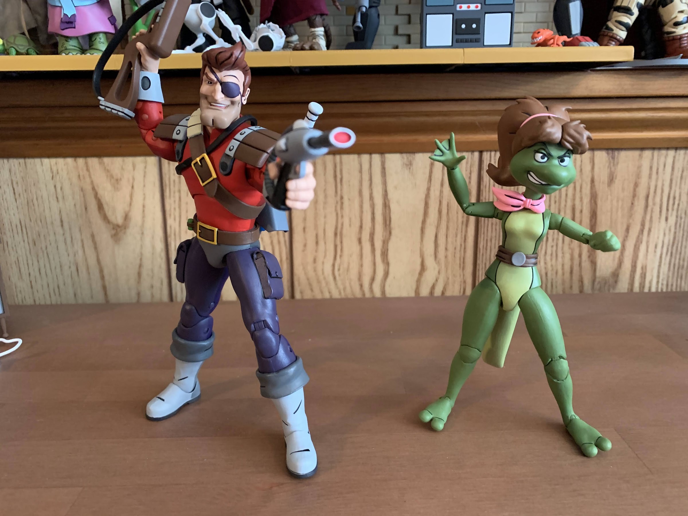
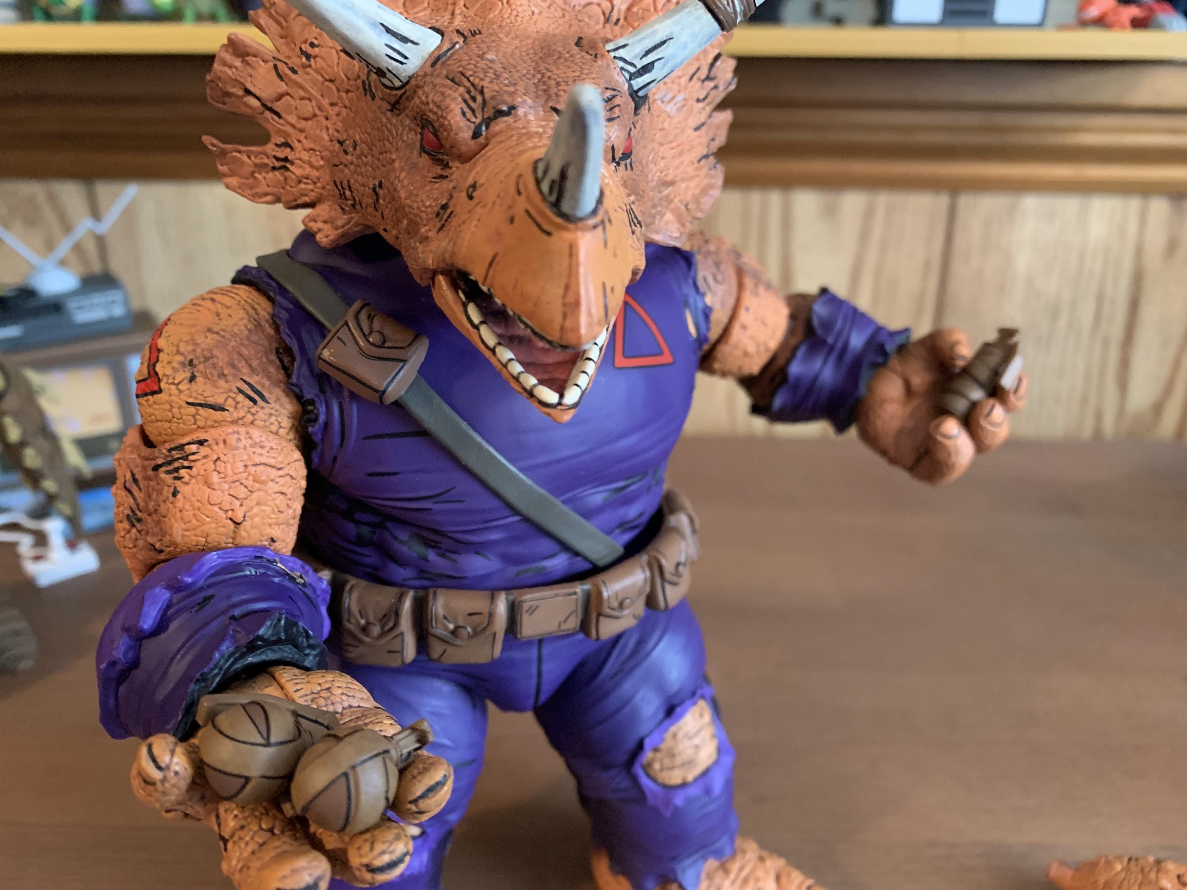
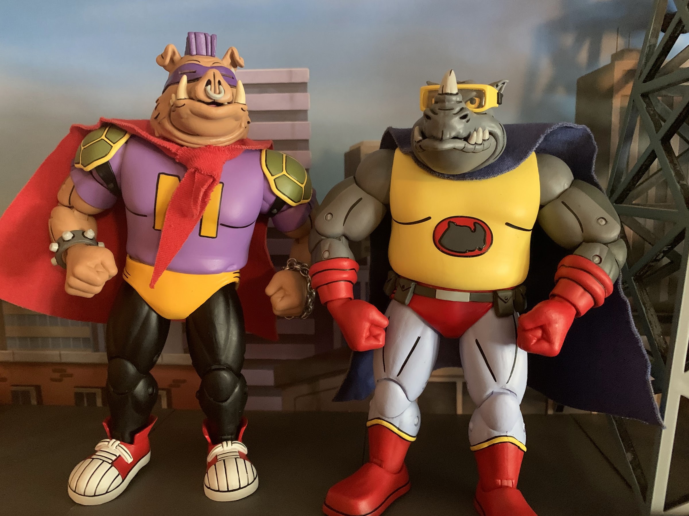
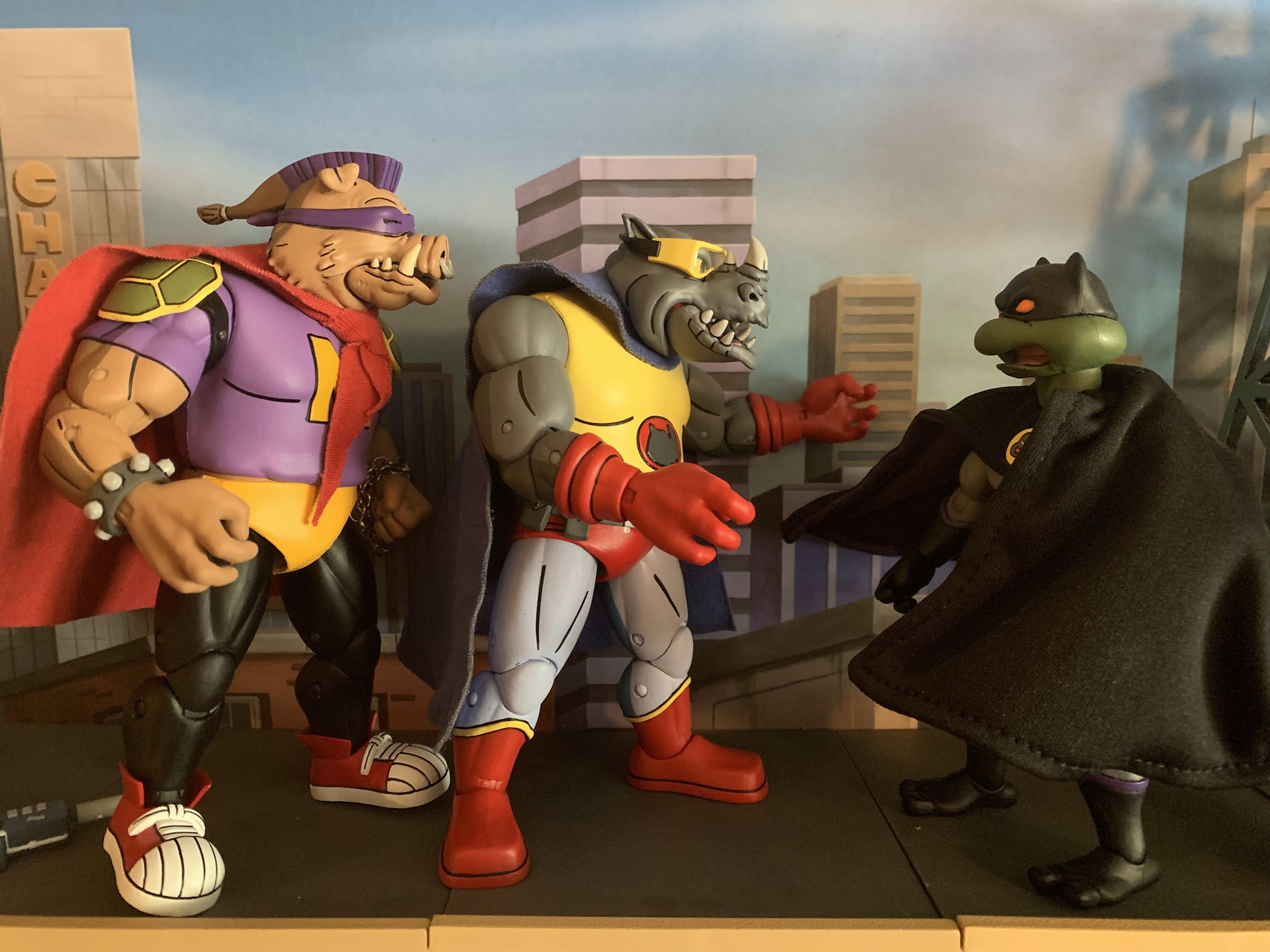
We did it! We finally made it to the end of the Haulathon releases from NECA Toys and we may have saved the best for last. Back in early 2020, I made a wish list for what I wanted from NECA and Teenage Mutant Ninja Turtles. It was only 10 deep, though there were some duos in there, and with this release we have finally completed my initial wish list. Rhino-Man and Mighty Hog are the super hero versions of Rocksteady and Bebop. Don’t confuse them with Super Bebop and Mighty Rocksteady, those are the robot versions, these are the cheesy heroes with their underwear over their pants and capes tied around their necks. I don’t know why I liked this design so much for the pair. I think as a kid, I just liked superhero versions of popular characters. When Bugs Bunny or Daffy Duck did it I thought it was fantastic. And those Happy Meal toys with the Looney Tunes in superhero costumes are maybe the best Happy Meal toys of all time. I suppose my affection for such things just caused the episode where Bebop and Rocksteady try their hand at heroics to be retained in my brain. A great many episodes of that show went in and went out pretty effortlessly, but Rhino-Man and Mighty Hog have lived rent free in there for over 30 years.

I love that these guys have been scaled down a bit as one of the only complaints I had about the wave two figures was that they were a little too big.

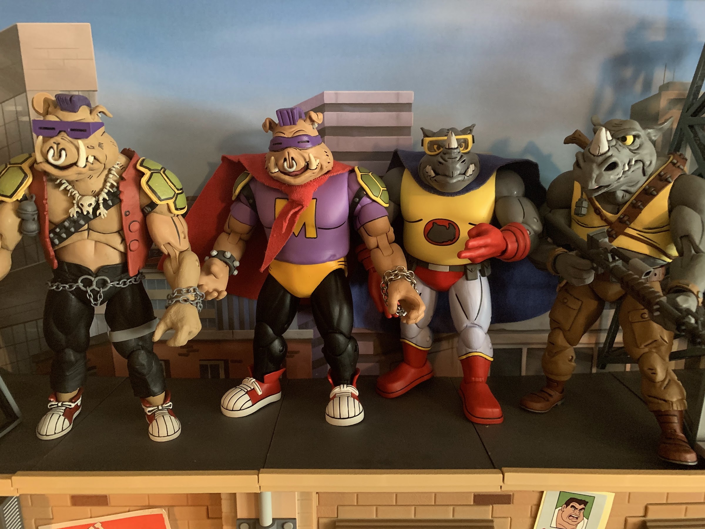
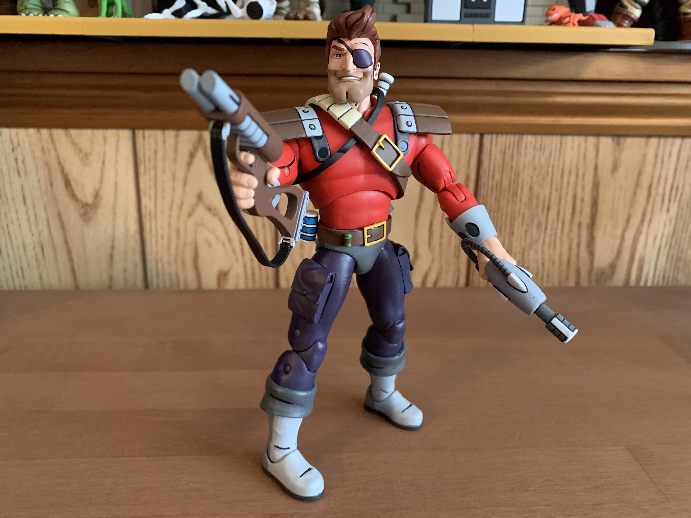
Perhaps Bebop and Rocksteady aren’t really so bad which is why tI liked seeing them as superheroes, even if they weren’t doing it out of a sense of justice. They’re almost too stupid to be evil, and as comedic relief in the show I think I warmed to them. Both have a very classic superhero look: shirt, trunks, tights, boots, cape. Rocksteady also adds some gloves and goggles while Bebop swaps his glasses for a bandana-style mask. Rhino-Man stands at about 6″ and is dressed in bright colors. Yellow for the shirt, red for the boots and gloves, and a light blue for the tights. He has his own logo on his chest and the goggles (which are removable) and blue cape just complete the ensemble. Bebop’s go as Mighty Hog has a bit more of DIY vibe to it I guess because he was designated the sidekick. His red cape is tied in a knot around his neck and he doesn’t get his own logo opting for a big, orange, M on his purple shirt. His black pants appear to be his normal pants as do the sneakers. He at least has some orange trunks and retaining the turtle shell shoulder pads is a good look. He’s also bigger than Rhino-Man coming in it at 6.5″ to the top of his head.

Can’t forget the jetpacks!

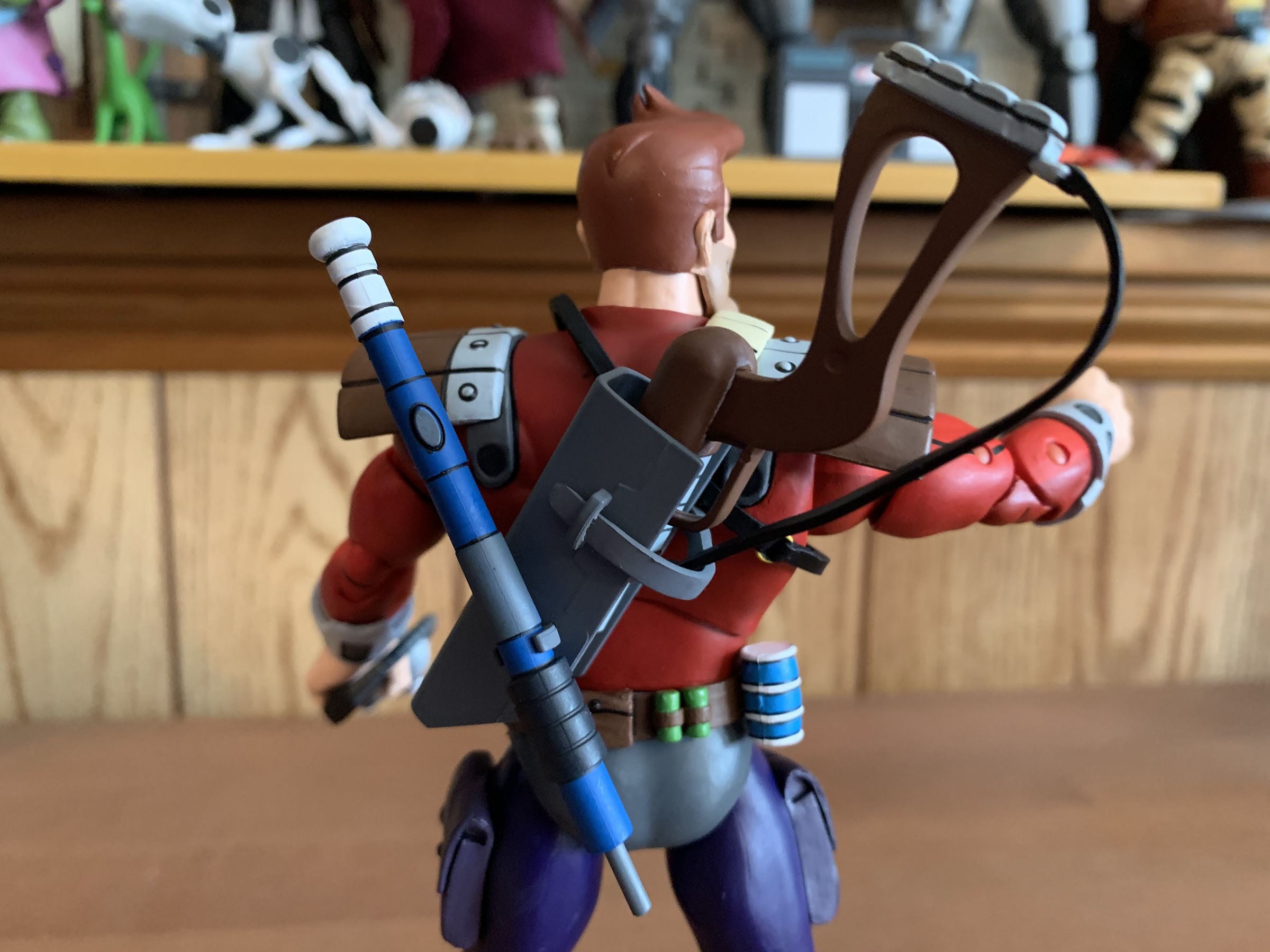
Both of these figures are all new tooling when compared with their prior release. That is welcomed as those molds feature some outdated joints and it’s nice to finally have updated versions of Bebop and Rocksteady, even if they’re not in their classic duds. The new head on Bebop looks terrific. I didn’t think it was possible to improve upon the first, but I think I like this one just a little better. Rocksteady didn’t turn out quite so well. He’s a little stubby looking, which is interesting because his other figures feel like their heads are just a little too long. He’s still clearly Rocksteady, he just doesn’t look as good as Bebop. The goggles go on and off relatively easy and definitely help to complete the look. Like the first go at them, these two do share some parts. Most obviously are the hands, but also most of the arms, thighs, and probably the torso. It’s hard to tell since both figures sport an overlay. The differences really rest with the forearms, shins and feet to go with the head.

“Heh, snort, you guys look stupid.”

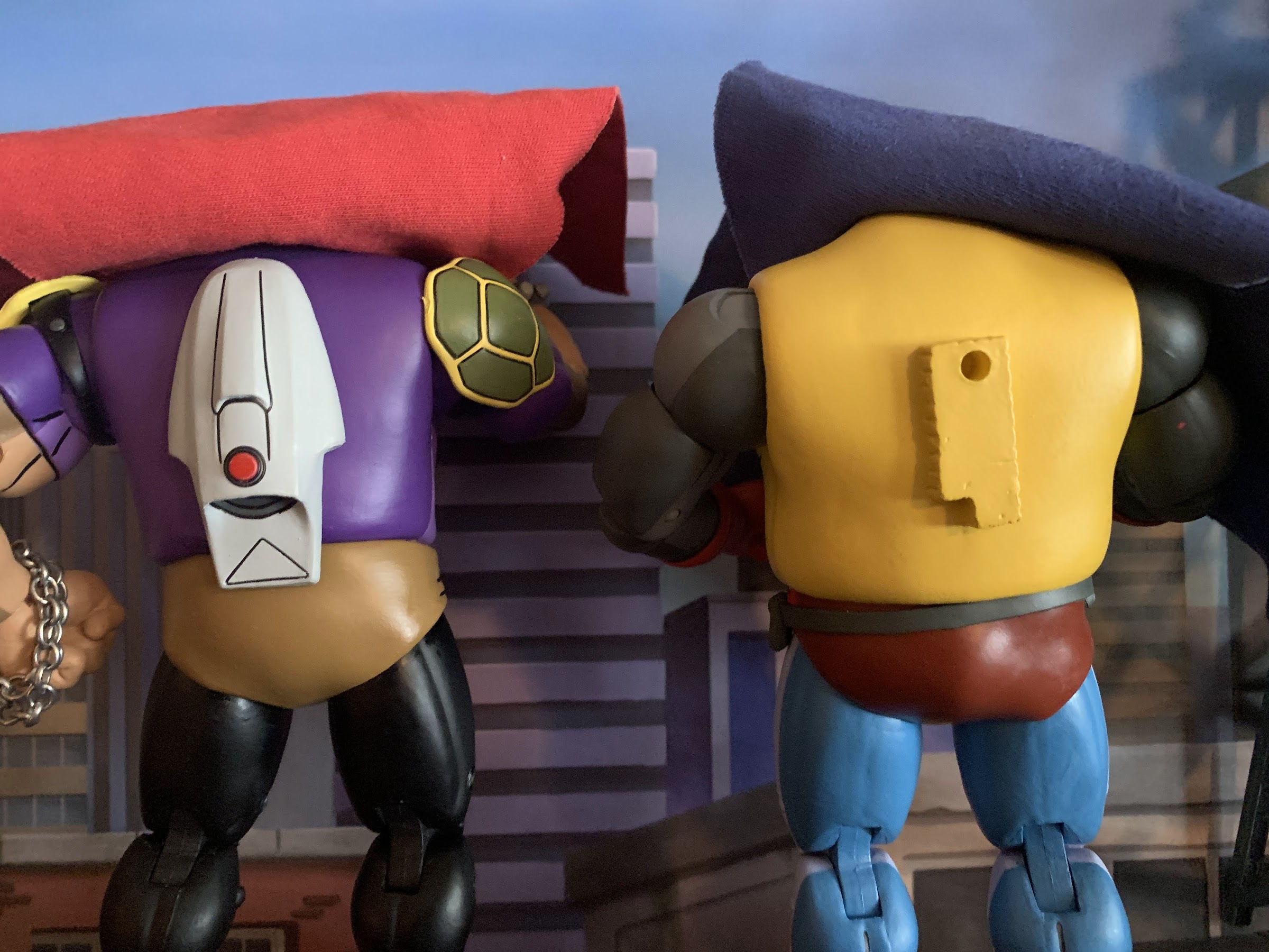
As per usual with this line, the paint job looks pretty nice. Most of the figures feature the toon shading the line is known for where NECA uses a darker color for the figure’s rear. Some parts are skipped, like the feet and Rhino-Man’s belt which is a little odd. Mighty Hog also doesn’t have any shading on his pants since they’re black. The linework is clean and all of the little details we would expect to see from the show have been translated into 3D plastic. One bummer is the capes are both just plain soft goods. After getting a wired cape with Dark Turtle I was hoping for the same here, but I guess we weren’t that lucky. Bebop also still has the actual chain bracelet on his left arm which I could honestly do without. The authenticity is nice, but it’s a little annoying especially when swapping hands. NECA omitted the little T-hook this time so you could just take it off if you wanted to and you won’t have a weird piece of metal sticking out of your figure, though it also means the bracelet can come off even without removing the figure’s hand. I’m surprised they haven’t switched to a plastic one, but it’s fine.

They don’t have a ton of stuff, but it’s fine.

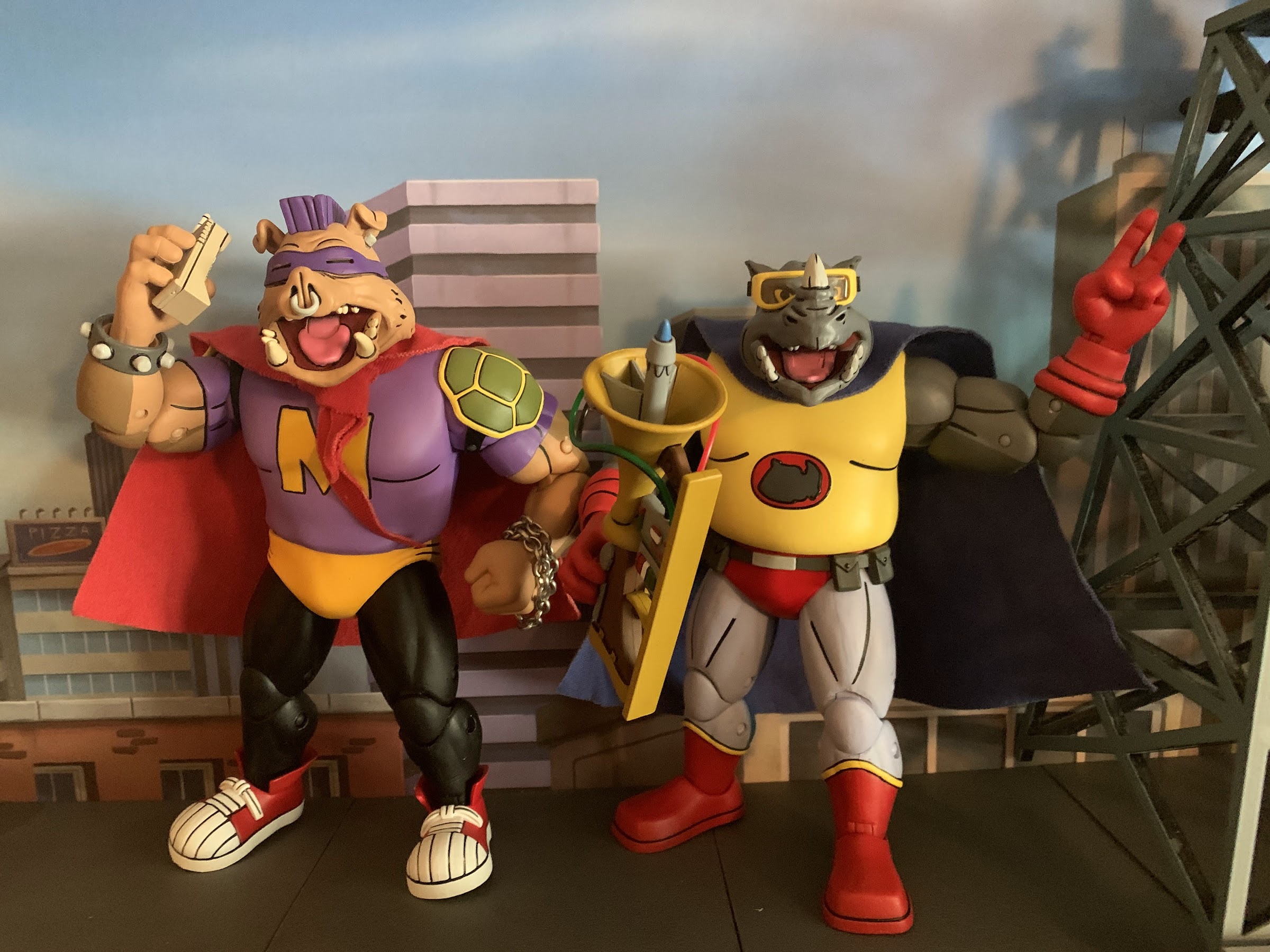
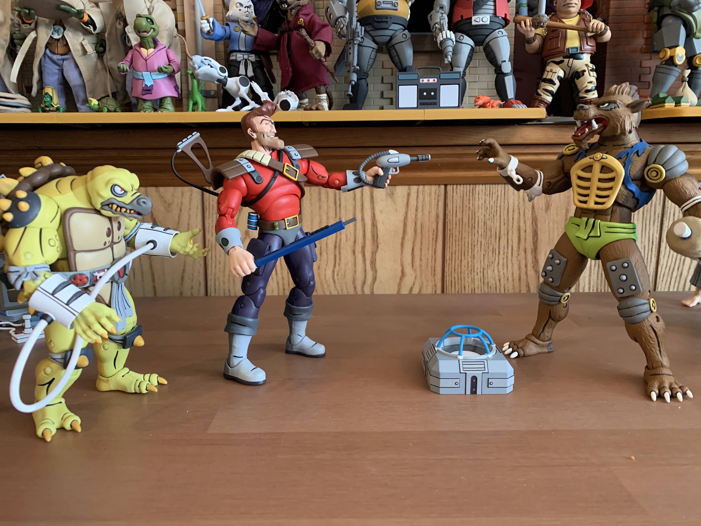
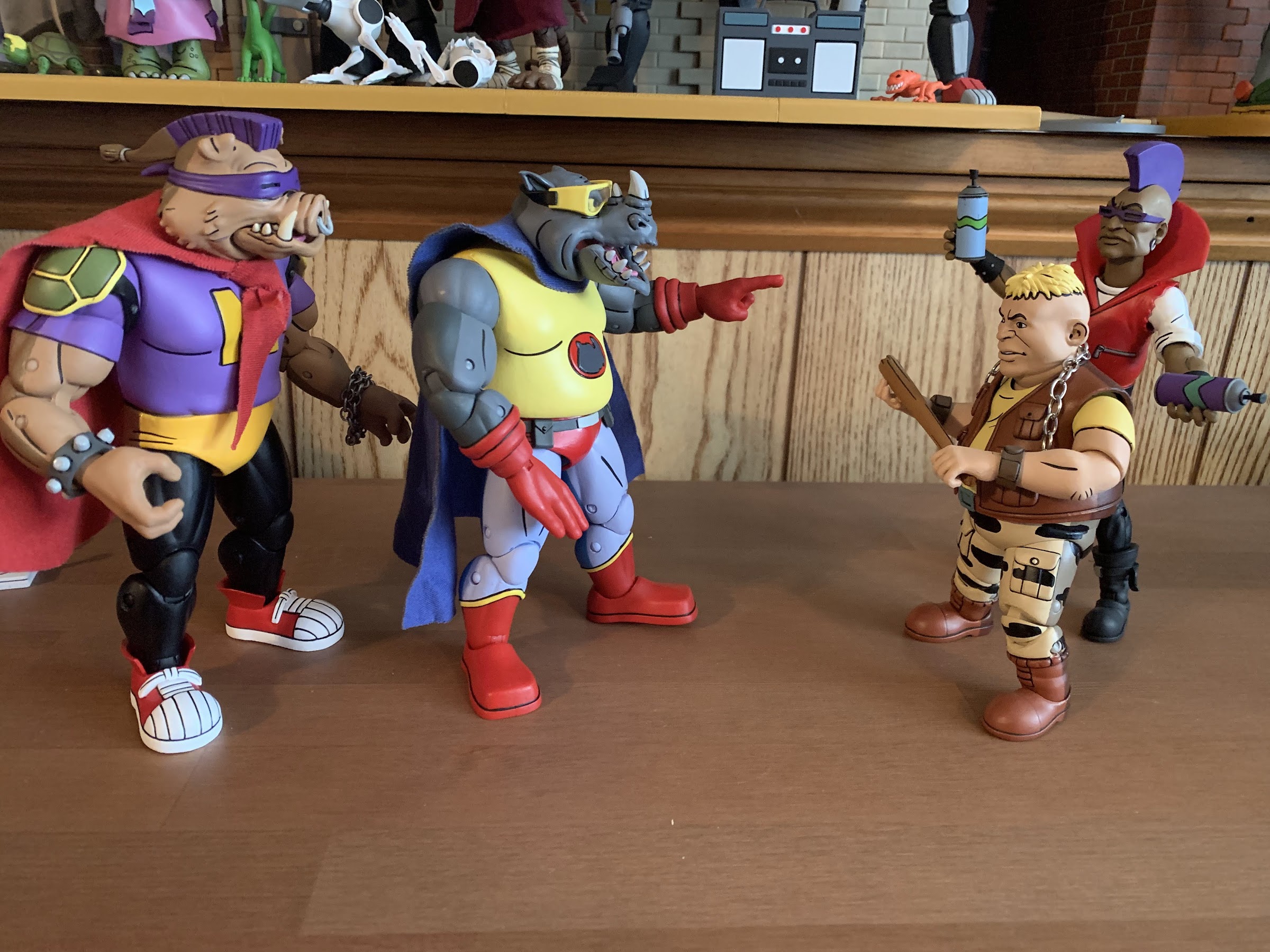
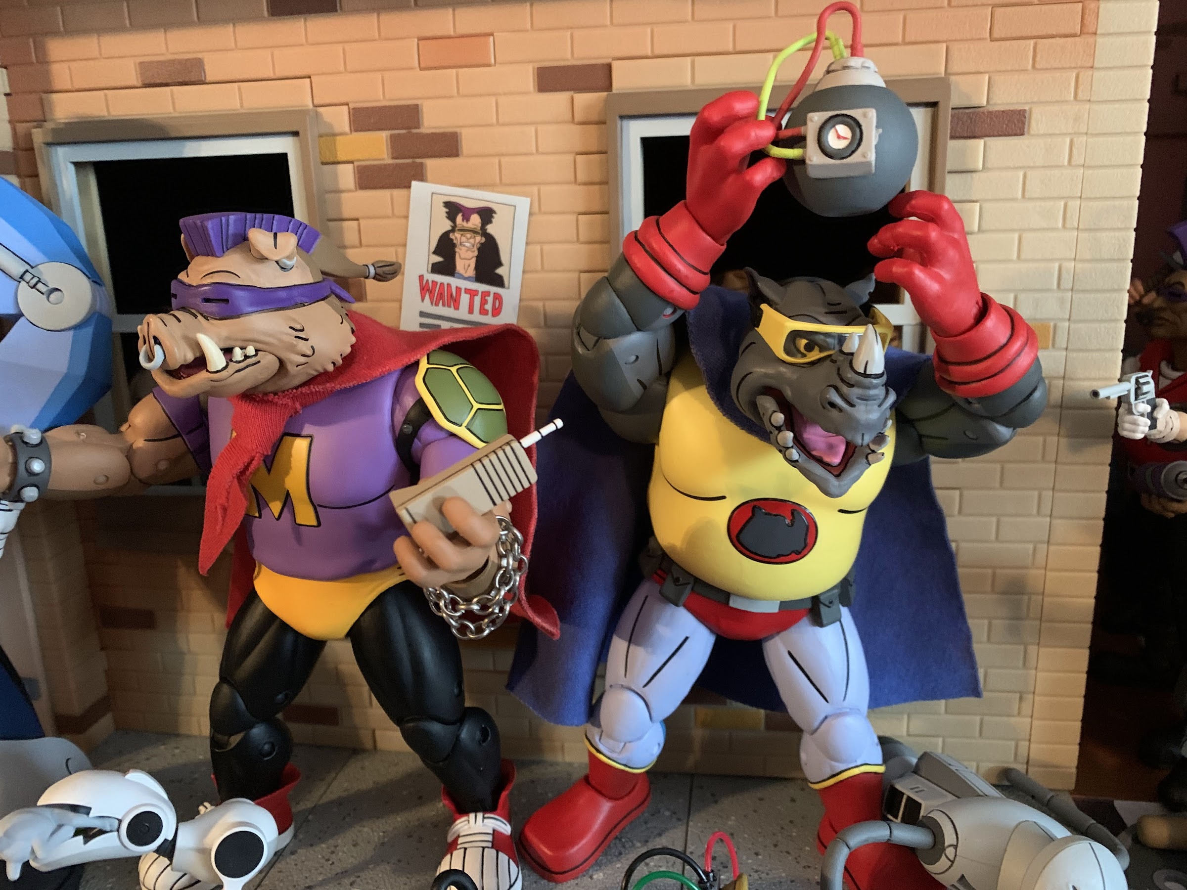
The accessories for this set are actually a little on the light side. Both figures come with the same sets of hands: fists, gripping, a left-handed peace sign, and a right handed chop. What’s missing is trigger finger hands, and while they don’t come with any guns, they used their standard white, laser, pistols (which you probably have a handful of laying around if you’ve been collecting this line for awhile) in the episode so that’s a bit of a bummer. The gripping hands can be finagled though to work with those older accessories. They also have their jetpacks which key into the back of each figure and once secured you’re probably never going to remove them. They also come with the police scanner which looks suspiciously like an old, 80s, cell phone. Shredder uses it in the episode to send the heroes after bad guys as there’s a contest going on that Krang wants them to win, hence why they’re heroes (the episode is just called “Rhino-Man” if you’re curious). Lastly, we get an accessory from a different episode, the Anxietron Ray from “Bebop and Rocksteady Conquer the Universe.” It’s a very intricate sculpt, though the device isn’t the prettiest. It reminds me of the baby translator Herb Powell creates on The Simpsons. It’s a cumbersome weapon to wield like an actual gun, but it can also just be placed on a surface and look fine. And I suppose it’s only included because there was room in the budget for another accessory and NECA didn’t see fit to pull anything else from the episode, which I mostly agree with. Some more hands might have been cool, but this is fine.

“Umm, hey, Mr. Dark Turtle, sir, can we please team-up with you?!” “WHAT?!”
“I can’t believe I’m doing this!”

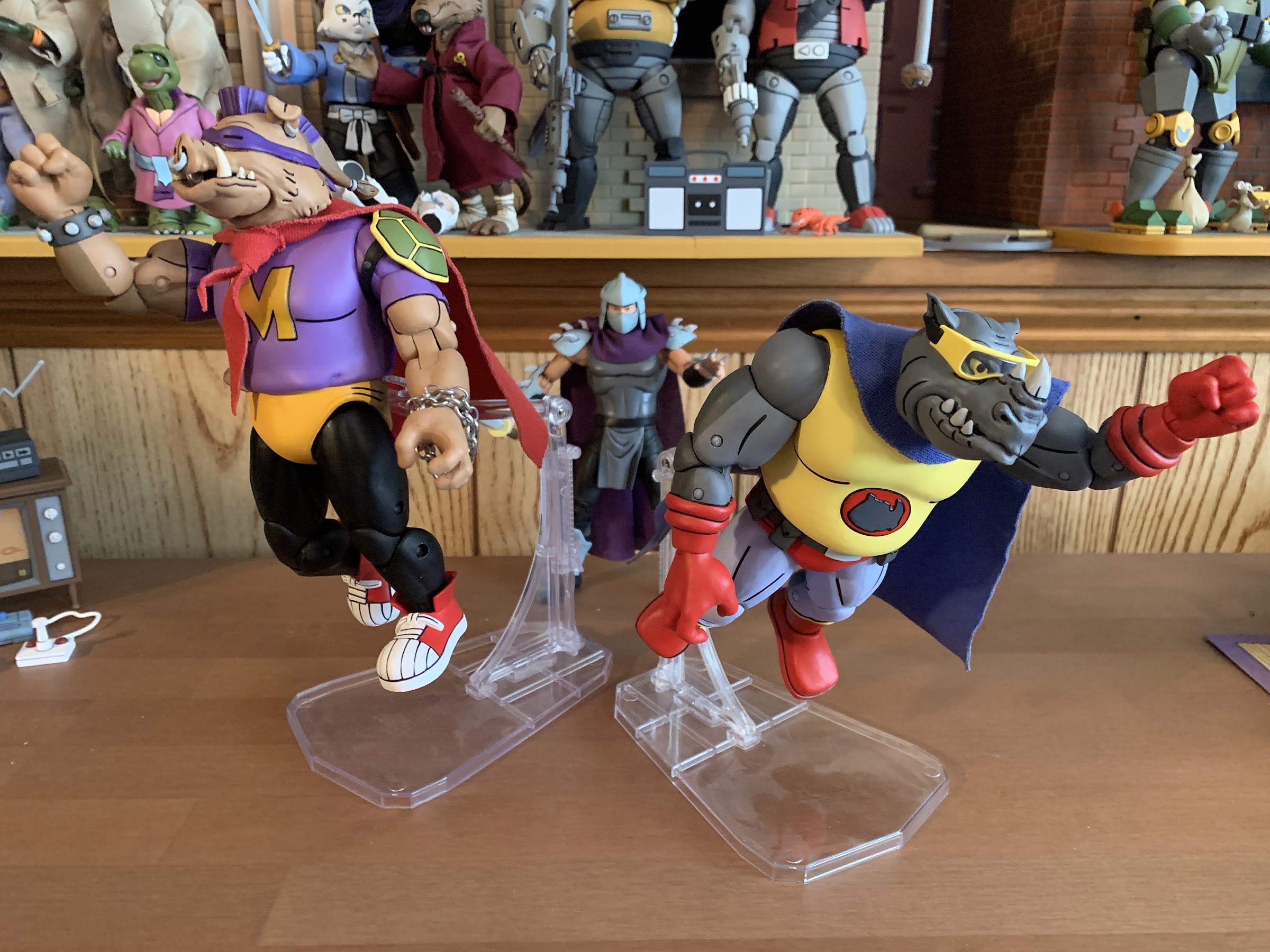
Bebop and Rocksteady have never articulated particularly well when designed by NECA (or really anyone, for that matter) and Rhino-Man and Mighty Hog are mostly the same. The head for both is on a ball peg, likely a double, and they rotate fine. Bebop has a little more up and down range by virtue of having more of a neck while Rocksteady is slightly limited for both. Each figure has a hinged jaw and it’s not the prettiest hinged jaw NECA has done. Rocksteady’s looks pretty bad when opened all the way and Bebop’s doesn’t look much better. The hinge is just set too far forward on the head when it needs to be recessed further back. It’s also done in pink and then painted and if you tilt the head up all the way you can see the pink hinge poking through on the underside. It’s something you’ll never see when they’re on a shelf, but it is odd. The shoulders are ball-hinged and they can just about hit horizontal with Rhino-Man while Mighty Hog’s range is hindered by the shoulder pads. It’s also hindered when rotating while Rhino-Man is fine. There’s a biceps swivel past that and double-jointed elbows to go with wrists that swivel and hinge horizontally, including the gripping hands. There might be a diaphragm joint in both, but it’s covered-up by the overlay. There’s a ball joint at the waist that allows for rotation and a little tilt, but very little forward and back. The hips are ball and socket joints which is the welcomed change over the original Bebop and Rocksteady figures and they kick forward almost to horizontal and kick back a bit. Both guys can pretty much hit a split and there’s a little thigh twist there as well. The knees are double-jointed and those bend past 90 degrees and at the ankles we get the hinge and rocker setup. Bebop’s shoes are much better this time around and less restricted. They still don’t get a lot of range out of the hinge, but the rocker works pretty well. Curiously, the right foot on my Mighty Hog has a curve to the sole and I’m wondering if that’s a defect or true for all. He stands okay despite it, but it is odd.

“Stop, hooligans, you’ve tagged your last wall!” “Wait, how is this even happening?!”

Many of the joints on this set were pretty tight or stuck out of the box. Out of all of the Haulathon releases, that issue was most prevalent with this set. I don’t think I had to heat any joints on the other figures. I did opt to heat some of the hands to make inserting weapons easier, but with this set I had to heat the elbows to get them working. Rhino-Man couldn’t do much below the waist so he got the full spa treatment, but once things were heated and the paint allowed to “crack” at the joints, things started moving pretty well. I still have a stuck hinge on one of Rhino-Man’s elbows, and the same hinge on Mighty Hog has some chipped paint which is an eyesore, albeit a minor one. Overall though, the range of movement is pretty basic with these two. Even though the elbows are double-jointed, it’s actually hard to get them past 90 degrees and place both figures in a heroic pose with their hands on their hips. They’re also heavy and cumbersome so getting them to appear as if they’re flying using one of NECA’s flight stands is also rather precarious. They at least look up well enough to pull it off, but I definitely didn’t feel comfortable leaving them on a shelf like that.

“Rhino-Man! Away!” “Blast! You morons, you’re hitting me with your exhaust!”

Rhino-Man and Mighty Hog are two figures I was really looking forward to and I’m mostly satisfied with the result. I do wish the head on Rocksteady was a little better and that they moved easier as well, but overall I’m happy with how they turned out. They look silly and that’s appropriate and I definitely like having them on my shelf. I’m also happy that wish list has been filled. Is this the best set from this massive Haulathon drop? I’m not sure. Subjectively, it’s probably my favorite, but objectively there was little to find wrong with the Dirk Savage and Mona Lisa set. Chakahachi and Lotus look pretty cool too even if some QC issues with Lotus dampened my enthusiasm there. Mostly, these sets have continued to basically excel without necessarily blowing me away. I don’t know if any of these figures would crack my top 10 were I to revisit it (and I probably will have to at some point since so much has been added), but none are likely to end up in the bottom 10 either.

“Bomb’s away!”

If you would like to add these phoney heroes to your collection then keep checking Target. The main Haulathon drop is over and done with now, but more product is likely to keep shipping. Given that we’re talking about Bebop and Rocksteady, it’s likely more of this set was produced than some of the others. NECA may also open up orders on their website for those who missed out so just try to stay in the loop and avoid feeding the scalpers.

Can’t get enough of Bebop and Rocksteady or TMNT characters moonlighting as superheroes? Check these out:

NECA TMNT Cartoon Super Bebop and Mighty Rocksteady

2021 introduced a lot of good things for collectors of NECA’s Teenage Mutant Ninja Turtles line of action figures based on the classic cartoon. The toy maker still kept the line a Target exclusive when it came to brick and mortar, but it also started selling a lot of it online to coincide with each…

Keep reading

NECA TMNT Bebop and Rocksteady Target Exclusive Series

I have been rather fortunate when it comes to toy collecting in recent years. When I was a kid, toy collecting meant going to Toys R Us or a similar store and seeing what was on the shelf. Catalogs, commercials, and card backs were my main source of information. I assume there were newsletters and…

Keep reading

Marvel Legends Spider-Man ’94 Spider-Man vs Carnage

It’s not Spider-Man vs Venom, but I guess it’s the next best thing?

Last year, Hasbro celebrated the 30th anniversary of X-Men, the animated series that premiered on Halloween 1992 and would become a ratings hit shortly thereafter for the Fox Kids Network. It was responsible for getting a lot of kids into the X-Men and Marvel comics in general and the first, prime, benefactor of that rise in popularity was Spider-Man. Spidey had taken a couple of swings at television and found modest success, but certainly nothing on the level that some of the other prime kids’ shows that were contemporaries. I personally recognized Spider-Man more from his public service announcements or the Marvel Productions animatic that would follow a show like Muppet Babies. With X-Men being a hit though, it opened the door for more Marvel cartoons and Spider-Man was next in line arriving in sneak peak fashion, just like the X-Men, in the fall of 1994.

You guys still into the VHS inspired packaging? I think I still am, but this would have been way cooler if it was actually two boxes and a slipcover instead of just one, big, box.

The Marvel Legends VHS series for X-Men must have been received well for the company to do the same with Spider-Man. That is easy to understand. What is not is why now? The X-Men wave has almost sold out on Hasbro’s website and it’s expected the remaining figures will eventually get there (Cyclops was just added to shopDisney in April) which suggests that a second wave is certainly in order. The 8 figures Hasbro did release hit on some members of the team and some notable villains, but more remain. Why not come back around with another 8 in 2023, 30 years after the show really took off since only 3 episodes premiered in ’92, and then come back with Spider-Man in 2024 to, you know, coincide with that show’s 30th anniversary? It seemed like it was setup perfectly for just that, but apparently Hasbro and the Legends team got impatient or they feel like they need to space the X-Men releases out more or that line is dead and they’re not ready to admit it. I personally don’t get it and I will be a little ticked off if they don’t come back to X-Men to finish off the team, at least, even though that product line was rather poor. I’m a sucker for that cartoon though so I was committed to filling out the roster, as imperfect as it was, and not having the likes of Gambit, Rogue, or Magneto leaves my shelf feeling incomplete.

It’s Spider-Man once again, who is the same, but different, as the last black-costumed Spider-Man we saw.

That aside, Hasbro’s approach to Spider-Man could be described as the same, but different. We’re still getting VHS styled boxes with TV show inspired artwork, only now they’re apparently coming in two-packs. I guess that’s great if you didn’t like the gap in releases between the figures in the X-Men line, but it stinks if you only want one of the two figures (and I think that will be true for many with the upcoming Doc Ock and Aunt May two-pack). Hasbro doesn’t think it’s worth their effort to credit the artist on the box, but good thing we have social media as I was able to find out that it’s Harry Moore once again who did the art on the retro card release too. The box is designed to look like a slip cover with two VHS tapes in it, but it’s just one box with the two figures inside. Like the X-Men line, this one is likely to be a collection of repaints with minimal investment made in the tooling of new parts. These figures aren’t direct adaptations of the characters you saw onscreen. It would have been great if that was what Hasbro committed to, but at this point no one should be surprised. A big feature of the X-Men line was also the cel-shading approach to the paint. It was something that was not applied consistently from release to release. Some figures looked okay, some looked terrible, but it mostly came down to the application being cheap and unfocused. With this line, we’re going to have two figures where one is shaded, and the other is not. It looks like cel-shading isn’t going to be as big of a focus here, but it’s hard to know why with anything Hasbro does.

Yeah, it’s pin-less and has some toe joints, but the only reason to get this figure is if you like the shading.

We’ll start with Spider-Man first. This is the symbiote, or black suit, Spider-Man from the show since we already received a standard, animated, Spider-Man via the retro card release late last year. Thematically, it makes some sense to pair symbiote Spidey with Carnage, a fellow symbiote, though anyone who watched the show can point out that Spider-Man never fought Carnage while wearing the black costume. Interestingly, this Spider-Man is a repaint of the figure that came in the Renew Your Vows two-pack last year. The animated Spider-Man from last year was on the noticeably smaller Amazing Fantasy figure mold making this figure basically not scale with the other Spidey. Cool. The sculpt is also much more cut than that one so this is a Spider-Man that looks almost absurdly ripped and lumpy for this source. The head appears to be the exact same as the retro card black costume Spider-Man and so are the hands, and for that matter, the torso. Whatever your preferred body is, none are particularly great for the animated Spider-Man as he was very broad shouldered and full in the chest which neither figure is. This one is pin-less in the arms and legs, so it has that going for it.

I don’t consider myself a Legends collector, and yet I now have 5 Spider-Men (Web-Man and Cyborg version not pictured).
“We’re the same guy, just in a different costume.” “If you say so.”

What is going to be most divisive with this release is probably the paint. The figure is cast in black plastic so the only paint present is the white and the blue. Yes, blue, as this figure is shaded like the show. Or rather, like basically every version of black-costumed Spider-Man. Just doing him in all black won’t show up on print or on TV, so he (and Venom) have always been shaded blue. In the show, Spider-Man was outlined in blue and the muscles were also done in blue. For the figure, Hasbro appears to have tried to outline the abdomen with blue while also hitting both clavicles. For the limbs, it’s just a few lines down the meat of the arms and the front of the legs. There are a couple of lines in between the eyes, and almost nothing on the back of the figure. There’s also none on the hands. It looks okay, but there doesn’t appear to be a ton of thought put into the blue on the arms. And, as usual, I think the figure would have benefitted from a little more. Something on the crown of the head would have looked nice, and maybe some under the pecs. And maybe just more curves to the lines would have helped with the biceps looking the worst out of all of the spots, but it’s probably as good as we could have expected out of this line. The rest of the paint is reserved for the eyes, hands, and the spider logo which has some gray shading. That is not consistent with the show, but it looks okay on the front, though I don’t know what they were going for on the back. The spider itself is pretty clean, though the white on the hands is too thinly applied. The eyes, which have a little luster to them, look okay.

“What am I supposed to do with these?”
“Nice split, spider dweeb!”

There’s no point in devoting a full paragraph to accessories for this guy as he just comes with the standard array of hands: fists, wall-crawling, and thwip. The thwip hands are useless since this version of Spider-Man shoots webs out of the back of his hands so why not drop them for a set of gripping hands? Or web accessories? It’s like the people who design these figures have little or no attachment to these characters, but any average fan would say “This doesn’t make sense.” Anyway, this guy should be pretty familiar when it comes to articulation too since he’s like most of the other Spider-Man releases. We get a double ball peg at the head that feels rough. It has some gapping issues and they did that thing where they cut out a chunk of the rear of the neck which shouldn’t be necessary for a figure that has no hair. Even with that, he doesn’t look up all that far and the head just wants to fight me for some reason. The shoulders are ball-hinges on butterfly joints. He can raise his arms out to the side fine while the butterfly joint provides okay range going back and forward, but nothing crazy. They also didn’t continue the paint on the spider logo on the rear so when the arms are all the way forward you get a gap. There’s a biceps swivel and the elbows are double-jointed. I cannot get the top hinge on the right arm of my figure to budge, but I was able to get the left one to move. He gets a little better than 90, so nothing impressive, but it doesn’t look ugly. The wrists swivel and hinge.

Go web! (Web not included)
Yeah, it doesn’t make sense, but they look good when they’re matchy-matchy.

In the abdomen we get a ball joint that lets the figure bend back and forward a little bit. It creates gaps in both directions so it’s better used for rotating and pivot and the range going to the side is pretty good. Below that we have an ab crunch that does what it’s supposed to and at the hips we get the utterly useless drop-down hinged hips. With the hinge up, he can kick forward about 90 degrees and he doesn’t really kick back due to the sculpted butt cheeks. With the hinge down, he kicks forward…about 90 degrees. Maybe a little better and more straight, but you’re gaining practically nothing. With the hips up or down, he can’t achieve a full split. It’s pretty crazy the amount of figures I have that can do a split, and yet none are Spider-Man. There is a thigh cut, but not only does it break up the anatomy it breaks up the blue shading as well. The double-jointed knees work better than the elbows and they go well past 90. There is a boot cut if you want it, but again, it breaks up the sculpt and the shading. At the ankle, we get a hinge that lets the feet go forward and back an acceptable amount, though it’s kind of ratcheted so finding those in-between positions is a challenge. The ankle rocker works well and we also get a toe hinge which is fine. Aside from the addition of the toe hinge, this figure moves as well as the previous symbiote Spider-Man which I would categorize as good, but not good enough for a Spider-Man figure. There’s plenty of things to nitpick, but mostly it’s just scrap those garbage hips. Ball and socket hips would work better and cost less than the silly hinge. The whole thing also has a gummy feel and ultimately posing this guy isn’t really a fun experience.

This entry won’t have the maximum amount of Carnage, but it will have enough.
He wanted a picture with his daddy.

Okay, that’s enough about Spider-Man, let’s talk about Carnage. This figure is a partial reissue of the Monster Venom wave Carnage from about four years ago. Some stuff is the same, while some stuff is different. The head, hands, and probably the arms are the same while the torso and legs are actually different. That older figure lacked butterfly joints while this one has them. It appears to be the same torso we saw with Web-Man, who shared a torso with Spider-Man 2099, if I’m not mistaken, and probably several others. He is a very bright red, which isn’t really what I’d call show accurate, and the black paint for the various swirls and lines on Carnage is understated compared with a comic version of the character to attempt to match the show. The head is clearly the comic inspired head so it doesn’t really match the show aside from the amount of black on it. The Carnage in the show had a much stubbier head as opposed to the elongated one from the comics. There was one shot of the symbiote right after it attached to Cletus Kasady that looked like the comic book character, but that was pretty much it. I think there should actually be a bit more black on the torso to really match the look of the show, but that’s not Hasbro’s goal apparently so I don’t why I feel the need to point out the inaccuracies. This figure also has some tendrils plugged into the arms and a removable one that slots into the back. That aspect of the character wasn’t seen much in the show where animation and the ability to do it well is a concern, but I prefer Carnage with them so they don’t bother me. I think he looks okay, he just doesn’t really look like the character from the show. He’s much too lean and suffers from that Marvel Legends “tiny shoulders” syndrome that so many figures in this line possess. The figure also struggles with trying to be somewhat inspired by the animated series without looking cheap. It seems to me if they just committed to a more toon-accurate paint job that would have solved that issue to a point, but I’m just some guy with a blog so what do I know?

Why use the regular hands when you can use these?
I basically feel the same way about this head as I do the hands. Plus it’s a pain to get on anyway.

When it comes to accessories, Carnage fares better than Spider-Man. Again, these are all reused from past releases, but you get a second head that’s of Kasady and he looks pretty creepy. There’s no paint on the hair, so that’s a bummer, but at least the face appears to be done with face printing making it much better looking than the original release. It’s a comic inspired look, but you probably could have guessed that. If you have the older figure, it might be fun to have this head on that, but I’ll probably never use it. For hands, Carnage has two open hands by default where his fingers look long and bladed. They’re basically style posed, though the right hand is more curled like it’s trying to grip something. The fingers on that hand also don’t end in points and are rather stubby so they look stupid. You’ll never use it though because the optional hands are way better. For the left, we get a more exagerrated, clawing, hand that also has some added tendrils on it. I think it looks great save for the added blob on the index figure which is just a bizarre design choice as it makes it look like he has six fingers. For the right hand, we get a fisted hand that’s affixed to a big, symbiote, axe head. I like how it’s sculpted to have slime separating the fist from the axe and then the axe head itself has a neat design with a little hook in it. It’s painted too so we get some black lines that look nice and help sell it. They also gave the figure a vertical hinge on this hand which is appreciated. The only downside is it is pretty heavy, and the hinge fairly loose, so posing it can be a tad frustrating.

Spider jump!

For articulation, we have a pretty standard Marvel Legends figure. The old ball hinge is in place for the head and the figure can look up and down without issue as well as rotate. He even gets a touch of tilt on the ball, so that’s okay. The shoulders hinge out to the side less than 90 degrees so that’s disappointing. Web-Man can get his arms out to the side without issue which has me thinking these two share a torso, but the arms are actually different. The butterfly joint provides for solid range going back, but not much across the chest. There’s a biceps swivel and the double-jointed elbows will let the figure bend past 90 degrees there. The wrists swivel and hinge and all except the axe hand hinge horizontally. In the torso, we get an ab crunch that works well going forward and back with no gapping issues present. Hasbro also continued the black paint so that looks good. The waist has a twist which looks pretty ugly because there’s nothing to hide it, but it does work. At the hips we get the standard ball and socket setup and, what do you know, he can do a split. It’s a miracle! There’s a thigh cut below that which works fine, but breaks up the black paint. The double-jointed knees also work fine and you get a boot cut if you want it. The ankles hinge forward and back all the way and rock side-to-side just fine. I think the legs are basically the same as the old release, they just don’t have the plug holes for more tentacles. In other words, more old Spidey parts shared with Web-Man and other Spider-Man figures. Aside from the shoulders, he moves well enough. There’s still gummy-ness to the joints with Carnage, but it isn’t as pervasive as it is with Spider-Man.

Spider kick!

Overall, this release is basically what I expected it to be. It’s a bunch of parts reuse, with a different paint job. As a kid, it always bothered me that every Venom figure I bought was just black plastic when in the comics he was clearly blue. Obviously, that’s because an all black look wouldn’t work, so he had to be shaded blue and even some artists made blue his dominant color (he was very much black in his first appearances though). Because of that, I always wanted a Venom or a Spider-Man in the symbiote costume that took a similar approach so that’s what drew me to this set. Plus, I did like the cartoon series and it’s where most of my Spidey knowledge came as prior to that it was all from Spider-Man and his Amazing Friends and the occasional stray comic book. This figure from Hasbro has its problems, but it comes close to satisfying that urge for me and I think it looks better than the more plain release from the retro card line. It’s pretty absurd that he’s so much bigger than the red and blue Spider-Man when they’re supposed to be the same character from the same show and the accessories blow, but at least the base figure looks fine.

Worth it? Eh, I guess if you like what you see, it’s okay given the apparent new going rate for Marvel Legends.

With Carnage, this is a character all new to me in figure form. Well, new in the sense that I had not purchased a Carnage since the Toy Biz Carnage II figure from the Spider-Man line way back in the 90s. I was never a huge fan of the character, he was just Venom without a conscience, but he did look cool and I certainly spent many hours playing Maximum Carnage back in the day. As a figure, he’s fine. He looks good, moves well enough for the character, and I like the optional parts. I like them so much that I consider the main hands rather useless, but it’s fine. And when I got that animated Venom in 2021 I knew I wanted to add a Spider-Man and a Carnage to my little display so I at least achieved that. As for this series going forward, I might have been interested in that Doc Ock, but the Aunt May he’s bundled with looks bad and I’m not paying for her. This set retails for $53 on Hasbro’s Pulse website. If you’re a member, you get free shipping, but if you’re not then tack on the price of shipping as well. This was the last order I made with my subscription and I don’t intend to get more. At this price, it’s something a fan of the show can possibly talk themselves into. The box is nice, if that interests you at all, and the figures are I guess the usual level of quality for Marvel Legends. Had they just given Spider-Man some worthwhile accessories it would have been much easier to recommend, but since they didn’t it puts this one squarely in the niche category. Few Marvel Legends are worth their asking price these days, and these are no exception. If you’re primarily a comic book collector and already have these figures, then don’t bother. If it looks like something you like and you know what to expect, give it a shot. Or wait awhile for the next warehouse sale when you can probably get it for 40-something where it would be a much easier recommend. That’s probably not going to happen for awhile though. There’s also shopDisney which is supposed to carry this and may be more aggressive with its sale prices if it hangs around a few months. You can also get free shipping there, though you have to spend $75 I think. If you time it right, and have a wife or kids that love Disney, it’s not a tough threshold to meet. At least it’s easier to get than the stupid Walmart exclusive.

Need to know more about what Marvel Legends has done for Spider-Man? Check these out:

Marvel Legends Spider-Man (Animated)

It was in 2021 that Hasbro released a PulseCon exclusive Venom figure on a Spider-Man retro card. The retro card series is meant to stir-up nostalgia for all of the adults who were buying toys and watching cartoons in the 90s as the retro card is a facsimile of the old cards Toy Biz used…

Keep reading

Hasbro Retro Card Symbiote Spider-Man

One of the most iconic costumes in the world of superheroes is definitely that of Spider-Man. I put that classic red and blue with webbed detailing right up there with Superman and Batman. I would argue that there’s no more iconic costume in the world of Marvel than Spidey’s, and the crazy thing with Spider-Man…

Keep reading

Super7 Mighty Morphin Power Rangers Ultimate Tyrannosaurus Dinozord

Roar.

Today we are wrapping up our look at Wave 1 of Super7’s Mighty Morphin Power Rangers Ultimates! action figures with the lone zord of the wave: the Tyrannosaurus Dinozord. The T-Rex zord was the vehicle of the Red Power Ranger and main body of the Megazord. It was basically the only one of the original five zords that could function on its own in a meaningful way. The other four rarely did anything, but on occasion, the T-Rex went into battle and took on some monsters in its dino form. As such, it made sense for Super7 to do a figure of this particular zord since it can standalone as an action figure while something like the mastodon or pterodactyl really would not. And it’s also because Super7 either isn’t allowed to produce, or has no desire to produce, zords that can combine into other zords like the famous Megazord.

Packaged for maximum width.

For me, a very casual Power Rangers fan, the appeal of this line is that Super7 can produce zords that are more accurate to the show. Whenever a company makes a combining one, they have to work within that framework. The zords in the show existed as both models, or puppets, and as actors in a suit. When the Megazord was formed, it then transitioned to a costume which could basically cheat the proportions. As a result, any figure that does the same isn’t going to resemble the one on TV. It does in a general way, but usually the proportions are off (especially the head) and any articulation the figure has needs to be able to be integrated without causing an issue for one of the individual components. When I look at my vintage Bandai Megazord, it almost feels like they prioritized the individual zords over the Megazord. Or, they simply determined that was the best way to go. The head is tiny, but since it needs to fit inside the head of the T-Rex that was something that couldn’t really be avoided. The shoulders are huge as well and the body is quite thick. There’s also the issue of the T-Rex tail which kind of just disappears. It’s still a tremendously fun toy, especially for 1993, but for collectors that want a screen accurate Megazord it’s not really going to cut it.

This is amusing to me.

For the T-Rex, the same is basically true as it needed to be more narrow to accommodate the transformation. The head also needs to fit in the chest and something has to be done with that tail. Ignoring that allows Super7 to just look at the character onscreen and let that dictate where the figure goes. It obviously can’t scale with the Power Rangers in the line so that part is essentially made up, but Super7 is a company that tends to feel bigger is better and that’s certainly the case with the T-Rex. The box alone is massive. I was pretty amused when I got my figures in the mail as I ordered just the Green Ranger, Goldar, and the T-Rex and each box was different in size. I knew this one would likely be the biggest, but I still wasn’t quite prepared. And that’s mostly due to Super7 packaging the figure from the side and leaving the tail fixed. They could have sent it out disassembled, but what’s the fun in that?

He can stand upright.
Or he can stand “Jurassic Park” style.

The Tyrannosaurus stands at roughly 8″ in height. I say roughly because this is a character that’s always going to have its knees bent to some degree so I’m basically selecting what I feel is a neutral position. Lengthwise, he’s going to need about 10.5″ of shelf space for that tail and that’s with a gentle curve in it. Not only is the figure pretty big, but it has some heft too. It’s solid which helps give it more of a premium feel over the other figures in the line and really over just about every other Super7 figure I own. And in terms of show accuracy, I’d say it’s pretty damn close. There’s a lot of paint on this figure and the metallic portions have a nice shine to them. There’s some black linework on the shins and around the silver portions of the tail. There’s lots of places that are just blocks of color consistent with the look of the show and most of the paint is cleanly applied. There’s a little slop on the linework on the left shin of mine and the right eye could have been better. It’s also missing linework on the top of the head which is disappointing (the paint is present on the promo images) as the head is one of the few places where there’s a plastic look to the figure. Basically everywhere on the body, Super7 decided to paint this guy, except for the head which is mostly red plastic. Normally, you would see the opposite as we did with The Simpsons since the eyes are naturally drawn to the head. I wish they had painted it, but it is what it is. The proportions also strike me as a touch imperfect when comparing it to the suit on the show. The head should probably be a little bigger and the hands boxier. The knees also should indent on the sides, but here they’re basically flush, and the red areas around the shoulders should be more rounded off. These are nitpicks, for the most part, and the only thing I really miss when comparing it to the screen is just more of that black linework., but I think most people will be happy with how this figure looks.

This one is probably not going to scale with any Power Rangers in your collection.
He’s sized well for battling Goldar.

There may be some temptation to display this guy with past iterations of the Dinozords. I only have one such era of releases, the 1993 and 94 stuff from Bandai. I did also get the Hasbro Megazord for my son, but that thing is pretty small and neither vintage nor collector grade. As for the old Bandai stuff, this figure isn’t that much bigger than the Tyrannosaurus released back then. He’s just a little taller, but way more bulky. The vintage one does have the proper linework on the head though so at least it has that going for it. The Dragonzord is another one some may want to place with this figure and, size wise, it more or less works. That Dragonzord is pretty damn chunky and not exactly screen accurate, but it’s a fun companion. If you want to go battle mode with your Dragonzord, then it suddenly dwarfs the T-Rex. That’s to be expected since the Megazord does the same to the Dragonzord. There was apparently just no way to get those forms right as a combining toy, and since it was for kids, it’s not like Bandai was that concerned about accuracy. This figure will presumably scale much better with future Super7 zords.

Meeting some old friends.
He’s big.

Naturally, a big, robot, dinosaur isn’t going to articulate particularly well. Super7 basically got most of the joints one would expect into this figure, it’s just not particularly functional. The head is on what feels like a double ball peg and can look up and down pretty well. The large panels on the side of the head prevent natural rotation in that the head will always want to turn to the side when trying to rotate, but it has a lot of room for nuance posing. The base of the neck is where you get your rotation and it’s on a ball hinge so you can get a little extra “up” range as well. For the arms, it’s the silver parts that move. The “shoulders” are on ball hinges and can move up and down and you get about 90 degrees of movement. Their range out to the side is very minimal. There are elbows that get you something less than 90 with a swivel as well and the wrists swivel and hinge and those are fine. There’s a basic twist in the waist area which begins where the silver portion of the chest ends. The hips are big ball hinges that go out the side a small amount and rotate a minimal amount. The knees are hinged joints that barely move and are rather useless and the joint is mostly going to be used for a swivel as the lower leg can rotate there a decent amount. The ankles are on hinges that don’t go back very far, but do go forward a decent amount. There is an ankle rocker but the range is pretty limited, but it’s enough to accommodate the range at the hips. The tail is on a series of ball joints. The first segment doesn’t move, but each one after that does so you get full rotation at each segment and a little up and down movement that allows the tail to be curled. If you have a heavy duty stand, you can even get this guy into his kicking attack pose where he stood on his tail in the show. Lastly, there’s also a hinged jaw and that works fine.

There’s 30 years of toy advancements staring right at you.
I’m actually surprised at how comparable they are in size.

The Tyrannosaurus isn’t going to do a whole lot on your shelf aside from stand there and look cool. I like the range at the head as it imparts some personality, even though I think the suit in the show didn’t allow for that. The hips are limited, but allow the stance to be widened which looks nice, or you can go for a more straight up and down pose. There’s also enough range going forward at the hips that the figure can be posed like one would pose an actual T-Rex which is more horizontal. It’s a pretty cool look, though not something you would have ever seen on television out of this character. It’s also easy to stand and there’s not much rub at the joints that will impact the paint as they mostly go as far as they’ll go and then stop. In the end, I think it’s fine as this isn’t supposed to do a whole lot and it’s technically more articulated than it is in the show.

Here’s some tiny Jasons for your dinosaur to play with.
If you like novelty coins, you get this too.

The accessories for this figure are also another area of limitation. What really can this thing even come with? Super7 decided we needed some hand options so we get a set of fists, open hands, and more neutral hands. I’m a little surprised they didn’t just make the hands articulate, but this is honestly probably better for us. There’s also a pair of mini, in-scale, Red Ranger figures. One is posed with the hands on the hips and the other is in a summoning pose. They’re very minimally painted as they’re just red, slug, figures with the white of the gloves, boots, and belts applied. I certainly wouldn’t expect a fully painted figure at this size, but I feel like those tiny, novelty, figures are better painted than this. Adding a white diamond to the chest would have helped to break it up a bit and some black for the visor. Without it, these look too cheap to really do much with. Lastly, we get a replica Power Coin that features the snarling T-Rex on one side and the zord symbol (I think that’s what it is) on the reverse. It’s a really heavy, chunk, of metal and it features some shading which looks nice. It’s neat, but not exactly practical and I have no idea what I’ll end up doing with it. I wasn’t expecting much, but I do think we could have used an effect piece for the mouth cannons. I honestly don’t know if it ever used them in the show, but who cares if it didn’t? Some little blast effects or something like a breath attack would have been pretty damn cool.

Making friends with the other dinosaurs. This guy will probably pair nicely with the upcoming Grimlock Ultimates! from the Transformers line.
“I gotta get me one of these!”

Ultimately, which is how I pretty much have to end a review of a Super7 Ultimates! release, I think this figure gets the job done. It’s supposed to be a more screen-accurate depiction of the Tyrannosaurus Dinozord from the TV show and it succeeds in that department probably better than any other release I’ve seen. There have been some really cool, and really expensive, Megazords over the years, but usually the T-Rex has to be compromised in some way to facilitate the transformation. Here, we don’t have to worry about that. Aside from some missing paint on the head, I’m really happy with how this figure turned out. It’s a chunky, hunk of plastic that moves about as well as can be expected and will look great in any Power Rangers collection. He doesn’t scale at all with the Rangers, which is to be expected, but will look fine battling someone like Goldar and I assume the monsters to come will follow suit. For me, this line is all about the zords and monsters so I’m generally pleased with what I’ve seen. I decided to pass on the Yellow Ranger and Putty, so this will be my final review of the first wave. I do plan on picking up the Dragonzord when it comes out and eventually I’ll have the Megazord as well. And like Goldar, this is a Super7 release that actually meets its asking price of $55. I’m actually surprised they didn’t try to get more for it as they will with the Megazord so I guess be happy for that. This is an easy recommend for me though.

Looking for more Power Rangers toy coverage? Well, look no further:

Super7 Mighty Morphin Power Rangers Ultimate Green Ranger

We continue to finally offload some long standing preorders this year and up next is Mighty Morphin Power Rangers from Super7. It was June 2021 when these figures were announced to the surprise of many. Why? Because Power Rangers are now owned by Hasbro, probably the biggest toy producer in the world who has its…

Keep reading

Super7 Mighty Morphin Power Rangers Ultimate Goldar

Last week, when we took a look at the first Power Ranger in Super7’s line of Ultimates! action figures based on Mighty Morphin Power Rangers I expressed some surprise that Hasbro would license out this brand since it competes with their own Lighting Collection. I do feel like the actual Rangers are pretty safe. People…

Keep reading

Bandai Mighty Morphin Power Rangers Megazord

It was now a couple of weeks ago I posted about some toys I always wanted as a kid, but never got. Shortly after, I rectified some of those decades old injustices by purchasing the Dragonzord with Green Ranger from Bandai’s Mighty Morphin Power Rangers line of action figures from 1993. The Dragonzord was my…

Keep reading

NECA Cartoon TMNT Dirk Savage and Mona Lisa

These two are on an odd pair, but not a bad one.

Today’s look at yet another Haulathon release from NECA Toys features two one-off characters from the cartoon series Teenage Mutant Ninja Turtles: Dirk Savage and Mona Lisa. For Savage, this is his action figure debut as he wasn’t featured in the vintage Playmates line. For Mona Lisa, she was only featured in one episode of the show, but did benefit from an action figure and that’s honestly how I remember her. I did see her episode as a kid, but the memories are rather fuzzy. She has also shown up on other iterations of TMNT and is often paired with Raph as a romantic interest because turtles and newts so often mate in the real world. For casual fans of the property, this is definitely a set that will lead to some head-scratching, but if you’re all-in on this line then you probably expected these two to show up eventually, though maybe not together since they weren’t featured in the same episode. And in keeping with this line, they’re pretty good so you might want to check them out even if you can’t remember them.

That is some chin.

We’ll start with Dirk first, the mutant hunter who looks a bit like a cross between Flash Gordon and Judge Dredd with a little Jay Leno in the face. He stands at around 6.75″ to the top of his head and touches 7″ if you factor in the hair. Dirk is a great example of how this line has a little pop to it. We get a real bright red for this shirt to pair with a deep purple for the pants. There’s browns and grays all over the place for the various straps and cuffs he’s sporting and there’s an abundance of little painted details all over the place. I love the toony quality his face possesses and the five o’clock shadow he has. The human characters have a tendency to feel drab in a line that stars a bunch of mutants, but Dirk is a fun design and a great piece for the shelf. The paint is very clean and I think everything here is unique to Dirk. If there’s reuse going on I can’t tell. He also brings back the shading which has been a bit hit and miss with this recent batch. Some figures have had it in abundance, and some have not. With Dirk, we get it on the shirt, pants, and boots, but NECA declined to include it on the belt, shoulder pads, or head. I’m not sure what the reasoning for this is, I think it would have looked nice on the hair and shoulder pads, but I’m guessing most won’t care.

For those who like weapon storage, this one’s for you.

For accessories, Dirk comes with a pretty substantial spread. We don’t get any additional portraits, but given how perfect his cocky expression is, I don’t think we need another. He comes with three sets of hands: fists, gripping, and trigger hands with all of the hands featuring the horizontal hinge instead of the vertical one. Dirk also has a pair of guns. One looks like a sci-fi version of a sawed-off shotgun and Dirk has a removable holster for the rear of the figure it can be slotted into. I had to look up promotional images of the figure to know how it’s supposed to go in as it’s a tight fit, but it can be done. The weapon itself looks fine, but the barrels end with a flat piece rather than look like a cylindrical barrel which is an odd look. I didn’t check to see if it was the same way in the show, but it wouldn’t surprise me if it is as I can see some censors not liking that it looks like a shotgun and mandating some changes. He also has a much smaller sidearm that I think shot out a cable in the show. It looks nice, though the red tip makes it look like a laser pistol or something. I do wish we got an effect part for the cable to pair with it though. Dirk also has a baton weapon that resembles a cattle prod. He can hold it or it has a slot on the holster for it making it relatively easy for Dirk to carry all of his weapons. Well, except for the giant laser trap he comes in. We saw the net portion with Genghis Frog and it’s a repeat accessory here, only it also comes with its base which it just slots into. It’s a plastic box, but it’s well-painted and well-sculpted. Dirk also has his wire cuffs which should be able to fit around the wrists of most of the figures in this line. It’s joined by a soft plastic cable of sorts, though it doesn’t appear to have a bendy wire inside it. I wish he had a slot on his belt to store it, but it can be wrapped around the holster or an arm with relative ease if that’s your thing. All of the accessories look pretty great though and there’s plenty of paint to go around. The only downside is Dirk’s hands are all really stiff so getting him to hold his guns and baton is a challenge. You’re best off to just use some hot water to soften the hands first or else risk scraping the paint. Mondo Gecko also came with his control cuff so if you have that figure it’s like having yet another accessory for Dirk.

“Come quietly or be taken, mutant!” “No, my buddy! Release my buddy!”
Tokka and Rahzar can’t fit in the foot trap so Mona is going to have to help us out.

For articulation, Dirk is done surprisingly well. He has some issues with his design that are going to interfere, but overall I think he’s going to be thought of as one of the better figures in the line. His head is on a double ball peg with a ball joint at the base of the neck as well so he gets tons of range. He can look up, down, rotate, and can hit some nice nuance poses as well. The shoulders are the usual ball-hinges and he can lift his arms out to the side, but rotation is going to be hindered by the oversized shoulder pads. There’s a biceps swivel past that which works as expected and then the usual double-jointed elbows which will get past 90 degrees. My right, lower, hinge on the elbow is pretty stuck, but I also haven’t given it my all to get it loose and it’s the only stuck joint on my figure. The wrists swivel and have the less desirable horizontal hinge, as mentioned before. The diaphragm joint is likely a ball peg of some sort as Dirk can tilt back and forward a small amount as well as to the side and rotate. The waist twists and the ball-jointed hips will allow Dirk to hit some killer splits. He can rotate at the same joint and he kicks forward pretty far and kicks back a small amount. The knees are double-jointed and bend past 90 degrees and below that we get a boot cut which is hidden by the cuff of the boot. The ankles bend forward and back and also feature a rocker. About the only real limitation with this guys is that he doesn’t have a great ab crunch, but that’s typical of NECA, and then there’s the shoulder pads which get in the way. Even so, I think he has plenty of range for what he is and it’s a nice surprise.

Dirk is quietly one of the tallest figures in the line.
She’s something of a scientist.

Dirk’s box-mate is the lovely Mona Lisa, who was a chemistry student tragically mutated into a newt or something. She fights for the environment and it’s sort of interesting that she’s a bit of a brain, but she’s paired with Raph and not Donatello. Compared with Dirk, her design is far more simple. She’s essentially a nude, anthropomorphic, newt lady with a ton of brown hair on top of her head. The only clothing she wears is her pink scarf and a belt that seems to only exist to make her look less nude since it serves no function. She’s basically all green plastic, but in true NECA fashion, every inch of her is painted. She stands at a petite 5.25″ and the hair will take her close to 6″ if you want to go there. Her body features the toon shading, but her head and scarf do not. The only embellishment on her person is the stripe of light green on her torso and another stripe of dark green on her rear which runs down and over her tail. In the show, this light green on her torso was more yellow so it’s interesting that NECA went with green instead. The paint is pretty clean, especially the linework. The only blemish on my figure is a chip on the back of her ponytail, but otherwise she looks fine.

Mona’s accessories are a bit more academic than usual.

Mona Lisa, not being a ninja or a mutant hunter, comes with more benign accessories, but she still comes with a lot. We get four sets of hands with her: fists, open, gripping, and a set of open hands without webbing. I’m not sure why there’s a set of open hands without webbing, but maybe there’s one, off, scene in the episode where they forget to draw them in. She also has a set of books, a red one and a blue one, and one is labeled Chemistry and the other Physics because she’s something of a scientist. They don’t open or anything, but they look fine. She also has some chemistry accessories. There’s a trio of test tubes done with translucent plastic, but painted to make them resemble having a liquid inside. One is blue, one is green, and one is pink. They have a stand they slot into which actually works well. There’s also a flask and a stand for that. The flask is also done with translucent plastic and painted to make it look like it has a green liquid in it. Take note, Hasbro, this is how you properly do such an accessory as the ones that came with Beast look bad. This one also has a cork stopper on the top that’s actually removable – pretty neat! We also get yet another flask, this one with a pink liquid, and it has a straw or something coming out of it. Lastly, we get a second head and this one is angry. I will say, swapping heads is a little tough. It takes some good old-fashioned elbow grease to pull the default one off and the second one doesn’t want to go on easily. Some heat will help there. The hands are also surprisingly tough to swap as well. They’re on tiny pegs that are pretty long and barbed and I don’t think we needed the barb at the end. Her forearms are so thin that they probably would have stayed in fine without them. You may want to apply heat to the forearms as a result, but careful when doing so because if you heat the peg that could actually make things worse.

They look cute together.

Articulation for Mona is a bit in-line with what we expect out of this series from NECA. Her head is on a double-ball peg, but the lower ball is so far in her neck that she really can’t do much save for rotate and tilt forward a little. The shoulders are standard ball hinges that go all the way out to the side and rotate all around. Despite her slight frame, Mona Lisa gets a biceps swivel and double-jointed elbows and it all works just fine. There’s more of a delicate feel to them, but the elbows aren’t gummy which would have been a killer on this figure since the piece is so small. The hands swivel and hinge and the hinges are all horizontal. There is a waist twist behind the belt, so that belt at least does something here. It’s a ball joint so she can arch back a bit, but she doesn’t crunch forward really at all. There’s also not much tilt and the figure really fights the waist twist. It could just be that the belt is really tight or maybe it’s not spinning on the ball joint freely. The legs are of the ball and socket variety and she can kick forward all the way and kicks back a bit. She can do full splits and there’s some rotation at the thigh too. The knees are double-jointed and bend past 90 degrees while her ankles are hinged and bend forward and back plenty. I’m pretty sure she has ankle rockers as well, but mine are pretty stubborn and it feels like the peg is bending when I try to engage them. Her tail is also articulated and it’s on a ball-hinge joint. It rotates and has some in and out movement as well which makes it useful as a third leg if you feel it’s warranted. She articulates well enough, especially if the ankle rockers are unique to my figure and not a widespread thing. The only real limitation that shouldn’t exist is with the head, but maybe because her head is so heavy due to her hair that NECA prioritized stability over range of motion. The “diaper” piece at the hips is one of the least inhibitive I’ve seen in this line so she has great range of motion below the waist which is helpful when finding poses.

“Don’t worry, Raph, this will be good for you.”
“Mona! What did you do to me?!”

Dirk Savage and Mona Lisa may be an odd pair for a two-pack, but they’re two characters done pretty well. Mona Lisa is a more simple, and thus less flashy, design, but her engineering and accessories are pretty fun and for fans of the character I think they’ll be quite pleased. Dirk Savage does pack that extra “bang” by virtue of his design and accessories. He poses very well for this line and his accessories give him a lot of variety when hunting for that perfect, shelf, pose. Considering we already had one of his accessories via the frogs and Tokka and Rahzar were targets of his, adding him to the collection feels like it makes that small segment of the property complete.

Share a pizza with someone you love.

This two-pack is exclusive to Target stores and will set you back $60 like the other two-packs released during this Haulathon event. Given the accessory loadout and the fact that both figures feature all new tooling this one feels like it earns that price tag better than some of the others. The online drop for this set has come and gone, but more seem to be shipping out so keep an eye on your local stores if you’re in need. Last fall’s sets, which featured similarly obscure characters, are still being found in the wild so there’s reason for optimism if you missed the initial release that these will be easy to come by as well once the initial rush dies down. Like the other two-packs we’ve seen recently, this one might not be for the casuals, but if you like good toys or remember either character there’s probably enough here to entice you. And I think those who do take the plunge will come away feeling pretty good about their decision.

More from the world of Teenage Mutant Ninja Turtles (1987):

NECA Cartoon TMNT Tokka and Rahzar

There is certainly a lot of Teenage Mutant Ninja Turtles product flying around these days, but I would guess collectors and fans of the property are paying the most attention to two toy makers in particular: NECA and Super7. One search for “NECA” on this blog will reveal that the company has produced a ton…

NECA TMNT Cartoon Rasputin and Genghis

During Season Two of the classic cartoon, Teenage Mutant Ninja Turtles, the world was introduced to the Punk Frogs. Despite their name, there was nothing particularly punk about these mutated amphibians as they all dressed like they were going to a Jimmy Buffett concert. They make a few return appearances in the show, and given…

NECA TMNT “Shred, Mondo, Shred!” Deluxe Mondo Gecko

When we took a look at NECA’s Muckman from the Teenage Mutant Ninja Turtles cartoon line of action figures, I mentioned how Muckman was supposed to be released in a two-pack with Mondo Gecko. That obviously didn’t happen and it’s because the figures just got too expensive for the two-pack format. Rather than release a…


Super7 Mighty Morphin Power Rangers Ultimate Goldar

He’s coming for your Power Rangers!

Last week, when we took a look at the first Power Ranger in Super7’s line of Ultimates! action figures based on Mighty Morphin Power Rangers I expressed some surprise that Hasbro would license out this brand since it competes with their own Lighting Collection. I do feel like the actual Rangers are pretty safe. People who are into MMPR will buy a set of Rangers from both companies and be happy. When it comes to the monsters though then I think Hasbro could have an issue. In truth, the monsters have been a relatively small part of the Lightning Collection. The few that have been released have been of the deluxe variety with an increased cost relative to the Rangers. They’ve also been kind of terrible from what I’ve seen. A few look like they’re sculpted well enough, but Hasbro really cheaped out on the paint apps for most of them and they just look awful as a result. It’s surprising because MMPR is an in-house brand for Hasbro now. I may not like it, but I understand when a Marvel Legends figure or a Star Wars release has less money put into it because those have the additional burden of a licensing fee, but that’s not the cast with Power Rangers.

Goldar has some size on Tommy, and I’m happy to see he doesn’t completely dwarf a Lightning Collection release.

Since Hasbro has declined to make any monsters worth my money, I naturally saw Super7’s line as a potential replacement. I like having villains, especially monster types, that are bigger than the heroes so the larger scale of Super7’s figures didn’t seem like an obstacle to me, but really a potential benefit. Though so far I’ve only committed to buying one such figure, but if it’s any good I may change my mind. And that figure is Goldar. I don’t need or want a big MMPR collection, but Goldar always felt like a character worth having. He’s Rita Repulsa’s general and basically her right hand man…monster. Despite his inability to actually defeat the Power Rangers, he was kept in that position when Lord Zedd usurped Rita’s throne and attempted to take matters into his own hands. As an enemy, I think Goldar was the first monster the Rangers battled in their Megazord, though I also haven’t gone back to watch the show in years so I could be misremembering. I always liked him as a design. He’s some sort of armored wolf, and as the name implies, he seems to like gold. He looks scary, and even though he wasn’t exactly batting a thousand, I always felt like he was a threat to the Power Rangers and not the show’s version of a Bebop or Rocksteady.

It’s probably not screen accurate, but this works for me.

Super7 apparently felt like Goldar was rather important and he was chosen to be the main villain in the first wave of Ultimates! Like Tommy, he comes in the same Ultimates! styled box with a green slipcover over a window box inside. He does get his own “power coin” logo on the slipcover and there’s a bio and still from the show on the back of the inner box. Once removed, Goldar stands a mighty 8″ or so to the top of his head, a touch taller if you count the horns of his helm. He looks rather resplendent in his golden armor which appears to be fully painted. Like the Green Ranger, it looks like Super7 committed to giving us a nice finish by casting the figure in the appropriate color, but then painting over it with the same. It gives the figure a much more “premium” appearance which is a good thing considering he’s priced at $55. The inner parts of his suit are painted red in accordance with the character design and there are a few gems or something painted as well. The face looks really nice as it’s blue with shading around the eyes. The teeth are cleanly painted and the furry…things…that drape over his shoulders look fine too. The crown of his helm is done in a translucent, yellow, plastic that almost looks like stained glass. It’s an unexpected, but welcomed, embellishment. If I am to nitpick the paint I’d first go to the black strap on the calf area which do nothing to convey the illusion of an actual strap. They’re flatly painted and unconvincing. Some of the red could have also been applied cleaner. It’s pretty hazy around the kneepads and some of the hands are a bit messy. In Super7’s defense, the hands are hard to paint as there are gold plates over the digits with red underneath. Hasbro declined to attempt such a thing and I’ll say for the most part they look good enough. I also feel like the feet could have used some shading as they’re the only part that looks “plasticy” to me.

Goldar is also sized well to compete with zords. I’m curious how he’ll stack up against the upcoming Megazord.
I figured we should sneak in a comparison to another Super7 figure featuring some gold accents that a lot of people seemed to have issues with. And we might as well put him up against another big boy in Apocalypse.

As for the sculpt, well there’s really little to complain about. Super7 absolutely nailed the portrait with Goldar which is something I wasn’t sold on with the Lightning Collection release. This looks like the character to me and I feel like if he started talking on my shelf I wouldn’t even be surprised. Most of the body has a nice texture to it as the gold is dented like a golf ball in several parts. I am not an expert on the show, but it looks accurate enough to me. All of the details I associate with the character are present like the giant codpiece and the bundled up tail on his rear. Super7 has received numerous criticisms from me over the years, but rarely is sculpting an issue and this guy is no different. He might really be one of their best which is not faint praise.

This ornately designed chest looks pretty damn nice.
These things are less interesting, but you get five of them!

Goldar has a rather expensive look to him so I was expecting Super7 to skimp on the accessories, but he’s actually pretty robust. For heads, we have two options which are essentially mouth closed and mouth open. Both look great, though I think I like the open one just a little bit more. For hands, we get a whole bunch: fists, gripping with horizontal hinges, gripping with vertical hinges, and open hands. For those gripping hands he has his rather large sword which is painted very nicely with hits of silver and gold and the red gem in the center. He also has his little wing nubbins on the back which can be removed and replaced with open, black, wings that also look quite nice. They’re entirely sculpted in plastic and the feathers are nicely textured and the paint is clean. In addition to all of that, we get some episode specific stuff. There’s an elaborate chest that contains the power coins after they stole them or something. The chest has a hinged lid so it can open and close and the paint job is pretty damn spectacular. Goldar also has the five Badges of Darkness which I think he gave out to the Putties to create evil, clone, Power Rangers. They’re identical and they just resemble grey stones with a light blue gem in the center of a star carving. Nothing special, but those more interested in episode-specific trinkets will get more mileage out of them than I. His extra stuff at least feels more purposeful than most of the stuff the Green Ranger came with.

The alternate head is definitely a keeper.
“I will destroy those teenagers with attitude!”

Goldar is not a character that looks like he’ll move very well, but again, Super7 kind of surprised me here. For starters, his head is on a hinged-ball peg. I do not like that, but at least he looks up and down okay and can turn his head. He just doesn’t really get much in the way of more nuanced poses. His head sits high on the ball, so he gets more than the Green Ranger, but Super7, please just go back to using double ball pegs. The shoulders are the hinged ball joints that peg into the arm and he can lift his arms out to the side past horizontal. This really surprised me as he’s got some rather large shoulder pads, but they do a solid job of getting out of the way. Rotating the arms all around isn’t going to happen, but you get enough. He has a biceps swivel and a single-hinged elbow that can’t quite hit 90. You also get a rotation point at the elbow as well. The wrists rotate and he has the proper hinge for the gripping hands, so that’s a plus. They are a tad loose though and his heavy sword can be a touch finicky to pose, but it seems to hold in position well enough. In the diaphragm, we get what’s probably a ball joint of some kind that lets the figure rotate, but also tilt to the sides. He arches back a little, and crunches forward a little as well. In both cases, it’s more range than I expected. He does have a waist twist below that and some hinged ball joints at the hips. Goldar can just about hit a split before the armor at his hips gets in the way and he can kick forward to almost horizontal, though he can’t really kick back at all. You get some rotation at the thigh and the single-hinged knee can go about 90 degrees. It also rotates a little at the joint. The ankles feature the usual hinge and rocker, though the shape of the plating of the armor does restrict things a bit. The hinge goes back well enough, but you don’t get much forward. The rocker is also limited, but I think you’re going to get enough out of it to keep his feet flat even in some rather wide stances.

He’s not some super-articulated ninja figure, but he can look tough and swing a sword so that works for me.

I would say Goldar articulates pretty well for such a design. I admit, some of that opinion is colored by my low expectations going in which were influenced by both the look of the figure and my own experience with Super7. I think they did a good job though and I don’t really feel like other companies would do much better. Yeah, you could slip in some double joints at the elbows and knees and maybe get a little better than 90, but is that really going to up one’s enjoyment of the figure? I think the easiest point for criticism is the head as Super7 should ditch the hinged ball peg. I suppose a hinged joint in the diaphragm could get more ab crunch? That’s probably a little more expensive to implement though and presents gapping issues usually. He basically reminds me of a NECA figure and his range is pretty comparable to Warduke. And since he has a less restricting his torso, he probably moves better than that figure. That figure is probably a little visually more impressive, but it’s definitely more subjective than usual. At least Super7 is comparing well to something that’s much cheaper since usually they present worse and cost more, a true double whammy.

A lot of people have had a lot of issues with these parts so do be careful.
I think the wings are worth the hassle as they do look rather nice once applied.

One thing I do need to talk about though is the quality control issues people have been having with this figure in particular. I have seen and heard from lots of folks who had issues with the head and wings. I didn’t actually mention the wings in the articulation portion, but they do connect via a ball and socket joint on the figure’s back and they have a hinge as well. The left wing seems fine, but the right is a bit iffy. The socket feels like it’s off just a tiny amount, probably not enough to notice with the naked eye, but it’s noticeably tight. People have been snapping the peg when trying to rotate or use the hinge. I noticed before even inserting that wing that the hinge also stressed the plastic when pushed all the way. I guess naturally that means don’t push it all the way, but it still should not be. With the head, I’ve seen folks have a hard time getting the alternate head on and snapping the post as a result. One person I talked to snapped it just rotating the head after getting it on. I mentioned in the review that the heads seem to sit high on the ball and I think that’s by design to help clear the stuff around his neck. If so, it’s a bad design because every toy collector is going to think they need to seat that head all the way down and if that’s breaking things then Super7 deserves to have to eat some costs replacing them. Just elongate the post, or find another solution, this one feels half-assed. Out of an abundance of caution, I heated the little wing nubs on my figure before removing them and also heated the wings before inserting them. Once in, I’m just leaving them alone as I posed them via the hinge before inserting them. For the head, the default one came off without any issues and I heated the open mouth one before putting it on. It seems fine, but it doesn’t really want to rotate so I won’t force it. I prefer the look of the open wings with the open mouth so I would have been bummed if they had broke in some way. I technically didn’t have any issues with my figure, but I feel like a lot of others had to suffer broken Goldars in order for me to have such an experience. I guess tread lightly and make sure you purchase from a place with a good return policy if it comes to that.

“Buy my toy!”

Quality concerns aside, I think this is one of the best Super7 figures I own. It’s rare that they hit in all three phases for me: sculpt, paint, articulation. Usually they try to close the gap by tossing a bunch of junk into the box with their figures, but with Goldar that’s not needed. And better yet, most of his “junk” actually feels purposeful. While I liked the Green Ranger as a figure, I couldn’t help but feel like it was overpriced. With Goldar, I don’t really get that feeling. I think he’s actually pretty damn good and for $55 he’s the rare Super7 figure I can say is worth it. I have a lot of Super7 figures that I’m happy with, but objectively feel are overpriced. Goldar gets to be both objectively and subjectively a good figure. If you’re one of the folks who had a different experience with the head or wings then you might feel differently, but I’m reviewing both the figure and my experience with the figure and for me this is exactly what I wanted out of this character. He looks good with the other releases in the line, and extra menacing with the Lightning Collection Rangers. He can face off with Super7’s Green Ranger, and look good battling the T-Rex zord and he’s probably the star of this inaugural wave. If King Sphinx or Lord Zedd turns out this good then I may need to add some more bad guys to my collection in the future.

Interested in more Power Rangers action figures review? Gives these a shot:

Super7 Mighty Morphin Power Rangers Ultimate Green Ranger

We continue to finally offload some long standing preorders this year and up next is Mighty Morphin Power Rangers from Super7. It was June 2021 when these figures were announced to the surprise of many. Why? Because Power Rangers are now owned by Hasbro, probably the biggest toy producer in the world who has its…

Keep reading

Super7 Mighty Morphin Power Rangers Ultimate Green Ranger

There’s a new Green Ranger in town.

We continue to finally offload some long standing preorders this year and up next is Mighty Morphin Power Rangers from Super7. It was June 2021 when these figures were announced to the surprise of many. Why? Because Power Rangers are now owned by Hasbro, probably the biggest toy producer in the world who has its own line of action figures to sell. This has become somewhat the norm though as Hasbro has licensed out both Transformers and G.I. Joe for action figure lines, both to Super7. Is Super7 just paying a tidy sum that Hasbro is happy to take? Or is it that Hasbro just doesn’t view anything that Super7 could produce as actual competition to what they’re doing? That’s probably likely as Super7 deals in a different MSRP from what Hasbro does and is going for a different aesthetic. Well, sort of. With Transformers, Super7 is doing figures based on the cartoon that don’t transform. Hasbro probably knows that Transformers fans aren’t going to stop buying Transformers that actually transform, so have at it, Super7! With G.I. Joe, Hasbro has the Classified line which is somewhat of a reimaging for the franchise. It’s also in the 20-25 dollar range and sold everywhere. Super7’s G.I. Joe figures are based on the cartoon, in a different scale, and cost roughly twice what Hasbro is putting out so it seems easy to see where the confidence is coming from. With Power Rangers though, that’s a bit more confusing. Super7 is, so far, just doing the Mighty Morphin era of the show, by far the most popular. The figures are 7″ scale and, like the comparison with G.I. Joe, basically double the price of Hasbro’s figures. Conceptually though, they’re not much different since both companies want to mimic the show. The larger scale, more paint, and more accessories also have a chance to make Super7’s offering look a lot better than what Hasbro is doing. About the only restriction it would seem placed on the Super7 version is there’s no combing zords. Or Super7 doesn’t have interest in doing those. Either way, out of all of the Hasbro properties Super7 has started making action figures for, this is the one that seems most likely to negatively impact Hasbro’s sales of its own line. As long as it’s good.

The Super7 packaging we all know…and love?

It took awhile, but Super7’s first wave of MMPR figures is here. When the line was first unveiled, I wasn’t sure where my money would go. During the great lockdown that was 2020, I started buying a lot more action figures. One line I dabbled in was the Lightning Collection. At first, I just wanted the Green Ranger as that was the character I liked the most. Toys for MMPR were insanely hard to track down in 93-94 and that toyline from Bandai is one of the black holes of my youth. Also not helping matters was the odd space the show occupied. As a 4th grader when it premiered, I wasn’t sure if I was too old for it. It debuted at the tail end of summer vacation where I lived, so kids like me got to decide if we liked it largely free of peer pressure before school started back up. At that point, it became clear the consensus was that MMPR was a baby show, you would be ridiculed for admitting you liked it, even though it was the highest rated children’s show on Fox so likely everyone was watching it and just lying about it. At any rate, the only figure I would ever own of a Power Ranger as a kid was the auto-morphing Green Ranger and I only got it because we happened upon a fresh case at the store. I was with my grandmother, who was usually good for a toy or something on an outing, but even she was excited by this as she had tried in vain to score Power Ranger toys for my sister and I with little success so she eagerly shoveled out the cash for a pair of figures for the two of us. Had one of my friends been there though when that happened, I may have had to pass out of peer pressure. It was such a conundrum and I hated the pressure to outgrow toys.

It is time for morphing.

I’m only sharing those details to enforce that I have a special attraction to the Green Ranger as a toy because of the scarcity and pressure to not even like the show as a kid. During 2020, I also finally acquired a vintage Bandai Green Ranger and Dragonzord and that was the gateway to get into Lightning Collection. I eventually added the entire MMPR team, but since then, I’ve been able to avoid adding more (not counting the TMNT crossover figures). The first wave from Super7 would contain the Green Ranger, Yellow Ranger, Goldar, Putty, and Tyranosaurus Zord. Goldar had some appeal as I didn’t care for the Hasbro offering, and the T-Rex looked cool, but did I need another set of Rangers? No, but I obviously gave in for my boy Tommy. There was some temptation to just wait it out as Super7 figures have mostly hit clearance at some point, but my will wasn’t strong enough to wait.

Nice knife.

The Green Ranger comes in the standard Ultimates! packaging. There’s a green slipcover, which is consistent across the line and not a Green Ranger thing, and once removed you get a nice window box and a bio on the back. The Green Ranger stands at 6.5″ and it’s likely all of the male Rangers to follow will be featured on this same mold. The body is of a lean man which is consistent with the in-suit performer of the show. The shade of green in use for the costume is a more olive green than the brighter color Hasbro used for its figure. There’s really no sculpted folds in the green and the presentation comes across as very clean, and maybe a touch minimalist. That’s not necessarily a bad thing. I suppose Super7 could have attempted to add that sheen the spandex suits seemed to possess, or even dirty up the boots and gloves, but simple was apparently the approach. The dragon shield is the Japanese version that the character was most often shown in as opposed to the frumpy, shiny, one used for the scenes shot in the US. The gold is a somewhat matte, yet metallic, finish and it’s a good approximation for how it looked on TV. There’s some black paint around the diamond and it’s cleanly applied. The helmet has a glossy appearance which also matches up with the show. The paint of the red diamond in the center and the teeth around the visor looks good.

Cool sword, but what is with that massive handle?

Other areas where the paint looks nice is the black trim of the belt and the morpher in the center. The words “Power Rangers” are even legible on the morpher which is impressive. Areas where the paint isn’t so great is the gold trim on the gloves and some of the green triangles on the gloves and boots as well. The right forearm on mine has one triangle that stopped short so there’s a gap of white between it and the gold band. On the left forearm, some of them just weren’t applied with enough opacity, or a residue of some kind got onto it after the fact. I left it in place for the images here, but after completing them I actually swapped the forearm on my left arm with the alternate left arm that comes in the box (we’ll get to that in the accessories). I’m tempted to do the same for the right arm, but my alternate right forearm doesn’t have great paint either. Aside from those issues, I do think he looks rather sharp. This shade of green just does something for me and it was the main driver of why I decided to get this figure. He does have his show accurate, black, holster for the Dragon Dagger on his left hip and all of the details of the gloves and boots are in place. There is one line missing from the helmet that should come out from the diamond and I’m torn on if I wish there was some black linework added there. Would it be too much, or would it add more pop to the presentation? It also looks like the red diamond should be outlined in gold and not the silver Super7 went with. One thing this figure does have over the Hasbro one though is that the white diamonds on the costume are painted on as opposed to ignored. Overall, I think I like the presentation of this figure vs the Lightning Collection offering, but concede it may fall short for those who want a more “stepped out of the TV” version of the character.

This sword is less impressive.

Because this is a Super7 Ultmates! release, we get a whole bunch of accessories. Tommy has a set of fist hands, gripping hands with a vertical hinge, gripping hands with a horizontal hinge, open/clenchy hands, a flute playing right hand, and a two-finger gesture left hand that I think is also intended for the flute. The Green Ranger’s signature weapon is his Dragon Dagger and Super7 included a damn fine representation of that weapon. The sculpt looks great and the paint is super impressive. I like that the center button on the handle is depressed so it slots into his special right hand very well. You could also have him wield it with his standard gripping hands too, but that’s not as fun. If you think the Green Ranger needs something more impressive to wield, he does come with the Sword of Darkness. It’s well-sculpted though the paint isn’t as crisp as it is on the dagger. I don’t like the very chunky handle which I’m assuming is show accurate, but maybe a little creative license could have helped here. It does have a real tassel tied to the end which is a nice touch and at least it isn’t warped and bent like the Hasbro version. If you don’t like it though, there’s also the Sword of Power. I don’t remember this thing, but it’s a big, black and gold sword that honestly I think looks stupid, but maybe I’m in the minority. He also has a gun which the internet tells me is the Mega Heater. I don’t remember it at all. It looks rather goofy, a very DIY type of thing made-up for the show, but if you like it you have it.

The figure comes with 3 different heads, but when two of them are this bad do they even count?

If you prefer your Rangers un-morphed and therefore unmighty, there’s a pair of unmasked heads. These are supposed to resemble the late Jason David Frank, but the likeness is terrible. Not helping things is that the paint is also poor. It’s not that it’s sloppy, it’s just unimaginative. The face is a solid color with no shading and the sculpt is too soft to create natural shading so it looks like a blob of nothing. One head features Tommy with a ponytail and the other he has the headband and a more tortured expression as it’s supposed to be Tommy from when he was under the control of Rite Repulsa. If you do happen to like these heads though, swapping them is pretty painless. You also get an activated morpher he can hold which is just as well-painted as the one on the belt. Sure, it makes no sense for him to be already in costume while in the process of morphing, but Super7 apparently felt like it had to include a morpher with each figure. The handle on it can slot onto either the gripping hands or even the clenching hands. It is pretty tiny though, so good luck in not losing it.

Shiny shields and one-color accessories, if that’s how you want to roll.

Lastly, we get some vintage toy inspired accessories. The Green Ranger comes with a shiny, vac-metal, dragon shield that can replace the show-accurate one he comes wearing. This shinier shield is a callback to the 8″ Bandai figure as well as the auto-morphing one and it snaps together in pretty much the same manner. To complete the look we also get a set of spare arms that lack the gold bands around the bicep. The old toys didn’t bother with that detail. They also didn’t have the gold trim on the boots and gloves or the green triangles instead of diamonds, but Super7 can only give you so much. Plus, the extra arms allow you to display your Green Ranger “naked” without the shield as he did pass it off to the Red Ranger on at least one occasion in the show (though I think the gold bands stayed on his arms when he did, but I could be wrong). I doubt many will want to display their figure in that way, but at least Super7 gives you the option. More likely is that some fans will want to buy doubles of the Red and Black Rangers to display with and without the shield. If Super7 had wanted to juice sales of this guy, they would have made the shield specific to him, but it looks like that’s not the case. Lastly, this figure also comes with two vintage style weapons in the form of a gray dragon dagger and a white blade blaster in gun mode. The dragon dagger is a replica of the one that came with the auto-morphing figure while the blade blaster came with the larger scale figure. It’s possible it came with the auto-morphing one too and I’m forgetting it. I don’t have that figure anymore though so I can’t comment on how well they nailed that weapon’s likeness, but the blade blaster is pretty spot-on to the one I have. I don’t know why anyone would ever use it, but it’s here.

I guess the gun is okay, but do we really need it?

The last thing we need to talk about with this figure is articulation. Being that this is a character from a martial arts-based show, he needs to move pretty well. Unfortunately, that has never been Super7’s strong suit. They openly dislike things like double-joints and seem loathe to break-up their sculpts in other ways. They did try something new with this figure, but in general, articulation is the one area where Hasbro’s Lightning Collection is always going to win out. One joint that it does have in common with that line though is the ball-hinged neck. I don’t know why Super7 went in this direction and away from double-ball pegs, but it is what it is. This figure looks up and down pretty well and you get full rotation, but there’s no nuance posing afforded by this design. The helmeted head doesn’t want to slide around on that ball at all. The shoulders are the usual ball-hinge design and they get full rotation while also being able to raise out to the side. The hinge feels tight, maybe due to how the arms had to be designed to be removable easily, while the rotation is pretty loose, but not so loose that he can’t hold a pose. Both style of arms feature a biceps swivel which looks better on the arms without the gold bands, but there’s not much Super7 could do there. The elbows are single-hinged and they do rotate at the joint as well while the wrists swivel and hinge and get plenty of range.

Maybe Super7 includes stuff like this to remind us of how far things have come?

In the torso, we get a joint I absolutely hate. Super7 felt the need to add an ab crunch to these figures and I think that’s fine. With the women Rangers, it’s a diaphragm joint that’s on a ball or double ball peg, but the males get this hinged ab crunch that looks awful. It’s basically an inverted design compared to what most companies will do where the hinge in the middle of the abdomen is the thin portion. Most companies will thicken that part to make it less noticeable and they also often have some chiseled abs to work around that this design wasn’t going to benefit from. Still, what Hasbro did looks much nicer while this looks awful. I continue to be shocked that a company that thinks a double-jointed elbow is too ugly to feature on one of their toys would okay this thing. Just do ball-pegs like the women! To add insult to injury, the joint doesn’t even work that well. The figure bends back a decent amount, but going forward is just so-so. Plus, this figure has the shield to contend with most of the time (though that also helps to hide the joint too) so the joint is largely just an eyesore and they would have been better off skipping it entirely. Below that is a waist twist, which is just a basic waist twist, so it’s fine.

“Oh man, I feel so naked!”

For the hips, Super7 is using a hinged-ball peg that goes into the crotch. Going out to the side, the figure can basically hit a split, or at least it would if the scabbard wasn’t in the way of the left leg. There is a thigh twist there, but it doesn’t have much range and might only get you about 45 degrees rotation going out away from the center of the figure. Kicking forward, the figure can basically do 90 degrees and it can kick back maybe half that, more if you want to really flex the diaper piece that is over the crotch. The knees are single-hinged and can bend back about 90 degrees. There’s a little shimmy to them, but I don’t think it’s truly intentional as the knees are cut in such a way as to prevent rotation. It’s not needed anyway as there’s a boot cut below that and the ankles are the traditional hinged and ankle rocker setup. They work fine as they go back pretty far and the rocker has generous range to help keep the figure’s feet flat on whatever surface you place it on.

You can sort of fake a playing pose with the dagger, but it’s a lie and you’ll always know it’s a lie.

In terms of posing, the figure is okay. He’s best suited to stand in a ready position with a weapon in-hand. He’s not going to be very good at kicking poses or sword-swinging ones either. The lack of butterfly joints also means he can’t do a proper morphing pose with the Power Morpher, but considering he’s not un-costumed I don’t think that’s a terrible loss. What is borderline unforgivable is that this guy can’t play the Dragon Dagger. With some forced perspective type shots, you could fake it for a photo, but that won’t do you much good for the shelf. Id you don’t need him actually squeezing the buttons then you can get the mouthpiece to the mask, but in order to do so I had to make the figure grip the very end of the dagger and it looks pretty silly. Limitations aside, the joints at least feel solid. The only loose ones are the shoulders, but they’re not giving me problems. The hinge in the head is also very loose, but again, it’s keeping the head where I want it so it’s not an issue at the moment. The figure does possess somewhat of a cheap feel to it, though it’s not awful. It’s mostly with the arms which again I think is a symptom of the removable design. The floppy hinge joint in the neck looks awful, but that’s only apparent when the figure has no head.

“Ha ha! Foolish Ranger! I am so much more ‘premium’ than you!”

The big question with this release, and it’s often the case with Super7, is the figure worth the $55 asking price? It’s a bit of a hard sell at that price and some of the other figures in the line aren’t really helping the cause. It’s a 6.5″ figure with okay paint for the most part, a decent sculpt, mediocre articulation, and a bunch of accessories. This is one of those Super7 figures that feels like it started with a price of $55 and then someone had to get the final product up from a much smaller cost to justify the price. And that’s apparent in the abundance of accessories that no one is really asking for. The vintage inspired stuff is cute, but how many people are actually going to use that stuff? The heat gun, the Sword of Power – these are all things I can do without and would actually prefer to not have around if it meant the price could come down. Super7 seems to have this thing where every figure in the line has to be $55, but other figures can certainly top that, but that $55 is a hard floor and in some cases it does the product no favors. More people would buy this if it were $40 and it wouldn’t look silly beside the likes of Goldar and the T-Rex zord. From Super7’s perspective, it makes people who buy the more impressive looking items feel better about that price, but I don’t know if it works that way. And it could be, and quite likely is, that Super7 would argue those other figures should be priced higher than what they are and maybe that’s true. All I know is, I’d like this figure a lot more at a cheaper price. I still willingly paid $55 for it and I don’t hate myself for it, but the pragmatist in me would advise others to wait for a sale. It’s the Green Ranger, he’s popular and not going out of stock anytime soon so there’s no harm in waiting. Where the price really hurts is that I’m only willing to get my favorite Power Ranger at $55 and he’s likely to be lonely on my shelf as a result. He’s just going to have to make due with being placed beside his Bandai and Hasbro counterparts.

Is Tommy Oliver your favorite Power Ranger too? Maybe you would like to check these out too:

Hasbro Lightning Collection Mighty Morphin Green Ranger

In the early days of the ongoing Covid-19 Pandemic I found myself filling the social hole in my heart with toys. That has continued, but in the earliest days I went backwards. I grabbed some toys that I had wanted as a kid, but never got, and I talked about them here. One such toy…

Keep reading

Bandai Mighty Morphin Power Rangers Dragonzord

So a week ago I did a post that I titled The Toys that Got Away. It was about toys that I had pined for as a child, but for one reason or another, was unable to ever acquire. It wasn’t intended to be a sympathy piece or anything, because I had an awesome childhood…

Keep reading

Hasbro Power Rangers x TMNT – Tommy and Raphael

When Mighty Morphin Power Rangers arrived on Fox Kids in 1993 it quickly became a ratings juggernaut. It was the hottest property around aimed at kids and seemingly everything got knocked down a peg as a result. By contrast, Teenage Mutant Ninja Turtles was embarking on its downturn. The third film wasn’t nearly as successful…

Keep reading

Mondo X-Men TAS 1/6 Scale Magneto

Behold! The Master of Magnetism!

If you showed a random individual this blog and asked them what my favorite cartoon was as a kid I’m guessing they would go with Teenage Mutant Ninja Turtles. And they wouldn’t be wrong as that was my favorite for a time, but come 1992 I was starting to drift away from that show. Batman: The Animated Series hit the airwaves and with it came a renewed interest in the caped crusader which really was coasting off of the recent success of Batman Returns. I don’t think I would have ever named that show my favorite though, but in looking back on it I can say it probably was the best cartoon series of the 90s. My favorite would soon follow in the form of X-Men, the unlikely hit for the Fox Kids Network that debuted on television sets on Halloween 1992. Because the show ran into some production snags, the show wouldn’t really get off and running until 1993, but before 1992 was over we would be introduced to the signature villain of the series: Magneto.

Magneto debuted on November 27th in the appropriately titled episode “Enter Magneto.” In it, we would be introduced to one of the most nuanced villains in superhero comics. Magneto, a victim of humanity’s most extreme form of cruelty as a Holocaust survivor, wants to exert dominance over all of humanity in the name of mutant supremacy. As his rival, Charles Xavier, described it, Magneto feels a war is brewing between humans and mutants and he intends to be ready. Xavier, for his part, believes there is a path to peace that doesn’t involve violence, but that’s partly because he didn’t have his sense of optimism crushed by the Nazis. When presented in that lens, Magneto may not seem right, but he’s definitely understandable and if he wasn’t opposite our beloved heroes then maybe we could even see ourselves rooting for him. The show was almost too good at making Magneto likable as he really wasn’t much of a villain following the next episode, “Deadly Reunions.” He wouldn’t show up again until the Season One finale where he teamed-up with the X-Men to take down the Sentinels. Season Two would see he and Xavier stranded in the Savage Land for the entirety of the season’s run essentially extending the team-up for another 13 episodes. Following that, he would mostly serve as an unlikely ally of sorts. The two-parter “Sanctuary” saw him try to separate himself and his followers from humanity, only to be undermined by one of his followers. He joined the ranks of the villains for the intended big finale “Beyond Good and Evil” which felt a bit forced. He’d also come back around to the side of the X-Men before the story’s conclusion and it looks like he’s going to be a member of the team when the show returns this fall in the form of X-Men ’97.

Artwork by Dan Veesenmeyer.

Maybe Magneto didn’t turn out to be the biggest villain of the show, but he was still quite memorable and damn likeable. It’s for that reason that I am left to assume that Magneto was given the honor of being the second release in Mondo’s line of X-Men action figures. It was in 2021 that Mondo revealed it had acquired the license for X-Men and did so by showing off Wolverine in its line of sixth scale action figures. I got my mitts on that figure in early 2022 and it was one of my favorite releases of the year. Mondo solicited Magneto in the fall and he has finally arrived. As the second figure in the line, Magneto does feel like a bold choice. Gambit, Cyclops, and other members of the team might have been safer, but this is a line that’s not after massive sales or casual fans. It’s a scale not a lot of folks collect and at a price point that’s certainly prohibitive (around $220). Still, if you want a representation of a character from the show then it’s hard to do better than Mondo. The only comparable is the mini busts released by Diamond which certainly look terrific, but aren’t action figures. Hasbro did its own line of figures last year, but they’re not even comparable given the difference in price, scale, and overall quality and dedication to the source material. And while I am not a sixth scale collector by nature, what Mondo is doing with this property is basically exactly what I want to see from a company tackling X-Men so I had to grab the Master of Magnetism.

And get this, the flap on the window box is secured by…a magnet!

Magneto comes in an impressive box. Perhaps not as flashy as Wolverine’s comic con exclusive packaging, but it is comparable to the non-exclusive version of Wolverine that followed. It’s a mostly white box adorned with production artwork from the show. There’s also a new image of Magneto by storyboard artist Dan Veesenmeyer, the same artist who handled Hasbro’s VHS packaging which is a nice bit of both synergy and authenticity. The art is great, though I do feel inclined to point out that it depicts Magneto from later in the series so the costume doesn’t match the figure in the box. There’s a nice write-up on Magneto inside the flap by showrunner Eric Lewald and contributing writer Julia Lewald. It is a window box and when pulled away you get a nice look at the figure in the plastic tray inside. It’s flashy, but I’m an opener so I felt no guilt when I cut into this to pull Magneto out.

“Better to die on our feet than live on our knees!” Magneto got all of the best lines.

Once removed, Magneto stands at approximately 12″ making him scale to about six feet. This has been a source of criticism for the line in the early going as Wolverine was around 10.75″. In looking at the model sheets for the show, Magneto was intended to be 6.5′ tall so the figure is a little small. Wolverine was a mere 5.3′ so his figure is too tall if we’re talking true sixth scale, but only by a quarter of an inch. Like a lot of action figure lines, my assumption is the scale isn’t true to life and Mondo is trying to bring the short characters up a little while bringing the tall ones down a little in the interest of keeping costs down. True sixth scale would have put Magneto at 13″ while Wolverine would be 10.5″. Does that matter? It’s one of those things that’s going to vary from person to person. I think a little more separation would have been nice, but I don’t care that much and I wouldn’t be surprised if Magneto was drawn closer to 6′ anyway in the show as Cyclops is intended to be right around that mark, but I swear he and Magneto stood around eye-to-eye.

They’re probably not true sixth scale, but at least Magneto is noticeably taller than Wolverine.

Collectors can fuss over the scale all they want, but what I think few would debate is that this figure is gorgeous. Magneto looks like he’s been ripped right from the show. The shade of red for this costume is perfect, the colors used to apply the cel-shading look correct, and the paint job is immaculate. His default head is a stoic one and I love the black shading just above the eyebrows and in between the eyes and brow. The cape is all plastic which is the right move if you want the figure to look like the source material as a soft goods one just won’t match what was painted on the cel. The inside of the cape is a dark purple while the outside is the softer lavender we’re accustomed to seeing. It sits high on the figure, which is also screen accurate for those early appearances as Magneto was often floating rather than standing. Magneto has his red gloves, which was how he was depicted in his first appearance, and the collar area is also filled-in with lavender. His later appearances would have red and sometimes he had purple gloves. The proportioning looks really nice and I like the true-to-the-source-material musculature on his chest and abdomen. About the only thing I’d consider even close to an eyesore on the figure is Mondo’s double-jointed knees. There is a noticeable gap between the end of the thigh and the joining knee piece. It doesn’t bother me, as this is an action figure and action figures have joints, but I’ve seen some express displeasure in how that turned out. I’ll get into it more when we get to articulation.

Both can manage their signature pose from the show’s iconic opening.

Magneto looks tremendous out of the box, but Mondo also included a bunch of stuff to really add some excitement to your display. Magneto comes with fist hands in the box, but he also has a set of wide open hands and a set of slightly clenched hands. The clenched hands evoke images of X-Men #1 in my mind, the Jim Lee one, and the image of Magneto on the cover with his hand out in front of him. The splayed hands are more in-line with how he demonstrated his powers in the show, and to do that Mondo also included some effect parts. We get two, conical, translucent pieces with yellow rings painted on them. To best show them off, we get another set of splayed hands with magnets at the center. The effect parts attach to those magnets effortlessly and look fantastic. There’s also a second, right, fist with a magnet on the back of it which seems like a direct call-out to Magneto’s pose during the opening credits of the show when the camera zooms in on his face before the good guys and bad guys clash. It’s a terrific idea and given that Wolverine has his sparking effect from the opening credits I wonder if recreating such scenes will be a priority going forward for Mondo?

Don’t piss him off Wolverine.

Magneto has even more stuff to help show off. He also comes with a tangled mess of shrapnel that also features a magnet in it. It’s sculpted really well and painted even better and it also features a little shout-out to the show by containing Xavier’s watch. There’s also a long, bendable, metal pipe, or cable, that I assume is intended to wrap around a foe. The bendable component isn’t quite good enough to pull that off without some finagling. It looks nice though, but isn’t as functional as it could be. We also have a stand and it’s the same stand included with all Mondo figures. For Wolverine, it wasn’t necessary and with Magneto it’s basically useless as it doesn’t fit between his body and cape. You could probably make it fit, but that’s more likely to scratch the paint on the inside of the cape than it is to provide actual stability. It’s also all black and not the least bit flashy so it’s an easy accessory to leave in the box.

Magneto doesn’t just have powers and extra hands to add some shelf presence, but extra heads as well. The stoic head is the one that comes on the figure, but he also has an angry, teeth-gritting, expression that is just fantastic. I love this head as Mondo painted black all around his eyes which is how the character is often drawn. I don’t ever want to see a helmeted Magneto figure not feature some black shading around the eyes and this head is proof of how awesome that can look. If you prefer your Magneto sans helmet, he has an unmasked head as well. It features his long, flowing, locks and the look is much better than the unmasked Wolverine head that came with that figure. The only thing I’m not crazy about is that Mondo used a lot of blue when shading the hair and I think they overdid it. It also would have been nice to get an empty helmet for him to hold when sporting this look, but if you position one of the helmeted heads just right, you can fake it. This first edition of Magneto also comes with two bonus heads that won’t be on the standard retail version currently up for preorder. First up, we have Magneto as The Leader from the episode “One Man’s Worth.” It’s basically Magneto with a beard and even longer hair, though he also looks a bit worse for ware. It’s pretty cool, though The Leader had a different costume so the look isn’t that convincing. Magneto did have a beard at times in the show so I suppose it works just as well for that. Like the unmasked head, there’s a bit too much blue for my liking in the beard and hair, but otherwise it’s pretty cool. Magneto also comes with the Evil Morph head. Wolverine had good guy Morph, and Magneto gets the evil version. It makes some sense since it was Morph who tricked Xavier into going to the Savage Land by impersonating Magneto, though he morphed his entire body to resemble Magneto and at no point was he presented as Magneto, but with his own head. It’s more of a gag inclusion, I suppose. The likeness on the Morph head looks awesome though and I do hope we get a full figure some day. Perhaps it will come with a different, evil, expression so as not to make this accessory redundant. The heads are all easy to swap, but you do have to be careful with the un-helmeted head and The Leader due to its long hair. There’s a tendency to want to pull the head back, but that will cause the hair to scrape against the neck and it will lead to paint rub. It will likely be hidden when another head is put on, but it’s something to be mindful of.

“We have to go help the others take down the Sentinels. Hop in, we’ll take the Blackbird!” “Umm, Logan, that’s…”

The articulation for Wolverine was what I would term basic, and with Magneto it’s more of the same, but less functional. The head is on a double ball peg so you can rotate it and have Magneto look down and he can look up slightly. With the no-helmet look, his ability to look up is further restricted by his hair. The shoulders are just ball hinges and he can raise his arms out to the side and rotate as far as the cape will let him. There’s no biceps swivel as instead there’s a swivel at the elbow which works fine. The single hinge grants just shy of 90 degrees of bend while the wrists swivel and hinge. The hands sit pretty deep on the bracers of his forearms though which restrict the ability to swivel. You will want to pull them out slightly to create more range before working at it (more on that to come). None of the hands seem to want to swivel on the ball hinge in the hands like I think they’re supposed to which would allow you to line the hinge up in whatever direction you want. Maybe I’m wrong though. There’s a ball joint in the diaphragm, but the cape isn’t going to let it do much. It basically just tilts to the side and bobbles forward a bit. It honestly could have been omitted entirely. There’s a waist twist below that which works fine and the hips are on some big old ball pegs. The diaper piece will restrict some motion, but he can kick pretty far, especially if you let the legs go out to the side a bit as they’ll want to do. He can almost do a split and there’s some thigh swivel at that point too. The double-jointed knees will let Magneto bend past 90 degrees and there’s basically a boot swivel at the base of the joint. It’s a bit awkward looking, but functional. Since the cape makes the ability to bend past 90 moot one could argue that Mondo could have simplified the joint and come away with something that looked better. As I said before, I don’t hate the look of the joint, but there’s some merit to that argument. Lastly, we have ankle hinges and rockers which work well. All of the joints are pretty smooth except for the diaphragm which is a bit loose. He holds his pose, but it could be tighter. More importantly, the lower half is plenty tight which creates a strong base which is important for a figure as back-heavy as this one. I haven’t had any shelf dives yet, but I’m definitely placing him near or against the wall on my shelf for peace of mind.

“I said ‘hop in!'”

Now for the part of the review that’s not as rosy, but does have a happy ending. I ran into some QC issues with my Magneto. The first was that I was missing a hand. My figure came with duplicate, splayed, right, hands and I was missing the one with the magnet in it. That was a bummer since I’d have much preferred to be missing the non-magnet hand, but at least I had the right fist with the magnet still so my figure could utilize multiple effect parts. The other issue was with the left fist right out of the box. When I want to rotate it the fist just came right off shearing at the post. The ease with which it happened tells me it was likely damaged before it ever got to me as the posts on all of the hands are cast in a very stiff plastic. I was able to drill the post out of the figure so I could still make use of the other left hands in the box, but I no longer had a left fist. If we were talking about a 20 dollar figure here I might have just let it go, but since this guy is rather pricey I figured I should reach out to Mondo to see if they had any spare parts. If they had suggested an exchange I might have taken that too, though I was so happy with the paint job on my figure it would have been tough. Instead, Mondo just apologized and told me a brand, new, figure was being shipped to me. I didn’t even have to return the other one. While it sucks to run into problems with any item purchased, with customer service like that it’s really of no concern since that’s about as good as it gets when it comes to taking care of the customer. And now my best friend gets a free Magneto that’s just missing a left fist and right, magnet, hand. Or at least, he would, if not for my experiencing the same issues with the second figure. I was able to remove the left fist from it no problem, but the right sheared off at the peg once again and I had to go into that one with a drill. I think part of the issue is that the hands should rotate on the peg inserted into them on the ball joint, with the peg in the forearm just providing stability. I tried heating all of the spare hands and I got some to actually move on the ball joint pretty well, but one of the clenchy hands actually snapped off of the peg in the ball so there’s another hand down. Both pegs, the one in the hand and the one in the forearm, are hexagonal and not smooth and round so they’re just not great at spinning. I’m guess Mondo does it this way to prevent looseness, but the fail right in my experience is too high with this setup. Again, if you buy from Mondo getting a replacement should be no problem so I don’t think it’s enough to scare away potential buyers, but definitely go easy and treat the hands delicately. And maybe be wary about buying this figure from other locations, especially eBay or other reseller places.

Soon comes the hard part: making room for Jubilee!

Mondo’s second entry in this line is a pretty damn fine one. Magneto looks incredible, and while the articulation isn’t likely to impress many, the number of heads and effect parts included make finding a dynamic pose rather effortless. The only downside is he’s so big and heavy that finding a proper flight stand poses a significant challenge. I’d love to find a way to display him levitating, but the included stand is rather useless when it comes to that task and finding another has yet to yield results. The combination of the large figure and the rigid cape poses quite the challenge there. Thankfully, the figure looks so damn good that it doesn’t take much for it to impress. The sculpt and paint alone mean this guy can’t possibly look boring even when placed in the most vanilla of poses. I think I even prefer him to last year’s Wolverine, which was my personal figure of the year, because Mondo just absolutely nailed the look of Magneto from the show. A special shout out to sculptor Alex Brewer for that and Mark Bristow for the paint. They really did an unbelievable job and I can’t wait to see what’s next for this line.

More from the world of X-Men: The Animated Series:

Mondo X-Men TAS Wolverine 1/6 Scale SDCC Exclusive Action Figure

When San Diego Comic Con was cancelled for 2021, many of the entities that would have sold exclusive merchandise at the event pivoted to web sales. And since the 2020 iteration of the famed event was also canceled due to the COVID-19 pandemic, many seemed to expect the same for 2021, or the massive delays…

Keep reading

Previously on X-Men: The Making of an Animated Series

A lot of cartoons made an impact on me as a child. My first love was The Real Ghostbusters. Its goofy cast of characters and excitement were plenty of fun and there were interesting toys to supplement the series with, which was pretty much the goal of all cartoons in the 80s. The Teenage Mutant…

Keep reading

X-Men: The Art and Making of the Animated Series

A few years ago, I talked about my love of X-Men, the animated series, via a book review of Previously…on X-Men by Eric Lewald. That book chronicled the development of the 92 animated series that helped propel the Fox Kids Network to the top of the Saturday morning leaderboards through notes from the author and…

Keep reading

S.H.Figuarts Dragon Ball Z Event Exclusive Super Saiyan 2 Son Goku

He’s attained a level beyond that of a Super Saiyan!

I feel like I need a little break with all of the TMNT reviews I’ve been doing lately. I could use a break from action figure reviews all together, but I have quite the backlog and I buy tons of them so I only have myself to blame for that. Today, we’re looking at last year’s event exclusive Super Saiyan 2 Goku from Bandai’s S.H.Figuarts line. For the past couple of years, Bandai has been doing event exclusives like basically everyone because they sell well, but with Bandai they’re not exclusive to any one event. The same cast of characters tends to get sold at multiple conventions and when that’s all done they also put them up for order on their Premium Bandai website. The only downside to ordering online is the wait as it’s sort of a made-to-order situation. I wish they would just unload their stock first and then turn to that, but instead, other retailers seem to get the unsold merch which they sell on their storefronts at inflated prices. The waiting isn’t that big of an issue though, and most of these event exclusive figures have just been repaints of older figures which is great because it gets them back out there and often looking better than before. Last year’s round of exclusives included re-releases of Majin Buu, Android 16, and Shenron, but the only one I grabbed was Super Saiyan 2 Goku.

Scream for me, Goku!

The Super Saiyan 2 transformation is perhaps the most boring of Goku’s transformations. I think it’s due in part to the original planned ending for Dragon Ball being the battle between Gohan and Perfect Cell. Gohan would ascend to a level beyond Super Saiyan, and for him, the transformation looked pretty different from his Super Saiyan look. His hair stood all the way up, looked to be longer and fuller, and then you got the aura and lightning effects. Series creator Akira Toriyama was convinced to keep going though so we got another arc and in that one it was decided that Goku needed to be the main hero once again. This meant he needed to achieve the same level of power as his offspring and then go beyond that. Super Saiyan 2 was the big transformation for the Cell arc, but for the Buu one it was Super Saiyan 3 allowing the Super Saiyan 2 look to essentially be an afterthought as it concerned Goku. As a result, it doesn’t look much different from the standard Super Saiyan look. Goku basically just loses most of his bangs and his hair is a bit spikier plus he gets the same aura with blue lightning effects. Simple, but still kind of cool. As sort of the forgotten and less celebrated transformation, I have a bit of a soft spot for it. Mostly, it was Bandai’s approach to the aura that got me to pounce on this one.

Bandai has taken multiple approaches to Super Saiyan hair. The honey yellow with shading on Vegeta might still be my favorite, though the new Gohan hair looks like a solid base, but needs some shading of its own. I do like the approach with Goku here. The Dragon Stars Trunks is obviously the most basic approach, and probably the worst, but it was also a 20 dollar figure.

This Goku figure is more than familiar at this point. He is exactly the same as almost every Goku figure I’ve reviewed so I’m not going to go into too great of detail for this review. I mostly just want to talk about what’s new. For the sculpt, it’s very little. We get a brand new hair piece that has a nice shape to it and is evocative of the Super Saiyan 2 look. There’s a metallic gold paint in use, which is typical of these event exclusives, and it does give it a very nice shimmer. Considering this is a form that is known to basically always feature an aura, I think this paint job works better than usual. It helps distinguish it from a Super Saiyan look. Would I want all Super Saiyan hair pieces to feature this paint job? Ehh, probably not. I like the yellow in play on my Super Vegeta and the shading is done well on that figure. I’ll be talking about it eventually, but the recently released Super Saiyan Gohan head went in a different direction and I’m still sorting out my feelings on that one. I’d love to see Bandai try casting the hair in white and then hitting it with an airbrush of yellow. Absent that, this looks good. The only thing I don’t like are the pieces of hair off to the sides of Goku’s head. There is a sizable gap between his forehead and these pieces that just looks unnatural to me. It looks like they should either be right on his head, or further from it. They do at least hide the sideburns and the seem created by the hairpiece behind them. This Goku also has a halo since this is Goku from when he takes on Majin Vegeta, which also explains the more basic gi he’s wearing that lacks any markings on it. I’ve never really liked the halo effects when it comes to Dragon Ball toys because even if the post is transparent, you still see it. It just pegs into the hair, but it doesn’t seem to want to come out so it might be glued in. I’m tempted to just rip it out, but I’ll probably leave it.

These things are a pain to insert and quite brittle.

As for the body, the only other new part is the chest. Since this is Goku from his brief return to Earth, his shirt is ripped which was something that occured during his fight with Yakon. He would go Super Saiyan 2 to battle Vegeta shortly after. There’s a sculpted rip in the orange part of his top and it looks okay, but it really could use more paint. Most companies would paint the inside of the rip darker than the outside. Just like most Goku figures, the only paint is really the blue and the flesh-tone of the upper torso, the blue on the sleeves, and the boots. The boots aren’t as clean as they are on some of the other Goku figures I have, even the budget-friendly Target offerings, so that’s a bummer. He does appear to have some light shading in parts. It appears to be yellow on the legs and a little on the torso to help sell his glow, but it’s very subtle. I wish there was more paint as the orange has a very plastic look to it, as do his arms and neck, but this isn’t a line known for using a lot of paint. He still has the floating crotch pieces which have a tendency to rattle around and feel cheap, but they work with the articulation so I don’t mind them as much as some folks do. I do hate the sleeves and how they pin into the shoulders and handling this figure just illustrates how Goku is in need of a redesign. They can do better than this and this mold is getting pretty long in the tooth.

When you get those pieces in (hopefully without breaking them) and get Goku positioned just right the effect does look pretty cool.

For accessories, we get the standard assortment of hands: fists, splayed, martial arts posed, Kamehameha hands, and a set of hands in a two finger pose for his instant transmission technique. For faceplates, we have four varieties: stoic, cocky, yelling, and a teeth-gritting expression. The face printing on all four is terrific and very much in-line with the more recently released Super Hero Goku so at least that’s one advancement this figure possesses. The other accessory is the main one and it’s an aura effect. It’s a big, yellow, burst that can be positioned behind the figure. It’s a much sturdier part than the others I have and it’s cast in translucent plastic that alternates from being clear to yellow to clear and to yellow once again. It’s a new mold when compared with the stand-alone one Bandai sells and I’m guessing they did a new one because this has some extra bits. Four, blue, translucent, plastic, sparking effects are included. They attach to the yellow effect via a ball peg at the end. This allows them to be manipulated so when you place Goku in front of the backdrop effect the lightning can be positioned coming around him. It’s a terrific idea to try and sell the Super Saiyan 2 transformation, though the execution is lacking. The ball pegs are really hard to get into the yellow effect. I even snapped one trying to get it in and had to glue it back together. There’s no reason why it needed to be this challenging to pull off. Once they’re in they at least stay in and the effect works well enough. It’s very specialized so this isn’t an effect you’re likely to use with other figures, but if you wanted to I suppose you could use it with Majin Vegeta or the new Super Saiyan Gohan, but then your Goku doesn’t have an aura to stand in front of.

That’s essentially it though. I’m not going to run through the articulation since this is the same figure I’ve reviewed before and some of them are linked below. If you’ve been collecting DBZ Figuarts releases then you know this one pretty well. And if you have all of the Goku figures then Super Saiyan 2 is the missing link, so to speak, as they’ve never done it before. I’m guessing that made this one fairly popular. I’m curious if he’ll get a more standard release at some point without the metallic paint job and maybe without the torn shirt. It’s a bit odd to make the Super Saiyan 2 form an event exclusive, but it was also easy to get so I suppose it’s like any P-Bandai release. If you want it, you’ll have to venture out onto the aftermarket. Some retailers have this figure still in stock, but it’s pricey. I don’t think this release is worth paying over 100 bucks for, but if you really want a Super Saiyan 2 Goku and somehow missed out then I guess you have no choice. Just be prepared to keep your expectations in check. You’re paying for new hair and an effect part as the body has been done before. And if that’s fine with you then go ahead. I’m personally a little underwhelmed and certainly annoyed by the quality of the plastic as it relates to the sparking effects. I don’t resent having this in my collection, but I probably could have done without considering I don’t even have Super Saiyan Goku or Super Saiyan 3. I guess I like the Super Saiyan 2 form more than I realized.

Need to know more about how this Goku articulates or want to see how good he could be with a redesign? Look no further:

S.H.Figuarts Dragon Ball Super Son Goku Super Hero

Back in the early 2000s I was a collector of Irwin Toys’ Dragon Ball Z line of action figures. When I started collecting that line, I just focused on my favorite characters which were primarily Vegeta, Trunks, and Piccolo. Gradually, the collector impulse took over and I started buying entire waves as they came out…

Keep reading

S.H.Figuarts Dragon Ball Super – Ultimate Gohan Super Hero

As part of the promotion for the film Dragon Ball Super – Super Hero, Bandai released a wave of action figures from its S.H. Figuarts brand of characters from the film. The neat thing was, these releases were actually really cheap relative to other SHF releases with a MSRP of just $35. Of the four,…

Keep reading

S.H.Figuarts Super Saiyan God Super Saiyan Son Goku

That is quite the mouthful, is it not? The Super Saiyan God Super Saiyan Son Goku is the latest action figure from Bandai’s S.H.Figuarts to arrive in Target stores in the US. This form of Goku is what happens when a Saiyan ascends to Super Saiyan God level, and then goes Super Saiyan again. Confused?…

Keep reading

NECA Cartoon TMNT Chakahachi and Lotus

Remember them? No? You’re probably not alone.

When it comes to character selection in NECA’s line of action figures based on the 1987 cartoon Teenage Mutant Ninja Turtles I think it’s safe to say we’re well into the weeds. This latest batch to arrive at Target as part of the company’s branded Haulathon have certainly illustrated that. Aside from heroic versions of Bebop and Rocksteady, I don’t think any of these characters would be considered household names. Even for people who consumed countless hours of the show as kids, many of these characters are probably hard for them to even recall. That is certainly true for today’s two-pack featuring Chakahachi and Lotus. For me, someone who has been immersed in TMNT since I was 4, I do recall the character of Lotus, or Lotus Blossom, but not because I can recall anything specific about her from the show. I’ve just come to think of her as a stand-in for the more popular Karai, a character who appeared in the comics and in most other versions of TMNT. As for Chakahachi? That’s a big “Nope” from me. I had to go digging to remember this guy and I honestly don’t know if I ever saw his episode. I probably did, as I’ve seen pretty much all of them save for every episode of the “Red Sky” era, but this ghost certainly didn’t leave an impression.

Who needs swords when you have cool ghost powers?

Who is Chakahachi? Well, he’s a ghost, which you may have surmised just by looking at him. He appeared in the episode “Farewell, Lotus Blossom” which was right in the heart of Season 4 airing in 1990 during peak Turtle-Mania. He should be memorable, but for whatever reason he is not. He was a leader of a clan baring his own name, but was sealed away in an urn with a magic pearl. When the urn was shattered in modern times, his ghost was set free to ravage the people of New York as he frantically searched for his beloved wife. He’s not really a villain, just a tragic ghost tale, and once his issue was resolved by the return of said pearl he went away never to be seen or heard from again. And it makes sense to pair him with Lotus since she was featured in that episode and somehow contained the spirit of the guy’s long dead wife. Like I said, I don’t remember the details. As for Lotus, she’s a ninja-for-hire who briefly usurps Shredder. She basically develops some feelings for Leonardo that could be classified as romantic, but it never goes anywhere. She did get to make more than one appearance in the show and in terms of the B-list characters she was somewhat high on the list of requests.

Okay, I guess the swords are still pretty cool regardless.

Let’s talk about the ninja ghost first. Chakahachi stands at approximately 6.75″ to the top of his hair, excluding the ponytail. He’s dressed as presented in the show wearing an old-fashioned ninja or samurai outfit that’s done in a range of blues. The armor is painted with more earthy colors and it pairs well with the pale blue of his flesh. I suppose it should be noted that in the show he was most often gargantuan in size, but I don’t think collectors were all that interested in paying $150 for a Chakahachi so this seems reasonable. He also was a normal size for parts of the episode so it’s not like this is inaccurate. Like most figures in this line, Chakahachi is painted from head to toe. It’s applied very well with virtually no blemishes on my figure. I’m especially impressed with how clean the line-work is around the yellow eyes which really help them pop. The cel-shading is fairly understated as the difference in the dark portion of the pants is barely perceptible when viewed from the side. It’s most noticeable on the more teal portions and the armor. The shoulder pauldron, I guess we’ll call it, is rather interesting as NECA put it on a hinged joint to help it get out of the way when moving the arm at the shoulder. It’s fine, but looks a little odd from certain angles. It also feels quite fragile so do be careful. Much of the torso features a soft plastic overlay and it looks quite good, but is going to present some problems when we get to the articulation in a moment.

He’s a far cry from how big he was in the show, but he has some decent size to him.

Chakahachi being a ninja ghost probably doesn’t seem like the type of character that demands much in the way of accessories, but NECA did a solid job of loading this guy up. He has three sets of hands to make use of: fists, gripping, and open. The gripping hands, sadly, feature the wrong hinge which matters here since he has a pair of swords. Or rather, a katana and a dagger. Both have a scabbard and each one slots into a pair of rings on his belt. The setup does feel a bit fragile and I would suggest you go ahead and heat those rings with some warm hotter just a bit before inserting the scabbards to play it safe. The two bladed weapons slide in and out of the scabbards just fine at least. The dagger has a pretty simple paint job, but the katana is quite nice. It features a wrapped handle which looks quite clean though the blade seems rather thin. The open hands that Chakahachi comes with are slightly clenched to make use of his ghostly powers. In a rarity for this line, we get three effect parts: a small flame, a ball of energy, and a fireball effect. All are cast in semi-translucent plastic that has a hint of pink to it which imparts an ethereal quality. The little flame and the ball of flame or energy can rest in the open palm while the fireball effect is a more pliable plastic that actually wraps around the figure’s forearm. It’s done really well and I love how he looks with these effects to the point where I can’t even see myself posing him with the swords. And since he has three effect parts, but only two hands, it frees one up for another figure which is something I can appreciate.

“Back off, ghost, I’m not your wife!”

Paint and accessories are the strengths of this figure, because articulation very much is not. Chakahachi possesses the standard range of joints, but he can’t make use of them all. The head is on a double ball peg which allows the head to do everything it needs to do. The shoulders are ball-hinged joints and they rotate just fine while raising out to the side to a horizontal position, being mindful that the left arm is a touch more limited due to that shoulder obstruction. The bicep swivels quite high on the joint, but it works just fine while the double-jointed elbows will bend past 90 degrees a healthy amount. The wrists swivel and all of the hinges are of the horizontal variety. That’s all the good stuff, the rest of the figure is not much to write home about. The torso is pretty much locked in place due to the overlay. You get nothing out of the diaphragm and the waist twist doesn’t work very well either. Whenever I try to rotate at the waist he wants to snap back in the opposite direction and I assume the overlay is to blame. The hips would be fine if not for the skirt. NECA declined to put slits in it anywhere which is a surprise because it’s segmented by design, but it’s all one piece. Because of that, he can’t do splits and can barely kick forward and back. You do get a little pivot at the thigh and the knees are double-jointed, but because the top hinge is buried in the cuffs of the pants it doesn’t really do much. I can force a 90 degree bend out of it, at least. There might be a boot swivel because my left leg doesn’t appear to be lined up properly, but I can’t get it to budge. I can get a little rotation though out of the top of the knee and the ankle. The ankle also has the customary hinge and rocker and both work fine. The rocker is pretty steep, but the range is good.

It’s a bit of a bummer that Chakahachi doesn’t articulate below the waist better than he does. I’m actually okay with the knees and ankles, it’s really the waist and hips. I suppose it wouldn’t be that hard to cut slits into the skirt for better range, but I’m not the type to customize my figures. They cost too much and I don’t trust myself. That would have solved a lot of the issues though. I’m not really sure why the waist won’t twist, but maybe it’s just that the tolerance is off on the ball joint there. The effect parts don’t require a ton of posing, at least. He can stand like a statue and look intimidating, but if you prefer the swords and for this guy to look more like an actual ninja you may be let down.

When your name is Lotus Blossom you pretty much have to live the gimmick.

That’s the rundown on Chakahachi, but how about his not-wife Lotus? She’s another ninja character and the second female figure from this recent batch of figures, which is pretty cool. The TMNT franchise is fairly light on women so it’s nice to see the few that are a part of it get figures. Lotus is far more slight than her box-mate coming in at approximately 5.75″ to the top of her hair. She’s not particularly short for this line, but she is more slender. At the same time, she has some really long legs which is somewhat atypical of the show’s look which tended to squish most of its characters. I don’t know if she had exceptionally long legs in the show, but it looks fine here. Her hair is done with a swoop in the front that partially covers her face and adds a dynamic element to her presentation. Her expression is quite stoic, befitting the character, and her all gray and black attire makes her the most “ninja” of them all as well. There’s no garrish colors on display with Lotus which feels almost out of place. Her paintjob is not particularly demanding, but she does feature the cel-shading with gray on the front and black on the back. The paint on her belt is fairly clean, though the right side isn’t painted so you see gray when looking at her from an angle. There’s also some black paint on the jaw of my figure which is unfortunate, but I was able to get most of it off with a magic eraser to the point where it may not even be noticeable in my pictures. The paint around her mouth and eyes is sharp though, but where it’s not is on her hands. She has little armored bits on the back of her hand which go over the hinge. NECA cast the hinge in flesh-tone and painted gray onto them. This will flake off almost immediately if you make use of that hinge. It’s also not cleanly applied on all of the hands. Overall, she looks okay, she’s just not as flashy as Chakahachi.

She’s deadly from up close and at a distance.

For accessories, Lotus comes with an assortment of hands: fists, gripping, and open. The fists actually have a small hole through them so they can handle her actual lotus blossom accessory. It’s a nicely painted flower and it slots into either hand just fine. The gripping hands are interesting because they’re at a slight angle. Rather than just give them the proper vertical hinge, the angled shape allows Lotus to point her sword towards an enemy. It’s different, and while I’d rather she just have the proper hinge for her gripping hands I will say it’s better than the more straight up and down hands we usually get with the wrong hinge. And she does have a sword to swing with those hands. It’s shaped like a katana, though with a very slender blade similar to Chakahachi’s. It too has a wrapped handle, but is done with more muted colors. There’s a scabbard for it that slides into a ring on the back of the figure and that was fairly painless to insert. If you would rather a ranged weapon, she also has a short bow with an accompanying arrow. It has a real string and the arrow has a little cut-out so you can “nock” it if you wish. The string is very taut, however, and there’s not much flex to the bow so I wouldn’t go nuts. Getting her to hold it in a convincing fashion is also another matter entirely. Lotus also comes with the scent analyzer, one of the silliest devices from the show. It looks like a handheld vacuum cleaner, but with a nose at the end of the hose. It’s goofy, but the type of thing I want to see in plastic form. Plus, it’s something she actually used. It doesn’t feature any articulation though which feels like a missed opportunity. It almost looks like the hose is connected via a ball joint, but it doesn’t want to do anything and I don’t want to break it.

This secondary head looks fine, but I can’t get the damn thing to work.

Lastly, Lotus comes with an alternate head featuring her hooded look. I’d tell you how nice it looks on her if I could get it on. When I tried to pop her head off, the double-ball peg in her head came out of the neck instead. Her head should come clean off, but I couldn’t get the damn thing out. To make it worse, I ended up popping the neck off from the double-ball peg it connects to thinking maybe the other head could go on that way, but it does not and getting the neck back onto her torso was a huge pain in the ass. I was heating it, applying lubrication, stretching out the hole, and I could not get it back on. I had to walk away and come back to it a few days later and I eventually got it back on, but there was no way I was going to try it again. The head looks fine, it’s well-painted and everything, but it’s not how I remember her. Plus, she has the remnants of the cowl sculpted onto her torso so it doesn’t make sense for her to have this head. We see stuff like this with superhero figures all of the time, and even NECA’s own Renet did this, where there’s a little removable loop for the cowl when a character isn’t wearing a hood or mask. I don’t know why NECA passed on that here, but it also creates the issue where her neck is flesh-colored when the cowl should cover it so with the ninja hood on she’ll look kind of silly. I’m sure that can be posed away to a degree, but it doesn’t feel like this alternate look was well thought out.

The scabbard and hair are going to obstruct some of the articulation at the head. You can remove the scabbard, but there’s not much you can do about the hair unless you want to remove her head.

In terms of articulation, Lotus is anther mixed bag. The head, as detailed above, is on a double ball peg and the neck is on another double ball peg. This gives her a ton of range at the head and neck, though her hair gets in the way and if the scabbard is on her back that can be problematic too. She can rotate and look down, but the hair prevents her from looking up and restricts the more nuanced posing we’re accustomed to. I assume the hooded head has zero restrictions and probably moves pretty well, though it looks like the ball joint is designed to sit rather deep in the head so maybe its not as free as I expect. Since I can’t get it on, I don’t care. The shoulders are ball-hinged and she can raise her arms out to the side just fine. Unfortunately, they’re pretty floppy which is an unusual problem for a NECA figure. They rotate around fine and she gets the NECA double-jointed elbows featuring a swivel and hinge above and below the elbow. This allows her to bend past 90 degrees just fine and the more baggy design of these limbs also suits this style of joint pretty well. The hands rotate and hinge and all of the hinges are of the horizontal variety. They’re also all stuck out of the box. Her hands are rather dainty, so be careful when trying to free them. There’s nothing in the diaphragm and her waist will only provide some twisting motion. Her hips are really tight, and similar to my Rex-1, they make an awful clicking noise when trying to kick forward. I can just about force them to horizontal, but the figure is fighting me all the way. Going out to the side isn’t an issue as she can handle splits and she does kick back a bit, but her diaper piece includes a fairly ample posterior that will get in the way. There’s a little swivel at the thigh and the knees are double-jointed. The bottom hinge is stuck on both legs, but she should be able to bend past 90 degrees though doing so really illustrates how most of the length in her legs is below the knee. There’s no boot swivel, which is a surprise as one could have been added rather easily, but the ankle hinge and rocker combo works well.

The scent analyzer accessory is certainly a thing.

Lotus is a bit of a frustration figure from a design perspective. Articulating her is not particularly fun as it feels like the figure is fighting me the whole way whether it’s the floppy shoulders that don’t want to stay in play, the hinges in the wrists that won’t move, or the hips which practically scream whenever they’re manipulated. Her gripping hands are also pretty firm so slotting the accessories into them is a pain. The sword works fine, but the bow and the scent analyzer are more of a challenge. She is one of those figures where you’re best off just using hot water on her hands before trying to get her to hold most of her stuff. And that second head is a bummer. While I was unlikely to display her with it, it would have been fun to snap some photos or maybe to change things up. Especially if it really freed up her head articulation like I imagine it would.

“Foolish reptile, I have been hired to kill you!” “But…but…I love you!”

This two-pack is one where the figures look pretty fine in poses that aren’t particularly ambitious. Chakahachi has the accessories and presence to pull it off, while the Lotus design is attractive on its own. I do feel like Lotus should pose better though and really she should be one of the most dynamic figures in the whole line. There’s not much to her that should prevent NECA from really going all out on the articulation, but they just didn’t do a great job there and I’m not sure what the reason for that is other than she’s just kind of a dud. As a result, I prefer Chakahachi, even though it was Lotus I was looking forward to more. The fact that both can still look cool on a shelf is why I feel like I can still recommend this set to the TMNT collector out there that wants to go deep. Obviously, these are characters that a more casual collector probably doesn’t need or even have interest in. The design and effect parts on Chakahachi make him rather appealing to me personally, but is that enough to get someone who has no idea who these characters are to drop 60 bucks on the set? That’s probably a tougher call.

Sorry, Leonardo. At least you have something to remember her by.

The Chakahachi and Lotus set is part of the TMNT toon line and is therefore exclusive to Target stores for the time being. Unfortunately, their online drop has come and gone and I don’t think it can be expected that they will return to the website. They were also part of the first week of the Haulathon event, but it looks like they’re being restocked in-store as I write this. As always, their distribution will vary by region in the US and your local stores may have already received a second batch or could still be waiting on it to arrive. It’s also possible that following the initial drop and online sale that any restock will hang out a bit longer this time around as people who want them get them. This is a set that really shouldn’t sell fast given the obscurity of the pair, but these Haulathon events are rather successful at generating buzz which helps to get product moving. It’s why we’re probably not done with this style of release, whether we like it or not.

Check out more reviews of NECA’s line of Teenage Mutant Ninja Turtles action figures:

NECA TMNT Turtles in Disguise

When NECA started on this journey into the Teenage Mutant Ninja Turtles cartoon it first began with a video game. An adaptation of a video game, to be more precise. The 2016 San Diego Comic Con exclusive contained a four pack of the famous, green, pizza destroyers in a pixel deco. They were the first…

Keep reading

NECA Cartoon TMNT From the Files of Pizza Squad (Deluxe Rex-1)

When you’re doing a syndicated cartoon expected to air basically every day, you need to pull story ideas from anywhere you can. I think that’s why parodies are so popular in the cartoons of the 80s to the point where it didn’t matter if the show was parodying something kids would actually know. Take REX-1,…

Keep reading

NECA TMNT Mirage Studios Renet

Welcome to the first Turtle Tuesday of 2023! 2022 is the year that NECA returned to the Mirage Studios subline of Teenage Mutant Ninja Turtles action figures it started way back in 2008. When the line was announced to return, it was essentially taking the place of the Turtles in Time figures that had been…

Keep reading

NECA TMNT Mirage Studios Triceraton Zog

Whether he’s friend or foe, it’s safe to say that you don’t want to piss off Zog.

Haulathon 2023 has brought some pretty big releases to NECA’s line of Teenage Mutant Ninja Turtles action figures. And I mean big in a literal sense. REX-1 was tall and hefty and the multi-armed clone of Shredder was no slouch either. Those two seem to pale in comparison to Zog, the Triceraton warrior from NECA’s Mirage Studios subline of TMNT figures. Similar to the clone Shredder, Zog isn’t so much tall as he is chunky. He’s not short though as he comes in at around 8″ in height, but he’s quite stocky and pretty damn heavy for an action figure made out of plastic. I said REX-1 was one of the heavier figures from NECA I’ve handled, but I think Zog edges him out. And everything about this guy is thick and imposing, right down to the box. It’s almost cartoonishly big and looks crazy on the shelf at Target, but he’s a big boy and he deserves a big box.

I couldn’t get over how big the box was for Zog.

So just who is Zog? Well, he’s an alien dinosaur from the comics who is kind of an ally to the turtles. Not so much willingly, for you see, Earth’s air isn’t conducive to the Triceratons and when they don’t get the right concentration of whatever the air is on their planet they basically start to go insane. I think his brain is literally decaying in the comics to the point where he mistakes Raphael for a commanding officer. It was the Utrom who brought him unwillingly to Earth and he was able to escape to the sewers where he resides for about a year before coming into contact with Raph. By then, his clothing is tattered and so is his mind. The Utrom, being a common foe for the turtles and Zog, is basically a unifier, but a run-in with the Shredder clones ends Zog’s miserable existence prematurely. That makes it rather appropriate that he gets released at the same time as the clones, but if you’re familiar with TMNT, then you know Zog was just the start of the turtles’ involvement with the Triceratons. The interactions that followed tended to be less pleasant.

He has a gun and a big ass knife, but he definitely doesn’t need them to look intimidating.

Zog is our fourth Triceraton from NECA following three in the toon line. The Triceratons are always depicted as bipedal dinosaur creatures resembling a triceratops. They usually have an orange complexion and tend to like being destructive. Zog, is essentially a big, orange, dinosaur in a purple jumpsuit. This is being a NECA comic release means he goes beyond that basic description as he is loaded up with detail. It all starts with the sculpt which is credited to Gurjeet Singh and Kushwara Studios on the box. There’s tons of texture to every inch of this guy. He’s scaly, lumpy, wrinkly to the point where there is hardly a smooth surface anywhere that’s larger than an M&M. And not one of those standard sized M&Ms, I’m talking those little mini ones that come in the tube. He’s sculpted in orange plastic, but there’s a wash basically everywhere to make him grimy and dirty and basically like someone who spent a year in a sewer. There’s some orange paint as a base coat as well because it flakes off of the hinged joints and does reveal a pale orange beneath. That’s basically the only eyesore to be found with this guy as he looks imposing. I love how the jumpsuit has just a hit of gloss in places to create the illusion of a shimmery spacesuit. His sleeves are completely ripped off leaving some cuffs behind around the wrists. NECA did the interior of the “material” black which creates this rich appearance. The other torn parts and the belt all feature cleanly applied paint. About the only thing one could reasonably nitpick is that the black wash is going to appear heavier in certain places and lighter in others. On my figure, the right side of the head seems noticeably darker than the left and there’s a very faint hit of gray near his top, left, horn that I assume was meant for the horn. It’s barely noticeable, but worth pointing out. Overall though, what a tremendously fun figure to just look at.

The detail on this guy is incredible, though I do wish they gave him a holster or sheath for the weapons.

A big, beefy, dino is not going to move like a ninja, but NECA has a few surprises in store with Zog. First off, the head is likely on a double ball and he can look way up which is cool if you want to try to pose him in a ramming position. He can’t really look down, but you get rotation and some room for tilt. The shoulders rotate all around and the hinge will allow the arms to raise up to about horizontal. We get a biceps swivel and single-jointed elbows which can’t quite hit 90 degrees nor can they really allow the arms to go out completely straight. He’s just too thick. The waist features a ball peg and you get a little motion front-to-back as well as side-to-side, but it’s mostly a rotation point. The ball-socketed hips will let Zog damn near hit a split and they pivot as well on the ball joint. What he can’t really do is kick as the leg will only go forward and back a little. Single-jointed knees can’t bend 90 degrees, but you do get another swivel point there. The hinges in the ankles are really tight and don’t seem to want to allow for much movement, but the ankle rocker works fine. On the rear of the figure is where the tail plugs in and it’s just a hinged ball-peg system like NECA’s Gargoyles line. The tail itself has a real, heavy-duty wire running through it so you can bend it, just be mindful that you’re not putting pressure on the plastic peg when you do. Lastly, we get an articulated jaw. In there is what I think is a first for this line in an articulated tongue. I think it’s basically just a little ball joint because it moves in all directions. It’s pretty damn amusing to play with. Did NECA need to make the tongue articulated? No, but I’m happy they did. Otherwise, he’s pretty basic, but it’s the size and overall presence that’s going to sell a pose with this figure more than range at an elbow or knee. I’ve had no trouble finding interesting poses with this guy and I’m guessing others will say the same.

Did someone say articulated tongue? Yeah, he has an articulated tongue.
Zog doesn’t just toss one grenade at his foes, he unleashes a whole handful.

The accessory load-out with Zog is fairly substantial. He gets an assortment of hands to pummel his victims and comes with a set of fists, open hands, gripping hands, another gripping left hand, and a right trigger finger hand. The gripping hands are interesting as no two hands appear to have the same grip. His left hand seems to be the loosest fit followed by the right hand. The third gripping hand, the other left one, is a really tight grip. The hands don’t have much flex either unless you apply heat. I’m guessing the variety in gripping hands is due to the other accessories. He has two spherical grenades and one that’s a canister. The loose gripping hand can handle the canister while the tighter ones can grip the other grenades by the handle, or whatever that part of the grenade is called. All three grenades are brown with these sculpted wraps on them which are outlined in black. They look fine, but almost comically small in Zog’s giant hands. Zog also has a big combat knife which fits rather well into the loosest gripping hand. It has a handguard on it which is spiked and it looks rather menacing. Lastly, we get a Triceraton blaster which is easily identified by it’s triangular shape. Fugitoid came with a smaller version though this one doesn’t look much bigger in these oversized hands. The gun is well painted and features a strap that’s sculpted in a pliable plastic. I suppose you can loop it over a shoulder if you prefer, but it does slot nicely into the trigger finger hand. The finger just barely gets behind the trigger guard and I’m curious why NECA didn’t just make the gun a little big bigger to not make it so tight, but it’s fine. That’s it for accessories though and I think it’s okay. The only thing I wish he had was some kind of weapon storage. He has these pouches on the rear of his chest strap and I wish they had just gave him a sheath for his knife instead. It probably isn’t how the character was drawn, but I’d be fine with them taking some liberties here. A way to holster the gun would have also been welcomed.

Zog is a massive figure and he comes at a massive price. Well, massive is too strong a word, but I couldn’t resist the wordplay. He retails for $50 like REX-1 which is quite a bit. Is he worth it? That’s going to vary from person to person as there are some collectors out there still angry that Marvel Legends hit $20 years ago (they must be really pissed now). For what you get, I’m finding it hard to be too upset about the price. This is a huge figure with a lot of plastic and a lot of paint. The accessory count won’t blow anyone away, but it’s not as if he’s short-changed either. I just think he looks damn cool and he’s one of those figures I’m having a hard time putting down. I just enjoy picking him up and feeling how hefty he is. The posing is limited, but at the same time it’s still fun. Especially if you have other figures to pose him with. I know some people are hoping for more Triceratons to army build, but I’m kind of hoping NECA stays away. Don’t make me have to decide if I want to army build $50 figures because I don’t know if I can resist. If they’re done as well as this guy then watch out wallet!

Interested in seeing more from NECA and Mirage Studios?

NECA Mirage Studios TMNT Casey Jones

Where there be turtles, there be Casey Jones – the bad ass vigilante of New York City! Casey was an early addition to the comics and he’s basically been included with every iteration of Teenage Mutant Ninja Turtles since. And in all of them he tends to wear a hockey mask and bludgeons bad guys…

Keep reading

NECA TMNT Mirage Studios Fugitoid

I’m having a hard time coming up with an action figure line that has had retail releases separated by more than a decade. I don’t mean long-running lines of figures like G.I. Joe or Marvel Legends which have been around for decades, I mean a line that was started, ended, then re-started like NECA’s line…

Keep reading

NECA Mirage Teenage Mutant Ninja Turtles

A dozen years ago, toy company NECA dipped its toe into the world of Teenage Mutant Ninja Turtles for the first time, and shockingly it failed to stick around. That’s incredible to hear for collectors currently chasing down Bebop and Rocksteady at Target, but it’s the truth. There are a lot of folks at NECA…

Keep reading