I’m back with another Star Wars action figure review! Actually, I don’t do these very often. This is only the third such review out of me because I usually don’t collect Star Wars. Sure, I think the franchise is fine and I did collect figures as a kid, but it’s not something I’m drawn to in the same way I am other properties. And that’s worked fine for me since there’s tons of Star Wars content and reviewers out there. And when it comes to Star Wars, I’m basically just an original trilogy fan, but the recent output of television from Disney has actually been pretty solid so it’s no surprise that this is yet another review of a character featured on The Mandalorian.
The Mandalorian is basically Star Wars as a spaghetti western. It’s easy to digest, but has some overarching plots (especially Season 3), and the characters are plenty likable. One of my favorite designs from the show came from the Season 2 finale which featured the Dark Troopers. These robotic replacements for Storm Troopers are these big, hulking, glossy, black instruments of death, though I don’t think they actually kill anyone in the show (it’s been awhile). The design was great though and it was only a matter of time until action figures arrived. The emphasis being on the word “time” there as Disney apparently didn’t give Star Wars license holder Hasbro any advance notice of what was coming in that season so even though it aired over two years ago we’re just now getting to the figures.
If you are a collector of Star Wars action figures from Hasbro then you probably know that the company has three styles of releases: The Black Series, The Vintage Collection, and the Retro Collection. The Black Series is the roughly 1:12, 6″ scale characters that Hasbro has made a focus of its action figures division ever since it brought back Marvel Legends. The Retro Collection is basically a 5 points of articulation line that harkens back to the original Star Wars line from Kenner. It’s a style that’s basically been resurrected by Super7 and it’s ReAction series and Hasbro wanted to tap into that themselves. The Vintage Collection, which is where the figure we’re talking about hails from, is like a combination of the two. It’s a 3.75″ scale line, but it features modern sculpting, paint, and articulation. It’s the only line from Hasbro that has much appeal for me. I’m not a scale snob when it comes to my collecting and I appreciate a variety, it just so happens that most of the properties I enjoy most either come in 1:12 or 1:10 scales. The smaller 1:18 stuff is a scale I’ve always found really charming and it’s a scale that’s perfect for Star Wars given the presence of vehicles. The one figure I did review from the line (I did also purchase a Koska Reeves figure, but never reviewed it) was a release I really enjoyed so adding to that has always been a possibility.
And I probably would have added more to it by now if not for one thing. Hasbro, for awhile, seemed to resist raising prices during the pandemic and was holding strong for awhile. However, it being a publicly traded company, eventually caved to shareholder demands and we’ve seen price hikes across the board from Hasbro over the past year. And it’s like they’ve been playing catch-up as the increases have been rather extreme. The Vintage Collection was basically Hasbro’s best bargain just a couple of years ago. I want to say the Koska figure I bought was only $12. Recently, I was at my local Target and saw the new, Kenner-inspired, Boba Fett and I was fixing to add him to my tiny collection, but he rang-up at $23! Yeah, no way. And the figure I knew I wanted when I first saw the episode was this Dark Trooper, but Hasbro wanted $26 for this one and I had to pass. Then, somewhat out of the blue, the figure hit clearance at the more palpable price of $17.50. Still higher than I think it should be, but I had wanted this for over two years so I gave in. And since the order pick-up option I selected actually sold out before the unit could be secured for me, I got free shipping out of it so let’s take a look and see if this thing is even worth the discounted price I got it for.

The Dark Trooper comes in Hasbro’s plastic-free packaging which I think they’ve already backtracked on. It’s just a cardboard box with an image of the figure on the front and a hanger affixed to the back. Inside the box is a cardboard tray that the figure is slotted into plus a brown paper pouch with the accessories. I buy most of my toys online so I have not cared one bit about the loss of the plastic bubble on the packaging. This hobby I and many others enjoy unfortunately is a big polluter since they’re primarily all plastic so I was in favor of Hasbro’s move to plastic-free, regardless of the company’s true motives (which I’m not speculating on). It seems to be going away though, so be it.
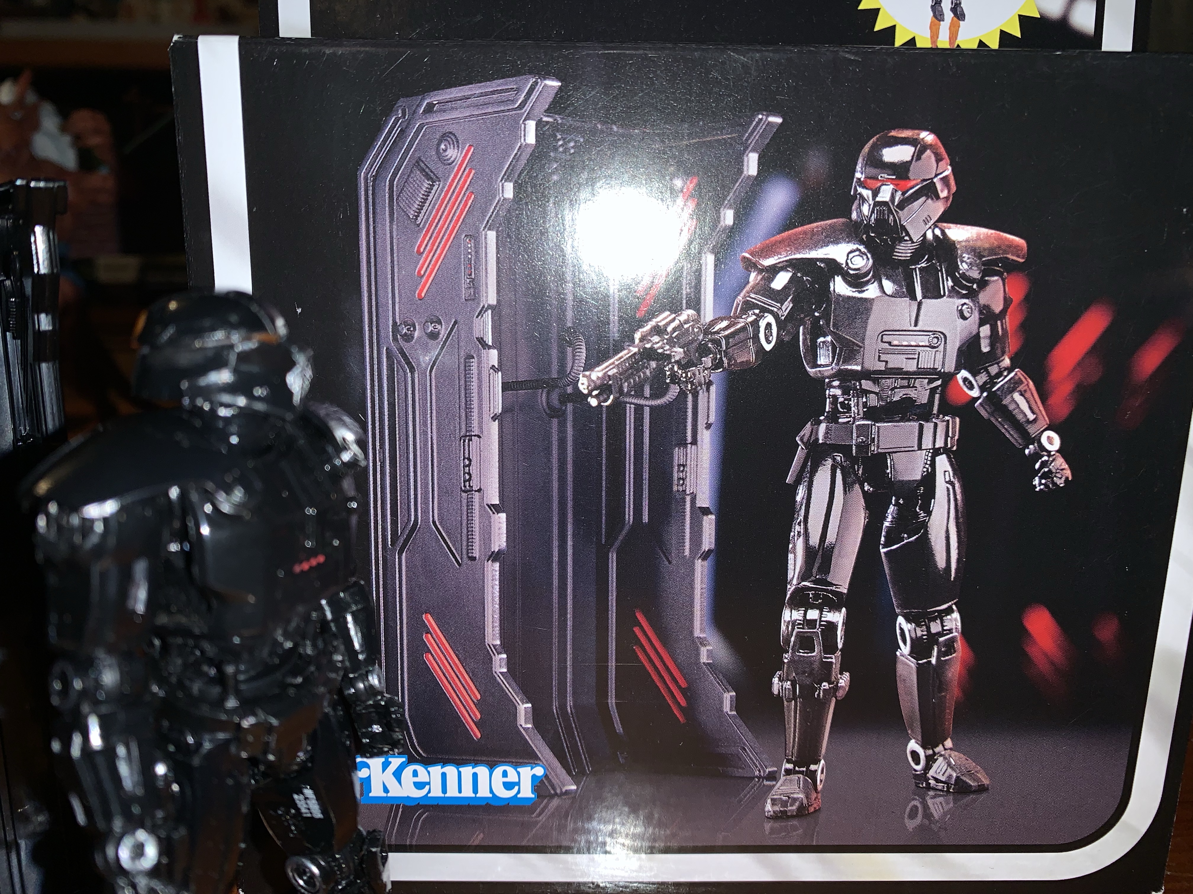
The Dark Trooper stands at just about 4″ tall and at first glance, wow, this thing does not look like the figure on the box. It’s cast in all black plastic with almost no paint. The paint is limited to the metallic portions of the elbows, wrists, and knees plus some patches on the biceps. There’s also some red dots on the chest, but that’s it. In the helmet, is red, transparent, plastic to create a light-piping effect that really doesn’t work very well at this scale. You have to basically hold a light to the back of the head (where the rear of the plastic is present in the form of a red square) to get anything out of it. They may have been better off just trying to paint glowing red eyes, or better yet, they could have done both and given us some options. As it stands, the eyes mostly get lost in the face.
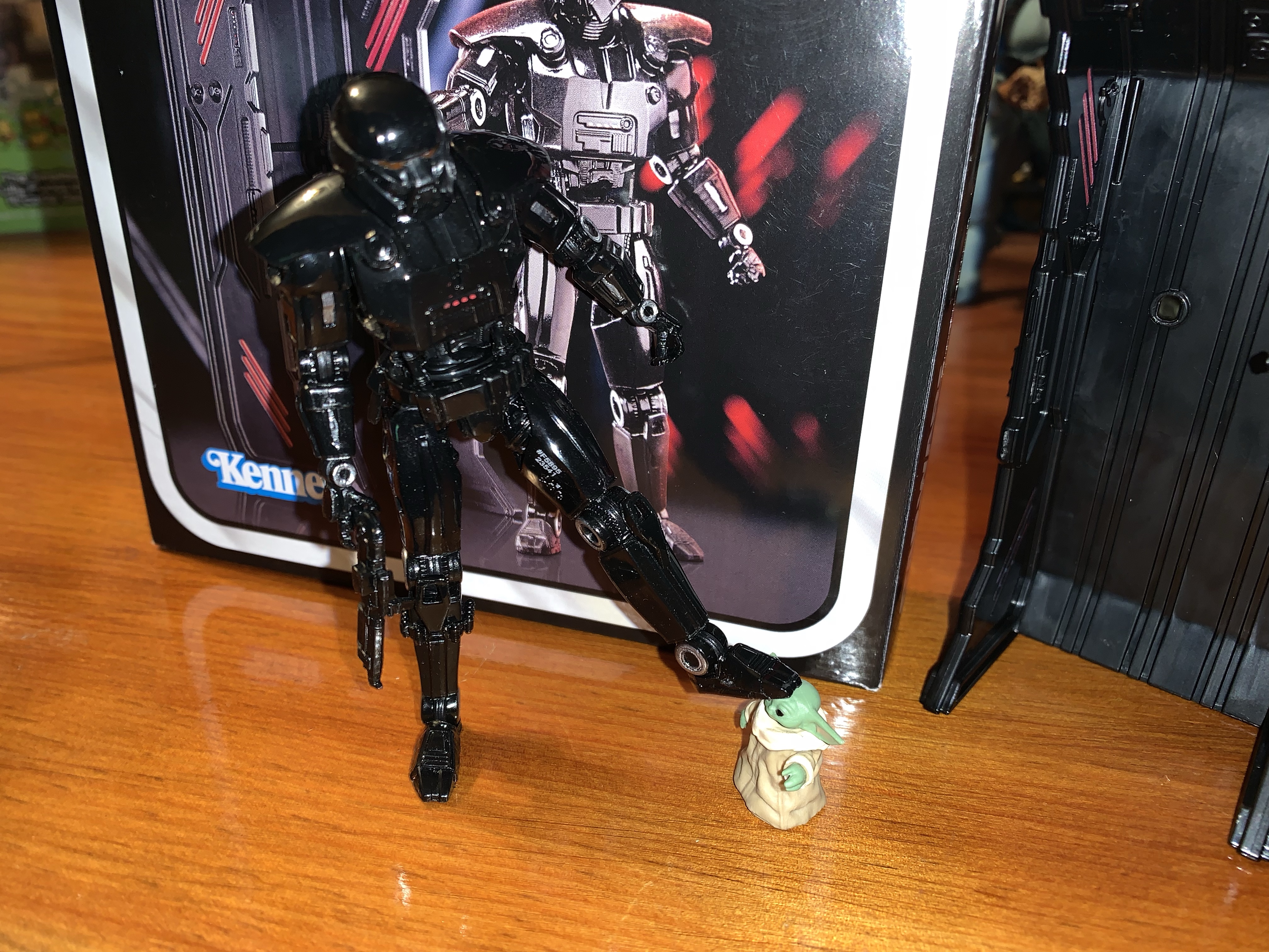
That is unfortunate, but what is really disappointing for me is the lack of a chrome-like finish. The image on the box is either a render or placed under some very harsh light. Even blasting white light on my figure at close range I can’t get it to resemble that finish even a little bit. It’s a glossy plastic, but not overly so, and it very much looks like plastic. There is no illusion here that this guy could be made of the same material as the actual character. The black plastic almost seems to suck in the light more than throw it back. And that could be due to its composition as it’s a soft plastic, there’s a gummy-ness to it, and not something harder. I think a harder plastic would have thrown more light back at the viewer and helped sell the figure. Or maybe it just needed some paint. The face, especially, just doesn’t translate because of the all black plastic. The sculpt is there, but you have to get in close to appreciate it.

And that’s an issue with the whole figure. Granted, this scale is not the best choice to celebrate a sculpt, but it still can if the finish is done properly. And the sculpt looks pretty nice. There’s a lot of detail in the abdomen and the limbs, and really, all throughout the figure. There is a floating crotch piece that has these little pistons on them, at least I think that’s what they are, that can get a little messed up. It’s a softer plastic and one of the four pistons on mine is warped a bit, but at least it’s on the rear of the figure. The left shoulder is also a little jacked-up, it probably didn’t come out of the mold clean, but otherwise I don’t have any issues with the sculpt. At first glance I thought the hands might be a little on the small side, but after a little research, that seems to be a case with the design and not the figure.

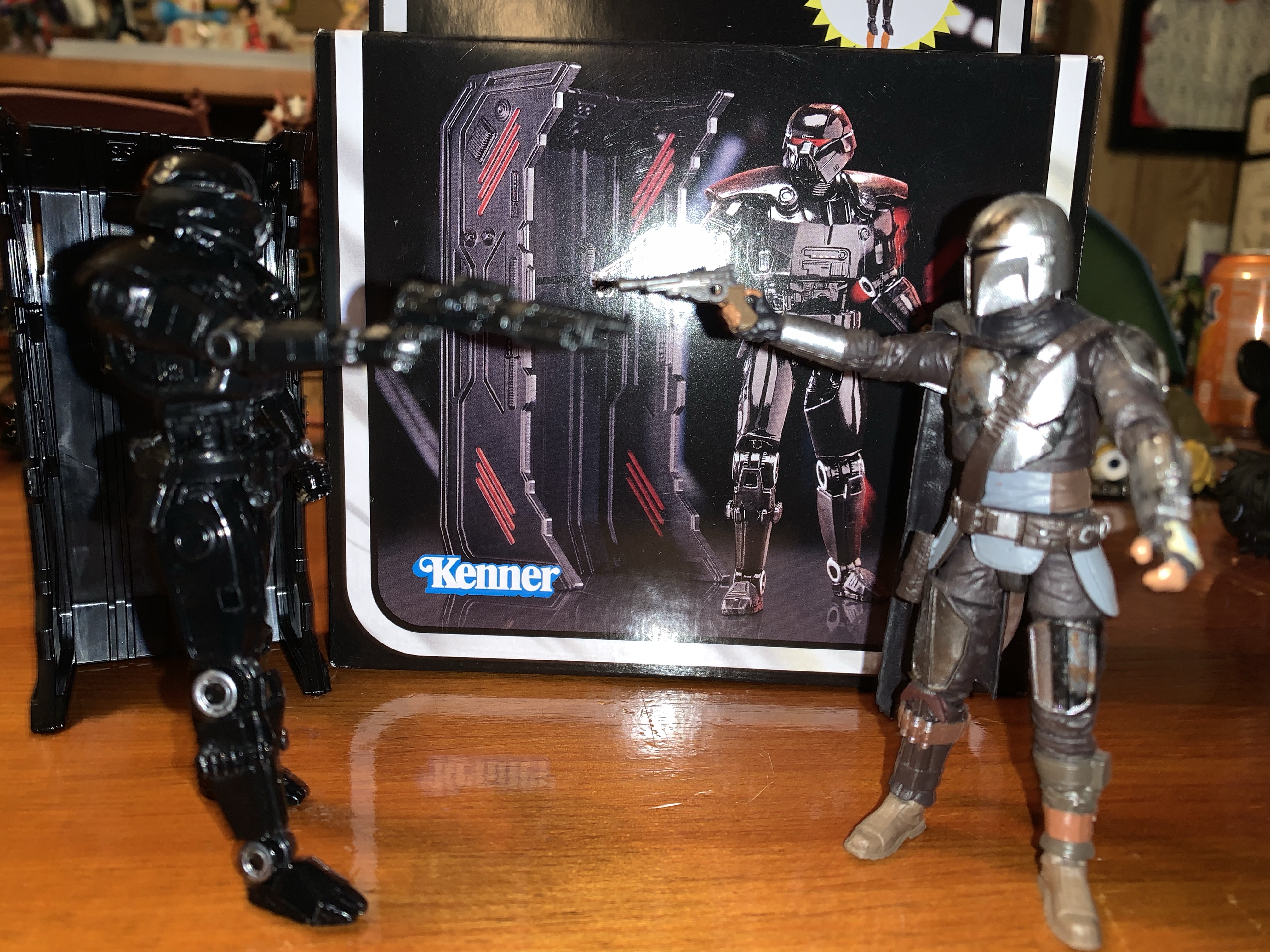
The Dark Trooper does come with a handful of accessories. For extra parts we get two fists. I don’t see myself using them, but I guess it’s always useful to have some fists. The default hands are a trigger finger right hand and a gripping left which work well for two-handed weapon poses. And the main weapon is a blaster rifle of some kind. It’s all black plastic and it can be either held by the Dark Trooper or it can be slotted into the right thigh. There are thrust effects that peg into the feet. They’re a semi-transparent orange plastic and look okay, but without a flight stand they’re kind of useless. The Dark Trooper also comes with its own, personal, hangar. It has to be assembled as it comes in three pieces and it was a little harder than I expected it would be. It’s black plastic with some red paint in places and it’s fine. It perhaps creates some desire for people to army build these guys so you can have some inactive units in your display, but at these prices I don’t know if many collectors want to do that. The hangar also has two cables that plug into it that I guess are supposed to curl under the arms. I guess they’re like charging cables? I don’t know. They don’t really hold the figure in place so they’re rather perfunctory.
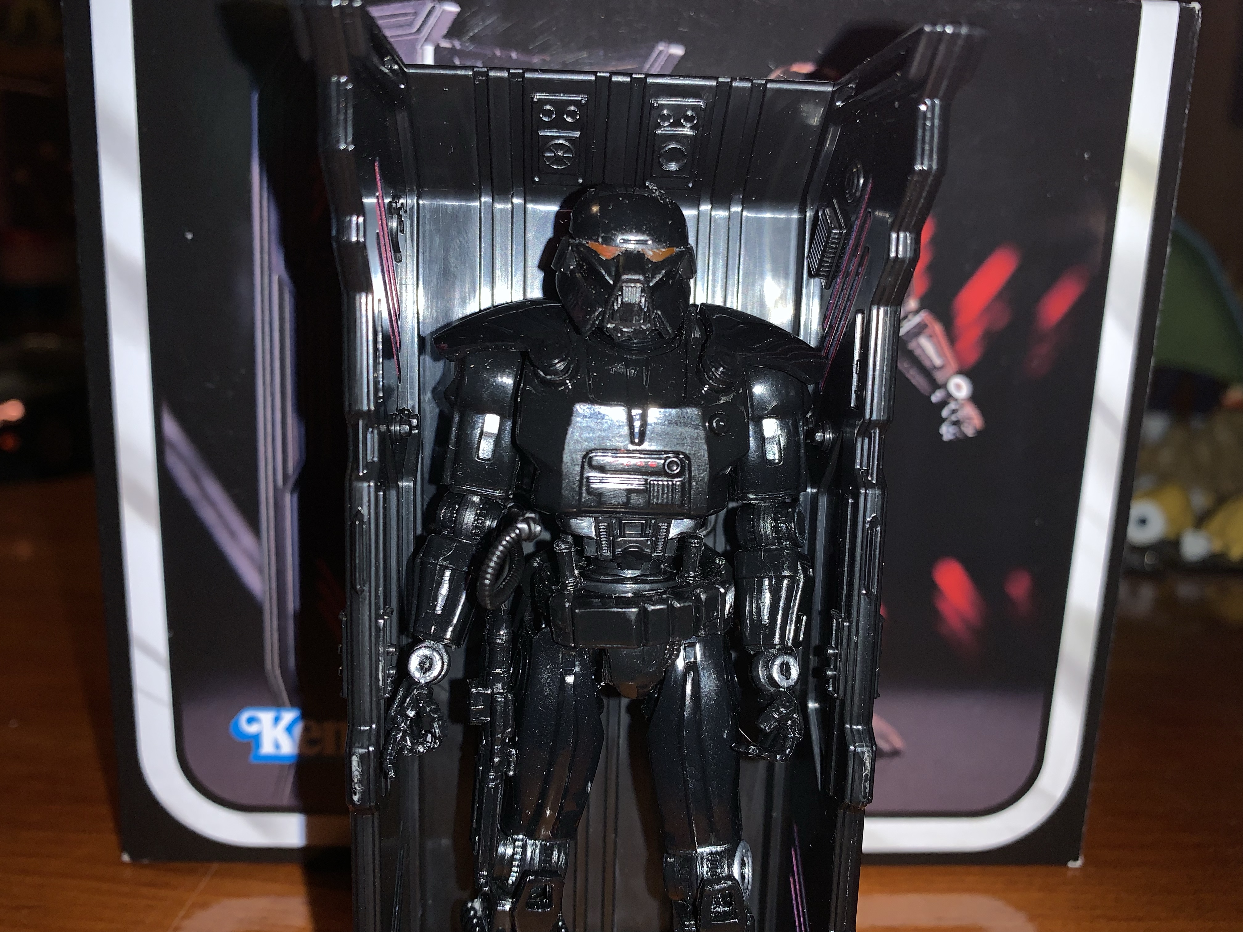
One of the hallmarks of this line is you get small, retro-inspired, action figures that move like modern toys. The Dark Trooper mostly comes as advertised in that regard, but it’s not without its flaws. The head feels like it’s on a ball peg of some kind with another joint at the base of the neck. You get your rotation and the figure looks down well enough. The range going up is minimal and you only get a little bit of tilt out of the joint. The shoulders are ball-hinged and the trooper can just about raise its arms out to a horizontal position. Rotating forward and back is fine, though the shoulder pad will prevent full rotation there. At the elbow there’s a swivel point which is basically your biceps swivel and the hinge will allow for a 90 degree bend. The wrists swivel and feature a large hinge as well that moves in a horizontal fashion. There is, sadly, no vertical hinge on the trigger hand. In the diaphragm, there’s a ball joint that’s mostly for rotation. There’s a little tilt and a tiny amount of forward and back, but not much. The hips can kick forward about 90 degrees and they go back a little bit as well. Out to the side, you basically get to a full split so that’s good. There is a thigh swivel that’s pretty well hidden and at the knee we get a swivel and a hinge that will go about 90 degrees. The ankles feature a hinge, but it’s very clicky. You basically have a neutral position, one click forward, and two clicks back. And really, all of the hinges are like that including the knees and elbows. It can make it a challenge to stand this guy to not have something more nuanced. There is an ankle rocker that too is a bit on the clicky side. It will move a little, then just jumps to a full tilt, which makes its usefulness limited.
Issues aside, I think the Dark Trooper will move well enough to get it into Dark Trooper poses. It basically just stomps around blasting foes and shrugging off the weapons of others. It’s not much of a melee fighter, because it doesn’t have to be, and when it does get in close it just swats away its prey. It also comes with enough stuff and the only thing missing is a flight stand to better take advantage of the thruster effects. I suppose a blast effect might have been preferred, but oh well. What’s going to determine if you like this figure or not is just how good do you think it looks? And for 25 bucks I don’t think it’s good enough. I didn’t seek out any reviews on this figure before buying it, so silly me for thinking the image on Hasbro’s packaging was indicative of what this figure looked like. Even at the discounted price I got this one at, I don’t think it’s really there. This should be a $12 line, and the fact that it’s double that is crazy and unfortunate as I think Hasbro is going to kill The Vintage Collection with these prices. I don’t hate that I have this figure, but it’s also not something I can whole-heartedly recommend.
If you want to read all of my Star Wars coverage you don’t have much to catch up on, but if you just like laser fodder, I’ve got plenty of reviews of such characters:

Star Wars: The Vintage Collection – Din Djarin (The Mandalorian) and The Child
Today we are celebrating ten years of The Nostalgia Spot! It’s not ten years to the day, the actual anniversary was about a week ago, but it’s close enough. In those 10 years, there have been 750 posts here on a variety of subjects, pretty much all of which could be labeled as nostalgic to…
Keep reading
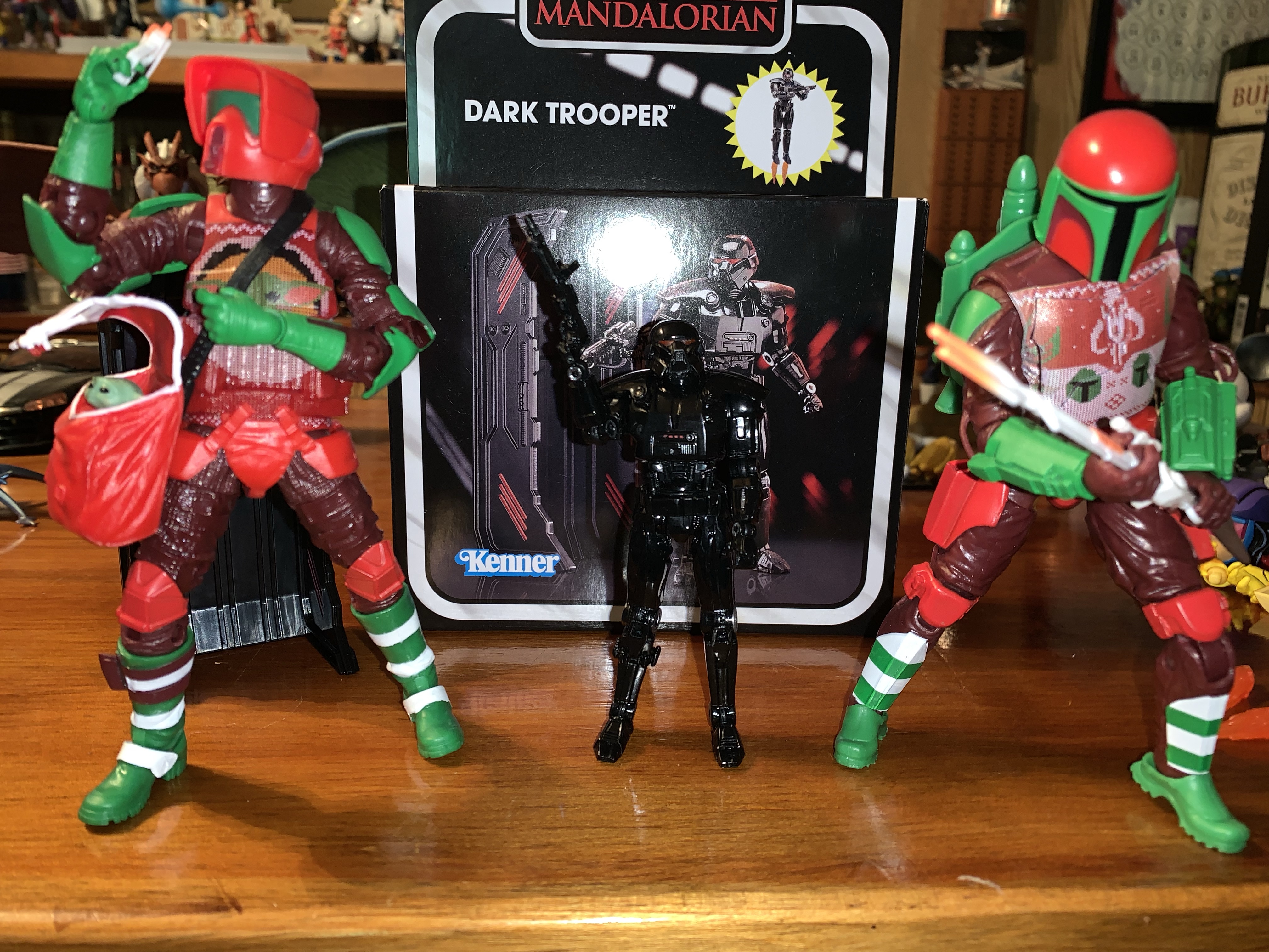
Star Wars The Black Series Mandalorian Warrior (Holiday Edition)
We’re getting to Christmas coverage at The Nostalgia Spot one day early this year with this look at one of the latest in the Holiday Collection from Hasbro’s Star Wars line of action figures referred to as The Black Series. I have previously looked at a figure from the very popular streaming show The Mandalorian…
Keep reading
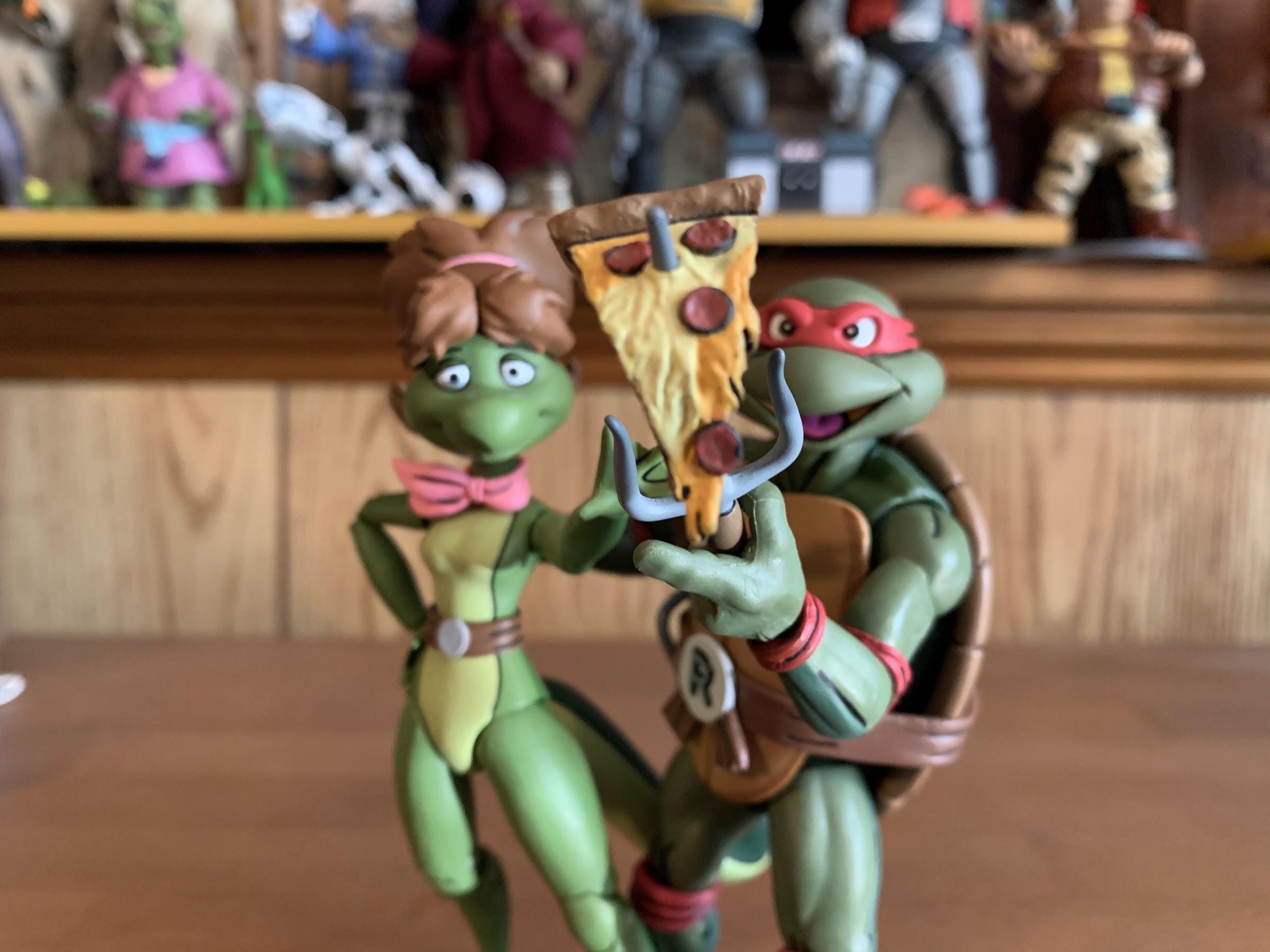
Bucky O’Hare Wave 3.5 Aniverse Storm Toad Trooper
It’s been a long time between releases by Bucky O’Hare license holder Boss Fight Studio. The last figure released by the company was 2018’s Storm Toad Trooper, a figure that arrived at my doorstep on Boxing Day 2018. Since that time, Boss Fight Studio has had sculpts and specs to show off, most notablyBruiser, but…
Keep reading