Category Archives: Television

S.H.Figuarts Dragon Ball Z Full Power Frieza

He’s a hard guy to get rid of.

Frieza is the villain from Dragon Ball who just refuses to die. His initial battle with the heroes of Dragon Ball Z spans a whopping 30 episodes! Thank goodness that DBZ was a weekday show or else it would have taken more than half a year to see Frieza get taken down. And that’s just talking about the actual fighting, he’s a presence prior to that with the show teasing that this diminutive, effeminate, character is the most powerful being in the universe. And if the confrontation wasn’t long on just a straight episode count, it felt even longer because Frieza has a series of transformations to undergo before reaching full power. I guess since his underling, Zarbon, had a transformation of his own Frieza couldn’t stop at just one. No, he had four distinct forms to cycle through and the one he spent the most time in is his ultimate form – his fourth form. It’s become the most recognizable form of Frieza ever since, and since DBZ action figure collectors want every version of every character, Bandai has cycled through all four for its S.H.Figuarts line.

My Frieza collection could easily be twice the size of this, but I think I’m good for now.

That is, all except for the unofficial fifth form. I say unofficial, but it’s very much official as he does this in both the manga and anime, it’s just not a transformation on the same level as the other forms. Frieza’s full power form is basically his final form during his battle with Goku and it’s a bulked-up version of his fourth form. The whole fight, Frieza keeps teasing his foes that he’s not even using the full might of his awesome power so this bulky version is basically meant to signify that, yes, Frieza is finally going all out. I don’t think it’s ever been retconned to be a suboptimal form similar to the super bulked out Trunks we’d see in later episodes, though when Frieza returns in Dragon Ball Super he’s rarely depicted in such a fashion. And he definitely fares better against the might of the newly transformed Super Saiyan Goku while fighting this way so he doesn’t appear to be sacrificing any speed, though he does ultimately fall.

“Oh Frieza, you’re so swole!”

Naturally, since Bandai has covered Frieza’s first four forms (and his golden one from later) it made sense to just do this Full Power Frieza and consider the villain complete. The figure was sold via the Premium Bandai website in 2023 and has recently started showing up for those who ordered it. This is the extremely buffed out Frieza that I suppose some have always wanted. There’s a part of me that finds this look for Frieza a bit ridiculous. I think the villain works best when he looks somewhat less imposing than most, but packs a lethal punch. I felt the sculpt on display in the renders looked pretty damn spot on though and I tend to like chunkier action figures. It also will pair well with the Legendary Super Saiyan Goku (and even includes an accessory for that figure) release from 2022 and as one of the most iconic confrontations in Dragon Ball Z it felt like a worthwhile addition to the collection.

Frieza has a terrific sculpt, but more shading and paint detail on the battle damage would enhance this figure so much.

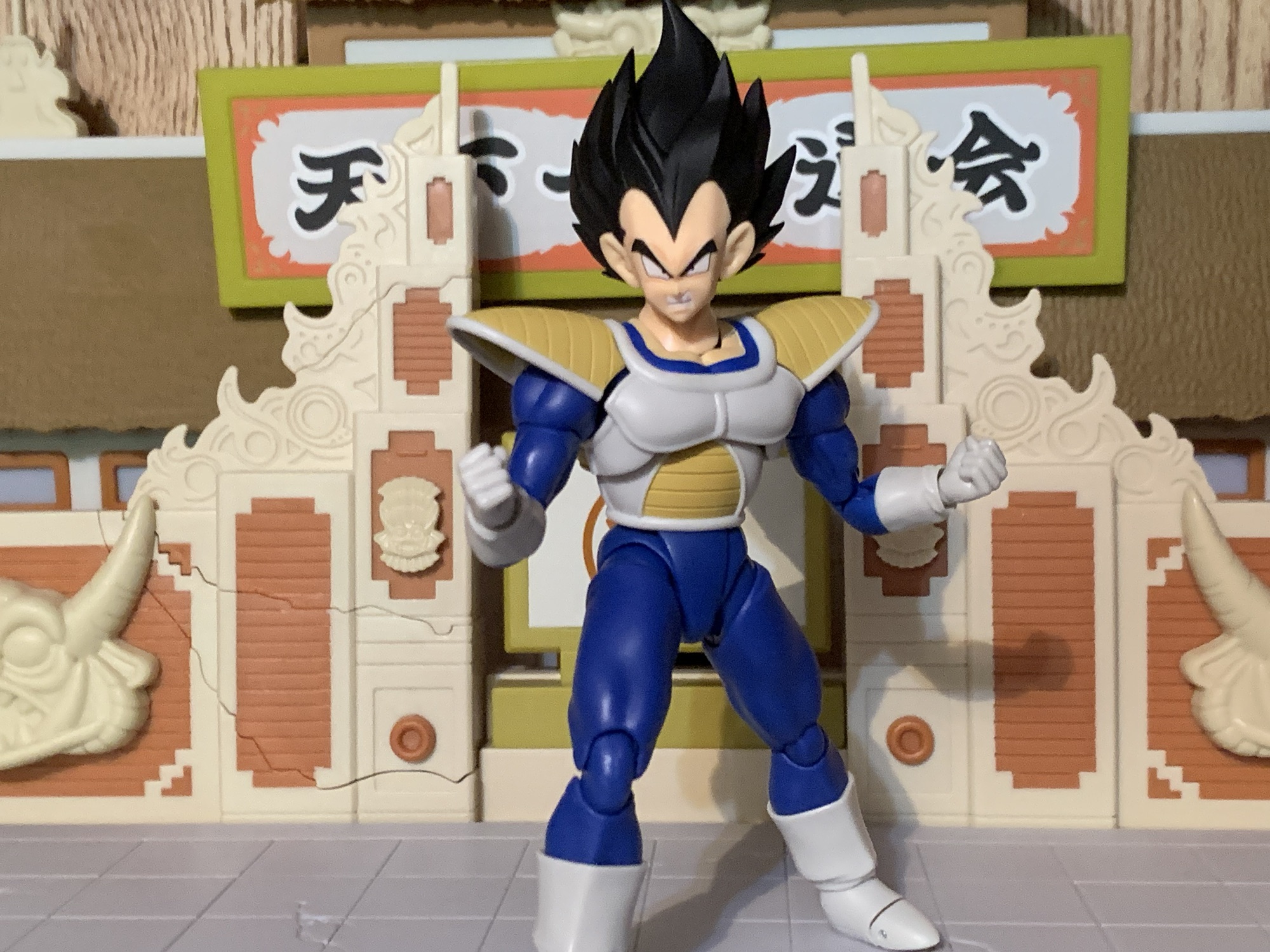
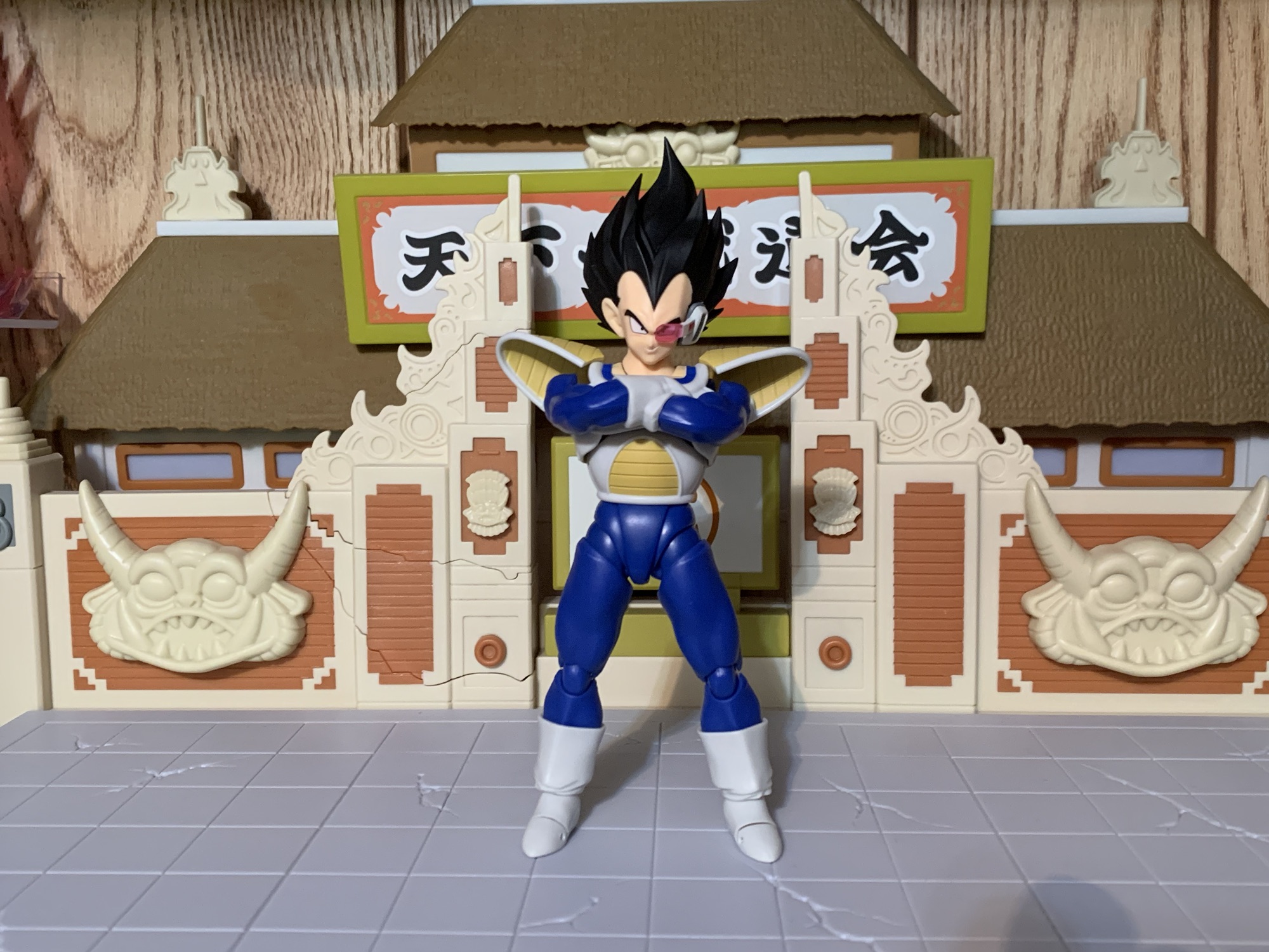
Frieza in his full power form comes in the usual box which features a nice window and a bunch of product shots. This one comes courtesy of the Vietnam factory, which has had some hiccups in the past, but appears to be on-par with the stuff we see coming out of China at this point. Frieza stands a shade under 5.25″ which makes him taller than the Fourth Form Frieza, but not as tall as Goku. As promised, he is very bulky. The neck is wider than the head, the shoulders are massive spheres, and the upper body especially is huge. It’s an over-the-top character design that Bandai and Tamashii Nations have done a great job at bringing to life. The purple areas are very glossy, as one would expect, and the white areas have a hint of a blue wash for a little depth. There’s veins and battle damage sculpted all into the body in various places. The articulation is numerous, as is typical of the line, but this figure does as good a job as most in hiding it as best it can. There aren’t any weird spots or massive gaps. The base of the neck is perhaps the one area that could be a little less gappy, but it’s not as bad as the recently released Vegeta.

“Stand back, Goku! I’ll take care of this monster with my Destructo Disc!”

Aside from the blue wash, paint is fairly minimal. The faces are all printed on exceptionally well and nothing appears misaligned or sloppy. There’s black in the ears as well as the finger and toenails. The purple spots appear to mostly be inserts of colored plastic except for the shins. The right shin on my figure is perfect, while the purple on the left is a bit sloppy around the edges. It’s the only real blemish I can find across all of the parts. His tail has also been chopped off at the end and there’s paint on the stub. I like that there’s a slight wash applied, but I do wish Bandai would try painting the sculpted-in battle damage. In the show and manga, those hatch marks are always black or black and red. By leaving them unpainted in the sculpt they’re almost invisible from the shelf and only apparent in-hand. Their sculptors do such a nice job that it’s a shame to see such detail almost go unnoticed.

“What?! He…he…has two?!”

In typical fashion, we do get a large assortment of optional parts with Frieza. For hands, we have a set of fists, clenching, open, flat palm, and open hands with peg holes in the palms. The peg holes are for two, pink, disc effects that have a nice buzzsaw edge and are done on translucent plastic. They plug into the hands, though the posts on them are not glued in so don’t be surprised if the peg stays in the hands when removing them. It’s not really a big deal since those hands only exist to work the effects so as long as one end stays inserted in another it’s fine with me.

The pegs for the disc effects may start in the discs, but they’ll probably come to live in the extra hands.

For portraits, Frieza comes with his standard cocky smile as the default one. The other expressions include a grimace where one eye is more narrow than the other, a teeth-gritting expression, and a yelling head. I’m surprised the grimace doesn’t feature one eye closed entirely as I think that’s where he ended up during the course of battle. He also has a portrait for Legendary Super Saiyan Goku that’s meant to simulate him getting punched in the face. I wish we had the same for Frieza. There are also two clenching feet that can be swapped with his flat feet. The feet can be tough to remove and I had to heat them in water. Without that, the whole ankle assembly was popping out. The hands swap easy enough while the heads can be a little tricky. The factory went with a standard double ball post and it’s a bit of a snug fit for most of the heads. This means that when removing them you may find the neck comes off the figure instead. I’ve been able to manage by making sure I pinch the neck when pulling a head off, but it can be a little frustrating. If you’re having trouble, heating the head with some hot water first would probably do the trick.

Probably the only comparison that matters.

Articulation for Frieza is largely what one would expect, it was just always a question of how effective it would be given the design of the character. I mentioned the double ball for the head and the ball joint at the base of the neck. His neck is so thick that the joint at the base of it will do most of the heavy lifting. The joint at the head is mostly for rotation and a little nuance while the neck will provide your up and down. The ball joint in the torso is going to further help with getting the character to look up while also adding a little crunch, rotation, and tilt. The purple plate in the middle of his torso will limit the crunch a bit, but it is on a hinge so it can move out of the way to some degree while the ball joint at the waist allows for further crunch forward and back. The shoulders are on butterfly joints which have some decent range coming forward, but very little going back. More room could have been cut-out to do so, but I guess someone didn’t want to break-up the sculpt. There’s some play on the shoulders to move up and down and the hinge will bring them out about 90 degrees. Bicep swivel is fine and the double-jointed elbows go a little past 90 degrees before the bulkiness prevents more range. Standard ball hinges at the wrist work fine.

If you like seeing Goku get punched in the face then you’ll like this extra accessory for Goku.

The hips feel like the normal ball-hinge setup. They can just about hit full splits going out to the side while kicking forward is no problem. At about the 90 degree point, the leg will want to go out from the body a bit because the crotch piece, but it will keep going higher. Because of Frieza’s narrow butt, the legs can kick back, but out to the side. There is a thigh swivel and I think the sculptor did a very good job of keeping it tapered as much as possible. Some more recent figures have looked a little goofy in that area. It will pop out from under the crotch piece when manipulating it, but you can slide the top edge of the thigh swivel under that for a more streamlined appearance. The double-jointed knee, like the elbow, will only go a little past 90 because of the bulk. The ball hinges at the ankle work okay, but the shape of the ankle and feet can make the more nuanced stuff a little harder. The tail, which does not come on the figure, connects via the standard hinged ball. It will rotate and has some play on the hinge. It’s mostly for adjustment posing, but it can also function as a third support, if need be.

“I have finally triumphed over you, monkey!”

Frieza is probably going to pose well enough without knocking anyone’s socks off. The butterfly could have been done better, but I don’t know that I disagree with the approach. The accessories are pretty solid as well and it’s always a plus to get energy effects. I do think we needed at least one pointing gesture since that’s such a common way for Frieza to attack. I don’t remember the flat palm gesture playing a role in the fight, but I haven’t watched it in over a year. I do lament the missed opportunity to not include a stump for his left arm and a similar thing for the base of his torso. Frieza got all cut up while fighting Goku and it would have been pretty amusing to be able to display him as he was at the end of that confrontation. He would have required some kind of stand as well, but honestly, every Frieza should have a stand. He, more than most characters from DBZ, is often hovering or flying as opposed to standing.

If ordered last year, Full Power Frieza would have set you back $85 plus shipping (which is usually $10). That’s not a cheap price for an action figure, especially one with so little paint. It’s not grossly out of whack with S.H.Figuarts releases, though he’s definitely not one of the better values. Is it worth it? I like it enough, and it helps that I spent that money roughly 9 months ago so it’s been gone for awhile. What will suck is the cost to acquire the figure now that the sale has been closed. I guess if you just somehow missed this and really need a Full Power Frieza to complete your collection then you’ll pay what you have to. For anyone else, it might be better to admire from afar because I’m guessing the secondary market is going to want somewhere in the neighborhood of $125. If you can get it down closer to $100, it might just be worth it. It’s a fine figure. I love the sculpt, I like the articulation, and there’s some good display options here. With a little more effort and creativity it could have been a truly special release, but as-is it’s probably good enough.

If you want some figures to pair with Frieza, here are a few:

S.H.Figuarts Dragon Ball Z – Mecha Frieza

When you have an action figure line as long in the tooth as the Bandai/Tamashii Nations Dragon Ball Z line from S.H.Figuarts, you tend to find some pretty obscure characters making the jump to plastic. Characters that may have existed for a blink and you miss it kind of moment, but when one’s collection already…

Keep reading

S.H.Figuarts Dragon Ball Z Vegeta 24,000 Power Level

When a toy line is as long in the tooth as Bandai’s S.H.Figuarts Dragon Ball Z line, producers tend to start looking in all of the various crevices of the property for new material. We recently looked at a figure that did just that in Mecha Frieza, a version of the chief villain of the…

Keep reading


Batman: Caped Crusader

Batman: Caped Crusader (2024)

In the far off land of 2021 we received word that a new animated Batman series was in development and attached to it was none other than Bruce Timm. Timm was one of the main creative minds behind Batman: The Animated Series and the DC Animated Universe it spawned so this news was met quite enthusiastically. Then Warner stepped in and muddied things up. The series was originally pitched as an HBO Max/Cartoon Network joint affair, but corporate reshuffling nixed that idea. Still, Caped Crusader is actually here now in 2024 which some other projects can’t say the same. It was shopped around for much of 2022 eventually landing with Amazon. This past Friday, the entire first season was dropped all at once on the Prime service ensuring talk of it will likely be ancient history once this goes live, but we should talk about it, nonetheless.

Caped Crusader is said to have come about as a result of Timm not wanting to continue with the universe he helped create starting with Batman. That’s understandable since a lot of that cast has either retired or unfortunately passed on and trying to recreate the magic of that series seems like a fool’s game. Timm instead used the opportunity of a new animated Batman to do things he couldn’t do with the other shows. This was to be a younger Batman set in a distinctive noir setting, not some time-locked version of an otherwise contemporary Gotham. It would not be beholden to any past era of the character, but would also be free to draw from the classic comic run. It could be more mature with its action and plots since it wouldn’t be airing as part of a network television kid’s programming block.

One of the most dramatic redesigns is that of The Penguin, which I rather enjoyed.

Alongside Timm is a host of other executive producers: J.J. Abrams, Matt Reeves, Ed Brubaker, James Tucker, Daniel Pipski, Rachel Rusch Rich, and Sam Register. Brubaker was hired as the head writer and directors Christina Sotta, Matt Peters, and Christopher Berkeley split the 10 episode series (4, 3, 3 respectively). Abrams’ Bad Robot Productions would handle much of the animation with DC Studios and Warner Bros. Animation also credited. Amazon MGM Studios is also listed, though I don’t know if that’s more branding or if that studio did actual work on the show. Frederik Wiedmann was brought on as the composer for all ten episodes.

Wiedmann had some big shoes to fill taking over for Shirley Walker, but equally as large is the role of Batman himself. Kevin Conroy left one hell of a mark on the character, but he had essentially retired from the role when the show was announced and would sadly pass away before this show could be completed. Dawning the cape and cowl this time is Hamish Linklater. He is joined by Jason Watkins who serves as loyal butler Alfred Pennyworth. This is a story of a Batman just starting out. We can assume he has been at this whole crime fighting thing for a little while because he has the costume, the car, and the cave all in place. What he doesn’t have are connections just yet within Gotham’s police department and other legal institutions. Most of the citizens seem to regard him as a myth and over the course of this first season the Batman will become more established and will be known to people like Commissioner Gordon (Eric Morgan Stuart) and his daughter, Barbara Gordon (Krystal Joy Brown).

Two characters featured quite a bit in the first season are Barbara Gordon and Harvey Dent.

I will say upfront that I came away from the first season of Batman: Caped Crusader with mixed feelings on the show. The design is definitely one of the elements I took issue with the least. Batman resembles his original design of black and gray with those tall, wide-splayed, ears on the cowl. He does not have the purple gloves, which is probably a solid choice. Alfred has a younger, rounder, build while Jim Gordon seems noticeably younger than usual while Barbara is noticeably older. She’s a career woman who is a public defender in Gotham. I don’t know how that is supposed to work, her being a public defender for those whom her father essentially locked up, but I suppose it makes for good conflict in a TV show. I just know I wouldn’t want the police commissioner’s daughter representing me if I were to find myself in trouble with the law.

The desire for a noir atmosphere is captured in the setting quite well. Technology is of the 1940’s with old style vehicles, phones, and televisions. There isn’t much technology on display in the rogue’s gallery, possibly to keep the show firmly locked in its setting, though it does give way to more supernatural elements. Batman has always encountered such and the 90s show had villains like Clayface, the Man-Bat, and others, though I can’t recall him fighting an actual ghost at any point like he does here. There are still villains who are very much of the gangster type. The first we meet is The Penguin, who has been gender-swapped to a female crime boss voiced by Minnie Driver. The first screenshot I saw of this version of the character looked a bit silly, like it was just the classic Penguin in a wig and lipstick, but the character model is much better in the show. I actually liked this change and found that bird-influenced appearance suited a female quite well. Another villain, Clayface (Dan Donohue), was redesigned to more resemble a Dick Tracy villain while the eventual Two-Face (Diedrich Bader) appearance was surprisingly simple.

I was routinely disappointed in the lighting in the show.

I could take or leave certain character designs, but what I found myself most disappointed in consistently was the animation on display. Characters have very stiff, sometimes robotic, movements. Walking animations with a character in full frame are surprisingly ugly for a 2024 show. Did Warner really cut the budget on this once it was no longer going to appear on one of their platforms? The lighting also isn’t always up to task. The very first shot in the series is a classic police interrogation scene under a single light. It looks awful as there’s a real lack of shadows being cast by the light. It’s a huge downgrade as far as I’m concerned. There are a few shots where more effort was put into it, but also plenty where it doesn’t even feel like the episode is taking place at night. It was never going to come close to matching the efforts from the 90s, but compared to X-Men ’97 this one leaves a lot to be desired.

The voice cast is a mixture of recognizable names as well as talent that is new to me. Most of them are quite good in their role. The only one I was left disappointed by was, unfortunately, Linklater’s Batman. Like a great many to do it before him, Linklater plays Bruce Wayne and Batman differently. Bruce is more personable, more perky, while Batman is curt and speaks in a lower voice. There’s an art to voicing Batman and I think Linklater needs more time in the role to really get it. His Batman is stiff to the point of sounding robotic. It’s possible he was receiving direction to play a character still trying to figure out his tough guy persona. Linklater is a talented actor so I’m assuming he’ll grow into the role, but it’s a little disappointing since a perfectly good Batman, Diedrich Bader, is right here on the cast already.

I don’t mind some supernatural elements in my Batman stories, but this guy is a little too Scooby Doo for me.

The ten stories of the first season are mostly stand-alone, but with some connecting tissue between them. The final three episodes are more purposefully connected and I suppose it can be considered serialized, but you wouldn’t miss a whole lot by mixing up the first 7 episodes. One villain, Harley Quinn (Jamie Chung), is introduced as her therapist persona first before the villain shows up and that’s one of the few aspects of the early episodes that wouldn’t work out of order. Speaking of, Quinn appears here in an origin separate from The Joker which was a somewhat bold choice. She’s her own thing this time around and I thought the show did a solid job with her. The tone of these stories is also allowed to be more mature. We see lots of people get shot, though gratuitous violence isn’t present. Batman is also free to punch guys in the face and sometimes the show feels a little preoccupied in pointing this out. There’s alcohol and even some romance making the show feel like it’s something akin to a PG-13 rating.

Other episodes were just okay. Few felt like they had heavy stakes and I found it hard to establish an emotional connection to any of the villains of the day. The best Batman episodes found something interesting to say about their bad guys, but this show struggled there. There’s even a kid villain in one episode that I think the episode wants us to have a response to at the end, but it just didn’t do enough to earn it. It at least does a good job of getting us to hate its crooked cop characters, but I think it also mishandles the character of Harvey Dent. We all know what Dent’s fate is to be when he’s first introduced, but this is an unlikable Dent. He’s arrogant and far more consumed with making the jump from District Attorney to Mayor of Gotham than actually doing his job so when the thing we all know is coming does, there’s no emotion. Plus there’s no one close to him to be affected by his transformation that we can feel something for instead. The Bruce/Harvey friendship is shoehorned in too late to make much of an impact, but I will give the show credit for finding another angle to play that at least puts Batman and Alfred at odds with each other. That’s also probably the only real character development we get out of our lead. We spend a lot of time with Gotham’s finest, but not a whole lot of time with Bruce or Batman. The show needs to find a way to make its lead more interesting.

When the show really wants to look good, it can. It gives me hope that a second season will be stronger.

I went into Batman: Caped Crusader not expecting to find something on par with Batman: The Animated Series. That would be an unfair expectation. I did expect to find something good and the product I got was at least approaching that. Caped Crusader is not a bad television series, but is it exceptional? No, not really. It’s a pretty easily digestible 10 episode season that mostly just gets credit for existing. Most of its “bold” choices for the Batman universe are just doing gender and career swaps with its characters. A lot of the story beats felt too predictable, too ordinary. The best episodes of the season were the ones that felt like stories that hadn’t really been told before, but they were few. I don’t expect it to make much of a mark on pop culture and I don’t know if a second season is even a sure thing. The show definitely expects one and it does the predictable thing of teasing a major villain at the very end to try and drum up some excitement, but it all feels a bit played out. Amazon did order a second season back in 2023, but if the streaming numbers are bad then nothing is stopping them from going back on that and getting one of those highly coveted tax write-offs. If it does come back then I’ll probably watch it, and if it doesn’t I probably won’t even notice.

Here’s more Batman content if you’re in search of such:

Batman – The Adventures Continue #50: Batman

If you’re a repeat visitor here at The Nostalgia Spot, then you’ve probably noticed that around here there is a high opinion of the television show Batman – The Animated Series. I did a re-watch of the series that spanned more than two years and also checked out the various films based on the property.…

Keep reading

Batman: The Animated Series Wrap-Up

One-hundred and nine episodes plus three features leading to one-hundred and twelve blog entries have been devoted to the subject of Batman: The Animated Series. It started as a celebration of the show turning 25 and then as a curiosity piece. Since its premiere in 1992, the show had become much celebrated and praised all…

Keep reading


Marvel Legends Iron Man Retro Card Series War Machine

War were declared.

Recently, we took a look at the Marvel Legends retro-carded Iron Man. In that review, I mentioned I was always more of a War Machine guy than an Iron Man one. As a kid, The Avengers and associated characters appeared outdated and were largely off my radar. Then War Machine was introduced and suddenly Iron Man seemed cool again. War Machine was the only figure from the 90s Iron Man toy line I would acquire. The snap-on armor of that line better suited War Machine, who was just Iron Man with a bunch of stuff affixed to him. And that stuff was mostly guns, very large guns.

Iron Man is undoubtedly the more famous of the two, but War Machine was always cooler.

War Machine feels like a post-Reagan era antihero. The name is almost grotesque for a superhero – war machine? He makes war? Does he seek it out? It’s quite silly, not that I paid it any mind as a kid because an armored guy with a bunch of guns is cool. And if you have spent any time looking at this blog then you know I’m still very much affected by things I thought were cool when I was a kid. As a result, when Hasbro released its retro-carded War Machine figure a little while back it got my attention. Not enough to get me to buy it right away (and I first encountered the figure at a comic store that wanted more than MSRP), but it was on my radar enough that I kept an eye on it. I was hoping to get it for a discount some day, but after getting Iron Man I felt like I needed this War Machine and had to settle for a discount of only a couple bucks.

Dude has guns everywhere.

War Machine comes on the same retro card as Iron Man, only the art has been swapped to change Iron Man to War Machine. This is consistent with how the Toy Biz line sold the character back in the day so I do like that Hasbro kept that tradition going, even if this is going in the trash eventually. Unlike Iron Man, this War Machine is much more closely aligned to his animated, season one, appearance of the Iron Man cartoon. He’s mostly a mix of white and black plastic with few painted details. The face is painted as are the lenses found on his head and mini gun as well as the center of the chest armor. The armor of the body is a bit more detailed than it was in the cartoon. To make it closer to 100% accurate, the panels that come across his traps should come to a point and the boots should end at the bottom of the knee pad. It’s pretty minor stuff, but the most “off” aspect are the eyes and mouth which should be red rather than black. Personally, I’m not bothered by that as I think the black looks better, but if you wanted a true representation of the character from Iron Man then it is inaccurate..

The effect parts that come with the retro card Apocalypse will fit this gun on the right forearm.

Ignoring the inaccuracy, I do like the look of this figure. It’s what drew me to it in the first place. The white and black complement each other so well and the mixture of finishes works really nice. The black parts have a satin, or matte, appearance while the white is glossy with a slight pearl quality to it. A matte finish would have probably looked nice too for the white (which is true of the face), but I like the juxtaposition. The paint on the mouth is a little messy, in particular the right side. The edge of the face is also imperfect. It’s not something to notice from the shelf, but it is apparent in-hand. As far as I can tell, nothing on this figure is reused from the Iron Man figure I looked at previously. The arms are pin-less, but the legs are not so I am assuming the legs are reused from a previous War Machine or Iron Man release for Legends. The presence of pins doesn’t bother me as they’re colored properly. The arms look fine as well as the joining elbow piece maintains the finish of the rest of the arms. There is some excess plastic on the right elbow that I’ll have to trim away. The sculpt of the character is a touch more slight than Iron Man, which is odd. I’m not really bothered by it when it comes to the upper body, but his thighs could use some beefing-up. Overall though, I find the color combo so appealing that I can overlook my otherwise minor criticisms.

He certainly does look like a machine of war.

War Machine is basically known for two things: looking like Iron Man and having big guns. This War Machine comes with two, shoulder-mounted, guns: a mini gun and a cluster rocket launcher. They snap onto pegs that are affixed to channels on the armor so they can slide back and forth and pivot. Both also come with effect parts. For the mini gun, it’s a fairly simple blast effect done on translucent orange plastic which pops on and off easily. The rocket blast effect is a bit more robust. Also done on translucent orange, it features three “trails” for three, orange, rockets to peg onto. The rockets are way too big to plausibly come out of the weapon, but I’m willing to bet that was true of the illustrated ones as well. There’s a bit of black spray at the base of the plume which is kind of odd, but doesn’t ruin the look. Aside from the guns and effects, the only other items in the box are two sets of hands: fists and open, repulsor, blasting hands. Like Iron Man, we don’t get any effects for the blasting hands and, oddly, they’re unarticulated. I’m a bit surprised we didn’t get an unmasked head, but I’d never use it so I can’t rightly complain. It’s more than we’re probably used to getting these days, so it’s fine.

The mini gun effect is simple, but effective.

The articulation for War Machine is fairly consistent with that of Iron Man. One change that is for the better is his head is on a double ball peg. It works great and the only limitation is the shape of the armor around the base of the neck prevents the figure from having much range looking up, but I’ll take it over the hinge which doesn’t work much better on Iron Man. The shoulder hinges are not impeded by the shoulder pads which move out of the way just fine and we get the standard biceps swivel, double-jointed elbows, and hinged peg for the hands (fists only). Even with the large forearm gauntlets, the elbow still bends past 90 degrees. There is a small canon on the right forearm that unfortunately does not swivel or anything so you have to use the bicep swivel to aim it. A forearm swivel would have been nice to accommodate such.

The missile blast is a bit more elaborate.

The torso features an ab crunch that’s just okay. It has better range going forward, which is preferred to having it going back, but more range would have been nice. There is a waist twist and it’s fine while the hips are affixed via ball sockets. They don’t quite go out to the side for splits, but they kick forward plenty far. There’s almost no range going back while the thigh twist and double-jointed knees work as well as expected. The ankle hinges go back all the way, but not forward very far due to the cut of the boot and the ankle rocker is fine. The articulation in general moves well with the appropriate tolerance. The knees are a touch gummy though and I don’t care for that. It’s fairly standard stuff though and the only aspect of the articulation that bums me out is the lack of forearm articulation for that gun.

Yeah, it’s pretty cool.

If you’re into Marvel Legends then you’ll probably like this War Machine. It looks quite a bit like the character from the cartoon and also works well enough as a comic book version. He has the weaponry one would expect and even some effect parts to go with them. He’s missing effect parts for his hand blasters and the gun on the forearm. And like Iron Man, a flight stand would have been really nice. We got all of that, or nearly all of that, with the Toy Biz Marvel Legends version of the character so it’s a bummer to remind one’s self of that fact. I’m sure it’s also disappointing to some to not have a James Rhodes head as well. Aside from that, the only other negative here is that this figure won’t work for your Marvel vs Capcom display. That’s through no fault of the figure though as the MvC War Machine was just a palette swap of Iron Man when Capcom found out late in the game that Iron Man was off limits for contractual reasons. If you really need that version of War Machine, Hasbro did release such a figure a little while ago so it’s out there. I’m just not interested in it.

90’s characters – assemble!

If you like this War Machine then here are some other figure reviews that will likely be of interest:

Jada Toys Mega Man

We just had 11 consecutive weeks of action figure reviews on Super7’s line of figures based on The Simpsons. Things were getting pretty negative in that sphere as that line went out with a whimper. I don’t like reviewing bad figures and it’s mostly because everything I review here I buy for my own collection.…

Keep reading

Marvel Legends X-Men Retro Card Series Apocalypse

It is Halloween and that means it’s time for costumes, candy, and spooky fun. It’s also Halloween 2022, a pretty important date if you grew up loving those mutants who ran around in colorful spandex fighting for a better tomorrow. That’s because 30 years ago on this very night, the animated series X-Men premiered on…

Keep reading

Marvel Legends Retro Iron Man and Plasma Canon

90’s nostalgia has taken me on a ride of late. I could blame X-Men ’97, but it could just be me getting older and having more fondness for the decades that have come and gone. It’s not a bad thing, but it can be bad for the wallet. Lately, I started looking at my somewhat…

Keep reading

Star Wars – The Acolyte

The Acolyte (2024, Disney)

It’s fine.

Looking to read some more Star Wars reviews?

Star Wars: The Vintage Collection Boba Fett (Vintage Comic Art)

I’ve been collecting action figures in some capacity for my whole life, and it occurred to me now that I’ve never owned the Fett man. That’s Boba Fett, who is one of the most iconic characters from Star Wars and also pretty noteworthy in the world of action figures. I am not the place for…

Keep reading

Star Wars The Black Series Mandalorian Warrior (Holiday Edition)

We’re getting to Christmas coverage at The Nostalgia Spot one day early this year with this look at one of the latest in the Holiday Collection from Hasbro’s Star Wars line of action figures referred to as The Black Series. I have previously looked at a figure from the very popular streaming show The Mandalorian…

Keep reading

Star Wars: The Vintage Collection Dark Trooper

I’m back with another Star Wars action figure review! Actually, I don’t do these very often. This is only the third such review out of me because I usually don’t collect Star Wars. Sure, I think the franchise is fine and I did collect figures as a kid, but it’s not something I’m drawn to…

Keep reading

Marvel Legends Retro Iron Man and Plasma Canon

The 90s are here to punch you in the face.

90’s nostalgia has taken me on a ride of late. I could blame X-Men ’97, but it could just be me getting older and having more fondness for the decades that have come and gone. It’s not a bad thing, but it can be bad for the wallet. Lately, I started looking at my somewhat tidy Marvel shelf and the figures from X-Men and Spider-Man which all refer back to their 90s animated counterparts and I felt like I had a hole. And that hole’s name is Iron Man.

This portrait is the only aspect of the figure that is dedicated to recreating the 90s animated series look.

X-Men was my jam when it aired on Fox Kids and Spider-Man was firmly situated in second place. On another channel though was Iron Man. It never sunk its claws into me like the other two shows, but I watched a fair amount of it. I can’t recall a single plot and only remember characters, but I liked it enough to find the accompanying toy line enticing. I never did go deep on it though. While the show was called Iron Man, my favorite character was War Machine. War Machine felt like a more 90s appropriate Iron Man. The name is inelegant and a bit stupid, but kids loved an armored dude covered in guns. I allowed myself to get his action figure and it would be the only figure I would get from that toy line. And he was cool, I just never felt like I needed any other characters.

Well, okay, mullet Tony is also pretty much lifted from the cartoon as well.

Despite that, I do love me some 90s Iron Man. The aesthetic, that is. The modular suit works for me even if it’s kind of stupid. He definitely does not look like a guy in an iron suit. He looks like any other superhero, but with some iron plating in places. No matter, I like what I like and what I like is this look for Iron Man. I did get the Toy Biz Marvel Legends version that came in a two-pack with The Mandarin and it was probably one of my last Toy Biz Legends. I’ve resisted the urge where modern figures are concerned, but obviously I decided to give in.

This guy is definitely more at home in a Marvel vs Capcom display.

In 2022 Hasbro released a retro Iron Man that’s at least an approximation of the animated series look. It’s at least the closest version they’ve felt inclined to release, though it’s mostly a repaint of a more comic accurate modular Iron Man. It’s also less an animated Iron Man and more a Marvel Super Heroes or Marvel vs Capcom 2 version of the character and if that wasn’t obvious by looking at the figure the big gun certainly drives the point home. Like X-Men and Spider-Man, Hasbro has found success releasing Iron Man figures on retro cards that harken back to the 90s. This guy is released on such a card, but also in an oversized box similar to the Pulse Con animated Venom from a few years ago. Only in this case, the box just repeats the art of the retro card with a fake window rather than go with original artwork. Inside the box is the figure on said retro cardback as well as another box for his big, freakin’, gun.

One thing I don’t like about the sculpt is this red hinge.

This Iron Man stands a tick over 6.5″ to the top of his dome. He’s a very glossy yellow and red with almost every part of the figure being colored plastic. It’s an aesthetic that I think works for both the animated series and the video game sprites this deco is based off of. As far as animated Iron Man goes, there’s actually not much to tie it back to that source aside from the default head. It has the full yellow facemask with some yellow piping on top that is consistent for the look of the show’s first season. It’s also really large which is a Marvel Legends trend that has cropped up over the past few years. Comic book characters, if anything, tend to have smaller heads than a real person would since it helps make their usually impressive physiques look even more so. Hasbro apparently sees things differently and whatever they use for their proportions likely wouldn’t agree with an actual Marvel artist.

He has hands for the repulsor blasts, but no blast effects for them.

Aside from that head though, most of this figure matches up with the video game Iron Man. The knock-off Superman logo on the chest is from the game and that’s the clearest tie there. The shoulders should be bigger and scalloped really for both, but the smooth appearance of the figure is certainly closer to that of the video game. The only aspect of the figure that doesn’t really tie back to anything is the angled cut of the “pants.” Some of the artwork from the cutscenes in Marvel Super Heroes makes it look like that angle may be present. Some of those scenes also include the yellow piping on the head so consistency isn’t really its strong point. All that is to say that if you want a true, animated, Iron Man then this is suboptimal. In that, it’s similar to a lot of the animated figures Hasbro has released over the years as rarely are they 100% accurate to the source. If this guy is going on your Marvel vs Capcom shelf though, then it’s pretty damn close if you’re looking to match his first appearance in that franchise. He’s definitely not as beefy as that character sprite. This is very much a Marvel Legends Iron Man with a video game deco and accessories.

It’s light on the Capcom, and that’s the wrong War Machine, but it’s a decent start to an MvC display.

And if you’re screaming at me “Wait! What about the head?” then don’t worry, I’m getting to it. Hasbro included a second head that omits the yellow piping and features a faceshield that matches the shape of the one featured in the game. It basically ends just below the mouth so Iron Man as a red chin. It’s a repaint of the head from the original release of this body and it looks fine. Actually, it looks better than the new head as it doesn’t seem to be as out of scale. Pop this on your figure and you get the true Marvel vs Capcom 2 Iron Man. It’s also the same style of helmet the character wore during his appearance on the Spider-Man cartoon, though the rest of the body was pretty different. We also get a Tony Stark head featuring his mullet hairdo from the cartoon. It’s…fine? He looks like Charles Bronson to me and it too is oversized, but if mullet Tony is your jam then here you go.

Did I mention this figure comes with a very big gun?

The other accessories in the box are hands and effect parts. For hands, we get fists, open, and gripping. The open hands feature pegholes for blast effects, but none are included. They at least painted the rim of the ports yellow so it looks okay. On the gripping hands, the blast holes are filled and painted over. Even though Iron Man doesn’t have blast effects for his traditional, blasting, pose he does have some effect parts. The first is a burst effect that plugs into his chest opening. In the video game he can fire a beam from this spot so I guess this is like a charging effect before that beam emits. The other effect part is for his fist to plug into for his victory pose from Marvel vs Capcom 2. It’s molded for his right fist, but you can squeeze the left one in there if you prefer. Both effects are molded in blue, translucent, plastic with white shading. The burst effect looks pretty nice, while the victory pose effect has the white applied too heavily. It looks more like a sea creature or something and some of the “spikes” are bent and warped.

Iron Man: “To me, proton canon!”

Now, that obviously isn’t everything included with this guy. Oh no, we still need to talk about that gigantic gun of his. The box labels it a “plasma cannon,” but all who have played the video games from where this came know it as the proton canon. It’s Iron Man’s big attack as this giant gun comes out of no where and sends a massive beam across the screen. Hasbro definitely wanted to get the size of this thing right as it’s about 6.5″ long making it roughly the same size as Iron Man himself. It’s around 3″ wide from the widest parts. Since no 6.5″ action figure would stand a chance at holding this thing, Hasbro included a 3″ clear, plastic, stand for it to plug into so that Iron Man can basically fake holding it on his shoulder.

Mega Man: “Oh no! After he hits me with that there won’t be anything left for Dr. Light to repair!”

The canon itself is mostly gray plastic, but with darker gray paint applied in parts. There’s a hit of metallic pink on the front and a few places where red is applied for lights or buttons. The one thing not painted that should have been is the targeting reticle that Iron Man looks through. There’s a sculpted bull’s eye on it, but it’s unpainted. It’s probably mostly a hollow piece, but there is some heft to it. The stand plugs in without effort and works as intended. It’s not particularly challenging getting Iron Man into the proper position to look like he’s firing the weapon and the gripping hands are able to grasp it securely.

Mega Man: “Heh, heh…”

Hasbro also included yet another effect part in the form of a blast effect for this gun. If you’ve played the games this thing comes from, then you know it unleashes a devastating beam effect not unlike something one would see out of an anime character. The blast effect Hasbro included is…less than adequate. They included a blue version of the same effect they included for the retro card Apcalypse’s gun. You know, that gun that’s probably a fifth of the size as this one? This dinky little blue thing looks ridiculous when plugged into the center of the gun. There are peg holes all around the center and if this thing was meant to go in one of them (and there were more of the effects) it might look passable, but as-is it looks stupid. And what sucks is the diameter of the peg on the effect means it’s too big to be used with Iron Man’s hands and feet. I wouldn’t have expected Hasbro to include a gigantic beam here, but how about a charging effect? Or just a half sphere or something? I can’t see anyone displaying this canon with this blast effect. You know that popular Bart Simpson meme with the “At Least You Tried” cake? I’m not even willing to give Hasbro that much credit here.

Iron Man: “Sigh….damnit…”

We should probably talk about the articulation on the actual figure before we wrap this one up. Iron Man articulates like most Marvel Legends figures save for the lack of a butterfly joint. The arms and legs are pinless and the torso uses the old style of ab crunch that’s just a big hinge. I do like that the yellow panels on the sides of his thighs come over the thigh cut so the whole piece rotates with the joint when usually Hasbro would just cut right through it. The waist twist is just a standard twist so it gets ugly real fast when you rotate more than one click. Which is a bit of an issue all around with this guy. Very little would be described as smooth as the shoulders, elbows, knees, ab crunch, and waist almost feel ratcheted. The shoulders especially feel like they’re fighting back when moved which is a touch unsettling. I also don’t like how Hasbro did the shoulders as the red caps are cut into for the shoulder hinge. It looks fine on top as the hinge is red, but that also means the underside is red so anytime his arms are lifted it looks goofy. They could have simply pegged the red parts in to avoid this. I’d consider a big red hinge in the armpit uglier than yellow and red pegs in the arms and legs, but I guess Hasbro disagrees.

Animated friends unite to take on evil!

Retro Iron Man is a flawed Marvel Legends release as most are, but not one that is critically flawed or anything. I think most Legends collectors will likely be satisfied with this take on Iron Man. I personally wish the shoulders were done differently and that the heads were more proportional. I also would have scrapped the fist accessory for some repulsor blast effects, or better yet, a better effect for the proton canon. The effect included for that is laughably bad to the point where it would have almost been better to not include one at all. Yeah, we would have complained about the lack of one and would have been justified in doing so, but that would somehow feel less insulting.

He’s not without his flaws, but I’ll allow him to end this with a victory pose.

If you are a fan of the 2D fighting games from the 90s and want an Iron Man for such a display, this gets the job done. I don’t know if there are any third party beam effects that would pair well with this one, but I’m almost tempted to try and tack-on the fist effect to the end. Even a piece of paper with the beam printed on it would look better than the included one if positioned right. The only other drawback to this release is the price tag of $40. A repainted Iron Man with a big gun warrants a $15 mark-up over the standard Marvel Legends figure? Eh, that’s a hard sell, which is why it took me so long to take the plunge (thank you Amazon gift card) as I don’t know if it’s really worth it. If it had a worthwhile blast effect then sure, but you’re going to need to dedicate additional blast effects you may have laying around or dedicate time and/or money into coming up with something better to really make this guy be all that he can be and that sucks. If you do want him though, Amazon still has this one for MSRP. Maybe the patient will score it on clearance at some point too.

For someone who isn’t a Marvel Legends collector, I sure have reviewed quite a few at this point:

Marvel Legends X-Men Retro Card Series Apocalypse

It is Halloween and that means it’s time for costumes, candy, and spooky fun. It’s also Halloween 2022, a pretty important date if you grew up loving those mutants who ran around in colorful spandex fighting for a better tomorrow. That’s because 30 years ago on this very night, the animated series X-Men premiered on…

Keep reading

Marvel Legends Spider-Man ’94 Spider-Man vs Carnage

Last year, Hasbro celebrated the 30th anniversary of X-Men, the animated series that premiered on Halloween 1992 and would become a ratings hit shortly thereafter for the Fox Kids Network. It was responsible for getting a lot of kids into the X-Men and Marvel comics in general and the first, prime, benefactor of that rise…

Keep reading

S.H.Figuarts Dragon Ball Z Vegeta 24,000 Power Level

Way over 9,000

When a toy line is as long in the tooth as Bandai’s S.H.Figuarts Dragon Ball Z line, producers tend to start looking in all of the various crevices of the property for new material. We recently looked at a figure that did just that in Mecha Frieza, a version of the chief villain of the series that appears briefly in the series and gets summarily dispatched with relative ease. Today’s figure appeared in more episodes of the show, but is still a fairly nuanced look at a popular character.

Assemble The Vegeta Squad!

Depending on who you ask, Vegeta is either the most popular character from Dragon Ball Z or just one of them. Everyone likes the bad boy and Vegeta fits the bill as he started off as a brutal antagonist of Goku before becoming more like a rival with a conscience. When Vegeta first showed up, he was a little guy with outrageous hair and big shoulder pads. He also sported a tail and what was basically a skirt of armor. Following his defeat by the Earthlings, Vegeta winds up on Planet Namek in search of the Dragon Balls so he can have his wish for eternal life granted. And when he showed up on that planet, he was basically in the same attire as he featured on Earth minus the tail and also minus the skirt. And that’s what we have here in Vegeta 24,000 Power Level, the latest delivery from Premium Bandai.

He’s a little guy.

First of all, before we get into the figure do we really think this Vegeta needed to be a Premium Bandai release? Vegeta is immensely popular and this version has never seen release before. The Scouter Vegeta is old at this point and it’s the most similar to this release. I think this should have been a general release. There’s enough new stuff here that I get why it wasn’t one of the $35 Target releases, but if the recent Super Saiyan Gohan (Cell Saga) can be a general release then surely this could have been as well. It being released as part of the web store means it was $65 and required a shipping charge of $10.

I’m not sure how I feel about the off-white armor, but at least the hands will match to past releases.

That out of the way, let’s talk about the figure. This Vegeta is mostly new and it takes some old problems and attempts to rectify them. In some ways, Bandai and Tamashii Nations are successful, but in others not so much. Let’s start with the good and it’s that this Vegeta is short. To the top of the exposed flesh of his famous widow’s peak, Vegeta is just a tick over 5″. To the tip of the hair he’s more like 6.25″, but either way it’s shorter than Goku and noticeably so and that’s the way I like my Vegeta. When he became a good guy he basically had height creep as the show and manga went on. He never got as tall as Goku, but he definitely got much closer. And since he is shorter in stature it means he’s mostly new parts. The engineering is the same, but the muscle definition when compared to the Super Saiyan Vegeta release is a touch softer which is a nice detail. It’s very true to the look of the series at this point as this is before the characters became more defined and Toriyama incorporated more straight lines into his art.

You may opt to use this hand with other Vegeta figures.

And speaking of, the thing that will likely stand out most are the included portraits. Bandai took care to make sure Vegeta’s facial features reflect the artwork of this era, something I don’t think the old Scouter Vegeta attempted. It’s ultimately a subtle thing, but likely anyone who has spent a lot of time with DBZ can spot a face from this era vs a later one. The lines around the eyes are rounded off and the chin is less angular. He has more pronounced cheeks and overall the faces look terrific. The rest of the body is true to the show with the broad chest, yellow shoulder pads, and all-white boots. As is often the case with this line, paint is minimal. The white portions are more off-white and it almost looks like there’s a wash, but I don’t see any difference between the exterior whites and the interior so I’m guessing there’s nothing here. The yellow paint for the armor looks fine and the faces look great, but more shading would have helped.

“How is his power level so high?!”

One thing that has plagued characters from this era of the show when making the move to plastic has been these damn shoulder pads. Bandai’s solution over the years has been to make them hinged which allows access to the full range of shoulder articulation, but the trade-off is the shoulder pads look bad when the arms aren’t in a neutral spot. For this figure, Bandai opted to ditch the center hinge and instead use a hinge and peg system located at the base of the rear of the shoulder pad. This allows the shoulder pad to rotate back in addition to hinge up. It’s better, I suppose, but still not ideal and the most annoying aspect of the figure is that the shoulder pads just won’t sit flush against the chest no matter what position the arms are in. It’s worse on the figure’s right side, but it drives me nuts. I don’t like the old hinges, but they at least didn’t have this problem. Really, we should have multiple shoulder pads that peg in so we have a neutral one and one for when the arms are raised. They did this with Jeice of the Ginyu Force, but I don’t know why they’ve never done it again.

“This time, Kakarot, I shall be the victor!”

The accessory loadout with this Vegeta isn’t great, but it’s not terrible either. We get four different portraits: neutral, smirk, teeth-showing, and really angry. The really angry expression is nicely stretched and looks really expressive. It’s very much of the era. For hands, we get fists, clenching, splayed open, and chop with the thumb in front, otherwise known as Big Bang Attack posed hands. Even though this era of the character didn’t feature that move, he still held his hand up in such a pose to fire energy blasts. And since the Super Saiyan Vegeta and Super Saiyan Blue Vegeta lacked this hand, it’s nice to get it here and the whites match well enough. We also get a scouter and a left ear for when he’s not wearing the scouter. It looks great, though going without means there will be a seem in front of the ear. It doesn’t really bother me, but I also plan to always go with the scouter anyway.

With the arms sitting high, you will need to rotate the shoulder pads back which also exposes gaps between the shoulders and body.

Lastly, we get a new crossed-arms piece. Previous figures have had this feature and it’s always been done as one piece that connects at the bicep swivel. With this figure, Bandai made the piece the entire arms so they plug into the shoulder, ball, joint. It’s a little harder to work with, and there’s a floating shoulder cap that might go flying when you first pull the arm out, but it does work. The left arm and right arm also separate where the blue sleeve meets the glove of the left arm. This makes it a lot easier to focus on getting the shoulders in place before moving onto adjustment. At first, I couldn’t get the arms to fit on the figure in a way that would allow the shoulder pads to sit in a neutral pose. Even the image on the back of the box couldn’t pull it off and the shoulder pads are up. After more fiddling, I did get it to work better. If you want the arms towards the bottom of the chest, it’s do-able. If you want them higher, you’ll have to rotate the shoulder pads back or up. Either way, while I don’t know if I’m sold on this piece attaching at the shoulder vs the bicep, I do like how it’s two pieces instead of one and it works well enough. Much better than the same for Raditz, anyway.

Pulled back for a more “shelf look,” which honestly doesn’t look terrible.

Articulation for this release is both familiar and yet not. Some of it is pretty good, and some not so good. We already talked about the shoulder pads so we’ll start at the head where Bandai is, once again, using a hinged ball peg. It’s not great, especially if you lose track of what direction the hinge is facing. It’s also tight, which means the much looser lower neck joint will do the heavy lifting when moving the head. The problem there is that the piece sits really high and gets very gappy. It’s ugly, and I can’t think of a figure in this line with a neck joint this unpleasant. The shoulders are on ball pegs with a hinge in the shoulder itself so you get a butterfly joint, but it doesn’t work that great. You basically pull the arm out first to bring it around the front, but the chest is so broad that it would need to move out much farther. Biceps swivel, double-jointed elbows, and wrist ball-hinges are all fine.

The torso features a joint in the diaphragm that feels like a single ball peg. It does very little. The upper torso will rotate and shift side to side, but it gets almost nothing forward and back. The waist joint is just a ball and socket that only swivels so you don’t get to leverage the joint for more forward and back. The legs kick forward and back nicely, but splits aren’t possible as the legs only go out to the side about 45 degrees. The thigh twist is fine and the double-jointed knees as well. The ankles are back to the old ball pegs which are very limited in all facets aside from rotation. There is a toe hinge, but it doesn’t have much range.

With the arms lower, the shoulder pads won’t need to be rotated back, but damn those persistent gaps!

For an S.H.Figuarts release, the articulation is pretty mediocre. We’re used to that when it comes to figures with this style of armor, but there’s no excuse for the lower half being as poor as it is. I’m surprised they didn’t go with a hinged peg in the diaphragm to get more crunch as his articulation there is worse than older figures in armor. This type of thing should be getting better, not worse.

When it comes to this edition of Vegeta, I’m a bit torn. Visually, it works for me as a representation of the character. The shoulder pads drive me nuts and the neck is pretty ugly, though I can at least pose around that to some degree. And the new crossed-arms piece works well enough. As for the rest, the articulation is lackluster and the paint is minimal. We get a nice array of faces and hands, but no effect part. He breaks one shoulder pad pretty quickly in the show so why not a swap-able piece for that? It also would have been nice if they made this figure convertible to a Saiyan Saga one with an included skirt and tail, but oh well. With a little more love, this could have been exceptional, but instead it’s merely passable.

We have plenty more Saiyans to look at:

S.H.Figuarts Nappa – Event Exclusive Color Edition

When it comes to my S.H.Figuarts collection, I’ve been able to largely keep to just Dragon Ball. And by Dragon Ball, I mean the original anime and manga that centered on a young boy named Goku. Even though that’s my favorite edition of the venerable series, it doesn’t mean my favorite is the one shared…

Keep reading

S.H.Figuarts Dragon Ball Z Event Exclusive Raditz and Son Gohan

I’ve been getting a little taste of July of late in the dead of winter as not one, not two, but three action figure exclusives from San Diego Comic Con have arrived at my door. That’s because the nature of the exclusive has changed over the years. Why make a limited number of something and…

Keep reading

Super Saiyan God Super Saiyan Vegeta – S.H.Figuarts 15th Anniversary Ver.

To celebrate the 15th anniversary of the Bandai/Tamashii Nations action figure line, S.H.Figuarts, Bandai turned to the fans. There was a large roster of releases eligible for re-release to mark the occasion, and anyone who wanted to could cast a vote for their five favorites. The winner was, not surprisingly, Vegeta. And in particular, it…

Keep reading

S.H.Figuarts Dragon Ball Z – Mecha Frieza

Talk about your makeovers.

When you have an action figure line as long in the tooth as the Bandai/Tamashii Nations Dragon Ball Z line from S.H.Figuarts, you tend to find some pretty obscure characters making the jump to plastic. Characters that may have existed for a blink and you miss it kind of moment, but when one’s collection already has most of the heavy hitters, the company needs to find ways to keep things fresh. That should be how we think of today’s figure, Mecha Frieza, a version of the villain that basically showed up for an episode and got murdered by Trunks, but since this is a variation on the long-running manga/anime’s chief villain, it doesn’t exactly feel like a deep cut.

I’m surprised that he didn’t view this as an opportunity to get taller.

Mecha Frieza is the end result of Frieza’s battle with Goku on the doomed planet Namek. After getting walloped by his own buzz saw-like attack, Frieza takes an energy blast from Goku right in the face and seems to be left for dead. Missing an arm, a chunk of his face, and all of his lower half, Frieza seemed like a goner, but apparently his race is able to survive even when blown apart. His father, King Cold (snicker), and the various minions at his disposal are able to fashion new, mechanical, parts to rebuild the villain and once completed he immediately sets course for Earth to exact revenge upon Goku. Only, Goku is no where to be found and instead he comes face to face with the Saiyan from the future – Trunks. From there, Frieza is dispatched effortlessly as he was just there to show how powerful a Super Saiyan really is. In other words, Mecha Frieza is a chump.

Frieza! Number one!

He’s a cool looking chump though! Mecha Frieza is a fun design as it takes the villain and covers him in odd junk. It’s a very Akira Toriyama-like design and seems rather out of place in this era of Dragon Ball. It’s a fun juxtaposition with the otherwise sleek and clean look of Frieza’s fourth form and the different textures and finishes just cry out to be captured in plastic. Years ago when Irwin Toys had the license to make Dragon Ball figures, Mecha Frieza was basically their crowning achievement. I should dig it out some day to see how it’s aged, but in my mind’s eye it was basically perfect from a sculpt presentation. Because of that, this version of Frieza has long been on my short list as a want when it comes to the S.H.Figuarts line. It just seemed like a character design that would display well. It would require more paint, more texture, than the average character in this line allowing it to occupy a prominent spot in any display. Last year, Bandai decided to make it happen and put Mecha Frieza up for preorder through the Premium Bandai website. Premium Bandai is essentially a made-to-order model for action figure production and since this figure is a bit more involved than most, it didn’t feel misplaced (where as, releasing any Vegeta through this model seems absurd, but whatever). I’ve had this figure for a little while now, but I finally have found the time to let you know how I think it turned out.

All of these new components did nothing for his bedside manner.

Mecha Frieza comes in the standard SHF packaging with product shots all around and a window on the front. The figure itself stands approximately 4.75″ to the highest point of its head. As expected, there’s a lot going on here and in some respects this may be the best work of Tamashii Nations. There’s a lot of white plastic for the remaining fleshy bits of Frieza with a slight blueish tone that looks rather nice. The black portions are mostly painted and they have this satin finish that looks really good in person and in photographs while the metallic bits are nice and shiny. The brown panels are painted cleanly as are the facial details. There’s some great sculpt work, especially in the robotic hand, and there’s a clever mix of parts that are either fitted together tightly or glued. It looks like the silver portion of the head and chest is separately molded and it’s a very involved sculpt that actually earns the “premium” designation.

These shoulder “caps” are unnecessary and feel like a case of over-engineering.

It’s not all perfect though. Bandai did do a couple of things with this figure that I don’t care for. One is the shoulders. I guess it’s for articulation purposes, but the outer shoulders are basically plastic caps connected via a hinge. It seems completely unnecessary to me and it’s not something done on the standard fourth form Frieza and I don’t think they’re doing this with the upcoming full power edition. It’s a harder, thinner, plastic too which looks cheap. The left shoulder which is painted black and brown looks fine, but the white shoulder with the purple cap does not look good as the white isn’t the same shade of white as the rest of the arm.

I’m also not a fan of the articulated tail. Just make it one, continuous, piece, please.

Another visual aspect I don’t care for is the tail. It’s well-sculpted and appropriately shiny, but Bandai decided it needed an articulation point in the middle that does next to nothing and looks bad. It’s also hard to attach to the figure and is cumbersome to deal with. Lastly, and the issue that bugs me the most, is the head on this figure is just too big. I’m guessing they enlarged it to better capture the detail, but he’s a real egghead. It’s really apparent when placing him beside the previous version of Frieza, and while I do think the head should be bigger than it is with that figure, not to this degree. They took it too far. And while the painted details they did add look great, there are still some slashes and such on the figure left unpainted which is a shame. I think a little color, or even just a wash, over those would have helped enhance this figure even further.

Flight stands aren’t a bad idea with this guy as the tail can make him difficult to stand.

Mecha Frieza comes with a fair amount of accessories. For hands, we get four sets: fists, open, clenching, and pointing. The figure also comes with four portraits: smiling, toothy smile, teeth-clenching, and yelling. The choice of expressions is done pretty well, but the quality control is a bit iffy. The heads are basically two sculpts fitted together where the white parts are out of one mold and the cybernetic parts out of another. On two of my heads, the parts aren’t seated properly. The angry, teeth-gritting head looks the worst as there’s a gap near the chin. The brown panel and the blue, transistor, things on the right side of the head are removable and intended to swap between the heads. I guess this was done to cut down on the paint hits?

This head isn’t quite assembled properly. It may seem like a small detail, but for the price point this shouldn’t happen.

The most attention-grabbing accessory though is definitely the sliced-in-half body. Mecha Frieza is best known for dying, so it makes sense that his figure should capture that. And since he got anime-sliced down the middle, it presented a real challenge for Bandai if they wanted to capture that in figure form. In order to do that, Bandai supplied a whole, separate, torso. It’s of Frieza with a horrified expression on his face. It’s basically cut in half, but glued together askew like his body is sliding apart. It is completely unarticulated, but there are no arms, legs, or tail. Instead, you’re supposed to disconnect the arms and legs from the main figure and affix them here. Same goes for the tail. There’s a circular, acrylic, base with a question mark-shaped post that plugs into it and then into the back of this bust. Because Frieza is hunched over, it’s a little more challenging to display than I’d like has he’s listing forward. It basically has to go as far back as the tail will allow to look its best. It’s also kind of annoying because it means you have to disconnect parts from the actual figure. Would it have cost that much more to just go all the way and put sculpted arms and legs onto this thing? It looks cool, but I don’t want to sacrifice the main figure to this thing.

“Hmm, it’s a bit grotesque, but what can I say? I do like it.”

Since this is an SHF release it’s obviously going to have quite a bit of articulation. Mecha Frieza does some good, and some not so good, when it comes to posing. The head is on the very annoying hinged ball peg. It means if you want to use the hinge you need to be mindful of which direction it’s facing since it rotates at the base. The neck is also on a ball peg and it has a habit of raising up a bit and creating a gap, but it can be reseated. I mentioned the hinged shoulder caps and they don’t do a whole lot, but if they pop off on you (one of mine arrived disconnected) they’ll be a bear to get back on. The biceps swivel is fine and the double-jointed elbows will go a bit past 90. I find the top joint in the elbow to be pretty tight and hard to work with. Hinged ball pegs at the wrist are fine.

“Looks like you will be the first of Goku’s friends to die, boy!”
“WHAT?! I thought I destroyed all of those monkeys and their offspring!”

The torso is a bit of another trouble spot because Frieza has this purple shield-like plate right in the middle of his body. It’s a separate piece of plastic that can pop off, but it will restrict Frieza from crunching forward much. Going back is okay, and there’s a ball peg at the waist that will add more range going in both directions, but it’s nothing crazy. The hips are the annoying drop-down style which have a tendency to be loose. Frieza’s are right at the edge of being too loose. He can’t do splits even with them, but at least he can kick fairly high. The thigh swivel works and looks pretty nice since it works with the sculpt. The double-jointed knees are fine and the ball-hinged ankles are okay. The ankle rocker is pretty steep. The tail articulation is pretty bad though. Hinged pegs at the rear and the midpoint function more like swivels. The midpoint joint is especially useless.

“No! I am still Frieza! The mightiest in all the known universe! I will not be felled by a blond-haired swordsman!”
“Gah!”

Mecha Frieza is an interesting release and in some ways a frustrating one. It’s not frustrating in the sense that it drives me nuts when in-hand like Super Saiyan Trunks, but frustrating in that it’s so close to being one of the best figures in the line. The sculpt and paint are terrific and well-executed. The oversized head is my main critique and I absolutely hate the tail. If the sliced accessory could display on its own without having to sacrifice the figure proper then it would be all the better. I think this figure was $85 plus shipping and at that price point it shouldn’t feel incomplete. Even with the imperfections, this is a figure I do think is worth having for your DBZ collection. Frieza is arguably the best villain the series has produced and he’s certainly become the most enduring and this form is perhaps the most interesting from a visual perspective. Sure, he showed up to die, but at least it was memorable. Certainly far more memorable than King Cold, and a great deal cheaper too.

“No…how could this…be..?!”

If you liked reading about this one then maybe you’ll enjoy one of these other Dragon Ball figure reviews:


Super 7 The Simpsons Ultimates! King-Size Homer

Homer is large and, more or less, in charge.

Well, we’ve done it. We’ve reached the last figure in Super7’s line of Ultimates! action figures based on The Simpsons. Did we save the best for last? No, not really, but I am happy to say today’s figure is definitely not the worst. And this fourth and final wave has featured multiple contenders for worst in the line. I don’t wish to beat a dead horse, but for whatever reason this fourth wave was pretty terrible. Even the figures that look fine, like last week’s Drederick Tatum, suffer from inexcusable levels of quality control. How hard is it to make sure an arm or a leg fits properly? I don’t know. A lot of toy companies seem to have no issues with such things, but Super7 has certainly made it look challenging with this line.

A much wider Homer than we’re used to.

King-Size Homer comes from the episode of the same name from the show’s seventh season. It is our second Homer Simpson in this short-lived line of action figures which normally wouldn’t seem like something that stood out, but here it does considering we never got a Marge or a Lisa in the line. The company that made it a point to include a female character in each wave of its Mighty Morphin Power Rangers line didn’t seem to find any value in doing the Simpson women before double-dipping on Homer. Cool. At least this Homer is a little more of a popular variant than wave one’s Deep Space Homer. Not that Homer going to space wasn’t a memorable episode, it’s just that there are a lot of Homer variants I would have gone with over that one. I still would have chosen several over this version as well, but I concede that of all the various Homer Simpson looks he’s had in the show, this is among the most memorable. And it’s way better than Dancing Homer or Homer the Vigilante, though it’s no Mr. Plow.

Oh look, he’s monologuing again.

King-Size Homer comes in the standard box with no slipcover, as has been true of every figure in this wave. If you’re unfamiliar with the episode, this gargantuan Homer is the result of him trying to gain a bunch of weight to be declared medically obese and thus eligible to work from home. As evidenced by his appearance here, Homer was pretty successful in packing on the pounds (thank you Play-Doh doughnut) and achieved his dream. Homer stands at right around the 7″ mark which is more or less in-line with the wave one figure, only now he possesses far more girth. He’s in his floral moo-moo and comes packaged with his “fat guy hat” and has an optional soft goods cape. Since this Homer is far bigger than the last, everything here is new sculpt and it looks pretty good. Homer has his much girthier neck and even his hands have been enlarged to match the show.

This sort of thing drives me nuts.

As for the paint, well it’s again another mixed bag. Unlike that first wave Homer, this one is done in yellow plastic and not painted over. There is a matte coat to cut down on the shininess of the plastic, but he has a cheaper look than that first Homer as a result, but it also puts him in-line with Devil Flanders, Burns, and Ralph. The strands of hair atop his head are done with soft plastic and with Homer it works far better than it does with Ralph. Unfortunately, he’s packaged wearing his hat and the default head on my figure has some warped hair as a result. It also has a blob of white paint on the back of the head too. The garment he’s wearing looks okay and the flowers are painted cleanly, but they did a thing that really annoys me. Since Homer has a cut for articulation in the torso, some of the floral pattern gets broken up and if you line-up one flower it doesn’t line up all of them. The cape looks nice at least and it’s well-tailored. It might be a tad on the small side, but it’s not as if it gets lost when he’s wearing it. It just slips over the head and it completes the look. The paint on the shoes and eyes is hit or miss. Some portraits look good, while others have a sloppy edge to the eyes. My Homer’s right shoe has a chunk of white missing around the sole.

Reaching broom included.

For accessories, Homer comes with various items from the episode that should look pretty familiar. For heads, we get one with a slight smile, a side-eyed angry expression, and one where he’s making his “Ooo” mouth. It’s basically the same expression that Deep Space Homer came with, which is one I like, but it feels a little redundant. For hands, Homer has fists and that’s really the only “set” he has as the rest are specialized hands. He has a gripping left hand which seems intended to work with his ice cream cone (Ooo, raspberry). The cone looks fine and comes close to matching Ralph’s alternate head which I suppose is nice for symmetry. There’s a different-shaped gripping right hand and that’s intended to work with Homer’s “reaching broom.” In the episode, Homer sits on the couch watching TV and utilizes the broom to just whack the keyboard of his work computer so it seems like he’s doing something. The broom-head has sculpted indentations for his fingers and thumb to slot into and he gets a pretty good grip on it. Sadly, his articulation is lacking so he can’t really use it as intended, but we’ll get to that. There’s also an open left hand and that one works well with the famous drinking bird. This is the bird Homer got from his brother Herb in the season three episode “Brother Can You Spare Two Dimes” and it’s a novelty toy. It returns as Homer’s assistant in the episode. The bird is articulated so you can simulate the pendulum effect it’s supposed to have. The sculpt and paint are fine, and this is an accessory Homer had to come with. Lastly, Homer has a pointing right hand and his medal which he is awarded at the end of the episode for using his ass to prevent the release of deadly, poison, gas.

At least they got this guy in.

It’s a solid spread of accessories and I think Super7 keyed in on the right objects from the episode to give Homer. They could have given him a computer, but as we saw with Ralph, without something to put the PC on it serves little purpose. I would have preferred an expression that could work with the ice cream cone, but I suspect that didn’t happen because he can’t reach his face. There is absolutely one thing missing though and it’s Homer’s sign from the episode that reads “Give Me Ride or Everybody Dies.” Really, that scene should have been priority for Super7. Cut the pointing hand and replace it with a hitchhiker’s thumb. Cut either alternate portrait and give us exasperated Homer with his hair limp. When you’re going to do these episode specific action figures you really need to hit on the episode’s best jokes and Super7 certainly whiffed on that one.

They’ve been staring at this bird for hours.

As for the articulation I’ve been teasing, what is there really to say? It’s terrible. Just look at this guy. It was going to be bad and it is as expected. He is basically a statue with arms that swivel. The head is the only aspect of the figure that has moderate range, because the rest does not. The elbows are poor, the diaphragm twist adds little, and the garment renders the leg articulation absolutely useless. They could have done absolutely nothing with his legs and the figure probably would not have suffered for it. I’m not going to kill Super7 for the articulation here because there isn’t much that can be done with a comically obese Homer Simpson. Maybe if they had done all of the clothes with soft goods it would have allowed for the legs to have some utility, but to do what, really? I guess it would be cool if he could sit down, but the line didn’t last long enough for Super7 to deliver a couch. The only thing that sucks is the lack of a vertical wrist hinge so he could properly wield his reaching broom. The cape at least has a wire, so you can add some dramatic flair to your Homer, but this is a figure that is just going to stand there.

You’re probably not getting that cone much closer to his face.

King-Size Homer isn’t exactly a homerun Homer, but he’s a cromulent one. The look, aside from my nitpick with the floral pattern, is on-model and while I bemoan the lack of yellow paint at least the finish is a matte one. The accessories are also pretty solid and the figure looks good with or without the costume accessories in the form of the hat and cape. I’d be a lot higher on the figure if Super7 had nailed the “Give Me Ride or Everybody Dies” scene and if this figure carried the standard MSRP of $55. It does not and instead will set you back $65. I guess because there is a minor uptick in plastic versus some of the other figures? Hell if I know why it’s more money since one would assume Homer is going to sell the best out of all of the figures in the wave. I can kind of see charging more for an obscure character like Drederick Tatum, but a popular version of Homer? The pricing is absurd, but is functionally moot since this line is dead. This figure is all but guaranteed to hit the clearance rack before long so you need only wait it out if you want a better deal.

The only award this line will ever receive.

And that’s a wrap on Super7’s journey with The Simpsons. It got off to an odd start given the confusing character selection and long wait for wave one. Plus the thing with Moe’s apron wasn’t great, but remedied in a fairly painless fashion. I felt the quality of the first two waves was pretty damn good though and the figures were about as good as I think could be expected of Super7. The issues with those figures were just the choice of characters and I suppose disagreements over accessories. Starting with the third wave though, the quality took a hit in particular with Burns and Ralph and this fourth wave was practically a disaster. King-Size Homer is the only figure in the wave without blatantly obvious quality control issues. I suppose the only good thing for Super7 is that waves 2, 3, and 4 basically all arrived at the same time so the line didn’t experience a gradual decline, it just went off a cliff.

“Way to lower the quality of the line, Flanders!”

It leaves me wondering what will be the legacy of Super7’s take on The Simpsons? I’m guessing it will be viewed as a failure considering a great many fans were unhappy about the character selection and we know the intent was to pivot away from this approach with the canceled fifth wave. It should have a “missed opportunity” vibe, but did we really miss out on much? If the fourth wave is any indication then no, because it can be assumed the fifth would have sucked just as hard. The majority of this line was just flat-out not worth the money and yet the price kept going up while the figures were getting worse. That’s a pretty bad combination. The figures also lack an attention to detail that would have made it feel like truly hardcore Simpsons fans were in charge at Super7. Lacking that charm, there’s no pull. I don’t see these figures appreciating in value and becoming something fans who missed out on chase down ten years from now. Maybe they will the ReAction figures which were actually pretty well done. Perhaps I should make a post on them because they were certainly more deserving of your money than the Ultimates! line and they actually form a cohesive display, premature death and all. In the end, The Simpsons and Super7 is just a thing that happened. If the line has any sort of lasting ramifications it may be something we look back on as the beginning of the end for Super7’s Ultimates! because the company’s reputation certainly didn’t get better by producing this line.

Here it is, for better or worse, the entire assortment of Simpsons Ultimates! by Super7.

Missed any of our Simpsons Ultimates! coverage?

Super7 The Simpsons Ultimates! Drederick Tatum

We have looked at 15 figures from Super7’s line of Ultimates! action figures based on The Simpsons and we’re about to look at the 16th. What I’m wondering at this stage is do I need to keep talking about the baffling character selection? Yes, yes I do. Drederick Tatum is today’s figure, the show’s Mike…

Keep reading

Super7 The Simpsons Ultimates! Radioactive Man

Last week, we started on our journey through the fourth and final wave of Ultimates! from Super7 based on The Simpsons. It did not start well. Devil Flanders represented a new low point for the line and maybe for Super7 as a whole. I know I certainly do not own a worse Super7 figure than…

Keep reading

Super7 The Simpsons Ultimates! Devil Flanders

Last week, we concluded our look at the third wave of Super7’s line of figures based on The Simpsons and now we embark on the fourth and final wave. That’s right, Disney pulled the rug out from under Super7 and handed The Simpsons license over to Jakks. Their products will start rolling out this fall.…

Keep reading

Mondo X-Men TAS 1/6 Scale Rogue – Limited Edition

Rogue is here to add a little drama to your shelf.

The conclusion of X-Men ’97‘s first season has left behind a void. For 9 consecutive Wednesdays, we had something awesome to get up for. Now the long wait for a second season has begun, but here to help fill the void while we wait is Mondo. Mondo has been dishing out some very impressive sixth scale action figures based on X-Men, the ’92 version. I’ve been waiting since that show debuted for action figures dedicated to that show that match the quality and accuracy that I want from a figure line. I probably wouldn’t have selected this scale for such a line, but basically everything else has been great. And now here to bolster the ranks of the X-Men is the best female member of the team: Rogue.

The only surprise with the packaging is that they didn’t use the storyboard from the Apocalypse episode. You know the image I’m thinking of.

X-Men was my formal introduction to the character Rogue. I had seen her on the cover of comics, but always in her 80s look. When the cartoon debuted I only knew the two characters were the same because of her unique hair color. Rogue, despite looking like a super model, is the muscle of the team. She can knock a Sentinel’s head clear off with a punch and look good while doing it, but like all good characters her powers come with a price. And for her, it’s that she can’t touch another living person without sucking the life from them. This allows her to steal other powers from her fellow mutants which is pretty cool, but not being able to physically touch or kiss another human is a trade-off she often wrestles with. Her inability to touch makes her one of the most empathetic members of the team and someone that’s easy to sympathize with. Despite that personal torment, she is often able to maintain an upbeat personality, can dish out puns with the best of them, and doesn’t mind getting her hands dirty when the situation calls for such.

There’s a lot to like about this figure, but I don’t think they quite nailed it with this default portrait.

Rogue from Mondo is a lot like the other figures released so far. She’s designed and sculpted by Alex Brewer and comes in a box featuring original artwork by storyboard artist for the show Dan Veesenmeyer. Tom Rozejowski handled the paint master and the rest of the packaging is adorned with recreations of original storyboards from the show from the episode “Till Death Do Us Part.” Original series showrunner and writers Eric Lewald and Julia Lewald provide the character bio which is situated on the inner flap of the box. Behind that is a window box showcasing Rogue and her array of accessories. This version of the figure is the limited variant which sold out much faster than any other limited edition to come before it in this line. Is that the popularity of Rogue or did she get an X-Men ’97 aided boost since anticipation was building to a fever pitch when she went up for sale?

That’s more like it!

Per Mondo, Rogue stands at approximately 11.75″ and I’m willing to take them at their word. She’s taller than Wolverine and Jubilee, but shorter than Gambit, Magneto, and the rest. That seems suitable and she seems much closer to true sixth scale than some of the other characters. She is wearing her show accurate yellow and green bodysuit with olive drab coat. She sports a variation on thigh-high boots in the show and Mondo’s approach for that was to make the green straps at the top of the boot as well as the yellow cuff separate, floating, pieces. Perhaps going this route made the figure easier to paint? Or maybe it was to allow these legs to be repurposed for a Storm down the road? Either way, the moving parts on a figure with so much paint are a little worrisome, but they can be seated in such a way that they’ll seldom move. Just do be careful when positioning them to not create a paint rub situation.

And if you want to get cheeky.

The head on the figure has received some criticism and it’s not unwarranted. The default portrait is basically a neutral expression. Rogue’s face has always been tough to duplicate in plastic for some reason. I think it’s because the female characters tend to not have hard facial features so there’s not a lot to key-in on. For the figure, Rogue features a very glammed-up look. Her eyes are narrow with long lashes and her lips are full and pouty. The paint is applied well as are the eyes (Mondo sent out a warning before the figure shipped that some heads featured poor eye placement. If your figure looks off just email their customer service and they’ll replace it), but it doesn’t really resemble Rogue. More like an artist’s interpretation of what a more sultry Rogue might look like. Or Rogue if she were in a Barbie line.

It might not be show accurate, but this power absorption hand is pretty neat.
Sorry Logan, not this time.

Thankfully, we have other, better, heads to choose from and the limited edition has far more than the standard. The alternate head for the standard edition is an angry expression and this works just fine. The right eye on mine features a dot of skin tone, but otherwise looks great. I think a lot of people will go with this for their display, whether they bought the limited edition or standard. If you did grab the limited version then you have some harder decisions to make. First up is the winking smile. The smile is very wide so this head doesn’t quite resemble the character from the show, but damn if it isn’t cute. I really like this one, though it does make me wish we had a non-winking smile portrait as well. Or perhaps a more subtle smile.

This is just fantastic.

Our next portrait is pulled directly from the show. In the episode “Deadly Reunions,” Cyclops gets knocked unconscious and stops breathing momentarily. Rogue, in an effort to save him, gives him mouth-to-mouth (C.P.R. back then called for this) and it works, but it also causes Rogue to absorb his powers. Rogue’s eyes start blasting red energy until Cyclops is able to instruct her to just shut her eyes. The included portrait is a screaming Rogue with those lasers streaking from her eyes. They’re done with translucent, red, plastic and it looks awesome. In some ways, I think this head most looks like Rogue from the show, probably because we can’t see her eyes and she looks kind of angry. The last head in the box is a bit of a gimmick one as it’s Rogue from X-Men: Evolution. Like the fairy Jubilee or unmasked Sabretooth, this head doesn’t work with the body since that Rogue had a very different look. It’s more of a fun inclusion. It looks fine, but I do think they should have added a touch of shading to the brim of her nose since that was something always present in the show.

I guess this one is for the younger fans.

That’s a whole bunch of looks for Rogue and one, if not more, are sure to please those who pick this one up. Also included are a whole bunch of hands. Rogue comes packaged with open hands, but she also has a set of fists, a right trigger hand, a left gripping hand, a more casual gripping right hand, and a bare left hand. When the left hand is removed, the yellow cuff is a separate piece which slides off to sell the look of her going ungloved. There’s also a removed glove accessory which slips into the casual gripping hand quite well. I do wish we got two bare hands since she did grab enemies with both hands at times, but one is better than none. If you want her to look like she is actually draining someone’s energy, she has yet another open left hand, but this one is encircled in translucent blue plastic. I don’t think her power absorption abilities were ever depicted like this in the show, her hand usually just glowed white and the light sometimes traveled up her arm, but I can’t deny that this hand looks pretty cool. Another included effect part of sorts is a gripping right hand that’s crushing a small gun. I don’t recall this gun or scene, I remember her crushing Bishop’s armband, but it’s an effective accessory at showing her strength.

This thing is all kinds of rad.
And the base works pretty damn well as a stand too.

The last major accessory included in the limited edition version is a base. Rogue is the first figure to get a base and Mondo stated they felt it was important to include something that hinted at her power. To do that, Mondo decided a decimated Sentinel head made the most sense. It’s well sculpted and really well painted and resembles a Sentinel from the show. There are two foot indentations, one towards the front and one towards the back, that the figure slides into rather effortlessly. It does a pretty good job of holding Rogue up too, though she has tumbled to the side on me once already. It’s not super heavy, so the figure took the base with it in falling over. I’ve resituated the figure on the base amongst my other figures in the line and hopefully she holds true. She also comes with a standard Mondo stand and I could potentially use that in conjunction with the base for added stability. One of the stands from a past release (Magneto?) that I have also has worked well to hold her off the ground just a little bit. That particular one has a very strong, telescoping, arm to it and can support the figure’s weight while some of the others feel too loose. I’m sure there will be folks in search of a proper flight stand for this figure and if I come across any that work I’ll be sure to update this.

Magneto has something to show you, Rogue.
A little X-Men ’97 preview, I suppose.

The visual aesthetics are what this line goes for, but this is an action figure so it does articulate. Rogue moves about as well as the rest of the line, and in some respects, perhaps a bit better. The head, shoulders, elbows, and wrists are all standard for the line. We’re talking a double ball peg at the head, single-hinges and swivels at the elbow, ball-jointed wrists, and ball-hinged shoulders. The head is limited by her big hair, but they did a decent job of sculpting out some room so the head can turn a bit and tilt. The shoulders and elbows are the most limiting. She can’t bring her arms across her chest or her hands to her face and it’s just something you’ll have to work around. Rogue does not have a waist twist, but does have a ball-jointed diaphragm. Mondo used a curved cut for it and I’m a tad surprised they didn’t try to conceal the cut under her bust or perhaps along the rib cage. It at least works well enough as a rotation point and it allows for a little forward and back. The hips are big ‘ole ball sockets and have probably the best range of any joint on the figure. They’re almost loose and I’m curious if they’ll get to the point where I do consider them loose, but for now they hold their pose fine. The knees are double-jointed and work okay while the ankles feature a hinge and an ankle rocker.

“Hey Remy, you got any plans tonight?!”
“I didn’t know you could read minds, ‘cherie.”

Since Rogue does wear high heels, she is a bit of a challenge to stand. It’s not as bad as I was expecting though. If you’re just looking to place her in a vanilla pose, she’ll stand okay. It might take a bit of adjusting, but it’s do-able. If you want her to do anything more dynamic then you’re better off with a stand. Even lunging positions are a challenge because she’s so top heavy, and I’m not talking about her chest. That hair adds a lot of weight, but since she doesn’t feature a trench coat or a cape, the Mondo stands actually can help out with this figure when normally I consider it useless. And if you have the limited version then you also have the base to rely on.

Cyclops and Jean kind of dominate the conversation, but this was the couple I was always rooting for.

Rogue is perhaps not a perfect, 1:1, encapsulation of the character model from the show, but she’s still a damn fine addition to the Mondo roster. The paint on this release is incredible. Not in the sense that it’s perfect and free from blemishes, but in that it just pops and really nails the cel-shading from the show. Yeah, you will likely find a dab of paint here and there where it shouldn’t be or even a slight smudge, but that’s the nature of hand-painted items. On the whole, the figure looks terrific and I’m very happy with the limited edition. With the Sabretooth figure, I wasn’t sure if the limited version was really worth it, but I feel completely different about this one. I love the base and the extra heads are probably the best heads in the box. The articulation may not be on par with figures in the 1:12 scale, but I haven’t had any real challenges in finding a display pose and I doubt many will.

We’re about halfway through the main roster and Cyclops is soon to be on deck.

Unfortunately, if you do want this version of the figure with extra stuff then you’ll have to score it secondhand. As I mentioned earlier, it sold out surprisingly fast leaving just the standard version as an option. Mondo sold out of the standard version as well, but has another preorder open right now on their website for $210. Other retailers may have open preorders as well that could be fulfilled sooner than Mondo’s estimate of September 2024. Even if I could only get the standard version, I’d consider it well worth it. She has the angry portrait and comes with all of the same hands as the limited edition version so you’re just missing out on the three extra heads and base. Rogue is an essential character for any X-Men display and she will certainly look good in your collection.

Now, nobody fall!

Interested in seeing more from Mondo’s X-Men line of sixth scale action figures:

Mondo X-Men TAS 1/6 Scale Gambit

It is my belief that when it comes to X-Men, the animated series which debuted in 1992, the breakout star of the show was Gambit. Wolverine was the closest thing we had to a household name going into the show and was the de-facto pick for favorite character of many. And while the whole roster…

Keep reading

Mondo X-Men TAS 1/6 Scale SDCC Exclusive Logan

Mondo has been absolutely killing it with its sixth scale line of action figures based on the now classic animated series X-Men. The company also really ramped up production in 2023 on the line by soliciting five new figures during the year. At over 200 bucks a pop, it was quite the hit to the…

Keep reading

Mondo X-Men TAS 1/6 Scale Magneto

If you showed a random individual this blog and asked them what my favorite cartoon was as a kid I’m guessing they would go with Teenage Mutant Ninja Turtles. And they wouldn’t be wrong as that was my favorite for a time, but come 1992 I was starting to drift away from that show. Batman:…

Keep reading


Super7 The Simpsons Ultimates! Drederick Tatum

He’s here to make orphans of your children.

We have looked at 15 figures from Super7’s line of Ultimates! action figures based on The Simpsons and we’re about to look at the 16th. What I’m wondering at this stage is do I need to keep talking about the baffling character selection? Yes, yes I do. Drederick Tatum is today’s figure, the show’s Mike Tyson parody, and he’s about as warranted as last week’s figure, Radioactive Man. I don’t know that any, named, character on The Simpsons who has spoken lines could be called a deep cut or anything, but there’s tons of minor characters in the show who show up for a joke here and there and then fade away. Sometimes for years at a time. Tatum isn’t unique in that sense, and yeah, those minor characters are certainly part of the charm of The Simpsons, but I don’t think I’m alone in saying that fans would prefer dozens of characters ahead of Drederick Tatum. Characters like Principal Skinner, Edna Krabapple, or how about freakin’ Marge Simpson?!

“I do not appreciate the way you are looking at me, Homer.”

We all know the case against Drederick Tatum, but what’s the argument for the character getting immortalized in plastic? I don’t think he had a figure in the Playmates line back in the day so that’s one. That line actually was super expansive and probably should have done a Tatum, but maybe they were afraid of a lawsuit? He is a minority character in a line that’s been all yellow dudes and the occasional alien, dog, or robot. And he has a pretty unique build in the show relative to the existing characters so it’s a different sort of figure.

“D’oh!”

The existence of this figure is probably pleasing to some. I know at least one person who is a Mike Tyson fan that is getting just this figure from the line. And that’s good for him since this figure won’t pair with anything else in the line. I don’t think it changes the fact that it’s still a bizarre choice in a line rife with them. Perhaps more concerning though would be is the figure any good? I have not had a very good time with the fourth wave of this line. It’s featured sloppy paint, a low accessory count, and limbs that just fall off. The bad news is those were the “cheap” figures of the wave at $55. The last two figures come with an inflated MSRP of $65 and that includes Mr. Tatum. What about this figure warranted the extra ten bucks? I have no idea. Maybe Super7 expected lower orders for this character and thus decided to tack on an extra Hamilton. Sure, he’s bigger than Flanders and Radioactive Man, but not to the degree one would think warranted more money. There’s not a ton of paint here and the accessory count is just okay. Basically every figure in this line has been all unique tooling and most have featured soft goods. What separates him from Krusty or Duffman? Again, I have no idea.

Duffman seems to be the figure most similar to Tatum.

This figure has to impress a bit more as a result of that price, and at least at first glance, it’s off to a solid start. Tatum stands around 7.5″ to the top of his head. This sets him a little taller than he probably should be if we’re going off of his appearance in “The Homer They Fall” as he was really no taller than Homer there. He’s a chunky figure with a good feel in-hand as there’s some heft to him, not the overly hollow, plastic, feel some of the other figures possess. He has a very neutral expression, but that’s suitable for the character. The paint on the face is okay. The top of the eyebrows aren’t painted and if you get in close the black lines around his stubble aren’t perfect. The eyes look nice and it’s amusing how this character has such small eyes compared with the usual Simpsons design.

“Don’t make me hurt you, Duffman.”

The body of the figure requires far less detail. He’s a boxer so he’s just a guy in trunks and boots. The body is molded in brown plastic and has a nice, matte, finish. The forearms appear to be molded in white plastic and painted brown, but they match the rest of the arms perfectly. Why? Because Super7 painted brown over brown! They had started to do that with the second wave in places, but abandoned the practice with the third wave. It looks so much better and it’s basically what NECA does with all of its toon figures. The trunks are just plastic though, as are the boots. They’re a really dark, almost black, navy and the exposed portions of the legs are painted brown and look fine.

This right shoulder just has no room to really move properly and leads to scuffing.

The paint is not perfect, but few figures can claim to have a perfect paint app. The brown paint doesn’t quite reach the white cuffs where the boxing gloves begin and there is some chipping around the elbow of the right arm of my figure which leaves behind white marks. What is more the fault of the figure and Super7 is how tight the shoulders are. Clearly, they’re not used to painting this much of their figures because the shoulders were close to stuck out of the box. The left arm was easier to free than the right and it’s fine, but the right arm is all chewed up on the underside of the shoulder joint. That sucks, and the elbows are also very hard to work with and I think it’s a combination of paint and how far recessed the hinge is in the arm. I basically have to take the hands off to work the elbows otherwise they’ll just pop off. They, and the heads, come off easily. Maybe too easily for the hands, but they’re not falling out so I’m not bothered by that. I am, once again, bothered by the hips though. Just like Radioactive Man, the right leg loves to come off when posing the figure. The left is a little better, but I even had that pop off on me when I was setting up for pictures.

Good luck getting him into any sort of “boxing” pose.

The rest of the articulation is pretty mediocre. The shoulders suck and so do the elbows. He has a diaphragm joint that pivots and can go back a bit, but not much forward. The waist twist doesn’t want to work on mine. It moves, but snaps right back into a neutral position so I think plastic is bending as opposed to rotating. The hips have good range, but the knees do not. Ankles are fine, but this is a design with stubby legs and small feet relative to the body so posing options are going to be pretty limited. He can’t really get into a “ready” position for a boxing match, but he can sort of deliver a punch at least. He, like most of the figures in this line, is best equipped to just stand on your shelf in a fairly neutral pose. And as a blunt, understated, sort of tough guy in the show, that’s at least a look that works better with Tatum than others.

Not enough is made of his nickname in the show.

Tatum does have some accessories to speak of, most notably the soft goods “Mr. Armageddon” robe. It’s very well done and looks nice. There’s no wire this time, but this isn’t the sort of garment calling for one. It looks so good though that I doubt many will display the figure with it off. For alternate heads we have a teeth gritting expression which is meaner than the normal one and an eyes closed one with a smile. They’re painted well enough, though I can’t see myself ever using the smiling portrait. Since Tatum wears boxing gloves, there isn’t much need for alternate hands, but we do get one extra set. They’re open hands with peg holes in them and they’re to be used with his championship belt. The belt is really thick and done on a rubbery plastic. It has pegs on the reverse side so he can hold the belt over his head. It does not fit around his waist nor does it look good draped over a shoulder because it’s just too thick to hang naturally. Completing the look is a white, preposed, towel to be draped over Tatum’s shoulders and it looks good whether he’s robed or not. The last accessory is his “butt-ugly shoe” which is from the episode “Large Marge.” Tatum was paid to endorse them, but wasn’t up to the task. Or just too honest for his own good.

“Please purchase this shoddy action figure butt-ugly shoe which I have been paid millions of dollars to endorse.”

Drederick Tatum is another somewhat subpar release for this line. He looks better than some of the other figures in the line, but the quality control isn’t up to par. Especially for the money Super7 is charging. It’s still hard to shake the feeling that the company blew off a lot of the review process in order to get these out faster (it was rumored that Super7’s slow release pace was a problem for Disney) because it’s very basic, tolerance, checks that these figures are failing at. The hips are still an issue and so are the shoulders. They both required more fine-tuning, which is indicative of a rush job since that fine-tuning may have been scrapped. Super7’s Brian Flynn acknowledged the issues with Devil Flanders, but said nothing of the rest of the wave other than to sell it as “So good,” like it’s a tragedy the line is ending. And to be clear, Devil Flanders is the lone figure I think was absolutely not fit for release in its present state. The rest are more flawed than outright disasters.

The champion of Wave 4?

Even with its problems, the Drederick Tatum figure is the best of The Simpsons Ultimates! Wave Four. That’s an admittedly low bar since one figure wasn’t fit for release while the other had plenty of issues on its own. The real question is does this figure do anything to warrant the price tag? No, not really. I mean, if you want a figure of Drederick Tatum this at least looks good. It’s going to satisfy that need, it’s just overpriced at $65. It’s possible not a ton of these figures were produced so waiting for a discount might come back to haunt the person who needs this figure to complete their collection, but I still have a hard time seeing this guy sell out at the current price. If you’re asking me it’s probably worth the gamble, but perhaps be ready to pounce if it drops below 40 bucks. Next week, we’ll see if this line’s final figure can redeem this awful wave or if the line is fated to end like Homer’s attempt at jumping the gorge.

Want to see more from Super7’s take on The Simpsons (you masochist):

Super7 The Simpsons Ultimates! Radioactive Man

Last week, we started on our journey through the fourth and final wave of Ultimates! from Super7 based on The Simpsons. It did not start well. Devil Flanders represented a new low point for the line and maybe for Super7 as a whole. I know I certainly do not own a worse Super7 figure than…

Keep reading

Super7 The Simpsons Ultimates! Devil Flanders

Last week, we concluded our look at the third wave of Super7’s line of figures based on The Simpsons and now we embark on the fourth and final wave. That’s right, Disney pulled the rug out from under Super7 and handed The Simpsons license over to Jakks. Their products will start rolling out this fall.…

Keep reading

Super7 The Simpsons Ultimates! C. Montgomery Burns

We wrap-up our look at Wave 3 of Super7’s Ultimates! line of action figures based on The Simpsons today with the main villain of the series: Charles Montgomery Burns. Mr. Burns has been around since the beginning and, like Ralph, is a worthy inclusion in the line at this stage and it’s only odd that…

Keep reading