They finally wore me down. It was nearly five years ago that I reviewed the Medicom MAFEX Batman (Hush Ver.) action figure and concluded that it would probably be the only figure I’d get. Then along came Superman. As a kid, I liked Superman well enough. I think the first pair of superhero themed pajamas I ever got were Superman ones. The films were pretty popular, but once Batman hit in 1989 Superman took a back seat to the caped crusader, who then took a backseat to the mutants from Marvel. I moved on, though when the Man of Steel toyline showed up from Kenner in 1995 I did dabble in it to get the flying Superman figure which is most notable for featuring the new mullet design of the hero. I think my thought process at the time was I should have at least one Superman in my vast action figure collection and I may have even planned on getting a villain, but it would be my only figure from the line. And for much of my life afterwards, I felt like I didn’t need a Superman in my modern figure collection until I laid eyes on that Hush Superman from Medicom.
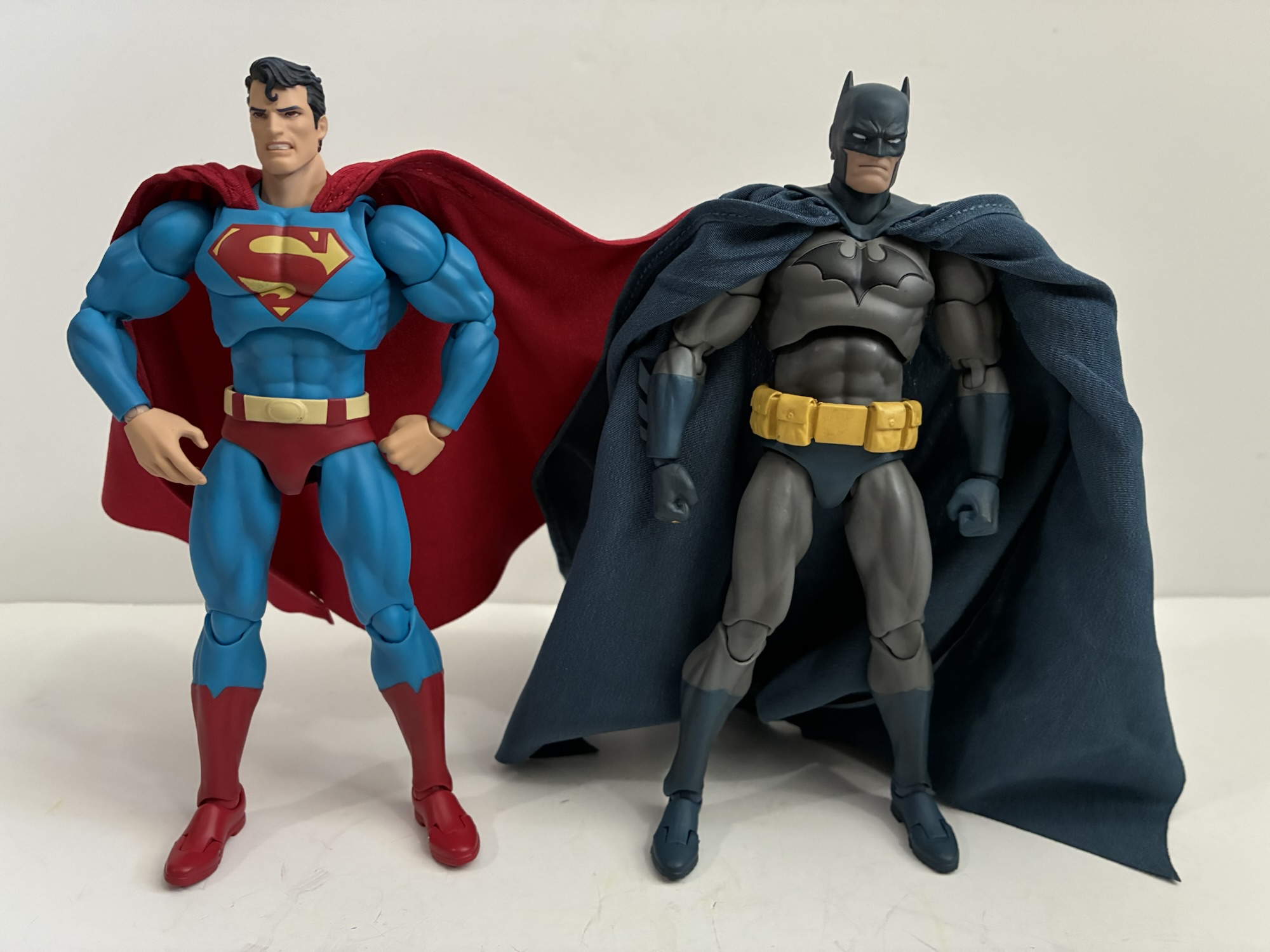
Medicom came much closer to the source art with Superman than it did Batman.
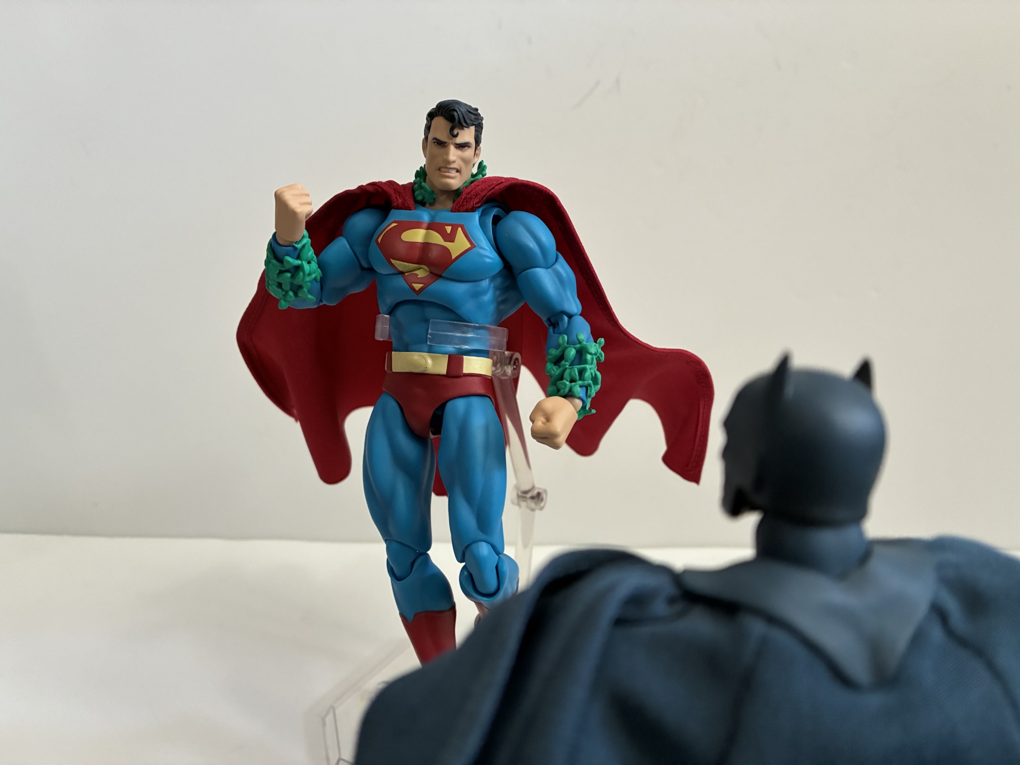
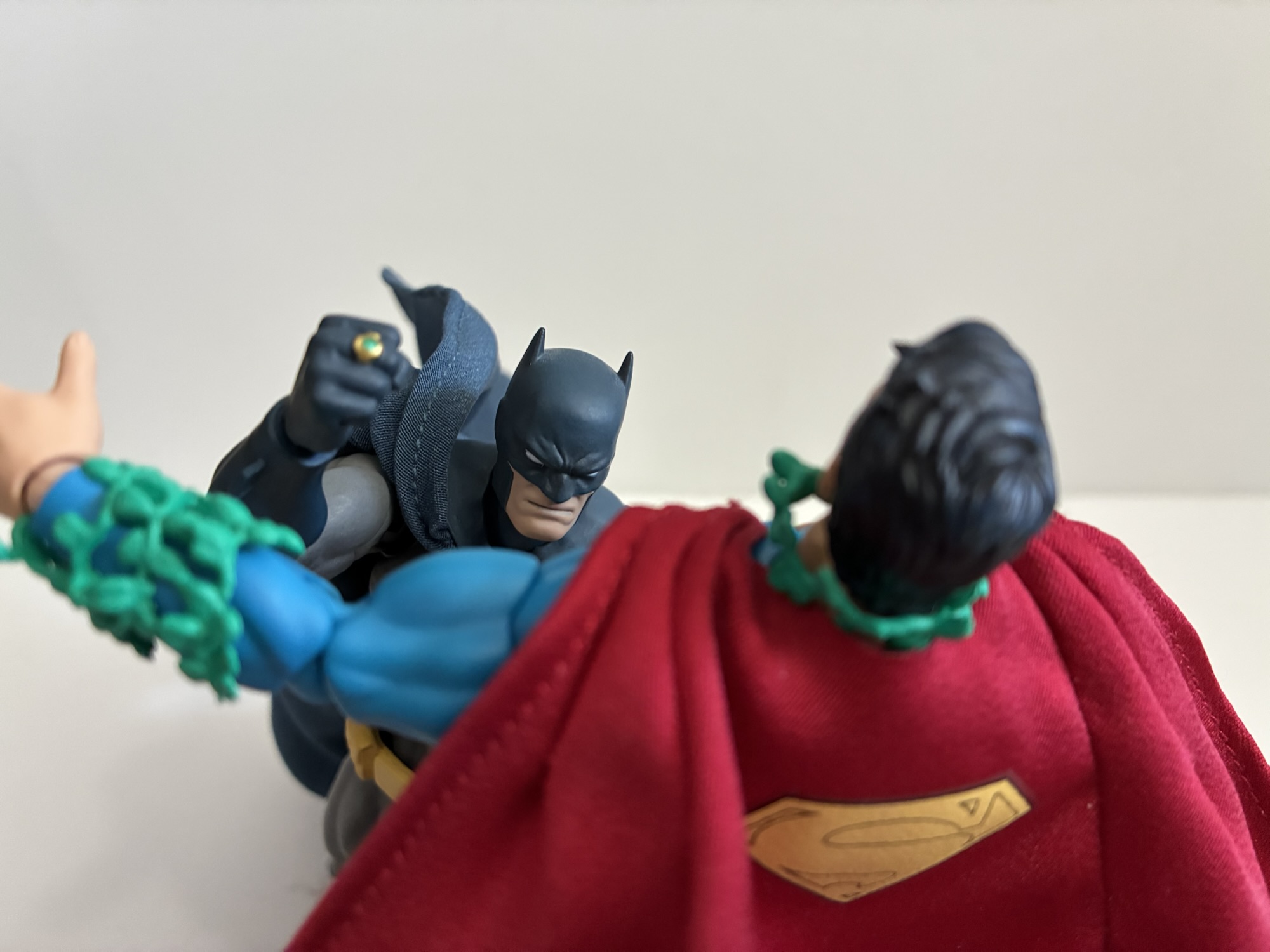
When Jim Lee took over the Batman books it seemed like the goal was to get his take on as many characters as possible as fast as possible. The Hush storyline included a ton from Batman’s rogues gallery and also managed to sneak in an appearance from the man of steel himself. In it, Superman gets possessed by Poison Ivy and Batman has to deal with him armed with his Kryptonite ring. The storyline was fine, but I did really dig Lee’s take on both Batman and Superman so an action figure based on his looks obviously appeals to me. It’s just that MAFEX releases are so expensive and I wasn’t blown away by Batman. I was able to resist the call of Superman despite how good the figure looked. Then it came back and I was able to do so again, and again, and again. Well, I don’t know what reissue we’re onto now, but I finally caved when yet another reissue went up for preorder early this year.
The sculpt is barely different from Batman, but executed so much better.
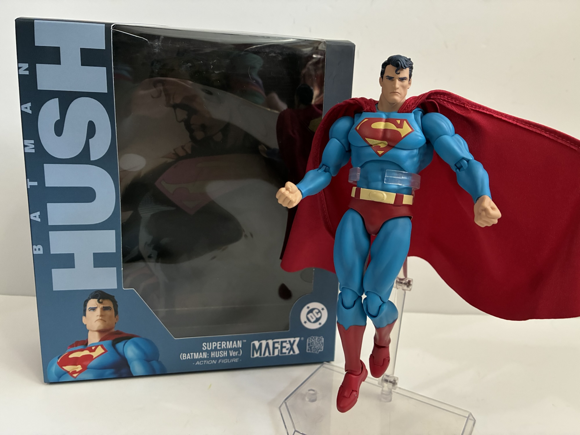
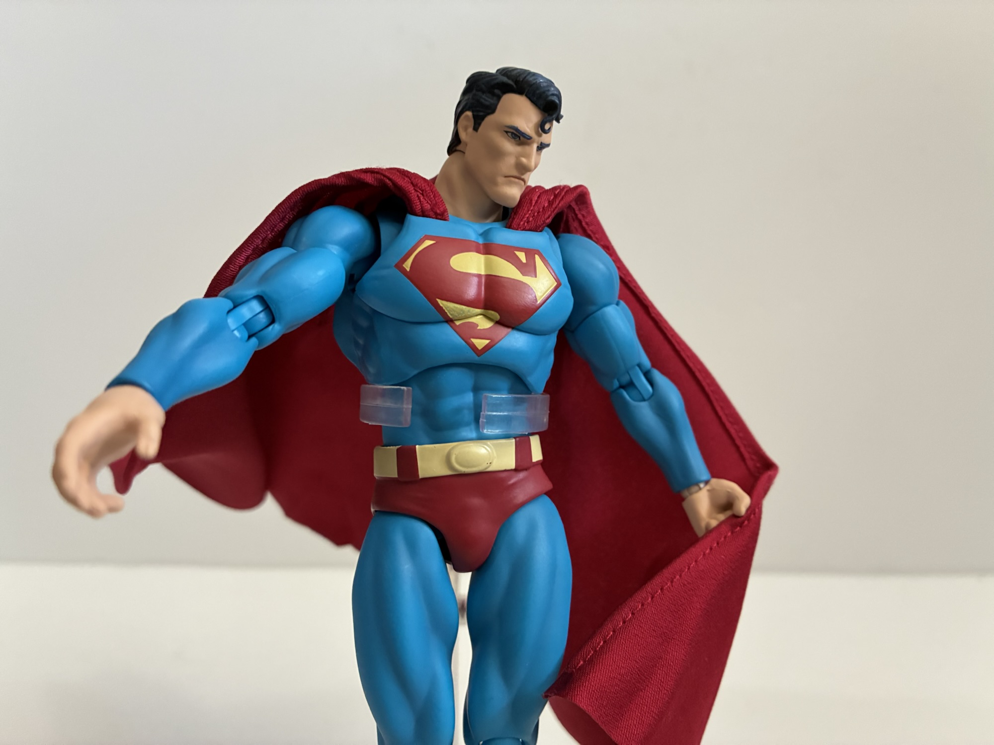
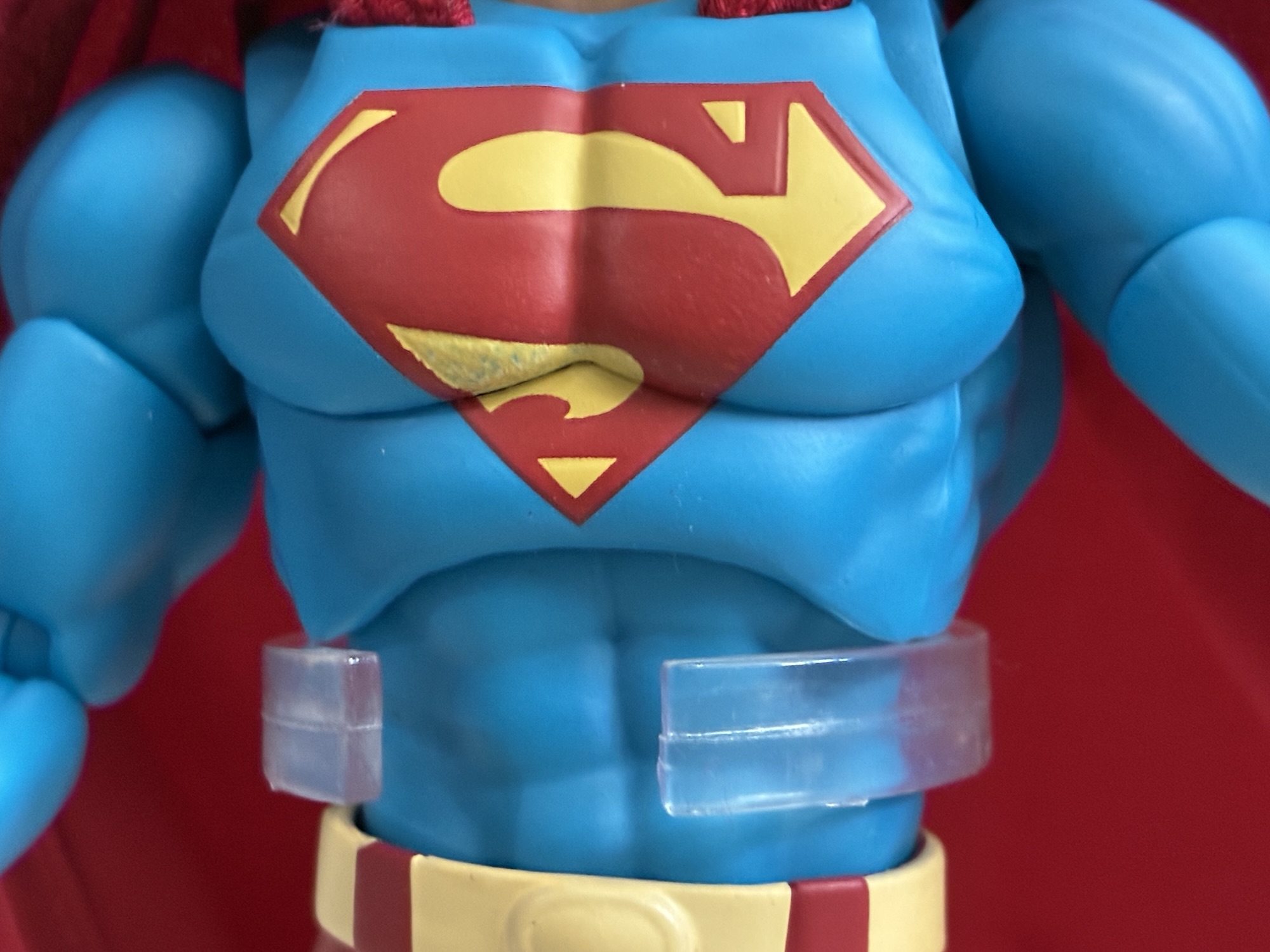
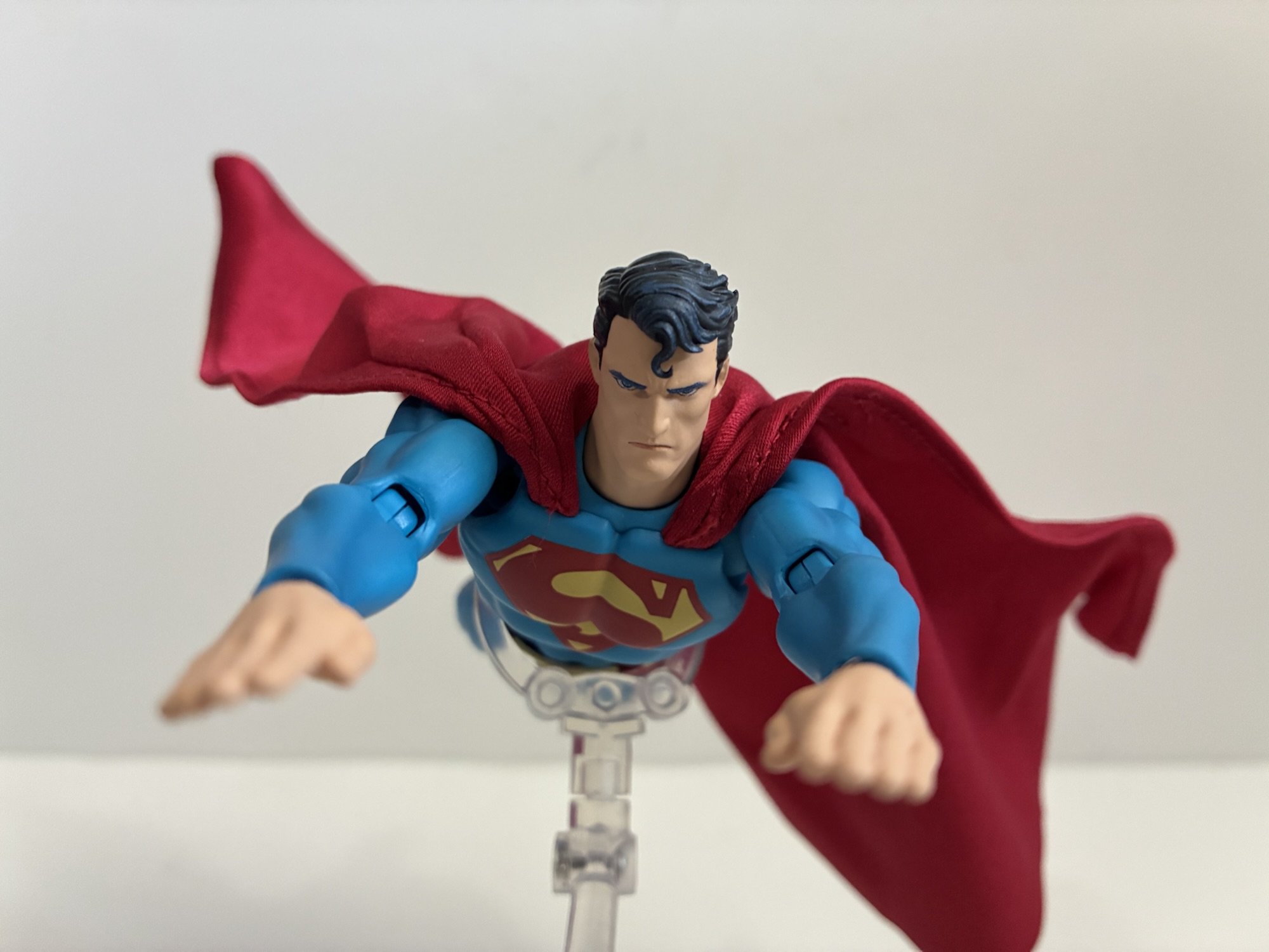
Superman has the typical Hush packaging and stands at approximately 6.375″ to the top of his head. He sports a very serious expression befitting his look in the book that borders on a scowl. The colors are slightly muted compared with a typical Superman. The red is just a little bit darker and the blue a little deeper. It’s most apparent on the yellow portions of the costume where the yellow is so pale it’s bordering on off-white. The hair is black but hit with blue highlights while the paint on this face is crisp and clean. The sculpt of the boot tops is present, but soft, giving them a painted-on appearance. The cape is soft goods and permanently affixed to the chest. The yellow shield is present on the rear of the cape and the printing is clean. The one blemish on my figure is on the right pectoral where the yellow in the “S” logo is scratched exposing some of the blue beneath. It’s a real unfortunate eyesore and in a tough place to touch-up with an equally tough shade of yellow to try to match to. I wish I had been able to see it before opening the box so I could have attempted an exchange, but he’s also sold out so it may not have done me any good.
The poor paint right in the middle of the chest is such a bummer.
In terms of sculpt, there’s actually quite a bit of reuse here when compared with Batman. It makes Superman an interesting case in how perception can be altered in subtle ways. I don’t like how skinny Batman is. Jim Lee’s take on the character is built like a tank, but his figure is most certainly not. Much of the arms and legs are shared with Superman with the only differences being the forearms to remove Batman’s “fins” and the boot tops which have a slightly different shape to them. Otherwise, the main difference is all in the chest. Superman has a much fuller, broader, chest which really adds to the aura the figure projects. The abdomen may even be the same as Batman’s, though Superman’s sculpt looks more defined so it could be different. The chest plus the smaller cape seems to be all it takes to make him look more imposing compared with Batman and his narrow chest and massive cape.
Most of the accessories are devoted to making Superman look like his possessed self from the book.
Accessories included with Superman are somewhat light. He has just the one alternate portrait which is red-eyed and angry as it represents him when he’s under Ivy’s control. To better sell the effect he also has some leaf garland to wrap around his neck and forearms which looks fine enough. Out of the box he comes equipped with fists, but he also has a set of flat palms, relaxed hands, open hands, and fists with a small gap between the thumbs and fingers that can hold the edge of his cape. There’s also a bonus right hand for Batman that’s a fist with the Kryptonite ring sculpted onto it. A solid inclusion, though it will only look right on the blue and gray Batman as opposed to the black and gray that followed it. Swapping the heads and hands is pretty painless so that’s a plus. Also included is the usual MAFEX stand which is always appreciated as it is a pretty good one. I just wish we got a smiling portrait or an effect one like laser eyes. I get why the Ivy parts are included, but I’ll honestly never use them.
He comes bundled with Batman’s Kryptonite ring fist to help give the caped crusader a fighting chance.
Articulation for Superman is the same as Batman. It’s a fairly robust list of articulation points: head, neck, shoulders, butterfly, bicep, elbow, wrist, diaphragm, waist, hips, thigh, knee, ankle, and toe. The head has pretty good range with its bent double ball peg approach. He can’t quite look all the way up using just the head and neck, but a little tweak of the diaphragm joint will accomplish that. The forward crunch will mostly come at the waist as the chest is a bit too bulky. There’s tilt there and very few restrictions to be found in the upper body. The hips are those pesky drop-down hips, but they’re smoother than the ones on Batman The thigh swivel works well and is completely hidden as all of the rotation happens at the ball joint. I don’t know why Bandai and Tamashii Nations can’t figure this out as they keep giving us those horrid things in their Dragon Ball line. The ankles don’t get much forward range, but going back works well and they even swivel. The ankle rocker works well and there’s the toe hinge if you like it. The only joint I have an issue with is the knee. It looks fine and the range is good, but when it’s bent all the way the kneecap pops out slightly from the thigh and gets stuck. I have to push it back in from the front before bending it back. I guess the lesson here is don’t bend the knee all the way, though it should work. The cape is also wired and it’s all in the sides. It’s a nice, light, material so it works just fine as intended and it’s not so big that it needed more wires throughout like Batman’s.
Best Superman ever? Probably.
I finally gave in and dropped $100 on a Superman figure and I would say he is mostly worth the wait. No, I’m not convinced any figure in this scale is truly work the ask of $100, but compared with Batman I would say I’m much happier with this Superman. He just looks fantastic and the articulation is more than sufficient to hit a lot of Superman-type poses. Truly, my only real complaint is with the paint as the scuffing on the chest of my figure is unacceptable at this price point. I probably could have received some compensation from Big Bad Toy Store for this, but I knew they didn’t have any stock left so I didn’t bother. It’s not their fault Medicom provided them a scuffed-up figure. The accessories could also be better or more robust at this price point. Removing cost from the equation and, yeah, this is a great Superman figure to own. Especially if it’s going to be the only Superman figure you own. And for me that’s almost certainly the case.
If this figure review interested you then maybe you’ll enjoy these:
You may have been wondering why I decided to devote an entry earlier this week to a nearly twenty year old action figure of mediocre quality, and if so, now you know why. I wanted to take a look at the DC Direct Batman based on his appearance in the Jeph Loeb written, Jim Lee…
James Gunn’s highly anticipated Superman has finally arrived in theaters. Is this the film Superman fans have been waiting for? The start of a mega franchise executives are hoping for? Or is it just a nice movie about a super guy and his super dog? Read on to find out!
When it comes to the world of more high end action figure collectibles, I’ve been able to get my hands on a few. Some rather prominent companies have yet to cross my path though, and it’s not really for any reason other than they either don’t make what I like or I don’t really like…
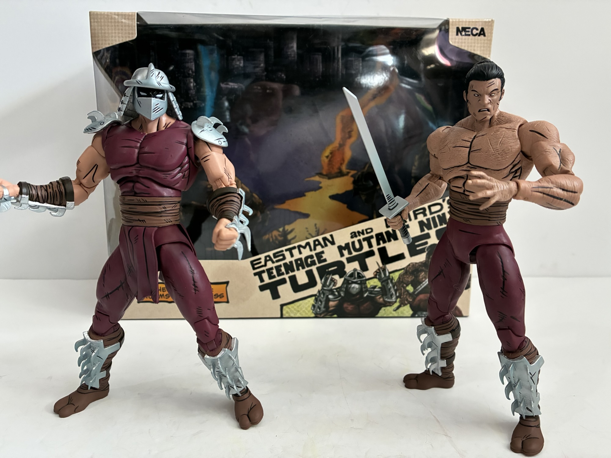
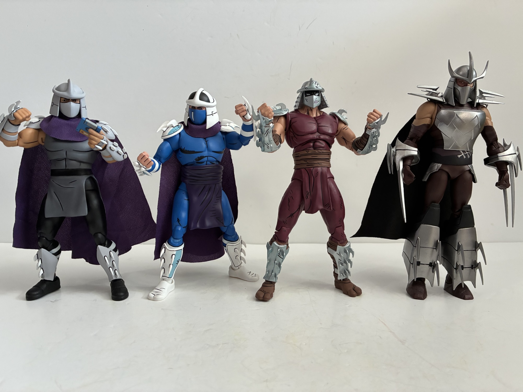
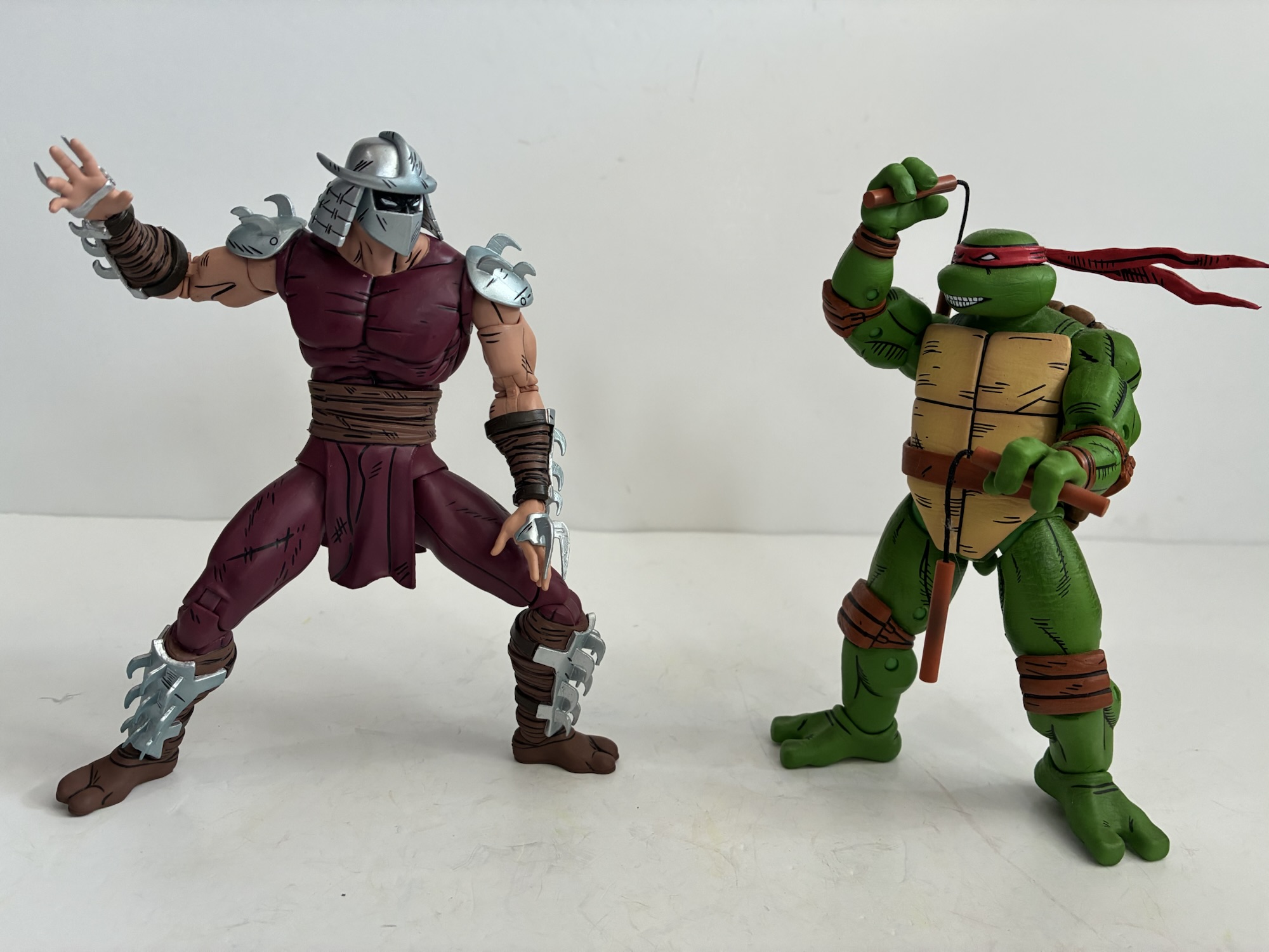
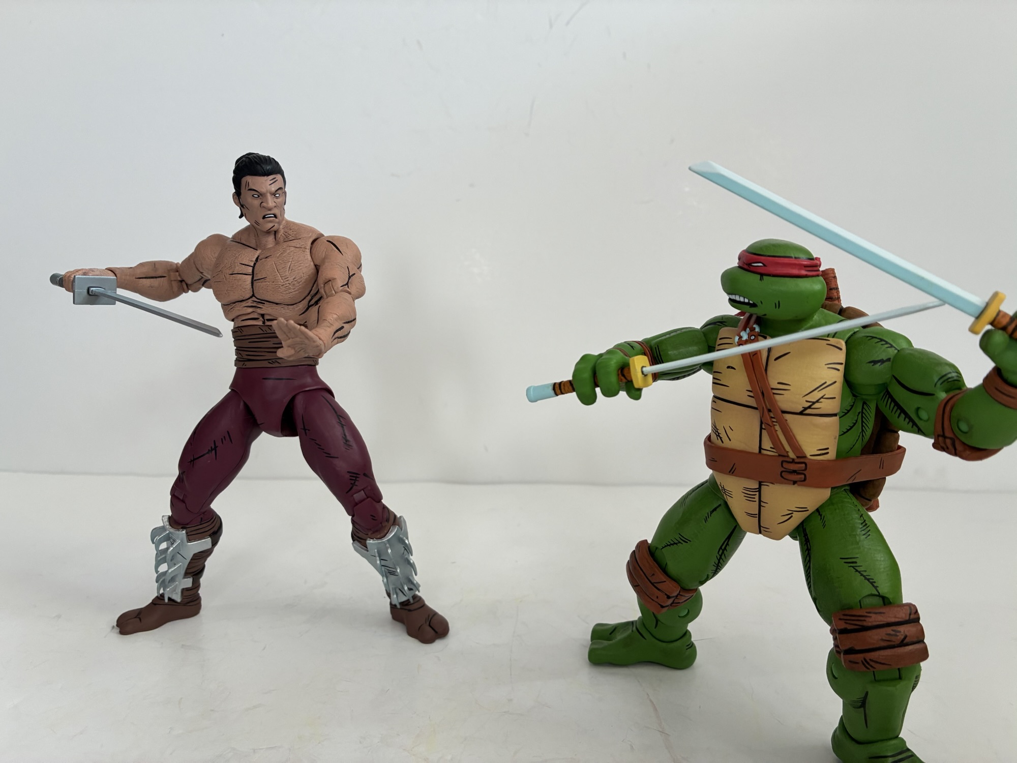
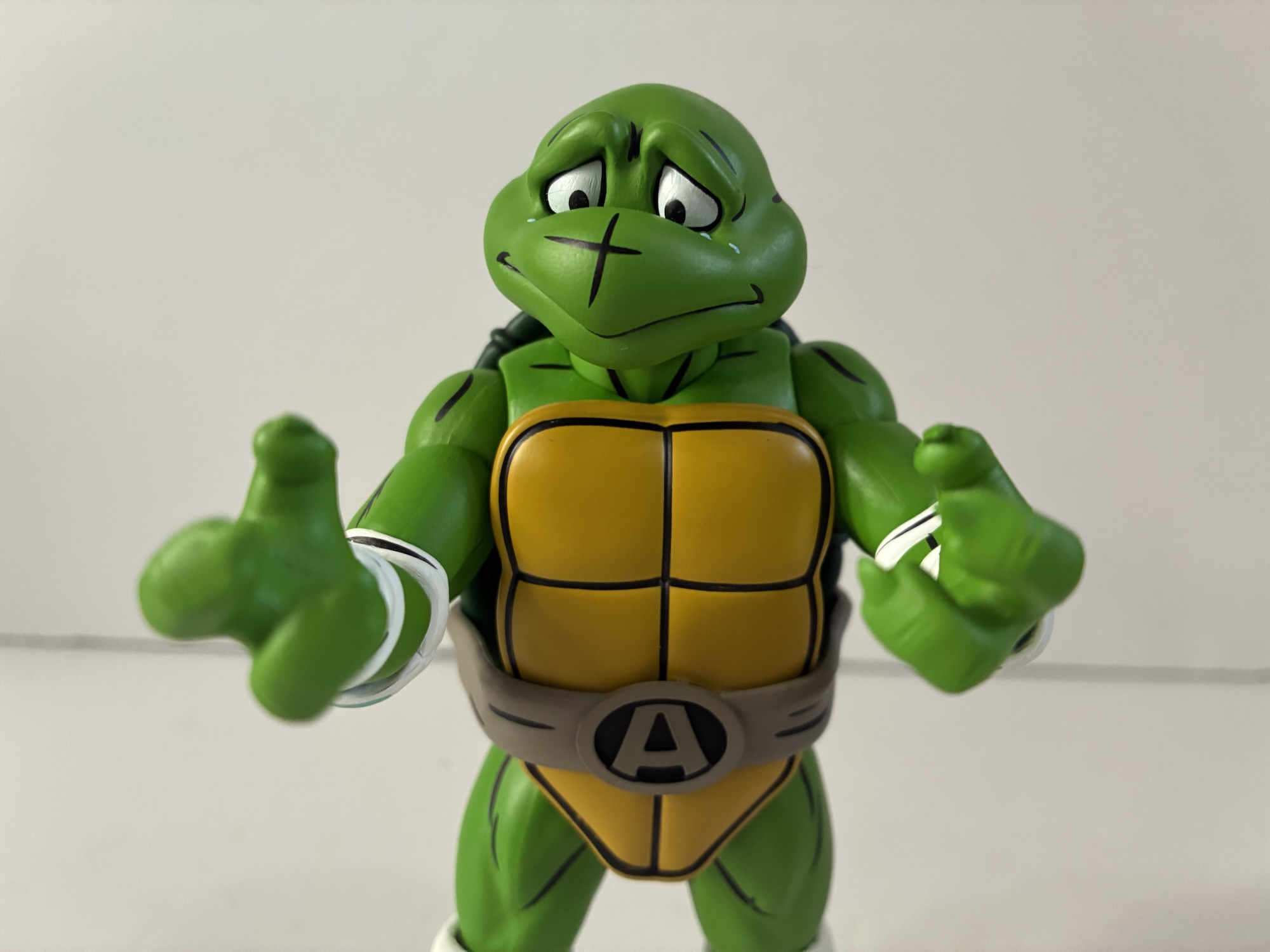
NECA’s dance with Teenage Mutant Ninja Turtles began way back in 2008 with a set of four turtles based on the first issue of the comic series. That set would then have other figures crafted around it of which most were cancelled, but when the license opened up and TMNT proved a hot seller they all found their way into the hands of collectors. A couple of years ago, NECA went back to the well and produced a new set of turtles based on their later look in the Mirage Studios run of comics based on the artwork of Jim Lawson. Those bigger, bulkier, turtles looked out of place with the old Shredder NECA produced based on his first appearance so it was all but assumed that an update would follow at some point. That update arrived in 2025 in the form of the Worms of Madness Shredder two-pack which was released at Walmart and also offered up to online retailers for the low, low, price of $60. More in some places. Despite my desire for a new Shredder based on his return appearance, I was not interested in this two-pack at that price. And that’s because the second figure in the set is basically a repaint of the initial one only shirtless and maskless so I played the waiting game. I knew it was only a matter of time before Walmart put this on clearance because they have a tendency to do just that, sometimes very quickly too. When the set was dropped to $30, I placed an online order and picked it up from my local store later that day. Mission accomplished!
2025 was really the Year of Shredder for NECA, and this isn’t even all of them!He’s going to fit in well with your Lawson turtles.
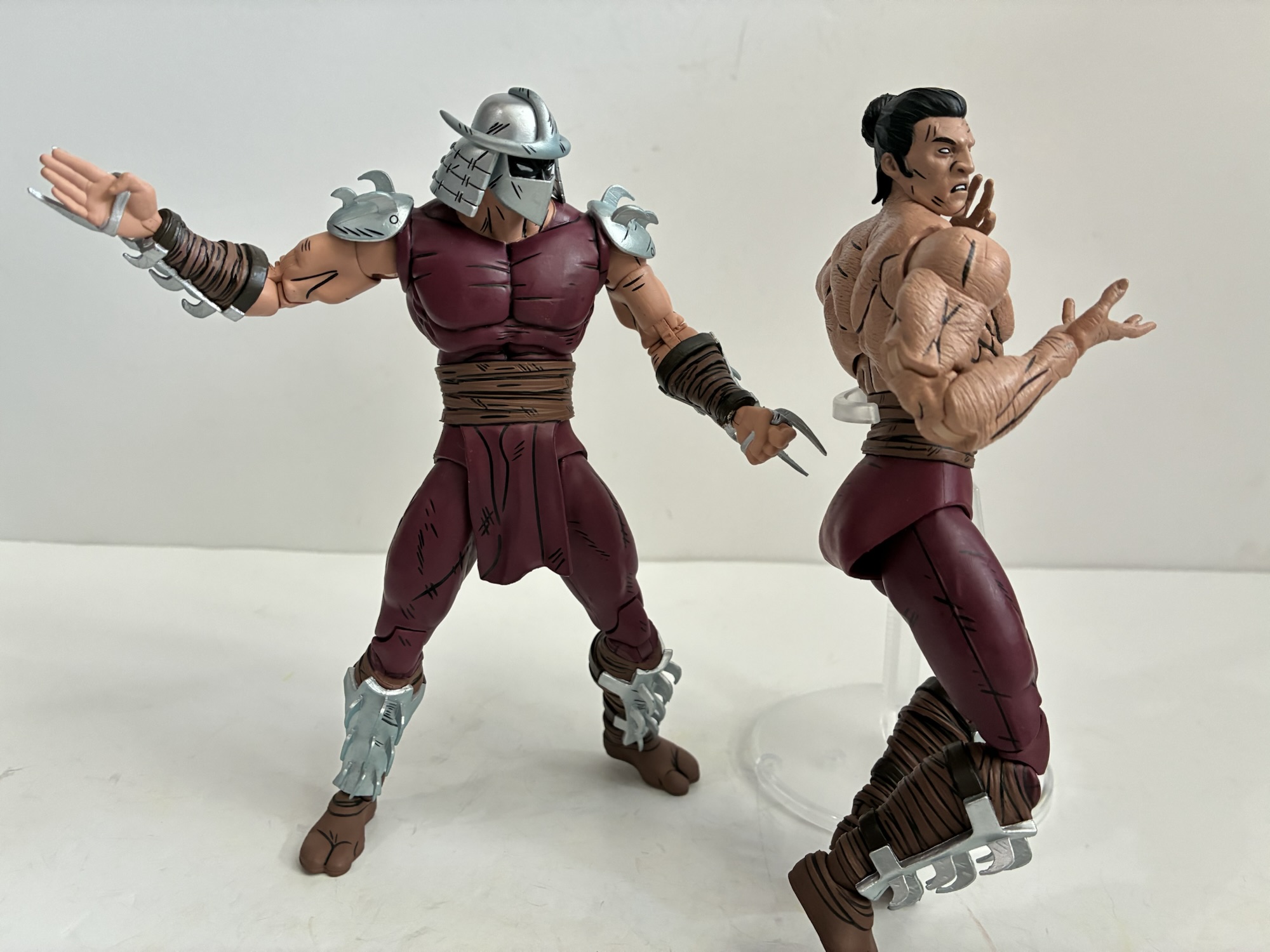
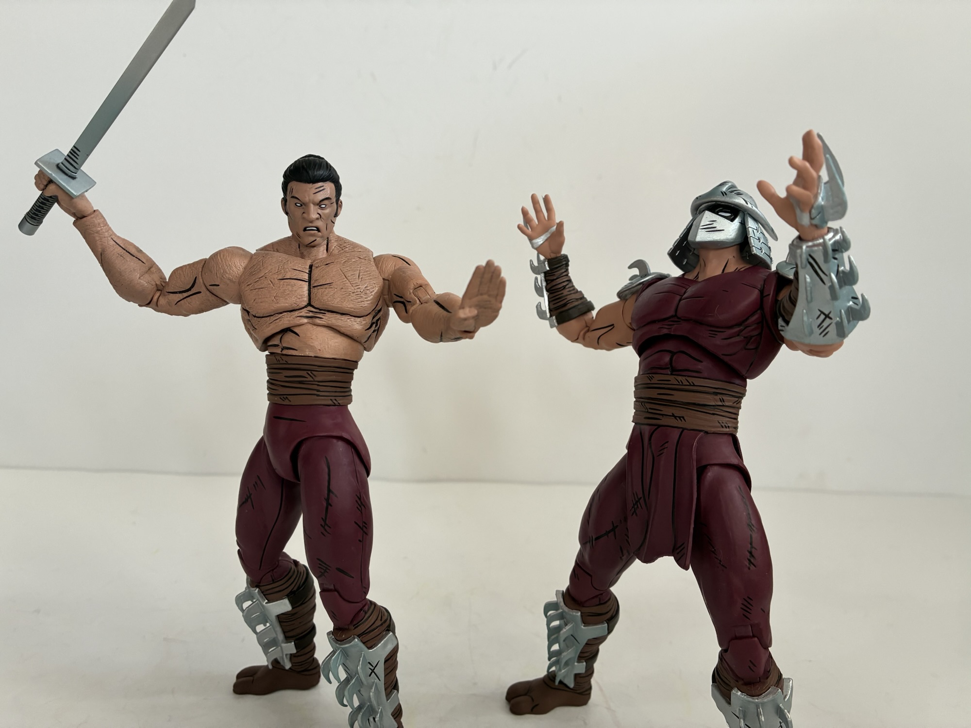
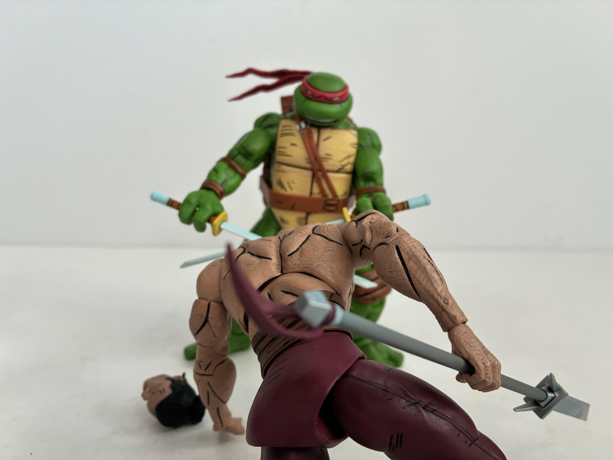
This set probably looks weird to someone not familiar with the Mirage run of comics and the name Worms of Madness isn’t helping. What most TMNT fans are likely aware of is that the Shredder was never intended to be some evergreen opponent for the turtles. Truly, I don’t think co-creators Kevin Eastman and Peter Laird ever expected to do multiple issue of what was ostensibly a gag comic which is probably why the Shredder was killed-off in that inaugural issue. When the franchise made the leap to children’s television and the toy aisle, the desire for a standard rival was created and the Shredder was the best fit. Perhaps Eastman and Laird felt the same for they laid the genesis for Shredder’s return in the Leonardo one-shot published in 1986. Considering that Shredder was literally blown up, it was going to be a hard sell to the reader for him to be alive all of a sudden. Enter the worms! I don’t know if I ever quite understood where these things came from, but essentially the Foot mystics had access to some special worm that could take on the form of whatever it ate. They basically gathered up whatever remained of the original Shredder, fed it to some worms, and from that we got a new Shredder (as well as the malformed clones NECA has already immortalized in plastic). The only truly relevant thing to know here is that when Shredder was brought back he took on a different look that was more reflective of the evolving art style in the books. He was taller, broader, and all together just more imposing to look at. This is a Shredder that will fit in with your Lawson turtles, and considering that NECA never reissued those first appearance turtles, this is likely the Shredder most will want in their collection over what has been made available up to now which makes this two-pack all the more frustrating since the other figure may not be something most people want.
He’s imposing.Shredder clones – assemble!
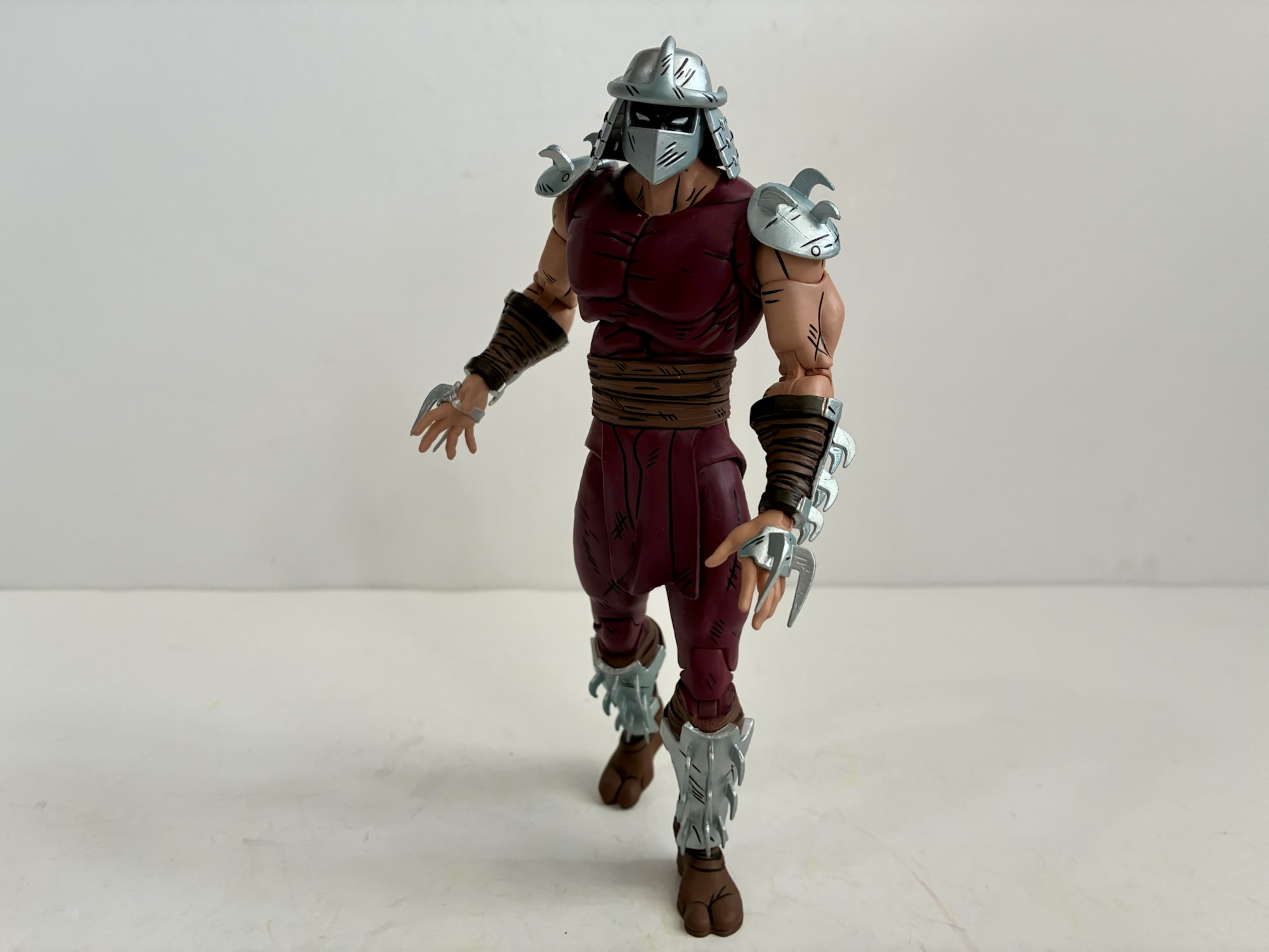
Shredder stands at a full 7″ and is another sculpt by Gurjeet Singh who previously sculpted the Foot Elite Assassin. The two are very similar stylistically and I would have expected them to share parts, but that doesn’t appear to be the case. Yes, they likely share some as the musculature of the abs on both is pretty much the same, but the sash is different. Shredder is also pin-less at the knees and elbows so while the arms appear to be more or less the same, some updates had to be made for Shredder in order for him to be pin-less. That must have been a driver for NECA with this figure as they probably could have just reused the arms, legs, and maybe even the chest and called it a day, but opted not to. Shredder is mostly clad in a skin-tight, dark red outfit that has a vague hint of purple to it. It’s more purple than the Elite and the browns on the sash, boots, and gauntlets are a more Earthy brown than the Elite. The metal portions are all a shiny silver with an ever so slight hint of blue. There’s also some sculpted distress details like this is a guy who has seen his share of battles. The black linework is frequent throughout and I continue to love the completely black-out flesh beneath the helm as that’s how the character was colored in the comics. He’s long of leg with a slightly undersized head which really conveys that comic look. This is definitely a more intimidating Shredder and I’m content with the looks of it.
Back dat ass up!
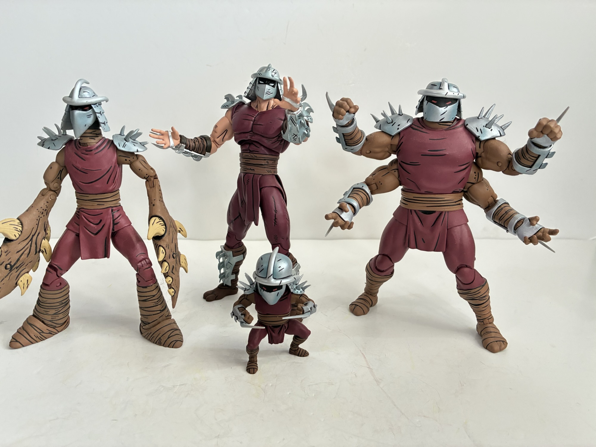
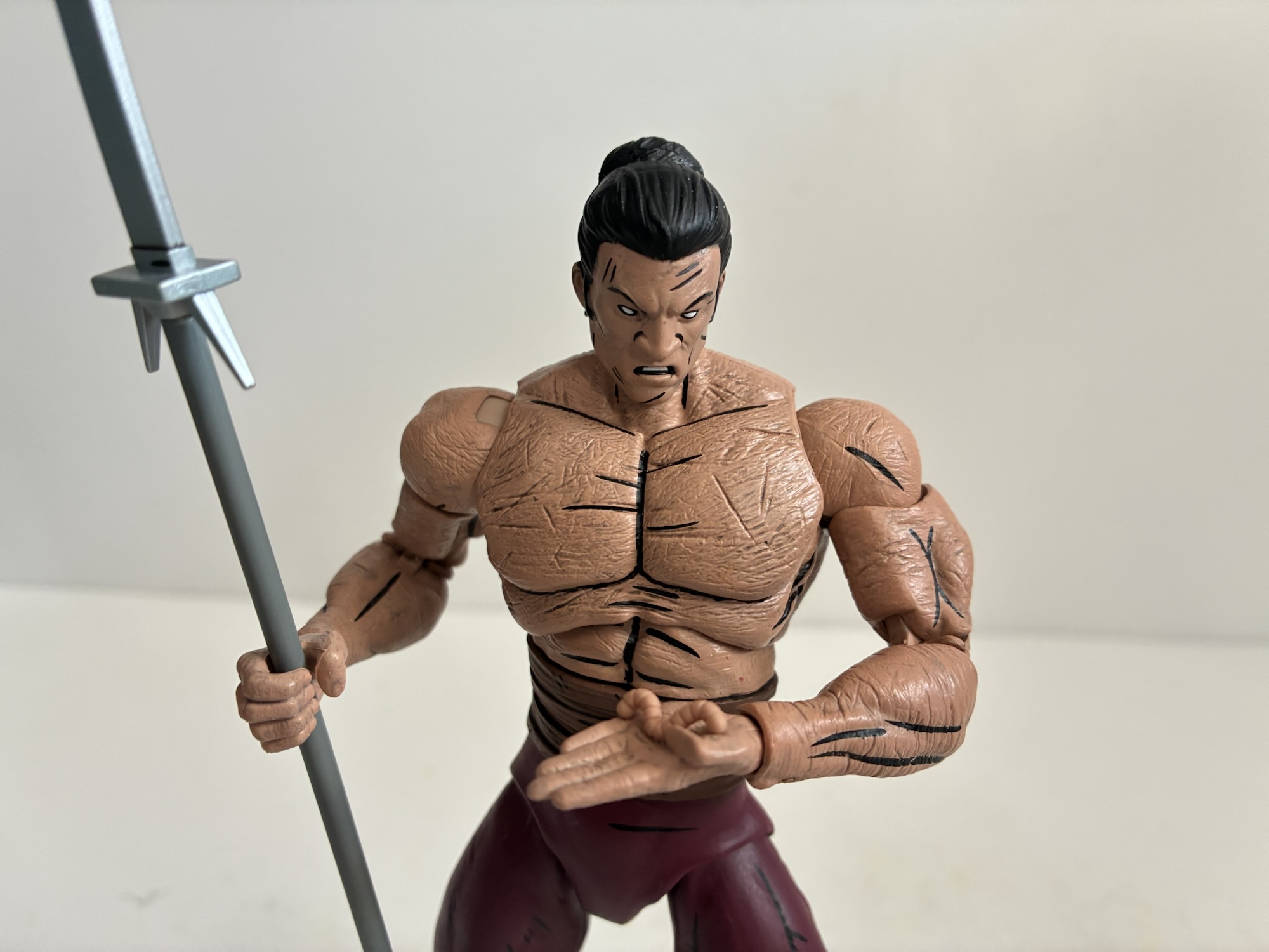
For accessories, Shredder has multiple sets of hands: fists, gripping, chop, and open. For weapons, he has a pair of swords that you’ve probably seen before as well as the smaller version of the bladed polearm (I think this came with Karai too). There’s also a tiny worm since you can’t have a Worms of Madness set without the worm. And then there’s the other Shredder. He’s his own figure, but in a way feels like an accessory. In the books, the turtles tangle with Shredder and eventually he removes his shirt and all of the armor on his head and arms to reveal his weird, wormy, body. It’s basically just a textured body with lots of lines carved into it. I’m thinking maybe to mimic the look of an earth worm? I don’t know, but for the figure you get a duplicate sculpt with different forearms to remove the wraps and armor. There are lots of subtle grooves in the torso with a paint wash applied to bring them out. I don’t know enough about toy making to know if this necessitated new molds or if this distress could be added to the sculpt without cutting into steel. The head is certainly new as it’s an unmasked Oroku Saki and it looks fine with clean paints. He does lose part of his sash, the bit that hangs over the crotch and rear, which exposes the odd sculpt of the bum area. Shredder has a big, droopy, butt that has a lot of area around the thigh hollowed out presumably to allow for more movement forward and back. It looks fine on the regular Shredder since he has a way to hide it, on the second figure it’s just out in the open and kind of funny looking. I guess be mindful of how you leave him on the shelf, unless you want to accentuate the buttocks then by all means do so. This figure also has the same assortment of optional hands as the other Shredder.
Worm.This diaphragm joint is no substitute for a proper waist joint.
Since we’re dealing with two identical figures from a structural standpoint, the articulation is going to be the same across both. We get: double ball head, shoulders, biceps, elbows, wrists, diaphragm, hips, knees, and ankles. To my surprise, there is no glove or boot cut like we’ve seen with toon versions of the character from NECA. There’s also no vertical hinge for the gripping hands, something I’ve basically come to expect with NECA as much as it irritates me. As previously mentioned, the elbows and knees are pin-less and work just fine. Range at the head is acceptable while the standard Shredder has the shoulder pauldrons which interfere with the shoulders. I don’t know why they don’t either pin them to the shoulder itself or use a loop through the shoulder peg. The diaphragm joint gets a little forward and back and rotates easily, but there’s no waist cut. I don’t know why NECA has been omitting waist articulation of late with its Shredders, but I don’t like it. Hide a ball-joint behind that sash and let us get this figure into more natural poses. The diaphragm joint isn’t a great substitute because the figure looks ridiculous if turned more than 45 degrees. He does get decent range at the hips though I find the ankles to be a bit tough to work with. The left bicep on my Shredder is also binding and not rotating. The right arm is fine as are both on the Saki figure. I’m not sure if heating it would do much good as that could make shearing it off easier. It’s at least the only trouble spot between the two figures as nothing is too tight or too loose. It’s still pretty basic articulation by today’s standards so don’t expect import-level posing or even Marvel Legends caliber. For this line, it’s mostly as one would expect.
Is this the update people were hoping for out of NECA where Shredder is concerned? I think so as it looks the part based on his appearance in the comic and he definitely looks like he can hang with the updated turtles. Did anyone want to pay $60+ to get this and the shirtless variant? That is probably less of a slam dunk. I know personally I did not want this other figure. At all. I assume NECA added it to the mix to basically make a cheap (for them) two-pack since it’s two figures using essentially the same tooling. It’s too bad they didn’t pair him with the Foot Elite instead. And I say $60, but a lot of places have this set at $70 which is an even worse deal. I do have to wonder if NECA had gone with a swap-able torso instead could they have convinced more people to pay $50 for the release than what they sold at the two-pack price? Would it really make a difference compared with the actual costs? I can’t answer that, but I feel like there was an opportunity to up the perceived value of the package, but maybe dropping half a figure from the set isn’t as big a cost savings as I would imagine. All I know is that their basic, single pack figure is $35-$42 depending on where you get it. I wouldn’t pay that for the extra figure in this set so I needed to wait for it to be essentially free to feel comfortable buying this one. And I was fortunate that I ended up getting Shredder for even less than that. If you think this figure looks neat and can get it for the same price then I think it’s an easy recommend. As a two-pack with mostly ho-hum accessories, it’s a much harder sell. You have to really want shirtless, wormy, Shredder and place considerable value on him to make it worth your while. Maybe if they had included something fun with the set, like a wormy stump for his neck, that could have made a difference. Instead, I could never shake the perception that this set was a money grab and we were being forced to pay extra just to get the new Shredder we wanted, but sometimes that’s how the toy industry works.
Leonardo always wins.
If you enjoyed this look at Shredder then here are some Shredder-adjacent reviews you may find informative:
NECA has gradually built out the ranks for Shredder’s Foot Clan via its line of action figures based on the pages of Teenage Mutant Ninja Turtles as published by Mirage Studios. The clan got started way back in 2016 with a box set released in conjunction with New York Comic Con. That set featured Shredder,…
NECA and Target’s Haulathon event which has seen a vast assortment of product dumped onto shelves recently was not content to limit the products to just the cartoon Teenage Mutant Ninja Turtles. Far from it, as an assortment of comic book based characters were also released and today we’re going to look at the first…
When it comes to the popularity of Teenage Mutant Ninja Turtles a lot of the credit goes to Playmates Toys. Kevin Eastman and Peter Laird created the characters born out of a joke. Credit them for having the vision to think this joke had appeal beyond their small circle as they self-published Teenage Mutant Ninja…
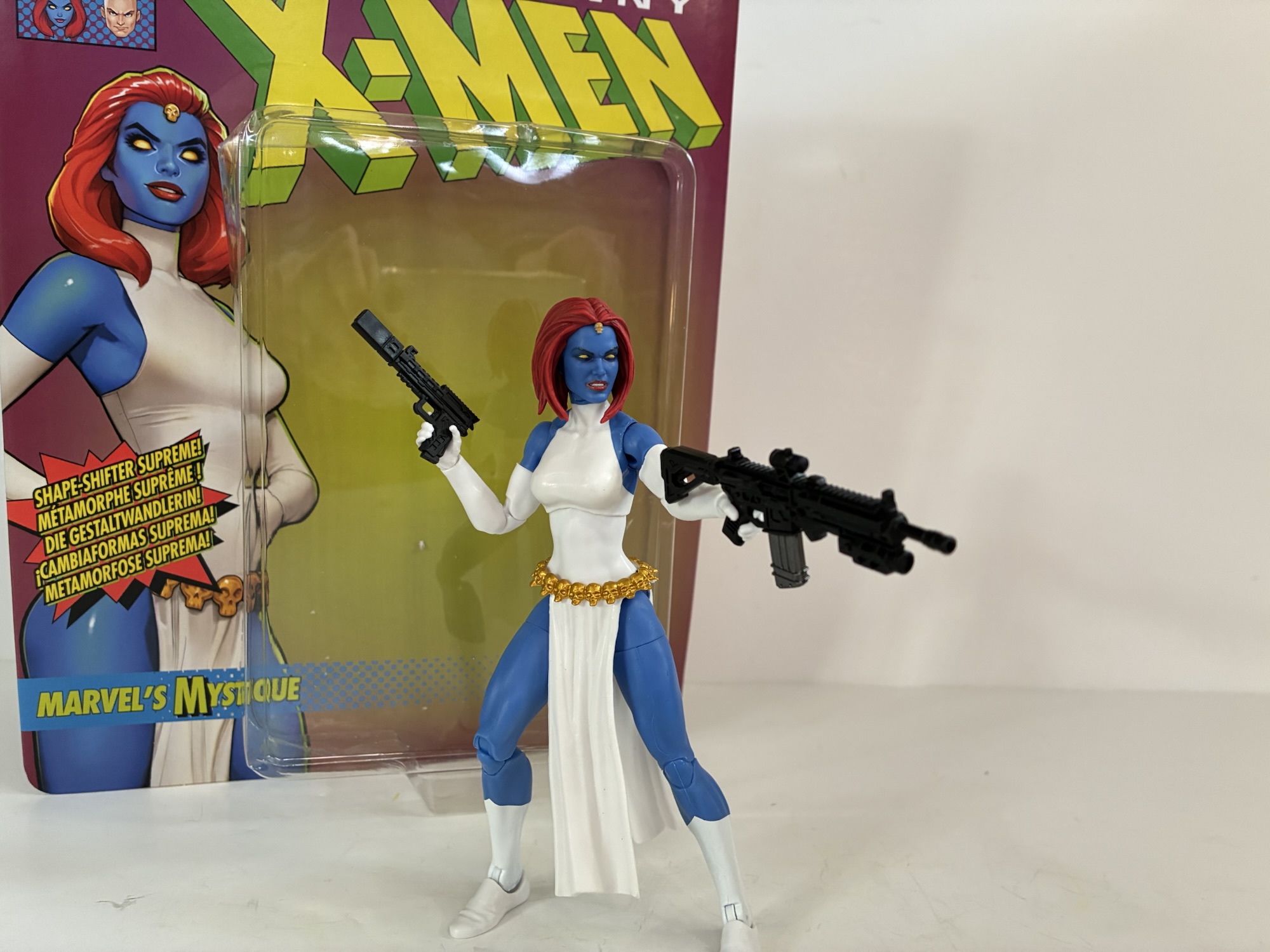
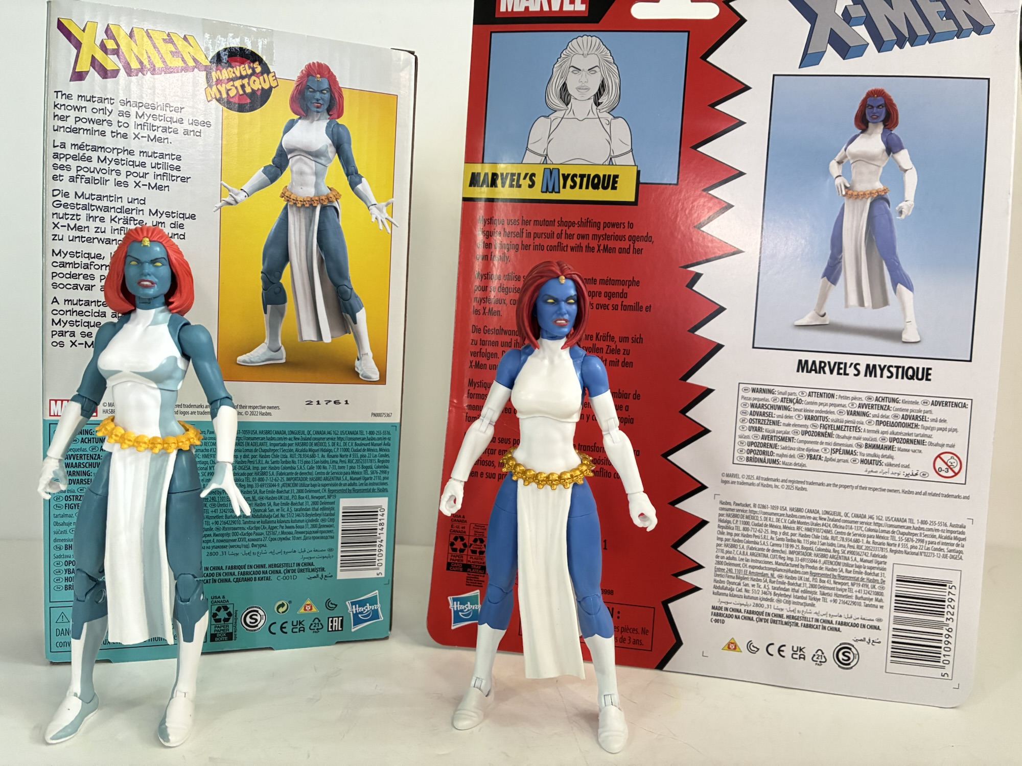
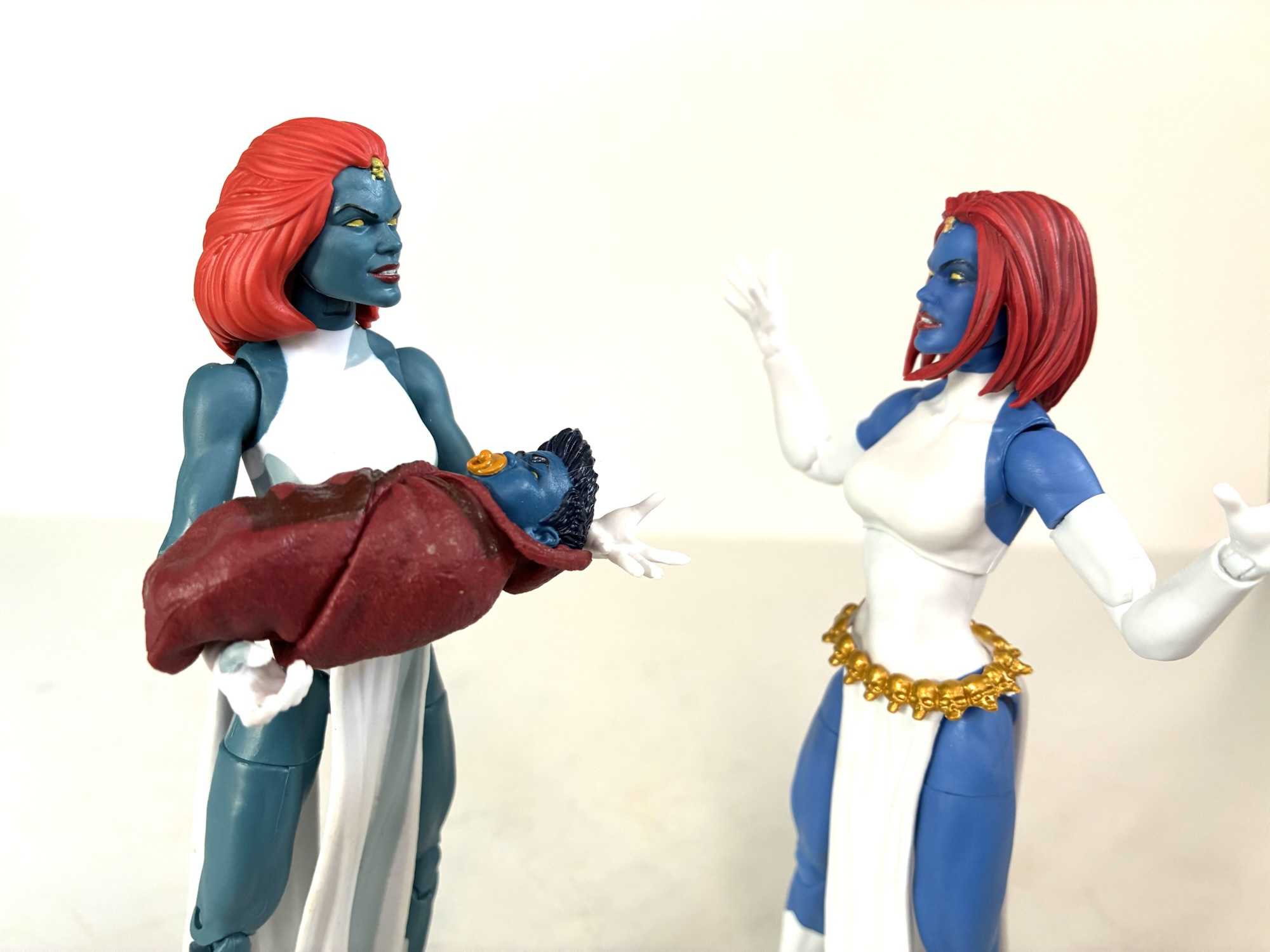
This should be a relatively quick review because today we’re looking at what I was hoping would be an upgrade over a prior release. Mystique was one of 8 characters released in the Marvel Legends X-Men – The Animated Series subline and she was just one of two villains for the line (3 if you count Evil Morph). She was an interesting pick for the line, but in thinking over the major villains in the show, not unworthy. It was just a surprise to see her take a slot over someone like Magneto (Apocalypse was released on a retro card in cartoon colors as a sort of companion figure to the line) who is is thought of as the main rival to the heroes. Mystique did make numerous appearances and she had her hand in some stories, though she did mostly fall by the wayside post Season Two with the exception of the Nightcrawler return episode. All that is to say I had no problem with the character selection, but I did have a problem with the figure.
At least her blue matches Kurt’s now.They just can’t seem to get her right.
Things got off to a bad start for Mystique when Hasbro advertised her using a render that was not accurate to the figure. There was a mix-up somewhere and the digital artist basically used the wrong base body for the render making collectors think they were getting a true upgrade on an old release. They did not. Instead we got the same old figure on the tubular body with a new, animated series inspired head. It had all of the problems of a lot of the female figures of the era where the knees basically bowed and the figure was limited with its posing. Now, we have a new Mystique and this time she’s exclusive to Target. The previous comic book version of the character was a Walgreens exclusive, if I’m not mistaken, so some fans had a hard time tracking her down. This time figures to be easier as she appears to be getting stocked in ample supply. It was my hope to bring one of these home and do a head swap, but once I got home I realized I had an issue.
Damnit…It’s an improvement, but worth full price?
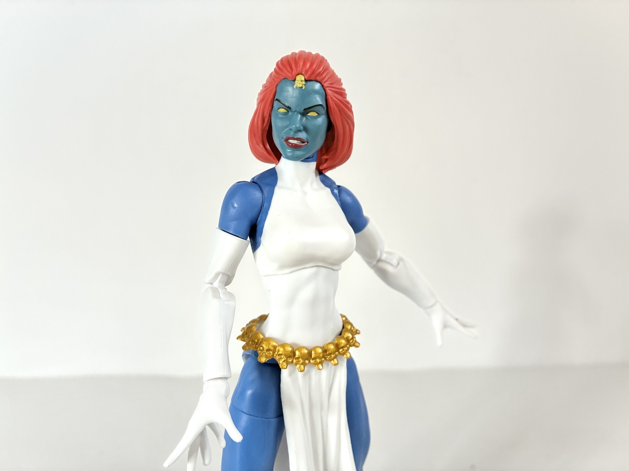
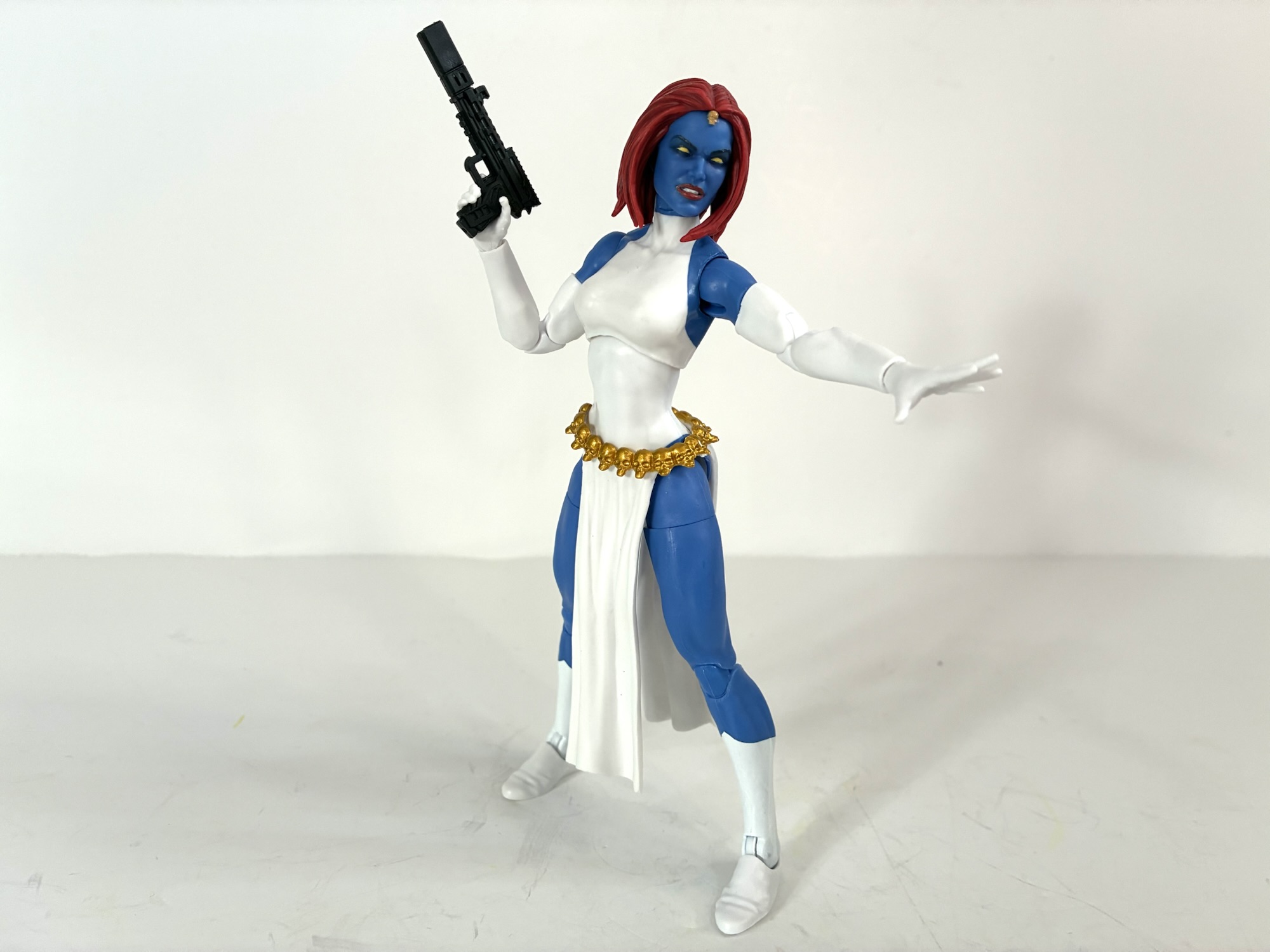
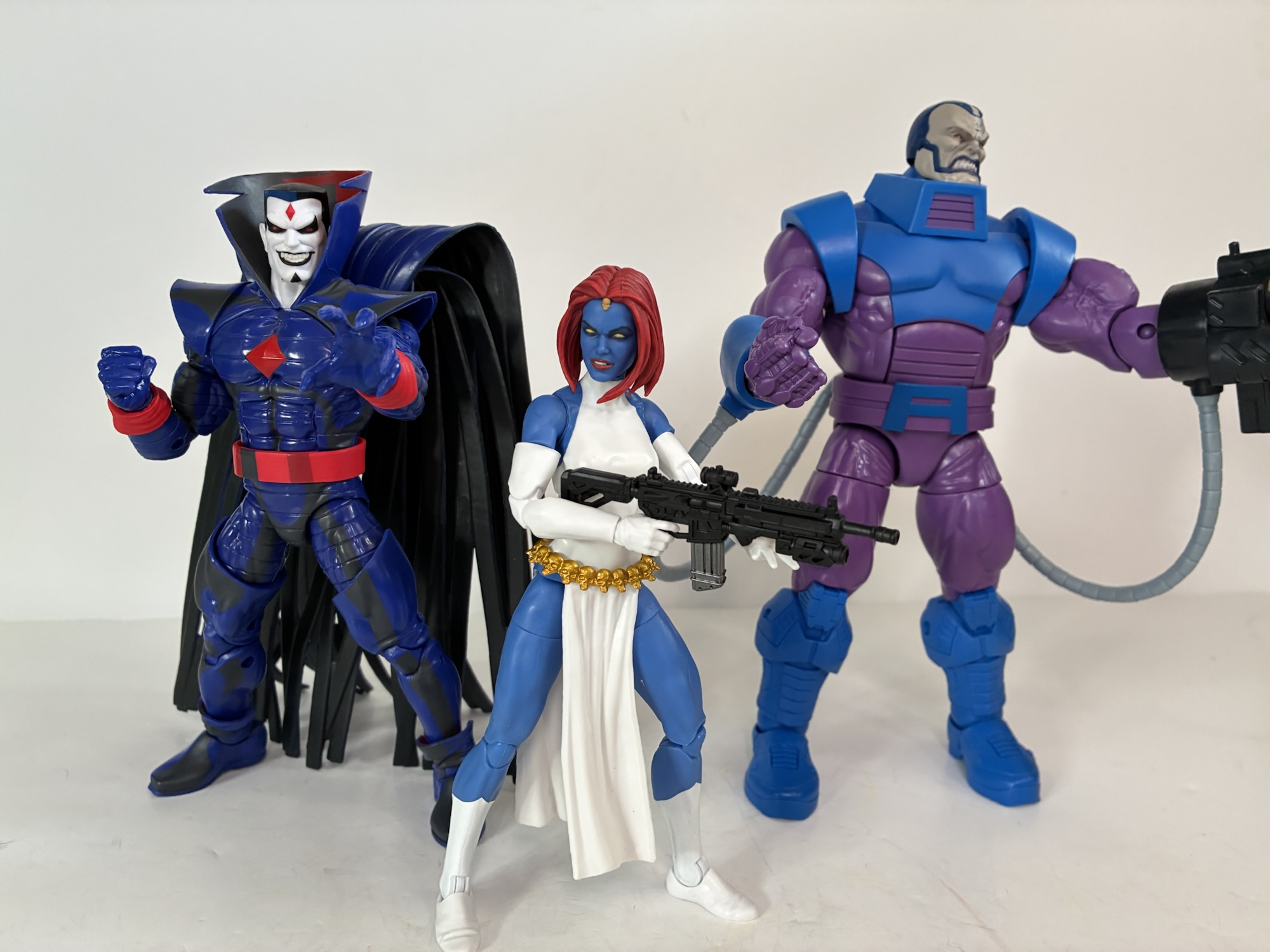
One of these things is not like the other. The cartoon version of Mystique had a grayish, blue-green skin tone while this comic book one is more of a royal blue. Oops. Still, maybe it’s an upgrade since this is on a newer body. Kind of. The arms are double-jointed now and the legs pin-less, but the torso appears to be the same with its narrow proportions. Mystique isn’t built like She-Hulk or anything, but I feel like she needs bigger shoulders. The original render is perfect in that her shoulders sit higher, or maybe the angle is just better. A lot of Legends females end up being too slight for my taste. They have the opposite issues of the men where head-on their proportions look fine, but from the side they’re lacking in bulk. Mystique has plenty of curves from a side view, but not the front. Anyway, she has sleeves up past her elbows and her boots are different so the costume isn’t exactly the same either, but it’s close enough that it wouldn’t have bothered me if the skins matched. They did a really odd thing where they painted some blue onto the butt area of the torso. Apparently someone took one look at this figure and decided she wasn’t showing enough ass and demanded a little stripe of blue be added. The same skull belt with skirt is still being utilized only now there’s a gold finish to the skulls which looks nice. The face appears to be the same, but the hair is entirely different. It’s a very late 90s look, almost like a Rachel haircut, and it’s okay. Funny enough, the back of the box once again has an incorrect render. There she has the animated portrait and the torso might even be different as there’s a sculpted belly button. Once again, we’re sold a Mystique that looks better on the box than in-hand.
What am I supposed to do with this?“Whoa! You’re not getting me to take that!”
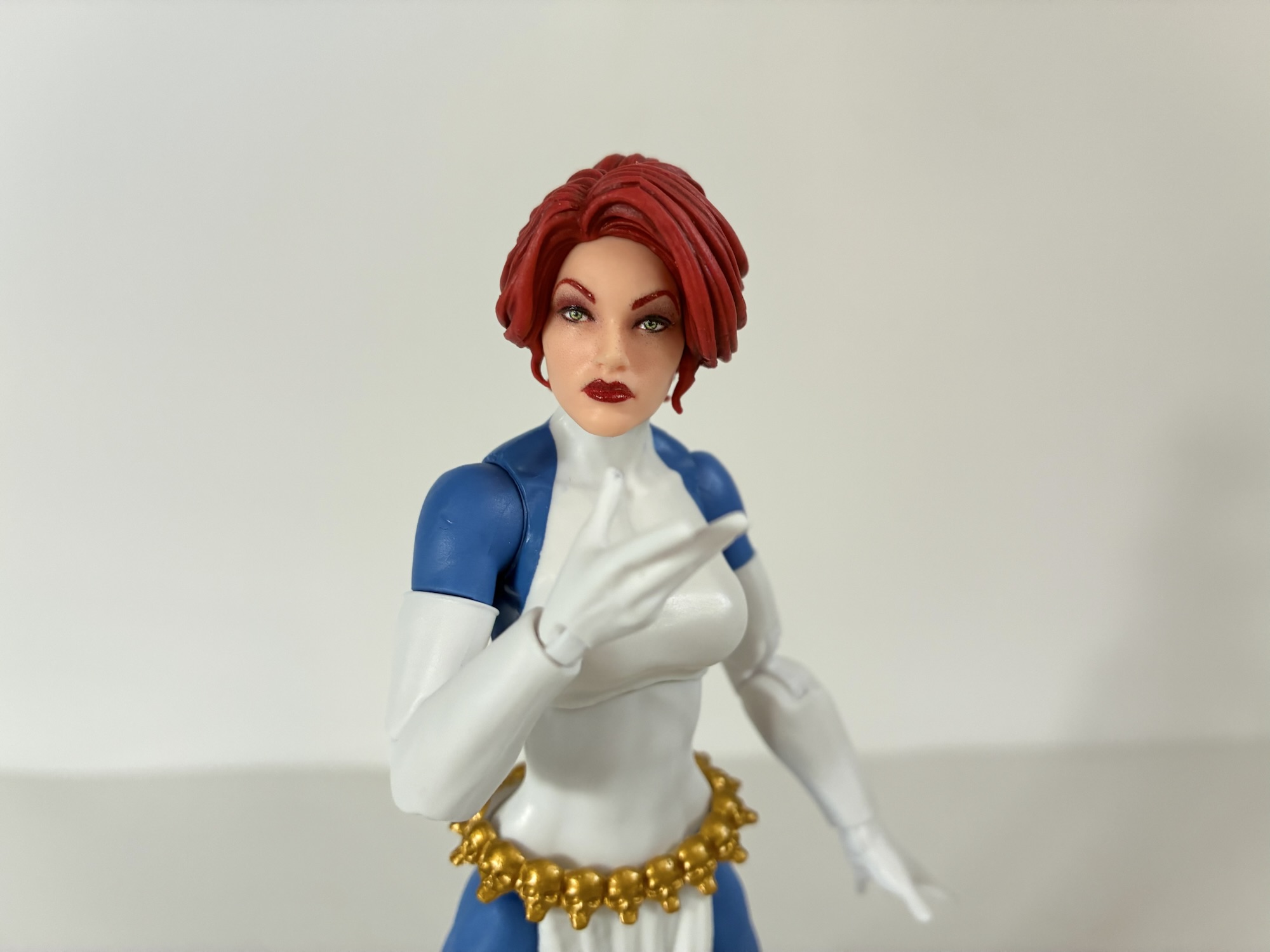
The double-jointed elbows are a marked improvement over the prior figure, but they don’t offer much more in a practical sense. With no butterfly joint and an ample bosom to deal with, she just doesn’t get really any clearance across her chest which would have been nice since she has a pair of firearms to utilize. They are new to me, but I’d guess they’ve been released before, and include a pistol and an assault rifle. They’re done in black plastic and seem fine while she also has a set of trigger finger hands and a set of open hands. She also has a very odd accessory in the form of Jean Grey as the Black Queen’s head. I think this was something that was locked away in a convention exclusive before or something, but I don’t like it. There’s nothing wrong with the head itself, but I’d much prefer another Mystique portrait. And you could say “Well, she’s a shapeshifter,” but what good is one head that’s a completely different color from the rest of her body? Yeah, I had fun with my Morph Toy Biz figure back in ’94 too, but that sort of gimmick does nothing for me now. If there was a surplus of White Queen figures out there then maybe I’d be tempted to buy one and paint it up, but as it stands this is just wasted plastic.
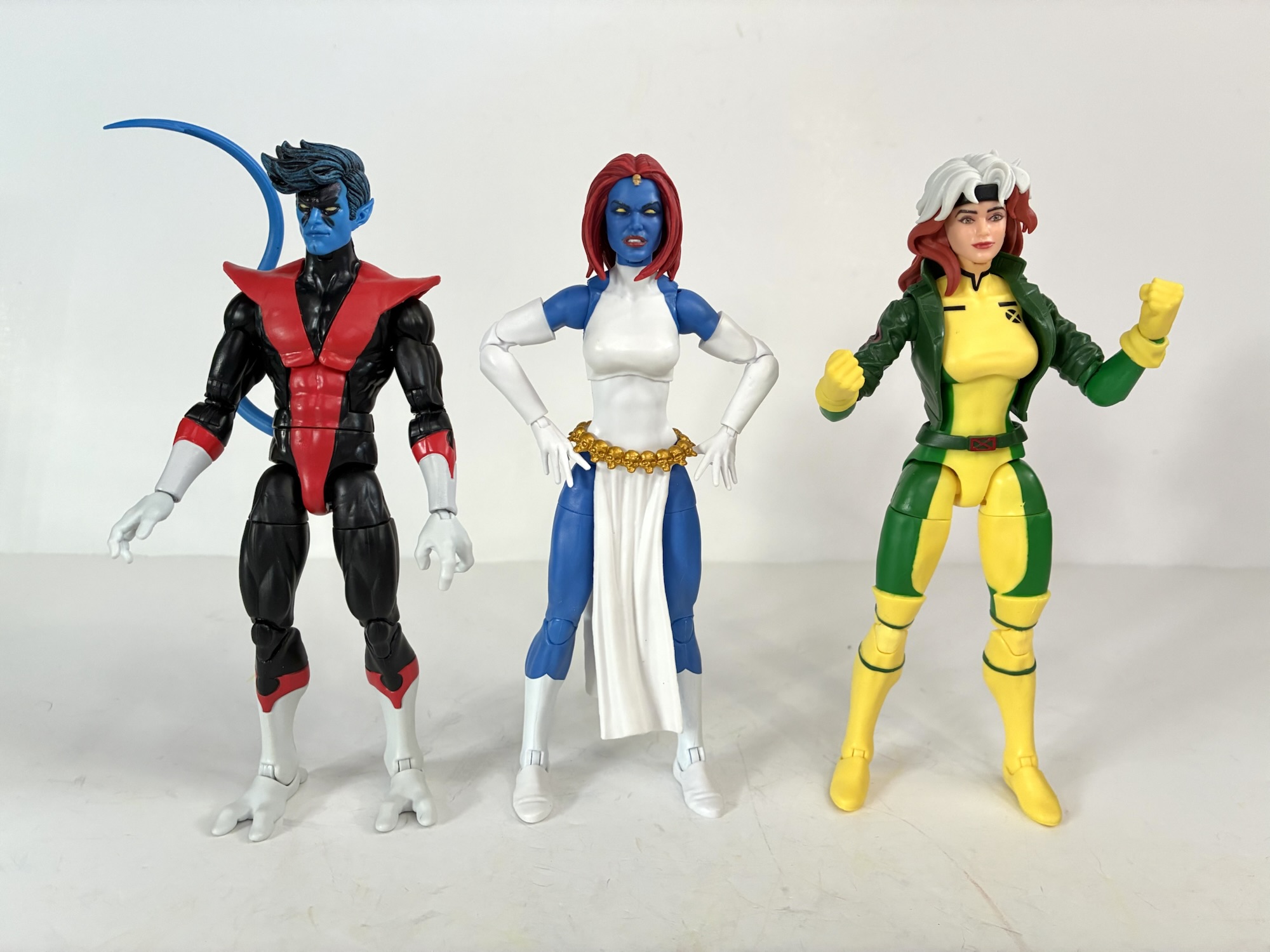
She doesn’t look bad alongside them…
Articulation is the same as the previous Mystique which was mediocre. The only change is now we get bicep swivels and double-jointed elbows. The knees aren’t bowed so she stands much easier and is an overall better release, I just wish that old head worked or we got the head that’s on the back of the card. I was tempted to try and heat and pry the hair pieces off of each, but I don’t want to risk ruining them in the process. That mediocre Mystique is now gone so replacing it if I messed up would be costly. I think I’ll just return it to her box and make this my display figure from now on. Maybe I’ll even add some shading to the dress – I don’t know. This is a figure only for those Legends collectors who must have a slightly better Mystique in their collection or for those who missed out on her. There’s nothing special about the figure itself and there’s a very good chance she hits clearance six weeks from now as most of the Target exclusives tend to do. If you’re on the fence then you probably shouldn’t pay full price. If I had been smart enough to actually compare my two figures before I opened this one I probably would have returned it. Oh well.
We have a whole lot more from Marvel Legends and the X-Men if that’s your fancy:
The penultimate figure in this series is a bit of a curveball. When one thinks of the animated series X-Men, the first villains that come to mind are Magneto, Sinister, Apocalypse, Sabretooth, and then it gets muddled. Graydon Creed made quite the impression in the show’s second season and may even be the most hate-able…
It is Halloween and that means it’s time for costumes, candy, and spooky fun. It’s also Halloween 2022, a pretty important date if you grew up loving those mutants who ran around in colorful spandex fighting for a better tomorrow. That’s because 30 years ago on this very night, the animated series X-Men premiered on…
This week, the long wait for an in-person San Diego Comic Con comes to an end. For the first time since 2019, attendees, creators, and the like will be invited back into the city of San Diego for a celebration of all things comics, movies, and general “nerd” culture. One of the many panels this…
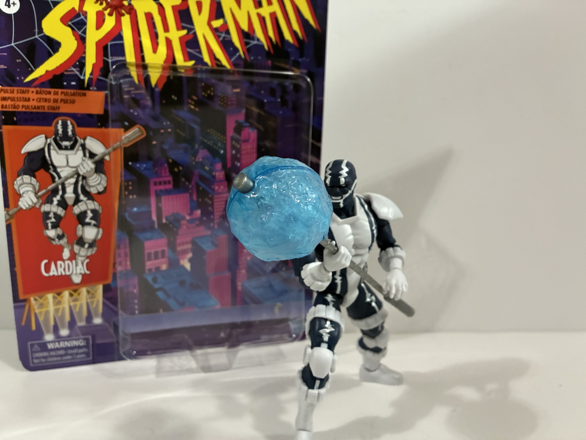
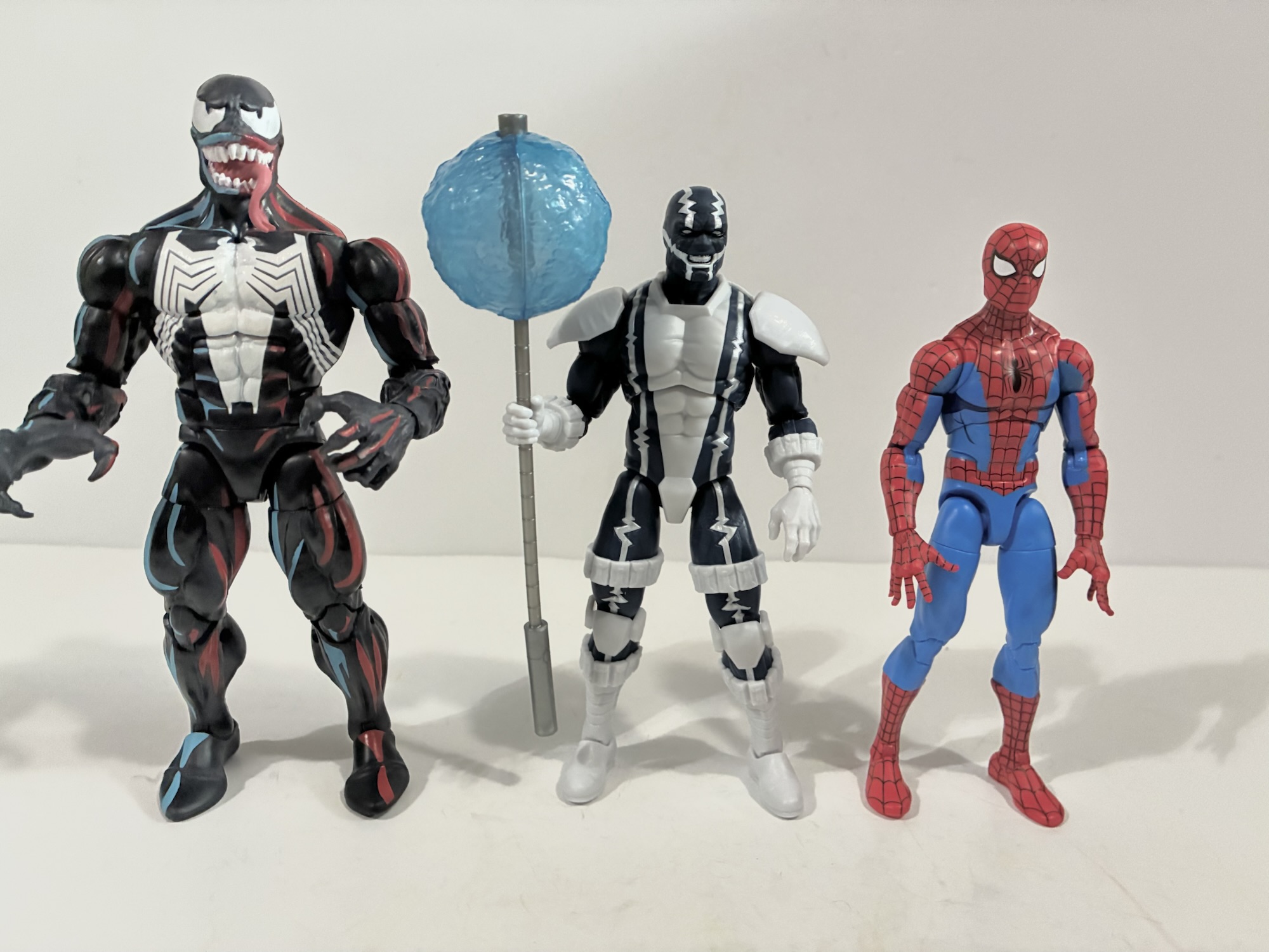
A figure some never expected to appear in Marvel Legends is the Spider-Man ally/foe Cardiac. For whatever reason, he was apparently off-limits at Hasbro. There could be a number of reasons for that, but whatever was in the way is obviously no longer an issue because Cardiac has now taken his rightful place in plastic. Had we never received a Cardiac action figure would that have been a great tragedy? No, but fans of the character certainly would have been disappointed. I’m personally not one. I barely remember the guy, but when I saw the reveal I thought the figure looked interesting. And then when I saw him hanging out on some pegs at my local store I said “What the heck?”
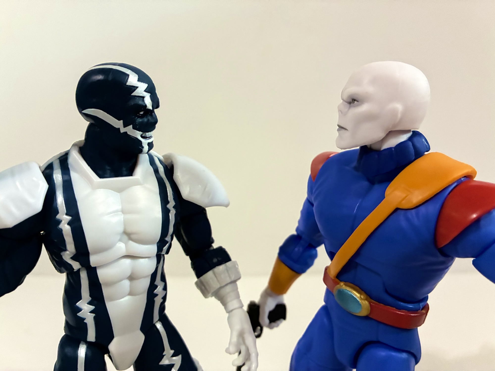
Cardiac is about average height for a superhero character.
Cardiac is basically a vigilante, like many heroes. He’s a cardiologist (get it?) who is basically angry at the insurance and pharmaceuticals industry for the unjust death of his brother and, man, that’s a guy who feels made for this moment in time. He’s basically a guy in a cool suit with a “pulse staff” that can shock dudes. He’s in a skin-tight, navy suit that’s adorned with an EKG down each side which is sculpted into the figure and painted silver. The rest of the figure is white plastic including his shoulder pads, knee pads, boots and gloves. And since Cardiac made his debut in 1990 he is adorned with pouches! They’re at the cuffs of both his gloves and boots and he also has them going around his thighs. It was just in the water at the time. What got me with this figure is I love the clean look of the white juxtaposed with the dark blue. The silver paint work adds a little something extra as well and it’s pretty clean. And I read a lot of 90s comics so I do have nostalgia for this type of look. It’s silly, in retrospect, but strangely effective.
“I find your lack of nose…comforting.”
That’s not to say everything is perfect. The paint isn’t perfect, but it’s surprisingly close. I wasn’t sure in the box what was going on with the torso, but it looks like the white is white plastic inserted into the blue torso. That helps to keep things clean and it also ensures that all of the blues match as well as the whites. There’s a little shading in the face around the eyes and in the creases of the brow which looks really good. I like the expression, a teeth-gritting one, though the paint is a little messier at the base of the mouth. Not distractingly so, but it looks off up close. One thing fans of the character have pointed out as being suboptimal is the nose. Cardiac was almost always drawn with basically a flat face and no nose. My guess is the sculptor here wanted to add a little realism so there’s a bump for a nose under the mask. It’s one of those inconsistencies with Legends that drives me crazy – are we matching the source art or going with this house style of realistic interpretations of comic book characters? Hasbro used to almost always go for the realistic interpretation, but over the past couple of years have started doing more source art looks. It seems almost universal that fans wanted a source accurate Cardiac, especially because this is likely the only one we’ll ever get. Not being a fan, it doesn’t bother me, but what does are the wrists. They’re puny and it’s weird looking. I’m not really sure what happened there (I have since seen images of people online putting the power effect over his wrists instead of the staff so maybe that’s a reason, though you could just use the wider opening on a thicker wrist), but his forearms look like they belong on a different body.
“Whoa! Don’t get that cotton candy on the threads, buddy!”
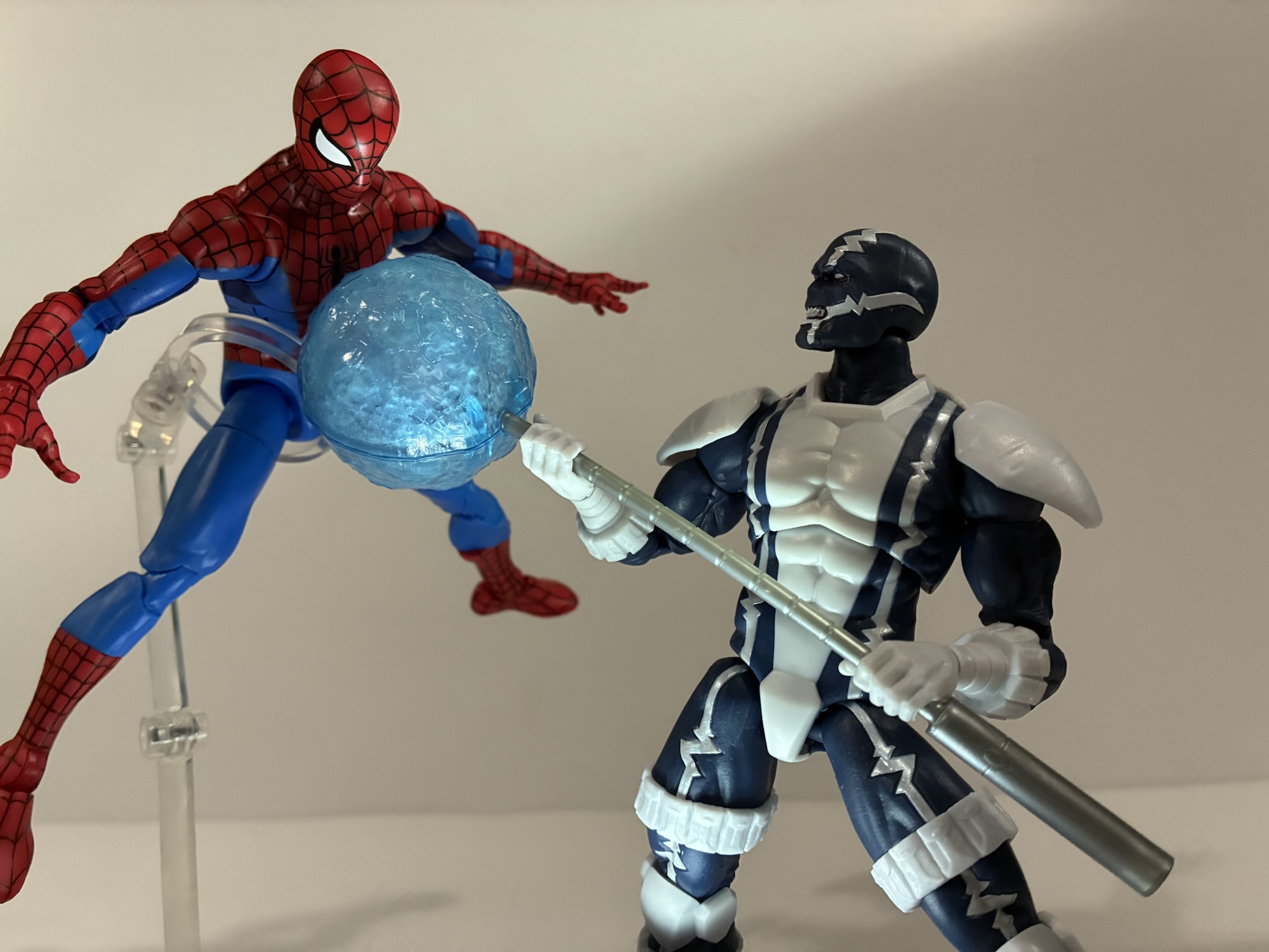
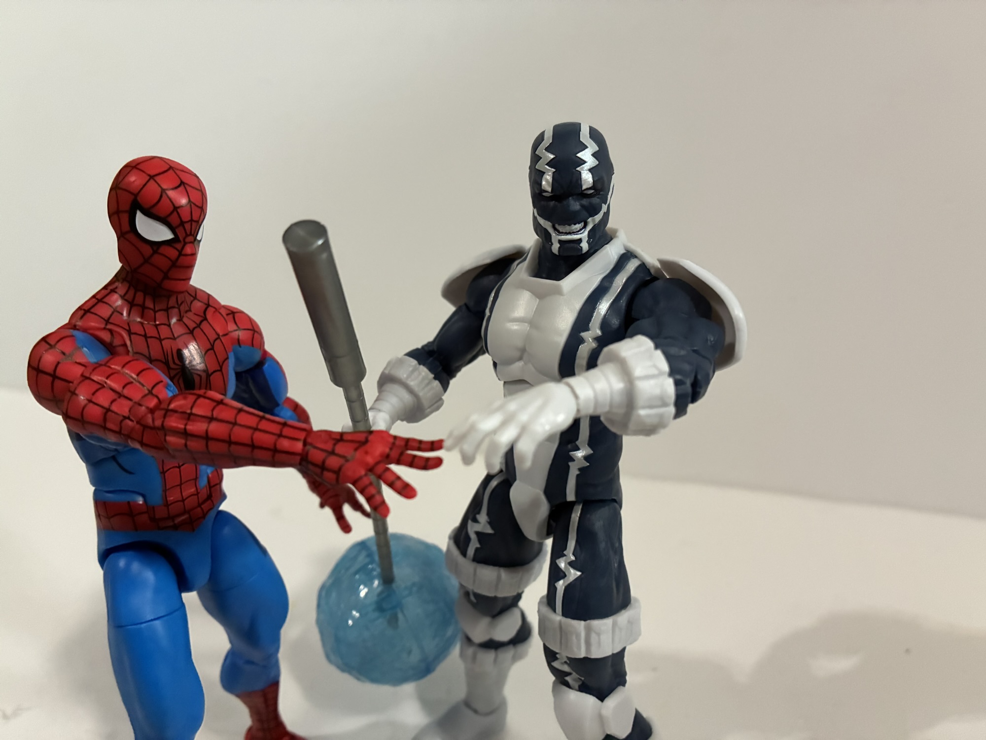
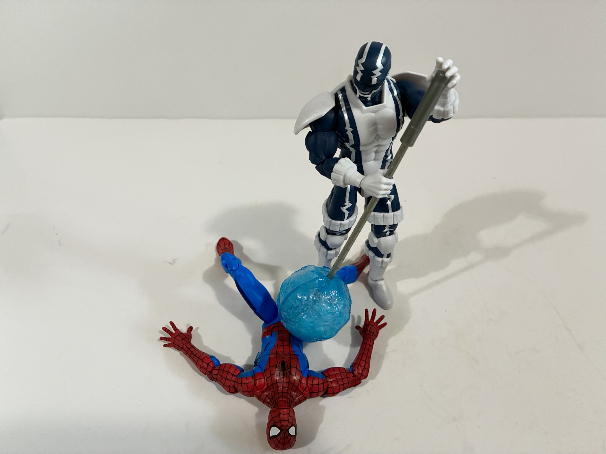
That’s a somewhat subjective critique, though a justifiable one if you’re someone who just wants their figures to look like the source. My only complaint concerns the articulation. Before we get to that, the accessory load-out for Cardiac is a set of gripping hands, a right fist, and a left relaxed hand. He also has his staff which has a blue effect orb that clips around one end. I think it probably looks as good as it could, it’s a translucent blue with some frosting inside the globe, but it does kind of look like cotton candy. Or blown glass. The actual staff is just gray plastic, but it’s new tooling and looks how it’s supposed to. The articulation though has one major flaw.
Those wrists are a bit dainty.
For the most part, Cardiac articulates like most Legends figures. He does have the double ball peg head and it’s one of their bad ones. The lower ball is seated too low in the neck so the range is poor looking up and down. He has standard arm articulation and the shoulder pads are looped through the shoulder pegs so they rotate with the arm. They may be the reason for it, but the arms won’t go all the way out to the side for a classic “T” pose. The bicep swivel, double-elbows, and wrists are all fine. The gripping hands have the preferred vertical hinge while the other two have a horizontal one. There is a diaphragm joint that works very well. The hips can nearly hit splits out to the side and kick forward 90 degrees. The thigh swivel is hidden by the thigh pouches, the knees are double-jointed, and the ankles hinge and rock. All work pretty well, so what’s the problem? The waist! There’s no waist articulation at all. No swivel, no ball, nothing. I saw some speculation it was because Hasbro didn’t want to break up the EKG lines, but they were fine breaking them up for the diaphragm joint so that doesn’t make sense. And it’s really missed. This is all new tooling so why not go nuts and give him a ball-jointed waist? What a bummer.
“Stay out of my way, web-head!”
Does that ruin the figure? No, but it keeps people from feeling like Hasbro nailed Cardiac. I didn’t review it, but a lot of people felt like they did just that with their ROM the Space Knight from last year. That’s a similar case where it’s a long requested character who is unlikely to ever receive another figure. With characters like that, you hope that Hasbro puts out something that is unlikely to be topped in their line. They went through the trouble of tooling a unique body, they just stopped too short. I don’t know what that joint would have cost, but I don’t think much. Ignoring that, this is a fun looking character design that will add a little something to your shelf. That’s why I got it and I didn’t even wait for a sale. I don’t know if I could have, but I’m okay with it since there isn’t another figure in the wave I have any interest in. I’m guessing if you are a Cardiac fan and were dying to add him to your collection then you’ve already got this in your hands. And I sincerely hope you’re satisfied with it, because it seems unlikely we’ll ever get another.
If you enjoyed reading about Cardiac here’s a few more from the world of Spider-Man:
In some ways, Secret Wars was bad for comics. Commercially, the 80’s event was hugely successful for Marvel even though it seems to have just a lukewarm reception by fans in some circles. It helped to establish the belief that events sell and Marvel seemed hellbent on taking that approach in 90s. One of Spider-Man’s…
We’re going to be doing a lot of 2025 catch-up here as Christmas always slows things down. Toy producers also like to push product for the holidays so I seem to always end up with a backlog at the end of the year. Especially when stores are doing generous sales and convincing me to buy…
I had a bit of an impulse buy a few weeks back with the Marvel Legends Spider-Man Unlimited action figure from the show of the same name. What I didn’t mention was that he was not alone for hanging on the pegs that day with him was The Chameleon. Like Spider-Man Unlimited, The Chameleon is…
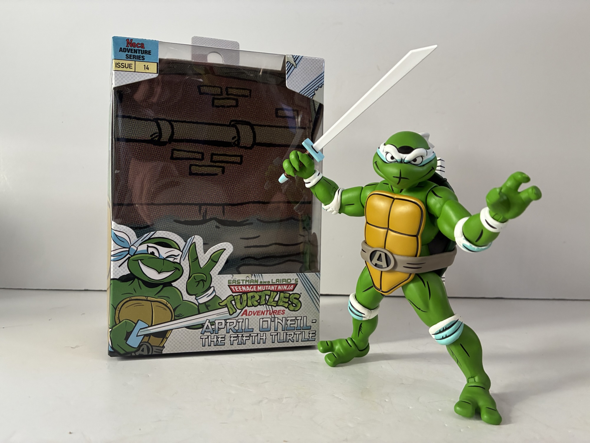
NECA’s line of Teenage Mutant Ninja Turtles action figures based on the pages Teenage Mutant Ninja Turtles Adventures by Archie Comics is like the little engine that could. It’s not a fast-moving line, the releases aren’t always heavy hitters, but when they land they’re usually pretty damn good. And NECA appears to be slow-walking this line since they have yet to release the actual turtles in the line. We got wrestling variants of the boys, and now we’re getting a version of their ally April O’Neil, only she’s in her seldom seen look as the fifth turtle.
Or maybe it’s the April you’re looking for?
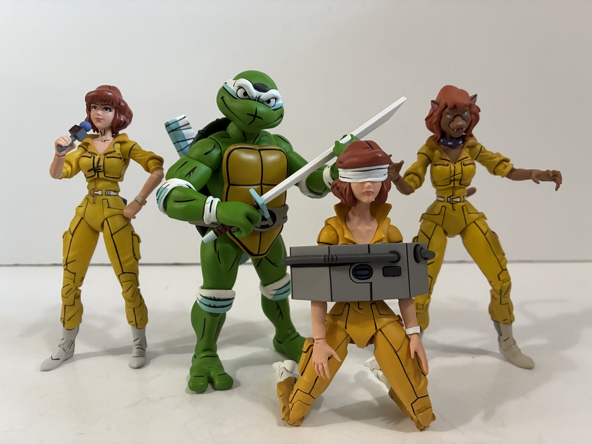
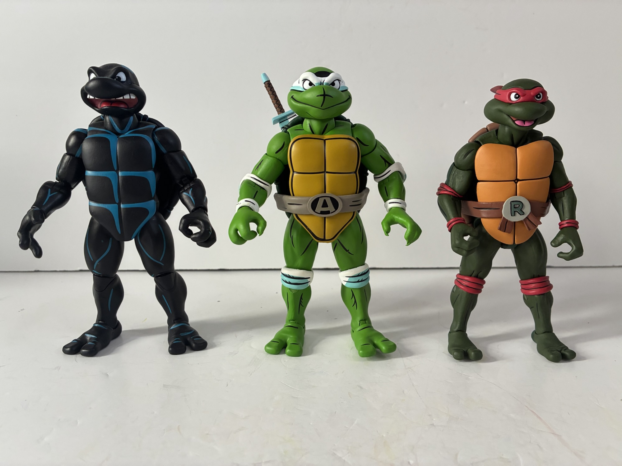
In the pages of TMNT Adventures there was a one-shot winter special where April O’Neil was mutated into a turtle. It didn’t last very long, but for at least a few pages she was essentially the fifth ninja turtle. And she looked how you might expect in that she has the same mask and pads, a belt, she’s armed with a single katana, and she has a big “A” on her belt. You may have expected her to go with yellow for her color of choice, but she actually had to settle for white instead. This figure was teased quite a while ago in April of 2023, but it didn’t actually see release until fall 2025. She is basically the first basic turtle in the Archie subline and one imagines that whenever NECA gets around to doing standard versions of the boys this is the buck they’ll be on. In that, it’s like a preview of things to come so even if you’re not interested in this obscure version of April this figure might be of some interest to you.
With Archie Raph and toon Raph.
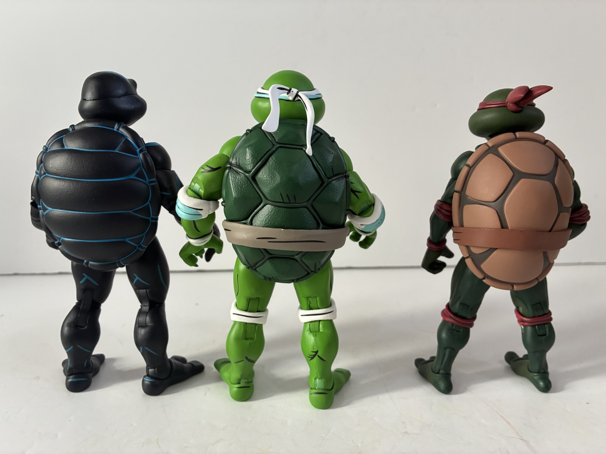
April comes in the standard Archie packaging with new artwork by series regular Ken Mitchroney. I like his very stylized take on the character with the accentuated beak and angled eyes. The figure dials that down a little, but a lot of those traits are still present. April stands at about 5.625″ to the top of her head. I have her as slightly shorter than Archie Raph and it appears to be due to her head sitting lower on the neck. Her head and plastron are actually wider which gives her a slightly stockier look compared with Raph, who is basically a blank turtle body. April has new forearms which are slightly thicker as well and her shell is different, having a more angled approach to the different panels. It’s hard to tell if anything below the waist is new. The knee pads create a thicker look, but it might just be an optical illusion. If I get out my grandfather’s old machinist gauge for measuring thickness it tells me their legs are the same, but confirms what I suspected with the forearms.
I don’t think this is how April wanted to present herself.
The stylization with April might be different from what some might expect. If you’re primary frame of reference for a female ninja turtle is Venus DeMilo from The Next Mutation then this April will look pretty different. That’s because they didn’t give her those odd plastron boobs that character had and instead she pretty much just looks like a turtle – kind of like how male and female turtles in the wild pretty much look the same. Her only embellishment is a slightly curvier plastron silhouette and clawed fingers. I thought at first the fingers might be reuse from the Archie Slash, but they are unique to April. Her portraits have that pronounced beak though, and while her eyes aren’t comically feminine, they have that Archie personality we’ve grown accustomed to with NECA’s figures. I love the little “t” shape they paint onto the beaks as that is pulled right from the books. The figure is a very matte yellowish green that is accentuated very nicely by the white wraps that have a touch of light blue shading. The shell is deep green and all of the grooves are filled with clean, black, paint. There’s black linework to accentuate the muscles and overall this is another homerun from NECA in the aesthetics department for this line.
“Where do you get off calling yourself the fifth turtle?!”
April’s accessories are quite numerous for a general release in this line. She has four distinct portraits: unmasked, grin, yelling, and a classic TMNT angry side sneer. The bandana knot is transferable between the masked portraits and while it’s a little snug, it works fine. The unmasked portrait features a sad expression and there’s even some tears painted on which helps to make it quite scene specific. For hands, April has gripping, fists, and open clawing hands. She comes with a single katana which is what she utilized in the book which features a brown hilt and blue pommel and guard. The blade itself is white which I love because metal is often done in white in comic books. I’m a little surprised they didn’t hit it with a touch of blue shading like the weapons that came with the Mirage turtles, but it looks pretty good as-is. To store it she has a large, white, scabbard that is shaded with blue that simply slots onto her belt. It’s not a super secure connection, but it will stay in place once she’s posed. Just expect it to fall out a lot when posing her. The sword does store effortlessly in the scabbard which is nice to see after my experience with the 2012 Leonardo and his stubborn blades.
She’s got the look, but does she have the skill to take on the Shredder?
April’s articulation is basically the same as the Archie wrestling turtles only she has some elbow and knee pads to obstruct things. She has joints at the head, base of the neck, shoulders, biceps, elbows, wrists, waist, hips, knees, and ankles. There are built-in thigh swivels into the ball-joints at the hips and her gripping hands have the proper vertical hinge for wielding a sword. She has the pinless knee and elbow joints, but the presence of the pads will limit the range. Her elbows are pretty much only good for a 90 degree bend while the knees extend a little past that. They’re also very tight at both spots and I haven’t noticed any lubricating oil in those places like I did with the wrestling turtles. The shell will limit her hip range, but the plastron is soft so she can kick forward about 90 degrees if you want to push it. Going out to the side for splits is no problem and the oversized feet with solid ankle rockers make getting her to stand pretty easy. The waist isn’t going to do much owing to the turtle anatomy and range at the shoulders is not good enough for two-handed sword poses. It would be nice to see NECA integrate a butterfly joint there since one would think the shell would hide some of the ugliness of said joint, but I don’t know if they’ve ever done such with any release, turtle or otherwise.
“Geez April, think you might reconsider going back to the news reporter look?”
Perhaps the best thing about April is she should retail for the reasonable price of $35. Some places have her as high as $41 but she is shipping to big box retail which is likely to have the cheapest price on her. She comes with plenty of stuff and the sculpt and paint are fantastic. Yes, the articulation is just okay, though it is better than some of NECA’s other TMNT figures. That’s what they’re known for though and if your primary interest is in the figure’s presentation then this April should please you, provided you ever felt the need to own a figure of April as the Fifth Turtle.
If you’re looking for more Archie inspired TMNT figures or more April then check these out:
When I was a kid, I didn’t really get a lot of comic books. I most often would encounter them at the grocery store and I always hoped my mom would end up in the check-out aisle with the comics instead of candy so I could maybe convince her to get me one. And when…
Whenever I approach my rankings for NECA’s now long-running action figure series based on the 1987 cartoon Teenage Mutant Ninja Turtles, I don’t always just pick the objectively best or worst toy in the line to slot them into the rankings. It’s a combination of the figure’s quality and the character’s importance. A great figure…
Remember San Diego Comic Con? You would be forgiven if you did not since, like last year’s edition, the event was a virtual one once again. Only unlike the 2020 version, this one came with the expectation it would be virtual. It also coincided with a global shipping crisis, so combine that with the expectation…
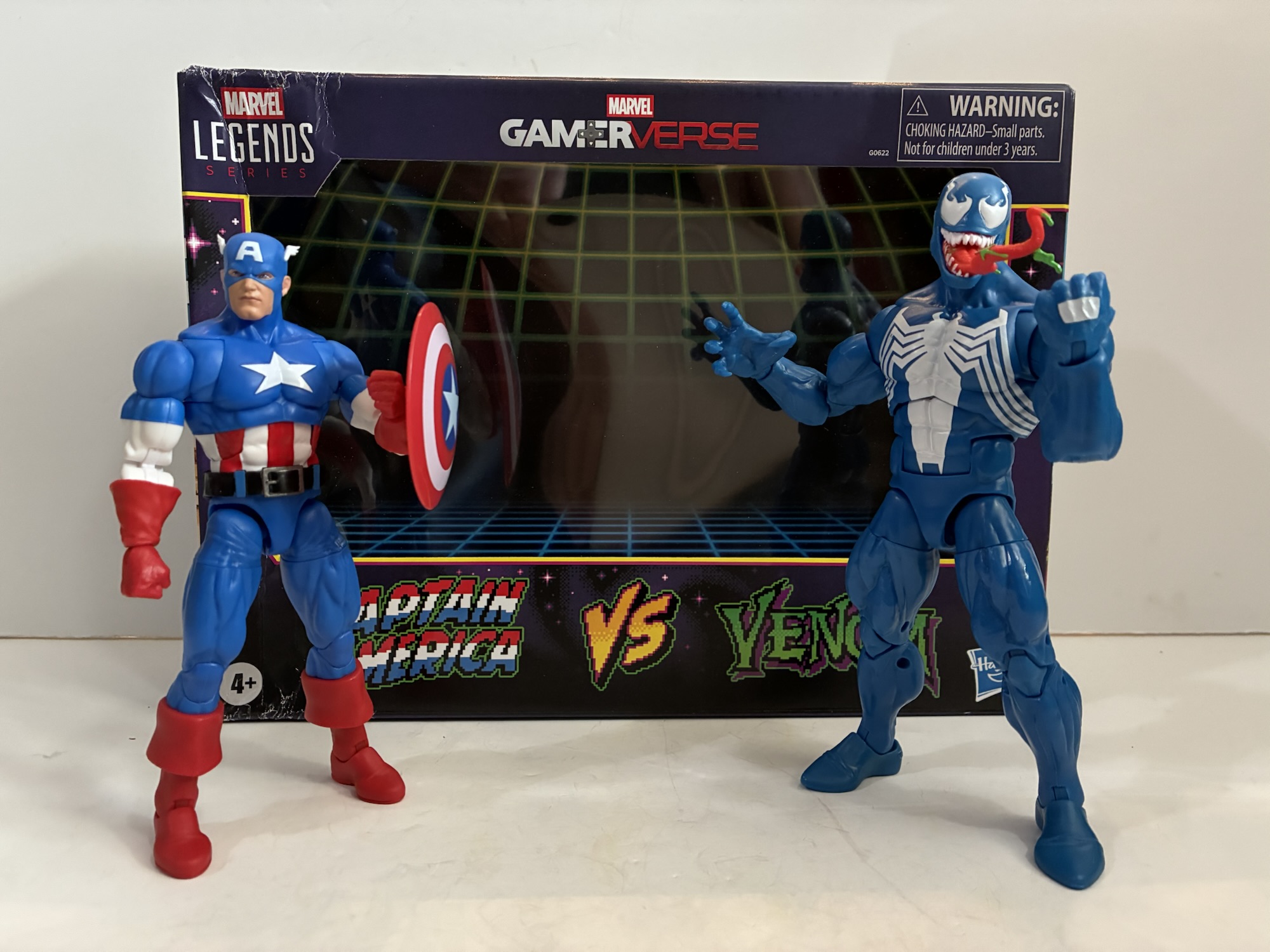
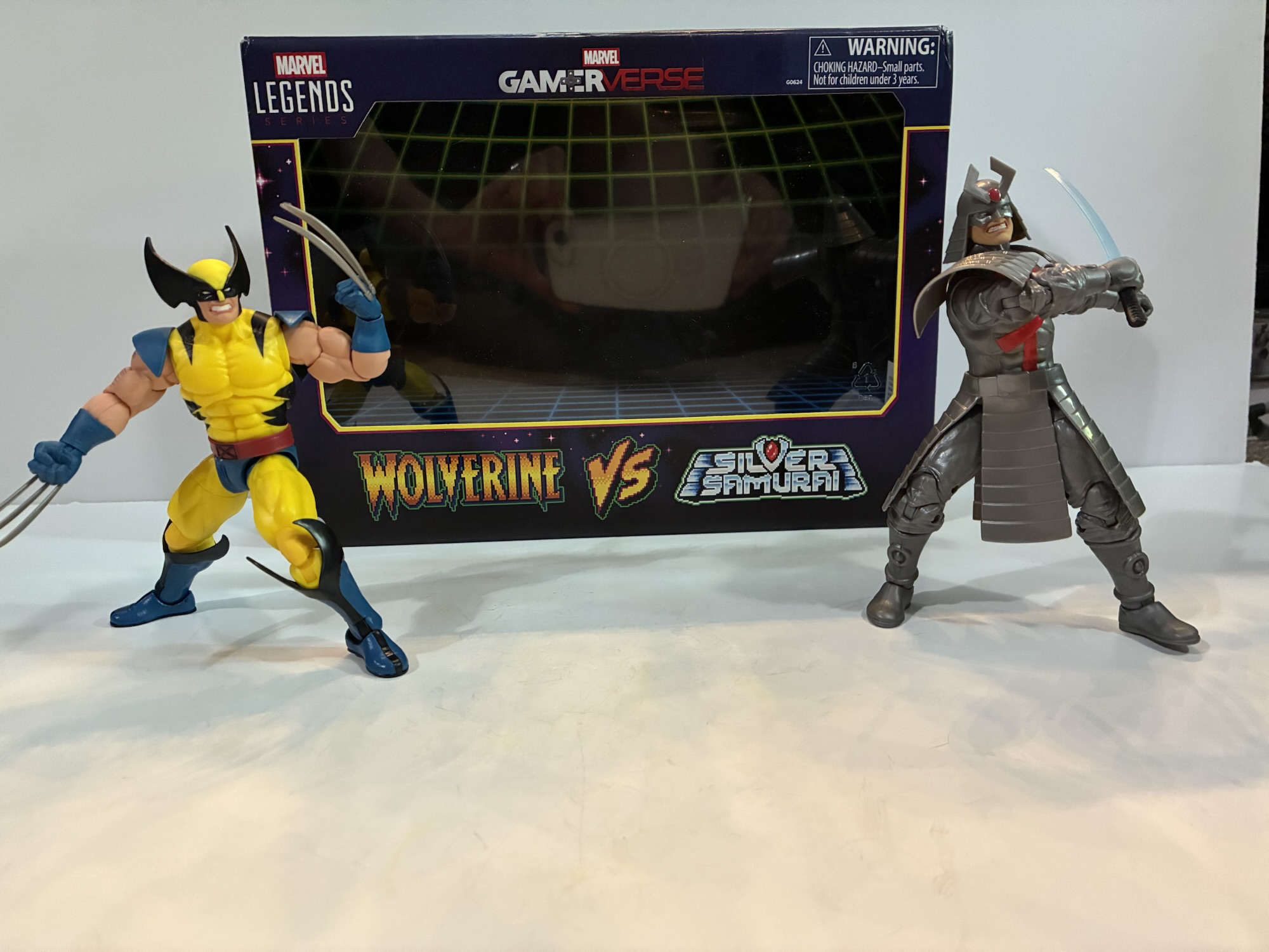
We’re going to be doing a lot of 2025 catch-up here as Christmas always slows things down. Toy producers also like to push product for the holidays so I seem to always end up with a backlog at the end of the year. Especially when stores are doing generous sales and convincing me to buy product I had already passed on. Stuff like today’s subject, the Marvel Legends Gamerverse two-pack of Captain America and Venom.
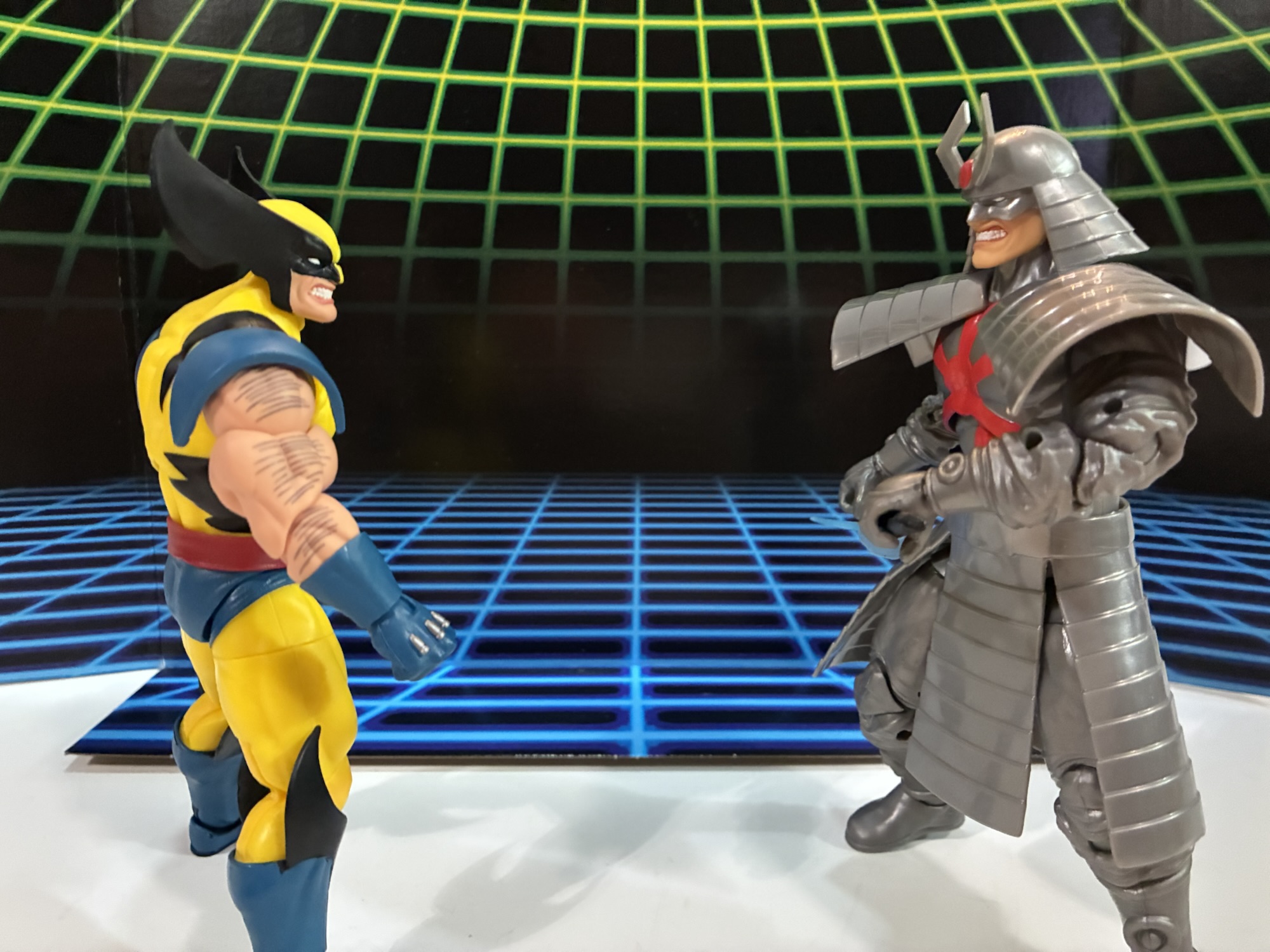
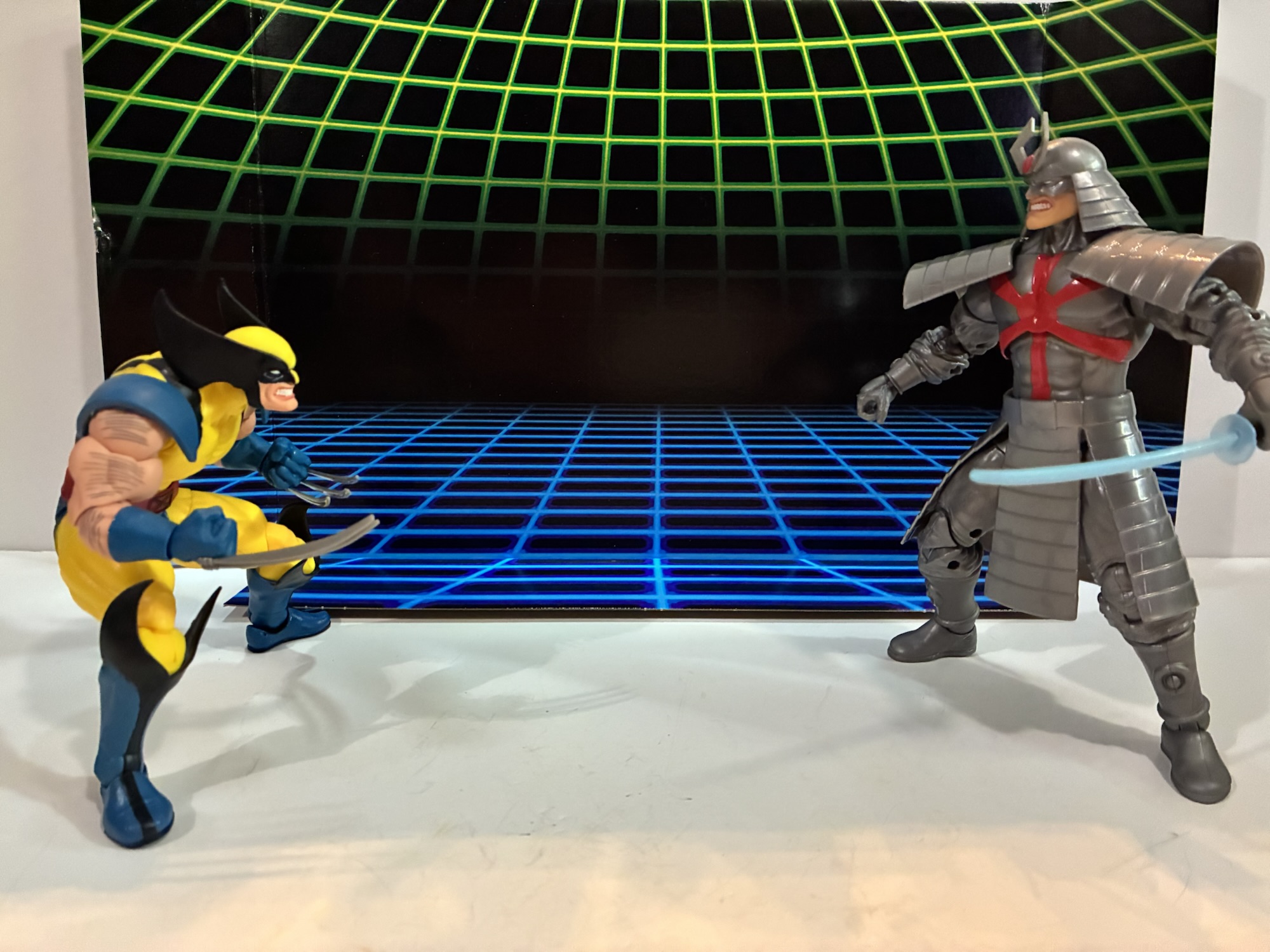
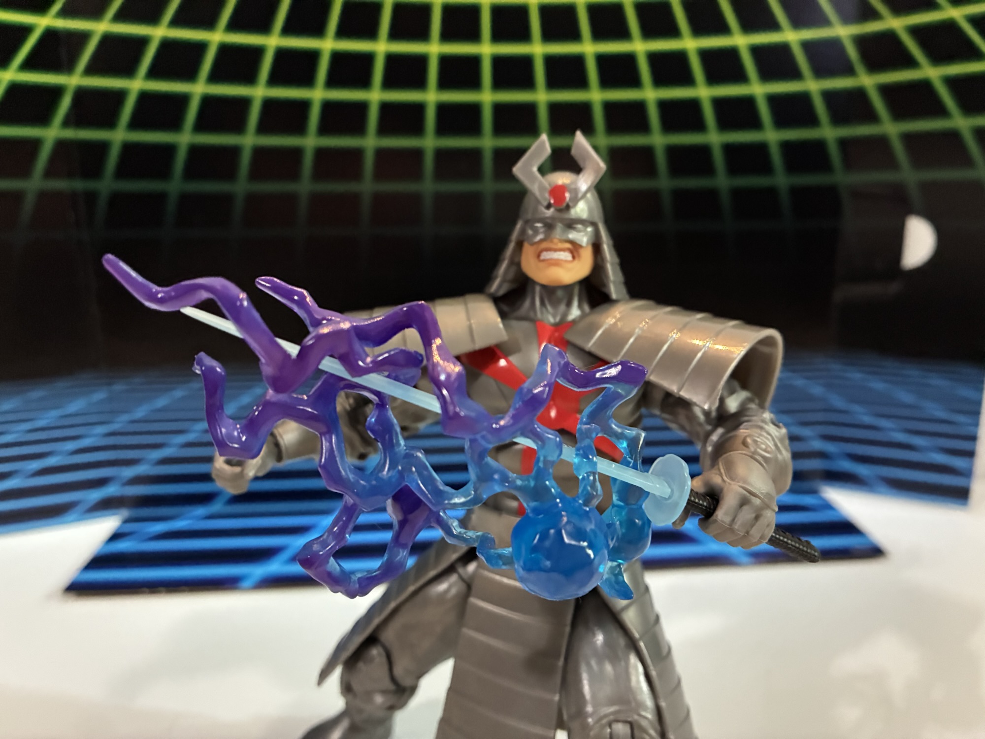
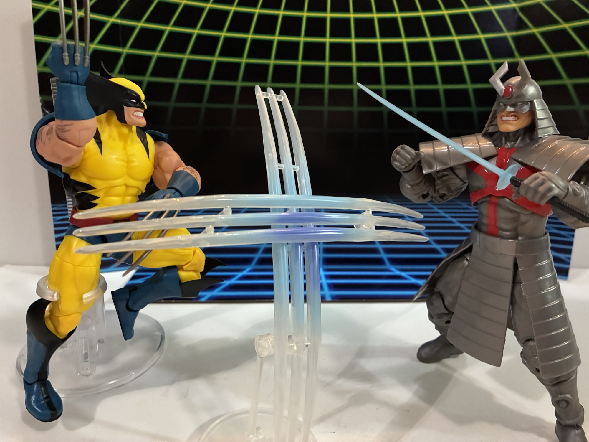
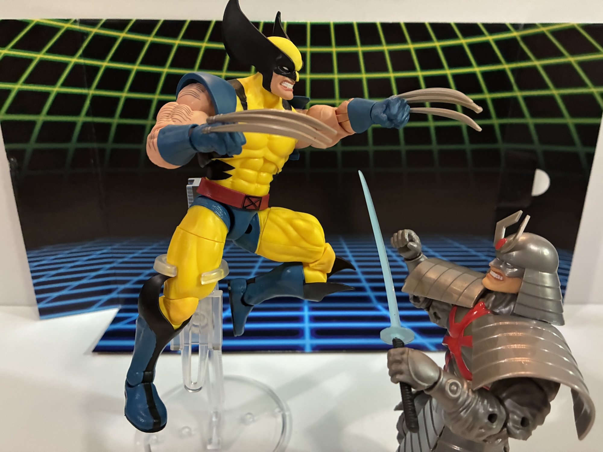
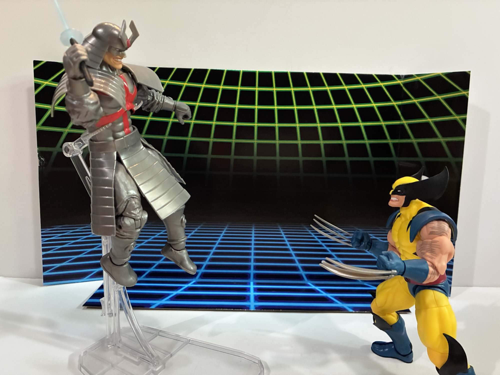
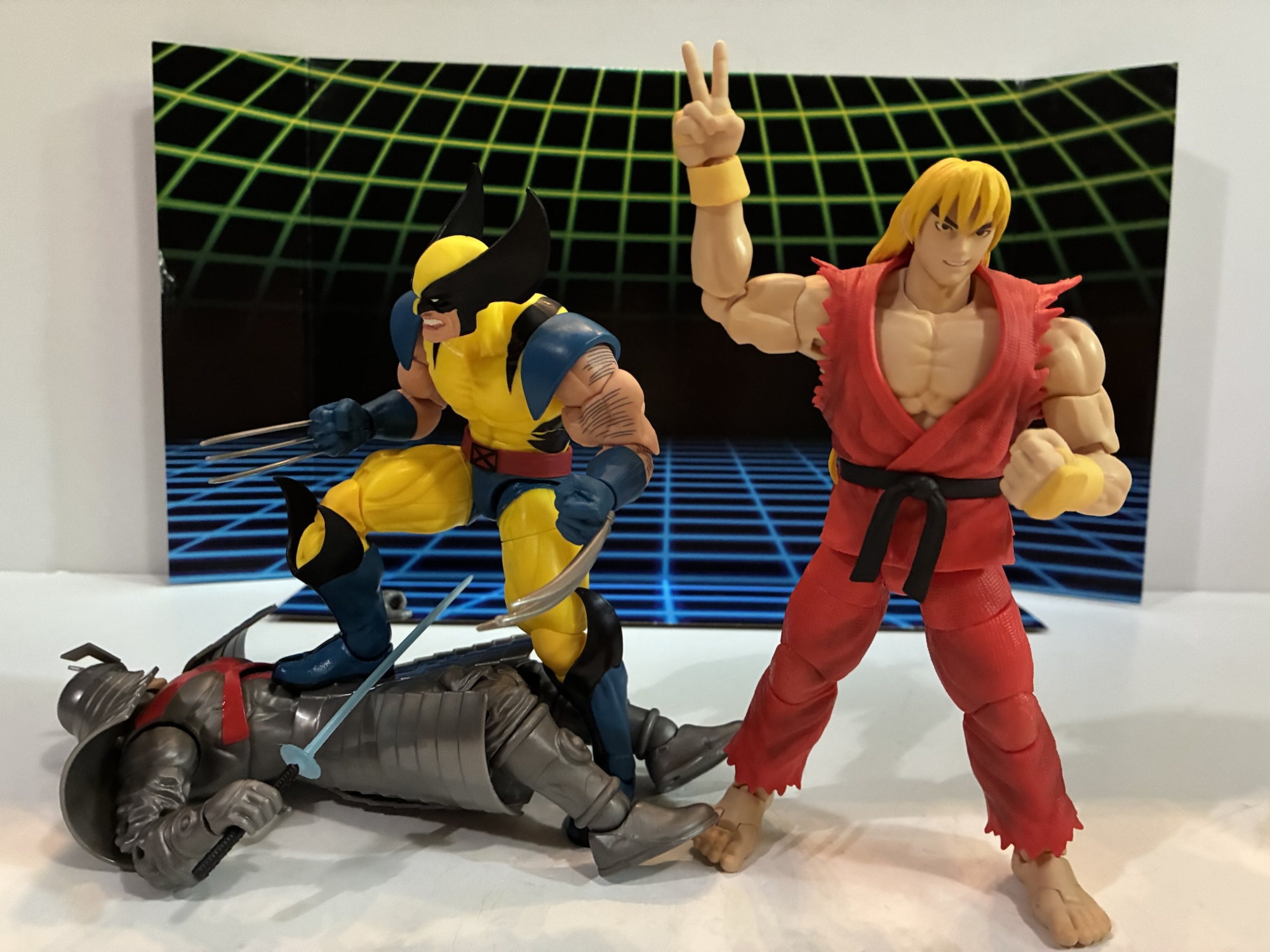
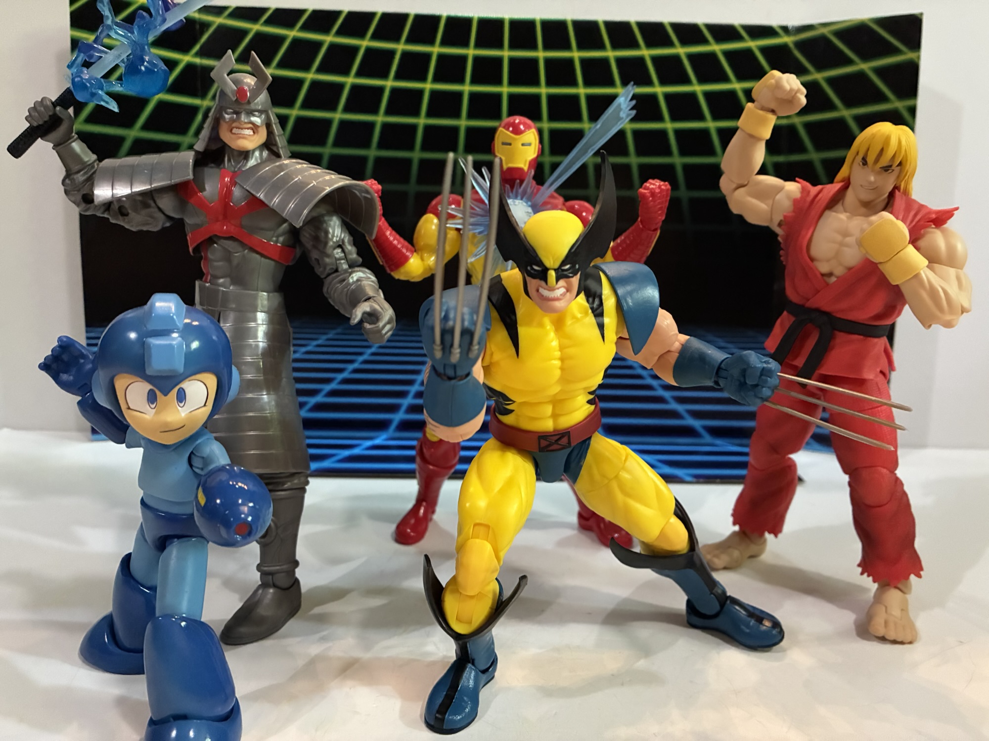
We’ve already looked at one release in this series which was the excellent Wolverine and the not so excellent Silver Samurai. The draw for me with that set was the all new Wolverine that quite resembles his sprite from the Marvel vs Capcom series of games. With this release, we get a very familiar Venom and a not so familiar Cap. I’m a Venom fan so I’m always a little tempted whenever a new one comes around and this being Hasbro’s first blue Venom did catch my eye, but I was willing to pass. As for Cap, I’ve never been a Captain America fan. He was one of the lame heroes of my youth and I only remember one kid who actually liked the character. On the other hand, I do like blue and when you have a hero with a lot of blue that gets my attention and this Cap very much got my attention. Not to the tune of $60 though, or whatever the MSRP was when this thing landed at retail. Then Target had some sale and I had reward money when this thing was in-stock at my local store making my price a whopping $16. For $8 a figure, basically 2005 Legends pricing, you’re damn right I was willing to take a look at this one.
He’s not just a blue version of the figure on the left.
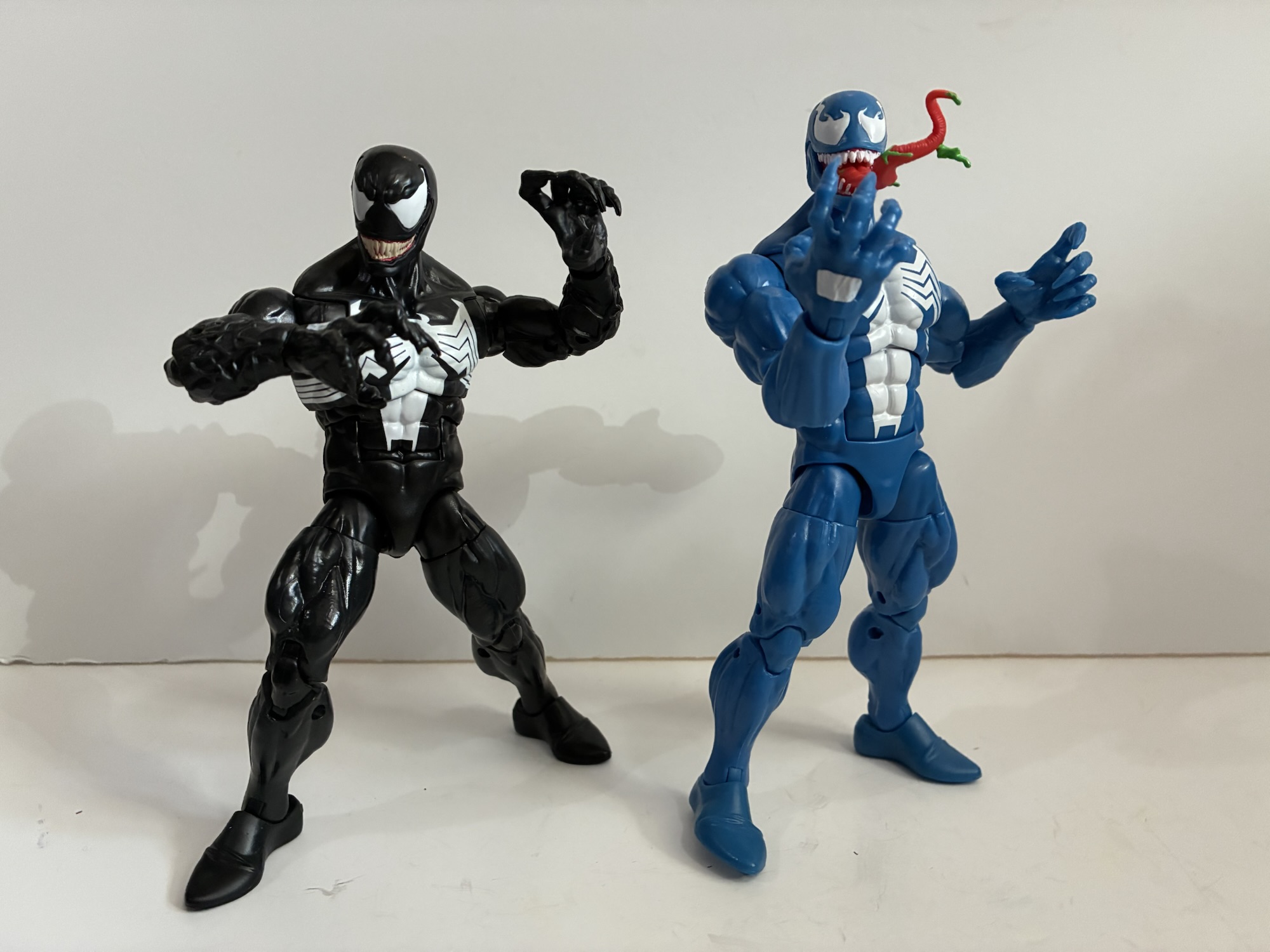
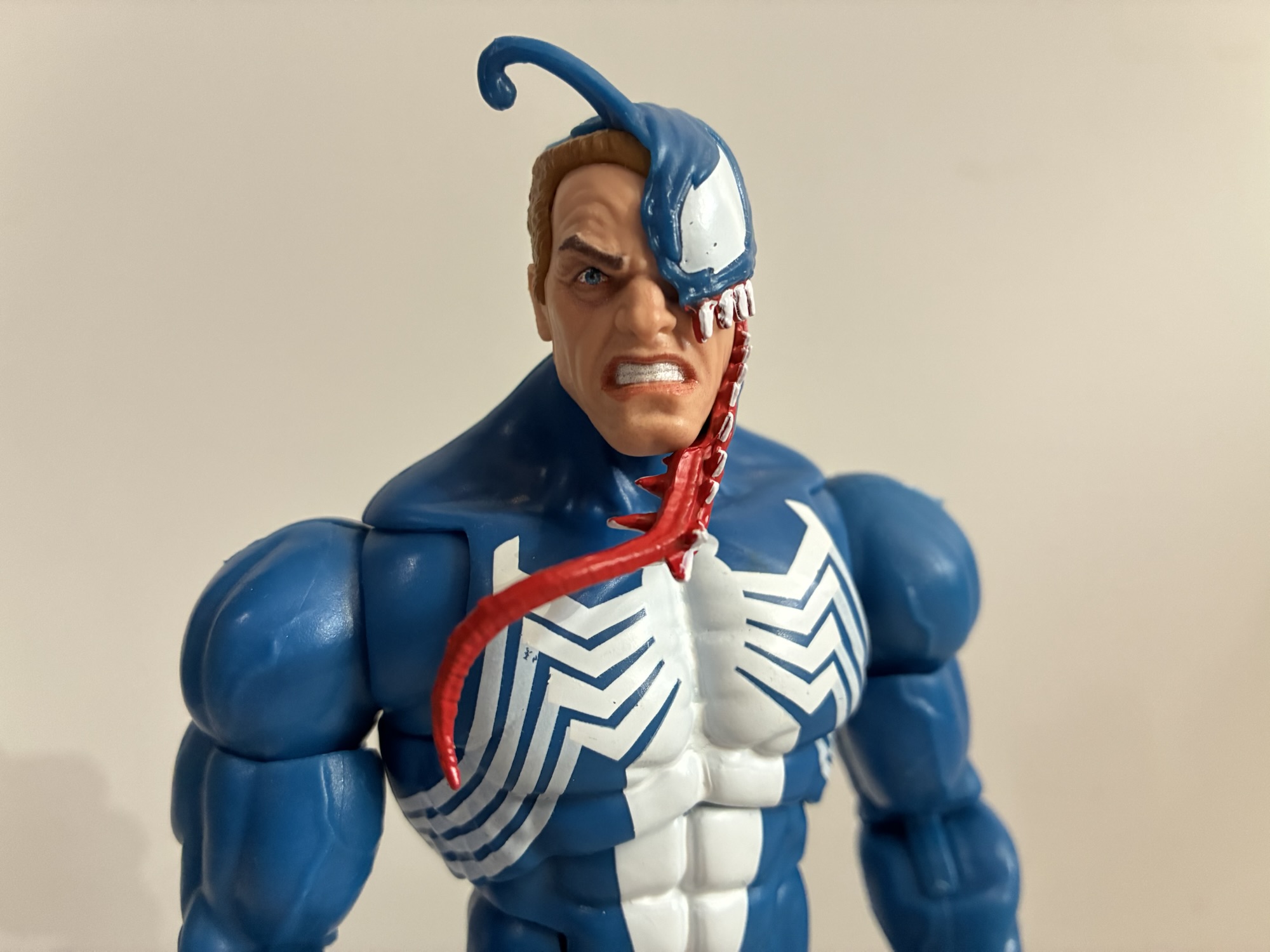
Let’s get Venom out of the way first since he very much resembles 2024’s Walmart exclusive retro-card Venom. At least, at first blush. The only parts this figure actually shares with that one (and other Venom figures) are the legs and hands. The torso and arms have actually been redone as this one goes with the old hinged-ball peg setup at the head. The musculature is slightly different, less vascular, and he has pin-less arms and no veins around the forearm. Like the animated Venom, the spider logo on the back has been squished to fit inside the butterfly joint which is fine while the logo on the front more comfortably fits inside the same joint. The shoulders are bigger which makes a big difference with the silhouette making this the best Venom body Hasbro has done. It’s just a shame they didn’t make the legs pin-less to match. The new torso does make this Venom slightly taller than the old one as he stands at about 7.125″ to the top of his “masked” head.
The spider logo could have used another coat.It’s a neat portrait, but is it one we really need for a video game Venom?
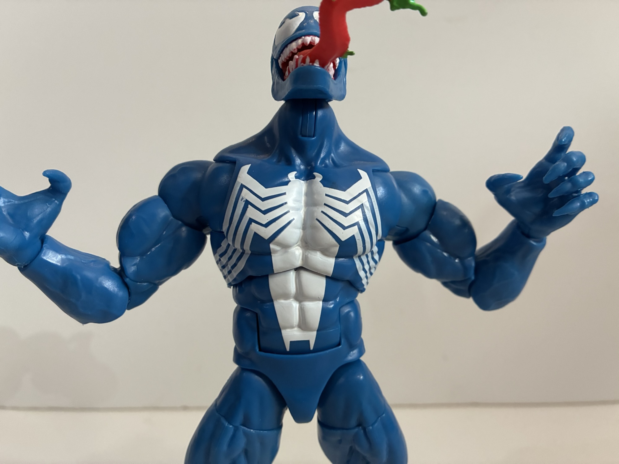
What obviously stands out most though is the color. This Venom is a light blue which is fairly similar to the in-game sprite. Venom, for a long time, was always colored blue in the comics and shaded with black as comic artists often do for characters that wear all black so I’ve always liked this blue look for him. My ideal would be a darker blue that’s shaded like the art of Mark Bagley, but this is still neat to see in figure form. The default head is the Eddie head in mid-transformation which I think originated in a 3-pack. The symbiote section is new sculpt to better match the look of this version and the overall look is actually pretty impressive. The alternate head is a Venom with his green-drool covered tongue protruding. The severe underbite and shape of the eyes is very much evocative of the game art, though thinner and more elongated than the actual sprite. The only negative with the presentation is the little used white paint. The opacity of the spider logo is fine in the middle, but the legs are too thin and a lot of blue pokes through. The paint for the eyes is hardly pristine and the white paint on the hands suffers from the same opacity issues, though not as severe as the spider legs. We might as well get the accessories out of the way now too as he only comes with two clawing hands and two fists.
I think this Cap can work fine as a comic Cap if you don’t care about the scale mail.
Even though I’ve always been a Venom fan, to my surprise it was Captain America that drew me to this set. Something about this shade of blue hooked me and the way it plays off of the red and white. It’s a clean version of Captain America’s suit as there are no sculpted textures for scale mail. It conforms to the video game look, but it also conjures up memories of his cartoon appearances for me. What also got me though is the sculpt. I don’t have any other Captain America figures, the last one I bought was the series 8 Ultimate Captain America back in 2004, so I can’t say for sure how much of this figure is reuse and how much is new. There have been quite a few Caps recently, the Secret Wars one and the 20th anniversary to name just two, and I assume some of these parts come from there. The torso must be new for it to not be textured and the proportions for it and the arms are terrific. This is what I want Legends to look like. The chest is broad and the shoulders large. There’s enough thickness front to back so he doesn’t have that pancake look. He has classic heroic proportions, something the ever popular Vulcan body lacks.
The white on his shield could be better.
The paint and colors are mostly okay as well. I already said I love this blue and it’s largely colored plastic. There is a slight variation between the blue of the chest and the blue of the arms. In most lighting it’s barely noticeable, under brighter lights the arms are noticeably lighter which also includes the portion of the chest comprised by the butterfly joints. The paint on the face and head is pretty good as is the paint on the abdomen. The white star on the chest suffers some of the same issue as Venom with the opacity, but it’s not as severe an issue. The gloves and boots are molded in red and possess a nice, matte, finish. The only visual issue I have with the figure is that the wings on the sides of his head are not perfectly symmetrical. It’s minor, but also one of those things that once seen cannot be unseen.
Caps shield rush effect part works very well.
Cap does a little better than Venom in the accessory department. He has an alternate portrait with a yelling expression which is fine, though I’d have preferred something else. Maybe teeth gritting which I feel like shows up in the game more often or a smile as that would pair with his extra hands. By default, Cap has fists, but he can also switch to a thumbs up gesture. I want to say this is from his victory pose and it’s fine, but I don’t think we needed two. An open hand would have been nice to pair with his main accessory – his shield. What is Cap without his shield? This is a pretty standard one. I’ve seen some complaints that it’s too small and that may be so, but it doesn’t really bother me. It has the usual clip for the wrist that can toggle to a peg and plug into his back. Like the main figure, the opacity of the white is not the greatest and more in-line with what we saw on Venom, but the printing is at least clean. It also has an effect, a piece of translucent, blue, plastic that can clip over the shield. There are sculpted motion lines on the part for his shield rush attack and the center of it has less color than the edges. It actually looks really cool and is a perfect accessory for this set. It’s just a shame that Venom couldn’t get a game-specific accessory too.
Venom can pretty much hit some semblance of his stance in the game which is about all that’s required.
The articulation for Venom is basically the exact same as the prior Venom I already looked at with the exception of the hinged head. This lets him get into a stance resembling his default one in the game. The ball joint in the torso seems to have a little more range as well, but everything else is the same. As for Cap, he’s a little less articulated owing to an inferior torso setup. He has the ball hinge head and his butterfly joints work pretty well. The pin-less, double-jointed elbows and knees work as expected though his bulky arms give him less than 90 degrees at the elbow. The thing I don’t like is the torso though which has a perfect design to include a ball joint in the midsection. Instead, he just has an ab crunch with a waist swivel. If this guy had the same setup as Gamerverse Wolverine it would have taken him to the next level and would probably be as good as any Captain America figure ever needed to be, but instead it’s got an easy to improve upon flaw for whenever Hasbro wants to give us a Maximum Captain America and charge $50 for the privilege of owning it.
The “Gamerverse” is coming together.
As a $60 two-pack, this release is a bit of a hard sell. Do you really need a Venom in blue even if it is a minor improvement over the most recent release? Surely, if you prefer black this Venom body will see a re-release. Plus it still has that ab crunch which could be improved upon. The Cap is for those who don’t necessarily need or want the scale mail texture. The extra effect part for the shield is also nice, though very game-specific. If you don’t care about the video games it hails from, then you may not value it much. Now, if you are a big fan of the Capcom games then this set holds some added appeal. It’s a solid likeness found in the games and only Venom’s lack of a game-specific accessory hampers that. If you don’t have a past release of either character, it’s certainly more enticing, but still overpriced at $60. If you can get it for less then it quickly becomes a far better value. I got it down to a lowly $16, but it would have been worth it at far more. I would say $50 is the magic number and anything less is a good deal. I’m quite happy with it, even Venom, and I just love how they pop in my display. They’ve been my desk figures for weeks and they may remain there for a bit longer too. If this set appeals to you on a visual level then I think you’ll find plenty to enjoy.
Of course, no Gamerverse could be complete without these guys.
For more from Marvel Legends and the MvC games check these out:
Video game inspired action figures are quite the hot ticket right now. I’m not entirely sure why that is, but maybe some of that is owed to Jada Toys and how well received their line of Ultra Street Fighter 2 action figures have been received. Hasbro, for their part, has had a “Gamerverse” subline of…
On Tuesday, I posted a review for the NECA TMNT Adventures Cryin’ Houn’ action figure, a figure that debuted during this year’s edition of Walmart Collector Con. Today, we’re looking at a true exclusive from that event. Cryin’ Houn’, and a lot of other figures released that day, were basically a first to market agreement…
One of my most anticipated releases of 2025 came out of no where. I was a kid during the early 90s and into video games so I know a thing or two about Street Fighter. Street Fighter II was everywhere and is pretty much the reason why the one-on-one fighting game became a huge genre…
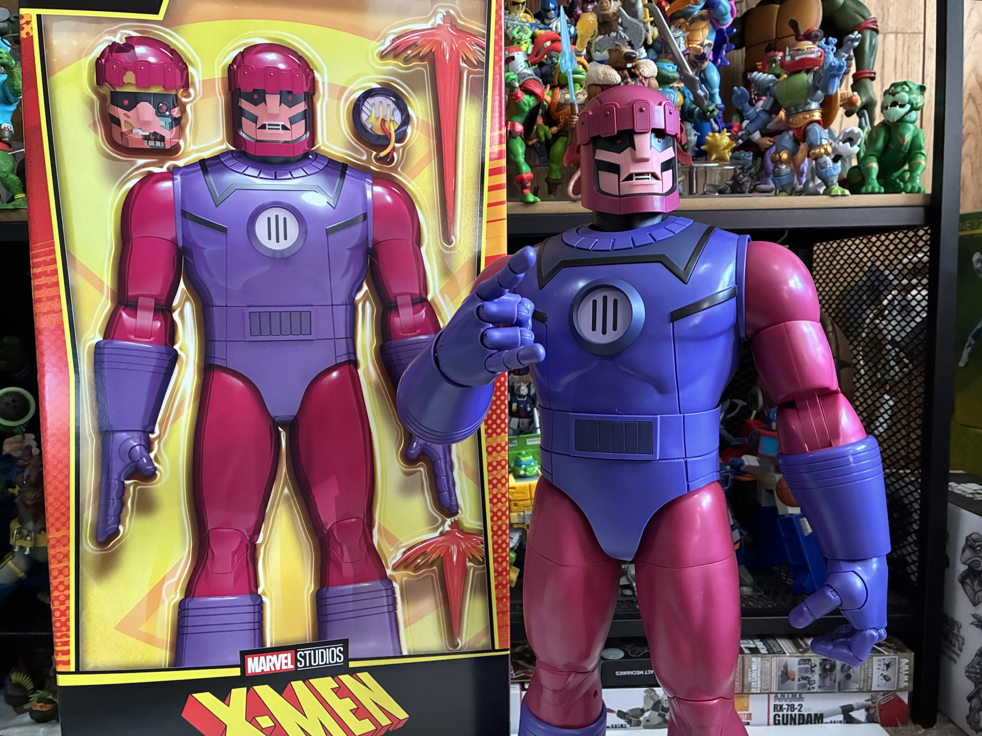
When X-Men premiered on Halloween 1992 the big bad guy of the day wasn’t Magneto, it wasn’t Apocalypse, it was the Sentinels. The mutant-hunting robots were chosen because they represented the threat from humanity as it pertained to the protagonists of the show. Any show or comic book can put some scary dude in a cape and call him the bad guy, but X-Men wanted you to know that the biggest threat out there for the heroes was humanity itself which had allowed its fear and bigotry to manifest itself in the form of giant, killer, robots. It sounds kind of crazy, even silly, but it worked as those cold, detached, humanoid robots stalked a young girl and even killed one of the X-Men. And when it came time to bring the X-Men back for X-Men ’97 it was decided pretty early on that the Sentinels needed to be a focal point of that return season.
So…this guy is so big my background is basically useless. And I even cut off the top of his head in this comparison with a standard Marvel Legends release and a Mondo sixth scale one.
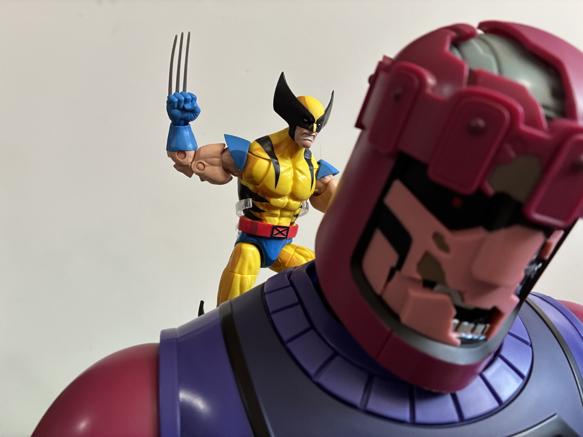
The Sentinels, being 30′ robots have never made for easy toys or action figures. Back in the old days, there was a Sentinel toy that was probably 14″ tall or so and was more of a play thing than something that looked cool or intimidating. The legs didn’t move, it had blast off hands and toes, and there was a retractable claw on one hand. It seemed almost lame even to me, but I still bought it when I had 20 bucks burning a hole in my pocket. In the Marvel Legends era, the Sentinel was the second build-a-figure and was the first I completed. It was more of a modern look, but still cool and I hung onto it for a long time until eventually selling it when I thought I was done with Marvel toy collecting (hah!). More recently, we’ve had a HasLab Sentinel, smaller arcade game Sentinels, and now this new made-to-order one. The HasLab model has been basically Hasbro’s crowd funding way to make more riskier products. It has always struck me as ridiculous that a company the size of Hasbro needs to resort to crowd-funding for anything, but the model has worked mostly well save for a failure here and there. The newer made-to-order model is simpler and something that strikes me as a better way to do things. They put a product up for a price and if you want it you order it, and if you don’t you don’t. It took about 14 months for fulfillment, but the Sentinel is here and hopefully it’s spectacular.
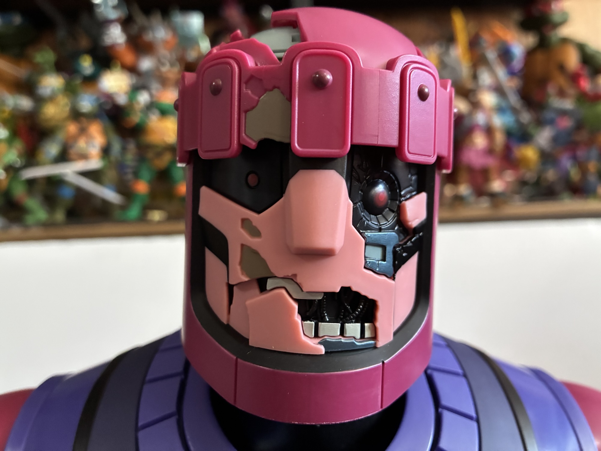
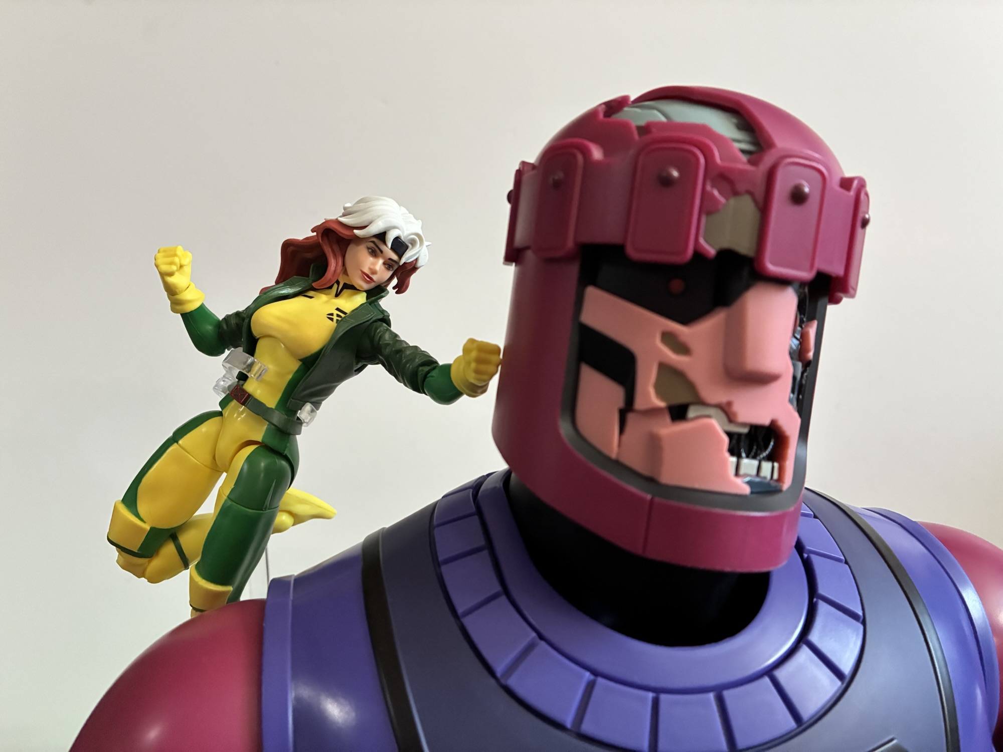
The battle damaged face looks great and is good for punching.
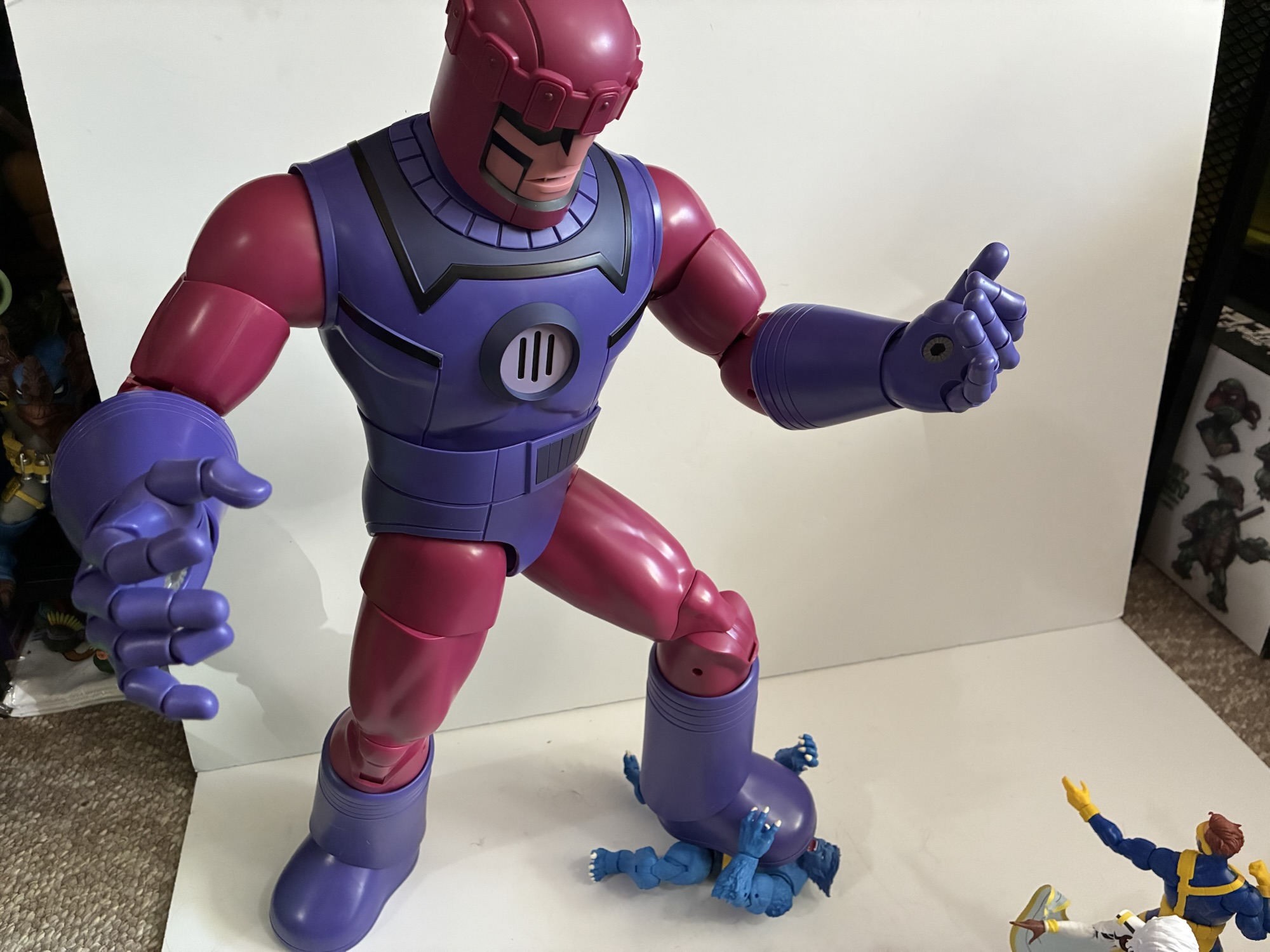
The Sentinel retailed for $175 direct from Hasbro with free shipping. It arrived in a brown box with a brown shipper box inside it. Within that is the actual product box. It contains a graphic on the front illustrating what’s inside with a larger picture on the right spine of a Sentinel in action. The other side has a group shot of the cast of X-Men ’97 and the rear has a cross-sell along with a shot of the figure in action with other X-Men ’97 action figures. There’s no window so if you got this as an in-box collector it might not do the trick for you, but if you just want a box that looks nice and fits in with the other X-Men ’97 boxes then this is fine. Inside it is another brown box and tray with the figure inside. It comes bagged and all of the accessories are bagged as well to protect it as much as possible and it seems good enough. In spite of that, my figure does have some dings on it. There’s light scuffing on the chest and on the side of the neck. I don’t think it has anything to do with how the product is shipped, I think this is just from assembly at the factory, but it’s a little disappointing.
The scene that has stayed with me since 1992.
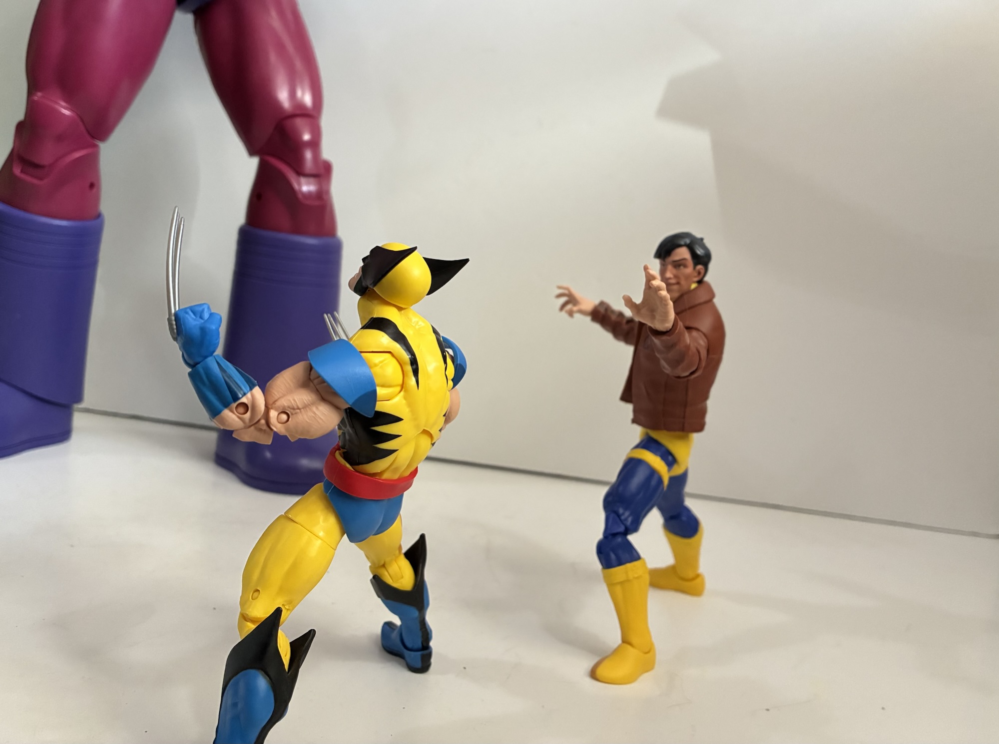
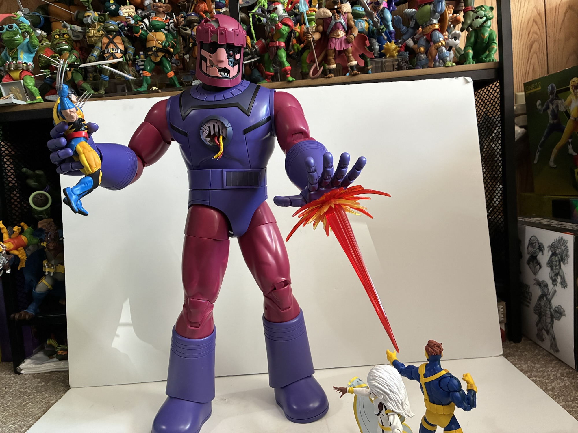
Apart from those blemishes, the Sentinel cuts a nice figure and presents well. Those scuffs are only visible up close, and while they shouldn’t be there, they don’t really impact my enjoyment of the product. This dude is pretty damn big and even though I saw lots of images online including Hasbro’s display at San Diego Comic Con, it still didn’t prepare me for how big it is. I have the Sentinel at about 22″ in height which is also the advertised height. It has some heft, especially in the lower legs. Now, the plastic is pretty hard and I likened the feel to a Super Soaker when someone asked me my thoughts, but it presents reasonably well. It is a Legends release so there’s not a lot of paint. The darker purple near the collar is painted on as are the black lines. The face has painted details and there’s a little linework on the top of the head and some on the belt. It’s mostly clean, though there is a blemish on the black linework on the rear of my figure that I’ll probably touch up, but the figure isn’t overly shiny. And mostly it just looks like a cartoon Sentinel. It’s based on the updated look in X-Men ’97 which really isn’t all that different from the ’92 look so if you’re interested in it as a fan of the original series it should work. It also works as a classic, comic, Sentinel if that’s your preference compared with the more modern HasLab and should fit into a comic or animated display without issue. And at 22″ I think it has enough size. Are they usually presented as bigger in the show? Yeah, probably, and my guess is they’re more like 30′ tall, but they’re also pretty inconsistent (compare the first episode with the season finale and, in particular, Wolverine fighting them in the tunnels) in the show.
“This one’s for you, Morph!”
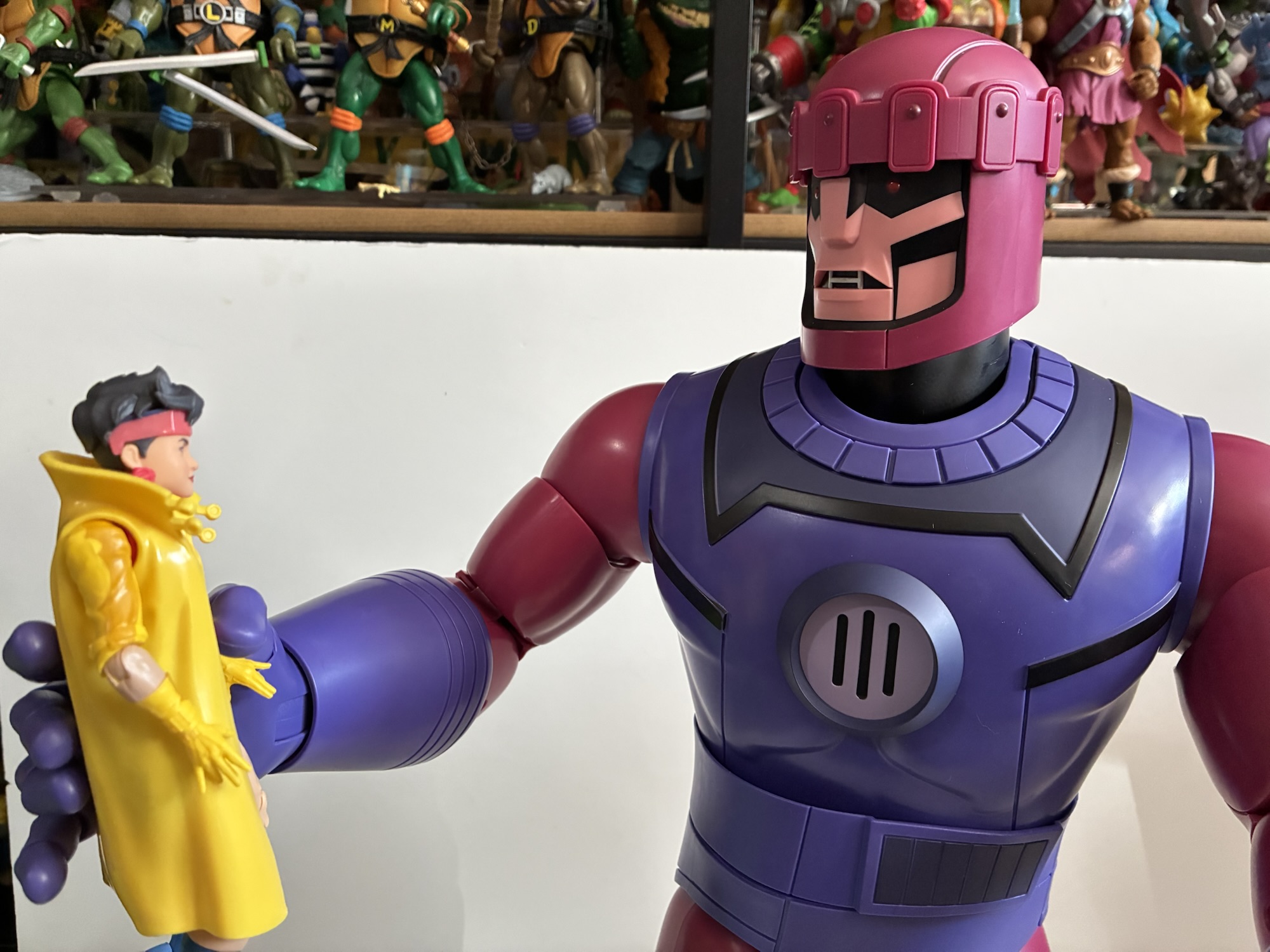
And the sucker is so big that I don’t think I could manage to squeeze it into a display at any other height. Nor do I think I could have found room for more than one, but Hasbro would probably like for people to double, or triple, dip on this release and the accessories aid with that. The Sentinel comes with an optional dome and face plate to display some battle damage. The dome is basically just missing a section so it exposes the “metal” underneath while the face plate is all cracked and broken. The sculpt and paint of the optional face plate looks terrific and I suspect it will give folks pause over how to display this thing. To further aid in the battle damage is an optional vent for the chest. This one has two wires poking out of it and it’s sculpted and painted well. Apart from that, there’s a pair of blast effects. They come in three pieces: a wide burst, a smaller burst to sit inside it, and the plume for the center. One centerpiece is longer than the other for a little variety and the parts are made of translucent, red, plastic with yellow painted on for a little pop. The smaller, inner, burst is actually translucent yellow so there’s a nice mix of color. They look good, but I do wish we got more of a beam effect too since that’s how their blasts were represented in the show. They can plug into the hands or the feet so if you have a means of suspending one of these in midair you could do a flying pose. The port on the hand can also accept the tentacle parts that came with the HasLab which is nice for those who have it, but why not toss one in with this set too? It’s already tooled so what could that possibly cost?
If only the VHS Cyclops came with a blast effect.Morph may have died, but Beast didn’t make out too well either.“Surrender, mutant!”
Even though this guy is much larger than your standard Legends release, it still moves like one. I don’t have that HasLab Sentinel, but I know one of the biggest issues people had with it were loose legs. To apparently address that issue, Hasbro put ratchets everywhere on this guy so nothing is loose. If you wiggle it a bit it will jiggle and the arms could move on you, but just don’t do that! The head and neck are separately articulated so there’s good range there. Again, I have some scuffing on the neck of mine, but it wasn’t caused by the articulation though I would still advise being a bit cautious. Shoulders, biceps, elbows, and wrists are all typical Legends articulation. What’s not are the fingers and thumb where each joint is a peg and hinge so you can individually pose each digit which is cool. Toy Biz loved articulating the fingers on the 1/12 figures back in the day and it was awful, but at this size it works fine. There’s a ball-joint at the waist and the crotch piece is a soft material so it can pivot in all directions without worry. Beyond that, we have the hips, thigh swivel, double-jointed knees, boot swivel, and ankle hinge and rocker. Range is pretty fair everywhere. No, he can’t do splits, but he can do walking poses and kick forward, should you want him to. The double joints at the elbows and knees aren’t going to produce much better than a 90 degree bend, but they don’t really need to. They are pin-less, but there’s also exposed screws that are holding things together. There’s no toe hinge, but I’m okay with that as this is more stable. And even with the tight joints, standing him can be a little precarious. I like the proportions, but I kind of wish they made the feet a little oversized to help with that stability, but I also haven’t had this guy topple over either.
If you’re pressed for space, something like this might be the best way to pose this guy.
Is this Sentinel worth $175? Yeah, I think it is. It’s not going to blow you away with how it looks. The lack of paint means it’s not like that giant dragon Four Horsemen solicited last year. It also doesn’t cost the nearly $1,000 that thing did. It’s an oversized Marvel Legends figure with Marvel Legends quality and I think the price is fair. It gets a little dicey post release as Hasbro does have extra product. Since they don’t charge upfront for these made-to-order pieces, consumers are free to cancel and either through that or via extra stock for replacements and such there are some available on the Pulse website at the time of this writing. I don’t know if that will be true when this goes live. They are no longer $175 though and are up to $220. Either production ended up being more than anticipated or those wonderful tariffs jacked the cost up, but it’s now not the same deal it was last year. It could also be part of Hasbro’s plan to reward those who preorder and keep that order with a cheaper rate and upcharge the Johnny-come-latelies. I don’t know, but I do know that $220 feels like a lot more and I’d have serious reservations about that price. I’m glad I don’t have to think about it and locked my order in a year ago, but if you missed it and feel FOMO kicking in then I guess you have a decision to make. Hopefully you got some cash for Christmas or something to make it an easier call. I think the Sentinels are some of the biggest (obviously) and most important villains for the X-Men and I’m so happy to finally get this version of the character in plastic. The HasLab wasn’t for me, but this is. Now where the hell can I put this thing?
Do you need some X-Men ’97 or ’92 figures to battle your Sentinel? Check these out:
Today we finish our look at wave 3 of X-Men ’97 Marvel Legends action figures and I think I saved the best for last. Cable was one of the non-members of the X-Men to play a pretty substantial role in the original animated series. He showed up in multiple episodes in both the first and…
This is it! This is the big one! Back on Halloween of 1992 Fox premiered X-Men and we were introduced to a character named Morph. For comic readers, it was a bit of a re-introduction as Morph was based on the character Changeling, but for copywrite reasons, had to undergo a name change. Changeling wasn’t…
The television event of 2024 for me was none other than X-Men ’97. I loved that show and I can’t wait for the second season to come around. It’s just a shame we may still be as much as a year away, but to somewhat tide us over until then we have this third wave…
More characters for your Mighty Mutanimals display have arrived courtesy of NECA Toys.
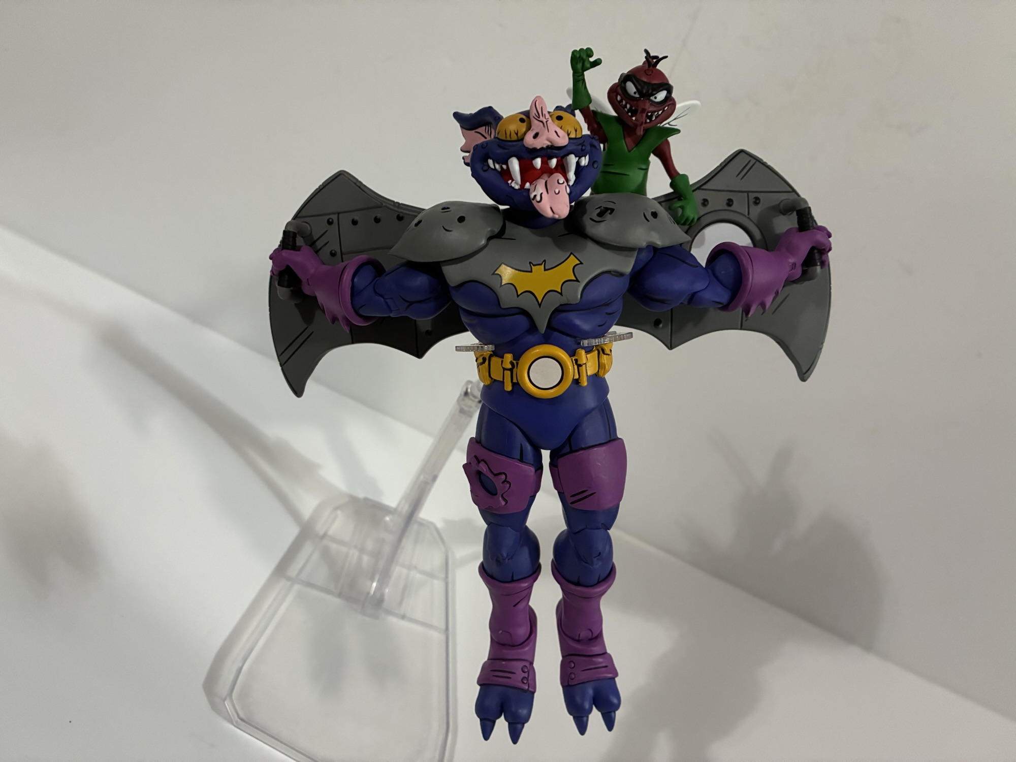
NECA started down the Archie-verse of Teenage Mutant Ninja Turtles in 2022 with the Mighty Mutanimals-adjacent Slash. For most, The Mighty Mutanimals team of heroes consists of Man-Ray, Jagwar, Leatherhead, Dreadmon, Mondo Gecko, Wingnut, and Screwloose. For those folks, NECA began that team in 2023 releasing the trio of Man-Ray, Jagwar, and Dreadmon all within about a month of each other. Following that, the team has been slow to complete as 2024 saw only the release of Mondo Gecko and 2025 will only be adding the subject of today’s post, Wingnut and Screwloose.
Wingnut has some decent size to him. As for Screwloose, well he’s a little guy.
Wingnut had an inglorious debut in the companion comic to the Teenage Mutant Ninja Turtles cereal. At least, it feels like an inglorious debut, but how many kids bought a box of cereal and saw him vs how many may have picked up the Playmates toy or an issue of Teenage Mutant Ninja Turtles Adventures? I’m willing to bet Ralston-Purina sold a whole bunch of cereal boxes that year. Wingnut was a villain there and he’d be a villain (along with Screwloose) in the cartoon series, but in the Archie books he and Screwloose are heroes with an obvious Batman and Robin motif. They’re aliens and hail from a world that Krang has destroyed making them both the last of their kind. Their creation is credited to Ryan Brown, and like a lot of the Archie versions of toyline characters, their appearance here is stylistically pretty different from other sources even if the same, general, vibe remains the same.
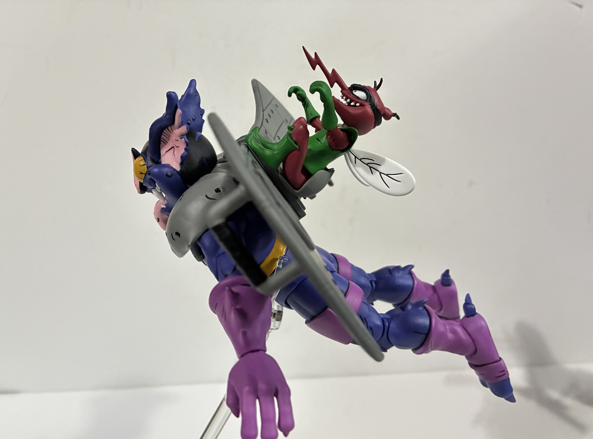
I never thought I’d have this many versions of this duo.
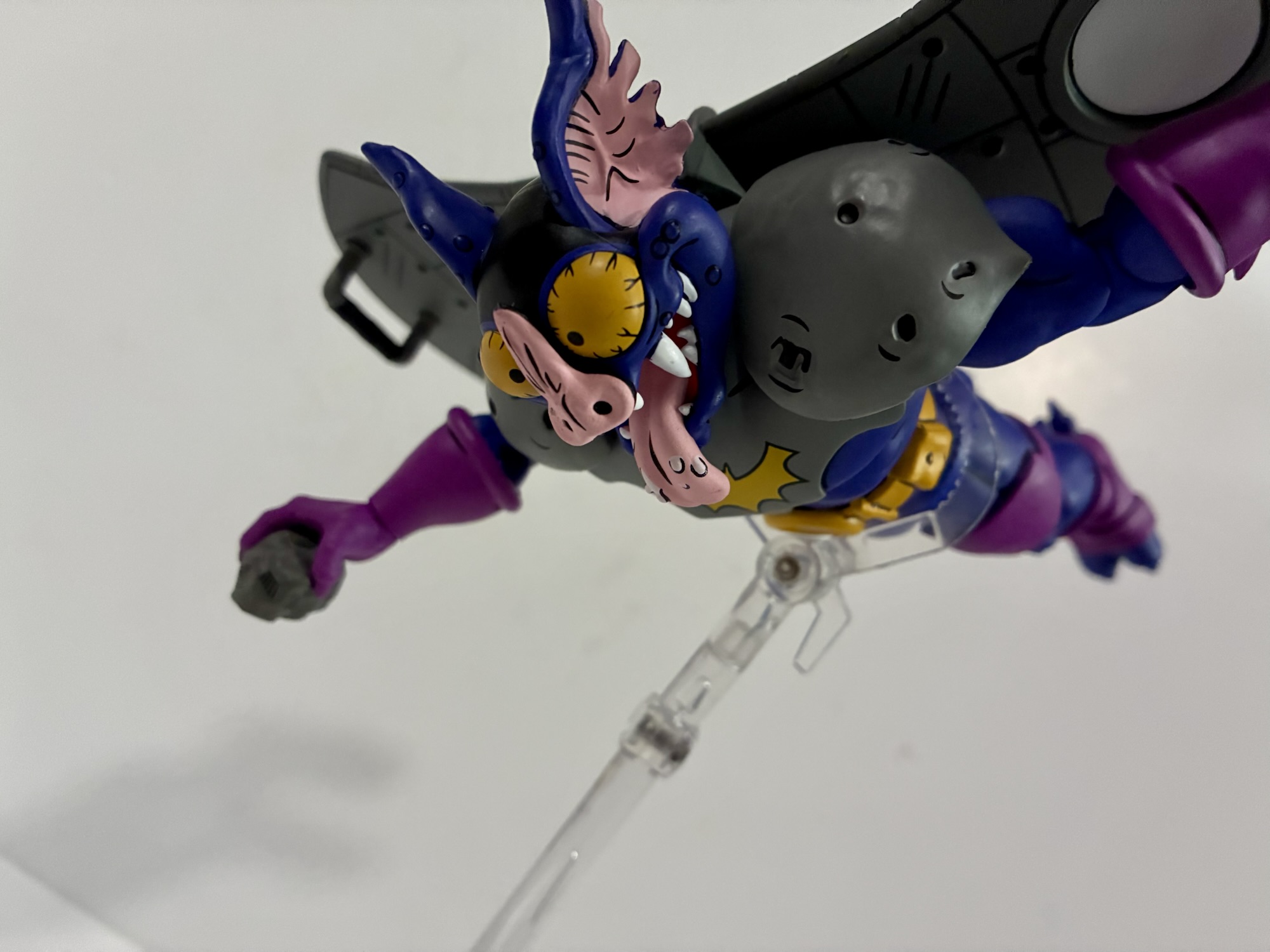
NECA’s version of Wingnut and Screwloose comes courtesy of sculptors Tomasz Rozejowski and Brodie Perkins. Paint, as always, is credited to the duo of Geoff Trapp and Mike Puzzo and the box art is by TMNT veteran artist Ken Mitchroney. The duo has that Batman and Robin vibe most are looking for, but the dominant color with Wingnut is purple. Most of his body is a dark purple while his gloves, boots, and thigh straps are a lighter, more red, purple. He has some gray armor on his chest and shoulders and the ever-present Not Batman logo in yellow on the chest. The combo of yellow and purple makes me think of ’66 Batgirl more than Batman. He has a big, yellow, utility, belt and his mechanical wings. Unlike every other Wingnut figure I own or have owned, there are no tiny, organic, wings present in the mechanical ones. I don’t know if he lacked them or if they’re inside these ones. These wings do give him even more of a Batman silhouette because of the shape.
That is some nose you’ve got there, Wingnut.
The sculpt and the paint is the star of the show here. Wingnut has a wild expression on his face with his saliva-coated tongue flailing about. There’s some black on the top of his head which plays off of the deep purple and the pink of his inner ears very well. The sculpt is very much reminiscent of an actual bat, but there’s a slight softening to it via the more cartoonish approach of the design vs what Playmates did with the vintage figure. He does retain that…unfortunate…nose shape and it’s big, veiny, and gross. There’s some nice details sculpted and painted into the shoulder pauldrons as well as the wings. There’s the usual abundance of black linework that helps make the figure “pop” with nary a touch of paint slop.
“I got a guitar!” “I got a gun!” “I got a rock…”
The accessory load-out for Wingnut is a bit on the minimal side, especially if you’re used to this character coming with a bunch of Batman-like gadgets. There is no alternate portrait, but we do get three sets of hands: fists, gripping, and open. There’s also an extra right hand with a much wider grip so he can hold his lone weapon: a rock. It is a pretty big rock. I’m sure it would hurt, especially if thrown from above. Wingnut’s number one accessory though is Screwloose. Sculpt and paint-wise, Screwloose is every bit as good as Wingnut just much smaller. He stands a little over 3″ which feels about right and has a maroon and green color scheme with his usual black mask. He’s minimally articulated with a swivel at the head, ball-hinge shoulders, wrist swivels, ball-jointed waist, ball-socket hips, ankle hinge, ankle rocker, and ball-jointed wings. He also has his own accessory in the form of a swappable lower half. It’s permanently molded in a sitting position so he can sit in the little seat built into the back of Wingnut’s wings. His tail pokes through the seat and kind of locks him in place. Separating him at the waist is a bit tricky and required some heat to accomplish. I may have been able to force it without heating, but there’s not a lot of room to grip this little guy and I was worried about breaking the wings in the process.
Screwloose is the rare character who can smell his own ass.
Wingnut’s articulation is fairly standard for the line. You get a ball-jointed head, ball-hinge shoulders, bicep, double-elbows, wrist hinge and swivel, diaphragm joint, waist swivel, ball-socket hips, thigh swivel, double-jointed knees, and ankle hinge and rocker. The pain points continue to pretty much be the same from release-to-release with NECA. The range at the head looking up is only okay, but the diaphragm joint doesn’t help the situation really at all as it doesn’t go forward and back much. At least with this figure, the point of the armor stops it form going forward so there’s an obvious obstruction one can see that would have been hard to work around where as Archie Shredder just kind of sucked at that joint “just because.” With Wingnut, it’s just unfortunate because if you want to have him flying parallel with the ground he won’t be able to look forward. He just doesn’t have the required range to do it. He can grip the handles on his wings, though it’s a little tricky since the wings don’t always want to stay in place. The right handle popped off on mine trying to get him in place, but it appears to be engineered to do. Though I think it’s supposed to be glued. The elbows and knees were pretty tight out of the box, but I didn’t have to heat anything. And the joints are pin-less, if that’s something you value.
I wish NECA made better flight stands.
With Wingnut and Screwloose it’s pretty simple: NECA is killing it with the sculpt and overall presentation. We miss out a little when it comes to articulation as a result, and while I’d like to see them make more of an effort in that area, Wingnut is not their biggest offender. He does come at an inflated price-point of $45 currently. Thus far, he’s only been solicited at Walmart so he may even go up when offered by online retailers. It’s not a great price, but we’re also entering a world of $30 Marvel Legends figures so at least from that standpoint it certainly could be worse. I’d have liked to see NECA include a flight stand with this release since he so clearly needs it, but aside from that I’m largely okay with what we got. This release features all unique and purposeful tooling with no obvious reuse potential available. Maybe there are different colorways they can do? Perhaps a Tournament Fighters edition? NECA has mostly abandoned the video game stuff, but that would be an easy re-release. He certainly looks good on the shelf along with Screwloose and the rest of the Mutanimals. Now we just need Leatherhead and the team will largely be complete. Perhaps in 2026?
Just missing Leatherhead now.
Looking to assemble your own Mighty Mutanimals shelf? Here’s a few reviews you may have missed:
.The NECA Cowbunga Collection is a content creator’s dream. Here we are deep into October still talking about figures that dropped in August. This time it’s another Teenage Mutant Ninja Turtles Adventures action figure and it’s fan-favorite Mondo Gecko. Most TMNT fans probably know Mondo from the Playmates action figure line. He also made the…
We’re almost done with all of these NECA Haulathon drops from March and up today is the last of the single-packed figures, the Mighty Mutanimal Dreadmon! Technically, he’s the third figure in NECA’s line of figures from the pages of Teenage Mutant Ninja Turtles Adventures since he’s listed as number 3 on the box. However,…
The next figure in NECA’s line based on the Teenage Mutant Ninja Turtles Adventures comic series is a much anticipated one for fans of those books and its spin-off The Mighty Mutanimals. And that’s because this character is making his debut in plastic. Previously, we looked at Slash who has been pretty well-represented in some…
Hi kids, it’s Spider-Man! He has a cold and a bad back so he won’t be saying anything or doing anything.
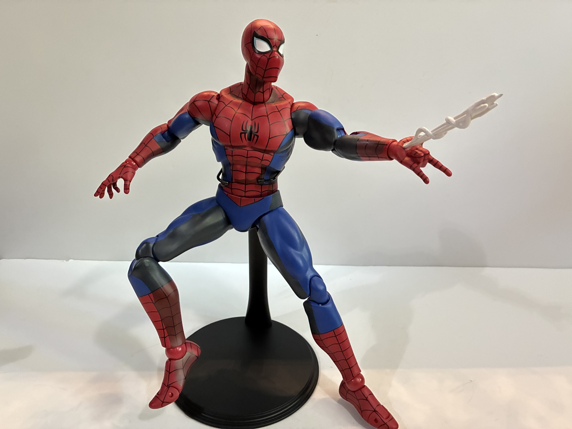
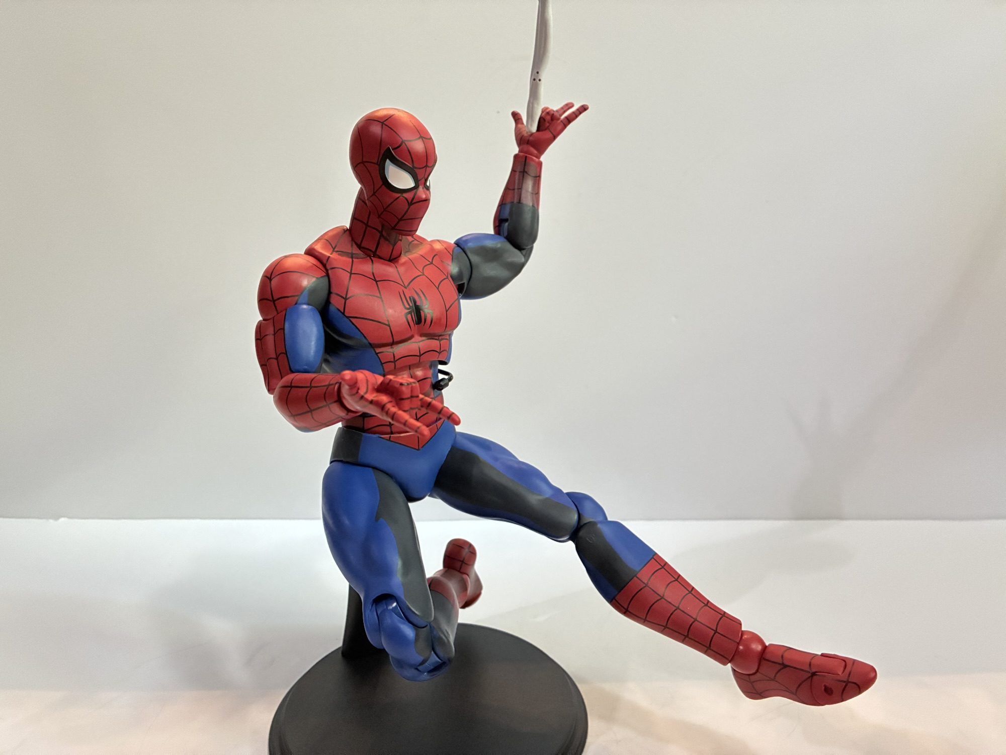
It took a long time for Mondo’s Spider-Man to get to me. At first, I wasn’t sure if I was going to even buy it. I passed on the Mondo offering in 2024, debated the symbiote costume variant, but ultimately passed on that as well. The X-Men line from Mondo is my true love and I just don’t have room on my shelf for another line of sixth scale action figures. I did get Venom because I love the character, and when Entertainment Earth had a big anniversary sale I decided to take the plunge on Spider-Man. That was in October of 2024 and at the time the figure was expected to ship in January. Then all of the tariff nonsense struck. The figure kept getting pushed out and eventually EE even had to up the price on me because of said tariffs all but wiping away the discount I was originally expecting. As the months went along I started to debate just cancelling it all together. I loved my Venom figure and I didn’t need a Spider-Man to enjoy it any more than I already did. When I received a notification that the figure was, at long last, in-stock I figured “Well, it’s happening.” Then nothing. Then my order was flipped to backorder. I emailed EE which didn’t offer much other than to say they didn’t get enough to fulfill all of their preorders. At that point, I figured I should just drop it and move on, but before I could my order was changed to “processing.” Now I have a Spider-Man from Mondo and I kind of wish I didn’t let my indecision get the best of me.
Spider-Man comes in a large window box with artwork by Nick Bradshaw and Peter Santa-Maria adorning it. It has an almost dark-deco vibe to the skyline which is evocative of the show’s CG cities when Spidey was seen web-swinging around New York. The figure itself is a sculpt by the renowned Alex Brewer with paint by Mark Bristow. The packaging concept is credited to Jordan Christianson and art direction to Hector Arce.
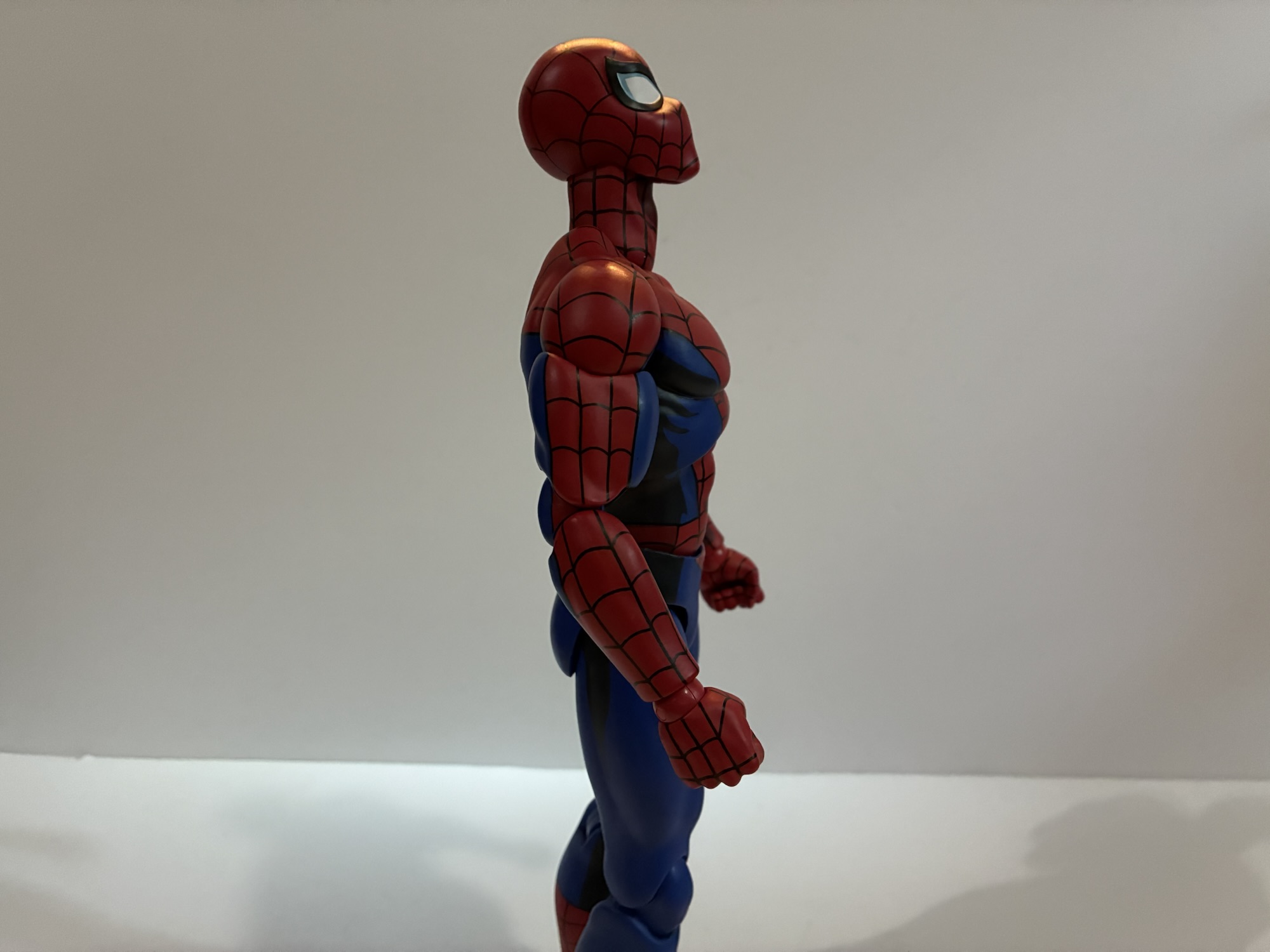
The ’94 version of Spider-Man could probably be taller, but I like the difference between he and Venom.
Spider-Man stands at about 11.75″ to the top of his head. I’m a little surprised they didn’t make him the full 12″, but I also don’t mind him being that much shorter than Venom. I tried to find some turn-around art from the show’s production for comparison, but the Internet has let me down. I can only compare him to still frames from the show and I have to say I feel like the silhouette is a touch off. Spider-Man in the 1994 cartoon is a pretty big Spider-Man. Pretty much all of the super hero shows back then had one style for all of the male characters. Flash Thompson would pick on Peter Parker for being a nerd, even though Pete was built like a linebacker. Here, the neck is a little slender and sits inside the silhouette of the head, which isn’t really how he was drawn. The shape of the head is also a little narrow which just draws even more attention to it. It was a Saban production and those were notoriously cheap for the time so there’s a lot of inconsistency from episode to episode, scene to scene, and shot to shot. Did Spider-Man look close to this in some shots? Probably, and there’s going to be some subjectivity on the part of the sculptor. For me personally I would have liked a slightly more beefy Spider-Man since that’s what stands out to me about the ’94 design.
Apart from that, the actual design and paint applications for this figure are fantastic. The eyes have that very ’94 shape to them and there’s a lot of empty space around the spider on the chest, as was true of the show. The linework is very clean and the cel-shaded paint job pops as one would expect. It was important to nail the shade of blue and red to make this feel like it’s from the show and Mondo did an excellent job there. There is some light scuffing on the left thigh of my figure which is odd because that area was wrapped in cellophane when packaged. Maybe it was wrapped too soon after painting or it just got too hot during transit? Despite that, the paint is easily the best aspect of the figure and really the entire Mondo sixth scale line and Spidey doesn’t lower the bar at all.
He’s a handsome fella.The mask looks more like a helmet when held this way.
Spider-Man has a host of accessories, though this particular edition has fewer than the limited run solicited by Mondo initially. For an alternate head we just have the unmasked version of Pete. It looks exactly like the character from the show and the paint job is terrific. He does have a bit of a smile to his face which does present an issue for a different accessory, but not one that actually came with this figure so I guess we can’t really ding it for that. There’s also a mask accessory. It’s shaped like Pete should be able to hold it and have it hang from a gripping hand, but I couldn’t get it to work. I thought it might be intended for Venom, but then I remembered Venom came with his own Spider-Man mask accessory and that one is glued into his gripping hand. Maybe other villains will be able to make use of this one down the road?
Go web!Long web.
For hands, Spider-Man comes equipped with a set of gripping hands. What he’s supposed to grip, I don’t know. He also has a set of relaxed hands, fists, and thwip hands. Peter also has his trusty camera which is molded to a web splat like it’s stuck to a wall. It does make it hard for him to hold, but I suppose one could stick it to a wall in their display with some tack or even via a finish nail or clear pushpin. Peter also has two thwip hands with short bursts of webbing coming out of them. The hands do not feature any articulation and are on straight pegs, which is fine for what they’re meant to do. There’s also another set with the long web lines attached just like we saw with Venom. There is a bendy wire in these webs, but I’m not really sure what purpose it would serve since the web lines are non-removable. For the ends of the webs, there are two conical attachments that serve as generic ends to the webs. There are also two web splats if you want the webs to be striking a surface or other figure. And lastly we have the typical Mondo display stand which is of limited utility. I don’t ever use these things, but I actually probably will with this figure. For that reason, it’s a shame it’s a plain black stand without any artwork on the base. It’s also the basic doll style stand and not the more dynamic one they have coming with Nightcrawler. I appreciate Mondo finally addressing the quality of their stands, but if you were going to do a better one wouldn’t Spider-Man be a character deserving of such?
It’s even a challenge to do convincing web firing poses.
That is all well and good, but where this figure has really come up short for me is with the articulation. Mondo’s figures are not super-articulated. They’re fairly basic as this is an aesthetics forward line, first and foremost. I’ve always felt it suits the X-Men line very well as the show that is based on featured pretty stiff, limited, animation. Those characters didn’t do a whole lot. Spider-Man wasn’t much better, but it still featured a character who spends most of his time crouching on landings, crawling on walls, and swinging through the city. Mondo correctly recognized that there was a need for more points of articulation with Spider-Man than they might normally do, but unfortunately the execution is lacking.
This is pretty much the extent of his range in the torso.
Spider-Man has a standard double-ball peg head which all Mondo figures seem to have. Unfortunately, Mondo really buried the lower ball joint in the neck which limits Spidey’s ability to look up. This can sometimes be corrected with a lower neck joint and Mondo opted to do just that. Unfortunately, the ball joint at the base of the neck might as well not be there. It’s way too snug and offers nothing when it comes to articulation. The shoulders are the standard hinged ball peg and there’s no butterfly joint. I’m okay with the absence of a butterfly joint at this scale and with this character design, but what I’m not okay with is how tight the right shoulder on my figure is. I could not get this thing to move much at all out of the box and I’m surprised it didn’t snap at the bicep. Even after heating and lubricating the joint, it still barely functions so it’s not a case of needing to just crack some paint that worked it’s way in there. There are bicep swivels, double-jointed elbows, and ball-hinge wrists and they work fine.
If you want your Spidey to crouch, good luck. Here he’s being supported by the stand.
Where things start to take a turn for the worse is with the torso. Mondo typically goes with a ball joint in the diaphragm and one at the waist and that’s what they did here. This combination is ideal for waist articulation even in a character like Spider-Man who is expected to crouch a lot. Unfortunately, Mondo screwed it up. The diaphragm joint does almost nothing. It doesn’t really rotate nor does it really go forward, back, or tilt. It’s just way too snug on the abdomen. As for the waist, it barely moves as well. Even rotating it doesn’t work all that well as the joint feels like it’s fighting me. Did the factory not lubricate any of these joints during the assembly process? It doesn’t feel, or sound, like it and I have noticed zero lubrication residue anywhere apart from what I added. I get it that Mondo would not want articulation that leads to large gaps in the figure or that might cause too much paint rub. They went too far though and basically made the pieces so snug and tight that the articulation is functionally useless.
This is probably the extent of his swinging ability.
At the hips, it only gets mildly better. We have ball-socket hips with built-in thigh swivels. The left hip is okay while the right hip is stubborn. It sometimes snaps back into position when I try to move it. I have popped it off and applied some lubricating oil which has improved it some. It still doesn’t mean Spider-Man can do splits or kick a full 90 degrees. If you try to kick forward, the figure wants to go off to the side. You can rotate at the hip to basically get into a split, but the way the cel-shading is done makes it look kind of dumb as the darker shaded portion of the legs will be forward-facing. The knees are standard double-jointed knees and at the ankles Mondo decided to go with hinged ball pegs like they do at the wrist. This means you can swivel and move those feet all around as much as you want, but it’s not a strong joint which is why I recommend using that display stand with this one. He’s just not going to stand very well. There’s also a toe hinge that’s kind of ugly. It works, but there isn’t enough stability in the figure to utilize the joint without a display stand.
I was not expecting Marvel Legends levels of articulation from this figure, but I was hoping for more. He’s really stuck in vanilla poses which is not befitting a Spider-Man. If the joints just worked he’d be fine. Then you could hunch him forward or having kind of twisting in a swing pose. I was hoping for a basic crouch, not a super low one, but you’re not getting that either. He can kind of do a basic swing pose, but it’s a bummer that he doesn’t have a web line to just grab onto. If they could pop out of the web shooting hands that would have solved that. I’m just really disappointed in what this figure is capable of and it left me feeling that Spider-Man is a poor fit for what Mondo wants to do.
At least this was a pleasant surprise.
There is one other thing to talk about and it’s Venom’s web swing. If you have the Mondo Venom, he comes with a left hand accessory that’s a web swing/harness for Spider-Man. It’s based on a scene straight out of the episode “Venom” where Venom webs up Spider-Man and takes his mask off. He dangles him off a rooftop threatening to expose his secret identity to the world. The accessory is basically a belt and two loops for each hand. I was able to slide it onto my Spider-Man figure starting at his feet. It wasn’t easy and his right leg popped off in the process, but it is doable. The two strands for his hands are simple enough to attach and I plugged the Venom hand portion into my figure to test it out. To my surprise, the thing actually works! I first just had him on a surface and Venom was able to remain standing while holding Peter, but Peter’s feet were on the same surface. I moved the pair to a shelf where I was able to dangle Peter off the edge like in the show. Venom was up to the task and the two remained without issue. I don’t know if I actually have the guts to leave them there permanently like that, but I was sorely tempted. I didn’t think it had a chance of working this well, but credit to Venom’s tight joints and hefty weight. The only disappointment is Peter’s stupid, smiling, face. He really needs an angry expression or a scared one to sell this display. The black costume version of the figure comes with an angry unmasked head which probably would work better for this specific display, but that was a limited edition and has long since been sold out.
The harness accessory working so well was certainly a pleasant surprise, but it doesn’t redeem this figure of Spider-Man for me. This is the first Mondo figure that I regret buying. He looks good enough in a neutral pose, but Spider-Man is not a character for a neutral pose. It’s frustrating to know that Mondo recognized that and incorporated more points of articulation into the figure to address the issue, but nothing they added really worked. Ball-jointed torsos aren’t that complicated even at this scale and if the worry was the figure would topple over well then why hinged ball-joints at the ankles? It’s unfortunate and this is a figure I can’t recommend especially at the price it commands. If you think he looks good and don’t mind that he won’t be doing much of anything on your shelf then have at it. I personally expected more from Mondo and Spider-Man.
If you liked this review then here’s some other related entries you might like:
Mondo has had success with its sixth scale line of action figures based on X-Men and X-Men ’97 so it’s no surprise that the company has decided to dip its toe into another 90s animated Marvel series in Spider-Man. And when it comes to Spider-Man, I’m not sure what to call it. I always referred…
It was in 2021 that Hasbro released a PulseCon exclusive Venom figure on a Spider-Man retro card. The retro card series is meant to stir-up nostalgia for all of the adults who were buying toys and watching cartoons in the 90s as the retro card is a facsimile of the old cards Toy Biz used…
Last year, Hasbro celebrated the 30th anniversary of X-Men, the animated series that premiered on Halloween 1992 and would become a ratings hit shortly thereafter for the Fox Kids Network. It was responsible for getting a lot of kids into the X-Men and Marvel comics in general and the first, prime, benefactor of that rise…
It’s the latest from Hasbro’s Marvel vs Capcom Gamerverse line!
Video game inspired action figures are quite the hot ticket right now. I’m not entirely sure why that is, but maybe some of that is owed to Jada Toys and how well received their line of Ultra Street Fighter 2 action figures have been received. Hasbro, for their part, has had a “Gamerverse” subline of Marvel Legends for quite awhile now, but it has mostly centered on the Spider-Man games released for the PlayStation. This year, Hasbro decided it wanted a piece of the Marvel vs Capcom pie without actually saying that outright. Gamerverse has now pivoted to that beloved franchise, though strictly the Marvel side. Despite having a previous relationship with Capcom via its Power Rangers x Street Fighter line a few years ago, Hasbro has shown no interest in actually engaging the licensor for these figures instead releasing a series of two-packs and one-offs of Marvel characters from that line of games. Most of them have not been of much interest to me, but there was one I could not ignore: Wolverine vs Silver Samurai.
One of these figures is more desirable than the other.
I have enjoyed the Capcom fighters going back to X-Men: Children of the Atom in arcades. The hyper fast fighting games were a sight to behold and it felt awesome to finally be able to take control of the X-Men in a setting that felt worthy of them. The games only became more popular when they were eventually paired with Street Fighter, then eventually it expanded to include all of Marvel and all of Capcom. The designs from those games always came across as rather unique for the Marvel characters and many years ago Toy Biz made a half-hearted attempt at characters in that style with a series of two-packs sold at KB Toy Stores. They weren’t great and I never actually bought any, but I’ve always wanted figures that match the art style presented in those games.
“Let’s go, bub!”
For Hasbro’s collection, we get the usual mixed bag from the company. Some of the figures in the line do a really good job of matching the games, while others very much do not. And considering most of the releases are two-packs, it probably comes as little surprise that one figure in each set appears to get more love than the other. That is certainly the case with this two-pack featuring Wolverine and Silver Samurai. Wolverine practically looks like he was yanked off the side of the arcade cabinet with his bulky frame and elongated claws and mask fins. Silver Samurai…just looks like the previous Legends release, but in a muted color. I’ll say upfront I do not care about Silver Samurai at all. He’s always been a D tier Wolverine adversary for me and his figure doesn’t offer much. I got this for Wolverine, and considering the set comes at the inflated sticker price of $60, there’s a good chance I way overpaid for a Wolverine figure. Now, I’m going to help you decide if you should do the same.
The presence of dark gray lines on the chest appear to be entirely random.
We might as well get the Silver Samurai out of the way. As best as I can tell, this figure is mostly a straight re-release of the prior Legends figure, but with a new torso and expression. The previous figure had a riveted look to the armor where as this one is pretty smooth. Both the arms and legs feature pinned joints owing to their age so if that’s something that bothers you then you may be disappointed here. The color this time around is a very bland gray. The only paint on this guy is reserved for the exposed part of his face, the white of his eyes, and the red on his crest and sun pattern on his chest. The rest of the figure is that lame attempt at metallic plastic Hasbro likes to use. All it does is create random lines or swirls in the plastic while adding zero luster. The chest on my figure almost looks cracked, but it’s just streaks in the plastic. The character in the game was damn near white by default with gray-blue shading. Hasbro didn’t bother to try and match that sprite or the art from the booklet and instead gave us this ugly lump of plastic.
He looks like a kid posing for a Little League picture.It’s fine.Looks cool, but it’s a little heavy for the blade.
For articulation, the Samurai is also not up to snuff. He’s very basic with a ball-hinged head, hinged-ball shoulders, bicep swivel, double-jointed elbows, ball-jointed diaphragm, waist cut, ball-socket hips, thigh cuts, double-jointed knees, boot swivel, ankle hinge and rocker. His wrist hinges are at least the proper vertical hinge for sword wielding, but his lack of a butterfly joint means he can’t hold his sword with two hands in a convincing fashion. You can get two hands onto it, but it looks kind of dumb. The shoulder pads are pegged into his traps and are annoying to deal with and tend to pop off a lot. For accessories, he has his katana which is done in a translucent blue plastic. It looks fine, but mine has some black paint on the blade. It’s also very flimsy which stinks because he also has an effect part for the sword that looks pretty cool. It’s bubbly and done with blue translucent plastic with hits of a dark blue or purple. The swords slots through it, but the weight of the part will cause it to droop. He also has his energy shuriken made out of translucent orange plastic and a flimsy plastic stand to peg into it. The weight can be a bit tricky to get it balanced because the stand is so poor, but it can be done. However, Jada this is not.
Bring it on!
Which brings us to the real reason I wanted this set: Wolverine. What attracted me to this figure wasn’t just the stylization on display, but also some engineering choices Hasbro made. They have not, to my knowledge, made an action figure like this Wolverine and some of the choices they made are ones that I’ve been wanting from them for years. We’ll get to that with the articulation portion, but first the elephant in the room must be addressed: this is a big Wolverine.
He’s a pretty big Wolverine.
Wolverine stands at just a touch under 6″. Wolverine runs taller in those games, probably because his sprite is always crouched, but if you wanted to slide him into your comic collection this may pose too big a hurdle to climb. The X-Men animated Wolverine by comparison comes in at 5.75″. Is slightly less than a quarter of an inch a big deal? Kind of, considering that older Wolverine is probably a little on the tall side as well (mostly owing to the really long neck of that sculpt). What really stands out as different though is just how much bigger all around this new Wolverine is. Line up any part of the body and compare it to the prior one and it’s a stark contrast. His biceps, thighs, fists, are all quite a big larger. It’s almost as if this Wolverine is in a different scale from its predecessors. Marvel Legends is thought of as a 1:12 scale line while this Wolverine almost feels like it’s in between 1:12 and 1:10 scale (I guess that would be 1:11). He’s a little big for 1:12, but not quite 1:10.
Even though he has a single hinge at the elbow, the range is pretty much the same as the prior double-jointed version.
As for the sculpt, this thing is entirely brand new. We have the new head with the exaggerated fins, or ears, or whatever those things are on his mask. He has just the one expression which features a gritted teeth look like the cabinet art. The body is also entirely new with the much beefier proportions. The shoulder pads are separate and looped onto the peg going into the torso as opposed to pegged into the shoulder itself. The black on the torso is painted and not sculpted in while the fins are black plastic. The face also appears to be painted onto black plastic and the opacity is not as thick as it needed to be. The left side of my figure’s face has some black showing through, which is a shame. The overall proportions and sculpt are all very nice, but other paint issues include a yellow speck on the left side of my figure’s abdomen and some blue smudging on the left thigh. The middle claw on the left hand (geez, everything is on the left side) has some excess plastic around the tip which I’ll need to trim. Silver Samurai’s left pauldron has a similar issue as well which I failed to note earlier. The knees also suffer from miscolored plastic, a frequent issue with Legends in the pin-less era, as they’re noticeably darker than the yellow used for the thigh and shin. It may also bother some to know that the back of his ankles feature a black rectangle since the figure is using black, plastic, for the ankle hinges. Unlike other Wolverine designs, the black trim on the boots doesn’t continue onto and down the center of the back of the boot so it does create an eyesore, but better it be there than on the front.
The effect part is whatever, but the torso articulation is aces. This twisting crouch wasn’t possible on older figures.
From a quality control standpoint, this Wolverine certainly doesn’t have a premium feel, but even with the minor paint imperfections I still think it looks pretty good overall. I love the sculpt, I really love the elongated claws, and I’m really happy with what we’re about to talk about next: the articulation. Hasbro did some good stuff here while also making some trade-offs. How the overall package is received will be somewhat subjective, but what is present works pretty well. They did keep the hinged-neck joint. Wolverine being a croucher needs a lot of range to look up and down and Hasbro has yet to find a better way to pull that off so it’s hear once again. We lose the nuance of a double ball, but the joint at least does what it set out to do. The joint some will likely miss is the butterfly joint. Instead, Hasbro has gone with a ball peg shoulder which is the sort of joint McFarlane is known for utilizing. Import companies use the same, but they’ll affix it to a hinged apparatus inside the torso to get that butterfly joint, but here we just get the up and down, in and out, that the ball peg affords which isn’t a ton. They either didn’t have room in the chest for the joint, or didn’t want to cut up the sculpt. Considering it means we don’t have those silly low shoulders many Legends figures suffer from, I’ll consider it a worthy trade-off. Wolverine can still cross his claws in front of his face and has some room to rear back with his arm. Would I have made the trade to cut out a little more on the back so he could really reach back? Yeah, probably, but I am otherwise okay with the range.
It’s too bad stands weren’t included with this set.
The arms also contain another surprise: single-hinged joints at the elbow. Ordinarily, this is something to be frowned upon, but given that it’s Wolverine it’s honestly a nonissue. The arms are always so bulky that even the old, double-jointed, Wolverine can barely bend his elbow past 90 degrees. This one can’t either, but the single joint is cut in such a way that it’s far more pleasing to look at so I consider it an improvement. There’s also a bicep swivel which is more like an import figure in that the piece is floating independent of the elbow. It’s basically just a cover over a straight peg. The elbow also swivels since it pegs into whatever is under the bicep and the wrists feature the standard swivel and hinge.
I wouldn’t come in high, if I were you, Samurai.
The torso is where I was most eager to get my hands on this guy. Most of the old Wolverine figures go with an ab crunch, a big old hinge right in the middle of the figure and a standard waist cut below it. Some of the newer ones use a ball-joint in the diaphragm and retain the ab crunch below it, but at the expense of waist articulation. The thinking from Hasbro is you get rotation in the diaphragm and bend at the waist, but why settle for that if you don’t have to? For this Wolverine, Hasbro went with the ball-jointed diaphragm and paired it with a ball-jointed waist. You know, like all of those import companies making figures that articulate better than the rest. The result is you get forward and back tilt at both spots plus rotation. He crunches forward very well, arches back a decent amount, and can twist and turn with the best of them. And somewhat to my surprise, there’s very little gapping on display at both the waist and diaphragm. They did a really good job with this torso and there’s no reason why it shouldn’t become the default approach going forward. And since it’s a big large and doesn’t feature any sculpted costume details, I suspect we’ll see it reused for other characters in the future.
Tag!
The rest of the articulation below the waist is your standard ball-socket hips, thigh cut, double-jointed knees, and ankles with hinges and rockers. There’s no boot swivel which is a bit of a surprise. It looks like the boot is a separate piece so I can’t fathom why it doesn’t just peg-on. Like the gloves, it’s possible the boot is just a sleeve glued into place. It’s not a huge omission, but if it could be there with no impact to the budget then why not go for it? For accessories, Wolverine comes with a set of fists and two slash effects. The slash is done on transparent plastic with some blue shading in the center. One can peg onto an included stand, the same, cheap, style one as Silver Samurai’s, and the other slash can then slot over that one to form an X. Wolverine has multiple attacks that make such a pattern with his claws in the game, plus his super move which just makes a big X on the screen that he jumps in front of. It’s a decent accessory, but I wish we got more for the price. Wolverine could really use a stand of his own to sell that effect part and I would have loved a second portrait. A yelling head would have been great or an unmasked one.
Wolverine (and Ken) most definitely wins.
This is a hard set to rate. Subjectively, I love this Wolverine. I love the proportions, I love the new articulation, and I just love messing around with him. He’s not one of those overly gummy Hasbro releases and I like that they went for it in making this sculpt really evoke the game. On the other hand, I can’t ignore the minor problems with the paint and I’ve heard of others having similar issues. Those knees are also an eyesore and the accessories are just okay. If we’re to split the price of the set between the two figures, he’s a little iffy at $30. I’d still recommend him at that price, but I wouldn’t feel like I’m getting a real steal or anthing.
Unfortunately, Wolverine is not a $30 figure. He’s sold in a $60 set with a thoroughly mediocre Silver Samurai. By Legends standards, there is nothing special about this Silver Samurai. Nothing interesting about the presentation, the articulation, and the accessories do not overcome that. I like the sword effect part, but I don’t know if I can use it since it’s so heavy. The shuriken is fine and at least it’s from the game. He has no extra parts and I find he looks dumb with two gripping hands at all times. Couldn’t we get one extra set of hands? His articulation isn’t good enough for a sword wielder and he doesn’t look like the character art or sprite. He’s a total dud for me.
One thing is for sure, Marvel vs Capcom fans are eating good!
Is this set worth $60? Absolutely not. This Wolverine is good, ignoring the scale issues it’s easily Hasbro’s best Wolverine. Considering I don’t really care for the proportions on the MAFEX Wolverine it might even be my favorite Wolverine of all time. It’s still not worth $60 or even $40. And if he’s not worth that then what’s Silver Samurai worth? I honestly wouldn’t pay $20 for him, or even $10. I just plain don’t like the figure so it’s worthless. Despite that, I think this set will sell well because Wolverine is, in case you haven’t heard, very popular and toy collectors get pretty geeked up about new articulation schemes. Even though nothing this Wolverine does is truly new, just new for Hasbro and Marvel Legends. And I’m having fun with it, so while I think it’s stupid to pay $60 for this Wolverine, I don’t hate myself for doing exactly that.
If you liked this review then maybe you’ll like these as well:
The toyline of my dreams was announced last October. In celebration of the 30th anniversary of the television series X-Men, Hasbro is doing a dedicated line of Marvel Legends with figures based on the look of the show. The show was obviously inspired by the designs of Jim Lee, but there are differences in the…
One of my most anticipated releases of 2025 came out of no where. I was a kid during the early 90s and into video games so I know a thing or two about Street Fighter. Street Fighter II was everywhere and is pretty much the reason why the one-on-one fighting game became a huge genre…
We just had 11 consecutive weeks of action figure reviews on Super7’s line of figures based on The Simpsons. Things were getting pretty negative in that sphere as that line went out with a whimper. I don’t like reviewing bad figures and it’s mostly because everything I review here I buy for my own collection.…