Author Archives: Joe

Hasbro MMPR x TMNT Shredder

Now you face the morphed Shredder!

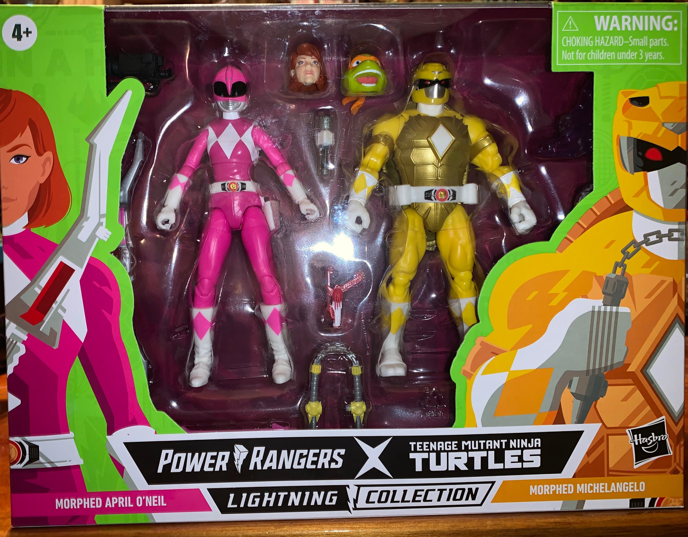
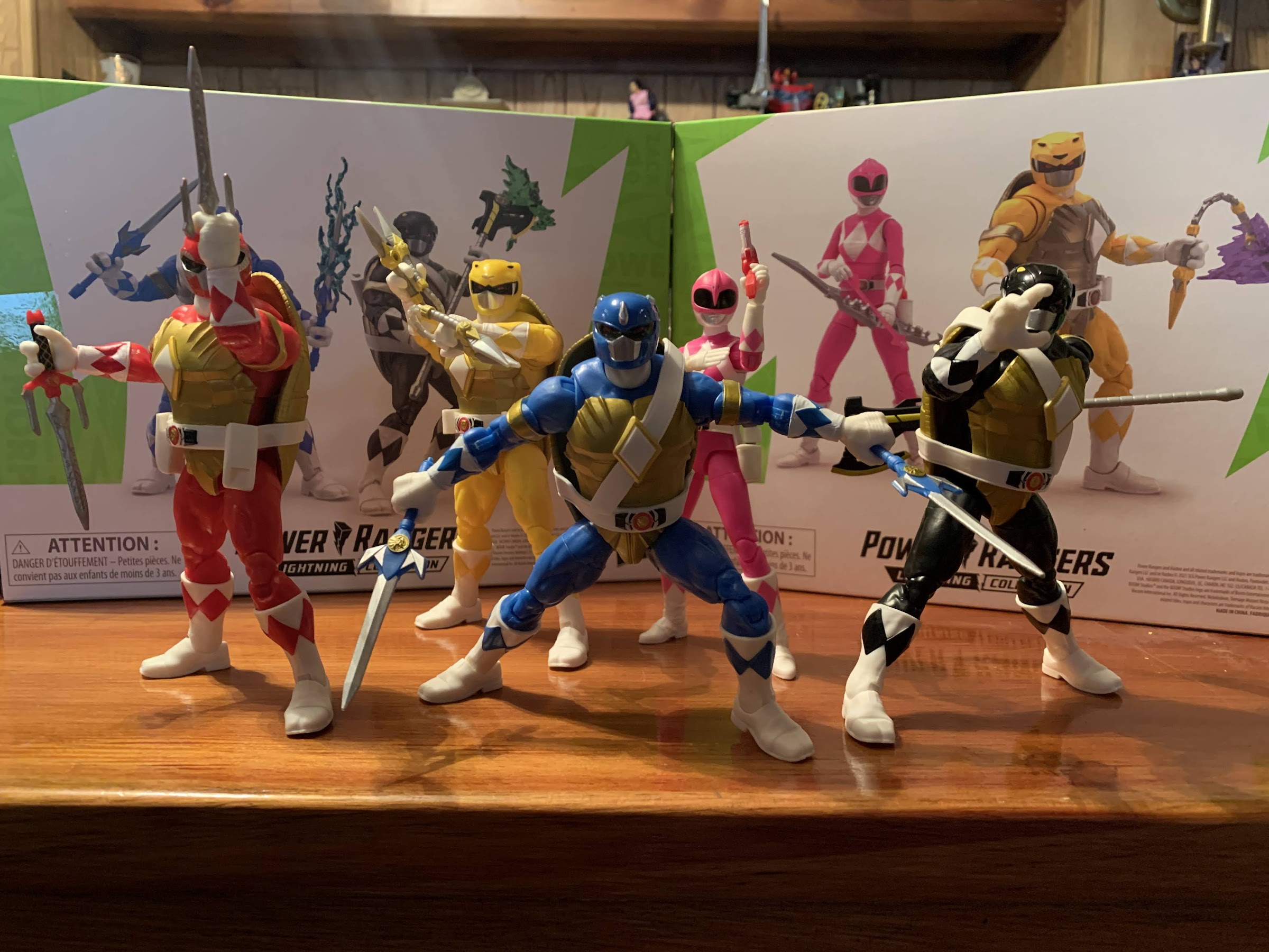
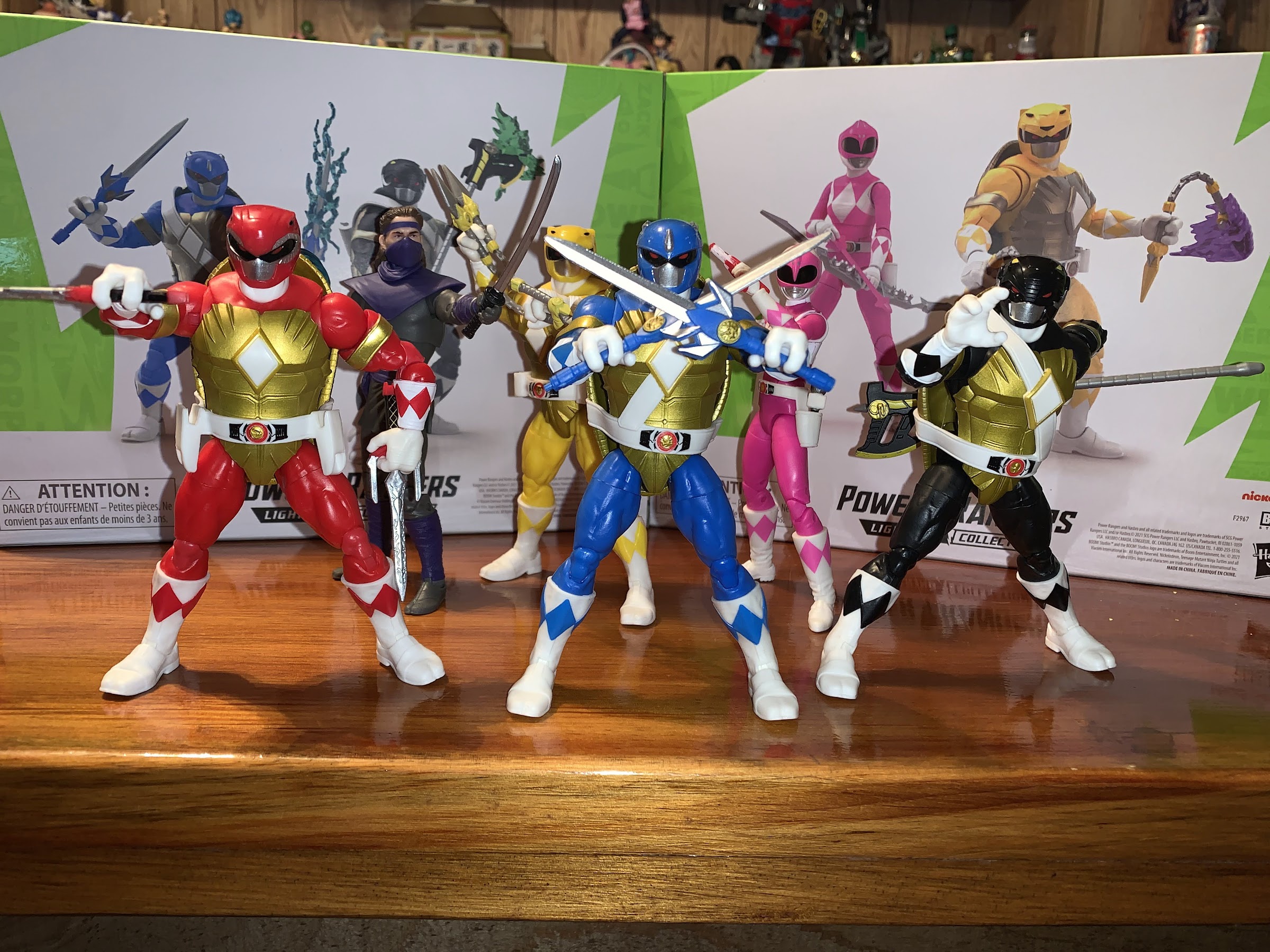
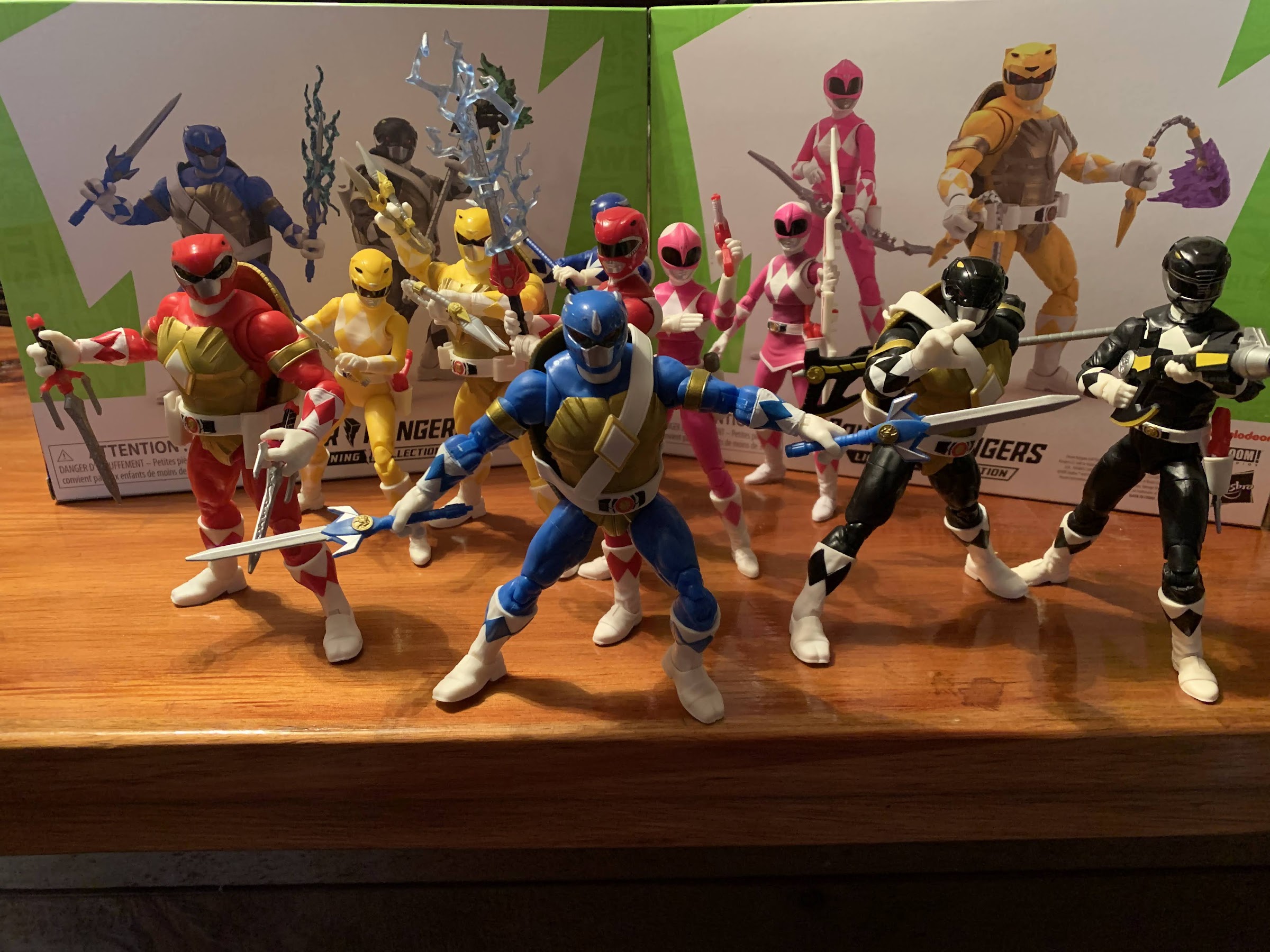
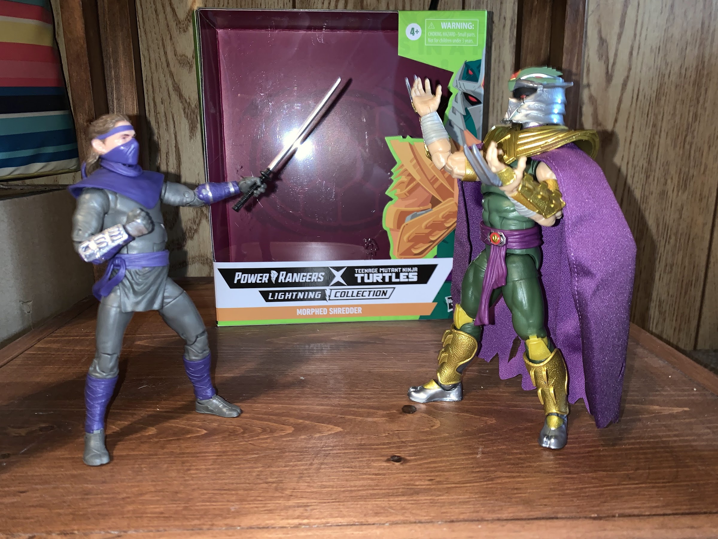
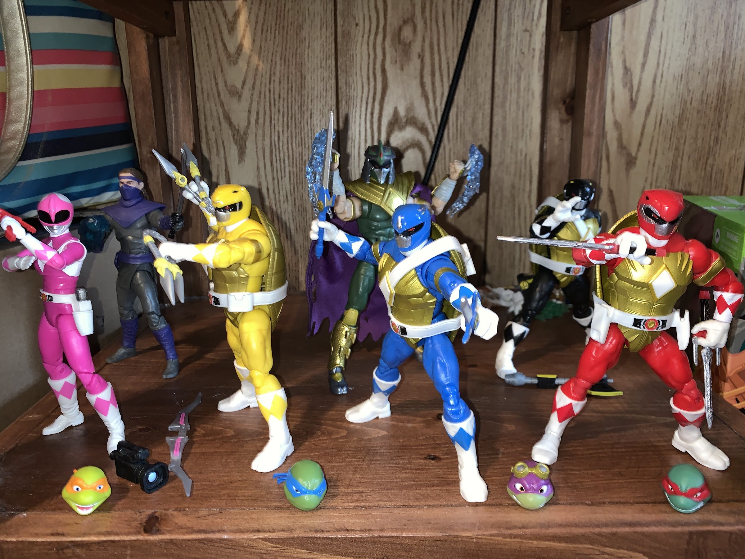
We’ve looked at the two-packs from Hasbro’s Mighty Morphin Power Rangers x Teenage Mutant Ninja Turtles line of action figures based on the comic book crossover, but have we saved the best for last? Coming in on his own is the arch nemesis for the turtles: The Shredder! And since this is a line specializing in combining the two properties, he can’t just be regular old Shredder, he needs to be something more! Now, maybe there was a thought to having Shredder somehow acquire Lord Zed’s staff or even Rita Repulsa’s magic (imagine Shredder in a Rita costume), but rather than do that they just gave him the powers of the former evil Power Ranger, Tommy, and his Dragonzord coin.

Is it just me or does he look huge in the box?

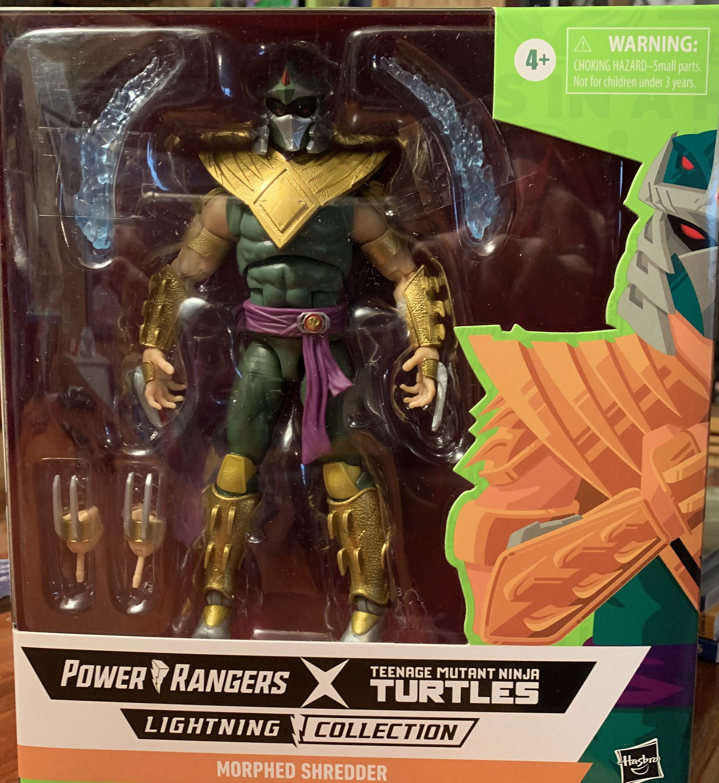
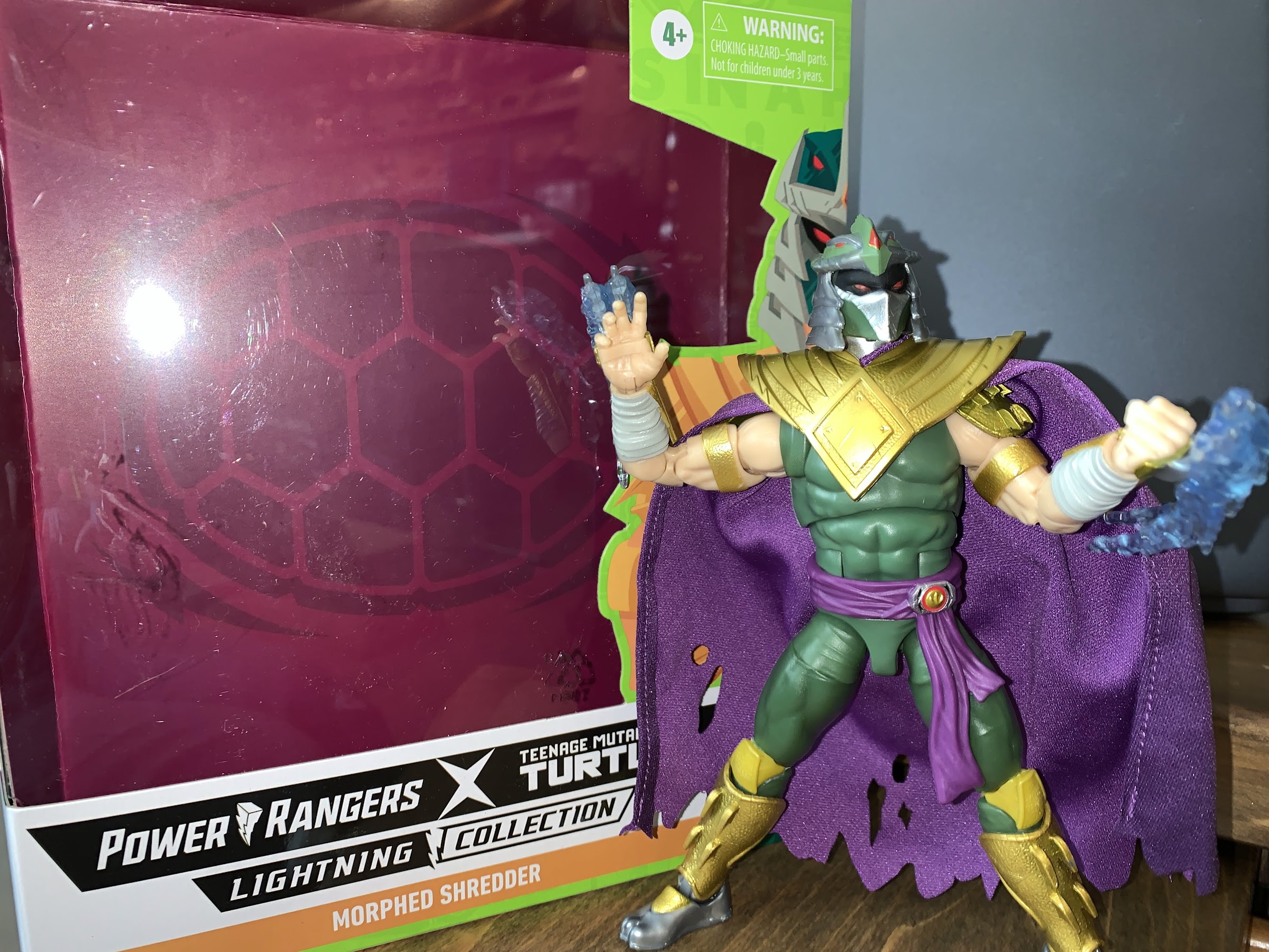
Shredder as the Green Ranger is a design unique to him. There’s obviously elements of both the traditional Power Ranger costume and Shredder’s, and the design is involved enough that he couldn’t be directly lifted from an existing figure. That is likely why this figure did not arrive in a two-pack but as a single carded figure with the MSRP of around $30. He comes in an oversized Lightning Collection box with new art and he looks sort of massive from the outside, though he’s not demonstrably larger than other figures in the line standing right around seven inches. Some of the body here is likely recycled from other figures in the line, or from other Hasbro lines in general, but there is quite a bit that’s new for us to dig into.

There’s a lot of good here, but some not so good.

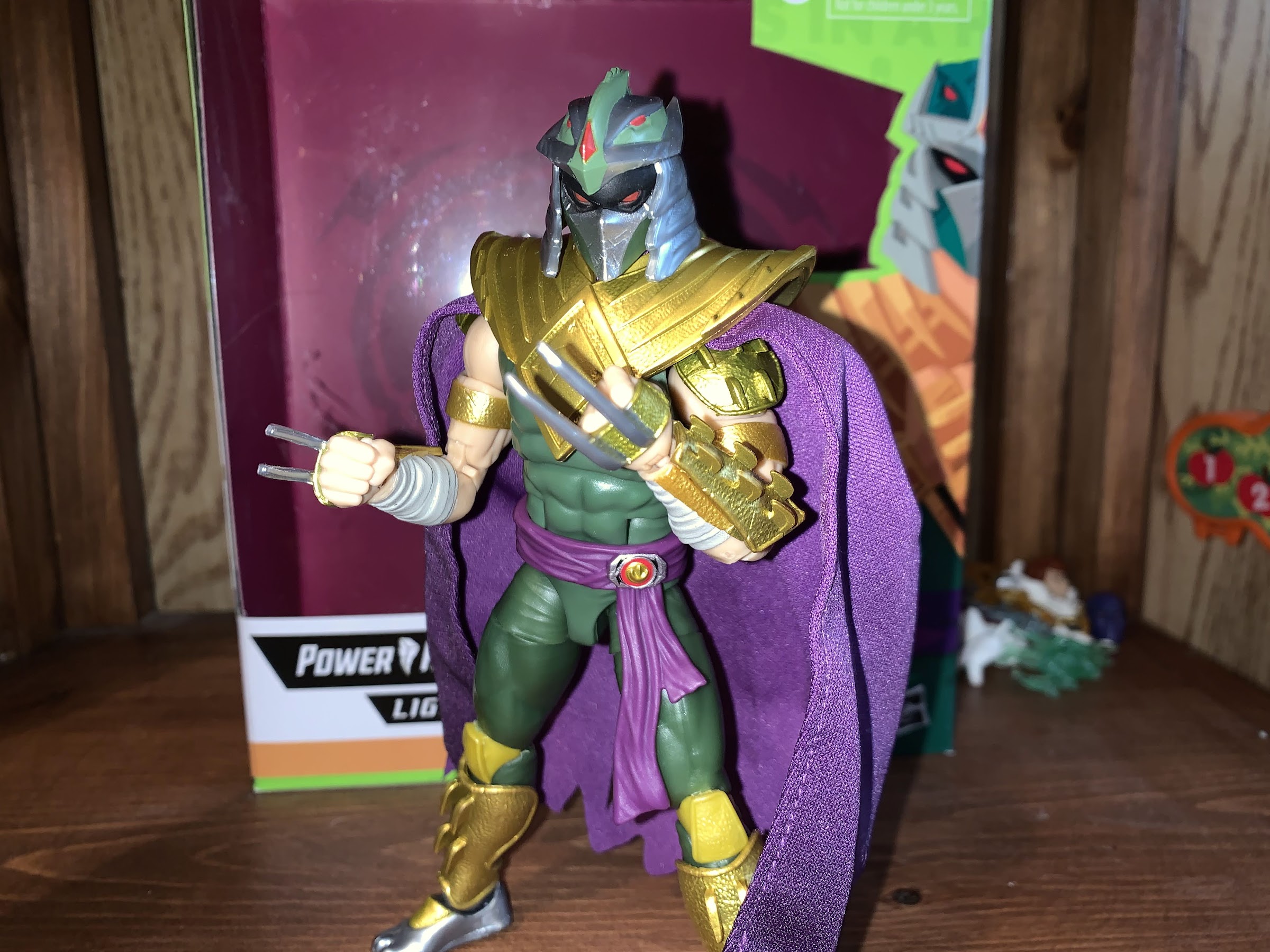
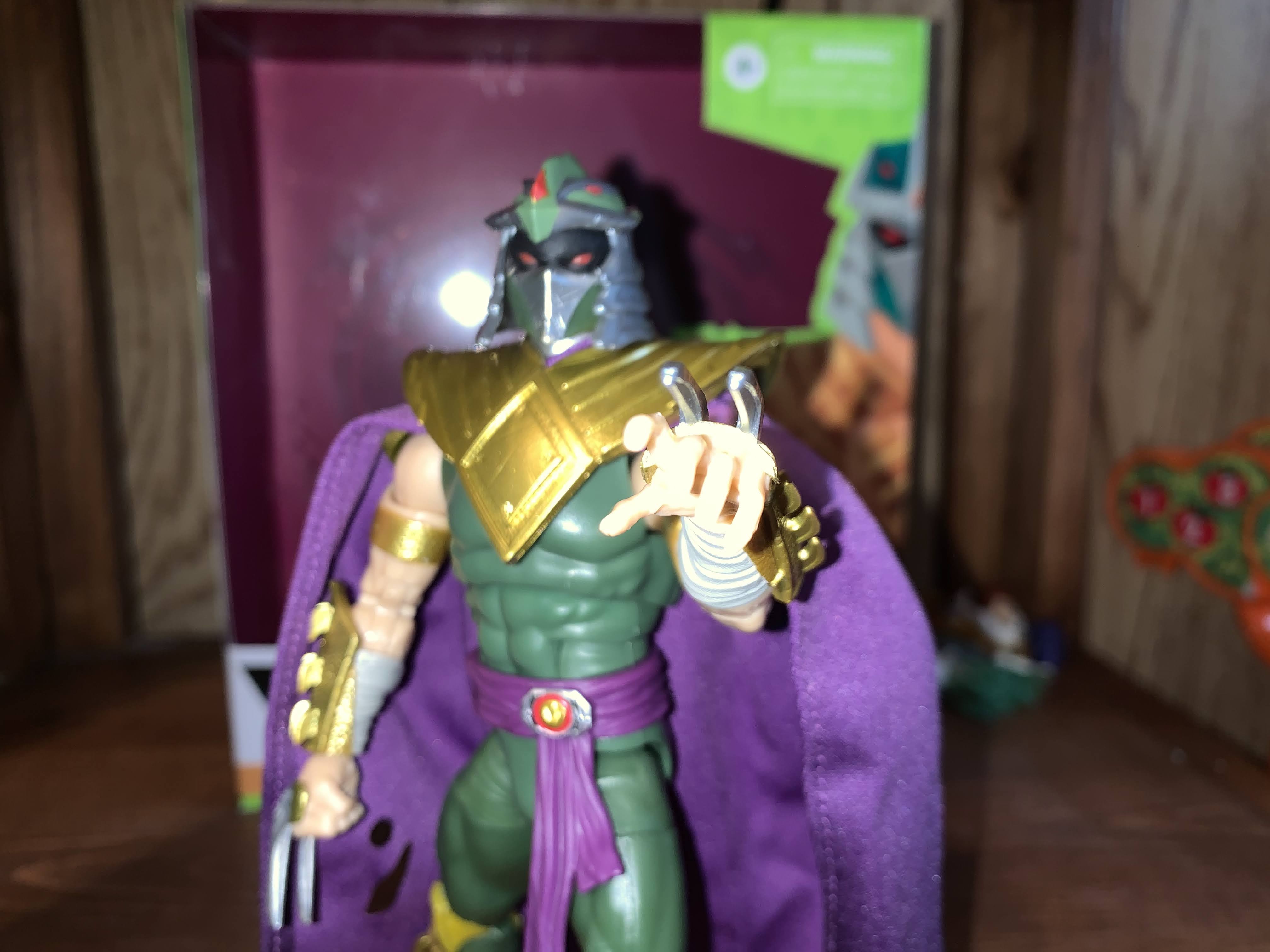
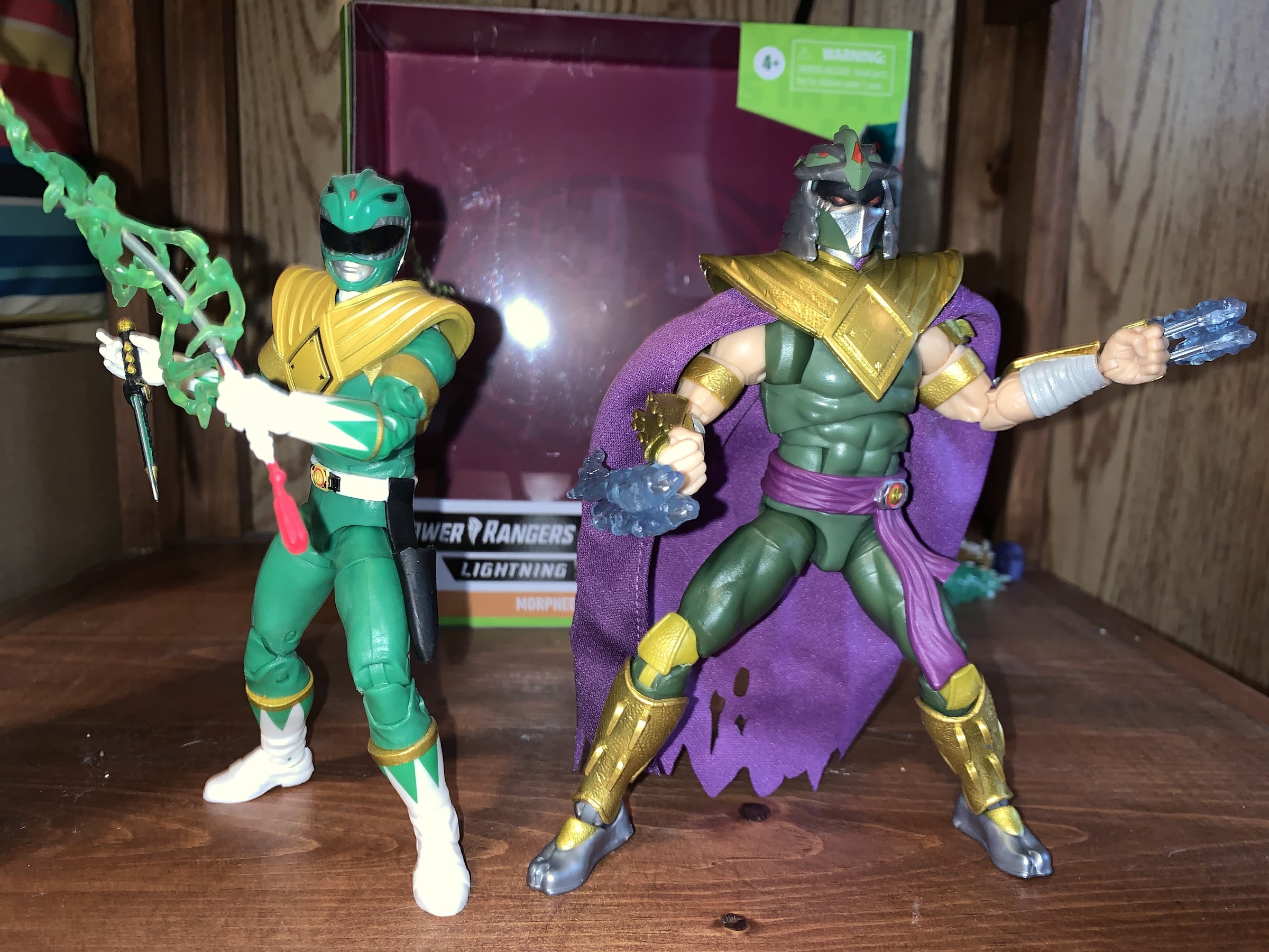
First off is the head sculpt. Shredder comes with his helmet permanently affixed to his head, which is often the right way to do a proper Shredder. The base look of this Shredder gives me strong 2003 vibes as his face is all black with red pupils and the mouth guard is painted silver. It makes him look pretty bad ass, but also accomplishes the task of merging the helmet with the Green Ranger helmet since having his exposed flesh painted black conforms to there being a visor there. Atop the helmet is the Green Ranger’s dragon theme with the red eyes and ridge in the center. The center diamond is there as well and then it’s rimmed with the silver “tines” customary to Shredder helmets. The sides are silver and they’re staggered in the design resembling blades one after the other. It’s a very striking Shredder design and I think the artists involved did a great job blending it with that of the Green Ranger. Unfortunately, the same can’t be said of the factory as the main head and the top of the helmet are separate pieces glued together. The top of the helmet is on crooked and set back too far on my figure and looks terrible. He should look like the box art with the center of the top piece lining up with the center of the mouthguard and the two should nearly touch. It’s not terrible enough for me to attempt an exchange or try to order from somewhere else, but terrible enough to drive me nuts. I’m very tempted to try to pry it off and re-attach it because it really does ruin what is otherwise a solid sculpt.

That mis-aligned helmet is driving me nuts. Even more so than the yellow knees.

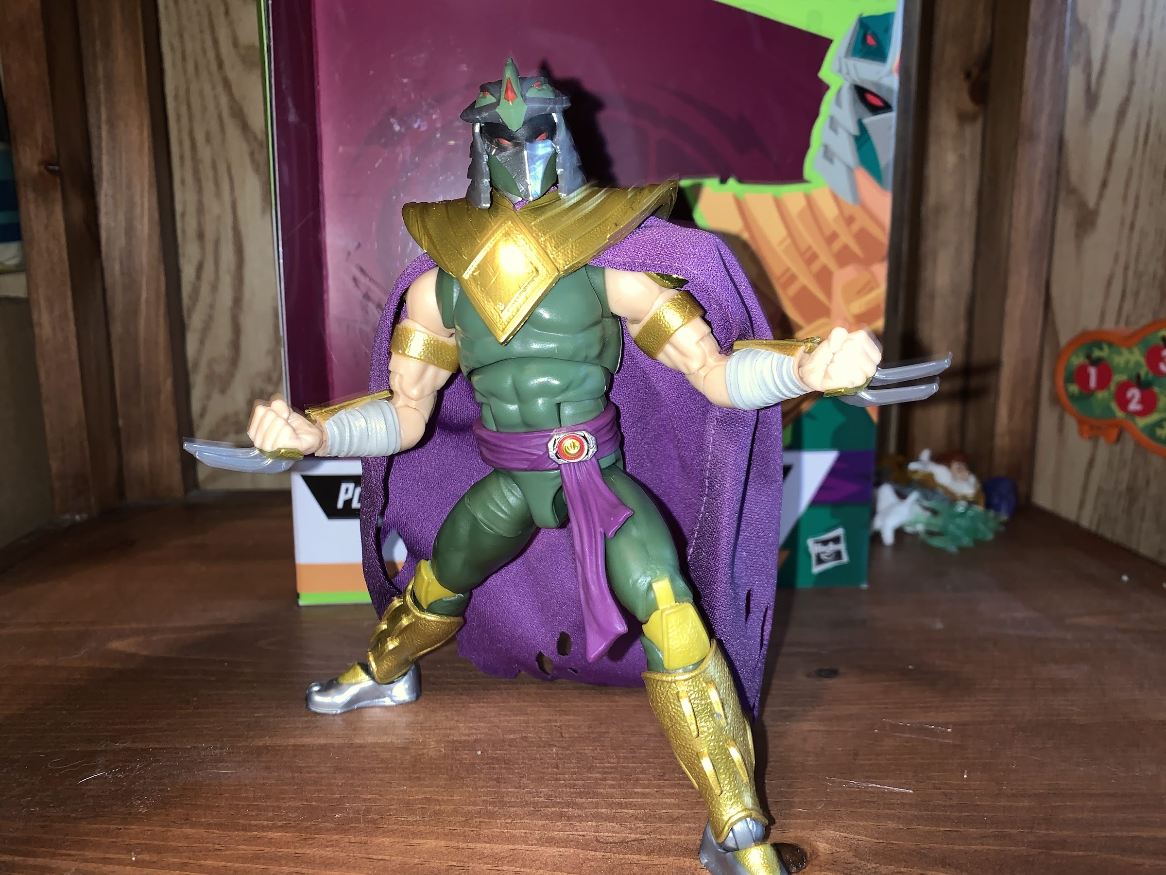
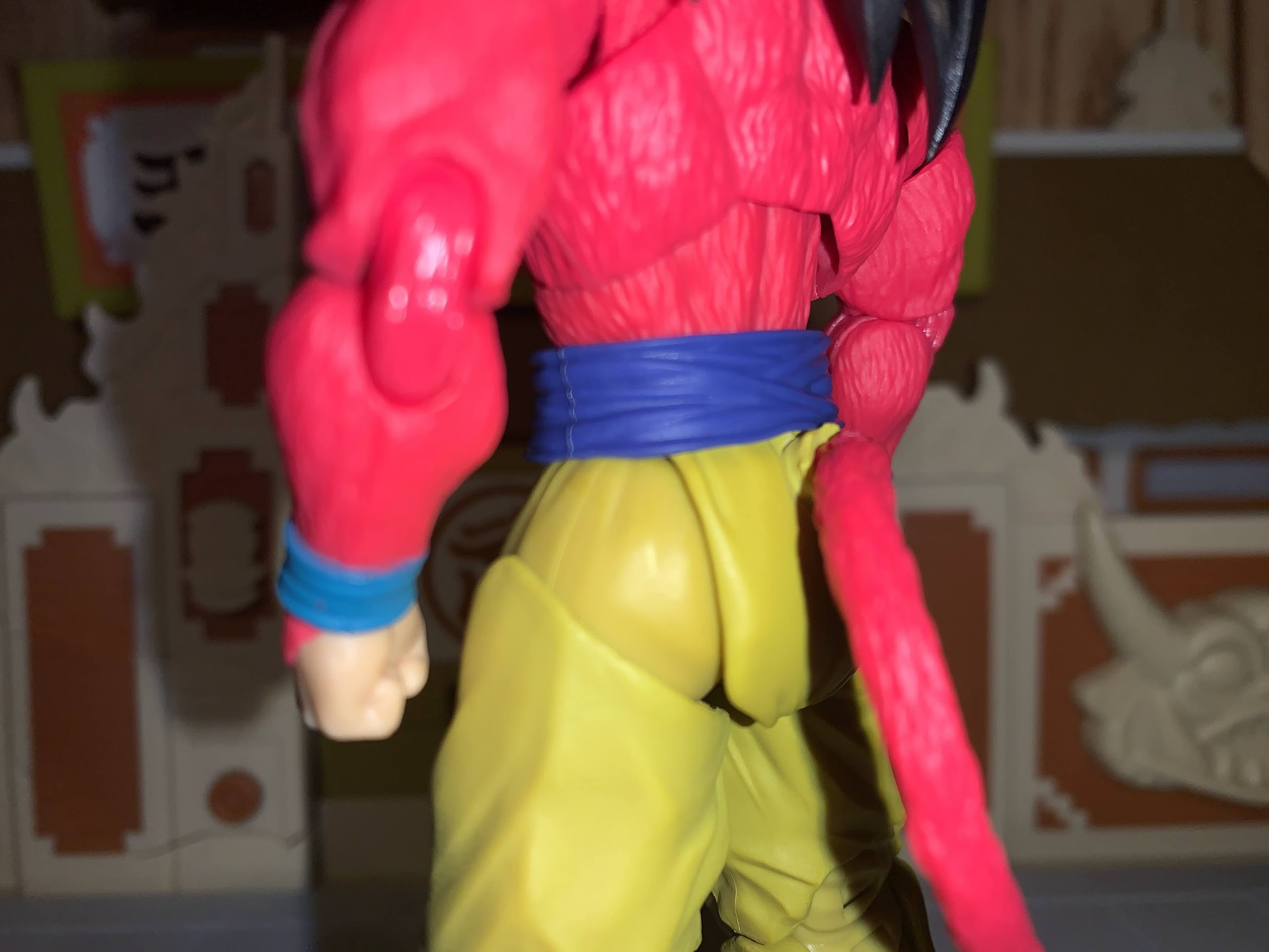
Below the head we have the customary Dragon Shield. Shredder’s version of it is a bit weathered looking with sculpted spikes near the shoulders. They’re less pronounced than the comic art, but it’s still cool that Hasbro sculpted a new Dragon Shield. His arms are bare and end with his Shredder gauntlets, only now they’re gold with the actual blades on the back of his hands in silver. His belt is a purple sash and the Power Morpher is off-center, which is a nice touch to differentiate Shredder from the others, and he’s sporting a soft goods, purple, tattered, cape. It would have been cool if it was a wired cape, but it has some personality by virtue of the holes cut into. The only thing, design wise, I’m not crazy about with this figure is below the waist. He has the same gold and silver combo for the greaves on his shins, but the knee portion is a separate piece so there’s visible green in-between the knee and boot. From what I can tell, this isn’t the case in the book either and it’s supposed to be one piece. I’m not sure why Hasbro did it this way as they didn’t have to and it wouldn’t have cost any more money. And they also sculpted the kneepad in gold which creates unsightly gold lumps of plastic above the knee on the joint. The better move would be to simply paint the kneepad, especially since it’s actually the top of the boot, but Hasbro likes to cut paints apps wherever possible.

I always like open hands with Shredder, even going back to the Playmates original.

The boots and misaligned helmet are the only true eyesore to be found on this guy from a design point of view. The straps on his forearm gauntlets aren’t painted, so on the open hands he has “flesh-colored” straps that look kind of dumb, but not as bad as the knees or helmet. Those looking for true comic accuracy will likely be a little disappointed that the blades aren’t more pronounced, but this is a toy intended for a mass market release so some safety measures likely play a role. Aside from that though, the only other issue from a presentation is one also found on the standard Green Ranger and it’s the omission of the white diamonds on the shirt. On the Green Ranger, Hasbro kept the white pieces for the butterfly joint so he had a hint of the side diamonds, but with Shredder they just ignored them all together. This is fairly common with Hasbro and the manner in which they cut costs as they often eliminate painted details. It’s been acceptable for the company when their prices made them perhaps the best bargain in the hobby, but with their prices creeping up into NECA territory it’s becoming a problem. I’ll have more to say on that subject in the not-too-distant-future. Here, it’s relatively minor though I do think a little dash of white on the torso would have done the figure well.

Go ahead, Tommy, try and take back your Dragon coin.

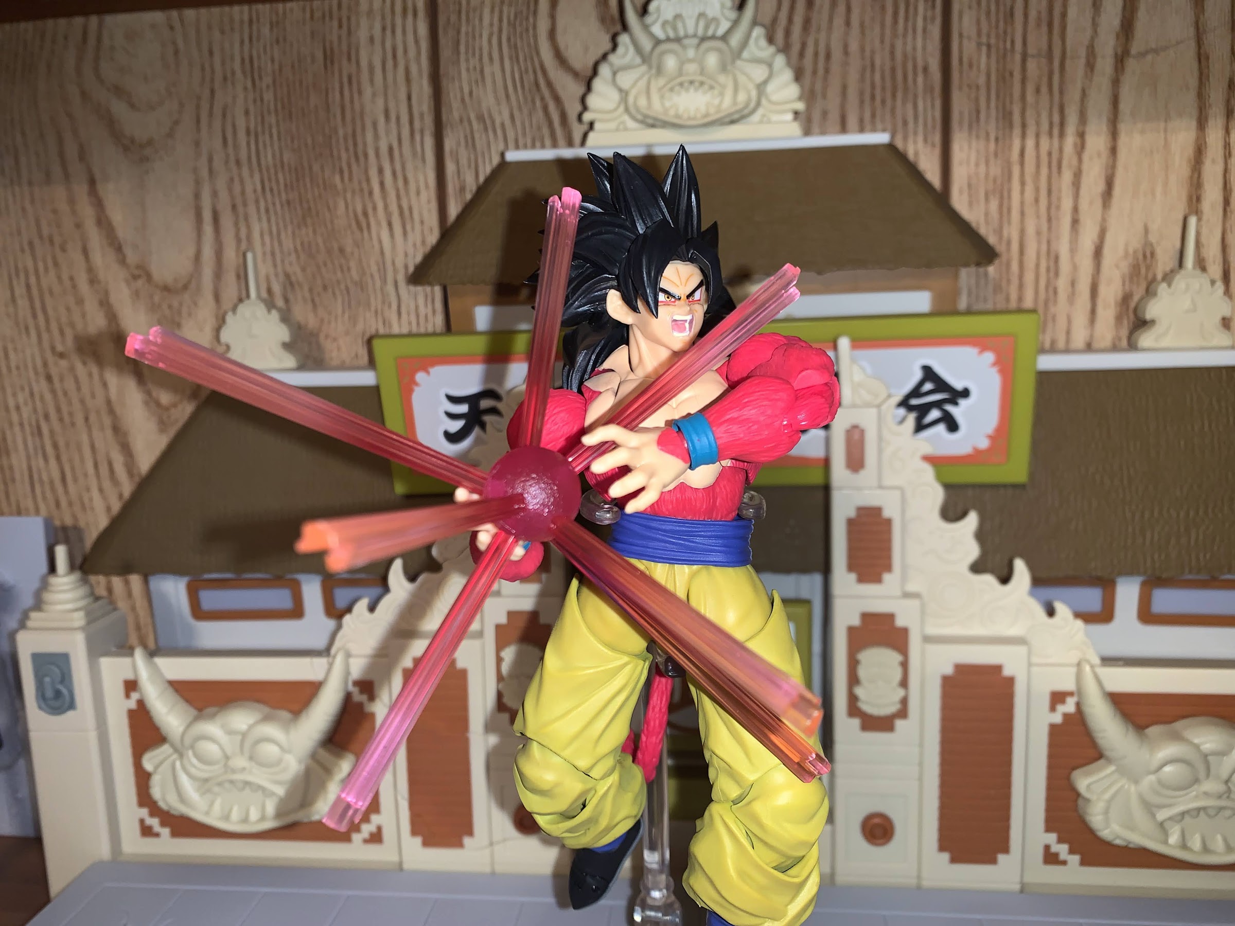
This guy commanding a premium price might have lead you to believe he’d come with a bunch of stuff, but that’s really not the case. He comes with open hands in the box and a set of fist hands. The claws were straight on 3 of the 4 hands I got, with the open right hand being bent in the package. It’s nothing a little hot water can’t remedy though. He also has a pair of effects pieces. I guess they’re an energy effect or something? The claws slide into them and they’re a translucent blue. They actually can poke all the way through as there are slits on both sides so you can adjust the effect as you see fit. You could also have them shooting forward from the blade, but I think they’re intended to be more of a slashing effect and that’s how it’s depicted on the box. They’re fine, though personally I would have gone with more of a lightning look as the flame look Hasbro appears to be going for makes them look like water. One of mine also has some black flakes of plastic within it, which is a bit of a bummer, but honestly only noticeable from up close. That’s it though. No sword, no alternate head, just two sets of hands and two effects parts. It’s not terrible, but not exactly overwhelming either.

Shredder triumphant!

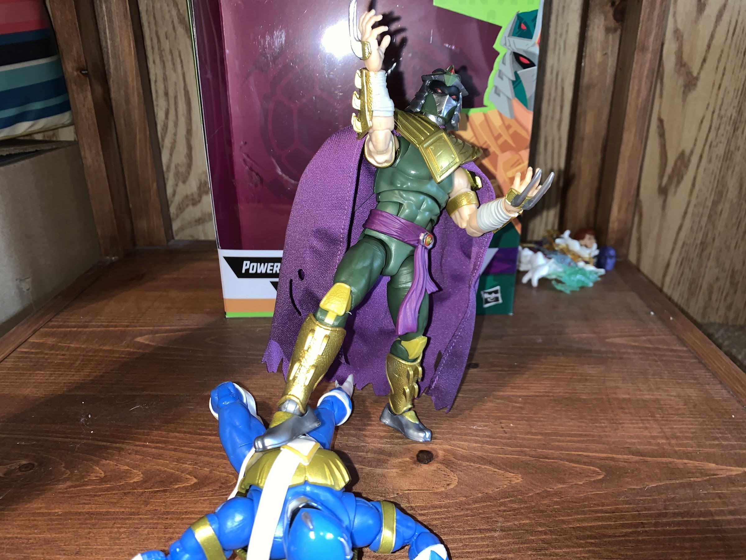
The articulation on Shredder is mostly as expected. If you’ve handled a Lightning Collection Ranger or a Marvel Legend then you should know what to expect. He has a ball hinged-head and probably some articulation at the base of the neck, but if so, it’s useless given the cape and Dragon Shield. He’s able to rotate and look up and down fairly well with basically no tilt due to the size of the helmet. His shoulders are ball-hinges with a butterfly joint. The spiked pauldron is pinned above the actual shoulder so it moves with the butterfly joint and doesn’t really interfere all that much with the range. It’s quite good and the cape and shield help hide any gaps left behind when the butterfly joint is fully extended. The left shoulder on my figure is really tight and hard to rotate, but I don’t feel like I’m going to break it, it just needs more breaking in. He has a biceps swivel and double-jointed elbows that give you about a 90 degree bend. No forearm swivel which stinks because the gauntlets are frozen in place which makes posing a bit annoying at times. The hands peg in, per usual, and can rotate and also feature a horizontal hinge.

There are some out there who wish the green on Shredder was a bit more like the Green Ranger, but I enjoy the muted shade.

In the torso, we have a diaphragm joint that’s pretty floppy. I don’t really like it as a result, but you can swivel there and get Shredder to bend forward and back an acceptable amount. He has an ab crunch below that, but the sash gets in the way so it doesn’t offer a ton. It’s a floating belt, but it’s way too tight. There also appears to be a seem underneath it that might be a waist twist, but I can’t get him to go. At the hips we have the standard ball pegs with thigh cuts below them. He can kick forward to about horizontal, but his cheeks prevent his leg from going back. The knees are double-jointed and work fine, which is good since I already mentioned they’re ugly. He does have a boot cut and at the ankle we have hinges and a rocker. The rocker works fine, though it’s a little loose while the hinges appear to be ratcheted. They’re annoying though because I can’t quite get the feet into a neutral position. The toe seems to always be pointed up a little, or down. I guess it’s not a huge problem as it just makes the most vanilla of posing difficult, but it is odd. I don’t have too much trouble getting him to stand even with the loose rockers. The only hindrance, really, is the floppy upper torso as he tends to bend back after being set down.

I think they scale pretty well. Shredder is taller and leaner, but still pretty damn beefy.

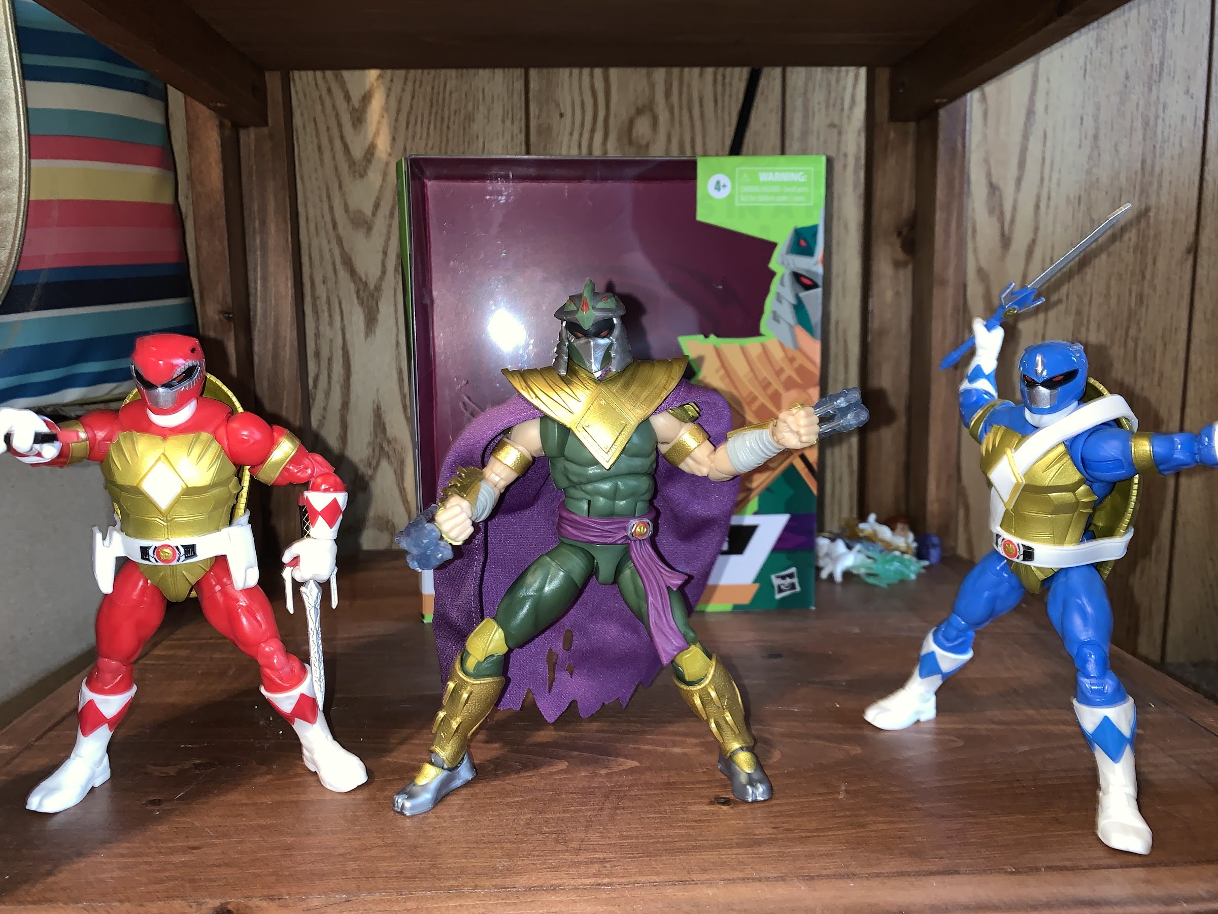
What we have with Shredder is what should be the best figure in this line if not for a few errors. I genuinely like the color palette on this guy as the muted green contrasts well with the bright Turtle Rangers and original Green Ranger. The gold paint and texture of the metallic parts of the armor look awesome, which is why the gold plastic knees really stand out as an eye sore. That torso really could stand to be tightened up though as I don’t like it. I’m more forgiving when it comes to the ankle hinges as I’m sure they had to use that ratcheted design for a reason and a standard one probably would have been too loose. The low accessory count is a bit of a bummer, but he does look great just armed with his claws and, even though it isn’t wired, I think the cape turned out very well. He’s a striking figure, but he is sold at what is a premium price for a Hasbro figure so I do think some of the flaws should not be readily overlooked. At the same time, he looks a million times better than the monsters released in the Lightning Collection so at least he has that going for him.

Group shot!

Shredder is the final figure in this line and is currently still available for preorder at various online stores. Gamestop is stocking this line as well and they can be found both online and in-store while supplies last. I would say normally if a line like this is a success then it will likely get reissued, but I have no idea what kind of arrangement Hasbro made with Viacom when it comes to the TMNT license so it’s possible they’ll be one and done. I wouldn’t wait on it if you’re interested. Given how terrible the helmet turned out on my figure, I would say take a look locally if you can to make sure the one you’re buying looks okay, but I suspect most will have to resort to online orders and hope for the best.


S.H.Figuarts Dragon Ball Super Event Exclusive Color Edition Super Saiyan God Son Goku

Goku has officially ascended to godhood.

The last of my San Diego Comic Con 2021 exclusives has finally arrived and it’s the event exclusive version of the Bandai/Tamashii Nations Super Saiyan God Goku. Now, Dragon Ball fans might quibble with my title for this article as I called it Dragon Ball Super when this form technically debuted in a Dragon Ball Z film, Battle of Gods, which would then be adapted into the anime series Dragon Ball Super. I’m just going with what’s on the packaging, folks, but if I had to place a label on this version of Goku I would say it does feel more like a Dragon Ball Super thing. At any rate, it’s the same film that featured the debut of Lord Beerus, who we looked at last week and it was my desire to add Beerus to my collection that prompted me to just get Goku too. The two clash in that film, and this figure felt like a good one to pair with Beerus. I’m not actually too keen on the Super Saiyan God transformation, but maybe this figure will change my mind.

Super Saiyan God is characterized by Goku getting reddish-pink hair and remaining rather lean. Not quite early DBZ lean, but certainly leaner than Buu Saga Goku.

Super Saiyan God was the latest power-up introduced in Battle of Gods and it would be quickly eclipsed by the Super Saiyan version of that, the mouthful Super Saiyan God Super Saiyan. Or, Super Saiyan Blue for short. I don’t really understand the specifics of the whole thing, but basically, in order for a Saiyan to attain this form, he needs to have five other Saiyans lend them their energy which somehow becomes divine and leads to this transformation. The actual transformation gives the Saiyan a firey red aura, turns their hair a red-pink, and actually causes them to slim down as opposed to bulk up. Since the shape of the hair remains the same, they don’t necessarily look like a Super Saiyan, which is this form can then go Super Saiyan and become the blue version. How Goku (and later Vegeta) learn how to use this form without the added step of having other Saiyans lend them energy is either not explained or not explained well. Either way, it wouldn’t be Dragon Ball if there wasn’t some element of things being made up as they go along, would it?

You do have to fiddly with angles and those damn sleeves to get the best look. Here I failed as you can see the flesh colored piece inside the joint, which should be orange.

This version of Goku should feel pretty familiar to anyone who has handled one of the many recent Goku figures that Bandai has released. It’s the same body as the Super Saiyan Blue Goku I’ve already reviewed and Bandai has been able to get a lot of use out of this buck. The only difference I can see with that figure is the arms are actually smaller and leaner, which is appropriate for this form. I’m not sure if they’re the same as the Saiyan Raised on Earth Son Goku figure, since I don’t have that one, but it is nice to see a subtle difference between the two godly Goku figures since it makes sense. Outside of the biceps and forearms, the other difference really is just in the paint job and belt. This figure has a lighter orange to the gi likely to account for the aura and because it’s the event exclusive color edition. The belt is the Cell Saga era belt too which doesn’t feature a knot and the boots are a much brighter shade of blue. The laces are also painted red like the piping as opposed to brown. The choice of colors, combined with the translucent, pink, hair, does really help to create the illusion that Goku is glowing. It’s neat, and I think it works well for this form.

The paint flaw on Goku’s left sleeve might seem like a minor thing to someone reading this, but for a figure with very little paint on it, it’s a bit ridiculous they can’t get it right. This is also the best pic for seeing how the vest and crotch are a different shade of orange.

Beyond those changes, a lot of the figure feels the same. There’s some shading on the front of the pants and abdomen, but that’s basically it. The other painted areas are the flesh color on the chest and the blue trim on the sleeves. Unfortunately, the left sleeve on mine was not painted particularly cleanly. The plastic on the face also doesn’t match the neck and chest as well as it could, otherwise, the painted details on the face look good. The plastic inside the butterfly joint is also cast in the proper color, orange, as opposed to flesh colored like my previous Goku figure so that’s a plus. There is no shading on the crotch area though, or on the upper torso, which will probably irritate some. I get their reluctance to shade the crotch because if it goes too heavy he might look like he pissed himself, but more shading would have been nice. It seems to be something the original release of this figure has over this one, as just looking up images of that reveals a more vibrant release.

He can assume the position, but the lack of energy parts is a bummer.

The figure also feels the same because the accessories are pretty much the same. You get four faces with this guy: stoic, smiling, teeth grit, and yelling. They all look fine, though I’m kind of partial to the stoic face for this form. As far as hands go, you get the fisted hands in the box plus flat palms, martial arts pose, Kamehameha, and wide open hands. Pretty much the only hand you don’t get is an instant transmission hand, but we have plenty of those in other sets so I don’t think it’s a loss. There’s no effects part though, which is always a bummer. Being an event exclusive, I wish Bandai had added an aura effect since this guy did retail for $50, but that’s how it goes.

Look! It’s the battle of the gods we were promised!

The articulation for Goku is, stop me if you heard me say it already, the same as past Goku releases. He has the floaty pieces in his hips to cover up the joint and the sleeves which peg into the shoulders that I’ve never really liked. He can look up and down no problem and the butterfly joints in the shoulders allow Goku to do his signature energy blast poses. His head is on the old ball-hinge the original release had, and not the updated ball peg which is much better. It works, but sometimes you have to fight it to get it to bend where you want it to. At least it works better on Goku than it did on Beerus since his entire head swaps and you can accidentally get that hinge facing in a direction you don’t want. The hips don’t go out very far to the side, but he can kick forward and back because has those floating pieces instead of a sculpted butt. The knees and elbows will get you better than 90 degrees while the ball-peg ankles are just okay. The toe hinge is bad. Most of the joints are nice and smooth, with the lone exception being the right thigh twist on my figure. This is a first for me, but that thing is stuck. I have never had this issue with a Figuarts release before, but one twist caused the leg to pop off. Thankfully, it’s just a ball and socket connection so no damage was done, but it is a bummer.

IS Beerus too tall or Goku too short? Considering one of these guys is the main character for the series from which all other figures should be compared to for scaling purposes, I’m going to say it’s the cat that is too tall.

Does this figure make me a fan of Super Saiyan God? Yes and no. I think the translucent effect with the hair and the brighter approach to the color palette work really well, and it’s essentially what you’re paying for if you get this exclusive. I think that approach to the hair is an improvement over the standard release from a few years back, but probably not enough of one to warrant an upgrade if you already have it. Otherwise, he’s a Figuarts Goku. It’s a good figure, I wish mine didn’t have that paint error on one sleeve, but aside from that it feels like a quality figure. I don’t regret my purchase, but I’m also not doing backflips. If you’re at all familiar with this line, then you should probably know if you want this figure or not. And if you do, and you have yet to purchase one, well you’re in trouble because the secondary market is essentially all that remains. The prices I’m seeing aren’t terrible, but they’re obviously more than the $50 it would have cost you last summer.

To close this out, will end with the gathering of the Gokus. You can see the different approach in color when comparing him to SSB Goku, and the leaner proportions. Goku Black is really an all-together different figure, but we’ll let him stand here anyway.

NECA Cartoon TMNT Tokka and Rahzar

Memorable mutants from their not so memorable role.

There is certainly a lot of Teenage Mutant Ninja Turtles product flying around these days, but I would guess collectors and fans of the property are paying the most attention to two toy makers in particular: NECA and Super7. One search for “NECA” on this blog will reveal that the company has produced a ton of TMNT action figures based on various iterations of the characters be it movies, television, or comics. As for Super7, their output is much slower and more specific, though they still have released 16 figures thus far and a handful of variants and have three additional waves already solicited. Super7’s approach is to essentially reproduce what Playmates made 30 years ago at a new scale and with modern technology. Both NECA and Super7 basically received permission to go full tilt on TMNT at the same time, and both have said they basically sat down at Toy Fair, explained the direction they were each going in, and basically have a handshake agreement to not step on each other’s toes which has held up just fine.

Sometimes though, multiple iterations of the property intersect. Playmates very much did its own thing when it came to characters and designs, and for awhile, the cartoon did as well. As the show went on though, the writers, artists, and so on started to just lift more from existing sources probably because it gets hard to keep coming up with new ideas for a show that’s pretty formulaic and largely exists just to sell toys. And since it’s a glorified commercial, why not just include the toys in the show directly?

Stop me if you’ve heard this before about this line, but these guys look like they jumped right off of the screen.

When it came time to make a sequel to the Teenage Mutant Ninja Turtles 1990 film, the writers wanted to include some mutant henchmen for Shredder. When Kevin Eastman and Peter Laird balked at including the cartoony Bebop and Rocksteady, new mutants were created in Tokka and Rahzar. Playmates foolishly felt the first movie would be a massive flop and did not support it with toys, but after it was a success, they were ready for the sequel and produced figures on several characters including the newly created mutants. Playmates wasn’t going to match the look of the costumes in the film, and it’s likely things were being worked on simultaneously, so their take on Tokka and Rahzar turned out a little different from how they appeared in the film. The film was another hit and the characters proved popular, so to no one’s surprise, Tokka and Rahzar made the jump to television. And since it was likely far easier to model them on the toys, that’s what the show did. All of this is to say I feel a little bad for Super7 since NECA has essentially provided us a set of figures that are based on the cartoon, which was based on the toys. It’s basically the same deal as what we saw with Antrax and Scumbug earlier this year.

Let’s just jump right to the comparisons! Left to right: Playmates Tokka (first run), NECA toon, and NECA movie.

Tokka and Rahzar come in the standard window box packaging we’re all used to at this point. They were initially offered as part of NECA’s Haulathon event and in a confusing fashion as they were sold on costumes.com. Apparently, it would have cost too much to create a new website. That website was also supposed to be for international customers only, but no one configured the site to actually lock out US residents so it ended up being a free-for-all when everything went up on March 18th. This set was said to be open to all in some places, but it was all terribly communicated and a lot of confusion was out there. I placed an order on that site, and a set arrived less than 2 weeks later even though product wasn’t supposed to ship until April (I’m not complaining). These guys are going to Target, and maybe online too, and it’s possible by the time this post actually goes live that all of this has been sorted out. For now, it’s a mess, but I got some toys out of it.

And now for the wolf. Same arrangement as before. I think my vintage Rahzar is the first run which had red paint around the eyes in error. Later releases featured black like the toon version.

As mentioned before, Tokka and Rahzar are based on their appearance in the episode of Teenage Mutant Ninja Turtles “Dirk Savage: Mutant Hunter!” and the designs for the characters are clearly based on their action figure counterparts from Playmates. It came pretty late in the cartoon’s life, episode 166 out of 193, so several people collecting this line barely remember their appearance. I personally was still watching, but I’d drop off the following season when the “Red Sky” era began and the show underwent a soft reboot of sorts. I remember being quite surprised to see this pair show up though, and even more surprised when they were intelligent creatures. Aside from resembling the movie characters to a certain degree, the pair are pretty damn different. They’re a bit morally ambiguous and largely out to satisfy their stomachs. Rahzar makes it very clear to Tokka that he’s his only friend in the world, which is about the only character development they really get. Rahzar seems to dislike everyone, but Tokka, and he does make some comment about no one being able to stop them so I guess they’re villains? Tokka is mostly useless though as he’s easily subdued and just exists to make Rahzar mad when something unfortunate befalls him. He gets captured by the mutant racist Dirk Savage, leading to a showdown between Savage and Rahzar that’s just a set piece for the turtles to save Savage and have him realize the errors of his ways. That’s the cure for racism in Hollywood, you just need to have the party the individual is racist towards save them. Problem solved! Tokka and Rahzar’s story just sort of ends there and they never show up again.

“All right son, I’ll take you to the dog park.”

Rahzar is obviously the larger of the two standing at around 7.25″ to the top of his hair. Tokka, is much shorter and chunkier coming in at around 5.25″. Both were sculpted by Paul Harding who has already made a mark on this line with expressive sculpts of Dirtbag and Groundchuck and it looks like NECA was so pleased with Tokka that they’re prepping the figure for a re-release as an Archie Slash, which makes sense since the Playmates Slash was repurposed into Tokka! Both figures are impressively sculpted. Rahzar has a lot of extra parts added to him like the broken shackles, forearm and thigh pads, and that grill on his chest. Tokka has various warts and similar blemishes on his body to go with a spiked shell that’s a dead-ringer for the old toy. He has elbow and knee pads plus those spiked shoulder pauldrons. I love the detail on both and the paint is what is expected of this line. The black linework is clean and really causes the pair to “pop” and we get that bisected shading as well with light on the front and dark on the back. The only overlay in use here is the green “diaper” on Rahzar so it’s hard to say if NECA expects to get much reuse out of his mold. If not, I love to see the commitment on display here from NECA to make the best possible versions of these characters uncompromised by cost-cutting measures.

Tokka’s shell features the same arrangement as the old toy for the spikes. There’s even the same linework on the center nubs.

When it comes to shortcomings from a presentation perspective, there’s very little to complain about here. We’re basically down to nitpicks as the paint around the spikes on Tokka’s shell is a little sloppy around the edges, but it’s pretty minor. The shurikens on his belt also have a soft appearance in the paint department, but again, it’s a nitpick. The only real blemish on either figure is with Rahzar’s right shackle. There’s a sizable blob of gray paint on it from the forearm guard that’s a bit of a bummer. The shackle is a separate piece that can come right off once the hand is popped off so, if I want to, I could easily take it off and try to touch it up. It’s tough to paint white over a dark color though so I don’t know that I’ll bother, but that really is it as far as issues. This is a very clean set.

These guys just want to eat and hang out, and honestly, I can relate.

Since our boys here only showed up in one episode, they didn’t really get to do much aside from eat and get captured by Savage. Given that, NECA included a bunch of food! There’s a turkey platter with about half of a bird on it, some sliced potatoes, and a big slab of salami, I think. There’s also a turkey leg and some bone-in-meat plus a whole fish which was something actually used as a weapon against Rahzar. There’s also yet another handheld, control, device that looks like a fancy adding machine. It’s the controller to the control cuff that actually came with the Mondo Gecko figure so, little by little, we’re building the arsenal of Dirk Savage (the foot trap that came with the Punk Frogs also belongs to Savage). Each figure also comes with a set of gripping hands and a set of open hands. I’m a little surprised there are no fists, but I don’t know that I actually miss them. The accessories are all painted very nicely, and even though I’m not sure what I’ll do with a big turkey platter, I’m happy to have it.

“Hey, gimme a bit of that.” “No.”

This line is certainly an appearance first, articulation second, sort of line, but these two boys move pretty well. We’ll start with Rahzar first who has a ball-jointed head. It feels like it might be a double-ball peg as he can look up very well, and bury his chin with rotation and tilt. There’s also a hinged jaw to add personality and it works very well. He’s most limited at the shoulders where traditional ball-hinges are hampered by the shoulder pads. The pads can slide a little, but he can’t really lift his arms out to the side much. He can rotate just fine though, and he has a biceps swivel, double-jointed elbows that get you 90 degrees or better, and wrist swivels with horizontal hinges. In the diaphragm is a ball joint that will mostly let the figure rotate, but you get some tilt and he can arch back and crunch forward a little bit. The hips are on ball-sockets and are nice and firm. You get a thigh twist there to go with double-jointed knees and the standard hinge and rocker combo at the ankles. All of those joints work quite well and I love that he has big feet because he’s easy to pose and stand. There were no stuck joints and they’re all cast in the most appropriate color of plastic too.

They seem to scale just fine with the turtles.

Tokka is similar, but being another turtle character, he has some limitations of his own. His head basically sits forward on the sculpt so he’s more limited in the up and down department, but he does have a really nice jaw hinge to make up for it. This dude can open wide! Like Rahzar, he has shoulder pads too that prevent him from bringing his arms out to the side, but he gets good range out of the double-elbows despite the elbow pads (why can’t we get these on the hero turtles?) and has a biceps swivel and standard wrist articulation. Like the turtles, he appears to have some joints in the torso, but unlike the turtles, it’s pretty useless. I can’t get any twist out of them, but braver folks than me might be more willing to really crank on that joint. The hips are ball and socket joints and he has the same thigh twist, double knees, and ankle articulation as Rahzar. Tokka’s feet are really impressive as he can bend each one back all the way so the foot lines up with the leg and he can bend it really far forward. It gives the figure a great base and I’ll definitely be happy to have a Slash with this kind of articulation later this year.

“Tokka, you and I are all we got!” “Have you been watching those Fast and Furious movies again?”

I feel like I’ve been saying this with a lot of the two-packs of late, but this set is another contender for best in the line. I’m partial to the bugs from a design standpoint, but I can’t imagine these two turning out any better than they did. These guys are picture perfect recreations of their animated look and the sculpt, paint, and articulation really comes together nicely. I suppose the accessories aren’t the most exciting we’ve seen, but it’s not as if there was much in the show associated with them. I guess we should be mad at the designers of the toon for not giving them some of their action figure accessories.

Tokka and Rahzar have started off as another Haulathon exclusive, but I suspect NECA will make every effort to get these figures into as many hands as possible so if you missed the initial drop keep your eyes open. Basically every set these days to hit Target brick and mortar has been relatively easy to get ahold of, excepting maybe the turtles themselves. I’m willing to bet Tokka and Rahzar will follow a similar pattern and hang around for a bit. Maybe I’m underestimating their popularity due to their appearance in The Secret of the Ooze, but that remains to be seen. If you can’t tell, I definitely give these guys a strong recommend so get out there and hunt these bad boys down like you’re Dirk Savage himself, just don’t be a racist!


S.H.Figuarts Dragon Ball Super Event Exclusive Color Edition Beerus

The God of Destruction has arrived.

Let’s take a break from the Goku and Goku-adjacent figures and talk about a totally different character: Beerus. Or should I say Lord Beerus: God of Destruction! Beerus made his debut in the film Battle of Gods which essentially became the premiere of Dragon Ball Super. He’s some sort of cat creature who happens to be charged with destroying worlds within his assigned universe. Being a god, he’s only sort of a villain. I guess if he were a Dungeons & Dragons character he might be considered Chaotic Neutral, or maybe Lawful Evil? I honestly can’t remember if there’s a rhyme or reason to his destruction. When we’re introduced to him, he is seeking out the Super Saiyan God and has come to Earth in search of, who else, Goku. If Goku can’t impress him and show him the power of a Super Saiyan God, then he has no use for Earth and will destroy it, so I guess he’s lawful? Anyway, he’s one of the best new characters to come to the show so I’m happy to add this event exclusive edition to my collection.

Like many a Dragon Ball villain there’s a lot of power packed into a somewhat unassuming frame with Beerus.

Beerus embodies the power of a god and Dragon Ball villain, while also displaying the traits of a cat. He gets sleepy, can be petulant, impatient, and certainly carries himself in a regal manner. And like many characters in this universe, an easy way to please him is via his stomach. He loves food and it’s the food on planet Earth that initially spares the world from his destruction. He’s quite threatening, but easily slips into a comedic performance as the scene demands. He’s terrific. And this figure is actually an old one from 2016. It was part of Bandai’s San Diego Comic Con collection of exclusives from last year. Premium Bandai’s website basically couldn’t handle the volume of people interested when the item went up for sale, so they offered a make-up sale a couple of days later that was for a second batch. I really wanted the Nappa they released, so I just went for that because the site was so slow and buggy that trying to add multiple items to my cart felt like a risk I just couldn’t take. However, when the second sale went up I gave in and grabbed both Beerus and the Super Saiyan God version of Goku.

“Come at me, if you dare.”

Unlike Nappa, this version of Beerus is a better use of an event exclusive. I loved that Nappa, but he was a re-release of a figure done in his proper animated colors. That’s something most fans probably wanted from the original release, and making him an event exclusive kind of sucks. Since it ended up being easy to get, I guess little harm was done other than some folks felt compelled to get two versions of the same figure. With Beerus, his change is subtle. I don’t have the original release, but from what I can tell, the main difference is just in the collar-like shirt he wears. I don’t know the proper name for the garment, but it’s the blue and black item he wears over his shoulders. The original was a standard matte look, while this one is done with a shiny, chrome-like, finish. It looks cools, and it’s the type of thing that owners of the previous figure probably don’t feel compelled to buy, while those looking to fill a hole in their collection aren’t settling for some glow-in-the-dark variant or something.

The dreaded Finger Poke of Doom!

Being that Beerus is an older release, there’s going to be some dated things on him. Let’s start with the aesthetics. He looks like Beerus from the show/movie. His default, stoic, look captures that of the character and a cat as he appears content, but those narrow eyes have a menacing quality to him like his mood could change at the drop of a hat. His skin is a pale gray-violet which works well with the blues and blacks of his attire. The only shading on the figure is on the front of the pants while the other painted flourishes are rather clean. The sculpt is rather nice as it captures how thin the character is and Bandai did a great job at the hips which don’t jut out like the Goku Black I looked at recently.

These two literally do not see eye-to-eye.

As nice as Beerus looks, there are a few nitpicks to find. His neck gets a bit gappy where it meets the upper chest, and I wish his face had a wash or something on it as it looks rather plain. His nose should probably be darker than the rest and just some subtle paint touches on some of the lines, as we saw with the Super Saiyan 4 Goku, would really bring out the features. His feet appear to be cast in blue plastic, which is rather odd. I only know this because some blue is peaking out of the seems and at the pins in the toe. And lastly, he also seems a bit too tall. Beerus stands at about 5.75″ to the top of his head, 6.625″ to the top of his ears. Goku is about 5.625″ to the top of his head, so his eye level is lower than that of Beerus which doesn’t look right. It’s been a few years since I watched Dragon Ball Super and it wouldn’t surprise me if Beerus was drawn shorter in that than he was in his debut feature, sort of like how Vegeta was suddenly taller when he became more of a good guy, but I don’t think even this is accurate to Battle of Gods.

Yeah, that doesn’t look right.

Aside from the paint, this release is the same as the older one so the accessories included are also the same. They’re just appearance accessories, so optional heads and hands. In addition to the neutral expression, Beerus also has a yell and a yawn. Both look terrific and I think all three portraits have worth in a display as the more comedic yawn is still a spot-on depiction of the character. With the hands, things are less interesting as Beerus comes packaged with fists and can swap to gripping hands, open hands, and he has a right, sort of clawing, hand. It’s a gesture he uses when firing some of his attacks and could also be used as a “Come here” gesture. What’s curious though are the gripping hands as he has nothing to grip. Was there a short-lived directive at Bandai to make sure all of their figures came with gripping hands? It’s bizarre, as Beerus doesn’t wield any weapons in the film or show so they really are useless. I would have preferred more style posed hands, or maybe one with chopsticks and a bowl of ramen or something. There are no effects parts either, which is always bummer. It does help that Beerus doesn’t really have a signature attack, but he could still have something.

Those knees aren’t pretty. On the plus side, these yawning head is great!

Where the figure really feels dated is with the articulation, which also factors into the appearance somewhat. The head is on a ball hinge, like what Bandai uses for the wrists. It’s okay, but once the head is on you don’t really know where the hinge is so it doesn’t function super well. Also like the hands, it’s something you have to battle with just to get those heads on. There’s a ball joint in the base of the neck so he can bury his chin and also look up a bit with the usual rotation and tilt. The shoulders have part of that collared garment pinned to them, like most of the Goku figures do with the his sleeves. It’s a bit unsightly, and you need to be careful with those pieces as they will slide under the chest part and could get scratched. It’s a ball hinge so the shoulder can move up and down a bit, but the butterfly joint is useless due to the chest piece getting in the way. There’s a biceps swivel and double-jointed elbows and a ball-hinge wrist. In the torso, there’s a diaphragm cut but it’s pretty tight. It feels like a ball-hinge so if you pull up on it you can get him to crunch back. Leave it low and the figure makes some uncomfortable noises when rotating there, and he doesn’t get much forward crunch either way. The ball-joint at the waist is a bit better and that’s where you’ll get rotation and a little tilt.

Note the single tear squirting out of his right eye.

At the hips, Beerus has hinged ball-joints that drop down. Leaving them in the up position results in a nice looking joint that is reasonably functional out to the side and kicking forward and back. Dropping the leg doesn’t add a ton, just a little extra clearance on the kick, which is probably why we don’t see this joint too much anymore. The knee is where things really get poor though as Beerus has just a single joint with no cap on the front. When you bend that knee, you just see the joint at the kneecap and it’s ugly. It’s unfortunate because that yawning expression would lend itself well to certain sitting, bent knee, posing that will expose this shortcoming. This is simply just an outdated joint, as some of the early SHF releases featured the same, and has been retired in favor of what we see on other poufy pants characters like Goku. It’s too bad they couldn’t fix that for this release. At the ankle, we also have the old ball-peg system. You get good movement back, little forward, and the rocker is just mediocre. There is a toe hinge, but I don’t have much use for toe hinges. Beerus, being a cat, also has a tail and that’s connected via a ball-hinge. You get some decent posing out of it, but the tail itself doesn’t articulate further. It’s soft and pliable, but does not have a wire in it so it’s fairly static. It’s a thin tail, though, so I’m fine with it not being segmented for articulation.

Beerus is right to yawn in Nappa’s direction.

Beerus is an old figure with a shiny coat of paint added to go along with a fancy box. The sculpt has aged well so he should still look the part on your shelf. I have some nitpicks with his size, but I largely think he looks good. He just shows his age primarily with those knees and it’s the one thing I would definitely change. This isn’t a budget release, after all, as he retailed for $50 so it would have been nice to see an upgrade made there. Even factoring that in, I still think he’s worth the price tag and I do find myself quite charmed by this release. He’s very much an essential character if you’re collecting Dragon Ball Super. Since this figure was an event exclusive, you’ll need to seek him out on the secondary market. Big Bad Toy Store is carrying this edition, but at a significant markup (more than 100%) so you might be better off on eBay or Mercari. I like the figure, but I don’t $100 like the figure so I guess it will come down to how important it is for you personally to add Beerus to your display.

“Buy me or the Earth is destroyed!”

NECA TMNT Cartoon Super Bebop and Mighty Rocksteady

The moronic duo gets an upgrade in every place except the one that matters most: the brain.

2021 introduced a lot of good things for collectors of NECA’s Teenage Mutant Ninja Turtles line of action figures based on the classic cartoon. The toy maker still kept the line a Target exclusive when it came to brick and mortar, but it also started selling a lot of it online to coincide with each new release. Sure, you still had some folks out there complaining about having to pay NECA’s $15 shipping charge, but to skip the aggravation of the hunt seemed like a worthwhile trade-off for me!

2022 has not started off that way. Well, it has and it hasn’t. The past few weeks have seen NECA post several products on their site as preorders to be delivered later this year, and some of those look pretty damn awesome. At the same time, they’ve also launched Haulathon – a “collector” event in coordination with Target that sees a lot of the first run of sought after items (as well as restocks of past items, so it’s not all bad) head to either Target’s stores, website, or both. And one of those exclusives is the two-pack of Super Bebop and Mighty Rocksteady. Or, is it Super Rocksteady and Mighty Bebop? The box and the episode title from which these two came say one thing, but Shredder and Krang say another in episode. I suppose it doesn’t matter as most just likely remember them as the robot versions of everyone’s favorite pair of dim-witted mutants.

Robot Rocksteady is packing a lot of heat.

Like a lot of characters from this era, Bebop and Rocksteady had toy versions that depicted them as robots, but they looked nothing like the characters from the show. For that reason, I consider these the first true depictions in classic for the robotic duo. They’ve been high on my own personal “Wants” list when it comes to this line for awhile, so I was thrilled to see the images leak online of the pair and even more thrilled to get them in-hand. Special thanks are reserved for a fellow local collector, @JoePoppingOn, who helped me in finding a set. Without his help, I’d still be on the hunt for these rad dudes.

These shoulder turrets are pretty cool, but sadly are non-articulated.

We’ve had three iterations of Bebop and Rocksteady from NECA at this point, but unlike those previous sets, these two are all new sculpts. There’s really nothing one can salvage from the other figures when trying to create the robot versions as they have an all-together different shape and the show made sure to put some kind of robot detailing on basically every surface. In addition to that, the two are pretty different from each other so NECA couldn’t even have them share too many parts. From what I can tell, the only parts shared between the two are the shoulders, biceps, hands, thighs, and lower leg. The forearms, torso, head, and feet are unique to each character and both feature extra additions like Rocksteady’s forearm mounted laser and Bebop’s shoulder guns. More importantly, they look just as they do in the show from the colors to the individual details. I love that Rocksteady appears to have a tape deck in his stomach while the Play and Stop buttons appear to be on Bebop’s belt. There’s little to no paint slop on my set and everything just looks terrific.

The parking meter will likely be the favorite accessory of many collectors who pick this set up.

These are big, chunky, boys that come in at around 6.5″ with Bebop’s mohawk and overall higher sitting head pushing him slightly beyond that. They basically articulate in the same manner as well. Both articulate at the head where they can swivel with some slight tilt. Rocksteady can look up pretty well, but Bebop not so well, and neither can really look down. Both have hinged jaws which work fine. At the shoulders are standard ball hinges, but both figures have stuff to maneuver around. For Bebop, it’s the shoulder pads which are connected to his vest. If you bring his arms up too quickly or forcefully you could risk popping them off so it’s best to be gentle. Rocksteady has these coils extending over his shoulders which creates a similar impediment, with more limitations on raising the arms out to the side. The biceps swivel and the double-jointed elbows work fine, as do the hands which swivel and feature a horizontal hinge. I’ll add that every joint is on these guys is tight, but not too tight, with none that I’d describe as loose. I did not have to heat up anything to get it working.

“What do you suppose this is for?” “I don’t know. Bowling?”

In the torso, we have the usual diaphragm joint. And as per usual with this line, it offers very little. With Bebop, he has a bandolier and a vest layered over it which makes it hard to get at. With Rocksteady, there’s really nothing in the way so you get good rotation there, but very little in terms of the ability to crunch forward and back. You also need to be mindful of the paint on his torso as I would hate to see anyone scratch it. Below the abdomen is a waist twist and below that is something we’ve all long been waiting for with a Bebop and Rocksteady set: ball-jointed hips! Yes, the old design which was a pin and ratchet combo is gone and these ball joints work great. They can’t do full splits, but the joint has solid tolerance and you get a thigh twist out of it too. The knees are double-jointed, and at the ankles we get a hinge and rocker which work great. The boxy design of their feet also makes standing these guys pretty painless, which is necessary because a lot of the accents on their sculpts (in particular Rocksteady) are made of hard plastic and likely wouldn’t handle a shelf dive too well. Overall, the pair don’t articulate all that well, but that’s par for the course with this line which prioritizes the aesthetics of the figure over pose-ability. I’d argue they have enough, but your mileage may vary.

More handheld gizmos to add to the collection.

In true NECA fashion we also get a generous assortment of “stuff” with this pair. There are two sets of the following styles of hands: fists, open hands, and gripping hands. For the gripping hands, the left hand is a standard “C” grip while the right hand has a trigger finger grip. A small nitpick for me is I wish we got a left and right trigger hand just to make the two look different, but it’s a minor complaint. We also get two new guns: a long rifle machine gun and a shorter machine gun with drill tip. They’re all new and are basically chunkier versions of the other guns we’ve seen for the duo. I love the sculpting on both of them, especially the long rifle, which has a scope and sight at the end. There’s also a busted parking meter for one to smash turtles with, and a pair of cartoon specific accessories to round things out. There’s the polarity deflector from “Return of the Technodrome”, and a cartoony, round, bomb with red and yellow wires sculpted on. Surprisingly, the bomb is here and not the Mezmerizer, which is a similar item from the episode they’re in, but I always enjoy a good bomb accessory. It’s from the episode “Mister Ogg Goes to Town,” Mister Ogg being one of the few characters I have zero interest in NECA tackling. The weapons are painted, and the hands pretty stiff, so you do need to take care when wedging the items in there because there probably will be some paint rub. The open hands are suitable for holding both the polarity thing and bomb, the latter of which has a flat, bottom, so it sits just fine on a surface. I personally wouldn’t try to get them to hold the polarity deflector with their gripping hands as I’m pretty sure that will lead to paint rub, but it’s your call. As always, if you’re nervous about it just run the hand under hot tap water for a few seconds and that should make them more pliable.

“At last! I have henchmen worthy of my stature!”

These guys are just great. They both look fine right out of the box as Rocksteady has his forearm blaster and a pair of guns on his shoulders as well. If I have a minor critique, it’s that those two guns on his back aren’t articulated at all as it would have been neat if they were on ball joints. Bebop also has his two “stock” guns in his shoulder pads, but they appear more decorative than anything as I can’t imagine it’s easy to aim a gun attached to the top of one’s shoulder. That’s what the accessories are for though and I’m torn on how to display them. I kind of wish I could just stick the parking meter into a slot on the street diorama, but sadly, there appears to be no way to do that.

“Hey, can you play this?”

These are good problems to have when it comes to toys, and this is a set that I hope all collectors have an easy time tracking down. Very few sets in this line have remained exclusive to Target stores, so once this Haulathon event is over there’s a reasonable chance that NECA makes them available directly through their store. It might be in the form of a preorder, so there would be a lengthy wait attached to it, but it’s better than not getting them. They were available on Target.com last Friday, but I assume by the time this goes live they will have sold out. The set retails for $60 too, which is becoming the standard for two-packs in this line that feature a lot of new sculpting that won’t likely translate to other figures. For now, we only have the hunt so keep an eye on your local Targets and coordinate with other collectors out there. Together, we can beat the scalpers!

Here’s a photo dump to end on:

“I don’t see what’s so great about this guy? He doesn’t even have a TV!”
“You call that a mohawk?”
“Well, at least it isn’t the meter maid.”
“Foul robot! Prepare to be destroyed!”

We Need to Talk About this X-Men Toy Line

As a kid, I was introduced to the X-Men without even knowing it. Spider-Man and His Amazing Friends was airing in my region and it was a show I watched when I could. That show featured Spider-Man (naturally) alongside Firestar, a new character created for the show, and Iceman. I had no idea Iceman was a member of the X-Men, or even what the X-Men were, and I wouldn’t for years after. I barely knew anyone from the Marvel Universe as outside of that show I basically saw Spider-Man PSAs and that Marvel Productions tag that would roll at the end of shows like Muppet Babies. Captain America? Wolverine? Iron Man? Totally off of my radar. Actually, the only other character I knew was the Hulk due to his television show.

In the early 90s that obviously changed. I was properly introduced to the X-Men via the inaugural line of action figures from Toy Biz. Despite not having a television show to cross-promote with, Toy Biz released the first wave of figures in 1991 complete with advertisements during the shows I watched. That’s how I learned who Wolverine and Cyclops were alongside Storm, Nightcrawler, Magneto and others. My friend from down the street loved the line, and at first that’s how I experienced the toys, but once the cartoon series launched in 1992 I too was hooked.

That show was X-Men and it was a ratings hit in 1993 when it was properly launched following “sneak peaks” in the fall of ’92. Once the show got its claws in me I was hooked and ready to turn aside the likes of Batman and the Teenage Mutant Ninja Turtles. X-Men became my life, and even though I also got comics and trading cards featuring my favorite mutants, it was always the cartoon series that was my first love and primary method of interacting with the brand (aside from the toys, of which I had many). As my passion for collecting action figures has reignited over the past five years or so, a dedicated line of toys based on that show has become my grail line, of sorts. It was on my mind so much that I had to get it out in this space, and despite not being an avid collector of Hasbro figures, I always kept tabs on the company and anytime a question was asked of the community about what they wanted next, I was always there to tell them.

Aside from the odd choice of shading the figure that gold or mustard color, Wolverine looks fine.

With 2022 marking the show’s 30th anniversary, it has long been in my sights as the most logical time for such a toy line to come around. And sure enough, last fall Hasbro confirmed it was indeed heading to the animated universe when it announced a new line of toys based on the show starting with Wolverine and Jubilee. Since then, we’ve seen reveals of Mr. Sinister, Storm, and Jean Grey with Wolverine and Sinister starting to make their way into the hands of collectors in the UK. Presumably, their arrival in the US is imminent, but before I even have these long sought toys in hand I’m feeling a bit letdown by this whole thing.

Hasbro is one of the biggest toy producers in the world. The company produces mass market toys sold all over the place and often at a fairly affordable price relative to other goods in that space. They have tremendous negotiating power with the likes of Target and Walmart and even own their own factories so they’re far more insulated against some of the challenges faced by smaller outfits dealing in the same type of goods. For awhile, their Marvel Legends and Star Wars: The Black Series have been consistently good at a relatively low price. While a figure from NECA might cost you 30 bucks, a figure from Hasbro would sit at $20. Over the last year though, things have changed and prices have gone up. Now that same NECA figure is around $37 while Hasbro’s is $25. And when it comes to the new X-Men line, we’re talking $28. And while the gap still remains around 10 bucks, the NECA figures continue to come with loads of accessories and are often uncompromised when it comes to necessary tooling, while Hasbro has gone in the other direction. Fewer accessories, fewer paint apps, and more reuse have made Marvel Legends no longer the value it once was.

Hasbro saw fit to sculpt new hair for Storm, but kept a face that doesn’t match the show.

With the animated X-Men line, Hasbro is targeting a rather specific audience. It’s one that experienced the show as a kid 30 years ago and is an adult collector now. In truth, almost every action figure line Hasbro produces is consumed by more adults than children, but with this line Hasbro can’t even pretend like it’s aiming to attract children. It’s being sold exclusively through Hasbro’s own online store, Hasbro Pulse, and will eventually be sold on Disney’s website and maybe at some of their physical stores. It’s simply a line meant to appeal to collectors, and since they’re promising figures based on the show, you would think accuracy would be important, no?

Apparently that’s a foolish assumption as it appears Hasbro is looking to cut corners wherever it can. When the line was announced, it became obvious right from the start that Hasbro would be re-releasing some older figures with cel-shading paint apps to mimic the show. The encouraging part though was some of the little details. Wolverine had two, newly sculpted heads that better reflected his appearance on the show. He also came with a little picture frame from the episode “Captive Hearts” that is quite popular in the online meme community. These figures may not be on the level of high grade imports, but at least the love was there (aww). Jubilee, on the other hand, looked almost nothing like her show counterpart aside from her gloves being color-corrected. She was coming with effects parts that looked nothing like her fireworks, but it was Jubilee, a character I’m not particularly fond of, so I could overlook it.

The face is wrong, the hair is wrong, and even that orange they used for her costume looks off. They literally just needed to give her a new head and match the cartoon colors, but weren’t willing to even go that far.

The reveals to follow have been uneven, at best. Sinister is an almost straight repaint of the previously released Marvel Legends figure. He looks fine, and Hasbro fixed his neck by making it bare instead of featuring the riveted costume, and applied a good paint job. He has zero accessories though, which is beyond cheap at this price point. Storm followed and, again, she’s mostly a repaint. She gets a new hair sculpt that looks okay in some stills, but her complexion is wrong, her costume is wrong, and she has a lighting effect, but no white-out eyes to pair with it. It’s just all wrong if it wants to be what it claims to be. Jean Grey is the latest reveal, and once again, Hasbro is just repackaging an older figure. For this one, they seemed to even instruct artist Dan Vessenmeyer to model the artwork on the inaccurate figure. Or, they gave him shots of the figure and he just went with it. Either way, her hair is wrong, the coloring on her costume looks off, and they’re including a second, non pony tail head when it doesn’t even make sense to do so in the context of the cartoon. Yes, she went without a pony tail for the series finale, but her costume was also more yellow than the usual tan. And you may be wondering why I would complain about a bonus accessory, but it sucks to get a useless accessory when a more appropriate one could have been included like a powers effect piece or a Cerebro helmet. All things that would make sense for the character.

What it comes down to, is that I look at these solicitations so far and I just get the sense that whoever is in charge of this line has no real attachment to the source. Or, they’re being so severely restricted by corporate that it’s completely stifled their attempts at making the best figures they could. And that’s Hasbro, in a nutshell: they’re not interested in delivering the best possible product. They want to deliver an acceptable product at as cheap a cost as possible. And I get it to some degree, the Marvel license is probably expensive, but so is Star Wars. Their Star Wars output looks a million times better and is far more accurate than what’s being done with the X-Men. Clearly, they value that line more, and I’m not saying they shouldn’t as Star Wars probably sells well. They’re going after a somewhat niche audience with this line, but I’d argue it’s not a tiny one. Literally millions of kids tuned into that show every Saturday, and I bet millions are still interested in it. What would it cost to do this line properly? If these figures had to be $35 to make that happen then so be it! I think collectors, generally speaking, will pay more if the product warrants it. We’ve seen prices go up this past year and spending habits don’t appear to be wildly affected by them. Everything has a limit, but Hasbro doesn’t appear interested in seeing what that is with this line.

Compare Hasbro’s Jean to what Diamond is doing and it becomes even more frustrating. I wish I could be happy with just collecting busts from this show.

It becomes even more frustrating when this X-Men line is compared to other lines based on 90s television properties. NECA’s Teenage Mutant Ninja Turtles line strives to match the cartoon as much as possible and it looks great. And the actual figures in that line cost similar to what Hasbro is doing here, and they often feature unique tooling that’s not likely to be reused. DC Direct did a Batman: The Animated Series line that, while imperfect in some respects, at least looked like the source material. Even Hasbro has done better as their Into the Spider-Verse action figures looked terrific! I pondered on more than one occasion picking those up despite not really feeling an impulse to collect figures from the film just because they looked so good. Mondo’s sixth scale Wolverine looks great, and Diamond Select has a line of busts based on this show that look fantastic. If Hasbro didn’t want to do this line right they should licensed it out to Diamond because they clearly seem to have someone onboard who values this show more than anyone at Hasbro does.

When this line became a reality, I knew it wouldn’t be exactly what I wanted. How could it? I knew there were going to be compromises, and in some respects it’s gone as well as I thought it would because my expectations weren’t terribly high to begin with. Still, I’m bothered by it as I’m preordering all of these figures out of obligation rather than a desire to actually have them in my possession. Perhaps my enthusiasm will rise when I have them together on a shelf, but voicing criticism now is really my only weapon as a consumer. Again, I was happy with the initial Wolverine reveal. I think he should have represented the standard for the line: some parts reuse, new toon accurate head, and one accessory clearly inspired by the show. That’s all! That’s a pretty low bar, it should have been manageable, but Hasbro is fucking it up. That Wolverine isn’t perfect, but it’s good enough, and I’m not sure I can say that about the other four. I hate to prejudge anything I have yet to experience, but it’s hard not to in this case. Will my opinions change when I’m actually reviewing these toys for this blog? It’s possible, but right now, it does not seem very likely. What was a dream line for me, has turned into a joyless obligation and that’s not something I anticipated happening. Do better, Hasbro.


S.H.Figuarts Dragon Ball Super Goku Black – Super Saiyan Rosé

Wine enthusiast Goku has arrived.

Our last look at an S.H.Figuarts release was the Dragon Ball GT Super Saiyan 4 Goku. Now, we look at a figure from the series that effectively replaced GT: Dragon Ball Super. And perhaps the most popular villain from that new series is Goku Black. Without getting into spoiler territory, Goku Black is basically an evil Goku from an alternate timeline. It’s more complicated than that, but a big part of his saga is trying to figure out how he came into existence so I’ll refrain from elaborating. All you really need to know is he looks like Goku, which isn’t exactly new territory since we already have Bardock, who looks just like his son, and there was Turles from the Tree of Might who also looked like Goku, though he’s non-canon. Goku Black is actually worthy of looking like Goku and being the true doppelganger as he’s extremely powerful and also quite evil – the usual Dragon Ball enemy.

Goku Black is part of the series of S.H.Figuarts releases going to mass retail like Target. I had forgot about him until I came across him in store recently. I had seen this release on retail outlets online for the “budget” price of $35 and for some reason I didn’t make the connection to Target. This figure is a reissue, so that’s part of the reason why it can be priced so low relative to other SHF releases, and it omits some accessories (like effects parts) from that past release. The surprising part is that this figure is quite different from Goku. All of the Goku’s at this price point have basically been the same figure with a different deco: Goku, Kaioken Goku, SSGSS Goku, SS Goku. Goku Black basically only gets to recycle the hair and left hand from those figures. It’s possible parts of his body are shared with other releases (like Zamasu) that I just don’t have, so Bandai apparently got what it needed to out of the original tools and can put this guy out there for cheap. Still, I was surprised to see him head to Target before a more popular character, like Vegeta, but I wasn’t necessarily disappointed either.

Coming up with poses for this guy feels tricky without accessories.

This edition of Goku Black is in his Super Saiyan form, which he calls Super Saiyan Rosé since his aura is pink. The original release from 2018 came with extra heads and parts, but this one is just the super version. I always like to get the extra stuff, but I’d honestly never use the non-transformed head so I can’t really complain. The hair has that pearl finish we saw with the Super Saiyan Blue Goku and it is an attractive piece. It’s also the exact same mold as that previous Goku. That’s kind of it though as far as what he shares with that Goku as his left ear has an earring, so he gets new faceplates, and his right hand has a ring as well. For clothing, he wears a black bodysuit with a purple tunic over it. It’s not form-fitting like the body suits Vegeta is so fond of, so there are sculpted folds and wrinkles in the forearms and biceps as well as the pants. The torso is basically one piece, while the bottom of the tunic (including the belt) is an overlay. There’s a little shading on the front of the figure, but it’s fairly subtle. Most of the figure is molded plastic, but since the colors are deep and more muted than typical Dragon Ball costumes, it looks pretty nice. There’s no mis-matching colors and the little bits of painted details, like the jewelry and face, look nice.

What’s the matter, Black? Someone pee in your cereal?

There are two areas of the figure that don’t look great to me. The first is the shoulder area where Bandai is utilizing that peg system for the sleeve cuffs. This allows the arms to move unencumbered, but the sleeves do stupid things as a result and result in gaps. You can fiddle with them so that it looks okay in most poses, but it always felt unnecessary. The other part that doesn’t look great are the hips which flare out to an abnormal degree. His hips are wider than his shoulders which is pretty crazy and obviously not accurate to the source material. And it’s not the overlay causing the problem as that’s actually tight against his hips and thighs. It’s just a weird design.

Also, no flight stand included, but you probably could have guessed that.

When it comes to the articulation, we have some good and some not so good. The head is a double ball peg, though it might be of an odd design like we’ve seen on characters like Lunch and Kid Goku. It basically provides rotation, tilt, and together with the joint in the base of the neck allows the character to look down. He can’t really look up though as the cuff of his tunic blocks that, but I suppose Goku Black looks up to no one. At the shoulders we have those ugly sleeves, but aside from that the butterfly joint works fine as the shoulder can move up and down and he gets decent range going across the chest. The interior of the joint is painted properly too, unlike some of the Gokus we’ve seen. Biceps swivel, double-jointed elbow, and wrist peg all work as expected. Ball joints in the diaphragm and waist provide twist and tilt and also allows Black to crunch forward and bend back an acceptable amount. The hips, despite being ugly, at least function well as the character can do almost a full split and the thighs swivel. His double-jointed knees work very well, but it’s at the ankle where things kind of suck. He just has those ball-peg ankle joints which don’t provide a lot of range and are prone to popping off if you push it too far. He can bend the foot back okay, but he can’t really go forward and the ankle rocker sucks. The toe hinge is tight, but also really small and I don’t see it adding much.

Aww, they’re twins!

The articulation on this guy is largely acceptable. It’s really just those ankles that I don’t like and the sleeve system up by the shoulders. All of the joints are nice and tight without being overly tight. Nothing is loose, and despite being a cheaper release, this guy feels like a SHF release. Which means, as a budget release, his only true weak area is in the accessory department. This guy just has optional parts, so no effects pieces. It’s unfortunate because those pieces are already tooled, so for Bandai the only cost is plastic. I get it though, translucent, purple, plastic isn’t exactly usable on a lot of things so it probably costs more than most parts as the machines have to be loaded with the stuff and there’s probably a lot of waste involved. Nevertheless, I can still be disappointed. Black comes with four portraits: smirk, yell, side-eyed teeth grit, and a scowl. For hands, we get fist hands, open “clenchy” hands, martial arts pose, and one two-finger Instant Transmission right hand. The clenchy hands and martial arts ones have a slightly different shape when compared with Goku, but they’re fine. Each right hand has the ring sculpted and painted as well. It’s an adequate assortment of stuff, there’s just nothing to put it over the top.

In hand, Goku looks far more paler than Black, but the flash of the camera says otherwise.

The Super Saiyan Rosé form of Goku Black is a solid release made even better by the $35 price point. Marvel Legends comes with less stuff and are now hitting $25 or more at retail, so $35 for an average SHF release is practically a steal. And I think he looks, and feels, more premium than most of the Goku releases at that same dollar amount. I think that’s mostly a result of the color palette in use as that orange plastic we see with Goku has a cheap vibe. Even Black’s skin tone is more saturated and warm and all together just more pleasant to look at. While I miss the effects parts, I don’t miss them enough to want to pay the after market rate which is around $200 these days.

This guy is available at various specialty shops online and should be arriving at Target now. I grabbed him because, when he first came out, I was trying to stay away from collecting Dragon Ball Super, but now I regret passing on some of them. I mostly got this guy in hopes that Bandai will re-release the Dragon Ball Super version of Future Trunks as he would pair well. Hopefully that’s in the cards along with Super Saiyan Blue versions of Vegeta. And if not, Goku Black is still a worthy addition to my humble display.


S.H.Figuarts Dragon Ball GT Super Saiyan 4 Goku

Step into the (not so) grand tour!

In the world of Dragon Ball, there are varying opinions on which version of the anime is superior. Dragon Ball Z is unquestionably the most popular, but there are people (like me) out there who swear by the original Dragon Ball that came before it. More recently, Dragon Ball Super has entered the fray and it’s a worthy successor to DBZ that may or may not be finished. Really, what few debate is what occupies the lowest rung of the Dragon Ball ladder: Dragon Ball GT.

Dragon Ball GT first premiered in 1996 after the conclusion of DBZ. Series creator, artist, writer Akira Toriyama was finished with Goku and the gang, but he was more than willing to let Toei continue the story because presumably it was easy money for him. Over the years, a level of trust had been established between the two as Toei produced numerous Dragon Ball movies which were created in-house with Toriyama still on-hand to design new characters. The films were all non-canon, but GT would represent a chance for Toei to truly broaden the scope of Dragon Ball.

If the goal was to create something demonstrably different from the other Super Saiyan forms, well, then mission accomplished.

The results were mixed at best. Toei, seemingly recognizing that Goku had long surpassed his peers by the end of DBZ, redesigned everyone and gave Goku some new traveling buddies in his granddaughter Pan and the now adult Trunks. And perhaps to capture the adventuring spirit of the original Dragon Ball, Goku was turned back into a child and set out on a quest to collect the Black Star Dragon Balls. During his journey, he would unlock a new ability: Super Saiyan 4.

I like the painted details on the face, but I don’t know that we need the “butt” in the center of the forehead on a stoic expression like this one.

Back in Dragon Ball Z (or just Dragon Ball for the manga purists), Toriyama conceived a new level of power for Goku that caused a minor transformation in that his hair would turn blond and his eyes teal. This was the Super Saiyan transformation, and really, the series could have ended with Goku’s unlocking of this ability and toppling Frieza, but it didn’t. Goku needed to keep getting stronger, so what’s stronger than a Super Saiyan? Super Saiyan 2! By the time the story was concluded, Goku had advanced to Super Saiyan 3. All three levels were fundamentally the same, except the shape of Goku’s hair changed with the third level being the most dramatic in that his hair was several feet long. Also, he lost his eyebrows for some reason. It’s not surprising there wasn’t a ton of imagination in these transformations. With the original, Toriyama has joked that he mostly designed it the way that he did so that he no longer had to color in Goku’s hair since the manga was in black and white and yellow hair would just be white.

For Super Saiyan 4, Toriyama decided to get creative. I’m not sure if Toei requested something different, or if this was Toriyama’s will, but Super Saiyan 4 definitely breaks the mold of other transformations. And being that most people aren’t really into Dragon Ball GT, it’s become the show’s only lasting legacy as the look does seem to have its fans. There’s certainly enough fans that Bandai and Tamashii Nations decided to bring the look to the S.H.Figuarts line in time for the show’s 25th anniversary.

A McFarlane approved side eye portrait.

If you’ve never seen Super Saiyan 4 before, well, it’s certainly a trip. In an effort to bring the Saiyan race back to its primal roots, Super Saiyan 4 mixes the look of the classic Great Ape transformation with that of a humanoid Saiyan. For Goku, this means his body becomes coated in a hot pink fur (why that color, I have no idea) and his tail returns. His hair still gets demonstrably more wild, but remains black. The hallmark of the look from a hair perspective is the tufts of hair that rest on the character’s chest. His eyes are also rimmed with red and the iris becomes gold with black pupils. His disposition seems to shift as well with Goku becoming cocky, and even a touch sadistic. Goku loves fighting in the same manner as a kid loves playing any competitive sport, but Super Saiyan 4 Goku might actually enjoy dishing out pain. As a design, it’s certainly garish, but it’s so outlandish that it kind of works. I know when I first saw images of this form back in the 90s I found it shocking and absurd, but over time I have come to appreciate it for its uniqueness.

They were able to ditch the sloppy look of the butterfly joints on past Goku releases, but this could still use some fine-tuning.

Despite that, I’ve never considered myself a true fan of Super Saiyan 4. I wouldn’t say I’m indifferent, but it doesn’t bother me that the look has basically been rendered non-canon by Dragon Ball Super. It is interesting though and that’s why I’m hear to talk about the action figure. The Tamashii Nations take on the look is largely as expected. It does some things well, and some things not so well. It’s also the first figure in the line that I’ve purchased that was made at Bandai’s new factory in Vietnam. What does that mean for the figure? Well, anytime you have someone completely new to something get added to a process there’s going to be some growing pains, and this figure certainly seems to suffer a bit from such.

I guess the one on the right s now the true Super Saiyan 4? Or is it actually 5?

This primal take on Goku stands at about 5.25″ to the top of his visage and a tick over 6″ to the top of the hair putting him right in line with other Goku figures in the line. He comes in the same, familiar, window box with an assortment of parts and effects to make the figure feel complete. The default expression for Goku is a stoic one. There’s a little bit of paint on the face to highlight the creases in his brow and under his eye which is all applied cleanly and does add a lot to the figure’s expression. I’m not sure we need the center line in the forehead, as it’s not something that appears frequently in the artwork. It kind of gives him a “butthead,” but it’s something I’m getting used. It certainly isn’t needed on a stoic expression. The hair looks appropriately wild to the point where it can be hard to manipulate the head on this guy without pricking your finger.

Flight stand not included, but definitely useful.

Below the head we have a mix of colored plastic and painted parts. The neck is flesh-colored plastic, while the chest is painted. There is a slight different in the color of the flesh which is always a bummer. His chest also sticks way out, consistent with the character’s look in the show, but it makes his neck appear to sit pretty far inside the figure. It also doesn’t help that there’s a noticeable gap between neck and chest. The pink portions are colored plastic save for the little bit on the hands. There’s sculpted texture, and it looks fine. The paint around the flesh-colored portions of the chest is not the cleanest, but it’s not so bad that I’m convinced Bandai’s standard factory in China would have done any better. The belt is a floating piece of plastic and the mustard pants feature a hint of a wash on the front of the figure, nothing on the rear. The colored components seem to match just fine, and on the rear of the figure is the tail which features the same sculpted fur as the arms and torso.

Screaming head or smirking head? Tough call, but it’s one largely dependent on what you want to do with the neat effect piece.

Bandai did a good enough job here with the look of the figure that I think any Super Saiyan 4 fan out there will be pleased. The colors and proportions look right to me, and the mix of portraits are also quite suitable for this version of Goku. In addition to the default expression, we have three more: smirk, side-eyed teeth gritting, and yelling. All feature the same clean paint apps and the selection is so good that it’s hard to settle on one. The bangs on Goku pop off to access the face plate, and one of my nitpicks with this guy is the hair doesn’t sit flush on the top of the head cleanly. I find myself constantly fiddling with it to get it to look as best it can. It’s not something that will be noticeable on a shelf, but in-hand it does become apparent. The fit is also loose, and I had the face or hair fall off when swapping hands. Goku also has an assortment of hands to utilize including fists, martial arts pose hands, wide open palms, two finger hands, Kamehameha hands, and Kamehameha hands with pegs. The pegged hands are for use with the energy effect, something we rarely get. It’s a translucent pink ball with 6 rods that can be inserted into it. It then pegs into one of Goku’s hands and looks pretty rad. I can’t imagine many collectors declining to utilize it in their display. Uncharacteristic of this line, I found the hands actually difficult to swap. Pulling them off of the figure is easy enough, but getting them on is a pain. Is this just a result of the new factory not being used to this sort of thing? It feels like it because I’ve never had to heat a figure from this line before, but for some of these hands I opted to.

A nice touch here is that the figure features a sculpted rip in his pants for the newly sprouted tail.

The other area where things feel a little off is with the articulation. This edition of Goku has basically all of the points of articulation one expects, but the engineering could have used a little more quality control in a few places. Most notably, it starts at the head. The figure really can’t look up, but that’s because of the hair. To make up for this, the two large strands on the back of his head are actually articulated, as are the two that hang over the chest. He can look down and that’s easy because his head is pretty floppy. It’s not so bad that he can’t hold a pose, but just a little pressure on the back of the head will send his chin diving into his throat. The base of the neck is articulated, but I can’t really get it to do anything which is unfortunate since it has that gap in it. At the shoulders, we have a modified butterfly joint with a newer ball peg and hinge setup. This gets rid of some of those floating pieces, but also leads to more gapping issues. I think this joint would look great on a standard Goku, but a shirtless one isn’t optimal. There’s also that flesh-colored paint to be mindful of as you don’t want the paint to rub off. He also has a biceps swivel, a double-jointed elbow that bends past 90 degrees, and ball-pegs at the hands. In the torso, we have ball joints in the abdomen and waist so he can rotate and pivot with a decent crunch forward and back. Again, watch the paint on the abs as you don’t want that to scratch. At the hips, he has legs that can do full splits and kick forward, but the sculpted butt cheeks prevent him from kicking backwards. There’s a thigh twist, double-jointed knees, and the standard ankle ball-joint. The range at the ankle is poor, and the toe hinge is too loose to really add anything. The ankle itself is also loose and standing him can be more tricky than typical of this line. The knee joints are fine, but in a first for me with this line, I had the knee cap pop off when bending it. It just tabs on, but it’s going to be annoying if it keeps doing that. He also has a ball joint where his tail meets his body. There are no other joints in the tail so it’s posing is limited, but I’d rather that than a bunch of ugly ball joints throughout.

“Don’t you dare talk shit about me and my series!”

The articulation, overall, is fine it’s not the usual “feel” I’m used to with this line. Some parts feel a little rougher than usual (the shoulders) and others are too loose for my liking. It’s understandable given the circumstances, and the move to the factory probably helped keep the price down as he’s $60, but a part of me wishes they handed them some lesser characters first before going right into such a unique look. Aside from that, the weight and overall feel is still excellent and this is certainly worthy of the S.H.Figuarts branding. Just the added paint on the face makes him look a lot nicer than the Super Saiyan Blue Goku I have and I do like the removal of some of the floating pieces in the shoulders and hips. If they didn’t stamp it right on the box where this thing was made few would likely question it. And I think this factory will get better, in time. Supposedly, the final form Cooler came out of the Vietnam factory and turned out great, so maybe they already have things mostly figured out.

As for Super Saiyan 4 Goku, this is a rather bizarre and unique look for character made even more so by the dismissal of Dragon Ball GT in favor of Dragon Ball Super. The series was never really canon to begin with, but since Toriyama designed the Super Saiyan 4 look most treated that part as canon. And maybe it will be again some day, or some variation on it, but for now we have the various Super Saiyan God forms. I don’t expect Bandai to go to the GT well too frequently in the future, though I suspect we’ll be seeing Vegeta in his Super Saiyan 4 form eventually and maybe even Gogeta. It helps that some of these parts can be reused for both figures, namely the arms, and it’s a subline that can trickle out and won’t command a ton of resources. As a weird little footnote in my Dragon Ball collection, I like this guy. I was going to pass on it eventually, but decided to give-in to curiosity. And it turned out to be $60 well spent.


Another Chapter Has Closed on Bucky O’Hare

So long, friends.

It was a little over two weeks ago on February 27th that toy maker Boss Fight Studio made an expected, but still disappointing, announcement that it no longer held the license for Bucky O’Hare. This came after more than a year of no updates on the status of the action figure line so the writing wasn’t just written on the wall, it was smashed into it. The last figure released was Captain Mimi LaFloo, a brand new character as far as toys are concerned, which was back in the fall of 2020.

The end of Boss Fight Studio’s excellent line of action figures based on Bucky O’Hare is, of course, a sad event. And I was certainly disappointed to hear the news, though part of me was also happy the property was no longer in limbo. The sadness is tempered by what we have though. Before Boss Fight came along, Bucky O’Hare was a dead property. There had been no new toys since the early 90s and the cartoon and comic were all long since ended as well. About the only thing even released over the decades was a trade paperback in digest form compiling the original run of comics and some of the Italian run, basically the stuff that aligned with the animated series. Continuity Comics and its owner Neal Adams made attempts at reviving the property via a commissioned CG pilot and a short-lived licensing deal with the now dead Shocker Toys, but no one was interested. No one except Boss Fight Studio.

I don’t know why the line came to an end. Boss Fight Studio is a bit tight-lipped on the developments, but have insisted from the beginning it was not sales related. The “non” updates over the past year all cited Continuity Comics as being really busy at the moment and that was apparently an obstacle. I have no inside information beyond what has been shared by the company and I certainly understand them not wanting to throw shade at the licensor. My totally unfounded guess is that Continuity was hopeful this line might lead to bigger things for Bucky O’Hare, and when that didn’t happen it lost interest. For what it’s worth, Adams expressed great enthusiasm for those initial figures released when asked about them at conventions so I think he, personally, was happy with the end product. Maybe he, and the company as a whole, just expected more of a windfall and when that didn’t happen it no longer made sense to devote any time and energy to a toy line. When Bucky last had a toyline, the going rate for an action figure was a mere 4 dollars so perhaps they thought Boss Fight’s pricing model ($35 per figure) was an issue. We did see Boss Fight show off prototypes for a line of mini figures that never came to be, perhaps that was the company trying to meet Continuity halfway, and when those weren’t pricing out well they just scrapped the whole thing.

Not getting Blinky definitely hurts.

Again, I don’t know anything so it’s all just speculation on my part. I do know that Continuity was hands-on and requested changes or revisions to every figure except Mimi, but I also don’t know if that’s irregular of a licensor. For me sitting here in front of my computer, I see the toy line as being easy money for Continuity. Nobody is getting rich here, but why not let a company like Boss Fight Studio just keep producing whatever it wants and be happy with that? Unless they actually are getting inquiries from other potential partners regarding Bucky O’Hare, it doesn’t make a lot of sense, but, I am an outsider and I don’t know what goes on behind the scenes at Continuity to make this line a reality. If anyone at either organization wants to share more, I’d love to know! Even if it’s off the record (you would be surprised how much off the record info I’ve received on unrelated topics just via having a little blog).

All of that being said, I do think it’s important to focus on what we did get. Boss Fight Studio produced 11 releases, 6 of which are unique sculpts or characters. Those releases are: Bucky (2 variants), Jenny (1 variant), Dead-Eye (1 variant), Toad Storm Trooper (1 variant), Bruiser, and Mimi. It basically shakes out to a handful of good guys and one villainous army builder for them to battle. It’s easy to focus on what’s missing: the rest of the crew (specifically Blinky), Toadborg, the Air Marshall, and the rest of the vintage characters released by Hasbro. And sure, I would have loved to add any of those characters. I really wanted to see what Boss Fight Studio could do with Toadborg and Al Negator and I was really hoping they would find a way to at least get us Blinky. That didn’t happen though, but I’m damn happy to have a fairly robust display even without those characters. I bought every release in the line, including 3 of each version of the Storm Toad, and I love them all. It’s hard to pick a favorite (and if you want my thoughts on them all, head over to the Bucky page), though if I had to I’d probably go with Dead-Eye just because a four-armed duck is pretty awesome.

That is a pretty righteous assortment of figures.

And that’s my main takeaway with this line: I’m happy it exists! These figures are awesome, and without Boss Fight Studio I’d have none. Nobody else wanted to do this, and it was really cool to see the license land with a small toy maker based in my home state of Massachusetts, no less. They did a great job with the figures they produced and it was obvious the company had an affection for the license. All things come to an end and it’s okay to be sad when they do, but it’s more important to be happy it happened at all. A sincere “Thank You” is in order for Boss Fight Studio for doing what no company had done in 25 years and what no company is likely to do anytime soon.


Hasbro MMPR x TMNT April O’Neil and Michelangelo

The end of the road…for now.

We have arrived at the last two-pack in the Mighty Morphin Power Rangers x Teenage Mutant Ninja Turtles line of action figures from Hasbro and it’s that bodacious dude, Michelangelo, along with the ravishing reporter April O’Neil. There’s not going to be a whole lot to say about these figures at this point as, if you read last week’s review of Leonardo and Donatello, then you know that the turtles in this line are all essentially the same figure. And when it comes to April, she’s basically just a standard Lightning Collection pink ranger with some minor differences.

The two best Starburst flavors.

Michelangelo, like Donatello, has to assume a different preferred color and for him it’s yellow. This isn’t completely foreign to Mikey as the original arcade game had him as yellow instead of orange for some reason, and even the follow-up, Turtles in Time, kept the yellow buttons and joystick (though his character sprite was corrected to feature the orange pads and mask). Mikey is the standard turtle ranger body sharing more similarities with Raph due to both having a belt without a shoulder strap. His weapon slots on the belt are unique to him as is his helmet, which takes the form of the sabretooth tiger from MMPR. Mikey can actually claim to being the best looking ranger in this set since it’s very easy to paint white over yellow. He’s a very a bright yellow and the white paint on his gloves covers up the yellow plastic quite well. Unfortunately, the yellow diamonds on his boots are painted terribly because nothing can be perfect. He also has a red spec under the tiger nose on his helmet that I’ve been trying to scratch away. There’s also still a lack of paint, in particular with the helmet, but that’s par for the course with Hasbro. The lower part of the shell does stick out more with my figure. One could attribute that to Michelangelo’s almost exclusive all pizza diet, but it does look like the tab underneath the gold piece isn’t seated properly and it doesn’t seem to want to go in. It’s a minor imperfection, but an imperfection nonetheless. His articulation is exactly the same as his brothers, so I don’t feel a need to go over it a third time. It’s good though.

Not sure about that effect piece for Mikey.

For April, she is essentially just the pink Power Ranger with one obvious difference: no skirt piece. I don’t know why that was eliminated, but it appears to be consistent with the comic. I don’t mind as the skirt is just a restrictive piece when it comes to articulation and doesn’t really add much to the look of the character. In comparing her with my Lightning Collection Kimberly, I do notice a new helmet design. This one is noticeably taller and not nearly as long when viewing it from the side. I don’t know if this was a running change for the pink ranger figures or if it’s just more accurate to the source material for this comic. I am surprised that Hasbro would re-sculpt it though and I do think it’s more pleasing to look at. Otherwise, her shade of pink is also noticeably brighter. Her torso is still a darker shade of pink than the rest of the figure, but it’s less noticeable here and at least the limbs, diamonds, and the pink portion of the helmet look to be a similar shade of pink. The prior figure was all over the place and my pick for worst in the line, so at least if Hasbro is making me rebuy it, it looks better. The only thing that looks worse is the morpher on the belt as Hasbro omitted the silver paint, as it did for the turtles as well. Her articulation is the same as the previously released yellow and pink ranger so if you want a complete rundown check out that review.

It’s so hard to get April into a good bow pose.

The accessory loadout is also quite familiar here as both figures come with extra hands, an alternate portrait, weapons, and an effect piece. Unlike the last set, we do have some extra stuff which I’ll get to. First though, let’s talk about Mikey who has fists, gripping hands, and open hands. These are the same hands released in the other sets, only Mikey can actually benefit from the wide-fingered sai grip hands as his weapon can fit between the fingers. And his weapon is a mash-up of the power dagger and nunchaku. Basically, he has four daggers instead of two and they’re joined by a chain. The chain is sculpted plastic, which I’m kind of torn on. I like the look of real chain, but that sucks for posing and would look terrible in the combined blaster (not that these look much better). The plastic chain here though is just boring gray with no paint applied to even simulate steel. They’re also not very long so most classic, Mikey, two-handed poses are unachievable. I also wish the chains were bendy to the point that they held their shape for better swinging poses. There’s a purple effects piece that doesn’t look great because it’s hard to come up with a convincing swinging pose. Even the box art just kind of gave up and depicts Mikey just standing there with the piece dangling. It’s a good concept for a weapon, it’s just the execution that’s cheap. The dagger portions of each ‘chuk also key together which looks better on the combined weapon and when inserting them into his holsters. His weapons are the toughest to holster, though rather, getting them in isn’t too hard, but getting them out can be a pain. I feel like I’m going to break them every time so I’ll probably refrain from doing it too much.

Go Team Yellow!
Hasbro at least improved the coloring on the pink ranger body.

As for April, she comes with the weapons one would expect, plus some extra stuff. She has a pair of gripping hands out of the box, and strangely, Hasbro didn’t include Kimberly’s arrow nocking right hand which works much better with the included arrow than the standard gripping hand. She also has a left fist and right open, chop, hand. As for weapons, she has the same as Kimberly including the line’s only blade blaster. It has the white and red deco as opposed to the silver Kimberly’s came with, but is otherwise the same. The bow is now silver instead of white and the included arrow is a hot pink that basically matches her costume as opposed to Kimberly’s gray. She also has the translucent, pink, blast effect arrow that is slightly darker than Kimberly’s. Since this is April, to make her feel more like that character Hasbro included a stick microphone and camcorder. The mic has a white, triangular, box on it, but there’s no graphic for the station April works for so it looks kind of stupid. The camcorder is a shoulder-mounted design and it’s fine. It’s just black, molded, plastic and the only paint is on the lens. I get why she comes with this stuff, but I don’t know if I’ll actually use it. I’d definitely trade the microphone for a proper collapsed blade blaster she could holster, but that’s a criticism I have of the Lightning Collection as a whole.

That’s not an ugly portrait, but it doesn’t look like April.
This portrait, on the other hand…

Like the other figures, these two come with an unmasked portrait. Michelangelo’s is a wild, open-mouthed, expression that’s befitting of the character, but could use more paint. Hasbro painted his tongue and teeth, but left the rest of his inner mouth green which is a bit odd. Maybe it’s the expression, but this one looks especially goofy on the turtle body. As for April, it looks like Hasbro recycled the Evangeline Lily head from its MCU line for her and stuck a different hair sculpt on it. It doesn’t look bad, but it also doesn’t look anything like the character from the comic so I suppose that does make it kind of bad. It at least looks better on April’s body given she’s better proportioned, but I doubt I’ll use it since I plan to keep the turtles with their helmets on.

Mikey’s daggers peg into each other to at least keep them tidy on here (or when holstered), but they still look goofy.

As promised, I will mention the combining effect that’s available to all who collect the entire line. Just like with the standard Lightning Collection releases, the weapons can combine to form the giant, blaster, the Power Rangers are fond of using. The turtle version is mostly the same, and yet not as fun. The bow and power axe are exactly the same so they combine in the same manner. One of Raph’s sais slots into the top where the power sword goes, but it’s not as long as said sword so it doesn’t look quite as neat. Leo’s swords and Mikey’s dagger-chuks clip underneath the bow and this is where it starts to look dumb. Because Leo’s swords tab together to form a lance, only one actually has a hole on the bottom to resemble a gun barrel with the other having a plastic tab. Mikey’s chuks apparently go in chain forward which just looks ridiculous. I mean, the whole thing is supposed to look ridiculous by nature, but this takes it further with the weapons appearing to not even be able to fire. If the chains could detach on at least one set of the ‘chuks that would be fine, but Hasbro didn’t want to go that route. This could also be comic accurate, for all I know, and if so then this is a criticism of the design and not the toy. It’s still a fun novelty, but it’s not as neat looking as the MMPR version.

Group shot!

That’s it though. Again, if you have enjoyed the prior two-packs then you’ll like this one. This might be my least favorite of the three though as Mikey’s weapons aren’t as fun to mess around with and April is just a basic Power Ranger, with an odd, unmasked, head sculpt. I’m at least relieved to see that Hasbro made some improvements to the Kimberly figure I was so down on, but it also could have been improved further given her torso is still an odd color. Hasbro also did a comic shaded variant of the pink ranger which might have made more sense for this line, though she would have clashed with the other releases so I get why they didn’t go that route.

Lets bring Tommy in.

This may be the last of the two-packs for this line, but it’s not the last release. That honor falls to Shredder as the green ranger. I haven’t been able to get my hands on that one yet, but rest assured, when I do I’ll be back to tell you all about it.

And now with the OG team. Billy’s back there, I swear.