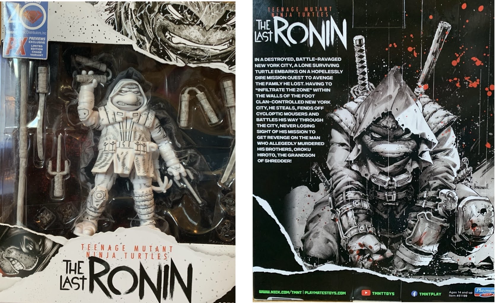
In 1964, Arthur Rankin and Jules Bass unleashed a Christmas Classic upon the world in the form of Rudolph the Red-Nosed Reindeer. The special basically put the company on the map and put it on the path to holiday domination for decades to come. Despite that, few of the specials that followed Rudolph truly hit the same highs and it’s likely due to a case of diminishing returns. Still, that didn’t stop the company from trying to replicate its original success with Christmas and today’s subject feels very much like a retread of Rudolph only with a different protagonist.
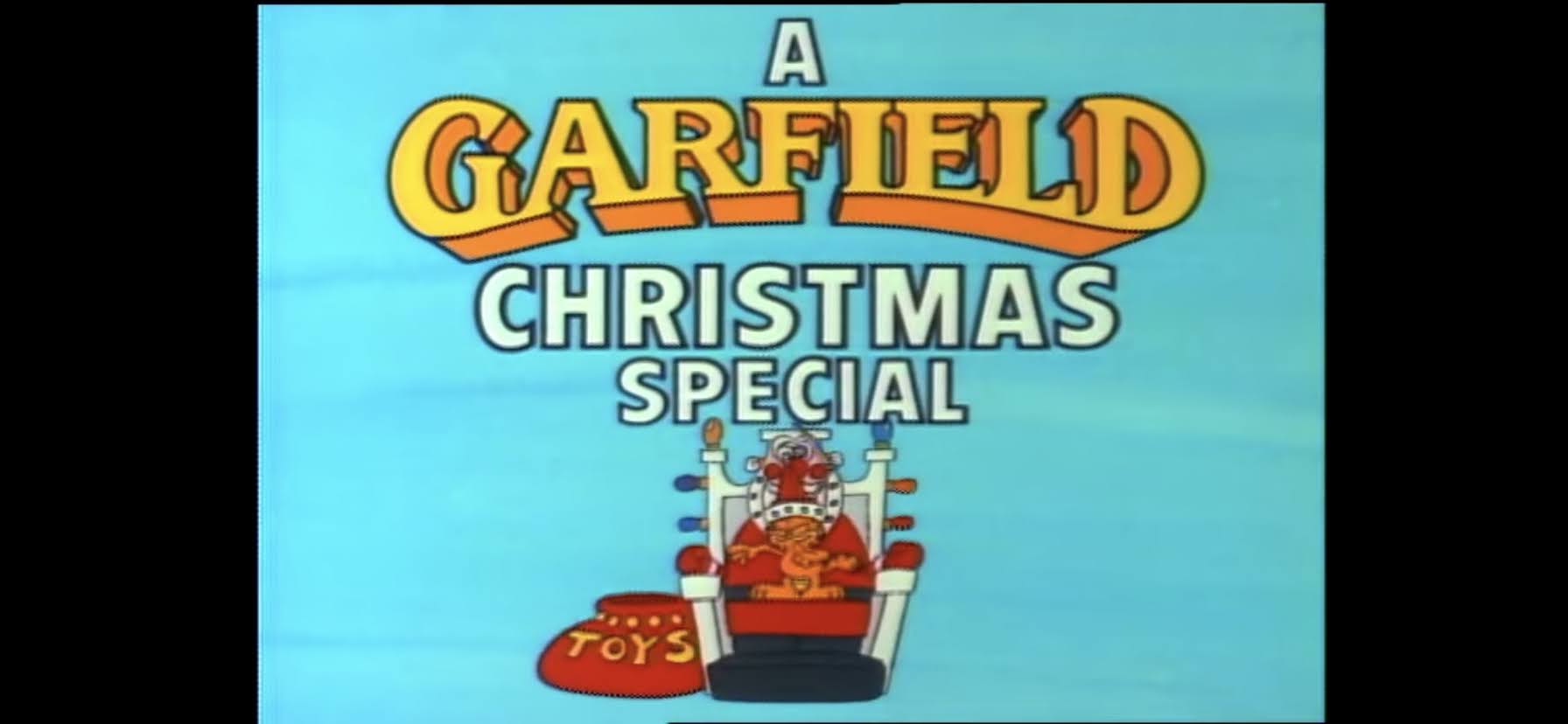
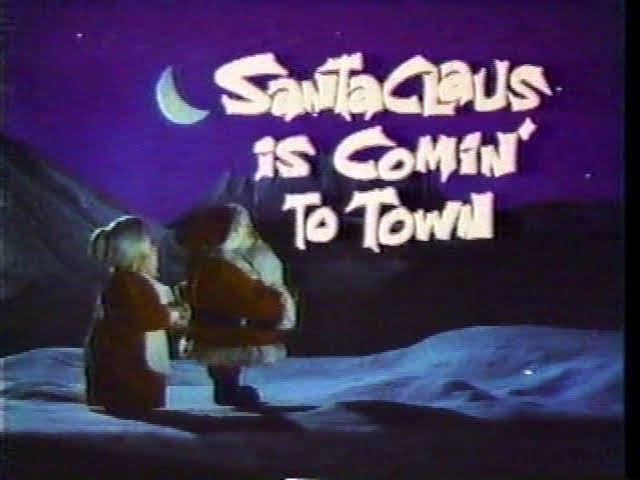
As popular as the character Rudolph is these days, he’s still in the shadow of the main man himself: Santa Claus. Maybe it was a bit odd to target Rudolph first with a Christmas special, but in 1964 the character wasn’t as explored as Santa. From that perspective, it makes sense to come back with Santa as the main character for a subsequent special which is likely how we ended up with Santa Claus is Comin’ to Town. Just like Rudolph, this special takes a popular song and uses it as the basis for a television special. It’s also going to bring in a celebrity narrator like Rudolph and Frosty the Snowman to basically push the story along and that’s a tactic the company loved returning to in the years to follow. Unlike Frosty, this one uses the “Animagic” stop-motion process so it looks more like Rudolph. That look is basically synonymous with the company now making specials like Frosty the exception, but in 1970 it wasn’t quite established that the Christmas specials from Rankin/Bass would all be animated with stop-motion techniques.
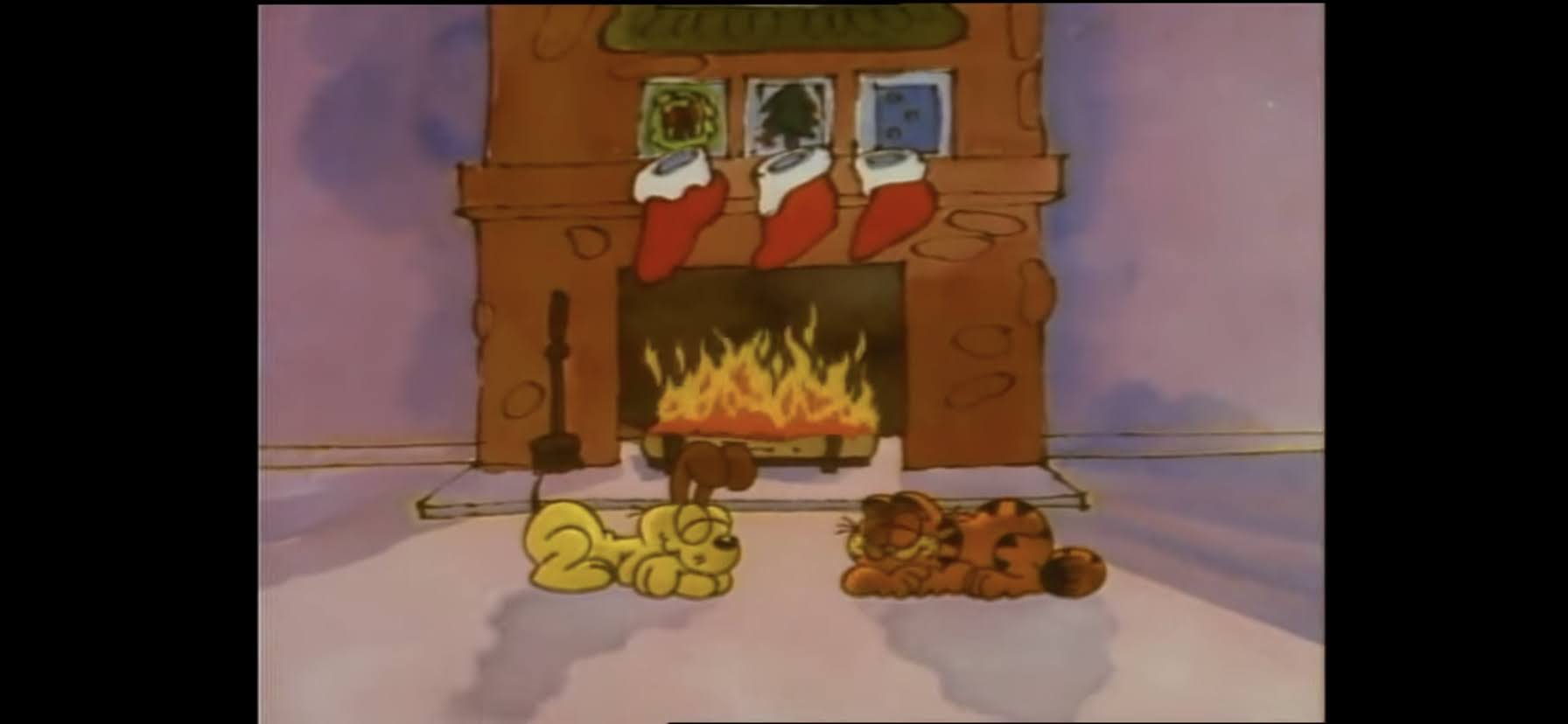
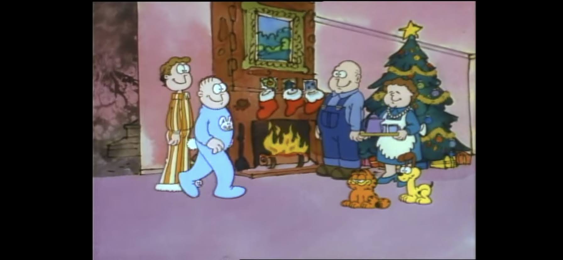
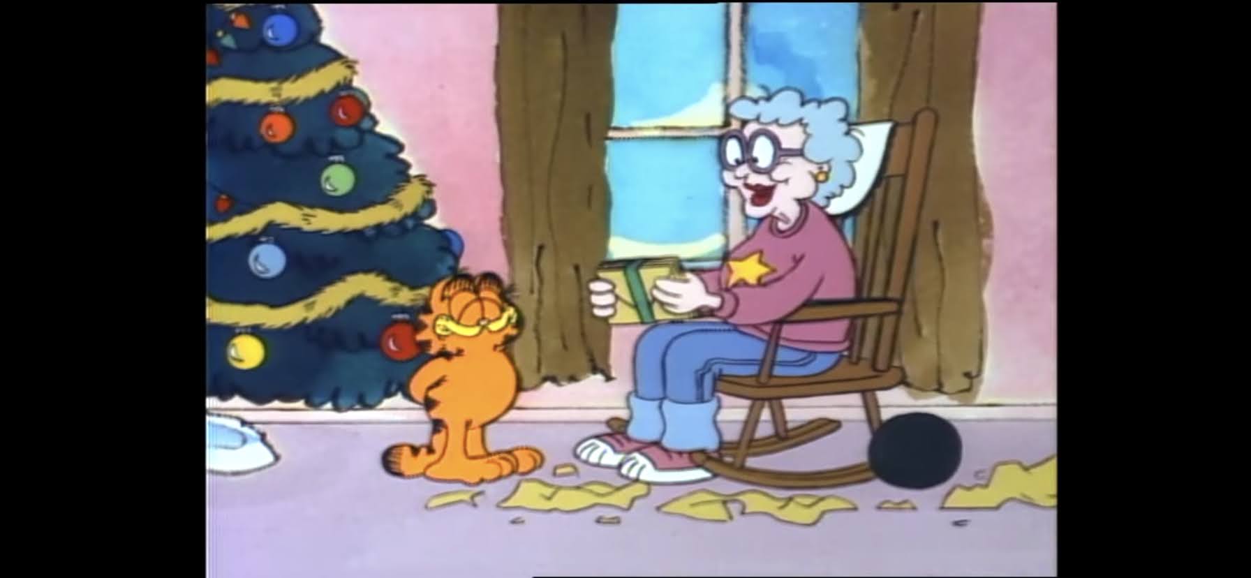
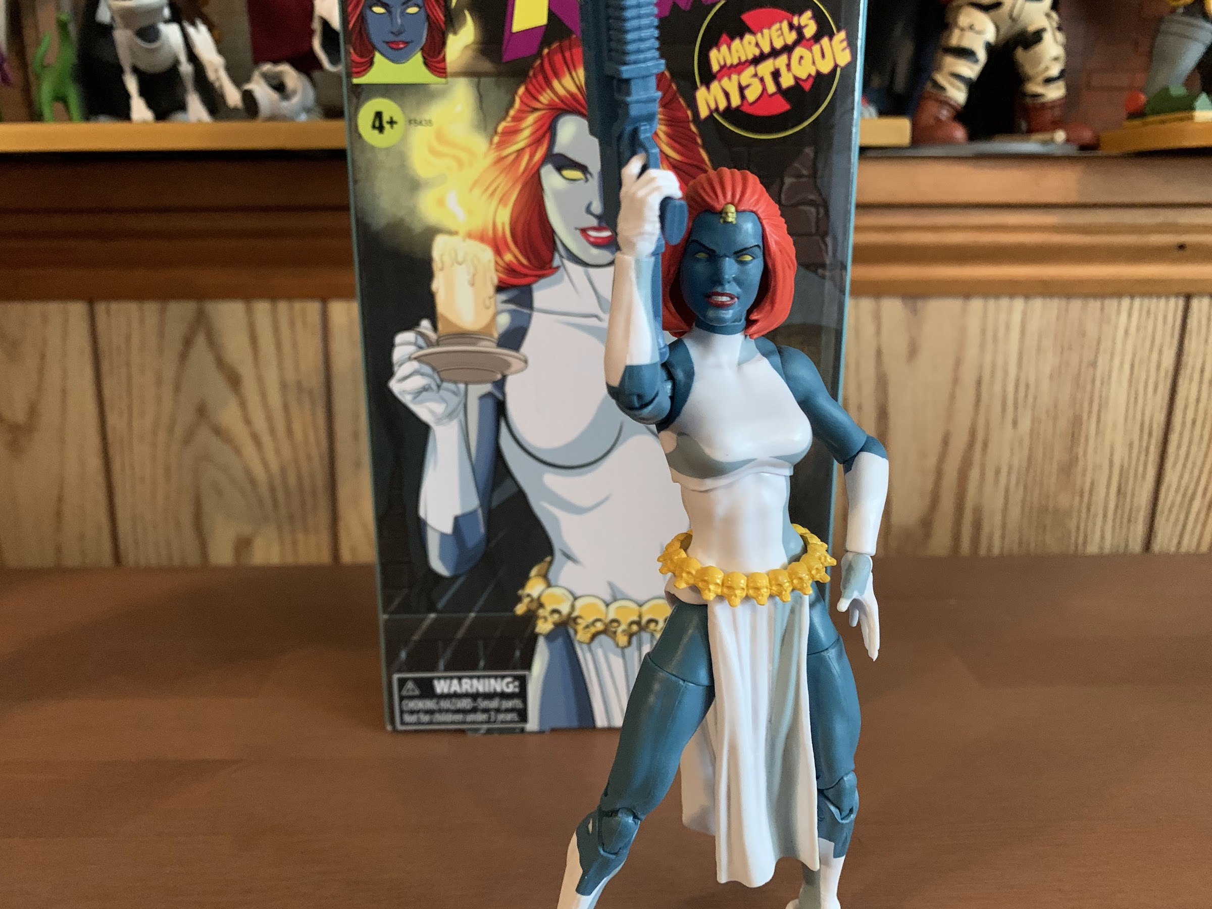
As a kid, I grew up with Santa Claus is Comin’ to Town as part of my cherished Christmas Tape. Despite that, it’s one of the handful of specials from that tape that I don’t count among the greatest ever produced. Santa Claus had the unfortunate placement of coming after Dr. Seuss’ How the Grinch Stole Christmas and right before Rudolph. Grinch has long been my favorite, but when I was a kid it was pretty much neck and neck with Rudolph. Santa Claus is Comin’ to Town is basically the comedown special on my old tape, but since it’s an hour long, that comedown had a tendency to overstay its welcome. My sister and I often just endured this one to get to Rudolph. It’s basically the same length and the structure is similar as we’re hearing a story we basically know, but having a lot of it filled in. There are songs to break up the narrative, but I think with this one they’re just not as good. And even though there’s a clear cut villain to root against in the form of the Burgermeister, he’s almost too ridiculous and the film also doesn’t really deliver a comeuppance for him. We’ll have time for it all, but basically I’ve been putting an entry like this one off for years because it’s not a favorite and it’s an hour long. I’ve got some work ahead of me.
We’ll probably be making several comparisons to Rudolph the Red-Nosed Reindeer, and here’s another. This one begins with a fake news reel. Narrated by Paul Frees (who is going to do a lot of heavy lifting in this one), it’s presented in black and white and uses what I assume is just stock footage of kids. He says in a rather stern voice that children are reminded not to cry and not to pout as he’s basically just introducing the theme of the song, “Santa Claus is Comin’ to Town.” As a kid, this always felt a bit ominous and thus unsettling. It’s a bit of a weird note to start on, but maybe the idea was to present Santa as a bit of an authority figure when it comes to Christmas and what follows will soften his image?
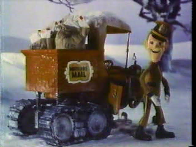
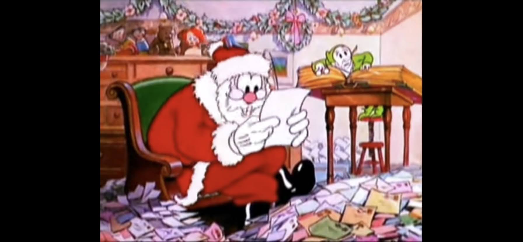
As the news reel comes to an end we’re taken to a winter setting where an interesting looking mail truck is driving over the snow. It looks like a conventional mail truck, except with tank treads. I always thought it was pretty cool. It’s marked Special Delivery, and our humble driver goes by the name Special Delivery Kluger. Fred Astaire provides the voice, and the lanky, long-chinned, fellow is a bit of a caricature of Astaire in the same way that there was a little bit of Burl Ives in the look of Sam Snowman and certainly a lot of Jimmy Durante in the narrator of Frosty the Snowman. His neat looking truck breaks down and he gets out of it to seemingly notice us, the viewer. We soon find out that old SD here is heading to the North Pole because he has some letters to deliver. He’s talking to us and breaking the fourth wall, but also, the disembodied voices of children can be heard asking questions about Santa Claus, most of which strike me as unimportant (“Why does he have a beard?”), but they are the questions kids ask. And these questions are coming from the letters that SD here is supposed to be delivering, not opening and reading. Seriously bud, that’s a federal offense! Well folks, we’re in for a treat because SD here is going to answer all of those questions and sing us the song for good measure.
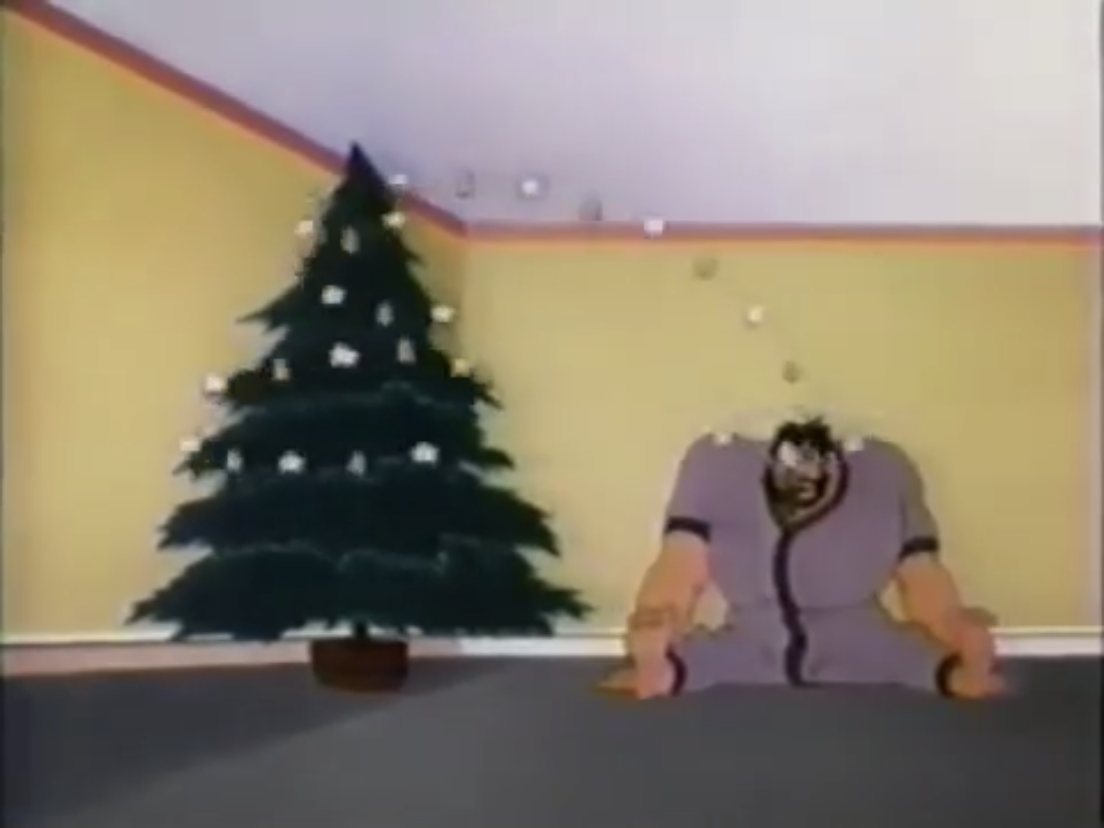
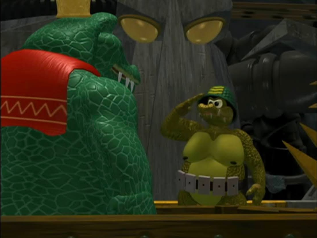
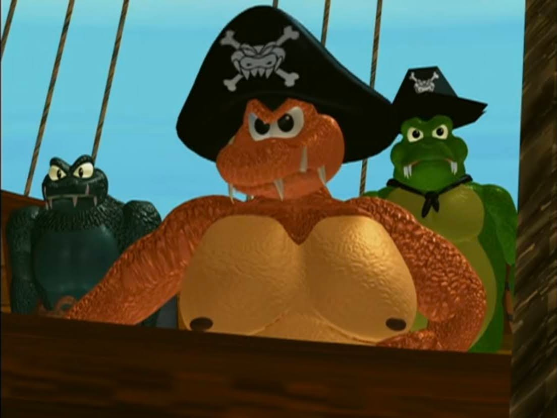
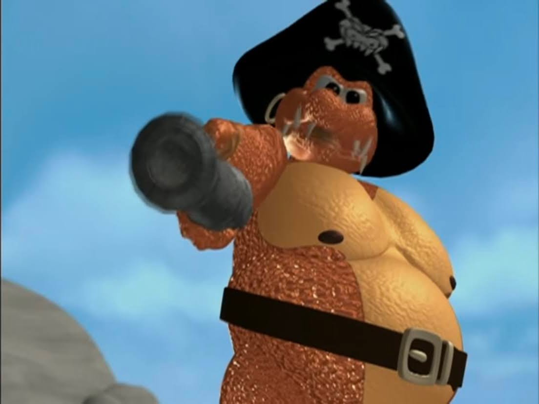
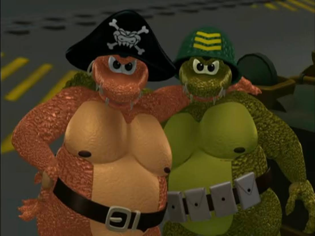
Special Delivery begins the song we all know which takes us into the opening credits. As it goes through, the melody changes and we basically get a sampling of the songs that will follow while Kluger dances around and mishandles the mail which serve as title cards. You would think this guy is in a hurry to get these deliveries out of the way, but I guess not. It’s story time! We’re going to a place called Somber Town which is at the base of the Whispering Mountains. It’s very dreary looking and we’re taken to the home of the Burgermeister (Paul Frees). I guess he’s sort of a mayor or something? His full name is Burgermeister Meisterburger and he’s busy eating. He’s eating some massive hunk of meat with a bib – how cute?
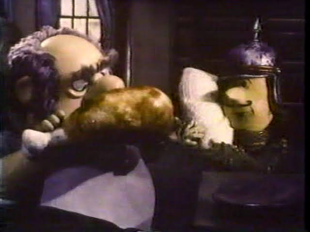
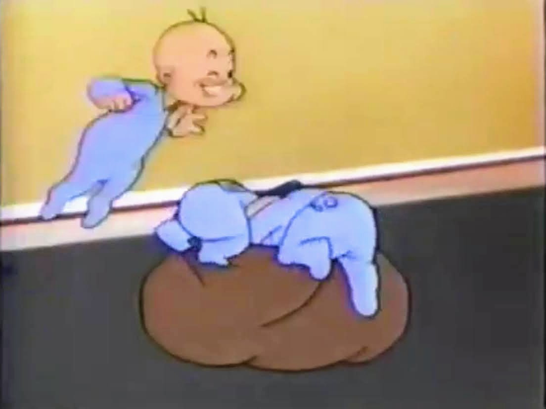
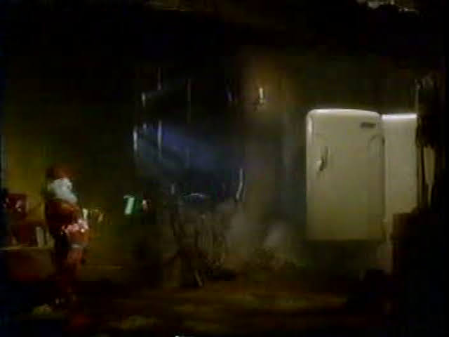
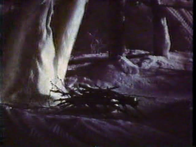
The head of the guard or something, Grimsley (Frees), enters with something to show his boss. It’s a baby and there’s a note requesting they take care of it from his mother. The only identifying information on the child is a tag that says Claus. The Burgermeister wants nothing to do with a “brat” like this and tells Grimsley to take it away. He does as he’s told and apparently to get to an orphanage you have to pass through some pretty rough terrain. It’s also dark, and it’s snowing, and he’s dragging the baby behind him in a cradle/sled. The wind picks up in intensity and the rope snaps. As Grimsley calls out for Baby Claus to come back (a lot of good that will do), we see it literally lifted by the wind and taken into the forest. No more baby.
The forest is apparently home to a being known as the Winter Warlock. He’s someone not to be trifled with, so when some animals come upon the baby (the cradle somewhat comically smashed into a tree and the baby just tumbled out) and hear the warlock approaching, they quickly hide him under branches and leaves. The warlock just strolls on by and all we see are his robes. Once that danger has passed, the animals know what to do as they take the baby the rest of the way over the Whispering Mountains to Rainbow River Valley where a family of toymakers reside: the Kringles.
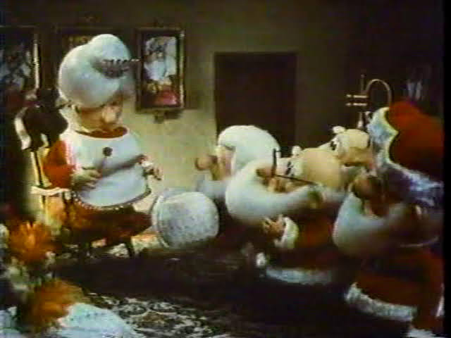
These Kringles are confirmed as elves and the animals just leave the baby on their doorstep and get the hell out of there. The door is answered by an elf named Dingle. He looks like a smaller version of Santa, though not particularly elf like, though he does speak in a voice that’s pitched up. He calls for his four other brothers: Ringle, Tingle, Wingle, and Zingle. They’re all voiced by, you guessed it, Paul Frees. They’re all pretty happy to find a baby and immediately take ownership by declaring “Our baby is the best baby of them all.” One of them rather comically just says “I like babies.” He’s the original “I like turtles,” kid.
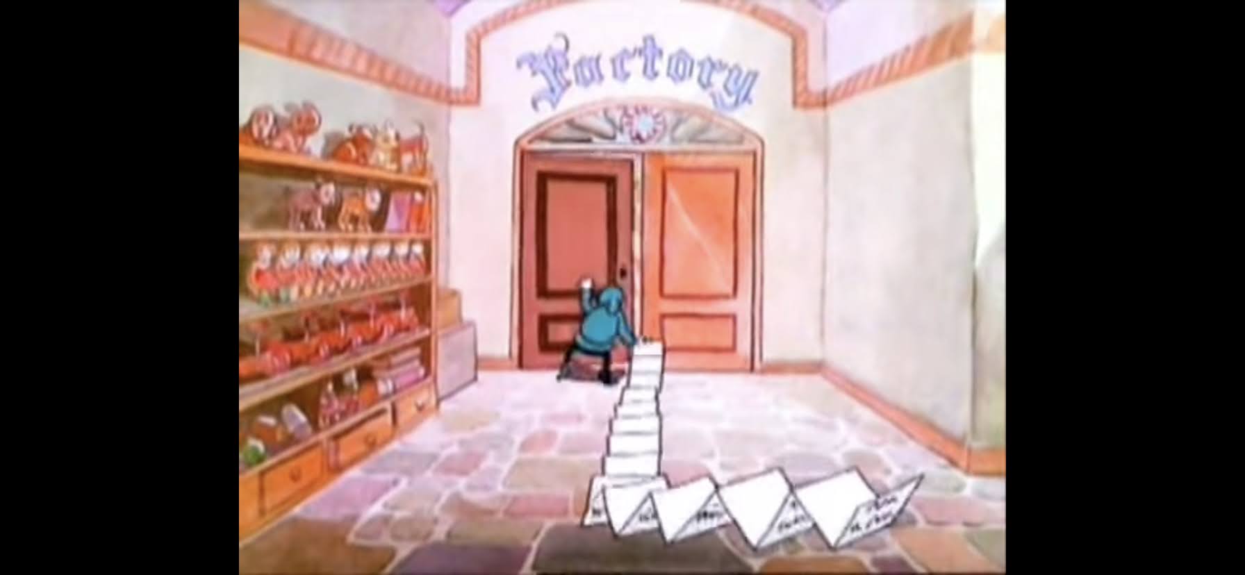
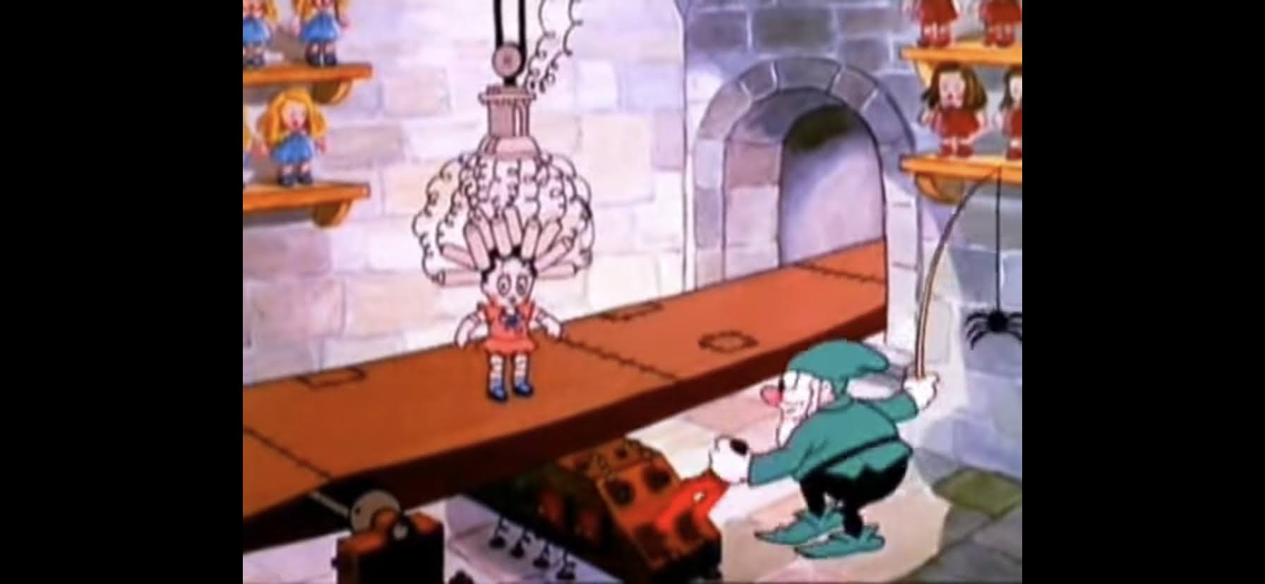
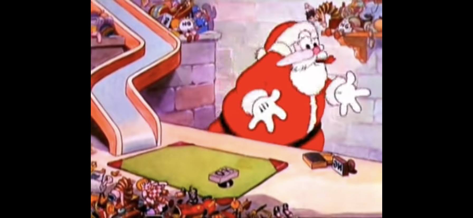
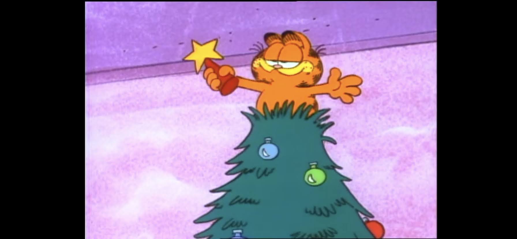
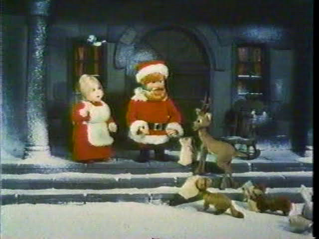
The elves take the baby in to see their matriarch, Tanta Kringle (Joan Gardner), who seems to be in agreement that the baby is now theirs. She declares they will call him Kris, and raise him as a Kringle. And then we get a time-jump and see Kris as a boy while our story-teller informs us that the elves taught him everything he needed to know, and stuff he didn’t, like how to make toys. Apparently, the Kringles make toys, but have no children to sell them to so they just pile up. They’re too afraid to take them over the mountain and past the Winter Warlock. Apparently, there are no other towns worth exploring except for Somber Town. Kris then vows that he’ll deliver toys to Somber Town when he’s big enough, and Tanta reminisces how that will be the day that will restore the Kringle name. She then goes into the first song of the special, “The First Toymaker to the King.” It’s fine, but it pays off in a little bit for another reason. The thing I like about the song most though is they present a lot of it like a storybook so we get some illustrated versions of the Kringle characters. It almost makes me wish the whole special looked like that.
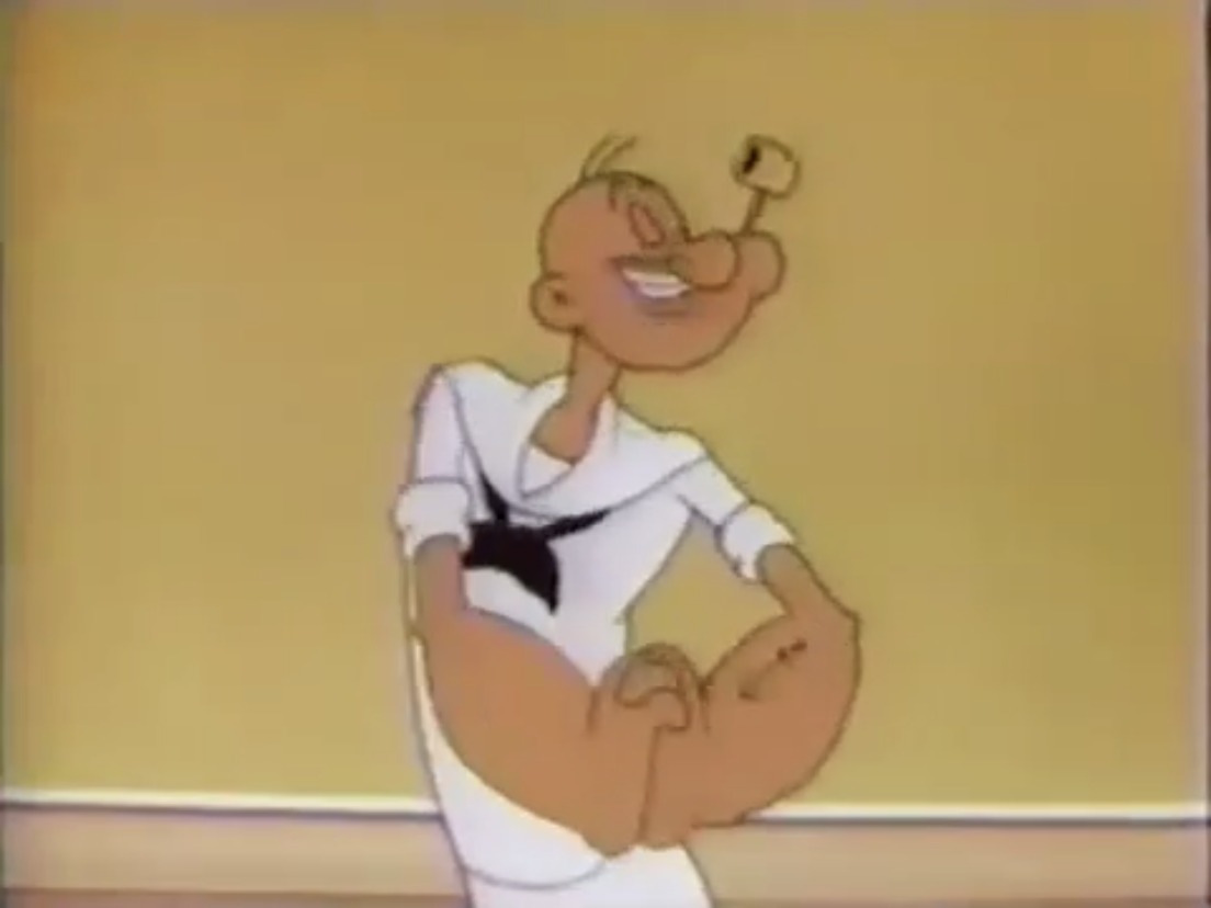
The song concludes with some disembodied children pointing out that’s how Santa learned to make toys. Yeah, no kidding. This is a running thing throughout the special where Special Delivery says something, and some children comment on it, usually just to reenforce what SD just said. When the song is done, SD goes on to say that Kris also learned a lot from the animals nearby, and most importantly, it was a seal that taught him how to laugh. As he goes “Ho ho ho,” we get another time jump and find an adult Kris (now voiced by Mickey Rooney) who declares to Tanta he’s a man now! Did they just finish doing something?! At any rate, he can take those toys over the mountain and the elves are pretty excited by the thought.
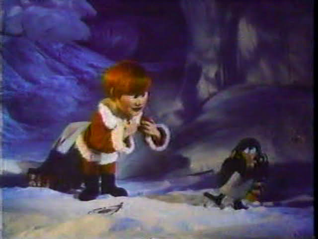
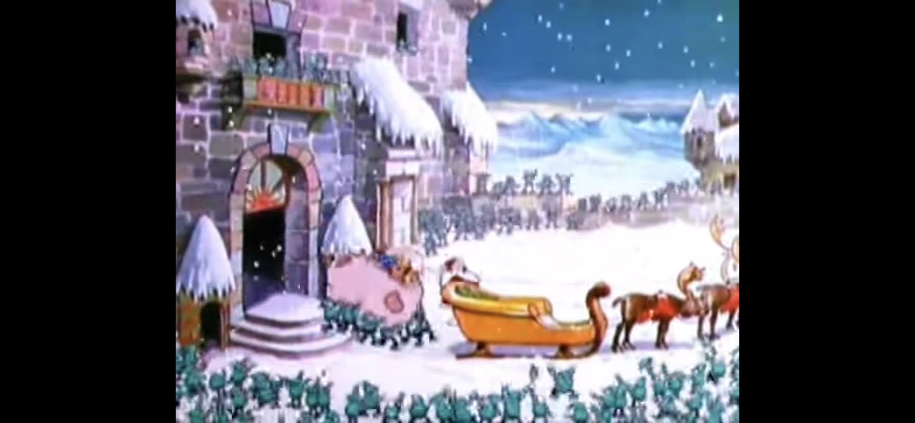
Later that night, Kris is packing for his journey when Tanta comes barging in. She’s got a present for him: a red suit. He’s overjoyed to receive a real Kringle suit which looks just like the traditional Santa outfit. We jump to morning and Kris is shown saying goodbye to everyone and sets off up the mountain. It only takes a moment before a penguin comes slamming into him. He questions the penguin on what he’s doing out there and deduces he’s looking for the South Pole, which is pretty damn far from where they are. Kris invites the penguin along, and decides to call him Topper who seems to like the name though we don’t know for sure because he’s a penguin and can’t talk. As they resume their march, a booming voice fills the air. It’s the Winter Warlock (Keenan Wynn) who basically tells them to beat it and never come back or they’ll be sorry. Kris encourages Topper to follow and the two race off.
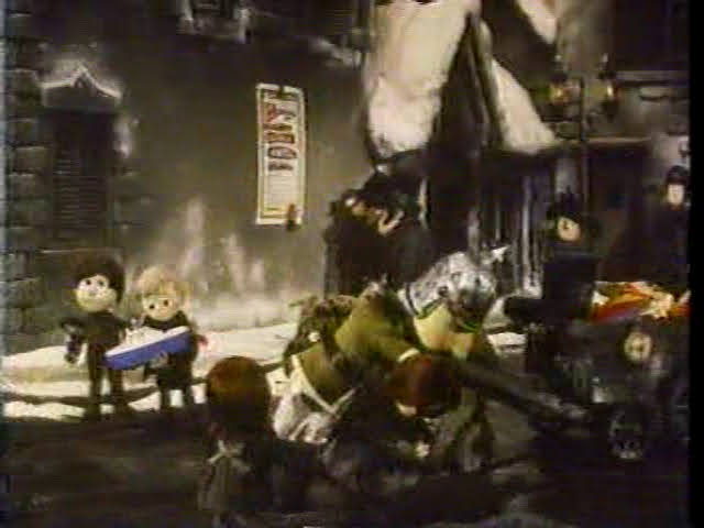
It’s the next day, and the Burgermeister is heading outside when he stumbles down some steps. The culprit? A toy was carelessly left out. He had to get his foot wrapped and he’s back in his estate where he vows to outlaw all toys! I’m doing this part from memory because my source for this special, The Christmas Tape, is missing a chunk of the special because someone failed to resume recording after the commercial break. It picks up when Burgermeister is singing his version of “The First Toymaker to the King,” which is now enforcing a message of “There will be no more toymakers to the king!” It’s a horrible message, but the song is kind of cute as it uses the same storybook technique as Tanta’s version, only now the ballerina’s are being arrested and the toy soldiers melted down. When the song is over, we see a soldier collecting toys throughout the town and chucking them into a wagon pulled by a fairly evil looking horse. Vicious!
It’s this toyless world that Kris stumbles into. He’s got his sack of toys over one shoulder and goofy red suit which everyone stares at. The people of Somber Town are depicted almost exclusively in black and white. Even their flesh seems to lack much color. One old woman even admonishes Kris for his clothes and he seems both hurt and confused by this. When he says he’s there to just give away some toys everyone freaks out and runs into their house leaving Kris even more confused.
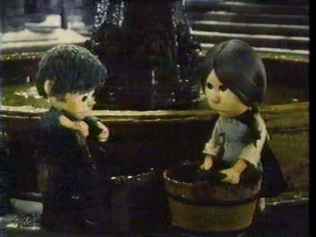
Kris continues on his way and comes across two kids washing their socks in a fountain. They explain to Kris that’s basically how children are judged in this town: by how clean their stockings are. He tells them they don’t have to look so sour and when they ask why he just says “I don’t like sour faces.” He then recites some of the song, the whole you better not pout or cry part, and when they keep asking why he says, “Because I came to town!” He then reveals what he brought and the kids perk up. They’re a bit apprehensive, but when they mention the Burgermeister Kris says he’ll just give him a big, red, yo-yo. The kids then dig in, but are soon interrupted by their school teacher Miss Jessica (Robie Lester) who dismisses toys as frivolous. She tries to further malign them, but Kris just sticks a china doll in her face and she immediately melts. Apparently she always wanted one and when she hugs it she even squirts out a tear.
We then go into our next song, “Be Prepared to Pay,” which states that kids must sit on Kris’ lap and give him a kiss to get a toy. Umm, suddenly it makes sense why people seem to eye this character suspiciously. When that’s done with, we see the Burgermeister being wheeled through the streets in a wheelchair. This is the same guy who was singing and dancing not that long ago on his bum foot, but now needs a wheelchair. What a fraud! He remarks to himself how nice it is to see the children all playing with their toys, which is to setup a “Guffah!” kind of joke where he realizes the kids are doing exactly what he doesn’t want them to do. He then demands that all of the kids are under arrest for playing with toys!
Kris comes running in to take the blame. He explains that he gave them the toys and it’s he who should be arrested. The Burgermeister appears to be taken aback by the Kringle’s clothes, as so many others were earlier, but agrees that he needs to be arrested. Kris stops him in his tracks though when he presents that yo-yo he mentioned earlier to him. Now it’s the Burgermeister’s turn to be disarmed by a toy as he clutches it and tells Kris he loves yo-yos. He goes back to his childhood and talks about all of the tricks he knew while he, sort of, demonstrates that by playing with it. He’s having a pretty good time, but if you thought he would be turned as quickly as Miss Jessica you’re sorely mistaken, as Grimsley reminds him that he’s breaking his own law. This seems to snap the Burgermeister out of his toy-induced trance and he tosses the yo-yo and demands that Kringle be arrested!
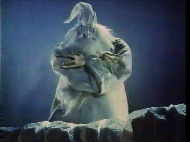
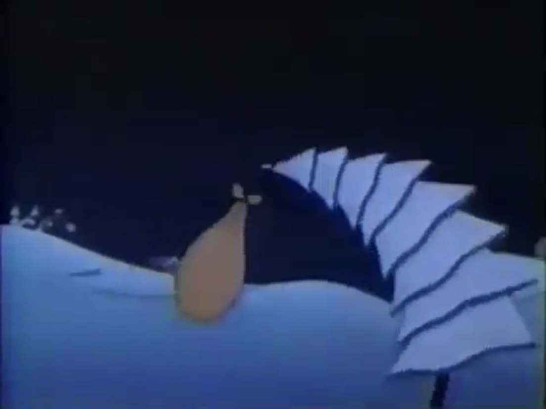
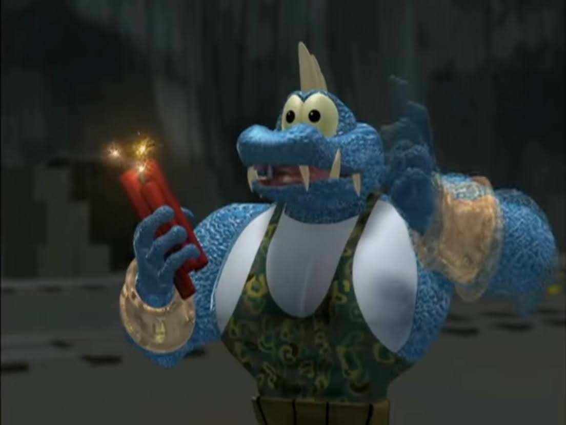
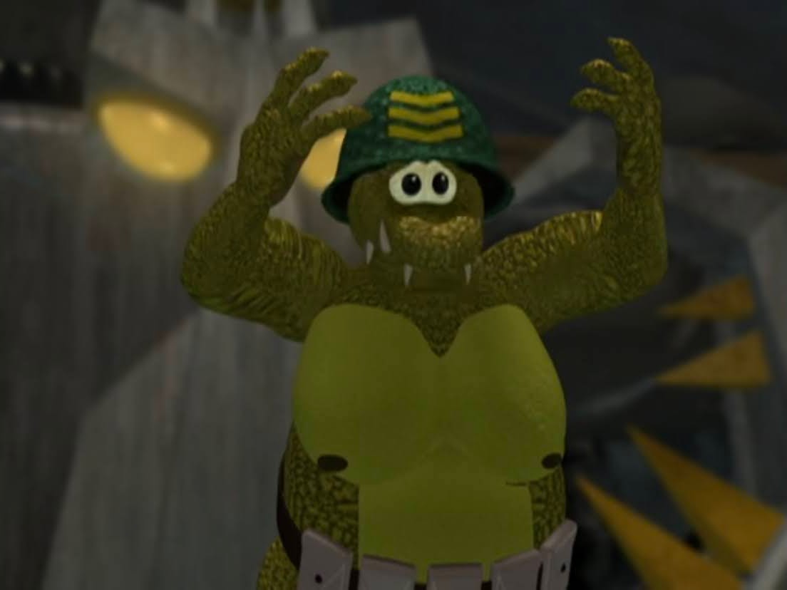
Kris isn’t going to just surrender though as he takes off knocking the soldiers down in the process. The Burgermeister then comments on his fleeing abilities remarking he climbs like a squirrel, leaps like a deer, and is as slippery as a seal. These are all animals you can apparently compare Santa Claus to. Kris demonstrates all of these qualities by scaling the wall surrounding the town and escaping. The soldiers give chase, but once Kris and Topper head into the woods they decide to back off. They claim they’ll never find him, but I think they’re just scared of the warlock as they rightly should be for Kris and Topper don’t get very far until they’re grabbed by trees. Yes, trees, and the Warlock shows himself! He’s basically all white, even his face, and he has a long robe, pointy hat, and big, white, beard. He gestures to Kringle and informs him that he has disturbed him for the last time and that he’ll never get away!
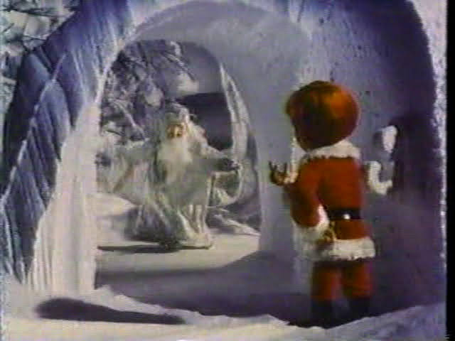
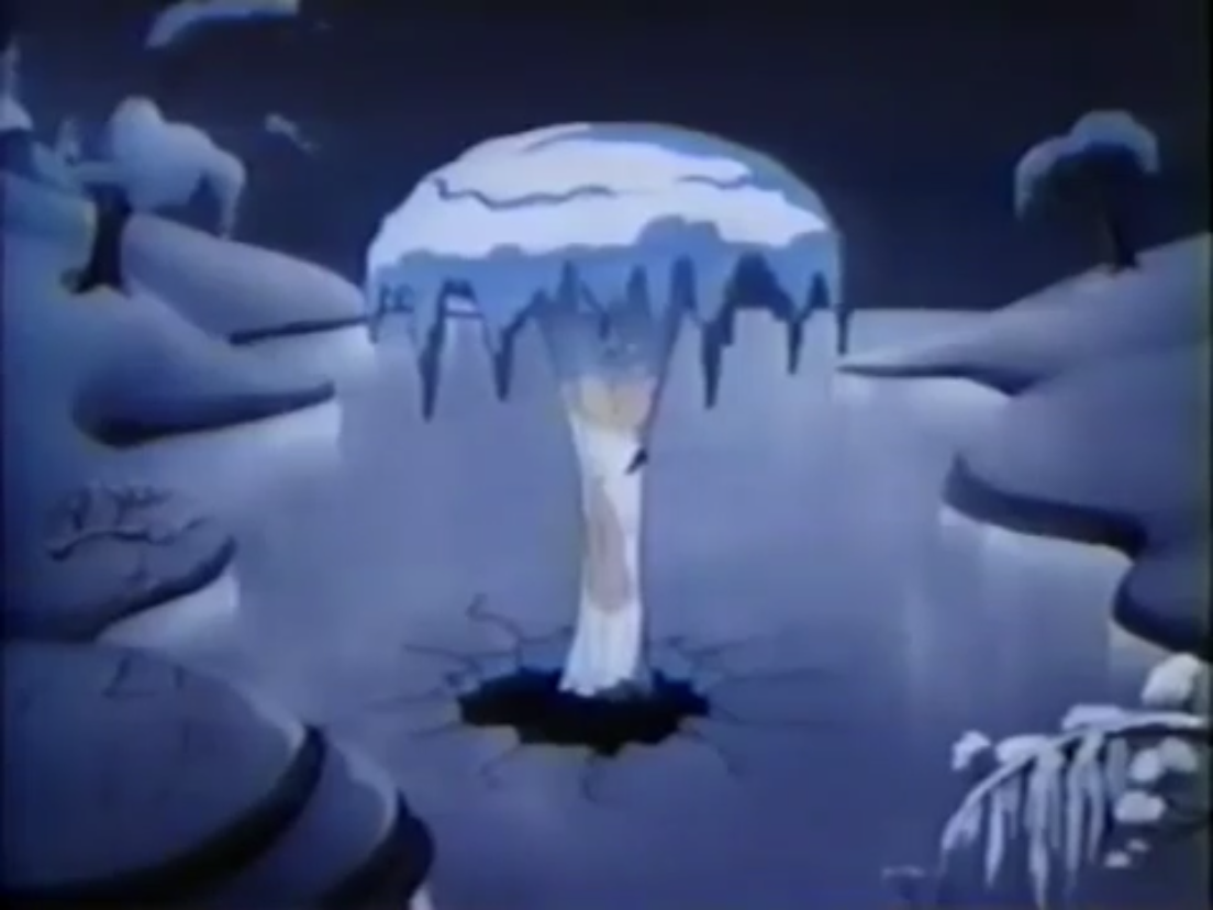
Kris figures he can talk his way out of this, so he requests that the Winter Warlock release him for a moment so he can give him a toy. The Warlock is pretty surprised by this, but immediately cheers up. He orders Willy Willow and Peter Pine, the trees, to release the Kringle so he can receive his toy. Kris presents him with a toy train, which the warlock refers to as a choo-choo. He starts to cry, and when Kris asks what’s happening he explains that his icy heart is melting. Once it does, his face goes from white to a natural flesh color and his mouth is no longer full of sharp teeth. He then wonders how he can go on and describes himself as a wicked creature at heart. It would seem this is Kris’ opportunity to stab him or something, but instead he laughs and insists that the warlock, who now wishes to go by Winter, can change. He reasons that turning from bad to good is as easy as taking your first step, which leads into the next song “Put One Foot in Front of the Other.” It’s an okay tune, but the animation that goes with it is weird as it seems to imply that Winter doesn’t really know how to walk. He looks rather awkward, and must have been difficult to animate a robe in stop-motion, but by the end he’s walking and feeling pretty damn good about himself.
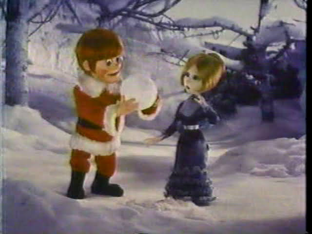
When the song is done we find Winter and Kris seated by a tree in the snow. It can’t be very comfortable, but I don’t think this Winter fellow actually has a proper house though Special Delivery claimed he had an ice palace. He has a proposition for Kris in that they can help each other. In exchange for more toys, he can show Kris some of his magic. He demonstrates this by making a large snowball and tells Kris to gaze into his magic, crystal, snowball. Someone is looking for him – Miss Jessica. It would seem she’s wandered into the woods to find him, and when Winter tells him to go to her he basically just falls from the sky beside her. Was that more magic? Either way, she informs him the kids are looking for more toys and Kris agrees to provide said toys so long as they’re good. When she asks how he’ll know, he shows her the snowball trick that Winter just demonstrated. This is apparently how he spies on children and he and Miss Jessica basically recite some more of the song through their dialogue which feels rather forced. Kris explains that he can’t just walk in and hand them out like last time, so he tells Miss Jessica to inform the kids to leave their doors unlocked and that he’ll deliver them under cover of darkness. And for being so nice, he even gets a kiss from Miss Jessica – golly!
Back at casa de Kringle, Kris is preparing for his toy delivery. Winter is there too as he apparently doesn’t want to hang out on a cold mountain anymore now that his heart is unfrozen. Kris is making his list, and checking it twice, but seems to determine that all of the kids are nice. I’m not sure if he takes this all that seriously, kids. He heads into Somber Town and basically just enters every unlocked house and leaves toys behind. The next morning, Burgermeister is royally pissed off to see the kids outside playing with their toys and makes a new law on the spot: all doors and windows must be locked at night!
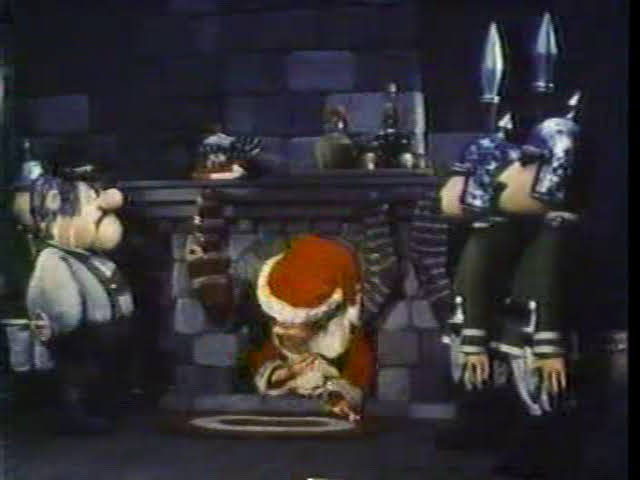
Kris returns the next night, but can’t get into the houses since they’re all locked. It’s pointed out he really needs to deliver a toy for a sick kid and is determined not to let her down. Topper is the one who points out the chimney, though it takes Kris a minute to figure out what he’s getting at. Kris thinks it’s a great idea and absolutely loves going down the chimneys. He visits all of the houses, but the next morning we find the toys all confiscated by the Burgermeister. Are the kids still playing with them outside? Seems pretty dumb. He mentions he knows they were left by the hearth of each house so he orders that every building will be inspected at dawn for toys. Talk about government overreach. After he makes his declaration, he accidentally sits on a tin solider and stabs himself in the ass. Good for him.
Kris keeps getting letters for toys delivered by animals, but he doesn’t know how to deliver them. He soon figures out that the stockings are a solution and sends a letter to Miss Jessica via the animals. We cut to the next morning and the Burgermeister, now with a bandaged ass, is inspecting a house. He’s pleased to find nothing but drying stockings by the fireplace and takes his leave. The father of the house breaths a sigh of relief, while the kids run for the stockings to uncover their toys. The Burgermeister really is an idiot since empty, drying, socks look a lot different than socks filled with toys. The kids though are arguably dumber because they, once again, take to the streets with their toys and the Burgermeister remains furious (somewhere along the way he apparently decided against arresting children). He then tells Grimsley he’s going to do what he should have done from the start: set a trap for the Kringle!
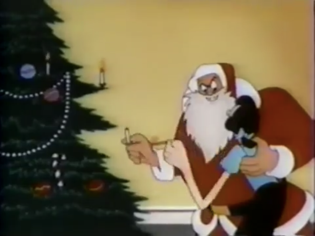
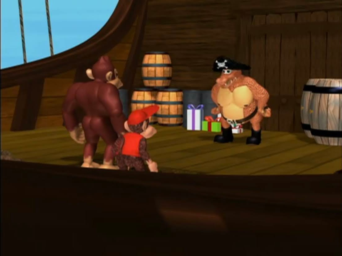
Miss Jessica overhears this declaration and tries to warn Kris, but once she gets to the Kringle home it’s nighttime and Kris is gone. She asks Winter for help via his magic, but he explains he’s all out of magic and seems pretty down about it. Then Grimsley shows up with a small assortment of men to arrest the Kringles. It would seem rendering Winter nice backfired as there’s no way they would have braved the mountain beforehand. We then see Kris getting bagged by the Burgermeister who arrests him on the spot. To make a spectacle of the whole thing, he burns all of the toys in the town square as the children look on with tears in their eyes.
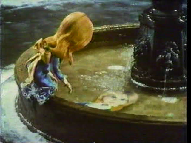
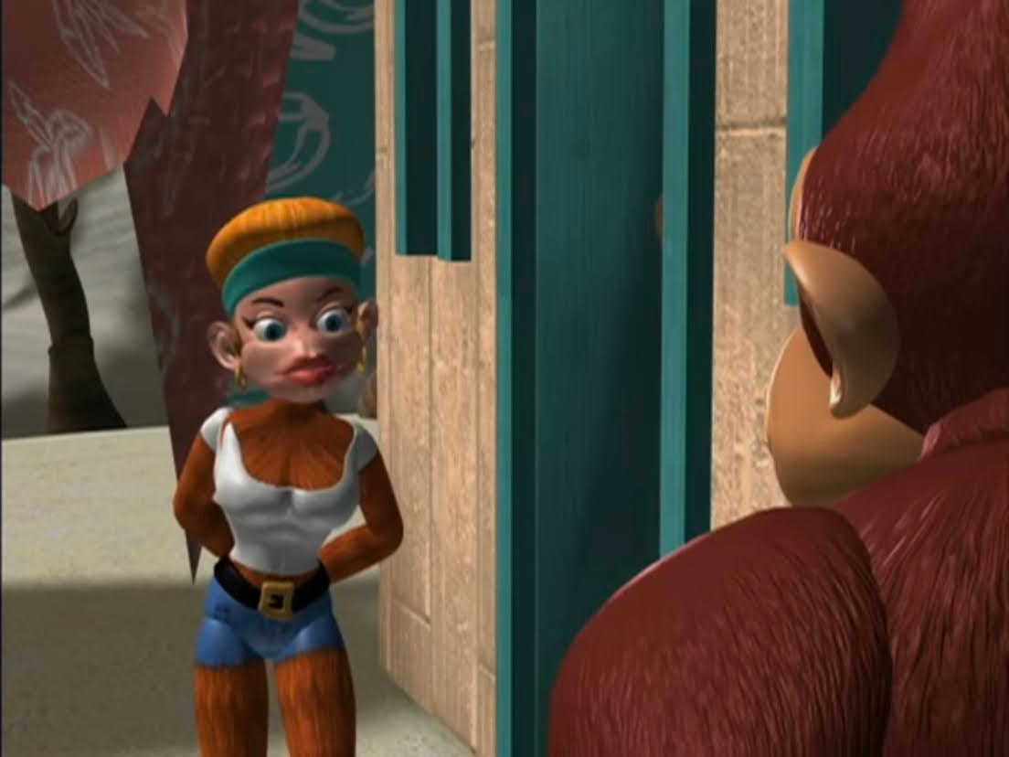
The next day, Jessica approaches the Burgermeister and pleads with him to free Kris and the Kringles. He laughs her off and it’s not explained why they didn’t round her up with the other Kringles since she’s an obvious accessory to their toy delivery scheme. As the Burgermeister takes his leave, Jessica claims her eyes are now open for the first time. I thought they were before? Whatever, she goes into the worst and shortest song of the special, “My World is Beginning Today,” which features the amusing shot of Jessica looking at a reflection of herself in the fountain, but it’s clearly a paper print-out of her puppet and not an actual reflection. She lets her hair down for the song though and looks lovely.
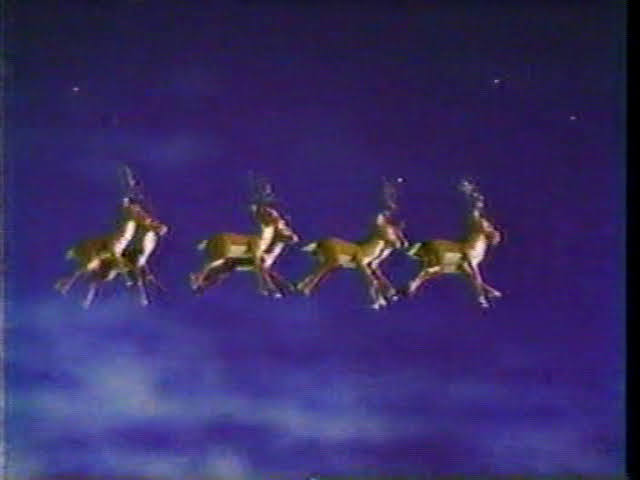
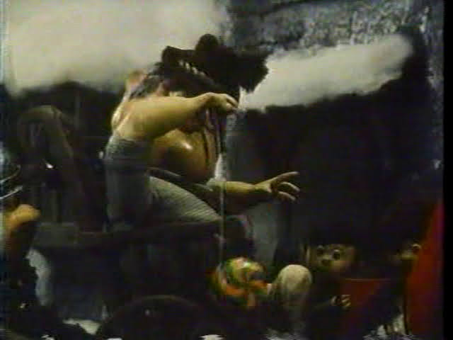
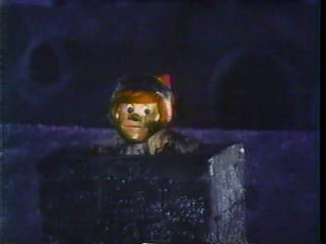
When the song is over, Miss Jessica is seen lurking outside the town’s prison. She finds the cell containing Winter and once again calls to him about using his magic to get them out. He’s pretty despondent about the loss of his magic and shows her the collection of useless stuff the jailer apparently let him keep: a short-circuited wand, dried up magic potion, stubs from old candles, and some magic feed corn. Jessica asks about the corn and he says it’s only use is to make reindeer fly. Jessica thinks that’s their answer and she takes the corn and rounds up some reindeer. This is apparently a pretty easy feat. Like most Christmas specials, the reindeer look like white-tailed deer and not actual reindeer, but she feeds them the corn and suddenly they can fly! The kids listening to Special Delivery’s story very much like this part, and one kid even says “don’t forget…” when the reindeer are introduced and we get a glimpse of Rudolph, but Special Delivery insists that’s another story.
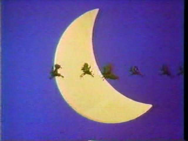
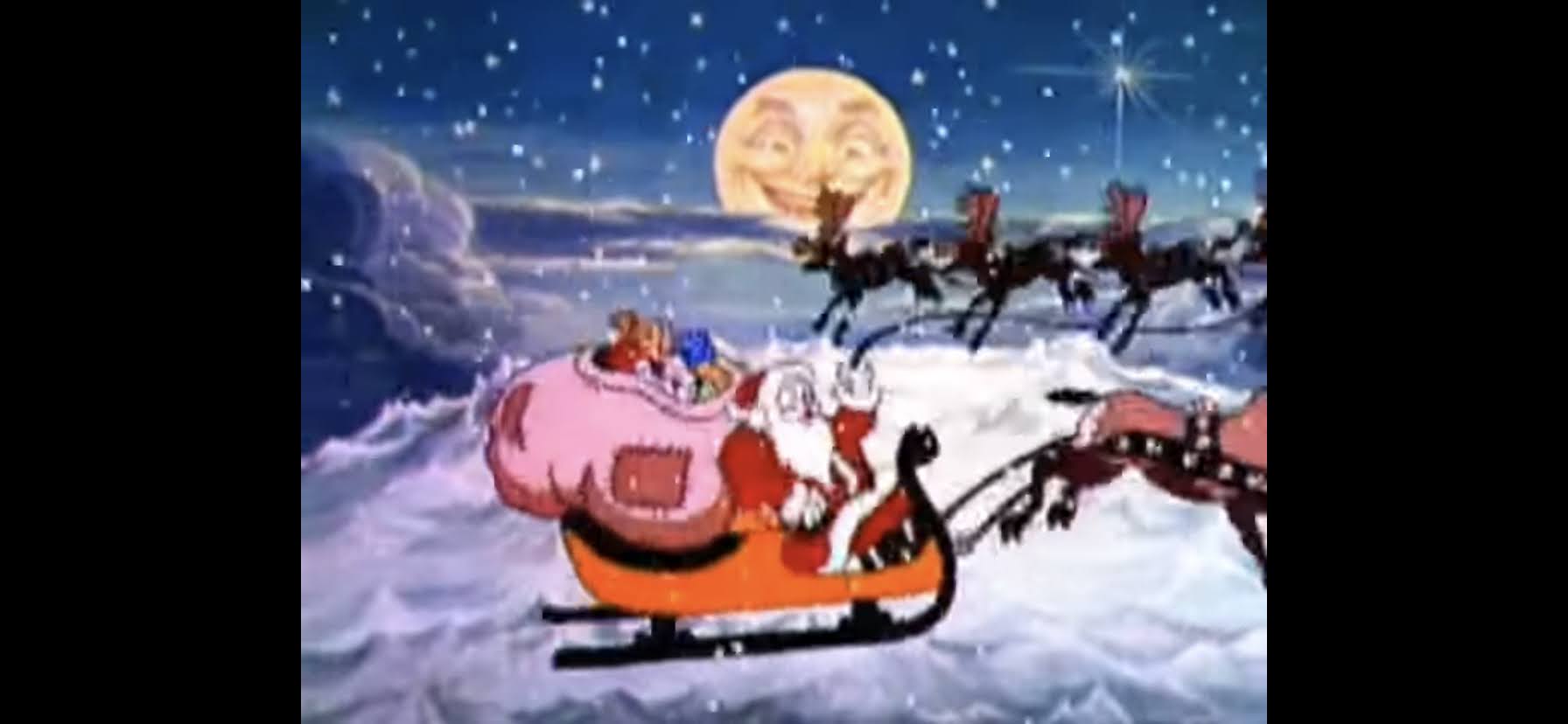
The reindeer are just what they need for an escape though. Well, we’re never told how they actually broke out of their cells, but I guess that was deemed unessential. They all fly off and Winter is especially happy to see he had a little magic left after all. It’s easily the most triumphant moment of the special as we get an instrumental version of the title song in the background as the whole crew flies in front of a crescent moon. I guess it can’t be a full moon until he’s finished his transformation into Santa.
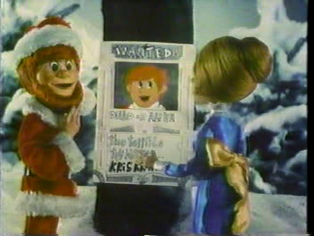
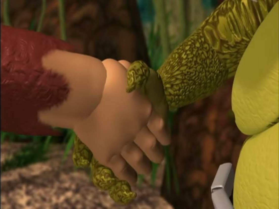
With the Kringles free, the Burgermeister vows to hunt them down. The crew returns to their home, but it’s been burned to the ground. Kris determines it’s no longer safe and that they need to run further north, so they do. There’s wanted posters (dead or alive, which seems extreme) put up for them, so Kris does the smart thing and grows a beard (probably should ditch the identifiable threads). It’s at this point that Tanta raises the idea of changing his name and shows him the Claus tag he was found with. Some kid chimes in “I knew it! I knew it! That’s where he got his name!” the kid’s a real rocket scientist. They don’t explain the Santa part. Jessica and Kris are then shown getting married under the first Christmas tree. Winter lights it up with a last bit of magic.
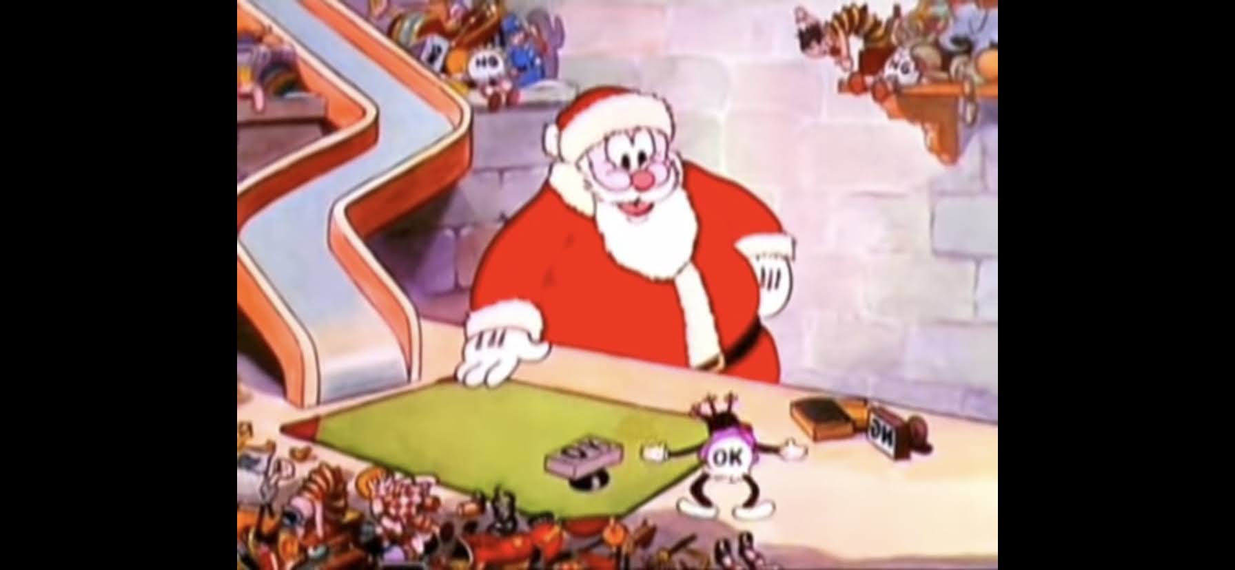
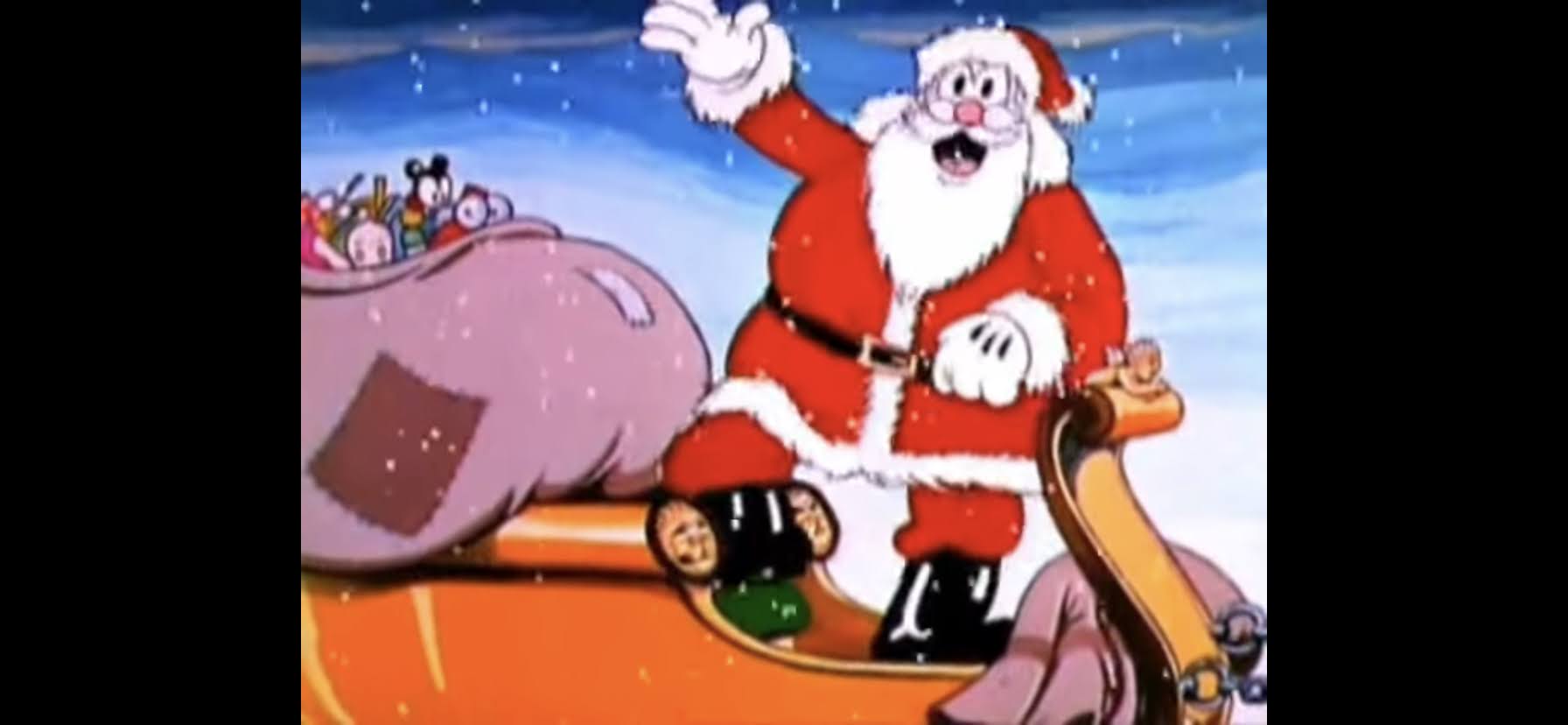
The crew is then shown heading further north until they hit the North Pole where Kris giddily announces it’s here they’ll build a new home to make toys. How they did so is not explained, but they do it. The animals deliver the letters and time just keeps marching forward. Kris and Jessica get rather “comfortable” with married life though he wonders how he can keep up with the orders. We’re then told that the Burgermeisters have fallen out of power and that Kris is no longer perceived as an outlaw. He’s old now, and realizes he can’t just keep delivering toys all of the time so he decides to do it on just one night a year and he settles on the holiest night of the year: Christmas Eve.
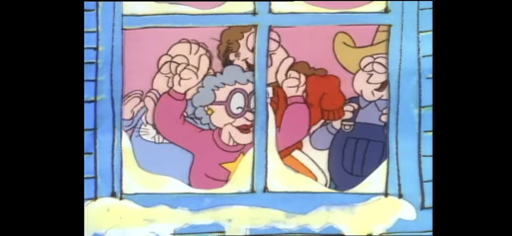
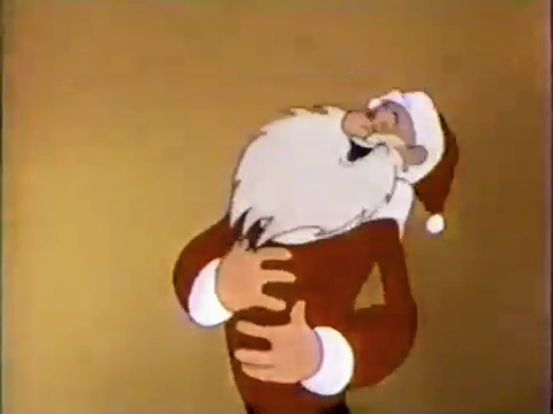
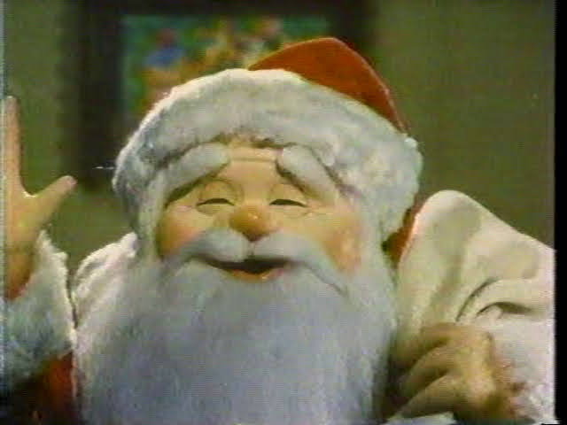
Santa Claus is then shown exiting his home to hop in his sleigh. Winter is there and apparently his magic is just fine now as he promises a nice, white, Christmas. Santa is pleased and he gets in his sleigh and takes off. Special Delivery comes back to tell us that’s the end of the story. He also takes a moment to mention how there’s still people who don’t like Santa and Christmas and we cut to a Scrooge-like character and some other adults that dislike the holiday. SD wishes everyone could be more like Santa, but there’s no time for moralizing here. He quickly remembers he has a ton of letters to deliver, and he also owes us a rather important song. Special Delivery then, delivers, on the promise of the special’s title and sings us the full version of “Santa Claus is Comin’ to Town” as he makes his way north. The song ends with him pulling up on Santa’s workshop and the old dude comes outside to wave at the camera while the children shout “Merry Christmas!”
And that’s how Santa Claus came to be. Or one way, there’s a bunch of others at this point, but when I was a kid this was definitely the one that framed my idea of Santa the most. I don’t think I necessarily thought the guy who brought me presents was also once harassed by some guy with “burger” in his name, but I definitely rolled with the magic feed corn makes reindeer fly and thought of him as adopted by elves. The magic snowball also resonated with me, but I also grew up being told that the birds spied on me for Santa. Both seem equally plausible at this point. Well, it would be hard for Santa to actually watch every kid in the world with his snowball. Maybe they should have added something at the end with Winter and his magic to try to explain how he could pull off bringing toys to the whole world. We only see him do it for one town, after all.
I guess that’s a story for another day. As for this one, it’s all right. It maybe longer than many specials out there, but it moves fast. If anything, it’s the songs that drag it down and help make it feel long when I think they’re supposed to have the opposite effect. And it’s not that they’re bad, they’re just not nearly as good as the songs in Rudolph. None of these songs are worth listening to outside of this special except for Fred Astaire’s rendition of the title track. And even then, I’d rather hear another version if it was up to me, but his is fine and it’s utilized well. It’s also a bit of a bummer that we never see the Burgermeister get his comeuppance. He does get hurt throughout the special, and he’s basically the cause of it, but maybe we should have actually seen the people overthrow him or something. Instead, we just see one kid tossing his portrait in the trash.
The animation is obviously a tremendous source of charm for this as well. The special definitely attempts some ambitious shots, but few of them really land. Some things are just funny when they probably shouldn’t be, like the baby at the beginning just floating around and smashing into a tree. That Santa must have one hard head! Winter is very awkwardly animated to the point where I almost feel anxious when watching him because he moves so slow. The reindeer flying in front of the moon are also pretty goofy looking, but the closeup shots of them flying look nice. And a credit to the animators for getting that sleigh off the ground with eight reindeer at the end. That could not have been easy.
The legacy of Santa Claus is Comin’ to Town is that it’s the spiritual sequel to a special that’s more beloved in Rudolph. Because it is old and tells an important story to the Christmas holiday, it’s hung around and likely will for a long time. It’s also the start of Mickey Rooney’s long run as Santa for the Rankin/Bass company and it’s basically the role I associate him with the most at this point, but I also didn’t grow up watching The Little Rascals. As a once a year viewing, this one is all right. I think I just saw it too much as a kid so at this stage of my life I literally never desire to watch it. I’ll watch it usually once out of habit and out of stubbornness as I refuse to skip specials on my Christmas Tape. Once I get through that initial viewing though, this one becomes the point I often check-out. I guess that’s its legacy in my house.
Can’t wait until tomorrow for more Christmas? Check out what we had to say on this day last year and beyond:

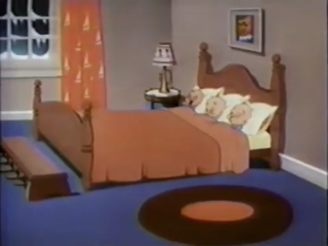
Dec. 7 – Bedtime for Sniffles
Not every Looney Tunes or Merrie Melodies star had to be inherently funny. Sure, most of them were and that’s often what many cartoon enthusiasts will point to the Warner catalog of cartoons as having over Disney, but it wasn’t some hard and fast rule. That’s why when a guy by the name of Chuck…
Keep reading
Dec. 7 – SuperTed Meets Father Christmas
When it comes to British imports and the subject of bears is brought up, most probably immediately think of Paddington or Winnie the Pooh. Few probably recall SuperTed, the Welsh teddy bear brought to life by a spotted alien and given super powers by Mother Nature. SuperTed is similar to Mighty Mouse in that he…
Keep reading
Dec. 7 – Bob’s Burgers – “Father of the Bob”
Bob’s Burgers has somewhat quietly become the best animated show on the Fox Network. Better than the modern version of The Simpsons, and better than Family Guy. It might be the ugliest of the three, but it more than makes up for that with its characters and plots. Bob’s Burgers looks like just another…
Keep reading