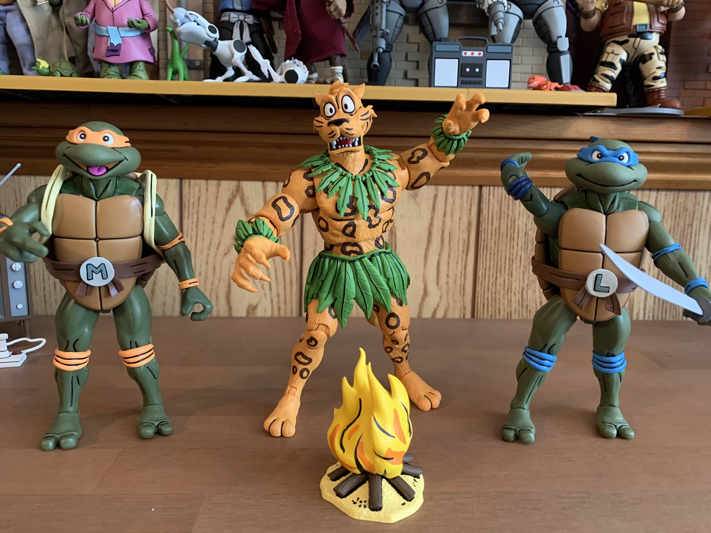
Today we are wrapping up our look at Wave 1 of Super7’s Mighty Morphin Power Rangers Ultimates! action figures with the lone zord of the wave: the Tyrannosaurus Dinozord. The T-Rex zord was the vehicle of the Red Power Ranger and main body of the Megazord. It was basically the only one of the original five zords that could function on its own in a meaningful way. The other four rarely did anything, but on occasion, the T-Rex went into battle and took on some monsters in its dino form. As such, it made sense for Super7 to do a figure of this particular zord since it can standalone as an action figure while something like the mastodon or pterodactyl really would not. And it’s also because Super7 either isn’t allowed to produce, or has no desire to produce, zords that can combine into other zords like the famous Megazord.

For me, a very casual Power Rangers fan, the appeal of this line is that Super7 can produce zords that are more accurate to the show. Whenever a company makes a combining one, they have to work within that framework. The zords in the show existed as both models, or puppets, and as actors in a suit. When the Megazord was formed, it then transitioned to a costume which could basically cheat the proportions. As a result, any figure that does the same isn’t going to resemble the one on TV. It does in a general way, but usually the proportions are off (especially the head) and any articulation the figure has needs to be able to be integrated without causing an issue for one of the individual components. When I look at my vintage Bandai Megazord, it almost feels like they prioritized the individual zords over the Megazord. Or, they simply determined that was the best way to go. The head is tiny, but since it needs to fit inside the head of the T-Rex that was something that couldn’t really be avoided. The shoulders are huge as well and the body is quite thick. There’s also the issue of the T-Rex tail which kind of just disappears. It’s still a tremendously fun toy, especially for 1993, but for collectors that want a screen accurate Megazord it’s not really going to cut it.

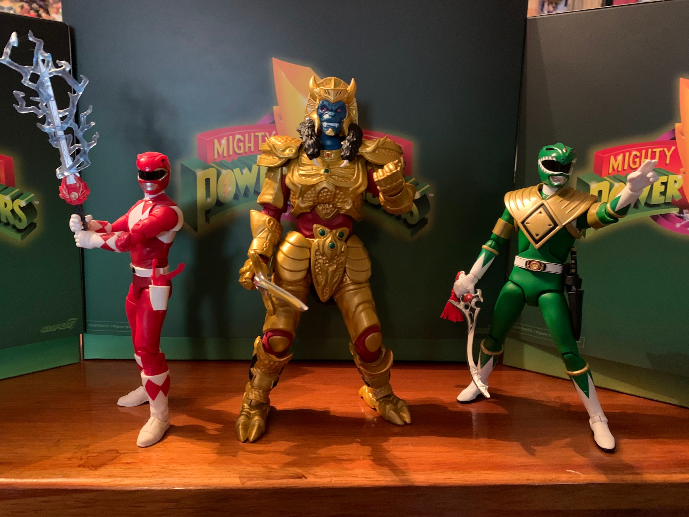
For the T-Rex, the same is basically true as it needed to be more narrow to accommodate the transformation. The head also needs to fit in the chest and something has to be done with that tail. Ignoring that allows Super7 to just look at the character onscreen and let that dictate where the figure goes. It obviously can’t scale with the Power Rangers in the line so that part is essentially made up, but Super7 is a company that tends to feel bigger is better and that’s certainly the case with the T-Rex. The box alone is massive. I was pretty amused when I got my figures in the mail as I ordered just the Green Ranger, Goldar, and the T-Rex and each box was different in size. I knew this one would likely be the biggest, but I still wasn’t quite prepared. And that’s mostly due to Super7 packaging the figure from the side and leaving the tail fixed. They could have sent it out disassembled, but what’s the fun in that?


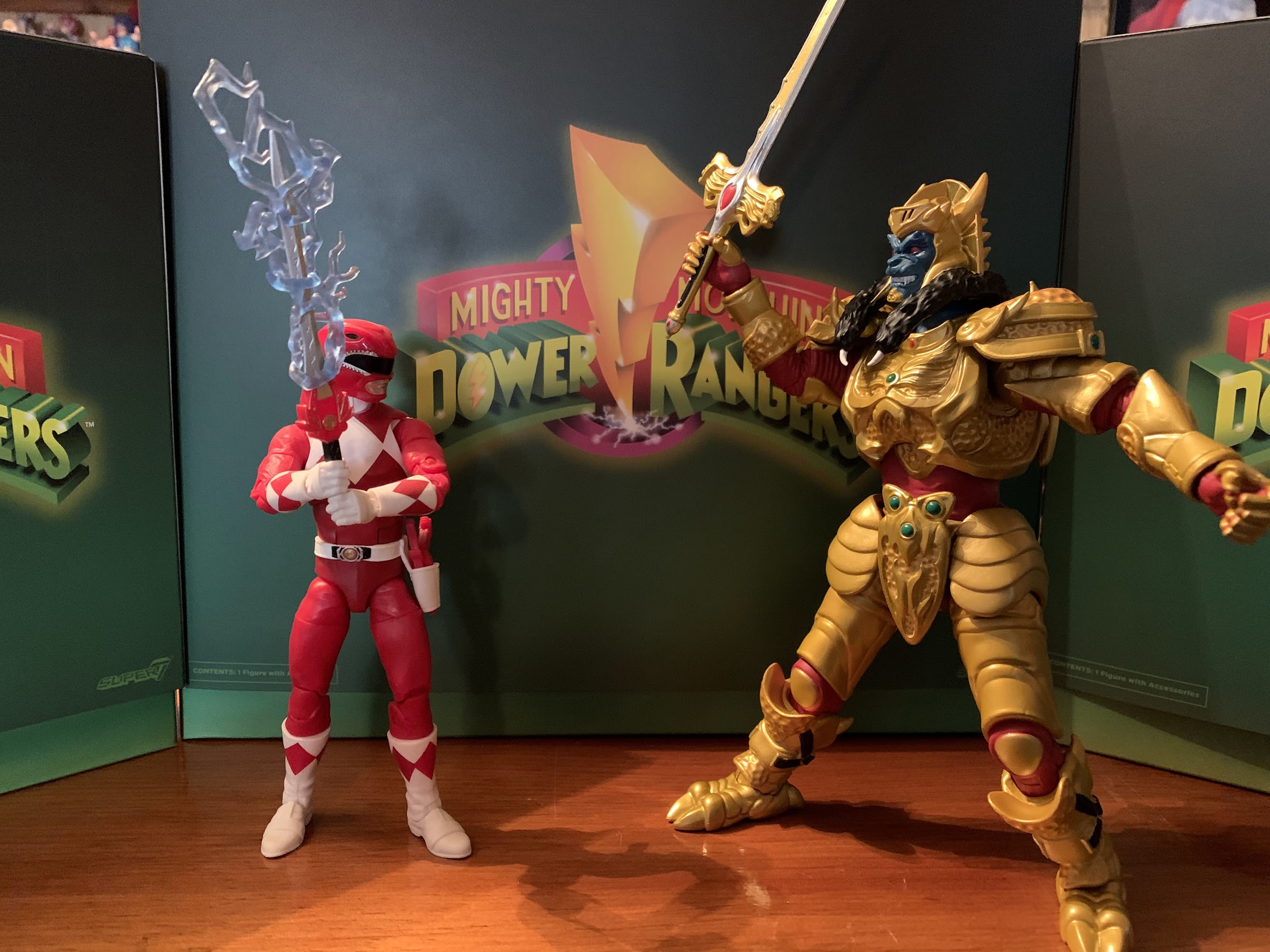
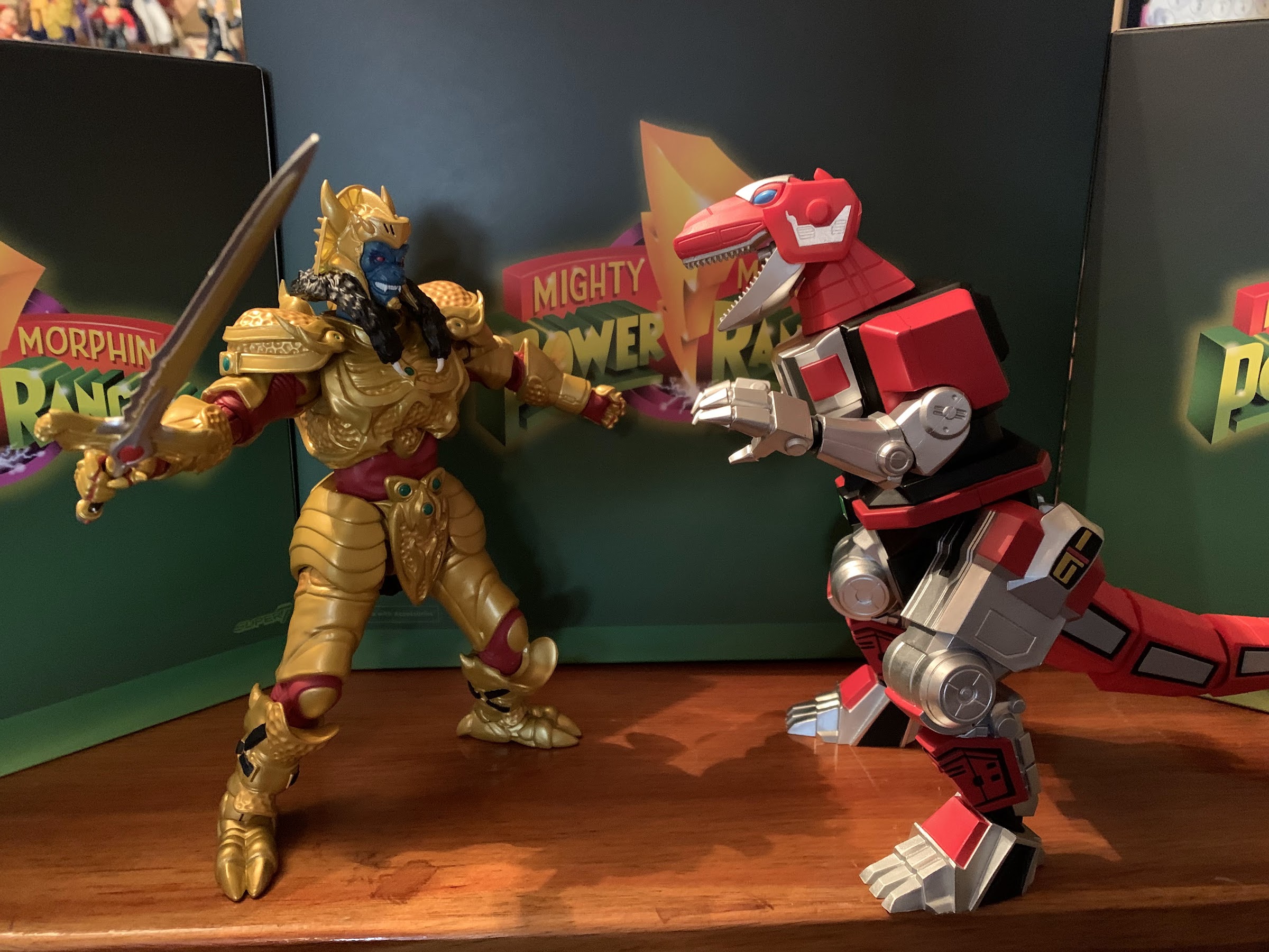
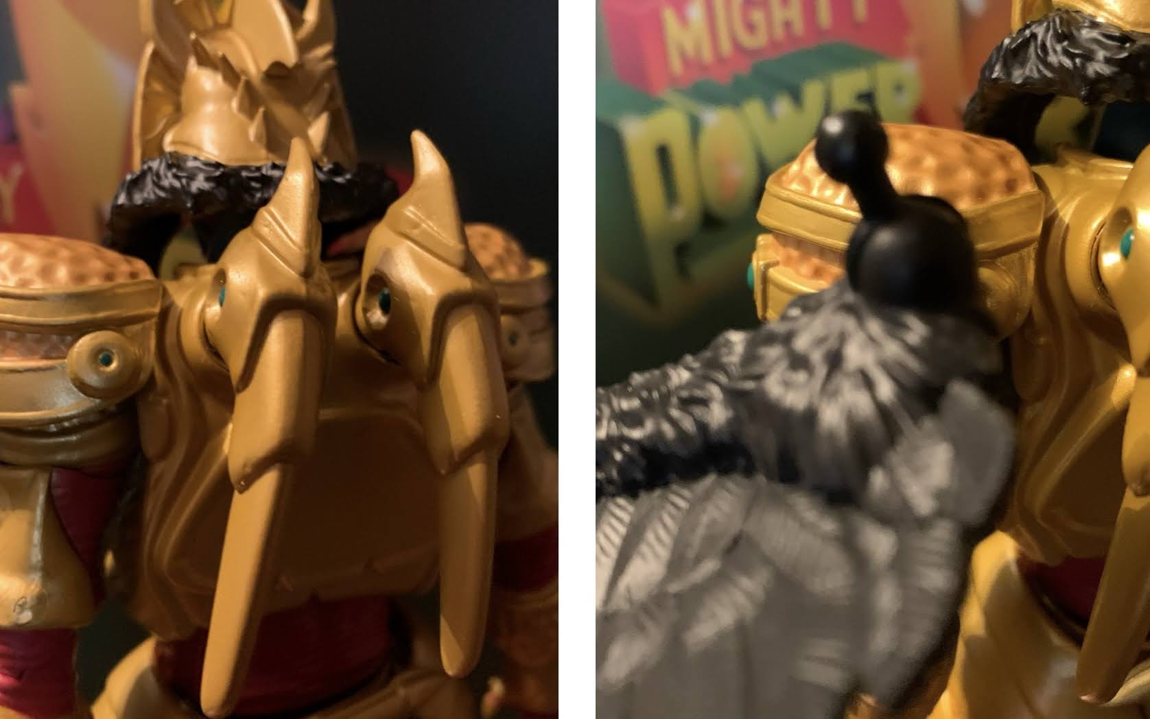
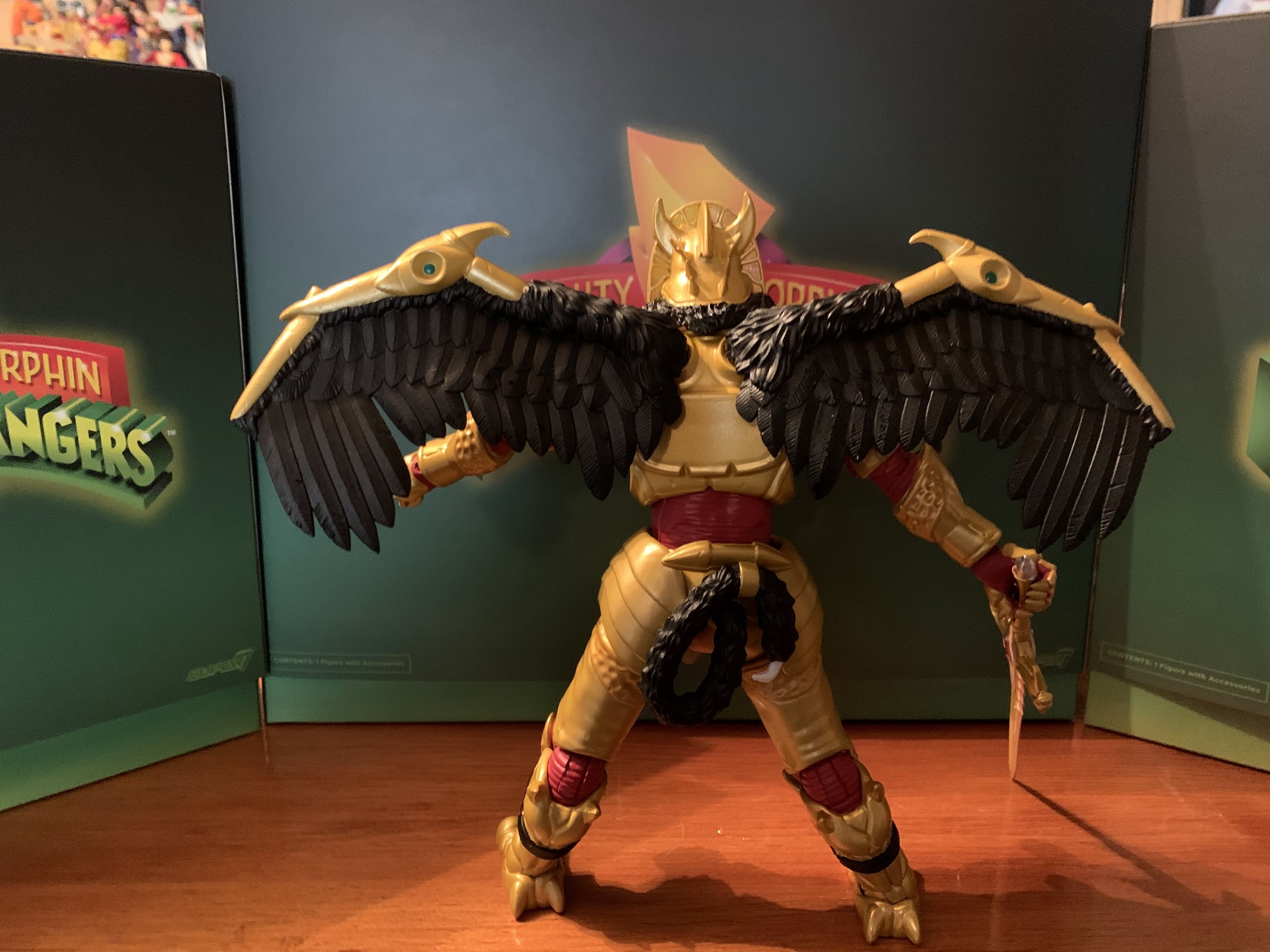
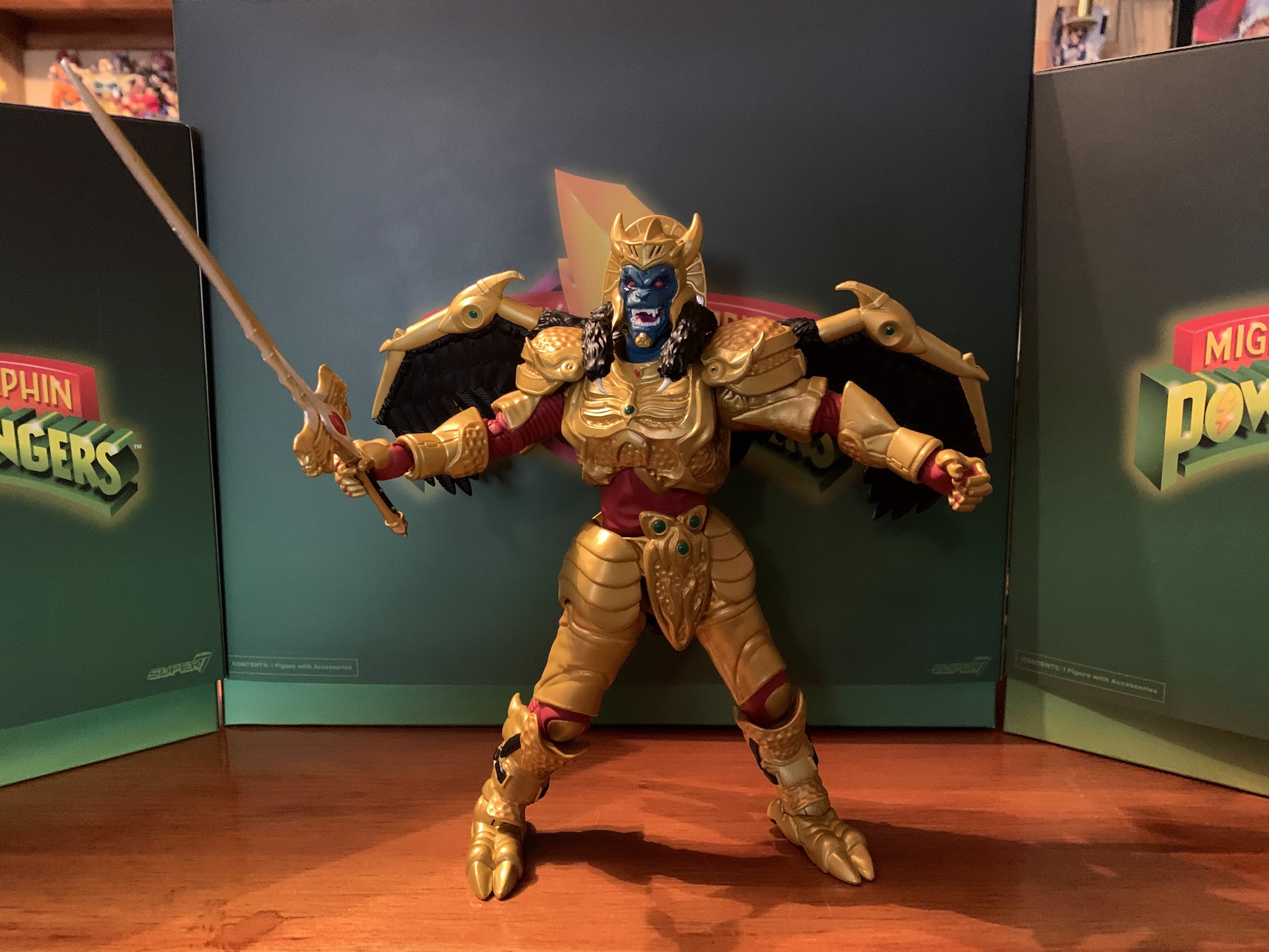
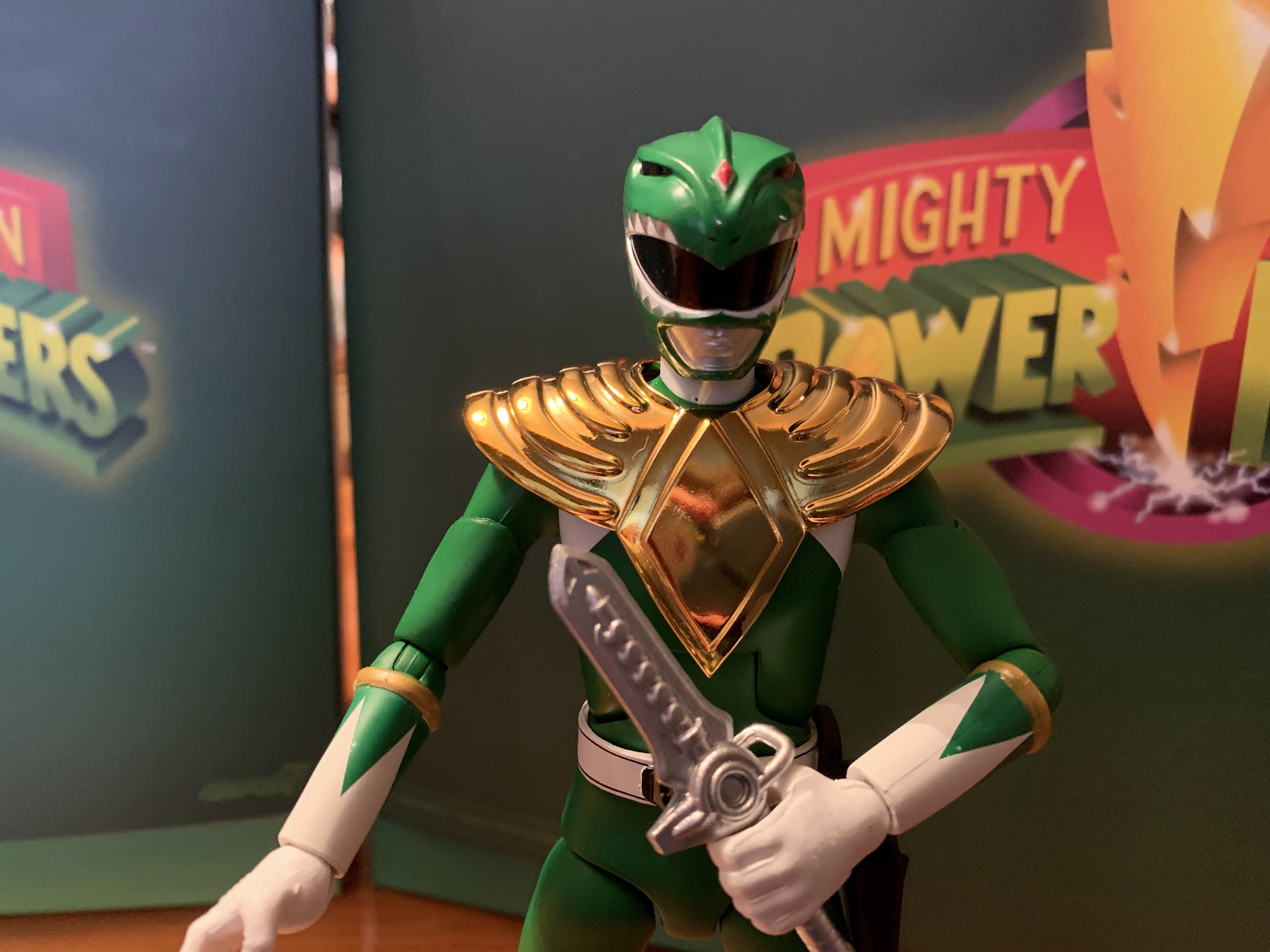
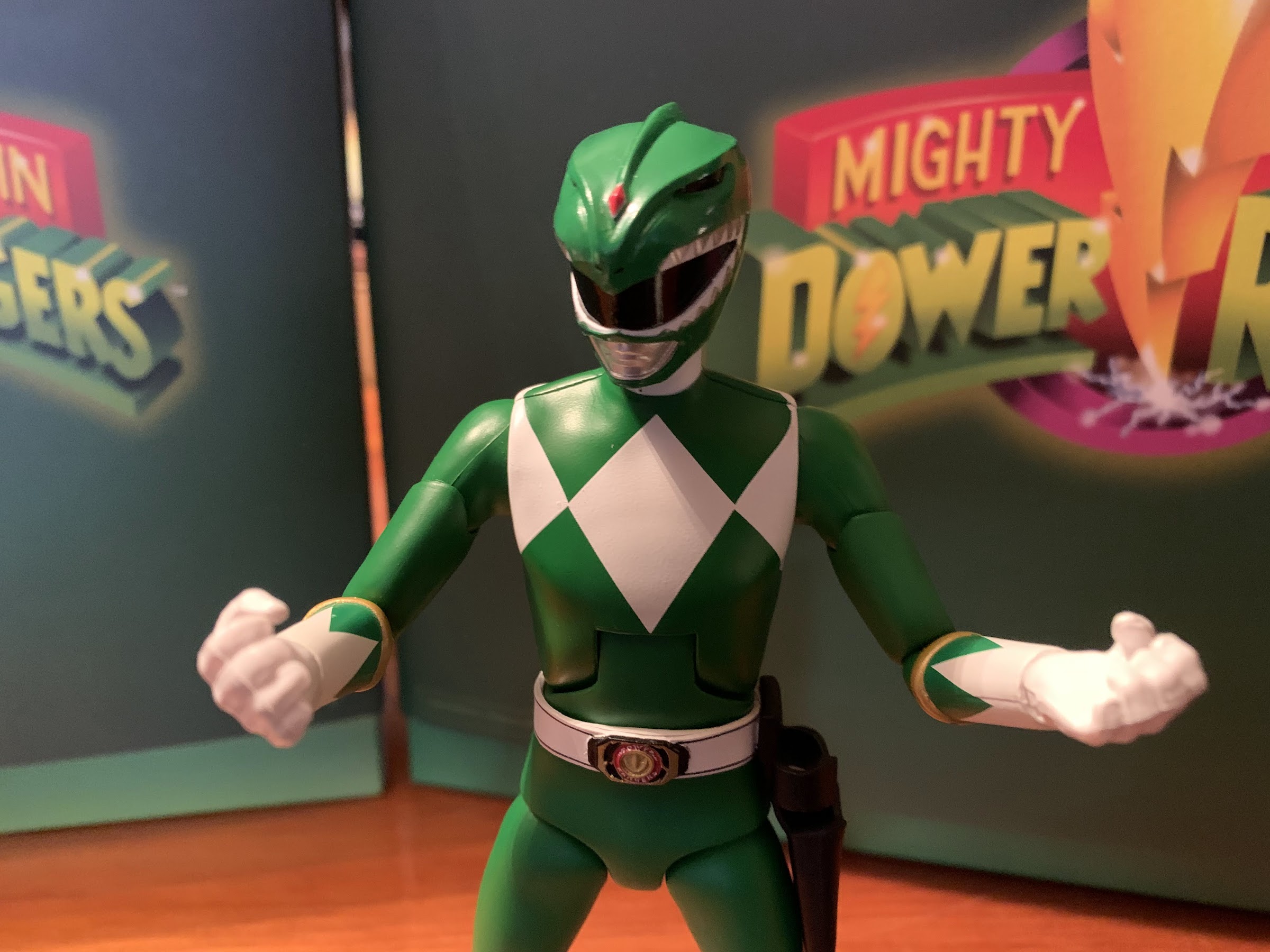
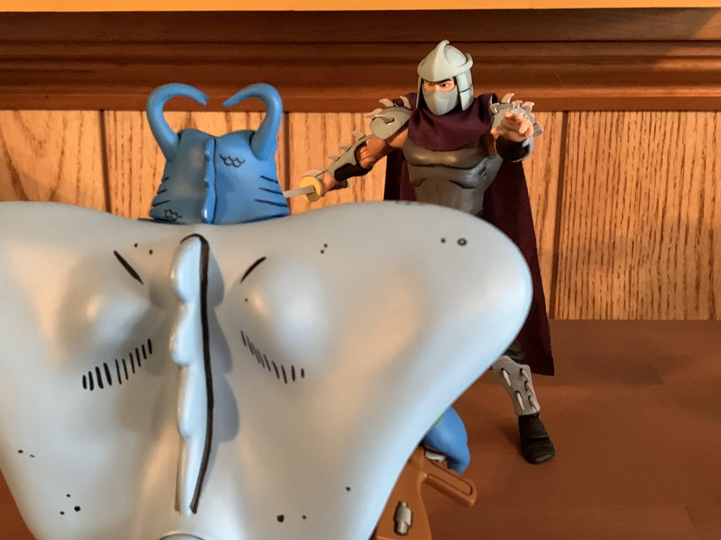
The Tyrannosaurus stands at roughly 8″ in height. I say roughly because this is a character that’s always going to have its knees bent to some degree so I’m basically selecting what I feel is a neutral position. Lengthwise, he’s going to need about 10.5″ of shelf space for that tail and that’s with a gentle curve in it. Not only is the figure pretty big, but it has some heft too. It’s solid which helps give it more of a premium feel over the other figures in the line and really over just about every other Super7 figure I own. And in terms of show accuracy, I’d say it’s pretty damn close. There’s a lot of paint on this figure and the metallic portions have a nice shine to them. There’s some black linework on the shins and around the silver portions of the tail. There’s lots of places that are just blocks of color consistent with the look of the show and most of the paint is cleanly applied. There’s a little slop on the linework on the left shin of mine and the right eye could have been better. It’s also missing linework on the top of the head which is disappointing (the paint is present on the promo images) as the head is one of the few places where there’s a plastic look to the figure. Basically everywhere on the body, Super7 decided to paint this guy, except for the head which is mostly red plastic. Normally, you would see the opposite as we did with The Simpsons since the eyes are naturally drawn to the head. I wish they had painted it, but it is what it is. The proportions also strike me as a touch imperfect when comparing it to the suit on the show. The head should probably be a little bigger and the hands boxier. The knees also should indent on the sides, but here they’re basically flush, and the red areas around the shoulders should be more rounded off. These are nitpicks, for the most part, and the only thing I really miss when comparing it to the screen is just more of that black linework., but I think most people will be happy with how this figure looks.


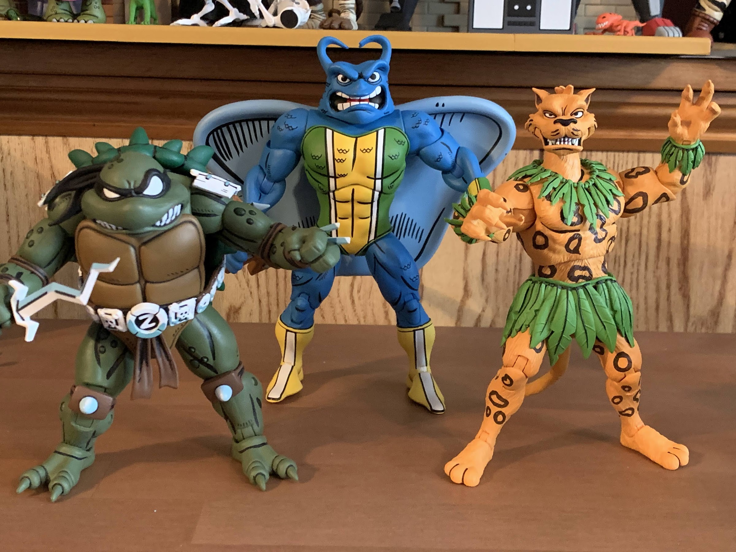
There may be some temptation to display this guy with past iterations of the Dinozords. I only have one such era of releases, the 1993 and 94 stuff from Bandai. I did also get the Hasbro Megazord for my son, but that thing is pretty small and neither vintage nor collector grade. As for the old Bandai stuff, this figure isn’t that much bigger than the Tyrannosaurus released back then. He’s just a little taller, but way more bulky. The vintage one does have the proper linework on the head though so at least it has that going for it. The Dragonzord is another one some may want to place with this figure and, size wise, it more or less works. That Dragonzord is pretty damn chunky and not exactly screen accurate, but it’s a fun companion. If you want to go battle mode with your Dragonzord, then it suddenly dwarfs the T-Rex. That’s to be expected since the Megazord does the same to the Dragonzord. There was apparently just no way to get those forms right as a combining toy, and since it was for kids, it’s not like Bandai was that concerned about accuracy. This figure will presumably scale much better with future Super7 zords.


Naturally, a big, robot, dinosaur isn’t going to articulate particularly well. Super7 basically got most of the joints one would expect into this figure, it’s just not particularly functional. The head is on what feels like a double ball peg and can look up and down pretty well. The large panels on the side of the head prevent natural rotation in that the head will always want to turn to the side when trying to rotate, but it has a lot of room for nuance posing. The base of the neck is where you get your rotation and it’s on a ball hinge so you can get a little extra “up” range as well. For the arms, it’s the silver parts that move. The “shoulders” are on ball hinges and can move up and down and you get about 90 degrees of movement. Their range out to the side is very minimal. There are elbows that get you something less than 90 with a swivel as well and the wrists swivel and hinge and those are fine. There’s a basic twist in the waist area which begins where the silver portion of the chest ends. The hips are big ball hinges that go out the side a small amount and rotate a minimal amount. The knees are hinged joints that barely move and are rather useless and the joint is mostly going to be used for a swivel as the lower leg can rotate there a decent amount. The ankles are on hinges that don’t go back very far, but do go forward a decent amount. There is an ankle rocker but the range is pretty limited, but it’s enough to accommodate the range at the hips. The tail is on a series of ball joints. The first segment doesn’t move, but each one after that does so you get full rotation at each segment and a little up and down movement that allows the tail to be curled. If you have a heavy duty stand, you can even get this guy into his kicking attack pose where he stood on his tail in the show. Lastly, there’s also a hinged jaw and that works fine.


The Tyrannosaurus isn’t going to do a whole lot on your shelf aside from stand there and look cool. I like the range at the head as it imparts some personality, even though I think the suit in the show didn’t allow for that. The hips are limited, but allow the stance to be widened which looks nice, or you can go for a more straight up and down pose. There’s also enough range going forward at the hips that the figure can be posed like one would pose an actual T-Rex which is more horizontal. It’s a pretty cool look, though not something you would have ever seen on television out of this character. It’s also easy to stand and there’s not much rub at the joints that will impact the paint as they mostly go as far as they’ll go and then stop. In the end, I think it’s fine as this isn’t supposed to do a whole lot and it’s technically more articulated than it is in the show.


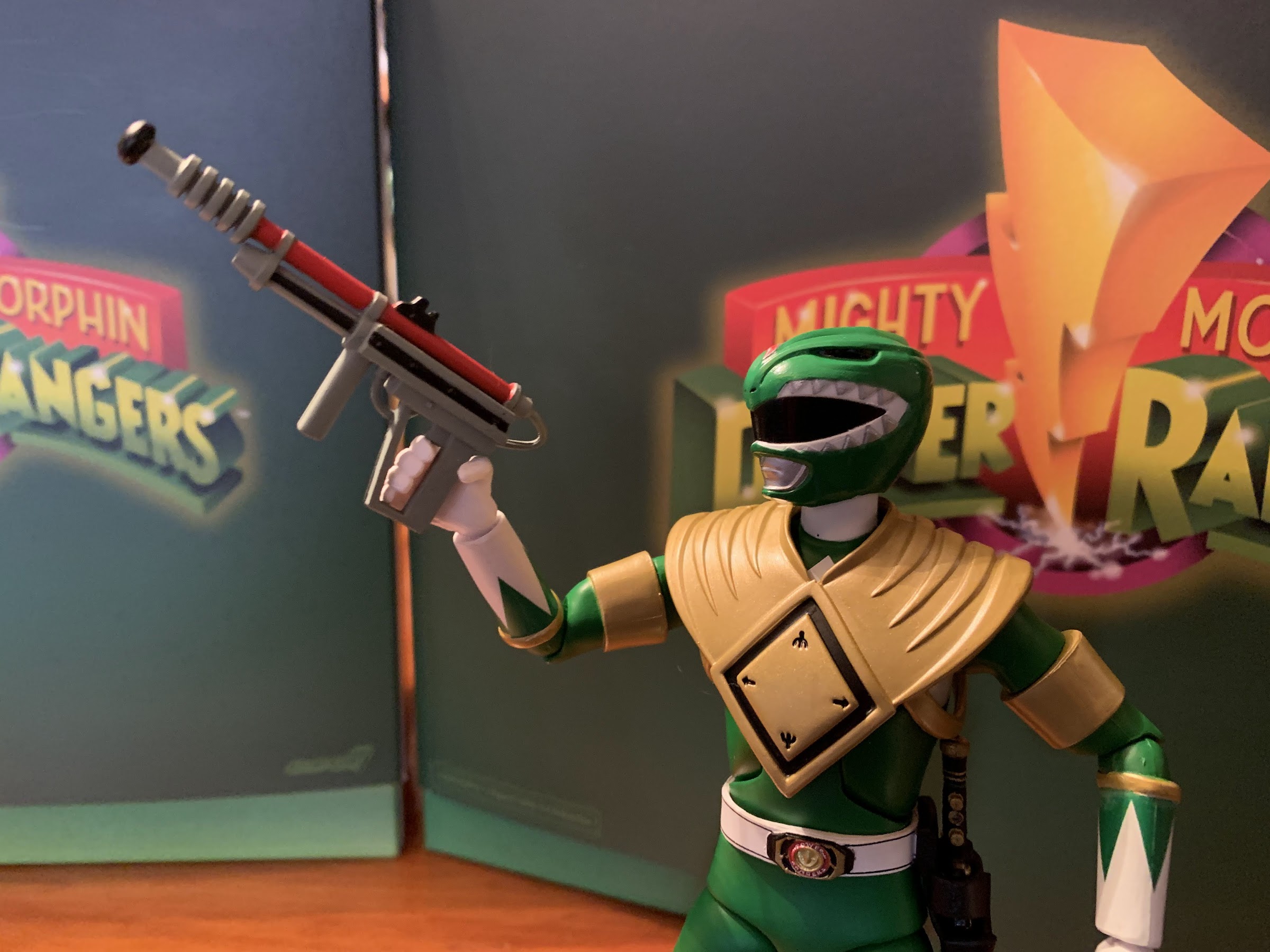
The accessories for this figure are also another area of limitation. What really can this thing even come with? Super7 decided we needed some hand options so we get a set of fists, open hands, and more neutral hands. I’m a little surprised they didn’t just make the hands articulate, but this is honestly probably better for us. There’s also a pair of mini, in-scale, Red Ranger figures. One is posed with the hands on the hips and the other is in a summoning pose. They’re very minimally painted as they’re just red, slug, figures with the white of the gloves, boots, and belts applied. I certainly wouldn’t expect a fully painted figure at this size, but I feel like those tiny, novelty, figures are better painted than this. Adding a white diamond to the chest would have helped to break it up a bit and some black for the visor. Without it, these look too cheap to really do much with. Lastly, we get a replica Power Coin that features the snarling T-Rex on one side and the zord symbol (I think that’s what it is) on the reverse. It’s a really heavy, chunk, of metal and it features some shading which looks nice. It’s neat, but not exactly practical and I have no idea what I’ll end up doing with it. I wasn’t expecting much, but I do think we could have used an effect piece for the mouth cannons. I honestly don’t know if it ever used them in the show, but who cares if it didn’t? Some little blast effects or something like a breath attack would have been pretty damn cool.


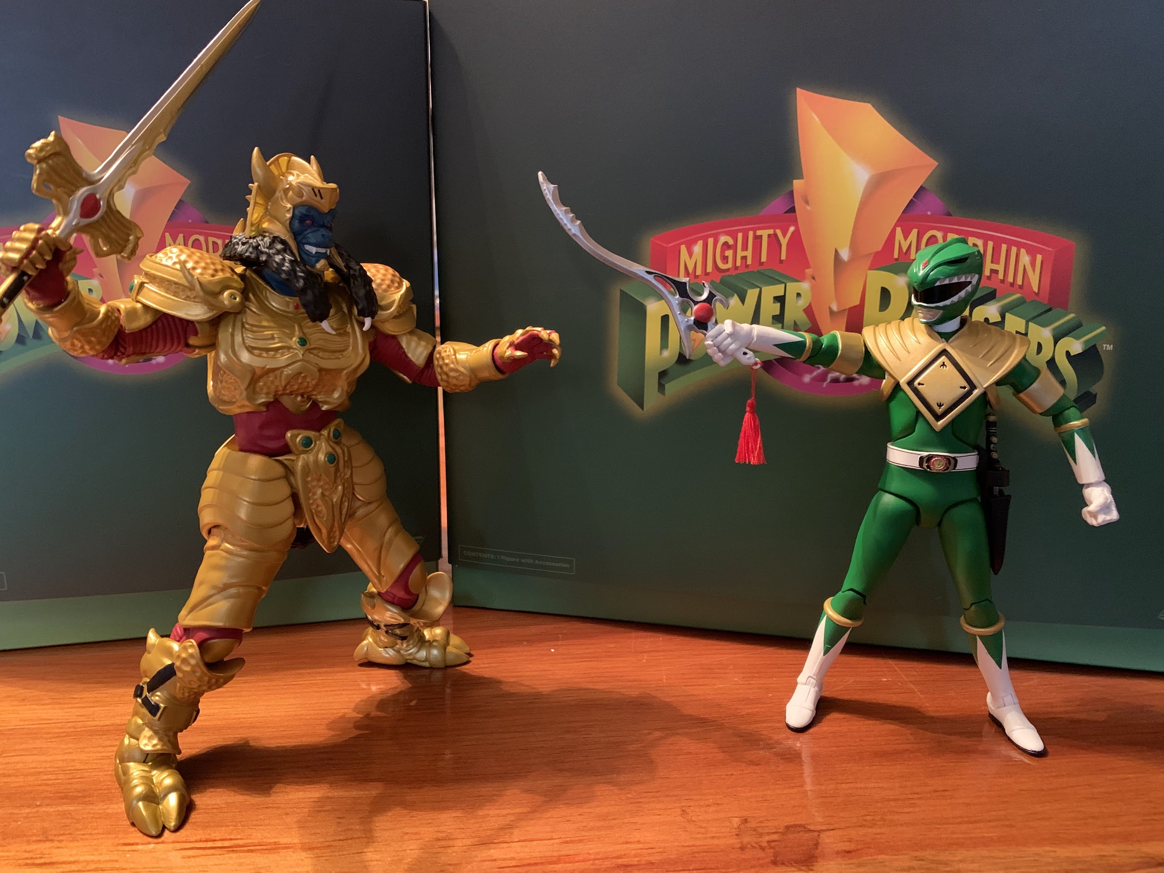
Ultimately, which is how I pretty much have to end a review of a Super7 Ultimates! release, I think this figure gets the job done. It’s supposed to be a more screen-accurate depiction of the Tyrannosaurus Dinozord from the TV show and it succeeds in that department probably better than any other release I’ve seen. There have been some really cool, and really expensive, Megazords over the years, but usually the T-Rex has to be compromised in some way to facilitate the transformation. Here, we don’t have to worry about that. Aside from some missing paint on the head, I’m really happy with how this figure turned out. It’s a chunky, hunk of plastic that moves about as well as can be expected and will look great in any Power Rangers collection. He doesn’t scale at all with the Rangers, which is to be expected, but will look fine battling someone like Goldar and I assume the monsters to come will follow suit. For me, this line is all about the zords and monsters so I’m generally pleased with what I’ve seen. I decided to pass on the Yellow Ranger and Putty, so this will be my final review of the first wave. I do plan on picking up the Dragonzord when it comes out and eventually I’ll have the Megazord as well. And like Goldar, this is a Super7 release that actually meets its asking price of $55. I’m actually surprised they didn’t try to get more for it as they will with the Megazord so I guess be happy for that. This is an easy recommend for me though.
Looking for more Power Rangers toy coverage? Well, look no further:

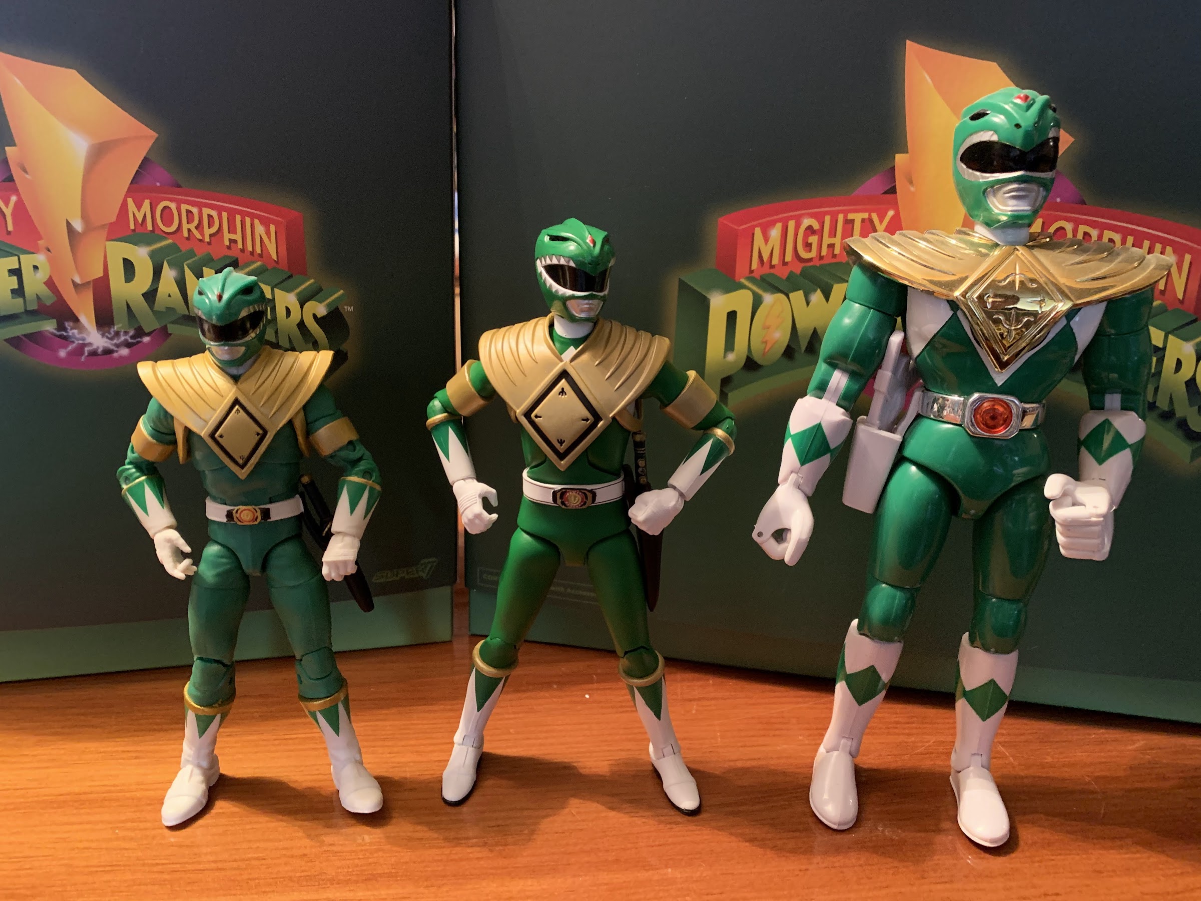
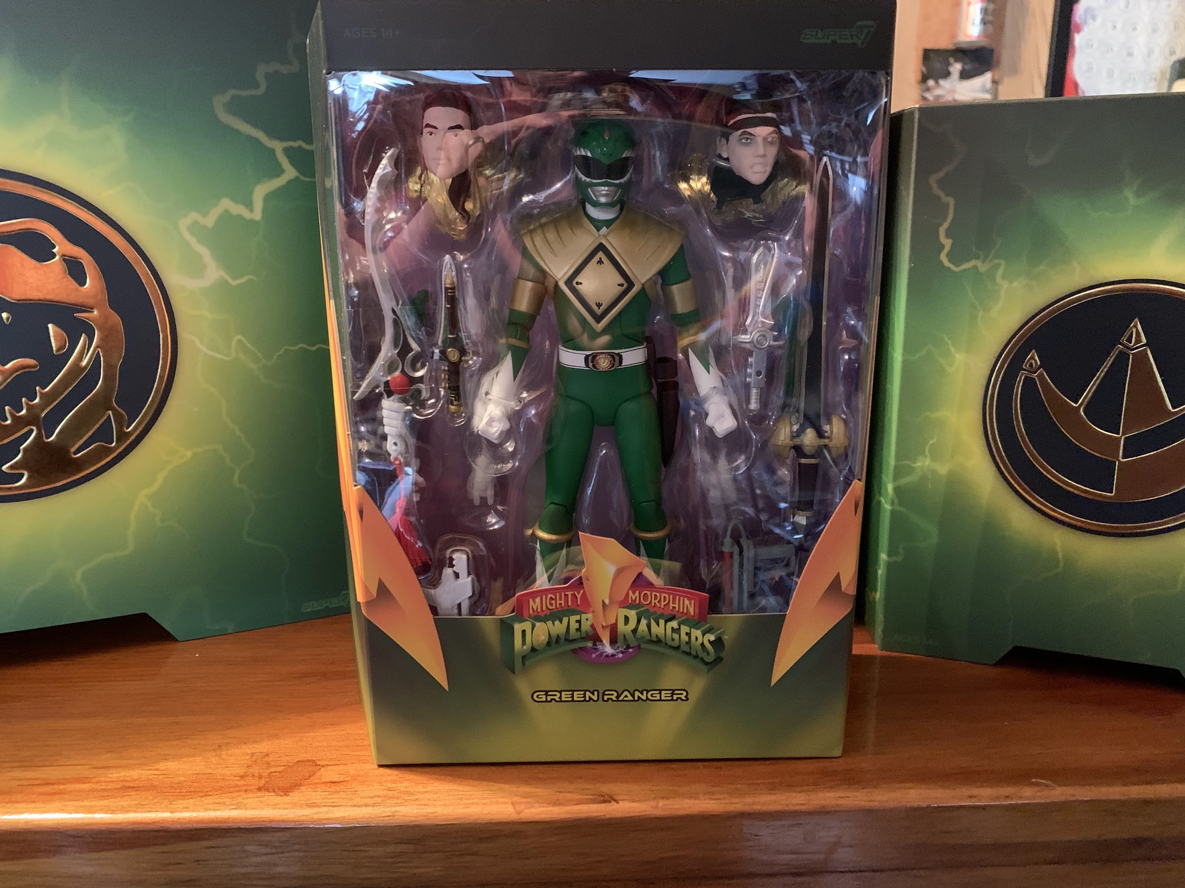
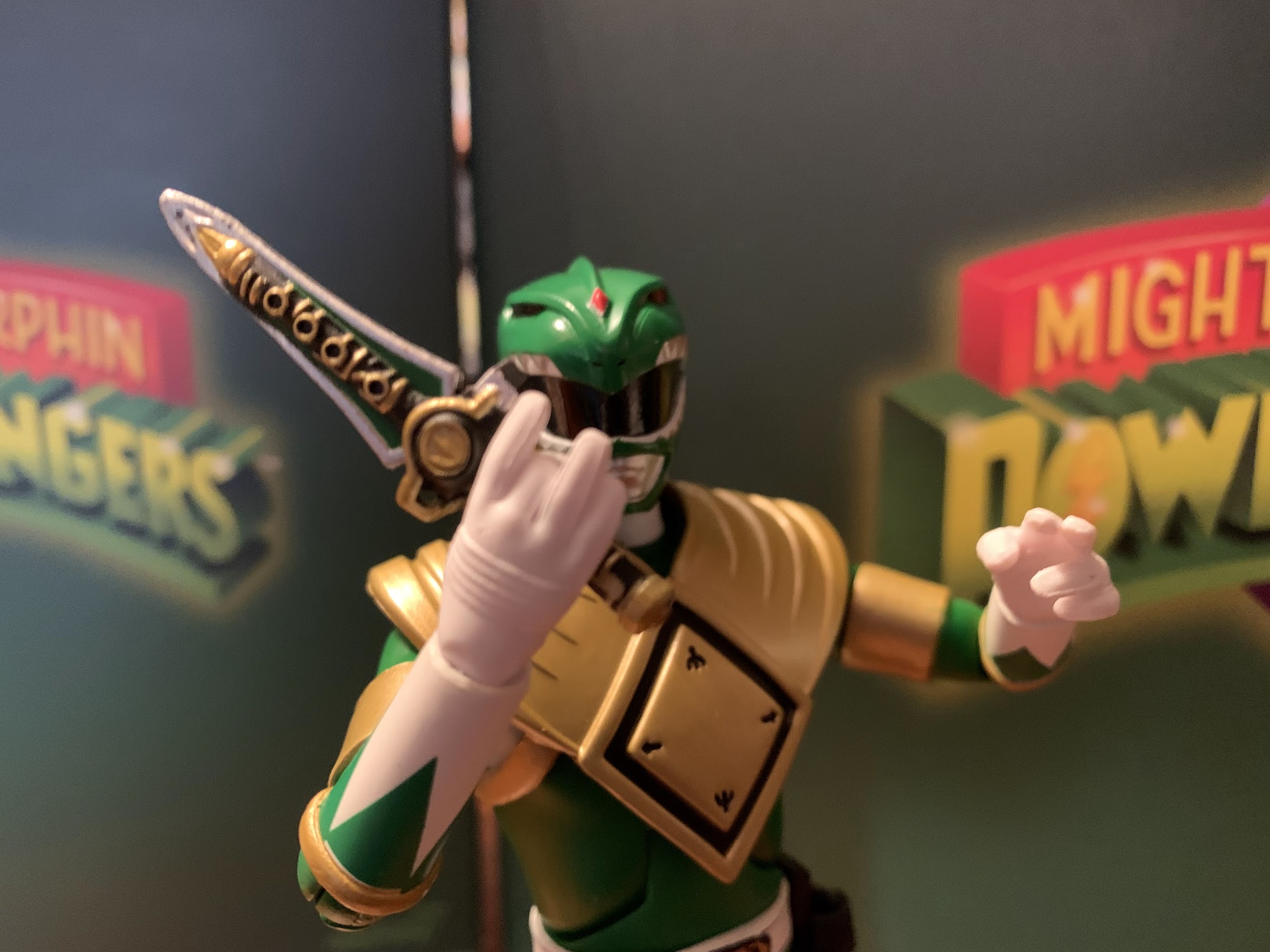
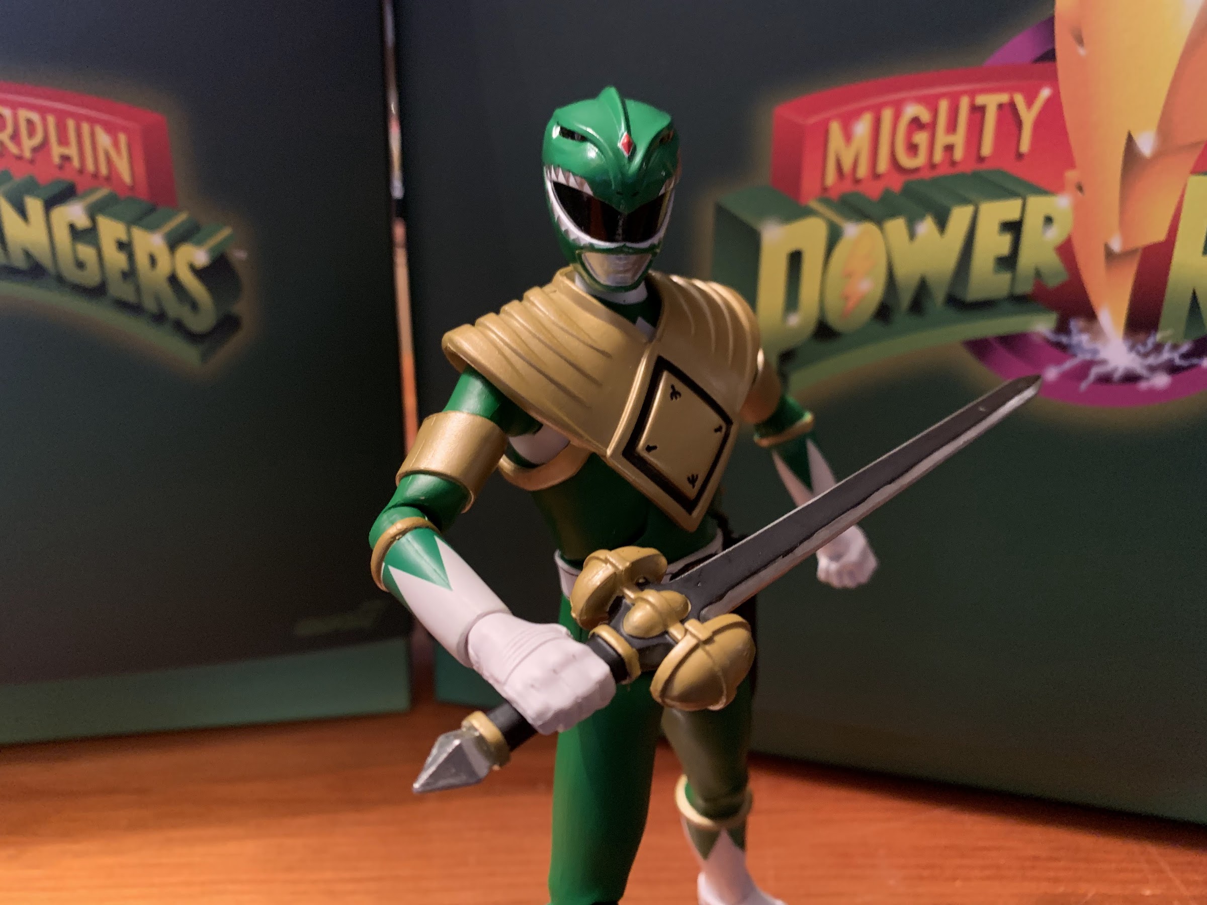
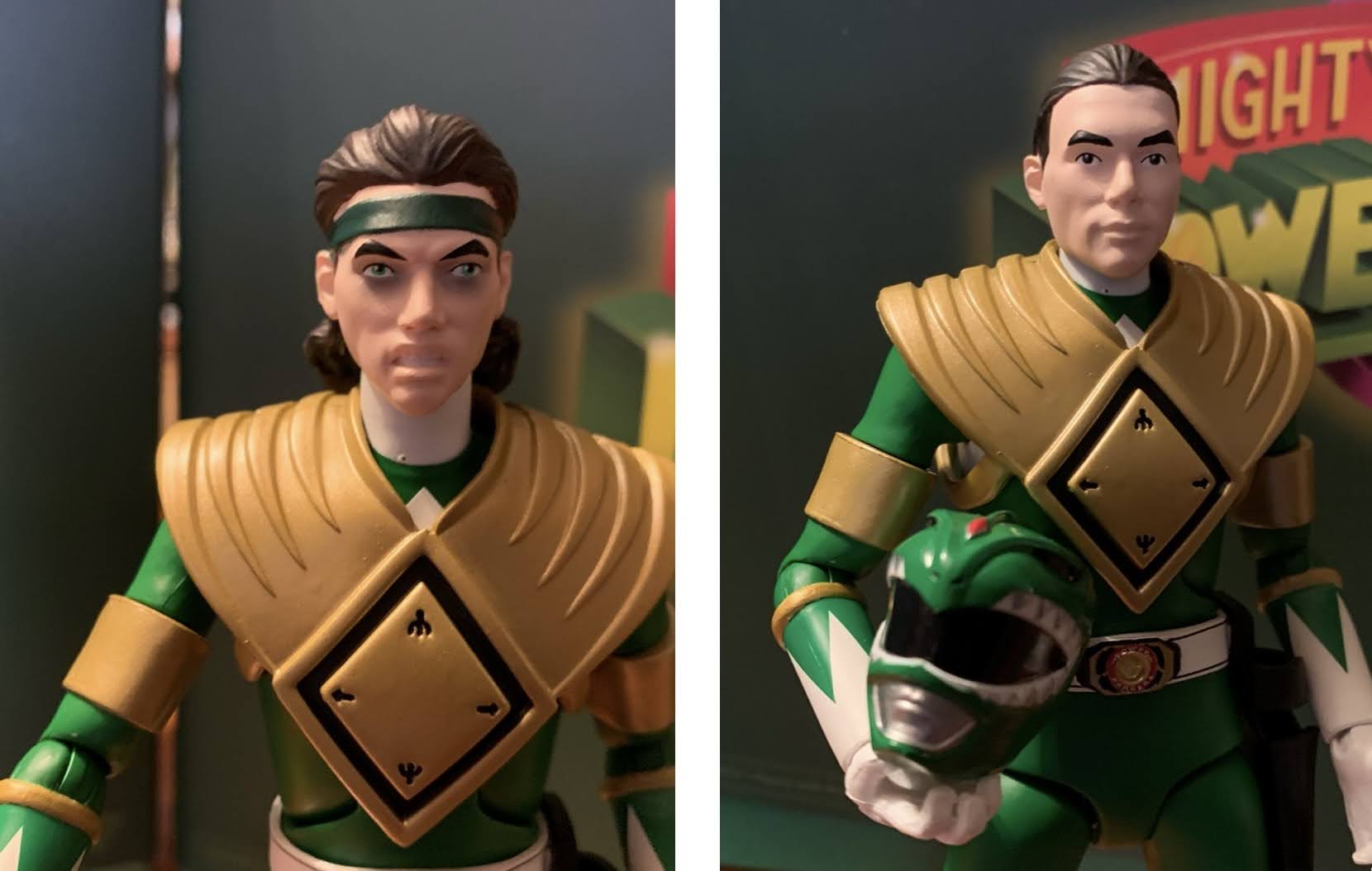
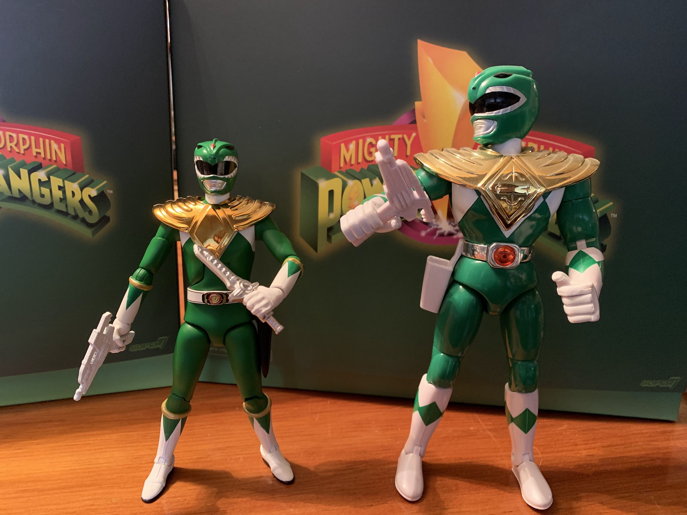
Super7 Mighty Morphin Power Rangers Ultimate Green Ranger
We continue to finally offload some long standing preorders this year and up next is Mighty Morphin Power Rangers from Super7. It was June 2021 when these figures were announced to the surprise of many. Why? Because Power Rangers are now owned by Hasbro, probably the biggest toy producer in the world who has its…
Keep reading
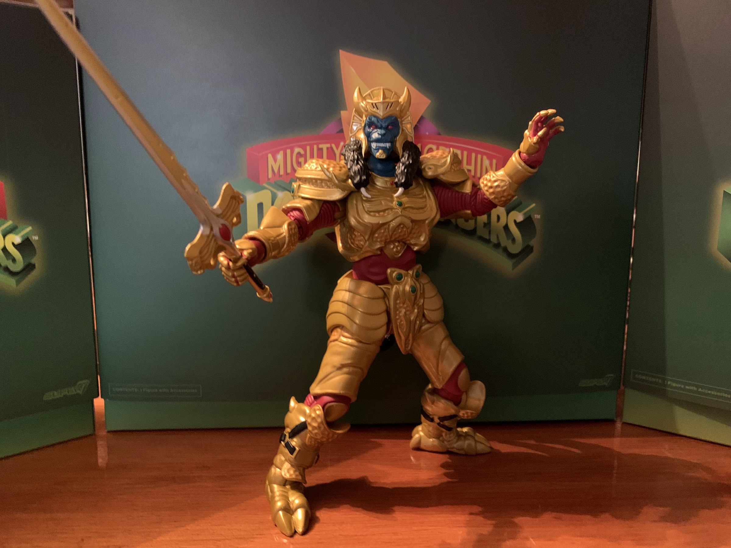
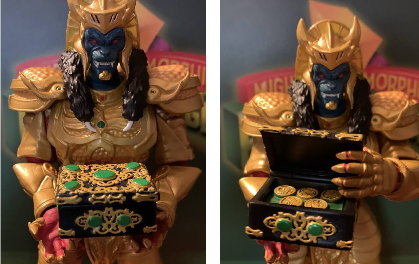
Super7 Mighty Morphin Power Rangers Ultimate Goldar
Last week, when we took a look at the first Power Ranger in Super7’s line of Ultimates! action figures based on Mighty Morphin Power Rangers I expressed some surprise that Hasbro would license out this brand since it competes with their own Lighting Collection. I do feel like the actual Rangers are pretty safe. People…
Keep reading
Bandai Mighty Morphin Power Rangers Megazord
It was now a couple of weeks ago I posted about some toys I always wanted as a kid, but never got. Shortly after, I rectified some of those decades old injustices by purchasing the Dragonzord with Green Ranger from Bandai’s Mighty Morphin Power Rangers line of action figures from 1993. The Dragonzord was my…
Keep reading