Rogue is here to add a little drama to your shelf.
The conclusion of X-Men ’97‘s first season has left behind a void. For 9 consecutive Wednesdays, we had something awesome to get up for. Now the long wait for a second season has begun, but here to help fill the void while we wait is Mondo. Mondo has been dishing out some very impressive sixth scale action figures based on X-Men, the ’92 version. I’ve been waiting since that show debuted for action figures dedicated to that show that match the quality and accuracy that I want from a figure line. I probably wouldn’t have selected this scale for such a line, but basically everything else has been great. And now here to bolster the ranks of the X-Men is the best female member of the team: Rogue.
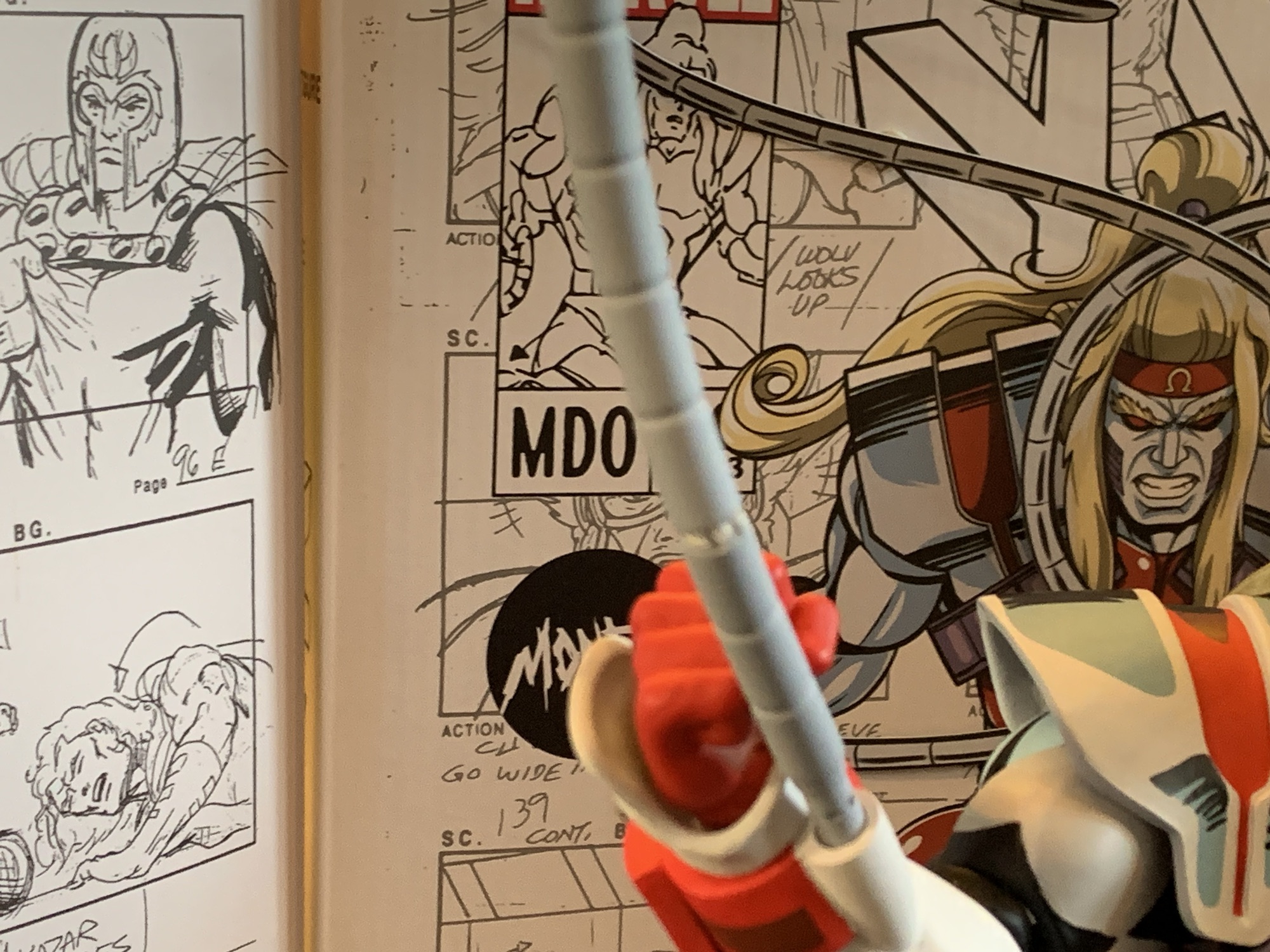
The only surprise with the packaging is that they didn’t use the storyboard from the Apocalypse episode. You know the image I’m thinking of.
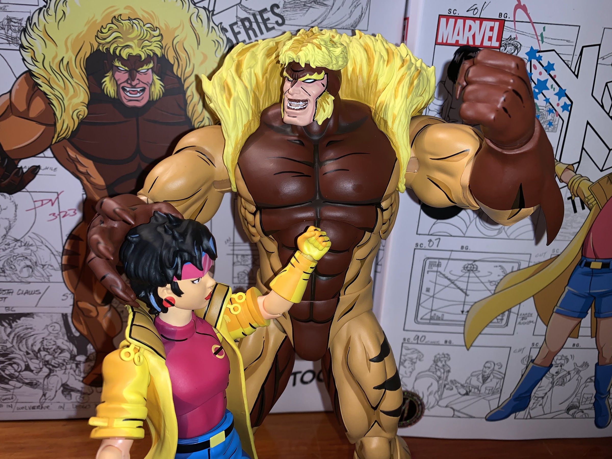
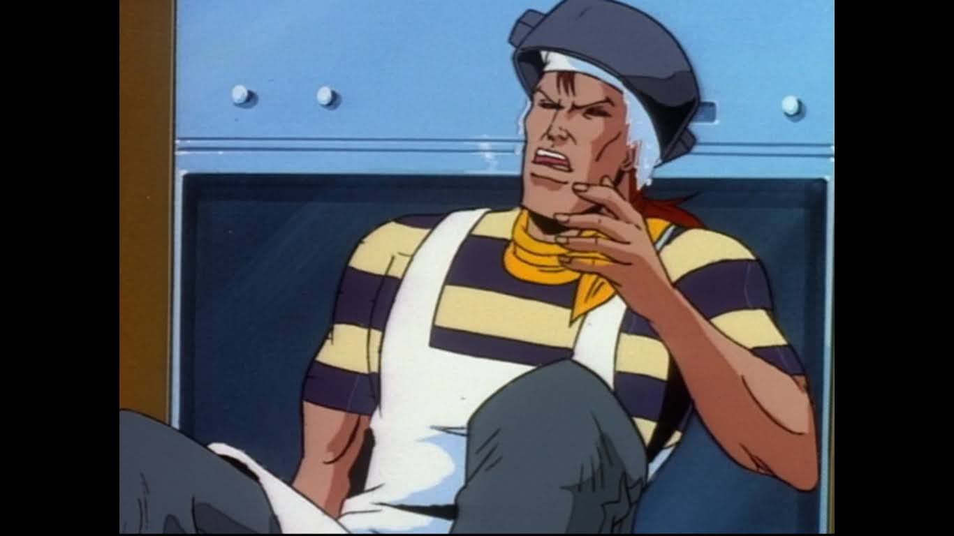
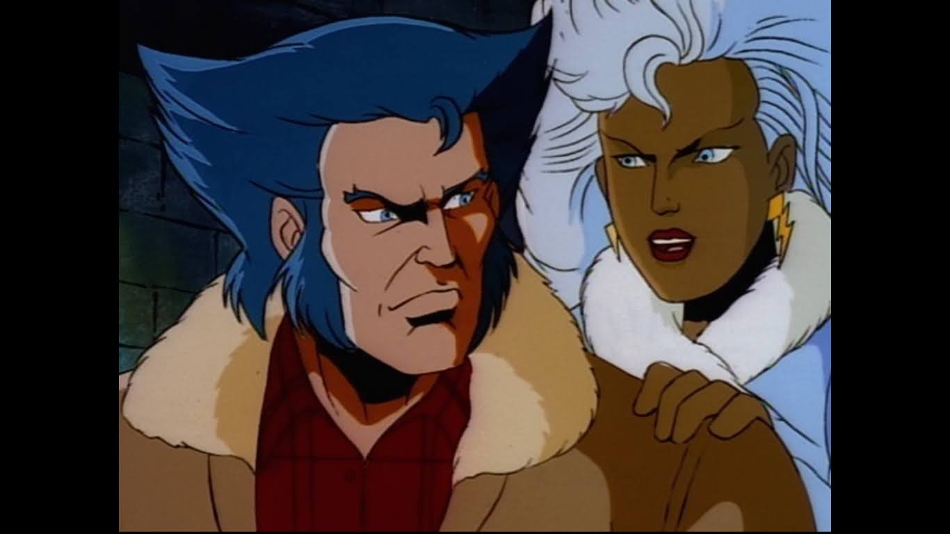
X-Men was my formal introduction to the character Rogue. I had seen her on the cover of comics, but always in her 80s look. When the cartoon debuted I only knew the two characters were the same because of her unique hair color. Rogue, despite looking like a super model, is the muscle of the team. She can knock a Sentinel’s head clear off with a punch and look good while doing it, but like all good characters her powers come with a price. And for her, it’s that she can’t touch another living person without sucking the life from them. This allows her to steal other powers from her fellow mutants which is pretty cool, but not being able to physically touch or kiss another human is a trade-off she often wrestles with. Her inability to touch makes her one of the most empathetic members of the team and someone that’s easy to sympathize with. Despite that personal torment, she is often able to maintain an upbeat personality, can dish out puns with the best of them, and doesn’t mind getting her hands dirty when the situation calls for such.
There’s a lot to like about this figure, but I don’t think they quite nailed it with this default portrait.
Rogue from Mondo is a lot like the other figures released so far. She’s designed and sculpted by Alex Brewer and comes in a box featuring original artwork by storyboard artist for the show Dan Veesenmeyer. Tom Rozejowski handled the paint master and the rest of the packaging is adorned with recreations of original storyboards from the show from the episode “Till Death Do Us Part.” Original series showrunner and writers Eric Lewald and Julia Lewald provide the character bio which is situated on the inner flap of the box. Behind that is a window box showcasing Rogue and her array of accessories. This version of the figure is the limited variant which sold out much faster than any other limited edition to come before it in this line. Is that the popularity of Rogue or did she get an X-Men ’97 aided boost since anticipation was building to a fever pitch when she went up for sale?
That’s more like it!
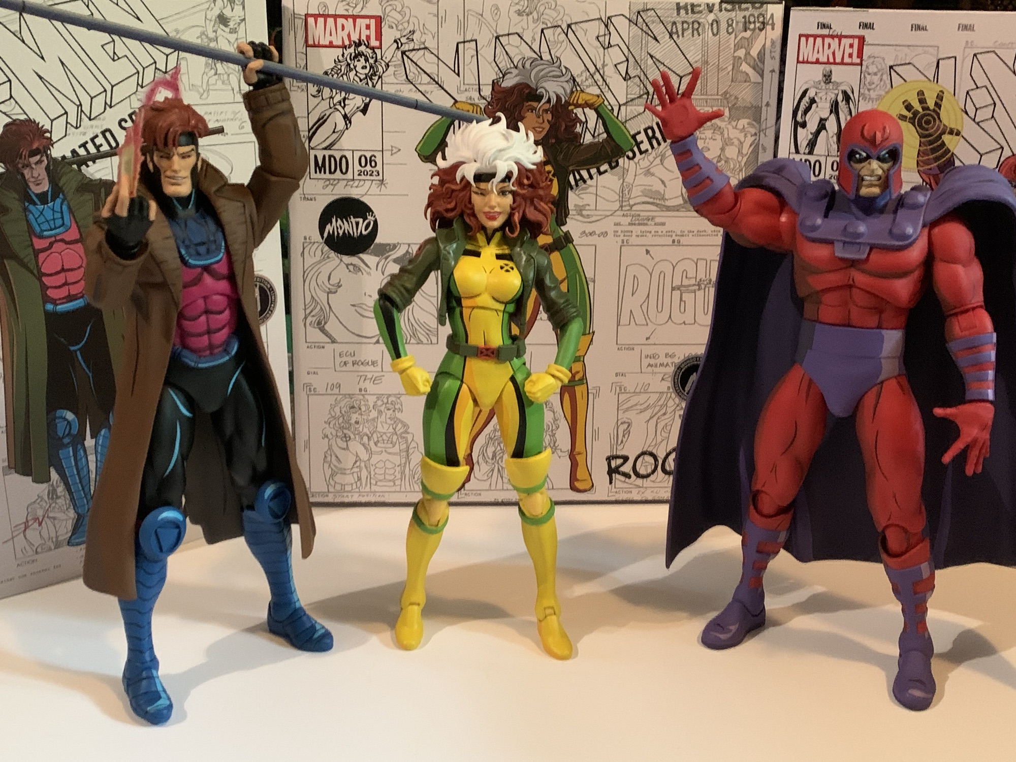
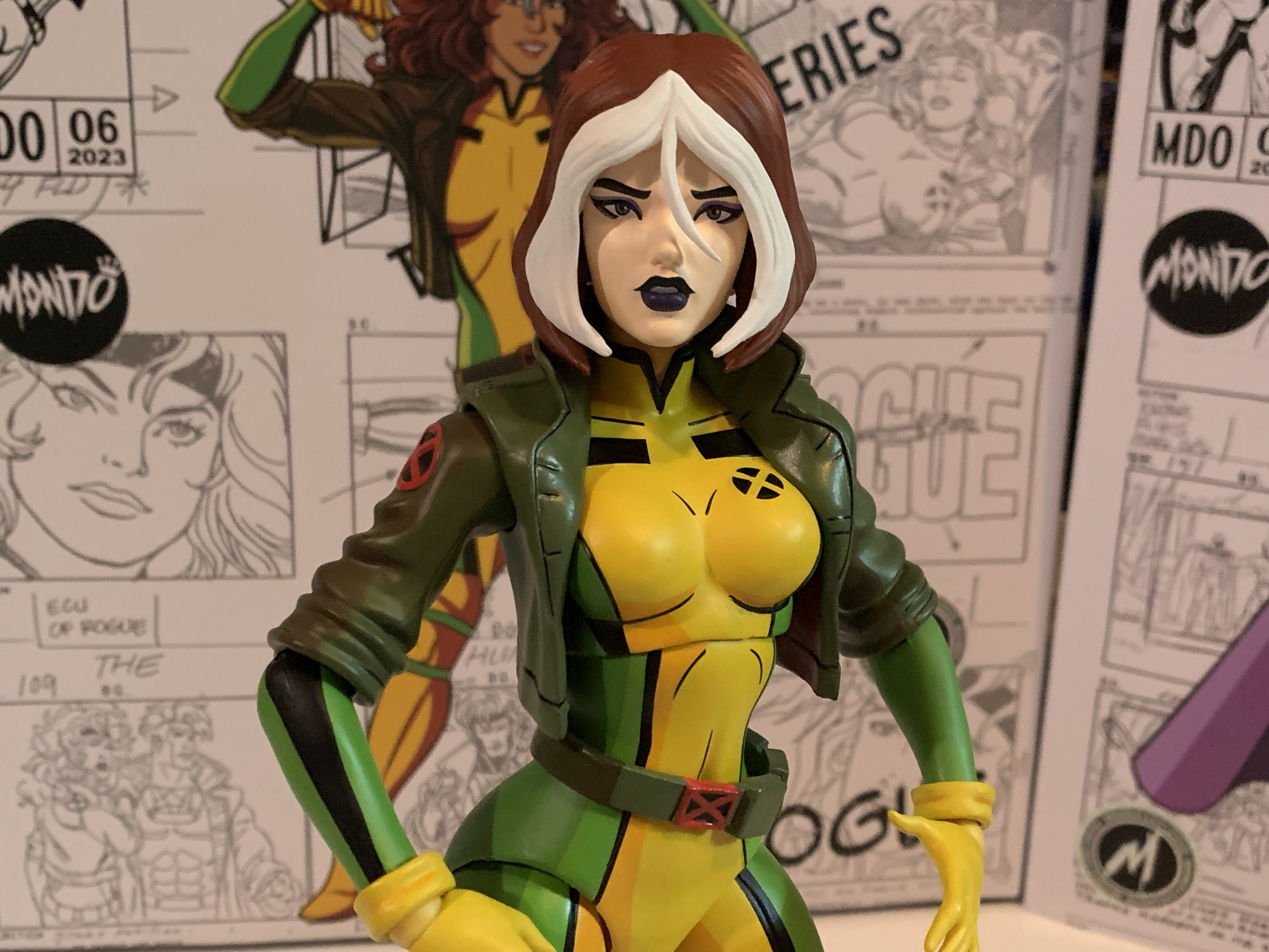
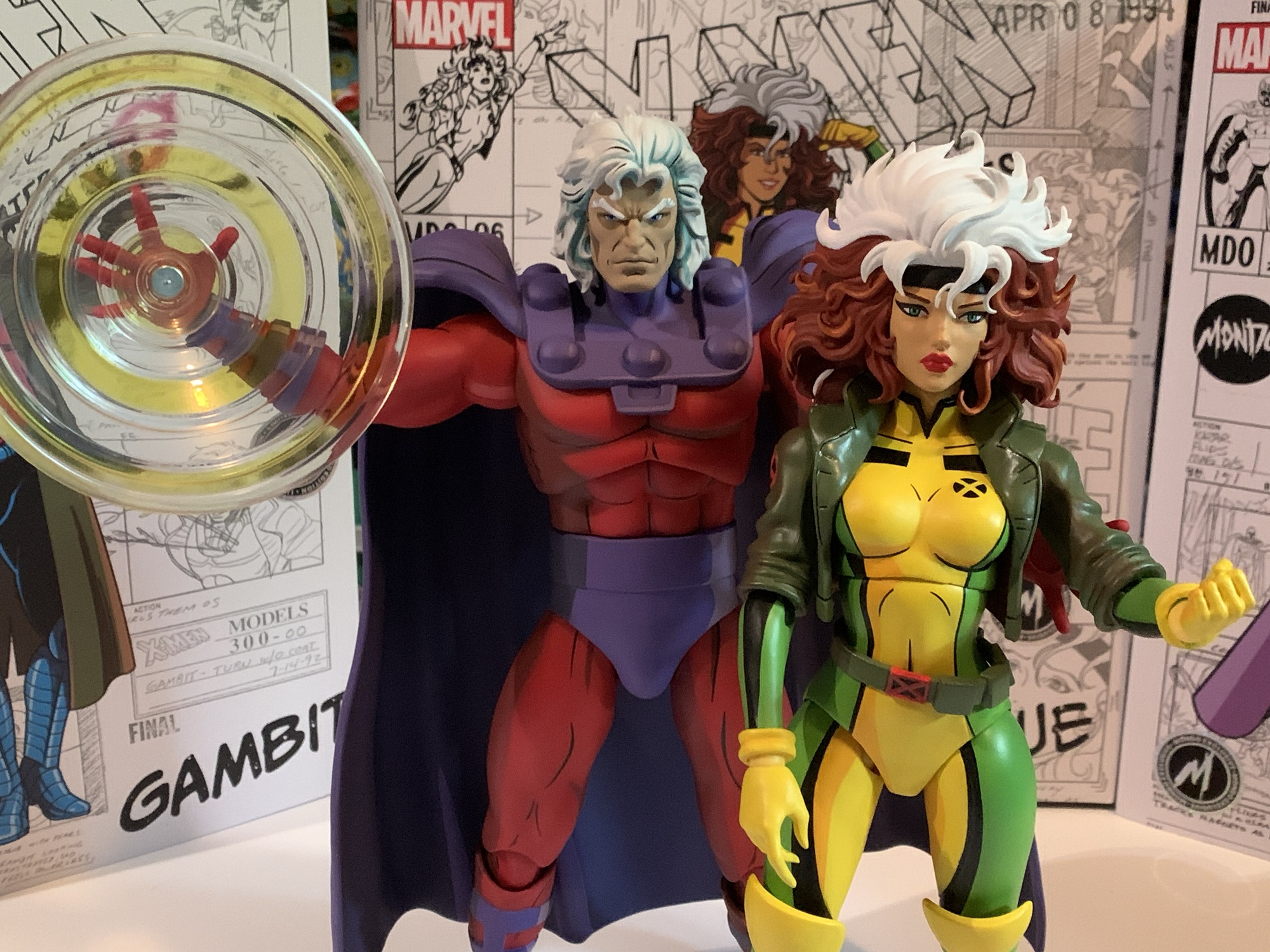
Per Mondo, Rogue stands at approximately 11.75″ and I’m willing to take them at their word. She’s taller than Wolverine and Jubilee, but shorter than Gambit, Magneto, and the rest. That seems suitable and she seems much closer to true sixth scale than some of the other characters. She is wearing her show accurate yellow and green bodysuit with olive drab coat. She sports a variation on thigh-high boots in the show and Mondo’s approach for that was to make the green straps at the top of the boot as well as the yellow cuff separate, floating, pieces. Perhaps going this route made the figure easier to paint? Or maybe it was to allow these legs to be repurposed for a Storm down the road? Either way, the moving parts on a figure with so much paint are a little worrisome, but they can be seated in such a way that they’ll seldom move. Just do be careful when positioning them to not create a paint rub situation.
And if you want to get cheeky.
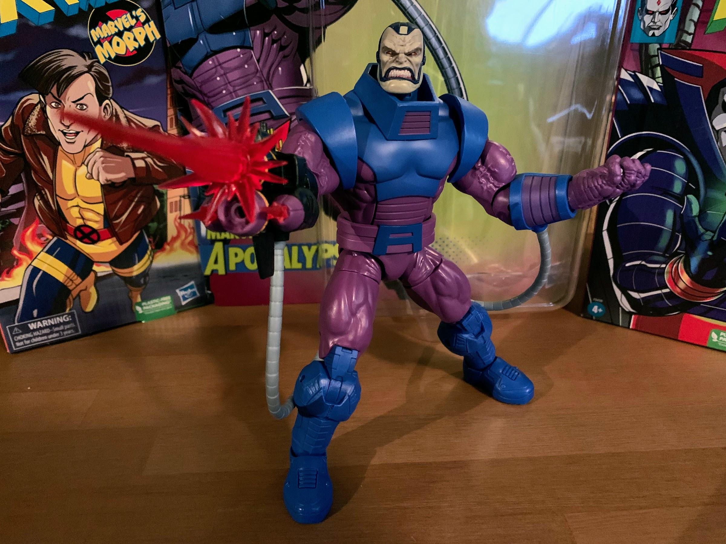
The head on the figure has received some criticism and it’s not unwarranted. The default portrait is basically a neutral expression. Rogue’s face has always been tough to duplicate in plastic for some reason. I think it’s because the female characters tend to not have hard facial features so there’s not a lot to key-in on. For the figure, Rogue features a very glammed-up look. Her eyes are narrow with long lashes and her lips are full and pouty. The paint is applied well as are the eyes (Mondo sent out a warning before the figure shipped that some heads featured poor eye placement. If your figure looks off just email their customer service and they’ll replace it), but it doesn’t really resemble Rogue. More like an artist’s interpretation of what a more sultry Rogue might look like. Or Rogue if she were in a Barbie line.
It might not be show accurate, but this power absorption hand is pretty neat.
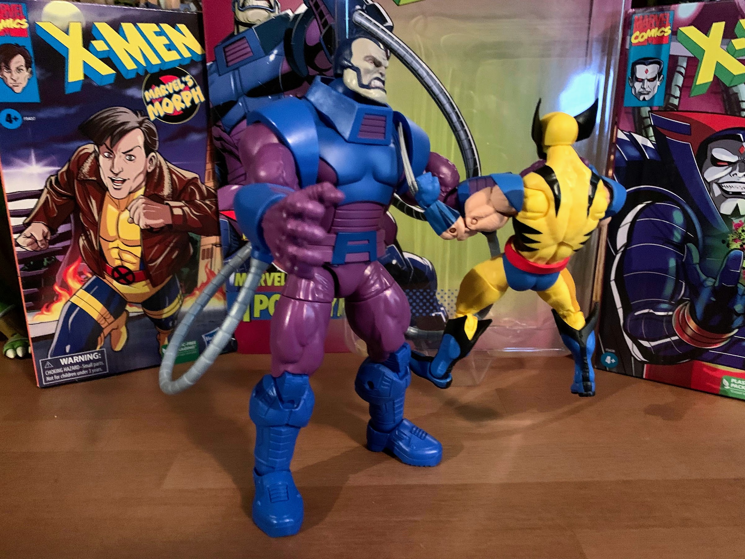
Sorry Logan, not this time.
Thankfully, we have other, better, heads to choose from and the limited edition has far more than the standard. The alternate head for the standard edition is an angry expression and this works just fine. The right eye on mine features a dot of skin tone, but otherwise looks great. I think a lot of people will go with this for their display, whether they bought the limited edition or standard. If you did grab the limited version then you have some harder decisions to make. First up is the winking smile. The smile is very wide so this head doesn’t quite resemble the character from the show, but damn if it isn’t cute. I really like this one, though it does make me wish we had a non-winking smile portrait as well. Or perhaps a more subtle smile.
This is just fantastic.
Our next portrait is pulled directly from the show. In the episode “Deadly Reunions,” Cyclops gets knocked unconscious and stops breathing momentarily. Rogue, in an effort to save him, gives him mouth-to-mouth (C.P.R. back then called for this) and it works, but it also causes Rogue to absorb his powers. Rogue’s eyes start blasting red energy until Cyclops is able to instruct her to just shut her eyes. The included portrait is a screaming Rogue with those lasers streaking from her eyes. They’re done with translucent, red, plastic and it looks awesome. In some ways, I think this head most looks like Rogue from the show, probably because we can’t see her eyes and she looks kind of angry. The last head in the box is a bit of a gimmick one as it’s Rogue from X-Men: Evolution. Like the fairy Jubilee or unmasked Sabretooth, this head doesn’t work with the body since that Rogue had a very different look. It’s more of a fun inclusion. It looks fine, but I do think they should have added a touch of shading to the brim of her nose since that was something always present in the show.
I guess this one is for the younger fans.
That’s a whole bunch of looks for Rogue and one, if not more, are sure to please those who pick this one up. Also included are a whole bunch of hands. Rogue comes packaged with open hands, but she also has a set of fists, a right trigger hand, a left gripping hand, a more casual gripping right hand, and a bare left hand. When the left hand is removed, the yellow cuff is a separate piece which slides off to sell the look of her going ungloved. There’s also a removed glove accessory which slips into the casual gripping hand quite well. I do wish we got two bare hands since she did grab enemies with both hands at times, but one is better than none. If you want her to look like she is actually draining someone’s energy, she has yet another open left hand, but this one is encircled in translucent blue plastic. I don’t think her power absorption abilities were ever depicted like this in the show, her hand usually just glowed white and the light sometimes traveled up her arm, but I can’t deny that this hand looks pretty cool. Another included effect part of sorts is a gripping right hand that’s crushing a small gun. I don’t recall this gun or scene, I remember her crushing Bishop’s armband, but it’s an effective accessory at showing her strength.
This thing is all kinds of rad.
And the base works pretty damn well as a stand too.
The last major accessory included in the limited edition version is a base. Rogue is the first figure to get a base and Mondo stated they felt it was important to include something that hinted at her power. To do that, Mondo decided a decimated Sentinel head made the most sense. It’s well sculpted and really well painted and resembles a Sentinel from the show. There are two foot indentations, one towards the front and one towards the back, that the figure slides into rather effortlessly. It does a pretty good job of holding Rogue up too, though she has tumbled to the side on me once already. It’s not super heavy, so the figure took the base with it in falling over. I’ve resituated the figure on the base amongst my other figures in the line and hopefully she holds true. She also comes with a standard Mondo stand and I could potentially use that in conjunction with the base for added stability. One of the stands from a past release (Magneto?) that I have also has worked well to hold her off the ground just a little bit. That particular one has a very strong, telescoping, arm to it and can support the figure’s weight while some of the others feel too loose. I’m sure there will be folks in search of a proper flight stand for this figure and if I come across any that work I’ll be sure to update this.
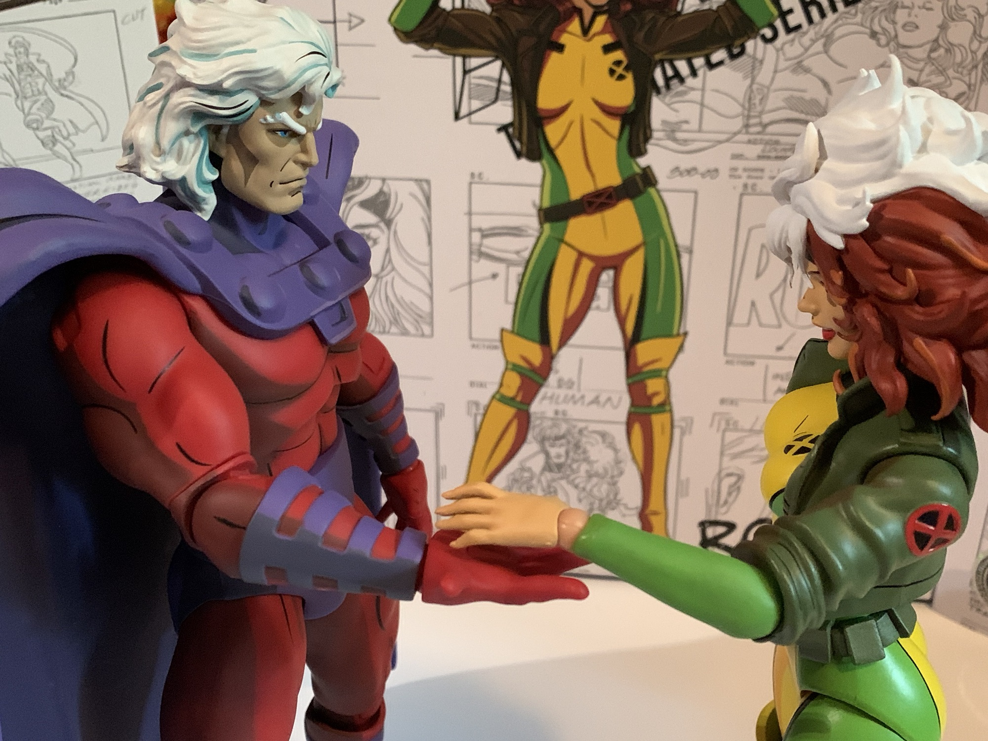
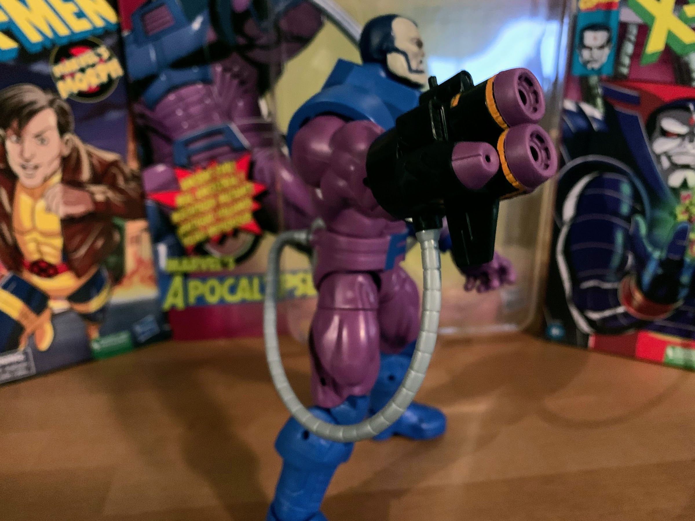
Magneto has something to show you, Rogue.
A little X-Men ’97 preview, I suppose.
The visual aesthetics are what this line goes for, but this is an action figure so it does articulate. Rogue moves about as well as the rest of the line, and in some respects, perhaps a bit better. The head, shoulders, elbows, and wrists are all standard for the line. We’re talking a double ball peg at the head, single-hinges and swivels at the elbow, ball-jointed wrists, and ball-hinged shoulders. The head is limited by her big hair, but they did a decent job of sculpting out some room so the head can turn a bit and tilt. The shoulders and elbows are the most limiting. She can’t bring her arms across her chest or her hands to her face and it’s just something you’ll have to work around. Rogue does not have a waist twist, but does have a ball-jointed diaphragm. Mondo used a curved cut for it and I’m a tad surprised they didn’t try to conceal the cut under her bust or perhaps along the rib cage. It at least works well enough as a rotation point and it allows for a little forward and back. The hips are big ‘ole ball sockets and have probably the best range of any joint on the figure. They’re almost loose and I’m curious if they’ll get to the point where I do consider them loose, but for now they hold their pose fine. The knees are double-jointed and work okay while the ankles feature a hinge and an ankle rocker.
“Hey Remy, you got any plans tonight?!”
“I didn’t know you could read minds, ‘cherie.”
Since Rogue does wear high heels, she is a bit of a challenge to stand. It’s not as bad as I was expecting though. If you’re just looking to place her in a vanilla pose, she’ll stand okay. It might take a bit of adjusting, but it’s do-able. If you want her to do anything more dynamic then you’re better off with a stand. Even lunging positions are a challenge because she’s so top heavy, and I’m not talking about her chest. That hair adds a lot of weight, but since she doesn’t feature a trench coat or a cape, the Mondo stands actually can help out with this figure when normally I consider it useless. And if you have the limited version then you also have the base to rely on.
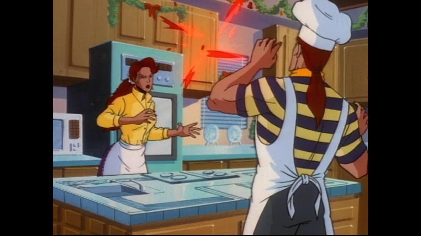
Cyclops and Jean kind of dominate the conversation, but this was the couple I was always rooting for.
Rogue is perhaps not a perfect, 1:1, encapsulation of the character model from the show, but she’s still a damn fine addition to the Mondo roster. The paint on this release is incredible. Not in the sense that it’s perfect and free from blemishes, but in that it just pops and really nails the cel-shading from the show. Yeah, you will likely find a dab of paint here and there where it shouldn’t be or even a slight smudge, but that’s the nature of hand-painted items. On the whole, the figure looks terrific and I’m very happy with the limited edition. With the Sabretooth figure, I wasn’t sure if the limited version was really worth it, but I feel completely different about this one. I love the base and the extra heads are probably the best heads in the box. The articulation may not be on par with figures in the 1:12 scale, but I haven’t had any real challenges in finding a display pose and I doubt many will.
We’re about halfway through the main roster and Cyclops is soon to be on deck.
Unfortunately, if you do want this version of the figure with extra stuff then you’ll have to score it secondhand. As I mentioned earlier, it sold out surprisingly fast leaving just the standard version as an option. Mondo sold out of the standard version as well, but has another preorder open right now on their website for $210. Other retailers may have open preorders as well that could be fulfilled sooner than Mondo’s estimate of September 2024. Even if I could only get the standard version, I’d consider it well worth it. She has the angry portrait and comes with all of the same hands as the limited edition version so you’re just missing out on the three extra heads and base. Rogue is an essential character for any X-Men display and she will certainly look good in your collection.
Now, nobody fall!
Interested in seeing more from Mondo’s X-Men line of sixth scale action figures:
It is my belief that when it comes to X-Men, the animated series which debuted in 1992, the breakout star of the show was Gambit. Wolverine was the closest thing we had to a household name going into the show and was the de-facto pick for favorite character of many. And while the whole roster…
Mondo has been absolutely killing it with its sixth scale line of action figures based on the now classic animated series X-Men. The company also really ramped up production in 2023 on the line by soliciting five new figures during the year. At over 200 bucks a pop, it was quite the hit to the…
If you showed a random individual this blog and asked them what my favorite cartoon was as a kid I’m guessing they would go with Teenage Mutant Ninja Turtles. And they wouldn’t be wrong as that was my favorite for a time, but come 1992 I was starting to drift away from that show. Batman:…
It used to be that when a show got cancelled that was it. It simply ceased to exist as a new product. If there were enough episodes it could last in syndication on both broadcast and cable for a good while, but rarely was it accessible to the point where a fan could have the entire series at their disposal. Some shows received VHS releases, but often they were sparse. Then home media became more affordable. DVDs were both cheaper to manufacture than VHS and could store more information. We started to see full season releases for shows, both active and cancelled. In some cases, the home media market was so great that previously dead programs were able to come back. Now we’ve entered the streaming age where massive entertainment companies are seeking to profit off of their libraries. Those profits have been a bit hard to come by though so these archives need to be supplemented with original programming. Some of that original programming is entirely original or at least only touched by an existing intellectual property (think The Mandalorian) and then some is either a reboot or continuation of an older show.
X-Men ’97 is a continuation of the now classic X-Men animated series that aired as part of the Fox Kids Network from 1992-1997. The original X-Men cartoon was a massive success and turned Wolverine and Gambit into household names. It attracted eyeballs in the millions, sold a bunch of toys, and made lifelong comic book fans out of a generation. For me personally it quickly became my favorite show on television and I was hooked for the show’s entire run. It put Teenage Mutant Ninja Turtles in the rearview mirror as this was something mature, something that more respected my intelligence, and gave me more to chew on. I still adored playing with my X-Men toys and sporting X-Men t-shirts so it’s not like it turned me into an adult overnight or anything, but it was something I genuinely loved in the moment and I still have a ton of admiration for. Having that show continue from where it left off in 1997 was something that didn’t even seem worth dreaming about as that’s how unlikely I felt it would be. Perhaps Disney, who has yet to fully introduce Marvel’s mutants into its vast Marvel Cinematic Universe, wanted to give folks a little primer on what the X-Men were all about? Whatever the reasoning, I am positively giddy like a kid once again that my favorite superheroes are back in an all new television series.
The intro is basically a shot-for-shot remake of the original.
X-Men ’97 was announced in November of 2021. At the time, my assumption was the series was being ticketed to launch in the fall of 2022 to mark the original show’s 30th anniversary. That obviously didn’t happen and the show was slated for 2023, but then slipped to March 2024. For the revival, Marvel selected Beau DeMayo (Moon Knight, The Witcher) to be the head writer with Jake Castorena as the supervising director. From the old show, Eric and Julia Lewald were brought in as consultants along with Larry Houston. Much of the original cast was returned including Cal Dodd as Wolverine, Alison-Sealy Smith as Storm, George Buza as Beast, and Lenore Zann as Rogue. Father Time unfortunately necessitated recasts for both Cyclops (now Ray Chase) and Magneto (now Matthew Waterson). Other voice actors, like Chris Potter (original voice of Gambit) and Catherine Disher (original voice of Jean Grey) were brought back for other roles rather than their existing ones. Such a choice is puzzling, unless we’re talking about a unique case such as Alyson Court who no longer wished to voice Jubilee since she felt the role should go to an actual Asian-American.
The action sequences are where this show will really be able to separate itself from its predecessor.
The show did premiere under a bit of a dark cloud. It was announced that credited series creator Beau DeMayo was fired the week of the show’s sneak preview and a little more than a week out from the Disney+ premiere. As the days went by, the head of animation at Marvel Studios, Brad Winderbaum, revealed some snippets of what was going on. It doesn’t sound like anyone was upset with the quality of the work DeMayo was turning in, and we’ve only heard rumors that he was “difficult” to work with. The term difficult in such a situation can be a loaded one. How many women and people of color have heard that excuse because certain individuals don’t respond well to confrontation from minorities? DeMayo, a gay, black, adopted man was someone who really identified with what the X-Men stood for and removing that voice from the show is certainly a risky move if the show is deemed a success. Winderbaum doesn’t get into specifics on the situation, but does try to frame it as a parting of ways between the showrunner and Marvel.
The group is probably more reflective of the foes to come than the group from the original.
Based on my viewing of the show’s first episode, “To Me, My X-Men,” it would appear that DeMayo’s exit indeed has little to do with the quality of the show. This first episode is the show getting its feet wet. It’s a way to reintroduce these familiar faces in a fun way that does harken back to the original series. It opens with a new version of the classic intro. The song is remixed slightly and all of the character introductions have been recreated and new characters have been added. It still ends with Professor Xavier and Magneto clashing together, though the villains side has been updated with what are probably better, more reflective choices (so long, Gremlin) given who the X-Men typically clash with.
The mutant who will come to be known as Sunspot is basically the Jubilee of this series, only his official joining of the X-Men will have to wait for a later day.
Similar to the premiere episode of the original series, X-Men ’97 includes a plot in its episode about bringing a new mutant into the fold and makes the Sentinels the big threat. Even though the show is longer now (it’s listed at 34 minutes, the actual episode is closer to 28), the episode still moves at a snappy pace. We find the team dealing with the aftermath of the professor’s passing. Cyclops is now the leader and is perhaps a little too forceful with his approach which rubs some members of the team the wrong way (namely, Wolverine). The Friends of Humanity are up to no good and have even repurposed some Sentinel tech into weapons of their own that basically resemble Mega Man’s Mega Buster. Roberto Da Costa (Gui Augustini), a wealthy teen who has been abducted by the FOH, is the one in the Jubilee role this time around, though his trek through the mansion is quite brief. The show appears confident that its audience is going to be pretty familiar with these characters and a more robust introduction was not needed.
The Friends of Humanity are back and they’re packing heat.
Other elements of the premiere include the addition of Valerie Cooper (Catherine Disher, the original voice of Jean Grey) as a government liaison for Cyclops and his team. DeMayo, when he was doing press for the show, described Cooper as the thesis for the show so it will be interesting to see how she’s utilized going forward. There’s also the plotline of Jean being pregnant and what that means for her and Cyclops’ future. The first episode ends with a pretty seismic change to the status quo, though if you saw the trailer it won’t come as a surprise and it’s likely the end you expected. Even so, I’ll save talk of that for episode two.
Wolverine still isn’t allowed to smoke, but looks like he’s now allowed to drink.
The first episode is a great reintroduction for the X-Men and really seems to setup what we’re looking at. It also establishes the look of the series. I’ve been a little wary about that going in, but after one episode I will say my fears were unfounded. This show looks as good as it can in 2024. It’s digitally hand-drawn by Studio MIR which is the right approach given that celluloid animation just isn’t done anymore. Stylistically, there will be folks who prefer the look of the old show, but objectively speaking this one animates much better. That is on full display during the action sequences which are far more fun and inventive. This feels like a show directed by people who as kids wondered just how far the super powers on display here could be pushed. Storm, considered an Omega level mutant in the comics and now show, really gets to show off what she can do to such a scale that I worry if the writers can keep her consistent.
I should have expected this, but I didn’t.
The episode includes closing credits done in the same style as the original show’s first season with a character model spinning in place and a brief descriptor of their powers below. Before it can cycle through all of the characters though, it cuts to a static image of the mansion for the rest of the credits. Was this a nod to how the first season’s ending credits would never get to Jubilee? That always drove me nuts as a kid. If it is in reference to that it’s a bit of clever humor, though I’d rather just see all of the characters get spotlighted. And that’s the one failing, if you will, of this episode is that most of the characters don’t get to do a whole lot. That’s going to happen with such a large cast, one that has even been increased since we last saw this group in action. I would imagine we’ll get spotlight episodes to come while also maintaining a serialized approach. Yes, what network executives hated for their broadcast channels in 1992 is the preferred method of story-telling in 2024. The only other disappointment for me was no in memoriam for the people we’ve lost since the original show went dark. It would have been nice to at least see a tribute to original Cyclops voice actor Norm Spencer and the original voice of Magneto, David Hemblen.
Storm is allowed to cut loose in this one, but will she be allowed to do so in every episode?
X-Men ’97 in its debut episode manages to strike the right balance between new and nostalgic. The fan service hits right and its reserved for parts of the show where fan service is appropriate. It also establishes a tone for the show which is in-line with the serious, dramatic, original series though it’s also apparent that this one will be allowed to be a little more grown-up (Wolverine and Morph are shown enjoying a couple of cold ones). That makes sense since the target audience is the kids of 1992, but it also likely won’t want to alienate the kids of the kids of ’92. It also left me wanting more which was good since this was a two episode premiere. I’ll get to that episode in another post, but the main takeaway for me is our beloved X-Men have been placed in good hands and I can’t wait to see what happens next.
A few years ago, I talked about my love of X-Men, the animated series, via a book review of Previously…on X-Men by Eric Lewald. That book chronicled the development of the 92 animated series that helped propel the Fox Kids Network to the top of the Saturday morning leaderboards through notes from the author and…
Mondo has been absolutely killing it with its sixth scale line of action figures based on the now classic animated series X-Men. The company also really ramped up production in 2023 on the line by soliciting five new figures during the year. At over 200 bucks a pop, it was quite the hit to the…
A lot of cartoons made an impact on me as a child. My first love was The Real Ghostbusters. Its goofy cast of characters and excitement were plenty of fun and there were interesting toys to supplement the series with, which was pretty much the goal of all cartoons in the 80s. The Teenage Mutant…
After getting short-changed by toy manufacturers for decades, Jean finds herself with two animated versions in the span of a few years.
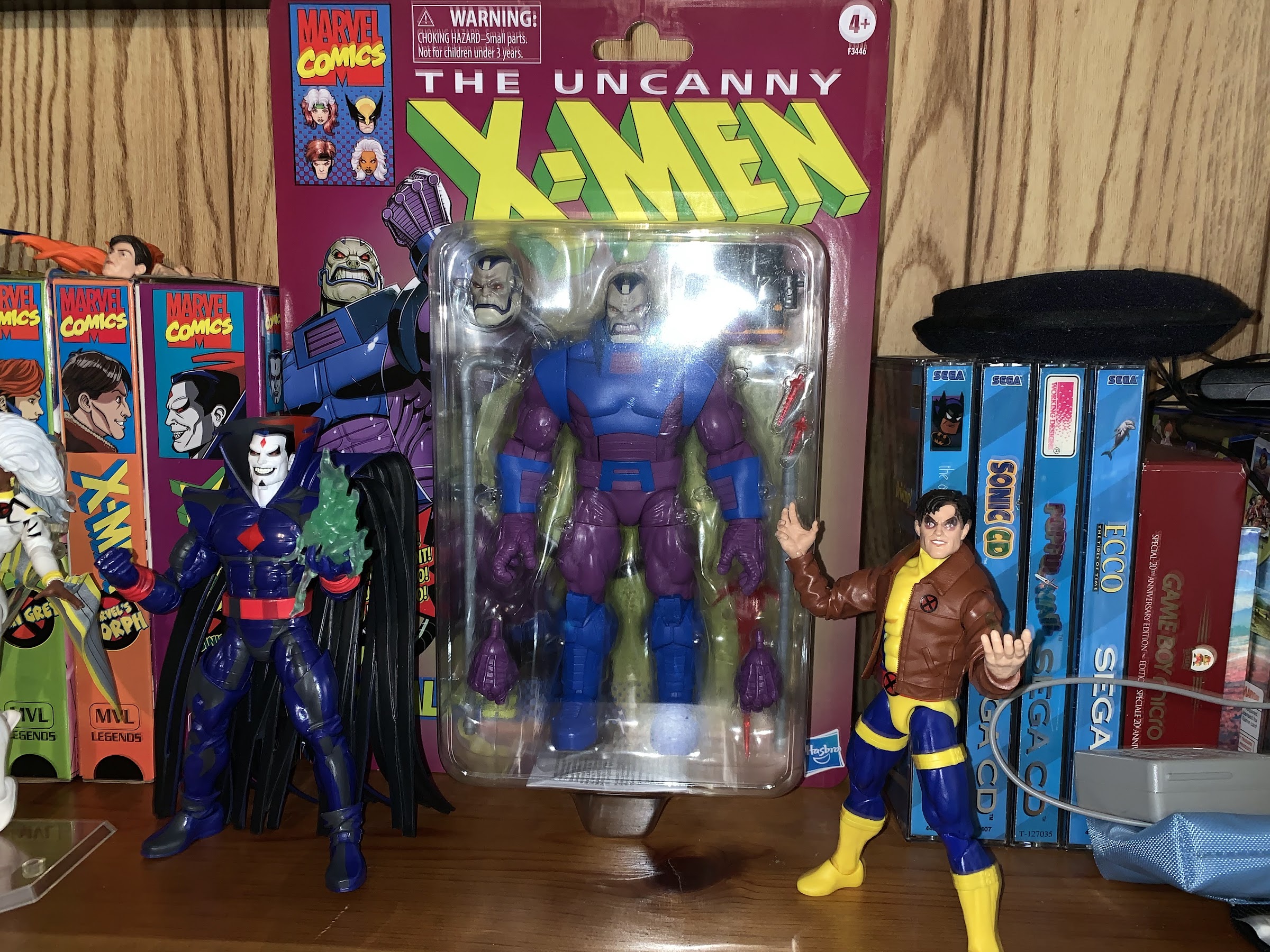
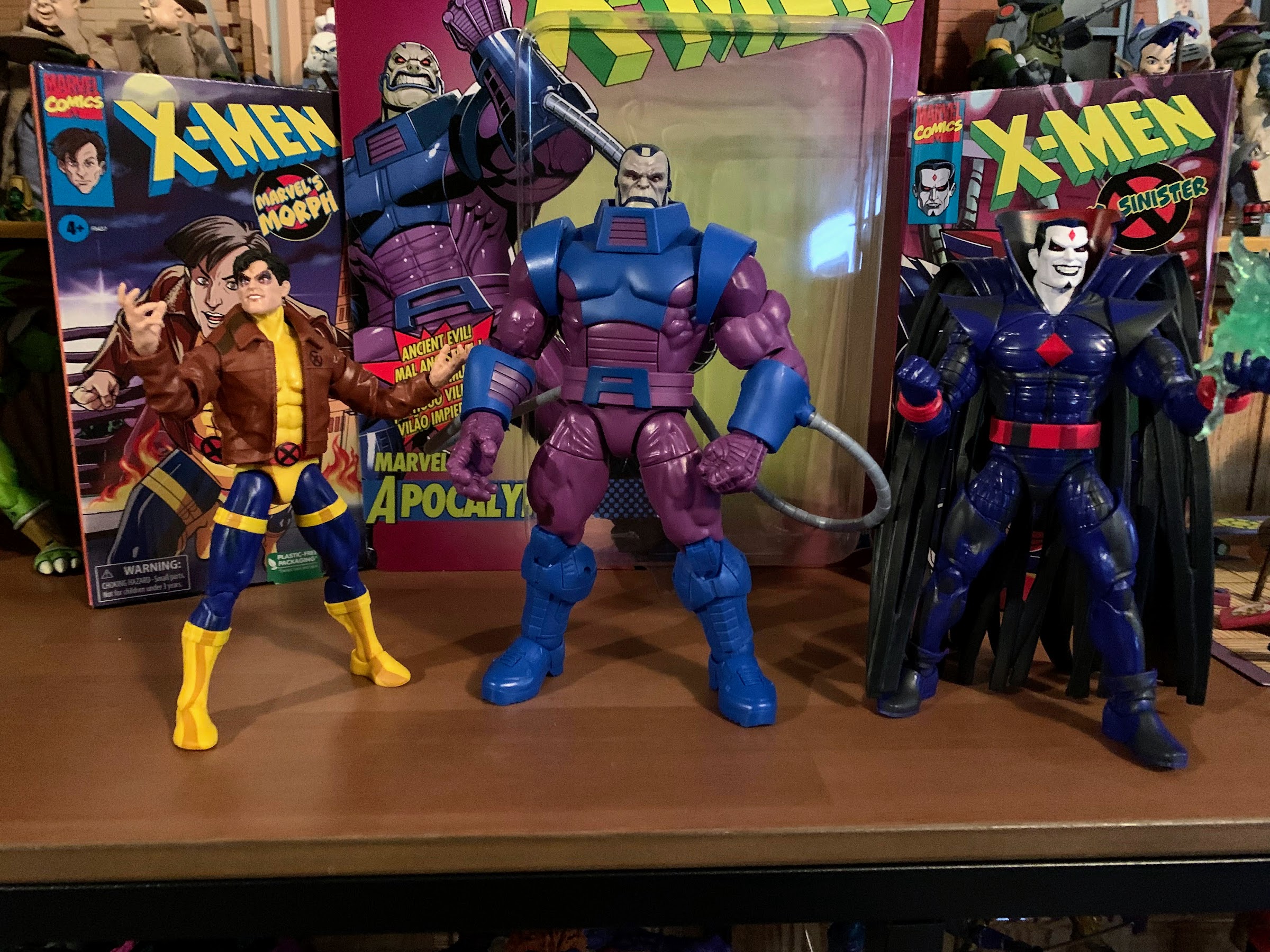
If you are reading this the day it goes live then Happy X-Men ’97 Day! Today is the day the long-awaited sequel series to X-Men debuts on Disney+. Rather than fast-track a review of the first two episodes to this blog, I decided instead to do what I most often do: review an action figure! It was in 2020 that Hasbro announced a subline of Marvel Legends based on the 1992 animated series which were released throughout 2021. Arriving in attractive VHS styled boxes, the X-Men line was more dud than hit. I wanted to love it, but it was hard to shake the feeling that Hasbro was just phoning it in. Despite that, I still bought them all and I continue to buy some of the tie-in figures since Hasbro decided not to deliver the full team. That’s why when the first wave of X-Men ’97 action figures arrived last fall I used it to supplement my existing roster of characters by picking up Magneto, Rogue, and Gambit. The figures had an animated look, though they lacked the cel-shading of the VHS line, but were close enough. Just in time for the debut of the series is wave two. It’s comprised mostly of new characters like Goblin Queen and X-Cutioner as well as some redos in the style of X-Men ’97. As a result, it’s a less attractive wave for me since I don’t want letter of the day Magneto and the VHS Cyclops was one of the few figures I actually liked. However, there was one figure in the line that intrigued me even though I had the VHS version: Jean Grey.
The new figure has a bit of a dead eye going on, but it’s better than the old which looks like a duck-faced Sharon Stone.
I’m not sure which figure was my least favorite in the X-Men VHS line from Hasbro, but the fact that Jean is in the running should probably say enough. The figure is dated and Hasbro couldn’t even be bothered to get the color of her costume right, but more than anything, I just hated the portraits. The figure was a re-release of an existing figure with a new paint job as that’s basically all of the effort Hasbro could muster when it came to the line. She had a ponytailed portrait, but it looked nothing like the version of the character from the show. They also included her down hair portrait, even though she never sported that look in that costume during the entire show’s run, and it was a release that just left me all sorts of grumpy in the end. The only positive I could lay on it was that the cel-shading was actually done pretty well given the standards of the line.
I know there are a lot of people who dislike cel-shading on their figures, but this costume needs something because the design is rather plain.
Jean gets a redo with X-Men ’97, and like most of the characters in the show making a return, she still sports a look that’s very similar to her ’92 counterpart. It’s a costume based on the look Jim Lee gave her and based on some of the promotional artwork I’ve seen it looks like she’ll have the ponytail some days, and let her hair down on others. The figure itself comes in the usual blister and Jean has her hair down look on the card despite the default portrait being the ponytail one. The figure stands approximately 6.25″ to the top of the head. Her costume is basically now a pale orange and dark blue. The figure is mostly orange plastic with a V-shape of blue on the front of the torso and a more rectangular one on the back. The shoulder pads are little cuts of blue plastic pinned into the top of the joint. The belt is still separate from the body, but it fits quite snug to the crotch piece. Paint is largely reserved for the face, X logo, and the blue parts of the arms and hands. The blue on the torso appears to be plastic that’s been plugged into the orange portion. The legs have a lot of sculpted details to the costume, but zero paint which give the figure an unfinished look to it. It’s obviously a limitation to some degree of the character design, but some linework in the grooves cut into the legs would have added a lot.
New Jean seems to scale smaller, but I like that. The smaller head relative to the body is a better fit for the source material as well.
The main draw of this figure for me is simply the default portrait. Jean is sporting a very neutral expression to the point where she looks almost bored. The face and ears are at least painted okay, though it’s a little messy around the right ear. The blue trapezoid shape on her forehead is just painted on and lacks presence since it blends in with the dark blue cowl. The hair is a separate piece of bright, orange, plastic. The sculpt is fine, but Hasbro missed a paint hit as her forehead is visible between the top of the cowl and hair and it’s just left blue. Her part is going in the right direction though and her ponytail isn’t stupid long so I consider it a win. Her eyes are also blue this time, which is consistent with the animated series. The prior release went with the comic green eyes. Most of the colors match with the only one being off the crotch piece which is a darker orange. It’s more noticeable in pictures than in person.
Looks like they missed some paint on her forehead. As far as I know, this is true for all of the figures.
The portrait isn’t a homerun, but it’s a solid double and a vast improvement over the VHS figure. And if you’re like me then I have good news as the size of the ball joint on both figures is the same. If you want, you can put this head on the VHS Jean body and the only blemish is the dark blue cowl which should be shaded black. It’s not enough to bother me and since the cel shading was executed well I do think this will be my preferred Jean going forward. I do think the forearms on the new figure are a better match for the original series as well when it comes to the gauntlets she wears, but they’re the wrong color and I don’t know how easy it would be to swap the arms. The shade of orange wouldn’t be an exact match either, but someone more committed than me could definitely kitbash the hell out of these two figures.
She does seem even smaller when put next to Rogue and Bishop.
As for the actual, new, figure, it does some things better than the old while also creating its own issues. For additional accessories, we get the hair down portrait. Swapping is easy and the hair looks fine, but will lock the head down and cut out almost all articulation at the neck. This portrait has a slight smile to it, but it’s again another lifeless face. She looks like a mannequin. Aside from that, it’s at least painted well and the hair hides the ears. The only other accessories is another set of hands. She comes with a right fist and an open left hand. The second set is a style pose pair that are open and very similar (if not the same) as the open hands that have come with past Jeans.
“Look, mom! Double elbows!”
The articulation is an area where this new Jean differentiates itself from the past ones the most. As far as I know, we’re dealing with all new sculpts here. The head is on a double ball peg instead of the hinged ball peg the other Jean has. It’s an improvement, though once again Hasbro buried the lower ball too deep in the neck needlessly limiting the range. She barely has any range looking down and only a little looking up. Rotation and tilt are fine, but Hasbro needs to figure these joints out. The shoulders are standard hinged pegs and she can raise her arms out to the side a full 90 degrees from the body. There’s a biceps swivel past that, pin-less double-jointed elbows, and a swivel and hinge at the wrist. The elbows will bend well past 90, though it’s not the most attractive joint. This Jean can at least get her hands to her forehead though.
Aside from the cowl being a little off, I think this looks pretty good. Certainly an improvement.
In the torso we have…nothing. It’s almost bizarre to see no articulation cut into a torso even though it’s theoretically a cleaner presentation. Instead, we get a ball joint at the waist. It goes forward and back a bit and offers full rotation and tilt. This is in comparison to the prior Jean which had a ball joint in the diaphragm and nothing at the waist. It should be both! Why can’t we have nice things, Hasbro? The hips will go out to the side past 45 degrees, but shy of full splits. Jean can kick forward about 90 degrees, but not back at all due to the shape of her buttocks. There is a thigh twist and the double-jointed knees are pin-less and work fine. The ankle hinge bends back all the way, but not forward very far. The ankle rocker is pretty steep, but there. Lastly, the ponytail just pegs into the back of the standard head and can rotate.
Yup, this is how she’s going to live on my shelf.
Is this new Jean an improvement on the old? Yes and no. There’s a softness to the sculpt, and when combined with the lack of any articulation cut into the torso as well as no paint, it gives the figure a very plain appearance. The softness does appear to at least resemble the animation, though I’m sure the show will feature shading of some kind. I don’t know why Hasbro didn’t get her a ball joint in the diaphragm as that would have really added to the articulation, but instead it’s just mediocre. It’s nice to see the arms updated with double-jointed elbows and I prefer the sculpted-in forearm gauntlets, but not enough to display this figure in place of the VHS version. Instead, I’m just taking this new head, slapping it on the old body, and calling it “good enough.” I just wish I didn’t have to spend another 25 bucks to get my Jean figure to this current state.
Get your X-Men fix right here before you check out the brand new X-Men ’97:
For some reason, Jean Grey has never been treated well by toy makers. Back in the Toy Biz days, Jean had to wait several years to finally show up in the X-Men line of action figures, and once she did, it was in some gimmicky line in a costume that looked made-up. Her first, good,…
We’re going to keep this Marvel/Mutant Monday thing going for one more week! After taking a look at a trio of figures from Hasbro’s new X-Men ’97 line of figures in its Marvel Legends catalog I’ve decided to do one more: Bishop. The first three figures I looked at were basically all missing pieces to…
Previously, on X-Men reviews we looked at Magneto from the upcoming series X-Men ’97. The animated series may have been delayed into 2024, but the action figures from Hasbro are already here. And if you were collecting Hasbro’s line of figures based on the animated series from the 90s, this new line offers a chance…
“All right, bub, I’m going to show you how we dressed in the 90s.”
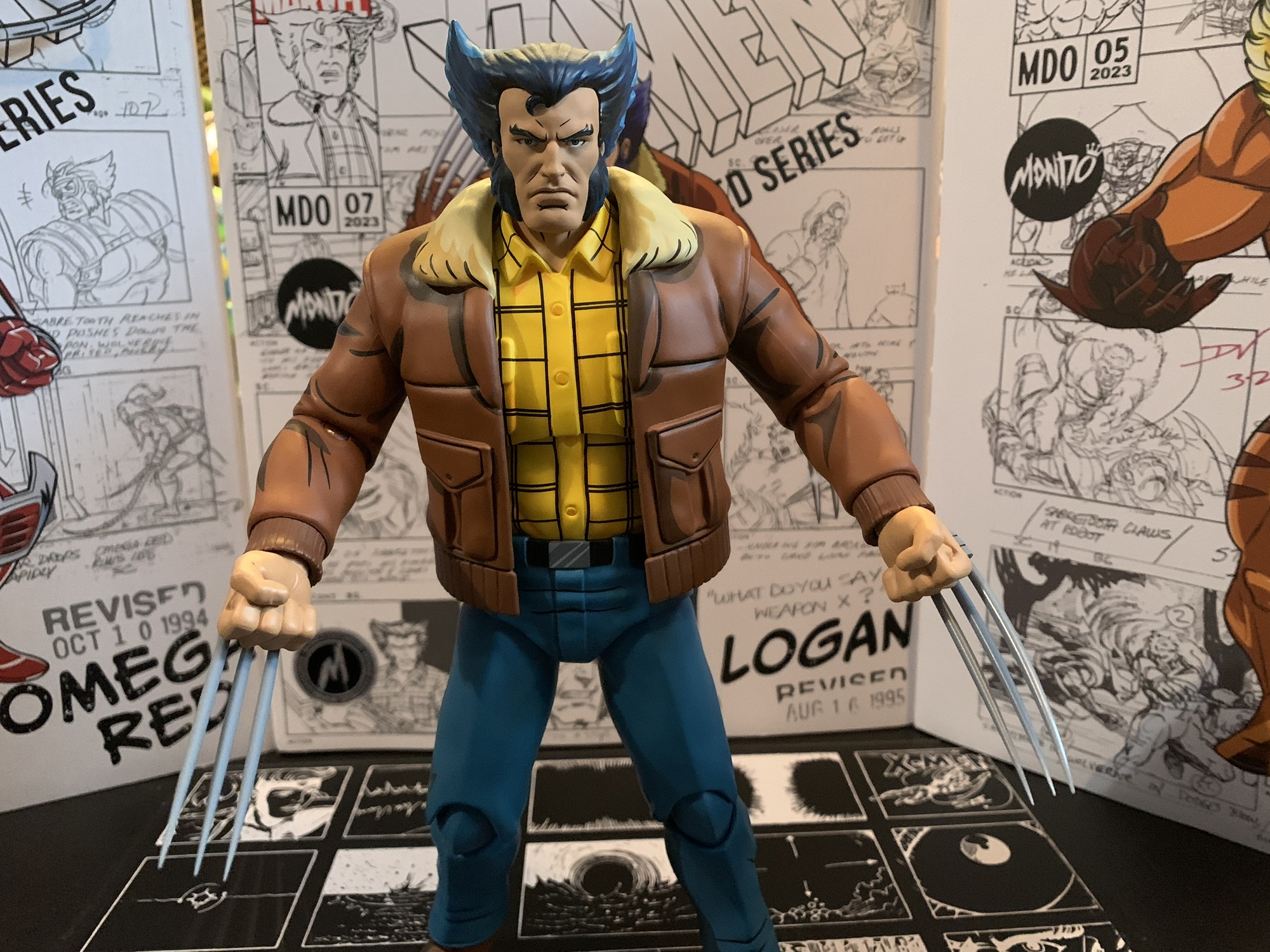
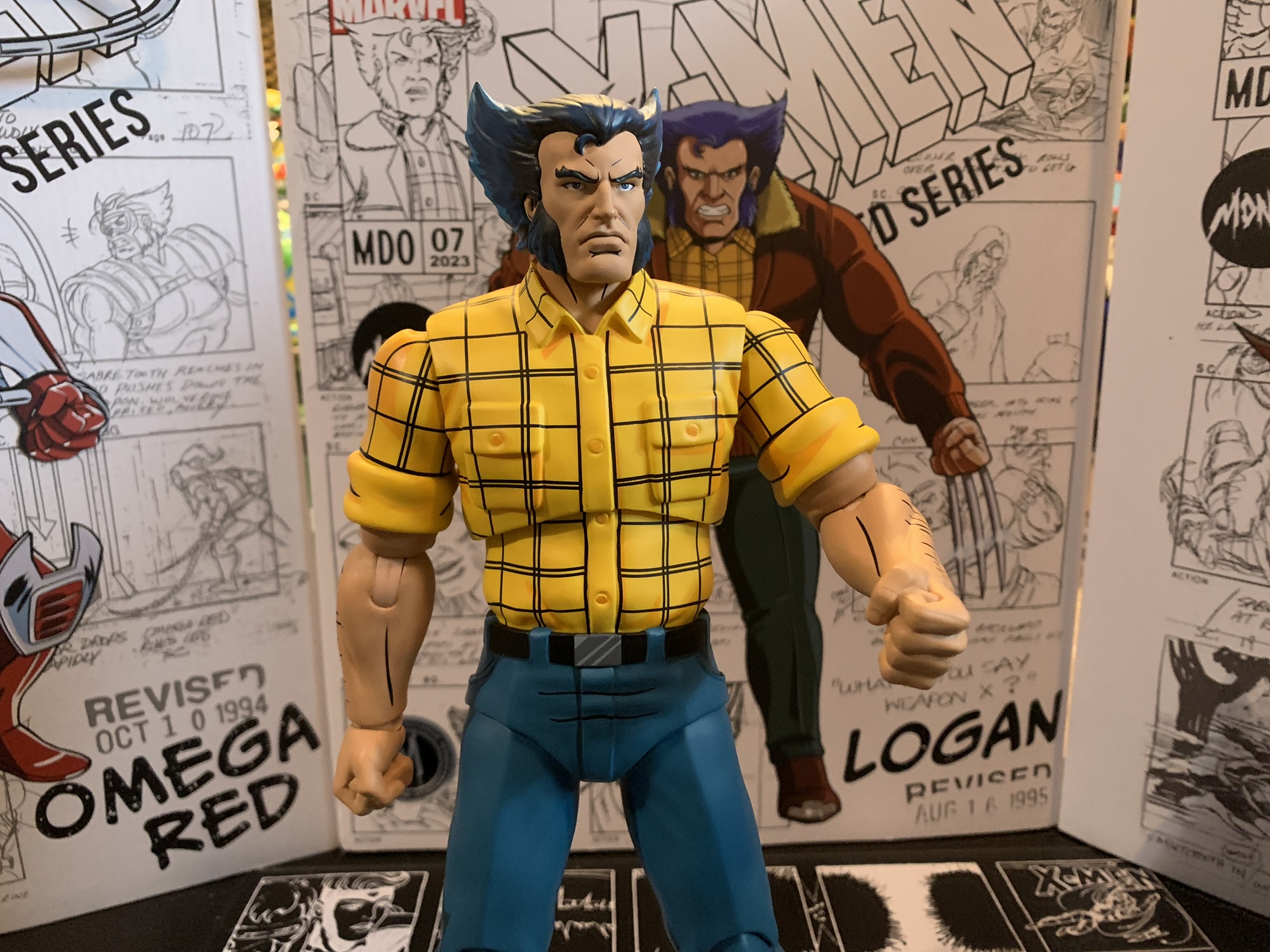
Mondo has been absolutely killing it with its sixth scale line of action figures based on the now classic animated series X-Men. The company also really ramped up production in 2023 on the line by soliciting five new figures during the year. At over 200 bucks a pop, it was quite the hit to the old wallet. It had me looking for reasons to bypass a release and maybe the San Diego Comic Con exclusive Logan was one figure I didn’t need to have. It was a variant on Wolverine, who was the inaugural release in the line, and when it comes to expensive lines to collect variants are often a spot where the wallet can breath. Then I saw the figure and I knew it just wasn’t going to happen. Logan looked too damn good and his plain clothes look from the show is almost as iconic as his costumed one. I was a day one buyer. The wait was a long one, but I now have Logan in my possession.
Just let the man play pool in peace, or else.
Costume on or off, Wolverine is still a bad ass.
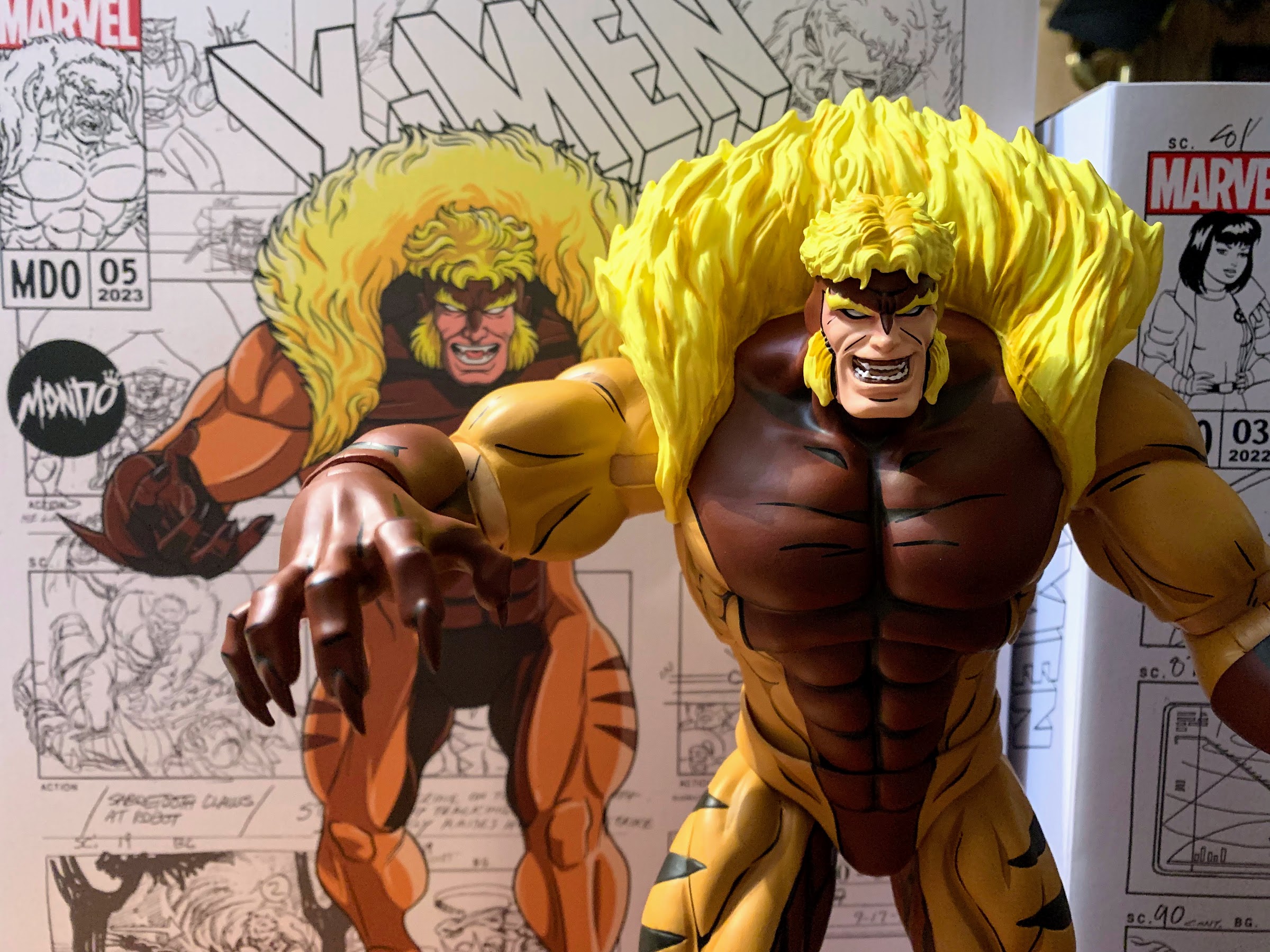
Logan follows Omega Red and arrived in the same manner. The figure was shipped directly from the factory and delivered to my home via DHL. The figure comes in the usual packaging which features brand new artwork from Dan Veesenmeyer and production art adorns the background (mostly from the episode “Weapon X, Lies, and Video Tape”). The front flap is affixed via a magnet once again with a write-up on the inner flap from showrunner Erik Lewald and his wife Julia, who also wrote for the show. The window behind it isn’t very useful since the figure is covered in tissue paper and plastic, but that’s for a good reason. Logan was sculpted by Alex Brewer, who I believe has handled all of the sculpts in the line, with paint by Tom Rozejowski. Remember those names, because we’ll be singing their praises throughout this one.
Tell us how you really feel, Logan.
Logan is covered in tissue paper and plastic films to protect him in transit because he is loaded with paint apps. He stands a ticker under 11″ so he’s basically the same size as his costumed counterpart. The look is his classic season one civilian attire which includes a brown bomber jacket, yellow, checkered, shirt, blue slacks, and cowboy boots. The man certainly had style. He’s sporting the jacket in box and to get all of the extra stuff off you’ll probably have to dismantle the figure a bit. I removed the hands, arms, and coat (yes, it’s removable) so as to avoid ripping through the plastic and leaving little pieces behind. All of that extra stuff apparently did its job because the paint is pristine on my figure. Which is terrific because everything is painted here: hands, face, hair, I’m not sure if anything is bare plastic. This isn’t the flashiest paint job in the line due to the character design, but it turned out wonderful. There’s tons of black linework, the cel-shading is smartly applied, and the faces are clean. It’s more exceptional work from Mondo and their team of artists.
These new portraits are why better than this one that came with the first Wolverine release.
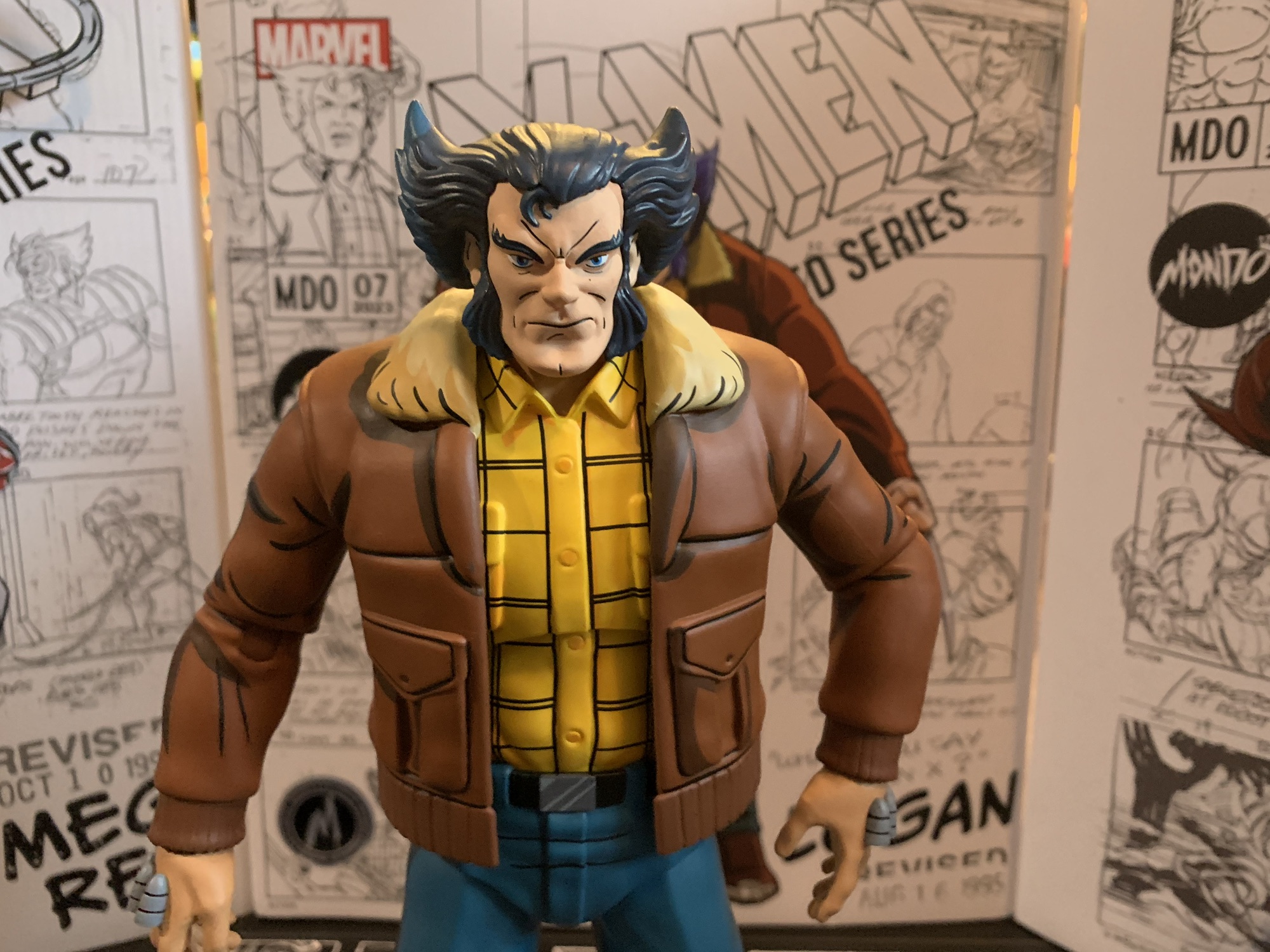
This figure looks so good that there’s very little room to critique it, but this is a review so we’re going to try. My first thought when I saw the figure was that his pants looked just a little bit off. After consulting the show, that seems to be the case as his pants usually had a touch more green to them than here. It’s easiest to see just by comparing the figure to the box art. It’s not a big deal to me and this approach makes him more like the old “Street Clothes” Wolverine action figure from Toy Biz clearly based on the show. Wolverine’s head without his mask is always a bit tough to get in three dimensions because of his unusual hairstyle. This one looks pretty damn good, though the hair might be just a bit too steep and pointed up. The first Wolverine figure came with an unmasked head and I think I like the hair shape on that one a little more, though the faces on the new figure are much improved. If I could get the hair halfway between the two that might be perfect. Lastly, Logan is still too tall for true sixth scale. They were kind of backed into a corner here because of the first figure. If this one was smaller it would look silly. He’ll look fine with Jubilee, but Sabretooth and Omega Red don’t quite tower over Logan like they should.
“Settle down, kid.”
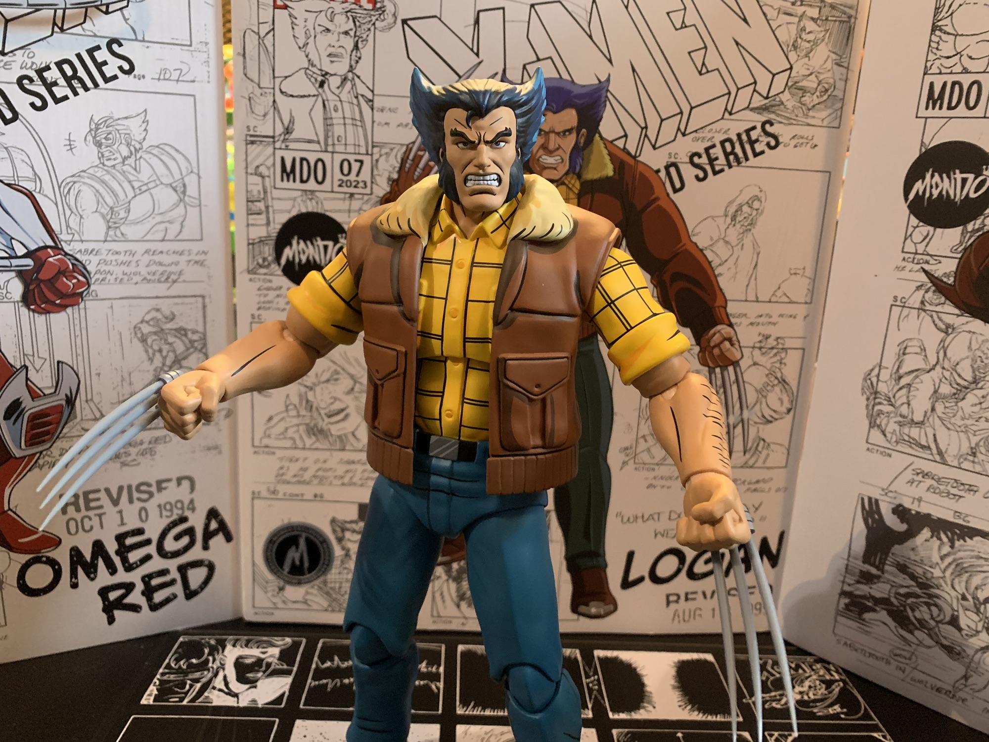
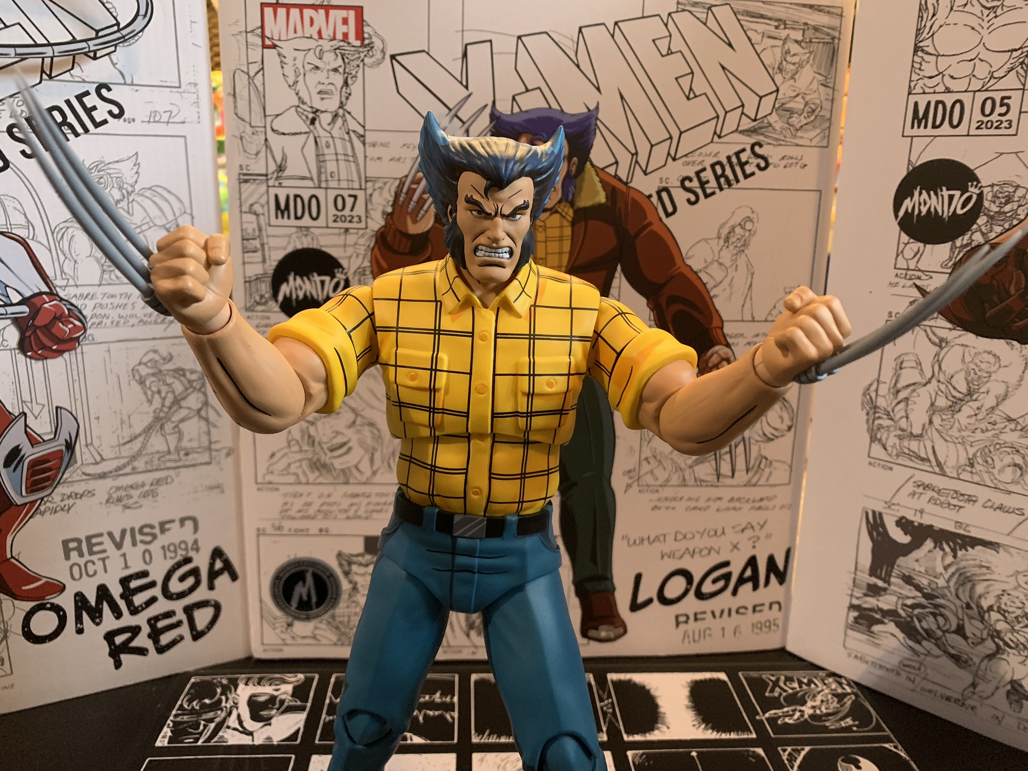
That’s a pretty short list of nitpicks and the rest of this review is going to be largely of the glowing variety. Logan doesn’t call for a ton of accessories, but that doesn’t mean he’s lacking. Logan comes with fists in the box, but he also has another five sets of hands to choose from. They are: fists with claw channels, open, trigger hand, gripping, and “Come here” gesture hands. All of the hands except the default fists feature the channels for his claws. I love this attention to detail since Season One Logan always had those on his hands even when un-gloved. This was corrected for Season Two so if you prefer that look you have the bare fists. For those many hands we have 8 claws. Yes, Mondo tossed in two extra in case you misplace any or break some. The approach is different from the first Wolverine as the plastic is much lighter and more pointed. They’re unpainted and there’s a little notch on the end of each one which helps them to lock into place. All of the hands I’ve tried have been able to accept the claws without fuss, which is cool. I love the removable claw feature and it’s what I always wanted out of my Wolverine figures as a kid. No need to go with straight arm poses to conceal a retractable claw gimmick. The only thing missing is a set of fists that could feature claws without the channels, but I probably would have never used them so I can’t really complain.
The painted stand adds a little flash to the display.
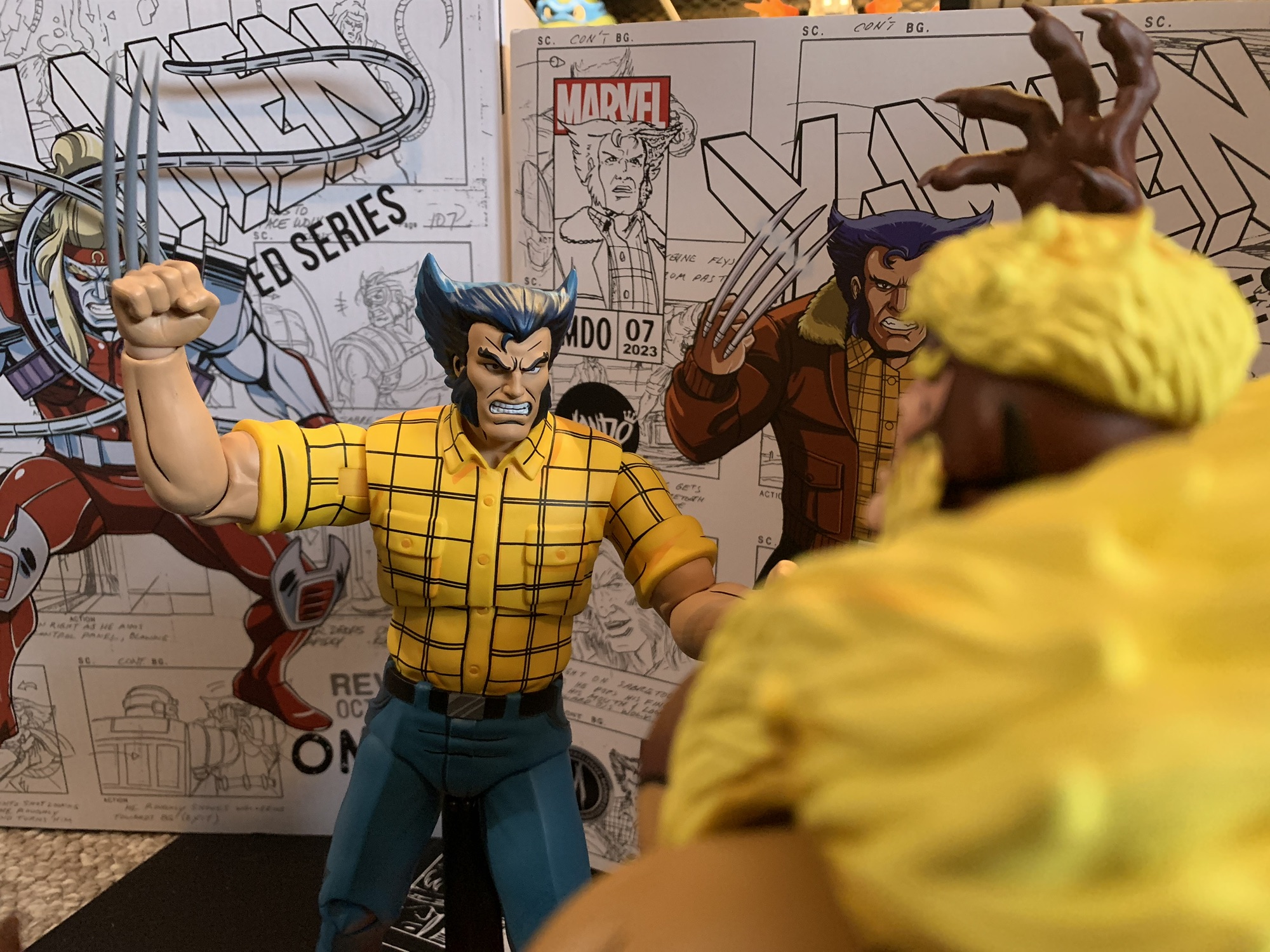
Because the coat is removable, you can even give your Logan a fashionable vest, if you like.
You may have noticed my advice to remove the coat when unboxing this guy and that’s because it’s removable. Mondo did the coat in a soft, pliable, plastic just like they did with Gambit while making the sleeves of the coat part of the sculpt. The arms pop out quite easily so you can slide the coat off and replace the arms with the extra set. They feature the sleeves of his shirt and there’s some painted arm hair on them so you can pull off a jacket-less look if you want. I love the option, though I can’t recall Wolverine sporting this look in the show. He had other plain clothes looks including a red flannel and a black t-shirt, but I don’t remember if he ever had just the yellow shirt. Looks like I need to go do another rewatch.
It’s a rugged dignity.
Logan also comes with two heads. He has what is probably a neutral expression for Logan by default, though it has a hint of a scowl which I think is just how Logan always looks. There’s also an angry, teeth-gritting, expression for when you want him going after Sabretooth. Both heads are easy to swap as it looks like Mondo has started using a soft, almost rubbery, plastic insert in the heads making this figure the easiest in the line to swap. It’s a great call because swapping heads on the other figures can be a little scary since it’s easy to wind up with unintended paint rub if you’re not careful. The last item in the box is the Mondo figure stand. This one is unique in that the base has the X-Men logo sculpted and painted onto it. I was surprised they weren’t doing this from the start and it does add a nice splash of color to the display. I suppose some will be bothered that Logan’s stand is different from the rest, but since it’s an improvement you won’t hear me complaining. Plus, I never use the damn things, but this one I almost feel like I have to.
Coat on or off, he looks pretty great.
Logan is like the other figures in the line in that he looks pretty awesome. He’s also like the rest in that he doesn’t articulate particularly well. It’s the trade-off we’re all accustomed to at this point. The head is on a double ball peg, though he doesn’t get as much range as I’d like. His hair kind of locks him down and it’s worse with the coat on. You get rotation and a little range down and a little tilt, but that’s about it. The shoulders are hinged ball pegs and the sleeved ones on mine were pretty stuck out of the box. That’s because they’re painted, but a little heat and some force got them moving fine (the alt arms were good to go from the start) and the peg is sturdy enough that you shouldn’t have much to worry about. They rotate and go out to the side all the way. The elbows are single-hinged with a swivel point and they’ll get you close to a 90 degree bend, but not all the way. The hands are on hinged ball-pegs and they’ll rotate just fine and you can align the hinge in whatever fashion you wish.
“All right you egg-sucking piece of gutter trash!”
In the torso, we have a diaphragm joint that doesn’t appear to do a whole lot. I can get a little rotation out of it, but it doesn’t tilt or crunch forward or back at all. I think the figure has a waist twist, but the shape of the sculpt is discouraging me from really trying to move it as there will definitely be some paint rub if I do. The legs are on big old ball sockets, but the crotch diaper piece is a large impediment to range. You can kick back a bit, and kick forward, but the leg wants to go out to the side. The legs will spread to close to 45 degrees or so and there is a thigh twist built into the socket joint. The knees are double jointed and will bend past 90 degrees. You also get a little swivel at the top and bottom of the knee joint if you want it. The ankles feature a hinge and there’s an ankle rocker. The range on both is acceptable and this figure isn’t a challenge to stand. He’s just not going to do anything truly dynamic, which was pretty true of the show, in fairness. I wish the diaphragm joint worked better than it does as the lack of rotation up there sucks.
The articulation isn’t impressive with these figures, but if you could find flight stands that could handle the weight you could do some pretty cool stuff with them.
As I said before, I can accept the articulation shortcomings because the figure looks too damn good. This Logan is precisely what I want from this line and I am immensely happy to add him to my collection. I had some nitpicks and I do miss the episode specific accessories the other figures came with (maybe a pool cue would have been fun, or his salami), but maybe the simpler approach here is the result of this one being a convention exclusive since the same was true of Omega Red. I love all of the hand options and that the claws seem to work really well across the board. The new head sculpts are a major upgrade over the first attempt and this depiction of Logan is simply iconic. There’s a reason why he got a figure in this outfit in the old Toy Biz line too. Am I interested in more variants? Probably not. Well, maybe a Beast in his Howard the Duck shirt, but we need a proper Beast before we can start thinking about variants. These arms are likely getting reused for Cyclops, who we have seen in render form as coming with a removable jacket like this figure. My hope is they get repurposed again for a proper Morph.
He looks damn fine with the rest.
“X-Men don’t cut and run!”
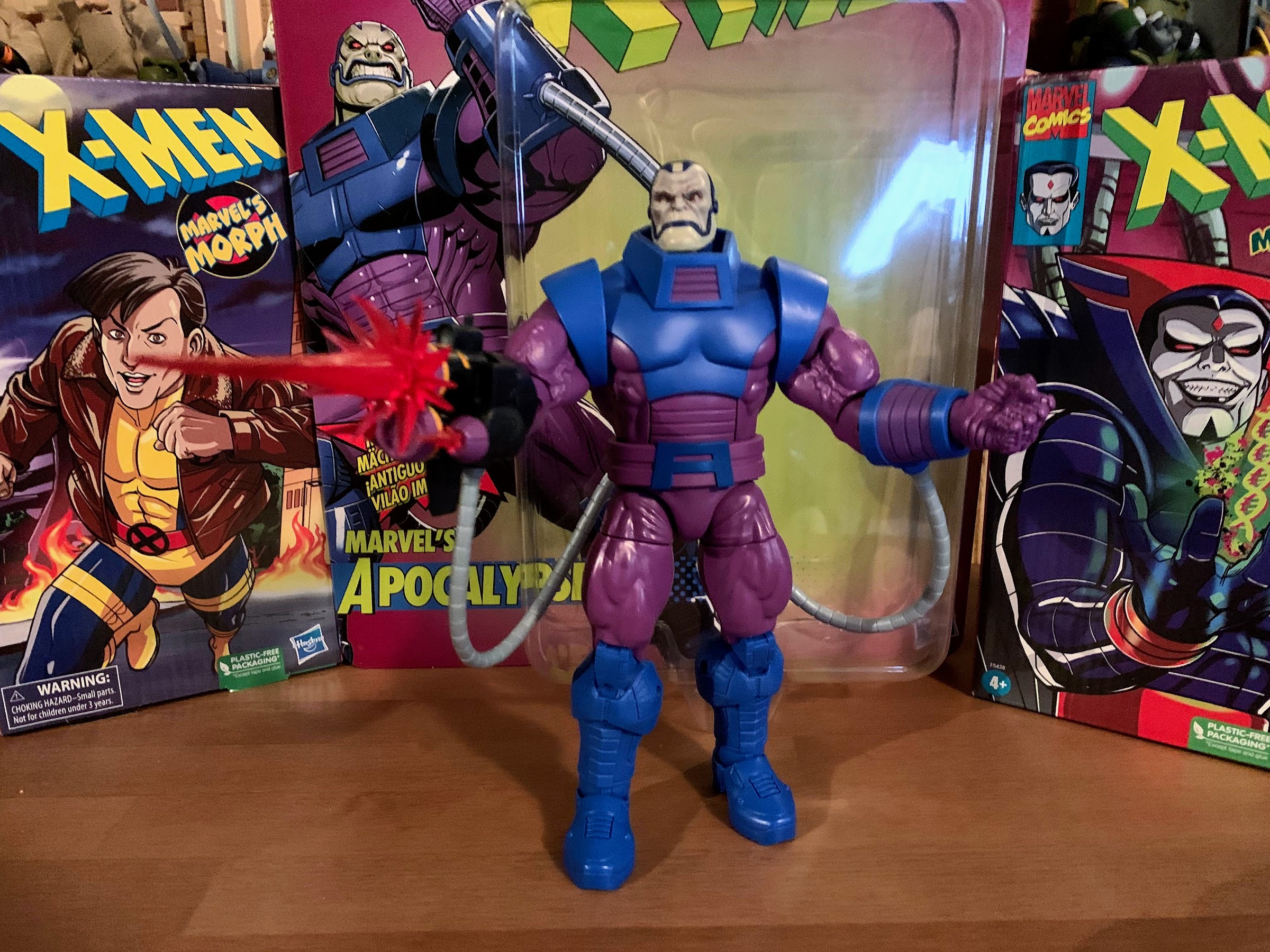
With this release, we have now hit the end of what has been solicited. These Mondo deliveries came fast and furious this past month, but it will likely be a bit of a wait until the next one. Rogue is expected to go up for sale in February so she has a chance to arrive this summer (I think Jubilee was solicited in January and she arrived in June) and we know Cyclops is coming too. Mondo is also dipping its toe into Spider-Man which might take-away somewhat from this line, but maybe not. I guess we’ll have to wait and see. We still need Jean, Beast, Storm, and Morph to make me happy. Xavier would be nice too, but I have no idea how to incorporate a sixth scale version of his hoverchair into my display. It also wouldn’t shock me to see another villain. Sinister seems most likely, but I could see Mystique interesting Mondo or maybe Lady Deathstrike. The future looks bright, and expensive, but so far it’s been more than worth it!
Think this figure is awesome? You should see what else Mondo has had to offer:
Last year, Mondo sold three different exclusives timed with popular conventions from its sixth scale line of action figures based on X-Men the animated series. One of them was a comic edition of Magneto which was sold at San Diego Comic Con. The other two were essentially preorders to be delivered at a later date.…
When one hears the phrase “mall babe” it implies a certain visual. Probably a short, young, girl with intentionally messy, short hair. There’s a certain confidence the phrase exudes so she has to have style. Maybe hot pink, bright blues, and certainly a long yellow coat with gloves to match! There has to be an…
It is my belief that when it comes to X-Men, the animated series which debuted in 1992, the breakout star of the show was Gambit. Wolverine was the closest thing we had to a household name going into the show and was the de-facto pick for favorite character of many. And while the whole roster…
The Soviet super soldier has joined the ranks of Mondo’s X-Men line!
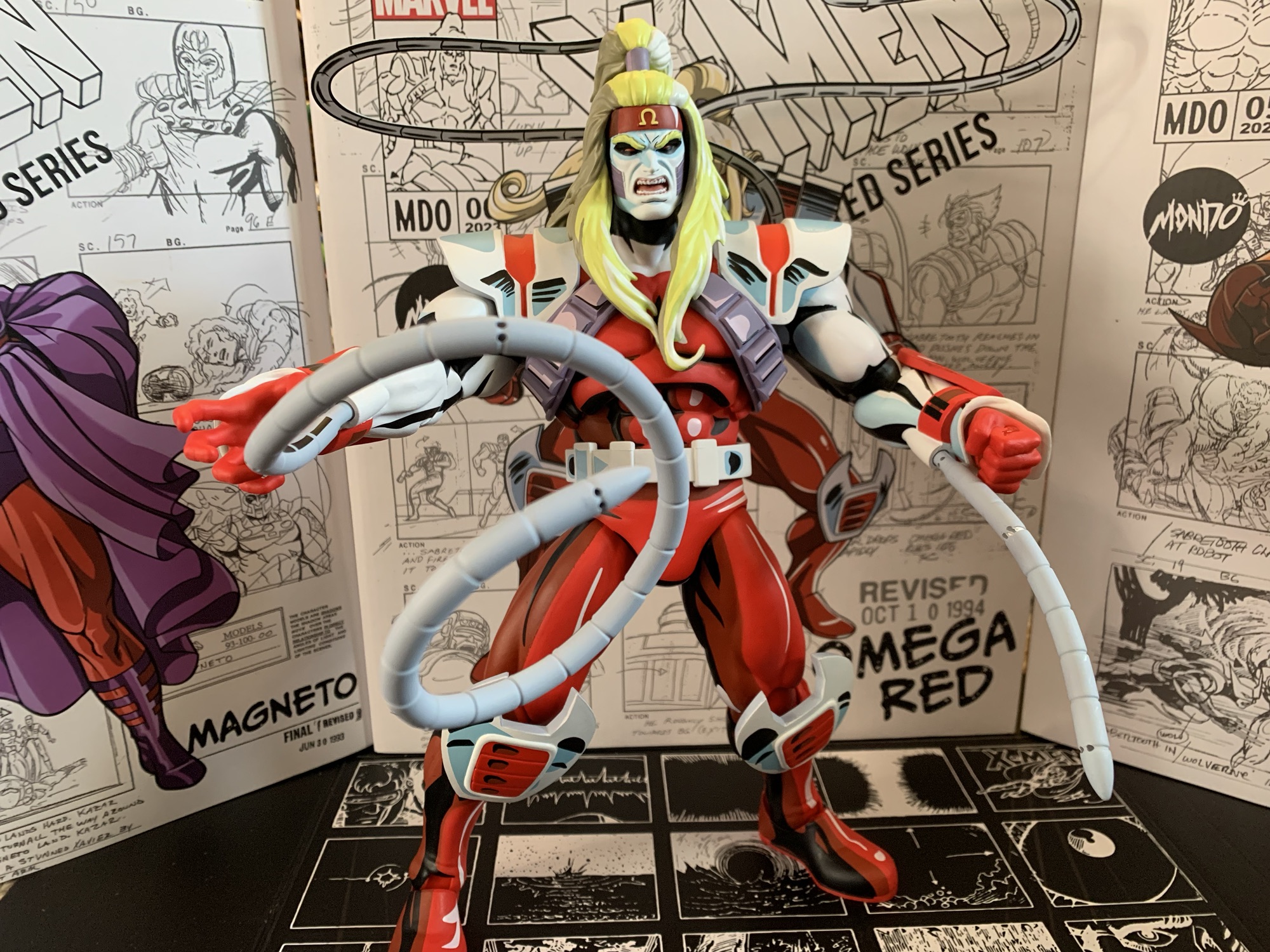
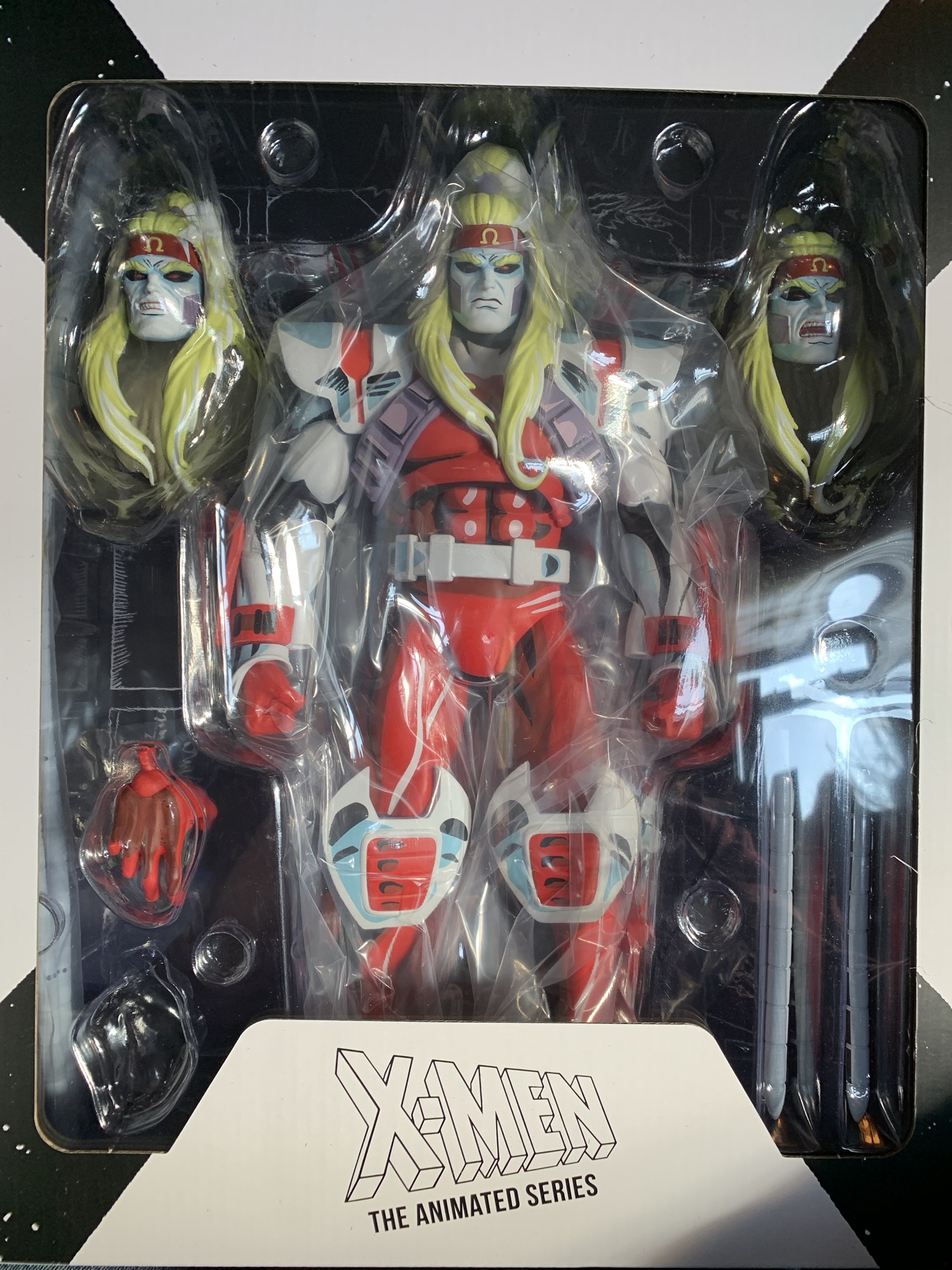
Last year, Mondo sold three different exclusives timed with popular conventions from its sixth scale line of action figures based on X-Men the animated series. One of them was a comic edition of Magneto which was sold at San Diego Comic Con. The other two were essentially preorders to be delivered at a later date. San Diego Comic Con brought Logan, a version of popular hero Wolverine in his civilian attire. New York Comic Con, which took place a couple of months later, featured Omega Red, the soviet super soldier who appeared in a pair of episodes. I don’t know how toy production works, but for whatever reason the exclusive sold most recently was the first to arrive at my residence so lets talk about Omega Red!
Omega Red comes in the standard box from Mondo with new artwork by series storyboard artist Dan Veesenmeyer and an assortment of production art as well. Omega Red has the added wrinkle of featuring raised elements on the box with his hands and coils being a separate piece of cardstock that’s been attached to the box. It’s a fun little embellishment I wasn’t expecting. The front flap is affixed via Velcro, which is different from the Gambit figure we just looked at which used magnets. The inner tray is a floating piece and is not affixed to the cardboard backdrop. I’m guessing the little variations in packaging are just due to them originating from different factories. Also of interest is that Omega Red shipped to me via DHL and it came straight from the factory rather than going to Mondo first in Texas and then being shipped via FedEx. This meant the figure required a signature, but it wasn’t an issue since I was home at the time of delivery. I’m curious if this will be how the figures are shipped going forward or if Omega Red was a special case.
There’s not a ton in the box this time, and for me, I’m even short a hand!
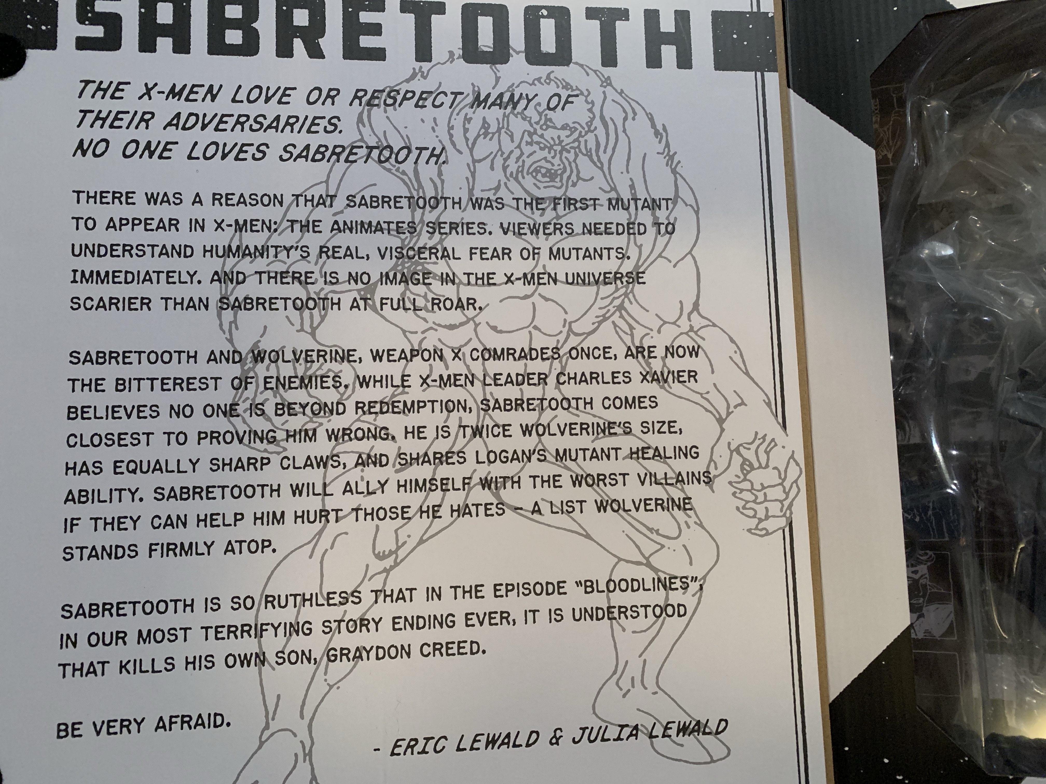
Omega Red is certainly an interesting choice for this line. We have three heroes and three villains so far and I bet if you asked fans of the show which villain would arrive third most would have guessed Mr. Sinister. Omega Red was only a featured player in two episodes and one of those episodes is considered among the worst in the series by showrunner Eric Lewald. And that was because he basically had to write it in a weekend since they were an episode short (I forget why, but it’s detailed in one or both of his books on the series). Omega Red was also a fairly new villain in the comics when the show began and he may have even appeared in the series because Marvel wanted to spotlight the new adversary of Wolverine and the X-Men. He’s basically the soviet equivalent of a Captain America or even the Weapon X project. He was created by artist Jim Lee and writer John Byrne and I would say he’s a case of 90s style over substance. Still, Omega Red was undeniably cool looking and his old Toy Biz figures was one of my favorites as a kid because of that. He’s a good enough foil for Wolverine, and strictly from a design perspective, I was happy to see that he was going to be included in this line.
Looks good! Except for that empty “bubble” in the plastic…
Unfortunately, I do have an issue right off the bat with my figure. When I opened the shipper box and took a look at the goods inside, I noticed right away that there was a spot in the bubble tray that was empty. It was supposed to contain an optional left hand for the figure. I was hoping it had just become dislodged during the shipping process, but upon opening the box there was no hand to be found. Bummer. It’s disappointing that this wasn’t caught by the factory since just a cursory inspection of the product would have revealed the missing item. I’ve reached out to Mondo to see if they can send me a hand or exchange the figure – whatever is needed to get the complete package. They got back to me after a few days to say a replacement hand is on the way and should ship by the end of the month. I’ll update this space accordingly when that happens. UPDATE: The missing hand arrived as promised maybe two weeks after I reached out. Perfect customer service!
Another issue to be mindful of is the plastic splitting on these short tentacles.
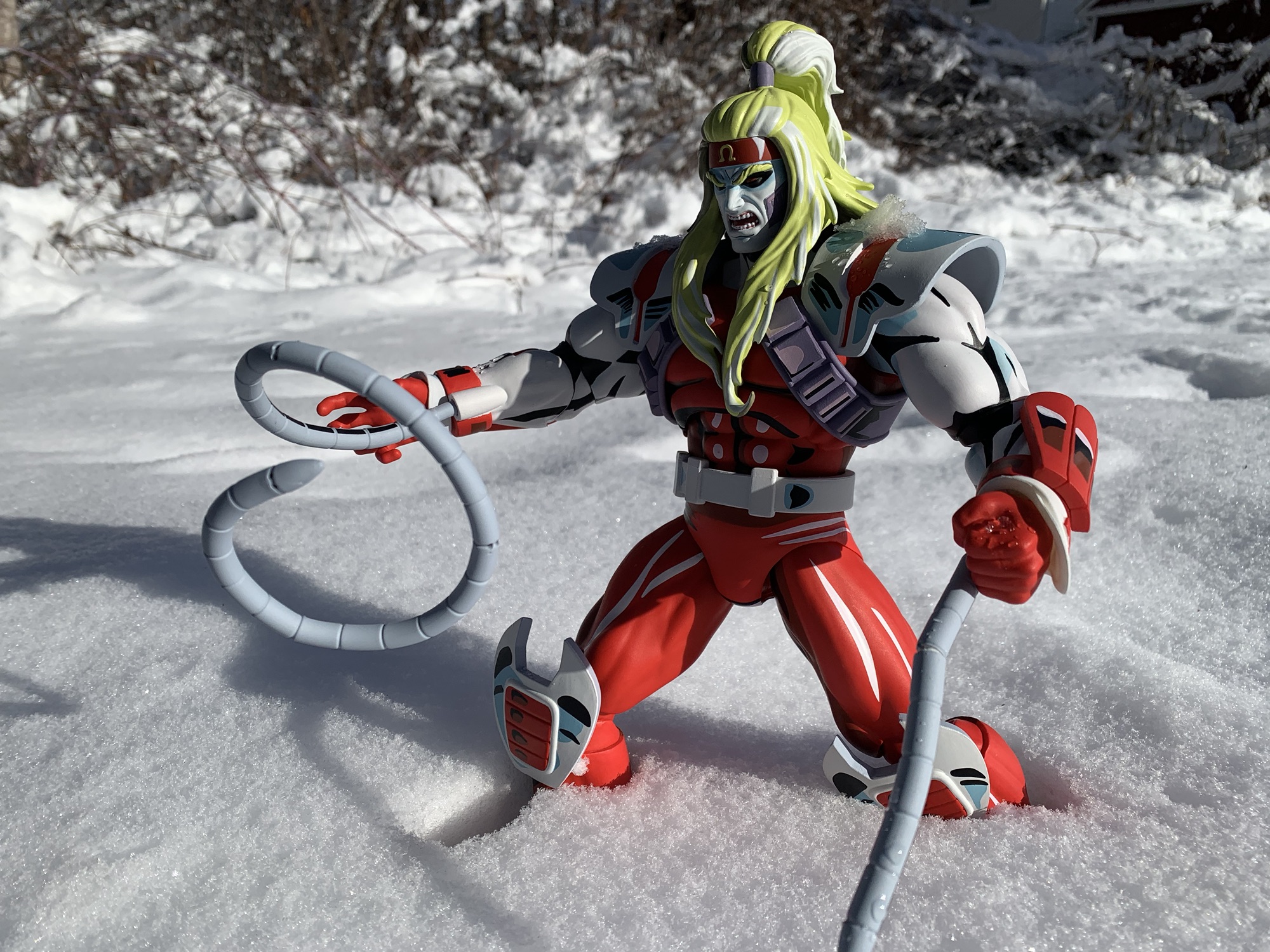
Omega Red stands at roughly 12.5″ to the base of his ponytail. This would put him at a bit over six feet, which seems reasonable for a sixth scale action figure. Omega Red is a very impressive looking figure. I’ve raved about the paint jobs in this line with every release, but Omega Red represents a new high bar. Alex Brewer is the sculptor for this figure, and he’s been the sculptor for all of them I believe, but handling the paint master this time around was Mark Bristow. Mark, you knocked this one out of the park! There are two primary shades of red in use, a bright red and a crimson, with black and white mixed in as well. The metallic portions of the suit are white with a gray-blue and some black linework and the same approach is taken for the white flesh of his arms and face. This figure is just covered in paint and it looks amazing. This is a figure that is going to draw eyes to it on your shelf. The sculpt is also very impressive as he has this massive upper body. He is just a joy to behold.
He’s not quite as big as Sabretooth, but Omega Red is still pretty large.
Of course, with a lot of paint comes a lot of room for error. For the most part, the paint job on Omega Red is very impressive and cleanly applied. Upon close inspection, there are a few blemishes here and there mostly in the form of a small scratch. Some of the white accents could be applied in a more opaque manner, especially the white on the forearms which ends up almost pink. There’s also a ton of paint around the elbow joints that’s a risk to flake off or get scratched with repeated use. I also think the black under his chin might be just a tad too heavy, but that’s more of a subjective critique. Overall, the presentation is the strength of this figure and I doubt any who picked this one up will be disappointed by it.
Poor Wolverine, he has to share the shelf with two of his mortal enemies and another guy who famously almost killed him.
What’s a little more surprising with this figure is the small assortment of accessories. There was only one edition of Omega Red so perhaps that’s why, but he’s comparatively lighter than the rest of the line. He comes with fisted hands in the box, but should have a set of open hands as well. The cuffs around his hands are removable and will pop off when you swap hands, but they’re pretty easy to work with and are just floating pieces. He also comes with three different portraits: neutral/scowl, smirk, angry yell. All three look appropriate for the character and all three use the same hair mold. It would have been nice if one had a more windswept hair piece instead, but I don’t think his hair changed much in the show either. They are a bitch to swap though. It took some force to get the default one off and I could not get it or any of the others to pop onto the ball joint without first heating it up. And even then, it still was a challenge. I’d recommend picking a favorite and just sticking with it, though admittedly that’s a hard choice because all three heads look terrific.
I’m having a hard time deciding what my preferred portrait is for this guy.
The only other accessories included with Omega Red are his carbonadium coils. He has two sets: long and short. The long ones are pretty damn long – about 14″. They’re done with soft plastic with a bendy wire inside that works reasonably well. You won’t be able to do anything too crazy, but they’ll pose. They’re done with gray plastic and there’s some black shading on them as well. I wish there was a little blue or white too, but they look fine. They plug into the ports on the underside of his forearms and that works fine. The shorter ones are about 4.5″ long and work the same way so you get a little variety, but that’s it. I did encounter some splitting of the plastic on one of the short tentacles, so beware if you intend to bend them a bunch. The only other thing in the box is the usual Mondo stand (and it’s the older version which lack the no-slip bottom). I’m a little surprised we didn’t get an effect part as the coils glow with green energy in the show whenever Omega Red sucks the lifeforce out of his victims. Some removable ice blocks to simulate his frozen state could have been cool too. I think the assortment is fine, I’m just a little surprised at the sparseness.
Omega Red won’t “wow” you with articulation. He’s meant to just stand there and look cool.
The articulation for this line has not been impressive and Omega Red may be the worst one yet. He is extremely locked-down for me so this figure is definitely a case of what you see is basically what you get. If you’re not impressed with how he looks, then you will definitely not be all that pleased with the product. The head is on the standard double-ball peg, but the hair means it can’t really do anything. He can basically look down a bit and that’s it. Try to even turn his head and you risk a lot of paint transfer. The shoulders are ball-hinged and pretty tight. I can only get about 45 degrees of range out to the side, and the big shoulder pads will also limit rotation quite a bit. There is a cut about the elbow for a swivel, but as I mentioned in the aesthetics portion, there’s a ton of paint here so you want to be careful moving it so as not to disturb any of that paint. The hinge in the elbow is very tight and maybe moves a little past 45 degrees. The hands rotate fine and the ball-hinge is pretty smooth. I still can’t get the hands to rotate on that ball, but at least they’re not as tight as Gambit’s.
We got some snow this past weekend so of course I had to take this figure outside for a photo shoot!
The diaphragm features a ball joint, but the fit is super tight. I can’t get that joint to do much of anything. There’s a waist twist, but it’s behind his belt so that’s super tight as well. I get a little pivot out of it, but not full rotation. The ball socket hips work about as well as they do on the other figures. He can widen his stance a bit and kick forward a bit, but nothing crazy. The thigh swivels on that joint and it works fine while the usual double-jointed knees are in place. My left knee works fine, the right is super tight and I don’t want to force it. The ankles hinge forward and back a little bit and the ankle rocker is suitable.
Omega Red barely poses as a result of all of that. He’s basically just going to stand there on your shelf and look cool. A more adventurous sort could probably get a little more out of this figure than I, but I don’t want to screw up the paint at all. The end result is I have a figure that I absolutely love to look at, but doesn’t bring me any joy to handle. Some would say that makes this a pretty poor release since it is, after all, an action figure and should be able to pose accordingly. I can’t bring myself to say that about it though because it does just look amazing. This is a figure for those who prioritize aesthetics over articulation and accessories. If you want a bad ass, foot tall, Omega Red in your collection then this figure is awesome. If you want something that can be posed in a dynamic fashion then this will let you down. If you know what you want out of this, then you should be able to make an informed decision. I personally love it, but it’s not for everyone.
This Mondo line has been pretty rad, check these out:
It is my belief that when it comes to X-Men, the animated series which debuted in 1992, the breakout star of the show was Gambit. Wolverine was the closest thing we had to a household name going into the show and was the de-facto pick for favorite character of many. And while the whole roster…
It’s Halloween 1992. You’re sitting in front of the television with a bowl of candy and your costume in pieces. Coming on is a prime time airing of Fox’s newest superhero cartoon: X-Men. You’ve seen the comics at the grocery store and in other places. You know Wolverine, you know there’s a guy who shoots…
When San Diego Comic Con was cancelled for 2021, many of the entities that would have sold exclusive merchandise at the event pivoted to web sales. And since the 2020 iteration of the famed event was also canceled due to the COVID-19 pandemic, many seemed to expect the same for 2021, or the massive delays…
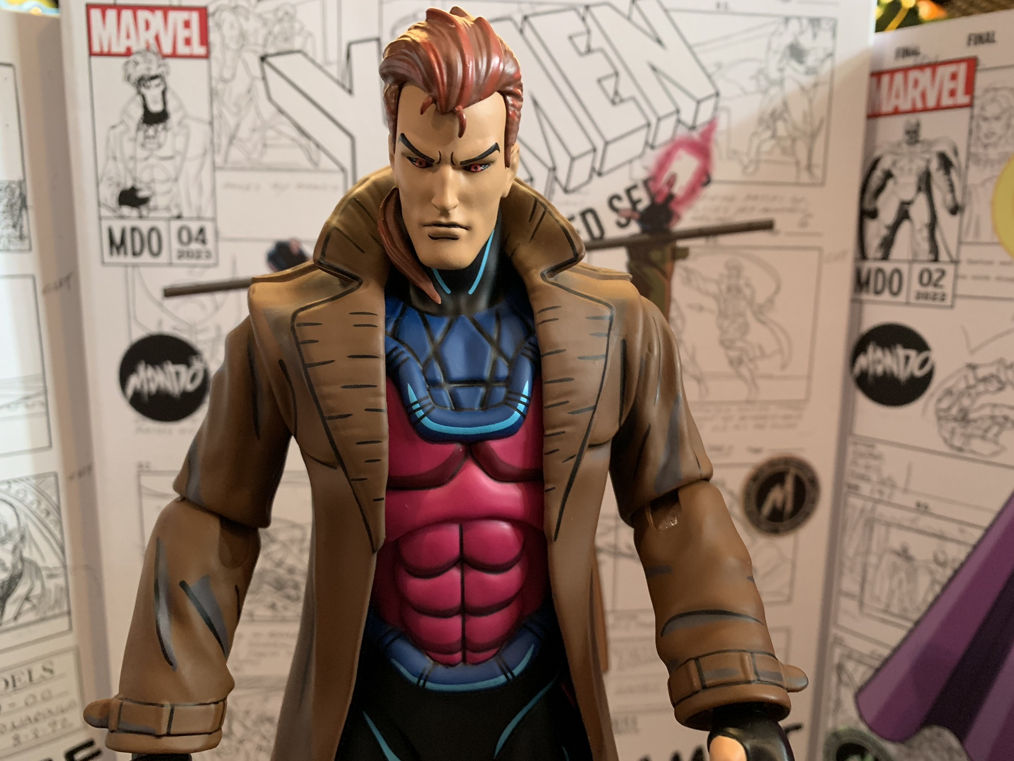
It is my belief that when it comes to X-Men, the animated series which debuted in 1992, the breakout star of the show was Gambit. Wolverine was the closest thing we had to a household name going into the show and was the de-facto pick for favorite character of many. And while the whole roster certainly benefited from a raised profile following the show’s success, it sure seemed like Gambit became the favorite for many in my circle. I was just a kid in the 3rd grade when the show premiered and it was something to see X-Men infiltrate the school yard. It felt like we went right from Batman to the mighty mutants and even the seemingly unstoppable Teenage Mutant Ninja Turtles saw their star fade pretty quickly. The show also arrived around the same time the Toy Biz action figure line was expanding past the first wave of X-Men and in that second wave was Gambit. He wouldn’t linger on the pegs very long and getting that figure for your collection was more than a little challenging (as was the yellow and black Wolverine II figure).
Nice packaging, as usual, from Mondo.
Gambit has often had a tough time making the jump to plastic. His design is tough to do in a satisfactory manner because of the trench coat. That original Toy Biz figure went with a pliable plastic that was more like paper than modern, rubbery, overlays. It was awful and prone to splitting at the seams. More modern figures always look a little “off” to me because I associate Gambit with this show more than anything. If he’s got a different head shape or his hair is more flat then it doesn’t look right. His unusual eyes can be tricky too since the sclera is black instead of white and the iris red. It’s an odd design, but Gambit is a pretty odd design all by himself. It’s like Jim Lee set out to make a character that just oozed “cool.” Usually, such characters turn out terribly, but for some reason it worked with Gambit. I couldn’t tell you why since everything about his design seems ridiculous to me in a vacuum. The hood with exposed face and ears, poofy hair, gloves with only certain fingers missing, the hot pink shirt, and of course the coat. His costume doesn’t really look like a costume and instead like someone with bad fashion sense. And there’s the fact that he actually has long hair, but somehow it’s all kept under wraps with that hood he wears. The back of his head and neck must just constantly be drenched in sweat.
The ranks are starting to fill out a bit.
Mondo has selected Gambit as its fifth release in its line of X-Men action figures. I’ve been really high on this line because it better than any other captures the look of the source material. I don’t think there’s another toy line that’s even comparable. Hasbro’s attempts at the same were trash and their figures based on Spider-Man aren’t any better. DC Direct (and now McFarlane via reissues of the same) did okay with the Batman: The Animated Series line, but those figures have their own problems. NECA’s Teenage Mutant Ninja Turtles line is probably the present gold standard, but even that can’t match the accuracy of the sculpts and paint we’re getting from Mondo. Of course, all of those lines are roughly 1:12 scale and a great deal cheaper. Mondo’s line is sixth scale which makes it a lot easier to go with robust paint apps and it also comes at a much higher cost. That price tag of over 200 bucks a figure has been the only real bummer here, but the quality of the finished product has at least reflected its price.
These shuffling card hands are pretty damn cool.
Gambit comes in a window box with a front flap that connects via magnets. It features new artwork from former X-Men storyboard artist Dan Veesenmeyer of Gambit in a fairly casual pose. I don’t think it’s Veesenmeyer’s best cover as it’s an off-model Gambit and the presence of actual storyboard art behind him draws attention to that fact. The figure is sculpted by Alex Brewer with the paint master handled by Tom Rozejowski. This is the timed edition of the figure which was limited to 1,000 units and comes with a few extra tidbits. A slightly cheaper version is (or will be) available that omits those extras, but comes in the same packaging. The interior packaging has been altered slightly from the past releases. The figure and some of the accessories are still in a tray, but the second tray with more accessories is now glued into the back of the cardboard insert. I don’t know what the reason for this change is, but it’s a bit annoying as you have to peel it off to get at the accessories underneath the bubble making this one essentially impossible to completely reseal if you want to have access to everything.
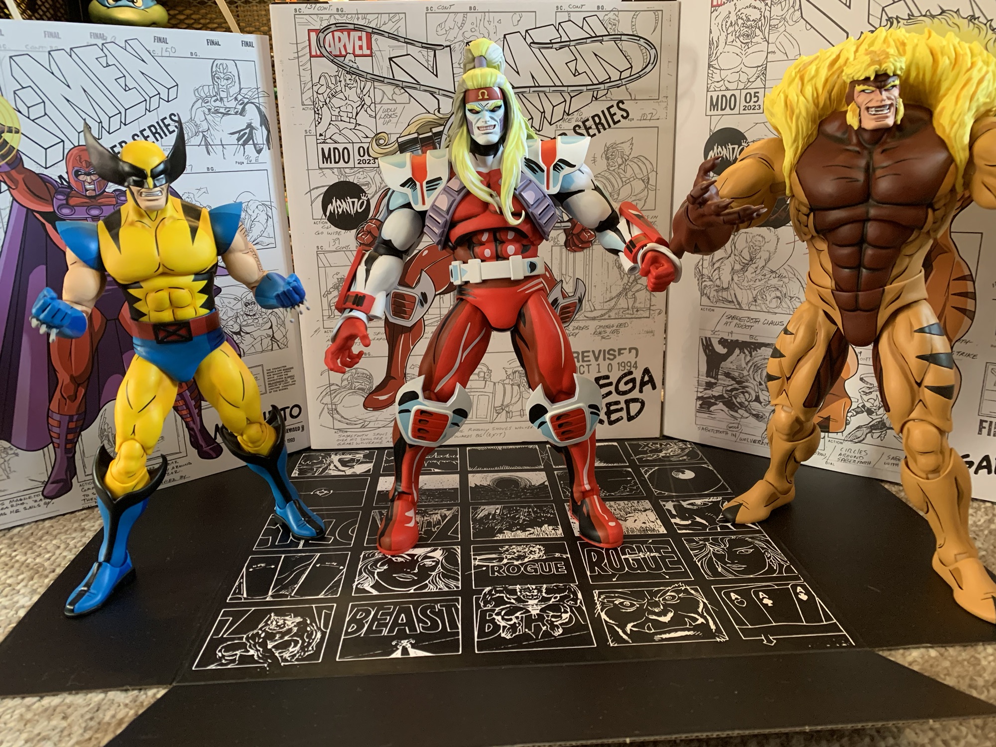
Gambit is about the same heigh as Magneto, a little shorter than Sabretooth.
Gambit stands right at the 12″ mark. This essentially makes him perfect for the scale as the show’s official height chart puts him right at the 6′ mark. I would argue he, and other characters, were drawn a bit bigger than 6′ in the show, but the height charts are the best information available and what Mondo should be basing its figures off of. This makes him scale well with Jubilee and Magneto, though Wolverine and Sabretooth practically occupy their own scale. Wolverine being too tall and Sabretooth too short. Gambit looks the part as his costume is accurate to the show and the portrait looks terrific. The head is the right shape and the hair has the part in the right spot. I think what makes Gambit look like Gambit is getting the size of the hair and face right and Mondo found the right ratio here.
He’s a cocky bastard.
Gambit’s coat is done all in plastic, so no soft goods here. The main body of the coat is a rather form-fitting overlay with the sleeves part of the sculpt of the arms. This is the best approach for this character and it’s consistent with what they did with Jubilee. The proportioning of the sculpt looks great and the paint features the same cel-shaded approach as the rest. Here, I think the shade of both the trench coat and the pink of the shirt are a little on the dull side. Less so the coat, but I would have personally liked to see the shirt a bit brighter to get more of that “pop” we get from the other figures. I’ve definitely seen production art that has this more muted approach, but I’d argue the finished product on screen turned out brighter. Aside from that, the application of the shading looks great. We get some hits of blue on the black pants which looks good and the interior of the coat is a darker brown to create the illusion of shadowing. The quality of the application of the paint is perhaps a touch behind the other figures. It’s mostly an issue for the hands which look a tad sloppy in places. Gambit is also the only figure in the line which needed to have its fingers painted so it’s a more challenging paint job, but it could have been better and arguably should be at this price.
For those who prefer their Gambit with a ponytail.
Nit picks aside, Gambit is going to look damn good on your shelf and with the other characters. The likeness is terrific and the many accessories are going to add some spice to your display options. The default portrait is a stern one, but Mondo also included three other options. My personal favorite is the smirk as I think of Gambit as a playful sort. This smile looks great and will likely be my chosen display option. We also get the unhooded portrait which features his hair in a ponytail that’s draped over his right shoulder. I think this look is taken from the Dark Phoenix Saga when Gambit and Cyclops go clubbing and meet Dazzler. It looks fine, but Gambit wasn’t one to appear in costume with his head uncovered so it’s a look that’s not likely to be popular. The fourth portrait is a gimmick one and it’s unique to this edition. It features Gambit with his stoic expression, but half of his head is transformed into Mystique. This is a reference to the Days of Future Past plot where Mystique impersonates Gambit to frame him for the assassination of Senator Kelly. It’s really well done, but the gimmicky nature of it means it’s not likely to be used by many for their display. The heads all pop on and off pretty easily, but this Mystique head is definitely one to be careful with as you could easily have some paint transfer from the hair to the neck/collar area.
This head is really well done, I just don’t see myself using it.
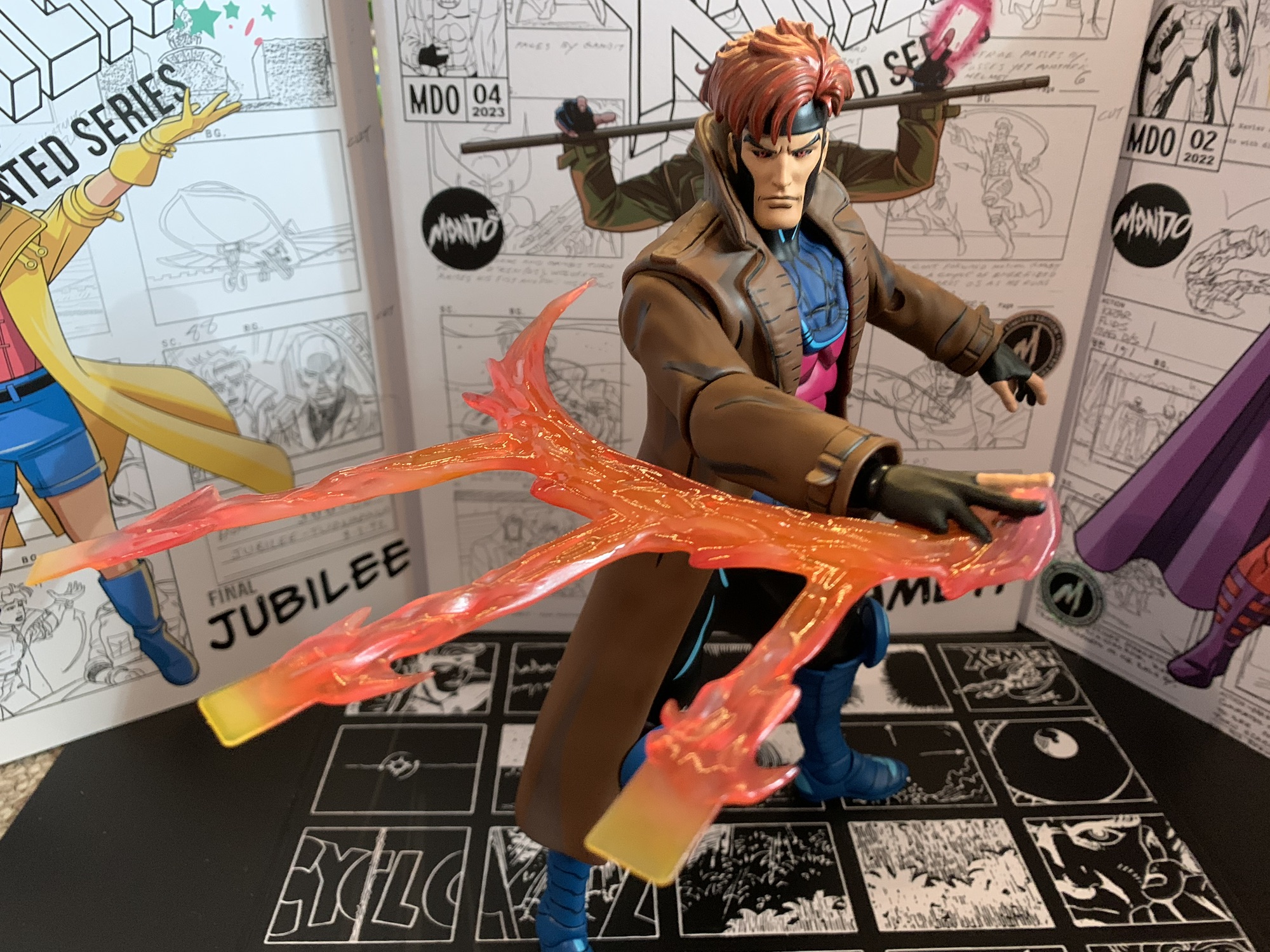
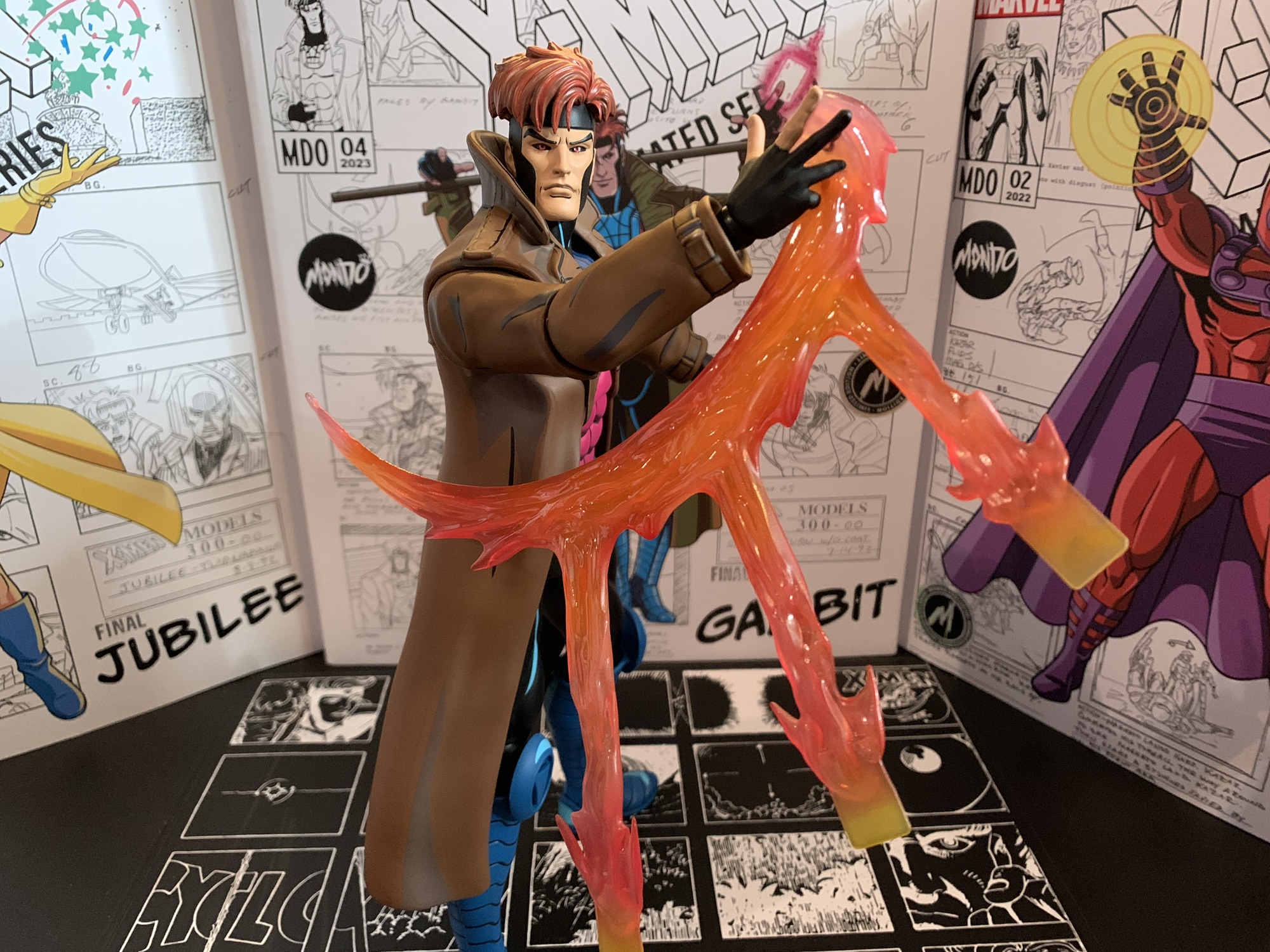
Gambit also comes with an assortment of hands for his other accessories. He comes with a pair of gripping hands in the box and also has a set of fists, open hands, and a trigger finger right hand. The trigger finger hand is likely included to be used with the pistol which is again from the assassination scene the Mystique head is based on. It also looks like the same gun Morph is seen with so it could potentially have some uses down the raid. It’s very thin with just a little hit of paint on the rear of it. It’s a snug fit in the hand and you may want to just heat the hand up first to avoid paint rub. This trigger hand also can work with Gambit’s cards. He has a hand of four aces and the back of the card makes them Mondo brand, which is kind of fun. There’s also a glowing, charged, card that’s done on translucent yellow plastic with some pink paint on the energy portions and is sure to be a favorite accessory of many. What’s missing though is Gambit’s classic two-finger gesture he often holds cards with. I’m genuinely perplexed at its omission to the point where it has me wondering if that was a gesture reserved more for the comics over the show? I don’t think so, but maybe?
This effect is pretty damn cool, just a little tough to “sell.”
We’re not done though as Gambit also has his trusty staff. It’s done in a blue-gray with some light gray shading and a little black linework. I’m honestly not sure how often his staff was shown with this color in the series. The opening title had it as green and I can recall it being brown at one point. I’m guessing it made an appearance in this color at some point, or maybe this was the color it was in the reference art? It fits rather snug in his gripping hands, and again, a little hot water might help to get it in there easier without paint transfer, though his bottom fingers have a tough time getting around the staff. We also get a set of card hands where the right hand is shuffling the cards and the left is catching them. I love how Mondo did the shuffling cards as they’re on transparent plastic to create the illusion of motion. I just wish his articulation made it easier to sell this effect, but we’ll get to that. There’s also another right hand that is connected to an effect part depicting the tossing of three, charged, cards. It looks pretty cool and doesn’t feature any reality-breaking inaccuracies like the Hasbro version of the same. Just like the shuffling hands, the figure has a hard time selling the illusion due to the articulation.
I can’t decide if it looks better with more of an arc to the toss.
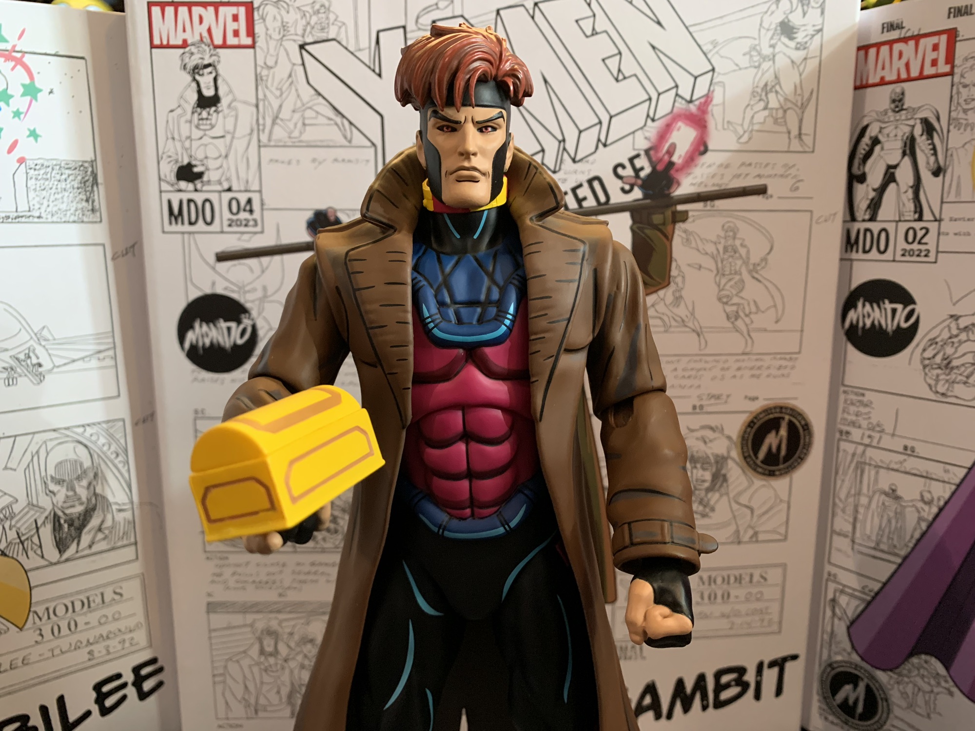
We’re still not done! Yes, Gambit has even more stuff to talk about and they’re episode specific. We get the tithe box from the episode “X-Ternally Yours.” I don’t like that episode, but it being the Gambit episode of Season Two I’m not surprised to see something from it included. The box looks okay, but the gold paint on it isn’t very well done. Also from that episode, but featured in multiple others, are the mutant power restricting collars. Gambit comes with two of them so I guess you can put one on Jubilee too. They’re done on a very soft, rubbery, yellow, plastic and the glowing portions are painted a magenta. I don’t know why they didn’t go with a bright red, but the collars just look so-so. There’s some nice details sculpted onto them, but they’re not accentuated with paint at all and I assume it’s because of the material. They definitely have a cheap look, which is uncharacteristic of this line. Gambit also has a charged chain to swing around. It’s a hard, translucent, yellow, plastic and it’s taken from the episode “Till Death Do Us Part.” It looks fine, though I kind of wish they went with a swinging, swooshing, sculpt since he swings it over his head in the episode. Lastly, we get the Mondo doll stand. It’s like the one that came with Sabretooth which has a slightly nicer and heftier base. It’s designed to go in-between the figure’s legs and it works, but it doesn’t allow for any dynamic posing or anything. It’s more for peace of mind if you’re worried about shelf dives.
I love the inclusion of episode specific accessories, even if I’m unlikely to ever really use them.
That’s a whole lot of stuff and collectors who pick Gambit up will have no shortage of display options. It’s partly what the line is known for. What it’s not known for is the articulation, and Gambit is no exception. Mondo prioritizes the look of its figures over function and this scale also limits what a figure can really do from a practical standpoint without having to worry about balancing issues. Gambit’s head is on a double-ball peg and it performs quite well. He gets plenty of rotation as well as enough range looking up and down and some tilt. The shoulders are ball-hinged and they’re quite tight. Some of that appears to be due to the fit of the coat, but regardless Gambit can’t raise his arms out to the side all the way. He can rotate fine, but going out is a problem. The elbows are single-hinged and they peg into the bicep. This gives them the ability to swivel there, but the range on the hinge is poor. Gambit can’t even achieve a 90 degree bend. The hands continue to be an issue as well for this line. The pegs are more of a straight peg with some ribbing at the end. Swapping is really easy as a result and the peg can rotate in the joint without fear of damage (unlike Magneto). There is a ball-hinge inside the hand, but the hands won’t spin on that joint so whatever the direction the hinge is positioned by default is where it will stay. The hinges are also quite clicky and lacking nuance. You basically just get 3 positions out of them and they’re quite tight. It’s definitely an area for improvement.
Gambit comes with two collars so you could use one with Jubilee, though it’s pretty roomy on her.
In the torso is a diaphragm joint. It’s likely a simple ball peg, possibly a double, and it mostly provides some rotation and tilt. You’re not really going to get an ab crunch out of it and the coat makes it a bit tough to mess around with. There is a waist twist while the legs are connected via ball and socket joints. Gambit won’t be able to kick all the way forward, but there’s enough posing there to at least put the figure in a wider stance. There is a thigh twist built into the joint and below that is the usual Mondo double-jointed knee. It can swivel above the knee and below it, if you want, though they’re pretty tight. The hinges will let the figure bend the knee past 90 degrees. The ankles are hinged and also feature an ankle rocker and they work fine. The hinge is either very tight or limited, but there’s enough nuance to keep the feet flat on a surface.
If you think cards are lame, Gambit has this handy, kinetically-charged, chain to wield as well.
Gambit’s articulation is mediocre at best. Most of the joints are there, they just don’t do much. My main gripe is with the elbows as they should be better. I also wish we had butterfly joints in the shoulders to help with the throwing accessories, but I couldn’t reasonably expect such. This means the figure is going to look best just standing on your shelf with the more static accessories. I think the shuffling cards are just barely usable with some finesse, but I’m having a hard time getting a good pose out of the throwing cards which really stinks as I want to use that effect part. I’ll probably end up sticking him with staff and charged single, but I do expect to change him up from time to time.
Gambit is largely as expected and could be considered more of the same from Mondo. That sounds like faint praise, but more of the same for this line is pretty damn good. He looks awesome and has a ton of accessories which create multiple display options. It’s just a figure held back by the subpar articulation, but it’s not so bad that it ruins the experience. If you like the rest, you’ll like Gambit. I don’t think he’s my favorite in the line, but he is right there with Magneto and Sabretooth when it comes to nailing the likeness. If you’re collecting this line, there’s definitely no reason to skip Gambit.
Check out some of these other figures from Mondo’s line of X-Men collectibles:
It’s Halloween 1992. You’re sitting in front of the television with a bowl of candy and your costume in pieces. Coming on is a prime time airing of Fox’s newest superhero cartoon: X-Men. You’ve seen the comics at the grocery store and in other places. You know Wolverine, you know there’s a guy who shoots…
When one hears the phrase “mall babe” it implies a certain visual. Probably a short, young, girl with intentionally messy, short hair. There’s a certain confidence the phrase exudes so she has to have style. Maybe hot pink, bright blues, and certainly a long yellow coat with gloves to match! There has to be an…
If you showed a random individual this blog and asked them what my favorite cartoon was as a kid I’m guessing they would go with Teenage Mutant Ninja Turtles. And they wouldn’t be wrong as that was my favorite for a time, but come 1992 I was starting to drift away from that show. Batman:…
New show, new toyline, that’s how the world works.
It was two years ago that Hasbro made the announcement that it was wading into the weeds of X-Men, the cartoon series that aired on the Fox Kids Network from 1992-1997. The line was released across eight installments in 2022 (plus a ninth if you include the obviously animated-inspired Apocalypse released on a retro card) and you probably don’t need to be a huge fan of the property to know that eight figures just isn’t enough to properly capture the series in action figure form. Fans can debate on what the biggest omission was and it would certainly be easy to select one of the several X-Men not included, but for me, the one I missed the most was Magneto.
Magneto has long been one of my favorite villains in anything. While he really wasn’t the big baddie he could have been in the show, he still had tremendous presence and was a captivating figure. I was delighted to see Mondo turn to him second for their line of sixth scale figures based on the show and they basically nailed the likeness of the character. In a perfect world, we would all be enjoying X-Men 97 right now, the sequel series to X-Men from the Fox days set to launch on Disney+ in early 2024. It was going to launch this fall which would have coincided with the 31st anniversary of the original show’s premiere, but I guess it just wasn’t meant to be. The show could be pushed back, but the tie-in merch was basically locked into their release windows so we at least have a new line of Marvel Legends based on the show to talk about.
He’s a bit of a slender boy.
As someone who is a big fan of that original animated series, I saw this X-Men 97 line as a chance to add to what Hasbro gave me in 2022. And I think some of that attitude is present in the character selection as we’re getting four characters right out of the gate not featured in the VHS line: Rogue, Gambit, Bishop, and the subject of this post, Magneto. Hasbro knows people like me will supplement that line with these figures which have a more animated look than a standard Marvel Legend release, even if it’s based on the new series instead of the old one. The characters are all coming on blister cards with artwork from the show on the front and they’re a mix of old and new tools. Unlike the VHS line though, these are definitely designed to resemble the source material where as the VHS line was very inconsistent with its approach. The line was actually pretty bad, if I’m being honest, but I keep buying this stuff anyway because nostalgia is a hell of a thing. If you think Marvel Legends are only getting worse these days then I guess I’m part of the problem as I’m still buying compromised visions of the characters I love.
There’s no cel-shading in this line, but he does have shadowy eyes. I just wish they went a bit heavier on the shading like the source material.
I’m looking at Magneto first because, as I said, he was the one I missed the most from the VHS line. He’s also the figure that best fits the style of the 92 series as not much has changed. I don’t collect enough Marvel Legends to know if the parts here are new or not, but they’re new to me. Out of the box, he stands at approximately 6.25″ to the dome of his helmet. We’ll get the accessories out of the way right now as he just has clenchy hands out of the box and a set of fists. He’s depicted in his classic attire from episode 3 of the original series: helmet, purple cape, red gloves. His costume changed here and there throughout the show. Sometimes he had purple gloves, something the part of his costume covering his neck and upper chest was red, but this is how he looked in Season One (and how he’ll presumably look, at least in the early going, of the new show). The crest on his helmet isn’t painted, but it doesn’t appear to be in the new show either. An outline might have helped though. The helmet has a very glossy appearance, but since it’s supposed to be metal I’m okay with that. The rivets holding his cape on are also shiny and there’s a little pearl quality to the purple portions of the wrists and shins. Those parts are painted, and the application is just okay. There’s some red poking through on the left shin of my figure and the lines aren’t all clean.
“Why is my hand shrunken when opened?”
The red portions of the costume are just colored plastic, but they have a nice, matte, finish. The cape is also colored plastic with a similar finish. I like how they sculpted in some shape into the shoulders which adds a little flair to the look. There is no cel-shading with this line, but Hasbro did paint the face with some black around the eyes as Magneto is often depicted in both the comics and animation. I like it, but I think they could have gone a little heavier with the black. There’s also some missed spots in between the eye and the eyebrow. The helmet is a separate, non-removable, piece and the face is painted underneath it. I don’t like the lipstick and I feel like his eyes are a little too high, but the face is okay enough.
The dainty hands are more pronounced when compared with Cyclops.
What I can’t shake though is the feeling that Magneto is just too small. X-Men 97 is a continuation of the original series so it stands to reason that the characters are the same size as they were back then. In that original series, Magneto was around 6’3″ and was basically eye-to-eye with Cyclops and Gambit if not a touch taller. With this figure, he is shorter than both Cyclops and Gambit. He’s also a touch slighter of build in comparison with the VHS Cyke. Maybe the new show is going for a slimmer profile with its characters and if so, criticism revoked, but the height is still an issue. Also of issue are the clenching hands which are almost comically undersized. Compare his open hand with Cyke’s two-finger hand and it’s like comparing a child to an adult. The fist hands are fine, and actually look like they’re reuse from Cyclops, and it’s even easier to see how small the clenching hands are by comparing them with the fists as there’s no way those two hands could be the same. The only big parts of the figure are his feet, which look terrible. They look like loafers and not boots. Magneto is a character that’s all about presence, so his size feeling off is a bigger deal here than it might be with other characters.
These two will never see eye-to-eye.
Articulation for Magneto is a touch limited for a Marvel Legends release, but that’s not exactly a deal-breaker. The head is on a hinged ball peg so you get range looking up and down, but it lacks the nuance of a double-ball peg. The shoulders are standard ball hinges and they raise out to the side past horizontal and rotate as far as the cape allows. The cape can be moved as it’s glued down to the figure’s chest, but also pegs into the middle of the back which can be popped out easily if you need it to. There are no butterfly joints, but I’m okay with that. There is a biceps swivel and double-jointed elbows that go past 90. They’re not the best looking elbows, and the entire figure has a bit of a gummy feel, but they work. The wrists swivel and both sets of hands feature horizontal hinges.
Lets bring in Gambit for another size comparison.
In the torso is an ab crunch that actually works really well going forward and back. There is a waist twist below the sash that works, but it gets ugly if you go too far. The hips are simple ball socket hips which can almost hit a full split going out to the side. They kick forward 90 degrees and kick back a little bit as well. There is the standard thigh cut which works fine and double-jointed knees that bend past 90 without issue. The ankles hinge forward and back and at least these ugly feet have solid range. The ankle rocker is also there and works fine.
If only he had an effect part of his own.
The articulation isn’t amazing or anything, but at least what is here works about as well as it could, minus the tactile issues. It’s enough for Magneto who basically just raises out his arms and floats around. What is lacking are the accessories since there basically is none. No un-helmeted head, no flight stand, no power effects. Just a figure with mis-matched hands. Is it enough? This figure cost me $26 and it’s a pretty bare bones release, all things considered. Any way you slice it, that isn’t great value. That’s probably why a lot of Marvel Legends are clearance buys for many people out there.
Yeah, he doesn’t look as good or come with as much stuff as the Mondo version, but it is almost a tenth of the price.
I bought this Magneto to go with my VHS set of figures. I know others are buying it for their comic collection. Presumably, there are people out there buying the figure to put on an X-Men 97 shelf, but with the show not out I guess it’s not surprising there isn’t a lot of folks going in that direction. For what I wanted out of this Magneto, it works. It’s undersized and lacking in bells and whistles, but otherwise looks the part. Is that worthy of your twenty-six dollars? That’s for you to decide. As for me, I don’t regret this one and compared to the VHS line he’s honestly among the better of those figures. It’s just a terrible value for what you’re getting, but as long as Hasbro is the only game in town it’s all we got.
Interested in more figures based on the animated X-Men?
The toyline of my dreams was announced last October. In celebration of the 30th anniversary of the television series X-Men, Hasbro is doing a dedicated line of Marvel Legends with figures based on the look of the show. The show was obviously inspired by the designs of Jim Lee, but there are differences in the…
If you showed a random individual this blog and asked them what my favorite cartoon was as a kid I’m guessing they would go with Teenage Mutant Ninja Turtles. And they wouldn’t be wrong as that was my favorite for a time, but come 1992 I was starting to drift away from that show. Batman:…
I wasn’t sure he would make it in time, but Hasbro managed to ship Cyclops before the end of the year. Cyclops marks the final figure (for now) in Hasbro’s X-Men animated series subline of Marvel Legends. It has been…a ride. What was once a dream line of mine to see brought to fruition, turned…
It’s Halloween 1992. You’re sitting in front of the television with a bowl of candy and your costume in pieces. Coming on is a prime time airing of Fox’s newest superhero cartoon: X-Men. You’ve seen the comics at the grocery store and in other places. You know Wolverine, you know there’s a guy who shoots lasers out of his eyes and that the bad guy can stick to your refrigerator. Outside of that though, there’s still a lot to be discovered. The theme song kicks in composed by Ron Wasserman which gets your blood pumping. A dazzling array of colorful costumes and bright lights play before your eyes – it’s too much to take in with just a single viewing, but as the characters line up for a colossal battle they slam together and the logo “X-Men” overtakes them. The screen is then filled by the snarling, angry, face of someone you don’t know. He’s massive! And scary! And he sends a police car hurtling towards the screen!
That character is Sabretooth and he has the honor of being the first character shown in an episode of X-Men. In less than a year, the X-Men will practically be household names. It will be the highest rated show on Saturday mornings and it will stay there through reruns all summer finally ceding the throne in the fall to a little show called Mighty Morphin Power Rangers. It’s kind of a big deal considering Fox was also airing Batman at the same time which was coasting off of Batman Returns and starred a character that had already been a household name for decades. As for Sabretooth, I had never given much thought to him being the first character we see in the show following the opening credits (which prominently displays all of the heroes and a bunch of the villains, including Sabretooth), but it was apparently by design. Sabretooth is the fourth release in Mondo’s line of sixth scale action figures based on X-Men, and on the inner flap of his box there’s a write-up for the character by the showrunner, Eric Lewald, and his wife and fellow writer Julia which explains why Sabretooth was chosen to essentially lead-off the series. And it’s because he’s big, intimidating, and scary. They wanted the viewer to understand why humanity would fear mutants. X-Men was not a show that was going to show its characters in stark black and white tones, and it was important to see how something like the Mutant Control Act could come about while also showing why it was fundamentally flawed in the episodes to come.
Sabretooth may be listed as figure 5 on the box, but he’s the fourth release.
It’s always fun to learn new details on decades old shows, but it’s also more fun to get a brand-spankin’ new action figure! As mentioned before, Sabretooth is figure number four in this line of action figures from Mondo, even though he was actually solicited fifth. Somehow, he leap-frogged over Gambit, but I’m not complaining. Spoiler alert, Sabretooth is probably the best year in the line and it’s a line that’s been trending in the right direction. Each release has been better than the last. While I subjectively prefer Magneto to Jubilee, I can’t argue that her figure is just a little bit better when it comes to function. Magneto had some ticks about him and his articulation is very limited due to his cape, but Jubilee remedied a lot of the little things. Sabretooth has an even cleaner sculpt and the quality control on the joints is superb. It’s not a perfect figure, but it is pretty damn close.
Poor Sabretooth…
Sabretooth comes in a massive box adorned with production artwork from the series and a new illustration by storyboard artist on the show, Dan Veesenmeyer. Sabretooth is the biggest figure in the line, so he gets the biggest box – makes sense. It has a front flap that opens up to reveal a window behind it, but Mondo packages their figures so well in plastic that the window isn’t very revealing for in-box collectors. It at least allows space for that write-up I mentioned which is both enlightening and pretty damn entertaining as it contains the line, “No one loves Sabretooth.” It also contains a reveal, of sorts, in that we the viewer are supposed to interpret that Sabretooth murders his son, Graydon Creed, at the end of the episode “Bloodlines.” The Friends of Humanity essentially leave their disgraced founder to suffer at the hands of Sabretooth and it’s hard to imagine the cold-hearted fiend taking it easy on the mutant racist just because they’re kin, but still a bit shocking to have his end confirmed.
He’s bigger than the others, but he could be bigger.
Out of the box, Sabretooth stands an impressive 12.5″ to the top of his head and around 13″ to the top of his mane. This makes him the tallest figure in the line, though he’s not much taller than Magneto. As was the case with past releases in this line, it’s likely that Sabretooth isn’t true sixth scale. The model sheet with height references from the show had him at 6.5′. You may think that’s too short and you would be correct as the model sheet has him with bent knees and hunched forward. I’m guessing that’s how he was supposed to be drawn more often than not, though in his early appearances we see him splayed out in a hospital bed which makes him look far bigger. Six and a half feet at sixth scale is exactly 13″, but this figure is 13″ when standing upright so it’s not exact. I personally get it as making this figure much bigger would make things a lot more difficult. Bigger equals more weight and that’s more of a burden on joints. It’s also added cost and this guy was already $240 as is. The figure can work at this size, and it’s actually more of a problem with Wolverine who came in much too tall. If he were the proper height the display would look better. As it stands, the only scale-related issue I have with Sabretooth is that he needed to be downsized not just in height, but all around, so his head size is small compared with the other figures in the line. Not egregiously so, but it noticeably and at this price point we have to get picky.
Who ya got? The egg-suckin’ piece of gutter trash or the runt?!
Issues of scale aside, the rest of the presentation on this figure is pretty damn fantastic. Once again, we’re dealing with a sculpt from Alex Brewer with the paint master being handled by Mark Bristow. This figure presents Sabretooth as he appeared in the show’s first season in which he made multiple appearances with most coming in the the show’s third and fourth episodes. This means he has the red-brown chest that continues all the way up to his cowl. Later appearances would have the red stop at his pecs. He also seemed to be drawn smaller in those later appearances, but we’re done dissecting his height. This edition of Sabretooth sports a costume design very similar to the Jim Lee redesign that was in the comics, but there are some subtle differences most notably being that the sleeves don’t feature any red on the back. Instead, they’re orange and the red begins at the gloves. Sabretooth’s costume always was a bit tricky to figure out as he looks almost nude, but his face is a different color implying it’s all a bodysuit. The episode “Weapon X, Lies, and Videotape” would toss us a curveball though in having Sabretooth remove a glove revealing his forearm and hand to be the same color as his apparent sleeve implying he’s just plain naked. I think it was an animation error, but then there’s also a scene where Sabretooth basically transforms from a relatively normal looking person into the costume we see today so I have no idea what was going on there.
Sabretooth called the head of Talos an ashtray on the show which is kind of surprising that the censors allowed any reference to smoking to sneak in.
This version of Sabretooth is known less for the costume and more for just being a hulking monster. He is way bigger than he often was drawn in the comics and it’s almost all in his upper body. His shoulders and chest are just plain massive. His abs were also ridiculous with some shots in the cartoon giving him a 12-pack as his abs basically continued into his crotch. His design is over-the-top and I am here for it. This is how I picture Sabretooth in my head and basically every action figure I ever owned of the character have left me unimpressed because he just wasn’t big enough. For me, this figure is a long time coming as he looks like he stepped out of my VCR and into my room. While Mondo didn’t go as crazy on the abs as the show sometimes did, he does have an 8-pack and that feels appropriate. His shoulders and biceps are appropriately large as is the chest. His body tapers in towards his waist as it did in the show and his legs are long. The claws on his fingers are pronounced just enough and rather pointy too. We talk about shelf presence a lot in the action figure world, but this is a figure that has shelf presence to spare.
Protect yourself and your pet: buy a muzzle.
And a lot of that is due to the excellent paint job. The sculpts have been good in this line, but it’s the paint that really makes them next level. Anyone who turns their nose up at cel-shading on action figures has never held one of these figures in their hands. It’s impressive, and Mondo selected the exact right tones to shade this figure. Even better, is all of the black linework around every muscle and feature on this sculpt that really gives it that pop. And even with all of this paint, it’s applied in a very clean manner. You have to go hunting with this guy to find imperfections. Some of this has to be hand-painted so there will be some variations from figure to figure, but on my copy at least there’s little to no paint slop to be found. There’s just little spots here and there along the black lines where it could have lined up with the sculpt a little better, but it’s by and large pretty damn good. The only thing I would categorize as an eyesore on this figure are the elbows, which are unpainted. They have black linework on then, but the joint is bare plastic and it’s not a perfect match for the painted parts. It can be hidden some by bending the elbows. It’s also going to show up more under harsher lighting, and in my photos which I utilized a flash for most it’s more visible than it is on my shelf as I type this.
He sure does love his explosives!
Sabretooth comes with a pretty substantial spread of accessories, though he’s a character that also doesn’t demand a whole lot. For heads, we get two to choose from: snarling/yelling and an open-mouth smile. I think both work very well and suit the character and it is hard to choose between the two. I’ll probably go with the smirk more often than the snarl, but I do enjoy both. For hands, we get three sets: fists, C-grip, and what Mondo describes as dramatic. They’re basically open, clawing, hands and what I think many will choose to pose him with. The gripping hands work with a pair of accessories. One, is the head of Talos (or ashtray) from “Weapon X, Lies, and Videotape.” It’s the head and the circuitry for the neck. Nothing articulates, but it’s painted very well and it’s a fun, episode-specific, inclusion. The other accessory he can grip is a handheld detonator and it goes with the explosives. This is from the episode “Cold Vengeance” where he and Wolverine battle in Alaska. Both aspects of the accessory are well-sculpted and well-painted and it’s another fun inclusion. I honestly can’t see myself ever displaying Sabretooth with the Talos head in hands, but I could with the explosives.
Does a mutant healing factor contribute to a healthy head of hair?
If you got the special timed edition of the figure from Mondo then you also got more stuff. For an extra 15 bucks, you get a third portrait of Sabretooth unmasked and sporting a smirk. This from the end of the episode “Bloodlines” referenced on the packaging flap. It looks great, but like the Fairy Tale Theater Jubilee head, it doesn’t match the rest of the figure as Sabretooth was out of costume for that scene. It’s still cool to get an unmasked head, but I’ll probably never use this and would have preferred a standard head with a new expression. Maybe unconscious? The timed edition also comes with the muzzle the X-Men put Sabretooth in when he was captured in “Beyond Good and Evil Part III.” You can basically slot it over either of the standard heads and then pop the head on to complete the effect and it looks pretty cool. It’s definitely a worthwhile inclusion. Lastly, we get a blaster and two trigger hands to hold it. The blaster is, once again, pulled from the episode “Weapon X, Lies, and Videotape” and it looks accurate to the show. This is an item I can see getting added to my display when I want to change things up because it looks pretty damn cool. The trigger hands also work well with the detonator, arguably better than gripping hands.
Sabretooth isn’t really a gun guy, but he pulls it off.
For the timed edition, I’d say that’s a pretty robust assortment of accessories. And if you wanted to save a bit of money and go the standard route, I don’t think you’re missing out on anything essential. Sabretooth is a brawler at heart, so really just the heads and hands are all he truly needs, but I’m always happy to have more. Where this line is typically not that impressive is the articulation. The characters really didn’t move all that well in the show so one could argue they don’t need to do much, but why be limited by the source material if you don’t have to be?
“Ya done nice, girly! And as a reward I’ll finish you off clean and fast!”
Sabretooth has a double-ball for the head that lets him look up and down a bit and rotate. There’s some nuance posing, and perhaps more important than the range, it’s easy to swap heads without scuffing anything. The shoulders are standard ball-hinges and he can get his arm up to about horizontal and rotate. There’s no biceps swivel, but he does have a swivel at the elbow which contains a single hinge that will bend about 90 degrees. The wrists are hinged ball-pegs so he can rotate and move the hand up and down or in and out depending on the direction of the hinge. And unlike Wolverine and Magneto, I had no issues getting the hands to rotate on the peg. In the diaphragm, there’s a big ball joint that lets the figure lean back a bit and forward a bit. It can rotate and tilt to the side as well. The waist is another ball joint, but it’s deep in there and the figure has one of those rubber diaper pieces so you won’t get much back and forth, but you will get rotation. The hips are big ball pegs that allow the legs to go out to the side past 45 degrees. He can kick forward as well, but not a full 90 with minimal range going back. The thighs do swivel, and the knees are double-jointed with swivels above and below the knee. The ankle hinges forward and back and have an ankle rocker. It’s the only joint that feels a tad stubborn, especially the right ankle, so the range isn’t quite what I’d like.
“Back off, dweeb!”
The articulation is basic, and the figure is quite heavy so there are limits to how it can pose. Aside from the ankle, nothing was stuck. The knees are a touch looser than I’d like and I’m sort of questioning if the double-joint makes sense here. Between the bending and the swiveling, the figure can sometimes want to kick out. I have had no issues getting him to stand, but I often don’t feel comfortable leaving him be in some poses. It does work better to have the figure in a crouch, which makes sense for the character, and I did leave him standing unsupported for days without falling. Mondo does include its usual stand and it’s actually slightly different. There’s more weight in the base so it probably works better than it typically does. And it’s actually usable with Sabretooth since he doesn’t have a cape or giant coat to get in the way. I’m not presently using it, but I did consider it this time around.
With each release, it gets harder to find space, but it’s a good problem to have.
Mondo is not trying to give collectors a super articulated line, just enough to create some distinct poses. What Mondo prioritizes is the aesthetic and it’s hard to imagine anyone making a better Sabretooth figure than what we have here. I love this figure. This is the Sabretooth I wanted when I was a kid. Maybe not at this size, but definitely these proportions. The sculpt is awesome, the paint incredible, and there’s plenty of stuff in the box. I am as pleased as I could be with this release. If Mondo were doing this line at 1:12 scale they wouldn’t be able to keep the stuff in stock. By doing sixth scale, it does shrink the market because this line needs a lot of space and it’s not cheap to collect, but it is so much more satisfying to behold than what some other companies have done with this property. If you’re in on this line and cherry-picking, this is a cherry to go after.
If this review has you wondering about the rest of the line, see below:
When one hears the phrase “mall babe” it implies a certain visual. Probably a short, young, girl with intentionally messy, short hair. There’s a certain confidence the phrase exudes so she has to have style. Maybe hot pink, bright blues, and certainly a long yellow coat with gloves to match! There has to be an…
If you showed a random individual this blog and asked them what my favorite cartoon was as a kid I’m guessing they would go with Teenage Mutant Ninja Turtles. And they wouldn’t be wrong as that was my favorite for a time, but come 1992 I was starting to drift away from that show. Batman:…
When San Diego Comic Con was cancelled for 2021, many of the entities that would have sold exclusive merchandise at the event pivoted to web sales. And since the 2020 iteration of the famed event was also canceled due to the COVID-19 pandemic, many seemed to expect the same for 2021, or the massive delays…
Today, The Christmas Spot temporarily alters it’s name to The X-Mas Spot. As a sort-of celebration for the animated series X-Men turning 30 this past Halloween we’re going to look at the show’s lone holiday special – “Have Yourself a Morlock Little X-Mas.” The show X-Men was a pretty serious affair as far as kid shows go. It wasn’t very jokey or gimmicky and it technically didn’t even have a tie-in toy line. Sure, ToyBiz had an X-Men line of figures, but it was technically a tie-in with the comic book. The show undoubtedly influenced the line, there was a Morph figure after all, but the point is this wasn’t a show that went for the cheap hits so when a Christmas special was announced during the holiday season of 1995 I was pretty damn surprised.
Why does a show like X-Men then feature a holiday special? As is the answer to most things that seem unexplainable from afar when it comes to television – it was the network. Fox wanted a Christmas special from the show so it delivered one. It’s not a fan favorite and writer/showrunner Eric Lewald basically admits they made it intentionally campy to reflect other cheesy Christmas episodes of popular shows. They even got in a “Not on Christmas!” line into it. The episode is what it is, a shoe-horned concept into a show that probably shouldn’t feature such an episode, but perhaps there is still some value here. Besides, who doesn’t want to spend Christmas with Wolverine?
This is the story of Jubilee’s first X-Mas with the X-Men, which means it probably shouldn’t be assumed that we’ve been watching their lives unfold in a linear fashion or else they’ve had one hell of a year.
The episode begins at the home of the X-Men. Cyclops (Norm Spencer), Rogue (Lenore Zann), and Jubilee (Alyson Court) are decorating a massive tree in the mansion’s foyer. As they do, they’re joyously singing “Deck the Halls” and Cyclops sounds particularly awful, but seemingly intentionally so as he calls attention to his bad singing and suggests the other two carry on without him. Brooding off by the fireplace is old Wolverine (Cal Dodd) who predictably wants nothing to do with the holiday festivities despite the insistence of Jubilee for him to do so. It’s her first Christmas with the X-Men, which would seem all of the events up until now that have occurred in the show have taken place within a year, and she seems a little hurt that Wolverine won’t participate, but Rogue is here to reassure her and even lifts her up to the top of the tree to put the star in place.
Gambit is apparently impervious to boiling water.
Off in the kitchen, Jean (Catherine Disher) is preparing a Christmas dinner, but she has to contend with Gambit (Chris Potter). Despite her being the appointed chef, Gambit is sporting an apron and togue and appears to view himself on equal footing here. He rudely inquires what she’s preparing and Jean angrily retorts “It’s called food, Gambit. Normal, Christmas food.” Gambit, being from Louisiana and a connoisseur of cajun cuisine, seems to disagree strongly with whatever is boiling in a pot. When he goes for some seasoning, Jean uses her telekinetic powers to keep the spice on the counter despite how hard Gambit pulls on it. She also adds “The day that I need your help in the kitchen is the day that I stop cooking!” It’s a fine line, but Wolverine just used a similar one on Jubilee (“The day that I sing “Jingle Bells” is the day pigs fly”) so it’s a little redundant. She releases her psychic hold on the seasoning sending Gambit tumbling into the stove. He falls on his rear and the pot of water that was boiling lands on him, but seemingly does no harm. Jean gets a little laugh out of this while Gambit still insists she knows nothing about cooking a proper Christmas dinner.
In the lab, Beast (George Buza) is suspended from the ceiling mixing something in a beaker. It turns from red to green while Beast recites a poem by a “Sir Walter” that sounds festive enough. I only know the poem’s author because when Beasts tastes his “goo” he declares it worthy of the poem though he’s sure to point out this concoction is non-alcoholic (wouldn’t want the kids to think otherwise). We then cut to Professor X (Cedric Smith) and Storm (Alison Sealy-Smith) watching the goings on via the security monitors. It’s a bit creepy, but I guess someone is always watching these things for security reasons. Xavier notes that Storm seems a little blue and she remarks that seeing Jubilee makes her reflect on her own childhood. She grew up poor on the streets of Cairo, in case you were wondering as they don’t have time to discuss it further since alarms start blaring. Xavier thinks they’re under attack and Storm gets the first very, sweaty, Christmas special line “Could we be under attack – on Christmas Eve?!”
Beast is always so festive.
Cyclops receives a transmission about the alarm via his usual belt insignia. The “X” on everyone’s belts in this show were like two-way radios. The funny thing here is that Cyclops is not wearing his field uniform so rather than pressing a button on his chest he’s just touching his shirt. The X-Men race to the alarm’s origin which turns out to be Beast’s lab. They bust in only to find Beast in the process of shutting down the alarm. He’s covered in a red sauce and when Cyclops asks if he’s okay he indicates that he is, but his cranberry glaze is not. Wolverine is the last to arrive and he’s disappointed they weren’t under attack. He decides he’s had enough of this Christmas stuff and indicates he intends to go somewhere else for a bit. Jubilee then asks him if he’ll go shopping with her and Storm and Wolverine is right to point out how terrible shopping on Christmas Eve sounds. He makes a lame joke about having better luck fighting Sabretooth, but Jubilee does the whole “Please? For me?” and Wolverine responds with “Turn it off, kid.”
I’m going to have to agree with Wolverine here, the mall on Christmas Eve is something to be avoided.
Despite all of that, Wolverine does indeed accompany Jubilee and Storm to the mall against his better judgement. We see them walking around a department store and Jubilee’s face is hidden by the amount of boxes in her arms. She’s trying to talk to both Storm and Wolverine, but can’t see, and Wolverine kindly removes the top box so she can do so. She thanks him for coming and he gives her a “Don’t mention it,” but also reiterates his desire to leave. Jubilee is pretty amped up for Christmas, but also worried she’s not doing it right as she reminds us again that she’s never had a Christmas with a family before. Storm is reassuring, and as the trio makes their way out Wolverine is accosted by a sales woman pitching cologne. She sprays it in Wolverine’s face and informs him it’s sure to make women act like animals (rather risqué for a kid’s show), but Wolverine informs her he’s about to turn into an animal before Storm intercedes.
I feel like we’re missing a conversation here: How did Jubilee convince Wolverine to go ice skating?
Storm gestures towards freedom and encourages Wolverine to make a break for it. He does looking almost feral in the process. We then shift to an outdoor scene and the crew is doing some ice skating presumably at Rockefeller Center. Storm is watching from a bench as Jubilee and Wolverine skate. Jubilee tries to get Wolverine to cheer up and encourages him to have fun, but he just tells her she wouldn’t want to know what he finds fun. He then hears some sirens and goes on alert, but since Jubilee doesn’t have a super sense of hearing she dismisses him at first until Storm hears them as well.
Ape (left) can basically turn himself or his limbs into whatever he can come up with, but often his imagination seems to be lacking.
An ambulance comes crashing onto the ice and we soon see it’s being driven by Morlocks. Ape (Ross Petty) and Annalee (Kay Tremblay) emerge from the ambulance and start taking supplies from it. Wolverine comes skating up ready for a fight and calls their actions low by their standards. He grabs Ape, who had transformed his hands into paddles that look like duck feet to carry supplies. I feel like he could have morphed them into something far more useful. Anyway, Wolverine is ready for a fight, but Storm arrives and brings a blizzard with her to conceal their actions. Annalee informs her that they’re taking supplies to help Leech, a juvenile Morlock who is apparently very sick. They didn’t know what to do as they already tried a hospital, but they couldn’t care for the mutant boy. She takes this opportunity to also remind Storm that she is the leader of the Morlocks, something established way back in season one of the show, and that she’s never around when they need her. Storm agrees to help them and she uses her powers to thwart the approaching police and to provide cover for their escape. Wolverine indicates he’s not helping sewer rats, while Jubilee is worried about her presents. Storm tells the child to leave them, but she scoops them up anyway before following.
Callisto (left) and Storm have to set aside their differences for poor Leech who is afflicted with a severe case of plot sickness.
We then see the group walking through ankle deep water in the sewer. It would seem Wolverine decided to join them after all while Jubilee is worried that they’re supposed to be home in an hour for Christmas dinner. When they arrive at Leech, Callisto (Susan Roman) is there to “welcome” them. She gives Storm a bunch of sass for not being around when they need her which gets Wolverine riled up, but Storm tells him to back off as she seemingly accepts the criticism. She does inform Callisto that they can settle their differences later, for right now Leech needs their full attention. As for the child, he’s laying on a table under a blanket apparently unconscious. Storm, citing Wolverine’s experience with field medicine, instructs him to prep the child as she wants to take him to Beast. Wolverine walks over and checks the kid’s pulse and just says, “Uh oh…”
I think this is Marianna’s only appearance in the show.
Seated against the wall, Jubilee watches with concern on her face. She soon hears something behind her and it turns out to be a small, Morlock, girl who bares a strong resemblance to Leech. Jubilee greets the little, green, girl who then emerges from the shadows to come sit with Jubilee. Meanwhile, Callisto is frustrated that Wolverine isn’t preparing Leech for transport and grabs Storm insisting she order him to do something. Storm fights back until Wolverine shouts “Shut up!” at both of them. He then delivers the bad news that Leech isn’t going anywhere. His pulse is dropping too fast and there’s no way he would survive the trip back to the mansion. This leaves Jubilee to get another sweaty Christmas special line in of, “No, he can’t! Not today! It’s Christmas Eve!” as she hugs the small girl and we pan to a tiny, Morlock, Christmas tree that basically looks like Charlie Brown’s tree, only the lone ornament is broken.
Wolverine apparently has some PTSD in his past related to trying to heal people with his own blood.
As the adults discuss what to do, it’s Jubilee who says “Please Wolverine! You’re so good at healing yourself, can’t you help Leech?” Storm seems to like this train of thought and inquires with Wolverine about a blood transfusion. He refuses, while the others persist. Storm thinks it’s because Wolverine hates the Morlocks, but he shouts back at her “Don’t you think I want to help the kid?!” He then explains he’s tried it before and it didn’t work. It was a group of 20 individuals and the last one to die was a kid younger than Leech. Still, when Storm initially asked he said “Maybe” to it working and Wolverine explains it did work once and the large group was the second time he attempted the feat. He doesn’t know why it worked once, but not again, and seems reluctant to try it here.
It turns out, Wolverine isn’t racist, he just doesn’t want to see another kid die!
Storm doesn’t really care and asks Ape if he acquired a transfusion kit from the ambulance. He just looks at her in confusion and she tells him to never mind. She finds what she’s looking for amongst the supplies and informs the others that she’ll contact the mansion to have Rogue fly Beast to them. As she does she hands the transfusion kit to Wolverine and tells him he knows what he must do. He angrily responds “You don’t know what you’re asking,” and she snaps back, “I am asking you to show the courage needed to save a child’s life!” “He wouldn’t be dyin’ if you looked after these people!” Woo! There’s some dramatic stuff right here! Wolverine’s words appear to cut Storm deep which calms her down.
The moment Ape has waited his whole life for!
Storm concedes Wolverine’s point, but then calmly tells him that even if the odds are one in a thousand, he needs to try. She tops it off with a “Ask yourself, if he were your child, would you refuse?” Wolverine just looks at the kit in his hands and the scene cuts back to Storm’s face, but it’s clearly just a single cel that they’re holding on and it looks pretty goofy. I wonder if the episode came in short and they had to find cheap ways to extend it? It cuts back to Wolverine who just silently shakes his head indicating that he wouldn’t refuse if the situation was different. Storm just says, “Good,” then tells Ape that Wolverine needs a flat surface beside Leech to lie on. You would think this is a command to get a table or something, but no. Ape walks over and turns himself into a table for Wolverine to lie one! Were they planning to eat Christmas dinner off of the guy too?
All right, I need to know more about larva guy over here. Does he do anything or does he just look like that worm that creates Slurm?
Over by the wall, the little Morlock girl asks Jubilee if Leech will be okay? Jubilee responds with a question of her own and in the process we find out the little girl’s name is Marianna (her voice is uncredited, but it’s presumably from the main cast). She asks her if she believes in miracles, but Marianna has no idea what a miracle is. Jubilee tries to sniff back some tears and holds the girl close telling her “Maybe in a little while, we’ll see.”
Good thing Cyclops is here to use his powers to make sure the stalk of celery Jean threw at Gambit didn’t connect. This is the most danger anyone on the X-Men is put into during this episode. Well, Storm and Jubilee are probably in danger of catching something walking around in a sewer.
At the snowy mansion, Jean and Gambit continue their kitchen feud. Gambit apparently did something to the ham and Jean is not happy. She demands Gambit’s removal from her kitchen and in the process refers to him as a swamp rat. Cyclops thinks they’re both acting like children, but before things can get any worse, Professor X enters to inform them of the emergency in the Morlock tunnels. Lucky for him, Rogue already ditched the holiday attire and is in her normal X-Men uniform and ready for action.
This is basically Charlie Brown’s tree, only it’s one that doesn’t magically become full and beautiful once decorated.
Back in the sewers, the transfusion has begun and the rest can only look on while Wolverine urges Leech to pull through. Marianna is still rather cheerful and asks Jubilee if Leech is better yet. She wants to show Jubilee their Christmas tree and takes her over to the pathetic, little, tree which is using a tin can as a tree stand. She’s proud of it though since Leech found it and Jubilee calls it the most beautiful tree she’s ever seen. Marianna then takes Jubilee to their Christmas feast and wants Jubilee to partake. It’s some kind of stew and probably smells awful. Marianna assures Jubilee she can have some of hers as she really wants Jubilee to share the experience. Storm them enters and Jubilee asks about Leech, but it’s too soon to tell. She then asks Storm how the Morlocks can go on having so little and she gets a little dose of Christmas wisdom. Storm tells her they have each other and that’s all they need to feel loved. She tops it off with another one, “As long as you are part of a caring family, every day is Christmas!”
Beast, I don’t think you’re using that properly.
Over by Leech, Callisto is growing impatient and Wolverine has had enough. He angrily rises from his “table” and rips the IV out of his arm defiantly shouting “I told you it wouldn’t work!” Storm tries to calm him down, but before she can Rogue and Beast arrive. Wolverine tells Beast he’s got to work fast and the blue one heads for the patient. For some reason, Leech is now fully clothed and not under a blanket and apparently the animation budget wasn’t high enough to have Beast check the kid’s vitals in a logical manner so he just starts running a stethoscope over the kid’s jacket. As he does so, he explains that Wolverine’s powers are not something that modern, medical, science understands and he doesn’t know what the end result will be.
This kid probably just thinks Jubilee cries all the time at this point.
As Callisto uselessly demands that Beast “Do something,” he continues to examine the child while Wolverine can’t bare to watch. Leech’s eyes soon flutter though, and we get a shot from his point of view as he focuses on Beast. He lets out a cry of surprise which causes Beast to laugh as he notes he doesn’t have the most reassuring of faces. This whole time, Leech has been depicted with yellow eyes and I have to assume it was an error since we see he has eyelids for his waking up shot. Or, it’s not an error and they just decided to give him eyelids for that one shot to make it more obvious that he was waking up. Jubilee is sobbing with Marianna in her arms and tells the girl that Leech is okay and she just matter-of-factly responds with “Of course he is!”
Leech is all better and seemingly over his fear of Beast. Hooray!
Storm then demands Callisto hand over the ceremonial scepter of power. She’s reluctant to, but Storm asserts her authority as leader of the Morlocks and offers no explanation. She then forces the woman to kneel before her, which she probably enjoys humiliating her one last time before announcing she’s transferring her title as leader back to Callisto. Callisto says nothing but rises and takes the scepter. Wolverine then strolls over to break the ice and asks what a guy’s gotta do to get some orange juice and a cookie around here? Leech (John Stocker), who is seated in the large arm of Beast, then announces he’s hungry too which produces a laugh out of Beast who then prescribes food for the patient. Wolverine then thanks Leech “for making it,” while Storm offers her apologies to Wolverine for not treating him with the same compassion he showed Leech, adding that she should have known better than to question his heart.
She’s just handing over a few gifts, Storm, let’s not turn this into something bigger than it really is.
Callisto announces that all X-Men are welcomed to join them for Christmas dinner, though adding they don’t have much to offer. Jubilee then announces that most of the presents she’s been dragging along contain food and offers those. Storm double-checks that she’s all right with doing so since it meant a lot to her to give these gifts out back at the mansion, but she’s totally cool with it because she learned her important, Christmas, lesson. She then encourages the kids, Leech and Marianna, to help her open them.
All right, I have some questions. Number one, which member of the X-Men was in-line to get a toy plane for Christmas?!
Jubilee then gets the customary “You have done something noble,” from Storm acknowledging her Christmas lesson, even though her act of nobility is just giving stuff away. She lives in a freakin’ mansion, for crying out loud. She gives Wolverine a hug as she says “I learned from the best,” and he gives her a reassuring pat on the back and a “You’re a good kid.” Beast then summarizes the events of today by reminding us this wasn’t the Christmas Jubilee had envisioned, but it will be a memorable one. Rogue gets to have a little chuckle here adding “So will a couple of cooks I know.”
Jean is enjoying this. I’m surprised they can’t still eat some of the dinner since there’s still 4 of them there, but Jean probably refuses and I’m guessing Cyclops is in the doghouse if he partakes in Gambit’s meal. Xavier is wise to stay out of it as well.
We cut back to the mansion where Jean has seemingly ceded control of the kitchen to Gambit who has prepared what he feels is a flawless Christmas dinner. Word comes down that the others are having Christmas dinner with the Morlocks, and Gambit does not take the news well that the whole crew won’t be getting together for Christmas dinner. Jean gets to suggest that they can heat it up tomorrow which just irritates the cook further. Gambit retorts in the third person with “Gambit does not make TV dinners!”
Oh no! He’s melting!
By the fire, we see Xavier taking a phone call from Jubilee who is concerned that he’d feel hurt that they’re not spending Christmas together. Xavier assures her that’s not the case, and while their presence will be missed, he’s proud of their actions today. He even refers to her action as a “generous sacrifice,” which seems to be quite the exaggeration here! He tacks on a whole thing about how she’s giving him the best gift of all by acting like a true X-Man in recognizing that she is where she’s needed most. We pan outside the mansion to the giant tree out front where the camera holds and the message “Merry Christmas from all the X-Men” appears to announce that this one is over.
Wolverine wished me a merry Christmas, you guys!
In the intro, I mentioned how out of place it felt for a show like X-Men to do a Christmas special. Now that it’s over, I don’t feel any different, but I do have to commend the show for just going for it. It’s a very dramatic show with a lot of heavy-handed line readings and this episode is no different. Except that this one gets to play with the overly dramatic Christmas special motif we’ve seen in other shows. It almost feels like an episode of Full House as a result, only with mutants, and it takes place mostly in a sewer. It has all of the usual holiday staples though in that we have a character excited for Christmas and the pageantry that accompanies it. Jubilee isn’t portrayed as a selfish child, but she is consumed by the act of Christmas and not its message, but it comes from a healthy place as she reminds us more than once she’s never really had a traditional, Christmas, experience. And she’s forced to adjust on the fly to her first Christmas with a family changing its setting, and even some of its participants.
Wolverine’s heart grew three sizes that day…
We also get the tried and true “some kid is sick at Christmas and needs a Christmas miracle to survive” via the Leech plot. Wolverine, who naturally functions as a Christmas antagonist of sorts, is brought into the story that way and it makes sense that the show would want to involve its most popular character in the plot. It finds a role for him, and we get the added drama of Wolverine being sort of racist against the Morlocks, but forced to save one. That angle isn’t really played up though. Wolverine just assumes the worst of the group, and he’s not entirely unjustified in doing so based on their prior interactions, and also gets in some cheap insults before they come upon Leech. It’s enough for Storm to assume the worst though and adds to the drama. Her and Wolverine’s argument is definitely the height of the special as far as the drama is concerned and the line readings from Sealy-Smith and Dodd are very much over-the-top, but in an earnest way.
Fans of the show probably weren’t asking to spend Christmas with the Morlocks, but the fact that they’re a poor family does lend itself well to a Christmas story.
And then, of course, we get the comedic B plot at the mansion involving Jean and Gambit. I feel like we actually could have used one more scene between the two as clearly Jean just gave up on preparing her idea of Christmas dinner at some point to let Gambit go full steam ahead with his oyster loaf and other foods. It’s fine and we actually get to see a different side of Jean in these scenes, who is normally rather buttoned-up and, frankly, boring. It also allows the whole team to get some presence in this one which is probably an important thing since Christmas is traditionally about family and it’s not like the show was planning on ever doing another Christmas episode.
At least we get to see how the X-Men decorate for Christmas. And they certainly go big.
As an episode of X-Men, this one is a bit of a failure. It’s plot feels out of place and the corny Christmas lines stand out far too much. It also doesn’t get to redeem itself with any special production values. The Christmas décor looks fine, and some of the characters are in outfits we’re not accustomed to seeing, but that’s about it. As a Christmas special though, it’s not that bad. Admittedly, there’s a ton of terrible Christmas specials out there so the bar isn’t exactly high. The messaging in this one is fairly simple and it really doesn’t beat you over the head with it since it’s largely contained to the show’s final minute. Xavier lays it on a bit thick right before the credits roll, but that’s hardly unusual for a Christmas special. It gets bonus points for having actual stakes, and while Leech is basically afflicted with “plot sickness,” the miraculous capabilities of Wolverine’s healing powers mean he could have legitimately been sick with something awful and Wolverine’s powers are just that good. There’s no Santa or anything like that, but it does have a human mutant story at its heart so that helps give it a solid foundation. Plus, it features the X-Men and you don’t get that too often in a Christmas story.
“Have Yourself a Morlock Little Christmas” gets a tepid recommendation from me. I suppose you have to be a fan of X-Men to get the most out of it, but at the same time, hardcore fans are possibly more likely to have a strong negative reaction to this one since it feels a bit silly to see the characters in this setting. This one is basically searching for the overlap on the Venn diagram of X-Men fans and fans of corny Christmas fair. At the end of the day, it’s only 23 minutes so you’re not sacrificing much to give it a look. And it’s fairly easy to find since the whole show is streaming on Disney+. It’s also available on DVD if physical media is still your thing. At worst, maybe you’ll be inspired to try some new dishes at your own Christmas dinner?
Can’t wait until tomorrow for more Christmas? Check out what we had to say on this day last year and beyond:
The early 90s saw an influx of cartoons produced solely with the intent to sell to cable networks. Previously, most cartoons were packaged from film or created for broadcast networks which would get the first run on major network affiliates and then gradually migrate to smaller stations. With cable becoming more affordable, it was fast…
After doing write-ups for the two cartoons inspired by Jim Carrey films from 1994, you must have figured I’d do the third today! Just as Carrey stormed the cinematic gates with Ace Ventura: Pet Detective, The Mask, and Dumb and Dumber in ’94, the television world followed suit in ’95 with an animated series based…
There was a huge demand for cartoons in the early 90s. Cable was expanding and needed content for all ages while a new broadcast network was also making noise. That network was Fox, and after scoring primetime hits with Married…with Children and The Simpsons, the network started to look at other areas where it could…
“I know more of this world than you could even dream, that is why I must…destroy it!”
It is Halloween and that means it’s time for costumes, candy, and spooky fun. It’s also Halloween 2022, a pretty important date if you grew up loving those mutants who ran around in colorful spandex fighting for a better tomorrow. That’s because 30 years ago on this very night, the animated series X-Men premiered on the Fox network. The decision to debut a cartoon in prime time with characters still on the periphery of mainstream appeal was both a bold choice and one brought about by necessity. Fox had done the same recently with Batman – The Animated Series, but that hardly feels like a gamble considering that was coming hot on the heels of Batman Returns. You see, the show should have premiered in September on Saturday mornings, but the project was fraught with delays and the early animation sent back from studio AKOM was said to be a disaster. And since the show wasn’t going to be able to premiere as planned, the producers involved decided to focus on the first two episodes to get them ready for a Halloween premiere with the rest of the season to follow in early 1993. Marketing dubbed it a sneak peek, and it must have worked because before long the show was a ratings hit and the rest is history.
Given that it’s such an important day for an elder X-Men fan like myself, it only felt appropriate to forego something spooky this Halloween in favor of something celebrating that show. Now, I originally intended to debut my review of Hasbro’s Morph, but I received that figure in late September and I was just too eager to talk about Morph. The timing just didn’t make sense, so we’re pivoting to something else. Had Mystique, the next planned figure in Hasbro’s dedicated X-Men animated line, arrived this month she would have been featured here. And she even embodies a bit of that Halloween look with her blank eyes and affection for skulls. Instead though, I think we have the next best thing with one of the major villains from the show: Apocalypse.
This card is stupid big.
Hasbro’s retro card series of Marvel Legends has caused some confusion in the collector community, and I’m afraid this Apocalypse only adds to that. It started a few years ago as an homage to the classic ToyBiz line of figures from the 90s. Hasbro created updated blister cards based on those styles and packaged Legends in them. They had to be slightly oversized to accommodate the larger Legends figures compared to the classic ToyBiz ones, but who in the collector community doesn’t love a good dose of nostalgia? They’re definitely neat, and since the designs of the figures are largely based on their 90s appearances they hit pretty hard when it comes to nostalgia. It was successful enough that Hasbro then did the same with Spider-Man. Unlike the old X-Men line, the Spider-Man line from ToyBiz was a direct tie-in to the animated series that premiered on Fox (in sneak peek fashion as well since it worked so well with X-Men) in 1994. As a result, collectors weren’t sure if these new Spider-Man retro card releases were based on the animated series as well. I’ve seen many collectors refer to the Hobgoblin, especially, from that line as being animated inspired, but that doesn’t appear to be the case. The only one released that is definitely based on the cartoon is the PulseCon exclusive Venom from last year (which is being followed-up with an animated Spider-Man this fall).
The actual figure though? Not really that big. I would have actually liked a little more height out of this guy.
Now adding to any confusion that still exists out there is this Apocalypse figure. Apocalypse had multiple releases in the ToyBiz days so a retro card release makes sense. However, this particular figure features a purple and blue deco. That is significant because that’s the color scheme Apocalypse had in the animated series. No where else has Apocalypse ever looked like this. And to drive the point home further, he comes with an interchangeable gun attachment for his arm that is pulled right from an episode of the show which has left many to ask “So why is this not a release in the VHS line?” And the answer is, “I don’t know.” I don’t think any of the marketing team for Legends has explained that one. My guess is that someone on the team really wanted to do this character in this look, but the budget for the VHS line couldn’t accommodate it so they did it this way. It’s bizarre, because this figure does not feature the cel-shading paint job of the VHS line so it’s not just a difference in packaging. This figure is also based on the build-a-figure Apocalypse released a few years ago, so disassembling it to fit in a VHS box would not have been problem. Plus, as illustrated with Mr. Sinister’s VHS box, Hasbro is willing to adjust the sizing when necessary on those boxes so there’s really nothing stopping Hasbro from releasing the figure in that line from a design standpoint. I know the cel-shading is a bit of a contentious topic in the community, but this figure is so cartoon specific that I can’t imagine there was a ton of demand from collectors not interested in the animated series. This version of Apocalypse has always been viewed as a little “goofy” because of those colors so comic collectors are most certainly not the target audience, but here we are.
This is unquestionably supposed to be Apocalypse from the cartoon, you can’t fool me Hasbro!
Because of the colors on this guy, I definitely consider him to be part of the animated series line of action figures. It’s bizarre, and if it’s simply a matter of budget then I don’t know why they didn’t just hit this guy with more paint so he would fit in, but here we are. That said, I’m happy to have Apocalypse in this deco as it’s been perhaps the figure I’ve wanted most to come out of the animated line next to Morph. This funky color palette just hits right for me. Like most kids in the early 90s, I was confused why Apocalypse looked like he was painted for Easter in the show and would have preferred him in black and blue, but over time this look has just become a hallmark of the series for me and I appreciate it more as a result. Plus, Apocalypse is so bad ass that he can look like this and still be feared!
The figure does come on the aforementioned blister card and it is pretty massive. It’s almost comical to look at how big this thing is relative to other retro card releases and even more ludicrous compared to the 90s cards. It features some nice artwork, though not in the animated style aside from the suit colors, and definitely has that old school ToyBiz feel. Many like to keep these releases mint-on-card, but I am not one of them. If you want to preserve the card as much as possible, I recommend slicing the bubble from the bottom with a blade which will allow you to slide this big boy out. And once removed, he is indeed rather big standing at around 8.25″.
Even this gun attachment is taken right from the show.
In looking at this figure, what immediately stands out as “animated” aside from the colors is the sculpt of the chest. I mentioned earlier that this figure is based on the build-a-figure from a few years ago, but it’s been re-tooled in several places and the upper torso is one such place. The musculature has a very soft look to it which is in-line with the show. There’s basically just a hint of pectorals and nothing more. The other details of the costume, such as the shoulders and the collar area, look as they should. The only parts not exactly screen accurate are the boots and the gloves. The boots are just all-together busier in their design, something an animated show would strive to eliminate. The hands are similar, but they’re also just not sculpted right as he should have a blue knuckleguard on each hand. Lastly, the cables that connect his arms to his back should plug-in around the elbow and not the forearm. Obviously, these inaccuracies exist because Hasbro is reusing old parts and I would say it’s mostly fine. While I would love to buy action figures that are committed to matching the source material to a more exact specification, I know that’s not Hasbro’s approach. They do things mostly with cost in mind and basically think giving us a new torso is good enough. The issue now is that approach was more acceptable when these figures were a lot cheaper. It’s something that will bother some folks, and for others it won’t. In my experience Hasbro has done a good job of conditioning its fanbase to accept these figures for what they are so my expectation is most will be unbothered.
In typical Hasbro fashion, they give you some of what you want, but not everything. This gun has four barrels, but you get just 3 blast effects.
As a last bit of aesthetics, we should talk about the paint job. Apocalypse is quite purple and quite blue, as he should be. Hasbro prioritizes using as much colored plastic as possible with their figures and this one is no exception. The paint is mostly limited to the head, upper torso and the gauntlets. The head is where the most paint was needed and it’s done well enough. We’ll talk about the appropriateness of the expressions when we get to the accessories, but there’s enough paint to bring out the sculpted details of the face with minimal slop. He’s not the easiest face to paint as the lips basically wrap around the whole head and he has that gap in the blue on top of the head, so Hasbro did a very nice job here. What is unfortunate though is his head is in two pieces glued together and there’s a blue seem as a result between his forehead and the portion of his flesh that runs up his head and it looks stupid. Otherwise, the paint details are fairly simple and done well enough. The chest even has this really nice, matte, finish which looks great, but also makes the shiny, plastic, portions look worse by comparison. Where they had to match colored plastic to painted, the figure also looks fine.
The source material for the gun is clearly the show, though it was simplified a bit for this release.
The elephant in the room when it comes to paint is obviously the exclusion of cel-shading. This is a retro card release, so cel-shading isn’t normally expected, but he’s also animated Apocalypse and the other X-Men animated figures all have it. Personally, I would like characters based on a cartoon to feature a paint job that reflects that medium. On the other hand, I concede that the cel-shading in the VHS line has been applied poorly. Part of me would like to give Hasbro some credit here in thinking that with a bigger figure to work with, the cel-shading would turn out better, but there’s no guarantee of that. They seem to struggle just finding the right colors to use when shading (see the hideous mustard color they use to shade yellow). Ultimately, it is what it is. I would love some shading on the torso, especially, but it’s not here. Maybe that’s a good thing? I don’t know, but that’s just my opinion. I don’t think he clashes in a significant manner amongst the other figures in the VHS line so I guess it doesn’t matter that much. As was the case with the accuracy of the sculpt, the absence of shading is going to matter more to some, and not at all to others.
Would it have been hard to just give us one more teeny, tiny, piece to stich in that bottom barrel? Though the proper thing to do would have been to sculpt a new, double-barrel, blast effect that plugs into both at the same time.
Moving on to accessories, Apocalypse is pretty much par for the course when it comes to Legends these days. He doesn’t have a lot, but at least here what he does have is done well. First of all, he has two sets of hands: fists and open, “clenchy,” hands. That’s fine as it allows him to look menacing, dramatic, and you can even get those clenchy hands to grab onto another figure. He also has two heads: an angry one and a stoic one. The angry one is reused, and the stoic is new. As a comic inspired sculpt, I think the angry head is fine. As an animated Apocalypse? It’s terrible. He basically never looked like this in the show so I probably won’t be using it. The stoic head is more my thing. It’s still done in the Legends style so it’s not a toon-accurate look for the character, but that’s been true of almost every release in the VHS line as well save for Wolverine. I refer to it as stoic, but he is frowning and looks kind of ticked off. I do wish the shape of both was different as Apocalypse tends to have a wide jaw compared with the top of his head, in both the comics and the show, but these heads are pretty uniform. If it were up to me, I’d have gone with this head, but with less detail to remove the frown and paired it with a laughing head. Imagine a laughing Apocalypse on your shelf with his fists on his hips or his arms crossed? Perfection. Lastly, we have the optional gun part. It attaches to the forearm and the cable can even plug into it. It is taken directly from the “Beyond Good and Evil” plotline when Cable confronts Apocalypse at the start so it is pulled right out of the show. It looks nice and Hasbro even included some blast effects for it which I would not have expected. It’s nice to have as it allows you to display Apocalypse as a menacing overlord on your shelf, or as someone willing to get his hands dirty which was rather true of the character in the show. They could have loaded him up with more arm attachments, but this feels like a fine selection of stuff for Apocalypse. It just would have been nice to get a new effect part for the main part of the gun that plugs into both of the center barrels. Since they instead gave us three separate pieces, one barrel will always be empty.
The gripping hands are wide enough that you can make your Apocalypse perform chokeslams on Wolverine.
Time to talk about the articulation. Despite being a big boy, Apocalypse moves okay and is pretty standard for the line. We have the ball-hinged head that lets him look up and down, all around, and even tilt the head a smidge. The collar doesn’t really get in the way until you try to rotate the head, but the range is decent. The shoulders are just ball-hinged and he can raise his arms out the side and rotate them pretty well even with the shoulder pads getting in the way slightly. The elbows are single-jointed and he can’t quite hit a 90 degree bend, so that could be better. The wrists rotate and hinge horizontally. In the torso, we get an ab crunch that lets him bend back a bit, and crunch forward a decent amount. It’s mostly colored plastic here so paint rub shouldn’t be of great concern, but it’s worth being mindful of. The waist is just a twist and the legs are ball-pegs. He can damn near do a full split and is capable of kicking forward just fine, though the cheeks will prevent much rear leg motion. There is a thigh cut which does what thigh cuts do and the knees are double-jointed. There’s no boot cut, but down in the ankles you have the usual hinge and rocker combination which works just fine. More importantly, everything is nice and tight so he shouldn’t be toppling over on your shelf. Apocalypse really only needs to hit a few poses and this figure is capable of doing that.
He is here to crush the mutants, and seems capable enough.
All in all, I am quite pleased with this release for Apocalypse. Yes, I would have preferred this come in the VHS line for both the packaging and the cel-shading, but since it didn’t, at least we got a fairly robust release as far as accessories go. I’ve been pretty disappointed with the majority of the VHS line because of the poorly applied cel-shading, inappropriate reuse of some sculpts, and the dearth of worthwhile accessories. It’s really been a money-grab kind of line and at least this Apocalypse feels more substantial and like a better value. They actually did some re-sculpting to make the figure more cartoon accurate, and while they didn’t go as far as they could with that, I think most will find they went far enough. My preference would have always been to receive figures with sculpts actually designed to mimic the animated look, but Hasbro was never committed to doing that for one reason or another. This figure does suffer a bit as a result because the head isn’t right and the veiny biceps look stupid on Apocalypse (and they would look stupid on any version of Apocalypse so I don’t get the thinking here). The rest of its shortcomings are just par for the course with Marvel Legends, like the dearth of paint apps (the cables look especially plain), so regular Legends collectors will likely be content. Unless someone else can get the license to produce animated X-Men figures (highly unlikely), this is unfortunately the best we’re likely to get. And at least with Apocalypse, this one does indeed feel good enough. Most of the VHS figures are not and the feeling of settling is palpable with each one, but here I don’t feel that way. At least not as much.
Apocalypse does come at an inflated price though of $40 which is obviously a lot for a Marvel Legends release. This one at least feels more worthy of that price compared with the VHS figures at around 28 bucks. A comparable figure would probably be NECA’s Chrome Dome from the Teenage Mutant Ninja Turtles line which was also $40. I would argue that the NECA release is a better value than this as it came with more stuff, more paint, and was 100% new tooling, but it also came out a year ago so maybe in 2022 it would be $45. Value, as always, is rather subjective, but in this case I think the value is there. If you’re interested in picking this one up, you may have to dig around a bit as it is sold out in several places. Hasbro Pulse still has it open for order so that may be the safest bet. Amazon does as well, but they can be hard to trust. Re-stocks may be on the way too so I don’t think it’s one you’ll have to spend a fortune on eBay for, but I also would recommend acting fast since I don’t think this one is ticketed for big box stores which would indicate there will be fewer of these out in the wild than the Age of Apocalypse version, by comparison. More importantly, if you can find some time today (admittedly, difficult given the holiday) or maybe even just this week throw on some classic X-Men and take a trip through time. It’s incredible to think I was watching the show as a kid 30 years ago, and while it may not hit the same as it did for me then, it’s still a worthwhile nostalgia binge and a show I think is worth celebrating. Or if you want to read more about it, I’ve covered both Previously on X-Men and the X-Men art book and recommend both to fans of the show. Here’s hoping the sequel series due next year is able to carry on its legacy.