You can’t wear a business suit for every occasion.
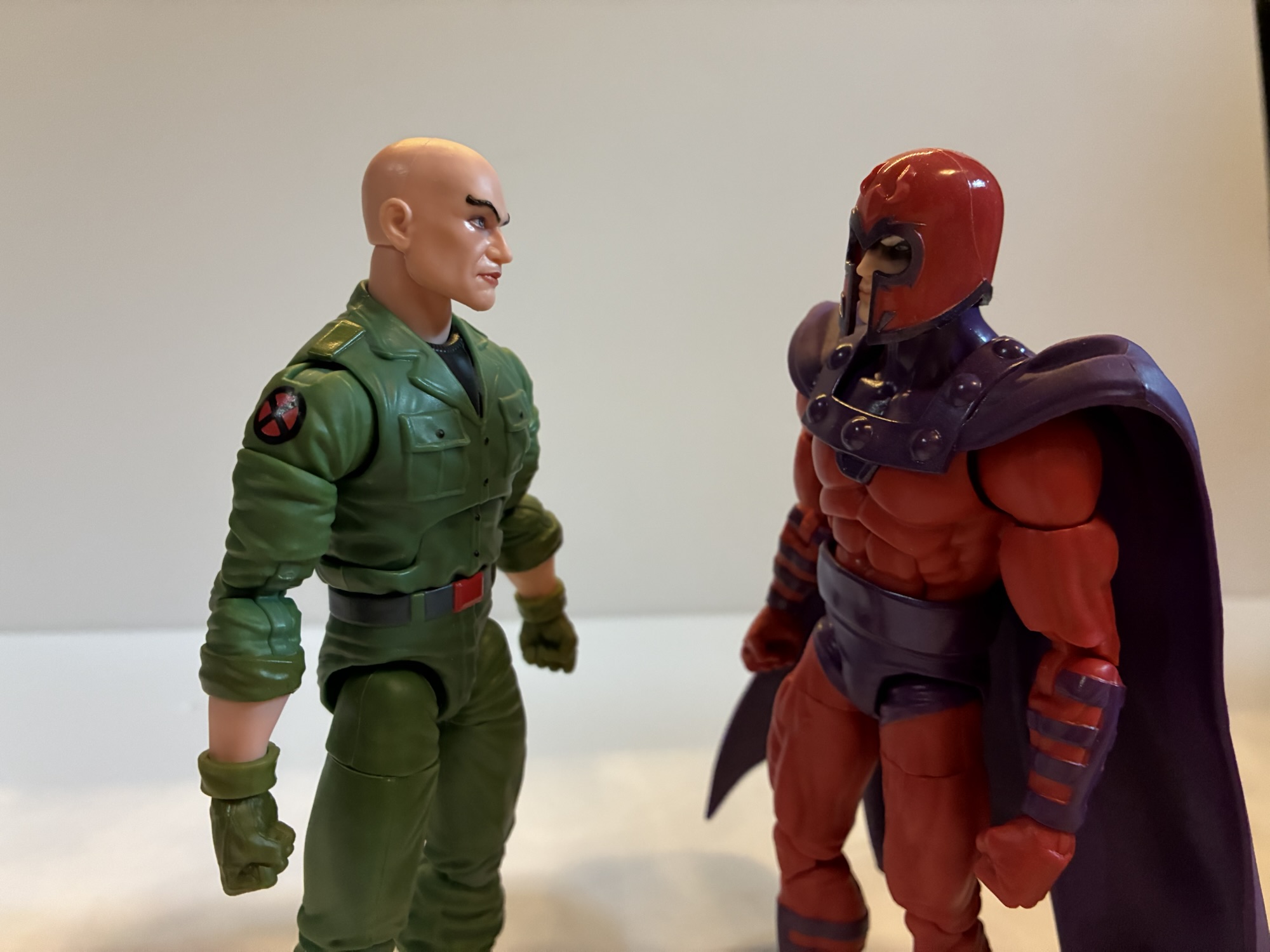
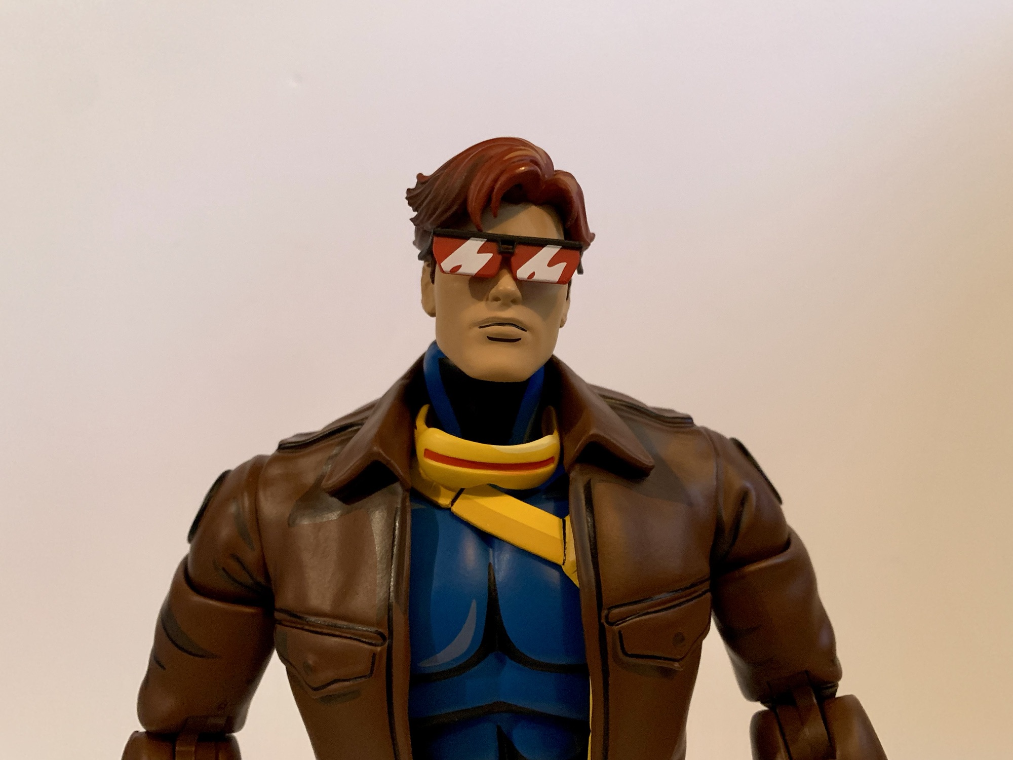
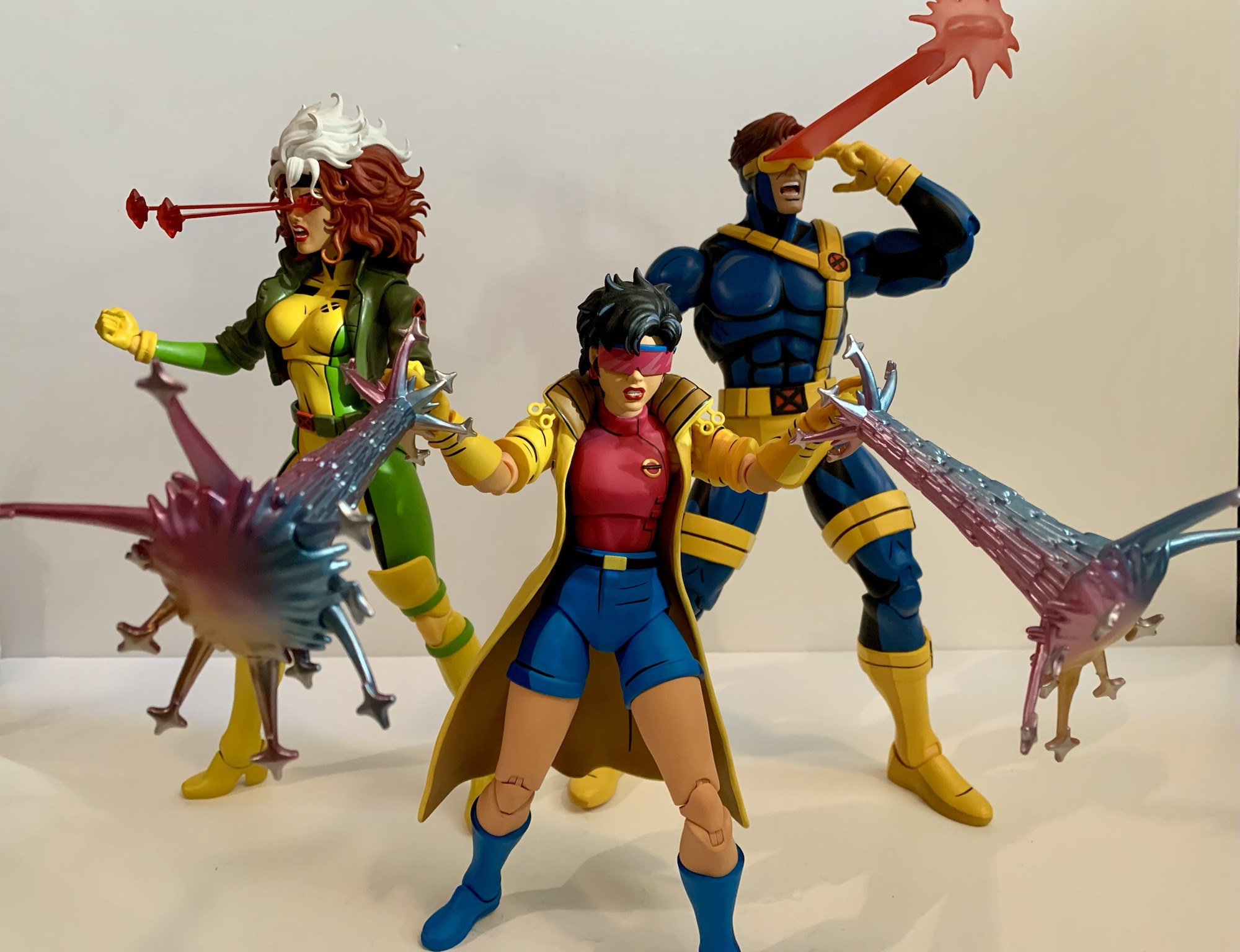
It feels like lately I’ve been getting swayed by clearance and discounts when it comes to my action figure purchases. Such is the case for today’s post on Professor X from the Marvel Legends line of action figures. Target had an exclusive version of Xavier featuring the character in his jumpsuit which showed up in the spring. Having recently purchased a different, more traditional version of the professor it wasn’t something I felt I needed. I wasn’t entirely satisfied with that figure though, so I was a little interested in this new one. Plus, the jumpsuit look feels like it’s pulled straight from the old animated series as this was the look Xavier sported for the entirety of the second season. And in that season, he and Magneto found themselves stranded in the Savage Land where a device Mr. Sinister had negated mutant powers, but somehow managed to cure a paraplegic like Charles Xavier. Of course, the X-Men destroy the machine to get their powers back thus dooming the world’s paraplegics to a life of paralysis. Seriously guys, you probably should have thought that one through a little better. I know this outfit showed up in the comics as well, but the combination of the look plus Hasbro’s decision to release it on a retro card definitely has me thinking X-Men ’92.
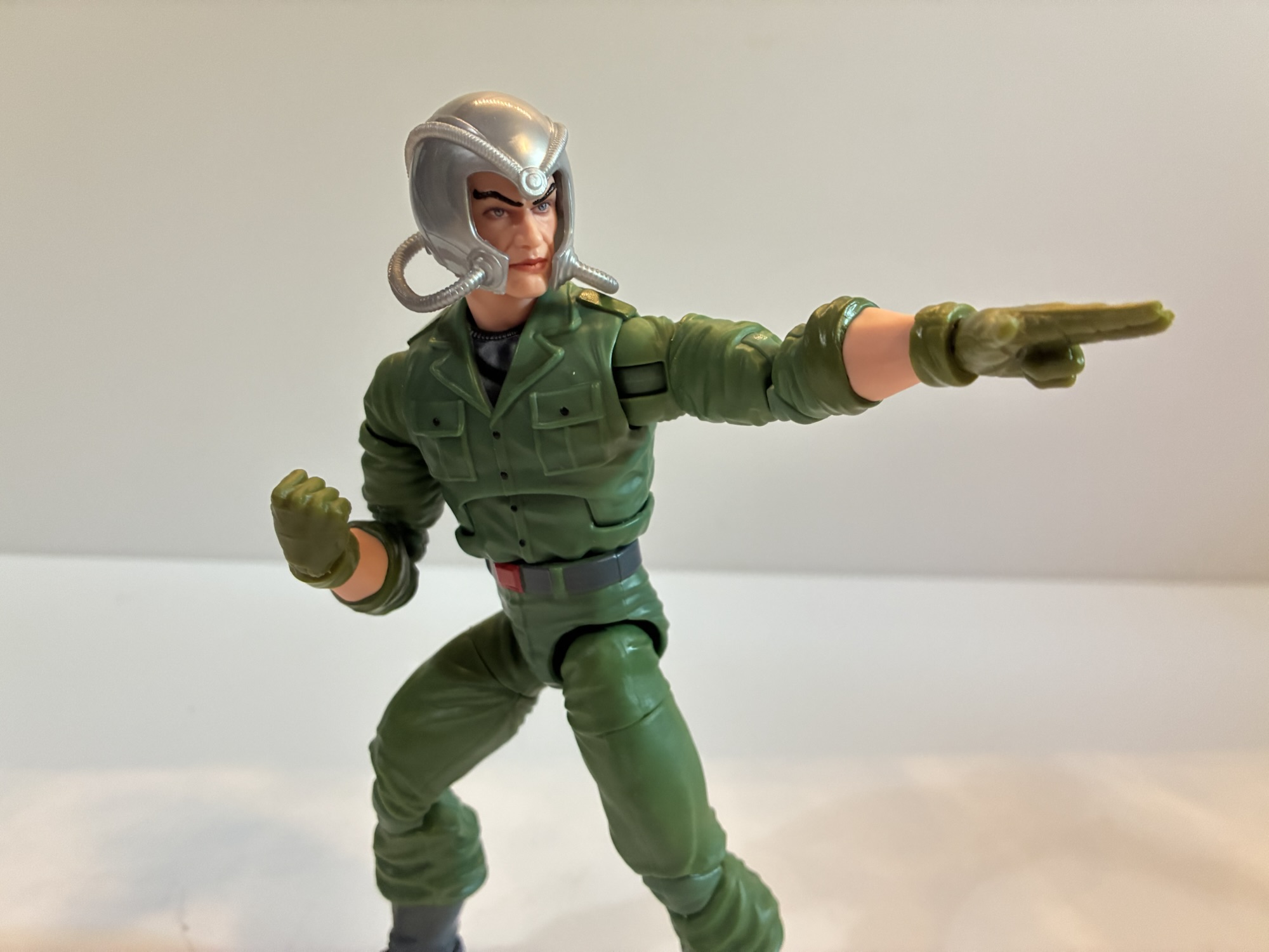
This is definitely a more 90s interpretation of Charles vs the older figure.Xavier definitely has some size to him.
When I buy one version of a character that I’m not crazy about I hate to compound the issue by buying another version of the same character. Especially when I don’t love that other version either. And with this Xavier it’s the face I don’t love. Xavier is often illustrated with pronounced cheek bones, but in three dimensions that makes for a bit of a lumpy appearance. Hasbro has also introduced more detailed face printing in recent years and sometimes they overdo it. That strikes me as the case here with Chuck as his eyes are rimmed with black and his lips are painted. The shade is almost like a slightly metallic peach and doesn’t look like a natural lip shade to me. It actually reminds me of a shade of lipstick my grandmother used to wear. I feel like he’s a wig away from being able to cosplay as a Golden Girl. This is in contrast to what I would want him to look like which is the animated series which took a very plain look to its character designs with mostly smooth features and no shading for the lips.
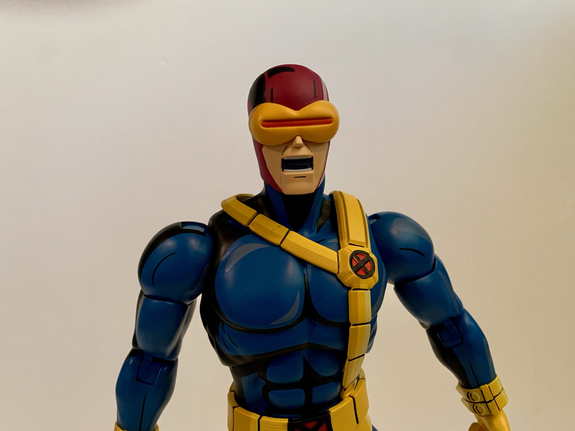
Some like this face, some don’t, but all can agree that Chuck has some crazy eyebrows.
Basically what I’m saying is that, apart from the bald head and the pronounced eyebrows, this portrait doesn’t scream Xavier to me. As for the rest of the sculpt – it’s fine. I think this body is reused from a past release, but I can’t be certain. The legs may be from Wonder Man though I’m not sure about the arms and torso. I don’t have enough Legends figures to know. Whether they are or are not, it doesn’t matter so long as they work for this figure and in this case I would say that they do. Most of the figure is colored plastic with paint reserved for the black undershirt and the belt. There are some black buttons painted onto the shirt and the rolled up sleeves were painted a lighter shade of green from the rest which is a nice touch. And we get some X logos printed on the shoulders. The greens are mostly consistent, but the legs and arms appear to have a touch more yellow to them than the torso. The knees and elbows are also a little off which is typical of these pin-less joints from Hasbro. This figure is not the worst offender in that regard and the difference is pretty subtle.
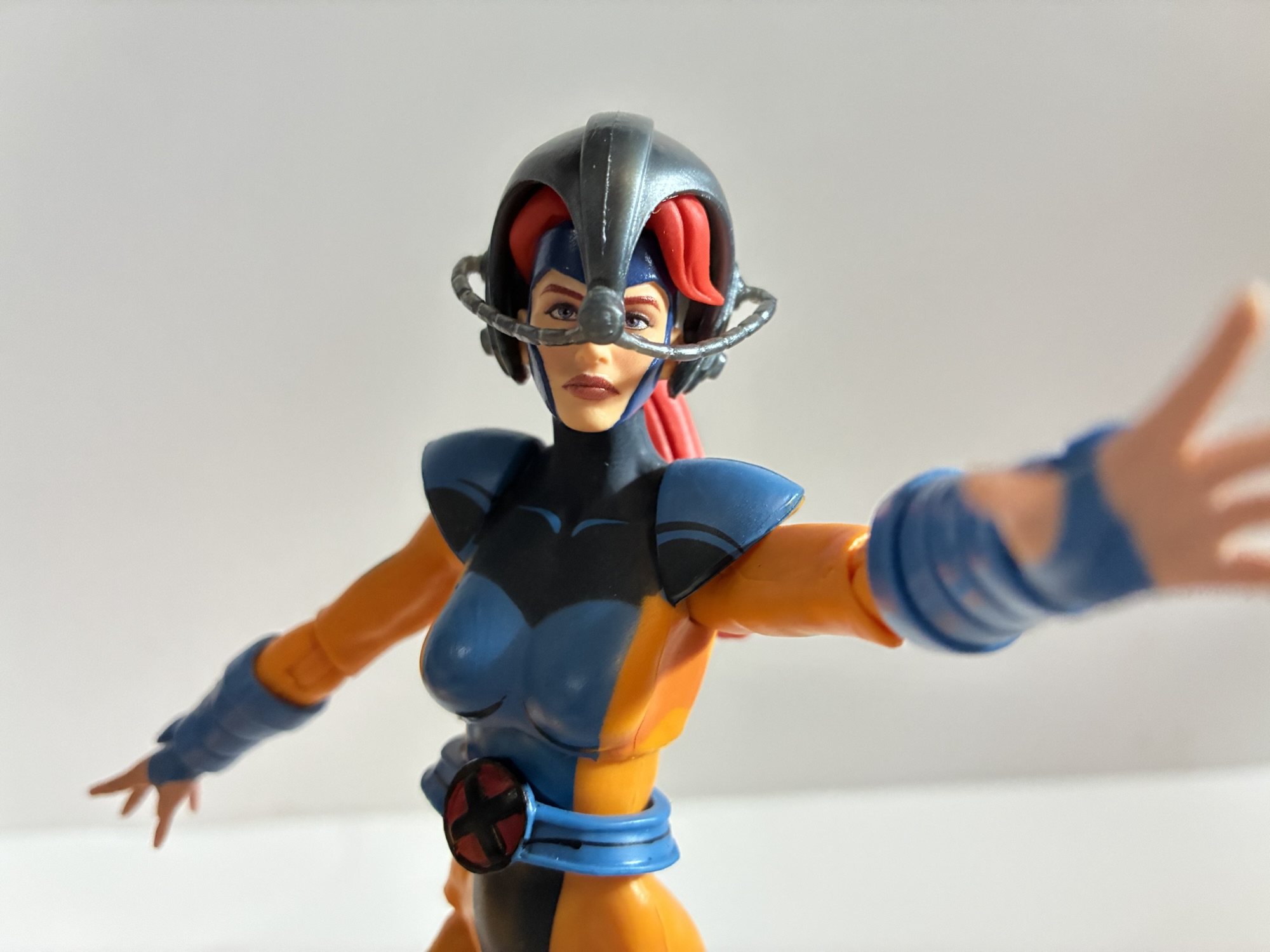
He’s got the helmet, even though he’s not supposed to have his powers in this state.
Xavier comes with just a few accessories, which is often the case for Legends these days. He has two sets of hands: fists and trigger hands. I have no idea why Professor X would come with trigger finger hands, but I guess if you want him to wield a gun he can. He also has a fifth hand which is a two-finger pointing left hand for doing mental power poses. It actually has some sculpted in lines to make it look like an actual glove which is surprising. It may be the same hand that came with the Age of Apocalypse Gambit so that may be how they justified the tooling cost. Chuck also comes with a new Cerebro helmet. At least, I think it’s new. It’s different from the one that came with hoverchair Charlie and it’s fine. It’s that swirly, gray, plastic Hasbro favors over shiny paint for metallic objects and it fits on his head just fine. There’s a hole on the back which had me thinking that was for X-Men ’97 Jean’s ponytail, but the helmet really doesn’t fit on her head because of her hair.
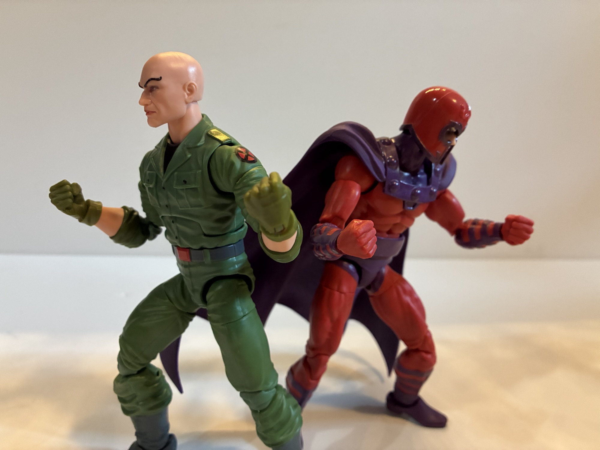
“We must fend them off, Magnus!”So much for pacifism.It’s a tight fit, but he can get into this chair and wear the former helmet.“So we meet again, old friend.”
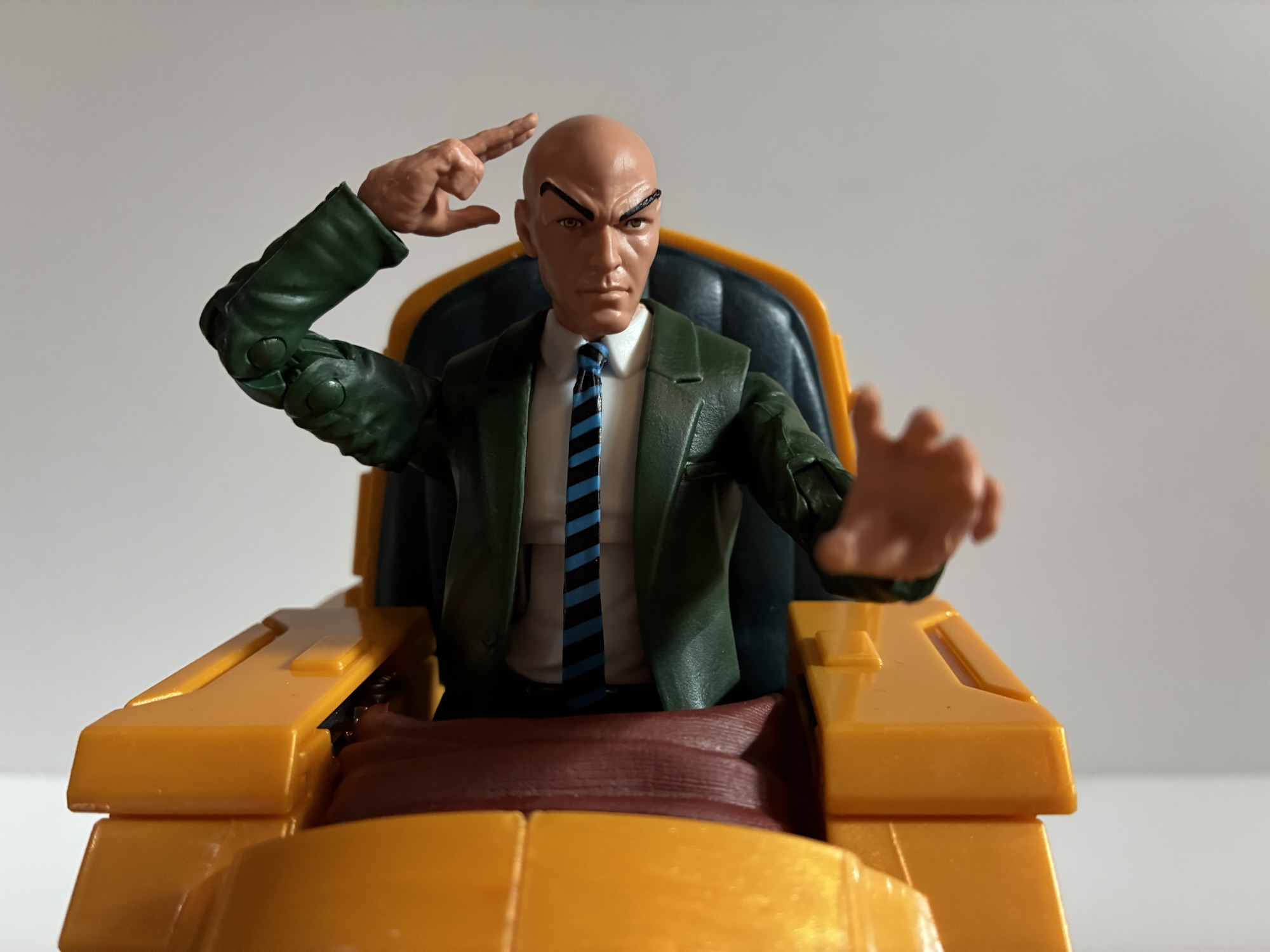
Xavier’s articulation is pretty standard Legends fair, though it has its own quirks. The head is a double ball peg and it’s actually the best double ball peg setup I’ve seen from Hasbro. The lower ball isn’t as deep as it normally is in the neck and he gets good range looking up, down, and tilt thanks to another joint at the base of the neck. Of course, the lack of any hair to work around is playing a role, but good is good. From there we have typical shoulder ball pegs, bicep swivel, double-jointed elbows, wrists, ab crunch, waist twist, hip, thigh, double-jointed knees, boot cut, and ankle hinges and rockers. The range on the ab crunch is pretty poor going forward and back, but aside from that the other joints are fine. The two-finger pointing hand and the trigger hands all have vertical hinges which is interesting. Not so much the trigger hands, but the two-finger gesture is an odd choice. I’m not sure which direction I’d want the hinge to go in this case. The waist twist being above the sculpted belt is a bit unfortunate because it’s ugly. If they could have set it inside the belt it would have looked better, but also cost more.
In the chair where he belongs.
The articulation is fine and it’s probably plenty for Charles Xavier, a guy who traditionally doesn’t walk. The figure also can fit into the hoverchair if you wish and he did sport that look in the show as well. This is a pretty fine Marvel Legends figure. If I liked the portrait sculpt then I’d be pretty happy here and probably would have paid full price. Since I don’t, I still question my decision to buy it as I don’t think it’s an improvement over the other Xavier I have. At any rate, he’s another addition to the animated shelf and he won’t look awful. And if I display him with the helmet I’ll probably barely notice the face. Plus, the new X-Men ’97 Morph is coming with a head for Henry Gyrich and even the Legends team had that head on the hoverchair Xavier body. Perhaps I’ll do the same eventually leaving this as my default Xavier. Even though this has been discounted for a couple of weeks now, I still see this one at Target so you may be able to find it if you’re interested. I paid $17 for it, but if they keep lingering maybe they’ll go even lower? That might be a gamble worth taking.
Professor X isn’t much on his own, so here’s some other figures that might catch your fancy:
Most view superheroes as idealized versions of people. Superman has all the power he needs to mete out justice as he sees fit. He’s a man who is super fast, super strong, basically invulnerable, and he even has laser eyes for good measure. Not every character can be Superman though and as the stable of…
It was two years ago that Hasbro made the announcement that it was wading into the weeds of X-Men, the cartoon series that aired on the Fox Kids Network from 1992-1997. The line was released across eight installments in 2022 (plus a ninth if you include the obviously animated-inspired Apocalypse released on a retro card)…
This week, the long wait for an in-person San Diego Comic Con comes to an end. For the first time since 2019, attendees, creators, and the like will be invited back into the city of San Diego for a celebration of all things comics, movies, and general “nerd” culture. One of the many panels this…
San Diego Comic Con is always an exciting time of year for toy collectors. Even for someone like me who has never considered actually going to the event, I get up for it because I know the coverage is going to be coming fast and furious. Some years are bigger than others, but for me I think I can say that the 2025 edition has been the most surprising. I went into it with certain expectations some of which were met, but some were not and that’s not unusual. What was unusual for me is that some of the things I basically considered a “lock” did not come to pass and I left the event being perhaps most excited about a company and a product line I definitely didn’t see coming. Let’s start with the familiar though and my bread and butter franchise: Teenage Mutant Ninja Turtles
TMNT
NECA is heading down the 2012 TMNT rabbit hole this fall.
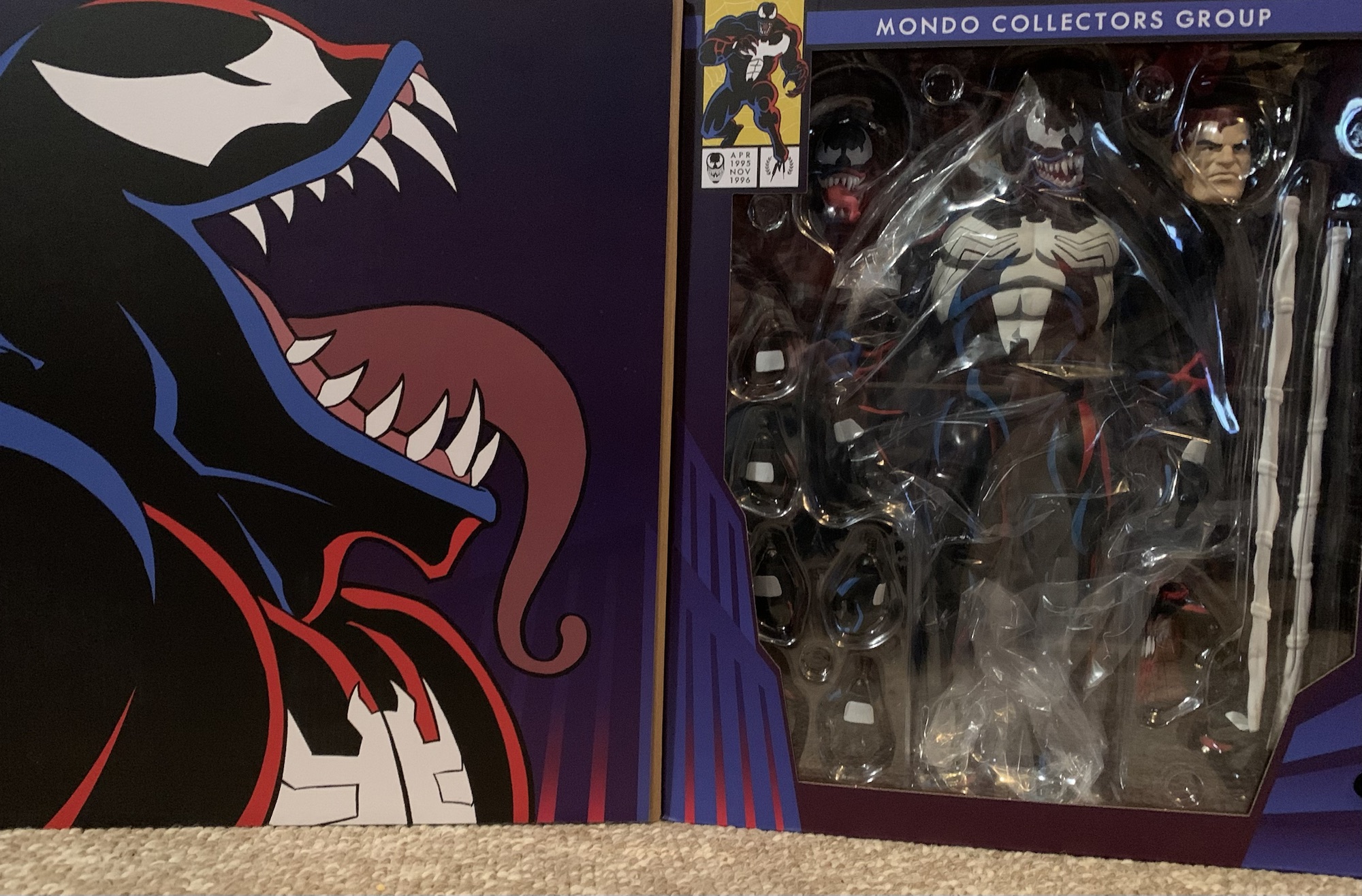
As has been the case most years, the Teenage Mutant Ninja Turtles had no shortage of coverage this year at the convention. There was even a dedicated brand panel that covered releases from several companies. We still have Playmates for vintage re-releases and some modern takes, NECA is hitting on the toon, Archie, and Mirage, Super7 has the 2003 edition of the show, and now we have Mondo doing sixth scale stuff. Mondo’s line is their own take on a post 1990 film franchise and it looks interesting, but isn’t really on my radar for the time being. I don’t have the space or funds for another Mondo sixth scale franchise. Super7 also reaffirmed its commitment to 2k3 by unveiling silhouettes for the next wave which will include Hun, April, and a motorcycle Raphael and Shell Cycle. This would seem to be the nail in the coffin for the vintage inspired figures Super7 started off with which is really frustrating considering the figures missing (topped by Heavy Metal Raph). I’m done with the 2k3 series after Shredder, and possibly done with Super7 after that as well.
NECA has been the company at the forefront for TMNT the past several years, but their showing was surprisingly light. They did announce a line of turtles based on their appearance in the game Fortnite, but that might have been the most noteworthy. There was a leak the week before SDCC of one of their reveals for the toon line, granny Bebop and baby Rocksteady, though that release wasn’t going to blow anyone away (even if it is entertaining). The only new figure shown for the toon line otherwise was a beach Slash. There was also no big display with dioramas and such, just figures in a case. It’s pretty clear that NECA wasn’t going all out for SDCC. Is that a shift in strategy? It certainly costs money to put these big displays up and staff a booth plus rental space isn’t cheap. Are they going to pivot more to social media for reveals? Is New York Comic Con considered their flagship event? Or did the reappearance of Toy Fair earlier this year just mean all of the stuff that would have been revealed at SDCC was instead shown there?
NECA didn’t have a lot of surprised in their booth, but this certainly was the most standout one.
I don’t know the answer to any of those questions, but I was very surprised at the lack of Tempestra. She has become the biggest missing piece for the toon line, even if she is very much a B-tier character in her own right. I’m not sure why they’re slow-walking that one. They mocked up an arcade cabinet accessory for a still unreleased movie April variant more than two years ago that most assumed was really made for a Tempestra. What I did like, even though none of the figures shown were new reveals, was how the 2012 TMNT line is shaping up. The sculpts look fantastic and they’re all dated for this year and will be sold as single releases so no four or two packs. I don’t think it’s been confirmed where we’ll be able to buy them, but they’re among my most anticipated releases for the second half of 2025. The only other showing that excited me was Garfello, i.e. Garfied cos-playing as a ninja turtle, which was unexpected. It looks great and comes with Odie and is the sort of silly release I’m very likely to get.
As for the rest, there wasn’t much to be excited by. Playmates is re-releasing its remastered turtles minus the bumpy texture a lot of people didn’t like. We actually knew about that going into SDCC, but that was basically the official launch. Mezco also showed off 1990 movie turtles for its One:12 line. They look worse than the NECA releases (which are coincidentally being re-released in single packs this year), but will probably cost more than twice as much.
Mondo
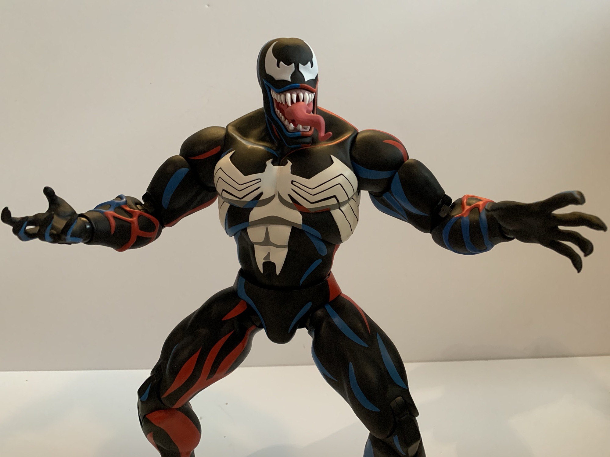
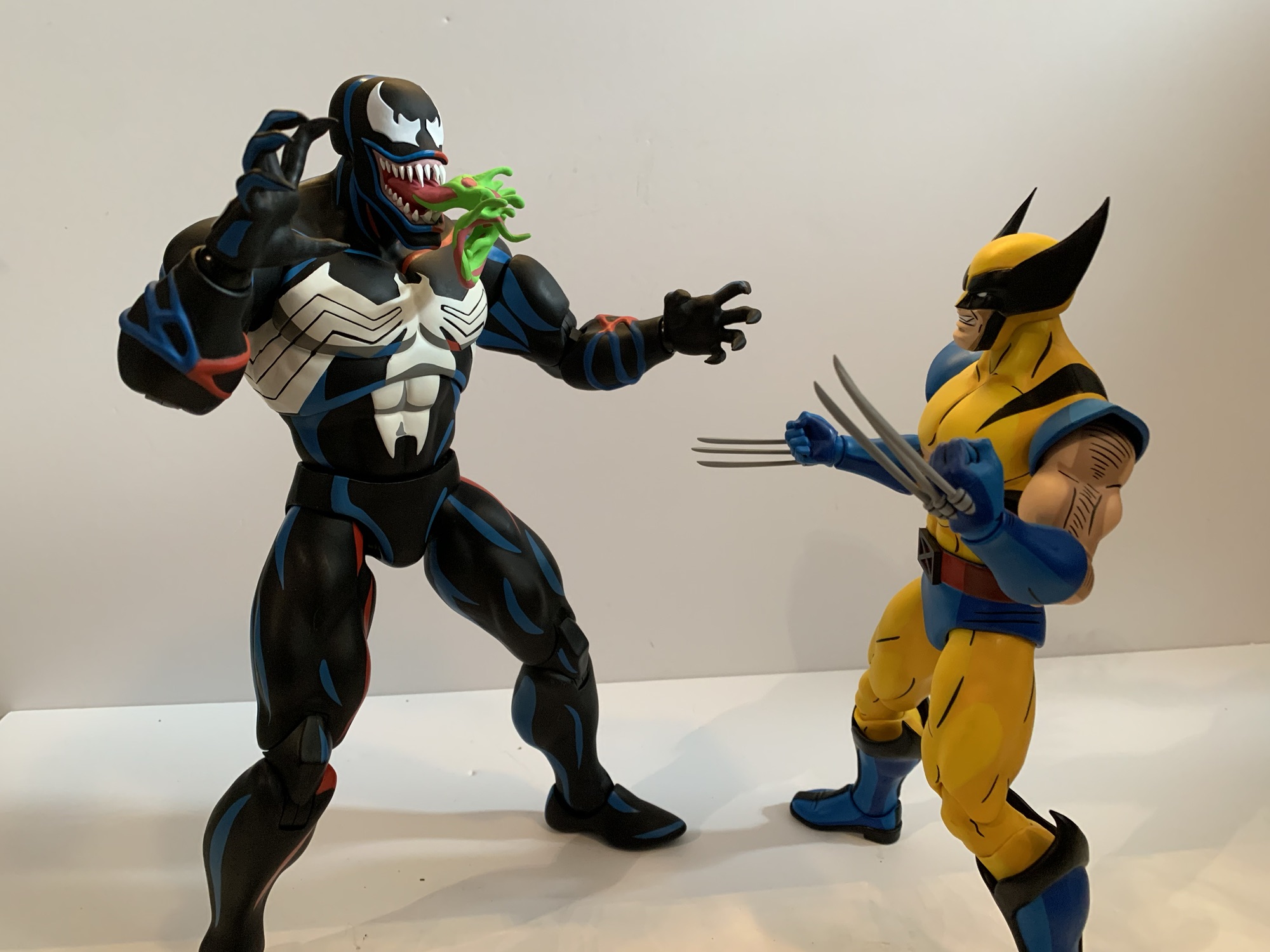
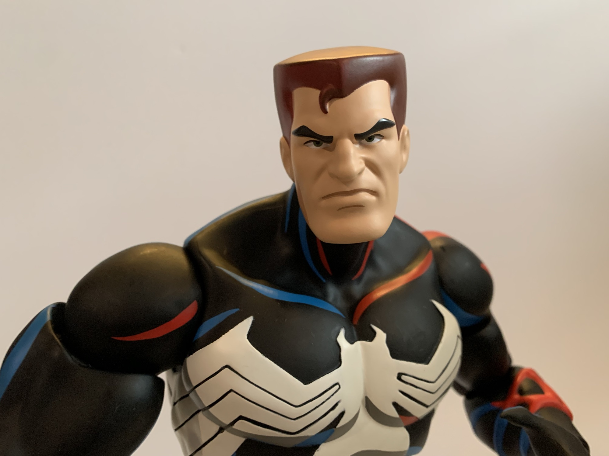
No one does animated X-Men better than Mondo.
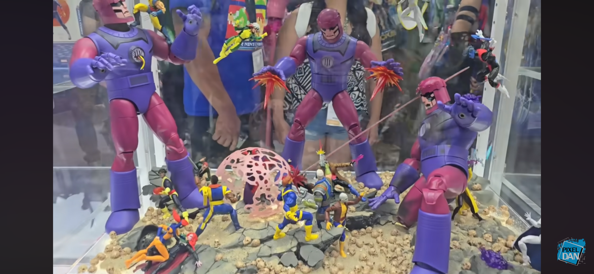
We’ll pivot from an IP to a company here as Mondo had a lot to show off. Perhaps more than any other company, though I confess I’m not interested in everything they do (like Masters of the Universe and ThunderCats). What gets my attention first and foremost when it comes to Mondo are their plans for their X-Men animated line of sixth scale figures. It’s a line that is becoming much harder to collect because of the tariff situation in the country, but I’m in too deep to dump it. Heading into the event, we knew the next figure to be solicited was likely to be Mr. Sinister who had already been shown. There was also the reveal of an event exclusive Savage Land Rogue which went up for preorder before the show. They were both at the event along with the next figure: Storm. She looks awesome and was my guess for next up. It didn’t end there though as we also got to see concept art for the next figure and it’s Beast! I’m glad he’s a little ways off since he might be an expensive one. Perhaps things can improve economically before going up for order, though there’s always the chance things get worse. Little is likely to change before Sinister goes up though which is happening in August. I love the look of the figure and he’s an A-list villain from the show, but I do not look forward to the sticker with that one.
That was a hoot!
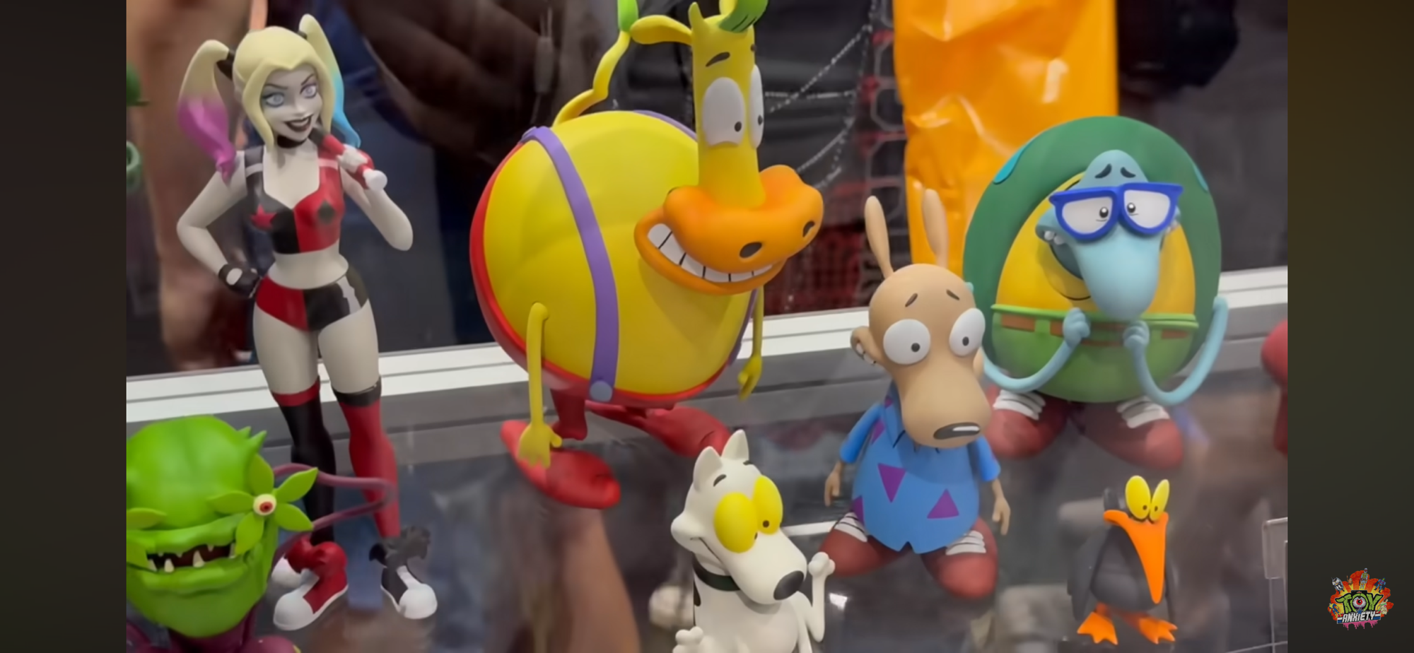
That’s the only sixth scale line I’m in, but Mondo did reveal more Marvel and DC figures (Superman, Two-Face, Dr. Doom, Lizard) in their other lines which all seemed solid. What really caught my eye though were their Mondo Squads which are more statuesque figures with swappable parts and sold in bundles of characters. Previously, they had done a set of characters from the Nicktoon Aaahh!!! Real Monsters and now they’re moving onto Rocko’s Modern Life. I love Rocko and this set of the titular character plus his mates Heffer and Filbert is pretty much an automatic buy from me. We don’t have a lot of Rocko merch out there so the scarcity will help. Also shown is a squad of Beavis and Butt-Head with their couch and the four fellows from King of the Hill (Hank, Bill, Dale, Boomhauer). Similar to Rocko, I may have to get King of the Hill since there’s so little out there for the franchise that I have really grown to love in recent years after previously dropping off around Season 5. Mondo also teased future squads based on Rugrats and The Ren & Stimpy Show.
The last of the real Ghostbusters makes his debut in Ray.
Mondo is also heavily invested in The Real Ghostbusters, which was probably the biggest reveal of the 2024 show. We’re still waiting on the first release to drop (once again, thank you tariffs), but we have now seen all four of the busters and their companion ghosts. And, to no one’s surprise, everything looks great. I still have reservations about the price, but it is what it is and we’ll talk more about that when Peter finally arrives (hopefully sometime in August). Mondo also revealed that Janine will follow the boys and she’ll be in her more traditional secretary attire. To sweeten the package, she’ll come with her desk and an alternate lower half for a clean cross-legged sitting position. I’m guessing all of this extra stuff means she’s going to retail for $202 like the Ghostbuster + Ghost package we’ve seen up until now, but maybe that won’t be the case. That will be a tall ask and is probably something I won’t be interested in.
Marvel Legends
It’s all X-Men ’97!
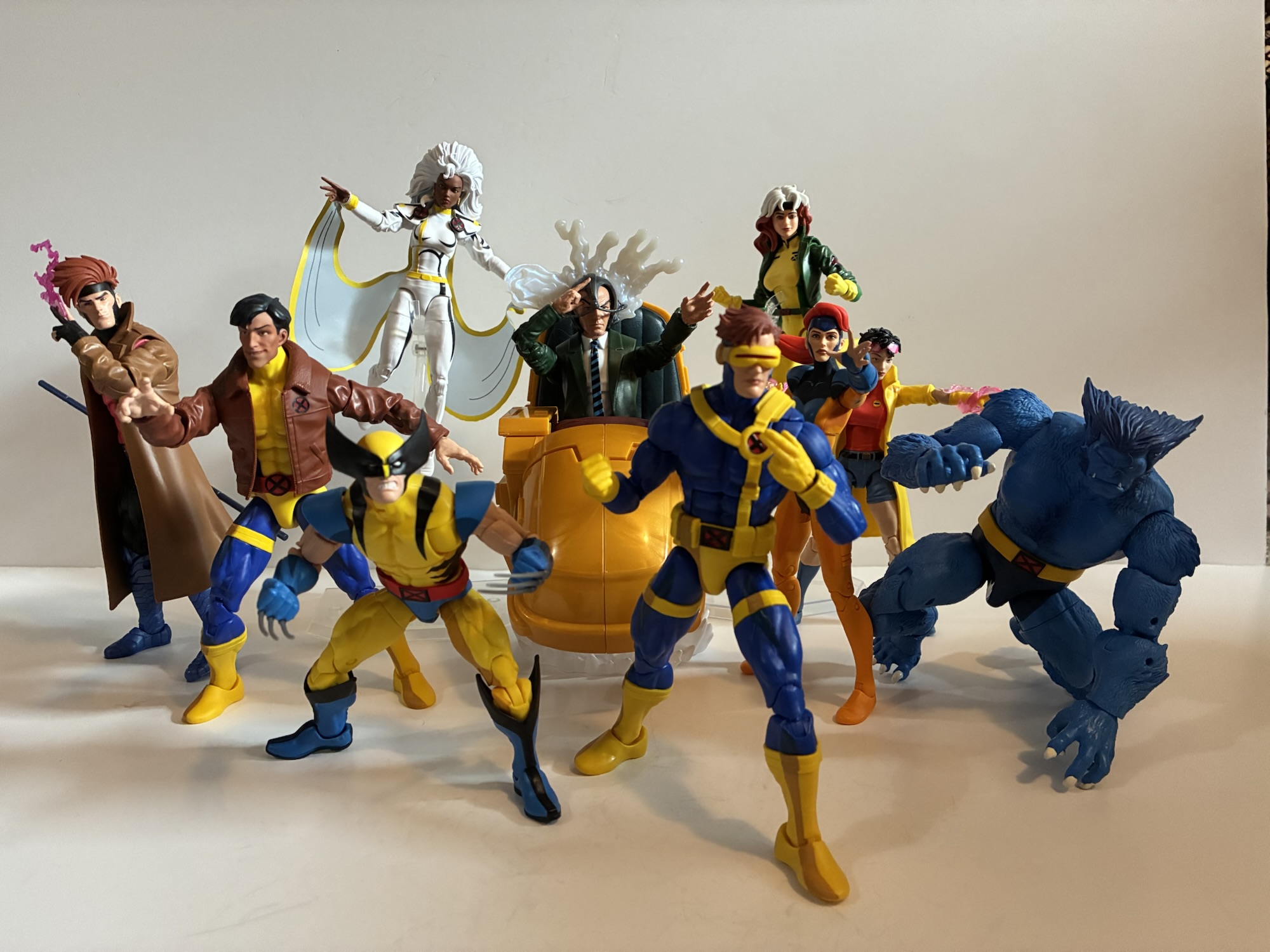
I knew Hasbro would have some X-Men ’97 stuff for us, but I wasn’t prepared for just how much and how much I’d like it. We learned what wave three will be and those figures were all on-hand for folks to gawk at: Morph, Jubilee (final suit), Sunspot (final suit), Emma Frost, Cable (first outfit), Wolverine (classic civilian clothes). All of them looked pretty damn good. I’m mostly looking to supplement my ’92 display with these so Cable and Wolverine were locks. My dissatisfaction with the ’92 Jubilee puts the ’97 one on my radar, though I’m disappointed she’s in her black jumpsuit. Maybe I’ll swap heads with the ’92 one? Maybe even arms and coat? Emma just looks great though a classic take on the White Queen was enough to get me to put in a preorder and I love Morph so I’m in for the ’97 version. The only one I didn’t preorder was Sunspot. Nothing against the figure, I just don’t really care about Sunspot.
Gambit, what did they do to you?!
That wasn’t all though as we got a nice look at the made-to-order Sentinel which went up last year and there were some two-packs announced. We can look forward to a finale Cyclops and Jean (Marvel Girl), finale Wolverine and Storm, and a pairing of Rogue and Gambit from their basketball scene in the first episode. None are essentials for me and I don’t think I’ll be getting any, but I love to see how all-in Hasbro is with X-Men ’97. The one set that I would have had the most interest in is the basketball two-pack, but it is unfortunately the worst looking set of the two. That’s because it looks like Hasbro repurposed its Starting Lineup body of NBA players for its shirtless Gambit. That sculpt has a very unpleasant looking ab crunch in the middle of it. It worked okay for Starting Lineup because all of those figures had a jersey. Gambit doesn’t have that luxury and it looks terrible. It’s honestly one of those “How did this get approved?” moments that comes along once in awhile.
Aside from that, I had little to be critical of with Hasbro’s panel. They also revealed their next made-to-order figure: Mephisto. Mephisto was previously released many moons ago by Diamond in their Diamond Select line. Marvel Legends has not touched him though because he’s basically Marvel Satan and not afraid to show it. There was going to be one attached to the Engine of Vengeance HasLab if it hit a certain number of orders, but that product didn’t even fund. The Legends team had previously stated Mephisto could not be released any other way, but there was almost certainly some gamesmanship in those statements. Something obviously changed and now Mephisto is on the way, though he won’t be showing up at Walmart or Target. He is coming with his own throne and this thing sure looks familiar.
Hey! I know that skull!
Crystar fans can probably spot where this thing is from and the Legends team was not shy about stating it’s based on the cover of issue 8 by artist Michael Golden. We’ve covered that issue here and that’s because it’s also the cover musician Glenn Danzig stole from to come up with a logo for his band Samhain which then became the logo for the band Danzig. The Legends team, once again, was not at all shy about pointing that out and might even be hoping for some cross-sale appeal with that fanbase. As for Danzig, no comment has been made. The item was shared in the official Danzig fan group on Facebook and has since been removed so either he’s not happy or the moderators for that group think he would not be happy to see it. Fans have frequently traded and sold issues of Crystar there so it’s not like the group hides from the connection, but maybe he’s salty that he won’t get a cut? He probably thinks he made the image famous, and he probably did, but he has also made a lot of money off of art he never owned so I think we can call it square on this one, Mr. Danzig. Especially if Marvel never came looking for a cut of those t-shirts. Either way, the throne looks awesome and yes, I’m buying it. I don’t even care about Mephisto, but this thing looks too good to pass up. It’s an open preorder that closes August 26th and will set you back $80 when it ships next year.
As for other odds and ends, I continue to be impressed with the offerings from Jada Toys, even if the IPs they traffic in have little or no appeal to me. Except for Frosty the Snowman, I will get that. Big Bad Workshop had a variant of its upcoming action figure of The Tick on display and he might already be my most anticipated for next year. I love The Tick and it’s been at the top of my most wanted for a few years now and I hope the line is a success. We also know who will be the next character: Chairface Chippendale. The Naughty or Nice collection is also continuing and we’re finally getting a Mrs. Claus. I assume she will go up for preorder around Christmas time and hopefully will fund. She’s not the design I would have gone with, but I’ll be happy to have a Mrs. Claus join Santa on my shelf some day.
And that’s a wrap! Thanks to all of the people who cover this event every year and whose videos I snipped screen grabs from: Pixel Dan, Toy Anxiety, Robo Don’t Know. Toyark.com also has some great coverage if you prefer still shots. All of the folks involved help people like me who can’t make it to the con enjoy from my home or wherever I happen to be.
If you liked reading this here’s some related content you may enjoy:
Mondo has been absolutely killing it with its sixth scale line of action figures based on the now classic animated series X-Men. The company also really ramped up production in 2023 on the line by soliciting five new figures during the year. At over 200 bucks a pop, it was quite the hit to the…
After taking a trip to the past with Rocko’s Modern Life during the spring, it seems only fitting that I also take a look at the Rocko’s Modern Life movie from 2019: Static Cling. To be fair, the term “movie” is definitely used loosely when applied to this piece of media. Static Cling was originally…
There’s been a hole in my Danzig collection for quite some time. It was a hole that was easy to fill and actually quite cheap considering most Danzig records fetch well over $100 these days, but an important piece was missing. And that piece is not what one would necessarily expect, but I would assume…
All right kids, back in your seats. Teacher is here.
Most view superheroes as idealized versions of people. Superman has all the power he needs to mete out justice as he sees fit. He’s a man who is super fast, super strong, basically invulnerable, and he even has laser eyes for good measure. Not every character can be Superman though and as the stable of superheroes increased over the years there was more room for nuance. I’m sure some folks in marketing at Marvel Comics scoffed at the idea of a team of superheroes being led by a middle aged paraplegic, but that’s the direction Stan Lee and Jack Kirby went in when they created the X-Men. That team was founded by Professor Charles Xavier, a powerful, telepathic, mutant (which is basically used to mean a superhero born with their powers) who just so happens to be confined to a wheelchair. Unlike a character like Daredevil, a blind superhero whose enhanced, super, senses essentially negate his disability, Xavier’s powers do not help him walk. Sure, some writers have played around with that over the years, but at his core Professor X is a man with a disability able to thrive in a world of super powered individuals.
He’s a bit of a little guy.
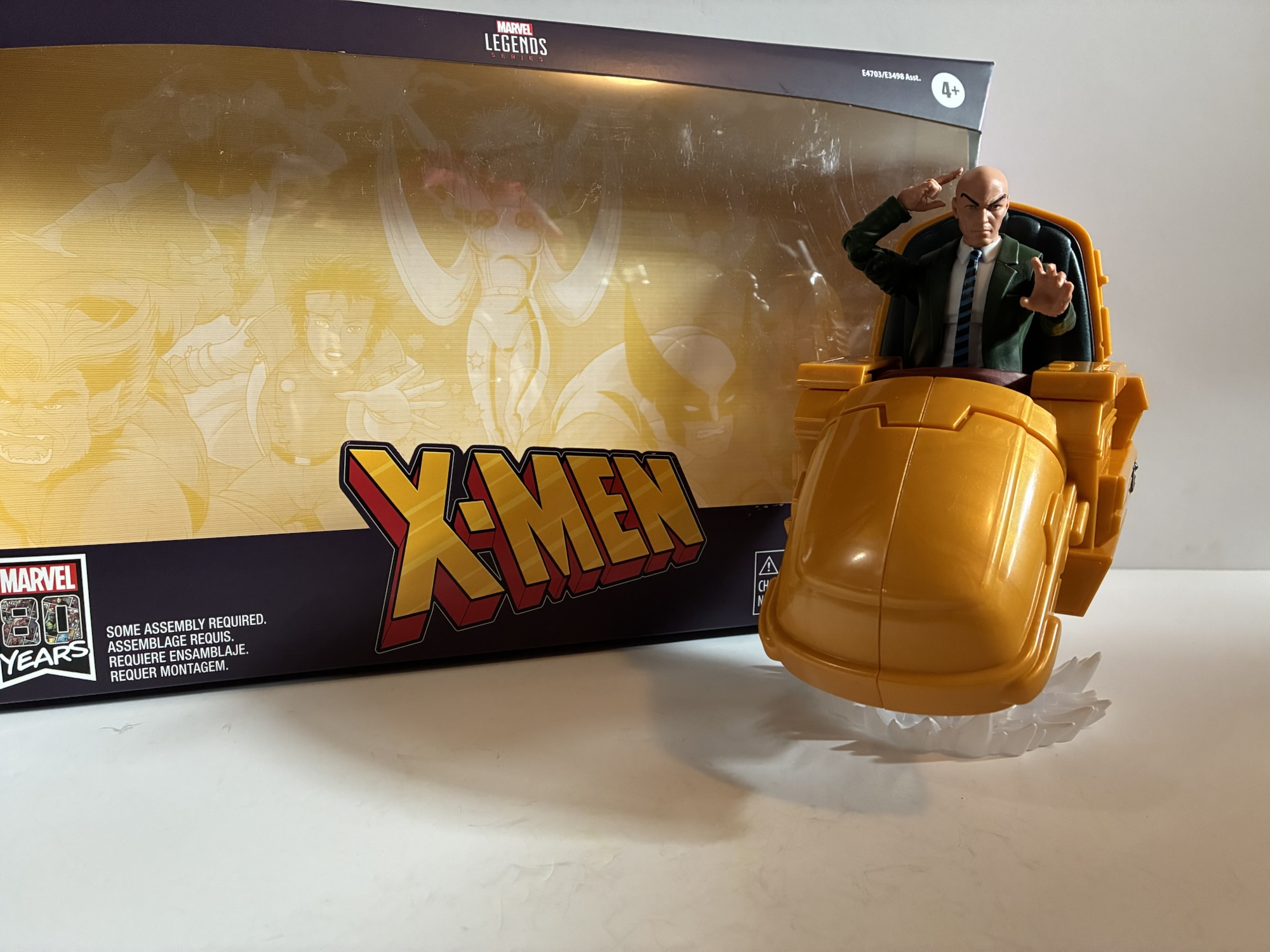
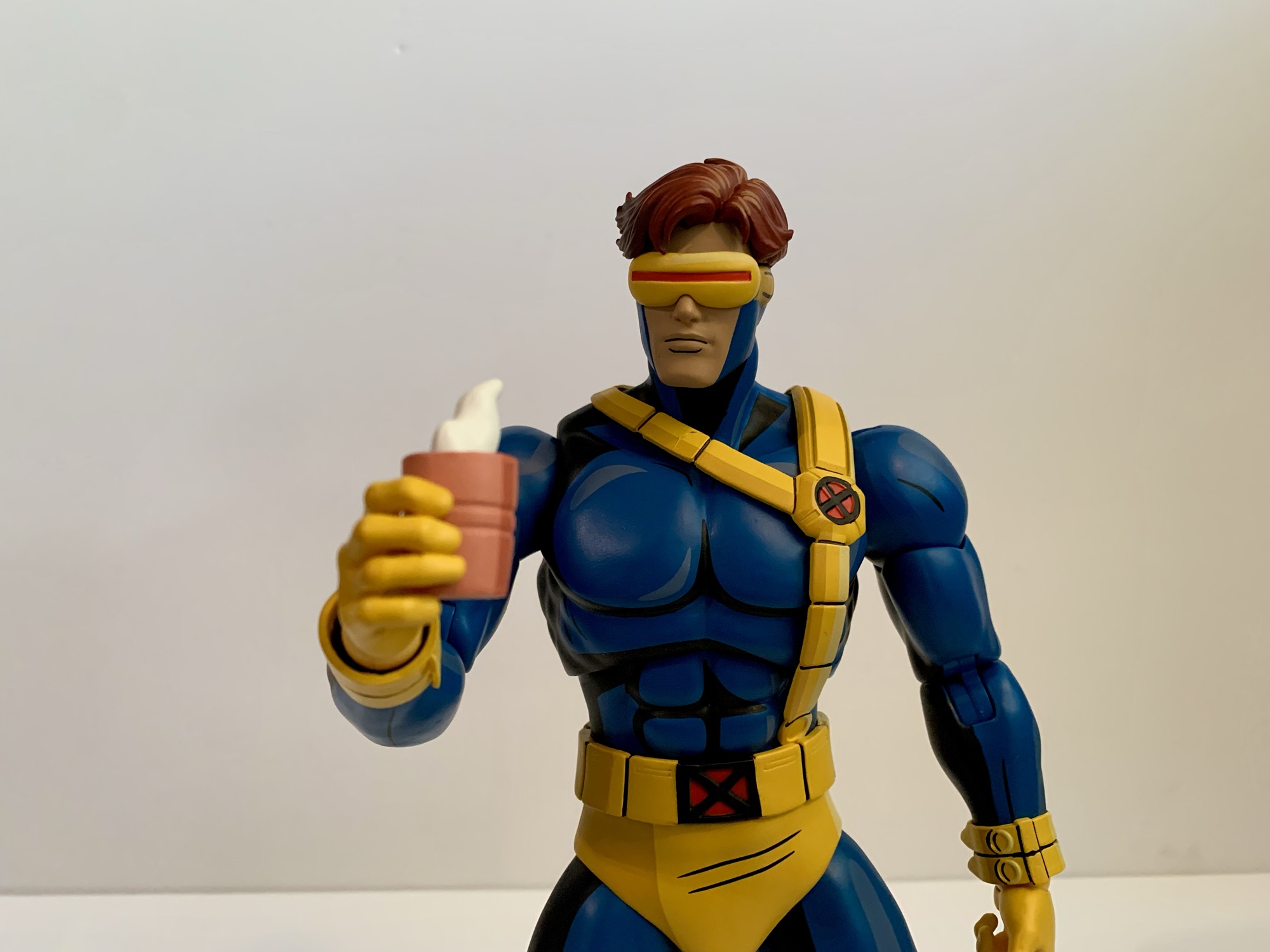
I don’t know for certain, but in a world where even female characters were treated like radioactive material, I can imagine folks at Toy Biz not being too excited about doing a Professor X figure. It took a little while for the head man to make his debut in that old toy line, but I was honestly pumped when he did. I think he may have been the final character from the cartoon series X-Men to be released and complete the team. I know we had to wait awhile for Beast and Morph, but I can recall getting those two figures on Christmas (1994, I want to say) and the following Easter Chuck was sitting beside my Easter basket (along with Ahab, a figure not exactly high on my wants list). And aside from having a blue suit instead of green, he was pretty faithfully depicted as he was in the show complete with his 90s, stylish, hoverchair. Because of the cartoon and Jim Lee’s run on X-Men, it’s the hoverchair I most often associate with Xavier. Hasbro certainly knows that’s the case for many which is probably why they released Xavier in a deluxe package with his famous chair.
Hope you like this gesture, because it’s kind of all he can do.
This figure was released a few years ago, but in 2024 Hasbro made it available once again to preorder. Having since acquired several characters from the cartoon in Marvel Legends form, I felt like I needed Xavier to pull it all together. The addition of the chair does make for additional cost. This thing was a whopping 50 bucks, by far the most I have ever spent on a Marvel Legends figure. I was pretty skeptical it would be worth that in the end, but when you’re basically one figure short of a full squad it’s the kind of thing one will extend themselves on. Toy companies are aware of this phenomenon, which is why I fully expect Xavier to be the last release in Mondo’s very awesome, but very expensive, line of X-Men figures. Trying to imagine what a sixth scale Xavier in his hoverchair will set me back is already giving me anxiety.
His chair comes loaded with a TV and some games so he doesn’t get bored.
That is a topic for another day, today we’re in the more familiar realm of 1:12, or there about. Xavier comes in an oversized window box and is featured prominently in the center. His chair is amusingly split in half so we can see one half of the chair on each side of the figure. The backdrop contains artwork of the entire, animated, team in a style that resembles the cartoon. Beast, for example, has pupils. It displays well, but I could not care less about that fact. Once removed, the chair requires some assembly. There are four pieces to it: each side, a backrest, and a cushion. The backrest slides onto either half while the cushion plugs into a slot in the center of one of the pieces. Then you just push it together. It’s pretty intuitive and most probably won’t need to consult any instructions. Not that there is any. I’m surprised they didn’t print some on an inside flap of the box.
I like the thought of this base, but not so much the execution.
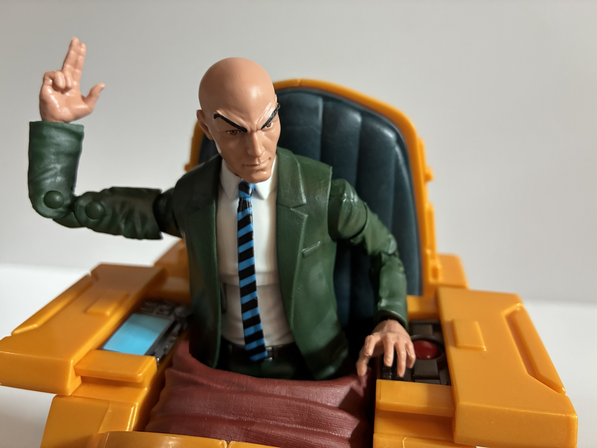
The chair looks pretty good from a sculpting standpoint. It’s not painted though, so you get some of that swirly plastic effect Hasbro seems to love when it’s trying to create the illusion of a metal material. There is a big seam down the middle which is unfortunate. It makes me wish that at least the front was a third piece that snapped over the assembled halves, essentially the same concept as the backrest, to at least get rid of the seam there. On each armrest there’s a control panel that slides out. One has a monitor while the other a keyboard and at least those two parts are painted. Even though the artwork seems to be evocative of the cartoon, the design of the chair is from the comic. The most obvious distinction is the shape of the front and lack of headlights. The chair sits fine as-is, but there’s also an included base. It’s a white post with a transparent piece of plastic over it in the shape of smoke, I guess? The transparent portion is frosted over with white paint and the plumes are pointed so, to me, it looks more like ice. I don’t think ice is what they’re going for here, but it gives the figure a little height.
Cool hat, bro.
As for Xavier himself, he’s depicted in his green suit with white shirt and blue and black tie. He has a very serious expression on his face with his signature, arched, eyebrows. His right hand is in a two-finger gesture while his left hand is open, but curled. He has no extra hands which is unfortunate. He should at least come with another right hand so he doesn’t always have to be making this very specific gesture. And because the damn thing cost 50 bucks – throw in some hands! Outside the chair, Charles stands just a tick over 6″. He has a slight build with a very big head relative to his body. It strikes me as a little off as Xavier from this era was usually portrayed as being rather broad shouldered. This figure makes him look like a weenie. Most of the figure is colored plastic with the belt and tie being where the most paint is utilized. The jacket portion of the torso is an overlay while the sleeves are part of the sculpt. This is pretty standard, but the small shoulders means some white sticks through the gap between the arms and jacket. There is also a slight discoloration to the arms vs the shoulders with the shoulders being noticeably darker and shinier. This is an older figure so it does feature pins in the joints. I don’t find them particularly distracting, but there must have been suit guys made over the past few years on pin-less bodies, no? I’m surprised he didn’t get a minor cosmetic upgrade as a result.
Hey professor, you got some…ugh…stuff…squirting out of the back of your head.
Articulation for Charlie is pretty typical stuff for Legends. We have: ball hinge neck, ab crunch, ball-hinged shoulders, biceps swivels, wrist swivels and hinges, waist swivel, ball-socket hips, thigh swivel, ankle hinge and rocker, double-jointed elbows and knees. Range at the hips and shoulders is mediocre and the ankles are pretty limited too, though I guess that doesn’t matter much for a character who will be seated. He’s going to do what you need him to do, but if that’s something you want him to do is outside Professor X’s typical wheelhouse then you won’t be impressed. Like standing. This guy is really hard to stand because the range on the ankle hinged is poor and his feet are tiny. Again, for this guy it doesn’t matter, but if you wanted to swap in a different Xavier and use this body as a custom for someone else you may be disappointed.
If you’re curious, it can kind of fit the head of the X-Men ’97 Jean.
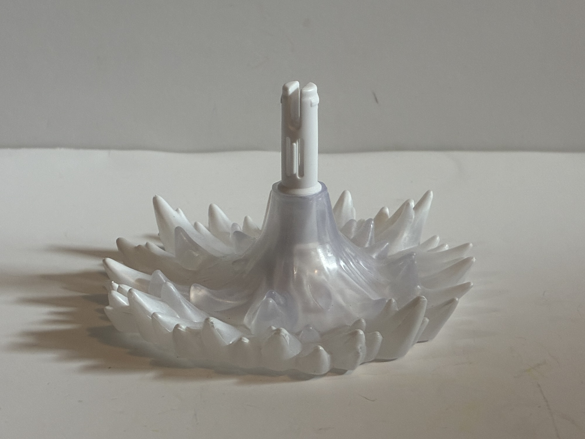
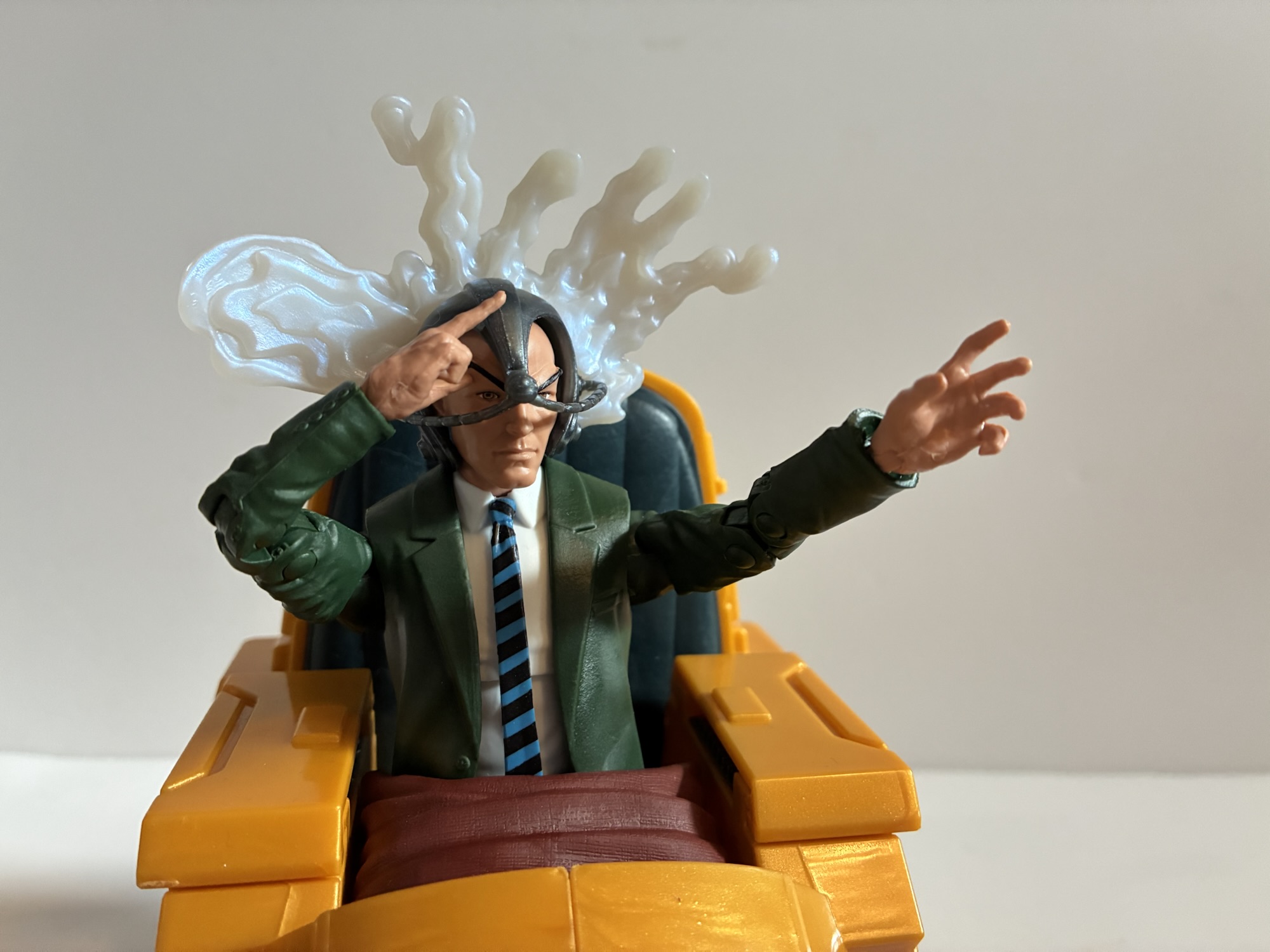
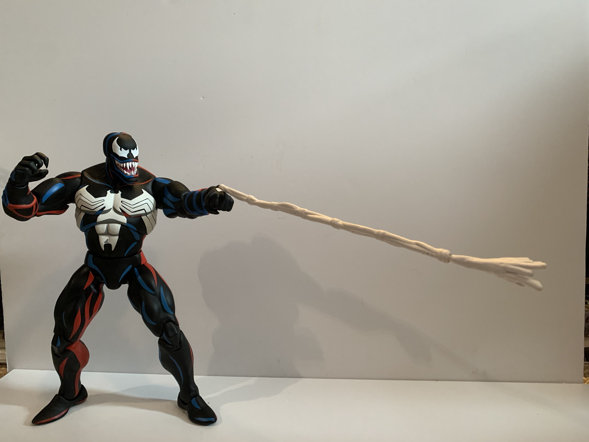
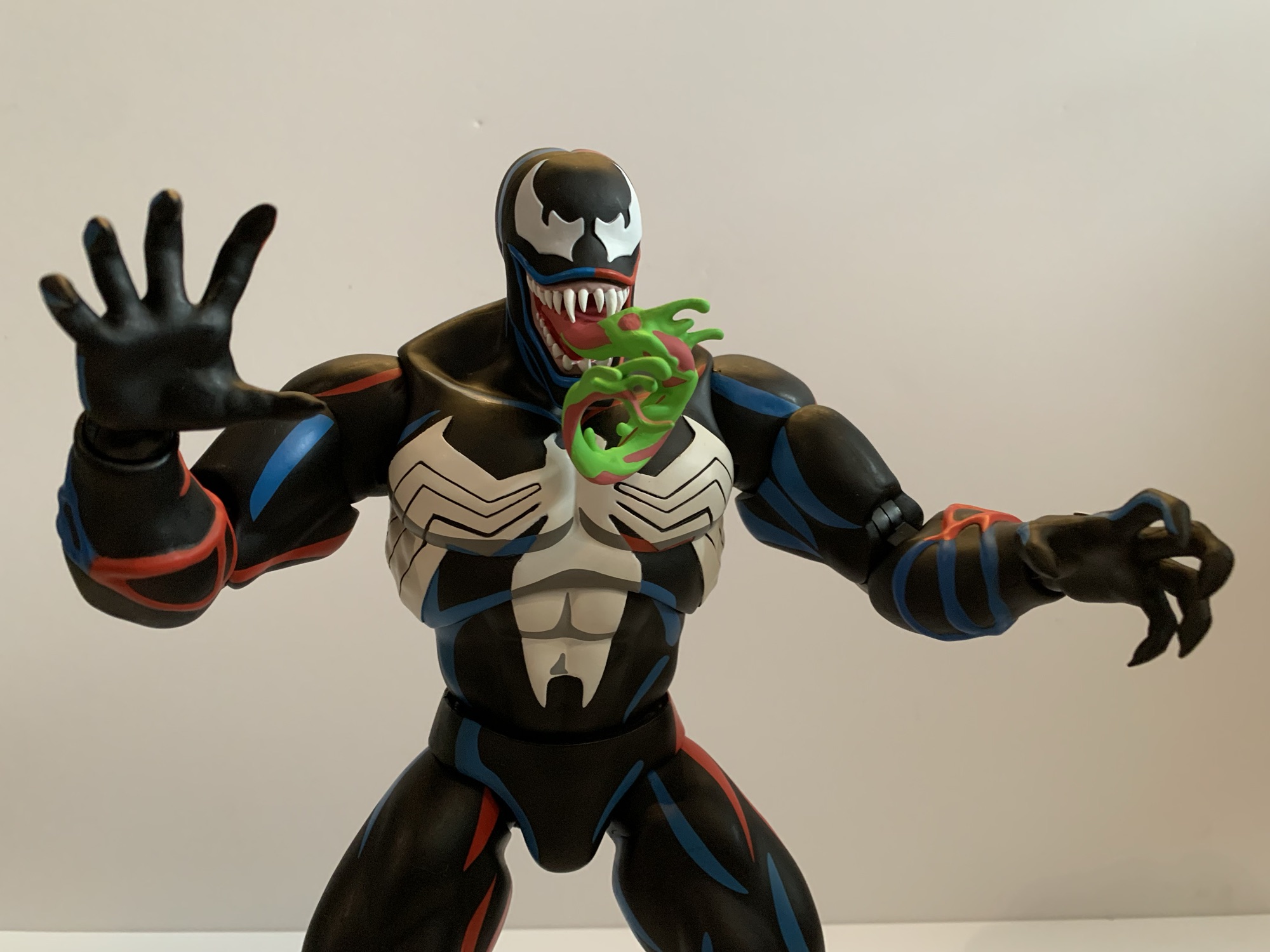
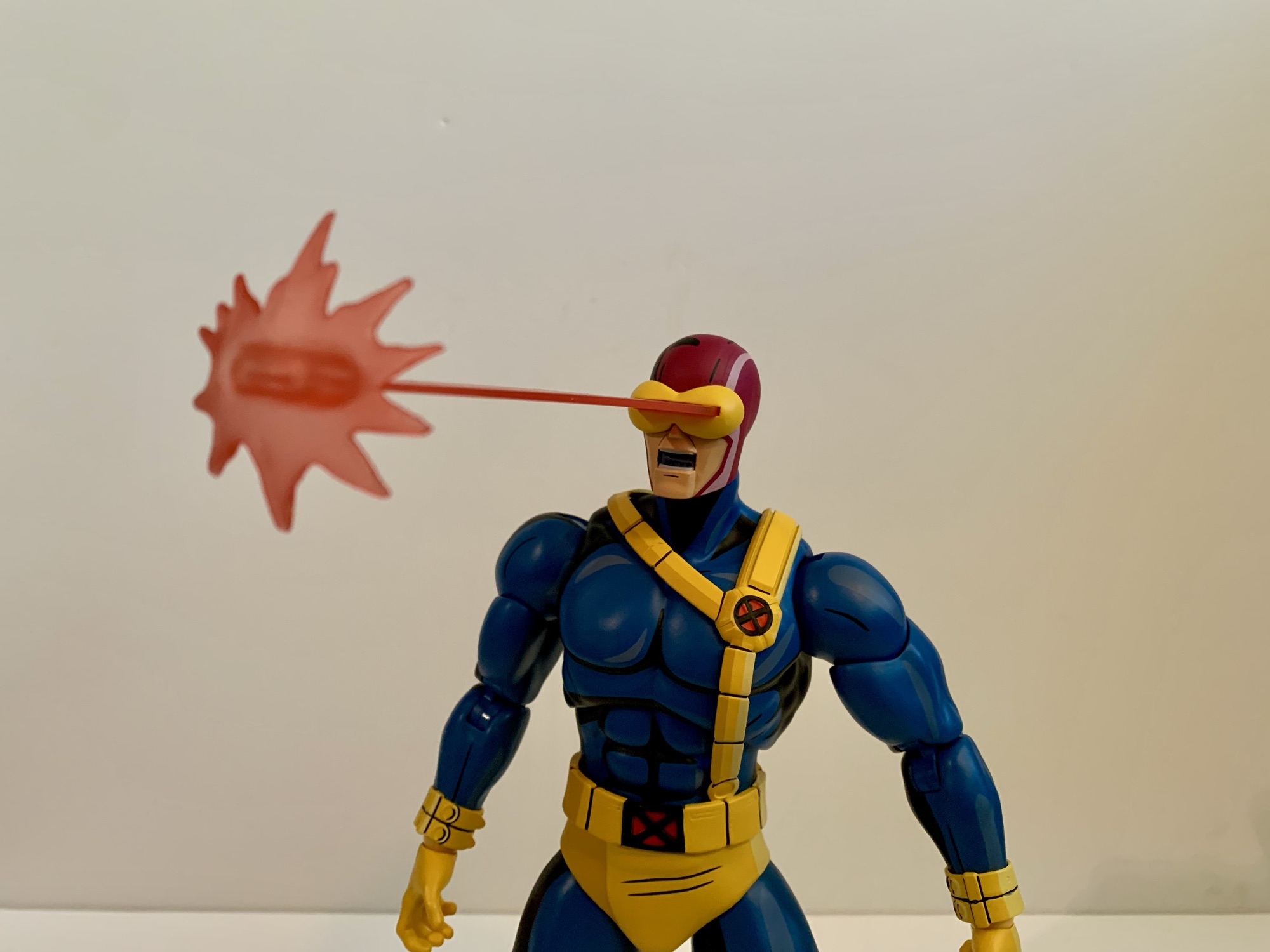
I have critiques for the presentation and articulation on this set, but the bulk of my criticism is going to reside with the accessories. I suppose one could consider the hoverchair itself an accessory, but since this is a set that’s double the price of a typical Legends release I think of it more like a two-pack where the hoverchair is almost like its own thing. And the hoverchair has the effect part stand and also a little blankie that can go over the lap of its occupant. That’s all fine, but for Xavier himself the accessory count is slight. He has his Cerebro helmet which is more of a classic design than one that’s evocative of the 90s or animated series (if you want a more TV helmet, the new Target exclusive Savage Land Xavier comes with one). It fits on his head fine though you may have to mess with it to get it aligned just right. It also has an effect part that plugs into the back. Its done in white plastic with a pearlescent coating. The shape is like a splatter effect and it’s supposed to represent his psychic powers which are sometimes illustrated with such a shape. For me, I think of them as being colored pink or blue (even the box art opts for pink), though I’m sure someone colored them white at some point in the comics. It’s just this color and this shape make it look like he’s getting hit in the back of the head with a balloon filled with milk, or a substance that’s much more disgusting.
Obviously, this is how everyone is going to display this guy.
For optional parts, we have the head of the Shadow King. Your mileage may vary, but for me, the Shadow King was always one of the lamest characters associated with X-Men. I loathe his episodes from the show so this isn’t an accessory that’s going to appeal to me. That being said, the sculpt and paint on the head is fine. There’s more paint on this thing than probably on the entirety of the rest of the set. It’s also just a head and it’s not meant for this figure. My understanding is that this head is designed to fit on the Kingpin body so if you want to create a Shadow King for your collection you need to go out and get yourself another Kingpin. Which is fine as a throw-in if they had room in the budget, but this head is the only other accessory in the box. We don’t get a second portrait for Charles, we don’t even get any extra hands! I wish he had some neutral hands for just when he’s sitting in his chair or at least one alternative to the pointing fingers hand. A portrait where he’s calling out commands to his X-Men would be appreciated too and I would happily trade this Shadow King head for accessories for Xavier that flesh him out. That’s the character I want. That’s what’s driving my purchasing decision. Not a random part that’s only useful if I go out and buy a whole other figure.
This set may be more expensive than your typical Legends release, but the end result is pretty much the same. This Charles Xavier figure is what you buy if you have a collection of Marvel Legends X-Men and you just want an Xavier. It’s going to slot into your display and anyone who sees it will know that’s Professor X. It’s not going to “wow” anybody though and there are a lot of shortcomings. The actual figure strikes me as a better representation of a 60s and 70s Xavier who was drawn more like an older guy. As a 90s Chuck, this guy is too small and slight. The chair looks fine, but the lack of paint also makes it look cheap. And if they had just done the thing in three pieces where the front portion that covers the characters legs was one piece it would have cut out that hideous seam right down the middle. The accessories are a bummer because the figure feels underbaked, and given that this is a re-release it’s an added bummer because they could have improved the figure at no added expense. There are better suit-guy molds at Hasbro they could have used or just more hands. It’s almost like they want you to go out and buy that Savage Land Xavier in the flight suit if you’re unsatisfied with this one and toss him in the chair instead. I prefer my Xavier in his green suit though, and I don’t like the portrait of that new Xavier. Plus, his assortment of hands are almost as bad as they are here (he comes with trigger finger hands – why would Xavier need trigger finger hands?!).
Obligatory, “To me, my X-Men,” shot.
Should you get this one? I don’t know. It’s really just to fill out a collection which is honestly the worst reason to buy something. I try not to do it because money and space are precious resources and I don’t like wasting either on something I don’t love. And to get this guy into your display it’s going to take some work since he does demand quite a bit of shelf space. It looks okay, so I don’t hate it. I would like it a whole lot more if it were $35 instead of $50 so maybe I should have held out for a sale. One may come, one may not, as X-Men are pretty hot right now thanks to X-Men ’97 so anyone waiting for a sale somewhere is probably taking a risk.
There are more reviews here of X-Men action figures if you’re looking to fill out a shelf:
The toyline of my dreams was announced last October. In celebration of the 30th anniversary of the television series X-Men, Hasbro is doing a dedicated line of Marvel Legends with figures based on the look of the show. The show was obviously inspired by the designs of Jim Lee, but there are differences in the…
2022 was the year a dream toyline of mine was made a reality. Hasbro finally decided to do a line of Marvel Legends based on the animated series X-Men, which premiered 30 years prior on Halloween 1992. The line was staggered with a release coming every 6-8 weeks or so and ended up totaling 8…
If you are reading this the day it goes live then Happy X-Men ’97 Day! Today is the day the long-awaited sequel series to X-Men debuts on Disney+. Rather than fast-track a review of the first two episodes to this blog, I decided instead to do what I most often do: review an action figure!…
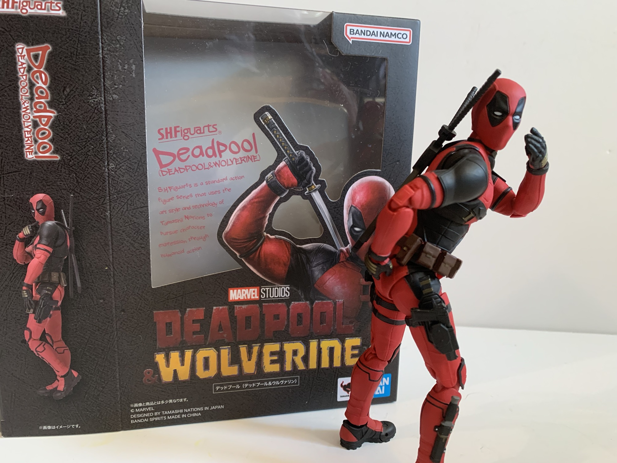
Marvel’s cheekiest hero gets the premium treatment.
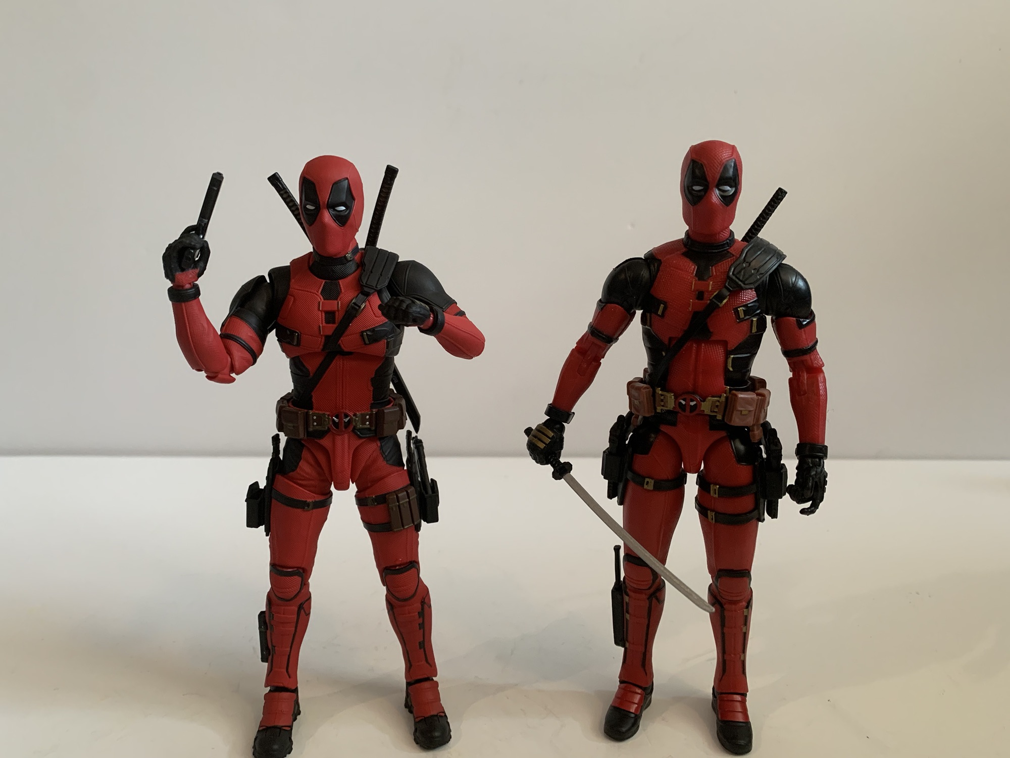
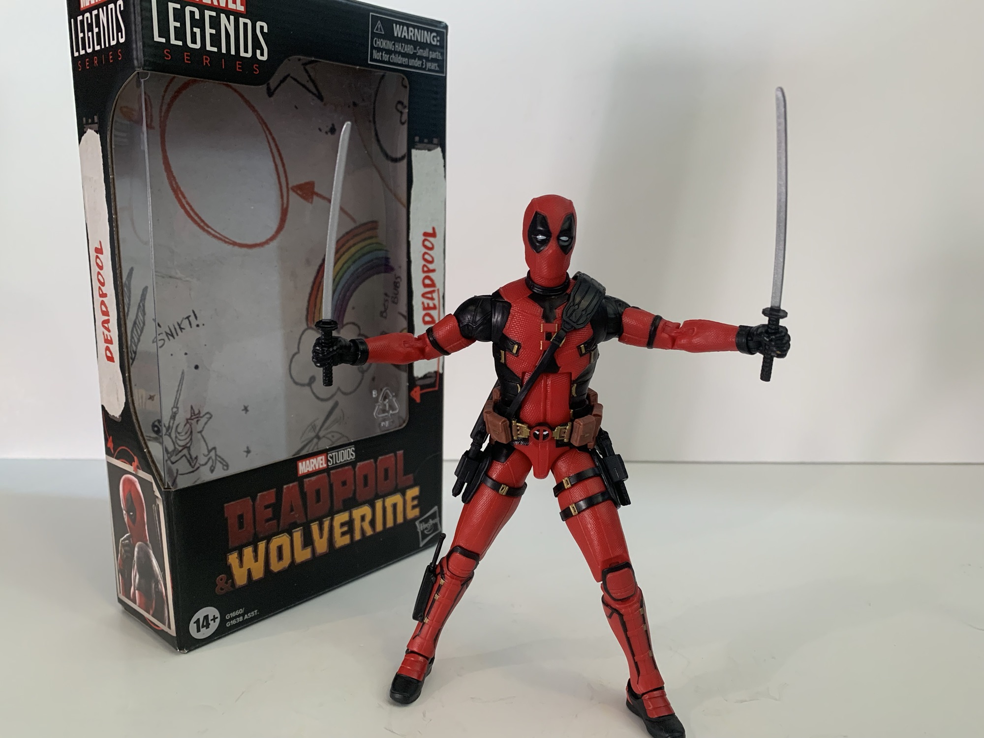
Despite the fact that I own dozens of them, I don’t really consider myself a fan of Hasbro’s Marvel Legends series of action figures. They largely are able to get a purchase out of me thanks to Hasbro’s exclusivity agreement with Marvel/Disney which basically makes them the only game in town. Despite that, I will say perhaps my favorite Legends figure that I own is Deadpool from the movie subline. Specifically, I like the Deadpool that came in the two-pack with Negasonic Teenage Warhead. By Hasbro standards, or really any action figure standards, it’s a damn fine release. It’s well sculpted, it’s painted well, it comes with enough stuff, and it also poses pretty well. I liked it so much that I bought the almost identical re-release from the Deadpool & Wolverine movie.
“Wait! Who the hell are you?!”
I may like that figure, but I have always been interested in something a bit more premium. Legends may be the only game in town when it comes to retail in the US, but for specialty shops and online we have the imports. And in this case, I’m talking the Bandai/Tamashii Nations S.H.Figuarts line. I am very familiar with the brand thanks to all of the Dragon Ball product that’s been released and I’ve had my eye on the Deadpool offerings for awhile. I passed on the first take because Bandai, for some reason, did not include any guns in the package. Deadpool kind of needs those so no guns meant no sale. I don’t know why that was, if it was a Bandai thing or a Disney one. Warner Bros. did ban guns from being included as accessories with DC action figures – did Disney briefly consider the same? I say briefly because it didn’t impact Hasbro or really any other figure release I can think of. The issue was rectified with the Deadpool 2 version of the character, but that featured the much darker and drab color palette from late in that movie which wasn’t really what I wanted. For Deadpool & Wolverine though, I finally found a version of the character I was willing to throw some money at.
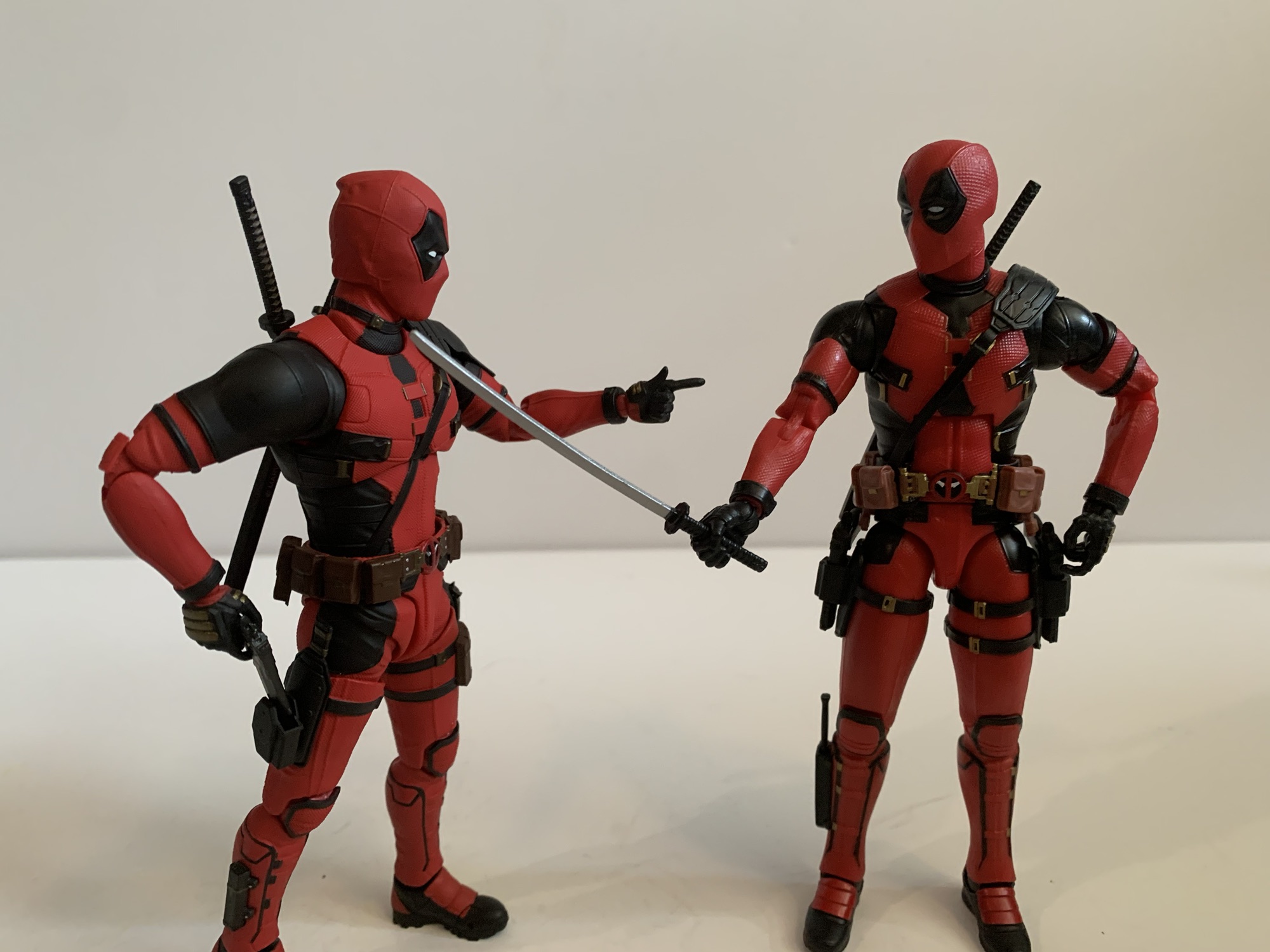
Bandai left, Hasbro right.
This version of Deadpool is, I assume, very similar to the past ones in the line. Just like the Legends version, little needed to be re-sculpted to make it work and it’s the sort of release where you really need to look closely to see what’s changed. The most obvious change though is just the color. This Deadpool is a bright red where as the others were noticeably darker. I would say the old costume was the color of dried blood, pretty useful for a character who gets shot and stabbed a whole bunch. The bright red does make the figure look cheaper by comparison. Bandai likes to stick with colored plastics as much as possible over painted parts and Deadpool is no exception. The red parts have that plastic look to them despite being richly textured. The black, both painted and non, has more of a satin finish to it. I’m not sure there’s really anything Bandai could have done to alleviate the issue with the red aside from throwing a wash on it. He does get pretty dirty in the film so it wouldn’t look terrible, but I get why they wouldn’t want to do that. It’s just one of those things that can’t be helped.
“Gasp! It’s Hugh!”
The good news is that’s basically my only complaint when it comes to the look of the figure. Aside from that red, he looks awesome. This figure is well proportioned to resemble actor Ryan Reynolds (and his stunt guys) in suit from the film. I like the head size, the shoulders, the length of the limbs – all of it. If this weren’t such a heavily articulated figure I’d say he looked like he stepped out of the movie. The hits of gold all seem to be in the right place and accounted for on the chest and the back of the hands. The belts, holsters, and straps are all where they should be. There are multiple textures throughout the body that help make the figure come alive along with little folds and creases in certain parts. He looks great, and standing the figure next to the Hasbro offering, you can tell which one cost more money.
It’s good to have the guns back.“Time to make the chimichangas”
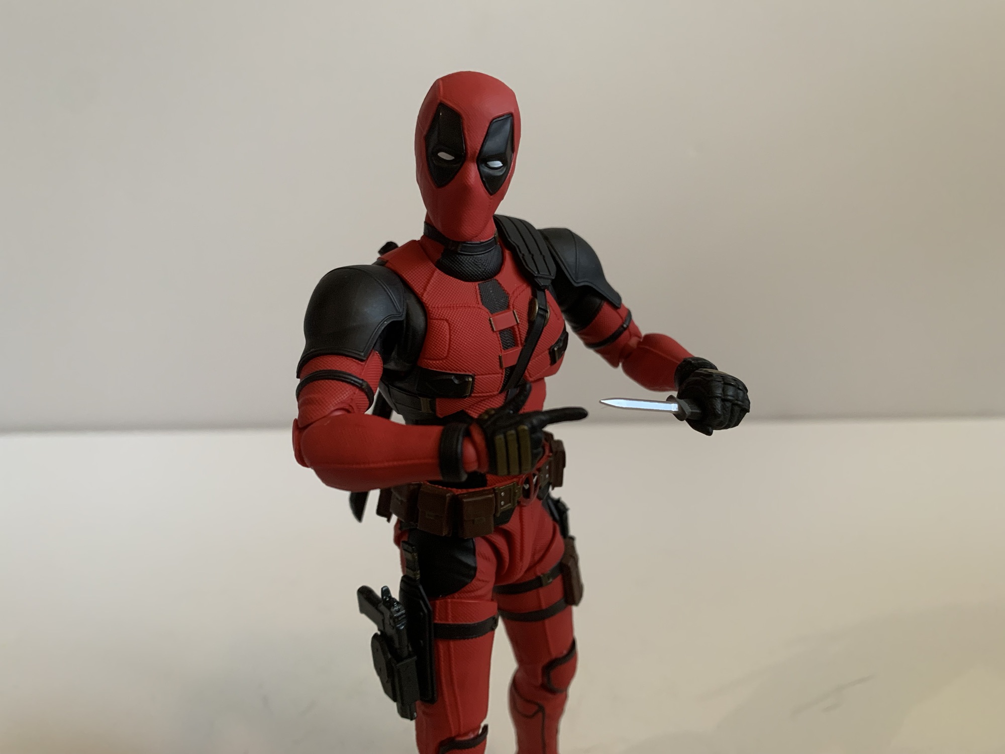
Deadpool also comes pretty well stocked with accessories and extra parts. For starters, we get a whopping ten sets of hands. That makes sense since Deadpool is a pretty expressive character and since he wears a full mask he tends to use his hands a lot. For those hands, we get sets of fists, fists with blades poking out, gripping, c-grip, finger-bang, thumbs up, trigger finger, relaxed, chop, and splayed open. Some of these hands have clear multiple uses. The “finger bang” hands are also pointing hands while the c-grip hands can be used to make a heart gesture. There’s basically nothing missing here aside from a middle finger gesture, but maybe Disney wasn’t okay with that? Deadpool also comes with 3 sets of interchangeable eye plates along with the set he’s wearing in the box. There’s a little tool included to help pry them out, though it’s still a little tricky even with it. For eyes, we have what I’d call neutral, happy, angry, and surprised. On their own, the differences are subtle, but it makes a difference when you get them into the head. Again, Deadpool is a very expressive character so these inclusions are much appreciated and I assume a lot cheaper for Bandai than doing three extra heads.
“What do we have down here?”“Look! A baby knife!”“Eat your heart out, Van Damme.”
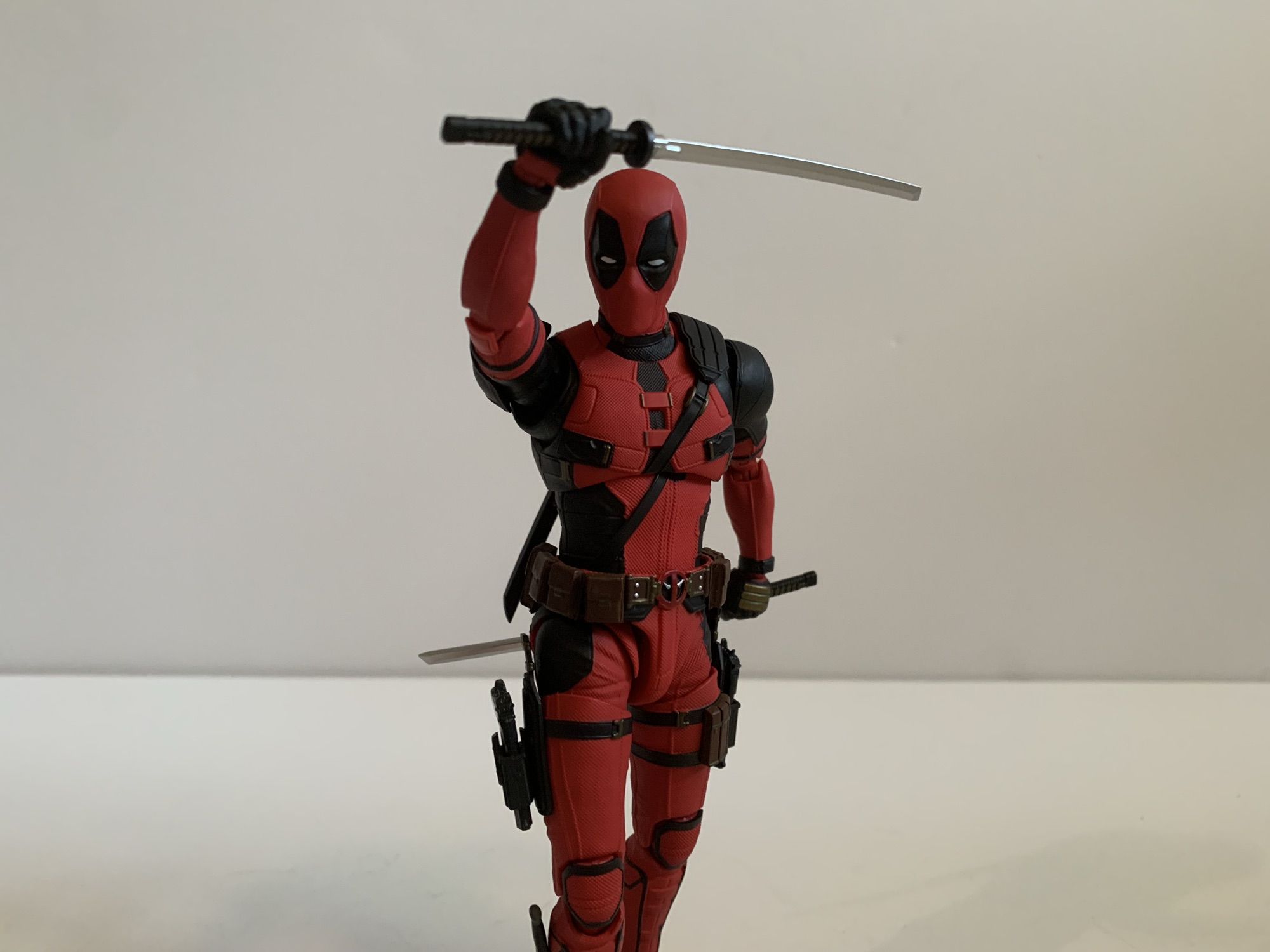
Deadpool also comes with his usual assortment of weapons. For melee attacks, he has two katana. Like they are in the film, the katana are a little small and thin. I don’t know if they’re technically katana as a result, though I also don’t know if they’re technically small enough to be considered wakizashi. They look nice though with some gold inlaid in the hilt. For storage, he has the scabbards that go on his back and that part plugs in. These swords don’t actually slot into them though, I’m guessing to prevent paint rub, and instead the figure has two dummy sword hilts to plug into them instead. Similarly, we get a sheathed knife that plugs into his right calf. If you want Deadpool to actually brandish his little knife, there’s an empty sheath to swap it with and a little knife all by itself. Lastly, we have the two desert eagles (I think) and their holsters. Unlike the bladed weapons, these do go into the holsters when not in use. They are the black versions of the weapon and not the gold ones he acquires during the film. It would have been nice to get the gold ones, but maybe that’s for a future re-release. The guns look fine otherwise, though I find his trigger hands are quite snug with them. Posing them convincingly is more challenging than I’d like.
“Who invited you?”
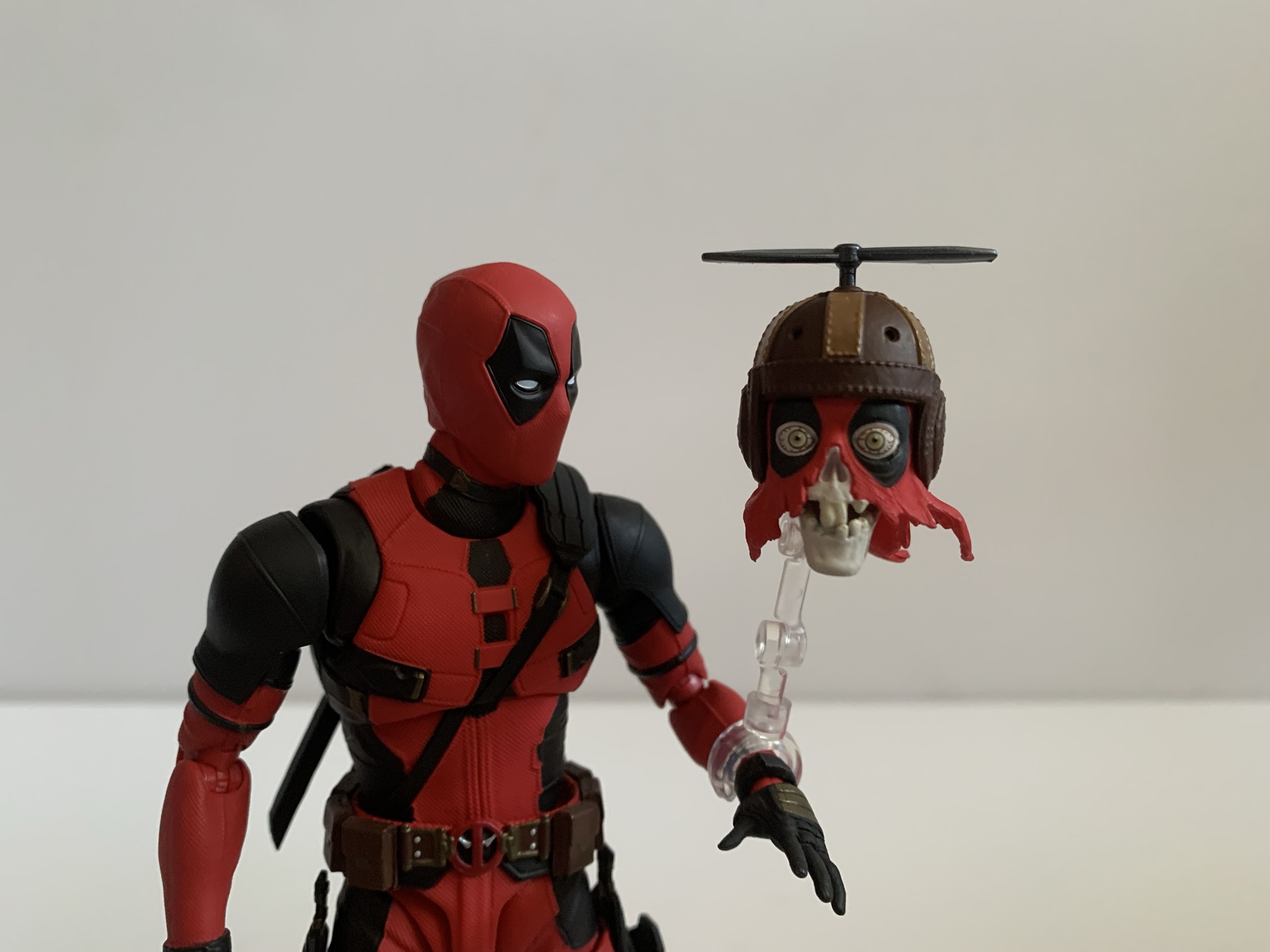
That’s not everything though, as Deadpool has one other accessory of note: Headpool. Headpool is the decapitated and decrepit remains of a Deadpool from an alternate universe. He has this old school leather pilot’s helmet with a propeller on top that allows him to basically float around. What’s left of his mask just dangles in tatters while his exposed skull is free to yammer away, despite no longer having a voice box. He’s basically a visual joke in the movie that Bandai brought to life. The head is well sculpted and painted and the little propeller does rotate, but that’s it for articulation. I’m surprised the jaw doesn’t move. Also included is a clear, acrylic, post that plugs into the head at one end and features a c-clamp on the other. It’s designed to clip onto Deadpool’s forearm, which works well enough, but I wish it had an optional platform to just stick him on the shelf beside Deadpool or a way to plug into Deadpool’s back so that he’s hovering over his shoulder. With the setup provided, he’s really only useful in one pose and I don’t know how many collectors will want to clip this guy onto Deadpool’s arm? I definitely don’t so it feels like a wasted accessory.
“Ohh that’s pretty cool…”
That’s a pretty good spread, all things considered, but there are some obvious omissions. The last Deadpool Bandai released came with some gun effect parts that I would have liked to have seen included. I guess we’re getting Headpool instead, but I would honestly trade him for the gun parts. Also not included is an unmasked head. For me, this isn’t a big omission as I’d never display him unmasked, but I understand people who think one should be included. Obviously, releasing the figure without one means that Bandai didn’t have to pay Reynolds for his likeness. If that keeps the figure’s price down a bit, then that’s a worthwhile trade-off as far as I’m concerned. Hasbro did the same, and as far as I know, the only figures with the Reynolds likeness are coming from Hot Toys. Maybe Bandai will come back to this with an unmasked head? It’s possible, but none of their other Deadpool figures featured such so I wouldn’t hold my breath.
Deadpool: “Snikt!” Wolverine: “What the fuck are you doing?”
This Deadpool figure comes with a lot more parts than its Hasbro counterpart, but it also features more articulation. Or at least it should. The Hasbro one is pretty well articulated on its own with only a few areas of weakness (basically the waist). This figure should remedy that, though I have to say upfront that posing this guys can be quite annoying. He is what I’d call a “fiddly” figure. He has so much extra stuff keyed into his body that will constantly pop off on you when posing him. The knife especially. It’s best to just take that off and pose him then replace it when you’re done. I already mentioned that the eyes are not the easiest things to swap, but they pale in comparison to the hands. For most, I needed to heat them up in order to get them onto the wrist pegs. This is unusual in my experience with a SHF release and it definitely does knock the fun-factor down since this figure has so many damn hands and so many possible expressions and poses to take advantage of. I basically did a lot of these pictures with a bowl of hot water at the ready that also eventually needed to be reheated. I tried to plan out my pictures as much as possible to get through as many as possible while the water was still warm enough to do its job. It makes me wish Bandai did the Medicom thing of putting the extra hands on acrylic posts to keep the entry hole as wide as necessary. I don’t know if that practice actually works or if it’s just confirmation bias at play, but I didn’t have any issues with my Medicom figures in the past.
“All right kid, hand over the pizza!”
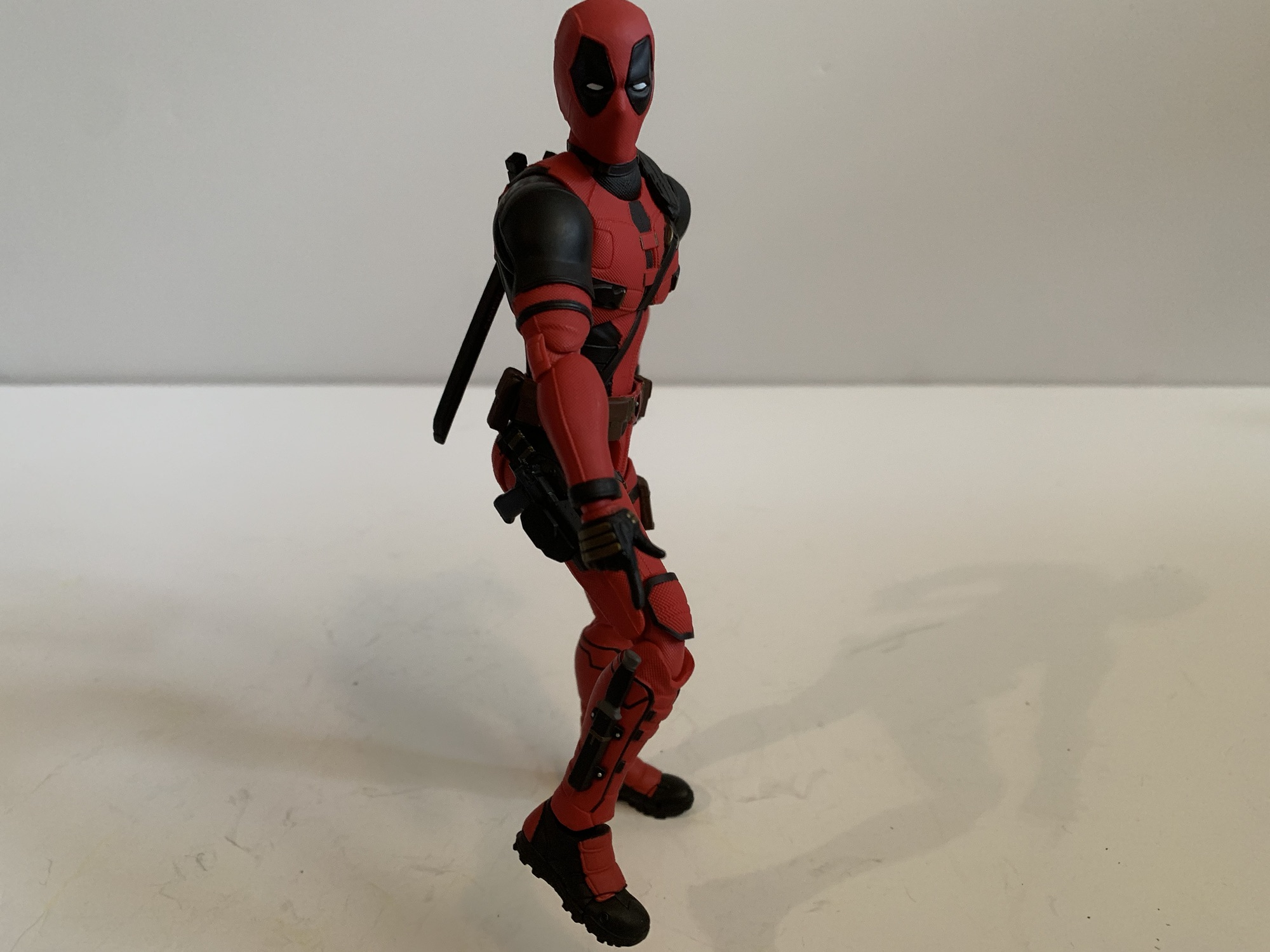
With that out of the way, lets rundown this articulation. We have a double-ball at the head, ball at the base of the neck, butterfly joints, shoulder ball hinges, bicep swivel, double-jointed elbows, ball hinge wrists, ball-jointed torso, ball-jointed waist, ball-jointed hips, thigh swivel, double-jointed knees, ball-hinged ankles with ankle rocker, and a toe joint. That’s basically the standard SHF setup and most of it works as intended. You will get great personality out of the head and the elbows and knees bend well past 90 degrees. At the hips, the holsters pose issues when trying to bring the legs out for full splits. Going forward and back isn’t an issue, but out to the side is as he can’t even really get to 45 degrees. The butterfly joints work well, but he has these shoulder pads that really make getting much use out of the bicep swivel more trouble than it’s worth. The figure is going to fight you at times in the shoulder region as a result. There is rotation in the diaphragm, but that waist seems to mostly offer forward and back. He can at least get a decent crunch going forward and arch his back enough until the scabbards get in the way, but the figure is more limited than I expected.
“Ow! Fuck! I wasn’t really gonna shoot him!” “No one messes with our pizza, dude!”
This is a figure where the articulation is there, but you have to work for it. I wish Bandai had done the shoulders differently when it comes to the padding up there and I also wish they had come up with a more creative solution for the belt and the impediments there. Maybe just make those holsters peg into the belt so they can swing out of the way? That would probably make the suit less accurate to the source, but if the actual holster itself still pegged into the thigh maybe it wouldn’t matter? The old hinged ball in the diaphragm may have helped too. That setup can lead to gapping issues, but if it’s on the back of the figure (and amongst a lot of black) it may have been worth the sacrifice. This is an expensive figure, most US retailers have it at $90, so a little extra engineering should be expected. Especially when so much of what’s in the box is likely reused from past Deadpool figures.
Wolverine: “I gotta get the fuck outta here.”
I bought this version of Deadpool because I wanted a premium version of the character for my shelf. Did I get what I paid for? For the most part, yes. It looks better, it’s more expressive, and even though it can be a chore to pose it does ultimately pose a little better than the cheaper Hasbro offering. Is it just worth more than 3x what that Hasbro figure costs? Honestly, probably not. If you’re comparing the two as apples to apples then, yes, this Deadpool figure is the superior action figure. It’s just going to be a more subjective exercise when value is added to the equation. I’ve been pretty happy all these years with that first movie Deadpool I bought. Hell, I still enjoy the old Toy Biz Marvel Legends Deadpool. I really didn’t need the updated Legends figure for the new movie, but I wanted more Deadpool. I certainly did not need this one, but I’m happy to have it. A more rational and cost-conscious person could probably buy one of the Legends offerings and be perfectly content with that as well. If you have the money and want the best Deadpool on the market, then yeah, go for it. If you’re content with the Hasbro figure then I don’t blame you if you come to the conclusion that you don’t need this.
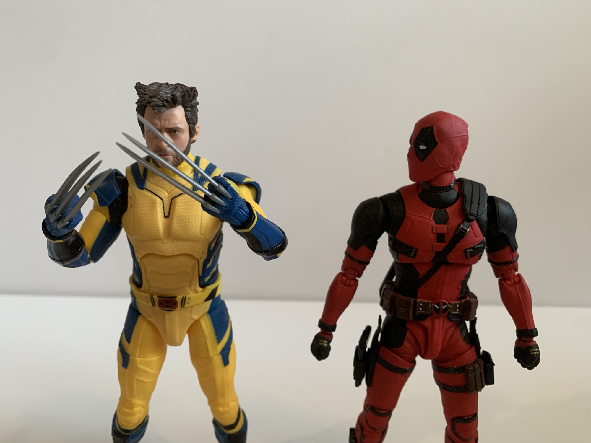
Bandai did also release a Wolverine to pair with this Deadpool. Unfortunately, it’s just not good enough for me to buy. Priced at $85, the figure is not much different from the Hasbro offering in terms of what’s in the box except for the fact that it doesn’t have an unmasked head. I don’t place much value in that when it comes to Deadpool, but I absolutely do when it comes to Wolverine. And what I couldn’t get past is the lack of sleeveless arms. The Bandai Wolverine is basically a look we never saw in the movie. When Wolverine had the sleeves on he went unmasked. He only masks up at the end when his suit is pretty beaten up and dirty. The proportions look way better than the Legends figure which is quietly kind of terrible in that area. The saving grace of that figure is the fantastic Hugh Jackman portrait. And with that figure, I can compromise at $25, but not at $85. If Bandai comes back with the Wolverine I want I’ll get it, but for now, Deadpool is going to fly solo on my shelf. Well, not exactly, since he has plenty of Deadpools to keep him company. And Headpool, how could I forget about Headpool?
If you’re looking for more Deadpool figure reviews we have more Deadpool figure reviews:
Despite the amount of reviews presents on this blog, I still do not consider myself a Marvel Legends collector. That’s because my interests are somewhat narrow when it comes to the Marvel brand. Over the years I’ve developed a fondness for Deadpool as depicted on film by Ryan Reynolds. I think the comic book character…
It might be hard for the young folk to believe, but once upon a time movies based on comic book characters were treated like box office poison. Unless you were Superman or Batman, you just didn’t belong in cinema. Even those characters weren’t bulletproof. Superman had a nice run, but fizzled out with the fourth…
Look through my various toy reviews and you’ll probably notice that I’m not much of a Marvel guy. That wasn’t always the case for me though as I was huge into Marvel Legends once upon a time. I basically stopped around the time Hasbro was awarded the Marvel license. I felt there was a dip…
In some ways, Secret Wars was bad for comics. Commercially, the 80’s event was hugely successful for Marvel even though it seems to have just a lukewarm reception by fans in some circles. It helped to establish the belief that events sell and Marvel seemed hellbent on taking that approach in 90s. One of Spider-Man’s big plotlines was Maximum Carnage. It was a multi-issue arc with a bunch of heroes and villains teaming up to form super teams, and like Secret Wars, it didn’t seem like fans thought much of the finished product, but it sure seemed to sell well. And if it had not we wouldn’t have the extremely derivative Maximum Clonage (sic) to follow. Also referred to as The Clone Saga, Peter Parker was suddenly confronted with multiple versions of himself thanks to The Jackal and no one knew who the real Peter was. It’s the storyline that brought us the Scarlet Spider and it’s also the storyline that gave us Kaine.
“Don’t look at me!”
Kaine was yet another clone of Peter. He was the like the goth Peter before Sam Raimi came up with the idea for Spider-Man 3. Clad all in black with this weird, blue, membrane running throughout and a tattered cape, he caused some trouble for both Spider-Man and Scarlet Spider before eventually being outed as yet another clone. Kaine was actually the point where I fell off the story as a kid. It just got way too soap opera-like for my taste and I got enough of that at home from a mother who would monopolize the television on Saturday to watch all of the episodes of All My Children she had recorded during the week.
That’s more sculpt and paint than we’re used to with Hasbro.
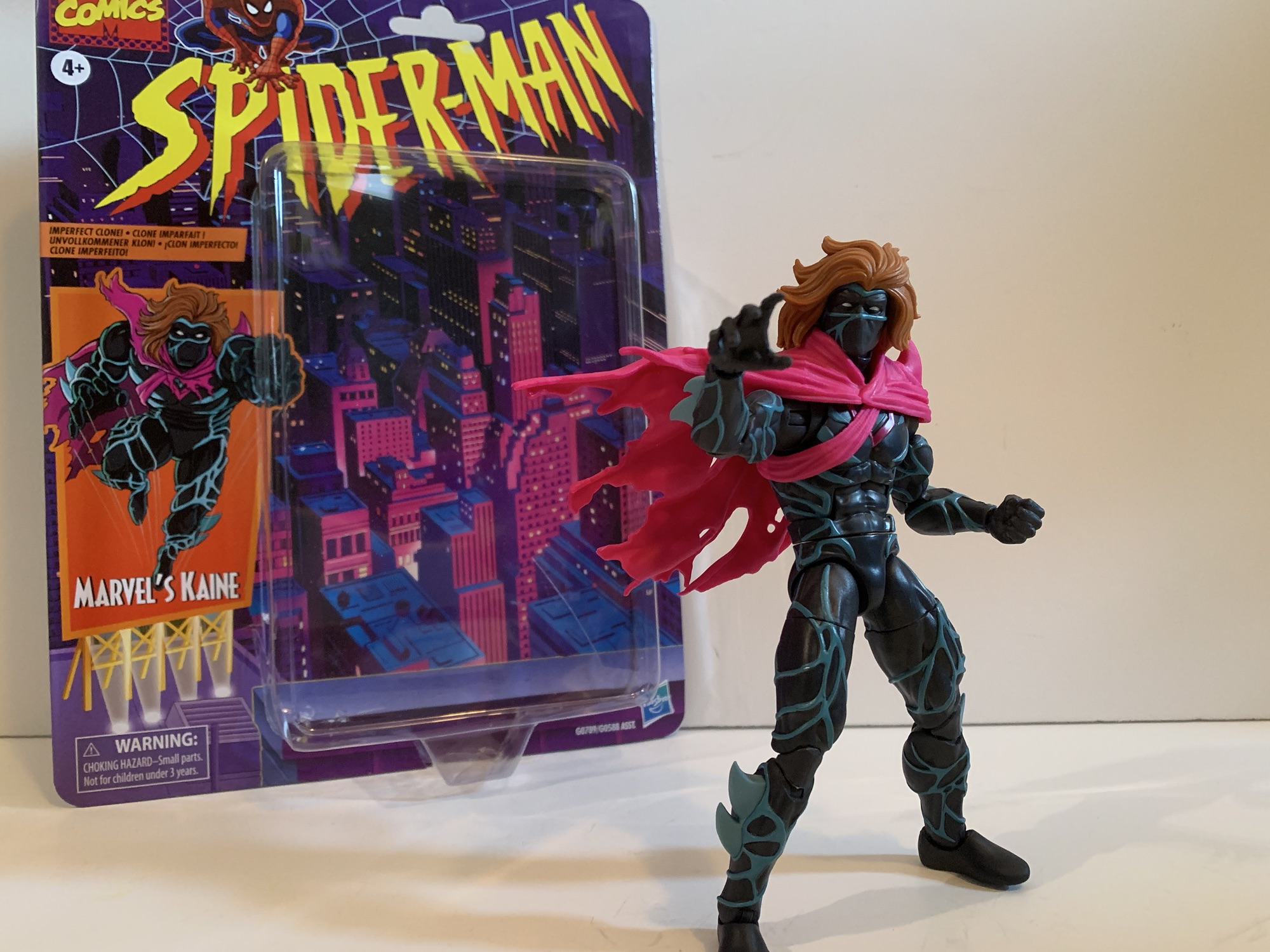
Kaine may have been a lame addition to the story, but if I’m being honest, he did look kind of cool. When Hasbro unveiled a Kaine figure last year, I took one look at it and said to myself, “Why not?” As a Marvel Legends figure, it looked interesting and the crazy pricing we’re seeing from the world of action figures makes these $25 ones feel more susceptible to impulse buying now. Kaine comes in the retro Spider-Man packaging which makes sense given his era. He never did get a single card release in that line, so I guess this is like making up for lost time. There was a Maximum Clonage box set that contained a Kaine figure that was probably exclusive to some store. It was a classic Toy Biz repaint and I think they used an Archangel body for the base and just slapped a cape on it. Maybe if he had made the jump to the actual show he would have been given a more prominent release, but honestly it’s all Kaine really deserved.
The cape looks nice and dramatic, but it will get in the way.
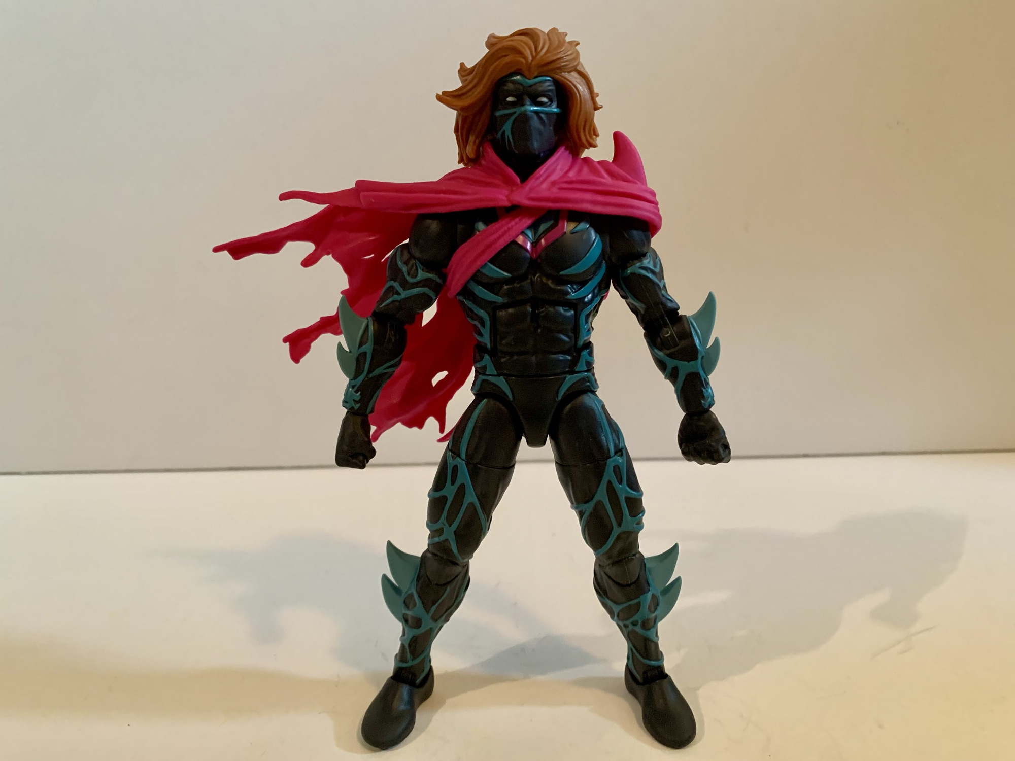
Hasbro apparently felt like he deserved better, because this Kaine figure goes harder than I would have predicted. This figure is basically all new sculpt. The blue veins are all sculpted and painted as are the fins, or blades, on his forearms and shins. Even the crotch piece has sculpted veins. The hair, head, and cape are all new as well and the only reuse this figure can take advantage of rests with the hands and feet, which I’m sure are recycled from tons of figures. This does come at a cost for the consumer as Kaine only comes with one set of alternate hands, but that’s how it goes. He has fists and open, style posed, hands. The cape is sort of an accessory because you can remove it, but the straps for it on the torso are much harder to get off so it’s really not designed to be removed, but you may want to and we’ll get to why in a bit.
Krillin: “I don’t think even the Dragon Balls could get us a mane like that!”
What I find really striking about this figure is that wonderful head of hair. Kaine looks like he walked out of a shampoo commercial or something. Fabio would be jealous as his hair never looked this good while hawking imitation butter. It, as well as the cape, are just one shade though. There’s no paint added which is a bit of a bummer as I think a wash would really help liven this figure up and also reduce that plastic look. I find this figure looks a lot better on my desk when the lighting is getting dim because it takes away that plastic sheen. Still, by the standards of the line, Kaine is an impressive looking figure and if you’re a customizer of some talent you can probably get this to look even better with minimal effort.
The articulation is basic by Legends standards. He should be able to pose well enough, even with the cape.
Since this is an all new body you may wonder if it has some articulation surprises. And the answer there would be, “Not really.” They had to make new molds to produce this figure, but I bet they just took an existing digital sculpt and then added the details to it before cutting steel. As a result, Kaine feels like a lot of Marvel Legends. He has the hinged ball neck, ball hinged shoulders, butterfly joints, bicep, double-elbows, swivel and hinge wrists, ab crunch, waist twist, ball hips, thigh cuts, double knees, and ankles that hinge and rock. Range at these joints is also all typical Marvel Legends stuff. He can almost do splits, kick forward 90 degrees, and the ab crunch works well enough. Where this figure is limited is the head and that left shoulder. The combination of the big hair and the plastic cape really lockdown the head. He can turn to the side a bit, look down, and barely look up. The left shoulder is also restricted by that cape, but really only in a sense that it can’t rotate all the way around. It does a decent enough job of getting out of the way with most movement and once you’ve settled on a position you can just reposition the cape. It’s not nearly as bad as it looks like it would be, though I’m sure there will be people getting custom soft goods capes for this guy.
Which one is the real Peter Parker?!
How do we feel about having a Marvel Legends Kaine? Fine. He’s a solid entrant for the line and it feels like real effort was put into making an accurate representation of the character in plastic form. Now I understand there’s some debate over just what color the blue vein things should be. He often was drawn to have gray instead of blue. Not being a massive fan of the character, I don’t care. I like the light blue on black so I’m happy. I’m not happy about the lack of accessories, but I expect that of Legends now. I have a weird soft spot for the trash of the 90s, so that’s primarily why I have Kaine. He’ll go with my Scarlet Spider and look like his goth cousin and that’s cool. And if you too think he looks cool then by all means drop $25 and grab him. I don’t know if he’ll be anyone’s favorite release in the line come the end of the year, but he certainly won’t be the worst.
We have more Spider-Man and Maximum Clonage stuff here if that’s your thing:
It was in this space last year that I shared my fondness for the Scarlet Spider costume when I reviewed the Medicom MAFEX Scarlet Spider action figure. I don’t buy much from Medicom because their figures are really expensive for what they are, but I sometimes break my own rule when I think they’ve made…
Last year, Hasbro celebrated the 30th anniversary of X-Men, the animated series that premiered on Halloween 1992 and would become a ratings hit shortly thereafter for the Fox Kids Network. It was responsible for getting a lot of kids into the X-Men and Marvel comics in general and the first, prime, benefactor of that rise…
When I was a kid, one of my favorite past times was drawing. Like most, I started really young with a box of crayons and coloring books. I’d eventually start keeping markers, colored pencils, and other instruments in a plastic McDonald’s case that came from a Happy Meal. It was blue and had a map…
The villain who can be anyone he chooses to be and this is what he chose.
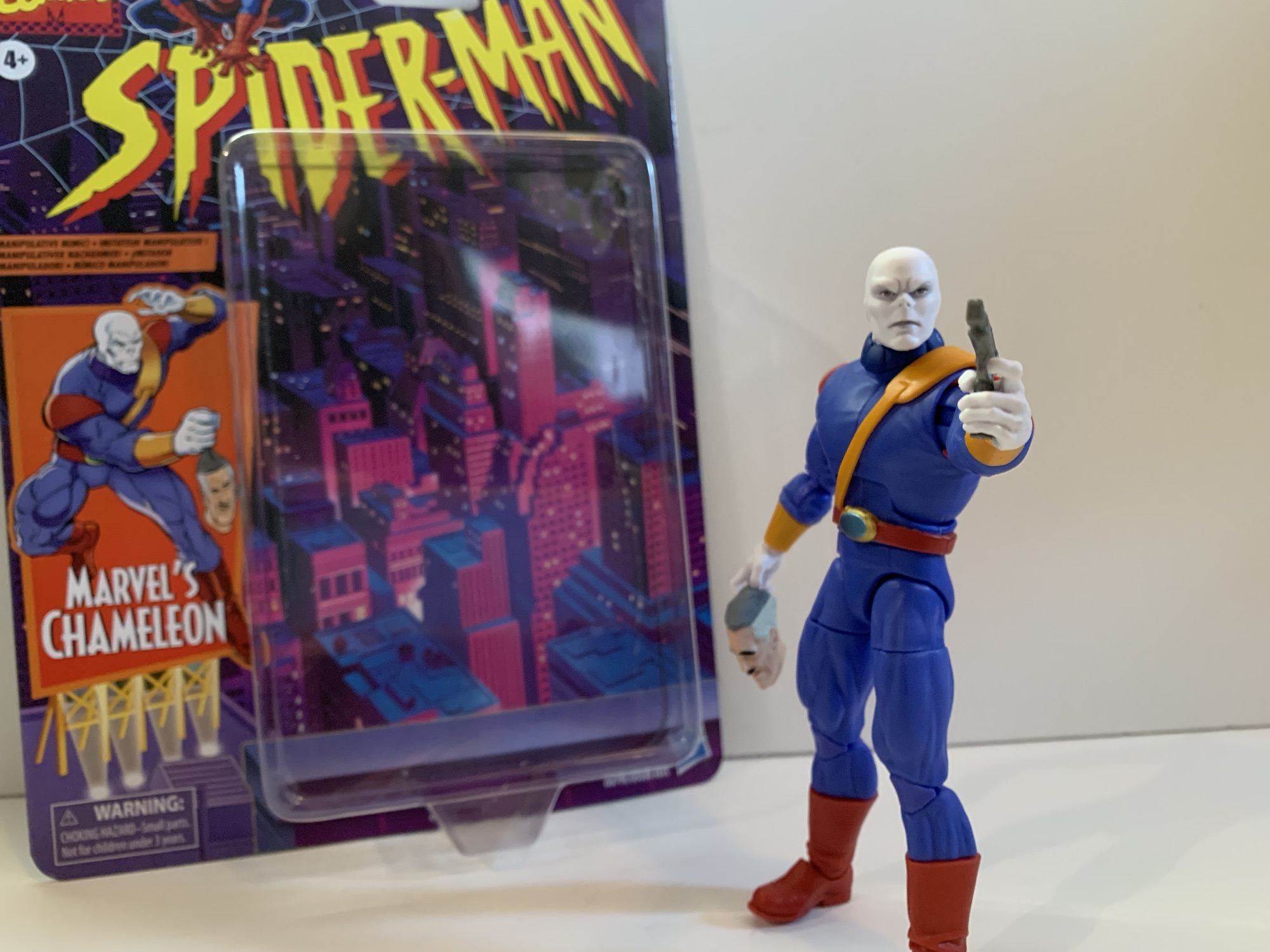
I had a bit of an impulse buy a few weeks back with the Marvel Legends Spider-Man Unlimited action figure from the show of the same name. What I didn’t mention was that he was not alone for hanging on the pegs that day with him was The Chameleon. Like Spider-Man Unlimited, The Chameleon is based on his appearance in a Fox Kids animated series, it’s just that this one is based on the more popular, more celebrated, Spider-Man which debuted in 1994. I can’t say that I was ever particularly fond of The Chameleon. He literally doesn’t talk so he doesn’t have much personality in the show. He’s just a shape-shifter in a purple outfit who received a featured slot in his own episode before becoming more of an ensemble type of villain. And for a villain that isn’t going to banter with Spider-Man, he’s probably best suited for that type of role.
Chameleon with animated Venom and the Walmart exclusive animated Spider-Man.
I have not been collecting figures based on Spider-Man like I did X-Men. That largely had to due with Hasbro’s release model. I would have loved to have added Doc Ock to my display, but I had zero interest in paying for a cruddy looking Aunt May figure just to get him. The two-pack approach really killed my enthusiasm for that line. I was never going to be as into it was I was X-Men, but I definitely would have bought more if I could have just picked up the characters I actually wanted. Chameleon was at least released as a retro card all by himself. He’s in his animated duds and mostly looks the part. My affection for the show, and boredom at not having bought anything recently at the time (damn, that changed fast) is what motivated me to pick up this release. Was that a smart move? Ehh…
And now with the rest of the animated figures I own.
Chameleon stands at approximately 6.5″ making him look a great deal larger than the animated Spider-Man released on a retro card. That’s more of a problem with that Spider-Man than Chameleon, but he does seem really big. Everyone was kind of big in that show, ordinary people on the streets seemed to all be jacked, so I guess it’s not that big of a deal, but I did expect him to be all together smaller. I have no idea how much of this figure is reused, but I’d wager it’s some and maybe that’s how he ended up tall and pretty thickly built. Even though he’s from the cartoon there’s no cel-shading or anything like that on him. He’s played straight up. The head is really well done with a lot of deep grooves in his lethal expression. There’s a little bit of what looks to be an almost silver paint around the eyes and in the creases of his brow. That combined with the really well applied eyes gives him an eerie look. Almost lifelike. It’s striking and it really gives Chameleon the appearance of a cold-blooded killer.
This belt is a pain in the ass to get straight.
The rest of the body is essentially bare plastic. I don’t think there’s another hit of paint on this guy. The only painted part is the belt. Since it has a shoulder strap, Hasbro did it all in one piece. It’s an orange plastic which matches the cuffs on his sleeves. The actual belt portion is painted red and the device on his belt buckle is painted gold and green. It’s somewhat soft, but the choice to make it all one piece means you’ll likely have to mess with it to get it on straight. The harness is pretty tight with no real room for play so it tends to want to pull up on the belt. It’s really challenging to get that belt buckle centered, if not impossible, so it may drive some folks a little nuts if they hate stuff like that. I wish they had just done it in two pieces similar to what they did with the strap on Cyclops. His shoulder pads are also a softer plastic that are keyed into the shoulder joint. I’m guessing the peg for the arm goes through a loop to sort of hold it in place. It moves with the arm, but getting them to mirror each other is a chore. The shoulder pad on the right shoulder of mine is seated nicely into the body while the left one is not so more of it is visible. In trying to jam it back in I actually damaged it slightly with my thumbnail so I guess I should learn to live with it.
At least he has fists?
Chameleon has the usual accessories for a Legends release which is to say he doesn’t come with much. Though, he does come with more than usual. Out of the package, he’s equipped with two trigger finger hands and he also has a set of fists he can turn to. For those trigger hands we get a pair of guns: a pistol and a much larger gun. They’re both a dull silver and they are the exact same two guns that came with the VHS Mystique. And if you’re buying more of this wave, they’re the exact same two guns that come with Agent Venom. I think the pistol also came with movie Deadpool so Hasbro has certainly got a bunch of mileage out of these two. Lastly, we also get a “mask” of one J. Jonah Jameson. It’s designed to resemble a rubber mask that’s been pulled off of someone’s head and is just hanging from something – like a hand. It’s both creepy and kind of funny looking. I like it, but I hate that they sculpted finger holes for it in the back. If you want Chameleon to hold his arm out and have the mask just hang from his fingers it will look stupid. If he holds it as his side it looks passable, but a little odd. I wish they had just sculpted it with the mask coming to a point in the center of the head like it’s going through his fist. Hell, since it’s an all new sculpt, just make it an extra hand like Mondo did for the Venom hand holding Spider-Man’s mask or the Spider-Man hand holding the mask of the Green Goblin. That would have been the way to go.
He also has a bigger gun.
You can probably take one look at this figure and conclude that it’s not going to articulate all that well, and you would be right. The head is on the old ball-hinge, but the oversized collar renders the hinge nearly useless. He can basically just turn his head to the side. Arms feature the usual hinged ball at the shoulder, bicep swivel, double-jointed elbow, swivel and hinge at the wrist. The trigger hands have the superior vertical hinge while the fists go with an appropriate horizontal one. The torso feature an ab crunch that has crappy range going forward, decent range going back. There’s a waist twist, ball-socket hips that can almost hit splits out to the side, kick forward a decent, and a thigh twist in each leg. The double-jointed knees are tight, but otherwise fine. There is a boot swivel that’s pretty ugly, but there if you want it, and the ankles hinge forward and back and there is an ankle rocker. Range at the ankle is mediocre. This figure is pin-less so that’s nice, but it also means that knees and elbows are a slightly lighter shade of purple than the rest of the body so you’re swapping one eyesore for another. I will say, on this figure the miscolored parts aren’t as bad as I’ve seen it on some others.
Sure to be everyone’s favorite accessory is this JJ mask. It doesn’t make sense for this version of Chameleon, but who cares?
Chameleon is pretty mediocre when it comes to articulation. He’s going to just stand there on your shelf. I don’t know why they’d go with the ball-hinged neck given the big collar. The collar is a floating piece so I guess if you want Chameleon to have more range looking up and down you could remove it, but I’d have preferred a double-ball peg so he could have more tilt for nuance posing. I don’t need him to look up at the sky or down at his toes. No butterfly joint when he comes with guns is a bit of a bummer, but I do like the unbroken appearance of the chest. He’s actually pretty broad-chested compared with a lot of Legends and the proportions are pretty damn good. Chameleon is an example for how a character doesn’t need a complicated design to look good in plastic if you just get the proportions right.
Standing tall. Standing proud.
And that’s what it all comes down to for me with Chameleon. Yeah, he doesn’t impress with the articulation and there are some design flaws that bug me, but he looks like the character from the show. He’s a big dude and he’s sculpted as such. The matte finish across the board just makes him look nice and they really nailed the face. He comes with an extra set of hands, two guns, and the mask accessory which is practically a motherload for a Marvel Legends figure being sold at the standard price. For that reason, I can’t really be down on this guy. He’s fine. If you like Chameleon as he appeared in the Spider-Man cartoon from the 90s then I think you’ll be happy with this one. He’s not going to be one you fiddle with much, but when you look to your shelf and see him standing there staring a hole through your soul you’ll probably think “Man, Hasbro kind of nailed that one.”
We have plenty more action figure reviews from the Spider-Man cartoon of the 90s:
Last year, Hasbro celebrated the 30th anniversary of X-Men, the animated series that premiered on Halloween 1992 and would become a ratings hit shortly thereafter for the Fox Kids Network. It was responsible for getting a lot of kids into the X-Men and Marvel comics in general and the first, prime, benefactor of that rise…
When I was a kid, my dad took me to some local convention or trade show. I have no idea why because my dad wasn’t the type who would go to such an event. He liked car shows, but from what I can remember this was more of a hobby show. It was early in…
It was in 2021 that Hasbro released a PulseCon exclusive Venom figure on a Spider-Man retro card. The retro card series is meant to stir-up nostalgia for all of the adults who were buying toys and watching cartoons in the 90s as the retro card is a facsimile of the old cards Toy Biz used…
There’s got to be at least one person who has been waiting for this day.
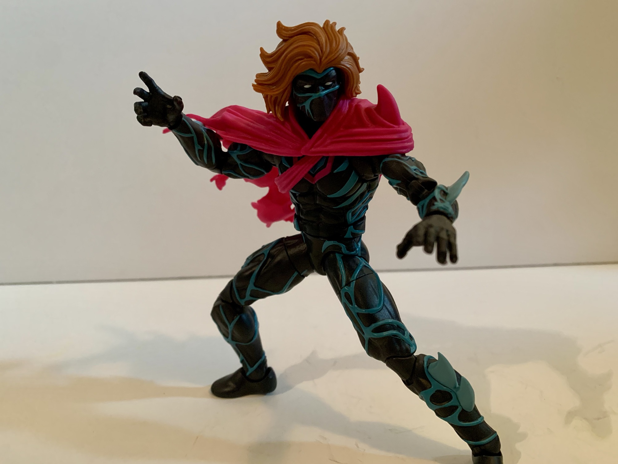
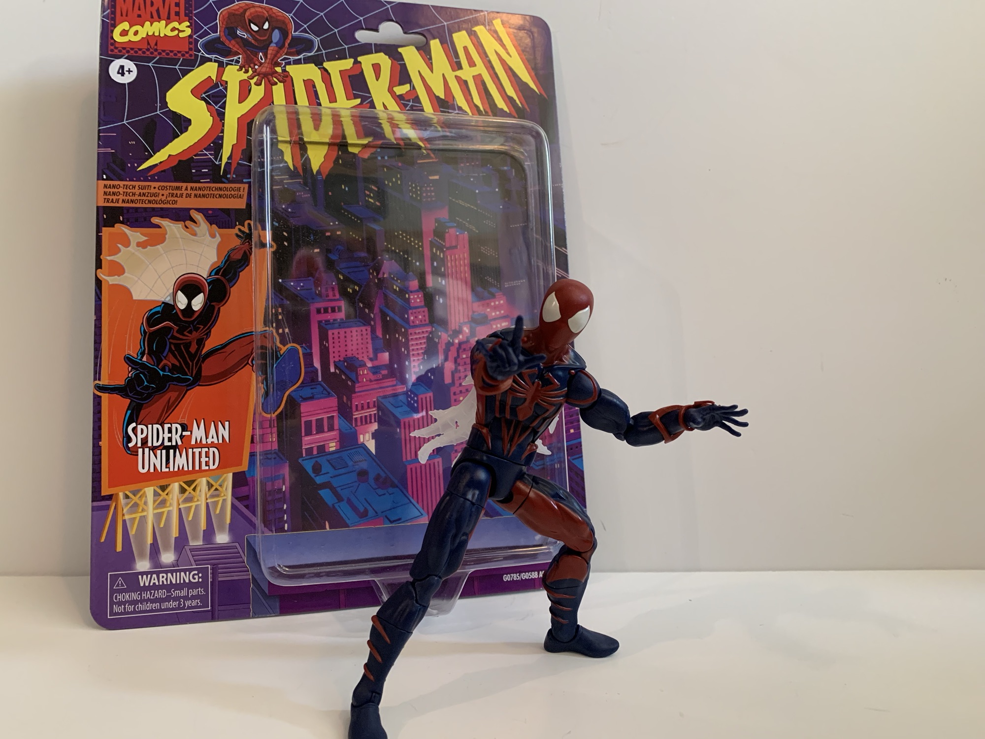
When the decision was made to end the animated series Spider-Man, it didn’t mark the end of the webbed one’s adventures on the small screen. Momentum was building towards a Spider-Man movie which would eventually arrive in 2002 so it made sense to keep old webhead in the public spotlight. Apparently, it would have been too costly to just renew Spider-Man and see if Peter Parker ever did find Mary Jane (we had to wait until 2024 to find out), so Saban Entertainment set out to do something new. Various ideas were kicked around including going back to the beginning, but with Sony working on an origin story for the big screen Marvel squashed that. Ideas for Spider-Man 2099 were considered as well as some sort of alternate universe story with two Peters that Marvel also nixed (perhaps PTSD related following Maximum Clonage). What Saban and Marvel eventually settled on was Spider-Man Unlimited, a show cancelled after three episodes aired that has largely been forgotten. Until now!
It is an interesting look for Mr. Parker, I just wish Hasbro went all out with the shading for the figure.
Spider-Man Unlimited is back in action figure form. Hasbro has done almost every other incarnation of Spider-Man at this point so why not? He did have a cameo appearance in Across the Spider-Verse, just like basically every Spider-Man, and since the look from the show was pretty unique I suppose it makes sense to give it a go in plastic. If anything from the show is remembered fondly these days, it probably is the suit which is sort of a mix of Scarlet Spider and Spider-Man 2099. It’s still red and blue, but there are no weblines and the whole thing is heavily shaded. He also has the web cape of Spider-Man 2099. It’s not the sort of look that can be easily adapted from an existing figure so the fact that Hasbro was willing to invest in new tooling for this is actually a surprise. And there’s really no way to do the figure without also using a fair amount of paint when compared with a basic Marvel Legends release. It will be interesting to see how this thing sells and if Hasbro’s investment paid off.
I’m guessing we’ll never get Venom and Carnage from this show so this will have to do.
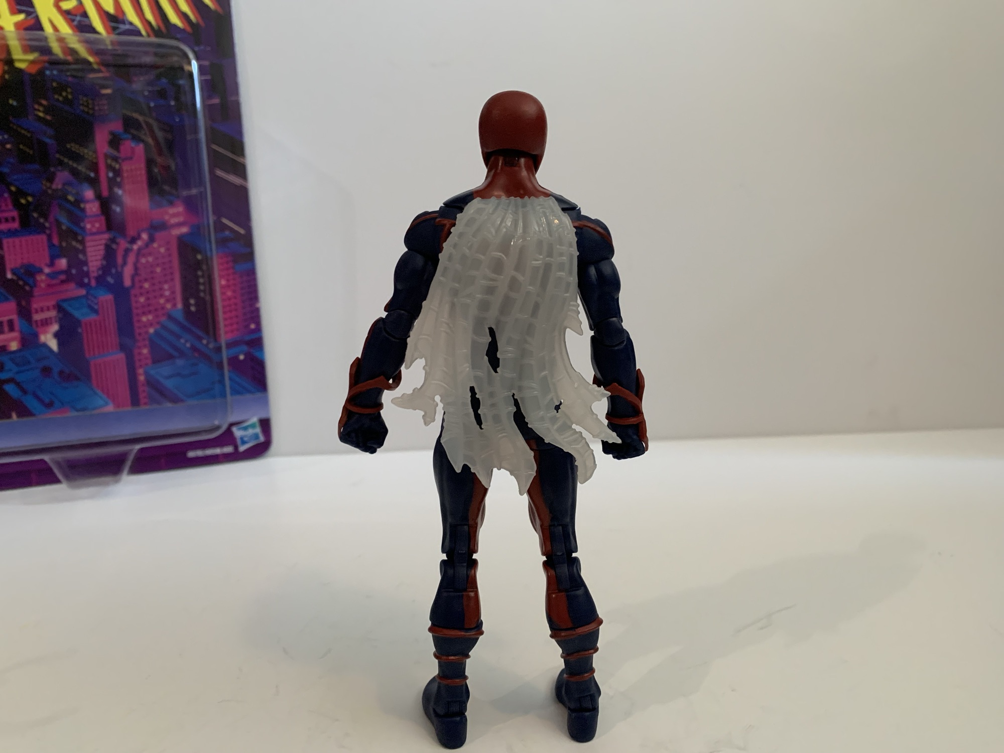
Spider-Man Unlimited is a bit of a throwback to a couple years ago when it comes to Spider-Man figures. I should point out that this suit was designed by Shannon Denton and Roy Burdine so if you like the look then thank them. The figure is mostly new tools because the spider logo on the chest is raised as are the legs running from them. Where they are not raised is on the arms and the red, spider, web-shooters are a separate piece. The calves have molded fins on them while the thighs and feet do not. In other words, the torso and shins are definitely new sculpt while the arms and thighs could have been sourced from another figure. The hands are conventional Spider-Man hands while the head is similar to past Spider-Man molds, but it looks too round to be from one of the symbiote costume figures and I want to say it’s all new. The web cape I’m not sure of as I don’t have any of the 2099 figures. It’s hard plastic and semi-transparent that’s slightly preposed.
It’s really not a bad sculpt.How do we feel about web capes? Personally, I could do without.This one can be touch to get into classic Spider-Man poses.Just like I don’t expect to see Venom and Carnage from the show, I’m guessing no Green Goblin will show up to help Spidey.
Most of this figure has been molded in blue plastic. All of the red you see on the figure is painted except for the web shooters and head. And on the head, the eyes are painted and not all that well. There’s some bleed around them and it’s noticeable even from a distance. The paint on the torso though is pretty clean and impressively so. The only ugly spot is the seem between the back and front of the figure where blue shows throw. Paint on the legs is mostly fine. The red is not particularly opaque on the knee pieces, probably because that piece is a hard plastic and it just doesn’t adhere as nice. To my surprise though, the head doesn’t really clash with the painted neck so that’s a plus.
I need to do a second coat and touch-up the edges, but I like the added shading on the face. Can I keep myself from shading the rest?
What does stand out aesthetically here is the lack of shading. It’s not really Hasbro’s approach to do heavy shading on their figures, but it feels like a pretty big component for the look of this version of Spider-Man. Rather than shade it, the blue and red just seem all together darker than they probably should be. It is really apparent though since the image on the box is similar to the look from the show. In my opinion, the shading makes the suit look more interesting than it is, but to properly shade this it would need most of the blue to be covered in black. What’s easier is the face, which was always shaded on the front and basically outlined in red. I think a solid compromise would have been for Hasbro to include that shading, but they opted not to. I decided to try it myself, despite not really being a customizer and, personally, I think the shading adds something. I could easily see myself getting carried away and going over portions of the body too, but I feel like I’d be better served to just stop at the head.
A flight stand can really aid in posing this one given its limitations.
Accessories for Spider-Man Unlimited are what you would expect: fists, wall-crawling hands, and thwip hands. That’s all. No Peter portrait or web accessories. The articulation is where the figure feels a little dated. Most new Spider-Man figures have settled on a scheme that includes a ball-jointed diaphragm that Spider-Man Unlimited omits. He just has an ab crunch and a waist twist which really limits the “spider” posing. The other aspects are mostly conventional: ball-hinge head, ball-hinge shoulders, butterfly joint, bicep swivel, double-jointed elbows, wrist swivel and hinge, waist twist, ball socket hips, thigh cut, double-jointed knees, shin swivel, ankle hinge, ankle rocker. Range at the butterfly joint is a plus, while range at the hips is just okay. The waist twist, thigh cut, and shin cuts all are useful, but also all break-up the sculpt quite a bit so your mileage may vary when it comes to how useful they are. The ab crunch, being the only joint in the torso, at least works well enough, but I’m surprised they would go through the trouble of sculpting a new torso without implementing what passes for modern articulation. I don’t love what Hasbro does with its Spider-Man figures, I think they should do a ball joint in the diaphragm and waist, but it would be better than what we have here.
Even in bad TV shows, Spidey can still kick some ass.
Spider-Man Unlimited is a figure I never thought we’d get, but now that he’s here, I find myself surprised I own him. I have a bit of a fondness for odd looks sported by famous characters, especially when it’s tied to some forgotten media like Spider-Man Unlimited. I also kind of bought it because I kept striking out when heading to stores in search of other figures, and then when I saw this, it was like a bit of retail therapy to just buy it. It wasn’t anything I was planning on getting, but now that I have it what do I think? It’s okay. The figure looks fine, and I guess when you’re talking about a costume like this that’s what is most important. The articulation isn’t very good compared to the other Spider-Man figures Hasbro has done recently which aren’t exactly amazing either. And the usual complaints about a lack of accessories applies here too. I will forever remain puzzled how Hasbro was able to condition Marvel collectors to accept Spider-Man figures without web effects. If this costume is one you actually have fond memories of or just think is cool, you shouldn’t have much trouble locating this figure at retail be it online or in-store. I’ve seen it a few times now and more seem to be shipping out every day. It will set you back $25 should you decide to take the plunge with no one’s favorite Spider-Man.
Postscript: So I got kind of bored with this one just hanging out on my shelf. It’s not a bad figure, but the Spider-Man Unlimited TV show was so heavily stylized that it just really wasn’t doing it for me. I saw some customs online that looked really good, so I decided to take a stab at re-painting this one. I went with the outline approach and mostly copied the process of this custom on the channel Ken I Make It. Some others I saw put the blue on the inside of the sculpt to highlight the muscles, which looks pretty cool, but isn’t really in-line with the show. I liked the clean look with the spider logo outlined in black and decided to stick with this approach. Maybe I’ll get bored again some day and decide to do it differently, but I’m pretty content with the end result.
For someone who doesn’t really collect Marvel Legends, I sure have managed to look at quite a few Spider-Man figures:
Last year, Hasbro celebrated the 30th anniversary of X-Men, the animated series that premiered on Halloween 1992 and would become a ratings hit shortly thereafter for the Fox Kids Network. It was responsible for getting a lot of kids into the X-Men and Marvel comics in general and the first, prime, benefactor of that rise…
It was in this space last year that I shared my fondness for the Scarlet Spider costume when I reviewed the Medicom MAFEX Scarlet Spider action figure. I don’t buy much from Medicom because their figures are really expensive for what they are, but I sometimes break my own rule when I think they’ve made…
Well, this is a figure that I never planned on reviewing. It’s a bit old at this point, but we’re looking at yet another Spider-Man retro card release from Hasbro and this time it’s Cyborg Spider-Man. Now, I remember seeing this quite some time ago at Target and thinking it looked fine, but I’m not…
Mondo has had success with its sixth scale line of action figures based on X-Men and X-Men ’97 so it’s no surprise that the company has decided to dip its toe into another 90s animated Marvel series in Spider-Man. And when it comes to Spider-Man, I’m not sure what to call it. I always referred to the X-Men cartoon as simply X-Men, though in the ensuing decades there’s been an attempt to retcon it as X-Men: The Animated Series since that’s what happened with Batman. Only, Batman had “The Animated Series” tacked onto it from the very beginning even if it wasn’t technically the show’s name. With Spider-Man, I guess I always called it just Spider-Man, but over the years I’ve come to think of it as Spider-Man ’94. I don’t know why I feel the need to differentiate it in such a fashion, but I do sometimes refer to X-Men as X-Men ’92.
Whatever you want to call it, Spider-Man was a pretty entertaining show for an early teens kid in the 90s. I was introduced to the character of Spider-Man via public service announcements and that really cool CGi Spider-Man that dropped in as part of the Marvel logo at the end of Muppet Babies. I did catch a few stray episodes of Spider-Man and His Amazing Friends, but for the most part I didn’t know a ton about Spider-Man going into the premiere of the ’94 cartoon. I knew the basics, had a few comics, read the back of many trading cards, but a lot of Spidey knowledge would come from the show. And I liked Spider-Man well enough going into the whole thing, but the character I really liked and wanted to see on television was Venom.
As is typical of Mondo, the packaging is pretty nice.
I’ve explained my love of Venom in other posts on the subject, but he was one of the big characters of the 90s. Sure, he debuted in the 80s, but I feel like he took off in the 90s leading to his solo outing in Lethal Protector. When the Toy Biz Marvel Super Heroes line emerged, I didn’t buy Spider-Man, I got Venom! When the video game Maximum Carnage hit, I played that thing and kept saying “Where’s Venom?” until finally getting to the stage where he was playable. He was just cool. This big, brutish, version of Spider-Man with a great concept for his costume and artists that took advantage of it. When the show hit, he was saved for last in the opening title for a reason and I would tune into that show week in and week out waiting for the big guy to finally show up. And when that episode finally hit and the alien slime dripped down onto Eddie Brock I could have jumped out of my skin with excitement. Unfortunately, that would be just one of three episodes that featured the character, but it was still cool to finally see him in animation.
That’s definitely Venom from the old Spider-Man cartoon.
I liked the show Spider-Man well enough, but it wasn’t as high on my list as X-Men. As a result, I don’t know how deep I’m going to go on a line of sixth scale toys that retail for over $200 a piece and require a lot of shelf space to display properly. However, when Mondo announced they were doing Spider-Man I knew I was at least in for Venom. Which doesn’t make the most sense, if I’m being honest. Venom, as a character created for animation, has a weaker design compared to his comic book counterpart. He couldn’t have the many rows of teeth, the giant tongue, complicated eyes, and so forth because it would be a nightmare to animate. He also couldn’t be shaded like he was in the books where most artists would start with a blue base and then layer on the blacks. He kept his basic shape, but the eyes and mouth were simplified. The show added its own touch by cutting out slits on the tops of the white eyes which give him the illusion of slit-like pupils as if owing to a snake. The tongue was there, but not monstrous and usually absent the green slime. Standing out most though was this blue outline the character would have on one side, plus a red one on the other. It’s not uncommon to see blue used to shade black in both comics and animation, but the red was certainly an interesting choice. It’s certainly a unique look for Venom, even if it isn’t my favorite, but there’s charm and certainly a great deal of nostalgia baked into this look.
Venom is pretty damn large even when compared with the biggest characters from the X-Men line.
Mondo’s Venom comes in a massive window box that is structurally the same as what we see from the X-Men line. Conceptually, it’s relying on new artwork and for this release that artwork is done by Kris Anka with Jordan Christianson receiving credit for the package design. There’s a big web on the front with Venom in the middle with a black, blue, and red Spider-Man logo across the top. There’s a Velcro flap with a side portrait of Venom on the inside. The window for viewing the figure has a comic book-like character portrait in the top left corner that also includes the dates April 1995 through November 1996 with both endpoints marking Venom’s debut and final appearance in the show.
Sorry Wolverine, since we don’t have a Spidey you’ll have to do.
Packaging is fun and all, but the real treat is what’s inside. Venom is a big, hulking, brute of an action figure. Mondo lists him as 13″ and my tape measure has him at just a tick over 13.25″. He’s big and right up there with Sabretooth and Omega Red from the X-Men line. This is another sculpt by Alex Brewer and on paint for Venom is Mara Ancheta and, let me tell you, these two did a bang-up job. That should come as no surprise to anyone familiar with what Mondo has been doing at this scale, but Venom looks like a maquette from the show. He is as faithful to the screen as you’re going to find. His upper body is massive with huge shoulders and bulging biceps. It tapers well at the abdomen and he has these tree trunk legs that just really add to the bulk on display.
I can hear Hank Azaria’s voice in my head.
All of the show specific details are captured beautifully in this figure. The portrait is perfect. He has this slight indent on the center of his head which he was often drawn with. It was like the meeting point between the blue and the red outline and it gave him a bit of a “butthead” look in some stills. Here it’s subtle so we don’t have a butthead Venom, but we have an accurate one. The eyes are perfect and he has those unique Spider-Man ’94 eye slits plus the blue and red lips around his lizard-like maw. The default head has an open mouth and the teeth are painted exceptionally well. On the chest and back is the classic white spider logo and the black lines in the legs are slightly sculpted in. The forearms feature those veins that kind of looked like webbing to me as a kid and they’re colored in blue and red as they were in his second appearance. The white patches are also present, a detail Mondo certainly wouldn’t overlook. And the paint is just fantastic. Crisp, clean, and in the right amount. Venom isn’t the sort of character that’s going to pop like a Cyclops or even a Spider-Man, but he has what he needs. There’s tons of blue and red highlights on the muscles and the logic on play is well applied as the figure creates an illusion of a light source. There’s also a hit of gray in the spider logo under the pectorals and in the abs which looks great and adds definition. If you inspect the figure in great depth you might find a white spot here and there or a softer edge to some of the paint, but in terms of paint slop it’s pretty much pristine.
Venom triumphant!
Now, where these Mondo figures usually don’t shine is with the articulation, and despite Venom doing some thing different, he’s still largely the same. All of the points of articulation you could want are here, they just don’t have the range to create a variety of poses. There’s the usual double-ball peg head, the ball-hinged shoulders, ball-jointed wrist, ball-jointed diaphragm, ball-jointed waist, ball-socket hips, thigh twists, double-jointed knees, ankle hinges, and ankle rockers. The sort of new, or less often seen, are the bicep swivels with double-jointed elbows. I think Mondo is going to be doing this more and more going forward as we did see it with Cyclops and it’s a change I like. In terms of what works and what doesn’t, it’s largely a case of tightness. The shoulders are very tight. Hitting a T pose might be impossible for this guy and just basic rotation is tough. You also have to be mindful of the arm rubbing on the pecs as you don’t want to mess up the paint. The elbows will bend a little past 90 degrees, but he’s so bulky that going any further really isn’t going to do much. The diaphragm joint feels very limited. I’m getting not much forward and back, rotation is oaky, but again it’s a painted surface and I don’t want to mess anything up. The waist is really hard to get much use out of and I can’t get the ankle hinges to budge. The rockers work so standing him has been easy, but this isn’t a Venom for deep crouches or those real spider-like poses.
Venom has these itty bitty webs.
There’s no sugar-coating it, articulation is a shortcoming with this figure and with this line. It’s just a question of as a consumer are you willing to accept that as a trade-off for the aesthetic? And aiding that aesthetic is the boatload of accessories Mondo included with this one. I have the limited version, which has some extra stuff that I’ll be sure to call attention to. As far as what’s included with all, we have a bunch of hands. By default, Venom comes equipped with open hands but he has sets of fists, gripping, and clawing hands that swap in and out pretty easily. He also has an extra right hand which is gripping a Spider-Man mask from the scene in his debut episode where he tries to expose Spider-Man to the general public. The mask is sculpted and fully painted and looks cool. It’s also kind of amusing to me because Mondo’s Spider-Man figure (I initially passed on that one, but then ordered it via a third party through a sale and I’m still waiting on it) came with a hand holding the mask of Green Goblin. Is that going to be a thing for this line where every character comes with a hand holding the mask of another character?
He also has some big web lines with different attachments for the end. This attachment is basically the traditional web line.
Naturally, Venom also has some effect parts. And namely, effect hands. He has two fists that are angled with long strands of web shooting out. The web lines are close to 9.5″ in length and are made of soft plastic or rubber with a wire running through it. I’m not sure how useful the wire will be, but I suppose it’s better than not having it. The line ends with a plug hole and you can insert one of two splatter ends or one of two included web ends. I like them, but the connection on my figure’s left hand is pretty weak. Weak enough that I think it might fall off soon which is something to be mindful of. The web line on the right hand seems secure. And if these web lines just seem like too much, there’s also a set of hands with short, 2.5″, web lines shooting out. These do not have a wire, because it’s not needed, but they certainly require less shelf space if you want Venom shooting webs on your shelf.
And if you prefer, we have a splat effect too.
Venom has always been an expressive character so he needs multiple portraits. And for the standard edition you get three. The default one features an open mouth and Venom’s typical sinister grin. The alt head has that tongue you all want snaking out. As it was in the cartoon, the tongue is pink and there isn’t any slime on it as was common in the comic books. Often in the show the tongue would end as if there was slime on it, but it was just colored pink. I always wondered if that was by design or if they just didn’t paint on the slime. Either way, this head doesn’t reflect that which is honestly probably for the best because it was pretty weird looking. Lastly, we have the unmasked Eddie Brock portrait. There’s not much to say about it other than the likeness is spot on. He has somewhat of an agitated expression when I think most may have preferred a sinister grin, but it’s fine. Paint across all of the heads is pretty damn immaculate. I don’t use that word often to describe the paint job on toys because there’s usually something wrong on everything, however minor. With these it’s pretty damn hard to find anything though.
I think of this as the Lethal Protector head.
And now for the extra stuff. If you get the limited version, you get two extra portraits. The first is another tongue head with a more dramatic tongue covered in green slime. This feels like more of a comic head even though the actual head and face of the character is still undoubtedly Venom from the cartoon. I think of this head as the idealized version of the character, what we would have wanted to see all things being equal from the show, but animation budgets prevented it. It’s awesome though and I am guessing this will be the favorite of many. The other head is an Eddie Brock portrait in mid-transformation. The Venom “mask” is closing its mouth over Brock’s face as it would do in the show and it looks amazing. I can’t believe how well they managed to get the paint on this thing and it’s this Brock face that has that sinister grin I was looking for. To go with this is a big piece of Venom goo that clips around the waist of the figure to make it look like alien slime is shooting off his back. It plays up that mid-transformation thing, even though the figure is basically already in Venom form, but it’s neat. It’s soft plastic so it doesn’t feel like something that will scuff the figure or anything.
Poor Venom has no Spider-Man for his swing. Maybe one day…
The last accessory is what I affectionately refer to as Venom’s web sex swing. It’s from the debut episode of the character where he webs up Spider-Man in this web contraption, pulls off his mask, and dangles him over the edge of a building where the onlookers at street level try to get a picture or video of Spider-Man unmasked. It’s basically five parts: you have a Venom left hand which is how it attaches to Venom. Then you have the five web lines, two of which end in loops to go over the Spider-Man figure’s wrists and the other two weblines end on what’s basically a web belt. The plastic is fairly soft and pliable and, according to Mondo, this belt part is supposed to slide over Spider-Man’s legs and come to rest around his waist. I don’t have that figure, but I have my doubts that this thing will be easy to get onto Spider-Man. When/if I get Spider-Man maybe I’ll update this with a picture of it in action, or confirmation that I just couldn’t do it. There are promo shots of it, but who knows how Mondo pulled them off. I suppose you could separate the figure at the diaphragm, but I don’t blame anyone for not wanting to pull apart a 200 dollar action figure. I know I wouldn’t.
What a portrait!
Mondo’s take on Venom is pretty damn rad. If you don’t care for his animated look then that’s understandable, but if you’ve ever wanted a representation of Venom from the Spider-Man cartoon on your shelf then this is the one to get. Yes, it’s very expensive and I was even a little annoyed at the price this one came in at, but it’s Venom and I had to have it. The articulation won’t blow anyone away, but the presence this one has is pretty damn incredible. He has all he needs and the execution of the sculpt and the paint is as close to flawless as I think I’ve ever seen with an action figure in any scale. Yeah it costs a lot, but you’re getting a damn good product. If you want the limited edition, unfortunately it’s sold out and you’re going to have to try your luck on the aftermarket. My preferred head is in the limited version, but I don’t know that I’d pay more than the ten bucks Mondo charged for the extra stuff. The standard version should still be available in various places, just not through Mondo directly. If this looks like something you want in your collection, I think the expense is worth it. Just know what you’re getting: a big, kick ass looking Venom from the 90s Spider-Man cartoon.
We’ve got plenty more Venom and more from Mondo for you to check out:
On Tuesday, I posted a review for the NECA TMNT Adventures Cryin’ Houn’ action figure, a figure that debuted during this year’s edition of Walmart Collector Con. Today, we’re looking at a true exclusive from that event. Cryin’ Houn’, and a lot of other figures released that day, were basically a first to market agreement…
When I was a kid, my dad took me to some local convention or trade show. I have no idea why because my dad wasn’t the type who would go to such an event. He liked car shows, but from what I can remember this was more of a hobby show. It was early in…
After putting a real hurting on my wallet in 2023, Mondo decided to take it easy in 2024 with its line of sixth scale action figures based on the animated series X-Men which ran from 1992-1997 on Fox Kids. Two figures ended up getting released this year, Rogue and now the leader of the X-Men…
After putting a real hurting on my wallet in 2023, Mondo decided to take it easy in 2024 with its line of sixth scale action figures based on the animated series X-Men which ran from 1992-1997 on Fox Kids. Two figures ended up getting released this year, Rogue and now the leader of the X-Men Cyclops. With Cyclops though we get a slight change because easily the biggest thing to happen to the X-Men in 2024 was the release of X-Men ’97. Well, some would argue for a movie staring a foul-mouthed merc and an old man as being the biggest business in the X world, but I’m going with the Disney+ series. Since the show turned out to be quite the hit, and because it’s a continuation of the original X-Men series, Mondo decided its figures could use a little rebranding which is why Cyclops is the first release to be billed as hailing from the new show. What does this mean for the figure itself? Not a whole lot.
Yeah, I know, this isn’t a fair comparison.
Cyclops still comes in the same style of window box with artwork from storyboard artist Dan Veesenmeyer. The difference between his release and the others is that the character model definitely resembles the look from X-Men ’97 and not the original show. That’s not a huge change as the costume is the same, but Cyclops has a slightly slimmer profile and the detail work is a dead ringer for the same in the new show. For the figure, there’s really no change and Mondo via its YouTube channel has basically admitted that the figures are going to hew closer to the original series. It’s just now they will be able to toss-in items and accessories pulled directly from the new show where it makes sense.
“To me, my X-Men!”
And we pretty much know this to be true because concept art for Cyclops was shown well before X-Men ’97 debuted. Here we have another sculpt by the awesome Alex Brewer with paint by Tomasz Rozejowski that really harkens back to 1992 and that original Fox series. Cyclops stands a full 12″ and is clad in his yellow and blue Jim Lee outfit which he wore almost exclusively in that show. Like prior figures in this line, there were two editions of Cyclops made available and I opted for the limited version which came with extra stuff which we’ll get to.
You may want to separate these two on your shelf.
The sculpt for Cyclops may not be complex, but it gets the job done. He’s well-muscled and proportioned with a portrait that evokes the original series. The details one would expect are in place like the segmented straps on the belt or the pouches and straps. There’s even a little extra detail where the chest strap attaches to the lower belt that I don’t remember seeing in the show. The hair and the visor are all appropriate and the placement of the thigh straps appears spot-on as well (they’re also floating and slightly annoying as a result). That doesn’t mean there isn’t room for some nitpicks. Cyclops was nicknamed Slim early on, but by the 90s he was a pretty massive dude. This figure depicts him as a big guy, but maybe not quite as big as he could be. The legs look fine and so do the arms, but the chest and abdomen strike me as a bit undersized. It’s almost like Mondo aimed to fit this Cyclops figure in-between the 92 and 97 version. It could also be for a different reason which ties into the extra stuff. This version of Cyclops has removable arms and an optional flight jacket part like the Logan figure. If he were any bigger he might look huge with the jacket. If so, I disagree with the approach as the jacketed look should be a secondary concern, but the feature also seems to play a role with his shoulders being set apart from the body. These are all things mostly noticeable when the figure is just standing straight up and down, pose him and it’s less an issue, but it’s an expensive figure so we have to nitpick where it’s warranted.
He scales well enough with the bad guys too.
What really offers no room for disappointment is the paint. Mondo just slays when it comes to that part of the presentation and Cyclops is no different. The base blue is the perfect royal blue and the lighter blue used to shade it and the blacks all make him pop. The yellow is the right shade with just a hint of red of in it to lessen that lemony look the Hasbro figure of the same has. The different shades of gold used to apply the cel-shading for the yellow looks great and everything is rich and full. There’s an impressive lack of paint slop and issues as well. With such an ambitious paint job some of that is expected, but I’m finding it hard to notice with this one. There’s a visible brush stroke on the chest strap, but apart from that I’m at a loss. This is some really impressive execution so Mondo better hang onto whatever factory put this one together.
Mondo decided it was important Cyclops be able to do stuff like this.
Cyclops comes with new branding, but he also comes with new articulation. Mondo tends to keep things basic with its figures as they prioritize aesthetics over function. And at this scale, I think that’s the right approach. However, there’s no denying that certain characters need to be able to hit certain poses and for Cyclops it’s being able to place a hand on the side of his visor to activate his optic blasts (even though we also see him do so without pressing a button in the show, but lets just go with it). In order to achieve that function, Mondo opted to incorporate double-jointed elbows into this one. And they work great, no problem hitting that pose and he can pretty much put his hand to his X communicator on his chest as well. And the aesthetics trade-off is nil, as far as I’m concerned. We’re all toy collectors and we’re used to double-jointed elbows. They look fine, better than the swivel joint used on Wolverine and Sabretooth that has some miscolored plastic, so I hope they do this more going forward.
This is a team that loves a good, brown, jacket.
Aside from that, the articulation is pretty much the same as other figures. The head is on a double-ball peg and the range is pretty nice. It is a little more gappy than past figures, but I’m guessing they prioritized plus range at the head given his unique skillset. The shoulders are the usual ball-hinges with a bicep swivel past that. Wrists are ball-hinged and they can be tight, but I didn’t experience any issues. The torso is where things get less impressive. Cyclops has the usual ball-jointed diaphragm and waist, but he also has that unique belt that goes around his chest. It’s connected to the belt at his waist so it’s going to get in the way. It has some play and will float when you manipulate the chest, but the range is okay, at best. Hips are ball-sockets with thigh swivels built in, but the rubber trunks will hinder the figure’s ability to kick forward and back. I can get him into one knee poses, but it’s awkward and one must be mindful of paint rub. Knees are double-jointed and the ankles hinge forward and back with an ankle rocker. The ankles are pretty tight, but I didn’t need to heat them up to get them working. Shoulders are really tight too, but again, no heat needed as I just went easy.
Multi-blast!This is the big one.It sags a little.
Cyclops has a ton of extra stuff to go through so let’s not waste any time. We’ll do the standard version accessories first which include a stoic head and a yelling head. Both feature interchangeable visors and come with a standard one by default. Getting the visors off and on is pretty painless, and both heads can use all of the visors. The extras are a visor with a lens flare and one with a slot in it for blast effects. And for blast effects we get two by default. The first is a pretty standard Cyclops blast. It’s 4″ long or so with a splash effect at the end. The easiest way to put it on is to slot it through the visor first, then plug it into the head. It can only go in one way so if it doesn’t fit just spin it around. The other blast effect is an arc with four short blasts. It strikes me as a very Marvel vs Capcom effect and it looks pretty cool. Both are done on translucent red plastic which feels appropriate for a Cyclops effect. They’re rigid so hopefully none arrived warp. I love the look of the blast, and the lens flare part is also pretty cool, so settling on a display is actually quite challenging with this guy. You’ll want to swap some stuff from time to time.
“I was raised by a cup of coffee.”
Cyclops also has an assortment of hands to make use of. By default, he comes with a set of fists which are always useful. In addition to that he has two clenching hands, two “finger bang” hands, a set of two-finger hands for his optic blasts, and a single right gripping hand. The gripping hand is for his cup of coffee which is included. This was seen a few times in the first season, most memorably for me in “Deadly Reunions,” and it’s a pink cup with sculpted steam wafting off of it. Even though Mondo included a gripping hand for it, I find the clenching hands work just as well to hold it. Swapping heads and visors is painless with this guy, but the hands are tough. The pegs going into the arms are ribbed when they probably don’t really need to be. The ball hinge also plugs into the hand and each hand is on its own, which is how Mondo always does it. Initially, I felt like the fists were more likely to come off at the hand and not where they’re supposed to in the forearm, so I heated the forearms of my figure with warm water. It’s made easier by the fact that the arms are designed to pop off. I was then able to get the hands out, but it was dicey. I’m reluctant to really jam any of the hands into his forearms as a result, though I haven’t had the same level of difficulty with the other hands.
Sometimes it gets cold out there.
That’s all the stuff that comes with the standard, $220, version. The $240 limited edition has a few more things including the aforementioned jacket. Swapping the arms isn’t too bad and the jacket arms come with bare fists. The fists are actually the exact same as the standard fists just painted flesh colored. They are removable, though I haven’t bothered since they’re in there pretty good. He sometimes wore gloves with the jacket in the show so the other hands work with this look as well. The arms are also double-jointed at the elbows just like the standard ones so there’s no loss of articulation in swapping them. I think he looks great with the jacket and it’s a tough call on how to display him. Right now, I’ve gone without, but I’ll be changing it from time to time for sure. Oh, and I had to try because this look is so close to Morph, but the Morph heads don’t fit. The opening is way too small, which is probably good so that I’m not tempted to attempt a very expensive custom.
The big blast needs a little help.“Take that, hairball!”
Cyclops would wear the jacket in the field plenty, but sometimes also to look more casual. To that end he has an uncowled head. It looks great and his eyes are painted red, which makes sense. Maybe some would have preferred brown eyes for the few times he was depowered in the show, but many won’t display him like that because he also has his shades. They’re black with the red lenses that have some white shading on them which looks nice. They’re a little brittle feeling, but have held up fine so far. They slot into his temples and look great when in place. He also has yet another visor that’s been removed so he can either hold it or stick it around his neck or something. It’s a nice touch. I will say, this head is the most X-Men ’97 looking part of the package, which could be intentional. This version also comes with another effect part that is one, massive, blast that’s almost 8″ long. It has a large splash effect at the end and it looks cool, but it’s heavy. There’s some drooping with this one so I’m reluctant to leave it in place for long stretches of time. It probably works best in tandem with an enemy getting blasted so there’s some added support for it.
Probably not going to be the preferred look for most collectors.This head can make use of the blasts though.
Oh, but we’re not done! Mondo likes to toss in a goofy accessory with all of these special editions. We had the elf Jubilee portrait, Gambit as Mystique, and the Morph heads. With Cyclops, it’s a Sentinel head styled to resemble Cyclops. This is taken from the episode “Till Death Do Us Part – Part One” where Wolverine is battling Cyclops robots in the Danger Room. It looks the part and is pretty ridiculous when placed on the head of the figure, but it’s there if you want it. And Mondo went the extra mile and also included a swappable visor piece so he too can make use of the blast effects. It’s a little tighter a fit than the other visor, but it works. I’ll never use it, but it’s funny. Maybe it can be used as a head of a fallen Sentinel with Wolverine or something? Lastly, there’s also the usual Mondo stand. I don’t use them so I didn’t even take it out of the plastic. I wish they’d put an X emblem on it like the Logan one, but it’s fine.
“How do I turn these darn things off?!”
Ultimately, this is another home run by Mondo. Cyclops is a much needed addition to the roster of characters and he turned out pretty great. Did I have issues? Yeah, because nothing is perfect. I’d have liked to see a little more beef in the torso, but that is basically the end of my complaints. I do think the hands could have been made to swap easier and the hands are a longstanding issue with the line (though it’s been better, Magneto was rough). I get why things are tight though because these are big, solid, figures and loose joints would kill them. This figure poses reasonably well and the swappable effect parts and heads are all a ton of fun. This is probably the figure that is the most fun to pick a display, though Gambit and Jubilee are pretty great at that too.
It’s the Blast Squad!
Cyclops is definitely the last figure from this line to see release in 2024, but on-deck is another Wolverine. Alex Brewer has sculpted all of the figures in the line since the original Wolverine so Mondo wanted to get his take on the character and the looks we’ve had are promising. There’s also a retro Cyclops coming based on his look in the season finale of X-Men ’97. I have not gone for the variants in this line and I didn’t go in for that one either. We should also start seeing the first figures from the Spider-Man ’94 line very soon. I don’t plan on going all-in with that one, but expect at least a couple reviews of that line. Beyond that, we don’t know what’s next, but it sure seems like this line is going strong. If I had to guess, I’d say Storm will follow Wolverine, but I hope we get all of the core cast from the ’92 series. Even though it gets harder and harder to find room each time one arrives.
If you liked this review, then check out more from Mondo’s X-Men line:
The conclusion of X-Men ’97’s first season has left behind a void. For 9 consecutive Wednesdays, we had something awesome to get up for. Now the long wait for a second season has begun, but here to help fill the void while we wait is Mondo. Mondo has been dishing out some very impressive sixth…
Mondo has been absolutely killing it with its sixth scale line of action figures based on the now classic animated series X-Men. The company also really ramped up production in 2023 on the line by soliciting five new figures during the year. At over 200 bucks a pop, it was quite the hit to the…
It is my belief that when it comes to X-Men, the animated series which debuted in 1992, the breakout star of the show was Gambit. Wolverine was the closest thing we had to a household name going into the show and was the de-facto pick for favorite character of many. And while the whole roster…
Despite the amount of reviews presents on this blog, I still do not consider myself a Marvel Legends collector. That’s because my interests are somewhat narrow when it comes to the Marvel brand. Over the years I’ve developed a fondness for Deadpool as depicted on film by Ryan Reynolds. I think the comic book character is fine, but I really like how the character has translated to live action. Which is unusual for me as typically I don’t care much at all about the live action versions of comic book characters. I enjoy the movies, when they’re good, but when it comes to toys just give me the comic book version.
“Hmm it’s probably a lot easier to hide all of the dried blook with a darker costume…”
Live action Deadpool appeals to me enough that years ago I picked up the Deadpool and Negasonic Teenage Warhead two-pack. I sold the Negasonic figure, but kept Deadpool as that was what I wanted. And it’s one of my, if not the, favorite Marvel Legends figure in my collection. I struggle to think of one I enjoy more. It wasn’t without some flaws, but generally speaking, it’s a fun figure with a great likeness. When it was announced that a new movie was coming I figured I’d be interested in any new Deadpool. If there was one thing about the old figure I wasn’t that crazy about it was the very muted shade of red. The new movie rectified that with a much brighter version of the Deadpool costume and it even added some little gold accents. The only question was how different was the figure itself from the one I already own?
Head is probably a little too big, or the body too small, but the details of the costume are pretty accurate.
Turns out, a lot. I’m guessing Hasbro had the digital files of that old figure still and used them to update the costume and create this new figure, but as far as cutting steel molds go this figure is almost entirely new. I can only say for certain that the hands are old as are the holsters for his swords (and the accessories are reused too), but the rest is different. Most of the differences are subtle as the previous figure had some distress marks throughout the suit and more visible wrinkles which this version has done away with. The chest has a different pattern to the costume as well as do the boots and holsters for the sidearms. It still very much feels like the same figure, but it’s different.
“See, I have swords, which are way less painful than blades that pop out of your fist.”
These differences all help to make this new version of Deadpool look like the one we see onscreen in Deadpool & Wolverine. And that makes a lot of sense since that’s what it’s supposed to do. The figure stands around 6.325″ making it a touch shorter than Wolverine. Jackman and Reynolds are close in height in real life with Jackman the slightly taller of the two, though onscreen they appear pretty damn close to equal. I’ve seen some express dissatisfaction with this Deadpool figure’s height, but I’m not bothered by it. The figure is mostly red plastic with the black and gold parts painted on. It has a better paint job than my old figure as the eyes are clean and there isn’t much overrun with the detail work. Some portions of the black are cast in black plastic. The holsters, for one, as well as the shoulders, wrist straps, and gloves. The feet are black as well with the red painted on and there the finish isn’t the same as it is with the other red. Perhaps it’s on purpose, but the red on the top of the boots is very glossy and a little darker than the rest of the suit.
“Ohhh, I should have seen that coming!”
The overall proportions for Deadpool are solid, certainly better than Wolverine. The head is probably a touch too big, but I like the shoulder placement and the torso shape. Could he be a little beefier? Yeah, probably, but it’s fine. Really, my only gripe with the look of the figure is that the bare plastic does give it a cheap look. This is consistent with a lot of Hasbro releases and even some higher end stuff like S.H.Figuarts. Give this guy a coat of paint and he probably would look a whole lot closer to “premium.” As it stands, he still looks good and the lighting of your display will either help to make the figure look better or look worse.
Oldpool has the edge when it comes to accessories.
Unfortunately, as was the case with Wolverine, this Deadpool figure is lacking some when it comes to accessories. Only in this case it’s made more obvious since we just saw the previous Deadpool get re-released with a bunch more stuff. For weapons, you get what is expected: two katana, one knife, and two sidearms. The sidearms are no longer glued into the holsters and are fully useable. The previous movie Deadpool had them glued in for some reason, but he also came with two additional handguns which were molded to make them appear to be mid-fire, which was cool. We don’t get those here nor do we get the extra hands. This Deadpool just has a set of gripping hands and trigger hands. The previous Deadpool had a set of fists and and a set of open, style posed hands. Deadpool is a very expressive character so it’s a shame to see the extra hands get axed. I’m not disappointed that Hasbro didn’t include the stuffed unicorn accessory again, but why not the hands? We’re also still lacking an unmasked portrait. It’s something consistently missing from movie Deadpool figures. Are companies just cheap and don’t want to pay for the likeness rights? Or is Ryan Reynolds averse to having his likeness (albeit a heavily distorted one via the makeup) cast in plastic for some reason?
“I do not respond well to my own failings!”
The sculpt for this guy may be new, but the articulation is exactly the same. It’s just as functional as before, but also just as dated as Wolverine. The main issue is the lack of a ball joint in the torso. Instead, we get the old ab crunch with a waist twist. It’s more of an issue with Deadpool since he’s basically a ninja and is a character that should be able to hit as many poses as humanly possible for an action figure. His gripping hands also have the wrong hinge for articulation as they’re sporting a horizontal one. The trigger hands have the proper vertical hinge, but they unfortunately are too loose for a satisfactory grip of the swords.
Some effect parts and more hands would have been cool, but honestly this is a pretty solid release.
This Deadpool is basically more of the same when it comes to movie Deadpool figures. If you like the old ones and want to see a deco more appropriate for Deadpool & Wolverine, then by all means go ahead and grab this one. It’s not as good a value, but he probably has the bare minimum, at least. If you don’t like the articulation of the old release or really lament the absence of a Ryan Reynolds portrait then this release won’t solve those problems for you. I ended my Wolverine review from the same film with the thought that while it was a flawed release, it nailed the Hugh Jackman portrait which was something other action figures weren’t providing making it perhaps a worthwhile investment. With Deadpool, the opposite is true as we are likely to receive a superior action figure in the form of the Bandai S.H.Figuarts movie Deadpool which has more hands, expressions, and effects. It’s also more than triple the price. If you only want one Deadpool and aren’t opposed to spending more money, that’s a figure that might make you happier. If cost is more of a priority then this will probably do fine.
We have more Deadpool & Wolverine and just Deadpool in general:
Look through my various toy reviews and you’ll probably notice that I’m not much of a Marvel guy. That wasn’t always the case for me though as I was huge into Marvel Legends once upon a time. I basically stopped around the time Hasbro was awarded the Marvel license. I felt there was a dip…
In celebration of the release of Deadpool 2 I thought it would be a good opportunity to take a look at one of my favorite action figures from the Marvel Legends line – Deadpool! Marvel Legends is a series of action figures that originated with the now defunct ToyBiz and is now owned by Hasbro.…
It might be hard for the young folk to believe, but once upon a time movies based on comic book characters were treated like box office poison. Unless you were Superman or Batman, you just didn’t belong in cinema. Even those characters weren’t bulletproof. Superman had a nice run, but fizzled out with the fourth…