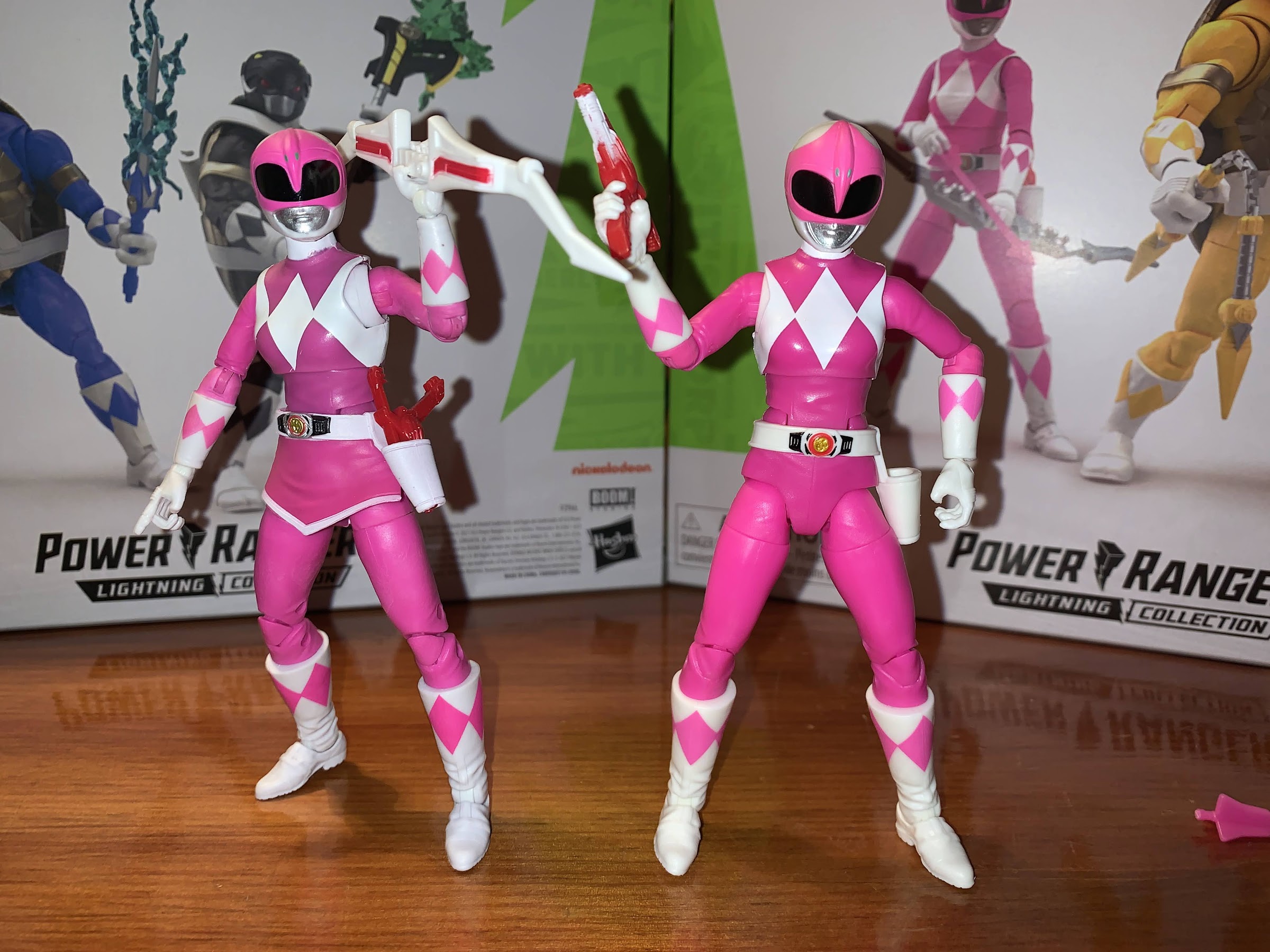
There is certainly a lot of Teenage Mutant Ninja Turtles product flying around these days, but I would guess collectors and fans of the property are paying the most attention to two toy makers in particular: NECA and Super7. One search for “NECA” on this blog will reveal that the company has produced a ton of TMNT action figures based on various iterations of the characters be it movies, television, or comics. As for Super7, their output is much slower and more specific, though they still have released 16 figures thus far and a handful of variants and have three additional waves already solicited. Super7’s approach is to essentially reproduce what Playmates made 30 years ago at a new scale and with modern technology. Both NECA and Super7 basically received permission to go full tilt on TMNT at the same time, and both have said they basically sat down at Toy Fair, explained the direction they were each going in, and basically have a handshake agreement to not step on each other’s toes which has held up just fine.
Sometimes though, multiple iterations of the property intersect. Playmates very much did its own thing when it came to characters and designs, and for awhile, the cartoon did as well. As the show went on though, the writers, artists, and so on started to just lift more from existing sources probably because it gets hard to keep coming up with new ideas for a show that’s pretty formulaic and largely exists just to sell toys. And since it’s a glorified commercial, why not just include the toys in the show directly?
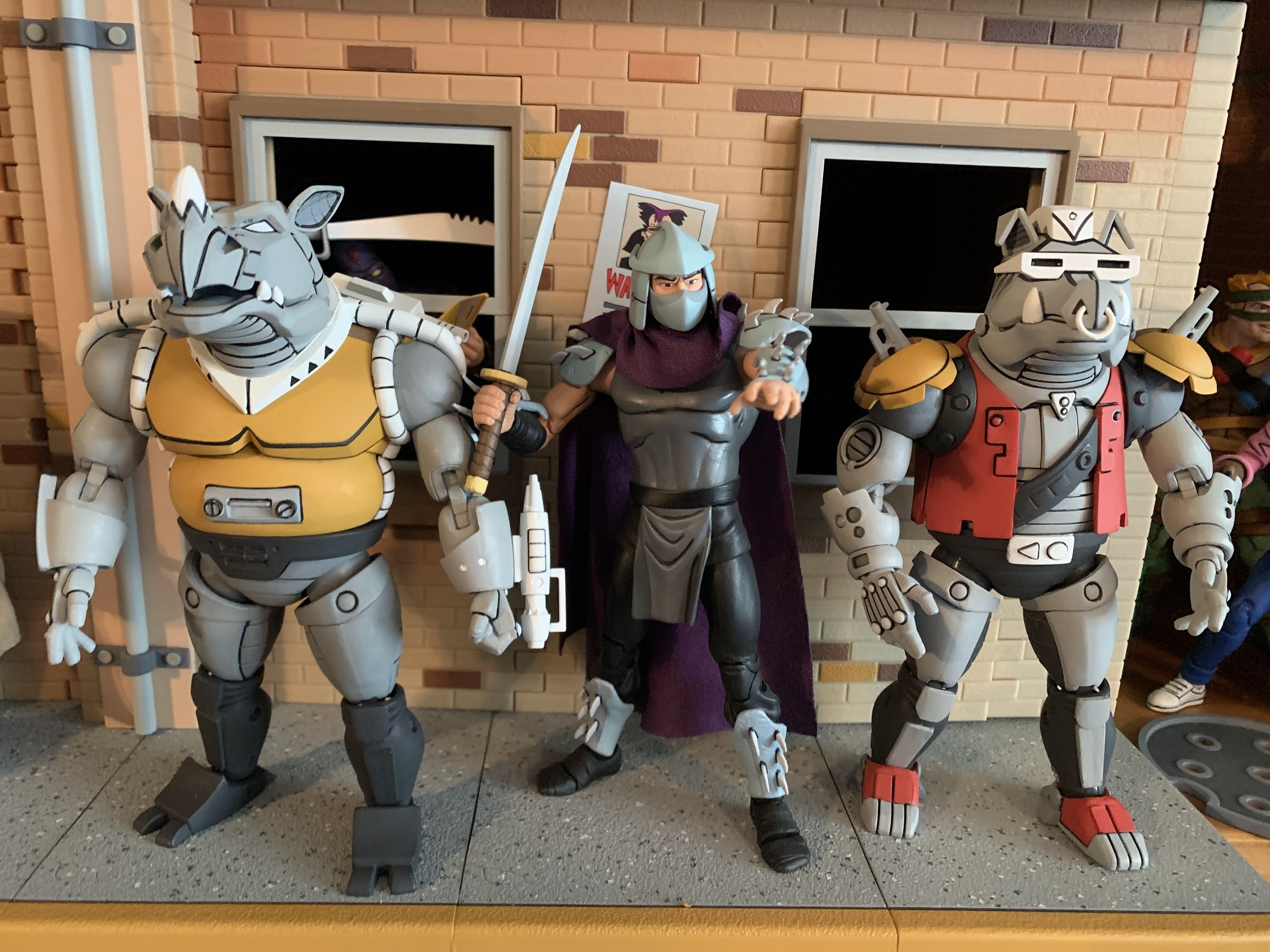
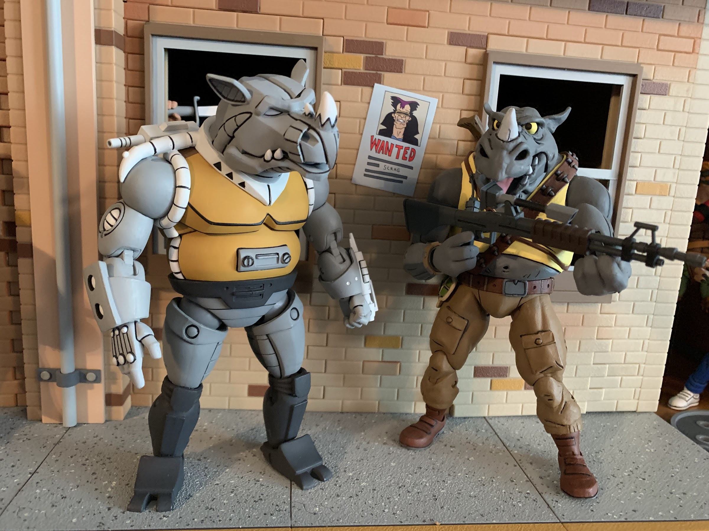
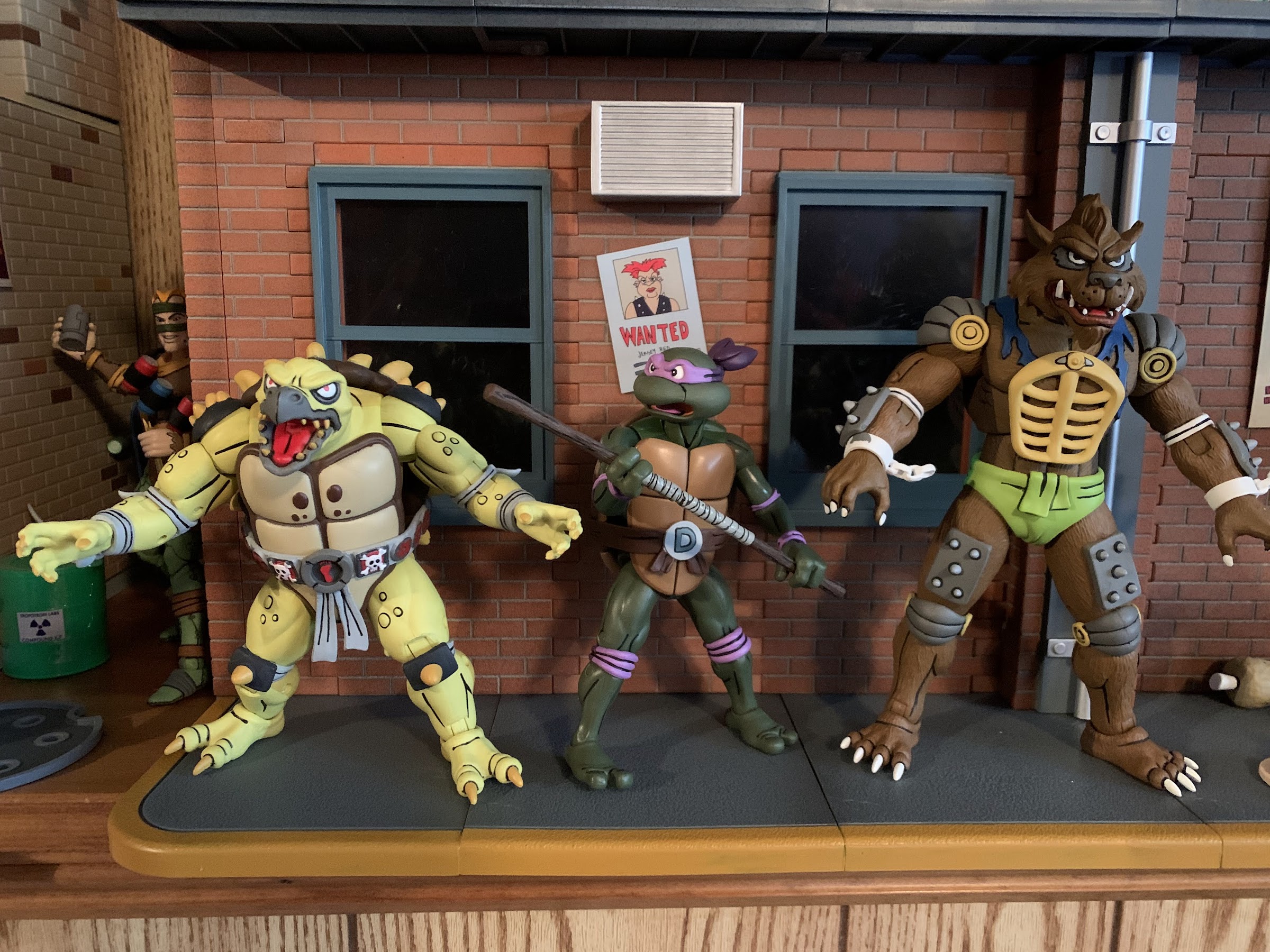
When it came time to make a sequel to the Teenage Mutant Ninja Turtles 1990 film, the writers wanted to include some mutant henchmen for Shredder. When Kevin Eastman and Peter Laird balked at including the cartoony Bebop and Rocksteady, new mutants were created in Tokka and Rahzar. Playmates foolishly felt the first movie would be a massive flop and did not support it with toys, but after it was a success, they were ready for the sequel and produced figures on several characters including the newly created mutants. Playmates wasn’t going to match the look of the costumes in the film, and it’s likely things were being worked on simultaneously, so their take on Tokka and Rahzar turned out a little different from how they appeared in the film. The film was another hit and the characters proved popular, so to no one’s surprise, Tokka and Rahzar made the jump to television. And since it was likely far easier to model them on the toys, that’s what the show did. All of this is to say I feel a little bad for Super7 since NECA has essentially provided us a set of figures that are based on the cartoon, which was based on the toys. It’s basically the same deal as what we saw with Antrax and Scumbug earlier this year.
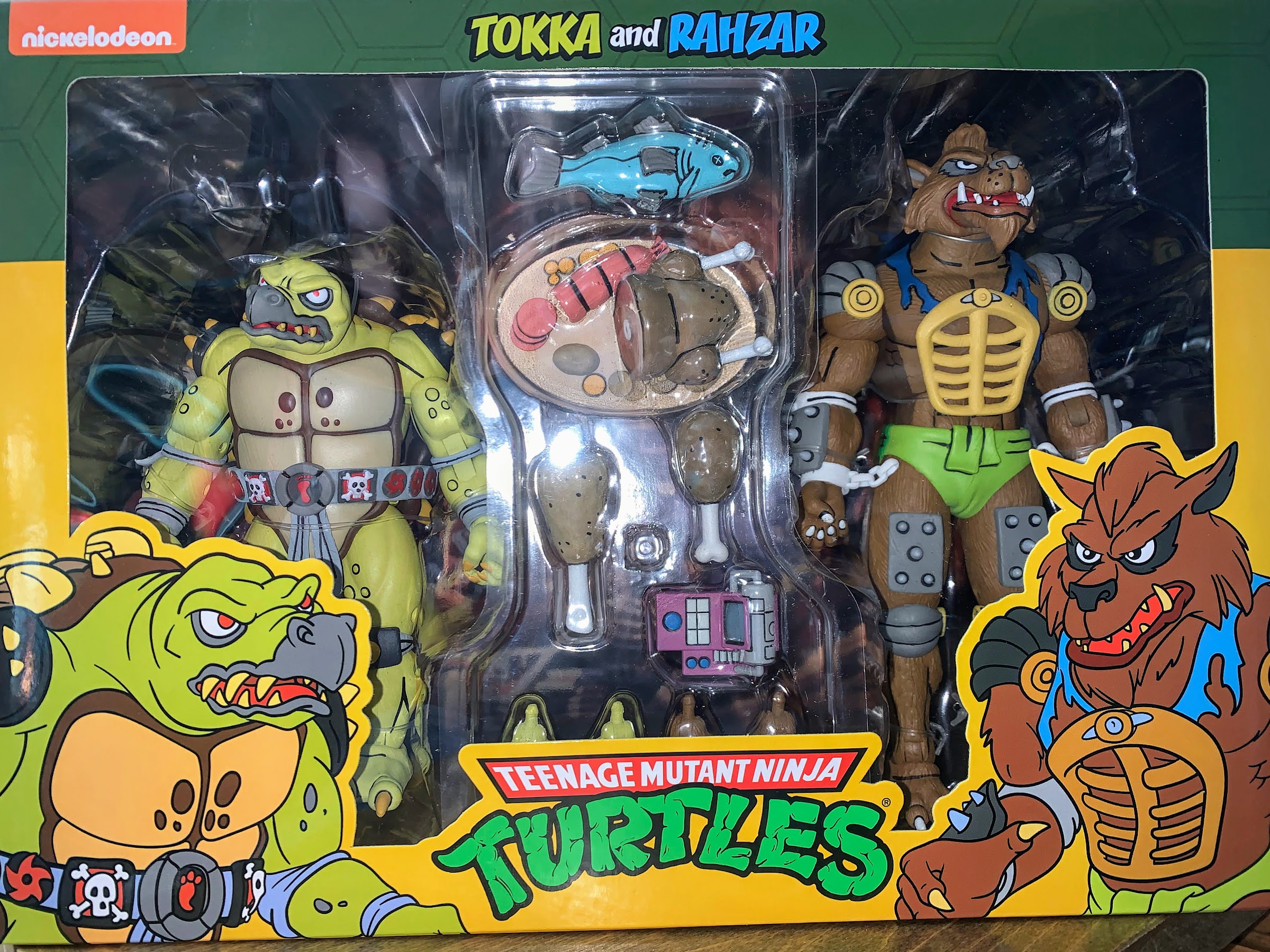
Tokka and Rahzar come in the standard window box packaging we’re all used to at this point. They were initially offered as part of NECA’s Haulathon event and in a confusing fashion as they were sold on costumes.com. Apparently, it would have cost too much to create a new website. That website was also supposed to be for international customers only, but no one configured the site to actually lock out US residents so it ended up being a free-for-all when everything went up on March 18th. This set was said to be open to all in some places, but it was all terribly communicated and a lot of confusion was out there. I placed an order on that site, and a set arrived less than 2 weeks later even though product wasn’t supposed to ship until April (I’m not complaining). These guys are going to Target, and maybe online too, and it’s possible by the time this post actually goes live that all of this has been sorted out. For now, it’s a mess, but I got some toys out of it.
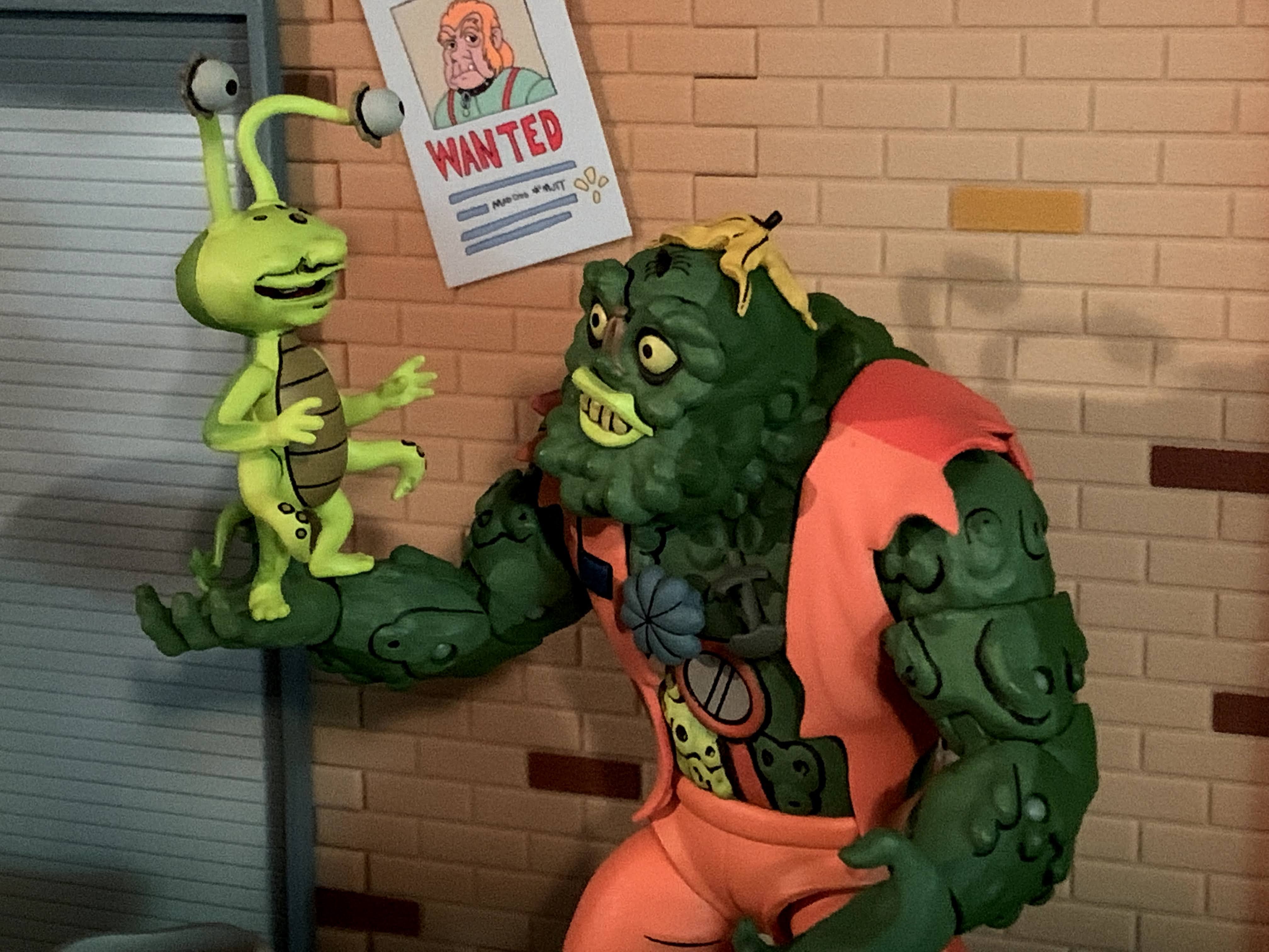
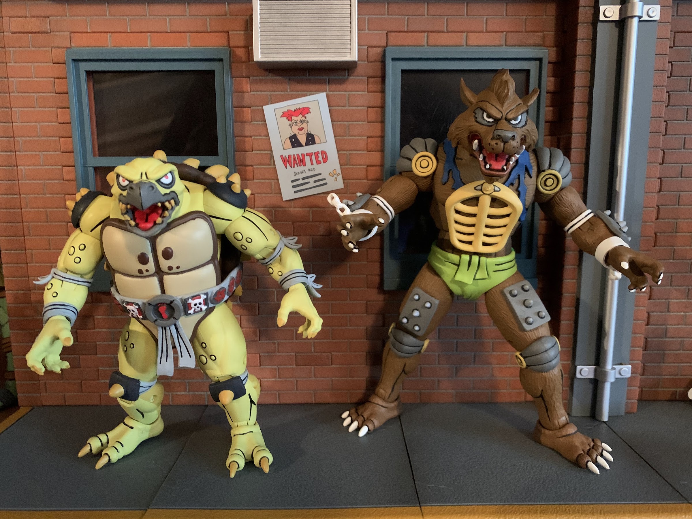
As mentioned before, Tokka and Rahzar are based on their appearance in the episode of Teenage Mutant Ninja Turtles “Dirk Savage: Mutant Hunter!” and the designs for the characters are clearly based on their action figure counterparts from Playmates. It came pretty late in the cartoon’s life, episode 166 out of 193, so several people collecting this line barely remember their appearance. I personally was still watching, but I’d drop off the following season when the “Red Sky” era began and the show underwent a soft reboot of sorts. I remember being quite surprised to see this pair show up though, and even more surprised when they were intelligent creatures. Aside from resembling the movie characters to a certain degree, the pair are pretty damn different. They’re a bit morally ambiguous and largely out to satisfy their stomachs. Rahzar makes it very clear to Tokka that he’s his only friend in the world, which is about the only character development they really get. Rahzar seems to dislike everyone, but Tokka, and he does make some comment about no one being able to stop them so I guess they’re villains? Tokka is mostly useless though as he’s easily subdued and just exists to make Rahzar mad when something unfortunate befalls him. He gets captured by the mutant racist Dirk Savage, leading to a showdown between Savage and Rahzar that’s just a set piece for the turtles to save Savage and have him realize the errors of his ways. That’s the cure for racism in Hollywood, you just need to have the party the individual is racist towards save them. Problem solved! Tokka and Rahzar’s story just sort of ends there and they never show up again.
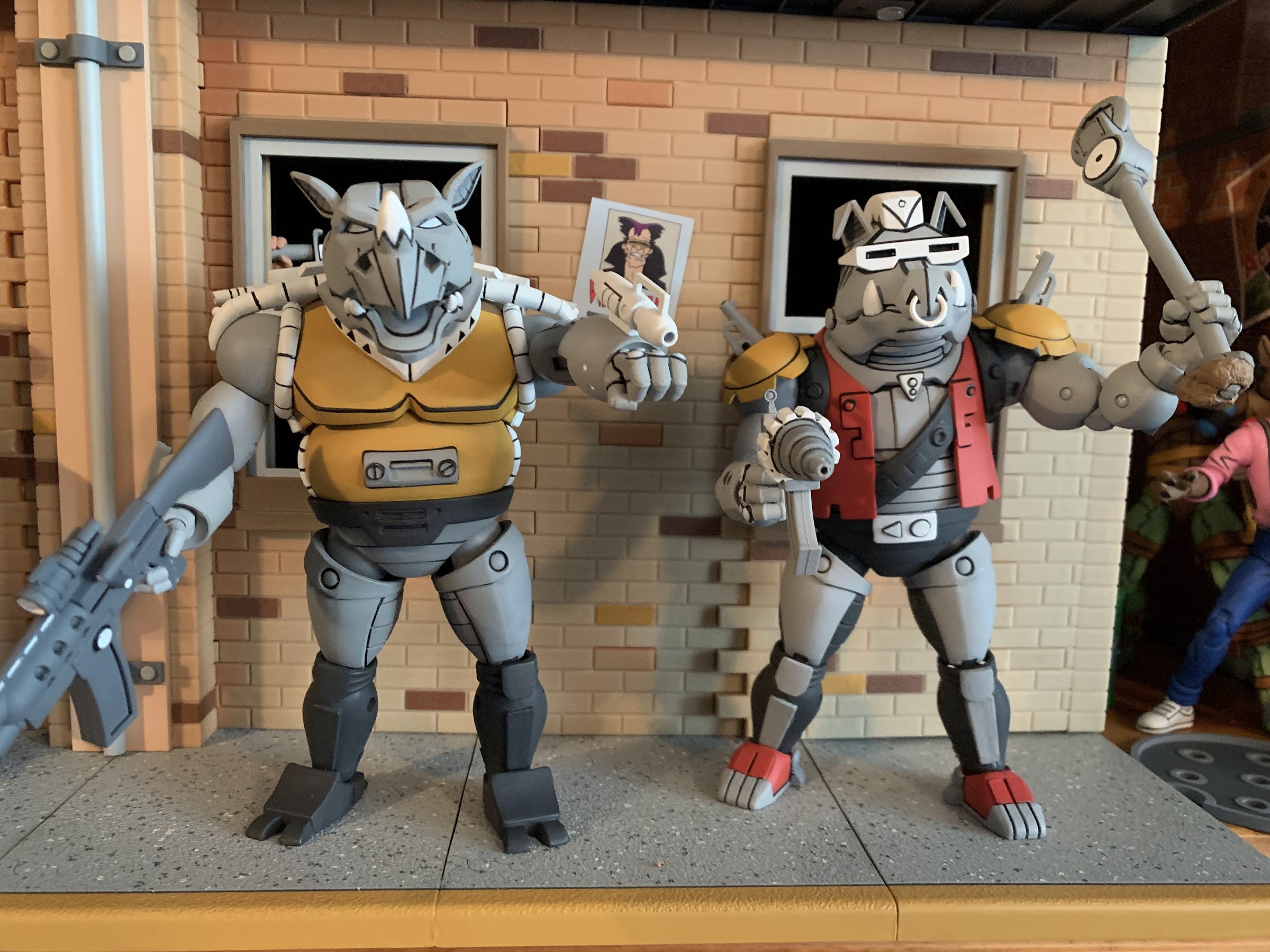
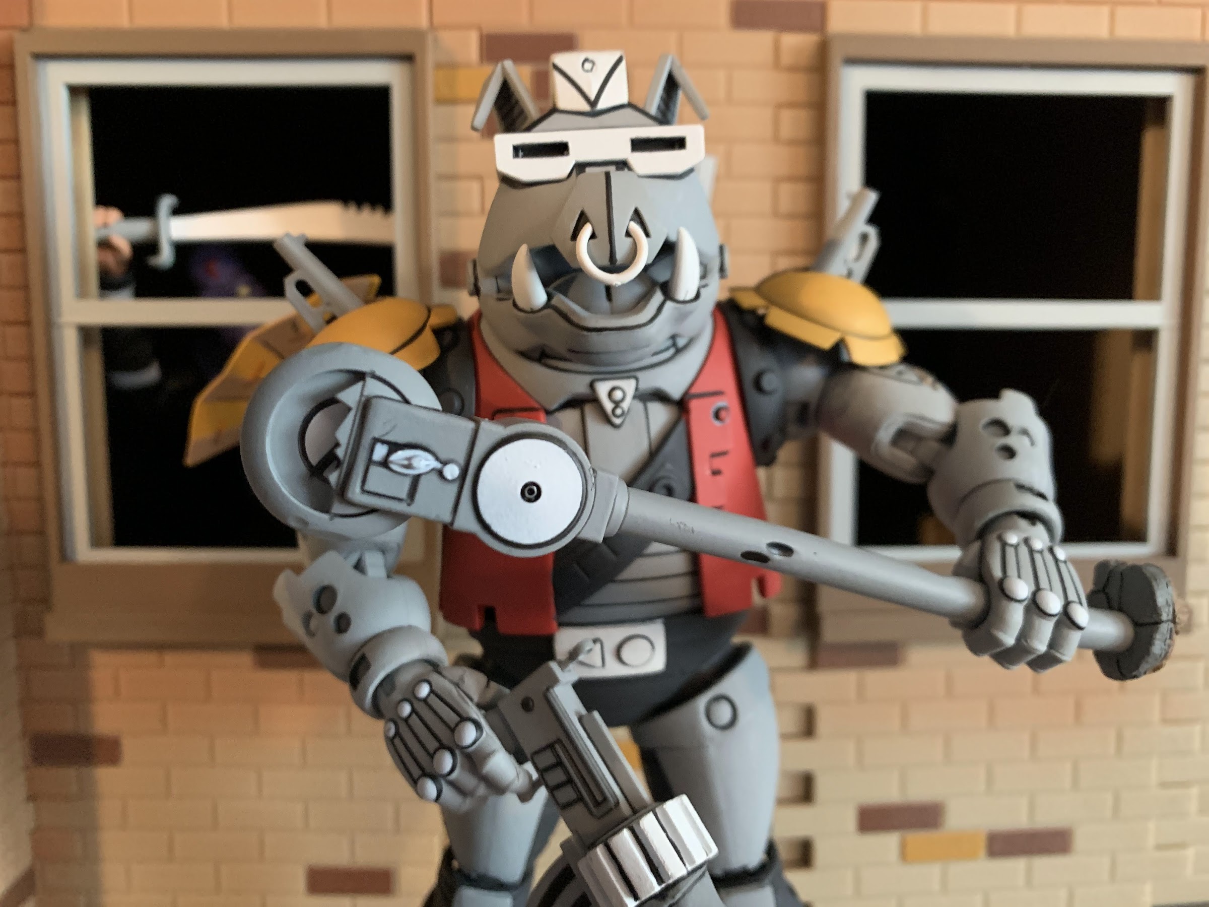
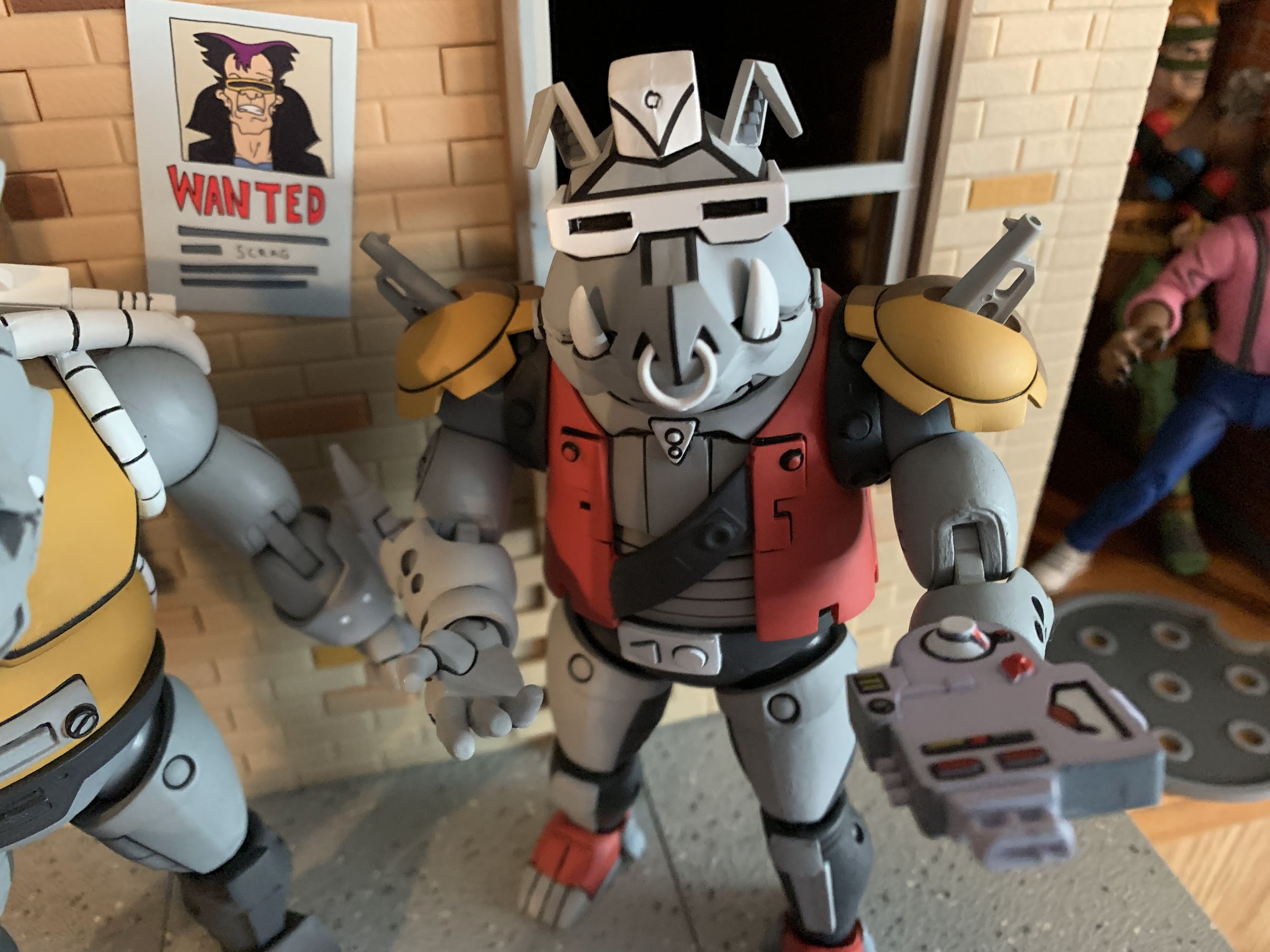
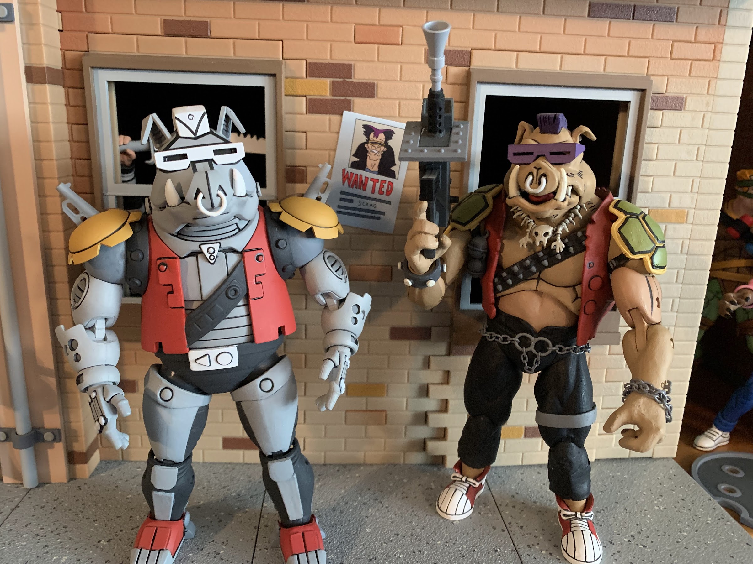
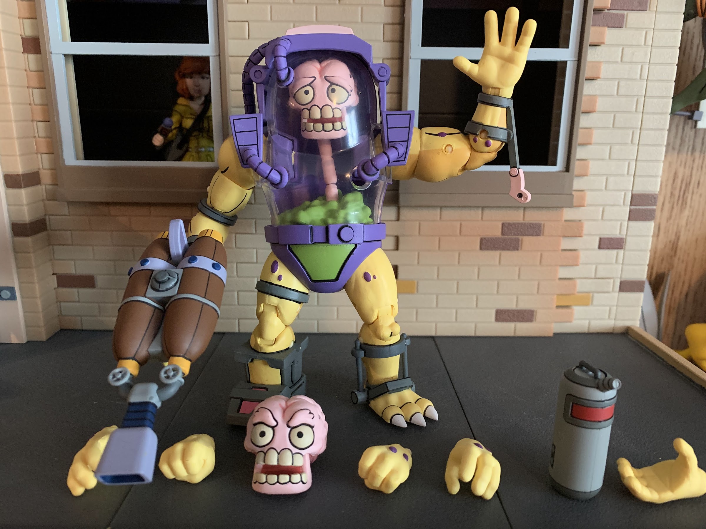
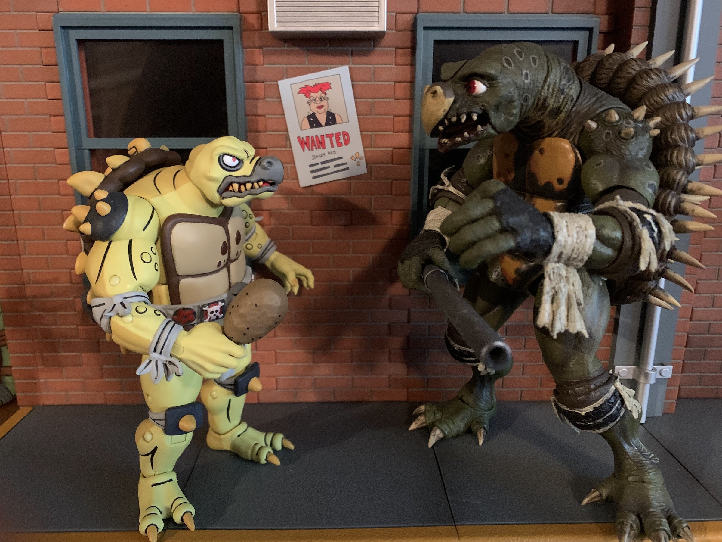
Rahzar is obviously the larger of the two standing at around 7.25″ to the top of his hair. Tokka, is much shorter and chunkier coming in at around 5.25″. Both were sculpted by Paul Harding who has already made a mark on this line with expressive sculpts of Dirtbag and Groundchuck and it looks like NECA was so pleased with Tokka that they’re prepping the figure for a re-release as an Archie Slash, which makes sense since the Playmates Slash was repurposed into Tokka! Both figures are impressively sculpted. Rahzar has a lot of extra parts added to him like the broken shackles, forearm and thigh pads, and that grill on his chest. Tokka has various warts and similar blemishes on his body to go with a spiked shell that’s a dead-ringer for the old toy. He has elbow and knee pads plus those spiked shoulder pauldrons. I love the detail on both and the paint is what is expected of this line. The black linework is clean and really causes the pair to “pop” and we get that bisected shading as well with light on the front and dark on the back. The only overlay in use here is the green “diaper” on Rahzar so it’s hard to say if NECA expects to get much reuse out of his mold. If not, I love to see the commitment on display here from NECA to make the best possible versions of these characters uncompromised by cost-cutting measures.
When it comes to shortcomings from a presentation perspective, there’s very little to complain about here. We’re basically down to nitpicks as the paint around the spikes on Tokka’s shell is a little sloppy around the edges, but it’s pretty minor. The shurikens on his belt also have a soft appearance in the paint department, but again, it’s a nitpick. The only real blemish on either figure is with Rahzar’s right shackle. There’s a sizable blob of gray paint on it from the forearm guard that’s a bit of a bummer. The shackle is a separate piece that can come right off once the hand is popped off so, if I want to, I could easily take it off and try to touch it up. It’s tough to paint white over a dark color though so I don’t know that I’ll bother, but that really is it as far as issues. This is a very clean set.
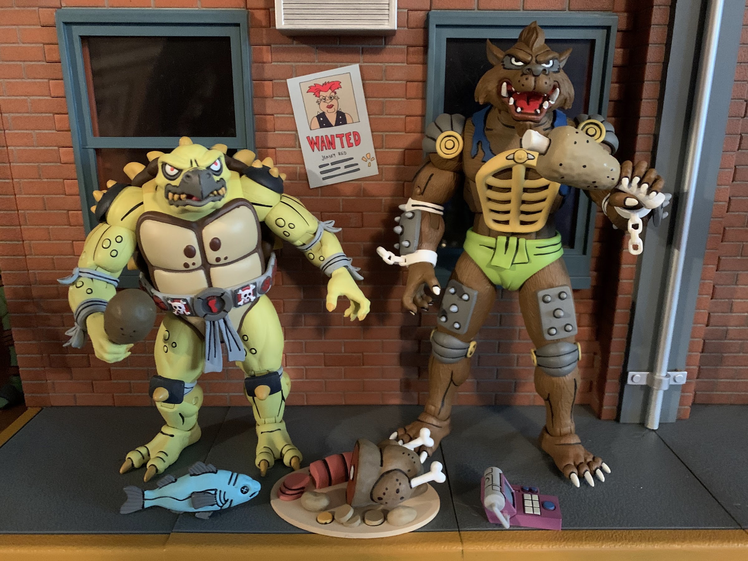
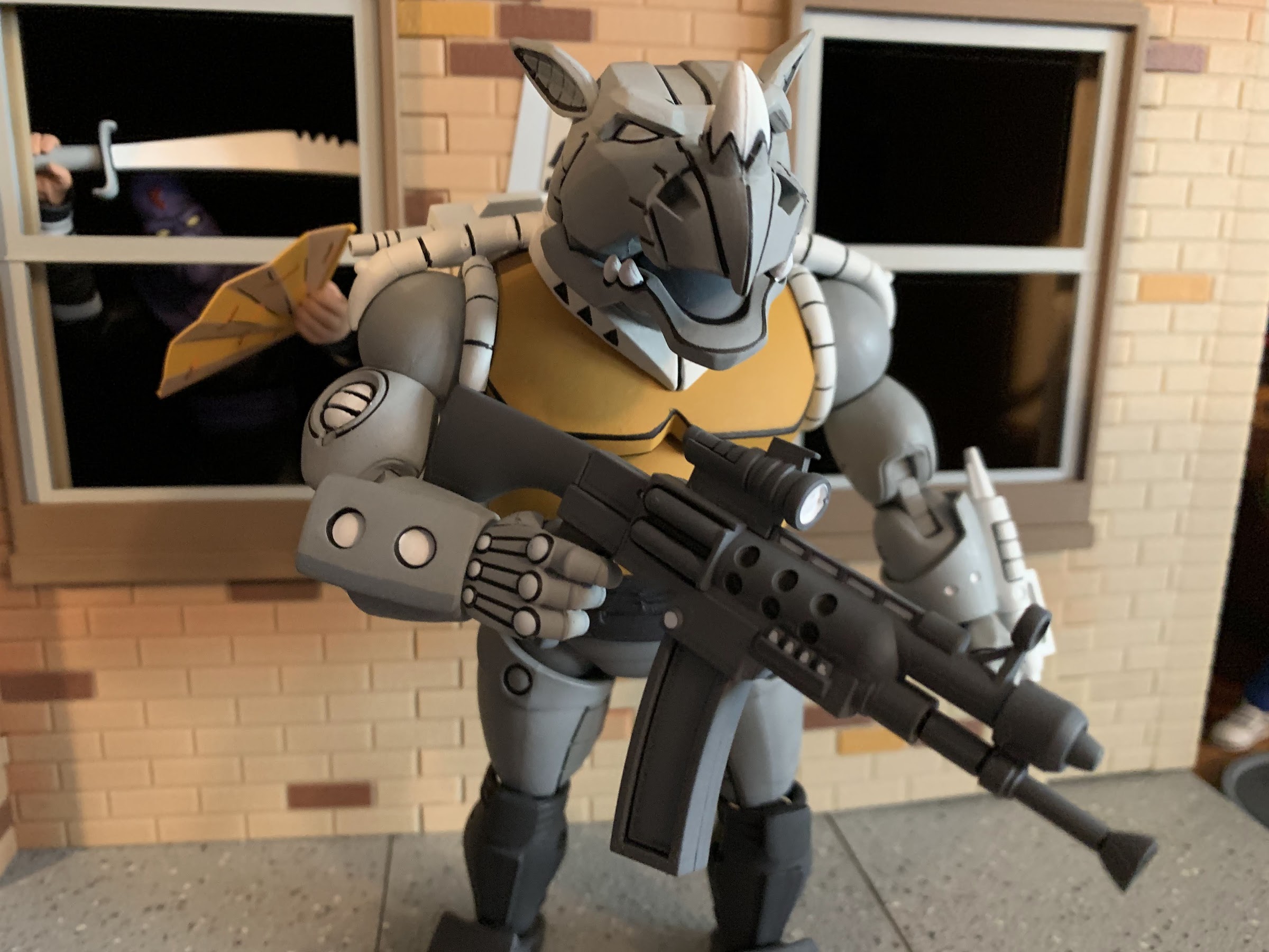
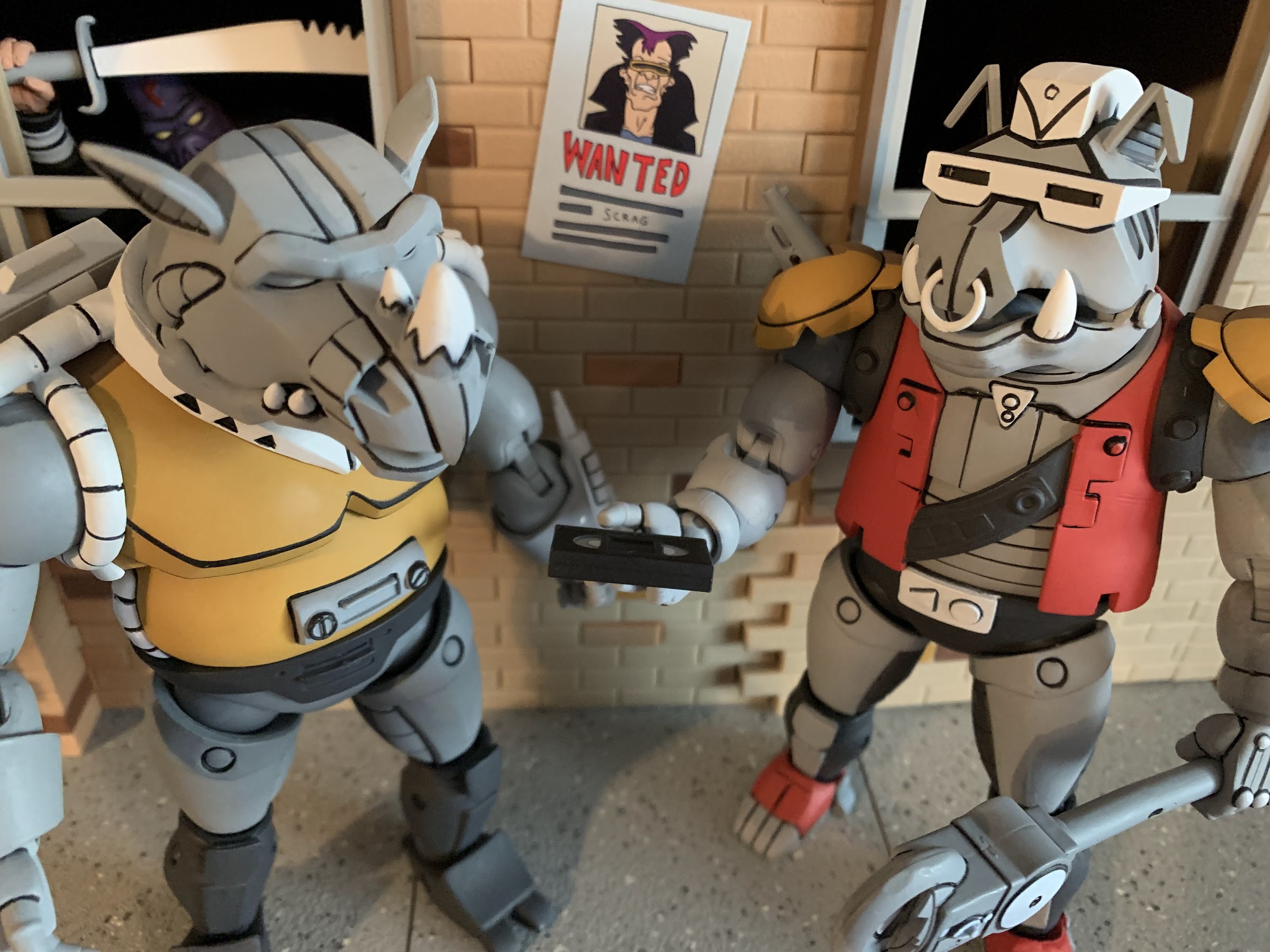
Since our boys here only showed up in one episode, they didn’t really get to do much aside from eat and get captured by Savage. Given that, NECA included a bunch of food! There’s a turkey platter with about half of a bird on it, some sliced potatoes, and a big slab of salami, I think. There’s also a turkey leg and some bone-in-meat plus a whole fish which was something actually used as a weapon against Rahzar. There’s also yet another handheld, control, device that looks like a fancy adding machine. It’s the controller to the control cuff that actually came with the Mondo Gecko figure so, little by little, we’re building the arsenal of Dirk Savage (the foot trap that came with the Punk Frogs also belongs to Savage). Each figure also comes with a set of gripping hands and a set of open hands. I’m a little surprised there are no fists, but I don’t know that I actually miss them. The accessories are all painted very nicely, and even though I’m not sure what I’ll do with a big turkey platter, I’m happy to have it.
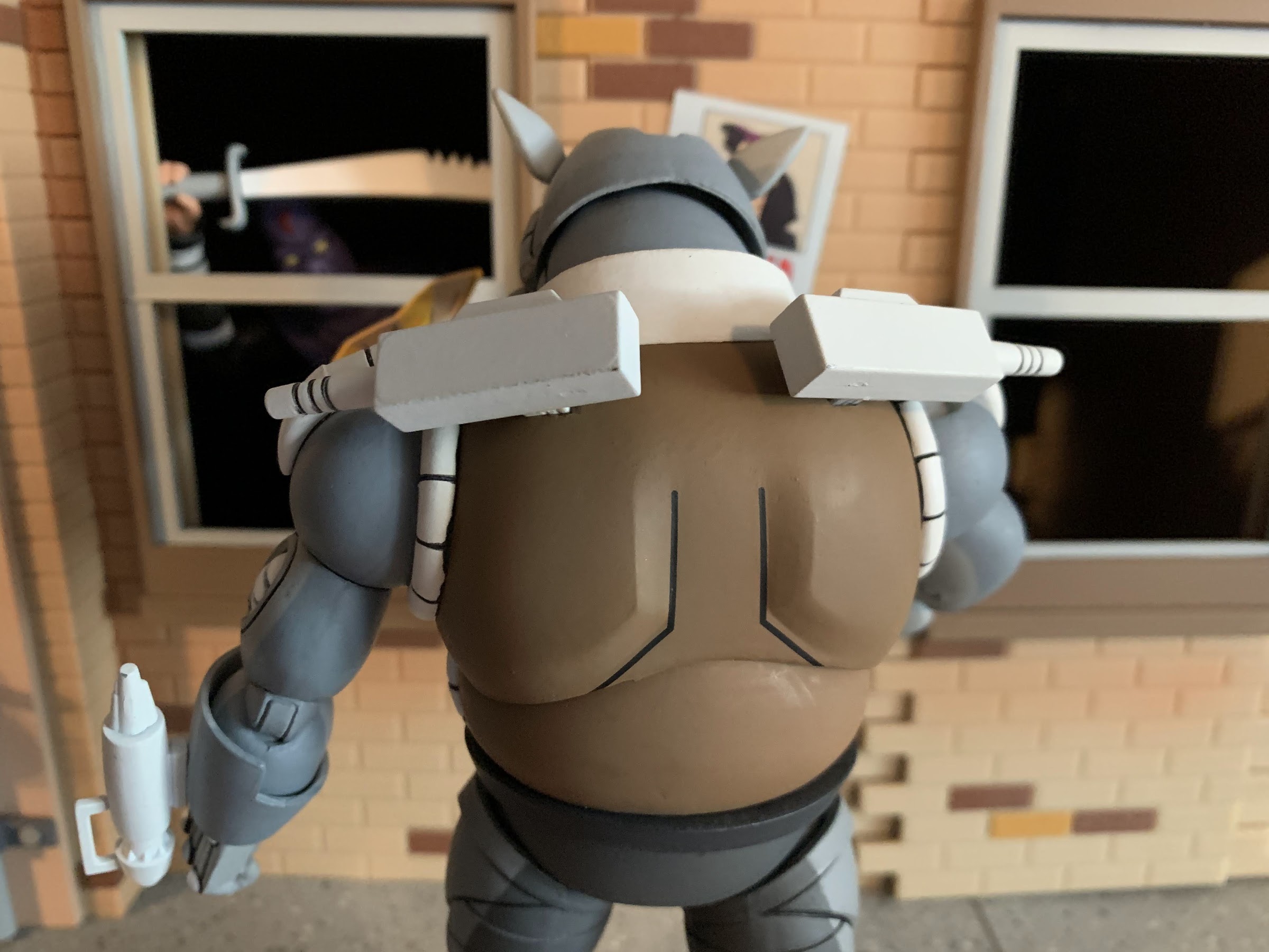
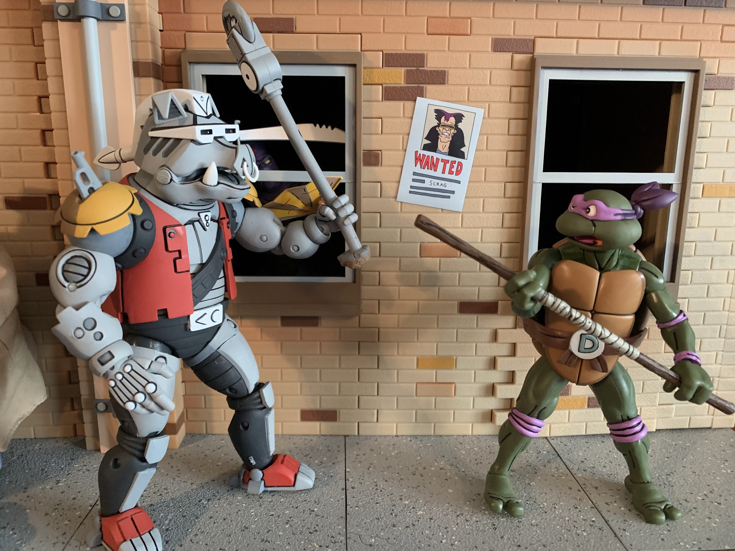
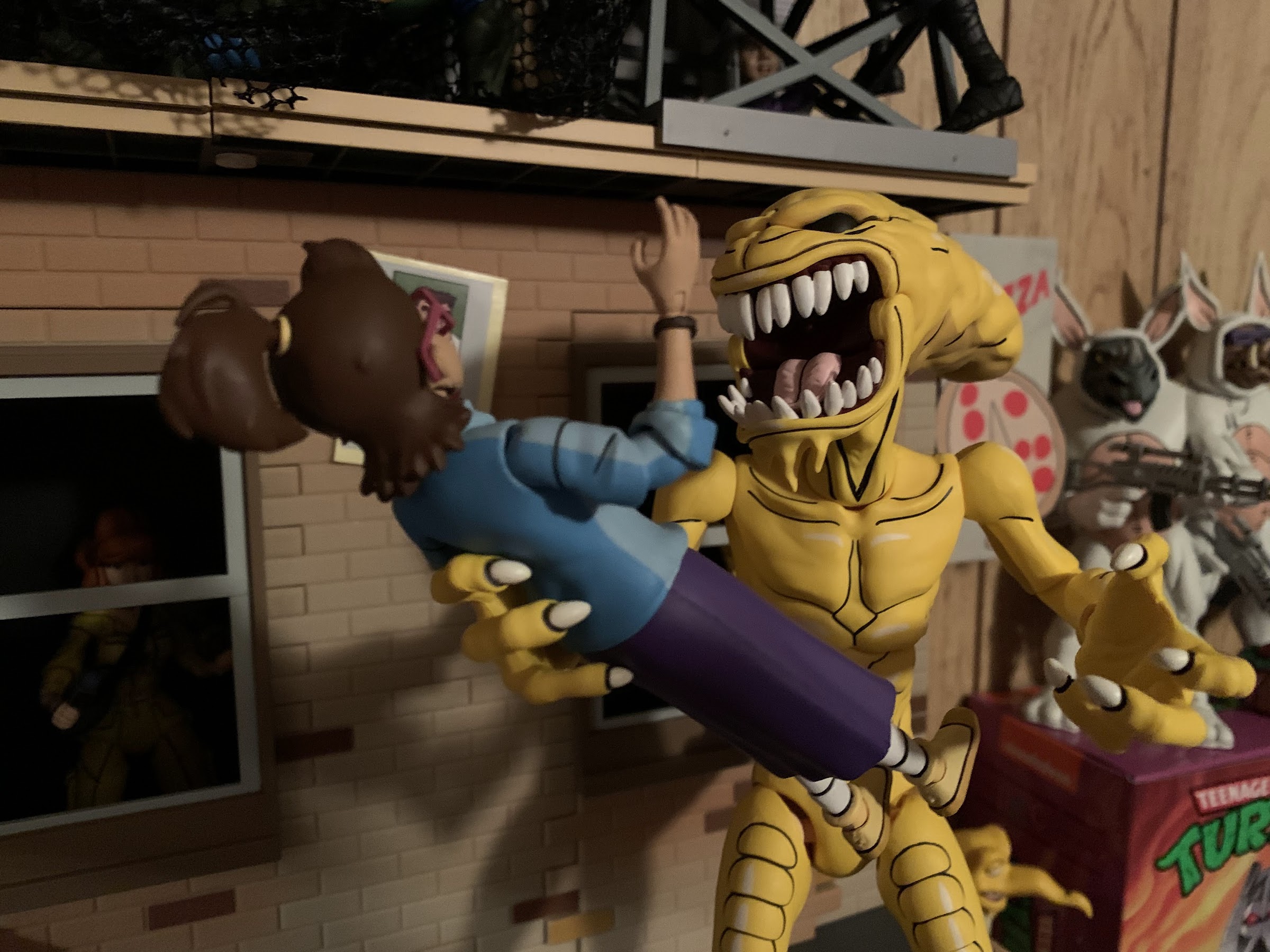
This line is certainly an appearance first, articulation second, sort of line, but these two boys move pretty well. We’ll start with Rahzar first who has a ball-jointed head. It feels like it might be a double-ball peg as he can look up very well, and bury his chin with rotation and tilt. There’s also a hinged jaw to add personality and it works very well. He’s most limited at the shoulders where traditional ball-hinges are hampered by the shoulder pads. The pads can slide a little, but he can’t really lift his arms out to the side much. He can rotate just fine though, and he has a biceps swivel, double-jointed elbows that get you 90 degrees or better, and wrist swivels with horizontal hinges. In the diaphragm is a ball joint that will mostly let the figure rotate, but you get some tilt and he can arch back and crunch forward a little bit. The hips are on ball-sockets and are nice and firm. You get a thigh twist there to go with double-jointed knees and the standard hinge and rocker combo at the ankles. All of those joints work quite well and I love that he has big feet because he’s easy to pose and stand. There were no stuck joints and they’re all cast in the most appropriate color of plastic too.
Tokka is similar, but being another turtle character, he has some limitations of his own. His head basically sits forward on the sculpt so he’s more limited in the up and down department, but he does have a really nice jaw hinge to make up for it. This dude can open wide! Like Rahzar, he has shoulder pads too that prevent him from bringing his arms out to the side, but he gets good range out of the double-elbows despite the elbow pads (why can’t we get these on the hero turtles?) and has a biceps swivel and standard wrist articulation. Like the turtles, he appears to have some joints in the torso, but unlike the turtles, it’s pretty useless. I can’t get any twist out of them, but braver folks than me might be more willing to really crank on that joint. The hips are ball and socket joints and he has the same thigh twist, double knees, and ankle articulation as Rahzar. Tokka’s feet are really impressive as he can bend each one back all the way so the foot lines up with the leg and he can bend it really far forward. It gives the figure a great base and I’ll definitely be happy to have a Slash with this kind of articulation later this year.

I feel like I’ve been saying this with a lot of the two-packs of late, but this set is another contender for best in the line. I’m partial to the bugs from a design standpoint, but I can’t imagine these two turning out any better than they did. These guys are picture perfect recreations of their animated look and the sculpt, paint, and articulation really comes together nicely. I suppose the accessories aren’t the most exciting we’ve seen, but it’s not as if there was much in the show associated with them. I guess we should be mad at the designers of the toon for not giving them some of their action figure accessories.
Tokka and Rahzar have started off as another Haulathon exclusive, but I suspect NECA will make every effort to get these figures into as many hands as possible so if you missed the initial drop keep your eyes open. Basically every set these days to hit Target brick and mortar has been relatively easy to get ahold of, excepting maybe the turtles themselves. I’m willing to bet Tokka and Rahzar will follow a similar pattern and hang around for a bit. Maybe I’m underestimating their popularity due to their appearance in The Secret of the Ooze, but that remains to be seen. If you can’t tell, I definitely give these guys a strong recommend so get out there and hunt these bad boys down like you’re Dirk Savage himself, just don’t be a racist!