TMNT Loot Crate Series 2 Vol. 4 – Donnie Batman and the Bat Guy (Bats!)

The Dark Turtle and Bat Boy have arrived! Is this the best Loot Crate yet?!

It’s been a little more than 3 months since our last dance with Loot Crate. If you’re new to the experience, it has been quite a drag. Crates that were supposed to ship a year ago are still outstanding, communication has been poor, rumors have painted a dire picture of the company’s finances, and the actual quality of the product has taken a hit as well. Since we last looked at one of these, someone decided they were so fed up with the experience that they doxed NECA director or product Randy Falk which he was understandably not happy about. That was a dick move on the part of whoever did that and anyone who actually took the time to call Randy on his cell phone or shared that info is a grade A asshole. That’s the type of entitlement that makes me embarrassed to be a part of this hobby.

Well, it’s more full than last time.

Ugliness aside, Randy didn’t deserve that. Saying that doesn’t mean we’re letting Loot Crate off the hook though. They’ve been pretty terrible, but I don’t feel the need to get into that once again. If you want more of a rant, check out the last entry on the subject, for the rest of this one I’m just going to talk about the contents of the latest crate.

The TMNT pin-collecting community has just been dying to get their hands on this Triceraton pin!

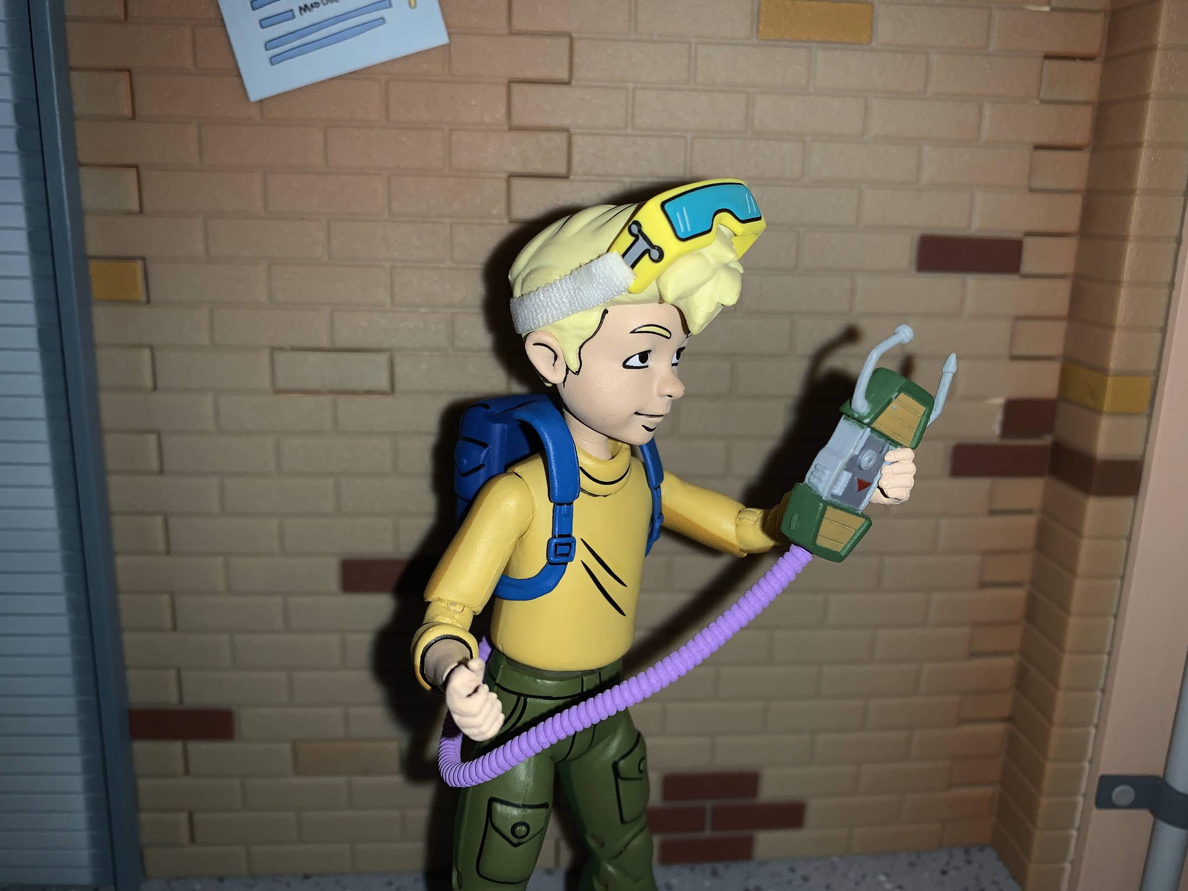
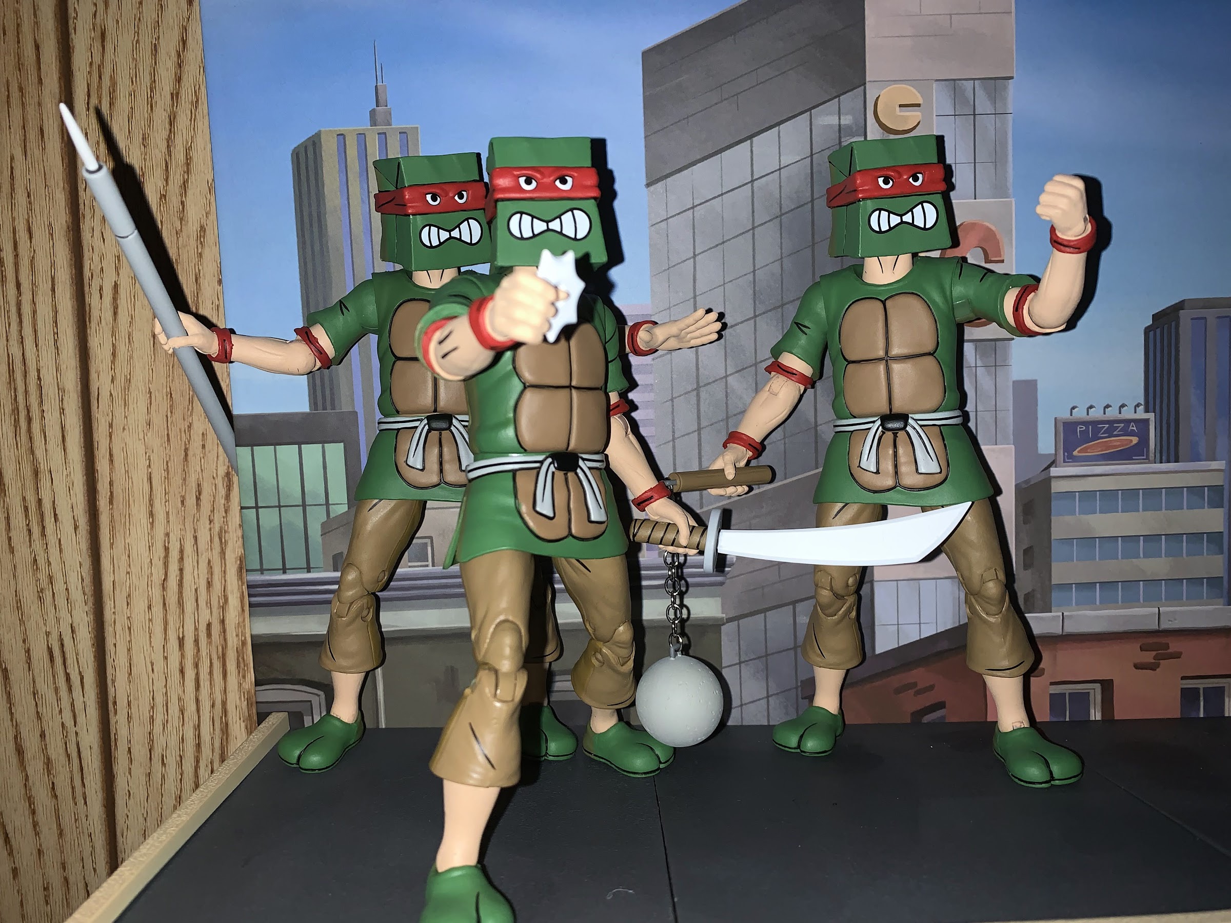
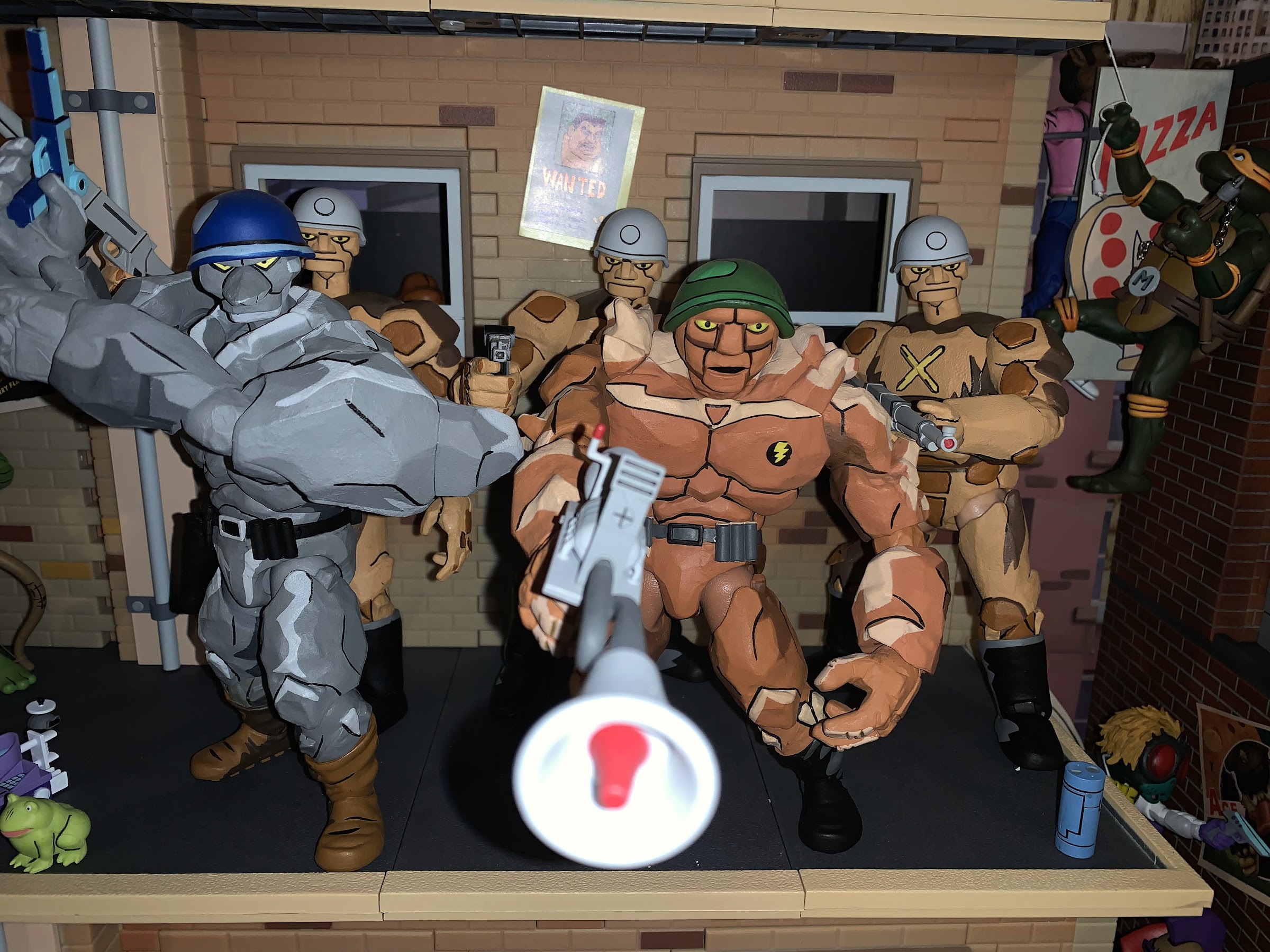
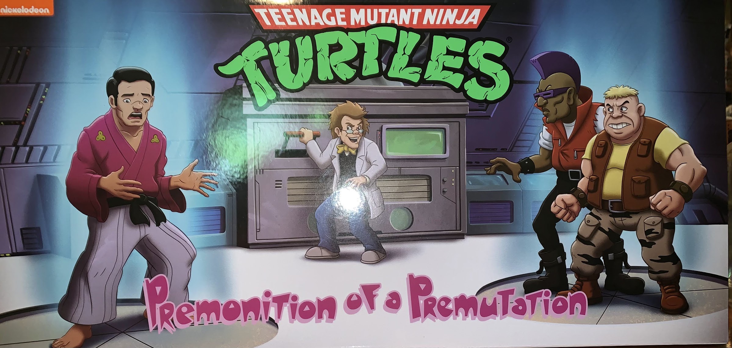
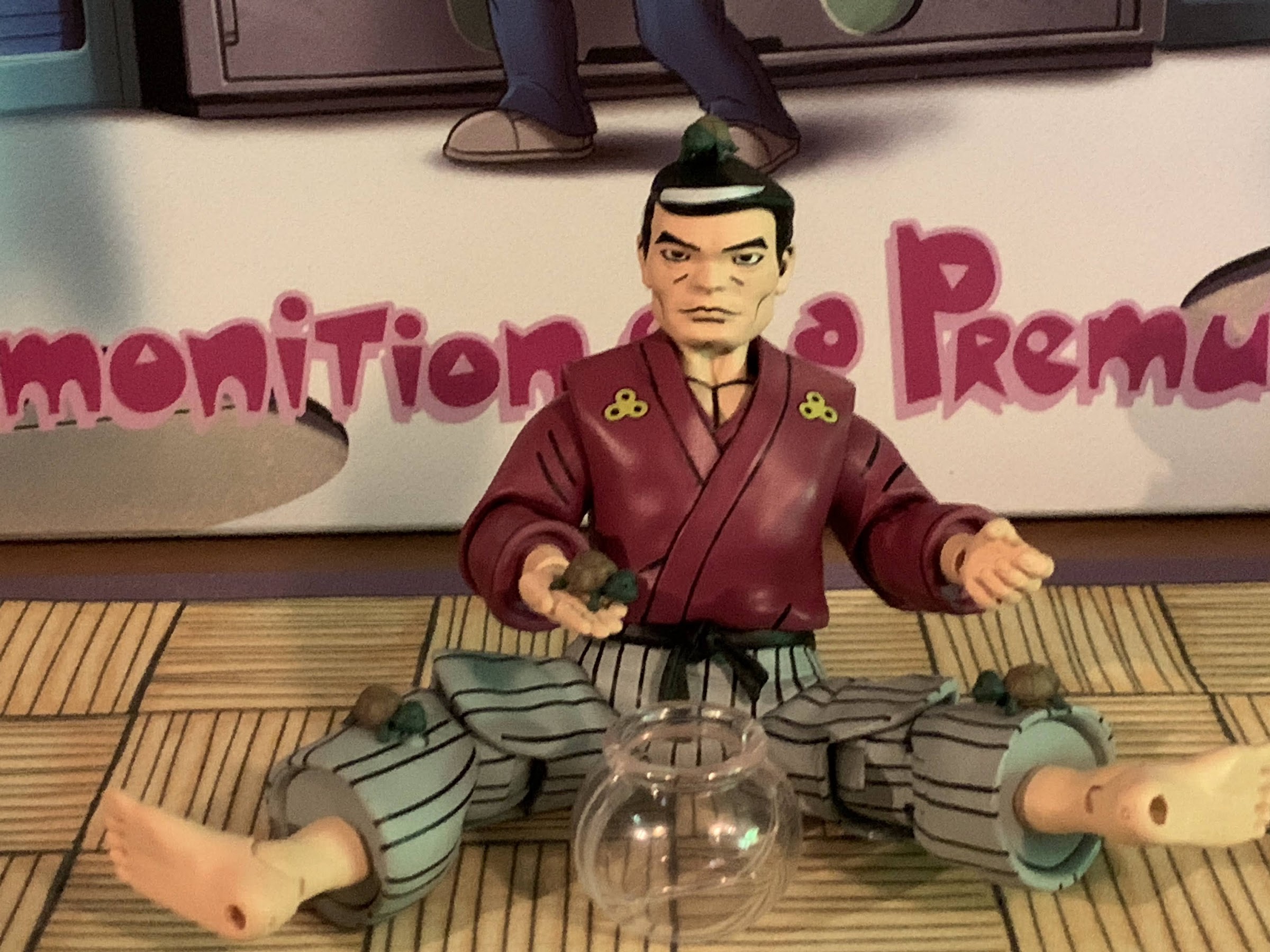
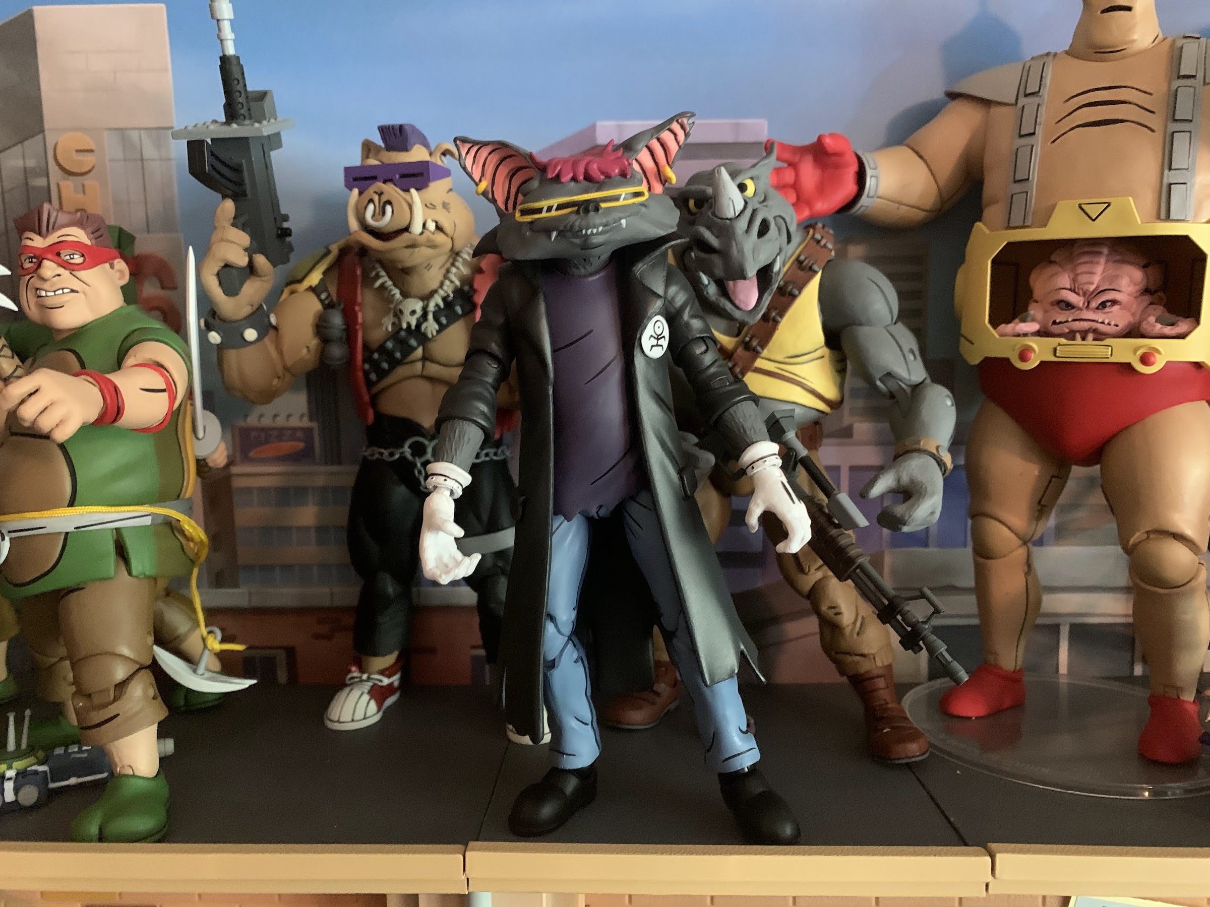
And this latest crate is the fourth one which is themed around the 1987 cartoon series. What happened to crate #2? Nobody knows, but it was skipped in favor of crate #3 and now we’re onto #4. I guess they’ll come back to it, hopefully in another 3 months or less. The toon one, being the fourth one, comes with a bonus figure as well so we have a lot to talk about. When consumers had the option to subscribe to this service, they could either purchase individual crates or all 4. Those that bought all four were to receive a bonus figure, Scrag, one of the gang members from the original mini series who hung out and committed crimes with Bebop and Rocksteady. He had his own little arc in that mini series. Despite never being named, or having a line to speak, we saw him go from punker, to mutant bat, back to punker again. After that, he went away and was never heard from again.

Oh boy, it’s an apron!

We’ll do Scrag last, but for now lets get the other junk out of the way. The Loot Crate model is to take something people want, like a NECA figure, up-charge it and toss in some junk to make it seem like it’s worth the $50 price tag. Obviously, it’s not or else they wouldn’t do things this way, but it’s always going to be a case of “your mileage may vary.” The bonus figure is another added layer of grift since you may not care about one of the other crates, but if you care about Scrag, you have to buy them. NECA and Loot Crate will point to eBay sales as a way to suggest you’re not being taken advantage of, but again, if they actually had that much faith in the product they’d just put them up for sale and let you buy what you want.

I’m not sure I trust the health of my hands when handling hot items to Loot Crate.

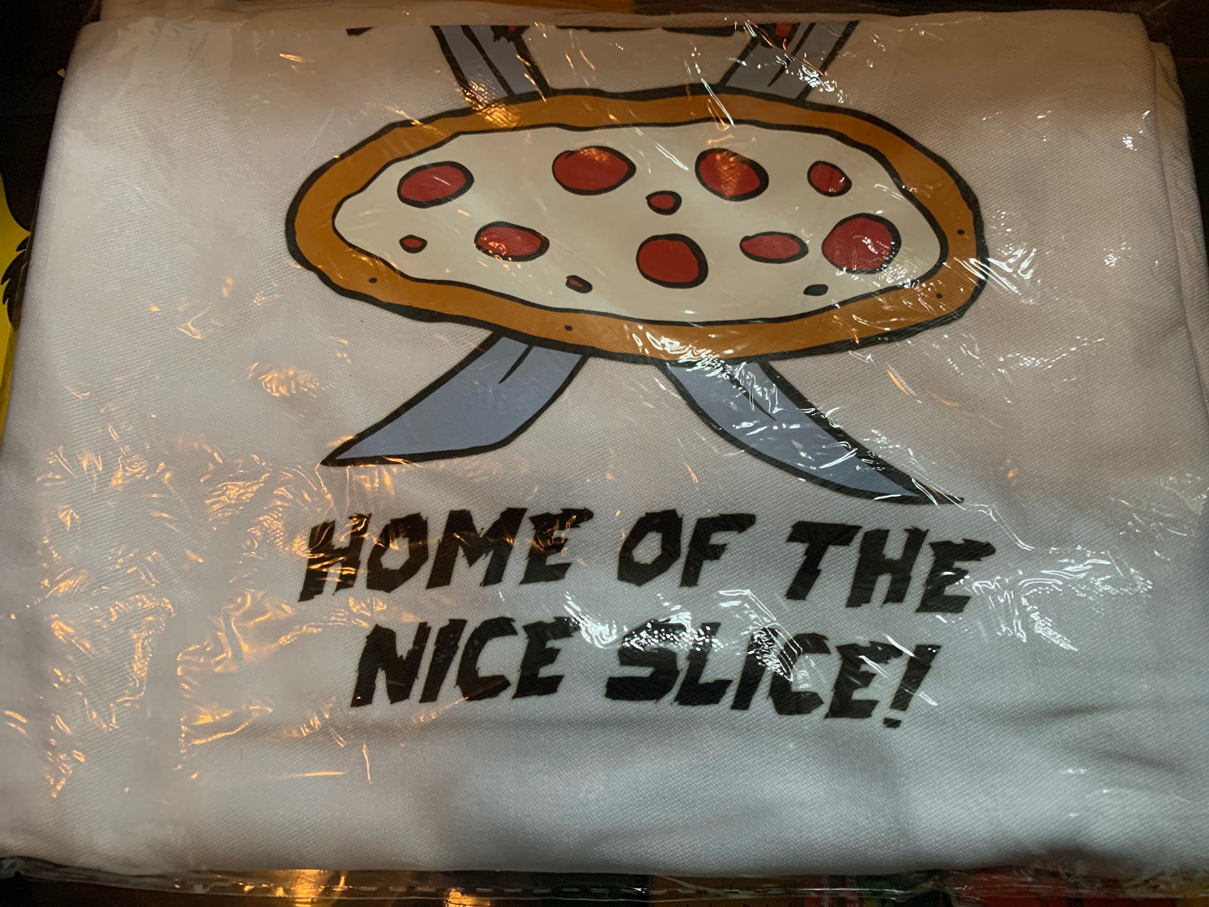
The model for these crates has been to include a t-shirt, some pins, and a few extras. Maybe a keychain, a sticker sheet, whatever. The first wave of crates definitely had more, while this current wave has had severely less. And this crate has the distinction of being the first without a t-shirt. I thought these things were advertised to always have a shirt, you even select a size when subscribing, but I haven’t looked up the actual solicitation so maybe that wasn’t the case. It’s certainly an expectation that one will be included. Instead of a shirt though, we get an apron. It has a Ninja Pizza logo printed on it which is taken from the show, but is otherwise just an off-white apron. Do people still use aprons? It being October, I just re-watched Beetlejuice once again and thought how old-fashioned Geena Davis looked sporting an apron at the film’s start. I have aprons in my house as they tend to be something you acquire through things like a bridal shower, but I don’t think I’ve ever used one. And I don’t recall ever seeing my mom or dad wear one. Same for grandparents. And when I go to my local pizza shop, few of them wear one. And if they do, they don’t bother with the top. Maybe they were more popular when washing machines were less common? Now if I’m cooking I just change my clothes if they get dirty in the process. I guess I’m just saying a novelty apron is not something I’ll ever use or know what to do with. It’s not that I need more t-shirts either, my dresser is bursting with them, but I at least wear them.

The license plate is stupid, but at least it’s “fun” stupid.

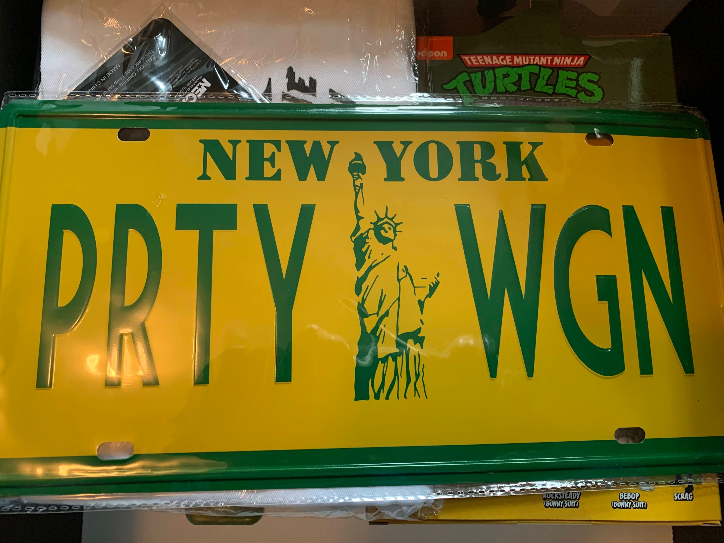
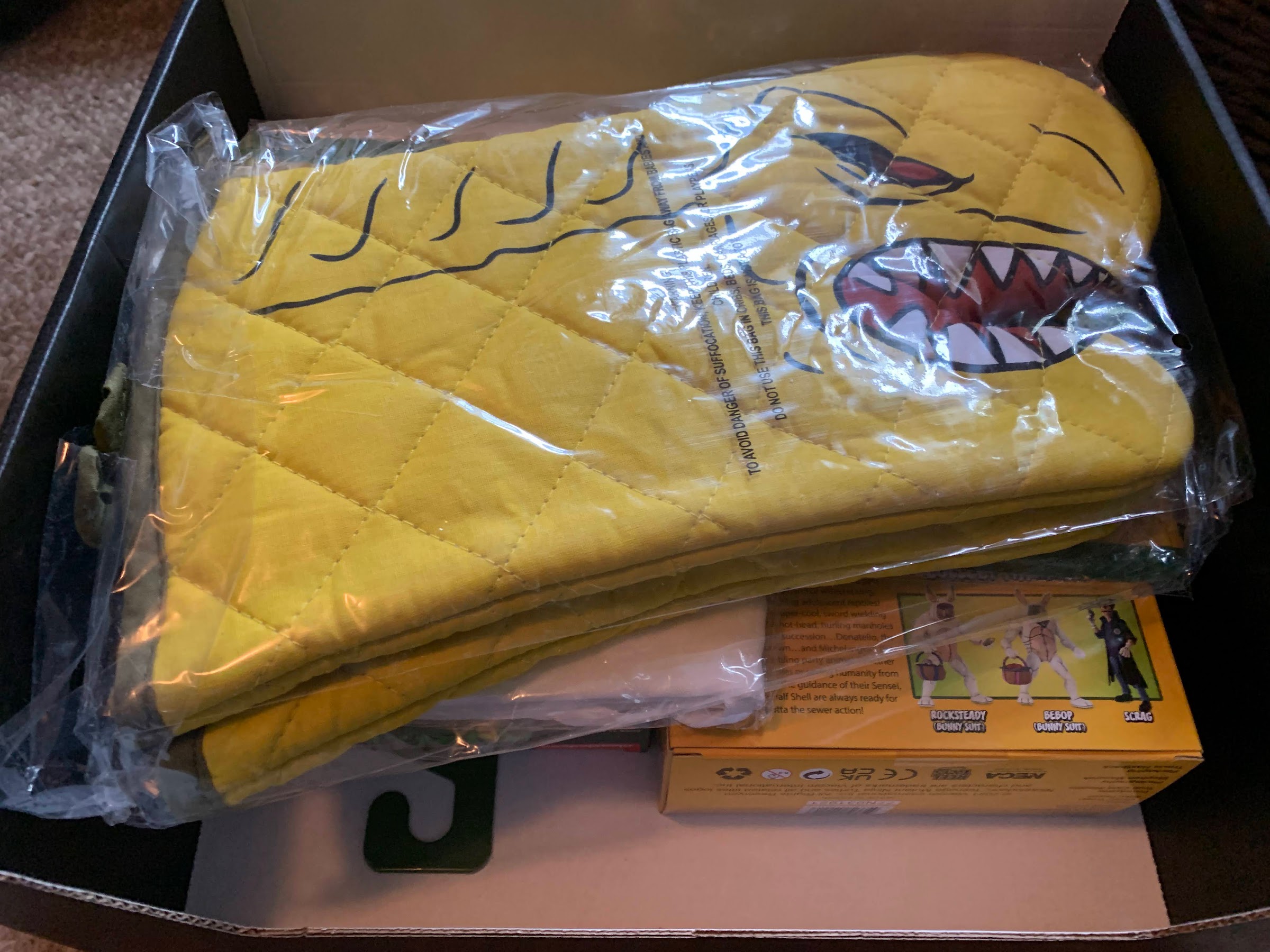
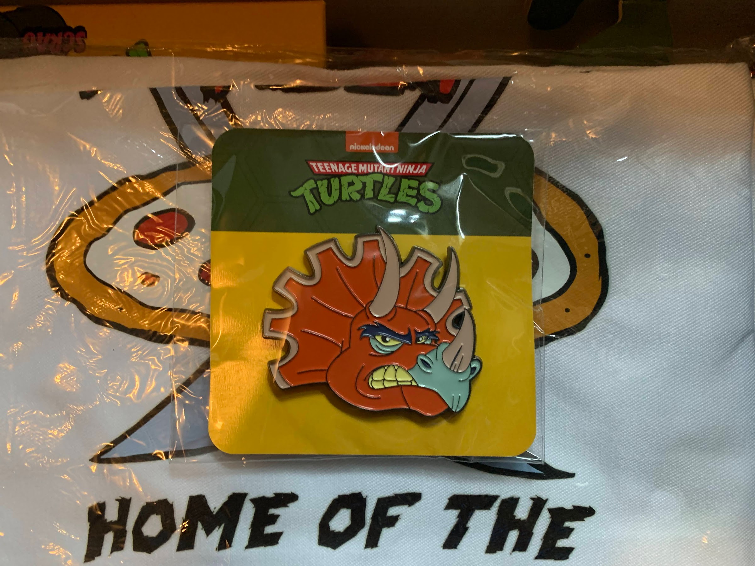
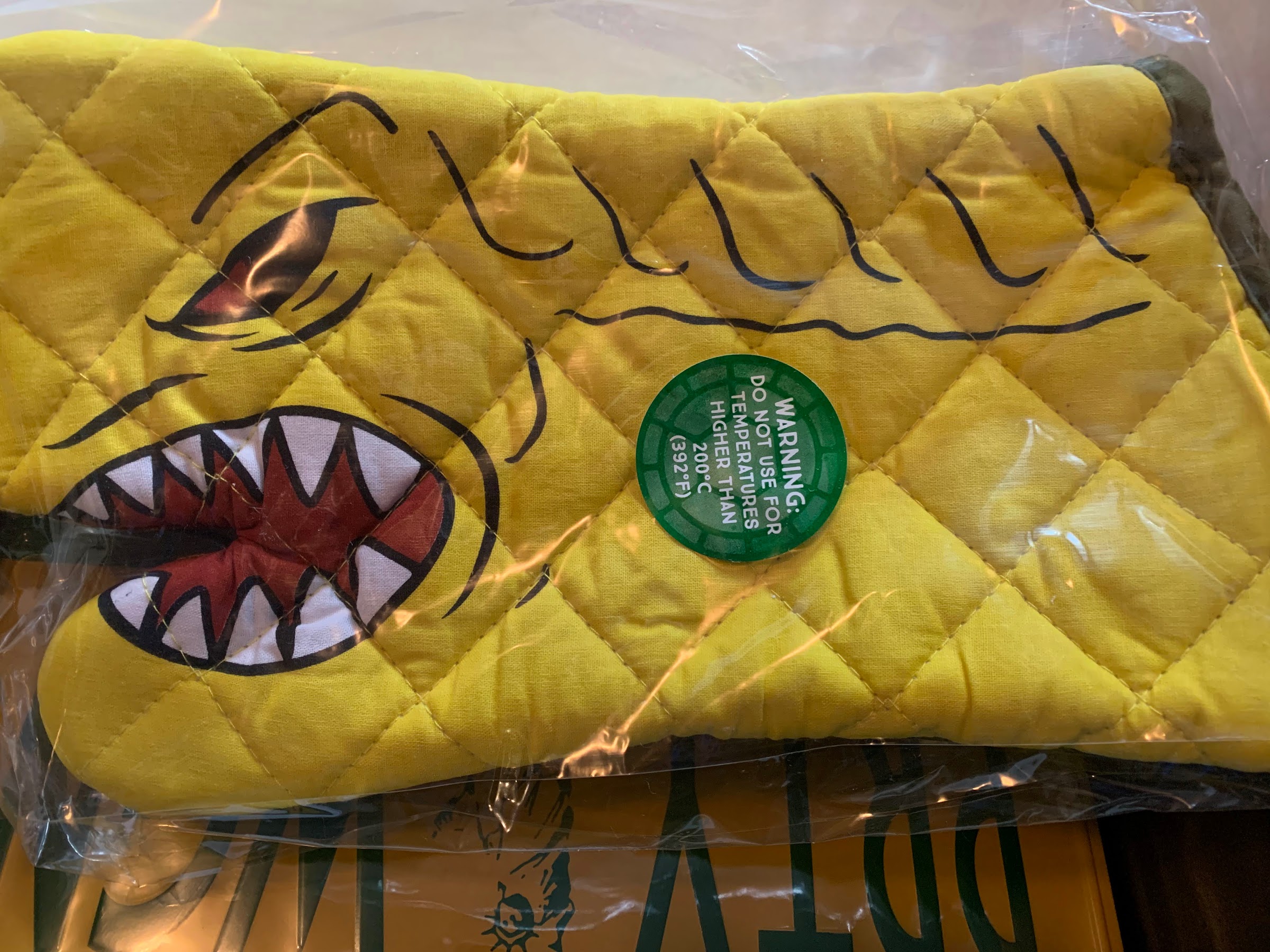
What pairs well with an apron? How about some oven mitts! We get a pair of pizza monster oven mitts. They’re yellow and they have a face on them so they look like cheap puppets. They’re a bit thin and are only rated for temperatures up to 392 degrees Fahrenheit which seems pointless since most pizza is cooked at a temperature above that. There goes my master plan of preparing pizza in my Ninja Pizza apron and pizza monster oven mitts. We also have the customary pin, this time it’s the head of a Triceraton from the cartoon. Lastly, we get a novelty license plate. It’s yellow and green with the Statue of Liberty in the center like an actual New York plate and it reads “PRTY WGN.” Cute. I’ll probably display the license plate in some fashion, but the rest will probably live in a drawer somewhere.

What everyone really paid for.

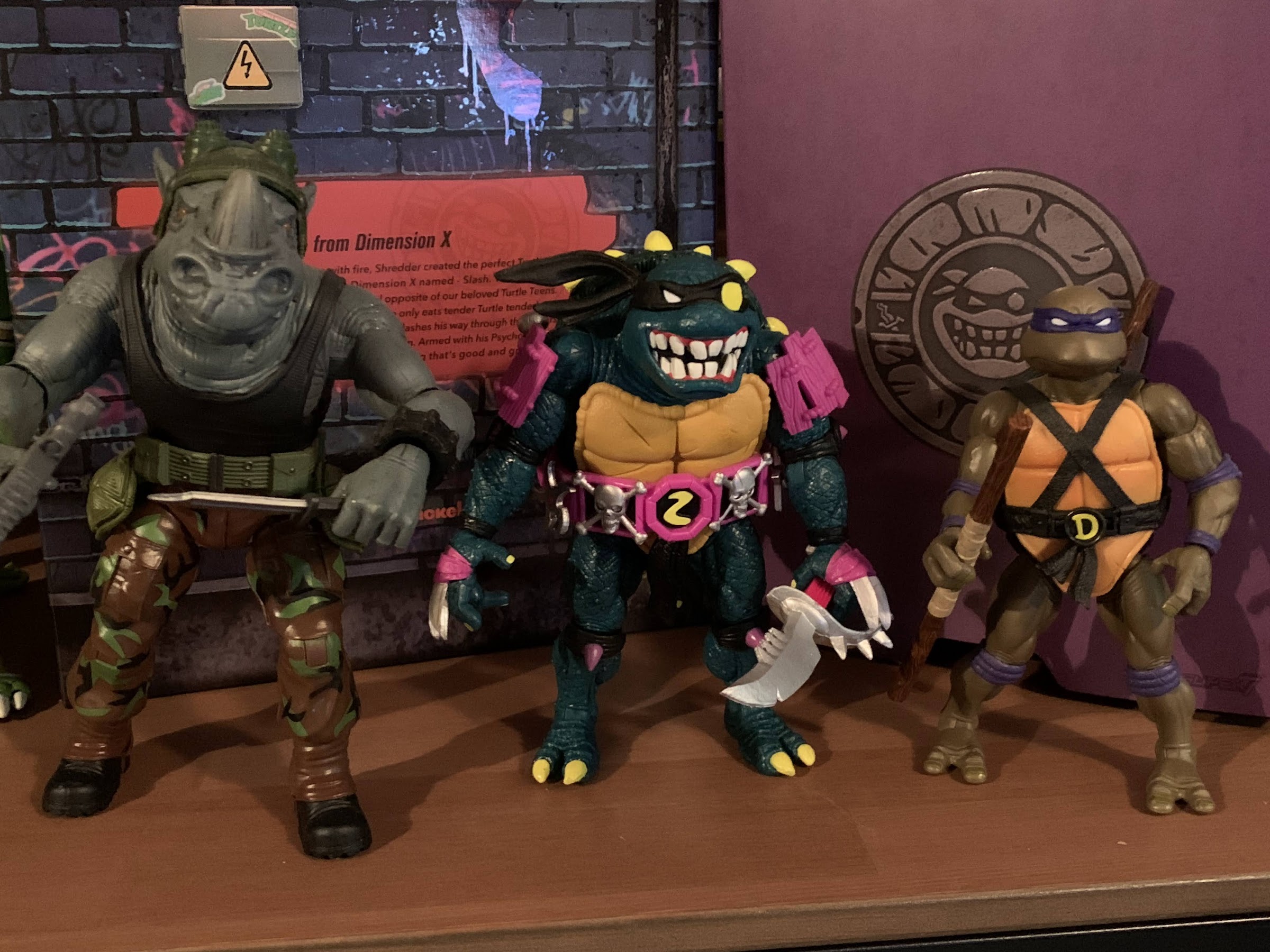
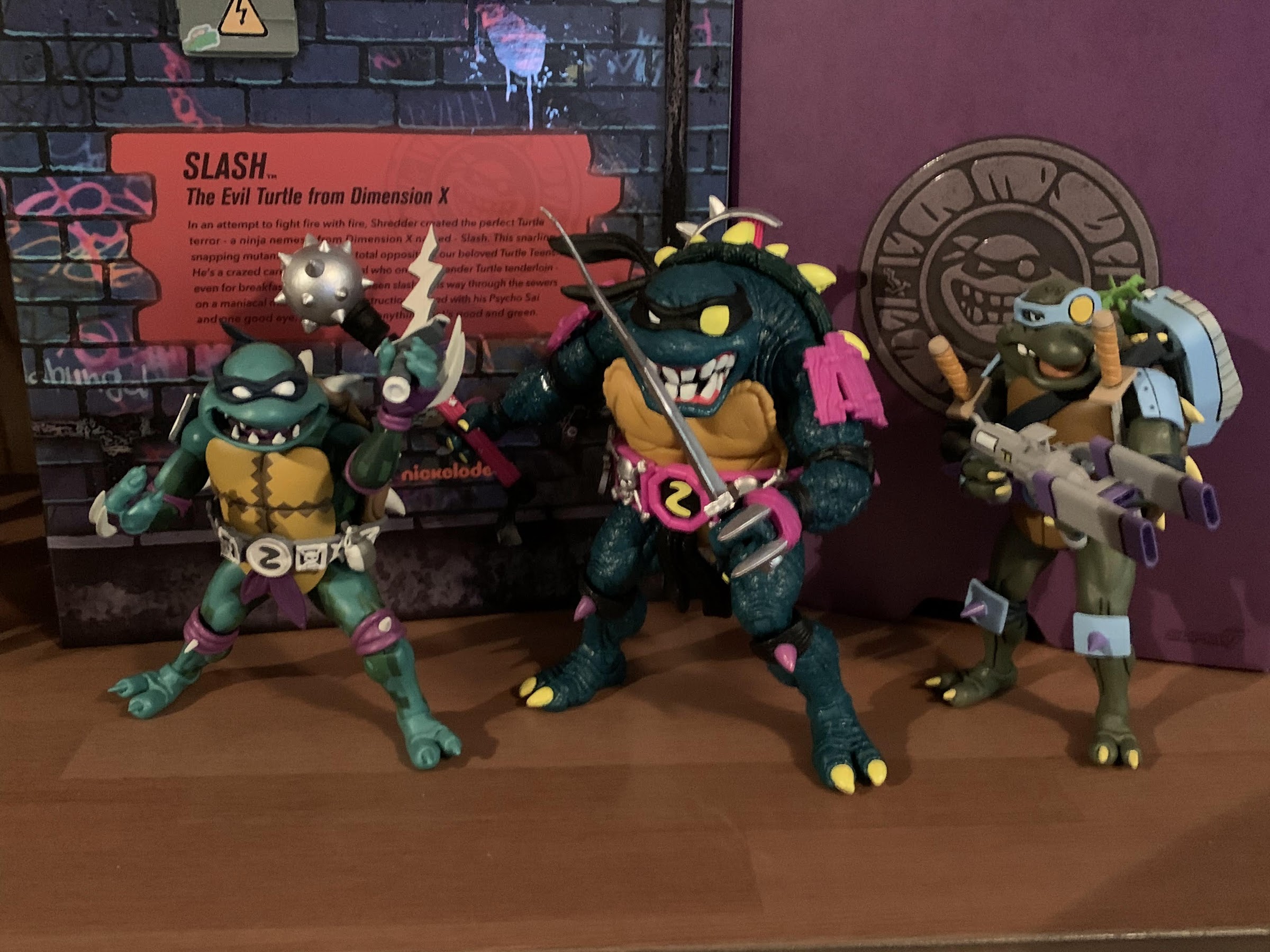
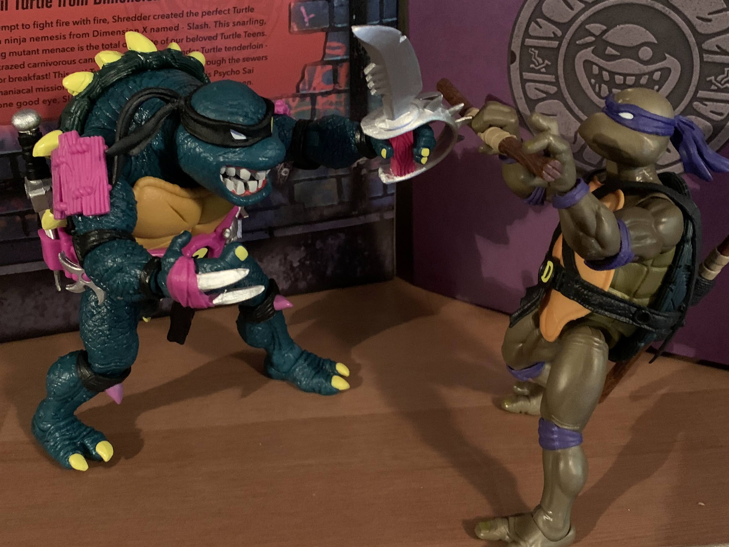
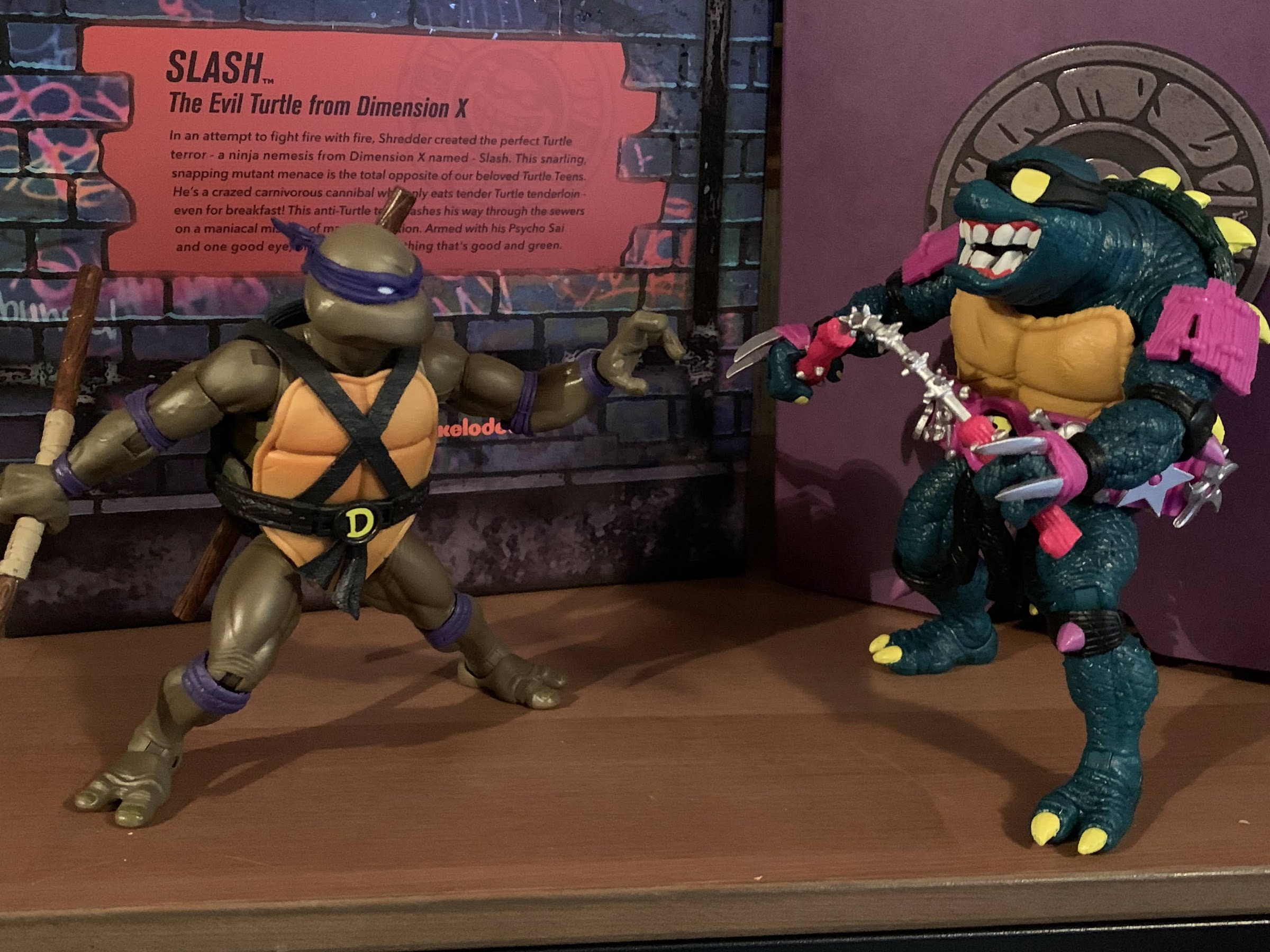
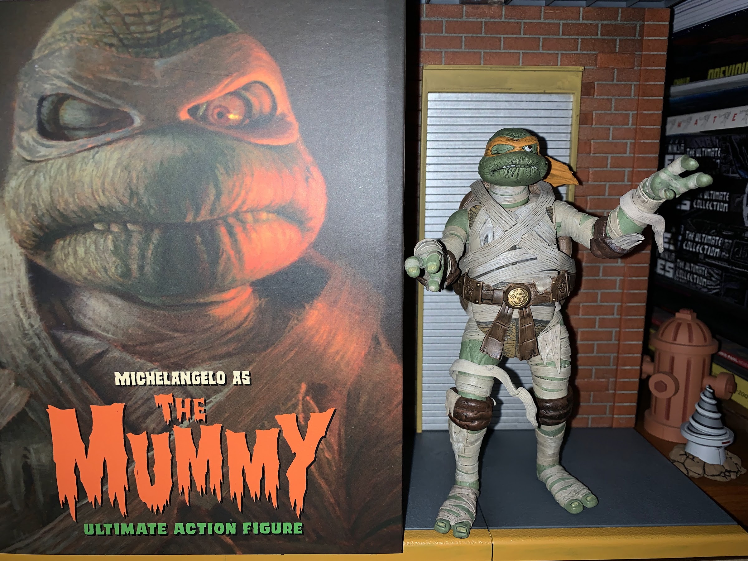
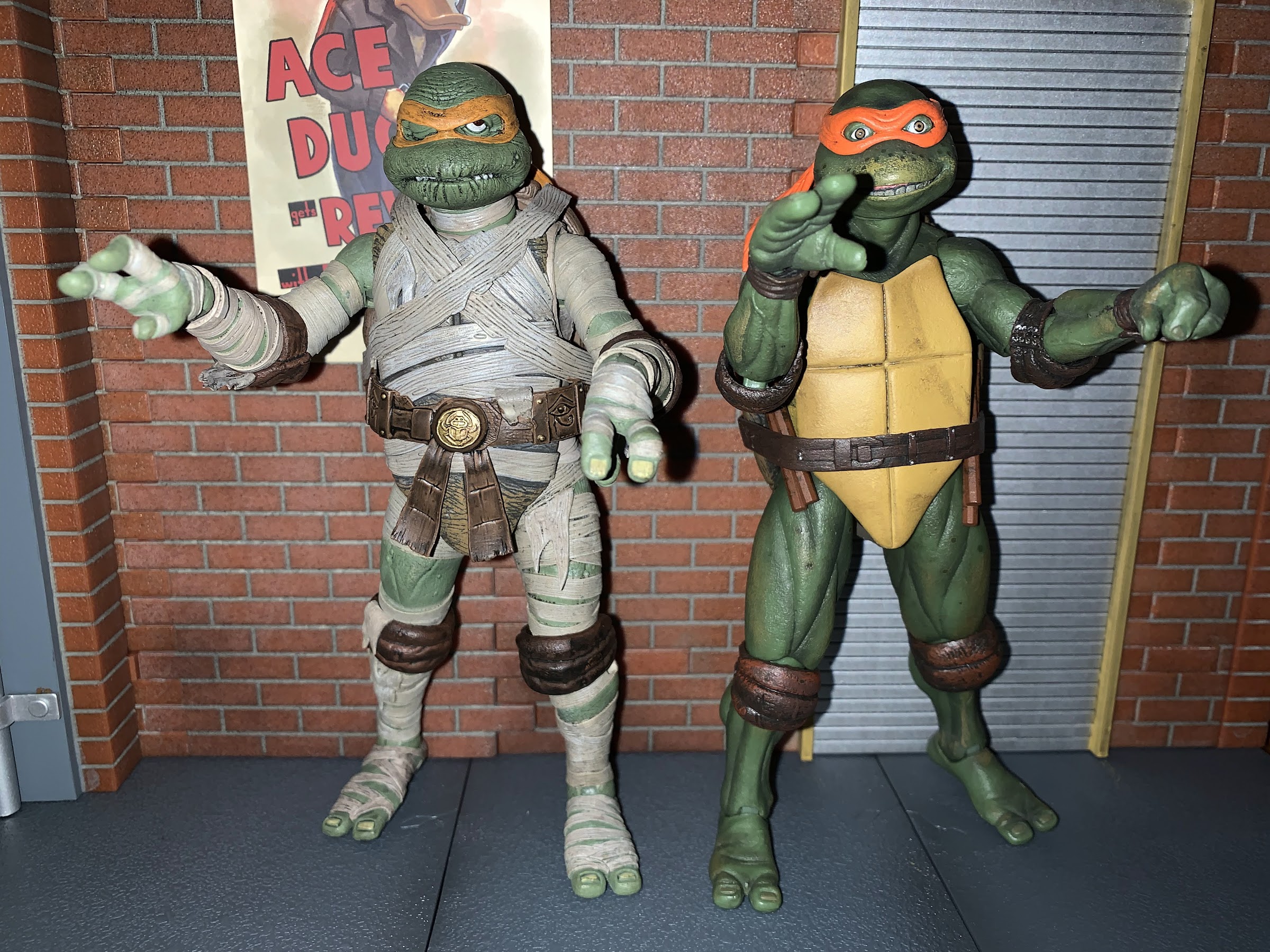
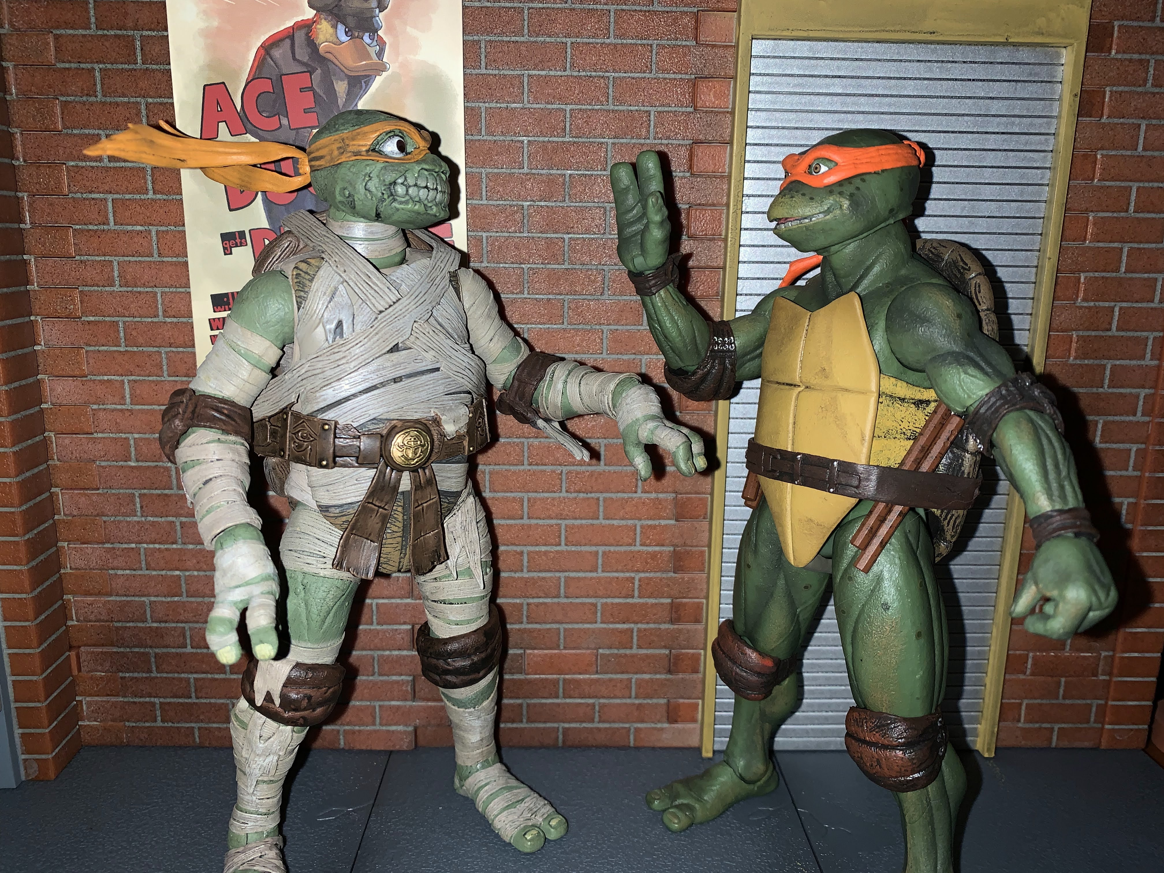
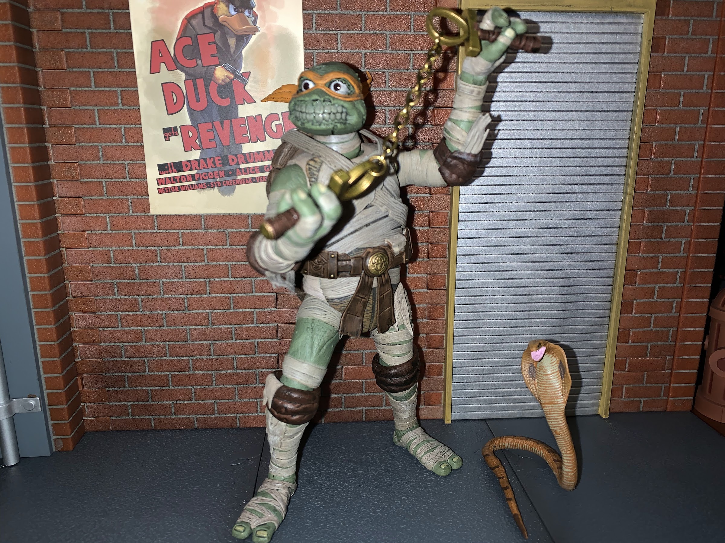
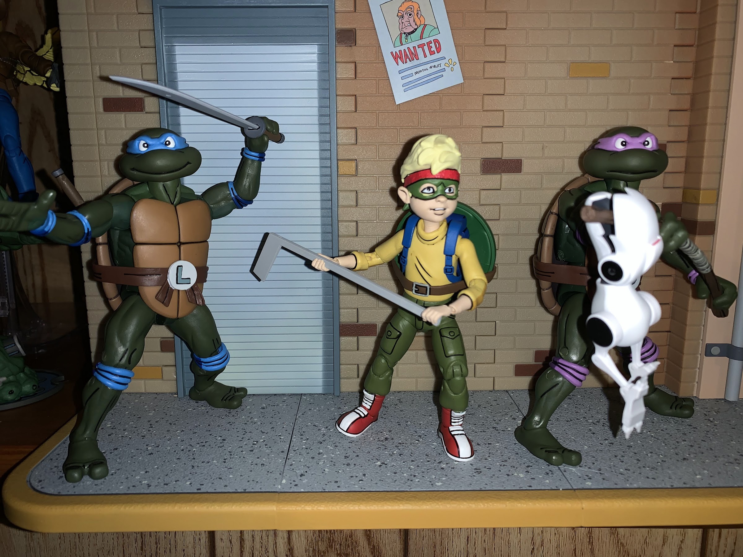
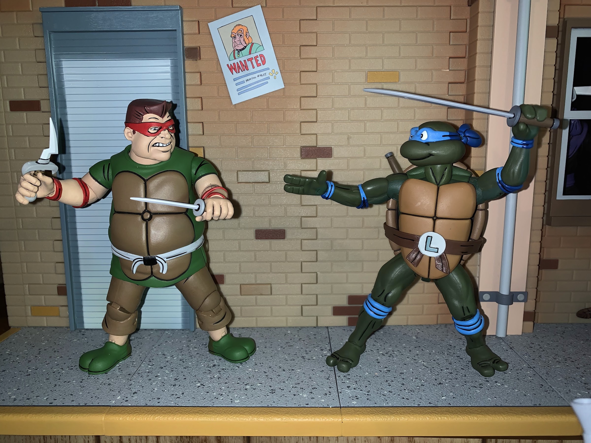
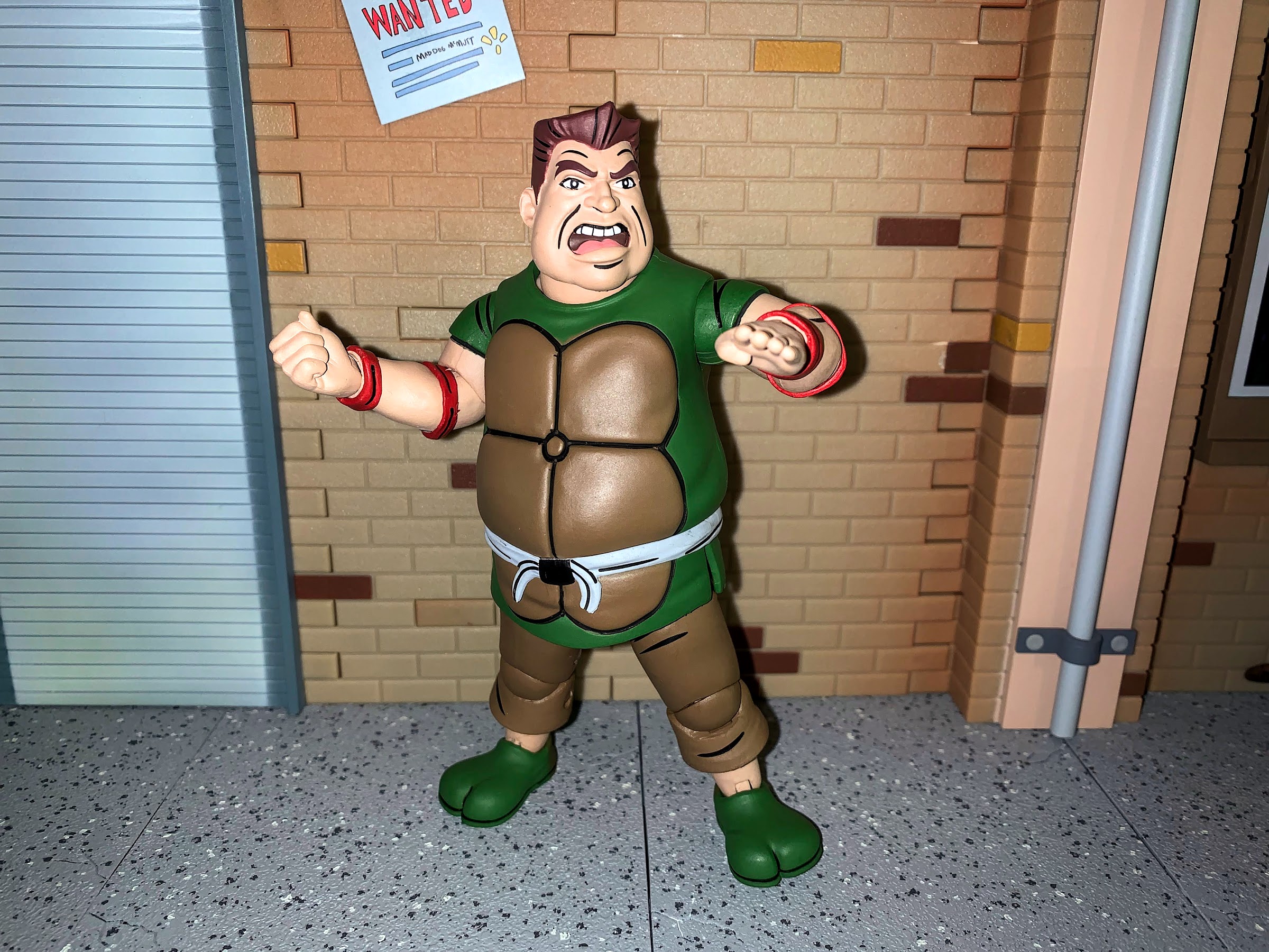
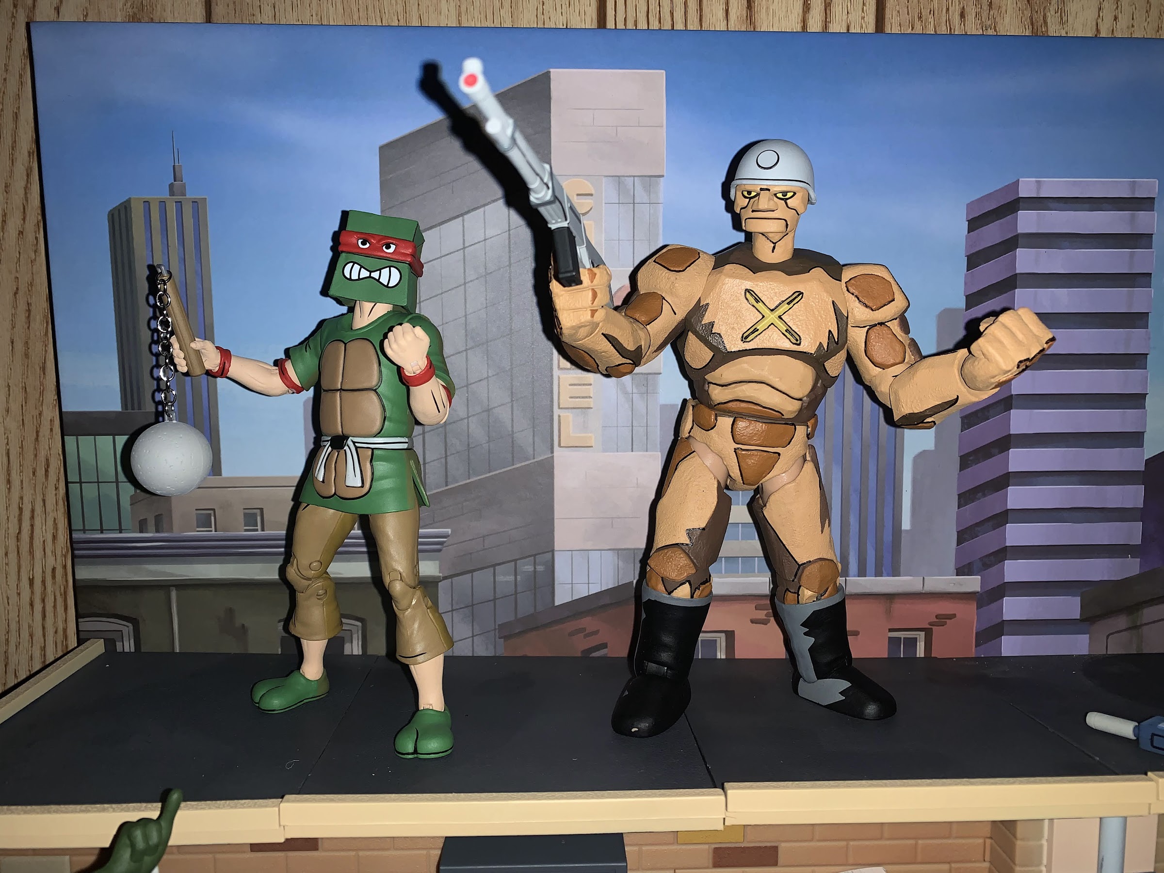
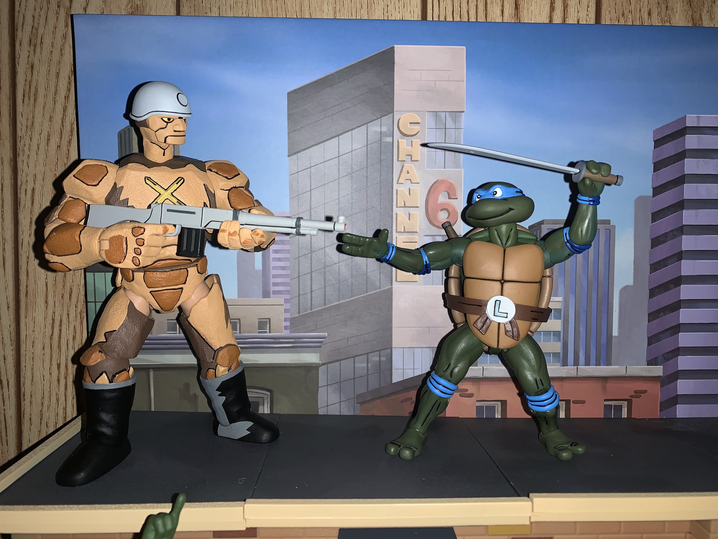
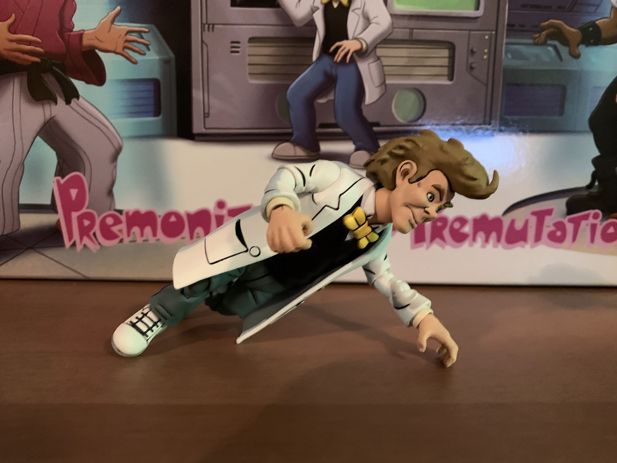
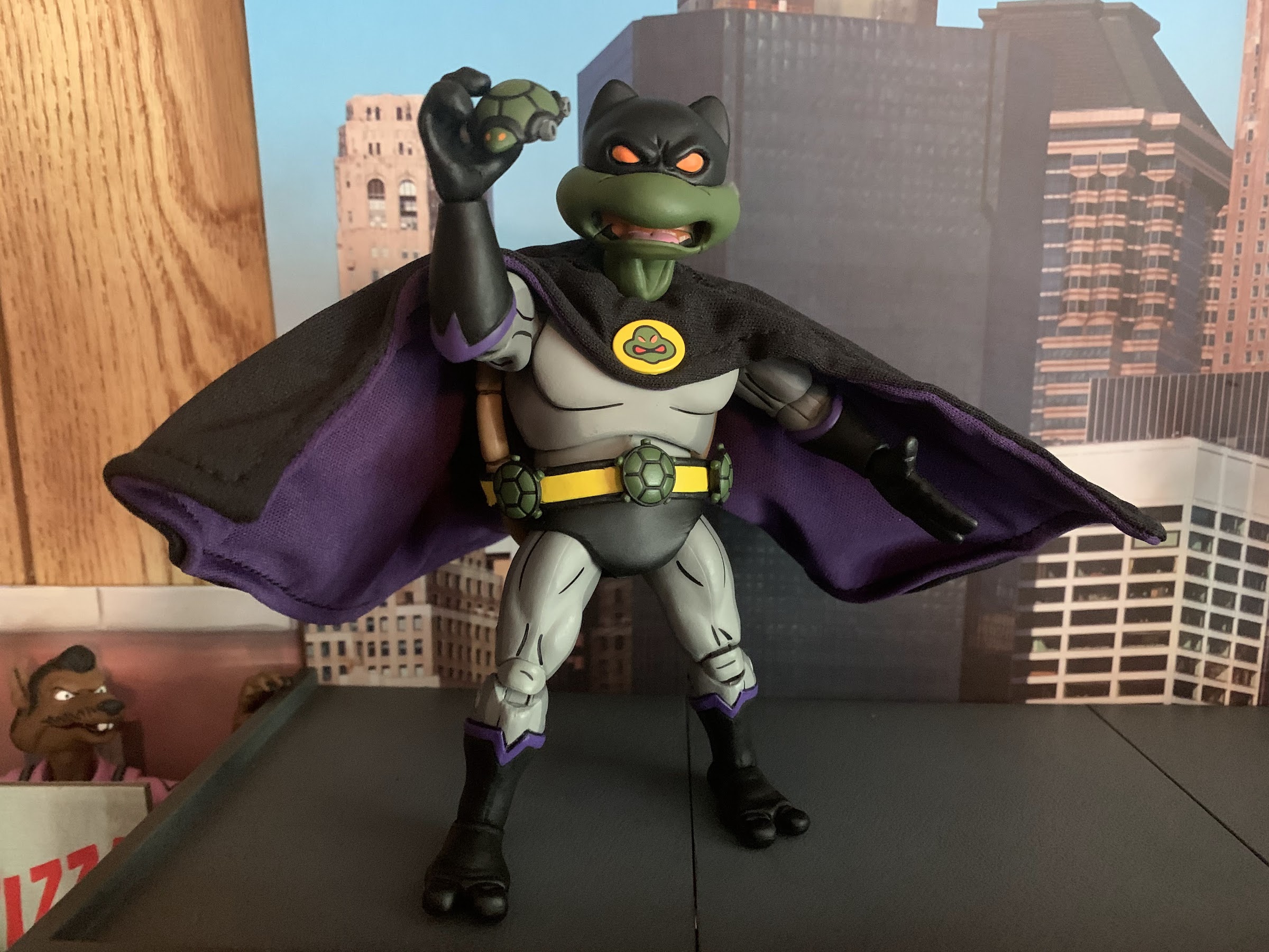
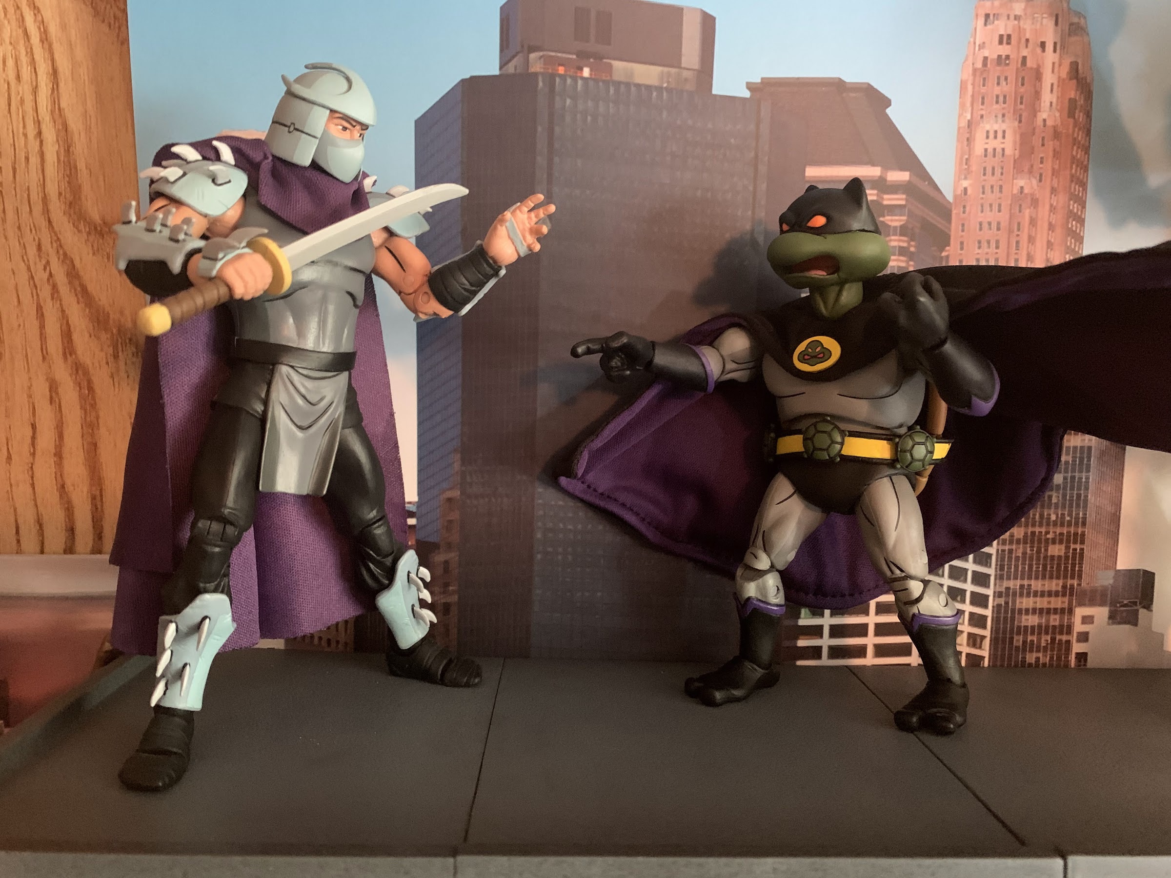
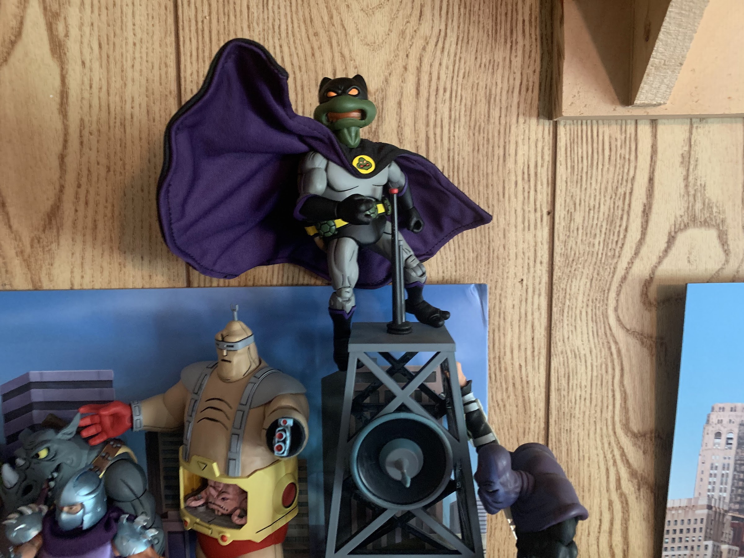
Let’s get to the main event, or the first main event, which is Donatello as The Dark Turtle. Dark Turtle has been on my wish list for a couple of years now. He’s from the same episode of the show as the Triceratons (“Night of the Dark Turtle”) and I just think he looks neat. In the episode, Donatello gets electrocuted and basically becomes a parody of Michael Keaton’s Batman. I’ve always liked the look of the character because the costume is a great Batman knock-off and the character looks really interesting because the artists cheat with him. They basically give Donatello a superhero-type body and ignore the fact that he’s a turtle. He still has the rear shell hidden under his cape, but the torso where the plastron should be just looks like a muscular dude bod. It makes no sense, but it looks cool.

“Do I know you?”
Wired capes rule. I see you down there, Rat Vernon…

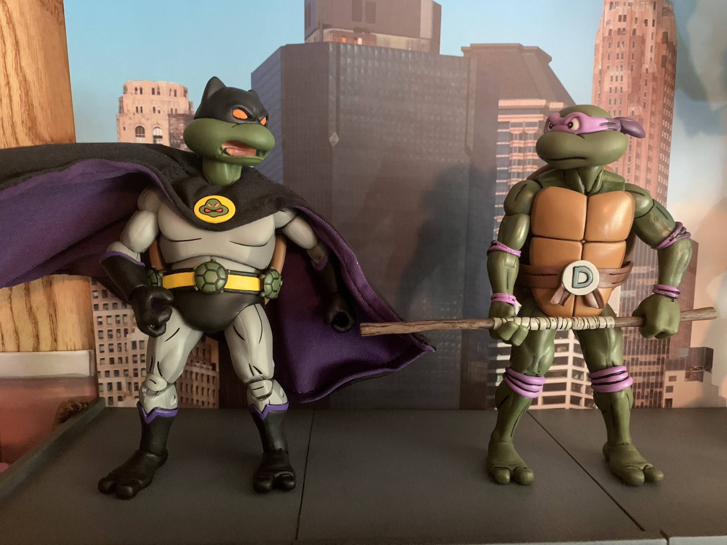
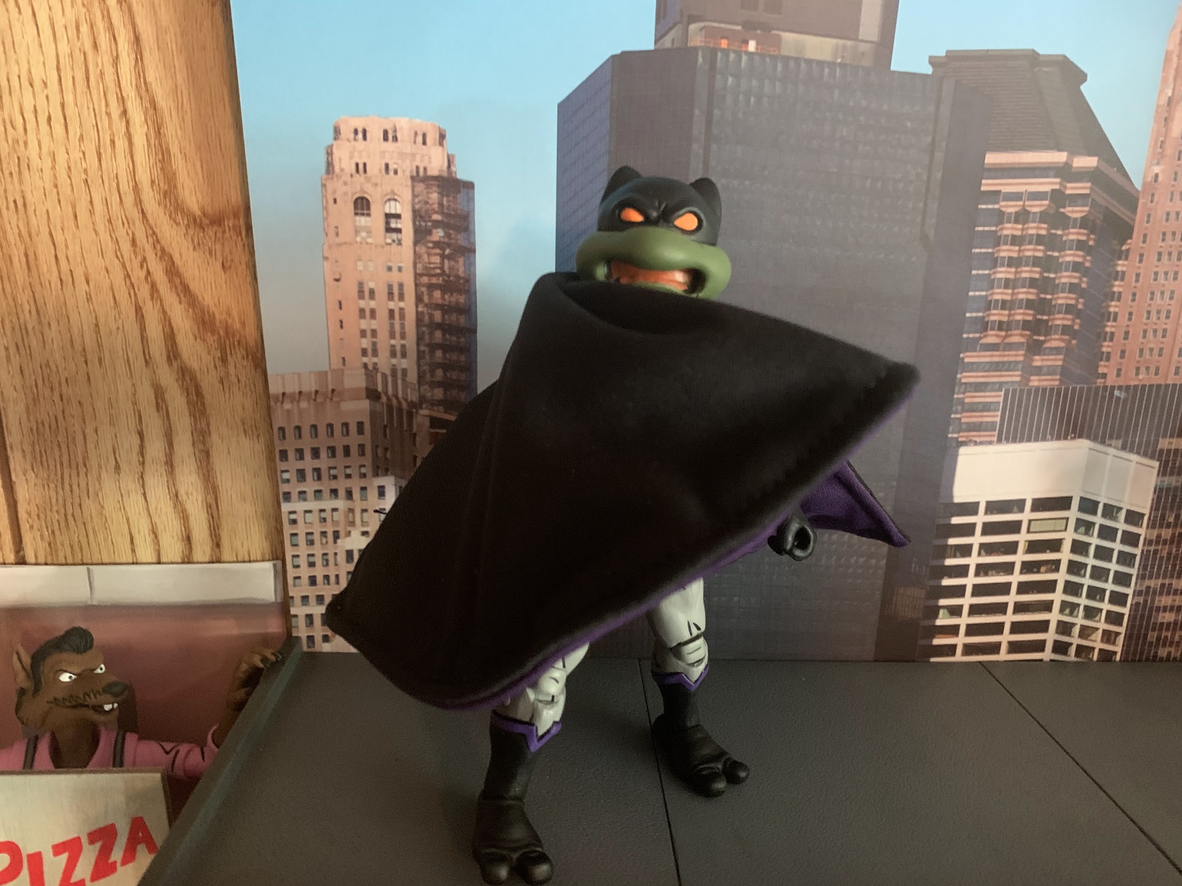
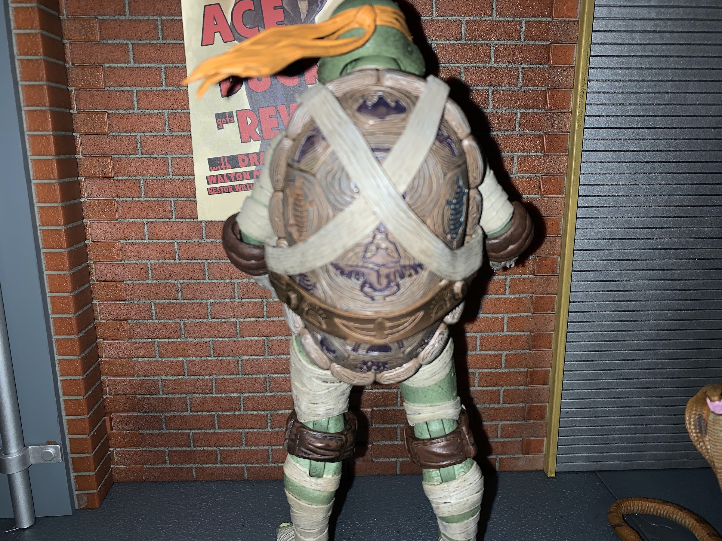
NECA’s approach to the figure is basically the same as the artists who designed the character. They didn’t just take their existing turtle body and re-paint it, they actually did a new torso. If they reused it from another figure, I can’t easily tell, though most of the figures in the line also feature an overlay of some kind so maybe this body is underneath another piece of plastic somewhere on my shelf. Either way, it looks cool. He looks very close to the character in the show. He might be a little more squat and chunky, but essentially looks the part. His face is sporting a yelling expression, but it’s also the same engineering used in the Turtles in Disguise set so you can swap his mouth piece out in favor of another expression if you have that set. The costume is done in a gray with shading on the sides and rear and I love how the belt and chest insignia came out. Best of all, the cape is wired so this guy can really hit some dramatic poses. He looks great and whatever corners may have been cut for a Loot Crate release do not come through in the quality department.

What doesn’t rule are NECA flight stands.

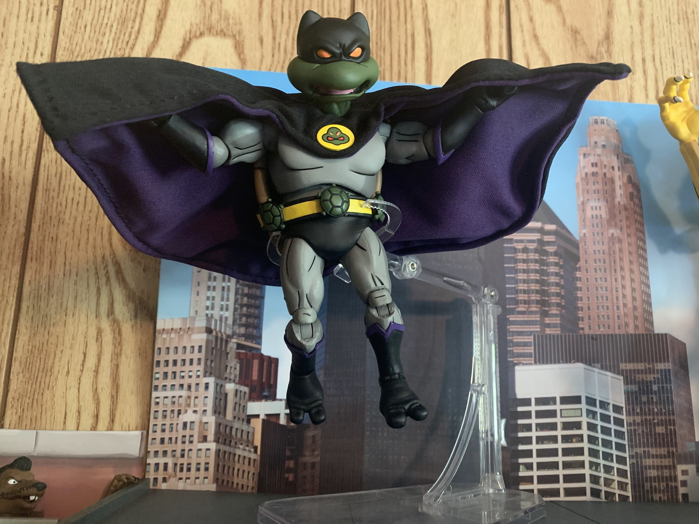
The paint job on The Dark Turtle looks pretty nice. The main color is gray, and NECA shaded it slightly differently from other figures as they included it on the sides of the torso. I wish they continued it just a little further and under the pectorals, but what they have here adds some nice definition to the figure. On the arms and legs, it’s more of the same with light gray on the front and dark on the back. There’s plenty of line work throughout the figure and the trim of the gloves and boots features some purple, a nice touch since this is Donatello, after all. I love how the belt came out which features three holstered turtle bombs that are probably glued on. The cape is pinned into his chest via the insignia on the front and it too is likely glue down. The cowl on the head is cast in black and the eyes are painted. Lastly, we have the cape which is black on the outside and purple on the inside. It’s all quite neat and clean and the only blemish on mine is a little black mark on the stomach. If I can get a magic eraser in there I might be able to take it off. I think he turned out well though and NECA didn’t take any shortcuts with the costume in making it screen accurate which is nice to see.

Watch out! He has a turtle-shaped smoke bomb and he knows how to use it!

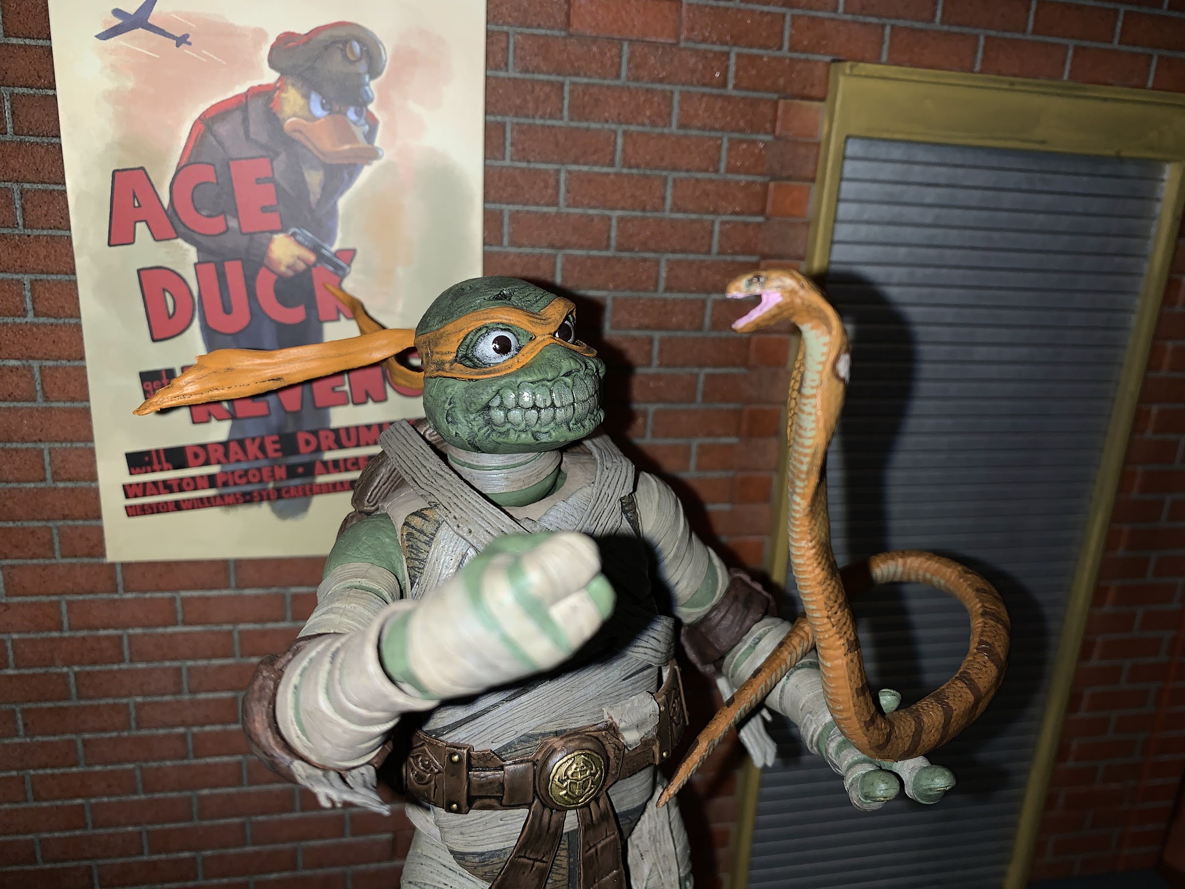
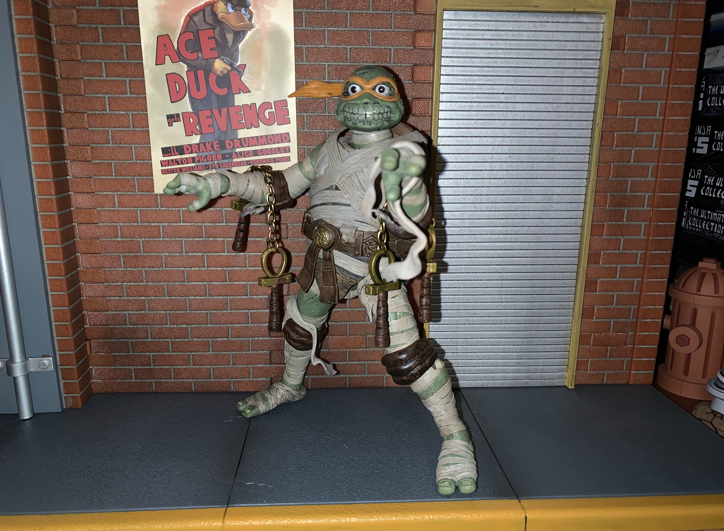
The cuts they did have to take will come through in the accessories. That’s been the case for all of the figures released this way and Dark Turtle is no different. He comes with gripping hands in the box, but also has a right pointing hand, and left open hand. Unlike the mouth, you can’t technically use hands from other sets with this figure because he wears black gloves. I think it’s a bummer they just didn’t give us a set of fists, a set of open hands, and maybe one pointing hand. Tossing in an already tooled accessory like a hand adds minimal cost, but obviously it wasn’t a cost NECA was willing to absorb. Dark Turtle does at least come with one accessory, his turtle smoke bomb. It’s a newly tooled accessory, so that’s cool, and it’s well-painted. It would have been nice to get another Turtle Hook accessory, but I wasn’t expecting one and I definitely wasn’t expecting a tooled version of Dark Turtle’s unique grappling hook.

“Hold it right there, Shredder! This ends now!” “Who is this psychopath?!”
He might have to live up here in my display because this just looks too cool.

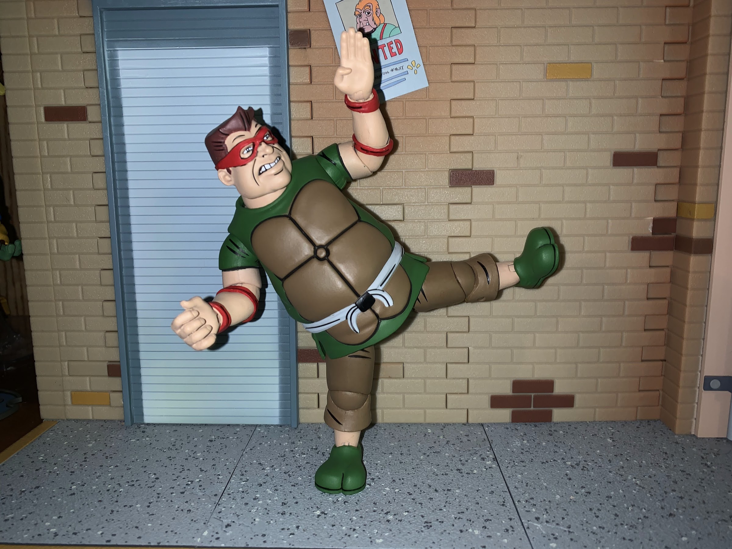
Dark Turtle is mostly reuse from the other turtles, and as a result largely moves the same. The head is still on a double-ball and the base of the neck articulates as well. He can look up and down just fine with plenty of nuance posing available as well. The shoulders are just ball-hinged and he can raise his arms out to the side, rotate, and so forth until he hits the rear shell. The left shoulder hinge on mine is pretty stuck and I haven’t been able to get much movement out of it, which is a bummer. There’s a biceps swivel after that and the elbows are still single-hinged with rotation and they bend pretty close to 90 degrees. At the wrist we have swivels and horizontal hinges. The torso is the big change as we have this big diaphragm joint. It feels like a ball peg, but we get some twist and tilt plus a little crunch forward, but not a lot. There’s basically no rear movement because of the shell, but it’s cool to have something here for a change on a turtle. At the waist, there’s a twist, but you get less than you do with the standard turtles because he’s wearing a black “diaper” piece. The hips are ball and socket joints and he can nearly do a full split. He kicks forward just fine, though not back due to the shell. There is a thigh pivot and the knees are double-jointed and bend past 90. At the ankles, we have the hinge and rocker combination that works well. He’s pretty decent for this line, and technically a little better than most since he does have some posing in the chest, but it’s so limited that it’s hardly worth celebrating. I just wish mine didn’t have the frozen shoulder joint. I’ve tried hot water, but I don’t want to risk breaking it so I might just have to live with it as-is.

The many expressions of The Dark Turtle.

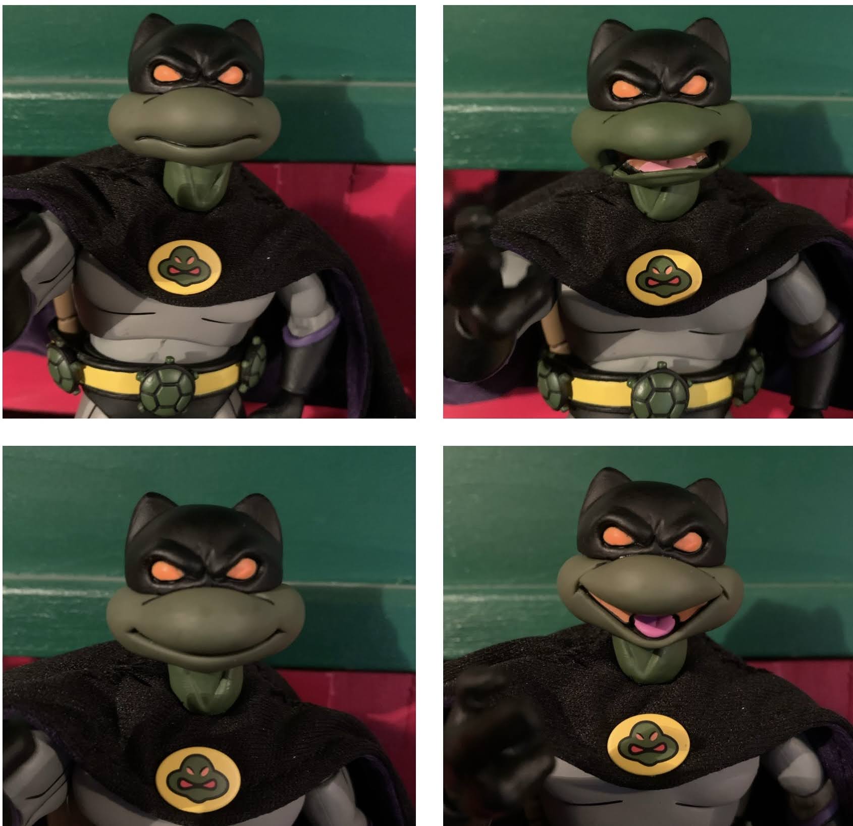
The last thing I want to talk about with Dark Turtle is the face-swapping. Just like the other turtles from the Turtles in Disguise set, Dark Turtle’s mouth can separate from the top of the head so you can mix and match expressions. The top piece even features a little tab on the rear to cover the cut-out for the bandana knots on the mouth pieces. He comes with a yelling expression, but he looks good with basically all of the other mouths. He’s always going to be frowning so any smile gives him a real sinister vibe. This figure is done in a matte style, so the glossy first-run set of the Turtles in Disguise do look a bit jarring on him. I have since picked up a matte version and I like the look of those much better. Also of note, the mouth on Dark Turtle is a newly tooled piece. The prior yell mouths NECA did were glued together from the top and the seam lines stood out. This one is glued together from the bottom and just looks much cleaner. I didn’t get the style guide four-pack so I don’t know if that change was done there, but it’s nice to see NECA continue to refine their product when the opportunity arises.

“You lookin’ for me?!”

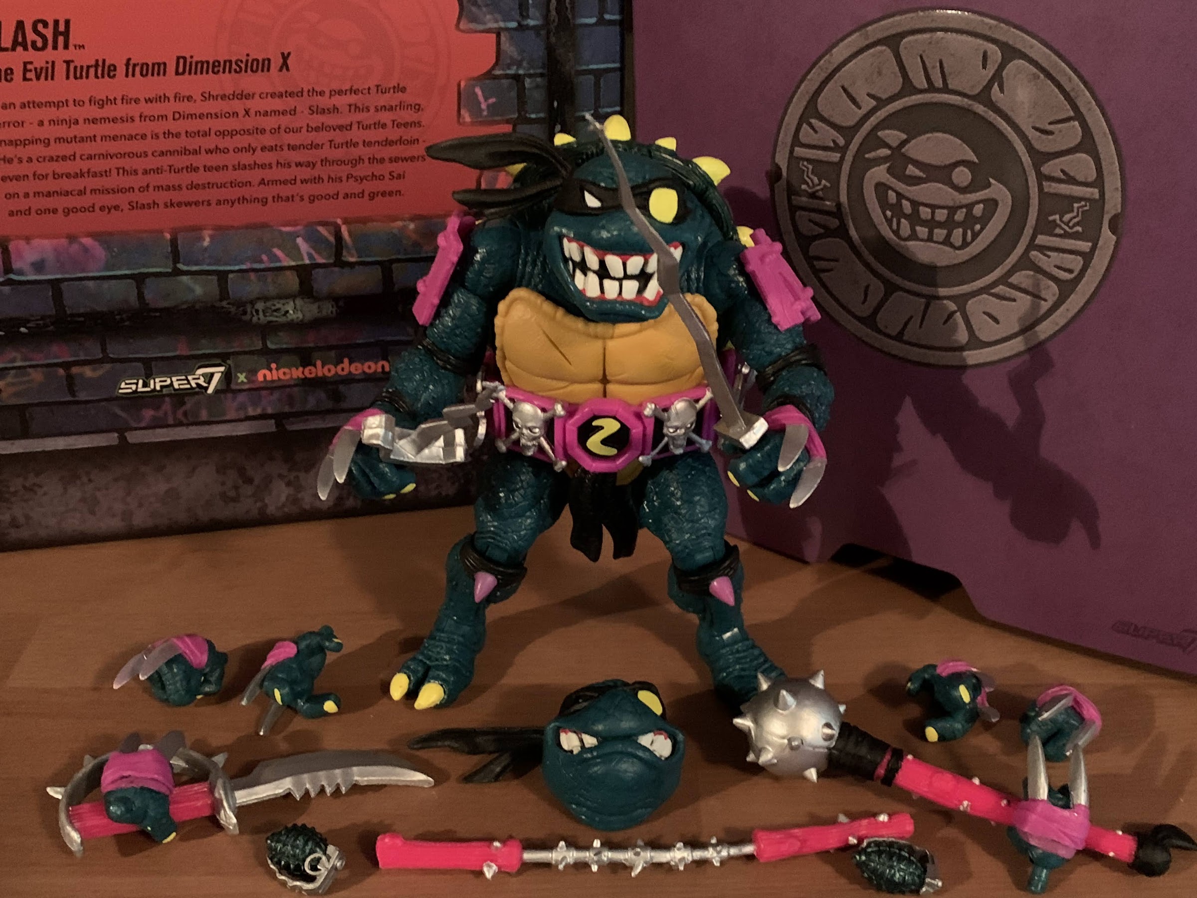
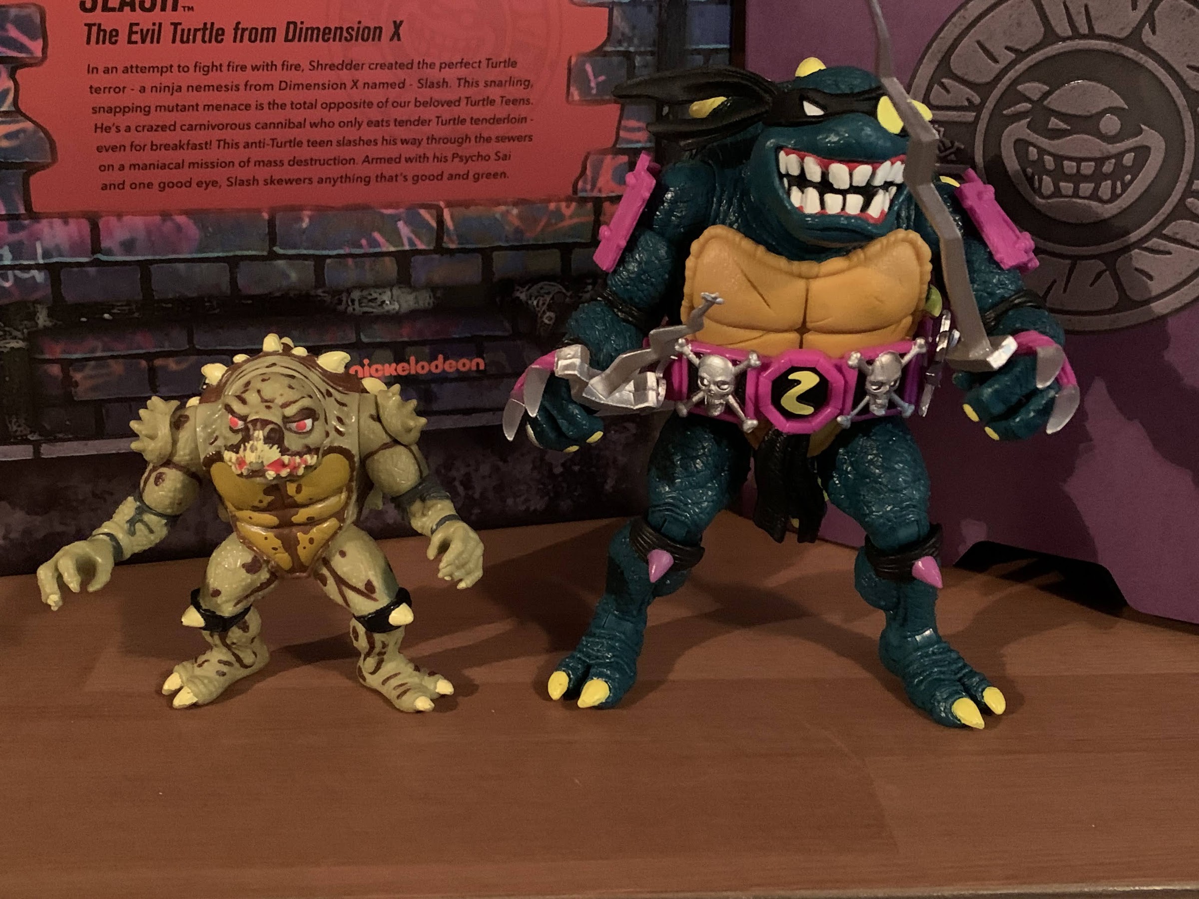
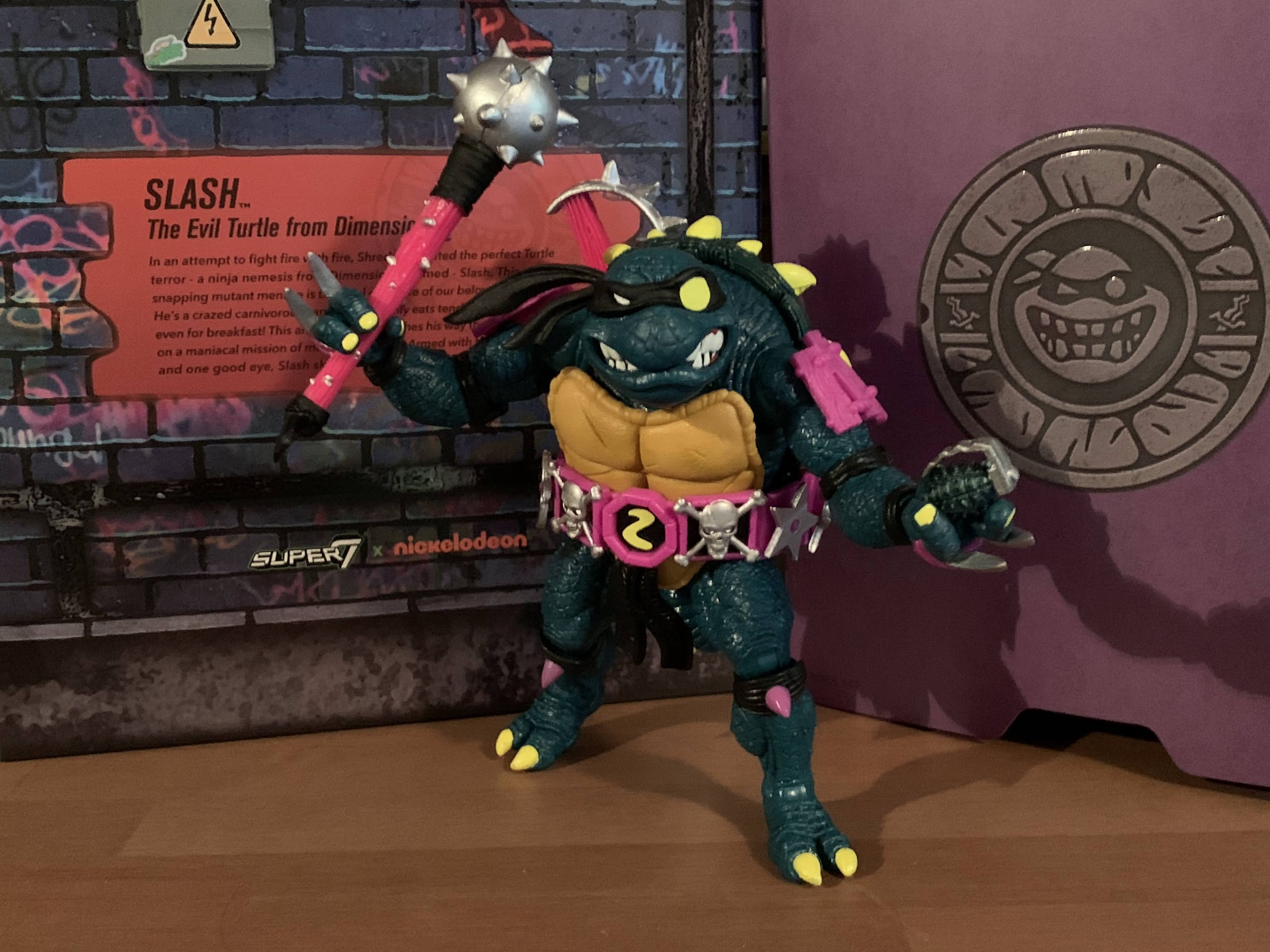
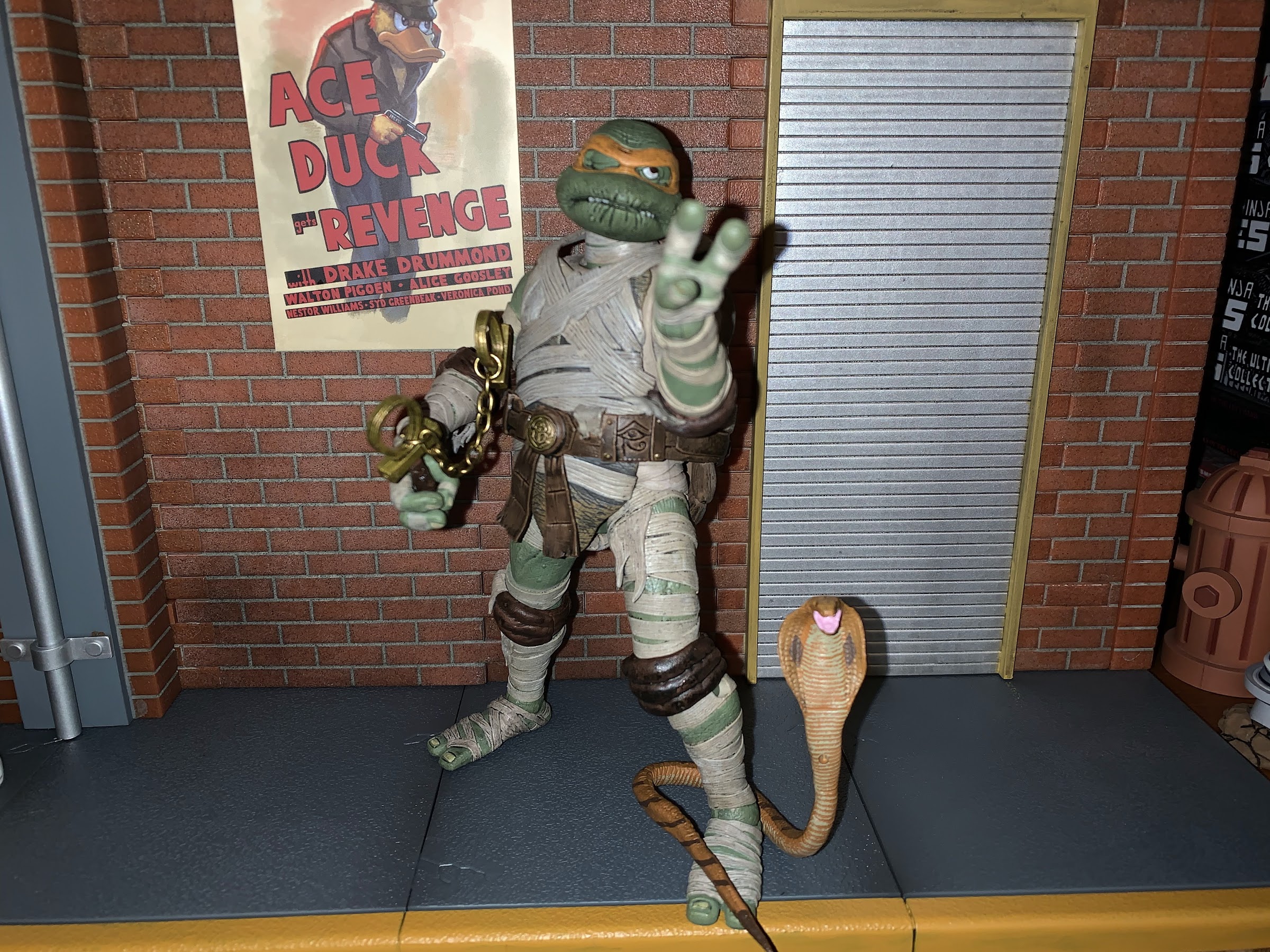
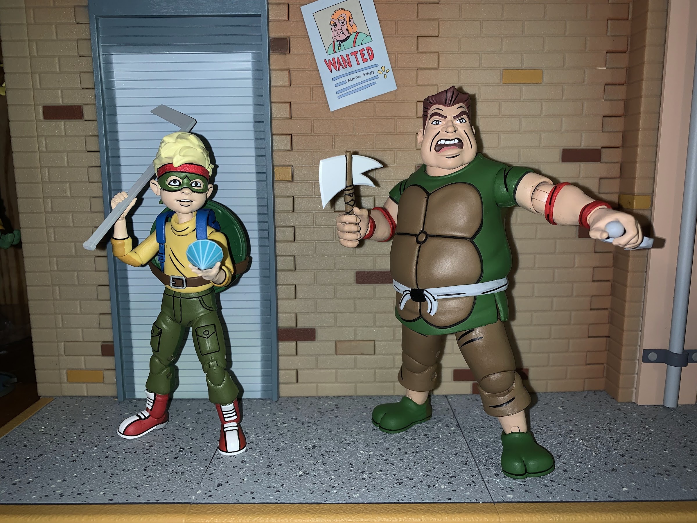
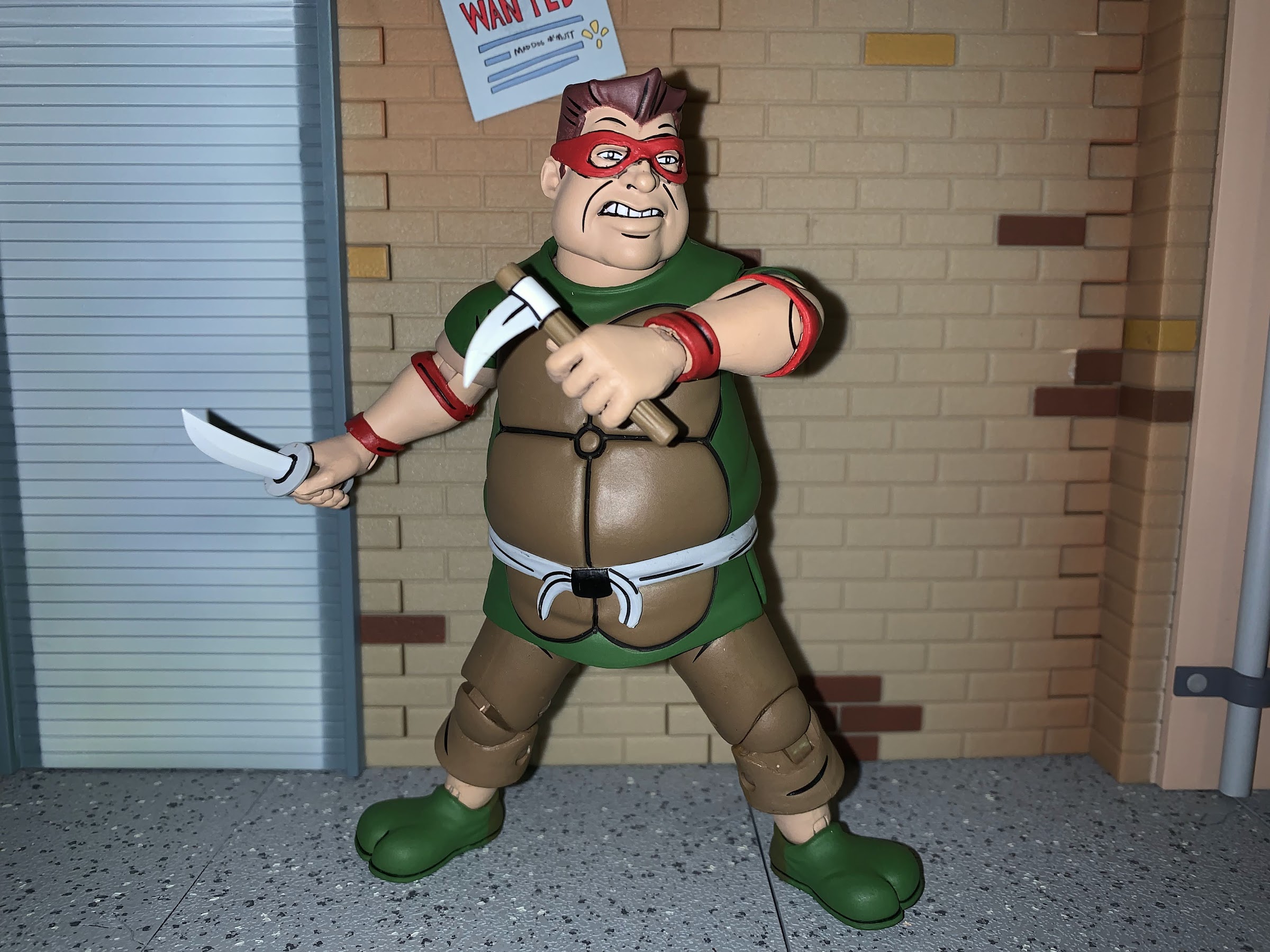
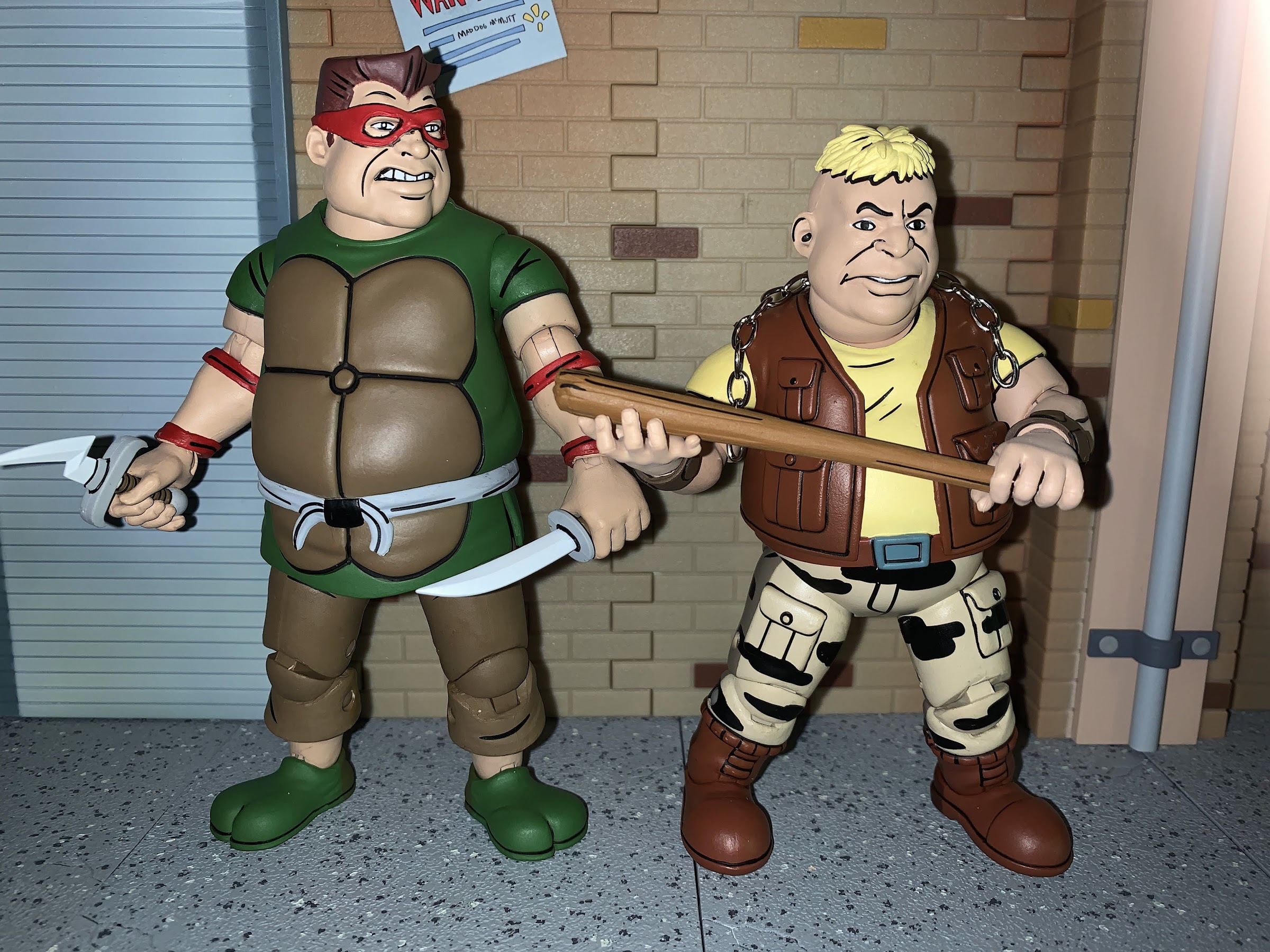
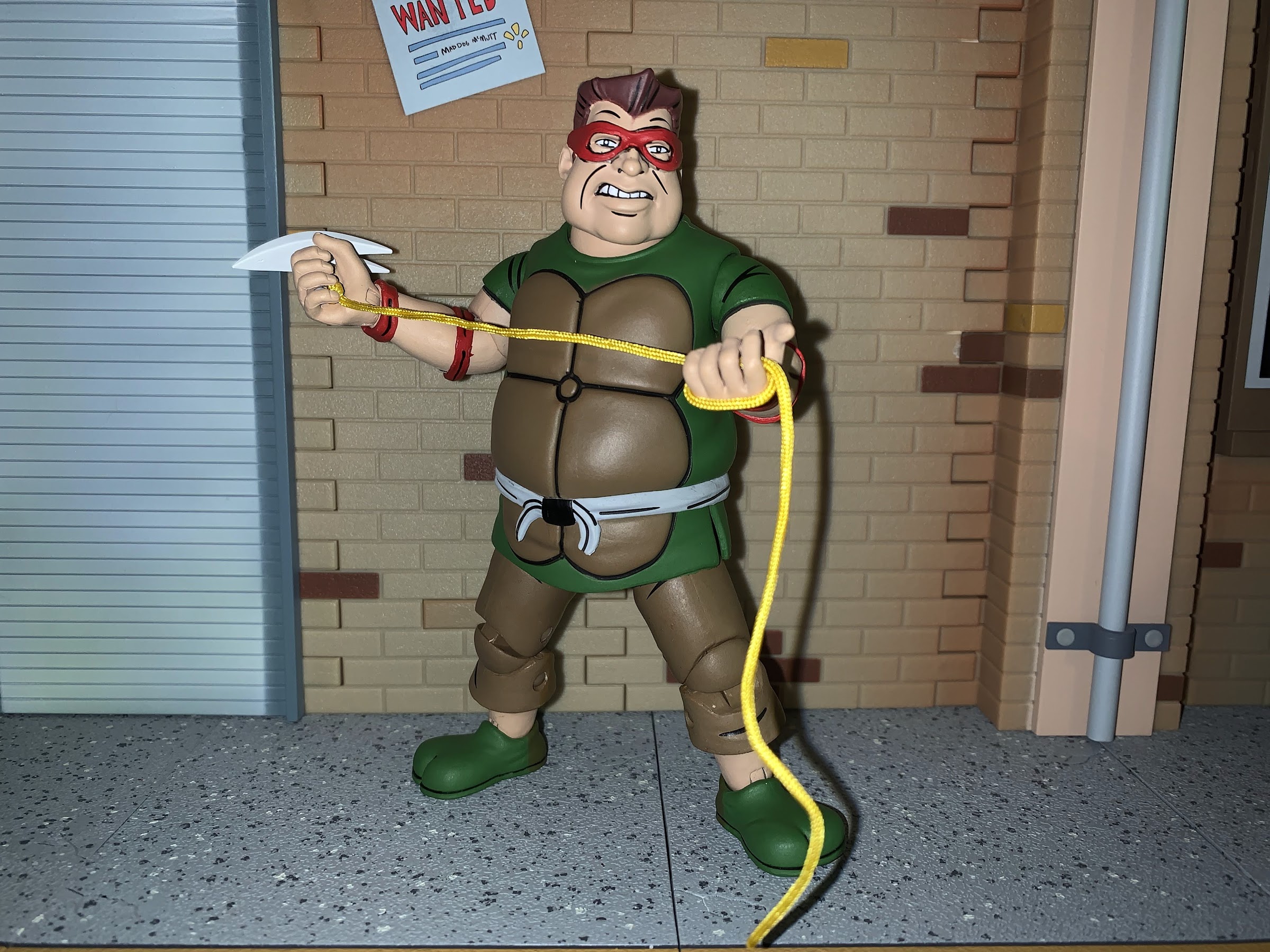
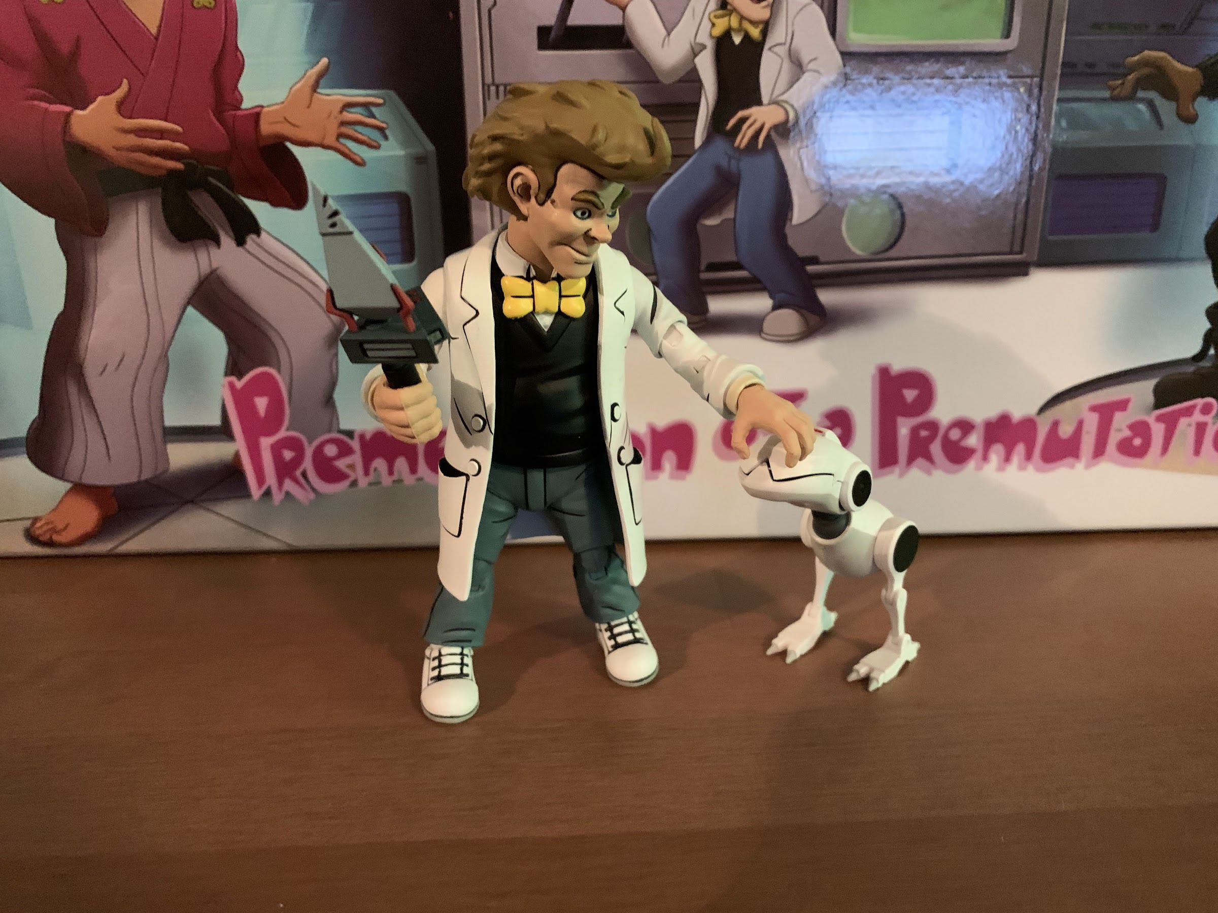
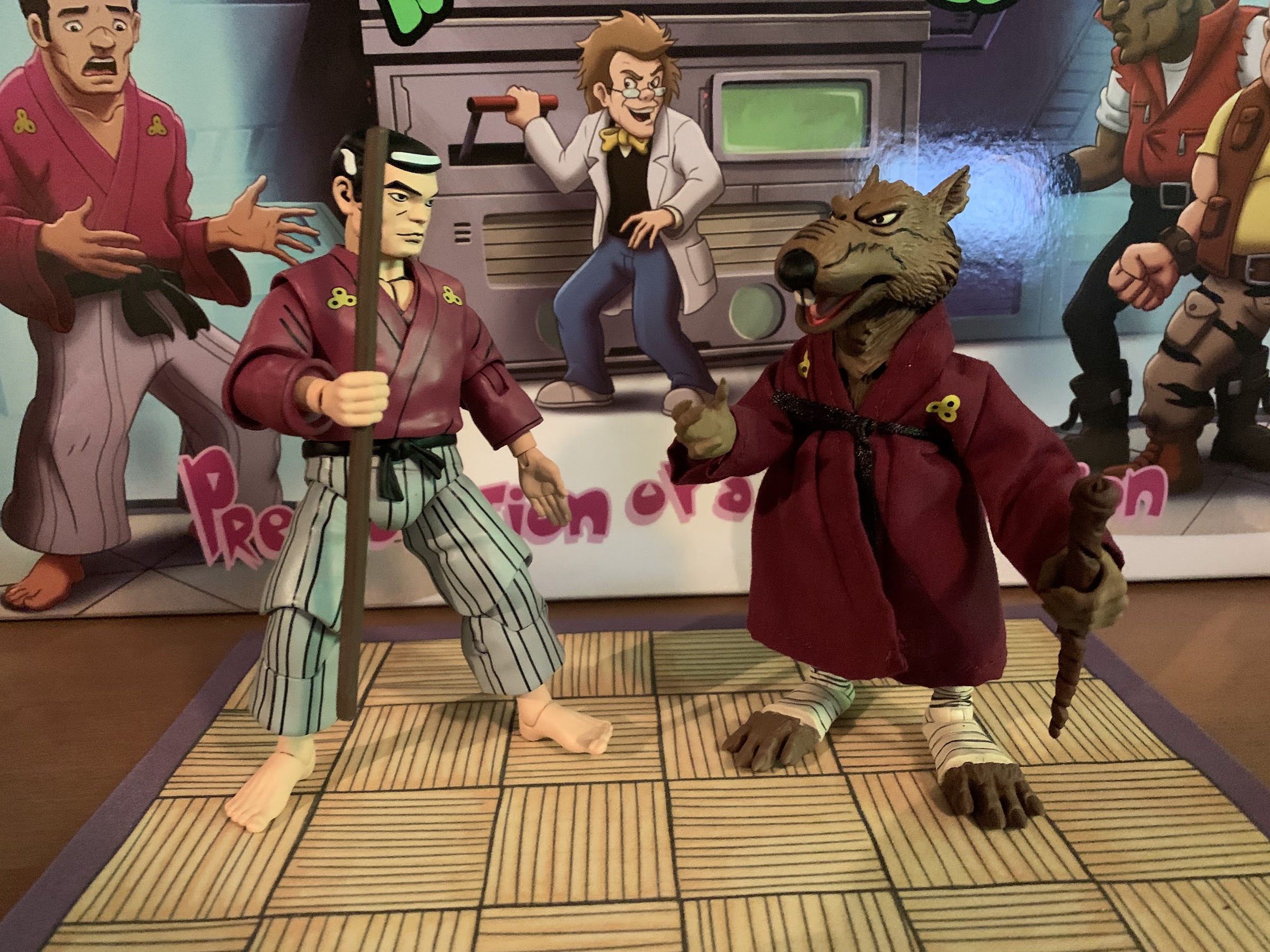
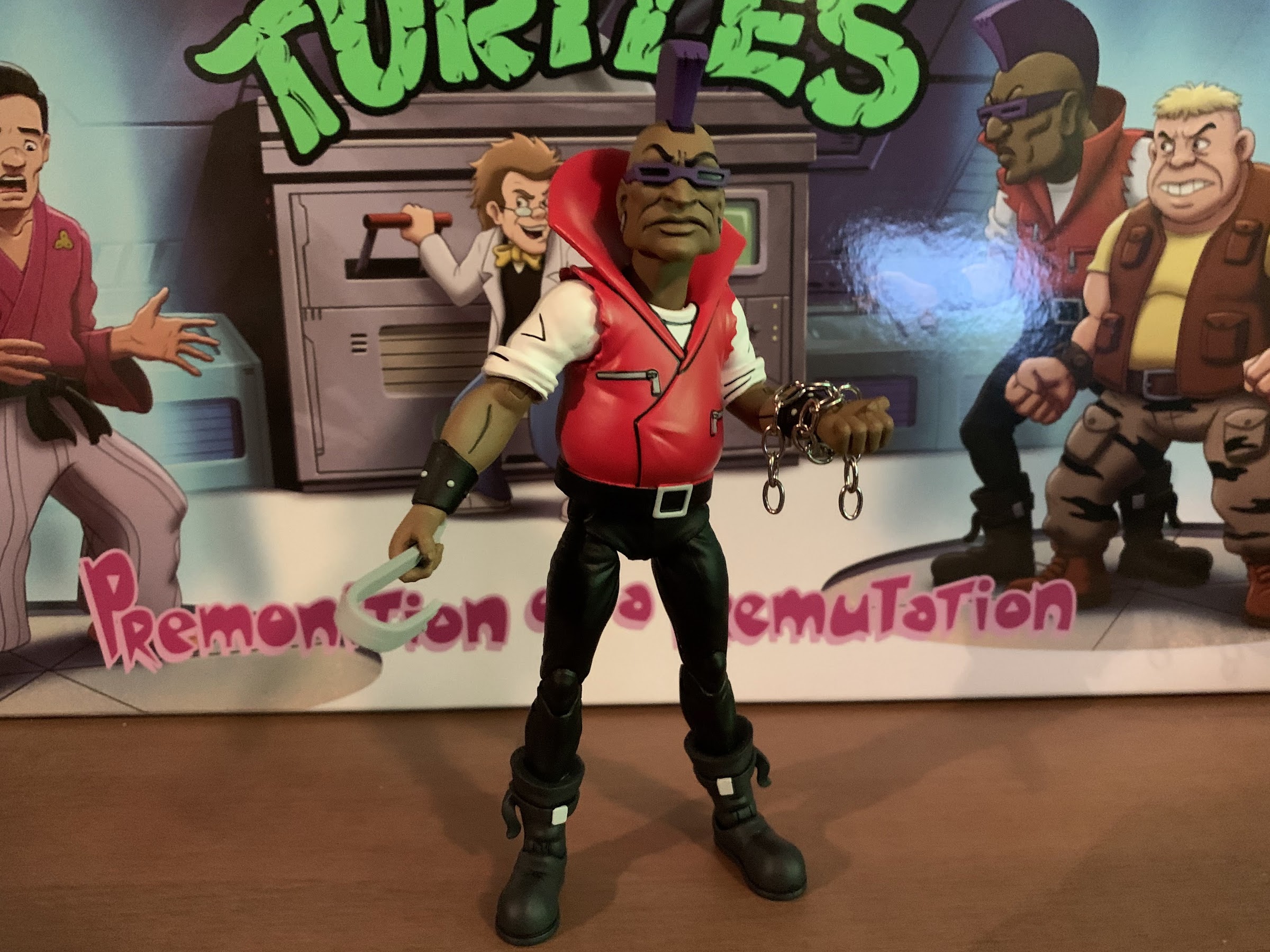
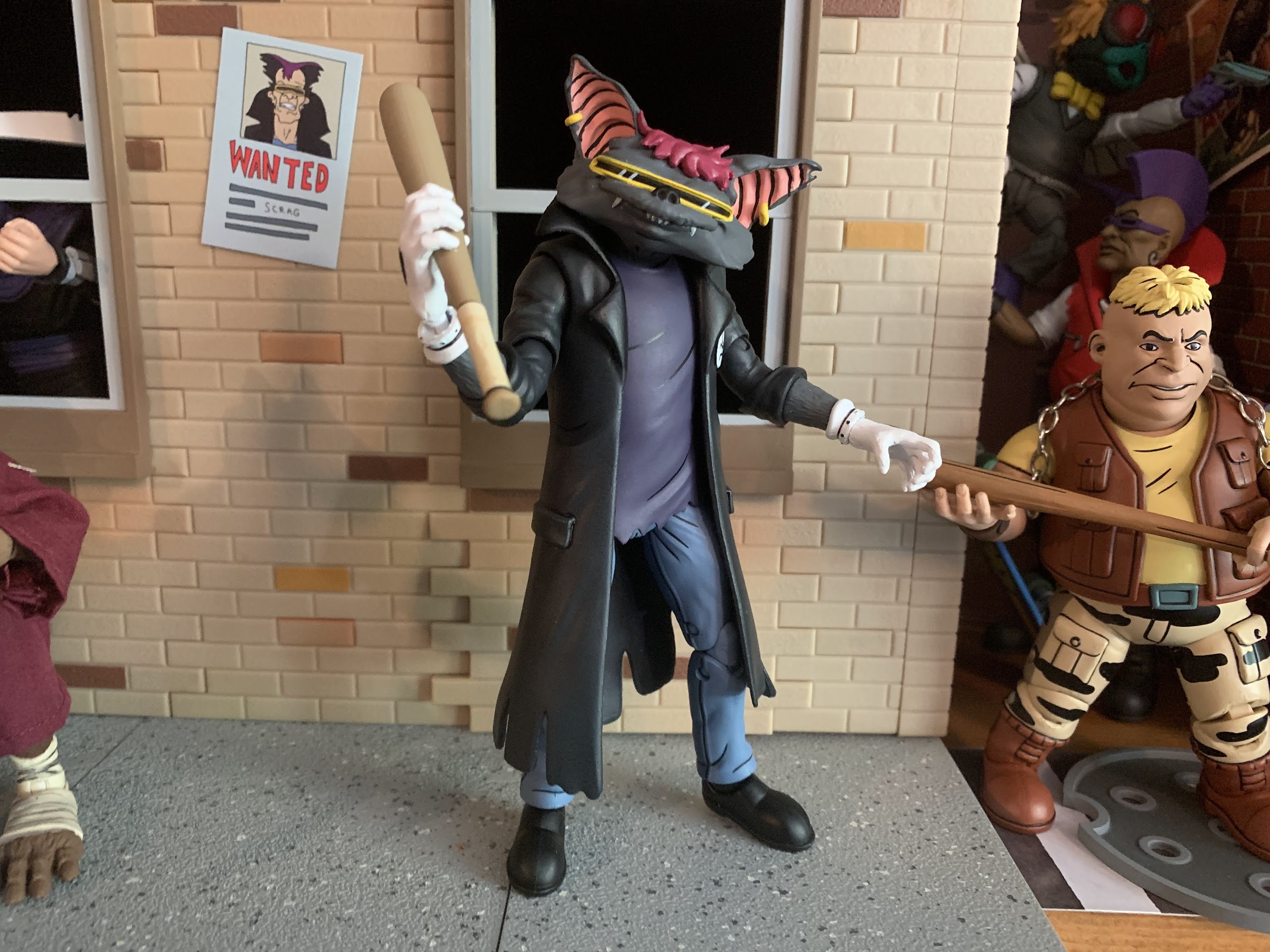
That’s a rather positive review of The Dark Turtle, but now lets turn out attention to Scrag. Scrag is an interesting character in that he just appears in the original mini series and then is never heard from again. For me, he was always the most recognizable of Bebop and Rocksteady’s original gang. We even see him before we meet the turtles! In the show, he’s never named and speaks no lines of dialogue. He just joins in on some vandalism and the whole threatening of April before getting experimented on by Shredder. For some reason, Shredder didn’t think much of the rest of Bebop and Rocksteady’s gang and only chose to keep those two. If they were the best that gang had to offer then the others must have been pretty terrible. Scrag is shown on a monitor when Shredder makes a comment to Krang about experimenting on the punks, and when that happens, we see he’s become a bat (some supplemental material even gave him the name Bat Boy). There’s a quick shot later of the punks locked up in a cell, but Scrag’s final appearance comes in the fifth episode (the final of the original mini series) where Shredder uses him to demonstrate a reverse mutation ray which restores his original, human, look. After that, who knows what became of old Scrag? Presumably Shredder didn’t waste more mutagen on him to re-mutate him so he was either disposed of or allowed to leave. Shredder and Krang weren’t really portrayed as killers, so my guess who be they opened a portal and just chucked him somewhere and had a good laugh about it later.

I wouldn’t say the gang’s all here, but it’s more of it than we’ve ever had.

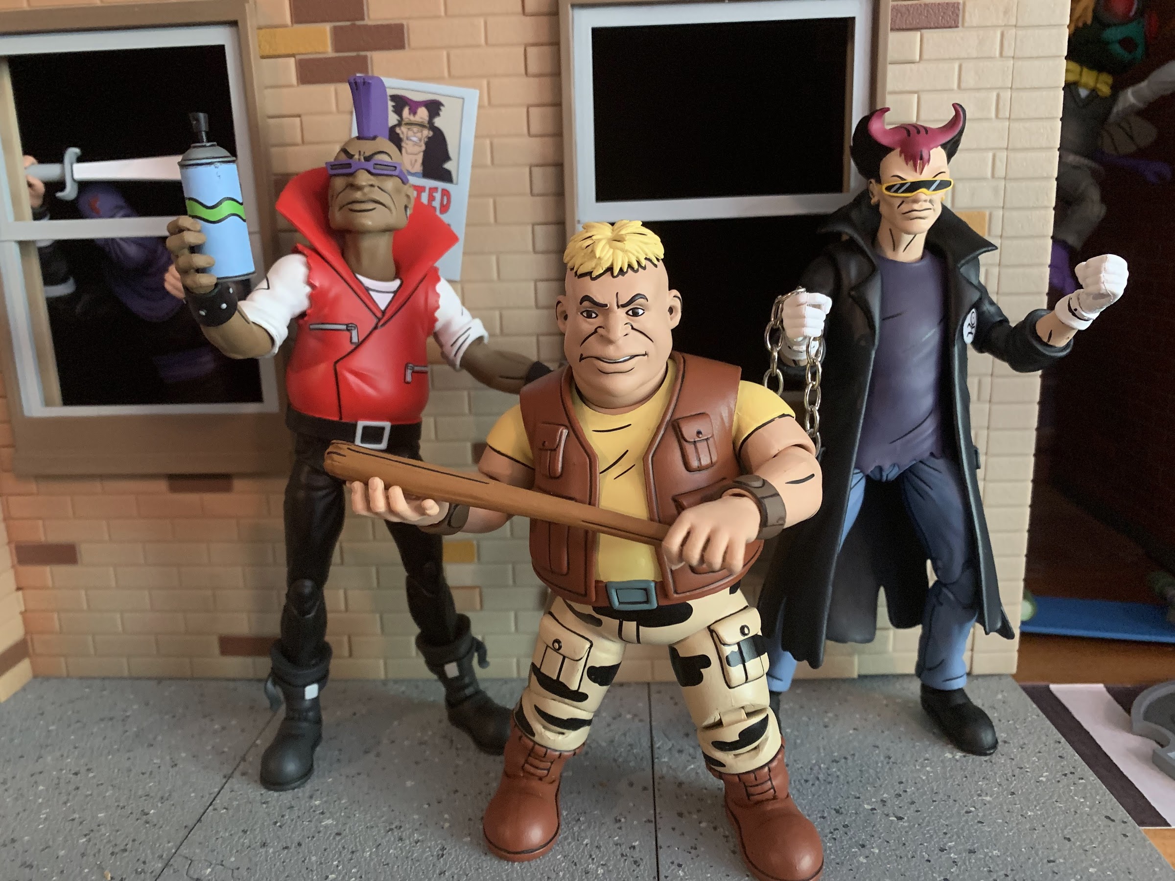
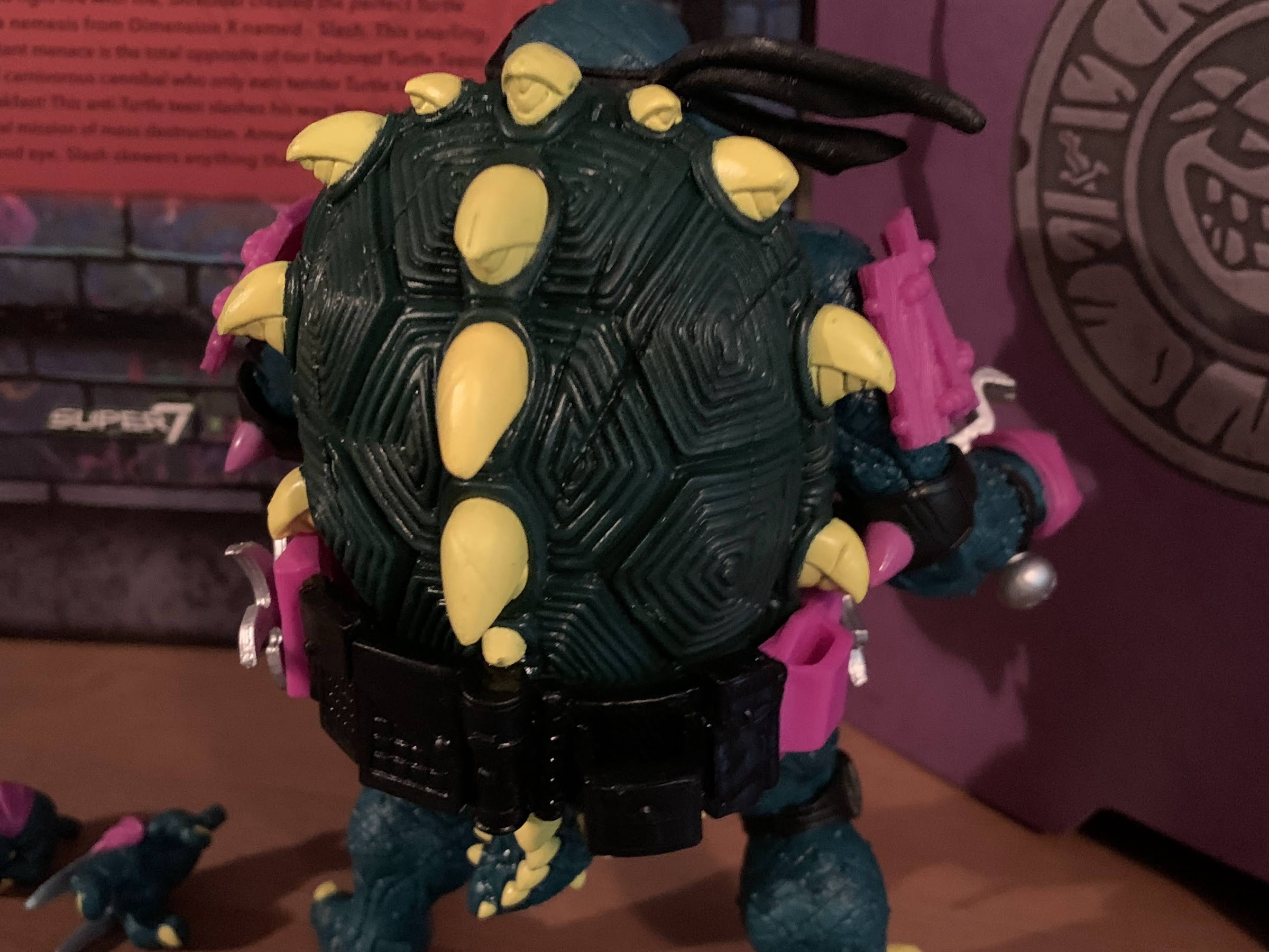
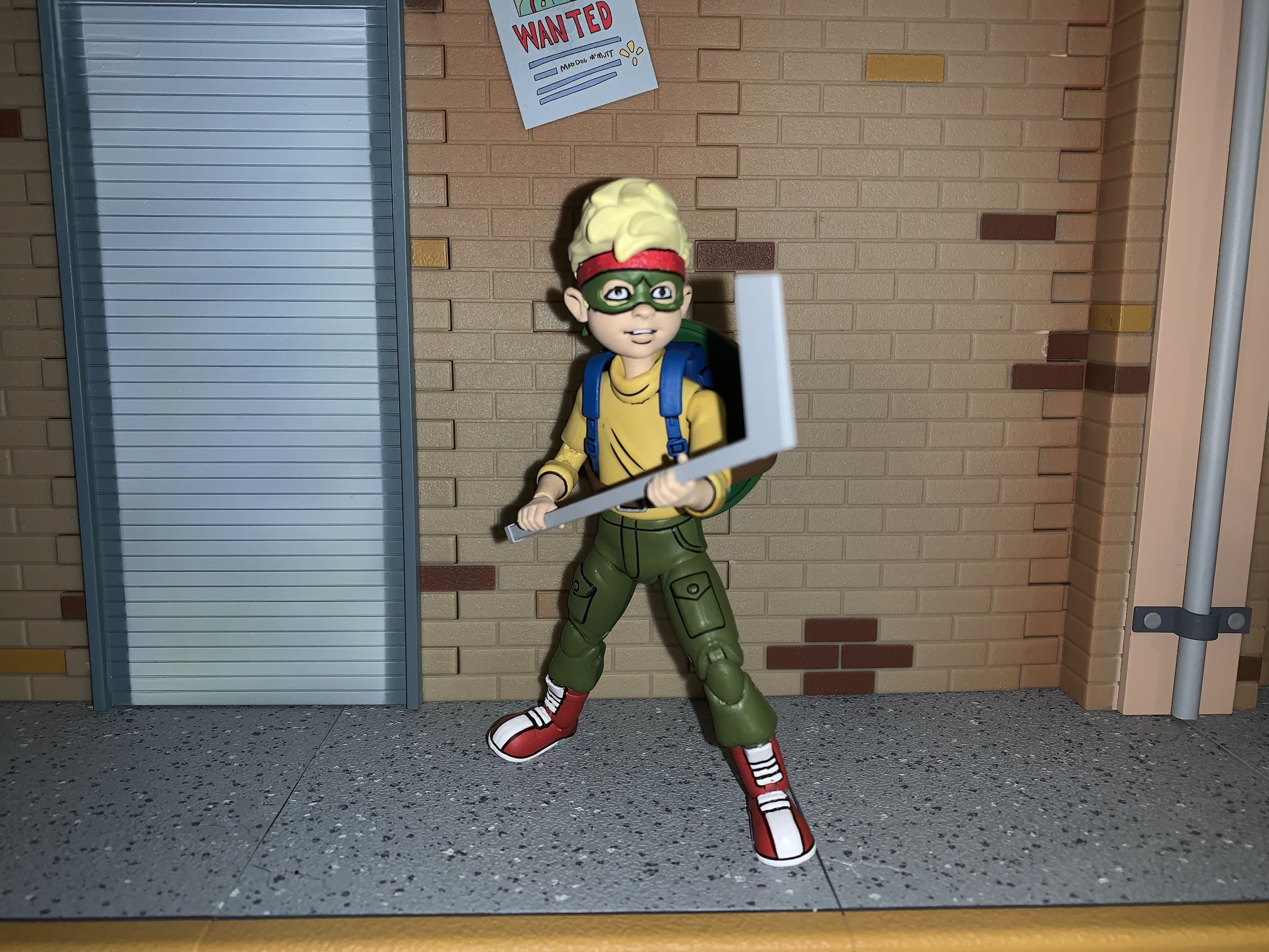
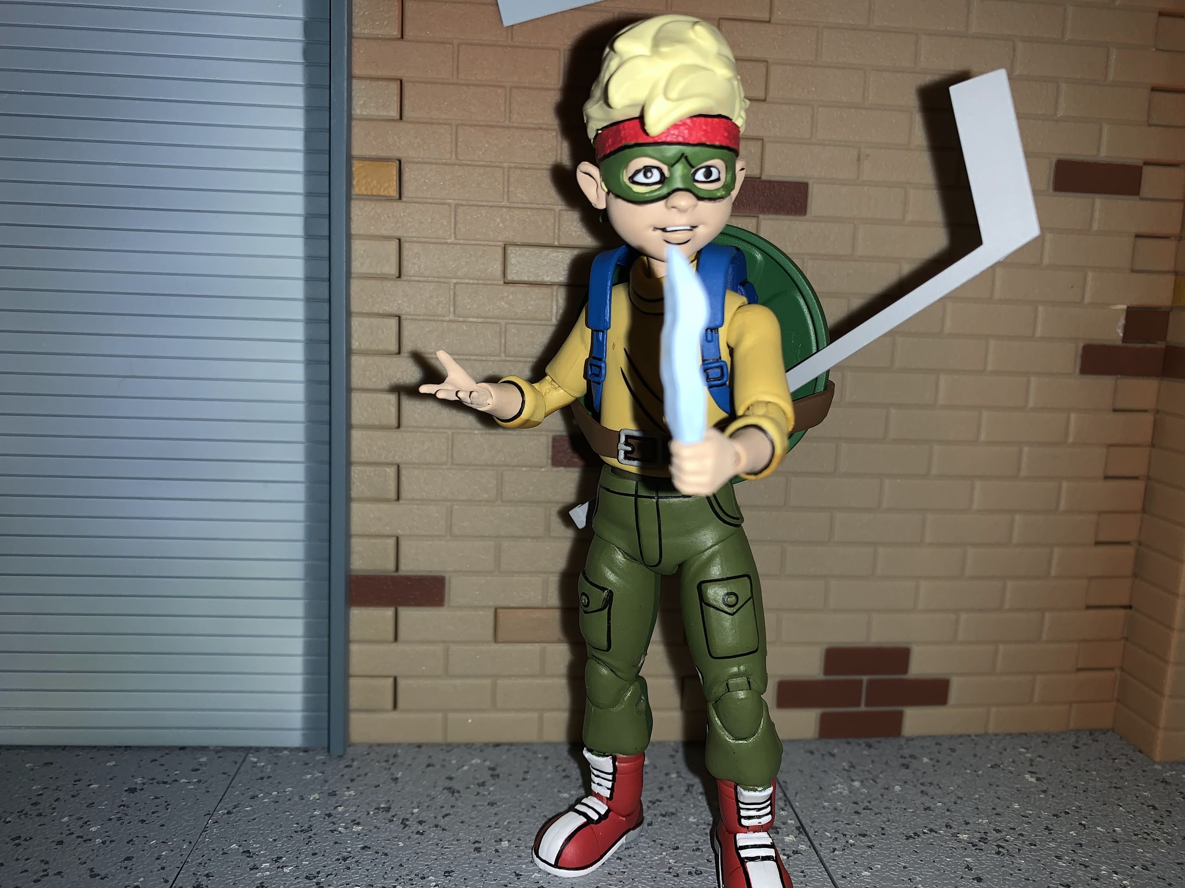
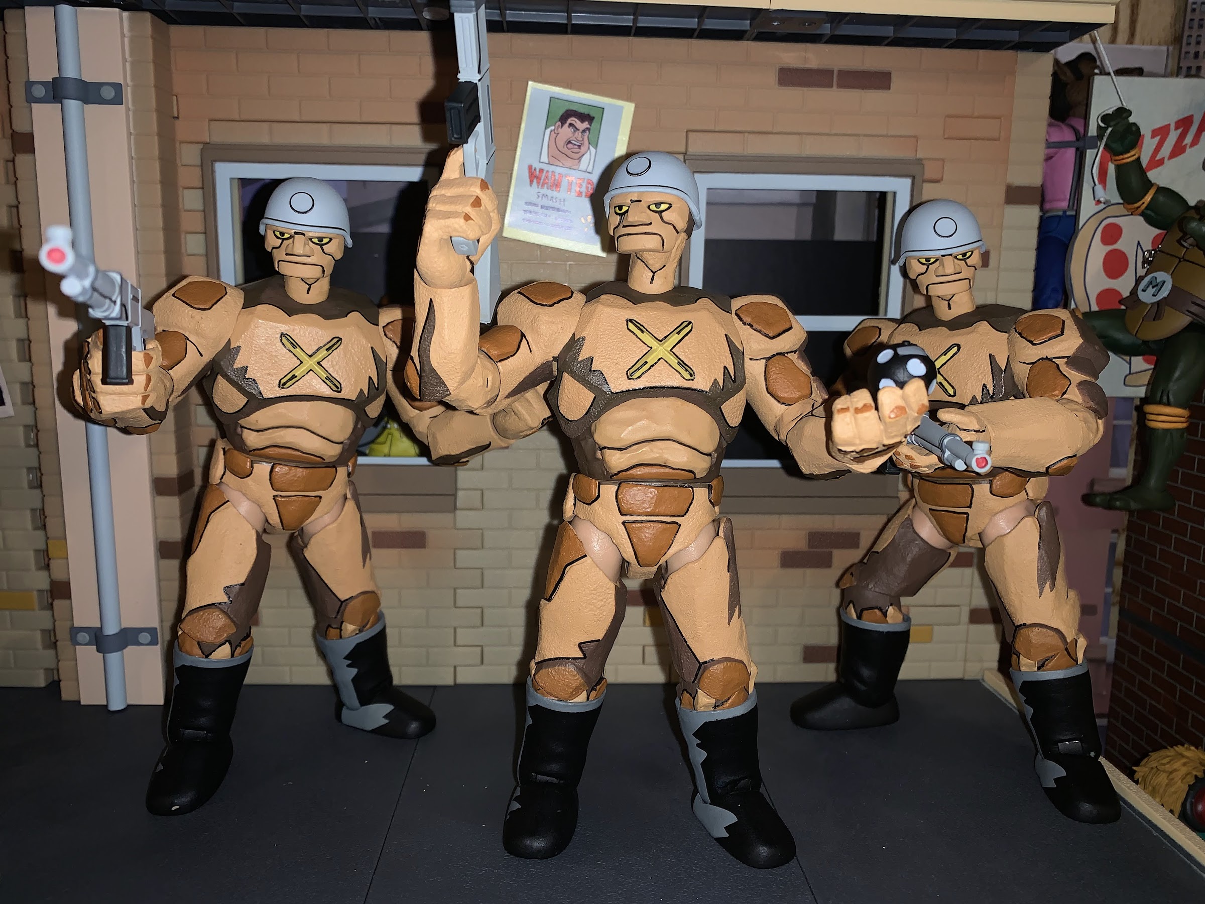
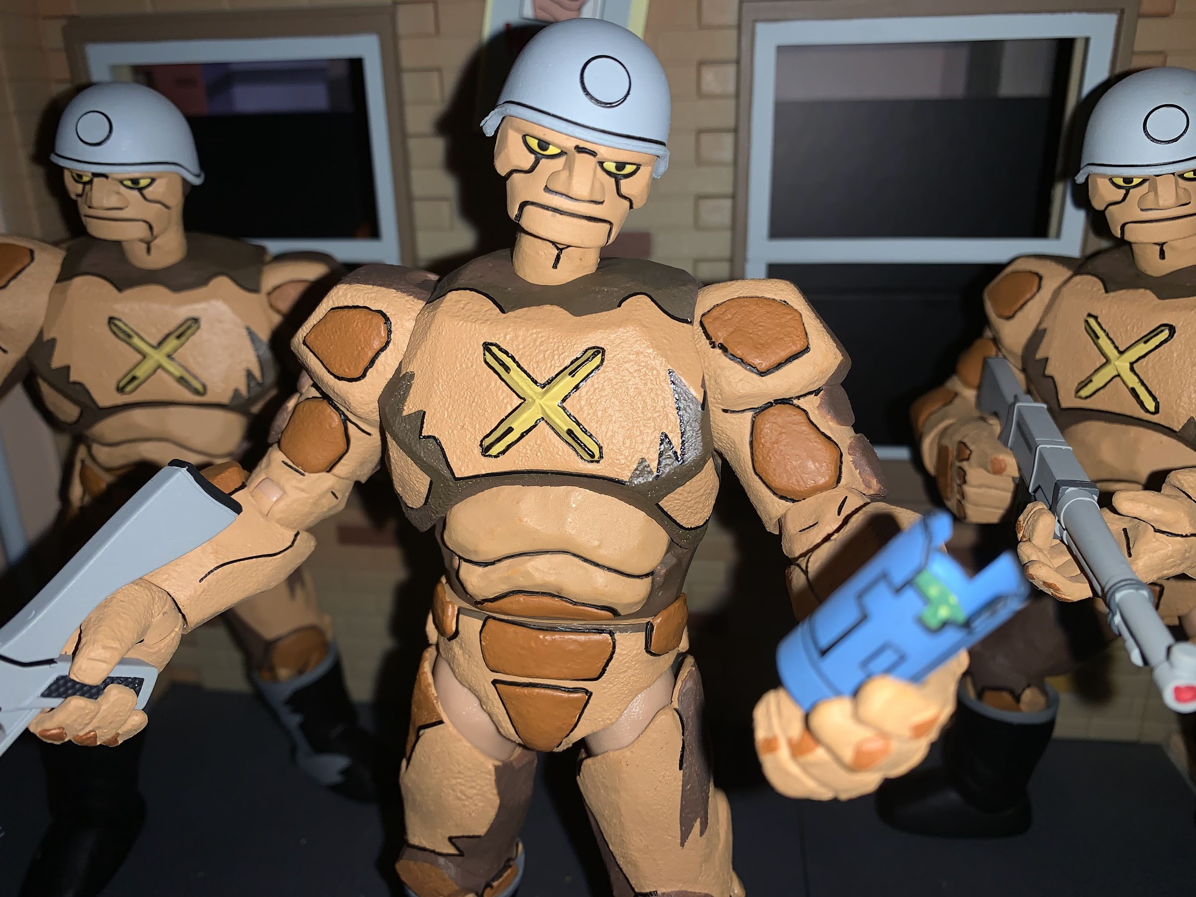
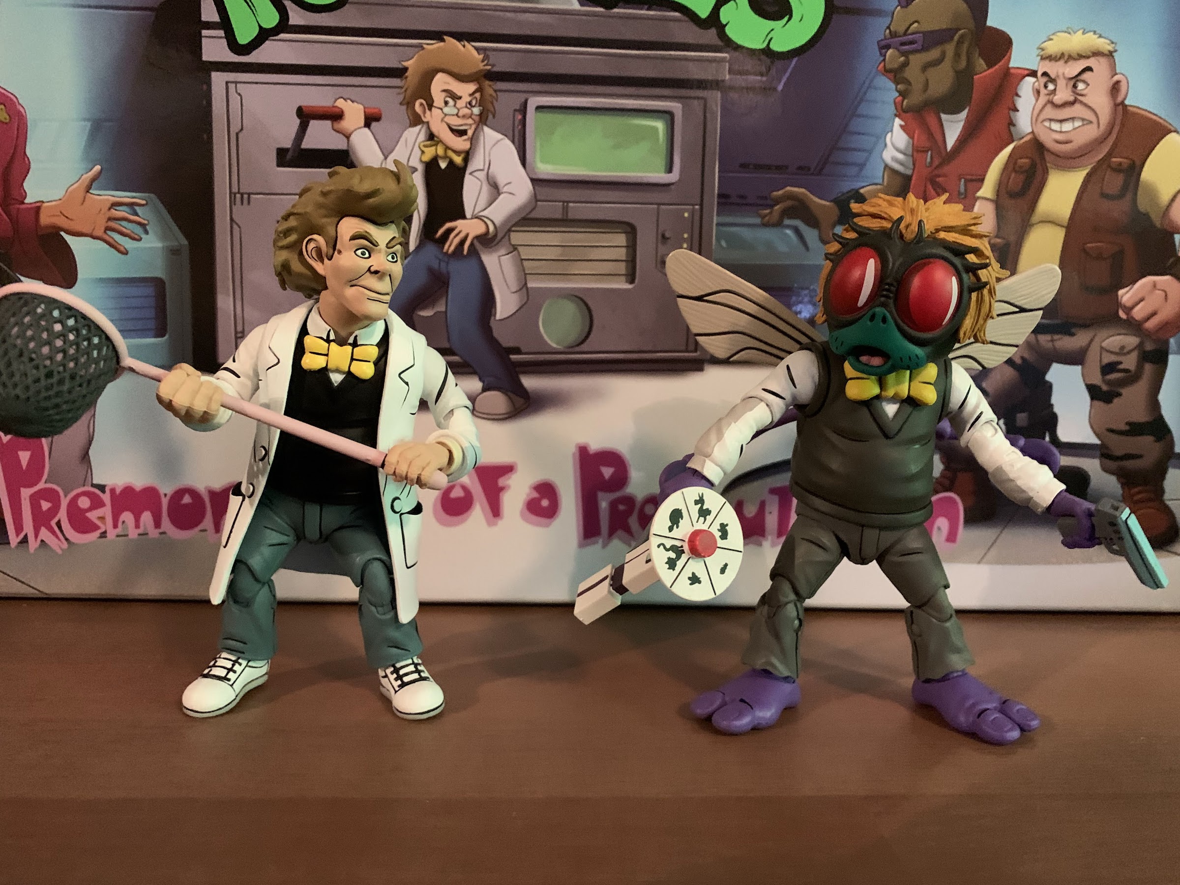
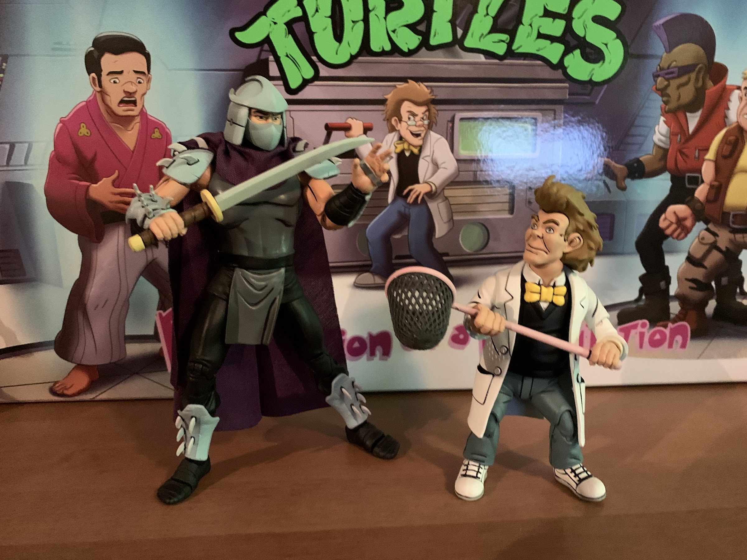
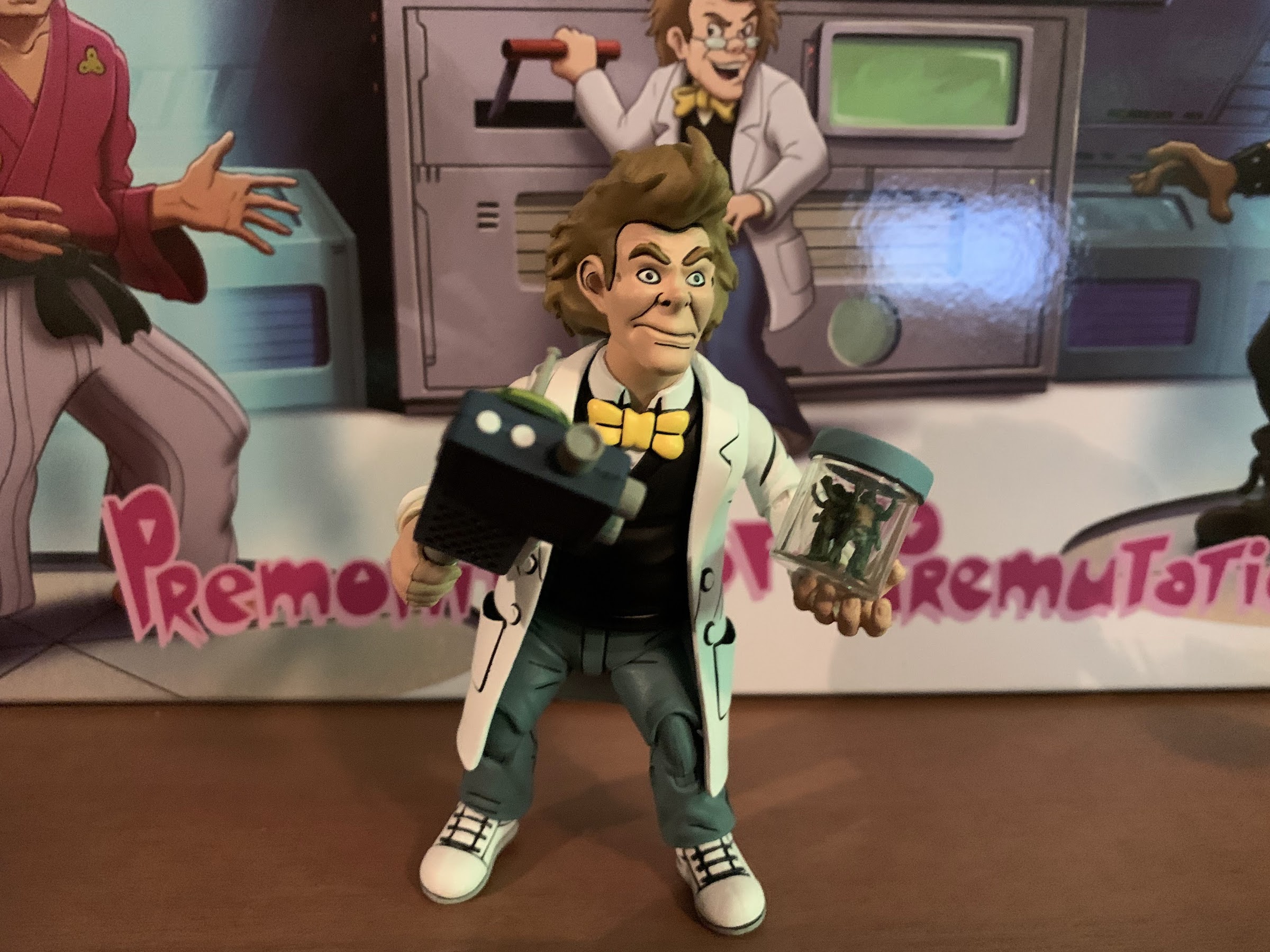
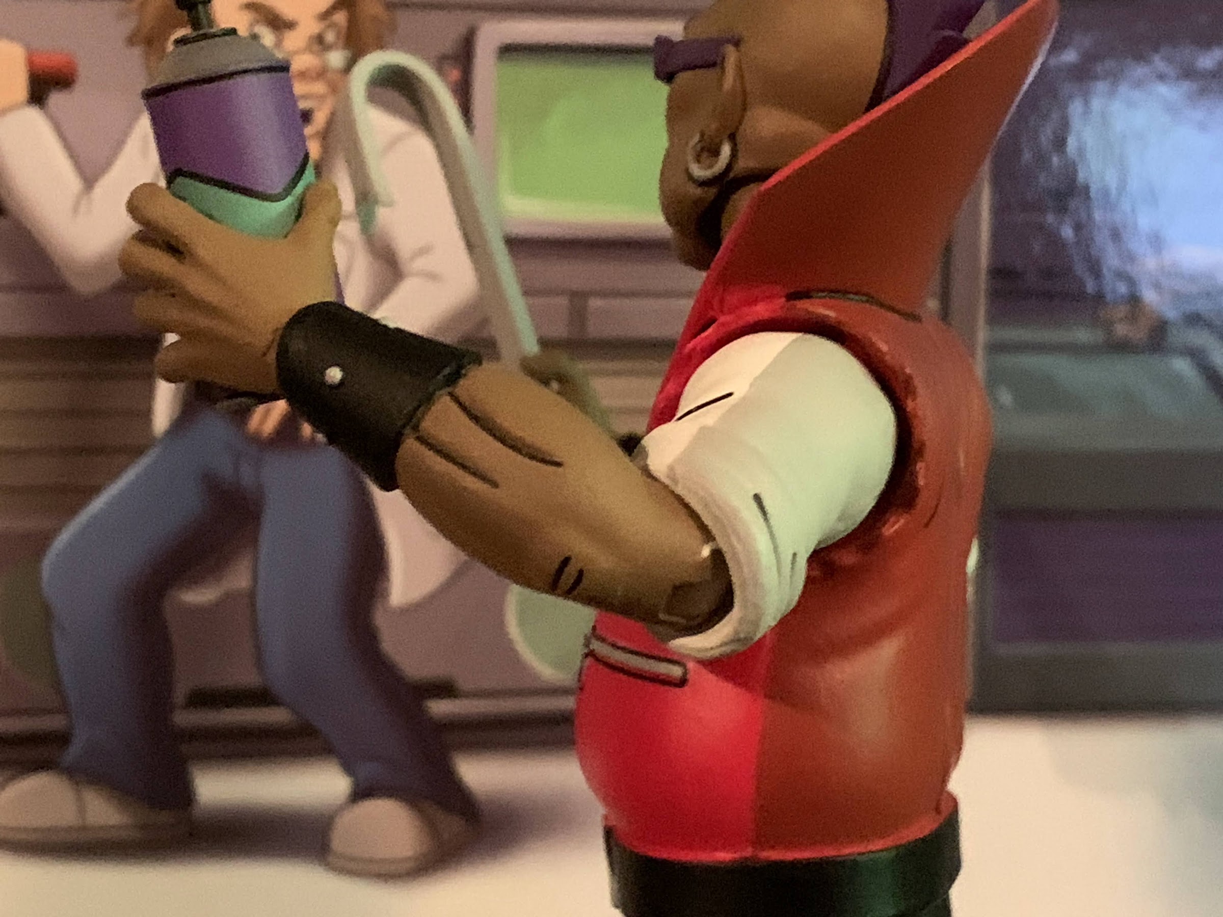
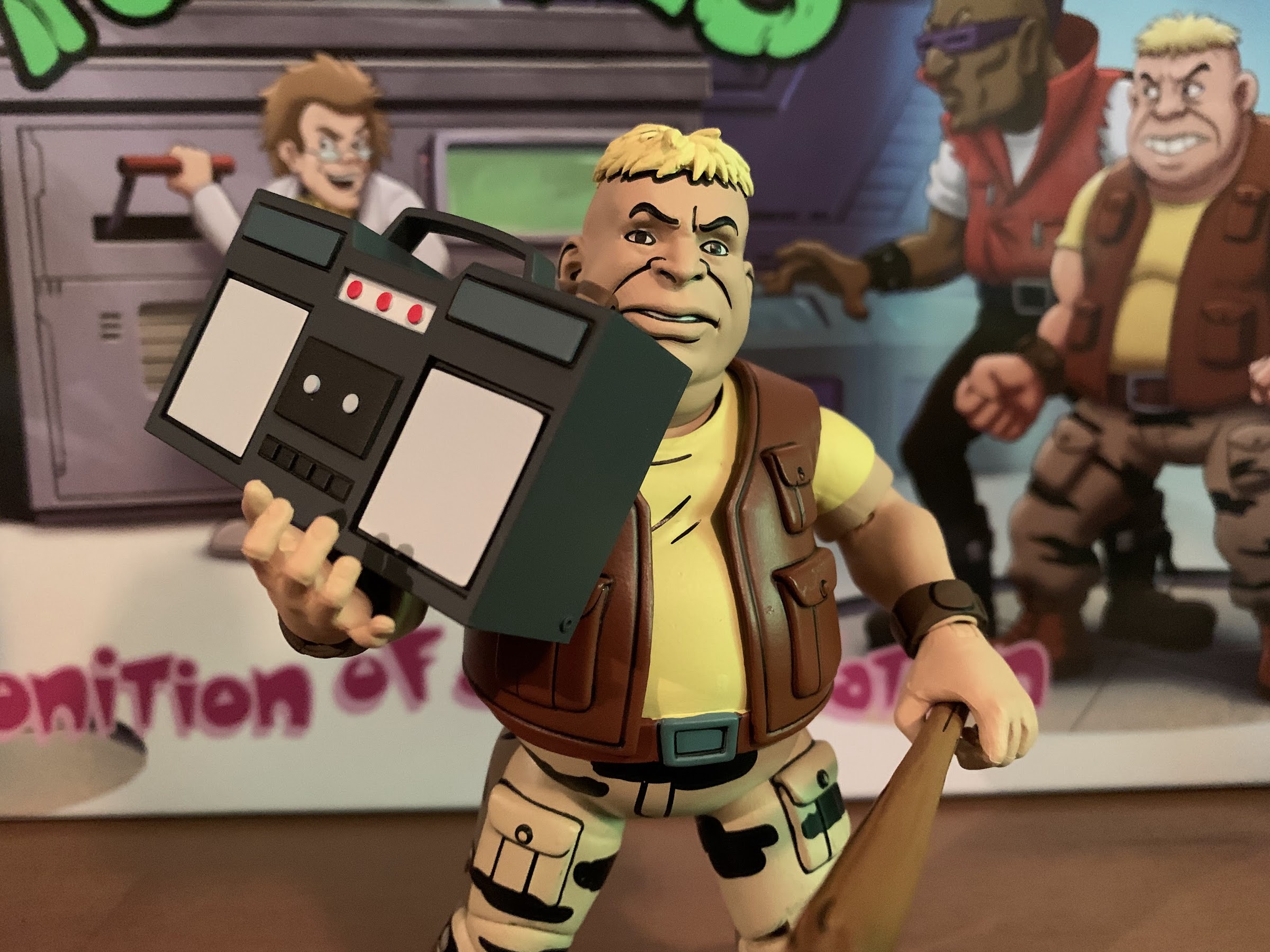
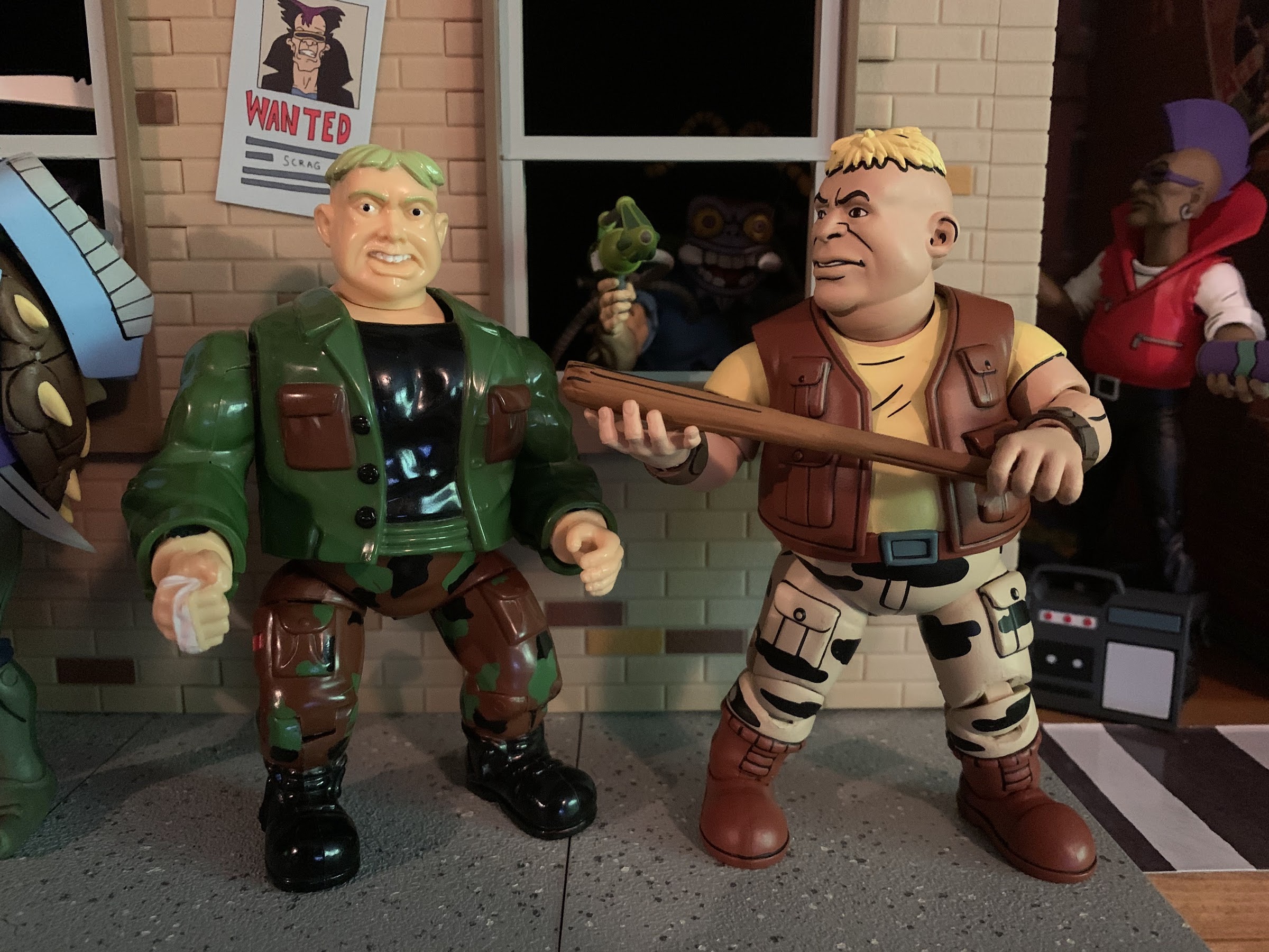
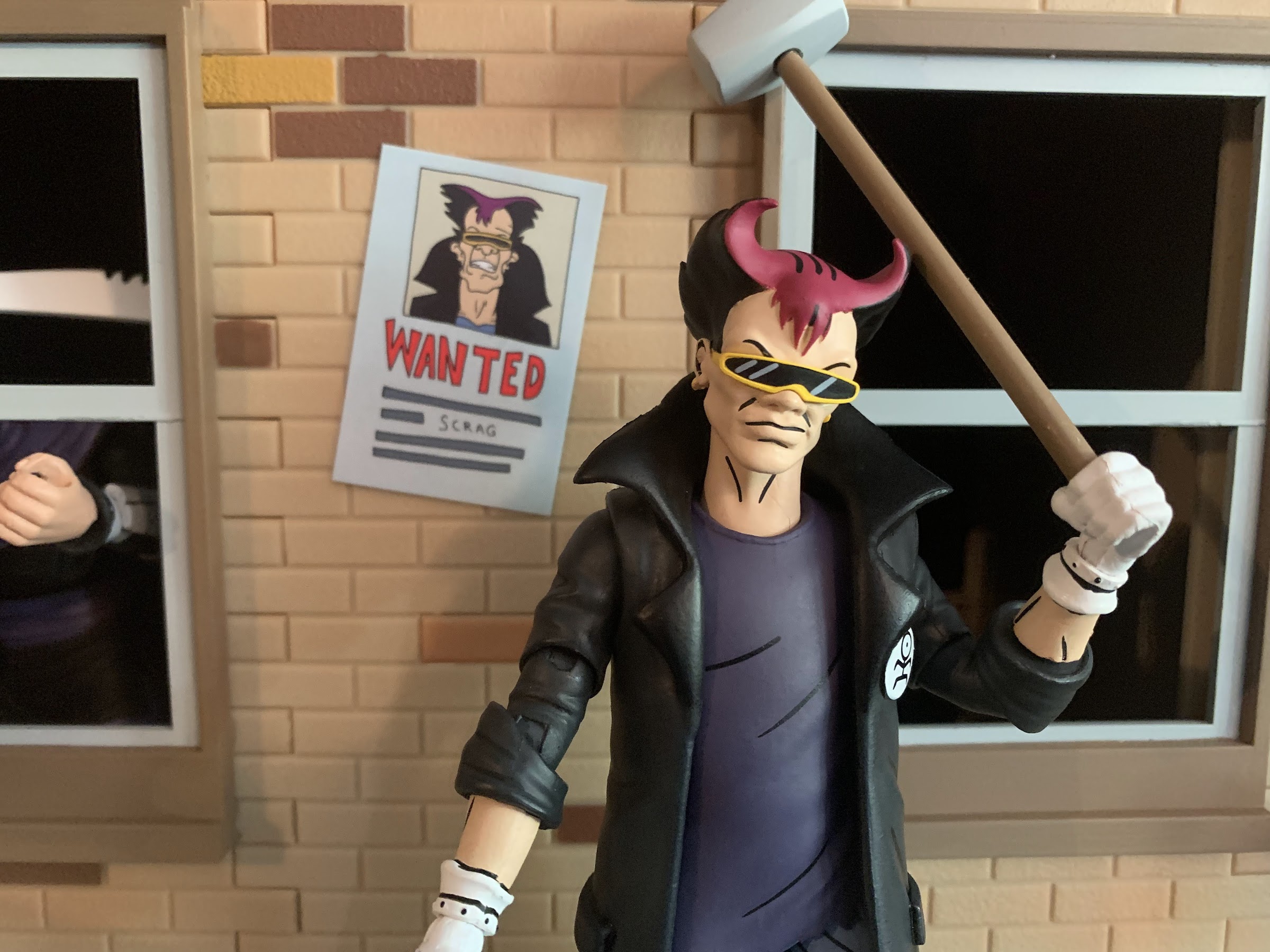
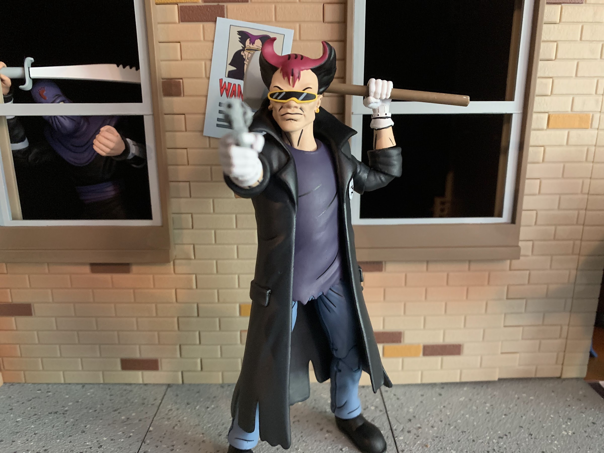
For a figure of Scrag, NECA turned to their Vernon body. We’ve seen that one reused before for Ace Duck and here it’s going serve us well as Scrag. And that’s because it will allow Scrag to be displayed in human or mutated form, but first let’s talk about human Scrag. Scrag stands a bit over 6″ and sports a black trench coat, purple shirt, and blue jeans. The main part of the coat is an overlay, as is the shirt, while the sculpted parts are basically all from Vernon including the neck piece. He has different shoes, which are just all black, and features these silly looking Mickey Mouse styled gloves. The head is the most obvious new piece and he looks pretty damn good. Some have been disappointed that the head-sculpts for this figure appeared to change noticeably from the initial solicitation, but I think both were changed to better reflect the source material. I suppose if you prefer one over the other that’s subjective, but as far as accuracy goes, this head-sculpt looks great. He has his unique hairstyle with hot pink painted on top and black on the underside plus his recognizable shades which feature one, continuous, lens, surrounded by a yellow frame. The only room for criticism I find with this guy is that just by virtue of sharing a body with Vernon he’s not exactly an impressive, physical, specimen. Scrag probably would have benefitted from some more mass, but the coat helps and I’m not surprised they went in this direction.

Scrag is also packing heat.

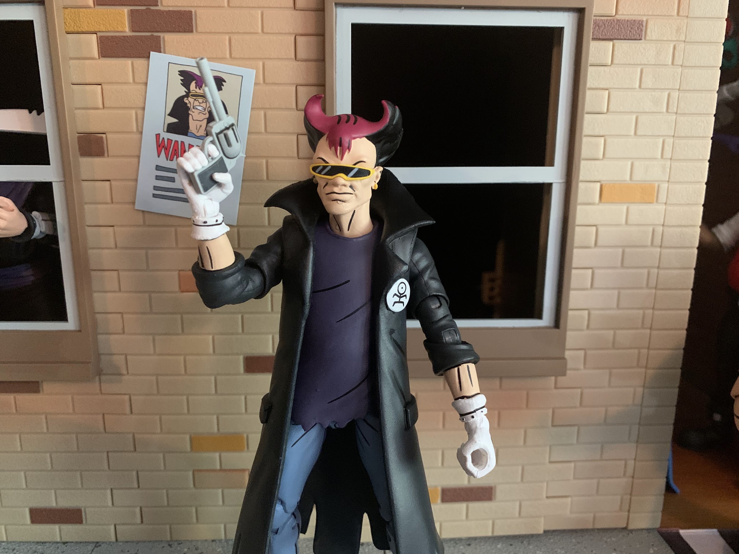
The paint on Scrag is less ambitious than what we saw with Dark Turtle, but still looks solid. The coat is all one color, save for the little logo on the chest that looks like a Pokémon, which is black so NECA didn’t bother shading it. And since it covers the shirt, they didn’t shade that either. There is shading on the pants with blue on the front and a dark blue on the back, but that’s it. The head is painted very clean though and there’s still plenty of painted black linework to be found on this guy. The white gloves are painted, but also appear to be cast in white plastic and they look fine, but will also transfer some of that white paint to anything he holds which is a bummer. I normally talk about accessories separately, but for the bat head I will say the paint looks awesome on it. There’s some nice linework inside the ears and his nose and teeth are painted cleanly. The frames of his glasses have a little gray sneaking onto them so that could have been cleaner, but it is what it is. It’s a tough spot and if it came out perfect I would be praising it, but since it didn’t, I have to mention it even if it’s understandable for this type of figure.

A bat holding a bat; now I’ve seen everything.

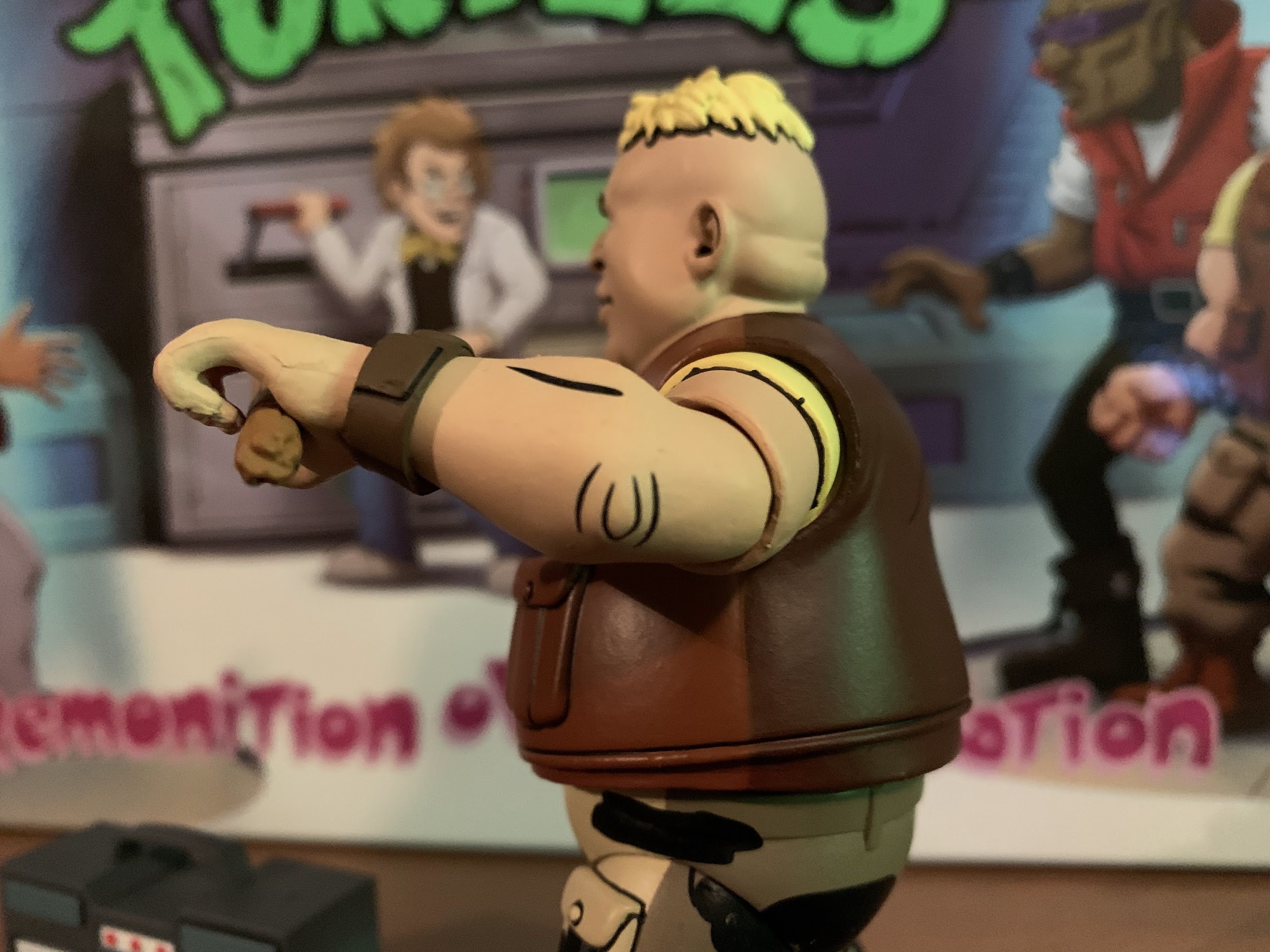
The articulation on Scrag is basically the same as Vernon only now we have a big overcoat to contend with. Both heads on this guy are pretty tight on the neck, but the base of the neck is articulated so I don’t have much trouble getting him to look up and down or rotate. And at least with it being tight, the front of the throat stays in-line with the chin on the un-mutated head. The shoulders are ball-hinged and oddly they’re very “clicky,” almost like they’re ratcheted. Maybe that was to help keep them in place since people will be tugging on the forearms to swap out parts? I don’t know, but by being this way it means you lose some nuance as the arm moves from click-to-click. They raise out to the side just fine and the elbows are the goofy NECA double-elbows with two swivels and two hinges, but they look okay on jacketed figures. The forearm rotates where it meets the sleeve and at the wrist the hands rotate and hinge in and out. There’s a diaphragm joint in this guy, but the overlay makes it useless. The waist rotates on a ball so you do get some nuance posing there as well. The hips are ball and socket joints and, like Vernon, are looser than I would like. He seems to stand better than either Vernon I have, but any wide stance would probably start to slide on its own after awhile. There is a slight thigh twist and the knees are double-jointed. The feet peg into the legs so you do get rotation, but it was very tight on mine. I only know it’s there because my figure’s toes were not in-line with the knees so I had to rotate them into place which took some force. After that though they move quite freely so I must have just needed to break up some paint. The ankles also hinge and rock side-to-side.

This is basically the only thing mutated Scrag did in the show – get shot.

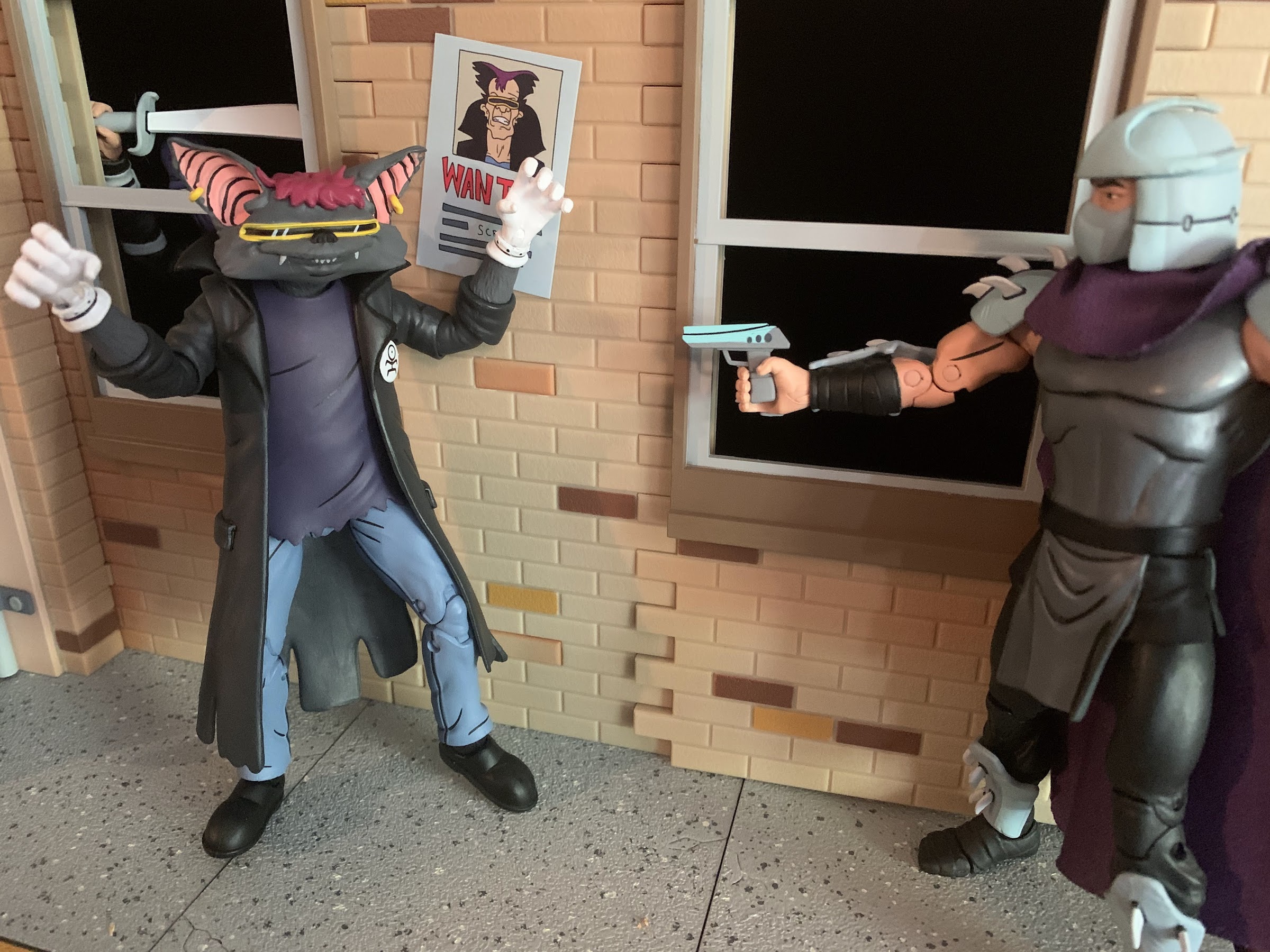
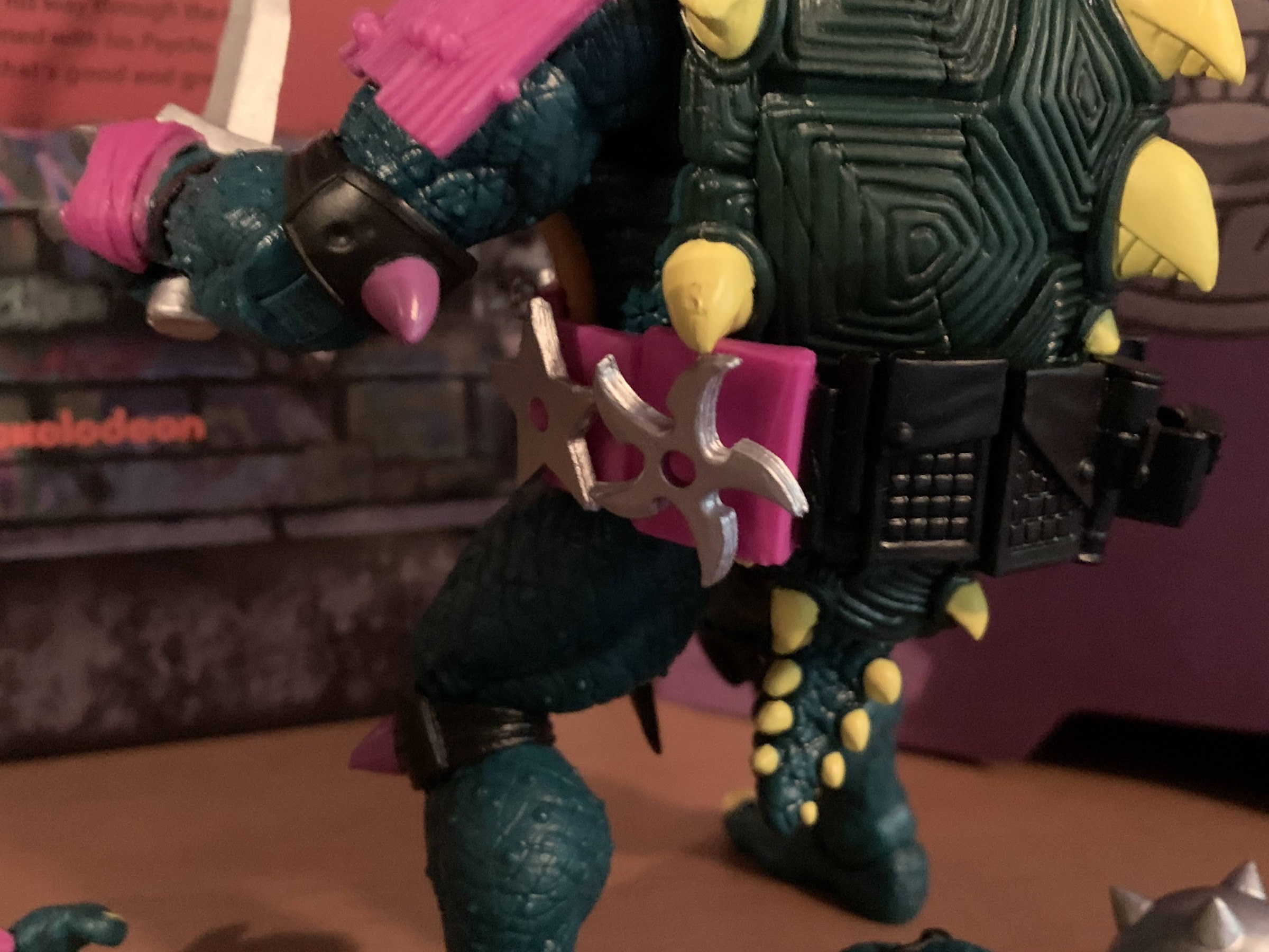
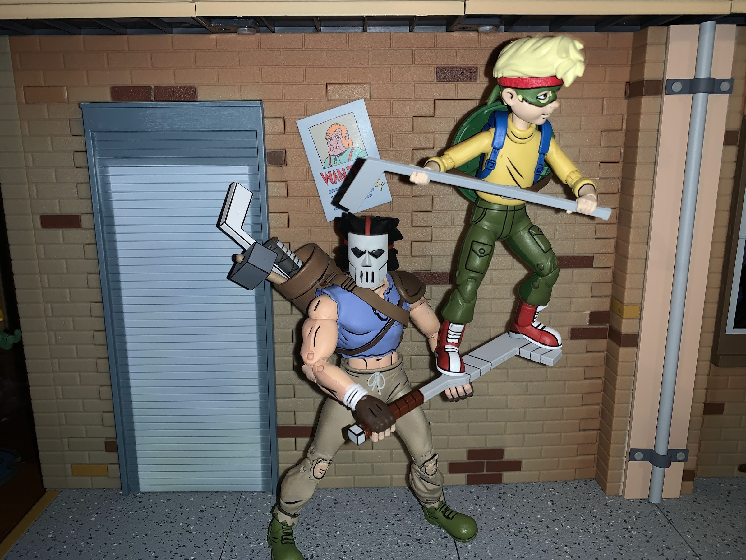
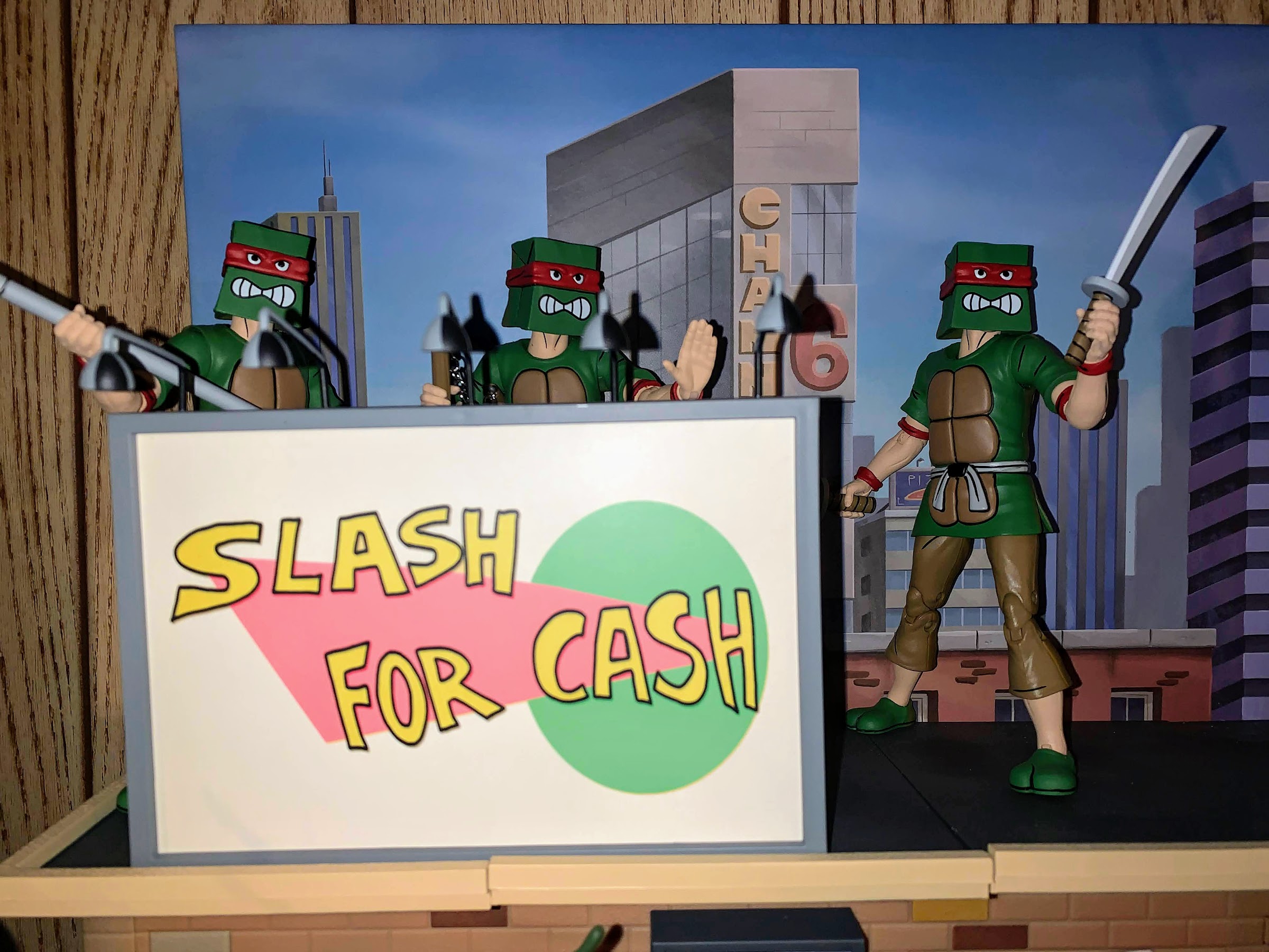
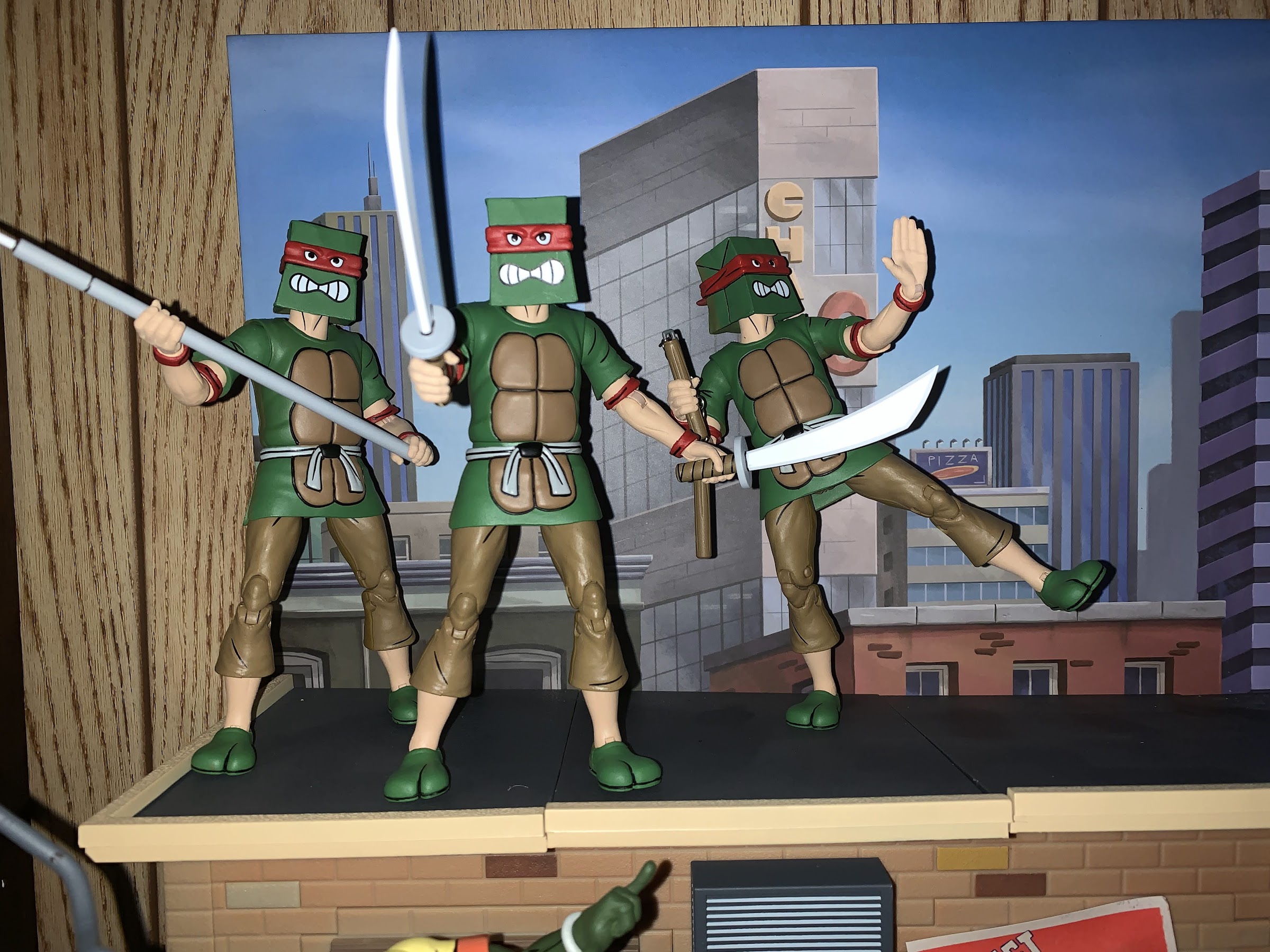
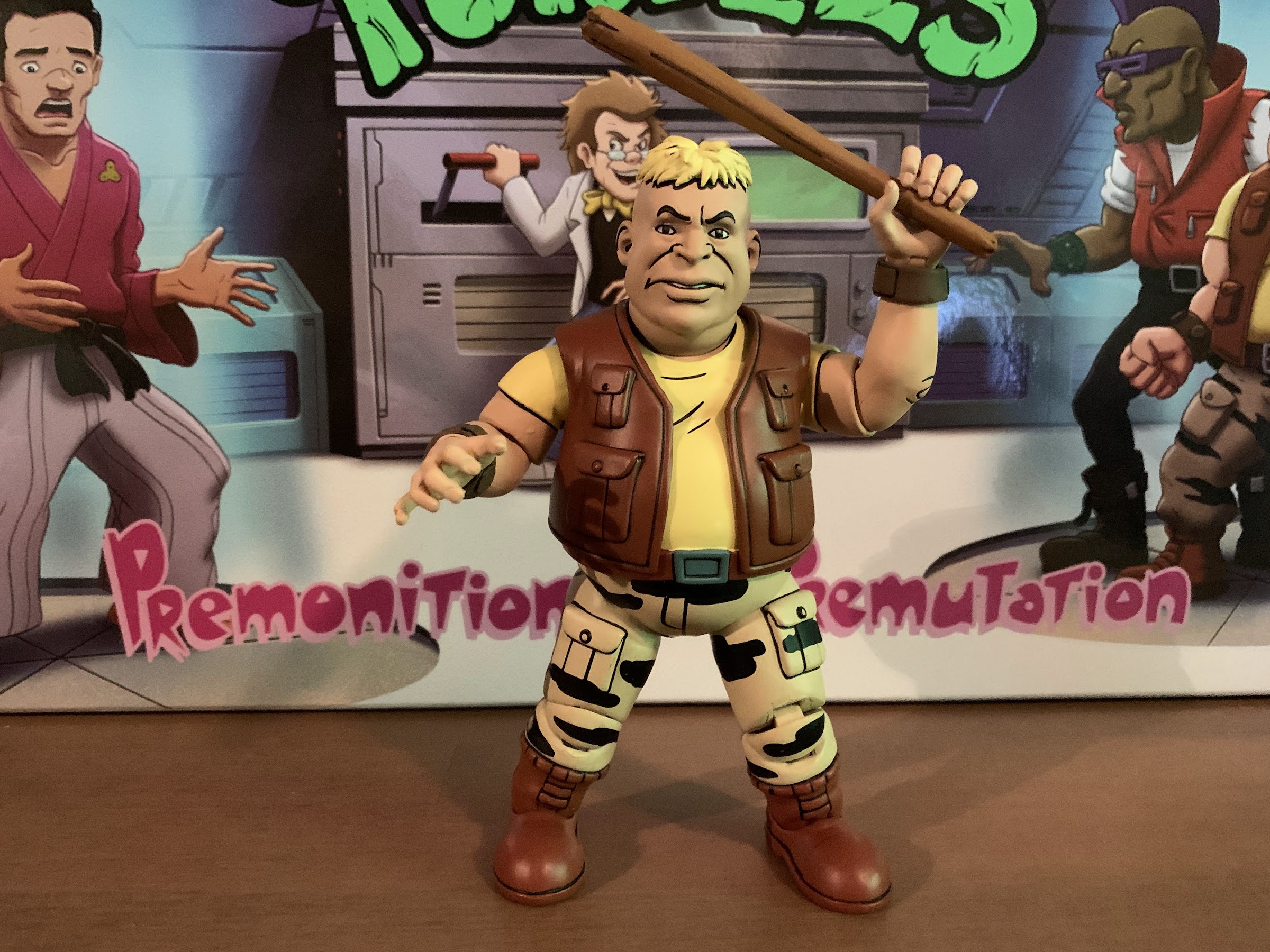
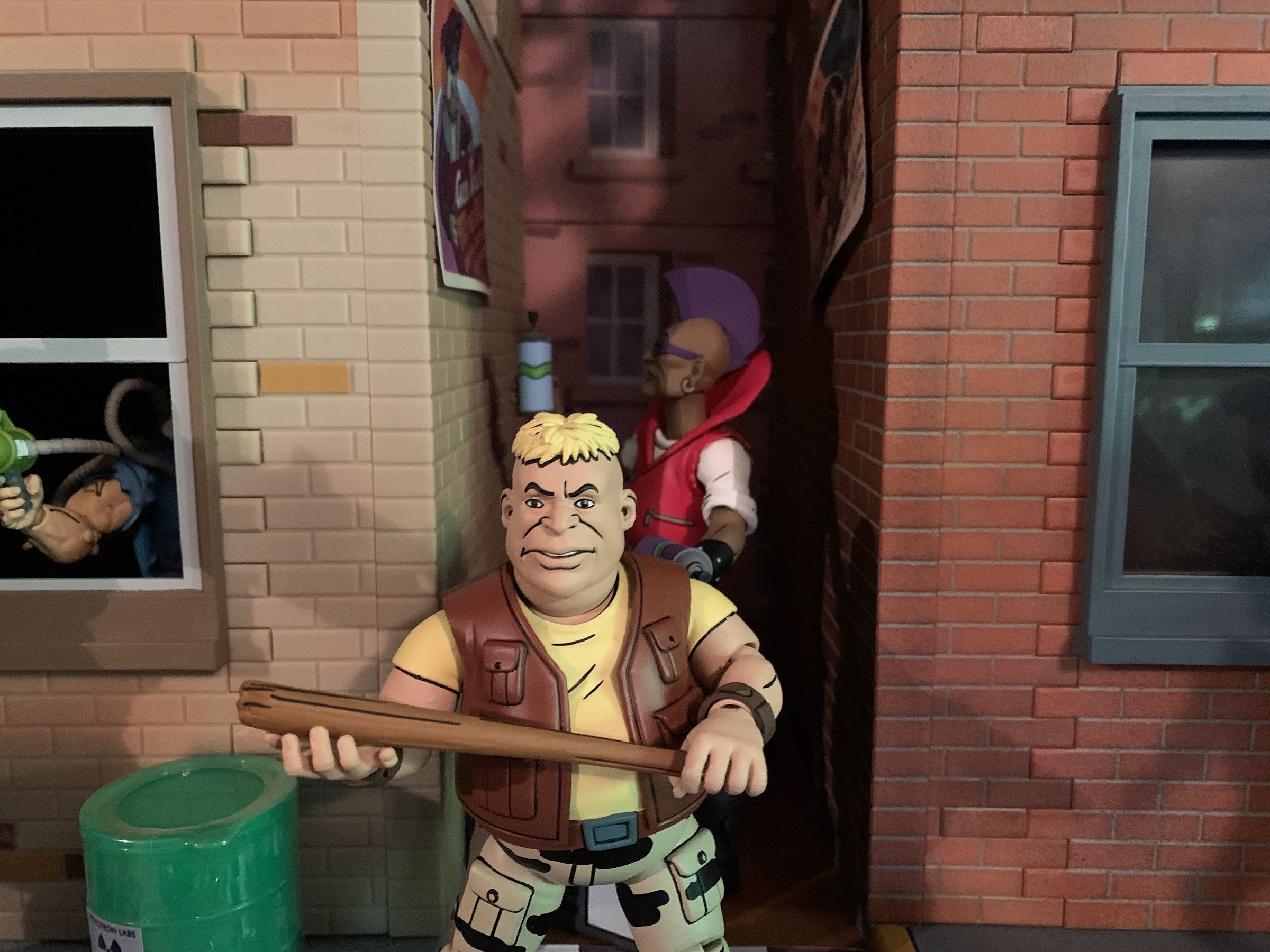
Scrag moves as expected. There’s some room for more dynamic shots, but mostly he’s just going to stand around and try to look intimidating on your shelf. To help him do so he comes with a pair of weapons. Up first is a mallet. To my surprise, it’s not a repeat of the mallet that came with Casey Jones. I don’t know if it will show up somewhere else, but it looks fine. The handle is just a light brown while the head is sculpted to resemble an actual mallet, as opposed to just a rectangular cube, and it’s fine. The hands will likely transfer paint onto it though if you’re not careful. The other weapon is a revolver. It’s surprisingly not the same as the one that came with Ace Duck and it’s painted gray with a dark gray handle and some black linework. To wield these he has a right trigger finger hand and a left gripping hand. The trigger finger is subtle enough that it can work as just a gripping hand with the mallet. Both are hard plastic though and to get the weapons into his hands as clean as possible you may want to heat them up first. Especially if you want the trigger finger in the proper spot on the revolver. I plan to heat that hand to get the revolver on then just leave it.

How it might have looked if Scrag had been accepted into the mutant gang.

Lastly, Scrag has his optional bat parts. I already mentioned that the head is well-sculpted and pretty well-painted, so I don’t have much to add there. The forearms have fur sculpted onto them so they’re not just gray and the cuffs of the gloves are sculpted on as well so they’re not just taken from Vernon. The hands are these somewhat relaxed gripping hands which is a bit of an odd choice. You can swap the hands between the two sets of forearms, which is why I would have preferred something more dramatic, I suppose, for the bat arms. Or maybe just fists? These wide hands can’t hold either weapon, but I suppose could hold some of the stuff Bebop and Rocksteady came with in the Premonition of a Premutation four-pack. I’d try a spray paint can, but I don’t want the white paint to transfer. As far as swapping the parts goes, only the right arm was easy on mine. Getting the left arm off was easy, but the bat arm didn’t want to go on (and taking off is no picnic either). I had to heat that up. The head also didn’t want to come off so I heated that as well. I probably could have forced the issue, but I was afraid of the head coming off of the neck joint which would have been a pain to correct for. The hot water worked fine though and ultimately I’m not sure how I want to display this guy. I think his human form will work a little better in my display since he can go with the pre-mutated Bebop and Rocksteady. I also think the human form looks just a little bit better as the bat head sits really low on the shoulders. It doesn’t look bad or anything, but another half-centimeter on the neck might have helped.

I like the look of Bat-Scrag, but I think this is how he’s going to live on my shelf for now.

As is the case with all of these Loot Crates, how much you like this one will largely depend on how you feel about the included action figures. And in this case, I think we may have received the best ones yet. Dark Turtle was a figure high on my wants list and I think he turned out awesome. Scrag is another figure I wanted because he’s never had a figure before and he has a memorable look and he turned out just fine. And the fact that both came with this crate makes it feel like a good value. Of course, that part is purely subjective. Each crate costs 50 bucks so if you want to you can rationalize it as paying 25 each for Scrag and Dark Turtle, which is below MSRP these days at retail. On the other hand, you had to buy the other 3 crates too to get Scrag so it’s more like the price for that figure is spread amongst the others. Again, it’s all in how you want to rationalize it for yourself. The other stuff included really adds little or no value for me. I said I’m likely to display the vanity plate, but had that been sold separately it’s not something I would have purchased. Ultimately, we got two new figures for the toon line and I’m pretty happy with them.

That leaves one crate outstanding. The supposed crate #2 features Armaggon and is video game themed. We know the figure has been done for months and I believe even Randy at NECA confirmed it’s on US soil as well so something else is holding it up. My hope is it gets shipped soon so we can put this Loot Crate nonsense behind us. It sounds like there’s very little enthusiasm on NECA’s part to continue with this release model, but nothing has been confirmed. NECA has even shown off prototypes for the rest of Bebop and Rocksteady’s gang so we know they’re on the way, we just don’t know how NECA plans to release them. The very fact that they’ve been shown is a good indicator that they won’t have anything to do with Loot Crate so that’s a plus. Hopefully they’re not part of this NFT garbage the company recently unveiled through Walmart as that is a non-starter for me thus far. Whenever that crate gets shipped though, rest assured I will be here to tell you all about it.


Super7 TMNT Ultimates! Slash

The evil, pizza-hating, mutant turtle from Dimension X has arrived!

It’s been over 9 months since I last reviewed a figure from Super7’s line of Teenage Mutant Ninja Turtles action figures. That figure was Muckman, and I actually waited on that one a little while because I ordered through Big Bad Toy Store and wanted my pile of loot to fill up a bit. Had I ordered directly from Super7 or had it shipped immediately from Big Bad, that month count might be 10! COVID has been crazy, obviously, and it’s caused a lot of delays. I think when I got that Wave 4 Muckman I was hopeful that Wave 5 would follow closer to the original plan of a 3-4 month lag in between. That obviously didn’t happen as we’re here in September ready to talk about the latest and greatest from Super7: Slash!

Slash is the first figure I’ve received from Wave 5 of TMNT…wait! This isn’t a wave 5 release! Slash is wave 6! Yup, I don’t know what’s going on, but somehow Big Bad Toy Store received Wave 6 before Wave 5. Super7 sent out review samples around a month ago for Wave 5 to the usual places, but as far as I know, still hasn’t shipped Wave 5 to any non-reviewers. They haven’t shown up at other retailers either, but here we are with a Wave 6 figure. And the interesting thing about Wave 5 for me is I ordered from both Super7 direct and Big Bad and still haven’t seen a whiff of either (I did get a “pre-order processing” soon for Leatherhead, so maybe the wait is almost over).

I no longer have my original Slash, but here he is with vintage Tokka who utilized the same mold as that old figure.

It doesn’t make much sense, but I suppose it doesn’t matter so lets just talk about Slash. Slash is billed as the evil mutant from Dimension X and he’s one of the characters associated with TMNT that has had a lot of different looks. He originated in the pages of Archie’s TMNT books where he’s a good guy. He still looks rather menacing, but he’s not an enemy of the turtles and will end up a member of The Mighty Mutanimals. When he went to the cartoon, he was made to be Bebop’s pet who gets mutated just like the other turtles. He’s pretty dumb, and gets outfitted with some random tech around the Technodrome and doesn’t really resemble any other iteration of the character. In between both appearances we had the action figure from Playmates which decided he was some evil character. He partly resembled the character from Archie, though they darkened his skin and added some additional details to basically make him fit in with that toy line. He was pretty squat in appearance and came with an arsenal of wicked looking weapons. Since this is how most fans were introduced to the character, it’s often the first thing that comes to mind when someone brings up the topic of Slash. And it was the toy version of the character that was added to the Super Nintendo port of Turtles in Time.

Slash doesn’t have a ton of height, but he does have a lot of bulk.

Because the old toy of Slash is so beloved, this was a figure pretty high on my personal list of wants from Super7. I’m a little surprised we had to wait until Wave 6 considering how popular the figure is, but it’s not like the past waves were full of duds and unpopular releases. And it could be worse since Super7 have revealed 8 waves and still no Rat King! Slash comes in the standard Ultimates! window box with the purple slipcover over it, because he’s a bad guy. The figure is a very faithful recreation of the Playmates original and that’s evident in just looking at it through the packaging, but like the other releases in this line, this new approach should do wonders for the detailing.

A meeting of Slash. I actually forgot how much I liked that video game Slash until picking it up for this shot.

Out of the box, Slash stands just a little over 6″. This makes him not much taller than the hero turtles, but he’s far more bulkier. And like the old toy, his head sits low so he has this crouched appearance to his posture. Handling him though is a trip down memory lane. I didn’t retain my original Slash figure, unfortunately, but this one helps me to remember every nook and cranny on that guy. I really like that old figure, though I hated his belt which never wanted to stay on, and my collection of Super7 figures would not be complete without him. His face perfectly captures the maniacal grin of the old figure with one eye being larger than the other. The teeth are well-painted, though I’m torn on if I like how they just filled his mouth with plastic or if I would have preferred to see it sculpted out. At this scale, it just stands out in a way it doesn’t on a 4″ figure. The skin has a nice, weathered, texture to it that’s consistent throughout the sculpt and Super7 added a wash to the figure to really bring those details out. I love what they did with the belt, going with a black and pink combo (the original was all black and a pink version followed later), and it’s great to finally see him with painted blades on his hands. The only thing I’m not crazy about are the shoulder pauldrons. They’re fully sculpted, like the vintage toy, but also like the vintage toy they’re unpainted. I feel like a major selling point of this line is to get all of the detail of the original toys, but now painted to bring them out, so when something so visible is missed it really stands out.

The belt is cast in hot pink, but parts of it are painted black. He also has some weapon storage on this thing.

The big talking point with this line since the first wave was delivered has concerned the articulation. Specifically, joint tolerance. Lets just get right down to it since that’s what people are most curious about. Slash is pretty good. The hips don’t flop around on this guy like they have on other figures and they stay where they’re supposed to when he’s standing on a shelf. The torso joint also doesn’t wiggle around which I think is a source of the problem on some of the other figures, but hopefully this is a good sign for the rest of Wave 6 (the early returns on Wave 5 paint the opposite picture, unfortunately) as it would be nice to put that issue to bed. Considering their production runs must have essentially been back-to-back, I’m not super optimistic.

The shurikens that were sculpted into the belt on the old figure are now removable which is pretty neat.

The hips are fine, and the rest of the articulation is basically what one would expect of this line. Super7, probably more than most, prioritizes the aesthetic over basically anything else. Their founder, Brian Flynn, is even on camera saying he thinks most collectors just place their toys on the shelf in a fairly neutral pose so that gives you some idea of where their thinking comes from. For Slash, we have a figure understandably limited by the fact that he’s a giant turtle, but it’s also limited because not much effort was made to do anything different with it. The head is on a double-ball-peg that is useful mostly for nuance posing since his head essentially juts forward and to the sides. He can look up a bit, but has basically no range looking down. The shoulders are ball-hinged and he can just about raise his arms out to the side, but those pauldrons get in the way. The arms rotate forward just fine and there’s a biceps swivel past that. The shoulder pauldrons actually pin into the biceps which is smart because it allows you to manipulate them out of the way where the shoulder is concerned. The elbow is single-hinged with a swivel, but because of the elbow pad he can’t quite achieve a 90 degree bend. The wrists rotate and he has both vertical and horizontal gripping hands for his weapons, so that’s a big plus. There is a joint in the torso, but it’s functionally useless and there’s no waist swivel nor is his tail articulated. The legs can go out to the side better than 45 degrees and the thigh twist works fine. The knees are single-hinged with a swivel, and like the elbows, the kneepad prevents a true 90 degree bend. The ankles hinge and rock pretty well and he’s a fairly easy figure to stand as a result.

Donnie is finding out that Slash is a lot to handle.

Slash basically is a what you see is what you get kind of release as he looks to only facilitate simple posing, and that’s basically true. It would have been nice to get a better waist twist like the other turtles, but that’s probably the only thing I miss. I don’t think they could have sculpted the neck in a way that would have let him stand up totally straight and still preserve the look of the original figure. It would have been nice to see the shoulders given more range via a ball-peg or butterfly joint, because he has room for one, but I’m not surprised that Super7 didn’t try this. And I would have liked to have seen the tail get some articulation because it’s current placement is a bit…phallic. At least the belt obscures it a bit.

He still has this wild looking nunchaku.

One thing we can count on when it comes to Super7 Ultimates! is that there will be no shortage of accessories and Slash is true of that. Slash actually has more stuff than the vintage figure and he even has some sculpted pieces from before turned into accessories this time. First of all, we get some extra parts. Slash comes with vertical gripping hands in the box, but if you want horizontal hinges he has those in the box too. He also has a set of fists and a set of style pose hands in the same style as the turtles. They can be used to hold larger objects or to just embellish a pose. All of the hands are sculpted and painted well and the blades are consistent from hand-to-hand which is nice. Slash also has a secondary head, and also like the turtles, it feels like a slightly more realistic interpretation of the character, but in a comic book sense. The expression is also very similar to a lot of the comic art as he has exposed teeth on each side of his mouth. It’s well-painted and looks really nice and, once again, I don’t know which head I like best. The default head is more of a maniacal expression, while this one with the more grimace expression and narrow eye has a whole different vibe. This one makes him look dangerous and sinister and it’s really cool. All of the hands and the two heads are also easy to swap.

Check out the new mug on Slash!

Slash also comes loaded with weapons to slice, chop, and bludgeon the turtles. The old toy featured ninja stars molded onto Slash’s belt and now those have been turned into weapons that peg onto the belt. There are two curved stars and one that’s more traditional. They don’t feel secure when pegging them on, but they also haven’t fallen off my figure so I guess the effect works fine. It’s the type of thing I like to see with these new figures so I like the approach. Slash also has two hand grenades and they have this metallic finish to them that looks really cool. The style pose hands can hold them all right and you can hook them onto the belt if you so desire.

He even brought some grenades!

The other weapons should seem more familiar as most of them are from the vintage release. Slash, being the anti-ninja turtle, basically came with a twisted version of the weapons featured by the heroic turtles. He has his spiked nunchaku with features studs on the handles and spiked chain. It’s done entirely in plastic as I’m guessing Super7 had no idea how to do it with real chain and preserve the look, but it is bendy, it just doesn’t hold a pose. Slash also has his trademarked crooked sai which can slide into the pink loop on his belt. There’s his giant, serrated, knife with a handguard and that too has a slot on the rear of his belt where it can be stored. He also has his club, which features black wrapping and a spiked ball at the top. I think I used to store this weapon on the rear of my old toy, but Super7 cast the black wrappings at the end in a hard plastic so there’s basically no way to get it into the belt without a lot of heat, and then getting it out would require the same. Lastly, we have a new weapon which is a crooked sword. I think the nunchaku, sai, and club are like the twisted versions of Mikey, Raph, and Donatello’s signature weapons while the giant knife is more its own thing. The crooked sword draws a more obvious parallel to Leonardo and it definitely looks like it belongs here. Lastly, we have the unpainted weapons sprue which is massive for Slash. I think these are on the way out, so enjoy them while you can. The club, knife, and nunchaku feature the hot pink color scheme with painted silver and black details while the sai and knife are black and silver. I feel like the hot pink might not be an exact match to the old toy, but it’s not something I care about personally, but it’s something I felt I should point out.

Look who has a sword now, Leo!

Super7’s take on Slash is mostly what one would expect. It takes that old Playmates figure and ups the scale while also taking advantage of modern sculpting and paint applications to really make this figure look as good as it can be. The engineering and paint applications help push this release to among the best in the line so far. There will always be room for criticism when it comes to Super7’s articulation choices, but aside from that, my only criticism is I wish the shoulder pauldrons were painted. They’re sculpted to look like wood planks held together by rope and just look like something that should have been painted, but wasn’t (to clarify, the renders featured unpainted shoulder pauldrons too so I’m not suggesting it’s an error). Aside from that, nearly every part of the figure has some kind of paint wash applied which really helps to reduce that “plastic” look some of the other figures in the line possess. He may not pose super well, but he at least has enough stuff to provide variety for your display. In short, this is one of the best releases by Super7 I own and if you’re collecting this line then you owe it to yourself to add Slash to the display.


Arcade1Up – The Simpsons

An image you can hear.

When it comes to arcade cabinets, there are few that would interest me as far as a purchasing decision is concerned. One such cabinet though has always been The Simpsons arcade game, and it’s not really because of the game’s quality. The game is fine, one of the better brawlers out there, it’s just limited by its genre. The beat-em-up was a style of game designed to extract quarters from patrons. The player had very limited control over their avatar, usually just a jump and attack button plus the joystick, while the game would just send wave after wave of enemies at them to gradually beat the player down and force them to make a purchasing decision on the spot. “Do I continue by inserting another quarter? Oh no, the timer is down to 5 seconds, I need to act quick!” The real advantage for this genre though is it could be adapted to almost any intellectual property, like an animated sitcom about a family of five.

The Simpsons is a game created by Konami released in 1991. In it, the player controls either Marge, Homer, Bart, or Lisa as they battle their way through a selection of levels in order to rescue Maggie from Mr. Burns. It’s a paper thin plot and it’s limited to what it can be by being created in between seasons 1 and 2 of the show. Who is the enemy in a sitcom? Why, the mean old boss of the father figure, of course! It just so happens that in later seasons Burns would actually become more cartoonishly evil and villain-like so think of the game as a precursor of things to come. It’s good at what it does, it’s just limited by its genre.

This thing will look really nice once I remodel this basement and get rid of all of the clutter.

What has always made it appealing to me as a cabinet to own is that it’s The Simpsons! There are plenty of Simpsons video games out there, but most aren’t very good. The arcade game is quite possibly the best one, and if not that it’s probably Hit & Run. The arcade has added appeal because, aside from a brief stay on Xbox Live and the PlayStation Store, it’s been locked to the arcade. The cabinet is appealing and all of the attract mode stuff is honestly what creates most of the nostalgia for me. It’s a fun thing to possess for a Simpsons fan, the only problem is the cost and space requirements to actually have one. It was just a handful of years ago that an arcade near me was going out of business, which sucked, and it was selling all of its games. I was really tempted to make them an offer on their The Simpsons arcade cabinet, but I declined. It’s something I can’t say I truly regret because it’s very impractical, but there’s still a part of me that would love to own such a thing.

Without a riser, this thing is basically a kid’s arcade. My own children for scale ages 7 and 6.

Since then, Arcade1Up has become a thing. The company specializes in making scaled-down versions of arcade cabinets with modern components. They sometimes contain just a game or two, but lately it seems most have a handful of games from the same studio or licensor. I reviewed earlier this year one of their counter models for Marvel Super Heroes and it was a pretty positive review. The problem with Arcade1Up is largely one of cost. When they first started rolling out, I think they were only two to three-hundred dollars. And since those early ones usually just contained a game from the 70s or 80s, I guess that made some sense. If you wanted an affordable Pac-Man cabinet for your rec room or whatever, then sure, why not? And those games are basically designed to just be high score targets, they’re not really progression-driven, so it’s the type of thing you might return to here and there and visitors to your home might try to beat your score. It’s still more novelty than practical, since if you just want to play a game like Pac-Man there are far cheaper options out there, but that’s the niche Arcade1Up is going for. They sell atmosphere that just happen to be games.

A much different experience once the riser is added to the bottom.

Ever since Arcade1Up became a “thing” I’ve hoped they would do The Simpsons, and sure enough, they did. The only problem was, when they unveiled this cabinet late last summer it came with the MSRP of 600 bucks, $700 if you wanted a stool. That was just too rich for my blood for what is a novelty item. I enjoy playing the actual game, but what I’m paying for is the decorative element more than anything and that price is just crazy for what I want. I’m a pretty big Simpsons fan, but I’d rather seek out an authentic cabinet if it was going to cost me $600 to get the Arcade1Up version. There was a silver lining though, and that’s most of these eventually hit the clearance rack. Surely, the price would remain high through the holidays, but there was hope after that. And sure enough, the unit did go on sale earlier this year, but for the still unfriendly price of $400. That’s certainly better than $600, but not quite in novelty territory for me. The magic number, in my mind, was $200. If the unit ever hit that, then I’d pounce. My wife was even onboard, and lo and behold, on a random Thursday in September it did indeed get dropped to such a price. I thought about it for maybe 10 minutes, longer than I thought I would, but eventually put in an order. A Walmart down the street had a few units and that’s where I got mine. My patience paid off.

The screen is quite nice and I love that the marquee lights up.

Now that I’ve had this unit for about a week, I’m ready to tell you all about it. First off, the package included the arcade cabinet and a riser to make it easier to play for those of us that stand more than 4 feet in height. The cabinet does come unassembled and putting it together took around 2 hours. I was able to do it myself and it’s a little clunky at times, but was plenty do-able. It does need to be positioned on its side for much of the build so you definitely want to make sure you’re putting it together on a carpeted, or soft, surface so the artwork doesn’t get scuffed. Once complete though, it’s a pretty faithful reproduction of the old cabinet. The color and artwork on the sides are the same and the marquee over the top lights up like the old one. Without the riser, it stands a mere 45.75″ to the tip top and it’s 18.75″ wide. The control deck where the controls are is where the old form gets broken a bit. That is 31.5″ wide and extends beyond the shape of the actual cabinet. The depth of the unit, without the control deck, is 22.5″ and with it 24.75″. It, and basically every Arcade1Up release, looks a bit off as a result because the controls are spaced further outside relative to the screen than the original, but visually it’s close enough. We’ll get to the gameplay in a second where it matters a bit more.

The other big difference is the screen. This unit uses a modern, LCD, screen instead of an old tube so it’s sharper and the colors are more saturated. There are certainly purists out there who will pine for the old display, but I think it looks really nice. The sprites hold up really well at this resolution and it just makes the game look the best it can. The size is listed at 17″, so presumably it’s a true square, which fits the size of the cabinet itself. The coin inserts on the front are fake and sadly do not light up. If I was going to make one cosmetic change to the unit it would be LED lights in that area. It is hollow so one could customize the unit fairly easily, but I probably won’t. There also isn’t an actual door there, but how cool would it be to put a mini fridge in there or something? Now my mind is racing.

Who could forget Lisa’s classic catchphrase, “Embrace nothingness”?

The riser is basically just a box you assemble that follows the colors of the unit. The cabinet sits on top of it and it boosts the overall height to just under 59″ which is far more comfortable for most adults. I am about six feet tall and I can comfortably play on this with the riser either standing or on a stool. The overall build is fine as it’s mostly held together by screws. The cabinet is made of a wood composite and the unit weighs over 100lbs. Over time, I’m guessing the screws will need to be tightened here and there, but right now it doesn’t wobble or anything. It’s not as rugged as the real thing, but good enough for home use. One thing I don’t like is the instructions on the riser want you to screw the riser to the main unit once inserted, but there are no pre-drilled holes. They just go right through the sides and I’d rather not drill through that, even though the artwork of the family is above that part. There’s also included wall anchors, but I didn’t install them as it’s pretty sturdy. Maybe if this were a more intense style of game I’d be more inclined to do so, but it seems fine. The only other build issue I have is one of the screws on the control deck doesn’t actually “bite” into the unit and just spins. It’s one of four, so it’s not going anywhere, but either the pre-drilled hole is the wrong size or something is mis-aligned.

I already mentioned that the screen is nice, but so is the audio and the actual controls. The speakers are pretty loud and they’re set high by default so you’ll likely get a good blast when first turning it on. The buttons are nice and “clicky” and the joysticks are firm. Interestingly, the two inner joysticks feel tighter than the outside ones, but it’s not something that impacts gameplay. There’s a headphone jack on the control deck and a “Live” button as this thing is Wi-Fi enabled for online play. It’s not something I have any interest in doing, but if you want to play with a full team when actual humans aren’t available in your house, at least it’s there.

Yup, that’s The Simpsons Arcade all right.

Actually playing The Simpsons is still pretty fun, but also a little different. The characters are mapped to the joysticks so going from left to right your options are Marge, Homer, Bart, and Lisa. Because of the placement of the characters, it’s far more preferable to play as either Bart or Homer because they’re in the center. Playing as either of the women is a bit awkward since the viewing angle isn’t optimal, but is do-able. The confines are also cramped, so playing with four players is not exactly the most comfortable experience. With my family of four, it’s basically best done with my wife and I on the outside and our kids in the middle. Mostly though, this game works best as a two-player experience with one character spacing the players out. For kids, that is less of an issue as my two seemed comfortable standing side-by-side playing as Homer and Bart. Beyond that, the actual quality of the game is as good as ever. It looks great, sounds great, and the nostalgia is strong. If you liked the game back in the 90s, you’ll probably still like it. It’s also not super long which is good for the style of game that it is. You can’t save your progress though, so if you want to see it through you have to do it in one session.

I’m guessing many will be playing this game for the first time.

The surprise of this set though is that it’s not just The Simpsons arcade game. You may have noticed that in the pictures there’s a track ball in the center of the control deck and that’s because this also includes Simpsons Bowling. Simpsons Bowling was an arcade game released in 2000. It wasn’t very popular or widely spread, plus the arcade scene was on life support come then in the US, so it’s a game most have likely never played. It was produced by Konami and my assumption is the license they had was about to expire and they wanted to get one last payday out of it. Or, they had a bowling game they wanted to put out and felt the Simpsons license would help move units. Whatever the reason, it was something I had never played and honestly one I don’t know if I ever even saw in the wild. It didn’t really factor into my purchasing decision, but it’s a nice bonus.

A solid selection of characters, but since the cast of the show is so massive, there’s always going to be some missing that people wish were not. I would have loved to have Moe and Otto since they were part of the Pin Pals and I’m rather surprised at the lack of Comic Book Guy.

As far as the game goes, it’s fine. It looks like a game released in 2000. It’s basically a little better than a PlayStation title, but not really on par with the latest and greatest of the era. It’s all rendered in 3D and the character models are certainly recognizable, but not perfectly on-model. Marge’s hair is a bit odd and they couldn’t quite do a perfect sphere so Homer’s head is literally a bit rough around the edges, but I wouldn’t call it ugly. What the game does very well is just the fan service. There’s tons of audio ripped right from the show for each character plus some newly recorded lines. That’s mostly found in the little quips characters will make if you’re taking too long. They’re very chatty though as they’ll have something to say following a strike or spare and there’s enough recorded lines to make sure there are no repeats during a play session. During multiplayer sessions, characters will also comment on how other bowlers are performing often by either dismissing their accomplishments or reveling in their failure. Each character also has their own ending when they win which is both voiced and animated and most of them are quite amusing. All of the talking makes this game have arguably the better attract mode which is something I never would have predicted.

When playing with more than one bowler, the non-active character will often look on and mock bad shots or dismiss good ones.

As for the actual gameplay, well, that’s where things falter a bit. First of all, the characters available are Homer, Marge, Bart, Lisa, Mr. Burns, Krusty, Willie, and Apu. Abe Simpson is a hidden character, but not something that needs to be unlocked, you just roll past Apu on the character select screen three times or so and then roll the track ball up one click past Homer and he should appear. The game is very simple once you get into it. There are two modes: Standard and Spares. Standard is just bowling. You first set the curve of the ball, then position the bowler, and then finally roll the ball. Each character is rated for Power, Curve, and Straight. Those with more power obviously send the ball down the lane with more velocity. Those with more curve can literally curve the ball more, and straight is apparently the character’s ability to keep the ball on a straight line, though I haven’t noticed much difference from character to character in practice. Everything is controlled with the track ball, which is a little awkward, but fine. Rolling the ball fast obviously makes the ball go faster in the game, but if you don’t do it straight you can send the ball down the gutter. If you get three strikes in a row (a turkey) you get one special roll. It’s either a fireball, toxic ball, bomb, or Maggie and it’s selected at random. The bomb and Maggie are basically guaranteed strikes, while the other two are a bit tricky because they obliterate the pins. If you’ve ever bowled before, then you know you rely on the pins falling and knocking each other over about as much as you rely on the ball doing the work. Most of the time, I can get strikes over and over and the only thing that stops me from a perfect game is that damn toxic ball which melts the pins and thus prevents them from knocking each other over. I have bowled strikes with it, but I don’t know what I’m doing differently when I do. As a bonus, following these special balls there’s usually a fun animation quirk by the ball return. The best is for Maggie who comes crawling up the thing looking all cute and stuff.

Because we need a wacky component to separate this from just plain old bowling, there’s a special ball opportunity for every turkey you bowl.

The Spares mode is a bit more of a unique gameplay experience. In that, you compete for money by getting spares. You don’t actually roll the first ball and instead for each frame you’re presented with an arrangement of pins that you need to knock over in one roll. It’s definitely the more challenging of the two modes and it’s this mode where bowlers that have better curve can work out better. The pins are also randomized so it’s not the same experience over and over. The scoring on it is odd as each frame is worth a hundred dollars. If you fail on that frame, the money for it gets added to the pot for the next frame. In this case, you can miss the first 9 frames and convert on the 10th and come away with $1000 which is not how I would have done it since there’s no reward for the number of frames cleared. In multiplayer mode, the bowlers split the pot at the end of each frame so it at least adds something there as frames can end up being worth different amounts. It puts pressure on the third or fourth bowler to match any spares or else one or two players could end up with a big score. What’s missing really is just a multiplier or something for each spare. As-is, the max score one can get is $1000 and you’re guaranteed that if you convert on the 10th frame, which doesn’t make a whole lot of sense to me.

What Simpsons Bowling does well is just in its presentation. All of the characters in the game are presented in the same attire they were wearing in the episode “Team Homer.” That’s the one where Homer joins a bowling league forming the Pin Pals. There are lots of other characters in the background too adding to the atmosphere. Even characters like Willie and Krusty have their proper bowling shirt on even though they were basically cameos in the episode. For Bart, Lisa, and Marge, they didn’t appear as bowlers in that episode so they don’t get a show-accurate costume. Lisa is just herself in bowling shoes while Bart has an original look. Marge is in her green dress and the only criticism I have is she should be wearing the shoes and glove she had in the episode “Life on the Fast Lane.” That’s minor though, and ultimately the presentation here is pretty terrific and the true strength of the game. I just wish we had Moe as a playable character since the other members of the Pin Pals are. Otto was also on the team briefly, but I’d rather see him in the background working the claw machine. He is indeed in the background, but doesn’t appear to be doing anything which is a bummer. Had this been released on home consoles around the same time it probably would have received a lukewarm reception, but as part of a novelty release like this, it’s more than welcomed.

Maggie emerging from the ball return after used as a bowling ball is pretty freakin’ cute.

The Arcade1Up edition of The Simpsons is basically as expected. It’s a faithful reproduction of the arcade game and Simpsons Bowling in a smaller package. It’s best served as an attention grabber in a room, it’s a way for fans of The Simpsons to interact with the property in a different fashion. The game itself is also a fun time capsule since it came so early in the show’s life and anyone who either was watching the show then or played the game will surely enjoy the trip down memory lane. It is not the type of game that demands frequent play sessions. It’s very disposable and there’s certainly some diminishing returns each time you come back which is why I think of this as a novelty item more than a gaming one. Simpsons Bowling does add to the package, but even that game lacks a skill component that makes it fun to return to over and over. Get this if you are just tickled by the idea of owning The Simpsons arcade game and have the space for it.

When Walmart marked this unit at 200 bucks it sold out pretty quickly. That’s a shame because I think that’s the right price for this sort of thing. Other retailers still have it and most have it marked down to $400. Some of those listings include the themed stool, which mine did not come with, so maybe that’s worth something to you. Is it worth 200 bucks? I don’t think so, but maybe if it hits $300 that will seem more palatable. There’s also a chance this gets re-issued as a counter-cade, but even those start off around $200 or more so it’s hard to say. If I never got this and Arcade1Up did a counter-cade edition at $150 I probably would have pounced. I might have even done $200. I was never going to do $600 and I wouldn’t recommend anybody else do that either, but if you love The Simpsons and come upon a deal for this, then I think it’s definitely worth the investment.


Marvel Legends X-Men Animated Series Morph

It’s everyone’s favorite mutant back in plastic!

This is it! This is the big one! Back on Halloween of 1992 Fox premiered X-Men and we were introduced to a character named Morph. For comic readers, it was a bit of a re-introduction as Morph was based on the character Changeling, but for copywrite reasons, had to undergo a name change. Changeling wasn’t a popular character and was only briefly considered a member of the X-Men, but he was somewhat famous for basically one reason: he died. Comics, like soap operas, tend to feature death that is rarely permanent. Characters either die or appear to die, but often return and usually with some new threads! Changeling was a bit unique because he died and stayed dead and that’s what made him appealing to the writers of the show.

When the team headed up by writer Eric Lewald got settled in to write X-Men they really keyed in on the social commentary that was present in the story. A group of individuals are outcast due to no fault of their own while one of their chief villains is a survivor of the Holocaust. It was very easy to draw a straight line from the civil rights movement to what was going on in X-Men. Because of that, even though they were writing a TV show that would primarily be watched by children, they felt it needed to be grounded and also needed some real stakes. Taking a character and killing him off in the second episode was a way to create such stakes. In hindsight, the death of Morph should have been easy to see coming. He was modeled on a dead character from the books and he wasn’t even included in the show’s intro. We don’t learn anything about him during his brief stay on the show, he’s just there to be likable and make others laugh via his unique shape-shifting powers.

“Wolverine! Fall back!” (I had to do it)

And yet, we loved him. When you present something to a child and then tell them they can’t have it, it tends to create even more desire for it. That was the case with Morph. He seemed fun enough, but had he been a character like any other it’s quite possible he would have been one of the least favorites on the show. Because he was killed though, it’s totally different. We may not have known him very well, but we did get to see how his death impacted those we would get to know which made it resonate even more. The network would go on to claim that he ended up being the stated favorite character of the majority of kids who chose to write-in and share their thoughts on the show. There was enough of such letters that the network convinced Lewald to bring him back, even though he had intended for Morph to die and stay dead. He eventually agreed, but on the condition that he come back as a villain. You can’t just have someone die and come back all sunshine and flowers, they’re going to be pretty affected by such a traumatic thing, which is how we got Evil Morph in Season Two.

Because Morph is viewed as a unique creation for the show it was assumed that he would show up in this line of action figures from Hasbro eventually. And apparently some of those child letter writers from the 90s are still among us as there’s been a lot of support for a Morph figure based on his toon appearance for years. As a result, it was expected that this figure of Morph would have appeal outside of the line and those who aren’t interested in cel-shaded X-Men would cave for a Morph figure. Which is why it was hardly a surprise to see Morph unveiled as the line’s sixth release. We knew he was coming, it was just a matter of when. I thought maybe they would save him for a convention or maybe even as a tie-in for the show’s 30th anniversary, but he was just tossed out there in May and made available for pre-order shortly there-after. I have not been shy about my displeasure with the quality of this line and the shortcuts Hasbro has been willing to take. My hope has always been that the budget on some figures was lower than others so resources could be put towards a proper Morph because, perhaps more than any other, this figure needs to be good because this is THE character from the show and unlikely to see another release. And in some ways, my faith was rewarded, but in others not so much. Reader beware, I have a lot to say about this figure and it might come across as nit-picky so if you just want a fluff piece this won’t be it.

No one left you behind this time, Morph. And take that Cyclops, Morph is here before you!

Morph comes in the same VHS styled packaging with art by Dan Veesenmeyer as the rest of the line. It looks nice and we have a joyful looking Morph running from the Mutant Control headquarters just as he did in the show before tragedy struck. The figure itself is contained within and comes in a little bag. Many collectors hate this approach, but I can’t say it’s really done any harm yet as all of the figures I’ve received have been fine. Once free, Morph stands around 6.5″ and is depicted in his blue and yellow costume with the flight jacket. Morph is a slightly tricky release because for a character with just a handful of appearances in the show, he did have some different looks. We saw him with the jacket and without as well as with yellow gloves and without. He also switched from black to brown hair in his later appearances which is what the old Toy Biz figure went with in the vintage line. He’s probably a bit oversized as represented here, but not egregiously so.

Why can’t his face just look like the reference art?!

Let’s first talk about this head. Like most figures in the Marvel Legends line, we have a lot of reuse here, but the head is unique. For it, Hasbro tapped the excellent Paul Harding to sculpt it. Harding is one of the best out there and we’ve already looked at some of the stuff he’s done for NECA’s Teenage Mutant Ninja Turtles line. A sculptor can only do as directed though, and for this figure Harding was instructed to do Morph, but make him in the “Marvel Legends style.” That style is to take a character from a comic, or in this case cartoon, and up the realism. Make them look believable. Unfortunately, I strongly disagree with this approach. You’re making a line of toys based on a cartoon specifically to match that look. We have Wolverine, Storm, Jubilee, etc in these costumes already in Marvel Legends, why do animated versions of them if they’re going to just be in the same style? It’s pointless! And it’s confusing, because we already received Wolverine and Hasbro gave him a new head that looks like the cartoon. Hasbro has done figures based on properties like Into the Spider-Verse within Marvel Legends which took a screen accurate approach, why not here?

Let me be clear, cel-shading on action figures is a good thing. It can really capture a certain aesthetic. Hasbro’s attempt at cel-shading is not. Why does the shading just stop at the shoulder, but pick up again after the bicep? Make it make sense!

As a result, this head-sculpt that comes on Morph leaves a lot to be desired. He’s very square-jawed when the show Morph had a very pointed chin and sunken cheeks. The extra detail on the face and painted lips (again, something Hasbro didn’t do with the animated Wolverine) further take away from the animated aesthetic had it been allowed to exist. They also did his hair in a dark brown. It’s too light to be the black-haired Morph we saw in seasons one and two, but too dark to be the brown-haired version we saw in “Courage” and later appearances. His expression is also very bland. It’s stoic, when anyone who has seen the show thinks of Morph in the same way he’s presented on the box art: with a smile. He’s a goof, that’s his defining characteristic. Practically every line out of his in the first episode is intended to make someone laugh, and if no one is around, he’s trying to make himself laugh as we saw when he’s watching TV. This head is so inappropriate for this character and release that I find it almost completely useless.

“I found your lifeless body…”

The rest of the figure is a mix of old and new. As far as I know, the entire upper body is recycled from a prior Cyclops release in a flight jacket. The main portion of the jacket is a soft plastic and features sculpted pockets and a zipper which looks fine, though the zipper is unpainted. The sleeves are molded, hard, plastic so the jacket is non-removable. The legs are new, and the floating X-Men belt might actually be new too. The legs are new so that they could make the thigh straps part of the sculpt which is a good move because they looked horrible on the old Cyclops figures. Some feel Hasbro placed them too high on the thigh, but I think they look fine and they’re obviously there to hide the thigh cut. And when I say “part of the sculpt,” I actually mean they sculpted out room for the straps on the legs as it still appears that the straps are a separate piece of plastic slid over the leg and glued in place. The knees are pin-less, and the straps above the boots are also sculpted in yellow plastic like the thigh straps. The body looks okay, maybe a little too thick for Morph, but not horribly out of place or anything. His hands do seem really large, but that’s a minor complaint. The neck is also inaccurate as there’s no end to Morph’s costume. Pretty much all of Morph’s neck is visible in the show, but here he has a turtleneck. Hasbro just had to paint the neck, but chose not to. And the paint in general is not great. The cel-shading is barely present on the jacket. There’s a swath of dark brown starting on the figure’s right collar going to the shoulder where it just stops for some reason, bypasses the biceps area, and then resumes at the elbow. On the figure’s left arm, it just starts at the biceps. There’s no shading on the front of the jacket at all and just a little under the pecs underneath. There’s a little hit of it on the belt which carries down to the trunks and one minor hit on each thigh and boot. Once again, Hasbro is using a mustard color to shade yellow which doesn’t look great, and for some reason the shading on his right boot is in a wavy line and mostly looks bad. Hasbro, if you’re going to do this bad of a job with cel-shading then why bother doing it at all?

“You will listen to me, Morph!”

It was my hope that Hasbro would go all out with Morph and really make him feel like an “ultimate” version of the character because how likely are we to see future Morph figures? Hasbro could have done so with accessories, but Hasbro declined to do much in that area. Morph comes with two heads: standard and evil. The Evil Morph head turned out rather well. He has a more gaunt appearance and the hair is a little darker. It’s also a little messy and he has the dark shading around his eyes as he has a hit of purple under the eye and black over it. Technically, his skin should be paler with a touch of yellow, but I’m not surprised to see Hasbro ignore that since then they would have had to do good and evil versions of his hands. Even ignoring that inaccuracy, it’s so much more livelier and on-model when compared with the standard head that I suspect most are going to display him as Evil Morph. Aside from that though, we get just two sets of hands: fists and open. Why not do a third head so we can have a brown haired option and a black haired one for standard Morph? Or a “Wolverine! Fall back!” expression? Why not a set of gripping hands, or at least one, so he can wield a gun like he did in the show? And how about said gun?! I personally would have loved a second set of arms to do a coat on or off look, but I didn’t actually expect that. I did expect more though and it’s a shame this is all we received. I really wanted Hasbro to go all-out for Morph, even if it meant tacking on a higher cost to purchase him, but they barely did half-ass.

Yeah, evil head all the way.

The articulation for Morph is basically what you expect out of Marvel Legends. He has the ball-hinged head that provides for good range, though looks “broken” from some angles. Even with the collar on the coat, he can still look up pretty well and range isn’t an issue. The ball-hinged shoulders let him get his arms out to the sides and rotate. There’s a biceps swivel, and single-hinged elbows that also swivel plus wrists that swivel and hinge. He does have a butterfly joint in the shoulders as well, but it’s functionally useless because of the jacket. The torso features an ab crunch that works fine though you have to work around the coat when bending backwards. The waist rotates and the hips go out to the side better than 45 degrees, but short of a full split. The legs kick forward to not quite horizontal and only kick back a touch since he has a sculpted bum. There’s a thigh swivel above the strap, so it’s well-hidden. The knees are double-jointed and work fine. There’s a boot cut below the straps and the ankles hinge and rock side-to-side and also work fine. It’s all pretty standard stuff and one of the things you can count on with Marvel Legends, be it the good parts or bad. I would like to see double-jointed elbows, but even without them his elbow can bend a little past 90 degrees and the aesthetic does at least look fine.

I don’t have any Marvel Legends hands to source, but a NECA TMNT Foot Soldier hand can work for Morph if you want him to wield a gun. The tone is slightly different since NECA paints it’s hands, but if you don’t pose it by his head like I’m doing here it probably looks fine on a shelf. The gun is from the Marvel Legends MCU Deadpool.

Morph is not the homerun I was hoping for, but he’s also not the dud that Jean was. The things holding him back are Hasbro’s direction and cheapness. I wish his standard portrait looked more like the show. I understand why it doesn’t, but I don’t agree with the approach. I don’t know who is responsible for the choice of expression on that head, but I also dislike that aspect of it. I also wish he had more stuff and that the cel-shading was better applied. One of those things is dictated by cost, the other by effort, and that’s a shame. No gripping hands is borderline unforgivable though. How much would that have cost? Twenty cents? Molds already exist for un-gloved gripping hands so it’s literally just the cost of plastic. If you don’t want to give us a gun, fine, but at least give us the hands so he can hold one from another figure. Mystique is on-deck, after all, and she has two guns! I could easily give one to Morph if he could only hold it. That’s less of an issue for those who are deep into Marvel Legends since they likely have some extra hands at their disposal, but I am not so lucky. If you’re collecting this line or have affection for the cartoon, you’re probably getting this figure no matter what I say. It’s an okay release, probably not worth the price Hasbro is charging these days, but most will be reasonably satisfied. It’s a shame that’s all we can seemingly hope for with this line, but it is what it is.

“Leaving without saying ‘goodbye?'” “Goodbye.”


NECA TMNT x Universal Monsters Michelangelo as The Mummy

Grrr….pizza….

As the toyline and cartoon series started to go long, Playmates Toys turned to other ideas to keep the good times rolling on the Teenage Mutant Ninja Turtles. Long thought to just be some quick fad, the turtles outlived all expectations into the 90s spawning multiple films and video games and a cartoon series that would total nearly 200 episodes. Such longevity was basically unheard of for such a blatant kid’s property and I have to think some of it is due to the creativity of Playmates. There were lots of variants of the turtles starting with different costumes and the introduction of action features into the toyline. Playmates would double-down on wacky variants with some featuring action features, like the sports turtles, or different gimmicks all-together like the beach turtles that could spit water. Talking turtles, mutating turtles, boxing turtles – basically everything was on the table. And when that started to run dry, Playmates turned to another tool: the brand mash-up.

In 1993 Playmates introduced the Teenage Mutant Ninja Turtles as Universal Monsters line. It featured Michelangelo as Frankenstein’s monster, Leonardo as The Wolfman, Donatello as Dracula, and Raphael as The Mummy. It was apparently successful enough that Playmates would come back with a second wave the following year. Playmates would also combine TMNT with Star Trek and make an effort to cross-brands with various properties at Lucasfilm including Star Wars and Indiana Jones. In later years, there were other mash-ups with the likes of Ghostbusters and WWE so there is apparently an appetite among TMNT fans to see their favorite heroes combined with various other brands. It’s become a recognizable aspect of the IP to the point that when NECA announced it had acquired the Universal Monsters license basically everyone and their mother started asking “So, are you going to do TMNT X Universal Monsters?”

Mummy ninja pose.

NECA initially responded to such questions in a non-committal fashion, but it’s now clear that was always on their mind because it didn’t take long for NECA to unveil Raphael as Frankenstein’s Monster. Other reveals, and releases, have followed and NECA’s approach to the famous combination has become clear. It should be noted, that when both NECA and Super7 were awarded a license for Teenage Mutant Ninja Turtles the two individuals most in-charge of the direction of the lines, NECA’s Randy Falk and Super7’s Brian Flynn, got together to get a sense of where each company was going with the line. When NECA said it wanted to do toys based on the cartoons and movies, Super7 was delighted because their aim was to basically re-create the vintage toyline. It could be that gentlemen’s agreement between the two that is the reason why we’re not seeing the same turtle and monster combinations in NECA’s line as Super7 also has a Universal Monsters license and might recreate those old toys. Or, it could simply be NECA’s desire to do their own thing that is driving the creative process with this line.

Mikey found someone to help him strengthen his impressions.

And that process is to take the designs and likenesses from the first Teenage Mutant Ninja Turtles film and combine those with the film depictions of the Universal Monsters. It’s a great idea on paper as it takes a realistic depiction of the turtles and combines them with a realistic depiction of the monsters. The past versions of these figures (and Playmates revisited it in the 2012 line) were all cartoon-based and the realistic visual fits NECA’s strong suit when it comes to their Ultimates line of figures. It also opens the door for a version of April to feature the likeness of actress Judith Hoag and if any other human characters are featured it’s assumed they too will feature an actor’s likeness. NECA also seems to have deliberately avoided the past turtle and monster pairings. For the first time Raph got to play Frankenstein, Leonardo is Ygor the Hunchback (a character previously unexplored by Playmates), Donatello will be the Invisible Man, and Michelangelo the Mummy. Splinter is also onboard to play Van Helsing, and April has the distinction of being the only repeat pairing as she is once again the Bride of Frankenstein. More figures are expected and it will be interesting to see if NECA doubles-down on the turtles and gives everyone a repeat release as a different monster. There are certainly plenty of unexplored monsters by NECA and plenty of opportunities for more figures.

Now I personally am not a big fan of the Universal Monsters. I never bought any of the Playmates figures, and I wasn’t sure with this new line. When NECA announced Raph, I did pre-order it immediately, but I would eventually cancel it. I didn’t have an obvious place for it in my collection and I was certainly helped by my favorite turtle, Leonardo, having an unappealing mash-up. I have seen all of the released figures so far in stores and I think they look fantastic for what they’re going for, it just wasn’t something I felt I needed. Until I came across Michelangelo.

There’s some nice sculpt work on the shell, though the turtle glyph on the right is unpainted and I have to assume it’s a factory error.

I already said I’m not much of a fan of Universal Monsters, but if I had to pick a favorite it would be The Wolfman. That was the only figure I was tempted by back in the 90s since it was my preferred monster with my favorite turtle, but ultimately I decided I could do without. I don’t know where I’d rank The Mummy amongst the other monsters, but definitely more towards the bottom than the top so it’s a bit of a surprise that this is the one figure that moved me to make a purchase. It’s also just a testament of how good it turned out. Taking the 90’s costume for Michelangelo and dirtying it up with a mummy aesthetic is surprisingly brilliant. This figure looks amazing.

For starters, the textures achieved by sculptor Tony Cipriano looks incredible. The many wraps that adorn Mikey look like they could be soft goods to the point that it’s almost jarring to actually handle the figure and feel that they’re made of plastic. The texture of the skin on Mikey’s head has this very dried out and weathered appearance. His lips are cracked, there’s creases in the forehead, and various warts mar the skin. The bandana has a dark wash over it making it appear dirty and old and he has one eye that’s closed, or possibly missing, and another looking off into nowhere. It’s important the face capture an unsettling expression since Michelangelo is typically the comic relief and least threatening of the four turtles. The shell of the figure has more of a wood look to it as it’s washed out. It’s also adorned with various carvings like a couple of turtles, a Foot logo, ninja stars, and what might be a reference to the ooze canister. What’s visible of the plastron on the front is very cracked and weathered, but it’s mostly covered in wraps. The belt has a nice leather look to it with a gold scarab on the buckle. It’s sculpted throughout with more glyphs and weathering and looks terrific. The elbow and knee pads from the film are present and look as good as ever. They look a little bigger and bulkier when compared with the movie releases, but it’s also possible these will be on the Secret of the Ooze figures to come.

How ’bout a kiss, cobra?

Michelangelo looks amazing. I can’t get over how well this figure came out. If this were a 60 dollar boutique release I think I would still be satisfied, but it’s a $36 or $37 figure from Target which is mind blowing. There’s really nothing for me to complain about when it comes to the sculpt and overall look for this figure. What nitpicks I can come up with are basically paint-related. There’s a spot at the top of the wrap on the right thigh where the beige paint bled over to the skin. There’s a little of that down by the knee of the same leg as well. In the hands or around the heel there are small spots where the paint for the wraps was missed, but it’s all in areas that are only noticeable when you’re looking for such things. Since there is a wash on basically every spot of this figure there may be some figures where that’s missed or too heavy. There’s one glyph on the shell that’s missing the wash, but from what I have seen around the web, this is an error on all of the figures. The wraps inside the shell don’t feature a wash, but they’re areas that really aren’t visible unless you’re holding the figure in-hand and really inspecting it. The small paint imperfections seem acceptable to me at this price-point. The only cause for concern I see is that this is a complex figure and paint job so it might suffer from inconsistencies from figure to figure, but that’s not something I can predict with any degree of certainty and it’s personally not something I would be concerned with. Plus, that’s what window boxes are for!

“Whoa dude, I’m going to have to recommend you don’t smile.”

The Mummy is basically known for one pose: a shuffling walk with arms outstretched. Because of that, it would have been reasonable to assume NECA would not prioritize the articulation on this guy, and while NECA definitely does indeed prioritize aesthetic, this figure still moves pretty well. The head is on a double-ball and has good range in basically all directions. The bandana knot just pegs into the head so you can rotate it if need be to help the figure look up. The default head is a little loose fitting on mine, but holds a pose. The neck is independently articulated as well, but mostly just helps the figure look down. The shoulders are ball-hinged and can raise out to the side just fine. The shell is going to get in the way a bit with rotation, but that’s nothing unfamiliar for TMNT fans. There’s no biceps swivel, and instead the figure has NECA’s double-jointed elbows with the hinge and swivel above and below the elbow. Because of the elbow pad, he can just barely bend the arms 90 degrees, but the swivel works fine. The hands swivel and hinge horizontally. At the waist, there is a twist, but it barely does anything. The hips are ball and socket joints and come out to the side for splits, but kick out and to the side when coming forward because of the plastron. The knees are double-jointed, but because of the knee pad, can’t quite hit 90 degrees. There is a swivel above the knee and the thigh also swivels, but just barely. At the ankle we have a hinge and rocker which works fine. It’s basically the same articulation as the movie figures, only with the double elbows. It’s not the thing the figure does best, but if you want your mummy in more “ninja” poses it’s certainly feasible.

You may think a mummy doesn’t need much in the way of accessories, but NECA apparently feels differently. For starters, Mikey comes with three sets of hands: “mummy” pose hands, gripping hands, and fists. The default, mummy, hands are basically posed how one would associate the mummy when it’s walking and reaching out towards a victim. They’re kind of curled and misshapen and since the thumb is under the fingers they can be considered loose, gripping, hands if you wish. As for what he has to hold, we have a set of nunchaku. Only now, the handles are gold-painted ankhs with brown tape around the handles. They have real chains, and there’s a gap on each side of the shell between the belt and shell they can be forced into if you like weapon storage. Mikey also has two pre-posed wraps that can be clipped onto a leg or arm for a little added effect. There’s a giant cobra which has a bendy wire through it that Mikey can hold, or have draped over his shoulders, or just have hanging around nearby. It’s in a hissing pose like it’s ready to strike.

The cobra makes me think of the Playmates figures and their “buddy characters” that can with so many figures.

Lastly, we have the best accessory: Mikey’s decaying, alternate, head. An image of a decaying Leonardo mask from the third TMNT movie has been floating around online for years, if not a decade. I believe it originated from an auction and it’s pretty damn hideous. Other images of decaying turtle costumes have followed, but that one is the most memorable and widely seen. Mikey’s alternate head is a clear homage to that one as the lips have been rotted away revealing two rows of big, flat, teeth. The flesh around the eyes has also receded leaving the face wide-eyed and a bit crazy looking. There are also chunks missing from other parts of the head and the bandana tails are a bit more wild looking. I don’t know if you’re supposed to be able to swap the knot between the heads, but as far as I can tell, they just peg into the head so it’s theoretically possible. The alternate head fits a little more snug than the default one and swapping them is pretty painless. It’s really hard to settle on one, though I feel like this alternate head captures a little bit of that Mikey humor inherent in the character and it might be the look I go with.

This figure actually presents a lot of display options. Classic Mummy pose? A Mikey nunchaku pose? Something with the snake? Default head or crazy, rotting, head? I’m planning on making Mikey a Halloween decoration that may live in his box (which I didn’t even talk about, but it’s beautiful) 10 months out of the year so it will be impossible to get all of these display options into one season. Maybe I’ll just need to find a place for him a little out of the way for the rest of the year. If you can’t tell, I love this figure and I absolutely recommend it. I don’t think it’s convinced me to buy the rest of the line, but if they hit clearance maybe I’ll reconsider. I think this guy displays just fine on his own, and if anything I’m more likely to invest in the accessory set for The Mummy than more TMNT x Universal Monsters figures.

Now the only thing left is to figure how to pose this guy on the shelf.

This figure was part of the Fall Geek Out event at Target. It was online as well, but I’m guessing that by the time this post goes live it will no longer be available there. This is the one and only Mummy Mike I saw in-store so it doesn’t look like he’s being shipped in the same vast quantities as the Leonardo figure from this line, but I could be wrong. If you missed the Target release, don’t fret. This figure is available to preorder in many of the usual places online and should be showing up in those same places eventually. Hopefully in time for Halloween.


NECA Cartoon TMNT Zach the Fifth Turtle and Smash

A bit of an odd duo today.

It happens often with children’s programming where someone, somewhere, gets the idea that the show needs an audience surrogate. That is often true of a show where the main cast is older than the target demographic, which was the case with the cartoon Teenage Mutant Ninja Turtles. As the name implies, all of the characters are at least teens or older where as the show’s audience was probably something like ages 4-10. I don’t know if that’s why we got a character like Zach, but it seems like a pretty safe hypothesis. What kid watching didn’t want to battle the forces of evil alongside their heroes? What would that look like if a random kid from the audience dressed up like a Teenage Mutant Ninja Turtle with stuff they found around the house and ran off to fight crime? Zach is the answer to that question and he’s profoundly lame.

This kid’s a total geek.

Yes, even when I was a kid, I did not have any affection for Zach, the so-called fifth turtle. He showed up for the first time in the season 3 episode “The Fifth Turtle” and I thought it was preposterous. Sort of how I had a negative opinion of the Crooked Ninja Turtle Gang, I felt like I was watching a very serious confrontation when I tuned into Teenage Mutant Ninja Turtles every afternoon. If it weren’t for the turtles and the events I was seeing on television, Shredder and Krang would be ruling the world! I’m supposed to accept some dumb kid with a hockey stick could render aid to the Teenage Mutant Ninja Turtles? I don’t think so.

Cool man, you got a rock.

Unlike my feelings for the Crooked Ninja Turtle Gang, my feelings for Zach haven’t exactly softened over the years. He’s a dumb part of a mostly dumb cartoon that I liked as a kid. He was a character I had no intention of ever purchasing, but lo and behold here we are. NECA bundled him with Smash, the leader of the Crooked Ninja Turtle Gang, a figure I felt the opposite about. And my collection of toon Teenage Mutant Ninja Turtles figures is pretty damn complete so I’m not going to pass on a new character. I’m just going to have to find things about Zach to like.

I can’t imagine this sight frightens Shredder all that much.

In truth, the general aesthetic for Zach is not unpleasant. He really does look like a cosplay any kid could come up with. He’s got the bandana, and since he’s not a green-skinned turtle he could go with the color green for his mask, though he’s got a red sweatband over it. To simulate a shell he’s got a green trashcan lid which is about as good as a kid can do there and it’s attached via a belt and also goes over his backpack, which is just plain useful to have. Oddly, he went with a turtleneck for his shirt. Well, the choice of a turtleneck makes perfect sense, it’s that he went with yellow instead of green. Maybe to simulate the plastron of turtles? Also, he’s from a season 3 episode and the Crooked Ninja Turtle Gang was already a thing so a green shirt with something on the front would have probably looked too similar. After all, when I was a kid I had a DIY Halloween costume that was a green turtleneck with a plastron crafted out of brown paper bags, which is basically what the CNT Gang rolled with. For pants, Zach’s got olive drab cargo pants which is as good as anything, plus some fashionable red and white sneakers that are pretty similar to the ones Bebop wears. Maybe they shop at the same place?

Hockey stick users – unite!

For the figure, NECA basically nailed it once again. To the top of his head, Zach is about 4.75″ and to the top of his hair around 5.125″ which feels pretty good for the line. I actually wish Baxter Stockman had this kid’s legs. They did a good job of reproducing Zach’s “costume” and even preserved the ability for the figure to wear the backpack with the trashcan lid over it. It’s a little tricky getting it all on, but not too bad and the belt on the trashcan lid feels very sturdy. He’s got his big, goofy, flock of blond hair which survived the transition from 2D to 3D just fine. I like how there’s a sweatband texture to his sweatband and the shirt and pants feature the usual two-tone approach to the paint. In terms of criticisms, I really only have two. For one, his face looks a little too full to be Zach. It’s really distracting because he looks like a kid I used to know. It’s not terrible or anything, it could just be better. Also, the paint on his bandana could be cleaner, though my other main criticism resides with the sneakers. The bottom of the shoe is cast in white, but painted red, so when that paint inevitably flakes off of the hinge it leaves behind white plastic. I hate when NECA does that and it’s something they’ve been better at avoiding of late, but apparently not here.

Nobody wanted to be Zach back in 1990, but we all wanted to be Kid Vid.

The aesthetic is good enough, and the articulation is pretty much as expected, though not without its flaws. Zach’s head sits on a little double ball peg and I’m happy to report the peg stays in place when popping off his head, unlike Usagi. He’s got good range there and there isn’t really anything to get in the way, which is nice. There’s no joint at the base of the neck. At the shoulders, we have hinged ball joints and he can raise his arms out just past horizontal, so that’s good. At the elbows, we have the controversial NECA double elbows with a hinged ball joint above and below the elbow. NECA likes these on sleeved arms and they’re okay. The range allows the character to bend past 90 degrees, but it looks awkward. I still prefer this to the single hinge and swivel though. No biceps swivel and the wrists rotate and feature a horizontal hinge. Again, vertical hinges would be better on the gripping hands, but that hasn’t been a priority for NECA. At the waist is a ball-joint that largely lets the figure swivel with little else. The hips are ball and socket joints and Zach can almost do splits, which is enough. He cannot kick back, and kicking forward causes the leg to want to go out to the side because the “diaper” piece gets in the way. There’s a slight thigh twist there and at the knees we have standard double-hinged joints. On my figure they are super gummy to the point where the joiner piece wants to flex as opposed to the hinges actually working. Definitely be very careful as you don’t want to shear that piece. No boot swivel, but the ankles hinge and have an ankle rocker, just be careful if you like that red paint on the hinge.

Considering how cool a flip phone could make you in 2000, this thing must have done wonders for his popularity in 1990.

The articulation is largely acceptable and Zach can do what he needs to do. The only sore spot for me are those knees as they shouldn’t be that gummy. I wish they would use a firmer plastic for the joining piece because what’s there just feels too soft. The range though is pretty standard stuff for this line which is to say it’s adequate, but not impressive, and that’s okay. NECA clearly prioritizes the aesthetic when it comes to this line and I’m more than okay with that.

Zach is one of those figures that comes loaded with accessories. I’m surprised by the volume here especially because Zach appears to be mostly new tooling. He shares hands with the Neutrino men and some of the internals on the torso could be the same as well, but I think that’s it. The only place they saved some money is in some repeat accessories, but even they’re slightly different. Zach has his blue backpack which is a soft plastic that fits over his arms. It unfortunately does not open, but it has a tiny peg on the back of it that is removable and almost will surely be lost by many who own this figure. The peg is removable so that the trashcan lid can plug into it. The belt is glued to the lid and I found sliding it over his legs to be the easiest way to get it on. I don’t think it necessarily needs to plug into the backpack, but it does secure it a little better. I just wish that pack could open.

You will lose this peg. Just accept it.

Zach also has his Turtlecom, one opened and one closed. It has a hole in the bottom of it and a purple, plastic, hose that plugs into it. The other end is intended to plug into the bottom of the backpack because it did that in the show for some reason. If you want that look for Zach on your shelf, definitely plug that sucker into the backpack before putting the trashcan lid on because it’s a pain otherwise. Zach also has a big, blue, diamond that I only vaguely remember from one of his episodes and a shard of a crystal, again, something I only vaguely recall. He also has his hockey stick, which is painted gray and actually is different from the one that came with Casey Jones. He also has an assortment of hands including gripping, fists, open, and an extra right gripping hand. The two right gripping hands appear to be exactly the same. Maybe the factory was supposed to duplicate one of the other Neutrino hands and messed up? Or NECA just tossed in an extra since they’re so small and could potentially be lost. Zach also has a second, mask-less, head and a pair of goggles that can be worn with it. The goggles make him look like Burger King’s Kid Vid, but he was the best member of the BK Kid’s Club so I get why Zach would want to look like him.

A look at the new Chrome Dome head compared with the old one. Note the different paint job on the eyes to indicate that the new one is powered down. The jumper cable doesn’t work very well, but you get the idea. Good look with that dumbbell joint, it sucks!

Perhaps the oddest accessory is Chrome Dome’s head. It looks just like the head that came with the figure only now there’s a hinged piece on the forehead that can be flipped up to expose some of Chrome Dome’s “guts.” The eyes are also painted differently to indicate that the unit isn’t turned on. There’s also what looks like a jumper cable as there are two, white, alligator clips on each end of a gray-black cord. Unfortunately, the clips do not function and are just frozen in place, but in the episode “Night of the Rogues” Zach was able to hook up to Chrome Dome to reprogram him. You’re basically intended to use the cable with the computer that came with Chrome Dome, though there’s no place to clip it to so you have to just finagle it somehow. The clip can kind of attach to the innards of Chrome Dome’s head, but it’s prone to popping off. The head can also be swapped with the original head if you have the figure. I actually had two Chrome Domes so this was ideal for me. Unfortunately, Chrome Dome’s head probably wasn’t designed to be removed with ease because getting it off sucks. It’s connected via a double-ball peg and I couldn’t get the head to come off with the peg staying in it. It took me awhile to get it out of the head utilizing a couple different sets of pliers and a lot of hot water. As a tip, the old head is hollow so when you get it nice and hot you can basically squeeze it which helped me get the ball-peg out. I was also lucky in that I didn’t necessarily care if I damaged the head since I have two. That crown piece is definitely fragile so be careful. It would have been nice if NECA just included a second dumbbell joint with this one since that would likely cost pennies and save some aggravation. And if you’re thinking of just replacing the old head, note that the hinged piece doesn’t quite sit flush on the head so it’s definitely not seamless, plus the hinge is visible. Neat idea, it’s the execution that could be better.

The leader of the Crooked Ninja Turtle Gang has appeared!

That was way more words than I ever though I’d devote to a character like Zach, so lets now pivot to his box-mate: Smash. Smash is the leader of the Crooked Ninja Turtle Gang and runs the Slash for Cash dojo. He’s depicted here in his CNTG attire which is the same as the goon, minus the paper bag hat. Smash instead feels secure just going with the red bandana and feels no need to cover his face. The body here is largely reused from Burne, which we most recently saw repurposed for human Rocksteady. The torso is definitely different though as Smash is noticeably taller than both. The upper arms are the same, but needed different forearms to account for the elbow pads and wrist straps. The thighs are probably the same as Burne’s, but the lower leg is different since Smash has pants that end above the ankles (he ready for a flood?!). He then has the same style shoes as the goon, but bigger. The head is obviously different and since he’s much bigger, and stockier, than the CNTG goon the overlay is different too so it’s actually surprising how much new tooling is here. I was expecting Smash to be much more in-line with the prior figures.

“Who’s the blond pipsqueak?”

And it’s good that NECA did that. I felt they should have with Rocksteady because he is just so small. Smash looks much better as a result, though he still has one issue in common and that’s those elbows. The hinge is above the elbow, so it looks stupid and I don’t know why they did it that way since his elbow only bends 90 degrees anyway. Just put the elbow pad where it should be. Aside from that, the aesthetics are solid here. The proportions for this body are still a little odd. I think maybe the head could be smaller or the shoulders broader, but it’s good enough. The paint is nice and clean on my figure with the only area being a little iffy is the mask. Some of the linework could be better there, but it’s still what I would consider good enough as that’s a delicate area. I still really like how this goofy costume turned out and Smash looks great with the rest of the gang.

The articulation isn’t great, but Smash can balance on one foot.

As for articulation, we already know that isn’t the strong suit of this base figure. Smash does at least one thing better, but for the most part he’s as expected. His head is on a double-ball and works great, no complaints there. The shoulders are ball-hinged and they’re okay. He can’t quite do horizontal, which is a bummer, but rotation is fine and not hindered by the shirt. The aforementioned elbows are not great, they swivel and hinge to about 90 degrees, and I already said what I said about the aesthetic. The wrists rotate and hinge and, again, all of the hinges on the various hands are horizontal hinges which is a bummer. There’s a ball-joint at the waist for swivel and he gets a little tilt in all directions as well. The hips are ball and socket joints and Smash can nearly do a split, but kicking forward and back is not a strength and he only gets a little rotation at the thigh. The knees are double-jointed and can bend past 90 degrees. The feet have the usual hinge and rocker combo and the one thing this figure does better than Burne/Rocksteady is that his feet are big enough to allow for one-footed stances. There are no surprises here, good or bad, so Smash is as expected. He’s not one of the better articulated figures in the line, one could argue he should be better, but it’s not terrible. We pretty much know what we’re getting at this point.

Mostly, Smash is likely to just be posed in a battle ready stance.
For those who prefer their Smash unmasked.

Like his underlings, Smash comes with a variety of weapons at his disposal. For hands, he has fists, gripping, and chop hands. He also has four different melee weapons: a hand axe, a knife, a kama, and a crooked dagger that looks pretty wicked. He also has a grappling hook with a yellow rope attached to it which is pretty neat. There’s also a second head included that features a yelling expression and no mask. It’s nice to have, but I can’t see myself ever using it. Swapping heads is at least easy as the double-ball is buried in that neck and isn’t likely to come out.

He does have a grappling hook, in case he ever wants to be Batman.

The Zach and Smash two-pack ended up being a pretty solid release. It’s a no-brainer if you grabbed the previous set, and if you happen to like Zach well then you have to get him. And if you’re like me and have a dislike for Zach, you can still talk yourself into it given that it’s a pretty well done set. This set is currently hitting Target stores as part of the Fall Geek Out event and should be available online as well. If you’re like me, then you preordered this sucker directly from NECA so no hunting required. Because it was already offered on NECA’s website, it’s unlikely a restock will happen anytime soon so get it now if you want it. I doubt it will be a much in-demand set, but you never know. And for now, this actually closes out the NECA preorders slated to arrive in 2022 for me. It’s kind of a weird feeling to have the year be “over” already. Other figures and sets have been revealed that I assume are coming later this year, but for now, I’m all caught up and it feels odd.

At long last, the Crooked Ninja Turtle Gang lives again!

NECA Cartoon TMNT Crooked Ninja Turtle Gang and Rock Soldier Two-Pack

They’re a bit of an odd couple.

When NECA launched its line of action figures based on the 80s-90s cartoon Teenage Mutant Ninja Turtles, I had no idea how deep I’d want it to go. I’m pretty sure I even made an offhand comment regarding the Crooked Ninja Turtle Gang as a jumping off point, because who has been sitting here for the past 30+ years yearning for action figures based on those guys? Well, here we are. I long ago lost count of how many figures I have in this line and my list of wants is pretty damn small at this point so it’s time for me to tell you all about the Crooked Ninja Turtle Gang. Oh, and we have some rock soldiers too.

The Crooked Ninja Turtle Gang debuted in the first episode of the second season, “Return of the Shredder.” In the episode, a gym leader named Smash is hired by Shredder and trained in the ways of the Foot and then sent out in the city to commit crimes. While doing so, Smash and his goons were to dress-up as the Ninja Turtles which meant green t-shirts and red elbow and knee pads. Smash wore a red bandana mask and positioned himself as the leader, while his various lackeys wore green paper bags over their heads. The imagery was ridiculous, but it worked, and the citizens of New York City actually confused this gang of ninja thieves with the Ninja Turtles. As a kid, it was not a favorite episode of mine. Season 2 was repeated a lot so I got to see it a lot and to me they just looked like lame villains. Of course, they were supposed to and the absurdity of the situation should have been read as comedy, but I was a kid and I took my turtles seriously. Now I look at these guys and they make me laugh. They’re ridiculous, so of course I want them on my shelf!

They’re proud representatives of the Slash For Cash dojo.

Last spring, NECA made the Crooked Ninja Turtle Gang and the Rock Soldier two-pack available on their website for pre-order along with another two-pack (don’t worry, I’ll get to it). They have now started shipping out while also showing up at Target as part of that store’s Fall Geek Out event. Previously, all of the preorders NECA sold on their website were basically guaranteed to arrive in the hands of collectors well before showing up at Target. These ones technically hit Target first, but for most the difference is about a week. I literally found them last Friday, and my order arrived Saturday. That’s fine, but I know some were a little irritated that the orders they prepaid for weren’t given more priority and I’m not going to tell people how they should feel about that: you’re either bothered by it or not. We can talk more about that when the Secret of the Ooze turtles start shipping.

They’re ninjas. Not particularly good ninjas, but ninjas nonetheless.

This two-pack is the line’s third “army builder” set. Army builder sets feature figures that were just generic fodder for the turtles to beat on. Collectors can be happy to have just one figure to represent the design from the show, while others are able to buy multiple sets to create an army just like on television. As such, I ended up buying three of these so I could have a full Crooked Ninja Turtle Gang of four once paired with Smash. It’s definitely cool to be able to do so, but like the Deluxe Foot Soldier, it also means ending up with a ton of accessories. It makes me wish they did different SKUs where you could buy a set of just figures and hands because there are enough weapons in one two-pack to outfit the whole gang. I guess it’s better to have too much than too little, so I’m not complaining, but if I could shave off 5 bucks or something I’d have been interested.

Those bag heads are pretty damn amusing to me.

Since this write-up has been so Crooked Ninja Turtle Gang focused we might as well start there. The CNT goon, or just goon from here on out, stands at around 5.875″ and is a mix of old and new parts, but appears to largely be new. The head is obviously new as he has the sculpted paper bag with the bandana sculpted on as well. He has a classic TMNT gritted teeth look painted on and the green is done with a more saturated green on the front and a paler green on the back. I love how these two shades of green play off of each other and it makes me wish the turtles followed this scheme. The bag is his actual head so there’s no portrait underneath it or anything and I think that’s fine as the proportions look terrific. His shirt is an overlay and the plastron on the front and shell on the back is sculpted in and it looks so good. I love the depth it adds and this costume basically looks better than what was worn on the show. The shirt is in two pieces with the bottom being like a skirt piece. The belt is sculpted onto that and this guy has his own unique feet as he’s basically wearing turtle slippers. He probably shares parts with Vernon, such as the neck and whatever is under the shirt. The thighs could be the same too, but I’m not positive. Either way, it doesn’t matter as what’s present is appropriate and what’s new looks excellent. The paint on all three of my figures is also very well done with the only blemish being a paint chip on the rear of the right elbow pad of one of the figures.

“Get a load of these clowns!”

It feels like the figures we’ve looked at of late haven’t had to do much as far as articulation goes. This guy is a ninja, be it a poorly trained one, but a ninja nonetheless so he needs to move. Thankfully, the articulation here is solid and for this line even good. The head is on a double-ball peg and the neck is on a ball peg as well so you get lots of range up there. He’s a little limited looking up and down, but that’s due to his head being a literal box shape. There’s a ton of nuance up there though and I think most will be pleased. The shoulders are ball-hinged and not restricted by the shirt as his arms can come up to a horizontal position and rotate around. The elbows are single-hinged with a swivel, but thankfully NECA sculpted and painted the point of the elbow above the joint, which was an issue with the SDCC four-pack reviewed recently. He can bend slightly past 90 and it’s acceptable. The hands swivel, and my one main complaint with the articulation is that all of the hands have a horizontal hinge when the gripping hands, at least, should feature a vertical one. That is an area NECA could stand to improve upon. At the waist there’s a ball joint that really just allows for rotation. The hips go out to the side quite far and there’s a thigh twist there as well. The knees are double-jointed and bend past 90 degrees. There’s a twist in the shin where the pants end and the feet have a hinge and ankle rocker. The rocker doesn’t work as well here as it does on some other figures due to the shape of the foot, but it provides for some nuance. Overall, probably adequate by the standards of modern action figures, but for this line it’s better than average.

All right, now we move onto accessories and this guy comes loaded. For starters, we have fist hands, gripping hands, chop hands, and splayed hands. There is a sword that appears to be a new sculpt which has a nice, wide, blade. There’s a spear weapon that looks like a longer version of those pokers some use to pick up trash. It’s just gray with a white tip, but it’s new so that’s cool. There’s one set of nunchaku and another flail type weapon that has a gray ball on one end. The handles of the nunchaku and flail are new pieces and not reused from Michelangelo, which is a surprise. There are also two shuriken weapons, one that is seven-pointed with a hole in the middle and another that has four points and has the silhouette of a fireball or something. As I said before, you basically get enough weapons in just one box for an entire display, but having multiples does allow you to display someone dual-wielding the swords or nunchaku. I’m quite happy with the selection here, I just wish there was a way to store weapons on the goons since there’s just so much.

We’re going to need some ground support, here.

Ok, time to talk about rocks. The rock soldiers were Krang’s army of bad guys from Dimension X. Mostly, we just saw General Traag from time-to-time, but there were a few episodes where Krang had a full-on army. Sometimes those armies just looked like Traag, but gray, and other times they were unique. They were more slender, possibly taller, and had an “X” on their chest. There was a red version and a gray one, and I honestly can’t remember if the turtles ever had to fight them or if they were just shown as some threat about to enter a portal that was ultimately closed. For me, they’re definitely not as memorable as the Crooked Ninja Turtle Gang and I did not even recall the specifics of their design until re-watching the show as an adult. I remembered there being generic rock soldiers, but I couldn’t have drawn one from memory.

They come with more mutagen canisters because you can’t have enough of the stuff.

The rock soldier included in this set is the red/brown version. It stands at about 7″, maybe a tick over, and certainly looks the part. The sculpt and paint scheme is very similar to Traag with the dominant color being the pale red-brown that was used for shading with Traag. The figure doesn’t follow that bisected approach of most figures in the line instead relying on patches of different colors to simulate the cel-shading which honestly is the better approach. There’s a dark brown and a more red/brown in use with a lot of black linework to help really give this one some pop. Curiously, there are parts where the black linework just seems to stop, but it appears to be deliberate given that it’s present on all three figures I own. The “X” on the chest is raised and the whole body has a nice texture to it. The paint application being more complex than usual does mean there are more blemishes here and there, but nothing egregious. About the only thing I wish NECA did differently is put some shading on the head and helmet as there’s none. Even Traag and Granitor have some on their helmets. To my surprise, there’s almost no parts reuse from that set. Just the lower torso and maybe the elbows, otherwise this is an all new sculpt.

This pistol is one of the few things reused from the past rock dudes set. Unfortunately, it doesn’t work too well with this trigger hand.

Given that we have a big, chunky, guy here this is definitely a figure that doesn’t call for as much articulation as the goon, but what we have is again pretty solid. The head is on a double-ball peg with a ball-peg at the base of the neck. Since he’s basically a pinhead, he gets fantastic range. The shoulders are just ball-hinges and the boxy nature of them means he can’t raise his arms out to the side completely, but probably enough for most poses. The elbows are the weird NECA double-joints, so you get a swivel and a hinge above and below the elbow. Since it’s sculpted for the rock aesthetic, it looks just fine and provides for great range, he just lacks a true biceps swivel. The hands rotate and hinge horizontally. The diaphragm features a ball joint which mostly allows for rotation as there’s very little tilt in any direction. The waist does swivel and it was stuck on all three of my figures, but a firm twist is all it took to loosen it up. At the hips, we have the ball joints with a swivel point. The legs don’t go out to the side very far, but he can kick forward all the way and go back a touch. The knees are surprisingly single-jointed and can’t quite hit 90 while the ankles feature a hinge and rocker combo that gets the job done. There is a swivel point at the knee to make up for that, but it barely moves given the sculpt. To my surprise, one of my figures has a stuck, left, hip. I have never encountered a stuck joint there since NECA switched to the ball and socket hips, but that sucker does not want to move.

Excluding the hip issue with one figure, I would say the rock soldier articulates well enough. He can hold a rifle with two hands, assume walking poses, and there’s enough adjustment areas to create some variety. His proportions are also much nicer than Traag and Granitor who are a bit too short for my liking. I’m definitely glad they did not reuse those legs. There is one instance of a painted joint on this figure that doesn’t match the base color, but it’s on the rear of the knees so it’s not much of an eyesore. The paint will flake off there though, so be wary if that’s an issue for you.

I honestly can’t recall if the turtles ever had to actually fight the rock soldiers.

The rock soldier also has some accessories for us to talk about, but not as many as the goon. This guy has just four hands at his disposal: a set of fists, a trigger right hand, and a half open left hand. The partly open left hands is almost like a loose, two-finger, trigger pose and I think it’s primarily in this shape so that the figure can handle the included weather bomb accessory. That’s the accessory I wanted Traag to come with way back when and it’s from the show’s fourth episode. It’s just a little, black, ball with gray indentations on it. There’s a sculpted button and what would be the screen. I wish we had an effect to make it look like it was active, or that it could split in half, but oh well. It can be held in that left hand though and is fairly sturdy. For the right hand, we have a pistol that’s the exact same mold as what came with Traag and Granitor only now it’s painted gray and black. Unfortunately, the rock soldier does not have a holster for it and the trigger finger is extended too far to actually rest on the trigger. We also have two rifles. It’s painted gray with dark gray parts. The eyepiece on the scope is painted purple while the muzzle has some red in it. It’s fine and it fits snugly into the rock soldier’s trigger hand. I’m guessing we get two in case you want to give one to Traag or Granitor. Lastly, we have a blue mutagen canister. It’s the updated two-piece version and the contents are painted green. This one is only painted in one shade of blue with black linework and doesn’t feature the shading of past versions, but it’s cool to get a blue version of the two-piece one.

Traag seems happy to have an actual squadron at his command.

All in all, this isn’t a two-pack of characters people have been begging for nor is it the type that’s going to knock anyone’s socks off. It is, however, very good for what it is and it’s hard to imagine NECA doing a better job with either character. What complaints I have are pretty minor, and I’m quite impressed by the amount of new sculpting in place here and the amount of paint is typical NECA, which is to say it’s a lot and it’s impressive. This line continues to be a tremendous value and anyone looking to amass a small army of rock soldiers and get the gang together should be plenty satisfied with this one. The one stuck hip in my set is slightly concerning, but it is one of three figures and it’s not an issue I’ve seen with that style of joint so I feel pretty confident that I just got a bad one and it’s not giving me much pause for concern. I would say buy with confidence. This set is presently being shipped out to Target stores and should be on shelves now. As of this writing it’s also available online at Target’s website and retails for $55 making this one of the easiest sets to acquire yet.


The Adventures of Batman & Robin (Sega CD)

On September 5, 1992 the now legendary Batman: The Animated Series debuted on the Fox Network in prime time with a special airing of “The Cat and the Claw: Part One.” It’s been 30 years since the premiere and in that time the show has seemingly become only more beloved, more celebrated, and is still held up as one of the finest animated series of all time. For an entire generation, Adam West was synonymous with Batman thanks to the popularity of the live-action Batman television series from the 1960s. For the millennial generation, and even some older Gen Xers, Kevin Conroy is their Batman and with good reason. While West’s take on the character was fun and lighthearted, the Conroy Batman as realized by the likes of Paul Dini and Bruce Timm (amongst others) was a brooding type. He was truly the dark knight, a man haunted by his past compelled to dawn cape and cowl each night as a means of seeking redemption for being just a bystander when his parents were murdered.

Batman is a terrific show and countless amounts of words have been dedicated to it in many places, including right here on this blog. To celebrate the show’s 30th anniversary it seemed like an appropriate time to tackle the show’s lost episode. The term lost episode can mean many things. Sometimes it’s an episode that was pulled from circulation for one reason or another. Or perhaps it was an episode that made it far in the writing and storyboard department, but was never actually produced. And sometimes it is literally a lost piece of media, though that is rather rare. And then there’s yet another category, the episode produced for another medium. In this case a video game.

My setup to experience this one. No emulators here.

When the compact disc was adapted for gaming most developers realized one of the biggest strengths of the medium was being able to capture full-motion video and high quality audio. The older cartridge format was expensive to produce and outfit with the sort of memory and storage capacity needed for such things, but with a CD that wasn’t a problem. When PC developers and console ones started exploring the CD, many just spent an inordinate amount of time jamming the games with flashy audio and video. Sometimes this was used to enhance the experience like to give the player a little break and advance the plot of a story-intensive game. Other times it went the complete opposite direction and the game turned into just a bad movie with button prompts that often did nothing but add to the player’s score.

The absence of network censors means glass will break, and lots of it.

Coming in somewhere in the middle is The Adventures of Batman & Robin for the Sega CD. This game, released in 1994, follows in the footsteps of the previously released Batman Returns for the Sega CD only this time it’s enhanced with a new story and brand new animated segments from renowned animators Tokyo Movie Shinsha. TMS worked on some of the very best episodes of Batman. Chances are, if you thought an episode looked incredible (Feat of Clay Part 2), it’s because TMS worked on it. The story segments are written by Paul Dini and the main voice cast reprised their roles as well. How could this go wrong?

If you were hoping to actually play as Batman, well, prepare to be disappointed.

Well, like I said, this one follows in the footsteps of Batman Returns. Chances are, if you’re old enough to have experienced the 8 and 16 bit console days then you probably encountered one of the versions of Batman Returns. Most of them were brawlers with some platforming elements. Unlike Sunsoft’s game based on the first Batman film, none of the Batman Returns offerings were any good. And if you played the Sega CD version, you may have played the worst of them all. That’s because it was a simple driving sim. You, as Batman, drive the Batmobile through rather long and boring stages to chase down the bad guys. Only when you actually get to them, you don’t get to play as Batman outside of his famous wheels.

While the gameplay isn’t terrible, it’s definitely not the main attraction. That’s the cut scenes and they are beautifully animated. The level of violence present is similar to Mask of the Phantasm. Here Batman is hacking up one of Poison Ivy’s monsters with an axe and his “blood” is spraying everywhere.

The Adventures of Batman & Robin is very much the same game. At the start of the game, Batman is shown in the Batcave and is alerted to a robbery taking place thanks to his super computer. He hops into the Batmobile, and the game begins. Each level is basically the same with the only difference being a change of scenery and sometimes the soundtrack. As Batman, you drive around in the Batmobile while a timer ticks down. There will be obstacles in your way that will change from level to level. At the outset, the obstacles are pedestrian vehicles and the game will end if you strike too many of them. Later on it will be more physical obstacles and even zoo animals.

As Batman zooms around in his car various checkpoints will be hit. When such occurs, the game will alert you that the next “stage” has begun. If at any point you die or fail to reach a checkpoint in time, a life is lost and you restart at the last checkpoint. Running out of lives means going back to the start of the level. The length of the levels will vary, with some as high as six stages, and they basically all follow the same pattern: chase, battle, chase, battle, etc. At first, Batman will be tackling the goons of one of his famous foils. They’ll just be driving other vehicles and Batman needs to take them out with arms (this Batman is much closer in behavior to his big screen counterpart) until they’re no more. At the end is when the actual bad guy appears, but again, just in some vehicle. At no point does it feel like Batman is actually battling the likes of Joker or Riddler. About the best the game does is given them a themed weapon like the various plant bombs that get thrown by Poison Ivy.

The visuals do get switched up here and there, such as this level where Batman enters Riddler’s virtual world once again.

Being a 28 year old game, the presentation isn’t the best. Where the show is known for its dark deco aesthetic, the video game feels like it’s halfway between that and Batman Forever. There’s a lot of bright, green, font in use and it’s hard to ignore the more futuristic looking Batmobile. The vehicles are still largely old fashioned in design, so this is unmistakably a BTAS game, but the electronic soundtrack is more Batman Beyond than what we’re used to. Shirley Walker did not work on this game so that is perhaps why it doesn’t sound like an episode of the show. The main theme isn’t terrible, but it’s used for too many levels so it gets really old. The visuals can also be dingey at times and obstacles have a tendency to pop-in. The greatest challenge this game has to offer is managing that pop-in and just being able to discern what is and what isn’t an obstacle. I played this game on an old CRT to try and get the optimal experience, but I think it’s the rare, vintage, game that might be better served by a modern TV with a brighter display. It should also be noted, while vintage games are generally believed to be better on vintage televisions, not all CRT sets are created equal. Mine is a puny 13″ Sharp TV and there is undoubtedly better out there.

While driving, there isn’t much for the player to do. Holding “Up” on the directional pad causes the Batmobile to move forward and steering is obviously handled with the left and right buttons. The B button is a turbo which does need to replenish itself, though I tended to just hold it down the whole time. I found when I tried managing it was the only time I failed to hit the checkpoints in time, so just holding it down worked better. The HUD is a mess of green lines and text, but it details the damage done to the Batmobile as well as a boss character, when needed. Batman can acquire a trio of weapons that are just hanging out in the road at various points: guided missiles, smart bombs, and mini rockets. The missiles and bombs are both mapped to the A button and it’s a bit confusing. I tended to just mash the button until they were gone as the mini rockets are infinite and mapped to C. Selling out to grab the missiles or smart bombs is basically a fool’s errand as the mini rockets are fine for every enemy. When I got the chance to attack, I just laid into each enemy until they died. That’s essentially how the game is played.

The only other change of pace really is when Batman trades in his Batmobile for the Batwing.

The game is certainly repetetive given that every level is the same except the final one. That level lets you pilot the Batwing so you have an extra axis to deal with. In that level, Batman flies along an unending bridge and has to maneuver through the scaffolding and deal with enemy vehicles at the same time in pursuit of the game’s final villain (which I won’t spoil). It’s a sorely needed change of pace, but it’s not really much more interesting than driving the Batmobile. If anything it’s more frustrating as maneuvering the Batwing through the various obstacles can be a pain, but the game is very forgiving when it comes to taking damage as it takes a lot to knock the Batwing out of the sky. Make it through this one and victory is yours. The entire game can be completed in less than an hour, and while there is no game save function, there is a level skip code that basically functions in the same manner.

The game is divided into 6 acts and in between each is an animated segment. These bits are the real star of the show, while the plot isn’t of particular interest, the animation is of a high quality and each segment can be enjoyed on its own merits. Because this isn’t intended for television, the violence is also more graphic. Batman gets to break glass and villains bleed. There’s some stuff that comes across as a bit shocking the first time through, though ultimately it is probably on par with what was seen in Mask of the Phantasm. Because it’s Sega CD, the actual visual fidelity isn’t of a high quality which is a real shame because it’s obvious TMS did some terrific work. If this were an actual episode it would be considered among the best from an animation perspective. The voice acting is also great, as expected, and I think most who play this will be happy with the selection of villains.

If you like seeing Batman actually dish out some punishment then you’ll definitely enjoy some of these cut scenes.

The Adventures of Batman & Robin on the Sega CD really is a game only worth playing to experience this “lost episode” of sorts. The plot won’t dazzle, but if we were scoring episodes purely on the quality of the visuals what’s presented here is easily top 5 material for the show, if not top 3. It’s just a shame the game that takes place in between these moments is so bland. It’s not long or difficult enough to feel too arduous a task, but when it’s over it’s one of those games most will be glad to see the credits hit. In hindsight, I’m surprised they didn’t try to insert a Bat Boat level or something to break things up, though I doubt maneuvering the boat would have been terribly entertaining. It may have been a mistake to reserve the Batwing for the final level and not replace an earlier Batmobile level with it, but again, the game would still feel repetitive even with such a change.

Like most Sega CD games, The Adventures of Batman & Robin is not easy, or cheap, to come by these days. Once upon a time many Sega CD titles were a dime a dozen, but not anymore and it hasn’t been that way for more than a decade at this point. The good news is, considering the actual game is so uninteresting most will be content to just experience this one on YouTube. There are numerous playthroughs available to watch. It’s just a shame the visual quality is so poor as this thing really should have been included on the Blu Ray set or something, but maybe the rights are tricky. If you’ve never seen it, definitely give it a look, but mostly I hope you’re able to celebrate this show turning 30 in some way today because it’s definitely a show worth celebrating.


NECA Cartoon TMNT Premonition of a Premutation SDCC 4-Pack

Straight from San Diego Comic Con 2022, it’s another NECA 4-pack of action figures from the classic cartoon series Teenage Mutant Ninja Turtles.

It was a little over a month ago that San Diego Comic Con occurred, in person, for the first time since 2019. This was cause for a celebration, even if for those of us who take in the convention from the comfort of our homes saw little change. Even without the event taking place the past two years, it didn’t stop most companies from saving announcements for the summer time to get all of those who are into the sort of subject matter featured at the convention worked up into a frenzy. It also didn’t stop those same companies from making convention exclusives.

NECA has been in the business of making con exclusive sets for years now. And unlike some companies, they have always made sure to include those who couldn’t make it in on the fun. This would often mean selling the exclusives on their website during the convention, or shortly before, which was often quite successful, but also lead to sell-outs and some hurt feelings along the way. With the convention getting cancelled, the exclusives were shifted to retail, but this year marked the return of the NECA webstore sale. And going back several years now, one of the pillars of con season for NECA has been Teenage Mutant Ninja Turtles. With the brand becoming the most popular thing NECA makes product for, the company has made sure to make a lot of stock available when it comes to these exclusives. And just like with 2021, NECA has turned to its toon subline of TMNT for another convention four-pack: Premonition of a Premutation.

It’s the figures you always wanted as a kid! Okay, well maybe not every body. Left to right: Baxter Stockman, Hamato Yoshi, Bebop, and Rocksteady.

As the name implies, this is a four-pack of popular characters from the show in their less celebrated pre-mutation forms. They are: Baxter Stockman, Hamato Yoshi, Bebop, and Rocksteady. Fans have been asking for these versions of the characters for years now and most knew it was only a matter of time given how popular the line is. Plus, the company already unveiled Scrag, one of the seldom seen gang members associated with Bebop and Rocksteady in the show’s earliest days, as a figure for Loot Crate that NECA swears will see the light of day some day. Obviously, even as a limited release item, NECA isn’t going to make Scrag and not the more popular punkers. Hamato Yoshi also felt like a given and we saw Baxter teased via the packaging on the Turtles in Disguise set last year. The only real surprise is that they were reserved for a convention exclusive four-pack, but given how easy it was to secure a set, this doesn’t seem like a bad thing. It only stinks for those who were only interested in one or two figures in the set and not all four since it wasn’t exactly cheap at $150 plus shipping. We also had to pay upfront and wait awhile if ordering online. I paid for this item on June 3rd and it was supposed to ship after the convention concluded on July 24th and I didn’t end up receiving it until August 24th. That was definitely a longer wait than usual for these convention exclusives, but it’s here now so let’s talk about it.

“Has anyone seen my glasses?!”

The set comes housed in the now standard NECA four-pack setup. It’s a long box with a front flap that’s secured by Velcro. All around the box is new artwork based on the cartoon featuring the characters and likely a few hints here and there about what could possibly be on the way. There are product shots on the rear, and the front flap lifts up to reveal the figures inside. They’re packaged all in a row with some of their accessories visible, and more behind them (basically just the optional hands). My box arrived in good shape and would have been suitable as a mint-in-box item, thought I did have one issue which we’ll get to momentarily.

He may have a net, but what he really needs is a fly swatter.

For me, and I think most collectors, the character I most wanted from this set has been Baxter Stockman so I’m going to start with him. Baxter made his debut in the show’s second episode as the inventor of the Mousers which would soon terrorize the turtles and especially their master, Splinter. It was fitting he debuted in the show’s second episode since he made his original debut in the second issue of the comic, though he looked much different. Baxter would become a lackey for Shredder, sort of a right-hand man, and he remained in that role into the show’s second season where he underwent his mutation into a fly at about the midpoint of that season. As a kid, I remember waiting for that to happen since I knew there was a mutant fly toy with the same name as the character I was seeing on television and I was pretty excited when that day finally arrived. NECA delivered the fly version of the character awhile ago now, which is kind of funny when one considers that the human version of Baxter appeared in the show more often than the fly one, but we all remember and love the old toy so it’s easily the dominant image when one conjures up the name Baxter Stockman. Baxter is also the only figure in this set to not get a figure in his human form back in the old Playmates days. The other 3 were all featured in the Mutations subline, so while not stand-alone figures, their human forms were at least represented in some fashion.

“Baxter! You’re of no use to me at this height!”

Let’s get it out of the way upfront: this figure is too short. A lot of this set contains reused parts from previously released figures to keep costs down. That’s fine when the reuse makes sense, but in the case of Baxter it really doesn’t. NECA reused most of the parts from the fly version, but when Baxter was mutated he also shrunk. In the show, he was shorter than Shredder, but about as tall as the turtles. Scale was not the show’s strong point, but it was fairly accurate in those first five episodes where Baxter debuted and I maintain that, whenever possible, that original mini series should be the go-to when it comes to character designs and scaling. Unfortunately, Baxter is about 4.25″ tall to the top of his head, a little taller when factoring in the hair, and when placed beside Shredder he looks ridiculous. He looks like some sort of goblin or something. He barely looks human because the scale is just so goofy and it really does drive me nuts. It’s probably not something that will bother everyone, but it does me. My figure also has another big problem: no glasses! They’re supposed to be attached to his head in the box and when I got my set I was surprised to see them missing, but figured they must have fallen off during transport and were in there somewhere. Nope, no glasses to be found. I emailed NECA right away and around 24 hours later received a response that said a replacement head will be shipped to me as soon as possible. We shall see, but I’ll certainly update this post should that happen.

I wish they had gone with the same grin he’s sporting on the box. This expression is just puzzling.

Aside from the height and glasses issues, the figure does do a decent job of recreating Baxter’s look. He has the same torso as the fly version which features the now black vest and yellow bowtie. The lab coat has been added and is fairly flexible and he has his sneakers instead of ugly, purple, feet. The head is okay, though a little oversized for the body in some respects. He has a somewhat neutral expression though his mouth is contorted in such a way that maybe he’s a little angry or in thought? He has his wild hair and it’s well-painted and fits the character. The face looks off-model from certain angles and might be due to how his nose angles up a bit. I think he looks better from the side than the front, but it’s not as-if he’s unrecognizable. It’s a decent depiction of the character, just not the homerun some of other figures in this line have been. Of course, mine has some ugly holes in the temples where his glasses should plug-in, but hopefully that’s only temporary.

“Good boy!”

As for his articulation, it’s about what one would expect. His head is surprisingly not impacted much by the hair. He basically can look in all directions and the only one that’s limited is looking up. The shoulders are standard ball-hinges and they raise out to the side almost horizontal and rotate. NECA used their controversial double-elbow with this guy which they do a lot for human characters in jackets or sleeves so you get rotation above and below the elbow and the bend goes past 90 degrees, it just looks weird because the piece in the middle is fairly long so rather than the elbow coming to a point when bent, it’s squared-off. The hands rotate and feature a horizontal hinge. The waist is connected via a ball-peg, but it basically only offers rotation as the torso is covered up by the plastic overlay for the shirt. The legs are ball-sockets and come out to about 45 degrees and he can kick forward enough and kick back just a little before the “diaper” piece gets in the way. The knees are double-jointed and work fine while the ankles feature the standard hinge and rocker combo. The cuffs of the pants get in the way a bit, but this isn’t a guy who will be doing much posing and what we have here is fine. The left foot on mine falls off frequently as I think they missed some glue at the factory, but that’s probably not a common occurrence.

Baxter has a tiny set of turtles that may be sparsely painted, but are still pretty cool nonetheless.

As for the paint, Baxter looks pretty good. The lab coat is a mix of white on the front and a light blue on the read and inside. There’s a lot of black linework and I really like how the front pockets turned out. The line work on his face is very clean, as is the black on the shoes. There’s a very light scuff on part of the jacket and some parts where the paint came out a touch thick, but that’s only noticeable upon really close inspection. Some of the joints will flake, but they all appear to be painted in the appropriate color so it’s just a mild annoyance. Overall, the paint application is easily the strong point of the figure and I have no complaints with it.

Wise human Hamato Yoshi.

Our next figure is Hamato Yoshi, the man who would one day become Splinter the rat and mentor to the Teenage Mutant Ninja Turtles (he seriously calls them that in the first episode, it’s so silly). Unlike Baxter, Yoshi does not reuse any parts from his previously released mutated form. Even the kimono is new as NECA chose to sculpt it rather than utilize soft goods. He stands a tick under 5.5″ to the top of his hair and basically looks the part. NECA did a good job with the facial likeness as Yoshi had a fairly unique look to him in the show. He wears his kimono more like a shirt in his human form with it tucked into some striped pants and fixed in place with a black belt. Curiously, there’s no shading on the pants, but the black lines are painted very well. There’s still shading on the top, but that’s it aside from the shading in the hair (which looks really good). I’ll just say the paint is well done with him, rather than devote an entire paragraph to it, and he definitely looks more on-model than Baxter.

“Life as a rat isn’t so bad, you get used to eating out of the trash.”

As for articulation, we would like a ninja master such as Hamato Yoshi to move better than Baxter and he does in some respects, but not in others. His head is on a double-ball-peg and gets good range of motion. There’s no joint at the base of the neck so he doesn’t look down super far, but far enough. The shoulders are ball-hinged and he can raise his arms out to the side okay while the shoulders of the kimono piece need to be worked around when rotating. It’s at the elbow where NECA made an odd choice to go with a single hinge and swivel. The biceps piece is cut at an angle and it makes it look like his arms are slightly bent all of the time. The puffy nature of the sleeves must have convinced NECA to do it this way, but he can just barely hit 90 degrees at the hinge and the swivel only works a little bit as it throws off the sculpt in most, non-neutral, positions. The wrists rotate and feature horizontal hinges and he has the same limited ball-joint at the waist as Baxter. At the hips, he can almost do full splits. He can’t really kick back though and kicking forward only goes so far until the legs want to shoot out to the side. The knees are double-jointed and NECA continued the paint on the top piece so they don’t look bad when bent, not on the bottom. He can bend his knees past 90 though and it looks okay. Above the ankle is a swivel point and below that we get the usual hinge and rock combo which works fine. One thing I wish he could do better than he does is sit, but otherwise he moves around fine.

Bebop sure had style back before he got mutated.

Next up is the tallest figure in the box and it’s Bebop. Bebop is also the first black character in the line and might end up being the only one as I can’t recall many others from the old show. He too also doesn’t reuse anything from his mutated counterpart, but he does appear to share some parts with Vernon. He stands around 6.25″ to the top of his head, and nearly a full 7″ when you factor in the mohawk. He’s pretty lanky looking, which seems close enough to the source material. He has the big red jacket and purple mohawk and matching glasses and the paint is all really well done. There’s shading on the torso, but not on the pants as they’re all black. I think I like the facial likeness on this guy the best out of all of the figures in the set and he may be my favorite overall.

Bebop looks pretty good, but these elbows are weird.

The articulation with Bebop is a bit similar to Yoshi in that I’m not crazy about the elbows. The head and neck are articulation via ball pegs and they work very well. He can even look up quite far with that mohawk of his so long as you turn the head first to avoid his giant collar. The ball-hinges at the shoulders allow the arms to be raised out to the side, but again NECA went with a simple hinge and swivel for the elbows. Bebop’s arms basically can’t be positioned straight and will always have a slight bend to them. When bent, you basically get 90 degrees out of it, but it looks odd because the actual hinge is above the elbow, which is sculpted and painted. They don’t make visual sense when bent and I wish I could say it was less noticeable than it really is, but he basically always looks “off” to a certain degree unless his arms are left in a neutral position. He has the same waist joint as the others and the hips are fine as he has the most range of anyone kicking forward and back in this set. He can almost do splits too, not that he needs to. This is also as good a time as any to say the hips are all nice and snug in this set, which is a noted improvement over some past releases. The knees are double-jointed and they work fine while the ankles are hinged and rock. There’s no boot swivel so don’t try to crank on those parts.

We might as well call him Mr. Big Head.

Lastly, we have Rocksteady who features a lot of parts reuse, but not from the rhino version of the character. Like Bebop, Rocksteady gets his parts from a member of the Channel 6 News Crew, in his case it’s Burne. This means Rocksteady is pretty short coming in at 5.5″. He’s probably a bit undersized compared with his character model, but not as severely as Baxter. His proportions are also a little odd as Burne featured a pretty big melon so Rocksteady does as well. His head was not this massive compared with his body in the show, but he’s at least still clearly Rocksteady and wouldn’t be mistaken for someone else. And since he’s based on Burne, he has another oddity in that he has two belts. The overlay on his torso features a belt sculpted onto the bottom while the pants on Burne featured a sculpted belt on the hips piece. It’s only noticeable if you’re looking for it, but it is odd. The paint on him is pretty good though with the pants and vest both featuring the usual shading, though the sleeves of his t-shirt are not shaded. There are some scuff marks on the rear my figure concerning the pants, but the front looks fine. The linework is all done really well, but overall I think he might be the weakest of the set. The giant head just bothers me more than Baxter’s shortness (I’m disregarding the missing glasses since that’s likely a me issue) and he’s another one I’d consider acceptable, but definitely not a strength of the line.

“Hey! Don’t even think about touching my soup, Ugly!”

Burne is possibly the worst articulated figure in the line so unfortunately that’s going to extend to Rocksteady as well. The head is on a ball-peg and that’s fine as he’s not restricted by the sculpt at all and can look in all directions. The shoulders are ball-hinged and they can get out to the side, but his elbows are terrible. They’re always bent a little bit, and more-so than we saw with Bebop. There’s just one hinge and when bent fully gets to about 90 degrees, but since the neutral pose is already bent you’re only getting a range of motion here of about 45 degrees. He also has the same issue as Bebop where the elbows are painted and shaped to be below the hinge and it just looks really weird. The hands rotate and hinge horizontally and the waist joint is a ball-peg that just basically allows for a twist with very little forward and back or side-to-side. The legs do not kick out very far, but he can almost do a split. The knees are double-jointed, but very tight. I can get the top hinge to work okay, but the bottom is fairly stubborn. Ideally, if only one worked you’d prefer it be the bottom so the kneecap stays in place. He can bend past 90 degrees though. There’s no boot cut and the ankles do the same thing all of the others do. Overall, he might be the worst articulated, though Baxter does have the long coat to contend with, but the only part I’m really disappointed with are those elbows.

Rocksteady’s elbows might be worse than Bebop’s.

Okay, that was a lot of words on some figures so now lets spend some more on accessories! Each character comes with a set of fist hands in the package and some additional ones to swap to. Baxter has a set of gripping hands with the left hand being looser than the right. He also has a more open, but still clenching, left hand and a right pointing hand. Hamato Yoshi has a set of gripping hands, karate chop hands, and a loose gripping left hand. Bebop has a gripping right hand, an open, but clenchy right hand, and two left loose gripping hands. Those two look almost the same, but I think one is slightly more closed than the other. Functionally, they’re almost the same though and I don’t understand why he doesn’t have a tight, gripping, left hand to pair with the right one. Rocksteady has a set of gripping hands and a set of open hands. The open hands are the same ones that Burne came with and they’re oddly shaped like maybe to be used as typing hands with the computer he came with? They’re weird and probably useless with Rocksteady.

“Hey Bebop! Get a load of these pipsqueaks!” “Yeah, they sure are ugly! Not as pretty as we are.”

In addition to hands, we have a whole bunch of other stuff too. Baxter comes with another Mouser and its the same as the one from the set released earlier this year. He also has the jeweled tracking device for some special crystal from a Season Two episode and there’s another tracking device that almost looks like it has a turtle shell in the center. They’re both painted very well and give Baxter something to hold onto. He also comes with a net for catching tiny turtles which are also here and come housed in a jar. The turtles are removable, but they’re one piece sculpted together and the only paint is green and yellow. They still look pretty neat and it’s certainly a fun accessory. The sculpt on the tiny turtles is also pretty damn impressive, as far as I can tell. The net is fairly basic and the actual net portion is soft plastic. I’m surprised they didn’t go for the real thing, but maybe that would have cost too much. Baxter Stockman is definitely well-stocked, pun intended, though and about the only thing missing is the remote for the Mousers. I’m seriously shocked that hasn’t been included with something yet.

These baby turtles are pretty damn great.

Hamato Yoshi is comparably much lighter in the accessory department than Baxter, but he has a few things. For one, he has a bo staff to arm himself with. It has some sculpted lines to simulate wood grain, but is otherwise very basic and just painted brown. He also comes with a translucent fishbowl and four baby turtles. They’re pretty damn cute and painted rather well considering how small they are. The only thing that stinks about them is it’s really hard to get them to stand on all fours inside the bowl. I’d probably have to get tweezers to do it properly. It would have been nice to get just a blob of mutagen for them to stand on outside of the bowl, and maybe one to go on the back of a shell, but this is fine.

Sometimes you just need some good tunes when committing acts of vandalism.

Bebop and Rocksteady essentially have a bunch of stuff they can share. Rocksteady has his stick that sort of resembles a baseball bat, but not quite. It’s a light brown with some black linework and certainly looks the part. There’s also a baseball bat if you prefer the real thing and it’s a very light brown with white tape painted onto the handle, but surprisingly no wood grain. It’s also not the same bat included with Casey Jones as this one is slightly smaller, so that’s also a surprise. There’s also a gray crowbar and an actual chain since I think it was Bebop who did sport one in the show. They also come with two cans of spray paint and the sculpt on these is really fun. It would have been cool if they could have attached the nozzles via small ball-pegs similar to the controls in Krang’s body, but they look cool. One is painted blue with a green, wavy, line across the center while the other is purple with the same green line. Rocksteady really can’t hold them though, but Bebop’s slightly wider clenched hand holds them well. Lastly, we get a new boom box which is different from the one included with the Turtles in Disguise set. It has a fairly simple design, but it’s painted well enough. The accessories are often a strong point with these four-packs, and with this set, that’s pretty much the case. What’s missing amounts to nitpicks, and it’s great to be able to add yet another Mouser to the family.

These two feel right at home in a darkened alley.

Overall, this a solid release from NECA. Compared with last year’s convention exclusive, I might like this one just a little bit more because we’re getting four, distinct, characters where as last year’s included another Vernon and Cat April wasn’t particularly high on my wants list. Plus, I can only get so excited for the news crew, even if I did want all of those characters on my shelf. With these four, I did want to add them all. The one I was probably least interested in is Hamato Yoshi, but a TMNT collection should include him so it’s not like I’m disappointed. He also arguably turned out the best out of all of the figures in this set. It’s really between him and Bebop, who would be perfect if not for the elbows. Baxter and Rocksteady are the two most off-model, and my Baxter obviously has the missing glasses which is a real bummer. I’m not one to complain as everyone makes mistakes and all products have a fail rate, but it does irritate me that two out of the past five shipments I’ve received from NECA featured an obvious defect readily apparently to anyone who would have looked at it. A missing accessory stored under the tray would be one thing, but the glasses are supposed to be right on the figure’s face! Does anyone inspect the product before shipping it?

Criticisms aside, this Rocksteady is certainly an improvement over the old one. I don’t have Bebop from that line, but if memory serves they made him white and I’m fairly positive the new one is an improvement. Same for Yoshi.

Frustrations aside, if you wanted human versions of these characters in your collection then this set should scratch that itch. Yes, two out of the four figures could have been better from a likeness point-of-view, but they’re not hideous or anything. They just aren’t as good as some of the other releases we’ve seen of late. None are threatening April for worst in the line, but none are challenging the likes of Chrome Dome for the top spot either. They’re merely adequate, but they didn’t really need to do much more than that. If you missed out on the web sales or the convention itself then you may be out of luck when it comes to this set. The after-market will definitely have some and it might not be the type of set that’s super sought after. There is no retail release planned though, but convention exclusives from NECA’s past have shown up recently on costumes.com so maybe keep an eye out there. It’s entirely possible that NECA didn’t sell every set and the extra will show up there or maybe even at Target? In other words, it might pay off to be patient, but it could also mean missing out completely. If this is a set you think your collection will be incomplete without, then it might make more sense to act now rather than chance it. Hopefully, your Baxter will have glasses.

That’s better.

UPDATE: NECA did indeed come through for me, albeit, it took awhile and repeated emails, but I did finally receive a replacement Baxter head on May 20th. That’s about 9 months from when the set was shipped to me. I had “played it cool” and didn’t even follow-up with my initial request until October and, despite politely asking if there was an estimated timeframe for when the replacement might be sent out, I was basically scolded for not being patient. Lovely. I wouldn’t follow-up again until February and I didn’t receive a response. A similar follow-up in April yielded the same, but maybe that one put me back on their radar since it wasn’t that much longer until the replacement was sent out from NECA’s headquarters in New Jersey. I was irritated by the experience as NECA has continued to sell this four-pack at other conventions. They had sets on-hand they could have exchanged mine out with, but chose not to. I don’t think they’ve done another production run and my guess is someone was told to just pull a head out of an existing set or maybe they had already opened one to replace another part/figure for someone else. Either way, they did come through and to some that’s all that matters, but NECA could stand to do better. Hopefully, the other orders I have with them go much smoother.

NECA and TMNT are no strangers to Comic Con as you can see here:

NECA TMNT Cartoon Channel 6 Newsroom SDCC Exclusive Set

Remember San Diego Comic Con? You would be forgiven if you did not since, like last year’s edition, the event was a virtual one once again. Only unlike the 2020 version, this one came with the expectation it would be virtual. It also coincided with a global shipping crisis, so combine that with the expectation…

Keep reading

NECA TMNT Musical Mutagen Tour SDCC Set

Awhile back, I decided to rank the various incarnations of the Teenage Mutant Ninja Turtles from worst to best. Occupying that dubious last place spot were the Turtles featured in The Coming Out of Their Shells tour. That may sound like the title of a TMNT sex tape, but it was something else entirely. If…

Keep reading

NECA 1990 TMNT Movie SDCC Set

For the past several years, the folks over at NECA have been making San Diego Comic Con an annual event for fans of the Teenage Mutant Ninja Turtles. I mean, it’s always an event, but it’s been especially fun for TMNT fans because NECA has been able to release limited action figure sets based on…

Keep reading

Gundam Robot Spirits The 08th MS Team Option Parts Sets 1 and 2 (Ver. A.N.I.M.E.)

Like weapons and things for your figures? Well have I got a recommend for you!

We’re back with another look at a Robot Spirits release in the Mobile Suit Gundam – The 08th MS Team line of products. Only this time we’re not technically talking about a new action figure, but a pair of accessory sets. It would seem Bandai intends to supplement this line with additional accessories like weaponry and vehicles that it can’t pack into the general releases. What kind of value collectors derive from each will largely depend on how many figures they plan to purchase and what their preferred weaponry is for the Gundams and Zaku units. I was on the fence with these sets, but ultimately decided to take a look so I’ll tell you about them here.

Not quite like the anime.

It didn’t seem like each set needed its own entry, so I’m going to talk about the first two option parts sets that have been released thus far. A third one is planned for early 2023. And we might as well talk about set one first which is largely a set of additional weaponry for the Gundam Ground Type. The main Gundam of the 08th MS Team had a few different loadouts when it came to weapons, though mostly we would see either a beam rifle or machine gun. It was in the intro to the show that we saw the RX-79 wielding the much larger 180mm rifle with the Gundam on one knee and the massive rifle propped on a shield that had been jammed into the ground. This set seeks to allow collectors to replicate that look on their shelf by including a blast effect for the rifle that came with the figure and an insert for the shield. The blue portion of the shield pops off and the new insert is just shorter with a peg on the bottom so it can fit into an included base. It looks fine, and I like getting a blast effect for the weapon, but the figure can’t actually crouch low enough to have the gun rest on the top of the shield. The box art appears to suggest otherwise, but upon looking closer it appears to be a trick of the camera and the shield is in the foreground and Gundam in the background. It’s kind of a bummer, because it doesn’t work for a shelf, though the new base for the shield at least provides an alternative way to display the shield when not on the figure’s forearm. It also works fine with the Desert Spec release.

Looks cool, but the weight basically means the elbow on my figure has to be bent as far as it will go to support it as the wrist just can’t do it.

Our next weapon is the rocket launcher. It’s a large weapon meant to rest on the Gundam’s shoulder. There are some moving and sliding parts to make it a bit easier to position, though they can pose an annoyance as things slide around. The magazine is removable and the neat part of that is they actually sculpted the rocket inside. There’s basically no paint though, which makes it a lot like other weapons we’ve seen. It also comes with a blast effect that features a plume of smoke with a rocket emerging out of the front. It looks really cool, but it also adds a lot of weight to the weapon. It’s not the easiest thing to pose especially if any part of your figure is a on the loose side, such as the right wrist with mine. There’s also an included adapter for the rear of the figure. You have to remove the backpack frame to access it, but the adapter allows the Gundam to stow the bazooka if that’s your preference.

The left arm works a little better, as does the missile launcher in general since its stockier design and rear smoke trail helps distribute the weight better than the rocket launcher.
Frontal shot so you can see the plastic tabs that come off to accommodate the effect parts. This weapon is rather delicate, but if you get it positioned right, it does look pretty cool.

Our next weapon is the missile launcher. This is another weapon intended to be shoulder mounted and it includes some blast effects. The actual gun is in four pieces: a frame, and three chambers for the missiles. For some reason, the chambers are removable which might sound neat, but it’s a bit of a pain as the thing constantly comes apart in the hands when trying to position it. There is a panel on the front of each chamber that needs to be removed if you want to attach the blast effect. And that effect is pretty cool as it contains multiple missiles blasting forth. There’s another smoke effect intended for the rear of the gun to complete the effect, and this added weight on the rear of the weapon helps make this one far more stable than the rocket launcher. It looks pretty cool, but I don’t know if I like it enough to actually use in my display.

“The filthy Feddies blew off my arm!”

The last item in this first set is an accessory for the Zaku. In the first encounter between Shiro and Norris, the Zaku gets damaged and loses an arm. If you want to recreate that battle, Bandai included a little nub to be plugged into the Zaku in place of the figure’s left arm. It’s a simple thing and it looks cool, but is another one of those accessories that might make more sense for those who are buying multiple Zaku units, and at around 75 bucks a pop, I don’t know if I’m going to be one of those collectors.

Set #2 is more focused on a pair of vehicles to add a little life to the display. Here we have the Hover Truck and Dop ship.

The second set of option parts are a little different. This one is more focused on support vehicles for those wishing to create more of a diorama with their collection as well as a few pieces the figures can utilize. The main draw for me was the Hover Truck. In the show, the 08th team consists of three mobile suits and the Hover Truck helmed by Eledore and Michel. The included Hover Truck here is to scale with the mobile suits so it’s pretty small, kind of like a Hot Wheel, but all plastic. It has some paint where needed and mostly looks the part. It’s modular though in that it can be presented as if it’s moving or if it’s stationary. The ground sonar probe on the right of the vehicle can be popped off and replaced with a deployed unit and the antennae on the right side can be removed and replaced with a tall, deployed, version. The cover on the back is also removable and the ramps on the front and rear of the tank are also functional. The turret on the top also can move a bit. There’s also an awning that can attach to the side and there’s a little table and chairs set (all one piece) that can be placed underneath it. Lastly, we have three unpainted character figures of Shiro, Michel, and Kiki. I initially thought it was odd they didn’t include Eledore, the actual driver of the tank, but this release is clearly aiming to recreate the scene from the sixth episode which Eledore wasn’t a part of.

This is the Hover Truck in travel mode while on the Dop I have the broken right wing attachment. Note the peg holes for thruster effects and the slot on the top of the dome is intended for a blast effect to simulate the Dop being hit by enemy fire.
It’s neat that Dop comes with landing gear, but I suspect most will want to put it on a stand for a flying pose. Note that the front guns can also receive effects parts for simulated firing.

To balance things out, there’s also an included Dop ship for the Hover Truck to take aim at. This one has a little weight to it and looks rather good. The windshield is transparent and there’s clearly some sculpting inside the ship that can be seen through it. Like the Hover Truck, there is a modular element at play as the ship can be displayed with the landing gear deployed or without. It also has a few slots for blast effects, damage bursts, and can make use of a flight stand. Sadly, there are no blast effects included for it, be it the guns or the thrusters. The ends of the wings can also pop off and be replaced with damaged ones, but I feel like Bandai could have done a better job of making the damaged wings look damaged as it wouldn’t be clear to someone unfamiliar with the Dop’s design. It’s well done though and all of the parts are engineered so that it’s basically impossible to put a piece in the wrong spot. Again, I just wish we got some effects for it.

If you prefer gray to yellow/gold, Bandai has you covered.

The last parts we have to talk about are for the Rx-79. First, we have a new “crown” piece for the head. The standard one is yellow, but in the final episodes the pilot Sanders was depicted with a gray piece on his mobile suit rather than the yellow. I always assumed this was an animation error, but it is what it is and if you prefer that look now you have the option to switch it. It’s also helpful for those who get multiple versions of the RX-79 to add a bit of variety, especially because we also get another head! In the anime, Karen’s mobile suit got its head knocked off and replaced with a head from the GM mobile suit for the final episodes. To complete that look, there are also two blast shields that clip over the shield included with the figure release. These shields looked more reinforced and it’s kind of cool to have the option. There’s two of them too so you can have a Karen and a Sanders in your display from that last arc if you so wish.

Now you don’t have to cannibalize another 70 dollar figure to achieve this look for Karen. Also pictured is the assault shield attachment.

Both of these sets exist just to provide more options for any 08th MS Team display. Option Parts 1 is definitely more as described since it’s weighted towards weaponry. If you like the weapons, or want to display a damaged Zaku it makes sense to grab. I do wish the weapons were easier to work with, but they can be finagled to create what I consider to be a worthwhile display. The second set is all about the two vehicles: the Hover Truck and Dop. Both look the part, but also do feel a bit underwhelming since they don’t do much. The extra parts for the RX-79 are fine, though I don’t think I’ll ever choose to go with the GM head, but maybe I’ll change my mind once the Ez-8 gets released. Both sets cost 50 bucks a piece from US retailers so it’s not as cheap as I’d like. If both were 30 then I’d feel a lot better about it. Instead, I’m more lukewarm here, but again I only have two Gundam RX-79G figures. If I had three or more then I’d definitely be more interested in using these. As for the second set, I felt I needed a Hover Truck so I’m more content there and the Dop adds a little something too. At the end of the day, I don’t regret either purchase, but it’s also hard for me to give either a true, glowing, endorsement. This is one of those classic cases of “your milage may vary.”