The Legend of Heroes: Trails of Cold Steel IV

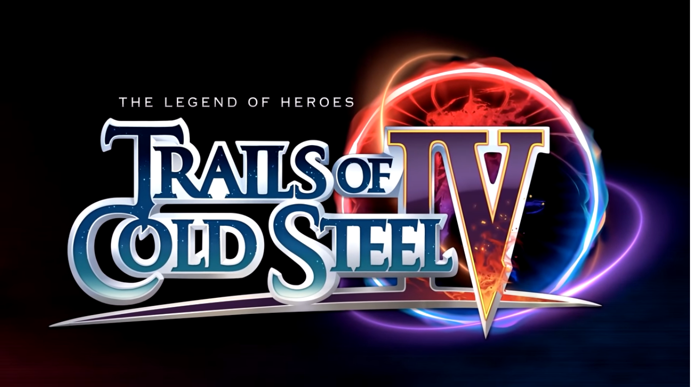
It took me five years to get from Trails of Cold Steel II to the end of Trails of Cold Steel III, but for IV a mere five months feels rather tidy. Yes, this review is going up later than I wanted since I finished the game back in November, but blame it on Christmas and a massive influx of toys at year-end. People seem to mostly come to my blog for toy reviews and Danzig, so the straight video game reviews get pushed aside sometimes. Don’t let that fool you into thinking I’m not passionate about my other pastimes, and in particular I am quite passionate about the JRPG genre of gaming and the Trails of Cold Steel franchise might be the best of the modern era.

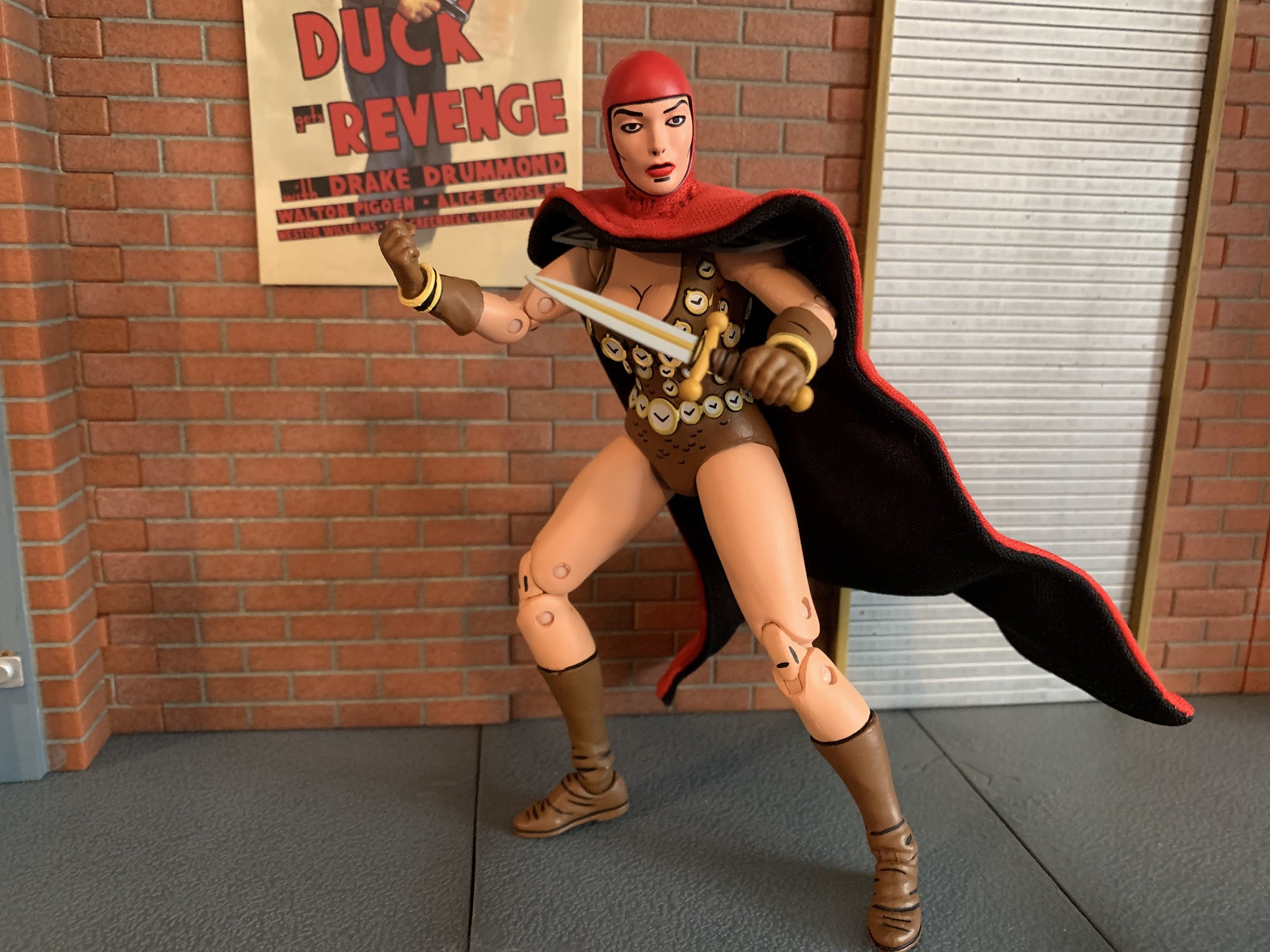
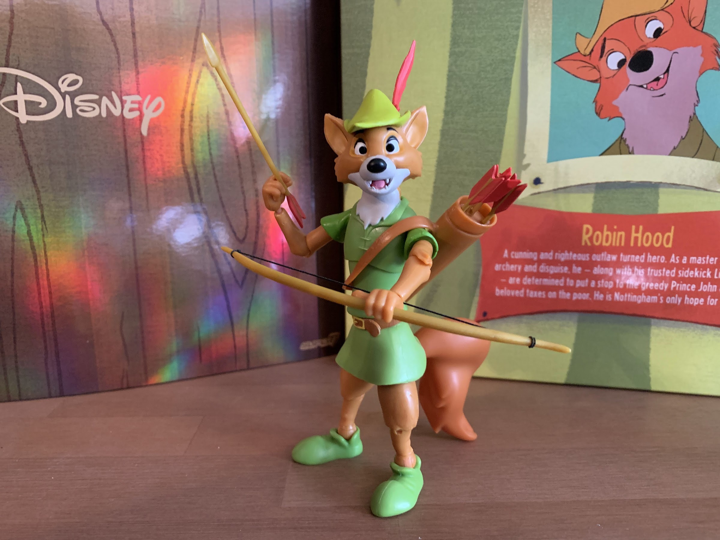
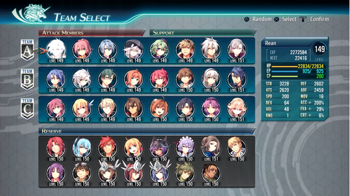
Which might be unfortunate since this is it. I finally reached the end after 400+ hours of gaming! I’ve seen the end and what it means for Rean Schwarzer, the hero of the series, and his many, many, companions. And I do mean many as this game is quite literally the culmination of three games worth of content. Trails of Cold Steel III saw Rean at the head of a new Class VII which meant new characters in the form of Juna, Kurt, Altina, Ash, and Musse. Trails of Cold Steel IV basically unites the Class VII of that game with the Class VII of the first two games giving you a pretty sizable pool of characters to utilize. And unlike the last game, almost all of the characters are available to you at any point. There’s often a character or two necessary to be included during each mission or chapter of the game, but that still means 3 or 4 other slots are open to the player. And it’s not just two Class VII’s that are available, but numerous other characters as well! In short, if you like party variety, then this game will more than satisfy in that area.

Rean is in a bad place, figuratively and literally, when this one begins.

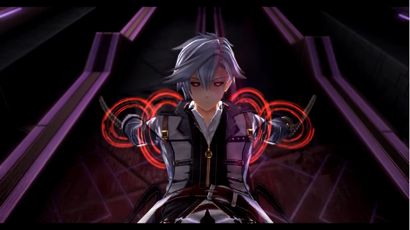
The last game ended with a pretty substantial cliffhanger. Rean witnessed the death of Millium which drove him into a rage unleashing his latent ogre power which he sometimes taps into, but never gives in to, if that makes sense. This affected the divine knight Valimar that he pilots, a sort of mecha type unit, and made him easy prey for Giliath Osborne, the Iron Blood Chancellor who orchestrated the assassination of the emperor and seized control of the nation of Erebonia. The game literally ended with Osborne grasping Valimar by the throat via his own divine knight and taunting him. When this game begins, there’s only a brief time-skip in place. There’s no time jump of a cold open this time, though you do play as the Crossbell group for the introduction in place of the cold open, and when you get control of Class VII it’s one without Rean. He’s been captured and the first chunk of the game is devoted to rescuing him. This is really the first time the player has not had control of Rean and it’s actually quite nice. You’ll mostly control the new members of Class VII: Juna, Altina, and Kurt. Instructor Randy accompanies them and he’s basically the Rean replacement as he’s a bit overpowered compared with the kids. Members of old Class VII are available at times, but the game doesn’t open up until Rean is returned to where he belongs.

Not only does this game unite the former members of Class VII with the new ones, but it’s also going to bring in the cast from the sister series Trails in the Sky so folks who have really sunk a massive amount of hours into this series are getting a major payoff.

And I don’t consider it a spoiler to say you will eventually rescue Rean. From there, it becomes a story about preventing the end of the world so the stakes are rather high. Basically, your opponents want to bring it all down and start from scratch and only Class VII can stop them. There is an opposition party ready to face fire with fire, but the resulting war will result in many, many, casualties no matter what so it’s something all would like to avoid. Rean is also marked as the “sacrifice” to this somewhat divine plan so there’s a shadow hanging over him the whole game through. He has to deal with that and the uncertainty that comes with it. It does get very “anime” at times, but I never felt confused along the way. Maybe frustrated, but that has more to do with how the characters are portrayed than anything.

The ruling class has orchestrated a war through treachery and it’s going to fall on you to put an end to it.

The gameplay is still largely the same. Trails of Cold Steel IV is a turn-based RPG in which turn order is determined by numerous factors. You can see the order of attack at all times, but it’s fluid and can be manipulated by both the player and the AI. An attacking party consists of four characters, but reserve characters can be swapped in on the fly during a player turn without penalty. Characters still have the use of basic attacks, magic attacks, and what the game calls crafts which consume CP instead of mana. A max of 200 CP can be accumulated and players earn it by dealing and receiving damage. At 100 CP, most characters have access to their super attack which can be triggered at any moment, but comes with a delay penalty. It will consume all CP the character has and its strength is impacted by just how much is utilized so it pays to wait until a character has accrued the full 200. These attacks can often turn the tide of battle or serve as a useful way to end one. Sometimes, they’re a desperation move that seems to work as much as it fails so it’s a viable thing to turn to when the going gets rough, but not something that can be relied upon like a crutch.

Returning this time is also the Link System. When in battle, characters link-up with another and their corresponding link level affects how they’ll respond. When a character lands a critical hit, a follow-up action can be made by the linked character. This accumulates Battle Points which can be spent on better follow-up attacks or used to issue Brave Orders. Brave Orders are unique to each character and most apply a buff of some kind to the party. Some can do things like revive fallen members or augment casting time. The amount of points each one consumes fluctuates from character to character and the party can now hold a maximum of 7 Brave Points instead of 5. Having a high link level also unlocks passive abilities like cover or an auto-restore function that will trigger at random. Link Points are earned by simply participating in a combat party together so there is some benefit to mixing things up at times, but also sticking with a more consistent approach will level up those specific links faster.

The all powerful S-Craft returns and is still a massive difference maker in battle.

What’s new this time around are the trial chests. These are actually returned from the second game, only now they unlock or upgrade Brave Orders. These chests are hidden throughout the game and each one requires a specific battle party to participate. If you come upon one and don’t have the proper characters in your party at the time, it’s no issue as the location is saved and you can teleport to most of them at any time from your base. These chests can sometimes force you into pairing off characters you may normally would not and they’re a fun little diversion. They’re not as rewarding as the trial chests from the second game, but I was still happy to have them back. Equipment, character progression, and the ARCUS system all return from the past games. Basically, this is a very familiar setup and if you didn’t like any of the previous games then you won’t like this one. On the other hand, if those systems entertained you there then you’ll be plenty entertained here.

Also returning are the mech battles. The divine knights play a big role in the plot of the game so naturally there are more divine knight battles this time around. This is welcomed as I always appreciated the change of pace brought on by these encounters and felt they were underutilized in the previous games. Unlike standard combat, only some characters have access to the game’s mechs, but the ones that don’t can function in a support role. These battles tend to be the most challenging encounters in the game as there’s a cat and mouse element at play. Each enemy has three spots it can be attacked, but only one is considered a weak point. Finding it is basically random, though there is some logic at play when just looking at the enemy. If they’re pretty wide open, you can probably go for the head, for example. They’ll change stances on you though so the weak spot is constantly changing. Plus, many enemies can dish out a lot of damage and it becomes a game of resource management. They may be open for an attack, but your character may need to defend or heal and it pays to be more cautious in these encounters than brash.

The amount of playable characters in this one is insane.

The systems are still the strength of the game and so is the story, but like the third game, it has almost no respect for your time. Because the cast is so bloated at this point, many scenes just drag on because everyone present has to offer their opinion on what’s going on. It’s often not profound or even interesting to hear from many of the characters and I found myself wanting this game to move faster more often than not. The characters are also unfailingly kind for those basically participating in a war of epic consequences. There are moments when an enemy could be dispatched, but they just let them get away. The game also loves to deus ex machina everything, often with some character arriving out of nowhere to save the day. It becomes so routine that it ceases to be surprising. Instead, it’s an exercise of “Who haven’t I run into from the past games yet that could show up now?” The game also is terrified of actually killing anyone off, so don’t expect to ever actually say goodbye, and for a story with such high stakes there really are few casualties. Many allies from the past games are now enemies due to their allegiance to the chancellor. They go along with it out of a sense of duty and the game seems to place far too much importance on that and has more respect for it than it should. Those characters are bringing about the end of the world and we’re supposed to feel bad for them because they’re conflicted in some way? Not to be too dramatic, but that’s like sympathising with a Nazi officer who feels bad about exterminating Jews. You have a choice, you have agency, but Rean and company just forgive and forget and that bothered me.

Like most modern RPGs, this game does feature a romance option. Rean, once again, can build social links with basically every other playable character and some non-playable character. As his bond with these characters intensifies, they (and Rean) gain permanent stat boosts so they’re all worthwhile. The women though come with the added benefit of being a romance option for Rean. And unlike the third game which only opened things up to 3 of the women, this game lets Rean pursue almost every female he comes across. Of the characters that can participate in the regular battle party (there are also many guest characters you’ll get to control. Again, this cast is huge!), only three of the women are locked off and one of them is a lesbian. This means you’re free to pursue whoever you had Rean pursue in the first two games, but it also means you can go after any of the women from the third game. This includes Rean’s students, which is pretty damn yucky. A teacher should not engage in a romantic relationship with a student, especially minors, but this game will let you do that if you want to. It tries to be respectful of the situation with Rean saying something like “When you’re of age, then we can be intimate,” type of thing, but that almost makes it worse. Rean can also go after his former teacher, Sara, which is also a little messy, but at least they’re both adults and removed from the teacher-student relationship by a couple of years, I think. And finally, Rean can also romance his sister. Now, before you really get worked up, his sister Elise is not a blood relative. Rean was adopted, but they were still raised as brother and sister and Rean literally can’t remember life before his adoption so emotionally they seem as linked as any biological brother and sister. Worse, the game also feels like it’s steering the player towards that outcome and I just couldn’t get onboard. Does that make me a prude? I don’t know, but I didn’t like it. There are also still characters that hit on underage girls all of the time and the only gay representation is from horny lesbians. Yoe mean with this massive roster of playable characters there isn’t one homosexual man? I just feel for the gay players out there looking for at least some representation, and some positive ones at that.

The romance options do add an extra layer of investment for the player and they can be rewarding, but some feel a bit icky.

If after spending well over 100 hours with this one you still want more, there is a New Game+ option. It’s mostly to allow for the player to experience all of the various bonding events available in the game. It’s impossible to achieve the max level of bonding with every character on a single playthrough (though if you like options for the romance stuff, you can max out all of the romanceable women in one playthrough) so you won’t see the “ending” for each character. The actual game’s ending is not locked behind New Game+ which is definitely appreciated. There are two endings, a good one and a bad one, but it’s not terribly hard to get the good one. There’s basically just one optional boss that has to be defeated, and if you don’t trigger that encounter in your normal playthrough, you’ll basically be allowed to teleport to it at the conclusion of the bad ending to rectify that. It’s a little extra time spent if you go that route, but it’s not terribly cumbersome. Personally, I am all set with watching the bonding events I missed on YouTube as it’s not worth it to me to go back through the game just for that. It would just take too much time.

Visually, the game is basically the same as the previous one. They use the same engine, but several characters have received new wardrobes at least. Environments are still a bit unimpressive, but I am happy to say that this game is far more stable than part 3 was. I don’t think it crashed on me once which is a far cry from what I experienced before. There’s still slowdown and framerate hiccups here and there, but I’ll take that over complete crashes. The music remains consistent and I liked this one a bit more than the previous game. There’s a bit more variety, though some tunes do get repetitive. The voice acting is pretty good as well, though some characters sound worse than others. And I don’t mean the performance, I just mean the audio quality. One character in particular sounded like her voice was recorded in a closet. The North American version of the game was released during the COVID pandemic so I am guessing that is to blame. Still, voice actors have been recording lines over the phone for years without it sounding funny so I’m not sure what happened here. It does stand out though and I’m purposely not naming the character I’m thinking of just to see if anyone chimes in with a guess because it was that noticeable.

Pom-Pom Party is the best mini game the series has introduced.

I’ve said a lot already about this game and I haven’t even touched on the side games. You still get to go fishing and play cards, but there’s also some gambling and a puzzle game to spend time with. In short, there’s a lot and you will easily sink more than 100 hours into this one. I think I even surpassed 120 this time. I was hoping for a shorter game compared with the third one, but I got a longer one. I guess that should have been expected as this is the big finale and it does deliver an actual ending. I mean, there’s still a tease for something more because The Legend of Heroes will seemingly never die, but I could stop here and be content. This cast of characters is set to return in one more game, Trails into Reverie (which has been out for a little while in Japan already), before it looks like we’ll be heading in a completely new direction. I suppose I’ll have to check that game out, but for now I am happy to be done with Trails of Cold Steel. And not because I didn’t enjoy it or anything, but because everything should have an ending and after over 400 hours it was time for one. Obviously, this game is for those who played the prior games. Enough was done with Trails of Cold Steel III that making that a jumping-on point is possible, but those who played all four will get the most of out of this (and some would argue you should play Trails in the Sky too, but I did not). Trying to just jump into this one is not really advisable so this game does possess a significant barrier for entry. I don’t regret one hour I spent with this series though. It’s quite entertaining and the mechanics are great. I do think the pacing could have been better and the characters could have been differentiated from one another a bit better as well, but for the most part I was really happy with the systems in place. And I would be more than happy to see them return. Maybe with a new wrinkle, or better yet, a game that really relied on the mech battles, but it’s not a mechanic that has completely run out of juice. It’s become increasingly hard to find good, quality, console JRPG games that don’t play like an MMO so I am happy to play whatever comes from Falcom next in this long-running series.

The Legend of Heroes: Trails of Cold Steel

There was a time when the term RPG meant really only one thing, at least for kids and teens in the 90’s:  Final Fantasy. Now the term is probably more synonymous with Bethesda and Bioware games, the “western” style of RPGs, with the eastern take being some-what of an endangered species. The “JRPG” as we…

Keep reading

The Legend of Heroes: Trails of Cold Steel II

Here at The Nostalgia Spot, we don’t just celebrate that which is old, but also that which celebrates the old. Few modern devices apply as well as a JRPG video game. The JRPG once dominated the video game landscape in the later stages of the 16-bit era and through the 32-bit era. Following that, the…

Keep reading

The Legend of Heroes: Trails of Cold Steel III

I knew it had been a long time since I reviewed The Legend of Heroes: Trails of Cold Steel II, but I was surprised when I went back and looked and saw that I posted that entry almost 5 years ago. The Trails of Cold Steel series was planned to be 4 games and I…

Keep reading

NECA TMNT Mirage Studios Utrom

Raise your hand if you knew who this was. Be honest!

We’ve become so accustomed to having the Teenage Mutant Ninja Turtles in our lives that the name of the franchise has almost lost all meaning. Well, maybe not all, but I feel we mostly have lost sight of how ridiculous a concept this franchise is. And it extends to other characters in the franchise and I’m talking about Krang. Krang from the cartoon series is an oversized, talking, somewhat monstrous brain. In the context of the show, he’s perhaps not as outlandish a design as he would be in another show, but he’s still pretty out there. And then you add in his body. A large, bald, man in a red diaper and suspenders. Krang can’t go in his head like a normal brain would because then he’d no longer be visible so he has to go in the body’s stomach. I think it’s Vernon who draws attention to this factor in the fifth episode of the series when he sounds positively repulsed at the sight of a man with his brain in his stomach, and he’s right to be grossed out! Krang is one of the craziest designs from a popular franchise that I can think of.

These two make quite a couple.

And if you have a deep familiarity with Teenage Mutant Ninja Turtles then you know Krang is taken from the original comics, only there his race of beings were called the Utrom. There weren’t many (any?) that were actually named, they were just alien brains that got around in robotic bodies. Like Krang, they controlled those bodies from the stomach area, but unlike Krang their bodies were far more mechanical looking. Think the endoskeletons from Terminator, as that’s more in-line for how they appeared. They were foes to the turtles, but also tied in with their origin, and I’d elaborate more, but ever since the 2012 show came along the Utrom and the Kraang from that series kind of run together in my head. Needless to say, they play a significant enough role in the original comics that an action figure from NECA made sense.

The Utrom from NECA stands at right around 6.625″ in height. It comes in the standard window box packaging with new artwork from Kevin Eastman on the box depicting the character. On the rear are product shots and a cross-sell for more figures in the line. Let’s just get right to the big talking point with this guy: the paint job. This figure is gorgeously painted. If you thought the Fugitoid figure looked terrific, wait until you see this. It is fantastic! I am in love with how this figure turned out. It’s sculpted in a light blue plastic, like a periwinkle, with white accents painted onto parts of it to go along with the usual black linework this line is known for. There’s also a hit from an airbrush that contains some gray paint and the effect is just wonderful. This looks like it jumped off of the the page, colored version, and I just love how stylized this looks. This is what I want from action figures based on comics. You can’t sculpt it in chrome, and just making shiny plastic isn’t going to achieve the same end result. The eyes are also painted yellow with a hit of yellow from the airbrush to create the illusion that they’re glowing. The Utrom in the figure’s stomach is also well-painted. The eyes and teeth are clean and there’s a wash applied to really bring out the nasty with this little guy. And with this amount of paint on the figure, there’s virtually no slop. No stuck joints. It’s about as perfect a paint job as one could get in this price range. If I have any nits to pick with it, it’s that a couple hits of the white look a little thin. Maybe the neck area and some of the details on the arms could have used another hit of the airbrush, but that’s all minor and just me trying to poke holes in this thing because, otherwise, it’s awesome.

The sculpt and paint on this guy are just incredible.

The wonderful thing about this figure too is it has a sculpt to match. There are tons of little details in the arms, especially, that look like wires and little machinations. I love the contrast of the smooth plates on the figure’s thighs and the ribbed portions underneath. The rear of the figure is really loaded with sculpted details which is commendable since that’s a spot NECA could have cheaped out on, but obviously did not. It all speaks really well to NECA as a company because they’re clearly committed to delivering the best, most accurate, representation of the character possible. Who knows if much or any of this figure can even be reused for other figures. I’m sure we’ll get a variant at some point, but we have numerous examples of other companies just half-assing their sculpts to present a compromised vision of a character in the interest of saving money on tooling and NECA is just putting them to shame. And something I should praise NECA for more often than I do is that they credit the folks who design their figures so a major shout out and hearty congratulations to sculptors Brodie Perkins and Josh Sutton with paint credited to Geoff Trapp and Mike Puzzo. We should also probably give a shout out to director Trevor Zammit as I assume he’s the one pushing to make these look like the source material and he just does a fantastic job with all of the TMNT lines he oversees at NECA.

And if you thought they would cheap out on the figure’s rear you’d have been wrong.

We’ve gushed over the look of this one, now let’s talk about the stuff it comes with. The Utrom has three sets of hands: fists, gripping, and trigger finger. All of the hands feature the horizontal hinge, our first disappointment of the release, but I do like that the fingers are soft plastic and getting the accessories into the trigger hands is relatively easy and free of paint rub. He also has a gun and it has a really fun design as it has these panels over it. It has some linework on it and the muzzle is painted rather simply, but well. There’s two red tools for the figure to wield. One resembles a wrench and the other is a bit more nondescript. I’m guessing it’s pulled right from the comic, but I don’t know exactly what it is. He also has a little canister with a straw in it. I think this is a drink for that actual Utrom in the belly, the only problem is he doesn’t hold it very well. The fingers on the trigger hands are flexible enough that you can wedge it in there with some effort, but a more relaxed hand would have worked better. Lastly, we have a second portrait for the robot that features battle damage. It’s right eye is hanging out and there’s a big gouge taken out of the top of the head that looks really cool. It’s nice enough that the temptation is there to get another figure, I just wish he had more battle damaged parts to swap to or even a second Utrom with a different expression to create a bit more variety. The Utrom that came in the comic con 4-pack years ago is much too big to fit in this guy.

Bang!

The accessories are solid leaving just the articulation for us to talk about. Like most of the figures in this line, the articulation isn’t going to be the strongest aspect of the release, but I think it’s going to be enough. There’s a ball joint in the head that provides rotation and some nuance posing. It looks down well, but not up. The shoulders are ball-hinged and you get all of the rotation you need, but the boxy shape of the shoulder means the figure can’t raise its arms out to the side. You get maybe 45 degrees there. There is a biceps swivel and it’s integrated very well into the sculpt. The elbow hinge is only a single hinge, but the design allows it to go past 90 degrees so that’s fine. The wrists swivel and hinge and I already mentioned the direction of the hinges is unfortunate. In the diaphragm, we do have a ball joint above the opening for the Utrom. It’s actually more functional than I expected as you get a little forward and back, some tilt, and a fair amount of rotation. At the waist is another twist and the hips are the standard ball and socket joint. There’s a thigh pivot there that provides just a little something for adjustment poses as opposed to a full thigh twist. The legs kick forward to a full horizontal position, though they do drift out from the body a little the higher you go. There’s no range going back, and the single-jointed hinge will get you a 90 degree bend. At the ankles we have a hinge that allows for plenty of range backwards, but nothing forward. The ankle rocker works fine. It’s decent and I think it’s enough for this character. He can do plenty of one-handed gun poses. I do think NECA could have sacrificed a little bit in the sculpt at the shoulders for more range, and the lack of vertical hinges for the hands is an ongoing problem. The actual Utrom in the body is not articulated, but I don’t think it needs to be.

The Utrom may not be a character that gets a lot of TMNT collectors excited, but the finished product is one of the best releases from NECA in a long time. I think this is easily my favorite from the Mirage line and I would put it up there with the best from the toon line as well. I can’t say enough good things about the paint job. This comic deco is fantastic and I love that NECA has the guts to try something like this with its figures. So many collectors dump on “cel-shading” when it comes to figure releases without realizing that most of the companies attempting that effect with their figures do a piss poor job. It takes effort and money to get it right as well as artistic vision. I’ve said it numerous times, but natural lighting cannot shade an action figure based on a comic book character the way that character is drawn in the book. It’s impossible. Comic book artists do their own thing that doesn’t work in reality and no one complains because it looks awesome. It’s stylized, but some of it is so prevalent that we don’t really think about it. I always use Venom as an example. We know his costume is black, but if you showed a panel from “Lethal Protector” to a kid he’d tell you the costume is blue because that’s how comic book artists shade black. And that’s what I want out of my figures. Major props to NECA on this one, they hit a homerun. I can’t wait to see what they do next.

More from NECA and their expansive selection of Teenage Mutant Ninja Turtles action figures:

NECA TMNT Cartoon The Wrath of Krang!

We’re back for 2021, and right now it looks like a lot like 2020 as we have a new Teenage Mutant Ninja Turtles action figure to talk about – Android Krang! Hopefully, this doesn’t mean 2021 is a lot like 2020 going forward, but if it’s going to copy anything from 2020 then let it…

Keep reading

NECA TMNT Mirage Studios Fugitoid

I’m having a hard time coming up with an action figure line that has had retail releases separated by more than a decade. I don’t mean long-running lines of figures like G.I. Joe or Marvel Legends which have been around for decades, I mean a line that was started, ended, then re-started like NECA’s line…

Keep reading

NECA Mirage Shredder and Foot Clan NYCC Exclusive Set

The Shredder had a rough go at things for awhile when it came to plastic. He was featured rather prominently in the old Playmates line, though perhaps not as prominently as one would expect. Playmates never did do a movie version of him, aside from Super Shredder, and his figure was arguably the worst from…

Keep reading

Marvel Legends Retro Card Cyborg Spider-Man

It’s Spider-Man with a robot arm!

Well, this is a figure that I never planned on reviewing. It’s a bit old at this point, but we’re looking at yet another Spider-Man retro card release from Hasbro and this time it’s Cyborg Spider-Man. Now, I remember seeing this quite some time ago at Target and thinking it looked fine, but I’m not a Marvel Legends collector so I never paid it any real mind. I say that, and yet 2022 is the year I bought more Legends than I have since 2006 mostly due to the X-Men animated line, but it also got started with the animated Venom. That Venom lead me down a rabbit hole where I wound up with Web-Man, Symbiote Spider-Man, and more recently the animated Spider-Man. It was getting that most recent one that basically resulted in me grabbing this guy because what I really wanted was a webline part. That figure didn’t come with one, but when I went to Target recently I spotted a figure that did. Spoiler alert – it’s this one!

Even with the new hardware, he still does spider shit.

Cyborg Spider-Man is a 2021 release, if I’m not mistaken. Possibly late 2020. Things blend together a bit in my head when it comes to release dates, especially for lines I don’t typically collect. The foot of this one is stamped 2016, but I’m guessing that’s because most of the parts are that old. It’s not recent though and not one I’ve seen in Target in quite some time. I don’t know why my nearest Target had one, random, figure on the pegs, but it did. It initially didn’t even ring up because the barcode was no longer in their system, and when it finally did, it rang up as some Spider-Man bow and arrow toy. Unfortunately, that toy carried the same MSRP as this one so I didn’t get a deal or anything, but it suggests to me that maybe Target recently unearthed some extra stock because the figure is also online again as of this writing. Regardless, I thought the sculpt was interesting and a pretty fun variant on Spider-Man, and since it came with a web line accessory, I said “Why not?” And since I have a blog that heavily leans into toy reviews, we might as well take a look.

I think of him as more of a punchy Spider-Man.

Cyborg Spider-Man stands a tick over the 6 inch mark. He comes packaged on a retro card and is a nice throwback to the Toy Biz figure of the same design. I actually never had that one, I really didn’t get many Spider-Man variants, but I can recall thinking it looked fine. I just prioritized getting villains over yet another Spider-Man. He was also a late entry in the line, if I’m not mistaken, and it’s possible I was already shifting priorities. The design hasn’t changed though. This is basically Spider-Man, but with a robot arm. He does have a belt and some accessories on the head, but it’s the big, cybernetic, left arm that stands out the most. Since I’m not a regular buyer of this line, I couldn’t tell you where all of these parts are from. The main body is the same one we saw with Web-Man which I think originated with a Spider-Man 2099 figure. The arm could be from someone like Cable or Deathlok, or it could be all new. Since it’s an older release, it’s not a pinless body so we get the ugly red dot on the inner right arm resulting from the red peg that goes through it. The blue pegs around the knees don’t cause the same sort of eyesore. It’s a very muscular sculpt and one that feels appropriate for this specific version of Spider-Man. I like how the cybernetic arm turned out and it looks as it should. The head has these giant eye lenses which are also fun and very McFarlane-esque. The belt is glued in place, but the white wraps on his right thigh are a floating part which could be removed if desired. It’s a little annoying that it doesn’t stay in place and it’s a reminder why newer figures like Morph and Cyclops have them keyed in. The only details I don’t like about the sculpt are the tiny shoulders, which is a consistent criticism I have for Marvel Legends. They just look silly and sit too low.

I wish they had painted the stitching on the mask.

As far as paint goes, we have our usual Marvel Legends mixed bag. The figure is a mix of blue and red plastic with a light gray used for the robot arm. The weblines are done well enough and I like the black outline on the red portions of the costume, something the animated Spidey didn’t roll with. The painted and colored reds look close enough and the painted portions of the head are fine. What I don’t like is how the spider logo on the rear turned out. It really needs a black outline or something to help it pop and it looks almost washed out. It also has a big hole which I guess is for an old flight stand. There’s also a severe lack of paint in most places. On the head, there’s stitches holding a portion of the mask together which were left unpainted. It’s a shame, because they’re sculpted well enough, but are barely noticeable due to the lack of paint. There’s also no paint on either the belt or the left arm save for the plate on the shoulder and bracelet area. The belt just looks boring and cheap as a result while the arm has too much of a plastic look. There’s no attempt to make it look like it’s made of metal and, again, it’s a shame because the sculpt is there. It just needs a little dry-brushing to bring it out. In a perfect world it would be painted-up like NECA’s Fugitoid, but I know Hasbro isn’t going to sink that kind of money into this line. At least this one is $23 instead of $28 or $35 so it’s easier to overlook these shortcomings, but still unfortunate to see Hasbro not do right by their sculptors and designers.

This spider on the back could have been handled better.

The articulation for this Spider-Man is not really it’s strong suit. I suppose we shouldn’t expect a cyborg version of the character to move as well as a traditional one, but I thought it would be a little better than this. The head is on the usual ball hinge which provides good enough range up and down, but not much nuance posing. The shoulders are ball-hinged and pretty limited out to the side. The left arm is hindered by the big plate on the shoulder, but even the right arm can’t quite hit a horizontal pose. There is a butterfly joint which provides more range going back than forward. It’s okay, but a bit ugly because the paint isn’t continued as far as the joint goes so you end up with gaps in the weblines on the front and the spider legs on the rear. The elbows are double-jointed on both arms and both can bend past 90 degrees. The cybernetic arm can even go further than the right arm as more plastic was cut away to make it work. The wrists rotate and hinge horizontally while the abdomen features a ratcheted ab crunch. It only allows one click back and one click forward so the range isn’t impressive. The waist twist is a waist twist and it is at least hidden by the belt because otherwise it would look pretty hideous. The legs can just about hit a split with a little effort, why newer figures can’t is a real mystery, while the legs kick forward to about horizontal with no range going back. We get the usual thigh cut and the double-jointed knees work just fine. There’s a boot swivel and the ankles hinge forward and back pretty far and feature a steep, but usable, ankle rocker. It’s nothing particularly impressive, but I don’t know what kind of posing most want to do with this guy. I tend to think he should be posed more like a brawler than the nimble Spider-Man of norm, but that could be just me. By Legends standards, it’s basically average.

Your webline is looking a bit limp there, Spider-Man.

And that’s kind of it for selling points with this guy because the accessories are not impressive. Cyborg Spider-Man comes with fist hands in the box and he has one thwip right hand he can switch to. He also has that all important webline I wanted which is just a piece of malleable, off-white, plastic with a little curl at one end and a triangular shape at the other. It’s kind of odd that they don’t have a clip on the end designed for the hand/wrist area. And since he can’t grip it with any hand it makes it hard to do much with. I found I can kind of get the triangle to work with the thwip hand, but it’s rather precarious and frustrating. It’s a bit amusing that I basically bought this figure for this piece and I’m not finding it very useful. If it was just a bendy wire that could wrap around him that would be better than this. That’s it though. One extra hand and one mediocre web effect.

All right, you can stay.

Given the articulation woes and the lack of accessories, this figure is basically one to judge based on the overall aesthetic. And if you like this interpretation of Spider-Man, then you’ll probably be fine with this one. I do like the look, and while I wish it was painted better, I think it looks okay on a shelf. The fact that it’s at the older price point definitely helps because if it was up any higher I’d have not bought it. And if you are into customizing your action figures, this one probably won’t take much effort to really bring out some of the details. There are elements of the figure that are a bit dated, but the sculpt helps make it worthwhile. In short, I’m content to have this figure I never planned on getting.

Like Spider-Man? Check out these entries:

Marvel Legends X-Men Animated Series Cyclops

I wasn’t sure he would make it in time, but Hasbro managed to ship Cyclops before the end of the year. Cyclops marks the final figure (for now) in Hasbro’s X-Men animated series subline of Marvel Legends. It has been…a ride. What was once a dream line of mine to see brought to fruition, turned…

Keep reading

Marvel Legends Web-Man

No, this is not bootleg Spider-Man, this is Web-Man! Who is Web-Man? I actually had no idea until I just looked it up. It would seem Web-Man is a copy of Spider-Man created by Dr. Doom. Not only are his colors inverted from the real thing, but so is most everything else. And since Spidey…

Keep reading

NECA TMNT Quarter Scale Toon Leonardo

Leo is here and bigger than ever!

We’re not yet far enough removed from the holidays that Christmas has left my brain. And if you were to ask me what my favorite Christmas present was as a kid I wouldn’t hesitate to say my Super Nintendo. I had a real “Ralphie moment” in that I found it last having failed to notice it off to the side propped between the dining room table and the wall. It was an awesome gift and a memorable way to get it. My second favorite though was my Giant-Sized Leonardo. I got that gift from an aunt who must have talked to my mom and found out who my favorite turtle was. My dad is one of nine kids so Christmas with his family was always done as a pseudo Secret Santa, only it wasn’t a secret. All of the cousins (or the parents) drew names so that not every family was buying a gift for every niece and nephew. I think it was supposed to be a ten dollar limit too, but this particular aunt always loves giving gifts and is known to blow past such suggestions. I didn’t even know the giant sized line existed when I unwrapped that gift so I was blown away. My favorite toy turned into this massive figure? It was incredible! The only negative was he only came with one sword when we all know that Leonardo wields two.

It was my affection for that old toy (which I sadly no longer possess) that convinced me to collect NECA’s quarter scale line of figures based on the cartoon Teenage Mutant Ninja Turtles. I’ve already looked at Raphael and Donatello so with Leonardo there won’t be a ton to discuss. As is the case in the show, the turtles are all identical save for their weapons and colors so the figures follow the same style. They’re all the same save for the belts and paint, including the headsculpts. NECA used this line to unveil their new approach to turtle heads that come in two parts: eyes and mouth. This allows for the collector to change the expressions to suit their mood. You can have all of the turtles basically look the same, or make sure they’re all doing something different. It’s an idea so good that it’s been brought to the 1:12 line since.

Leonardo comes in the same “Giant Sized” box as the previous two figures and stands a shade under 15″. He weighs over 3 pounds so he’s a big, weighty, toy. The sculpt is the same as before save for the L medallion on the front of the belt and the holsters for Leo’s swords on the rear of the belt. Like the smaller figures, NECA uses it’s two-tone shading with dark colors on the rear and bright colors on the front when it comes to paint. Most of the figure is painted, which is good and bad. Good because it gives the figure a real depth of color, but bad because there are spots of paint transfer. The rear of the my figure’s thighs have some brown from the shell and there’s some blue above the kneepad of the right knee as well. It’s not terrible, but it can stand out on a figure of such size. The black linework is largely sharp and helps make the figure “pop” when looking at it. It’s an impressive piece, as were the past two, and there’s almost a sense of disbelief to have such a giant turtle in-hand.

I prefer my Leo to be happy.

Leonardo’s expressions are both familiar and different. NECA intentionally mixes up the included mouth shapes with each release. Raph has just two, while Donnie had three, and Leo reflects the Donatello release. His included mouths are a smile, open mouth smile, and a neutral expression. The one mouth he doesn’t have is the yelling mouth which was included with both Donatello and Raph. Donatello had both the smile and neutral mouth so Leo doesn’t come with anything new, but I’m glad he has three options instead of two. Swapping them can be trying. I had to heat up some of them to get the eyes to snap in place while others I didn’t have to. He comes with the standard eyes on the smiling mouth and the standard eyes seem to work better as a result. The angry eyes required more effort, but I didn’t have any problem getting them on and off the neck peg and none are too loose like they are with Raph so that’s a plus. In terms of hands, Leo was given gripping hands, open hands, and thumb’s up hands. He doesn’t get the finger-pointing hands, but more importantly, his gripping hands are the same as Raph and Don. In the 1:12 line, NECA actually created three different sets of gripping hands: standard with horizontal hinge, standard with vertical hinge, and a wider gripping hand so that Raph can be posed with the middle tyne of his sai in between his fingers. For the quarter scale line, NECA apparently chose to only adopt the wide gripping hand. I expected this figure to come with new gripping hands with a vertical hinge because the 1:12 version has them and the quarter scale movie Leonardo has them as well (the 7″ movie Leo unfortunately does not). It sucks because NECA is obviously aware of which hand works best for a sword wielder like Leonardo (I’d argue the vertical hinge is also appropriate for Raph and Mikey with only Donatello benefitting from a horizontal hinge), but it’s frustratingly inconsistent in its approach. The recent Hudson figure from the Gargoyles line has it, but a character like Usagi Yojimbo does not. Make it make sense! And for $125 for a figure requiring minimal new tooling, it feels like something that we should have got here.

This aspect of the figure could stand to work better.

As for accessories beyond the optional parts, we have the customary swords. They’re the same shape as the 1:12 version, just upscaled. They appear to be sculpted in white with painted handles. The one benefit of Leo having Raph’s more specialized gripping hands is that the handles of the swords fit easily into them. It’s also helped by the fact that the hands are fairly pliable. This means there’s less chance for paint rub on the hands, which is not something that can be said of the sheaths on the rear of the figure. The fit for the swords is a tight one, especially the sheath on the bottom. And you will get some paint rub onto the nice, white, blades so maybe don’t even bother. I got the top sword through with minimal rub while the bottom one lead to a lot. I used a Mr. Clean Magic Eraser to get most of the brown off of the blade, but I don’t ever plan on sheathing these again. If it’s something you must do, then maybe heat the sheaths with a hair dryer first and see if that helps. Aside from the swords, Leo just has the same two slices of pizza which can key into the slices that came with the other figures. He also has a communicator which opens and closes just like Raph and Don and he has one paper good. It’s a newspaper or magazine titled Crimestoppers Weekly. It’s fine and obviously something that’s cheap to include.

The articulation for Leo is the exact same as the other two figures, so I don’t feel like I need to get into it. I just want to highlight that, unlike the 1:12 figures, these quarter scale figures have double-jointed elbows. The elbow pad pegs into the center part of the elbow and you actually get decent range there, a bit past 90 degrees. The joints are pretty tight overall though and I had issues with the biceps swivel and thigh twists. The biceps just required some additional effort as I just needed to make sure I got some leverage on the shoulder before twisting. The thigh swivel is much harder to get at since these figures have legs that pin into the crotch piece. That’s because they need to be ratcheted to support the figure’s weight, but it makes it quite difficult to get any leverage on that thigh twist. Both are stuck and attempting to twist them just stresses that peg in the hip and could easily lead to an unfortunate break. There’s some traces of lubrication at the joint, but it apparently wasn’t applied well enough. I had the same issue with Raph, bt Donatello had a lot of lubricating oil in there and I was able to twist his thighs without issue. I assumed it was all solved, but Leo is like Raph unfortunately. I haven’t been able to get them to move and I’m guessing I never will.

It’s nice to see them all together, but it also makes it plainly obvious who we’re missing.

Giant Sized Leonardo is a throwback sort of figure with modern engineering. If you have the other two, you basically know what to expect. Because of the lack of vertical hinges on his gripping hands, I might have to consider this figure the worst of the 3 given the issues with the thighs. It paints me to admit that since Leonardo is my favorite, so subjectively I like this figure more than the other two, but there are certainly some disappointments. If that is not an issue for you then you’ll probably be content. And if you have the other two then you basically already know if you want this or not. Had Leo been the first figure out in this line I might have been able to just go one and done with my favorite turtle in this scale, but since I started with Raph I pretty much have to have all four now. As for when that will happen, who knows? Michelangelo has yet to go up for solicitation, though a finished sample was present in a recent interview The Fwoosh conducted with NECA’s Trevor Zammit so I have to assume it’s either in production or in line to go into production. Which isn’t surprising since it’s the same figure as the other three. Leonardo started showing up last fall, the place I ordered it from seemed to get it in last, so maybe Mikey will show up on a similar timeline. I’m anxious to see how they do his nunchaku in this scale and to see if he comes with any extras. It will be nice to finally have all four together when that day comes.

Like your turtles big? Then check these out:

NECA Quarter Scale TMNT Toon Raph

My first NECA Teenage Mutant Ninja Turtles product was the original release of the Mirage Studios quartet released in 2008. Nearly a decade went by before I bought another TMNT product from NECA, and that item ended up being the quarter scale movie Donatello. It was love at first sight for me and Donnie, and…

Keep reading

NECA TMNT Quarter Scale Toon Donatello

2022 has been a year of catch-up so far for me. A lot of stuff I preordered a year or more ago is finally coming due, and often without the actual preorder! The NECA quarter scale toon Donatello from the classic cartoon series Teenage Mutant Ninja Turtles is yet another preorder that just didn’t get…

Keep reading

Neca 1/4 Scale TMNT Movie Leonardo

NECA is now 3/4 of the way through the release schedule of their TMNT 1990 movie line with the release of Leonardo – the REAL leader of the group. And like Donatello and Raphael before him, he’s a pretty impressive specimen. The original 1990 movie impossibly never had dedicated action figures. Playmates half-assed a line…

Keep reading

Marvel Legends Spider-Man (Animated)

Not quite amazing Spider-Man.

It was in 2021 that Hasbro released a PulseCon exclusive Venom figure on a Spider-Man retro card. The retro card series is meant to stir-up nostalgia for all of the adults who were buying toys and watching cartoons in the 90s as the retro card is a facsimile of the old cards Toy Biz used to utilize. The cards were for the Spider-Man tie-in series of toys that went along with the cartoon series of the same name. Airing on Fox Kids, Spider-Man was a natural follow-up to X-Men as it featured arguably Marvel’s most popular and recognizable hero in a starring role. The X-Men animated series did wonders to help boost the profile of Marvel’s mutants, and the Spider-Man cartoon essentially did the same. The retro card series that Hasbro launched just a few years ago often had some overlap with that cartoon, but they weren’t necessarily cartoon-specific sculpts. The exclusive Venom was different in that it contained two, new, headsculpts clearly modeled after Venom from the show. Plus, it featured his unusual shading from the show of light blue on one side and red on the other.

Go web!

2022 saw Hasbro double-down on the retro releases as it launched the X-Men Animated Series subline of Marvel Legends. While we can certainly debate how hard the company actually went in to trying to recreate the characters as they appeared in the show, the line did try to showcase those characters with some animation specific shading and (in some cases) sculpts. The line must have been successful because Hasbro is doing the same in 2023 only with Spider-Man as the featured series. Why now? I don’t know. The X-Men line coincided with the show’s 30th anniversary and it would have made sense to do the same for Spider-Man in 2024, but Hasbro is apparently far too eager to wait another year. The show is getting the same treatment in that it’s likely to be reused sculpts with some shading added and it’s all packaged in a box designed to mimic a VHS release. The first set, as they’re apparently going with two-packs for now, won’t be out for a few more months, but we essentially got a preview to close-out 2022 in the form of an exclusive Spider-Man sent to Walmart. This Spider-Man is sold on a retro card designed to resemble the old Web Racer Spider-Man toy from the 90s. The image is essentially the same, but since there wasn’t much in the way of preservation for those old cards it had to be redone and has been lovingly recreated by artist Harry Moore. This time, Spidey is fully posable and doesn’t have a string running through him. It’s a new sculpt, though not a unique sculpt, and most importantly it features a cel-shaded paint job to fit-in with the previously released Venom.

The sculpt is mostly fine, save for how pointed his face is (unless it’s just mine).

Let’s get it out of the way upfront: Walmart sucks. This guy went up for preorder in July, but before a single figure was shipped it started showing up in stores in early December or late November. It showed up in tiny quantities though, apparently just 2 per store, and it was a bastard of a release to track down as a result. It also never showed up in Walmart’s app or website as in-stock, so it was a total shot in the dark to go looking for one during the busy, holiday, rush. As for those preorders, that’s how I got mine, but several are still waiting and with the listing being dropped from Walmart’s website it sure looks like a lot of folks are heading for a cancellation. It’s great that they made sure to send product to stores first, rather than take care of the orders they already took-in months ago. And if you are lucky and like me and manage to get one shipped from Walmart, expect it to come packed in a foil envelope likely beat to hell once it arrives. The cardback on mine is dinged-up pretty well, plus the plastic bubble was cracked and broken. I’m not a mint-on-card collector, but I know a lot of people are with these retro cards and plenty more like to double-dip to keep one carded and one opened. To those folks, best of luck. You’re going to need it.

The rear spider looks nice and clean.

Once opened Spidey stands at a tick over 6″. This sculpt is apparently the same as the first appearance Spider-Man also released in 2022 in the new style of packaging. It’s a pinless body and it’s notable because it’s a smaller Spider-Man. He’s well-defined, but not as bulky as the other new Spider-Man body from this year released in the Renew Your Vows two-pack. This is probably Hasbro’s best Spider-Man body to date. I’m certainly not an expert as I only dabble in Marvel Legends, but it’s much better than the Web-Man and Symbiote figures I do have. It still has its problems, which we’ll go over, but just overall has a nice shape. The smallish Legends shoulders aren’t laughably small here and most of all I just like this shade of blue that’s in use. It’s a light blue, shaded with a darker blue, and it just captures the look of the character from the era. I get more of an 80s vibe if anything from the color combo, but it’s fine as an animated version too, though I’d argue his blue was actually darker in the show. The only thing about the sculpt I don’t like is the head. It’s a little big, plus it feels pinched in the front. I don’t know why it’s not more round as it doesn’t even look like a human face could make this shape. It’s a shame, because the eye shape is nice and it’s pretty well-painted. Many have complained that web lines on their figure are off-center. Mine is, but it’s small. You can see it by looking at the hexagonal shape in the middle as one side touches the tip of the eye lens while the other does not.

The range isn’t perfect, but it’s good enough to get some Spidey poses out of it.

The overall paint job strikes me as pretty much par for the course with Hasbro. There’s a lot of colored plastic in use which leads to issues of color-matching. The red on the chest is noticeably darker than the red on the arms and feet. That’s because one is painted, and one is red plastic. The edges are also not crisp and clean as my figure has a blemish on its right pectoral which is a rather lousy place for such an imperfection to exist. There are little instances of that throughout the figure, though not in a large number at least. The web lines mostly look good though with a defined curve to them rather than a boxy look which tends to happen. Both spider logos are nice and clean, and the pinless body is a welcomed addition as there’s no unsightly red dot on the inner arm any longer. There is one eyesore on the back of the figure where Hasbro didn’t continue the red paint of his belt area far enough so when he crunches forward you end up with a section of blue instead. Normally, not a big deal, but Spider-Man is a character who is known for deep crunches so here it’s not acceptable. The cel-shading is what it is. For Hasbro, this is one of their better applications of it. There’s some linework on the torso in black to highlight the musculature and the shading goes under the pecs. The rest of the shading is reserved for the inner arms, as they apparently wanted to avoid shading red areas as much as possible, and inner right thigh and outer left. There’s also a hit on both boots and the inner arm shading continues onto the gloves a tiny bit. Does it make a ton of sense? No, they’re clearly going in a haphazard manner. I think it looks fine on the torso while the inner arms are kind of “meh.” The thighs and boots don’t bother me. It is what it is and you know if you like it or not at this point. And if you want to remove it, good luck. It’s paint on top of paint where the arms are concerned so it won’t be easy to just wipe away. And where it goes over the web-lines you’re basically screwed. You would be better off just repainting the whole thing. At least for Hasbro, this one is probably better than all of the X-Men releases with only Sinister perhaps being better. Venom was pretty good too for what he is so maybe these Spider-Man releases will just plain be better than what we saw with the X-Men?

“Take that!”

Articulation for a Spider-Man figure is rather important, and I was a little let down by the other Spideys I have. This one is better. Is it perfect? Of course not, but it’s a step in the right direction. The head is still on a ball and hinge so it looks up and down rather well and can rotate, but lacks much in the way of nuance posing. The shoulders are ball-hinged and they raise out to the side just fine, though it does expose the red hinge underneath which is set against the blue of the armpit which is one eyesore not solved by pinless tech. The butterfly joint provides more range back than it does forward, but it’s not a tremendous eyesore so I consider that a win for a Hasbro butterfly joint (and if you want more range, there’s a popular mod for doing so that may apply to this figure as well, just search for it on YouTube). There’s a biceps swivel which does what it needs to do and double-jointed elbows. I cannot get the top hinge on either arm to budge though so I am presently only getting a 90 degree bend (after the review, I did resort to the hot water trick and got it going, though it’s still pretty tight). Hopefully this isn’t a widespread issue. The wrists rotate and hinge horizontally on all hands. In the torso, we have a diaphragm joint which allows for some forward and back, but is mostly good for rotation and tilt which it does rather well. There’s a lot of painted stuff here though, so do be careful. At the waist is the ab crunch which goes forward and back plenty far. Missing is a waist twist which makes me wonder if a ball-peg would have worked better in place of the ab crunch. At the hips, we have ball and socket joints which still can’t quite hit a split. This is Spider-Man, Hasbro! Why can’t he do splits? He can at least kick forward a reasonable amount, but not back. There’s a thigh cut there, double-jointed knees which work better than the elbows, a boot cut, and a hinge and ankle rocker combo at the ankle. All of that stuff works well with no gummy-ness to the joints. I know some would like a toe-hinge, but I don’t really care if it’s here or not. He can hit some good Spidey poses though with the only real disappointment being those hips and my stuck elbows.

“Now it’s our turn, Spider-dweeb!”

That’s where the good stuff ends as when it comes to accessories Hasbro loves to disappoint. Spider-Man comes with three sets of hands: fists, wall-crawling, and thwip hands. That’s basically the standard, Spidey, assortment, but some gripping hands would be nice. I suppose they’re not needed though since he doesn’t come with a web-line to grip. Instead, he has two web splat effects, one bigger than the other. They’re all white and made of a pliable plastic, but they don’t really do anything. I guess you can toss one onto a villain’s face? They’re more like window-dressing parts and what I would prefer to have is an actual webline or something from the show like his web backpack. These things are just useless.

Spider-Men! Assemble!

If you want to get your hands on this guy, I guess all you can do for now is monitor Walmart to see if the listing returns. Their exclusive Black Series Holiday Scout Trooper recently showed up at Big Bad Toy Store so maybe this Spider-Man will too? Otherwise, it’s the secondary market at this point where this thing will cost a lot more than the $27 Walmart was charging. As is the case with virtually all Marvel Legends these days, this one isn’t exactly worth it, but if you have that Venom or really loved watching this show as a kid then you may feel a strong pull towards this guy. And in that case, it’s a price that can be accepted. At 50 or 60 bucks? Ehh, I wouldn’t do it. With Hasbro launching a dedicated Spider-Man line in 2023 it seems highly unlikely that this will remain a Walmart exclusive forever. After all, how can you do a Spider-Man line that doesn’t feature Spider-Man in red and blue? Hasbro does some stupid things, like not finishing the 92 X-Men team, but I don’t think they’re dumb enough to let this figure remain a Walmart exclusive. My assumption is there will be a VHS re-release with different accessories. It’s possible it will be on a different mold, but I don’t think they’ll go through that trouble. It’s a good Spidey though, probably Hasbro’s best, so when that re-release does happen (or this mold gets a comic release in this shade of blue) I would suggest jumping on it unless you absolutely hate the cel-shading. And if that’s the case, there’s the Spider-Man and His Amazing Friends three-pack that has a Spidey from that show on this body with no cel-shading. It’s probably every bit as good as this one, perhaps better if you prefer your Spidey with a darker blue, but it costs $75 and comes with a decent Firestar and an absolute dumpster fire of an Iceman. That set would have been right in my nostalgia wheelhouse if they didn’t blow it so hard on Iceman, my favorite member of the X-Men when I was a kid. Hasbro just can’t make things easy for Spider-Man fans.

“So am I a member of the X-Men now? Because the Avengers keep coming after me and I don’t want to overcommit. Especially since I have class tomorrow.”

More from the world of Spider-Man and Marvel Legends:

Hasbro Retro Card Symbiote Spider-Man

One of the most iconic costumes in the world of superheroes is definitely that of Spider-Man. I put that classic red and blue with webbed detailing right up there with Superman and Batman. I would argue that there’s no more iconic costume in the world of Marvel than Spidey’s, and the crazy thing with Spider-Man…

Keep reading

Marvel Legends X-Men Animated Series Wolverine

The toyline of my dreams was announced last October. In celebration of the 30th anniversary of the television series X-Men, Hasbro is doing a dedicated line of Marvel Legends with figures based on the look of the show. The show was obviously inspired by the designs of Jim Lee, but there are differences in the…

Keep reading

NECA TMNT Mirage Studios Renet

She’s traveled a long way to get here.

Welcome to the first Turtle Tuesday of 2023! 2022 is the year that NECA returned to the Mirage Studios subline of Teenage Mutant Ninja Turtles action figures it started way back in 2008. When the line was announced to return, it was essentially taking the place of the Turtles in Time figures that had been sold through specialty shops over the past two years or so. These figures would be sold in a similar fashion as it was the small shops that would be able to place orders after being shutout of the more popular movie and cartoon sublines of TMNT. What NECA didn’t clarify at the time was that the Mirage figures (and Archie) would not be exclusive to those places, just available. When the company released Fugitoid earlier this year, it was via Target with the specialty shop places not getting the figure until months later. Since then, more has been revealed and for collectors it’s been a mixed bag as far as the experience goes. Specialty shops were given the figures Renet, Casey Jones, and the Utrom to solicit, but in the case of Renet and Jones, they were getting a variant based on the IDW re-colored issues. Renet is normally clothed in blue and Casey red, but the figures up for order featured a Renet in red and a Casey in gray. Is that a big deal? It depends on who you ask. A Blue Renet would eventually surface as a Walmart exclusive attached to some weird, NFT-like, distribution in which the consumer places an order either online (it has since sold out) or in-store that just gives them a code. They then go home and enter that code into a different website to take digital ownership of the figure at which point the collector can either “store” it or ship it. The turn-around on shipping was promised to be around two weeks, but turned into a month or more for those who participated. Oh, and the figures sold in this fashion (which also included black and white variants of the Mirage Foot Soldier and Shredder) retailed for 40 bucks, five more than the other versions.

Renet is no damsel in distress.

I personally wanted nothing to do with that arrangement. It sounds needlessly complicated, plus the toys are more expensive. Unfortunately, I did want the blue version of Renet, but I’m too stubborn to give in and jump through those hoops so when I eventually found the standard version at Target I just grabbed it. My experience with the character has mostly been in black and white anyway, so I’m not that attached to the blue color scheme, I just prefer it. It looks nicer. For others who grew up reading the colorized version of the old books they understandable have more attachment to the blue costume and I do not blame them one bit that the easy to order version of the character is essentially a variant with the true version locked behind an exclusive arrangement. That is, frankly speaking, bullshit and not the way I think NECA should be approaching this line. If part of the selling point of the Mirage line is to feature it at actual comic shops then it should be those places that get the standard version and send the IDW colors to Walmart. Instead it feels like NECA is admitting that variants of these characters aren’t going to be that popular so they’re making the more desirable version both exclusive and more expensive. It’s not a good look and given that NECA’s reputation has already taken a hit in 2022 thanks to the Loot Crate fiasco, it feels like another self-inflicted wound.

She can also go hoodless, if that’s your preference.

All that aside, Renet is pretty damn good figure. That’s the frustrating part as it would be nice to just voice with the wallet and skip the release all together, but the product is good and it’s not like sculptor Jon Matthews is responsible for how the thing is sold. Renet, if you’re unfamiliar with the character, debuted in issue number 8 or the Mirage Studios run. She is the Mistress of Time and carries the Sceptre of the Sands of Time which, as you probably could have guessed, affords her the ability to manipulate time. This leads to a time-hopping adventure with our heroes which would be adapted in both the 2003 cartoon series and the 2012 one (she kept her blue clothing in both, by the way). Given that there are so few female characters associated with the brand, it makes sense to turn to Renet fairly early in the relaunch to provide some variety out of the gate.

And if you want to go hoodless, she has this little piece to go over her neck that resembles the hood.

The figure arrives in the trapezoid styled box that Fugitoid came in complete with new artwork from Kevin Eastman. Renet stands approximately 6″ in height and feature the unfamiliar color combo or red and brown. Her default portrait features a red hood with a removable helmet that’s also red and accented with yellow. Her actual costume, which is essentially a one-pieced bathing suit, is brown and adorned with numerous clockfaces which are all sculpted details, and not decals. There’s some black linework to make the suit appear to be armored and she has gray shoulder pads, brown gloves, and brown boots. Every inch of this figure is painted and given the numerous clockfaces on the costume it’s really impressive that there’s little in the way of paint slop. If you go hunting for it you’ll probably find a clockface that isn’t perfect, but it’s rather remarkable how well the paint turned out. And I can say I saw three figures at Target and all three looked great. There’s the customary linework as well on the clothing and even some of the flesh portions like the knees and elbows. The only detail I don’t care for is the black line under her mouth which I just don’t think needs to be there. Otherwise, the paint is terrific.

The sculpt all around on this figure is exceptional for what is a mass produced item.

The sculpt for Renet is equally wonderful. The clocks I already mentioned and they’re a nice touch. The clock hands on each face are painted on so I guess if you have exceptionally high standards you can take NECA to task for not sculpting those, but I think they look good. Renet’s face and hair looks very true to the source material which was a bit rugged back in the day. Eastman will readily admit that he felt they had a hard time drawing females in the early days and it was something they worked hard to refine. I think she looks good though and her body certainly isn’t lacking for curves as she’s rather buxom. I like that her legs and arms have some shape to them though like she is strong and capable. This is in contrast to a lot of Marvel Legends where I feel their females tend to be too thin and lacking in muscle definition. Other sculpted details on the figure include wrinkles and creases in the gloves and boots which simulate the look of leather very well. The shoulder pads have sculpted indents in them too. Renet’s unusual helmet is also handled well with sculpted ridges and those weird ovals on the side.

And it’s not just the figure, the accessories are well-sculpted and well-painted too.
This scroll contains basically the only paint imperfections in the set. I can live with it.

Renet also comes packed with the standard assortment of articulation we’ve come to expect from NECA. The head is on a double-ball peg that allows her to look up, down, rotate, and tilt. Her shoulders are ball hinged and she can raise her arms out to the side to a horizontal position and rotate around. The shoulder pads flex so they don’t get in the way much, but I would recommend not rotating all the way around to not damage them. There is a biceps swivel plus double-jointed elbows which is great to see. NECA has, in the past, seemed resistance to double double-hinged elbows on characters without sleeves and I’m glad to see they’ve moved on from that fear. The wrists rotate and hinge horizontally. In the torso, there is a diaphragm joint, but it basically just affords some rotation with no forward and back. You will want to be mindful of doing much here too since the sculpted timepieces could get damaged. Because of that fear, I consider the joint functionally useless. At the hips are ball and socket joints that allow Renet to do splits. The crotch is a soft plastic so you do want to watch out for paint rub there, though mine seems okay. The thigh can rotate on that ball a bit and the knees are double-jointed. There is no boot swivel, and the ankles hinge and rock side-to-side. Lastly, we have the wired cape which is basically part of the articulation. It works very well and will allow you to position it as you see fit. My only issue with it is that it doesn’t always want to sit flush with her chest. The articulation here is serviceable. I wish she had some vertical hinges on her gripping hands and it would have been nice to get something out of the diaphragm joint. I like how the legs turned out though as they look terrific since the only visible joints are the knees. It’s a very clean looking figure so if the articulation isn’t going to amaze then at least it’s not contributing to some ugly cuts in the plastic.

This head looks awesome too, I just wish I had a place for it in my display.

Renet also comes with a pretty solid assortment of accessories. For hands, she has a set of open hands, fists, and gripping hands. For those gripping hands she has a scroll she can hold loosely. It’s brown and a yellow-gold on the parchment and is really the only instance of paint slop on my set as there’s a black blob on the yellow. She also has a dagger which is painted rather well and easily slips into her gripping hands as the fingers are fairly flexible on both. She also has her sceptre which looks terrific. The top of it is a monstrous, clawed, hand gripping an hourglass and it’s incredibly well-painted. The only thing that would make it look even better would be if it had an actual hourglass in it. The bottom of the staff also features another claw gripping a gold ball. Just a really cool accessory. Renet also have an alternate portrait with her hood down. There’s a piece of red plastic that serves as the hood which can be placed between her head and cape and the illusion is well conveyed. Her expression on the alternate head is one of concern which is contrast to the strong, stoic, default portrait. She’s also sporting a mullet, which is amusing. I don’t know if I’ll ever use this other head, but it looks good. Lastly, she has a third head which is actually not of her, but Lord Simultaneous. It’s done in transparent red plastic and is accentuated with some black linework and yellow eyes. It looks really cool as the face is screaming, I just don’t know what to do with it. I wish NECA had included a transparent stand for it, just a tall post, for display purposes. The head can be placed on the figure, but I can’t imagine many using this head for their display in such a fashion.

Never would I have imagined Renet serving as the centerpiece of Mirage shelf. Also, I need another shelf.

Renet the character is not one I have ever been particularly attached to, and the wrong color presentation initially lead me to believe I could pass on this release. Then I saw it in-store and found myself giving in, and that’s because this is a really well done figure. The sculpt is terrific and the paint somehow even better. I love the inclusion of the wired cape and she comes packed with plenty of accessories. And if you find her at retail, she should only cost you around $35. Some places tack on a few bucks, but if you shop around you can probably find a good deal on this one. Ignoring the garbage that is the release model for the blue version, this is worth your while if you want to add Renet to your Mirage Studios TMNT collection. The relative obscurity of the character means that Renet will likely be the favorite release in this line of few, but she might be the best overall figure that NECA has done so far in the Mirage line and that’s some pretty high praise.


TMNT Loot Crate Series 2 Vol. 2 – Pixelated Shark Boy

Wow, it’s actually full this time.

2022 is nearly in the books. As we countdown the final hours and minutes until 2023, it feels good to say that the new year will begin with no further Loot Crate obligations. That’s because after a delay of more than a year, the second crate in Loot Crate’s Teenage Mutant Ninja Turtles series of crates is finally here. It may be the second crate, but it’s arriving fourth due to…who knows? Loot Crate basically went silent to start 2022 and stopped providing updates on where things were. This crate was supposedly ready to rock 10 months ago, but obviously that wasn’t the case. I ranted and raved a bit in the other crate reviews so if you want more background info I’d say go give those a peek, but let’s relax and be happy that it’s all over now.

If you’re new to the scam, each crate in a series of four is based on a different pillar of the Teenage Mutant Ninja Turtles media empire: comics, movies, television, and video games. This final crate is the video game one, which in the first series was themed around Turtles in Time. The same could be said for NECA’s line of action figures released to comic shops, but this one is a mix of two different video games: Turtles in Time and Tournament Fighters. Like past crates, you get a bunch of junk and a t-shirt with the real selling point being an exclusive action figure from NECA. And in this one it’s Armaggon from Tournament Fighters, a character that I’m not particularly attached to, but I know a lot of other collectors out there who are really excited to get this one. And not because they’re huge fans of Tournament Fighters, but because Armaggon was a character in the Archie comics. He’s basically a mutant shark from the future and he’s quite the badass. The Armaggon from the video game was a mostly faithful adaptation of the comic character making this figure a pretty faithful adaptation of the same. Well, except for that pixel deco NECA uses for its video game line.

Before we get to the main event though, we should probably talk about the junk. As I mentioned in the prior paragraph, some of this is from Turtles in Time and some from Tournament Fighters. From Turtles in Time, we get a pair of socks. They have some graphics on them from the game (turtles on one sock, villains on the other) and…they’re socks. They’re fine. We also get a pin, as every crate has included a pin so far. This one features Leatherhead’s head and…it’s fine. We also get a boxed set of two glasses featuring Tokka and Rahzar from the game. When I picked the box up and saw the image of the glassware inside, I assumed they were shot glasses, but they’re actually bigger. I guess these are whiskey glasses? Bourbon glass? Loot Crate calls them juice glasses. Either way, the graphics are more like decals so if you decide to use these you will want to hand wash them because a dishwasher will likely obliterate the images. Some of the decals on mine are crooked, which is a shame. At least the images look, in a running theme for this crate so far, fine.

Tournament Fighters, in case you forgot, was a TMNT fighting game released exclusively for consoles. It’s odd that it wasn’t released to arcades, but maybe that’s how late it was to arrive. It’s also a Konami fighter, and now that I think about it, Konami really didn’t tackle the genre much and I can’t think of a single Konami fighting game released in arcades (Martial Champion, anyone?). They mostly specialized in brawlers, but I guess they felt they could not ignore the hype generated by the likes of Street Fighter II and Mortal Kombat. The game was released for the Super Nintendo, Genesis, and Nintendo Entertainment System. In what is an example of a bygone era for game development, each version of the game was completely different from the other. The Super Nintendo one is the version that featured Armaggon, so it’s from that game that the theme for the t-shirt is pulled. In what can only be described as a Christmas miracle (I got my crate before Christmas), Loot Crate actually sent me the proper sized shirt. The shirt itself is just black with the turtles fighting Shredder with some very 90s colors in the background. It’s…fine. Lastly, and it’s not really from any game, is a Krang stress ball. He has more of a toon look to him, but a licensing art toon look. It’s pretty fun though, I’ll give it that. We also get a summary card of the stuff in the crate, something the last one omitted.

They put a lot of effort into this packaging.

So yeah, the junk in this crate is all fine. Nothing is terrible, nothing is really a surprise, and nothing is really all that welcomed. I guess it’s nice to have another shirt, and I definitely prefer it to the apron from the last crate, and I’ll wear it and probably the socks because why not? I’ll find a home for the silly stress ball, and the rest will probably end up in a drawer or behind my bar. In comparison with the other crates, it’s way better simply by virtue of getting the shirt size correct, but it’s still a bunch of stuff I never would have purchased individually. The real attraction is and always has been the action figure. And in order to get the bonus figure of Scrag in the last crate, I had to get all of them. If I could have picked and choosed what crates I wanted and still got Scrag I may have passed on Armaggon. Nothing against him, I just have no affection for Tournament Fighters. It was a middling fighting game that was also brutally difficult and I wasted a rental on it as a kid. It wasn’t one of my worst rental decisions, but it was a game I never contemplated renting again or actually buying. And if I’m going to get an Armaggon, I’d prefer a true comic one. That said, I was still curious about this figure. I could tell from early solicitations that it was going to reuse some components from Bebop and Rocksteady, but it was also hard to tell just how much. And to a lesser extent, I was curious how the figure would be packaged and if NECA was intending to do more from the game.

And here’s good old shark boy, free from his box!

Armaggon comes bundled in a box that is essentially the same shape as the other Loot Crate figures. The graphics on it though are tailored to the Tournament Fighters SNES game and they did a really good job. Almost too good considering this isn’t a figure that will show up on shelves at a store near you. The box graphics are designed to mimic the packaging of a Super Nintendo game and NECA even put it’s own logo on there in the same style as the Nintendo logo of old. There’s shots of the arcade Donatello on it designed to emulate the same posings from the artwork of the Tournament Fighters game and they whited out the eyes on him and updated the figure to look a bit more like the Donatello from the game. He doesn’t look quite like the source though since those sprites were designed to resemble the 1990 movie suits. It would have been interesting to see NECA try to do the same just to see how that figure would have looked, but eh, it’s fine.

Once removed from his cardboard prison, Armaggon cuts a pretty intimidating pose on a shelf. He’s fairly tall coming in at a tick under 7″ (not counting his fin which puts him closer to 7.5″) or so which makes him one of the largest figures in the video game line. The first thing that jumps out though is the head. He looks pretty crazed with those red eyes and red gums to go with a lot of sharp teeth. It’s a nice sculpt and one that’s obviously all new. It sits on the torso of Bebop and I’m guessing the biceps and shoulders are recycled as well. The forearms needed to be re-tooled because Armaggon has some red fins there and they give his arms the added length they need. The hands are straight from the other release though as are the thighs which have the clothing wrinkles still sculpted in which is a bit annoying, but NECA did the same for the Triceratons so it’s hardly a surprise. The lower legs and the feet are all new since Armaggon has flippers. The other new part appears to be the crotch as his belt is part of the same piece. On the rear of the figure is a shark tail and that’s all new as well. To summarize, the only old parts are the torso, upper arm, hands, and thighs which is less than I expected.

He has the same gripping hands as Rocksteady, with one being a trigger finger. I’m not sure he needs them.

What stands out with the figure is the paint and his cybernetic bits. The pixel deco is one of NECA’s best applications of it. There are parts of the figure, like the right thigh and shoulders, that really blend like a sprite should when viewing it from the shelf. It’s a neat effect, and while some don’t like it, at least it’s done well. The cybernetic stuff is basically all of the yellow around the head area. It’s sort of like a harness, I don’t really know the function of it, but it’s very intricately done. He has lots of tubes and straps and while they look good, it does give the figure a fragile appearance. And considering it’s a limited edition figure that’s not supposed to ever be sold at retail, it makes it even scarier to handle. He also has his missiles sculpted into his traps and they’re colored gray like the game. They don’t do anything, but it’s obviously something the character needed. Overall, I’d call the sculpt and paint pretty damn good all things considered. The reuse present is appropriate and there’s plenty of new stuff to justify the cost. Well, if we’re applying a cost of 25 bucks or so to the figure since the crate costs $50.

In terms of articulation, well, there isn’t a lot to talk about. As hinted at earlier, this guy is scary to pose. The head is locked down, but he does have a hinged jaw which is cool. The arms though are connected to those tubes and harness contraption and I hesitate to do much with them. They bend, but I can see them getting stressed and I personally will pose this guy in as unstressful a position as I can get. Which is probably straight up and down, but we’ll see. He does have hinged shoulders though and a biceps swivel. The elbows are double-jointed and the wrists swivel and hinge. There’s a torso joint that basically just provides a tiny bit of rotation and little else. If the waist does anything, I can’t tell. At the hips, we have ball and socket joints like the Triceratons which I am very happy about as I feared we’d get the old style Bebop and Rocksteady hips. There’s a slight thigh twist at the ball and the knees are double-jointed. The ankles hinge and have a rocker and move fine. The tail is on a ball peg, but it does very little. This guy is pretty stiff out of the box so be gentle. Maybe just be extra cautious and heat anything up that feels stuck. The lower half of the figure is the stronger part when it comes to articulation and it’s okay. I feel fine posing him down there. It’s the arms and upper torso that scare me the most, and really it’s the upper arm. The elbows and hands are fine. He’s not going to pose very well though, unfortunately.

These three all share some parts between them.

As has been the case with basically all of the Loot Crate figures, the accessories are rather weak. In fairness, I don’t know that Armaggon needs anything from the game. Maybe an effect? He just has extra hands though and they’re all recycled from Bebop and Rocksteady. He has a set of fists and open hands plus a trigger finger right hand and a gripping left. He has nothing to grasp, but if you want to give him a gun or something at least you can. I’ll probably just go with the open, style posed, hands and leave it that way.

Will NECA ever do proper Tournament Fighter turtles? I wouldn’t rule it out.

Well, that’s it! The second, and hopefully final, series of Loot Crates based on Teenage Mutant Ninja Turtles are history and it feels good to be done. I’ve had plenty of preorders over the past two years that went long so it’s not the delays that bothered me. It’s the lack of communication and the outright lying that came out of The Loot Company that ticked me off. Plus, we’re not talking about a preorder that took two years to be delivered. This was paid for back in early 2021 and it was supposed to ship in September of the same year! That’s nuts! At the end of 2021 they were saying it was going to ship imminently – there’s no way that was ever true! And they screwed up a ton of the orders, went really light on the stuff in crate 3, and just all around delivered a bad consumer experience. Hopefully, Loot Crate is allowed to die for good this time and never return, because if another round of these things is announced I’m staying away. Unless they change their business model to not require payment upfront, because this stuff felt super shady. If I’m allowed to ignore the consumer experience and just judge the whole thing on what we got, it still was a subpar experience. The Danny figure stunk, and there was nothing of value in 2 of the remaining three crates outside of the figures. At least those figures were done well enough, but why do they need to be sold this way? Collectors will happily just buy these figures from NECA direct and there’s really no character too obscure for release at this point. Now, it’s just my opinion, but I don’t think NECA liked the experience of partnering with Loot Crate either so it’s my hope that they have enough pull with their owner, who owns Loot Crate, to put an end to the partnership because it really hurt their brand more than it helped. For now, let’s just be happy it’s over and try to enjoy the figures we got. Here’s to a new year free of Loot Crate!

TMNT Loot Crate Series 2 Vol. 1 – The “It’s Dan now” Crate

Loot Crate’s first series of Teenage Mutant Ninja Turtles crates in 2020 were a massive success. The crates sold out and anyone who missed out found out acquiring them on the secondhand market would be most expensive, and that’s because each crate came bundled with a NECA exclusive action figure. NECA’s parent company rescued Loot…

Keep reading

Marvel Legends X-Men Animated Series Cyclops

The field commander of the X-Men has arrived.

I wasn’t sure he would make it in time, but Hasbro managed to ship Cyclops before the end of the year. Cyclops marks the final figure (for now) in Hasbro’s X-Men animated series subline of Marvel Legends. It has been…a ride. What was once a dream line of mine to see brought to fruition, turned into something less. I won’t go so far as to get overly dramatic and juxtapose dream line with nightmare, but basically nearly every negative thought I had going into it came true. I don’t have a high opinion of Hasbro to begin with, but they are a giant toy maker that is pretty good at getting out a decent product at a good price. It’s just in 2022, most of those things have stopped being true. There’s been a reduction in quality, content, and it’s been paired with a rising price. Initially, I tried to be positive about a line based on the show X-Men. We had those Into the Spider-Verse figures to use as examples of what Hasbro is capable of when it decides to base their design’s on a particular source material, but the company chose not to do that with this line. Instead, we got previously released comic book figures with a dash of cel-shading and little in the way of new tooling or accessories. The line is best qualified as lazy, and I hate to use that word because I know there are people who work at Hasbro who are anything but lazy. The direction of the line has sucked. It’s been inconsistent, underwhelming, and yet, I’m still sad to see it end. To a degree. I want the company to just finish the main cast so I can take a step back and assess what we have, but that’s been put on pause with no guarantee of anything past this figure.

For some reason, Hasbro (and Toy Biz before them) have had trouble with this costume, but I think they finally got it right.

Given all of that, there’s at least a chance that Hasbro saved the best for last. Prior releases of Jean, Storm, Jubilee, Mr. Sinister, and Mystique have basically been of the straight repaint variety with varying results. Mystique and Storm got new hair parts, while Wolverine got a new head and hands. Morph has been the only new figure, though in Marvel Legends fashion, his body is mostly reused from past figures. He did get to debut new legs which were re-tooled to allow for his thigh and boot straps to be keyed in and it’s a part that’s going to be reused quite a bit in the figures to follow. Like this one! Cyclops, like Morph, is a mix of old and new. His costume is based on the show, which was based on the costume Jim Lee designed for the character during his run. It’s been a bit of a challenge to get this costume to look nice in plastic because of the unusual belt. Cyclops has a belt that goes up and over both shoulders, but only attaches to the waist at one spot on the rear and front. It’s sort of like a pair of suspenders, except one side of the belt has been clipped to the other side instead of the waist. It’s pretty goofy, but it’s been around over 30 years now so it seems pretty ordinary as a result. It just stinks for a toy-maker like Hasbro which wants to reuse the main body of its figures and add belts onto it, but past attempts have made the end result look ugly and chunky. Not to mention it can make any articulation in the torso seem pointless.

The chest strap is now keyed into the sculpt so it doesn’t hinder articulation and it’s not as cumbersome.

That’s why, like Morph, Hasbro decided to re-tool some parts to better accommodate the belt. The torso for Cyclops, which I think is the same as Vulcan, has been modified slightly so that the belt can now key-in like the straps on the thighs and boots. This means the belt no longer has to be one continuous piece, it’s actually “broken” at the ab crunch, but when the figure bends it creates the illusion that the belt is sliding around, but really it doesn’t move. The bottom piece of the belt just gets hidden by the ab crunch with no gap visible between the top and bottom piece. Is it totally seamless? No, but it’s an action figure and it needs to articulate and short of just making the belt part of the sculpt, this is probably the best solution. And by keying it in, it sits closer to flush with the rest of the costume. It’s not as chunky and awkward looking, and it’s easy to see why Legends collectors more interested in the comic line are excited for this release because you know Cyclops is likely to get re-released there. Possibly on a retro card or something.

Stay away from my friends, Sinister!

Hasbro did some actual tooling and it’s for the better. Sadly, that’s a pretty major development for this line as standards are pretty low at this point. And it’s not all, as Cyclops has a new head and his gloves might be new as well since they’re a little different from other figures released on this buck thus far. And just taking him at face value, he looks fine. Maybe even good. The head seems a little too big for the body as superheroes (especially from this era and the show) tend to have smaller than normal heads. The shoulders still sit too low and the chest could use more mass. Cyclops is a big dude, and this figure doesn’t really capture that perfectly, but it does so better than before. There’s also an eyesore on this guy on the forearms. Vulcan has long gloves that go up his forearms and Hasbro decided to sculpt in a groove where that glove ends and the paint stops. Cyclops has short gloves and apparently Hasbro blew the budget for tooling on the torso modifications because they didn’t do the same for the forearms. It feels especially cheap because surely there are other figures who would benefit from forearms without that line? It’s so frustrating how Hasbro will go halfway to deliver an accurate product, but stop short of something so simple.

Yup, he’s cel-shaded. Get over it.

The major talking point of this line has and likely always will be the cel-shading. Again, I reiterate that I like cel-shading when it makes sense. I think figures seeking to emulate a specific look benefit from the effect, but only if it’s done well. This line has been an example of how not to do it well. It’s been applied in a cheap and lazy fashion. Cyclops really isn’t any different, but by virtue of much of the figure being cast in a dark blue, it’s not as bad. The darker blue used to shade the main body, arms, and legs looks good. A better figure still would have used three colors for the shading, but here it’s acceptable. The yellow parts still look terrible. They’ve been using this gold, mustard, color for the yellow which matches no source material I’ve ever seen, comic or show, but expecting them to change at this point would be equally stupid. It’s also applied the same as it was on Morph for the boots which includes this goofy, wavy, line on the right foot that makes no sense. The belt on his torso has almost no shading, so it really stands out as just being bare plastic, but the trunks and waist have a little. It’s still not good, but it’s not the worst we’ve seen in the line (that honor rests with Jubilee), but it is as expected so at least they’re consistent?

“You left me to die!” “No, I didn’t.”

If this line has a strength (aside from the very well done box art by Dan Veesenmeyer) it rests in the articulation as it’s been pretty solid. I think at this point that’s the main strength for Marvel Legends given the changes brought this year. Cyclops still uses the ball-hinge head which works fine and his design doesn’t introduce any elements that would hinder the range up there so that is good. The shoulders are hinged and come out to horizontal just fine, rotate, and we get a biceps swivel that does what it does. There’s a butterfly joint in each shoulder that works well enough, though the left one will be hindered a bit by the chest strap. The elbows are pinless and double-jointed and he can bend his arm past 90 degrees. Even though we have that “cut” on the forearm, there’s no articulation there. It only exists to be ugly. The wrists swivel and hinge in typical fashion. In the torso, there’s an ab crunch that’s rather stubborn on my figure, though that seems to be unique to mine. It works, but bending him back makes him look pregnant or like he has a beer belly. The waist rotates as one would expect. At the hips, we have ball and socket joints and he can spread his legs enough, not a full split, but enough for Cyclops. He kicks forward just fine, not really back, and we have the usual thigh cut. A lot of people remain unhappy with the placement of these straps and how high they are, but I couldn’t possibly care less about that. The knees are double-jointed and bend past 90 and we get a boot cut below the straps. It’s ugly, but you don’t have to use it if you don’t want to. The ankles hinge forward and back enough plus they have a rocker. I’ve seen more than one person have issues with the ankle rocker snapping. It does feel a tad gummy, and even though these are the same feet as what we saw with Morph, the ones on Cyclops feel different. Just be careful. This guy is going to do what he needs. It’s disappointing that the ab crunch results in such an ugly look for the figure considering this is a mold Hasbro intends to reuse over and over, but it is what it is.

If you know, you know.

What is not a strong suit for this line has been the accessory count and Cyclops is no different. He doesn’t even get a second head. The only other items in the box are a set of open hands and a two-finger pointing right hand designed to be used with his visor or his X communicator. There’s no effect parts or anything like that which feels pretty damn cheap.They’ve done Cyclops effects in the past, but I guess they wouldn’t work here. For 28 bucks, he really should have a second head that includes a blast. The fact that the Mr. Sinister figure in this wave was a straight re-paint with no accessories should have created enough savings for the entire line to get a decent spread. The open hands are also reused from Morph (and likely from other figures) and, like the gripping hands we saw shoehorned into the Wolverine set, are sculpted to be bare hands so he has sculpted fingernails and it looks rather silly. Again, Hasbro couldn’t see a benefit with multiple figures of creating a gloved, open, hand? We’re moving well beyond “cheap” with some of these shortcuts.

“Next time, I use these!”

Did Hasbro save the best for last? I wouldn’t go that far. I still think, given that this is a line of figures supposed to be based on the animated series, that Wolverine remains the best. He got two new heads which both look like they came from the show plus a fun little toss-in accessory in the form of the picture frame. Cyclops is sort of in a tie with Sinister and Morph. I can see arguments for all 3. Sinister is the most on-model, but also the biggest rip-off in many ways in the line given how little Hasbro had to put into it. Morph gets bonus points for just being Morph, but there was really no imagination put into that figure and the default portrait really looks nothing like the character from the show. As has been the case with most of these, Cyclops is a figure of half-measures. Hasbro did some good, but also did some bad, and the bad is mostly in what they chose not to do. His proportions are still iffy, but that seems to be a problem with Legends in general while the forearm thing is just annoying and it makes it look like Hasbro has zero pride in their product. Cyclops, like basically every release in this line, is a terrible value and I can pull up several other figures from different companies in a similar price-point that actually justify their cost. Nothing from Hasbro of late in the Marvel Legends line does that, but we keep buying it so it’s not likely to change.

This is it for the animated line for now. Despite my issues with it, I would still like for Hasbro to at least finish off the team and hit on a couple of the most important villains.

Given all of that, I actually find myself really drawn to this Cyclops. I’ve always loved this look for him and that combo of a rich, royal, blue with yellow just does it form. There’s a ton of nostalgia at play here which has made this figure hard to put down. Certainly if you’ve been collecting this line you’re not going to stop before you get to Cyclops unless you’re just so dissatisfied that you’re bailing all-together and selling everything off. For what this line has been, he’s good, but overall he’s more fine than good. It’s hard to get enthusiastic about any of these. If you would like to add Cyclops to your shelf he’s available on Pulse and should be available at some point on ShopDisney. He’ll set you back 28 bucks plus shipping, but once he’s gone it’s unclear if he (or any of the figures in this line) will receive another production run. Some have already started to sell out so you may not want to sleep on it. At the same time, this is the last release in the line for now with no, true, assurances that it will continue. Hasbro called it a “pause” so that it could focus on doing figures from the Spider-Man 90s cartoon, but it’s not like they’re obligated to continue it. My guess is that it’s still under consideration, but if the figures sell out then it’s more likely they return to it. This clearly hasn’t been an expensive line to produce, so any hurdle it has to clear performance wise may not be very big. I think they just wanted to space out some of the retro card releases like Rogue, Gambit, and the new Beast a bit more before tackling them for this line. We’ll probably know the fate of this one come this time next year (likely a little earlier as I imagine PulseCon is where we’ll find out), but as always, buyer beware if you feel you need the team to be complete to feel satisfied. I am, for better or worse, all-in with this line so if more come you can be sure I’ll cover them. And if you just want more animated X-Men figures to talk about, I did order the Mondo Magneto so the discussion isn’t over with 2022.

More from the world of X-Men: The Animated Series:

Marvel Legends X-Men Animated Series Wolverine

The toyline of my dreams was announced last October. In celebration of the 30th anniversary of the television series X-Men, Hasbro is doing a dedicated line of Marvel Legends with figures based on the look of the show. The show was obviously inspired by the designs of Jim Lee, but there are differences in the…

Keep reading

Marvel Legends X-Men Animated Series Mr. Sinister

This week, the long wait for an in-person San Diego Comic Con comes to an end. For the first time since 2019, attendees, creators, and the like will be invited back into the city of San Diego for a celebration of all things comics, movies, and general “nerd” culture. One of the many panels this…

Keep reading

Marvel Legends X-Men Retro Card Series Apocalypse

It is Halloween and that means it’s time for costumes, candy, and spooky fun. It’s also Halloween 2022, a pretty important date if you grew up loving those mutants who ran around in colorful spandex fighting for a better tomorrow. That’s because 30 years ago on this very night, the animated series X-Men premiered on…

Keep reading

Super7 Disney Ultimates! Robin Hood

Robin Hood is after you and he’s not in a joking mood!

When Super7 announced it was taking Disney into its world of Ultimates! line of action figures, they really seemed to confuse the Disney fans unfamiliar with their business model when the first wave consisted of Sorcerer Mickey, Pinocchio, and Prince John from Robin Hood. Where was Robin Hood?! Well, he was coming, just in Wave 2. The company was apparently going to slow burn the movies in Disney’s very famous film library, but persistent confusion and outcry (which Super7 felt was coming from the Disney collector, and not necessarily the Super7 collector) caused them to change lanes. Wave 4 of Disney Ultimates! was solicited a couple of months ago and all three figures are based on The Nightmare Before Christmas. That will apparently be the model going forward, but given that there’s a significant lag between solicitation and delivery, we’re still talking about Wave 2 which just dropped in the past month and included that much sought after Robin Hood.

Robin and PJ together at last!

Robin Hood is the lone figure from the film of the same name in Super7’s Wave Two. He comes in the standard window box with slipcover and I got mine direct from Super7 for the not so lovely price of $55. Back when the figure first went up, I really wanted to support Super7 in their journey into Disney so I placed my order direct with them. I also thought that meant I’d get it before other retailers, but Big Bad Toy Store has been shipping these for about a month now so that obviously didn’t work. And after being all-in on Wave One largely on principle, I just couldn’t do it for Wave Two which also featured Alice from Alice in Wonderland, the Mad Hatter from the same, and Hyacinth Hippo from Fantasia. I just could not muster up any appetite for those three figures as I don’t really like either movie. The hippo looked the most impressive out of all four figures in the wave, but since I had Prince John I did want to pair him with someone. And Robin Hood was a film I liked a lot as a kid and it holds up pretty well today.

So what do we think? Accurate enough for you?

When the solicitation did go up, I wasn’t that impressed, but I also wasn’t for Wave One and those were refined along the way and turned out better than the render. Unfortunately, the same isn’t true of Wave Two. Robin Hood looks as solicited which is to say he’s a bit off-model. The head shape seems all wrong to me, the proportions are off, and there’s nothing in the paint or sculpt that attempts to capture that scratchy look of the lines from the film. It’s like they had someone sculpt the character from memory, or maybe there’s some modern, licensing, art out there designed to make the character look cuter? There could also be another factor contributing to the aesthetic that we’ll get to. First glance though is that he doesn’t look right. There’s clearly no commitment to make the character look like he just jumped out of the film which is the approach I want to see, but maybe that’s not what Super7 wants?

Who has two thumbs and an arrow through the head?

It doesn’t get much better with the figure in hand. Robin Hood is very plain looking. There’s almost no paint on this figure past the neck. It’s a very “plastic” looking release similar to Prince John. Unlike Prince John, there are no soft goods present on the base figure. And I should talk about this like it’s two figures. I’m fine with that though as a soft goods tunic would probably look terrible. Unfortunately, the figure just looks cheap and it feels just as cheap. The tail in particular looks too soft and feels worse because it’s hollow. I don’t disagree with making it hollow as a heavier tail affects balance (and he already balances poorly), but there’s nothing really on it. No attempt to make it appear furry. It’s just not good.

This pose is easy enough to pull off, once you heat the hand to fit the bow anyway.

Accessories can help liven up a dull experience, but with this figure, your mileage may vary. Robin Hood has gipping hands in the box and a second set of hands with a tighter grip and a thumb up. They appear to be intended for use with the bow and arrow. The bow looks fine and has a real string, but it doesn’t fit either hand well. The standard gripping hand is too loose and the secondary one is too tight. At least with the too tight option some heat can make it pliable to get the bow in there. The included arrow fits fine into the other tighter hand as it slides between the index and middle finger so he can string it. There’s also a quiver and to get that onto the figure you will want to remove the head because there’s almost no give in the strap. The quiver is also solid plastic and the arrows don’t come out which is a bit of a bummer, but not the end of the world as long as you don’t lose the one, lone, arrow. His other accessory is a second head which features a startled expression and an arrow through his hat. The arrow is warped and looks ridiculous and I doubt I ever would use this head anyway. There’s also an unsightly seem line on the lower jaw that takes away from the presentation. All of the other accessories are for the stork disguise, which we’ll discuss separately, which really makes the base offering feel light. The default gripping hands are essentially useless as they don’t work with the bow and arrow and he has nothing else to hold. No sword, really? And how about a legitimate second head that maybe has a cocky grin or a more determined face instead of this gag head? You basically can pose with the bow and arrow or with nothing which is pretty poor for options.

This is not, though it’s hardly convincing anyway. If I let this figure rest like this either the bow or the arrow would eventually give out and go flinging off somewhere. The arrow should be able to peg into the bow, or knock, for added stability.

Which brings us to articulation. Never the strong suit for Super7, I’m afraid it’s worse than usual here. Super7 went with a ball-hinge for the head, which is different from the usual big ball peg for this line and also different from the double-ball I see in the TMNT line. The only thing the hinge does is let the figure look down, but not really any more than the previous setup. There’s no up rotation and no nuance posing. He can rotate, but that’s basically it. The hinge just gets in the way when swapping heads making for a frustrating experience. The shoulders can raise out to the side and rotate all around while the elbows are single-hinged with a swivel. The biceps also swivel at the sleeve. The arms are very thin and gummy feeling, but at least the elbows bend past 90 degrees. The wrists also swivel and hinge and all of the hinges are horizontal hinges which is not optimal for the bow and arrow. There’s a diaphragm joint that does almost nothing. No forward, no back, just a little rotation. The waist also can rotate. At the hips, we just go forward and back. There’s no out to the side and the knees are a single hinge and swivel point. The swivel does more harm than good as it’s hard to figure out what the neutral position is supposed to be. The hinge does very little and I think his knees are supposed to always be pointing out from his body, but it’s frustrating to pose. Worse are the ankles which, like the knees, just swivel and hinge. There’s no ankle rocker. And what’s more annoying is trying to get the hinge pointed where you want it is a pain because it swivels above and below the hinge so if you grip the foot to rotate that piece it will just spin with the shoe. It’s maddening. Thankfully, he does have that ugly tail because it makes getting him to stand much easier than it would be without and that thing swivels and has a hinge. No ankle rocker is an awful choice. It’s usually the one joint Super7 does well and here they declined to try it for some reason (probably for the disguise). The only saving grace for this figure, articulation wise, is he can do a bow stringing pose, but that’s pretty much it.

Hey! It’s some stork guy!

And now that takes us to basically the other figure: Stork Robin Hood. During the film, Robin Hood disguises himself as a stork to enter an archery contest and Super7 decided to make that a focus for this release. I don’t know that I agree with the call, but it’s what they decided. Personally, I consider his beggar persona more iconic, but admit the stork has a fun look in the film. To do that, the figure separates at the waist and Super7 included a second lower half. It’s just the legs in a squat pose and the only articulation is found at the ankles which is the same hinge piece the other lower half possesses. Basically, we’re just cutting out the knee joints. For the that, there are new “feet” which are Robin’s feet on stilts that peg into the ankle joints. They feature no additional articulation, not even a swivel at the boot. I’m guessing this is why they abandoned the ankle rocker to make the connection point simpler, but why not just make the stilts peg into the standard feet? Were the knees that much of a problem? And if they were, just make the stilts already attached to the second torso – why separate them? The left leg also isn’t straight and I don’t know if that is by design or not. There are three sets of winged hands that peg into the arms where the hands go plus there’s a quiver, bow, and arrow to match the ones he used in the film plus the golden arrow trophy on a pillow. Lastly, we have a new head to complete the ensemble.

Robin is considerably taller in this getup. Note how I picked he wrong bow and failed to secure the quiver before putting on the head.

Assembling the figure isn’t what I would describe as a fun experience. The hands are tight, but they came off without damage and the winged ones go on fine. Before doing that though, you will want to slip the soft goods tunic over the torso. The head is a bit of a pain to get off and on, but doable. The torso pegs together easy enough as do the feet and once assembled Robin stands over 8″ tall. It’s once the whole thing is together that the frustration sets in. The hinges where the feet peg in are way too loose. It makes his legs want to go all over the place when trying to stand him. And since there’s no articulation at the boots on the stilts, you have few tools to work with when trying to balance the guy. I watched it fall over and over before finally getting him to stand still in a semi decent arrow-knocking pose. And once I did, I realized I forgot to put the quiver on. That thing has no give in the strap so getting it on is way harder than it should be. And then once it’s on, trying to get the head without disturbing it is even harder. My quiver now has purple paint on it from it riding up under the hat while trying to get the head on. Plus at some point he fell and one of the false arrows in the quiver snapped off. And if you need to do anything to this guy once posed, expect it to all fall apart. The waist isn’t held on by much, though I suppose it’s better that it separate easily than not. Having him actually draw the bow is pretty tough too as the arrow doesn’t have a notch in it. I hooked the string onto a finger and then just tried to balance the arrow in a convincing manner, but it doesn’t work too well.

He can at least handle the bow in a slightly more convincing fashion than the base figure.

Once standing it’s the type of figure that you don’t dare mess with. Or at least, I wouldn’t if I intended for him to stay this way. I will say, the stork head looks great. It’s easily the best sculpted part of the set and also the best painted. One of the legs features some chipped paint which stinks though. The whole costume really looks much better than the base figure, provided you can stand him. I just don’t know why so much of the budget was put into making this costume the way it is. He has a set of open hands, a set of gripping hands, and a set of bow and arrow hands. Why so many when the regular Robin Hood gets just two? What purpose do the regular gripping hands serve that the arrow hands can’t do? The direction and decision making on this one is just baffling and to top it off there are no peg holes in the feet. For a figure that struggles to stand, why not at least put some holes in there? He really should just come with a stand, or a second torso. Or the damn legs should just be static so he stays standing. It’s not like they can do anything. They could have included a second, unarticulated, torso then at least you would get a second display piece out of this. The money spent to tool more hands would have been better served on that. They wouldn’t even have to paint it or anything since it’s hidden by the soft goods. Instead, it feels like an inordinate amount of the budget went towards this disguise that most people will never use. I’m slightly tempted to display it by virtue of the fact that it looks better than the standard Robin Hood, but I have zero confidence in it staying upright on my shelf and I’m not sinking more money into this thing to add a stand. I think the proportions and articulation of the base figure were compromised to make this stork version look more on-model and that makes no sense. Someone just fell in love with the concept of making Robin Hood “transform” into this stork persona and never stopped to question if it was really a good idea to move forward with.

PJ seems to think he smells. He’s not wrong.

The final verdict is that Super7 delivered an off-model and compromised figure of Robin Hood that can pull off a convincing stork disguise in theory, though in practice the results are far more mixed. Is that what people wanted? I know I didn’t. To make matters worse, the figure looks and feels cheap, the articulation is poor, and the display options boil down to two, three if you’re in love with the arrow through the hat expression. And it costs 55 bucks! This thing is way overpriced relative to what you’re getting. At this price point, this thing needs to “wow.” It needs to feel like a premium collector item, but it looks like a toy from the 90s. The look of it really reminds me of the Lion King action figures from when that film came out. The plastic look of the figure makes me think of Happy Meal toys. That’s not a good thing for a $55 action figure. This is the worst Super7 figure I own and I’m out. No way am I paying upfront for any of the figures in this line again. Had I ordered this from another retailer I would have cancelled it. It’s that bad. If it were 25 bucks and didn’t feature the stork I still don’t think I’d buy it because it just doesn’t look that good. Why spend money on something that doesn’t look good whether its 10, 20, or 50 bucks? And I didn’t even mention the shipping so I’m actually in for closer to $70 on this thing. That’s pretty bad. I’m also really second guessing the preorder I have for Wave 3’s Big Bad Wolf. I want to see Super7 go into the classic shorts for this line so I preordered that partly as a show of support for that move, but after getting this and looking at the anatomy of the character in the solicitations I’m left feeling the experience will be similar. Unlike with Robin Hood, there’s still time for me to cancel that one and I’m thinking that’s probably a good idea.

We’ll end on a shelf shot, since that’s probably what matters most for many would-be buyers.

It probably goes without saying, but I’ll say it anyway, that I do not recommend this figure at all. If you love the stork version or are not bothered by how Robin Hood looks then maybe take a swing when it inevitably hits clearance. This thing will not stay at $55 and I bet it’s around $38 before long. Hold out even longer and you may do better. Seriously, Entertainment Earth has had some wild sales on Super7 stuff of late so at this time next year it wouldn’t shock me to see this sold for less than $30. I still wouldn’t buy it at that price, but it’s a lot better than $55.

Looking for more from Disney and Super7?

Super7 Disney Ultimates! Prince John

Our third and final figure of the inaugural wave of Disney Ultimates! from Super7 is the most surprising of the bunch: Prince John, the phony King of England! Super7 often surprises with its deep cuts, and Prince John certainly fits the bill. While it’s hard to argue much from Disney could be considered a true…

Keep reading

Super7 Disney Ultimates! Mickey Mouse as The Sorcerer’s Apprentice

The first figure from this line of Super7 action figures based on characters from Disney’s treasure trove of animated characters was Pinocchio. In that review, I mentioned how Disney wanted to outdo itself with Pinocchio and sunk a lot of money into that film’s production. Well, the only other film from that era that might…

Keep reading

Super7 Disney Ultimates! Pinocchio

It seems I keep setting personal records this year for longest duration of a preorder and the new champion is Super7’s first wave of Disney Ultimates! These figures went up for preorder in August of 2020 likely closing sometime in September. At the time, the expected release was somewhere around June 2021, but a lot…

Keep reading

NECA TMNT Secret of the Ooze 4-Pack and Accessory Set

Teenage Mutant Ninja Turtles II – Let’s Get Silly!

It’s that time of year when a lot of folks are reflecting on the past year and all of the things that happened. This usually coincides with list-making for favorites and worst of the year in basically every category you can dream of. And for action figure enthusiasts, there’s definitely a lot of list making. And here to blow it all up is NECA who managed to sneak this set out before the end of the year even though it wasn’t expected until Q1 2023. When the set went up for preorder in April, I think most hoped that by Christmas we’d have it hand. And when a few months ago two-packs of the Teenage Mutant Ninja Turtles from The Secret of the Ooze started showing up at Walmart that seemed to encourage fans to dream of an early arrival. It also predictably annoyed some since the stuff that was prepaid for in the spring was still outstanding while Walmart was getting basically the same thing, but that’s a whole other thing.

NECA has eased into the second film in the TMNT franchise. After first indicating it wasn’t that interested in any of the films beyond the first, we started to see the villains. Tokka and Rahzar, multiple versions of Super Shredder, and a standard Shredder all arrived before the actual turtles. Those first film turtles are some of my all-time favorite action figures. They began life as quarter scale figures and the very first one I got was Donatello. It was a Christmas gift in 2016 so it’s fitting that I’m still talking movie turtles now six Christmases removed. Despite my love for those figures, I wasn’t really feeling that excited about these ones. I ordered the set largely out of convenience. I had no desire to stalk Walmart in search for them and my Secret of the Ooze collection had grown large enough that it needed the turtles. I don’t even particularly like the movie, but I did as a kid, and I’m still at least fond of the costumes from it. I also expected these figures to be very similar to the previous ones so there wasn’t a lot to be excited about. Then I got them in hand and I felt rather stupid for ever overlooking a NECA TMNT release.

There she is, in all her glory!

This set is the NECA store exclusive VHS four-pack. Just like NECA did with the first film, this set of four turtles comes housed in a pretty substantial box which is designed to resemble the original VHS release of the film. Only the turtles on the box have been substituted for images of the actual figures. It’s pretty cool, though this set made it a lot harder on photographer Stephen Mazurek. The front cover looks fantastic, but the image on the rear is pretty goofy looking because these figures really aren’t articulated enough to replicate the poses from the back of the VHS box. As a result, Mikey and Donnie both look like they’re riding an invisible horse or something. The box is huge though as it’s nearly 17″ in height and 10″ across. The lettering on it is raised, like a VHS, and it will look nice next to the same box from the first movie set. And like that, it’s a slipcover and the inner box features a tray with the figures and accessories inside secured behind a plastic cover with more photography all over the place. Considering that nothing in the box is exclusive to this set, you’re basically paying a premium for the fancy box and at least it delivers. Well, there is one thing that’s exclusive and it’s a backdrop. It’s a thick cardboard and it’s of the club from the film’s climax, the exterior wall. Could we one day see the interior stage setup? Only time will tell.

These may be the only turtles I choose not to display with their weapons.

I’m as charmed as anyone by a fancy box, but what I really care about are the figures inside. The turtles are all on the same body, but it does differ from the body of the first film turtles. They each stand at around 6.25″ in height, and considering it’s a 7″ scale line, that seems pretty good. The only thing that stinks about that is all four turtles are the same height when at least Michelangelo should be shorter, but that was something we had to overlook with the other figures too. The stuff that’s reused are the arms and legs and maybe whatever is inside the shell. The plastron, shell, pads, belts, and heads are all new. Even though the thighs appear to be the same between releases, these figures do have updated hips with the ball and socket joint. Like the previous figures, the biceps are actually a little different as Leo and Mikey share the same parts while Donnie and Raph share some as well. The shells are all the same, though Raph’s has some distress marks carved into his and Leo’s appears to allow for the scabbards of his swords to key-in. Each turtle does differ in that the pattern of their freckles are applied different from brother to brother.

In terms of changes from the past figures to these ones, they’re mostly subtle, but apparent. Obviously, the heads are all different as the costumes were overhauled to allow for a wider range of expressions. Donnie’s changed the most, while there’s a hint of the first film Leo and Raph in their designs. Mikey was practically unchanged, but his head seems a little smaller and more round. All of the turtles wear their bandanas over both shoulders and that’s reflected here. There are no optional display parts there. The colors are also a bit softer, especially Leo and Raph, and it’s captured here. The skin tone also appears to have more yellow incorporated into the green so they have a slightly different appearance. For some reason, there’s a powdery, green, residue on them this time around which tends to rub onto the accessories when placed in the gripping hands and can even find its way onto one’s hands after extensive play. I’m not sure why that is, but it’s so far been easy to clean off of the accessories. The plastron of each turtle is shaded more heavily than it was in the first film and I like how it contrasts with the otherwise brighter look. Michelangelo also has satchels for his nunchaku this time around which is cool and a nice addition to both the real world costume and the figure. Perhaps due to the flaky nature of the topcoat, there are a few spots on the figures where the plastic is shiny. On Leo especially, his right foot appears a lot glossier than the left which is a bit odd. Maybe they missed that piece with a final paint app or something. The powdery green also shows up in some of the grooves, especially on the hands, which is a little off-putting but not something that can be seen from a shelf. I would classify such issues as relatively minor, for otherwise these look like they jumped out of the movie. It’s almost eerie at times to look at them because they seem so lifelike.

It’s turtle time.

Since the bodies in use are very similar to the past turtles, it shouldn’t surprise anyone to learn the articulation is more or less the same. All of the turtles feature a double-ball peg for the head. The lower peg is recessed quite a bit so the range isn’t optimal. The turtles can basically rotate fine, but looking down varies from turtle to turtle with Michelangelo performing the best. None of them can look up and the ball peg is pretty snug and tight. At the shoulders we have ball-hinges and they can raise their arms out to just about horizontal and rotate all around. There’s no biceps swivel, which is something I would have welcomed, but we do have the NECA double-elbows which feature two hinges and a swivel above and below the joint. The elbow pads are smaller this time around and peg into the elbow like the quarter scale figures. This results in better range than we saw on the first film release as the turtles can now bend their elbows past 90 degrees. The wrists swivel and every hinge features a horizontal orientation, which is a bummer for Leonardo, especially. In the torso, there’s a ball joint or something, but it doesn’t do a whole lot. It basically just provides a tiny bit of rotation and tilt. The hips are the newer model hips and the turtles can just about do splits. They can’t quite kick forward all the way though as the thighs rub against the plastron. It’s also very creaky and unpleasant. There’s a bit of a thigh swivel at the ball-joint and the knees are double-jointed. They can just get past 90 degrees there while the ankles feature the usual hinge and rocker combo and works all right. They’ll move okay, but elaborate stuff is a bit out of the question. I do wish they had decided to sacrifice a tiny amount of the aesthetic to carve in a biceps swivel, but I understand why they didn’t. The lack of vertical hinges for the gripping hands is the one major oversight and NECA frustrates me in that area. They sometimes include such a hinge, and sometimes they don’t. Toon Leo and Raph, for example, have them and even the quarter scale movie Leonardo has them. The 7″ scale ones don’t though and that’s a real bummer.

Combat cole cuts!

This four-pack also comes packed with a fair assortment of accessories. Some are repeats, and some are new. For hands, all four turtles come with gripping hands. They then share the following sets: open, relaxed gripping, thumbs up, and pointing/sai grip. The gripping hands are really tight, but pliable. They’ll hold almost everything, but the green paint will transfer. There’s a full canister of ooze, which you probably have several of by now, and a second empty canister of ooze which is new. The fire extinguisher makes a return, but new this time is the foam bat from the opening of the film. It’s not actual foam though, but painted, hard, plastic. There’s also a new pizza box and it comes with a bunch of pizza “stubs” which is a nice addition. There’s also a full slice with a hole through the center so Raphael can catch his touchdown pass as he did in the film. There’s an extra left forearm and this is for Donnie as his default forearm features the wristwatch in the wrist strap as seen in one scene of the film. I have no idea how easy it is to swap forearms as I have no intention of removing the unique wristwatch arm. Mikey also comes with his “combat cole cuts,” two pairs of linked sausages which are in a nice, rubbery, plastic that almost makes them feel real. And lastly, each turtle has his standard weapons. For Leo, Raph, and Donnie, these are the same as the first film turtles with Donnie’s bo having a noticeably lighter paint app. For Mikey, his nunchaku have been updated so that instead of a pair of strings connecting the two he has something more like a bendy wire. It doesn’t seem to be strong enough for posing, but perhaps it will be more durable. They slot rather snugly into his new satchels too.

That’s a fair amount of stuff. I think we could always use more hands, especially with vertical hinges, but I think they come with enough. Maybe another set of open hands should have been included so they could execute a proper Cowabunga pose, but at least we have the hands from the first set. If that’s not enough though then NECA has you covered as they also put up for sale an accessory set alongside this release. I passed on the same for the first film, but this time I decided to go all-in. And there’s a lot of stuff in here. It comes in a square box with an image of one of the film’s theatrical posters on the cover (the same image we saw on the Super Shredder release) with photography on the rear and spines. Inside the box is a big plastic tray with a cover over it and all of the accessories are visible. It’s not as flashy a package as the VHS box, but it’s durable and easy to reseal if you can’t find a home for all of this stuff.

I guess we’ll just plow through it, but this thing has a lot of stuff pulled from the film. Up first, another ooze canister! This one though is basically the catalyst for the film as it’s the empty, broken, canister and it can separate just like the one in the film. It’s a nice little thing to have and kind of makes me wants another Splinter. To keep track of these things, there’s a computer and keyboard and, uh oh, one canister is still active! Also in here is Michelangelo’s chocolate bar so he can annoy Raph. And if he’s thirsty, there’s a red mug of what appears to be cola that features a straw and a blue mug without a straw. If salty is more your thing, there’s also a bowl of popcorn and two bags of potato chips (the bare essentials). When it’s time to clean up after another pizza party, there’s a pair of aprons: pink and purple. They’re soft goods and can tie onto any of the figures. There are also two cleaning brushes (wax on, wax off) and Donnie’s bo with a mop molded onto both ends – perfect for cleaning and romancing! These guys eat a lot of pizza, so there’s another box of pie! It’s the same box as the one featured in the four-pack, but this one has four, full, slices inside. They appear to be the same mold as the pizzas that came with the first film figures. When it’s time to move out of April’s apartment there’s a suitcase which can open and actually has a lot of room for stuff inside. Michelangelo’s hat is also included to protect him from the rain, and since you’ll be wanting to contact April once a new home is found there’s also a payphone. It has a slot on the back so that it can be hung on a nail or tack, if you wish. As for something cute, there’s a pre-mutated Rahzar which features articulation at the head. Less cute is the pre-mutated Tokka which has a hinged jaw. Rahzar looks fine, but Tokka is actually pretty impressive. There’s more paint on this little snapping turtle than is featured on most Hasbro figures. There’s also some included reading material, a little, paper, newspaper with “NINJA RAP IS BORN” as the cover story. They had to include that. And if reading’s not your thing, then you can also rock out with the included keytar. It easily slips over the head/shoulder of any turtle and is known to cause massive headaches in villains.

That’s a lot of stuff, and I feel like I’m forgetting something, but I don’t think there’s any way to shake that feeling. Probably the main draw of this set is the five extra heads included for the figures. For Donatello, we get an open mouth expression which works for any of his talking poses. For Michelangelo, we get the opposite as his is more stoic compared with his default open mouth. Leonardo also gets a stoic face and it’s an expression I more associate with the character than his smiling portrait from the four-pack. Raphael’s is the least different as he has a half smile, I guess, by default and the new head is a full smile. He gets a third head though which features tape across the mouth so he can be “a little too Raph” should it please you. I wish they included a post to tie him to as well. Oddly, the Raph heads feature a darker shade of red on the bandana while the others are more uniform. I’m guessing this is an error, but it’s probably not something that will bother most. As for swapping the heads, it’s pretty painless. I was nervous about it at first, but I didn’t even need to heat them up or anything (same is true for the joints on the figures) and was able to just pop them off. Getting the secondary heads to really snap-in is tricky and may require heat. It does create a dilemma on what to display. I definitely prefer the alternate Leo head and I think I like the open mouth Donnie head more. Raph is the only one where I’m kind of lukewarm as far as preferring one over the other. Eventually, I probably will tie him up as it’s just too funny.

These figures are pretty damn terrific. If you have any desire to add action figures of the turtles from Secret of the Ooze to your collection then you absolutely should track these down. The four pack is basically long gone, but two-packs should continue shipping all throughout 2023 to Walmart stores. Hopefully, NECA does a big restock at some point to help make it easier because they’re going to be in demand. The accessory set is unfortunately a NECA store exclusive and it too is long gone. They might reissue it at some point, but considering they’ve never done that for the first film accessory set it likely will be a long wait. If it’s something you have to have then you’re just going to have to bite the bullet and buy one on the secondary market. For 60 bucks, I think it’s worth it, but I don’t think I’d personally go much higher than that. The two-packs are a complete enough package that it’s hard to call the accessory set essential, but there is a lot of fun stuff in there. I particularly like the phone and the PC, though figuring out a way to display the PC is going to be tricky. I wish they had just included a little table for it and the office chair Donnie went surfing on. If the accessory set had included more hands, especially the coveted vertical hinged hands, it definitely would have been more of a slam dunk.

The collection basically doubled with this release (not pictured is the Shadow Master variant of Super Shredder nor the Euro variant, the latter of which I didn’t get).

This is another homerun from NECA and an A+ release. It’s also potentially the last release from the Secret of the Ooze for me. A figure of Keno with his moped is coming in 2023, but I’m on the fence there. Do I need a Keno? No, but the fact that he comes with his motorcycle is pretty cool. And if he’s sold on the NECA website that will go a long way. I’m definitely not going to run around Walmart looking for him. If this is the end though, then I’m pretty damn happy with the display I have and I think anyone else who invests in this line will be too.

More from The Secret of the Ooze…

NECA TMNT Secret of the Ooze Tokka and Rahzar

Merry Boxing Day every one! I hope you enjoyed the Christmas content this year, but it’s time to go back to our usual programming. Which in 2020 means toys. And I just could not wait any longer to talk about what was probably my most anticipated release of 2020: NECA’s Tokka and Rahzar based on…

Keep reading

NECA TMNT Secret of the Ooze Ultimate Shredder

For the first time in a long time we went a week without a blog entry here. That’s because I took a much needed vacation and didn’t schedule anything. I’ll probably be backing off a little bit as we dig deeper into 2022 since there’s a certain holiday I need to get crackin’ on if…

Keep reading

NECA TMNT Super Shredder

“The last vial of ooze!” “He must have drank all of it!” “It’s a Super Shredder!!!” It’s a simple, obvious, and corny introduction for a character, but as a 7-year old it felt rather impactful. The introduction of Super Shredder in the waning moments of Teenage Mutant Ninja Turtles II: The Secret of the Ooze…

Keep reading