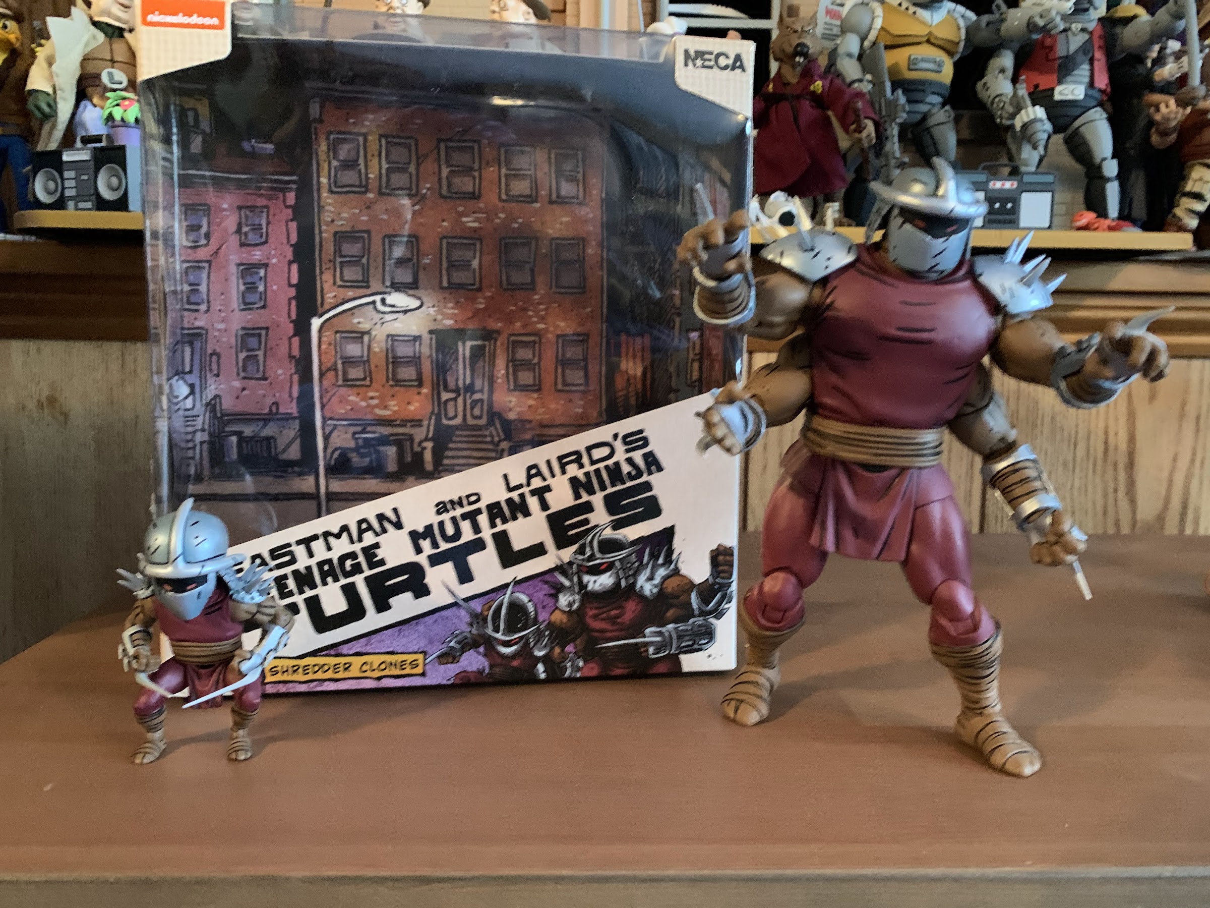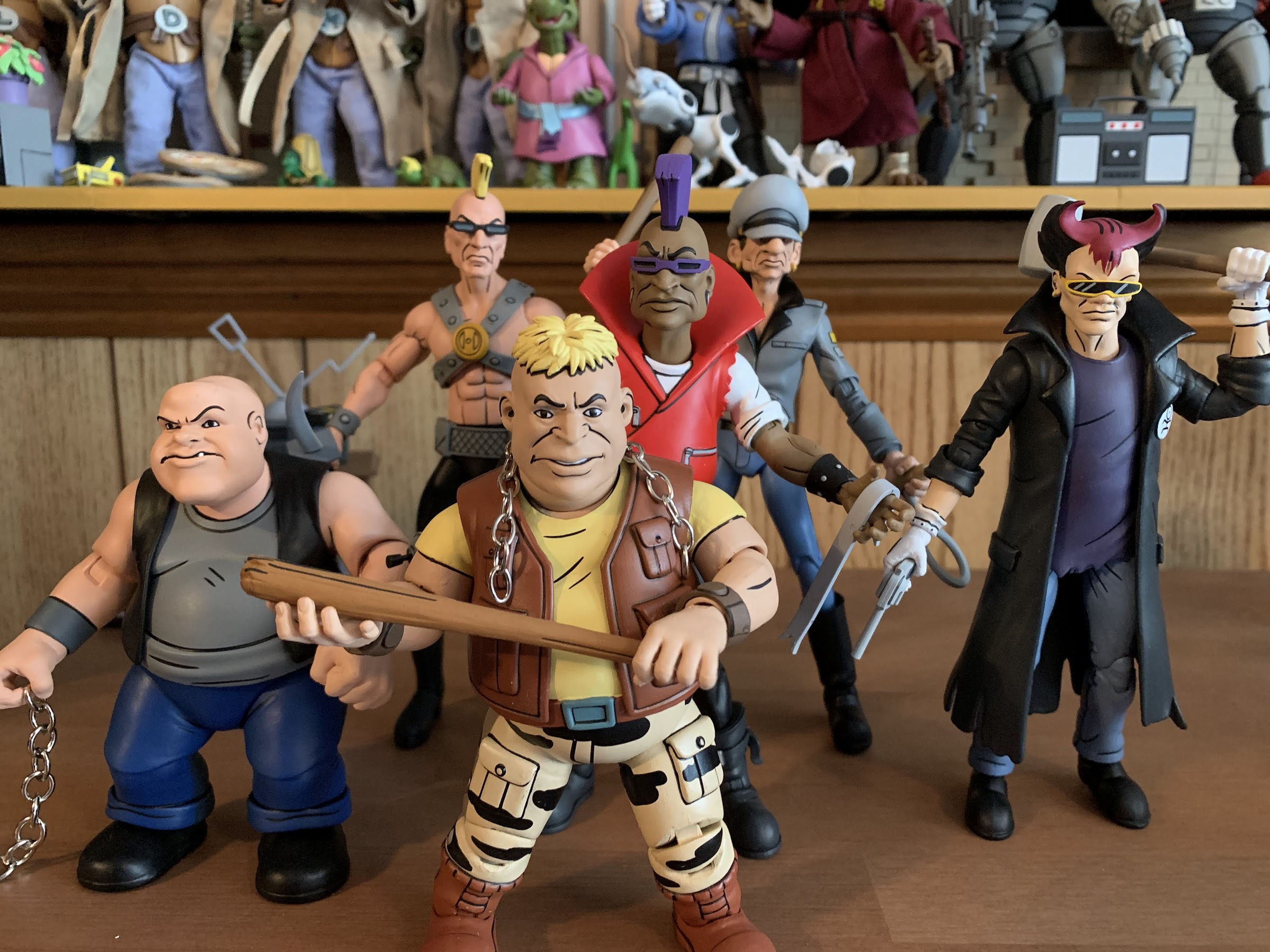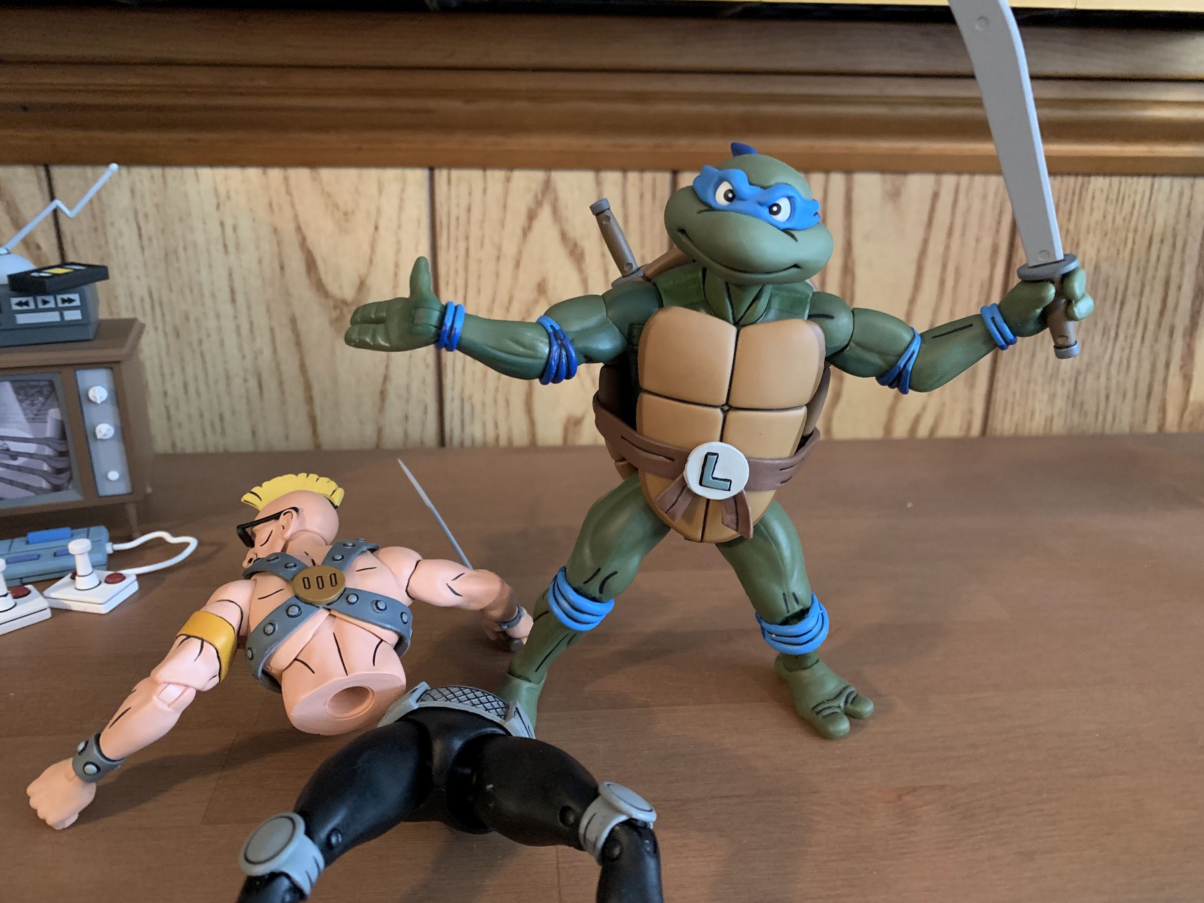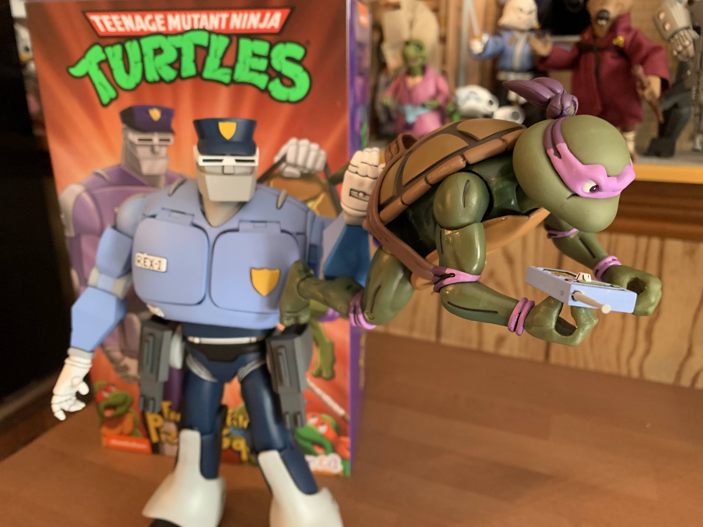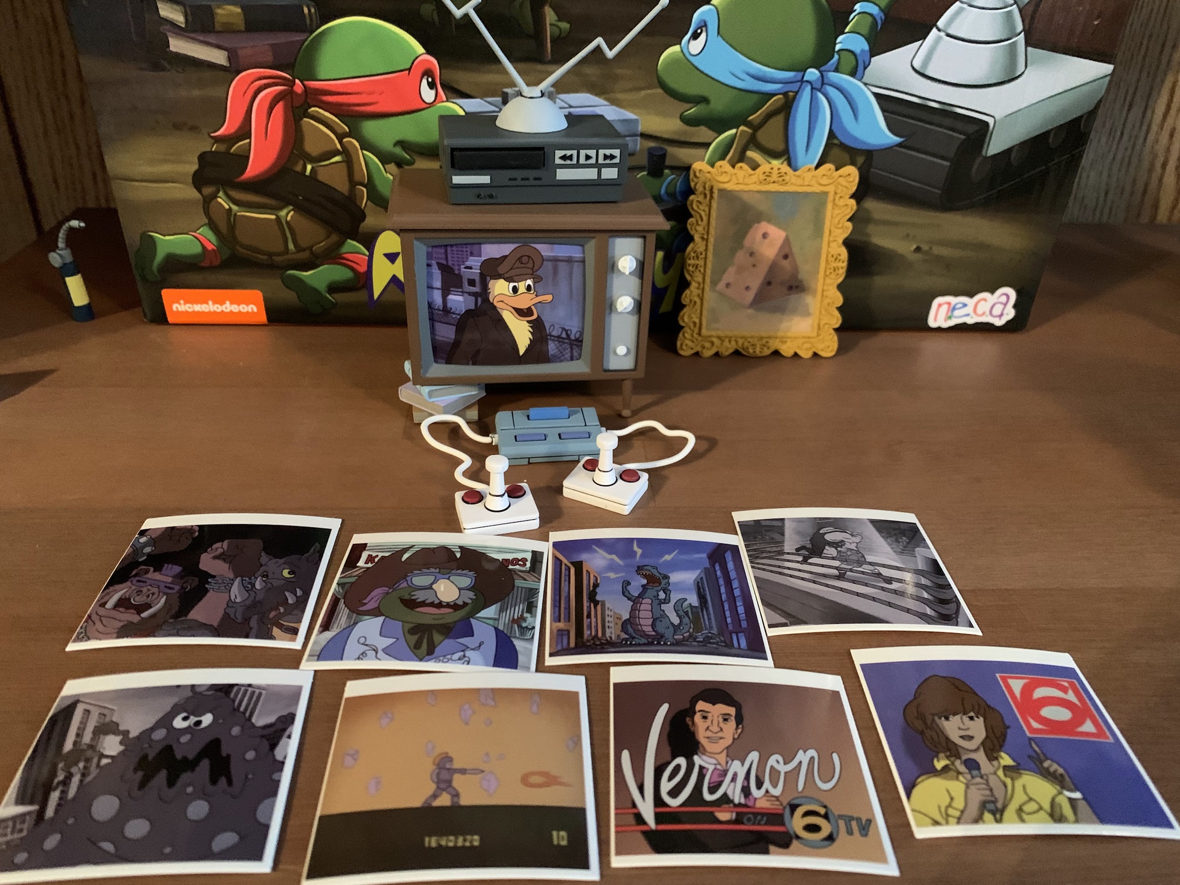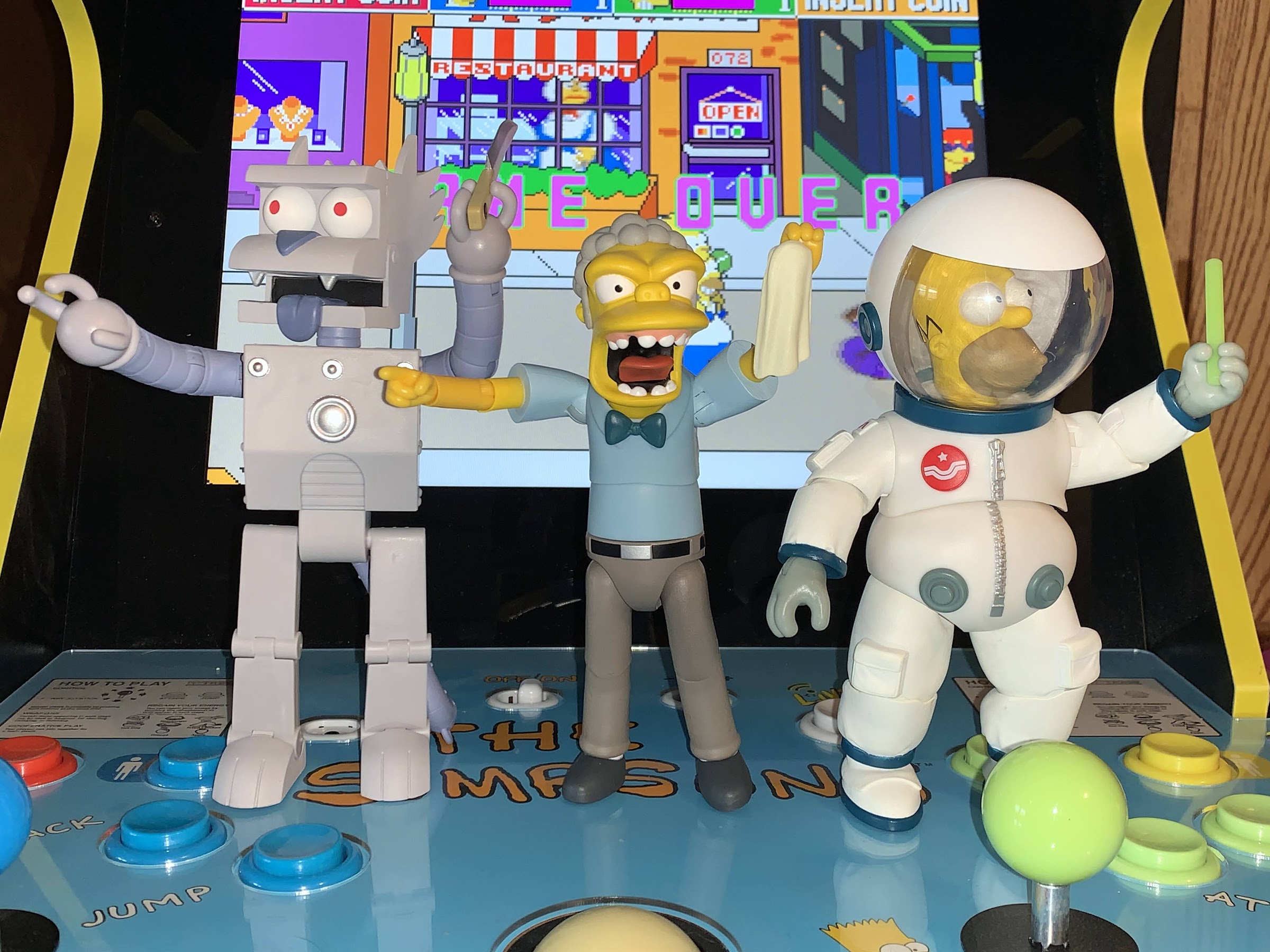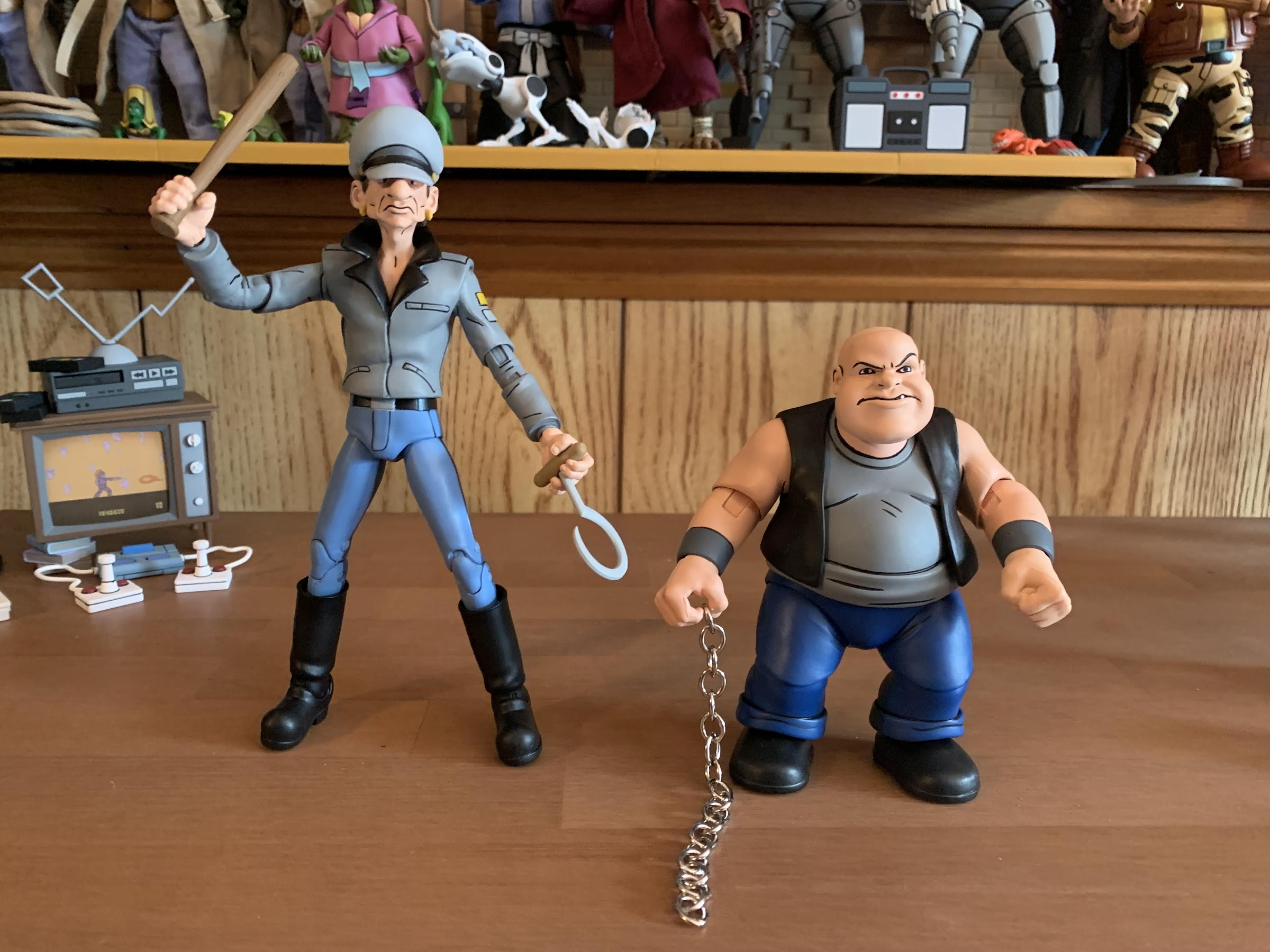
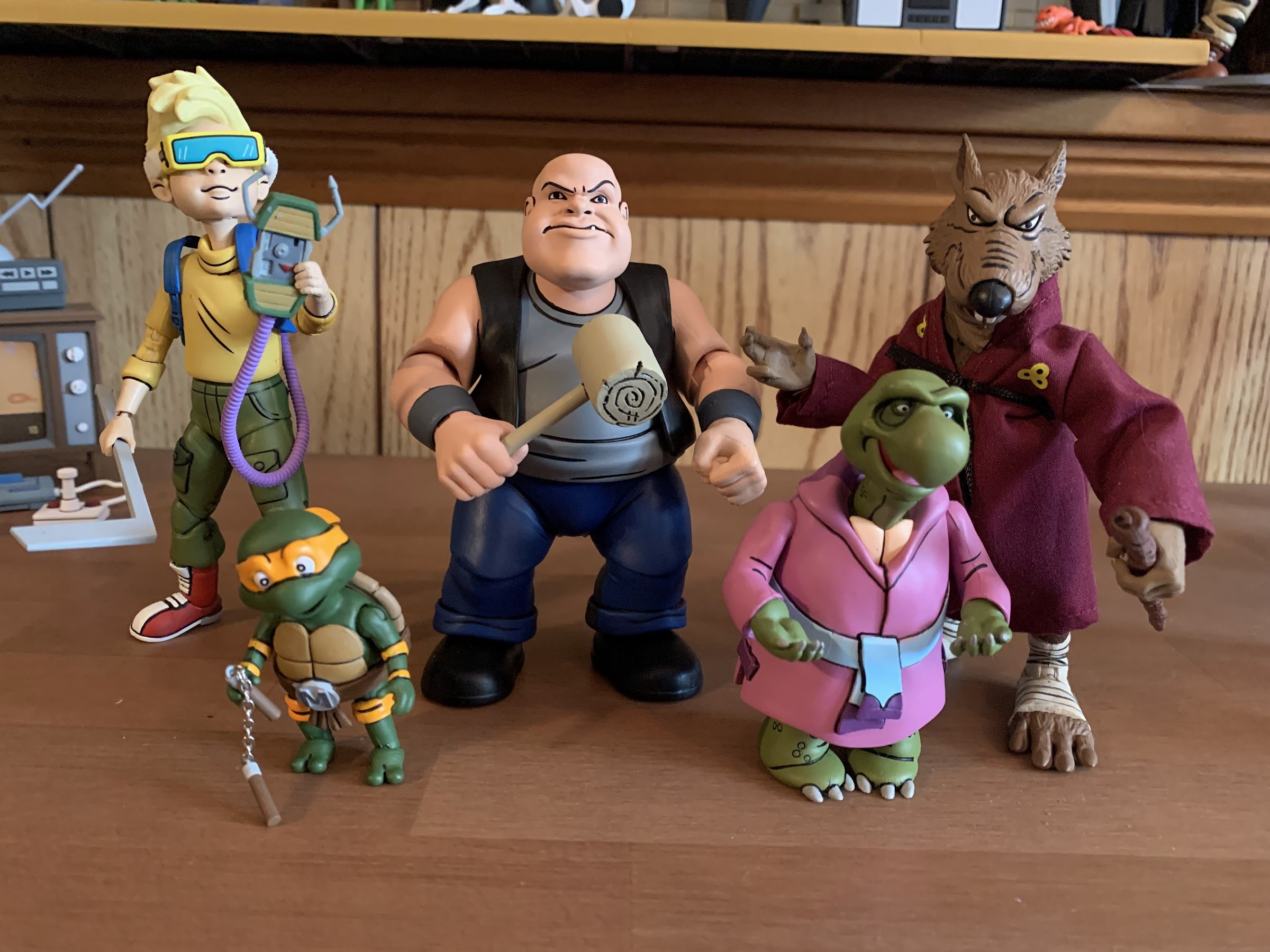
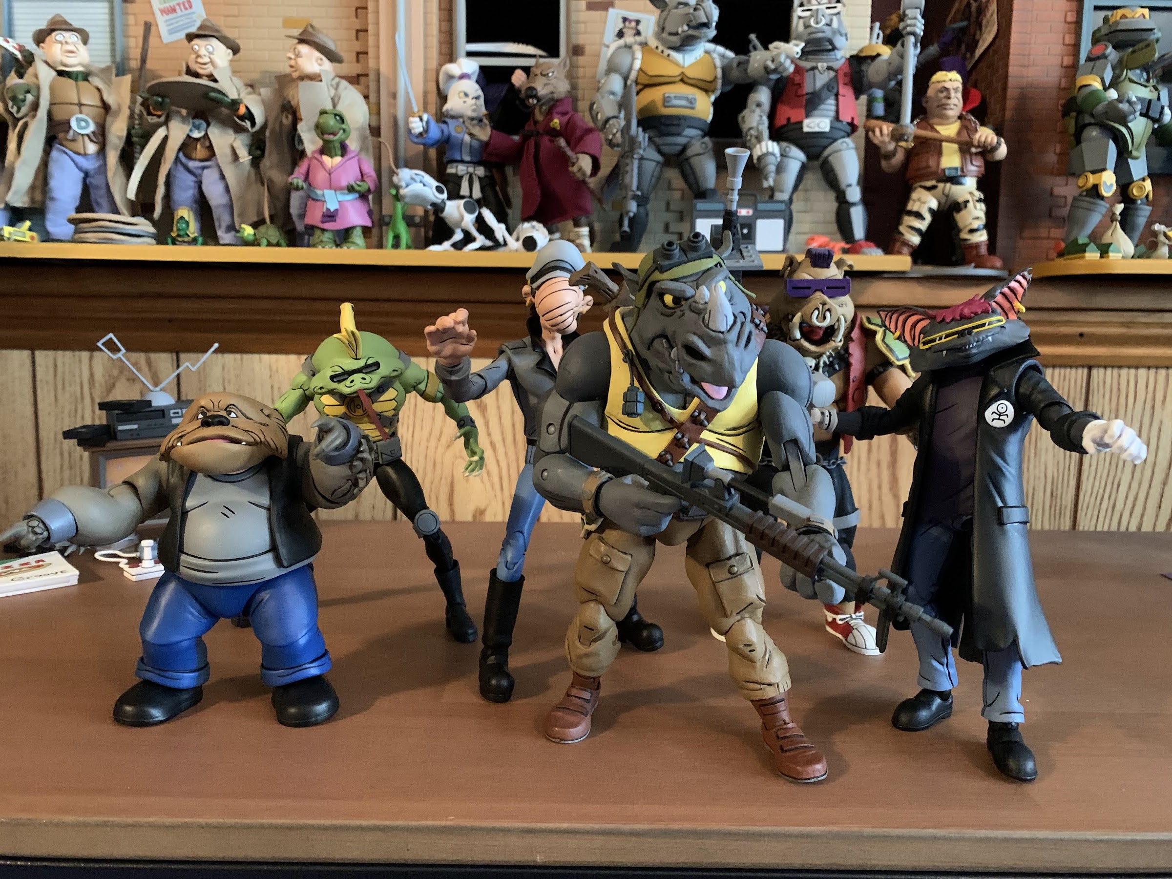
It’s time to look at another NECA two-pack that’s been released during this year’s Haulathon event at Target. And for today, it’s the Tall Thug and Short Gangster two-pack, who are better known as Dopey and Dumbo. I say “better known” as that’s a relative term since these are some pretty deep pulls from the cartoon series Teenage Mutant Ninja Turtles which premiered with a five episode mini series in 1987. Like the previous two-pack of Grunt and Jersey Red, these guys hail from Bebop and Rocksteady’s seldom referenced street gang which was in the very first episode. I went into all of the details in that review, and if you want a refresh it’s linked at the bottom of this entry, but to make things short these guys appeared briefly, were mutated offscreen by Shredder, showed up in a couple of quick shots, and then were never heard from again. None of them had a speaking role or were even named in the show. We only know their names thanks to production art and only the most involved TMNT fans even know that much. And it probably goes without saying, but NECA couldn’t use their “real” names on the box for legal reasons since there’s a mouse out there that’s pretty protective of its copyrights.
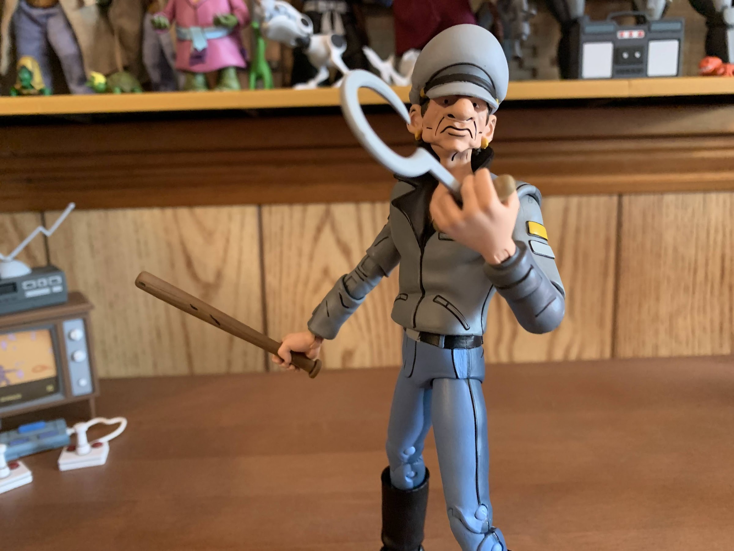
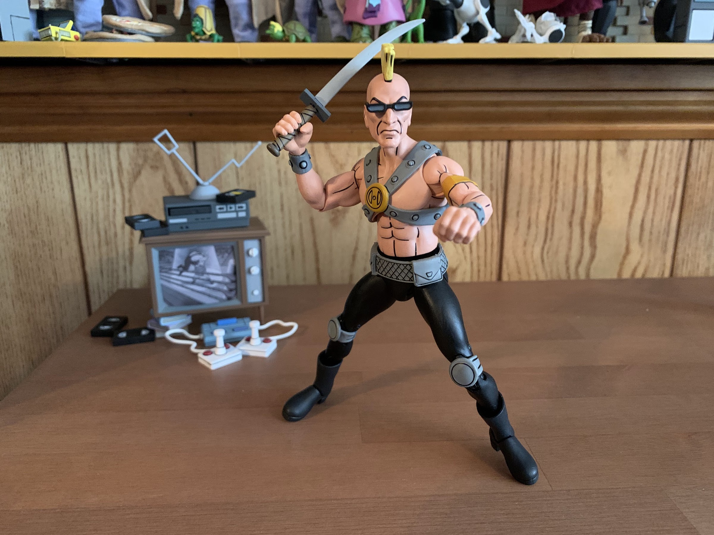
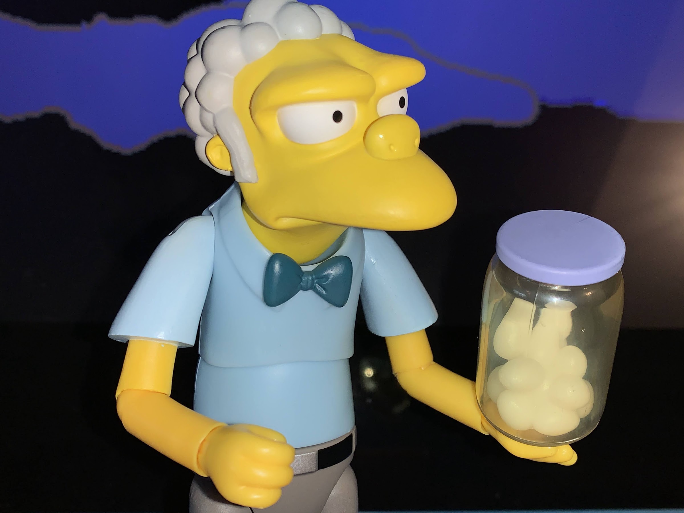
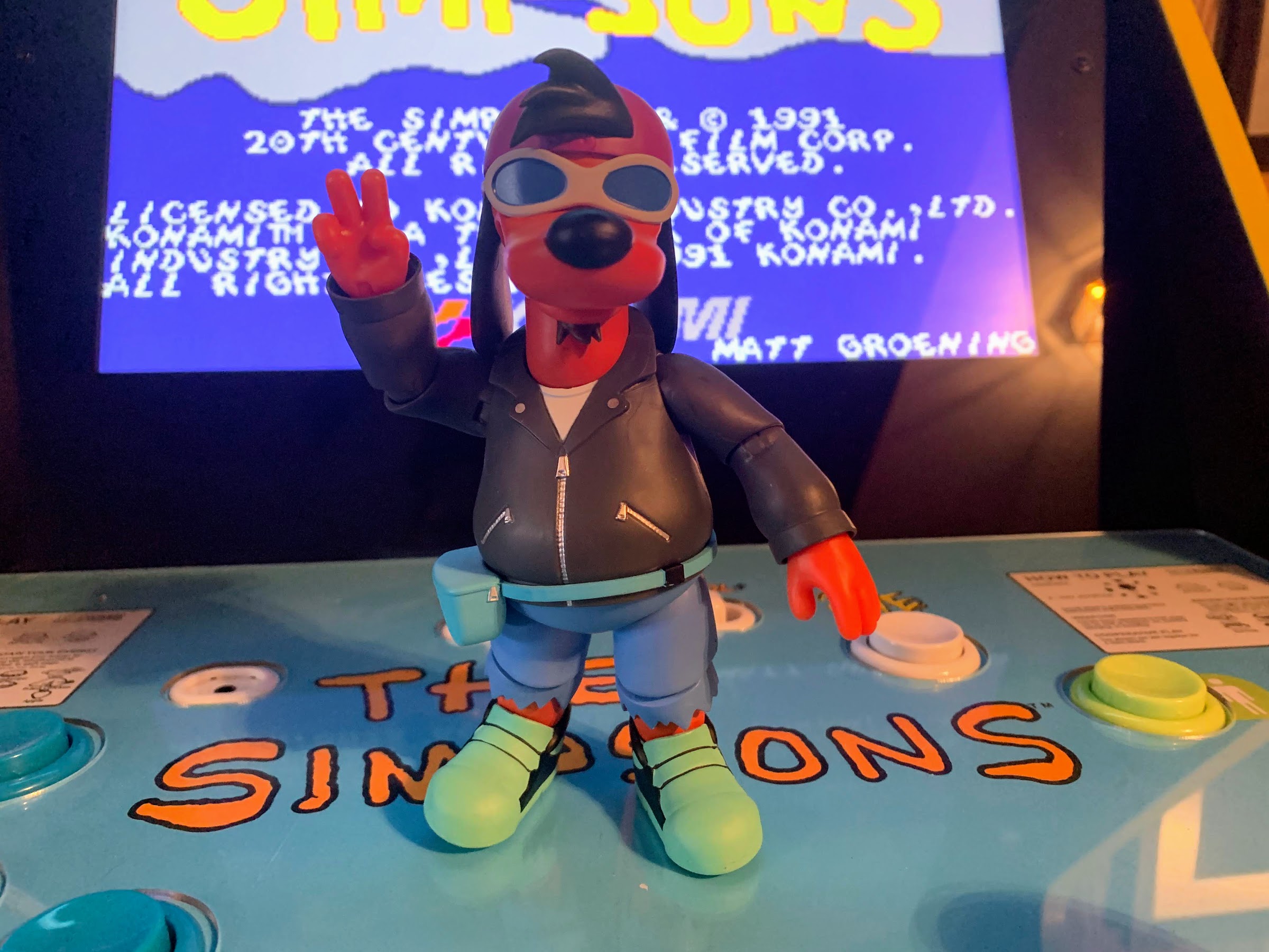
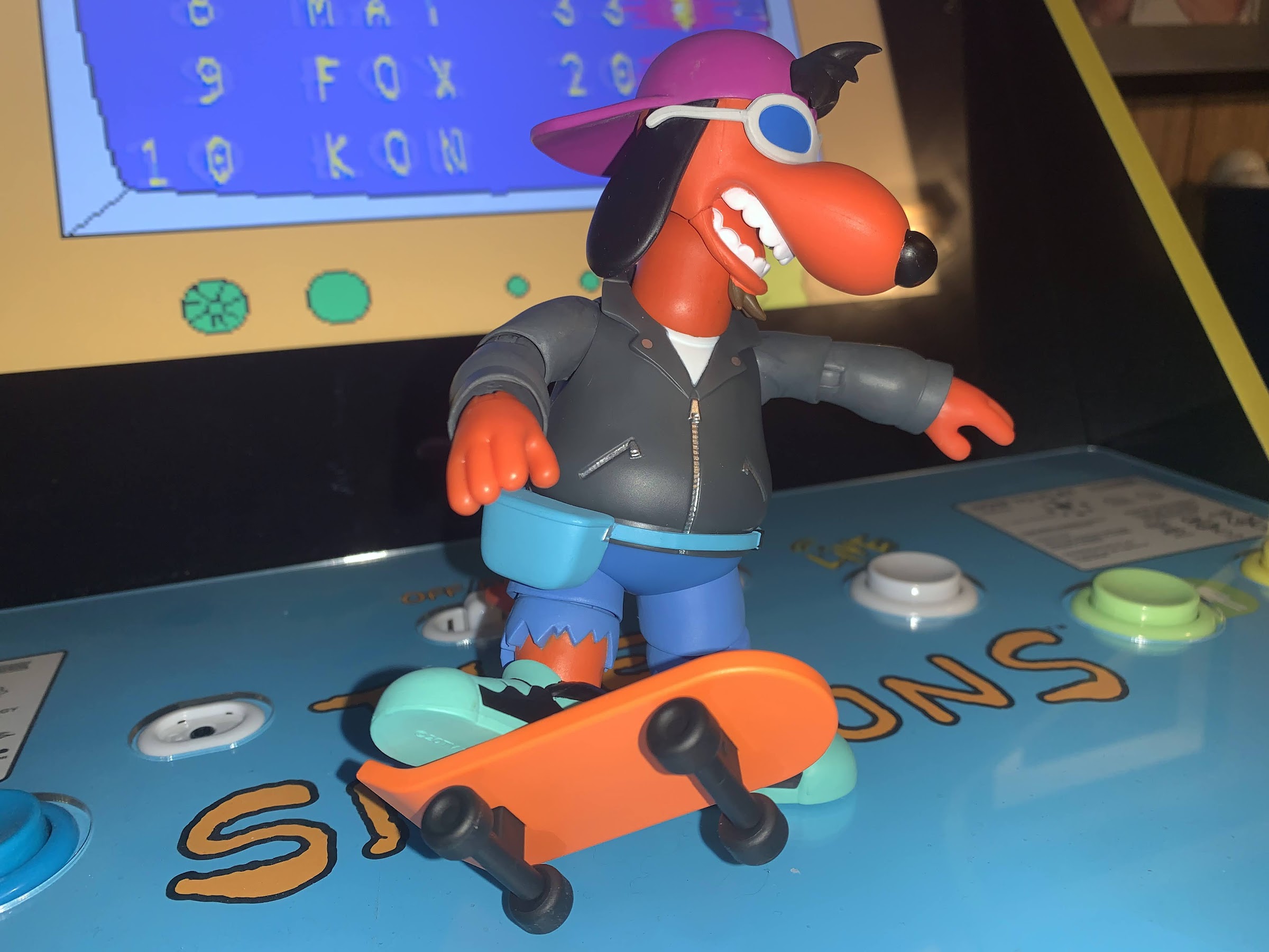
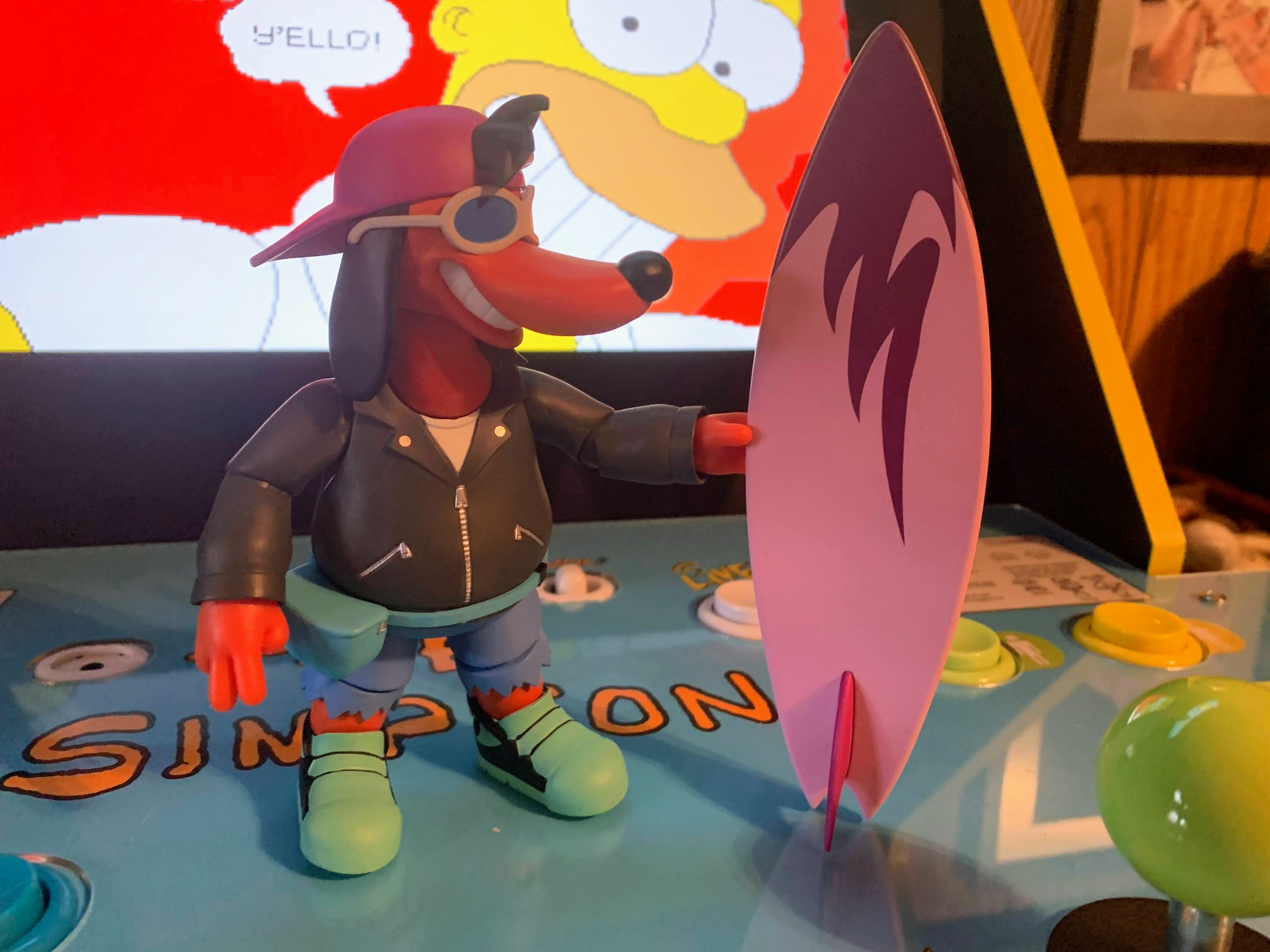
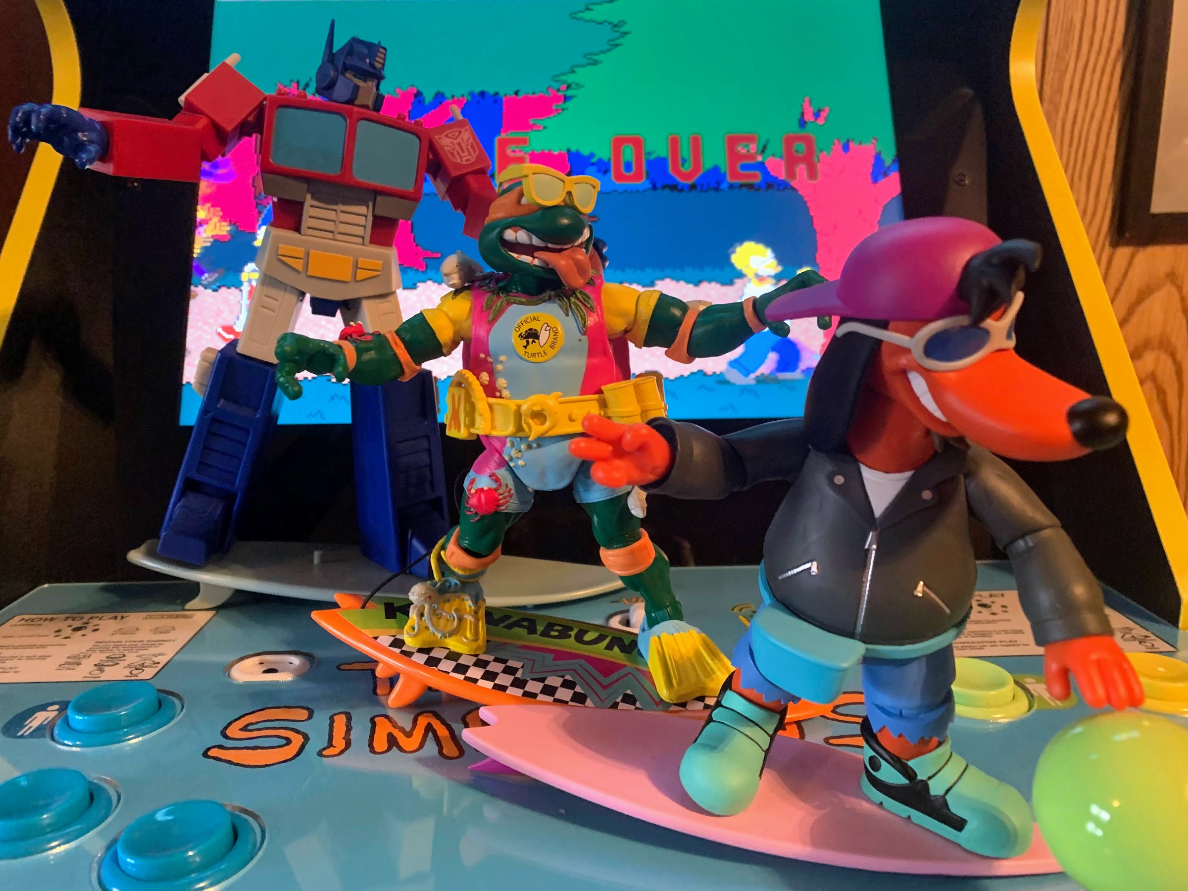
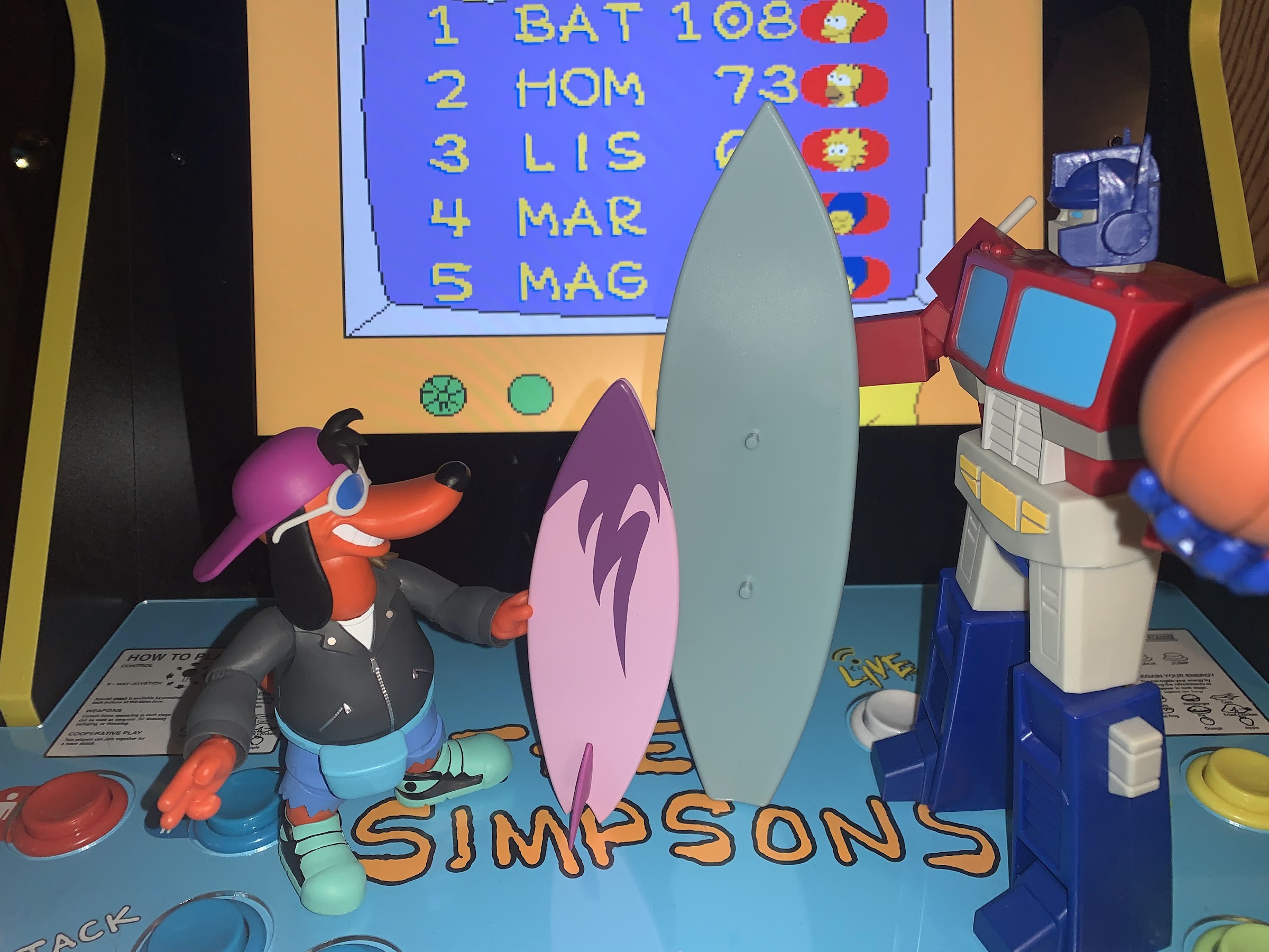
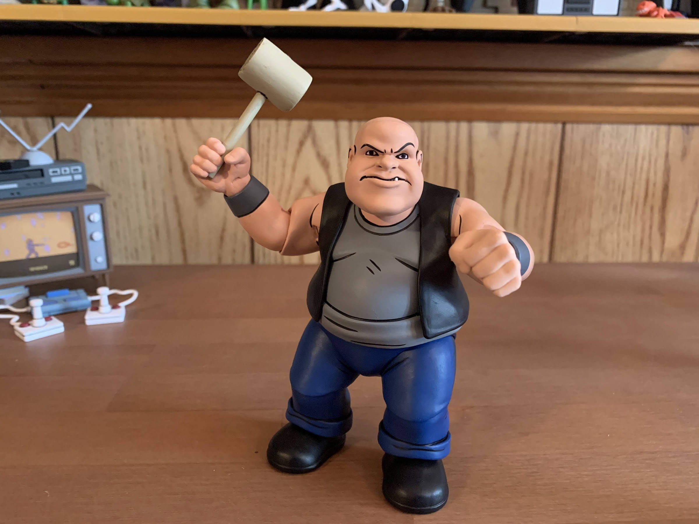
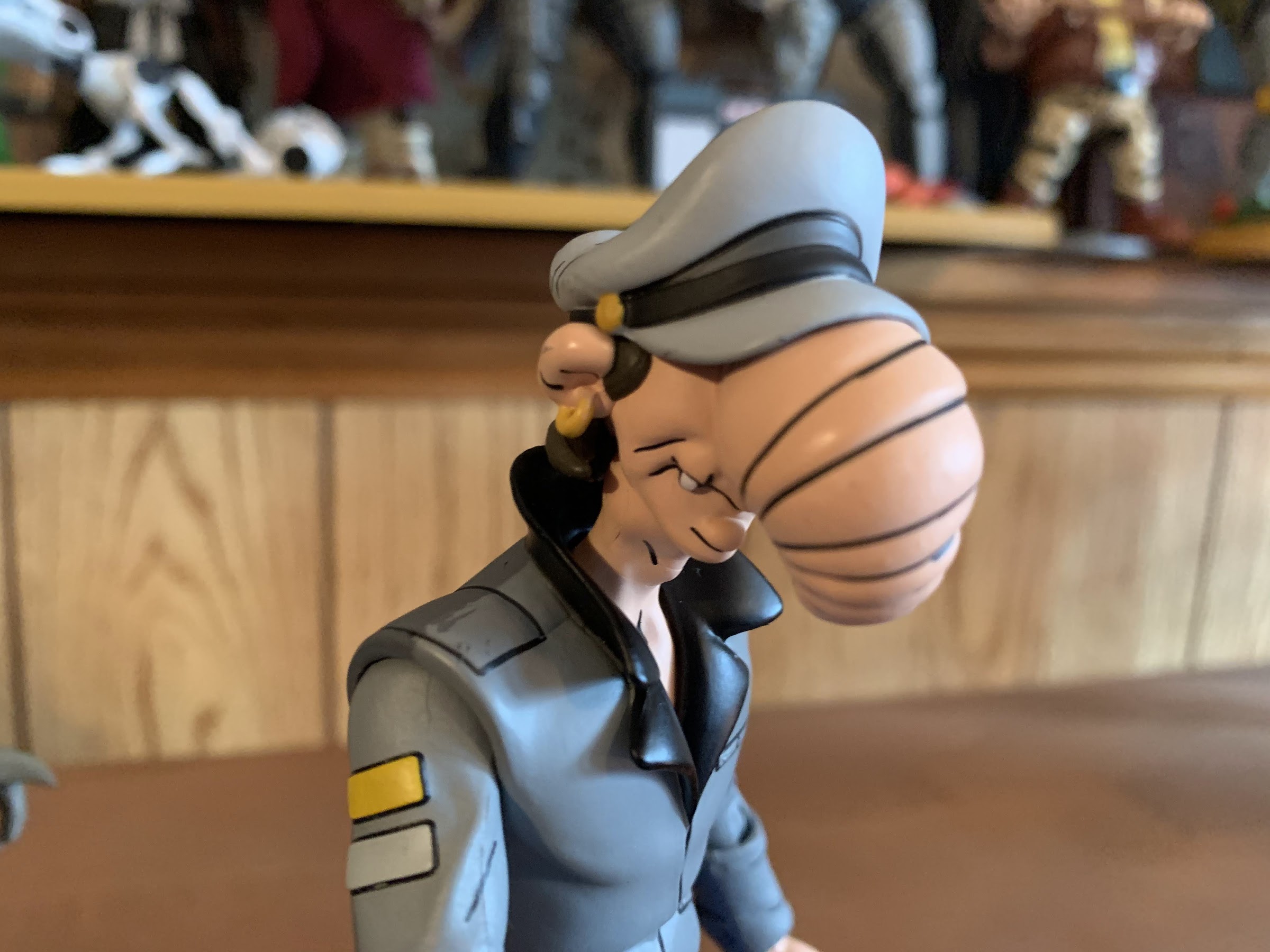
The Tall Thug, who is Dopey, is perhaps the oddest of the bunch from a style standpoint. If there was a narc in the gang, I’m putting my money on this guy. He’s got a big, floppy, hat that covers most of his face and this jacket that makes him look like he just came from a Janet Jackson show during the Rhythm Nation tour. His boots almost look like platform shoes and this is just an all-together odd design for a purported gangster. Dumbo, the short guy, is dressed far more practically with a simple gray tank top with black vest combo to go with some blue pants and black boots. Aside from some wristbands, he’s got nothing going on as far as jewelry or even fancy weaponry. This is a thug who is clearly saving his earnings and must have a retirement goal in mind and I respect that. He’s also very short, like shortest in the line short. We might as well make it official and do a measurement which places him at approximately 4.75″ which is shorter than Baxter Stockman but pretty close to Splinter and Screwloose. He’s got bragging rights with Kala and Kerma and that’s about it. As for the so-called tall thug, he’s around 6″, maybe a tick over as it’s hard to tell where the head ends and the hat (which isn’t removable) begins with this guy, which really only makes him tall relative to Dumbo here. Compared with the rest of the gang, he’s fairly average.
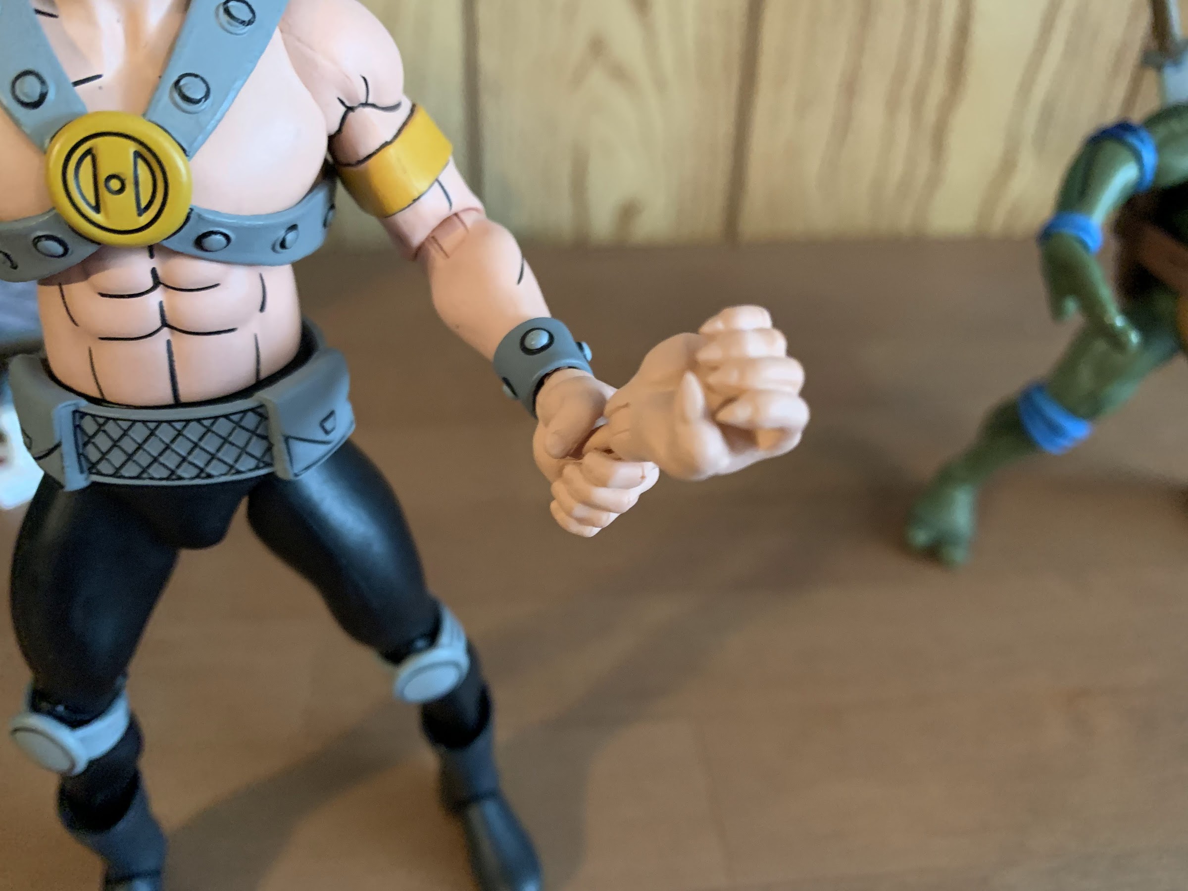
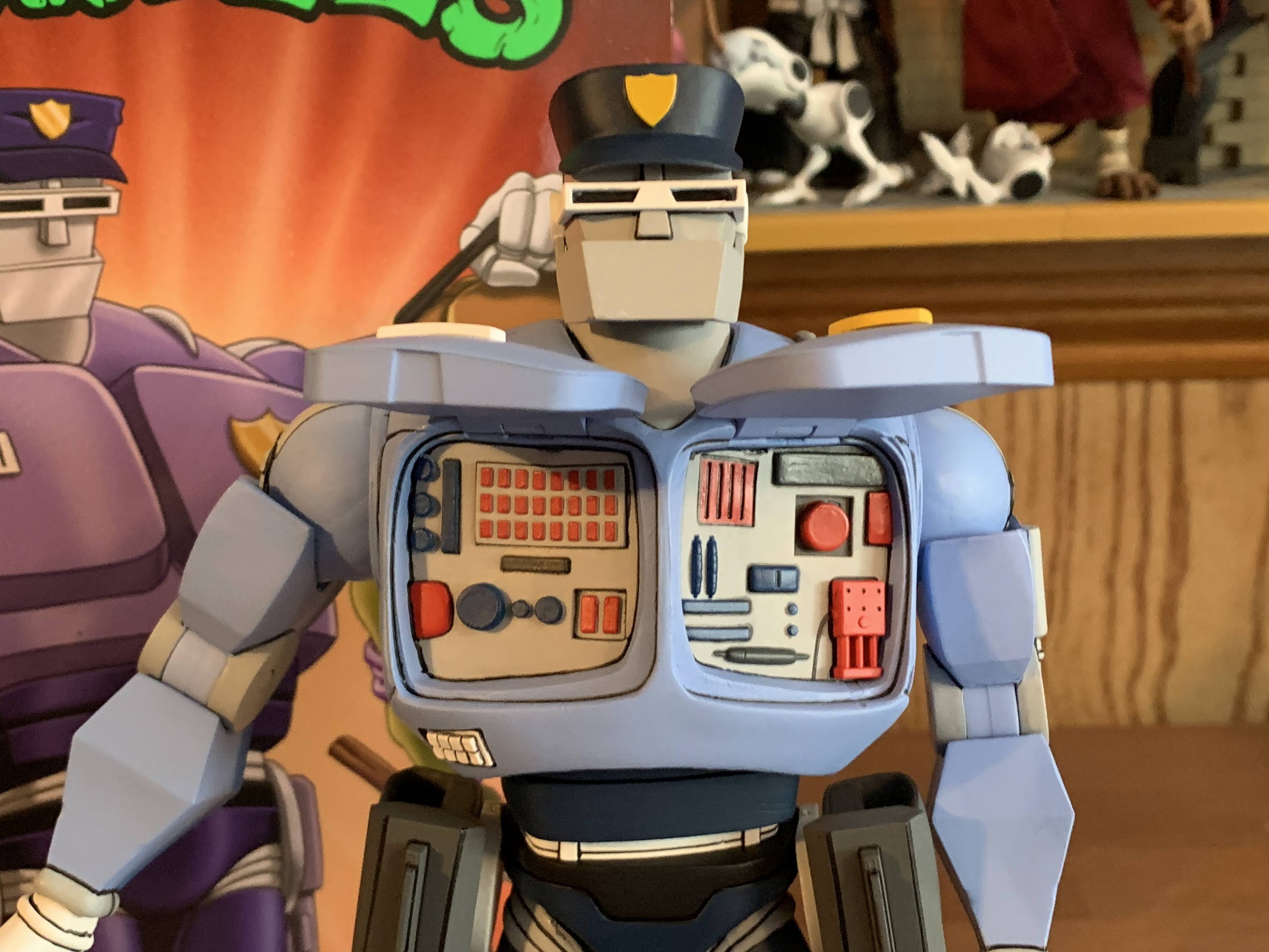
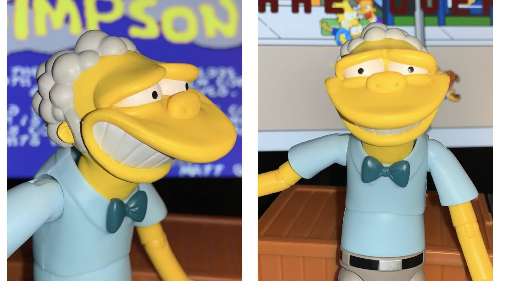
Because these guys were little more than background characters, there’s not much to their designs. Dopey’s face is barely visible on the show due to the hat which sits low and his bulbous nose that dominates his face. NECA did give him eyes with pupils, so that’s good, and there’s probably elements to this guy that had to just be guessed by the designers. The jacket is a gray overlay with the cel-shading on the rear of the figure while the arms are separately molded. There’s some linework for pockets and such and he has two stripes near each shoulder, but there’s not much too it. He has the NECA double-elbows which is a swivel and hinge at the top of the joint and bottom which can look odd on some figures, but here it’s fine. He’s wearing blue pants which might be more like work pants as opposed to denim, but this was a low detail cartoon so it’s hard to know what the model was going for. There’s some sloppy paint on his belt, but otherwise the paint seems sharp. I like all of the detail on the face as this guy has a somewhat lumpy appearance and it adds character. The rest is done well enough, it’s just not a very exciting character design.
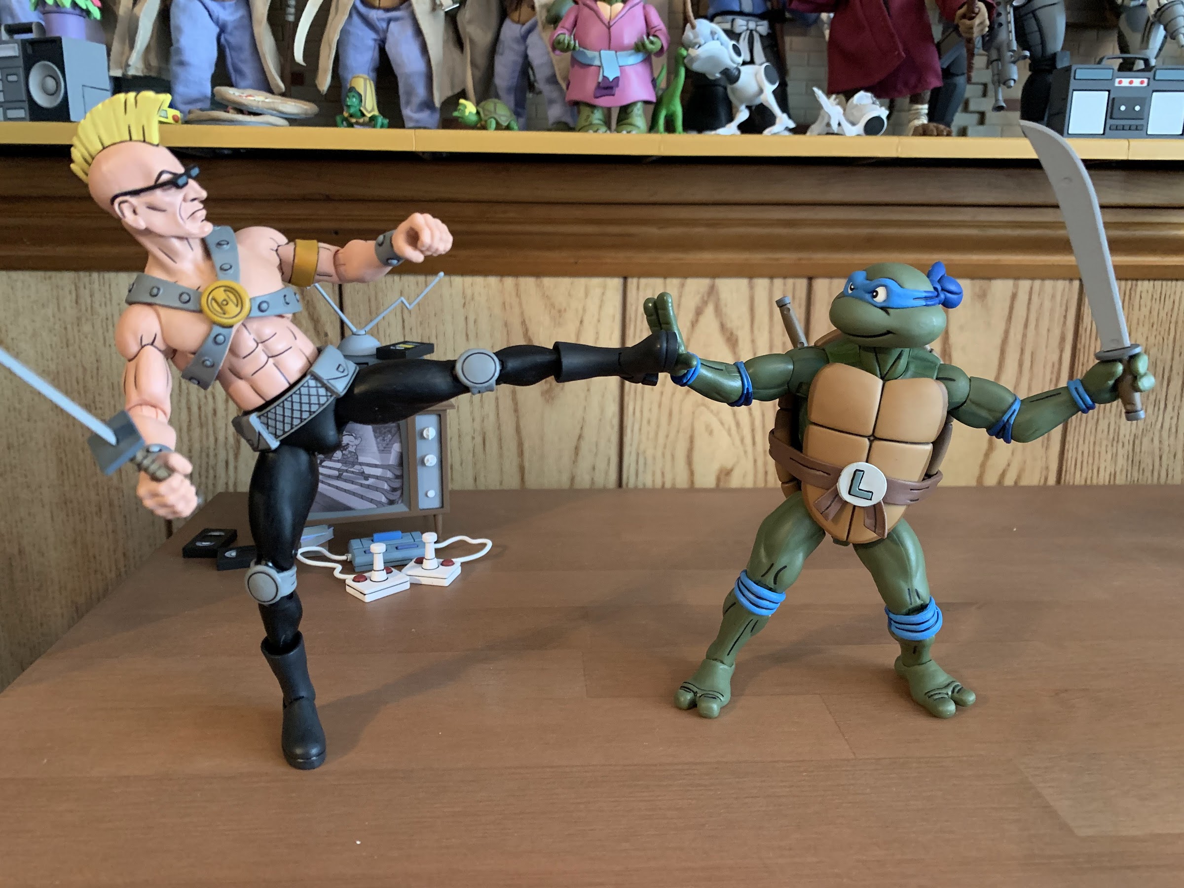
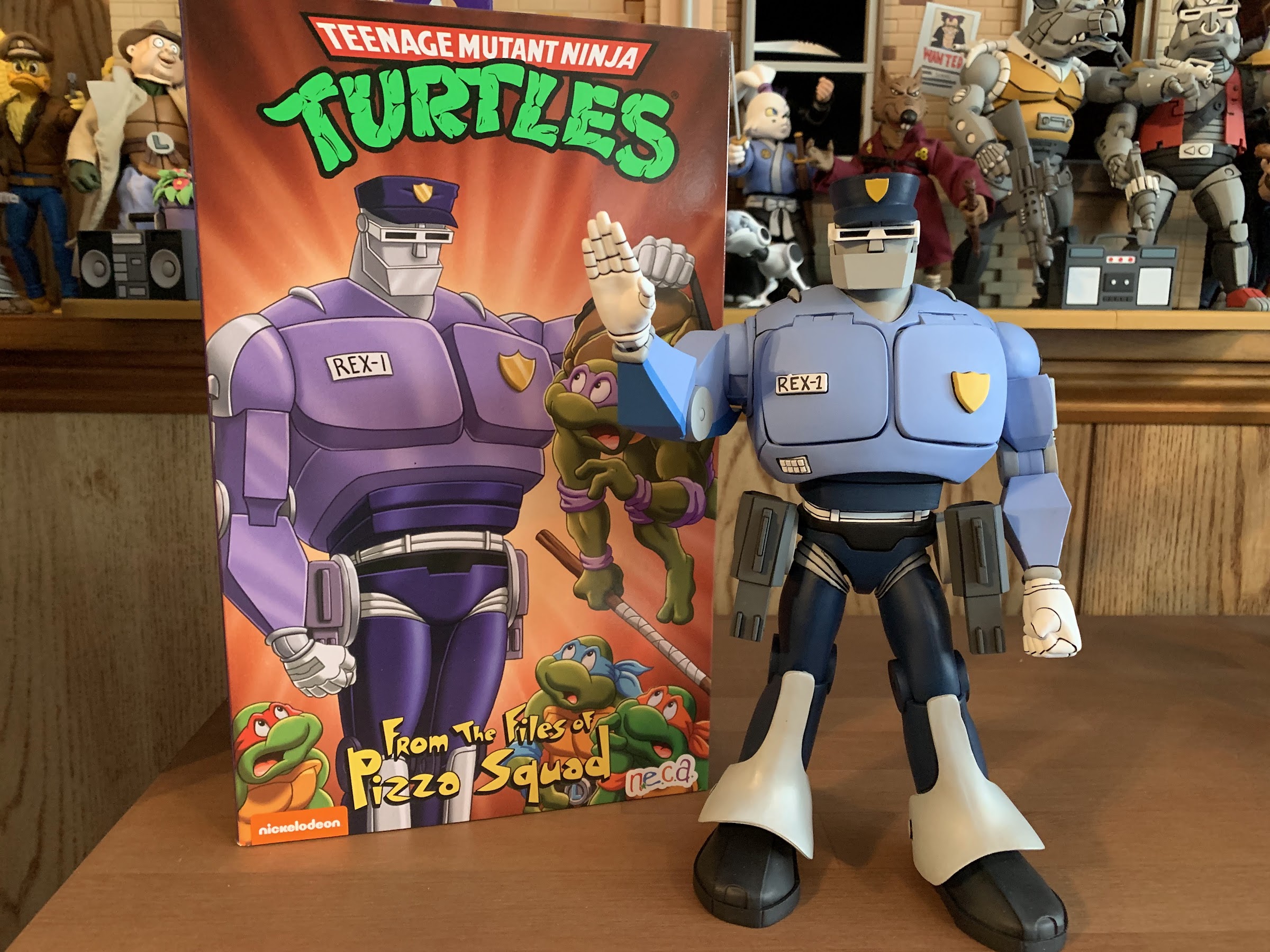
For articulation, Dopey should feel fairly familiar. He’s very much in-line with someone like Vernon and Grunt. The head is on a double ball and he can rotate, look down, and gets some fairly solid tilt and nuance posing. He can’t really look up due to both his hair and the collar on his coat, but he’s the “tall” thug so he shouldn’t look up to anyone! The shoulders peg in and hinge and they can rotate, but at a slight angle since his coat is designed to look like it has shoulder pads. They hinge out almost to horizontal. At the elbow, you get rotation at the top of the joint which is essentially your biceps swivel. The bend goes past 90 degrees, but it results in a squared-off “U” shape to the joint which does look odd, but it’s more than functional. You also get rotation past it for the forearm and the wrists swivel and hinge. In the diaphragm, there is a joint, but like Vernon and so many others in this line, it’s useless due to the overlay. There’s another joint at the waist that’s mostly for rotation. You do get a little tilt in all directions, but it’s minor. The legs are ball and socket joints and you can hit some pretty solid splits. He kicks forward to just about horizontal before the diaper piece gets in the way. There’s some rotation at the thigh and he can kick back a little bit and off to the side. The knees are standard double joints that bend past 90 and you get a boot cut below that. The ankle hinges are fairly useless due to the shape of the boot, but you get a decent ankle rocker. He’s going to be able to do enough and I’m happy to say nothing was overly tight or loose. The elbow swivels are a little stubborn, but it’s more due to the shape of the cut and they’re still usable and didn’t require any heat. The gripping hands have the wrong hinge, which is an issue on just about every figure from NECA these days save for REX-1.
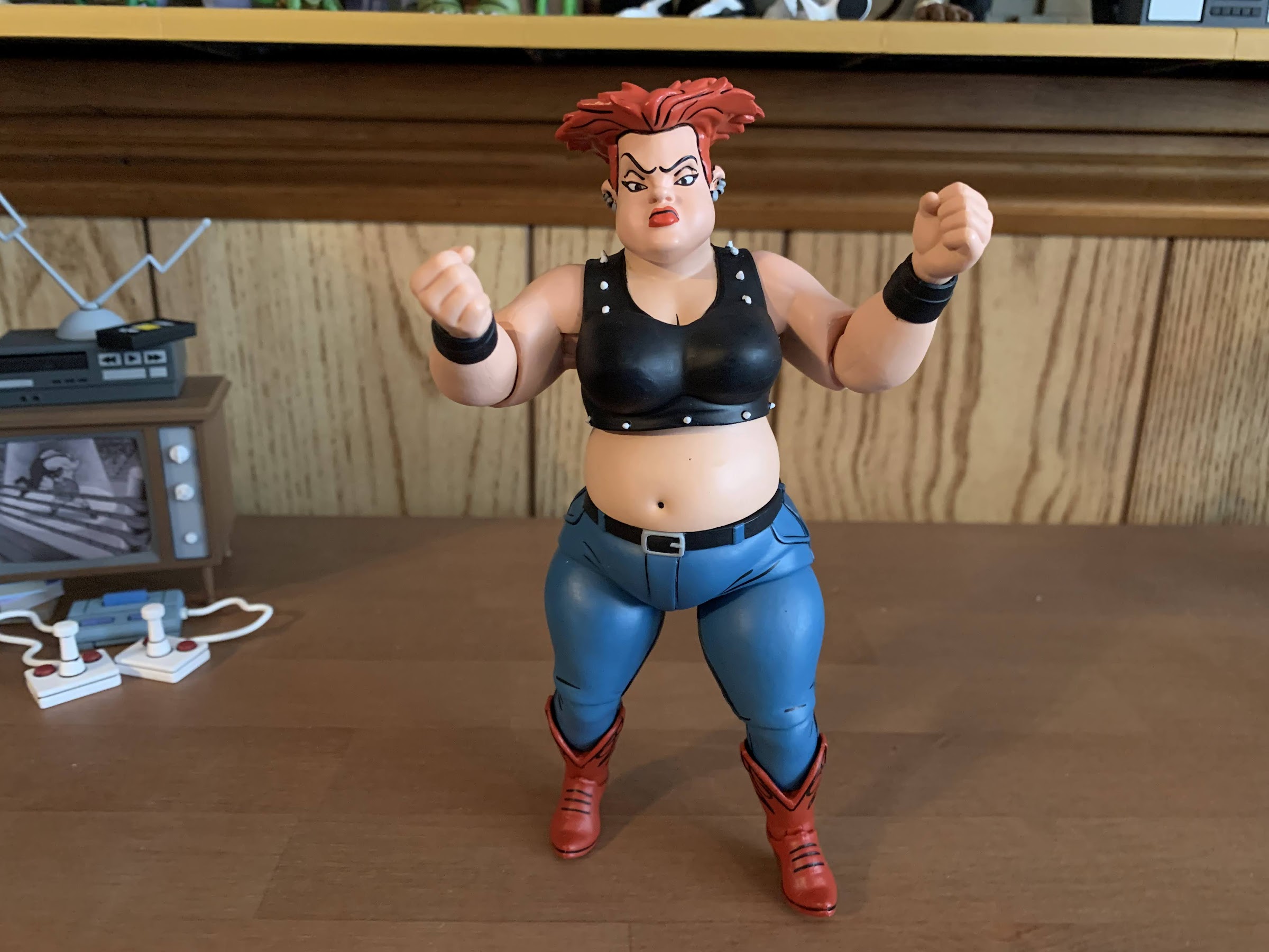
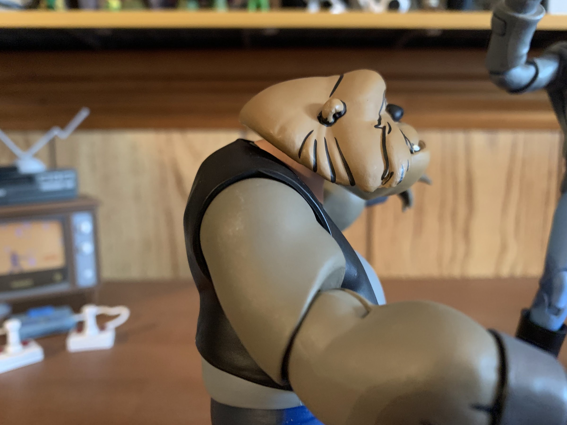
With Dumbo, we have a very basic design. I already talked about it a little, but we have bare arms, a bald head, and clothing that just hits blue, black, and gray as far as the colors go. The pants feature the cel-shading, but the black vest does not and since the shirt is barely visible on the rear of the figure it would seem NECA declined to apply it there. The linework is done well on both the shirt and the flesh parts. There’s some on the pants but it’s fairly limited in application. He does appear to be all new tooling though. Dopey likely is as well, which is a surprise for such minor characters. They could have reused the Burns/Human Rocksteady mold again, but he was noticeably shorter than Rocksteady so NECA must have decided they needed to capture the same. I wish they had instead put more money into that human Rocksteady since I think his proportions are off, but oh well. I thought he might share arms with Jersey Red, but his are ever so slightly larger. He’s just very plain, but the paint on him is mostly fine. There’s a blemish on his left arm, but nothing too extreme.

A little chunk like Dumbo probably isn’t going to articulate very well, and that’s pretty much true here. The head is set very low on the body as he’s one of those no-neck characters. He gets enough movement side-to-side and can look up, but he can’t look down and there’s very little tilt available. The shoulders can rotate fine and they hinge out past horizontal, so that’s good. The elbows are just single-hinged and a little awkward looking as you can see the sculpt of the point of the elbow past the joint, but at least here they didn’t paint any lines onto the elbow like they did with human Rocksteady so it’s not as weird looking. He can bend to about 90 degrees there and it swivels in place of a biceps swivel and on a thick-armed guy like this I like the approach. With Grunt, who had defined biceps, I was critical of the choice to forego the biceps swivel. The wrists swivel and hinge horizontally, per usual. At the waist, we get a swivel point that’s probably a ball-peg, but it doesn’t do a whole lot. The overlay for the shirt gets in the way so he can only rotate a few degrees to either side and gets virtually no tilt in any direction. The ball-socketed hips will allow the little guy to nearly hit a full split and you get a little swivel at the joint as well. He can’t really kick forward as his legs want to go off to the side, but if you accept that you can get them to go fairly far. He actually can do the same backwards just as well which is rare. The knees are just single joints and his default posing has them bent slightly. They can’t bend much farther than that either, but they do swivel. The feet can’t do much due to the cuffs of the pants. You basically just get a little tilt out of the ankle rocker and the hinge is fairly useless.
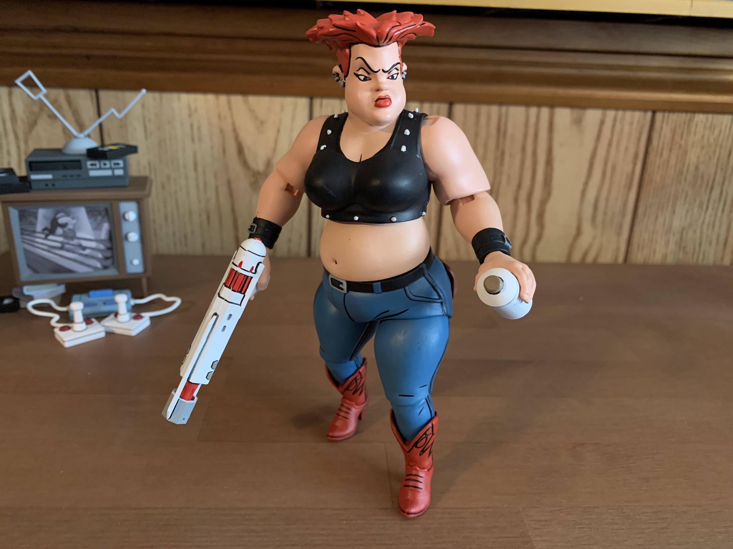
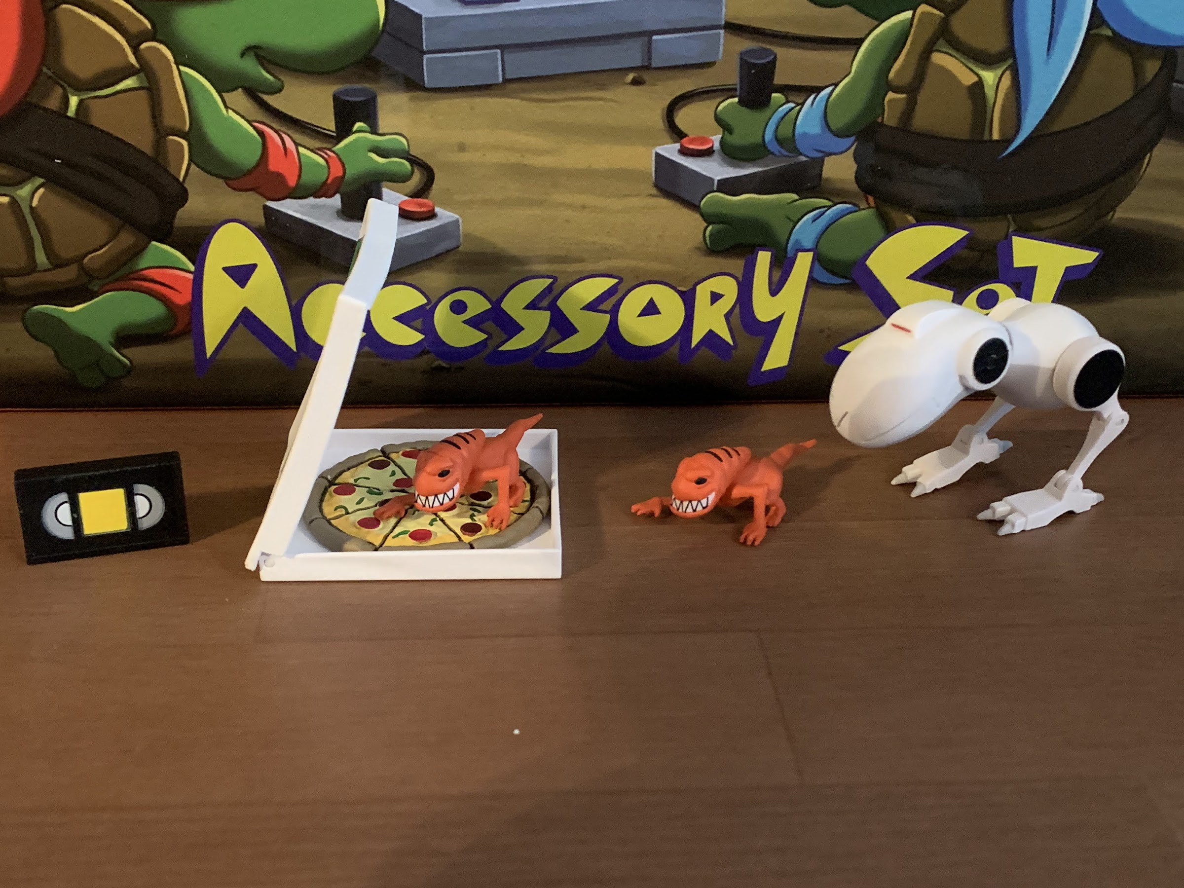
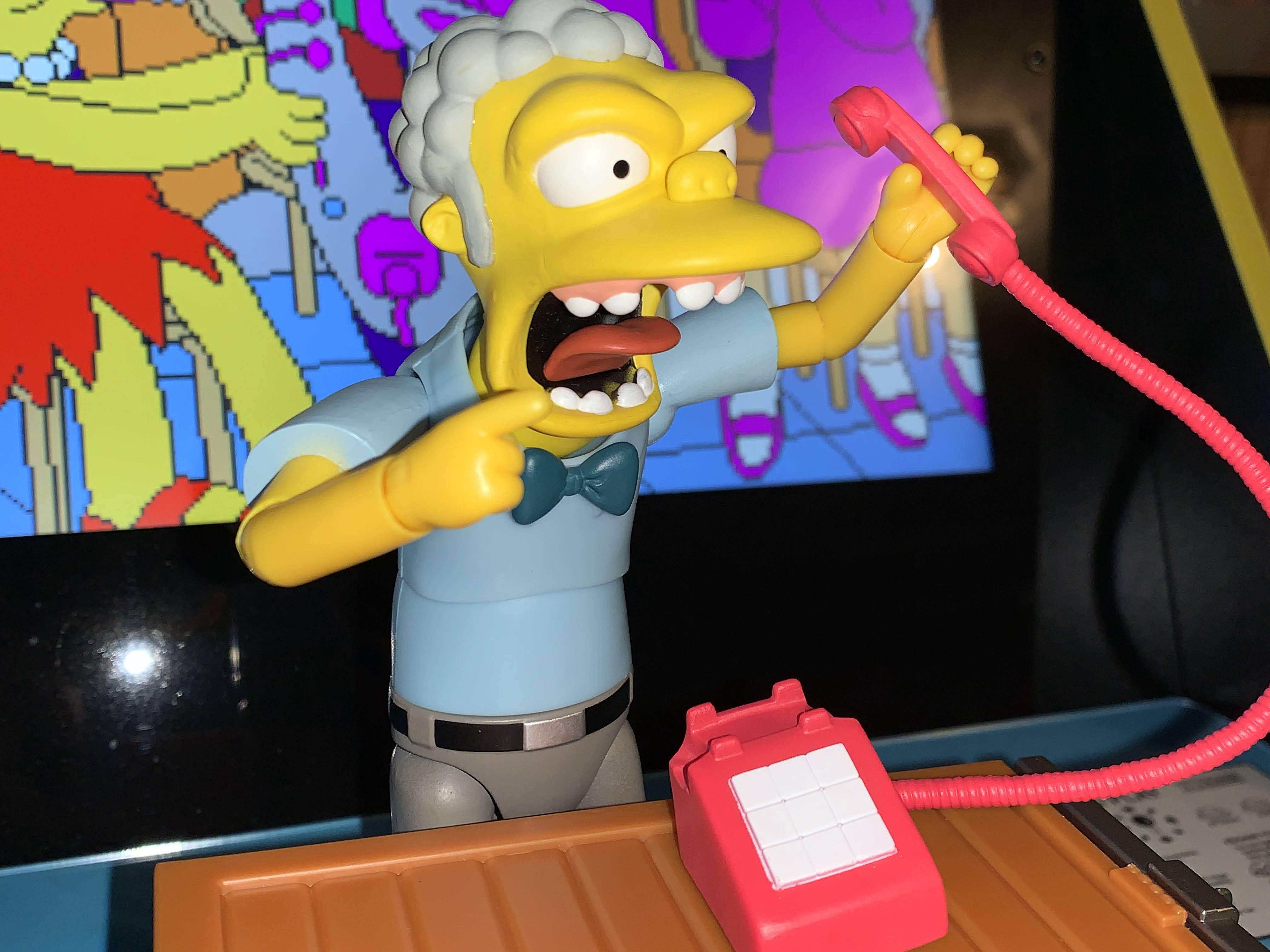
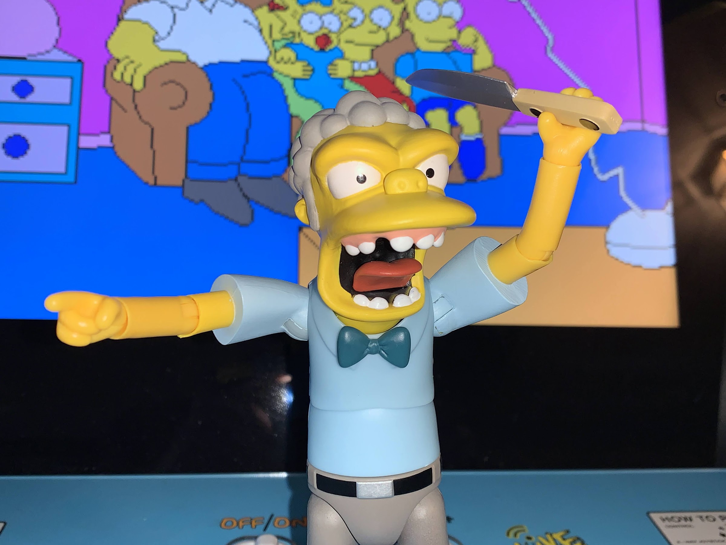
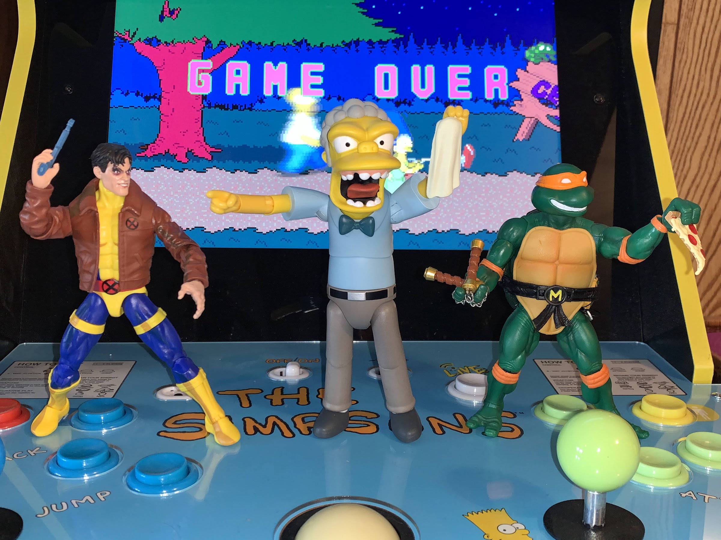
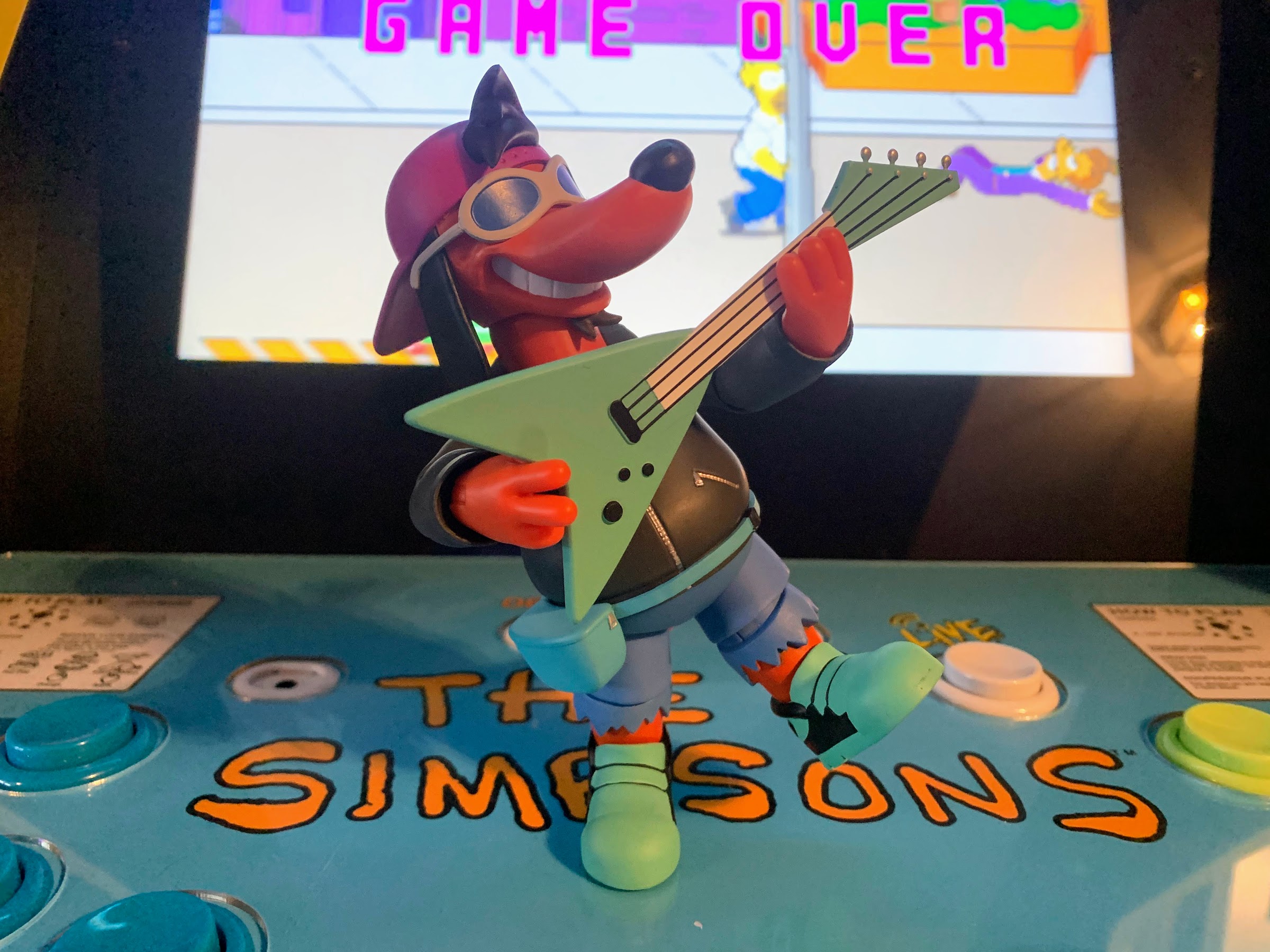
Dumbo is a guy who isn’t going to move much. You’re going to set him on a shelf and pose his arms with some accessories. As for those accessories, we get a few. Dumbo and Dopey both come with fists in the box and have a set of gripping hands. Dopey has an additional left gripping hand with a gap between the middle and ring finger. That gap is for use with the meat hook accessory which fits in the hand with the metal portion slotting between the fingers. It has a wood handle and gray hook and looks fine. It’s nice to get a unique weapon as the rest are less interesting. Dumbo was seen wielding a chain in the episode so we get another one of those. It’s an actual chain and it’s different from the one that came in the Premonition of a Premutation set. It’s a bit longer and the links are more rounded. I like the length, but I prefer the shape of the links on the first one we got. There’s also a short baseball bat they must have swiped from a Little League field or something. It’s painted brown and has some linework to give it a wood appearance so that’s cool. Lastly, there’s a mallet, like a cartoon, Itchy & Scratchy, mallet. It’s amusing to me to think of street gangs running around with mallets, but it’s from the show. It’s a very pale brown, almost a yellow-brown, with some black detail on each end of the head to give it a wood appearance. It’s fine, though almost too silly to use even for Teenage Mutant Ninja Turtles.
That’s not all as we also have to talk about the mutations. Just like with Grunt and Scrag before him, Dopey and Dumbo come with extra parts to mutate them. In the case of Dopey, he was mutated into a shrew or something. He basically ended up with an even bigger nose. He was always positioned to the rear of the brief shots we got so it was hard to make out much and I’m guessing NECA had to use a lot of artistic license in sculpting this. He gets the extra head though with the massive nose and he’s quite ugly. We never saw his hands, but NECA decided to give him an extra right hand that was mutated into this monstrous shape. It’s affixed to a new forearm so you separate it below the second hinge to peg it in. Both swaps are easy and they don’t really affect articulation in any way. I will say, there’s no linework on the middle finger of the monstrous hand and that does distract me a bit as it’s present on all of the other fingers, but otherwise it looks fine. It’s not the most interesting mutation, but NECA did it about as well as they could.
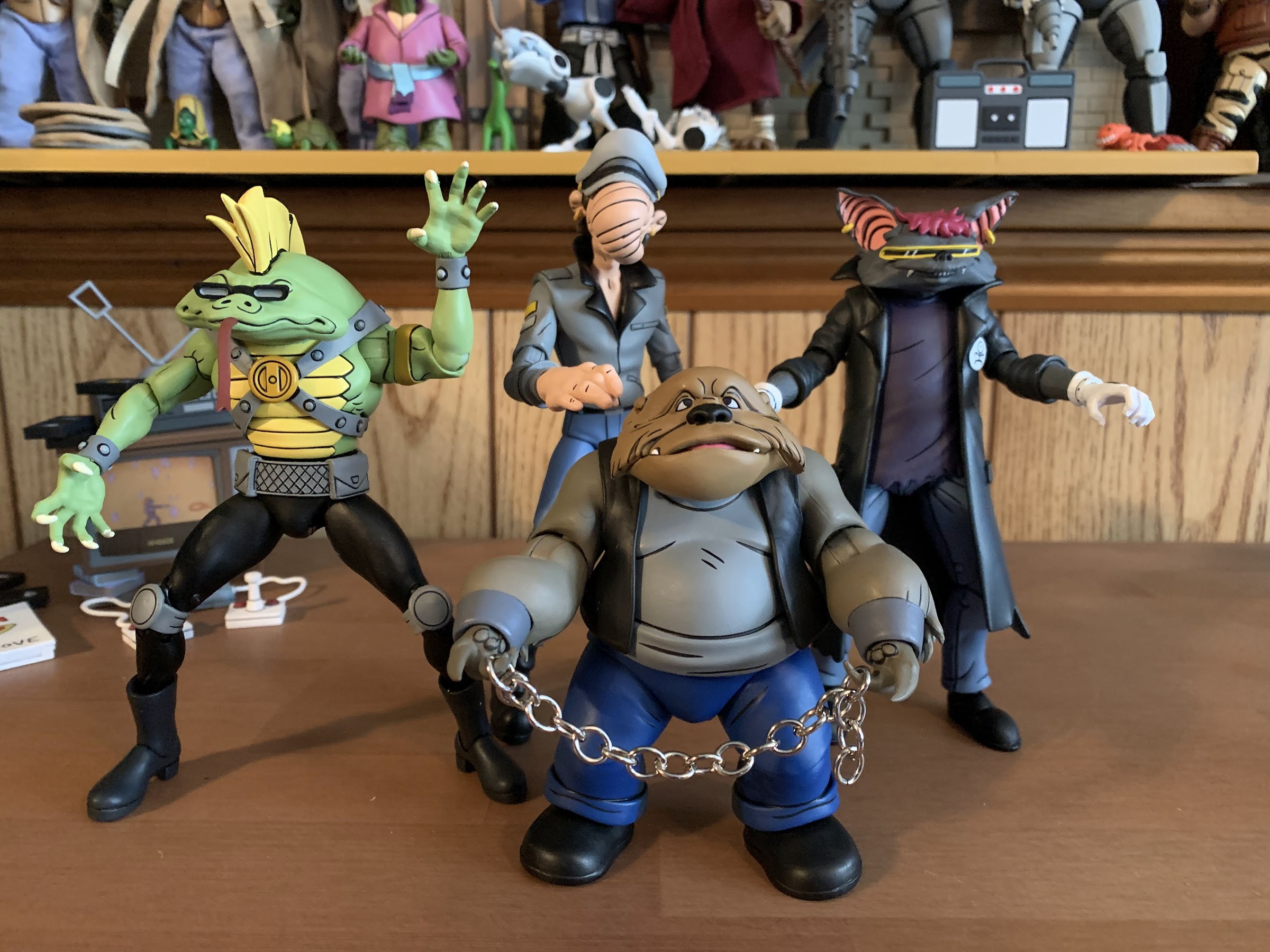
For Dumbo, he got mutated into some sort of dog-sloth thing. He’s always been referred to as a dog mutation by the fanbase, but I’m getting a sloth vibe. Especially with the tiny hands that seem to feature long claws. Whatever he is, he had better exposure than Dopey in the show so this one was easier to do as far as the design goes, but in terms of engineering it’s more involved since Dumbo’s look is sleeveless. He gets a new head that’s wide enough that it hides the flesh around the collar of his shirt from head-on, but does lock the head down even more so than before to the point where he can’t really do much there. Unfortunately, it doesn’t sit as low as I’d like though as from the side you can clearly see the flesh parts. It almost would be better if the double ball peg for the head stayed on the head when you pull it off (and it’s a little tough getting that off) so the mutated head could sit even lower. The arms are an easy swap and they look fine. They’re darker than the head, but that’s in keeping with the show. The biceps piece appears to be the same as the standard arms, but the forearms had to be resculpted to include fur. The hands are tiny and sharp and you do lose the hinge joint. They don’t really do much though. He can still hold his chain, but that’s probably it. Overall, it’s okay. His mutation is more interesting than Dopey’s, though I wish they did a better job hiding the neck. Just a floating piece to slot over that would have been nice.
This two-pack is another one where if you have the other gang members then you probably want this one, and if you don’t, then you probably won’t see much of a need for it. These are of two of the least interesting designs in the group. I kind of like Dopey just because he looks so stupid as a “gang” member given his attire while Dumbo is just a very bland design that wasn’t supposed to receive this much attention or scrutiny. With the mutated forms, it’s the opposite as I think Dumbo’s is a bit more interesting while Dopey looks, well, dopey. He’s definitely the one to position towards the back if you’re going with a mutated display. And that’s the dilemma present. I like Scrag and Grunt’s mutant looks while Dumbo’s isn’t great, but his un-mutated look is boring. However, they pair better with human Bebop and Rocksteady so that’s probably how I’ll display them. At least for now, maybe I’ll change it up at some point, but I’ve had Scrag in his human form since getting him as well so I don’t know when that change will happen. They’re able to better make use of their weapons in human form so there’s that too.
This set is exclusive to Target stores and retails for $60. It’s a lot, but it’s the going rate. Again, if you have the other characters then you might as well get this one. The designs may not be the most exciting, but they are executed well. If you don’t have those other sets or don’t feel like you need to add to the old gang, then I don’t think you’ll miss this one. The accessories are about as exciting as the characters themselves so there’s little incentive to buy them unless you just want to collect them all.
Need more obscure Turtle characters in your life? Look no further!

NECA Cartoon TMNT Grunt and Jersey Red
Collectors my age who watched the original mini series for Teenage Mutant Ninja Turtles over and over likely all wondered the same thing at some point: what happened to the rest of Bebop and Rocksteady’s gang? When we first meet the dim-witted duo, they’re humans and part of a street gang harassing the people of…
Keep reading
NECA Cartoon TMNT Premonition of a Premutation SDCC 4-Pack
It was a little over a month ago that San Diego Comic Con occurred, in person, for the first time since 2019. This was cause for a celebration, even if for those of us who take in the convention from the comfort of our homes saw little change. Even without the event taking place the…
Keep reading
TMNT Loot Crate Series 2 Vol. 4 – Donnie Batman and the Bat Guy (Bats!)
It’s been a little more than 3 months since our last dance with Loot Crate. If you’re new to the experience, it has been quite a drag. Crates that were supposed to ship a year ago are still outstanding, communication has been poor, rumors have painted a dire picture of the company’s finances, and the…
Keep reading