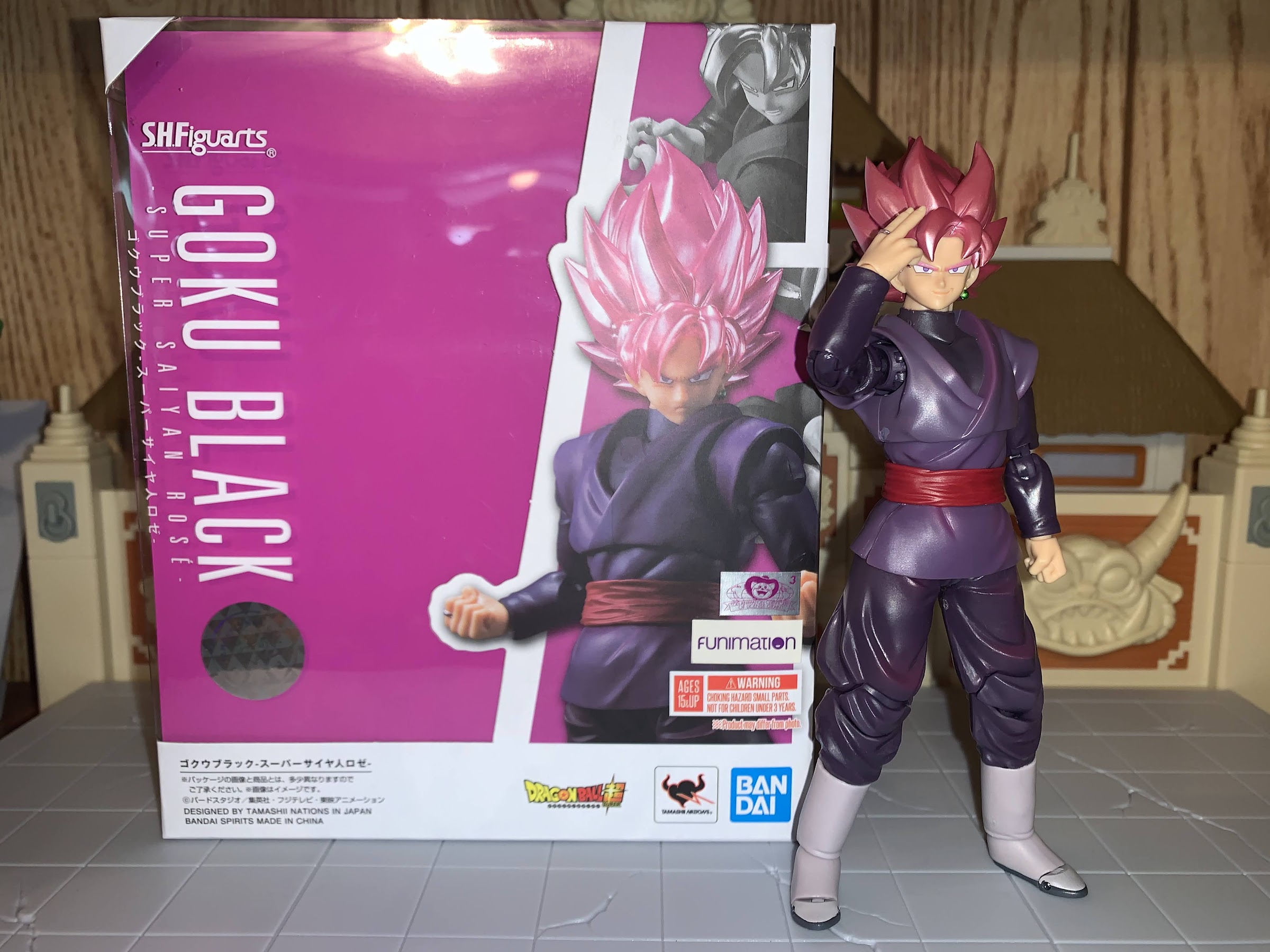
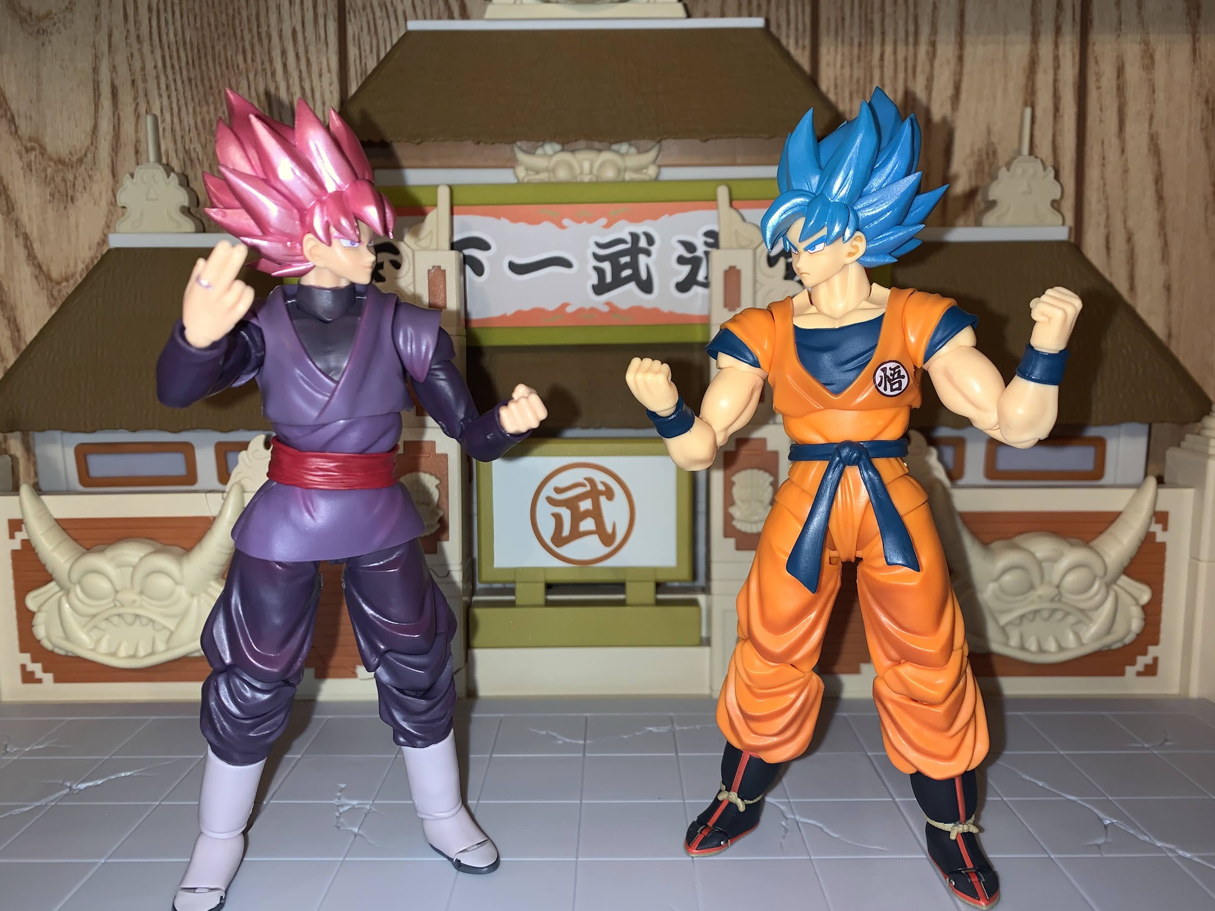
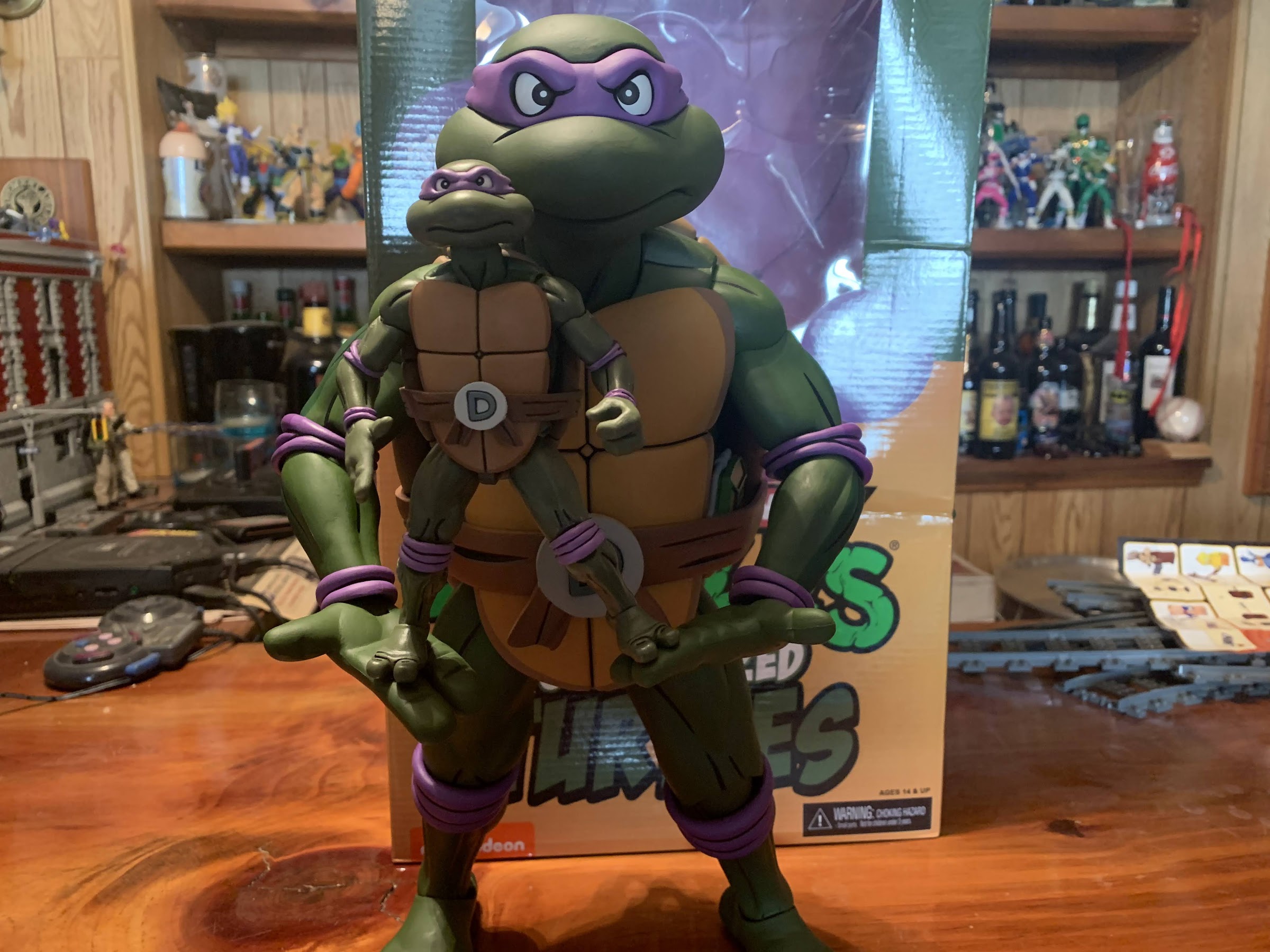
Our last look at an S.H.Figuarts release was the Dragon Ball GT Super Saiyan 4 Goku. Now, we look at a figure from the series that effectively replaced GT: Dragon Ball Super. And perhaps the most popular villain from that new series is Goku Black. Without getting into spoiler territory, Goku Black is basically an evil Goku from an alternate timeline. It’s more complicated than that, but a big part of his saga is trying to figure out how he came into existence so I’ll refrain from elaborating. All you really need to know is he looks like Goku, which isn’t exactly new territory since we already have Bardock, who looks just like his son, and there was Turles from the Tree of Might who also looked like Goku, though he’s non-canon. Goku Black is actually worthy of looking like Goku and being the true doppelganger as he’s extremely powerful and also quite evil – the usual Dragon Ball enemy.
Goku Black is part of the series of S.H.Figuarts releases going to mass retail like Target. I had forgot about him until I came across him in store recently. I had seen this release on retail outlets online for the “budget” price of $35 and for some reason I didn’t make the connection to Target. This figure is a reissue, so that’s part of the reason why it can be priced so low relative to other SHF releases, and it omits some accessories (like effects parts) from that past release. The surprising part is that this figure is quite different from Goku. All of the Goku’s at this price point have basically been the same figure with a different deco: Goku, Kaioken Goku, SSGSS Goku, SS Goku. Goku Black basically only gets to recycle the hair and left hand from those figures. It’s possible parts of his body are shared with other releases (like Zamasu) that I just don’t have, so Bandai apparently got what it needed to out of the original tools and can put this guy out there for cheap. Still, I was surprised to see him head to Target before a more popular character, like Vegeta, but I wasn’t necessarily disappointed either.
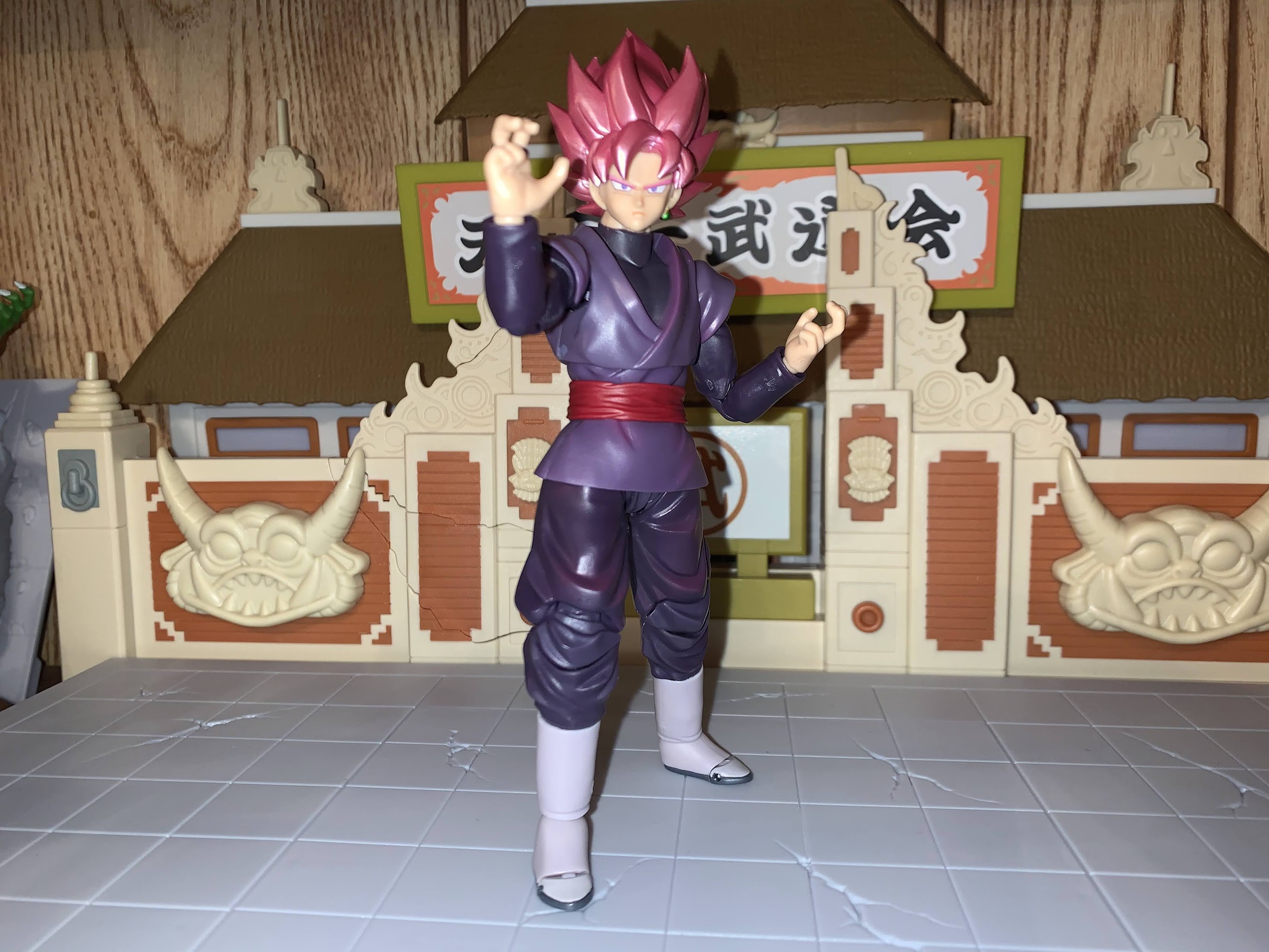
Coming up with poses for this guy feels tricky without accessories.
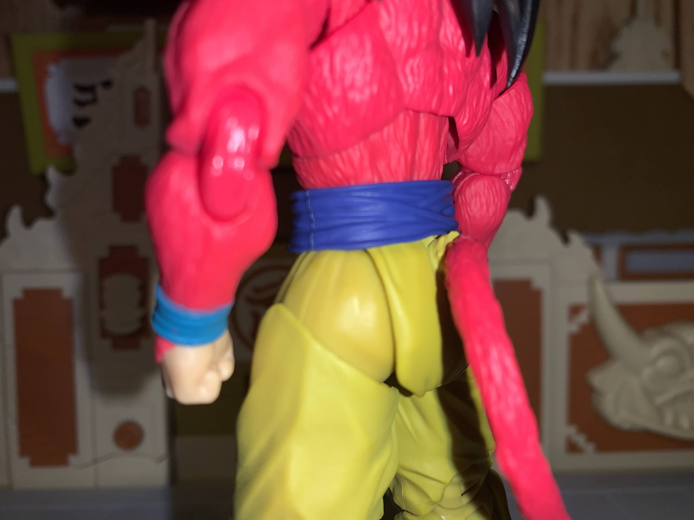
This edition of Goku Black is in his Super Saiyan form, which he calls Super Saiyan Rosé since his aura is pink. The original release from 2018 came with extra heads and parts, but this one is just the super version. I always like to get the extra stuff, but I’d honestly never use the non-transformed head so I can’t really complain. The hair has that pearl finish we saw with the Super Saiyan Blue Goku and it is an attractive piece. It’s also the exact same mold as that previous Goku. That’s kind of it though as far as what he shares with that Goku as his left ear has an earring, so he gets new faceplates, and his right hand has a ring as well. For clothing, he wears a black bodysuit with a purple tunic over it. It’s not form-fitting like the body suits Vegeta is so fond of, so there are sculpted folds and wrinkles in the forearms and biceps as well as the pants. The torso is basically one piece, while the bottom of the tunic (including the belt) is an overlay. There’s a little shading on the front of the figure, but it’s fairly subtle. Most of the figure is molded plastic, but since the colors are deep and more muted than typical Dragon Ball costumes, it looks pretty nice. There’s no mis-matching colors and the little bits of painted details, like the jewelry and face, look nice.
What’s the matter, Black? Someone pee in your cereal?
There are two areas of the figure that don’t look great to me. The first is the shoulder area where Bandai is utilizing that peg system for the sleeve cuffs. This allows the arms to move unencumbered, but the sleeves do stupid things as a result and result in gaps. You can fiddle with them so that it looks okay in most poses, but it always felt unnecessary. The other part that doesn’t look great are the hips which flare out to an abnormal degree. His hips are wider than his shoulders which is pretty crazy and obviously not accurate to the source material. And it’s not the overlay causing the problem as that’s actually tight against his hips and thighs. It’s just a weird design.
Also, no flight stand included, but you probably could have guessed that.
When it comes to the articulation, we have some good and some not so good. The head is a double ball peg, though it might be of an odd design like we’ve seen on characters like Lunch and Kid Goku. It basically provides rotation, tilt, and together with the joint in the base of the neck allows the character to look down. He can’t really look up though as the cuff of his tunic blocks that, but I suppose Goku Black looks up to no one. At the shoulders we have those ugly sleeves, but aside from that the butterfly joint works fine as the shoulder can move up and down and he gets decent range going across the chest. The interior of the joint is painted properly too, unlike some of the Gokus we’ve seen. Biceps swivel, double-jointed elbow, and wrist peg all work as expected. Ball joints in the diaphragm and waist provide twist and tilt and also allows Black to crunch forward and bend back an acceptable amount. The hips, despite being ugly, at least function well as the character can do almost a full split and the thighs swivel. His double-jointed knees work very well, but it’s at the ankle where things kind of suck. He just has those ball-peg ankle joints which don’t provide a lot of range and are prone to popping off if you push it too far. He can bend the foot back okay, but he can’t really go forward and the ankle rocker sucks. The toe hinge is tight, but also really small and I don’t see it adding much.
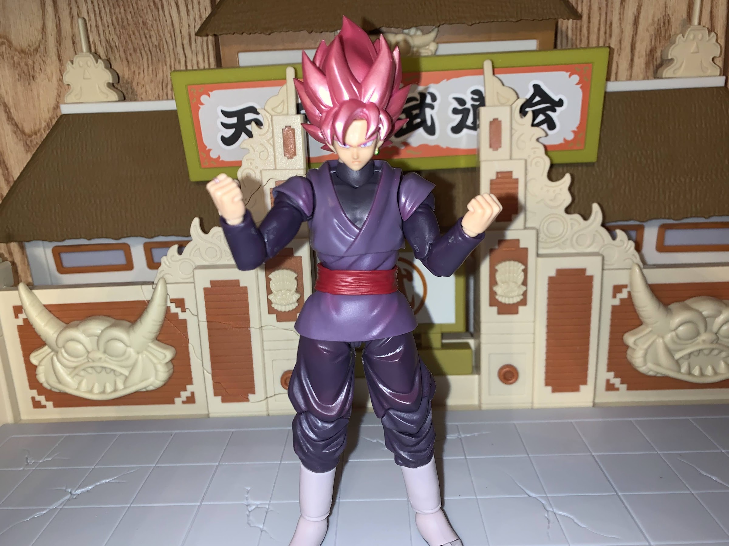
Aww, they’re twins!
The articulation on this guy is largely acceptable. It’s really just those ankles that I don’t like and the sleeve system up by the shoulders. All of the joints are nice and tight without being overly tight. Nothing is loose, and despite being a cheaper release, this guy feels like a SHF release. Which means, as a budget release, his only true weak area is in the accessory department. This guy just has optional parts, so no effects pieces. It’s unfortunate because those pieces are already tooled, so for Bandai the only cost is plastic. I get it though, translucent, purple, plastic isn’t exactly usable on a lot of things so it probably costs more than most parts as the machines have to be loaded with the stuff and there’s probably a lot of waste involved. Nevertheless, I can still be disappointed. Black comes with four portraits: smirk, yell, side-eyed teeth grit, and a scowl. For hands, we get fist hands, open “clenchy” hands, martial arts pose, and one two-finger Instant Transmission right hand. The clenchy hands and martial arts ones have a slightly different shape when compared with Goku, but they’re fine. Each right hand has the ring sculpted and painted as well. It’s an adequate assortment of stuff, there’s just nothing to put it over the top.
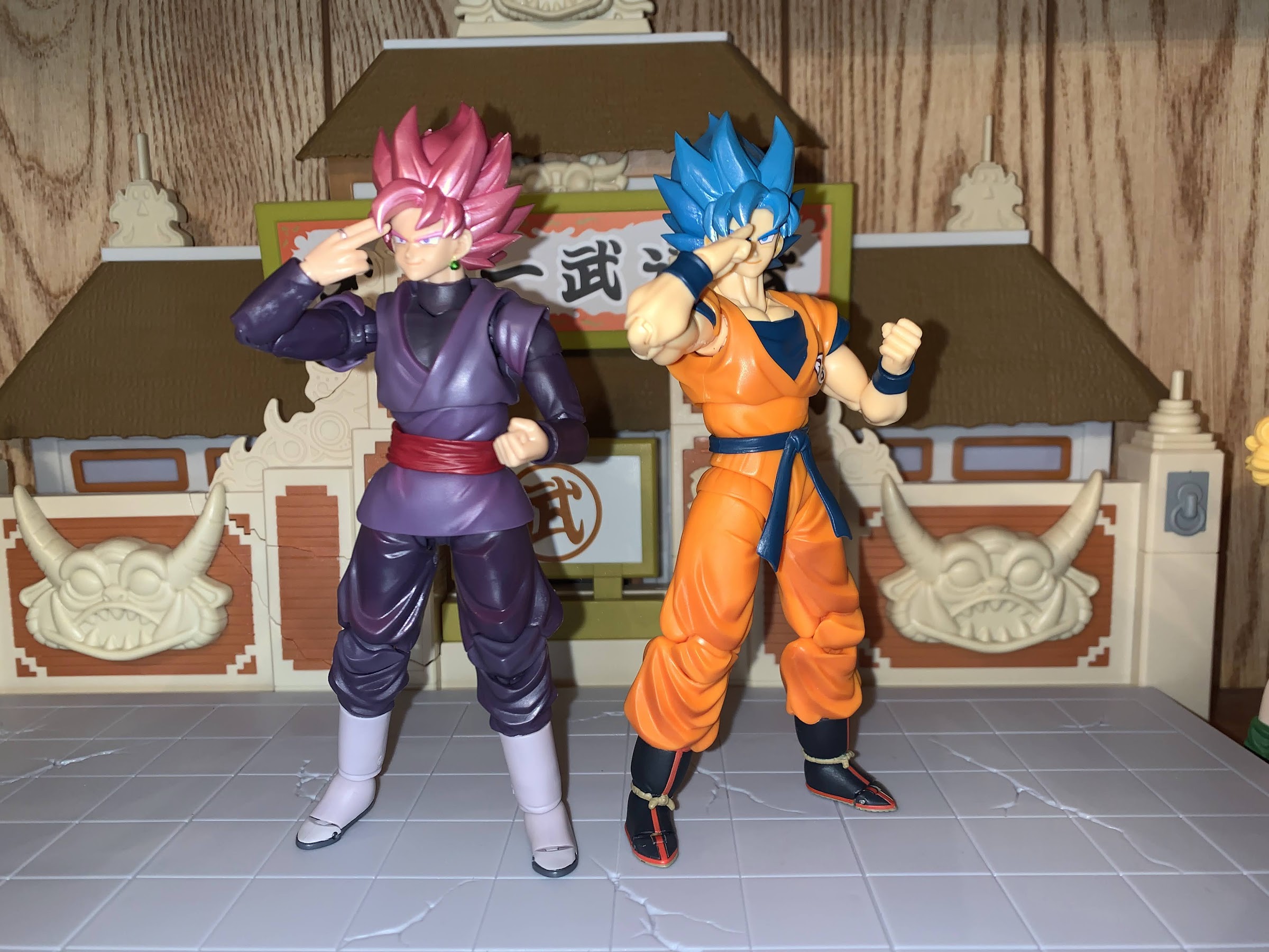
In hand, Goku looks far more paler than Black, but the flash of the camera says otherwise.
The Super Saiyan Rosé form of Goku Black is a solid release made even better by the $35 price point. Marvel Legends comes with less stuff and are now hitting $25 or more at retail, so $35 for an average SHF release is practically a steal. And I think he looks, and feels, more premium than most of the Goku releases at that same dollar amount. I think that’s mostly a result of the color palette in use as that orange plastic we see with Goku has a cheap vibe. Even Black’s skin tone is more saturated and warm and all together just more pleasant to look at. While I miss the effects parts, I don’t miss them enough to want to pay the after market rate which is around $200 these days.
This guy is available at various specialty shops online and should be arriving at Target now. I grabbed him because, when he first came out, I was trying to stay away from collecting Dragon Ball Super, but now I regret passing on some of them. I mostly got this guy in hopes that Bandai will re-release the Dragon Ball Super version of Future Trunks as he would pair well. Hopefully that’s in the cards along with Super Saiyan Blue versions of Vegeta. And if not, Goku Black is still a worthy addition to my humble display.
In the world of Dragon Ball, there are varying opinions on which version of the anime is superior. Dragon Ball Z is unquestionably the most popular, but there are people (like me) out there who swear by the original Dragon Ball that came before it. More recently, Dragon Ball Super has entered the fray and it’s a worthy successor to DBZ that may or may not be finished. Really, what few debate is what occupies the lowest rung of the Dragon Ball ladder: Dragon Ball GT.
Dragon Ball GT first premiered in 1996 after the conclusion of DBZ. Series creator, artist, writer Akira Toriyama was finished with Goku and the gang, but he was more than willing to let Toei continue the story because presumably it was easy money for him. Over the years, a level of trust had been established between the two as Toei produced numerous Dragon Ball movies which were created in-house with Toriyama still on-hand to design new characters. The films were all non-canon, but GT would represent a chance for Toei to truly broaden the scope of Dragon Ball.
If the goal was to create something demonstrably different from the other Super Saiyan forms, well, then mission accomplished.
The results were mixed at best. Toei, seemingly recognizing that Goku had long surpassed his peers by the end of DBZ, redesigned everyone and gave Goku some new traveling buddies in his granddaughter Pan and the now adult Trunks. And perhaps to capture the adventuring spirit of the original Dragon Ball, Goku was turned back into a child and set out on a quest to collect the Black Star Dragon Balls. During his journey, he would unlock a new ability: Super Saiyan 4.
I like the painted details on the face, but I don’t know that we need the “butt” in the center of the forehead on a stoic expression like this one.
Back in Dragon Ball Z (or just Dragon Ball for the manga purists), Toriyama conceived a new level of power for Goku that caused a minor transformation in that his hair would turn blond and his eyes teal. This was the Super Saiyan transformation, and really, the series could have ended with Goku’s unlocking of this ability and toppling Frieza, but it didn’t. Goku needed to keep getting stronger, so what’s stronger than a Super Saiyan? Super Saiyan 2! By the time the story was concluded, Goku had advanced to Super Saiyan 3. All three levels were fundamentally the same, except the shape of Goku’s hair changed with the third level being the most dramatic in that his hair was several feet long. Also, he lost his eyebrows for some reason. It’s not surprising there wasn’t a ton of imagination in these transformations. With the original, Toriyama has joked that he mostly designed it the way that he did so that he no longer had to color in Goku’s hair since the manga was in black and white and yellow hair would just be white.
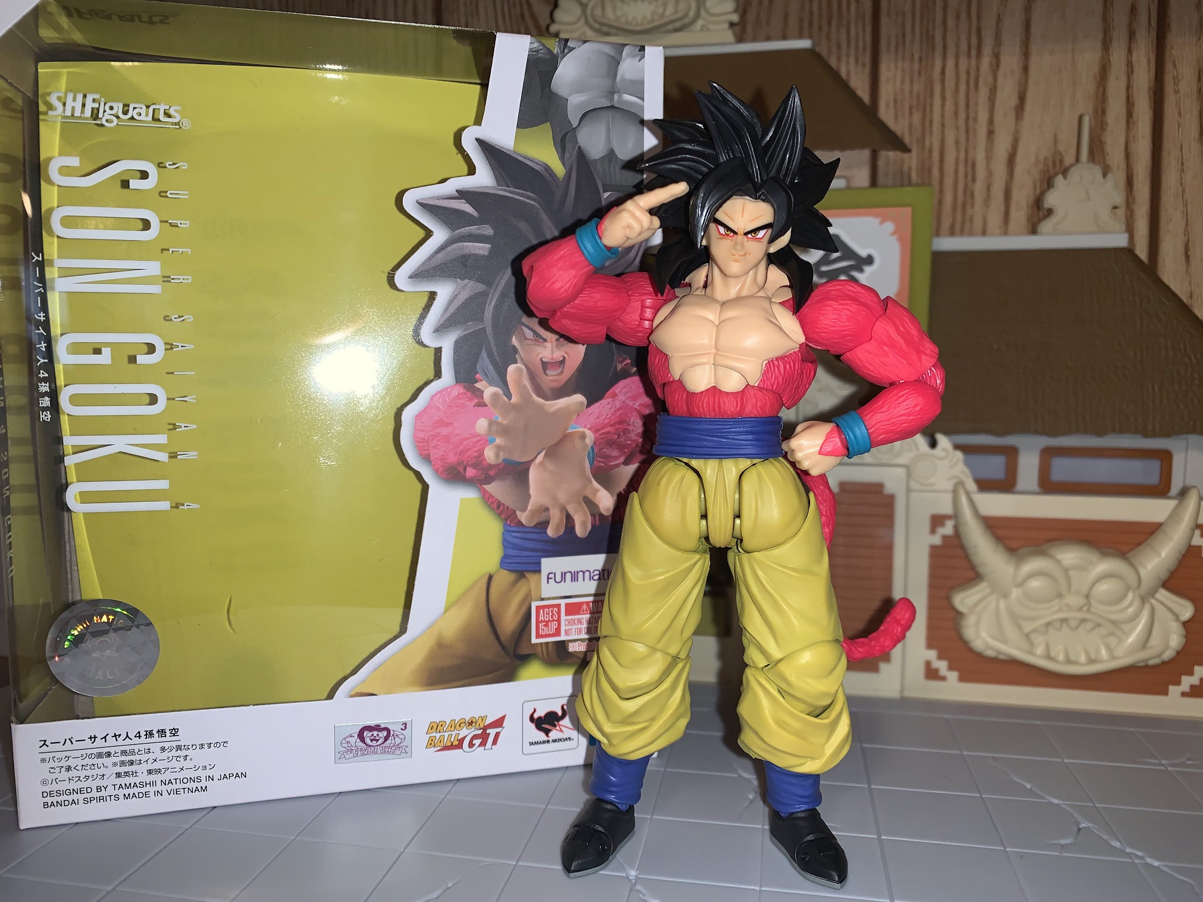
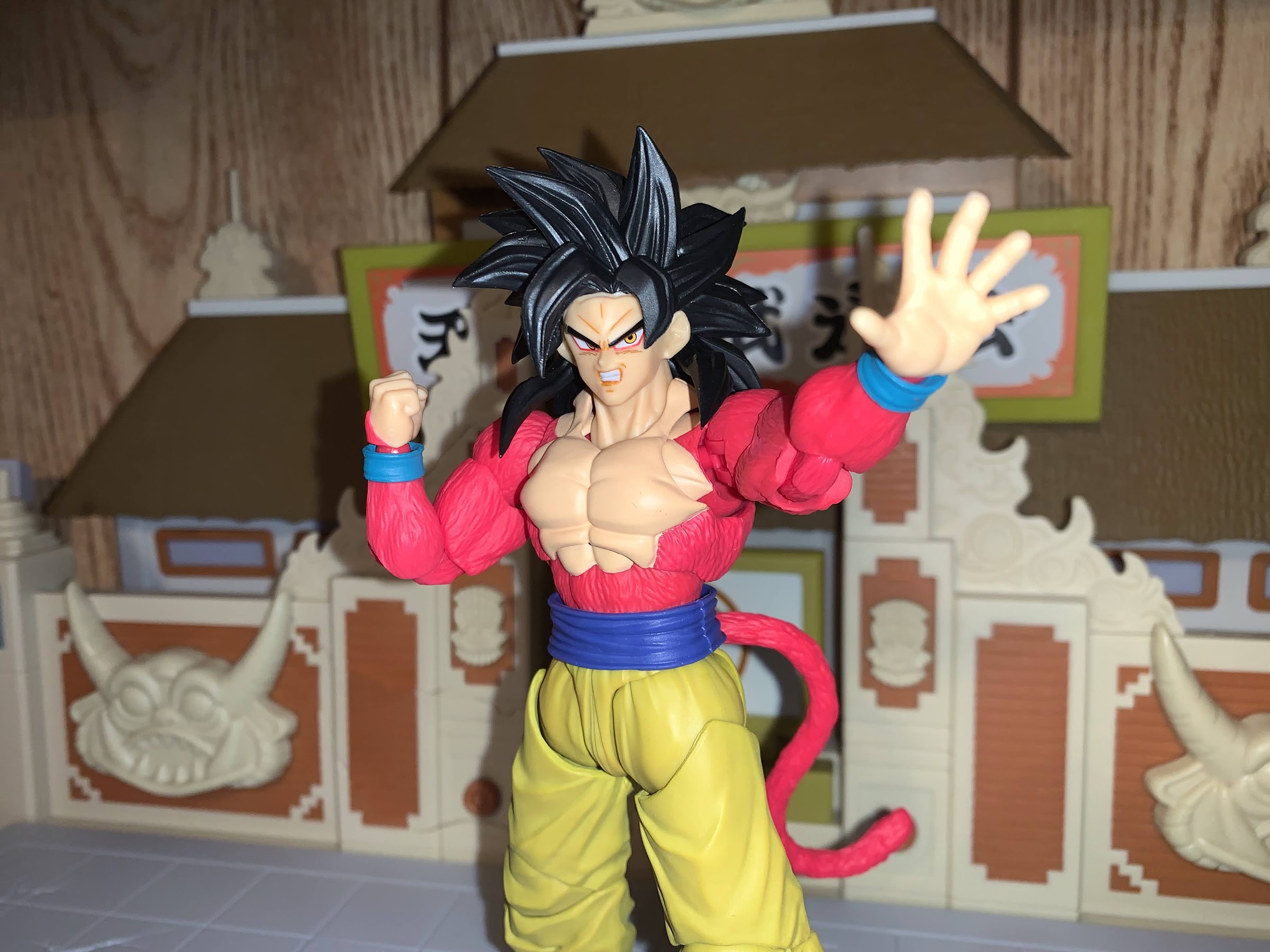
For Super Saiyan 4, Toriyama decided to get creative. I’m not sure if Toei requested something different, or if this was Toriyama’s will, but Super Saiyan 4 definitely breaks the mold of other transformations. And being that most people aren’t really into Dragon Ball GT, it’s become the show’s only lasting legacy as the look does seem to have its fans. There’s certainly enough fans that Bandai and Tamashii Nations decided to bring the look to the S.H.Figuarts line in time for the show’s 25th anniversary.
A McFarlane approved side eye portrait.
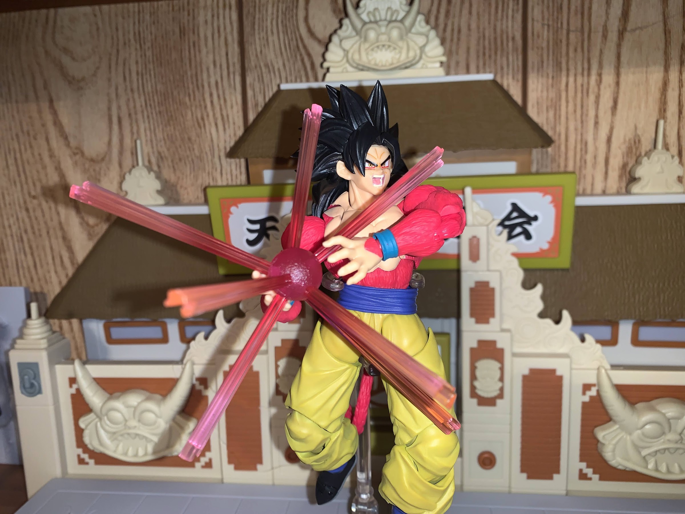
If you’ve never seen Super Saiyan 4 before, well, it’s certainly a trip. In an effort to bring the Saiyan race back to its primal roots, Super Saiyan 4 mixes the look of the classic Great Ape transformation with that of a humanoid Saiyan. For Goku, this means his body becomes coated in a hot pink fur (why that color, I have no idea) and his tail returns. His hair still gets demonstrably more wild, but remains black. The hallmark of the look from a hair perspective is the tufts of hair that rest on the character’s chest. His eyes are also rimmed with red and the iris becomes gold with black pupils. His disposition seems to shift as well with Goku becoming cocky, and even a touch sadistic. Goku loves fighting in the same manner as a kid loves playing any competitive sport, but Super Saiyan 4 Goku might actually enjoy dishing out pain. As a design, it’s certainly garish, but it’s so outlandish that it kind of works. I know when I first saw images of this form back in the 90s I found it shocking and absurd, but over time I have come to appreciate it for its uniqueness.
They were able to ditch the sloppy look of the butterfly joints on past Goku releases, but this could still use some fine-tuning.
Despite that, I’ve never considered myself a true fan of Super Saiyan 4. I wouldn’t say I’m indifferent, but it doesn’t bother me that the look has basically been rendered non-canon by Dragon Ball Super. It is interesting though and that’s why I’m hear to talk about the action figure. The Tamashii Nations take on the look is largely as expected. It does some things well, and some things not so well. It’s also the first figure in the line that I’ve purchased that was made at Bandai’s new factory in Vietnam. What does that mean for the figure? Well, anytime you have someone completely new to something get added to a process there’s going to be some growing pains, and this figure certainly seems to suffer a bit from such.
I guess the one on the right s now the true Super Saiyan 4? Or is it actually 5?
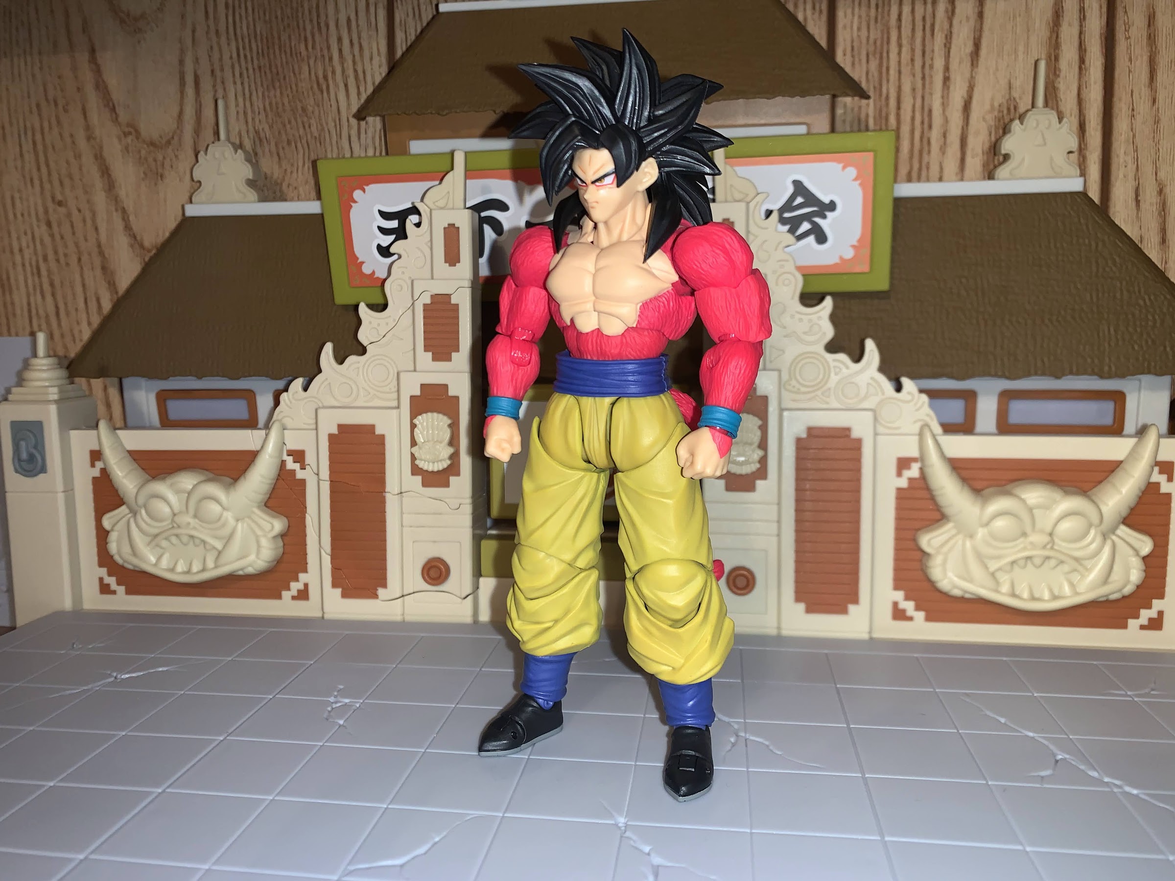
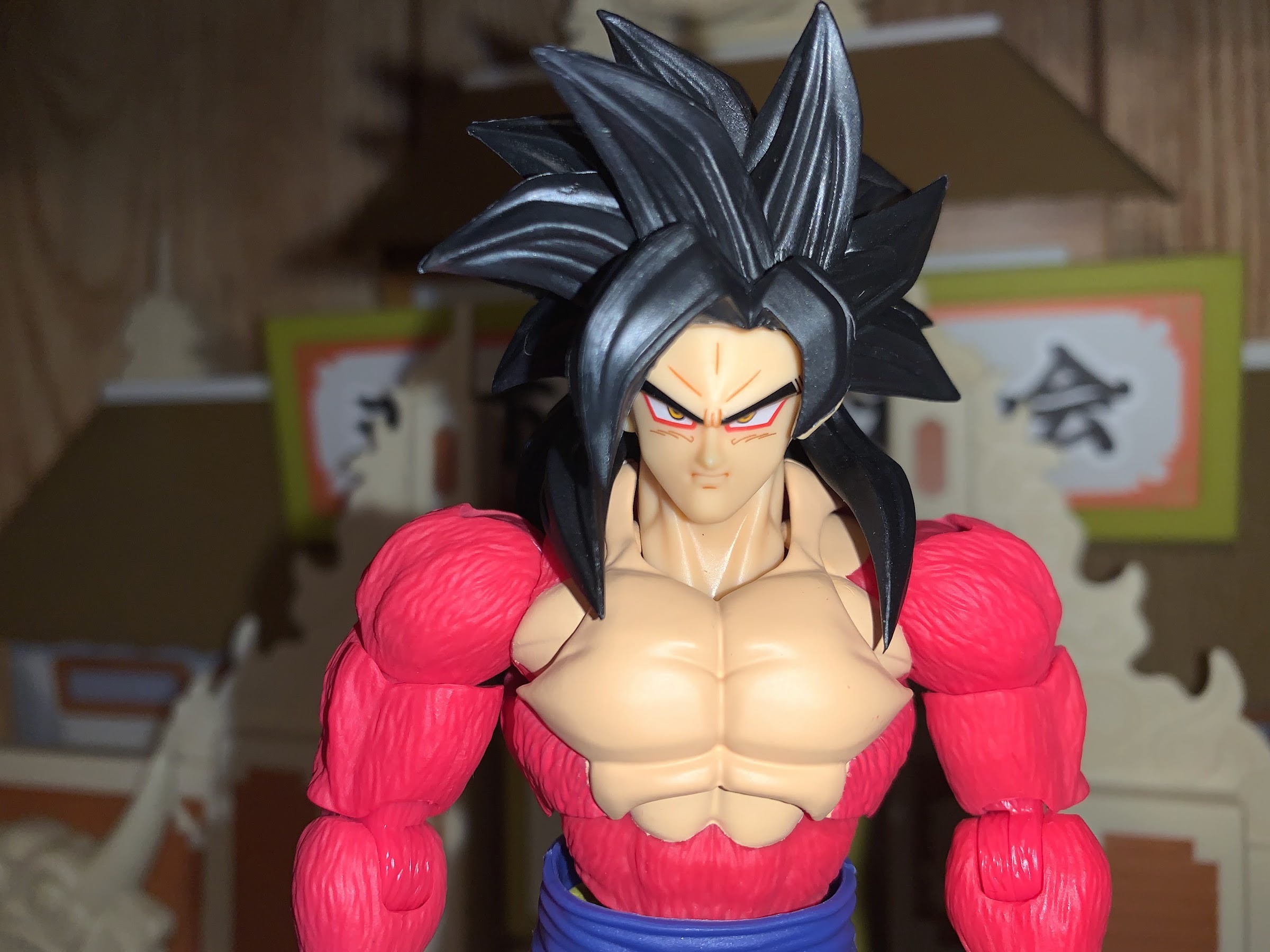
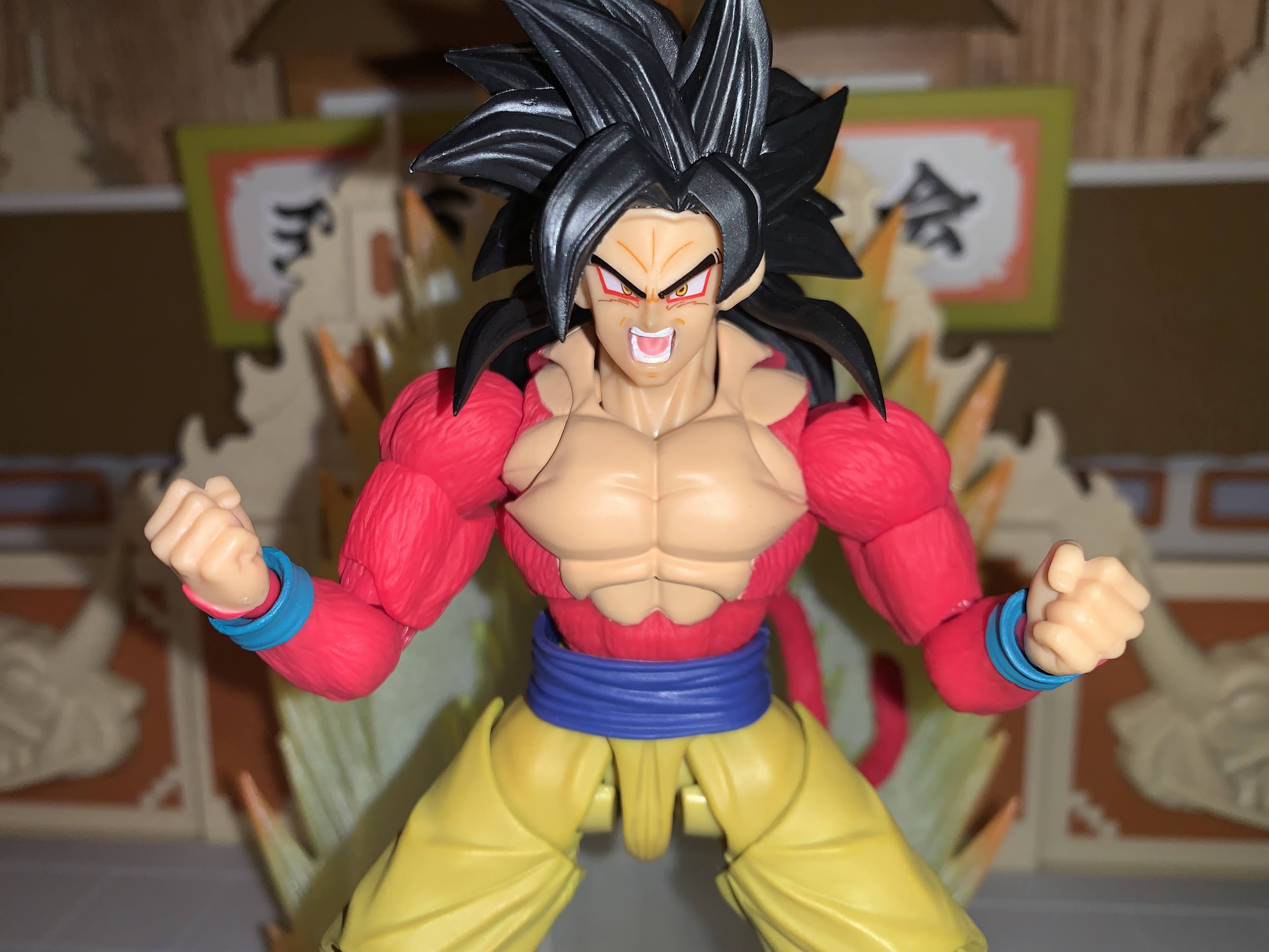
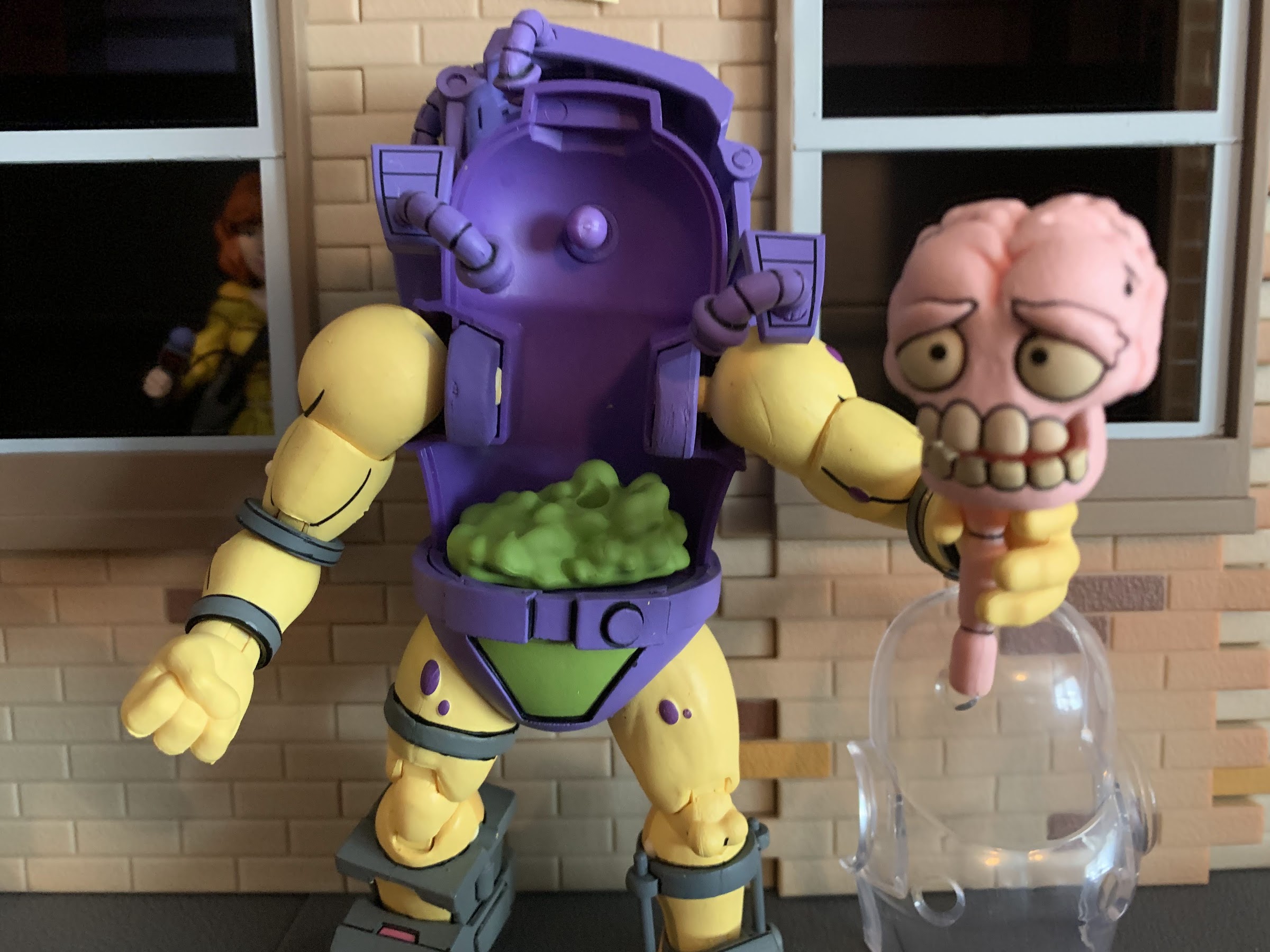
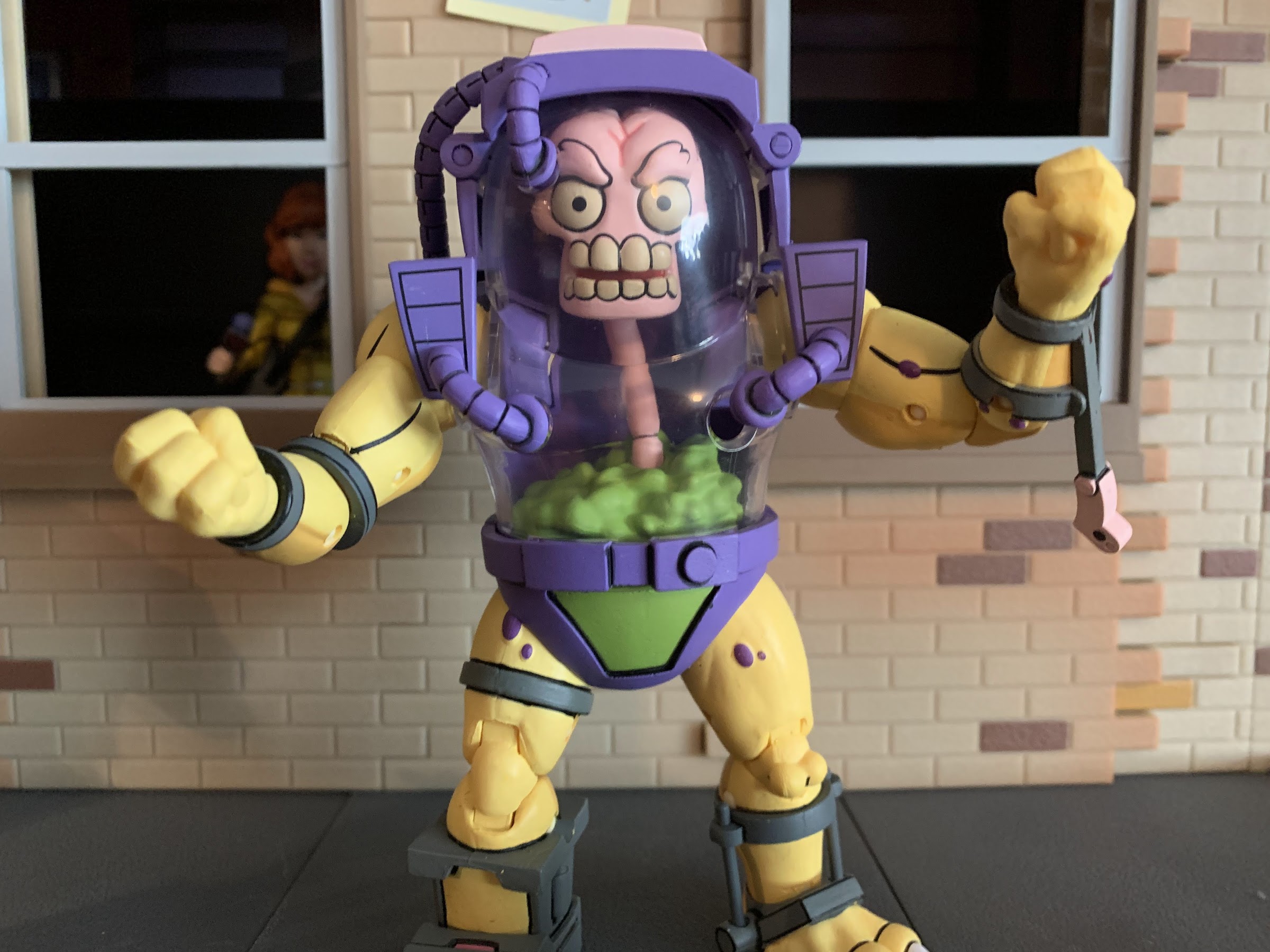
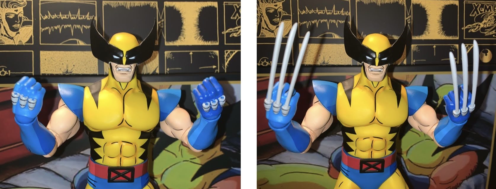
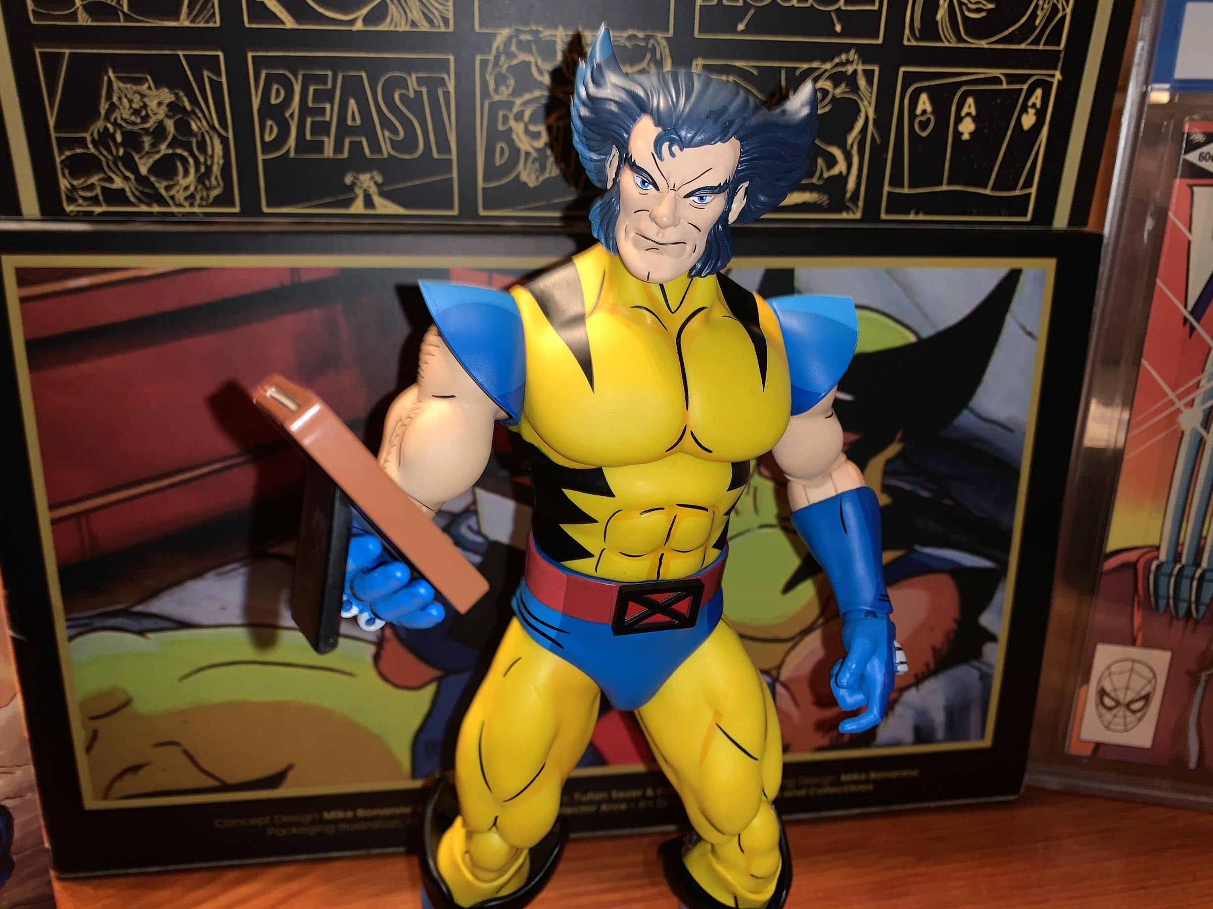
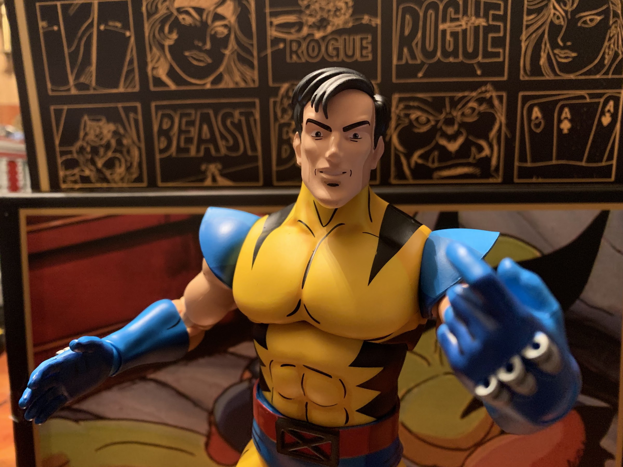
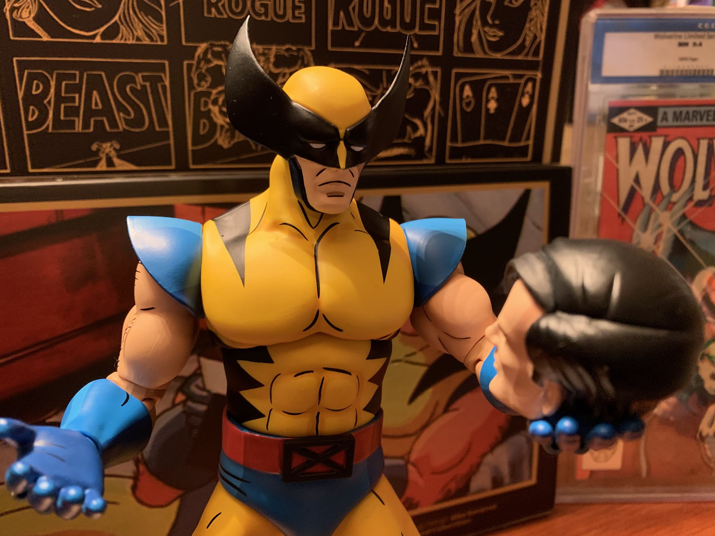
This primal take on Goku stands at about 5.25″ to the top of his visage and a tick over 6″ to the top of the hair putting him right in line with other Goku figures in the line. He comes in the same, familiar, window box with an assortment of parts and effects to make the figure feel complete. The default expression for Goku is a stoic one. There’s a little bit of paint on the face to highlight the creases in his brow and under his eye which is all applied cleanly and does add a lot to the figure’s expression. I’m not sure we need the center line in the forehead, as it’s not something that appears frequently in the artwork. It kind of gives him a “butthead,” but it’s something I’m getting used. It certainly isn’t needed on a stoic expression. The hair looks appropriately wild to the point where it can be hard to manipulate the head on this guy without pricking your finger.
Flight stand not included, but definitely useful.
Below the head we have a mix of colored plastic and painted parts. The neck is flesh-colored plastic, while the chest is painted. There is a slight different in the color of the flesh which is always a bummer. His chest also sticks way out, consistent with the character’s look in the show, but it makes his neck appear to sit pretty far inside the figure. It also doesn’t help that there’s a noticeable gap between neck and chest. The pink portions are colored plastic save for the little bit on the hands. There’s sculpted texture, and it looks fine. The paint around the flesh-colored portions of the chest is not the cleanest, but it’s not so bad that I’m convinced Bandai’s standard factory in China would have done any better. The belt is a floating piece of plastic and the mustard pants feature a hint of a wash on the front of the figure, nothing on the rear. The colored components seem to match just fine, and on the rear of the figure is the tail which features the same sculpted fur as the arms and torso.
Screaming head or smirking head? Tough call, but it’s one largely dependent on what you want to do with the neat effect piece.
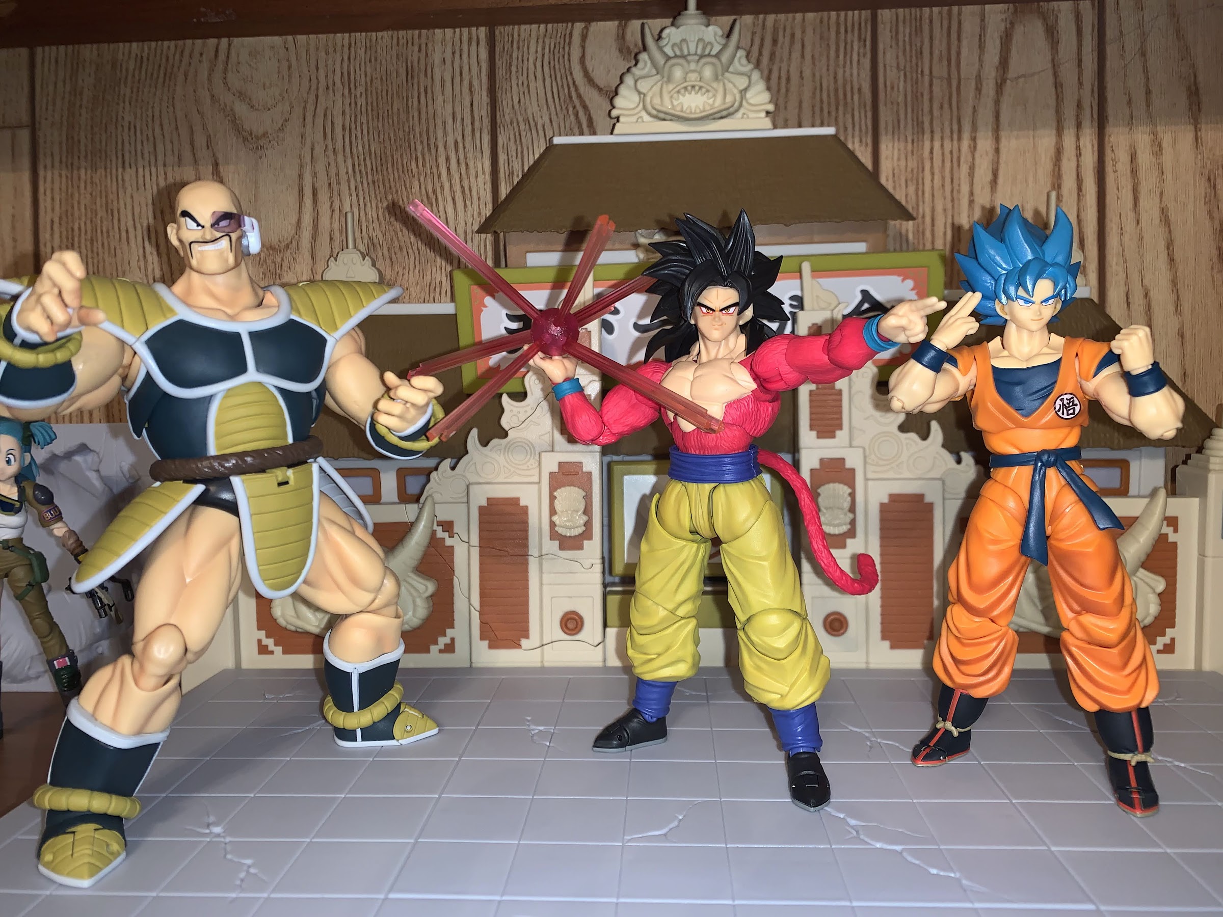
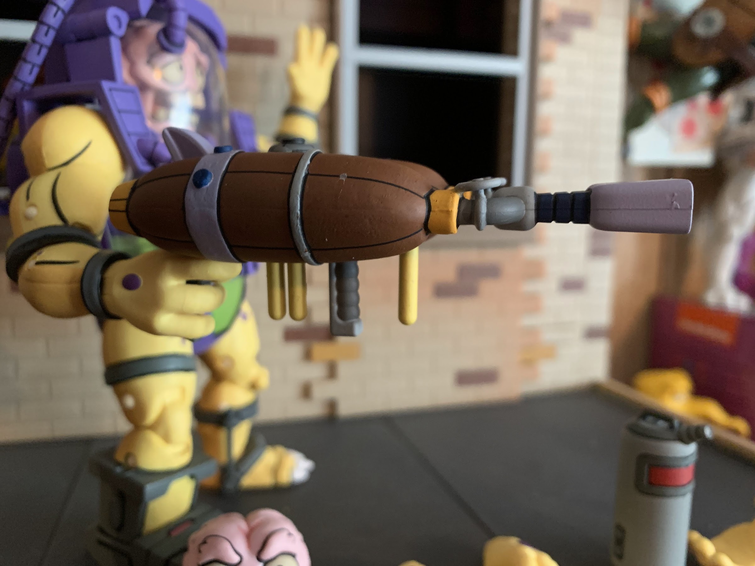
Bandai did a good enough job here with the look of the figure that I think any Super Saiyan 4 fan out there will be pleased. The colors and proportions look right to me, and the mix of portraits are also quite suitable for this version of Goku. In addition to the default expression, we have three more: smirk, side-eyed teeth gritting, and yelling. All feature the same clean paint apps and the selection is so good that it’s hard to settle on one. The bangs on Goku pop off to access the face plate, and one of my nitpicks with this guy is the hair doesn’t sit flush on the top of the head cleanly. I find myself constantly fiddling with it to get it to look as best it can. It’s not something that will be noticeable on a shelf, but in-hand it does become apparent. The fit is also loose, and I had the face or hair fall off when swapping hands. Goku also has an assortment of hands to utilize including fists, martial arts pose hands, wide open palms, two finger hands, Kamehameha hands, and Kamehameha hands with pegs. The pegged hands are for use with the energy effect, something we rarely get. It’s a translucent pink ball with 6 rods that can be inserted into it. It then pegs into one of Goku’s hands and looks pretty rad. I can’t imagine many collectors declining to utilize it in their display. Uncharacteristic of this line, I found the hands actually difficult to swap. Pulling them off of the figure is easy enough, but getting them on is a pain. Is this just a result of the new factory not being used to this sort of thing? It feels like it because I’ve never had to heat a figure from this line before, but for some of these hands I opted to.
A nice touch here is that the figure features a sculpted rip in his pants for the newly sprouted tail.
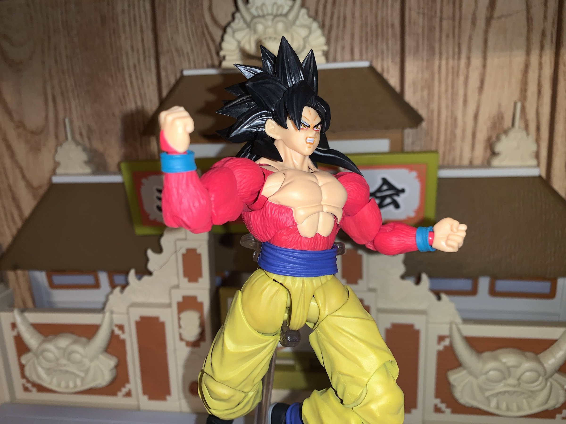
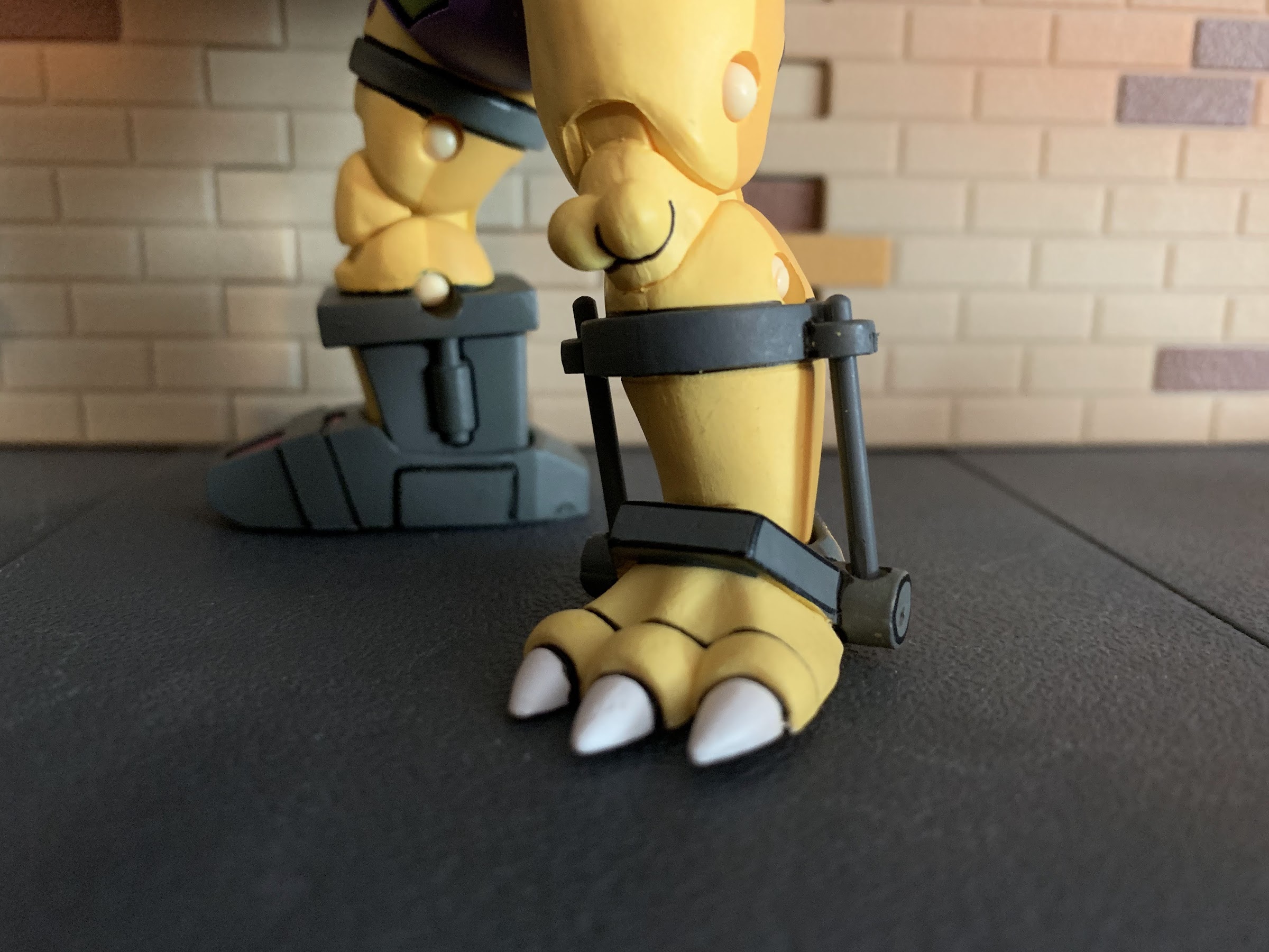
The other area where things feel a little off is with the articulation. This edition of Goku has basically all of the points of articulation one expects, but the engineering could have used a little more quality control in a few places. Most notably, it starts at the head. The figure really can’t look up, but that’s because of the hair. To make up for this, the two large strands on the back of his head are actually articulated, as are the two that hang over the chest. He can look down and that’s easy because his head is pretty floppy. It’s not so bad that he can’t hold a pose, but just a little pressure on the back of the head will send his chin diving into his throat. The base of the neck is articulated, but I can’t really get it to do anything which is unfortunate since it has that gap in it. At the shoulders, we have a modified butterfly joint with a newer ball peg and hinge setup. This gets rid of some of those floating pieces, but also leads to more gapping issues. I think this joint would look great on a standard Goku, but a shirtless one isn’t optimal. There’s also that flesh-colored paint to be mindful of as you don’t want the paint to rub off. He also has a biceps swivel, a double-jointed elbow that bends past 90 degrees, and ball-pegs at the hands. In the torso, we have ball joints in the abdomen and waist so he can rotate and pivot with a decent crunch forward and back. Again, watch the paint on the abs as you don’t want that to scratch. At the hips, he has legs that can do full splits and kick forward, but the sculpted butt cheeks prevent him from kicking backwards. There’s a thigh twist, double-jointed knees, and the standard ankle ball-joint. The range at the ankle is poor, and the toe hinge is too loose to really add anything. The ankle itself is also loose and standing him can be more tricky than typical of this line. The knee joints are fine, but in a first for me with this line, I had the knee cap pop off when bending it. It just tabs on, but it’s going to be annoying if it keeps doing that. He also has a ball joint where his tail meets his body. There are no other joints in the tail so it’s posing is limited, but I’d rather that than a bunch of ugly ball joints throughout.
“Don’t you dare talk shit about me and my series!”
The articulation, overall, is fine it’s not the usual “feel” I’m used to with this line. Some parts feel a little rougher than usual (the shoulders) and others are too loose for my liking. It’s understandable given the circumstances, and the move to the factory probably helped keep the price down as he’s $60, but a part of me wishes they handed them some lesser characters first before going right into such a unique look. Aside from that, the weight and overall feel is still excellent and this is certainly worthy of the S.H.Figuarts branding. Just the added paint on the face makes him look a lot nicer than the Super Saiyan Blue Goku I have and I do like the removal of some of the floating pieces in the shoulders and hips. If they didn’t stamp it right on the box where this thing was made few would likely question it. And I think this factory will get better, in time. Supposedly, the final form Cooler came out of the Vietnam factory and turned out great, so maybe they already have things mostly figured out.
As for Super Saiyan 4 Goku, this is a rather bizarre and unique look for character made even more so by the dismissal of Dragon Ball GT in favor of Dragon Ball Super. The series was never really canon to begin with, but since Toriyama designed the Super Saiyan 4 look most treated that part as canon. And maybe it will be again some day, or some variation on it, but for now we have the various Super Saiyan God forms. I don’t expect Bandai to go to the GT well too frequently in the future, though I suspect we’ll be seeing Vegeta in his Super Saiyan 4 form eventually and maybe even Gogeta. It helps that some of these parts can be reused for both figures, namely the arms, and it’s a subline that can trickle out and won’t command a ton of resources. As a weird little footnote in my Dragon Ball collection, I like this guy. I was going to pass on it eventually, but decided to give-in to curiosity. And it turned out to be $60 well spent.
It was a little over two weeks ago on February 27th that toy maker Boss Fight Studio made an expected, but still disappointing, announcement that it no longer held the license for Bucky O’Hare. This came after more than a year of no updates on the status of the action figure line so the writing wasn’t just written on the wall, it was smashed into it. The last figure released was Captain Mimi LaFloo, a brand new character as far as toys are concerned, which was back in the fall of 2020.
The end of Boss Fight Studio’s excellent line of action figures based on Bucky O’Hare is, of course, a sad event. And I was certainly disappointed to hear the news, though part of me was also happy the property was no longer in limbo. The sadness is tempered by what we have though. Before Boss Fight came along, Bucky O’Hare was a dead property. There had been no new toys since the early 90s and the cartoon and comic were all long since ended as well. About the only thing even released over the decades was a trade paperback in digest form compiling the original run of comics and some of the Italian run, basically the stuff that aligned with the animated series. Continuity Comics and its owner Neal Adams made attempts at reviving the property via a commissioned CG pilot and a short-lived licensing deal with the now dead Shocker Toys, but no one was interested. No one except Boss Fight Studio.
I don’t know why the line came to an end. Boss Fight Studio is a bit tight-lipped on the developments, but have insisted from the beginning it was not sales related. The “non” updates over the past year all cited Continuity Comics as being really busy at the moment and that was apparently an obstacle. I have no inside information beyond what has been shared by the company and I certainly understand them not wanting to throw shade at the licensor. My totally unfounded guess is that Continuity was hopeful this line might lead to bigger things for Bucky O’Hare, and when that didn’t happen it lost interest. For what it’s worth, Adams expressed great enthusiasm for those initial figures released when asked about them at conventions so I think he, personally, was happy with the end product. Maybe he, and the company as a whole, just expected more of a windfall and when that didn’t happen it no longer made sense to devote any time and energy to a toy line. When Bucky last had a toyline, the going rate for an action figure was a mere 4 dollars so perhaps they thought Boss Fight’s pricing model ($35 per figure) was an issue. We did see Boss Fight show off prototypes for a line of mini figures that never came to be, perhaps that was the company trying to meet Continuity halfway, and when those weren’t pricing out well they just scrapped the whole thing.
Not getting Blinky definitely hurts.
Again, I don’t know anything so it’s all just speculation on my part. I do know that Continuity was hands-on and requested changes or revisions to every figure except Mimi, but I also don’t know if that’s irregular of a licensor. For me sitting here in front of my computer, I see the toy line as being easy money for Continuity. Nobody is getting rich here, but why not let a company like Boss Fight Studio just keep producing whatever it wants and be happy with that? Unless they actually are getting inquiries from other potential partners regarding Bucky O’Hare, it doesn’t make a lot of sense, but, I am an outsider and I don’t know what goes on behind the scenes at Continuity to make this line a reality. If anyone at either organization wants to share more, I’d love to know! Even if it’s off the record (you would be surprised how much off the record info I’ve received on unrelated topics just via having a little blog).
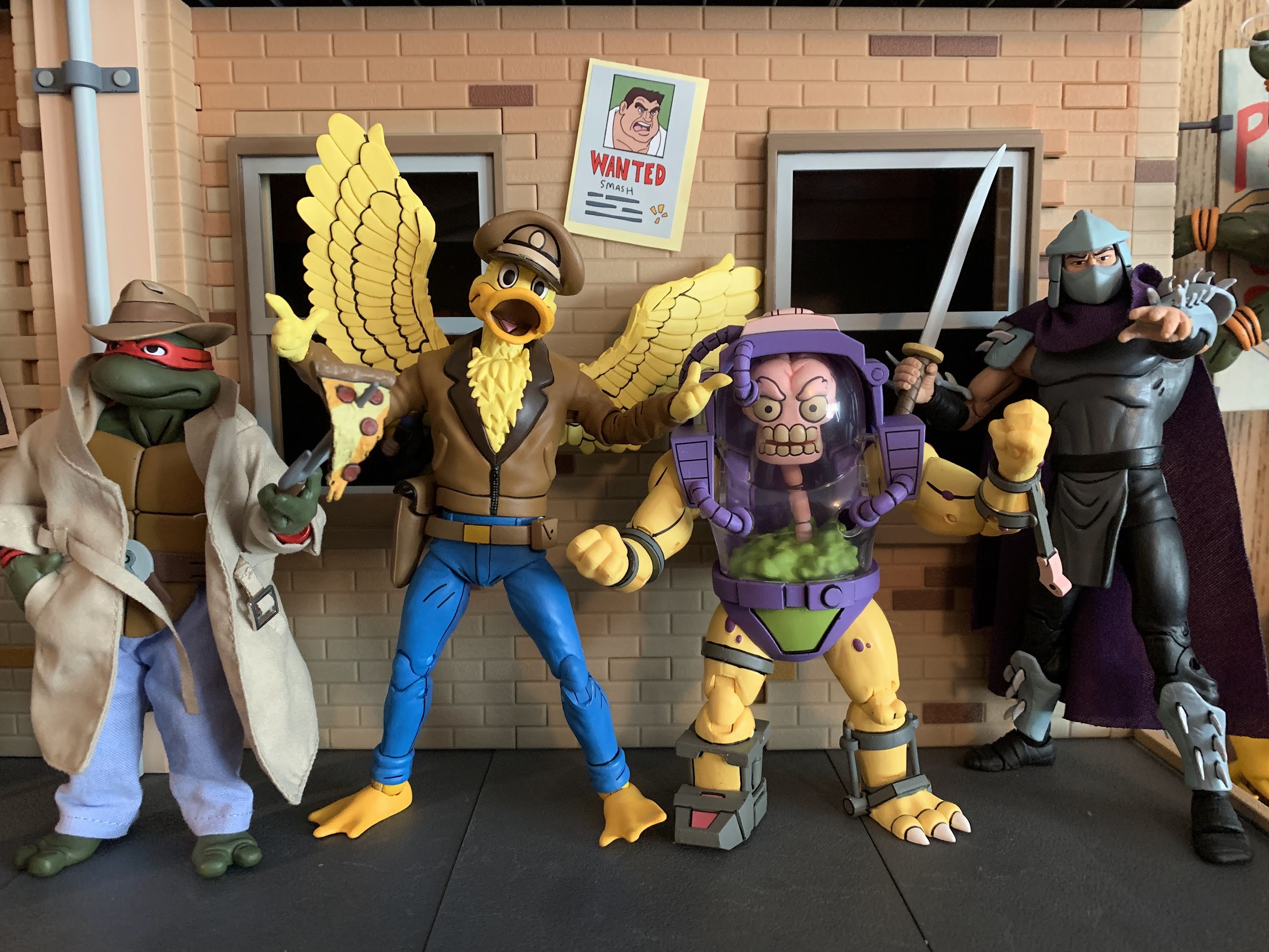
All of that being said, I do think it’s important to focus on what we did get. Boss Fight Studio produced 11 releases, 6 of which are unique sculpts or characters. Those releases are: Bucky (2 variants), Jenny (1 variant), Dead-Eye (1 variant), Toad Storm Trooper (1 variant), Bruiser, and Mimi. It basically shakes out to a handful of good guys and one villainous army builder for them to battle. It’s easy to focus on what’s missing: the rest of the crew (specifically Blinky), Toadborg, the Air Marshall, and the rest of the vintage characters released by Hasbro. And sure, I would have loved to add any of those characters. I really wanted to see what Boss Fight Studio could do with Toadborg and Al Negator and I was really hoping they would find a way to at least get us Blinky. That didn’t happen though, but I’m damn happy to have a fairly robust display even without those characters. I bought every release in the line, including 3 of each version of the Storm Toad, and I love them all. It’s hard to pick a favorite (and if you want my thoughts on them all, head over to the Bucky page), though if I had to I’d probably go with Dead-Eye just because a four-armed duck is pretty awesome.
That is a pretty righteous assortment of figures.
And that’s my main takeaway with this line: I’m happy it exists! These figures are awesome, and without Boss Fight Studio I’d have none. Nobody else wanted to do this, and it was really cool to see the license land with a small toy maker based in my home state of Massachusetts, no less. They did a great job with the figures they produced and it was obvious the company had an affection for the license. All things come to an end and it’s okay to be sad when they do, but it’s more important to be happy it happened at all. A sincere “Thank You” is in order for Boss Fight Studio for doing what no company had done in 25 years and what no company is likely to do anytime soon.
It’s the first Turtle Tuesday in a little while that I don’t have some new TMNT review to post. Given that, I think it’s time to revisit the rankings I did last year for NECA’s toon line of action figures. This has become NECA’s most popular line, and while it has cooled a bit since last year, that also could just be due to better distribution making it easier for collectors to get their hands on these things. NECA has done preorders and direct sales going back to April of last year and it’s made a world of difference. And it’s a great thing to be able to simply enjoy this line for what it is and not be frustrated with how hard it can be to get some of these.
Last year, I had 21 distinct rankings for this list and now a little more than a year later it’s doubled! The amount of figures has actually more than doubled as we’ve seen some variants come out and some figures I’ll rank together (like the frogs and various Foot Soldiers). It was a very busy year for the line and it’s pretty damn impressive how many new releases made it out given the ongoing global shipping and factory issues.
Forty-two is a lot of figures to rank so let’s not waste any more time. Where a figure is a repeat from last year, I’ll include the prior ranking. The order for those older releases is largely the same, but there were some changes here and there as certain figures have fallen out of favor a bit, or I’ve gained new appreciation for. There are no rules here aside from this is how I feel right now in this moment. Some of these are rather fluid, though I feel pretty good about my number 1, and about my number 42…
April O’Neil(21) – She’s still in last place because her sculpt just isn’t great. She’s also still hard to get, but NECA is prepping an update for 2022 so stay tuned.
Krang (Bubble Walker)(20) – Also still in second to last place, just not a fun release, and not really one that could be. It’s very much limited by the design, and the walker itself looks fine, but has a cheap feel. It could have used real knee joints and ball-joints where the legs meet the “bubble.”
“Hello, I’m Kerma. I’ll trade you this lizard if you’ll come with me to my home planet and save it. And if not, I’ll just blow you up with this bomb!”
Kerma – Figure or accessory? He’s just enough of his own thing that I gave him a ranking. He looks great, but he doesn’t articulate much because he was released as an accessory. I do draw a distinction between him and Joey Eyeball though, who won’t be ranked.
Turtles (Style Guide)(19) – The original turtles are a bit dated and these ones are colored to resemble licensing artwork. You either like them, or you don’t. Still the only release I entirely passed on in this line.
Roadkill Rodney (18) – This one’s fine, but there’s not much to him. A perfect example of how just because something is ranked near the bottom of this list doesn’t mean it isn’t worth owning.
Cat April – The good news is the body on the previously released April looks fine, it’s just too small. Cat April recycles that body and includes a new head that’s better proportioned for said body. It’s April mutated as a cat though, so it has limited appeal, hence why it was supposed to be a convention exclusive. She also doesn’t stand well and there’s just something missing here.
It’s sort of weird to feel excited about getting the receptionist from a 30 year old cartoon, but here we are.
Irma – Similar to the Roadkill Rodney, this is a figure that looks good, but is limited by the design. In this case, it’s Irma’s skirt which basically makes her a glorified statue as her leg articulation is useless. The optional rat parts are kind of fun though.
Foot Soldier (All versions) (17) – The Foot have been released in standard and two separate battle damaged variants as well as a deluxe option in 2021. The deluxe one is probably the best as it has updated lower leg articulation and a ton of accessories (including the ability to create a new character, the Alpha Foot), but it does suffer a bit from loose hips syndrome. It’s a good all-purpose army builder though and gets the job done.
Burne – April’s blowhard boss, Burne is an essential character to the show who doesn’t exactly translate well to the world of action figures because there’s just not much for Burne to do besides stand there and look pissed. Or smug, depending on your mood. As a short, squat, guy he doesn’t articulate very well, but we needed a Burne in the line and he’s solid.
Fly away, mutant mosquito! Or was it actually alien?
Screwloose – Screwloose was just an accessory in the Playmates line, but NECA made him his own thing. He looks pretty good, but he essentially comes with no accessories (aside from a flight stand) and has limited articulation when compared with other small fries Baxter and Splinter. Fine, but unremarkable.
Vernon/Vernon 1.1 – Vernon received not one, but two figures in 2021! Both are the same sculpt aside from the portrait, though the convention exclusive Vernon had slightly modified colors. That one came with my favorite expression for the character, scared, but the two-pack version came with the mutated rat parts so it’s hard to choose a favorite here. I’m just glad to have both because now I can display rat Vernon and normal Vernon.
The Punk Frogs – Finally, all four frogs have been released in figure form! The vintage line famously only did two, and one of them did not look a thing like the cartoon version. These four are definitely toon accurate, but they have the worst ball-socket hips in the line with some barely able to stand because of how loose they are. NECA also only did two different expressions so they’re a bit boring. A case where NECA did the minimum and did that well, but skimped on any extra bells and whistles to make them special.
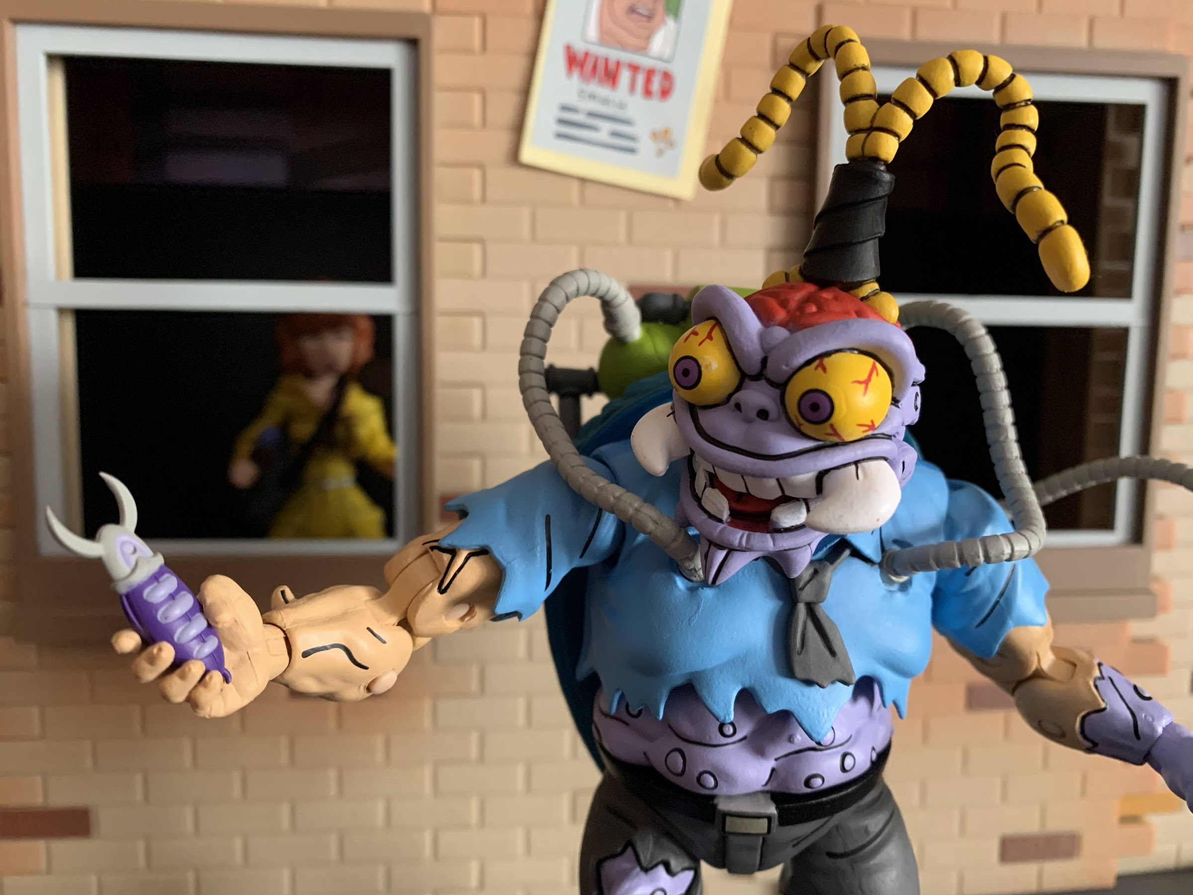
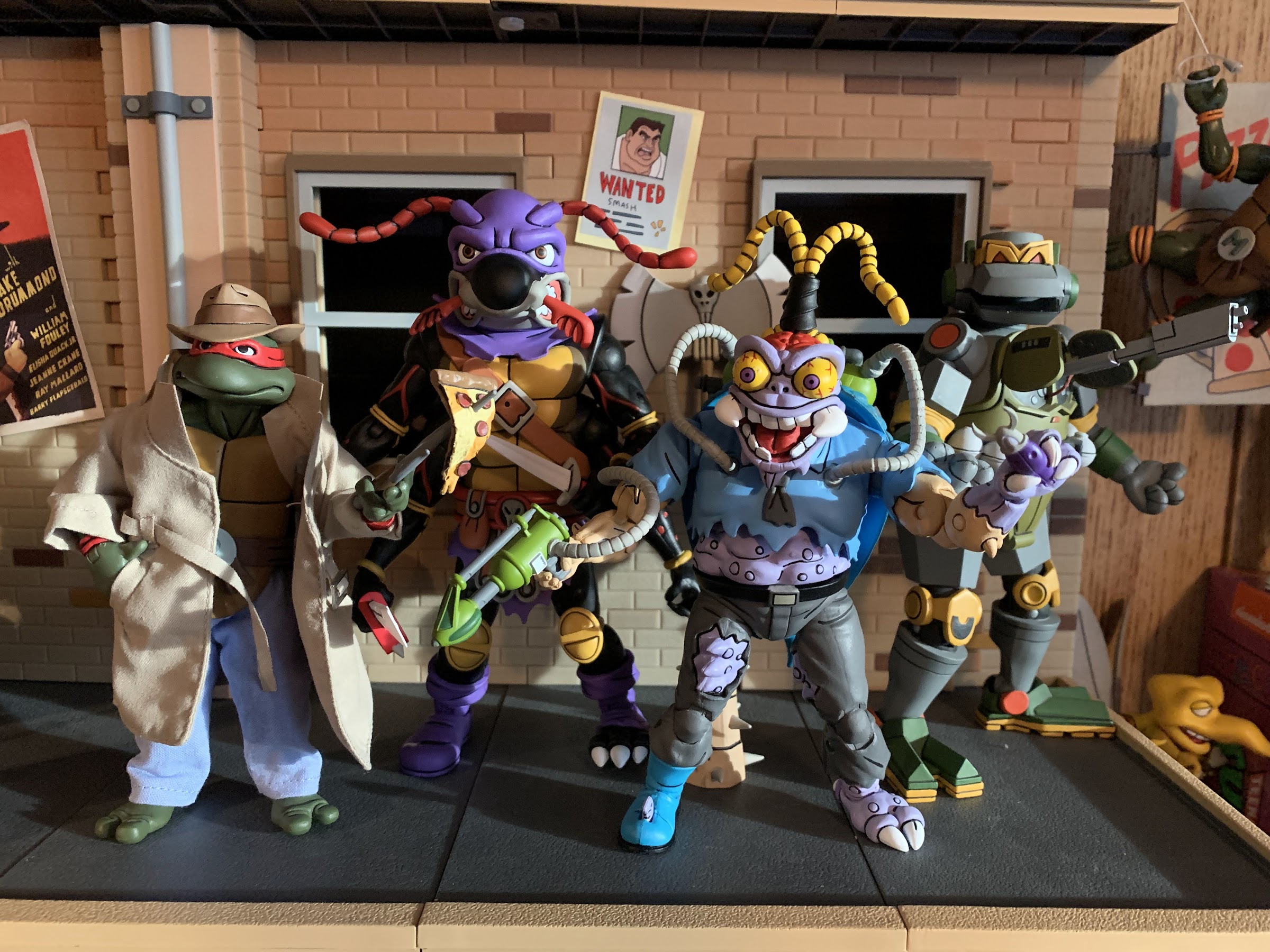
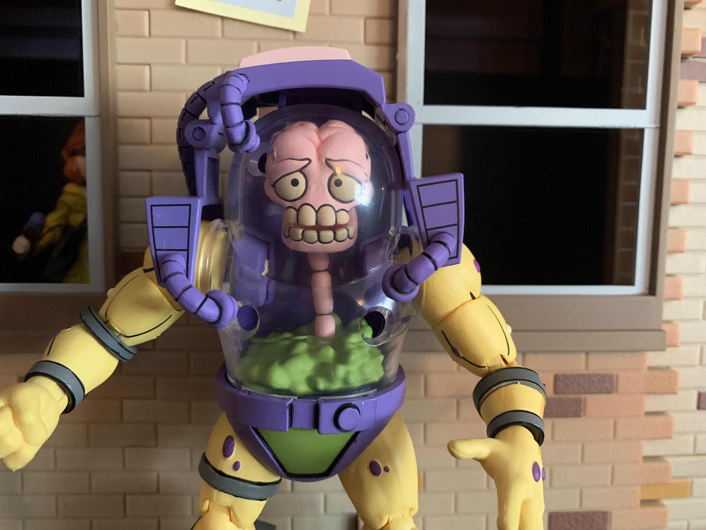
Mutagen Man is not my favorite figure in this line, but he is the most unique.
Mutagen Man– He’s certainly one of the most unique characters from the show and toyline, he’s just not one of the most fun to actually handle. He’s pretty limited, and my version of the figure has a hose that won’t stay inserted in the tank which drives me crazy. The head-swap trick is pretty ingenious though and I definitely like having this guy in my display.
Triceraton Infantry (16) – This guy was pretty solid when he came out, and he’s still pretty solid more than a year later. A good representation of the character in toon form. My only complaint is the lack of a hinged jaw which the other Triceratons received, but the grunt did not.
First Edition Turtles (15) – The original four. NECA nailed the coloring, the head-sculpts were a little iffy, but acceptable. The articulation is dated though and there’s no reason for the company to revisit them now that we have the new four-pack.
Zarax (14) – The Triceraton leader, as far as we know. He looks cool and has unique, bladed, weapons. I liked him when I got him, and I feel the same way about him then as I do now.
Zork (13) – Same as above, minus the blades, and green!
Slash (12) – The controversial toon design of Slash. He actually received a running change in 2021 swapping out that mediocre hip connection for the new ball-peg design and the new ankles. It’s a change that’s for the better, though not enough to seek out if you have the first one. I have always liked the goofy toon Slash so I like this guy. I wish he used a different body from the turtles as he should be chunkier, but he’s good as-is.
He may not have been the best Muckman released in 2021, but he’s still damn good.
Muckman and Joe Eyeball – Our first, true, deluxe figure on the list, Muckman is plenty good. No, his toon design isn’t as fun and crazy as the old toy, but that’s animation for you. This guy is still cool and his sculpt is pretty damn impressive. The only downers with Muckman is he’s very light on accessories considering the gun he comes with isn’t even his. Joe Eyeball is cool though, but what he really needed was some muck effects parts to hold since that’s how he attacked in the show. His chunky design also isn’t fun to pose so he basically just stands there on my shelf.
Wingnut – The Batman parody turned out pretty fun, but similar to Muckman, he’s a chunky guy who doesn’t pose well. The sculpt though, especially the little wings inside the big ones, is terrific. The only negative really is he has those weird double-elbows and basically every figure of him I’ve seen has a crappy paint job when it comes to the fangs. Still a fun figure though.
Granitor (10) – I was a bit high on the rock soldiers last year, maybe too high. Granitor is a good figure, though his utilizing the same body as Traag means his proportions are not toon accurate. This set was also light on accessories so it’s basically you either love the sculpt, or you don’t. I very much like it, I just like others more.
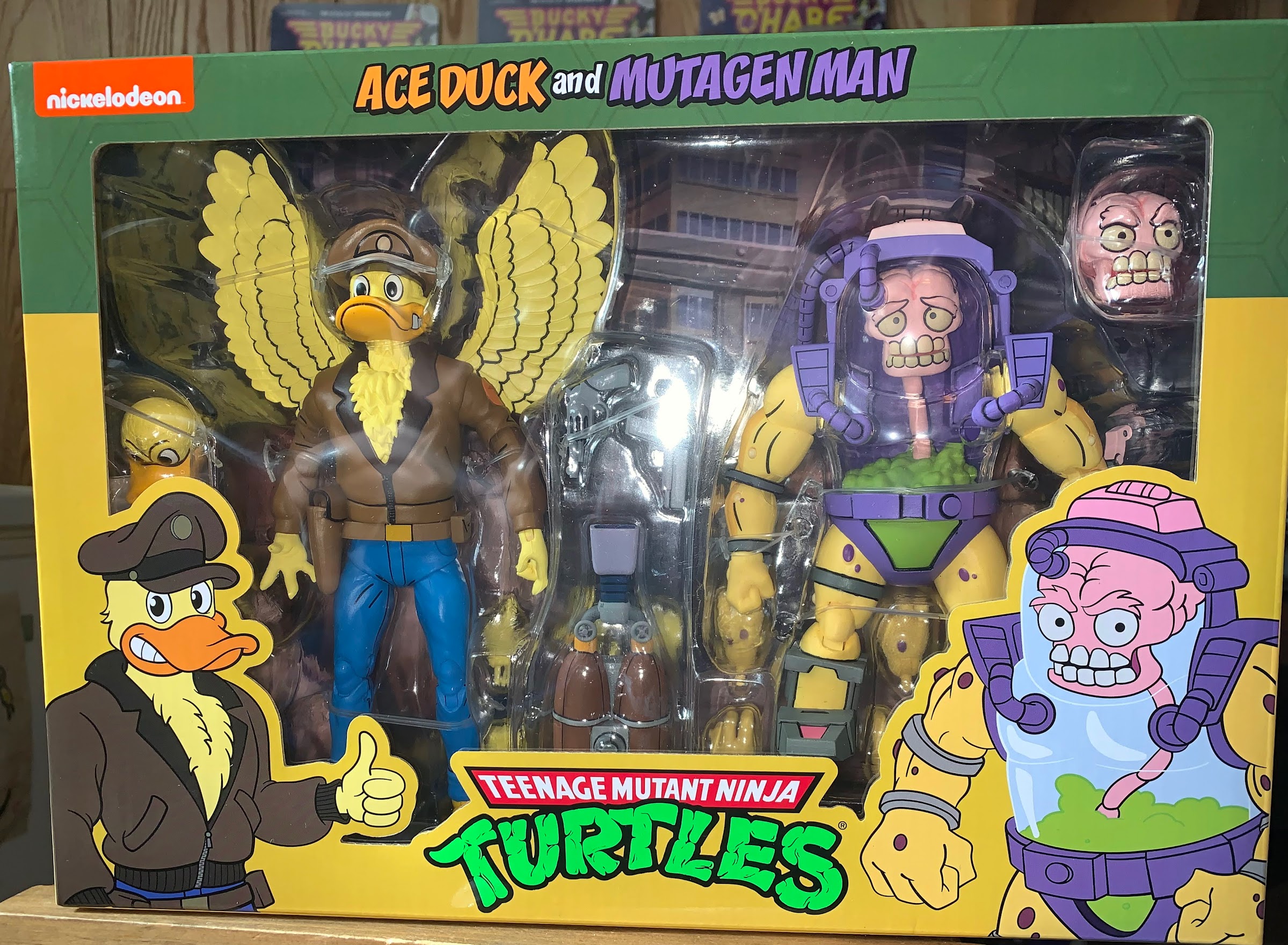
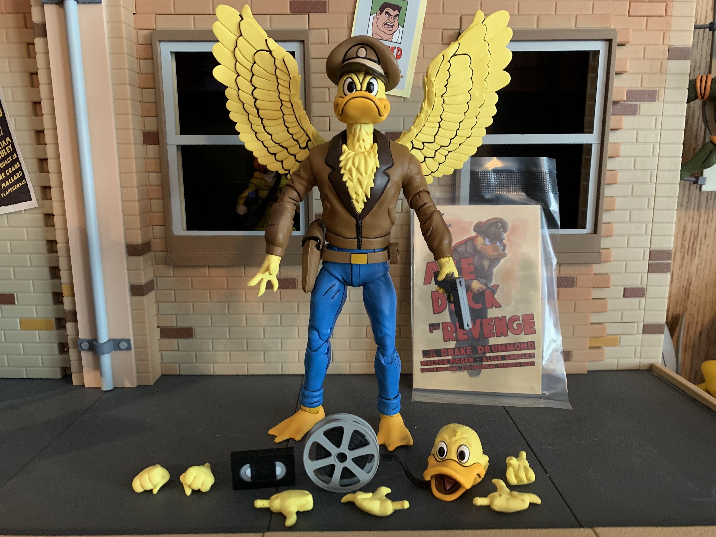
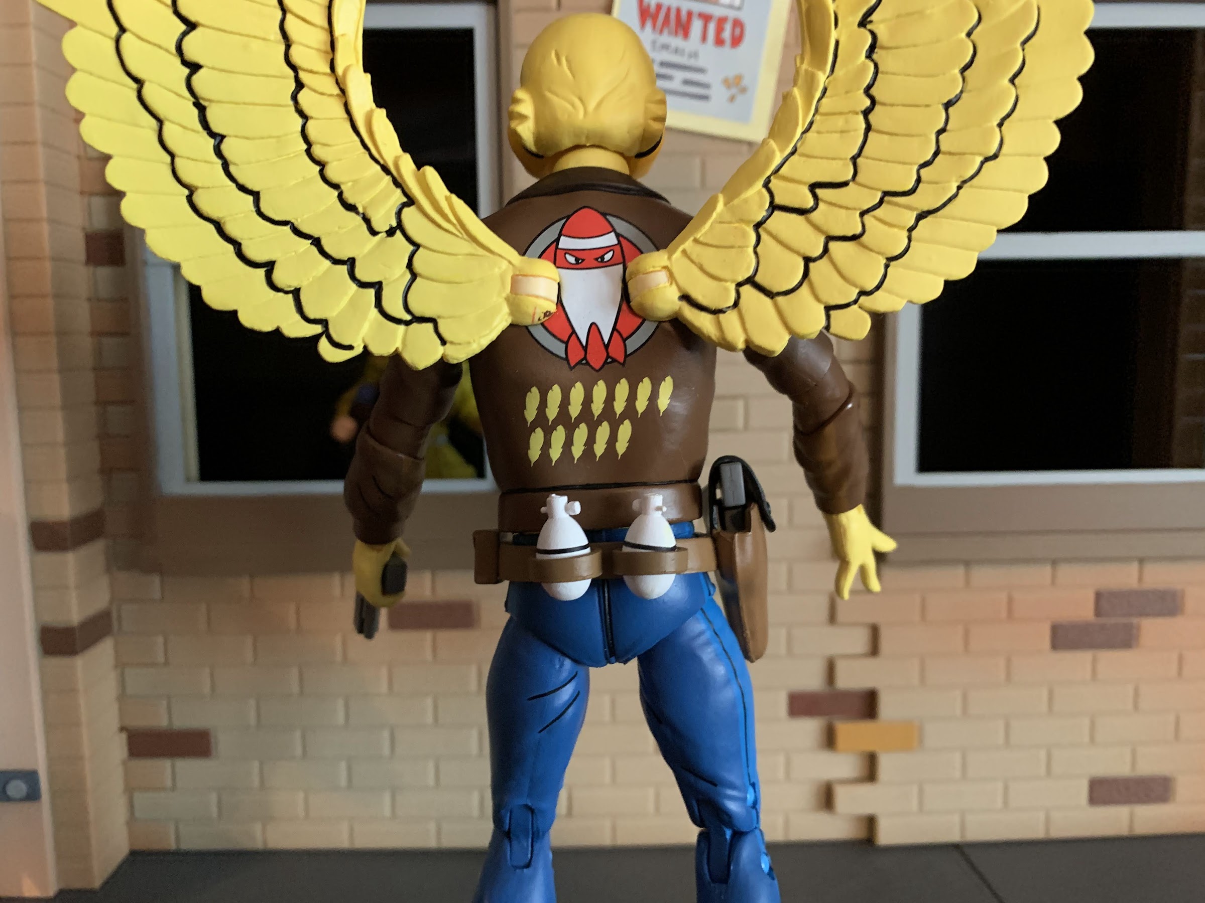
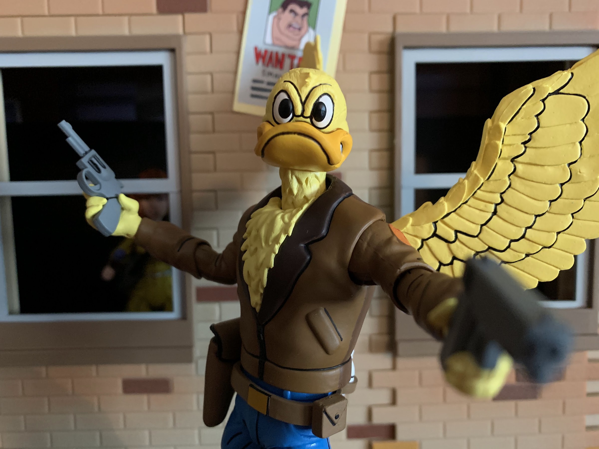
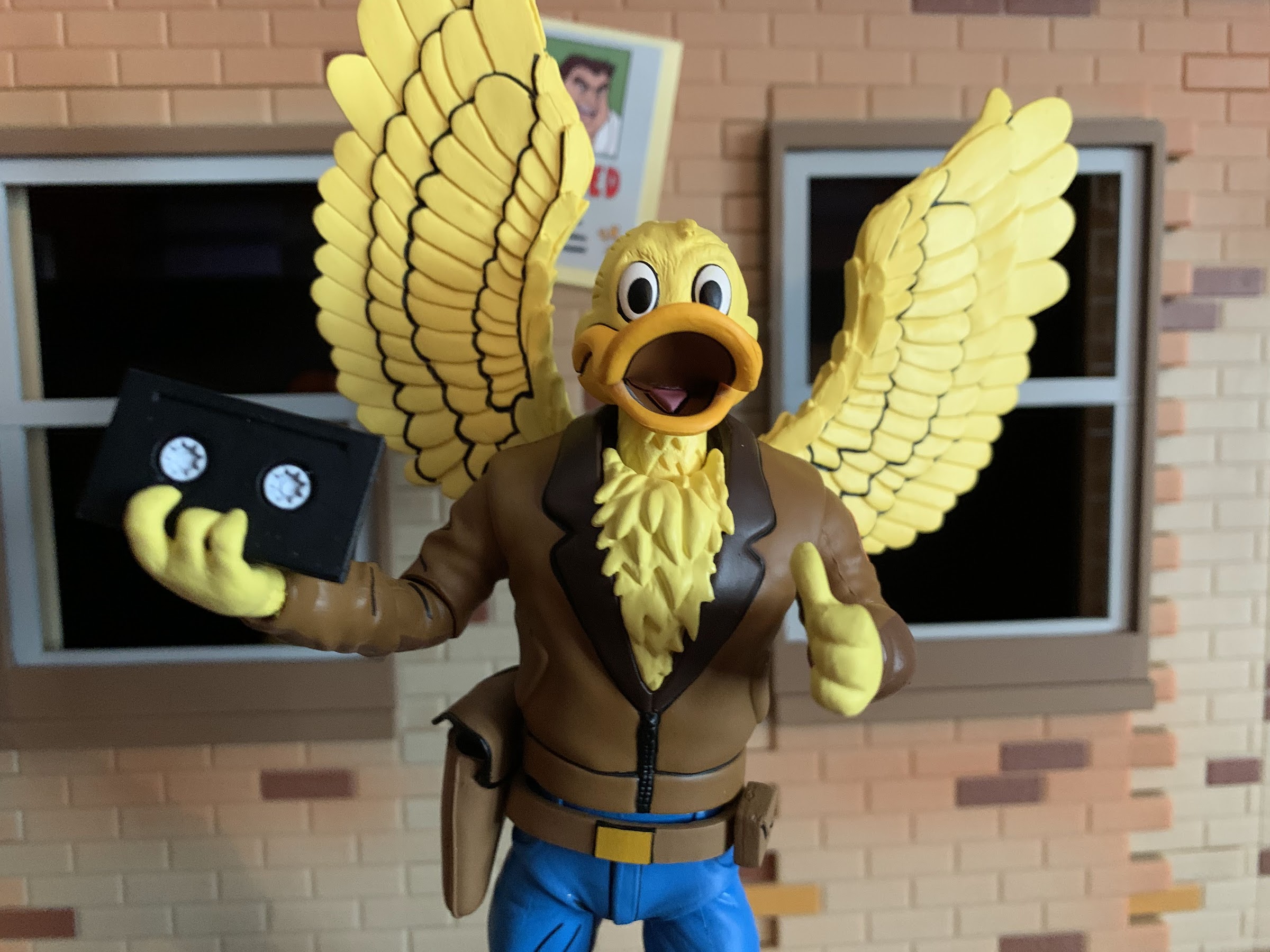
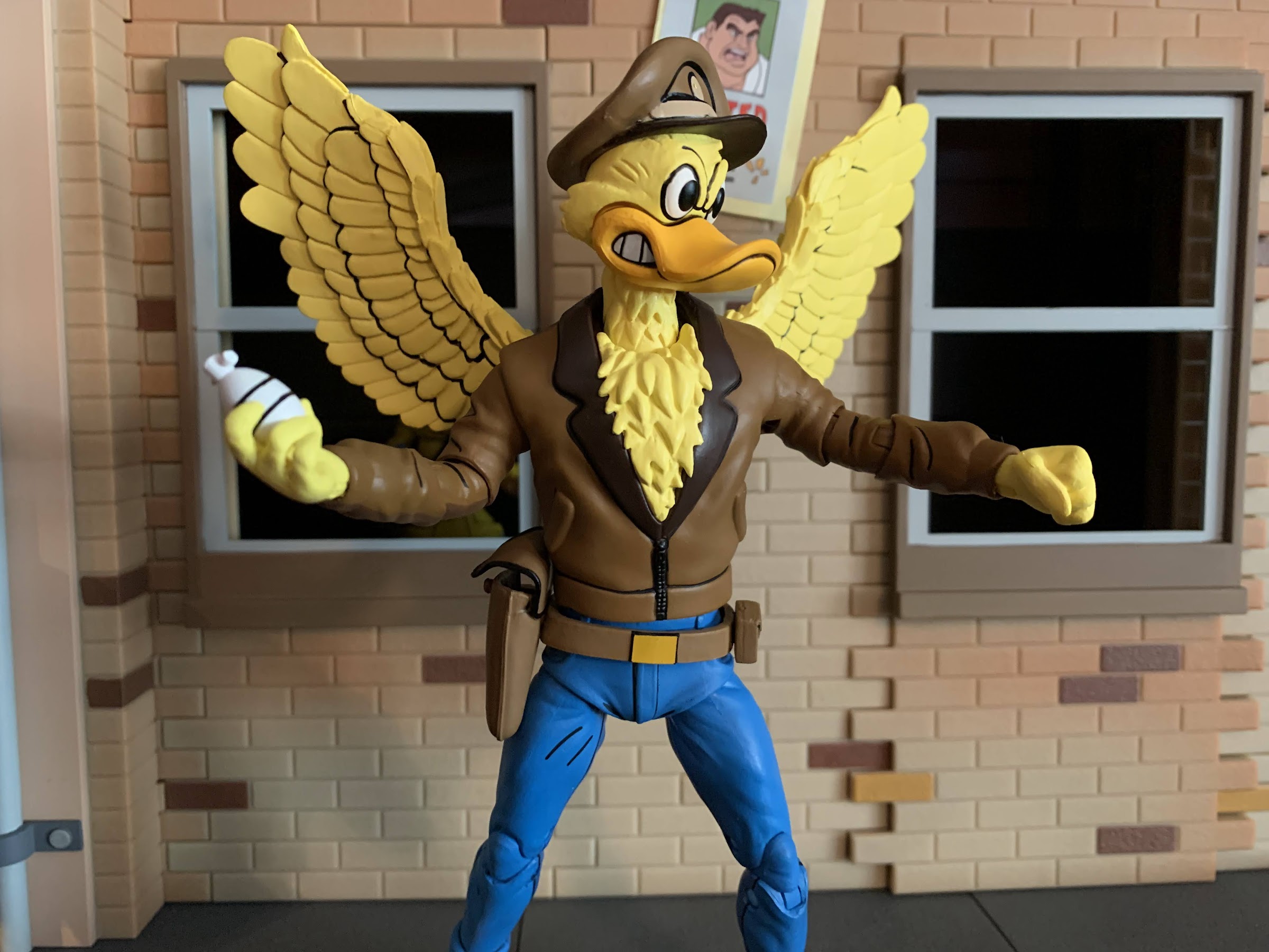
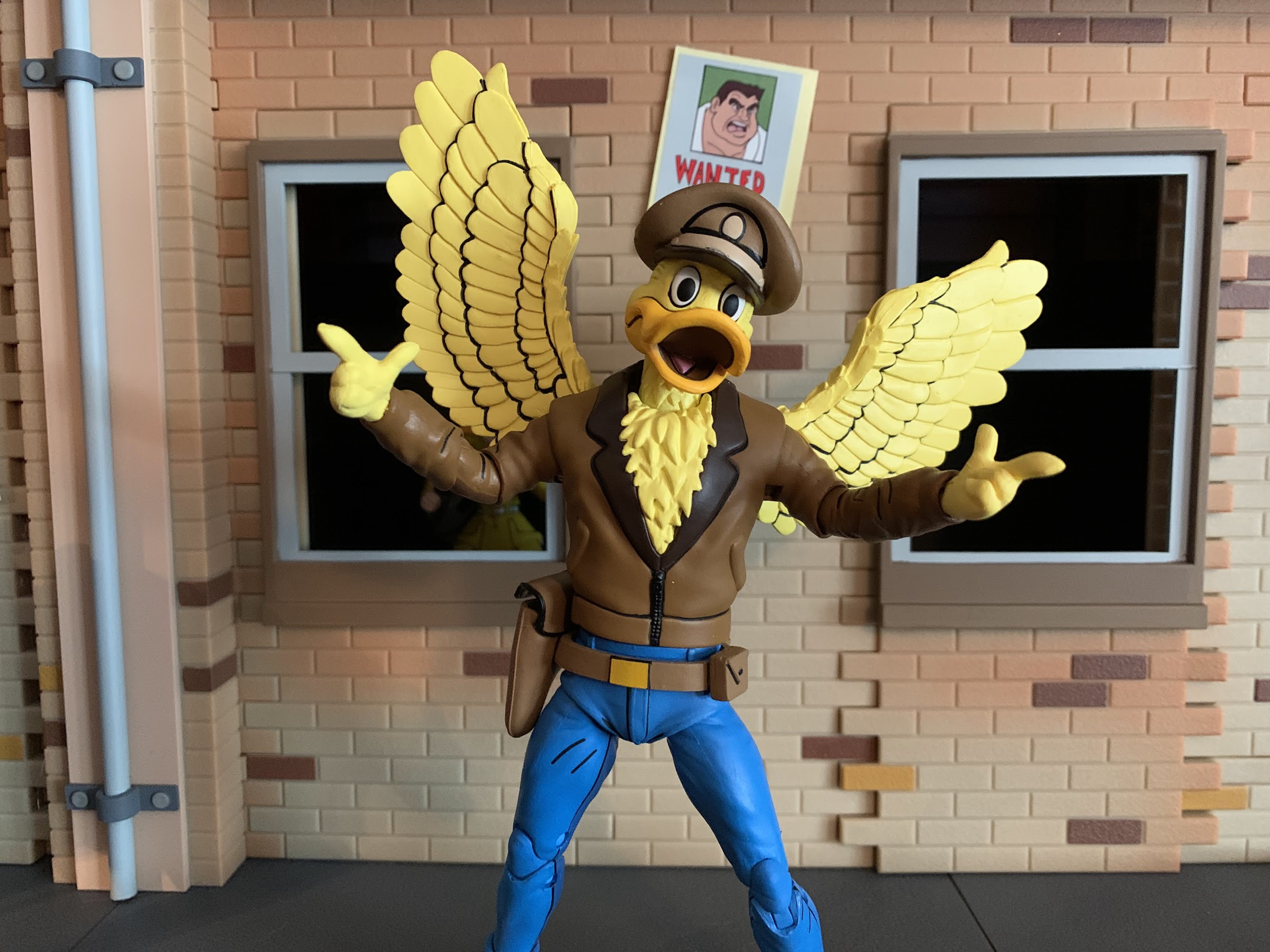
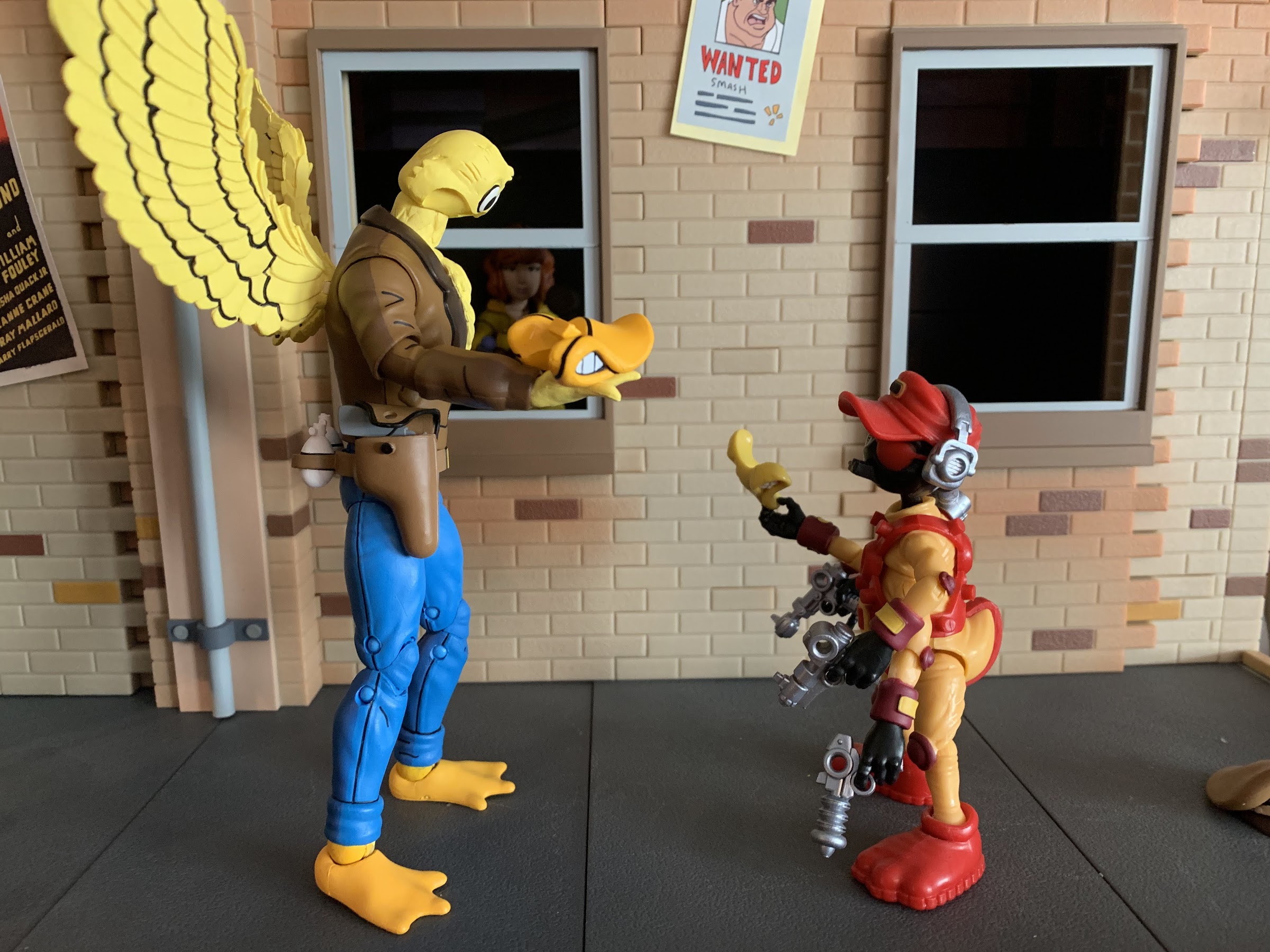
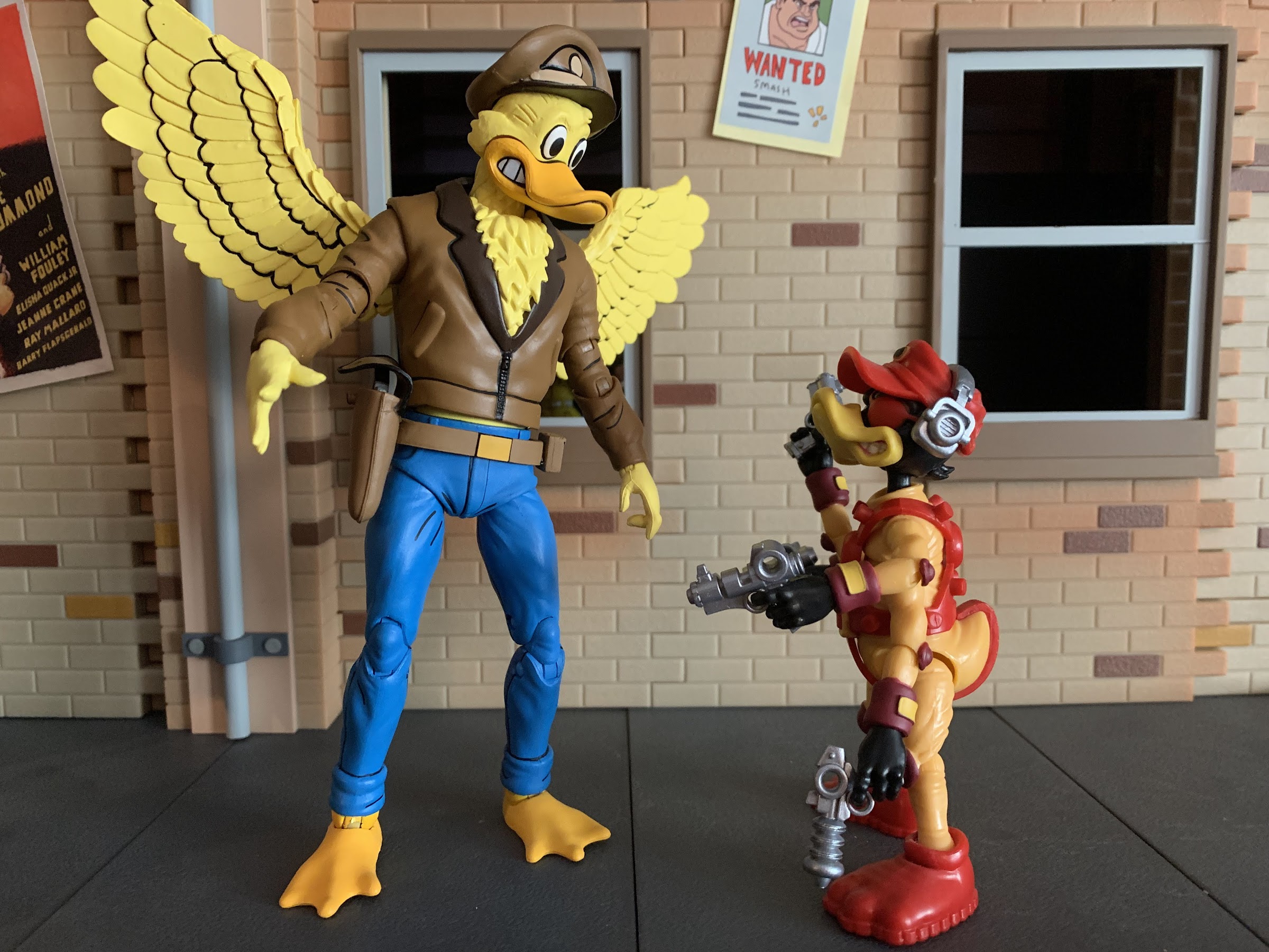
Ace Duck – Ace Duck in figure form is about as good as he can be. His articulation is solid, he has plenty of accessories, and NECA was wise to make the beak removable so he has more variety than most in this line. He’s just Ace Duck who isn’t one of my favorite characters and he was barely in the show so my affection is limited.
Let’s shred!
Mondo Gecko – A character I had a tremendous amount of affection for as a kid is Mondo Gecko. The skateboarding lizard was designed to be cool, and he mostly is. NECA’s version is also just fine: good sculpt, has skateboard, solid accessories. The paint is a little iffy as NECA did that annoying thing where it painted the joints after not casting them in the right color plastic, but that’s pretty much the only negative wit this guy aside from the sort of steep cost ($40). He does come with Kerma, and apparently it was the board that knocked the costs out of whack, so it is what it is.
Shredder (9) – Shredder is a great sculpt that’s just becoming a bit dated at this point. The articulation is not terrific, and there are some little inaccuracies here and there when compared with the toon. Still, I’m not sure it’s dated enough that we need a new Shredder. Some torso articulation and better legs would certainly improve the figure, but I don’t know if it would be enough to get me to buy a new one. Maybe if they tossed in a wired cape?
Casey Jones (11) – I was a little hard on Casey last year. He’s not without some issues as he has the painted joints eyesore and there’s a gummy quality to the plastic on him that I don’t like. On the other hand, he looks terrific, has a bunch of weapons, and poses reasonably well. If he could stand a bit better and didn’t have the painted joints issue, he’d rank higher for me. And maybe NECA will fix those problems because he’s due for a re-release. He and April are basically the only characters not to be re-released at this point and there are a bunch of collectors who are missing out.
Traag (7) – Traag succeeds much better than Granitor at matching the source material. He’s still lacking in accessories, but if you got Muckman then at least you picked up a new gun for him.
A worthwhile update for the flagship line. We can’t have the turtles be upstaged by all of these rogues, can we?
Turtles in Disguise – A four-pack of the turtles with new head-sculpts that can separate at the bandana to create multiple expressions, plus they have better leg articulation and a ton of extra stuff. Want the turtles to go full disguise with those creepy masks? Go for it. I still think the heads need some tweaking, they’re very wide, but the expressions are more faithful to the cartoon than what we had previously which felt more like Playmates homages. The only downside is the glossy finish on the figures which really stands out as basically every other release in the line has a matte appearance. NECA reissued the set with a matte paint job on the head pieces, but the some of the bodies still appear glossy, while some don’t. And since they come wearing their disguises, you basically have no idea what you’re getting until you open the set making it hard to commit to a repurchase.
Bunny Bebop and Rocksteady– I had no idea where to rank these guys. The Loot Crate figures are essentially the same, only one has a Bebop head and one a Rocksteady head. They came with some extra hands, Easter baskets, and a little remote weapon. I love them. The engineering on the legs is unfortunately no different from the regular Bebop and Rocksteady, but otherwise these look terrific. And they make me smile. Your mileage may vary, but I am very much charmed by this duo.
Splinter (8) – What can I say? NECA nailed Splinter. He looks fantastic. He’s not exactly a blast to pose, but I don’t care, I wouldn’t change a thing.
Leatherhead (4) – Leatherhead is great, I’m just less forgiving of this body now than I was in 2021. He has terrible hips and ankles and I do wish his head had more range. Otherwise, he looks the part and he doesn’t need to pose much to be fun as a result.
This is one expressive figure.
Pizza Monster – The giant pizza monster is a terrific sculpt with some poor quality control when it comes to the ankles. Many a collector has broken them, and one of mine even arrived broken in the box. It’s enough of an issue that I basically just leave them alone. It makes him harder to stand, and those hips are too loose, but get him in a good pose and he’s a lot of fun to look at.
Rocksteady (3) – Same as Leatherhead. Rocksteady looks fantastic and I love how NECA was able to give him a paunch. I do wish he had a removable helmet, but that’s about it. This is mostly just a reaction to the lousy lower half and fragile hips. Mine has not broken, but I know many have. What’s disappointing is that NECA has re-released he and Bebop, but has yet to replace the leg system.
Dirtbag – One of the star two-packs of 2021, Dirtbag is the preferred figure in the set of many, but I lean Groundchuck. Dirtbag looks every bit as awesome, his design is just more conventional. He does have the added perk of being able to separate at the torso to simulate him emerging from the ground, but his articulation is a bit limited particularly in the head area. Obviously, it’s not enough to really damage the experience considering how high I have him ranked.
These guys are like a traditional, wrestling, stable.
Krang (Android) (5) – The mighty Krang is mighty impressive. Really, the only shortcomings with this figure is the pose-ability. What can you really do with this design? He’s a top-heavy dude with tiny feet. I do kind of wish the ball and chain weapon had plastic, pre-posed, chains as they just don’t look great on the shelf. I’ve basically gone with a standard hand and one gun hand ever since I got him. Also, his entire body is painted and prone to chipping which makes handling him a bit stressful. Still, I think he’s as good as can be and is an essential release in the line.
Baxter (2) – Was I a bit generous with Baxter a year ago? He was very new, so maybe a recency bias was in play, though really it just came down to him looking like he should. Baxter in his fly form looks terrific, and he came with a bunch of stuff and NECA jammed a ton of articulation into that little body. I have no bad things to say about this figure, and I also always loved the character’s design.
Antrax – The executioner! And one of the newest, and greatest, figures in this line. His negatives can be summed as a lack of vertical gripping hands and a lack of just extra hands. Maybe you can nitpick the posing too, but otherwise, the sculpt and paint are fantastic and he has a bunch of weapons. The character design is fun, and the figure equals that. A homerun for NECA.
Trying not to overload this post with pictures, so we’ll let Dirtbag get in here too.
Groundchuck – With this one, I maybe letting my affection for the vintage toy play too great a role in my ranking, but I don’t care. It’s my list and I’ll rank ’em accordingly. He’s a terrific figure though and that design; bright red-orange, metal bits here and there, it’s just cool. Or it was cool to me as a kid, and I’m sticking with it. He’s got the ridiculous, personalized, cattle gun too and I just have fun posing him and looking at him.
Bebop (1) – Formerly my number 1, Bebop is exactly what I want him to be from a likeness perspective. It’s just all in that old engineering that made me rethink my ranking of him. Plus, 3 of the last 4 on my list are all newer releases so I really only moved one figure ahead of him. Fix those damn legs and he’s back in contention for number 1.
Rat King is here to torture poor Vernon.
Rat King – The sewer dweller was part of the first set released after my last ranking post and the fact that I still think this highly of him more than a year later is testament to how good he is. In short, his sculpt is perfect and the paint on my figure is exquisite. I love all of the stuff he comes with and just the presence he has on the shelf. The only negative with this guy is that crotch overlay which is prone to flaking. Newer versions of the figure supposedly corrected that, but I have been unable to confirm that for myself. If you got a good one out of the box, as in one that didn’t already chip, and you knew of the issue, then your figure is probably fine. It only happens when really flexing that piece. It limits the posing to a degree, but not as much as you think.
With a name like Metalhead how can I not love him?
Metalhead (6) – I don’t know why I had Metalhead at six when I think he’s damn near perfect. He looks the part, he’s big, and chunky, and has some fun accessories. He was the first deluxe release, and he’s still one of the best. I love this guy!
Who would have predicted that two of the best figures in this line would be a pair of one-off bugs?
Scumbug – Yeah, the moment I saw the solicitation for this one I knew I was going to be over the moon with him. Scumbug looks like an updated version of the Playmates toy with some richer colors and a slightly more chunky appearance. He is awesome, but if you don’t like the character’s design then you probably aren’t as high on him as I am. I loved the old toy, so I think he’s terrific. And he has enough stuff and articulation to make him the second best figure in the line. Who would have thought that was possible a year ago?!
This guy is just the best.
Chrome Dome – The biggest figure in the line is also the best. Chrome Dome is impressive. He’s huge, he’s well-articulated, and his paint applications are exactly what I want from this line. And to my surprise, NECA loaded him up with a bunch of extra hands and accessories and still managed to keep the price tag at 40 bucks. He’s not only the best figure in the line, he’s the best value in the line! I just think about some of the figures I’ve spent 50, 60, 100 bucks on that aren’t as impressive as Chrome Dome. NECA has a way of putting out exceptional figures at crazy prices. Maybe no one wants to hear that in the current climate of rapidly rising prices, but it’s the truth. Don’t sleep on Chrome Dome because it’s hard to imagine anyone being let down by this guy.
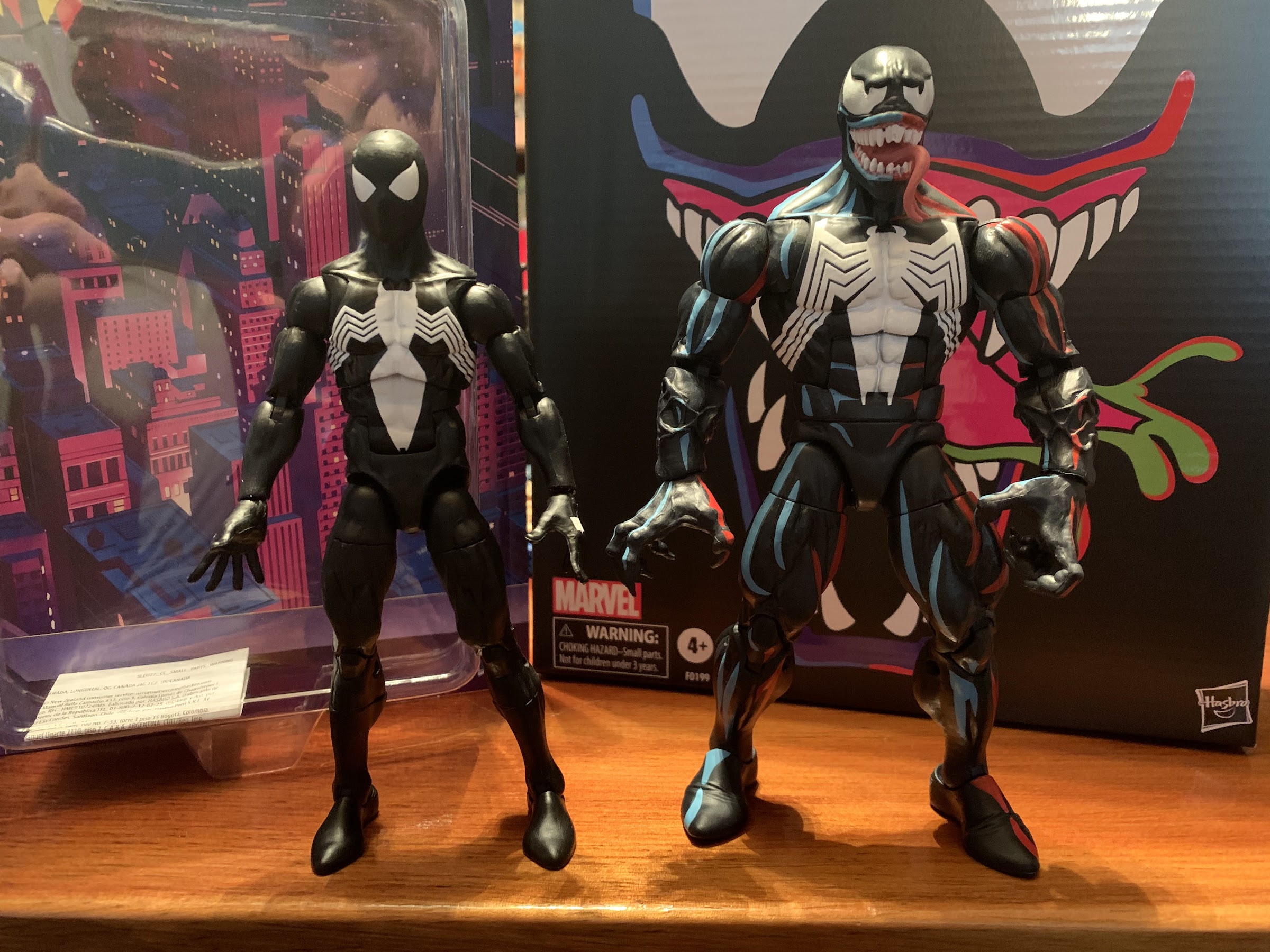
One of the most iconic costumes in the world of superheroes is definitely that of Spider-Man. I put that classic red and blue with webbed detailing right up there with Superman and Batman. I would argue that there’s no more iconic costume in the world of Marvel than Spidey’s, and the crazy thing with Spider-Man is he really has two now iconic costumes. The Black Costume, the Symbiote Costume, the Alien Costume – whatever you call it, is pretty popular on its own. I know I’ve encountered several fans who even prefer the black look to the classic one. I can’t go that far with it, but I do enjoy it, even if Venom has largely taken ownership of the look over the years.
A small sampling of black costumed Spidey’s of the last 20 years or so: Kaiyodo Ultimate Spider-Man, Hasbro, Toy Biz Spider-Man Classics. The new one is an improvement in almost every way save for the “web holes” on the back of the Toy Biz Spider-Man’s hands.
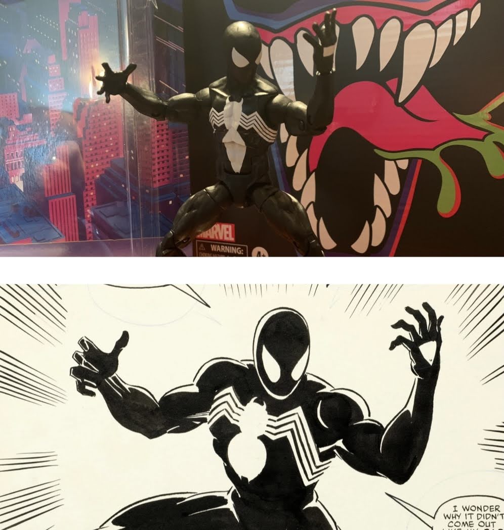
The Symbiote costume has been popular. I can still remember when it first showed up in the ’94 Toy Biz line alongside the Venom II action figure. I wanted it, but because it was so popular, I had trouble tracking it down at the usual spots. I did have a local, dedicated, comic book store that had it along with Venom II. Unfortunately, they wanted 10 bucks for it which was double what Toys ‘R Us would charge me. I could only get one, so I got Venom. When I had replenished my funds, I could have gone back for it, but it was one of those figures saddled with a bad gimmick that made for an unattractive presentation. That was a thing we had to deal with back then. I didn’t mind a gimmick if it didn’t harm the sculpt, but ones that did were the bane of my existence as an action figure enthusiast in the mid-90s. I never ended up getting that figure, but I did get the 2022 edition so I feel like I’m making it up to my younger self.
This mold is an update over the prior one with the biggest addition being the diaphragm joint.
The retro card series from Hasbro is essentially just a subline of Marvel Legends. The packaging reflects the old Toy Biz line, right down to the artwork used for repeat characters. It does cause some confusion as collectors aren’t quite sure if this is an homage line or a line that’s supposed to reflect the animated series itself. I see this most with the recent Hobgoblin release, even though it looks nothing like the old cartoon. Homage line seems to be the right call. That Toy Biz line wasn’t a direct animated line either, though it was much closer to its source material than the X-Men line. What this line certainly isn’t though is a dedicated toon line like the upcoming X-Men one Hasbro is launching this year. These strike me as designs based on the comic with nostalgic packaging.
Together at last.
The exception, of course, is the animated Venom released last year. I have a lot of nostalgic attachment to Venom and the show, so I wanted to grab that release. When I did, I knew I wanted to at least pair him with a Spider-Man. As a bit of a fill-in, I grabbed Web-Man because I really liked the color palette. I also put in an order for this Symbiote Spider-Man when solicitations went up so the long goal was always to get this guy for my display and now he’s here.
The best I can do to visually illustrate my shoulder critique.
This Spider-Man is actually on a different body than Web-Man. I think Web-Man is on the “pizza body” and this version is on the updated body. They’re not vastly different, but there are some. This Spider-Man stands a tick shy of six and a half inches, which seems tall to me, but I’m not a regular collector of this line and can’t speak for how others feel. I don’t believe it’s a true 1/12 scale line. The overall look is pretty much what I envision Spider-Man to be. He’s well-muscled, but lean compared with the more bulky heroes out there. I really like the head shape which has a more pointed chin than Web-Man, and Hasbro did a solid job of minimizing the look of the articulation. It helps that this is a character in an all black suit so you don’t get unsightly issues like the color of the pins not matching the surrounding area. My one real critique of this body is a common one I have for Marvel Legends and it’s the shoulders. They just sit so low on the body. It’s not as noticeable as it is with Web-Man, but it’s something that needs to get better. They just really like this look of large traps sloping down into the shoulders when superheroes tend to have really big shoulders! These ones even sit entirely below the sculpted clavicle. It’s not super noticeable if you pose him well, but this design isn’t really helping out articulation (which we’ll get to) so I don’t understand why it persists.
At least the paint slop is on the rear of the figure.
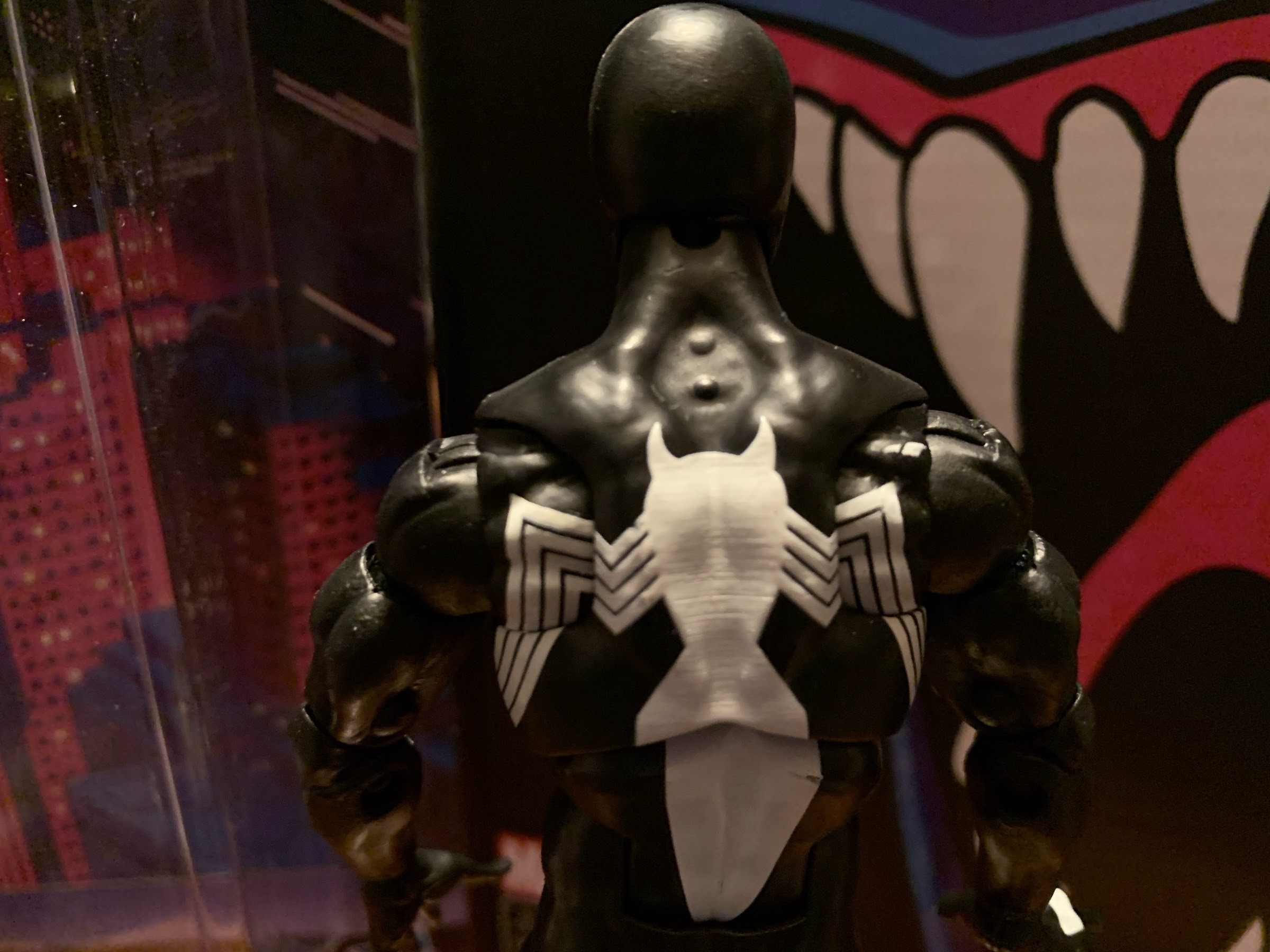
Being an all black figure means there’s little need for paint. Had this been a true toon line, or one aiming to even replicate comic shading, there would be a need for blue highlights, but that’s not Hasbro’s style. He’s all black save for the white portions. And when it comes to that, we have almost two figures. From the front, he looks pretty great. The eyes are well-defined and well-painted. I love the shape of them. The logo on the chest is quite clean as well, though the opacity of the paint is subpar. There’s too much black showing through giving it a grimy appearance. That’s true of the white panels on the hands as well. Here, we have a possible error too as there’s no “web hole” even though the packaging claims this is the symbiote suit. Longtime fans know that when Spider-Man ditched the alien, he still kept the black look as a traditional costume so in that sense the absence is not an error. It’s a nitpick, I know, but how hard would it have been to get that right? On the rear of the figure, the spider logo is more messy. There’s a scratch on mine in the lower torso and some excess white paint just behind the right shoulder. It’s on the rear of the figure so it’s not a huge deal, but it’s an error and one of those that you can’t even see when inspecting a figure in the card which is always frustrating.
Spider pose!
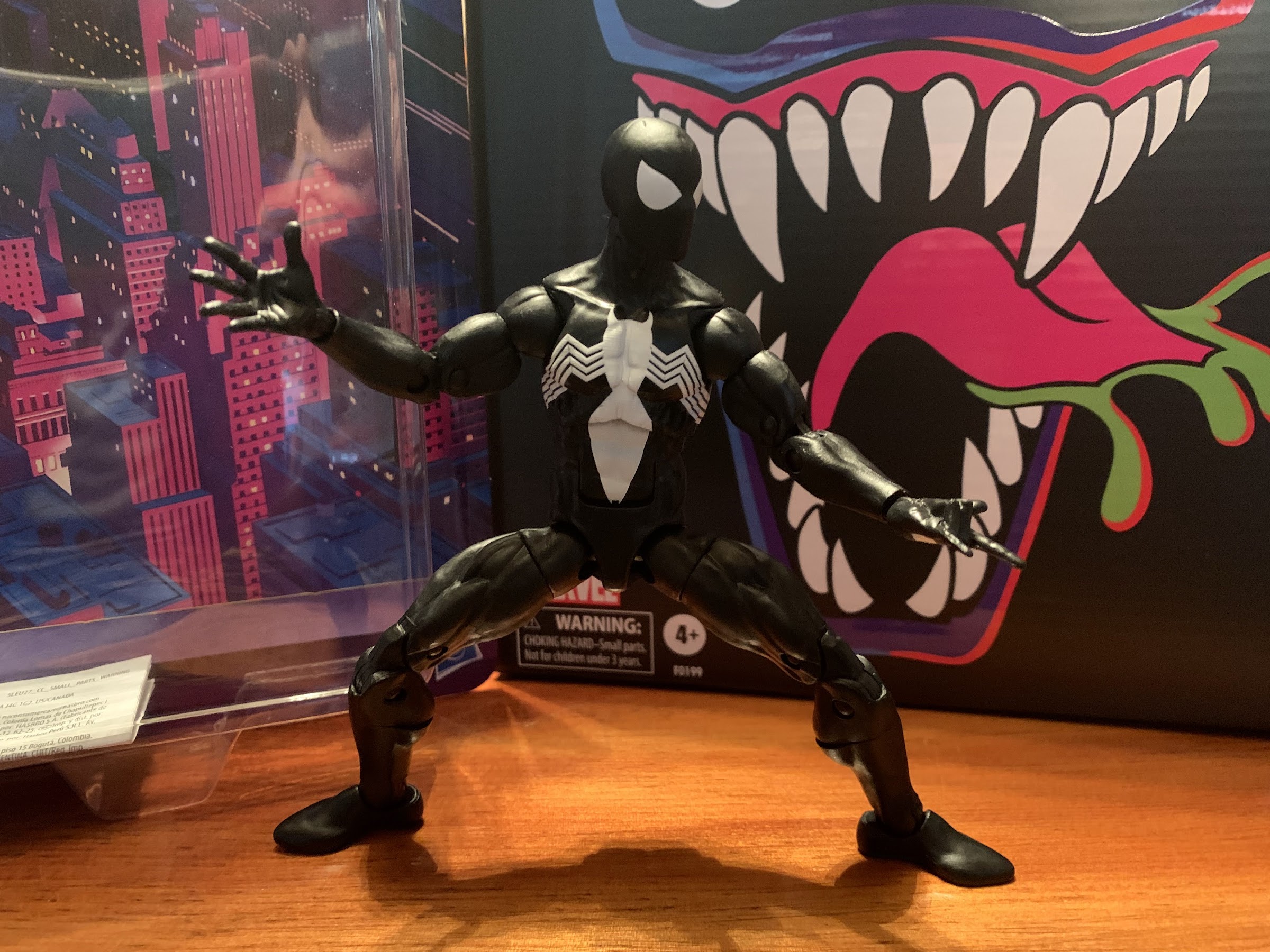
Spider-Man is known for being rather nimble, so of course a Spider-Man action figure is packed with articulation. This dude has a lot, but it’s not all as functional as it probably could be. His head is on a ball-peg and that has plenty of range. The shoulders are ball-hinged and this is the area I alluded to earlier. He can’t raise his arms out to the side all of the way and getting him into a swinging pose is more challenging than expected, but do-able. He does have butterfly joints and they’re okay. Hasbro painted the spider logo all throughout the joint so you don’t get an ugly gap on the rear of the figure. The legs won’t be aligned, but there’s no real helping that. There’s a biceps swivel, double-jointed elbows, and the hands swivel and hinge. All of the hinges are horizontal. There’s a ball-joint in the diaphragm which lets the figure tilt n’ twist. The spider will obviously become miss-aligned when you do so, but again, there’s no helping that. There is a solid amount of clearance between the upper and lower torso so paint rub is minimal, but still something to watch out for. The joint also lets Spidey bend back a bit and crunch forward and when used in tandem with the ab crunch below you get quite a bit of range. There’s no waist twist, and the hips use a ball and hinge so you can drop the legs down. The drop-down function doesn’t really add anything as he can kick forward just as far either way. His butt cheeks prevent him from kicking back, but he can go out to the side almost to a full split. There are thigh cuts, double-jointed knees, a boot cut, and ankle hinges and rockers and all have plenty of range.
If you’re persistent, you can even get a one-handed pose. Note: the figure did fall over shortly after this picture was taken.
This figure articulates well enough. If I were allowed to design it, the only thing I’d change is those shoulders and the hips. Normal ball and socket hips would allow a thigh twist there so we could ditch the kind of ugly thigh cut. I just find that style of cut useless because it miss-aligns the muscle groups and just looks stupid. This guy though can get into most Spidey poses. The one that’s still out of reach is the classic three-pointed stance. To aid in his posing are some extra hands, which are the only accessories he comes with. He comes with fists hands and he can swap to open, “wall-crawling,” hands and web shooting “thwip” hands. The thwip hands don’t make any sense if this is the symbiote suit, but I think they’re still good to have. No gripping hands is kind of a letdown, but he also has nothing to grip. I would love web effects, and they’ve done them in the past, and that’s something sorely missing. This is also a $22 figure and accessories and paint are where Hasbro skimps with them. I’m not surprised, but I can still want more. And what really could some already tooled web effects actually add to the cost here? It’s probably less than a dollar, probably far less, but that’s what you get with Hasbro.
It would look better with some web effects…
And cost, or rather price, is really the main goal with this line. Hasbro wants to get you a good enough action figure at a low cost. This isn’t an import figure or a boutique thing, it’s a mass market retail release. As such, it’s pretty good! The figure does have that cheap feel when compared with a lot of other figures I own. The plastic can feel “gummy” at times and little in the articulation is smooth, but it’s also not loose or stuck so that’s a positive. And this is also a style of character that really fits what Hasbro wants to do: simple sculpt, simple paint, lots of articulation points. There’s a reason Hasbro keeps reusing this body, because it works. And for me, it gets the job done as now I have a Spider-Man to pair with my Venom. It would have been cool to get an animated deco, but this is fine. There are rumors that Hasbro intends to do an animated Spidey in his classic red and blue, and if so, I’ll probably take a look. Should they do that, I hope they at least update the arms to a pin-less system as I really hate how those look on the already released Spider-Man figures which end up with unsightly red dots on their underarm. I don’t know if it will be a deal breaker, but I guess I’ll know when I see it.
In this house, Venom always gets the upper hand.
Symbiote Spider-Man is currently being stocked by both Target and Walmart with other smaller shops still awaiting product. It’s a popular release, so it doesn’t hang around on pegs for very long. I actually got mine via Hasbro’s eBay page which doesn’t charge for shipping. If you’re still looking, maybe keep an eye on that and see if they do a restock. It’s popular for a reason so I would expect the figure to remain in production for at least a little while, but with all of the delays around the world, it could be awhile. Stay vigilant and good luck and if you have to go to the secondary market at least the prices don’t appear to be outrageous.
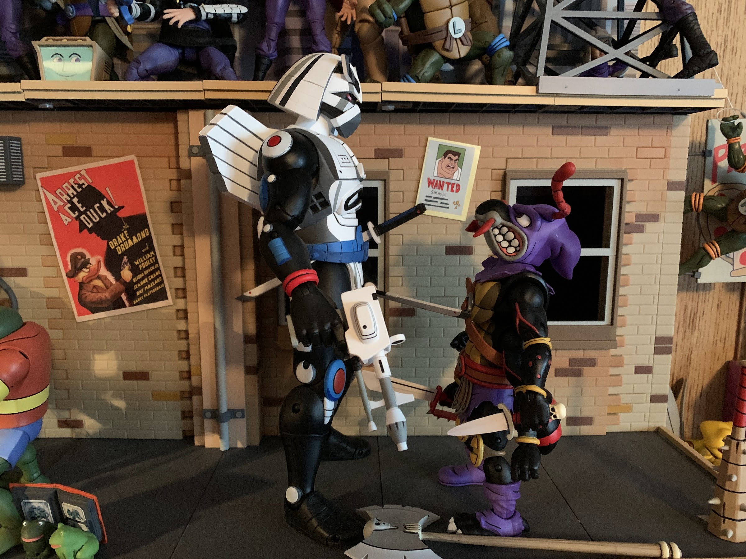
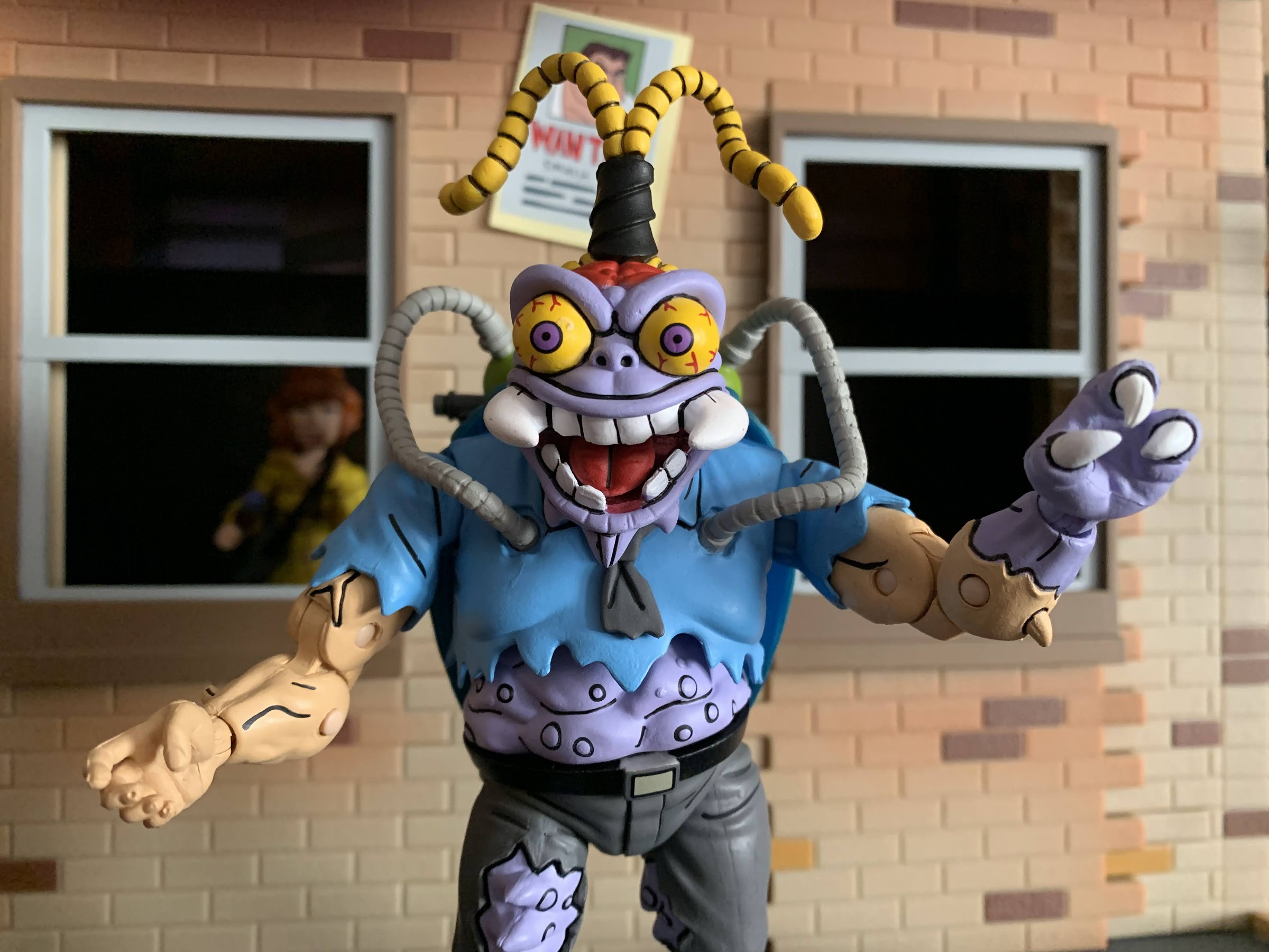
I’ve been looking forward to this one for awhile. Antrax and Scumbug only appeared in the cartoon series Teenage Mutant Ninja Turtles once, but like last week’s figure review, they were present in the toy line long before their animated debut. And these later period episodes, such as “Night of the Rogues,” tended to just stick with the Playmates look rather than do their own thing (Slash) probably because they just didn’t have the time to design their own characters. And for me, Scumbug is a very nostalgic character. I can still remember getting him from my grandmother along with Michelangelo. The character honestly freaked me out a little because he was so gross looking and downright creepy. And for awhile, he was just one of those villains that never appeared in the show and it was a bit of a surprise when he finally did since I had just assumed the show passed him over for some reason.
Have two hideous monsters ever looked more beautiful?
Since these characters were so closely aligned with the vintage toy, much is the same with the NECA version. I almost feel bad for Super7 since they have yet to get to doing these characters as some (like me) may now pass on their version because these turned out fantastic. Let’s just get it out of the way right now: this might be the best two-pack yet. It’s between this one, Bebop and Rocksteady, and Groundchuck and Dirtbag. I think what will ultimately separate all of those sets from each other is just nostalgia for the product. Those who never had the Playmates toys might not care that much about these guys because they were, after all, only in one episode. However, I do think one look at this set from anyone with even a hint of affection for this toyline might be enough to get them to pull the trigger because these bugs are just that cool to look at.
That axe suggests he’s hacked off his fair share of heads.
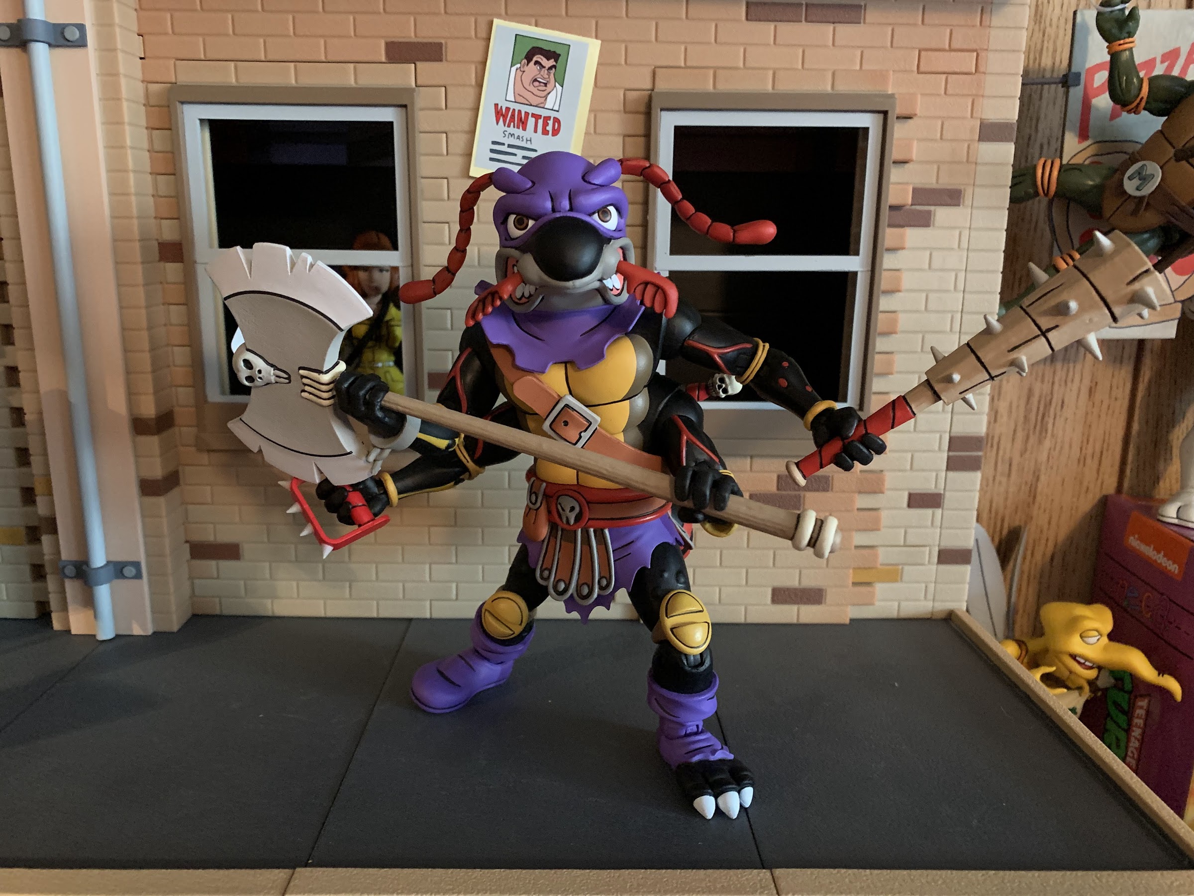
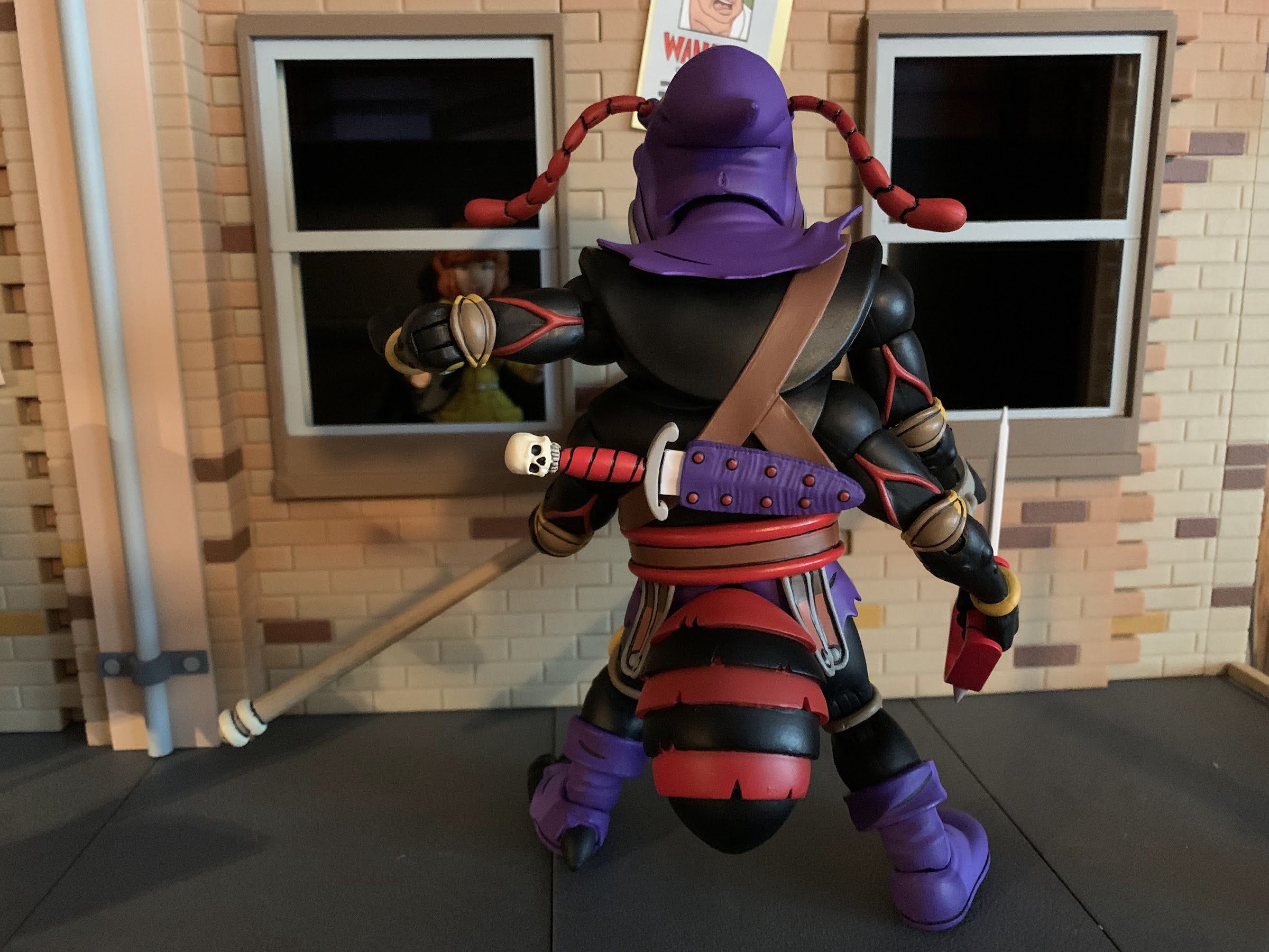
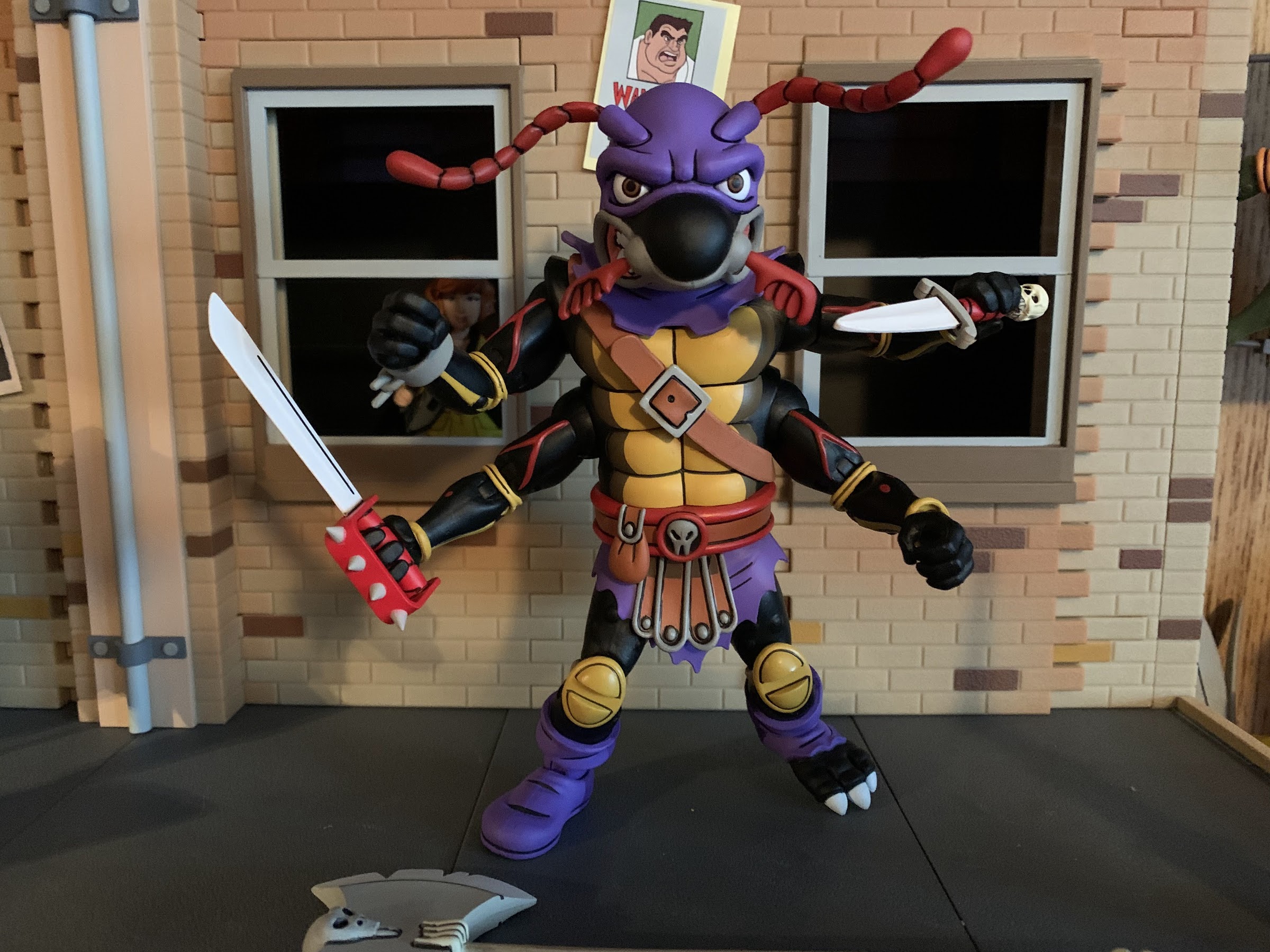
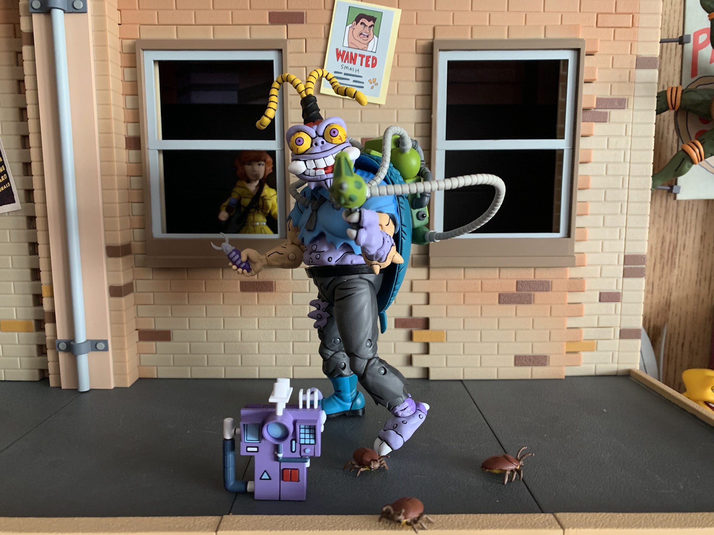
We might as well go in alphabetic order and start with Antrax. This is one big ant. He’s Krang’s executioner from Dimension X, if memory serves (come on NECA, lets put character bios on these boxes!), and he looks the part. He’s a big, black, ant with red veins on his body, a brown carapace, and a purple executioner’s hood. Maybe the purple is odd, but the red and black is not. And even though he’s a bug, he’s a big fella coming in at a tick under 7 inches to the top of his head. The antennae make him push past that if you want to factor them in. Basically, he’s not looking up to many guys in this line as I have him just a touch taller than characters like Zarax and Metalhead, and shorter than only Krang’s Android Body, the pizza monster, and Chrome Dome. And what stood out to me when I first picked up that rather large box these bugs come in was just the size of his head. This dude’s got one big dome and the really cartoony sculpt (Jon Matthews) is an attention grabber.
He’s a big ant, but he still has to look up to Chrome Dome.
The other thing that probably jumps out is the amount of limbs on this guy. He’s an ant, so he’s got to have six limbs which take the form of four arms and two legs. The designers of the old toys really loved going against symmetry as he and Scumbug both have a different design for their left foot and right. He’s got a purple boot on his right foot, and exposed toes and claws on the left. The arms are almost all the same though as they’re black with red veins and orange elbow pads. The upper right arm has the remnants of some handcuffs on the wrist while the other three just have orange-yellow bracelets that match the elbow and knee pads. He has shoulders for each arm too which is most noticeable from the rear of the figure which is kind of interesting. It’s like NECA took a standard figure, and in place of a head inserted another upper torso. There’s a shoulder strap that’s home to a knife sheath on the back of the figure and a belt around the waist that’s got a non-functioning pouch on it. Skulls are a theme with this guy as one shows up on his belt and more will feature into the accessories. He’s a really fun design and the paintwork is excellent. Since he’s mostly black, we don’t get much of that half-and-half shading, though it is present on the hood and boots, but he’s got some shading on the front of his carapace and the other paint accents are cleanly applied.
Double the arms means double the fun!
The articulation on this guy is both familiar and unique. We only have one, true, four-armed character in the line (I don’t count Baxter) in the form of Screwloose, but this guy has four, fully-articulated, arms to pulverize turtles with. Screwloose, if you recall, had single elbow joints and he’s a bit of a little guy for the line. Antrax has four legit arms and each one is connected to his body via a shoulder ball and hinge. He has double-jointed elbows with elbow pads thus proving that we should be able to get the same on the actual turtles. It works great too as he can bend past 90 degrees at each one. There’s a biceps swivel on each arm, but all four were stuck on mine and I still can’t get the upper right arm to work. There’s just too much play in the shoulder to get enough leverage even after heating it up. The wrists all swivel and hinge, but they all have horizontal hinges which is a real bummer. I don’t know why NECA did that, but all four should be vertical since he’s got a bunch of melee weapons. Or at least it should have been two and two.
I love me some weapon storage.
At the head, Antrax features what I think is just a single ball peg. It’s wicked smooth, if I may bust out some northeast slang, and it’s oddly satisfying to manipulate. He can’t look down much at all, but he can look all the way up and tilt his head. The antennae on top and the two pincers or whatever those things are on the snout can rotate. In the torso, he has a joint in the middle that lets him rotate and slide to the left or right. It’s kind of funky as you can basically purposefully miss-align the shoulders, if you wish, which looks odd. He can’t really crunch forward and back though, but not many figures in this line can. There doesn’t appear to be a waist twist, but past that he’s pretty conventional with ball-jointed hips, double-jointed knees, and ankles that hinge and rock side-to-side. His thorax, tail, whatever it’s called is connected via a ball-peg and can rotate all about on the figure’s rear. Aside from the biceps, I’ve had no issues with joints being stuck. Some of the wrists are more loose than I’d like, but otherwise everything else is great.
I love the weapon storage, but I also love the dagger. How can I keep it hidden behind the figure?!
As for accessories, an executioner needs tools for execution and Antrax comes pretty well loaded. I will say for starters, he has no extra parts, just four gripping hands. There’s a lot of unique tooling going on here so I’m not surprised by the lack of extras, but I do wish he had a couple of hands. I already said I wish he had vertical hinges, but just something to have instead of a gripping pose for any hands that aren’t holding a weapon because it looks awkward to have an empty gripping hand. He does at least have enough weapons to occupy each hand. Up first, is a dagger with a red handle and skull pommel. This one can slot into the sheath on his back or be held like a dagger normally is. He’s also got a much larger sword with a wicked spiked, handguard, suitable for hacking some bone. There’s a big, spiked, club with a red taped handle that’s quite pointy and also quite heavy. This one gives the figure the most trouble with the looseness of some of the hands since it possesses so much weight. The top is flat though if you just want to stand it beside the figure. Lastly, what would an executioner be without an axe? Antrax has a massive double-sided axe with a bunch of notches taken out of it and another skull for good measure. It looks terrific and it’s between this or the little dagger as for what my favorite is. I will say, getting the weapons into his hands is tough as they’re pretty firm and the handles are also pretty thick. Not wanting to risk getting red paint on the hands of my figure, I just went ahead and dipped them in hot water first. Even then, getting the axe in-hand is tricky because it’s so thick at the base.
Get a load of this maniac!
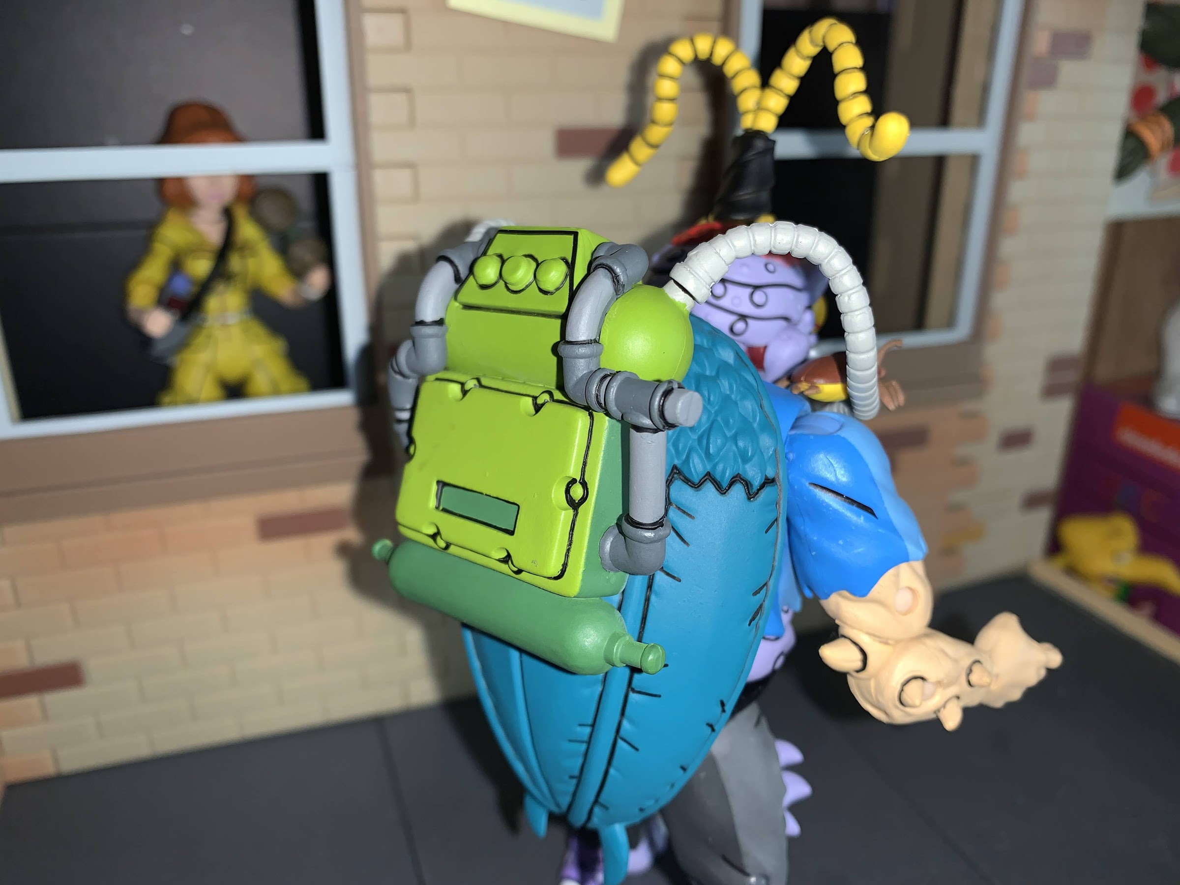
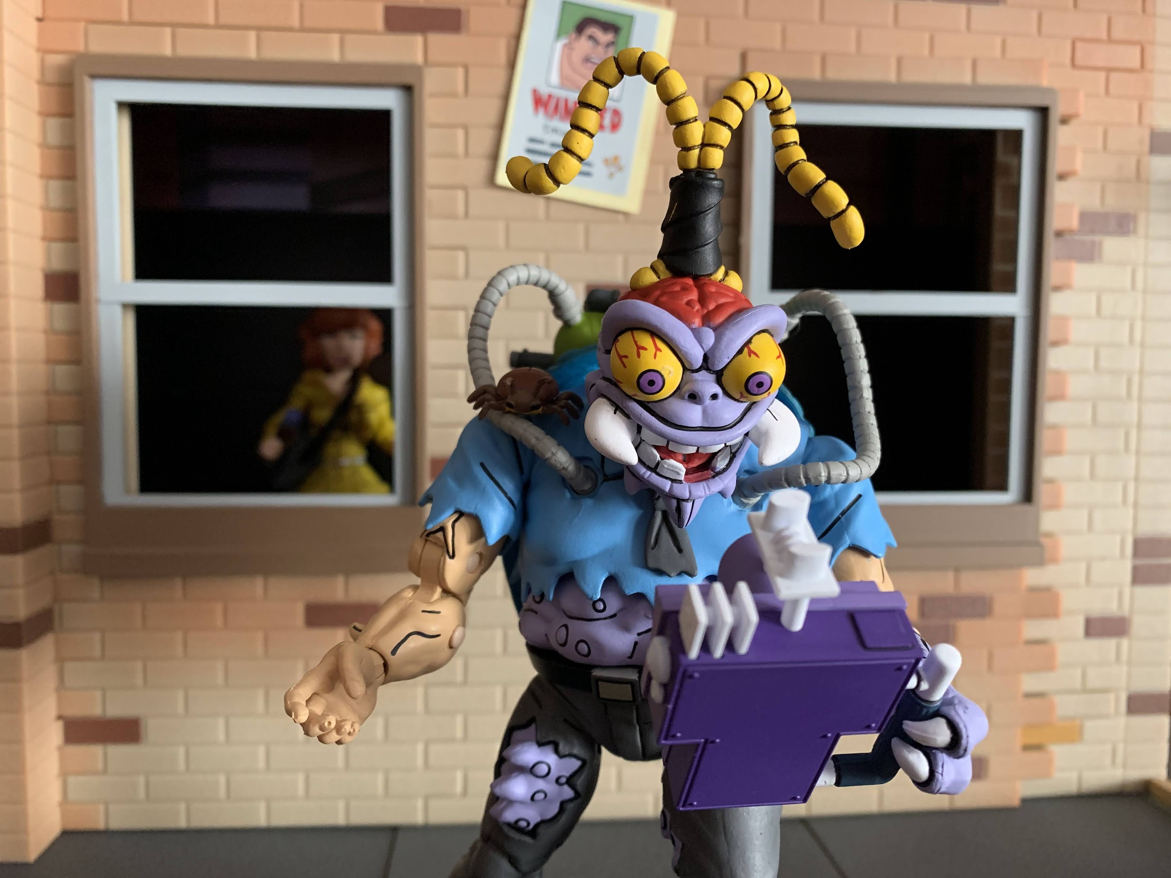
Antrax is pretty awesome, and he seems to be the preferred figure from this two-pack for many, but for me that honor is going to Scumbug. His sculpt and my nostalgic affection for the figure is what’s primarily winning him over for me. He stands much shorter than Antrax at approximately five and a half inches, six and a quarter to the top of his antennae, but he commands just as much attention. I owe that mostly to these wild eyes he possesses. They’re yellow and bloodshot with a purple iris and a black inner pupil. He pares that gaze with this big, maniacal, smile and I can’t help but smile back when I look at him. He’s another character with an exposed brain on top and his yellow antennae appear to be taped together like a topknot or something. I think he’s supposed to be a mutated exterminator and he’s sporting the tattered remains of a blue dress shirt and tie and gray slacks. His body though is in varying stages of mutation. Both arms feature spikes poking through the flesh, while the left hand has discarded his human flesh in favor of purple. His gut is also hanging out and it too is purple and lumpy while his left foot has apparently torn through his boot and the right is just starting to do the same. On the rear of the figure is his carapace and a backpack that contains who knows what. It connects to the figure’s chest via non-removable tubes and a third tube that connects to a handgun that looks like an exterminator’s sprayer.
Guns n’ bugs, baby!
This sculpt for Scumbug is just wild. A lot of that harkens back to the old toy, which I no longer have. It’s an insanely detailed and complicated character for animation, especially a somewhat cheaply produced cartoon like Teenage Mutant Ninja Turtles. And the paint application is phenomenal. We get the same style of shading on much of the figure as we’re accustomed to save for the head, which I think is wise since there’s enough going on there. There’s a lot of black lining on this guy around the various spikes, warts, and whatever that’s all applied very clean. There are so many places where things could have gone wrong, like the fleshy parts poking through the thighs of his pants, but it didn’t. It’s terrific and I’m in love with this hideous monster of a bug.
The backpack is non-removable and does unbalance the figure a bit, but that’s pretty much my only nitpick here.
Scumbug, being this kind of short and pudgy figure, looks like something that would not articulate well, but of course that’s not the case. He’s one of those characters who is hunched over a bit so his head more sticks out than up from the body. This means he can’t look up, but he can look down and side-to-side and the range on the side-to-side is great. There’s so much personality to it and it’s similar to the Super7 Muckman in terms of functionality. He also has an articulated jaw which just adds to the crazy when it’s opened and everything inside his mouth is well-painted and detailed. The shoulders are ball-hinged and his biceps swivel where the arm pegs into the sleeves. He has double-jointed elbows which bend past 90 and wrists that swivel and hinge horizontally. In the torso, he’s got a ball joint where the shirt meets the lower body that lets him rotate and tilt a bit and he also has a waist twist below that. The hips are the standard ball-joints and his knees are double-jointed with hinges and rockers at the ankle. It’s all surprisingly functional and really the only thing holding him back is that pack that happens to be on his back which throws off his balance. You’ll have to manage that while posing him, or use a stand, but I’ve been able to get him into some decent poses without the aid of such.
NECA won’t be content until every character in the line has a tracking device to hold onto.
Like Antrax, Scumbug does not come with extra hands or an alternate head. He definitely doesn’t need another head, but some style posed hands would have been nice in the event you don’t want him gripping something. His right hand, the more human-looking one, is in a trigger finger pose which is odd as he comes setup to wield his gun with his right hand. That one, the clawed one, is a gripping hand and if you don’t want him to hold the gun with that hand you simply unpeg the hose from the backpack and switch it to the other side. Whatever hand isn’t holding the gun can wield this little insect-shaped device which threw out some funky electric net in the cartoon. He also comes with a big, chunky, purple, handheld device that’s from a different episode, but NECA loves shoving these random tracking devices into sets. Lastly, there are three unmutated cockroaches to scatter across your display. They’re actually pretty well-painted with brown on top and yellow on the bottom.
The accessory count is plenty good as Scumbug has all that he needs. About the only thing I’m missing with this guy is somewhere to store the gun should I not want him holding it. I suppose I could just unhook it from the backpack, but I wish there was a holster somewhere for it. It’s not a big deal for me as I plan to display him always with gun in-hand.
I barely remember this thing, but it’s cool to have. Like the gun though, I do wish there was a place to store it when not being held.
This insect-themed two-pack is one of NECA’s best. Antrax and Scumbug both are fantastic sculpts with an exceptional paint job and a great batch of accessories. We’ve come a long way in that regard as thinking back to Bebop and Rocksteady those figures featured a lot of the same tooling, had duplicate hands and weapons, and not much that made the set unique. Here we have a ton of new tooling for both the figures and weapons and it’s all tooling that really won’t be of much (any?) benefit going forward. It does come at an added cost as this set was $65 instead of the now usual $55. It’s worth every penny though as these guys are awesome and I hope collectors don’t sleep on this set just because these characters weren’t in a dozen episodes.
Now comes the hard part: making room.
NECA made this set available for preorder back in April of 2021. It was the last of three new releases for the toon line that month and if you didn’t order it then you should get another shot when it hits Target. As of this writing, we have no idea when that might be. It seems NECA is just about done shipping all of those orders so it could be that we may see them ship to Target soon. Or, NECA pre-sold the entire order and collectors will have to wait for a second run at a later date. I don’t think so, but I suppose it’s possible. I think it’s more likely the company is just prioritizing the customers who already paid for their sets, since I had no problem exchanging my broken pizza monster for another leading me to believe they’re sitting on a bunch of inventory just waiting to be released. If you’re in the market, keep an eye out. They’ll probably hang around for a bit due to the price and the characters being unfamiliar to casual collectors, but then again, they are exceptional action figures so maybe they come and go pretty fast. If you are collecting this line though and have been on the fence with these guys, I say get off of it, because you’re missing out on two of NECA’s finest.
One of last year’s biggest announcements in the world of action figures was NECA’s acquisition of the Gargoyles license. It had been decades since Gargoyles figures occupied real estate at the toy and hobby shops of America and fans of the series were eager to see what NECA had cooking. It being 2021 though, collectors were forced to be patient as delays seemed to impact the roll out of product. NECA had indicated they had multiple figures sculpted and ready to go, and a teaser video following the Goliath announcement depicted the nefarious Demona. It was later in the year that NECA would show off Thailog, the villainous Goliath clone, which seemed to suggest he would follow Demona. Instead, he leap-frogged her, sneaking out to some stores in December with a wider release following in 2022.
I don’t know what NECA’s original slot for Thailog was in the grand scheme, but I don’t think he was supposed to be the line’s second release. Being a Goliath clone, Thailog is essentially the same figure as Goliath with only minor differences. That’s not an issue as why should NECA do anything different with the sculpt for a character that is a literal duplicate of another? It’s just that most companies don’t like to dip into repaints right away with a new line, but if the factory was running behind, it may have made sense to go right from Goliath to Thailog since the same molds are in use, nothing needs to be tested, and the machines don’t need to be refitted with the molds of another. That’s what I think happened, but I have no inside information, it’s just a theory that makes sense. Either way, Demona is still coming (along with a bunch of others) and right now we have two figures released that look pretty similar to each other.
He’s Goliath with a smile. Oh, and he’s evil.
Since Thailog is basically the same as Goliath, there’s not going to be a lot to talk about here. The sculpt is identical excepting the face. Goliath came with two portraits: stern and angry. Thailog has just the one and it’s a mischievous, sinister, grin. Aside from that, he comes in the same window box with character specific artwork and product shots on it. The massive wings that came with Goliath are here as well, along with the bendy tail. Even the loincloth is the same.
And he’s also packin’ heat.
Where Thailog is different from Goliath is primarily in the deco. His skin is a dark blue-gray that almost looks black under certain lighting conditions. The hair is a silver-white with some black dry-brushing added for effect. Portions of the body are shaded with black as well and the loincloth he wears is a light blue. The wings are basically all one color as opposed to Goliath who has black membranes with a purple bone structure. His eyes are also red, which just makes it all the more obvious that he’s a bad guy. He’s a cool looking character and if you like the sculpt for Goliath you’ll like it here as well.
These two take up a lot of real estate.
The good news, all of the good details Goliath embodied are captured here, but that also means the not-so-good aspects of Goliath are also still present. The biggest criticism that has arisen from this line definitely concerns the wings. They’re huge and they’re a hard plastic so there’s not much that can be done with them. Either they take up a ton of real estate going out to the side, or you can angle them back and distribute some of that behind the figure. Either way, it’s a lot, and it’s a position that really only works for gliding poses. Standing on a shelf is not really what they’re made to do, but NECA doesn’t include a flight stand so you’ll have to buy your own or try to hang these suckers from the ceiling. I don’t know what the solution is, NECA is planning on including caped wings for Goliath with Bronx, but we need some more options. At least a more casual, standing, pose for the wings. My assumption is they looked at articulated wings during the development stage and either ruled them out for aesthetic reasons or cost ones, but it’s something that should be considered, at least. The other drawback to these wings is they peg in under Thailog’s hair which restricts the movement of the head. His head is tilted down a bit and he can’t just look straight ahead, which is kind of annoying. Turn his head too far and you’ll probably knock a wing out of the socket. The hair either needs to have room for the wing joint sculpted into it, or it needs a hinge. It’s disappointing that this couldn’t be addressed following the release of Goliath.
These beasts have a fair amount of articulation, but the wings and unique gargoyle anatomy are definitely restricting when it comes to dynamic poses.
The other area Thailog gets to differentiate himself from Goliath is with his accessories. He comes with a similar assortment of hands: open hands and fists. Like Goliath, he has a fifth hand and for Thailog it’s a traditional gripping hand as opposed to Goliath’s clawed grip. That’s because Thailog has two accessories he needs to be able to properly grip in the form of a briefcase and gun. The briefcase is rather cool as it’s a matte black with metallic accents. It snaps open and inside is a bunch of sculpted money and a set of keys. Nothing is removable, but it also doesn’t need to be. Thailog can either grip the handle with his gripping hand, or you can just dangle it off of a claw on the open hands which you will probably want to do because his other accessory needs to be gripped.
This dude’s loaded!
Thailog comes with his own sidearm. It’s a smallish handgun, but it fires a cannister or missile. I assume it’s from the show, but I haven’t seen the episode featuring Thailog in awhile. It’s simple, but it looks fine, and NECA has a little something up its sleeve with it. The cannister at the end actually pegs in and can be removed and replaced with a blast effect. It’s pretty big stretching to nearly ten inches and pegs into the barrel of the gun. There’s a sculpted plume of smoke at the barrel with some sharp blasts behind it. When the cloud ends there’s just a long cylinder with another smoke trail wrapping around it before it ends in another blast. It’s there the cannister can be reattached to complete the illusion of the gun firing. It’s very well painted and looks fantastic. It’s also a rigid plastic that is somewhat light, but it’s still a lot for the figure to handle. I find his wrist and elbow need to be positioned carefully or else the gun will start to droop. NECA didn’t include a little stand with this one like it did the Turtles in Time Baxter to help support the blast effect, but so far it’s holding up all right. I do worry that overtime his arm will start to droop, but I guess that’s tomorrow’s problem. It is an impressive display piece though, and it’s one I expect to see NECA make use of again either in this line or another.
Because the figure didn’t already occupy enough space with the wings. At least this effect piece is undeniably cool though.
That’s basically it though. I don’t feel the need to rundown the articulation on this guy since it’s the same as it was with Goliath. I will say there are no stuck joints with this figure and most of them feel fine. There is some looseness in the right arm and right foot so I’m finding it hard to get Thailog into the proper standing pose for his breed as the right foot tends to want to drop all the way to the surface. Stands and his tail can help, but I might have to go with a flying pose to mitigate this, which I don’t really want to do as I think the gun effect works better with a standing pose, and I definitely want to make use of that. I will add his articulation isn’t great for a gun wielding character. He doesn’t have a butterfly joint in the shoulder and his pectorals prevent him from bringing the gun out in front of him where I’d like to position it. And the wings interfere with the head so I can’t get him to hold the gun out to the side while looking down his arm. Again, this stems from this figure being Goliath who has no need for guns so such poses didn’t have to be considered, but hopefully Demona is better equipped to wield a firearm than Thailog.
This is a bit of a short review, but it’s also the type of release that most know what they’re in for. If you’re all-in on this line, you’re getting Thailog. If you liked the Goliath figure, then you’re probably getting Thailog. Some more casual fans will probably pass on this one as Thailog wasn’t a huge character in the show and there will also be some hoping for an armored version from NECA that they’d rather have. I liked Goliath when he came out, so naturally, I like Thailog, but some of the issues with Goliath I was willing to overlook due to excitement for a new license are a bit harder to overlook here. There’s room for improvement and it starts with those wings so hopefully NECA is listening to the fans and has something up its sleeve. Currently, Thailog is shipping to Target stores and should be available at specialty as well. Demona and Bronx are tentatively scheduled to release sometime in March, but no solicitations have gone up as of this writing so take that news with a grain of salt. 2022 should be a pretty big year for Gargoyles, and I’m definitely eager to see more!
It was back in April of 2021 that NECA did a month of preorders. Each week, a new item (and some restocking older items) was added to NECA’s webstore and they would stay up for about 10 days and anyone who wanted one could order one to be delivered later in the year. The first one that went up was the Ultimate Pizza Monster and I eagerly jumped on it not realizing the format. The following week, Ace Duck and Mutagen Man were added and the Pizza Monster was still up. Frugal shoppers noted that you could order both in a single order and save on shipping (15 bucks an order, not an insignificant sum) so when that set went up I held off. It worked out, because next week Antrax and Scumbug were put up so I bundled the two-packs together, hit submit, and returned to my life not realizing that by doing so I would delay getting the Ace/Mutagen Man pack by a good six weeks while waiting for the bugs to come in stock.
Was it worth it to save 15 bucks? Realistically, yeah, but while other collectors were getting their toys I was definitely feeling left out and a little jealous. The wait is over though as my order with both two-packs has arrived and now we can talk about the duck and…guy? Both of these characters originated in the Playmates toyline. In some ways, Ace was like the original toy creation as he wasn’t from the comics and he wasn’t created for the show. I think his design even originates with Varner Studios, but I could be mistaken. At any rate, most know him from the old toy because his appearance in the toon was a very brief cameo. In that universe, Ace Duck is a movie star. I get the impression he’s an Indiana Jones type and I assume he’s played by an actor in a costume and isn’t an actual mutant, but I suppose it also doesn’t matter. He shows up for all five seconds and then never again, a real blink and you miss it moment. As for Mutagen Man, he too started off as a toy that was then brought into the cartoon for his own episode. He followed a similar arc to other characters as he’s tragically mutated and then taken advantage of by Shredder making him a villain at first, before the turtles set him straight.
Maybe not the most fearsome dudes on your shelf, but they try.
In terms of toys, one of these is quite conventional and one very much is not. Ace Duck is a humanoid character who just so happens to be a duck. He’s got sculpted feathers, large wings on his back, and a duck bill on his face. When I look at him I can’t help but think of the Howard the Duck movie from the 1980s. His engineering though is fairly familiar. I think a lot of what’s here is present on Vernon with the most obvious part being the hips and legs. As such, he’s basically right around the normal human height in the line at 6.5 inches. Ace is apparently a pilot with pale yellow feathers and a bomber jacket. The jacket is an overlay with the arms being fully sculpted. His default expression is in-line with the Playmates figure as it’s a bit neutral with exposed teeth on the sides. The hat is removable and just rests on his head as opposed to keying in to a slot. His belt is a separate piece that hangs loosely while his wings peg into his back in a manner similar to Baxter Stockman. They are removable, if that’s your preference, but he’ll obviously be left with a pair of holes in his back if you do so. Surprisingly, he doesn’t have a tail of any kind instead presenting a normal, human, butt.
Ready for action!
Ace basically looks as one would envision and he features a lot of the trademarks of this line. NECA uses lighter shades of paint on the front of the figure and darker ones on the back. They did not opt for any shading on the yellow portions of the figure so nothing on the wings or head. The wings do feature some black linework which helps them to pop, while the feathers on the chest and neck area do not. Basically every inch of this guy is painted so you will encounter some flaking and stuck parts. The only flaking I’m not a fan of is at the ankles where the orange feet were apparently sculpted in either a pale color or clear. Basically, I’m trying not to move them a ton and preserve as much of the paint as possible There is some nice linework on the belt and I like the bomb illustration on the back of the jacket. A series of feathers beneath it appears to represent Ace’s kill count. As mentioned before, the hat just sort of sits there, but it looks fine. It’s fully painted and really the only blemish on my figure is some paint slop just above the bill of the hat. The belt hangs a bit looser than I would like, but otherwise looks fine. It is removable with the tab being hidden by the ammo box. There are two loops on the back for Ace’s grenades and a holster on the right hip that best fits his revolver. There’s even a tabbed flap that can be secured over it. Wouldn’t want it to fall out during flight!
This is a duck that’s killed before.
Ace comes with a pretty loaded batch of accessories. There’s the previously mentioned revolver as well as a 9mm handgun. Both are grey with some black lining and look just fine. I definitely prefer the classic look of the revolver, but I also like having it holstered. It’s a conundrum. Ace also has a movie reel and a VHS tape perhaps simply owing to his nature in the toon as opposed to being direct callbacks to anything. I don’t know what I’ll do with either, but they definitely look terrific. Ace also has a pair of white grenades that kind of resemble the egg ones the vintage toy came with. They slot nicely into the belt or can be handled by the figure. There’s also another Ace Duck movie poster included like the ones that came with the street scene diorama. This is a new picture and it’s printed on a thicker cardstock so it should be more durable, but might be harder to adhere to the diorama as a result. I have a second diorama on order so I’m going reserve this for when that one arrives.
He’s got a fowl attitude.
Or maybe not?
Out of the box, Ace comes with a neutral expression and he has a second head with angry eyes and a yelling beak. The beaks actually can be removed and swapped so you really get 4 expressions out of this guy, which is pretty cool. It’s basically the same idea as the Boss Fight Studios Dead-Eye Duck from a few years back. Ace also comes with 8 different hands he can use. In the box, he has a trigger finger left hand with a vertical hinge and an open right hand with horizontal hinge. The extra hands include a right gripping hand with vertical hinge, set of fists, a set of “finger bang” hands, and a left thumb’s up hand. Only the gripping/trigger hands have the vertical hinge, which is acceptable. The right gripping hand has a slight trigger finger pose, but it’s not as severe as the left hand. He has enough to dual wield, if you like, while also having a fair amount of expressive options.
When a gun just won’t do.
Finger bang! Bang! Bang! Bang! Bang!
Ace is similar to Vernon in terms of some of the sculpt, but also when it comes to articulation. He’s basically the same concept as he has the ball-jointed head and independently articulated neck. The shoulders are ball-hinged and the elbows feature those odd looking NECA double-joints that seem to only look passable on figures with sleeves. The hands swivel and hinge, while the torso features a ball-joint at the waist. This allows him to rotate and tilt, but the overlay prevents any real forward and back. And like many figures in this line, he might have a joint in the diaphragm, but it’s functionally useless. The hips are the now standard ball-joints and they’re a little loose, but not unacceptably so as we’ve seen with some other figures. The thighs do swivel a bit and the knees are double-jointed. The ankles feature hinges and rockers and they work fine, just watch out for the paint. Lastly, he has the wings on his back which are just like Baxter’s as they can swivel and hinge.
“Hi, I’m Mutagen Man…”
Which brings us to Mutagen Man. He’s certainly the more interesting of the two because his design is just so unique. And what do you do with a unique design? You make a unique figure. Mutagen Man is essentially a tank with arms and legs. He’s a bit stubby, as a result, making him shorter than a lot of the line at roughly 5.5 inches. The tank has a purple frame to hold it in place and is translucent from the front. Inside is poor Seymour Guts who is basically just a brain and a spinal column and a collection of stomach acid or something. He doesn’t appear to be too pleased with his mutation as he sports a concerned look out of the box. His limbs are at least intact, though they’re spotted with purple splotches here and there and something horrible happened to his feet. One is encased in a steel boot while the other is framed-up for support and features three, clawed, toes. He’s definitely a bizarre one, though the animated take on this character is far less grotesque than the original toy. It is, however, more emotive and thus more sympathetic.
This whole contraption lifts off rather effortlessly, allowing one to pull out the transparent tank plastic to access the head.
Even with this guy being less detailed than the old figure, he’s still an attention grabber simply by virtue of how weird his design is. NECA did a great job of visualizing this guy as a toy, so my hat is off to the duo of Tony Cipriano and Josh Sutton, the credited sculptors for the set. The whole housing for this figure can come off. The hoses that peg into the front of the tank pop out and the shoulder harness is hinged and comes right off. This allows the user to pop off the front of the tank to manipulate, or swap out, the head inside. The green goop is all sculpted and the spinal column pegs into it and the head pegs into the back of the tank to hold it in place. You can move it a bit so that Seymour is looking left or right and the jaw can be manipulated too. You can also pull the whole thing out and swap it for an angry expression. It’s a little tricky to do the first time, but not scary. I will say, NECA probably should have included some instructions though as some might be left feeling confused about the whole setup (same with Ace’s swappable beaks). The only downside to this system is the left hose on my figure does not want to stay in the hole in the tank. The top hose and right one are fine, but the left constantly pops out and I don’t know if there’s anything I can do about it since glue is not an option.
Definitely a creative setup.
The torso is pretty unique, but the limbs are also a bit funky too. Both arms feature these bands at the elbows, and the left arm has some weird handle just sticking out of it. It’s part of the character’s design, but I kind of hate the thing because I’m afraid it’s going to snap. The same can be said with the unusual mechanism on the figure’s left ankle. He basically has a brace, and in order for the articulation to work, the sides of that brace needs to be able to move and slide around. They’re kind of like pistons, but it’s just another thing that looks like it could be prone to breaking. He’s also got this funky left knee that looks like a chin. I wonder if he was supposed to have exposed bone in the cartoon, but the animators decided not to paint it as such? He also has these purple spots here and there on his arms and legs, and part of me feels like NECA missed an opportunity by not casting the pegs in purple plastic to make them appear to be part of the figure’s aesthetic, but then that probably wouldn’t have been consistent with the show.
And now he can be angry! Note how the hose on the figure’s left refuses to stay in place. It’s already driving me nuts.
Since Mutagen Man is so bizarre a design, he definitely doesn’t have the most articulation in the line. The head can turn a little and the jaw opens a bit, but aside from that, you get nothing in the torso and head/neck. The shoulders rotate and are hinged and he does have a biceps swivel, which was super tight on my figure. I had to heat up the right biceps to get it to budge. The elbows are technically double-jointed, but those bands he wears will limit the range to about 90 degrees. The hands rotate and swivel and all of his hands feature a horizontal hinge. My one, consistent, complaint with this line is the lack of vertical hinges. Ace Duck is proof that NECA is aware that a vertical hinge works best for basically any weapon, but they often go with a horizontal hinge anyway. Mutagen Man’s legs are likely on a ball and socket system, but they sit pretty far into the crotch so the range is very limited. The knees are double-jointed, but again, you’ll be hard-pressed to do better than 90 there. That’s partly due to the bulky right boot, and the delicate left ankle brace. You do get your hinge and rocker, but be careful and go easy on that left one.
This ankle scares the crap out of me.
This gun is rather wacky, in a good way.
The actual points of articulation are okay on Mutagen Man, but functionally he’s more of a neutral pose character. That doesn’t mean NECA still didn’t include some accessories for this guy to play with. I already mentioned the other head, but he also has some hands he can swap. He comes with fisted hands in the box, but he also has a set of wide, C-grip, style hands, a right trigger finger hand, left open palm hand, and left standard gripping hand. The wide gripping hands are here for his tank accessory which in the show contained a solution that would basically keep him alive. The tank is nicely painted and snaps right into those hands rather effortlessly. The trigger hand is for this wild looking gun that is sort of intended for the figure, but as we saw with Muckman, this weapon is actually from a different episode. In that episode, Baxter wields it after I think he steals it from a fireman or something. It’s basically two tanks strapped together and it looks like it would either blast water or some kind of gas. The very D.I.Y. look of this weapon actually pairs well with Mutagen Man so I think I’ll display him with it. It is designed to be gripped with two hands though, and Mutagen Man just doesn’t have that kind of clearance in his arms to pull that off.
They seem to scale just fine with the rest of the line.
Ace Duck and Mutagen Man certainly are an unlikely duo, but they make for solid action figures. Ace is a testament to the consistency of the line. It knows what it wants to do and there’s an aesthetic this line is going for which Ace captures. The articulation is solid, the accessories numerous, and the overall package is quite good. It’s really the design of the character and the impact it had in the cartoon that holds it back from standing out more than it could. Mutagen Man does not suffer the same as his design is quite out there. It’s really fun seeing how NECA managed to work around the character’s design and create a figure worthy of the “action” description. It’s not a character that’s as fun to handle as some of the others in this line, or even Ace for that matter, but it’s certainly one that demands attention. The way in which the character’s expression can swap is ingenious, though I feel kind of bad because I’m unlikely to ever swap from that concerned look he comes packaged with. I would be surprised if either Ace Duck or Mutagen Man end up being anyone’s favorite in this line, but they’re hardly lacking and those who did purchase this set are probably pretty happy.
“Hey man, wanna swap beaks?”
NECA offered this two-pack up on its website in April of 2021 as a pre-order item. That opportunity has obviously come and gone at this point, but the set should still hit Target at some point so if you missed out you’re not out of luck just yet. When they will ship though is anyone’s guess. I haven’t heard of any sightings of this or any of the other preorders showing up at retail so it’s possible the presale was so successful that nothing was left. Possible, but maybe not likely. Keep your eyes open though as once it does hit I don’t think it will fly off of shelves just going by the recent side character releases and should be rather attainable. It’s definitely a worthwhile set for those who are all-in on the toon line or have a nostalgic attachment to the old toys.
“Hey, little fella, where’s your wings?” “Where’s your butt?!”
When San Diego Comic Con was cancelled for 2021, many of the entities that would have sold exclusive merchandise at the event pivoted to web sales. And since the 2020 iteration of the famed event was also canceled due to the COVID-19 pandemic, many seemed to expect the same for 2021, or the massive delays experienced by many industries just played a large role in delaying product intended for the event to sometime after. I talked about this in my review of the NECA Toys San Diego Comic Con set for Teenage Mutant Ninja Turtles. The wait for that seemed long, but it wasn’t as long as it was for my most anticipated release related to the event: Mondo’s 1/6 scale Wolverine!
Each box is individually numbered and comes with a slipcase featuring storyboard art for the show’s iconic intro.
Halloween 2022 is going to mark 30 years since the premiere of X-Men on Fox Kids. The animated series was the introduction to the famed superhero team for a generation of fans. It was what helped vault the already popular team of mutants from just a comic book phenomenon to something bigger. Since then, the X-Men have seen their standing relative to other costumed superheroes falter some, largely due to Marvel selling off the film rights to 20th Century Fox leaving them out of the Marvel Cinematic Universe which has turned also-rans, like The Avengers, into some of the hottest properties in the world. Seriously, as a kid if you told me The Avengers would one day dwarf the X-Men in popularity I would have looked at you as-if you had two heads. It was just unheard of at the time that Captain America or Thor would ever have that kind of appeal.
Am I really going to open this?!
Well, 2022 is apparently the year the X-Men will attempt a comeback! In celebration of the animated series turning 30, we can expect a host of new merchandise to mark the occasion including a series of action figures from Hasbro. And it will spill over into 2023 with a new series set to launch on Disney+ continuing the adventures of the animated universe which ended in 1997. The appropriately titled X-Men ’97 is still shrouded in mystery, but we know a lot of the voice cast is returning to reprise their roles and there seems to be an energy about the franchise that hasn’t been there in recent years.
Oh my god, that’s perfect. How can I open this?!
The first of this new wave of merch is now upon us. Mondo’s take on Wolverine from the show was the first such figure I saw announced. I’ve been pounding the drum for a dedicated line of figures based on the show for years now, and seeing Mondo enter the market was a huge development. Mondo is a company I’m not personally familiar with. I certainly know of the company and their wares, I’ve just never owned any as they tend to stick to larger scales. And larger scaled figures come with larger price tags and larger space requirements. Do I necessarily want a sixth scale version of the X-Men? No, but seeing how it’s just the first of what I hope will be more toys based on the property I had to jump in and support it. And to make the package even more special is the SDCC theming which positions Wolverine in his longing pose on a cardboard bed pining over his unrequited love for Jean Grey. It’s a scene, and a meme, brought to life and it certainly put a smile on my face. What didn’t was the hefty price tag of $200 plus $20 to ship it. I wasn’t certain of the price until I got into the website to order it, and by then I was past the point of no return. At least with Mondo charging upfront some of that sting has subsided in the ensuing six months since I ordered this item. Any bruises have been replaced by my own longing to get this thing in-hand and see how it turned out.
I opened it.
First of all, the packaging is quite fetching. It almost feels like a crime to open this guy. It’s an elaborate window box positioning Wolverine on his bed, photo of Scott and Jean in-hand, looking pretty miserable. He’s got himself a nice pillow propping him up, and it’s the type of package that I see many people never opening even though he’s got an assortment of parts for a more traditional display. If the price tag wasn’t so high, I’m sure more would entertain the idea of leaving this figure sealed and buying another for display. This is the SDCC exclusive, while a standard release is expected to follow that omits the packaging and some of the accessories that will cost less. How much less is still unknown as the figure has yet to go up for order anywhere. I am very entertained by this package, but I can’t leave him in place, so out he comes!
He’s out! Though he doesn’t look any happier. Mondo included a stand that is unnecessary, and kind of boring. They couldn’t put a big, red, X, on that base and dress it up a little?
First of all, getting Wolverine out without destroying this box was a challenge, but one I successfully navigated. The ties on his torso aren’t actually twisted, so they can be pulled off once you slide the display out of the window box. Getting at the other stuff was more challenging as it’s under the bed and you need to open it up. I found going at it from the foot of the bed easiest and was able to slide out the inner cardboard box and the bagged accessory piece as well. From there, I found it easiest to just snip at the other ties holding him down to the plastic bubble. Mondo wisely put paper inbetween the ties and the figure so you don’t have to worry about scratching it as you remove them. The hands and picture frames are wrapped in plastic to hold it in place and that has to be just torn off. Once the restraints are removed he lifts out rather easy. The pillow is also tied down and I just left it for now. It’s funny, when the figure is in the box I never noticed that the pillow is basically just suspended in air on top of the plastic bubble, but once the figure is out it’s definitely noticeable.
Wolverine towers over his Fox Kids contemporaries.
Now that Wolverine is out, I can tell you he stands at about 10 3/4″ to the top of his head. The “ears” take him to around the 11 1/2″ inch mark. The sculpt is very neat as there’s not a lot of articulation showing. The cel-shading is also done in a manner where it goes from lighter on the figure’s right side to darker on the left. It’s most noticeable on the gloves as the top of the left hand is almost entirely painted in a dark blue while the right hand has just a bit of that on the left side and palm. The head features shading on just the left side of the yellow portions and it’s very subtle from the front. The exposed flesh on Wolverine’s face has some shading on the left side and above the chin. True to the show, the black ears feature no blue accents. The rest of the figure follows the same pattern with the paint getting progressively darker as you move from one side to the other. There are three shades of red and three shades of blue on the belt and trunks to accomplish the effect while a more saturated, honey-like yellow, is used to outline some of the muscles. It looks pretty damn terrific and accomplishes what it set out to do. One could quibble with the chest area as the shading is least pronounced there. Maybe adding in some white would have accentuated that as that was a common tactic in the show, but sometimes less is more.
Bring in a quarter scale turtle though and he’s dwarfed. He’s still got bragging rights on Venom though.
The overall sculpt for Wolverine is also quite nice. His ears really fan out and are a bit narrow in keeping with the show’s look. It stood out in images to me as being a little odd, but in-hand the likeness seems more realized, or I’m just charmed to finally have it. He’s broad-shouldered and the musculature looks rather true to the show and not overdone. I like how they did the hair on his arms entirely with paint which keeps with the somewhat flat look of animation. The X logo on the belt is sculpted and is rather clean which does a fine job of drawing attention to it. Everything looks well-proportioned too, though it will be interesting to see how much taller future figures are in the line given that Wolverine is among the shortest characters on the show. Mondo pretty much nailed the look of the character and it’s nice to see.
As far as I can tell, the “Come here” hand is best utilized to recreate this legendary cover. Too bad he doesn’t have a smiling, unmasked, head.
And that’s just out of the box with the sad face and no clawed hands. Underneath that bed is the other stuff. For starters, Wolverine has an open right hand and a relaxed, sort of gripping, left hand for the packaging setup. In addition to that he has the following: left open hand, left curled index finger hand (maybe for a “Come here” gesture?), a right gripping hand, clawed fists, and clawed fists with the sparking effect arcing between them. The gripping hand is here for the turkey leg accessory, another frequent meme or gif shared on social media, and it could also hold the picture frame if you really want it to. The clawed hands feature long, hard, grey, claws. I think one could argue they should have been white in keeping with the show, or white with some blue shading, but they look okay. The claws on the arcing piece are perfectly straight and it’s a great looking item. The sparking part is a translucent blue plastic and it’s soft and bendy which helps make it easy to pop the hands in place. I’m surprised they didn’t just make the blue part removable, but maybe they feared people breaking the claws when putting it on. Swapping hands is mostly easy, but those claws are tricky to work as it requires some force to remove the hands and you have to be mindful not to break the claws (or stab yourself). I’ll probably display him with the arcing effect for at least a little while. The picture frame is really well done and you can remove the picture from it via a slit in the top. It’s not probably not going to be easy though as it doesn’t seem to move around at all in there. It might be easier to just continue to use photoshop instead.
Of course, it’s a lot easier to swap the clawed hands if you just take the claws off first! I actually had forgot about the teaser images for this figure which featured Wolverine with un-clawed fists or with just one claw extended to carve the turkey. The claws are in there pretty snug out of the box, or at least they were on one hand for me. Maybe swapping hands around caused the other one to loosen, but either way, I was able to pull them out of one hand easily enough while the other I dipped in hot water first. It’s a great idea for a figure at this scale since the claws can be thick and durable enough to withstand such use and they’re not tiny and likely to get lost. All of the channels on Wolverine’s hands feature holes for the claws, but they definitely do not go in easy. I think if I really wanted Wolverine to have claws in the non-fist hands I’d probably have to insert a paper clip or something into the channels first just to widen them and push some of the paint out of the way, but it’s probably do-able. I don’t particularly think he needs to be able to have claws on his non-fist hands, but I do like the option to have his fists without the claws if I want. It also makes it easier to straighten the claws, as they probably won’t look perfectly straight out of the box. Of course, I took most of my pictures before realizing I could even do this, so if you think his claws aren’t straight enough in my images at least you know that’s something that’s adjustable.
Snikt!
Wolverine also has extra portraits to work with. The default one is the sad face which is mostly good for a laugh, but isn’t one you’re likely to display outside of the pose he came in, but it will probably be something fun to use with photography. He also has a neutral head and a teeth-gritting, angry, head. Both expressions work very well for this version of the character and it’s hard to pick a favorite, or would be under normal circumstances, but I’ll explain that in the next paragraph. Wolverine also has an unmasked head that looks…okay. He’s making an odd shape with his mouth and I don’t know what Mondo was going for. Something more neutral would have likely looked better. I do like the shading on his hair though and his mutton chops are on display. It’s not terrible, but hard to imagine many using it.
The hair looks good, but I don’t know about that expression.
Lastly, we have another odd, but welcomed, head in the form of Morph. He’s depicted with his black hair and a slight smile. His facial structure looks good, but the eyes are a bit off. They painted black lines on the bottom of the eyes and then additional lines below that and it makes them look like they’re upside down. I don’t think they needed the added lines for this particular expression and they probably should have outlined the whole eye. Still, it’s something people are unlikely to make much use of since Morph never changed his body to look like Wolverine in the show while leaving his head unchanged. He did the opposite with Gambit, though. I know Magneto is slated to come with an Evil Morph head, but beyond that I don’t know what the plan for the character is. Seems unlikely they’d go full build-a-figure with him at this scale, but who knows? Maybe they’ll just do Morph eventually and he’ll completely different portraits and these will be bonus extras for those all-in on the line.
This is actually a Morph figure with a bunch of Wolverine heads.
Hey, another use for sad Wolverine and the Morph head!
Where things do come apart at the seems a bit with this figure is with the overall paint job. Bigger figures mean more opportunities for shading, and also more opportunities for things to go off the rails. The main figure is largely good, but there are parts where the paint gets a little iffy. The black teeth, or claws, on the torso aren’t always sharp. The worst spot is on the figure’s right just below the pectoral where the yellow and black meet to form a little green. There’s also a little paint rub on the left thigh where it meets the blue trunks. Yellow is tough to work with as any little instance of rub is going to show, but it’s still disappointing. By far though the worst is with the neutral expression head. That has a bunch of the black paint mixing with the yellow over Wolverine’s left eye. It looks like what happens when you go from using a black watercolor and dip it into yellow without cleaning the brush well enough. It’s terrible looking and renders that head unusable, as far as I’m concerned. I did reach out to Mondo in hopes of getting a replacement because it’s not acceptable for any figure to have that bad a paint app, and certainly not one that cost 200 bucks. All of the other paint imperfections I can live with and find acceptable, even at this price point, but not that head. I haven’t heard back as of this writing, save for an automated response, but I’ll update this post accordingly should I hear from them. UPDATE– not five minutes after this post went live I was contacted by Mondo to say a replacement was on the way and should arrive within five business days. Nice!
UPDATE Part 2 – A week and a day following my initial reach out and I had my replacement. Only, Mondo didn’t replace the one head I had an issue with, they replaced the whole thing! Yes, they sent me a whole other, unopened, still sealed, unit. It’s kind of crazy and I don’t know what I’m going to do with it. I want that head, but do I want it enough to open another one of these or should I just keep it sealed and deal with the initial crummy one? I did take the bad head out of the baggie it came in to find it’s more like a glue that is on the head. I don’t know if I can remove it without damaging the head further. I’m tempted to try and then paint it, or I could just open the new one and see if it has a better neutral expression then ship it off at cost to someone I know would like to have this and might not care about a bad head. Regardless, that’s certainly good customer service, even if I think Mondo is kind of crazy to not just have some spare parts on-hand.
Well, that’s not good.
The articulation for this figure might be the only other area collectors are likely to find fault with. Mondo likely prioritized the overall aesthetic for Wolverine with articulation taking a back seat. Personally, I’m happy with that decision and I think it’s the right choice as the animation was pretty stiff. Wolverine’s head sits on a double ball-peg so you get rotation and the ability to look up and down slightly. There’s also some tilt. Some of the heads seem to have more range than others as I could get sad Wolverine to look up a bit, but angry Wolverine not really at all. The unmasked heads are a pain to get seated properly on the peg and sit quite deep so their range isn’t any better. At the shoulders are standard ball-hinges and you will want to take care not to rub the shoulder pads. They come out to the side a decent amount, but not 90 degrees. There’s no biceps swivel with Mondo instead opting for a swivel just above the elbow hinge. It works okay and I admittedly like the look of his arms so I’m fine with the trade-off. This does mean the elbows are single-jointed so that’s a bummer as you’re not going to do better than 90 there. The hands are on ball joints so they at least move around just fine. Removing the default ones was a little scary and I did dip them in hot water just to air on the side of caution, but I have not had any issues swapping them.
Posing isn’t going to be this figure’s strong suit, but he does balance really well.
In the torso, Wolverine has a diaphragm joint and a waist twist. The diaphragm joint is quite noisy so there’s a lot of rubbing going on so do be careful. It lets Wolverine tilt back a fair amount, but he doesn’t crunch forward hardly at all. You do get some twist too, but again, lots of rubbing and you have that black paint right underneath. The waist twist is just a twist and doesn’t feel like a ball joint. The belt and trunks are also all one piece so, again, be mindful of potential rubbing. At the thigh, it feels like we just have a simple ball and socket joint. Again, and I sound like a broken record, lots of rubbing on that crotch piece so how far forward he can kick is largely dependent upon how far you want to push it. There’s a twist there too which works fine and the knees are double-jointed, but really just present a 90 degree bend. At the ankles we mostly have a pivot, or rocker, joint as there’s very little up and down because of how deep into the foot the joint was set. He stands just fine, though Mondo did include a stand, but doing a running pose or something similar would be a challenge for Wolverine. The joints are all at a good tolerance. Nothing is loose, and none felt scary to move out of the box. It’s just not the most dynamic assortment of articulation, but it is very low profile. And really, the only thing that would have made him more exciting for me would have been butterfly joints so he could really reach out with those claws. Those tend to be ugly though so I understand why they aren’t present. Others may feel differently though.
Ultimately, this just looks like Wolverine from the show and I think that will make a lot of people very happy. Plus, that packaging! They even included the reference art on the back of the box!
Mondo’s first foray into the X-Men animated universe is mostly positive. Objectively speaking, this figure has some problems. The articulation isn’t great and certainly the paint on one of the heads is not acceptable. I also assume the more minor paint issues will vary from figure to figure and there are more subjective things to critique like some of the shading choices or the expression on the non-masked head. For me personally though, this figure is a ton of fun to both look at and handle. He looks like the character from the show I loved as a kid and I couldn’t be happier that this exists. Certainly, I wish he didn’t cost 200 bucks as this line will get very expensive if all of the figures are priced at that level. This is the San Diego version, but also the brown costume variant was priced at 200 so who knows what the going rate is going to be? On the other hand, if they only put out one or two per year then that certainly makes it a lot easier to budget.
Wolverine is lonely though. Imagine Sabretooth at this scale?!
This version of Wolverine was a convention exclusive limited to 3,250 pieces. If you want him, you’ll have to go to the secondary market or hope that Mondo does indeed release a stripped down version in the future. Again, Mondo has been pretty quiet about that release and future ones so I don’t know if that’s still the plan. The secondary market is basically you’re only source for this one now where it will likely cost more than the $200 Mondo charged. How much more remains to be seen. Right now, the listings are pretty high, but I don’t know if they’re actually selling. This is a rather niche item because of its scale and there’s a very real possibility that those hoping to make a buck have to settle for far less than they expected. Over three-thousand units isn’t a small number for this sort of thing so keep your eyes open if you want him. As for me, I can’t wait to have a more robust X-Men collection to display. Between Mondo and Hasbro, it figures to be an eventful 2022 for the almost 30 year old show.
That was a long one, I could really go for something to eat. Who wants turkey?!
2022 has been a year of catch-up so far for me. A lot of stuff I preordered a year or more ago is finally coming due, and often without the actual preorder! The NECA quarter scale toon Donatello from the classic cartoon series Teenage Mutant Ninja Turtles is yet another preorder that just didn’t get fulfilled and was cancelled because I found another avenue. Though in this case, it was my buddy Mikey (@JehutyZero) who found this Donatello just hanging around a calendar store. And to make it sweeter, he was 50% off! Now, that was 50% off of an up-charged price to begin with, but I was still able to get him for well below the MSRP of $125. If waiting a few extra months saved me around 50 bucks every time then I’d be happy do it, so thanks again to Mike!
Where there was one, there is now two.
The quarter scale line was NECA’s reintroduction to the TMNT brand. That’s how we first got to experience the figures based on the 1990 movie and I loved those, and still do. I wasn’t sure about the cartoon line when it was announced, but the callback to the old Playmates Giant Size turtles and just how nice Raphael looked is what got me to bite. And If you get one, you kind of need all of them, right? When Raph dropped, he was our first taste of NECA’s retooled cartoon turtle with the mix and match expressions and updated articulation. Now, that’s old news since that’s been done in the smaller scale, but I’m still eager to see where this subline goes.
“It’s a little me!” “It’s a bigger me!”
Like all of NECA’s TMNT figures, this one is pretty familiar because Donatello is essentially the same figure as Raphael. The only difference is the choice in color for the various pads and such and the belt which features a holster for his bo staff on the back and the big “D” belt buckle. And that’s fine, because the turtles all looked the same in the show. And it’s also fine, because that Raph figure is great! These guys weigh around three and a half pounds and stand pretty close to 15″ tall. They are impressive and demand attention no matter where they’re placed in a room. The paint apps are sharp and NECA does a great job of hiding the articulation so they have a very clean appearance. It’s a challenge to settle on a display pose and expression because no matter how you pose them, they look great.
This is a picture I couldn’t do with Raph since he came out before the Turtles in Disguise set.
With Donatello being largely the same as Raphael, he really can only separate himself via his accessories. NECA is apparently going to include two slices of pizza with each turtle. They key-in to each other so eventually you’ll be able to form an entire pie if you so desire. And Donnie comes with the box to store it in. The Vinnie’s Pizza box is made of paper, but it’s laminated so it’s not pitifully durable, though it would have been cool if it was plastic. Then again, at this scale the paper goods box does look a bit more authentic than a plastic one would. Another paper good is Donatello’s issue of Genius Quarterly. It’s just a piece of glossy paper with a crease down the center. It’s fine, but it’s so thin that it doesn’t really look much like a magazine. Donatello also comes with the same Turtlecom as Raph, which really opens and closes and is a lot of fun to just mess around with. And for hands he has three sets: gripping, open, and pointing. Of note, the gripping hands are the same as Raph’s with the wider finger placement. All of the hinges are horizontal though, which is a bummer as some vertical ones would have been nice (I’m guessing Leo will at least have those). And then there’s the trusty bo, which just like the smaller version, can separate in the middle which can help make it easier to get in and out of the holster. It’s fully painted and looks about as good as a stick wrapped in tape can look.
Enjoy it before Mikey gets here, boys.
Donatello also gets to separate himself with his expressions. Like Raph, Donny has two sets of eyes: normal and angry. Unlike Raph, he comes with three mouth expressions to mix and match with: a smile, neutral, and yell. Donatello can look serious, grim, surprised, angry, and frightened. And these are all interchangeable so if you wish you can use any with Raph or use Raph’s open mouthed smile with Don. The act of mixing them up can be a shore as the fit is rather tight. I had to heat them up to get them together, but I suppose it’s better than the too loose issue I had with Raph. As I said earlier, it’s hard to pick a favorite expression. Right now I’m going with a battle pose and giving Donnie an angry yell, but I may switch it to something more light-hearted eventually, perhaps incorporating the pizza more.
He moves much better down there.
Being that Donatello is the same figure as Raphael, the articulation is also the same. Or is it?! Well, yeah, it is, but with Donatello it works a little better. In my review for Raph, I stated there wasn’t a thigh swivel, even though it looked like there was one. Other reviewers noted the same, but credit to YouTuber Anthony’s Customs for getting me to revisit the subject when he insisted there’s a thigh swivel, it’s just stuck. I was prepared to break out the hair dryer with Donatello, but I actually didn’t need to. It seems NECA applied some extra lubricant to the thigh area this go-around, and while there’s still some tightness, I can confirm that thigh does twist. I still haven’t accomplished the same with Raph, but I probably will apply some heat and see what happens. It definitely helps in getting him to stand to have as much flexibility in the legs as possible. Everything else works pretty well. A lot of the joints are tight, but that’s because the figure is so heavy. I also love the double-jointed elbows and I really wish NECA could get those to work at the smaller scale. You get a solid 90 degree bend and the elbow pad hides the joint nicely.
It’s a simple enough thing, but those facial expressions really bring these figures to life.
This is just a very aesthetically pleasing release from NECA. Donatello is large and commanding, despite that not really being his nature. I feel compelled to get all four turtles, but really, just one of these guys has enough presence to tie together any TMNT display or to just be a one-off. The only downside is it can be hard to find room for a toy this large and that MSRP of $125 isn’t insignificant. I do think the value is solid for what you get, and the extra stuff that comes with Donatello really helps in that regard. Up next in this line is Leonardo, the best turtle, but when he’s coming is anyone’s guess. I think COVID really hit this line hard as the goal was to release all four in 2021, but that clearly didn’t happen. Hopefully 2022 is the year, but I guess we’ll have to wait and see. I’m curious what else we’ll see for accessories. Leo, given that he has two swords and probably requires different hands, might not have any surprises, but will NECA do a quarter scale turtle hook with Michelangelo?! That could be a lot of fun. Until then, Donatello and Raphael will jut have to hold down the fort until their brothers arrive.
Donnie, I have a hard time believing that magazine is going to sustain you until Leo arrives.