Well, we’ve done it. We’ve reached the last figure in Super7’s line of Ultimates! action figures based on The Simpsons. Did we save the best for last? No, not really, but I am happy to say today’s figure is definitely not the worst. And this fourth and final wave has featured multiple contenders for worst in the line. I don’t wish to beat a dead horse, but for whatever reason this fourth wave was pretty terrible. Even the figures that look fine, like last week’s Drederick Tatum, suffer from inexcusable levels of quality control. How hard is it to make sure an arm or a leg fits properly? I don’t know. A lot of toy companies seem to have no issues with such things, but Super7 has certainly made it look challenging with this line.

King-Size Homer comes from the episode of the same name from the show’s seventh season. It is our second Homer Simpson in this short-lived line of action figures which normally wouldn’t seem like something that stood out, but here it does considering we never got a Marge or a Lisa in the line. The company that made it a point to include a female character in each wave of its Mighty Morphin Power Rangers line didn’t seem to find any value in doing the Simpson women before double-dipping on Homer. Cool. At least this Homer is a little more of a popular variant than wave one’s Deep Space Homer. Not that Homer going to space wasn’t a memorable episode, it’s just that there are a lot of Homer variants I would have gone with over that one. I still would have chosen several over this version as well, but I concede that of all the various Homer Simpson looks he’s had in the show, this is among the most memorable. And it’s way better than Dancing Homer or Homer the Vigilante, though it’s no Mr. Plow.
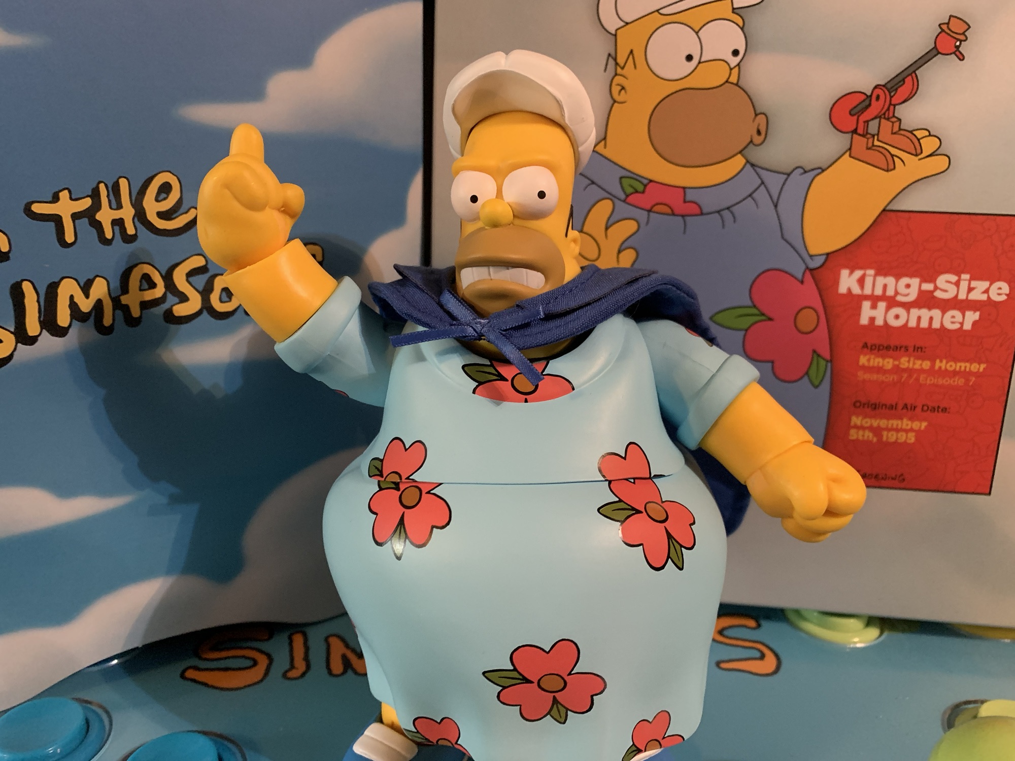
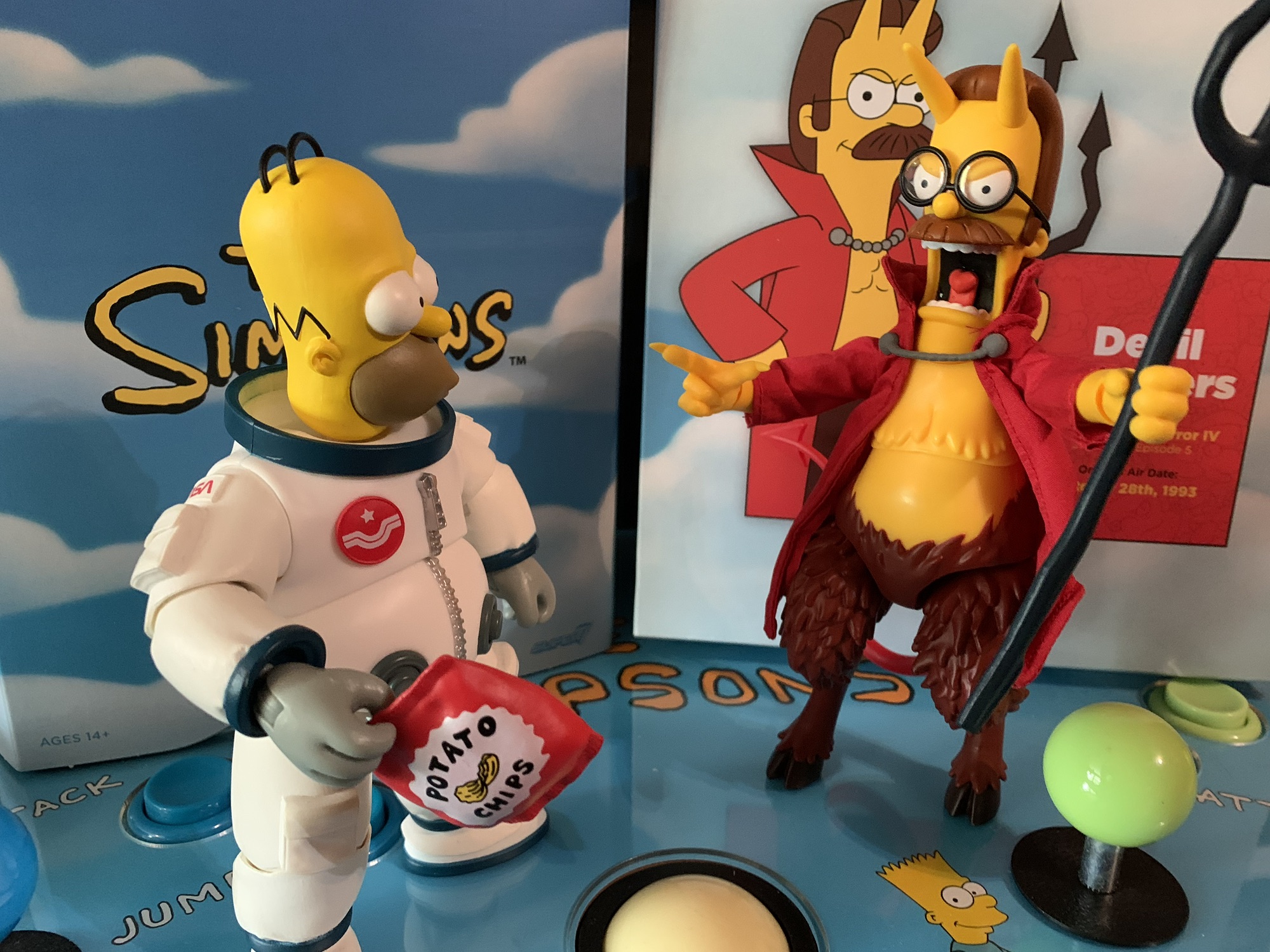
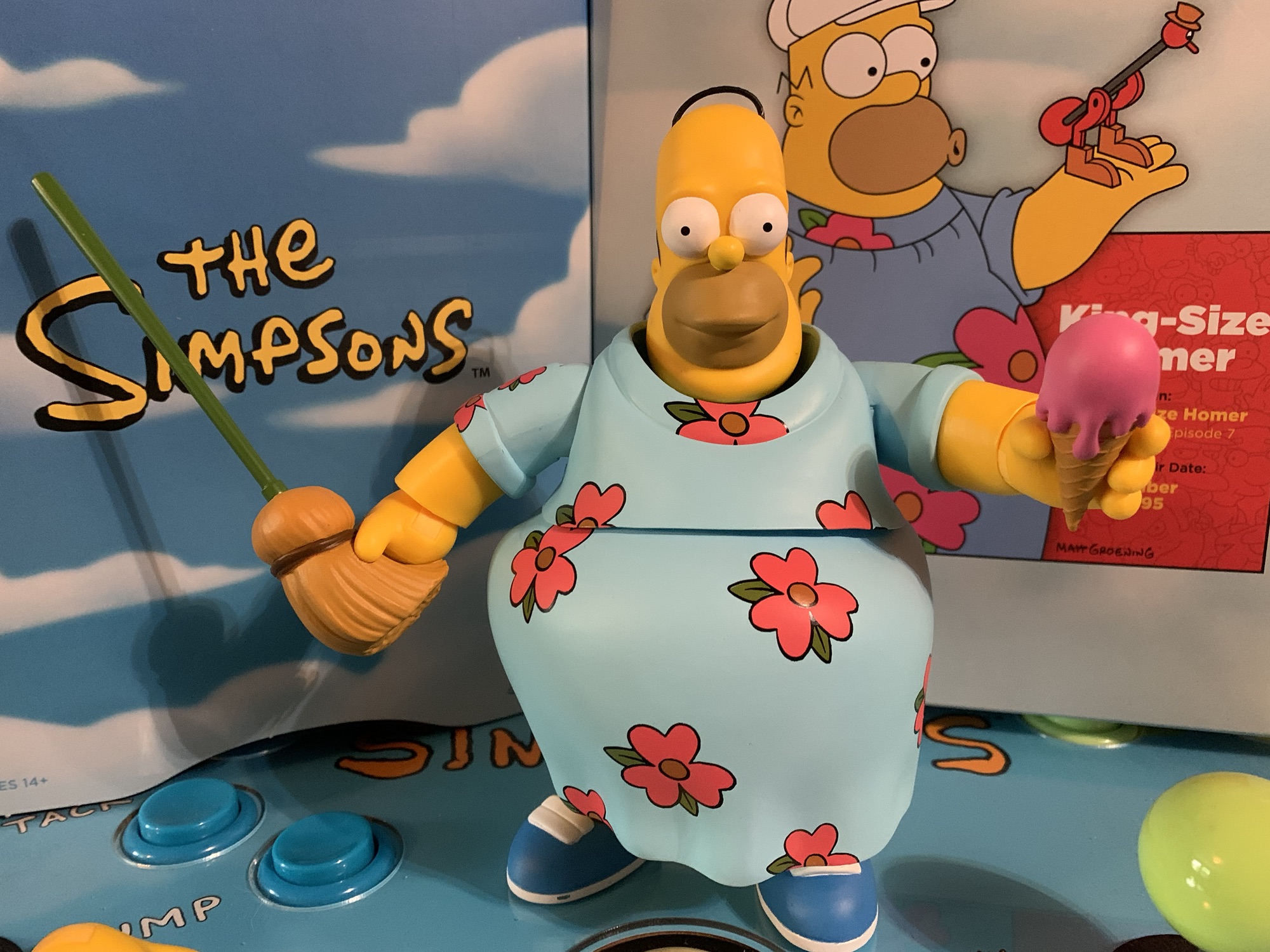
King-Size Homer comes in the standard box with no slipcover, as has been true of every figure in this wave. If you’re unfamiliar with the episode, this gargantuan Homer is the result of him trying to gain a bunch of weight to be declared medically obese and thus eligible to work from home. As evidenced by his appearance here, Homer was pretty successful in packing on the pounds (thank you Play-Doh doughnut) and achieved his dream. Homer stands at right around the 7″ mark which is more or less in-line with the wave one figure, only now he possesses far more girth. He’s in his floral moo-moo and comes packaged with his “fat guy hat” and has an optional soft goods cape. Since this Homer is far bigger than the last, everything here is new sculpt and it looks pretty good. Homer has his much girthier neck and even his hands have been enlarged to match the show.

As for the paint, well it’s again another mixed bag. Unlike that first wave Homer, this one is done in yellow plastic and not painted over. There is a matte coat to cut down on the shininess of the plastic, but he has a cheaper look than that first Homer as a result, but it also puts him in-line with Devil Flanders, Burns, and Ralph. The strands of hair atop his head are done with soft plastic and with Homer it works far better than it does with Ralph. Unfortunately, he’s packaged wearing his hat and the default head on my figure has some warped hair as a result. It also has a blob of white paint on the back of the head too. The garment he’s wearing looks okay and the flowers are painted cleanly, but they did a thing that really annoys me. Since Homer has a cut for articulation in the torso, some of the floral pattern gets broken up and if you line-up one flower it doesn’t line up all of them. The cape looks nice at least and it’s well-tailored. It might be a tad on the small side, but it’s not as if it gets lost when he’s wearing it. It just slips over the head and it completes the look. The paint on the shoes and eyes is hit or miss. Some portraits look good, while others have a sloppy edge to the eyes. My Homer’s right shoe has a chunk of white missing around the sole.

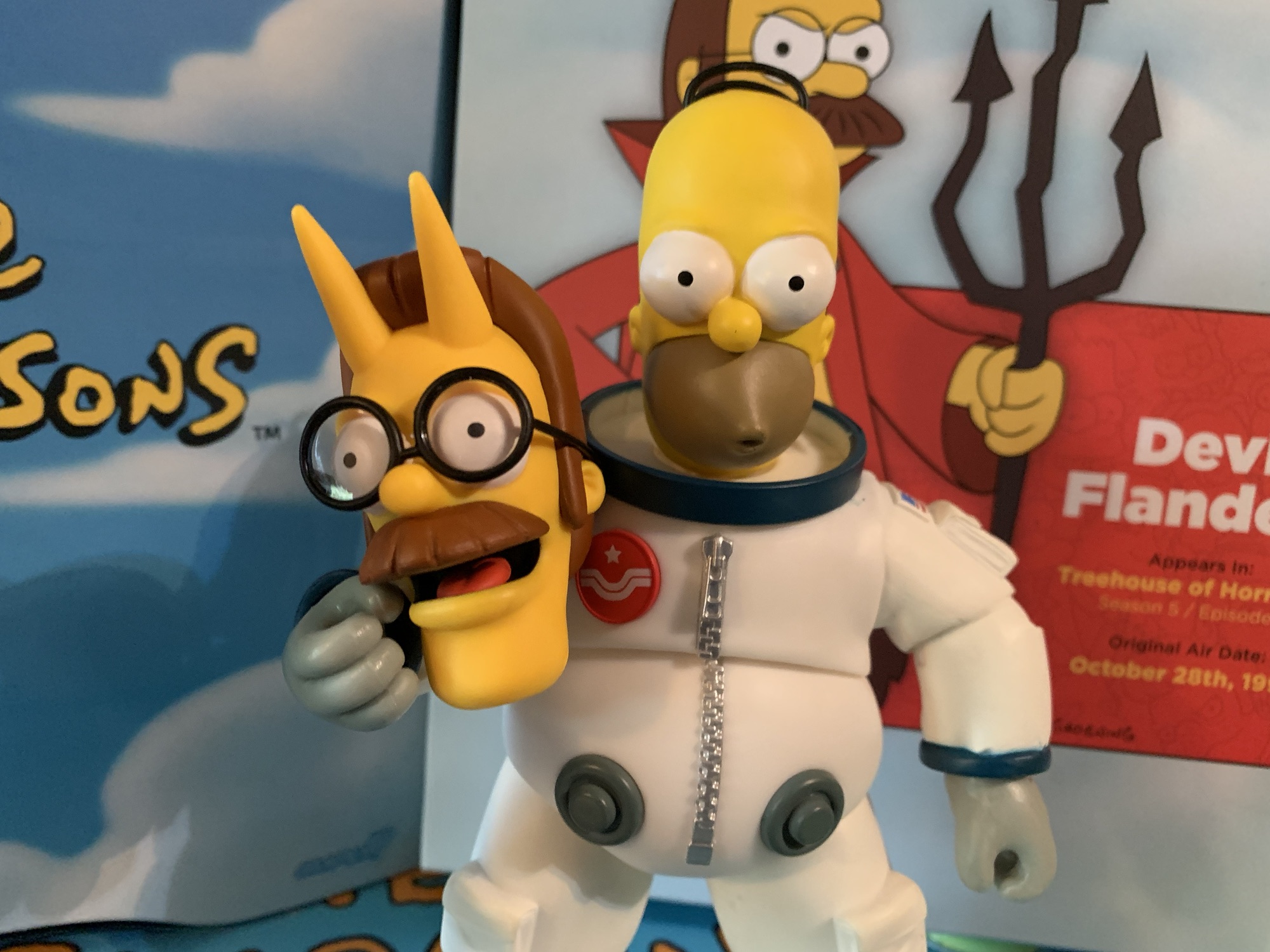
For accessories, Homer comes with various items from the episode that should look pretty familiar. For heads, we get one with a slight smile, a side-eyed angry expression, and one where he’s making his “Ooo” mouth. It’s basically the same expression that Deep Space Homer came with, which is one I like, but it feels a little redundant. For hands, Homer has fists and that’s really the only “set” he has as the rest are specialized hands. He has a gripping left hand which seems intended to work with his ice cream cone (Ooo, raspberry). The cone looks fine and comes close to matching Ralph’s alternate head which I suppose is nice for symmetry. There’s a different-shaped gripping right hand and that’s intended to work with Homer’s “reaching broom.” In the episode, Homer sits on the couch watching TV and utilizes the broom to just whack the keyboard of his work computer so it seems like he’s doing something. The broom-head has sculpted indentations for his fingers and thumb to slot into and he gets a pretty good grip on it. Sadly, his articulation is lacking so he can’t really use it as intended, but we’ll get to that. There’s also an open left hand and that one works well with the famous drinking bird. This is the bird Homer got from his brother Herb in the season three episode “Brother Can You Spare Two Dimes” and it’s a novelty toy. It returns as Homer’s assistant in the episode. The bird is articulated so you can simulate the pendulum effect it’s supposed to have. The sculpt and paint are fine, and this is an accessory Homer had to come with. Lastly, Homer has a pointing right hand and his medal which he is awarded at the end of the episode for using his ass to prevent the release of deadly, poison, gas.

It’s a solid spread of accessories and I think Super7 keyed in on the right objects from the episode to give Homer. They could have given him a computer, but as we saw with Ralph, without something to put the PC on it serves little purpose. I would have preferred an expression that could work with the ice cream cone, but I suspect that didn’t happen because he can’t reach his face. There is absolutely one thing missing though and it’s Homer’s sign from the episode that reads “Give Me Ride or Everybody Dies.” Really, that scene should have been priority for Super7. Cut the pointing hand and replace it with a hitchhiker’s thumb. Cut either alternate portrait and give us exasperated Homer with his hair limp. When you’re going to do these episode specific action figures you really need to hit on the episode’s best jokes and Super7 certainly whiffed on that one.

As for the articulation I’ve been teasing, what is there really to say? It’s terrible. Just look at this guy. It was going to be bad and it is as expected. He is basically a statue with arms that swivel. The head is the only aspect of the figure that has moderate range, because the rest does not. The elbows are poor, the diaphragm twist adds little, and the garment renders the leg articulation absolutely useless. They could have done absolutely nothing with his legs and the figure probably would not have suffered for it. I’m not going to kill Super7 for the articulation here because there isn’t much that can be done with a comically obese Homer Simpson. Maybe if they had done all of the clothes with soft goods it would have allowed for the legs to have some utility, but to do what, really? I guess it would be cool if he could sit down, but the line didn’t last long enough for Super7 to deliver a couch. The only thing that sucks is the lack of a vertical wrist hinge so he could properly wield his reaching broom. The cape at least has a wire, so you can add some dramatic flair to your Homer, but this is a figure that is just going to stand there.
King-Size Homer isn’t exactly a homerun Homer, but he’s a cromulent one. The look, aside from my nitpick with the floral pattern, is on-model and while I bemoan the lack of yellow paint at least the finish is a matte one. The accessories are also pretty solid and the figure looks good with or without the costume accessories in the form of the hat and cape. I’d be a lot higher on the figure if Super7 had nailed the “Give Me Ride or Everybody Dies” scene and if this figure carried the standard MSRP of $55. It does not and instead will set you back $65. I guess because there is a minor uptick in plastic versus some of the other figures? Hell if I know why it’s more money since one would assume Homer is going to sell the best out of all of the figures in the wave. I can kind of see charging more for an obscure character like Drederick Tatum, but a popular version of Homer? The pricing is absurd, but is functionally moot since this line is dead. This figure is all but guaranteed to hit the clearance rack before long so you need only wait it out if you want a better deal.

And that’s a wrap on Super7’s journey with The Simpsons. It got off to an odd start given the confusing character selection and long wait for wave one. Plus the thing with Moe’s apron wasn’t great, but remedied in a fairly painless fashion. I felt the quality of the first two waves was pretty damn good though and the figures were about as good as I think could be expected of Super7. The issues with those figures were just the choice of characters and I suppose disagreements over accessories. Starting with the third wave though, the quality took a hit in particular with Burns and Ralph and this fourth wave was practically a disaster. King-Size Homer is the only figure in the wave without blatantly obvious quality control issues. I suppose the only good thing for Super7 is that waves 2, 3, and 4 basically all arrived at the same time so the line didn’t experience a gradual decline, it just went off a cliff.

It leaves me wondering what will be the legacy of Super7’s take on The Simpsons? I’m guessing it will be viewed as a failure considering a great many fans were unhappy about the character selection and we know the intent was to pivot away from this approach with the canceled fifth wave. It should have a “missed opportunity” vibe, but did we really miss out on much? If the fourth wave is any indication then no, because it can be assumed the fifth would have sucked just as hard. The majority of this line was just flat-out not worth the money and yet the price kept going up while the figures were getting worse. That’s a pretty bad combination. The figures also lack an attention to detail that would have made it feel like truly hardcore Simpsons fans were in charge at Super7. Lacking that charm, there’s no pull. I don’t see these figures appreciating in value and becoming something fans who missed out on chase down ten years from now. Maybe they will the ReAction figures which were actually pretty well done. Perhaps I should make a post on them because they were certainly more deserving of your money than the Ultimates! line and they actually form a cohesive display, premature death and all. In the end, The Simpsons and Super7 is just a thing that happened. If the line has any sort of lasting ramifications it may be something we look back on as the beginning of the end for Super7’s Ultimates! because the company’s reputation certainly didn’t get better by producing this line.

Missed any of our Simpsons Ultimates! coverage?

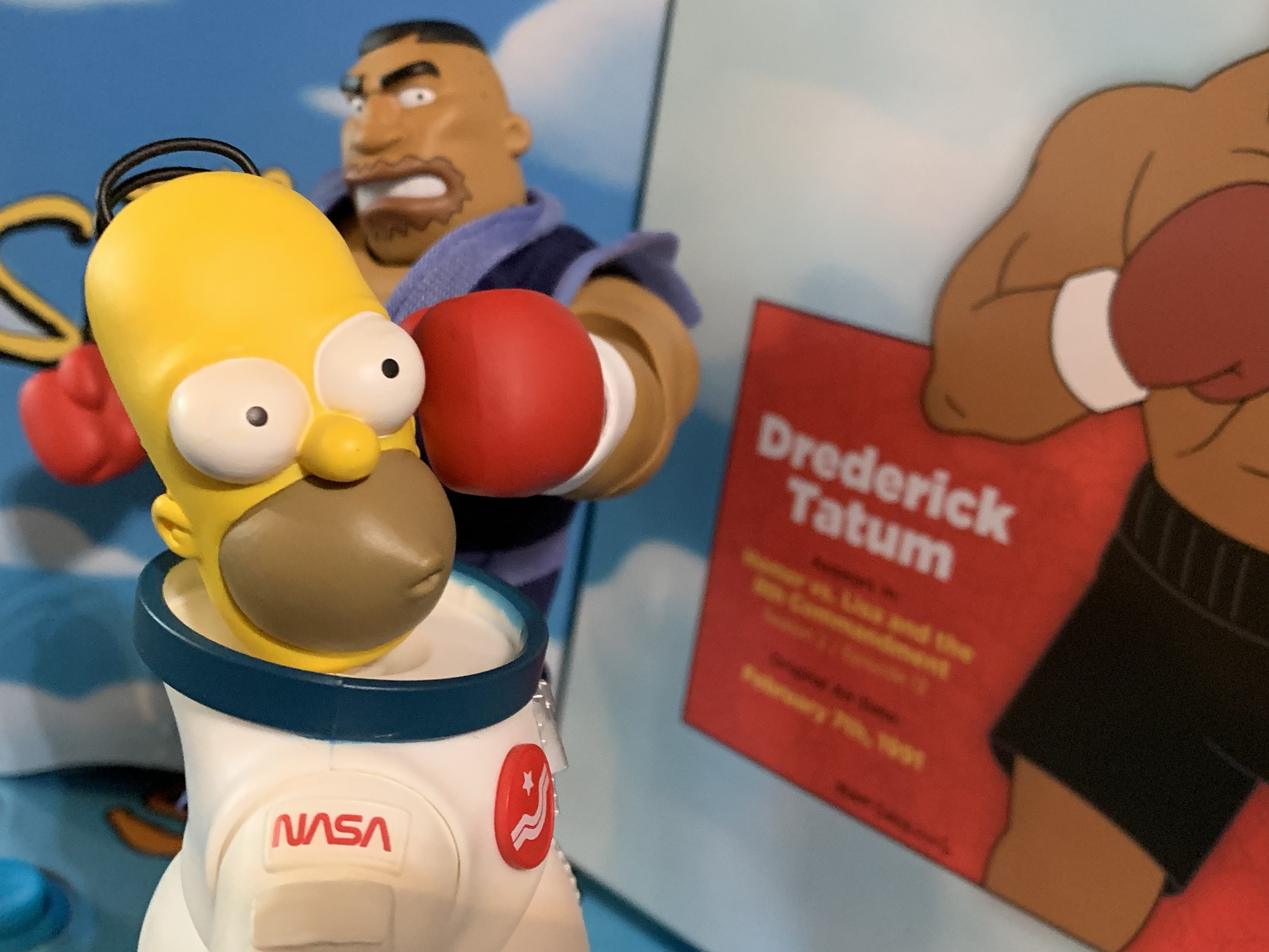
Super7 The Simpsons Ultimates! Drederick Tatum
We have looked at 15 figures from Super7’s line of Ultimates! action figures based on The Simpsons and we’re about to look at the 16th. What I’m wondering at this stage is do I need to keep talking about the baffling character selection? Yes, yes I do. Drederick Tatum is today’s figure, the show’s Mike…
Keep reading
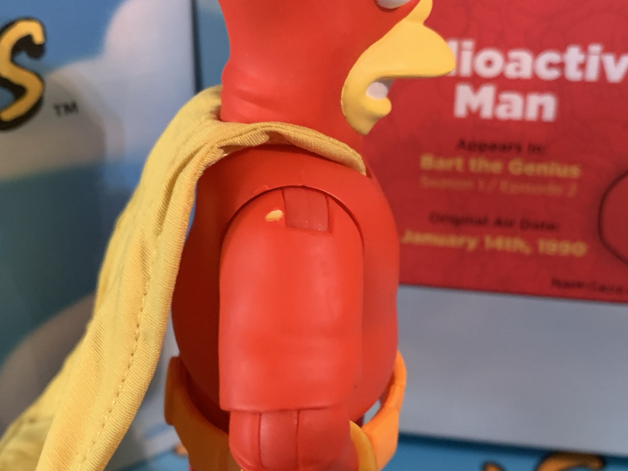
Super7 The Simpsons Ultimates! Radioactive Man
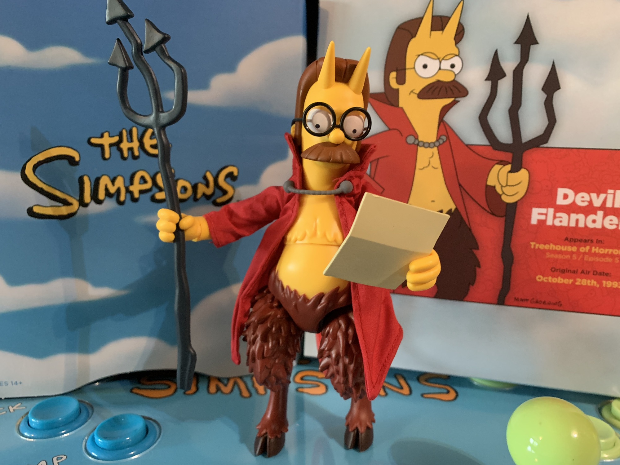
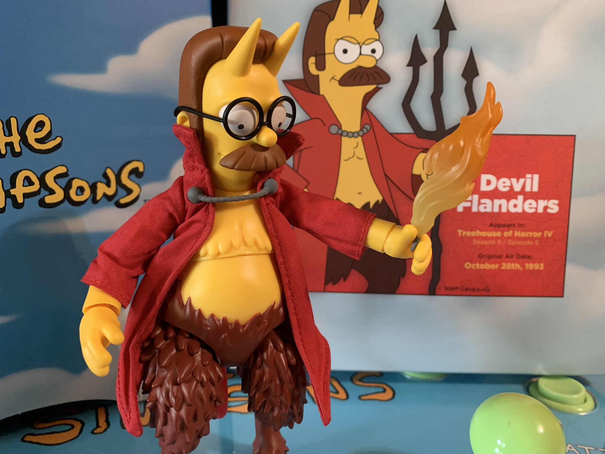
Last week, we started on our journey through the fourth and final wave of Ultimates! from Super7 based on The Simpsons. It did not start well. Devil Flanders represented a new low point for the line and maybe for Super7 as a whole. I know I certainly do not own a worse Super7 figure than…
Keep reading
Super7 The Simpsons Ultimates! Devil Flanders
Last week, we concluded our look at the third wave of Super7’s line of figures based on The Simpsons and now we embark on the fourth and final wave. That’s right, Disney pulled the rug out from under Super7 and handed The Simpsons license over to Jakks. Their products will start rolling out this fall.…
Keep reading