Author Archives: Joe

Super7 TMNT Ultimates! Metalhead

Let’s get this party started!

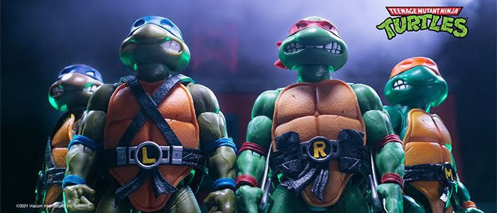
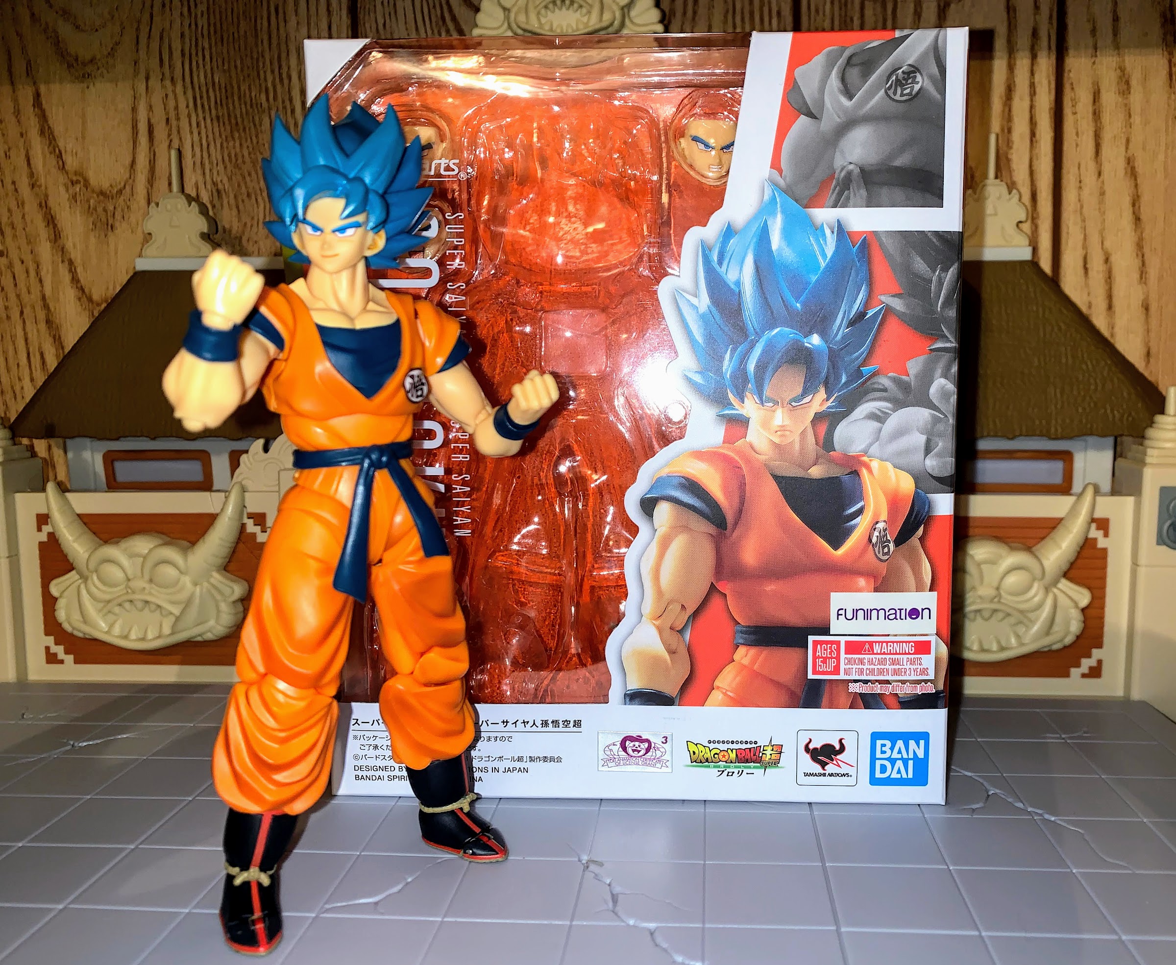
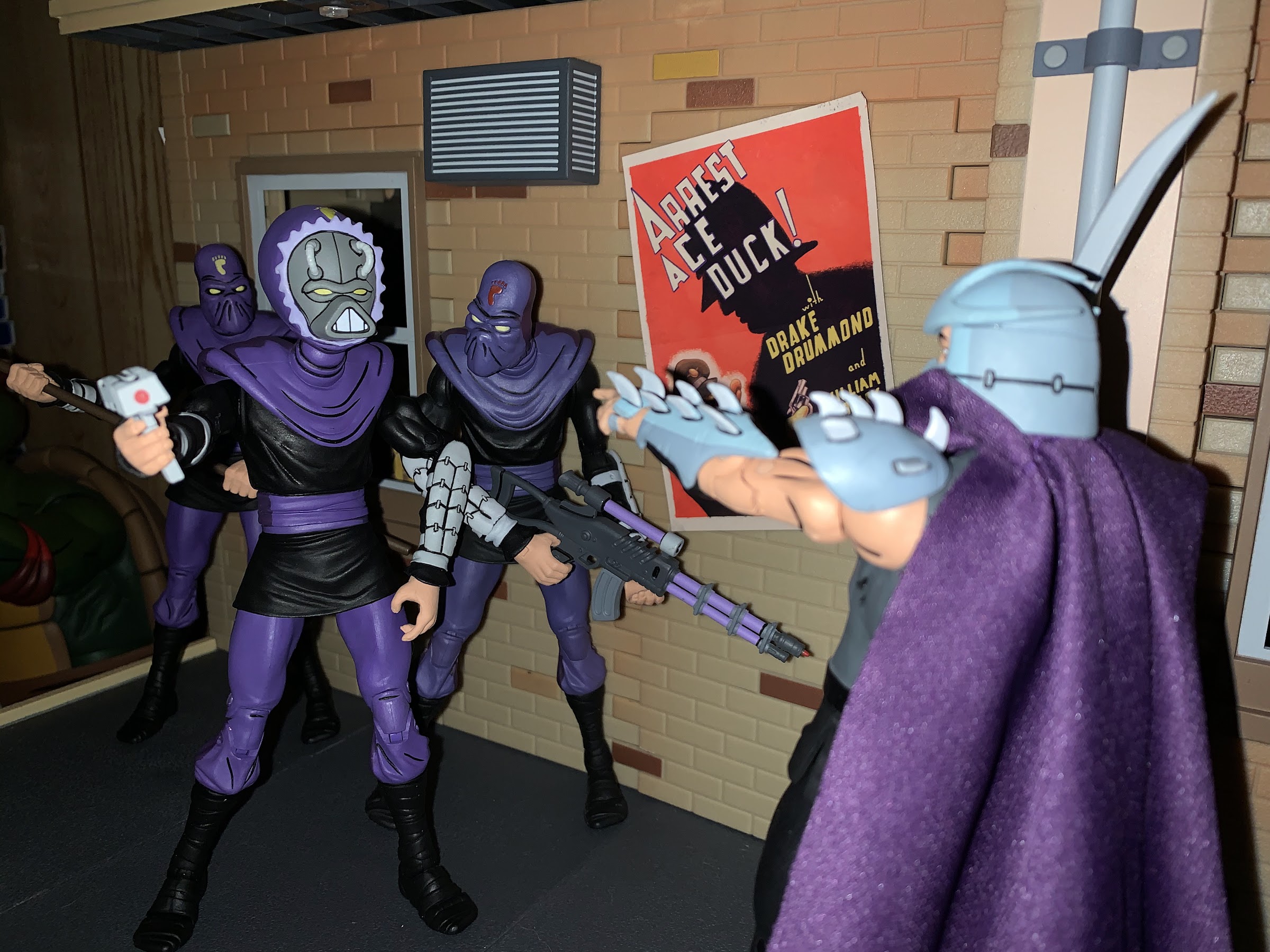
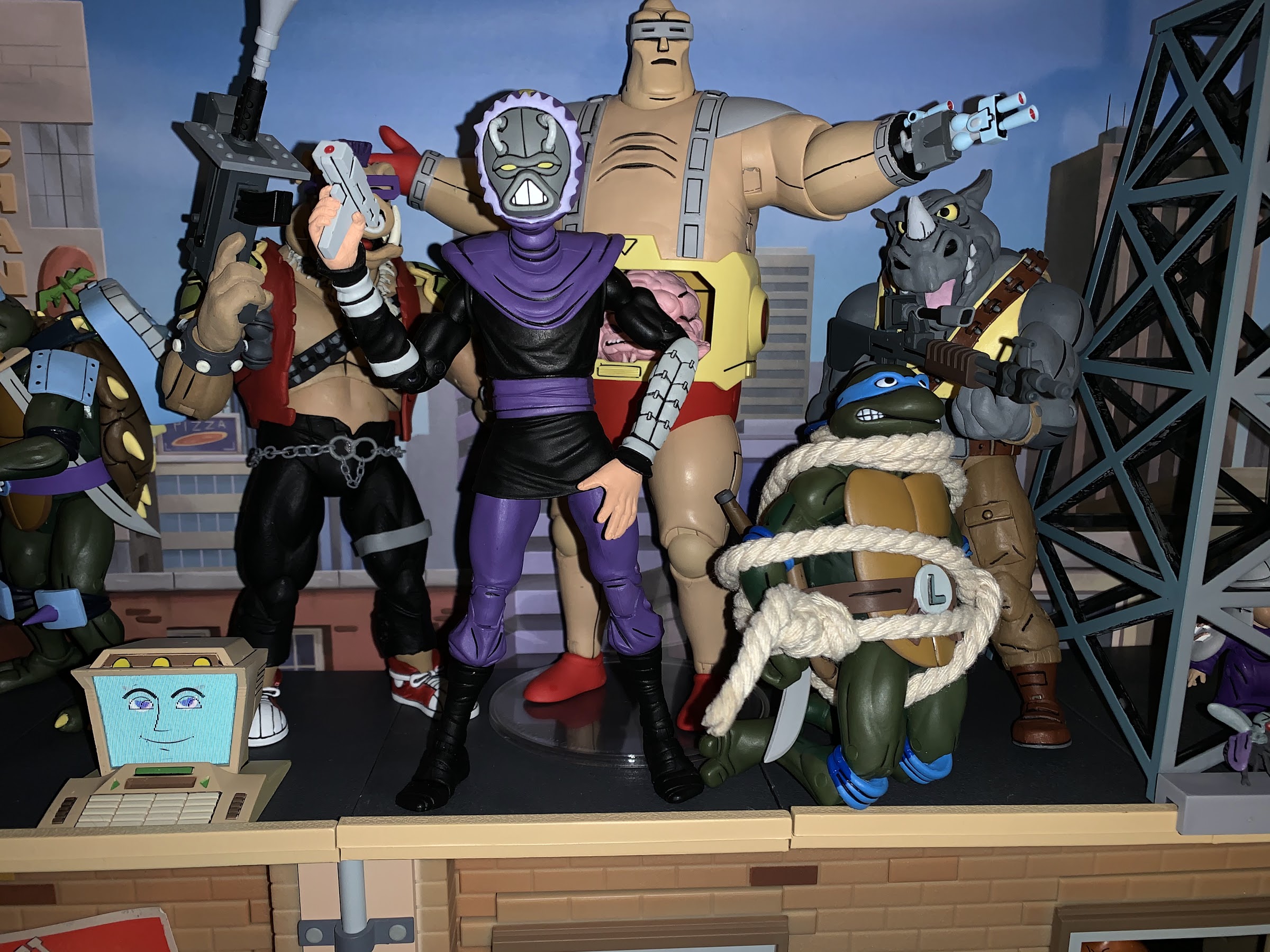
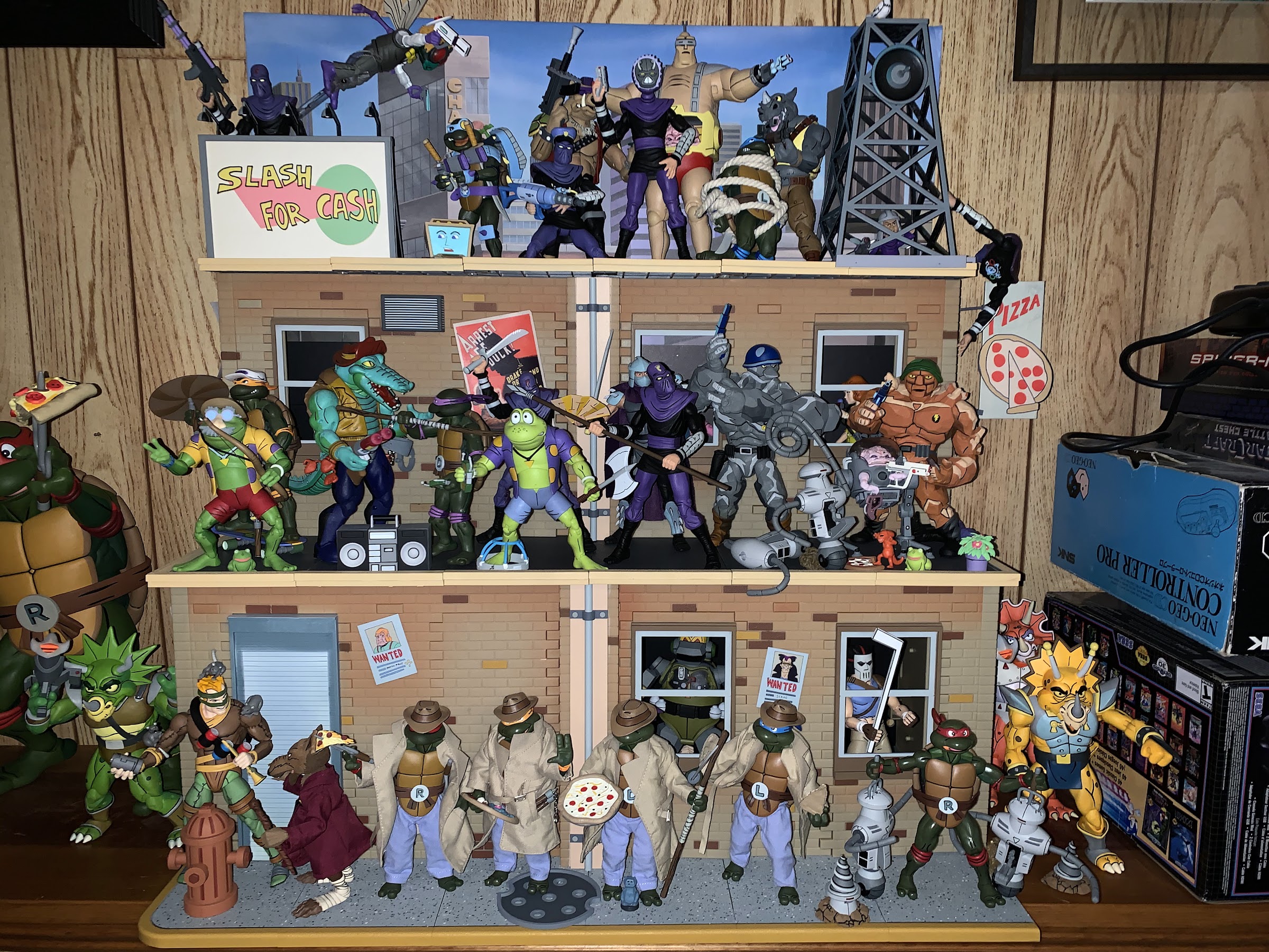
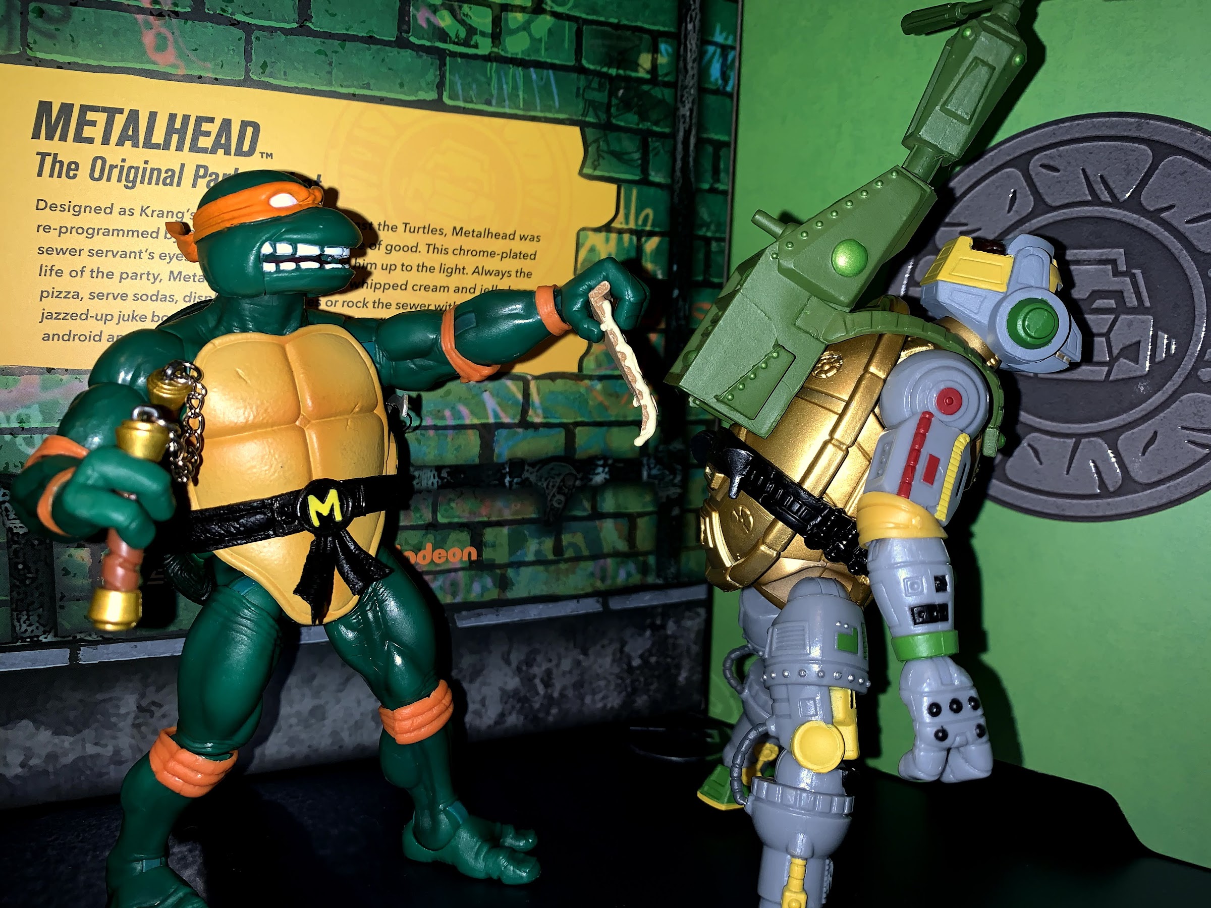
This post marks number 800 for this blog! Now, when I hit a nice, round, number like that I usually try to find a special topic of some kind, but also one representative of the content on this blog. Well, we certainly look at a lot of toys on this space, and there have definitely been a lot of Teenage Mutant Ninja Turtles posts, and I do consider myself a metalhead so why not do a figure review of Super7’s TMNT Ultimates! Wave 3 Metalhead? Now, I’m taking a bit of a gamble in making such a milestone post a figure review. This thing could suck for all I know, but I’ve handled enough figures from this line that I’m reasonably confident that it won’t. Plus, it’s Metalhead, one of my favorite figures from the original Playmates line and one I wish I had held onto (sorry, no comparison shot).

There’s a lot going on with this sculpt.

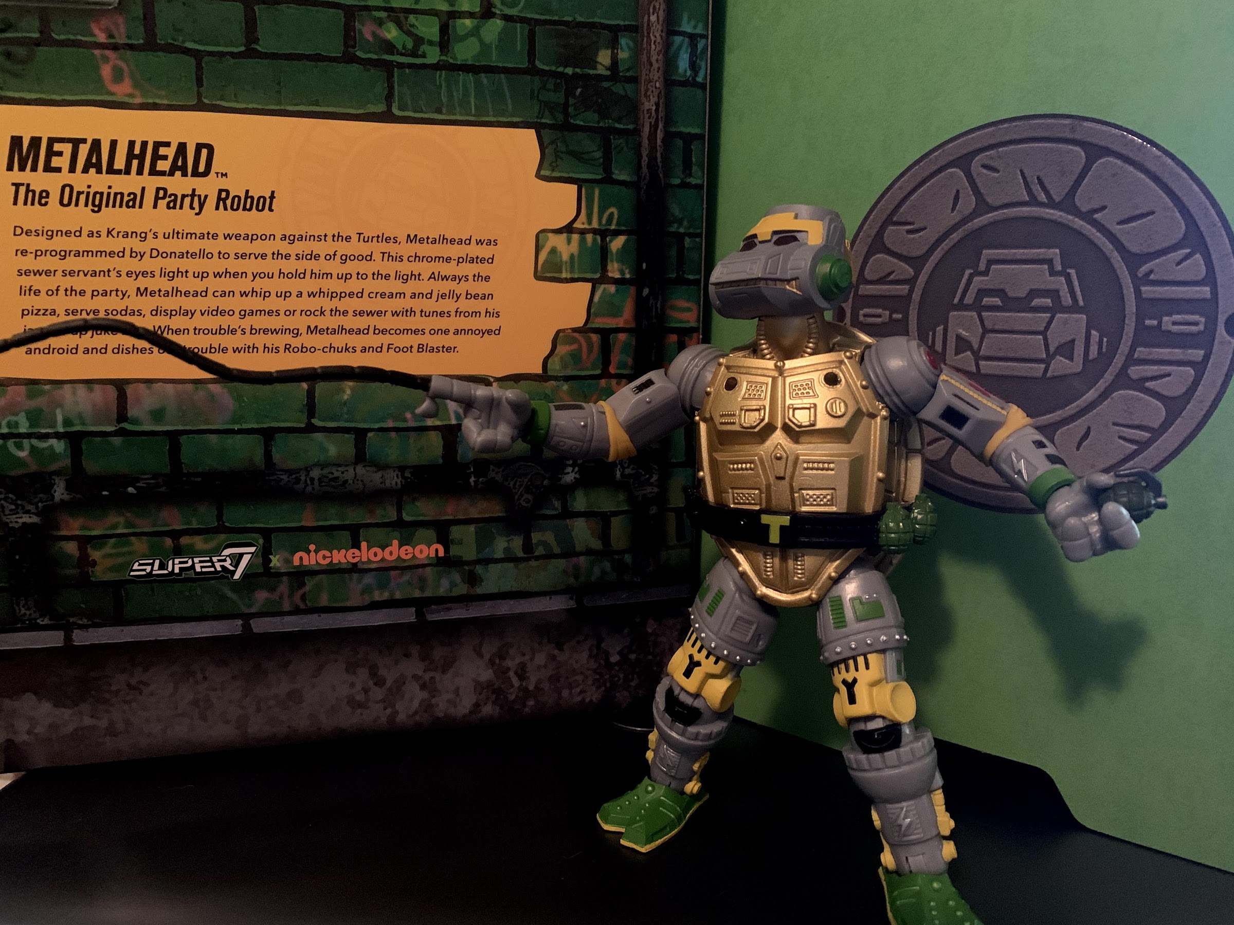
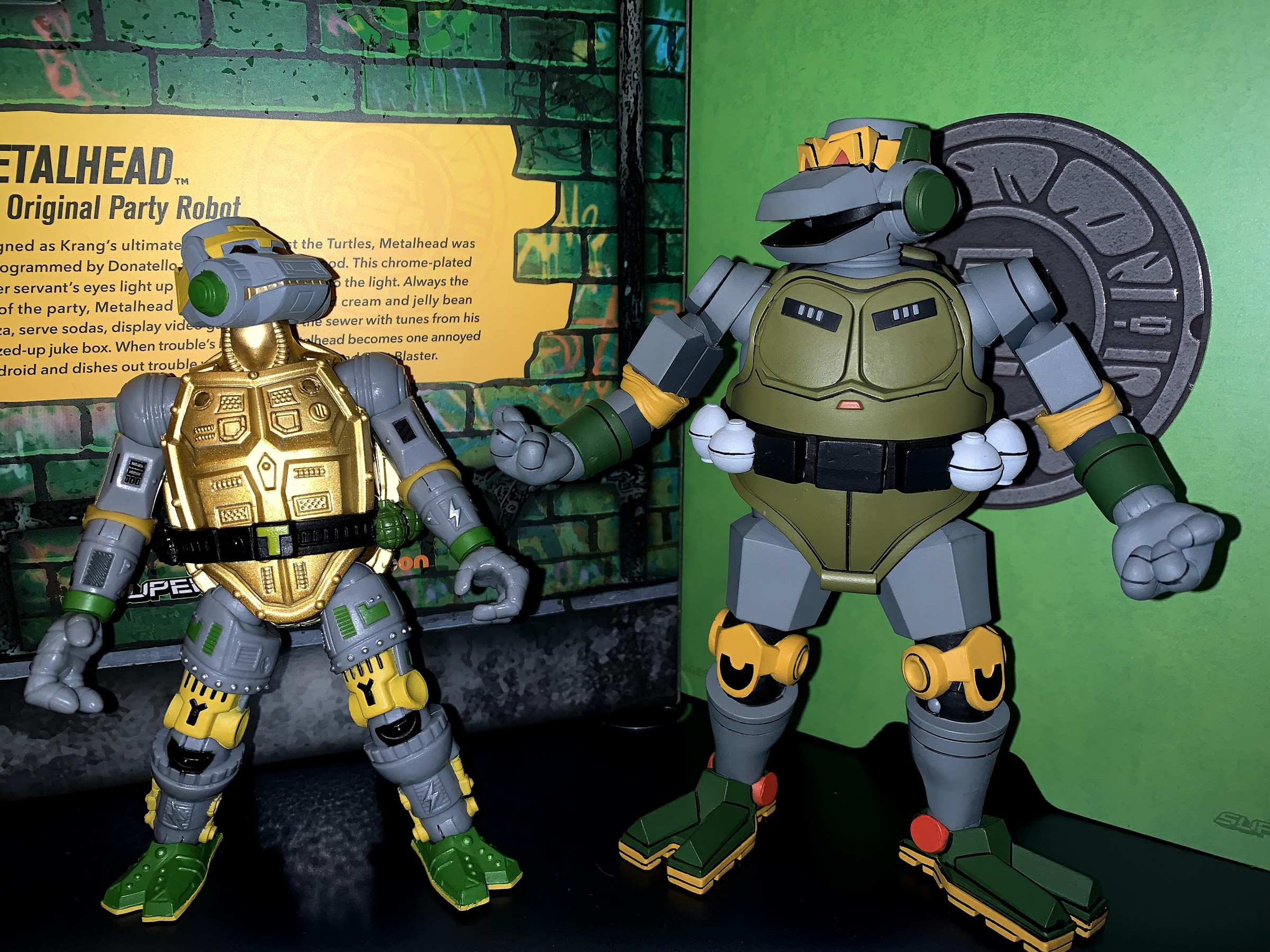
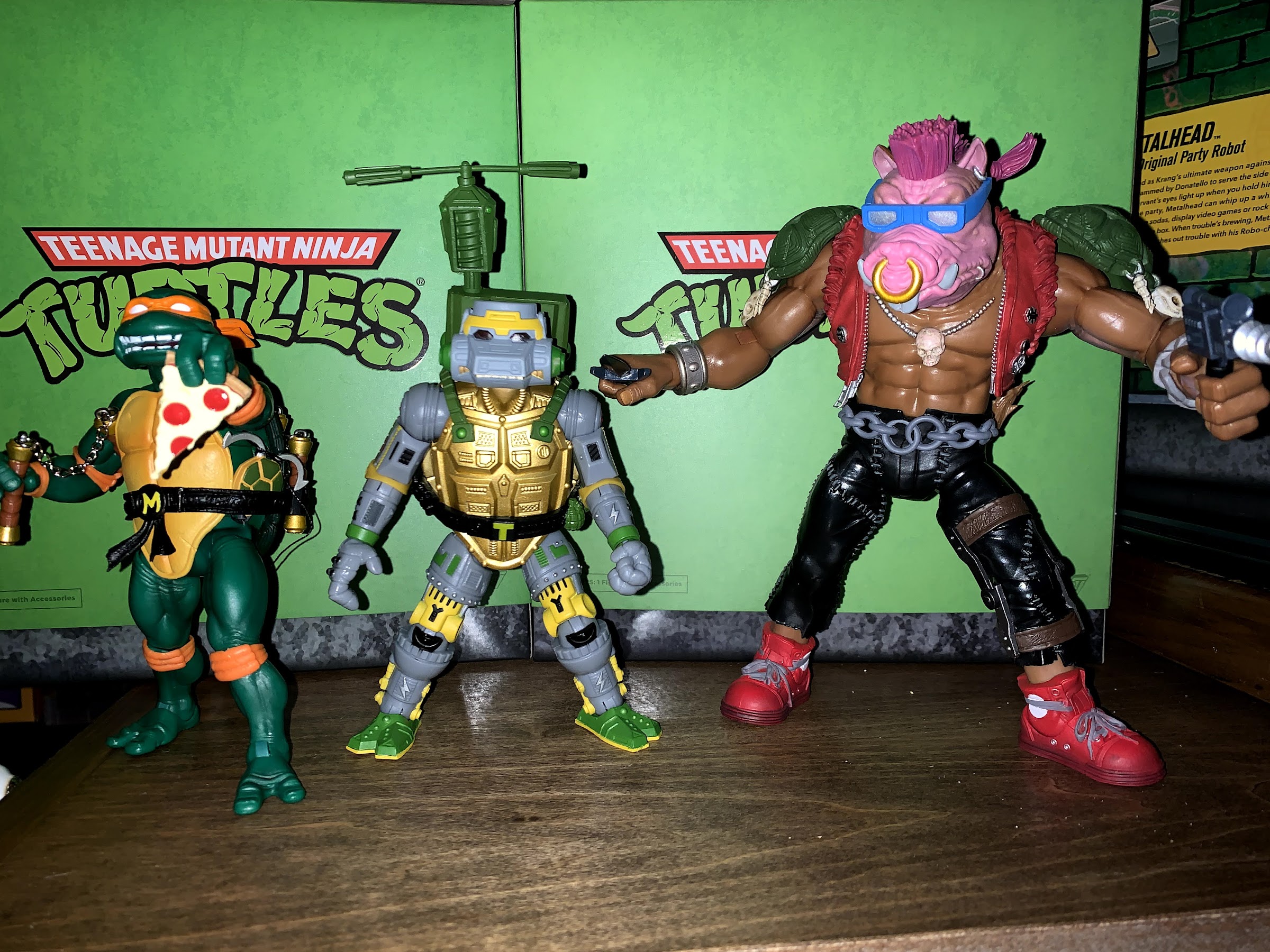
When it comes to this line, it’s interesting to see the choices Super7 makes in regards to how faithful they want to be to the vintage toy and what they want to change. With Bebop, we saw they elected to pump him up quite a bit so that he towers over the turtles. Metalhead is a robot turtle, and across other mediums he tends to be on the larger side. Super7 though, saw him as a robotic duplicate of the turtles akin to the fifth turtle, so they decided to make him the same size. He’s not the same sculpt as his body is loaded with tiny, technical, bits, but he is the same height, width, and obeys the same proportions. This puts Metalhead at about six inches which means that, despite this being a 7″ scale line, he’s actually shorter than NECA’s cartoon version of the character by nearly an inch. Obviously, these two are not meant to be exactly the same as they’re the same character from two different sources, but it is an interesting comparison.

I had to bring out the flash for this shell.

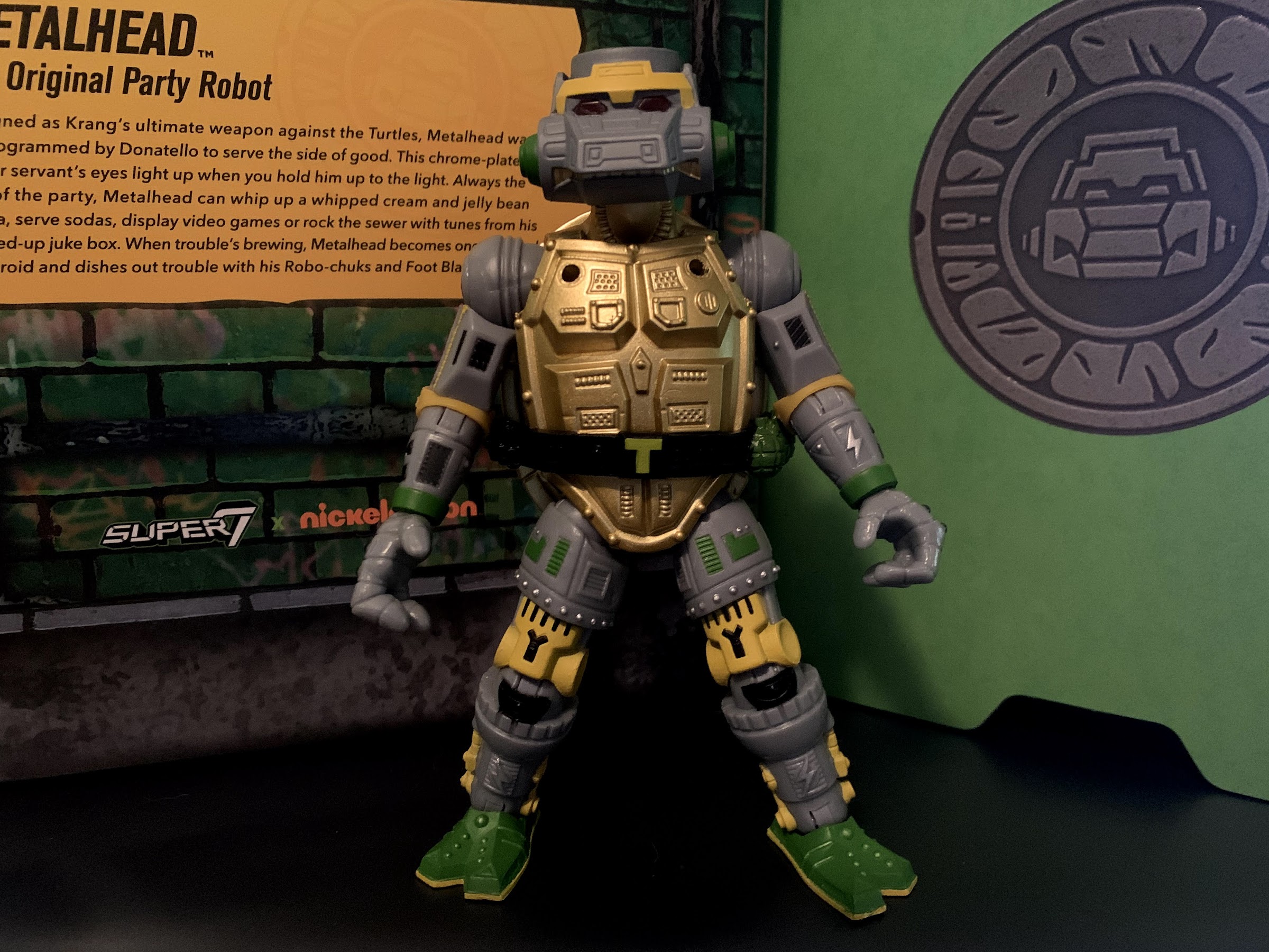
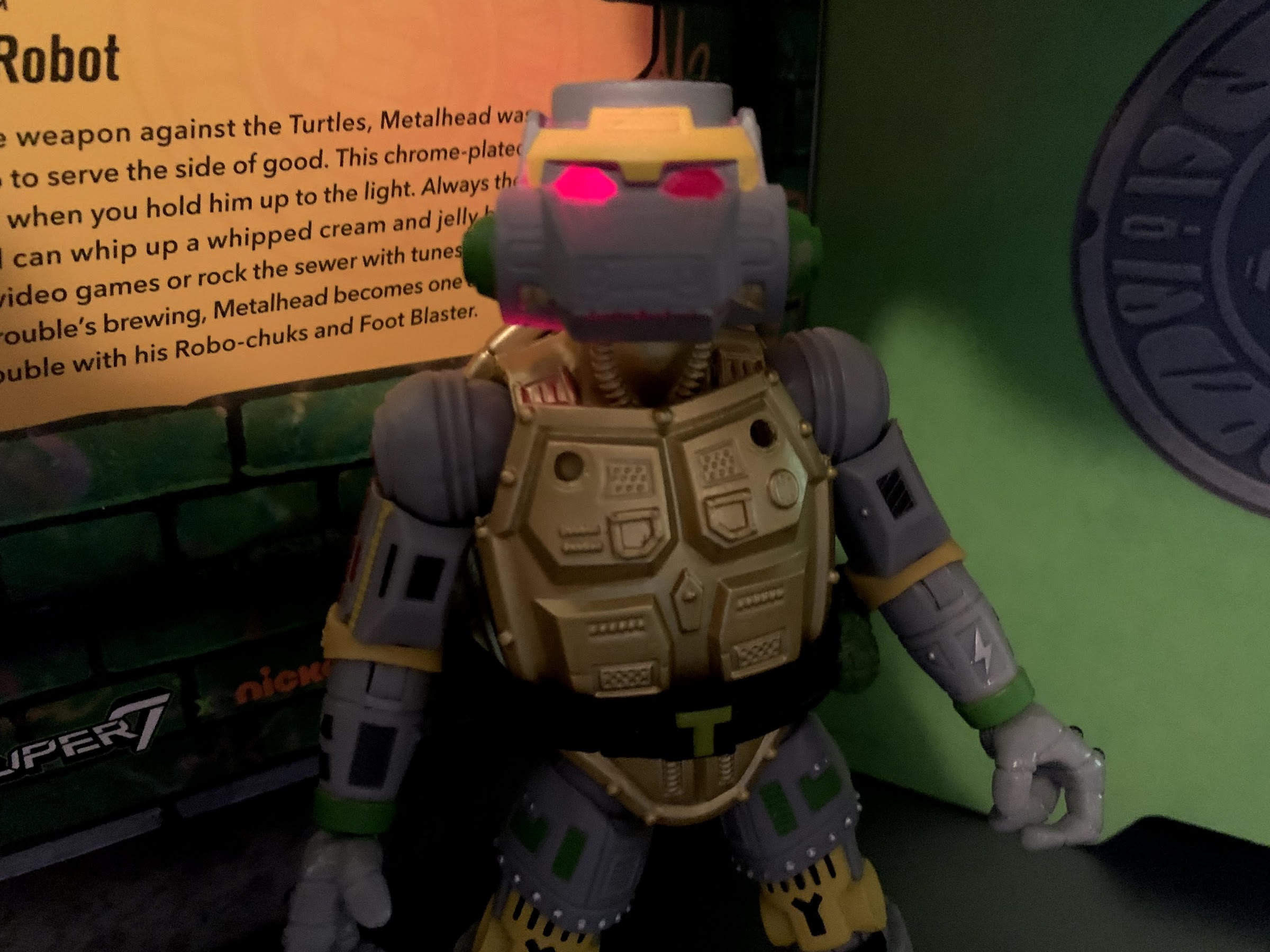
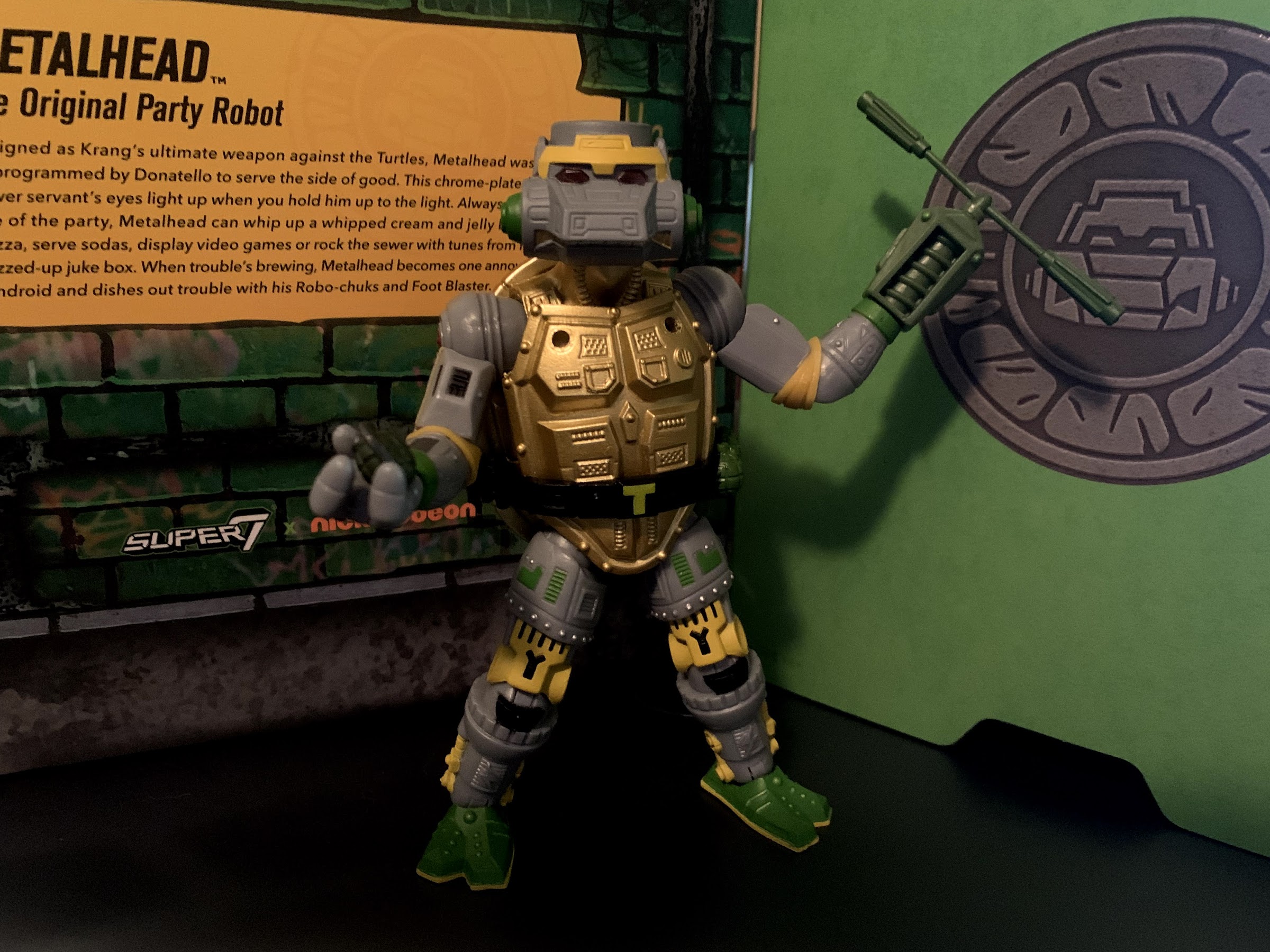
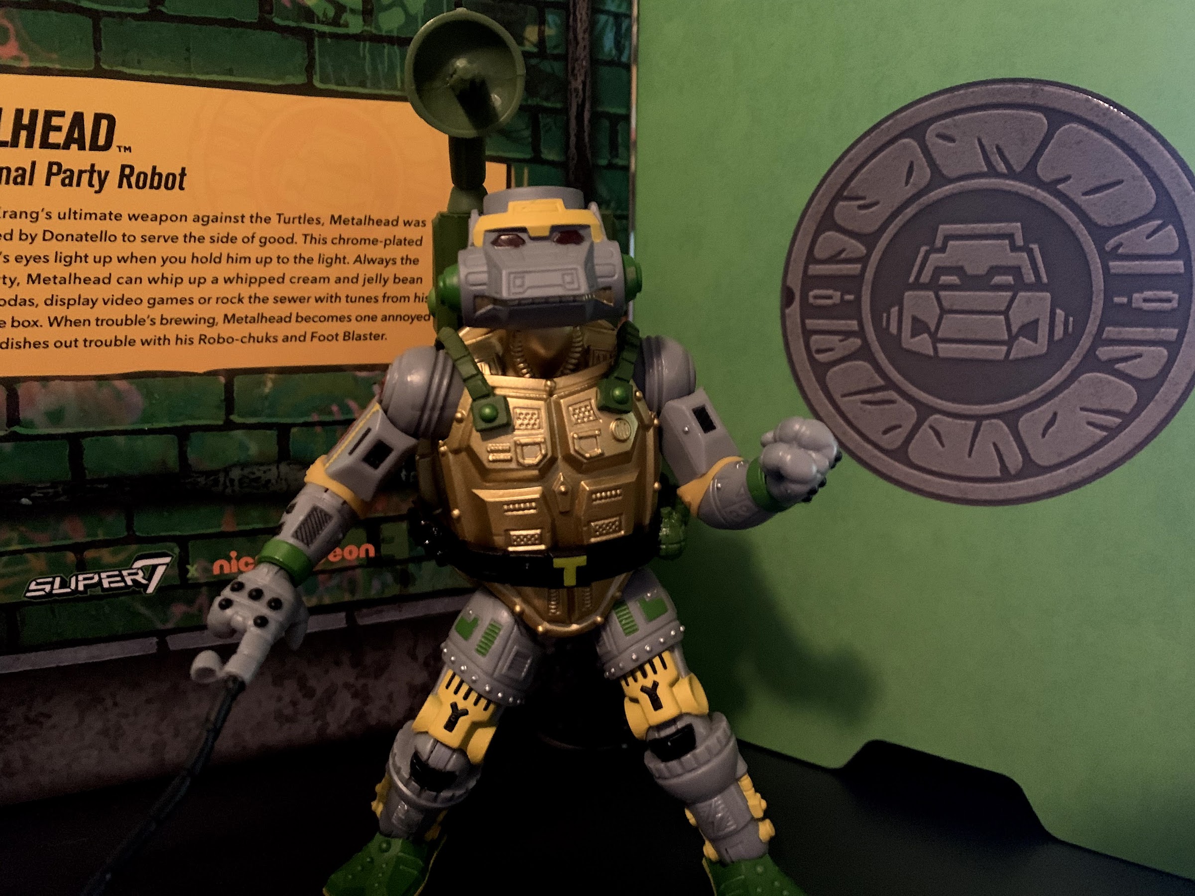
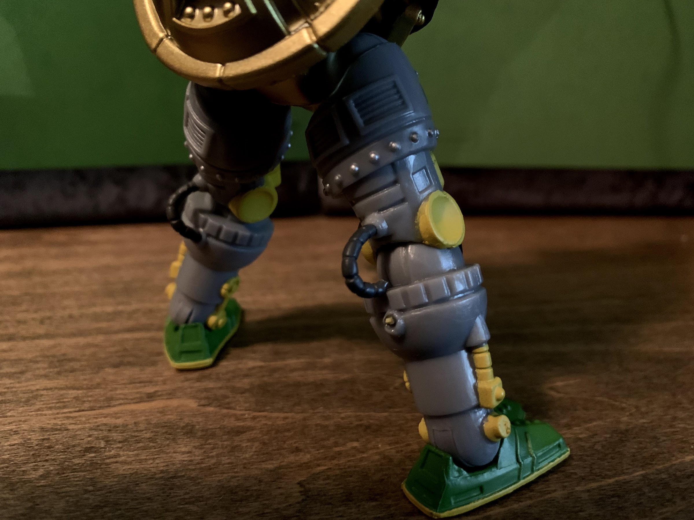
Metalhead was one of the more detailed sculpts released by Playmates in the original toy line, and the same is true for this version as well. His entire body is covered with grooves, buttons, vents, wires, and rivets. It’s an impressive mold and it also means Super7 had to use a lot more paint than they usually do. The base color for the figure is gray, so every bit of red, black, yellow, silver, and green is painted on. And a lot of the details are quite familiar to me as I look this guy over, especially the little lightning bolts on the forearms and shins. Those were sculpted on the original toy, but unpainted and it’s nice to see them brought to life here. The head still features the light piping which is to say that his eyes and brain are cast in a red, transparent, plastic and the rest of the head is molded around it. Shine a light into the top of his brain and it should filter through the eyes. If you don’t care for this though, Metalhead’s alternate head is exactly the same, but with that feature removed in favor of red paint. Super7 seems to have taken some small liberties with the figure’s legs as there are now tubes connecting the back of the knee to the thigh. I don’t recall how these looked on the old figure, I’m guessing they were there, but part of the sculpt. Here it looks cool, but is a little concerning when it comes to articulation, but we’ll get to that in due time.

“I will crush you, puny robot!”

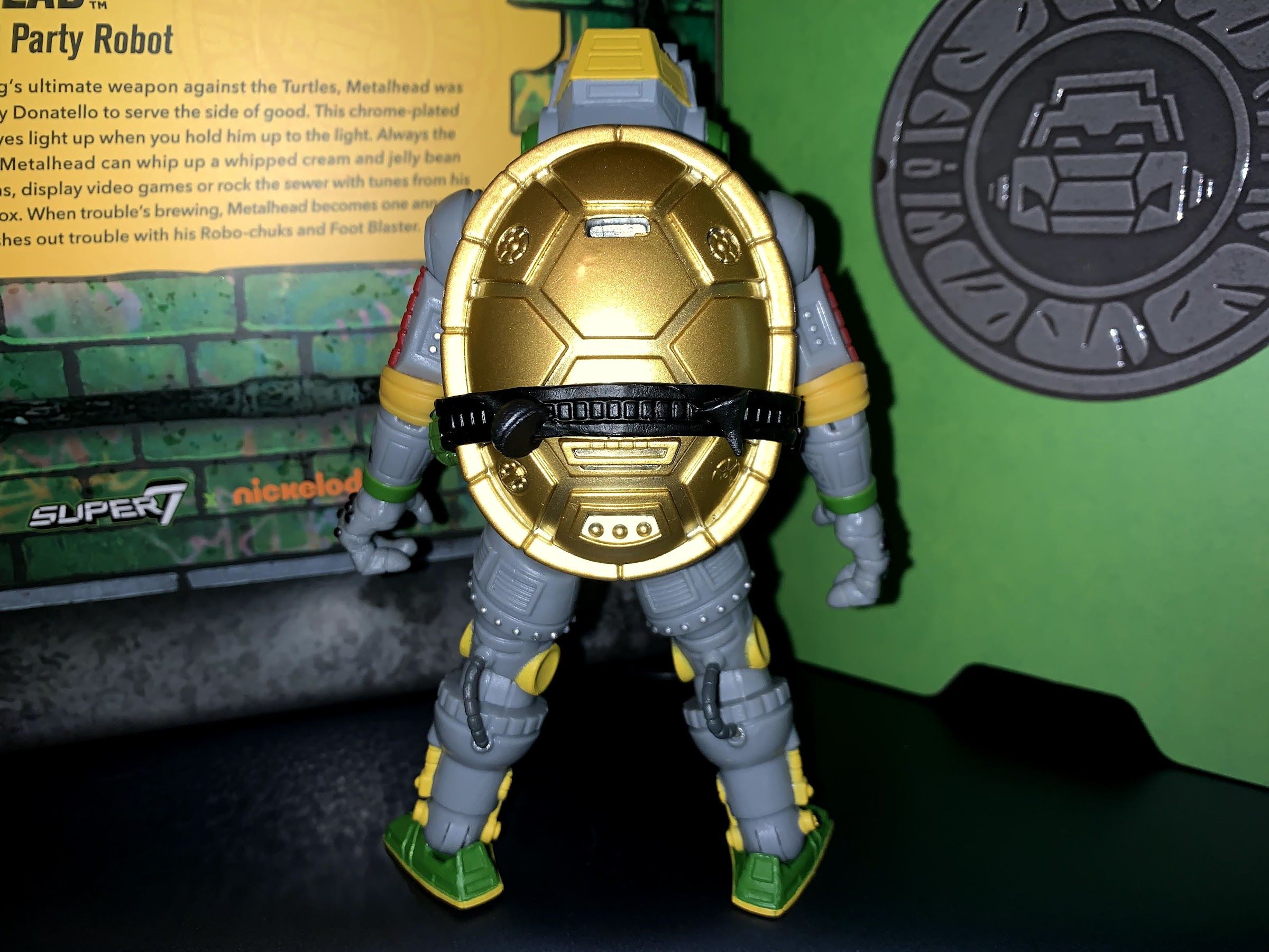
Of course, the elephant in the room concerns Metalhead’s torso. The original figure was vac metal, a process by which a layer of reflective, metallic, paint is placed over a hard plastic to create a finish akin to chrome. The vac metal is less a paint, and more like a heavy, duty, coating. The problem is, it only adheres to harder plastics like ABS (most toys are a type of PVC) and it’s prone to chipping as it does not possess any sort of give. Super7 opted not to do the chest or shell in vac metal for these reasons. I think, with a little creativity, they could have made it happen if they had really wanted to. The front of the figure’s “shell” is a separate piece so they could have made that removable and given people a vac metal plate to put over it if they so desired. Instead, they just went with a super, metallic, paint job for the torso that’s a very lustrous gold. I am personally not that into vac metal, so I don’t really care. I think this paint job is pretty flashy and I quite like it. Something about how the light rolls across the rear of the shell is very pleasing. It’s so pleasing that I kind of don’t want to put the backpack on him.

Light piping in action! The other head just has red-painted eyes.

If there’s anything to nitpick about the figure’s appearance, beyond the size (I get it, but I do think of Metalhead as being bigger than the turtles), is mainly in just some of the finer details. So much of the character’s sculpt has been painted and brought to life, but the belt is just three colors and most of that is black. The oil can, funnel, and bolts affixed to the belt are unpainted while the grenades are just green. It would have been cool to see some added embellishment there. There’s also the unsightly holes in this figure, one on the rear and two on the chest. They’re to accommodate his backpack accessory, but when that’s not in use you get the holes. Some plugs would have been cool to fill them, or they could have used magnets to hold the pack on. It’s not the end of the world, and I suspect most will use the pack anyway, but it’s just neat when companies go that extra mile.

Robo-chuks and grenades. You can see how the stuck thigh swivels impact how the left kneed is positioned. It’s irksome.

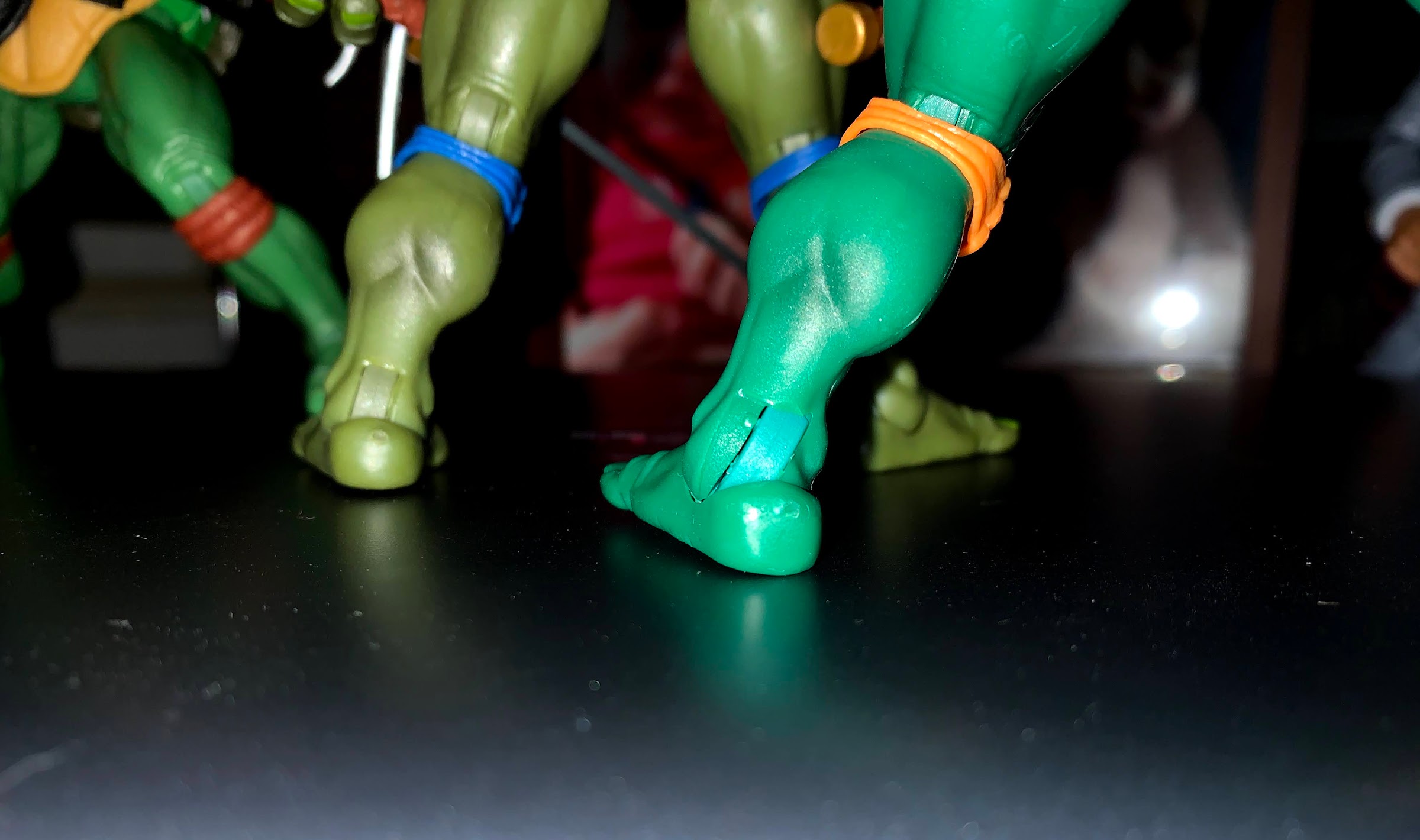
In terms of articulation, Metalhead is basically the same as his organic allies, though the execution is not. Metalhead has a head that sits on the same ball joint and he can pivot up, down, and to the side. The range isn’t spectacular since he has a sculpted neck with no lower neck articulation, but it works all right. At the shoulders, we have ball hinges, but the shape of the shoulder means he really can’t lift his arms out to the side much. He won’t be serving as a “T” for any cheer squads. The elbows are single-hinged, and like the other turtles, the elbow pad won’t let him achieve a 90 degree bend. The wrists rotate and have horizontal hinges. At the hips, he can pivot a bit, but the shell won’t let him spin all the way around or anything. The legs connect via these small, skinny, pegs and below them should be a thigh swivel, but my figure is totally stuck on both legs. I’ve tried heating it, then freezing, to see if that will get it moving, but to no avail. It really stinks because the left leg is rotated inwards a little so his knee isn’t facing forward. He has a swivel at the knee, but you have to be mindful of those hoses on the back because they link the upper and lower leg which really isn’t a smart design. I wish the thigh cut had been repositioned to just above the yellow knee indicator as there is a natural place for it in the sculpt. The other swivel is just too close to the hip and it’s hard to get any real torque without putting pressure on the peg connecting the hip. Below the knee is the standard ankle rocker which works well.

I do really like his tentacle finger.

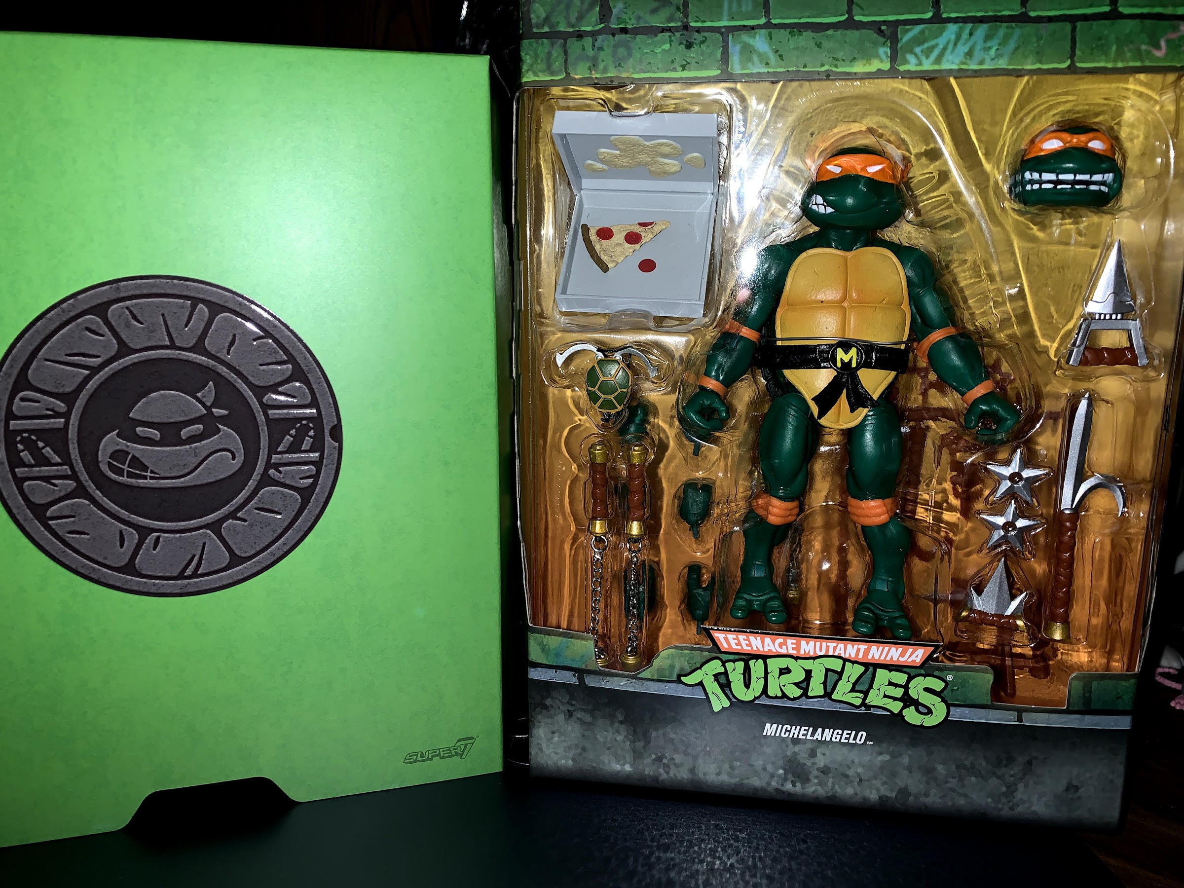
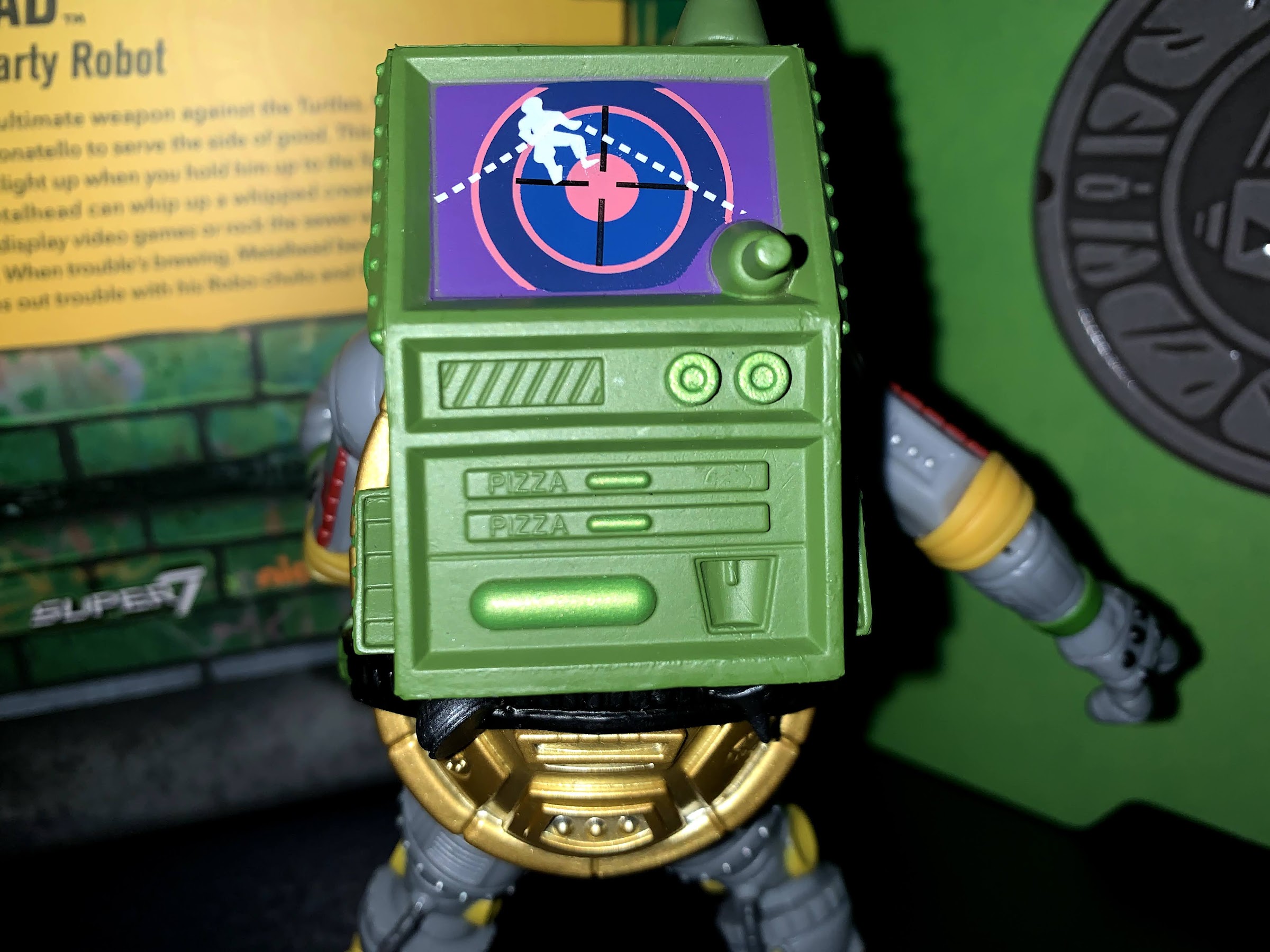
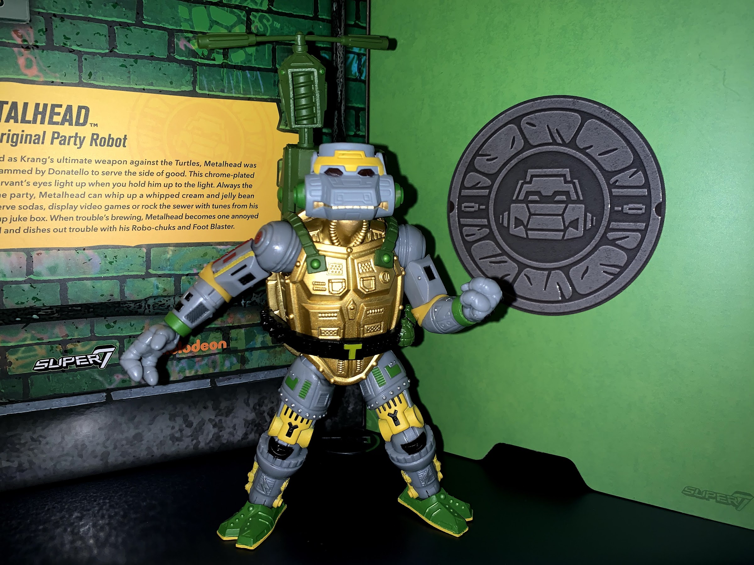
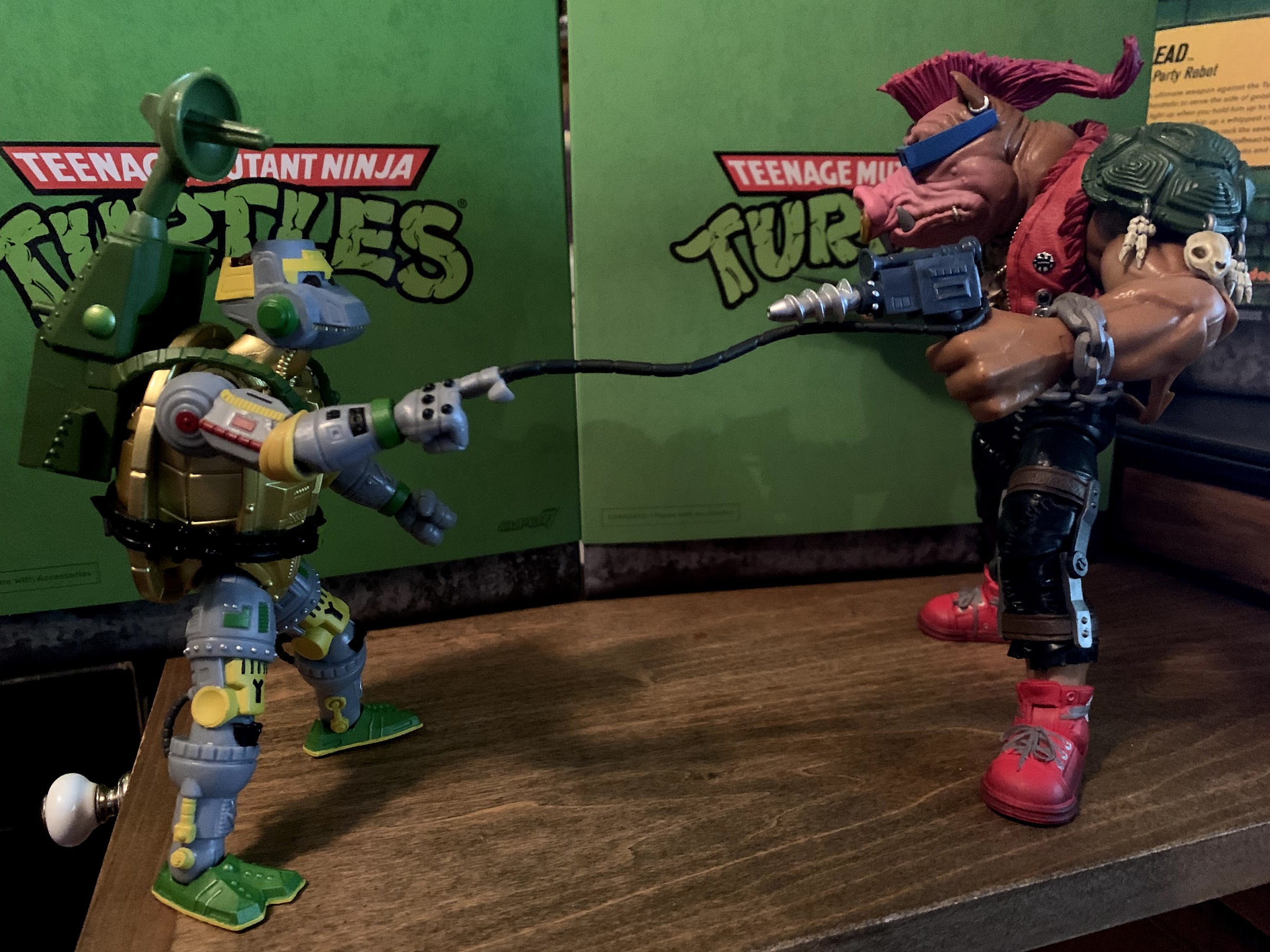
Metalhead ends up not being the best articulated figure, but he’d have enough if it just worked better. To make up for it though, he has stuff. Like every figure in this line, Metalhead comes with extra hands. He has gripping hands in the package plus a pair of fists and wide gripping hands. I’m not really sure what the wide hands are needed for, but he has them. He also has another right hand which features a tentacle like extension popping out of his index finger. It’s pretty cool looking and something the original toy did not feature. He also has some mechanical nunchuks that clip into his wrist in place of a hand (like the original figure, which I think was the first figure I ever had with swap-able hands). The actual ‘chuks portion can rotate, but not freely like a propeller so it’s more for positioning. Swapping parts is easy, and if anything too easy as they sometimes pop off when just positioning the figure. He also has his pizza oven backpack, since this guy is a party robot. It snaps into his back and the straps plug into the chest. There’s a mini satellite dish that plugs into the top, or you can use the second nunchuk attachment which makes it function like a helicopter. I think this resulted in someone on staff at Super7 saying they mistook the nunchuk that came with the original Playmates toy for a propeller as a kid and wanted to give anyone else who did the same that option with the new toy. Lastly, we have a pair of grenades that Metalhead can toss at his foes. They look just like the ones molded into his belt, so that’s a nice touch, but I wish they could affix to the belt in some way. Or if the backpack could open, now that would have been cool!

You can see how the backpack causes him to lurch forward to stand.
I guess the primary function of this pack is to supply pizza and soda, but according to the bio it has the features of a jukebox, arcade, and can blast Foot Soldiers. That’s quite a bit better than my backpack.

The accessory assortment is solid, though I wish Super7 took more time in painting them. The vintage line was all uniform, so I get that they want to match it, but they provide an unpainted weapons rack with every figure, Metalhead included. Why not add more paint to the rest? The backpack especially could use a little flair on the rear as could the innards of the nunchuk. The grenades don’t even have silver on the handles or pin. They provide these nice, painted, weapons for the turtles, but it seems Super7 shorts every other figure in the line in this area. There’s also the issue of the backpack being quite heavy. Metalhead’s hips aren’t flimsy like Raph’s, but they’re also not strong. His torso might also weigh more than the other turtles because he’s prone to falling backward. Add the backpack and the problem is exacerbated. This is one you’ll need to keep an eye on and you shouldn’t get too ambitious with the posing. It would be a shame if that shell were to scuff or worse. I’m not sure why they didn’t make the backpack hollow, and therefore lighter, but I have a conundrum where I want to display the figure with it on, but it would be a great deal more stable to go without.

And now he can fly!
“Thanks, dude, I needed a pick-me-up!”

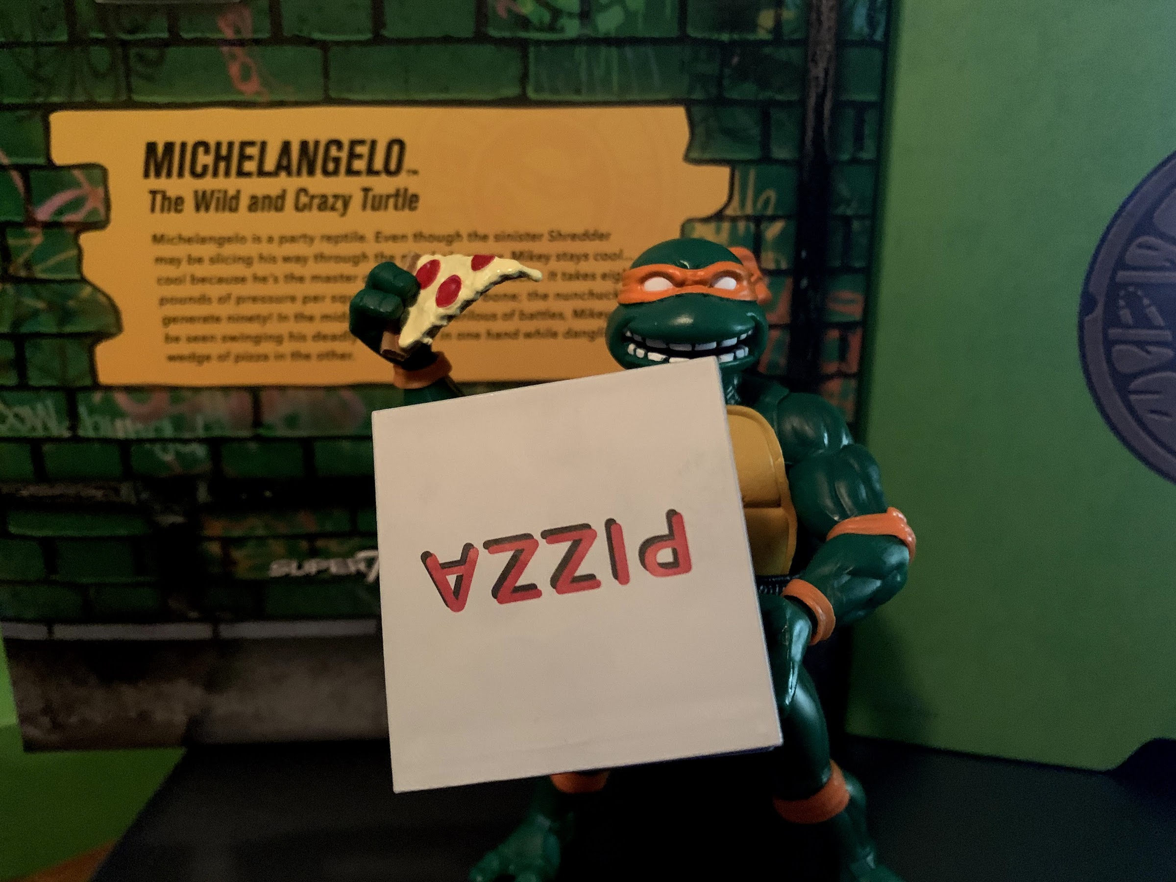
These issues with the figure may seem like a classic case of nitpicking, but they all add up to be more problematic than expected. Getting Metalhead to stand is more challenging then it should be, add the backpack and it really becomes an issue. Then when you take away something like a thigh swivel, you’re forced to rely on the other joints to create a strong base. And when you find yourself constantly tinkering with the figure to get him to stand, you end up grabbing the lower leg and forgetting there are hoses behind it and that’s how you end up with a broken toy. Yup, those hoses I pointed out as a potential problem turned out to be just that. The right leg ended up breaking on me, and not from twisting the lower leg too far, but just by my finger wrapping around the leg in just the right (wrong) way, apparently. It’s a very thin, soft, plastic and it won’t take much to break. I have a feeling in ten years when we’re looking back on this line that Metalhead’s tubes will be akin to the old Playmates Krang and the antenna on top of the head that always broke. I ordered this figure through Big Bad Toy Store so I reached out to them (because Super7 asked me to do that first with my Michelangelo issue) to see about an exchange. The stuck thighs already had me frustrated and contemplating an exchange, and the broken coil became the tipping point.

I can’t believe this design choice made it into the final figure.

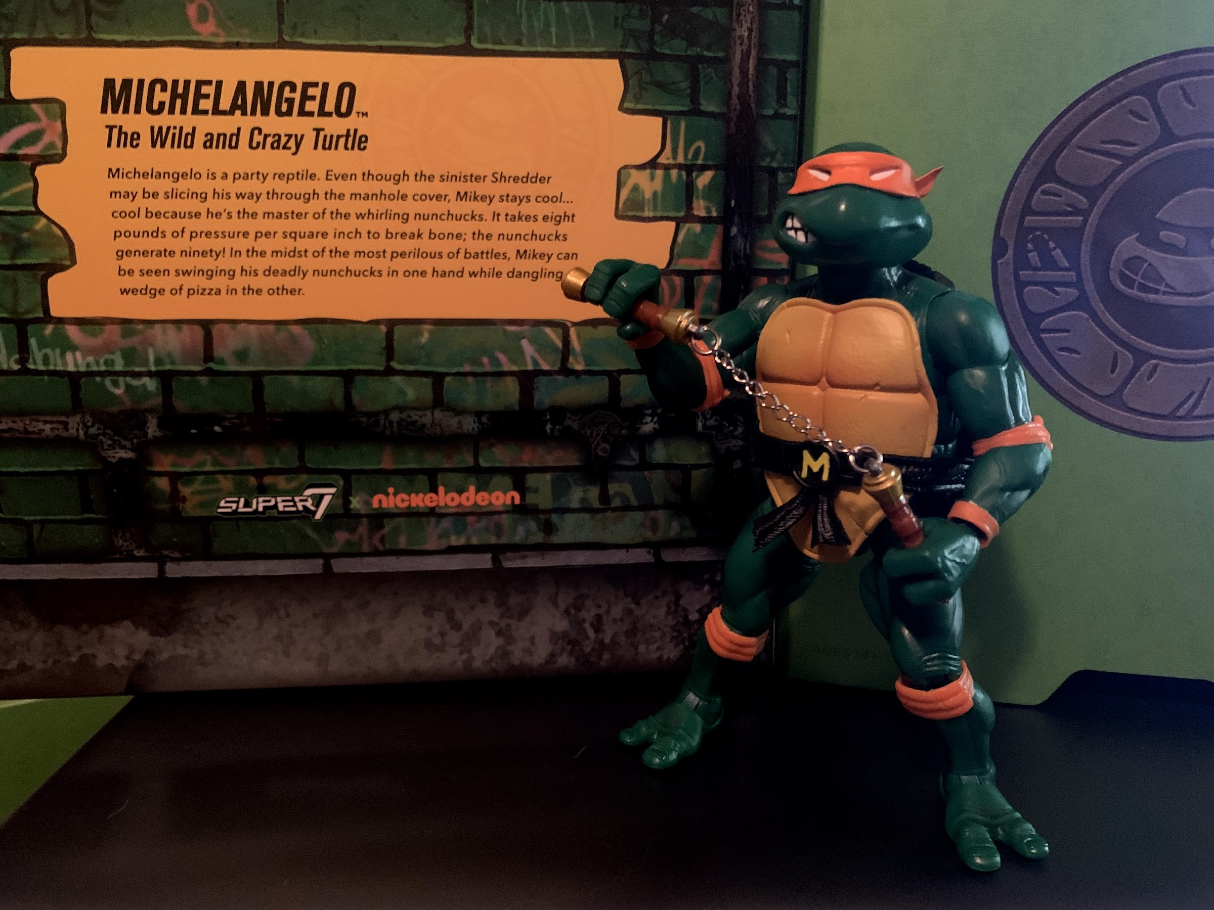
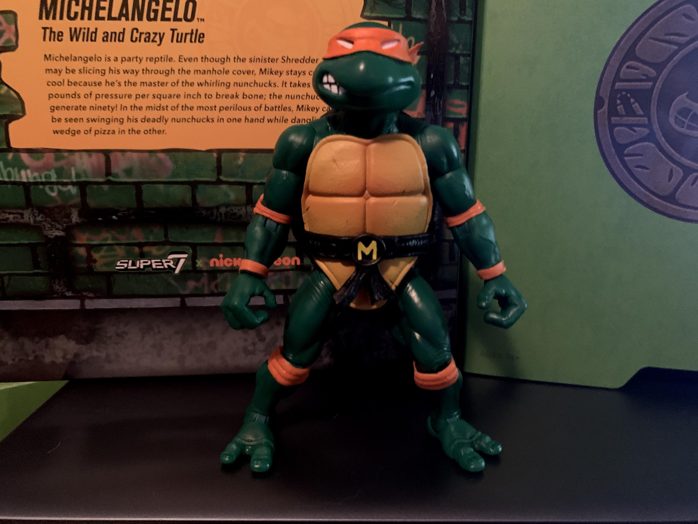
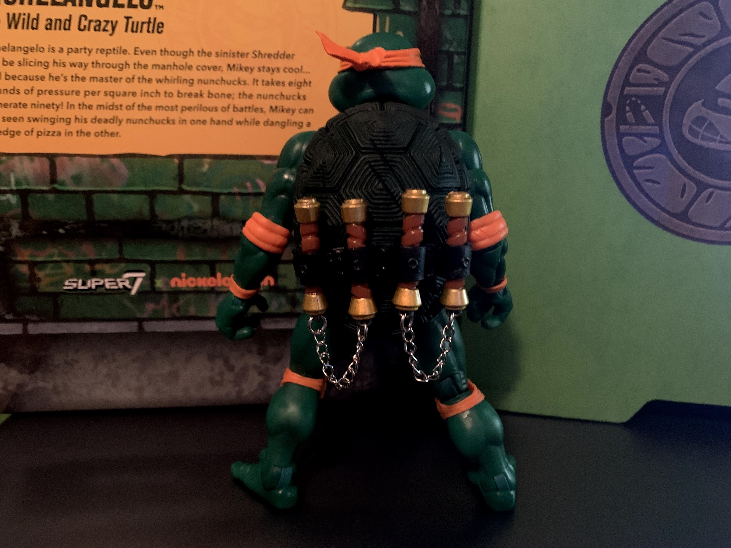
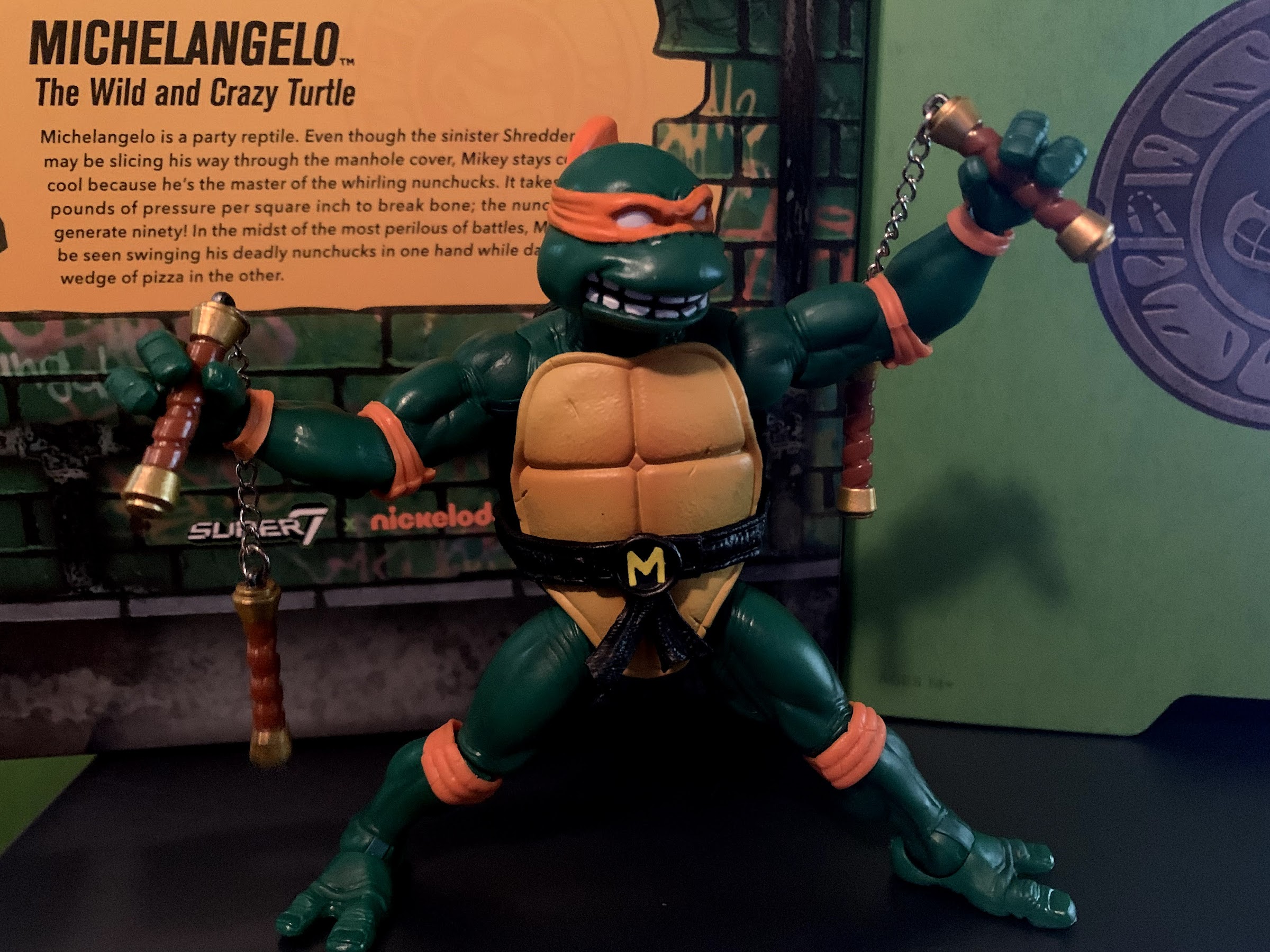
Metalhead ended up being a more frustrating experience than I expected. He had become the one I was looking forward to the most from Wave 3 of Super7’s Teenage Mutant Ninja Turtles line of Ultimates!, and now he’s my most disappointing. It has not been a great start to this wave as I had the ankle issue with Michelangelo so hopefully the last figure I look at (Rocksteady) won’t be more of the same. This follows really no issues with waves 1 and 2 for me beyond stiff or loose joints, and it’s not causing me to rethink all of the open preorders I have with Super7, but it has taken some of the wind out of my sails.

Hooking the tentacle on a more stable figure has the hidden benefit of helping Metalhead stand.

In the end, maybe Metalhead wasn’t the best choice for my 800th post, but it’s a decision I’ll have to live with. I’ll come back and update this post if I have any success on getting a better Metalhead. Right now, the figure is available in a few places to order, but he won’t last forever since Super7’s model is made-to-order. They’ve relaxed their one and done strategy for this line for both of the first waves, but I wouldn’t count on that going forward. Especially as factory availability remains challenging and shipping from Asia continues to be a problem. I can’t give my full endorsement to this figure as-is, but if you like the look and are okay with the limitations, then you should have enough information to make an informed decision that works for you. I do like the look of this one, and no matter how my interactions with customer service goes, I’m not about to toss him in the trash or anything, but he definitely feels like a “set it and forget it” action figure which is a shame since he has enough stuff that a variety of display options are present. His base just won’t cooperate though, so he gets to be a shiny, golden, idol instead.

Bebop is so big.

UPDATE: I reached out to Big Bad Toy Store, where I bought my Metalhead, about the issues I had with it and they replaced it at no cost to me and without any additional questions. They also let me keep the first one. My new Metalhead arrived a few days later and he’s much better in some ways, and not in others. First of all, all of the joints are free and usable and obviously the wire/hose/coil behind the knee is fine. On the negative side, the hips on the new one seem even more loose than my first one so he’s still no fun to stand. I’m guessing that’s just going to be the reality of this figure where some are tighter than others. There was also some yellow paint slop on the black portion of the knee which was unfortunate. At any rate, he at least looks better because his knee isn’t constantly twisted and I went over the paint slop with a black marker. Because of the performance issues though, I do think Rocksteady is the superior figure in this third wave and I’m still a little disappointed in Metalhead, but I feel better about this one at least. And hats off to Big Bad, I’ll definitely continue to turn to them for my action figure needs.


Super7 TMNT Ultimates! Michelangelo

Turtle #3 is here!

It’s been a longer wait than expected, but Wave 3 of Super7’s Teenage Mutant Ninja Turtles Ultimates! has finally arrived. The original plan was for a new wave of figures to start shipping every 4 months, but COVID had other plans. When we last looked at a figure from this line, there was snow on the ground, we were all trapped in our homes waiting on a vaccine, and Valentine’s Day cards had yet to hit the clearance rack. Now we’re in the dog days of summer, people are arguing over masks again, and kids are heading back to school. It is what it is, but at least the wait is over and collectors now have 3/4ths of the Teenage Mutant Ninja Turtles assembled for Michelangelo has arrived!

This packaging shot is the only time you will see the extraneous “ninja” weapons.

If you’re unfamiliar with this line of action figures form Super7, this line is an homage to the original Playmates line of action figures first launched back in 1988. Actually, it’s less an homage and more like a straight remake with the figures boosted to fit in a 7″ scale with updated articulation, paint, and sculpting. Some look so much like the old toys that from a distance one might think they’re the same, just bigger. Up close though the differences become more obvious. With the turtles themselves, they especially look more updated than some of their friends and foes. Those old figures had permanently bent elbows and knees and while you could approximate such a pose with these new figures, it’s not something most would want to do. The turtles also come with a secondary portrait that’s a lot different from the original so if that’s the chosen method of display then they’ll actually look quite different. All of the main details are still in place though including the white eyes, facial expressions, belts, and skin tone.

Yup, that’s Mikey.
How do you store your ‘chuks? Chains up or chains down?

And if you’ve handled Raphael or Leonardo, then you know what to expect from Michelangelo. The party dude is essentially the same figure as his brothers. The only thing that distinguishes the turtles from one another is the color of their skin, shell, mask, pads, and the shape of the belt which needs to be customized to serve the turtle’s chosen weapons. Michelangelo sports a deep, forest, green for his skin which has always looked great with the orange mask and pads. As a kid, it was toss-up for me which shade of green I liked best between Mikey and Raph, but I think I can safely say I prefer Mikey now. His default head still sports that side grimace with the right side of his mouth baring teeth and the left not. He has four loops on the rear of his belt to store his chosen weapon, the nunchaku, and a yellow M is emblazoned on his belt buckle so he doesn’t forget his name. He looks good and there is a black wash over parts of his body to accentuate the muscle tone. It does, unfortunately, seem to be on the default head and gives his orange mask a dingy quality. There’s also a bizarre factory error on my figure concerning the left ankle (pictured below). It looks like the cut was done incorrectly for the ball-hinge. Since his foot can only rock, not twist, it means it can never lineup with his knee and looks weird. It’s probably only something I’ll notice, but it’s definitely one of those things that once seen cannot be unseen. One of the horizontal hinged hands has a similar issue. Regardless, it’s not enough of an issue for me to initiate a return and exchange, but I did reach out to Super7 to see if they are willing to send a new lower leg (which just pegs into the knee) and I’ll update this post accordingly if they do indeed provide such.

That’s not supposed to be that way. You can see the outline for where the cut was probably supposed to be made for ankle articulation.

Where Mikey differs from his brothers is in some small ways. The rear of his shell is basically black where Raph’s was a light brown and Leo a deep green. His belt is all black and the trim on his belt buckle and the rings in the belt is ever so slightly darker than the same on Raph’s, and a lot darker than the chrome used on Leo (which sounds like that was a factory error and re-releases of Leo should be closer to Raph and Mikey). The front of his shell is fairly yellow, which surprised me a little because Leo’s was darker, with more orange mixed in, than Raph’s. Mikey’s though is pretty much the same shade of yellow as Raph though making me wonder if Leo was supposed to match and it’s just a factory variance. Oddly enough though, one difference that looks weird is Super7 declined to paint Mikey’s finger and toenails. Leo and Raph both had a bright, yellow-green, color to their nails that looked fine on Raph, but a little like nail polish on Leo. Maybe they didn’t like how it looked on Mikey who features the darker skin tone. They could have gone with another color though rather than not paint them at all, but it’s not something that stands out on a shelf either so I guess it’s just me nit-picking.

I hate taking this picture because Raph’s heads are not fun to swap.
And that’s because I choose to display Leo and Raph this way, so this is likely how Mikey will have to be displayed.

In terms of articulation, Michelangelo is exactly the same as his brothers. As such, I don’t feel the need to break it down completely again since you have that in my reviews of Raphael and Leonardo, so instead I’ll just say what’s good and bad about it. For one, Super7 does not like double-hinged joints. It’s something we just have to agree to disagree with when it comes to Super7. I will say, Mikey’s joints are at an appropriate tolerance which is an improvement over his predecessors. His extra hands and head also swap a lot cleaner. Maybe all of that extended time sitting in a hot shipping container did some good? The only joint that is a little tight is at the shoulder, but that’s a strong joint so it’s something I don’t worry about breaking. The hips, a point of contention with the past figures, seem tighter and Mikey stands just fine. The lack of a butterfly joint and the fact that his arms can’t quite bend at 90 degrees are more of a problem for a ‘chucker like Mikey. I can’t, for example, get him to do the ‘chuk over the shoulder with the other hand reaching across the chest/belly to grab it pose. The ‘chuks aren’t quite long enough, nor can he reach all the way across his body. He can at least hold one handle of the nunchaku while the second is in a belt loop.

The most popular nunchaku pose? At least absent a whirling piece.
Chains are awesome, but it does suck that they can’t be posed.

Where Mikey is the same, but different, from his brothers is in the accessory loadout. Obviously, he’s got to have his ‘chuks and Super7 decided to give him three sets. One is all painted, plastic, versions of the nunchaku he came with in ’88, only now the chain is sculpted instead of plain. The second set is painted as well, but features actual chain links between the handles which has basically become the standard ever since NECA’s 2008 release of the Mirage Michelangelo. Both have advantages and disadvantages when it comes to displaying the figure as the real chains give the figure an added sense of realism, while the plastic version allows for gravity-defying posing. The plastic links have a slight bendy quality to them so you can try to position them in a manner that makes it look like Mikey is swinging them. Both sets can fit into the rear holsters on his belt just, albeit quite snugly, though I prefer the chained versions for that since it’s not going to put stress on the weapons like it would the all plastic version. The third set is another pair of plastic nunchaku, but unpainted like the vintage toy. It’s attached to a sprue/rack along with the other “ninja” weapons likely no one uses. Something I’m just now noticing is that all three turtles feature a slightly different shade of brown for their weapons rack. I’m not sure if this is intentional or not, but might bug some people. I, personally, never take them out of the package so I have no right to complain.

Michelangelo comes with the box, but he’ll need help from his brothers if he wants to score a slice.
The alternate head has been a point of contention in the fanbase. I think it’s okay, but yeah, it could have been better.

In addition to the nunchaku, Mikey also comes with painted versions of the generic weapons all of the turtles came with and have come with: ninja stars, that hooked thing, and the little knife weapons. He also has an assortment of hands including gripping, fists, and style posed hands. He also has another set of gripping hands with a vertical hinge instead of a horizontal one. The second head follows in a similar aesthetic to his brothers in that it’s a bit more realistic, with actual wrinkles and lines to accentuate his expression and basically bring him to life, albeit in a comic book sort of way. Where his alternate head differs though is that Mikey isn’t just wearing an updated version of his old expression, but one entirely different. It’s an all toothy, open mouthed, grin and it definitely takes a little getting used to. It reminds me of the 2k3 Michelangelo from Playmates, as well as that popular GIF of the costumed Mikey head grinning. It’s an appropriate expression for Mikey, but I’m not super enthused with the execution. There’s a rather sizable gap between each of his teeth that looks odd and it made painting the mouth a great deal more difficult. It’s a little sloppy. On a shelf, it’s probably not noticeable, but it should look better. It puts me in a bit of a tough spot with the figure as I’ve gone with the alternate portraits for Leo and Raph in my display, but those old toys ones just don’t blend well with that look. So while I want to go default here, I’m likely go with the alternate head just for balance. It’s not a terrible look or anything, but I definitely have a clear preference for the vintage head with this figure where as with Raph I definitely preferred the new one, and with Leo it was more 50/50.

It’s well-painted, but yeah, my Mikey won’t be wielding this thing.
I feel like Super7 missed an opportunity for a pun here.

We’re not done though as Mikey still has a few more accessories. Unlike his brothers, he does not come with any Turtlecoms or even a slice of pizza. Instead, he has his trusty Turtle Hook weapon/grappling hook that he featured in the cartoon. The Turtle Hook started off as this piece of equipment all of the turtles seemed to carry, but it would eventually become Michelangelo’s weapon of choice because certain parts of the world had some issues with the nunchaku. It makes the Turtle Hook something that’s both loved and hated, we all loved it as a fun accessory, but hated to see Mikey running into battle with just a grappling hook. It’s a smart inclusion for a toy though, and while I like the look of it, I must say this is my least favorite attempt at the Turtle Hook to date. It’s non-articulated, and the string attached to it is very plain and lacks something that would make it easier for the figure to hold. Both Bandai and NECA put a piece of plastic at the end of their Turtle Hooks, but Super7 elected not to. It’s probably not something I’ll display with my figure, though I suppose I prefer it to another Turtlecom. Mikey’s other unique accessory makes a lot of sense for him though and it’s one I do like: a box of pizza. There’s only one slice left in it, and there’s some “cheese” stuck to the top of the box, and it’s just a smart inclusion for Mikey. I do wish the box could open and close though, but it works for a display. The pizza in it is permanently glued in at an odd angle which kind of stinks since you can’t fill it with more slices. It also seems a touch small given the size of the slice. I’m guessing a lot of collectors will choose to display Mikey with the pizza though alongside the slices that came with Leo and Raph as opposed to a more battle ready pose. It certainly works well with his alternate head.

Like father like son. My old Mikey was certainly loved over many years.
I really should have dug out my 2003 Mikey for this, but he’s buried under a bunch of stuff in storage.

Super7’s take on the party turtle arrives largely as expected. That’s what happens when a mold is reused for four different characters. The good thing is that mold looks pretty great and packs enough functionality to make this a worthwhile figure to own. And if you already have Raph and Leo, well then you’re going to get Michelangelo. Super7 did right by the character when it comes to his signature weapon, and I do appreciate Mikey getting a couple of unique accessories to help differentiate him from his brothers. I do wish he didn’t come with more ninja stars and those generic weapons, but I also understand what Super7 is going for with this line. Thankfully, there’s only one more turtle to go and then we can hopefully bid those things goodbye. Hopefully, the wait for Donatello won’t be as long as the wait for Michelangelo was as that would mean a 2022 release for Donnie. I guess we’ll just have to cross our fingers until then. And if you want to know more about Wave 3 of Super7’s TMNT Ultimates! line then check back soon as we have a couple more figures to talk about!

Now that we’re done here, it’s pizza time!

UPDATE: After reaching out to Super7 about my Mikey’s weird ankle joint, I was asked to contact the retailer first to see if they had replacement parts on-hand, so I did. I emailed Big Bad Toy Store and about 2 days later I heard back. They were sending me a new Michelangelo at no cost to me and didn’t even want the other one back. That’s some pretty awesome customer service. I’m no shill, and I don’t have any advertisements on this blog or receive review samples, so I’m just telling you as a consumer that Big Bad is pretty great. The unit was partially defective through no fault of theirs and they still made it right. Now, I’m guessing they get reimbursed by the manufacturer when these things happen, but it doesn’t change the fact that it makes things really easy on the consumer when retailers just replace product with zero hassle.

A tale of two heads: matte (left) vs shiny (right)

And upon receiving my new Mikey, I did notice something that escaped me in my initial review. Truly, it wasn’t really something I could have seen unless I had two figures in front of me that featured this distinction. And that is, my new Michelangelo has a coating on his default head that gives it more of a textured, matte, finish. It’s subtle, but it’s something that’s on Leo and Raph. And with Leo, I noted in my review that he had a little swath on his face where this was missing and it seemed to be widespread. I have no idea why this is the case with Michelangelo though. There’s only been one factory run so it’s probably not a running change, unless it was something that was supposed to happen and the factory noticed it mid-production, but it’s pretty odd. It’s hard to predict if this will be an issue in the collector community to the point that Super7 will be asked to respond. I definitely prefer the matte look, but maybe some will like the glossy appearance since it more resembles the original. Who can say? If it matters to you though, there’s not a lot you can do since most of these are purchased online. If buying from eBay, you can inspect pictures. If you find it in a comic book store then obviously you can get a better look at it, but you’ll also likely be asked to pay a significant mark-up.

The alt heads. I probably wouldn’t have noticed anything with these two if not for the regular heads being more apparent. Matte left and “glossy” right.

Super7 is Heading to Springfield!

Wednesday, August 18th, ended up being quite an eventful little day in the world of toy collecting. There were some reveals from major toy companies, leaks, and even those long neglected Street Sharks fans got something to get excited about late in the day. Personally, it was a good day for me too as I finally got to click “ship” on a Big Bad Toy Store Pile of Loot that includes my Super7 Teenage Mutant Ninja Turtles Wave 3. However, nothing prepared me for what Super7 had in-store for us (or technically didn’t) come the evening.

It started in the afternoon when Super7 posted a tease for a new license: an image of a glowing, green, rod with the vastness of space behind it. To the uninitiated, this may have been cryptic or even confusing. A glowstick? What could that be a reference to? For diehard fans of The Simpsons though, the image was unmistakable: an inanimate carbon rod! This rather plain looking object was the punchline to the episode “Deep Space Homer” where the show allegedly “jumped the shark” by sending Homer to outer space. It’s a ridiculous concept, but like a lot of classic era episodes of The Simpsons, there’s plenty of jokes to make it worthwhile.

Speculation was then running wild on social media about what Super7 had planned for The Simpsons. Most, including myself, assumed a wave of ReAction figures was forthcoming. If you’re unfamiliar with ReAction, that’s Super7’s retro, five points of articulation, throwback line of figures that are sold on elaborate cardbacks and can be found everywhere. They’re not my cup of tea as I have no nostalgic attachment to the Star Wars figure line from the 70s and 80s. They’re just ugly figures to me, but sometimes Super7 creates some interesting figures in this line so I wasn’t ready to dismiss the idea. The Nicktoons figures have turned out pretty well, so maybe The Simpsons could be pulled off just as well.

What I was hoping for though, was that Super7 would give The Simpsons the Ultimates treatment. We’ve talked about the Ultimates figure line a lot here, but for those just popping in, Super7’s Ultimates line is a 7″ scale action figure line that’s made to order. These are the figures that are decidedly modern in their approach to sculpting, articulation, etc. The Simpsons isn’t a brand that screams “Ultimates” since we’re not talking about sword-wielding ninjas and such, but I’m interested in figures that capture the likeness best and come packed with tons of accessories and facial expressions. Still, I assumed that would be far off, and if Super7 did want to do Simpsons in that style that they would start small (like they did with Ren and Stimpy) and maybe just offer a Homer or Bart or a one-off character.

What do we have here?!

And I was wrong! Later in the evening, the Twitter account @preterniadotcom tweeted an image of a Google search result for a Super7 Ultimates Deep Space Homer. The link went to a 404 error, but it’s mere existence was encouraging. The same account then dug a little further and was able to find a solicitation image that all but confirmed the existence of a Deep Space Homer action figure. As the name suggests, it’s Homer in his astronaut suit and he indeed comes packaged with our beloved carbon rod. He has extra hands and three different facial expressions. He also has a bag of chips and the colony of ants. It’s just a digital render, but it sure looks promising.

The fun didn’t stop there. Soon many people were messing around with the Super7 store URL and it wasn’t long before an image of the entire first wave of Simpsons Ultimates was uncovered. A user at thefwoosh.com was the first person I saw to uncover the image, but soon every social media account connected with toys was sharing it. The day began rather ordinarily, and then we got a Simpsons tease, then we got confirmation of an Ultimates figure, and when we all went to sleep we had an entire first wave. And it wasn’t just two figures, it wasn’t even the standard four, but five figures! Super7 clearly appears to be all-in when it comes to The Simpsons and I am here for it!

Wow! It looks great! And you get a Homer accessory with your rod!

So who all is joining Homer in this inaugural first wave? Well, in true Super7 fashion, it’s a surprising collection of characters intended to appeal to the diehard Simpsons fan. Disney fans were confused when Super7 launched a Disney line last year consisting of Sorcerer Mickey, Pinocchio, and Prince Jon from Robin Hood because there was no Robin Hood. Super7’s approach is both strategic and also by the seat of their pants. They like to produce the figures that they simply want, and Super7’s Brian Flynn loves Prince Jon so he gets to be in Wave One. To them, that suggests to the consumer that “Of course Robin Hood will be in Wave Two,” but for fans unfamiliar with the company it’s just confusing. With The Simpsons, I’m pretty sure the same thing will happen because Wave One is Deep Space Homer, Moe, Poochie, and robot versions of Itchy and Scratchy from the episode “Itchy and Scratchy Land.” I don’t want to speak for Super7, but my guess is these are just favorite characters, episodes, and gags for the people at Super7. It’s also a tell to the Simpsons fanbase that they’re going to go deep. It’s a foregone conclusion that you’re going to get a Bart, Lisa, Krusty, etc. at some point, so they’re going to give you some of those deep cuts upfront so you don’t have to worry about Super7 not getting to them.

Should I spend hundreds of dollars to amass an army of Itchy and Scratchy robots?!

Of course, since everything except the initial tease is basically a leak (or a cleverly disguised reveal to get people talking) we don’t necessarily know what the plan is or what direction they’re going in. Maybe Super7 isn’t interested in doing a base Homer? I kind of doubt it, but we’ll have to wait and see. They’ll probably want to get someone out there soon to talk about the license and give fans a head’s up, but for now we at least know about five figures. And from what I see, they look terrific. I don’t know that I need Homer in a space suit, but I do like what Super7 is showing here so it’s not something I’m going to pass on. Moe looks as Moe should. He comes with his apron, rag, a Flaming Moe, and a bright red phone for prank calls. He even has an angry, screaming, face that should pair well with that phone. He also has a panda in a crate, because Moe gets his hands into some questionable business practices. Poochie also looks great and comes with his surfboard, skateboard, and all of the stuff he needs to take things “To the extreme!” The stars of the inaugural first wave though might be those robotic Itchy and Scratchy figures. They just look fun with Itchy featuring a removable skull top to expose his robotic innards and Scratchy possessing a removable face to do the same. They have various implements of destruction as well as items to feature in a parade. And, not to be missed, is the Bort license plate that comes with Scratchy (chef’s kiss).

This has to happen.

Even though I get what Super7 is doing here, that doesn’t change the fact that this is a rather bold selection of characters for the first wave of a new IP. Is there a market for high end Simpsons action figures out there? I guess we’ll find out. Many are used to paying 10 bucks or so for the Playmates figures of 20 years ago. These will retail for $55 a piece so there’s likely to be some sticker shock. I’m familiar with Super7 so I know what to expect. I’m also used to paying that kind of money for a toy in 2021 so it should go without saying that I’m all in. And then there’s also the delay in actually getting these. Simpsons fans who have been out of the collector game for a long time will be surprised at the price, and then further surprised when they find out they won’t even get their figures for a year. Super7’s made-to-order model is basically designed in such a way that they almost can’t lose money on a figure offering, but if this wave underperforms it might mean a smaller Wave Two. I suspect they have a list of figures they really want to make and it’s possible nothing will stop them unless sales are truly abysmal, but it will be interesting to see the response to these. As for me, I have a long list of characters that I’d love to see, and I expect a lot of the figures to come will be episode specific. Surely there will be a Bart in Wave Two, but I’m also really hopefully for a Skinner and Chalmers pairing full of Steamed Ham references. Such a thing would surely get the social media a-buzzing!

Update 8/20/2021: The entire first wave is now available through Super7 at https://preorder.super7store.com/. If you want to order from a place that doesn’t charge upfront, more options should become available later in the day. I recommend at least heading on over to Super7’s store for more high-res images of the line including a look at the sleek packaging!


Chrono Trigger (DS)

Chrono Trigger was originally released in 1995, but has been re-released numerous times since.

One of the great hallmarks of the Japanese Role-Playing genre of video games is Chrono Trigger. The 1995 Super Nintendo game was crafted by a dream team of the era’s best RPG developers. Produced by Squaresoft, the title was a collaboration between Square and Yuji Horii, who at the time was best known as the creator of Dragon Quest. The designer for the title was Hironobu Sakaguchi who was credited as the father of Final Fantasy. For RPG fans in the 90s, Squaresoft working on an RPG that was essentially Dragon Quest + Final Fantasy was an RPG fan’s wet dream. How could it be get any better than that? Well, it did, because numerous other talented individuals worked on the title. Akira Toriyama handled (Dragon Quest, Dragon Ball) character designs and a young artist by the name of Tetsuya Takahashi was also part of the art department for the game. Composers Yasunori Mitsuda and Nobuo Uematsu were onboard to provide the music while a trio of Final Fantasy vets, Akihiko Matsui, Takashi Tokita, Yoshinori Kitase, handled the directing duties. A lesser name at the time, Masato Kato (Xenogears, Final Fantasy VII), contributed as a writer on the project and would come to be the main architect of the Chrono Trigger story.

Needless to say, this was a huge project for Squaresoft and the Super Nintendo in the mid-90s and was the spiritual merger of Square and Enix years before that merger would become a reality. Unfortunately though, the game was almost too big and too late arriving in the first quarter of 1995 after the Japanese launch of Sony’s PlayStation and roughly 6 months before that console’s US release. Another obstacle to the game’s success was its price. In the US, the retail price of a new copy of Chrono Trigger was $80, a pretty massive sum of money for a single game that wasn’t part of an established franchise. RPG gamers, particularly in Japan, had reason to be excited for Chrono Trigger and were likely willing to pay such a price, but the casual gamer had no idea what this was and the JRPG subgenre was still finding its footing in the west. All of that is to say, it’s not particularly surprising that, despite largely strong review scores in gaming mags, the game didn’t sell vast quantities when initially released. The production run was likely modest, and many people simply missed it.

It’s easy to see a little Dragon Ball in Toriyama’s designs for Chrono Trigger.

In 1995, I didn’t quite miss Chrono Trigger, but I also didn’t get the full experience. The title was a rental for me, and even though SNES JRPGs aren’t as long as modern ones, a single rental still wasn’t enough time to experience everything the game had to offer. I distinctly remember getting to the point where the character Frog leaves the party, and I don’t believe I made it much farther. The game somewhat quickly came to be regarded as a missed classic. I think this was largely due to the explosion in interest in the genre following the release of Final Fantasy VII, but even a mere 2 years after the SNES release, the game was already hard to come by. Prices on the after-market were routinely $100 or more, and even though we should have still been used to higher priced games, it was hard to justify that kind of expense when brand new PlayStation titles were $50.

For many, their first introduction to Chrono Trigger would come from emulation. Emulators for 8 and 16 bit consoles were becoming popular and many used them as an alternative to paying exorbitant after-market prices for rare games. I know I gave Chrono Trigger another shot on an emulator, but I don’t recall making it very far. For me, there was always a logic hump to get over when it came to playing console games on the PC. I also lost interest because not long after that Squaresoft announced a PlayStation port of Chrono Trigger. The title would be released alongside Final Fantasy IV as Final Fantasy Chronicles in 2001 (ironically, quite late in the lifecycle of the original PlayStation). I was a day one buyer of the bundle and it was in that form that I finally completed a playthrough of Chrono Trigger. Unfortunately, the PSX version of the game wasn’t the best way to experience it. In porting the SNES game to the disc-based PSX a new problem was unleashed: load times. The loading was a necessary evil to enjoying the game as simply going from gameplay to the menu included a load of approximately 5 seconds. It may read as inconsequential in text, but in playing the game it’s annoying and monotonous. Still, it wasn’t all bad for the PSX version as it did include some flashy new animated segments from Toriyama’s Bird Studio and animated by Toei, who also animated Toriyama’s most famous franchise Dragon Ball.

Aside from availability, the big selling point of the PSX release were the new cutscenes.

The PlayStation release was a flawed one, but not so flawed that it could sap all joy from Chrono Trigger. Still, I have wanted to replay the game for years now, but was reluctant to return to that PSX port even though I still own it. And ever since 2008, there really has been no need to as that is when Square-Enix released what many consider to be the definitive version of Chrono Trigger on the Nintendo DS. The DS version kept the good parts of the PSX port but returned the functionality of the SNES version. It also contained improvements in the form of a refined translation and display mode tailored to the DS which basically removed all visual clutter from the main screen and moved it to the bottom one. It also made the game portable, and really the only sacrifice one has to make is the loss of being able to easily play the game on a television. When the DS version came out it slipped under my radar. I was likely just too preoccupied with whatever I was playing at home to grab it. Only recently did I finally rectify that, though similar to the SNES version back in the late 90s, my procrastinating did hurt me in the wallet to some degree though not as badly as it would have in 2000.

My desire to play Chrono Trigger in 2021 stems from the fact that most of my experience with the game was in an inferior form 20 years ago. Since then, the game’s reputation has only managed to grow and many now regard it as the greatest RPG of all-time. The RPG podcast Axe of the Blood God even did a March Madness style bracket for its listeners to vote on that resulted in Chrono Trigger besting the likes of Final Fantasy VII, Skyrim, and The Witcher 3 to be crowned the best ever. Now, one RPG podcast is hardly the final say on any single game, but I found it telling that a subscription-based userbase for an RPG podcast would still settle on Chrono Trigger as one would imagine anyone paying to listen to an RPG podcast is quite likely a diehard RPG enthusiast. And I personally had no real qualms with the result myself as I personally hold Chrono Trigger in very high regard and the end result made me realize that I just need to experience it again for myself.

The DS version really declutters the main screen by moving all of the informative graphics to the bottom screen.

If you’ve read this far and have no idea just what Chrono Trigger is allow me to explain. It’s a pretty traditional JRPG from the 90s. As the player, you control and manage a party of up to 3 characters with more in reserve as you go from town to town in the game talking to non-player characters to find information on where to go. Traveling from these towns to the next destination unfolds over a world map; a zoomed out view of the game’s world where characters can traverse miles in seconds. Upon entering hostile areas, the player will encounter enemies which triggers a battle sequence. Unlike its peers, Chrono Trigger’s transition from exploration to battle is entirely seamless. There’s no change to the art style, no loading of a new screen, the characters just simply pull out their weapons and commence fighting. In battle, characters can attack, use magic, use items, or flee when it’s their turn. Turns are determined by the character’s underlying speed score which affects how quickly their action meter fills. For RPG veterans, they know this as Square’s Active Time Battle System first implemented in Final Fantasy IV and Chrono Trigger makes no real changes to it. Where Chrono Trigger does distinguish itself from Final Fantasy is in the removal of random encounters on the map as enemies will now appear on screen before a battle begins. The other distinguishing trait is in the Tech system, which I’ll get to shortly. For the most part though, the game plays like any other JRPG. When the battle is over, character’s gain experience which contribute to them leveling-up and seeing their base stats improve. They also gain ability points which are applied automatically to their magic and skills and will eventually result in them learning a new ability. Characters can also be outfitted with a weapon and three forms of armor that enhance their native abilities and are gradually replaced overtime as better equipment becomes available.

What sets the wheels in motion is essentially a misunderstanding and an overzealous Chancellor.

That all is pretty conventional, but Chrono Trigger changes this up a bit with its emphasis on time and its Tech system. The word tech is essentially a synonym for magic in other games, though the game doesn’t consider all techs “magic.” They’re the abilities characters learn as they get stronger and the only way to learn a new tech is for a character to participate in combat, which is different from earning experience towards leveling up as inactive characters will still earn experience. Techs come in various forms, some are simply strong physical attacks, others are elemental spells like Water and Fire, and some are support abilities like healing and buffs. Each character has their own unique techs to learn and they basically shape how that character should be used. Some are naturally more physical fighters with the character Ayla in particular lacking a magic attack. Some are magic attackers, some are more of a support character, and a few try to blend both. That part is pretty standard, the part where Chrono Trigger introduces a new wrinkle is in the form of dual and triple techs. Each character will eventually learn a tech that’s compatible with another character. This starts off slowly, but by the end of the game basically every character has a tech that works with another. Learning them is simply a matter of the two characters participating in battle together when they both know the tech needed to create the dual tech. Like standard techs, they take on various forms and can be healing or attacking in nature. Some allow the non-magic users like the previously mentioned Ayla to add an elemental component to an attack, but mostly they’re just high impact moves as the damage output is greater than the sum of its parts. The same is true for triple techs which just incorporate all three active characters.

The Tech system is certainly flashy which helps cover up its lack of depth. Very little player input is required to learn them and it becomes more about balancing risk vs reward. Especially early in the game when the speed of the characters is both slower and more varied. Dual and triple techs are only usable when all of the characters involved have full action gauges so waiting on slower characters means there are moments when characters aren’t doing anything. Towards the end of the game it’s less of an issue as you will likely have access to multiple characters that have maxed out or near maxed out speed. The only added wrinkle is there is one, optional, character that has no dual techs and only a few, hidden, triple techs. Deciding whether or not to utilize that character can be tricky because you’re losing the ability to combine attacks. That character is also entirely offensive in nature which means someone else is going to have to be the healer in the party and usually that character is weaker and not the best choice for dual-teching. By the end of the game though, it’s again rendered somewhat moot as there is at least one character capable of healing that also can dish out plenty of damage.

I know they don’t make any sense, but I do miss the World Map that was prevalent in every JRPG in the 90s.

The main focus of the game’s plot and design revolves around the ability to travel through time. The game begins with the main character, default name Crono, encountering a runaway which leads to the main character getting into a rather sticky situation. It’s not particularly unique for the genre, but it will result in the player getting sent 400 years into the past. As you progress through the game more periods become available. They’re accessible via permanent warps in certain areas and they’ll take you to the future and even further into the past. A key component of advancing the plot involves traveling to the future to obtain something only available there and then going back in time to change something in a later period. Even though you’re essentially playing with the time stream the whole game, it’s still a linear experience for the vast majority of the game. Only towards the end does it open up a bit, as do many of its peers, when the player gains access to a vehicle that both flies and functions as a time machine removing the need to backtrack to specific warp points.

The game is certainly still fun after more than 25 years. The game cycles characters through early on which keeps things fresh and exciting. Level-ups occur at a brisk enough pace and new abilities are added at a suitable pace as well which can become addicting. Seeing each era available in the game also provides incentive to keep going, it’s once you’ve seen them all that the game starts to lose a little steam. Players will naturally gravitate towards a preferred trio only really swapping characters out to make sure abilities aren’t neglected. It’s helpful that you can swap at will, though saving the game is still relegated to the world map and designated save points. By the end of the game, a tedium will start to set in as it becomes apparent that Chrono Trigger’s lack of random encounters doesn’t mean all confrontation is avoidable. Rather it would be more appropriate to describe Chrono Trigger as a game of scripted encounters. Many enemies are onscreen, but completely unavoidable. This becomes annoying in traversing to the various time warps as many will always feature battles in certain spots, even when the party is far beyond the enemy’s talents. One optional string of quests late in the game involves going back and forth between a dinosaur village in two time periods that is just a constant string of fetch quests and backtracking. You will come to know all of the encounters in your way as you battle through them again and again. You may even come to miss random encounters as at least they had some variety as opposed to these scripted ones which never change.

The seamless transitions from exploring to battle are pretty neat, though the non-random encounters aspect of the game has been oversold.

Where the game has not suffered though in the ensuing years rests in its presentation. Toriyama’s digitized character designs are still as charming as ever and the inclusion of the anime cutscenes serve as a reminder of what these sprites represent. The script is mostly light-hearted with plenty of moments of humor. I don’t think anything in this game made me laugh out loud, but it was something I definitely enjoyed for the most part. The score is also a strength, even on tiny DS speakers, though I do feel like it’s missing a signature track similar to how Final Fantasy back in the 90s had its victory theme. The world design is enjoyable though with eras of typical fantasy fare, but also there’s the variety inherent in the future world and prehistory period. The future is quite impressive given the sheer amount of clutter forced into each area. It could have become too messy and busy to look at, but instead remains impressive after all of these years. Certainly, if you’re more of a modern gamer and something like the PlayStation 3 was your first console you may not appreciate the visuals as much as someone who started gaming in the 70s or 80s, but hopefully most will still find them pleasant enough.

And this takes me to my final thoughts and how I view Chrono Trigger as both a product of its time and something that is inherently timeless. Which is to ask, is Chrono Trigger worthy of being viewed as the best RPG ever? I find it hard to argue that it is. I can certainly see how someone who first played it in the 90s can form an attachment to it. It has a terrific team behind it, looks great, sounds great, and it’s just different enough from a Final Fantasy or a Dragon Quest to feel unique. And if you’re into time travel then you really have a recipe for a terrific gaming experience. Where I think it comes up short though is largely in its systems. There’s almost zero customization available to the player as each character has a defined role. Actually, if anything, their roles aren’t defined quite enough as it’s not hard at all to just pick 3 favorites and stick with them. Especially towards the end of the game when all techs have been learned and you can just spam the best dual and triple techs to get past just about every encounter. Enemies basically have just two tricks, they’re either susceptible to physical attacks or magic ones, and not much else. All of the challenge is found in the first 10 hours or so when you’re forced to adapt on the fly, but come the end of the game when it should be getting harder it’s actually getting easier. The final dungeon is almost painfully boring as it’s very linear and offers little or no challenge. I just powered through with the team of Crono, Ayla, and Frog and never had to turn to another character. And I didn’t do any grinding (which is actually another feather in the game’s cap) and was around level 50 come the end. I wasn’t having a bad time with the game or anything like that, but I was certainly ready for it to be over and was reminded why I never embarked on a New Game+ back on the PSX version.

The game boasts an enjoyable cast of characters, though main character Crono is basically just a cipher for the player.

That’s not to say that Chrono Trigger isn’t a competent RPG or an enjoyable experience in 2021. It very much is, and I think a lot of people fell in love with the game because it is so accessible and the presentation is rather flashy for a game form 1995. It’s just not the deep, RPG, experience some might prefer in the genre. I think there’s still a debate over whether or not it’s even the best SNES RPG available. Final Fantasy VI is quite epic in scope with a touch more depth, while Final Fantasy V is very much a systems-focused RPG experience at the expense of story and presentation. In looking at the offerings in the console generation to follow, I still think highly of Final Fantasy VII and I’m also a big proponent for the game’s sequel, Chrono Cross. Then you have games like Suikoden II, Tactics Ogre, Xenogears, and more and I’m reminded that the late 90s and early 2000s really were the golden age of the RPG, the JRPG in particular. And I’m left to honestly wonder if this game can compete with the likes of Skyrim and The Witcher. Those modern titles offer something almost completely different in terms of gameplay, but if I was in one of those annoying scenarios that literally never happen and I had to pick just one RPG to play forever am I picking Chrono Trigger? Am I even considering it? I don’t think so. There is a New Game+ option once the game is over and there are extra endings to uncover, but like the systems, they’re more style than substance. I probably will play through this again since I have the DS version now, but I’m not currently itching to so it may be awhile.

One thing I am certain about in my replay of Chrono Trigger is that the DS version is indeed the way to go. I love making this a portable experience and even though you can’t save at will, at least a DS can be placed into sleep mode to hold your progress. The new display is superior to what came before it with the menu shortcuts on the bottom and the gameplay on the top. I enjoy having the cutscenes even if they don’t add a ton they’re still enjoyable to look at. And from what I can tell, the new translation is superior to what I remember, though admittedly it has been a long time since I looked at the original. The added DS specific content is kind of worthless though. You get a battle arena and a new dungeon that’s just more tedious than anything, but if you’re not tapped out on the game’s combat by the end it’s there. It’s also entirely optional and adding this new content to the game did nothing to harm what had already been created. If you liked Chrono Trigger before, you’ll still like it now. And if you’ve ever enjoyed a classic JRPG, you’ll probably like this as well. It moves at a good clip and it’s very approachable. I would just caution first-time players to not come into it expecting the greatest RPG known to man because that’s an impossible standard for any game to live up to.


What I Want from Super7’s TMNT Ultimates! Line

The year 2020 will forever be linked with the COVID-19 pandemic, a pandemic that has stretched on into 2021 and may very well continue into 2022 at this point. The greatest tragedy of the pandemic is obviously the millions of lives lost to the virus, and I don’t want anyone to forget that the lives lost far surpasses the inconveniences we’re currently dealing with. One of those inconveniences just happens to be a global shipping crisis. When the virus first ravaged China, it causes factories and ports to shut down. Since many consumer goods are manufactured in China, that lead to shortages across the world and things have been slow to come back. Now, many factories are at least operational, but the ports have a huge backlog. Some companies are pointing the finger at the few shipping companies in operation and accusing them of unfair practices and price gouging as the cost to ship a container across the Pacific has exploded. This doesn’t figure to be something that will resolve itself anytime soon either, and some are already cautioning the American public that the holiday shopping season won’t look like seasons from years past.

One industry affected by all of this is the toy industry. Most plastic toys are manufactured in China or Hong Kong and have been affected by the factory closings and shipping situation. Release dates in 2021 have practically lost all meaning as a result and a March release became an April release, became a Q3 release, and so on. One company hit by all of this has been Super7. Super7’s business model is essentially to put a line of action figures up on their site for a one month preorder. When that month concludes, the company places a factory order for the amount of presales (plus extra for quality control and to sell at their physical store) and eventually consumers have something in their hands in roughly 8-10 months. The idea is to put a wave for their various lines up for sale every 4 months, so that by the time the first wave is shipping the third wave is available for pre-order. This model has been blown up though, and one line affected has been Teenage Mutant Ninja Turtles.

The first wave of TMNT figures from Super7 started rolling out last August and into September. Wave 2 followed in December/January and Wave 3 was expected around May. Well, delays pushed things back further into Q2 2021 and then the shipping industry struck. Up until just last week, Super7 was still waiting for the container holding some of the figures for this line to be unloaded at the port. They had the turtle from this wave, Michelangelo, in their warehouse nearly two months ago, but not the rest. It’s something that likely frustrates all parties involved since the product is there, ready to go, but still out of reach. Some retailers, like Big Bad Toy Store, managed to get some of their stock before Super7, which is unheard of. They didn’t get everything though, and many collectors are still waiting. It was actually last night that I finally saw someone post that Super7 is shipping their set of figures so at least the long wait for some is about to end.

As for me, I’m still waiting with no end in sight. I only ordered 3 of the 4 figures in the wave and I ordered them from Big Bad Toy Store. The store prioritized complete sets of orders before fulfilling a handful of singles and has now stopped fulfilling orders leading me to believe they’re waiting on more. Since I can’t tell you what I think about the likes of Michelangelo and Rocksteady right now, I’ll pivot and do a post I’ve been kicking around in my head for awhile.

If you’re unfamiliar with the line, Super7’s take on TMNT is to recreate the toys made famous by Playmates and realize them with a modern aesthetic and in a 7″ scale. As a result, it’s pretty easy to make a wish list since the figures the company produces will mirror those, for the most part. The company has said it intends to do at least a few figures in the line that Playmates never did (maybe more of the Punk Frogs?), and there are some that are off-limits due to licensing issues. For the most part though, I’m expecting we’ll get most, if not all, of the unique characters from the vintage line and some of the turtle variants. The company has already unveiled 5 waves of figures which cover all of the original 10 figures and a bunch of the later figures. They’re clearly not focusing on one year over another, so anything is fair game.

So what would I like to see next? Well, I have some thoughts. I’m not all-in on this line as I’m mostly cherry-picking my favorites, but if Super7 were to release any of the following I’d probably buy it.

Slash

I feel like I’m one of the few who actually likes the cartoon Slash, but this is the Slash we need Super7 to adapt.

If you polled collectors about what character they want to see next it would not surprise me in the least if Slash finished in first. The evil, mutant, turtle from Dimension X was taken from the Archie companion comic Mighty Mutanimals where he was actually a good guy. In what quickly became a trend, Playmates and the cartoon would take a Mutanimal and make him evil which apparently annoyed creators Ryan Brown and Stephen Murphy. When the cartoon wanted to make Ray Fillet a villain, they put their foot down which is why we ended up with just Ray, a weird, composite, fish, mutant.

I certainly respect the views of the creators, but unfortunately, evil Slash is my preferred take. Even the good guy version looks like a bad guy, and this guy is begging to be realized in a modern style. Super7 plays fast and loose with the scale so I’m curious how they’ll approach Slash. The vintage figure was quite squat and actually shorter than the hero turtles, but I’d prefer Super7 make him just a touch taller than the good guys. He certainly should be chunkier, and I’m curious if they’ll give him a proper neck or just stick with the vintage approach. I’m also quite curious to see how the company approaches the figure’s spiked nunchaku. They probably can’t do an actual, spiked, chain, so I suspect it will be bendy, molded, plastic, but maybe they surprise me with something more elaborate. I’m also curious if they stick with the solid purple blades on his hands, or do something more metallic. When the company did Shredder, they basically just stuck with the Playmates colors which is partly why I passed so I suspect they’ll treat Slash in a similar fashion. Mostly though, I hope they take their time with the headsculpt and really bring out those teeth. It would be a shame if they stay too true to the original and produce something soft instead.

Triceraton

I forgot about the rat hanging off of his belt, a snack for later? photo: tmnt-ninjaturtles.com

When I was a kid, I had no idea this guy was part of a race of space dinosaurs called Triceratons, and just thought his name was Triceraton. When the cartoon finally got to him I was forced to admit my head-canon was off. I don’t care though as this guy was pretty bad ass looking. And he was a character I frequently paired with Slash as they had a similar aesthetic with their bumpy skin and all together evil appearance. The cartoon Triceratons NECA gave us are pretty cool and true to the source material, but this guy is different. He’s still an orange, bipedal, triceratops with big guns, but he just looks all together meaner and more formidable. I’m also hopeful that Super7 makes this guy big! I’m talking Bebop size! He’d just have a ton of shelf presence with his bright, orange, skin if made at that size. I just hope they give him some more expressive hands as my only gripe with the Bebop figure rests in the static nature of his posture. At least the Triceraton has a snarling facial expression which will help give him a more dynamic feel all by itself.

Monty Moose

Oh Monty, how I pine for thee. Photo: hollywoodheroes.com

I talked about this guy in my Toys that Got Away feature as he was a figure I saw at the store, but couldn’t buy at the time, and then never saw again. I don’t know what it was about Monty Moose that appealed to me. Maybe it was because I grew up in New Hampshire where a moose sighting wasn’t terribly uncommon? Or maybe it was the Canadian Mountie inspired attire that just looked cool to me. Whatever the case, I still think he looks rather unique and this is another figure that would be huge. The newly released Rocksteady has that long snout of a face that forced Super7 to package him him looking off to the side. Monty Moose has a similar visage, but also packs those massive antlers. Turn him to the side and you just create a new problem. He might need special, oversized, packaging to get the job done and I do feel like he’d come in pretty close in size to Bebop and Rocksteady since he is a freakin’ moose!

Space Usagi

Blast-Off Bunny – Hah! Photo: Google

Earlier in this post I mentioned that some figures from the vintage line were off-limits due to licensing issues, and unfortunately that happens to affect Usagi Yojimbo. It wasn’t that long ago that Super7 founder Brian Flynn mentioned in an episode of The Fwooshcast that Usagi was coming and the contract was already signed, but since then things have apparently changed. Either Flynn got a little ahead of himself, or that agreement became null and void thanks to a new Netflix series featuring the samurai rabbit. Basically, anything Usagi is on pause right now which affects both Super7 and NECA who also have not featured the character in their TMNT line. I’m reasonably optimistic that things will get worked out, but there’s no guarantee.

And if they do get worked out, I suspect we’ll see a standard version of Usagi before we see the space one, even though if I had it my way I’d go with the radical space variant first. I guess some folks in the 90s just found space rabbits appealing because I have no idea why Usagi ever needed to go to space. It was pretty gnarly though and I used to pair him with Space Cadet Raph (who is all but assured to be released in Wave 6, 7, or 8) for intergalactic adventures in my bedroom. He had this neat mask molded to his face that kind of made him look like a Star Trek villain, plus a cape and and dome that fit around his ears. He got to pack a gun instead of his boring old katana, and it’s just the type of wacky character the line was known for and one I’d like to see get another shot at life.

Walkabout

Photo: tmnt-ninjaturtles.com

The old Playmates line is incredibly nostalgic for me, and for various reasons. One reason is when I happen to remember getting a specific figure. Even though my grandmother bought me lots of TMNT stuff when I was a kid, I associate her with Walkabout because she and my grandfather gave him to me when they got back from a vacation. Normally, they’d vacation in a place like Mexico and bring me back a sombrero or t-shirt that probably advertised alcohol, but this time I got a turtle toy and I was pretty surprised and excited. The orange kangaroo Walkabout just looked different to me than many of the other toys in the line and there was just something about him that I really liked. Maybe it’s because a kangaroo was just an exotic creature to someone living in the US, maybe I was really enamored with Crocodile Dundee, or maybe I just liked that he had a tail and articulated knees? I don’t know, but if Super7 makes him I’m buying him!

Rat King

There’s a lot of stuff going on with that sculpt. Photo: dallasvintagetoys.com

When I talked about Slash I said I felt he was the character most fans were looking forward to seeing the most. Well, if he has a rival it’s probably Rat King as he’s another classic figure of a now classic character begging to be realized by Super7. Not much distinguishes Rat King from his cartoon appearance, he’s just more detailed and a little more gross. And speaking of gross, how will Super7 sculpt and paint Rat King’s dead cat belt?! There isn’t much Super7 will need to do with this figure, sort of like how it really didn’t have to do too much to Baxter Stockman. Just make him bigger, add some articulation, and paint every last detail that was in that old sculpt. And please, paint the damn accessories! If I have one, lingering, complaint with this line as a whole it’s that the turtles get their weapons painted up all nice and pretty while everyone else largely gets monochrome accessories that aren’t nearly as flashy.

Hothead

Hey Super7, looks like he’d pair well with Samurai Leo… photo: dallasvintagetoys.com

Hothead is a figure I never had as a kid and I don’t ever recall playing with him either. He was a late comer to the line when I was getting pulled in different directions and would eventually devote my meager resources to X-Men. However, I do feel like I missed out on a cool figure in Hothead. I mean, he’s a mutant dragon – what’s cooler than that?! Or should I say what’s hotter than that? Regardless, he has a killer look and a neat feature that allowed his neck to extend. I suspect Super7 would have to include two necks with this guy, which kind of messes things up for them as they like to make the neck just part of the torso sculpt, but would they do this figure any other way? I guess they refrained from making Mutagen Man water-tight so maybe they’d ignore the extending neck feature and just settle on a middle-ground. Honestly, as long as he comes out looking good I’ll be interested, but I hope they come up with something interesting. A fully articulated neck, or bendy neck, would probably be the most extravagant way to go as he’d look so awesome if he could be positioned looking around and such. Ah, I shouldn’t get my hopes up though.

Scale Tail

This guy is just insane, check out his “tail” gunner. Photo: transformerland.com

Another one I never had as a kid is Scale Tail, but I at least had friends who had this guy. He’s just another bonkers sculpt from Playmates and Varner Studios, who handled a lot of the figures in the line. He’s a mutant cobra, but one arm is composed entirely out of snakes while his forked tongue has been outfitted with a forked gun. He’s just ridiculous, and that’s really the only reason why I want to see Super7 tackle him. They’d definitely make him fairly large, not so much in height, but length, and it’s hard to imagine someone coming into a room and seeing that thing on a shelf and not immediately asking about it.

Rock’n Rollin’ Turtles

One of the few left from my personal collection.

Super7 started with the main turtles with each figure anchoring one of the four waves. For the fifth wave, Sewer Samurai Leonardo is the anchor turtle leading most to believe that Super7 will do the rest of the “disguised” turtles across the next 3 waves. Recently, Super7 designer Kyle Wlodyga, during an appearance on The Fwooshcast, indicated that we will eventually see an entire wave of four turtles and my hope is they’ll be the Rock’n Rollin’ Turtles! One of the few figures to survive my purge many years ago is my Classic Rock Leonardo. He looks like Leonardo doing a Springsteen cos-play, and despite my not having any particular affection for the music of Bruce Springsteen, I just happen to like the figure. The leather vest, denim pants, turtle guitar – all solid gold as far as I’m concerned. The rest of the wave was a Rappin’ Mike, Punk Rock Don, and Heavy Metal Raph (more like Hair Metal Raph) which I do not currently own. I think I used to have Mike, but never Don or Raph. If Super7 did all four, I’d at have to consider getting them all, but I’d definitely get Leo to pair with my vintage one. There aren’t many turtle variants that I need to see updated, but these are pretty close.

Sports Turtles

Mikey was the star of the sports series. Photo: Rad Plastic

Behind the Rock’n Rollin’ Turtles in terms of importance to me are the sports turtles. These included the likes of Michelangelo as a pro wrestler, Raph as a baseball player, and Leonardo as a quarterback, among others. I would not need to get all of these guys, but I really liked my vintage baseball Raph for some reason, and Mikey as a wrestler is just a lot of fun. Some of the others included a soccer Raph, basketball Donatello, and hockey Leonardo. Some of them are fairly charming, but definitely not essential (especially at $55 a piece if prices remain steady). Most of the other wacky turtle variants are things I don’t need. I have some nostalgic attachment to a few here and there (like Raph the Magnificent), but even as a kid they were figures I’d be excited to get, play with for a weekend, then retire. Unless they’re interesting visually, they have no appeal for me in a collector line.

That’s about it for me though. If Super7 gets to all of these figures then great, and if not, I guess I’ll have to live without them. I’m not saying I wouldn’t buy figures not listed above, but the rest aren’t figures I’m really rooting for. Some of that has to do with NECA as their cartoon Scumbug and Groundchuck are pretty close to that Playmates aesthetic, and since I’m all in on their toon line, it makes me less likely to get the Super7 offering. Had Super7 got to those characters first, then yeah, I probably end up with them similar to how I ended up with Baxter Stockman. That’s fine though. These things aren’t cheap and I have only so much room in my house to dedicate to toys.

Hopefully, retailers start getting their stock of TMNT Ultimates! Wave 3 and I can tell you how much I love the figures from that line. And hopefully Wave 4 remains on-track for Q4 2021. And hey, maybe some day I’ll be able to tell you what I think of Super7’s Disney Ultimates! which I ordered roughly a year ago. It’s 2021, baby, and release dates don’t mean a thing!


S.H.Figuarts Super Saiyan God Super Saiyan Son Goku

That is quite the mouthful, is it not? The Super Saiyan God Super Saiyan Son Goku is the latest action figure from Bandai’s S.H.Figuarts to arrive in Target stores in the US. This form of Goku is what happens when a Saiyan ascends to Super Saiyan God level, and then goes Super Saiyan again. Confused? You probably should be, which is why in-universe Goku proposed just calling the form Super Saiyan Blue because he just looks like his regular Super Saiyan self, but with blue hair instead of blond. And that’s cool! At least I think it is, but blue has always been my favorite color so that is all the explanation you really need for why I like it. And if you’re unfamiliar with it, that might be because you stopped paying attention after the Dragon Ball Z hype dyed-down for this form is from the more recent Dragon Ball Super. And if you liked DBZ back in the day and have slept on Super, I recommend checking it out because it’s pretty fun.

Do you like your Goku stoic?

The SHF line from Bandai and Tamashii Nations has become one of the premiere collector lines for action figure enthusiasts. It’s a super-articulated, 1/12 scale line that is known for its high level of quality. That can also mean a high price tag as well with many releases tagged for $60 or more at release. It wasn’t that long ago that the line was basically an import only affair, but US-based retailers have slowly been adding the line to their stores. Barnes & Noble and Gamestop were among the first places I encountered the line outside of online toy shops, but Bandai has wanted to make this a more accessible line and has partnered with American distributor Blue Fin Brands to make these things even more available. And also more affordable. That’s why you can now find some products at Target, which was unthinkable just a couple of years ago. And in order to appeal to a more casual Target shopper, Bandai has turned to Goku and a rather aggressive pricing strategy. Likely owing to the fact that the company is reusing the same mold over and over, Bandai has been able to price Goku at $35. He doesn’t come with as many accessories as other figures in the line, but he’s hardly bare bones. Bandai started with its standard Goku, then released the Kaioken version, and now it’s released the Super Saiyan Blue version. I suspect the new Full Power Super Saiyan Goku will show up as well.

Or do you prefer him smug? I like smug.

This seems like a pretty good strategy to me, especially because I may have never bought this particular figure otherwise. I’ve somewhat reluctantly begun to expand my Dragon Ball collection to include some of Z and Super, and this figure is the first one I have in hand. As I said above, I like the Super Saiyan Blue look. It’s just Super Saiyan Goku, but with cooler hair. I never had the opportunity to get this figure before and the only other versions I’ve encountered in a physical store have been the model kits or the Dragon Stars edition, and neither really appealed to me. I have wanted to cherry-pick a bit from the Dragon Ball Super, and to some extent Dragon Ball Z, releases so I was happy to see this figure get reissued as it was originally a released timed with the film Dragon Ball Super – Broly.

Of course, there’s also pissed off Goku.

Goku is about as good as any other SHF release I’ve purchased, and that’s a good thing. To the tip of his hair, he’s just shy of 6.5″ which makes him about a half inch taller than the Super Saiyan Vegeta I have from the same line. That looks about right for late era DBZ and DBS as Vegeta was gradually drawn taller than his original appearance (apparently, being good causes you to grow in the world of Dragon Ball), but was always kept shorter than Goku. He sports his traditional organge gi with his own kanji on the front and rear (accurate to the film) and a knotted belt. His undershirt, wrist wraps, belt, and boots are navy and his skin is quite pale, which is often how it’s colored when in one of his super forms. His hair is a dark, pearl, blue which is basically how it’s colored when the character lacks an aura. I was a little surprised Bandai didn’t try to create the illusion of an aura, but this looks good too.

And when Goku gets mad, he starts working on something…

As is the case with most figures in this line, Goku doesn’t possess a ton of paint. The gi is done in orange plastic with a slight wash on the front to add a touch of depth. Basically, the only painted parts are the facial features, blue sleeves, blue wrist wraps, the flesh of his chest, the kanji on his chest and back, and the red stripes and knots on his boots. What little paint there is has been applied in a clean manner. My only gripe is with the opacity. The white on the kanji needs to be thicker as some of the orange bleeds through it. The same is true of the chest which looks like it’s cast in blue plastic to match the undershirt and it shoes through just a little. It’s not too noticable though and I’m genuinely pleased with how well the flesh plastic of his neck matches the painted flesh. In total, the paint is fine, but since this is sort of a “budget” release it’s easy to wonder if that plays a role in the thin paint on the kanji.

Like the good old Kamehameha attack!
In case you prefer a side view of the destruction.

Beyond the paint, the sculpt for this figure is generally really good. Goku is a character than can be tough to get right for some reason as I’ve seen many figures where his head just looks too small. And I kind of felt that way about the standard Goku Bandai did and it’s why I never picked him up. Maybe it’s just the shape of the Super Saiyan hair, but this one looks better to me. His head might be a touch on the small side, but it doesn’t throw off the look of the figure. The gi looks terrific as far as the folds and such are concerned and they really did a great job hiding the articulation when Goku is in a vanilla pose. I’m especially happy with how the face turned out on all of the swap-able pieces. Anime characters like Goku sometimes end up with facial features that are too soft, but Goku does not suffer in that regard. His nose is pronounced whether looking at the figure head-on or from the side. I like the variety of expressions as they all very much scream “Goku.” The musculature of his arms looks “just right” to me. It’s easy to see why Bandai would re-release this base sculpt over and over because there isn’t much they could do to improve upon it.

Since I don’t have a proper Dragon Ball Super villain, King Piccolo is just going to have to take one for the team.

People love the SHF line because of the sculpts, but also because of the articulation. Goku boasts as much articulation as pretty much any other figure in the line, which is to say he packs a lot. He has a single ball peg at the head/neck that lets him look down pretty far and up just a bit. Go too far back and a small gap will appear at the base of the neck. It’s okay, but not as good as some other figures. At the shoulders, we have the usual ball-hinge setup with a butterfly joint. The shoulder cuffs of the gi can be moved around as they’re just pegged into the arms which allows you to position Goku’s arms in almost any position you can think of, though he can’t quite reach across his body. Bringing the arms forward will, of course, create a large gap behind the shoulder, but he can do a decent Kamehameha so you’ll probably get what you want out of it. Unfortunately, the interior of the shoulder is cast in flesh-colored plastic when it should be orange so if you look at the figure from certain angles when in that classic pose it doesn’t look right. At the biceps, he has a swivel and below that a double hinge that does better than 90 degrees. The hands are on ball-hinges and the wrist cuffs hide the ball portion very well. In the torso, we have the SHF ball hinge so you can twist and pivot at the base of the rib cage, but also pull up on the figure to crunch him forward and back. At the waist is a twist, and below that we have what I think are ball pegs at the hips. He can kick forward and back just fine, but out to the side he’s a touch limited with his left leg, but for some reason his right is even more limited. I don’t know if the floating, plastic, “cap” Bandai used just isn’t lining up right on that side or what the deal is, but I don’t want to force it. He’s got a twist in the upper thigh, double-hinge knee, and ball peg at the ankle with a toe hinge. The ankle articulation isn’t great because it’s recessed so far in the boot. They could probably stand to do better there, but I have no issues standing him. The belt also features a peg at the knot so you can reposition it as needed. It’s a floating piece otherwise so it can also slide around.

“Keep you low power, Super Saiyan, stink away from me, Vegeta.”

The articulation is overall pretty good. It’s not the best SHF figure I’ve seen, but it does strike a pretty terrific balance between pleasing the sculpt and offering a wide range of motion. Really, the big negative is that butterfly joint and maybe the sleeves, which peg into the shoulder to move around, but can get kind of ugly in certain poses. They can be manipulated into something pleasing enough, but it feels like a better solution could be found. For $35 though, this figure is a terrific value. I don’t know that much really competes. Maybe the Tokka and Rahzar NECA released last year which averaged out to around 30-35 a piece? And I haven’t even mentioned the accessories. Goku comes with 4 portraits and four and half sets of hands. The facial portraits are stoic, smile, teeth gritting, and yelling. The hands are fists, open palms, martial arts pose, Kamehameha hands, and one double-pointing “Instant Transmission” right hand. Basically, you get everything you need with no extras. It would be awesome to get a stand or energy effect, but given the price I’d say you’re getting a solid assortment. The only facial portrait one could ask for that isn’t here is maybe just a cheerful expression, but that’s definitely not needed for the Super Saiyan Blue form. And when it comes to the hands, there’s none I could want that isn’t here. Goku isn’t a character that needs gripping hands and he can do all of his signature poses with what Bandai provided in the box, save for the ones that need a stand.

Just a couple of cocky Saiyans.

And that’s what this is, a low cost entry point into the SHF Dragon Ball line. It definitely strikes me as a sound strategy as I can see some people seeing this in a place like Target and picking it up on a whim and that leading them down the rabbit hole that is the SHF line. It’s even worked on me to a degree as I now want a villain, or at least someone, to pair with Goku. I definitely would like to get my hands on a Super Saiyan Blue Vegeta and I hope he gets a reissue at some point. I don’t know that I need the Broly to place on a shelf though. This is a line I intend to just cherry pick my favorite looks and characters and it felt right to add at least one Goku to the mix. And I like how he turned out. Could he be better? Yes, especially at that butterfly joint, but overall he looks nice and moves well enough that I think anyone who picks this figure up will be happy with it.

“Bye!”

Masters of the Universe: Revelation (Part 1)

If you’re into nostalgia then you’re probably familiar with how bad a relaunch, reboot, or long overdue sequel can go when it comes to fanbase reception. It’s essentially a form of gatekeeping, the time honored tradition of true fanatics who take ownership of an intellectual property they didn’t create and react in explosive, irrational, ways when something doesn’t go the way they wanted it to. The worst of it manifests in the form of harassment directed towards the actor, writer, etc. that the fanbase has decided has wounded them and it’s pretty gross. I think we saw the worst of this with The Last Jedi when angry fanboys decided to harass actress Kelly Marie Tron for playing a role they apparently didn’t like, never mind that the actor rarely has much input in how a character is presented and is just following a script and director. Like I said, it’s largely the reaction of the irrational and unfortunately it colors all individuals interested in these subjects as big man-babies, since this is largely the reaction of a male audience.

When tackling such a project, it seems the artists involved can either try to placate this segment of a fanbase or ignore it. With the new Netflix series Masters of the Universe: Revelation, writer and executive producer Kevin Smith seemed to try to have it both ways. The series was billed as a sequel to the Filmation series He-Man and the Masters of the Universe which ran from 1983-1985 and spanned 130 episodes. Rather than make the new show the same in style and tone as the original, Smith opted to write a sequel of a show intended for six-year-olds in the 80s for the same fanbase which is now approaching 40. It turns out this is a bad approach for Masters of the Universe if the most vocal portion of the fanbase is concerned. The show has received positive critical reviews, but has also been review bombed at outlets like Rotten Tomatoes with audience scores in the “rotten” range.

Teela assumes the spotlight for these episodes, and considering the MOTU fanbase is largely male, you can imagine how that has gone over.

What is the source of this fan outrage? As is often the case with these things, it’s hard to pinpoint. Some clearly went in expecting to hate the show and got what they wanted. They rage about “wokeness” or other abstract concepts they struggle to get specific with. And then there is the always prevalent “they ruined my childhood” cries if a character behaves differently than expected or is killed off, never mind that those 130 episodes Filmation made are never going anywhere. In the case of Masters of the Universe: Revelation, the complaints definitely span some of those topics, but one complaint I saw a lot of was that there isn’t enough He-Man. In hindsight, perhaps fans should have expected a more ensemble approach since the show purposefully dropped He-Man from its title. And the trailer Netflix released presented an honest look at the show. It’s also important to note, this is part 1 of a planned 2 part event and is only 5 roughly 24 minute episodes. It strikes me as a very Poochie response to complain about there not being enough He-Man, while ignoring that there’s a pretty obvious story in play here, but some fans are far more interested in feeling aggrieved over cries of a classic bait and switch.

Despite cries alleging the opposite, He-Man is still a part of this show.

I’ve already paid far too much lip-service to the arguments of a set of individuals who were going to hate the product no matter what. Is the show actually good though? It’s important to remember how this all originated. The original show was a glorified toy commercial. The animation was limited even compared with Hanna-Barbera properties of the era and the plots paper thin. There were some fun character designs, but clearly not a lot of thought was put into the creation of the series and characters as everyone has some generic name. Even He-Man himself, the title character, has an absurdly stupid name that we’ve just all grown to accept overtime. And it’s fine. That old show worked for what it was, but it’s certainly not the type of cartoon you can hand an adult who has never seen it and expect them to enjoy it. It’s not going to happen. Like many shows of that era, you need nostalgia goggles to have a good time. If Revelation had been designed as a sequel in both spirit and tone, it would have been terrible. It may have succeeded as a fun novelty, but nothing more.

Instead, we have a series that wants to treat the original premise with respect. There will still be the relics of the past that can’t be changed, like a character named Stinko, that pull the viewer out of it a bit, but I certainly don’t blame Smith for keeping that stuff in place. This series is given a TV-PG rating, but it’s definitely aiming beyond that in tone. It’s not overly violent, but characters do strike each other and we even get an impalement in one episode complete with a blade covered in blood emerging from the victim’s chest. Powerhouse Animation Studios was contracted to handle the animation and viewers may know them as the company behind Netflix’s well-received Castlevania series. Masters of the Universe has a similar look to that series, but with a brighter color palette befitting the show. The characters are large and the scenery detailed. The animation can be a bit jumpy at times, but I’m always delighted to see a series choose a 2D aesthetic over a 3D CG one. The series is scored by Bear McCreary and its mature tone matches the visuals well. It’s appropriately triumphant when it needs to be, and McCreary is able to add a dash of some of the familiar stings from yesterday that should please anyone familiar with the property.

Mark Hamill crushes it as Skeletor, which should surprise no one.

The setup for the series is a confrontation between He-Man (Chris Wood) and Skeletor (Mark Hamill, who is so good in the role) leads to the destruction of all magic in Eternia. In order to save the world, magic needs to be brought back and hero and villain will need to work together in order to make that happen. The heroine Teela (Sarah Michelle Gellar) is the focal point for these five episodes as she is turned into a reluctant hero entrusted with bringing back magic. She has a cast of allies at her side, but notably no He-Man for both he and Skeletor are essentially removed from the picture alongside magic. Their presence still looms large over the show, because how could it not, so even though they aren’t always there physically, they’re certainly there spiritually.

The only people who should be mad about screen time are Fisto fans. There’s just not enough Fisto.

Now, light spoilers ahead, but it’s hard to frame the series without revealing a little bit of the plot and nothing I say here isn’t already covered in the official trailer for the show. When He-Man is removed from the picture is when his identity as Prince Adam is revealed to Teela. Prior to the confrontation, Teela was made the Man-At-Arms for the kingdom as a promotion in a ceremony at the castle that is quickly adjourned when Skeletor strikes Grayskull. Upon finding out Prince Adam’s secret and that it was a secret also kept by her father, Man-At-Arms (Liam Cunningham), she reacts with anger. She feels like she has given her all to a kingdom and to a man, Prince Adam, who did not even deem her worthy of knowing what’s really going. Feeling betrayed, she abandons her post as a result of both that and at seeing how her father is “rewarded” for his year’s of service when the king finds out his son’s secret, and that sets the wheels in motion. A lot of criticism levied at the show that I’ve seen points to this moment as being unrealistic, poorly written, etc. It’s really none of those things. The audience does not need to feel it would react in the same manner, but that doesn’t make Teela’s actions unjustified or unearned. And the story will come back to that moment and explain it even better in the following episodes, maybe not as explicitly as some of the audience apparently needed, but it’s there for anyone willing to pay attention.

Heroes and villains on the same side?! Kevin Smith, what madness have you unleashed?!

The story takes on a quest-like feel as Teela gets pulled back into her old role as a Master of the Universe and will round up allies along the way. Each character they encounter is dealing with a new personal crisis resulting from the climax of the first episode. Where the show succeeds very well is in giving each character a clear arc that allows them to grow along the way. Some arcs will end in death, at least for now, which is always controversial. It’s important to remember this is only the first grouping of episodes and a lot can change in the next batch. While I suspect some deaths are permanent (and should be as they’re satisfying) it also would not surprise me in the least if the story finds a way to undo all of them, but I won’t prematurely criticize the show for something it may not even do. The show ends, as virtually all Netflix shows seem to do, with a cliffhanger and it’s one Kevin Smith likened to The Empire Strikes Back. Our heroes are going to get knocked down again before they can rise up, and we have to wait for the next batch of episodes (which presently have no release date, but Smith has indicated they’re nearly finished) to see that rise take place. And I’m pretty sure it’s going to happen, so fans crying about the end really need to chill.

Tri-Klops as a creepy techno-evangelist is a turn I didn’t see coming, but am very much here for.

Beyond the plotting, the show finds time for humor so it’s not all doom and gloom. There are some interesting developments for the world post magic, and the villain Tri-Klops (Henry Rollins) takes an entertaining turn. There’s a lot of humor and genuine chemistry found in the pairing of Orko (Griffin Newman) and the sorceress Evil-Lyn (Lena Headey) that may have been my favorite part of the whole thing. I actually wish there had been more time allotted for quieter moments between characters, but the short running time means this show moves at a brisk pace and it’s a pretty easy binge. I watched it with my kids on a rainy afternoon and it was short enough that I wasn’t feeling fatigued come episode 5. Mostly though, the cast should be praised for their work on this one. Netflix appears to have spent good money attracting talent, while the show probably also saved a few bucks by casting some Smith regulars (including his daughter) in a few minor roles. If you’re a fan of Kevin Smith’s work, you’ll probably find added enjoyment in trying to pick out actors like Jason Mewes and Justin Long from the cast of characters present.

Masters of the Universe: Revelation is the spiritual sequel to the original show from Kevin Smith that apparently many fans didn’t want. Despite that though, it’s well-written and the production values are about as good as it gets for an animated television series in 2021. The show is not prestige TV by any means, but fans of Masters of the Universe looking to see how the characters could behave in a mature setting should at least find it engaging. It is a fairly predictable show, especially if you’re familiar with Kevin Smith and the type of story-telling that intrigues him. Predictable does not equal unenjoyable though, and even though I could foresee a lot of the plot beats a mile away I still found them satisfying as they made sense for the story being told. I suspect the remaining five episodes will unfold in a similar fashion, and fans bemoaning the fact that they didn’t get to see tidy, little, plots where He-Man foils Skeletor at the end of every episode will eventually get the resolution they want. Part of the show’s premise, after all, is to showcase the final confrontation between He-Man and Skeletor. I’m guessing the people who don’t like this show aren’t wrestling fans because this thing is scripted like a classic wrestling angle where the hero needs to go away, because the return “pop” is always the biggest. This show is a fairly easy recommend from me since it’s quite digestible and it’s entertaining. If you’re someone who is very specific about what you want from your toy commercial turned show, then maybe it’s not for you. And if you’re someone who finds the whole concept of Masters of the Universe dumb to begin with, then yeah, it’s probably not going to win you over either. And if you just want to see Prince Adam wave his sword in the air and become bathed in light, well you can always go watch the old cartoon. Or wait for the more kid-friendly show coming out later. That one actually has He-Man in the title, so if he’s not in every episode you’re free to get mad.


Another Comic Con Season is Over and it was Expensive!

San Diego Comic Con has come to be a convention that means a lot of things. It only vaguely has anything to do with comic books and instead is more a celebration of, and I hate to use the term, “geek” culture: video games, movies, comics, toys, etc. It’s also a huge commercial event with many companies exhibiting wares like a trade show and also hawking rare, convention, exclusives to hungry patrons looking to get their hands on something unique. The problem is, these convention exclusives were once novelties, but in the toy industry, they’ve become practical necessities for fans of certain products and it creates a hyper-competitive environment full of broken websites, tapped-out wallets, and frustrated fans.

For the second year in a row, the COVID-19 pandemic forced the event to be done remotely. At least with this year, companies had plenty of time to plan for that and many crafted special videos or hosted live panels to show off to fans what’s expected to come later this year and into next. Unfortunately, a global shipping crisis could not be foreseen so a lot of product that would have been sold at physical booths this year are still in transit. It certainly takes a damper out of things when, as a consumer, you fight scalpers and busted websites only to secure an order for something that won’t even ship for 6 to 8 months. In that case though, at least the consumer can be happy to have secured a coveted item and the waiting is just what it is.

It’s been an interesting season. I was musing on Twitter how this time of year that purports to celebrate the collector, toy, industry instead brings out the worst in the industry. As one would say though, it is what it is. I spent a lot of time, and money, going after the stuff I personally wanted and watched from afar as plenty of other fellow collectors tried to get the things they wanted. Some experiences went better than others, but I can at least say that I did get everything I really wanted, and the things I didn’t I passed on because it just wasn’t worth it to me.

This fall, the mask comes off!

The company always in my sights this time of year is NECA. I have been collecting NECA’s Teenage Mutant Ninja Turtles products ever since they started making the stuff back in 2008. NECA chose to use this time of year to only highlight items expected to arrive in stores between now and October, so while there weren’t a ton of reveals, there was certainly plenty to get excited about. On the film front, they had a new Casey Jones to feature that now comes with an unmasked portrait as NECA was able to get the likeness rights to actor Elias Koteas (with some help from April actress Judith Hoag) around the time the original figure was released. It looks great, though considering it’s basically the same figure I already have just with a new head and elbows means I may pass on it. Complicating the matter is Walmart posting a preorder just last night for a mystery two-pack claiming to be April and Casey from the farm portion of the film. There was no image to go with it, but being a TMNT product, it sold out. It’s dated for November so I suppose it’s not a surprise it was withheld from the show. Also from the movies is Shredder from the sequel, The Secret of the Ooze. He’s largely the same figure as the first film except he’s purple and has a new cape and helmet. Still, he looks pretty awesome and would pair quite well with Tokka and Rahzar.

From the cartoons, NECA had some two-packs that we knew were coming thanks to a Target leak, but had yet to see. Groundchuck and Dirtbag will be arriving together which makes sense since they debuted together in the same episode of the show. Dirtbag even has a nifty feature where he can separate at the torso and be placed in a sculpted pile of rubble like he came up from out of the ground (since he’s a mutated miner or something). The other big two-pack shown was Wingnut and Screwloose who too looked quite impressive. Screwloose in the cartoon was a much larger character than someone like Joe Eyeball so he gets a full figure this time around, which is awesome. He looks to be roughly the same size as Baxter. Those were the only new reveals, but they did show additional shots of some of the figures NECA put up for preorder earlier in the year and also teased a cartoon Tokka and Rahzar two-pack. For the comics, they only had a teaser for Fugitoid and nothing for the video game line was shown or teased which was expected as the comic line is intended to replace it.

I don’t know if the kid version of me would be excited for this group, but the adult version certainly is!

As expected, NECA did have an exclusive set to sell this year as they have every year going back several years now. And for TMNT, they actually had two. The first is an exclusive Super Shredder that will be sold at Walmart stores. It’s another paint variant meant to resemble a European version of the old Playmates toy, similar to how the Shadow Master variant was an homage to a mail order exclusive of the same toy. This one is basically hot pink with metallic blue shoulder pads and spikes. It’s fine, though most fans were more interested in the cartoon 4-pack that went on sale at NECA’s webstore yesterday. Titled The Catwoman from Channel 6, the set contains four figures: Mutated Cat April, Irma, Vernon, and Burne as well as a bunch of unique Channel 6 themed accessories like cameras and little mutated versions of Vernon and Burne as turtles. It’s a pretty cool looking set as the box is done up like the deluxe releases with f.h.e. inspired artwork, but mostly it’s the first chance at an Irma and Burne. They may not be heroes or villains, but they were in a lot of episodes of the cartoon and it’s hard to have a display that doesn’t include them. Many were disappointed that the Cat April doesn’t come with a new, non-mutated, April head, but her skin tone is different as a cat and it wouldn’t have made sense. Irma comes with rat parts, like Vernon, while the cowardly cameraman has two new portraits to differentiate him from his prior release: a scared version and a blindfolded one. The set was sold with some “swag” like last year’s Musical Mutagen Tour and set collectors back $175. A version without the swag will arrive at Target in the coming months and retail for $150. I was able to place an order yesterday as the set remained in stock for awhile relative to other NECA exclusives, which means about 15 minutes. International versions are still available, and really the only downer is NECA has not provided a release window so I have no idea when this thing will ship.

She looks perfect!

In non-turtle news, NECA had some horror stuff to show based on Halloween and Gremlins II. I’m not really into that aspect of their business, but I am very interested in one of their newest intellectual properties: Gargoyles. Despite boasting that they have around six or seven sculpts already completed, NECA was content to just show two characters: Demona and Thailog. Demona had been teased already so this was just a chance to get a closer look at her, and predictably, she looks terrific. Thailog, being a clone of Goliath, was a bit underwhelming as he’s basically a Goliath variant. He has a new portrait that’s rather smug looking, and I like it, but I would have preferred to see another new sculpt. Demona was confirmed as the second release, and I believe Thailog was confirmed as the third, but no release window was given. Since Goliath still hasn’t shipped, it would probably be generous to expect both to arrive before October is through, but hopefully Demona can at least make it out before Halloween. Goliath is my most anticipated action figure release this year and I can’t wait to go hands-on with this line!

After the NECA hysteria died down, my focus turned to Bandai. I am a casual collector of Bandai’s S.H.Figuarts line and it’s Dragon Ball figures, but one of their exclusives this year caught my eye. An anime accurate Nappa was going on sale following the manga-inspired version that was released a couple of years ago. I had seen that figure on display several times at a local comic shop and came close to pulling the trigger, but ultimately passed. I decided I would not do the same this time, but Bandai seemed to have other ideas. The sale started at 9 EST last night and it was doomed from the start. The website crashed and no one could check out. Twitter was flooded with complaints while the social media accounts for Bandai and Bluefin Brands tried to push patience. It was a repeat of last year, and despite promises to do better, Bandai came up short. After an hour of constant refreshing and baby steps, I finally got through, but others weren’t as lucky. It helped I was only going after one of the four Dragon Ball exclusives, the others being Goku, Whis, and Beerus. I would have liked to have grabbed Beerus as I enjoy that character, but I just didn’t feel like spending more money. Same for the special stands that were on sale which featured a custom base. At least with Nappa, I have an expected delivery window of August, so the wait for this exclusive should be fairly quick.

I can’t believe this exists.

The longest wait though is reserved for Mondo. I am a first-time buyer of Monda, though I’ve seen their stuff before. They did a line of Mirage-inspired Teenage Mutant Ninja Turtles that were pretty cool and also have tackled Batman: The Animated Series. Their figures are 1/6th scale, so they’re around 12″ usually and quite expensive. Last November though, the company unveiled a figure in a new line: Wolverine. Not just any Wolverine though, Wolverine from X-Men the animated series. I was immediately interested despite the scale and cost and I only became more interested when the company teased it earlier this week. This thing comes with the photo frame of Scott and Jean that Wolverine broods over and has become a popular meme over the past few years. And to top it off, he comes packaged in a window box that simulates Wolverine laying on his bed pining for Jean. It’s ridiculous, and also ridiculously expensive at $200. A standard version should arrive sometime next year that will certainly be cheaper. How much cheaper I’m unsure of as the world of action figures continues to get hammered by shipping price hikes. This figure comes with a sad Wolverine head and we know that’s exclusive to this set, but is the picture? Or the alternate Morph head? The turkey leg?! Yes, he comes with a turkey leg.

I wish I didn’t have to wait until 2022 to get it!

Mostly, I just felt the need to show my support for anything X-Men animated as that has become my new grail toyline. NECA has crafted the TMNT lines of my dreams and are now going to dip their toes into Gargoyles. X-Men though was my biggest love as a kid and I’ve talked about my desire to see that cartoon get dedicated action figures based on it. Some will wave the retro-carded line by Hasbro in my face and say “This is X-Men animated,” but it’s not. Doing figures based on the designs of Jim Lee is not the same as doing an actual cartoon line. This figure from Mondo appears to get that right based on the paint deco which uses two shades of yellow, two shades of blue, and doesn’t have over-the-top detailing like stubble on Wolverine’s face or individually sculpted teeth. Unfortunately, I’ll have to wait until January (if not longer) to find out just how good this thing is as that’s the current expected ship date. Apparently, this wouldn’t have been ready to sell at a physical booth had the convention happened.

It was quite a week though, and it followed a week of reveals by Super7 the prior week which got G.I. Joe fans talking. The state of the shipping industry makes it hard to say how many of the products shown off this week will actually reach collector hands this year, but it’s fun to know what’s coming. Right now there’s a lot of waiting going on which is rarely fun, but often necessary. And I’m an adult capable of being patient when it comes to my toy hobby. Still, waiting on the chance to try and buy these exclusives was anxiety-inducing when it doesn’t have to be. It’s great companies are creating products people want, but why the artificial scarcity? And with so many of them not even shipping for months, why not just open preorders for most of them? I get it if you’re selling some goofy, expensive, variant that not everyone needs, but a character like Nappa from Dragon Ball Z in his show accurate colors should be something every DBZ collector has a chance at. NECA appeared to meet demand with its set, and they have more shipping to stores as well, so I give them high marks this con season. Plus, I think the exclusive figures in that set, namely Irma and Burne, will see release in the main line at some point too. Even the mutated April might get a re-release and if that happens the only truly exclusive things in that set will be the large cameras and alternate Vernon portraits. And that’s fine! I want to get the toys that I like and I want everyone else to as well. I don’t need these things to be hyper exclusive to have value for me. Some people see things differently, but I’m confident in saying they’re the minority in this day and age. It’s a time of year I both look forward to a lot and also dread. It’s over now though and I’m largely feeling good so…mission accomplished?


A little Christmas in July

I’ve had Super Nintendo under the tree once before, but never on the tree!

As someone who loves Christmas time, the concept of Christmas in July should sound appealing. Instead, I’ve always kind of thumbed my nose at it. Part of what makes Christmas so special is the fact that it only comes once a year. Even though the actual holiday season is pretty lengthy, it still never overstays its welcome, for me anyways. And when it’s over, it’s over. I always put out my Christmas stuff on the day after Thanksgiving and I’m quick to put it away. Sometimes I leave stuff out until New Year’s Day, but if there is some unseasonable warmth between the 25th and the first then I’ll take advantage of that when it comes to the outdoor decorations.

Christmas in July is something that exists because it’s halfway until Christmas, and probably because Christmas is such a strong performer at retail. I’m assuming most of the Christmas in July mindset is driven by corporations looking to make an extra buck during the summer months and for companies like Hallmark, it’s become the time of year to unveil the latest in holiday décor. As a kid, I can recall Cartoon Network also using it as an excuse to tap into the trove of Christmas cartoons and fill some programming blocks during leaner times. Their Christmas in July programming was never appointment viewing or anything for me, but it wasn’t something I was offended by either. Even though in my household growing up we had a Christmas Tape; a VHS of Christmas specials recorded off of TV. That tape was completely off limits between New Year’s and Thanksgiving and it wasn’t as if it was under lock and key, it was just understood that to indulge in such when it wasn’t Christmas was borderline offensive. That tape, by the way, still exists to this day.

As an adult, I’ve softened a bit on the whole Christmas in July thing. The past couple of years I’ve caught Christmas episodes of popular shows on television during this time of year. Just last weekend Disney aired the excellent Duck the Halls, and getting in an early viewing was actually somewhat pleasurable. In 2020, it was positively delightful to take in some Christmas programming during a long year of lockdowns and isolation and catching a show set in the winter time is a bit therapeutic during a heatwave. No, I’m not getting out the decorations and breaking out the Christmas Tape, but a little holiday cheer in July isn’t so bad.

Isn’t it cute? Sadly, the NES ornament from last year is put away with the other Christmas stuff so no comparison shot with that.

One thing that’s good for Christmas lovers during the summer months is it’s a good time to do some shopping. Around the holidays, anything Christmas related is sold at its peak value, but during the rest of the year you can score some deals. I’m always on the look-out for stuff I like that I don’t have, and I’ll share some of my more recent scores shortly. Things that aren’t cheap or on-sale though are Hallmark ornaments. Like a lot of people who enjoy Christmas, I have probably more ornaments than can reasonably fit on an average-sized tree. And with the kids reaching school age, I’m probably due for a lot more homemade ones too that I’ll have to find room for. As a result, I tend to be rather picky these days with what ornaments I invest in, but one I couldn’t turn down was the new Super Nintendo ornament from Hallmark.

Part of me wishes the controllers weren’t glued down, but I’m sure there are some grooves in the sculpt for them so it probably wouldn’t look as good if someone were to pop them off.

Last year, I grabbed the Nintendo Entertainment System ornament from Hallmark and was quite enchanted by it. The sculpt is fantastic and it plays the theme from Super Mario Bros. when you press the power button. Naturally, I had to pair the SNES one with it when I was made aware of it. The SNES one is modeled after the US SNES and it features two controllers and has a copy of Super Mario World in the game slot. When you press the power button, it plays the main theme from the game complete with sound effects as-if you were watching the demo screen. The Super Mario World theme isn’t as beloved as the Super Mario Bros. one, but it’s still an ear worm all its own and an appropriate choice for the ornament considering it was a pack-in game originally (and I originally received my copy and a SNES on Christmas, as I imagine many kids did who had one). It might have been cool to see a different Nintendo franchise get to shine a little, but it’s also hard to fault Hallmark for just sticking with Mario. The ornament was created by artist Jake Angell and retails for a pretty reasonable sum of $20. It comes with the batteries needed to work the music, though Hallmark continues to cheap out on us by not including an ornament hook or ribbon to actually hang the thing from the tree.

Even the backside is accurate. The only question remaining is will this thing yellow over time like the real thing?!

The ornament itself though looks terrific. It’s pretty tiny, measuring approximately 2 and 7/16″ wide by nearly 3″ long. The power, reset, and eject buttons are sculpted and detailed, though only the power button functions. It also presses down instead of slides. Both the Player 1 and Player 2 controllers are sculpted separately and attached to the ornament; one on the left side and one on the top-rear. The attention to detail is, again, superb as the shape of the face buttons are even accurately represented in addition to the colors. The L button on the Player 1 controller kind of words on my ornament as well, though it doesn’t actually do anything and I’m not certain it’s supposed to have this much play. I am left wishing the controllers weren’t glued to the unit though. If the wires had been done to be bendy that would have been pretty near. Especially because the Player 1 chord wraps under the console so it doesn’t sit perfectly flush on a surface should you choose to utilize this as a desk adornment instead of a tree one. The rear of the unit is also accurately represented with really the only thing missing being the 1-800 Nintendo repair sticker.

It even fits in pretty well with your quarter scale action figures!

It should also be noted, the song is loud! I was pretty surprised when I hit the button for the first time that such a small device can generate such a big noise. As stated though, you get the regular theme from Super Mario World with some sound effects of Mario jumping around and finding Yoshi. It then breaks into the victory theme to close it out which is a nice touch. All in all, if you’re a Nintendo fan then you’re probably getting this thing or someone who loves you is planning on gifting it to you in December. It will probably be a big seller if it’s anything like last year’s ornament so it’s actually a good thing that it’s out now so you get several months to try to score one. They’ll be stocked regularly from now until the end of the year and you can pre-order it from some stores right now so anyone who wants it should be able to get it for retail. It might get harder though the closer we get to the actual holiday.

New ornaments are fun and all, but what people really love are novelty, singing, dancing, figurines which is why I invested in a Santa Dancing Homer. This guy comes courtesy of eBay as he’s no longer in production. He features a 2002 copywrite which makes sense as this was when Simpsons merch was still pretty robust. It would fall off not long after and resurface for the 25th anniversary, though surprisingly little seemed to come out for the 30th. Are we as a culture just officially sick of The Simpsons? Maybe, though I’m not. I hope it never ends! There’s just something comforting about there always being new episodes of a show that’s been on since I was a kid and it’s not some dumb news program or pro wrestling. And yeah, I know, it past its peak in 1999 or so, but so what?!

In case you’re wondering, yes, that countdown is accurate.

Homer is festively attired in a Santa suit which has a soft, though somewhat rigid, texture. Not including the base he’s attached to, Homer is about 12″ tall with the base adding roughly 1 1/4″ to that height so he doesn’t require a lot of room for display. The portions of his body that are visible are cast in yellow plastic and the added details, like his eyes and trademark stubble, are painted effects. I suppose it should be noted this Santa suit is a bit nicer looking than the one he wore in the series premiere, “Simpsons Roasting on an Open Fire,” though it’s pretty similar to the much later Christmas episode “Grift of the Magi.” The main difference between the two is the original costume came with a scruffy beard.

Homer runs on double A batteries and is not, by himself, posable. When you have fresh batteries in him, you can either activate him via the yellow button or by a switch on the bottom of the base. The yellow button will make him wiggle and utter one of his many phrases or sing a song. The button on the bottom of the base is for activating the motion-sensing function so you can scare people who walk by him. When he does animate, his lower jaw moves and his hips sway. Sometimes he’ll turn his head too. If he goes into song, his arms will move up and down a bit along with the hip swaying and mouth-flapping. The songs are pretty amusing as Homer doesn’t know all of the words. When he sings “We Wish You a Merry Christmas,” he mostly just says the song’s title over and over and ad-libs a bit all while adhering to the song’s melody. The speaker is a little fuzzy, but Homer can be understood clearly and obviously the lines were recorded by Dan Castellaneta. It’s a novelty Christmas item, so how much you enjoy it probably depends on how much you like Homer Simpson. I love Homer, so this decoration is an easy win. It also wasn’t hard to come by, nor was it super expensive. I think I basically ended up paying retail for it, though he’s used. Another neat feature is that you can use a 6V wall plug to power him if you would rather not use batteries. It’s not a bad idea since batteries being left in a Christmas decoration like this one throughout the year can often lead to leakage and a ruined toy.

The last holiday item we’re going to look at is a simple one: this plush Santa Raphael from Teenage Mutant Ninja Turtles. It was in reading the book Rad Plastic earlier this year that I was reminded about the plush line of TMNT toys from the early 90s and it was the first time I can recall being made aware of this Christmas variant. It pains me that the original Fred Wolf cartoon never did do a Christmas episode, but this plush kind of makes up for that. Well, not really, but hey, it’s Christmas!

There’s not much to say about this guy though: what you see is what you get. The tags on him reflect a 1990 release for this guy and that agrees with the book. It’s basically the same as the regular plush turtles that were available, only this one has Santa pants and boots stitched onto it. He’s about 17″ long from the top of the head to the tip of his toe as his feet are kind of outstretched as there’s no stitching to orient his feet in a standing position. The coat can probably be removed, as I don’t see any stitching holding it to the body, but it has white elbow pads stitched to it that are pretty tight and I don’t want to risk messing this up. The white elbow pads are actually a nice touch and the white cuffs on the boots basically line-up with where Raph’s kneepads normally would end up. It even appears he has his red elbow pads on underneath the jacket, though it’s impossible to say if the same is true for the knees. He also comes with a removable hat that mostly just rests on his head. I wish it was a bit bigger, but it’s all right.

“Aww c’mon, man! You’re embarrassing me and the other Raphs around here with that get-up!”

As you can probably imagine, this was another eBay purchase and yet another inexpensive one. For a 30 year old plush, Raph is in pretty good shape. The whites are still white, and the only sign of ware really is on the eyes which are a bit scratched. This style of plush is definitely assembled on the cheap, so there are exposed seems and I don’t really like the material used for the mask as it’s thin and prone to wrinkling. On the plus side, he has no odor which is always the risk when buying an old, used, plush and he’s still quite soft to the touch. It’s probably helped that he’s a Christmas decoration and whoever owned him before me may have had him put away 11 months out of the year lessening the annual ware and tare. He’s kind of dumb, but what can I say, I like him!

Well, that’s about all of the holiday cheer I have in me at the moment. Maybe I’ve inspired you to hit a Hallmark store or check popular resell locations for some Christmas stuff while the getting is good. It’s a good time to be on the hunt right now, but things tend to change quickly. If you need more Christmas in July though, you could always head on over to The Christmas Spot and check out several year’s worth of Christmas goodness. I’m already at work on the 2021 version and I’ve got some slight changes in store for this year, but don’t worry, you’re still getting 25 posts in 25 days about a Christmas special of some kind. Unfortunately, there will not be anything TMNT related this year, but it’s a safe assumption we’ll be heading back to Springfield, at least. And you know what? Mario may make an appearance this year too. Be sure to check back in December! Merry July, everybody!


NECA TMNT “Trouble’s Afoot” Deluxe Foot Soldier

Threatening, but also not.

I’m back after a much needed break, and wouldn’t ya know, I’m back with another NECA toy review from its mega popular line of Teenage Mutant Ninja Turtles action figures! Today’s subject may not be the sexiest release from this line, but it’s one that is still worth talking about. The lowly Foot Soldier from the original TMNT cartoon series was basically just fodder for the turtles to smash, slash, and bash and chew up screen time. As the show moved away from letting the turtles even carve up robots with their weapons, the impact of the Foot was diminished, but they never went away completely. The Foot Soldier is a bit underwhelming on its own, but this deluxe, stand-alone, release, is made even more tame by the fact that it’s essentially a modified re-release of a figure we’ve had for a few years now. That, however, does not make this one the first skip-able release in the growing toon line.

The deluxe Foot Soldier comes in NECA’s Ultimates styled packaging which features a five-panel window box with impressive artwork and photography all over. Like the prior deluxe releases in this line, this one is adorned with f.h.e. inspired artwork to mimic an old VHS release. Titled “Trouble’s Afoot,” this one was handled by artist Dan Elson and very much looks the part as it stokes the flames of nostalgia. These boxes are so hard to toss because they’re so charming, and they do a good job of holding all of the stuff (and there is a lot of stuff with this one) contained in the box. If you’re a mint-in-box collector, then you should be very happy with this release.

I absolutely love the packaging decisions NECA has made with this line.

This Foot Soldier release has been a long time coming. It was originally going to be the first deluxe release, but it was passed over in favor of both Metalhead and Krang to officially be released as #3 in the series. This decision ended up delaying this one for over a year, but few collectors were actually disappointed since the other deluxe releases were far more exciting. And that’s because this figure is largely the same was what was released back in 2017 as part of NECA’s San Diego Comic Con exclusive set. Following that release, Foot Soldiers were released in two-packs with a turtle as part of the first wave of Target exclusives and then again as a dedicated two-pack as part of Wave 2. Following that, special battle damaged variants were included in Wave 3 which featured new torsos, but largely retained everything else. Given NECA already gave us an army builder set and multiple other avenues to acquire Foot, some may have wondered why we would ever need a “deluxe” version, but NECA had an ace up its sleeve in the form of Alpha One.

Yeah, I had to get two.

Somewhat later in the cartoon series, there was an episode called “The Foot Soldiers are Revolting” which featured the super intelligent Alpha One. The Alpha One Foot Soldier looked like a regular Foot Soldier, but with an oversized head that resulted in the metal interior to burst forth from the purple hood. This Foot Soldier lead a rebellion against Shredder that lasted for an episode, and NECA could have just put this guy into another two-pack, but instead chose to release him as a solo effort. This does mean one deluxe Foot Soldier costs a few bucks more than the standard or battle damaged ones (30 bucks compared with the 52 dollar two-pack price), but NECA is hoping collectors will appreciate the packaging and additional accessories, as well as some new engineering.

New Foot vs Old Foot. The differences are subtle, but do exist.

Yes, that’s right, there is a bit more “new” here than some may have realized. NECA is pretty good about making running changes to its figures when a change is warranted. For years, this line has been criticized for joints that are too tight and hips that are prone to breaking. In my experience, I have not had any significant quality control issues with my figures, but that doesn’t mean issues haven’t come up. The Foot I had acquired as part of the box set were pretty stiff and ended up being my least favorite from that particular set, but they didn’t break or anything. This Foot has a re-worked neck joint which is largely done to make it easier to swap heads. It’s possible to swap heads on the original Foot, but the ball in the torso is likely to pop out first as opposed to the second one in the head so it’s not easy, or recommended. The other difference is in the hips which are now simple ball-pegs. The end result is a much looser, and freer, range of motion, but the downside is the looseness makes it a little harder to pose as the figure sometimes wants to just do splits. I ran into a similar issue with the Punk Frogs two-pack, but this is how NECA is doing hips now so I suppose we better get used to it. It’s better than the absurdly tight Bebop and Rocksteady hip joints, but it is disappointing to see one problem solved, only to be replaced by another. The other additional change is in the ankles, so much like the new turtles we got in the disguise four-pack, these Foot have true ankle rockers. Beyond that, the articulation is the same as the previous release. The only other difference is this Foot Soldier is noticeably brighter when it comes to the purple in comparison with the past release. I say “noticeably,” but it’s really only noticeable when you have an old and new figure standing side by side. And even then, you’re not likely to notice if they’re on a shelf.

This really only happens in video games.

Even with the change in hips, this new Foot still stands at roughly six and a half inches which is right in-line with the previous release. Where it is going to distinguish itself beyond the subtle articulation improvements is just in the amount of stuff. This guy comes with six sets of hands: fists, gripping, tighter gripping, trigger finger, relaxed, and a set of “chopping” hands. The plastic used for the hands is nice and pliable, which is necessary because the included accessories seem to range in thickness. Returning from prior releases is the long rifle with a suction cup end on it. The dark gray on this gun is ever so slightly darker than the previous version, but is otherwise the same. There’s a small, white, handgun which has been repeated a few times and the bulbous, blue, rifle from the damaged two-packs returns as well. The gray and orange ninja stars are present, as is the blue and purple mutagen canister. The sword with a yellow and brown hilt that was previously packaged in the SDCC set and with Shredder is included and we get yet another purple communicator, this one features the new Krang and has been released previously. I feel like NECA missed an opportunity to put a sticker of post shower Krang on this one, but oh well.

“You have failed me.”

That’s all of the old stuff, what you probably want to know about is what’s new. Well, one of the guns is a mix of both. The rifle we’ve seen included with the other Foot Soldiers as well as Bebop and Rocksteady makes a return, but with a new purple and gray paint deco. It’s kind of silly, and I don’t know if they were ever colored this way in the show, but I like the end result as it looks like a Foot-specific gun and every soldier should color coordinate with its chosen weapon. We also have a long spear that’s nearly 8″ long. It’s definitely low tech amongst the other weapons, but looks pretty cool in the hands of the Foot. There’s a new sword with a white and gray deco that has a serrated edge. It looks similar to some of the Mirage weapons and is fine. There’s a fan that’s done in a peach and gold color scheme that looks sleek. I can’t recall if it was a special item in the show, or just a fan, but I think it there was one with magical properties? It’s been awhile. There’s a second Foot head with a yellow Foot insignia on the forehead instead of a red one which was basically just a color variation in the show. I know it was present in the Alpha One episode so it makes sense to have it here. There is also a cop hat if you want an Officer Foot. There is, of course, the Alpha One head which looks great and has the same range of motion as the other heads and I suspect it is this head most will choose to display. Lastly, Alpha One has his own, unique, handgun represented as well.

You’re in trouble now, Shredder. Maybe.

That’s a lot, and it’s a bit overwhelming. It feels like NECA is encouraging collectors to get multiples of this release and army build a group of Foot Soldiers with some variety in their arsenal. The only problem is that by buying multiples you double that amount of accessories and it’s just so much! It’s a good problem to have, but NECA probably could have omitted some of the repeat weapons like the old sword, blue rifle, and white handgun. I also wish they had a proper sash on the figure, instead of just a sculpted one, so we could store some of these weapons on the actual figure like the illustration on the box featuring a Foot Soldier with ninja stars in his belt. Instead, you basically have to pick what you like best and just put the rest out of sight. At least I have extra Foot Soldiers to best align my preferred weapons with my display.

Looks like they figured out how to work together, after all.

The Deluxe Foot Soldier is definitely the lesser deluxe release of the three available, and will probably remain so after the next three drop (Mondo Gecko, Muckman, and Krome Dome), but that doesn’t make it worthless. The base figure represents an improvement over what has been released before, and we basically have every accessory under the sun now. The Alpha One head makes this a release to track down on its own as that is a unique character and one likely to remain exclusive to this set. Part of me hopes that NECA does a new Foot Soldier two-pack that’s like a budget release with less accessories, maybe even just hands, so we can make better use of the accessories we have here. That probably won’t happen, but I would not be surprised if these new Foot Soldier bodies are re-released as a standard two-pack with the Wave 2 accessories. Maybe they’ll include the new color scheme on the rifle as well.

Updated display. Maybe slightly irresponsible to add two new Foot Soldiers considering the space limitations already.

Like all of the other cartoon Teenage Mutant Ninja Turtles releases from NECA, this figure is exclusive to Target stores in the US. International collectors can find these at specialty shops, though all of the international releases seem to be lagging way behind compared with the US ones (I don’t think Canada, for example, has received a release for Krang yet) with the exception of China which has had this guy for about a month (among other upcoming releases). Target isn’t stocking this release, and hasn’t done any online sales for this line in months, so your best bet is to check often and figure out the local rep’s schedule to maximize your chances of finding this release on the shelf. Hopefully with this being a re-release and an army builder, they stick around on shelves longer than usual. Good luck, and don’t feed the scalpers!