One thing I lament a bit is the loss of the shared television experience. And in particular, the thrill of knowing a seasonal favorite was airing on a given night. These things seem to be dying as even Charlie Brown has found himself relegated to PBS. And it’s mostly due to these specials getting gobbled up by streaming platforms. There’s still a few that get seasonal airings, but their numbers are dwindling.
Once upon a time, a seasonal special was a surefire way to get some nice ratings during a holiday. That made them attractive for producers who went out of their way to create a holiday themed cartoon for their popular characters. And when it comes to cartoons, few could argue that the Looney Tunes weren’t near the top of the mountain in terms of popularity, or just sheer greatness. Bugs Bunny is a character that can lay claim to being top dog, or rabbit, in the field of animated characters. Want to argue Donald Duck or Popeye? Sure, they and others can make an argument, but so can Bugs. I’m not concerned with figuring out who is best, but I am reminded that Bugs and the gang once had their own holiday specials you could find on television at the right time of year. Unfortunately, they’re almost all bad. How can this be?! Bugs Bunny is fantastic! Daffy Duck, Elmer Fudd, Tweety, Sylvester – they practically write themselves! It’s an unfortunate reality though, as we saw with Bugs Bunny’s Looney Christmas Tales, and the rabbit didn’t just get victimized by Christmas.
Warning, there are few treats ahead.
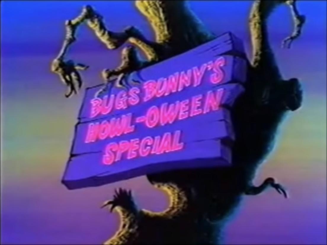
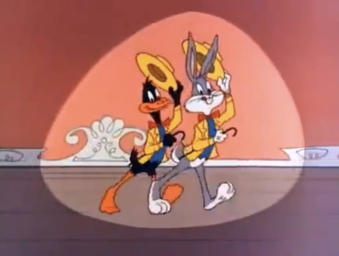
In 1977, CBS aired Bugs Bunny’s Howl-oween Special. This could have been an annual viewing tradition, and it was for a little while, but fell by the wayside because it’s, well, not great. Come the 70s, Warner’s theatrical shorts division was dead and their vast cast of characters had pivoted to the small screen. The classic Merrie Melodies and Looney Tunes were now airing in syndication with little in the way of original animation being created aside from wrap-around segments or commercials. Warner and CBS not surprisingly saw an opening to do a Halloween special because the Looney Tunes have dabbled with the macabre before. They could have, and probably should have, just rounded up some popular, spooky, cartoons and aired them in a block. Maybe they could have done some wrap-arounds too, or brought in a live-action host, and people probably would have tuned in. They did not.
What the Hell is this hot garbage?!
Instead, Warner made the decision to take 8 classic (well, mostly classic) shorts and edit them together. Only they didn’t stitch them together with wrap-arounds, instead they tried to make the transition from one toon to the next seamless with new animation. This feels almost sacrilegious to cut up these cartoons like that. Some are even split in half with entire cartoons shoved in the middle. A-Haunting We Will Go is the first toon, and it gets chopped up to have four different cartoons inserted into it before it concludes. Now, maybe if the original directors were making these calls it wouldn’t be so bad, but none of them worked on this special. Hal Geer is the credited executive producer while David Detiege is the credited director who must have overseen the new animation and layouts. I don’t know if they tried to get Chuck Jones or Friz Freleng to do this thing, but presumably that would have cost money and they probably didn’t want to be a part of this.
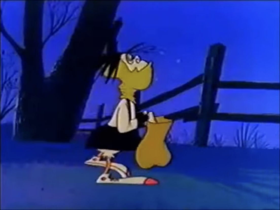
Witch Hazel faired slightly better than Bugs. Slightly.
If dicing up the cartoons feels bad enough, wait until you see the new animation! Holy Hell is it bad. Now, I don’t want to rag on the animators and artists involved. They probably had a shit budget to work with and Warner animation was a shell of its former self come the late 70s, but they couldn’t even get Bugs Bunny on model. It is immensely distracting to watch the old animation suddenly cut to the new, because Bugs looks about as different as he can. He looks like the bootleg Bugs that adorned VHS covers of public domain cartoons in the 80s. It’s bad. The audio is also noticeably different since Mel Blanc had gotten older. That can’t be helped, but it does just add to that jarring feeling.
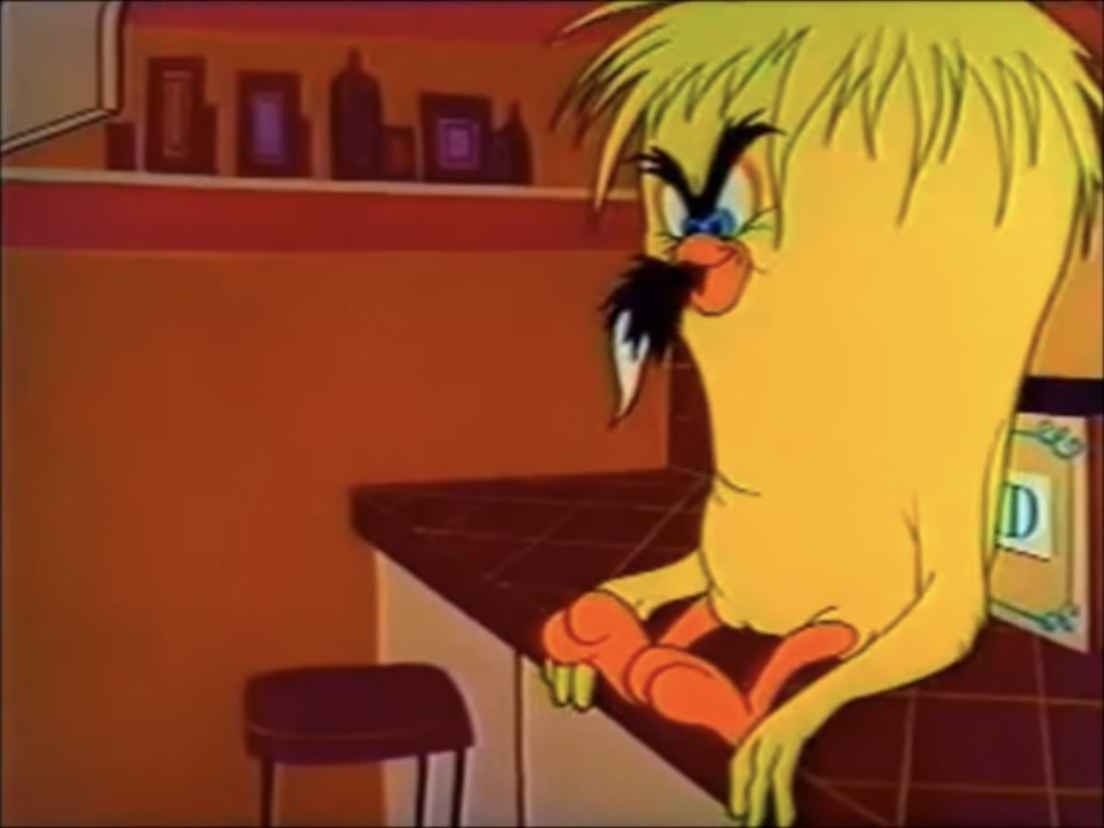
It’s a shame what happened here, because most of these cartoons are great on their own like “Hyde and Go Tweet.”
If you can get past all of that, is there something to enjoy here? Yes and no. You get snippets of the old shorts in some cases which just isn’t very satisfying if they’re cartoons you’re familiar with. The pacing is off and most will be left feeling frustrated. Which is a shame, because most of these shorts by themselves are plenty enjoyable:
A-Haunting We Will Go
Broom-Stick Bunny
Hyde and Hare
Hyde and Go Tweet
A Witch’s Tangled Hare
Claws for Alarm
Scaredy Cat
Transylvania 6-5000
Bewitched Bunny
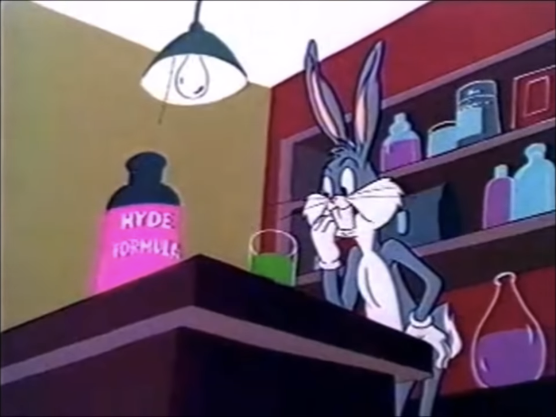
Some of these edits will confuse kids. The special goes right from Hyde and Hare to Hyde and Go Tweet which both feature Dr. Jekyll and Mr. Hyde, but the character models aren’t the same. Claws for Alarm and Scaredy Cat are brutally cut up and quite lousy as a result, even though Scaredy Cat is a terrific toon by itself. And like the new animation issues, you’re also jumping from different eras of Warner shorts which have different production values. It also draws attention to the reuse common in these cartoons like Bugs’ witch costume and walk cycle being the same as Daffy’s nephew. I guess what I’m saying is, this special cuts up the cartoons while also drawing attention to their original flaws. Talk about a swing and a miss.
If you’re thinking about watching this thing, don’t do it!
If you want to spend Halloween with Bugs Bunny and his friends, you can get this special on DVD. You won’t find it airing anywhere, but it is streaming for free in the usual places. It’s mostly an example of what not do do with these shorts. If you want to just experience some spooky tunes, watch the above mentioned shorts by themselves. Or see if you can get the Halloween edition of Toon in With Me that aired this morning. Maybe it’s on demand, but it has some of these cartoons and it’s far more well put together than this. There’s also a block of Looney Tunes airing tomorrow morning on MeTV that may or may not follow a spooky theme. The official Warner YouTube channel even has a bunch of Halloween cartoons on there for free which is way better than this, even if they’re edited. Basically, there are far better options when it comes to enjoying Halloween with Bugs and the gang.
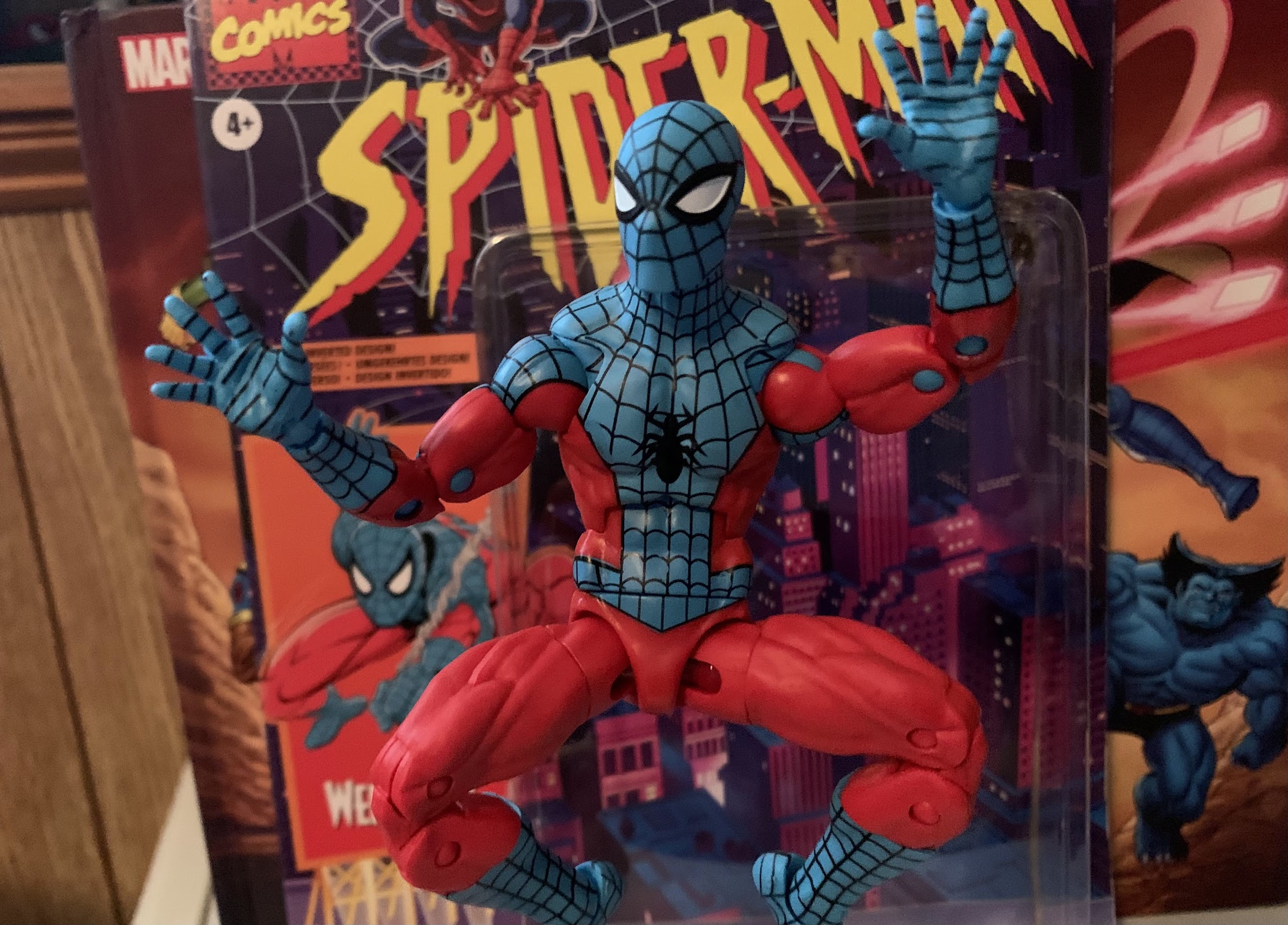
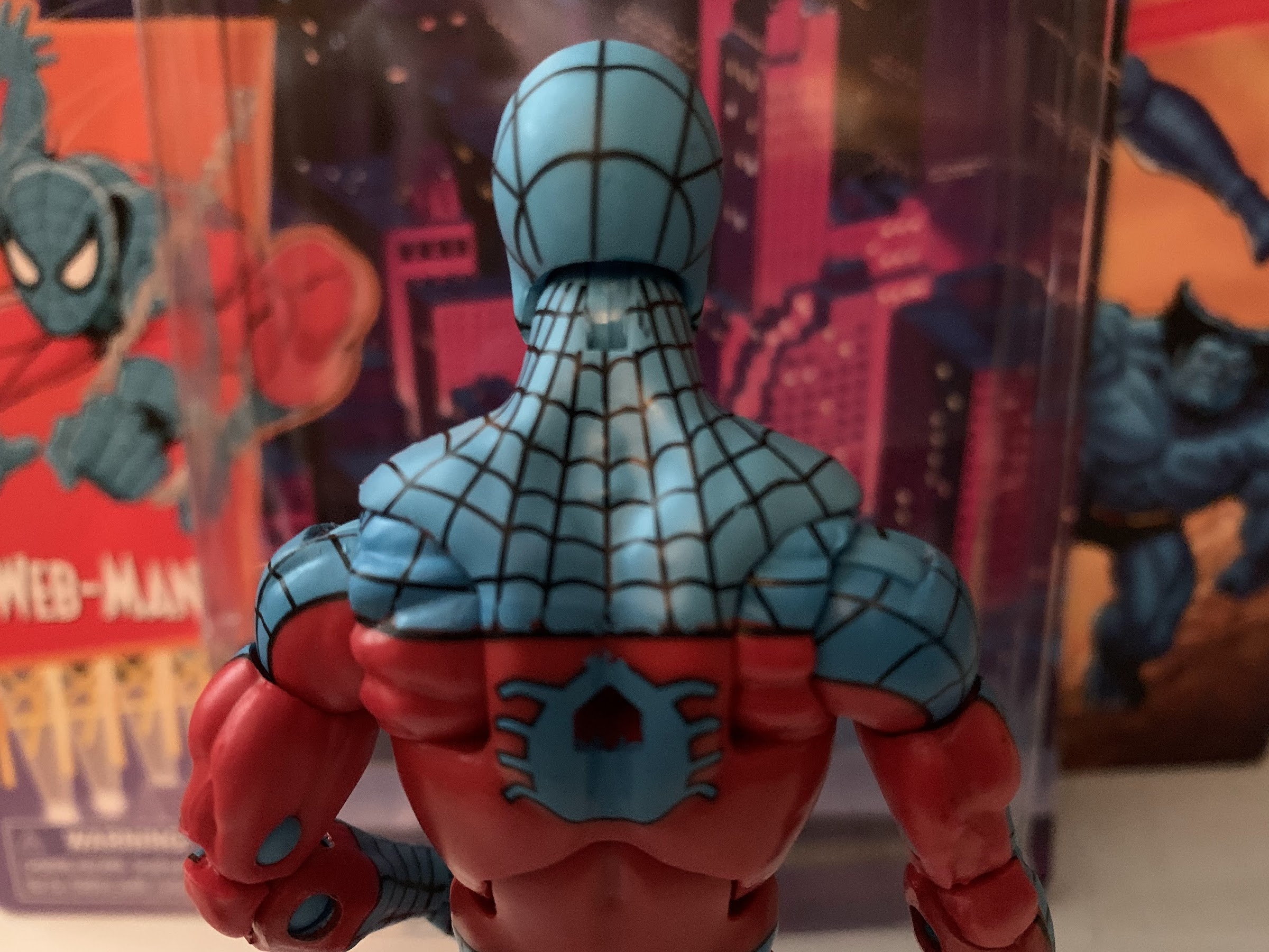
No, this is not bootleg Spider-Man, this is Web-Man! Who is Web-Man? I actually had no idea until I just looked it up. It would seem Web-Man is a copy of Spider-Man created by Dr. Doom. Not only are his colors inverted from the real thing, but so is most everything else. And since Spidey is basically a genius, Web-Man is quite stupid. As far as I know, he appeared in just one issue in 1977 and has never been heard from again. Though this being a comic book character, it’s entirely possible I’m wrong about that last part as comics have been known to recycle characters here and there. Even obscure ones.
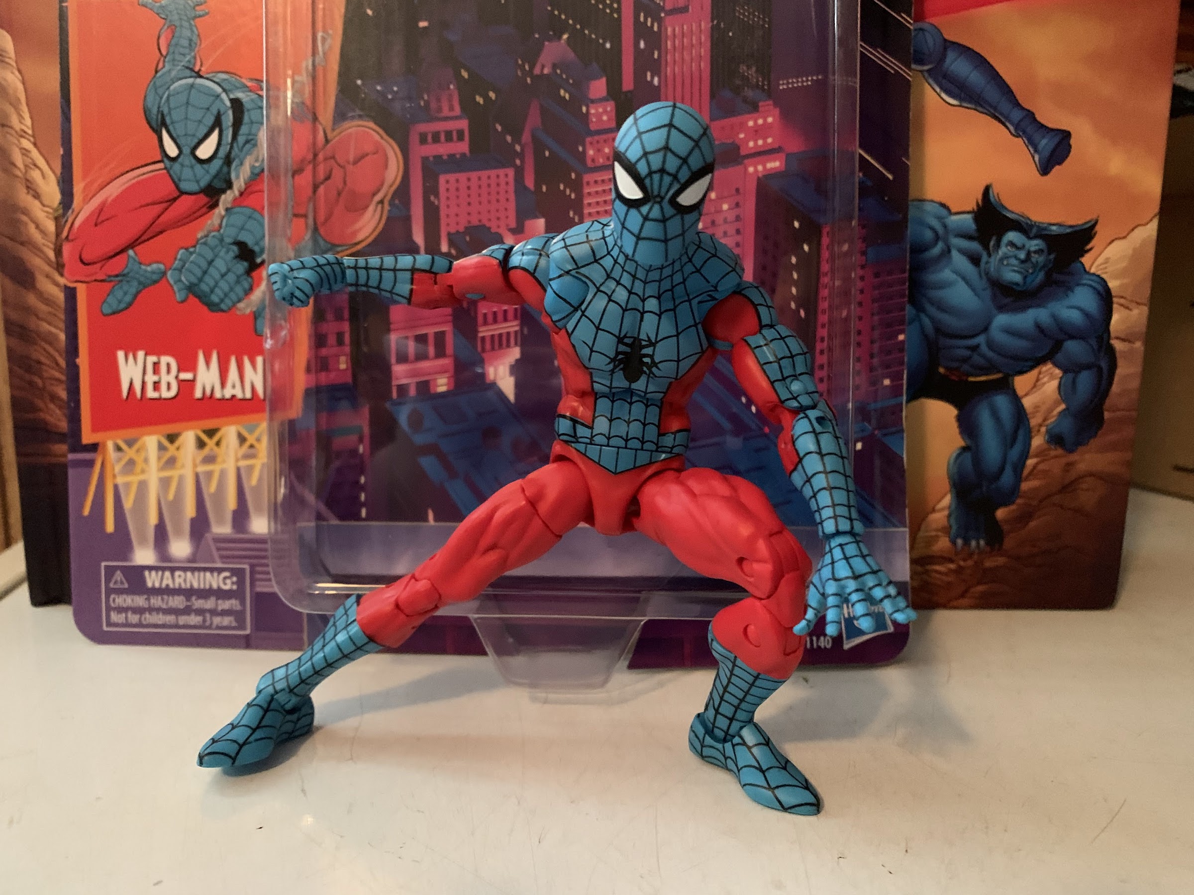
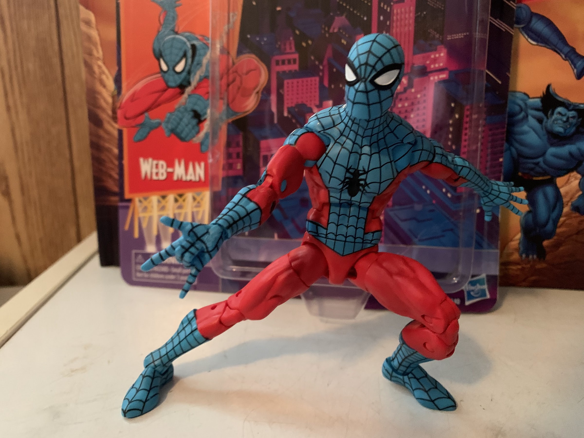
I’ve mentioned in posts before that I used to collect Marvel Legends. And alongside Legends, I also collected the offshoot Spider-Man and X-Men lines produced by Toy Biz and later Hasbro. I stopped though around 2007 and really haven’t looked back aside from a lone Deadpool acquisition last year. So why on Earth am I doing a Web-Man review? It’s kind of a funny thing. I’ve been aware of Hasbro’s retro card releases of the past year or so which seek to emulate the 1994 Toy Biz Spider-Man line. I loved that line as a kid and I had a bunch of those cards (and probably still do) and the figures that were once stuck to them. It definitely tickles my nostalgia bone to see these things in stores, though so far not enough to get me to bite. When it came to Web-Man though, I just loved the colors. He’s this light shade of blue juxtaposed with a very bright red. It’s not the true inverse of Spider-Man, who trends darker typically, but there is something so aesthetically pleasing to me about this color combo. I loved it the moment I saw it in product shots online, but not enough to buy it. That is, until, Amazon just happened to have the thing in stock and I grabbed one. I did want to add at least one Spider-Man to my collection because I snagged a Pulse exclusive Venom over the weekend (he has yet to ship), and now I have one. Sort of.
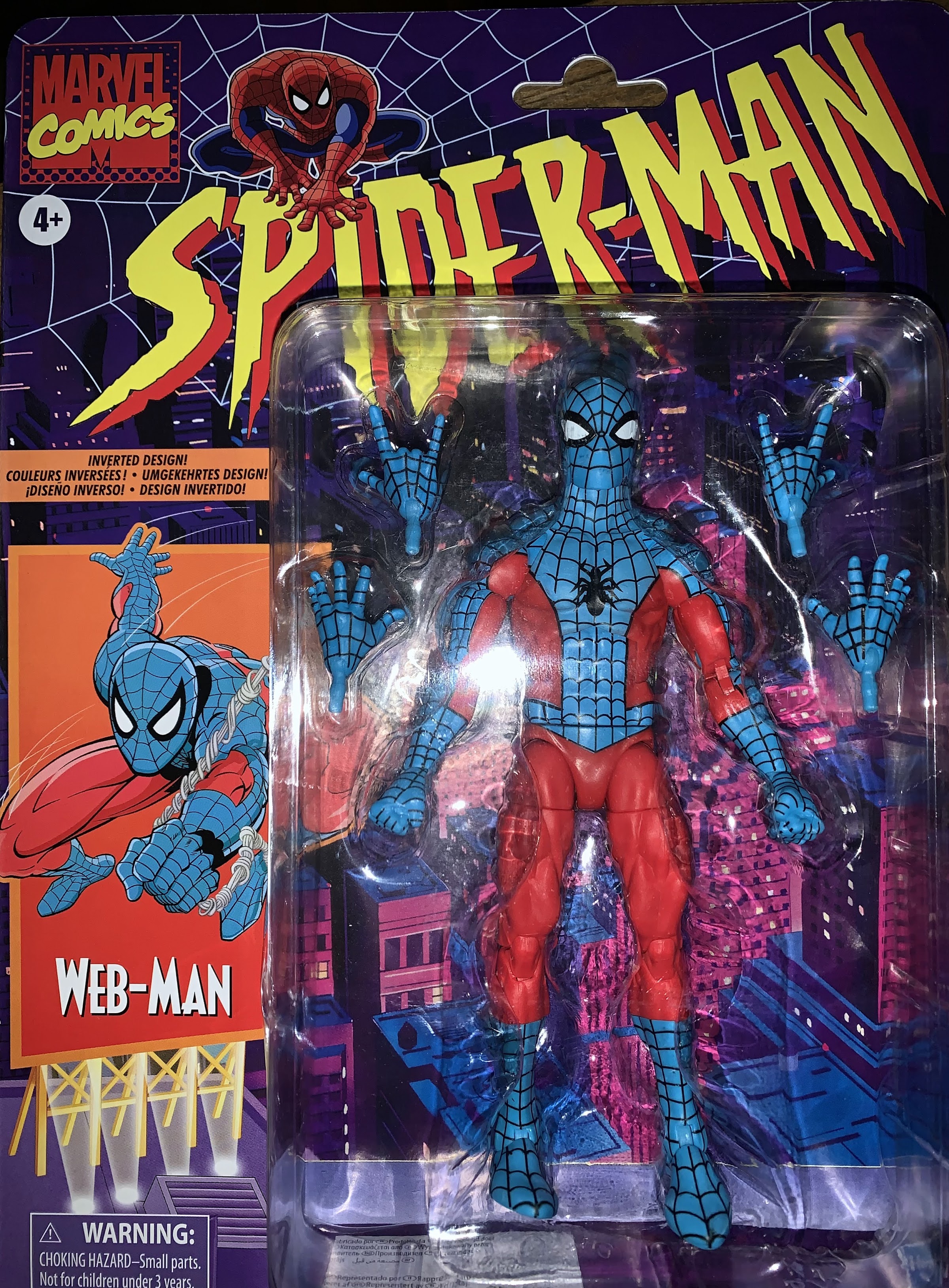
These cards are indeed glorious.
Being that I haven’t purchased a Spider-Man figure in quite some time, this figure is probably a bit more exciting for me than it is for longtime Legends collectors. I think the last Spider-Man I bought was Iron Spider-Man, which I think was released by Hasbro, but was one of the last figures Toy Biz was working on when it was dissolved. I’d dig it out if it was easily accessible (I might have even sold it) to compare, but other than that my last Spidey might have been the Marvel Legends Series 6 First Appearance Spider-Man. Either way, this is quite different. Now, my understanding is this Web-Man uses the same body as Hasbro’s Spider-Man 2099. I was actually a little surprised when I got him because I had just assumed this was a repaint of the classic Spider-Man released on the retro card. That one was pretty well-received, from what I understand, and ended up being hard to track down because everyone and their mother apparently wanted at least two: one to play and one to keep mint-on-card. The main difference between this body and that one is a diaphragm joint which takes the place of the waist twist on this one. There are pros and cons to each, one major pro of the other Spidey is that he can crouch down into a 3-point stance, but it’s more of an interesting observation for me than anything. I just assumed that all Spider-Men would be produced on that body going forward.
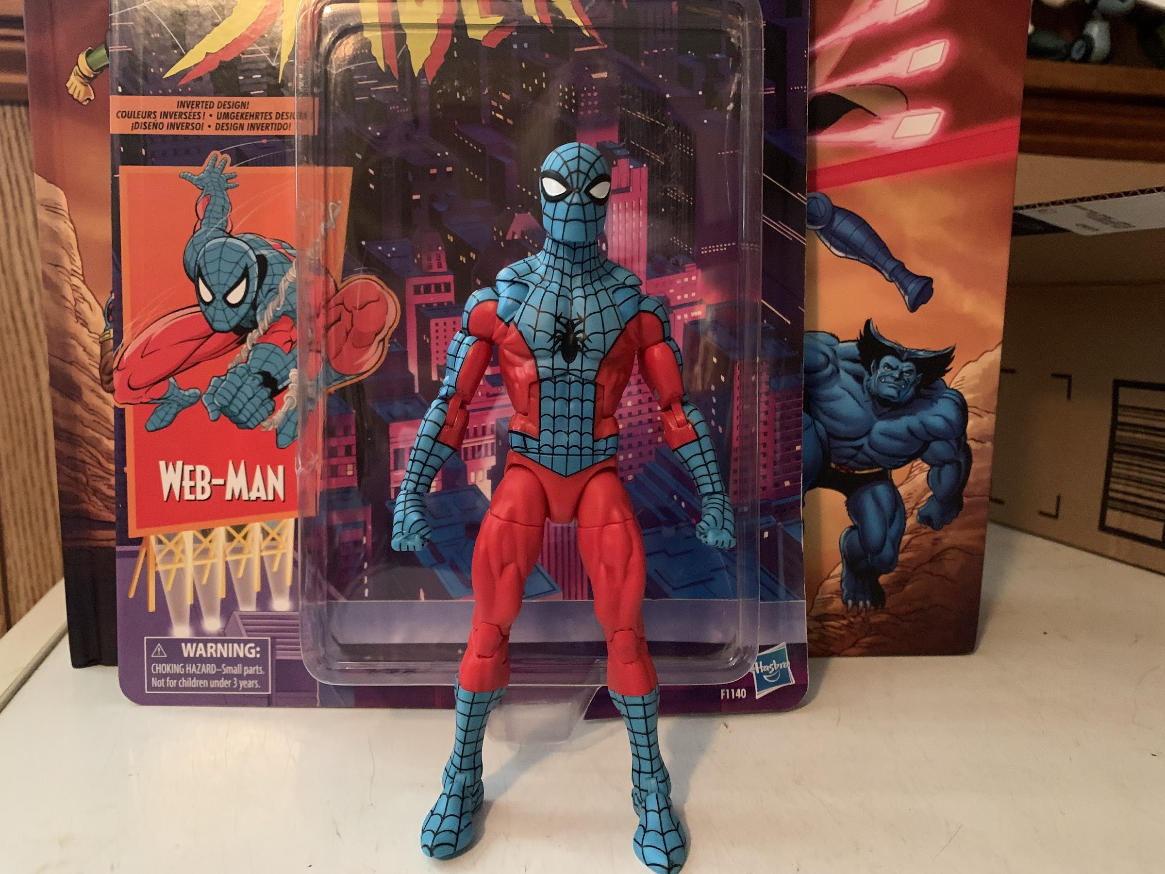
I love this blue, it’s just beautiful.
As mentioned before, this guy comes on a retro card back which looks lovely. He has a one sentence bio on the back with no cross-sell below. The card itself is thicker than the old ones and the blister is attached in a different way. It would have been awesome to see Hasbro invest in resealable blisters, but they also appear to be trying to phase plastic out of their packaging as much as possible (and that’s a good thing). Once extracted, Web-Man stands at about 6 1/4″ when placed on a flat surface. Immediately, my eyes are drawn to this guy. That blue is just beautiful and it contrasts so well against the bright red. The black web-lining is bold and striking and just serves as a reminder that this is one of the best designs of all-time. Superman, Batman, Captain America – all take a backseat to the classic Spider-Man design. I love the shape of the eyes which remind me of Ditko’s Spider-Man, but bigger. The webs on the mask form a little pentagon in-between the eyes and it’s so clean looking. The reference art I found on the guy doesn’t feature that detail, but I don’t care. I like the look of it. His head is a bit more square than most Spider-Man sculpts I’ve seen, but it’s not something I mind. The color matching between the blue, plastic, head and the blue paint on the torso is pretty well done. If anything, the head is just ever so slightly darker, but I don’t think most will notice it unless they’re putting this figure under intense scrutiny, which I am.
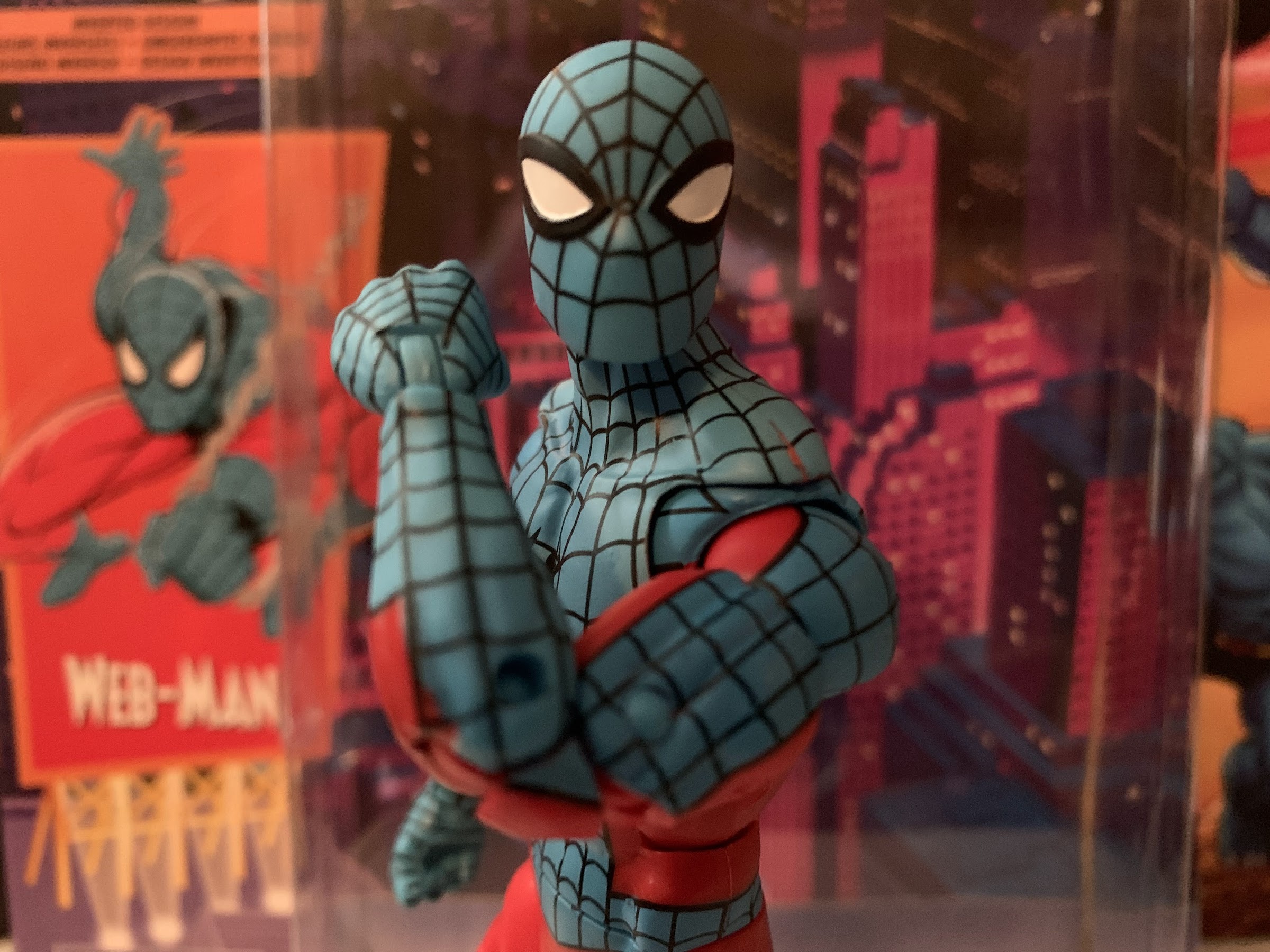
There’s a bit of ugly here, like that red line above the shoulder and a little missing blue near the front elbow pin.
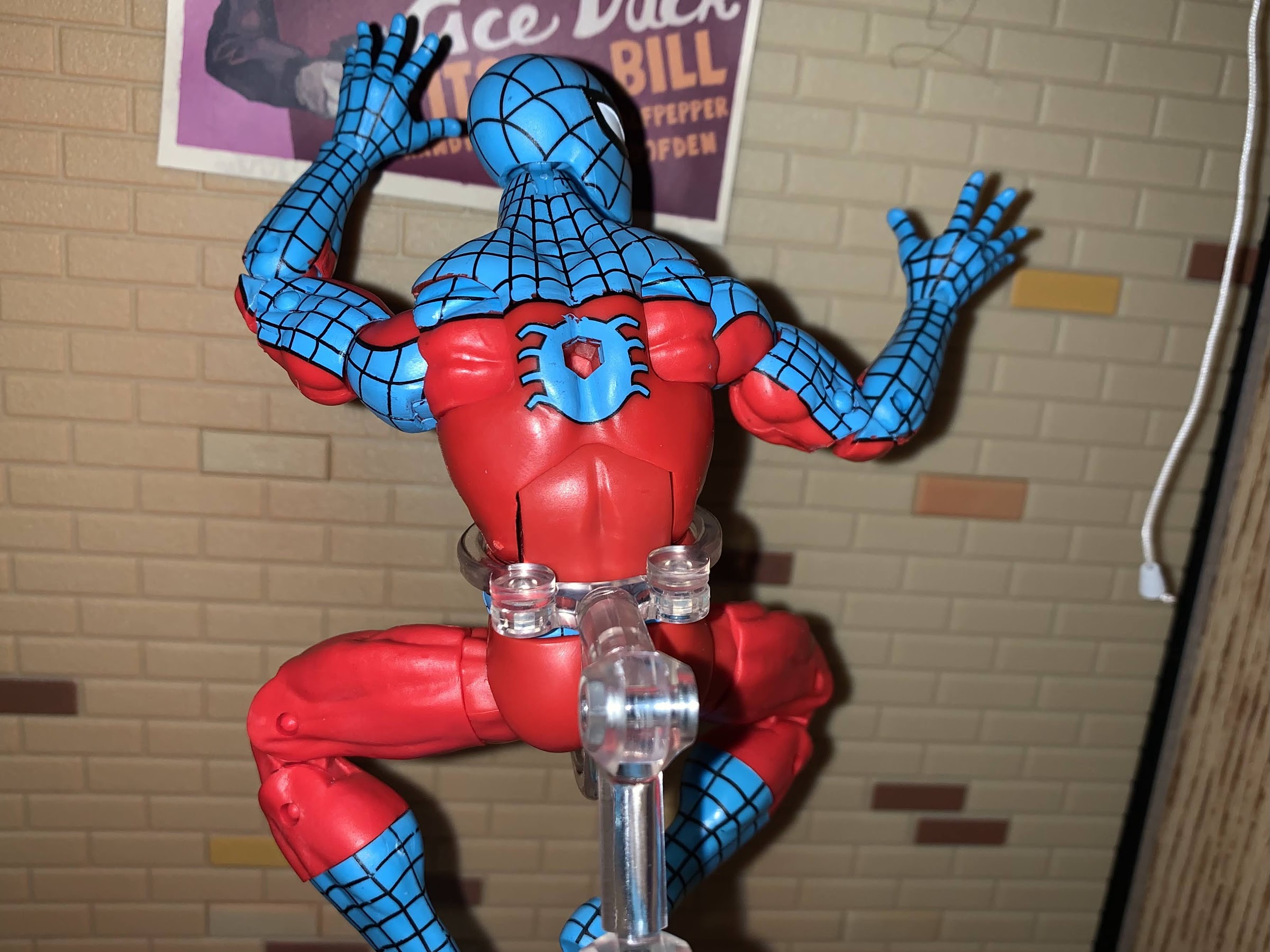
The torso is a little more of a mixed-bag, but certainly not a disaster. Web lines are hard, and with this figure I would say it passes the eye test when on a shelf. When right in front there are a few blemishes. The outer, black, line on the right hip is a little off on mine and there’s a little bit of blue paint over the center line right around the belly button. The right pectoral also has some blue slop and it’s probably the ugliest error on the front of the figure as the black webbing doesn’t extend to the outer line as a result. Up by his left trap is some missing paint resulting in a red line that’s distracting. It’s right on a seem where the plastic was fused together and if I was confident in my ability to match this paint I’d probably cover it. The back of the figure also features some messy spots along the edge, and he has an awful hole in his back. I don’t think Hasbro still uses those old peg stands, but I could be wrong. I’m guessing this hole was needed for Spider-Man 2099’s cape or something. It is an unfortunate eye sore though, as are the pins in his arms. If ever a character cried out for pin-less engineering in the arms, it’s Spider-Man, because you’re always going to run into this with his classic (and inverted) costume where you can only match the outer or inner color of the arm. Hasbro always opts to match the outer arm, which is the right move, but it means the inner arm has a circle of color that shouldn’t be there. In this case, it’s blue above and below the elbows. At least with the knees it’s not an issue. It would be nice if they just put a dab of paint there, but this is Hasbro and they’re quite focused on making low cost figures which is why their figures often are priced lower than everyone else.
I do wish he didn’t have a giant hole in his back.
Aside from the blemishes here and there, I do really like the look of this figure. This is a solid sculpt for a Spider-Man adjacent character. The only sculpting issue I have is that his shoulders are really small. Hasbro likes to almost recess them in the torso which just gives them an odd look. It’s really only noticeable in vanilla poses, but given this is a Spider-Man, you’re not likely to pose him in such a manner on your shelf. The musculature looks good otherwise as this is a lean dude and I like that he seems to have a unique spider logo on his chest. He’s just a very pleasing figure to look at, all in all.
I wish I could get that left hand on the ground, otherwise the articulation is pretty good.
Now when it comes a Spider-Man figure articulation is going to be super important. This figure may lack the updated configuration of the new Spider-Man body, but he’s no slouch in the articulation department. For starters, his head sits on a ball-hinge. This gives him very good up and down range, but little tilt. At the shoulders we have a butterfly joint that works very nicely. The inner pieces are painted though, so hopefully paint rub doesn’t become a major issue over time. For now, it seems okay. The shoulders are on standard ball-hinges and you do get that mismatch color issue here too as the hinge is blue plastic so he has a stripe of color in his armpit that shouldn’t be. Like the pins, this is just a trade-off on where to put the offending color and Hasbro did the best it could. And in this case, if they had tried painting over it the paint would likely just flake off rather quickly. The weird way they sculpt the shoulders does make it difficult to get his arms horizontal, but you can get close. There’s a biceps swivel past that and double-jointed elbows which bend past 90, but not much past. I was a little surprised with that part. At the wrists are swivels and hinges which might be a little gummy out of the box. At least mine were. In the torso we have an ab crunch and Web-Man can crunch forward pretty far and back a little bit, but without any ugly gapping issues. There’s a waist twist below that and the legs are on ball-pegs. He can kick forward rather well and almost do a split. There’s a thigh cut past there and double-jointed knees. We also get a boot cut and hinges at the ankles to go along with excellent pivot action.
Thwip!
Really, the only complaint I have with the articulation is the inability to get the figure into a classic, Spider-Man, three-point stance. Aside from that, he moves well and I didn’t have any stuck joints on my figure. Almost better, there are no loose joints either as everything is nice and tight. He’s a lot of fun to mess around with and probably would be even more fun with an action stand or some web effects. Sadly, he’s rather light on the accessory front, a common thing with Marvel Legends. He comes with fisted hands in the package that can be swapped with web-slinging hands or wall-crawling ones. They’re pretty standard Spider-Man hands, though he lacks gripping ones so even if you make your own web he won’t be able to grab them. It’s certainly decent, but does beg the question would collectors be happy to spend another buck or two to get more stuff? I’m used to buying NECA and Super7 figures which retail for a lot more than Legends so it’s probably no surprise where I come in on that question, but Hasbro exclusive collectors are definitely more price sensitive from what I’ve seen.
“I don’t think this is the New York I’m used to.”
Web-Man is what I wanted him to be. I saw a design that looked really pleasing to me and the finished product didn’t disappoint. Yes, I can pick over this thing and find little blemishes and imperfections here and there, but that’s true of pretty much any mass market retail action figure. Especially one with as demanding a paint job as Web-Man. It definitely would be preferable to find a vast assortment of these guys at retail rather purchase online sight unseen. That way you can hopefully find the one with the least amount of imperfections. This is admittedly an odd figure to have as the lone Spider-Man representation so to kind of make up for that I’ve pre-ordered the upcoming black costume Spidey. Even so, I love how this guy looks and it doesn’t bother me at all that I don’t have a traditional Spider-Man figure right now. Maybe when Hasbro eventually does a pinless one I’ll bite, but for now this is great. If you’re like me and you find yourself just drawn to this color scheme then this one’s for you.
“Easy there, big fella! You’re a little out of your league here.”
It was almost two years to the day where I made an entry here expressing a wish for Hasbro to tackle the X-Men. And not just any X-Men, the now classic animated series from 1992. That was probably my greatest obsession as a kid. I loved Teenage Mutant Ninja Turtles, but I grew out of it after 3 or 4 years. X-Men filled that void and my obsession lasted longer. I collected the toys from Toy Biz and it was the first time I displayed my toys like collectibles instead of just dumping them in a large bin when I was done playing. I still played with them too, but when I was done I had makeshift shelves to pose them on. It was a large shelf that went three or four rows deep and eventually I had to add another. I was able to separate heroes and villains, though with how quickly things can change in the comics, sometimes I had to move guys back and forth. I don’t think I stopped collecting though until I was in high school in the very late 90s. By then, the X-Men line was nearing its end anyway and Toy Biz was pivoting to more collector-focused lines for their legacy properties while the kid-friendly stuff was focused on new shows like X-Men Evolution and the movies.
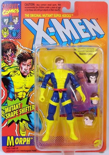
There weren’t a lot of toon-specific figures back in the 90s, but Morph was definitely one of them.
Like Teenage Mutant Ninja Turtles though, the thing with the old X-Men toyline is that it wasn’t really an animated focused line. It started as a comic book line with the inaugural first wave reflecting the 80s costumes and lineup for the team. It was only once the show became a hit that the toyline started to mimic it to a point. One of the first instances of that I can recall is the wave one Storm, who was released in a black costume, getting repainted silver with two ring-capes added on to kind of match her show appearance. Toy Biz would also repackage some of the previously released figures with new card backs advertising them as from the show, but the figures were basically the same comic book inspired releases we already had. Wolverine, for instance, still had his giant buckle on his belt instead of an X logo. Storm did get repainted yet again though, this time white and with a more elaborate cape. The most well-remembered instance of the line matching the show was in the Morph figure. Morph was famously created for the show, though he was modeled after the character Changeling from the comic, and killed off in the second episode. Kids loved him though, so Toy Biz made a figure with swappable heads to mimic his shape-shifting powers. He didn’t look much like the cartoon character aside from the general costume, but it was still one of my favorite figures because it was freakin’ Morph! Toy Biz would also do a Phoenix Saga wave of figures clearly inspired by the cartoon, and other figures here and there appeared to match some show designs, but for all intents and purposes the toys from Toy Biz were comics first and the show a distant second.
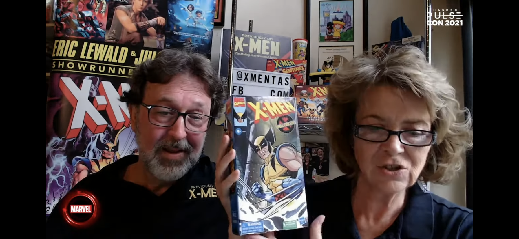
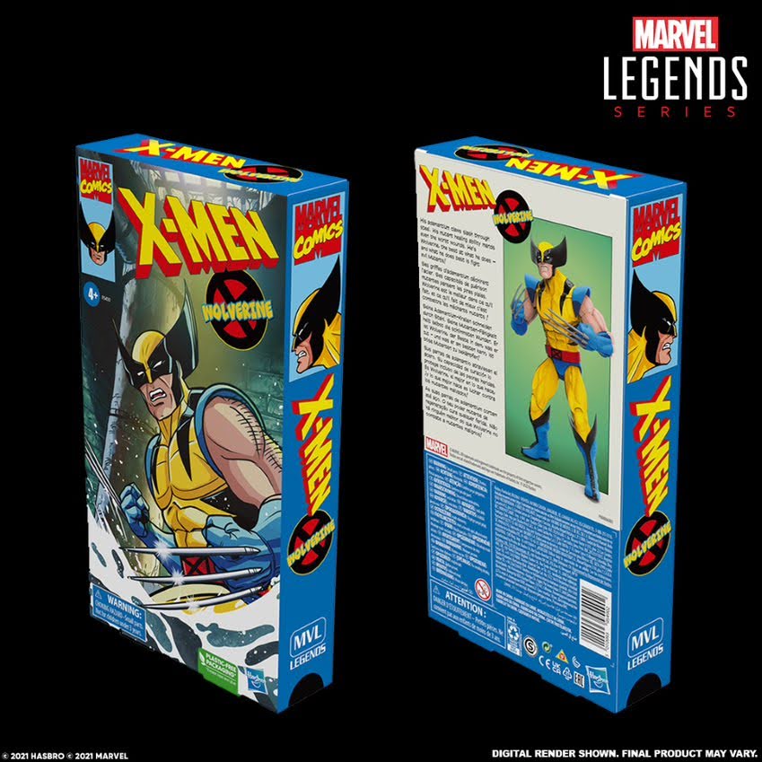
2022 will mark the show’s 30th anniversary, and as I hypothesized two years ago, Hasbro is finally going to do proper action figures based on the show. This past week saw Hasbro host its own virtual convention, Pulsecon, and the guests of honor for the final panel on Saturday were Eric and Julia Lewald, authors of the wonderful X-Men: The Art and Making of the Animated Series. Eric was the showrunner for X-Men and his wife Julia a veteran TV writer who contributed some scripts as well and the mere fact that they were announced as guests had my juices flowing all last week. Surely, they were there to pitch their book, but also to reveal something. What we didn’t know is what that something would be. It would likely tie into the animated series, but did we dare hope it would be an actual line of Marvel Legends based on the show? Maybe it would just be more retro card-back releases, which is what Hasbro has been doing for the Spider-Man cartoon lately. There’s also the new retro, five points of articulation, line. I was both optimistic and guarded, but I’m happy to report my dream has come true!
This is glorious!
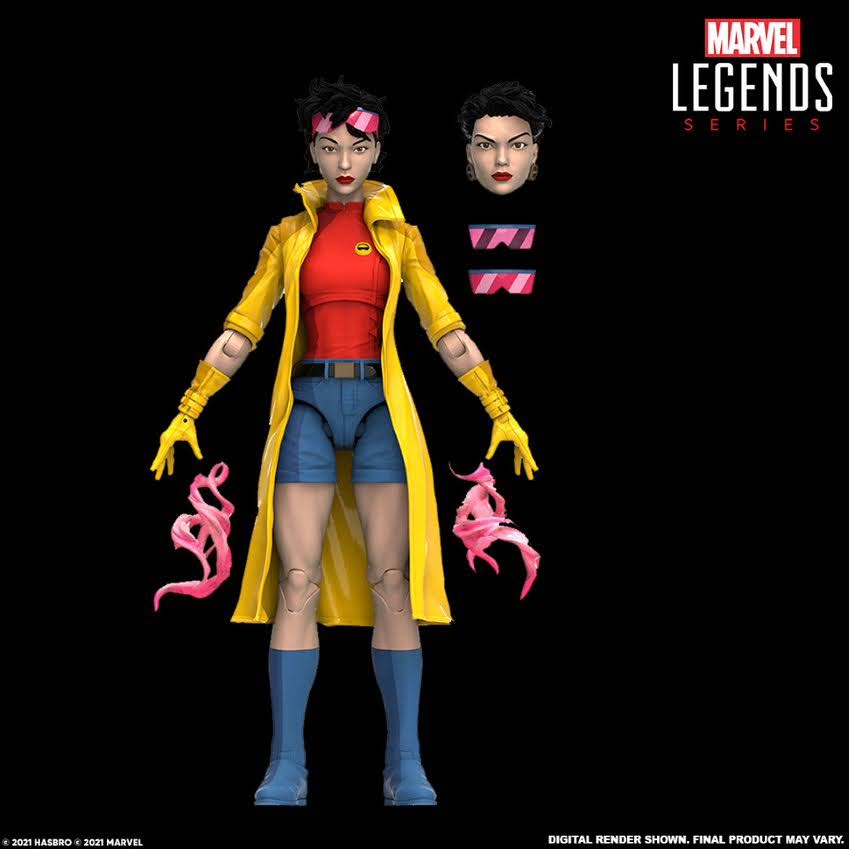
Hasbro had the Lewalds show off two figures for the new X-Men animated series line of toys: Wolverine and Jubilee. The figures will come in an oversized VHS styled box with new artwork and product shots. They’re meant to be displayed as one would those old VHS releases and they look positively striking. I don’t know if Hasbro got the idea from NECA’s TMNT releases, or if it was an organic thing, but either way it looks fantastic. Not to be outshined though, are the figures themselves. They are indeed Marvel Legends-styled releases and I’m sure there will be a lot of parts reuse between these figures and previously released editions. Wolverine could very well be the same Wolverine body that’s been released before, though it looks like he has new heads to better reflect the show art design. What stands out most though is the paint application which has that cel-shaded look to better match-up with the show. He’ll come with the now standard swappable hands, one with claws out and one claws retracted, but he also gets to bring along the photo of Scott and Jean (just like the upcoming Mondo release) so fans can reenact the most memed scene of the show. Jubilee, for her part, appears to mostly be the same release as before too only I don’t think she’s getting a new head. She’s less impressive as a result since she’s lacking her show-specific earrings on one head, but she does have yellow gloves now. Like Wolverine, she’ll have two portraits and she also has some effects pieces. I do wish they worked in a show specific accessory for her as well (maybe some chili fries? A Genosha collar?) to up the fun factor. One show specific accessory per figure would be a nice goal for Hasbro to have.
Only thing missing is a turkey leg.
These two figures are definitely promising and they’re pretty much exactly what I hoped for, even though they weren’t announced as one big wave as I had previously hoped for. There are a few things to nitpick based on the few shots we were given. Wolverine’s hands appear to lack the claw channels on his non-claw hands which isn’t show accurate, and Jubilee’s head just doesn’t look very “toon” to me. I’m hoping Wolverine is more indicative of where the line is going as opposed to Jubilee, but only time will tell. Otherwise, I like this direction and that parts reuse doesn’t bother me. Now if they try to re-release Sabretooth and pass him off as animated that will be worth criticizing because the Sabretooth on television was pretty different from the comics. He was just huge and honestly a little weird looking, but not in a bad way. Hasbro is a company more focused on price and keeping the price low. These figures already run high by their standards as they’re currently available for preorder at $27 a piece. Wolverine is slated for a May release with Jubilee following in June. Not shown, but announced, are figures for both Storm and Jean, two characters who should be easily adapted from recent releases with some paint modifications. No release date was announced for them, but maybe July and August? A monthly schedule would be fine with me and maybe we’ll learn more in early 2022. Or maybe Hasbro is saving something for Halloween, the 29th anniversary of the show’s premiere, to give us a peek at either Storm or Jean.
Less impressive than Wolverine is Jubilee, but there’s still time for things to change.
What is great is the goal of Hasbro’s to make this a full line. It’s going to be a slow release compared to some of the others, but I can be patient. I’ve waited nearly 30 years for this, I can wait longer. I know some fans were disappointed in the character selection. Wolverine is a given, but he’s also a character that’s been made and released over and over while Jubilee is…Jubilee. A lot of fans were hoping for Morph as he’s become synonymous with the show and is a character that collectors have wanted for years now. I feel very confident that Morph is coming, so I’m not sweating his exclusion for now. He’s the character Hasbro has to hit a homerun with, and hopefully they do. He seems like the most obvious candidate if they want to time a figure with the 30th anniversary on Halloween of 2022. Will they time the reveal or the release with that date is the big question. This is a good time to be an X-Men fan though, and I’m already brainstorming ways to display this line. It’s going to be a long wait until May, but it’s going to be worth it!
Preorders for Wolverine and Jubilee are currently available on Hasbro Pulse (no premium membership required) with an expected release on Disney’s shopdisney website at some point. These are not planned for mass market retail so get your orders in if you want them.
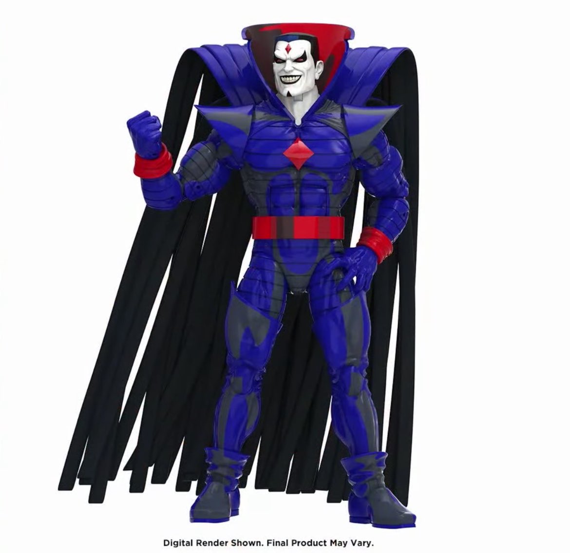
UPDATE: Just a few days after the big reveal, Hasbro went and revealed a third figure in the wave. And despite having already soft announced Storm and Jean, the third figure shown off is none other than Mr. Sinister! He’s available for pre-order on Pulse and currently has the same release date as Jubilee. He is almost a straight repaint of a previously released Mr. Sinister (they may have had to swap out the neck, or it’s just now painted white instead of blue) and will come in an oversized box. Needless to say, it’s a good sign that Hasbro is willing to do villains alongside the X-Men!
Originally, the cartoon short was something that was exhibited in theaters alongside news reels, serials, and feature films. All of the major motion picture companies owned their own theaters and most built up a stable of cartoon stars. This was the era that saw the creation of Mickey Mouse, Bugs Bunny, Tom and Jerry, Popeye, and many more. These characters were stars that rivaled the popularity of the most famous actors of the day. Then it all changed. The government went after studios with anti-trust lawsuits stemming from the fact that they operated as producers and exhibitors for their films. Post World War II saw many, mostly white, families leave the confines of the city for the suburbs taking them further away from those theaters they used to frequent. And then came television. All of the big companies reacted to TV in different ways. Walt Disney rather famously embraced it, while at the opposite end was Warner Bros. which did everything in its power to avoid television.
Eventually, TV took over and it’s remained a staple of the modern household. When the movie-going experience was altered thanks to independent theaters and changing tastes, the cartoon short largely vanished. It was an easy place to trim costs since virtually every studio took a big hit to their bottom-line during this era. Those characters that once flourished though didn’t need to be put out to pasture completely. Instead, they became stars on the small screen as studios packaged them up and sold them in syndicated packages to various outlets.
When I was a kid, there’s no doubt in my mind that the biggest toon stars from that era were the characters owned by Warner Bros. Bugs, Daffy, Porky, Tweety, and the rest were among my favorites, and they were everywhere. Warner Bros. had different packages of shorts it shopped around. What the studio considered the cream of the crop went to the big networks and were shown on Saturday morning. The lesser packages went to smaller, regional, channels and cable. Nickelodeon entered the picture in 1988 and it started off with a somewhat meager offering. Remember Bosko? I sure do and he was seen rather frequently on Nickelodeon’s Looney Tunes show. The show was a huge success for the cable outlet, which had really just begun to go all-in on animation, and when it came time to renew with Warner the channel got a better set of shorts. Remember the “Sorry, Bosko” commercial? I do!
Get the hell out of here, Bosko!
Warner’s cartoons weren’t the only ones out there though as there was a pretty sizable cast coming from MGM. Ted Turner, the famous billionaire who owned the Turner Broadcasting System, set out to acquire cartoons for his cable networks. He would come to acquire Hanna-Barbera and MGM’s cartoons, which had also acquired some smaller outlets like United Artists, and this would lead to the creation of Cartoon Network. Cartoon Network was a place for Turner to air all of the stuff he had acquired, but the channel also had it’s own Bugs and Daffy show too (because MGM bought some, it’s confusing so you should just watch this edition of Nick Knacks on it). Eventually, Turner sold to AOL, which would merge with Time Warner, and basically all of these cartoon stars would come to rest under one umbrella by the time the 90s were over.
This ended up being a bad thing for cartoon viewers. Once Warner controlled everything except for the classic Disney characters, the company started to pull back. Eventually those networks that had been a home for these characters for so long were no longer allowed to air them. Even worse, Cartoon Network had become so full of original content it no longer had need of these characters either. To Boomerang they went, the sister channel to Cartoon Network that few cable providers seemed to carry. Eventually, they would be forced out of there as well as the Cartoon Network What a Cartoon! era shorts matured and made the jump over. Reboots would follow like The Looney Tunes Show and Wabbit, but there was no easy access to the classic, unaltered, shorts that generations had grown up with.
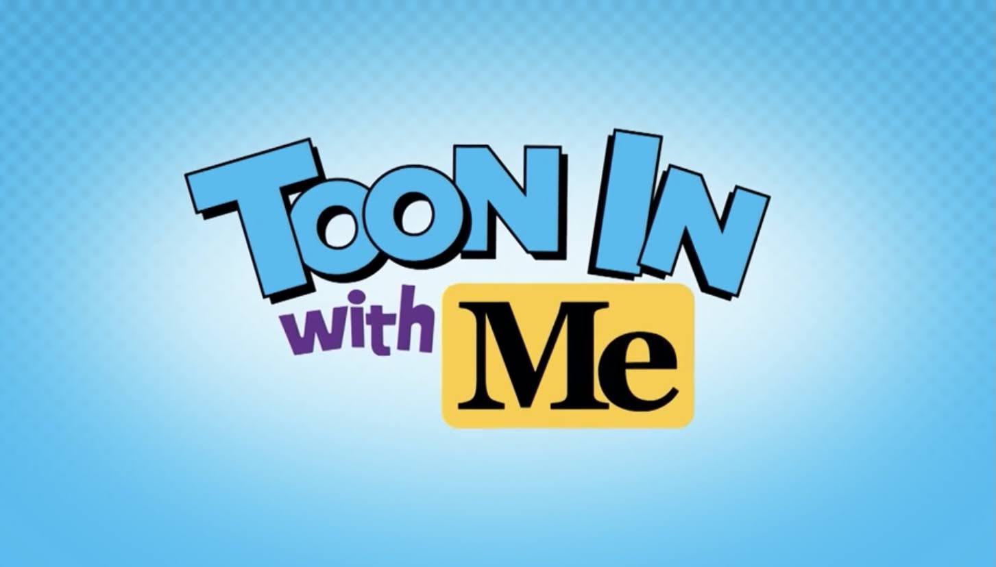
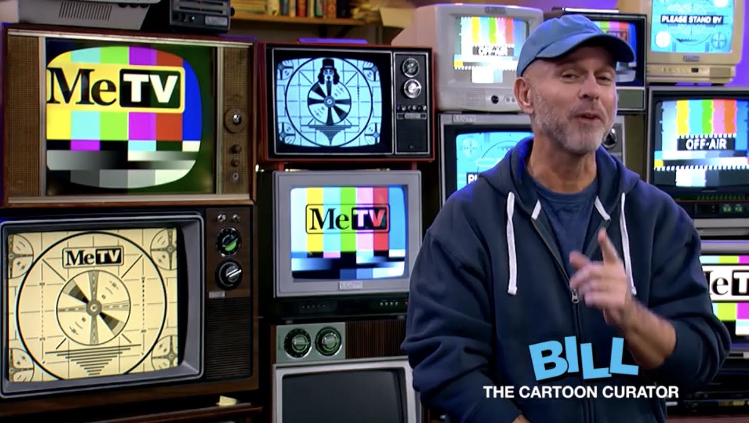
Your hosts for Toon In With Me: Toony the Tuna and Bill the cartoon curator.
Until 2021. Launched in January of this year on MeTV is Toon In With Me. It was a quiet launch since it took me several months to even know the show existed. Before that, I could not have told you what channel MeTV was in my area or on my cable package. For those in a similar boat, MeTV is a broadcast network with a local affiliate in most markets. It specializes in “Memorable TV” and it’s not unlike a lot of local stations from when I was a kid. Right after Toon In With Me is Leave it to Beaver and I see lots of odds for The Andy Griffith Show, M.A.S.H., and Happy Days. It seems like the type of channel my dad would watch if he was home sick or something.
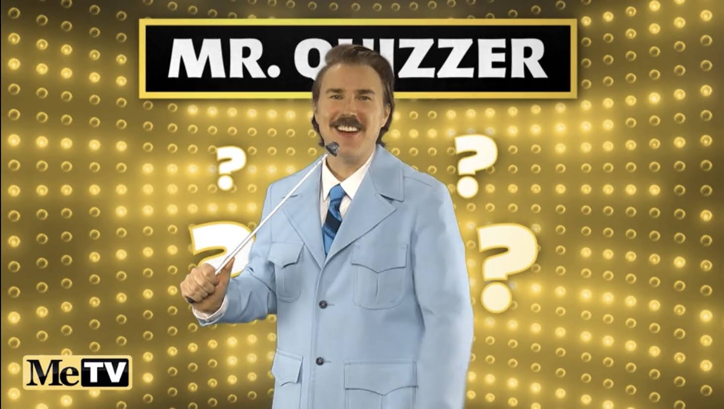
Kevin Fleming provides the voice of Toony and plays a bunch of other recurring characters like Mr. Quizzer.
Toon In With Me is an old school cartoon show with a live-action wrap-around segment. It’s hosted by Bill the Cartoon Curator (Bill Leff) and he is accompanied by a puppet, Toony the Tuna (voice of Kevin Fleming). There is usually a theme for each episode and they end up acting out some skits with help from Fleming and Leila Gorstein. Fleming and Gorstein have a stable of characters to work with that they play and it’s all intentionally corny, but charming. When they’re not on the screen, we get to watch a cartoon!
Bill Leff plays the host of the same name (as well as a few other characters) and introduces the cartoons, usually with some fun background info on it.
The stable of cartoons the show has to select from is quite large. There’s Looney Tunes/Merrie Melodies, MGM, King Syndicates, Paramount, and United Artists. Of course, most of this stuff is just owned by one company, but they probably had to do individual deals for each set of characters. Just about every episode though will open with either a Looney Tunes or Merrie Melodies short and often it’s Bugs Bunny. Other cartoon stars shown quite frequently include Tom and Jerry, Daffy Duck, Porky Pig, The Pink Panther, Barney Bear, and Popeye. That’s obviously not exhaustive as you’ll see Tweety Bird and Droopy Dog, but those are definitely the characters I see recur the most. It’s an effective mix, and whatever package they have from Warner is very reminiscent of the one Nickelodeon had for its version of Looney Tunes. That’s both good and bad as I’ve certainly seen plenty of classics that I once watched on Nick, but I’ve also seen some of the not-so-classic I once saw there as well such as Cool Cat and Merlin the Magic Mouse. I’ve noticed the Tom and Jerry shorts definitely favor the Chuck Jones era, but I don’t know if they’re limited at all in what cat and mouse era they can exhibit.
Comedian Leila Gorstein might be the show’s MVP as she’s relied upon to play a large cast of characters, all of which are pretty entertaining.
Stumbling upon Toon In With Me has been a tremendous amount of fun in my household. It’s on every week day at 7 AM EST and I set my DVR to record it. It’s become a show that I watch with my kids. During their summer vacation from school I could watch with both, but ever since school restarted it’s become a show I mostly watch with my daughter as she’s in half-day preschool. She’s become quite the little Bugs Bunny fanatic and has even decided to break her streak of Disney Princess Halloween costumes in favor of the wise-cracking rabbit this year. I love sharing these old toons with her, even if she sometimes would rather watch something more modern since she’s not much into Popeye or The Inspector. It makes me wonder just who the target audience for the show is. It’s definitely presented in a kid-friendly manner, but it doesn’t talk down to the audience. The hosts will share viewer mail at the end of every episode and it’s almost always from an adult. My guess is a lot of people in their 30s, 40s, and up enjoy the nostalgic trip the show brings and they’re probably the core audience. Hopefully kids are watching too.
MeTV also shows cartoons on Saturday morning, like The Bugs Bunny Show, which even includes the classic intro!
Toon In With Me is a nostalgia lovers dream. The cartoons appear to be mostly unedited, or at least haven’t been edited further than what networks did 30 years ago, and several generations of people have grown up with them and have a fondness for them. I love that the show is here for the current generation of children because there’s a shocking amount of children out there who don’t know who Bugs Bunny is, and the number would be higher if not for the new Space Jam movie. Being on a broadcast station means the show is accessible to everyone with a TV set and a digital antenna, and it looks like the website offers a bunch of clips too, though probably not of the actual cartoons. And if you just want the toons, MeTV also has a Saturday morning block of cartoons including an hour’s worth of Looney Tunes. It’s hard to resist the temptation to just buy a big box of Froot Loops and chow down on Saturday with the cartoons going. Definitely check the show out though if you want more cartoons in your life.
He’s back ready to teach JV lowlifes everywhere a lesson or two.
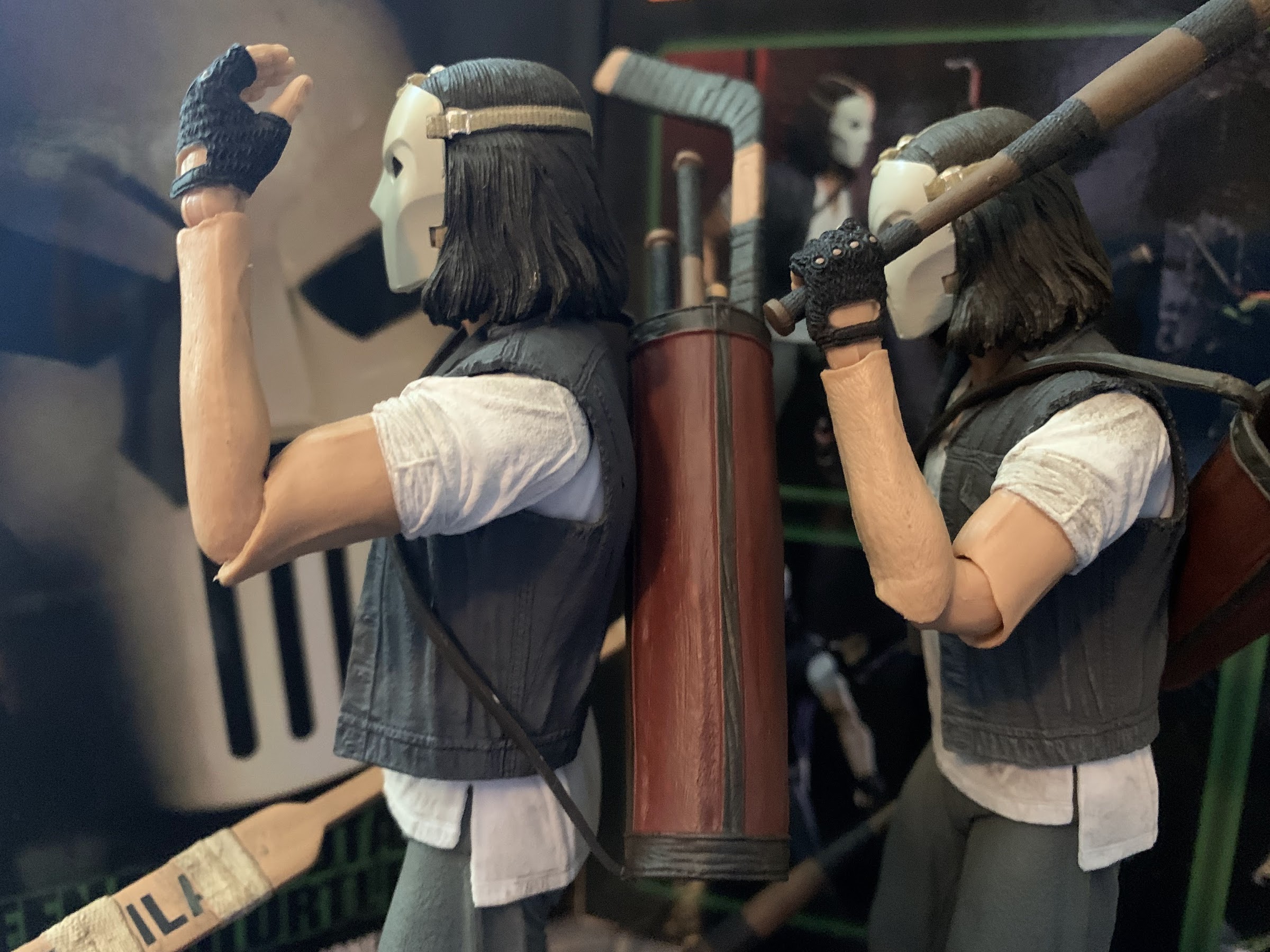
I swear this blog is not just a NECA Teenage Mutant Ninja Turtles blog, even though that’s what it has looked like lately. I’ve just been getting crushed with new releases lately, but it looks like a drought of some length will be incoming soon. Before that can happen though we need to talk about everyone’s favorite vigilante: Casey Jones!
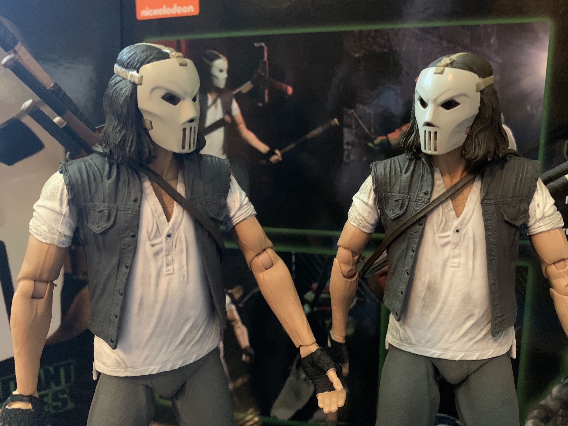
It was over a year ago that NECA released its Casey Jones and Raphael two-pack from the Teenage Mutant Ninja Turtles movie line. The Jones figure came with a masked portrait, golf bag, assorted melee weapons, and a whole bunch of hands. It was basically everything a fan would want of a Casey Jones figure based on his appearance in the first film, a figure that had never been done before despite the character’s popularity. There was just one thing missing: an unmasked face.
When it comes to producing action figures based on a real life actor certain legal hurdles must be cleared in order to recreate the likeness of a real person. When it came to Casey Jones actor Elias Koteas, he apparently had no desire to be cast in plastic. The message was relayed to fans through NECA and Koteas would expound on that on social media a bit basically just saying he thought it was a bit weird to be turned into a toy. It’s probably not something the average person ever considers, but I guess it is weird for random people to just have a small version of you that they can do whatever they want with. Enter Judith Hoag, the actor who portrayed April O’Neil in that film and has been a bit of a champion of that film for the past few years. She was rather enthusiastic about the prospect of an April O’Neil figure and when she found out Koteas wasn’t onboard she reached out. She’s apparently a very convincing woman because soon after he was onboard and NECA was cleared to create the Casey Jones figure it and the fans wanted from the start.
This is what you want, right?
The only problem there is that approval from the actor came too late to incorporate that into the first edition figure. It was really right around the time that figure was hitting retail that Koteas shared on social media that he was now onboard. I’m sure NECA was happy to have that approval, but probably not super excited for that information to come out while they were trying to sell the masked version. It ended up not mattering as that set was a bear to track down at retail as it sold out almost immediately. NECA would eventually open it up for preorder though on their site, so I’m assuming that everyone who wanted that two-pack at the time now has it.
He brought the mask though in case you miss it.
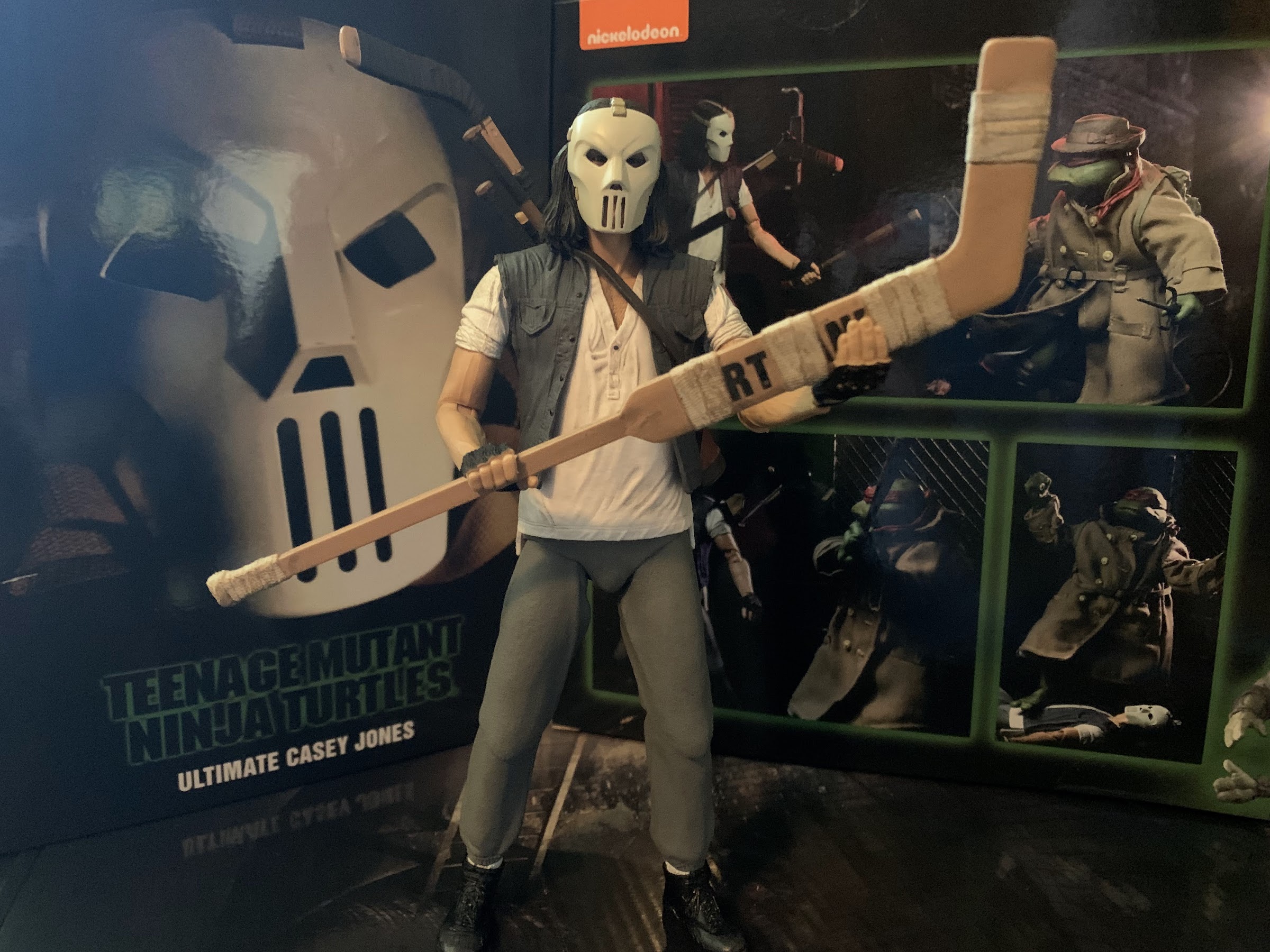
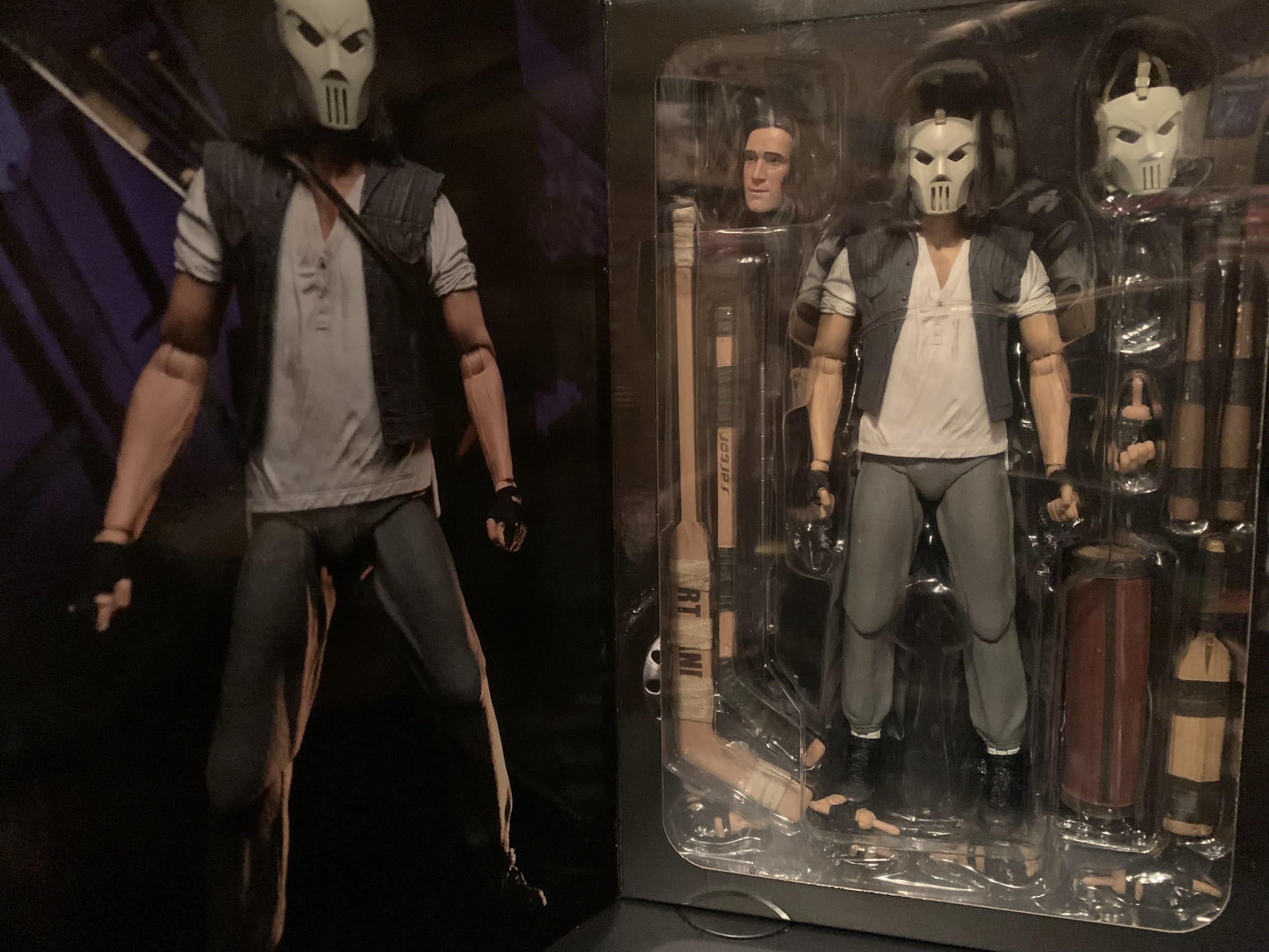
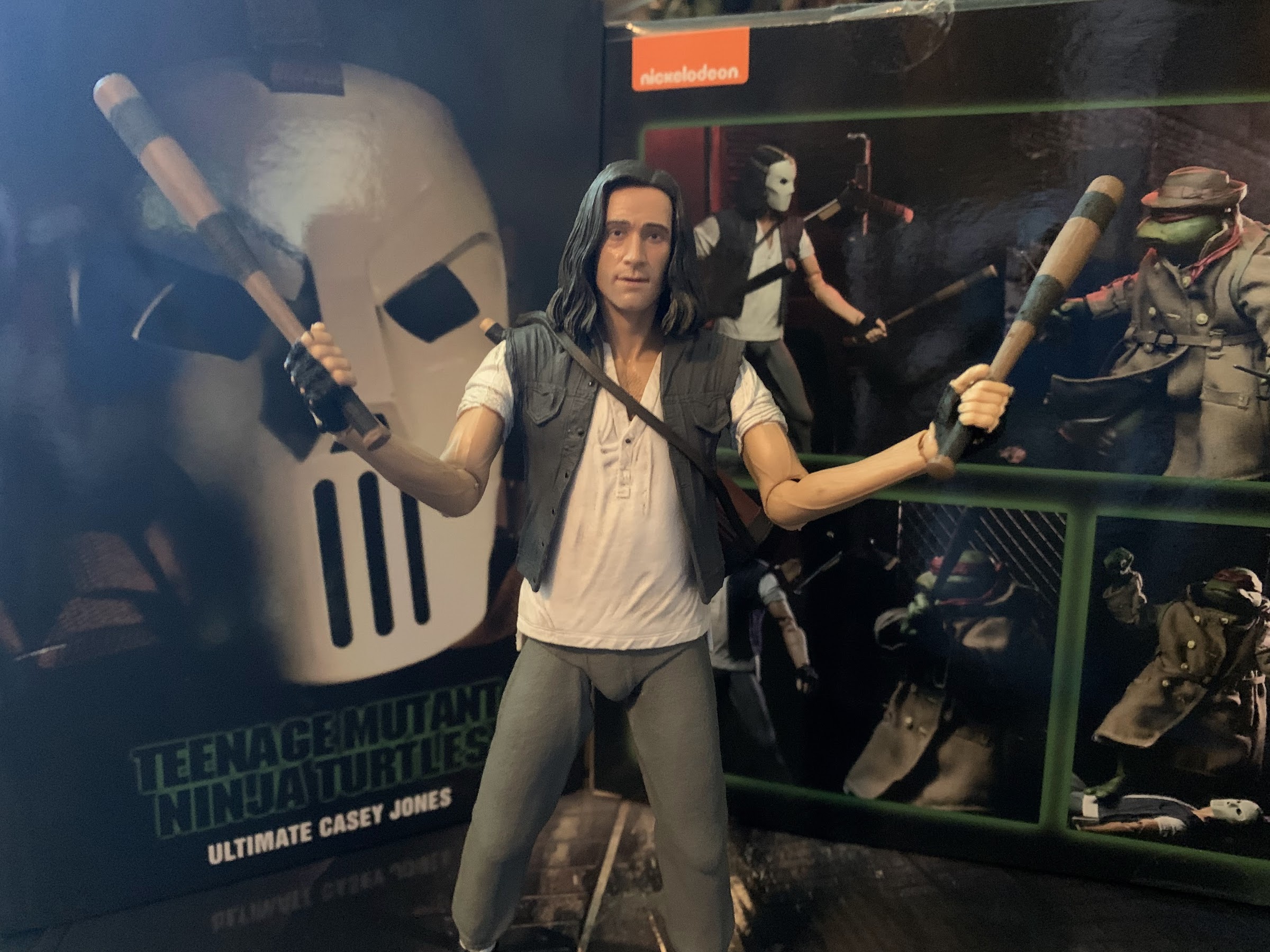
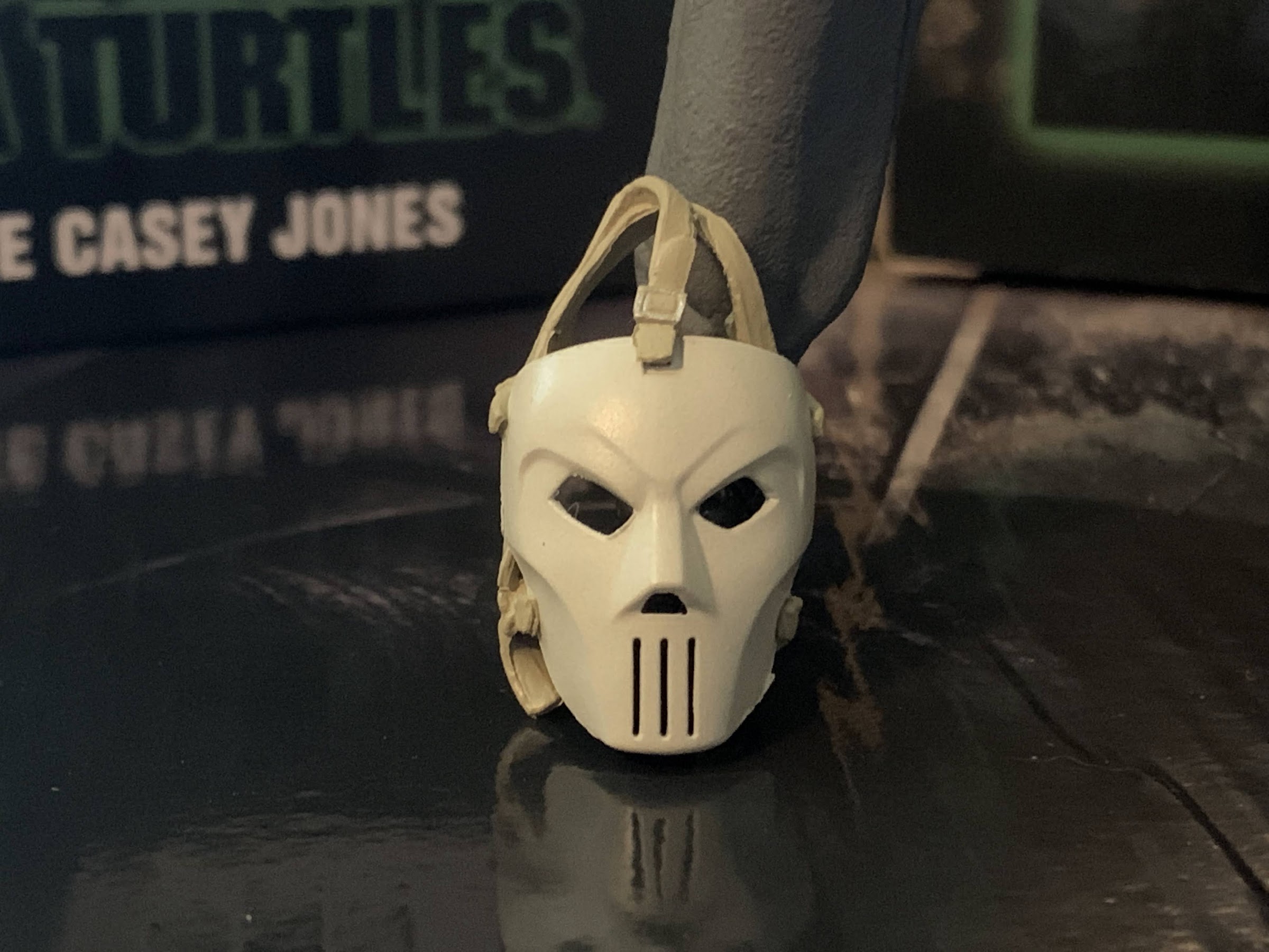
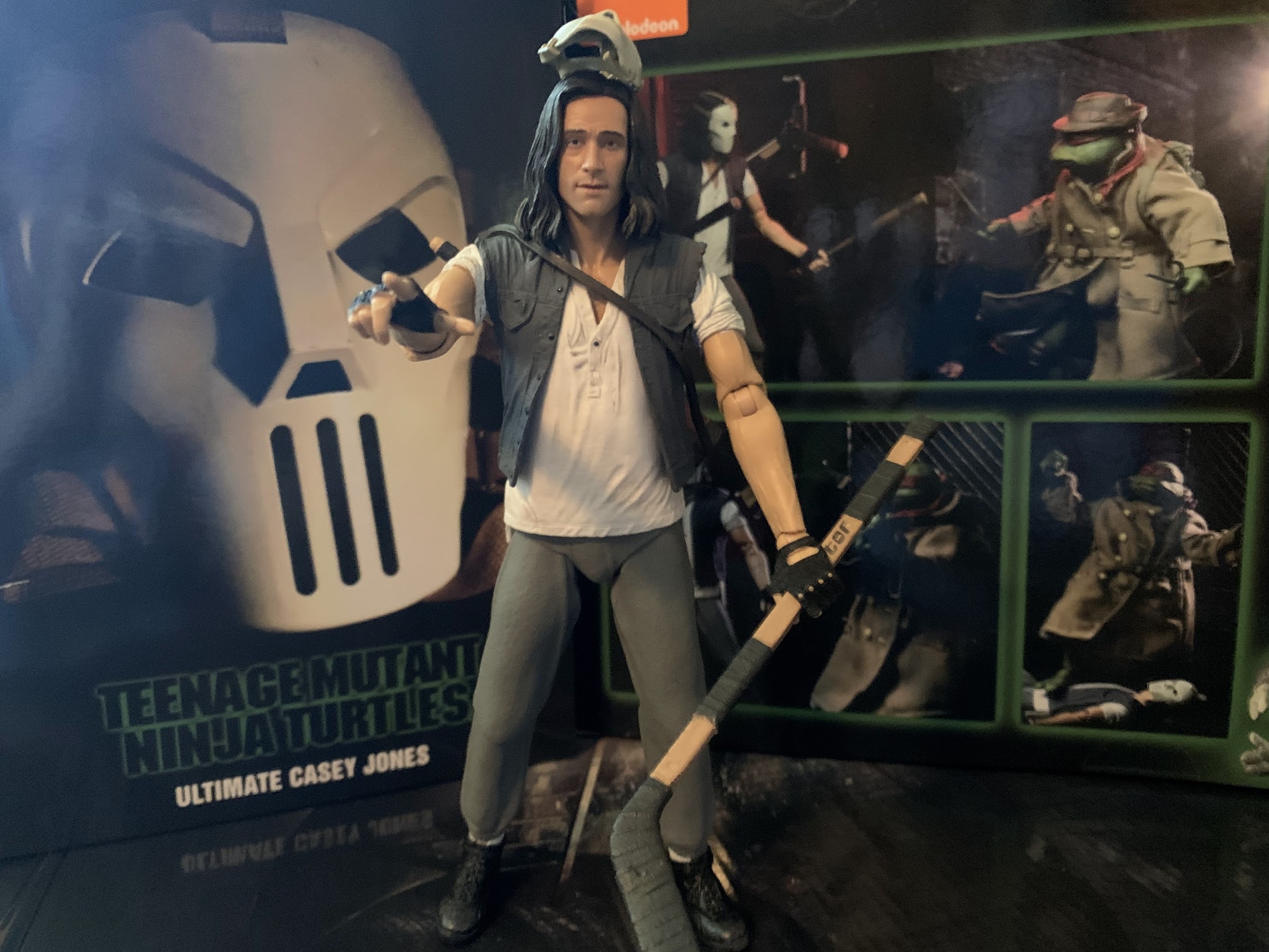
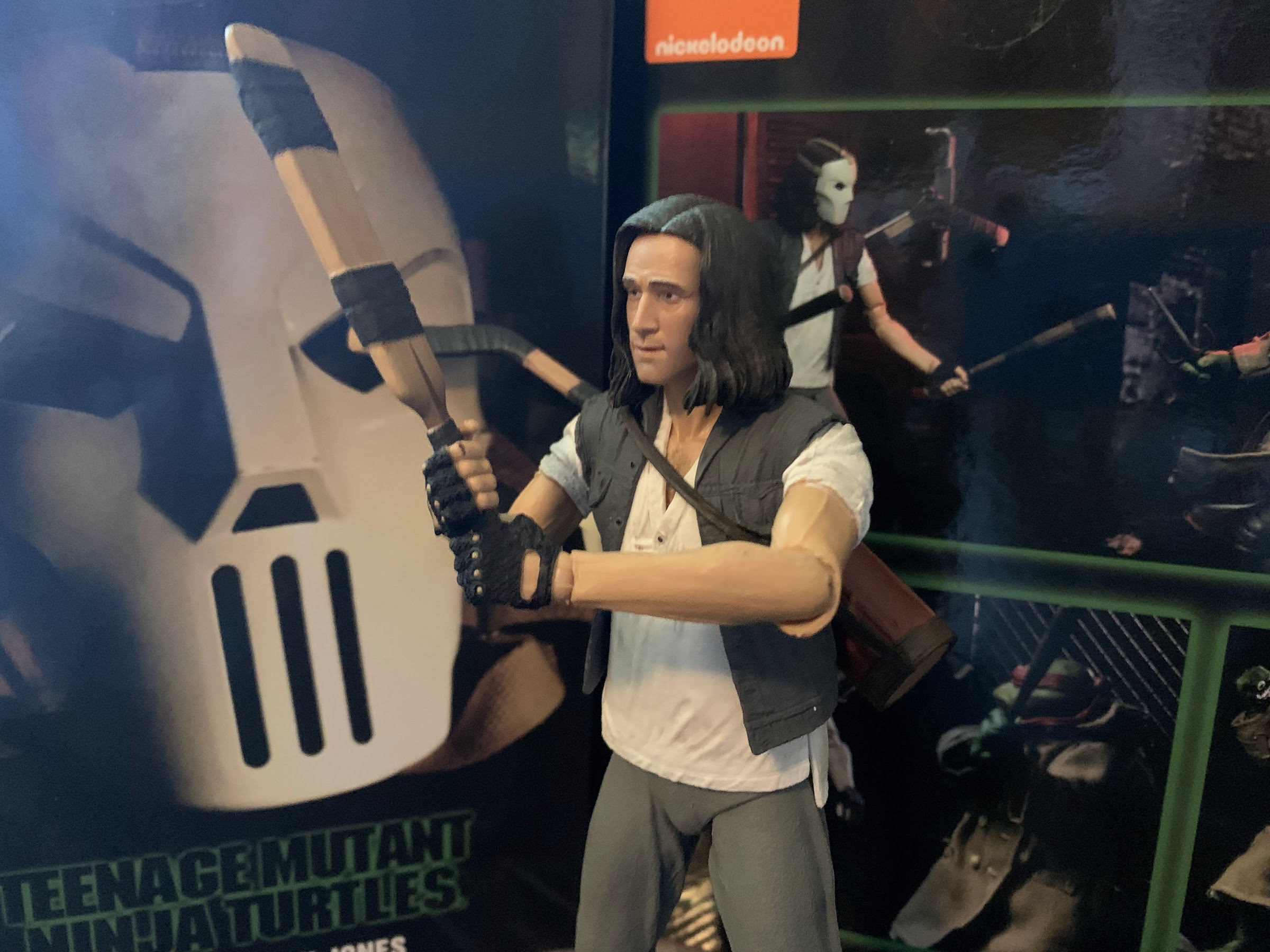
With that figure already done, what was NECA to do with the actor likeness? Well, they felt a re-release was in order, but rather than update that two-pack and ask collectors to rebuy Raph, they decided to single pack him as one of their Ultimates releases. Ultimate Casey Jones is basically true to that expression as he’s now equipped with everything you need. He has all of the same weapons and hands as before, but now he comes with an unmasked head and a loose mask for good measure. It’s a very familiar release as a result, but if you must have that unmasked portrait here is your chance. It was, after all, a bit easy to dismiss the likeness issue because most likely agree that Casey looks cooler with the mask on. Had the original come with the unmasked head from the start, how likely were collectors to actually display him without the mask? Personally, I wasn’t likely to, but it’s also worth noting he wears the mask in the film for maybe 5 minutes. Probably less. He’s introduced with the mask, but quickly removes it to deal with Raph. When he rescues April and the turtles from the Foot he once again dons the mask, but that scene is brief and once it’s over the mask is put away for good. That’s why it’s entirely defensible for collectors to want the unmasked version. Plus, Koteas isn’t a bad-looking dude. He deserves to have that face uncovered.
Still technically hasn’t even looked at another guy before since he’s looking at himself.
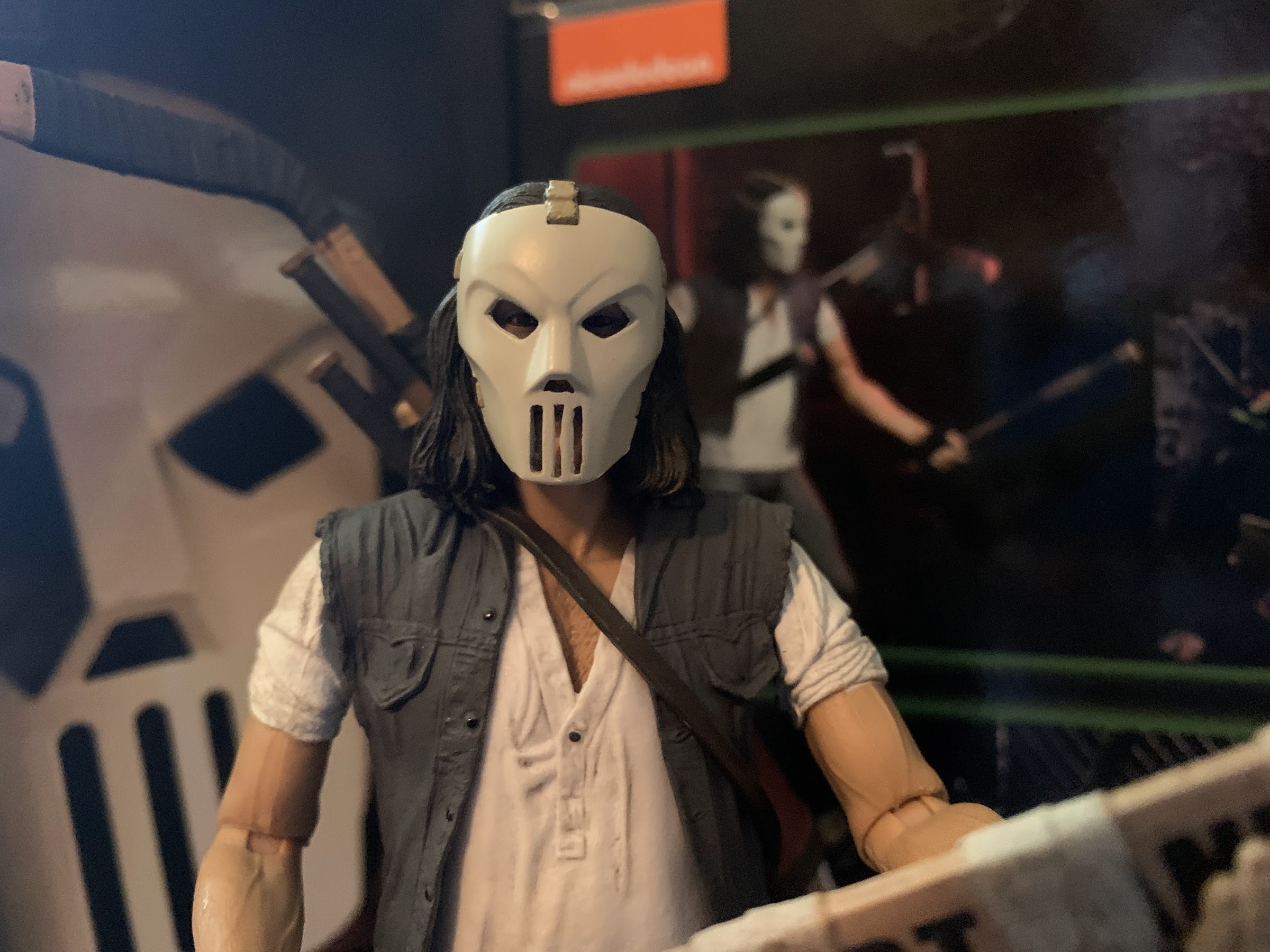
The grill on his mask didn’t come out as clean as the first release, which is odd because it’s likely the same piece as the included loose mask which looks terrific.
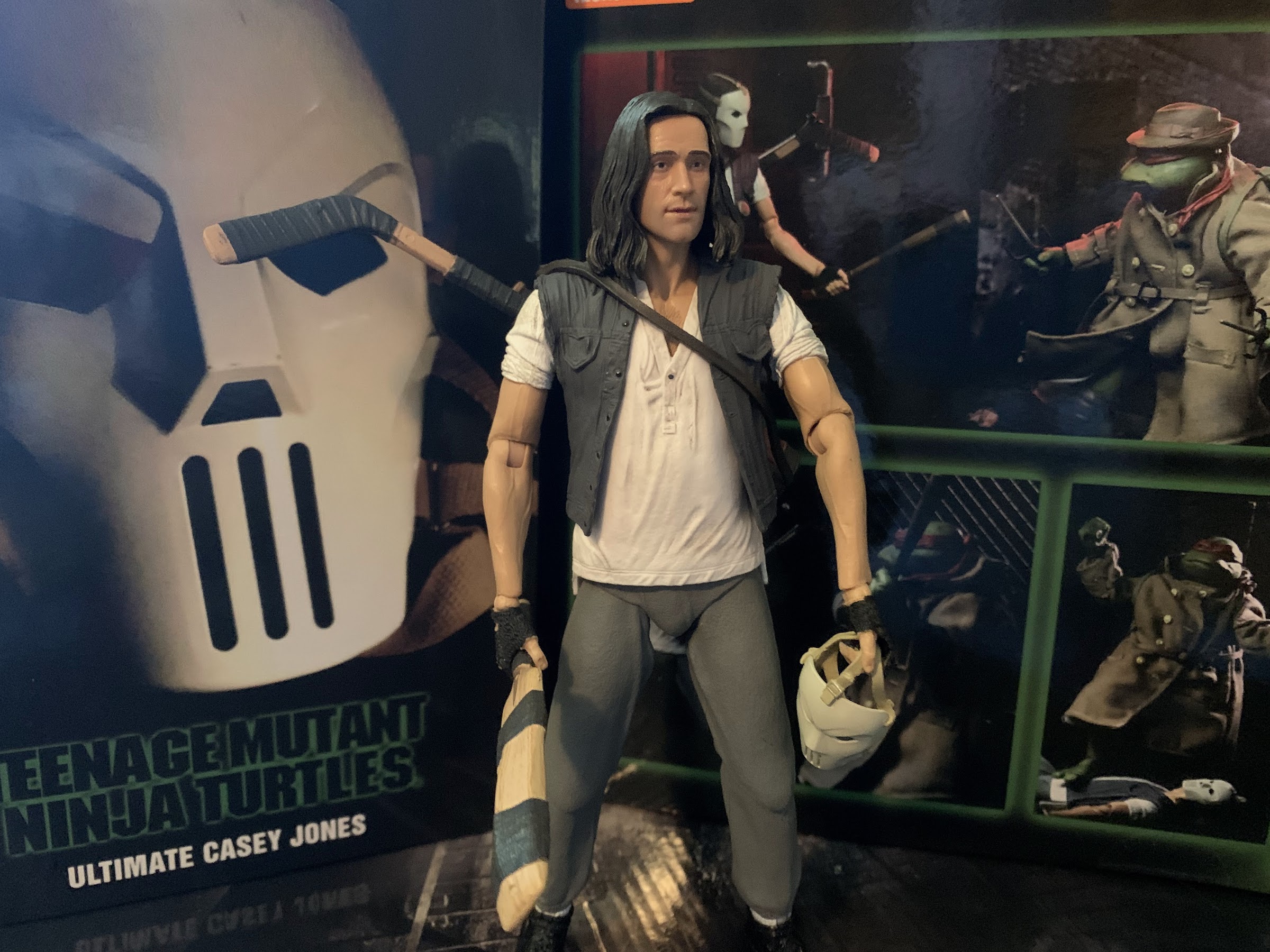
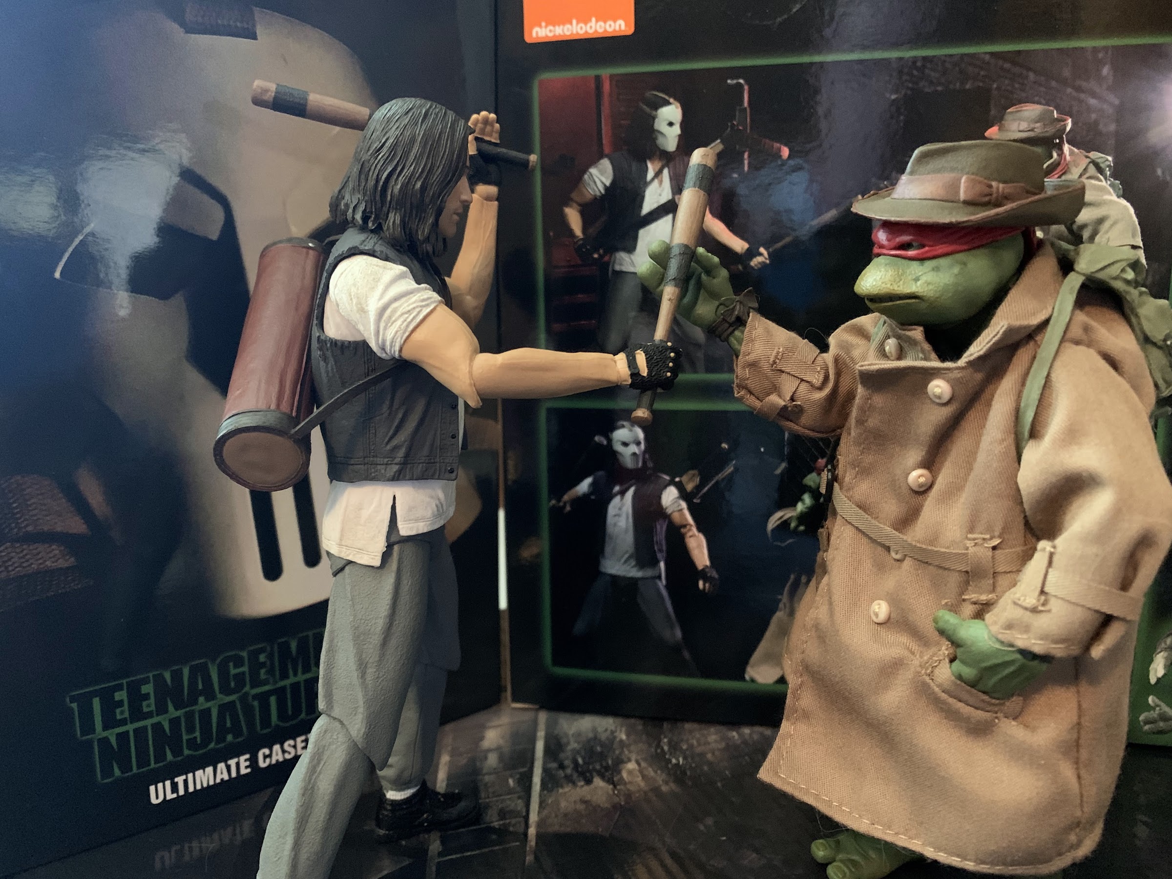
Ultimate Casey Jones is nearly the same figure as before, so I suppose this review should be brief. There are some changes though, so it’s not just a straight re-release. Now the figure comes in the Ultimates styled packaging, the five panel box with numerous product shots all around with a neat mask picture (like a photo of NECA’s own prop replica) on the cover. The figure comes with the masked portrait on and he’s still in his main attire in the film: white shirt, tattered vest, gray sweatpants. The sculpting and paint job is handled pretty well. This isn’t a knock your socks off kind of release, because the character isn’t some crazy mutant, but what is here is handled well. My only gripe when it comes to the paint is that the shoulder joints are just painted white which flakes off so he looks like he has rips in his armpits when raising his arms out. The same paint flaking issue also affects the ankles as his socks are painted over a black hinge, but it’s not that noticeable due to his footwear. Otherwise, it’s great as the white shirt has this dingy quality to it like the character just puts this on every night without washing it. The texture and paint on the fingerless gloves is well down, though there’s some minor paint imperfections on some of the fingers, and the sweatpants look like sweatpants. If the knee joints were less visible it would be easy to mistake them for soft goods.
“I’ll never call golf a dull game again.”
Of course, what we need to talk about is the face. That’s the main selling point, after all. And as far as the likeness goes, this is well done. Actor likenesses are hard and NECA certainly knows that. Their Back to the Future line contains a tremendous likeness with its Doc Brown character, but those Marty McFly figures are pretty rough. For Casey, the likeness isn’t as breathtaking as the Doc Brown figures, but it is very good. This looks like Elias Koteas and he has a hint of a smile on his face that’s suitable for the character. The hair looks good, it’s well-painted, and I think collectors (and hopefully Koteas) will be pleased with this one.
Those old elbows (right) were a point of contention with the original release. You definitely get more range out of them, but it is awkward looking.
The other difference with this release is with the articulation. This guy is largely the same, so I’ll run down what is the same as the prior release: ball-jointed head, ball-hinged shoulders, wrist swivels with horizontal hinges, waist twist, hips, single-hinged knees, hinged ankles, ankle swivel. The big change, is in the elbows. The prior release had double-jointed elbows and it was the odd NECA-styled double elbow which rotate above and below the joint, but contains a huge (relatively speaking) joiner in-between. The end result is the elbow doesn’t really point like a real elbow should and instead looks square when bent. The range is awesome, but the aesthetics not so much. NECA agreed so this release just has a single hinge and swivel at the elbow. This means Casey can’t really bend his elbow past 90 degrees, but it does look better. It’s a trade-off worth making, in my opinion, and it looks like NECA is about to make a similar change to it’s April O’Neil movie figure only with her it’s the knees and not the elbows.
Since he lacks vertical hinges for his hands, he can’t really properly swing a club, but he can still look cool!
The actual articulation on this release works okay. He’s not a truly dynamic figure which could frustrate some. Part of that is due to the limited torso articulation. I didn’t include it in the list of joints, but there’s almost certainly some diaphragm joint in this guy, but it’s functionally useless. That’s due to NECA using an overlay for the shirt, which certainly looks more authentic, but results in lesser poses. His feet also can create problems because he’s wearing high tops, which just don’t move as well as some other styles of foot wear. You get little ankle rotation and the hinge only affords so much as well. I will say this one seems to stand better than my previous release, so maybe something has been changed in there, but if so I can’t pinpoint what that change would be. The other articulation shortcoming rests in the hands, which all feature horizontal hinges. Again, we saw this with the Shadow Warriors set, NECA is really good about giving someone like Leonardo vertical hinges to properly wield his katana, but seemingly everyone else who would benefit from the same is left wanting. He even has two sets of gripping hands that are almost identical. I thought maybe with the original release it was a factory error and one set was supposed to have the vertical hinge, but apparently that wasn’t the case.
This is a neat little inclusion and basically the only new accessory in the set.
Though the loose mask isn’t something he can actually wear.
The accessory count should feel familiar to anyone with the first Casey release. He has a boat load of hands for starters that include pairs of gripping hands, slightly looser gripping hands, and fists. He also has an even looser left gripping hand for supporting his goalie stick and a pointing right hand. The plastic is rather pliable on the hands which makes it nice and easy to work the weapons in and out, making one set of gripping hands feel truly extraneous. Since the paint can get a little sloppy on the hands though, it’s not bad to have a second pair. For weapons we’ve got two baseball bats, a hockey stick, goalie stick, cricket bat, and a golf club. They all fit into his golf bag which can also fit over his head, though it is easier to remove the head first to slip it on. If you stuff everything into it the end result is pretty ridiculous, but it can be done! He also has the masked head, if you prefer that. It looks to the be same as the previous one, but for some reason it didn’t come out as clean when it comes to the vents over the mouth. I don’t know why that is, but it is noticeable when comparing it with the previous release. Lastly, he also has a loose mask this time to hold or hang off of the handle of one of his weapons as he does when running from Raph. It’s actually a pretty cool little accessory and, unlike the second portrait, it came out nice and clean. You cannot put it over the figure’s head, but why would you want to? It’s just a neat thing to have and it’s not like there was much else NECA could have tossed in.
Now we can finally properly recreate the infamous Jose Canseco bat scene.
As well as educate others on the finer points of cricket.
Ultimate Casey Jones is easily summarized as the Casey we all wanted from the start. It’s an improved version of what was already a good figure. Yeah, there are some areas one can nitpick, but I think most will be quite happy to have him. There are also probably some folks who don’t see this release as a necessity and that’s understandable too. I certainly questioned how much I “needed” this release, but when presented with an opportunity to own it I went for it, and I’m happy to have done so. This figure is currently being sold by Walmart which appears to be in the midst of a restock at an MSRP of 30 bucks. NECA has not made the figure available on its website, but there’s always a possibility that it will down the road. There’s also a mysterious listing on Walmart’s website for a farm two-pack of April and Casey, but NECA has not confirmed the existence of that so for now it’s just a picture-less listing. A special shoutout to a user at thefwoosh.com, Detrimental_Fig, who was able to find this figure locally and ship it to me after I failed to track one down. Collectors, help each other out and don’t feed those scalpers! There should be plenty to go around.
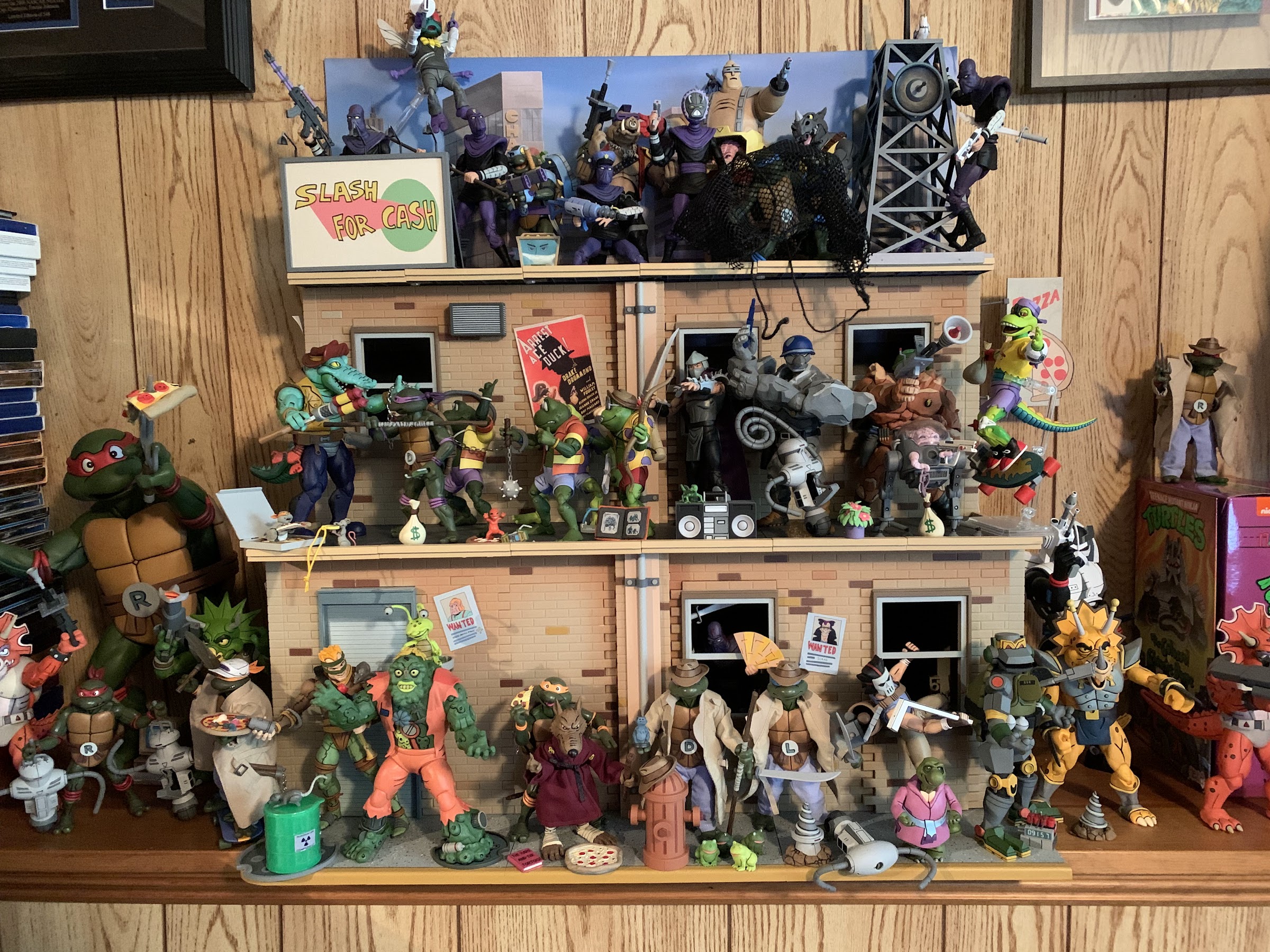
Loot Crate’s first series of Teenage Mutant Ninja Turtles crates in 2020 were a massive success. The crates sold out and anyone who missed out found out acquiring them on the secondhand market would be most expensive, and that’s because each crate came bundled with a NECA exclusive action figure. NECA’s parent company rescued Loot Crate from bankruptcy a couple of years ago, so the two are kind of one in the same. It made sense for the two to team-up and for TMNT collectors it meant there were actually figures out there that were easy to obtain, provided you actually jumped in when the crates were first solicited.
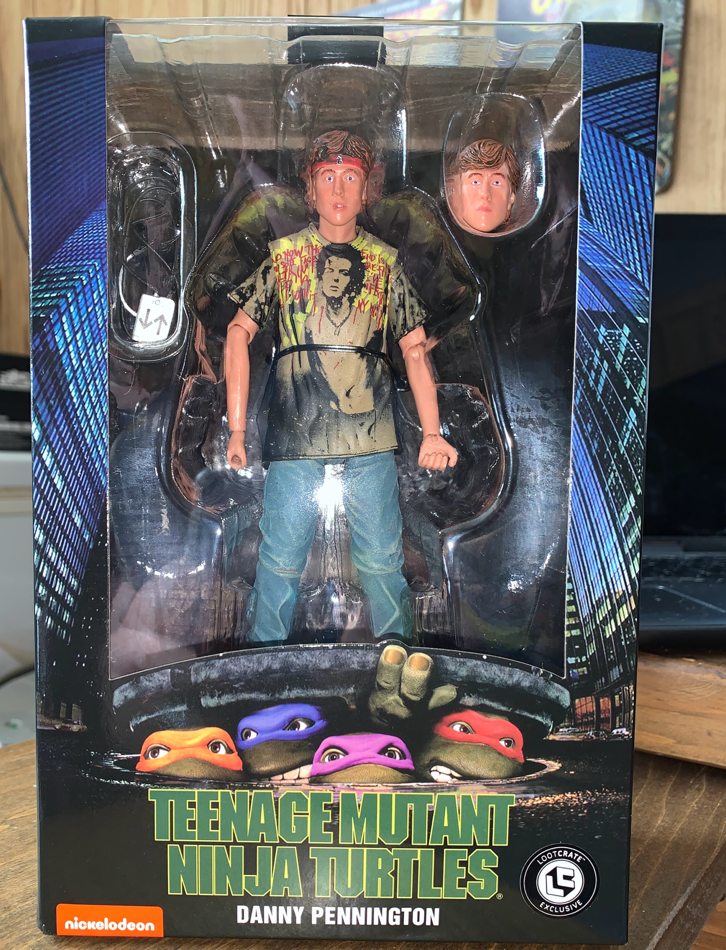
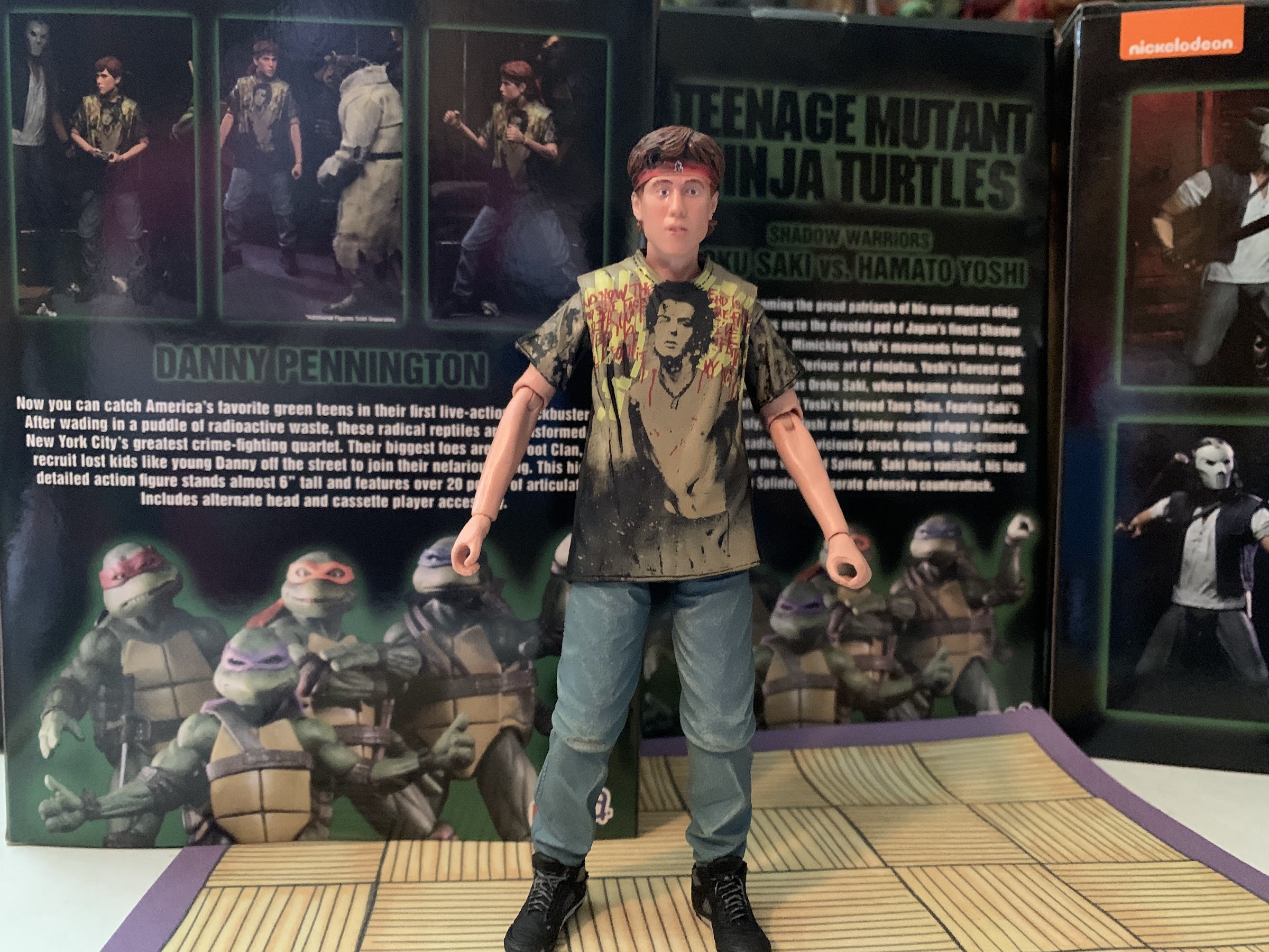
Considering they were such a success, it’s no surprise that Loot Crate is back for round two. This wave went up for preorder earlier this year and it includes four crates. Each crate will take inspiration from one of the four main pillars of TMNT media: film, video games, comics, and cartoon. And to be more specific, the themes are Teenage Mutant Ninja Turtles (1990), Tournament Fighters, Mirage Studios, and the ’87 cartoon. Basically, all are returning from themes from last year with the exception of Turtles in Time exchanging places with Tournament Fighters. And unlike last time, Loot Crate was pretty upfront with what the figures featured in each crate would be rather than just providing the theme. And also just like last time, subscribers who prepaid for all four get a bonus fifth figure, Scrag, from the cartoon to ship alongside the fourth crate. And also, just like last time (I know, I sound like a broken record at this point), the first crate out the door is the one based on the 1990 film and the figure is one Danny, or Dan, Pennington.
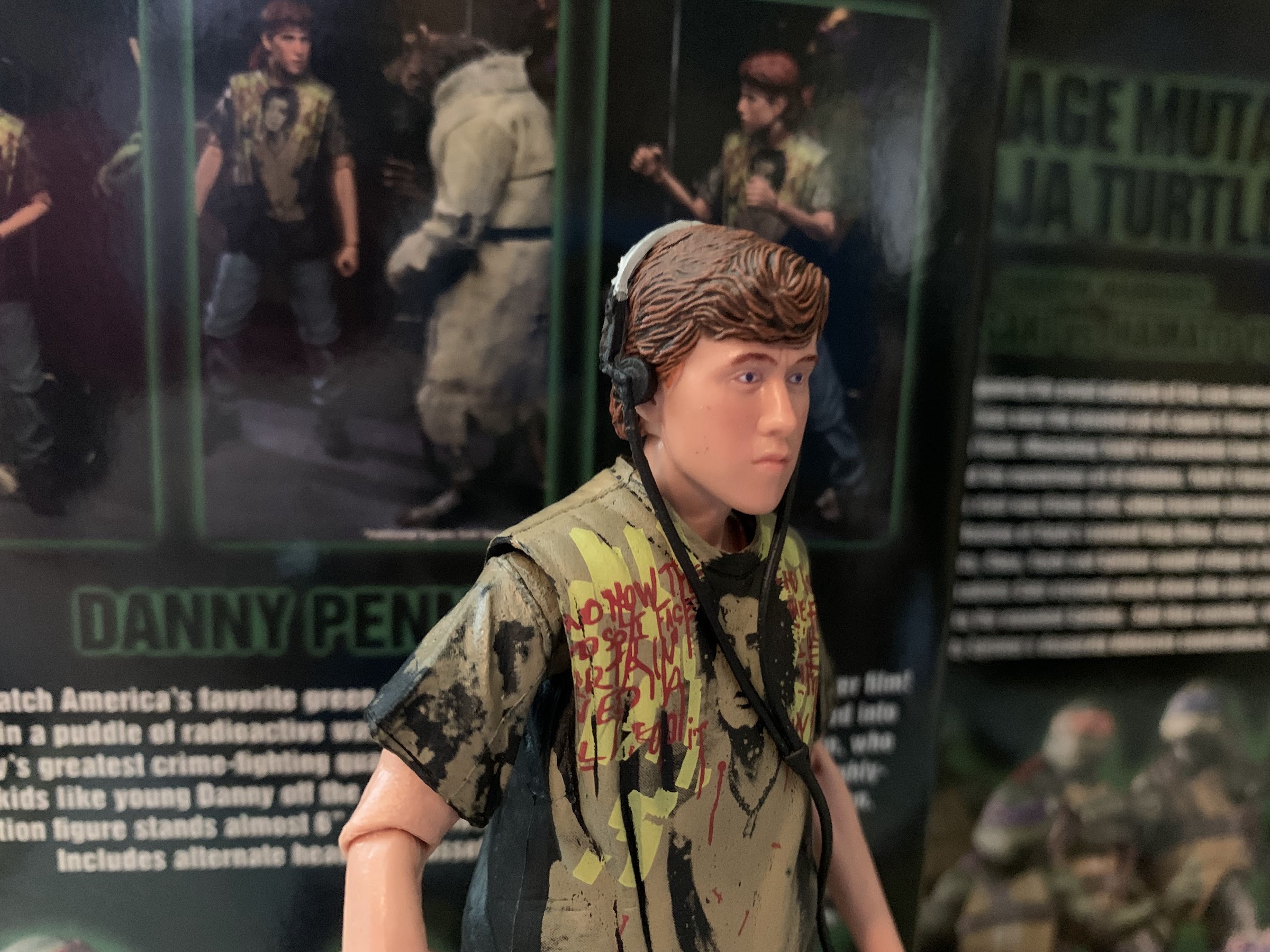
Never did I expect to own a Danny figure.
NECA and Loot Crate’s approach to the figures in this series is to give collectors something that might not make sense at retail. When it comes to the original movie, all of the heavy hitters have seen a retail release and even some not-so-heavy hitters have too. The only exception is Tatsu, but the actor who played him just isn’t interested in playing ball with NECA. Enter Danny. The youth in search of a father figure recruited by the Foot who has a change of attitude when he meets the turtle dad Splinter is a solid choice for a Loot Crate. He’s not in a ton of the film, but he plays a role and might even have more screen time than Shredder. He’s not a fighter, so he’s not the sort of character who needs a bunch of accessories and extra parts and he’s just not someone that excites retail partners. Of course, the flipside is that Walmart can’t seem to keep anything from the film line in stock, so why should Danny be viewed any differently? And that might be true, but the good news is that Danny has two looks in the film so if NECA ever wants to test him at retail they could release his other look there and find out.
Now, I grabbed the Shadow Warriors set, so I’m basically willing to buy anything from the first film. Danny wasn’t the figure that excited me the most when this round of crates was unveiled, but he was also someone I was more than willing to welcome into my collection. Plus, I wanted that bonus figure. If you’re unaware, each crate retails for $50 and the included figure is something lesser than a NECA Ultimate release. These figures are basically half of that $50 and the rest of the “value” comes from pins, a shirt, and other assorted stuff. Your mileage may vary with that stuff, but to me it’s mostly junk. The figure is what makes or breaks each crate and I’m happy to say that I was satisfied with each of the previous crates. With Loot Crate, I think the fear on the consumer end is that we’re paying more for a lesser product and any figure is going to be severely compromised with reused parts that don’t make sense or they’ll just be variants no one asked for. They’re being bought sight unseen, so there’s a trust element at play. Last year’s crates included two straight repaints: Spirit Splinter and First Appearance Shredder. I passed on Splinter, but the Shredder was a rather stunning repaint of a figure previously only available as a convention exclusive, so I was satisfied. The other figures included a glow-in-the-dark “shell shock” turtle and the bunny boys, Bebop and Rocksteady. I wasn’t too excited by the shell shock turtle, but it was a neat idea. The bunnies I loved because they’re just so silly, the exact kind of figure I want from something like this.
This…is not good.
Because of my positive experience with the 2020 crates, I had few concerns this time. The promo shots of Danny looked good, but myself and many others were concerned about the scale. The scale in this line is a bit funny largely due to the turtles themselves probably being too big, but for the most part NECA has been able to work around that by making sure the other figures (like Casey) are at least a little taller than the green dudes. Danny, portrayed by actor Michael Turney, is a little tricky. He shares scenes with his dad, Charles, who is not in figure form (yet?) as well as some with April and Casey. He’s not around the turtles a lot, but he’s definitely shorter than Casey and a little shorter than April. We also see him with Shredder and Splinter. That said, I was fine with Danny coming in as the shortest character in the line, but I still wasn’t prepared for this.
At least his shirt looks nice.
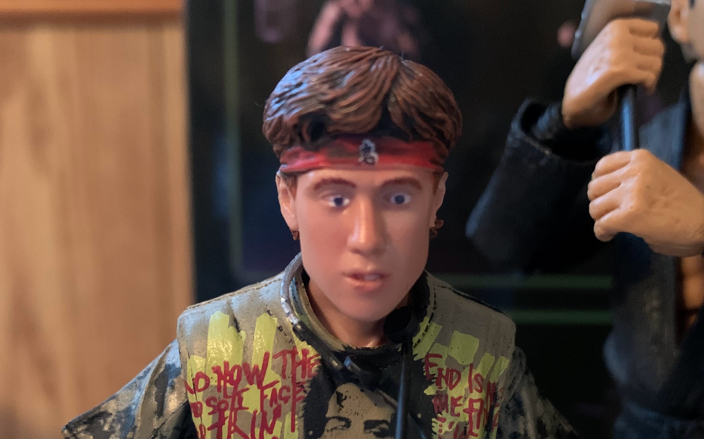
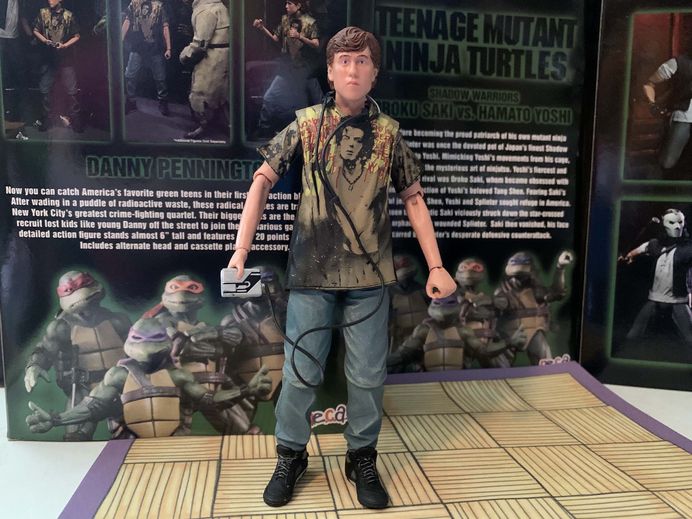
Danny (no way I’m calling this short stack Dan) comes in at a “whopping” 5 3/4″. For comparison, Oraku Saki is a touch over 6 3/4″ and he uses the same body as Shredder and the Foot. He towers over Danny, as does Casey and the turtles. In the scenes he shares with April, he doesn’t appear to be much more than an inch shorter than she. With Casey, the top of his head is right around the eyes. Here he looks like a 10 year old next to basically anyone in this line. It’s fine to quibble over a quarter inch or so, but this is pretty bad. And it’s made worse when one realizes why. Danny is so damn short because NECA opted to reuse the legs (and possibly more) of its John Connor from Terminator 2 figure. They’re denim, and they’re loose-fitting, so they look the part, but they’re way too small. And everything about the figure just seems small as a result like the arms and the head size. I expect some parts reuse with these figures, but it’s irresponsible on NECA’s part to reuse parts that just aren’t suitable for the character. They could have recycled parts from someone like Marty McFly and that would have been better, even if the fit of the pants is tighter than they want. As it stands, this figure looks ridiculous whether right next to another figure or off on his own and that’s a real shame.
Yuck.
And my issues with Danny don’t end there. He comes with two portraits: one with the Foot bandana and one without. The default one with the bandana leaves something to be desired. The paint on the eyes is not perfectly aligned with the sculpted out area for them and just looks sloppy. Mine isn’t as bad as some of the ones I’ve seen online, but if I was at the store sifting through a row of Danny Pennington figures I would have passed on this one. The other head is much better, but both also feature no flesh-colored paint. The prototype had a nice, matte, appearance, but this one is rather shiny and plastic looking. There’s also some brown from the hair on the ears of the alt head, so neither option for me is ideal. The arms on this guy are also really spindly and the forearms look excessively long. They’re very awkward looking, and the hands are curled into hooks as I think they too are recycled from the John Connor figure who was meant to hold onto handlebars. The only positives I can find with the aesthetics of this figure is that the facial likeness, on a basic level, is acceptable and the paint on the denim and sneakers looks nice. NECA also struck a deal with the Sex Pistols to recreate Danny’s Sid Vicious shirt and the quality of the print looks fantastic. I just wonder if they blew too much of the budget on that piece of authenticity and not on making a quality figure.
The alt head is a little better, at least.
Danny’s articulation is nothing to write home about. His head is on a tiny ball-peg and moves around okay, but he can’t look up which is a bit of a problem for such a short guy. His shoulders are ball-hinged and are quite stiff. He can’t raise his arms too far, but can rotate around. The elbows swivel and are single-hinged while the wrist rotates and hinges as well, but it’s tight and gummy and at times it’s hard to tell if the hand is rotating or the plastic is just bending. There’s a waist twist, but it’s severely limited by the oversized t-shirt. He has the old style hip joints and they’re rather tight and potentially fragile, so buyer beware. The thighs rotate a bit and the knees are single-hinged with swivels. The ankles probably do something, but his high tops prevent basically all movement down there. I would advise not forcing the issue because if it breaks who knows if Loot Crate can replace it (they had to cancel some orders of this crate because they oversold it).
You should probably stick your head in those things because you’re not going to like what I have to say about you.
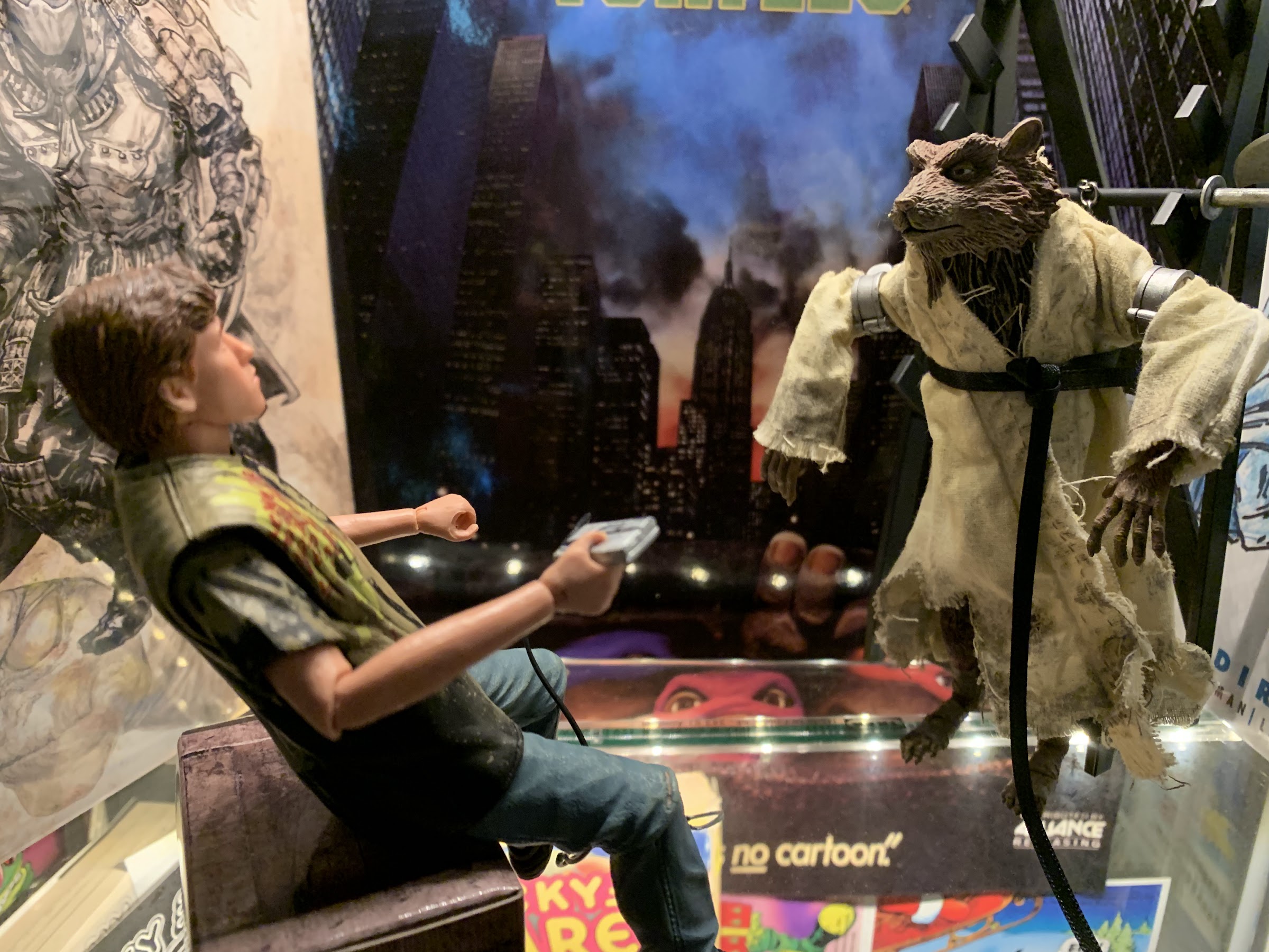
In terms of accessories, Danny is very light. He has the second head I mentioned before and in addition to that he has a Walkman, or personal tape player. It’s cast entirely in a rubbery plastic, which feels really cheap. I think if he were a retail release, just the wire connecting the headphones would be cast in this while the rest would be a harder material. The chord is super long, but I suppose that’s better than the alternative. The paint is a bit sloppy on the headphones, but they do kind of fit on his head if you like that look. That’s it though. No extra hands, no Whopper, no nothing. I’m a little surprised they didn’t slip in a low cost item like a small picture of Leonardo like the one April gave him or maybe April’s wallet or the money he took from it. A bandana for him to hold, and drop at his feet, might have been fun too. And basically any extra hands would have been welcomed because the ones he has just don’t look natural.
Go ahead and do it, Shredder. I don’t care.
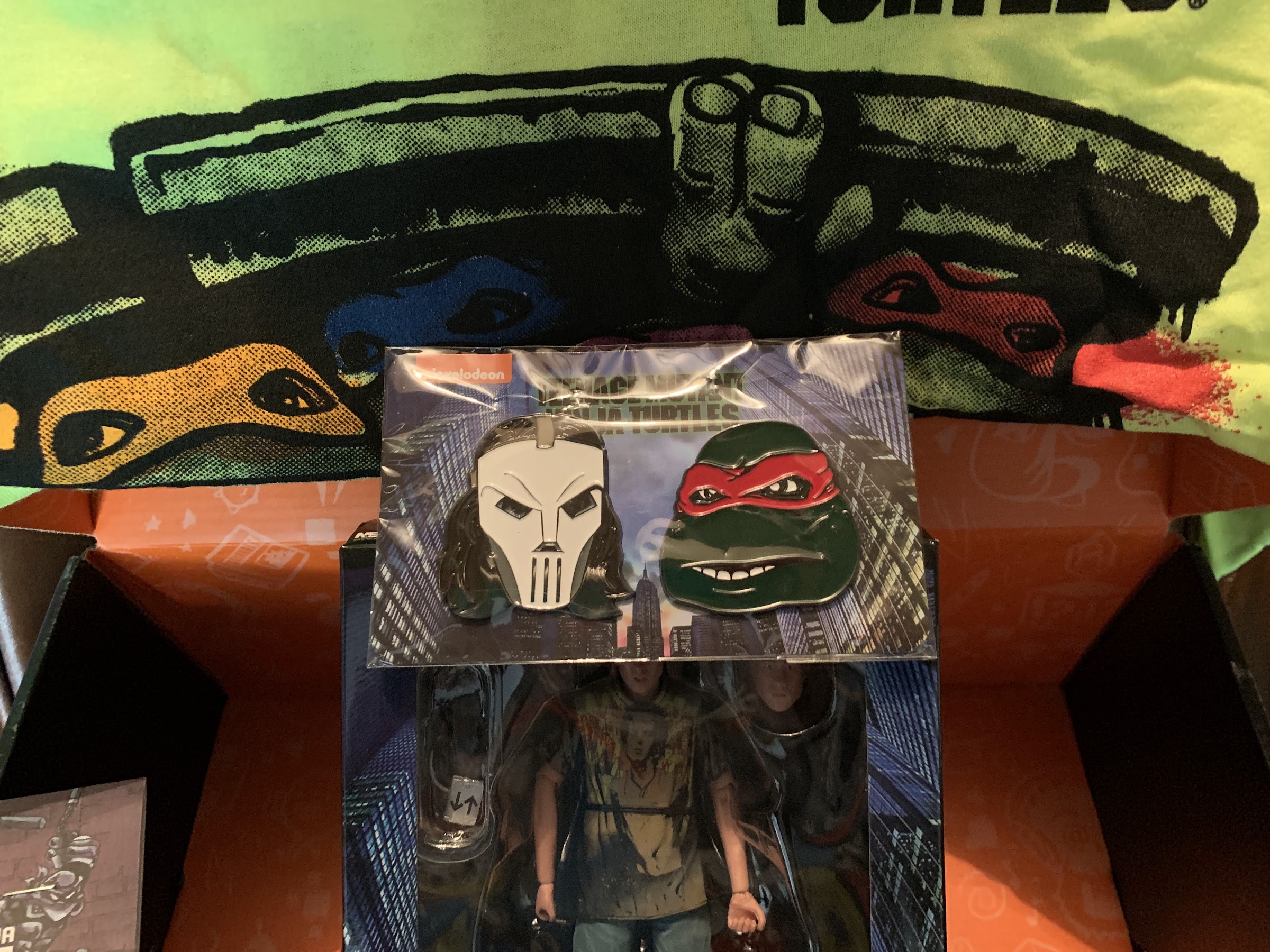
Well, Danny might be a dud, but what about the rest of the contents? Like I said, the figure makes or breaks this thing, but even so the rest of the items offer little. This is the smallest crate yet as the only other items are a shirt, set of coasters, and a set of pins. The shirt is this neon green, the same color as a TMNT camera I had back in the day, and features the manhole art from the theatrical poster of the film. It’s very loud, but since it’s long sleeved it has a chance of sneaking into my wardrobe. The pins are just two, oversized, portraits of a masked Casey and Raph. The coasters though are weird. They’re kind of soft and bendy, not really the type of material one associates with coasters, and the artwork on them is Mirage artwork. Why are we getting comic coasters in the movie crate? I don’t hate the choice or anything, it just surprised me.
If you were hoping for the rest of the crate to pick up some of the slack, well, you’re going to be disappointed.
If you can’t tell, I’m pretty disappointed with this crate. It’s easily the worst one yet and since it’s the first one from Series Two it’s hard not to worry about the ones to follow. I have three more to look forward to and if they all leave me feeling like this one did then I’ll probably have to bow out of this subscription service. This crate, to me, is what consumers fear when they sign up for these blind box type of releases. We all worry we’re just getting junk for our money, and this time that is mostly true. It’s just one though, so I’m trying to keep that in perspective, but this one isn’t up to the standards NECA and Loot Crate established last year.
Jerk can’t even sit. I give up.
Unfortunately, the wait to see if crate two is any better is going to be a long one. This crate was already pushed back from August, and now crate two isn’t expected to begin shipping until December meaning consumers aren’t likely to see it until 2022. This crate was marked as “shipped” on September 13th for me and I didn’t get it until October 6th. It is what it is as shipping overseas is crazy right now and it’s getting bad domestically as well. One thing I will say in Loot Crate’s favor is their communication is great when it comes to the delays and that’s all I ask for when it comes to such. Of course, it has to be said some people are having worse experiences as I alluded to. Some had their orders cancelled or delayed indefinitely, which is inexcusable for an item that was thought to be made-to-order. Loot Crate did have to close orders earlier than expected, but the fact that it couldn’t deliver on every order placed is not a good look. Yeah, we’re definitely not off to a good start here.
At least someone is willing to put their arm around him.
It’s just a start though and there’s time to recover. The hope here is that NECA and Loot Crate take the criticism to heart and that most give them constructive feedback. I’m happy to inform people when I get a good product from both, and for the most part my NECA reviews have been overwhelmingly positive, so hopefully this experience is the exception. And if that proves to be the case, that’s obviously better than the alternative, but it’s still disappointing that Danny received such a bummer of a release because he’s probably not getting a redo. Hopefully, his dad didn’t have kittens when he got a look at how his son was treated.
The set everyone has been waiting for! Okay, maybe not everyone.
NECA’s line of Teenage Mutant Ninja Turtles action figures at retail began with quarter scale figures based off of the 1990 film. Since then, things have opened up for the company and toon and video game figures have followed as well as a line of movie figures in a 7″ scale line. And of the lines NECA has released to retail, I would still argue the movie line has been the best and most well-received, even if the cartoon line might be more profitable. The problem with that though is there just isn’t a lot of characters to mine from. Cartoons and video games are full of one-off and reoccurring characters to turn into action figures, but the movies are basically just the turtles, a handful of villains, and their allies. And some of them aren’t exactly exciting action figure options, while some that would be aren’t available due to licensing restrictions.
Bad News: You can only find this set at Walmart. Good News: it still retails for $50.
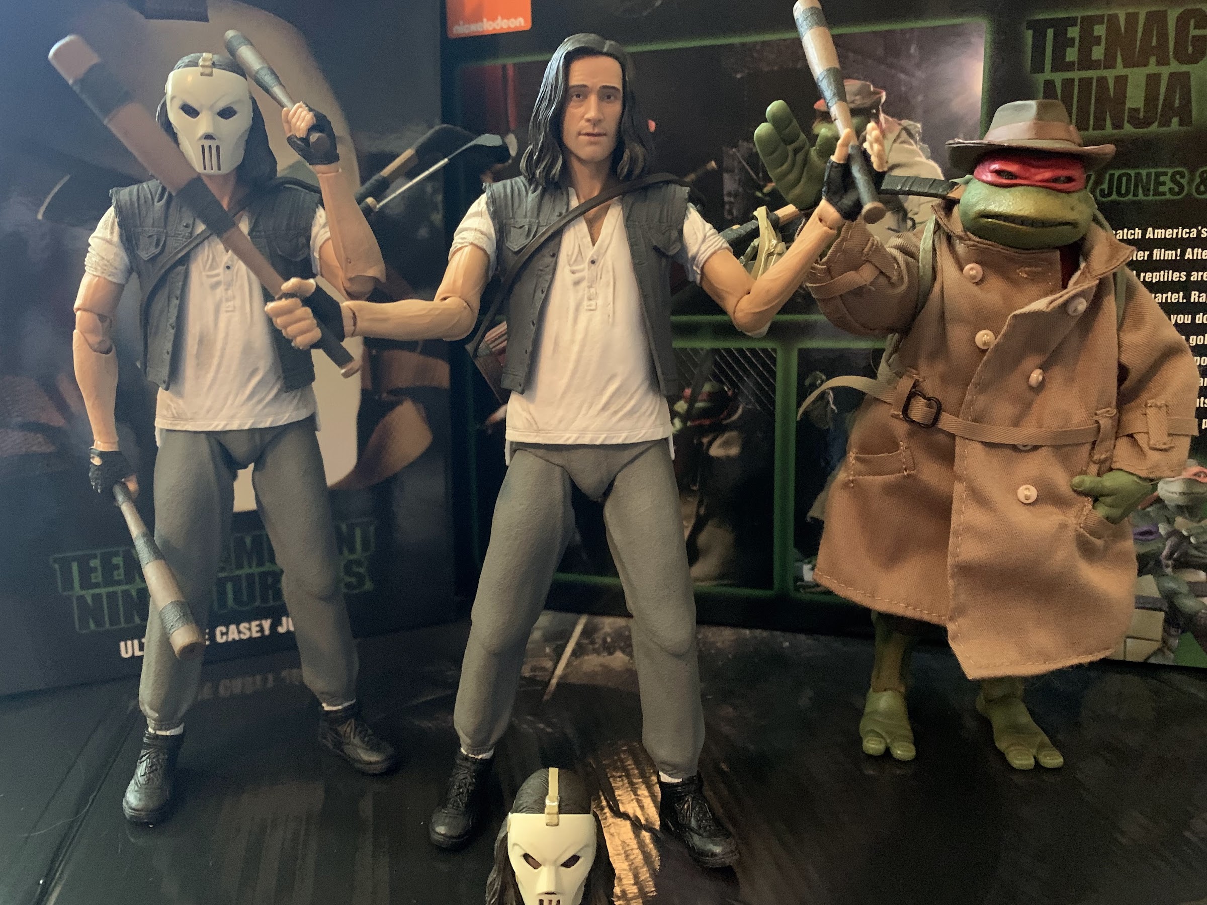
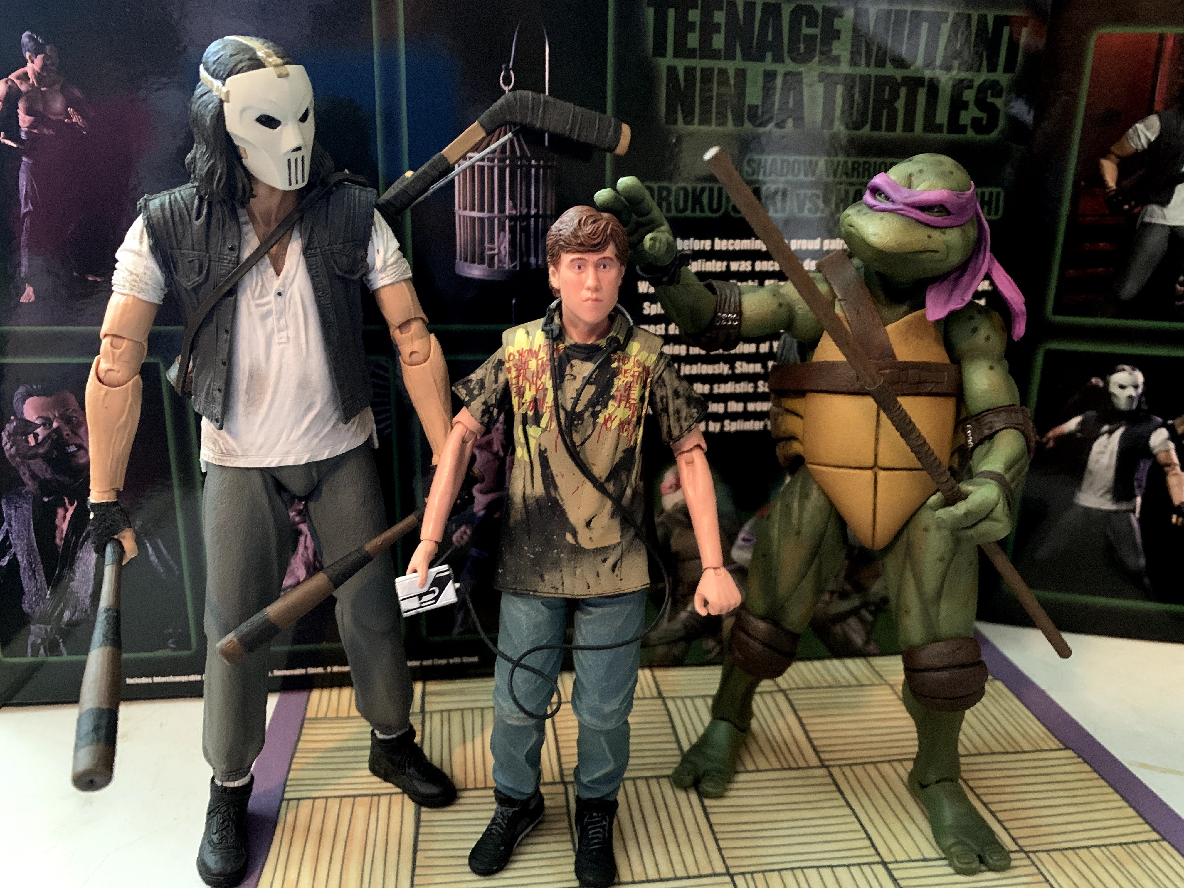
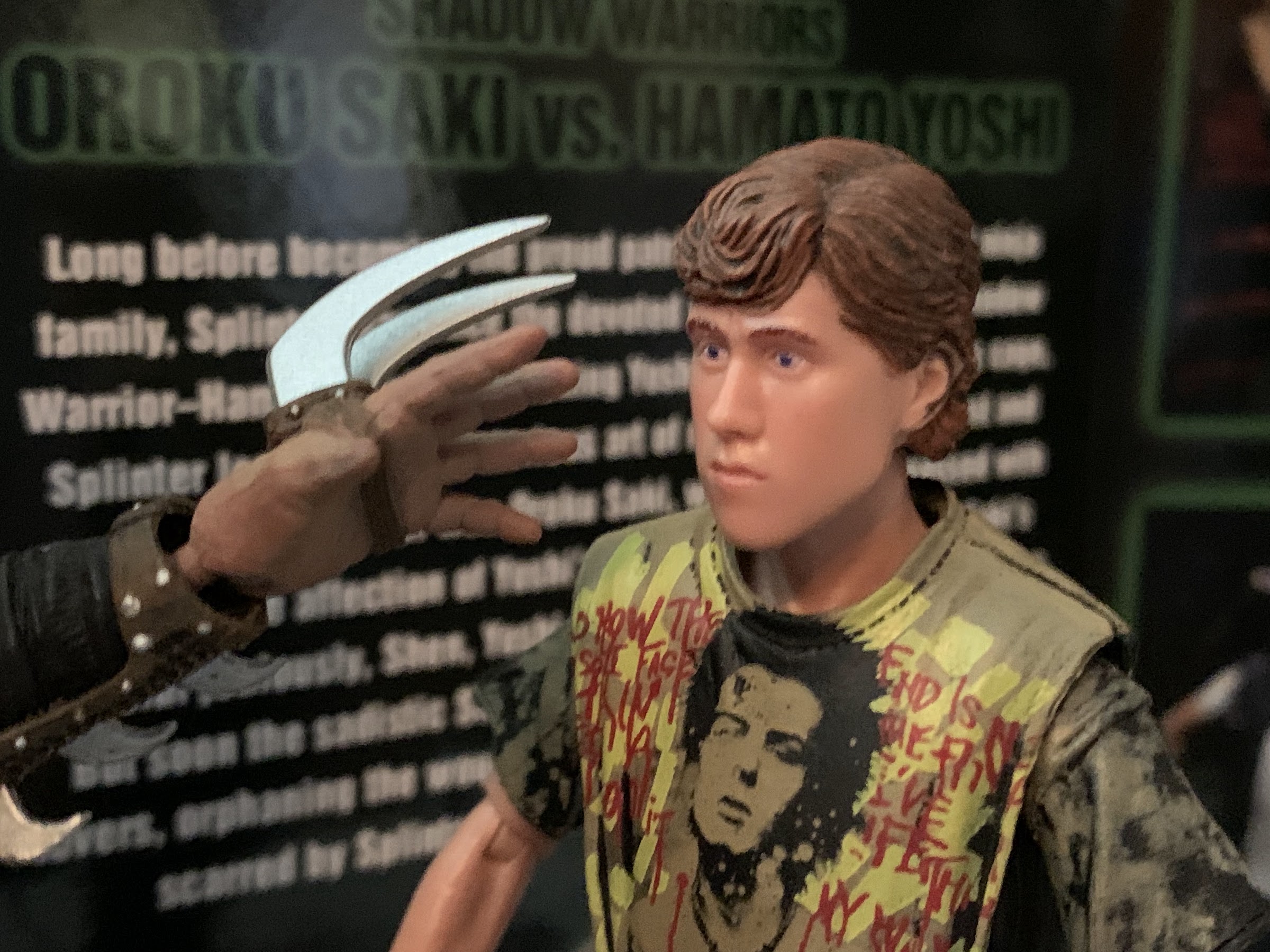
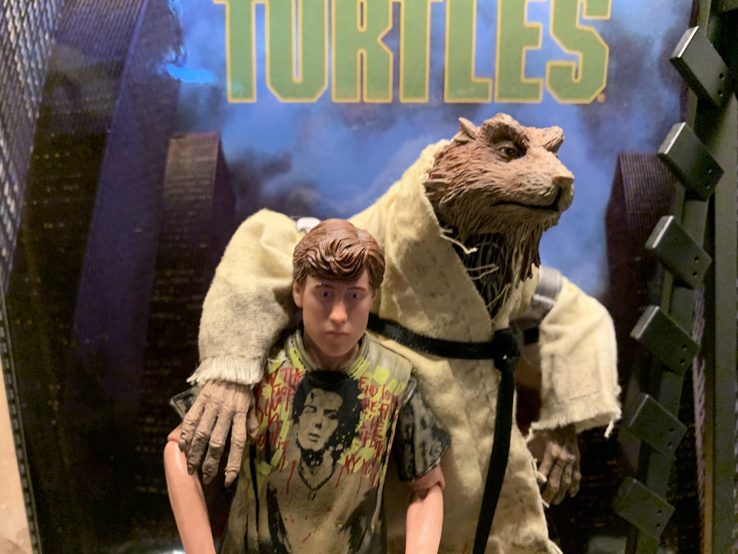
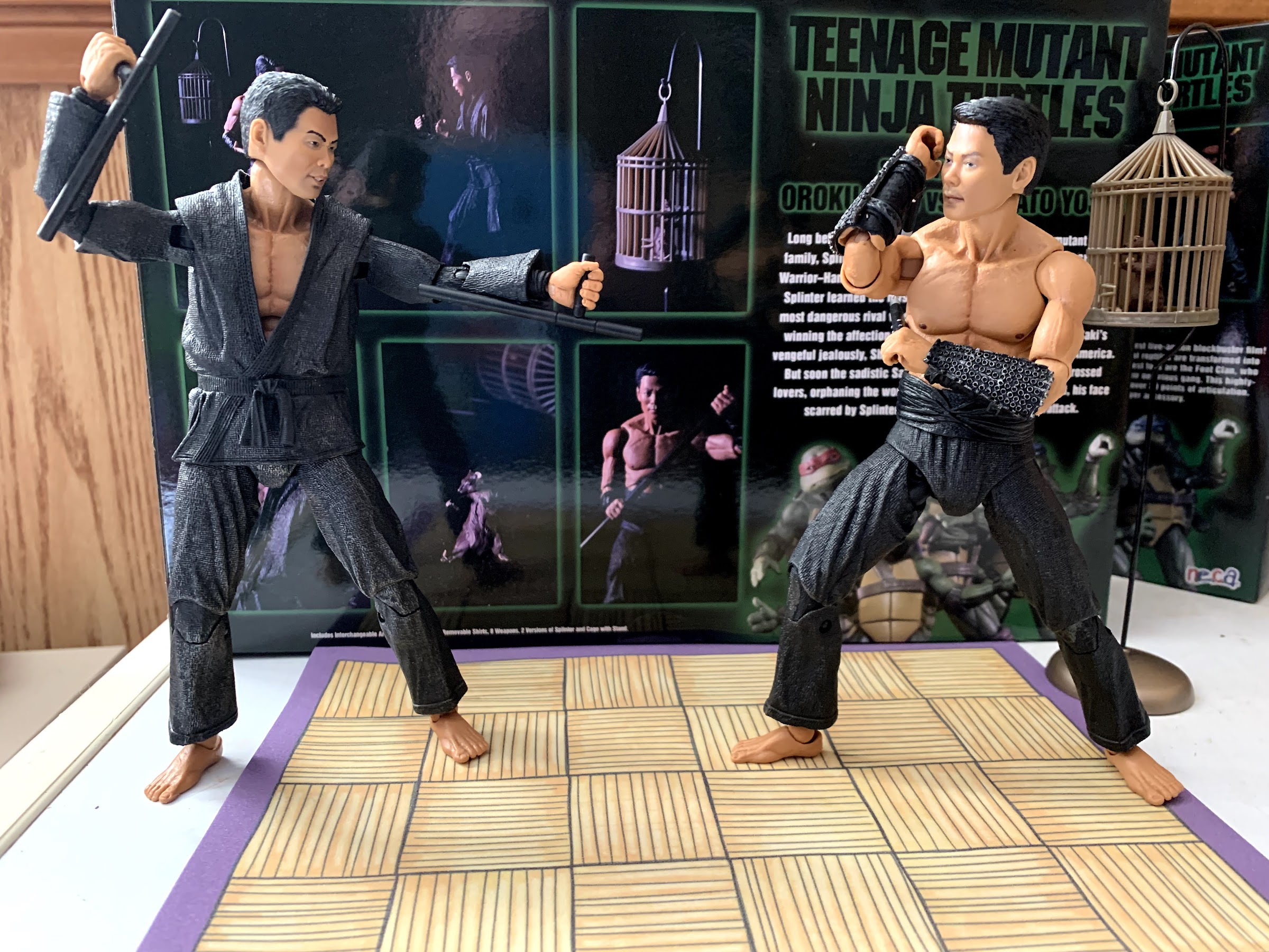
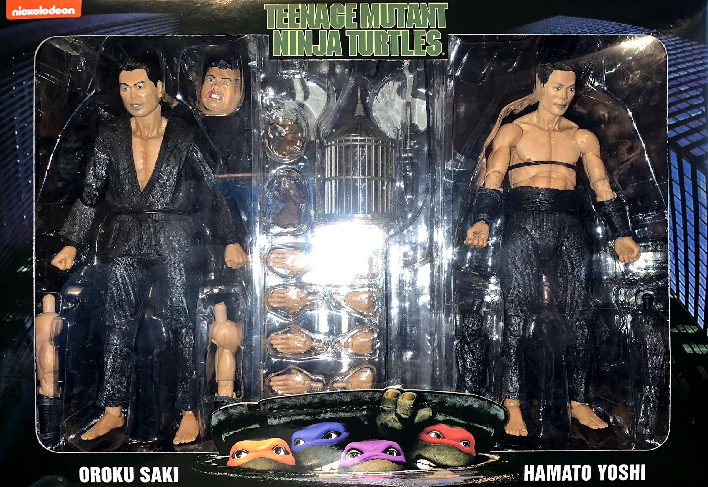
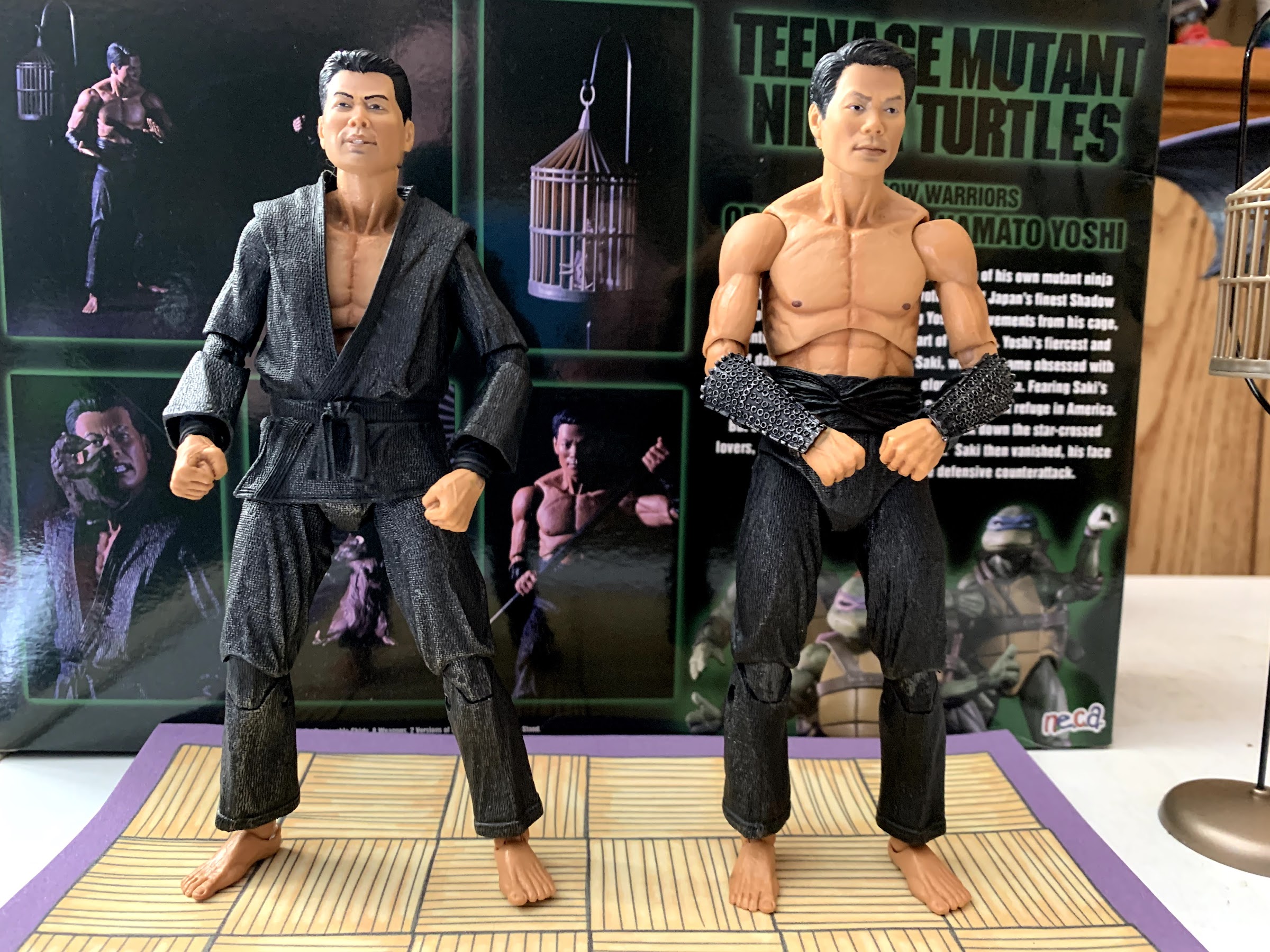
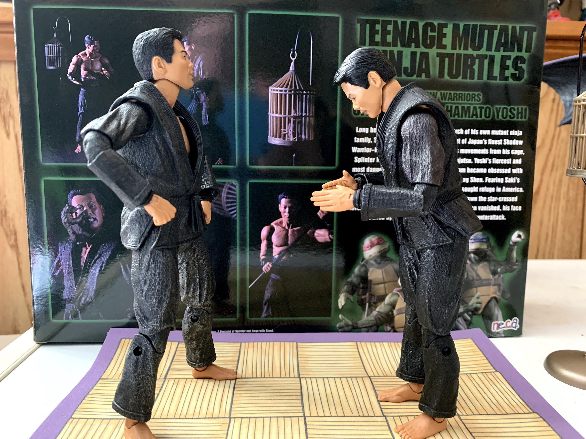
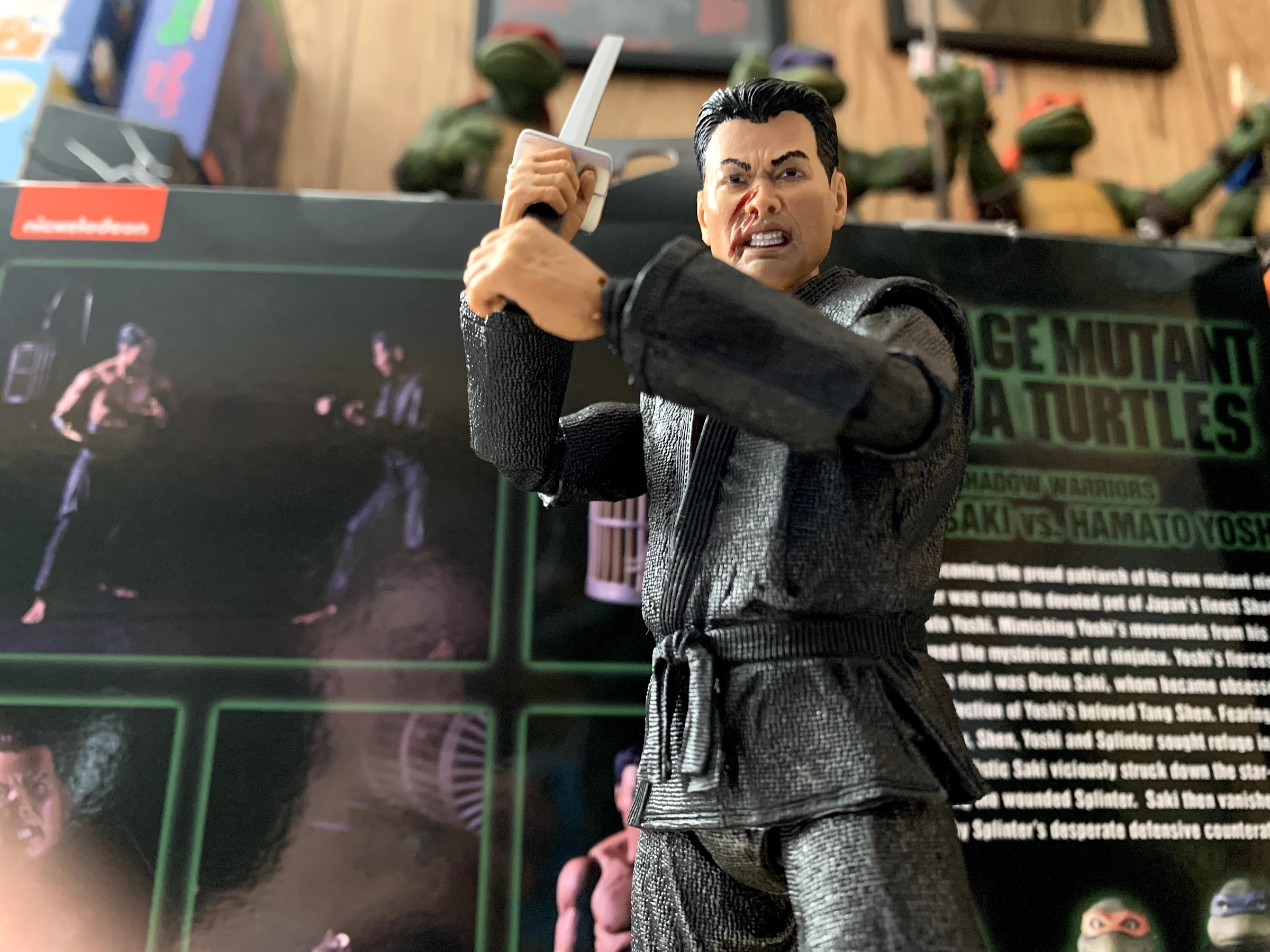
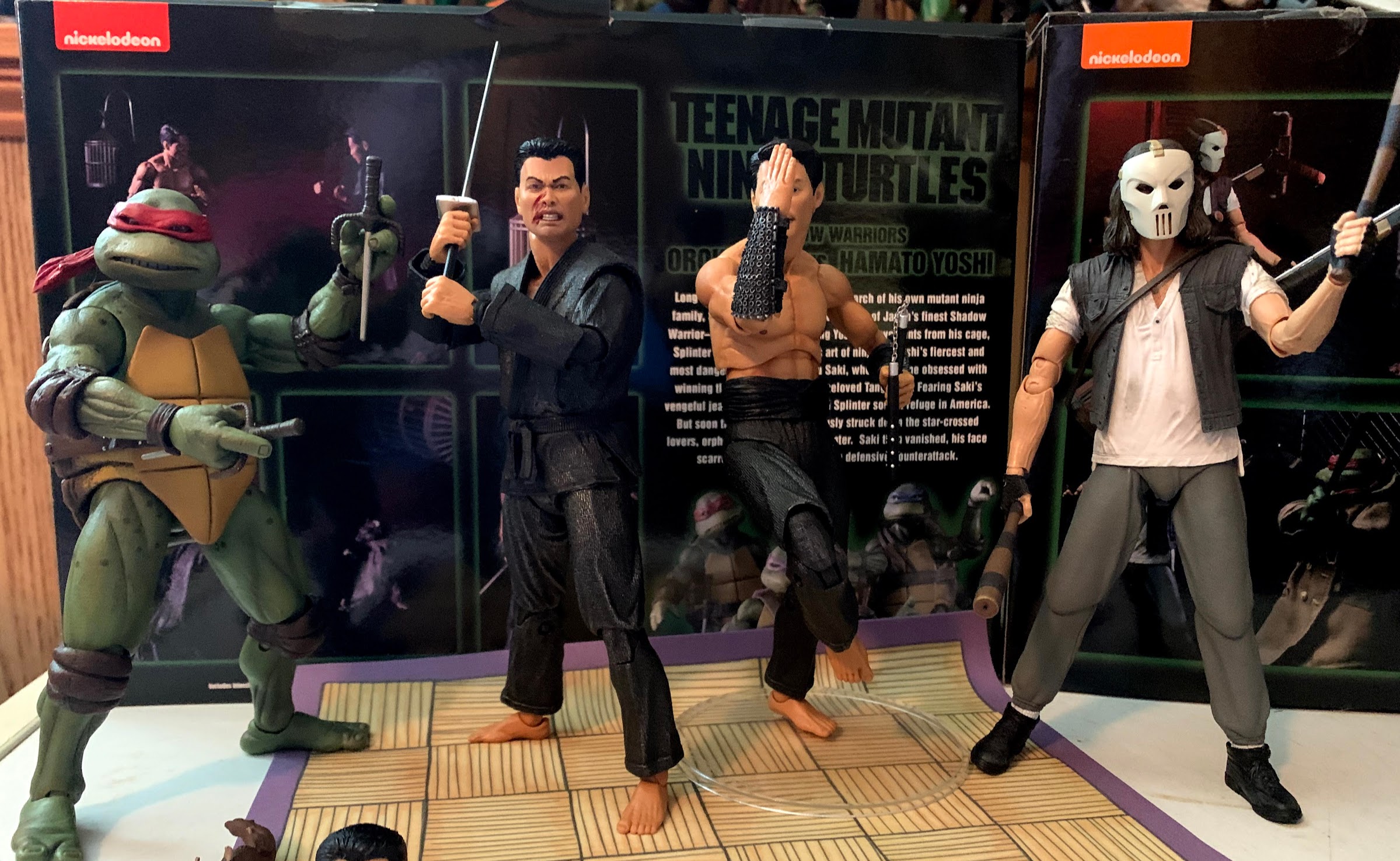
Given that, I suppose it’s not that surprising that NECA decided to turn the Shadow Warriors into their own two-pack. In the film, Master Splinter tells his origin to young Danny Pennington about his master, Hamato Yoshi, and describes him as one of Japan’s finest shadow warriors. Yoshi had a rival, Oroku Saki, who very much wanted to win the affections of Yoshi’s lover, Tang Shen. When it became apparent there would be blood, Yoshi and Shen fled to America, but Saki followed eventually murdering the lovers and taking Splinter’s ear for good measure. It’s a short scene in the film, but since we already have the turtles, Splinter, Shredder, Casey, and the Foot in toy form, why not give this a shot? And if some parts can be reused then all the better.
These two are essentially the same figure, which isn’t much different from the previously released Foot ninja.
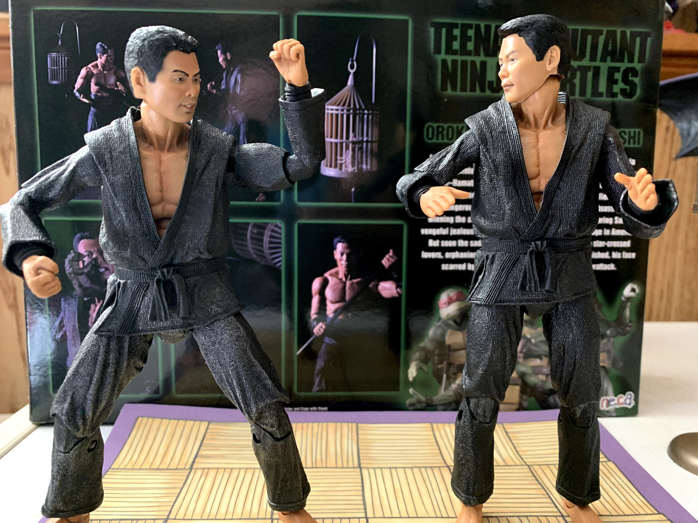
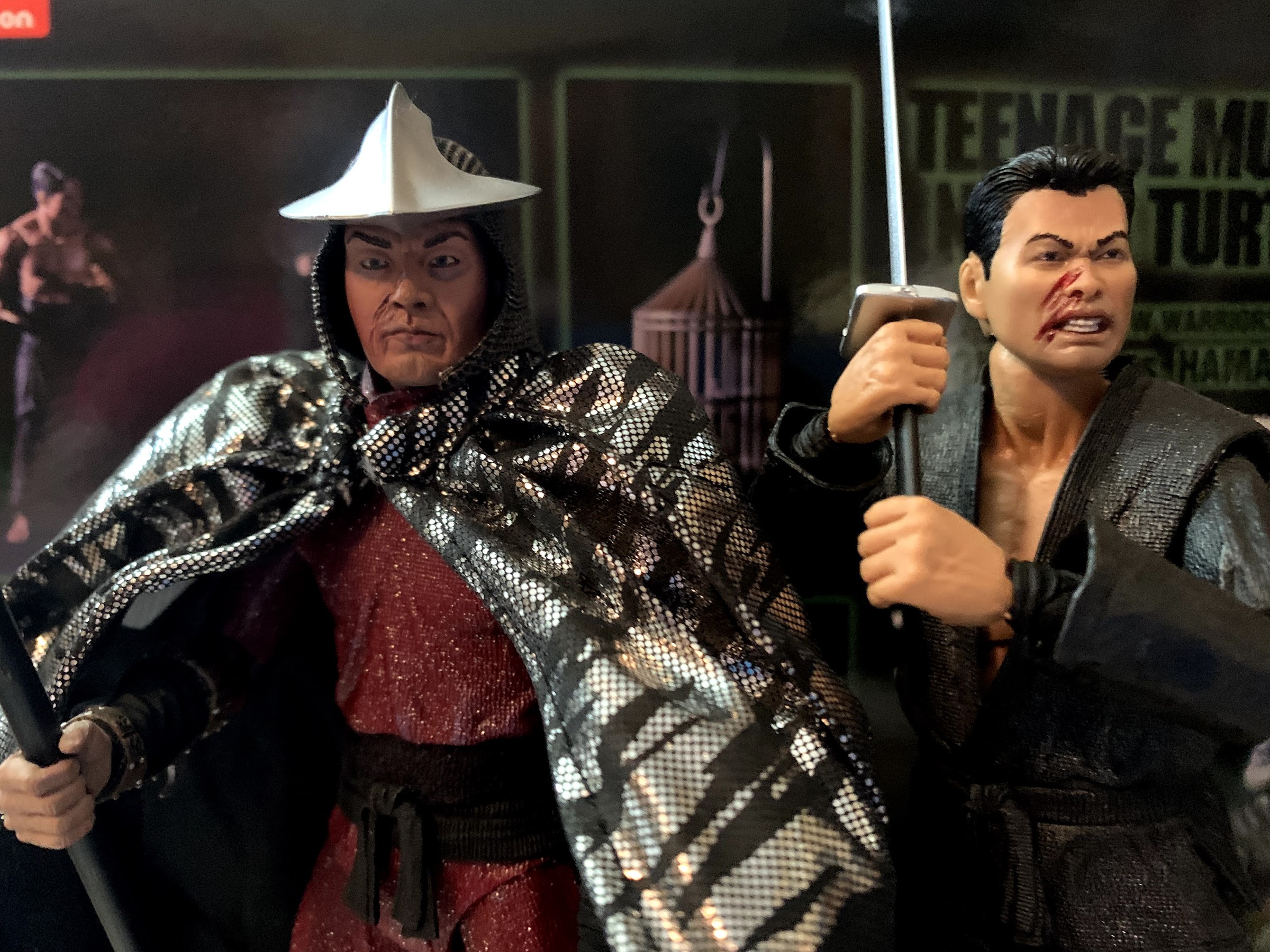
The Shadow Warriors two-pack is essentially a Hamato Yoshi vs Oroku Saki two-pack, with an unmutated Splinter as well. Saki and Yoshi are both depicted in their training gi, which is black with a slight shimmer to it. Some of these pieces are recycled from the Shredder and Foot we’ve already received, but a lot is new too. It’s just that both figures are essentially the same save for the headsculpt. Saki comes packaged with his robe on while Yoshi is bare-chested. Both are capable of being displayed the same way though as NECA made the robe removable as well as the arms so you can just swap them with the included extra bare arms or sleeved arms, even though each character was only depicted in the film as packaged, and not together. Yoshi is displayed as he was in the flashback when training alongside Splinter, while Saki is basically in murder mode. Yoshi’s face is rather stoic, while Saki’s default portrait has a faint hint of a smile.
If you want to, you can have both figures dressed the same. Note: Honor not included.
When it comes to both figures, there are things to like and things to dislike about the presentation. I do like the texture of the clothing and the folds give off the illusion of real cloth. The robe portion of the gi works well-enough, and if you want to go off-script they look pretty cool if you make them sleeveless. The faces look fine too, though it’s certainly helped by the fact that the scenes in the film are shot in near blackness with the audience really only getting a good look at Saki. James Saito played Shredder in the film, but it looks like a different actor played him for the flashback this set is based on and he went uncredited. The actor who played Yoshi also wasn’t even credited so I can’t even look up an image to see how the likeness turned out. At any rate, Saki as represented by this figure looks like Saito, but I wish NECA had done a better job with his smile. When we first see him spin and look at the camera he has a wicked grin. I think they tried to do it justice, but it doesn’t look as good as it does on camera. He has a second face that’s bloody and scratched and looks fine, though again, it’s not the expression I would have chosen. In the film, he sports more of a scowl as he slices off Splinter’s ear, but here he has gritted teeth and looks quite enraged.
I enjoy the “shimmer” of the gi.
But bare-chested is also a solid look.
The only other issues I have with the presentation of these figures is tied into the articulation. NECA made some interesting choices when it comes to the torso. The head is on a ball-peg, but the neck is static. Below that is a diaphragm joint with the cut right above the abs and along the rib cage. It looks odd, and what is unfortunate is that you get nothing out of it. The figures barely pivot and twist there and there is almost no ab crunch achieved. NECA apparently thought articulating the base of the neck would look bad, but didn’t think the torso did, but also didn’t make it functional. It’s just a poor design. The shoulders are a little funky too as they slope down quite a bit. I think they do this to make the articulation at the shoulders appear more seamless on a shirtless body, since they also did the same with Goliath. It also may have been done to make sure the gi isn’t too bulky, but again, it does make the figure look odd in some poses. The good news is, you can always use the robe and problem solved, but Yoshi never wore the robe in the film.
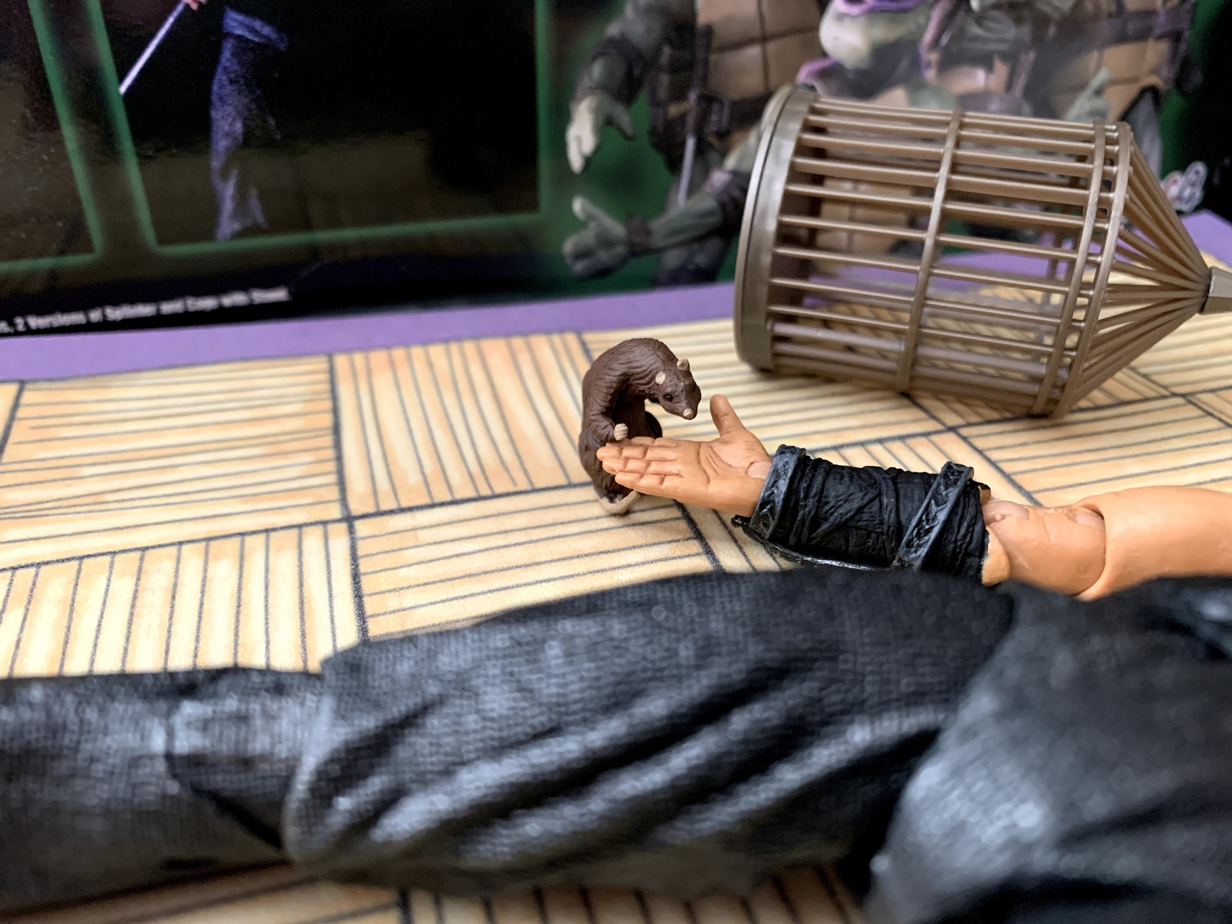
Just a man doing ninja stuff with his pet rat. Nothing to see here.
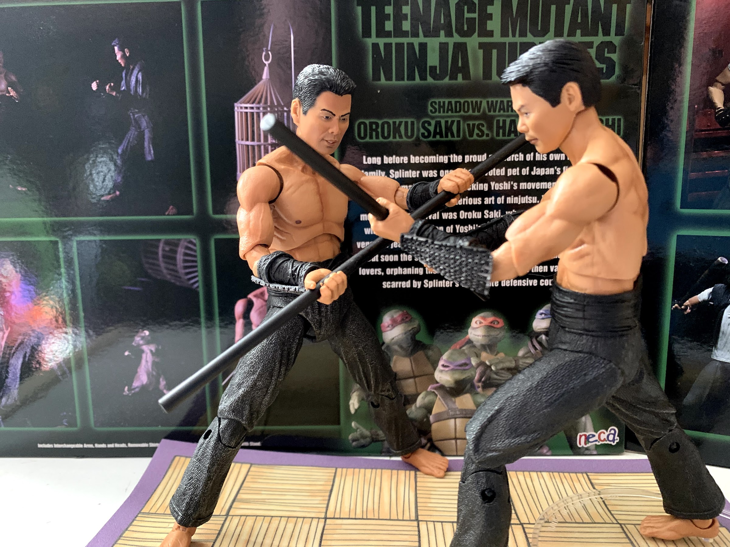
The rest of the articulation at least works fine. Those shoulders peg into the body so they’re easy to remove and they’re just hinged. There’s no biceps swivel, but the arms swivel above and below the elbow as NECA is using those controversial elbows here. These guys are more ripped than Casey Jones was, so I think the arms look better, but they’re still weird as you get this big, middle, piece when bending the elbows all the way. They are partially hidden by the wrist-guards on the bare arms, and obviously totally hidden by the sleeved ones. At the hands, we have rotation and horizontal hinges on every included hand. Since these guys come loaded with melee weapons, this strikes me as a huge oversight on NECA’s part to not include vertically hinged hands. The horizontal hinges on the gripping hands are borderline useless. At the waist is a twist and below that are the old styled hips. These are ratcheted and caution needs to be taken with them. I was able to get Yoshi into a high kick, but I was pretty scared in doing so as these hips are notoriously fragile. The thighs do rotate a bit and the knees are double-hinged with a swivel above them. At the feet we’ve got a hinge and ankle rocker, which works really well and is nice and tight. Unlike some of my complaints with the aesthetics of the upper body, I will say the legs look terrific and these may be the best sculpted pants I’ve seen NECA release.
It’s murder time!
Despite the lack of neck articulation and the poor abdominal joint, these guys are able to achieve some pretty convincing martial arts poses. You won’t have much luck getting them to balance on one foot or anything, but that’s what stands are for. Because of the lack of properly hinged hands, these arguably display better in hand-to-hand combat poses. They both come packaged sporting fists, and if you want to you can swap them for chop pose hands or gripping hands. The right fist that came on Yoshi in my set ended up with some paint rub on it from his vambrace, which sucks. The other set of hands are gripping hands and they’re very tight. I could not get most of the weapons into their hands without first softening the hands with hot water which is annoying, but oh well. NECA at least included each set of hands for both figures, so they don’t have to share gripping hands or anything like the SDCC set did with the Foot Soldiers.
Get him, boy!
Okay, that might have been a bad idea.
If hand-to-hand combat is not your preference, NECA did see fit to include a fairly large assortment of weapons. The weapons, though, should be rather familiar if you’ve purchased the other movie figures as they’re all duplicates. You get in this set a pair of axes, a pair of katana, a pair of black staves, a pair of black tonfa, black nunchaku, and studded nunchaku. The black nunchaku has a plastic chord connecting the handles so it’s more posable, but potentially more fragile, while the studded set features a short chain. Again, this feels like a set that exists because it was fairly cheap to produce so it’s not surprising to see recycled weapons. We only see Saki in the film wield the katana, so it’s hard to be disappointed with the selection. Again, my only disappointed rests in the difficulty in getting the weapons into the hands and the fact that we don’t have the right hinges for most of them. At least if you have the weapons rack you should have little trouble filling it now.
Only sadness, and a thirst for vengeance, remains.
The martial arts pose Splinter is cool, the other one looks like a poop.
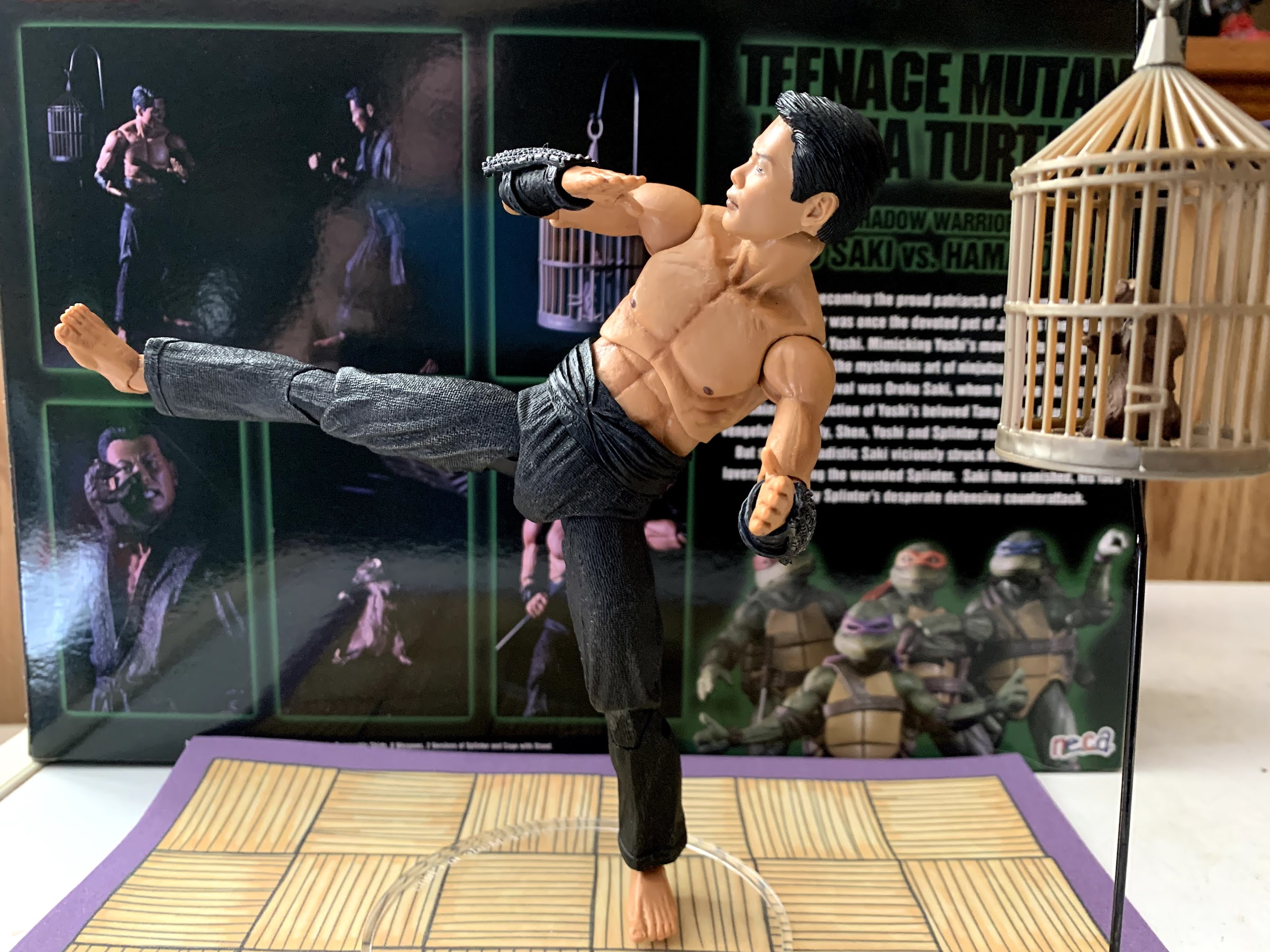
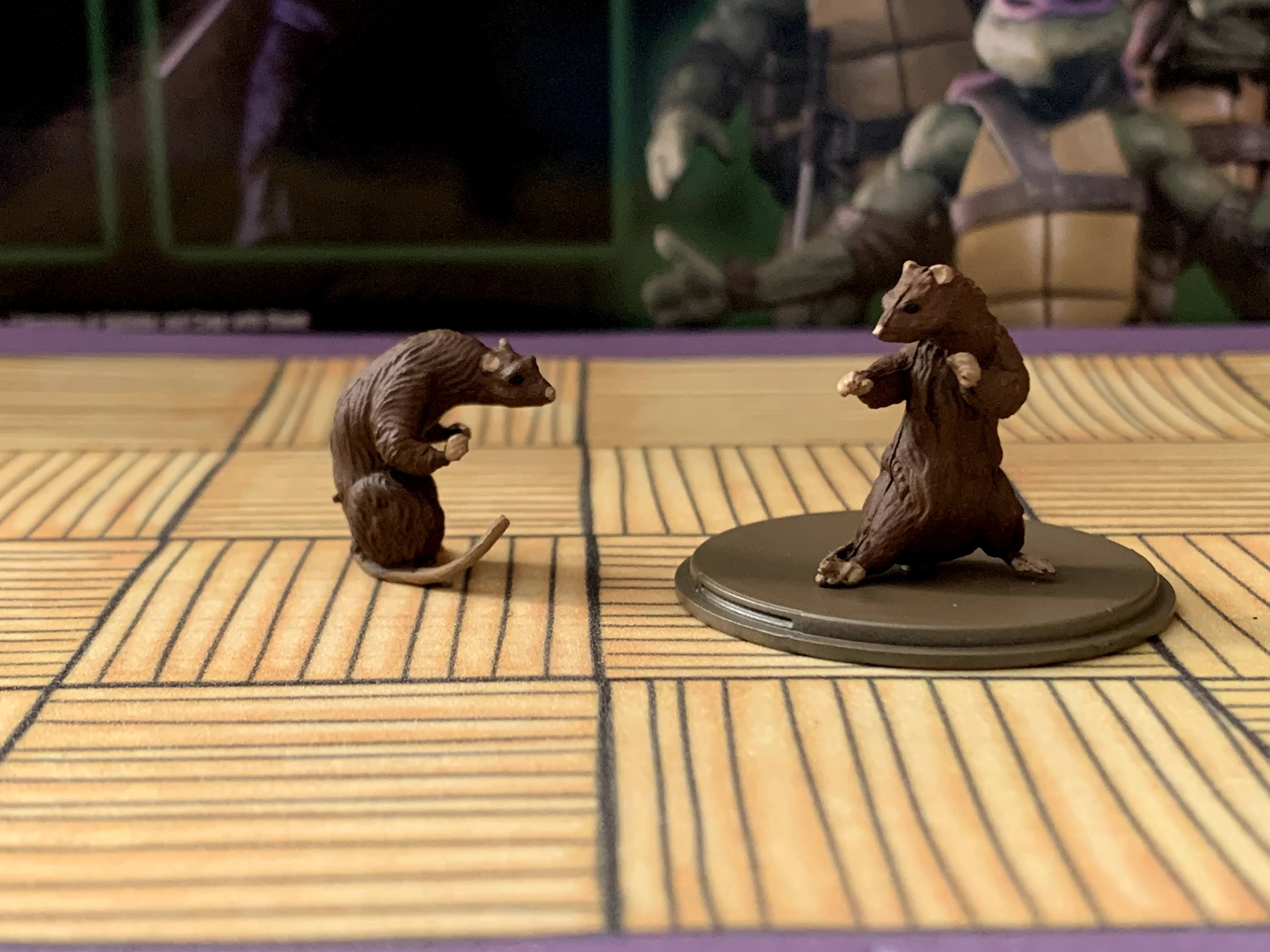
The other accessory is basically a third character: Splinter. And you get not just one Splinter, but two! That’s because this is pre-mutated Splinter so he’s just a little, unarticulated, sculpted lump of plastic. One Splinter is in a martial arts pose clearly inspired by the portion of the flashback, “Mimicking his movements from my cage,” which is a line my dad always repeated for some reason. Maybe because it was just so ludicrous, but the film plays it off so naturally. The other Splinter is a grieving Splinter after Saki slices off his ear and leaves him to mourn the death of his master. It’s rather odd looking as his body is just super long and definitely not the one I plan to display. Both rats have a peg hole in the base of them which allows them to peg into the base of a cage. The cage is done in a thin plastic and the bottom pops off rather than have an articulated door. It looks okay, but also rather cheap and I’m surprised NECA opted not to paint it. Maybe they feared the paint would just gum up between the bars? It does come with a stand though that the cage can be suspended from which is welcomed and even though it does look cheap, it might actually be my favorite part of the set. The only downside is NECA didn’t come up with a way for Splinter to easily get into scratching position on Saki. It can be done, but I wish they had included one more hand that was specifically for grabbing Splinter so that Saki could look like he’s trying to pull him off of his face.
I suppose we should do this.
The Shadow Warriors two-pack is a set that I didn’t need, and in fact, wasn’t actively seeking out. I happened across it at Walmart, the only retail location allowed to sell the movie line, and picked it up for a friend only to find out another friend found him a set that very same day. I ended up keeping it rather than trying to offload it onto someone else or return it, and I’m fine with the decision. These guys look pretty cool, they’re just characters I didn’t need for my display to feel complete. It’s also worth noting, we never saw Yoshi and Saki face off in the film as depicted here. When Saki actually attacks Hamato Yoshi he’s in a construction outfit. This set is capturing both characters independent of each other as Yoshi is really meant to tie-in with Splinter. Does this mean we’ll get a figure of Yoshi in overalls and a hardhat? Never say never, though I wouldn’t hold my breath.
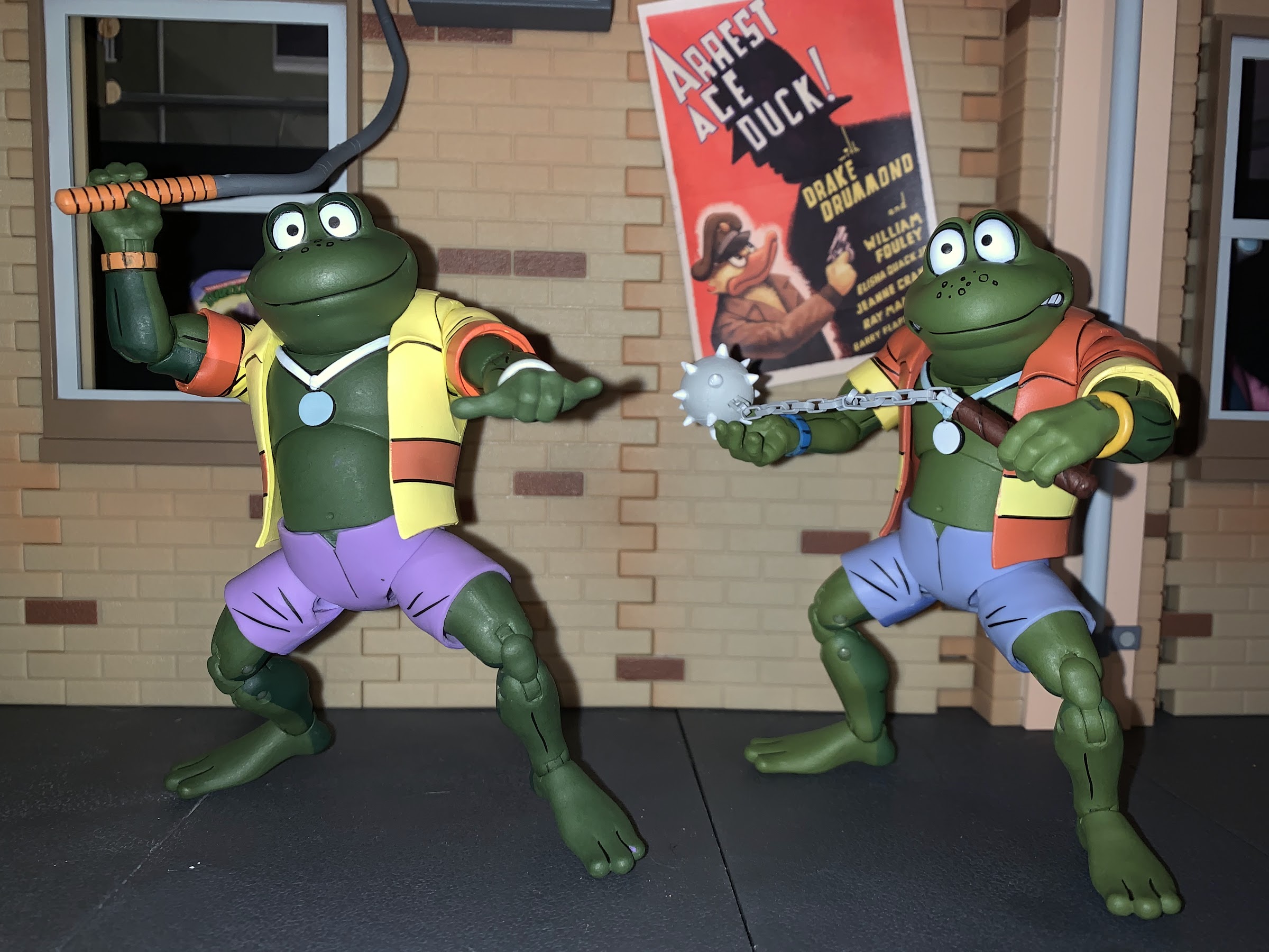
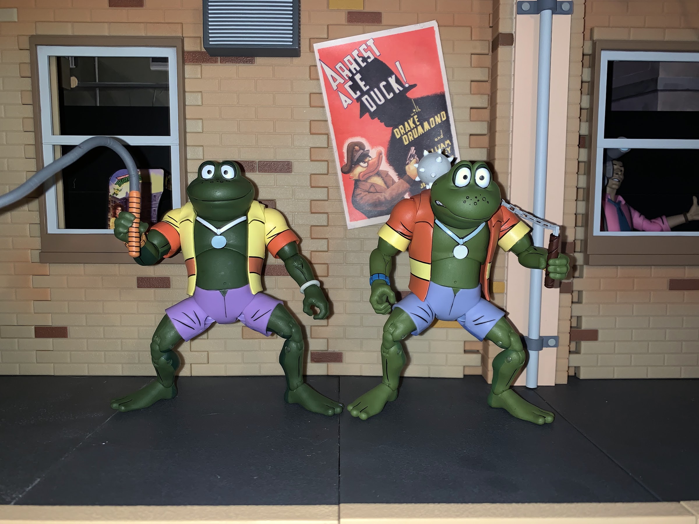
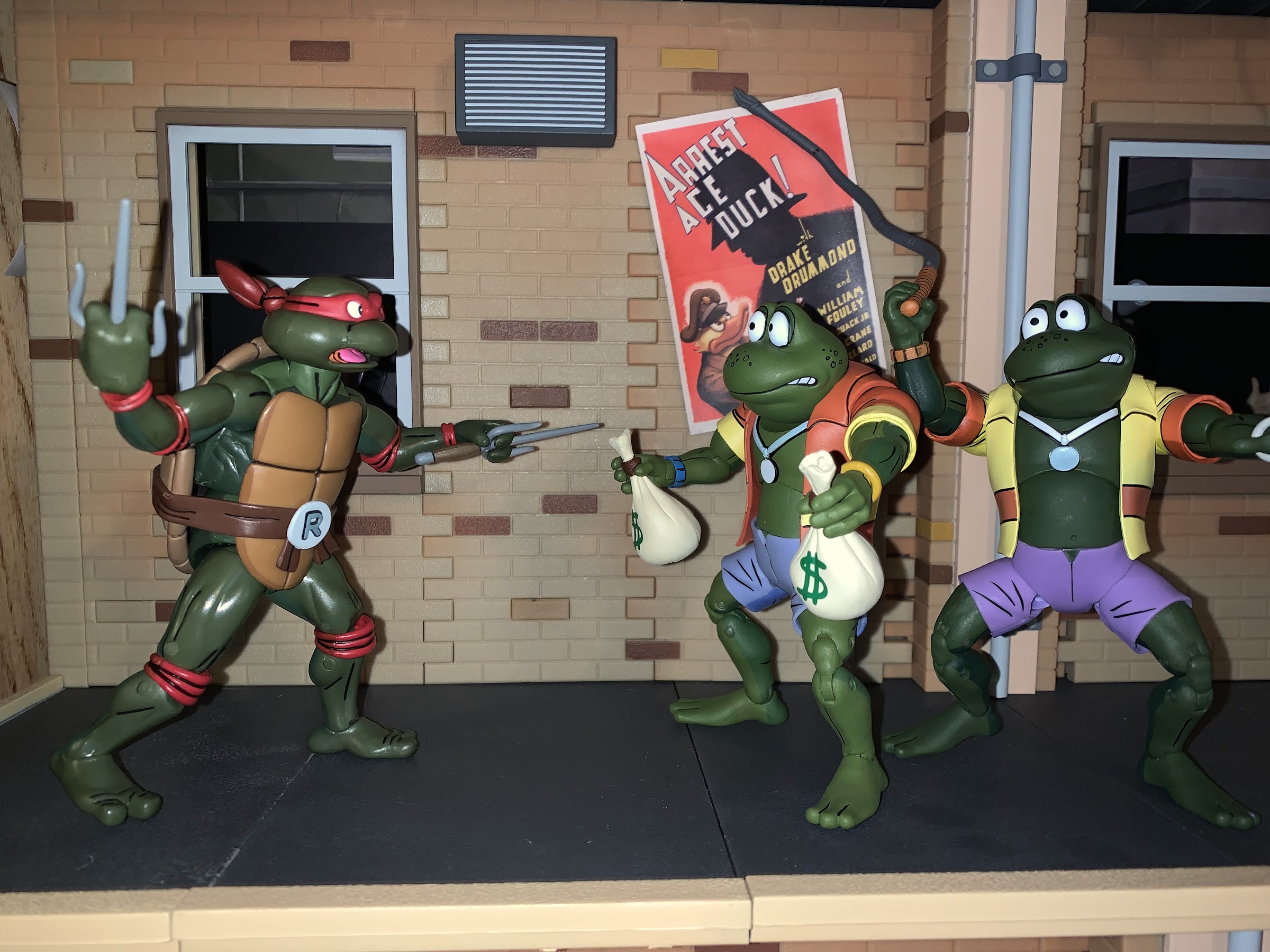
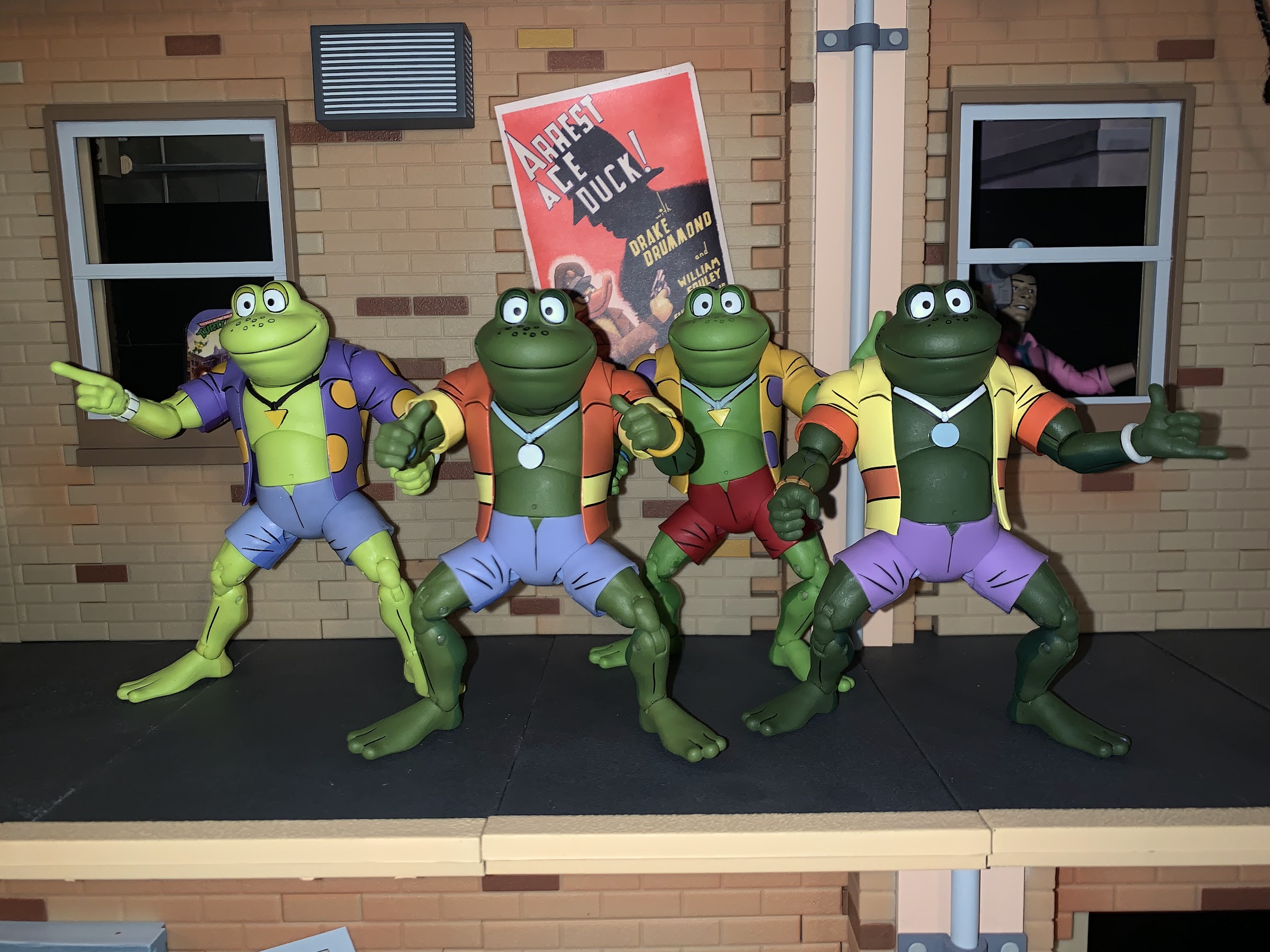
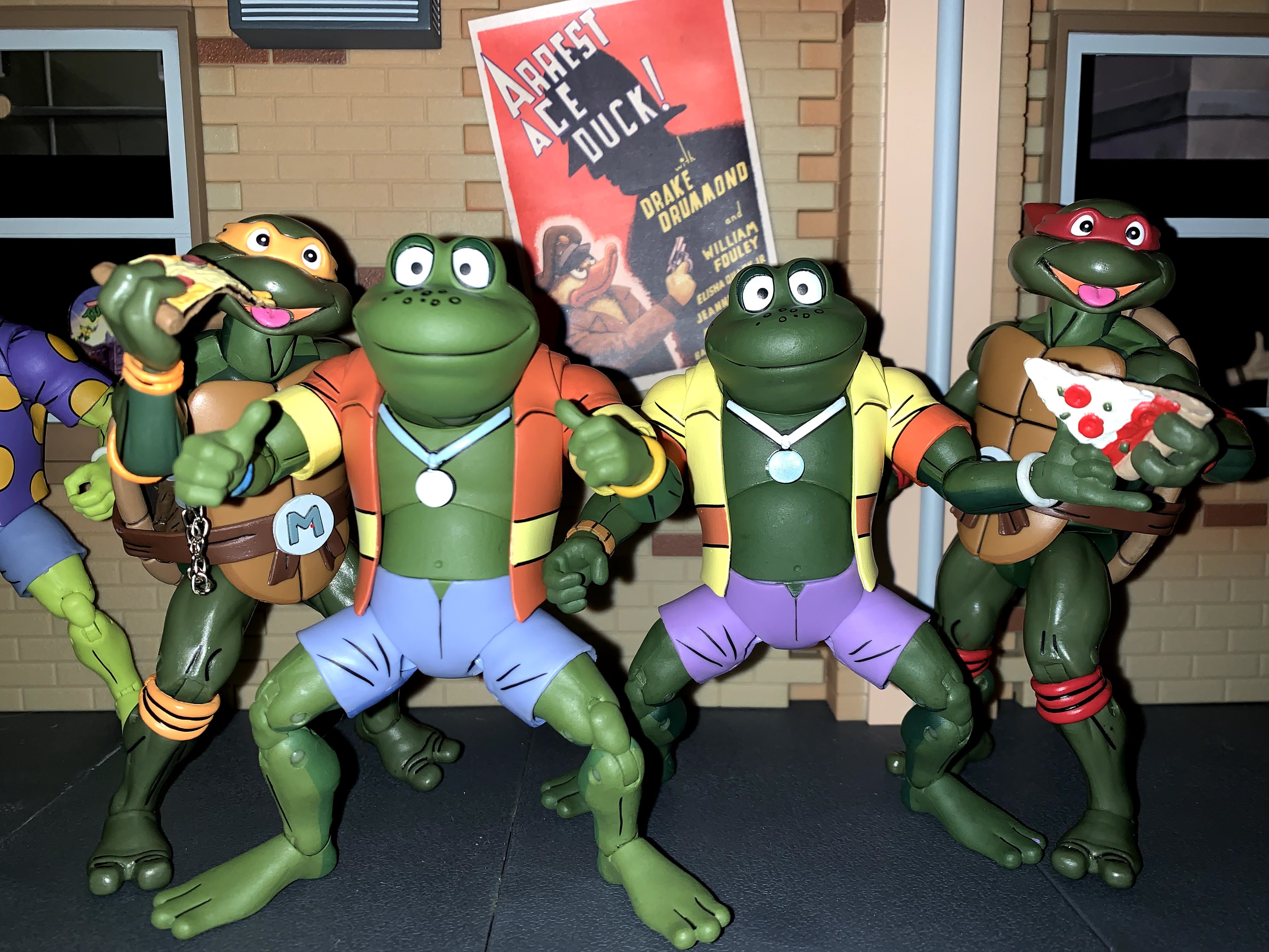
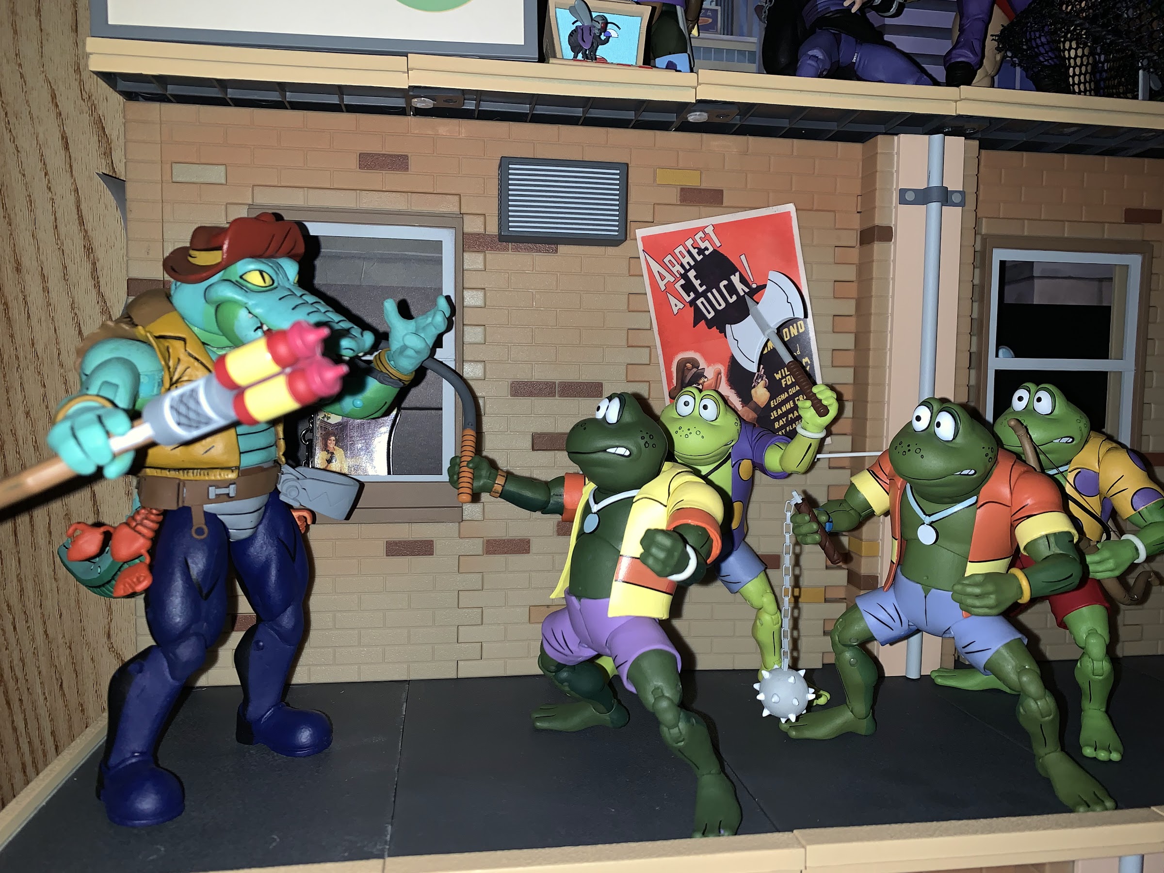
It took almost five months, but the Punk Frogs are now complete. NECA, recognizing that they were about to release the same sculpt four times, decided to space out the frog two-packs in its Teenage Mutant Ninja Turtles line of cartoon action figures. Genghis and Rasputin arrived back in May, while Napoleon and Attila started showing up in Target stores across the US about a week ago. NECA also made the new set available on its website for an in-stock sale, but if it’s anything like the first two-pack, it should be a fairly painless set to track down at retail.
No surprises with the packaging here, your standard turtle van inspired box.
When I reviewed the first two-pack, I was mostly satisfied, but not really blown away. In the months since I’ve grown a bit more dissatisfied with the set due to one flaw we’ll get to in the articulation portion of the review, and as a result I wasn’t really that excited to find this set at retail. I can’t just have two frogs though, so of course I bought it, and it’s mostly what I expected which is both good and bad.
Just like with the first set, the factory head is much easier to work with than the second one
If you have the first set, then this one offers no surprises. The frogs were all basically the same character model in the show with only minor differences. Each one was a different shade of green and the shirts they wore were distinguishable via the pattern on them. Two feature stripes, and two feature polka dots, and the colors are just the inverse of one another. They also have a different shape to the medallion on their necklace, and like the turtles, each features a different weapon of choice. The two prior frogs, Genghis and Rasputin, had polka dots on their shirts and triangular medallions. Napoleon and Attila feature stripes and a circular medallion. Napoleon’s dominant color is yellow with red-orange stripes while Attila has red-orange as his dominant color with yellow stripes. The stripes also aren’t too intense as it’s basically relegated to one large stripe around the abdomen and at the cuffs of the sleeves. Napoleon also has lilac colored shorts while Atilla’s are a more pale shade of blue. They both feature NECA’s toon shading which features light shades on the front and a darker paint on the back. The shirts are very understated, but it’s more pronounced on the skin and shorts. It’s fine, but after seeing the more elaborate Chrome Dome paint job this certainly feels a lot more “ho-hum.”
“We were setup! Honest!”
Adding to the visual display are the optional parts NECA included. Like the prior two frogs, Napoleon and Attila come with a pair of portraits: smiling and scared. It would have been nice if NECA could have offered different headsculpts with this release, or at least one unique one instead of the same two. They both work fine, the frogs often featured this dopey grin and the scared look works as well, it’s just a bit bland for a display. I assume most will display all four together and you’re not going to have two be happy and two scared as that wouldn’t make sense if you like to have some drama to your display and when they all look the same it’s just boring. I get it, as it keeps costs down, but it’s still something I can gripe about. As for the hands, that’s where NECA offered something unique. Each frog is packaged with standard gripping hands that hinge horizontally. Attila gets Rasputin’s recycled loose gripping hands which made sense for Rasputin’s bow, but doesn’t serve a tremendous purpose here. His unique hands though are thumb’s up hands while Napoleon gets the same fists as Genghis plus some “Hang Loose” hands. Since the cartoon decided to make the frogs all different shades of green, the hands really aren’t interchangeable like they are with the turtles, which is a bummer. That’s not NECA’s fault though.
“Who took this picture of us in our birthday suits?!”
Okay, I lied, NECA didn’t actually sculpt nude frogs to recreate that scene from the toon.
What is NECA’s fault though rests with the articulation on these guys. Again, if you have the prior set you know what you’re getting, but to run it down quickly these guys have: ball-jointed heads, ball-hinge shoulders, single-hinge elbows, elbow swivels, wrist swivels, wrist hinges, diaphragm joint, waist twist, ball hips, double-jointed knees, ankle hinges and rockers. Nothing was stuck on mine and the hinges are cast in the proper color so even though you’re likely to experience some paint flaking it won’t leave behind the eyesores some of the other figures possess. What isn’t good, are the wrists and hips. None of the included hands feature the proper hinge. Both frogs wield melee weapons, but don’t have vertical hinges. It really should have been the default choice for the gripping hands, but that wasn’t the case. And the other shortcoming concerns the looseness of the hips. I touched upon it in my review of the first two frogs, but those two only got worse over the months. Genghis is the only figure in my display to take a shelf dive this summer and it’s largely due to his hips just getting weaker. When you try to stand these guys, they have a tendency to want to do a split. It’s frustrating, and the problem persists here too. It can be easily remedied by the consumer, just pop the legs off (they come off fairly easily and the ball peg is quite durable) and apply a small coat of super glue. Wait for it to dry (I can’t stress the importance enough of that step) and then re-attach the legs and the added layer of glue should help to tighten things up. Should we have to do that as consumers? No, but at least the remedy is an easy one.
These frogs are nude though.
Something Playmates never gave us: all four frog together at last!
Napoleon and Attila have some unique accessories, and some familiar ones. Napoleon’s weapon of choice is a whip and NECA opted to cast it in rubber with a wire running through it like an old bendy figure. The end result is it functions, though it doesn’t look particularly great, especially the split ends on the whip. And with this weapon, the vertical hinges are really missed. Attila’s weapon is a spiked ball and chain flail. It’s not the same as what we saw with Android Krang as the ball is smaller and so are the chain links. Like those though, the chain is real which is cool, but obviously limits posing. The other accessories are two, un-mutated, frogs and two bags of loot. The loot sacks are the same as the one Mondo came with, only now they have a dollar sign painted on them. The only new item is the photo album they come with. It has three pictures inside and all are of NECA action figures. One is all four frogs, one is Rocksteady and a turtle, and the third is Bebop and I think Slash? It’s a cute accessory though and I’m largely okay with what we have here. I do wish we could have received a second version of each weapon, a frozen in place flail and the same for the whip with a more finely-sculpted end.
Unlike turtles, these frogs are not known to eat pizza.
It’s four against one, and yet I still like Leatherhead’s chances.
If you buy this set then you know what you’re getting, assuming you have the first one. The figures look good, but are limited in terms of their expressions and ability to properly wield their weapons. They’re held back further by the looseness in the hips which is going to vary from set-to-set. I assume the best-case scenario is they’re just loose, but tolerable, where as I know some have frogs that basically can’t stand without some modification or assistance. The only other difference this set has with its predecessor is in the price. It would appear the two-packs are getting a slight markup at Target as this one cost me $55 as opposed to the usual $52. I honestly didn’t even notice until someone else pointed it out and had to check my receipt for confirmation. Sure, I don’t like paying more for what is essentially the same set as what I got five months ago, but I also get it. The shipping industry has gone bananas and we’re setting new records on a weekly basis for the amount of container ships stranded at sea because there’s no room at the ports. It’s just something we’re going to have to deal with over the coming months because it’s costing companies like NECA more money to deliver product to us, so naturally, some of those cost increases are coming our way. As for what’s next for this line, I’m actually not sure. I think the next two-pack to come to retail is supposed to be Groundchuck and Dirt Bag, but it could also be any one of the solicited two-packs NECA sold through its store earlier this spring or even the Pizza Monster deluxe figure. With the state of the industry as it is, there’s really no telling when stuff will arrive, but I don’t think this is it for the line for 2021. And if the next release is that Groundchuck and Dirt Bag set, it figures to be a lot more exciting than this one.
It was nearly 6 months ago that NECA unveiled one of its newest licenses for 2021: Gargoyles! I was incredibly pumped at the time to see that NECA had acquired Gargoyles because the license had so much potential. The show was basically a cult hit in the 90s often characterized as Disney’s answer to Batman: The Animated Series, but Gargoyles truly was its own thing. Rooted in Shakespearian lore with a fantastic backstory, the time-displaced clan of mythical creatures found themselves the protectors of New York City from enemies both current and from the past. And if you’re going to start a line of action figures based on Gargoyles, well, who else are you going to start with other than Goliath?
When NECA unveiled the license acquisition they showed off Goliath with it. The midnight post on Twitter showcased the fearsome creature and the direction the line would head. He was available to preorder the next day with a July release date attached, which slipped to August, to September. That’s 2021 for you, but after a really not so long wait all things considered, I’ve finally managed to secure a Goliath action figure from my local Target.
He lives again!
Goliath is a big boy and he comes in a big box. The Ultimates styled packaging from NECA is bigger than even the Chrome Dome box. It has less to do with the figure’s height and everything to do with those wings. The front of the box features some artwork of Goliath which I believe is stock as it looks rather familiar while product shots can be found on the back and interior. The back also has a bio of the series that surprisingly is not the same as the narration from Keith David that was attached to the second season’s intro, though it’s in the same vein.
That’s a lot of man…stone beef.
The packaging is fine, but what I’m after is that figure inside. Freeing Goliath from his confines is rather painless as there is not an abundance of ties on him. Once out he’ll need to have his tail and wings attached. Figuring out how tall he is isn’t straight-forward since gargoyles have unique lower, leg, anatomy. With his knees bent in his natural standing posture he’s about seven and a half inches tall. His anatomy is sculpted in a more realistic manner than the cartoon. His flesh features veins and thick muscles. It’s cast in a very light shade of purple, almost gray, with a darker purple paint wash over it to really bring out the musculature. The wash is used more liberally on the face to darken around the eyes and lips. His default expression is a stern one with visible pupils that definitely reads as “Goliath.” The belt and loincloth he wears are cast in a soft plastic so they’re quite flexible. The only place the wash isn’t visible is on the tail which is done in a rubber material so that it can bend. It looks rather plain in comparison to the rest of the figure, but it’s always going to be behind him so it’s not something I take issue with. The finer painted details, like the eyes and claws, are all clean. Overall, this is a striking figure in-hand.
I think most will be happy with the scale here.
The wings can go really wide, or really deep, with nothing in between.
Let’s talk about those wings though, for a second. They’re huge! They measure 20.5″ from tip to tip when spread out so this guy will need a big shelf. They’re made of a very rigid plastic, likely ABS, and painted purple and black. The membrane inside the wings is well-sculpted and the detail shows in natural light. Even though the plastic is a bit lighter than some others, they still add considerable weight to the figure and, combine that with their size, will just be a constant battle when posing the figure. In terms of making wings that look good, I’m not sure NECA could have done much better. Bendy wings would have probably too resembled one of those Halloween store rubber bats, and fabric wings would have clashed with the looks of the rest of the figure. What people will miss with these though, is just an alternative. They’re great for dramatic posing, but not for casual or even hand-to-hand combat poses. Goliath could use some partially folded wings, though what I see most requested are the folded, “cape,” styled wings the character would often sport with the two claws at the peak of the wings crossed under his chin and clasped together. NECA likely knows this, but didn’t want to jack up the cost too high on a new IP. Hopefully, something like that follows in the future, and when it does, may I suggest they use the same material that they used for the cape on Shadow Master Super Shredder?
Disc stands help with posing.
Okay, wing talk is complete, for now, so let’s talk articulation. Goliath’s head sits on a ball-peg. It’s not a particularly large ball though, and he doesn’t have articulation at the base of the neck. Combine that with his long, sculpted, hair and wings and you end up with a head that can’t do much. He can look forward and straight down okay and there’s a little tilt too. Rotation is a challenge due to the hair which will interfere with the wings, but if you work at it you can get him to look to either side. It just may require removing a wing, turning the head, and reinserting it. At the shoulder we have ball-hinges and he can almost raise his arms to a horizontal position. The shape, and slope, of his shoulders prevents him from raising his arms out to the side any higher, but he can rotate forward and back just fine. Past that is the biceps swivel and double-jointed elbows which all work fine. The hands peg in and feature hinges, though the right hand on my figure is very loose. The hand hasn’t fallen out, but it takes minimal effort to do so. In the diaphragm is a ball-joint that gives the figure some tilt and rotation. He can even crunch forward a decent amount. There’s a waist twist below that and the new styled double-ball leg joints sit below that.
He can make a scary fist.
In the legs, things get interesting. Goliath has the usual thigh twist, but below that is a single-hinged knee. It can bend back to about 90 degrees, but it can also swivel. It looks to just peg in to the thigh, and I like how the knee cap is sculpted over it. At the ankle, we get the usual hinge and rocker and then beyond that is a toe hinge. Gargoyles have interesting anatomy in that they basically stand on their toes. There’s some slight twist, or rocker, action to the toes, but I can’t tell if that’s intentional or just some play in the joint. They need to be tight though, and they pretty much are, though nothing was overtight on my figure. At the tail, there’s a peg and a hinge so you can move that thing all over the place. It can kind of help with getting the figure to stand, though it’s not really strong enough to help out as much as I’d like. The wings peg into the figure’s back and they’re actually hidden a bit by the hair, which is nice. They can rotate and also feature a hinge that’s ratcheted. It makes an awfully scary noise when positioning it, but they seem fine. Because they’re wide open, there isn’t a whole lot of versatility to them, but at least you have some options, particularly if you go with a flying pose.
If you prefer, you can have your Goliath be studious.
Achieving such a pose though has proven to be a challenge. Standing Goliath is not easy. There’s just enough looseness to his thighs and knees that the weight of his wings pulls him back and the tail doesn’t help out much. I did have some success using two NECA disc stands as each foot has a peg hole. What I hoped to use though was a flight stand. I only have tried two, a SHF stand and a NECA one, and neither worked. The SHF stand features a crotch piece which just doesn’t fit Goliath while the NECA one was rather frustrating because there’s very little range in the actual “grabber” piece. I at least got him into that one, but he looked stupid. What I didn’t try was the stand that came with the video game Baxter, but since Goliath can’t look straight ahead for a true flying pose (technically, gliding, as Goliath would remind me) I didn’t bother. I have a MAFEX stand and a Bring Arts one, but I feel both won’t be able to handle the weight. I’ll have to look elsewhere for something that works, or hang the figure from the ceiling with fishing line or something.
Clearly, the book is a prop to make him look smart because no one is reading that.
Goliath, likely owing to his size and NECA’s desire to keep the price down as much as possible, comes with just a handful of accessories. He comes packaged with two, open, style-posed hands that he can swap for fists. There’s also another left hand that’s more of a gripping hand which works well for his included book. There’s no title on the book, but it appears to match the one he read on werewolves from the series. He also has a jalapeno pepper, which is basically an in-joke for fans. Lastly, there’s a second head. When I first saw this figure unveiled, I figured NECA would go with a faceplate system to change expressions, but he actually has a whole, new, head. The hair is the same, but the face is a more fearsome, yelling, expression with blank eyes. I think, given the limited wing options, I’ll display Goliath with this face instead of the calm one, but both look great. The alternate head is well-painted and well-sculpted with each individual tooth brought out.
Snack time!
The accessory count is low, but Goliath isn’t really a character screaming for a lot of accessories. The optional left hand works just fine with the included book and pepper and he can be positioned with it in a fairly convincing manner, should you wish. He’s a bit limited in terms of more fearsome posing. Take the picture on the front of the box, that crouched pose isn’t really one he can do. He also can’t do the on-all-fours pose the gargoyles sometimes assume in the show. At the very least, he would need some neck articulation to pull that off. This isn’t terribly surprising though as NECA always prioritizes the aesthetics of their figures over posing. And I’m largely in agreement with that approach, though I do think they can do better here. I would like to see them figure out how to get a true gliding pose as well. They could possibly do so with neck articulation, or with different hair-shapes or even a hinge in the hair.
I look forward to getting some friends for this guy, and some foes.
Goliath is a good first effort from NECA for Gargoyles. I don’t think he’s quite the homerun that I had hoped he would be, but I think some of that will be addressed in time. The limited wings makes him feel like he’s not really an “Ultimate” edition of the character, but if I’m right and that’s a product of NECA keeping costs down, then maybe that will change in the future. NECA indicated the response to Goliath was beyond their expectations so the fanbase is there and I’m willing to bet its willing to spend a bit more to get more. The only real issue is, with costs soaring across the industry, will NECA be comfortable charging $40 or $50 for a figure in this line? That remains to be seen. For now, we’ve only seen the next two releases: Demona and Thailog. Both appear to have one set of wings so it may be awhile before we see something else. Finding a home for this line is going to be a challenge, but it’s a challenge I’m ready to welcome. I’m all-in on Gargoyles, so NECA, keep ’em coming!
The wait was a bit longer than originally anticipated, but the fourth issue of the Teenage Mutant Ninja Turtles flash-forward story The Last Ronin has arrived. If you are not familiar with this story, The Last Ronin was a concept first kicked around by TMNT co-creators Kevin Eastman and Peter Laird back in the late 80s/early 90s about a final story for the turtles. One, last, ronin, makes a final stand against the Foot with the memory of his family burning in his heart. It’s in some ways a parallel to the original story where the turtles set out to kill the Shredder to avenge their master, only their master was still alive. With the success of films like Logan and their comic counterparts, it made sense for the creative team to adapt this story now especially after Waltz and Eastman concluded their run on the main comic.
The first issue of The Last Ronin told the story of the last ninja turtle. The unnamed ronin infiltrated New York City, now under the control of the Foot Clan, on a suicide mission to avenge his family. The final panel reveals who the identity of this character is, and in my reviews of each so far I’ve not revealed that spoiler so I don’t plan to now. We’ll just call him Ronin. It almost doesn’t matter anyway as this turtle is like an amalgamation of all four as he wields all of their weapons (and then some) and has become consumed by his quest for vengeance. All trace of his normal personality is basically gone. Since that issue though, the following two took place in both the present (which is the future) and the past and showed how one of the turtles met his end. As a result, not a whole lot of plot has moved forward in the present timeline.
Issue #4, subtitled titled “Blood in Snow,” has what feels like a shorter flashback to reveal the fate of the final turtle and moves things forward in the present timeline far more than the others. When I read issue #2, I actually found it a bit challenging because it basically bothered me to see one of my childhood heroes fall. Issue #3 surprised me in that I didn’t get the same feeling, and as a result, it disappointed me a bit. Issue #4 is more of the same. It’s not that I expect these to be gratuitous in their depiction of death and violence, it just doesn’t do much to tug on the heart strings. There was a lot of room especially in this issue for some tragic drama, but the writers and artists chose not to lean into it giving the flashback more of a procedural feeling than an emotional arc.
Let’s not do this.
The plot that takes place in the present is, unfortunately, no better. It’s very cliché with its plotting. One moment had me rolling my eyes as our Ronin has taken on a protégé. In this issue, the characters are assaulting a fortress that is a key to breaking into the main Foot headquarters and Ronin goes ahead telling his pupil not to follow. Of course, he gets into some trouble and his protégé does indeed make the save leading to this exchange:
Ronin: I thought I told you to stay put!
Protégé: You did. I didn’t.
Ronin: Terrible discipline, excellent initiative. DON’T do it again!
How many times has such an exchange taken place in movies and comics? The characters also just march along with not much of a climax. There’s a villain from the past at the end, but the villain receives no development and is entirely dependent on the reader just being familiar with them. And the showdown really doesn’t land. I get the sense that more energy has been put into telling the story of how the turtles were defeated with little regard for this current timeline. We don’t even know how New York ended up in such a state, you would think the US government would have some issues with it, but I can at least understand the creative team not wanting to tell that story. What is unfortunate is that their main story just lacks drama and excitement. I fully expect the next issue will just feature Ronin leading a last ditch attack on the tower where the leader of the Foot waits. All or most of his allies will fall, but it will end with the two facing off at the top of the tower with likely both falling. And I’m not saying that can’t work as an outline, but they really need to land on some of the bigger moments to make it work.
The future stuff looks good, but I found myself really enjoying the setting of the flashback portion.
What hasn’t been a letdown though is the artwork. The Escorza brothers handle the majority of the work and they continue to do a good job. There’s plenty of good action panels and they really do a terrific job with the flashback sequence which features some characters in rather resplendent armor. Eastman does contribute 4 pages as well and continues to handle the portions where the Ronin character narrates his own flashback. His pages are done in black and white and feature his own, unique, artwork. For fans of the original Mirage line, these panels are a delightful throwback. A novelty, but a fun one. Newer readers might see them as weaker since Eastman’s art is not and has never been as polished as many of his professional peers, but that was part of the TMNT charm back in the day. And it was good enough to make him quite wealthy.
I’m guessing we’re not quite done with flashbacks as we need some Eastman art in Issue #5.
The trajectory for The Last Ronin appears clear with issue #4 concluded. With only one issue left in the mini series, and the flashbacks seemingly complete, we’re ready to see this revenge story come to its conclusion. I do feel like The Last Ronin began with tremendous momentum and spark, but each issue to follow has been weaker than the one preceding it. I’m hopeful they’ll rebound and stick the landing. It’s possible the story just wasn’t necessarily big enough for five issues and maybe that’s the problem, but we’ll see. I don’t expect Alan Moore writing or anything from Teenage Mutant Ninja Turtles, but it could definitely be better. As such, I began this series giving it a strong recommend, but at this point I might suggest to newcomers to wait for the trade paperback edition at this point. We’re also in for a bit of a wait, it would seem. Issue #4 was delayed about a month and the fifth and final issue has yet to be solicited by the publisher. That means it’s probably slipped to 2022 at this point. This year has been one of delays so I’m not surprised by any at this point. Hopefully the extra time allows the team to do something special. I want this story to succeed, and I am eager to see how it concludes.