Today, X-Men ’97 dropped the curtain on its first season and what a way to bring it to an end. Last week’s episode was a roller coaster of emotions for me. I couldn’t go into much detail of my review of “Tolerance is Extinction – Part 2” without wading into spoiler territory, so allow me to indulge myself before we get to this week’s episode. When one thinks of childhood trauma baked into media, the death of Bambi’s mom is probably the most often cited. If you’re an 80’s kid it might be the death of Optimus Prime in the first Transformers movie or the death of Littlefoot’s mother in The Land Before Time. The 90s kid has Mufasa while the comic book readers like me have X-Men #25. No one truly died in that issue, but it’s the infamous issue where Magneto decides he’s had enough of Wolverine and uses his magnetic powers to rip the metal off of his bones and force it through his pores and open wounds. It’s all anyone wanted to talk about concerning X-Men when it happened and it changed the character of Wolverine in a big way. Like basically all things in comics, Wolverine eventually regained his awesome adamantium skeleton, but it took a surprising amount of years for that to happen.

Despite being one of the most singular, powerful, moments in X-Men history, that confrontation with Magneto has really just been confined to the page. The original X-Men animated series had just kicked-off its second season when it happened, but never touched it during the rest of its run. I remember feeling anxious during the Asteroid M episodes, “Sanctuary,” out of fear it might happen, but Wolverine escaped that arc unscathed. I remember my friend jumping in his seat when we saw the first X-Men movie in theaters when Magneto lifts Wolverine up on the train and asks “Does that remarkable metal run all through your body?” He thought, and I too, that Magneto might give a tug in that moment and I certainly thought it could be him laying the groundwork for a future confrontation that never arrived. Other animated efforts and movies that followed never did go to that well, but in its ninth episode X-Men ’97 did.

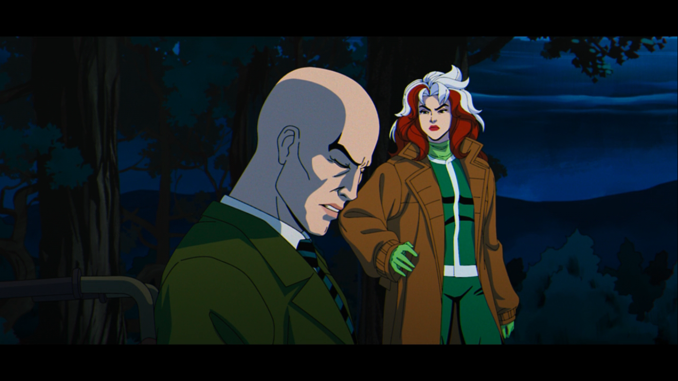
When Magneto emerged from Bastion’s imprisonment in the eighth episode and used his magnetic powers to attack the whole planet’s electrical grid is when I first felt X-Men #25 was on the table. It was similar to his attack to open that issue on the planet’s satellite defense system which knocked out power all across the globe. Even though much of the events of last week’s episode were mirroring the events of New X-Men from 2001, there was always the possibility of multiple plotlines converging. As I said in my review of last week’s episode, that “Greatest Hits” approach the original series and this one is able to take is part of what makes it so successful. When it was Wolverine who was tabbed to deliver the opening, “Previously…on X-Men,” line I pretty much knew what we were in for. It became even more obvious when Rogue basically assumed the role of Colossus from the Fatal Attractions plotline X-Men #25 is a part of by joining Magneto (along with Roberto) midway through the episode. It made it hard to enjoy all of the fan-service leading up to the final act with the return of the old costumes, the Hulk cameo, or Cyclops’ return dig at the film costumes as I was expecting the worst for old Wolverine. And even during the episode, my X-Men animated Wolverine figure decided to take a shelf dive. I’d love to say it was during that scene, but I don’t remember because I was engrossed in the show and only after it was over did I check to see who fell. He knew.
The final scene of the episode was done exceptionally well, though it still left a glimmer of hope that Wolverine would not be subjected to his worst injury to date. When he removes Magneto’s helmet to allow Xavier a chance to attack him with his telepathic powers, the imagery was evocative of Xavier’s answer to Magneto’s brutal assault on Logan from X-Men #25. For a brief moment, I thought he might be spared. Then Cyclops blasted his mentor, not because he was turning on him or anything, but because Gold Team had not yet taken down Bastion and they couldn’t risk Xavier, through Magneto, re-activating the Prime Sentinels.

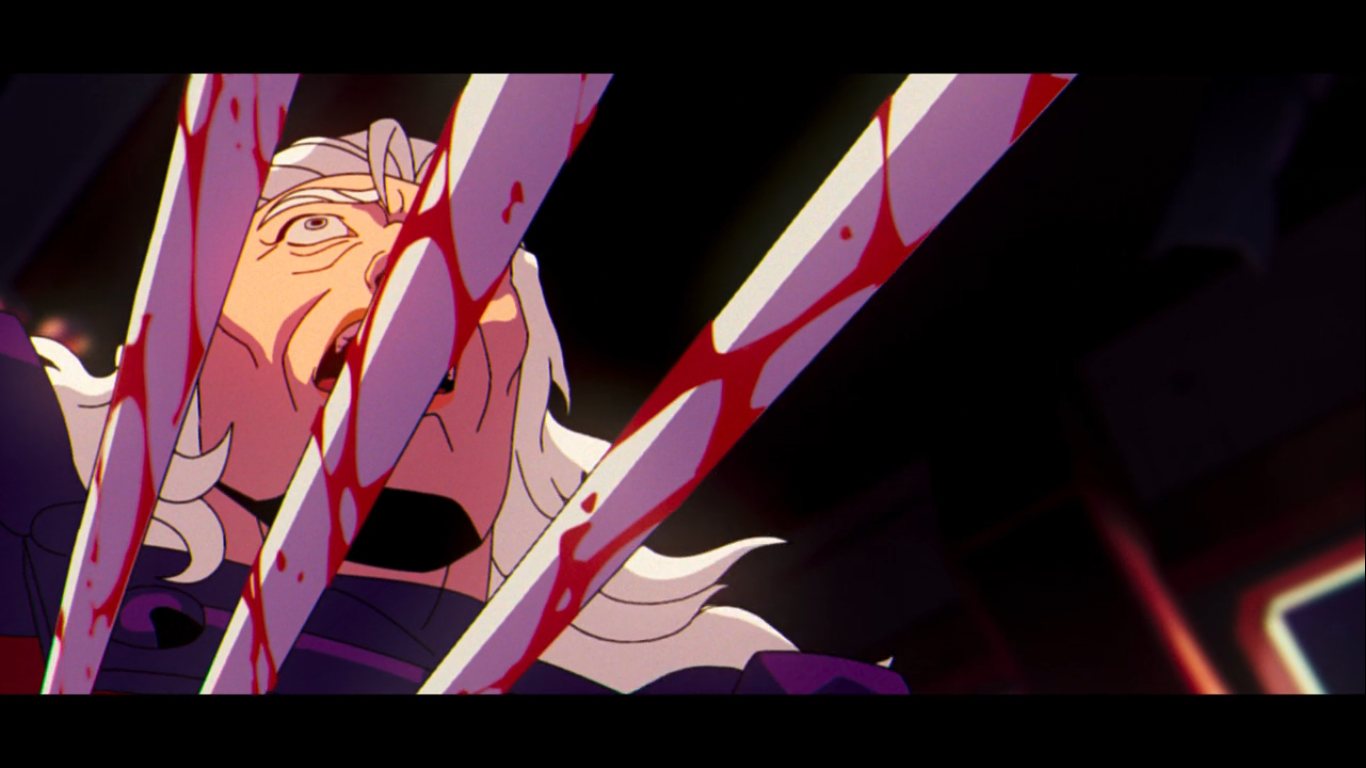
That’s when Wolverine struck. In actually more graphic fashion compared with the comic from which the story was taken, we get to see a flash of his claws and then the ends protrude through Magneto’s torso. At that moment, I could only watch with both dread and awe since there was no going back now. The attack was brief. We got just a quick shot of each character’s reaction, friend and foe alike, at Wolverine’s attack. It was like all of the participants in the melee up to that point were just made aware that violence has consequences, like a bunch of kids play-fighting in the yard until someone gets really hurt. The final image of Wolverine in mid-air with the adamantium oozing out of his body was a near 1:1 recreation of Andy Kubert’s artwork. It was chilling and a hell of a way to end an episode of television. I was riding an exercise bike on my first viewing and I wish I had thought to check my heartrate readings on my fitness app when it was all said and done. I was covered in sweat, more than usual after a workout, and that same pit in my stomach I felt as a 9 year old in 1993 had returned.

The moment was so captivating that it practically erased everything that came before it. I had to watch it again to be reminded of the fact that Morph and Beast had been defeated and were at the mercy of Bastion last we saw them. Sinister had taken control over Cable like he did his mother before him unleashing his telekinetic powers on Jean. She was able to make psychic contact with Cyclops, and through her, he saw what was going down just long enough for her to tell him she loved him before Cable’s blast engulfed her. And at Asteroid M, Magneto is likely mortally wounded or damn close to it while Xavier had Magneto’s helmet basically crushed around his skull neutralizing his psychic powers. This concept is new to the show as when the original aired the idea that Magneto’s helmet was designed to protect him from Xavier had not been invented yet. You can even see in the show’s fourth episode Xavier attack him with the helmet on, but I don’t mind it being a new wrinkle for this show as basically every version of the X-Men has done the same.

As a kid, I don’t know how many times I read X-Men #25 and its follow-up, Wolverine #75, so I had a good idea what was going to happen in this season finale (in case you forgot, that’s what we’re here to talk about today) in space. I was less certain about the Bastion plot, but I had some ideas. Given the nature of how the last episode ended, there isn’t much I can say about the plot of this one that doesn’t spoil something, but I’m sure I can find something to talk about. The “Previously…” line is delivered by Magneto and our opening credits contain few surprises. More Dark Phoenix, more Apocalypse, but also a new scene of Magneto and Xavier unleashing their powers for the first time in front of each other on some terrorists from “Enter Magneto.”

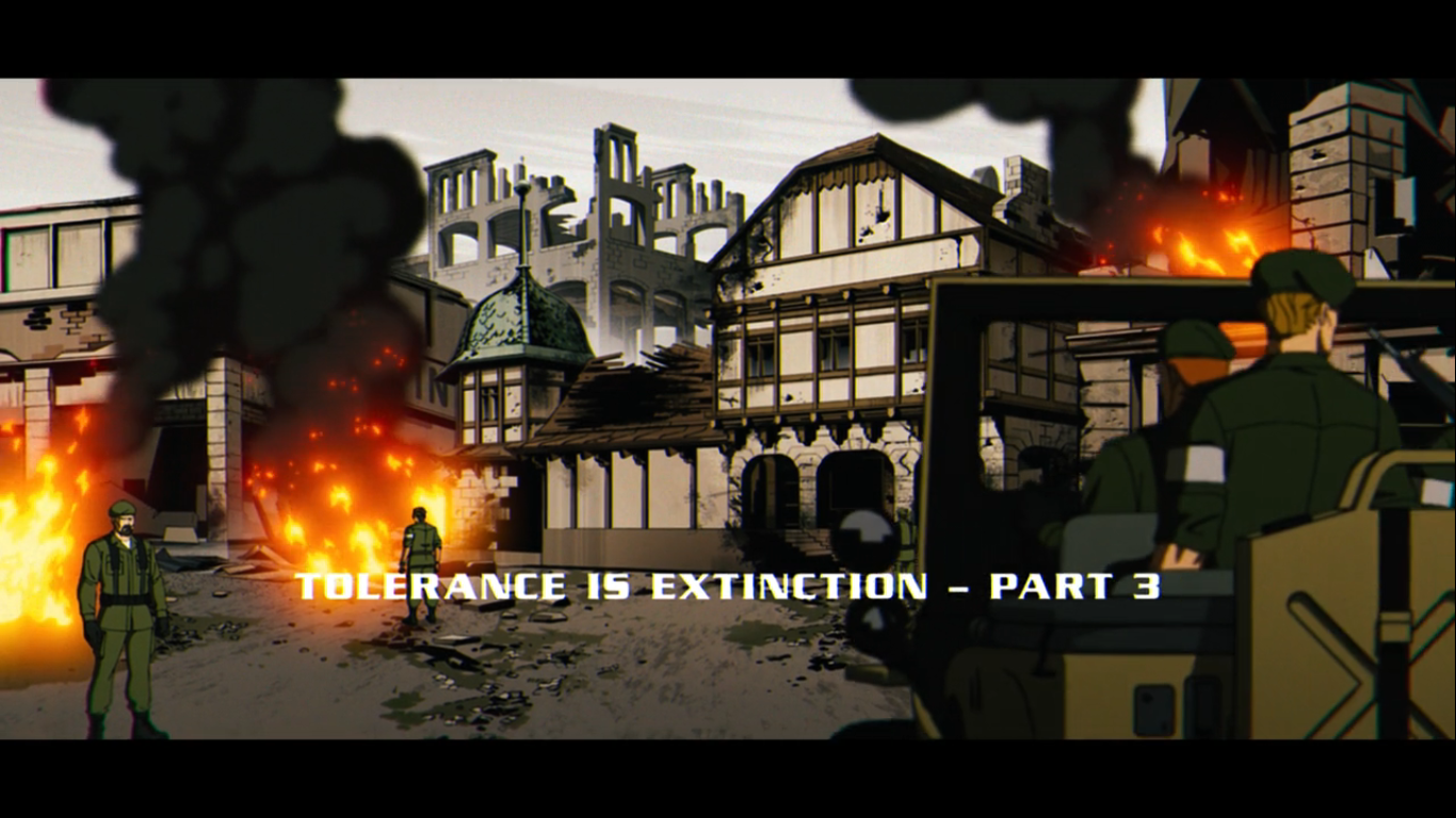
And we’re shown that flashback because that is essentially where the episode begins. A young Xavier and Magneto having some drinks in a bar in a war torn country chatting about the potential for mutants. The war setting is even established by the opening chords of the famous song by The Byrds “Turn! Turn! Turn!” which I thought we all agreed we were done with? That and Credence Clearwater Revival. It’s at least brief which probably saved Disney a few bucks. Outside of the flashback, the episode is going to pick-up right where we left off with Wolverine in bad shape and the Earth heading for catastrophe. The only one who can heal the Earth’s magnetic field is Magneto and he needs some convincing.

At ground level, we last saw Bastion essentially victorious. And he will be ready for his victory lap that villains are so fond of, but as is often the case, the celebration is premature. Again, I’m not here to spoil anything, but I don’t think it’s a spoiler to say that the X-Men will need to deal with this guy. If last episode was more of the Magneto conflict, then this one is definitely more on Bastion. He is pretty set on eradicating mutants, and once that is done, he intends to rule over humanity since they can’t exactly be trusted either. And if he can’t do either, well, let’s just say that’s something he won’t respond to very well. And if that weren’t enough, the world super powers are left mulling what to do about the Magneto Protocols. Should the grid get restored, not only will the Prime Sentinels be reactivated, but President Kelly will have access to the missile defense system crafted especially for targeting Asteroid M.

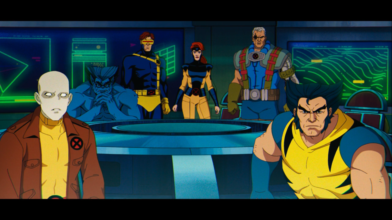
The X-Men had split into Blue and Gold teams last episode, but it’s going to take all able-bodied X-Men to stop Bastion. A large portion of the episode is devoted to the battle that you knew was going to happen and, as has been the case with this show, it’s quite satisfying and spectacular. The action direction continues to be a strong point and the animation staff is up to task. Since we’re dealing with a finale here, there is an effort to give everyone some time to shine, provided they were able to stand at the conclusion of the last episode. The episode also pays more than lip-service to actual character growth and this is the episode that is able to cash in on the smaller moments (and some big ones) that we saw throughout this first season.
Where this episode did stumble a bit for me is that it’s basically a small portion of fallout from the previous episode, then a whole bunch of action, and then setup for next season. It’s become routine in the streaming age for shows to be serialized and include a lot of cliffhangers and X-Men ’97 is no different. I received some Game of Thrones vibes from the show when watching this one as the penultimate episode was where a lot of the spectacle was while this one felt a bit more like clean-up followed by setup. They left no room for the characters to really respond to what happened last week. It’s mentioned only in passing and we see Wolverine’s banged up body a few times, but we get almost nothing from the characters. How is Jubilee processing this? She and Wolverine were tight. Is anyone mad at him for pushing Magneto as far as he did by getting all stabby on him? Again, we don’t know and the way the episode ends makes it seem like it’s a thing we’re just not going to address at all and that feels like a real missed opportunity for a show that loves the soapy drama.

Like last week, expect to be tickled by several cameos. Some are repeat cameos, but many are all new. Sure, it can feel like stunt-casting or something akin to it, but considering the plot in this episode has worldwide ramifications it makes sense to get a look around the globe. It’s certainly interesting and makes me wonder if X-Men ’97 will turn into a launching pad for an animated universe set in the 90s. Nostalgia for the period will likely never be hotter than it is now so it wouldn’t be Marvel and Disney’s worst idea. As long as my X-Men show doesn’t become overrun by non-mutant superheroes I’m all for it. Even if I personally have little interest in revisiting the other 90s Marvel cartoons.
I may seem a little down on this episode, but that’s only because the prior two were so strong. This is indeed a good episode, and it’s a long one at that, and DeMayo and Sellitti do some great stuff with their dialogue. There are certain characters they write so well and it’s on display in this episode. There’s also more callback lines to the original series and its woven in effectively and with purpose. There’s some heavy stuff intermingled with the action concerning Xavier and Magneto and this episode is one of the first pieces of X-Men media that really convinces the audience that Xavier and Magneto care deeply for each other. They’re not just paying lip-service to the “old friend” label they like to toss around so casually.
This episode concludes what has inarguably been a successful first season for X-Men ’97. The second season is in production so the wait should not be as long as it was from announcement to premiere. I suspect we will hear more at San Diego Comic Con this summer. Series creator and showrunner Beau DeMayo was heavily involved in the second season and it can be assumed much of his vision will make it to air. Following that, we’ll be heading into some unchartered waters with the show. Disney and DeMayo have remained tight-lipped on why he was let go from the series just before the premiere which is unfortunate because it would be nice to know if fans should be advocating for Disney to reverse that decision. If he was fired because of an OnlyFans account or creative differences, then that was probably a stupid decision given how well this show has turned out (and for the record, the OnlyFans thing would be stupid if the show sucked too). If he was fired over workplace misconduct or something (and full disclosure – I have no idea why he was let go and I’m just tossing out examples) then all right, that’s not someone I’d want to go to bat for. This stuff has a way of getting out so it’s more probable than not we’ll know in time, but for now, I’m extremely satisfied with how X-Men ’97 turned out. I’m also extremely bummed about not having a new episode to look forward to next week. This is going to be an intolerable wait.
Previously…on X-Men ’97:

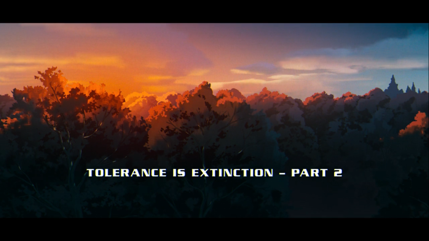
X-Men ’97 – “Tolerance is Extinction – Part 2”
Magneto was right. That was the realization many characters seemed to share at the end of last week’s episode of X-Men ’97. As we roll into the penultimate episode of the show’s first season, a lot is on the line and the show is drawing inspiration from several different sources related to the X-Men over…
Keep reading
X-Men ’97 – “Tolerance is Extinction – Part 1”
Ever since the episode list was released for X-Men ’97 I’ve been looking forward to what reads like an epic, three-part, season finale. In truth, given that X-Men ’97 is a serialized show you could basically call every episode “X-Men ’97 Season 1 Part 1” and so on, but the titles do add a dramatic…
Keep reading
X-Men ’97 – “Bright Eyes”
When we last saw our beloved X-Men, their world had just been destroyed. An idyllic place set to the soundtrack of the very on-the-nose choice of “Happy Nation” by Ace of Base in Genosha was laid to waste. Mutants of all backgrounds were slaughtered including our beloved Gambit and less beloved Magneto. In the aftermath…
Keep reading