Just about every iteration of the Teenage Mutant Ninja Turtles has its own Shredder. He’s the big bad villain of the franchise despite having the dubious honor of being killed off in the very first issue of the comic book series. For the 2012 series, Shredder was back as the head of a crime syndicate and portrayed as a brutal, ruthless, threat to the good guys. Gone are the days of the Shredder surrounded by moronic henchmen entrusted with far too much responsibility. This Shredder is violent and enjoys inflicting harm upon his adversaries, both physical and psychological. There is no redeeming quality to him and he’s quite good at what he does. And if you’re going to have a figure line based on this version of the franchise, you have to do him justice.
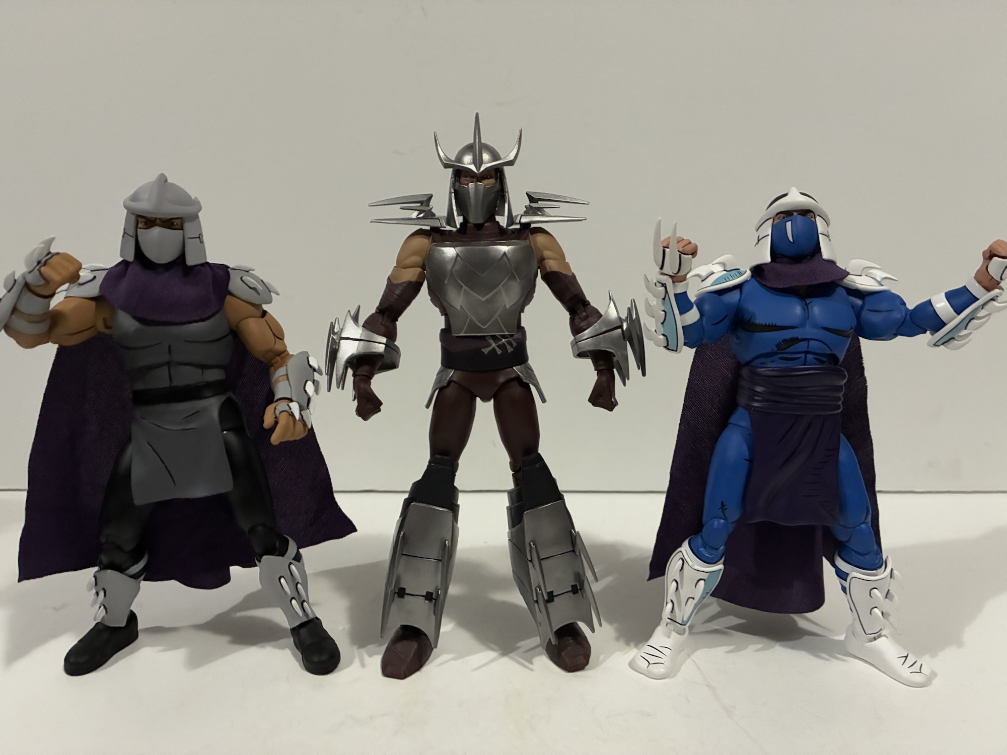
This Shredder is not the screwball these other two are.
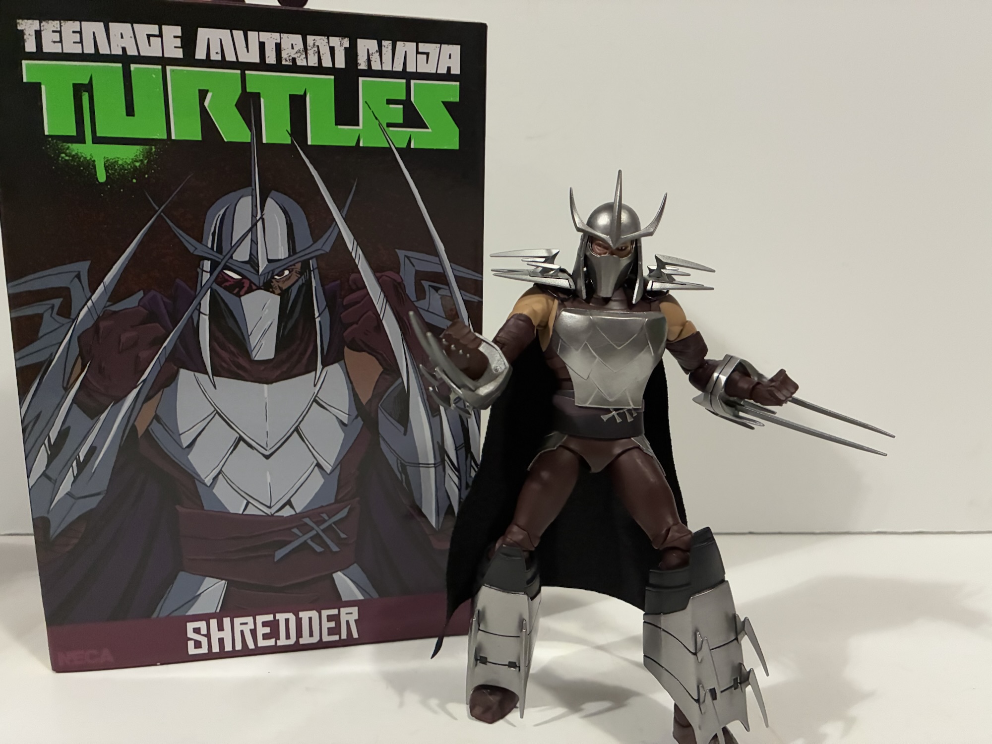
The Shredder is the sixth figure in NECA’s line based on the 2012 animated series Teenage Mutant Ninja Turtles. Despite that distinction, he’s the fifth release and I suspect the only reason why he’s numbered six is because it worked better for the mural that’s being displayed via the spine of the box art. This is a sculpt attributed to a trio of individuals/entities: Daniel Katcher, Richard Force, and Kushwara Studios. Nicole Falk is credited with tailoring the soft goods cape and Ciro Nieli handled the box art. Paint is credited to Geoff Trapp and Mike Puzzo.
That’s a lot worse than a rat scratch.
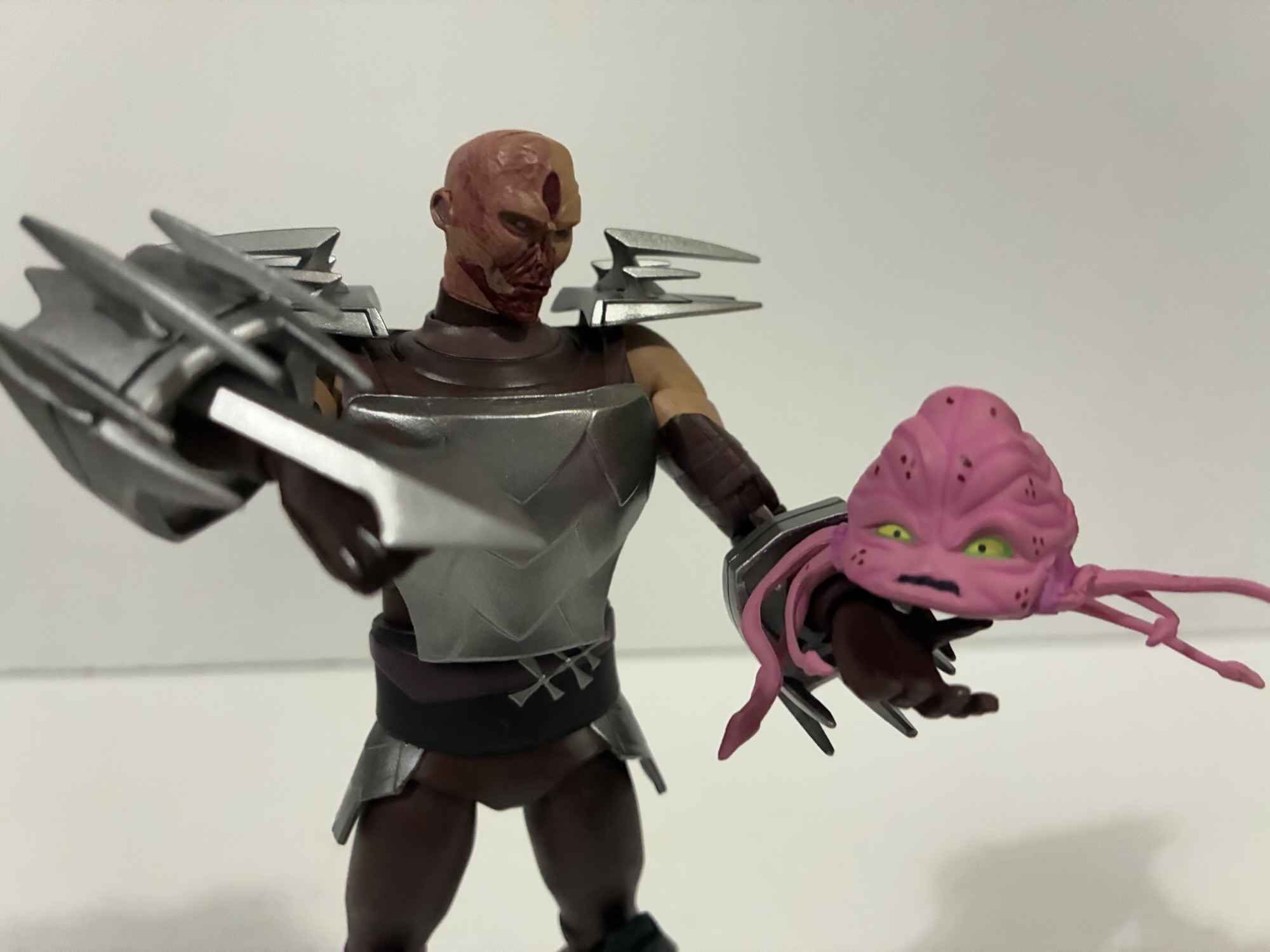
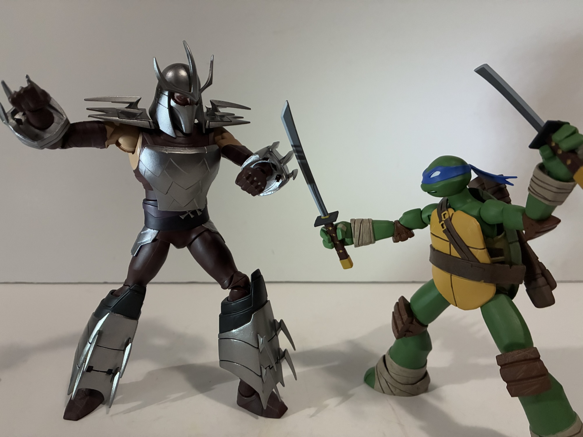
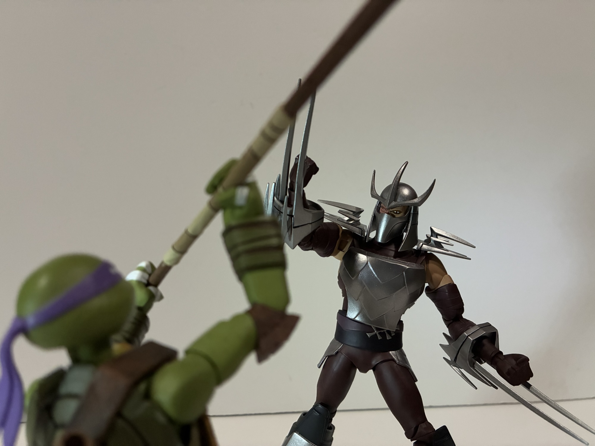
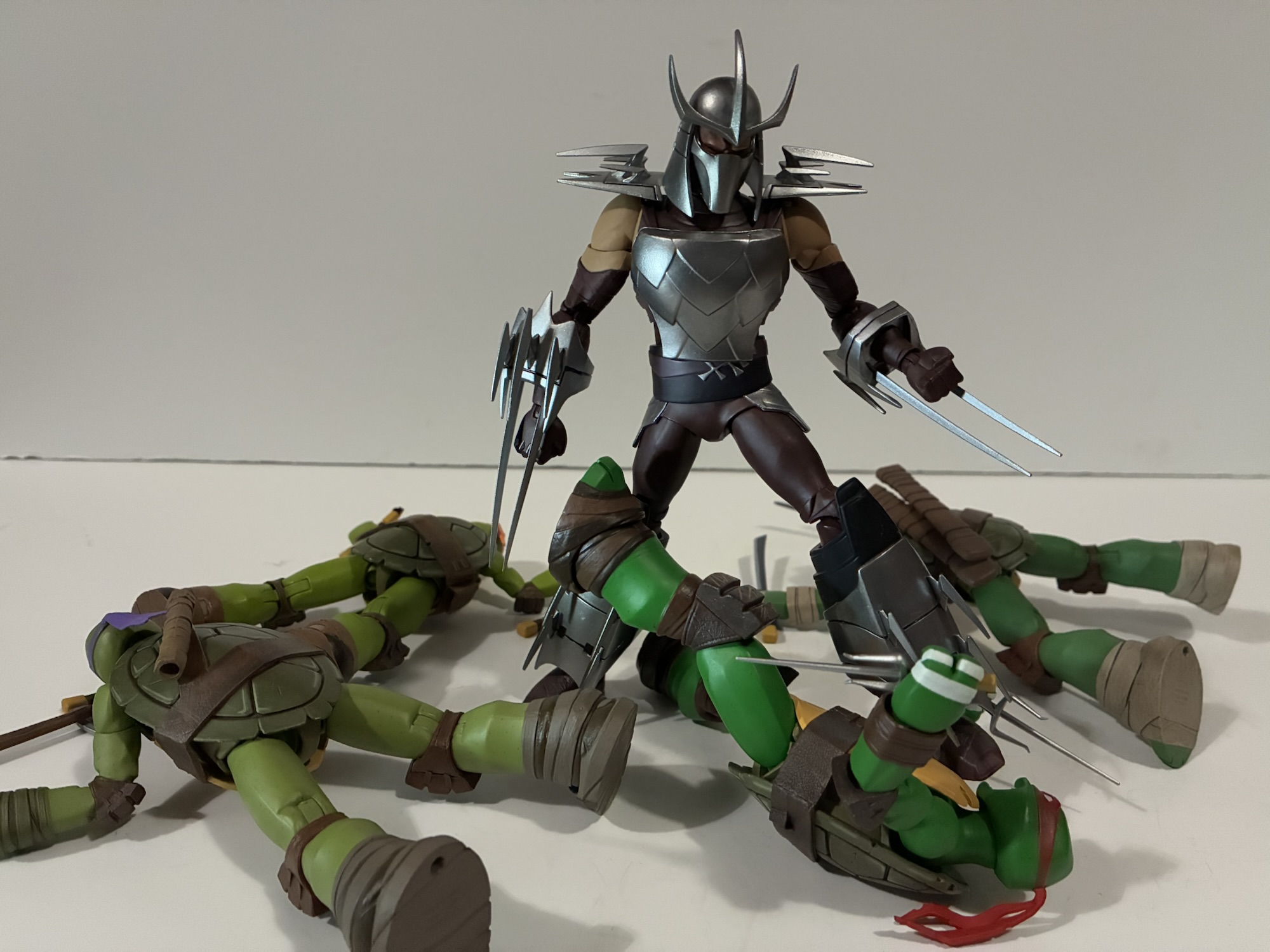
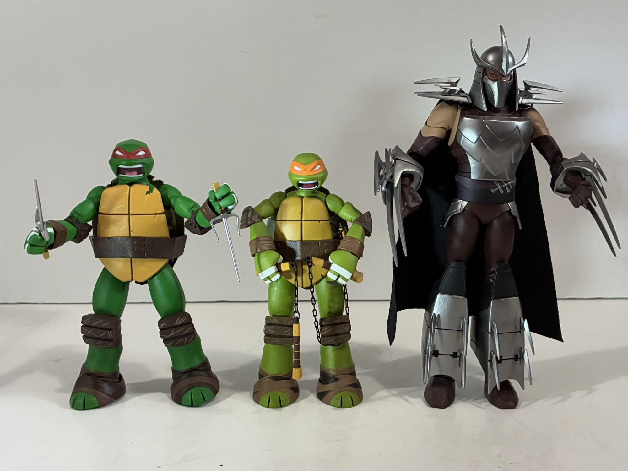
Shredder towers over the turtles in this line coming in at approximately 7.125″ to the top of the dome of his helmet. He’s a broad shouldered, but somewhat slender, Shredder perhaps having more in common with the Mirage portrayals of the character than appears at first blush. He’s still adorned with armor and lots of bladed features. The blades of his shoulders jut out from his body as opposed to vertically and his gauntlets are almost ludicrously large. The garment he wears beneath his armor is a dark magenta while the armored bits are done with a shiny silver. Those spikes are all rigid and sharp. He looks pretty on-model, though as one of those characters often obscured by shadows in the show it can make it a touch hard to determine just how on-model he is without pulling out numerous stills and production art. If anything, his arms and chest might be a little larger in figure form than it is in the show, but since it adds to his presence I’m not considering that a negative.
He can also get angry. And stabby.
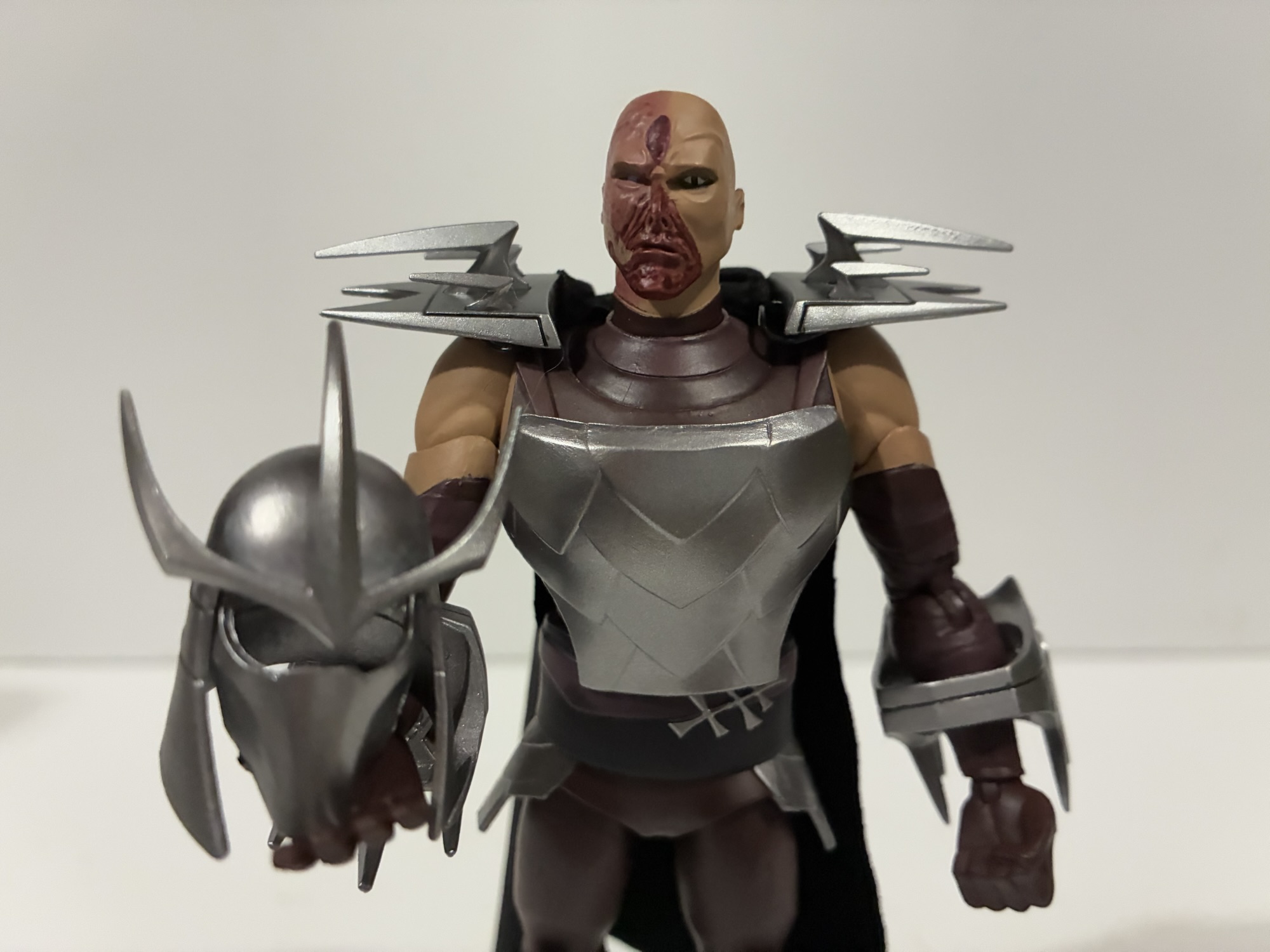
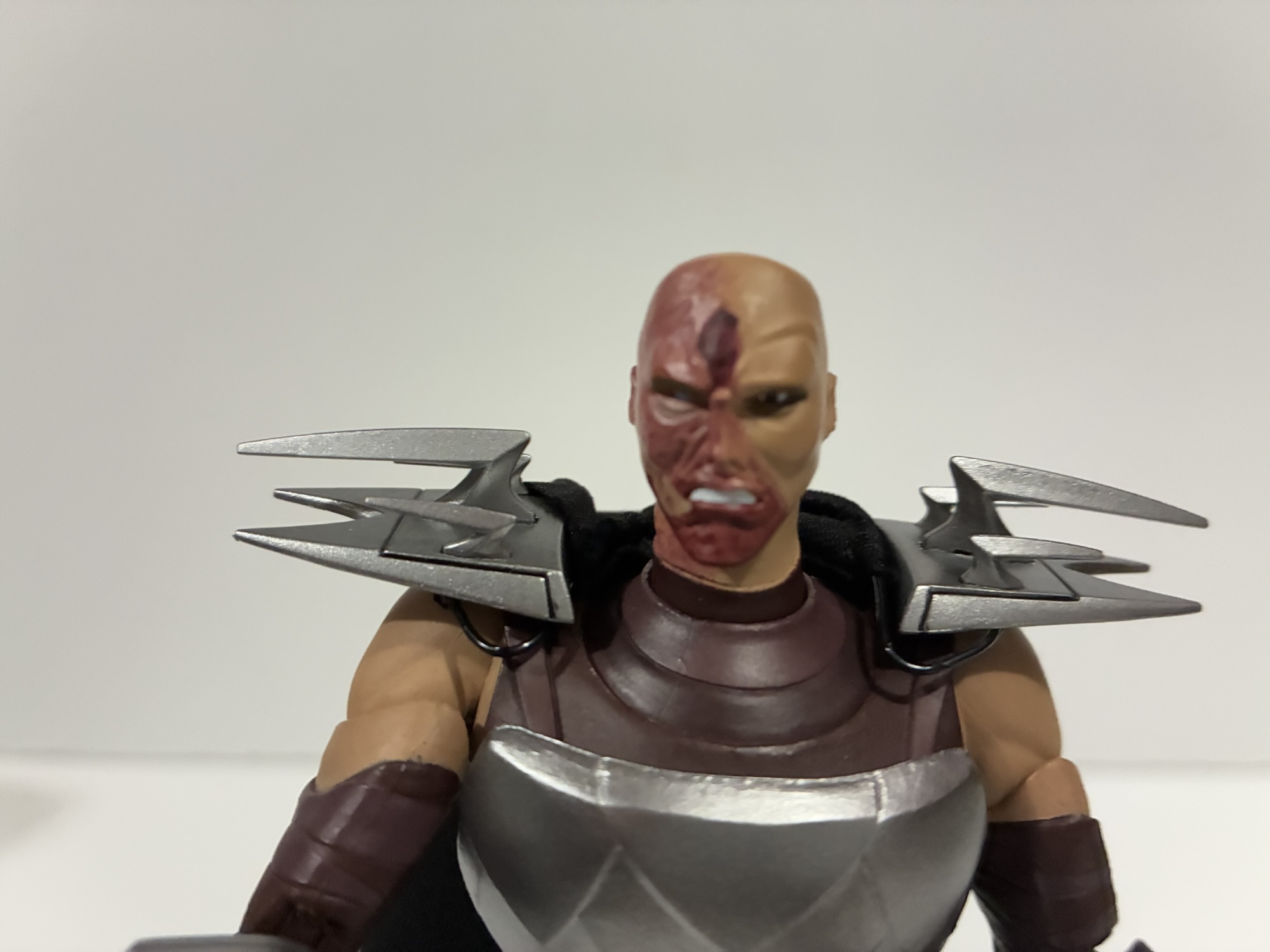
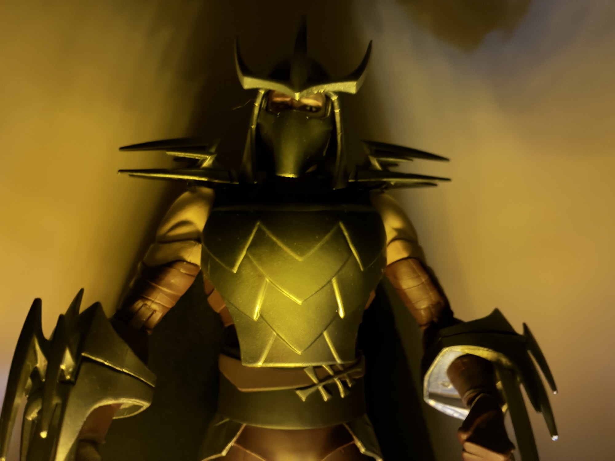
The paint on Shredder is fairly rudimentary not calling for a lot of pizzazz, with one exception. Underneath the removable helmet is the burned visage of Oroku Saki. He’s pretty ugly looking and NECA did a good job of capturing that. He has an alternate portrait which portrays him as more angry and it’s every bit as good, though won’t really change the look of the figure once the helmet is put back on. The colors all match well whether they’re painted or not and there’s no obvious paint slop anywhere on my figure. Some of the finer details are less than perfect, but certainly acceptable for a mass-produced item. The cape is pretty plain as most NECA capes tend to be. It’s just a thin, black, material though there is a wire through it, just probably not where you want it to be. The wire is merely at the top of the cape and used to hook the cape under the pauldrons. It’s easy to take on and off, but it’s a shame NECA won’t do fully wired capes for posing.
They have no chance one-on-one with Shredder.
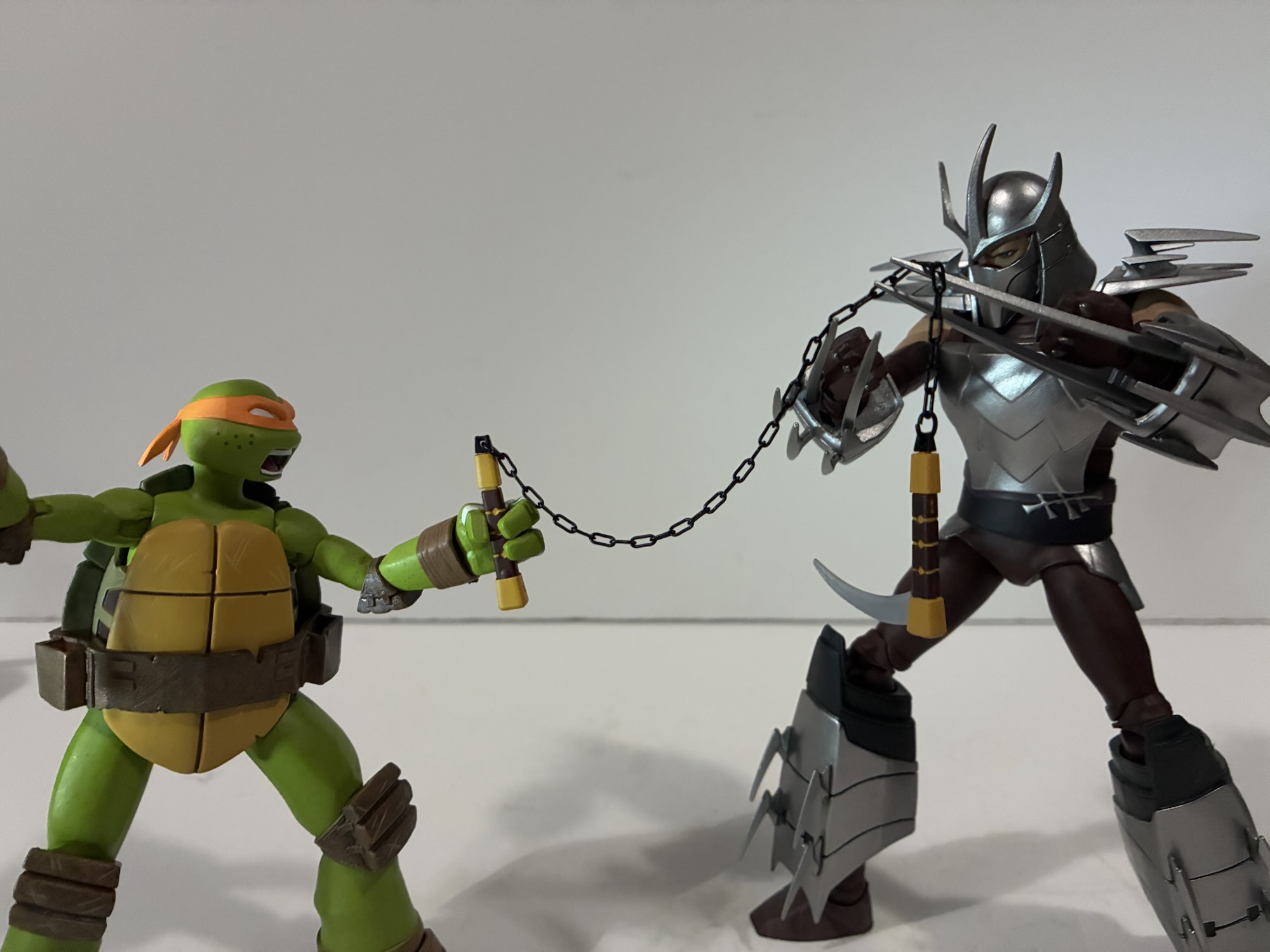
Aside from the alternate portrait, Shredder comes with three sets of hands: fists, gripping, and relaxed. For weapons, he has six blades to make use of. In the show, Shredder had retractable blades built into his gauntlets which were his weapons of choice. He has two long ones and one central blade with a diamond-shaped point. You get four of the long blades and two of the center blades which just plug into his gauntlets. You can fit all three into each hand at once, but it is a little busy looking and I don’t think he ever went into battle in such a manner. He also comes with a lone Kraang alien. The little guy looks the part and is well-sculpted as well as well-painted, but not articulated. One set of tentacles is shaped into a curve while the other set is more flat which makes it a challenge to do much with if it’s not being held. I’m guessing we’ll be seeing this guy, or variations on him, quite a bit if this line endures.
I don’t like the B Team’s chances here.
Shredder’s articulation is fairly basic and likely what someone familiar with NECA would expect. The head is on a double ball peg, though it’s limited a bit by the helmet. The arms feature joints at the shoulders, biceps, elbows, and wrists while the torso just has a waist joint. That waist joint is a ball joint, but because of the shape of his breastplate it can’t do much. Range rotating is extremely limited and he can’t crunch forward much and only tilt back a little bit. The bicep swivels are a little odd looking, like his shoulders are a touch too small, which may limit their range as well if you don’t like how they look. Hips are standard ball-joints with a thigh swivel and they work fine. Knees are double-jointed and the ankles hinge and rock. My figure does have some stuck and stubborn joints. The top elbow hinge on both arms doesn’t want to do much while the left ankle was also problematic. The gauntlets can rotate which is nice and the boots swivel too so you can keep the armor lined up with your posing.
Shredder is proof that the good guys don’t always win.
Shredder is going to be pretty limited when it comes to posing. Mine also seems to have a loose right ankle and he’s a challenge to stand sometimes. He also already took a shelf dive and his right pauldron broke off which is irksome. I had him in a pretty vanilla pose too. The torso is aggravating because NECA could have tweaked his design just a little bit to keep that breastplate from causing a problem, but opted to just plow forward with it the way it is. I always make it a point to mention that NECA prioritizes the aesthetics over articulation as I think that’s their right as action figure makers, but sometimes they go too far. There are very minor sacrifices they could be making to improve the experience, but they choose not to do so. I have probably over a hundred NECA figures at this point and I suppose some NECA fatigue is setting in. Rarely am I impressed with what I get because so often the figures just meet my expectations as opposed to exceeding them. I don’t think it’s a requirement that every figure need to blow me away or anything, but it would be nice to be pleasantly surprised once in awhile.
Thankfully, Shredder doesn’t need incredible articulation to have shelf presence.
Shredder is a B+ entry in the line. He looks like the character and is pretty menacing, he’s just not at all fun to mess around with. Some of that is the character design as there are lots of sharp things to avoid and the blades have a tendency to fall out. And then some of that is just on the engineering for a figure that can’t do a whole lot. Most will likely just have him stand there on their shelf and that will be that. And that’s what I plan to do with him. I have no plans on going too deep with this line, but I knew I wanted a Shredder to go with the turtles. This mostly gets the job done.
If you missed the rest of the 2012 NECA TMNT toy line coverage then check these out:
After a bit of a hiatus due to the Christmas holiday, we have reached the last of the four brothers from NECA Toys’ line of action figures based on Teenage Mutant Ninja Turtles, the 2012 animated series that aired on Nickelodeon. And who better to save for last than the party dude himself: Michelangelo. Mikey…
We are onto the third member of the Teenage Mutant Ninja Turtles and its everyone’s favorite hot head. Raphael got softened for the 1987 cartoon series to make him sarcastic and a bit of a goof-off. He didn’t take anything too seriously and had a certain dry wit about him. It’s quite different from his…
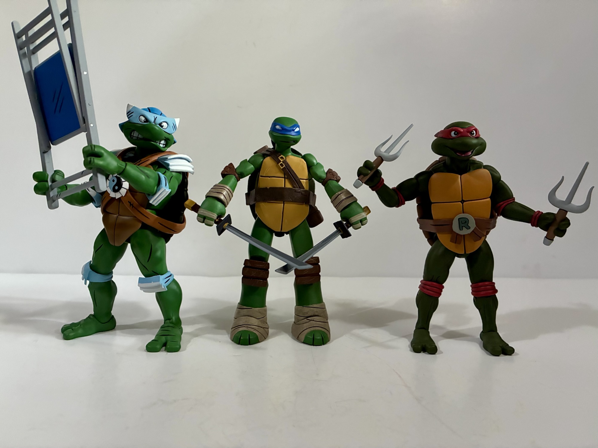
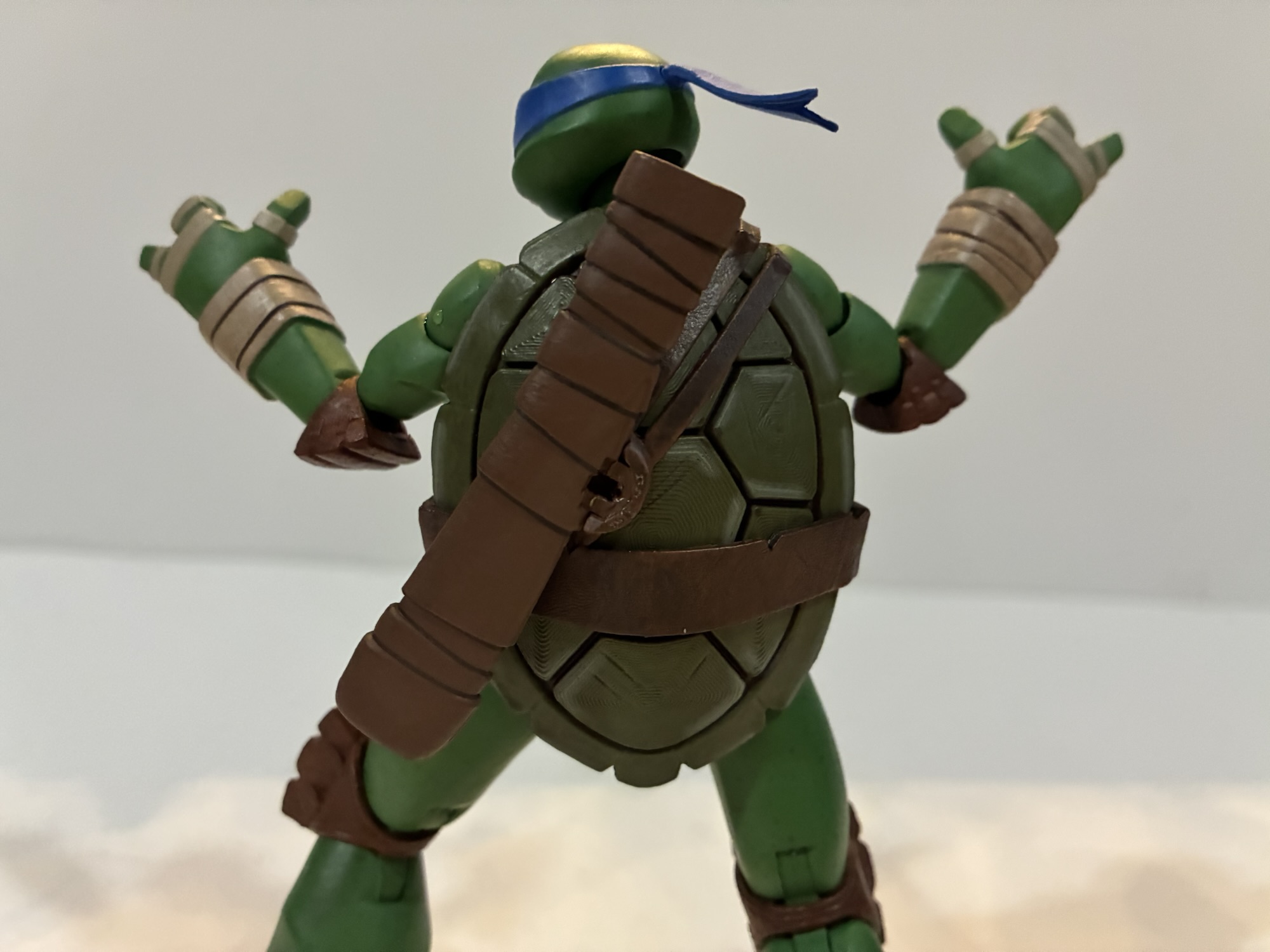
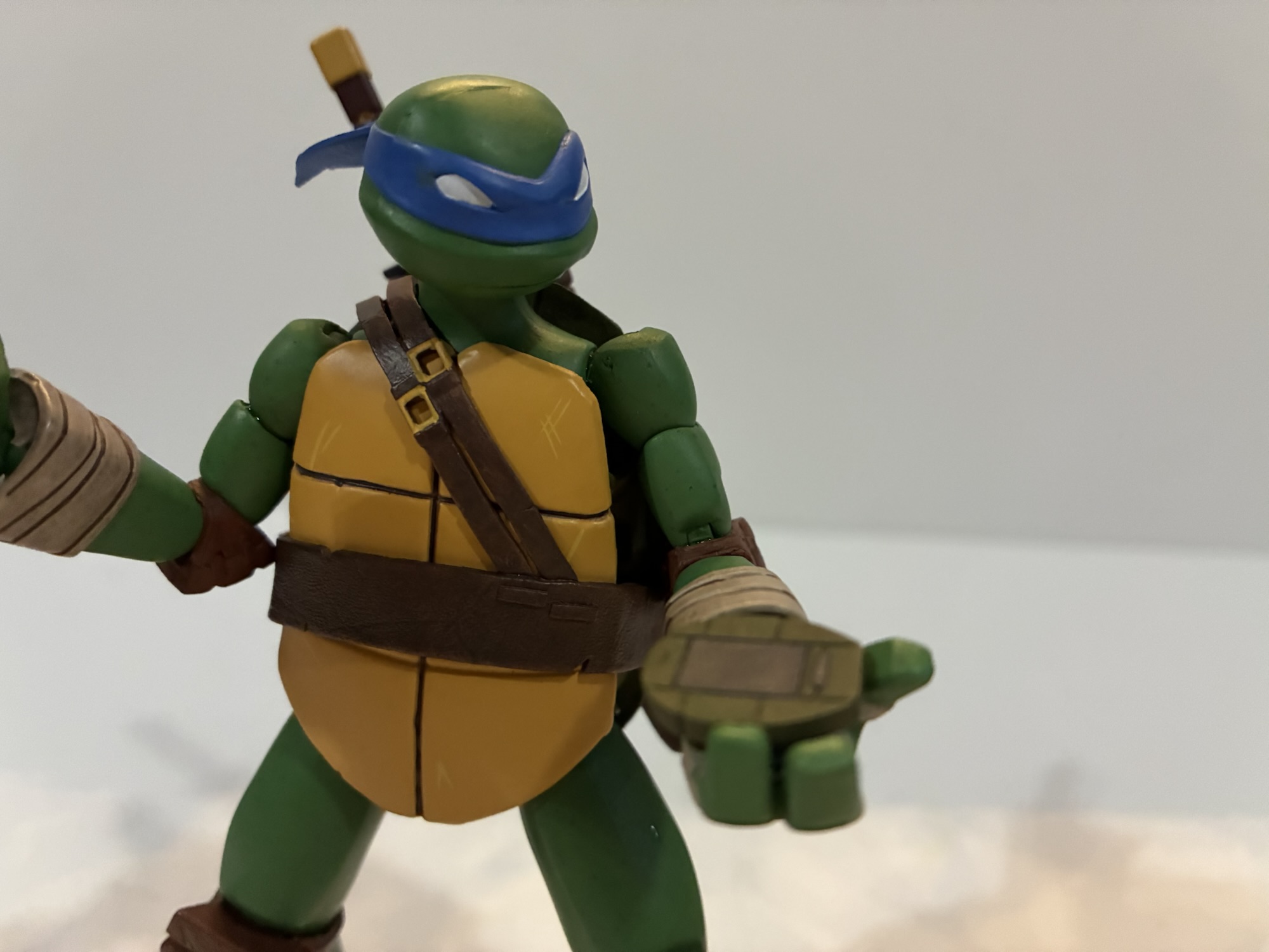
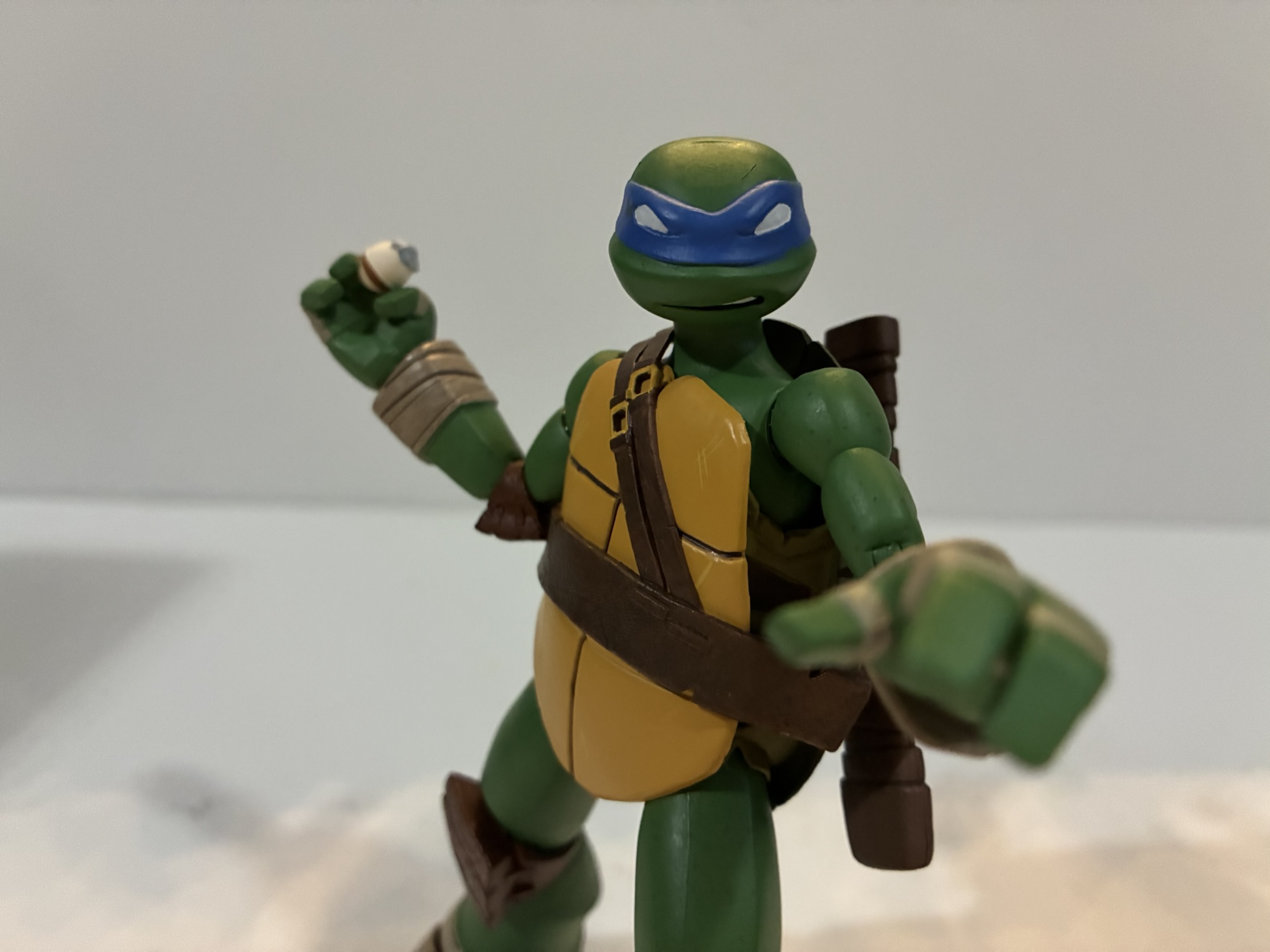
We were able to get through some of the logistics of this line with Leonardo, so for this second review we can just get right to it. One of the best decisions the 2012 iteration of Teenage Mutant Ninja Turtles made was bringing back veteran voice actor Rob Paulsen. He’s voiced countless characters over the…
It’s the end of the year so that means it’s time for year-end awards and accolades. It’s easy content and who doesn’t enjoy reflecting on another year gone by? Unless, of course, that year was a bad one. I don’t think 2025 is going to go down in history as a particularly good year, but that doesn’t mean there weren’t some great toys released or announced. I don’t always do posts like this, but I felt like I did a lot of toy reviews this year so it felt warranted. It was also interesting because some staples, like NECA’s Teenage Mutant Ninja Turtles cartoon line, didn’t put out a ton of figures. And yet I still managed to have reviews up almost weekly this year. I have a bunch coming in early 2026 as we play catch-up, but that’s probably true most years. It did feel like this year in particular had a heavy dose of releases at the end of the year and I think I know why – which I’ll get to momentarily. My rules for this list are pretty simple though: if it came out in 2025 and I got it then it’s eligible. Even if I haven’t technically posted the review yet. And since I’m based in the US, it’s all US release windows so if Asia was enjoying something at the end of 2024 that didn’t arrive at my house until 2025 then it’s fair game for me. Now, let’s get started with an atypical category:
The Storyline of the Year – Tariffs
Yes, those wonderful tariffs are being brought up again, but hopefully it’s the last I need to say about it until they’re gone. The “brilliant” strategy of the new administration in the US was to tax the hell out of imports because someone convinced the president that a trade deficit is akin to being robbed. It’s not. And even though tariffs are paid by those who are doing the importing, it’s a regressive tax that is passed onto the general public either in whole or in part. It varies from company to company, but it also created a bottleneck in shipping and some packages have been tossed or seized for “reasons.” I had one seized, but was fortunate the shipper re-sent without any additional charge to me, but it has meant I’m on week 6 for a package that still isn’t here as of this writing. I’ll tell that story when I get to the figure review. Anyway, tariffs have had a huge negative impact on a lot of industries this year and I’m not going to pretend that my hobby is the worst affected, but it still sucks and continues to suck as we head into 2026.
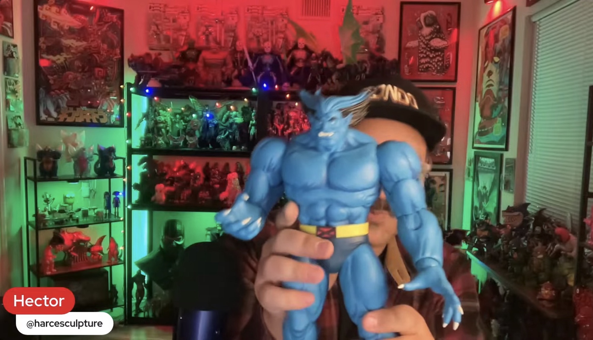
Reveal of the Year – Mondo X-Men ’97 Beast
He looks so good!
I don’t know why, but it feels like we’re always waiting on a toy company to deliver some version of Beast. Back in the early days of Toy Biz, Beast was one of the last characters featured in the cartoon series to make it to plastic (poor Jean had to wait even longer for a non Phoenix version) and current Marvel Legends collectors are waiting on him to finish up the X-Factor squad (they may technically be waiting on a properly costumed Angel too). With Mondo’s X-Men and X-Men ’97 line of sixth scale figures, we’re still waiting on Storm, Jean, Morph, and Beast, but in 2025 all but Morph were shown. Storm already went up for preorder too and I think Beast is expected next. Mondo showed him off in their end of year stream (they had previously announced and displayed him at a convention) and he looks fabulous. We’ve never had a proper animated Beast. The last one Hasbro did is good, but the portrait isn’t right for that version of the character. Animated Beast never had those whited-out eyes which I have always felt was inappropriate for the character as the pupils show the human within the beast. I’m a little afraid of how much a chunky boy like Beast is going to cost, but I can’t wait to add him to my collection in 2026!
Honorable Mentions: Mondo Squad Rocko’s Modern Life, Big Bad Workshop The Tick, Marvel Legends X-Men ’97 Apocalypse
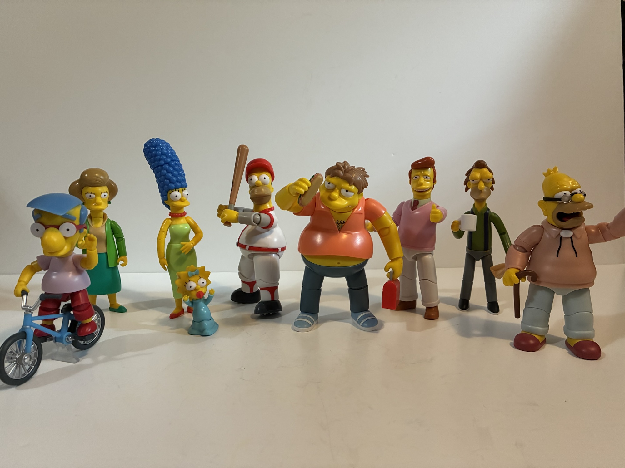
Worst Toy Line of the Year – Jakks Pacific The Simpsons
Jakks got to take over The Simpsons from Super7 which meant more releases at a much cheaper price. Their output has been fine. I have nits to pick with them as I do most things, but for the price it’s hard to complain. What lands Jakks on this list though is just how damn frustrating the line is to collect. My local stores never got anything past Wave 2 until very recently when they got Wave 4. I was able to snag a Barney off of Target’s website, but nothing else from his wave has shown up in store for me or online and it’s very annoying. I’ve basically “quiet quit” the line as I’m not paying scalper prices for them or blowing a ton of gas riding around hoping to find them because the on-line inventory tracking is so poor.
Honorable Mentions: None
Figure I wish Arrived in 2025 – S.H.Figuarts Gamerverse Cyclops
A weird thing happened in 2025. Two companies, Hasbro and Bandai, decided to unleash upon us a “Gamerverse” line of figures. Hasbro has been doing that for years, but mostly for the Spider-Man games on PlayStation. In 2025, both companies are dipping their toes into Marvel vs Capcom and, oddly enough, both are focusing on the Marvel side of that equation. For Hasbro, it’s not a surprise as they don’t have a license for anything Capcom, but Bandai has been doing Street Fighter figures for years. Maybe they’ll get to more from them, but thus far we’ve only seen Marvel and sneaking out in Asia just before the end of the year is the first figure in the line – Cyclops. There are some things about the figure I’d change based on what I’ve seen so far, but overall I think he looks like the best Cyke that’s ever been. I like the Legends Cyclops I have from the VHS styled line of X-Men figures, but that one came with almost nothing. The X-Men ’97 one comes with some effect parts, but it looks horrible. This one may be the last Cyclops I’ll ever need so I’m really eager to see how he looks and moves in person.
Honorable Mentions: S.H.Figuarts Across the Spider-Verse Scarlet Spider, Storm Arena Street Fighter Alpha 3 Sagat
Debuting Toy Line of the Year – Storm Arena Street Fighter Alpha 3
Storm Collectibles has been releasing figures based on Capcom properties for years, but always in a weird scale and for a large sum of money. Perhaps feeling pressure from Jada Toys, Storm decided to launch a new line in 2025 based on designs from Street Fighter Alpha 3 and this time they were finally listening to fans. The Storm Arena line is a true 1:12 scale action figure line where each figure comes with alternate hands, portraits, a stand, and effect parts and for the low price of $26! I honestly didn’t see this one coming. Larger characters, like Sagat who is due any day now, will retail for more, but still at a hell of a price in today’s market. And the figures do not sacrifice anything as far as I can tell. The sculpts are terrific, the articulation is excellent, and they even retained that soft plastic torso Storm loves to use. They only managed to release two figures in 2025 and they’re basically the same figure with different heads – Ken and Ryu, and yet I was tempted to make them Line of the Year anyway. They are that good and I can’t wait to see how Sagat turned out. 2026 could really be the year this line takes off.
Honorable Mention: NECA Teenage Mutant Ninja Turtles (2012), Marvel Legends “Not Marvel vs Capcom” Gamerverse, InArt The Dark Knight Rises, Mondo The Real Ghostbusters
Most Disappointing Cancellation of the Year – Super7 Teenage Mutant Ninja Turtles (Vintage)
Super7 did not have a good 2025, but it did manage to finally make it’s long-planned pivot to action figures based on the 2003 version of Teenage Mutant Ninja Turtles, though how long-planned that was we don’t know. When Super7 first announced they were doing figures based on that show it was supposed to be in conjunction with their line of vintage-inspired TMNT. The release pattern would go Vintage, 2003, Vintage, 2003, etc. Well, plans apparently changed as Super7 clarified things to say the vintage-inspired line is “on pause.” I don’t know about you, but anytime I’ve seen a toy line described as being on pause the phrase has been synonymous with cancelled. Other than Marvel Legends, which saw Hasbro pivot to a 1:18 scale line when oil prices were incredibly high, I can’t think of another line that came back. Maybe Super7 will buck the trend, but it’s disappointing because there are some Technodrome-sized holes in the collection headlined (for me) by Heavy Metal Raph. We know Super7 was running into issues with Playmates who did not like them recreating their figures, but this is a case where the company needs to take a stand and go to bat for its collectors. Paramount wanted them to do 2003 which is fine, but they should have negotiated at least one final wave to give their fans what they have been waiting for. They managed to do it for Rat King, surely they could have for the rest.
Dishonorable Mention: NECA Gargoyles
Toy Line of the Year – JoyToy Teenage Mutant Ninja Turtles
This is a line I never saw coming. When JoyToy first showed off their 1:18 scale Teenage Mutant Ninja Turtles I was very much intrigued, but thought they would mostly be a one-off in my collection. Then came Shredder, Bebop, Rocksteady, April, Krang, and on and on it went. JoyToy pumped out a ton in this line in 2025 and there’s still more on the way including a 1:18 scale Turtle Van! And it’s not just the volume of releases, but the quality. These figures have a ton of unique sculpt, accessories, and paint and the roster is basically complete even if the line came to a sudden end today. We got freakin’ Zork already – that’s insane! Trying to pick a favorite is almost a pointless exercise and it’s the line I’m basically most excited for when a new reveal is announced because I never know what to expect. If you dismissed this line because of the scale or because it’s a little bit of a chore to collect due to the restrictions then I suggest giving it another look. It’s really been phenomenal.
Honorable Mentions: Storm Arena, Mondo The Real Ghostbusters
Worst Company of 2025 – Super7
All of that stuff I said about Super7’s vintage-inspired Teenage Mutant Ninja Turtles line can basically be copied and pasted here, but that doesn’t really tell the whole story. Not only did Super7 bungle some of their lines, they also laid off a huge chunk of their workforce and closed their retail locations. I get it, things must not be going well there and tariffs certainly didn’t help, but they dumped some of the people responsible for what little success they’ve had in recent years which didn’t make a whole lot of sense. And they’re still just doing stupid stuff with their line. They are expected to deliver wave 2 of the 2003 TMNT line in the coming weeks, but wave 3 consists of Hun, April, and a Raph with a motorcycle – who asked for that?! And their prices continue to climb where now it seems like $65 is the new norm for them and the figures hardly live up to the term “Ultimate” anymore. They are in a price point all on their own that is grossly out of touch with the wider market. I have no idea how they survive 2026 at this point. I’m not rooting for them to fail, just expecting it.
Honorable Mention: None
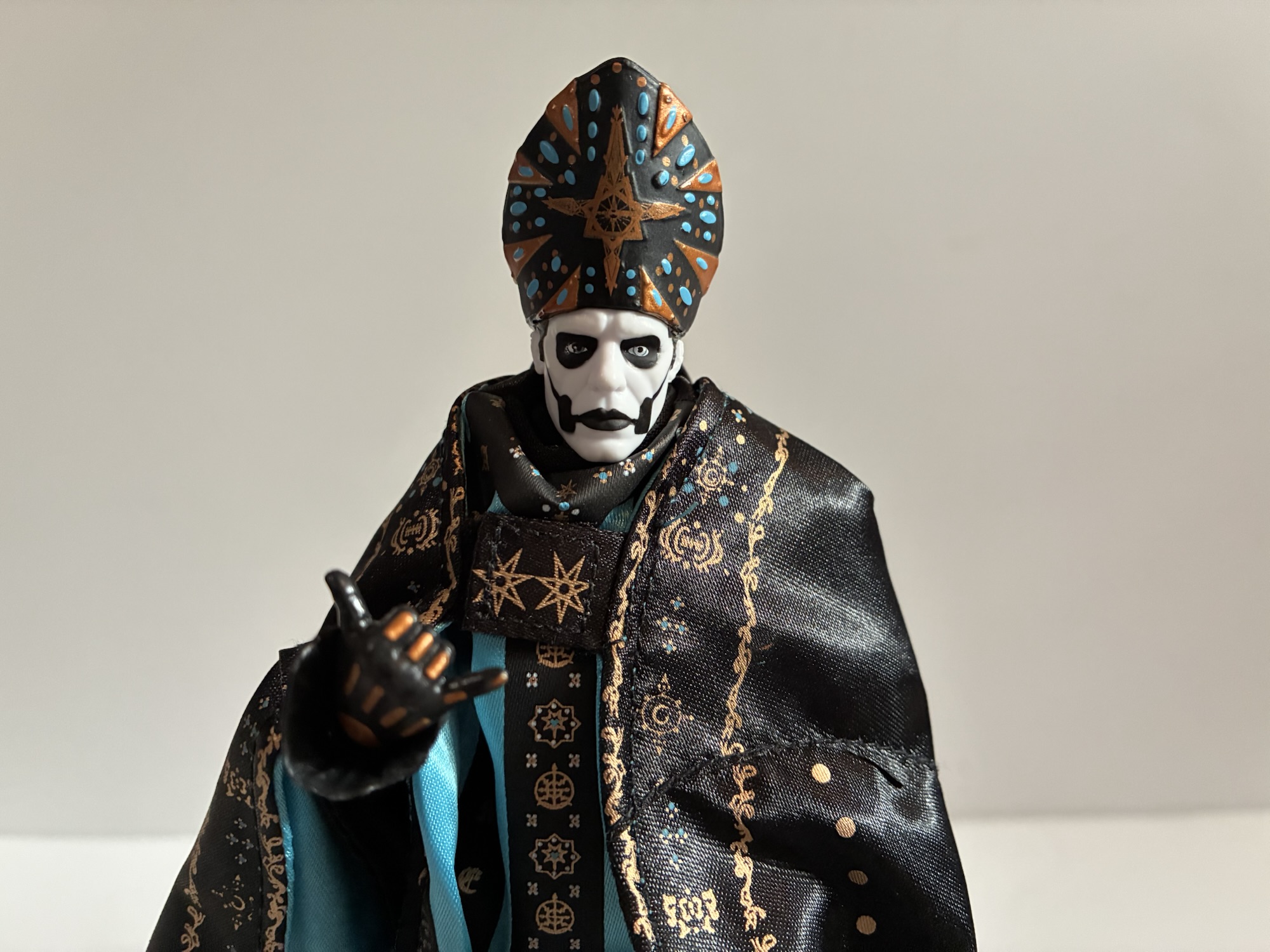
Worst Figure I Reviewed in 2025: Super7 Ultimates! Ghost Papa Emeritus IV
I call him Mr. Frumpy.
Probably no surprise that my pick for worst company of the year is also responsible for the worst toy I reviewed in 2025. This Papa Emeritus isn’t terrible on its own. It’s the same body we’ve seen before with a few tweaks, but the blatant false advertising really stuck in my craw. The base figure is merely okay. It looks a little cheap especially considering the price, but is a decent likeness. With the soft goods though it just looks frumpy and awful. The solicitations they sent out for the figure with the soft goods look nothing like the final version. I don’t expect any release to precisely match a promotional shot, especially one using digital renders of a figure and not a prototype, but there’s a limit and Super7 betrayed its fanbase with this one. And yet, I still ordered Papa V Perpetua with the hope it will actually resemble the figure I purchased so clearly I’m part of the problem.
Action Figure of the Year – The Runners Up
Marvel Legends Gamerverse Wolverine – this figure is a blueprint for what I want to see from Marvel Legends going forward. The sculpt is unique and appropriate for this version of Wolverine, but mostly it’s the articulation. They finally went with the double-ball peg joint in the diaphragm and combined it with a ball joint at the waist. No more ugly ab crunch. The only thing that sucked about this release is you had to also pay for a crappy Silver Samurai since it was sold in a two-pack.
Mondo X-Men ’97 Nightcrawler – a sixth scale figure would have to be really special to take the top spot, but Nightcrawler came close. Maybe if I had been able to get the limited version, or if the economic conditions didn’t push the price to over $300 for the same, I’d have given it to Nightcrawler, but runner-up isn’t bad. This figure looks impressive, as all Mondo figures do, but it does something most don’t which is they made it fun to pose. Even their Spider-Man couldn’t manage that. Look for the full review in the coming weeks.
JoyToy Groundchuck – I said it was hard to select just one figure from JoyToy’s excellent line of TMNT figures, but if I had to pick one it would be Groundchuck. Not only does he look impressive, he comes with so many tremendously fun accessories. I love it when an action figure creates a dilemma for me when it comes to displaying it on my shelf and this one qualifies. I currently have him with three effect parts attached which is kind of ludicrous, but oh so much fun!
Action Figure of 2025 – InArt The Dark Knight Rises Batman
Queen Studios really came out of no where for me. I wasn’t asking for a Batman based on The Dark Knight Rises, but this figure looked so damn good that I couldn’t say “No.” This is, quite simply, one of the best 1:12 scale figures I’ve ever had the pleasure of handling. The sculpt is incredible, the likeness is spot-on, and the articulation is great. If you got the deluxe version then you also got a ton of accessories as well. In a way, it has the opposite problem for me when compared with the JoyToy Groundchuck in that he just looks so cool standing in a vanilla pose that I am not tempted to pose him with anything else. The shortcomings with this release are few – the alternate portraits are too similar, no wired cape, and it’s not sold in the US. It was still relatively easy to import for under $100, which while not cheap, actually feels worth it compared with other figures in that price range (it’s cheaper and likely better than what Mezco is prepping). While it’s not exactly fair to compare such a figure to one that costs $25, this one is so exceptional that it just had to be it. It’s so good that they got me to preorder their next Batman based on Arkham Origins even though that’s another figure I wasn’t asking for and they damn near got me with their Dark Knight Rises Catwoman. I expect it to be every bit as good as this one too. Keep your eyes on Queen Studios and their InArt line because they are making some terrific stuff.
If you want to read more about the best figures of 2025 then check these out:
Is this a review I really need to do? Probably not, but I’m doing it anyway. Queen Studios wasn’t a shop that was on my radar going into 2025. I’m guessing that’s true for a lot of folks and that’s probably why they had a media blitz when it came time to promote their brand…
Video game inspired action figures are quite the hot ticket right now. I’m not entirely sure why that is, but maybe some of that is owed to Jada Toys and how well received their line of Ultra Street Fighter 2 action figures have been received. Hasbro, for their part, has had a “Gamerverse” subline of…
Last week we had ourselves a look at Dirtbag from JoyToy’s line of 1:18 scale Teenage Mutant Ninja Turtles action figures. As most probably expected, we’re back this week with a look at his buddy Groundchuck, the mutant bull that could have very easily been named Bull’s Eye, but maybe Playmates felt that was too…
If Michelangelo is here then you know what time it is!
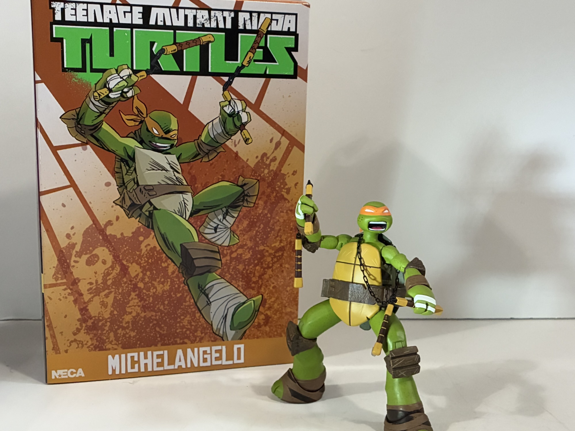
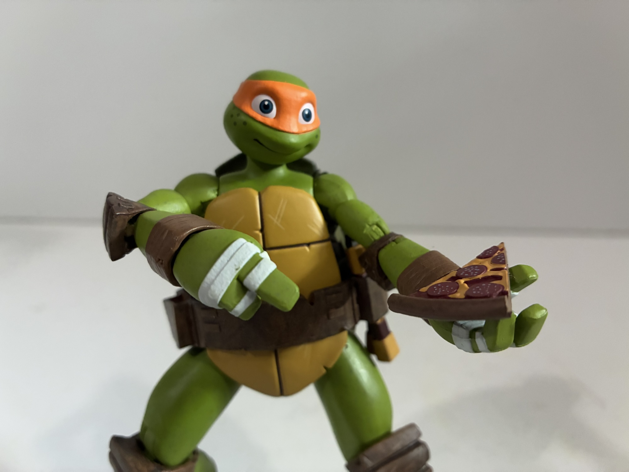
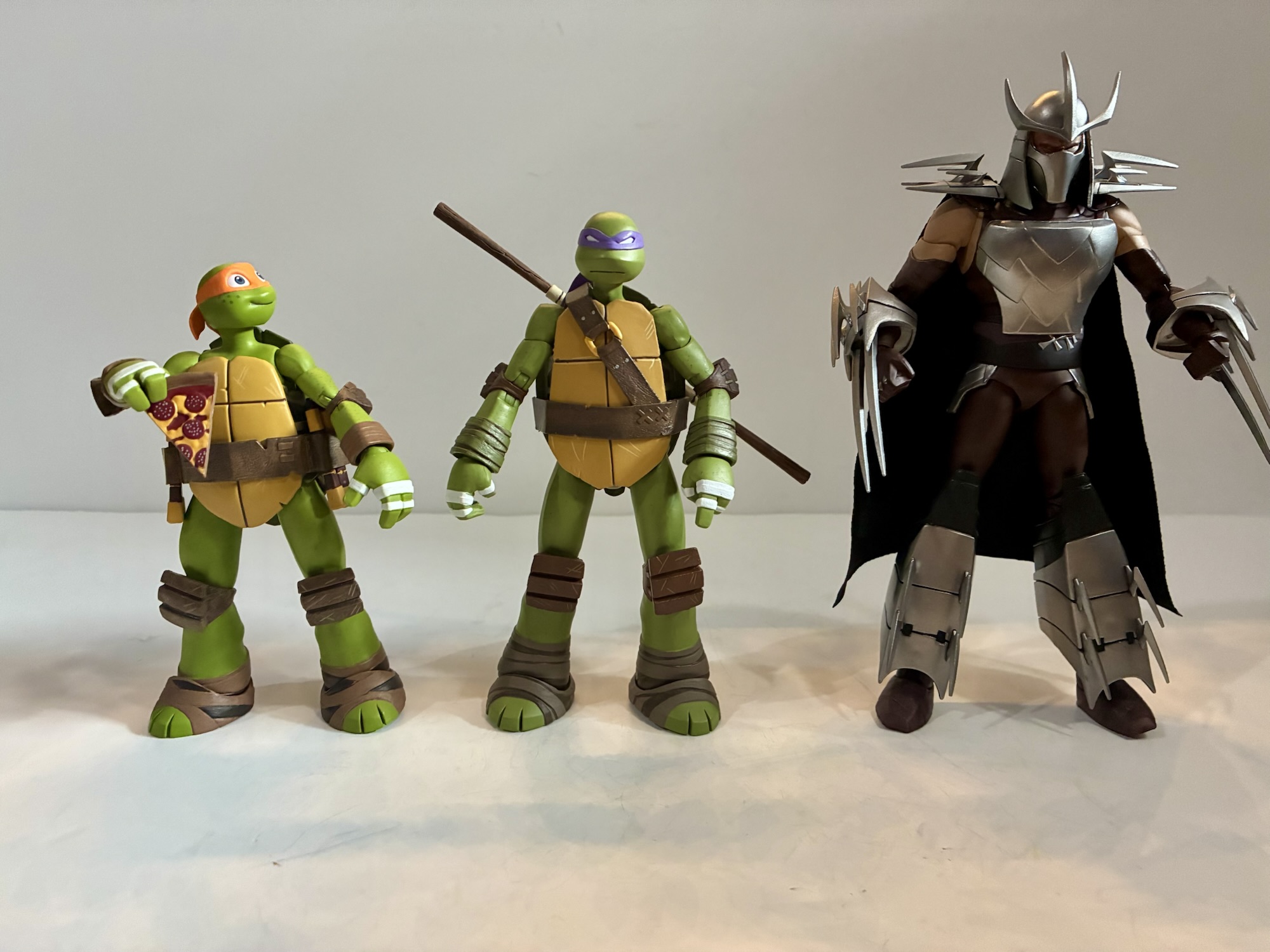
After a bit of a hiatus due to the Christmas holiday, we have reached the last of the four brothers from NECA Toys’ line of action figures based on Teenage Mutant Ninja Turtles, the 2012 animated series that aired on Nickelodeon. And who better to save for last than the party dude himself: Michelangelo. Mikey has always been the more carefree, happy-go-lucky, turtle. He doesn’t take anything too seriously and just wants to have a good time. He does have a big heart though and the 2012 version of the character was perhaps the most childlike one we’ve seen yet. He is a teenager like his brothers, but he is the smallest of the four and kind of the baby of the bunch. Maybe there’s a bit of arrested development there, growing up in a sewer probably isn’t the best for emotional growth, but he can throw down when he has to and proved himself shockingly competent when stranded in Dimension X.
Michelangelo is the only one Raph has bragging rights over when it comes to height.
Michelangelo is another sculpt by May Thamtarana with paint by Geoff Trapp and Mike Puzzo. He’s number two in the series and with four turtles you can almost complete the mural on the side of the boxes which was done by Ciro Nieli. Michelangelo stands at 5.25″ making him the shortest of the four, as he should be. He has a smiling, almost cherubic, portrait by default which suits the character. Like his brothers, he also has a battle portrait with whited-out eyes and a yelling expression. As perhaps the most expressive of the turtles in the show, it’s a shame we only get the two heads. I’d love a pizza scarfing head, an excited yell, or something even more cartoonish. NECA likely plans on selling us more Michelangelo figures though so they don’t want to give it all up on the first go even if the box does say “ultimate.”
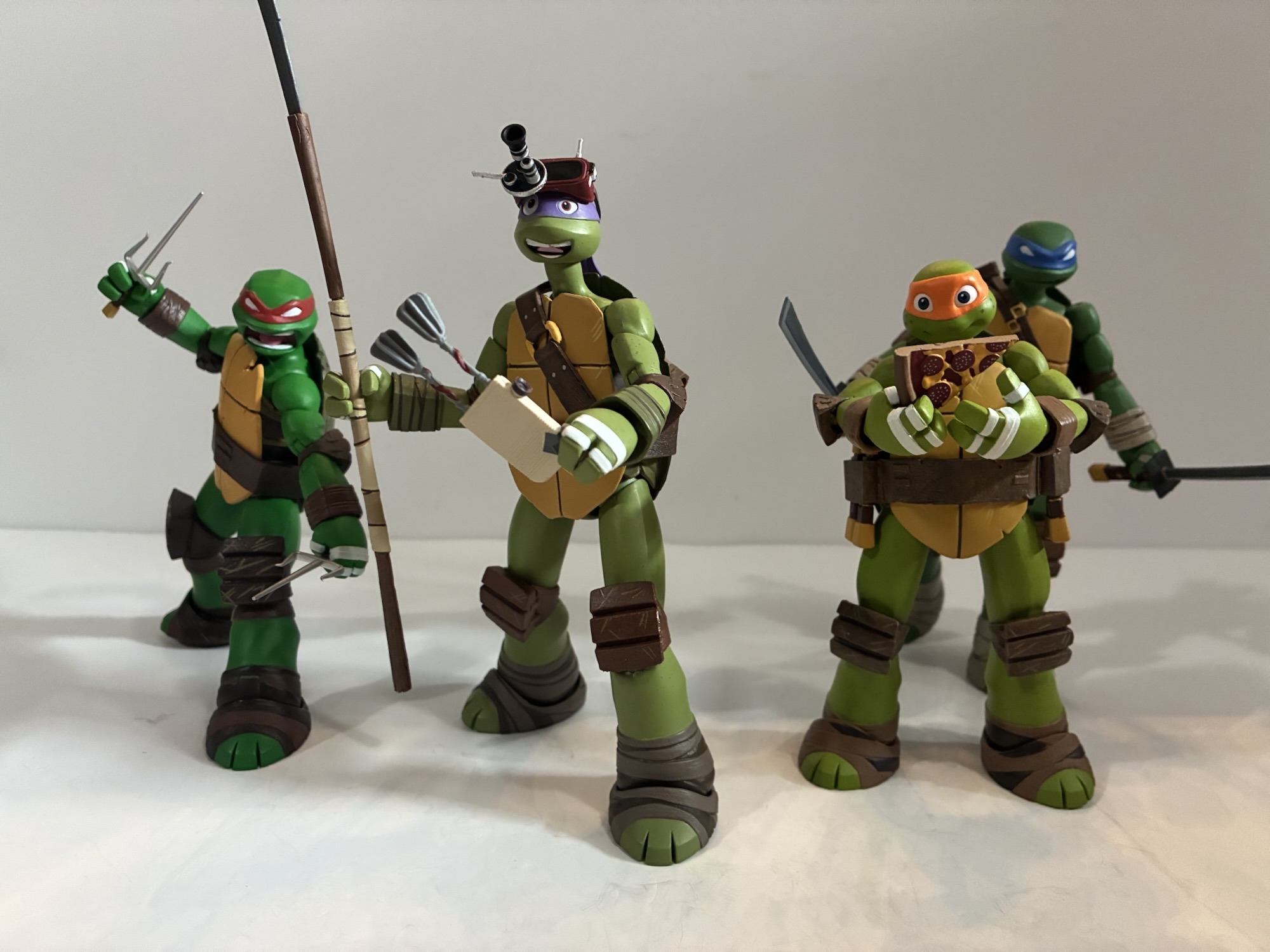
All of the turtles come with a slice, but Michelangelo is the only one who definitely needs one.
Michelangelo’s proportions and coloring looks pretty accurate to the show. He has thin arms and a pear shape to his body as it widens the further down you go. The plastron and belt have some nice distress effects sculpted and painted in while the pouches for his weapons are also present. Paint is mostly clean and NECA made sure to capture the freckles on Mikey’s cheeks. I do have one bit of paint slop near the left knee where it looks like some of the brown from the kneepad transferred to the leg. He’s very pleasing to look at overall and he might be my second favorite in the aesthetics department behind Donatello.
Mikey’s weapons got an upgrade in 2012.Old reliable.I feel like he needs a board to make proper use of these hands.
Michelangelo comes with a fairly substantial assortment of accessories. I already mentioned the second portrait, and for hands we have a set a gripping, pointing, hang loose, a relaxed left, and a C-grip right hand. The hang loose gesture is the same that came with Leo and it’s a much better fit here with Michelangelo. The C-grip hand continues to confound me to some degree as I’m not sure what accessory it’s intended to be used with. I guess the T-Phone, though you will have to heat the hand up first as it’s not quite wide enough to accommodate it. Which, yes, Mikey has a T-Phone as well as a slice of pizza and stink bomb, same as the other turtles. He also has his trusty nunchaku which are painted plastic handles joined by real chain link. The handles come apart where the chain meets them like the toon Michelangelo’s nunchaku, only here we’re not swapping to a spinning effect. Instead, Mikey comes with the longer chain with bladed weapon at the other end. In the show, Mikey’s ‘chuks could basically extend somehow and had a pop-out blade to make them just a little more formidable.
Aww, Icecream Kitty!
The last accessory is probably everyone’s favorite: Icecream Kitty. The mutated cat that lives in the freezer is included and she’s pretty well done. The figure doesn’t move, but it doesn’t really have to. It’s a nice spread of stuff, but with Mikey it feels like more could have been included. Some soft goods, pizza-stained, briefs would have been pretty funny. Some spinning effects would have also been much appreciated. I love the real chain look, but they don’t display well since gravity is always going to do its own thing. Like the other turtles, Mikey’s gripping hands are all really stiff so you may want to heat them up in order to get him to hold anything. With the handles of his weapons coming apart at the chain, they are easier to slip into his hands than some others. His second head also would not go on for me without heat, but your mileage may vary there.
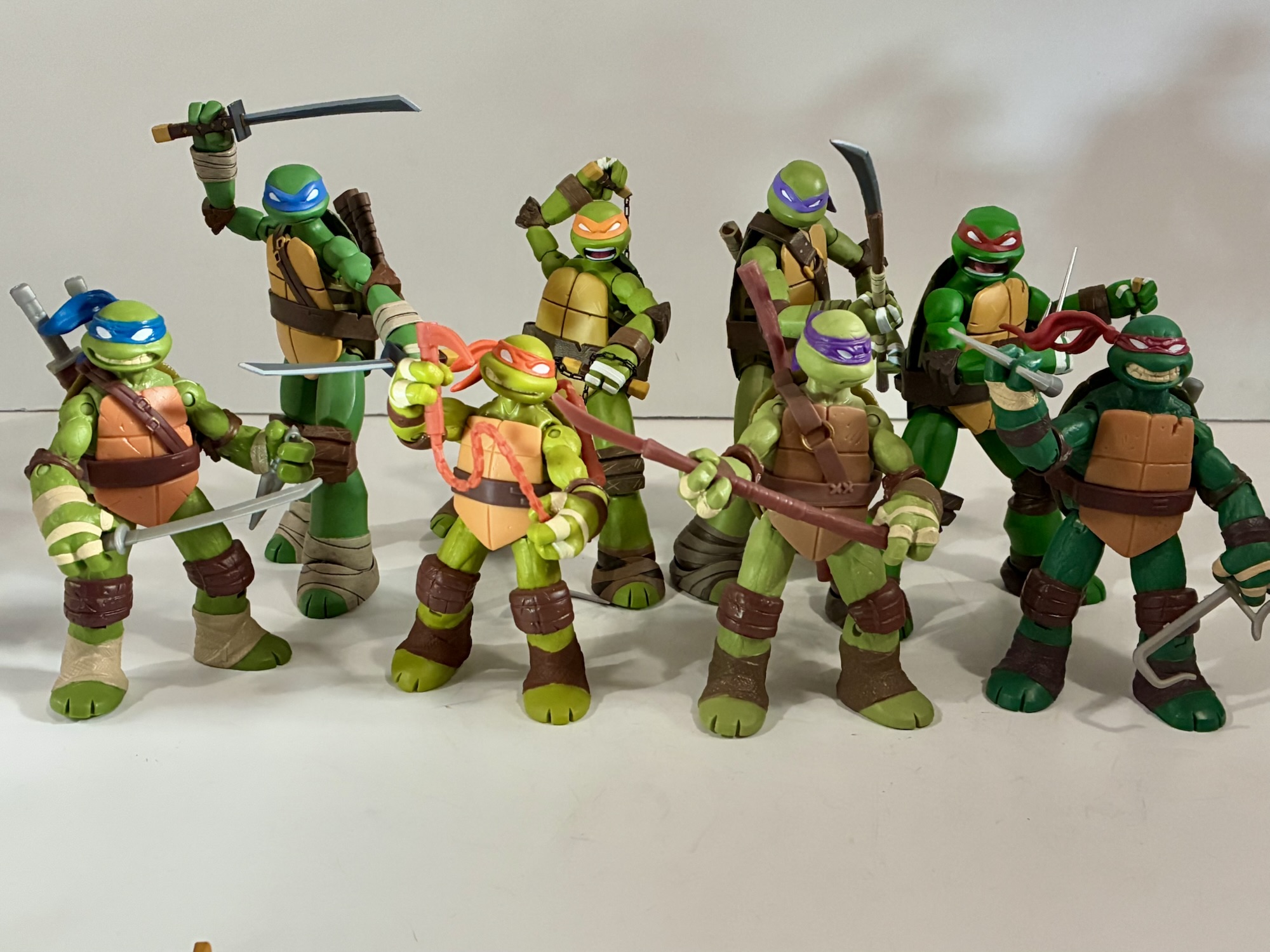
Since we’ve looked at all of the turtles now feels like a good time to bust out the Playmates originals.
Michelangelo’s articulation is the same as the others, but with him the range is a little less. His upper body is so much smaller that getting much range out of the shoulders can be a challenge. The right shoulder on mine is a bit stubborn as well at the hinge. It’s not stuck, but it also doesn’t appear to enjoy being articulated. The hips seem more restrictive as well. The rest are fine and nothing required heat in order to function. He’s going to get into some basic poses, but likely won’t impress in that department.
Ninjas on the prowl.
Michelangelo is about as good as the rest of his brothers. In my book, that makes him pretty solid. This is a line that does a good job of capturing the aesthetics of the show in a very generic way. The characters are unmistakable for what they are, but the available portraits and articulation are limited enough that you likely won’t be able to recreate your favorite scene. That’s pretty par for the course with NECA though which is very much an aesthetics forward approach with articulation and accessory count secondary. Aside from the hands, there is no reuse between the turtles so this isn’t as cheap a line to produce as some which is also probably why a lot of accessories are repeated. NECA was able to keep the MSRP at $38, which while not exactly cheap, is also not horrendously overpriced. These are a much better likeness at a far friendlier price than what Super7 did with its 2003 line. All that is to say if you liked the other 2012 offerings from NECA then you’ll like Michelangelo. And if you bought the other brothers you’re probably not skipping this one anyway. They are the best looking figures based on the show thus far and likely will remain that way for a long time to come. We may be done with the turtles, but we’re not done with wave one just yet as we have one final figure to look at: the Shredder!
If you missed the other reviews of NECA’s 2012 turtles then look no further:
We are onto the third member of the Teenage Mutant Ninja Turtles and its everyone’s favorite hot head. Raphael got softened for the 1987 cartoon series to make him sarcastic and a bit of a goof-off. He didn’t take anything too seriously and had a certain dry wit about him. It’s quite different from his…
We were able to get through some of the logistics of this line with Leonardo, so for this second review we can just get right to it. One of the best decisions the 2012 iteration of Teenage Mutant Ninja Turtles made was bringing back veteran voice actor Rob Paulsen. He’s voiced countless characters over the…
We’re going to start this one off with a question: When you order directly from a producer, do you expect to be first in line for product? NECA’s recent launch of its Teenage Mutant Ninja Turtles action figure line based on the 2012 Nickelodeon series raised this question. On September 16, NECA launched the line…
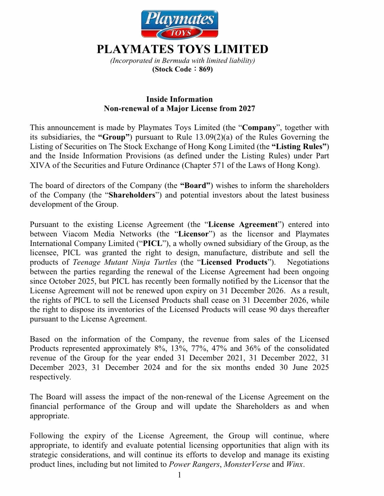
Before 2025 left us, it had one big piece of news to drop when it comes to action figures: Playmates Toys will no longer hold the master toy license for Teenage Mutant Ninja Turtles. If you’re into the action figure collecting hobby or have ever been a fan of Teenage Mutant Ninja Turtles then you’re likely aware of how big this is. Just in case though, without Playmates there would be no TMNT as we know it today. In the 1980s, the comic was a surprise hit and it attracted the attention of Marty Freedman and his Surge Licensing brand. At the time, there wasn’t much to Surge, but TMNT co-creators Kevin Eastman and Peter Laird decided to let Freedman sell the property as a potential toy franchise. The only problem was no one was biting.
Enter Playmates Toys which, at the time, was known mostly for dolls and such. The action figure market had been burning pretty hot in the 1980s and basically every toy maker wanted to find a way to penetrate it. There was definitely an element of oversaturation come the middle part of the decade. Kenner’s Star Wars line had basically created the modern action figure, but that line had slowed considerably following the completion of Lucas’s original trilogy with 1983’s The Return of the Jedi. Mattel had made huge in-roads with Masters of the Universe, and it paired with an animated series had basically created the modern blueprint for how to market toys to boys. Playmates was the only company interested in turtles and their involvement was contingent upon an animated series being created to accompany the line. The existing comic book just wasn’t going to cut it because of its limited reach, but also because it was not a book intended for kids. Playmates provided most of the financing for the original mini series that launched the TMNT franchise which debuted in late 1987. The first wave of figures followed in the summer of 1988 and the rest is history.
The source for the news that Playmates will not be continuing with TMNT.
Teenage Mutant Ninja Turtles has never been as popular as it was around 1988-1991. Still, it’s also never really gone away and alongside the franchise this whole time has been Playmates. Peter Laird stuck with them when it came time to reboot the franchise in 2003 and Viacom stuck with the company after acquiring it in 2009. That meant toys for a new film franchise, a new animated series, and then the successors to those. In 2025, Skydance stepped in and bought Paramount, which is the parent company of Viacom. With the master toy license apparently expiring at the end of 2026, Skydance has decided not to continue with Playmates for whatever comes next for TMNT ending a partnership that lasted nearly 40 years and is responsible for what the franchise is today.
As an adult collector, I won’t pretend like the mere fact that Playmates will no longer be making toys based on TMNT is a thing that upsets me. I long ago outgrew what Playmates was doing who remained committed to creating affordable toys for children even as the demographics of the action figure consumer skewed older and older over the years. Sure, they made some attempts at more collector focused toys and their reissues of vintage-era toys over the years likely hold more appeal for adults than kids, but Playmates wasn’t out here truly trying to compete with other companies producing adult collectibles. For that, we’ve had NECA, Bandai, and to a lesser extent, Super7. For years, the master license agreement Playmates held prevented other companies from making collector-focused toys based on TMNT, but that went away in the 2010s. Collectors may have still fumed at Playmates at times since they did have a hand in ending Super7’s line of vintage recreations, but I never personally blamed them for protecting their own designs. If Super7 wanted to recreate those old toys in 1:10 scale then they needed to get the legality of that all cleared up on day one and not figure it out as they went along.
This news is undoubtedly terrible for Playmates and those who work for the company. In the notice to investors announcing the decision, Playmates included the percentage of revenue TMNT had for the company over the past several years and it’s pretty staggering. I don’t know how they replace that. This year, Playmates has tried at bringing back Mighty Morphin Power Rangers, but I have no idea how well it’s performing (based on the toy aisles around me, not well). I know they had Godzilla and Voltron somewhat recently, but neither seemed to have made a big splash. Where they go from here is anyone’s guess and I hope this doesn’t put an end to them.
With the agreement with Playmates coming to an end, does that also mean NECA’s days are numbered?
From a collector standpoint, what this means for the other companies holds great interest to me. It is not uncommon for other licensing agreements to be tied to the master license. In other words, if the master license expires at the end of 2026 for Playmates then it’s possible the same is true NECA, McFarlane, Super7, and everyone else. TMNT has become the property that has the most cooks in the kitchen these days. It’s almost comical how many companies have made TMNT figures of late. The licenses for overseas production (like JoyToy) may not be impacted at all nor may a license for an odd scale like Mondo’s who is embarking on a new line of sixth scale turtles in 2026. Or maybe they are? We don’t know, and it likely depends on what comes next.
Typically, if a company is not renewing the master license it’s because another company came in and outbid them. So far, we don’t know that to be true as no one has come forward with such an announcement. This is curious as one would expect that whoever did land TMNT would be pretty excited about it and would want to make such information known to its own investors. With Toy Fair a mere two months away, it’s possible such news is being saved for the trade show, but in today’s world that rarely seems to happen. It’s possible this news that Playmates will not hold the license after 2026 was designed to drum-up bidding for it. If Playmates apparently can’t afford it any longer it begs the question who can? Most immediately assume Hasbro could be in play. As one of the biggest toy producers in the world they’re always going to be linked to any major property that comes loose. Mattel could be in play, but that company just laid out money for the DC license – can they take on TMNT too? McFarlane, who previously held the DC license and will be losing it this coming year, just started dabbling in TMNT in 2025 – maybe that relationship has worked well? Could they possibly afford it?
Whoever does get the license will likely want more control over the property like Hasbro does with its Disney properties and like Mattel will exercise with DC. This could very well be the end for NECA, Super7, and the rest as far as TMNT is concerned. Unless one of them can manage to afford the master license or if Skydance surprises everyone and elects not to pursue a traditional master license. It’s possible that with Mutant Mayhem 2 on the way in 2027 that Skydance just wants to license that brand out to someone to make toys geared towards children. Maybe they end the general license and instead put into actual agreements certain eras of the franchise. NECA gets ’87 and 2012, Super7 gets 2003, McFarlane keeps IDW, etc. I doubt it, but until we hear otherwise I suppose it’s possible.
And why do I doubt it? Because companies like Skydance are in this to make money. Playmates likely paid more money for the master license than any of these companies and it wouldn’t surprise me if their sales are still more profitable than the collector market. As new owners, Skydance holds no allegiance to these old agreements. In corporate acquisitions, it’s not at all uncommon to see the new owner end past agreements and forge ahead with its own. They like to be able to tell their shareholders that they’re responsible for whatever revenue they make and not attribute it to the old regime. It’s stupid, but that’s how these things often go. And eliminating these deals and obligations can also lead to something else: a potential sale of TMNT.
It’s probably not a good thing when your new owner doesn’t view you as a key part of the company’s future.
When Skydance acquired Paramount this summer, new chairman George Cheaks circulated a memo in which he named the key franchises for Paramount as SpongeBob Squarepants, PAW Patrol, RuPaul’s Drag Race, South Park, Ms. Pat, and The Daily Show. Notably absent was Teenage Mutant Ninja Turtles and this memo was often brought up in news reports about the cancellation of the Paramount Plus series Tales of the Teenage Mutant Ninja Turtles. It begs the question that if Skydance doesn’t view TMNT as a key part of its present and future does that mean they want out of the turtle business? It’s certainly possible and if the franchise isn’t tied down by any other external agreements that might actually make it more attractive to potential buyers. The sequel to Mutant Mayhem is due to arrive in the fall of 2027 and how Skydance handles that could reveal a lot. If a delay is announced early on in 2026 that could be a bad sign. It feels like anything could be on the table there as Warner Bros. has recently shown the world these massive corporations do not care one bit about cancelling a movie for tax write-off purposes.
The only certainty right now is that Playmates will stop producing toys for Teenage Mutant Ninja Turtles at some point in 2026. Where they cut things off remains to be seen. If they have more stuff planned for the current iteration of the franchise do they continue with it or just shut it all down? Do they just go all out with rereleases in 2026 as those are quicker to produce (assuming they still have the molds) and probably sell just as well as the new stuff? It seems like if they’re ever going to cash-in on the likes of Scratch and Hot Spot now would be the time do it. As someone who fell in love with TMNT back in the 80s when Playmates came onboard I’m definitely sad to see this era come to an end for no reason other than it’s just something that’s always been. Teenage Mutant Ninja Turtles no longer being associated with Playmates would be like Hasbro dropping Transformers or Mattel selling off Masters of the Universe. For me, this will be the biggest shake-up in toys since Marvel went to Hasbro ending the Toy Biz era. My hope for 2026 is that these other companies don’t take anything for granted. If they’ve been holding back on anything, now is the time to do it because tomorrow is promised to no one.
If you want to reflect on the Playmates output for TMNT then maybe these will interest you:
I think it was during the summer of 2020 while spending one of the many days of that year inside and isolated that I stumbled upon a Twitter post about an upcoming book titled Rad Plastic. I believe the tweet was from the account The Toys That Made Us, which is (was?) a Netflix series…
Last week we took a Turtle Tuesday off which feels like a rarity for this blog. And that’s because there seems to be new stuff featuring the Teenage Mutant Ninja Turtles branding coming out all of the time. And it’s only going to become more plentiful as the franchise celebrates its 40th anniversary this year.…
A few years ago, Mattel launched a new subline of action figures based on their most famous IP: Masters of the Universe. The subline was titled Origins and it basically took the vintage toys of the 80s and updated them with more modern articulation while still preserving that vintage aesthetic. And ever since then, collectors…
We’ve got another 11 special slot for you today. After all, it is the season of giving, is it not? And once again, we’re mostly sticking to the land of children’s fair or G-Rated content. In fact, our most aggressively G-rated special leads things off today.
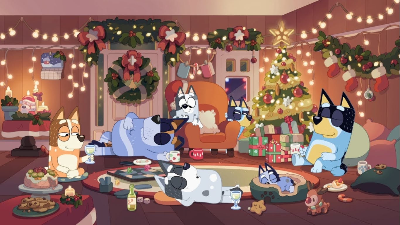
I detailed in the write-up for this one that I basically have a “No Preschool” shows rule when I do this and that’s because that’s a genre that is very specialized. It’s not that adult comedy isn’t, but preschool might be the only genre that really can’t entertain a demographic other than its intended one. However, one show rises above them all: Bluey. I know many adults who adore the Australian import and her canine family – I’m married to one of them. The show is charming and clever and it manages to impart worthwhile life lessons without feeling too formulaic. The adults are incredibly patient with their children and always down to play making them seem like the idealized version of a parental figure. Unfortunately for our purposes, the Christmas episodes aren’t the best. This one unfortunately is a bit formulaic as Bluey is wronged by her toddler aged cousin and basically seeks revenge by hurting her feelings. Still, there’s some fun stuff and I really like the food coma impacted adults. Bluey might make the parents play like kids, but it’s also not afraid to show them as adults.
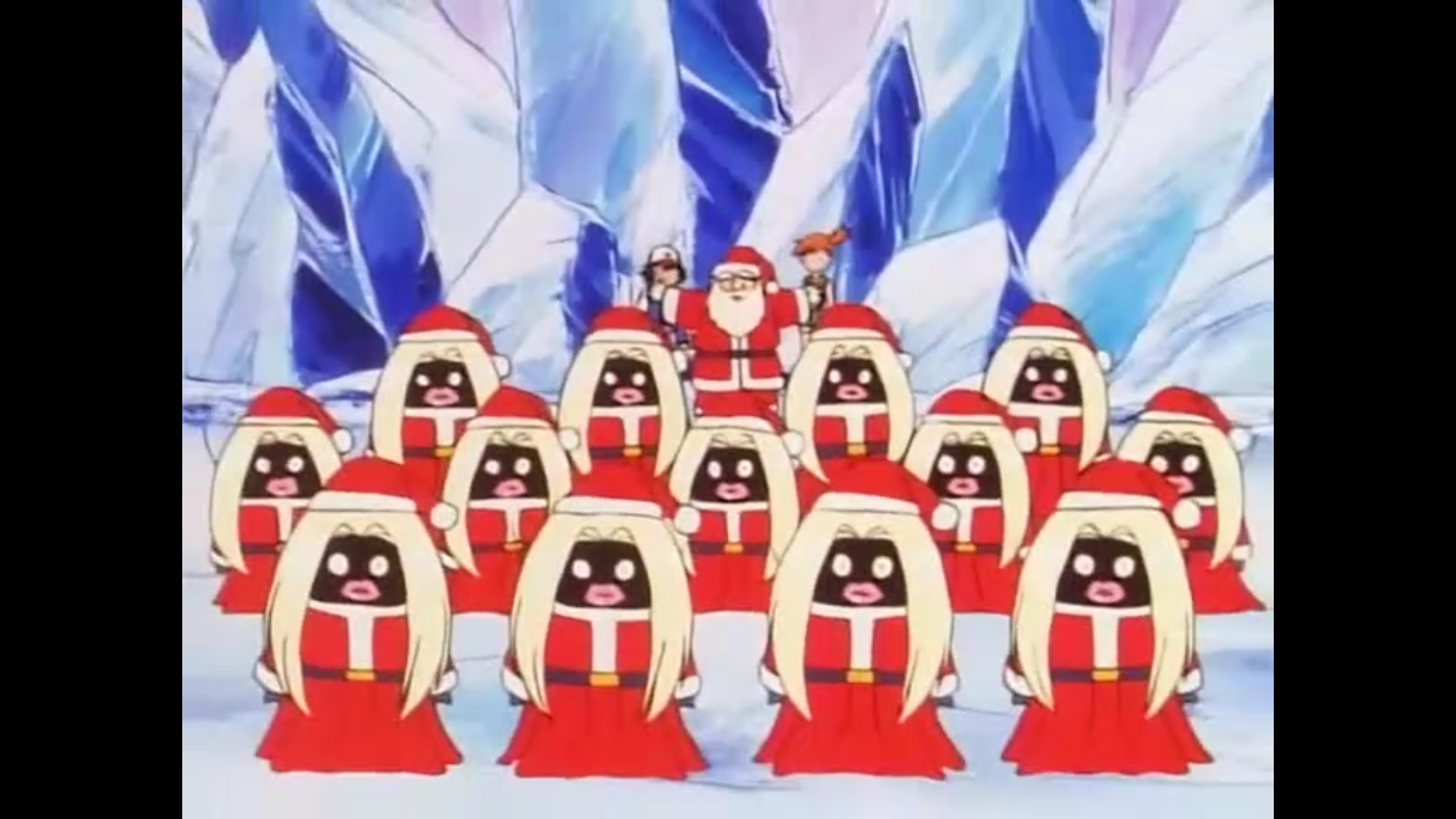
Pokémon may not be as popular as it was in the late 90s and early 2000s, but it’s still plenty relevant. The show, in its various forms, number hundreds of episodes and yet this Christmas episode from 1999 is one of the harder to view today. That’s all due to the presence of Jynx, the pocket monster who resembles a character in blackface. Even though she’s been recolored to deemphasize that, this episode still remains “lost.” Is that a big deal? Only if you really like Christmas episodes. In this one, Ash and his pals wind up at Santa’s village and need to help him out and thwart Team Rocket in the process. There’s a bit of a B plot with Jessie and her connection with Christmas, but it’s nothing profound. It’s a pretty okay episode of TV with some interesting lore (that I think the show dropped) if you’re a Pokémon fan.
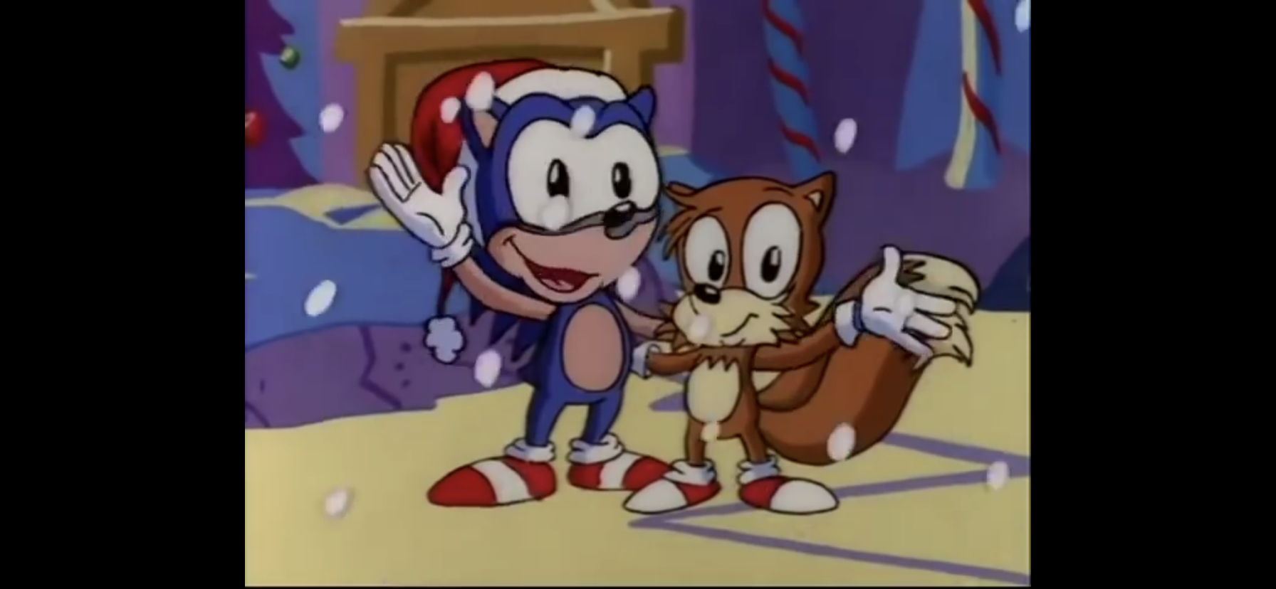
It still blows my mind that the 1987 iteration of the Teenage Mutant Ninja Turtles never tackled Christmas. There was no Christmas episode, no Christmas themed action figures, nothing. The 1991 movie The Secret of the Ooze got a Christmas-themed poster to help sell VHS copies of the movie which feels like the closest thing we got. We really should have had a mutant reindeer or something in the Playmates line. Anyway, this holiday episode comes from the 2003 series and it remains the only Christmas episode any TMNT cartoon has featured – which is perhaps even more insane. It’s based on the Michelangelo one-shot from Mirage Studios and features a simple plot where Mikey thwarts a Christmas robbery and also adopts an adorable kitten. Klunk is the original ice cream kitty. The issue was adapted for the show and it’s pretty faithful. The only major change is that while Mikey is out doing stuff the rest of the gang is back at the lair hosting a bunch of friends they’ve made throughout the show. It’s solid, nothing spectacular or revolutionary, and it does feature some nice Christmas outfits during the final scene that I’d love to see in action figure form. At least in 2025, the Christmas drought comes to an end for TMNT with the theatrical short Chrome Alone 2: Lost in New Jersey. It’s from the current version of the franchise and is attached to a new SpongeBob movie opening on the 19th. Hopefully, it can be viewed easily without seeing that movie.
At least it gives Disney a new look to sell as a doll for Belle.
In 2017 I had the crazy idea to dedicate one of my write-ups to a movie – what was I thinking?! If I had to guess, I was just curious if this direct-to-video midquel for Disney’s Beauty and the Beast was any good. The actual movie is one of my wife’s favorites so it was something we could check out together. And it’s okay. Honestly, most of the direct-to-video Disney stuff I’ve seen has been perfectly fine. Not on the level of the theatrical output, but mostly entertaining. It doesn’t look as good, naturally, and features some regrettable CG that hasn’t aged well, but it tells a decent Christmas story that mostly fits into the movie without creating too many obvious plot holes. And it has Tim Curry who is wonderful in everything. Honestly, if you’re able to separate this from its theatrical better then it’s perfectly fine. That’s just an admittedly difficult thing to do if you’ve already seen it a bunch.
The Disney show that asked “Do you want to build a snowman?” way before Anna.
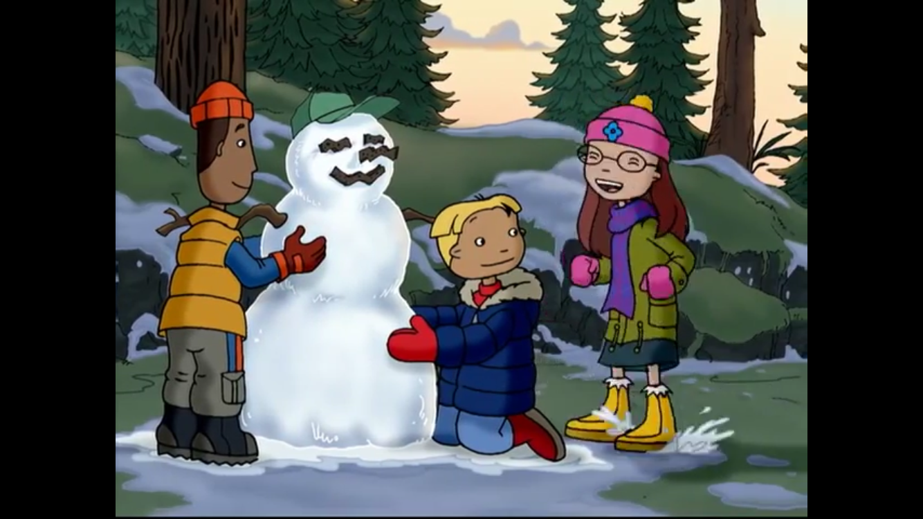
Interesting that we wind up at The Weekenders a mere three spots ahead of Pokémon. That’s because the legacy of this show seems to be that it temporarily dethroned Pokémon as the Saturday morning ratings king. I honestly don’t really know why. The Weekenders isn’t a bad show or anything, it’s just a bit of a low energy one which feels a bit out of place for Saturday morning. Then again, it’s from ABC which always had the low energy Saturday morning shows. It was like their specialty or something. I was a Fox Kids kid so I didn’t watch much of the stuff on ABC and by the time this show was airing I wasn’t awake on Saturday morning anyway. This one is fine though. It does the thing where it gathers a bunch of kids from different backgrounds, gives a snapshot of their holiday experience, and also sneaks in one wacky adventure that mostly goes wrong. I don’t like the look of this one at all, but the kids are well represented and feel authentic. It’s an emotionally mature cartoon, whether or not that’s something you like is more subjective than anything.
The Christmas special where Nickelodeon tortures a kid and his dog.
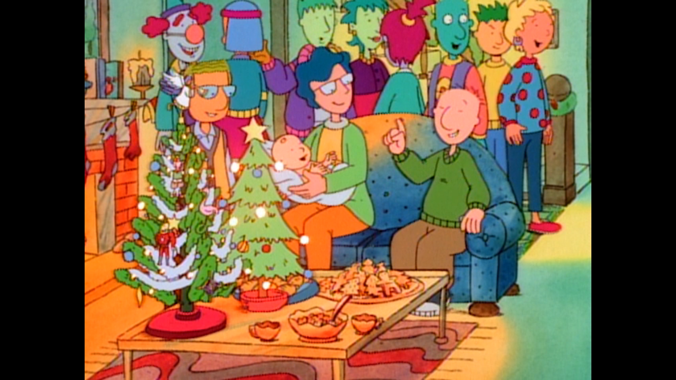
Interestingly enough, this leads us to Doug. Doug was the quiet Nicktoon. It’s grounded, to a point, but has its own cartoon traits to distinguish it from live-action. And most of those traits rest with the dog, Porkchop, who is the subject of “Doug’s Christmas Story.” Porkchop is a bit like Scooby Doo, though without the talking. He gets accused of attacking one of the kids in town which is preposterous for all regular viewers of the show, but it gets taken very seriously. We basically see the titular Doug imagine his dog getting put down and it’s made rather apparent that euthanasia is on the table for old Porkchop. It’s a humorless Christmas special that’s rather weighty as a result. And that’s fine as long as the show does the plot justice. As far as that goes, the results are a bit mixed. It loses me in the final act, but it’s not bad and a sad story about a dog at Christmas is sure to bring about some Christmas feels.
I didn’t know how to separate these two, so I didn’t! This episode comes from Disney’s take on Doug which is largely viewed as inferior to the Nickelodeon years. I mostly subscribe to that notion, but I honestly didn’t keep up with the Disney version. I am by no means the authority on Doug, but I did enjoy this episode just a little more than the first one. The plot is Doug’s family is preparing for a new baby and that basically consumes his parents at Christmas time. His dad is apparently afraid to leave the house or has money concerns with a new kid on the way so the Funnie family won’t be buying anything or doing anything this Christmas. Doug hates this lack of Christmas spirit so he and Porkchop vow to have their own, secret, Christmas up in his room. It honestly takes up only a few minutes of the episode’s duration as most is devoted to Doug navigating the holiday and then the final act is all about the baby. It’s charming though and the final act hits better than the first Christmas special.
The DC Animated Universe has made a few attempts at Christmas episodes, but I don’t think any are really a home run. This is the one from the ensemble show which brings its own challenges, but also opportunity to view the holiday through different perspectives. Writer Paul Dini attempts that with “Comfort and Joy” and the results are just decent as opposed to a Christmas classic. I think I enjoyed the more offbeat plot between Flash and Ultra-Humanite the most. It had some solid humor and I like the depiction of Ultra-Humanite. The Martian Manhunter plot is the one that I think the episode wants us to be moved by, but it’s pretty conventional “Guy goes to small town and finds the Christmas spirit,” plot. It’s fine, but it’s been done before. And the Hawkgirl and Green Lantern plot is a waste of time. No Batman and no Wonder Woman so if you wanted to see them you were let down. Considering Batman has already taken a go at Christmas, it’s not a big loss. I guess I would have liked to see what Wonder Woman was up to, but at least she wasn’t shoehorned into one of the other plots which were crowded enough.
If you want a brief, Christmas, short that looks pretty cozy then have I got the cartoon for you. Bedtime for Sniffles is a Chuck Jones directed Warner Bros. cartoon starring the mouse in his cute days. Sniffles would evolve into more of a pest since his cartoons weren’t funny enough, but here he’s just a sweet character trying to stay awake on Christmas Eve. There’s some visual humor, but nothing outlandish. This is Jones really trying to audition for Disney as the look of this one is very evocative of a Mickey Mouse short with realistic and well-detailed backgrounds and a character that emotes in the cutest way possible. It’s harmless fluff and better than a lot of other Looney Tunes/Merrie Melodies Christmas specials.
Bobby – slamming doors in the face of carolers since 1995.
More cutesy stuff as we’re onto the Fox Kids series Bobby’s World. This was a Howie Mandel creation back when it felt like a lot of comedians were getting opportunities in television. We had Camp Candy, Little Rosie, and Life with Louie among others. Bobby’s World felt like an early breakout hit for the Fox Kids Network on its march towards Saturday morning dominance. Bobby was pretty wholesome, but the show was also a comedy so there’s plenty of silly stuff to entertain the kids. For this one, Bobby travels to see his grandparents and engage with his extended family. He wants a video game for Christmas really bad, but he’s going to have to learn the Christmas spirit instead because everything goes wrong. It’s solid, though I did kind of hate the resolution. It’s worth watching and you could really put together a solid viewing party of Christmas specials from Fox Kids if that was your goal.
My mom loves the kid on the left so much she named her cat after him.
Boy, did this one take a tumble since I first mentioned it? This one was part of my initial list of my 25 favorite Christmas specials which I compiled back in 2015. Then, I had it ranked all the way up at number 16! There may have been some recency bias at play for even though this special debuted in 2009 I think I had seen it for the first time fairly recently in 2015. Back then, I mostly stuck to “the classics” when it came to my Christmas viewing and it was doing this blog that really caused me to both branch out and to rediscover Christmas specials I had not seen in years. Yes, Virginia suffered as a result, but it’s still plenty fine. It might have worked a little better as a shorter subject as it is a little slow, but I enjoy the story which is loosely based on reality. In it, Virginia is a believer in Santa, but she’s at that age where her peers stop believing and she’s getting left behind. Her dad has a saying that “If it’s in The Sun, it’s true,” referring to the local paper so Virginia decides to write to the paper asking if Santa Claus is real. And wouldn’t you know, they print a reply that says “Yes, Virginia, there is a Santa Claus!” It’s a great climax, it just takes a bit to get there and some of the stuff along the way is less fun. Plus, it revolves around mostly adult characters who dismiss the idea of Santa which limits the special’s reach with kids. I never liked showing my kids stuff that might create doubt about Santa so maybe this is more of a special for kids in Virginia’s age range. They do sneak in a real Santa at the end, but I don’t know how reassuring that is. By far though, the real reason why this has dropped so much is it is ugly to look at. Cheap, 2000’s, CG has not aged gracefully and maybe that’s why it’s no longer on TV? There are other versions of this story out there which I should check out, but even though I no longer have this one in my top 20, I still think it’s worth watching provided you’re not bothered by the Santa stuff I already mentioned.
Can’t wait until tomorrow for more Christmas? Check out what we had to say on this day last year and beyond:
This year we’re doing not one, but two classic Mickey Mouse shorts set at Christmas time. The first one, Mickey’s Orphans, was a cartoon I had failed to mention years ago when doing a scattershot look at Mickey-related Christmas specials. Today’s subject, Mickey’s Good Deed, was mentioned in that post and is the second Mickey…
I don’t think there’s much debate that the most popular and enduring character churned out by the Hanna-Barbera factory during its hey-day is none other than Scooby Doo. About the only franchise that even competes with the big dog is The Flintstones, which hasn’t been relevant for ages. Scoob has basically had an omnipresence ever…
When I was a kid growing up in the 80s The Berenstain Bears was a popular series of books that usually imparted a simple, clear, message. I seem to recall a fire safety book being a go-to in school for fire safety week and I know I got a copy of one about not eating…
Today, we move on with our Ultimate Christmas Special Rankings starting with number 199. As you can probably guess, we’re going to generally stick to 10 a day in order to have this neatly conclude on Christmas, but we’ll have a couple spots where we’ll have to do more. This isn’t one of those spots as you just get 10 today. Like yesterday, these specials are what I would consider to be genuinely bad, for the most part, but we’re working our way to the “meh” part of the rankings. We’re also going to kick things off with one I probably dislike more than most. There is a part of me that feels like I’m being unreasonable, but I pretty much loathe number 199.
Hah! It’s a snowman with a nut right where…his nuts…you know…
The Ice Age franchise had a nice run for itself, commercially speaking, during the 2000s. I can’t say I really loved any of it, but my memory of the movies I did see are that they were fine. Decent family entertainment that I never have to see again. For some reason, I hate this Christmas special. Maybe I was just in a bad mood when I went back to it last year for the countdown, but I just hate-watched the damn thing. Every plot point irritated me, it was so predictable, cliche, and talked down to the viewer. The attempts at humor were supremely irritating. I think this style of humor just didn’t age well. The competent CG doesn’t come close to rescuing it and I get no feels from it other than white, hot, rage. I honestly expect most people to see my take and not quite get it. Most probably see this as a pretty by the numbers, ho-hum, Christmas special. Let’s move on though as I’m already sick of talking about Ice Age.
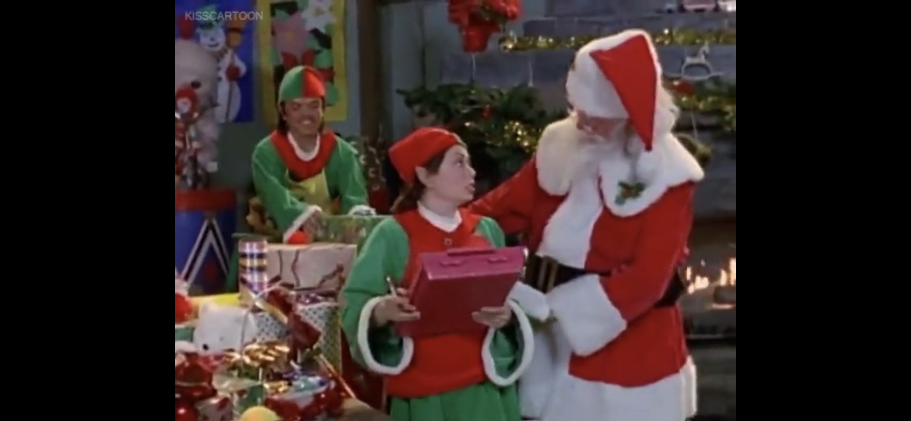
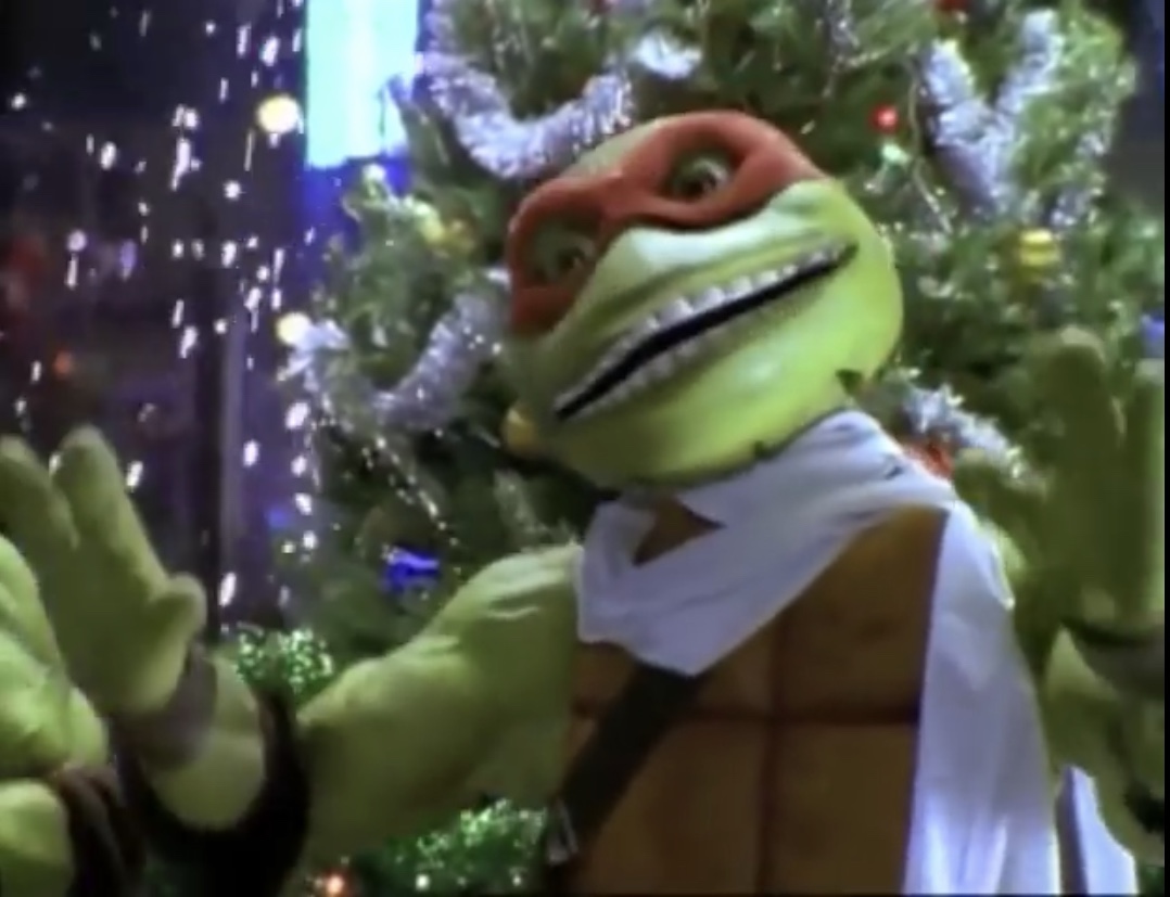
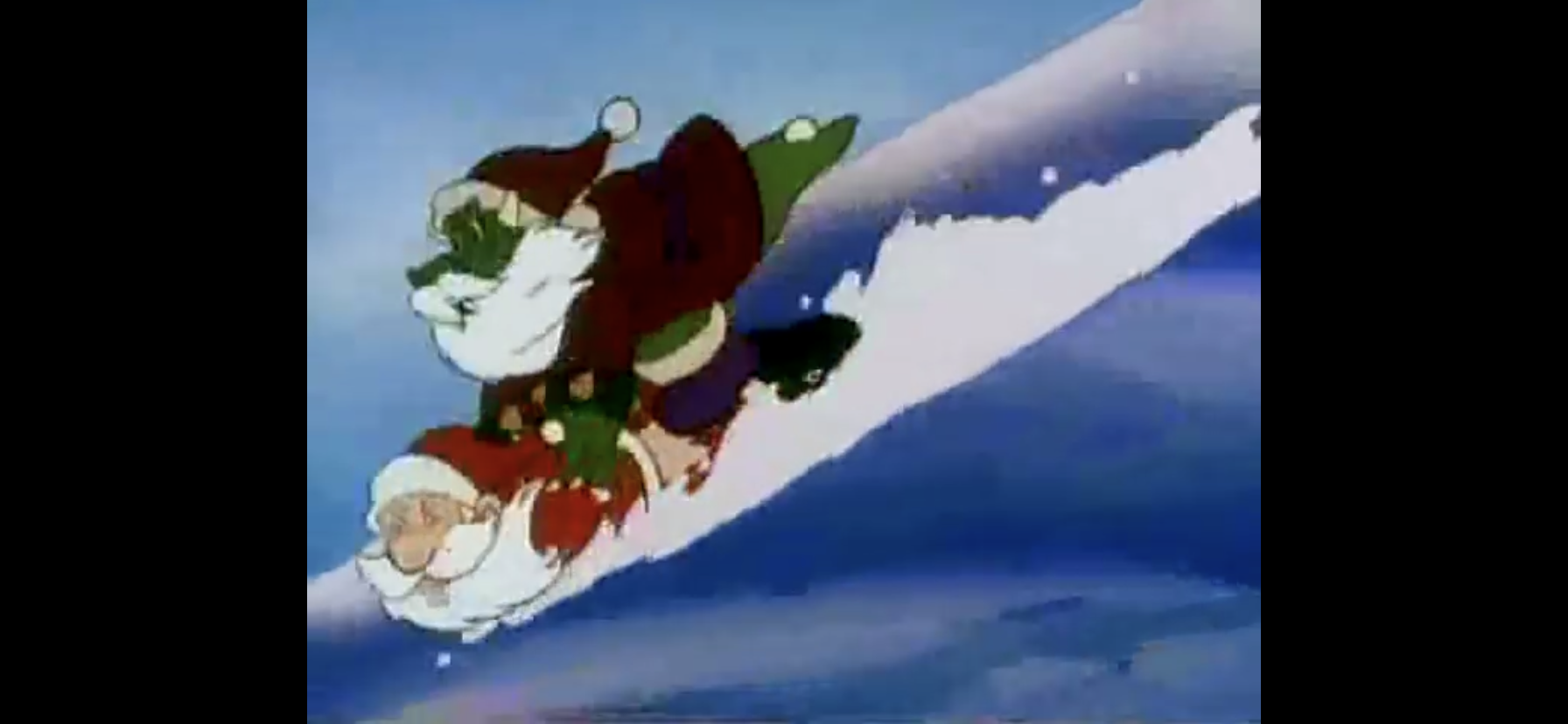
Okay, this is a bad Christmas special. Very bad. It’s also entertainingly bad and it helps that I didn’t make my parents spend $30 on a VHS of this thing when I was a kid. It’s brief which helps. If this was your more typical hour long special then it would likely be intolerable. The only bummer for me with this one is that it’s the only Teenage Mutant Ninja Turtles Christmas special from this era. The ’87 cartoon had an episode where the turtles met the freakin’ Easter Bunny, but no Christmas episode. Instead we got this: repurposed live show costumes with unrecognizable voices and actors. It’s bad, and the budget must have been almost nothing. The songs suck in such a way that they’re funny, and the special is so well known now that we even got some NECA toys last year based on it. What a time to be alive.
He’s laughing, but there’s nothing funny about this one.
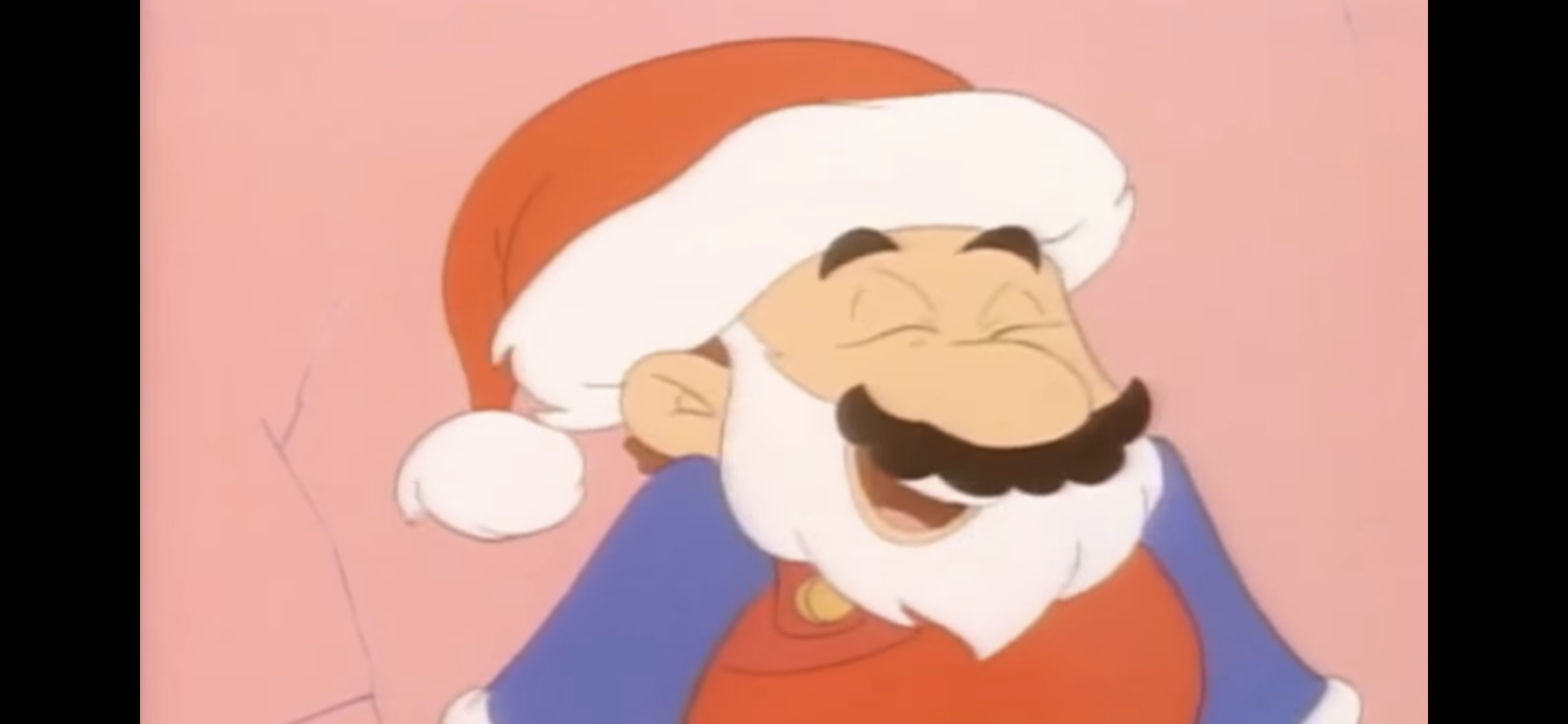
This one is barely a Christmas episode as it’s a made-up version of the holiday by Mario to supplicate some cave people he deems as lesser than him. Poor, misguided, cave, people, if only they had a holiday to believe in? Mario the missionary brings them Christmas and it just turns one cave person, Oogtar, into a spoiled brat. He almost ruins Fake Christmas, that little Ratgoo, but everything turns out fine in the end. It’s just phenomenally stupid and the Super Mario World cartoon was pretty terrible. There’s a reason why Nintendo wants nothing to do with it or its predecessors these days.
In this holiday special, the Smurfs are tasked with saving some kids from Satan. Yes, you read that correctly.
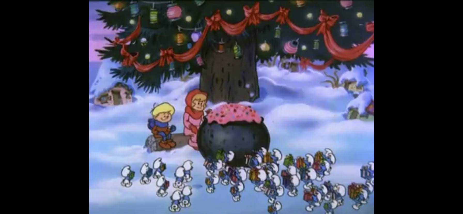
Oh boy, this one took a pretty surprising turn. The Smurfs holiday themed episodes manages to be both forgettable and also get mixed up in my brain. The other Smurfs holiday episode I covered is a better Christmas special, but so unmemorable. This one? This is the one where the Smurfs have to take down the god damn devil! What other conclusion is there to draw from the villain? Every other plot point here is pure corn, just garbage, Christmas, stuff. The Smurfs are a pretty terrible franchise that has somehow endured – I guess people really like little, blue, men?
Another video game mascot with a Christmas special, and it’s not much better. This is a cheaply thrown together episode of The Adventures of Sonic the Hedgehog, the wacky cartoon and not the more serious Saturday morning one. I hate the visual style and the plot is nonsense, plus an unspeaking Sally Acorn role? They did her wrong. It just manages to be memorable because of the wild turn at the end. Spoilers if you haven’t seen it, but Santa Claus retires! Yes, the big man hangs them up, but don’t worry as he has a successor ready: Sonic the Hedgehog. In the world of Sonic, he is now Santa Claus. It’s canon and I’ll hear no argument against it, I’m just patiently waiting for one of the video games to acknowledge this fact.
Pretty convenient all of these video game cartoons landed so close together, eh? It’s by design. This list has a subjective element to it where I did try to group things together to some degree. Especially when it comes to kids specials and the more subversive adult comedy ones. And spoiler alert, tomorrow very much has a theme to it. Anyway, this is another lousy Super Mario Bros. cartoon that takes place during Christmas and this one has a more conventional holiday plot. Koopa is out to take over Christmas and Mario and the gang have to save Santa. Toad learns a lesson and Luigi gets to help out. It’s all pretty conventional. There’s some awful animation and if you watch the full episode this is from you get some live-action stuff that has nothing to do with Christmas. Seriously, what a wasted opportunity. The only redeeming element to this one is basically the same as the Super Mario World cartoon: Koopa. I find him entertaining. Oh, and it’s also really short.
The Mighty Morphin Power Rangers had one Christmas episode and it came during the White Ranger era post the departure of the original red, yellow, and black rangers. In other words, it’s from an era of the show I didn’t watch as I fell off during the second season. I came back for the White Ranger mini series falling for the hype, but didn’t stick around. This one is pretty damn stupid. The Rangers have to go to the North Pole and stop the forces of Lord Zed who have taken it over. It’s an episode that was clearly conceived of on the US side because we don’t get a single shot of the Rangers in action. They stay in their teen persona so there’s very little action. Instead, there’s lots of bad acting that wouldn’t even be passable for a soap opera. The storyline back at Angel Grove with the sad kid or whatever? Terrible – no one cares. I wanted to see the Megazord slice and dice some massive reindeer monster or something and this did not deliver.
I have to admit, I don’t remember anything about this one. Or rather I didn’t until I went back to it before writing this. And yeah, it’s not very memorable. It’s from an era of cartoons on television where budgets were very small and the animation was very limited. This thing is capital U Ugly and I find nothing charming about the character designs. The audio quality is poor as well, though that may be a preservation problem and not something that was apparent at the start. It’s very similar in tone and quality to Tennessee Tuxedo, but shorter and therefore better. And for a character named Krazy Kat, she’s not very crazy. The craziest thing about her is her choice in grammar.
It’s big, beefy, dino-men in Santa hats – did you expect something else?
When it comes to cartoon dreck, there isn’t much lower than the direct-to-syndication cartoon that only exists to sell toys. And it gets even worse when that toyline is just a blatant rip-off of a more popular one. That’s Extreme Dinosaurs for you, which was an extension of Street Sharks. It’s terrible. It is the sort of cartoon where it can look okay in still shots because the character designs are big and colorful, but once things start moving around it turns to shit. I hate all of the attempts at “extreme” language or whatever and this is the sort of show that somehow makes dinosaurs seem lame. As for a Christmas special, it’s another let’s help Santa plot. Not a full-on The Santa Clause, but yeah, dinosaurs are going to help save Christmas.
Mickey does not subscribe to the whole “love thy neighbor” thing.
Around the turn of the millennium, Mickey Mouse tried to make it again in shorts and the results were mixed at best. Mickey’s Christmas Chaos is one of those shorts and it’s tonally kind of a mess. Mickey behaves more like a Warner Bros. character here as he goes to war with his neighbor Mortimer as each tries to one-up the other with their Christmas decorating. The animation is so flat that it limits the impact the gags can have. Plus, there’s really nothing new here. There are no pieces of physical comedy that feel original or offer a new twist on an old concept. I get trying to redefine Mickey or show a different side of him, but this isn’t it. Paul Rudish would figure it out much later. At least this one has a nice ending for best boy Pluto, and if you’re someone who disagrees and actually likes this one then good news! There are a pair of Christmas episodes from the House of Mouse series full of crap like this!
That’s all for now. Come back tomorrow as we move into the bland and the meh that also happen to be free and easy to view. We’re going into the public domain, folks!
Can’t wait until tomorrow for more Christmas? Check out what we had to say on this day last year and beyond:
Nothing puts one in the Christmas Spirit like carols about the refrigerator. Or so Dinosaurs would have you believe. Not that Christmas is actually mentioned at all in today’s special because it takes place in a setting on Earth millions of years before the Christ in Christmas was born. Back then, the sentient beings of…
In 1995, Warner Bros felt it was a big enough entity that it could launch its own broadcast television network. Dubbed The WB, it would try to compete with the big four of ABC, CBS, NBC, and Fox, but never really achieved that level of success which is why it no longer exists. The strategy…
In 1994, Nintendo and developer Rare Ltd. released unto the world Donkey Kong Country for the Super Nintendo. It was a pretty big deal because with Sony prepping its 32-bit PlayStation console for release, and Nintendo no where near ready to unveil the Nintendo 64, the company needed to eke out a few more years…
We are onto the third member of the Teenage Mutant Ninja Turtles and its everyone’s favorite hot head. Raphael got softened for the 1987 cartoon series to make him sarcastic and a bit of a goof-off. He didn’t take anything too seriously and had a certain dry wit about him. It’s quite different from his comic book portrayal where he was emotional, easily angered, and often confrontational not just with his enemies, but even his family. That Raphael was immortalized on the big screen and seemed to convert a lot of viewers into Raph fans. Perhaps that’s why his personality has mostly been kept the same for future iterations of the character, though with both Rise of the Teenage Mutant Ninja Turtles and Mutant Mayhem, his character has once again seen a softening.
Sort of like Wolverine, Raph is a bit of a short king.
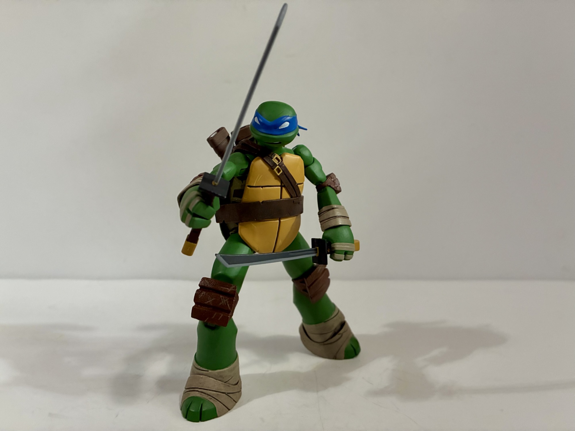
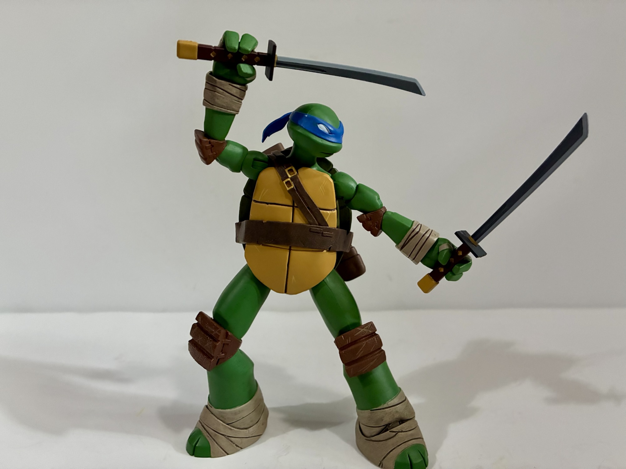
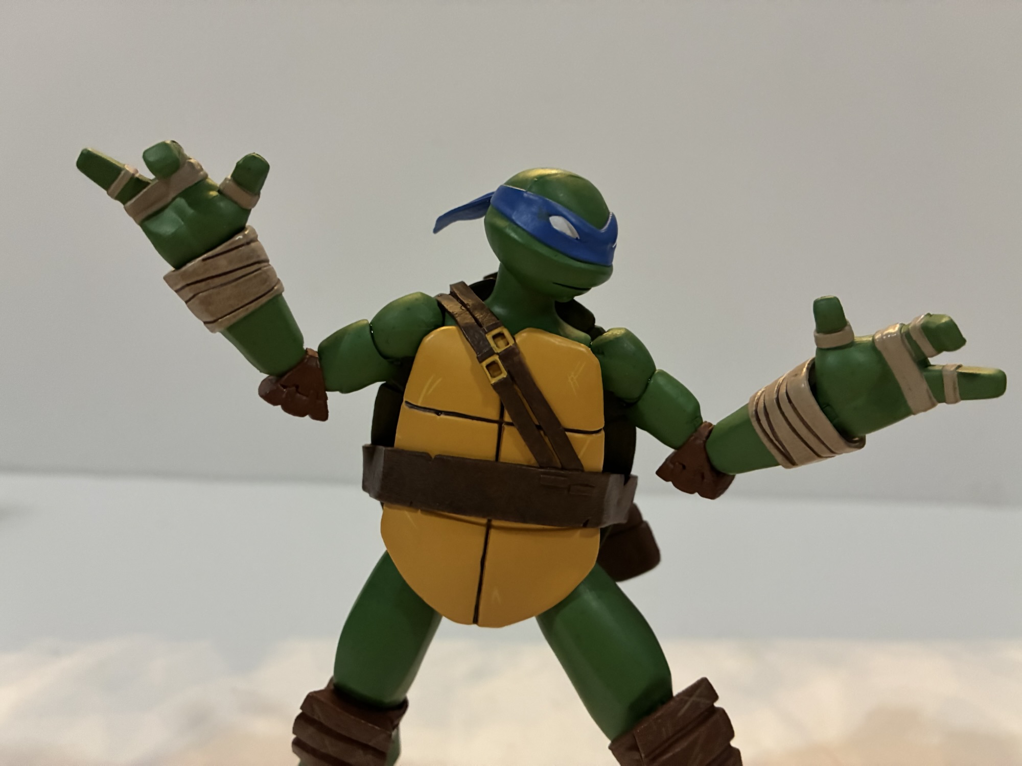
For the 2012 show, Raphael was confidently in angry teen mode. He could clash with his brothers, in particular Leonardo, and was often irritated by Mikey, but his love for them is never in doubt. And since it was a Nickelodeon show, he had to keep the potty mouth in check. NECA’s take on the character is another sculpt by May Thamtarana with paint by Geoff Trapp and Mike Puzzo. Box art is by Ciro Nieli and Raph is number 3 in the wave making him the first being reviewed by me in proper order. Out of the box, Raph stands at about 5.375″ and unlike the previous two he’s sporting his non battle mode portrait, though since it’s Raph it still presents as a scowl.
As good as he looks, something’s off with that green.
Raph is another excellent sculpt by Thamtarana. His proportions are well captured as are the little details that make Raph, Raph. His neck and limbs are just slightly larger than his brothers as he is the more brawny turtle. There are some harder edges to the shape of his thighs and biceps and his wrist and foot wraps are the proper color. Like Donatello, there appears to be no shared parts between Raph and Leonardo, or Raph and Don for that matter. The only parts the turtles continue to share are hands. Raph has a more battle-damaged shell and his plastron has that lightning bolt like crack in the top left. He looks great, except for one thing.
I thought it might help to get an array of Raphs to illustrate my point as well as a picture from the source material.
Raphael is just not the correct shade of green. He’s a deep green similar to his Playmates counterpart. In the show, his complexion was far more pale and hued very close to Michelangelo. This darker green appears to be more common in licensing art and some of the offshoots of the show, like the Half Shell Heroes. The question here is did NECA have this color forced upon them based on the reference material Viacom supplied? Or did they just mess it up? Considering how detail-focused director Trevor Zammit is with the ’87 toon line it’s hard to imagine him not knowing what color Raphael is supposed to be. And if your first thought is, “Well, since it’s a newer show maybe he’s not that familiar with it,” know that he is on record as saying the 2012 series is his favorite depiction of the turtles. The prototypes on display at New York Toy Fair showed the same so the only thing I’m willing to rule out is that this wasn’t a factory error NECA had to roll with. It just is what it is and collectors will have to decide for themselves if it’s a deal breaker or not.
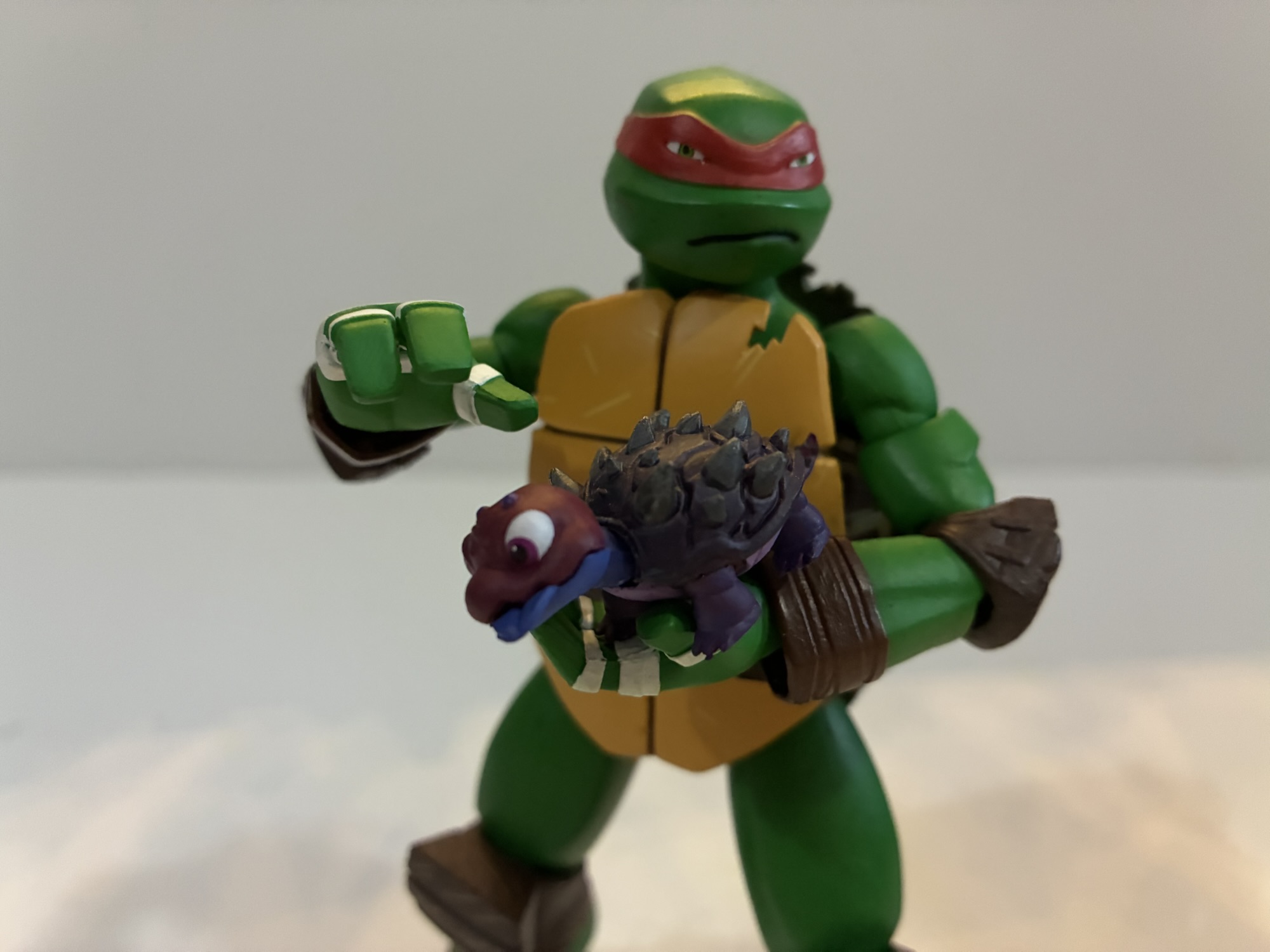
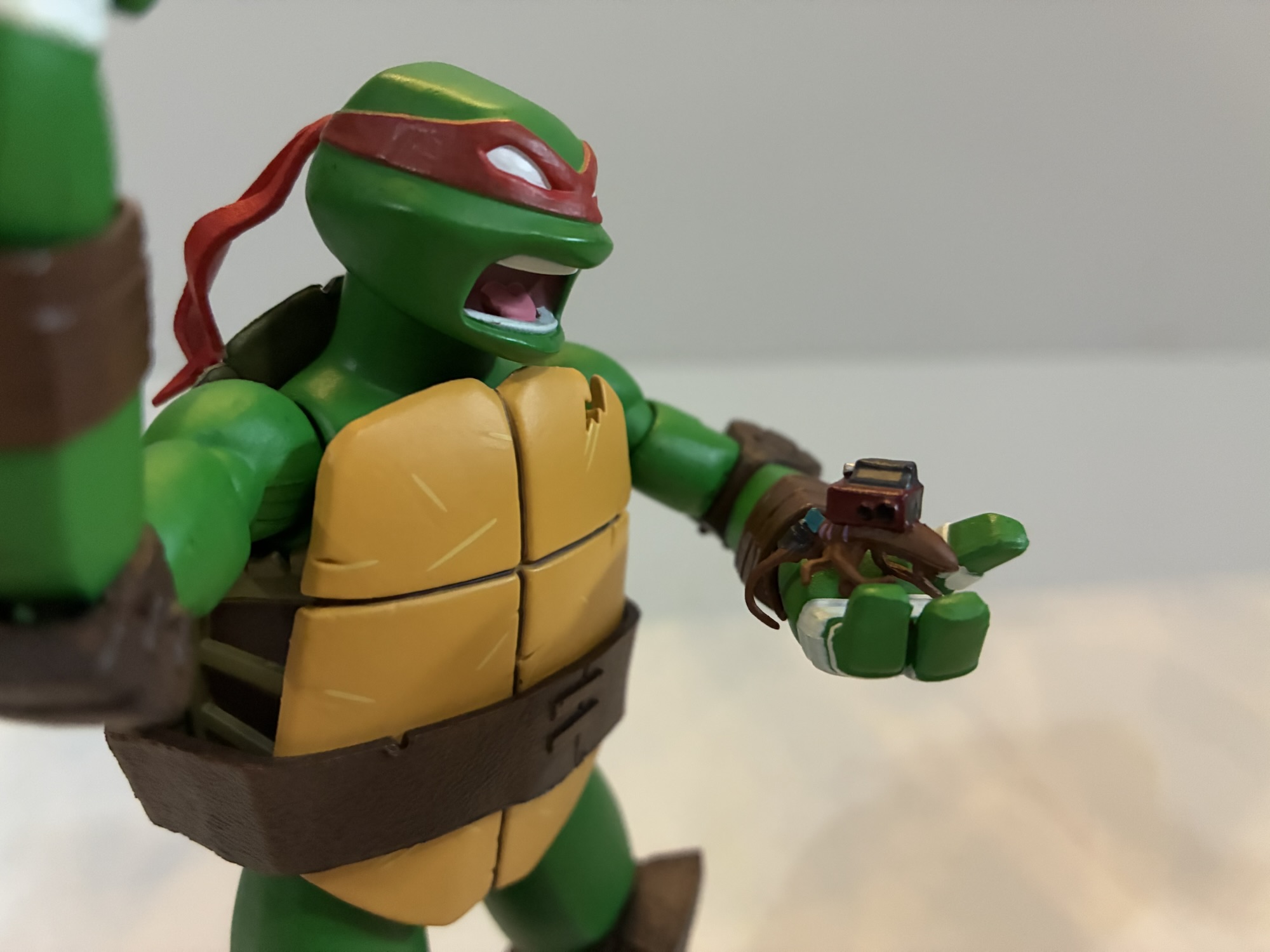
Raph comes with a buddy and a not-buddy.
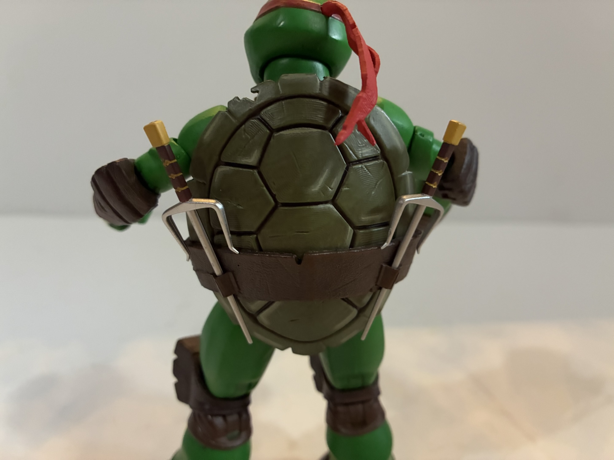
Obviously, for me Raph’s complexion was not a deal breaker since I bought it knowing full well it was wrong. I can’t say I dislike this color, but I would have definitely preferred him to be screen accurate. To go along with the figure we get a secondary portrait featuring his whited-out eyes and a yell. For hands, we get the usual gripping hands, fists, and a set of the relaxed open hands Leo came with. Raph also has the slice of pizza, smoke bomb, and T-phone. For unique accessories, there’s Chompy, the baby space turtle Raph took in for a little while. You may be wondering why he didn’t come with Spike, his first pet turtle, but he’s coming with someone else. Raph also comes with his nemesis: a tiny cockroach with a tracking device. Raph hates cockroaches and this little guy would go on to become the Cockroach Terminator. He looks good, but there’s almost too much paint and it gets a little messy. Lastly, Raph has his trusty sai. They’re very thin and rigid with zero give so they’re a little scary. Do be careful with them. Because of the thinness, you may be tempted to try and fit them into the tight gripping hands, but I would still advise to just play it safe and heat those hands first. He has his weapon storage on the rear of his shell which works well.
“Want this last slice I found under my bed?”Weapon storage.
Raph’s articulation is exactly the same as Leonardo and Donatello. His range is no better or worse than either as well, though Donnie’s thinner arms seem to get a little more range at the elbow. Like Donatello, my Raph did not have any stuck or stubborn joints. He has been pretty free and easy since coming out of his box. He does present his own frustrations, but they’re not really articulation related. The sai handles are so thin that he doesn’t get a great grip on them. They won’t really fall out, but they’ll spin around a lot when handling him. And if you’re the sort who likes to have their Raph hold his sai with the middle blade between his fingers then you will definitely want to heat the hands first. And I would reheat them to remove the sai as well. It certainly looks cool to display him this way, but I’m hesitant to leave him for too long like this out of fear it might warp the sai.
Too bad Leo has to remain eyes-out.
Raph is another solid entry in NECA’s 2012 Teenage Mutant Ninja Turtles toy line. He is structurally the same as his brothers so if you like them you’re probably going to enjoy Raphael as well. He just comes with the unfortunate caveat that he’s not the right shade of green. And we’re not talking about a minor difference here, but a pretty obvious one. Like I said in the write-up, if that doesn’t bother you then you’re sure to like this figure. If it does, well, it might be the only thing you can see. I confess, it does bother me and it’s in the back of my mind every time I look at the figure, but I wasn’t going to not get Raphael. This isn’t a line I plan to go deep on with variants and such, but if NECA ever does a corrected Raph I might have to bite at that.
Miss any of our TMNT 2012 coverage? Check these out:
We were able to get through some of the logistics of this line with Leonardo, so for this second review we can just get right to it. One of the best decisions the 2012 iteration of Teenage Mutant Ninja Turtles made was bringing back veteran voice actor Rob Paulsen. He’s voiced countless characters over the…
We’re going to start this one off with a question: When you order directly from a producer, do you expect to be first in line for product? NECA’s recent launch of its Teenage Mutant Ninja Turtles action figure line based on the 2012 Nickelodeon series raised this question. On September 16, NECA launched the line…
Playmates Toys has been the master toy license holder for Teenage Mutant Ninja Turtles for as long as I’ve been aware of TMNT. In the 80s, the toy line produced by Playmates was excellent: fun sculpts, imaginative characters, crazy set pieces, and tons of vehicles. It was a great companion to the animated series airing…
We were able to get through some of the logistics of this line with Leonardo, so for this second review we can just get right to it. One of the best decisions the 2012 iteration of Teenage Mutant Ninja Turtles made was bringing back veteran voice actor Rob Paulsen. He’s voiced countless characters over the years, but many know him as Raphael from the original TMNT cartoon. For the 2012 show, the decision was made to have Paulsen play a different turtle: Donatello. It made sense to move him off Raph who is almost never portrayed in the same manner as he was in that cartoon. He’s more aggressive, frequently angry, and not the wise-cracking fellow from the old show. Not that Paulsen couldn’t adapt to a different style, but hearing his take on another turtle was an opportunity for something different.
It felt like it made sense to show Donnie with the shortest and tallest figures from wave one.
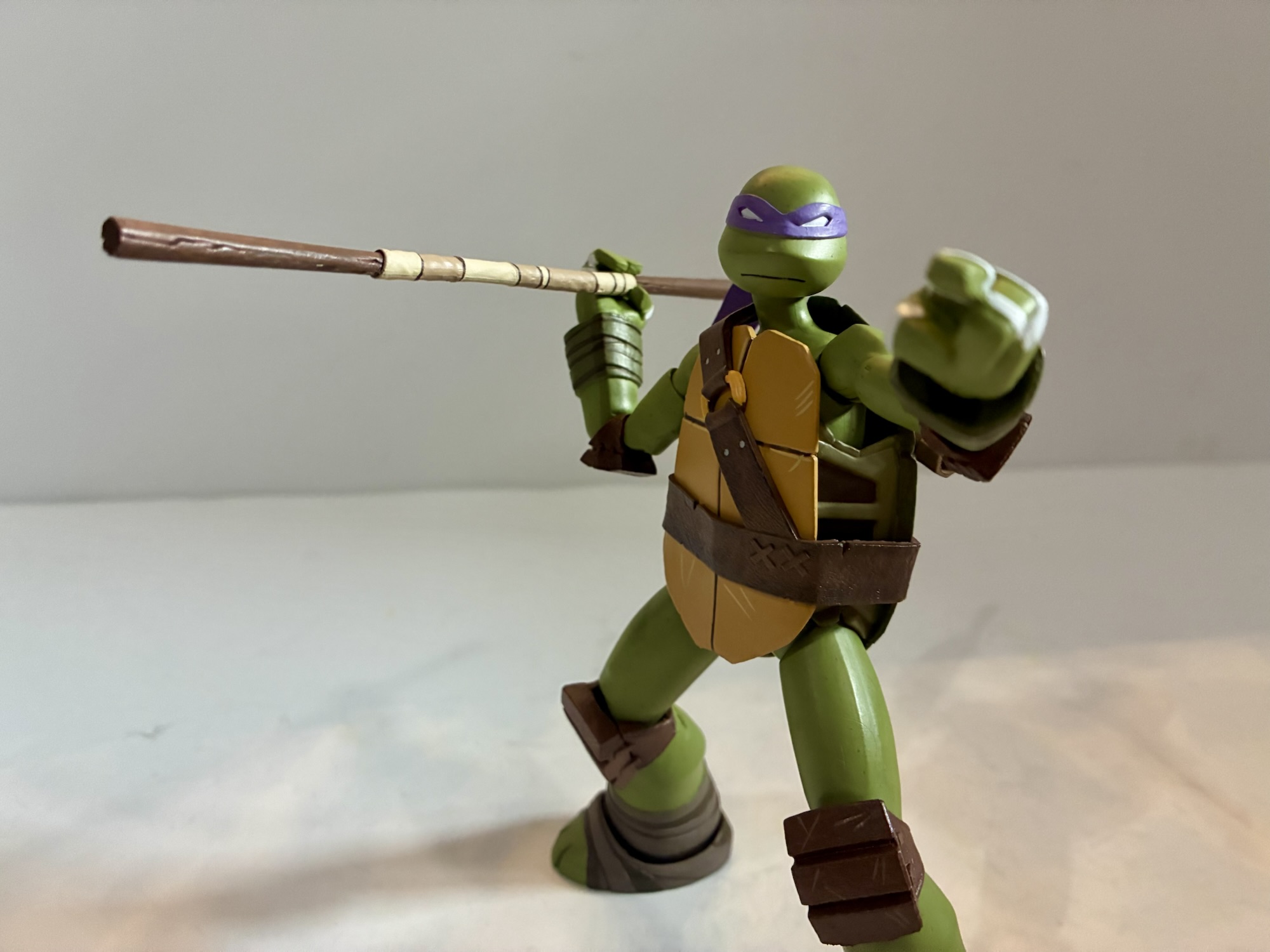
Donatello in the 2012 show is similar to past versions of the character. He’s the brains, able to come up with clever gadgets and such, but he’s also pretty introspective, insecure, and about as confused about his place in the world as most teenagers. It was fun seeing an episode where Donatello questions the worth of his bo staff. As a kid, I always saw that weapon as decidedly lame compared with what the other turtles had. Combine that with the more feminine purple of his bandana and it made Donatello the lamest turtle to my six-year-old brain. This Donatello is one I can appreciate and he has more nuance than perhaps any of his brothers. His affection for April is a long-running story and a bit tragic in some ways.
This thing can be fiddly.“All right, a real weapon!”
NECA’s interpretation of Donatello comes courtesy of sculptor May Thamtarana with paint by Geoff Trapp and Mike Puzzo. Ciro Nieli did the illustrations on the box just as they did for Leonardo. Donatello stands a tick under 5.875″ giving him considerable height over his brothers, but leaving him shorter than Shredder. As the tallest turtle in the show, this strikes me as appropriate. His sculpt is almost entirely different from Leonardo’s and that’s going to be true of his brothers as well. From what I can tell, the only parts shared between the turtles are the hands. Everything else is unique which is pretty impressive and can also be a sign of variants to come.
You know Donatello is always going to have gadgets.
Donatello is very well built for not only is he taller his proportions are pretty on-model. His limbs are longer and compared to some of his brothers thicker, or thinner, depending on the turtle. His belt and plastron have the same weathered approach as Leonardo and by default he’s sporting his battle portrait. NECA and Thamtarana really nailed the shape of Donnie’s head which is smaller and rounder than the others and sits pretty high. Like Leo, he’s the most on-model interpretation of this character we have seen yet cast in plastic. He also comes with some minor assembly required. The holster for his bo is a separate piece which plugs into his shell. There’s a hole in the shoulder strap to accommodate this. The actual part is a softer plastic than basically everything else in the box and I saw some people express frustration with getting it in place. Mine went in without issue, but I also got to it shortly after it was delivered in a fairly cool climate which may have helped. If it were warm and more pliable it might have been a different story.
“Having a chicken around really pays off!”
Donatello comes with gripping hands by default as well as a set of open hands and a set of pointing hands. The right open hand is more of a C-grip hand and I assume it’s for his other accessories. He does have an alternate portrait with his pupils visible and a big, open-mouthed, smile which exposes the gap between his front teeth, a hallmark of the character. It’s a great likeness and it’s exactly the kind of portrait we want to see with these figures. He also has his trusty bo staff which can separate at the tape. This makes it a little easier to slot into his holster, but also allows for it to be switched with the included bladed end creating a naginata. Donnie’s lame weapon got a little upgrade in the show. He also has more unique accessories in the form of his microscope goggles and a homemade tracking device that appears to be made out of a Game Boy and egg beater. The goggles don’t get a snug fit on either head, but will probably stay if placed on a shelf. Donnie also has the same T-phone, smoke bomb, and pizza slice as the rest. His last accessory is Dr. Cluckenstein, the big-brained chicken. She looks good, though is just a slug figure with no articulation. Mine also came with one of the toes broken off which is a bummer. It’s the only real quality control issue I had with the wave.
Poor little fella has a broken toe.
Donatello has the same articulation as Leonardo with the only difference being his shape provides for more range in places. He can look up much better than Leo and his shoulders are easier to engage with. He’s also the figure I had the least amount of issues with out of the box as far as stuck joints are concerned. Knees and elbows all worked fine as well as the ankles. He has the same horizontal wrist hinges as Leonardo, though it’s less of an issue with his chosen melee weapon. His gripping hands are just as rigid though so you’ll want to heat them up before trying to get him to hold his staff. Even the C-grip hand isn’t particularly good for anything without some heat if you want him to actually grip something with any authority. I did have issues swapping heads again, though in this case the default portrait came off fine, it’s just the alternate didn’t want to go on. I just heated it up and that was that.
They’re a lovable bunch.
Donatello is an overall better release than Leonardo and might be the best in the line. I’ll reserve judgement for that until I’ve spent more time with the rest of wave one, but I think he just comes together in a nicer package. His articulation is slightly more forgiving, his accessories more purposeful, and best of all he has two worthy portraits for your display. He’s still not as articulated as he could be, but if you just want an on-model Donatello from the 2012 series you’ll be hard pressed to do better than this.
We have plenty more from Teenage Mutant Ninja Turtles to refer you to:
We’re going to start this one off with a question: When you order directly from a producer, do you expect to be first in line for product? NECA’s recent launch of its Teenage Mutant Ninja Turtles action figure line based on the 2012 Nickelodeon series raised this question. On September 16, NECA launched the line…
I think most people understand that when it comes to a toy line the most popular figures are of the most popular characters. The problem is, what do you do when everyone has the most popular characters? You make them again, but different! That’s sort of the genesis of the variant action figure of a…
Is this it? Have I finally hit the point where my Teenage Mutant Ninja Turtle toy collecting is out of control? It just might be, for today we have Donatello’s Portable Portal Generator, the latest piece from NECA’s line of toys based on the vintage cartoon series. And it’s not that this is a bad…
We’re going to start this one off with a question: When you order directly from a producer, do you expect to be first in line for product? NECA’s recent launch of its Teenage Mutant Ninja Turtles action figure line based on the 2012 Nickelodeon series raised this question. On September 16, NECA launched the line on its own webstore where their fans could purchase the four turtles as a bundle. If they wanted to add Shredder, then the order would qualify for free shipping. It seemed like a solid deal. Then on September 28th, the same selection of characters appeared on Walmart’s website as in-stock. Those who took advantage of the NECA sale were still waiting for their order to ship, but someone who waited it out could order from Walmart that weekend and get their figures a few days later. A bit of a raw deal, but it’s just toys, right?
It’s another installment of turtles from NECA.
It gets a little more complicated when the reality that NECA fulfills all its own orders is introduced. In other words, whether you order through NECA direct or Walmart, you’re just ordering from NECA. It all gets packaged and shipped by NECA, and even though the people who ordered directly from them were charged upfront, the people who ordered through Walmart essentially jumped the line. And then following that came the shipping woes. Numerous reports of wrong orders, wrong tracking numbers, duplicate tracking numbers, and partial shipments. Several people who ordered from NECA ended up getting shipments of just Michelangelo and Shredder with an assurance the rest would ship later. This on top of NECA’s well publicized shipping woes of the prior year just added to an overall bad experience. I got my set through NECA. I ordered on the 16th of September and didn’t receive a partial shipment. I got the whole thing on October 29th. I don’t really care about when I get stuff, as long as I get it, but it is annoying to see the same company prioritize different orders. Just better communication would solve most of the issues, but apparently that’s too hard.
The likeness is pretty damn good here.
It’s a shame there was such consternation in the collector sphere for this line because I think it had a lot of positive buzz leading up to release. The Teenage Mutant Ninja Turtles Nickelodeon show was a hit both commercially and critically. It’s held in high regard by old and new TMNT fans for its successful melding of the classic comic book tales and some new stuff. It’s really one of, if not the, best takes on the franchise. As part of the 40th anniversary, Nickelodeon wanted to celebrate a lot of eras of TMNT and do so by merchandizing the hell out of it. Super7 had the 2003 cartoon shopped to them while NECA got 2012. And while I grew up on the 87 toon, the 2012 series was the one I watched with my kids. They loved it and for them it’s “their” Teenage Mutant Ninja Turtles so this franchise holds a special place in my heart. When NECA announced they were doing figures from this show I was very much onboard.
He comes with a decent assortment of stuff, but I’m guessing most will just rock the swords.
And up first is the leader in blue – Leonardo. Unlike other iterations of the turtles, this is a property that can’t get by with one sculpt for four boys. The turtles from this show all had a unique appearance. It wasn’t just a different colored bandana or a belt with a shoulder strap. As a result, it feels more appropriate to give each turtle his own review. I did get Shredder as well, so we’re going to have a lot of TMNT content for a little while. I’m not sure how quickly I’ll get these reviews out because we also have Christmas to talk about, but we’ll see how it goes.
I don’t really know what these hands are for, but he comes with them.
Each turtle is sold as an “Ultimate” version with the standard five-panel packaging. It’s adorned with artwork by Ciro Nieli. The sculpt is by a name new to me, May Thamtarana, with paint by the usual NECA duo Geoff Trapp and Mike Puzzo. There’s no photography on the box which is a bit unusual, but it does have some spine art which will create a mural for those saving boxes. Leonardo, despite being the leader, is actually numbered 4 in the series which is just wrong. Everyone knows it goes Leonardo, Donatello, Raphael, then Michelangelo. That’s the only order I’ll accept.
Scale on this line is going to be pretty interesting.
Leonardo stands at right around 5.5″. If you’re curious about scale, that would put him at a height of 5’6″ in 1:12 scale, 4’7″ in 1:10 scale. I think it’s safe to say that NECA is going for 1:12 with this line based on that. I tried to find an official height chart for the show, but came up empty. I saw lots of unsourced claims that Leonardo is supposed to be between 5’4″ and 5’6″ with one outlier saying he was a mere 5’1″. I did see one piece of production art for Leatherhead that placed Michelangelo at an even 5′ while NECA has the figure at about 5.125″ tall. In other words, I think this is close enough.
He has a gun. Cool?
What is going to be this line’s strong suit is the overall look and proportions of these characters. From the unique proportions to the shape of the limbs it’s all very evocative of the show. NECA, as usual, utilized a liberal amount of paint to bring Leo to life. The body may be molded in green plastic, but it’s coated with paint as well to give it a rich, matte, finish. There’s some nice dry-brushing on the wraps present on the wrists and ankles and some weathering to the shell. He comes ready for battle with whited-out eyes and a little slit of teeth visible which was applied cleanly. The only shortcoming I’m noticing in the presentation department are the knee pads, which while textured very nicely, do give off a shiny appearance like they’re not painted. The right-most scabbard also has some sloppy, white, paint inside it and I’m not sure why they bothered as it seems to interfere with the swords as well. On one hand, it’s some nice attention to detail if that was always visible in the show, but I’d also rather be able to insert a sword into it easily.
If it wasn’t already useless, I can’t even get this alternate head onto the figure because the ball joint keeps popping out of the neck.
Where we are going to run into some issues is with the accessory load-out. When NECA debuted these figures at Toy Fair earlier this year each turtle appeared to have the battle portrait and a more casual one. When it came time to ship them, that was still true of 3 of the 4 turtles, but not Leonardo. His alternate portrait has his eyes closed like he’s meditating. I know there was a storyline where he was unconscious a few episodes, but literally no one wanted this portrait in place of one where his eyes are open with visible pupils. It’s either really bad judgement on NECA’s part or a naked attempt at making a future accessory pack or variant figure more enticing. I usually have to reserve this mini rant for Super7, but if NECA is going to call this the “Ultimate” Leonardo figure, then he needs a portrait where his damn eyes are open. As for the portrait itself – it’s fine. If that’s what you want for your Leonardo. I can’t see myself ever using it and that’s especially true since I can’t get his default head off without having the neck joint come out with it.
This scabbard keeps falling off, which is really annoying.
Aside from that major boner, the rest of what’s in the box is pretty solid. Leonardo has his two katana, and in keeping true to the show, one is shorter than the other. Maybe it’s hard to find matching swords when you live in a sewer? It’s funny that they bothered to add this detail to the show since it’s not an obvious or dramatic difference, but it’s represented here. The swords are well-painted, but the hands he has to hold them are extremely rigid. Heat them up, don’t try to shove them into his hands, no good will come of that. In addition to those gripping hands, Leo also has a set of fists, relaxed open hands, and these odd looking hands that kind of look like a “hang loose” gesture. He also comes with a smoke bomb (basically a little egg), T-phone, and a slice of pepperoni pizza. Those three things are included with each turtle. His unique accessory is a gun that I think he acquires from The Kraang in an episode. I don’t remember it, and NECA doesn’t list out the accessories on the box, but it looks pretty cool. It’s just as hard for him to hold as his swords if you don’t heat up a hand, but he can support it with an open hand for a two-handed pose.
Everybody comes with a T-Phone, pizza, and smoke bomb.
I was curious how these turtles would pose given their more slender profile vs other iterations of the gang. For the most part though, these are NECA figures and they handle like NECA figures. The head is a double ball-joint with decent range. The neck is angled though so Leo doesn’t look up very well, but aiding that is a diaphragm joint that basically just allows the entire shoulder and neck area to rock back and forth a bit. It’s not dramatic, but it’s also not nothing. Arms are fairly basic: shoulder ball-hinge, bicep swivel, double elbows, wrist swivel and hinge. The gripping hinge is the wrong one as once again NECA failed to provide a vertical hinge for a sword-wielding character. It’s perhaps my biggest pet peeve with the company as they’re incredibly inconsistent about it. Most of the Ultimate releases in the toon get the correct hands, but we’re starting off on the wrong foot with the 2012 line. Seriously, I’d trade the stupid gun for better hands. Or a better alternate portrait.
You can pose him with the smoke bomb if you really want to.
The rest of the articulation is also pretty standard. There’s a waist twist, but the shell really limits it. The side panels seem to extend a lot lower than usual too which cuts it off further. Ball-socket hips, thigh swivel, double-jointed knees, and ankle hinges and rocker round it out. The shell/plastron interferes with range at the hips. The plastron is soft, but not that soft. He won’t kick out a full 90 degrees nor can he do splits. The ankle rockers gave me some trouble out of the box, but I seem to have them moving now without having to heat them up. I didn’t have any issues with the usual trouble spots of knees and elbows, but the shoulders are pretty tight. And since the arms are so thin, they can be a bit harrowing to manipulate. It’s hard to engage the shoulder hinge without putting strain on the bicep peg. If you’re used to NECA articulation, then I don’t think he’s necessarily much better or worse than we typically see. I do wish we would get some real innovation at this point when it comes to TMNT figures because the same old articulation schemes are getting hold. I feel like we should have ab crunches by now. If Hasbro can make a Hulk clap than surely someone can make a turtle bend over.
To match eyes or not?
Leonardo isn’t the lead-off homerun I was hoping for with NECA’s new TMNT 2012 toyline. He looks great, but the little issues with things like his scabbard, the way too tight gripping hands, the wrong hinge articulation, and that lame alternate portrait really put a damper on him. He’s also the only figure in this first wave, including Shredder, to not come with a little buddy character and that’s a bummer. The gun accessory is really well done for what it is, but it’s just so useless. I’ll never display Leonardo with a gun, which just puts more of a spotlight on what’s missing. He’s the best looking 2012 Leonardo we’ve received provided you want to display him in battle mode and that’s going to have to be good enough if you’re into this version of the franchise.
We don’t have a lot of TMNT 2012 toy talk here, but we have some plus a lot of Leonardo:
Playmates Toys has been the master toy license holder for Teenage Mutant Ninja Turtles for as long as I’ve been aware of TMNT. In the 80s, the toy line produced by Playmates was excellent: fun sculpts, imaginative characters, crazy set pieces, and tons of vehicles. It was a great companion to the animated series airing…
When I was a kid, I had parents with divergent musical tastes. Dad likes oldies from the 50s and 60s while mom was more into modern rock (then 80s). One area where their tastes overlapped was Bruce Springsteen. We had several of his records in my house and I distinctly remember that cover to Born…
It’s been said before and it will be said again: everyone is making Ninja Turtles. It feels like the list of companies not making Teenage Mutant Ninja Turtles is smaller than the list of those who are. Viacom has not been shy about licensing the brand out to toy makers and it’s reaching a point…
Pictured: Not Sergeant Bananas, but also Sergeant Bananas.
It feels like the last few times I’ve made a Super7 Teenage Mutant Ninja Turtles post I’ve wondered if it’s my last one so I’m going to stop trying to predict that. This one comes courtesy of Big Bad Toy Store and their generous summer of deals. I wasn’t going to pick up this particular action figure because it came at a pretty large MSRP, but when it was slashed nearly 50% I decided to bite so here we are to talk about Guerilla Gorilla.
Someone at Super7 must have loved Sergeant Bananas. Their love for that ape in a banana-print onesie apparently was so vast that they could not take “No” for an answer. It’s pretty surprising. I’ve never met a TMNT fan who loved Sgt. Bananas. I had the figure as a kid and he was fine. I liked his little buddy, Larry the Lemur, quite a bit, but Sgt. Bananas was one of those characters who never made the leap from figure to cartoon. He never even showed up in the Archie books. And therein lies the problem for Super7. Looking back on it, this figure is where we should have been clued into the fact that Super7 was having some issues getting stuff approved because of Playmates Toys. Originally, some just thought Sgt. Bananas must be independently owned, but he was likely created by the team at Mirage Studios for the toy line which means he’s owned by Paramount as they got everything with the purchase of the franchise. The problem for Super7 is that Playmates was able to exercise control over the characters that only appeared in their toyline when it comes to Super7’s. Making a series of vinyl blind box toys? Sgt. Bananas is on the table! Making a Playmates homage toyline though, well, you’re going to have to do without.
Between height and heft, the addition of Guerilla Gorilla is the largest one yet to the line.
And that’s how Super7 landed on Guerrilla Gorilla. The company so badly wanted to make Sgt. Bananas that it instead pivoted to this similar character who appeared in an issue of Teenage Mutant Ninja Turtles Magazine. I was pretty tapped into TMNT during this time, but I had no idea there was a magazine. I’m not surprised since pretty much everything that was popular had a magazine. Guerrilla Gorilla debuted in issue number 4 titled Bungle in the Jungle. The issue is by Ryan Brown with art by Jim Lawson. In it, the turtles meet Guerrilla who is basically a freedom fighter out to protect the jungle from deforestation. According to Turtlepedia, he and Sgt. Bananas are the same character and there is some sort of legal distinction needed. They’re both mutant gorillas with an army motif, but they don’t look all that similar aside from that. Sgt. Bananas had the pretty goofy banana print uniform while Guerrilla is more understated, generic, army ape with an olive vest and camo pants. If you’re asking me to pick a design then, yeah, I’ll take Guerrilla Gorilla, but I’m not married to either one.
He even makes Bebop and Rocksteady look slight.
The whole thing becomes a little crazy to me when we start talking price. Despite the character looking to be only slightly larger than the turtles in the magazine, Super7 decided Guerrilla Gorilla needed to be massive in comparison. And that uptick in size meant an uptick in price all the way up to an MSRP of $75. That seems nuts to me for Super7 to essentially ask TMNT fans to pay that kind of dough for a character they’ve probably never even heard of. That seems to be part of the Super7 brand though – we make the stuff no one else would, or something like that. I think they like to be perceived as a little “out there” and their co-founder Brian Flynn is quite fond of tossing around the word “bonkers” to describe a lot of what they do. I just don’t think it makes much business sense, and if the quality isn’t there then people start to get pissed. It doesn’t seem like a company on great footing these days, but what do I know? I’m just a dude with a blog.
He comes with a ton of stuff, and each banana in the bandolier is removable, but how useable is it all?
Guerrilla Gorilla comes in the standard Ultimates! style packaging including the now discarded slipcover. It’s probably the biggest box yet in the TMNT line, though it’s not as big as some of the Power Rangers stuff I’ve received. Out of the box, our ape friend stands around 8.5″ to the top of his crew cut. More than just the height though is the sheer mass of this thing. This is a heavy toy. You could probably really hurt someone with this thing if wielding it like a club. And it might even hold up pretty well too because it’s quite solid. For more dimensions, each arm on this guy is about 6″ long. His wingspan is around 15″ – this is a big, freaking, action figure for 1:10 scale. Stick a turtle next to him and they’re going to look puny. Even the bigger characters in the line look a little small when they’re next to this guy. Of the figures I have, the only one similar in terms of height and mass is the Triceraton, but Guerrilla has him beat. If you’re of the opinion that size matters then you’ll probably be pleased with this one.
He’s a big guy so he needs a big knife.
Size is but one aspect of presentation, the rest is devoted to sculpt and paint. As far as sculpt goes, this guy seems fine. I like his portrait and there’s solid texture on the furry parts without being too overdone or realistic for the line. He’s mostly molded in brown plastic, but there’s paint applied to give it some definition. The skin portions are a little bland by comparison and come across as a little plasticky, but it’s not bad. Super7 continues to do a solid job with jackets as his vest looks really nice and I like the shade of green in use here. The gold of the zipper is painted well. The camo pants are just okay. There’s nothing wrong with them, the pattern is just a little on the minimal side. If they were fully painted I think they’d look a lot better and it’s the unpainted stuff that just brings this one down a smidge because the area is just so damn big. There’s no hiding it.
He can get down into some gorilla type poses, but don’t expect too much beyond that.
The articulation, on the other hand, is a bit of a stumbling block. It tends to always be the case with Super7 and I’m at least happy to report this guy isn’t a floppy mess. Loose joints would absolutely sink him at this size and weight so Super7 seemed to take extra care to make sure everything is tight. The factory applied shock oil in places to help lubricate joints including the elbows and wrists and it does help, but he’s also really stiff. Swapping parts is not fun. As of this writing, I haven’t been able to get his right hand removed though I’m assuming I’ll be able to with some heat. I was able to remove the left and it takes some effort to insert another one. The default head came off, but I had to kind of snap it back. There’s a chip missing from the double ball peg inside and I don’t know if I did that or if it’s just a factory thing. I could not get his alternate head on, but I’m assuming some heat will do the trick as the opening doesn’t look any smaller with the naked eye. It’s just that this plastic has zero give. There’s no flex at all.
I mentioned the double ball head already, but you also get ball-hinged shoulders, biceps, single elbows, wrist hinge and swivel, diaphragm joint, waist cut, ball-hinge hips, thigh swivel, single knees, ankle hinge and rocker. The head sits real low so it’s not going to do a ton while the shoulders are extremely tight. They’ll move, but it takes some force and there’s no smoothness to the hinge so it basically behaves like a ratcheted joint. The bicep swivel appears to be like a sleeve over a post so it moves independent of the forearm. Most import toys do something similar and we saw the same with the recently released Gamerverse Wolverine by Hasbro. The elbows swivel too and the range is fine. I’ve found the wrists and ankles to work pretty well as do the hips. The knees start off slightly bent, but will form a 90 degree angle when bent all the way. The diaphragm joint has really no forward and back range and is basically another swivel point. He can stand upright, or be pitched forward with knuckles on the ground. He’s stable, but obviously he’s not going to do a whole heck of a lot. With all of the plastic here, and the jacket overlay, I do wish they tried working a butterfly joint into this guy as that would have helped with the weapons, but that’s also not Super7’s style.
He comes with two ammo options for the bazooka: banana and coconut.
Super7 could have just stopped at “Giant Monkey Man,” but they decided he also needed to come with a ton of stuff. I guess they really took the whole “Ultimates!” moniker to heart here as there’s not much else Guerrilla Gorilla could come with. For starters, he has 10 available hands. I don’t even know how to describe most of them as they’re just different levels of gripping hands plus the customary fists and open variety. There is one that’s an obvious trigger finger hand and it has the preferred vertical hinge. There’s an opposite hand with a less pronounced trigger finger that also has the proper hinge. He also has the yelling head as an alternate portrait and it looks good. The helmet also fits on it just fine. He has a set of sunglasses and they fit the standard, smiling, portrait better than the yelling one, but you can fudge it if you’re determined. He comes wearing an empty bandolier and there are seven bananas to slot into the openings on it. In case he gets hungry, or maybe they’re ammo? I don’t know with this guy. He also has three grenades, a big ass knife, a machine gun, and a bazooka.
I don’t know if you can get a trigger finger into there. If so, it’s going to take a lot of heat.
The machinegun is painted silver with a plain, black, painted handle and it has sculpted vines on it that basically serve as a sling. He can wear the gun over his shoulder if he wants and it will stay in place rather well. The bazooka has no potential for weapon storage (you can slide the knife and grenades under the bandolier if you so desire) and he basically has to hold that one. It comes with a gigantic banana sticking out of the end which can be removed and replaced with a coconut. A coconut makes more sense as a projectile, but when have TMNT weapons ever made sense? The issue with basically all of the weapons, and especially the guns, is that the hands offer zero give. If you want him to hold anything, you’re going to have to heat these hands up to get them nice and pliable. Otherwise you’re just going to strip paint or worse. He can hold the grenades and bananas just fine while you should probably heat up a gripping hand if you want him to hold the knife.
You can finagle some weapon storage out of this guy.
Posing him with the weapons is another story. I kind of hate how they designed this bazooka. It looks fine, the silly premise suits the line, but it has a handle and trigger on it set way back. If your ape holds it as intended it looks more like he’s holding a small gun. It doesn’t rest on his shoulder. I tried using an open hand to just balance it on his shoulder with the hand on top, but that didn’t really work either. The machine gun works only slightly better. The hard plastic vines sculpted to it means it looks a little ridiculous. I wish he could hold it in a firing pose with the vine around his shoulder. The vine really needed to be a separate piece like a true strap so it could be soft and pliable. Then it probably would work the way I want it to. I also can’t envision getting a trigger finger onto the actual trigger with it. It, like everything, is super rigid with no pliability so the end result would probably be a busted trigger guard or worse if I tried to force the issue.
The rare sergeant who can boast he takes bigger turds than the size of the private before him and actually mean it.
Guerrilla Gorilla is, in many ways, a great encapsulation of the Super7 experience. They got so excited and gung-ho about making a massive gorilla figure that they didn’t really stop and take the time to envision a more practical build. It’s great that the figure is so big and has this shelf presence about it by virtue of its size, but it doesn’t do a lot of the little things well as a result. And it never needed to be this big. Would anyone care if he was the same size or even a little smaller than Bebop? I know I wouldn’t. The incredibly tight hands and some of the joints suck a lot of the fun out of handling this thing. I’ve seen many people who claim Super7 is really a company for in-box collectors and this Guerrilla Gorilla figure makes them look right. That said, it’s not an awful release. If you’re the one weirdo out there who wanted this character as a figure then you’re probably really happy. And you may have even been happy to drop $75 on it. I did not care one bit about the character or his more famous version so it was a nonstarter at that price. Given the size and amount of stuff in the box, the MSRP really isn’t all that bad. For $40? Yeah, I went in on that to see how it was and to add a unique piece to the Turtle shelf. I’m content with him, warts and all, at that price provided I don’t shear his hand off trying to swap stuff. I have a feeling we’ll never see another Guerrilla Gorilla from anyone else so if you ever had an interest in the character now is probably the time to get on it. Even though the figure is just okay, I would not be shocked if a couple of years from now he’s a bit expensive on the aftermarket because he’s such an oddball character. That’s a dumb reason to buy a toy, but all I’m saying is if you think you may want him in your collection best to do it now while you can score one on clearance rather than later when $75 might look like a good deal.
The Super7 Ultimates! line may be winding down for TMNT, but we’ve already taken a look at quite a few here:
My summer of discounts continues today with yet another Super7 Ultimates! release. Back when wave 7 of Super7’s line of Teenage Mutant Ninja Turtles was unveiled I quickly locked in a preorder for three figures: Punker Don, Robotic Bebop, and Triceraton. By the time the line released way, way, late, I only ended up with…
The last Super7 review I did was for the wave of Teenage Mutant Ninja Turtles based on the 2003 cartoon and I concluded it by speculating it would be awhile before I found a reason to review another figure from Super7. That turned out to be a lie. With it being revealed that Super7 has…
Who isn’t making Teenage Mutant Ninja Turtles action figures these days? It’s becoming a far easier thing to keep track of than just who is making them. For years, it was the domain of Playmates Toys and only Playmates Toys. NECA tried to get in on that TMNT action in 2008 and it ended prematurely…