We continue to finally offload some long standing preorders this year and up next is Mighty Morphin Power Rangers from Super7. It was June 2021 when these figures were announced to the surprise of many. Why? Because Power Rangers are now owned by Hasbro, probably the biggest toy producer in the world who has its own line of action figures to sell. This has become somewhat the norm though as Hasbro has licensed out both Transformers and G.I. Joe for action figure lines, both to Super7. Is Super7 just paying a tidy sum that Hasbro is happy to take? Or is it that Hasbro just doesn’t view anything that Super7 could produce as actual competition to what they’re doing? That’s probably likely as Super7 deals in a different MSRP from what Hasbro does and is going for a different aesthetic. Well, sort of. With Transformers, Super7 is doing figures based on the cartoon that don’t transform. Hasbro probably knows that Transformers fans aren’t going to stop buying Transformers that actually transform, so have at it, Super7! With G.I. Joe, Hasbro has the Classified line which is somewhat of a reimaging for the franchise. It’s also in the 20-25 dollar range and sold everywhere. Super7’s G.I. Joe figures are based on the cartoon, in a different scale, and cost roughly twice what Hasbro is putting out so it seems easy to see where the confidence is coming from. With Power Rangers though, that’s a bit more confusing. Super7 is, so far, just doing the Mighty Morphin era of the show, by far the most popular. The figures are 7″ scale and, like the comparison with G.I. Joe, basically double the price of Hasbro’s figures. Conceptually though, they’re not much different since both companies want to mimic the show. The larger scale, more paint, and more accessories also have a chance to make Super7’s offering look a lot better than what Hasbro is doing. About the only restriction it would seem placed on the Super7 version is there’s no combing zords. Or Super7 doesn’t have interest in doing those. Either way, out of all of the Hasbro properties Super7 has started making action figures for, this is the one that seems most likely to negatively impact Hasbro’s sales of its own line. As long as it’s good.
It took awhile, but Super7’s first wave of MMPR figures is here. When the line was first unveiled, I wasn’t sure where my money would go. During the great lockdown that was 2020, I started buying a lot more action figures. One line I dabbled in was the Lightning Collection. At first, I just wanted the Green Ranger as that was the character I liked the most. Toys for MMPR were insanely hard to track down in 93-94 and that toyline from Bandai is one of the black holes of my youth. Also not helping matters was the odd space the show occupied. As a 4th grader when it premiered, I wasn’t sure if I was too old for it. It debuted at the tail end of summer vacation where I lived, so kids like me got to decide if we liked it largely free of peer pressure before school started back up. At that point, it became clear the consensus was that MMPR was a baby show, you would be ridiculed for admitting you liked it, even though it was the highest rated children’s show on Fox so likely everyone was watching it and just lying about it. At any rate, the only figure I would ever own of a Power Ranger as a kid was the auto-morphing Green Ranger and I only got it because we happened upon a fresh case at the store. I was with my grandmother, who was usually good for a toy or something on an outing, but even she was excited by this as she had tried in vain to score Power Ranger toys for my sister and I with little success so she eagerly shoveled out the cash for a pair of figures for the two of us. Had one of my friends been there though when that happened, I may have had to pass out of peer pressure. It was such a conundrum and I hated the pressure to outgrow toys.

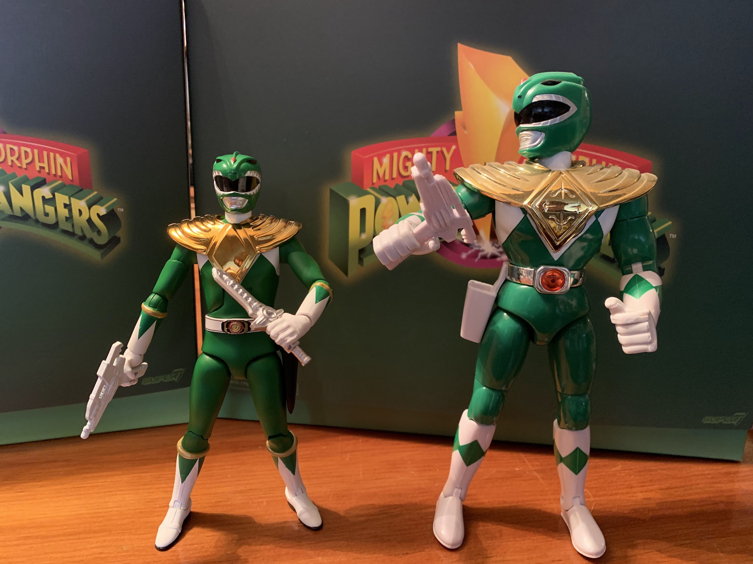
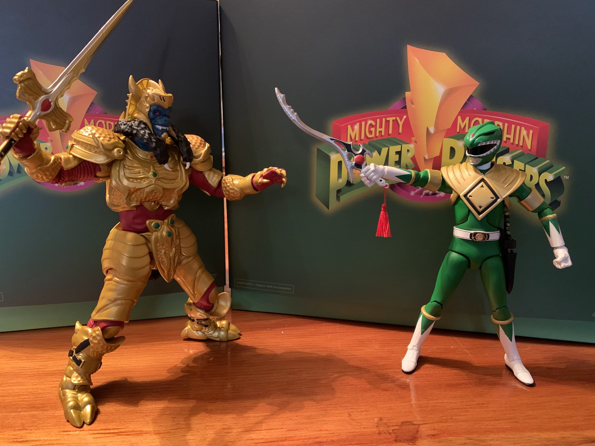
I’m only sharing those details to enforce that I have a special attraction to the Green Ranger as a toy because of the scarcity and pressure to not even like the show as a kid. During 2020, I also finally acquired a vintage Bandai Green Ranger and Dragonzord and that was the gateway to get into Lightning Collection. I eventually added the entire MMPR team, but since then, I’ve been able to avoid adding more (not counting the TMNT crossover figures). The first wave from Super7 would contain the Green Ranger, Yellow Ranger, Goldar, Putty, and Tyranosaurus Zord. Goldar had some appeal as I didn’t care for the Hasbro offering, and the T-Rex looked cool, but did I need another set of Rangers? No, but I obviously gave in for my boy Tommy. There was some temptation to just wait it out as Super7 figures have mostly hit clearance at some point, but my will wasn’t strong enough to wait.
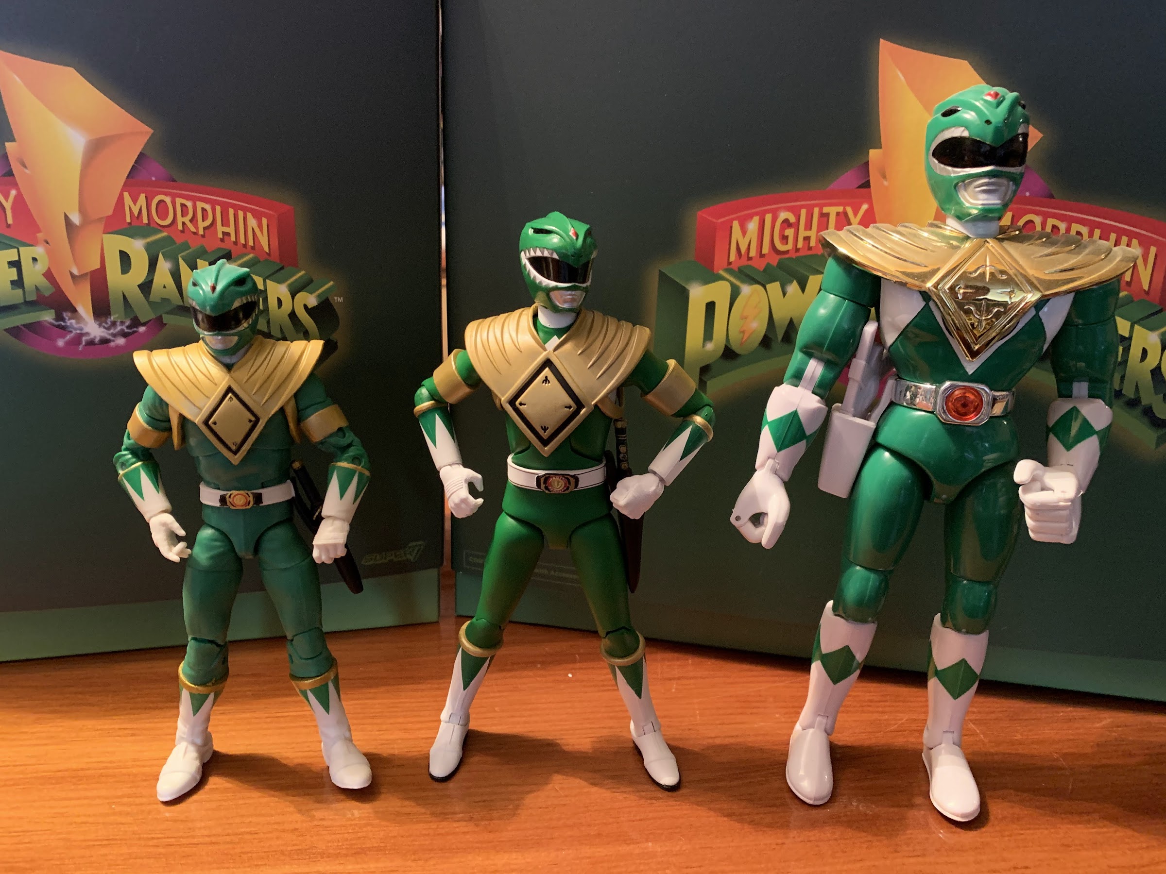
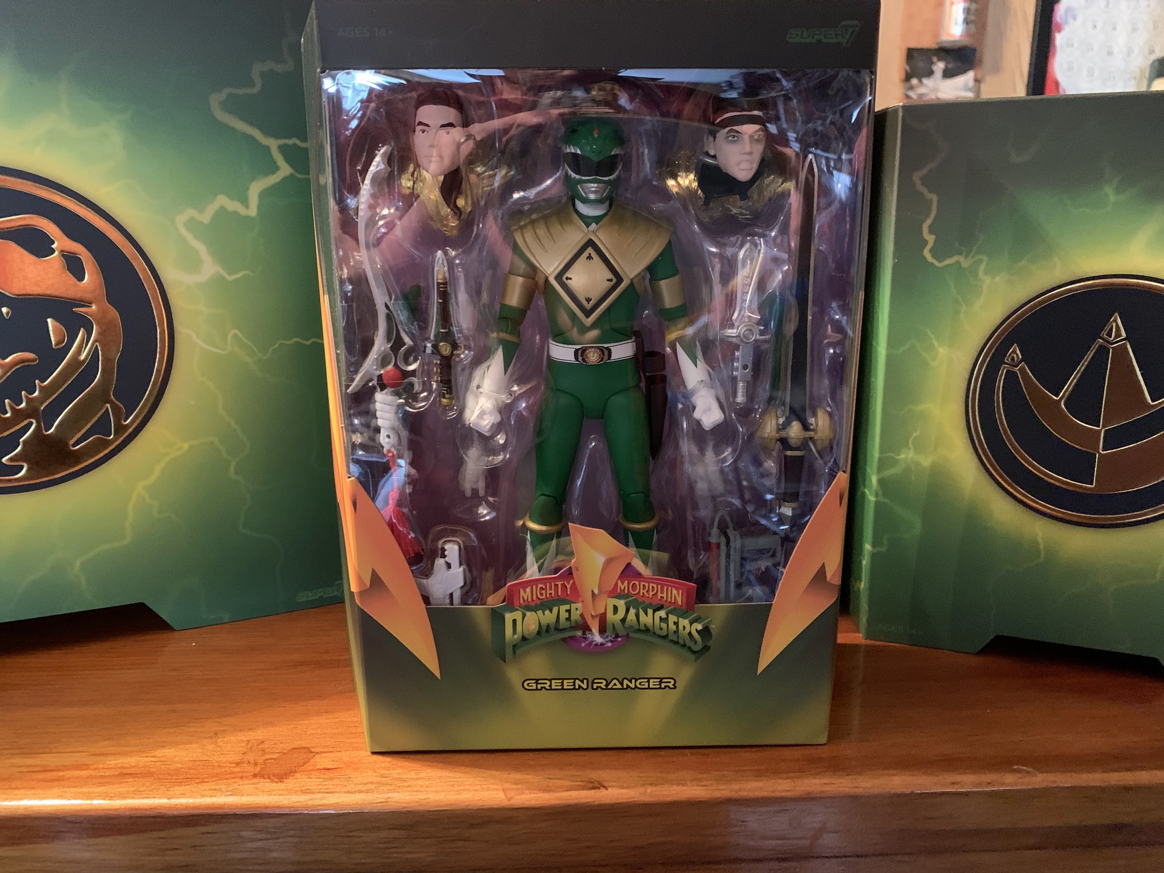
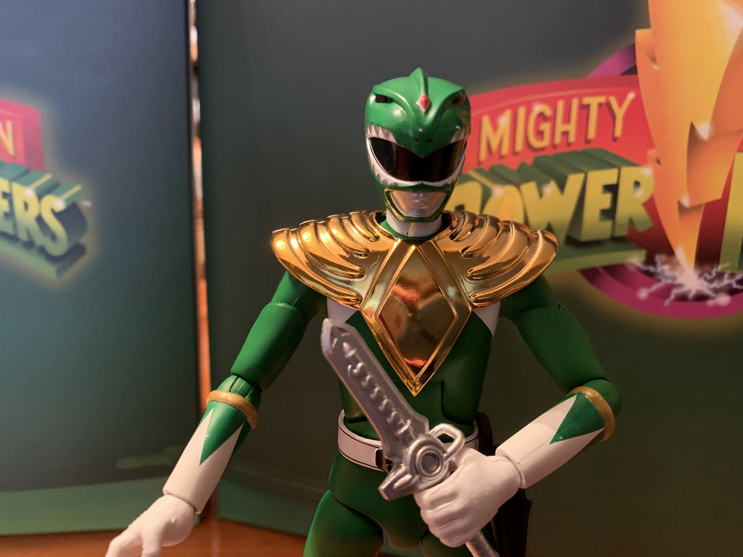
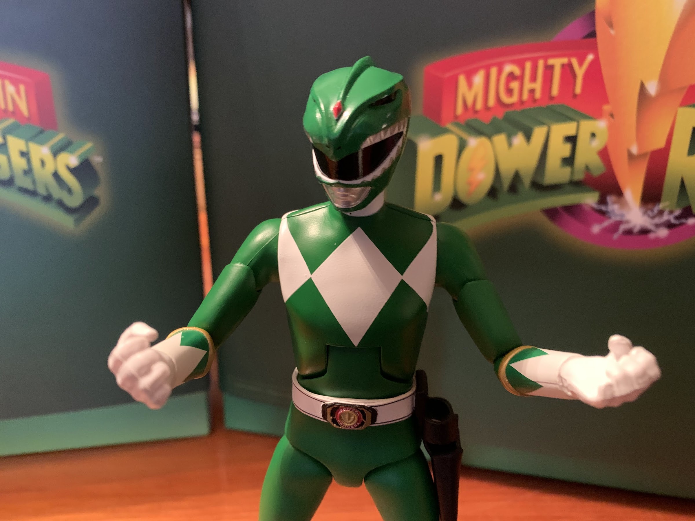
The Green Ranger comes in the standard Ultimates! packaging. There’s a green slipcover, which is consistent across the line and not a Green Ranger thing, and once removed you get a nice window box and a bio on the back. The Green Ranger stands at 6.5″ and it’s likely all of the male Rangers to follow will be featured on this same mold. The body is of a lean man which is consistent with the in-suit performer of the show. The shade of green in use for the costume is a more olive green than the brighter color Hasbro used for its figure. There’s really no sculpted folds in the green and the presentation comes across as very clean, and maybe a touch minimalist. That’s not necessarily a bad thing. I suppose Super7 could have attempted to add that sheen the spandex suits seemed to possess, or even dirty up the boots and gloves, but simple was apparently the approach. The dragon shield is the Japanese version that the character was most often shown in as opposed to the frumpy, shiny, one used for the scenes shot in the US. The gold is a somewhat matte, yet metallic, finish and it’s a good approximation for how it looked on TV. There’s some black paint around the diamond and it’s cleanly applied. The helmet has a glossy appearance which also matches up with the show. The paint of the red diamond in the center and the teeth around the visor looks good.

Other areas where the paint looks nice is the black trim of the belt and the morpher in the center. The words “Power Rangers” are even legible on the morpher which is impressive. Areas where the paint isn’t so great is the gold trim on the gloves and some of the green triangles on the gloves and boots as well. The right forearm on mine has one triangle that stopped short so there’s a gap of white between it and the gold band. On the left forearm, some of them just weren’t applied with enough opacity, or a residue of some kind got onto it after the fact. I left it in place for the images here, but after completing them I actually swapped the forearm on my left arm with the alternate left arm that comes in the box (we’ll get to that in the accessories). I’m tempted to do the same for the right arm, but my alternate right forearm doesn’t have great paint either. Aside from those issues, I do think he looks rather sharp. This shade of green just does something for me and it was the main driver of why I decided to get this figure. He does have his show accurate, black, holster for the Dragon Dagger on his left hip and all of the details of the gloves and boots are in place. There is one line missing from the helmet that should come out from the diamond and I’m torn on if I wish there was some black linework added there. Would it be too much, or would it add more pop to the presentation? It also looks like the red diamond should be outlined in gold and not the silver Super7 went with. One thing this figure does have over the Hasbro one though is that the white diamonds on the costume are painted on as opposed to ignored. Overall, I think I like the presentation of this figure vs the Lightning Collection offering, but concede it may fall short for those who want a more “stepped out of the TV” version of the character.
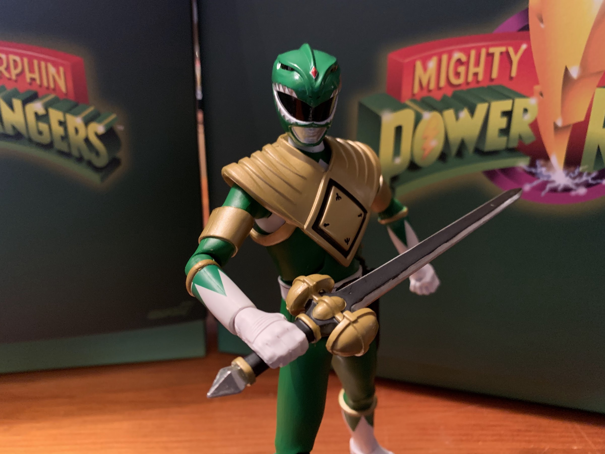
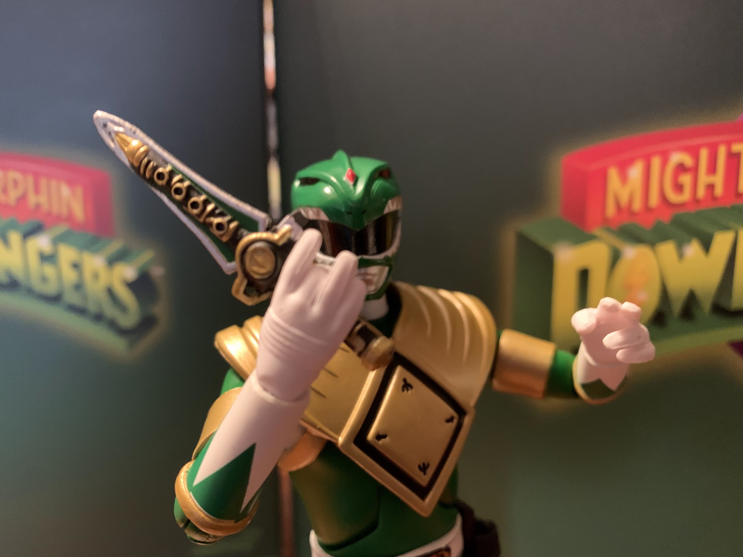
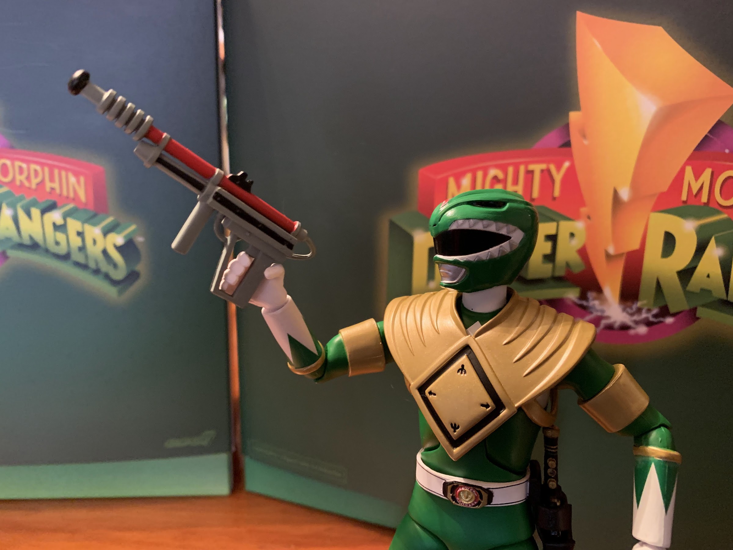
Because this is a Super7 Ultmates! release, we get a whole bunch of accessories. Tommy has a set of fist hands, gripping hands with a vertical hinge, gripping hands with a horizontal hinge, open/clenchy hands, a flute playing right hand, and a two-finger gesture left hand that I think is also intended for the flute. The Green Ranger’s signature weapon is his Dragon Dagger and Super7 included a damn fine representation of that weapon. The sculpt looks great and the paint is super impressive. I like that the center button on the handle is depressed so it slots into his special right hand very well. You could also have him wield it with his standard gripping hands too, but that’s not as fun. If you think the Green Ranger needs something more impressive to wield, he does come with the Sword of Darkness. It’s well-sculpted though the paint isn’t as crisp as it is on the dagger. I don’t like the very chunky handle which I’m assuming is show accurate, but maybe a little creative license could have helped here. It does have a real tassel tied to the end which is a nice touch and at least it isn’t warped and bent like the Hasbro version. If you don’t like it though, there’s also the Sword of Power. I don’t remember this thing, but it’s a big, black and gold sword that honestly I think looks stupid, but maybe I’m in the minority. He also has a gun which the internet tells me is the Mega Heater. I don’t remember it at all. It looks rather goofy, a very DIY type of thing made-up for the show, but if you like it you have it.
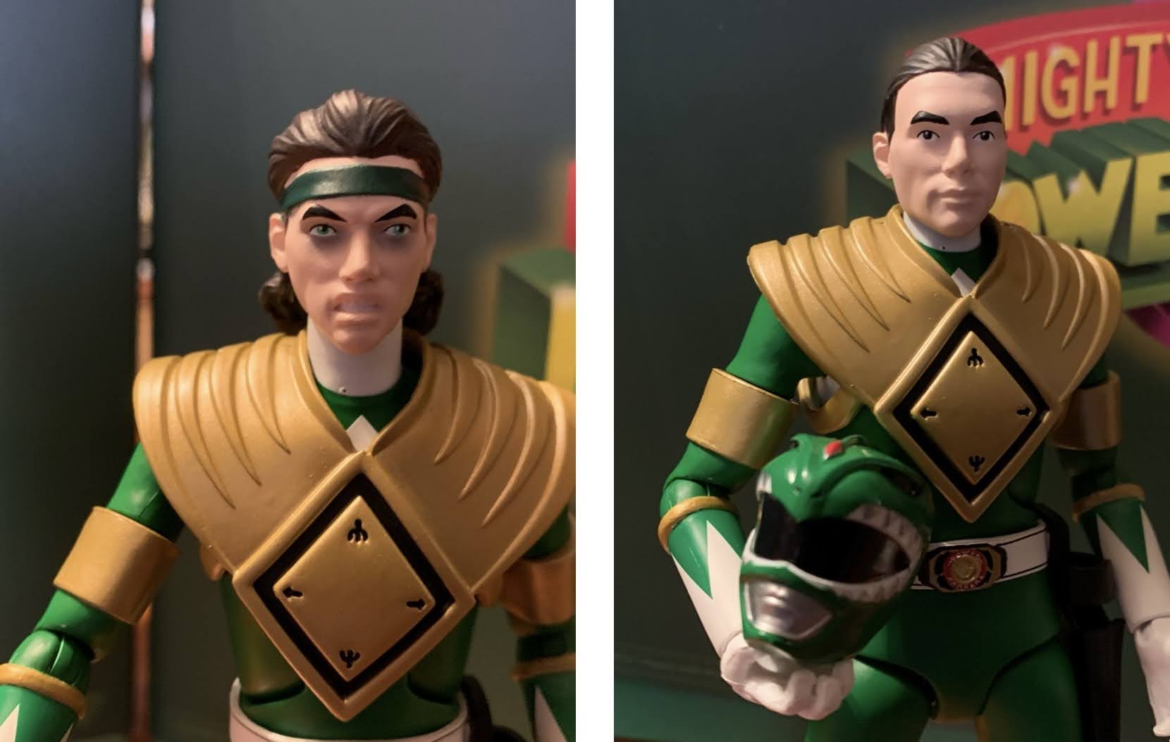
If you prefer your Rangers un-morphed and therefore unmighty, there’s a pair of unmasked heads. These are supposed to resemble the late Jason David Frank, but the likeness is terrible. Not helping things is that the paint is also poor. It’s not that it’s sloppy, it’s just unimaginative. The face is a solid color with no shading and the sculpt is too soft to create natural shading so it looks like a blob of nothing. One head features Tommy with a ponytail and the other he has the headband and a more tortured expression as it’s supposed to be Tommy from when he was under the control of Rite Repulsa. If you do happen to like these heads though, swapping them is pretty painless. You also get an activated morpher he can hold which is just as well-painted as the one on the belt. Sure, it makes no sense for him to be already in costume while in the process of morphing, but Super7 apparently felt like it had to include a morpher with each figure. The handle on it can slot onto either the gripping hands or even the clenching hands. It is pretty tiny though, so good luck in not losing it.
Lastly, we get some vintage toy inspired accessories. The Green Ranger comes with a shiny, vac-metal, dragon shield that can replace the show-accurate one he comes wearing. This shinier shield is a callback to the 8″ Bandai figure as well as the auto-morphing one and it snaps together in pretty much the same manner. To complete the look we also get a set of spare arms that lack the gold bands around the bicep. The old toys didn’t bother with that detail. They also didn’t have the gold trim on the boots and gloves or the green triangles instead of diamonds, but Super7 can only give you so much. Plus, the extra arms allow you to display your Green Ranger “naked” without the shield as he did pass it off to the Red Ranger on at least one occasion in the show (though I think the gold bands stayed on his arms when he did, but I could be wrong). I doubt many will want to display their figure in that way, but at least Super7 gives you the option. More likely is that some fans will want to buy doubles of the Red and Black Rangers to display with and without the shield. If Super7 had wanted to juice sales of this guy, they would have made the shield specific to him, but it looks like that’s not the case. Lastly, this figure also comes with two vintage style weapons in the form of a gray dragon dagger and a white blade blaster in gun mode. The dragon dagger is a replica of the one that came with the auto-morphing figure while the blade blaster came with the larger scale figure. It’s possible it came with the auto-morphing one too and I’m forgetting it. I don’t have that figure anymore though so I can’t comment on how well they nailed that weapon’s likeness, but the blade blaster is pretty spot-on to the one I have. I don’t know why anyone would ever use it, but it’s here.
The last thing we need to talk about with this figure is articulation. Being that this is a character from a martial arts-based show, he needs to move pretty well. Unfortunately, that has never been Super7’s strong suit. They openly dislike things like double-joints and seem loathe to break-up their sculpts in other ways. They did try something new with this figure, but in general, articulation is the one area where Hasbro’s Lightning Collection is always going to win out. One joint that it does have in common with that line though is the ball-hinged neck. I don’t know why Super7 went in this direction and away from double-ball pegs, but it is what it is. This figure looks up and down pretty well and you get full rotation, but there’s no nuance posing afforded by this design. The helmeted head doesn’t want to slide around on that ball at all. The shoulders are the usual ball-hinge design and they get full rotation while also being able to raise out to the side. The hinge feels tight, maybe due to how the arms had to be designed to be removable easily, while the rotation is pretty loose, but not so loose that he can’t hold a pose. Both style of arms feature a biceps swivel which looks better on the arms without the gold bands, but there’s not much Super7 could do there. The elbows are single-hinged and they do rotate at the joint as well while the wrists swivel and hinge and get plenty of range.
In the torso, we get a joint I absolutely hate. Super7 felt the need to add an ab crunch to these figures and I think that’s fine. With the women Rangers, it’s a diaphragm joint that’s on a ball or double ball peg, but the males get this hinged ab crunch that looks awful. It’s basically an inverted design compared to what most companies will do where the hinge in the middle of the abdomen is the thin portion. Most companies will thicken that part to make it less noticeable and they also often have some chiseled abs to work around that this design wasn’t going to benefit from. Still, what Hasbro did looks much nicer while this looks awful. I continue to be shocked that a company that thinks a double-jointed elbow is too ugly to feature on one of their toys would okay this thing. Just do ball-pegs like the women! To add insult to injury, the joint doesn’t even work that well. The figure bends back a decent amount, but going forward is just so-so. Plus, this figure has the shield to contend with most of the time (though that also helps to hide the joint too) so the joint is largely just an eyesore and they would have been better off skipping it entirely. Below that is a waist twist, which is just a basic waist twist, so it’s fine.
For the hips, Super7 is using a hinged-ball peg that goes into the crotch. Going out to the side, the figure can basically hit a split, or at least it would if the scabbard wasn’t in the way of the left leg. There is a thigh twist there, but it doesn’t have much range and might only get you about 45 degrees rotation going out away from the center of the figure. Kicking forward, the figure can basically do 90 degrees and it can kick back maybe half that, more if you want to really flex the diaper piece that is over the crotch. The knees are single-hinged and can bend back about 90 degrees. There’s a little shimmy to them, but I don’t think it’s truly intentional as the knees are cut in such a way as to prevent rotation. It’s not needed anyway as there’s a boot cut below that and the ankles are the traditional hinged and ankle rocker setup. They work fine as they go back pretty far and the rocker has generous range to help keep the figure’s feet flat on whatever surface you place it on.

In terms of posing, the figure is okay. He’s best suited to stand in a ready position with a weapon in-hand. He’s not going to be very good at kicking poses or sword-swinging ones either. The lack of butterfly joints also means he can’t do a proper morphing pose with the Power Morpher, but considering he’s not un-costumed I don’t think that’s a terrible loss. What is borderline unforgivable is that this guy can’t play the Dragon Dagger. With some forced perspective type shots, you could fake it for a photo, but that won’t do you much good for the shelf. Id you don’t need him actually squeezing the buttons then you can get the mouthpiece to the mask, but in order to do so I had to make the figure grip the very end of the dagger and it looks pretty silly. Limitations aside, the joints at least feel solid. The only loose ones are the shoulders, but they’re not giving me problems. The hinge in the head is also very loose, but again, it’s keeping the head where I want it so it’s not an issue at the moment. The figure does possess somewhat of a cheap feel to it, though it’s not awful. It’s mostly with the arms which again I think is a symptom of the removable design. The floppy hinge joint in the neck looks awful, but that’s only apparent when the figure has no head.
The big question with this release, and it’s often the case with Super7, is the figure worth the $55 asking price? It’s a bit of a hard sell at that price and some of the other figures in the line aren’t really helping the cause. It’s a 6.5″ figure with okay paint for the most part, a decent sculpt, mediocre articulation, and a bunch of accessories. This is one of those Super7 figures that feels like it started with a price of $55 and then someone had to get the final product up from a much smaller cost to justify the price. And that’s apparent in the abundance of accessories that no one is really asking for. The vintage inspired stuff is cute, but how many people are actually going to use that stuff? The heat gun, the Sword of Power – these are all things I can do without and would actually prefer to not have around if it meant the price could come down. Super7 seems to have this thing where every figure in the line has to be $55, but other figures can certainly top that, but that $55 is a hard floor and in some cases it does the product no favors. More people would buy this if it were $40 and it wouldn’t look silly beside the likes of Goldar and the T-Rex zord. From Super7’s perspective, it makes people who buy the more impressive looking items feel better about that price, but I don’t know if it works that way. And it could be, and quite likely is, that Super7 would argue those other figures should be priced higher than what they are and maybe that’s true. All I know is, I’d like this figure a lot more at a cheaper price. I still willingly paid $55 for it and I don’t hate myself for it, but the pragmatist in me would advise others to wait for a sale. It’s the Green Ranger, he’s popular and not going out of stock anytime soon so there’s no harm in waiting. Where the price really hurts is that I’m only willing to get my favorite Power Ranger at $55 and he’s likely to be lonely on my shelf as a result. He’s just going to have to make due with being placed beside his Bandai and Hasbro counterparts.
Is Tommy Oliver your favorite Power Ranger too? Maybe you would like to check these out too:

Hasbro Lightning Collection Mighty Morphin Green Ranger
In the early days of the ongoing Covid-19 Pandemic I found myself filling the social hole in my heart with toys. That has continued, but in the earliest days I went backwards. I grabbed some toys that I had wanted as a kid, but never got, and I talked about them here. One such toy…
Keep reading
Bandai Mighty Morphin Power Rangers Dragonzord
So a week ago I did a post that I titled The Toys that Got Away. It was about toys that I had pined for as a child, but for one reason or another, was unable to ever acquire. It wasn’t intended to be a sympathy piece or anything, because I had an awesome childhood…
Keep reading
Hasbro Power Rangers x TMNT – Tommy and Raphael
When Mighty Morphin Power Rangers arrived on Fox Kids in 1993 it quickly became a ratings juggernaut. It was the hottest property around aimed at kids and seemingly everything got knocked down a peg as a result. By contrast, Teenage Mutant Ninja Turtles was embarking on its downturn. The third film wasn’t nearly as successful…
Keep reading