Tag Archives: hasbro

Marvel Legends X-Men ’97 Rogue

Rogue is back with a facelift.

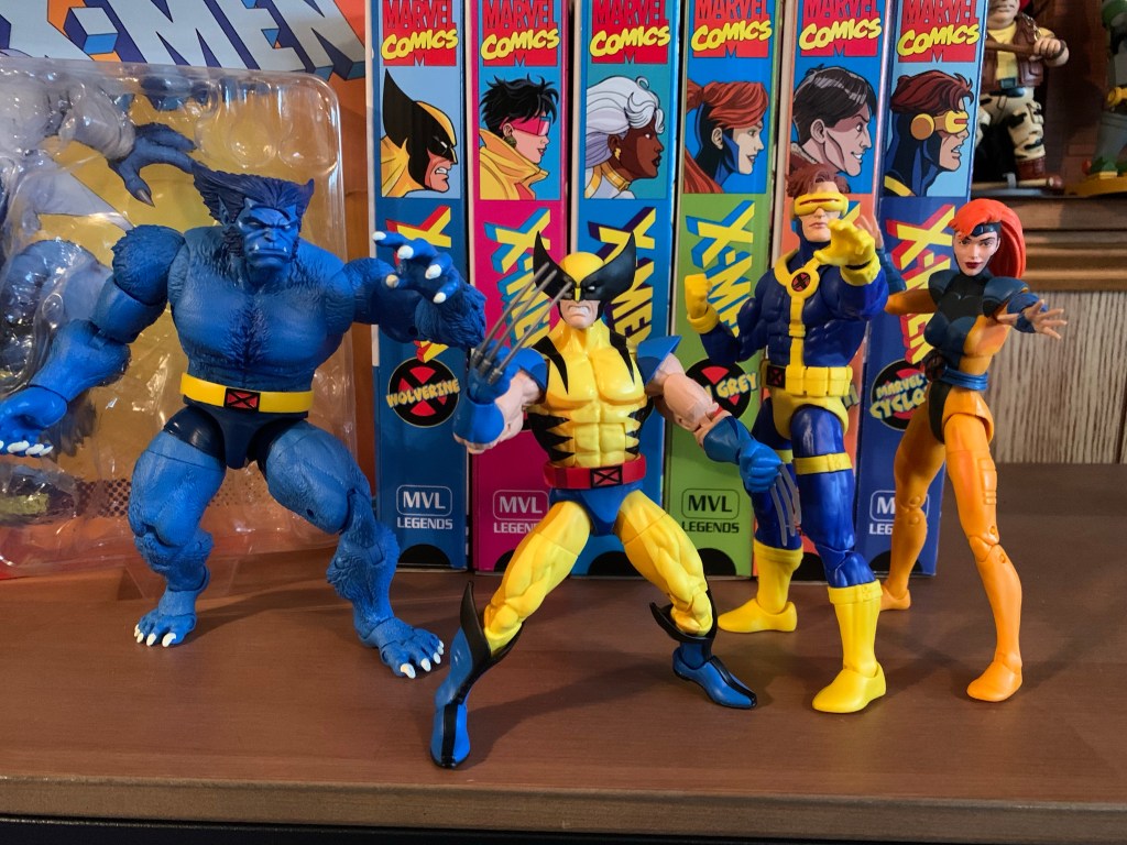
Previously, on X-Men reviews we looked at Magneto from the upcoming series X-Men ’97. The animated series may have been delayed into 2024, but the action figures from Hasbro are already here. And if you were collecting Hasbro’s line of figures based on the animated series from the 90s, this new line offers a chance to fill in some gaps. That’s what drew me to Magneto, and that’s what is drawing me towards Rogue.

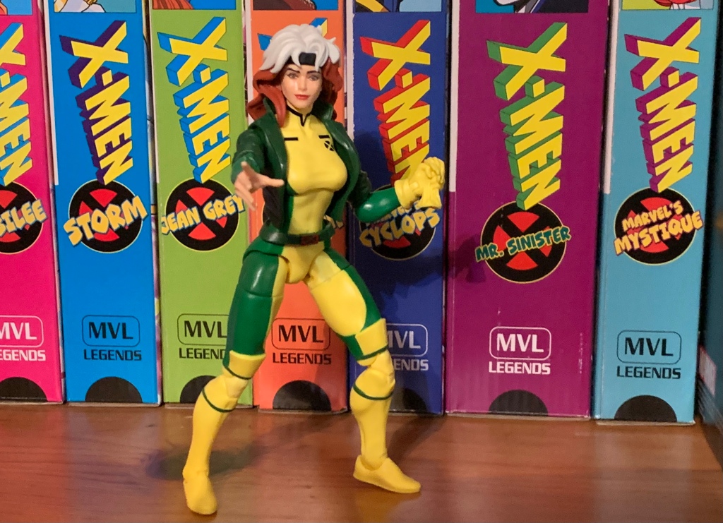
Rogue comes at us in the same style of card back as Magneto with artwork from the show on the front and a cross-sell on the back. Rogue is in her animated attire which is very similar to the costume Jim Lee designed for her in the comics, but with some minor differences. Her headband is just a headband with no knot on the back and her jacket is green instead of brown. Otherwise, she still has her two-toned hair and her yellow and green bodysuit. And her costume in the new show is the same as the costume from the old show. There is a style change going from the old show to the new and that’s reflected in the figure, but on the surface, this figure should be a candidate to serve as an animated Rogue in your X-Men animated series collection.

If you were introduced to Rogue via the 90s cartoon then you probably prefer her in the green jacket.

Rogue stands at about 6.25″ to the top of her hair. I was critical of the size of Magneto so I should do so here. Rogue is a bit too tall, not egregiously so, but she’s not perfect if that matters to you. I’m okay with it, personally. Her head sculpt is all new. The hair is done with two pieces: one brown and one white. It looks fine. There’s no shading which would probably help, but the two-toned nature of her design covers up for that. Her face and said hair are the most obvious change for the new show. She doesn’t have the big 80s hair she had before, and while her face looks fine, it just doesn’t look like Rogue to me. I’ve been trying to figure out what it is about her face that differentiates it from say Jean, and I think it’s how her eyes are shaped. Usually stretched a bit and diamond shaped. It looks close enough though to the image on the box so ultimately I’m fine with it, this is more information for those looking to fill in the ’92 collection. Her face does have some shine to it, which I don’t care for, but that’s hardly surprising for a Marvel Legends release.

Rogue stands mostly in-line with the other female figures from X-Men.

The rest of the figure is a mix of old and new. The jacket is a floating piece while the sleeves are sculpted. It looks fine, the X logo on her right arm looks pretty ugly, but I have no issue with the approach. The opening for the arms is pretty large though so it’s something you have to be mindful of when posing if you don’t want her to look like she’s wearing a vest. The upper torso piece is new to better match the new show. She’s still a tremendously busty woman, only now the suit isn’t so skin-tight that she looks like she has cantaloupes on her chest. Some might complain that her breasts have been slightly deemphasized, but I personally think this looks better. This new torso does appear to have a slightly different finish to it though, at least the upper part, as the yellow on top doesn’t match the yellow of her abdomen perfectly. It’s slight, but something I notice with the figure in-hand.

You have probably seen a similar meme before. Cartoonists and figure sculptors just love working on Rogue’s butt.

The other main difference between this Rogue and the previously released retro card figure (which I don’t have), is that the boots are now fully sculpted. That figure had the top of the boot represented by a floating piece, but now that’s just sculpted to the thigh. It looks okay. When fully bending the knee it’s probably not as good looking as the previous solution, but at least there’s no fussing with the extra piece. The majority of the figure is molded in yellow and the green is painted on and the paint application is mediocre. The torso is okay, I have some yellow spots but they’re hidden under the jacket, but the thighs are a bit messy. The green straps on the boots also aren’t cleanly applied. And something sure to irritate some, myself included, the green portion of her thighs doesn’t line up on the front and back of the leg. Meaning if you twist the thigh to line the yellow and green up properly on the front of the figure, it will be mis-aligned on the back and vice versa. That’s just annoying, but also speaks to Hasbro as I often get the impression they just don’t care about the details. There’s also a weird paint detail on the side of each thigh. It’s like an extra application of green, but on the plastic seem of the upper thigh. It’s on both sides and I don’t really know what’s going on with it.

“Momma!”

The figure looks fine, it’s just imperfect when some of those imperfections don’t really need to be there. The articulation is also mostly fine. The head is affixed via the usual Marvel Legends hinged-ball peg. For Rogue, it works okay as her hair hides the gap and odd angles when pushing her head all the way down or up, she just doesn’t have a ton of room for nuance posing. The shoulders are hinged pegs and they’re really tight. Perhaps this is the result of creating a new upper torso, but not new arms? They’ve been doing that for years though so one would think they’re experienced at it. The joint is tight though on Rogue and sometimes when rotating it feels like the peg is binding more than rotating. It’s unpleasant, to say the least. The elbows are single-hinged and bend about 90 degrees. There’s also a swivel which works fine. The wrists swivel and hinge horizontally and they’re fine.

“I hate you!”

The diaphragm joint feels like a double ball peg. There’s a little movement to either side and some tilt forward and back, but nothing extreme. It should rotate, but like the shoulders, the joint wants to fight any rotation and is prone to binding. The plastic they’re using is just too gummy. There is no waist articulation and the hips are big ball sockets. She can do better than 45 degrees, but splits are out of the question. She kicks forward pretty well, but she can’t kick back much at all because she’s got herself a pretty ample backside. There is a thigh twist, but the design of her suit means it looks bad when utilized. I would have preferred her hips be designed to swivel on the ball peg. The knees are double-jointed and they’re fine, though there’s some paint transfer from the green to the yellow kneecap on my figure. The ankles are hinged and feature a rocker. The range is fine, but they’re very “clicky” so you basically just have 3 or 4 positions they can get into as there’s no smoothness to the joint.

The glove is off!

The articulation is mostly there, but the quality of the plastic lets the figure down. Those shoulders are problematic as is the diaphragm joint. She should have a joint at the waist, especially considering she has a belt to hide it, but that’s a spot where Hasbro seems to favor aesthetics over articulation with its female figures and I can accept that limitation. She could have double-jointed elbows and it’s mostly Hasbro being cheap in reusing old parts that prevents that from happening. There’s no butterfly joint, but I don’t consider that a terrible loss. Even though she’s a figure that could benefit from being able to rear back in a punching pose. It’s another figure where the quality control, the finer tuning, lets it down so it’s not much fun to pose. She’s also difficult to stand which I think has a lot to do with her body being more slight and her head top-heavy. The lack of nuance with the ankles adds to the frustration.

Sorry Logan, no going back for Morph and Beast.

As was the case with Magneto, Rogue is not going to shine when it comes to accessories. Of those, she has just two: an ungloved right hand and a second left fist that is holding her removed glove. The left hand is reused from the last Rogue release while the right hand is surprisingly different. I’m sure it’s not new, but it’s more of a reaching hand, I suppose? She should have a set of ungloved open hands for grabbing other figures. A second portrait with a more aggressive expression would also be nice. If you want her to look like she’s going to syphon someone’s energy she kind of looks like a creeper with that smile she’s sporting. The cuffs of the gloves are at least separate pieces that slide off of her arm so at least you can make the ungloved hand look convincing, but it feels half-assed still. I feel like a good company would include a ’92 inspired head or something, maybe some effect parts, but that’s not Hasbro.

Rogue comes away feeling a lot like Magneto. This is a fine enough likeness of the new X-Men ’97 design and probably a tolerable stand-in for the ’92 series. Considering the VHS line from Hasbro rarely seemed to feature new tooling, chances are a ’92 Rogue would have just been the previously released retro card with some haphazard cel-shading. At least this figure doesn’t have that blemish. It has problems with the articulation though and the accessories stink. At $26, it’s a harder sell than it should be. I don’t regret buying it, but I can’t give it a full-throated endorsement either. This is the sort of figure one buys out of a sense of obligation: I have an animated X-Men shelf, and it needs a Rogue. It’s not really one that’s bought because it’s a terrific product, but that seems to sum up the Marvel Legends experience.

Interested in more figures based on the animated X-Men?

Marvel Legends X-Men ’97 Magneto

It was two years ago that Hasbro made the announcement that it was wading into the weeds of X-Men, the cartoon series that aired on the Fox Kids Network from 1992-1997. The line was released across eight installments in 2022 (plus a ninth if you include the obviously animated-inspired Apocalypse released on a retro card)…

Keep reading

Marvel Legends X-Men Animated Series Mystique

The penultimate figure in this series is a bit of a curveball. When one thinks of the animated series X-Men, the first villains that come to mind are Magneto, Sinister, Apocalypse, Sabretooth, and then it gets muddled. Graydon Creed made quite the impression in the show’s second season and may even be the most hate-able…

Keep reading

Marvel Legends X-Men Animated Series Morph

This is it! This is the big one! Back on Halloween of 1992 Fox premiered X-Men and we were introduced to a character named Morph. For comic readers, it was a bit of a re-introduction as Morph was based on the character Changeling, but for copywrite reasons, had to undergo a name change. Changeling wasn’t…

Keep reading

Marvel Legends X-Men ’97 Magneto

New show, new toyline, that’s how the world works.

It was two years ago that Hasbro made the announcement that it was wading into the weeds of X-Men, the cartoon series that aired on the Fox Kids Network from 1992-1997. The line was released across eight installments in 2022 (plus a ninth if you include the obviously animated-inspired Apocalypse released on a retro card) and you probably don’t need to be a huge fan of the property to know that eight figures just isn’t enough to properly capture the series in action figure form. Fans can debate on what the biggest omission was and it would certainly be easy to select one of the several X-Men not included, but for me, the one I missed the most was Magneto.

Magneto has long been one of my favorite villains in anything. While he really wasn’t the big baddie he could have been in the show, he still had tremendous presence and was a captivating figure. I was delighted to see Mondo turn to him second for their line of sixth scale figures based on the show and they basically nailed the likeness of the character. In a perfect world, we would all be enjoying X-Men 97 right now, the sequel series to X-Men from the Fox days set to launch on Disney+ in early 2024. It was going to launch this fall which would have coincided with the 31st anniversary of the original show’s premiere, but I guess it just wasn’t meant to be. The show could be pushed back, but the tie-in merch was basically locked into their release windows so we at least have a new line of Marvel Legends based on the show to talk about.

He’s a bit of a slender boy.

As someone who is a big fan of that original animated series, I saw this X-Men 97 line as a chance to add to what Hasbro gave me in 2022. And I think some of that attitude is present in the character selection as we’re getting four characters right out of the gate not featured in the VHS line: Rogue, Gambit, Bishop, and the subject of this post, Magneto. Hasbro knows people like me will supplement that line with these figures which have a more animated look than a standard Marvel Legend release, even if it’s based on the new series instead of the old one. The characters are all coming on blister cards with artwork from the show on the front and they’re a mix of old and new tools. Unlike the VHS line though, these are definitely designed to resemble the source material where as the VHS line was very inconsistent with its approach. The line was actually pretty bad, if I’m being honest, but I keep buying this stuff anyway because nostalgia is a hell of a thing. If you think Marvel Legends are only getting worse these days then I guess I’m part of the problem as I’m still buying compromised visions of the characters I love.

There’s no cel-shading in this line, but he does have shadowy eyes. I just wish they went a bit heavier on the shading like the source material.

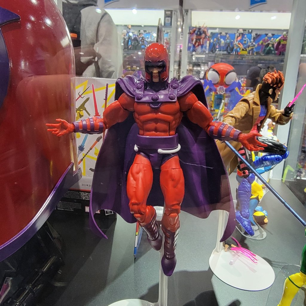
I’m looking at Magneto first because, as I said, he was the one I missed the most from the VHS line. He’s also the figure that best fits the style of the 92 series as not much has changed. I don’t collect enough Marvel Legends to know if the parts here are new or not, but they’re new to me. Out of the box, he stands at approximately 6.25″ to the dome of his helmet. We’ll get the accessories out of the way right now as he just has clenchy hands out of the box and a set of fists. He’s depicted in his classic attire from episode 3 of the original series: helmet, purple cape, red gloves. His costume changed here and there throughout the show. Sometimes he had purple gloves, something the part of his costume covering his neck and upper chest was red, but this is how he looked in Season One (and how he’ll presumably look, at least in the early going, of the new show). The crest on his helmet isn’t painted, but it doesn’t appear to be in the new show either. An outline might have helped though. The helmet has a very glossy appearance, but since it’s supposed to be metal I’m okay with that. The rivets holding his cape on are also shiny and there’s a little pearl quality to the purple portions of the wrists and shins. Those parts are painted, and the application is just okay. There’s some red poking through on the left shin of my figure and the lines aren’t all clean.

“Why is my hand shrunken when opened?”

The red portions of the costume are just colored plastic, but they have a nice, matte, finish. The cape is also colored plastic with a similar finish. I like how they sculpted in some shape into the shoulders which adds a little flair to the look. There is no cel-shading with this line, but Hasbro did paint the face with some black around the eyes as Magneto is often depicted in both the comics and animation. I like it, but I think they could have gone a little heavier with the black. There’s also some missed spots in between the eye and the eyebrow. The helmet is a separate, non-removable, piece and the face is painted underneath it. I don’t like the lipstick and I feel like his eyes are a little too high, but the face is okay enough.

The dainty hands are more pronounced when compared with Cyclops.

What I can’t shake though is the feeling that Magneto is just too small. X-Men 97 is a continuation of the original series so it stands to reason that the characters are the same size as they were back then. In that original series, Magneto was around 6’3″ and was basically eye-to-eye with Cyclops and Gambit if not a touch taller. With this figure, he is shorter than both Cyclops and Gambit. He’s also a touch slighter of build in comparison with the VHS Cyke. Maybe the new show is going for a slimmer profile with its characters and if so, criticism revoked, but the height is still an issue. Also of issue are the clenching hands which are almost comically undersized. Compare his open hand with Cyke’s two-finger hand and it’s like comparing a child to an adult. The fist hands are fine, and actually look like they’re reuse from Cyclops, and it’s even easier to see how small the clenching hands are by comparing them with the fists as there’s no way those two hands could be the same. The only big parts of the figure are his feet, which look terrible. They look like loafers and not boots. Magneto is a character that’s all about presence, so his size feeling off is a bigger deal here than it might be with other characters.

These two will never see eye-to-eye.

Articulation for Magneto is a touch limited for a Marvel Legends release, but that’s not exactly a deal-breaker. The head is on a hinged ball peg so you get range looking up and down, but it lacks the nuance of a double-ball peg. The shoulders are standard ball hinges and they raise out to the side past horizontal and rotate as far as the cape allows. The cape can be moved as it’s glued down to the figure’s chest, but also pegs into the middle of the back which can be popped out easily if you need it to. There are no butterfly joints, but I’m okay with that. There is a biceps swivel and double-jointed elbows that go past 90. They’re not the best looking elbows, and the entire figure has a bit of a gummy feel, but they work. The wrists swivel and both sets of hands feature horizontal hinges.

Lets bring in Gambit for another size comparison.

In the torso is an ab crunch that actually works really well going forward and back. There is a waist twist below the sash that works, but it gets ugly if you go too far. The hips are simple ball socket hips which can almost hit a full split going out to the side. They kick forward 90 degrees and kick back a little bit as well. There is the standard thigh cut which works fine and double-jointed knees that bend past 90 without issue. The ankles hinge forward and back and at least these ugly feet have solid range. The ankle rocker is also there and works fine.

If only he had an effect part of his own.

The articulation isn’t amazing or anything, but at least what is here works about as well as it could, minus the tactile issues. It’s enough for Magneto who basically just raises out his arms and floats around. What is lacking are the accessories since there basically is none. No un-helmeted head, no flight stand, no power effects. Just a figure with mis-matched hands. Is it enough? This figure cost me $26 and it’s a pretty bare bones release, all things considered. Any way you slice it, that isn’t great value. That’s probably why a lot of Marvel Legends are clearance buys for many people out there.

Yeah, he doesn’t look as good or come with as much stuff as the Mondo version, but it is almost a tenth of the price.

I bought this Magneto to go with my VHS set of figures. I know others are buying it for their comic collection. Presumably, there are people out there buying the figure to put on an X-Men 97 shelf, but with the show not out I guess it’s not surprising there isn’t a lot of folks going in that direction. For what I wanted out of this Magneto, it works. It’s undersized and lacking in bells and whistles, but otherwise looks the part. Is that worthy of your twenty-six dollars? That’s for you to decide. As for me, I don’t regret this one and compared to the VHS line he’s honestly among the better of those figures. It’s just a terrible value for what you’re getting, but as long as Hasbro is the only game in town it’s all we got.

Interested in more figures based on the animated X-Men?

Marvel Legends X-Men Animated Series Wolverine

The toyline of my dreams was announced last October. In celebration of the 30th anniversary of the television series X-Men, Hasbro is doing a dedicated line of Marvel Legends with figures based on the look of the show. The show was obviously inspired by the designs of Jim Lee, but there are differences in the…

Keep reading

Mondo X-Men TAS 1/6 Scale Magneto

If you showed a random individual this blog and asked them what my favorite cartoon was as a kid I’m guessing they would go with Teenage Mutant Ninja Turtles. And they wouldn’t be wrong as that was my favorite for a time, but come 1992 I was starting to drift away from that show. Batman:…

Keep reading

Marvel Legends X-Men Animated Series Cyclops

I wasn’t sure he would make it in time, but Hasbro managed to ship Cyclops before the end of the year. Cyclops marks the final figure (for now) in Hasbro’s X-Men animated series subline of Marvel Legends. It has been…a ride. What was once a dream line of mine to see brought to fruition, turned…

Keep reading

Star Wars: The Vintage Collection Boba Fett (Vintage Comic Art)

Make way for the Fett man!

I’ve been collecting action figures in some capacity for my whole life, and it occurred to me now that I’ve never owned the Fett man. That’s Boba Fett, who is one of the most iconic characters from Star Wars and also pretty noteworthy in the world of action figures. I am not the place for Star Wars history, but it’s my understanding that the original Boba Fett figure was hard to come by as safety standards prevented its release because of the missile firing action it possessed. Or it was released, then recalled, something like that. Needless to say, that original Boba Fett is a prized possession for vintage Star Wars collectors and the notoriety surrounding it has only added to the character’s popularity.

I didn’t collect the original Kenner line of Star Wars toys, but I did get into The Power of the Force which debuted in the 90s. My interest in it was somewhat of a passing one. I think I got a bunch of money for a birthday to do as I pleased and saw it as the right time to build up a Star Wars collection. Following that, it didn’t move much farther so I had plenty of gaps in my collection (the only Han Solo I had was the mail-away one in Storm Trooper armor you could get via Froot Loops), but the only one I was a little bothered by was my lack of Boba Fett. He just wasn’t in stock that day, and really, not a ton was as I ended up with quite a few figures from the Shadows of the Empire line. I would have opportunities to get Boba Fett later, and his spaceship, but when push came to shove I just didn’t want it enough.

I’m guessing a lot of folks leave these on card because it does display well.

As an adult, I don’t buy many Star Wars figures, but I do have a trio from The Vintage Collection. This is the Kenner homage line, but with more articulation and more paint. I liked the Mandalorian I picked up, but I really didn’t care for the Dark Trooper. I was so unimpressed with that figure that when I went to post my review I couldn’t be bothered to retake my photos which had come out rather blurry. I almost didn’t post it, but I took the time to write it so I let it slip through. I thought I was done with The Vintage Collection, but then I came across this Boba Fett the other day. I had previously considered getting the Kenner colors version of basically the same figure a few months back, but Hasbro wanted $26 for it so I wasn’t all that tempted. For some reason, $20 felt that much better when it came to this new one so let’s talk about it.

I just find the little guy charming and he does kind of fit in with the Christmas figures.

This Boba Fett is labeled as the Vintage Comic Art variant. As far as I know, the sculpt is 100% reuse from past Boba Fett figures and it’s part of a wave of Fett variants because the guy sells. This one is exclusive to Target which is where I found it. For some reason, it didn’t scan when I tried to buy it, but it wasn’t due to a register lock, so an associate just entered a price for me. I got it for $20, which is actually a buck cheaper than it’s supposed to be (thanks Target employee!) so I guess I have a tiny bit of surplus value in it. I’ve actually had that happen a couple of times at Target where I tell the associate the right price and they give it to me for less anyway. One older woman let me have a $4 Hot Wheel for a buck because I think she just felt that’s what it was worth which amused me.

Just look at that guy – such a bad ass!

Anyway, I don’t know where this look for Boba Fett comes from, but I’m going to assume it’s from a comic book adaptation of The Empire Strikes Back since that’s what’s listed on it. Again, other places could better inform you on the history of this thing, but what attracted me to it was the colors. This figure is cast mostly in a rich, dark, green with mostly red and white mixed in. Maybe it’s my love of Christmas influencing me a bit, but this color scheme works for me. It just pops, and I like where the red is utilized. What really works though is the helmet which has this blue shading on it between the black and white. And that little dot of white on the top of the helmet is just – chef’s kiss! It looks great! And I found myself taking it to the register against my better judgement. I think what also works in its favor is the size. As an homage line, we’re talking about a 3.75″ figure, give or take, where that colored plastic look comes off better. On the few Black Series figures I have, the red plastic in particular comes across as cheap, but it’s not as noticeable in a smaller scale.

I’m not in love with the soft goods or the appearance of the jetpack, but it’s not like they’re displayed prominently.

The presentation is rather lovely for this scale and the figure also comes with a couple of accessories. There’s a non-removable soft goods cape affixed to the back of the figure’s left shoulder. It has some holes in it so that it looks weathered, I suppose, though it does throw off the look of the figure a little bit. On the other hand, the plastic cape on the Din Djarin figure is a bit of a pain to deal with so I can’t say I mind too much. On the figure’s back is the jetpack with a non-removable missile, which is a little disappointing. The paint on it isn’t super detailed, but I’m guessing it wasn’t in the comic it’s based on too.

“Stick ’em up, unless you can tell me where I can stick this handgun then please help me!”

For weapons, Boba Fett gets a sidearm and a short rifle with a sling on it. The handgun is basically cast all in a light blue, while the rifle is solid purple. It’s an interesting look, for sure, and it works for me as a toy. There are no optional hands, but both hands are trigger-finger hands so he can hold a weapon in either hand. He can casually hold the rifle in two hands, the classic Boba Fett pose, though he can’t aim it with two hands. I like both, but I’m disappointed that he doesn’t have a holster for the sidearm. Now, he doesn’t have one on the card art, but maybe just give him one anyway? Or find a way to include one on his back or something. I feel like he has to be displayed holding the handgun or else it will get lost. The rifle at least has the sling so it can go over a shoulder, but the handgun has to be just shoved somewhere it’s not supposed to go if you want to store it.

Articulation is just okay. It’s a bit of a bummer that he can’t really do a two-handed, gun-firing, sort of pose.

The articulation on this guy is exactly the same as Din Djarin. I’m guessing some of the parts are the same, but there’s plenty that isn’t. This figure is going to pose much better than those old Kenner figures and really about as well as The Black Series. The limitations the Holiday Mandalorian I have possesses are pretty much the same here. It’s the torso that’s limiting since Fett wears armor so you don’t get anything in the diaphragm. The lack of butterfly joints at the shoulder prevent some of those gun holding poses you would like to have and the knees and elbows are single-hinged. The only joints I don’t like really are the hips, which are hinged ball pegs. Ball and socket joints would work better and I don’t see how they would cost anymore other than the expense of switching from one thing to another. The feet are a little on the small side so this guy might fall over here and there, but once you find a pose it seems to be fine.

The big thing with this series and figure is just the cost versus what you get. Should a 3.75″ figure cost over 20 bucks? I think in the minds of most the answer is “No.” I do wish we got a little more for our buck like maybe an effect part for the jetpack. This one doesn’t even have holes to accept the effect parts that came with the Dark Trooper which did bum me out a bit. A removable missile or a blasting missile effect would have been awesome too. I’d have taken that over the sidearm. My feeling with a lot of what Hasbro is doing (and it’s worse in the Marvel Legends line) with its prices is that they’re going up without the consumer feeling like they’re getting something extra. In fact, they seem to be cutting back on a lot of paint apps, accessories, etc. This one isn’t that bad as we at least get two guns and a fun paint job, but there’s no way to really downplay that the asking price is more than we’re used to.

At least he can handle this pose.

As someone who never owned a Boba Fett before, I’m happy with this being my first. I think he looks cool, he looks fun, and he adds something to my modest nook of Star Wars figures. It’s the appearance that sells this, so if you like it go out and grab one. If you’re not a completist though, maybe double-check and make sure you don’t prefer a different variant as there’s no shortage of Boba Fett these days. This figure is exclusive to Target in the US and my store at least got a whole bunch so I don’t think it will be super hard to find, but it might be the type of release where if you wait too long you could miss your chance.

If you would like to read more Star Wars toy reviews, I’ve got a few more you can check out:

Star Wars: The Vintage Collection Dark Trooper

I’m back with another Star Wars action figure review! Actually, I don’t do these very often. This is only the third such review out of me because I usually don’t collect Star Wars. Sure, I think the franchise is fine and I did collect figures as a kid, but it’s not something I’m drawn to…

Keep reading

Star Wars The Black Series Mandalorian Warrior (Holiday Edition)

We’re getting to Christmas coverage at The Nostalgia Spot one day early this year with this look at one of the latest in the Holiday Collection from Hasbro’s Star Wars line of action figures referred to as The Black Series. I have previously looked at a figure from the very popular streaming show The Mandalorian…

Keep reading

The 2023 San Diego Comic Con Reaction Post

It’s the second most wonderful time of the year!

You probably heard, but Hollywood is essentially on strike right now. Two large unions are fighting for better pay, benefits, and assurances that they won’t be replaced by artificial intelligence while major studio heads like Bob Iger are tossing stones from their golden mansions. I am firmly on the side of labor when it comes to most strikes, but this isn’t a strike post. It’s a comic con one as the just recently wrapped San Diego Comic Con of 2023 had a decidedly different feel to it in light of the work stoppage. Unions frown upon any of their members even promoting their projects right now, and with good reason. Without the glitz of Hollywood, it meant Comic Con could go back to being about comics for at least one year. Though for me, every year is all about the toys!

I don’t know when it started, but Comic Con has become a huge spot for toy producers to show off what’s coming in the next few months to a year and 2023 was no exception. I sat glued to my phone once preview night started and fought with myself to put it down all weekend since I couldn’t be there in person. Now that it’s over, I’m going to tell you what I think because my opinions are very, very, important and the fate of the companies involved, nigh the entire industry, is dependent upon securing my approval.

NECA TMNT

That is one big ass Krang! Photo: Pixel Dan

Let’s start with the old standby – NECA and their many versions of Teenage Mutant Ninja Turtles. In some respects, this year’s display felt slightly subdued, but I think that’s because NECA has really branched out beyond just the cartoon and movies. They basically showed off a little bit of everything and undoubtedly they’ve held stuff back for the conventions to come. And that’s fine by me, I was kind of happy that I took one look at the new TMNT toon stuff and didn’t feel like I necessarily needed any of it. And some of that is tempered by the fact that I know I have a major expense in the sewer lair diorama to look forward to. On the toon side though, I’m definitely in for the street turtles. While I prefer the season one street looks to these, I’m still happy to have what they showed. That’s it though. I’m probably going to get more, and the giant Krang was certainly the show-stealer, but I’m definitely in more of a wait and see how I feel mode when some of this stuff starts becoming available.

These wrestling turtles so perfectly nail that Archie aesthetic I love. Photo: The Fwoosh

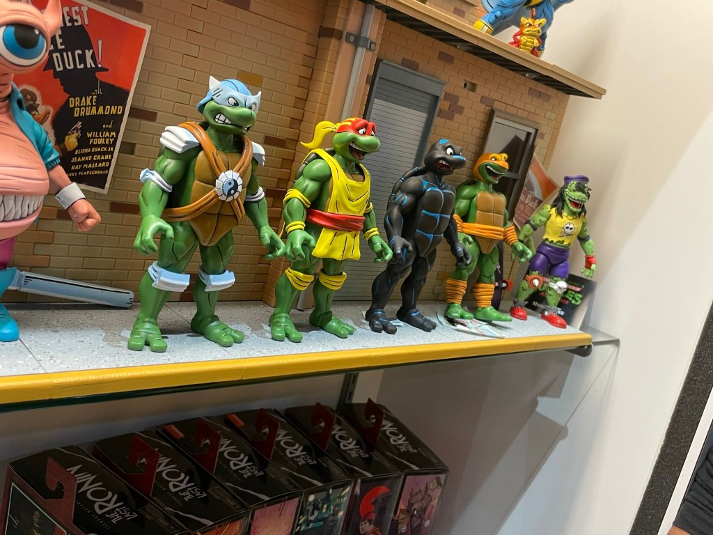
On the movie end, we just had some new Secret of the Ooze figures to look at. There was kick-boxing Keno, some new Foot, and two versions of Professor Jordan Perry. Is that too much of the professor? For me, yeah, and I can probably ignore all of these. Oh, and there was a pretty neat Shredder throne on display, but that’s another thing I don’t need. The comics end was far more exciting with a bunch of new figures based on The Last Ronin shown. They all look pretty damn good, but I may be out on that subline for the simple reason that I can’t buy, and display, everything TMNT from NECA. The Mirage line is getting some new figures as well, with the big one being Rat King who looked fantastic. That is definitely going on the “must buy” list. As for Archie, that may have stolen the show with a brand new Mondo Gecko unveiled and the much demanded Wrestling Turtles! Even if the models shown for the turtles were so early that they didn’t feature any articulation, I couldn’t have been more excited! I’ve wanted that black suit Raph ever since I was a kid and my dad bought me TMNT Adventures #10. I must have read that thing cover-to-cover at least a dozen times.

As for disappointments, there wasn’t much to be found. All of the new stuff looked good, so any disappointment was likely just the result of something not being shown. And the big one, for me, is Tempestra. I thought there was a very good chance we would see her from the toon line, especially after the profile boost given to the character thanks to Shredder’s Revenge, but she remains the elusive final member from the Night of the Rogues. I feel confident she’s coming though, so I’m not that broken up about it. I’d also like to see a new toon Shredder, or an Archie one, but again that’s probably coming, we just don’t know when. And hey, that Turtle Van is looking pretty sweet!

Super7

All right, when can I have them?! Photo: The Fwoosh

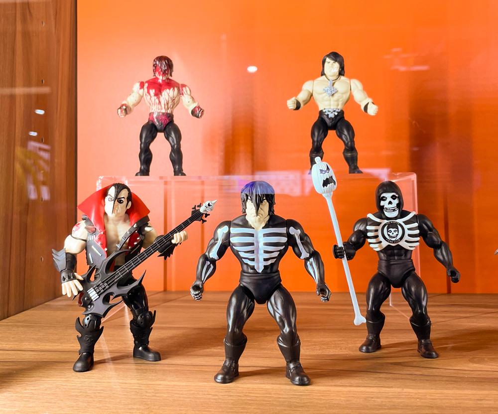
Super7 has cast such a wide net these days that maybe I should break their display up, but then again, there wasn’t a ton for me. The biggest though, by far, was the official unveiling of the new line of Misfits figures. These are being done in a retro, Masters of the Universe, style which is pretty cool. It means they won’t be as expensive as Ultimates, but definitely better than ReAction. I’ve felt for awhile that Super7 needed something in between those two lines, and maybe this is it. Would I like an Ultimate Glenn Danzig some day? Sure, as long as it’s good, and some of the figures Super7 has done of real people haven’t turned out so hot. This line, which features Skeleton Danzig, Jerry Only, The Fiend (aka Crimson Ghost), Samhain Danzig, and early 90s Danzig, already has hit on some great designs. We just need a Doyle to round things out. I’m also amused by how Super7 is basically just following the Medicom blueprint when it comes to Glenn Danzig.

On the disappointing side, well, there just wasn’t anything from the other lines I care about at Super7. Well, they did have TMNT Wave 8 on display and that’s looking fine, but there was nothing from the Disney or Simpsons Ultimates or even any new ReAction that I saw for either. Super7 usually doesn’t unveil new Ultimates at Comic Con, and they also don’t always go with a robust display. If they have something anticipated that they just got from the factory or something, they may bring that, but not always. I’m just concerned for both of those lines. The most recent Disney wave based on The Rescuers failed to secure enough preorders to go into production. Is the line in jeopardy? Sort of similar is that The Simpsons Wave 4 is still listed with an ambiguous “TBD” on the pre-order status page. It could be an oversight and they just haven’t updated it, or it could mean that no progress is being made and until it goes into production it should be considered as “in jeopardy,” as far as I’m concerned. It’s not exactly a star-studded wave and features two figures at $65 so nothing would surprise me.

Hasbro

Now that’s a figure worthy of the Master of Magnetism. Photo: The Fwoosh

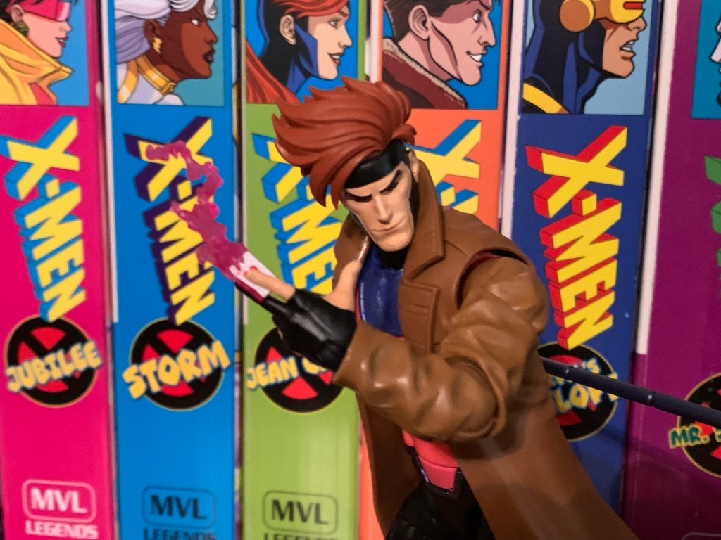
I am certainly not the biggest Hasbro fan, but the company had my attention going into the convention because we knew that Marvel Legends based on the highly-anticipated X-Men ’97 were likely to be shown. And they were! Coming in Wave 1 is Wolverine, Rogue, Gambit, Storm, Bishop, and Magneto all with new sculpting to make them better resemble the upcoming show. For me, someone who collected the VHS line of X-Men based on the 1992 cartoon, I wanted to see if some of these could be fudged into that line. We have no assurances that Hasbro intends to come back and finish that team, so plucking Gambit and Rogue from this one might be our best option. And, for the most part, they look okay. Rogue has her green jacket and black headband and Gambit has a more “toon” appearance to his face. Neither face-sculpt looks truly like the ’92 show, but Hasbro was unlikely to give us that in the VHS line anyway. There is no cel-shading though, so that might throw off the display a bit, but given how half-assed Hasbro’s approach to that style was maybe it’s for the best? Wolverine is essentially the same as that release too, just now he has an unmasked portrait and pin-less limbs, so collectors waiting on a non-cel-shaded version of that figure should be happy. I personally don’t need it. And with Storm and Bishop featuring new hairstyles, I can pass on them as well. That Magneto though is a must have and I’m happy to see that Hasbro shaded his face. He could use some accessories, but this is Hasbro we’re talking about so that’s hardly a surprise.

I don’t know if I’m as happy as Pixel Dan is about this Crystar, but I’m definitely in “gimme gimme gimme” mode! Photo: Pixel Dan

Hasbro also gets credit for one of the biggest surprises as they showed off a figure of Crystar! Yes, Crystar The Crystal Warrior is coming to Marvel Legends and the figure looks pretty sweet. It’s all done in translucent plastic with a blue hue and he has his sword and shield to round things out. The comic he hails from is pretty forgettable, except for the fact that the iconic Danzig skull was lifted from the cover of issue 8. Naturally, this is one I need for the Danzig collection more than anything.

And that’s pretty much it for me. I did see other great stuff like Jada’s Mega Man line and NECA had some new Gargoyles to show, but the above stuff is what really stood out for me and got me excited. Mondo also unveiled an Omega Red in their sixth scale line based on the X-Men animated series and he looks unsurprisingly spectacular, I just wish they’d slow down a bit as that line is killing me financially. Special shout out to all of those working hard during the convention covering this stuff for people like me who can’t go. I’m talking about The Fwoosh, Pixel Dan, Toy Shiz, Toy Bro, and loads of others. The excitement is now over, we have lots to look forward to, and the next convention or show lurks on the horizon. This golden age of toy collecting appears to be going strong, weap for my wallet!

Teenage Mutant Ninja Turtles: Shredder’s Revenge

In the late 1980s the arcade scene in the US was still going strong. Classic style arcade games like Donkey Kong and Pac-Man were being overtaken by a new genre of quarter-munching pain: the brawler. Or the beat-em-up. If you’ve played one, then you can picture what I’m talking about. It was usually a one…

Keep reading

The Saga of Crystar – Crystal Warrior #8

There’s been a hole in my Danzig collection for quite some time. It was a hole that was easy to fill and actually quite cheap considering most Danzig records fetch well over $100 these days, but an important piece was missing. And that piece is not what one would necessarily expect, but I would assume…

Keep reading

Super7 is Heading to Springfield!

Wednesday, August 18th, ended up being quite an eventful little day in the world of toy collecting. There were some reveals from major toy companies, leaks, and even those long neglected Street Sharks fans got something to get excited about late in the day. Personally, it was a good day for me too as I…

Keep reading

Star Wars: The Vintage Collection Dark Trooper

Isn’t he a cute little fella?

I’m back with another Star Wars action figure review! Actually, I don’t do these very often. This is only the third such review out of me because I usually don’t collect Star Wars. Sure, I think the franchise is fine and I did collect figures as a kid, but it’s not something I’m drawn to in the same way I am other properties. And that’s worked fine for me since there’s tons of Star Wars content and reviewers out there. And when it comes to Star Wars, I’m basically just an original trilogy fan, but the recent output of television from Disney has actually been pretty solid so it’s no surprise that this is yet another review of a character featured on The Mandalorian.

The Mandalorian is basically Star Wars as a spaghetti western. It’s easy to digest, but has some overarching plots (especially Season 3), and the characters are plenty likable. One of my favorite designs from the show came from the Season 2 finale which featured the Dark Troopers. These robotic replacements for Storm Troopers are these big, hulking, glossy, black instruments of death, though I don’t think they actually kill anyone in the show (it’s been awhile). The design was great though and it was only a matter of time until action figures arrived. The emphasis being on the word “time” there as Disney apparently didn’t give Star Wars license holder Hasbro any advance notice of what was coming in that season so even though it aired over two years ago we’re just now getting to the figures.

So…he looks a bit different on the box, no?

If you are a collector of Star Wars action figures from Hasbro then you probably know that the company has three styles of releases: The Black Series, The Vintage Collection, and the Retro Collection. The Black Series is the roughly 1:12, 6″ scale characters that Hasbro has made a focus of its action figures division ever since it brought back Marvel Legends. The Retro Collection is basically a 5 points of articulation line that harkens back to the original Star Wars line from Kenner. It’s a style that’s basically been resurrected by Super7 and it’s ReAction series and Hasbro wanted to tap into that themselves. The Vintage Collection, which is where the figure we’re talking about hails from, is like a combination of the two. It’s a 3.75″ scale line, but it features modern sculpting, paint, and articulation. It’s the only line from Hasbro that has much appeal for me. I’m not a scale snob when it comes to my collecting and I appreciate a variety, it just so happens that most of the properties I enjoy most either come in 1:12 or 1:10 scales. The smaller 1:18 stuff is a scale I’ve always found really charming and it’s a scale that’s perfect for Star Wars given the presence of vehicles. The one figure I did review from the line (I did also purchase a Koska Reeves figure, but never reviewed it) was a release I really enjoyed so adding to that has always been a possibility.

And I probably would have added more to it by now if not for one thing. Hasbro, for awhile, seemed to resist raising prices during the pandemic and was holding strong for awhile. However, it being a publicly traded company, eventually caved to shareholder demands and we’ve seen price hikes across the board from Hasbro over the past year. And it’s like they’ve been playing catch-up as the increases have been rather extreme. The Vintage Collection was basically Hasbro’s best bargain just a couple of years ago. I want to say the Koska figure I bought was only $12. Recently, I was at my local Target and saw the new, Kenner-inspired, Boba Fett and I was fixing to add him to my tiny collection, but he rang-up at $23! Yeah, no way. And the figure I knew I wanted when I first saw the episode was this Dark Trooper, but Hasbro wanted $26 for this one and I had to pass. Then, somewhat out of the blue, the figure hit clearance at the more palpable price of $17.50. Still higher than I think it should be, but I had wanted this for over two years so I gave in. And since the order pick-up option I selected actually sold out before the unit could be secured for me, I got free shipping out of it so let’s take a look and see if this thing is even worth the discounted price I got it for.

This guy is a bit of a nightmare to try to photograph. He’s so dark the camera often doesn’t want to focus on him.

The Dark Trooper comes in Hasbro’s plastic-free packaging which I think they’ve already backtracked on. It’s just a cardboard box with an image of the figure on the front and a hanger affixed to the back. Inside the box is a cardboard tray that the figure is slotted into plus a brown paper pouch with the accessories. I buy most of my toys online so I have not cared one bit about the loss of the plastic bubble on the packaging. This hobby I and many others enjoy unfortunately is a big polluter since they’re primarily all plastic so I was in favor of Hasbro’s move to plastic-free, regardless of the company’s true motives (which I’m not speculating on). It seems to be going away though, so be it.

Bang!

The Dark Trooper stands at just about 4″ tall and at first glance, wow, this thing does not look like the figure on the box. It’s cast in all black plastic with almost no paint. The paint is limited to the metallic portions of the elbows, wrists, and knees plus some patches on the biceps. There’s also some red dots on the chest, but that’s it. In the helmet, is red, transparent, plastic to create a light-piping effect that really doesn’t work very well at this scale. You have to basically hold a light to the back of the head (where the rear of the plastic is present in the form of a red square) to get anything out of it. They may have been better off just trying to paint glowing red eyes, or better yet, they could have done both and given us some options. As it stands, the eyes mostly get lost in the face.

“And now I squish your little friend!”

That is unfortunate, but what is really disappointing for me is the lack of a chrome-like finish. The image on the box is either a render or placed under some very harsh light. Even blasting white light on my figure at close range I can’t get it to resemble that finish even a little bit. It’s a glossy plastic, but not overly so, and it very much looks like plastic. There is no illusion here that this guy could be made of the same material as the actual character. The black plastic almost seems to suck in the light more than throw it back. And that could be due to its composition as it’s a soft plastic, there’s a gummy-ness to it, and not something harder. I think a harder plastic would have thrown more light back at the viewer and helped sell the figure. Or maybe it just needed some paint. The face, especially, just doesn’t translate because of the all black plastic. The sculpt is there, but you have to get in close to appreciate it.

“Whoa! How did you do that?!”

And that’s an issue with the whole figure. Granted, this scale is not the best choice to celebrate a sculpt, but it still can if the finish is done properly. And the sculpt looks pretty nice. There’s a lot of detail in the abdomen and the limbs, and really, all throughout the figure. There is a floating crotch piece that has these little pistons on them, at least I think that’s what they are, that can get a little messed up. It’s a softer plastic and one of the four pistons on mine is warped a bit, but at least it’s on the rear of the figure. The left shoulder is also a little jacked-up, it probably didn’t come out of the mold clean, but otherwise I don’t have any issues with the sculpt. At first glance I thought the hands might be a little on the small side, but after a little research, that seems to be a case with the design and not the figure.

::Muffled screams::

The Dark Trooper does come with a handful of accessories. For extra parts we get two fists. I don’t see myself using them, but I guess it’s always useful to have some fists. The default hands are a trigger finger right hand and a gripping left which work well for two-handed weapon poses. And the main weapon is a blaster rifle of some kind. It’s all black plastic and it can be either held by the Dark Trooper or it can be slotted into the right thigh. There are thrust effects that peg into the feet. They’re a semi-transparent orange plastic and look okay, but without a flight stand they’re kind of useless. The Dark Trooper also comes with its own, personal, hangar. It has to be assembled as it comes in three pieces and it was a little harder than I expected it would be. It’s black plastic with some red paint in places and it’s fine. It perhaps creates some desire for people to army build these guys so you can have some inactive units in your display, but at these prices I don’t know if many collectors want to do that. The hangar also has two cables that plug into it that I guess are supposed to curl under the arms. I guess they’re like charging cables? I don’t know. They don’t really hold the figure in place so they’re rather perfunctory.

Go to bed, Dark Trooper, I’m sick of looking at you!

One of the hallmarks of this line is you get small, retro-inspired, action figures that move like modern toys. The Dark Trooper mostly comes as advertised in that regard, but it’s not without its flaws. The head feels like it’s on a ball peg of some kind with another joint at the base of the neck. You get your rotation and the figure looks down well enough. The range going up is minimal and you only get a little bit of tilt out of the joint. The shoulders are ball-hinged and the trooper can just about raise its arms out to a horizontal position. Rotating forward and back is fine, though the shoulder pad will prevent full rotation there. At the elbow there’s a swivel point which is basically your biceps swivel and the hinge will allow for a 90 degree bend. The wrists swivel and feature a large hinge as well that moves in a horizontal fashion. There is, sadly, no vertical hinge on the trigger hand. In the diaphragm, there’s a ball joint that’s mostly for rotation. There’s a little tilt and a tiny amount of forward and back, but not much. The hips can kick forward about 90 degrees and they go back a little bit as well. Out to the side, you basically get to a full split so that’s good. There is a thigh swivel that’s pretty well hidden and at the knee we get a swivel and a hinge that will go about 90 degrees. The ankles feature a hinge, but it’s very clicky. You basically have a neutral position, one click forward, and two clicks back. And really, all of the hinges are like that including the knees and elbows. It can make it a challenge to stand this guy to not have something more nuanced. There is an ankle rocker that too is a bit on the clicky side. It will move a little, then just jumps to a full tilt, which makes its usefulness limited.

Issues aside, I think the Dark Trooper will move well enough to get it into Dark Trooper poses. It basically just stomps around blasting foes and shrugging off the weapons of others. It’s not much of a melee fighter, because it doesn’t have to be, and when it does get in close it just swats away its prey. It also comes with enough stuff and the only thing missing is a flight stand to better take advantage of the thruster effects. I suppose a blast effect might have been preferred, but oh well. What’s going to determine if you like this figure or not is just how good do you think it looks? And for 25 bucks I don’t think it’s good enough. I didn’t seek out any reviews on this figure before buying it, so silly me for thinking the image on Hasbro’s packaging was indicative of what this figure looked like. Even at the discounted price I got this one at, I don’t think it’s really there. This should be a $12 line, and the fact that it’s double that is crazy and unfortunate as I think Hasbro is going to kill The Vintage Collection with these prices. I don’t hate that I have this figure, but it’s also not something I can whole-heartedly recommend.

If you want to read all of my Star Wars coverage you don’t have much to catch up on, but if you just like laser fodder, I’ve got plenty of reviews of such characters:

Star Wars The Black Series Mandalorian Warrior (Holiday Edition)

We’re getting to Christmas coverage at The Nostalgia Spot one day early this year with this look at one of the latest in the Holiday Collection from Hasbro’s Star Wars line of action figures referred to as The Black Series. I have previously looked at a figure from the very popular streaming show The Mandalorian…

Keep reading

Bucky O’Hare Wave 3.5 Aniverse Storm Toad Trooper

It’s been a long time between releases by Bucky O’Hare license holder Boss Fight Studio. The last figure released by the company was 2018’s Storm Toad Trooper, a figure that arrived at my doorstep on Boxing Day 2018. Since that time, Boss Fight Studio has had sculpts and specs to show off, most notablyBruiser, but…

Keep reading

Marvel Legends Spider-Man ’94 Spider-Man vs Carnage

It’s not Spider-Man vs Venom, but I guess it’s the next best thing?

Last year, Hasbro celebrated the 30th anniversary of X-Men, the animated series that premiered on Halloween 1992 and would become a ratings hit shortly thereafter for the Fox Kids Network. It was responsible for getting a lot of kids into the X-Men and Marvel comics in general and the first, prime, benefactor of that rise in popularity was Spider-Man. Spidey had taken a couple of swings at television and found modest success, but certainly nothing on the level that some of the other prime kids’ shows that were contemporaries. I personally recognized Spider-Man more from his public service announcements or the Marvel Productions animatic that would follow a show like Muppet Babies. With X-Men being a hit though, it opened the door for more Marvel cartoons and Spider-Man was next in line arriving in sneak peak fashion, just like the X-Men, in the fall of 1994.

You guys still into the VHS inspired packaging? I think I still am, but this would have been way cooler if it was actually two boxes and a slipcover instead of just one, big, box.

The Marvel Legends VHS series for X-Men must have been received well for the company to do the same with Spider-Man. That is easy to understand. What is not is why now? The X-Men wave has almost sold out on Hasbro’s website and it’s expected the remaining figures will eventually get there (Cyclops was just added to shopDisney in April) which suggests that a second wave is certainly in order. The 8 figures Hasbro did release hit on some members of the team and some notable villains, but more remain. Why not come back around with another 8 in 2023, 30 years after the show really took off since only 3 episodes premiered in ’92, and then come back with Spider-Man in 2024 to, you know, coincide with that show’s 30th anniversary? It seemed like it was setup perfectly for just that, but apparently Hasbro and the Legends team got impatient or they feel like they need to space the X-Men releases out more or that line is dead and they’re not ready to admit it. I personally don’t get it and I will be a little ticked off if they don’t come back to X-Men to finish off the team, at least, even though that product line was rather poor. I’m a sucker for that cartoon though so I was committed to filling out the roster, as imperfect as it was, and not having the likes of Gambit, Rogue, or Magneto leaves my shelf feeling incomplete.

It’s Spider-Man once again, who is the same, but different, as the last black-costumed Spider-Man we saw.

That aside, Hasbro’s approach to Spider-Man could be described as the same, but different. We’re still getting VHS styled boxes with TV show inspired artwork, only now they’re apparently coming in two-packs. I guess that’s great if you didn’t like the gap in releases between the figures in the X-Men line, but it stinks if you only want one of the two figures (and I think that will be true for many with the upcoming Doc Ock and Aunt May two-pack). Hasbro doesn’t think it’s worth their effort to credit the artist on the box, but good thing we have social media as I was able to find out that it’s Harry Moore once again who did the art on the retro card release too. The box is designed to look like a slip cover with two VHS tapes in it, but it’s just one box with the two figures inside. Like the X-Men line, this one is likely to be a collection of repaints with minimal investment made in the tooling of new parts. These figures aren’t direct adaptations of the characters you saw onscreen. It would have been great if that was what Hasbro committed to, but at this point no one should be surprised. A big feature of the X-Men line was also the cel-shading approach to the paint. It was something that was not applied consistently from release to release. Some figures looked okay, some looked terrible, but it mostly came down to the application being cheap and unfocused. With this line, we’re going to have two figures where one is shaded, and the other is not. It looks like cel-shading isn’t going to be as big of a focus here, but it’s hard to know why with anything Hasbro does.

Yeah, it’s pin-less and has some toe joints, but the only reason to get this figure is if you like the shading.

We’ll start with Spider-Man first. This is the symbiote, or black suit, Spider-Man from the show since we already received a standard, animated, Spider-Man via the retro card release late last year. Thematically, it makes some sense to pair symbiote Spidey with Carnage, a fellow symbiote, though anyone who watched the show can point out that Spider-Man never fought Carnage while wearing the black costume. Interestingly, this Spider-Man is a repaint of the figure that came in the Renew Your Vows two-pack last year. The animated Spider-Man from last year was on the noticeably smaller Amazing Fantasy figure mold making this figure basically not scale with the other Spidey. Cool. The sculpt is also much more cut than that one so this is a Spider-Man that looks almost absurdly ripped and lumpy for this source. The head appears to be the exact same as the retro card black costume Spider-Man and so are the hands, and for that matter, the torso. Whatever your preferred body is, none are particularly great for the animated Spider-Man as he was very broad shouldered and full in the chest which neither figure is. This one is pin-less in the arms and legs, so it has that going for it.

I don’t consider myself a Legends collector, and yet I now have 5 Spider-Men (Web-Man and Cyborg version not pictured).
“We’re the same guy, just in a different costume.” “If you say so.”

What is going to be most divisive with this release is probably the paint. The figure is cast in black plastic so the only paint present is the white and the blue. Yes, blue, as this figure is shaded like the show. Or rather, like basically every version of black-costumed Spider-Man. Just doing him in all black won’t show up on print or on TV, so he (and Venom) have always been shaded blue. In the show, Spider-Man was outlined in blue and the muscles were also done in blue. For the figure, Hasbro appears to have tried to outline the abdomen with blue while also hitting both clavicles. For the limbs, it’s just a few lines down the meat of the arms and the front of the legs. There are a couple of lines in between the eyes, and almost nothing on the back of the figure. There’s also none on the hands. It looks okay, but there doesn’t appear to be a ton of thought put into the blue on the arms. And, as usual, I think the figure would have benefitted from a little more. Something on the crown of the head would have looked nice, and maybe some under the pecs. And maybe just more curves to the lines would have helped with the biceps looking the worst out of all of the spots, but it’s probably as good as we could have expected out of this line. The rest of the paint is reserved for the eyes, hands, and the spider logo which has some gray shading. That is not consistent with the show, but it looks okay on the front, though I don’t know what they were going for on the back. The spider itself is pretty clean, though the white on the hands is too thinly applied. The eyes, which have a little luster to them, look okay.

“What am I supposed to do with these?”
“Nice split, spider dweeb!”

There’s no point in devoting a full paragraph to accessories for this guy as he just comes with the standard array of hands: fists, wall-crawling, and thwip. The thwip hands are useless since this version of Spider-Man shoots webs out of the back of his hands so why not drop them for a set of gripping hands? Or web accessories? It’s like the people who design these figures have little or no attachment to these characters, but any average fan would say “This doesn’t make sense.” Anyway, this guy should be pretty familiar when it comes to articulation too since he’s like most of the other Spider-Man releases. We get a double ball peg at the head that feels rough. It has some gapping issues and they did that thing where they cut out a chunk of the rear of the neck which shouldn’t be necessary for a figure that has no hair. Even with that, he doesn’t look up all that far and the head just wants to fight me for some reason. The shoulders are ball-hinges on butterfly joints. He can raise his arms out to the side fine while the butterfly joint provides okay range going back and forward, but nothing crazy. They also didn’t continue the paint on the spider logo on the rear so when the arms are all the way forward you get a gap. There’s a biceps swivel and the elbows are double-jointed. I cannot get the top hinge on the right arm of my figure to budge, but I was able to get the left one to move. He gets a little better than 90, so nothing impressive, but it doesn’t look ugly. The wrists swivel and hinge.

Go web! (Web not included)
Yeah, it doesn’t make sense, but they look good when they’re matchy-matchy.

In the abdomen we get a ball joint that lets the figure bend back and forward a little bit. It creates gaps in both directions so it’s better used for rotating and pivot and the range going to the side is pretty good. Below that we have an ab crunch that does what it’s supposed to and at the hips we get the utterly useless drop-down hinged hips. With the hinge up, he can kick forward about 90 degrees and he doesn’t really kick back due to the sculpted butt cheeks. With the hinge down, he kicks forward…about 90 degrees. Maybe a little better and more straight, but you’re gaining practically nothing. With the hips up or down, he can’t achieve a full split. It’s pretty crazy the amount of figures I have that can do a split, and yet none are Spider-Man. There is a thigh cut, but not only does it break up the anatomy it breaks up the blue shading as well. The double-jointed knees work better than the elbows and they go well past 90. There is a boot cut if you want it, but again, it breaks up the sculpt and the shading. At the ankle, we get a hinge that lets the feet go forward and back an acceptable amount, though it’s kind of ratcheted so finding those in-between positions is a challenge. The ankle rocker works well and we also get a toe hinge which is fine. Aside from the addition of the toe hinge, this figure moves as well as the previous symbiote Spider-Man which I would categorize as good, but not good enough for a Spider-Man figure. There’s plenty of things to nitpick, but mostly it’s just scrap those garbage hips. Ball and socket hips would work better and cost less than the silly hinge. The whole thing also has a gummy feel and ultimately posing this guy isn’t really a fun experience.

This entry won’t have the maximum amount of Carnage, but it will have enough.
He wanted a picture with his daddy.

Okay, that’s enough about Spider-Man, let’s talk about Carnage. This figure is a partial reissue of the Monster Venom wave Carnage from about four years ago. Some stuff is the same, while some stuff is different. The head, hands, and probably the arms are the same while the torso and legs are actually different. That older figure lacked butterfly joints while this one has them. It appears to be the same torso we saw with Web-Man, who shared a torso with Spider-Man 2099, if I’m not mistaken, and probably several others. He is a very bright red, which isn’t really what I’d call show accurate, and the black paint for the various swirls and lines on Carnage is understated compared with a comic version of the character to attempt to match the show. The head is clearly the comic inspired head so it doesn’t really match the show aside from the amount of black on it. The Carnage in the show had a much stubbier head as opposed to the elongated one from the comics. There was one shot of the symbiote right after it attached to Cletus Kasady that looked like the comic book character, but that was pretty much it. I think there should actually be a bit more black on the torso to really match the look of the show, but that’s not Hasbro’s goal apparently so I don’t why I feel the need to point out the inaccuracies. This figure also has some tendrils plugged into the arms and a removable one that slots into the back. That aspect of the character wasn’t seen much in the show where animation and the ability to do it well is a concern, but I prefer Carnage with them so they don’t bother me. I think he looks okay, he just doesn’t really look like the character from the show. He’s much too lean and suffers from that Marvel Legends “tiny shoulders” syndrome that so many figures in this line possess. The figure also struggles with trying to be somewhat inspired by the animated series without looking cheap. It seems to me if they just committed to a more toon-accurate paint job that would have solved that issue to a point, but I’m just some guy with a blog so what do I know?

Why use the regular hands when you can use these?
I basically feel the same way about this head as I do the hands. Plus it’s a pain to get on anyway.

When it comes to accessories, Carnage fares better than Spider-Man. Again, these are all reused from past releases, but you get a second head that’s of Kasady and he looks pretty creepy. There’s no paint on the hair, so that’s a bummer, but at least the face appears to be done with face printing making it much better looking than the original release. It’s a comic inspired look, but you probably could have guessed that. If you have the older figure, it might be fun to have this head on that, but I’ll probably never use it. For hands, Carnage has two open hands by default where his fingers look long and bladed. They’re basically style posed, though the right hand is more curled like it’s trying to grip something. The fingers on that hand also don’t end in points and are rather stubby so they look stupid. You’ll never use it though because the optional hands are way better. For the left, we get a more exagerrated, clawing, hand that also has some added tendrils on it. I think it looks great save for the added blob on the index figure which is just a bizarre design choice as it makes it look like he has six fingers. For the right hand, we get a fisted hand that’s affixed to a big, symbiote, axe head. I like how it’s sculpted to have slime separating the fist from the axe and then the axe head itself has a neat design with a little hook in it. It’s painted too so we get some black lines that look nice and help sell it. They also gave the figure a vertical hinge on this hand which is appreciated. The only downside is it is pretty heavy, and the hinge fairly loose, so posing it can be a tad frustrating.

Spider jump!

For articulation, we have a pretty standard Marvel Legends figure. The old ball hinge is in place for the head and the figure can look up and down without issue as well as rotate. He even gets a touch of tilt on the ball, so that’s okay. The shoulders hinge out to the side less than 90 degrees so that’s disappointing. Web-Man can get his arms out to the side without issue which has me thinking these two share a torso, but the arms are actually different. The butterfly joint provides for solid range going back, but not much across the chest. There’s a biceps swivel and the double-jointed elbows will let the figure bend past 90 degrees there. The wrists swivel and hinge and all except the axe hand hinge horizontally. In the torso, we get an ab crunch that works well going forward and back with no gapping issues present. Hasbro also continued the black paint so that looks good. The waist has a twist which looks pretty ugly because there’s nothing to hide it, but it does work. At the hips we get the standard ball and socket setup and, what do you know, he can do a split. It’s a miracle! There’s a thigh cut below that which works fine, but breaks up the black paint. The double-jointed knees also work fine and you get a boot cut if you want it. The ankles hinge forward and back all the way and rock side-to-side just fine. I think the legs are basically the same as the old release, they just don’t have the plug holes for more tentacles. In other words, more old Spidey parts shared with Web-Man and other Spider-Man figures. Aside from the shoulders, he moves well enough. There’s still gummy-ness to the joints with Carnage, but it isn’t as pervasive as it is with Spider-Man.

Spider kick!

Overall, this release is basically what I expected it to be. It’s a bunch of parts reuse, with a different paint job. As a kid, it always bothered me that every Venom figure I bought was just black plastic when in the comics he was clearly blue. Obviously, that’s because an all black look wouldn’t work, so he had to be shaded blue and even some artists made blue his dominant color (he was very much black in his first appearances though). Because of that, I always wanted a Venom or a Spider-Man in the symbiote costume that took a similar approach so that’s what drew me to this set. Plus, I did like the cartoon series and it’s where most of my Spidey knowledge came as prior to that it was all from Spider-Man and his Amazing Friends and the occasional stray comic book. This figure from Hasbro has its problems, but it comes close to satisfying that urge for me and I think it looks better than the more plain release from the retro card line. It’s pretty absurd that he’s so much bigger than the red and blue Spider-Man when they’re supposed to be the same character from the same show and the accessories blow, but at least the base figure looks fine.

Worth it? Eh, I guess if you like what you see, it’s okay given the apparent new going rate for Marvel Legends.

With Carnage, this is a character all new to me in figure form. Well, new in the sense that I had not purchased a Carnage since the Toy Biz Carnage II figure from the Spider-Man line way back in the 90s. I was never a huge fan of the character, he was just Venom without a conscience, but he did look cool and I certainly spent many hours playing Maximum Carnage back in the day. As a figure, he’s fine. He looks good, moves well enough for the character, and I like the optional parts. I like them so much that I consider the main hands rather useless, but it’s fine. And when I got that animated Venom in 2021 I knew I wanted to add a Spider-Man and a Carnage to my little display so I at least achieved that. As for this series going forward, I might have been interested in that Doc Ock, but the Aunt May he’s bundled with looks bad and I’m not paying for her. This set retails for $53 on Hasbro’s Pulse website. If you’re a member, you get free shipping, but if you’re not then tack on the price of shipping as well. This was the last order I made with my subscription and I don’t intend to get more. At this price, it’s something a fan of the show can possibly talk themselves into. The box is nice, if that interests you at all, and the figures are I guess the usual level of quality for Marvel Legends. Had they just given Spider-Man some worthwhile accessories it would have been much easier to recommend, but since they didn’t it puts this one squarely in the niche category. Few Marvel Legends are worth their asking price these days, and these are no exception. If you’re primarily a comic book collector and already have these figures, then don’t bother. If it looks like something you like and you know what to expect, give it a shot. Or wait awhile for the next warehouse sale when you can probably get it for 40-something where it would be a much easier recommend. That’s probably not going to happen for awhile though. There’s also shopDisney which is supposed to carry this and may be more aggressive with its sale prices if it hangs around a few months. You can also get free shipping there, though you have to spend $75 I think. If you time it right, and have a wife or kids that love Disney, it’s not a tough threshold to meet. At least it’s easier to get than the stupid Walmart exclusive.

Need to know more about what Marvel Legends has done for Spider-Man? Check these out:

Marvel Legends Spider-Man (Animated)

It was in 2021 that Hasbro released a PulseCon exclusive Venom figure on a Spider-Man retro card. The retro card series is meant to stir-up nostalgia for all of the adults who were buying toys and watching cartoons in the 90s as the retro card is a facsimile of the old cards Toy Biz used…

Keep reading

Hasbro Retro Card Symbiote Spider-Man

One of the most iconic costumes in the world of superheroes is definitely that of Spider-Man. I put that classic red and blue with webbed detailing right up there with Superman and Batman. I would argue that there’s no more iconic costume in the world of Marvel than Spidey’s, and the crazy thing with Spider-Man…

Keep reading

Super7 Mighty Morphin Power Rangers Ultimate Tyrannosaurus Dinozord

Roar.

Today we are wrapping up our look at Wave 1 of Super7’s Mighty Morphin Power Rangers Ultimates! action figures with the lone zord of the wave: the Tyrannosaurus Dinozord. The T-Rex zord was the vehicle of the Red Power Ranger and main body of the Megazord. It was basically the only one of the original five zords that could function on its own in a meaningful way. The other four rarely did anything, but on occasion, the T-Rex went into battle and took on some monsters in its dino form. As such, it made sense for Super7 to do a figure of this particular zord since it can standalone as an action figure while something like the mastodon or pterodactyl really would not. And it’s also because Super7 either isn’t allowed to produce, or has no desire to produce, zords that can combine into other zords like the famous Megazord.

Packaged for maximum width.

For me, a very casual Power Rangers fan, the appeal of this line is that Super7 can produce zords that are more accurate to the show. Whenever a company makes a combining one, they have to work within that framework. The zords in the show existed as both models, or puppets, and as actors in a suit. When the Megazord was formed, it then transitioned to a costume which could basically cheat the proportions. As a result, any figure that does the same isn’t going to resemble the one on TV. It does in a general way, but usually the proportions are off (especially the head) and any articulation the figure has needs to be able to be integrated without causing an issue for one of the individual components. When I look at my vintage Bandai Megazord, it almost feels like they prioritized the individual zords over the Megazord. Or, they simply determined that was the best way to go. The head is tiny, but since it needs to fit inside the head of the T-Rex that was something that couldn’t really be avoided. The shoulders are huge as well and the body is quite thick. There’s also the issue of the T-Rex tail which kind of just disappears. It’s still a tremendously fun toy, especially for 1993, but for collectors that want a screen accurate Megazord it’s not really going to cut it.

This is amusing to me.

For the T-Rex, the same is basically true as it needed to be more narrow to accommodate the transformation. The head also needs to fit in the chest and something has to be done with that tail. Ignoring that allows Super7 to just look at the character onscreen and let that dictate where the figure goes. It obviously can’t scale with the Power Rangers in the line so that part is essentially made up, but Super7 is a company that tends to feel bigger is better and that’s certainly the case with the T-Rex. The box alone is massive. I was pretty amused when I got my figures in the mail as I ordered just the Green Ranger, Goldar, and the T-Rex and each box was different in size. I knew this one would likely be the biggest, but I still wasn’t quite prepared. And that’s mostly due to Super7 packaging the figure from the side and leaving the tail fixed. They could have sent it out disassembled, but what’s the fun in that?

He can stand upright.
Or he can stand “Jurassic Park” style.

The Tyrannosaurus stands at roughly 8″ in height. I say roughly because this is a character that’s always going to have its knees bent to some degree so I’m basically selecting what I feel is a neutral position. Lengthwise, he’s going to need about 10.5″ of shelf space for that tail and that’s with a gentle curve in it. Not only is the figure pretty big, but it has some heft too. It’s solid which helps give it more of a premium feel over the other figures in the line and really over just about every other Super7 figure I own. And in terms of show accuracy, I’d say it’s pretty damn close. There’s a lot of paint on this figure and the metallic portions have a nice shine to them. There’s some black linework on the shins and around the silver portions of the tail. There’s lots of places that are just blocks of color consistent with the look of the show and most of the paint is cleanly applied. There’s a little slop on the linework on the left shin of mine and the right eye could have been better. It’s also missing linework on the top of the head which is disappointing (the paint is present on the promo images) as the head is one of the few places where there’s a plastic look to the figure. Basically everywhere on the body, Super7 decided to paint this guy, except for the head which is mostly red plastic. Normally, you would see the opposite as we did with The Simpsons since the eyes are naturally drawn to the head. I wish they had painted it, but it is what it is. The proportions also strike me as a touch imperfect when comparing it to the suit on the show. The head should probably be a little bigger and the hands boxier. The knees also should indent on the sides, but here they’re basically flush, and the red areas around the shoulders should be more rounded off. These are nitpicks, for the most part, and the only thing I really miss when comparing it to the screen is just more of that black linework., but I think most people will be happy with how this figure looks.

This one is probably not going to scale with any Power Rangers in your collection.
He’s sized well for battling Goldar.

There may be some temptation to display this guy with past iterations of the Dinozords. I only have one such era of releases, the 1993 and 94 stuff from Bandai. I did also get the Hasbro Megazord for my son, but that thing is pretty small and neither vintage nor collector grade. As for the old Bandai stuff, this figure isn’t that much bigger than the Tyrannosaurus released back then. He’s just a little taller, but way more bulky. The vintage one does have the proper linework on the head though so at least it has that going for it. The Dragonzord is another one some may want to place with this figure and, size wise, it more or less works. That Dragonzord is pretty damn chunky and not exactly screen accurate, but it’s a fun companion. If you want to go battle mode with your Dragonzord, then it suddenly dwarfs the T-Rex. That’s to be expected since the Megazord does the same to the Dragonzord. There was apparently just no way to get those forms right as a combining toy, and since it was for kids, it’s not like Bandai was that concerned about accuracy. This figure will presumably scale much better with future Super7 zords.

Meeting some old friends.
He’s big.

Naturally, a big, robot, dinosaur isn’t going to articulate particularly well. Super7 basically got most of the joints one would expect into this figure, it’s just not particularly functional. The head is on what feels like a double ball peg and can look up and down pretty well. The large panels on the side of the head prevent natural rotation in that the head will always want to turn to the side when trying to rotate, but it has a lot of room for nuance posing. The base of the neck is where you get your rotation and it’s on a ball hinge so you can get a little extra “up” range as well. For the arms, it’s the silver parts that move. The “shoulders” are on ball hinges and can move up and down and you get about 90 degrees of movement. Their range out to the side is very minimal. There are elbows that get you something less than 90 with a swivel as well and the wrists swivel and hinge and those are fine. There’s a basic twist in the waist area which begins where the silver portion of the chest ends. The hips are big ball hinges that go out the side a small amount and rotate a minimal amount. The knees are hinged joints that barely move and are rather useless and the joint is mostly going to be used for a swivel as the lower leg can rotate there a decent amount. The ankles are on hinges that don’t go back very far, but do go forward a decent amount. There is an ankle rocker but the range is pretty limited, but it’s enough to accommodate the range at the hips. The tail is on a series of ball joints. The first segment doesn’t move, but each one after that does so you get full rotation at each segment and a little up and down movement that allows the tail to be curled. If you have a heavy duty stand, you can even get this guy into his kicking attack pose where he stood on his tail in the show. Lastly, there’s also a hinged jaw and that works fine.

There’s 30 years of toy advancements staring right at you.
I’m actually surprised at how comparable they are in size.

The Tyrannosaurus isn’t going to do a whole lot on your shelf aside from stand there and look cool. I like the range at the head as it imparts some personality, even though I think the suit in the show didn’t allow for that. The hips are limited, but allow the stance to be widened which looks nice, or you can go for a more straight up and down pose. There’s also enough range going forward at the hips that the figure can be posed like one would pose an actual T-Rex which is more horizontal. It’s a pretty cool look, though not something you would have ever seen on television out of this character. It’s also easy to stand and there’s not much rub at the joints that will impact the paint as they mostly go as far as they’ll go and then stop. In the end, I think it’s fine as this isn’t supposed to do a whole lot and it’s technically more articulated than it is in the show.

Here’s some tiny Jasons for your dinosaur to play with.
If you like novelty coins, you get this too.

The accessories for this figure are also another area of limitation. What really can this thing even come with? Super7 decided we needed some hand options so we get a set of fists, open hands, and more neutral hands. I’m a little surprised they didn’t just make the hands articulate, but this is honestly probably better for us. There’s also a pair of mini, in-scale, Red Ranger figures. One is posed with the hands on the hips and the other is in a summoning pose. They’re very minimally painted as they’re just red, slug, figures with the white of the gloves, boots, and belts applied. I certainly wouldn’t expect a fully painted figure at this size, but I feel like those tiny, novelty, figures are better painted than this. Adding a white diamond to the chest would have helped to break it up a bit and some black for the visor. Without it, these look too cheap to really do much with. Lastly, we get a replica Power Coin that features the snarling T-Rex on one side and the zord symbol (I think that’s what it is) on the reverse. It’s a really heavy, chunk, of metal and it features some shading which looks nice. It’s neat, but not exactly practical and I have no idea what I’ll end up doing with it. I wasn’t expecting much, but I do think we could have used an effect piece for the mouth cannons. I honestly don’t know if it ever used them in the show, but who cares if it didn’t? Some little blast effects or something like a breath attack would have been pretty damn cool.

Making friends with the other dinosaurs. This guy will probably pair nicely with the upcoming Grimlock Ultimates! from the Transformers line.
“I gotta get me one of these!”

Ultimately, which is how I pretty much have to end a review of a Super7 Ultimates! release, I think this figure gets the job done. It’s supposed to be a more screen-accurate depiction of the Tyrannosaurus Dinozord from the TV show and it succeeds in that department probably better than any other release I’ve seen. There have been some really cool, and really expensive, Megazords over the years, but usually the T-Rex has to be compromised in some way to facilitate the transformation. Here, we don’t have to worry about that. Aside from some missing paint on the head, I’m really happy with how this figure turned out. It’s a chunky, hunk of plastic that moves about as well as can be expected and will look great in any Power Rangers collection. He doesn’t scale at all with the Rangers, which is to be expected, but will look fine battling someone like Goldar and I assume the monsters to come will follow suit. For me, this line is all about the zords and monsters so I’m generally pleased with what I’ve seen. I decided to pass on the Yellow Ranger and Putty, so this will be my final review of the first wave. I do plan on picking up the Dragonzord when it comes out and eventually I’ll have the Megazord as well. And like Goldar, this is a Super7 release that actually meets its asking price of $55. I’m actually surprised they didn’t try to get more for it as they will with the Megazord so I guess be happy for that. This is an easy recommend for me though.

Looking for more Power Rangers toy coverage? Well, look no further:

Super7 Mighty Morphin Power Rangers Ultimate Green Ranger

We continue to finally offload some long standing preorders this year and up next is Mighty Morphin Power Rangers from Super7. It was June 2021 when these figures were announced to the surprise of many. Why? Because Power Rangers are now owned by Hasbro, probably the biggest toy producer in the world who has its…

Keep reading

Super7 Mighty Morphin Power Rangers Ultimate Goldar

Last week, when we took a look at the first Power Ranger in Super7’s line of Ultimates! action figures based on Mighty Morphin Power Rangers I expressed some surprise that Hasbro would license out this brand since it competes with their own Lighting Collection. I do feel like the actual Rangers are pretty safe. People…

Keep reading
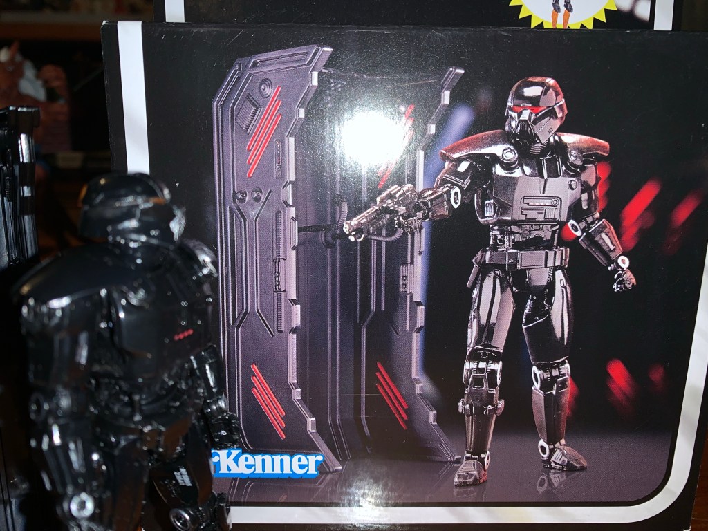
Bandai Mighty Morphin Power Rangers Megazord

It was now a couple of weeks ago I posted about some toys I always wanted as a kid, but never got. Shortly after, I rectified some of those decades old injustices by purchasing the Dragonzord with Green Ranger from Bandai’s Mighty Morphin Power Rangers line of action figures from 1993. The Dragonzord was my…

Keep reading
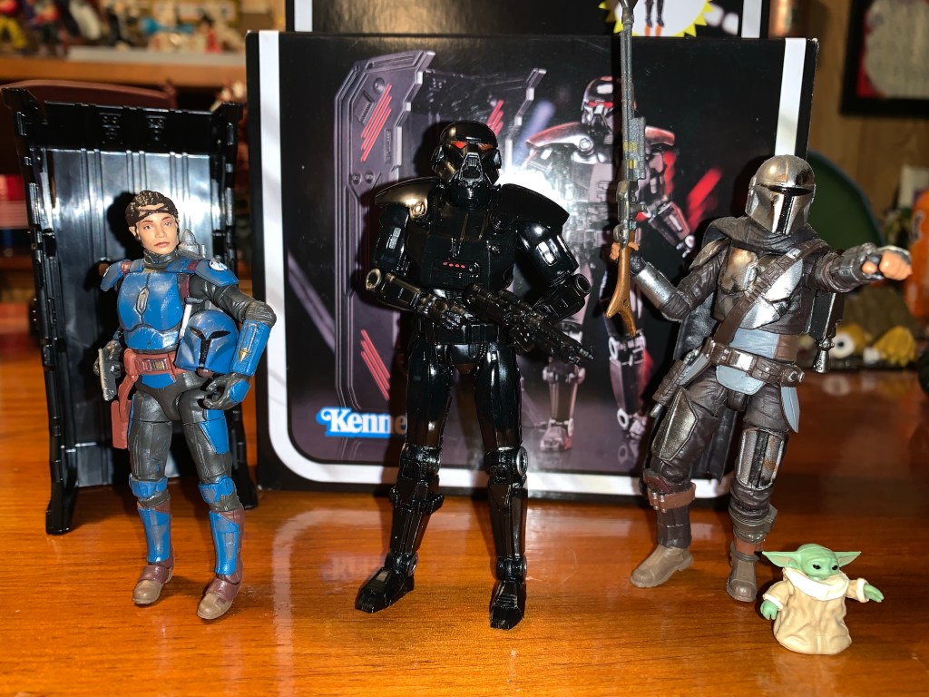
Super7 Mighty Morphin Power Rangers Ultimate Goldar

He’s coming for your Power Rangers!

Last week, when we took a look at the first Power Ranger in Super7’s line of Ultimates! action figures based on Mighty Morphin Power Rangers I expressed some surprise that Hasbro would license out this brand since it competes with their own Lighting Collection. I do feel like the actual Rangers are pretty safe. People who are into MMPR will buy a set of Rangers from both companies and be happy. When it comes to the monsters though then I think Hasbro could have an issue. In truth, the monsters have been a relatively small part of the Lightning Collection. The few that have been released have been of the deluxe variety with an increased cost relative to the Rangers. They’ve also been kind of terrible from what I’ve seen. A few look like they’re sculpted well enough, but Hasbro really cheaped out on the paint apps for most of them and they just look awful as a result. It’s surprising because MMPR is an in-house brand for Hasbro now. I may not like it, but I understand when a Marvel Legends figure or a Star Wars release has less money put into it because those have the additional burden of a licensing fee, but that’s not the cast with Power Rangers.

Goldar has some size on Tommy, and I’m happy to see he doesn’t completely dwarf a Lightning Collection release.

Since Hasbro has declined to make any monsters worth my money, I naturally saw Super7’s line as a potential replacement. I like having villains, especially monster types, that are bigger than the heroes so the larger scale of Super7’s figures didn’t seem like an obstacle to me, but really a potential benefit. Though so far I’ve only committed to buying one such figure, but if it’s any good I may change my mind. And that figure is Goldar. I don’t need or want a big MMPR collection, but Goldar always felt like a character worth having. He’s Rita Repulsa’s general and basically her right hand man…monster. Despite his inability to actually defeat the Power Rangers, he was kept in that position when Lord Zedd usurped Rita’s throne and attempted to take matters into his own hands. As an enemy, I think Goldar was the first monster the Rangers battled in their Megazord, though I also haven’t gone back to watch the show in years so I could be misremembering. I always liked him as a design. He’s some sort of armored wolf, and as the name implies, he seems to like gold. He looks scary, and even though he wasn’t exactly batting a thousand, I always felt like he was a threat to the Power Rangers and not the show’s version of a Bebop or Rocksteady.

It’s probably not screen accurate, but this works for me.

Super7 apparently felt like Goldar was rather important and he was chosen to be the main villain in the first wave of Ultimates! Like Tommy, he comes in the same Ultimates! styled box with a green slipcover over a window box inside. He does get his own “power coin” logo on the slipcover and there’s a bio and still from the show on the back of the inner box. Once removed, Goldar stands a mighty 8″ or so to the top of his head, a touch taller if you count the horns of his helm. He looks rather resplendent in his golden armor which appears to be fully painted. Like the Green Ranger, it looks like Super7 committed to giving us a nice finish by casting the figure in the appropriate color, but then painting over it with the same. It gives the figure a much more “premium” appearance which is a good thing considering he’s priced at $55. The inner parts of his suit are painted red in accordance with the character design and there are a few gems or something painted as well. The face looks really nice as it’s blue with shading around the eyes. The teeth are cleanly painted and the furry…things…that drape over his shoulders look fine too. The crown of his helm is done in a translucent, yellow, plastic that almost looks like stained glass. It’s an unexpected, but welcomed, embellishment. If I am to nitpick the paint I’d first go to the black strap on the calf area which do nothing to convey the illusion of an actual strap. They’re flatly painted and unconvincing. Some of the red could have also been applied cleaner. It’s pretty hazy around the kneepads and some of the hands are a bit messy. In Super7’s defense, the hands are hard to paint as there are gold plates over the digits with red underneath. Hasbro declined to attempt such a thing and I’ll say for the most part they look good enough. I also feel like the feet could have used some shading as they’re the only part that looks “plasticy” to me.

Goldar is also sized well to compete with zords. I’m curious how he’ll stack up against the upcoming Megazord.
I figured we should sneak in a comparison to another Super7 figure featuring some gold accents that a lot of people seemed to have issues with. And we might as well put him up against another big boy in Apocalypse.

As for the sculpt, well there’s really little to complain about. Super7 absolutely nailed the portrait with Goldar which is something I wasn’t sold on with the Lightning Collection release. This looks like the character to me and I feel like if he started talking on my shelf I wouldn’t even be surprised. Most of the body has a nice texture to it as the gold is dented like a golf ball in several parts. I am not an expert on the show, but it looks accurate enough to me. All of the details I associate with the character are present like the giant codpiece and the bundled up tail on his rear. Super7 has received numerous criticisms from me over the years, but rarely is sculpting an issue and this guy is no different. He might really be one of their best which is not faint praise.

This ornately designed chest looks pretty damn nice.
These things are less interesting, but you get five of them!

Goldar has a rather expensive look to him so I was expecting Super7 to skimp on the accessories, but he’s actually pretty robust. For heads, we have two options which are essentially mouth closed and mouth open. Both look great, though I think I like the open one just a little bit more. For hands, we get a whole bunch: fists, gripping with horizontal hinges, gripping with vertical hinges, and open hands. For those gripping hands he has his rather large sword which is painted very nicely with hits of silver and gold and the red gem in the center. He also has his little wing nubbins on the back which can be removed and replaced with open, black, wings that also look quite nice. They’re entirely sculpted in plastic and the feathers are nicely textured and the paint is clean. In addition to all of that, we get some episode specific stuff. There’s an elaborate chest that contains the power coins after they stole them or something. The chest has a hinged lid so it can open and close and the paint job is pretty damn spectacular. Goldar also has the five Badges of Darkness which I think he gave out to the Putties to create evil, clone, Power Rangers. They’re identical and they just resemble grey stones with a light blue gem in the center of a star carving. Nothing special, but those more interested in episode-specific trinkets will get more mileage out of them than I. His extra stuff at least feels more purposeful than most of the stuff the Green Ranger came with.

The alternate head is definitely a keeper.
“I will destroy those teenagers with attitude!”

Goldar is not a character that looks like he’ll move very well, but again, Super7 kind of surprised me here. For starters, his head is on a hinged-ball peg. I do not like that, but at least he looks up and down okay and can turn his head. He just doesn’t really get much in the way of more nuanced poses. His head sits high on the ball, so he gets more than the Green Ranger, but Super7, please just go back to using double ball pegs. The shoulders are the hinged ball joints that peg into the arm and he can lift his arms out to the side past horizontal. This really surprised me as he’s got some rather large shoulder pads, but they do a solid job of getting out of the way. Rotating the arms all around isn’t going to happen, but you get enough. He has a biceps swivel and a single-hinged elbow that can’t quite hit 90. You also get a rotation point at the elbow as well. The wrists rotate and he has the proper hinge for the gripping hands, so that’s a plus. They are a tad loose though and his heavy sword can be a touch finicky to pose, but it seems to hold in position well enough. In the diaphragm, we get what’s probably a ball joint of some kind that lets the figure rotate, but also tilt to the sides. He arches back a little, and crunches forward a little as well. In both cases, it’s more range than I expected. He does have a waist twist below that and some hinged ball joints at the hips. Goldar can just about hit a split before the armor at his hips gets in the way and he can kick forward to almost horizontal, though he can’t really kick back at all. You get some rotation at the thigh and the single-hinged knee can go about 90 degrees. It also rotates a little at the joint. The ankles feature the usual hinge and rocker, though the shape of the plating of the armor does restrict things a bit. The hinge goes back well enough, but you don’t get much forward. The rocker is also limited, but I think you’re going to get enough out of it to keep his feet flat even in some rather wide stances.

He’s not some super-articulated ninja figure, but he can look tough and swing a sword so that works for me.

I would say Goldar articulates pretty well for such a design. I admit, some of that opinion is colored by my low expectations going in which were influenced by both the look of the figure and my own experience with Super7. I think they did a good job though and I don’t really feel like other companies would do much better. Yeah, you could slip in some double joints at the elbows and knees and maybe get a little better than 90, but is that really going to up one’s enjoyment of the figure? I think the easiest point for criticism is the head as Super7 should ditch the hinged ball peg. I suppose a hinged joint in the diaphragm could get more ab crunch? That’s probably a little more expensive to implement though and presents gapping issues usually. He basically reminds me of a NECA figure and his range is pretty comparable to Warduke. And since he has a less restricting his torso, he probably moves better than that figure. That figure is probably a little visually more impressive, but it’s definitely more subjective than usual. At least Super7 is comparing well to something that’s much cheaper since usually they present worse and cost more, a true double whammy.

A lot of people have had a lot of issues with these parts so do be careful.
I think the wings are worth the hassle as they do look rather nice once applied.

One thing I do need to talk about though is the quality control issues people have been having with this figure in particular. I have seen and heard from lots of folks who had issues with the head and wings. I didn’t actually mention the wings in the articulation portion, but they do connect via a ball and socket joint on the figure’s back and they have a hinge as well. The left wing seems fine, but the right is a bit iffy. The socket feels like it’s off just a tiny amount, probably not enough to notice with the naked eye, but it’s noticeably tight. People have been snapping the peg when trying to rotate or use the hinge. I noticed before even inserting that wing that the hinge also stressed the plastic when pushed all the way. I guess naturally that means don’t push it all the way, but it still should not be. With the head, I’ve seen folks have a hard time getting the alternate head on and snapping the post as a result. One person I talked to snapped it just rotating the head after getting it on. I mentioned in the review that the heads seem to sit high on the ball and I think that’s by design to help clear the stuff around his neck. If so, it’s a bad design because every toy collector is going to think they need to seat that head all the way down and if that’s breaking things then Super7 deserves to have to eat some costs replacing them. Just elongate the post, or find another solution, this one feels half-assed. Out of an abundance of caution, I heated the little wing nubs on my figure before removing them and also heated the wings before inserting them. Once in, I’m just leaving them alone as I posed them via the hinge before inserting them. For the head, the default one came off without any issues and I heated the open mouth one before putting it on. It seems fine, but it doesn’t really want to rotate so I won’t force it. I prefer the look of the open wings with the open mouth so I would have been bummed if they had broke in some way. I technically didn’t have any issues with my figure, but I feel like a lot of others had to suffer broken Goldars in order for me to have such an experience. I guess tread lightly and make sure you purchase from a place with a good return policy if it comes to that.

“Buy my toy!”

Quality concerns aside, I think this is one of the best Super7 figures I own. It’s rare that they hit in all three phases for me: sculpt, paint, articulation. Usually they try to close the gap by tossing a bunch of junk into the box with their figures, but with Goldar that’s not needed. And better yet, most of his “junk” actually feels purposeful. While I liked the Green Ranger as a figure, I couldn’t help but feel like it was overpriced. With Goldar, I don’t really get that feeling. I think he’s actually pretty damn good and for $55 he’s the rare Super7 figure I can say is worth it. I have a lot of Super7 figures that I’m happy with, but objectively feel are overpriced. Goldar gets to be both objectively and subjectively a good figure. If you’re one of the folks who had a different experience with the head or wings then you might feel differently, but I’m reviewing both the figure and my experience with the figure and for me this is exactly what I wanted out of this character. He looks good with the other releases in the line, and extra menacing with the Lightning Collection Rangers. He can face off with Super7’s Green Ranger, and look good battling the T-Rex zord and he’s probably the star of this inaugural wave. If King Sphinx or Lord Zedd turns out this good then I may need to add some more bad guys to my collection in the future.

Interested in more Power Rangers action figures review? Gives these a shot:

Super7 Mighty Morphin Power Rangers Ultimate Green Ranger

We continue to finally offload some long standing preorders this year and up next is Mighty Morphin Power Rangers from Super7. It was June 2021 when these figures were announced to the surprise of many. Why? Because Power Rangers are now owned by Hasbro, probably the biggest toy producer in the world who has its…

Keep reading
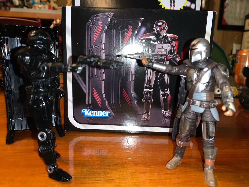
Marvel Legends X-Men Retro Card Marvel’s Beast

Welcome, Professor McCoy, to The Nostalgia Spot.

2022 was the year a dream toyline of mine was made a reality. Hasbro finally decided to do a line of Marvel Legends based on the animated series X-Men, which premiered 30 years prior on Halloween 1992. The line was staggered with a release coming every 6-8 weeks or so and ended up totaling 8 figures, pretty standard for a single wave. There was hope on my part that the line would continue into 1993, when the show really took off, but that was not Hasbro’s plan. As a result, several characters from the show are still outstanding, and while Hasbro has referred to this break as a pause, that’s hardly a guarantee of anything going forward. If this were a romantic relationship, it would be dead, and maybe it should be since the line was subpar. I am a glutton for punishment apparently so I do want to see it continue so that we can get the missing X-Men and some of their most notable villains, but I can’t count on that. That means I’ve had to take matters into my own hands. I’m probably playing right into Hasbro’s thinking in doing so, but so be it, which is why I now have Marvel’s Beast to talk about.

We need to ponder the potential release, or non-release, of Beast in the X-Men Animated Series subline.

Beast, or The Beast, had an interesting run in the television show. He was part of the team, but basically written out of the first season pretty quickly as he was arrested and held for trial for the bulk of the episodes. He’d be released at the end of that first season and was able to become a recurring character as a result. Beast has always been one of those characters where the viewer is not supposed to judge a book by its cover. He looks like a beastly creature and adopted a name to play off of that, but in reality he’s pretty gentle, thoughtful, empathetic, and highly intelligent. Since he’s a well read individual, the writers of the show had a lot of fun with him as they could make him rather wordy and insert lines from famous writers and poets into his vocabulary as he was quite fond of quoting others. Some viewers found it annoying, but I was always rather charmed by Beast. And mostly, I just liked him because he was blue! Blue is my favorite color so a big, blue, furry, creature is aesthetically pleasing for me. Especially because I just really like the shade of blue used for his fur. It stands out and it’s a fun, somewhat ridiculous, design.

I prefer him naked.

This figure of Beast is a re-release. There’s been a prior blue version as well as a gray version and Hasbro apparently felt now was the time for another re-release. This one differs in that the shade of blue is different, more of a cobalt, and it’s all together brighter than that past one. There’s also less shading and he comes with a new head and some new accessories. It’s my thinking that certain figures from the animated series were not in play last year because of planned releases like this one or figures that were recently released on a retro card like Rogue and Gambit. It’s also my feeling that if we get a Beast in a 2024 or 2025 from the show he’ll basically just be this figure with some cel-shading and maybe a new head. And since I just really like how this blue turned out, I took the plunge with this figure as a stand-in. Maybe a permanent stand-in? Who knows? I’ll probably want that damn box when and if it comes so, yeah, this could easily be a double-dip for me, but at least I’m future proofed.

Beast! No!

The retro card is a throwback to the Toy Biz days and features artwork by David Nakayama. It’s a lovely card and many collectors like to keep one mint and open another, but I am not one of those guys. Beast stands right around 7″ if you stand him up straight, though practically speaking he’s a little shorter since this is a character that is almost always in some kind of a hunch or crouch. He comes out of the box sporting a white lab coat which is one of the new additions. It’s not an original idea to pair Beast with a lab coat as Toy Biz did the same early in the Marvel Legends line, but some people who already have the older Beast might want it. It’s decent, but the quality of the soft goods isn’t going to impress. Mine has several stray threads and if I intended to display Beast with this coat on I’d probably do some trimming. It does have a chest pocket on the left side which is neat.

The coat is not the best quality, but I also don’t know how much of a draw it truly is for collectors.

Getting the coat off is rather easy and once done we have our furry blue boy in all of his glory. This Beast is clearly inspired by the artwork of Jim Lee, as nearly all of the retro card releases seem to be. He has a stoic expression which features his completely white eyes and his teeth poking over his upper lip. This is where the distinction between show and comic comes into play as Beast in the show always had pupils, but in the comics he was often depicted this way. I prefer my Beast with pupils, but I can’t hold that against a figure that is trying to emulate a comic look. His hair is a darker blue and the body has lots of sculpted fur on it. There are hits of dark blue shading in the middle of the chest and shoulders which makes up the bulk of the paint on this guy. Otherwise, there’s just the belt and upper legs. The trunks are sculpted in navy and the belt in yellow with the X logo painted on. The upper thigh piece appears to be sculpted in navy and the parts of his exposed fur are painted and Hasbro did a good job of matching the blue paint to the blue plastic. The area around his ab crunch though is less successful as far as color-matching goes as it appears that was sculpted in navy as well. The rest of the paint is basically reserved for the white claws on the hands and feet and it’s done okay. It’s not the cleanest application of paint I’ve ever seen, but at least it’s not egregiously bad or anything. The proportioning on the sculpt is very well done for a Marvel Legends release. His chest and shoulders have plenty of mass and so do the legs and biceps. He should fit in pretty well with your other X-Men releases from this era of the comics, or show, in my case.

Fascinating!

I already mentioned the coat, but Beast does come with some other things as well. For hands, he has a somewhat tight gripping right hand and a loose gripping left hand. He also has a right fist and a left fully open hand. I would have preferred just two sets of gripping hands that match each other, so two tight and two loose, as the loose gripping hand is a nice style pose hand. The fist I find useless while the open hand is fine. It would be a bit more useful with better articulation, but we’ll get to that. The claw paint on all of the hands is pretty consistent in that it’s passable. Beast also gets a second head and this one is from the older release. It’s a screaming head and it’s pretty well painted and the inside of the mouth is sculpted. The hair on it is slightly more narrow, enough so that it throws off the aesthetic for me. I like the wider hair look of Beast, but this older head probably wasn’t going for that. It’s fine, but I’ll never use it as I just don’t think of Beast as a screamy sort of character, but artists have had fun drawing him like one for years. Beast also comes with a pair of beakers, one containing the X-Gene and another a green liquid. They’re fine and they look nice since they’re cast in transparent plastic with a colored fill to create the illusion of a liquid inside. They’re also two different designs with one featuring a more spherical base and they certainly work with the lab coat if that’s the look you want. Lastly, Beast has a pair of glasses. They’re cast in transparent plastic with the ear pieces painted black. They’re pretty terrible though because there’s nothing to hold them onto his face. They’re rubbery and soft so they don’t pinch at all and there are no holes or any way to key them in. I’m glad they didn’t do that, but these could have been manufactured in a stronger material so that they gripped his head better. Or they could have been designed to fit between his brow and his nose. Whatever, it is what it is, and at least they fit in his pocket. I received a Baxter Stockman figure last year from NECA that came missing a pair of glasses, and since NECA still has not sent me the replacement they promised, I’ll give these to Baxter for now.

Lastly, we need to rundown the articulation on this blue boy. Beast has quite a bit, and most of it I like, but he’s not without his problems. For starters, he has the usual ball hinge at the neck only with this figure the ball basically sits right on top of the hinge. His head is low so it affects the range. He can rotate and tilt a bit and he does have up and down, but since he’s a character who crouches a lot I would like even more range looking up. His shoulders are ball-hinged with butterfly joints. He can raise his arms to the side no problem and the butterfly joint goes way back, but hardly anything forward. He has a biceps swivel and double-jointed elbows that will bend past 90 degrees even with his rather generously sized biceps. The wrists swivel and hinge with all of the hinges being of the horizontal variety which is appropriate, in this case. In the torso, we have a diaphragm joint that runs along the bottom of the rib cage. It mostly affords rotation as any movement to the front, back, or tilt is minimal at best. Below that is an ab crunch that is mostly hidden behind the floating belt. It basically only has 3 positions so you get one click back and one click forward. It’s okay. At the hips we have some ball and socket joints and he can nearly hit a full split. He kicks forward about 90 degrees with no movement to the rear. There’s a thigh cut below that and double-jointed knees which work just fine. The ankles have a ratcheted hinge, from the feel of it. It will go back all of the way with two clicks of movement, but it goes forward only one click. He has a very nice ankle rocker and he also has a fairly well-engineered toe hinge as well. I wish the toe hinge was a little more firm, but it seems to be usable.

For Beast, it’s a solid mix of articulation points and approaches and, for the most part, I think it works. Where it’s lacking just a bit is with the ab crunch and the butterfly joints not coming forward more. Beast is known for that one-handed pose on the ground in a crouch not unlike Spider-Man. He has the big, open, hand for such, but he really can’t hit it convincingly. If you get him in a crouch with the hand down he looks silly because he doesn’t have the range in the head to be looking forward. More range back in the diaphragm would have helped. It does make me think his proportions might be just a little off in that his arms should be longer. It wouldn’t surprise me if he’s a character where artists cheat at times and when he’s just standing around his arms look fairly normal in length, but when posed in a more “beastly” manner they mysteriously get longer. It’s just a bummer he really can’t do his classic Jim Lee pose from the cover of X-Men #1. He can stand on one hand though, if you’re patient. I wouldn’t recommend leaving him like that on a shelf without a stand, but I was able to pull it off.

It’s kind of a Beast pose.

This Beast is probably as good as a Marvel Legends version of the character is likely ever to get. Yeah, he can’t hit all of the “Beast poses,” with ease, but he still poses well. Mostly though, the sculpt looks great for the character so it’s no wonder why Hasbro has re-released it multiple times at this point. The extras like the lab coat do little for me, but this new, stoic, head is definitely more of what I envision for the character. Yeah, I want a smiling portrait with pupils in the eyes (like the box art, I might add), but I can’t really hold that against the figure since this is a comic interpretation and he has white eyes in the comics. Mostly, I just like this blue and I love how it pops on the shelf. I think the shading on the figure is enough, though maybe some hits on the calves and forearms would have livened things up, but it’s fine. The prior version looks over-shaded to me so I prefer this dialed-back approach. The only other thing to mention is the cost. This figure, for whatever reason, is considered a deluxe release so it’s going to cost you around $35 or more in some places to add him to your collection. Considering it’s nearly 100% reuse, there’s not much in the package to justify the price aside from Hasbro just doing whatever it wants. Compared to other releases at this price point it’s not a good value, but if you need a Beast (or have doubts about Hasbro doing more animated X-Men) you’re probably going to pay it. At least the figure looks nice enough.

More from the world of X-Men:

Marvel Legends X-Men Retro Card Series Apocalypse

It is Halloween and that means it’s time for costumes, candy, and spooky fun. It’s also Halloween 2022, a pretty important date if you grew up loving those mutants who ran around in colorful spandex fighting for a better tomorrow. That’s because 30 years ago on this very night, the animated series X-Men premiered on…

Keep reading
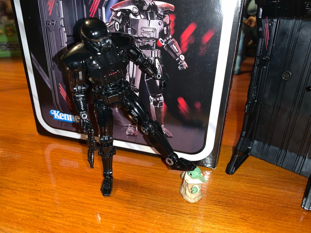
Marvel Legends X-Men Animated Series Wolverine

The toyline of my dreams was announced last October. In celebration of the 30th anniversary of the television series X-Men, Hasbro is doing a dedicated line of Marvel Legends with figures based on the look of the show. The show was obviously inspired by the designs of Jim Lee, but there are differences in the…

Keep reading
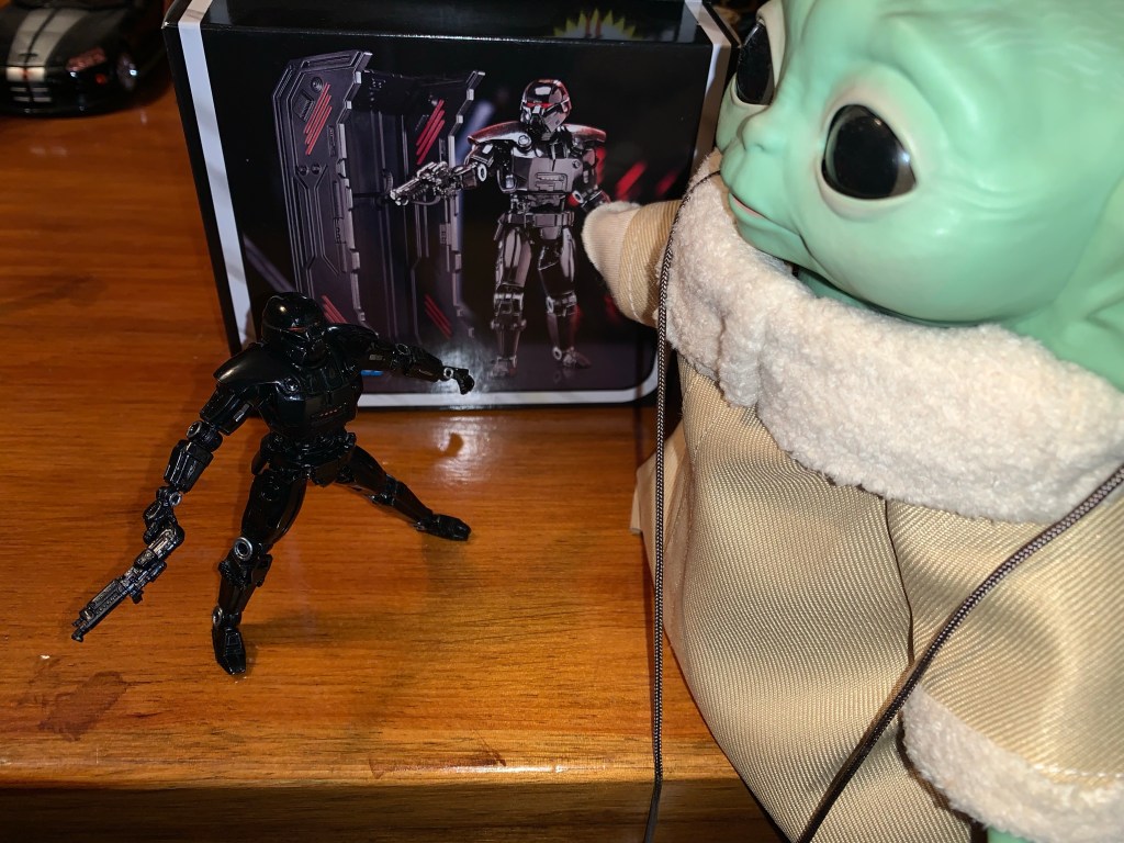
X-Men: The Art and Making of the Animated Series

A few years ago, I talked about my love of X-Men, the animated series, via a book review of Previously…on X-Men by Eric Lewald. That book chronicled the development of the 92 animated series that helped propel the Fox Kids Network to the top of the Saturday morning leaderboards through notes from the author and…

Keep reading

Marvel Legends Retro Card Cyborg Spider-Man

It’s Spider-Man with a robot arm!

Well, this is a figure that I never planned on reviewing. It’s a bit old at this point, but we’re looking at yet another Spider-Man retro card release from Hasbro and this time it’s Cyborg Spider-Man. Now, I remember seeing this quite some time ago at Target and thinking it looked fine, but I’m not a Marvel Legends collector so I never paid it any real mind. I say that, and yet 2022 is the year I bought more Legends than I have since 2006 mostly due to the X-Men animated line, but it also got started with the animated Venom. That Venom lead me down a rabbit hole where I wound up with Web-Man, Symbiote Spider-Man, and more recently the animated Spider-Man. It was getting that most recent one that basically resulted in me grabbing this guy because what I really wanted was a webline part. That figure didn’t come with one, but when I went to Target recently I spotted a figure that did. Spoiler alert – it’s this one!

Even with the new hardware, he still does spider shit.

Cyborg Spider-Man is a 2021 release, if I’m not mistaken. Possibly late 2020. Things blend together a bit in my head when it comes to release dates, especially for lines I don’t typically collect. The foot of this one is stamped 2016, but I’m guessing that’s because most of the parts are that old. It’s not recent though and not one I’ve seen in Target in quite some time. I don’t know why my nearest Target had one, random, figure on the pegs, but it did. It initially didn’t even ring up because the barcode was no longer in their system, and when it finally did, it rang up as some Spider-Man bow and arrow toy. Unfortunately, that toy carried the same MSRP as this one so I didn’t get a deal or anything, but it suggests to me that maybe Target recently unearthed some extra stock because the figure is also online again as of this writing. Regardless, I thought the sculpt was interesting and a pretty fun variant on Spider-Man, and since it came with a web line accessory, I said “Why not?” And since I have a blog that heavily leans into toy reviews, we might as well take a look.

I think of him as more of a punchy Spider-Man.

Cyborg Spider-Man stands a tick over the 6 inch mark. He comes packaged on a retro card and is a nice throwback to the Toy Biz figure of the same design. I actually never had that one, I really didn’t get many Spider-Man variants, but I can recall thinking it looked fine. I just prioritized getting villains over yet another Spider-Man. He was also a late entry in the line, if I’m not mistaken, and it’s possible I was already shifting priorities. The design hasn’t changed though. This is basically Spider-Man, but with a robot arm. He does have a belt and some accessories on the head, but it’s the big, cybernetic, left arm that stands out the most. Since I’m not a regular buyer of this line, I couldn’t tell you where all of these parts are from. The main body is the same one we saw with Web-Man which I think originated with a Spider-Man 2099 figure. The arm could be from someone like Cable or Deathlok, or it could be all new. Since it’s an older release, it’s not a pinless body so we get the ugly red dot on the inner right arm resulting from the red peg that goes through it. The blue pegs around the knees don’t cause the same sort of eyesore. It’s a very muscular sculpt and one that feels appropriate for this specific version of Spider-Man. I like how the cybernetic arm turned out and it looks as it should. The head has these giant eye lenses which are also fun and very McFarlane-esque. The belt is glued in place, but the white wraps on his right thigh are a floating part which could be removed if desired. It’s a little annoying that it doesn’t stay in place and it’s a reminder why newer figures like Morph and Cyclops have them keyed in. The only details I don’t like about the sculpt are the tiny shoulders, which is a consistent criticism I have for Marvel Legends. They just look silly and sit too low.

I wish they had painted the stitching on the mask.

As far as paint goes, we have our usual Marvel Legends mixed bag. The figure is a mix of blue and red plastic with a light gray used for the robot arm. The weblines are done well enough and I like the black outline on the red portions of the costume, something the animated Spidey didn’t roll with. The painted and colored reds look close enough and the painted portions of the head are fine. What I don’t like is how the spider logo on the rear turned out. It really needs a black outline or something to help it pop and it looks almost washed out. It also has a big hole which I guess is for an old flight stand. There’s also a severe lack of paint in most places. On the head, there’s stitches holding a portion of the mask together which were left unpainted. It’s a shame, because they’re sculpted well enough, but are barely noticeable due to the lack of paint. There’s also no paint on either the belt or the left arm save for the plate on the shoulder and bracelet area. The belt just looks boring and cheap as a result while the arm has too much of a plastic look. There’s no attempt to make it look like it’s made of metal and, again, it’s a shame because the sculpt is there. It just needs a little dry-brushing to bring it out. In a perfect world it would be painted-up like NECA’s Fugitoid, but I know Hasbro isn’t going to sink that kind of money into this line. At least this one is $23 instead of $28 or $35 so it’s easier to overlook these shortcomings, but still unfortunate to see Hasbro not do right by their sculptors and designers.

This spider on the back could have been handled better.

The articulation for this Spider-Man is not really it’s strong suit. I suppose we shouldn’t expect a cyborg version of the character to move as well as a traditional one, but I thought it would be a little better than this. The head is on the usual ball hinge which provides good enough range up and down, but not much nuance posing. The shoulders are ball-hinged and pretty limited out to the side. The left arm is hindered by the big plate on the shoulder, but even the right arm can’t quite hit a horizontal pose. There is a butterfly joint which provides more range going back than forward. It’s okay, but a bit ugly because the paint isn’t continued as far as the joint goes so you end up with gaps in the weblines on the front and the spider legs on the rear. The elbows are double-jointed on both arms and both can bend past 90 degrees. The cybernetic arm can even go further than the right arm as more plastic was cut away to make it work. The wrists rotate and hinge horizontally while the abdomen features a ratcheted ab crunch. It only allows one click back and one click forward so the range isn’t impressive. The waist twist is a waist twist and it is at least hidden by the belt because otherwise it would look pretty hideous. The legs can just about hit a split with a little effort, why newer figures can’t is a real mystery, while the legs kick forward to about horizontal with no range going back. We get the usual thigh cut and the double-jointed knees work just fine. There’s a boot swivel and the ankles hinge forward and back pretty far and feature a steep, but usable, ankle rocker. It’s nothing particularly impressive, but I don’t know what kind of posing most want to do with this guy. I tend to think he should be posed more like a brawler than the nimble Spider-Man of norm, but that could be just me. By Legends standards, it’s basically average.

Your webline is looking a bit limp there, Spider-Man.

And that’s kind of it for selling points with this guy because the accessories are not impressive. Cyborg Spider-Man comes with fist hands in the box and he has one thwip right hand he can switch to. He also has that all important webline I wanted which is just a piece of malleable, off-white, plastic with a little curl at one end and a triangular shape at the other. It’s kind of odd that they don’t have a clip on the end designed for the hand/wrist area. And since he can’t grip it with any hand it makes it hard to do much with. I found I can kind of get the triangle to work with the thwip hand, but it’s rather precarious and frustrating. It’s a bit amusing that I basically bought this figure for this piece and I’m not finding it very useful. If it was just a bendy wire that could wrap around him that would be better than this. That’s it though. One extra hand and one mediocre web effect.

All right, you can stay.

Given the articulation woes and the lack of accessories, this figure is basically one to judge based on the overall aesthetic. And if you like this interpretation of Spider-Man, then you’ll probably be fine with this one. I do like the look, and while I wish it was painted better, I think it looks okay on a shelf. The fact that it’s at the older price point definitely helps because if it was up any higher I’d have not bought it. And if you are into customizing your action figures, this one probably won’t take much effort to really bring out some of the details. There are elements of the figure that are a bit dated, but the sculpt helps make it worthwhile. In short, I’m content to have this figure I never planned on getting.

Like Spider-Man? Check out these entries:

Marvel Legends X-Men Animated Series Cyclops

I wasn’t sure he would make it in time, but Hasbro managed to ship Cyclops before the end of the year. Cyclops marks the final figure (for now) in Hasbro’s X-Men animated series subline of Marvel Legends. It has been…a ride. What was once a dream line of mine to see brought to fruition, turned…

Keep reading
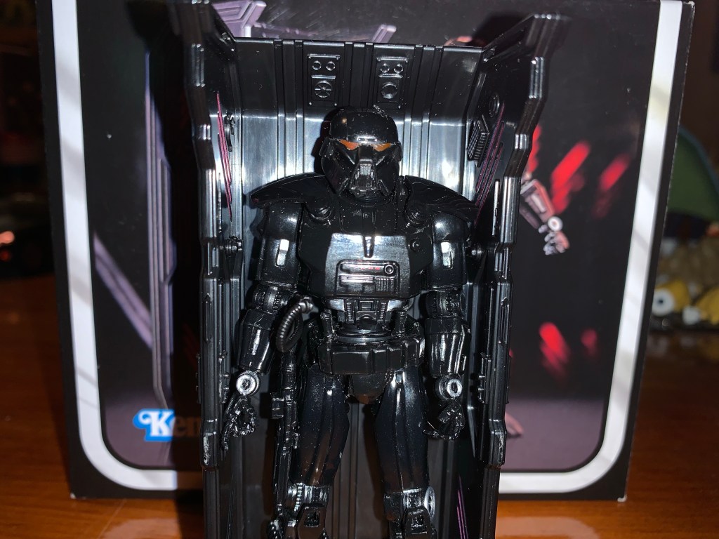
Marvel Legends Web-Man

No, this is not bootleg Spider-Man, this is Web-Man! Who is Web-Man? I actually had no idea until I just looked it up. It would seem Web-Man is a copy of Spider-Man created by Dr. Doom. Not only are his colors inverted from the real thing, but so is most everything else. And since Spidey…

Keep reading