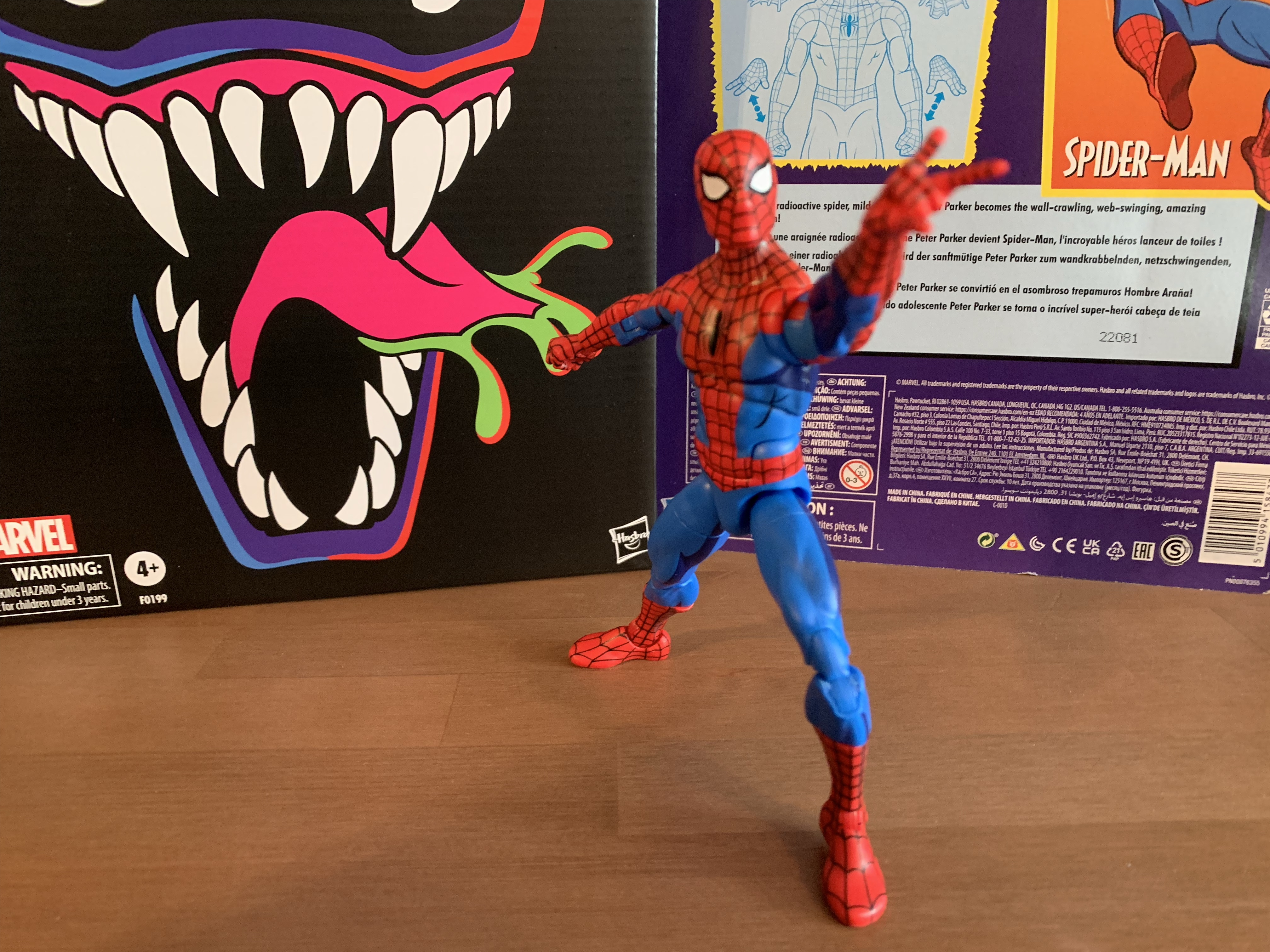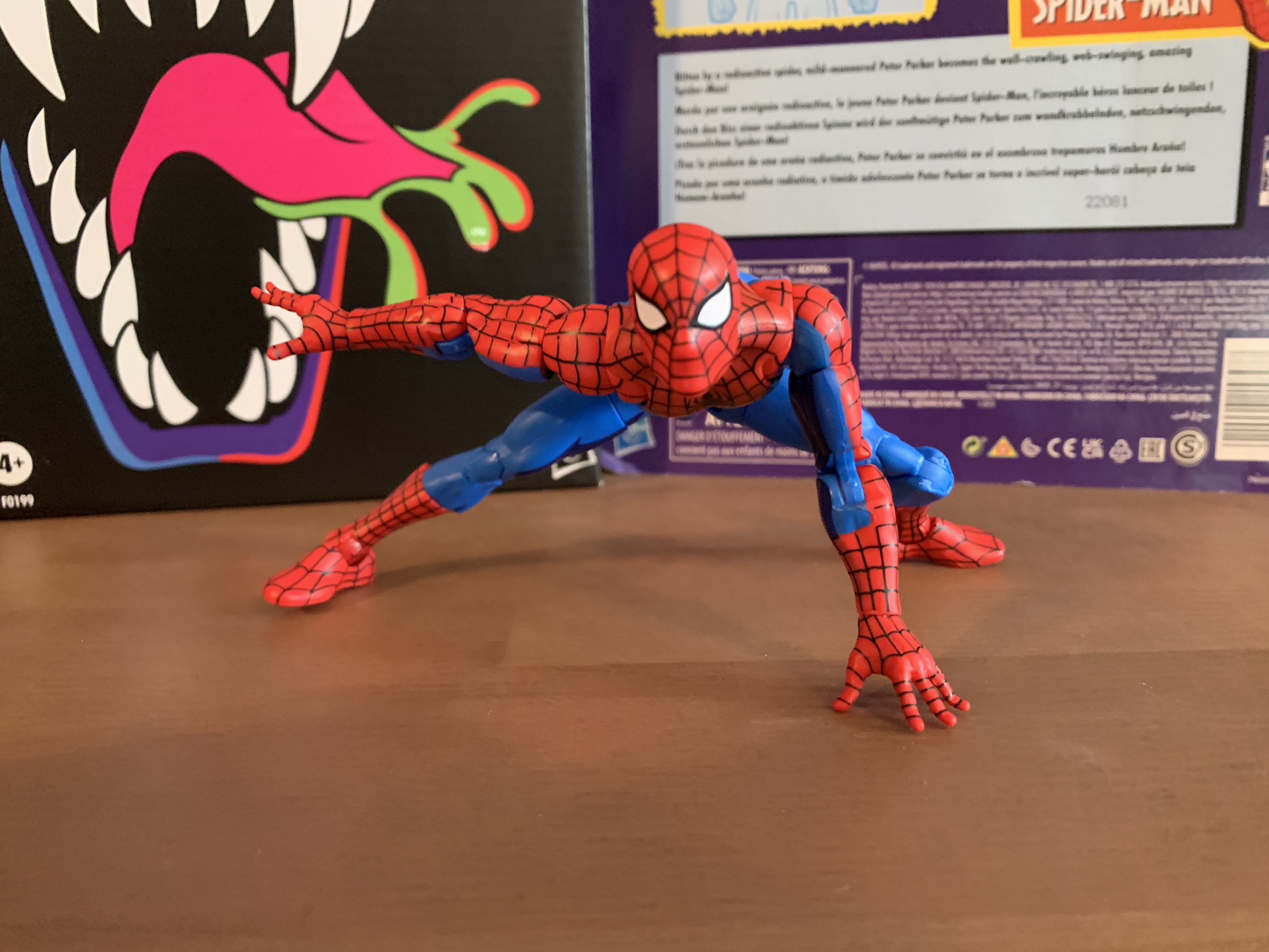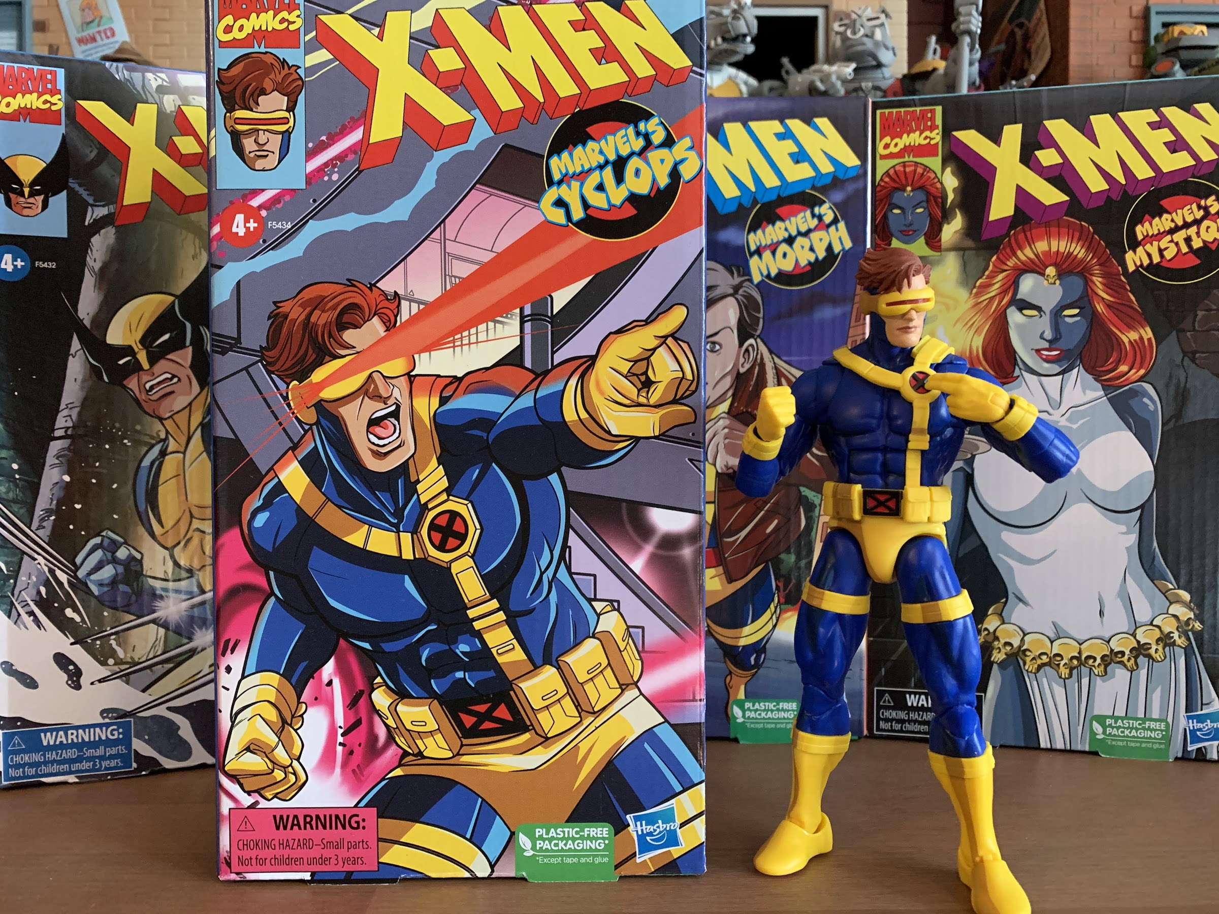
Tag Archives: hasbro

Super7 Mighty Morphin Power Rangers Ultimate Tyrannosaurus Dinozord

Roar.

Today we are wrapping up our look at Wave 1 of Super7’s Mighty Morphin Power Rangers Ultimates! action figures with the lone zord of the wave: the Tyrannosaurus Dinozord. The T-Rex zord was the vehicle of the Red Power Ranger and main body of the Megazord. It was basically the only one of the original five zords that could function on its own in a meaningful way. The other four rarely did anything, but on occasion, the T-Rex went into battle and took on some monsters in its dino form. As such, it made sense for Super7 to do a figure of this particular zord since it can standalone as an action figure while something like the mastodon or pterodactyl really would not. And it’s also because Super7 either isn’t allowed to produce, or has no desire to produce, zords that can combine into other zords like the famous Megazord.

Packaged for maximum width.

For me, a very casual Power Rangers fan, the appeal of this line is that Super7 can produce zords that are more accurate to the show. Whenever a company makes a combining one, they have to work within that framework. The zords in the show existed as both models, or puppets, and as actors in a suit. When the Megazord was formed, it then transitioned to a costume which could basically cheat the proportions. As a result, any figure that does the same isn’t going to resemble the one on TV. It does in a general way, but usually the proportions are off (especially the head) and any articulation the figure has needs to be able to be integrated without causing an issue for one of the individual components. When I look at my vintage Bandai Megazord, it almost feels like they prioritized the individual zords over the Megazord. Or, they simply determined that was the best way to go. The head is tiny, but since it needs to fit inside the head of the T-Rex that was something that couldn’t really be avoided. The shoulders are huge as well and the body is quite thick. There’s also the issue of the T-Rex tail which kind of just disappears. It’s still a tremendously fun toy, especially for 1993, but for collectors that want a screen accurate Megazord it’s not really going to cut it.

This is amusing to me.

For the T-Rex, the same is basically true as it needed to be more narrow to accommodate the transformation. The head also needs to fit in the chest and something has to be done with that tail. Ignoring that allows Super7 to just look at the character onscreen and let that dictate where the figure goes. It obviously can’t scale with the Power Rangers in the line so that part is essentially made up, but Super7 is a company that tends to feel bigger is better and that’s certainly the case with the T-Rex. The box alone is massive. I was pretty amused when I got my figures in the mail as I ordered just the Green Ranger, Goldar, and the T-Rex and each box was different in size. I knew this one would likely be the biggest, but I still wasn’t quite prepared. And that’s mostly due to Super7 packaging the figure from the side and leaving the tail fixed. They could have sent it out disassembled, but what’s the fun in that?

He can stand upright.
Or he can stand “Jurassic Park” style.

The Tyrannosaurus stands at roughly 8″ in height. I say roughly because this is a character that’s always going to have its knees bent to some degree so I’m basically selecting what I feel is a neutral position. Lengthwise, he’s going to need about 10.5″ of shelf space for that tail and that’s with a gentle curve in it. Not only is the figure pretty big, but it has some heft too. It’s solid which helps give it more of a premium feel over the other figures in the line and really over just about every other Super7 figure I own. And in terms of show accuracy, I’d say it’s pretty damn close. There’s a lot of paint on this figure and the metallic portions have a nice shine to them. There’s some black linework on the shins and around the silver portions of the tail. There’s lots of places that are just blocks of color consistent with the look of the show and most of the paint is cleanly applied. There’s a little slop on the linework on the left shin of mine and the right eye could have been better. It’s also missing linework on the top of the head which is disappointing (the paint is present on the promo images) as the head is one of the few places where there’s a plastic look to the figure. Basically everywhere on the body, Super7 decided to paint this guy, except for the head which is mostly red plastic. Normally, you would see the opposite as we did with The Simpsons since the eyes are naturally drawn to the head. I wish they had painted it, but it is what it is. The proportions also strike me as a touch imperfect when comparing it to the suit on the show. The head should probably be a little bigger and the hands boxier. The knees also should indent on the sides, but here they’re basically flush, and the red areas around the shoulders should be more rounded off. These are nitpicks, for the most part, and the only thing I really miss when comparing it to the screen is just more of that black linework., but I think most people will be happy with how this figure looks.

This one is probably not going to scale with any Power Rangers in your collection.
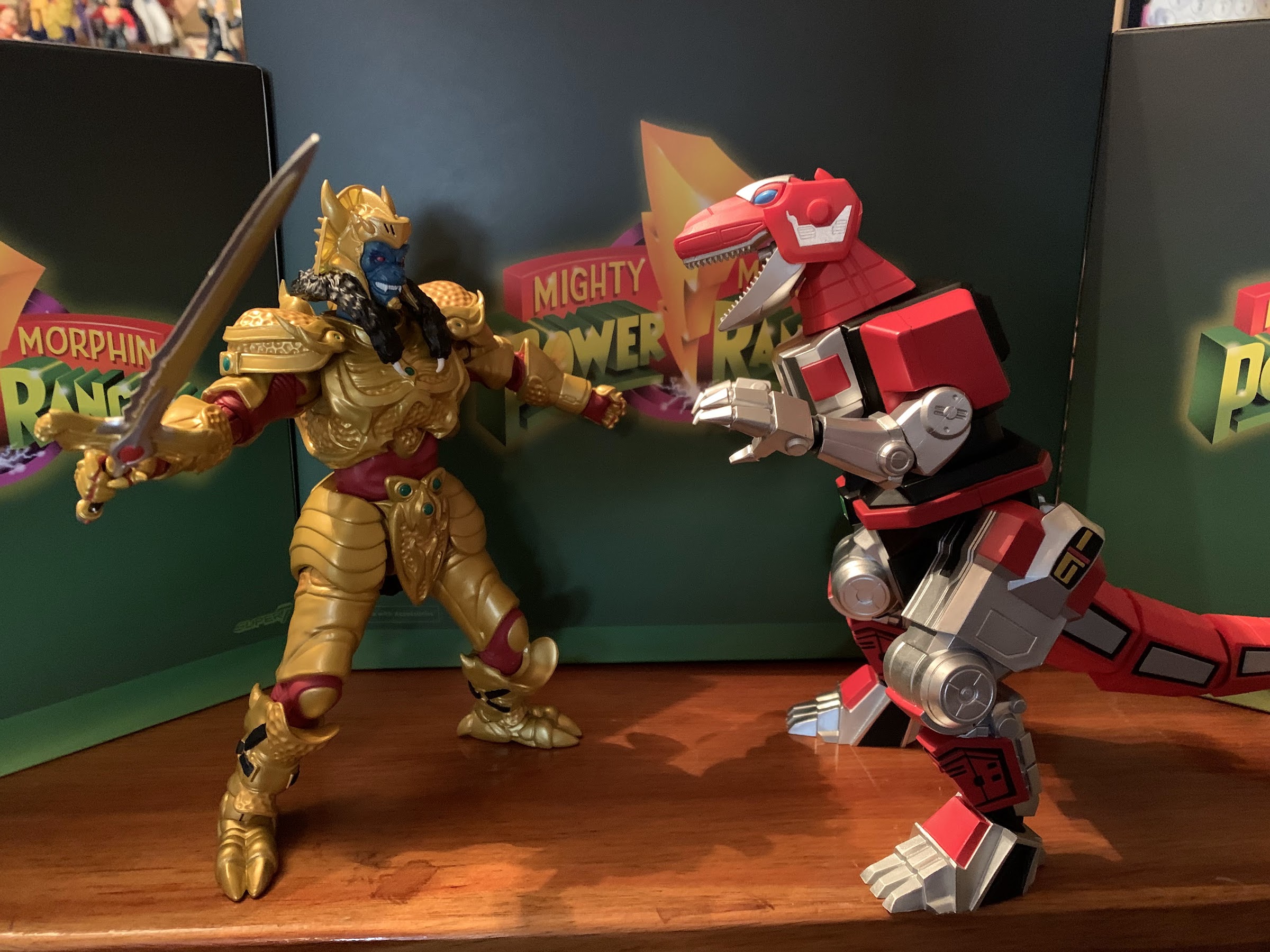
He’s sized well for battling Goldar.

There may be some temptation to display this guy with past iterations of the Dinozords. I only have one such era of releases, the 1993 and 94 stuff from Bandai. I did also get the Hasbro Megazord for my son, but that thing is pretty small and neither vintage nor collector grade. As for the old Bandai stuff, this figure isn’t that much bigger than the Tyrannosaurus released back then. He’s just a little taller, but way more bulky. The vintage one does have the proper linework on the head though so at least it has that going for it. The Dragonzord is another one some may want to place with this figure and, size wise, it more or less works. That Dragonzord is pretty damn chunky and not exactly screen accurate, but it’s a fun companion. If you want to go battle mode with your Dragonzord, then it suddenly dwarfs the T-Rex. That’s to be expected since the Megazord does the same to the Dragonzord. There was apparently just no way to get those forms right as a combining toy, and since it was for kids, it’s not like Bandai was that concerned about accuracy. This figure will presumably scale much better with future Super7 zords.

Meeting some old friends.
He’s big.

Naturally, a big, robot, dinosaur isn’t going to articulate particularly well. Super7 basically got most of the joints one would expect into this figure, it’s just not particularly functional. The head is on what feels like a double ball peg and can look up and down pretty well. The large panels on the side of the head prevent natural rotation in that the head will always want to turn to the side when trying to rotate, but it has a lot of room for nuance posing. The base of the neck is where you get your rotation and it’s on a ball hinge so you can get a little extra “up” range as well. For the arms, it’s the silver parts that move. The “shoulders” are on ball hinges and can move up and down and you get about 90 degrees of movement. Their range out to the side is very minimal. There are elbows that get you something less than 90 with a swivel as well and the wrists swivel and hinge and those are fine. There’s a basic twist in the waist area which begins where the silver portion of the chest ends. The hips are big ball hinges that go out the side a small amount and rotate a minimal amount. The knees are hinged joints that barely move and are rather useless and the joint is mostly going to be used for a swivel as the lower leg can rotate there a decent amount. The ankles are on hinges that don’t go back very far, but do go forward a decent amount. There is an ankle rocker but the range is pretty limited, but it’s enough to accommodate the range at the hips. The tail is on a series of ball joints. The first segment doesn’t move, but each one after that does so you get full rotation at each segment and a little up and down movement that allows the tail to be curled. If you have a heavy duty stand, you can even get this guy into his kicking attack pose where he stood on his tail in the show. Lastly, there’s also a hinged jaw and that works fine.

There’s 30 years of toy advancements staring right at you.
I’m actually surprised at how comparable they are in size.

The Tyrannosaurus isn’t going to do a whole lot on your shelf aside from stand there and look cool. I like the range at the head as it imparts some personality, even though I think the suit in the show didn’t allow for that. The hips are limited, but allow the stance to be widened which looks nice, or you can go for a more straight up and down pose. There’s also enough range going forward at the hips that the figure can be posed like one would pose an actual T-Rex which is more horizontal. It’s a pretty cool look, though not something you would have ever seen on television out of this character. It’s also easy to stand and there’s not much rub at the joints that will impact the paint as they mostly go as far as they’ll go and then stop. In the end, I think it’s fine as this isn’t supposed to do a whole lot and it’s technically more articulated than it is in the show.

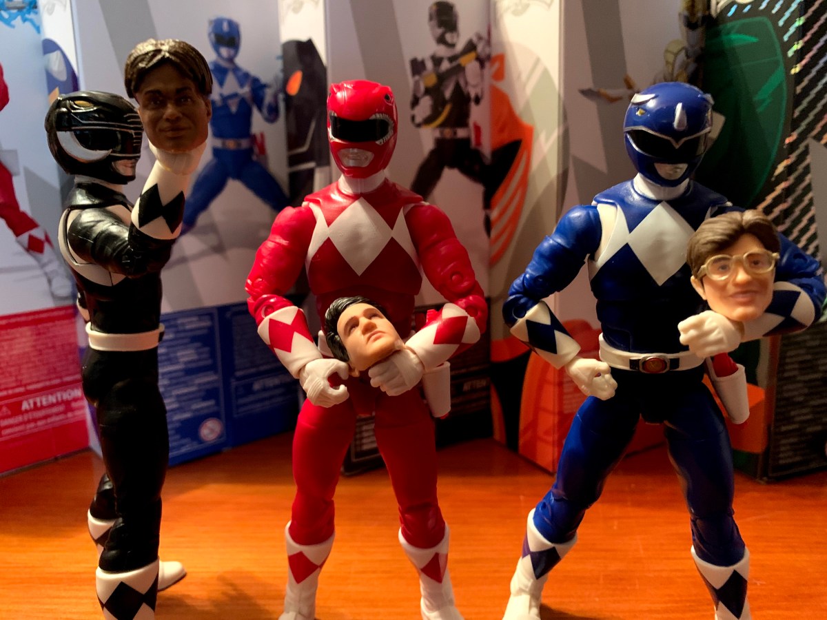
Here’s some tiny Jasons for your dinosaur to play with.
If you like novelty coins, you get this too.

The accessories for this figure are also another area of limitation. What really can this thing even come with? Super7 decided we needed some hand options so we get a set of fists, open hands, and more neutral hands. I’m a little surprised they didn’t just make the hands articulate, but this is honestly probably better for us. There’s also a pair of mini, in-scale, Red Ranger figures. One is posed with the hands on the hips and the other is in a summoning pose. They’re very minimally painted as they’re just red, slug, figures with the white of the gloves, boots, and belts applied. I certainly wouldn’t expect a fully painted figure at this size, but I feel like those tiny, novelty, figures are better painted than this. Adding a white diamond to the chest would have helped to break it up a bit and some black for the visor. Without it, these look too cheap to really do much with. Lastly, we get a replica Power Coin that features the snarling T-Rex on one side and the zord symbol (I think that’s what it is) on the reverse. It’s a really heavy, chunk, of metal and it features some shading which looks nice. It’s neat, but not exactly practical and I have no idea what I’ll end up doing with it. I wasn’t expecting much, but I do think we could have used an effect piece for the mouth cannons. I honestly don’t know if it ever used them in the show, but who cares if it didn’t? Some little blast effects or something like a breath attack would have been pretty damn cool.

Making friends with the other dinosaurs. This guy will probably pair nicely with the upcoming Grimlock Ultimates! from the Transformers line.
“I gotta get me one of these!”

Ultimately, which is how I pretty much have to end a review of a Super7 Ultimates! release, I think this figure gets the job done. It’s supposed to be a more screen-accurate depiction of the Tyrannosaurus Dinozord from the TV show and it succeeds in that department probably better than any other release I’ve seen. There have been some really cool, and really expensive, Megazords over the years, but usually the T-Rex has to be compromised in some way to facilitate the transformation. Here, we don’t have to worry about that. Aside from some missing paint on the head, I’m really happy with how this figure turned out. It’s a chunky, hunk of plastic that moves about as well as can be expected and will look great in any Power Rangers collection. He doesn’t scale at all with the Rangers, which is to be expected, but will look fine battling someone like Goldar and I assume the monsters to come will follow suit. For me, this line is all about the zords and monsters so I’m generally pleased with what I’ve seen. I decided to pass on the Yellow Ranger and Putty, so this will be my final review of the first wave. I do plan on picking up the Dragonzord when it comes out and eventually I’ll have the Megazord as well. And like Goldar, this is a Super7 release that actually meets its asking price of $55. I’m actually surprised they didn’t try to get more for it as they will with the Megazord so I guess be happy for that. This is an easy recommend for me though.

Looking for more Power Rangers toy coverage? Well, look no further:

Super7 Mighty Morphin Power Rangers Ultimate Green Ranger

We continue to finally offload some long standing preorders this year and up next is Mighty Morphin Power Rangers from Super7. It was June 2021 when these figures were announced to the surprise of many. Why? Because Power Rangers are now owned by Hasbro, probably the biggest toy producer in the world who has its…

Keep reading

Super7 Mighty Morphin Power Rangers Ultimate Goldar

Last week, when we took a look at the first Power Ranger in Super7’s line of Ultimates! action figures based on Mighty Morphin Power Rangers I expressed some surprise that Hasbro would license out this brand since it competes with their own Lighting Collection. I do feel like the actual Rangers are pretty safe. People…

Keep reading

Bandai Mighty Morphin Power Rangers Megazord

It was now a couple of weeks ago I posted about some toys I always wanted as a kid, but never got. Shortly after, I rectified some of those decades old injustices by purchasing the Dragonzord with Green Ranger from Bandai’s Mighty Morphin Power Rangers line of action figures from 1993. The Dragonzord was my…

Keep reading

Super7 Mighty Morphin Power Rangers Ultimate Goldar

He’s coming for your Power Rangers!

Last week, when we took a look at the first Power Ranger in Super7’s line of Ultimates! action figures based on Mighty Morphin Power Rangers I expressed some surprise that Hasbro would license out this brand since it competes with their own Lighting Collection. I do feel like the actual Rangers are pretty safe. People who are into MMPR will buy a set of Rangers from both companies and be happy. When it comes to the monsters though then I think Hasbro could have an issue. In truth, the monsters have been a relatively small part of the Lightning Collection. The few that have been released have been of the deluxe variety with an increased cost relative to the Rangers. They’ve also been kind of terrible from what I’ve seen. A few look like they’re sculpted well enough, but Hasbro really cheaped out on the paint apps for most of them and they just look awful as a result. It’s surprising because MMPR is an in-house brand for Hasbro now. I may not like it, but I understand when a Marvel Legends figure or a Star Wars release has less money put into it because those have the additional burden of a licensing fee, but that’s not the cast with Power Rangers.

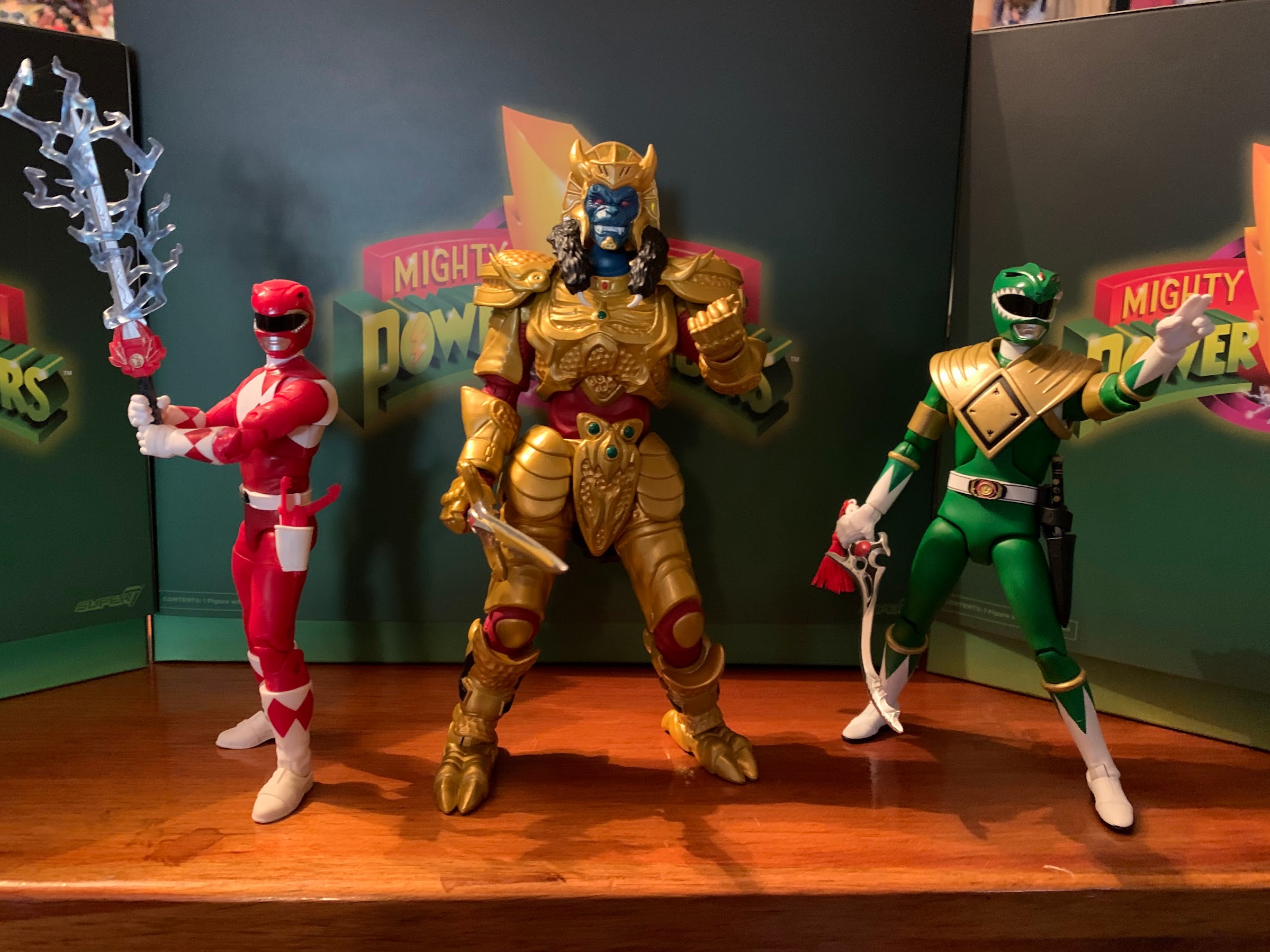
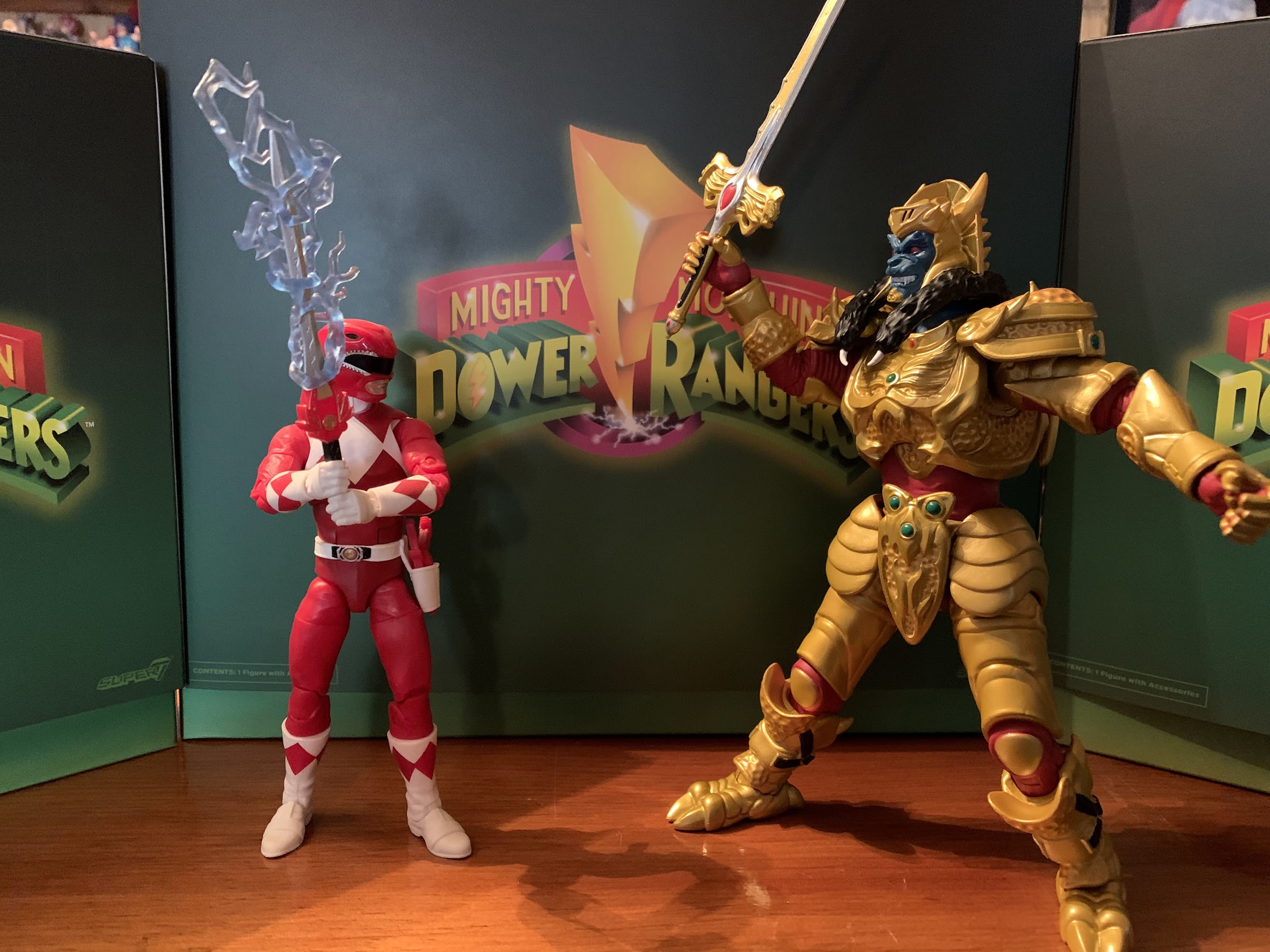
Goldar has some size on Tommy, and I’m happy to see he doesn’t completely dwarf a Lightning Collection release.

Since Hasbro has declined to make any monsters worth my money, I naturally saw Super7’s line as a potential replacement. I like having villains, especially monster types, that are bigger than the heroes so the larger scale of Super7’s figures didn’t seem like an obstacle to me, but really a potential benefit. Though so far I’ve only committed to buying one such figure, but if it’s any good I may change my mind. And that figure is Goldar. I don’t need or want a big MMPR collection, but Goldar always felt like a character worth having. He’s Rita Repulsa’s general and basically her right hand man…monster. Despite his inability to actually defeat the Power Rangers, he was kept in that position when Lord Zedd usurped Rita’s throne and attempted to take matters into his own hands. As an enemy, I think Goldar was the first monster the Rangers battled in their Megazord, though I also haven’t gone back to watch the show in years so I could be misremembering. I always liked him as a design. He’s some sort of armored wolf, and as the name implies, he seems to like gold. He looks scary, and even though he wasn’t exactly batting a thousand, I always felt like he was a threat to the Power Rangers and not the show’s version of a Bebop or Rocksteady.

It’s probably not screen accurate, but this works for me.

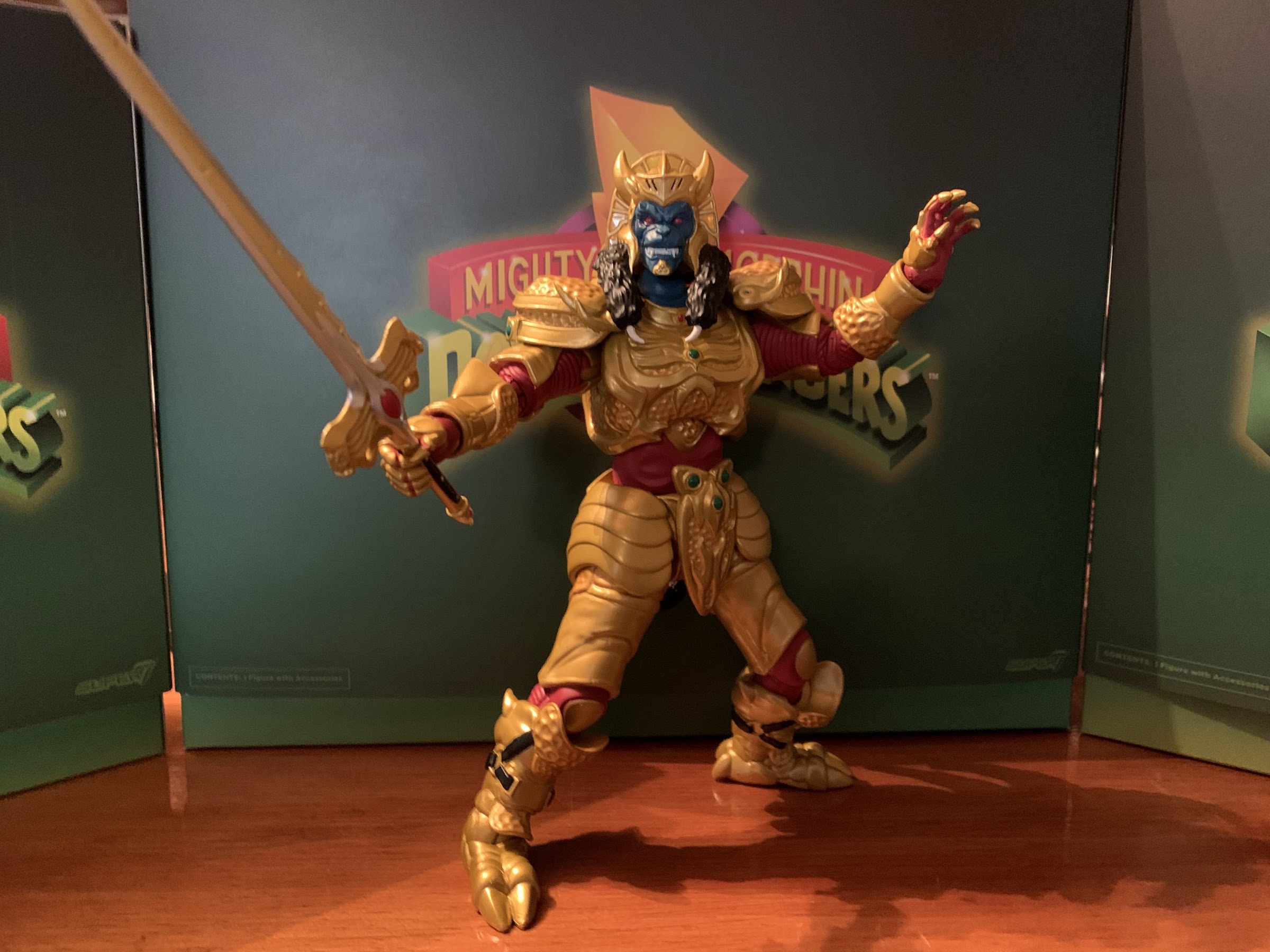
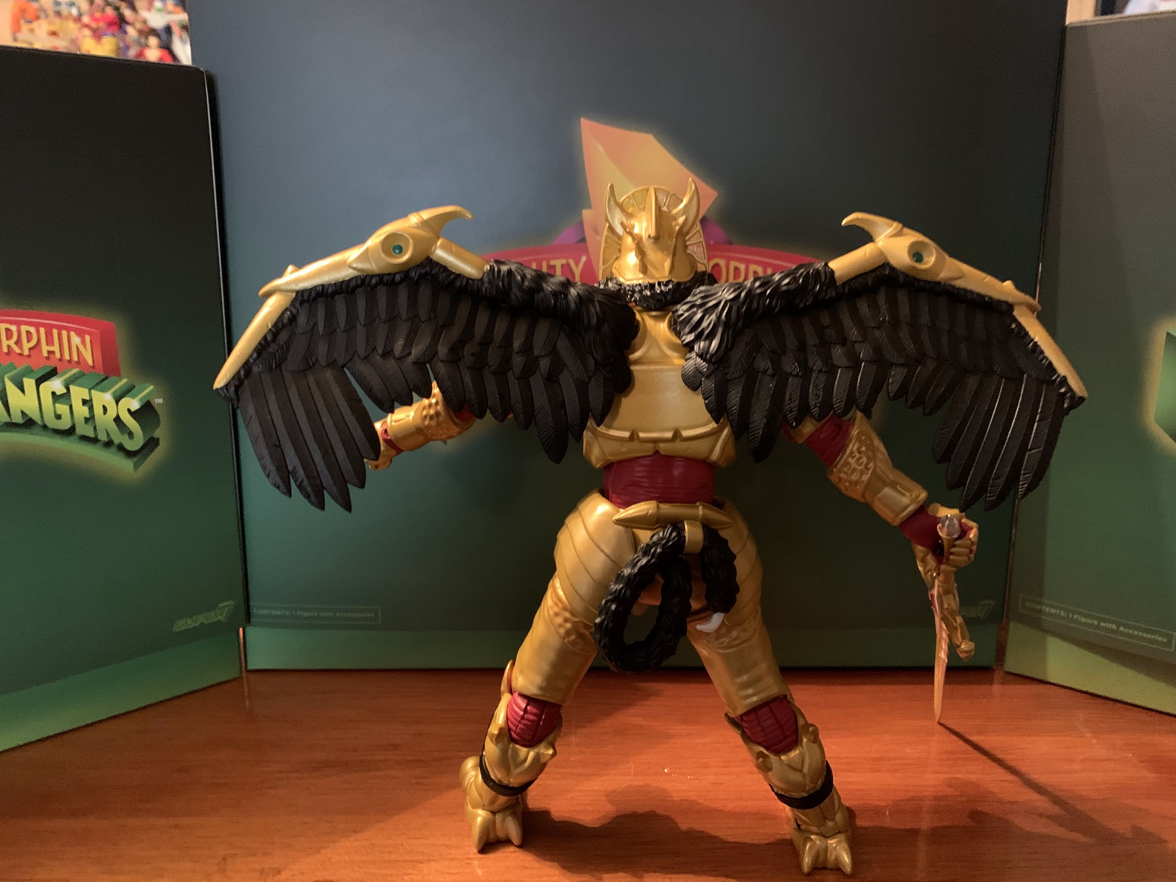
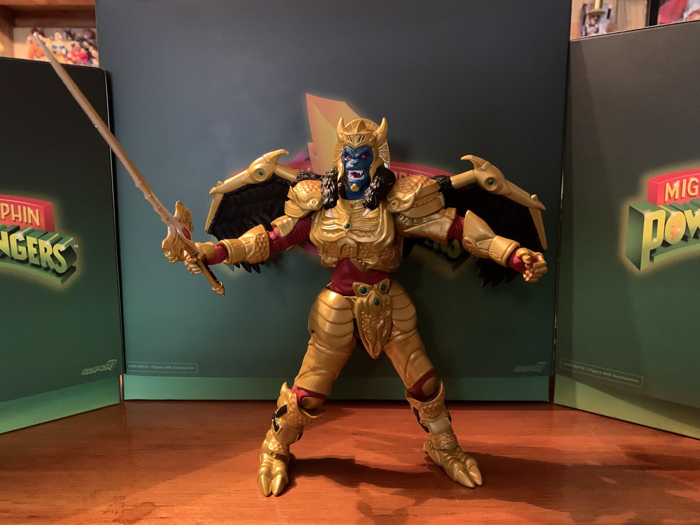
Super7 apparently felt like Goldar was rather important and he was chosen to be the main villain in the first wave of Ultimates! Like Tommy, he comes in the same Ultimates! styled box with a green slipcover over a window box inside. He does get his own “power coin” logo on the slipcover and there’s a bio and still from the show on the back of the inner box. Once removed, Goldar stands a mighty 8″ or so to the top of his head, a touch taller if you count the horns of his helm. He looks rather resplendent in his golden armor which appears to be fully painted. Like the Green Ranger, it looks like Super7 committed to giving us a nice finish by casting the figure in the appropriate color, but then painting over it with the same. It gives the figure a much more “premium” appearance which is a good thing considering he’s priced at $55. The inner parts of his suit are painted red in accordance with the character design and there are a few gems or something painted as well. The face looks really nice as it’s blue with shading around the eyes. The teeth are cleanly painted and the furry…things…that drape over his shoulders look fine too. The crown of his helm is done in a translucent, yellow, plastic that almost looks like stained glass. It’s an unexpected, but welcomed, embellishment. If I am to nitpick the paint I’d first go to the black strap on the calf area which do nothing to convey the illusion of an actual strap. They’re flatly painted and unconvincing. Some of the red could have also been applied cleaner. It’s pretty hazy around the kneepads and some of the hands are a bit messy. In Super7’s defense, the hands are hard to paint as there are gold plates over the digits with red underneath. Hasbro declined to attempt such a thing and I’ll say for the most part they look good enough. I also feel like the feet could have used some shading as they’re the only part that looks “plasticy” to me.

Goldar is also sized well to compete with zords. I’m curious how he’ll stack up against the upcoming Megazord.
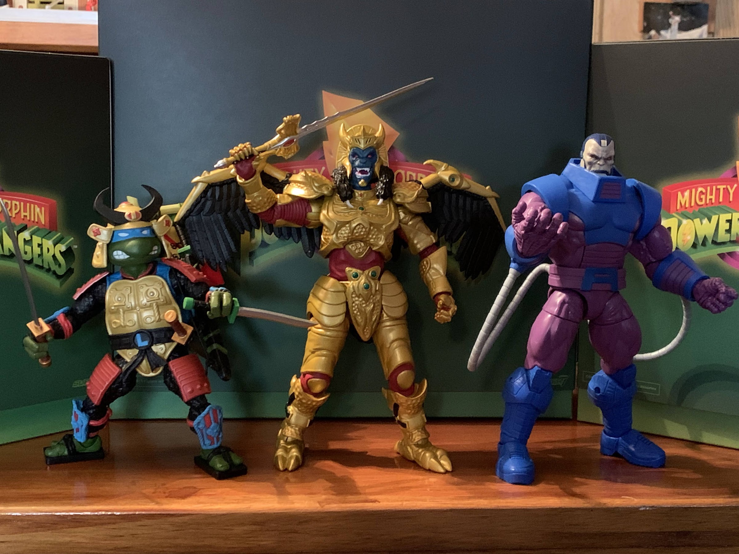
I figured we should sneak in a comparison to another Super7 figure featuring some gold accents that a lot of people seemed to have issues with. And we might as well put him up against another big boy in Apocalypse.

As for the sculpt, well there’s really little to complain about. Super7 absolutely nailed the portrait with Goldar which is something I wasn’t sold on with the Lightning Collection release. This looks like the character to me and I feel like if he started talking on my shelf I wouldn’t even be surprised. Most of the body has a nice texture to it as the gold is dented like a golf ball in several parts. I am not an expert on the show, but it looks accurate enough to me. All of the details I associate with the character are present like the giant codpiece and the bundled up tail on his rear. Super7 has received numerous criticisms from me over the years, but rarely is sculpting an issue and this guy is no different. He might really be one of their best which is not faint praise.

This ornately designed chest looks pretty damn nice.
These things are less interesting, but you get five of them!

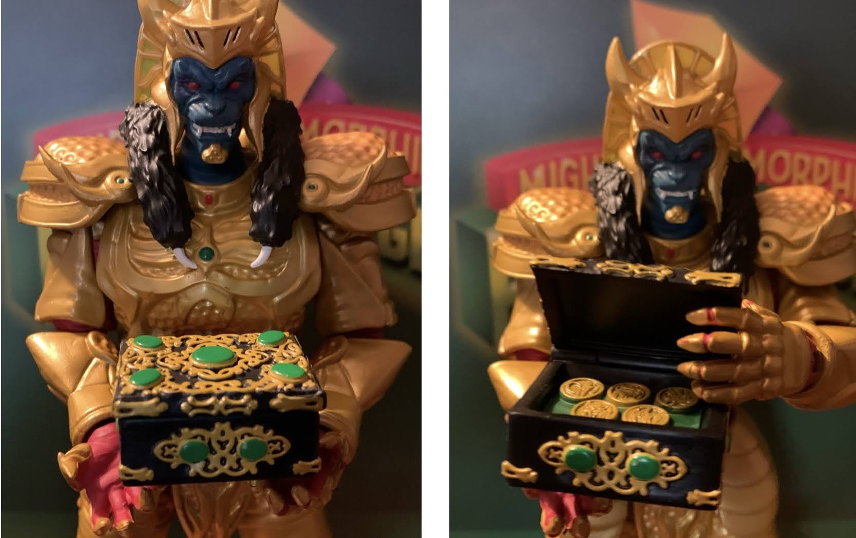
Goldar has a rather expensive look to him so I was expecting Super7 to skimp on the accessories, but he’s actually pretty robust. For heads, we have two options which are essentially mouth closed and mouth open. Both look great, though I think I like the open one just a little bit more. For hands, we get a whole bunch: fists, gripping with horizontal hinges, gripping with vertical hinges, and open hands. For those gripping hands he has his rather large sword which is painted very nicely with hits of silver and gold and the red gem in the center. He also has his little wing nubbins on the back which can be removed and replaced with open, black, wings that also look quite nice. They’re entirely sculpted in plastic and the feathers are nicely textured and the paint is clean. In addition to all of that, we get some episode specific stuff. There’s an elaborate chest that contains the power coins after they stole them or something. The chest has a hinged lid so it can open and close and the paint job is pretty damn spectacular. Goldar also has the five Badges of Darkness which I think he gave out to the Putties to create evil, clone, Power Rangers. They’re identical and they just resemble grey stones with a light blue gem in the center of a star carving. Nothing special, but those more interested in episode-specific trinkets will get more mileage out of them than I. His extra stuff at least feels more purposeful than most of the stuff the Green Ranger came with.

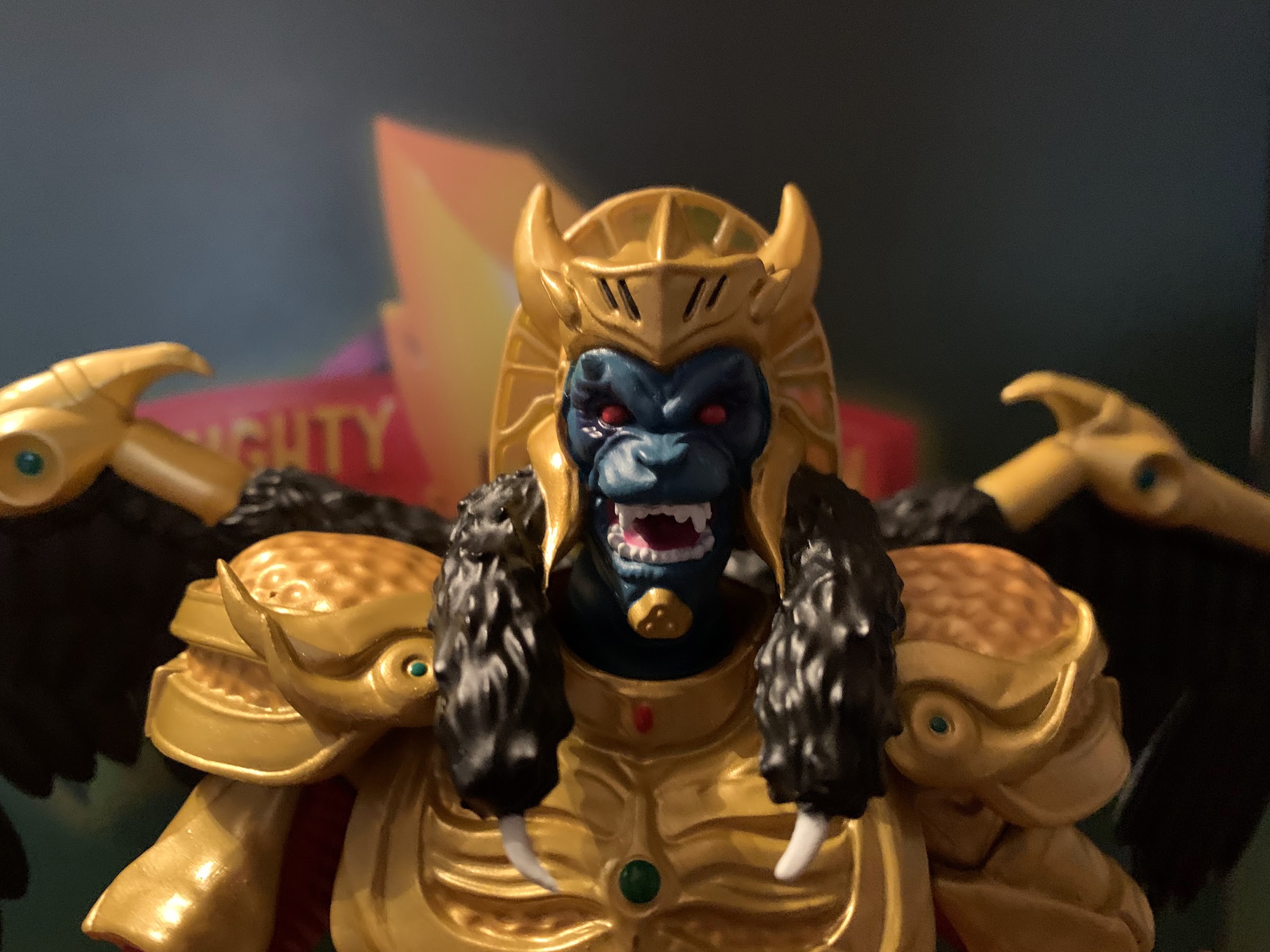
The alternate head is definitely a keeper.
“I will destroy those teenagers with attitude!”

Goldar is not a character that looks like he’ll move very well, but again, Super7 kind of surprised me here. For starters, his head is on a hinged-ball peg. I do not like that, but at least he looks up and down okay and can turn his head. He just doesn’t really get much in the way of more nuanced poses. His head sits high on the ball, so he gets more than the Green Ranger, but Super7, please just go back to using double ball pegs. The shoulders are the hinged ball joints that peg into the arm and he can lift his arms out to the side past horizontal. This really surprised me as he’s got some rather large shoulder pads, but they do a solid job of getting out of the way. Rotating the arms all around isn’t going to happen, but you get enough. He has a biceps swivel and a single-hinged elbow that can’t quite hit 90. You also get a rotation point at the elbow as well. The wrists rotate and he has the proper hinge for the gripping hands, so that’s a plus. They are a tad loose though and his heavy sword can be a touch finicky to pose, but it seems to hold in position well enough. In the diaphragm, we get what’s probably a ball joint of some kind that lets the figure rotate, but also tilt to the sides. He arches back a little, and crunches forward a little as well. In both cases, it’s more range than I expected. He does have a waist twist below that and some hinged ball joints at the hips. Goldar can just about hit a split before the armor at his hips gets in the way and he can kick forward to almost horizontal, though he can’t really kick back at all. You get some rotation at the thigh and the single-hinged knee can go about 90 degrees. It also rotates a little at the joint. The ankles feature the usual hinge and rocker, though the shape of the plating of the armor does restrict things a bit. The hinge goes back well enough, but you don’t get much forward. The rocker is also limited, but I think you’re going to get enough out of it to keep his feet flat even in some rather wide stances.

He’s not some super-articulated ninja figure, but he can look tough and swing a sword so that works for me.

I would say Goldar articulates pretty well for such a design. I admit, some of that opinion is colored by my low expectations going in which were influenced by both the look of the figure and my own experience with Super7. I think they did a good job though and I don’t really feel like other companies would do much better. Yeah, you could slip in some double joints at the elbows and knees and maybe get a little better than 90, but is that really going to up one’s enjoyment of the figure? I think the easiest point for criticism is the head as Super7 should ditch the hinged ball peg. I suppose a hinged joint in the diaphragm could get more ab crunch? That’s probably a little more expensive to implement though and presents gapping issues usually. He basically reminds me of a NECA figure and his range is pretty comparable to Warduke. And since he has a less restricting his torso, he probably moves better than that figure. That figure is probably a little visually more impressive, but it’s definitely more subjective than usual. At least Super7 is comparing well to something that’s much cheaper since usually they present worse and cost more, a true double whammy.

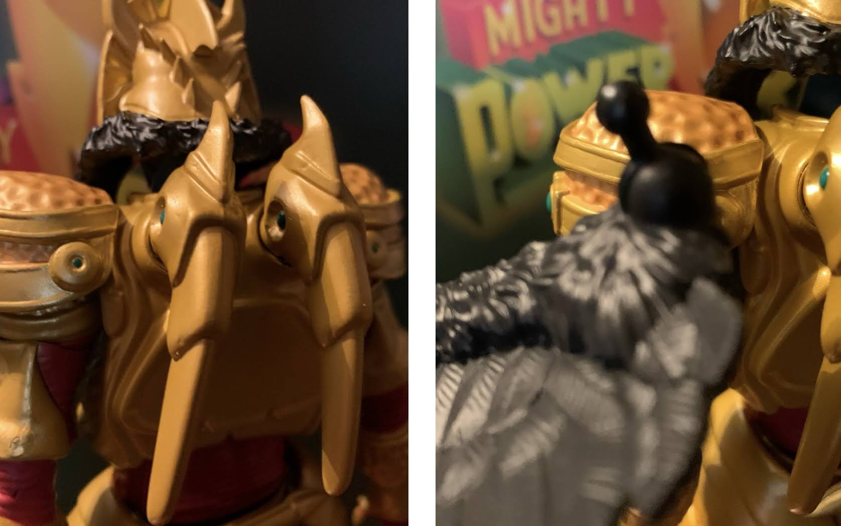
A lot of people have had a lot of issues with these parts so do be careful.
I think the wings are worth the hassle as they do look rather nice once applied.

One thing I do need to talk about though is the quality control issues people have been having with this figure in particular. I have seen and heard from lots of folks who had issues with the head and wings. I didn’t actually mention the wings in the articulation portion, but they do connect via a ball and socket joint on the figure’s back and they have a hinge as well. The left wing seems fine, but the right is a bit iffy. The socket feels like it’s off just a tiny amount, probably not enough to notice with the naked eye, but it’s noticeably tight. People have been snapping the peg when trying to rotate or use the hinge. I noticed before even inserting that wing that the hinge also stressed the plastic when pushed all the way. I guess naturally that means don’t push it all the way, but it still should not be. With the head, I’ve seen folks have a hard time getting the alternate head on and snapping the post as a result. One person I talked to snapped it just rotating the head after getting it on. I mentioned in the review that the heads seem to sit high on the ball and I think that’s by design to help clear the stuff around his neck. If so, it’s a bad design because every toy collector is going to think they need to seat that head all the way down and if that’s breaking things then Super7 deserves to have to eat some costs replacing them. Just elongate the post, or find another solution, this one feels half-assed. Out of an abundance of caution, I heated the little wing nubs on my figure before removing them and also heated the wings before inserting them. Once in, I’m just leaving them alone as I posed them via the hinge before inserting them. For the head, the default one came off without any issues and I heated the open mouth one before putting it on. It seems fine, but it doesn’t really want to rotate so I won’t force it. I prefer the look of the open wings with the open mouth so I would have been bummed if they had broke in some way. I technically didn’t have any issues with my figure, but I feel like a lot of others had to suffer broken Goldars in order for me to have such an experience. I guess tread lightly and make sure you purchase from a place with a good return policy if it comes to that.

“Buy my toy!”

Quality concerns aside, I think this is one of the best Super7 figures I own. It’s rare that they hit in all three phases for me: sculpt, paint, articulation. Usually they try to close the gap by tossing a bunch of junk into the box with their figures, but with Goldar that’s not needed. And better yet, most of his “junk” actually feels purposeful. While I liked the Green Ranger as a figure, I couldn’t help but feel like it was overpriced. With Goldar, I don’t really get that feeling. I think he’s actually pretty damn good and for $55 he’s the rare Super7 figure I can say is worth it. I have a lot of Super7 figures that I’m happy with, but objectively feel are overpriced. Goldar gets to be both objectively and subjectively a good figure. If you’re one of the folks who had a different experience with the head or wings then you might feel differently, but I’m reviewing both the figure and my experience with the figure and for me this is exactly what I wanted out of this character. He looks good with the other releases in the line, and extra menacing with the Lightning Collection Rangers. He can face off with Super7’s Green Ranger, and look good battling the T-Rex zord and he’s probably the star of this inaugural wave. If King Sphinx or Lord Zedd turns out this good then I may need to add some more bad guys to my collection in the future.

Interested in more Power Rangers action figures review? Gives these a shot:

Super7 Mighty Morphin Power Rangers Ultimate Green Ranger

We continue to finally offload some long standing preorders this year and up next is Mighty Morphin Power Rangers from Super7. It was June 2021 when these figures were announced to the surprise of many. Why? Because Power Rangers are now owned by Hasbro, probably the biggest toy producer in the world who has its…

Keep reading

Marvel Legends X-Men Retro Card Marvel’s Beast

Welcome, Professor McCoy, to The Nostalgia Spot.

2022 was the year a dream toyline of mine was made a reality. Hasbro finally decided to do a line of Marvel Legends based on the animated series X-Men, which premiered 30 years prior on Halloween 1992. The line was staggered with a release coming every 6-8 weeks or so and ended up totaling 8 figures, pretty standard for a single wave. There was hope on my part that the line would continue into 1993, when the show really took off, but that was not Hasbro’s plan. As a result, several characters from the show are still outstanding, and while Hasbro has referred to this break as a pause, that’s hardly a guarantee of anything going forward. If this were a romantic relationship, it would be dead, and maybe it should be since the line was subpar. I am a glutton for punishment apparently so I do want to see it continue so that we can get the missing X-Men and some of their most notable villains, but I can’t count on that. That means I’ve had to take matters into my own hands. I’m probably playing right into Hasbro’s thinking in doing so, but so be it, which is why I now have Marvel’s Beast to talk about.

We need to ponder the potential release, or non-release, of Beast in the X-Men Animated Series subline.

Beast, or The Beast, had an interesting run in the television show. He was part of the team, but basically written out of the first season pretty quickly as he was arrested and held for trial for the bulk of the episodes. He’d be released at the end of that first season and was able to become a recurring character as a result. Beast has always been one of those characters where the viewer is not supposed to judge a book by its cover. He looks like a beastly creature and adopted a name to play off of that, but in reality he’s pretty gentle, thoughtful, empathetic, and highly intelligent. Since he’s a well read individual, the writers of the show had a lot of fun with him as they could make him rather wordy and insert lines from famous writers and poets into his vocabulary as he was quite fond of quoting others. Some viewers found it annoying, but I was always rather charmed by Beast. And mostly, I just liked him because he was blue! Blue is my favorite color so a big, blue, furry, creature is aesthetically pleasing for me. Especially because I just really like the shade of blue used for his fur. It stands out and it’s a fun, somewhat ridiculous, design.

I prefer him naked.

This figure of Beast is a re-release. There’s been a prior blue version as well as a gray version and Hasbro apparently felt now was the time for another re-release. This one differs in that the shade of blue is different, more of a cobalt, and it’s all together brighter than that past one. There’s also less shading and he comes with a new head and some new accessories. It’s my thinking that certain figures from the animated series were not in play last year because of planned releases like this one or figures that were recently released on a retro card like Rogue and Gambit. It’s also my feeling that if we get a Beast in a 2024 or 2025 from the show he’ll basically just be this figure with some cel-shading and maybe a new head. And since I just really like how this blue turned out, I took the plunge with this figure as a stand-in. Maybe a permanent stand-in? Who knows? I’ll probably want that damn box when and if it comes so, yeah, this could easily be a double-dip for me, but at least I’m future proofed.

Beast! No!

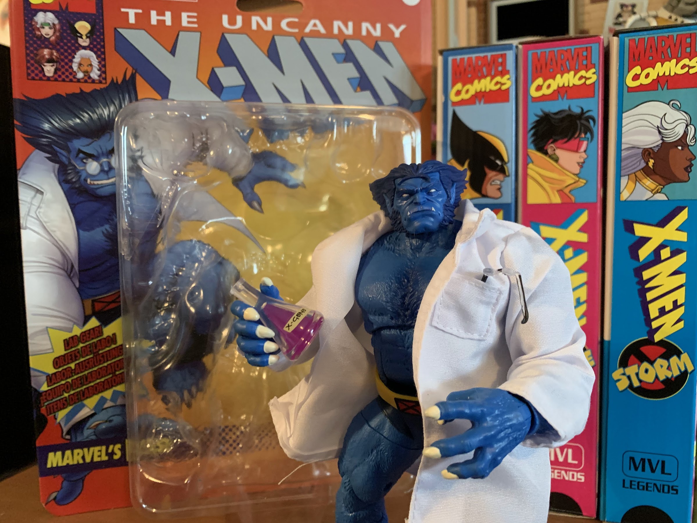
The retro card is a throwback to the Toy Biz days and features artwork by David Nakayama. It’s a lovely card and many collectors like to keep one mint and open another, but I am not one of those guys. Beast stands right around 7″ if you stand him up straight, though practically speaking he’s a little shorter since this is a character that is almost always in some kind of a hunch or crouch. He comes out of the box sporting a white lab coat which is one of the new additions. It’s not an original idea to pair Beast with a lab coat as Toy Biz did the same early in the Marvel Legends line, but some people who already have the older Beast might want it. It’s decent, but the quality of the soft goods isn’t going to impress. Mine has several stray threads and if I intended to display Beast with this coat on I’d probably do some trimming. It does have a chest pocket on the left side which is neat.

The coat is not the best quality, but I also don’t know how much of a draw it truly is for collectors.

Getting the coat off is rather easy and once done we have our furry blue boy in all of his glory. This Beast is clearly inspired by the artwork of Jim Lee, as nearly all of the retro card releases seem to be. He has a stoic expression which features his completely white eyes and his teeth poking over his upper lip. This is where the distinction between show and comic comes into play as Beast in the show always had pupils, but in the comics he was often depicted this way. I prefer my Beast with pupils, but I can’t hold that against a figure that is trying to emulate a comic look. His hair is a darker blue and the body has lots of sculpted fur on it. There are hits of dark blue shading in the middle of the chest and shoulders which makes up the bulk of the paint on this guy. Otherwise, there’s just the belt and upper legs. The trunks are sculpted in navy and the belt in yellow with the X logo painted on. The upper thigh piece appears to be sculpted in navy and the parts of his exposed fur are painted and Hasbro did a good job of matching the blue paint to the blue plastic. The area around his ab crunch though is less successful as far as color-matching goes as it appears that was sculpted in navy as well. The rest of the paint is basically reserved for the white claws on the hands and feet and it’s done okay. It’s not the cleanest application of paint I’ve ever seen, but at least it’s not egregiously bad or anything. The proportioning on the sculpt is very well done for a Marvel Legends release. His chest and shoulders have plenty of mass and so do the legs and biceps. He should fit in pretty well with your other X-Men releases from this era of the comics, or show, in my case.

Fascinating!

I already mentioned the coat, but Beast does come with some other things as well. For hands, he has a somewhat tight gripping right hand and a loose gripping left hand. He also has a right fist and a left fully open hand. I would have preferred just two sets of gripping hands that match each other, so two tight and two loose, as the loose gripping hand is a nice style pose hand. The fist I find useless while the open hand is fine. It would be a bit more useful with better articulation, but we’ll get to that. The claw paint on all of the hands is pretty consistent in that it’s passable. Beast also gets a second head and this one is from the older release. It’s a screaming head and it’s pretty well painted and the inside of the mouth is sculpted. The hair on it is slightly more narrow, enough so that it throws off the aesthetic for me. I like the wider hair look of Beast, but this older head probably wasn’t going for that. It’s fine, but I’ll never use it as I just don’t think of Beast as a screamy sort of character, but artists have had fun drawing him like one for years. Beast also comes with a pair of beakers, one containing the X-Gene and another a green liquid. They’re fine and they look nice since they’re cast in transparent plastic with a colored fill to create the illusion of a liquid inside. They’re also two different designs with one featuring a more spherical base and they certainly work with the lab coat if that’s the look you want. Lastly, Beast has a pair of glasses. They’re cast in transparent plastic with the ear pieces painted black. They’re pretty terrible though because there’s nothing to hold them onto his face. They’re rubbery and soft so they don’t pinch at all and there are no holes or any way to key them in. I’m glad they didn’t do that, but these could have been manufactured in a stronger material so that they gripped his head better. Or they could have been designed to fit between his brow and his nose. Whatever, it is what it is, and at least they fit in his pocket. I received a Baxter Stockman figure last year from NECA that came missing a pair of glasses, and since NECA still has not sent me the replacement they promised, I’ll give these to Baxter for now.

Lastly, we need to rundown the articulation on this blue boy. Beast has quite a bit, and most of it I like, but he’s not without his problems. For starters, he has the usual ball hinge at the neck only with this figure the ball basically sits right on top of the hinge. His head is low so it affects the range. He can rotate and tilt a bit and he does have up and down, but since he’s a character who crouches a lot I would like even more range looking up. His shoulders are ball-hinged with butterfly joints. He can raise his arms to the side no problem and the butterfly joint goes way back, but hardly anything forward. He has a biceps swivel and double-jointed elbows that will bend past 90 degrees even with his rather generously sized biceps. The wrists swivel and hinge with all of the hinges being of the horizontal variety which is appropriate, in this case. In the torso, we have a diaphragm joint that runs along the bottom of the rib cage. It mostly affords rotation as any movement to the front, back, or tilt is minimal at best. Below that is an ab crunch that is mostly hidden behind the floating belt. It basically only has 3 positions so you get one click back and one click forward. It’s okay. At the hips we have some ball and socket joints and he can nearly hit a full split. He kicks forward about 90 degrees with no movement to the rear. There’s a thigh cut below that and double-jointed knees which work just fine. The ankles have a ratcheted hinge, from the feel of it. It will go back all of the way with two clicks of movement, but it goes forward only one click. He has a very nice ankle rocker and he also has a fairly well-engineered toe hinge as well. I wish the toe hinge was a little more firm, but it seems to be usable.

For Beast, it’s a solid mix of articulation points and approaches and, for the most part, I think it works. Where it’s lacking just a bit is with the ab crunch and the butterfly joints not coming forward more. Beast is known for that one-handed pose on the ground in a crouch not unlike Spider-Man. He has the big, open, hand for such, but he really can’t hit it convincingly. If you get him in a crouch with the hand down he looks silly because he doesn’t have the range in the head to be looking forward. More range back in the diaphragm would have helped. It does make me think his proportions might be just a little off in that his arms should be longer. It wouldn’t surprise me if he’s a character where artists cheat at times and when he’s just standing around his arms look fairly normal in length, but when posed in a more “beastly” manner they mysteriously get longer. It’s just a bummer he really can’t do his classic Jim Lee pose from the cover of X-Men #1. He can stand on one hand though, if you’re patient. I wouldn’t recommend leaving him like that on a shelf without a stand, but I was able to pull it off.

It’s kind of a Beast pose.

This Beast is probably as good as a Marvel Legends version of the character is likely ever to get. Yeah, he can’t hit all of the “Beast poses,” with ease, but he still poses well. Mostly though, the sculpt looks great for the character so it’s no wonder why Hasbro has re-released it multiple times at this point. The extras like the lab coat do little for me, but this new, stoic, head is definitely more of what I envision for the character. Yeah, I want a smiling portrait with pupils in the eyes (like the box art, I might add), but I can’t really hold that against the figure since this is a comic interpretation and he has white eyes in the comics. Mostly, I just like this blue and I love how it pops on the shelf. I think the shading on the figure is enough, though maybe some hits on the calves and forearms would have livened things up, but it’s fine. The prior version looks over-shaded to me so I prefer this dialed-back approach. The only other thing to mention is the cost. This figure, for whatever reason, is considered a deluxe release so it’s going to cost you around $35 or more in some places to add him to your collection. Considering it’s nearly 100% reuse, there’s not much in the package to justify the price aside from Hasbro just doing whatever it wants. Compared to other releases at this price point it’s not a good value, but if you need a Beast (or have doubts about Hasbro doing more animated X-Men) you’re probably going to pay it. At least the figure looks nice enough.

More from the world of X-Men:

Marvel Legends X-Men Retro Card Series Apocalypse

It is Halloween and that means it’s time for costumes, candy, and spooky fun. It’s also Halloween 2022, a pretty important date if you grew up loving those mutants who ran around in colorful spandex fighting for a better tomorrow. That’s because 30 years ago on this very night, the animated series X-Men premiered on…

Keep reading

Marvel Legends X-Men Animated Series Wolverine

The toyline of my dreams was announced last October. In celebration of the 30th anniversary of the television series X-Men, Hasbro is doing a dedicated line of Marvel Legends with figures based on the look of the show. The show was obviously inspired by the designs of Jim Lee, but there are differences in the…

Keep reading

X-Men: The Art and Making of the Animated Series

A few years ago, I talked about my love of X-Men, the animated series, via a book review of Previously…on X-Men by Eric Lewald. That book chronicled the development of the 92 animated series that helped propel the Fox Kids Network to the top of the Saturday morning leaderboards through notes from the author and…

Keep reading

Marvel Legends Retro Card Cyborg Spider-Man

It’s Spider-Man with a robot arm!

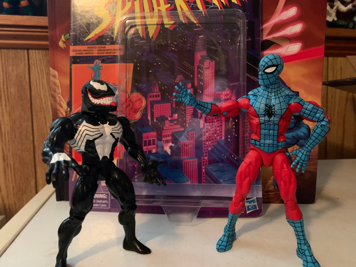
Well, this is a figure that I never planned on reviewing. It’s a bit old at this point, but we’re looking at yet another Spider-Man retro card release from Hasbro and this time it’s Cyborg Spider-Man. Now, I remember seeing this quite some time ago at Target and thinking it looked fine, but I’m not a Marvel Legends collector so I never paid it any real mind. I say that, and yet 2022 is the year I bought more Legends than I have since 2006 mostly due to the X-Men animated line, but it also got started with the animated Venom. That Venom lead me down a rabbit hole where I wound up with Web-Man, Symbiote Spider-Man, and more recently the animated Spider-Man. It was getting that most recent one that basically resulted in me grabbing this guy because what I really wanted was a webline part. That figure didn’t come with one, but when I went to Target recently I spotted a figure that did. Spoiler alert – it’s this one!

Even with the new hardware, he still does spider shit.

Cyborg Spider-Man is a 2021 release, if I’m not mistaken. Possibly late 2020. Things blend together a bit in my head when it comes to release dates, especially for lines I don’t typically collect. The foot of this one is stamped 2016, but I’m guessing that’s because most of the parts are that old. It’s not recent though and not one I’ve seen in Target in quite some time. I don’t know why my nearest Target had one, random, figure on the pegs, but it did. It initially didn’t even ring up because the barcode was no longer in their system, and when it finally did, it rang up as some Spider-Man bow and arrow toy. Unfortunately, that toy carried the same MSRP as this one so I didn’t get a deal or anything, but it suggests to me that maybe Target recently unearthed some extra stock because the figure is also online again as of this writing. Regardless, I thought the sculpt was interesting and a pretty fun variant on Spider-Man, and since it came with a web line accessory, I said “Why not?” And since I have a blog that heavily leans into toy reviews, we might as well take a look.

I think of him as more of a punchy Spider-Man.

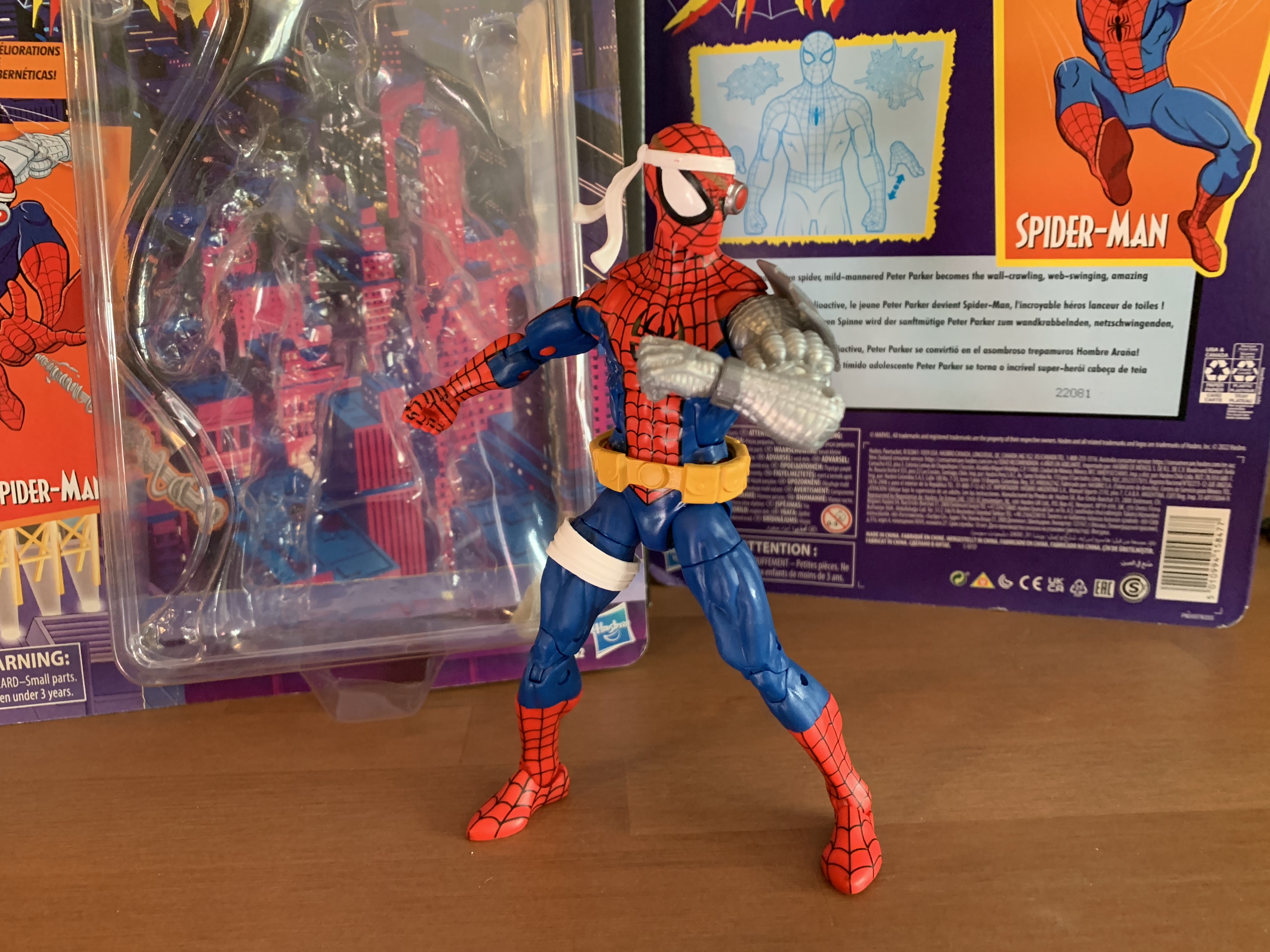
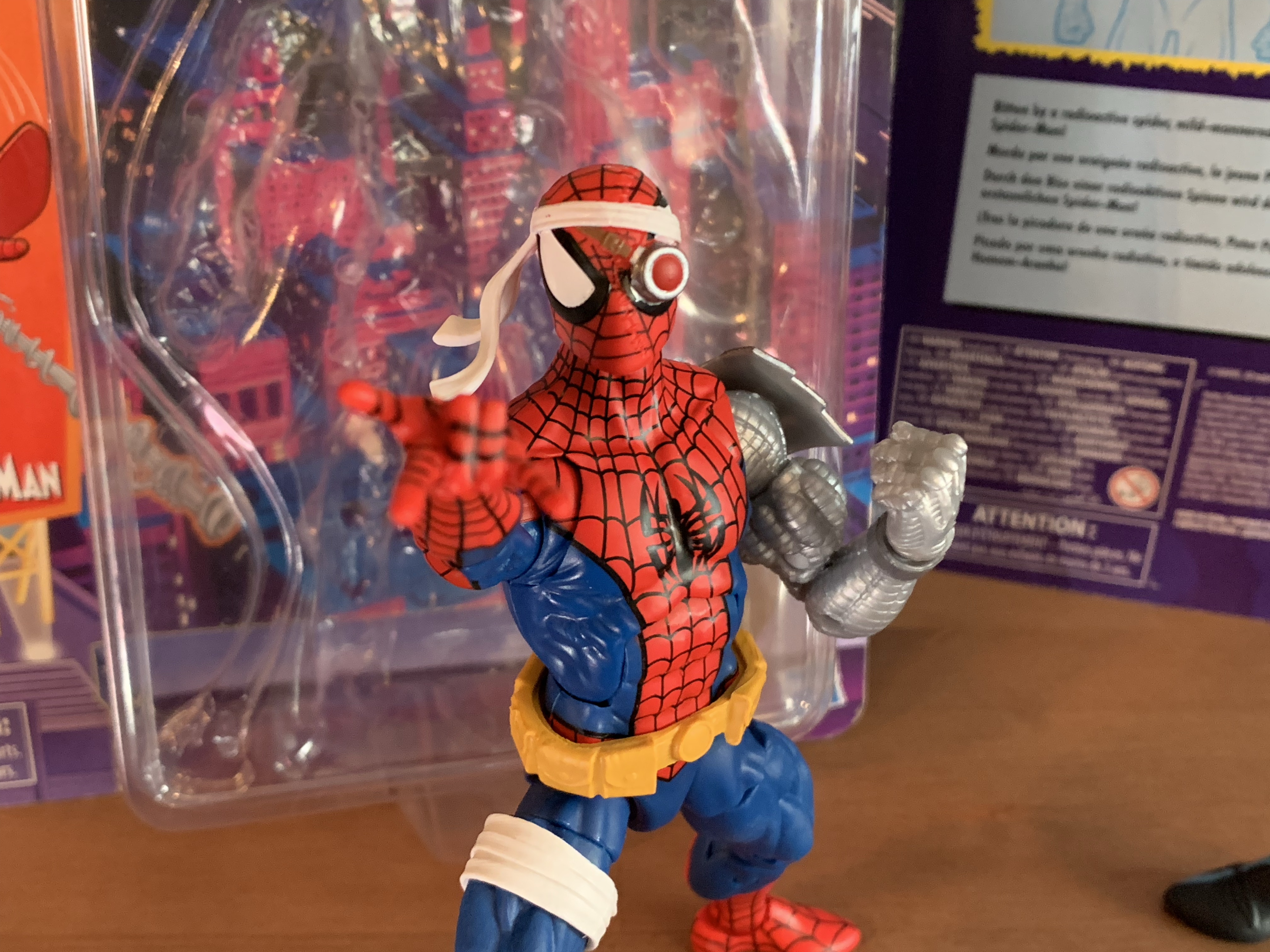
Cyborg Spider-Man stands a tick over the 6 inch mark. He comes packaged on a retro card and is a nice throwback to the Toy Biz figure of the same design. I actually never had that one, I really didn’t get many Spider-Man variants, but I can recall thinking it looked fine. I just prioritized getting villains over yet another Spider-Man. He was also a late entry in the line, if I’m not mistaken, and it’s possible I was already shifting priorities. The design hasn’t changed though. This is basically Spider-Man, but with a robot arm. He does have a belt and some accessories on the head, but it’s the big, cybernetic, left arm that stands out the most. Since I’m not a regular buyer of this line, I couldn’t tell you where all of these parts are from. The main body is the same one we saw with Web-Man which I think originated with a Spider-Man 2099 figure. The arm could be from someone like Cable or Deathlok, or it could be all new. Since it’s an older release, it’s not a pinless body so we get the ugly red dot on the inner right arm resulting from the red peg that goes through it. The blue pegs around the knees don’t cause the same sort of eyesore. It’s a very muscular sculpt and one that feels appropriate for this specific version of Spider-Man. I like how the cybernetic arm turned out and it looks as it should. The head has these giant eye lenses which are also fun and very McFarlane-esque. The belt is glued in place, but the white wraps on his right thigh are a floating part which could be removed if desired. It’s a little annoying that it doesn’t stay in place and it’s a reminder why newer figures like Morph and Cyclops have them keyed in. The only details I don’t like about the sculpt are the tiny shoulders, which is a consistent criticism I have for Marvel Legends. They just look silly and sit too low.

I wish they had painted the stitching on the mask.

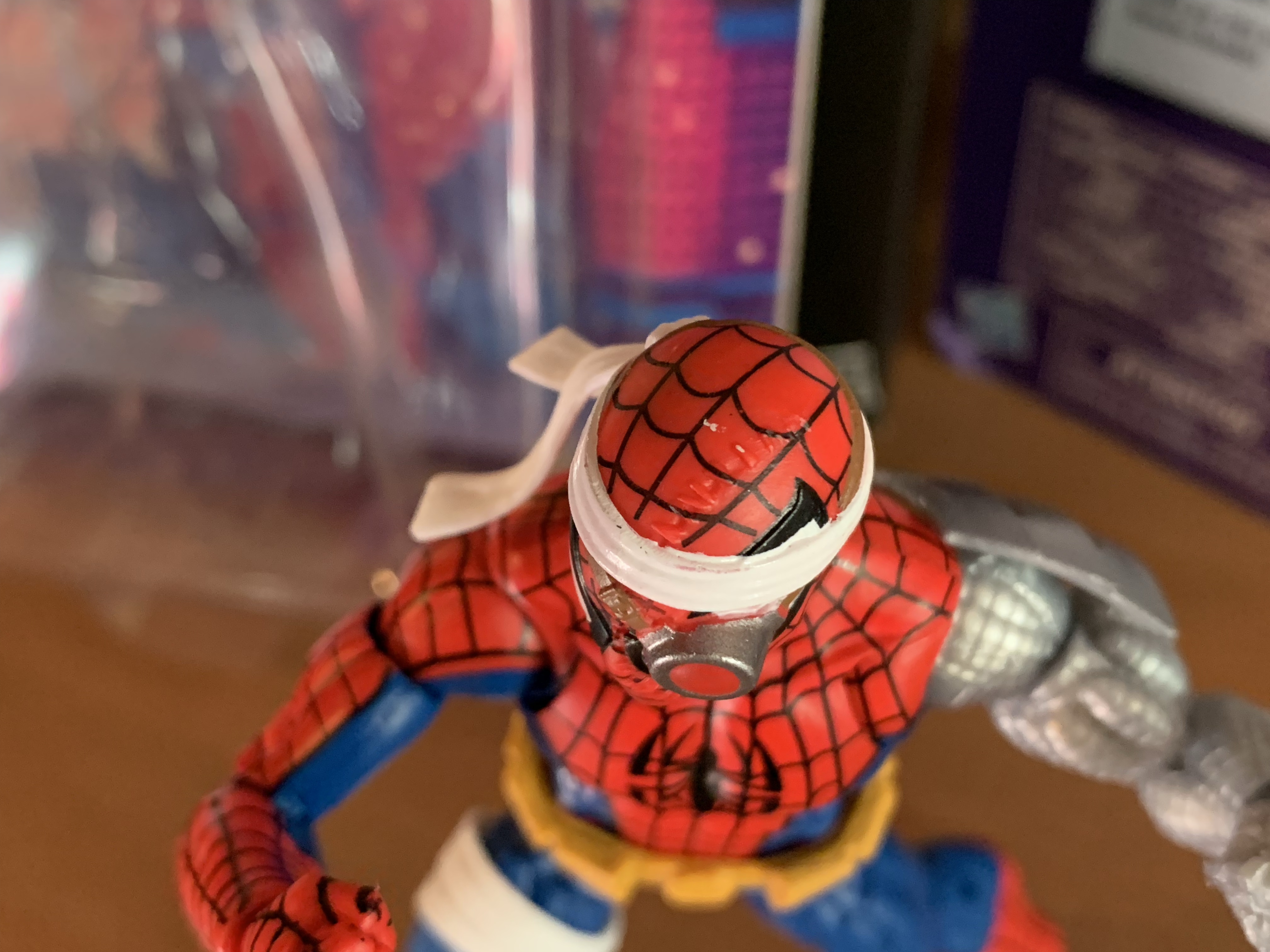
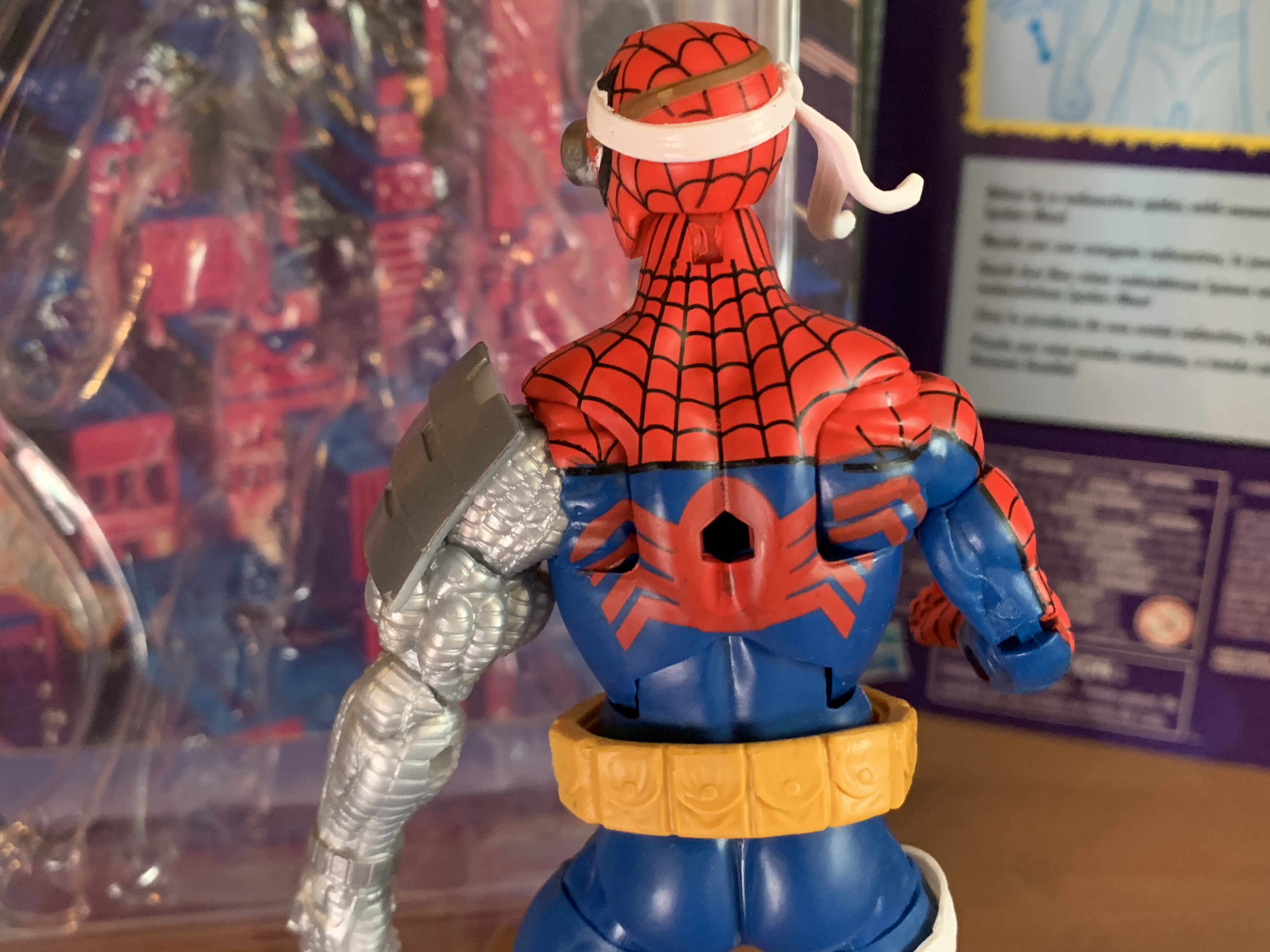
As far as paint goes, we have our usual Marvel Legends mixed bag. The figure is a mix of blue and red plastic with a light gray used for the robot arm. The weblines are done well enough and I like the black outline on the red portions of the costume, something the animated Spidey didn’t roll with. The painted and colored reds look close enough and the painted portions of the head are fine. What I don’t like is how the spider logo on the rear turned out. It really needs a black outline or something to help it pop and it looks almost washed out. It also has a big hole which I guess is for an old flight stand. There’s also a severe lack of paint in most places. On the head, there’s stitches holding a portion of the mask together which were left unpainted. It’s a shame, because they’re sculpted well enough, but are barely noticeable due to the lack of paint. There’s also no paint on either the belt or the left arm save for the plate on the shoulder and bracelet area. The belt just looks boring and cheap as a result while the arm has too much of a plastic look. There’s no attempt to make it look like it’s made of metal and, again, it’s a shame because the sculpt is there. It just needs a little dry-brushing to bring it out. In a perfect world it would be painted-up like NECA’s Fugitoid, but I know Hasbro isn’t going to sink that kind of money into this line. At least this one is $23 instead of $28 or $35 so it’s easier to overlook these shortcomings, but still unfortunate to see Hasbro not do right by their sculptors and designers.

This spider on the back could have been handled better.

The articulation for this Spider-Man is not really it’s strong suit. I suppose we shouldn’t expect a cyborg version of the character to move as well as a traditional one, but I thought it would be a little better than this. The head is on the usual ball hinge which provides good enough range up and down, but not much nuance posing. The shoulders are ball-hinged and pretty limited out to the side. The left arm is hindered by the big plate on the shoulder, but even the right arm can’t quite hit a horizontal pose. There is a butterfly joint which provides more range going back than forward. It’s okay, but a bit ugly because the paint isn’t continued as far as the joint goes so you end up with gaps in the weblines on the front and the spider legs on the rear. The elbows are double-jointed on both arms and both can bend past 90 degrees. The cybernetic arm can even go further than the right arm as more plastic was cut away to make it work. The wrists rotate and hinge horizontally while the abdomen features a ratcheted ab crunch. It only allows one click back and one click forward so the range isn’t impressive. The waist twist is a waist twist and it is at least hidden by the belt because otherwise it would look pretty hideous. The legs can just about hit a split with a little effort, why newer figures can’t is a real mystery, while the legs kick forward to about horizontal with no range going back. We get the usual thigh cut and the double-jointed knees work just fine. There’s a boot swivel and the ankles hinge forward and back pretty far and feature a steep, but usable, ankle rocker. It’s nothing particularly impressive, but I don’t know what kind of posing most want to do with this guy. I tend to think he should be posed more like a brawler than the nimble Spider-Man of norm, but that could be just me. By Legends standards, it’s basically average.

Your webline is looking a bit limp there, Spider-Man.

And that’s kind of it for selling points with this guy because the accessories are not impressive. Cyborg Spider-Man comes with fist hands in the box and he has one thwip right hand he can switch to. He also has that all important webline I wanted which is just a piece of malleable, off-white, plastic with a little curl at one end and a triangular shape at the other. It’s kind of odd that they don’t have a clip on the end designed for the hand/wrist area. And since he can’t grip it with any hand it makes it hard to do much with. I found I can kind of get the triangle to work with the thwip hand, but it’s rather precarious and frustrating. It’s a bit amusing that I basically bought this figure for this piece and I’m not finding it very useful. If it was just a bendy wire that could wrap around him that would be better than this. That’s it though. One extra hand and one mediocre web effect.

All right, you can stay.

Given the articulation woes and the lack of accessories, this figure is basically one to judge based on the overall aesthetic. And if you like this interpretation of Spider-Man, then you’ll probably be fine with this one. I do like the look, and while I wish it was painted better, I think it looks okay on a shelf. The fact that it’s at the older price point definitely helps because if it was up any higher I’d have not bought it. And if you are into customizing your action figures, this one probably won’t take much effort to really bring out some of the details. There are elements of the figure that are a bit dated, but the sculpt helps make it worthwhile. In short, I’m content to have this figure I never planned on getting.

Like Spider-Man? Check out these entries:

Marvel Legends X-Men Animated Series Cyclops

I wasn’t sure he would make it in time, but Hasbro managed to ship Cyclops before the end of the year. Cyclops marks the final figure (for now) in Hasbro’s X-Men animated series subline of Marvel Legends. It has been…a ride. What was once a dream line of mine to see brought to fruition, turned…

Keep reading

Marvel Legends Web-Man

No, this is not bootleg Spider-Man, this is Web-Man! Who is Web-Man? I actually had no idea until I just looked it up. It would seem Web-Man is a copy of Spider-Man created by Dr. Doom. Not only are his colors inverted from the real thing, but so is most everything else. And since Spidey…

Keep reading

Marvel Legends Spider-Man (Animated)

Not quite amazing Spider-Man.

It was in 2021 that Hasbro released a PulseCon exclusive Venom figure on a Spider-Man retro card. The retro card series is meant to stir-up nostalgia for all of the adults who were buying toys and watching cartoons in the 90s as the retro card is a facsimile of the old cards Toy Biz used to utilize. The cards were for the Spider-Man tie-in series of toys that went along with the cartoon series of the same name. Airing on Fox Kids, Spider-Man was a natural follow-up to X-Men as it featured arguably Marvel’s most popular and recognizable hero in a starring role. The X-Men animated series did wonders to help boost the profile of Marvel’s mutants, and the Spider-Man cartoon essentially did the same. The retro card series that Hasbro launched just a few years ago often had some overlap with that cartoon, but they weren’t necessarily cartoon-specific sculpts. The exclusive Venom was different in that it contained two, new, headsculpts clearly modeled after Venom from the show. Plus, it featured his unusual shading from the show of light blue on one side and red on the other.

Go web!

2022 saw Hasbro double-down on the retro releases as it launched the X-Men Animated Series subline of Marvel Legends. While we can certainly debate how hard the company actually went in to trying to recreate the characters as they appeared in the show, the line did try to showcase those characters with some animation specific shading and (in some cases) sculpts. The line must have been successful because Hasbro is doing the same in 2023 only with Spider-Man as the featured series. Why now? I don’t know. The X-Men line coincided with the show’s 30th anniversary and it would have made sense to do the same for Spider-Man in 2024, but Hasbro is apparently far too eager to wait another year. The show is getting the same treatment in that it’s likely to be reused sculpts with some shading added and it’s all packaged in a box designed to mimic a VHS release. The first set, as they’re apparently going with two-packs for now, won’t be out for a few more months, but we essentially got a preview to close-out 2022 in the form of an exclusive Spider-Man sent to Walmart. This Spider-Man is sold on a retro card designed to resemble the old Web Racer Spider-Man toy from the 90s. The image is essentially the same, but since there wasn’t much in the way of preservation for those old cards it had to be redone and has been lovingly recreated by artist Harry Moore. This time, Spidey is fully posable and doesn’t have a string running through him. It’s a new sculpt, though not a unique sculpt, and most importantly it features a cel-shaded paint job to fit-in with the previously released Venom.

The sculpt is mostly fine, save for how pointed his face is (unless it’s just mine).

Let’s get it out of the way upfront: Walmart sucks. This guy went up for preorder in July, but before a single figure was shipped it started showing up in stores in early December or late November. It showed up in tiny quantities though, apparently just 2 per store, and it was a bastard of a release to track down as a result. It also never showed up in Walmart’s app or website as in-stock, so it was a total shot in the dark to go looking for one during the busy, holiday, rush. As for those preorders, that’s how I got mine, but several are still waiting and with the listing being dropped from Walmart’s website it sure looks like a lot of folks are heading for a cancellation. It’s great that they made sure to send product to stores first, rather than take care of the orders they already took-in months ago. And if you are lucky and like me and manage to get one shipped from Walmart, expect it to come packed in a foil envelope likely beat to hell once it arrives. The cardback on mine is dinged-up pretty well, plus the plastic bubble was cracked and broken. I’m not a mint-on-card collector, but I know a lot of people are with these retro cards and plenty more like to double-dip to keep one carded and one opened. To those folks, best of luck. You’re going to need it.

The rear spider looks nice and clean.

Once opened Spidey stands at a tick over 6″. This sculpt is apparently the same as the first appearance Spider-Man also released in 2022 in the new style of packaging. It’s a pinless body and it’s notable because it’s a smaller Spider-Man. He’s well-defined, but not as bulky as the other new Spider-Man body from this year released in the Renew Your Vows two-pack. This is probably Hasbro’s best Spider-Man body to date. I’m certainly not an expert as I only dabble in Marvel Legends, but it’s much better than the Web-Man and Symbiote figures I do have. It still has its problems, which we’ll go over, but just overall has a nice shape. The smallish Legends shoulders aren’t laughably small here and most of all I just like this shade of blue that’s in use. It’s a light blue, shaded with a darker blue, and it just captures the look of the character from the era. I get more of an 80s vibe if anything from the color combo, but it’s fine as an animated version too, though I’d argue his blue was actually darker in the show. The only thing about the sculpt I don’t like is the head. It’s a little big, plus it feels pinched in the front. I don’t know why it’s not more round as it doesn’t even look like a human face could make this shape. It’s a shame, because the eye shape is nice and it’s pretty well-painted. Many have complained that web lines on their figure are off-center. Mine is, but it’s small. You can see it by looking at the hexagonal shape in the middle as one side touches the tip of the eye lens while the other does not.

The range isn’t perfect, but it’s good enough to get some Spidey poses out of it.

The overall paint job strikes me as pretty much par for the course with Hasbro. There’s a lot of colored plastic in use which leads to issues of color-matching. The red on the chest is noticeably darker than the red on the arms and feet. That’s because one is painted, and one is red plastic. The edges are also not crisp and clean as my figure has a blemish on its right pectoral which is a rather lousy place for such an imperfection to exist. There are little instances of that throughout the figure, though not in a large number at least. The web lines mostly look good though with a defined curve to them rather than a boxy look which tends to happen. Both spider logos are nice and clean, and the pinless body is a welcomed addition as there’s no unsightly red dot on the inner arm any longer. There is one eyesore on the back of the figure where Hasbro didn’t continue the red paint of his belt area far enough so when he crunches forward you end up with a section of blue instead. Normally, not a big deal, but Spider-Man is a character who is known for deep crunches so here it’s not acceptable. The cel-shading is what it is. For Hasbro, this is one of their better applications of it. There’s some linework on the torso in black to highlight the musculature and the shading goes under the pecs. The rest of the shading is reserved for the inner arms, as they apparently wanted to avoid shading red areas as much as possible, and inner right thigh and outer left. There’s also a hit on both boots and the inner arm shading continues onto the gloves a tiny bit. Does it make a ton of sense? No, they’re clearly going in a haphazard manner. I think it looks fine on the torso while the inner arms are kind of “meh.” The thighs and boots don’t bother me. It is what it is and you know if you like it or not at this point. And if you want to remove it, good luck. It’s paint on top of paint where the arms are concerned so it won’t be easy to just wipe away. And where it goes over the web-lines you’re basically screwed. You would be better off just repainting the whole thing. At least for Hasbro, this one is probably better than all of the X-Men releases with only Sinister perhaps being better. Venom was pretty good too for what he is so maybe these Spider-Man releases will just plain be better than what we saw with the X-Men?

“Take that!”

Articulation for a Spider-Man figure is rather important, and I was a little let down by the other Spideys I have. This one is better. Is it perfect? Of course not, but it’s a step in the right direction. The head is still on a ball and hinge so it looks up and down rather well and can rotate, but lacks much in the way of nuance posing. The shoulders are ball-hinged and they raise out to the side just fine, though it does expose the red hinge underneath which is set against the blue of the armpit which is one eyesore not solved by pinless tech. The butterfly joint provides more range back than it does forward, but it’s not a tremendous eyesore so I consider that a win for a Hasbro butterfly joint (and if you want more range, there’s a popular mod for doing so that may apply to this figure as well, just search for it on YouTube). There’s a biceps swivel which does what it needs to do and double-jointed elbows. I cannot get the top hinge on either arm to budge though so I am presently only getting a 90 degree bend (after the review, I did resort to the hot water trick and got it going, though it’s still pretty tight). Hopefully this isn’t a widespread issue. The wrists rotate and hinge horizontally on all hands. In the torso, we have a diaphragm joint which allows for some forward and back, but is mostly good for rotation and tilt which it does rather well. There’s a lot of painted stuff here though, so do be careful. At the waist is the ab crunch which goes forward and back plenty far. Missing is a waist twist which makes me wonder if a ball-peg would have worked better in place of the ab crunch. At the hips, we have ball and socket joints which still can’t quite hit a split. This is Spider-Man, Hasbro! Why can’t he do splits? He can at least kick forward a reasonable amount, but not back. There’s a thigh cut there, double-jointed knees which work better than the elbows, a boot cut, and a hinge and ankle rocker combo at the ankle. All of that stuff works well with no gummy-ness to the joints. I know some would like a toe-hinge, but I don’t really care if it’s here or not. He can hit some good Spidey poses though with the only real disappointment being those hips and my stuck elbows.

“Now it’s our turn, Spider-dweeb!”

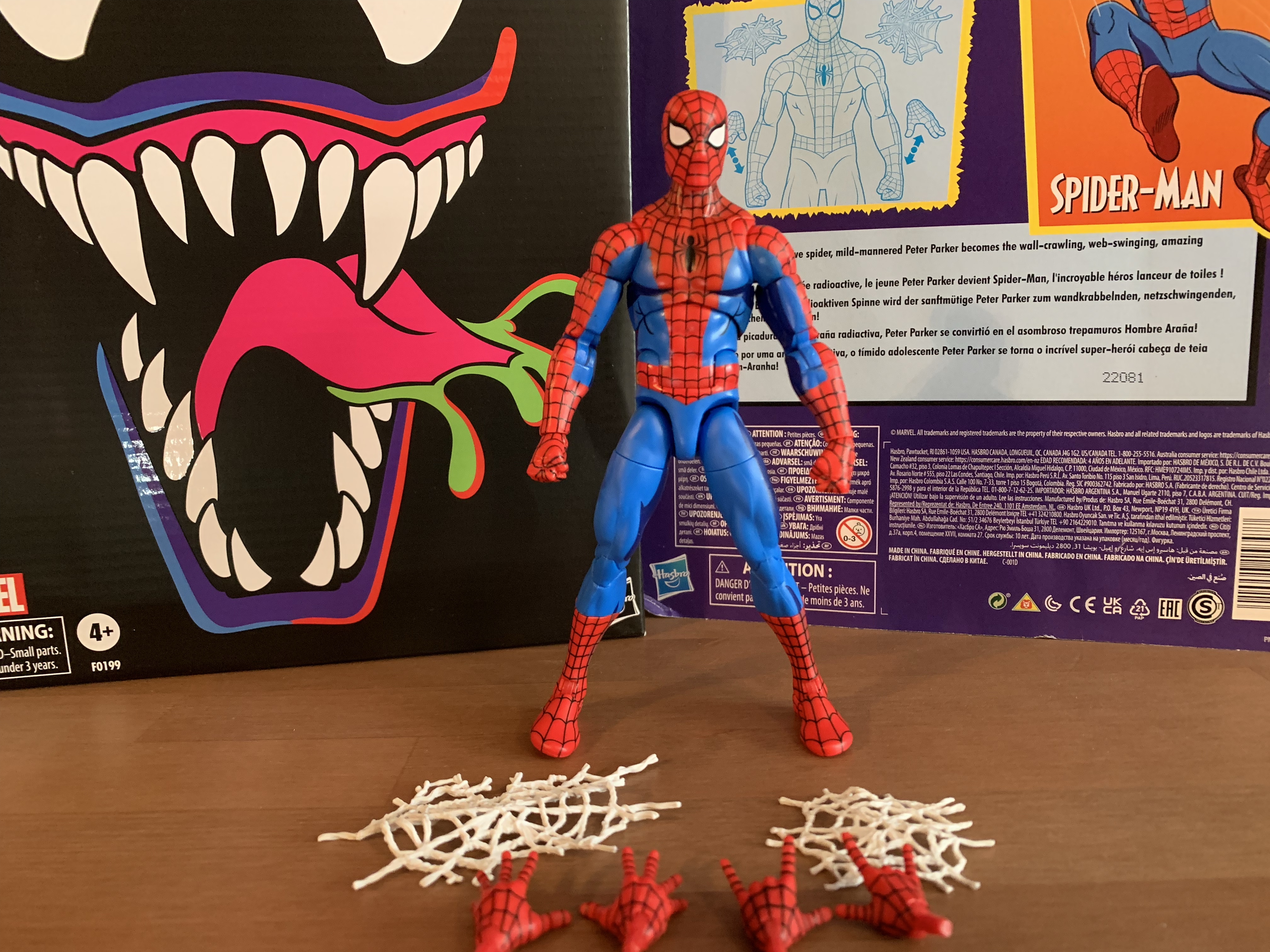
That’s where the good stuff ends as when it comes to accessories Hasbro loves to disappoint. Spider-Man comes with three sets of hands: fists, wall-crawling, and thwip hands. That’s basically the standard, Spidey, assortment, but some gripping hands would be nice. I suppose they’re not needed though since he doesn’t come with a web-line to grip. Instead, he has two web splat effects, one bigger than the other. They’re all white and made of a pliable plastic, but they don’t really do anything. I guess you can toss one onto a villain’s face? They’re more like window-dressing parts and what I would prefer to have is an actual webline or something from the show like his web backpack. These things are just useless.

Spider-Men! Assemble!

If you want to get your hands on this guy, I guess all you can do for now is monitor Walmart to see if the listing returns. Their exclusive Black Series Holiday Scout Trooper recently showed up at Big Bad Toy Store so maybe this Spider-Man will too? Otherwise, it’s the secondary market at this point where this thing will cost a lot more than the $27 Walmart was charging. As is the case with virtually all Marvel Legends these days, this one isn’t exactly worth it, but if you have that Venom or really loved watching this show as a kid then you may feel a strong pull towards this guy. And in that case, it’s a price that can be accepted. At 50 or 60 bucks? Ehh, I wouldn’t do it. With Hasbro launching a dedicated Spider-Man line in 2023 it seems highly unlikely that this will remain a Walmart exclusive forever. After all, how can you do a Spider-Man line that doesn’t feature Spider-Man in red and blue? Hasbro does some stupid things, like not finishing the 92 X-Men team, but I don’t think they’re dumb enough to let this figure remain a Walmart exclusive. My assumption is there will be a VHS re-release with different accessories. It’s possible it will be on a different mold, but I don’t think they’ll go through that trouble. It’s a good Spidey though, probably Hasbro’s best, so when that re-release does happen (or this mold gets a comic release in this shade of blue) I would suggest jumping on it unless you absolutely hate the cel-shading. And if that’s the case, there’s the Spider-Man and His Amazing Friends three-pack that has a Spidey from that show on this body with no cel-shading. It’s probably every bit as good as this one, perhaps better if you prefer your Spidey with a darker blue, but it costs $75 and comes with a decent Firestar and an absolute dumpster fire of an Iceman. That set would have been right in my nostalgia wheelhouse if they didn’t blow it so hard on Iceman, my favorite member of the X-Men when I was a kid. Hasbro just can’t make things easy for Spider-Man fans.

“So am I a member of the X-Men now? Because the Avengers keep coming after me and I don’t want to overcommit. Especially since I have class tomorrow.”

More from the world of Spider-Man and Marvel Legends:

Hasbro Retro Card Symbiote Spider-Man

One of the most iconic costumes in the world of superheroes is definitely that of Spider-Man. I put that classic red and blue with webbed detailing right up there with Superman and Batman. I would argue that there’s no more iconic costume in the world of Marvel than Spidey’s, and the crazy thing with Spider-Man…

Keep reading

Marvel Legends X-Men Animated Series Wolverine

The toyline of my dreams was announced last October. In celebration of the 30th anniversary of the television series X-Men, Hasbro is doing a dedicated line of Marvel Legends with figures based on the look of the show. The show was obviously inspired by the designs of Jim Lee, but there are differences in the…

Keep reading

Marvel Legends X-Men Animated Series Cyclops

The field commander of the X-Men has arrived.

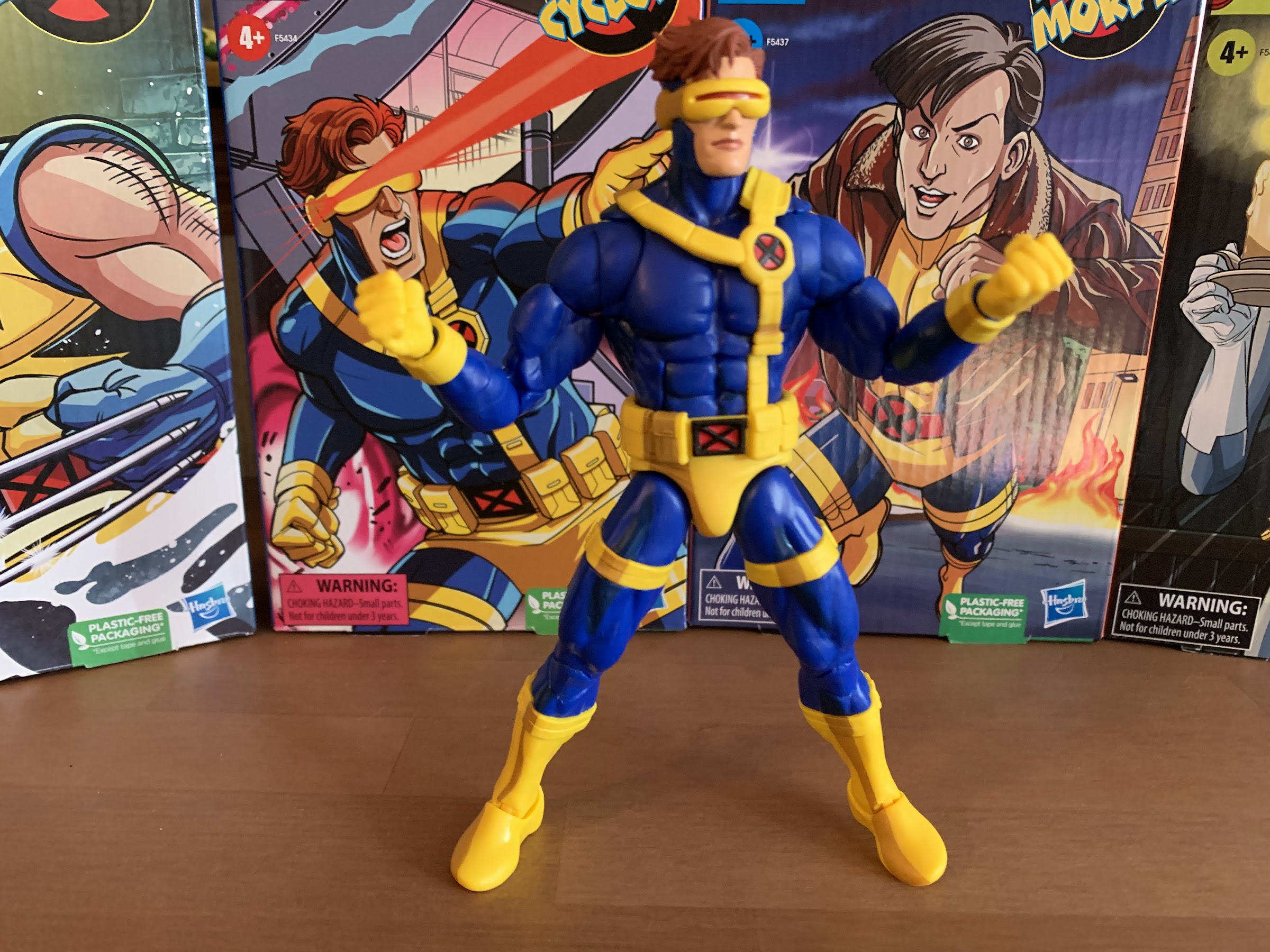
I wasn’t sure he would make it in time, but Hasbro managed to ship Cyclops before the end of the year. Cyclops marks the final figure (for now) in Hasbro’s X-Men animated series subline of Marvel Legends. It has been…a ride. What was once a dream line of mine to see brought to fruition, turned into something less. I won’t go so far as to get overly dramatic and juxtapose dream line with nightmare, but basically nearly every negative thought I had going into it came true. I don’t have a high opinion of Hasbro to begin with, but they are a giant toy maker that is pretty good at getting out a decent product at a good price. It’s just in 2022, most of those things have stopped being true. There’s been a reduction in quality, content, and it’s been paired with a rising price. Initially, I tried to be positive about a line based on the show X-Men. We had those Into the Spider-Verse figures to use as examples of what Hasbro is capable of when it decides to base their design’s on a particular source material, but the company chose not to do that with this line. Instead, we got previously released comic book figures with a dash of cel-shading and little in the way of new tooling or accessories. The line is best qualified as lazy, and I hate to use that word because I know there are people who work at Hasbro who are anything but lazy. The direction of the line has sucked. It’s been inconsistent, underwhelming, and yet, I’m still sad to see it end. To a degree. I want the company to just finish the main cast so I can take a step back and assess what we have, but that’s been put on pause with no guarantee of anything past this figure.

For some reason, Hasbro (and Toy Biz before them) have had trouble with this costume, but I think they finally got it right.

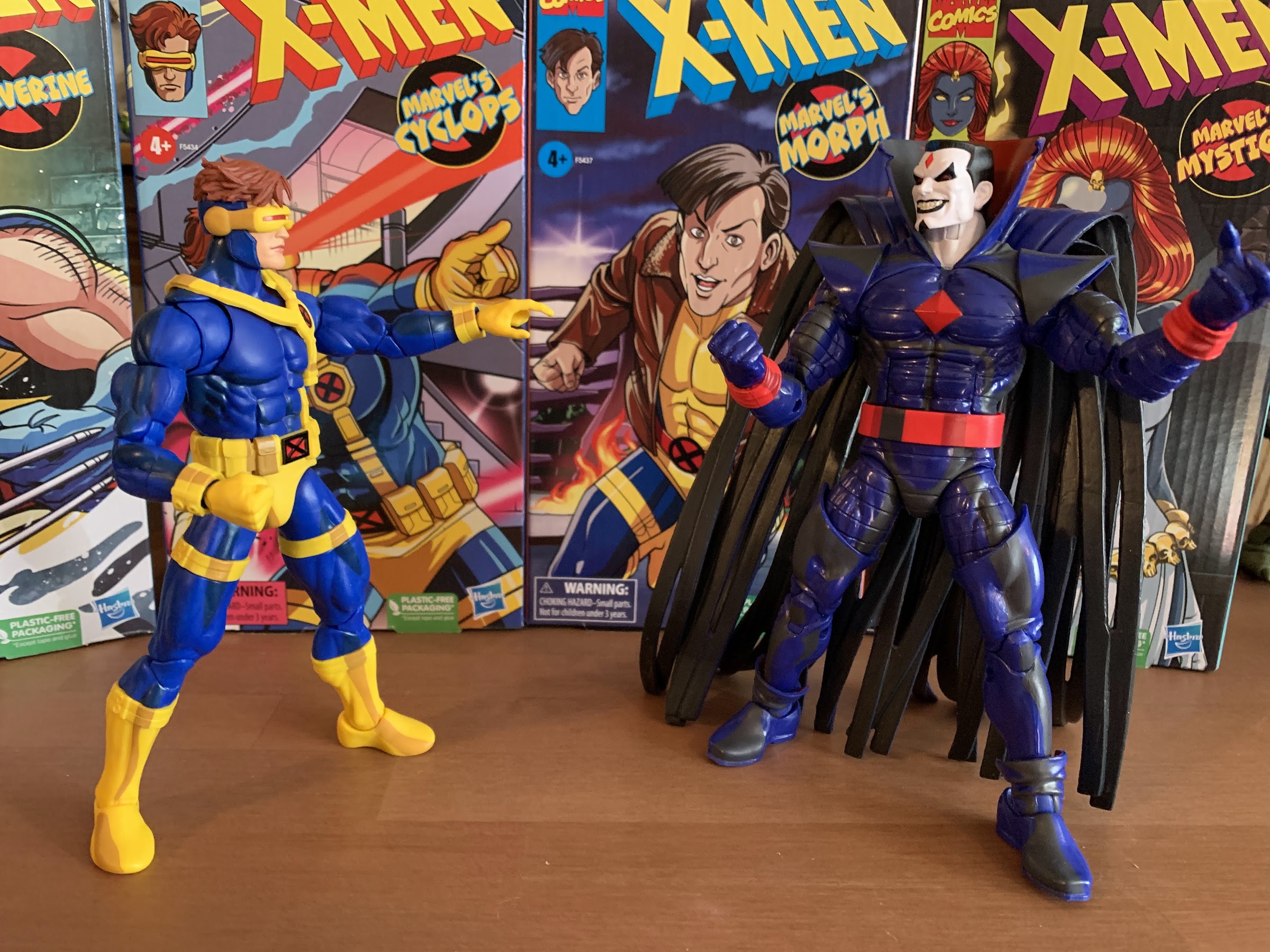
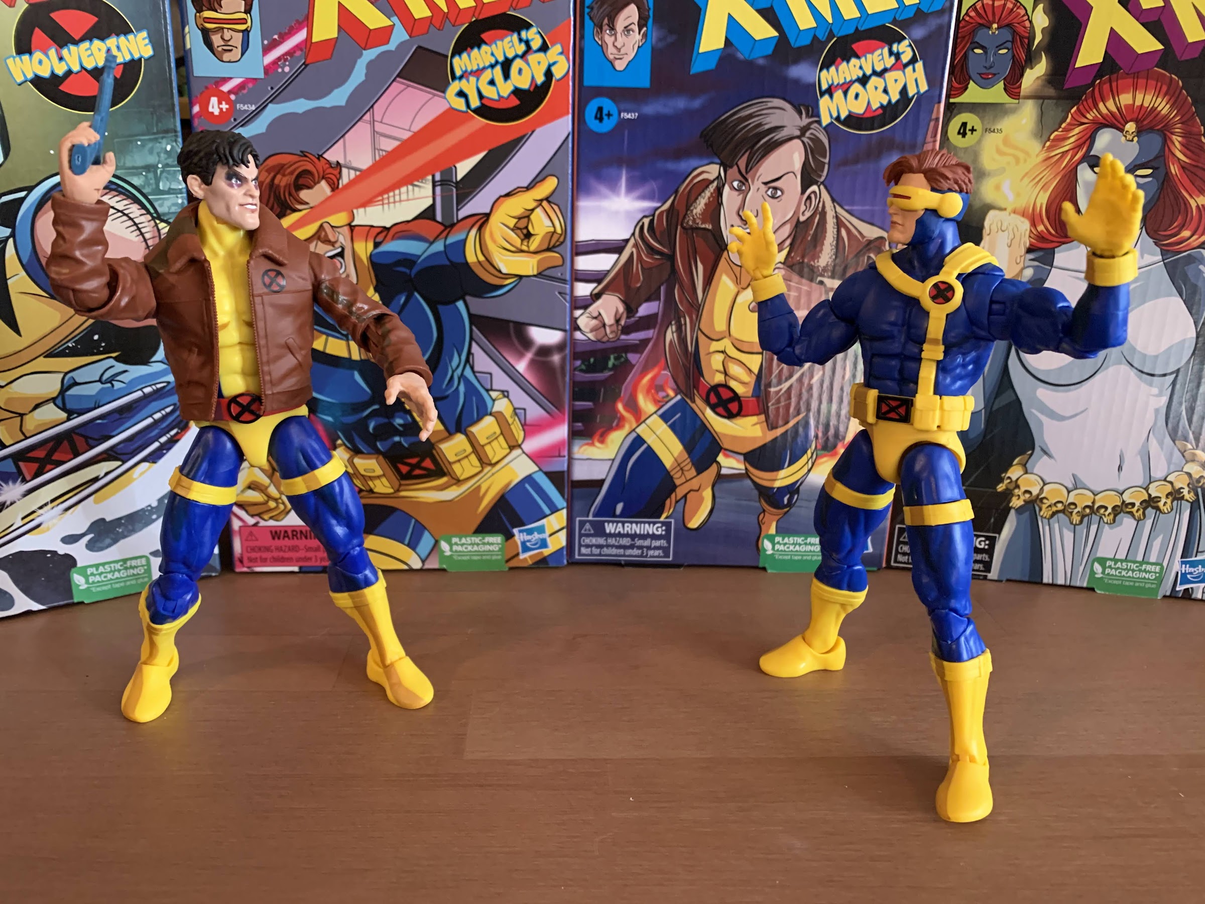
Given all of that, there’s at least a chance that Hasbro saved the best for last. Prior releases of Jean, Storm, Jubilee, Mr. Sinister, and Mystique have basically been of the straight repaint variety with varying results. Mystique and Storm got new hair parts, while Wolverine got a new head and hands. Morph has been the only new figure, though in Marvel Legends fashion, his body is mostly reused from past figures. He did get to debut new legs which were re-tooled to allow for his thigh and boot straps to be keyed in and it’s a part that’s going to be reused quite a bit in the figures to follow. Like this one! Cyclops, like Morph, is a mix of old and new. His costume is based on the show, which was based on the costume Jim Lee designed for the character during his run. It’s been a bit of a challenge to get this costume to look nice in plastic because of the unusual belt. Cyclops has a belt that goes up and over both shoulders, but only attaches to the waist at one spot on the rear and front. It’s sort of like a pair of suspenders, except one side of the belt has been clipped to the other side instead of the waist. It’s pretty goofy, but it’s been around over 30 years now so it seems pretty ordinary as a result. It just stinks for a toy-maker like Hasbro which wants to reuse the main body of its figures and add belts onto it, but past attempts have made the end result look ugly and chunky. Not to mention it can make any articulation in the torso seem pointless.

The chest strap is now keyed into the sculpt so it doesn’t hinder articulation and it’s not as cumbersome.

That’s why, like Morph, Hasbro decided to re-tool some parts to better accommodate the belt. The torso for Cyclops, which I think is the same as Vulcan, has been modified slightly so that the belt can now key-in like the straps on the thighs and boots. This means the belt no longer has to be one continuous piece, it’s actually “broken” at the ab crunch, but when the figure bends it creates the illusion that the belt is sliding around, but really it doesn’t move. The bottom piece of the belt just gets hidden by the ab crunch with no gap visible between the top and bottom piece. Is it totally seamless? No, but it’s an action figure and it needs to articulate and short of just making the belt part of the sculpt, this is probably the best solution. And by keying it in, it sits closer to flush with the rest of the costume. It’s not as chunky and awkward looking, and it’s easy to see why Legends collectors more interested in the comic line are excited for this release because you know Cyclops is likely to get re-released there. Possibly on a retro card or something.

Stay away from my friends, Sinister!

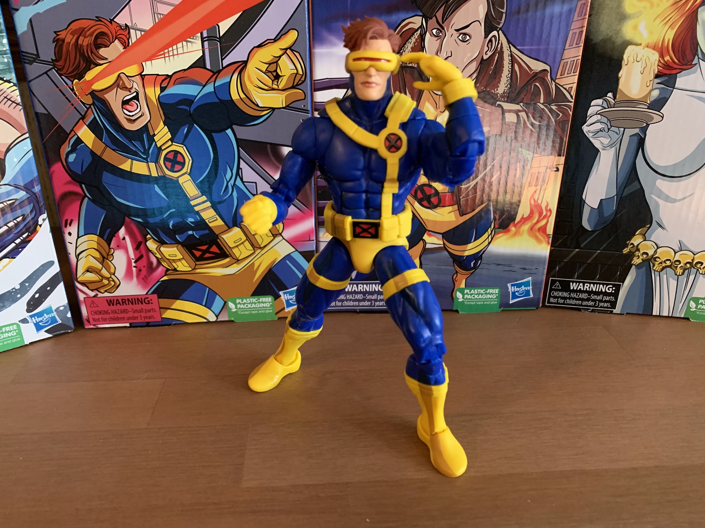
Hasbro did some actual tooling and it’s for the better. Sadly, that’s a pretty major development for this line as standards are pretty low at this point. And it’s not all, as Cyclops has a new head and his gloves might be new as well since they’re a little different from other figures released on this buck thus far. And just taking him at face value, he looks fine. Maybe even good. The head seems a little too big for the body as superheroes (especially from this era and the show) tend to have smaller than normal heads. The shoulders still sit too low and the chest could use more mass. Cyclops is a big dude, and this figure doesn’t really capture that perfectly, but it does so better than before. There’s also an eyesore on this guy on the forearms. Vulcan has long gloves that go up his forearms and Hasbro decided to sculpt in a groove where that glove ends and the paint stops. Cyclops has short gloves and apparently Hasbro blew the budget for tooling on the torso modifications because they didn’t do the same for the forearms. It feels especially cheap because surely there are other figures who would benefit from forearms without that line? It’s so frustrating how Hasbro will go halfway to deliver an accurate product, but stop short of something so simple.

Yup, he’s cel-shaded. Get over it.

The major talking point of this line has and likely always will be the cel-shading. Again, I reiterate that I like cel-shading when it makes sense. I think figures seeking to emulate a specific look benefit from the effect, but only if it’s done well. This line has been an example of how not to do it well. It’s been applied in a cheap and lazy fashion. Cyclops really isn’t any different, but by virtue of much of the figure being cast in a dark blue, it’s not as bad. The darker blue used to shade the main body, arms, and legs looks good. A better figure still would have used three colors for the shading, but here it’s acceptable. The yellow parts still look terrible. They’ve been using this gold, mustard, color for the yellow which matches no source material I’ve ever seen, comic or show, but expecting them to change at this point would be equally stupid. It’s also applied the same as it was on Morph for the boots which includes this goofy, wavy, line on the right foot that makes no sense. The belt on his torso has almost no shading, so it really stands out as just being bare plastic, but the trunks and waist have a little. It’s still not good, but it’s not the worst we’ve seen in the line (that honor rests with Jubilee), but it is as expected so at least they’re consistent?

“You left me to die!” “No, I didn’t.”

If this line has a strength (aside from the very well done box art by Dan Veesenmeyer) it rests in the articulation as it’s been pretty solid. I think at this point that’s the main strength for Marvel Legends given the changes brought this year. Cyclops still uses the ball-hinge head which works fine and his design doesn’t introduce any elements that would hinder the range up there so that is good. The shoulders are hinged and come out to horizontal just fine, rotate, and we get a biceps swivel that does what it does. There’s a butterfly joint in each shoulder that works well enough, though the left one will be hindered a bit by the chest strap. The elbows are pinless and double-jointed and he can bend his arm past 90 degrees. Even though we have that “cut” on the forearm, there’s no articulation there. It only exists to be ugly. The wrists swivel and hinge in typical fashion. In the torso, there’s an ab crunch that’s rather stubborn on my figure, though that seems to be unique to mine. It works, but bending him back makes him look pregnant or like he has a beer belly. The waist rotates as one would expect. At the hips, we have ball and socket joints and he can spread his legs enough, not a full split, but enough for Cyclops. He kicks forward just fine, not really back, and we have the usual thigh cut. A lot of people remain unhappy with the placement of these straps and how high they are, but I couldn’t possibly care less about that. The knees are double-jointed and bend past 90 and we get a boot cut below the straps. It’s ugly, but you don’t have to use it if you don’t want to. The ankles hinge forward and back enough plus they have a rocker. I’ve seen more than one person have issues with the ankle rocker snapping. It does feel a tad gummy, and even though these are the same feet as what we saw with Morph, the ones on Cyclops feel different. Just be careful. This guy is going to do what he needs. It’s disappointing that the ab crunch results in such an ugly look for the figure considering this is a mold Hasbro intends to reuse over and over, but it is what it is.

If you know, you know.

What is not a strong suit for this line has been the accessory count and Cyclops is no different. He doesn’t even get a second head. The only other items in the box are a set of open hands and a two-finger pointing right hand designed to be used with his visor or his X communicator. There’s no effect parts or anything like that which feels pretty damn cheap.They’ve done Cyclops effects in the past, but I guess they wouldn’t work here. For 28 bucks, he really should have a second head that includes a blast. The fact that the Mr. Sinister figure in this wave was a straight re-paint with no accessories should have created enough savings for the entire line to get a decent spread. The open hands are also reused from Morph (and likely from other figures) and, like the gripping hands we saw shoehorned into the Wolverine set, are sculpted to be bare hands so he has sculpted fingernails and it looks rather silly. Again, Hasbro couldn’t see a benefit with multiple figures of creating a gloved, open, hand? We’re moving well beyond “cheap” with some of these shortcuts.

“Next time, I use these!”

Did Hasbro save the best for last? I wouldn’t go that far. I still think, given that this is a line of figures supposed to be based on the animated series, that Wolverine remains the best. He got two new heads which both look like they came from the show plus a fun little toss-in accessory in the form of the picture frame. Cyclops is sort of in a tie with Sinister and Morph. I can see arguments for all 3. Sinister is the most on-model, but also the biggest rip-off in many ways in the line given how little Hasbro had to put into it. Morph gets bonus points for just being Morph, but there was really no imagination put into that figure and the default portrait really looks nothing like the character from the show. As has been the case with most of these, Cyclops is a figure of half-measures. Hasbro did some good, but also did some bad, and the bad is mostly in what they chose not to do. His proportions are still iffy, but that seems to be a problem with Legends in general while the forearm thing is just annoying and it makes it look like Hasbro has zero pride in their product. Cyclops, like basically every release in this line, is a terrible value and I can pull up several other figures from different companies in a similar price-point that actually justify their cost. Nothing from Hasbro of late in the Marvel Legends line does that, but we keep buying it so it’s not likely to change.

This is it for the animated line for now. Despite my issues with it, I would still like for Hasbro to at least finish off the team and hit on a couple of the most important villains.

Given all of that, I actually find myself really drawn to this Cyclops. I’ve always loved this look for him and that combo of a rich, royal, blue with yellow just does it form. There’s a ton of nostalgia at play here which has made this figure hard to put down. Certainly if you’ve been collecting this line you’re not going to stop before you get to Cyclops unless you’re just so dissatisfied that you’re bailing all-together and selling everything off. For what this line has been, he’s good, but overall he’s more fine than good. It’s hard to get enthusiastic about any of these. If you would like to add Cyclops to your shelf he’s available on Pulse and should be available at some point on ShopDisney. He’ll set you back 28 bucks plus shipping, but once he’s gone it’s unclear if he (or any of the figures in this line) will receive another production run. Some have already started to sell out so you may not want to sleep on it. At the same time, this is the last release in the line for now with no, true, assurances that it will continue. Hasbro called it a “pause” so that it could focus on doing figures from the Spider-Man 90s cartoon, but it’s not like they’re obligated to continue it. My guess is that it’s still under consideration, but if the figures sell out then it’s more likely they return to it. This clearly hasn’t been an expensive line to produce, so any hurdle it has to clear performance wise may not be very big. I think they just wanted to space out some of the retro card releases like Rogue, Gambit, and the new Beast a bit more before tackling them for this line. We’ll probably know the fate of this one come this time next year (likely a little earlier as I imagine PulseCon is where we’ll find out), but as always, buyer beware if you feel you need the team to be complete to feel satisfied. I am, for better or worse, all-in with this line so if more come you can be sure I’ll cover them. And if you just want more animated X-Men figures to talk about, I did order the Mondo Magneto so the discussion isn’t over with 2022.

More from the world of X-Men: The Animated Series:

Marvel Legends X-Men Animated Series Wolverine

The toyline of my dreams was announced last October. In celebration of the 30th anniversary of the television series X-Men, Hasbro is doing a dedicated line of Marvel Legends with figures based on the look of the show. The show was obviously inspired by the designs of Jim Lee, but there are differences in the…

Keep reading

Marvel Legends X-Men Animated Series Mr. Sinister

This week, the long wait for an in-person San Diego Comic Con comes to an end. For the first time since 2019, attendees, creators, and the like will be invited back into the city of San Diego for a celebration of all things comics, movies, and general “nerd” culture. One of the many panels this…

Keep reading

Marvel Legends X-Men Retro Card Series Apocalypse

It is Halloween and that means it’s time for costumes, candy, and spooky fun. It’s also Halloween 2022, a pretty important date if you grew up loving those mutants who ran around in colorful spandex fighting for a better tomorrow. That’s because 30 years ago on this very night, the animated series X-Men premiered on…

Keep reading

Transformers Generations Holiday Optimus Prime

Prime is here to…transform…your holiday!

We interrupt our regularly scheduled holiday posts with something very familiar to this blog: a toy review! Yes, we have ourselves another Christmas toy to talk about and it too comes from Hasbro. We already looked at a Star Wars toy at the end of November, and now we’re turning to what I suppose is Hasbro’s flagship franchise: Transformers. Like Star Wars, I don’t have a strong history with Transformers toys from my youth. I had one or two figures in the 80s and I couldn’t even tell you what their names were and I’m not even sure I could pick any of them out of a lineup of Generation 1 toys. When Generation 2 launched in the early 90s, I took a passing interest. I think I ended up with a mere four figures: Grimlock, Megatron, a fire truck, and Optimus Prime. Even though I wasn’t that into Transformers, that Optimus was a favorite toy of mine for at least a little while. I had to save up a lot of money to get it, 30 bucks in 1992 money, and I remember getting it on Halloween. I was pretty blown away by the diecast parts and the rubber tires on him and I quickly learned how to convert the figure with ease from robot to truck mode. The sound effects were neat, and once I had that Prime I basically had to get Megatron which I would for Christmas that year. I wasn’t that taken with that toy though as he was way bigger than Prime, had that camo deco that wasn’t show accurate, and just wasn’t a ton of fun to play with. Transformers was just filling a short gap for me between my obsession with Teenage Mutant Ninja Turtles and my blossoming love of X-Men. Despite my enjoyment of that Prime though, I let my sister sell it in a yard sale many years later. I think she got 50 cents for it.

I will never get used to Optimus Prime as this style of truck.

Even though Transformers has never really been my thing, I’ve still ended up with some toys here and there including the Masterpiece Prime and more recently the Super7 offering. Transformers as a franchise is something I have basically zero interest in. The show never worked for me, I don’t care about these characters, and the movies are terrible. Well, Bumblebee was okay, but it was basically just E.T. with robots. As a toy though, I think the bots to vehicles concept is wonderful – it’s two toys in one! In actual practice, I just tend to find them to be less fun. Most are either clearly better as a car or a robot and it’s rare you get two worthwhile toys out of it. I was also more of an action figure guy and the robots and their limited articulation sometimes frustrated me so it’s been easy to not get sucked in. I am a major sucker for Christmas though, so when Hasbro announced this holiday themed Optimus I was pretty interested and put in a preorder right away. As the weeks went by though, I started to have second thoughts. Is this something I really need? It’s not exactly priced in the usual impulse territory, and I wasn’t sure where I’d put it or how I’d display it. I was pretty close to just cancelling the preorder, and then I got the “processing soon” email from Pulse so I just let it ride. Was that a good choice? I guess it’s time to find out.

And this is why I prefer the classic style for Prime as you don’t get this ugly seam down the middle in truck form.

This Optimus Prime comes from the Generations subline. I don’t really know what that means, but I see other figures in this line at big box stores. It looks to me like the releases are focused on classic characters with a modern lens. I wasn’t sure what to expect as far as quality goes. My son has acquired a few Transformers figures here and there, including the movie Grimlock from last year, I want to say. That thing is pretty cool, though he doesn’t seem to place much value in it. My nephew had a Transformers phase (and it’s what lead me to get the Super7 figure) and he had more of the standard releases which is what I’m expecting of this figure. That’s to say it’s not a gigantic piece nor do I expect it to feature any diecast parts. Paint is minimal, as it probably should be for a figure with this many moving parts, and it’s not something I expected to be of the rugged nature and I would say my expectations are largely met.

For those who prefer the no trailer look.

The figure comes in a nice holiday themed box that makes me think of the Hess truck releases over the years. I don’t know if Hess was a regional thing, but the company was a gas station in the northeast when I was a kid that always put out a special truck, or vehicle, each year. I had a few growing up and the trucks are still released through Speedway each year even though Hess no longer exists. Optimus Prime is certainly decked out for Christmas as he features a white and red color scheme. The trailer of his truck looks like a big candy cane and the “glass” on the cab of the truck is tinted green to drive the point home. Optimus is not in his standard Freightliner truck form with the flat front, but his more Peterbilt style as seen in the films, though this truck is actually a licensed model from Volvo. I prefer the gen 1 look for Prime as I think it’s better for transforming. This style of truck has an actual front-end which is something that needs to split down the middle. When in robot mode, it forms the side of his legs and it’s a bit clunky, but I guess this is the Prime the kids today are more familiar with. In addition to the colors, there’s some snow decals on the trailer to give the appearance that Prime is trucking through a blizzard to deliver some holiday cheer. The Autobots logo also has a festive Santa hat applied to it and the overall effect is achieved – this is clearly a Christmas toy. I am left wishing that Hasbro sought out a partnership with Coca-Cola for this one though. Imagine if Optimus was transporting Santa packs of Coke? That would have been pretty damn cool, even for someone like me who rarely drinks Coke products. Maybe Coke is still pissed about that Pepsi Prime variant from way back?

The trailer opens into a repair station, but it’s completely devoid of color and looks terrible.

As a truck, it looks fine. I hate the seam in the middle of the front-end, but that’s the type of thing you just have to accept with Transformers. As a robot, the Christmas theme is a little less obvious, but still apparent. Prime stands around 7″ tall and basically looks like Optimus Prime. He has his standard blue head, but the rest of the body is pretty well dominated by the color red with some white and probably too much black. The underside of the truck is what forms the front of his legs so there’s more black than I would like for a Christmas toy. They should have just substituted that for a dark green. It’s basically not important in truck form, so it could have been any color, really. I get why they kept his head blue, but I would have gone with green like the Super7 ReAction figure of Christmas Prime. We do at least get a hit of green right in the center of the chest as the transparent green plastic is used there to house the Matrix of the Holiday Spirit. The only other thing I’m not crazy about, visually speaking, is how most of the tires of the truck are now positioned on the figure’s back rather than the legs. It gives Prime a very rugged appearance and it’s a little messy. As for the trailer, it opens up into a “battle station” like the G1 Prime. It’s basically just all white plastic inside and it’s incredibly dull to look at. It has an articulated fixture with some claw arms on it, I guess like a repair station for Prime, but it’s so lifeless looking that I’ll never display this thing open. It’s basically just a play feature for the kids.

He’s packing a candy cane flavored blaster!

When it comes to accessories, there’s not a lot to talk about. I suppose the trailer can be considered one, but we’ve covered that. It looks fine as a trailer, bad as anything else. Prime has his Matrix of the Holiday Spirit, which as far as I know, is just the usual Matrix of Leadership. Only now it has a red core with a green center. It’s fine and it’s something that’s basically expected to come with every Optimus Prime figure. It fits in his chest, or it can be removed, but the figure can’t actually hold it since both hands just have a hole through them. The only other accessory is Prime’s ion blaster which also has a red and white candy cane deco applied to it. In his hand, it looks okay. He doesn’t have trigger finger hands so it’s not the most convincing thing when the figure is brandishing it as a weapon. It has a hinge in the center so it can be folded and stored on the figure’s back. What’s far more notable about it though, is Hasbro left a slot for it on the underside of the trailer when Optimus is in truck form. When it’s placed there it, well, looks like a penis:

Hmmm…

Now that you’re done giggling, we can talk about the figure as an action figure. The set arrives in vehicle form and Optimus transforms in what Hasbro considers 37 steps. It sounds like a lot, but some of the steps are pretty basic and are simply “this little piece needs to move on a hinge 90 degrees – done!” As someone who doesn’t handle many modern Transformers, I found the directions mostly descriptive enough. There are no words, just images, likely so that Hasbro didn’t have to print this in multiple languages. The only part I found tricky was actually pretty early in the process, step 3, as it involves moving the rear cab panel down, but they didn’t engineer much in the way of anything to gain leverage with. And it being the first time, it’s hard to pinpoint where the piece separates. Plus, the hinge is on some transparent, green, plastic and that stuff is usually pretty damn fragile. It’s not really a good idea to do that type of piece on transparent plastic, and I’ve already seen people share images online of the part breaking, so definitely be careful with step 3. It can be freed up from the side, just don’t force it.

The gun looks less obscene when stored on the figure.

Once transformed, Optimus has what feels like the usual amount of articulation for a Transformer. The head rotates and can look down and up a little. The shoulders rotate and the arms can raise out to the side below the shoulder joint as there’s a hinge inside the shoulder housing. Past that is a swivel and an elbow hinge that achieves a 90 degree bend. The hands just rotate. At the waist is a twist and he can crunch forward a little bit at the same spot. The legs kick forward and back 90 degrees and he can even do splits, if you wish. The knees bend 90 degrees as well and that’s where the articulation stops. There’s nothing at the ankles which is what will limit the posing the most. The most exotic thing he can do is simulate a running pose or a walking one. He looks convincing enough in a “blasting” position too, but like most Optimus figures I encounter, can’t do a two-handed pose with his blaster. This one also has some extra bits and such to watch out for, mostly on the back of the calves related to the truck’s front end. The mirrors and smokestack could conceivably be a breaking point if this guy were to take a shelf dive or something and I definitely tried to avoid grabbing those parts when transforming the figure.

Of course, we have to work the Matrix into this guy somehow.

Which brings us to the last bit of info that’s probably worth having: the price. This guy retails for $56 via the Pulse website as well as other retailers. I have no idea if this guy is headed to any brick and mortar locations, so feel free to tack on a shipping charge as well. That’s a bit steep for a Transformer with no diecast, no rubber, and few accessories. I’m guessing the plastic box that is the trailer is contributing to the cost, as well as a smaller production run, but it definitely feels like there’s a Christmas surcharge here. I already mentioned I was contemplating cancelling this one before it shipped and it was mostly due to the price. If this were 35 bucks I would be far more likely to recommend it, but at more than 20 beyond that it’s a tough sell. I guess if you’re into Transformers you may want this in your collection, or perhaps being really into Transformers makes it easier to pass since you’re probably sitting on a mountain of Optimus Prime toys. As a result, this figure feels like it’s more for people like me: toy collectors who are into Christmas offshoots. And as a Christmas version of a popular character, it’s fine. I would have liked more accessories, maybe a blast effect for the gun or something other than the matrix that the figure can actually hold, but it does get the job done. This is clearly a Christmas toy on your shelf. It’s just the price that’s hard to get past. If you’re okay with spending $56 or more on this guy, then you’ll probably be content to roll him out each Christmas to decorate your house. If the thought of spending that much on a red, white, and green Optimus makes you recoil, then feel free to ignore it. And if you’re somewhere in the middle, maybe waiting it out will pay off in the form of a discount in the new year.

Want to read more about Transformers or maybe some Christmas toys? We’ve got you covered:

Super7 Transformers Ultimates! Optimus Prime

I think we’re over discussing the merits of non-transforming Transformers, right? It’s been done for a long time, but was really pushed to the forefront with the Hasbro RED series in 2020 and while there will always be a section of the fanbase that wants nothing to do with such a concept, it’s still an…

Keep reading
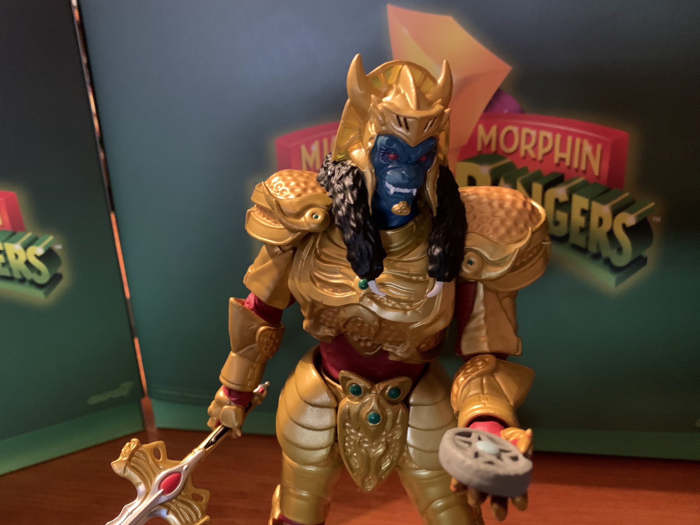
Figura Obscura – Krampus

Over the years, I’ve acquired quite a few action figures designed by the good people over at Four Horsemen LLC. They’ve been designing figures for companies for awhile now. My first exposure to the company was via NECA’s inaugural line of Teenage Mutant Ninja Turtles based on their appearance in the Mirage Studios comics. Lately,…

Keep reading

NECA Gremlins Santa Stripe and Gizmo

The Christmas Spot is just around the corner, but before we can get to there we have a new Christmas action figure release from NECA Toys to talk about: Santa Stripe! NECA has done an admirable job of mining material from the film Gremlins and it’s sequel Gremlins 2: The New Breed, and Santa Stripe…

Keep reading
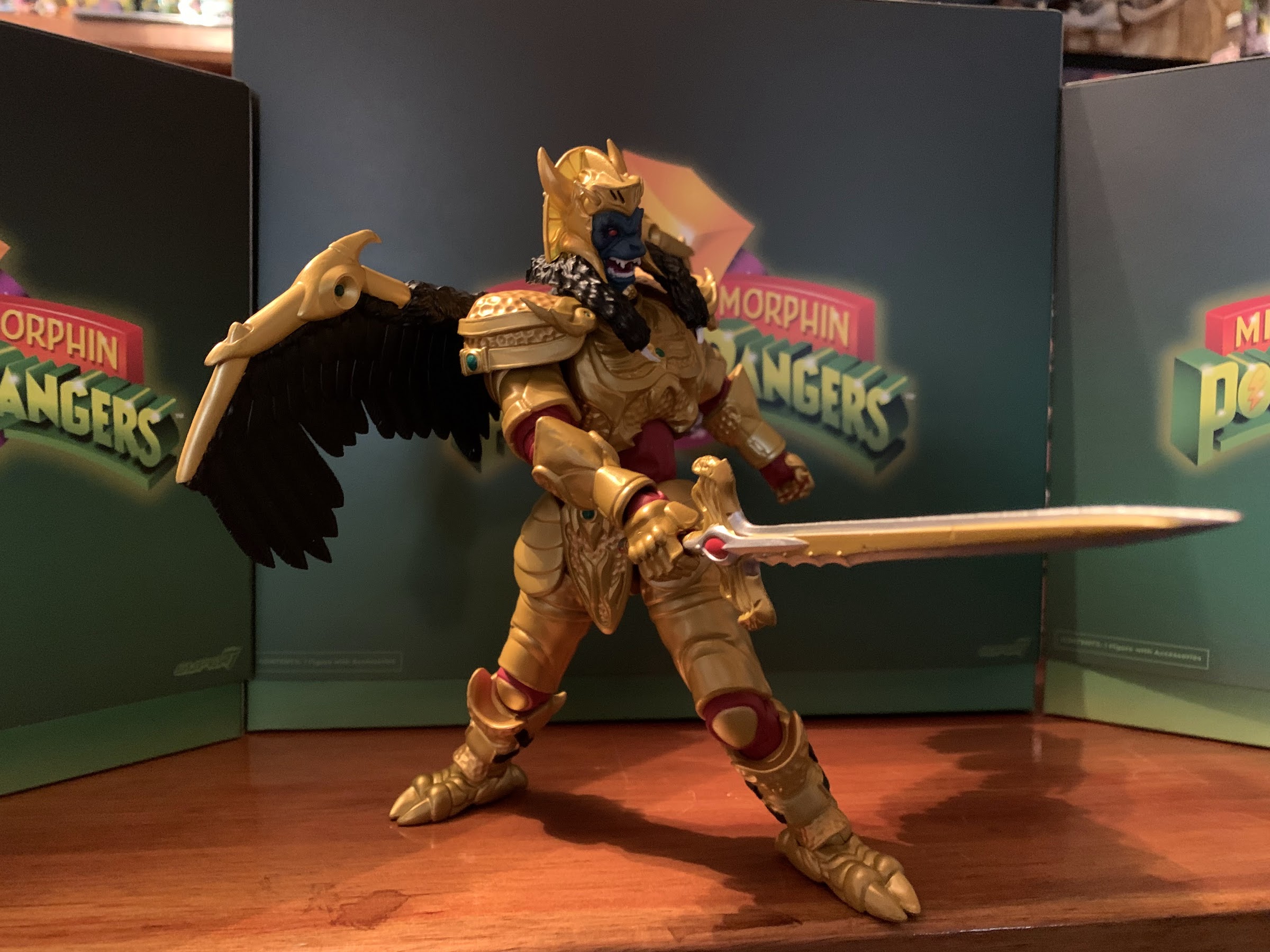
Star Wars The Black Series Mandalorian Warrior (Holiday Edition)

Straight from my Christmas shelf, it’s the holiday Mandalorian Warrior!

We’re getting to Christmas coverage at The Nostalgia Spot one day early this year with this look at one of the latest in the Holiday Collection from Hasbro’s Star Wars line of action figures referred to as The Black Series. I have previously looked at a figure from the very popular streaming show The Mandalorian from Hasbro’s The Vintage Collection. That’s a line of Star Wars figures that basically takes the old Kenner form and adds a whole bunch of articulation to it. I found that particular figure exceedingly charming and I’m a bit happy that I’m not a huge Star Wars fan or else I’d end up with a bunch of them (I’ve since only bought one more which I didn’t bother to review). Despite my preference, the clear most popular line from Hasbro in regards to Star Wars is the 6″ line known as The Black Series. I guess Star Wars collector wanted to see their favorite characters in a larger scale, or Hasbro simply ran out of 3.75″ figures and going to a new scale was an easier way to get someone to buy yet another Luke and Vader. Since I’m not a huge collector of Star Wars, it’s a line that’s never appealed to me. I always found the smaller scale for Star Wars as something that made the brand unique, plus it works way better for vehicles.

Special holiday figures demand special holiday packaging.

One way for Hasbro to get someone like me to buy a figure from its Black Series is to simply add some Christmas to it! Hasbro has been doing Christmas versions of Star Wars characters for a couple of years, if I’m not mistaken. This year’s lineup was actually supposed to drop last year, but delays at the factory or port, or both, caused them to miss Christmas 2021. Rather than drop them after the holidays, Hasbro simply held onto them to release later. There are a handful of these and they’re basically all just re-paints and re-decos of previously released figures to give them some holiday appeal. It’s been a desire on my end to add more Christmas toys to my annual display, so naturally this caught my eye. While I didn’t care for most of them, the holiday version of a Mandalorian Warrior stood out as being quite striking and festive so I decided to track it down. If you’re unaware, Hasbro arranged for each figure to be sold via a different retailer with this one landing with Target. It actually took me 4 tries to get this guy as I’d see him pop up on the app and I’d place an order for pickup only for it to be cancelled due to lack of stock. The fourth time was the charm though, and I even spied a couple on the pegs last time I was in there, so they appear to be shipping in some relative abundance. Perhaps the delay helped to make sure there would be enough product to meet demand. Nevertheless, lets rip this sucker open and give it a look.

“Fly away, Rodney!”

The Holiday edition of figures comes in a window box that’s desiged to resemble a wrapped present. The other benefit of these being delayed so long is that they retain the old window box packaging instead of the plastic free stuff Hasbro has switched to. I’m generally in favor of the move to eliminate needless plastic, but concede the window box is more attractive. I guess enjoy it while you can. It provides a straight-forward look at the figure inside and the accessories and if you’re an in-box collector it probably looks okay. Once removed, our nameless warrior stands a tick over 6″ at around 6.25″ and looks rather resplendent in his green and red attire. The helmet is rather striking at it’s predominantly red and green, but there’s a bit of shading applied in a dark red and, of course, we have the black visor. The shoulder pads, gauntlets, jet pack, and boots are done in green with red being applied to the belt, trunks, kneepads, and weapon holsters on his thighs. The rest of the figure is a reddish brown though his shin guards are white with thick, green, stripes. Much of the figure is done in molded, colored, plastic with the paint reserved for the helmet, shoulders, and shins. The only major deco is applied to the chest which has a festive, ugly, Christmas, sweater design applied to it. It’s the strong part of the figure and what basically ties it all together. The other colored parts look a bit cheap as a result, especially the trunks/belt and the jetpack. I’m left wishing they hit it with an enamel or clear coat that gave it a hard candy appearance. Just anything to apply a texture really would have helped.
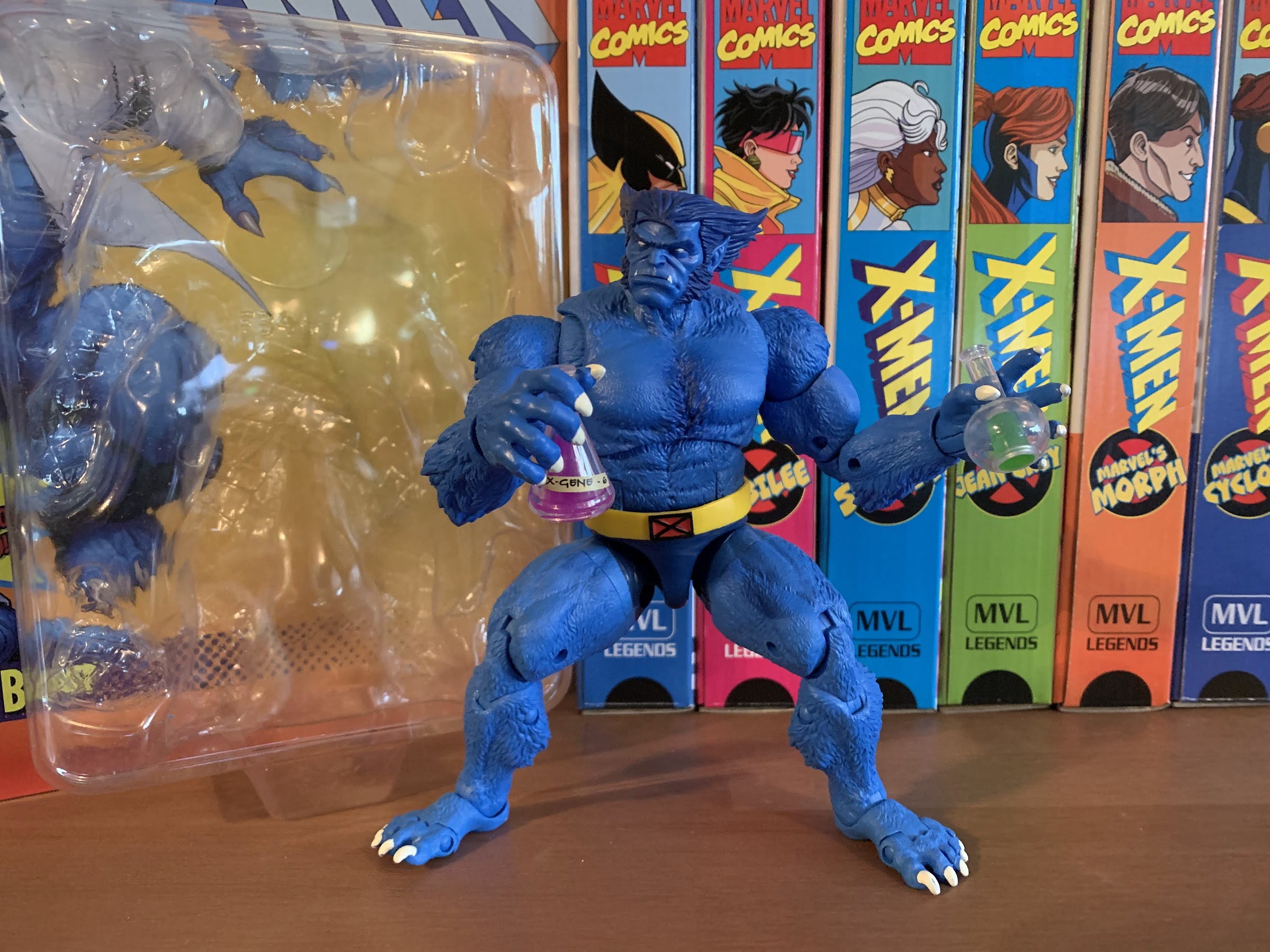
I’m still working on acquiring Christmas figures, so it felt appropriate to pose him with some red and green figures from Hasbro for the time being.

As for the sculpt, this one is apparently an old one. I am not a collector of The Black Series, but my understanding is this was reworked from an old Jango Fett release from the earliest days of the line and it does show in places. I mentioned the finish as being cheap, but that’s more an issue of paint than sculpt. The feet are a bit odd as they’re very small. This guy looks like he’s wearing Crocs rather than boots. Maybe he’s supposed to and the feet are new? I’m not sure, but I suppose it doesn’t matter. By far, the worst offense this figure commits is featuring some sculpted wires that connect his biceps area to his forearms. Assuming it’s true that this is based on a Jango Fett figure, I suppose there was nothing Hasbro could do about the awkwardness involved in connecting two parts of the arm via wires, but here we have a fantasy creation that doesn’t need to be held down by that. Surely they had other arm molds without these annoying things they could have utilized? As it stands, we have two pieces of the figure joined by plastic. It can bend and flex, but stress marks appear rather quickly and I assume anyone that poses this frequently will eventually find these broken in short order. Hasbro must have determined they were too small to implement them like they do the cables on Apocalypse where they’re separate pieces that can be removed effortlessly. Not so here.
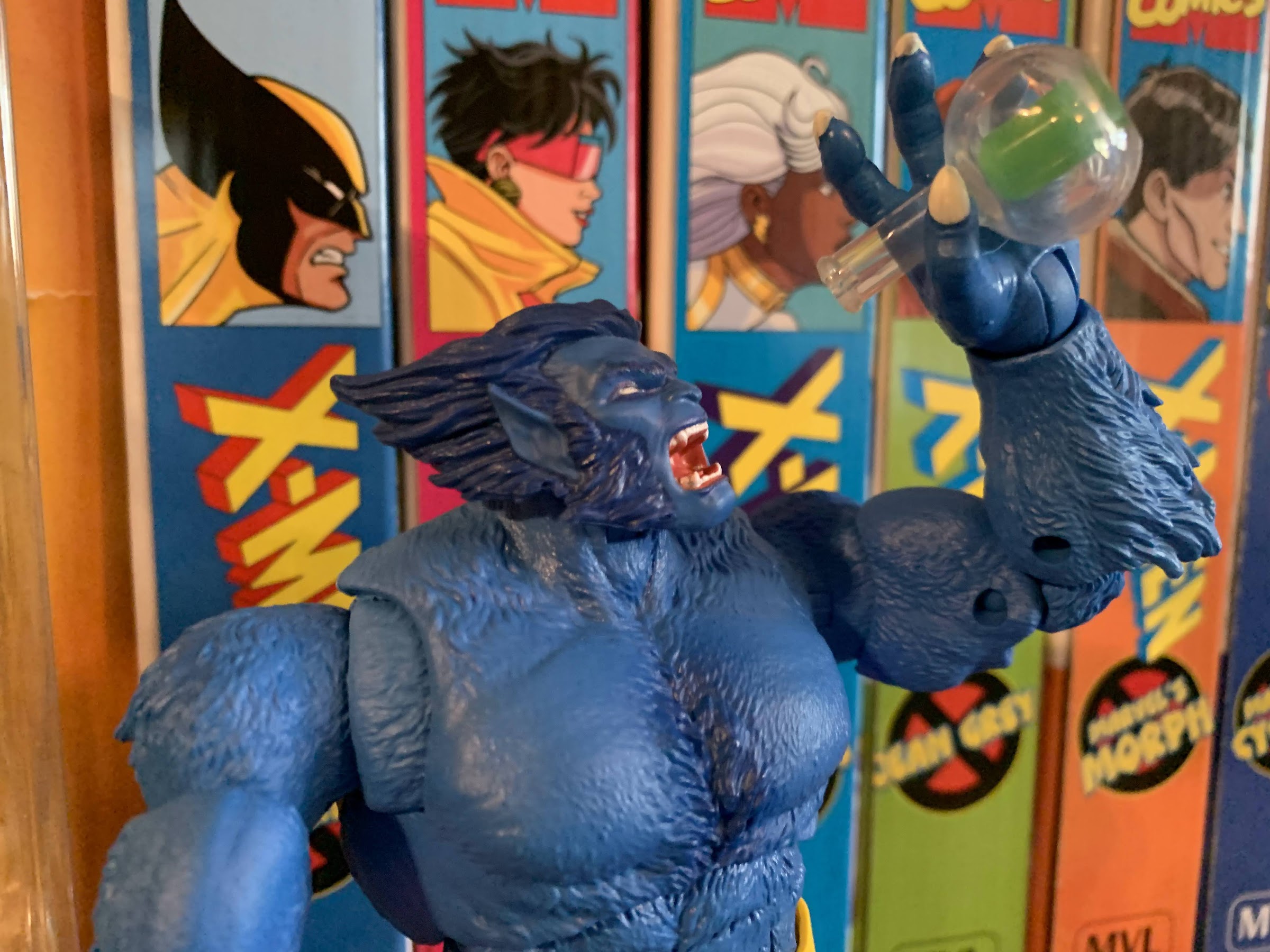
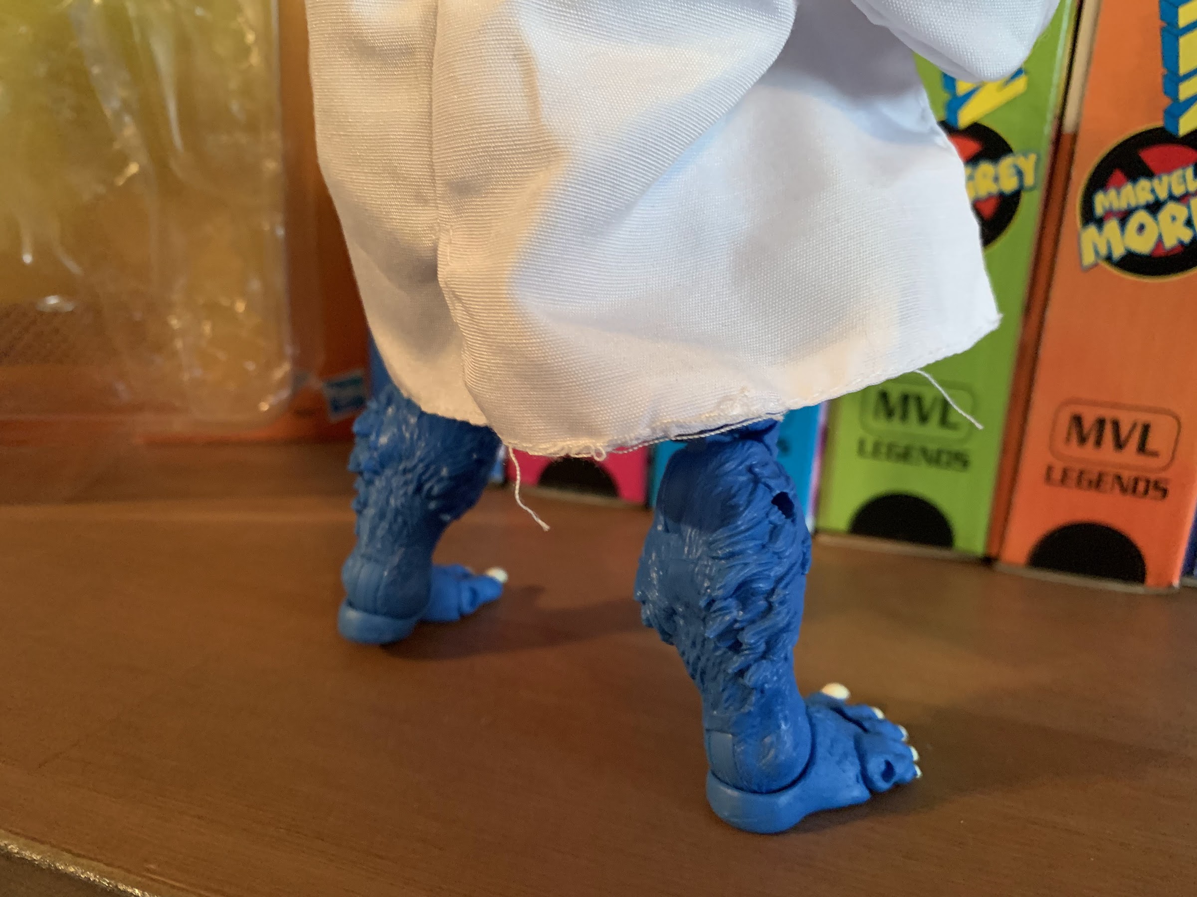
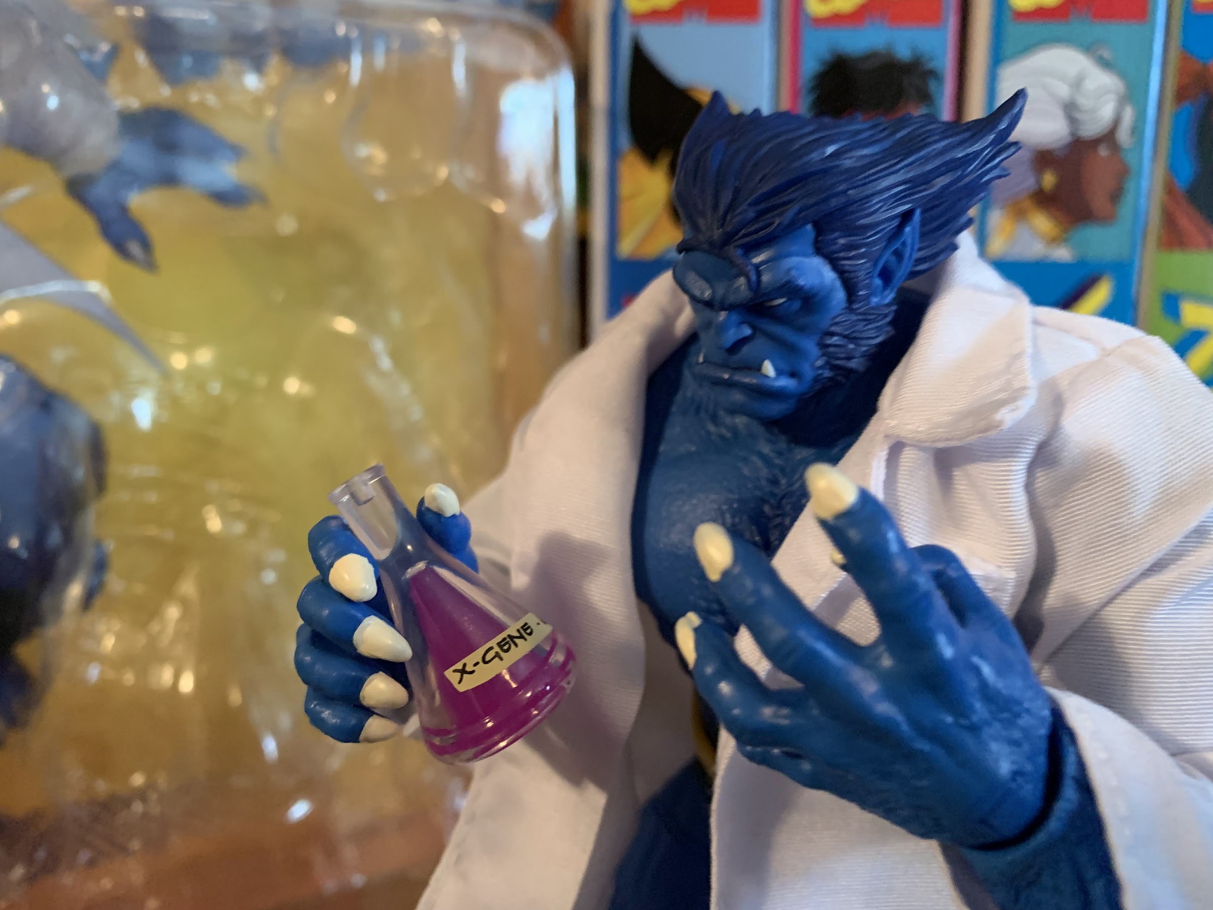
Though I suppose he could just battle Krampus.

I suppose that’s a good springboard to talk about the articulation. Here the figure shows its apparent age as well as this isn’t one to write home about. The head is on the typical Hasbro ball and hinge combo, but the boxy nature of the helmet means he basically can rotate and do little else. The shoulders feature the shoulder pads which prevent his arms from coming up to horizontal, but they can rotate around. The biceps do swivel, but as mentioned before, you need to be mindful of those sculpted wires when utilizing that function. There’s just a single hinge at the elbow, and the range is rather abysmal as he can’t even hit a 90 degree bend. The forearms swivel, which helps to keep those wires in-line, and the wrists swivel and hinge horizontally, not vertically as would be better. The armor means he does nothing in the torso and the waist is just a twist. The hips let the figure kick forward, but not back, and he can spread his legs far enough. There is a thigh cut and the knees are double-jointed. The ankles feature a hinge and rocker, but the range forward on the hinge is poor. The rocker is okay, but the feet are rather small so he can be tough to stand and pose. In addition to that, he’s a bit loose and floppy in the lower half which is unpleasant. The figure feels rather basic as a result, and it rears its head with the accessories as well.

You also get this little guy in the box. Cool?

As for those accessories, the Mandalorian Warrior comes with few. He has no extra parts, but his hands are trigger finger hands so he can hold his weapon in either hand. And that weapon is a long rifle, the Amban blaster, which can fit in either hand, but he can’t really hold it properly. I was amused when Target’s solicitation shot even featured him holding the weapon in an unnatural manner. He can basically just carry it, but the lack of butterfly joints and the proper wrist range means he can’t hold it as if he’s firing it. He also can’t holster it anywhere and it’s a shame the two holsters on his thighs can’t store anything. The deco of the rifle is a bit interesting as it’s primarily brown, white, and orange which was done to make it resemble the Nerf version of the same. It’s a bit of a deep pull so many who get this might wonder why they didn’t give it more of a Christmas deco, but it seems appropriate to make it a “toy” version of the gun. The only other accessory is a small bogling, which is done in all white with blue feet. It’s cute, I suppose, and it frees up Grogu for a separate holiday release which is probably what Hasbro wanted to get casuals like me to buy two. And that other figure is the Walmart exclusive Scout Trooper which I may or may not get. I suppose the jetpack can be considered a third accessory since it is removable. It just plugs into the back and, as I mentioned before, is rather plain looking given the lack of paint.

“Well little guy, we’re pretty mediocre, but at least we’re Christmas!”

The holiday edition of the Mandalorian Warrior presently retails at Target for $26.49. That seems really high for a figure that is, as far as I know, just a re-paint. It probably has a smaller run than some other figures which may account for some of the increase, but I’m guessing the added price is mostly to take advantage of people like me who will impulse buy a Christmas Star Wars figure. As an annual decoration, I think it’s okay. It stands out on a shelf because of the color combo and the Mandalorian design, which is basically just Boba Fett, is pretty timeless and distinct. As an action figure, it’s pretty mediocre though as the paint is scarce, the articulation poor, and the accessories lacking. I would have preferred pistols that actually fit in the holsters to the rifle, and they must have done a Mandalorian figure that can holster the rifle like the Vintage Collection version, no? I don’t understand why they would reuse this old mold when better ones exist. Maybe because if they just did the actual Mandalorian it would be even more obvious that they wanted to separate Grogu off for another release? If that’s the reason then that’s lame. Ultimately, I don’t necessarily regret my purchasing decision here, but it doesn’t endear Hasbro to me either. It certainly drives home that Hasbro is a big company out to make as much money as possible, and I’ve helped them out in their quest for that. If you want what is essentially a Christmas Boba Fett, then this might do it for you. If you’re expecting what is the current level of quality of a Black Series release with a Christmas surcharge then this might disappoint you. And if you never needed to see Star Wars characters dressed for Christmas, then you can certainly skip this.


Marvel Legends X-Men Animated Series Mystique

Mystique is bringing the big guns.

The penultimate figure in this series is a bit of a curveball. When one thinks of the animated series X-Men, the first villains that come to mind are Magneto, Sinister, Apocalypse, Sabretooth, and then it gets muddled. Graydon Creed made quite the impression in the show’s second season and may even be the most hate-able villain the show produced. Omega Red was certainly memorable since he was a very 90s sort of villain and being tied to Wolverine never hurts. And, of course, we have Mystique, the character Hasbro selected to be the second villain of the line (third if you want to count Morph). I think she has a claim to that fifth spot and I can certainly see an argument for Mystique as one of the most memorable villains of the show. It’s just that her character is very much tied to others. She does briefly cross paths with Sinister, and her box art appears to be inspired by that scene, but she’s not really associated with him. There’s her adopted daughter Rogue, biological son Nightcrawler, and her lackeys in the form of Pyro, Avalanche, and the Blob. All of those characters could certainly make an appearance in this line, and I would certainly argue that Rogue should be, but it strikes me as odd to get Mystique before some of these other characters. And it’s especially surprising considering she is, as I mentioned in the first setence, the penultimate figure of the line with the only remaining character set for release being Cyclops. Hasbro left open the possibility that they will return to the world of the X-Men animated series, but for now we basically have to consider it done which just makes this selection an odd choice.

Are we all in agreement that the box art is the best thing about this line?

I don’t know how Hasbro settled on the characters for this line, but my guess would be it’s largely sales related and cost-oritented. You can’t do this line without Wolverine, and basically any member of the team can’t be considered a surprise. I’m guessing Hasbro skipped over Rogue and Gambit because of their recent retro card released figures, and the same is true for Beast who has a new figure shipping now. Magneto also had some recent figures, so maybe that’s why Hasbro went with an older figure like Sinister. He was prominent enough in the show that it was hardly an upset to see him released as soon as he was, and he pairs well with Morph who was a character they absolutely had to do. With Mystique, it’s possible she’s a favorite of someone on staff who pushed for her, but it seems more likely to me that this release has more to do with Hasbro and the Legends team wanting to get her back out there. Like most of this line, Mystique is a re-paint with some minor additions and the previous figure was released as a Walgreen’s exclusive. Retail exclusives can be a pain to track down, so putting out another version that’s easy to acquire is often a welcomed development. I could be wrong, but that’s my guess on how Mystique made it into this 8 figure line.

I don’t hate this figure, but I would like it a whole lot more if it actually looked like the render on the box.

Mystique comes in the customary VHS styled box with artwork by Dan Veesenmeyer. It depicts Mystique in a shadowy area holding a candelabra which gives it a real horror vibe which mixes well with the character’s blue skin and affinity for skulls. It might be my favorite illustration in this line so far. On the spine is the usual profile shot and on the rear is the customary product shot, only with this figure the product on the back is not representative of the figure inside. In what has become an annoying and, frankly, unacceptable trend with Marvel Legends of late the promotional renders for figures have been using the wrong molds. The actual figure is on the same female buck that the former Mystique figure utilized, while the render on the back appears to be based on the newer Shriek figure. It’s a much better base for a superhero line as the figure is well proportioned, looks like a woman of impressive physical fitness, and it’s an all-together better looking figure than what’s actually in the box.

“I have some information about your daughter…”

The render basically gives Mystique an unfortunate hurdle to overcome right out of the gate and I’m going to try to not let it impact my feelings here, but the simple fact is this older female body is just okay. It’s very slight and not particularly heroic looking (granted, she is a villain). It has articulation limitations as well which we’ll get to and it’s just a base body that I would like to see retired. Mystique does feature her cartoon accurate costume of a white, sleeveless, dress with long gloves and boots. The head has been reworked to give her a new hair piece which looks fine. I love her wicked grin which is very appropriate for the character and they got the little skull on her hairline correct. Her body is mostly colored plastic as she’s basically a two-toned figure of blue and white. The controversial cel-shading is also present and, once again, Hasbro made the odd choice to use gray instead of black and it’s a shade of gray that looks too close to the gray-blue of her skin. It’s applied okay here, certainly not as bad as some of the other figures in the line, but it still comes across as half-assed. She really should have multiple shades of gray, black, and blue to do her justice and considering she’s a character who often featured heavy shading in the show it really feels like a missed opportunity. There’s no shading on her hair or on her yellow belt and it just very much feels like an afterthought. The only shading is applied to the clothing. The belt is a floating piece and the skirt portion of her outfit is a part of the belt which is a little odd. I think an overlay might have worked better, but then you lose the articulation in the torso. I am forced to reiterate, once again, that I love the idea of putting shading on these figures, but if they’re not going to put the effort in then don’t do it. She really needs some on her face to bring her to life, but I’m not brave enough to try my hand at customizing. She also has a hole in her back which is unnecessary and unwanted.
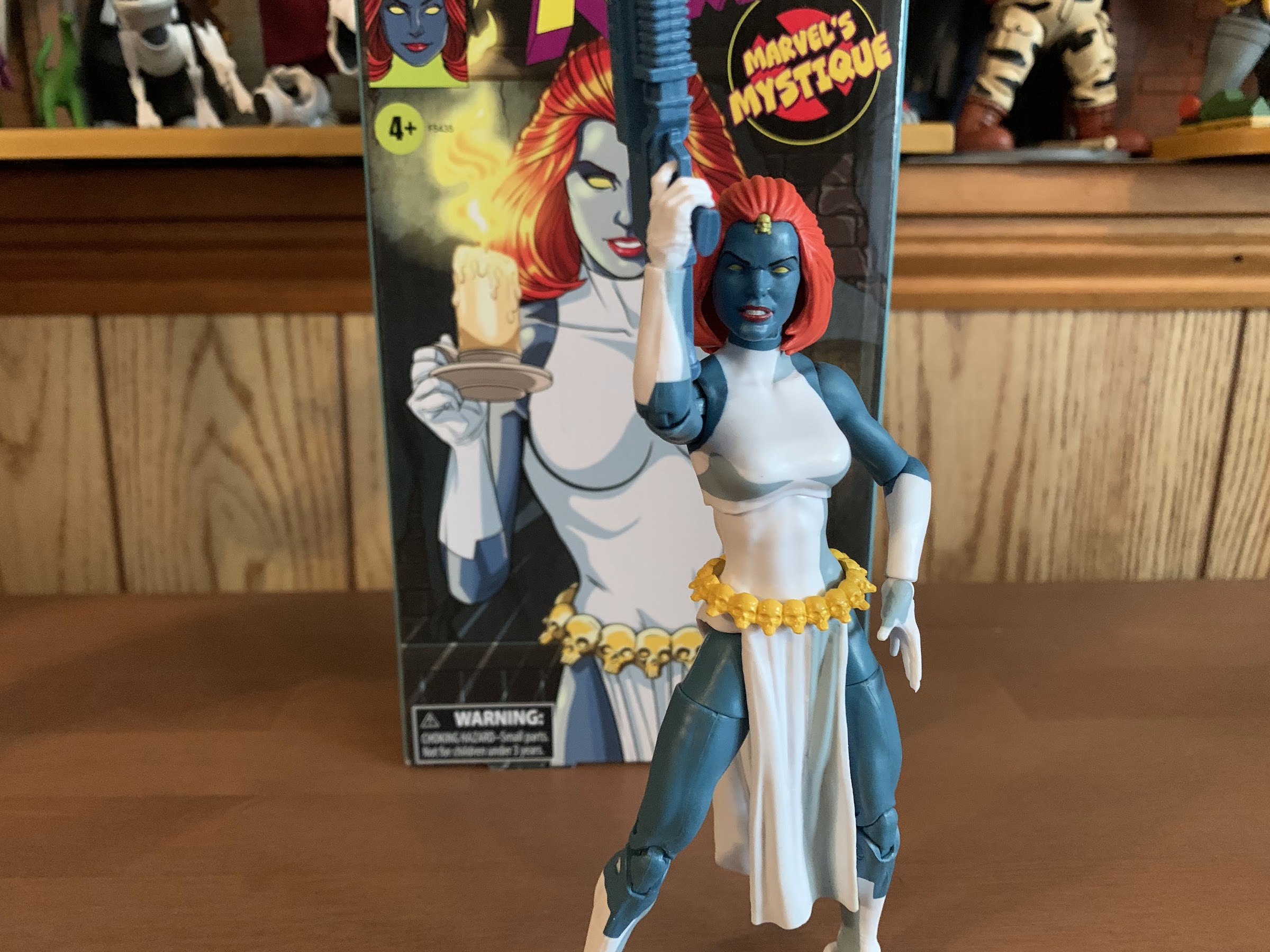
“Lord Apocalypse!”
I don’t know if she ever had a gun this large in the show, but at least it opens up the smaller gun for another figure.

Mystique comes with a fair amount of accessories, though most are just reused from elsewhere. She has open hands out of the box with her right hand being more “cupped” than the left like she should be holding a long-stem glass. She has optional trigger hands and they’re for her two guns. One is a large, machinegun, type and the other a pistol. Both are just cast in the same blue-gray plastic used for her flesh which is pretty damn cheap on Hasbro’s part and it makes the larger gun, especially, look stupid in her hands. The pistol is the same gun that came with the movie Deadpool. At least being blue makes it kind of resemble the gun she used in “The Cure” and the one Morph was seen with at times. Her final accessory is a more thoughtful one, but again, Hasbro’s cheapness ruins it some. That accessory is a baby Nightcrawler wrapped in a brown blanket which has better shading than most of the figures in this line. This is a callback to the show and the scene of Mystique preparing to toss her unwanted mutant child off of a waterfall. The problem is, this baby is repurposed from a baby Hulk figure. It lacks Nightcrawler’s defining pointed ears and he has this pompadour styled hair that looks stupid. He also has a yellow pacfier, which he did not possess in the show. Lastly, Mystique’s portrait is inappropriate for posing her with the child. Had they included a secondary one with tears streaming down her face that would have been something. Should we give Hasbro credit for at least referencing the show? I guess, but I’m also the type who sees little point in doing something if you’re not going to do it right.

And the other character in need of a gun is Morph. This blue one looks a little like the gun he featured in “Till Death Do Us Part.”
I appreciate the thought, but that’s not Kurt.

The last thing we need to consider with this action figure is the articulation. Mystique, being essentially on the same body as Jean, has few surprises. The ball-hinged neck lets her look in all directions save for up since her hair gets in the way. The shoulders can lift out past horizontal and rotate fine while the arm articulation is limited to single-hinged elbows with a swivel point in the elbow. She can’t quite hit 90 degrees and the lack of a bicepts swivel is a disappointment. The wrists rotate and hinge with the right trigger hand featuring the proper, vertical, hinge so that’s good. The torso has the diaphragm joint under the bust which offers little more than some rotation and tilt with very little forward and back. There’s no waist twist, and the legs can barely manage a 45 degree spread. She does kick forward okay, but not back, and there’s a thigh cut for rotation there. The knees are double-jointed and they feel less gummy than Jean and Storm’s. There’s no boot cut and the ankles hinge forward and back a decent amount and rock side-to-side. It’s a mediocre spread of articulation. She can at least pose fine with the hand gun.

“Oh, my beloved child. Wait…you’re not my baby!”

Mystique is another bare minimum type of release from Hasbro in this line. She looks okay, the cel-shading is at least passable, and there’s a tiny bit of re-tooling with the head. They still half-assed the accessories and really should have just used the new body they had already made for other figures as I bet this belt and head would have fit just fine. Why they didn’t is not something I can figure out. And making the guns the same color of plastic as her body is just weird and cheap. Imagine if everybody ran around with guns that matched their skintone perfectly. That’s Hasbro not wanting to pay to change the color of the plastic in the machines. And the baby Kurt is a nice thought, but a poor execution. At least the box art looks great.

“So long, imposter!”

Mystique is presently available via Hasbro’s Pulse website and the Shop Disney webstore. Like all of the figures in this line, she comes with a slight upcharge that’s not really reflected in the product. Chances are, if you’ve been collecting this line then you’ll probably want to add Mystique to your shelf. She could have been a lot better, but by the standards of this line she’s actually one of the better releases. I suppose I’d stick her somewhere in the middle, and I probably prefer her to any of the X-Men women. I’m still left wishing she wasn’t the character we got with one of these precious 8 slots Hasbro budgeted for, but at least she’s not a dud. That means we only have one more figure to look forward to in this line, Cyclops, before we say “goodbye for now.” Hopefully it’s a good one, but it’s not looking like it will arrive before the year’s end so check back in 2023 for my thoughts on Cyke.

If we’re only getting a few villains out of this line, at least they fit reasonably well thematically.

Marvel Legends X-Men Retro Card Series Apocalypse

“I know more of this world than you could even dream, that is why I must…destroy it!”

It is Halloween and that means it’s time for costumes, candy, and spooky fun. It’s also Halloween 2022, a pretty important date if you grew up loving those mutants who ran around in colorful spandex fighting for a better tomorrow. That’s because 30 years ago on this very night, the animated series X-Men premiered on the Fox network. The decision to debut a cartoon in prime time with characters still on the periphery of mainstream appeal was both a bold choice and one brought about by necessity. Fox had done the same recently with Batman – The Animated Series, but that hardly feels like a gamble considering that was coming hot on the heels of Batman Returns. You see, the show should have premiered in September on Saturday mornings, but the project was fraught with delays and the early animation sent back from studio AKOM was said to be a disaster. And since the show wasn’t going to be able to premiere as planned, the producers involved decided to focus on the first two episodes to get them ready for a Halloween premiere with the rest of the season to follow in early 1993. Marketing dubbed it a sneak peek, and it must have worked because before long the show was a ratings hit and the rest is history.

Given that it’s such an important day for an elder X-Men fan like myself, it only felt appropriate to forego something spooky this Halloween in favor of something celebrating that show. Now, I originally intended to debut my review of Hasbro’s Morph, but I received that figure in late September and I was just too eager to talk about Morph. The timing just didn’t make sense, so we’re pivoting to something else. Had Mystique, the next planned figure in Hasbro’s dedicated X-Men animated line, arrived this month she would have been featured here. And she even embodies a bit of that Halloween look with her blank eyes and affection for skulls. Instead though, I think we have the next best thing with one of the major villains from the show: Apocalypse.

This card is stupid big.

Hasbro’s retro card series of Marvel Legends has caused some confusion in the collector community, and I’m afraid this Apocalypse only adds to that. It started a few years ago as an homage to the classic ToyBiz line of figures from the 90s. Hasbro created updated blister cards based on those styles and packaged Legends in them. They had to be slightly oversized to accommodate the larger Legends figures compared to the classic ToyBiz ones, but who in the collector community doesn’t love a good dose of nostalgia? They’re definitely neat, and since the designs of the figures are largely based on their 90s appearances they hit pretty hard when it comes to nostalgia. It was successful enough that Hasbro then did the same with Spider-Man. Unlike the old X-Men line, the Spider-Man line from ToyBiz was a direct tie-in to the animated series that premiered on Fox (in sneak peek fashion as well since it worked so well with X-Men) in 1994. As a result, collectors weren’t sure if these new Spider-Man retro card releases were based on the animated series as well. I’ve seen many collectors refer to the Hobgoblin, especially, from that line as being animated inspired, but that doesn’t appear to be the case. The only one released that is definitely based on the cartoon is the PulseCon exclusive Venom from last year (which is being followed-up with an animated Spider-Man this fall).

The actual figure though? Not really that big. I would have actually liked a little more height out of this guy.

Now adding to any confusion that still exists out there is this Apocalypse figure. Apocalypse had multiple releases in the ToyBiz days so a retro card release makes sense. However, this particular figure features a purple and blue deco. That is significant because that’s the color scheme Apocalypse had in the animated series. No where else has Apocalypse ever looked like this. And to drive the point home further, he comes with an interchangeable gun attachment for his arm that is pulled right from an episode of the show which has left many to ask “So why is this not a release in the VHS line?” And the answer is, “I don’t know.” I don’t think any of the marketing team for Legends has explained that one. My guess is that someone on the team really wanted to do this character in this look, but the budget for the VHS line couldn’t accommodate it so they did it this way. It’s bizarre, because this figure does not feature the cel-shading paint job of the VHS line so it’s not just a difference in packaging. This figure is also based on the build-a-figure Apocalypse released a few years ago, so disassembling it to fit in a VHS box would not have been problem. Plus, as illustrated with Mr. Sinister’s VHS box, Hasbro is willing to adjust the sizing when necessary on those boxes so there’s really nothing stopping Hasbro from releasing the figure in that line from a design standpoint. I know the cel-shading is a bit of a contentious topic in the community, but this figure is so cartoon specific that I can’t imagine there was a ton of demand from collectors not interested in the animated series. This version of Apocalypse has always been viewed as a little “goofy” because of those colors so comic collectors are most certainly not the target audience, but here we are.

This is unquestionably supposed to be Apocalypse from the cartoon, you can’t fool me Hasbro!

Because of the colors on this guy, I definitely consider him to be part of the animated series line of action figures. It’s bizarre, and if it’s simply a matter of budget then I don’t know why they didn’t just hit this guy with more paint so he would fit in, but here we are. That said, I’m happy to have Apocalypse in this deco as it’s been perhaps the figure I’ve wanted most to come out of the animated line next to Morph. This funky color palette just hits right for me. Like most kids in the early 90s, I was confused why Apocalypse looked like he was painted for Easter in the show and would have preferred him in black and blue, but over time this look has just become a hallmark of the series for me and I appreciate it more as a result. Plus, Apocalypse is so bad ass that he can look like this and still be feared!

The figure does come on the aforementioned blister card and it is pretty massive. It’s almost comical to look at how big this thing is relative to other retro card releases and even more ludicrous compared to the 90s cards. It features some nice artwork, though not in the animated style aside from the suit colors, and definitely has that old school ToyBiz feel. Many like to keep these releases mint-on-card, but I am not one of them. If you want to preserve the card as much as possible, I recommend slicing the bubble from the bottom with a blade which will allow you to slide this big boy out. And once removed, he is indeed rather big standing at around 8.25″.

Even this gun attachment is taken right from the show.

In looking at this figure, what immediately stands out as “animated” aside from the colors is the sculpt of the chest. I mentioned earlier that this figure is based on the build-a-figure from a few years ago, but it’s been re-tooled in several places and the upper torso is one such place. The musculature has a very soft look to it which is in-line with the show. There’s basically just a hint of pectorals and nothing more. The other details of the costume, such as the shoulders and the collar area, look as they should. The only parts not exactly screen accurate are the boots and the gloves. The boots are just all-together busier in their design, something an animated show would strive to eliminate. The hands are similar, but they’re also just not sculpted right as he should have a blue knuckleguard on each hand. Lastly, the cables that connect his arms to his back should plug-in around the elbow and not the forearm. Obviously, these inaccuracies exist because Hasbro is reusing old parts and I would say it’s mostly fine. While I would love to buy action figures that are committed to matching the source material to a more exact specification, I know that’s not Hasbro’s approach. They do things mostly with cost in mind and basically think giving us a new torso is good enough. The issue now is that approach was more acceptable when these figures were a lot cheaper. It’s something that will bother some folks, and for others it won’t. In my experience Hasbro has done a good job of conditioning its fanbase to accept these figures for what they are so my expectation is most will be unbothered.

In typical Hasbro fashion, they give you some of what you want, but not everything. This gun has four barrels, but you get just 3 blast effects.

As a last bit of aesthetics, we should talk about the paint job. Apocalypse is quite purple and quite blue, as he should be. Hasbro prioritizes using as much colored plastic as possible with their figures and this one is no exception. The paint is mostly limited to the head, upper torso and the gauntlets. The head is where the most paint was needed and it’s done well enough. We’ll talk about the appropriateness of the expressions when we get to the accessories, but there’s enough paint to bring out the sculpted details of the face with minimal slop. He’s not the easiest face to paint as the lips basically wrap around the whole head and he has that gap in the blue on top of the head, so Hasbro did a very nice job here. What is unfortunate though is his head is in two pieces glued together and there’s a blue seem as a result between his forehead and the portion of his flesh that runs up his head and it looks stupid. Otherwise, the paint details are fairly simple and done well enough. The chest even has this really nice, matte, finish which looks great, but also makes the shiny, plastic, portions look worse by comparison. Where they had to match colored plastic to painted, the figure also looks fine.

The source material for the gun is clearly the show, though it was simplified a bit for this release.

The elephant in the room when it comes to paint is obviously the exclusion of cel-shading. This is a retro card release, so cel-shading isn’t normally expected, but he’s also animated Apocalypse and the other X-Men animated figures all have it. Personally, I would like characters based on a cartoon to feature a paint job that reflects that medium. On the other hand, I concede that the cel-shading in the VHS line has been applied poorly. Part of me would like to give Hasbro some credit here in thinking that with a bigger figure to work with, the cel-shading would turn out better, but there’s no guarantee of that. They seem to struggle just finding the right colors to use when shading (see the hideous mustard color they use to shade yellow). Ultimately, it is what it is. I would love some shading on the torso, especially, but it’s not here. Maybe that’s a good thing? I don’t know, but that’s just my opinion. I don’t think he clashes in a significant manner amongst the other figures in the VHS line so I guess it doesn’t matter that much. As was the case with the accuracy of the sculpt, the absence of shading is going to matter more to some, and not at all to others.

Would it have been hard to just give us one more teeny, tiny, piece to stich in that bottom barrel? Though the proper thing to do would have been to sculpt a new, double-barrel, blast effect that plugs into both at the same time.

Moving on to accessories, Apocalypse is pretty much par for the course when it comes to Legends these days. He doesn’t have a lot, but at least here what he does have is done well. First of all, he has two sets of hands: fists and open, “clenchy,” hands. That’s fine as it allows him to look menacing, dramatic, and you can even get those clenchy hands to grab onto another figure. He also has two heads: an angry one and a stoic one. The angry one is reused, and the stoic is new. As a comic inspired sculpt, I think the angry head is fine. As an animated Apocalypse? It’s terrible. He basically never looked like this in the show so I probably won’t be using it. The stoic head is more my thing. It’s still done in the Legends style so it’s not a toon-accurate look for the character, but that’s been true of almost every release in the VHS line as well save for Wolverine. I refer to it as stoic, but he is frowning and looks kind of ticked off. I do wish the shape of both was different as Apocalypse tends to have a wide jaw compared with the top of his head, in both the comics and the show, but these heads are pretty uniform. If it were up to me, I’d have gone with this head, but with less detail to remove the frown and paired it with a laughing head. Imagine a laughing Apocalypse on your shelf with his fists on his hips or his arms crossed? Perfection. Lastly, we have the optional gun part. It attaches to the forearm and the cable can even plug into it. It is taken directly from the “Beyond Good and Evil” plotline when Cable confronts Apocalypse at the start so it is pulled right out of the show. It looks nice and Hasbro even included some blast effects for it which I would not have expected. It’s nice to have as it allows you to display Apocalypse as a menacing overlord on your shelf, or as someone willing to get his hands dirty which was rather true of the character in the show. They could have loaded him up with more arm attachments, but this feels like a fine selection of stuff for Apocalypse. It just would have been nice to get a new effect part for the main part of the gun that plugs into both of the center barrels. Since they instead gave us three separate pieces, one barrel will always be empty.

The gripping hands are wide enough that you can make your Apocalypse perform chokeslams on Wolverine.

Time to talk about the articulation. Despite being a big boy, Apocalypse moves okay and is pretty standard for the line. We have the ball-hinged head that lets him look up and down, all around, and even tilt the head a smidge. The collar doesn’t really get in the way until you try to rotate the head, but the range is decent. The shoulders are just ball-hinged and he can raise his arms out the side and rotate them pretty well even with the shoulder pads getting in the way slightly. The elbows are single-jointed and he can’t quite hit a 90 degree bend, so that could be better. The wrists rotate and hinge horizontally. In the torso, we get an ab crunch that lets him bend back a bit, and crunch forward a decent amount. It’s mostly colored plastic here so paint rub shouldn’t be of great concern, but it’s worth being mindful of. The waist is just a twist and the legs are ball-pegs. He can damn near do a full split and is capable of kicking forward just fine, though the cheeks will prevent much rear leg motion. There is a thigh cut which does what thigh cuts do and the knees are double-jointed. There’s no boot cut, but down in the ankles you have the usual hinge and rocker combination which works just fine. More importantly, everything is nice and tight so he shouldn’t be toppling over on your shelf. Apocalypse really only needs to hit a few poses and this figure is capable of doing that.

He is here to crush the mutants, and seems capable enough.

All in all, I am quite pleased with this release for Apocalypse. Yes, I would have preferred this come in the VHS line for both the packaging and the cel-shading, but since it didn’t, at least we got a fairly robust release as far as accessories go. I’ve been pretty disappointed with the majority of the VHS line because of the poorly applied cel-shading, inappropriate reuse of some sculpts, and the dearth of worthwhile accessories. It’s really been a money-grab kind of line and at least this Apocalypse feels more substantial and like a better value. They actually did some re-sculpting to make the figure more cartoon accurate, and while they didn’t go as far as they could with that, I think most will find they went far enough. My preference would have always been to receive figures with sculpts actually designed to mimic the animated look, but Hasbro was never committed to doing that for one reason or another. This figure does suffer a bit as a result because the head isn’t right and the veiny biceps look stupid on Apocalypse (and they would look stupid on any version of Apocalypse so I don’t get the thinking here). The rest of its shortcomings are just par for the course with Marvel Legends, like the dearth of paint apps (the cables look especially plain), so regular Legends collectors will likely be content. Unless someone else can get the license to produce animated X-Men figures (highly unlikely), this is unfortunately the best we’re likely to get. And at least with Apocalypse, this one does indeed feel good enough. Most of the VHS figures are not and the feeling of settling is palpable with each one, but here I don’t feel that way. At least not as much.

Apocalypse does come at an inflated price though of $40 which is obviously a lot for a Marvel Legends release. This one at least feels more worthy of that price compared with the VHS figures at around 28 bucks. A comparable figure would probably be NECA’s Chrome Dome from the Teenage Mutant Ninja Turtles line which was also $40. I would argue that the NECA release is a better value than this as it came with more stuff, more paint, and was 100% new tooling, but it also came out a year ago so maybe in 2022 it would be $45. Value, as always, is rather subjective, but in this case I think the value is there. If you’re interested in picking this one up, you may have to dig around a bit as it is sold out in several places. Hasbro Pulse still has it open for order so that may be the safest bet. Amazon does as well, but they can be hard to trust. Re-stocks may be on the way too so I don’t think it’s one you’ll have to spend a fortune on eBay for, but I also would recommend acting fast since I don’t think this one is ticketed for big box stores which would indicate there will be fewer of these out in the wild than the Age of Apocalypse version, by comparison. More importantly, if you can find some time today (admittedly, difficult given the holiday) or maybe even just this week throw on some classic X-Men and take a trip through time. It’s incredible to think I was watching the show as a kid 30 years ago, and while it may not hit the same as it did for me then, it’s still a worthwhile nostalgia binge and a show I think is worth celebrating. Or if you want to read more about it, I’ve covered both Previously on X-Men and the X-Men art book and recommend both to fans of the show. Here’s hoping the sequel series due next year is able to carry on its legacy.