In 1995, Warner Bros felt it was a big enough entity that it could launch its own broadcast television network. Dubbed The WB, it would try to compete with the big four of ABC, CBS, NBC, and Fox, but never really achieved that level of success which is why it no longer exists. The strategy seemed to be to go for a younger demographic with its prime time shows, similar to Fox, but even younger. Maybe they felt there was a market for the kids who had outgrown Nickelodeon and were searching for something else to watch. The American household had long since evolved past the one television per home model and kids basically had as much access to TV as adults so I suppose it made some sense. Warner never did leave the little kids behind entirely though as they also programmed afternoon and Saturday mornings tailored to children. Kids WB was definitely meant to challenge Fox Kids who had become the dominant brand for broadcast children’s programming behind the strength of shows like X-Men, Mighty Morphin Power Rangers, Spider-Man, Batman, and Animaniacs. The interesting part about Warner’s decision to launch its network when it did is that a lot of its intellectual property was tied-up in other places, like Fox. They basically had to run out the clock on the likes of Batman and Animaniacs until they could get those rights back which meant in the meantime turning to other characters like Superman and Tweety (seriously, Tweety was somewhat inexplicably popular in the mid 90s).
Eventually, Warner did get those rights back and Batman was able to join Superman on Kids WB with his old collection of episodes from the Fox days as well as some new ones. We’ve already talked about this pretty extensively in the Batman section of this blog, so we probably don’t need to dawdle any longer. That power hour of Superman and Batman would eventually give way to Batman Beyond as the continuation of what was becoming the DC Animated Universe. Bruce Timm, Paul Dini, Dan Riba, and other creators behind those shows would continue to flesh out their world. It seemed obvious to anybody keeping up that the end game was to collect all of these heroes in place for a new Justice League show. The problem with that strategy ended up coming from an unexpected place.
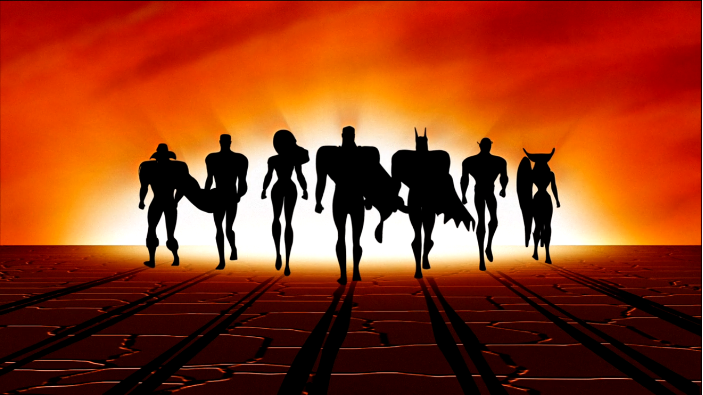
A little known cartoon outside the US called Pokémon made some headlines in the 90s due to it causing a bunch of kids in Japan to have seizures during an episode. It was basically just a peculiar story and I bet a great many folks who read it assumed they’d never hear about this show again. They would be wrong as the game would arrive in the US eventually and the show followed. While it didn’t make a huge splash at first, it would gradually rise in popularity until it became the ratings king of Saturday morning. And it was on the Kids WB Network. The success of Pokémon seemed to convince the powers that be at the network that the future lied in licensing Pokémon adjacent programming for their network essentially forcing out their homegrown stars. Those shows were costly to produce and the only revenue they saw from them was ad revenue. Luckily for fans of the DC shows, there was a new home waiting for them in Cartoon Network, which had found tremendous success on weekday afternoons with its action block Toonami. That network started airing reruns of Batman and they performed well enough that they were willing to make a deal with Warner for new content thus becoming the home of the Justice League.
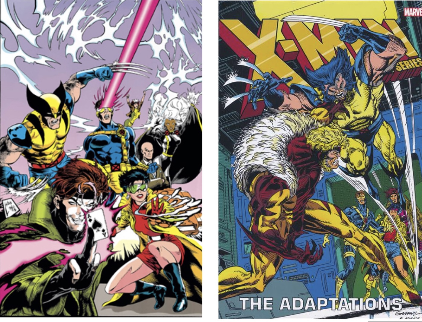
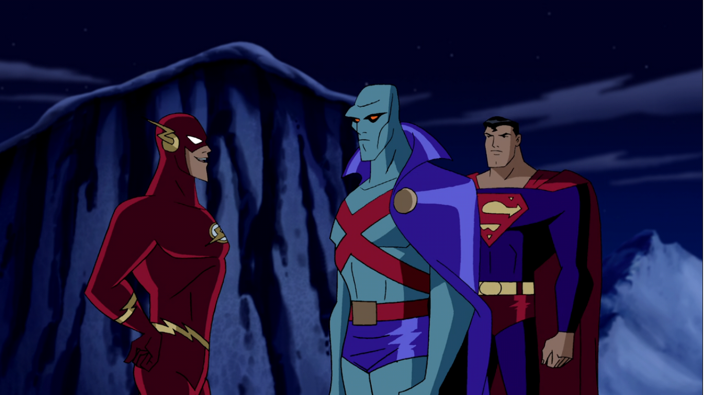
Justice League premiered on November 17, 2001. It’s another animated series from Warner and DC developed by Bruce Timm with Butch Lukic and Dan Riba returning as directors. Stan Berkowitz and Rich Fogel are the credited head writers, but they received contributions from the likes of Dwayne McDuffie, Paul Dini, and a host of other writers. It would definitely seem that Dini was less involved with this show than past DC animated programs, but he is the writer of today’s episode “Comfort and Joy.” This is, obviously, a Christmas episode and it excludes Batman. Maybe because he already did two Christmas episodes? It’s the only episode of the series, which was one order of 52 episodes, that’s a stand-alone one. Every other episode is either a two-parter or more. The main team consists of Superman, Batman, Wonder Woman, Green Lantern, The Flash, Hawkgirl, and Martian Manhunter. It’s not a show I ever watched so I’m banking on my familiarity with these characters from outside this show to help me through this one. And even so, I mainly know Superman, Batman, and Wonder Woman and both Wonder Woman and Batman aren’t featured. I guess it’s time to get acquainted with Martian Manhunter!

The episode begins with Martian Manhunter (Carl Lumbly) standing in a snowy environment silently assuring some alien lifeform that they will save their world. Apparently, these aliens (who look like uglier versions of The Snorks) have entrusted the Justice League with some sort of gravitational device. I guess we’re not on Earth, even though the snowy area has evergreen trees on it, and the aliens that Martian Manhunter is communicating with are on a different planet. Superman (George Newbern) and Green Lantern (Phil LaMarr) are assembling the device which is rather massive and ugly looking. This show is digitally animated and the characters and backgrounds mostly look fine and can pass as cel-animated. The device, however, is rendered in 3D and just looks really bad. It’s the type of thing that probably looked bad even back then, but so many shows loved incorporating that sort of thing into their look.

As the two super men do their part, we see Hawkgirl (Maria Canals-Barrera) delivering some rope and parts to The Flash (Michael Rosenbaum) who dashes about the assembled device and inserts what looks like circuit boards into a compartment. He indicates that J’onn (apparently Martian Manhunter’s real name, which just sounds like “John” but they had to make it annoying to type since he’s an alien, or whatever) is “beaming the directions” into his head as he goes along. When he’s done, he dashes over to the others who have assembled where J’onn has been standing and we see the device in action. The planet they’re on is some ice planet and it was going to collide with the planet those Snork guys are inhabiting. The device envelops the ice planet with some green beems and basically backs it off. It’s all done with some pretty bad CG. It worked though as the aliens cheer and Superman remarks that the ice planet will never threaten the other one again.
Show’s over, right? No, because now we can get to Christmas! Flash indicates that this was the best way to start a holiday break, which apparently Green Lantern is no fan of? He immediately bails, I guess he can just fly through space, and Hawkgirl decides to join him. Flash asks J’onn what his plans are for the holidays and he responds, without a trace of emotion in his voice, that these times hold no special meaning for him. He then walks onto the device which apparently doubles as a spaceship, or the this is an unrelated spaceship. Flash remarks that his personality is rather “frosty” and then Superman, with a sly smile, indicates that they’ll have to do something to change that. And that’s our A plot – show Martian Manhunter the spirit of Christmas!
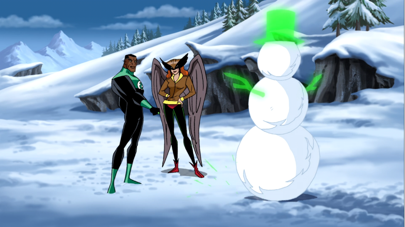
That takes us into the usual opening credits and when they end we’re back on the ice planet. Green Lantern has created a green snowboard using his power ring and is blasting down the side of a mountain with glee. Hawkgirl is there to watch and when Green Lantern comes to a stop she remarks that she thinks it’s odd for a man who can fly through space to get so worked up by snow. Green Lantern tells her it reminds him of his grandmother and how he used to play in the snow as a kid. He offers a “See?” like he’s going to prove to her how awesome snow is and goes on to assemble a snowman with his ring. When Hawkgirl doesn’t heap praise upon him he flops to his back to show her another “secret” and makes a snow angel. He points out his “wings” and Hawkgirl is appropriately unimpressed. What is this? Are we to assume Hawkgirl has never seen snow before or the things that kids do with the snow? When she turns her back to him he nails her with a snowball and when she angrily asks what that was for, he responds with “It’s supposed to be fun.” Predictably, Hawkgirl returns the remark with a smile and uses her mace to conjure up a wave of snow herself and sends it in Green Lantern’s direction. They both then enthusiastically commence what is sure to be an epic snowball fight before we cut to another scene. That might be the worst thing Paul Dini has ever written.
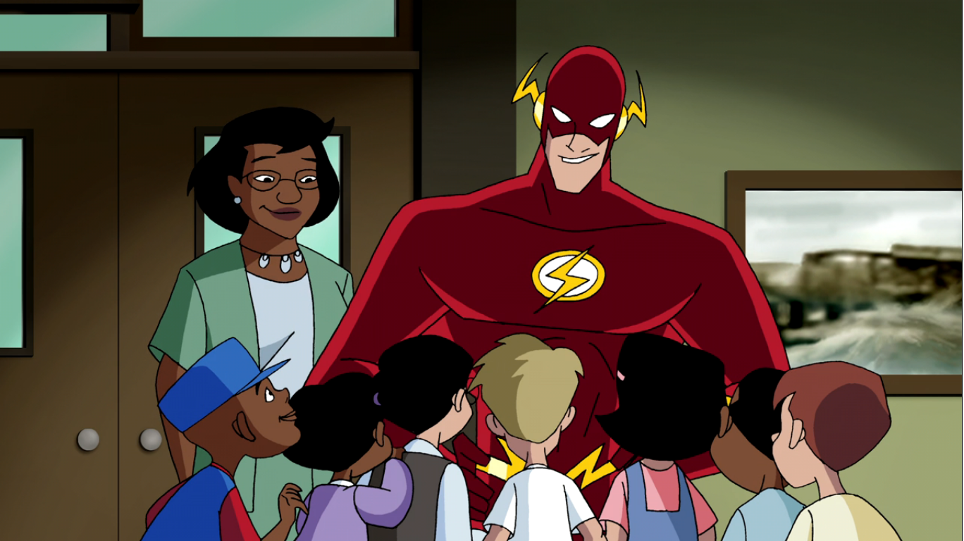
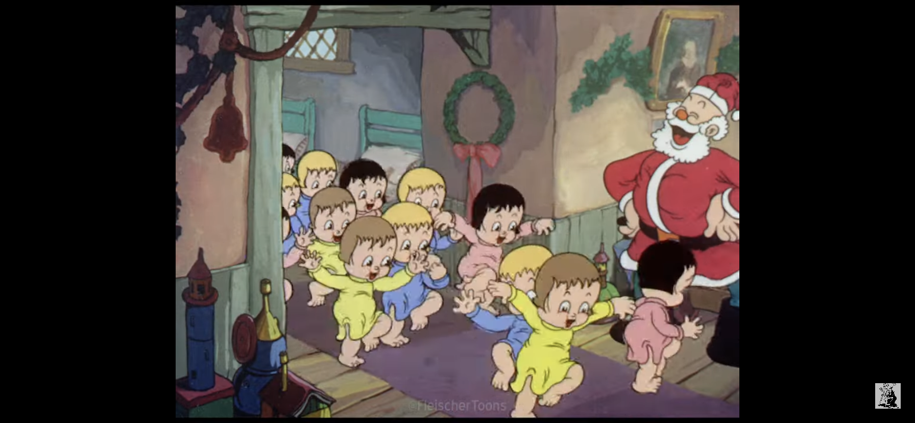
The next scene begins with an exterior shot of an orphanage. It would seem the structure of this episode is going to be “how each member of the Justice League (minus Batman and Wonder Woman) spends Christmas.” And for this one, it’s The Flash. Well, I suppose I ruined the surprise there as the scene begins with a woman (Kimberly Brooks) prepping a group of kids for the arrival of the man in the red suit. We’re probably supposed to think she means Santa, but The Flash comes zipping in to the delight of the kids. I was hoping they’d be bummed it wasn’t Santa, but I guess we’re playing things pretty straight. He mentions he’s there and he’s bringing gifts and questions what the kids want this year. They direct his attention to the TV where a commercial for a DJ Rubber Ducky is playing. It’s terrible, but likely intentionally so, as it’s a rapping duck who shakes his ass at the screen and makes farting noises. I can’t tell if they’re supposed to be farting noises or if they’re just a poor imitation of traditional, animated, duck noises that we see from the likes of Donald Duck or Quackers. Flash seems amused though and promises the kids he’ll get that for them while the woman cautions him about making a promise he can’t keep since the stores are apparently sold out. Flash is dismissive of her concerns setting up this plot for us as Flash needs to supply some orphans with a sought after Christmas toy. This is definitely going to be a low stakes episode.
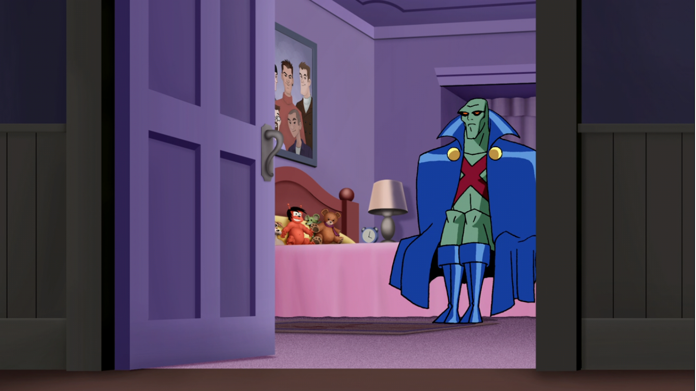
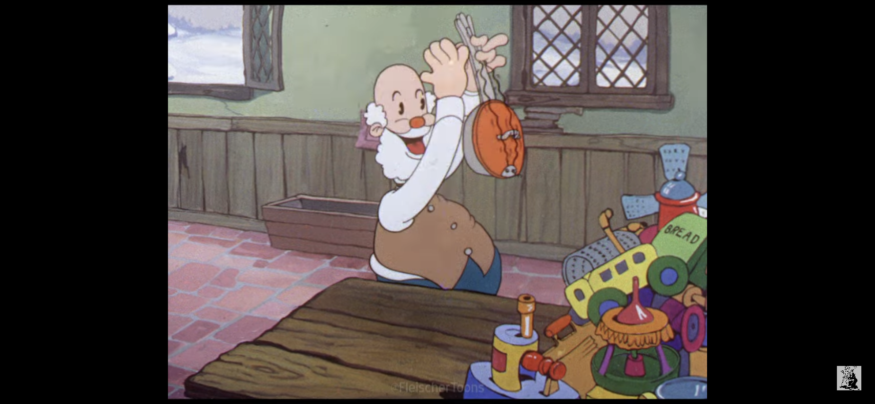
Next we check-in with Superman and Martian Manhunter. Superman has apparently decided to take his green buddy back home to the farm for a good old-fashioned Christmas. Hey, if it worked for Garfield then it can work for the Manhunter. J’onn is unsure of his presence here, but Clark insists he wasn’t leaving him alone at the Watchtower, which I assume is their headquarters. We also get our one mention of Batman as Clark remarks that he insisted on monitor duty tonight. When they enter the house we’re introduced to Martha (Shelley Fabares) and Jonathan Kent (Mike Farrell) who welcome their son in. Clark tells them he brought a friend, and J’onn introduces himself and lets them know that their son insisted on his coming. He also introduces himself as a martian which naturally doesn’t phase the Kent parents and they welcome him into their home. Once inside, Clark asks where Kara (aka Supergirl) is and we’re informed she’s skiing with Barbara (Batgirl) and won’t be home until New Years. Clark remarks that J’onn can stay in her room then we cut to the big man entering a very, girly, looking bedroom. He indicates to Clark that it’s a bit strange seeing this side of him, but Clark just lets him know that’s because here he can be himself and relax. We then hear his dad call out from the other room that he’s lighting the tree causing Clark to bolt out of the room like a child crying out “That’s my job!” Left alone, J’onn takes a seat on the bed and seems a little sad. A cat saunters in and we actually see the green guy smile and call out “kitty,” but he just gets a hiss in return which seems to wound him more than a scratch would have.

We next check in on the snow fight (yay). Green Lantern has magicked up a trio of glowing, green, catapults which sling a volley of massive snow balls in Hawkgirl’s direction. She maneuvers around them through the air and smashes her mace into the ground sending a shockwave in Green Lantern’s direction. He takes a direct hit which knocks him into a tree causing a mass of snow to fall from its branches and bury him. Hawkgirl lands with a cocky grin on her face that soon fades when a dozen, green, hands emerge from the snow all brandishing a snowball. They fire off an assortment of snowballs in her direction causing her to give up. Immediately after her concession a snowball hits her square in the face to add insult to injury. Green Lantern then emerges from the snow to inquire if she’s feeling more festive now. She indicates she’s not and that she just doesn’t get the holidays on Earth. She mentions that on her home world (okay, so she is an alien which makes the last scene slightly less ridiculous) they had a different sort of celebration and that she’s only encountered one other like it on another planet. She apparently can’t get home, but she could get to this other world and Green Lantern seems game. It sounds like we’re going to see an otherworldly holiday when we next check-in with this pair.

Back on Earth, Flash is shown running through traffic pausing for a moment to wave to a little kid riding in a car. He whirls past a Santa on the corner and deposits a dollar into his collection box and helps himself to a candy cane. His ultimate destination though is a toy store which is surrounded by a mob of angry folks. When Flash gets there, one man urges him to do something and accuses the store owner of hoarding this DJ Rubber Ducky toy, but he insists he’s completely sold out as he tries to hold the doors closed. The crowd disperses and we’re shown Flash race from store-to-store and all have a “Sold Out” sign posted regarding the toy. Flash then grumbles how dealing with Gorilla Grodd was easier than finding this thing, but takes notice of a store display featuring Santa’s workshop. He then remarks that’s his solution – to go straight to the source! Is Flash going to visit Santa? No, apparently not. He heads to a factory in China where the toy is made and we see him walking out with the factory’s last DJ Rubber Ducky. A Mr. Hama (Robert Ito) tells him that they’re happy to pass on the last unit to someone like The Flash and we see that this silly toy is freaking huge! It’s basically the size of Flash’s torso.

Next we return to the home of the Kents to see how Martian Manhunter is doing. The family is gathered at the kitchen table and the Kents are telling stories about young Clark at Christmas. Jonathan remarks that they used to have to wrap his presents with lead foil so he couldn’t peek and Clark rather sternly remarks, “You mean Santa wrapped my presents,” and the Kents just go along with that. Meanwhile, Martian Manhunter looks a touch confused and looks down to the steaming mug in his hand which bares the visage of Santa Claus. Martha then informs J’onn that anyone who attends Christmas at their home leaves with a present and she hands over a box to J’onn. He seems surprised, and conjures his inner little drummer boy by pointing out that he brought no gift in return. Martha insists though and J’onn opens his gift to find it contains a rather nice looking sweater, not an ugly Christmas sweater. She says she hopes it fits as he slips it on, over his cape I might add, and then tells her not to worry as he smiles and expands his body to fill the sweater. It’s actually pretty absurd that the sweater was too big in the first place since this guy is a massive man, or rather, a massive martian.

We cut to a billboard of a scantily clad woman on a foreign world. I’m guessing Bruce Timm is responsible for this shot. This is the planet Hawkgirl was talking about and we spy she and Green Lantern descending to ground level. Despite that billboard containing a shot of a human looking woman, the streets are largely filled with inhumanoid aliens including one that’s just a big snake scooting about. Green Lantern asks if this is the place she goes to relax and Hawkgirl responds with a no, this is the place she heads to for fun! She leads him to a sleazy looking nightclub and the two make their way to the bar. She orders a pair of drinks that just look like frothy milk in a beer stein. She chugs one and lets out a loud belch when done remarking it’s delicious and slides the other one over to Green Lantern. He gives it a try and promptly spits it out. When he looks at the drink he spies two worms floating in it. I suppose it makes sense that a hawk girl would enjoy such a delicacy. She then turns to him and the background audio drops as she remarks only one more thing is needed to make this evening better. Green Lantern says “Yeah?” and he seems to think she’s looking for a kiss only for her to whirl around and smash this gigantic alien seated at the bar with her mace. She quickly hands the mace to Green Lantern while the monster rages and when he turns to her she gestures to Green Lantern indicating to the creature that he is the one responsible for the pain in his hand. The monster pounces on him and the two roll around the floor. A pair of aliens look at the brawl and then smile at each other before one blasts the other in the face with its mug. This sets off a bar-wide brawl leaving Hawkgirl to sip her drink with a contented smile upon her face. I thought this was the sort of carnage heroes were supposed to prevent, not start.

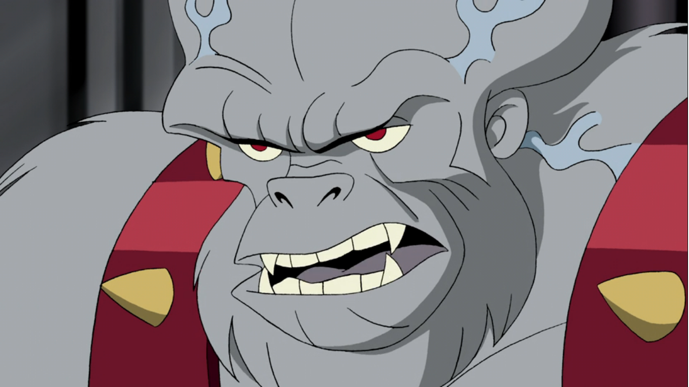
We find The Flash racing towards Central City duck-in-hand. Upon arrival though he encounters an explosion at a museum and heads over there to survey the damage. As he walks inside he sets the duck down and wonders who would blow up a bunch of priceless artwork? His answer is Ultra-Humanite (Ian Buchanan), a big man-ape in suspenders with a huge cranium indicating he’s rather intelligent, though lacks fashion sense. He apparently finds the use of public money to fund art offensive so he decided to blow it up – makes sense. He’s also armed with a laser gun and starts firing off at Flash who manages to avoid it. He ends up under a suspended sculpture that the villain blasts from the ceiling and it falls on him. He even looks up to see it, but still gets nailed. I thought this guy was fast? Ultra-Humanite then approaches eager to finish him off, but he takes too long for when he blasts he finds no Flash. Worse, his gun won’t even fire as Flash brandishes the giant battery he yanked from it when he ran by and taunts him by suggesting he should have asked Santa for some more. This enrages Ultra-Humanite, but Flash just pummels him. The shot is from behind Ultra-Humanite so we don’t actually see his fists land, but it’s more than implied. Unfortunately though, he lands right on old DJ Rubber Ducky.

Flash hears the crack and knows what happened immediately. When Ultra-Humanite gets up to reveal the broken toy, Flash runs over to, I guess, check on it. Ultra-Humanite doesn’t care and just casually strolls away remarking how it’s just plastic and crude electronics. Flash tries to appeal to him by asking him if he can recall having his hopes and dreams dashed when he doesn’t get what he wanted most and Ultra-Humanite just remarks it happens quite frequently and the Justice League are usually the ones responsible. He thinks the kids would be better off with a book, and he’s probably not wrong, though impractical. Flash is pretty heartbroken and as Ultra-Humanite reloads he even suggest he can go ahead and use that gun on him since he couldn’t possibly feel any worse than he already does. When he said this, his back was towards the villain and Ultra-Humanite is happy to oblige! As Flash turns his head he gets smashed in the face with the butt of the gun.

Flash is then shown waking up from his concussion laying on the floor. He’s in a lab, or work shop, of some kind and as he rubs his head he sits up and finds Ultra-Humanite at a work bench fixing the duck. Ultra-Humanite tells Flash that his words did not fall on deaf ears and in the spirit of the holiday he proposes a truce. Flash is confused, but seemingly accepts the truce by shaking the hand of the man-ape. He’s then told by Ultra-Humanite that he is repairing the toy while also making some improvements. Flash asks him if he’s rigging it with explosives and Ultra-Humanite rather sternly says “Flash, it is Christmas!” Flash then counters with the question we’re likely all wondering, “Then why did you hit me?” “You hit me first.” Okay, seems fair. He then asks Flash to hand him a screwdriver and I guess we’re just all going to forget about that whole blowing up the museum thing?

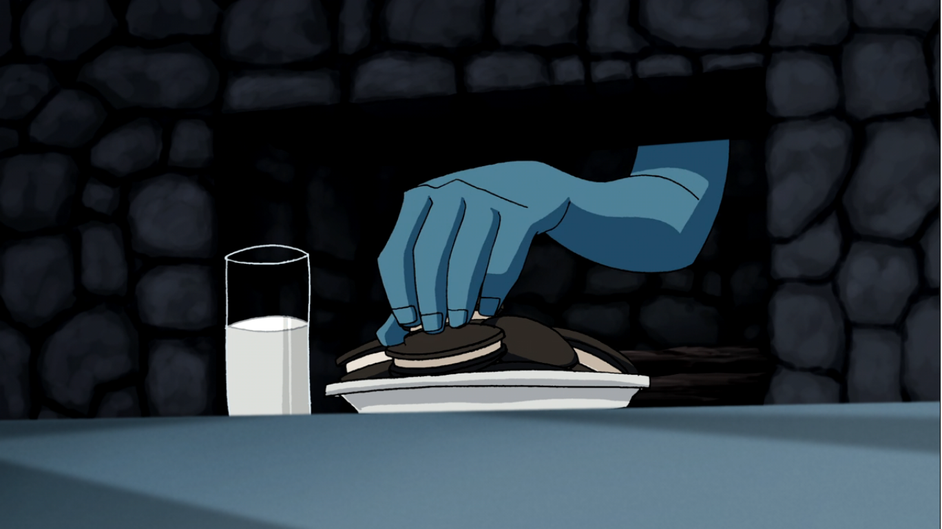
We return to Martian Manhunter who has apparently ditched that nice sweater gifted to him by the Kents. He’s just staring out the window, but then goes intangible and passes through the floor. From there he spies the Kents doing the dishes and making out a bit in the process. It’s an odd kink, but we don’t kink shame here. He then moves onto the living room where Clark is placing gifts under the tree. He picks one up and remarks, “Lead,” so he’s not placing gifts, but peeking! Good thing you have a lot of good will built up with Santa, Clark! J’onn then moves outside and into town where he returns to a solid state and transforms his appearance to that of a human. He then sees a couple walking down the sidewalk who wish him a “Merry Christmas,” and he returns the gesture with a polite wave. He observes them head into a diner and then moves on. J’onn finds himself outside a home and he can hear a young girl inside assuring a “Tommy” that Santa is real and she just knows he’ll come and eat the cookies she left out. This seems to stir something in J’onn who smiles a bit. He drops his disguise and flies up onto the roof, the sound of which wakes the little girl up with a start. We see the cookies and milk left out, and J’onn’s hand pops out of the fireplace to snatch one of the cookies. We next find J’onn outside a church and we can hear singing from within. He’s just standing outside in the snow back in his normal, green, appearance listening to the hymn which is “It Came Upon a Midnight Clear.” When the verse ends with “The world in solemn stillness lay to hear the angels sing,” he almost winces and perhaps a look of understanding crosses his face.
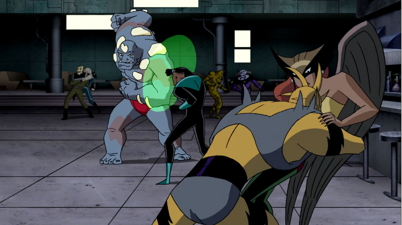
Back at the brawl, Green Lantern is still tangling with the big guy while Hawkgirl is now involved smacking around some poor fools of her own. The whole place is in chaos and Hawkgirl is quick to point out that this is way better than a snowball fight! Green Lantern agrees, but I’m detecting some sarcasm here, as he blasts the big monster man away with his ring. He then conjures up a green boot to kick an alien off of Hawkgirl and goes to help her up, only for her to call out “Don’t let your guard down!” He turns and finds the monster has returned and he knocks him into Hawkgirl.
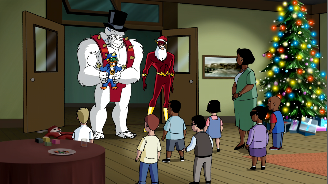
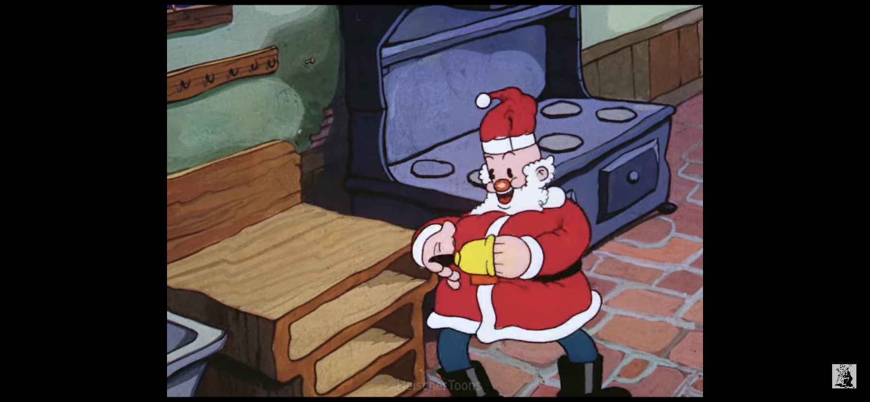
We somewhat abruptly cut back to the orphanage and Flash and Ultra-Humanite’s silhouettes appear on the door as they approach the building. They’re arguing about Ultra-Humanite wearing a costume and Flash points out that he put on the beard and also suggests that the big gorilla guy wouldn’t want to scare the kids, would he? We can tell he’s trying to place a top hat on him, and I’m guessing it’s a Frosty look. Flash then enters the room and declares himself Santa Flash! The prior shot made it look like they were at the entrance to the orphanage from outside, but the entrance shot makes it seem like they were already in the orphanage. I’m guess it’s just an error. Flash is sporting the hat and beard, but that red suit of his could really use some padding. He’s greeted with cheers and then goes on to introduce his helper: Freaky the Snowman! Ultra-Humanite enters to no reaction from the children. He’s clad all in white and sporting the top hat and deadpan expression. He rather curtly instructs Flash to give them the toy and then take him to jail, so I guess we aren’t just going to forget about the arson from earlier.
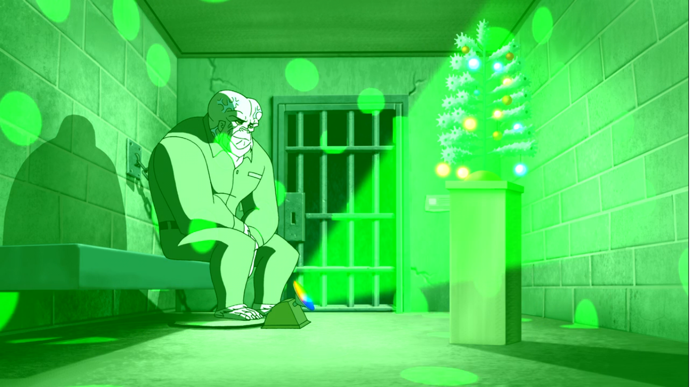
Flash once more seeks to confirm that it won’t explode and Ultra-Humanite seems offended by the suggestion. He places the toy on the floor himself and turns it on. The kids are then surprised to hear the voice of Ultra-Humanite come from the toy duck as it beckons them to come closer and hear a story. It’s going to tell them the tale of The Nutcracker and Ultra-Humanite rather smugly mentions to Flash how he improved upon the original. Flash doesn’t seem convinced and remarks he preferred the “poopy noises.” He then notices the kids all sitting around the duck with smiles on their faces. They may not have received the duck they thought they were getting, but they seem content with this one. Flash then smiles and agrees that this present is good too. We then fade out to see Ultra-Humanite being lead into prison by two guards. As he enters his cell he remarks “Haven’t I seen enough of you for one night?” He’s speaking to Flash, who was waiting for him. He setup a little Christmas tree in the big guy’s cell and tells him he thought he could use a little Christmas cheer. Ultra-Humanite approaches and observes that it’s an aluminum tree. Flash basically starts to apologize for being corny and all, but Ultra-Humanite stops him by saying he had one just like it as…though he trails off a bit. Flash leaves him to his tree and once out of the cell Ultra-Humanite turns on a floor lamp that projects Christmas lights all throughout the cell. He sits on the bench and a hint of a smile seems to cross his face as Flash looks on with a more obvious smile from outside the cell.

We return to the D plot of the episode where the bar brawl has apparently come to an end. The place is trashed and there’s one, lone, janitor uselessly sweeping the floor which is littered with numerous unconscious bodies. The camera pans over to find Green Lantern and Hawkgirl in a seated position with the big monster guy. His arm is draped around the two of them and it would appear they’re enjoying a post brawl cuddle session. Green Lantern and the monster guy are unconscious, but Hawkgirl isn’t. She’s sporting a very contented smile and plants a kiss on Green Lantern’s cheek and says, “Merry Christmas, John.” Too many John or John sounding names in this show. That’s apparently the end of this one though as she basically returns to the cuddles.

At the home of the Kents, it’s still dark. We find Clark asleep in his bed, but his eyes soon pop open and a smile crosses his face. He hops out of bed and puts on his robe apparently intent on heading for the tree on Christmas morning. He opens his bedroom door and we can see from the window that the sun is just starting to rise, so the tree is fair game at this point. As he walks into the hall he finds both of his parents standing there with smiles on their faces outside the bedroom door where J’onn is staying. We can hear singing coming from within the room, and the melody is similar to “It Came Upon a Midnight Clear” but the words are unintelligible as he’s apparently singing in his native tongue. Clark places a hand on the shoulder of each parent and remarks “And he said he didn’t bring a gift,” so I guess they’re enjoying the song. We then cut to inside the bedroom and J’onn is seated by the window, naked, stroking the cat. He’s in a more alien form than usual and I suppose the takeaway is that he found the Christmas spirit and apparently the cat did too. We get one last exterior shot of the Kent home before the credits roll.

The premise of “Comfort and Joy” makes a lot of sense for this show. If you’re going to do a Christmas episode about a superhero team it would seem the approach is to either have some big, Christmas, mess or just try to show what the holidays mean to each hero. It’s a bit odd to completely exclude Wonder Woman (Batman is essentially excused by Clark and we’re left to assume that Christmas Eve is just another work day for grumpy Bruce, or an act of selflessness on his part since he doesn’t have a family to spend Christmas with), but that’s the issue with superhero teams: it can be hard to find room for everybody. And on the surface, the approach makes sense. For Flash, we just see how he solves a problem that arises from the mere existence of Christmas. For Hawkgirl, she’s from another world and needs to find a way to relate to Christmas and also wishes to share her interpretation of a holiday with her apparent lover. And for Martian Manhunter, who seems to be mostly devoid of emotion, he really has nothing in his past to allow him to relate or identify with the holiday so Clark takes it upon himself to bridge that gap.
The problem lies in the execution. This episode really wants to be profound. It wants to be a feel good story and also likely seeks to ask the audience what Christmas means to them. It’s just overly simplistic with the approach that leaves little room for a genuine emotional response. The first half of the episode is pretty dreadful. I hated that initial scene between Hawkgirl and Green Lantern and honestly their plot never landed for me. There were no stakes and nothing about the resolution was all that fun or interesting. The plot with Flash had some stakes, albeit they weren’t exactly important. I mean, I want orphans to have a nice Christmas and all, but the material possessions aren’t that important. At the same time, I do appreciate it not completely dismissing the material component as we all know kids want to wake up on Christmas morning to find that toy they want. And if it doesn’t happen, they’re going to be pretty bummed. Still, it found its footing once Ultra-Humanite was introduced via the humor he injected into the story. I liked his deadpan delivery and he’s a well-written character in a very literal sense as his words and delivery are quite entertaining. The resolution was corny, as Flash pointed out, but what Christmas episode isn’t?
With the Martian Manhunter plot, Dini was really trying to hit a home run, but he only managed a bloop single. There’s some good character animation with Manhunter via his reactions to what is around him and his struggle to find something in the holiday he can relate to is interesting on the surface. I enjoyed the small bits of humor sprinkled into the story via Clark and his attitudes towards Christmas. I love that Superman believes in Santa and he’s very serious about it and his regression to a more childlike state is handled well and not overdone. Manhunter finding some meaning in the song he hears from outside the church feels forced. It’s like Dini was trying to find a unique way for J’onn to find the Christmas spirit, but the manner in which he settled on is just an empty one. The climax of that plot just doesn’t do it for me. I’m not a talented enough writer to offer a suggestion on how to better craft the climax, I just know it doesn’t land for me. And as someone who consumes and enjoys consuming a lot of cheesy Christmas stuff, it’s not hard to move me with such a tale, but I got nothing out of this one. Sorry, J’onn.
If you like your superhero shows to possess some realism and a serious approach, then I suppose this is still worth giving a look since there really aren’t a lot like it. The Christmas episodes for Batman and The New Batman Adventures aren’t particularly strong either, but they are more fun. I would much prefer those to this one, but maybe you’re a Superman or Martian Manhunter fan more than you are a Batman one. If you want to watch it, it’s presently streaming on the Max platform despite threats of removal earlier this year. If this is after 2023 that you’re reading this, then who knows if it’s still there (or if Max is even still alive)? It’s also still available to rent or buy digitally from places like Amazon. The show was released on DVD and they were still reasonably priced at the time of this writing, but if the show were to get delisted, it wouldn’t shock me if aftermarket prices started to rise. I think such an approach is only merited by those who want to take-in the full series as dropping some coin for the full 52 episodes just to experience this one is probably not worth it.
Can’t wait until tomorrow for more Christmas? Check out what we had to say on this day last year and beyond:

Dec. 2 – Donkey Kong Country – “The Kongo Bongo Festival of Lights”
In 1994, Nintendo and developer Rare Ltd. released unto the world Donkey Kong Country for the Super Nintendo. It was a pretty big deal because with Sony prepping its 32-bit PlayStation console for release, and Nintendo no where near ready to unveil the Nintendo 64, the company needed to eke out a few more years…
Keep reading
Dec. 2 – Tennessee Tuxedo and his Tales – “The Tree Trimmers”
In the early 1960s, content producers were still trying to navigate the lay of the land when it came to television. Animation had been popular for decades in movie theaters and the big studios knew they appealed to kids, but it was just so expensive to produce that few were willing to try it on…
Keep reading
Dec. 2 – Toy Story That Time Forgot
When the credits started to roll in 2010 signaling the end of Toy Story 3 I think most who were watching it assumed this was “good bye.” The toys which had captured the hearts of movie-goers going on two decades were saying good bye to their former owner and playmate, Andy, and so too were…
Keep reading