There’s got to be at least one person who has been waiting for this day.
When the decision was made to end the animated series Spider-Man, it didn’t mark the end of the webbed one’s adventures on the small screen. Momentum was building towards a Spider-Man movie which would eventually arrive in 2002 so it made sense to keep old webhead in the public spotlight. Apparently, it would have been too costly to just renew Spider-Man and see if Peter Parker ever did find Mary Jane (we had to wait until 2024 to find out), so Saban Entertainment set out to do something new. Various ideas were kicked around including going back to the beginning, but with Sony working on an origin story for the big screen Marvel squashed that. Ideas for Spider-Man 2099 were considered as well as some sort of alternate universe story with two Peters that Marvel also nixed (perhaps PTSD related following Maximum Clonage). What Saban and Marvel eventually settled on was Spider-Man Unlimited, a show cancelled after three episodes aired that has largely been forgotten. Until now!
It is an interesting look for Mr. Parker, I just wish Hasbro went all out with the shading for the figure.
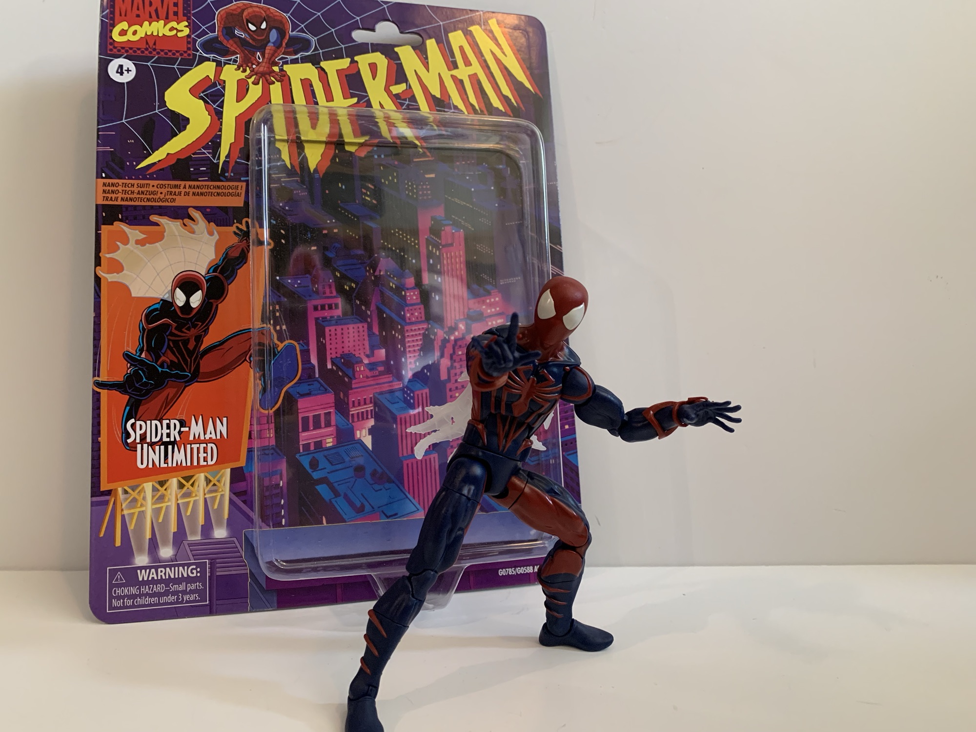
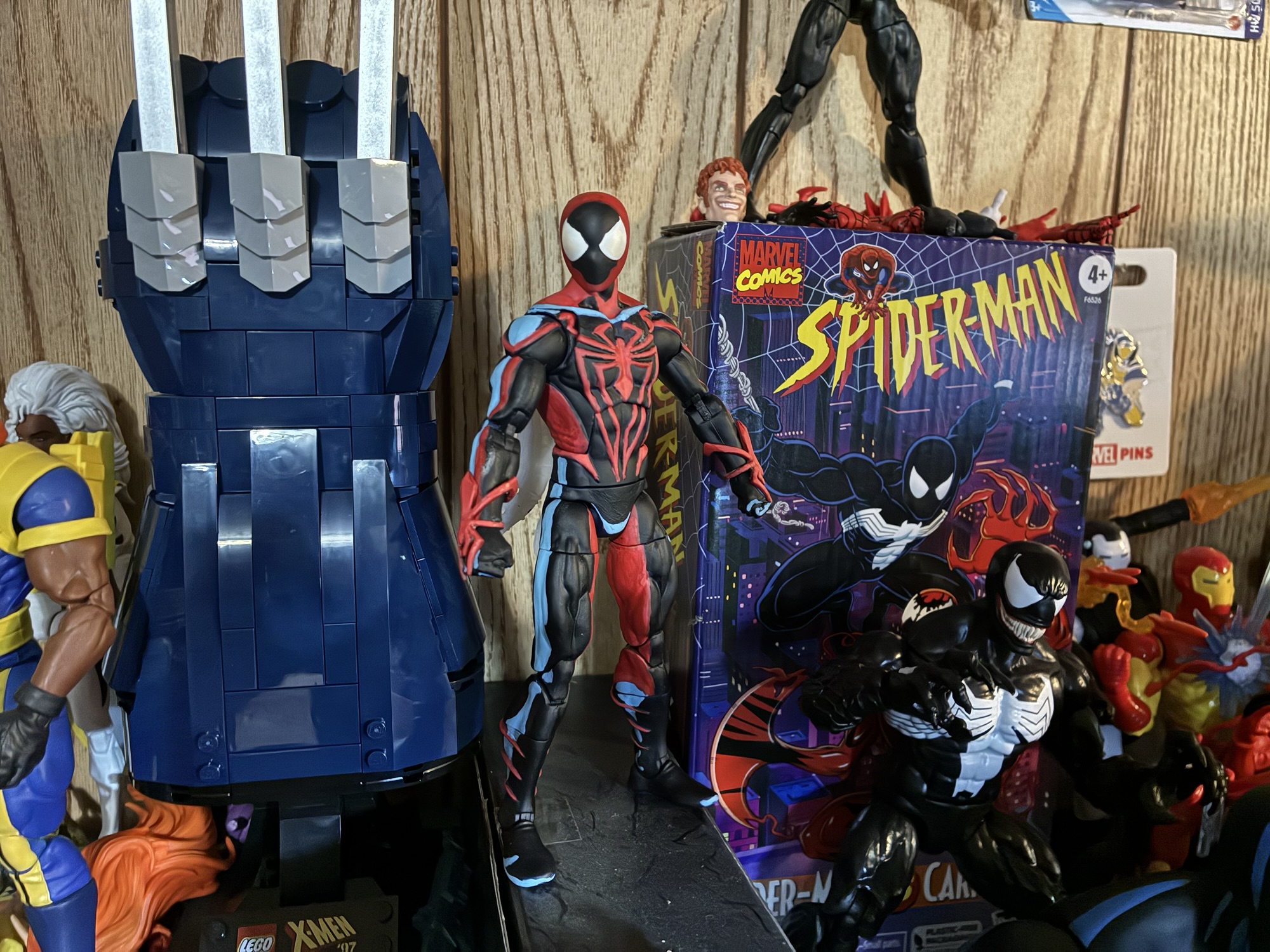
Spider-Man Unlimited is back in action figure form. Hasbro has done almost every other incarnation of Spider-Man at this point so why not? He did have a cameo appearance in Across the Spider-Verse, just like basically every Spider-Man, and since the look from the show was pretty unique I suppose it makes sense to give it a go in plastic. If anything from the show is remembered fondly these days, it probably is the suit which is sort of a mix of Scarlet Spider and Spider-Man 2099. It’s still red and blue, but there are no weblines and the whole thing is heavily shaded. He also has the web cape of Spider-Man 2099. It’s not the sort of look that can be easily adapted from an existing figure so the fact that Hasbro was willing to invest in new tooling for this is actually a surprise. And there’s really no way to do the figure without also using a fair amount of paint when compared with a basic Marvel Legends release. It will be interesting to see how this thing sells and if Hasbro’s investment paid off.
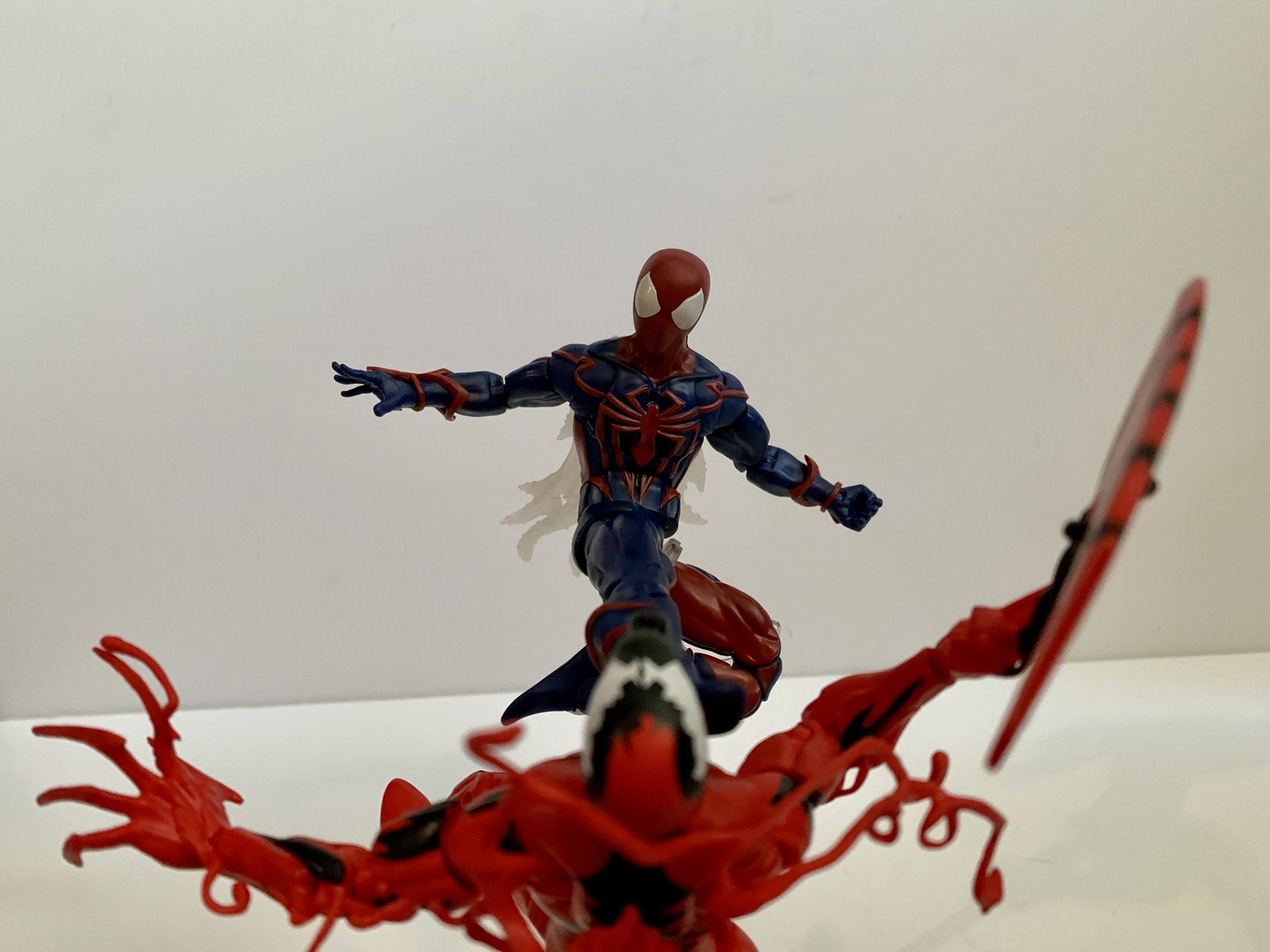
I’m guessing we’ll never get Venom and Carnage from this show so this will have to do.
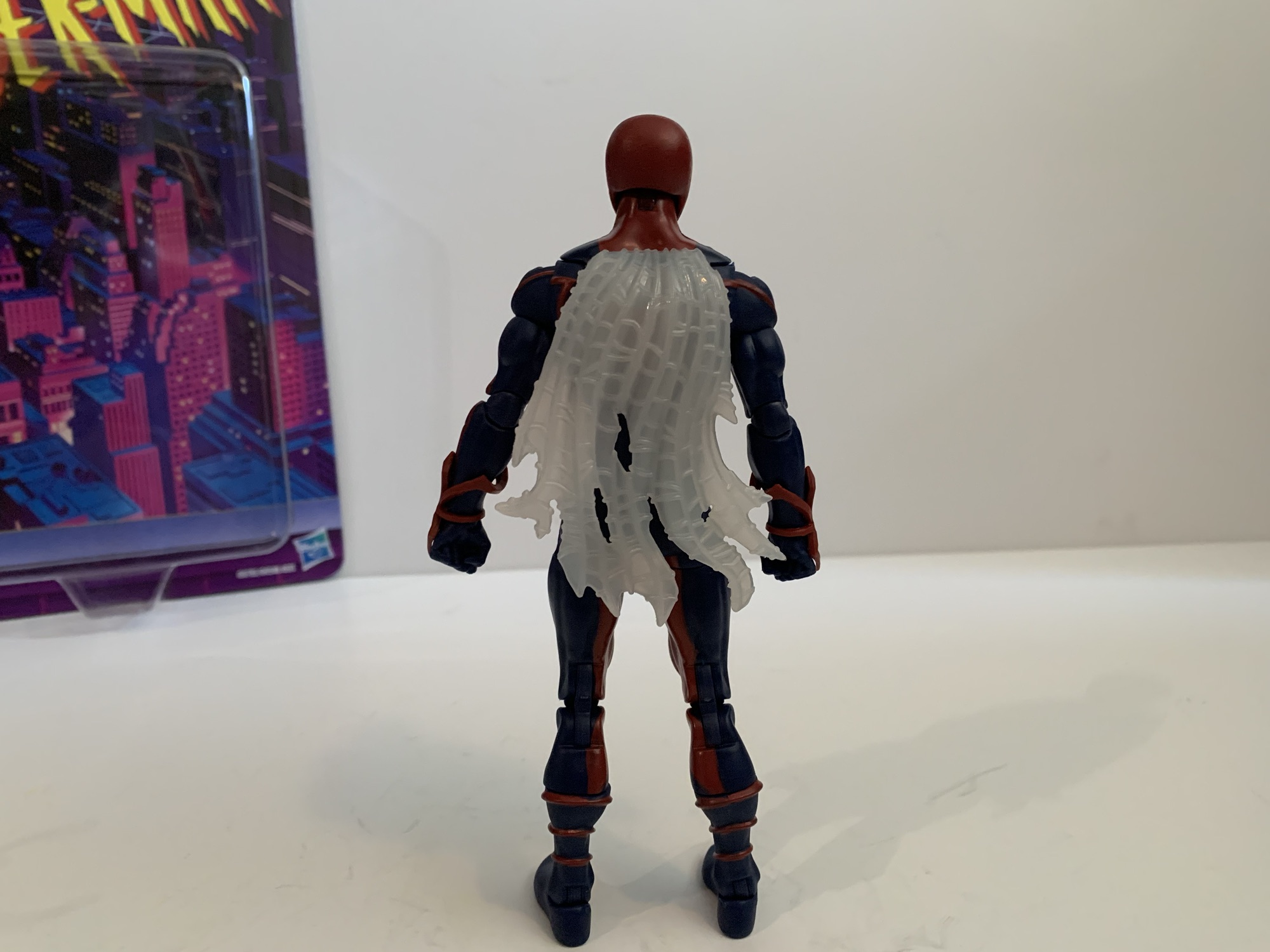
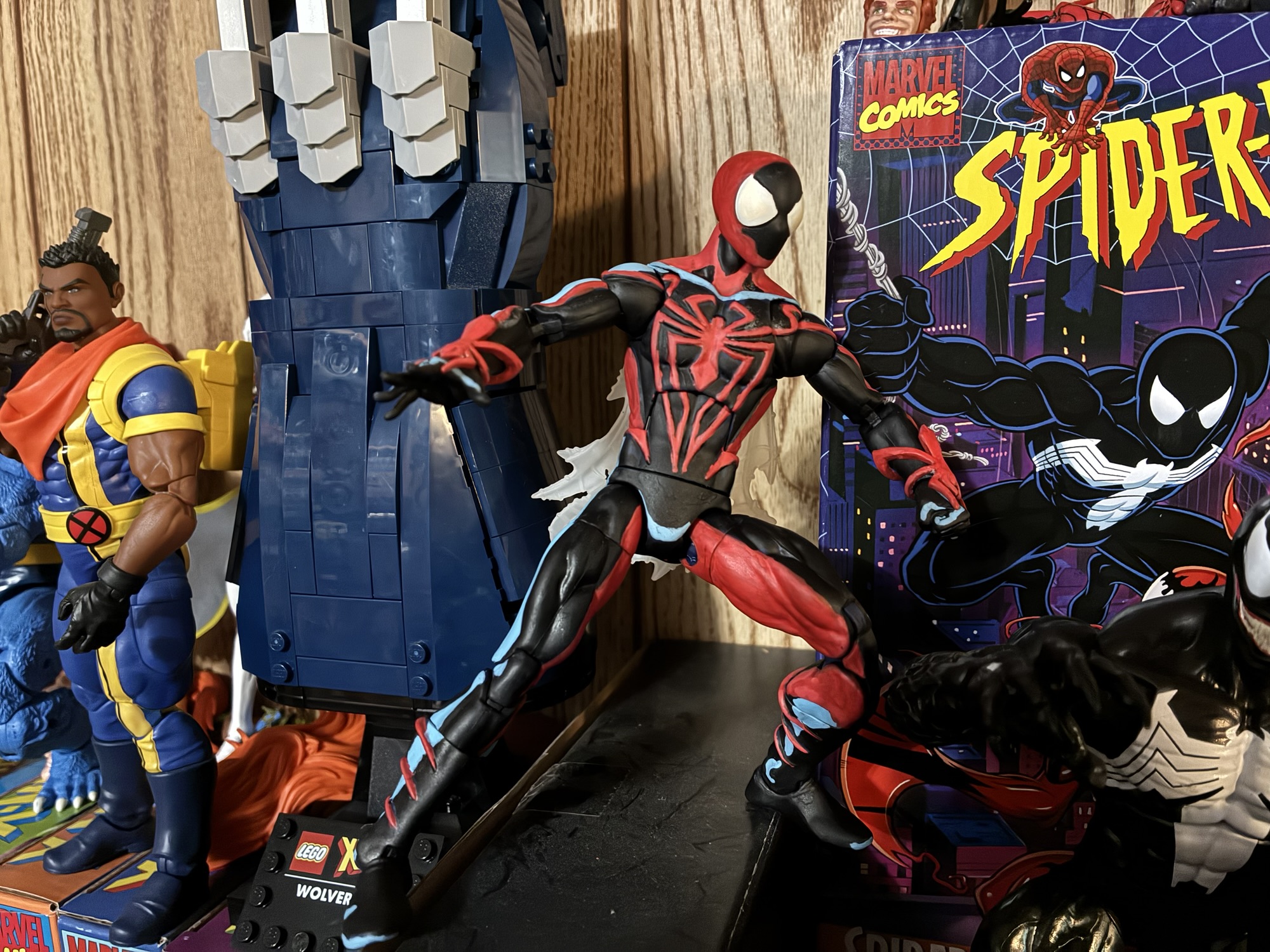
Spider-Man Unlimited is a bit of a throwback to a couple years ago when it comes to Spider-Man figures. I should point out that this suit was designed by Shannon Denton and Roy Burdine so if you like the look then thank them. The figure is mostly new tools because the spider logo on the chest is raised as are the legs running from them. Where they are not raised is on the arms and the red, spider, web-shooters are a separate piece. The calves have molded fins on them while the thighs and feet do not. In other words, the torso and shins are definitely new sculpt while the arms and thighs could have been sourced from another figure. The hands are conventional Spider-Man hands while the head is similar to past Spider-Man molds, but it looks too round to be from one of the symbiote costume figures and I want to say it’s all new. The web cape I’m not sure of as I don’t have any of the 2099 figures. It’s hard plastic and semi-transparent that’s slightly preposed.
It’s really not a bad sculpt.How do we feel about web capes? Personally, I could do without.This one can be touch to get into classic Spider-Man poses.Just like I don’t expect to see Venom and Carnage from the show, I’m guessing no Green Goblin will show up to help Spidey.
Most of this figure has been molded in blue plastic. All of the red you see on the figure is painted except for the web shooters and head. And on the head, the eyes are painted and not all that well. There’s some bleed around them and it’s noticeable even from a distance. The paint on the torso though is pretty clean and impressively so. The only ugly spot is the seem between the back and front of the figure where blue shows throw. Paint on the legs is mostly fine. The red is not particularly opaque on the knee pieces, probably because that piece is a hard plastic and it just doesn’t adhere as nice. To my surprise though, the head doesn’t really clash with the painted neck so that’s a plus.
I need to do a second coat and touch-up the edges, but I like the added shading on the face. Can I keep myself from shading the rest?
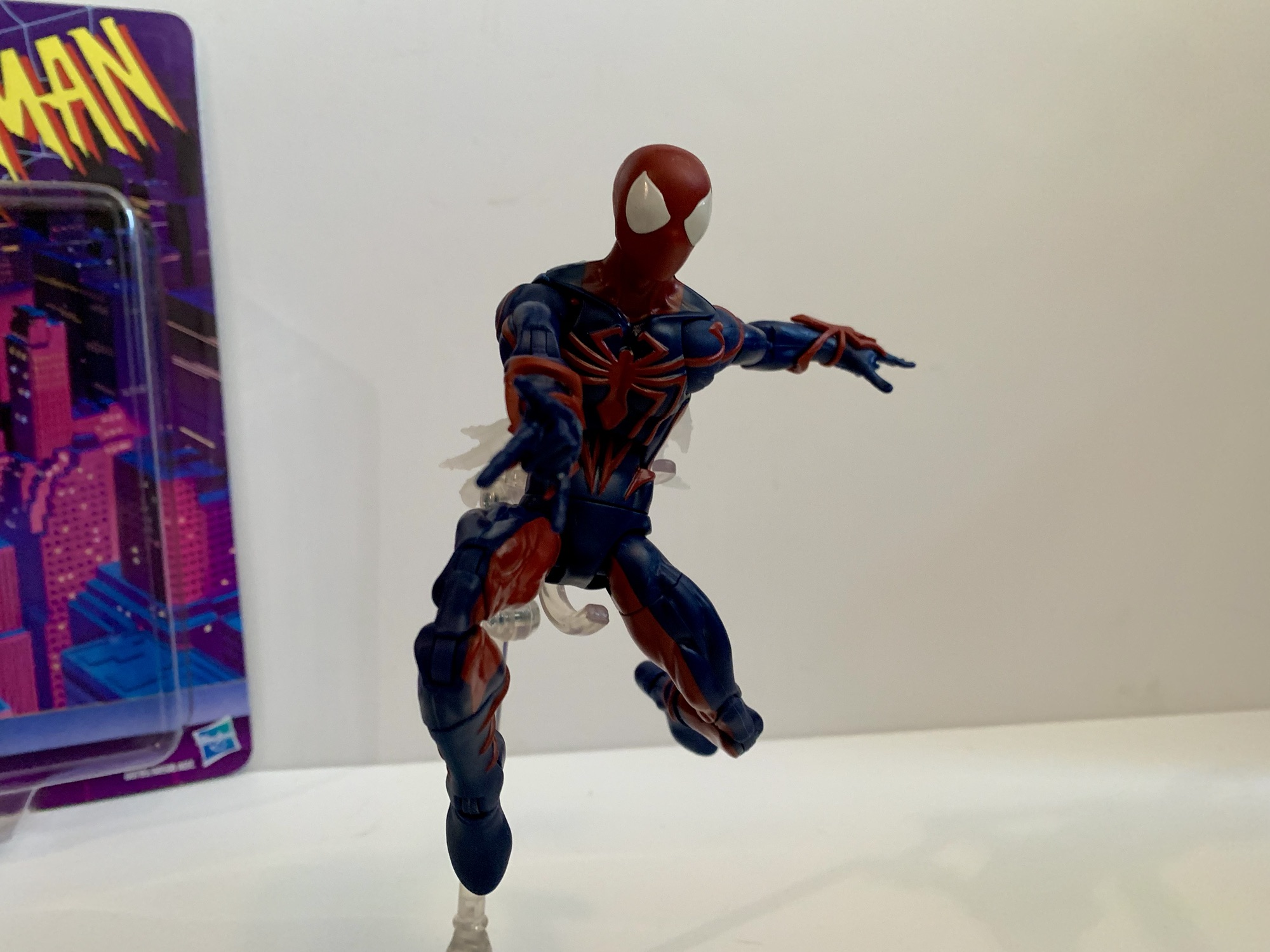
What does stand out aesthetically here is the lack of shading. It’s not really Hasbro’s approach to do heavy shading on their figures, but it feels like a pretty big component for the look of this version of Spider-Man. Rather than shade it, the blue and red just seem all together darker than they probably should be. It is really apparent though since the image on the box is similar to the look from the show. In my opinion, the shading makes the suit look more interesting than it is, but to properly shade this it would need most of the blue to be covered in black. What’s easier is the face, which was always shaded on the front and basically outlined in red. I think a solid compromise would have been for Hasbro to include that shading, but they opted not to. I decided to try it myself, despite not really being a customizer and, personally, I think the shading adds something. I could easily see myself getting carried away and going over portions of the body too, but I feel like I’d be better served to just stop at the head.
A flight stand can really aid in posing this one given its limitations.
Accessories for Spider-Man Unlimited are what you would expect: fists, wall-crawling hands, and thwip hands. That’s all. No Peter portrait or web accessories. The articulation is where the figure feels a little dated. Most new Spider-Man figures have settled on a scheme that includes a ball-jointed diaphragm that Spider-Man Unlimited omits. He just has an ab crunch and a waist twist which really limits the “spider” posing. The other aspects are mostly conventional: ball-hinge head, ball-hinge shoulders, butterfly joint, bicep swivel, double-jointed elbows, wrist swivel and hinge, waist twist, ball socket hips, thigh cut, double-jointed knees, shin swivel, ankle hinge, ankle rocker. Range at the butterfly joint is a plus, while range at the hips is just okay. The waist twist, thigh cut, and shin cuts all are useful, but also all break-up the sculpt quite a bit so your mileage may vary when it comes to how useful they are. The ab crunch, being the only joint in the torso, at least works well enough, but I’m surprised they would go through the trouble of sculpting a new torso without implementing what passes for modern articulation. I don’t love what Hasbro does with its Spider-Man figures, I think they should do a ball joint in the diaphragm and waist, but it would be better than what we have here.
Even in bad TV shows, Spidey can still kick some ass.
Spider-Man Unlimited is a figure I never thought we’d get, but now that he’s here, I find myself surprised I own him. I have a bit of a fondness for odd looks sported by famous characters, especially when it’s tied to some forgotten media like Spider-Man Unlimited. I also kind of bought it because I kept striking out when heading to stores in search of other figures, and then when I saw this, it was like a bit of retail therapy to just buy it. It wasn’t anything I was planning on getting, but now that I have it what do I think? It’s okay. The figure looks fine, and I guess when you’re talking about a costume like this that’s what is most important. The articulation isn’t very good compared to the other Spider-Man figures Hasbro has done recently which aren’t exactly amazing either. And the usual complaints about a lack of accessories applies here too. I will forever remain puzzled how Hasbro was able to condition Marvel collectors to accept Spider-Man figures without web effects. If this costume is one you actually have fond memories of or just think is cool, you shouldn’t have much trouble locating this figure at retail be it online or in-store. I’ve seen it a few times now and more seem to be shipping out every day. It will set you back $25 should you decide to take the plunge with no one’s favorite Spider-Man.
Postscript: So I got kind of bored with this one just hanging out on my shelf. It’s not a bad figure, but the Spider-Man Unlimited TV show was so heavily stylized that it just really wasn’t doing it for me. I saw some customs online that looked really good, so I decided to take a stab at re-painting this one. I went with the outline approach and mostly copied the process of this custom on the channel Ken I Make It. Some others I saw put the blue on the inside of the sculpt to highlight the muscles, which looks pretty cool, but isn’t really in-line with the show. I liked the clean look with the spider logo outlined in black and decided to stick with this approach. Maybe I’ll get bored again some day and decide to do it differently, but I’m pretty content with the end result.
For someone who doesn’t really collect Marvel Legends, I sure have managed to look at quite a few Spider-Man figures:
Last year, Hasbro celebrated the 30th anniversary of X-Men, the animated series that premiered on Halloween 1992 and would become a ratings hit shortly thereafter for the Fox Kids Network. It was responsible for getting a lot of kids into the X-Men and Marvel comics in general and the first, prime, benefactor of that rise…
It was in this space last year that I shared my fondness for the Scarlet Spider costume when I reviewed the Medicom MAFEX Scarlet Spider action figure. I don’t buy much from Medicom because their figures are really expensive for what they are, but I sometimes break my own rule when I think they’ve made…
Well, this is a figure that I never planned on reviewing. It’s a bit old at this point, but we’re looking at yet another Spider-Man retro card release from Hasbro and this time it’s Cyborg Spider-Man. Now, I remember seeing this quite some time ago at Target and thinking it looked fine, but I’m not…
Mondo has had success with its sixth scale line of action figures based on X-Men and X-Men ’97 so it’s no surprise that the company has decided to dip its toe into another 90s animated Marvel series in Spider-Man. And when it comes to Spider-Man, I’m not sure what to call it. I always referred to the X-Men cartoon as simply X-Men, though in the ensuing decades there’s been an attempt to retcon it as X-Men: The Animated Series since that’s what happened with Batman. Only, Batman had “The Animated Series” tacked onto it from the very beginning even if it wasn’t technically the show’s name. With Spider-Man, I guess I always called it just Spider-Man, but over the years I’ve come to think of it as Spider-Man ’94. I don’t know why I feel the need to differentiate it in such a fashion, but I do sometimes refer to X-Men as X-Men ’92.
Whatever you want to call it, Spider-Man was a pretty entertaining show for an early teens kid in the 90s. I was introduced to the character of Spider-Man via public service announcements and that really cool CGi Spider-Man that dropped in as part of the Marvel logo at the end of Muppet Babies. I did catch a few stray episodes of Spider-Man and His Amazing Friends, but for the most part I didn’t know a ton about Spider-Man going into the premiere of the ’94 cartoon. I knew the basics, had a few comics, read the back of many trading cards, but a lot of Spidey knowledge would come from the show. And I liked Spider-Man well enough going into the whole thing, but the character I really liked and wanted to see on television was Venom.
As is typical of Mondo, the packaging is pretty nice.
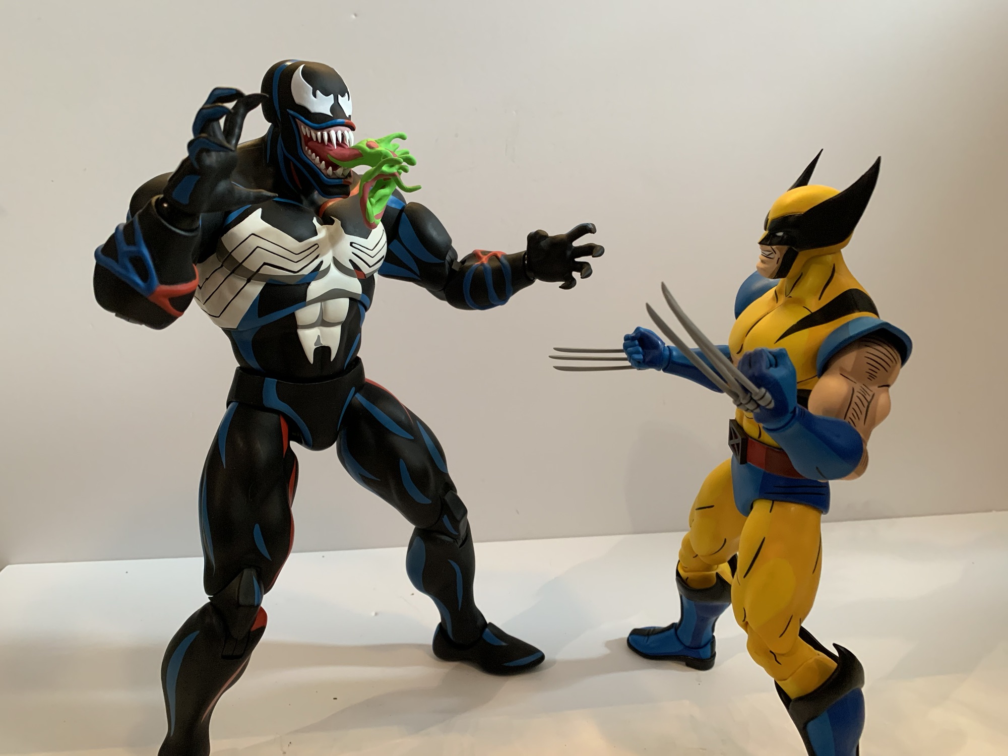
I’ve explained my love of Venom in other posts on the subject, but he was one of the big characters of the 90s. Sure, he debuted in the 80s, but I feel like he took off in the 90s leading to his solo outing in Lethal Protector. When the Toy Biz Marvel Super Heroes line emerged, I didn’t buy Spider-Man, I got Venom! When the video game Maximum Carnage hit, I played that thing and kept saying “Where’s Venom?” until finally getting to the stage where he was playable. He was just cool. This big, brutish, version of Spider-Man with a great concept for his costume and artists that took advantage of it. When the show hit, he was saved for last in the opening title for a reason and I would tune into that show week in and week out waiting for the big guy to finally show up. And when that episode finally hit and the alien slime dripped down onto Eddie Brock I could have jumped out of my skin with excitement. Unfortunately, that would be just one of three episodes that featured the character, but it was still cool to finally see him in animation.
That’s definitely Venom from the old Spider-Man cartoon.
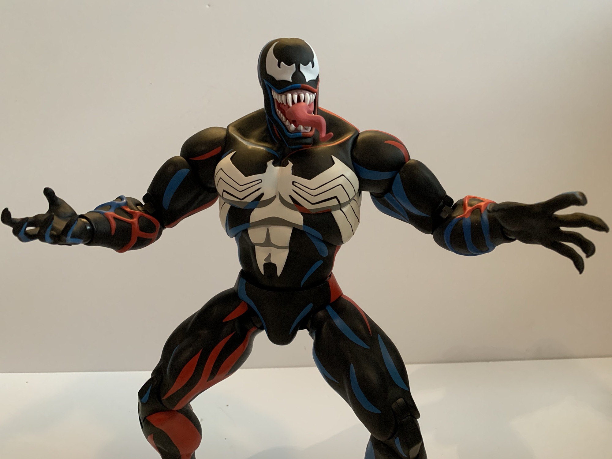
I liked the show Spider-Man well enough, but it wasn’t as high on my list as X-Men. As a result, I don’t know how deep I’m going to go on a line of sixth scale toys that retail for over $200 a piece and require a lot of shelf space to display properly. However, when Mondo announced they were doing Spider-Man I knew I was at least in for Venom. Which doesn’t make the most sense, if I’m being honest. Venom, as a character created for animation, has a weaker design compared to his comic book counterpart. He couldn’t have the many rows of teeth, the giant tongue, complicated eyes, and so forth because it would be a nightmare to animate. He also couldn’t be shaded like he was in the books where most artists would start with a blue base and then layer on the blacks. He kept his basic shape, but the eyes and mouth were simplified. The show added its own touch by cutting out slits on the tops of the white eyes which give him the illusion of slit-like pupils as if owing to a snake. The tongue was there, but not monstrous and usually absent the green slime. Standing out most though was this blue outline the character would have on one side, plus a red one on the other. It’s not uncommon to see blue used to shade black in both comics and animation, but the red was certainly an interesting choice. It’s certainly a unique look for Venom, even if it isn’t my favorite, but there’s charm and certainly a great deal of nostalgia baked into this look.
Venom is pretty damn large even when compared with the biggest characters from the X-Men line.
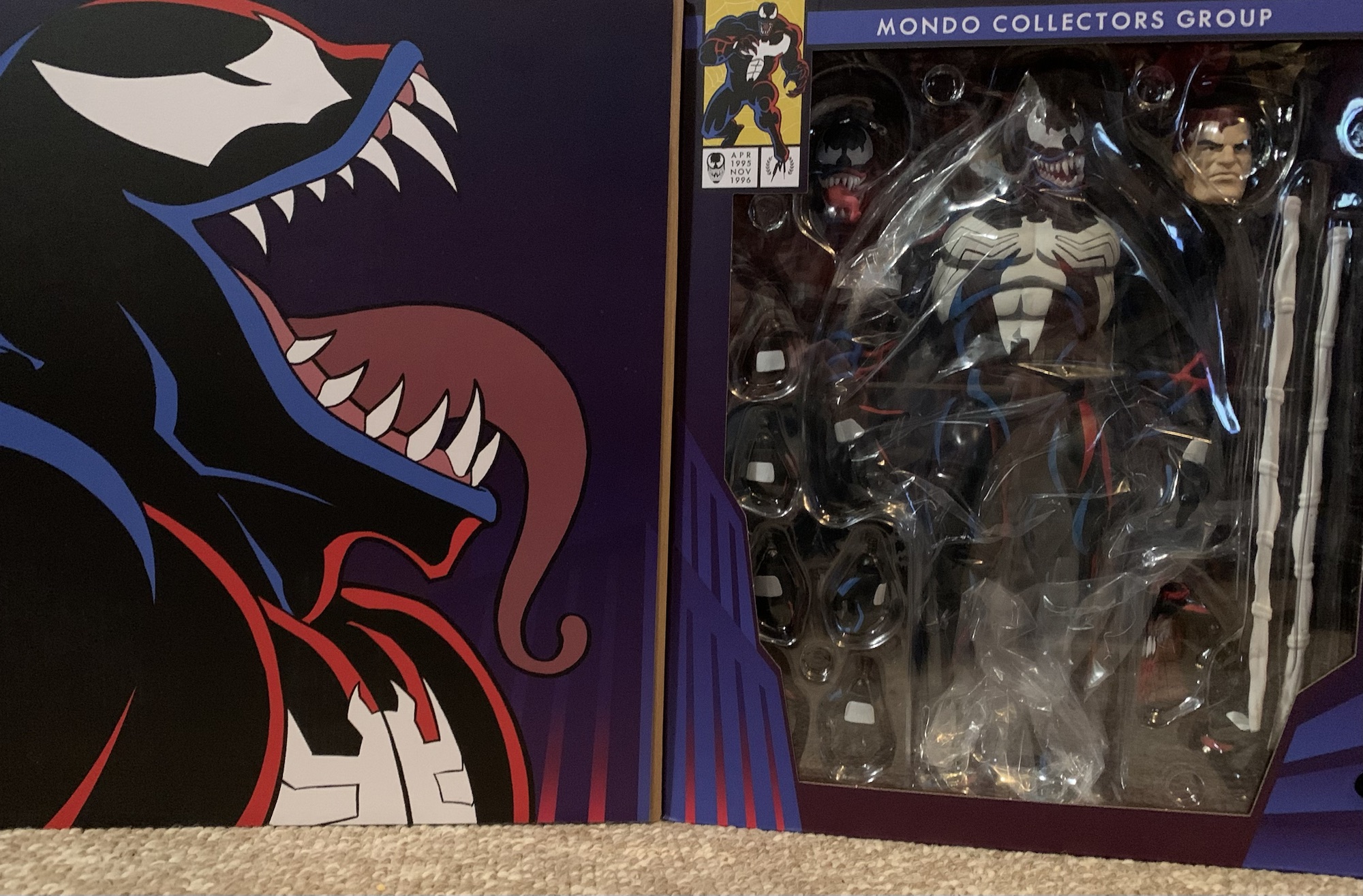
Mondo’s Venom comes in a massive window box that is structurally the same as what we see from the X-Men line. Conceptually, it’s relying on new artwork and for this release that artwork is done by Kris Anka with Jordan Christianson receiving credit for the package design. There’s a big web on the front with Venom in the middle with a black, blue, and red Spider-Man logo across the top. There’s a Velcro flap with a side portrait of Venom on the inside. The window for viewing the figure has a comic book-like character portrait in the top left corner that also includes the dates April 1995 through November 1996 with both endpoints marking Venom’s debut and final appearance in the show.
Sorry Wolverine, since we don’t have a Spidey you’ll have to do.
Packaging is fun and all, but the real treat is what’s inside. Venom is a big, hulking, brute of an action figure. Mondo lists him as 13″ and my tape measure has him at just a tick over 13.25″. He’s big and right up there with Sabretooth and Omega Red from the X-Men line. This is another sculpt by Alex Brewer and on paint for Venom is Mara Ancheta and, let me tell you, these two did a bang-up job. That should come as no surprise to anyone familiar with what Mondo has been doing at this scale, but Venom looks like a maquette from the show. He is as faithful to the screen as you’re going to find. His upper body is massive with huge shoulders and bulging biceps. It tapers well at the abdomen and he has these tree trunk legs that just really add to the bulk on display.
I can hear Hank Azaria’s voice in my head.
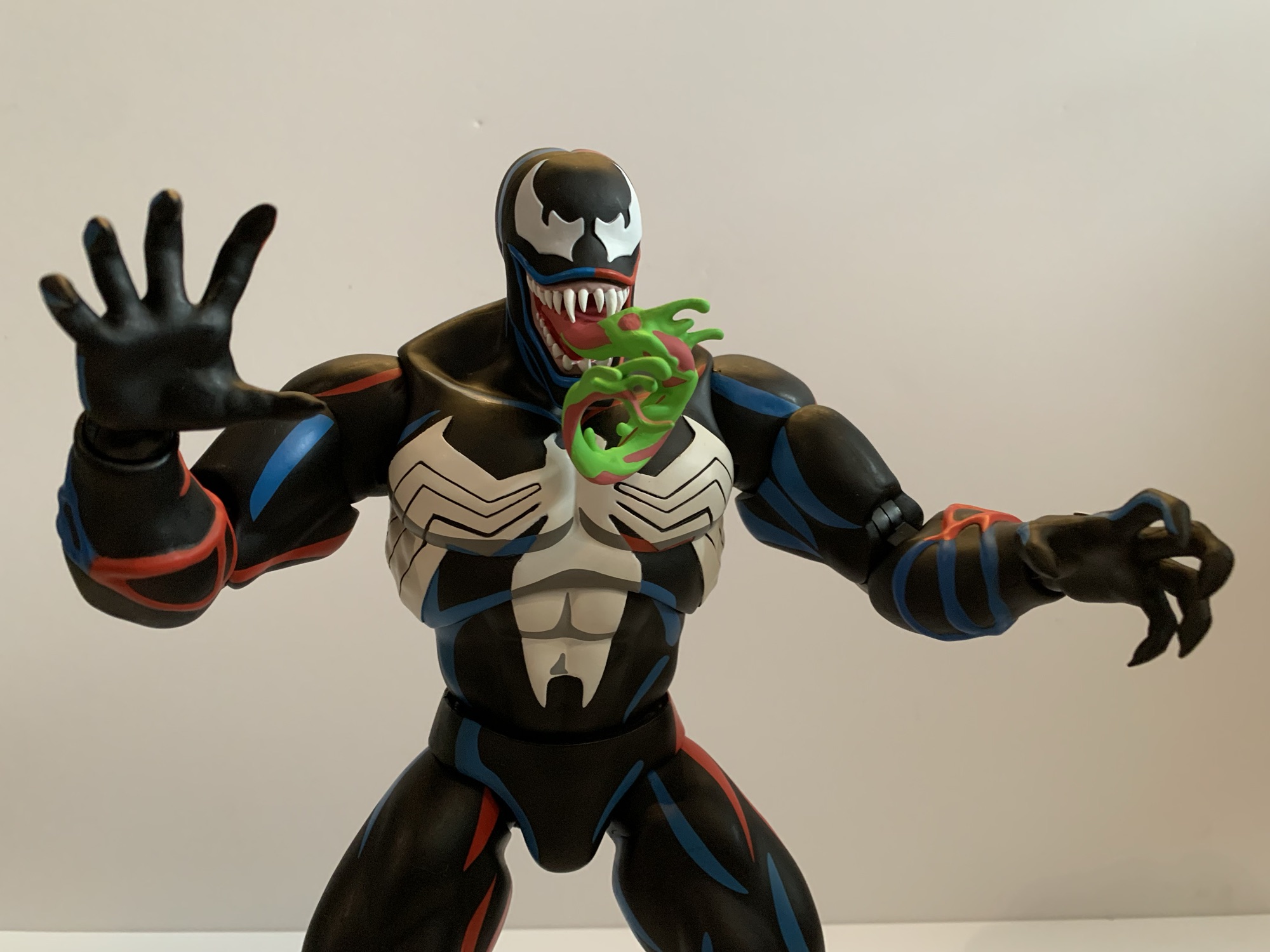
All of the show specific details are captured beautifully in this figure. The portrait is perfect. He has this slight indent on the center of his head which he was often drawn with. It was like the meeting point between the blue and the red outline and it gave him a bit of a “butthead” look in some stills. Here it’s subtle so we don’t have a butthead Venom, but we have an accurate one. The eyes are perfect and he has those unique Spider-Man ’94 eye slits plus the blue and red lips around his lizard-like maw. The default head has an open mouth and the teeth are painted exceptionally well. On the chest and back is the classic white spider logo and the black lines in the legs are slightly sculpted in. The forearms feature those veins that kind of looked like webbing to me as a kid and they’re colored in blue and red as they were in his second appearance. The white patches are also present, a detail Mondo certainly wouldn’t overlook. And the paint is just fantastic. Crisp, clean, and in the right amount. Venom isn’t the sort of character that’s going to pop like a Cyclops or even a Spider-Man, but he has what he needs. There’s tons of blue and red highlights on the muscles and the logic on play is well applied as the figure creates an illusion of a light source. There’s also a hit of gray in the spider logo under the pectorals and in the abs which looks great and adds definition. If you inspect the figure in great depth you might find a white spot here and there or a softer edge to some of the paint, but in terms of paint slop it’s pretty much pristine.
Venom triumphant!
Now, where these Mondo figures usually don’t shine is with the articulation, and despite Venom doing some thing different, he’s still largely the same. All of the points of articulation you could want are here, they just don’t have the range to create a variety of poses. There’s the usual double-ball peg head, the ball-hinged shoulders, ball-jointed wrist, ball-jointed diaphragm, ball-jointed waist, ball-socket hips, thigh twists, double-jointed knees, ankle hinges, and ankle rockers. The sort of new, or less often seen, are the bicep swivels with double-jointed elbows. I think Mondo is going to be doing this more and more going forward as we did see it with Cyclops and it’s a change I like. In terms of what works and what doesn’t, it’s largely a case of tightness. The shoulders are very tight. Hitting a T pose might be impossible for this guy and just basic rotation is tough. You also have to be mindful of the arm rubbing on the pecs as you don’t want to mess up the paint. The elbows will bend a little past 90 degrees, but he’s so bulky that going any further really isn’t going to do much. The diaphragm joint feels very limited. I’m getting not much forward and back, rotation is oaky, but again it’s a painted surface and I don’t want to mess anything up. The waist is really hard to get much use out of and I can’t get the ankle hinges to budge. The rockers work so standing him has been easy, but this isn’t a Venom for deep crouches or those real spider-like poses.
Venom has these itty bitty webs.
There’s no sugar-coating it, articulation is a shortcoming with this figure and with this line. It’s just a question of as a consumer are you willing to accept that as a trade-off for the aesthetic? And aiding that aesthetic is the boatload of accessories Mondo included with this one. I have the limited version, which has some extra stuff that I’ll be sure to call attention to. As far as what’s included with all, we have a bunch of hands. By default, Venom comes equipped with open hands but he has sets of fists, gripping, and clawing hands that swap in and out pretty easily. He also has an extra right hand which is gripping a Spider-Man mask from the scene in his debut episode where he tries to expose Spider-Man to the general public. The mask is sculpted and fully painted and looks cool. It’s also kind of amusing to me because Mondo’s Spider-Man figure (I initially passed on that one, but then ordered it via a third party through a sale and I’m still waiting on it) came with a hand holding the mask of Green Goblin. Is that going to be a thing for this line where every character comes with a hand holding the mask of another character?
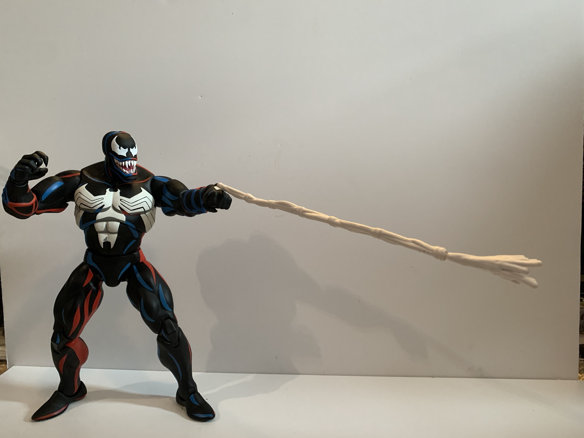
He also has some big web lines with different attachments for the end. This attachment is basically the traditional web line.
Naturally, Venom also has some effect parts. And namely, effect hands. He has two fists that are angled with long strands of web shooting out. The web lines are close to 9.5″ in length and are made of soft plastic or rubber with a wire running through it. I’m not sure how useful the wire will be, but I suppose it’s better than not having it. The line ends with a plug hole and you can insert one of two splatter ends or one of two included web ends. I like them, but the connection on my figure’s left hand is pretty weak. Weak enough that I think it might fall off soon which is something to be mindful of. The web line on the right hand seems secure. And if these web lines just seem like too much, there’s also a set of hands with short, 2.5″, web lines shooting out. These do not have a wire, because it’s not needed, but they certainly require less shelf space if you want Venom shooting webs on your shelf.
And if you prefer, we have a splat effect too.
Venom has always been an expressive character so he needs multiple portraits. And for the standard edition you get three. The default one features an open mouth and Venom’s typical sinister grin. The alt head has that tongue you all want snaking out. As it was in the cartoon, the tongue is pink and there isn’t any slime on it as was common in the comic books. Often in the show the tongue would end as if there was slime on it, but it was just colored pink. I always wondered if that was by design or if they just didn’t paint on the slime. Either way, this head doesn’t reflect that which is honestly probably for the best because it was pretty weird looking. Lastly, we have the unmasked Eddie Brock portrait. There’s not much to say about it other than the likeness is spot on. He has somewhat of an agitated expression when I think most may have preferred a sinister grin, but it’s fine. Paint across all of the heads is pretty damn immaculate. I don’t use that word often to describe the paint job on toys because there’s usually something wrong on everything, however minor. With these it’s pretty damn hard to find anything though.
I think of this as the Lethal Protector head.
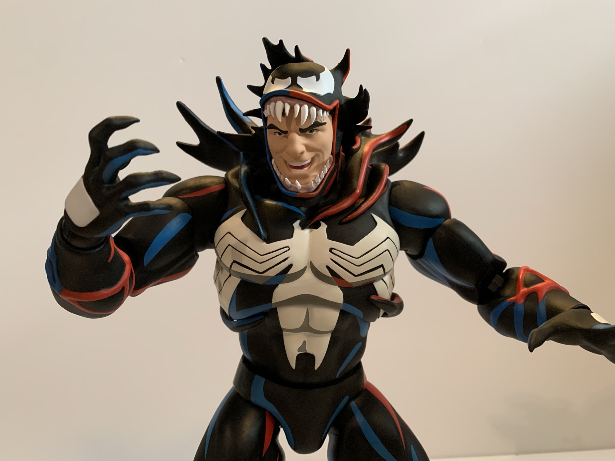
And now for the extra stuff. If you get the limited version, you get two extra portraits. The first is another tongue head with a more dramatic tongue covered in green slime. This feels like more of a comic head even though the actual head and face of the character is still undoubtedly Venom from the cartoon. I think of this head as the idealized version of the character, what we would have wanted to see all things being equal from the show, but animation budgets prevented it. It’s awesome though and I am guessing this will be the favorite of many. The other head is an Eddie Brock portrait in mid-transformation. The Venom “mask” is closing its mouth over Brock’s face as it would do in the show and it looks amazing. I can’t believe how well they managed to get the paint on this thing and it’s this Brock face that has that sinister grin I was looking for. To go with this is a big piece of Venom goo that clips around the waist of the figure to make it look like alien slime is shooting off his back. It plays up that mid-transformation thing, even though the figure is basically already in Venom form, but it’s neat. It’s soft plastic so it doesn’t feel like something that will scuff the figure or anything.
Poor Venom has no Spider-Man for his swing. Maybe one day…
The last accessory is what I affectionately refer to as Venom’s web sex swing. It’s from the debut episode of the character where he webs up Spider-Man in this web contraption, pulls off his mask, and dangles him over the edge of a building where the onlookers at street level try to get a picture or video of Spider-Man unmasked. It’s basically five parts: you have a Venom left hand which is how it attaches to Venom. Then you have the five web lines, two of which end in loops to go over the Spider-Man figure’s wrists and the other two weblines end on what’s basically a web belt. The plastic is fairly soft and pliable and, according to Mondo, this belt part is supposed to slide over Spider-Man’s legs and come to rest around his waist. I don’t have that figure, but I have my doubts that this thing will be easy to get onto Spider-Man. When/if I get Spider-Man maybe I’ll update this with a picture of it in action, or confirmation that I just couldn’t do it. There are promo shots of it, but who knows how Mondo pulled them off. I suppose you could separate the figure at the diaphragm, but I don’t blame anyone for not wanting to pull apart a 200 dollar action figure. I know I wouldn’t.
What a portrait!
Mondo’s take on Venom is pretty damn rad. If you don’t care for his animated look then that’s understandable, but if you’ve ever wanted a representation of Venom from the Spider-Man cartoon on your shelf then this is the one to get. Yes, it’s very expensive and I was even a little annoyed at the price this one came in at, but it’s Venom and I had to have it. The articulation won’t blow anyone away, but the presence this one has is pretty damn incredible. He has all he needs and the execution of the sculpt and the paint is as close to flawless as I think I’ve ever seen with an action figure in any scale. Yeah it costs a lot, but you’re getting a damn good product. If you want the limited edition, unfortunately it’s sold out and you’re going to have to try your luck on the aftermarket. My preferred head is in the limited version, but I don’t know that I’d pay more than the ten bucks Mondo charged for the extra stuff. The standard version should still be available in various places, just not through Mondo directly. If this looks like something you want in your collection, I think the expense is worth it. Just know what you’re getting: a big, kick ass looking Venom from the 90s Spider-Man cartoon.
We’ve got plenty more Venom and more from Mondo for you to check out:
On Tuesday, I posted a review for the NECA TMNT Adventures Cryin’ Houn’ action figure, a figure that debuted during this year’s edition of Walmart Collector Con. Today, we’re looking at a true exclusive from that event. Cryin’ Houn’, and a lot of other figures released that day, were basically a first to market agreement…
When I was a kid, my dad took me to some local convention or trade show. I have no idea why because my dad wasn’t the type who would go to such an event. He liked car shows, but from what I can remember this was more of a hobby show. It was early in…
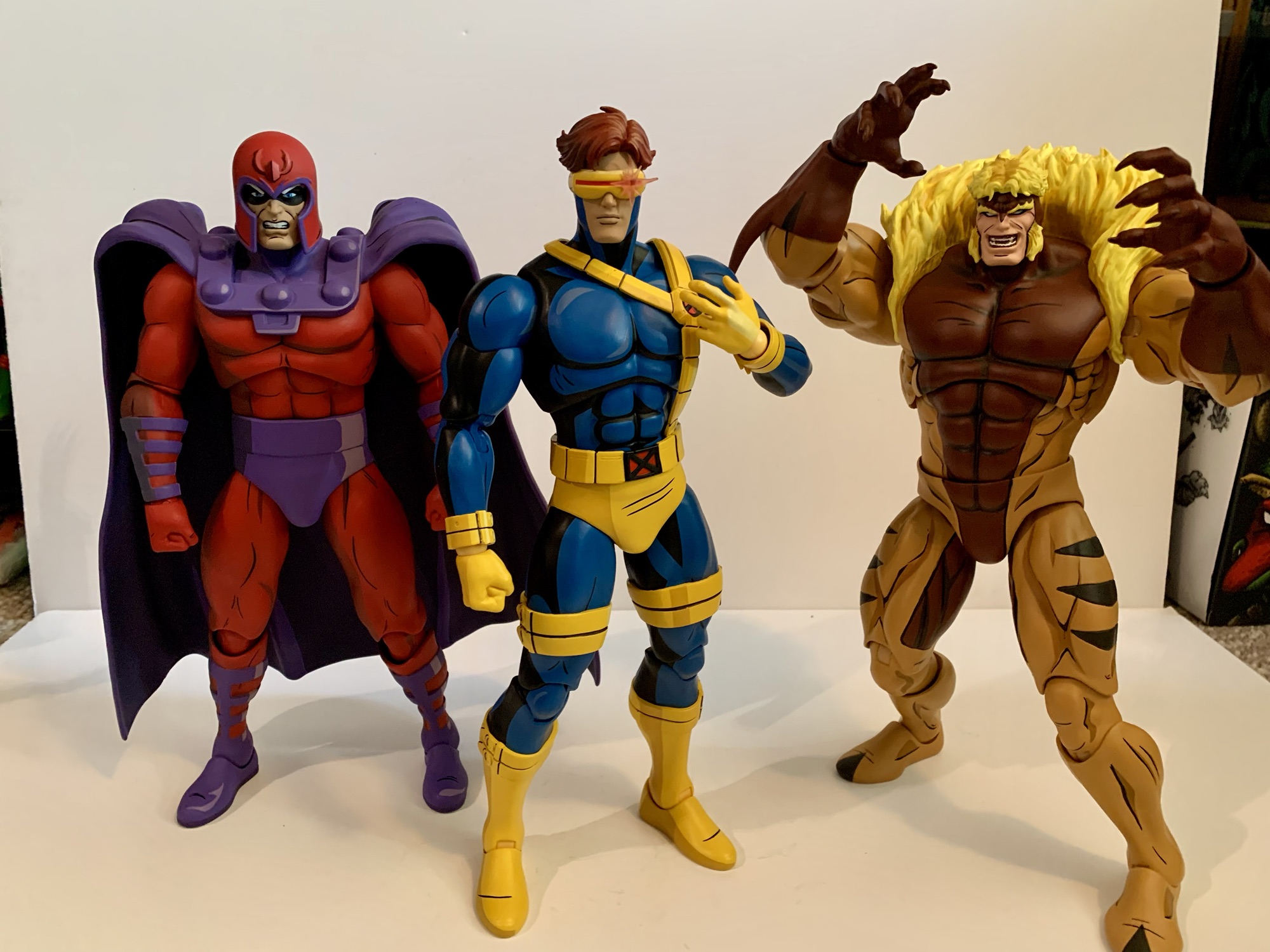
After putting a real hurting on my wallet in 2023, Mondo decided to take it easy in 2024 with its line of sixth scale action figures based on the animated series X-Men which ran from 1992-1997 on Fox Kids. Two figures ended up getting released this year, Rogue and now the leader of the X-Men…
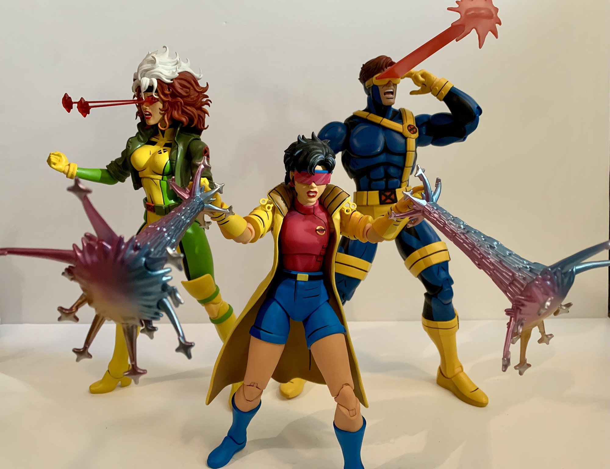
After putting a real hurting on my wallet in 2023, Mondo decided to take it easy in 2024 with its line of sixth scale action figures based on the animated series X-Men which ran from 1992-1997 on Fox Kids. Two figures ended up getting released this year, Rogue and now the leader of the X-Men Cyclops. With Cyclops though we get a slight change because easily the biggest thing to happen to the X-Men in 2024 was the release of X-Men ’97. Well, some would argue for a movie staring a foul-mouthed merc and an old man as being the biggest business in the X world, but I’m going with the Disney+ series. Since the show turned out to be quite the hit, and because it’s a continuation of the original X-Men series, Mondo decided its figures could use a little rebranding which is why Cyclops is the first release to be billed as hailing from the new show. What does this mean for the figure itself? Not a whole lot.
Yeah, I know, this isn’t a fair comparison.
Cyclops still comes in the same style of window box with artwork from storyboard artist Dan Veesenmeyer. The difference between his release and the others is that the character model definitely resembles the look from X-Men ’97 and not the original show. That’s not a huge change as the costume is the same, but Cyclops has a slightly slimmer profile and the detail work is a dead ringer for the same in the new show. For the figure, there’s really no change and Mondo via its YouTube channel has basically admitted that the figures are going to hew closer to the original series. It’s just now they will be able to toss-in items and accessories pulled directly from the new show where it makes sense.
“To me, my X-Men!”
And we pretty much know this to be true because concept art for Cyclops was shown well before X-Men ’97 debuted. Here we have another sculpt by the awesome Alex Brewer with paint by Tomasz Rozejowski that really harkens back to 1992 and that original Fox series. Cyclops stands a full 12″ and is clad in his yellow and blue Jim Lee outfit which he wore almost exclusively in that show. Like prior figures in this line, there were two editions of Cyclops made available and I opted for the limited version which came with extra stuff which we’ll get to.
You may want to separate these two on your shelf.
The sculpt for Cyclops may not be complex, but it gets the job done. He’s well-muscled and proportioned with a portrait that evokes the original series. The details one would expect are in place like the segmented straps on the belt or the pouches and straps. There’s even a little extra detail where the chest strap attaches to the lower belt that I don’t remember seeing in the show. The hair and the visor are all appropriate and the placement of the thigh straps appears spot-on as well (they’re also floating and slightly annoying as a result). That doesn’t mean there isn’t room for some nitpicks. Cyclops was nicknamed Slim early on, but by the 90s he was a pretty massive dude. This figure depicts him as a big guy, but maybe not quite as big as he could be. The legs look fine and so do the arms, but the chest and abdomen strike me as a bit undersized. It’s almost like Mondo aimed to fit this Cyclops figure in-between the 92 and 97 version. It could also be for a different reason which ties into the extra stuff. This version of Cyclops has removable arms and an optional flight jacket part like the Logan figure. If he were any bigger he might look huge with the jacket. If so, I disagree with the approach as the jacketed look should be a secondary concern, but the feature also seems to play a role with his shoulders being set apart from the body. These are all things mostly noticeable when the figure is just standing straight up and down, pose him and it’s less an issue, but it’s an expensive figure so we have to nitpick where it’s warranted.
He scales well enough with the bad guys too.
What really offers no room for disappointment is the paint. Mondo just slays when it comes to that part of the presentation and Cyclops is no different. The base blue is the perfect royal blue and the lighter blue used to shade it and the blacks all make him pop. The yellow is the right shade with just a hint of red of in it to lessen that lemony look the Hasbro figure of the same has. The different shades of gold used to apply the cel-shading for the yellow looks great and everything is rich and full. There’s an impressive lack of paint slop and issues as well. With such an ambitious paint job some of that is expected, but I’m finding it hard to notice with this one. There’s a visible brush stroke on the chest strap, but apart from that I’m at a loss. This is some really impressive execution so Mondo better hang onto whatever factory put this one together.
Mondo decided it was important Cyclops be able to do stuff like this.
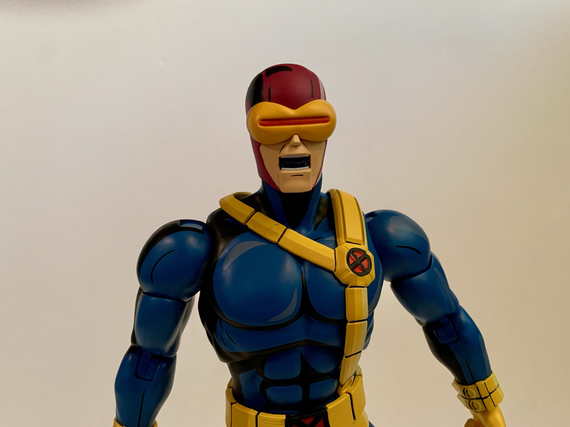
Cyclops comes with new branding, but he also comes with new articulation. Mondo tends to keep things basic with its figures as they prioritize aesthetics over function. And at this scale, I think that’s the right approach. However, there’s no denying that certain characters need to be able to hit certain poses and for Cyclops it’s being able to place a hand on the side of his visor to activate his optic blasts (even though we also see him do so without pressing a button in the show, but lets just go with it). In order to achieve that function, Mondo opted to incorporate double-jointed elbows into this one. And they work great, no problem hitting that pose and he can pretty much put his hand to his X communicator on his chest as well. And the aesthetics trade-off is nil, as far as I’m concerned. We’re all toy collectors and we’re used to double-jointed elbows. They look fine, better than the swivel joint used on Wolverine and Sabretooth that has some miscolored plastic, so I hope they do this more going forward.
This is a team that loves a good, brown, jacket.
Aside from that, the articulation is pretty much the same as other figures. The head is on a double-ball peg and the range is pretty nice. It is a little more gappy than past figures, but I’m guessing they prioritized plus range at the head given his unique skillset. The shoulders are the usual ball-hinges with a bicep swivel past that. Wrists are ball-hinged and they can be tight, but I didn’t experience any issues. The torso is where things get less impressive. Cyclops has the usual ball-jointed diaphragm and waist, but he also has that unique belt that goes around his chest. It’s connected to the belt at his waist so it’s going to get in the way. It has some play and will float when you manipulate the chest, but the range is okay, at best. Hips are ball-sockets with thigh swivels built in, but the rubber trunks will hinder the figure’s ability to kick forward and back. I can get him into one knee poses, but it’s awkward and one must be mindful of paint rub. Knees are double-jointed and the ankles hinge forward and back with an ankle rocker. The ankles are pretty tight, but I didn’t need to heat them up to get them working. Shoulders are really tight too, but again, no heat needed as I just went easy.
Multi-blast!This is the big one.It sags a little.
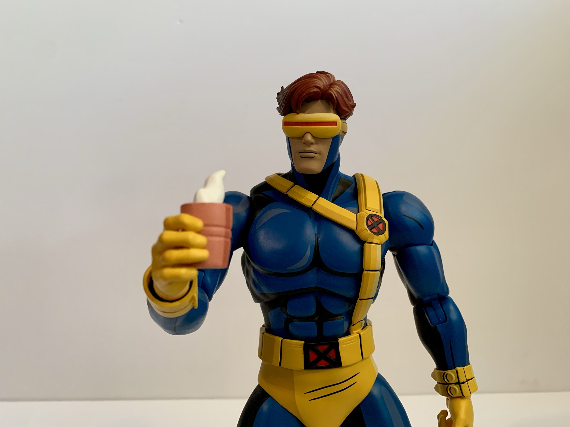
Cyclops has a ton of extra stuff to go through so let’s not waste any time. We’ll do the standard version accessories first which include a stoic head and a yelling head. Both feature interchangeable visors and come with a standard one by default. Getting the visors off and on is pretty painless, and both heads can use all of the visors. The extras are a visor with a lens flare and one with a slot in it for blast effects. And for blast effects we get two by default. The first is a pretty standard Cyclops blast. It’s 4″ long or so with a splash effect at the end. The easiest way to put it on is to slot it through the visor first, then plug it into the head. It can only go in one way so if it doesn’t fit just spin it around. The other blast effect is an arc with four short blasts. It strikes me as a very Marvel vs Capcom effect and it looks pretty cool. Both are done on translucent red plastic which feels appropriate for a Cyclops effect. They’re rigid so hopefully none arrived warp. I love the look of the blast, and the lens flare part is also pretty cool, so settling on a display is actually quite challenging with this guy. You’ll want to swap some stuff from time to time.
“I was raised by a cup of coffee.”
Cyclops also has an assortment of hands to make use of. By default, he comes with a set of fists which are always useful. In addition to that he has two clenching hands, two “finger bang” hands, a set of two-finger hands for his optic blasts, and a single right gripping hand. The gripping hand is for his cup of coffee which is included. This was seen a few times in the first season, most memorably for me in “Deadly Reunions,” and it’s a pink cup with sculpted steam wafting off of it. Even though Mondo included a gripping hand for it, I find the clenching hands work just as well to hold it. Swapping heads and visors is painless with this guy, but the hands are tough. The pegs going into the arms are ribbed when they probably don’t really need to be. The ball hinge also plugs into the hand and each hand is on its own, which is how Mondo always does it. Initially, I felt like the fists were more likely to come off at the hand and not where they’re supposed to in the forearm, so I heated the forearms of my figure with warm water. It’s made easier by the fact that the arms are designed to pop off. I was then able to get the hands out, but it was dicey. I’m reluctant to really jam any of the hands into his forearms as a result, though I haven’t had the same level of difficulty with the other hands.
Sometimes it gets cold out there.
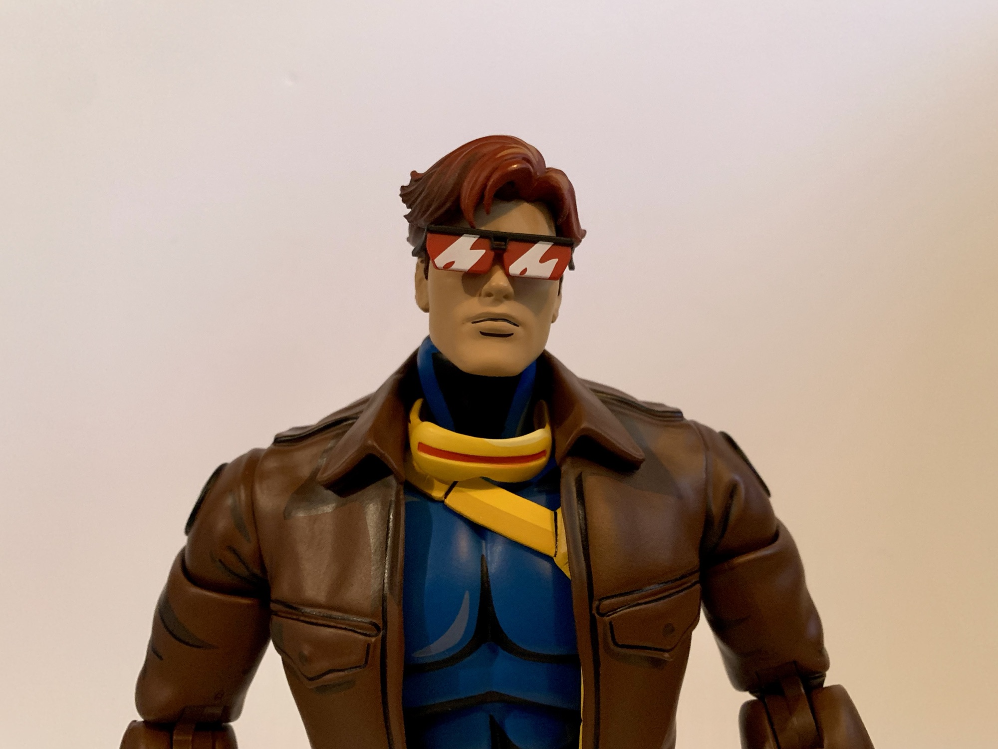
That’s all the stuff that comes with the standard, $220, version. The $240 limited edition has a few more things including the aforementioned jacket. Swapping the arms isn’t too bad and the jacket arms come with bare fists. The fists are actually the exact same as the standard fists just painted flesh colored. They are removable, though I haven’t bothered since they’re in there pretty good. He sometimes wore gloves with the jacket in the show so the other hands work with this look as well. The arms are also double-jointed at the elbows just like the standard ones so there’s no loss of articulation in swapping them. I think he looks great with the jacket and it’s a tough call on how to display him. Right now, I’ve gone without, but I’ll be changing it from time to time for sure. Oh, and I had to try because this look is so close to Morph, but the Morph heads don’t fit. The opening is way too small, which is probably good so that I’m not tempted to attempt a very expensive custom.
The big blast needs a little help.“Take that, hairball!”
Cyclops would wear the jacket in the field plenty, but sometimes also to look more casual. To that end he has an uncowled head. It looks great and his eyes are painted red, which makes sense. Maybe some would have preferred brown eyes for the few times he was depowered in the show, but many won’t display him like that because he also has his shades. They’re black with the red lenses that have some white shading on them which looks nice. They’re a little brittle feeling, but have held up fine so far. They slot into his temples and look great when in place. He also has yet another visor that’s been removed so he can either hold it or stick it around his neck or something. It’s a nice touch. I will say, this head is the most X-Men ’97 looking part of the package, which could be intentional. This version also comes with another effect part that is one, massive, blast that’s almost 8″ long. It has a large splash effect at the end and it looks cool, but it’s heavy. There’s some drooping with this one so I’m reluctant to leave it in place for long stretches of time. It probably works best in tandem with an enemy getting blasted so there’s some added support for it.
Probably not going to be the preferred look for most collectors.This head can make use of the blasts though.
Oh, but we’re not done! Mondo likes to toss in a goofy accessory with all of these special editions. We had the elf Jubilee portrait, Gambit as Mystique, and the Morph heads. With Cyclops, it’s a Sentinel head styled to resemble Cyclops. This is taken from the episode “Till Death Do Us Part – Part One” where Wolverine is battling Cyclops robots in the Danger Room. It looks the part and is pretty ridiculous when placed on the head of the figure, but it’s there if you want it. And Mondo went the extra mile and also included a swappable visor piece so he too can make use of the blast effects. It’s a little tighter a fit than the other visor, but it works. I’ll never use it, but it’s funny. Maybe it can be used as a head of a fallen Sentinel with Wolverine or something? Lastly, there’s also the usual Mondo stand. I don’t use them so I didn’t even take it out of the plastic. I wish they’d put an X emblem on it like the Logan one, but it’s fine.
“How do I turn these darn things off?!”
Ultimately, this is another home run by Mondo. Cyclops is a much needed addition to the roster of characters and he turned out pretty great. Did I have issues? Yeah, because nothing is perfect. I’d have liked to see a little more beef in the torso, but that is basically the end of my complaints. I do think the hands could have been made to swap easier and the hands are a longstanding issue with the line (though it’s been better, Magneto was rough). I get why things are tight though because these are big, solid, figures and loose joints would kill them. This figure poses reasonably well and the swappable effect parts and heads are all a ton of fun. This is probably the figure that is the most fun to pick a display, though Gambit and Jubilee are pretty great at that too.
It’s the Blast Squad!
Cyclops is definitely the last figure from this line to see release in 2024, but on-deck is another Wolverine. Alex Brewer has sculpted all of the figures in the line since the original Wolverine so Mondo wanted to get his take on the character and the looks we’ve had are promising. There’s also a retro Cyclops coming based on his look in the season finale of X-Men ’97. I have not gone for the variants in this line and I didn’t go in for that one either. We should also start seeing the first figures from the Spider-Man ’94 line very soon. I don’t plan on going all-in with that one, but expect at least a couple reviews of that line. Beyond that, we don’t know what’s next, but it sure seems like this line is going strong. If I had to guess, I’d say Storm will follow Wolverine, but I hope we get all of the core cast from the ’92 series. Even though it gets harder and harder to find room each time one arrives.
If you liked this review, then check out more from Mondo’s X-Men line:
The conclusion of X-Men ’97’s first season has left behind a void. For 9 consecutive Wednesdays, we had something awesome to get up for. Now the long wait for a second season has begun, but here to help fill the void while we wait is Mondo. Mondo has been dishing out some very impressive sixth…
Mondo has been absolutely killing it with its sixth scale line of action figures based on the now classic animated series X-Men. The company also really ramped up production in 2023 on the line by soliciting five new figures during the year. At over 200 bucks a pop, it was quite the hit to the…
It is my belief that when it comes to X-Men, the animated series which debuted in 1992, the breakout star of the show was Gambit. Wolverine was the closest thing we had to a household name going into the show and was the de-facto pick for favorite character of many. And while the whole roster…
Well folks, we did it! We made it to another Christmas! These things come faster and faster each year which makes something like an online advent calendar helpful as it attempts to keep the season from going by even faster. It’s cliché, but the years go by even faster the older you get and if you have kids it seems worse. It’s great to stop, breathe, and just try to take it all in for I know if I’m fortunate enough to live to be an old man I’ll probably look back on my life and think it went by in a flash.
That’s the sort of melancholy vibes Christmas brings about for me, but it’s important to remember this is a day of fun. Of revelry! I try to save a good one for each December 25th, or at least a weird one (I did go with Samurai Pizza Cats one year), and this year I felt like turning the day over to America’s real first family: The Simpsons.
Homer is going full Grinch in this one. Well, sort of.
The Simpsons has been featured here before. Many times too. The show has staked its claim to Halloween via the Treehouse of Horror anthology series, but it was Christmas that marked the show’s debut. For years the show avoided the topic as how could anyone hope to top the show’s debut episode? Eventually, that fear subsided and the show started cranking them out. Not quite annually, but there’s certainly plenty at this point. And today’s episode comes from the show’s fifteenth season and is appropriately titled “‘Tis the Fifteenth Season.” At the time, it felt like quite the achievement to be on the air so long that it was celebrated, or at least marked, in the very title of the episode. Now, it almost seems quaint. Fifteen seasons isn’t even half the show’s current total. Will The Simpsons ever end? When I was a mopey teen angry the show wasn’t as funny as I remembered it being I would have said it needs to die, but now I’m just curious to see how long it can go. There’s a comfort in knowing that every fall a new season of The Simpsons debuts. It probably won’t go on forever, but that doesn’t mean it can’t try.
In almost any other episode, I would have liked this couch gag, but this is not the holiday couch gag I’m looking for.
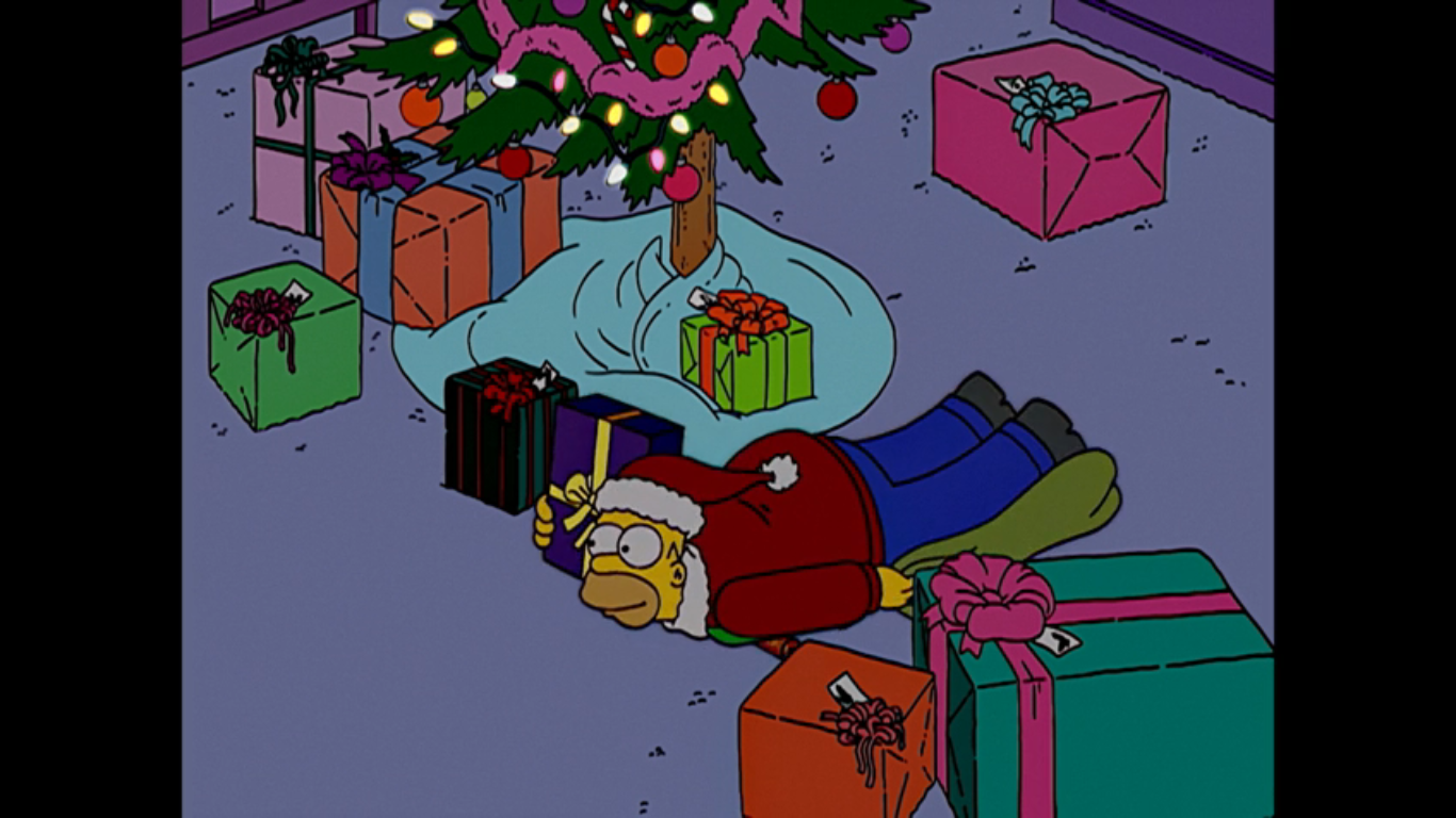
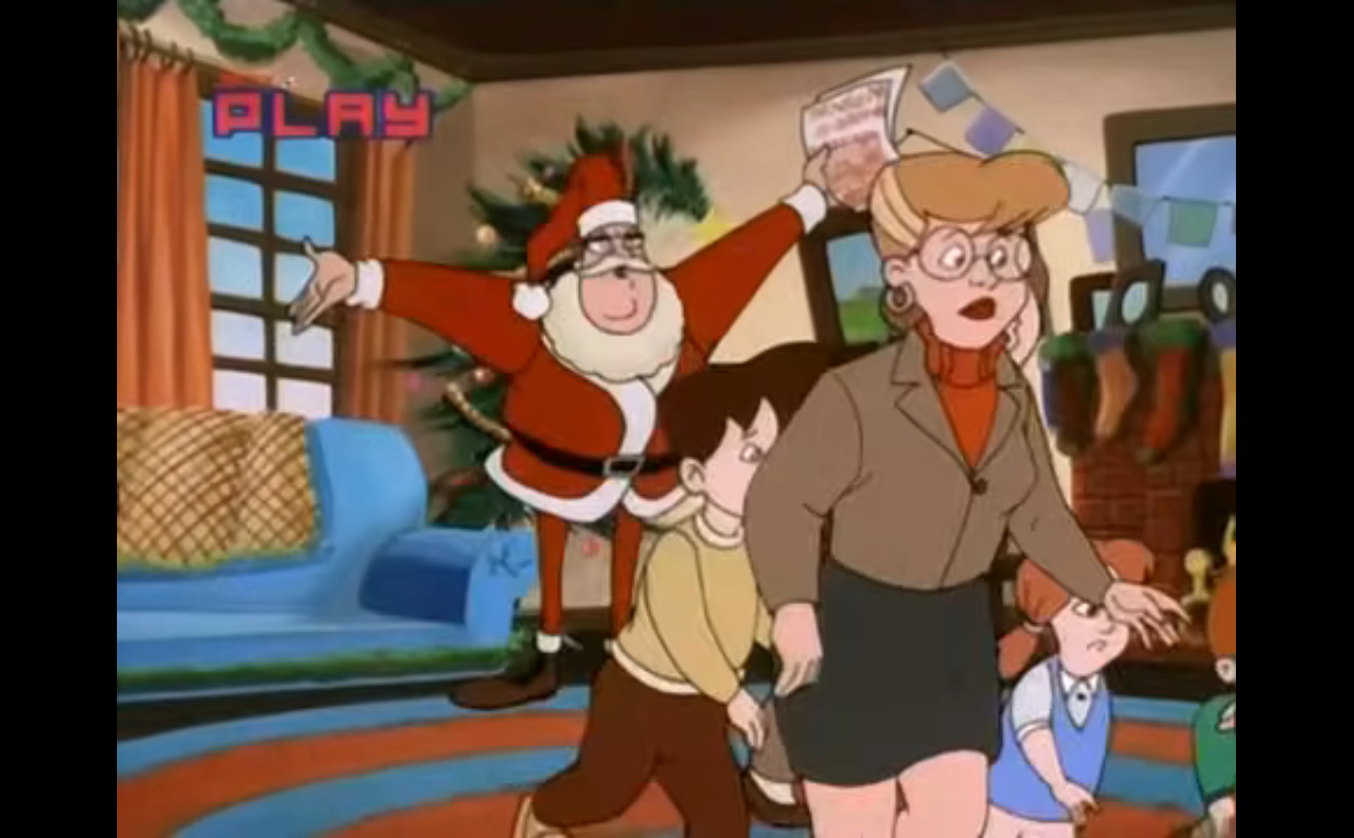
The first episode aired of The Simpsons, “Simpsons Roasting on an Open Fire,” was pretty much a Homer (Dan Castellaneta) story. He was denied a Christmas bonus and Marge (Julie Kavner) spent all of the family’s extra money on getting a tattoo removed off of Bart (Nancy Cartwright). Rather than come clean, Homer takes a part time job as a mall Santa to earn extra money in hopes of providing his family with the kind of gifts he felt they deserved. Or rather, the type of gifts that would make him feel like a successful provider. Following that episode, Homer would take a back seat in future holiday outings. We had episodes centered around Bart, Lisa, and even Marge while Homer was like a sidecar. The kids need his help in the waning moments of “Grift of the Magi” to steal some toys, he and Flanders have a B plot in “Skinner’s Sense of Snow,” and that’s kind of it. In today’s episode, Homer is very much the focal point as he must learn the spirit of giving, then learn to reject materialism, then…become the Grinch? This one ends in a place one wouldn’t have predicted at the start, so let’s jump into it and see how we get there.
How is it that Itchy and Scratchy are able to exist in this space?
This holiday episode of The Simpsons begins with the standard, abbreviated, opening where we just jump right to Marge almost running Homer over in the driveway. The couch gag isn’t even holiday themed, it’s anime, which is a surprise. We’re not off to a good start here. The episode proper then begins not with Christmas, but Thanksgiving. The family is watching a Channel 6 holiday broadcast featuring Krusty (Castellaneta), Sideshow Mel (Castellaneta), Mr. Teeny, and a large woman dressed as a ballerina. Am I supposed to know who she is? Kent Brockman is appearing via cardboard cutout which Krusty informs us he’s contractually allowed to do because he’s in rehab. Again. Oh, and Itchy and Scratchy are present too which is really confusing. Are they someone in costume? Are they animation and we can’t tell because the whole show is animated? Anyway, Krusty informs the viewers for every dollar spent on Krusty merchandise he’ll be nice to a sick kid. And that hookers with a cold count as sick kids. Never change, Krusty.
Homer no like sweater.
It’s now time for Christmas decorating, and set to “It’s the Most Wonderful Time of the Year,” we see Homer and the kids putting up the decorations. Bart and Lisa (Yeardley Smith) twirl some string lights like a lasso and fling them on the bushes outside. Homer tries to do the same with a tree and inadvertently kills two birds in the process which he slyly covers with snow and walks off. Inside, the stockings are being hung with care one by one until we get to Grandpa (Castellaneta) who hangs an IV bag instead. Marge is shown putting the family dog, Santa’s Little Helper, in a festive sweater which he predictably hates. We pan over to Snowball II who is already in a sweater and doing her best to get it off. The camera continues it’s pan to find Homer also in a sweater and also desperately trying to remove it with his teeth like an animal. Never change, Homer.
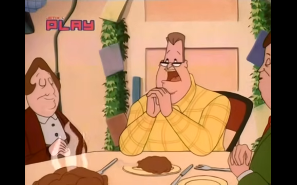
Looks like someone forgot Lenny’s present.
We now are taken to the Springfield Nuclear Power Plant where it’s apparently already time to exchange Secret Santa gifts. Carl (Hank Azaria) is Homer’s Secret Santa and he has quite the present for the big guy: a new DVD player and the first season of Magnum P.I. Homer is quite happy with this extravagant offering (come on Carl, there had to have been a limit you blew by), but there’s a problem. No one has a present for Lenny (No, not Lenny!) and that’s because Homer is his Secret Santa. Realizing he forgot, Homer runs offscreen and we get to hear him battle with a vending machine. Lenny (Harry Shearer) can tell what’s going on and a scowl crosses his face before Homer returns with his gift: a roll of Certs. Homer seems pleased with himself, but Lenny doesn’t hold back and tells him that his gift flat-out stinks. Carl piles on too telling Homer he’s the most selfish man he knows (then why did you go all out on Homer’s gift, Carl?). Homer appears offended and tries to defend himself by saying Mr. Burns is the most selfish man around. He starts to bad mouth him, and Skinner, only for Burns to sidle up behind him without him knowing.
I’m surprised this hasn’t been utilized for a current plot.
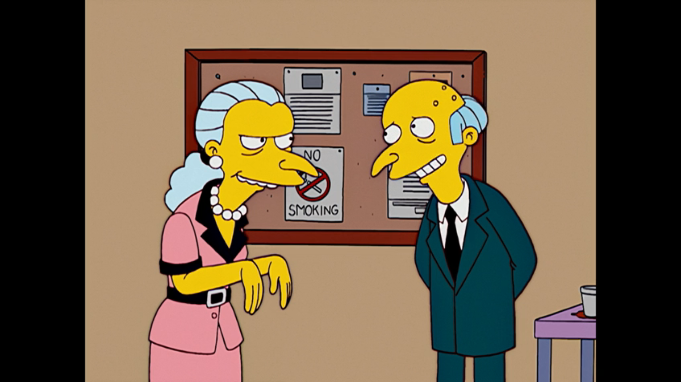
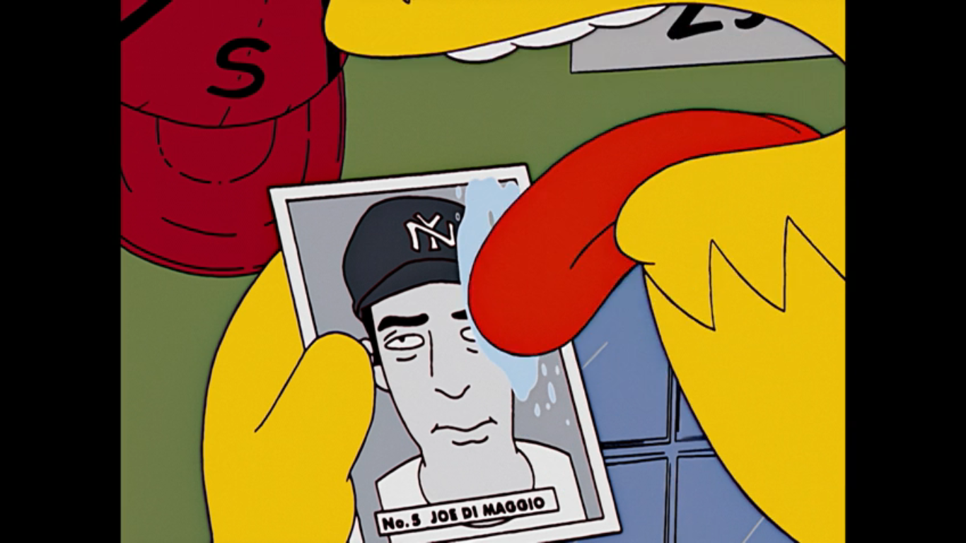
Burns (Shearer) hears the insults, but laughs startling Homer. He declares that Homer’s very obvious description of him describes “Cathy in personnel” to a tee. Who is this mystery woman? No time for that, for Burns is here to hand out Christmas bonuses. This feels familiar. The bonus this year? A five dollar voucher to the plant cafeteria which no one is happy with. I guess it’s better than the series premiere when they got nothing? Burns has something special for Bart though, I guess because he knows Homer has a son? They’ve obviously crossed paths many a time, but I don’t get the sense that he’s giving Bart a gift because of any of that. The gift is, as Burns puts it, a confectioner’s card of a current baseball player. The way he phrases it he clearly doesn’t place any value on this card, but it’s a Joe DiMaggio card and a pretty famous one in card collecting circles at that. Not that Homer is aware. Burns refers to DiMaggio as a rookie for the New York Nine and when Homer says the name in disbelief (likely because he knows that Joe DiMaggio has long since passed his rookie days) Burns confirms it’s him and adds, “It seems they’re now letting ethnics into the big leagues.” He then turns away from Homer and is surprised to see Cathy (Tress MacNeille), from personnel! She looks exactly like Burns and he asks her how things in personnel are she has a one word response for him: Excellent.
Oh no! He must deftly lick it off!
Homer may not know how valuable the card is, but he knows it’s worth something so he takes it to the only place in town he’d logically go: The Android’s Dungeon. Homer finds Comic Book Guy (Azaria) eating some nachos from his usual perch atop his stool and asks if he can get any money for the card? Comic Book Guy takes one look at it and nearly has a heart attack as he turns up his cash register and empties its contents onto the counter. He greedily snatches the card from Homer, but then immediately begins to fret because he got nacho cheese on it. He reasons the only solution is to deftly lick it off, which he does. Homer just grabs his armful of cash and walks off remarking “Freak,” under his breath. We don’t know how much Homer just got, but probably not a substantial amount? Most stores only keep so much money on-hand, though I suppose a business that buys and sells might have more than usual. Either way, he probably didn’t get full value since that’s a card worth tens of thousands of dollars, but at least he’s happy.
Jesus was a prune? I guess I’ve learned something today.
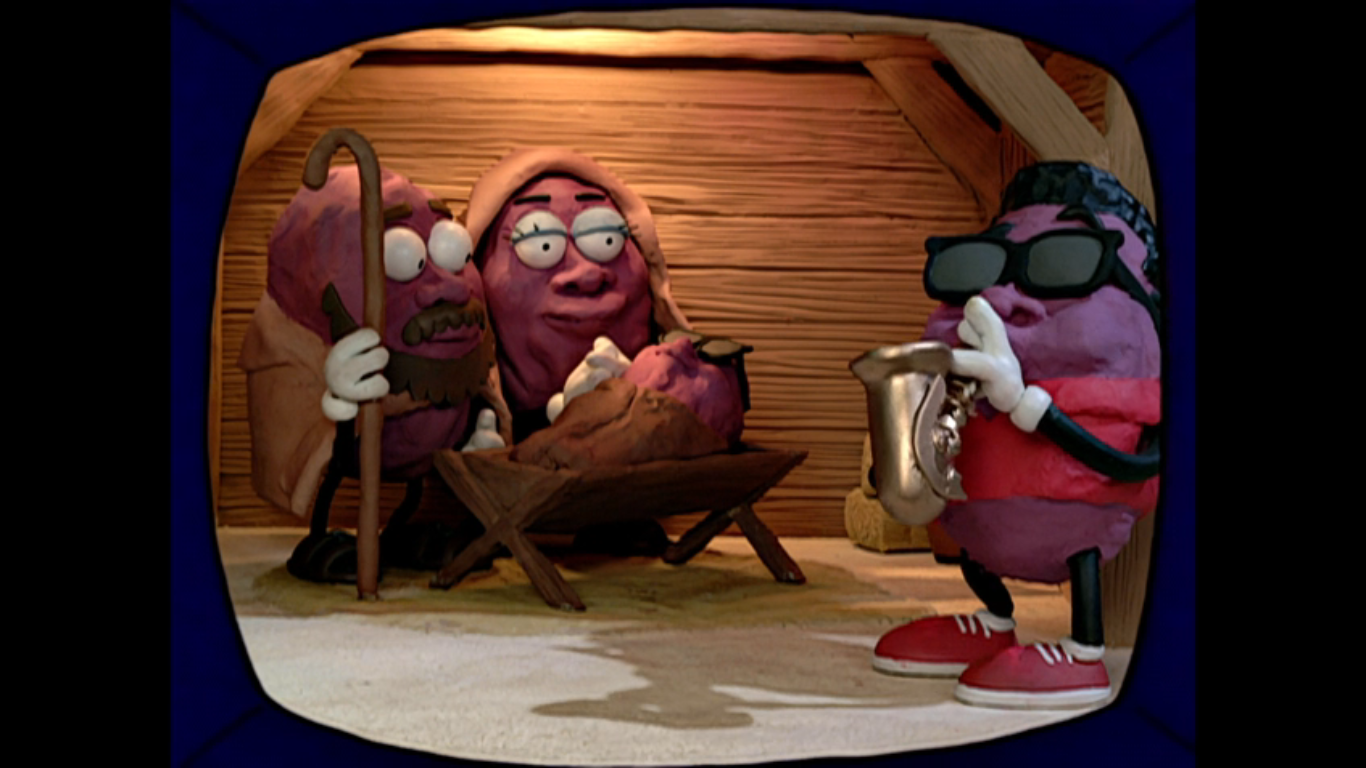
We return to 742 Evergreen Terrace to find the rest of the family seated in front of the TV. A common past time for the Simpson family. They’re watching the 1986 “classic” Christmas with the California Prunes. Obviously, this is a parody of the 1987 sorta classic A Claymation Christmas which featured the California Raisins, a special I probably should have covered by now, but just have not. This could almost barely be considered a parody as we get to see some of this special which features claymation characters that look almost exactly like the California Raisins. There’s a soulful rendition of “Oh Holy Night” being played (and possibly sung by Karl Wiedergott since he’s listed in the credits, but not assigned a role), but with words adjusted to better fit prunes like “We are the fruit that your grandmother eats.” It’s also a nativity scene so if you ever wanted to see what Jesus would look like as a prune, well now you have. I think this is actually really close to the actual segment it’s parodying so if this seems ridiculous, there’s a more sincere version out there. Lisa declares it offensive to Christians and prunes. You know what it’s not offensive to? Animation fans, because this segment looks way too good to just be a quick gag on an episode of The Simpsons.
Comic Book Guy sure keeps a lot of cash in his register.
Homer then comes bursting into the room with his hands and pockets overflowing with cash. He declares they’re going shopping at the Springfield Heights Promenade. Marge jumps up with excitement declaring “That’s the rich people’s mall! Let’s shop till we droop!” Lisa corrects her to say it’s drop, but Marge just scolds her with “That’s a very violent image, Lisa.” Burl Ives then whisks us into Springfield Heights with his version of “Silver and Gold.” The tagline for this place is “Our prices discriminate because we can’t.” It’s basically a fancy outdoor marketplace. I’m not sure if it’s based on anything specific, but it has a similar vibe to Boston’s Quincy Market and there’s a hint a little ways in that might give that away. For a sight gag, we get an Abercrombie and Rich store and there’s a cart that will put your image on a Rembrandt. Moe is clearly pictured on such a painting. Seems almost too tacky for this place, but if it is anything like Quincy Market then it’s also a tourist trap and tourists buy all kinds of stupid stuff.
Cameos of Christmases Past.
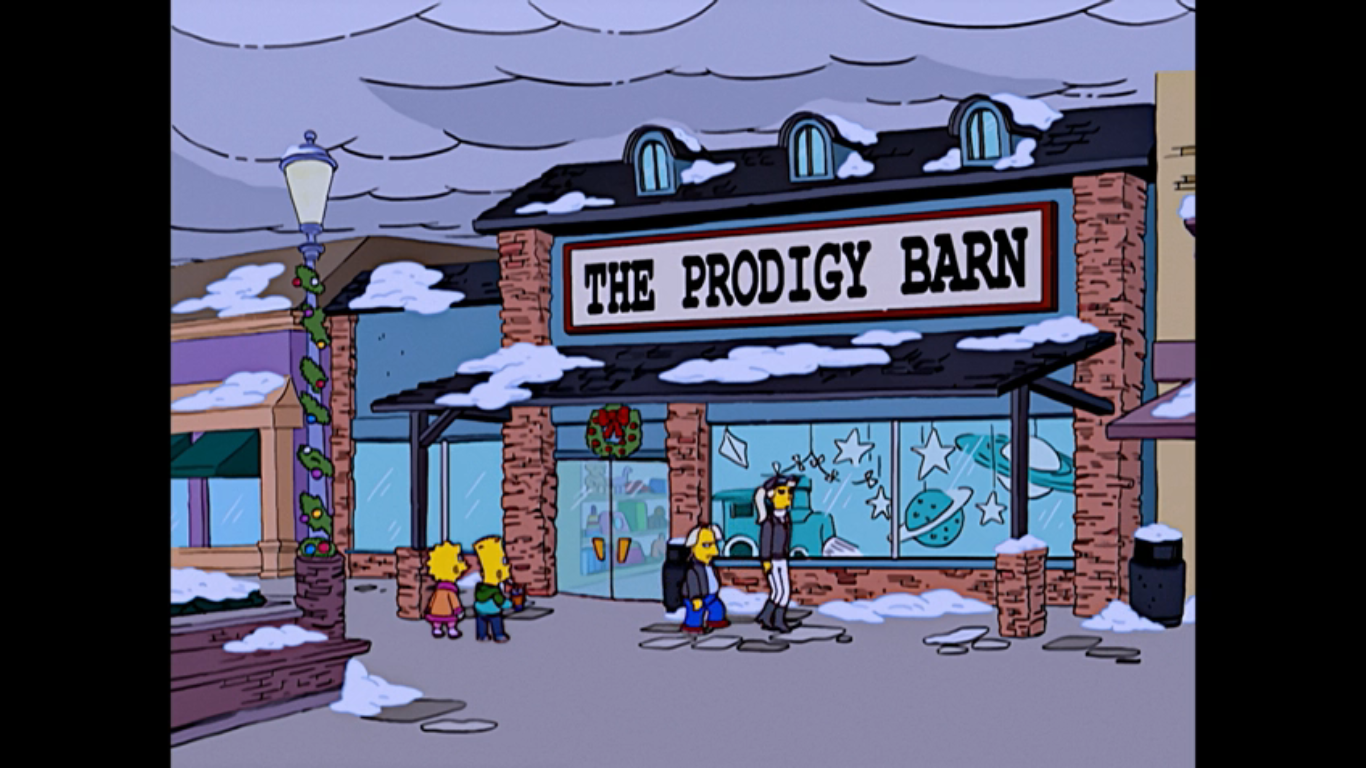
Homer is handing out wads of cash to everyone in the family to go buy Christmas presents with. And when they’re done, he also promises to get a glorious Christmas tree for the home. In fact, he declares it will be so large that its absence from the forest will cause mudslides and flooding. Everyone cheers this except Lisa. That’s some nice attention to detail. We cut to Bart and Lisa shopping together and Lisa has stumbled upon a toy store called The Prodigy Barn. Very quickly there’s a cameo of the rich happiest kid in the world and his mom from “Marge Be Not Proud,” though his hair is now blond instead of brown. Inside, Bart is playing a video game console clearly modeled after the original PlayStation as he’s blasting state capitols on a map of the United States. He soon realizes that this game is trying to teach him stuff and reacts angrily tossing the controller at the screen and declaring “That’ll teach you to teach me!”
This may be more of a gift for Marge.
We jump to Marge shopping at Victor’s Secret, an obvious pun on Victoria’s Secret, where she’s looking to buy a present for her beloved Homie. She’s picked out some very large underwear that’s sort of tiger striped, but she needs the clerk to help her figure out if it’s the right size for Homer. Make that two clerks as they both easily fit into the underwear and Marge is delighted that it’s the right size. They (Castellaneta) then offer to gift wrap it for her and in order to do so they have to fold it like a flag. They stuff it into a tiny box and hand it over to Marge warning her to stand back when she opens it.
This episode is from before everything had Wi-Fi capabilities. I bet that astrolabe was obsolete in less than five years.
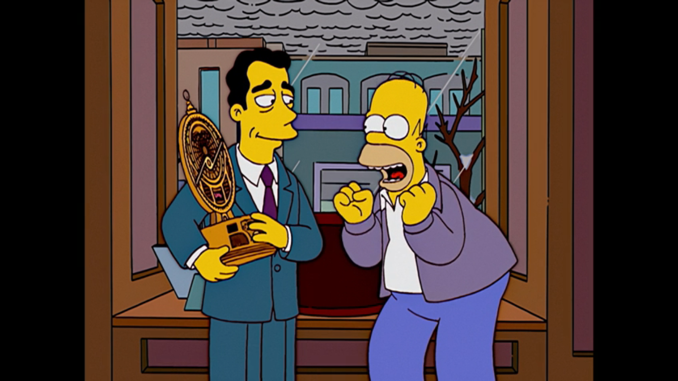
Outside of a store called Things Unnecessary, Homer is rummaging through his bag of goods with a contented look on his face. We then find out he’s bought the family all key rings. Cheap, stupid, key rings. He drops his gifts though when he catches a window display for a talking astrolabe. He immediately goes inside where a clerk with a British accent shows it to him. He wants to make it a gift for himself and notes how it is so unnecessary. The clerk (Shearer) laughs and remarks that he has excellent taste then lists the features which include a pad of paper and pen for writing upside down. Homer is pretty much sold, but then he looks at the price tag: 500 bucks. If he buys this he won’t have anything left for a tree. The astrolabe (I think it’s Azaria, but it’s not listed in the credits on IMDB) then announces that today is the birthday of comedian Margaret Cho, which makes this December 5th. We can also see the current coordinates for the location of this device which online sleuths discovered long ago point to Boston, hence my Quincy Market theory. “That’s the birthday I’m always forgetting, I must have it!” And with that, Homer has bought an extremely unnecessary and extremely expensive gift for himself.
What is it with sitcoms and their Christmas suicide jokes? I feel like I should apologize for how many there have been this year.
We cut to the car and the family is on the road. Bart asks if they can get their big tree now and Homer laughs nervously and confirms that they can as he also inspects the cash he has left which totals 2 bucks. He still insists that they’ll get a tree from the finest lot in town as he proceeds to lead the family to a rather unsavory part of town. Lisa is the first one to remark that she doesn’t like this neighborhood, but Homer just tells her to lock her door and avoid eye contact while he turns on the radio. It’s a version of the song “Convoy,” which was part of the plot of “Radio Bart” way back when, only now it’s “Christmas Convoy.” It’s our soundtrack to the sights which includes Gil preparing to hang himself with Christmas lights, some hobos roasting pigeons over a flaming drum, and a bloody snowman with an axe in its head.
Well, sufficient is certainly one way to describe it.
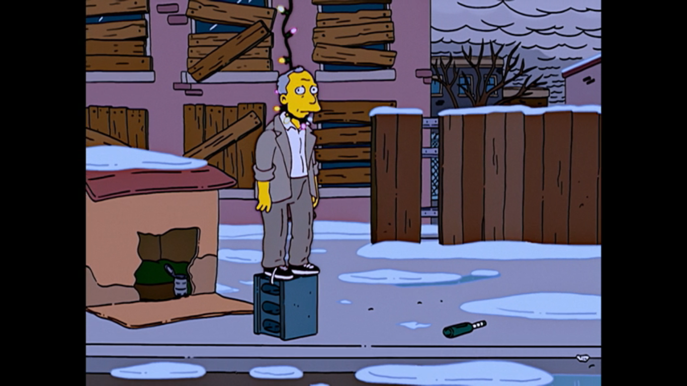
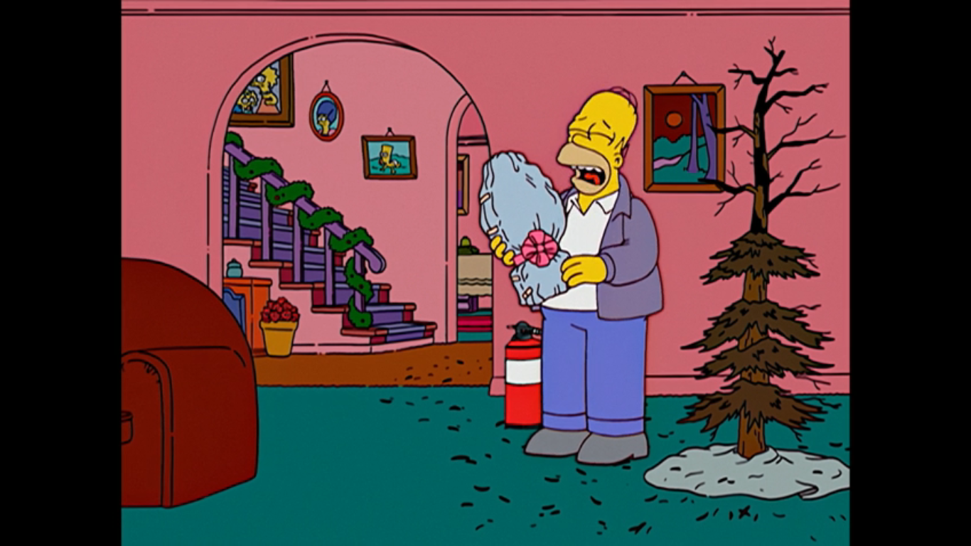
Homer pulls into a pretty sad looking tree lot and buys the best tree 2 bucks will get you, which is pretty brown and lacking in fullness. Homer presents it to the family as a great tree, but Marge points out that it looks a little dry. Homer tries to insist it just needs a little love, but when he rubs it the tree bursts into flames. I’m betting Homer thinks the tree will magically transform when decorated into a glorious one, like it did for Charlie Brown. We cut to the house and the partially burned tree is up. Homer remarks, “Isn’t it sufficient?” and pats it again once again causing the tree to go up in flames. He’s ready with a fire extinguisher and quickly puts it out, but Bart is left to wonder why they couldn’t afford a good tree? Marge asks Homer if there’s something he’s not telling them and right on cue we hear the astrolabe announce that it’s 6:31 PM in Montreal.
A man sobs alone with his astrolabe at Christmas time. Is there a sadder sight?
Marge rightly asks where that voice came from, but Homer tries to play it off as Maggie finally talking. She finds the astrolabe all wrapped up with a tag on it that says “To: Me, From: Santa.” Marge exchanges the gift for Maggie, who Homer was holding, and confronts him on the fact that he wasted their money on an extravagant gift for himself. Homer tries to reason with her that there’s a trickle down theory at play here: If he’s happy then he’s less abusive to the rest of the family. I should try that the next time I buy an expensive action figure. Lisa is the one to inform him that this time he was just plain selfish as sad music plays and the family leaves Homer with his toy. The astrolabe then announces “I am not returnable,” causing Homer to start sobbing. It then announces it will begin testing its smoke alarm for the next three hours which causes Homer to sob louder and announce, “This is sadder than Tuesdays with Morrie.”
Marge has opted for pettiness and I for one support her.
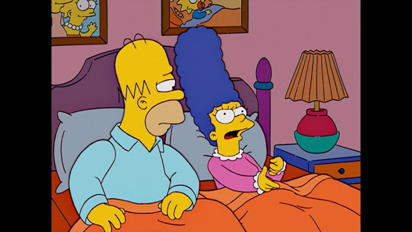
Where do Homer and Marge often settle their disputes? In bed, of course, as we find Homer trying to defend his selfish act. He tries to suggest that she is in fact selfish too for choosing to get her haircut at Supercuts instead of Regular Cuts, the joke being Supercuts is a pretty cheap place to get a haircut. And whoever does Marge’s hair deserves a lot. Marge is obviously not taking the bait and just points out to Homer that Christmas is the time to think of others, but he only cares about himself. He denies this accusation pointing out that he cared what they thought when they found out. She informs him that he can sleep on the couch tonight, but Homer just wants her to yell at him now and get it over with. Marge refuses instead opting to parcel out her anger over the next few days and weeks so she can jab at him when he seems most content. Homer can only groan as he grabs his pillow and flees.
This doesn’t seem like much of a punishment for Homer.
Homer has decided to stay up late watching Christmas specials with his selfish purchase. He’s also opted to unwrap it early as well and even declares that he doesn’t need Marge since he has the astrolabe. It responds to him by telling him that Columbia’s chief export is coffee. On television is The Year Santa Got Lost starring Jimmy Stewart (Castellaneta) as the voice of the mailman. It looks like another claymation piece and the characters all resemble toys from Rudolph the Red Nosed Reindeer, except for the mailman who just looks like a mailman. I guess he’s a nod to Special Delivery from Santa Claus is Comin’ to Town. It’s a very boring story that Jimmy is telling and Homer taps out insisting that Jimmy Stewart as a puppet is just wrong. On the next channel is Mr. Mcgrew’s Christmas Carol, a parody of Mr. Magoo. It’s sort of like the California Prunes from earlier in that this parody is so similar to the thing it’s parodying that it’s almost indistinguishable. Upon stumbling on this, Homer declares he loves that blind, senile, old man! He’s then interrupted by his father knocking on a window in his bathrobe claiming he can’t find his way back to the nursing home. Homer shouts at him, “I heard you the first five times!” then throws his shoe at the window. A bunch of snow falls off the roof and poor Grandpa is buried.
Oh that Magoo McGrew, that’s not a woman, you silly, old man!
We get to see some of McGrew (Castellaneta) which looks a lot like the actual Mr. Magoo’s Christmas Carol, the very first animated Christmas special made for television. I’ve never covered it because it’s, well, terribly boring. We get to watch McGrew mistake a potbelly stove for a pregnant woman which somehow leads to him sticking his head into a roaring fire. Homer laughs for, once again, old McGrew has mistaken something for something. As the special moves along, Homer comes to realize that McGrew is just like him. Well, except for the rich part. When it gets to the climactic scene at the cemetary, Homer is on the floor in front of the TV begging the ghost to spare McGrew and to take Tiny Tim instead! The ghost gestures to the headstone which reads Ebenezer McGrew. Homer then sees it as reading” Homer Simpson – Unloved by All. He cries out “Unloved by Al? No!” then the ghost gestures again and he reads it correctly and yells even louder.
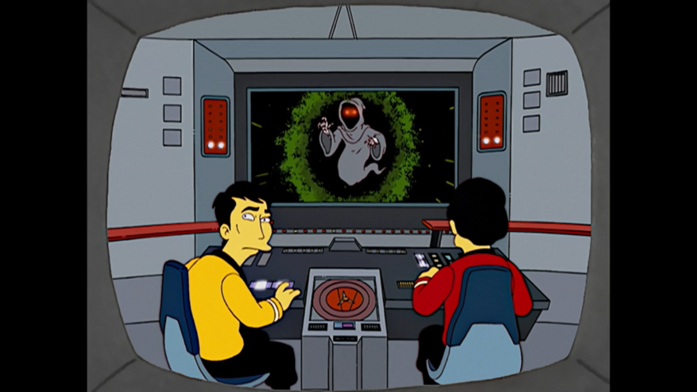
Marge wanted to see more of this Star Trek Christmas Carol and I think I’m with her.
The next morning, Homer is still in the midst of a fretful sleep moaning on the couch “I’ll be good.” Lisa wakes him up with some concern in her voice and Homer just asks her what day is it? She tells him it’s Saturday, December 6h and Homer jumps up saying “Good! There’s still four more days till Christmas!” No one bothers to correct him. We next find the family at breakfast where Homer is talking about the amazing cartoon he watched the night before. He describes it and Lisa has to point out that what he watched was A Christmas Carol by Charles Dickens and that it’s been around for 160 years. Bart points out that television has been mining that thing for decades and he is certainly not wrong. What’s sort of implausible here is that someone who watches as much TV as Homer would be unfamiliar with it. Bart gets to prove his point by turning on the TV (there sure has been a lot of the family watching TV so far in this one) to reveal an Urkel parody and a Star Trek one. Marge thinks the Star Trek one looks pretty good. Homer then announces that TV and nightmares have joined forces to convince him to be a less selfish man. He vows to become the least selfish man in town and Marge reminds him that he’s made this promise before. Homer points out that this time he’s sober…ish. That’s a bit alarming since it’s only breakfast.
It really is the perfect gift for someone always getting stuff in his eye.
Time to see Homer put his words to action. We find Flanders (Shearer) and his two boys, Rod (Pamela Hayden) and Todd (Cartwright), taking some boxes of old clothes and lima beans to an area frequented by the homeless, only Homer beat them to the punch. He gave them his old clothes and we get to see a whole bunch of unhoused men dressed like Homer. One comes over to remark that these new pants smell worse than his old ones, but Homer just says “You’re welcome.” To the Nuclear Power Plant where Homer owes Lenny a present. A real present. Homer presents Lenny with a photo cube that’s full of pictures of them (and Carl) which Lenny seems to appreciate. And there’s another surprise, Homer filed down all of the corners so it won’t hurt if it comes into contact with Lenny’s frequently injured eye. He demonstrates by jabbing Lenny in the eye and he smiles uncomfortably and announces it only stings a little.
Marge has been waiting fifteen seasons for this.
Back at the house, the family is finishing up dinner when Homer goes to eat the last porkchop, catches himself, and then walks the platter over to Marge. He offers her the last porkchop and Marge is so overcome with emotion she doesn’t know what to do. Homer has never offered her the last porkchop and she happily accepts. She is super emotional about it as she’s basically sobbing while she eats it remarking that his thoughtfulness tastes so good and that tears are the sweetest sauce. She’s not even bothering to use utensils, just her hands, and all the rest of the family can do is stare at her. Homer also adds that she’s starting to creep him out.
I feel like we’ve been here before.
We then cut to the family at church where Ned and Homer are in charge of the collection plates, though they’re really more like baskets on poles. Homer gets to Burns who just deposits a coin into the basket so Homer jabs at him. He drops another coin in, but Homer is still not satisfied so he keeps jabbing him in the face. Burns finally relents by emptying his entire wallet into the basket, including his credit cards and eventually the wallet itself. He then angrily suggests that Homer take his blood too and pricks his finger, but only dust comes out which Burns acknowledges by saying “Yes, I’m old.” Ned happily empties his basket into a sack held by the Reverend Lovejoy (Shearer) who is only too happy to inform Ned that this week he came in a distant second to Homer who has a rather impressive haul. Homer announces he’s not looking for glory, he’s just trying to buy that stairway to Heaven Jesus sang about. When Ned corrects him that it was actually Led Zeppelin who sang that song, he just scoffs and tells him to get back to his bong, hippy! He and the reverend then smugly walk off leaving Ned to stew in anger. His kids come over and Todd asks him if he’s jealous of Homer with some shock in his voice. Ned confesses that he is a little jealous. To try and cheer him up, Rod confesses he’s jealous of girls because they get to wear dresses and Ned angrily responds with “One problem at a time, boy.” This was the era where Ned Flanders became a more bigoted Christian. I know some people don’t like this turn for Ned, but when a show is on for as long as The Simpsons characters are going to change with the times.
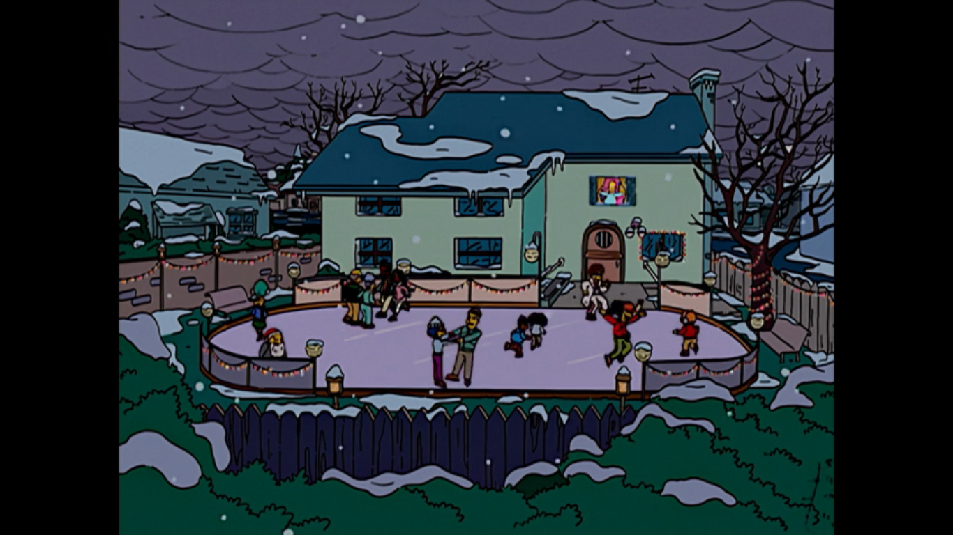
Homer: a man of many talents. Or maybe just this one?
We return, yet again, to the Simpson master bedroom only now things are far less frosty. Marge is delighted in Homer’s transformation and he has come to view being unselfish as a natural high like hiking or paint thinner. And he’s not done! Homer then unveils to Marge his latest gift to the town: an ice skating rink in the Simpson backyard. How he built that without Marge’s knowledge is not specified. Similarly, how could he, the man who couldn’t afford a Christmas tree, manage to buy all of the materials needed for a rink? I should stop asking questions. It’s a hit though as numerous people are skating on it. Comic Book Guy demonstrates he’s pretty nimble for a man of his generous waist even though his leap results in a fall. A fall that splits his pants. With a declaration of “Activate cloaking device,” he ties his coat around his waist, only for that to rip too. Overcome with depression, he chooses to engage candy bar sadly.
Nelson is showing off and giving Flanders the business here. What a guy.
Ned is shown making his way to the Springfield Men’s Mission singing “Here comes sandwiches,” to the tune of “Here Comes Santa Claus.” He has a plate of cheese on bread for the homeless who dwell here, but because this is Season 15 Ned we have to get a little peak in his head as he refers to this as Boozy Bum Lane. In other words, this is the Ned who partakes in charity not because it’s right or just a nice thing to do, but because he just wants to get into Heaven. He’s shocked to find the place empty, so shocked he even spells out the H word (no, not that one). And he soon realizes that everyone is at Homer’s where they can rent skates for free (how did he come into possession of all these skates? Shut up, Joe, just go with it) no matter how gross and black their feet may be. Ned is frustrated and dismayed to hear Gil (Castellaneta) refer to Homer as the nicest guy in town. Nelson (Cartwright) is also there to deliver his customary “Ha! Ha!” and add a dash of “Your position has been usurped!” He also makes a couple more passes to rub it in even laughing “You’re sad at Christmas!” While he does he demonstrates some really fine tandem skating with Sherri or Terri. Sometimes a guy surprises you.
Great sight gag, I approve!
After an act break, we return to the TV! Man, this episode has a lot of old Simpsons tropes between the bedroom scenes and the plot-advancing television spots. It’s the nightly news with Kent Brockman (Shearer) delivering a breaking news report on the nicest guy in town: Homer Simpson. He has to deliver it in his Brockman way though by first shocking and horrifying the viewer with the announcement that Santa Claus is dead! This gets a scream out of Bart and Lisa who are, strangely, the only ones watching the news in the house. Bart didn’t seem to believe in Santa way back in the first episode, but I guess he’s had a change of heart? Or maybe it’s just a part of him he can’t let go? This was all a clever setup by Brockman to declare that Santa might as well be dead, because Homer Simpson has stolen his spotlight. They then show a photo of Homer strangling Bart in front of Marge and Lisa, but it’s been digitally altered to replace Bart with an image of a bouquet of flowers.
Ned, you’re starting to freak me out a little bit.
Next door, Ned is practically steaming watching this report. He starts tugging on his moustache and assuring himself “Pain is the cleanser,” in an attempt to banish his jealous thoughts. Mel Gibson would approve. A ring of the doorbell gets him off the couch and it’s a pregnant woman (Hayden) who needs help with her car. An overzealous Ned offers to jump the car, rotate the tires, and even fold the map she’s holding. This just turns her off and, calling Ned a creep, the woman says she was looking for Homer Simpson. That is apparently the last straw as Ned vows to show the whole town that he’s nicer than Homer. That he can be the nicest man who ever lived! He then looks at a picture of Jesus on the wall and tells him he said nicest man, not man-god, and to keep his pants on. I don’t think Jesus wore pants, Ned. Hah!
Skinner and his mother asking the important questions here.
To make good on his boast, Ned has decided to go door-to-door dressed as Santa Claus handing out presents to everyone in town. His first stop is the Skinner residence where Seymour (Shearer) is flabbergasted by Ned’s mission. Agnes (MacNeille) barks at him, “What’s your angle, pervert?” and Ned is actually honest by answering “Giving in this world, living in the next!” In other words, he just wants to get into Heaven. When Skinner asks how he can possibly afford this on a widower’s salary, Ned informs him he rented out his house to a fraternity. We cut back to Ned’s home and there are Greek letters (Sigma, Chi, Sigma? I’m not up on frat business) above the door and a keg goes flying through the front window. We hear an agitated Rod also shouting “Stay out of our medicine cabinet!”
That’s quite an imagination you’ve got there, Homer.
Homer takes note of Flanders’ good deeds and scoffs at them. We see he’s already been to the Simpson house and gifted Bart a Krusty-branded version of Operation. We hear the toy groan when Bart “tweezes my wang.” I feel like they’re usually more subtle than that? Homer, apparently taking Ned’s bait, wants to outdo him and thinks the best way is to buy everyone a car. Lisa, ever the voice of reason, is there to tell her father that he doesn’t need to outdo Mr. Flanders and to remind him to remember the theme of the season. Homer seems to think it’s despair and Lisa goes on to share her feelings on the matter of gifts as a Buddhist. She thinks people would be better off without presents, which gets Homer thinking. We see a car, a Christmas sweater, and then an image of Budai (smiling fat dude often mistaken for Buddha), and they all combine into an image of Budai (Azaria) driving. He offers Homer some sage advice, “[…]attachment to material goods kills the soul.” Then, for some reason, Budai gets pulled over by the cops in Homer’s imagination and vows to never return to jail. Homer is satisfied now and decides he needs to take away everyone’s presents! He then thanks, Buddha which brings back his brain cloud to show Budai getting arrested and threatening the cops that they’re in trouble if he ever gets out.
Look at Santa’s Little Helper! He’s cuter than Bradford II!
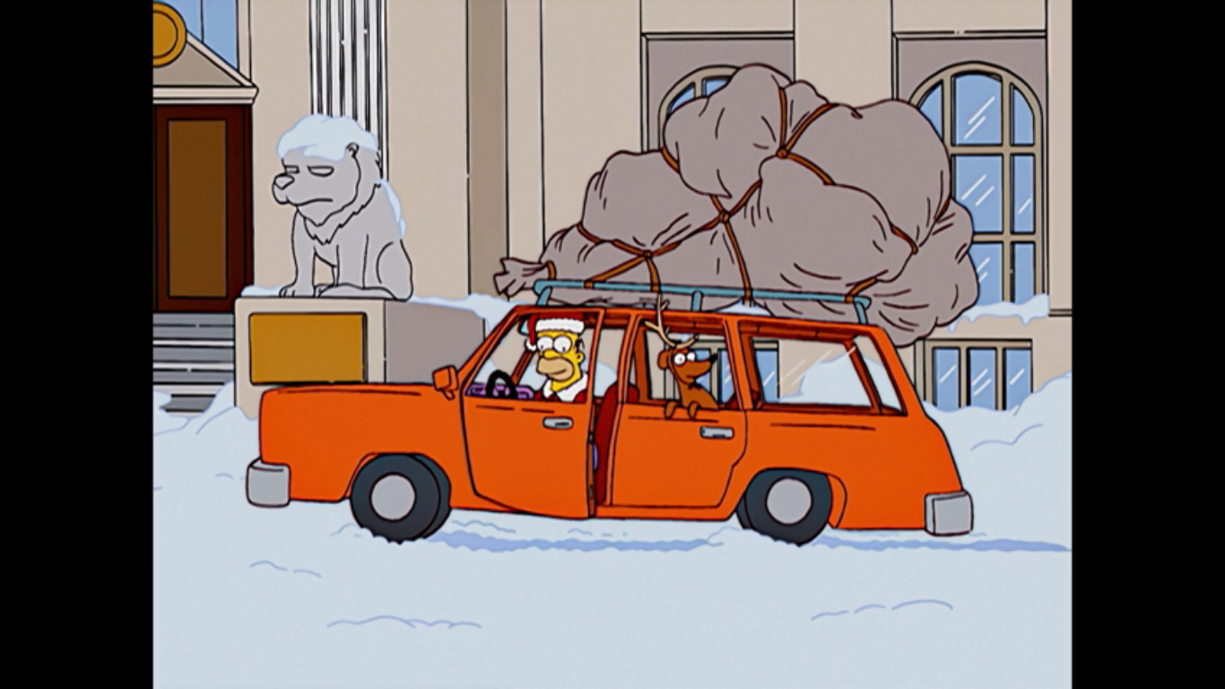
And now it’s time for an extended Grinch parody! Homer, with assistance from Santa’s Little Helper, is going to go house to house stealing all the presents under the tree in town on Christmas Eve. And as he does so, he’s going to sing about to the tune of “You’re a Mean One, Mr. Grinch” which goes something like this: You’re a hero, Homer Jay. You’re as crafty as a skunk. They’ll thank you in the morning for stealing Flanders’ junk, Homer Jay! You’re a double-bacon genius burger, and just a little drunk!” As he does, we see clips of him walking like the Grinch, slithering like the Grinch, cutting down stockings like the drink, and chloroforming a toddler like the Grinch. Wait! That’s all Homer and not a good look for the big guy.
This sort of thing didn’t work out all that well for the Grinch, but maybe it will for Homer.
At dawn, Homer is seen driving the family station wagon into the center of town with a massive sack of stuff tied to the roof. He hops out of the car and douses the bag in gasoline before hopping onto the ground to put a hand to his ear. There he waits to listen to the thanks coming from the folks of Springfield. It’s a rather clever inverse of the Grinch. He wanted to hear sadness and anger over his stealing Christmas, but heard singing instead. Homer wants to hear the singing, but he just hears anger. First from Lenny, then Dolph (MacNeille), and then we start to jump around. Snake (Azaria) is shown shocked and saddened by the fact that he’s been robbed at Christmas and reflects, “Man, so this is how it feels.” In a season of Simpsons repeating Family Guy gags, I feel like I have to point out that Family Guy did a very similar joke where an inmate stabs himself to see how it feels. We then jump to a rather sad scene at Nelson’s house. He wonders if his dad came back in the night to steal their presents while his mom (MacNeille) just gruffly says “I wouldn’t put it past him.” She references the night he left and Nelson gets defensive insisting he just went to the store and when he gets back he’s going to wave those Pop Tarts right in her face! Poor, delusional, Nelson.
Definitely not a gracious mob.
Homer then pulls back a little disappointment in hearing anger, but he points out happily that a mob is approaching shaking its fists in anger! The show decides to let Cookie Kwan (MacNeille) and Drederick Tatum (Azaria) get some lines in before the mob begins pummeling a confused Homer with snowballs. Even the Simpson family joins in on the beating. And who comes to Homer’s aid? Why, it’s Ned Flanders, of course. He stands protectively between Homer and the mob to tell them what Homer did was wrong, but that maybe he was also wrong to give everyone those gifts? Ned gets bombarded with snowballs for suggesting such and knocked to the ground.
Well, I hope this hurts less than a football to the groin, Hans.
Now, it’s Homer’s turn to rise to Ned’s defense. He shouts out for everyone to wait and look to the sky for there is the Christmas they need. And in the sky high above Springfield is a brilliant, shining, star. Everyone is transfixed with Selma (Kavner) even declaring it a miracle. We cut abruptly to find out that it isn’t a star, but a flare fired by Hans Moleman (Castellaneta) who appears to have gone off the road and is stuck chest-deep in the snow. It’s his last flare too, but don’t worry, for rescue dogs have come to his aid! Oh, actually those are wolves and the McGrew-like Moleman is blind and confused and sure to die.
Homer’s big speech is a thing of beauty. Bravo to writer, Michael Price, who penned this one.
Back in the center of town, Ned is finishing up reading from the Bible, the same passage old Linus referenced in A Charlie Brown Christmas. Before he can finish though, Mayor Quimby (Castellaneta) buts in to say that Ned can’t pray on city property. Homer takes it from there, “Let’s just say that on this day, a million years ago, a dude was born who most of us think was magic, but others don’t, and that’s cool. But we’re probably right. Amen.” The crowd returns with an “Amen” as well, and I just love that summation by Homer. It sums up that Christian smugness so prevalent in American society since that’s the majority opinion.
He’s such a good boy!
Homer then decides, with Ned’s help, to return all the gifts! As the two toss gifts to the mob, we get the expected animation of Santa’s Little Helper doing his Max impression as well. To sneak in an extra joke, we also get to see Professor Frink (Azaria) open his present and find it’s a brassiere (his choice of words), but in the spirit of Christmas, decides to make pretend that he has boobs. Bart is shown sharing his sentiments that this is a great Christmas and that not even Moe’s (Azaria) annual suicide attempt can bring him down. We then cut to Moe on top of City Hall threatening to jump and no one taking him seriously. Moe vows to jump and that they’ll all be sorry, but then laughs and confesses he’s not going to do it, but slips and falls anyway.
And as for Moe…who did NOT die!
No one was paying attention to old Moe for they were busy launching into a rendition of “Hark! The Herald Angels Sing,” because we need to tie this back to Peanuts one more time. Moe actually gets to deliver the “Peace on Earth and mercy mild,” line so we see he’s not dead, just really, really, hurt. As the crowd sings, we cut back to the wrapped astrolabe on the roof of Homer’s car. We hear it say that today is the birth of Jesus, and also the birthday for singer Barbara Mandrell. Snake then steals it for good measure, a nice way to bring the whole story back around to the beginning. We fade out on the crowd singing. Merry Christmas!
I like that they got the astrolabe into the end somehow.
As far as Simpsons Christmas episode go, that is one of the most joke-heavy ones they’ve done. There are tons of one-liners and just silly moments for the sake of comedy. Yeah, there are plenty of holes one can go poking through it, especially if past episodes are brought up. I’m always a little surprised when this turns into a “Homer Loves Flanders” redux in the second half thus leading into the Grinch parody. It’s quite a ride considering where we started. There’s really no B plot as the plot of the episode just moves from one stage to the next. I like that about it and it is reminiscent of “Grift of the Magi,” another Christmas episode that just moved from one situation to the next. The difference there is that one morphed into a Christmas episode where as this one was pretty much committed the whole way through.
The stop-motion segments are great and really help to give the episode a “special” sort of feel.
As I mentioned during the write-up, there are a ton of moments where TV is used to advance the plot. I’m pretty much okay with it though as there was some great comedy to be found there. The Christmas special parodies were all well done, even if some played it mostly straight. The extra surprise of stop-motion utilized was pretty damn cool too and shout out to Chiodo Brothers Productions, Inc. for producing those segments. Some of the jokes could be described as easy or layups, but I found they worked. And try to keep in perspective that some of this stuff was still pretty novel back in 2003. Now, a Grinch parody feels a bit more played-out, though I’m struggling to think of many Magoo parodies so The Simpsons was and is still ahead of the curve there.
“‘Tis the Fifteenth Season” may honestly be the funniest Christmas episode of The Simpsons. That doesn’t mean it’s the best, but there’s a solid amount of laughs to be found. Some don’t like the portrayal of “Jerk Ass” Homer like we see in the first act and I also know folks who don’t like what Flanders morphed into in the 2000s. Such opinions are valid, but for me, it works. This is funny television. It’s not trying to make much of a statement, just lampoon Christmas specials. There isn’t really a cynical message either so if you don’t care for those types of Christmas specials then I don’t think this one qualifies. It’s just a bunch of stuff that happened at Christmas.
Merry Christmas from me and the Simpsons.
And that’s it for the 2024 edition of The Christmas Spot! If it’s the last time I do this 25 specials in 25 days thing then I feel like I went out with a pretty solid selection of Christmas episodes. There was some good, even some great, and some stinkers, but those are fun to read and write about. It was a lot though as I finish writing this one on December 23rd, possibly the latest I’ve taken to finish one of these. That’s partly why I feel like I need to take a step back because it’s become harder and harder to find the time (and material) to keep this up. Whether you read one or 25 of these things this year, thank you, and I hope you had some fun. Merry Christmas, Happy Hanukah, joyous Wednesday, and good luck in the new year!
That’s a wrap on Christmas 2024, but if you must have more here’s what we had to say on this day last Christmas and beyond:
We have reached another Christmas Day! It’s a great time to celebrate and enjoy the moment for tomorrow we mourn the passing of the season. It’s the great come-down every year. For this holiday, I am once again returning to my list of the best of the best when it comes to Christmas specials. This…
Welcome to Christmas Day 2022! We made it another year and another long year is ahead of us until we make it back, but right now, it’s time to celebrate! And in keeping with the theme of this year’s countdown, we are once again looking at another much beloved Christmas special on this day. Before…
We made it! Another year in the books, and another Christmas has come. Indulge in it. Bask in it, for it only comes once a year, and not to get too dramatic, but you never know how many you’re going to get. And we’re ending this year’s edition of The Christmas Spot with another throwback…
When Pixar released Toy Story in 1995 it proved to the world that audiences would accept films created entirely within a computer. Prior to that, 3D animation was thought of as a gimmick, something for commercials and video games, but not something that could carry an entire feature length film. It’s similar to the prejudices traditional animation faced in the early days and in hindsight it was a pretty silly thought. Sure, when the medium was young and crude it wasn’t ready, but it needed to mature. It needed refinement and now it’s practically all we have when it comes to animated movies.
After the success of Toy Story, other companies broke through. Everyone remembers the great ant war of 1998 when Pixar’s A Bug’s Life went toe-to-toe with Dreamworks’ Antz, but not too long after came Ice Age. From Blue Sky Studios, Ice Age would be a commercial hit for 20th Century Fox in the 2000s beginning with the 2002. A franchise was born that technically isn’t yet concluded, but after the release of the third film in 2009, but right before the fourth in 2012, came a Christmas special. It’s not all that dissimilar from what contemporary Shrek did. These movies are expensive and time-consuming so studios found that it was more efficient to create television specials basically alongside film production since the same assets could be utilized. It’s not like hand drawn animation where most of the frames are different, it’s more like virtual stop-motion. These character models and environments already exist on a computer and before they get too outdated they can be put to more use.
After three movies, this was the core group (left to right): Diego, Manny, Ellie, Eddie, Crash, Peaches, Sid.
Ice Age, if you didn’t already figure it out, takes place at the dawn of man and stars a bunch of animals who have human intelligence. There’s a mammoth, saber-toothed cat, sloth, squirrel, and so on and they have their own misadventures which are often comedic in nature. John Leguizamo stars as the dimwitted sloth, Sid. Despite being a sloth, Sid isn’t physically slow, but is mentally, making him a good-natured idiot. By contrast, we have Ray Romano’s Manny the woolly mammoth. He’s a bit irritable and finds himself constantly annoyed by Sid, but he has a big heart so he can’t just find it in himself to ditch the sloth. Denis Leary plays Diego, the saber-toothed cat who starts off as a foe, but is soon turned friend. In the second film, Manny finds a lover in Ellie (Queen Latifah) and in the third film they welcome their daughter, Peaches (Ciara Bavo). Lurking throughout the series is Scrat (Chris Wedge), a squirrel forever chasing an acorn, but never quite getting it. He doesn’t interact with the gang a whole lot and is more like a side story, but he seems to be the most popular character in the franchise with many in the audience just wanting to see him get that nut. It’s sort of like wanting the Trix rabbit to just get some damn cereal once for all.
When it comes to Ice Age I’m pretty sure I saw the first three. I don’t know if I saw anymore than that. I also remember very little about the plots and events that take place in the films. I was older, I didn’t have kids or siblings to bring to the movies, so these were things I caught much later and mostly because I married someone five years younger than me. She had experienced the movies and liked them and wanted to share them with me. They’re kind of just fine. They always looked pretty good and Blue Sky Studios was plenty capable of animating in this style, I just never found myself drawn to the characters. Sid and Scrat work well as comedic relief, but like most comedic relief types there is a limit to how much is too much, more so with Sid than Scrat. Manny is very similar to Ray Romano’s sitcom character so he’s not exactly lovable and Diego is lacking in charisma. There was just nothing in this movies that clicked for me, but I’m willing to set that aside and take in a Christmas special. Maybe these characters will work much better over a 24 minute duration as opposed to a 100 minute one. And since it’s one of those Christmas specials that takes place before the birth of that Christ guy, it’s already interesting just to see where the story goes (or rather, begins).
And who could forget that lovable scamp, Scrat.
This one begins without any big song, or title, or anything like that. It just jumps right into the latest from Scrat, the squirrel who is always on the hunt for acorns. Set to the tune of “The Dance of the Sugar Plum Fairy,” (a little too obvious a selection, if you ask me), we see Scrat sneaking about and swiping acorns. He first takes one from a setting which includes a few yellow and orange gourds making me think this is Thanksgiving. He then moves onto a snowman which has three acorns set in it like buttons. It’s at least a cute visual as Scrat jumps inside the snowman and his face replaces the snowman’s face before he hops off essentially bisecting the snowman in the process. Then this thieving sequence goes full Grinch as Scrat finds acorns…hung on a clothesline? Just go with it. After swiping those he’s left with a giant sleigh of sorts full of the damn things. He tries to give it a pull, but he’s no Max. The sleigh, which is basically just a slab of bark, falls apart and all of his acorns go rolling away. You got greedy, Scrat.
Manny’s family heirloom is a big, round, rock. Things were simpler back then.
The proper story then begins as we find Manny rolling into frame a giant, round, rock and the actual title hits. Manny calls for his wife Ellie as he wants to surprise Peaches with the Christmas Rock. He says he just pulled it out of storage so I guess they have a cave for living in and maybe another cave for storage? Peaches, on cue, comes sliding down a hillside and collides with her parents knocking them over. She apologizes, but she’s also in the middle of a snowball fight with the possums Eddie (Josh Peck) and Crash (Seann William Scott) and can’t exactly stop running. They miss with their attempts at a volley and Peaches fires back using her snout encasing the two in snow. Upon realizing why her dad was trying to get her attention, Peaches excitedly races over to the Christmas Rock. Before Manny can get out a word of warning though, she decides to kiss it and her mammoth lips adhere to the stone. Rocks don’t really work like that, but it is a cartoon.
Peaches love rock.
Manny frees his daughter from the stone and then explains how this thing is a family heirloom. Ellie fills us in that the object of the rock is to catch Santa’s eye when he goes by on his sleigh. It lets him know that a kid lives there who is deserving of presents. I guess we’re just jumping right into Christmas here. It’s Santa’s show, nothing more. Don’t question it! Manny is so excited that he starts singing “Oh Christmas Rock,” which sounds like the song you think it does. Clearly, this rock is the custom of the ice age and the whole tree thing has yet to be invented. Until now!
Sid has a radical idea: how about a Christmas tree?
Well, first we have to hear from Diego. He questions why Manny is singing to a rock, but he just explains “Duh! It’s Christmas!” He asks Diego if sabers have any Christmas traditions and he explains how his dad used to bring home a gazelle and he and his family would devour it. He demonstrates by fashioning a gazelle out of snow, but once he starts digging in he realizes that he’s terrifying Peaches so he changes the story’s ending to playing with the gazelle and having a wonderful Christmas time. Now, Sid gets to wander over and take a look at this so called Christmas Rock. He wants to touch it, but Manny won’t let him and says he’ll break it. The others think this is preposterous, but Diego seems to agree with the mammoth. Sid then determines that a rock is a poor way to get someone’s attention. He suggests a tree instead which Manny scoffs at the suggestion of a Christmas Tree. Sid then settles on a nearby evergreen and gives it a sprucing up with earthworms, dead fish, a hedgehog for an ornament, and spider webs for garland.
It was so apparent that Sid would find a way to break the rock that there was no way to make it funny.
When Sid’s tree is finished even Diego has to admit it is pretty eye-catching. Sid thinks it could use something else, but he can’t quite put his finger on it. As he sizes up his tree, he’s backing up until he bumps into a tree and his ass gets stuck. When he frees himself from the tree, he finds he has a piece of ice in the shape of a star stuck to his butt. Feeling that’s the thing that will really scream “Sid” when added to the tree, the sloth climbs up it and jams the top of the tree through the center of the star in brutish fashion. Now, he’s satisfied, but the tree bends over all the way to the ground due to his weight. When Sid lets go, the tree snaps back into place sending the “star” whirling through the air like a shuriken. It nearly takes off Manny’s hair in the process and shatters against the Christmas Rock which elicits a gasp from all of the onlookers. Sid sort of laughs off the gasps as he goes to lean on the rock and asks them all what they did they expect? Then the rock cracks and crumbles as was foretold.
Now you’ve gone and made the mammoth mad, you dumb sloth.
All Manny can do is inspect the remains of his family heirloom. Sid has gone into full apology mode, but the angry, shaking, mammoth doesn’t want to hear it. For as angry as he looks, his voice doesn’t really match. Sure, he’s not happy, but I’m not sensing any rage here. He just gestures at Sid and tells him he shouldn’t be worried about how mad he’s made him, but how mad this will make Santa. It’s obvious that Manny is searching for words here as he devises a punishment for Sid: The Naughty List! This is apparently something Manny has just made up, but Sid wails with suffering at the thought of being left out of Christmas. As Manny leaves him to his misery, Ellie questions him about this solution he came up with. Manny dismisses any concern reasoning that Sid will get over it since only kids believe in this Santa stuff. Peaches overhears him though and immediately challenges him on his belief in Santa. Manny tries to take it back, but Peaches fires back that most hurtful of accusations: “The only one who deserves to be on The Naughty List is you, dad!” That sings even more than “I learned it by watching you!”
I think he may even be faster than Frosty, though he isn’t on his belly so it doesn’t count.
Peaches takes off leaving her parents alone. Manny tries to brush it off and says this Santa stuff won’t be hurtful to an adult like Sid. We smash cut to Sid to still wailing, still in tremendous emotional pain about being placed on The Naughty List. Crash and Eddie are there to console him as they tell him to stop crying. When Sid questions why they point out that his tears are freezing to the ground. He looks at his feet to find them encased in ice, then returns to his whimpering which is pretty much unintelligible. His frozen feet start to slide though and soon Sid is off sliding down the hillside leaving Eddie and Crash to look at each other with an uncharacteristic amount of worry in their eyes. At least, I think it’s uncharacteristic. They don’t seem to be the sort that usually cares much about feelings and such. Plus they were basically just shown delighting in being naughty.
Just a squirrel having a romantic dance with his nut.
That’s our act break, and when we return we find Scrat up to his usual antics again. There’s an acorn stuck frozen in a pond. Set to “Dance of Flowers” (I guess I should give them credit for not going with the Ice Skater’s Waltz), Scrat first has some difficulty in reaching the acorn due to his tendency to slip and fall. Eventually he gets a tongue on it and is able to wrap himself around the acorn and pluck it from the ice. So begins an ice skating routine between a squirrel and his nut. He treats the acorn like a dance partner as he skates about carving the image of an acorn in the ice as he goes along. At some point he slides through a hollow log on the surface of the ice and emerges with a big flourish of a finish. At the end of which he realizes he lost his acorn and what he’s holding instead is a giant spider which isn’t too happy to see him. We cut to black as the spider attacks. That certainly killed some time.
It would seem only the kid knows which way is north.
We now return to our regularly scheduled programming. Sid is still aghast about being put on The Naughty List. When he asks Diego how he got onto Santa’s bad side he quips “Because he doesn’t have a loser’s list.” As Diego walks off, Sid thanks him for trying to cheer him up completely oblivious to the insult. Peaches then comes over with a solution. She suggests they take their concerns to the source, the big man himself, Santa! To do so, they need to head to the pole (“The north one?”) and the two possums want to join them since they don’t want to be on that list either. As for Peaches, she wants to help out her Uncle Sid, but also prove to her dad that Santa Claus is real. Sid is convinced, but doesn’t think Peaches should go since the North Pole is a desolate, frozen, wasteland. We pull out for dramatic effect to reveal that everything is a frozen, desolate, place though one of the possums (I have no idea who is who) needs to remark that this place isn’t exactly Miami. A pointless joke since the visual did the trick already. Sid relents, then he and the possums quickly demonstrate that they have no idea which way the North Pole is as they all start walking in different directions. It’s the kid, Peaches, who has to point them north. They’re all gonna die.
Quite literally the blind leading the blind.
We next catch up with our clan marching to the tune of “The Twelve Days of Christmas” as sung by Sid. Great. They all join in with their own version of the song: Nine fleas a biting, eight pounds of earwax, seven frosty fingers, six frosty fingers (one snapped off), five…and they don’t get it out. It sounded like they may go with frosty fingers again, but they find themselves in white out conditions. One of the possums thinks they walked off the edge of the Earth, but Sid assures them it’s just your every day white-out and that they’ll be fine if they stick together, so of course they’re all separated. They all start walking around and calling out each other’s names. There’s a decent gag where one of the possums is looking for the other one, Eddie, and then remembers that he in fact is Eddie so even they can’t tell each other apart. They’re all reunited when the possums get squished between the butts of the two larger mammals.
It’s Prancer the rescue reindeer!
Sid, with a good idea for once, instructs them all to hold onto each other as he leads them through the snow since he has a self-assessed good sense of direction. Which means he’s going to march them off a cliff. This thing writes itself. Before Sid does do just that, we get a fake out where he stops to sneeze, but then marches them off the cliff to their certain doom. Only they get deus ex machina’d by a flying reindeer! It’s time to meet Prancer (T.J. Miller), a very modest, flying, reindeer. He celebrates himself and demonstrates his powers, but once he reveals his name the two possums laugh. I don’t get it. He’s annoyed. Sid thanks him for his help and wishes him a merry Christmas as he starts to wander off. Prancer seems shocked that Sid doesn’t want his help, but he assures the reindeer that they can take it from here. Then he walks off the cliff again. This time it’s Peaches who is there to save him ensnaring his neck with his snout as she declares that the reindeer is coming with them. Good idea.
Well, I bet Santa will definitely do a double-take when he sees that monstrosity.
It’s time to check in on the mammoth parents. Manny has reassembled his rock using mud and it looks pretty terrible. When he asks Diego what he thinks he asks him if he wants the Christmas answer or the real answer? It matters little for the thing falls apart soon after. Ellie then comes along in a panic because she can’t find Peaches and Sid and the possums are missing too. Diego informs the parents the last time he saw them they were trying to figure out how to get Sid off Santa’s Naughty List. Manny gets defensive at just hearing that before anyone can even look at him. He asks Diego if he can pick up Sid’s scent. The cat informs him that he can, but it makes his eyes burn. The mammoths insist that he does anyway and sure enough, he’s repulsed. He finds it and starts to follow it, but the effect of Sid’s musk is making him visibly woozy.
It’s so funny that Sid knows what a barf bag is even though it won’t be invented for thousands of years. Hardy har har.
Sid and the gang have resumed their journey along with Prancer. Sid inquires with the reindeer how long it will take them to get to the North Pole and this is apparently the first time the subject has been raised. Prancer is surprised to hear where this is leading and tells the group you can’t walk there, you have to fly. And it just so happens that they’re in the presence of a flying reindeer willing to give them a lift. We cut to them in the air with Sid on his back, the possums wrapped around his legs, and Peaches seated in his antlers. He basically just makes a bunch of standard airline references as he struggles with the weight of the mammoth on his antlers. Peaches asks him if she’s too heavy, but he insists she’s not while whispering under his breath that she very much is. Sid isn’t doing too well either as he asks Prancer if he comes equipped with barf bags. Pretty wild how they know all of this stuff before it’s been invented.
What Christmas miracle number is this? Two? The rock breaking was kind of a miracle too.
Before Sid can blow chunks all over Prancer, we cut back to Manny and Ellie marching through a blizzard in search of their daughter. The fact that they’re now flying is going to make it pretty hard to catch up with them, let alone track via Diego’s nose. And that’s also going to be impossible if Diego is covered in snow, as Manny soon discovers when looking for the cat. He pokes at what appears to be Diego’s head, but when the snow falls away we see it’s actually his butt. Diego’s head pops out the other end and he asks his friend if he’s glad he didn’t kiss him? That’s an odd thing to say. Diego then tries to resume tracking the group, but his sense of direction has been thrown off by the blizzard and he’s apparently lost the scent. He then spies some tracks, but they’re his own and we pull back to see the trio have been walking in circles. Manny is hopeless, but Ellie tells him that he needs to have faith that Peaches will be all right. I think she’s going to stick up for Sid here, even though he’s not the brightest sloth he can look after a kid, but no. She tells Manny to just believe in the magic of Christmas. Manny finds this suggestion absurd, as he should, but she begs him to go along with it. He half-heartedly says that he believes in the magic of Christmas. Then the blizzard stops, the skies open, and the northern lights are visible. Manny insists it was just coincidence while Ellie insists she doesn’t care how it happened, but she’ll take it. This is stupid.
Things are starting to look a bit more Christmassy.
Now, to resume the journey north with the other crew. Prancer lands in an area that doesn’t look like all of the rest. It’s still covered in snow, but there’s also bushes with large, purple, berries and birch trees that have red stripes on them instead of black. Peaches quickly confirms that the berries are sugar plums while the possums declare the bark to be peppermint bark. Sid is excited to find some yellow snow which he goes to consume, but Prancer stops him with a deadpan “No. Just no.” We don’t actually see the yellow snow, but just Sid’s reaction to it. I should have expected a yellow snow joke at some point, but after three movies I had just assumed it had been done before. Possibly more than once.
Look at that cute little guy! I know he’s threatening the mains with a stabbing, but he’s still cute!
Their foraging is soon interrupted by another sloth. He’s much smaller than Sid and blue with a big spear. He (Judah Friedlander) introduces himself as part of the “Santarouge,” that’s a portmanteau of Santa and entourage, if you’re trying to figure out how to pronounce it. He’s also pretty hostile. His purpose, and that of the others in his group, is to keep away those who would disturb Santa from his important work. Peaches doesn’t seem to mind the hostility and is delighted to have the existence of Santa confirmed and practically begs the little guy to let them meet with him. He refuses and points his spear in their direction. Sid, being the bigger mammal, tries to challenge him with the overused line of “You and what army?” The little blue guy snaps his fingers in a sassy way and countless more mini sloths appear each one armed with a spear and shield. He then gives the command to, “Raise heck.” We can joke about eating piss snow and kissing asses, but we draw the line at saying the word hell.
I guess we needed an avalanche.
As the mini sloths move in and surround the crew, Prancer decides he’s seen enough. Announcing that they’re no match for the power of flight, he takes off and…gets his head stuck in the ice. Okay, so somehow the group was backed into a corner of sorts where the environment curled over their heads. It’s pretty preposterous, but it’s one way to account for Prancer basically being able to just fly away. Seeing their new friend stuck, Peaches tells the others to grab a leg and pull. They do, which looks really painful for Prancer, but also causes a bunch of cracks to open in the snow and ice around them. We see a little ball of snow go bouncing away. It rolls and bounces off the side of a cliff and comes to smack Manny in the shoulder. How did they get all the way up there so fast without flying? Shut up! All you need to know is that little snowball was the start of an avalanche that consumes all of our main characters and the other sloths. All dead. The end.
Santa fashion hasn’t changed much since the ice age.
I’m not that lucky. We’re actually somehow only halfway through this snoozefest of a Christmas special. Which means it’s time to finally meet Santa Claus (Billy Gardell)! He has a cozy little cottage located somewhere nearby. He’s outside smacking some wood into the shape of toys while singing “Santa Claus is Coming to Town.” He basically looks like any old Santa. Not really much going on to make him look different. He tosses whatever he made into a giant sack which is seated on a crude looking sleigh. It’s one he needs to pull on his own so I guess there’s the crudeness I was looking for. You might think that him singing such a song would be a conflict with our plot since it makes mention of a list and checking it to see who is naughty and who is nice. He sings the line about the list, but then hums the rest. Oh, you clever writers! He then looks up from his work to see the incoming avalanche and accepts his certain demise with an utterance of “Nutmeg.”
Oh, look. They survived. Great…
After Santa gets taken out, we’re left to survey the carnage. It’s basically just a bunch of snow with trees sticking out. Oh, and bodies. Lots and lots of bodies. Everyone seems to be in one piece though, and once Manny and the others realize they’ve finally caught up to Sid and company, everyone starts looking for Peaches. Don’t worry though, she’s fine, but while mother Ellie is relieved, father Manny is pissed. He announces that there’s a grounding a coming, but when Peaches apologizes we realize he wasn’t talking to her, but Sid. That’s when Santa makes his entrance. Sid recognizes him as Santa immediately while Manny cautions him not to mistake every fat guy he sees for Santa. Santa takes exception to the fat crack and insists it’s the suit. Sid remarks he’s just as old and decrepit as he expected, which is a dumb thing to say of a healthy looking, well-fed, guy who just happens to have a white beard.
Behold! The Naughty List!
Santa is rather alarmed at what’s happened and notes that everything was destroyed. Sid is just concerned about the whole Naughty List thing, but when Manny interjects to tell him there’s no such thing Santa corrects him by saying, “There is now, Manfred!” He then unfurls a long scroll with a bunch of names on it and Manny’s gets added to it. It’s at this point that Manny realizes that this guy is the real deal. He tries to act astonished and even a tad giddy, but it’s just not in Ray Romano’s range. Diego is confused about seeing all of their names on this newly christened Naughty List and Sid just gestures to their surroundings as reason why. Santa is pretty upset since it’s Christmas Eve and he can’t possibly remake all of the toys and such for the good girls and boys and everyone looks sad.
Manny claims there’s 800 of these little buggers. Anyone want to count?
All except Manny. Now with the magic of Christmas coursing through his veins, the mammoth is unable to concede defeat. He insists there’s still time, but Peaches is there to point out that there’s only eight of them. Manny then draws her attention to the 800 or so other sloths. They’re surprised to see him refer to them and Manny remarks how it’s pretty bad that they never thought to give Santa a hand. Peaches is still skeptical, but Manny tells her to believe in him, just like he believed in her. Or something. That’s all the convincing she needs though as she sidles up to a little sloth with a drum around his neck. She tells him to “Hit it!” and he smacks her on the ass. Dude, she’s a minor! How inappropriate. She angrily instructs him to play the drum and he does as he’s told.
I guess up until now this one had gone rather light on the singing.
This is where Sid takes over because this is his story, I guess. He’s going to provide emotional support by leading everyone in “Deck the Halls.” Fantastic. The lyrics in use are not the traditional ones and there’s a bunch of puns. The possums point out that they don’t know what a hall is, or a season, but Sid insists they just go with it. As he leads the song, others make toys and point out how odd they’re acting. There’s a moment where Sid is picking up objects and declaring what is and isn’t a toy. When he comes to a boomerang-shaped rock he declared it’s not a toy, then throws it, and it boomerangs on him and strikes him in the skull. Little, toy, effigies of Manny, Sid, and Diego are made while one of the blue sloths discards a ball of twin since no one will want that. Except for the cat, Diego, who freakin’ loves the thing.
Are we done now? Please?
Manny is shown holding mistletoe in his trunk and he asks his wife what to do with it. She places it on a structure they have seemingly constructed out of the peppermint birch trees and you think they’re going to kiss, but no, it’s Sid who jumps up and kisses Manny remarking that “There’s just something about mistletoe.” Santa decides it’s his time to join in as we can see it’s getting dark. More visuals of animals putting together toys as the song nears its climax with Sid crediting all of the sloths with making this Christmas magic happen. Diego questions him, and he corrects himself to say it was all because of every one instead. Big finish, pose for an image, please make it stop.
This new sleigh is an improvement, I’ll them that. All of that purple fur trim leads me to believe there are some naked sloths lurking about.
Santa saunters over to show his appreciation for all that everyone has done and to marvel at his new sleigh. It looks pretty good, I guess, and it’s loaded with a massive sack of toys. Sid tells Santa that the mini sloths can help him build toys every year. The head mini sloth is taken aback by this suggestion, but thinks it over for a second and declares that they’re going to need hats. Cute hats. Sid also informs Santa that he probably has enough toys for all the kids in the world. Santa is impressed, but he can’t possibly deliver to the entire world in a single night.
Check out Prancer: the big failure!
That’s when Prancer steps in. He declares he’s going to give Santa the best Christmas present ever: himself. Sid gleefully hooks Prancer up to the sleigh and gives the order to take off, only he can’t. Oh, he tries, but it would seem this load is far too large for one reindeer. So much for that. Prancer is left to ponder failure, his first experience of it, but Manny isn’t ready to settle. He starts headbutting the back of the sleigh in an effort to get it moving. He offers words of encouragement, but it’s not those words Prancer hears. Instead, Manny sarcastically adds “Unless you know ten other reindeer,” and it’s that which catches the reindeer’s ear. He acknowledges he can’t do this by himself and takes off leaving the others stunned. As they watch him go, Santa lets out a grunt of resignation. Sid tries to cheer him up, but it isn’t working. He asks if he’s still on The Naughty List and Santa confirms that he is. Damn. Tough grader.
Oh, hooray! More reindeer!
We cut to Sid with the reigns in his mouth as he tries to pull the sleigh. We pull back to see the others are all hooked up as well, but they’re not moving very far. Sid pauses to inform us that they’ve moved about 30 feet and guesses that they should be able to make it around the world in about 8,000 years. I’m not doing the math to fact check the sloth. Santa lets out a bah humbug, but it’s a short lived feeling of resignation for up in the sky appears Prancer! You knew he was coming back. We all knew, and he brought his family! Do I need to list them off? No, I don’t think I do. For some reason the possums find the name Blitzen funny, funnier than Prancer. He doesn’t have a sense of humor though and flies the pair high into the sky where they’re forced to concede it’s actually a very fine name.
It’s not a moon shot, but a norther lights shot is still pretty good.
The reindeer are all hooked up to the sleigh and all that’s left is to see if they can get this thing off the ground. Well, first Manny and Prancer need to have a brief conversation so we can learn that the moral of this story is that you can’t do everything on your own. That’s it? They’re kind of jamming that in at the end, but okay. With all of the reindeer in place, getting Santa off the ground is no problem. As he takes to the sky, he calls back down to “Manfred” and chucks his list at him. Manny unfurls it to find the Naughty has changed to Nice. We also learn there are 989,000 or so mini sloths, if this list can be trusted. Sid is delighted to see his name on the Nice List as Santa deposits some presents.
Merry Christmas, Scrat. Enjoy the concussion.
Up in the sleigh, we find that little squirrel, Scrat, one more time. He finds his gift from Santa, a massive acorn. When he goes to eat it, the top pops off to reveal a smaller acorn inside. It’s basically an acorn nesting doll and eventually Scrat gets to the end of it to find a rather ordinary sized acorn. Hey, it’s better than nothing. When he goes to eat it he somehow loses his grip on it. It flies off the back of the sleigh and Scrat lunges for it, but he’s caught on a rope of some kind. He swings from the back of the sleigh and under it all the way to the front where he gets kicked in the head by a reindeer. He goes back and forth, this night of misery unlikely to end for him anytime soon.
And that’s it. Through a sloth, some mammoths, and other creatures, we learn the surprising origins of Santa and how he came to have reindeer and elves. I guess. They’re not really elves though, they’re sloths. Or maybe Santa had sloths until he found the elves and then told the sloths to take a hike. It doesn’t matter. What does matter is that the magic of Christmas lead a father to his child through a blizzard and an avalanche and helped save Christmas. This one tries to make the joke that “Isn’t it funny how corny Christmas specials are?” while also trying to be sincere at the same time. It fails at both. None of the attempts at obvious humor work and the examples of Christmas magic do not resonate at all. I can’t decide if this one is too cynical or not cynical enough? It doesn’t go far enough to be subversive and instead just treads water in this awkward middle ground.
I will say, I expected to hate Sid way more than I did. He was mostly tolerable.
It doesn’t help that I don’t care about any of these characters. The performances are so flat and wooden and the only ones that feel like they’re really trying are John Leguizamo and Ciara Bravo. Denis Leary sounds like he’d rather be anywhere else while Romano is just going through the motions. I just don’t think he’s a very good voice actor. His delivery works in live action where he can use his facial expressions to his advantage, but not here since his face is that of a hairy elephant. There’s not much the character can do except frown a bit. The Ellie character is such a nothing character, only there to offer support or worry about her kid. I felt bad for Queen Latifah since she had nothing to work with.
This is the sort of special that tries to make its viewer laugh and laugh often so there’s at least a few jokes that work here and there, but most lack impact. The story is slow and thank God we had the Scrat stuff to pad it out. That’s honestly the best part. That and the head mini sloth, but he has nothing to do after his initial introduction. Prancer is okay, but there’s obviously no drama since we know how he’s going to get that sleigh off the ground. And again, there’s nothing done to find humor here. They just let it play out so it lands like a wet fart.
Most people who watch this are probably going to have very little to take away. It’s just a thing that exists and there’s a pretty good reason why it’s not a special that has to air on network TV every year. Oh, it had a run, but probably because of the brand. For someone like me who has seen a lot of Christmas specials, I’m a harsher critic. I’m almost offended when a Christmas special so thoroughly wastes my time like this one. The animation is at least good, I’ll give it that, but I’m out on positive things to say. If you would like to waste your time with the characters of Ice Age, then you can find this streaming on Disney+. Hopefully, your Christmas Eve is a lot more fun and exciting than sitting in front of a TV and watching this thing.
Can’t wait until tomorrow for more Christmas? Check out what we had to say on this day last year and beyond:
It feels like, at this point in time, we have hit peek 90s nostalgia. I can recall when it felt like 70s nostalgia hit pretty hard and then the 80s arrived not too far after. It’s inevitable whenever a generation that spent much of their adolescence in a given decade hits adulthood. And by adulthood…
When it comes to doing these write-ups, I naturally trend towards older Christmas specials. The name of the blog is The Nostalgia Spot, after all, so it would only make sense for me to favor stuff that’s at least a decade old, if not more. The fact of the matter is, there’s really not enough…
2021 marked an important anniversary in animation: Shrek turned 20. The animated film from DreamWorks is credited as really helping to launch the company as a viable competitor to Disney’s Pixar. Prior to Shrek, DreamWorks had found success at the box office with Antz and Chicken Run, but Shrek was the first to really explode…
Last year, I made it a point to go through the vast majority of the Nicktoons Christmas specials I was at least somewhat familiar with. My cut-off was basically 1996 which coincided with the premiere of Hey Arnold! That was when I started to fall off of Nicktoons and Nickelodeon in general. I was entering my teen years and other things took priority. Plus, my preferred Nicktoons were more of the gross-out, slapstick, sort of toons like The Ren & Stimpy Show and Rocko’s Modern Life which Hey Arnold! did not resemble at all. However, upon reflection, I would have to say that my real Nicktoons cut-off is CatDog.
CatDog debuted in early 1998 right after that year’s installment of the Kid’s Choice Awards. I had basically long since aged out of that show, but I was at least still watching Nickelodeon enough to be aware of CatDog‘s existence. I’m going to blame that on a crush I had on Summer Sanders, host of the gameshow Figure It Out which I would check out after school. CatDog was something that was heavily promoted, as most new Nicktoons were, and I can recall at least having some interest. By the time it was airing in a more normal timeslot though I had basically checked out. I know I did watch at least an episode or two, but my determination was “This isn’t for me.” And it probably wasn’t nor was it supposed to be.
All that being said, CatDog could possibly entertain me as an adult. I don’t know. It’s basically another take on The Odd Couple. Here we have a paring of naturally opposite animals in Cat (Jim Cummings) and Dog (Tom Kenny) with the wrinkle thrown in that they’re physically conjoined at the hips. Or spine? They don’t really have rear hips. They’re the super pet Bart Simpson created in Fly vs Fly with a cat on one end and a dog on the other. How they poop is anyone’s guess. They both eat so I guess there’s a two-way street running through them which sounds unpleasant. There’s certainly room for humor though, Arnold this is not, and did you see those names in parenthesis? Talk about a cartoon superstar pairing of Jim Cummings and Tom Kenny. I honestly can’t recall ever hearing Cummings on a Nickelodeon show, he was more the domain of Disney and Warner Bros. He’s also been around forever so I’m sure I heard his name on Nickelodeon before (and it looks like I probably did as he did do some work for Aaahh!!! Real Monsters), but it’s interesting to see. Sort of like finding Mel Blanc on a list of Disney credits – it’s not something that happened very often.
There’s two of them so they need two tree, right? That’s why my family of four has four trees in the house. Wait…
The Nicktoons were hardly the equal of the Disney Afternoon when it came to opening numbers, but CatDog begins with one of my least favorite songs out of them all. It’s this country number that just sounds so generic. We’re not off to a great start. When that intro is through, we get a rather simple title card before we’re taken to the home of the titular character, CatDog. Duality is the name of the game here and it informs a lot of the style surrounding CatDog. The house is basically a giant fire hydrant on one side and a dead fish on the other. Inside, it looks like a pretty normal house so I guess that fish isn’t an actual decaying corpse. The two (one?) characters are decorating their Christmas trees. It’s basically two trees in one with one side covered with fish and the other steaks. The two have just finished decorating and now it is time to place their gifts for each other under this double tree. Dog goes first and places a wrapped gift while Cat closes his eyes. We can hear him hoping it’s a sports car (I wouldn’t get my hopes up). When it comes time for Cat to do the same, he has nothing. He fishes around in his “pockets,” which is mysterious fur pockets that appear when the need arises, and comes up with a single jellybean. That would seem to be these two in a nutshell, Dog is the caring and considerate one who is held back only by his lack of intellect. Cat is selfish, like most cats are perceived to be. It’s the inverse of the Ren and Stimpy pairing.
It’s the only way to travel.
Despite Cat’s gift for Dog being an unwrapped piece of candy, he doesn’t take notice and instead is eager to head off on another Christmas tradition. The two put on scarves and Dog adds a stocking cap as they fly out the window. To travel on the snow, Dog basically becomes a toboggan with Cat grasping hold of his hands. As they travel, Dog begins to sing, but his song only has one line, “The best part of Christmas is being together.” After his one line, the scene fades out and then comes back in on a mall shaped like a pig’s head. I guess that works as an analogy.
Via the process of elimination when looking through the credits it would appear that this guy is called Mr. Sunshine. I appreciate the irony.
The camera moves inside the mall where we get a closeup on a Santa figure that appears to be doing The Macarena (remember that?). It’s followed by quick cuts of other cheesy merch and fists full of cash as they fly off the shelves. There’s a snowman that appears to be capable of dropping its pants (it’s wearing jeans for the sole purpose of removing them, resembling one of those novelty Seymour Butts dolls people would have affixed to their rear windshield), a boxing Santa, Mean Bob action figure, dinosaurs in festive attire, and so on. When the cuts are finished the camera lingers on a star atop a massive tree. The star is emblazoned with a dollar sign because this is a mall, after all. The camera pans down this massive tree and a very unenthusiastic individual dressed as an elf moves into frame to say, “Imagine the thrill of meeting Father Christmas,” in a very even, flat, tone of voice. I think it’s Billy West using a similar voice to the one he used for the ghost in the Ren & Stimpy episode “Haunted House.”
Cheer up, Santa, I have a feeling that Dog is your kind of guy. Err, dog.
We then find Santa (Brian Doyle-Murray) seated at the base of that tree with some monkey kid on his lap. He asks the lad what he wants for Christmas and he responds that he’d like a Kung-Fu Kenny with real blood and hands you can slice off into death rays! Santa is not impressed despite the kid standing in his lap and jumping about. When the kid leaves Santa remarks to himself, “So much for the Christmas spirit.” Enter CatDog, who comes sliding up the stairs out front and then rolls through the mall like a runaway tire. The duo soar into the air only to land directly in Santa’s lap. Despite the pair obviously cutting the line, Santa asks Dog what he’d like for Christmas and assumes it will be something expensive with a death ray. Dog sort of chuckles at the suggestion and then, once he confirms that Cat isn’t trying to eavesdrop, whispers in Santa’s ear that all he wants is for Cat to like his present from him. Santa is taken aback, pleasantly at that, at Dog’s selfless desire. The feeling is short-lived as Cat and Dog switch places with Cat, rather loudly hoping that Dog will hear (he’s too busy playing with an ornament), informing the big guy that he’d like a sports car.
Such a lovely little girl.
Santa has no reaction to Cat’s selfish want and Cat doesn’t seem to be at all interested in getting his approval anyway. The two depart, but a call to “Make way,” is soon heard. It’s coming from the mall owner, Rancid (West), who is a big, ugly, green, rabbit that looks like some sort of cross-over between an Arthur character and something from Life in Hell. He wants everyone to move out of the way so that his niece, Rancine (Maria Bamford) can tell Santa what she wants. She’s about as ugly as him, just smaller and in a dress, and she does not look happy. Santa goes through the whole routine with a look on his face that suggests he knows that this kid isn’t going to ask for something selfless. She at first can’t even think of anything since her rich uncle buys her whatever she wants, but then she lays eyes on CatDog.
CatDog is not for sale!
Now, this gets pretty bizarre and also pretty horrific because Rancine informs Santa that she wants to own CatDog. This is a world inhabited entirely by animal people, from what I can see. Santa is a human, and that flat-speaking elf is humanoid, but green, while everyone else appears to be an animal person. Like CatDog. This is like a kid in the real world sitting on Santa and pointing out at a pair of conjoined twins and saying “I want to own them!” Obviously, totally illegal and morally reprehensible. Any parent who raised a kid who thinks they can own another person or persons obviously failed. Naturally, Rancid tries to “buy” CatDog from itself. Themselves? Whatever. They are not for sale and tell Rancid that in no uncertain terms. Santa seemed a bit worried that they’d go for it, but upon hearing that he basically breathes a sigh of relief. What a weird way to have one’s Christmas spirit reenforced. Rancine screams in protest, but surprisingly that’s as far as she goes.
This is unsettling to me for some reason.
In another part of the mall, Cat is admiring himself in a mirror when they’re approached by a gang of dogs. These are the Greaser Dogs and, since they’re dogs, they seem to enjoy picking on Cat. Cliff (Kenny), the leader, is singing Dog’s Christmas song as they come upon the pair. Immediately, they desire to kick the crap out of Cat so the pair have to split. As they run, Cat drops the mirror he had been looking at and all three members of the gang step on it, cracking it. That’s 21 years of bad luck right there. CatDog ducks into a store display Christmas tree to avoid the dogs and lurking inside is their neighbor, Winslow (Carlos Alazraqui), an ugly, blue, mouse. Cat doesn’t ask him why he’s in a tree and instead asks him if he knows what Dog got him for Christmas. When he tells him he hopes it’s a sports car, Winslow gives him a reality check on that one. Cat tries to reassure himself that it would take a Christmas miracle to get such a gift, but Christmas miracles happen all the time! Winslow informs him, “Not to you, they don’t.”
There aren’t enough scenes set inside Christmas trees. Someone needs to make a special that takes place inside a tree the whole time.
Winslow ducks inside the tree which has its own infrastructure, it would seem. It’s not as nice as the tree Chip and Dale take shelter in for Pluto’s Christmas Tree, but it still looks like a place I want to visit. When he emerges from the tree it’s beside Dog. He tells Winslow that he hopes Cat likes his present – a popsicle stick house boat. Winslow tells him there’s no way he’s going to like that, but Dog thinks Cat likes all of his gifts from him. Despite Cat always throwing them away (he thinks he does this to entertain the kids who live at the dump). Winslow breaks the news to him that the only way Cat will like the gift he got him is if it’s a sports car, and he’ll never, ever, be able to get him one. He walks away chuckling to himself how he loves messing with these two on Christmas while Cat and Dog are both left feeling pretty down about Christmas.
Oh Cat, you are wrong to focus only on the material stuff at Christmas. Haven’t you seen any Christmas specials?
We next find the pair exiting a store called Soap Dish. Dog is enjoying a bar of soap which he thinks is delicious. I have no idea if this is a one episode thing or if he always eats soap. As he chews and swallows it, bubbles come out of his mouth. When Cat speaks, bubbles also come out of his mouth thus proving my theory that whatever Dog eats Cat “shits” out his mouth and vice versa. What a horrible existence. Cat is pretty down thanks to Winslow and doesn’t see how their Christmas can possibly turn out well. Dog falls back on what he perceives to be their great traditions like putting up their double star. We just cut to the pair doing so in the past which results in Cat getting flung into a wall which he dubs the “Double Scar.” Dog then tries to cheer him up by talking about how they have their friends and family to spend the holidays with. Cat reminds him that they are their own family and all that happens on Christmas is Winslow, Eddie the Squirrel, and the Greaser dogs all show up uninvited, but Dog considers this a major compliment. Cat, on the other hand, wants stuff (specifically citing a golden toaster oven which seems extravagant) and directs Dog to a display of dog bones. Cat appeals to Dog’s stomach and asks him if he’d like a nice, new, bone. He responds in the affirmative, but in a very plain manner like, “Sure, I wouldn’t mind a new bone.” Cat, on the other hand, really must have that sports car. He has an idea, and he indulges himself by asking Dog the old “Are you thinking what I’m thinking?” Dog is thinking about drinking out of a toilet, but Cat is most certainly not. He has an idea to get stuff for Christmas, but all he does is laugh. It’s a chilling, evil, sort of laugh and Dog seems rightly unnerved. Until he starts laughing along.
Santa isn’t going to like this.
We return to Santa and Rancine is still on his lap screaming. CatDog comes waltzing up and Rancid remarks, “Look, it’s those freaks you wanted.” Cat has come to make Rancid an offer. He is willing to go along with this proposal and be his niece’s new plaything if it comes with full access to all of Rancid’s stuff. Rancid is in agreement, but what about Dog? He doesn’t like that this deal makes him feel sort of cheap. Cat reassures him by saying this deal gets him access to a sports car and Dog all the T-bones he wants! Rancid then asks him if he likes T-Bones in a suggestive manner indicating that Cat is right. Dog cheers up and says “T-Bone was my nickname at fat camp! Where do I sign?” Santa had been staring at the group with bated breath while Francine rubbed her hands together like an evil sort of person. Rancid tells Dog there’s no signature needed, they’ll shake on it. And they do.
CatDog is one gift among many. That hardly seems special.
Outside a massive, stone, mansion rests a rather cruel and inelegant looking Santa robot. It’s a decoration for Rancid’s home and everything has a very cold presence. The limo pulls up carrying the crew, but only Rancid and Rancine emerge. Rancid has a large, wrapped, box in his arms and once he enters the mansion he chucks it towards a giant tree. As it hits the floor we hear CatDog groaning in pain from inside. The gift comes to rest at the base of the tree as Dog remarks there’s only a few more hours until Christmas and access to all of Rancid’s stuff! Cat is just as giddy and remarks that this is an idea with absolutely no downside. We then cut back to the mall to find Santa seated on the stairs outside looking downright miserable. Mrs. Claus (Bamford) is there beside him trying to ease his mind, but he can’t get over what he saw. CatDog sold itself to Rancid as a Christmas present! That would seemingly make CatDog a prostitute in the eyes of Santa and he just can’t get over that. Meanwhile, that even speaking elf is just flabbergasted that this Santa is the real deal. He asks if that means the Easter Bunny is real too and Santa remarks “He better be, he owes me sixty bucks!”
That’s one cold looking Christmas.
Dog was Santa’s only hope for Christmas spirit in this world, but now that belief has been shattered. Santa feels that he has no other choice: he has to cancel Christmas. The world is no longer deserving, and as Santa flies off in his sleigh with four reindeer (he’s a fake!), Christmas basically just disappears. Lights, decorations, trees, all vanish before our eyes. The giant tree in Rancid’s mansion? Stripped of even its fake pine needles leaving behind a cold, monstrous, spiked, metal contraption. All of the gifts beneath it have vanished, all except the one containing CatDog. It’s been stripped of its festive color, but at least they weren’t wiped from existence too like all of the other stuff.
That must have been a comfortable experience. At least they’re used to being close together.
With Christmas gone, we cut to a news broadcast. The anchor (West) informs the viewing audience that Christmas has been cancelled and that their sources out of the North Pole have indicated it’s all the fault of CatDog! Winslow is shown watching the broadcast from CatDog’s couch and he’s pissed. The Greaser Gang then barges in looking to murder CatDog, but Winslow has no idea where they are. We then return to Rancid’s mansion where Dog is ancy to be opened. And with good reason, that box is way too small to comfortably house a CatDog. Rancine approaches and opens the box and acts surprised it’s a CatDog! The pair flop out and seem oblivious to how empty the place is. Rancine informs them she got screwed this Christmas and warns them that they better be good! Dog happily tells her they’re the best and don’t even require batteries. I’d be wary of this Rancine girl if I were you, CatDog.
Cat got what he wanted. I guess the story’s over.
Or perhaps not? We next find Dog and Rancine having a tea party. Only, instead of tea Dog is being served bones. Rancine looks like her usual, miserable, self so I wonder if she’s capable of experiencing any joy? Cat is eager to take Rancid’s sports car for a drive though so Dog must go too. As he pulls Dog away, Rancine replaces him with a large, green, stuffed, dinosaur with a message of “I Heart You” on its chest which makes me think this is a Barney reference. CatDog goes racing around the interior of the mansion with Cat declaring he’s king of the world, a Titanic reference because it’s 1999. Cat is feeling pretty good about his decision to sell themself for Christmas and Dog appears to be in agreement as he consumes his bone. They then come to a stop beneath the giant, metal, Christmas tree. Dog leaps up to embrace it, but is turned off to find it smells of sweaty metal.
Rancine is not the sort of person one should expect caring or understanding from.
Now, Dog starts to miss Christmas and their usual traditions. Even Cat is in agreement as he reflects upon their double star and the way it caught the light. They both want to return to their old Christmas, so they race back to Rancine in the sports car to inform her of their decision which she will undoubtedly take well. When they initially pull up indicating they’ve made a terrible mistake she’s in agreement for they left giant skid marks in the hall. Cat then informs her they made a different mistake and that they need to go home. Dog tries to bid her farewell, but Rancine clamps onto his snout and informs him that the last person who tried to welch on a bet with her had his shins turned into a coffee table. She then gestures to a table where there’s some guy laying on his stomach with his ankles going through a table surface so the transformation was less gruesome than it sounds. The message is clear though, Rancine isn’t letting the pair leave, and to make sure they won’t she drags them to her room and locks them in a bird cage suspended from the ceiling. As Dog yells to her that she’s a very naughty child, she returns to the room to agree with him and add that she’s proud of it. She’s definitely going to be one of those girls that wears the sweatpants that says “Juicy” across her ass cheeks when she gets to college.
She deserves this.
In the streets of town a mob has formed all demanding an end to CatDog. We see the Greasers, Eddie, and presumably other recognizable faces amongst this crowd with murderous intent. Eddie (Dwight Schultz) is particularly aggrieved since he was supposed to get a Jet Ski this year. Back to CatDog, and Dog is laying at the bottom of the cage with foam coming out his mouth while Cat calls for help. Rancine enters annoyed that all of her toys break on Christmas. She ascends a ladder to the cage and we can see that Dog has achieved this state via another bar of soap. Cat pulls the old switcheroo leaving Rancine dangling from the cage as they make their escape. Dog, always the nicer of the two, tells Cat they can’t just leave her like that. He agrees, and sets the ladder back up that she used to reach the cage. CatDog climbs up and shoves Rancine into the cage and shuts the door. There, problem solved!
Rancid has such a massive ego that his doors and windows are shaped like him. I’m trying to imagine my house if every opening was shaped like me.
CatDog now must escape the mansion, but to do so they need to avoid Rancid. As they creep through the halls they spy the rabbit coming their way. He has his head buried in some paper though and could hardly be bothered as he walks by. They pretend to be one of his many statues anyway and in the process reveal that they can change color like a chameleon. Was this done for comedic effect or is this something they do often? Regardless, with Rancid avoided the pair make their way back to the main living room with the big, metal, tree. There’s a window high up on the wall and Cat takes over to climb the tree to the top. The window is still a ways away, but there’s a chandelier above them and Cat still has his scarf. He twirls it over his head like a lasso and successfully ropes the chandelier. The duo swing for the window…and slam into the wall. He missed, and CatDog falls to the floor, but worry not! The front door is unlocked, so that was a lot easier than expected. Too bad about the pain and misery that was all for nothing.
Free at last!
CatDog goes belly-whopping out the door just like Frosty himself! They slide over the hillsides all the way to their home. They seem completely oblivious to the lack of Christmas decorations in town and on their house, but Cat is just relieved they still have five minutes of Christmas left. Then they enter their home to find no tree. That’s the least of their worries for soon the Greaser Gang shows up with Eddie the Squirrel and Winslow. They’re still pretty pissed about the whole cancelled Christmas thing and are looking to exact a bit of sweet revenge by wailing on CatDog. Well, Cat more than Dog it would seem as old habits die hard. This is also when CatDog finds out that they’re the reason Christmas is cancelled, but before the gang can wail on CatDog, Rancine shows up. She declares CatDog her property (disgusting slaver!) so she gets to wail on them first, followed by Rancid. Cat then breaks down declaring it all his fault, but they just reply with “We know,” and prepare for a beating!
It’s like the reason for the season. Or something.
It’s Dog who cries out for everyone to be quiet. It’s time for a speech. Dog declares they can still have a Christmas even without all of that usual stuff. He then grabs a bunch of junk from around the house, fills a punch bowl with water from the sink (gross), and assembles it all into a double junk tree! He’s pretty proud of himself, but it’s Cliff who points out that it’s just a pile of jump and disgusting dish water. Eddie gets in the best line calling Dog a Noel Nincompoop, but his gesture worked on Cat. Or maybe Cat just doesn’t want to get beat up? Dog points out they’re together just like every Christmas and even Shriek (Bamford) the poodle is forced to admit this is what they do every Christmas. Cat even goes so far as to call them all a family. Sort of. Winslow still thinks they’re stupid, but when Dog takes his picture of a steak and bites it into the shape of a double star and places it on the “tree,” everyone is overcome with awe.
I assumed this would happen at some point.
The room is filled with a wondrous glow. The new double star works just like the old one and finally everyone seems to agree that Christmas is possible even without all the “stuff.” Dog says they didn’t cancel Christmas and Cat adds “Because no one can.” He indicates that Christmas “is in here,” though he can’t quite decide just where in here as he moves his hand around his chest until he finds just the right spot. Now we get the required “Merry Christmas, Dog,” from Cat followed by a “Merry Christmas, Cat,” from Dog as the two embrace. Winslow, overcome with emotion, says “That’s the most beautiful thing I ever saw. With the possible exception of some stuff I saw when I was in the navy.” Is that a gay sailor joke in a children’s cartoon?!
So, wait, we’re just going to let the slavers in on this group hug?
There’s no time to contemplate that one as Winslow says “Merry Christmas, CatDog,” and goes in for a hug too. Then the rest of the gang does the same and we have a big group hug. Winslow adds that now it’s just like that stuff he saw when he was in the navy, except everyone’s clothes are on. Okay, he didn’t really say that, but imagine if he did. This warm, happy, moment is broken up by the sound of a crash outside, followed by laughter. The kind of laughter that can only come from one person: Santa Claus!
You can’t pay Brian Doyle-Murray to play Santa and not have him show up again at the end.
Santa comes in and a more natural light does with him. We were in kind of a cool blue and black environment, but now it’s positively bright. Cat immediately goes to Santa to apologize for what he did. Santa counters that he should apologize to CatDog, even though what they did was among the most vile acts imaginable. He’s really laying it on thick. He definitely equates this whole thing with prostitution. Imagine the naughty stuff Santa must see and he found that to be the most vile? Maybe this world is just way cleaner than I could imagine? Dog accepts Santa’s apology and Christmas is back on, baby! All of the stuff returns and Cat and Dog are each left holding presents from each other. Or Santa. I don’t know anymore.
Now, everybody sing!
Santa departs leaving CatDog to open their presents. Cat gets the popsicle stick house boat he always wanted while Dog gets a delicious bar of soap. All that’s left now is to hang the stockings and sing. It’s an original song, and during it the Greasers get to rough up Cat a bit and Winslow hits him in the face with a snowball. He hands Cat a snowball of his own to basically rub on his head, so I guess this is as nice as he’s going to get. Everyone is then surprised when the quietest, and tallest, Greaser, Lube (Alazraqui) breaks into a lovely solo. Everyone gathers round, well, everyone except CatDog. They’re singing about nothing being better than Christmas with CatDog, but CatDog isn’t around.
Looks like the house is backing to looking nice.
And that’s because they’re with Santa! We cut to an external shot of the house all covered in snow and lights. There’s a magnificent full moon in the sky and Santa’s silhouette goes passing by. There’s four reindeer, and something peculiar leading the team. It’s CatDog, or more like Dog, who is basically a reindeer while Cat is holding on for dear life. He urges Dog to get them down in one piece, but Dog sees a garbage truck. This is bad for Cat, and Santa, as Dog lunges for it taking them with him as we fade to black on this holiday special.
I feel like we’ve had a low number of Santa Moon Shots this year.
That was certainly an unusual Christmas episode. CatDog needs to learn a pretty conventional lesson about how it’s not the material things that make Christmas so special. Well, Cat more than Dog needs to learn that, but it comes via the duo prostituting themselves to a rich, spoiled, kid. Santa reminds us several times that CatDog sold themselves for Christmas and that it’s a truly vile act. It’s so bad it shatters his belief in Christmas which is pretty wild. Maybe you don’t like the prostitution analogy, but the only other one would be CatDog selling themselves into slavery which is pretty abhorrent. I’d argue even more so as that’s really selling one’s dignity. Sex work is just work, selling one’s actual being is something only a desperate person should even consider, not someone who just wants a sports car and bones.
At least it’s an original tale and I only felt semi-lost by the inclusion of recurring characters whom I had no knowledge of. I don’t really need to know why a pack of dogs delights in beating up a cat, especially one who probably lies and cheats his ways out of problems like Cat. Winslow seems like just an asshole and no frame of reference needed there while Eddie is…well, he’s just there. I’m surprised they didn’t use him to make a Cousin Eddie reference. The look of this one passes the Christmas test as there was plenty of that present, until it wasn’t as part of the plot. Rancid and Rancine are as ugly as their names imply which I assume is intentional. Same for Winslow and the gang. There were plenty of not ugly character designs so it’s clear that the ugliness is a choice in places. This isn’t a Klasky-Csupo joint where just everything and everyone is unpleasant to look at.
They certainly have the Christmas spirit so you could do worse than watch CatDog.
Is this episode CatDog good? I don’t know. I felt pretty indifferent about CatDog when I was younger and the show was just starting and I suppose I still feel that way. I get the whole point of the show and the whole opposites attract kind of thing makes sense conceptually, but I mostly felt nothing. Maybe that would come from watching more episodes? Cat seems like he’s mostly intended to be unlikable while Dog is cheerful and sweet. He’s almost too cheerful and sweet here as he’s oblivious to how shitty a friend Cat is to him. I don’t worry about them getting beat up, I’m not begging them to not sell themselves for Christmas, and I’m not really invested in their Christmas experience. I kind of wish the episode went all-in on its messaging and just ended it on the group hug. They didn’t need stuff, so why bring the stuff back? Maybe just cut to Santa flying overhead and looking on with an approving smile? The final visual of CatDog pulling the sleigh was fun, but the special didn’t need it either.
I guess this one gets the absolute lightest of recommends from me. It’s a Christmas episode and there’s some value to be found here. I didn’t hate it, I wasn’t bored, but I don’t anticipate watching it again unless one of my kids suddenly acquires an affinity for CatDog. It’s pretty low on the list of Nicktoons Christmas episodes for me, but I suspect people younger than me who may have been the right age for CatDog when it aired feel different about it. And that’s fine, different strokes and all that. If you would like to check this one out then the easiest way is via Paramount+. There you will find this episode along with every other episode of CatDog waiting for you, should you wish to view them.
Can’t wait until tomorrow for more Christmas? Check out what we had to say on this day last year and beyond:
Let’s try this one more time for 2023 – can we find a good Looney Tunes Christmas special? And more importantly, a good Bugs Bunny one? We’ve looked at two already that were merely okay. Nothing terrible, but hardly holiday classics. For our final go at this, I’m feeling a little more optimistic and that’s…
When it comes to The Christmas Spot, I have very few rules. I definitely favor animated Christmas specials, but that’s not some rule I’ve created for myself. The programs don’t have to be all ages, they don’t have to be “nice,” and they certainly don’t have to be any good as I’ve looked at an…
One of my favorite modern Christmas specials is the DuckTales episode “Last Christmas.” I feel like anytime I talk DuckTales I have to specify which era, though in this case I really shouldn’t since the original DuckTales never did a Christmas episode. To make up for that, the 2017 edition of the show did two…
Ok, so I know we did Prep & Landing last year, and we already did Operation: Secret Santa this year, but I just had to complete the trilogy. Not to be a downer, but I don’t know if I’m going to do this next year so I need to make sure that I feel good about the list of Christmas specials I’ve covered here at The Nostalgia Spot. And Prep & Landing, being perhaps the best series of Christmas specials since the days of Rankin Bass, needs to get the full treatment. Well, all except for Tiny’s BIG Adventure. It’s not that the cartoon short starring the diminutive elf is bad, it’s just not essential. There’s a reason why it’s the only one not on Disney+.
Operation: Secret Santa felt like a little treat for fans of Prep & Landing when it landed in 2009, but Naughty vs. Nice is the true sequel to the original special. It’s maybe not the very next Christmas for our heroes Wayne (Dave Foley) and Lanny (Derek Richardson), but it is another Christmas that sees them sort of on the job. As was the case with Operation: Secret Santa, Lanny and Wayne won’t be asked to actually prep a house in this one. Instead, they’re tasked with saving Christmas from another threat, the dreaded jinglesmell1337! Yeah, it ups the stakes as sequels often do. In the first one, Wayne had to realize the value of his job and preserve Christmas for just one little boy. In this one, the villain threatens to take down the entire Santa Naughty and Nice list grid throwing the entire operation into pure chaos. The kind of chaos that not even Santa can solve quickly putting the entire holiday in jeopardy. Look what technology has done to Christmas!
Like the original, Naughty vs. Nice was essentially created to give the ABC network a Christmas special it could turn to year after year. And since it was the second half hour length cartoon in the series, it gave the network a solid hour of programming it would return to year in and year out. With the creation of Disney+, that network timeslot has probably lost some value, but it still aired this year back on December 10. Apologies for not getting to this one sooner in case you were hoping to go and watch it after this, but at least you still have streaming options.
The coal elves were mentioned in the original special, but now we get to see them in action.
This one begins like the previous one with a licensed Christmas song. This time it’s “Santa Claus is Comin’ to Town” as performed by Bing Crosby and The Andrews Sisters over scenes of an idyllic Christmas town. We move into a home and the camera settles on a fireplace with stockings hung with care about it. Then the music cuts out as a puff of black smoke filles the area and out comes The Coal Brigade! We saw a brief glimpse of the Coal Elves in the first special, but they weren’t elaborated on. Not that any was really needed. They were dirty and covered in soot and one could surmise these guys were in charge of delivering coal to the bad kids.
You don’t want to find one of these in your stocking.
As the elves emerge from the fireplace, one cocks his “gun” like a break-action shotgun, though it more resembles a gatling gun made out of roman candles. The other elf takes out his “fruitcake,” a little handheld device from which the elves communicate and document. They spy a drawing on the wall with crayons on the floor around it and the way the shot is framed it’s like they’re two crime scene investigators coming upon a corpse. Wayne’s voice fills our ears explaining the nature of these two as they spy other elements of naughty behavior including a broken lamp and a bad report card. They document everything and then send it back to HQ via a satellite in space. An elf there reviews the findings and confirms the naughty behavior. A supervisor elf then does the same to check it twice. A naughty rating is then relayed back to the elves via the fruitcake and they print out a ribbon that says “Try harder next year.” It’s affixed to a lump of coal and loaded into a gun which is then fired into one of the stockings.
Casey Jones? As a Storm Trooper?
As the elves make their way for the fireplace, they’re intercepted from behind by a masked figure. It’s clearly a child based on their stature sporting a “Not Storm Trooper” mask and towel for a robe. The child activates a toy, robotic, dog which comes running down the hallway at the elves. The elf with the gun unloads on the dog, but it does nothing since their ammo appears to match the sleep grenade we’ve seen the elves use and a robotic dog isn’t going to succumb to that. They scramble to get back up the chimney as the dog bites at them eventually escaping. However, our assailant pats the dog on the head and it opens its jaw to reveal the fruitcake! The child laughs in a distorted voice for it seems that was the goal all along.
Magee is back to coordinate another Christmas and her tree is still dead.
We are taken to the North Pole and a message on the screen alerts us that it is December 22nd, the following year. Magee (Sarah Chalke) is in her office coordinating the lead-up to Christmas and giving Tiny her order for what I assume is eggnog. She grabs the phone to place a call to Mr. Thistleton (Chris Parnell), the elf we saw in the prior scene checking the list twice. He appears to be the head tech elf when it comes to the Naughty and Nice list and coordinating of presents. Magee requests he deliver some good news “baby,” and he responds by calling her “baby” too, but catches himself and immediately seems regretful about it. Hey man, Magee created the hostile work environment first by calling you baby so don’t feel bad about returning with the same.
This kid is up to something. Something very naughty.
Thistleton does, however, have some good news to relay. It’s looking like this year will produce a record number of names on The Nice List and as he explains we see old pal Timmy Twerlep on said list. He’s getting a football. We also get a glimpse at the assembly line for toy production, though it’s mostly gift wrapping. They have conveyor belts of stuff and tubes to suck up the finished product and deposit them in a massive sack already loaded onto Santa’s sleigh. Suddenly, an image in red flashes across the monitor of one of the elves. The image is unmistakably the child we saw in the opening scene, mask and all, and for a moment the assembly line shuts down. It then resumes operation and the elves mostly shrug it off, all except Thistleton. He has the image on every monitor in front of him seemingly preserved as he narrows his gaze and remarks that someone is being very naughty.
Wayne is out doing some Christmas shopping for his favorite elf: himself.
Smash cut to old pal Wayne who appears to be driving a snow mobile while saying he’s been very nice this year. It’s a demo for a new model of snow mobile called a Natalé and it would seem that Wayne intends to get himself a rather expensive Christmas present this year. As he disembarks the floor model, Lanny (Derek Richardson) enters the showroom with his arms full of gifts. Lanny has been out shopping for others while Wayne is shopping for himself. I’m sure there will be no comeuppance later for such selfish behavior. Lanny gets slammed in the automatic door and doesn’t appear to have the wherewithal to just step out of it as he asks Wayne if he wants to come trim the tree with his family. Wayne tells Lanny that this shiny new Natalé is all the family he needs. He even asks the sales elf if he can remove the passenger seat. I guess he no longer has the same girlfriend he had in the prior special.
A Christmas ornament shaped gondola – makes sense.
Lanny’s fruitcake then flashes a dire sign: Cranberry Red. He holds it up to Wayne who springs into action ordering the sales elf not to sell the snow mobile as he’ll be right back. We cut to the pair on a gondola as we hear Magee apologizing for pulling them away from their holiday shopping spree. The gondola is basically a Christmas ornament and inside is like a mobile command center. Thistleton is appearing via hologram while Tiny drives. He informs the pair that someone has acquired a fruitcake conduct calculator and is attempting to hack the Naughty List, which they obviously cannot have. The person is known only by their online handle: jinglesmell1337. Lanny seems particularly taken aback by the image of the perp and their disgusting handle. Thistleton tries to humble brag following the disclosure of this information, but Magee ends transmission. Wayne then attempts to cut to the chase as he’s got this figured out: the big guy wants THE Prep & Landing elf to infiltrate the home of jinglesmell1337 and retrieve the stolen fruitcake. He announces that he will indeed undertake this mission, but Magee has some apparent bad news for him. She relays that the big guy does indeed want he and Lanny to get this item back, but also that he thinks they need the help of someone with expertise in the field of naughty children. In other words: a coal elf.
Either Lanny has a big thirst or the bartender is thirsty for Lanny.
Magee drops the two off in the Coal District and slips in a quick apology towards Wayne before ordering Tiny to floor it. Lanny thinks working with a coal elf is going to be pretty tinsel while Wayne doesn’t see the point. We then head into a coal elf bar. A more rock n’ roll type of song about naughty children (“Naughty Naughty Children (Better Start Actin’ Nice)” by Grace Potter) is played against a backdrop of coal elves shooting pool, tossing axes, and riding a mechanical bull. Because they’re covered in soot, the animation team can get away with making the bar cloudy and smoke-filled like a bar occupied by a bunch of cigar-chomping miscreants. At the bar, Wayne notes that their so-called expert is fifteen minutes late as the bartender delivers their drinks: hot chocolate. Wayne receives a pretty standard sized mug with a single marshmallow while Lanny receives an oversized one with several marshmallows and even some candy canes. He says “Thank you, sir!” as the bartender slides a piece of paper his way. It says Carol and there’s a phone number. Lanny then feels embarrassed as he realizes he just called a woman “Sir” and we finally pan to the bartender who is indeed a rather large, muscled, female elf. She seems unbothered by the slip-up and gives the elf a wink and moves along leaving Lanny to feel rather embarrassed. I say go for it, man.
Wayne, who very much wanted out of Prep & Landing in the first special, is now enjoys being the big shot of the department.
Wayne then looks to his left and sees an old coal elf (the credits would seem to suggest that this is Crumbles, voiced by Phil LaMarr) reading a newspaper. The headline is “Who Will be Elf of the Year?” and Wayne has no inhibition about offering up to the fella that he will be named Elf of the Year. The old guy puts down the paper and appears transfixed as Wayne confirms that he’s THE Prep & Landing guy. The elf has apparently heard of him, but mistakenly calls him Dwayne. He calls out to the other elves that Dwayne from preps and landing is in their presence and that he’s going to be Elf of the Year! Wayne basks in the attention modestly remarking how he’s here to save Christmas and all that while also remarking that their so-called expert is late.
Here’s an elf who knows how to party!
He’s interrupted by the sound of a novelty car horn as we hear an engine being revved. A voice cries out “Jingle Bam!” as a snow mobile comes barging into the bar in a cloud of coal dust. A large, rowdy, coal elf with big sideburns emerges from the snow mobile firing off finger guns to the adoration of all in the bar. He quickly apologizes to Carol for the mess, who shrugs it off indicating that she’s unbothered by his entrance. By the bar, Wayne looks horrified while Lanny is excited as he suspects this is their expert. Wayne just says “Noel” as this elf explains how he just dropped some serious coin on a brand, new, Natalé – it’s a turbo! Lanny notes it’s a lot like the one Wayne was going to buy, but he just says “Noel” again with disbelief. The elf explains that the dealer had another buyer, but he was able to sweet talk him into letting him take it. He then announces that he’s here to save Christmas and repeats his “Jingle Bam!” catchphrase again. The old coal elf then calls attention to Dwayne since he said he was going to do the same. Noel takes one look at “Dwayne” and calls him by his real name, Wayne, but the old elf corrects him and adds “No one ever listens to me.” Noel then orders Wayne to come and dispense with some hugging, but when Wayne doesn’t move Noel tackles him and puts him in a headlock. Through a collapsing wind pipe, Wayne is able to croak out an explanation to Lanny: this is Noel, his little brother.
Ooo, are we going to get some fireworks between these two?!
Lanny is understandably shocked to hear that Wayne has a brother as we next catch up with the trio at headquarters. Noel is in a good mood and happy to be finally teaming up with his big brother, who is in fact much smaller in stature than the coal elf, but Wayne does not seem to share in his brother’s enthusiasm. As they approach the hangar where Thrasher (Hayes MacArthur) resides, Wayne warns his brother that the secret reindeer can be pretty irritable and that it’s best he just doesn’t say anything. When he catches a glimpse of Thrasher, Noel’s face hardens. He marches over to him shouting out “Hey! Bambi! I told you if I ever saw you again I’d put your head on my wall!” Thrasher responds with a snort at him and a threat, but when Noel whips out a box of candy canes, the two erupt with laughter. It would seem they’re old friends making Noel one of the few creatures Thrasher actually likes. He does not feel the same way about Wayne.
Aww, kid Wayne and Noel were so adorable!
As the crew heads for their target, Noel is teaching Lanny how to properly utter a “Jingle Bam!” of his own. He’s having some trouble, but Noel encourages him to keep at it. He then takes a seat by Wayne who is reading a brochure for snow mobiles since he needs to find a new one. Noel informs Lanny that he was Wayne’s original partner, though not in Prep & Landing. We see a flashback of Wayne and Noel playing superheroes as kids. Wayne was Captain Avalanche and Noel was his sidekick Snowball. The flashback is shown like an old 8mm film and it’s a nice effect as we see the two playing to Noel’s narration. He then brings up a toy associated with the product, the Commander Avalanche Super Sled, and how Wayne wanted it so bad, but that Peterson kid (Peterson was also the elf who got the promotion Wayne wanted in the first Prep & Landing) got it instead. Wayne was enjoying the flashback until Noel got to that part and he especially doesn’t like Noel bringing up how he cried like a baby when he didn’t get that toy. Noel sighs wistfully as he says “My big brother, the big baby.”
Okay, this guy might be a little nuts.
Wayne angrily hops off the bench and reminds everyone that they have a mission to do. He asks Thrasher over the intercom how soon until they hit the drop zone, but Thrasher just snaps back, “Do not question me, Wayne! I tell you when we’re over the drop zone!” He then kindly informs Noel that they’re over the drop zone, much to Wayne’s annoyance. He even tosses in some words of encouragement about saving Christmas to old Noel. Wayne then summons Lanny for an equipment check, but Noel interrupts him to say the only thing they need is his big, freakin’, gun. Lanny is impressed with the weapon as Noel chuckles about the two still using parachutes. He then saunters over to the exit, and with a “Jingle Bam!”, jumps out. Wayne angrily removes his hat which contains his parachute and hands it to Lanny as he follows his brother. The two head for land, but as Noel lands on his feet with relative ease, we see Wayne completely miss the roof. Crashing sounds and a car alarm are heard as Lanny comes into frame safely via his parachute.
Noel is packing some serious heat.
It’s time to enter the belly of the beast, as Noel calls it. It must be he that extinguishes the flames of the fireplace for a large plume of smoke emerges before we see Noel and Lanny enter. Noel cautions Lanny that this is a dangerous mission and that one of them might die. He matter-of-factly states “Probably you,” which unnerves Lanny even more. Wayne then pops up between them stretching and cracking his back following that tremendous fall from Thrasher. He tells Noel to stop being dramatic and for the pair to follow his lead saying “Stealth is my middle name.” Lanny whispers to Noel “I thought it was Frances,” who nods in acknowledgement. Wayne then creeps over towards the tree and calls attention to an ornament on the floor. Standing beside it, he says that Noel would have stepped on it and blown their cover, but as he picks it up to put it back on the tree Noel cries out for him to stop!
Wayne, in his attempt to show up his brother, is just sloppy.
That’s because the ornament is connected via string to an iPod dock. Yes, this is from 2011 when an iPod dock could be found in many living rooms across the country. It activates and we get another lively, licensed, Christmas song (“Nuttin’ for Christmas” performed by Plain White T’s) which is sure to alert the residents in this house that someone is lurking downstairs. A quick cut to a teddy bear placed on a staircase with a glowing red light suggests a camera is in place. We then cut quickly to jinglesmell1337 at their computer as further traps are unleashed. A dump truck full of ornaments pulls up beside the trio and unloads on them. Noel gives the order to run and to “Serpentine! Serpentine!” as toys from the hallway fire Nerf-style darts. They reach the stairs with Noel and Wayne seemingly unscathed, but poor Lanny is loaded with darts.
It’s like the mini boss of the mission, the dreaded Hop With Me Bunny!
We cut back to jinglesmell1337 as they handle a video game controller. As the brothers reach the top of the stairs, they’re met by a purple, stuffed, bunny with a voice like Elmo. Hop With Me Bunny (Kevin Deters) is just a toy that hops in place and Wayne thinks he’s up to the task. He runs at the doll, but it drop kicks him back into Noel and Lanny. Noel announces that he’s got this, much to the annoyance of brother Wayne. He tackles the toy and puts it in a headlock. Wayne, ever defiant and determined to prove he’s as tough as his brother, tries to join in, but the rabbit kicks him again. Noel then pins it to the floor and with a mighty yell reaches into the beast’s chest to rip out its heart! I mean battery pack. The bar, gunplay, and now this apparent Mortal Kombat style fatality are all possible thanks to creative use of coal, sleep aids, and toys. Wholesome Disney is marketing violence to your kids, parents.
Lanny is doing his best, but I don’t think he’s cut out for these type of missions.
While this melee is taking place, Lanny decides to go for the fruit cake. We see him nervously darting and rolling towards the lair of jinglesmell1337. The kid is seen just sitting in front of their PC as Lanny removes the pin from a sleep grenade and nervously approaches. He spins the chair around and the head of the kid rolls off and to the floor. Lanny thinks he killed the naughty kid, and in his moment of panic basically forgets that he’s holding a live grenade. It goes off with a puff of sparkles in his face as Wayne and Noel come running down the hall. The bedroom door slams shut trapping Lanny inside as he tries to fight off the effects of the grenade. He rises to his feet as a figure approaches. He asks “Jingle Smell?” and the child emerges from the shadows. It’s a girl sporting a pink Disney Princess sweatshirt and a sour expression. Lanny can only look at her say, “but you’re so adorable!” before he passes out.
Behold! Jinglesmell1337!
After an act break, we find Lanny stuck to the wall being held in place by adhesive give tags. We’re also properly introduced to Grace Goodwin aka jinglesmell1337. Grace (Emily Alyn Lind) wants the password to the fruitcake so she can take her name off the Naughty List, but Lanny isn’t going to be too cooperative. He’s also loopy from the sleep grenade which essentially means he’s drunk. He’s coherent enough to question why he would ever help a kid remove themself from the Naughty List which is when Grace reveals him: Gabriel. Gabriel is her little brother and he’s revealed by her opening a door to his room where he slumbers peacefully in his crib. A connecting door between two kid rooms is rather unusual, but it works for the reveal. Grace says that ever since he was born, she’s essentially been getting blamed for his naughty, toddler, behavior. She details how he destroyed her favorite plush and I guess we’re to assume he’s responsible for the writing on the wall, busted lamp, etc. I’m not sure that we can totally blame the poor grades on the little guy, but maybe that alone isn’t enough to land Grace on the dreaded Naughty List.
Not a cameo I was expecting.
As Grace details her arguments towards Gabriel, Wayne and Noel can be seen lurking in the ductwork above. We also see some of Gabriel’s actions via a cutaway which includes a scene of Grace waiting to see Santa at a mall. A misbehaving Gabriel causes her mother to pull her away before she gets her turn and behind her is a clear reference to A Christmas Story of Ralphie waiting in-line to see Santa and that weird kid in the pilot gear is staring uncomfortably at him. Grace adds that no one notices her ever since her brother was born nearly two years ago (in case you were thinking he wasn’t the cause of her landing on the Naughty List the prior year) and she really needs Lanny’s help to get the password to allow her to access the fruitcake. Unfortunately, Lanny tells her that what he needs is a pizza! Dismayed she turns to her computer, but Lanny then suggests that maybe all she needs to do is say the magic word.
Umm, mission failed?
Grace giddily races to the computer and enters “Please” as the password and is instantly granted access to the fruitcake. She changes her entry on the Naughty List and does a celebratory dance in response. Noel, who has now moved under the bed amongst some stuffed animals, warns us that we don’t want to see what happens next as he basically cocks his gun while Wayne begins his descent from the ventilation – and gets his hat stuck in the grate. As the change is uploaded to the network, we see quick cuts of the satellite and Thistleton as things start beeping and a red image of Grace in costume appears on a screen. This is not good.
Do you even know how to use that thing, Wayne?
Noel decides to make his move as he army crawls across the floor. Unfortunately, he’s spotted by Lanny who calls out to him, “Noel! We’re getting pizza!” Grace then whirls around to see the elf, but Wayne intercepts Noel and yanks his gun from his hands. Declaring this is his mission, Wayne attempts to fire at Grace while Noel cries out a warning, and with good reason. Not only does Wayne miss, but the recoil of the gun sends him flying backwards where he lands in a tackle box full of makeup and has the lid shut on him. Noel then lunges for the fruitcake, but Grace does as well. They fight over it with one grabbing the fruitcake and the other the cable it’s connected to. It ends up getting sent soaring through the air where it smashes through a window to land down in the street. Grace may have been able to blame a lot of naughty stuff on her baby brother, but that broken window is pretty much all on her.
Don’t worry everybody, Noel has saved the day!
Noel springs into action as Wayne calls for him to stop. He tells his brother not to worry, he’ll get the fruitcake. He jumps out of the window and sees the device in the middle of the street. Unfortunately, a snowplow is heading right for it. Noel steals himself and makes a run for it deftly avoiding the plow and snatching up the fruitcake all in one motion. He then places a call to Magee to inform her mission accomplished, they have the fruitcake. She is, of course, delighted and even tells Noel he’s likely to win Elf of the Year for this! She’s interrupted by an emergency call from Thistleton and has to disconnect, but Noel is left feeling pretty good about himself.
Noel has picked up on his brother’s hostility towards him so he isn’t as dense as you might think.
An individual who is not feeling too good right now is Wayne who has followed his brother and is shown staring at his little brother from the sidewalk. When Noel announces to him that Magee said he’s likely to get Elf of the Year is when Wayne seems to feel totally deflated. He seems almost numb as he makes sarcastic quips as he slams his head into a nearby trash barrel causing a pile of snow to fall on him. Noel then finally asks his brother if he’s all right indicating that he’s been getting kind of a vibe from him so he’s not completely oblivious to his older brother’s hostility.
That is not the look of someone happy to see their brother.
From beneath the pile of snow, we see Wayne’s eyes laser-focused on his brother. He shakes the snow off and, despite the obvious cold, he’s steaming like a tea kettle. He starts yelling at Noel and throwing snowballs at him about how his problem is, and has always been, Noel. He accuses him of showing him up all of the time as he chases after him. Noel, to this credit, doesn’t stand his ground even though he could probably wipe the floor with Wayne. He apologizes for “Dolores” and swears he never knew there was mistletoe there. Wayne is apparently still mad about this so-called Dolores, but also the mission, the turbo, and pretty much everything. Grace comes running outside to witness the last of Wayne’s volley. As Noel tries to appeal to him by saying how great it is they got to go on this special mission together, Wayne reveals that he not only didn’t want to have Noel along for this, but he also wishes he never had a brother!
Words hurt, Wayne. Words hurt.
That one cuts deep. Noel stops running and lets the snowballs strike him harmlessly as he stares up at his brother from the street as he’s perched on a car. He has a serious expression his face, one we haven’t seen on the jolly elf yet, and tells Wayne he knows he didn’t mean that as he finally fires a snowball in retaliation. The blast of snow knocks Wayne off the car and to the ground as Wayne tells his brother to tell him he didn’t mean what he said. Wayne says nothing as he dusts himself off and won’t even look at his brother his face still simmering with rage. Noel’s face softens to one of hurt as he details that he always looked up to Wayne and thought of him as a hero, until now. The writers even slip a joke into this otherwise weighty moment by having Noel mention that Wayne taught him how to write his name in the snow. I don’t think we needed that, let the moment be.
I hope you didn’t forget about the sled, because Wayne sure didn’t.
Wayne still doesn’t turn around as Noel produces a gift from behind his back. Where he was concealing it no one really knows. He tosses it at Wayne’s feet with a half-hearted “Merry Christmas.” The box opens and out falls the Captain Avalanche Super Sled. No wonder why Noel mentioned it during their transport, he needed to get his brother fired up to finally get one. Wayne picks it up with awe and looks it over. It’s just as awesome as he remembered it. Now, it’s Noel’s turn to turn his back on his brother as he gathers up his hat. Wayne says the sled is even better than he remembered and adds that Captain Avalanche was nothing without Snowball – never have been, never will be. Noel stares a dagger over his should to quip “You got that right,” seemingly expecting more. Wayne then apologizes and somewhat sheepishly says “Jingle Bam?” Noel turns around with a smile, returns the “Jingle Bam!,” and pulls Wayne in for a great, big, bearhug.
There’s no more time for family drama, they need to get that device to that tower or Christmas is ruined!
Grace has been watching the whole time and a look of relief crosses her face to see the brothers makeup. Behind her, Lanny has apparently broken free to stumble out the front door asking if the pizza is here yet. Grace’s parents must be very heavy sleepers. Wayne gets a jingle in his earpiece and answers with a “Hello, beautiful,” so these elves really need a crash course in workplace etiquette from HR. It’s Magee, naturally, and they have a crisis. She asks if Wayne is in possession of the fruitcake and he indicates that he is. Something is wrong though as they now have a glitch in the system that is placing every child in the world on the Naughty List! Thistleton indicates it’s an issue originating from the fruitcake, but he can’t seem to interface with it. That would be because the antenna is broken. Thistleton instructs Wayne that he needs to basically find a new antenna, but not just any antenna, the most powerful antenna he can source. The elves are dumbfounded when they hear this, but the still drunken Lanny happily points out a giant antenna on a nearby building. Perfect!
These elves have abandoned all notions of stealth at this point.
Grace, who understands this is all her fault and would like to make amends, begins rewiring the fruitcake so that it can accept the new antenna. As the crew races over to the building, we see Lanny is riding in Grace’s backpack. As she finishes what she’s doing, she tosses the device to Wayne and also apologizes for being so naughty. Wayne just encourages her to always be her brother’s hero while Lanny tries to insist that he’s coming with them, only to suddenly pass out. At headquarters, the Naughty List has consumed about 75% of the world’s children and it’s climbing. The implication here is that if it hits 100% there’s somehow no way to undo it because we need some real stakes here, people.
Spider elves, spider elves…
Wayne and Noel race up a tree outside the building and use a cable attached to the building like a zipline. Now they’re actually working together in a functional manner with Wayne using his silly, curled, elf shoes as the zipline handle and Noel grabbing onto his hands. When they reach the side of the building they’re met by a series of lighted snowflakes which have been mounted to the side of it. Noel notes it looks like the lair of Professor Permafrost prompting Wayne to toss him one of those candy cane grapnel launchers with a “Race you to the top, Snowball!” The two elves move with lightning speed up the obstacles like Spider-Man, but a new obstacle awaits them at the top.
Jingle Bam!
When they reach a landing the pair is met by grating above them that they can’t simply scale. There’s also some high voltage warnings indicating that they might not want to go any further even if they could. Noel asks Wayne what they’re to do now, but Wayne has an idea: the Captain Avalanche Super Sled! With it’s suction cup grappling hook and zipline action, they can shoot it through the grating with the fruitcake attached! Wayne then wisely hands the sled to his brother noting that he’s the better shot. Problem is, Noel can’t get a clear view of the tower because of the grating and some flags. Wayne, with Magee chirping in his ear, has one final solution: holiday hug. He tackles his brother off the landing and activates his parachute. The parachute allows the pair to float above the grating clearing the way for Noel to fire the Super Sled at the antenna and activate the zipline feature to bring the fruitcake where it needs to be. Parachutes don’t really work that way, but maybe there was some giant fan below them that wasn’t shown?
And not a speck of mistletoe in sight.
With the fruitcake in position it’s able to sync with the computer at the North Pole. Almost instantly, the Naughty List comes down replaced with a record number of Nice List occupants. Maybe this even worked out for some kids who were supposed to be on the Naughty List? A celebration breaks out up at the North Pole and Magee is so overjoyed that she plants a wet one on Thistleton. This is a full blown HR crisis at this point. Wayne and Noel celebrate as well and a crisis would appear to be averted.
Love your siblings, folks. That’s the message here.
We’re then shown a clip of Christmas morning. Grace, who did not make the Naughty List, receives a brand new Miss Whiskers, her favorite toy her brother destroyed. She’s so happy that she even hugs the little guy and wishes him a merry Christmas. We’re shown this via Santa’s magic snow globe as the big guy is here to put a bow on this thing. The moral of this story is that family is everything. Wayne thanks Santa (W. Morgan Sheppard) for pairing them up with Noel adding it was the best Christmas present ever. Santa then notes the time, 4:30, and how they don’t want to be late.
Oh good, I’m so relieved they got to share the award. Nice dress, Magee.
And what don’t they want to be late for? Why, the Elf of the Year presentation! And wouldn’t you know, the award is being shared this year by both Wayne and Noel. Lanny and Magee are there to celebrate with them as the pair triumphantly hold up their award. The credits then enter with Crumbles, the old elf, looking at the newspaper about it still insisting that Wayne’s name is actually Dwayne. Carol is also present and she reprises the song from earlier seemingly revealing that she is the vocalist of this group? Good for her.
Carol apparently has a set of pipes to go with those biceps.
And that’s the end! A kid mistakenly placed on the Naughty List finds her way onto the Nice List while Wayne the elf learns to appreciate his family above things, glory, and so on. Noel gets celebrated as co-Elf of the Year and demonstrates he’s a very forgiving elf while Lanny is basically just along for the ride. Naughty vs. Nice has a lot of the elements that made the original Prep & Landing so much fun. We get sneaky, super specialized elves who have to overcome personal problems for the greater good. There’s a race against time and Christmas is in jeopardy, but it all works out in the end.
It’s just that Naughty vs. Nice is a bit messy compared with the first special. How is Santa’s Naughty and Nice system so bad that kids are getting blamed for the misdeeds of a baby sibling? That seems like quite a flaw in the system that would impact a lot of children, not just Grace. She also went about addressing her problem in a pretty naughty manner that I guess is just forgiven since she ends up helping Wayne and Noel solve the problem she created, in response to a problem caused by Santa, which was caused by her brother. It’s certainly a thing.
Wayne really didn’t deserve his brother’s forgiveness.
Where this special really doesn’t work as well for me as the original is with Wayne. In the first Prep & Landing, Wayne basically flirts with the Naughty List himself. He maintains some sympathy though in doing so because he feels overlooked and unappreciated. Again, a problem caused by the top of the North Pole hierarchy. What’s that big man do all year? In this one, Wayne is just plain hostile towards his loving, adoring, brother out of pure jealousy. Even before Noel enters the picture, Wayne can be seen downplaying the importance of family and overinflating his own ego with boasts of winning Elf of the Year and being THE Prep & Landing guy. He’s a total dick not just to Noel, but to Lanny who he completely dismisses. And as for Lanny, the special basically treats him the same. He’s basically sidelined in this one. Sure, he gets a couple of funny lines and basically gets to be drunk, but he should be pretty pissed with Wayne too and he gets nothing.
Basically what I’m saying is that Naughty vs. Nice has an unlikable protagonist. We went from moments of frustration with Wayne in the first special to outright detesting him here. He’s basically the villain and he gets off easy. He gets the present he’s always wanted, the award he coveted, and all he had to do was say “I’m sorry.” Noel would have been justified in refusing that apology and maybe he should have? Wayne should not have been rewarded with Elf of the Year. I think it would have been a much better arch for him if he was forced to humbly congratulate Noel for receiving the honor.
Poor Lanny had a tough time in this one. Hopefully the new special is a better experience for him.
In spite of all of that, is Naughty vs. Nice worth a watch? Yes, it’s still entertaining, just a bit frustrating. I think it really needed one more pass by a script doctor or someone who had been separated from the pre-production process who would have recognized that Wayne was awful and needed refinement. It’s similar to the original Toy Story which had to do the same thing with the Woody character when it was realized that he was far too villainous initially and needed refinement. I can excuse the sidelining of Lanny because there’s only so much room in a 23 minute cartoon, but the Wayne character is a tough pill to swallow. There’s still a relatively fun story here and the action is well done. There’s humor, and Michael Giacchino’s score is as excellent as ever. It’s just not as enjoyable an experience as the original Prep & Landing.
If you would like to view this or the first one, Disney+ is the easiest way to do so. The specials are also likely being shown on Freeform if you have cable and may even still have an airing scheduled this late in the game. The special was also released on DVD and Blu Ray with the first one and isn’t terrible expensive should you wish to go that route. And if you love these characters then be on the lookout for a brand new Prep & Landing coming in 2025. I honestly thought the franchise was dead when Disney+ was launched without the promise of a new one, but I’m happy to see it’s going to continue. Hopefully, the next one let’s Lanny do something.
Can’t wait until tomorrow for more Christmas? Check out what we had to say on this day last year and beyond:
I realize we just did a Christmas post the other day set in a mall, but at least this one is actually set at Christmas! And we’re pivoting from Nicktoons to Disney toons (which surprisingly don’t have their own fun branding) with the short-lived cartoon Future-Worm! I’ll be honest, before doing this post I had…
As we’ve maneuvered through the countdown for 2022 the theme of The Christmas Tape has stayed strong. And today, I am going down a rabbit hole because of that tape. If you read the first entry this year, you may recall I talked about a Cinnamon Toast Crunch commercial that contained a contest for kids…
One of the franchises I have great admiration for is The Chipmunks, or Alvin and The Chipmunks. It’s been around since 1958 when Ross Bagdasarian Sr. came up with a novelty song called “The Witch Doctor.” Realizing he could make funny sounds by speeding up his voice, a tactic cartoon makers had been utilizing for…
Kids who did a lot of their growing up in the 90s likely have fond memories of The Disney Afternoon. There were a lot of programs competing for eyeballs in the weekday afternoon timeslot and Disney put forth a pretty compelling block of animation, even though the actual launch wasn’t that exciting. It included two series that had already been on television for sometime: DuckTales and Chip ‘n Dale: Rescue Rangers. Both shows were already in the weekday afternoon timeslot, but Disney wanted to market an entire two hour block so they took those shows, paired them with an even older show in Adventures of the Gummi Bears and added a new show: TaleSpin.
TaleSpin was my least favorite of all the Disney Afternoon shows. I usually checked out when it came on. It’s possible that it conflicted with the airing of another show I would have rather watched (like Teenage Mutant Ninja Turtles or The Real Ghostbusters), or maybe I just plain wasn’t interested despite my enjoyment of the other programs in the block. I was aware of, and had seen, the Disney adaptation of The Jungle Book, but it wasn’t a favorite of mine. I didn’t have much of a frame of reference for Scrooge McDuck going into DuckTales, and I just plain liked the characters of Chip and Dale, so those two shows were easy sells for me. The lazy and irresponsible Baloo is now the pilot or a cargo plane? That just seemed too out there for me. And it certainly didn’t help matters that I did not like the introductory theme song. DuckTales and Rescue Rangers have absolute bangers of intro songs, as did Adventures of the Gummi Bears, but that call and response setup of TaleSpin just didn’t do anything for me. I usually didn’t make it past that.
I can accept giant turtles wielding swords but I draw the line at Baloo the pilot.
With the benefit of time, I can look at TaleSpin as just a really bizarre concept. It’s basically The Jungle Book plus Tales of the Gold Monkey plus Cheers with a dash of Casablanca. That is a bananas setup for an afternoon cartoon series aimed at kids. I watched some of Cheers as a kid with my parents, but I never made the connection despite the TaleSpin character of Rebecca (Sally Struthers) being an almost exact duplicate of the character of the same name on Cheers. I also probably didn’t watch enough TaleSpin to make that connection, but that is one crazy pull. Does that eclectic mix all add up to something that works? I can’t say since I haven’t dived into TaleSpin as an adult, but there are plenty of people whose opinion I respect that go to bat for the series.
Ironically, my love of Christmas didn’t extend to the original Disney Afternoon shows that I actually watched. Of the four, only TaleSpin dedicated an episode to Christmas. These were all shows designed to be direct-to-syndication for a weekday slot. Programmers don’t really like holiday episodes because they have to schedule around them since most networks don’t want a Christmas episode popping up in June. I think that’s largely the reason why those shows didn’t address the holiday despite Scrooge McDuck first debuting in a Christmas comic. That attitude would wane though starting with TaleSpin as several Disney Afternoon shows would do a Christmas episode. Perhaps someone saw the appeal of being able to sell a block of cartoons that could also be seasonal? Kids like holiday episodes, for the most part. I know it would get my attention when a network would advertise a bunch of Halloween or Christmas episodes coming my way. And when one show in the programming didn’t follow the theme (snow episodes do not count as Christmas episodes, people) it would bother me. Usually, it was my beloved X-Men that wouldn’t join in on the fun, but even that show gave-in eventually.
Rebecca would like to see it snow for Christmas, but all it ever does is rain in Cape Suzette.
After the opening song that I still don’t care for, I’m surprised to see an honest to goodness title card for this episode. I have no idea if that’s a regular thing, but I applaud any show that invests in title cards for its episodes. When it fades, we’re treated to images of a snow-covered little town. Rebecca is speaking over the images about her memories of Christmas choosing to really zero-in on said snow. We zoom out and realize she’s been staring into a snow globe while holding her daughter, Molly (Janna Michaels). Rebecca wishes it would snow for Christmas for that’s what she misses most about the holiday. Presumably, she grew up in a part of the world where it snowed regularly. Molly suggests there’s still time for snow as they observe the pouring rain outside, but Rebecca kind of laughs off the suggestion noting that it never snows in Cape Suzette. I think they’re located somewhere in the Caribbean where it has quite possibly never snowed period.
Rather than simply replace the candy cane, Baloo decides to enchant young Molly with a story about a Peppermint Fairy. It’s going to backfire in spectacular fashion.
Rebecca has to leave and basically tells everyone to be on their best behavior since Santa’s watching, and all that stuff. Baloo (Ed Gilbert) chuckles and agrees to be good or whatever. A pet peeve of mine is cartoon characters who chuckle and laugh as part of their line delivery for no good reason. Someone decided that Baloo needed to sound extra jolly or something. Nearby, Wildcat (Pat Fraley) is decorating a Christmas tree and Baloo compliments him on his work as he fires an ornament from a slingshot onto the tree. Molly hops up and begins working on a letter to Santa Claus, which we find out from Kit Cloudkicker (R.J. Williams) is actually her second letter for Santa. I have to believe this one is about what her mom wants for Christmas, but as she’s working on it Kit is bouncing around on a pogo stick stringing some garland on the tree and making everything bounce. Molly’s candy cane rolls off the desk and shatters on the floor, drawing a sad reaction from the little cub. Baloo comes over to inspect the mess and share some good news: if Molly puts part of the candy cane under her pillow tonight, the Peppermint Fairy will replace it with a new candy cane! Molly seems dubious, but Baloo insists she’s the cousin of the Tooth Fairy or something. Molly accepts this as true and takes off while Baloo ties a little string around his finger so he doesn’t forget to make the switch later.
Panic has set in for Baloo forgot he was supposed to play a fairy the night before.
The sound of a rooster would seem to indicate morning has come. Baloo and Kit appear to have passed out in front of the television, but are awoken by a panicked Rebecca who comes racing down the stairs. Apparently, the store where she bought a gift for Molly for Christmas gave her the wrong item and she needs to get there and exchange it in time for Christmas (it’s Christmas Eve). Baloo is pretty groggy as he takes his marching orders which are to keep an eye on Molly and to make sure a shipment of soap gets loaded onto the cargo plane. When Rebecca races off, Baloo notices the string on his finger and immediately it dawns on him that he forgot to make the switch. He starts panicking and kind of does a Humphrey Bear impression in the process as he moves back and forth desperate for a candy cane. There just so happens to be two on a wreath directly behind him and he grabs one in hope that he isn’t too late. Assuming that candy cane is real and not plastic, that thing probably has pine needles stuck all over it. I don’t think Molly will be too impressed.
Not only has Baloo destroyed the child’s belief in fairies, but also in Santa Claus as well!
Baloo, rather loudly, exclaims he has a candy cane and runs upstairs to Molly’s room. Then, the big oaf decides to be quiet as he listens for any sounds coming from inside the room. Hearing nothing, he creeps in and we see Molly asleep in her bed with a portion of the broken candy cane peeking out from under her pillow. As Baloo gently reaches in to make the swap, Molly’s eye pops open and she asks, “Did the Peppermint Fairy forget something?” Baloo recoils with a sheepish grin and tries to come up with an explanation, but he can’t get much out as Molly accuses him of lying to a kid! The worst crime of all. She then draws a connection between the Peppermint Fairy and Santa Claus. If the Peppermint Fairy isn’t real, then all of that Santa stuff Baloo told her must be bologna! Wildcat interjects to say Santa hates bologna, but no one seems to be paying attention to him. Baloo tries to recover and insists that there is a Santa Claus, and not only is he real, he’s going to take Molly to see him at the North Pole so she can hand deliver her new letter! As he makes these vows, we see Kit wincing in pain indicating he knows that what Baloo is promising is impossible. Baloo tells the kid to get her coat and then leaves the room whispering under his breath how they need to pull this off before Rebecca gets back. Kit asks him what he’s doing, but Baloo just runs down the stairs and insists he has a plan.
Louie may no longer be a king, but he seems to be doing well for himself.
We then cut to Louie’s Place. It’s basically a giant bar built into a massive tree which is run by the former King Louie (Jim Cummings) from The Jungle Book. I don’t know if he was a king at any point in time in the show, but he seems to have a lot of monkey hirelings so he might as well be. As for how he can get away with running a bar in a kid’s show, I’m guessing it’s referred to as a juice bar. We even see him taking a phone call and stuffing a bunch of fruit into a blender, I suppose making his breakfast. Maybe it’s for punch and we just don’t see him add the rum? At any rate, it’s quite clear that the person on the other end of this conversation is Baloo, and he needs Louie’s help to pull this whole Santa thing off. And Louie is an integral part to the scheme as he shouts “You want me to dress up as who?!” as the blender basically explodes juice all over him. Get ready for Louie Claus, I guess.
Poor Wildcat gets left behind. He just wants to see Santa too.
Back on Cape Suzette, Baloo and the others are getting ready to leave for “The North Pole.” This means that Wildcat doesn’t get to load the cargo of soap flakes onto the plane like he’s expected to. As Baloo and the others run by knocking him over, he calls back to them and his voice actor, Pat Fraley’s, Krang voice sneaks out which sounds really funny to me (he voices the alien brain in the original Teenage Mutant Ninja Turtles cartoon). Poor Wildcat would like to go with them, but Baloo and the others basically ignore him after he crashes through a crate of soap. They take off, leaving Wildcat to beg for them to bring him along from the end of the dock to no avail. Molly would like it to snow, Wildcat has a shipment of soap flakes…I think I see how these two things will fit together.
Louie really went all out here.
Baloo takes the kid and Kit to Louie’s Place, which now is all decked out for Christmas with a sign indicating it’s now Santa’s Place. Not that any of this is needed for Baloo has decided to blindfold Molly and she’s just going along with it for some reason. I have no idea if she’s ever been to Louie’s Place, doesn’t seem like the kind of place a kid should frequent, but it shows up a lot in the show and this is episode 43 or something. An attendant answers the door sort of like the guy from the Emerald City in The Wizard of Oz. It’s a monkey dressed as an elf, and he promptly lets Baloo and the kids in. Once inside, Baloo removes the blindfold and Molly looks around. These monkeys have done a good job decorating the place and have even thrown together a work shop where they appear to actually be making toys. Louie must have owed Baloo some favor. Molly even sees antlers passing by a window and assumes they belong to reindeer, but it’s just a monkey with a lone horn Max style running by the window over and over.
If I didn’t know any better I’d say he seems to enjoy playing Santa.
Kit then encourages Molly to listen for he hears the sound of jingle bells. There’s a commotion by the fireplace and soon a body drops in. It’s Santa Claus! Only, it’s Louie in a Santa suit with black sunglasses. He saunters over to the gang singing like he normally would which prompts Baloo to whisper to him “Ix-nay on the ive-jay!” You can’t take the soul out of this orangatang, Baloo! He’s a different kind of Santa. He does his best to tone down his personality and puts Molly in his chair and whips out his list. Finding “Molly” on it, he insists she’s going to get everything she wanted! He’s got a sack full of all kinds of stuff and starts listing it off as he goes through it all assuming whatever she wants must be in there. She may like some of that stuff, but it mostly appears to be instruments from the bar so that expectation may have been dubious, at best.
Louie didn’t have to go through with the trouble of making toys out of bar wares, she just wanted to give him a letter.
Molly, of course, doesn’t want any of that. She just wants to deliver her letter. Louie finally stops yapping and takes a seat with Molly on his lap ready to scope out this letter of hers. I guess up until now, Baloo and Kit hadn’t noticed that Molly’s wish was for snow to make her mother happy so when Waldo (uncredited, could be Richard Karron) reads the letter out loud spelling out her wish Louie can do nothing except tell her that her wish is his command! Louie then excuses himself to have a chat with a shocked Baloo. He tells him he was asked to play Santa, not Jack Frost! How are they going to pull that off? In a backroom, Baloo tells Louie he just needs to keep up the Santa ruse for a little while longer so he can put Molly’s wish into action. Louie is quite reluctant and is also worried about his customers who are bound to show up eventually. Baloo just tells him to invite them into this little game and sing Christmas carols to entertain the kid while he and Kit take off. Louie reluctantly goes along with Baloo’s suggestion and returns to Molly instructing the other monkey-elves to sing “Jingle Bells.”
Not your typical holly, jolly, bunch.
Baloo and Kit make for the plane and take off to the sound of monkeys singing “Jingle Bells.” Elsewhere, some other folks lurking in a cave are singing the same song, but far worse. It’s the crew of Don Karnage (Cummings), the pirate wolf, and he’s none too happy with his crew for keeping him awake. The only ones credited as speaking are Mad Dog (Charlie Adler) and Dumptruck (Chuck McCann). They’re in a dank cave around a Charlie Brown style tree and looking rather miserable. Karnage, one of the chief villains of the show who speaks with something akin to an Eastern European accent, decides to give his men what they want. They’re pirates, so why not head out and steal their own Merry Christmas? The crew likes this idea as they all make for their planes.
I think Baloo may have a date for under the mistletoe.
Back on Cape Suzette, Rebecca has returned carrying a lot more than the nutcracker she was supposedly on the hunt for. She has a stack of presents so high she can’t even see where she’s going, and her cab driver decided he must hate tips since he doesn’t offer to help. Once she’s able to look past the pile of gifts, Rebecca is pretty surprised to see Wildcat all by himself on the dock with the crates of soap flakes and no seaplane. She asks him where everyone is and, through sobs, Wildcat explains that Baloo took Molly to the North Pole without him! He’s also apparently been trying to get Molly’s snow globe to work and is having a hard time. He’s not a very bright cat. The seaplane then returns and Baloo and Kit race off of it and onto the dock to grab a couple of crates of soap flakes. As they do, they say “Hi!” to Rebecca, then “Bye!” to Rebecca, then finally stop as if they just realized who they were talking to. She’s a bit pissed, but once Kit explains that Baloo is trying to make Molly’s Christmas wish comes true she softens immediately and flashes some rather hungry eyes the big bear’s way (play your cards right, Baloo, and you just might have a very merry Christmas yourself), but there’s no time to bask in Rebecca’s affection. It’s started to rain and Baloo can see his plan going all up in…suds.
The bar flies have arrived and they’re not happy about being denied their booze.
Back at Santa’s, I mean, Louie’s, “Jingle Bells” has apparently been going on for quite some time. Don’t they know more Christmas songs? Worse, the regulars have shown up and they don’t like being left out in the rain. They’re pretty ornery, but Waldo isn’t letting them in. These guys definitely all have the look of alcoholics who need to get their Christmas buzz going on. This show is more like Cheers than I realized. Inside, Louie looks tired and bored as he conducts this deteriorating performance until Molly interrupts him. She politely asks if he’s going to make it snow soon and he can do nothing except answer in the affirmative and hope Baloo comes through.
This doesn’t look good.
A voice comes over a nearby CB radio. It’s Baloo calling for “Santa” as he pilots the seaplane to Louie’s. Louie is relieved to hear him, though I’m curious how they expect to pull this off in the rain. Unfortunately for them though, Don Karnage and his band of pirates are also sailing these unfriendly skies and overhear their conversation. Karnage thinks Baloo is transporting something special by the sound of the conversation and he intends to steal it. Unfortunately for him, it’s just soap. Louie tells Molly to get ready for some snow and as the two share a hug Don Karnage moves in!
Disney allows its villains to fire actual bullets. Take that, Spider-Man!
Baloo gives the order to stand ready to Rebecca and Wildcat who open up two boxes of soap flakes in preparation. I guess they’re just going to go through with this idea and hope it looks like snow even in the driving rain, though this seems rather foolish. Could lead to a fun suds rave at Louie’s though! Before they can start dispensing with the soap, bullets rip through the hull of the SeaDuck. Rebecca and Wildcat are able to duck just in the nick of time to avoid getting their heads ripped apart. I’m a little surprised that this show was able to arm its villains with actual machine guns. Maybe there’s something quaint about the weapons originating from old school airplanes? Looney Tunes had dogfighting in its cartoons and even Snoopy mimed it in Peanuts cartoons. I guess it’s just one of those things deemed acceptable when it came to children’s cartoons, but don’t even think about arming Bebop and Rocksteady with realistic shotguns! Or, this is just Disney doing whatever it wants and no network is going to tell the House of Mouse what to do.
This “I love it,” delivery is so over-the-top both vocally and as animation that I too love it.
Don Karnage announces himself over the radio to Baloo who ordinarily is not happy to run afoul of pirates when doing deliveries, but is really unhappy here since this is messing up his whole plan. Don Karnage does offer Baloo a way out: give him the cargo and he won’t shoot him down. Baloo does not dignify that with a response as Rebecca makes her way into the cockpit to tell “Don Garbage” (hah, nice one!) that this plane is carrying a present for her daughter and he can’t have it! Karnage indicates that there’s a price on her head, I’m not sure if he means Rebecca or Molly, and reasons that this will be like taking candy cane from a baby. Then, in true, silly, villain, fashion he shouts “I love that!” with an overexaggerated smile. The animation here is pretty fluid and is by Wang Film Productions, not the best animation studio to work on the show, but a solid one.
Oh no! Bubbles!
The pirates continue to rip through the hull of the SeaDuck, but somehow it stays aloft. There’s even one shot where the bullets seem to go right through the propellers but the only damage reflected are holes in the hull, which don’t seem to bother the plane one bit. Kit informs Baloo that they have no chance of outrunning the pirates in this storm, but Baloo has no intention of running. He tells the crew to give Karnage and his boys what they want. Rebecca, Kit, and Wildcat all dump a crate of soap flakes out of the cargo bay door. As they do, each one shouts “Merry Christmas” because we have to stay on brand here. Karnage is at first excited to see the doors open, but then is less so when a bunch of bubbles start blowing in his face. Impossibly, these bubbles cause all of the airplanes the pirates are piloting to malfunction. Don’t ask me how, they just do. They all plummet from the sky to crash in the sea below. No one appears harmed, or even bewildered, Karnage just looks pissed as his plane begins to sink. His associates, on the other hand, are delighted by the bubbles and even refer to it as snow. They’re not too bright. They’re also sinking, possibly to their demise (but probably not).
These guys have a serious drinking problem.
Aboard the SeaDuck, Baloo asks if they were able to save any soap for Molly. Wildcat proudly holds up one box, but then realizes it’s basically empty. Baloo mutters “Now, what are we going to do?” as their plane flies through the sudsy skies with ease. Back at Louie’s, the monkeys have seemingly regained their vigor and are putting on an at least passable performance of “Jingle Bells.” Louis is seated on a stage with Molly on his knee as he assures her she’ll get her wish any minute now. He also promises it will be so white she’ll be able to clean her clothes with it, which is true, as far as he knows. Waldo then wanders over to direct Louie’s attention to the front door. Despite a board being laid across it, the door is swelling with banging from the other side. The patrons are beyond restless, they need their booze, and they break down the door!
Aww geez, you guys went and made the kid cry!
When the drunks come barging in they’re surprised to see everyone in costume, especially Louie. One of the guys immediately addresses him by his actual name, and even though he’s trying to get them to shut it, it’s to no avail. Molly has heard, and seen, that this Santa is not he. Her eyes begin to well up with tears as the patrons laugh at the sight of Louie in a Santa suit. They pull off his beard for added affect and we see Molly’s point-of-view as her eyes dart from the various, unsettling, sights. Eventually, she jumps up and runs to Louie and it looks like she’s giving him a hug, but really she just wanted to pull her letter from the imposter’s pocket. She then runs off as Louie calls out to her, but she slips away. He can do nothing but turn around and ask the patrons, “Now, what did you guys go and do that for?”
No, Molly! Don’t lose your faith in Christmas!
Molly runs down to the beach and up a cliffside to a bluff overlooking the sea. She’s in tears, and still in her pajamas from the morning, and clutching her letter to Santa. The rain has at least stopped, but it’s dark and as she ascends to the top of the cliffside she looks down at her letter. Calling it a lie, she tosses it down to the sea then collapses at the base of a tree to sob. Meanwhile, the letter gets caught by the wind and we see it nearly hit the water before soaring high into the air. Almost like a Santa Claus moon-shot, it passes by a full moon and disappears into who knows where?
This whole setting is really reminding me of the intro to The New Adventures of Winnie the Pooh.
Molly is soon awakened by the calls of her mother. She rises to her feet, and to her credit, she’s not upset about the whole Santa thing being ruined for her, she’s just sad she doesn’t have a gift for her mom. We then see Rebecca, Baloo, Kit, Wildcat, and Louie come up the hill to find Molly bathed in moonlight. She’s just staring at the sky as her mom approaches her and wraps her in her coat and fusses over her wellbeing like a mother should. Then she realizes her daughter is transfixed by something. She asks her what’s going on, and Molly just whispers “I saw him!”
I wonder what’s going to happen next…
Rebecca looks up to the sky and is soon joined by Baloo. Both are acting like they see something, but in the quick shots of the sky we’re treated to, we just see stars. The camera focuses on the sky until a single snowflake flutters down and lands on Rebecca’s nose. Louie remarks, “crazy,” because he apparently has to always be doing something. The snow starts to fall a little heavier and Kit catches one on his tongue while Wildcat seems to hardly notice because he thinks he got the snow globe working. They’re all in awe as Louie approaches Baloo. He quietly asks how he pulled this off and Baloo confirms he didn’t. When Louie inquires who did, he can only say “If I told you, you wouldn’t believe me.” Rebecca scoops up Molly in her arms and Molly looks directly in the camera and softly says “I would.” Her mom gives her a smile and Molly says “Merry Christmas, mom.” The camera zooms way out to show Cape Suzette covered in a blanket of snow as the episode fades to black.
And here comes the snow!
I started this post off saying that, as a kid, I didn’t much care for TaleSpin, but I enjoyed this. Maybe I’d enjoy more episode of TaleSpin, or maybe this is just Christmas working its magic on me? There aren’t any surprises in this one. Once the plot is in motion it’s pretty easy to guess where the story is going to take us. It’s almost like the main plot of Miracle on 34th Street condensed into a 23 minute cartoon about bears and jungle animals. Molly is disillusioned and Baloo sets out to prove to her that Santa Claus is real, only she has a mostly impossible ask of the would-be Santa Claus. The only difference is that Louie is not, in fact, Santa and instead he just kind of comes in at the last second to deus ex machina this thing, and it’s okay! Santa has such powers and could do stuff like that. I like that we don’t actually see him (even though I’m wondering what Santa in this world looks like, and if DuckTales (2017) would have stuck with the look) and we just see the awe struck faces of the protagonists. It’s enough.
“I would.”
The animation in this one is quite good with some very nice character work. Louie and his monkey minions are rather emotive and I really feel a cohesive approach to the material with other Disney Afternoon works, especially Adventures of the Gummi Bears. Molly practically looks like an unused design from that show at times and the work done with her when she realizes that Louie isn’t who he said he is was fantastic. My heart broke for her, even if I knew it was coming. And I really liked that the carefree Louie was shown to be pretty broken up by it too. He was too sad for Molly to really get mad at the bar flies, though they could have handled that whole situation better. Just tell them if they want to come in and drink they need to sing Christmas tunes for the kid – no problem!
The animators did a great job translating Molly’s heartbreak during this sequence.
I may not have covered all of the Disney Afternoon Christmas episodes in this space, but I think I have seen them all. And of them all, to my surprise, TaleSpin might be the most enjoyable. It’s between this and the Goof Troop one. That one tries a little too hard to tug on the heart strings where as this episode is pretty simple and effective at doing so. Even though I knew it was coming, I still got a little teary eyed when Molly ran off into the night because it was handled well. The whole diversion with Don Karnage was a brief bit of comedy, for the most part, that tried to be a little suspenseful. It mostly existed just to make sure Baloo failed to deliver on Molly’s wish himself, though I think the soap flakes rapidly turning into suds might have accomplished that too, but at least we spared Baloo the embarrassment.
Merry Christmas had by all.
If you want to check out this episode of TaleSpin before the holidays come and go then the easiest way to do so is via Disney+. There you will find it as the 43rd episode of the series. The show was also released on DVD if you prefer to go physical. I can’t vouch for the series as a whole, and I still think it’s theme song is mid, but this is a damn fine Christmas episode that I enjoyed quite a bit.
Can’t wait until tomorrow for more Christmas? Check out what we had to say on this day last year and beyond:
It’s been said that the 80s were pretty wild, and it’s not much of an exaggeration. At least where children’s media is concerned. After years of the government getting involved in what was okay to broadcast to children, the Reagan administration basically said “Eh, kids deserve to have everything and anything marketed towards them.” There…
This year we’re celebrating two things at The Christmas Spot. Well, 3 things if you count Christmas by itself, which I suppose you should. Every fifth day, we’re celebrating the best of the best which is why yesterday was A Charlie Brown Christmas. If you read the feature on December 1st for this year, then…
In the 1980s, Nickelodeon didn’t have a lot of animated content. That’s probably surprising for today’s adolescents, but that’s how the network was in the old days. That was due in large part to the network first prioritizing educational content, and then wanting to make sure whatever it aired couldn’t be found on another channel.…
It was right here in this spot one year ago today that Futurama‘s “Xmas Story” was inducted into the very prestigious Christmas Spot Top 25 Christmas Specials of All-time. Well, it was named as such a few years prior, but last year is when it got the full write-up treatment. And while I selected that Christmas episode for inclusion, it really is a toss-up for me over which Futurama Christmas special I enjoy most: “Xmas Story” or its sequel “A Tale of Two Santas.”
“Xmas Story” is our introduction to Christmas in the year 3000. Philip J. Fry (Billy West), the time-displaced protagonist of the series, gets to learn how much Christmas has changed over a thousand years and we, the viewer, get to experience the same. Turns out, a robotic Santa Claus had been invented several decades prior to that story which went crazy. Its standards for niceness were too high and thus everyone was deemed naughty. Santa, apparently no longer content to hand out coal to naughty children, decided that it would prefer to kill the naughty instead making Christmas one of the worst days of the year.
That tidbit about Santa is basically just a third act story in that episode. Prior to that, the episode is a bit more light-hearted with some conventional Christmas episode drama and it’s purposefully done that way to highlight the drastic change in tone once Santa shows up. This sequel episode, which took a long time to see the air, doesn’t dawdle and instead gets right to Santa. Seeing that the robot is the big source of conflict for the holiday and the most unique aspect of Future Xmas, the episode doesn’t see a reason to delay the robot’s arrival until the final act once again. Though Santa is going to be put on ice, as it were, for a sizable portion of the episode.
“There were no survivors.”
The episode begins in a typical manner. Our tagline is “This episode performed entirely by sock puppets.” which is a damn lie! The snippet of an old, public domain cartoon just before the Planet Express ship crashes is some screaming, black, dog character (Bosko? – Yes, according to Wikipedia it’s Box Car Blues which is a Bosko short). When the episode begins, we find the Planet Express crew watching television, a familiar sight on Futurama. The news is on and our lovely anchor, Linda (Tress MacNeille) is sharing a story about a futuristic version of a Polar Plunge. You know, those charity events where people dive into frigid waters at Christmas time sometimes dressed in festive attire? Well, in this version the people are jumping into a river of ammonia and we get to see it happen live on television! As Morbo (Maurice LaMarche) informs us after, there were no survivors.
Lock your kids in the closet and say goodbye to your pets – there’s no stopping Santa’s brutal rampage each year.
It’s now time to hear a holiday message from the head of Walter Cronkite (Frank Welker). He is here to offer up a warning about Santa Claus. As he details the danger this menace presents, we’re treated to images of the robot’s exploits from the prior episode. The message is concluded with Cronkite telling the viewer, “Remember, I told you so.” And as he finishes, the screen gets covered by planks of wood. Hermes (Phil LaMarr) is apparently pretty frightened by the prospect of Santa to the point where he feels the need to cover the television. Fry is fine with it since he’s tired of this wood show. We cut to the crew trying in vain to install the fireplace cover to keep Santa at bay. The Professor (West) is there to scold them for taking too long saying he only has a few years left to live and doesn’t want to spend them dead! Leela (Katey Sagal) encourages Fry and Bender (John DiMaggio) to push harder prompting Bender to say, “Oh? Push!” Once the robot is pushing instead of pulling the giant shield slams into place causing Fry and Leela to get tossed aside.
This basically the “Season’s Greetings” of the year 3001.
With the shield in place, the Professor seems no happier. Declaring they’re doomed, he takes a seat and remarks he’s thankful that he installed some blast shields for shutters. He presses a button on the chair and we see his idea of defensive shutters are more like the shields on the 1989 Batmobile. Steel plats cover the entirety of the Planet Express building. Unfortunately for Amy (Lauren Tom), no one told her the Professor was going to be activating them as she was busy boarding up the windows. The blast shields knock her off of her ladder. There were no survivors. Actually, she’s fine, I just couldn’t resist going back to Morbo for a second. Once the shields are in place, we can also see the Professor’s holiday greeting spelled out in Xmas lights on the roof of the building: Trespassers Will Be Shot.
Naturally, the crew has to undertake a mission that will surely endanger their lives.
The Professor shouts a challenge to Santa calling him a cadaver junkie in the process. Even so, with the shields in place the Professor surmises that they’re all likely to make it through the holidays alive so long as they’re not dumb enough to leave the very spot they occupy. Fry, Leela, and Bender all cheer at this declaration, until the Professor remarks that they have a delivery to make: letters to Santa addressed to his death fortress on Neptune. We cut to the Planet Express ship leaving the building, getting some of its landing gear stuck in the blast shields which are very eager to close up. On the ship, the three seem to be in decent spirits and Fry is even reading some of the letters to Santa. One is from a little girl (credit to MacNeille, but I would have guessed it was Lauren Tom) expressing her desire to not want Santa to bring her any gifts this year because the bicycle he shot at her from his bicycle gun really hurt. She’s still sporting a cast in the cutaway. Leela remarks, “How awful! Let’s read another!” The next one is from a little boy (MacNeille) and he’s writing to ask Santa for a coffin for his grandfather. He goes on to point out that Santa choked him with a chestnut last year and his corpse is really starting to stink. The camera even pans to poor, dead, grandpa in a shadowy corner.
These elves are a pretty sorry looking bunch.
Fry is dismayed at all of these letters. Xmas was a time for bringing families together in the 20th century and he wants to bring that kind of Xmas back for the people of this era. Bender questions who would be willing to do such a thing and Fry confirms that they are! Leela is in agreement as the ship speeds towards the north pole of Neptune. Upon landing, we meet the Neptunians of Jolly Junction which looks more like a war zone than a happy, Santa, village as the sound of gunfire and barking dogs fills the air. The Neptunians are dressed like elves and seem to always come in pairs which are always holding hands. A welcome party, as Leela dubs it, comes over to greet them. The first one (West) offers to sell them a kidney while his companion (David Herman) invites Fry to punch him for a buck. Leela refers to them as elves which is when they explain they’re Neptunians (I think Elzar is one too, a four-armed alien race, basically) that are just small because Santa doesn’t feed them. His companion then grabs Fry’s hand and makes him slap him demanding a dollar in return.
At least they have something to look forward to.
As the gang walks through Jolly Junction we get to see how the elves live. It’s not pretty. Some are being massacred by wolves while another pair is trying to stab each other with broken bottles. When the crew walks past a house with two Neptunians each holding a baby (the babies are in turn holding hands) they beg for any morsel of food that they could provide. When Fry points out that they live in a gingerbread house, one of the elves retorts “Hey! It’s food or shelter – not both.” Fair enough. Bender calls them lazy and assumes that they should have money from all of the toy making that goes on. Just the mention of toys causes all of the elves within earshot to gasp and raise their heads. A helpful one points out that the toy factory has been closed for years since Santa judges everyone to be naughty. We see the closed toy shop which has a “Coming Soon: Crack House” banner on it. Fry has his blood angried up at this and vows to shove his foot up Santa’s chimney! He informs the elves that he just needs directions on how to get into Santa’s ice fortress. The first elf to greet them volunteers and his companion takes one look at their hands which are joined together and remarks, “Aww, phooey!”
On Neptune it’s eat or be eaten.
The eager elf and his unwilling companion lead the crew into Santa’s fortress as promised. They’ve hidden them in the sack of letters they’re to deliver and stuck them in a sleigh. This allows the elves to transport their guests past Santa’s traps, which are basically buzzsaws designed to take out anyone taller than an elf and some guard dogs (Welker) who bark “Jingle Bells.” A poor, wayward bird comes into lethal contact with one of Santa’s lasers which drops at the feet of the elves. The pessimistic one remarks, “An omen?” while the more cheerful of the two just shouts, “Dinner!” and stuffs the carcass into his pocket.
He seems excited to bask in the world’s naughtiness.
We cut to inside the fortress to find Robot Santa (DiMaggio, taking over the role from John Goodman) seated at a large console. It’s apparently his way of spying on the people of Earth to see who is being naughty and who is being…naughty. He’s viewing two robots from the robot mafia wailing on some poor guy in the street. Santa declares that beating up a shop owner for protection money is very naughty, but that not paying the mobsters their protection money is equally as naughty! Satisfied with himself, Robot Santa changes the display and it’s Scruffy, the janitor, seated on a stoop doing nothing. He runs his finger across the underside of his nose and Santa accusingly shouts “I saw that!” and appears to write Scruffy’s name on the naughty list. His standards really are set too high, there wasn’t even any nostril penetration!
Leela is the type to think she has the solution to a problem that’s plagued humanity for generations.
Santa is interrupted by the elves delivering the sack of letters. Santa is angry they failed to knock reminding them he could have been watching something really naughty on his device (“I get New Orleans on this thing!”). The elves, clearly terrified, apologize and run off before Santa can say anything else. Inside the letter sack, Leela informs the others of her plan to confuse Santa with a logical paradox and issues a warning to Bender. The three emerge from the sack and Santa is understandably surprised. He whips out a very large gun preparing to blow them away, but surprisingly responds in kind when Leela asks him to stop. He listens as she introduces her paradox (while Bender covers his ears and hops up and down) which claims that Santa is designed to punish the naughty, but is too naughty, and therefore he should have to destroy himself. The robot’s head begins to smoke and spin before finally exploding. Wow, that was easy. Why didn’t anyone think of that before?
Maybe all of the explosive stuff was in the back?
Because Santa had a head built with paradox absorbing crumple zones – that’s why! A new head just pops up to take the old one’s place forcing Fry and Leela to bail. Bender, because he was covering his ears, is a bit slow to pick up on what’s going on, but upon seeing Santa pointing his massive bazooka his way he gets the right idea to run. Santa fires as the trio duck into an elevator and the doors close right on the missile. It’s stuck there, blinking and beeping, while the elevator goes down. The tip of the warhead gets cut off, but we soon see Fry, Bender, and Leela emerging from the elevator at the base of the mountain, only Leela is carrying the explosive for some reason. She pauses, remarks “Wait! This is what we’re running from!” then tosses it back into the elevator. Fry hops onto a toboggan with Bender behind and Leela in the rear. They just sit in place with Fry shouting “Faster! Faster!” The bomb in the elevator then explodes and the force of the explosion sends the crew shooting down the mountainside.
No one gets away from Santa Claus!
The trio go fast enough down the mountain that they’re able to avoid the many security towers raining gunfire down upon them. They zoom through the elf town even passing by the pair that helped them sneak in tossing a bunch of snow up in their wake which covers them. At least the bird they were roasting on a spit was spared! The crew crashes into the Planet Express ship and frantically races abord to try and get the hell out of there. As Leela tries to take off, the ship refuses to respond. She doesn’t understand the problem, but we soon cut to outside the ship and see Santa has a grasp of the rear thrusters. The situation seems dire, but the burning engines cause the ice below Santa to melt. He slips into the water and when Leela powers down the engines the water immediately refreezes burying Santa up to his chin in ice.
Looks like they fall ass backwards into a way to imprison Santa.
The crew comes out to survey the situation, as do the elves. With Santa literally on ice, Xmas can go on as it was always intended! Fry announces that he can be the one to deliver the presents, but Santa scoffs at him and points out that no human could deliver billions of toys in a single night. Fry objects and argues Evel Knievel could, but Bender chimes in that only a robot could do it. Then he realizes that by pointing that out he’s basically volunteered himself and regrets it immediately. The elves, for their part, all cheer in unison tossing all manner of clothing into the air in celebration!
These guys need a better union.
After a break, we find Bender with Santa’s hat on outside the ship still. Santa declares that Bender can’t do the job since he wasn’t built to Yuletide specifications. Bender retorts that he wasn’t built to steal Leela’s purse either, but that didn’t stop him. He produces her purse from inside his jacket and Leela immediately grabs it from him. Bender then orders the elves to bow before their new master, which they seem happy to do. This takes us into a musical section where the elves, along with the Planet Express crew, sing a song welcoming the elves back to work. It’s a rather cheerful sounding melody with dark and bleak lyrics. The elves proudly announce they’ll do the job for free and expect to be horribly maimed in the process. One elf gets a toy lodged in his brain. There’s a spot where Leela sings about turning up the controls to super speed, which she does, causing even the song to get faster in response which is pretty clever. The elves make some pretty shitty toys while Bender gets spray-painted red to look the part of Santa Claus. When the song is over, it’s time to get Xmas underway!
Bender knows what to do with a flying sleigh.
The song concludes with the elves getting their drink on celebrating their adequate gorillas. Bender takes flight and passes by the moon before circling the area and dropping gifts that explode like fireworks. Poor Robot Santa can only issue threats from his icy prison. Bender arrives on Earth and encounters his first home. The chimney has a grate across it which Bender bends easily before entering. Upon landing in the fireplace, he comes face to face with a mother and her kids. She (MacNeille) declares that this is the end and frantically instructs her children to take their suicide pills. Bender stops her telling her he’s the good Santa and he comes baring gifts – at reasonable prices! This is when the father (Herman) pops his head up telling his kids not to believe Santa for he is the father of all lies and the uncle of all tricks. Not even Bender producing a box of Tri-Ominos can sway them and he’s forced to bail. As he does, the entire family wails on his legs with fireplace tools. Bender is able to escape though quite the worse for ware.
You have to admire the woman’s confidence to think she could seduce a robot.
His next stop sees him popping out of the chimney to a well-lit room which startles him. It’s the home of the, shall we say, loose old lady character? She (MacNeille) is perched in a doorway rather seductively, though her charms are unlikely to affect Bender. She saunters over to the mechanical man and offers him a cookie from her cookie jar. Bender is receptive to the idea and sticks his hand in only for an old-fashioned mouse trap to snap across his fingers. As he regals the trap, he asks “What’s in these things?” The old lady them suggests he slip into something…fiery, and she pulls out a flamethrower and lights him up. Poor Bender is then shown emerging from the chimney charred and broken.
Poor Kwanzaa-bot.
We next catch Bender flying in the sleigh his body reflecting the punishment he has endured this evening. He is soon approached by Kwanzaa-bot (Coolio) who is in some sort of rocket powered canoe. He’s alarmed to see “Kringle,” as he calls him, in such a sorry state, and Bender just bemoans the fact that everyone hates him. Kwanzaa-bot counters with an at least everyone understands you. Bender asks if he wouldn’t mind helping him out with these toys, but Kwanzaa-bot has his own work to do tonight: handing out the traditional Kwanzaa book “What the Hell is Kwanza?(sic)” Kwanzaa-bot then hangs his head and sighs, “I’ve been giving these out for 647 years.”
Fry should probably look more disgusted than he is here.
It’s time to check-in on the rest of the Planet Express crew at their headquarters. Amy, looking no worse for ware following her earlier accident, is using a jetpack to spray Xmas lights onto the traditional Xmas tree. They come out of a can like silly string. Leela is decorating a bush with candy canes which Nibbler promptly eats off. Fry has moved an old-fashioned clawed bathtub into the living room to make eggnog in – just liked Grandma used to drink (even though in the prior Xmas episode we found out his idea of eggnog was just bourbon and ice cubes)! Hermes looks on as Fry tastes it immediately spitting it out declaring it’s gone sour. Zoidberg (West) then emerges from the nog requesting privacy while he takes a scented bath. Leela is at the side of the Professor’s chair reminding him that Bender is Santa so they don’t have to hurt him. He angrily shouts back at her “Yes! Yes! Yes! You sound like a broken mp3!” and waves her off.
It’s hard being Santa Claus.
At that moment, Bender drops in with an unenthusiastic “Ho. Ho. Ho.” The Professor immediately produces a shotgun and blasts the poor robot in the chest knocking him down. Leela cries out, “Professor! Don’t you remember what I just told you?” He just shouts, “No!” in response and blasts Bender again who had been assisted to his feet by Amy and Hermes. We cut to the roof Planet Express HQ where Bender is seated crossing off the Professor’s name on his list. He moans that there’s got to be a better way. We then cut to a street view with a Toys for Tots bin in clear view. Bender walks by it with his sack of toys and then just dumps them in the sewer. He declares himself a genius then walks off laughing his usual evil laugh. A sewer mutant (Vyolet, voiced by Tress MacNeille) pops up waving one of the Barbie-like dolls Bender just dumped in the sewer crying out that it creates an unfair standard of beauty.
What a world.
With the toys “delivered,” Bender ducks into an alley to unscrew his present – a bottle of booze. As he enjoys it, New New York’s finest beat cops Smitty (West) and URL (DiMaggio) happen upon him. They both reason that bagging Santa on Xmas Eve would do wonders for their careers, earning URL a promotion and getting Smitty back onto the force (he’s apparently not an actual cop in this moment). They approach Santa Bender who looks alarmed to see them. There’s no struggle, apparently, as there’s a camera shutter and then a copy of the New New York Post is superimposed on the screen with a picture of Bender and the headline “Suspect Nabbed in Santa Case!” And below that, “Chanukah Zombie Still at Large.”
The Professor is now a man who just carries a shotgun everywhere he goes.
We then find our defendant at Famous Original Ray’s Superior Court where Bender is being brought before the Honorable Judge Whitey (West). His crime? Being Santa Claus! When the judge asks him to enter a plea, Bender stands up and announces “Not Santa,” at which point the Professor rises from the crowd to shout, “There he is again!” and blasts him in the back with his shotgun. The Hyper-Chicken (LaMarche), a frequent lawyer character on the show, is addressing young Premula on the witness stand. He tells her she need not fear him and then promptly pecks at her. He apologizes for mistaking her as corn, then politely asks her to point at Bender. She does, the crowd gasps, and the Hyper-Chicken has no further questions. Bender, apparently representing himself, then gets his chance to cross-examine the young girl (who appears to be the same girl injured by the bicycle gun from earlier). He points out that she was paid for her testimony today. She confesses that it’s true as Bender gave her a dollar and some candy causing Bender to scream back at her, “And yet you haven’t said what I told you to say! How can any of us trust you?!” The girls breaks down into tears causing the judge to order Bender to stop badgering the witness. The mere mention of a badger gets the Hyper-Chicken all flustered as he starts looking about for danger.
Maybe one day he’ll be a judge.
Judge Whitey gavels the room to get the Hyper-Chicken to stop freaking out over imaginary badgers. He’s apparently heard enough as he tells everyone in the court he has a ham dinner with mayonnaise waiting for him back at his mansion, so he finds Bender guilty. He sentences him to death which will take place at sundown (wow, the future moves fast). Bender is lead out in handcuffs while Leela is left to remark she hopes that dumb chicken feels bad about what he’s done. We cut to the chicken at the top of the courthouse crowing to the heavens.
He apparently gets a lot of the same messages.
After a break, we find our hero (villain?) Bender being lead to his cell by Smitty, URL, the mayor and the robot preacher while Smitty calls out “Deactivated robot walking. We’ve got a deactivated robot walking.” When Bender comes to a cell with some gangster looking robot in it, he (DiMaggio) calls out to Bender that when he sees the Robot Devil to tell him he’s a coming for him! One cell down the hallway is where Bender finds the Robot Devil (LaMarche), but before he can tell him what the other guy said he just says “I heard him!”
That wasn’t part of the plan.
Fry and Leela apparently aren’t going to give up without a fight. We find them on Neptune where the elves are dressed in summer casual attire and happy to see the two return. Leela doesn’t care about them though as they’re here for one thing and one thing only: Santa. Leela reasons that if they return to Earth with the real Santa the courts will have to spare Bender. She uses a chainsaw to free him from the ice while still leaving him stuck in a cube. Santa taunts her the whole time over who will get the last “ho.” Once Santa has been extracted, everyone soon realizes that they have a problem. The heat from the factory has caused a greenhouse effect and the cube starts melting immediately. Santa is soon free forcing Fry and Leela to bail on this idea. There’s a brief chase sequence through the toy factory which includes on animation goof where Santa suddenly has his hat back on, even though Bender stole it. He also gets his ass impaled on a toy solider. Fry and Leela reach the ship without much trouble and as they fly away trying to devise another way to free Bender, the camera pans to find Santa clinging to the ship and hitching a ride to Earth.
Bender already hates magnets so this is probably the absolute worst way for him to die.
Back on Earth, Bender has been strapped to a table in-between two gigantic magnets. Mayor Poopenmeyer (Herman) is there to explain to Bender how these two magnets will rip him to shreds in the most humane way possible. When Bender points out how that doesn’t sound very humane, the mayor confirms that it is for the witnesses since it’s not boring! He then dawns an executioner’s hood and takes his place by the switch. When a random number generator hits zero, he’ll throw the switch. Since the number generator is random, it just spits random numbers that aren’t zero, for the time being.
Jesus must have been their ace in the hole in case the Spartacus routine failed.
This allows the others to attempt to free Bender. Leela comes running in ordering the mayor to stop the execution on account of the fact that he has the wrong Santa. He just keeps calling out numbers though while the “real” Santa is brought in. It’s Fry dressed in a Santa suit which causes the witnesses to all gasp and the mayor to cry out “What?” Then Hermes enters in a Santa suit declaring that he’s the real Santa, followed by Amy (in a much more revealing outfit) and the Professor. And in the rear is Santa’s friend Jesus, which is Zoidberg in a Jesus costume. Fry tells the mayor that he’ll have to execute all of them. The mayor tells them they’re not Santa and points out that they’re not even robots, then gets in the line of the episode, “How dare you lie in front of Jesus!”
Is Santa looking out for a fellow robot? Or does he just need something from Bender?
The random number generator then hits zero and the mayor gleefully throws the switch. Bender immediately feels the effects of the magnets, which as you may or may not know, causes Bender to sing folk songs, “Swing low sweet chariot coming forth to carry me home!” Fry can’t bare to see Bender suffer, while the Professor happily points out that at least it’s not boring! At that moment, the real Santa finally comes crashing through the wall in his sleigh. Doing so destroys one of the gigantic magnets though Bender still appears to be in some distress since he is attached to the board he’s on. Santa also has his hat back, so I guess he found a spare somewhere. Santa opens fire on everyone in the room and destroys the other magnet. The mayor cries out to Jesus for help, but Zoidberg informs him that he helps those who help themselves and then makes a retreat.
Is Robot Santa going to turn over a new leaf? Is this the heartfelt Xmas special conclusion we’ve been waiting for?!
Santa then approaches Bender who immediately thanks him for saving his life then begs him not to kill him. Santa laughs and tells Bender he’s not here to kill him, but he does need his help to save Xmas. Sappy music chimes in and Bender remarks, “Gee whiz, Santa, you want me to help you save Xmas?” Fry then cries out, “Don’t do it! He’s evil,” and it’s Santa who turns to Fry and says “I know he is, but I have no choice!” Robot Santa needs Bender to help him complete his brutal rampage, because without that it just wouldn’t feel like Xmas. He the turns to Bender and says, “Bender, won’t you join my slaying tonight?” All Bender can muster is a, “Well, ’tis the season!”
Of course not! Now there’s two of them for twice the carnage and mayhem!
It’s time for a holiday montage! It begins with Santa and Bender flying through the city streets while Bender smashes light poles with a baseball bat set to the tune of “Jingle Bells.” Santa then fires a missile into a diaper truck, one that apparently picks up dirty diapers? It rains diapers on the people of New New York causing Robot Santa to cry out, “Let it snow!” Bender then gets to hurl dolls through windows and brick walls and poor, little, Premula gets shot with a bicycle gun once again. It just wouldn’t be Xmas without that poor girl getting shot with a bicycle gun.
Fear: The Magic of Xmas.
At Planet Express HQ, fire is raging all around while the crew is huddled in the darkened living room. Leela is miserable because all of the trouble they went through just lead to an Xmas just as horrible as before. Then it dawns on Fry that this terrible future version of Xmas still does retain some of the magic of the one he left behind for it’s fear that has brought them together. The Professor is ready to tell him how stupid he thinks that sentiment is, then an explosion goes off and he meekly requests, “Hold me!” The whole crew are then left embracing each other in terror on the sofa as somber music plays.
Bender doing his best Hans Gruber.
We’re not done though, as we need to check-in with Bender and Santa one more time. We learn that Santa’s reindeer are Smasher and Thrasher as Bender calls out to them while also whipping them. Kwanzaa-bot pulls up alongside them to inform them Chanukah Zombie is throwing a party and they should come check it out, Bender just responds with “Word.” With Kwanzaa-bot gone, Santa tells Bender he wanted to give him something for covering for him while he was trapped in the ice. Bender greedily accepts the present, but is surprised to find that the box is empty. When Bender informs the big guy he made a mistake, Santa turns to him and says “Oh it might appear empty, but I think the message is clear: Play Santa again and I’ll kill you next year!” And with that, Santa swats Bender out of his sleigh where he falls to a fiery end. Laughing, the robot turns and heads off towards a gold-tinged moon laughing all the way. Merry Xmas, everyone!
Merry Xmas, Santa!
I’ve watched my fair share of dark or bleak Christmas specials over the years. I tend to find most of them funny when they’re done well. As a result, I’m pretty used to them and sometimes it takes me doing one of these write-ups to notice just how bleak an episode like this one is. Santa is a murderer. He inflicts violence upon children and misery upon the “elves” of Neptune. I can see why some at Fox would find this depiction of Christmas distasteful. There’s a perverse message in it that Xmas is supposed to bring people together in fear and we see our beloved main characters all in a fetal position grasping at each other. The darkest joke may have been the family Bender drops in on and the mother ordering her children to take their suicide pills. Does that count as a suicide joke? I suppose not in the traditional sense, but there’s no way to frame a mother ordering her children to kill themselves in order to spare them a long, torturous, death as anything but bleak.
Was the darkest joke in this one the family suicide pact? The little girl getting repeatedly attacked with a bicycle? The kid asking Santa for a coffin for his grandfather’s rotting corpse?!
Despite all of that, the episode is very funny. There are way too many lines in this one to quote them all. I might as well just post the script. Some of them don’t even read as well as they come out like the Professor’s “No!” in response to Leela asking him if he remembers what they just talked about. Billy West’s delivery is just so perfect. Pretty much every line the Professor has in this episode gets a chuckle out of me and it’s largely because of the performance of West. John DiMaggio does a lot of heavy lifting as well voicing Bender and some of his usual incidentals while also taking over the role of Robot Santa. He sounds surprisingly similar to John Goodman’s version of the character enough so that if you weren’t watching these close together you may not even notice the change. DiMaggio would continue to voice Robot Santa in his various appearances on the show. None of which really compare to the first two. I enjoy the other Futurama holiday specials to some degree, but the first two stand head and shoulders above the pack.
Professor Farnsworth is my pick for episode MVP. Every line he has is gold.
If you’re interested in this dystopian Xmas of the future then you can check out Futurama on either Hulu or Disney+, depending on your subscription and residency. Futurama still airs on cable in syndication as well and this episode is probably airing somewhere, perhaps even right this very minute! The series has also been released on physical media and is available to purchase digitally. Futurama is an easy show to find, and a worthwhile one as well.
Can’t wait until tomorrow for more Christmas? Check out what we had to say on this day last year and beyond:
Welcome, to the world of tomorrow! Today! We’re looking forward while we look back on one of the best animated Christmas episodes of all time – Futurama’s “Xmas Story.” Have you ever wondered what Christmas could be like in the 31st century? Well, now you don’t have to. Turns out, it’s pretty bad, but the…
Let’s continue our look at the best of the best in the field of Christmas specials with perhaps the most quoted, parodied, and maybe even beloved special of all time: A Charlie Brown Christmas. This is the special that shouldn’t exist. It’s one if you are able to separate your nostalgia for the special itself…
We’re rounding the corner to Christmas. With just five days left until the big day, that means we have time for just five more specials after this one! And since we’ve hit another multiple of five, it’s time to do another retro-lookback (or whatever I’m calling these things) at an all-time classic: Toy Tinkers. Toy…
If you were a mid-tier comedian in the 90s looking to breakthrough into television then Fox was the network for you. Whether it was via sitcom or cartoon, Fox seemed to think this was a winning strategy which is apparently why comedian Louie Anderson got his own show called Life with Louie. Life with Louie was pretty unique when compared with the rest of the Fox Kids lineup in the mid 90s. Most of the shows were either superhero cartoons or some kind of wacky offering. Life with Louie was a more grounded show and was basically a slice of life animated sitcom. It was slightly autobiographical as it starred a kid version of Louie (voiced by himself) and just followed his day-to-day life dealing with typical kid problems. It was a show that was allowed to have more heart than the rest of the lineup which is perhaps why it managed to attract critical acclaim.
I don’t know if Life with Louie was popular in spite of its unique approach. I watched it, but I can’t recall ever having a conversation about the show with another kid. It also wasn’t appointment viewing for me, but I was a pretty loyal Fox Kids watcher on Saturday morning so I saw a lot of the show. It’s a show that probably would have felt more at home as part of the ABC One Saturday Morning lineup, but at least on Fox it got to stand out a bit. As I got older, Saturday morning stopped being appointment viewing for me. I probably slept through most of the programming including Life with Louie. As a result, I’m far more familiar with the first season as opposed to the later ones.
They know what they’re doing when it comes to Christmas.
The show basically followed in the footsteps of The Simpsons and premiered with a Christmas episode. We’ve already looked at that one, and it was an episode that was featured in primetime. Fox liked to pull that trick with its animated shows. The calendar in December was often where most shows took time off for reruns. Holiday specials worked their way into lineups because back then most people didn’t own physical copies of those shows so they were like appointment viewing. Miss it, and you had to wait a whole year to see it again. Life with Louie‘s second Christmas episode didn’t get the same treatment. By then, the show was in its third and final season and would only air three more episodes after it. It must not have been a big hit for Fox since the final episode count ended up being 39. In other words, it never got that full series order most animated shows strive for (usually 52 episodes, sometimes 65). Still, 39 episodes isn’t a bad run and the first Christmas special was pretty good so I’m feeling relatively confident going into this one which I have never seen.
Louie and Tommy are not thrilled to find out that Santa has a five dollar limit.
The episode begins with the typical song, but all of the clips used in the intro are Christmas or winter related. Since the show only had two Christmas episodes, they’re basically all taken from the first episode and the one we’re about to watch. The episode begins with a narration by Anderson, as all do. No live-action segment as we go straight to animation. It’s Louie, his brother Tommy (Miko Hughes), and his mother Ora (Edie McClurg) and dad Andy (Anderson) strolling through downtown Cedar Knoll. As the narration explains, winter in Wisconsin lasted a long time, but Christmas was like the relief from that long, cold, winter. Unfortunately for Louie, he’s one of 11 children to Ora and Andy so his dad informs him that there’s a five dollar limit on Christmas. Louie is pretty glum about this and responds with a healthy dose of sarcasm suggesting he and Tommy each ask for half of the alphabet and then maybe next year they’ll get a board they can spell out “Thank you” on. Anderson, as narrator, does explain that five bucks went a lot further when he was a kid than it did in the mid 90s, but not far enough to get something really cool. This is demonstrated when a shopkeeper changes the price on a window display of a remote-controlled Jeep from five bucks to seven.
I should also get it out of the way now, that despite Louie having so many siblings, Tommy is really the only one we see featured much. I guess the cast just would have been too massive otherwise so they’re usually offscreen and mentioned only in passing. I also find it funny that for kid Louie, Anderson does a deeper voice than his natural one, and for his dad he does a higher, nasally, one. Having never heard the real Andy Anderson speak I can only assume this is what he sounded like. Or Louie just decided this was way funnier.
This kid is most definitely an orphan or something.
We next find Louie at school getting lunch and discussing Christmas presents with his friends. He’s pretty mopey about this imposed five dollar limit (the subject of Santa is not discussed so I take it these kids are all non-believers, or Santa just fills stockings and parents get the good stuff) while most of his buddies are all expecting something more extravagant. Everyone that is, except Teako (Jer Adrianne Lelliott). I don’t think Teako is a regular character and is someone introduced for this episode, which means he’s definitely part of the plot. He’s not joining in with the other kids eating lunch and is instead shooting a basketball since the cafeteria doubles as a gymnasium. My schools all did the same, but we were never allowed to shoot hoops at lunch. Anyway, he indicates he doesn’t know what he’s asking his parents for Christmas and doesn’t really have much to say about the holiday in general. Instead, he seems like he wants to change the subject and asks if anyone wants to play HORSE. Toddler (Justin Jon Ross), offers to play with him and the subject is seemingly dropped. Teako is definitely either poor or an orphan or both – I’m calling it now.
Judging by his expression, I’m guessing playing Santa for Tommy’s class wasn’t Andy’s idea.
In Tommy’s classroom, the teacher (possibly Samantha Dean) is eager to welcome Santa Claus to entertain the kids today. And playing Santa is none other than Mr. Anderson. He looks the part well enough and the kids seem pretty excited to have him there, but when the teacher suggest he sing some Christmas carols he balks. His schtick in this show is that he basically doesn’t want to do anything, but despite whatever protest he musters he basically goes along with it anyway which is exactly what happens here. Andy isn’t much of a singer though, so the kids aren’t exactly enjoying his rendition of “Deck the Halls.” He’s also changing the words as he goes to make it a song about kids driving their fathers nuts around Christmas. He may not be much of a singer, but he’s a pretty good ad-libber. Tommy started off enjoying seeing his father in some state of misery, but is now more embarrassed than anything. And the other kids staring at him would seem to indicate they all know who this Santa really is. When Andy is finished with his song, Tommy decides to, I guess, get even in a way by asking where all of the presents are? This sets off a stampede of kindergarteners who soon overwhelm Andy who acts like he’s under siege in a war situation.
Those kids are mongrels!
Andy and Tommy return home and his Santa suit is in tatters. Andy refers to the children as demented demons as he holds up what remains of his suit for his wife Ora, who downplays the abuse. He casually strips down into his long underwear and approaches his recliner, which Louie is presently occupying. I like how it’s basically understood that Louie is expected to vacate the chair for his old man and he does so. Andy collapses into the chair vowing to never play Santa again, but Ora has some bad news for him: she already signed him up to play Santa at the local orphanage (told you, Teako is definitely a resident) and Andy complains about it, but you know he’s going to go along with it. Louie, enjoying his father’s misery, asks him what happened to his heart and Andy replies “I gave it to the Tin Man.” Pretty good comeback, Anderson.
Teako is the kind of friend that allows Louie to feel good about himself. We all need friends like that.
The next day, we find Louie and his classmates engaged in a good old-fashioned game of dodgeball. The bully characters, lead by chief rival Glen Glenn (Justin Shenkarow), are all on one side while Louie and friends are on the other. They’re not doing so hot, but Teako is on their team and he’s pretty damn good. Louie, on the other hand, is trying his best to avoid getting nailed by a rubber ball including hiding behind Toddler, who as you may have guessed based on his nickname, is a pretty small kid on his own. Eventually, it’s down to just Teako and Louie versus Glen. When Glen misses, Teako asks Louie if he’s ready and hands him a ball. Louie is reluctant, but seems to trust Teako. Teako tosses his ball in a high arc, like he’s shooting hoops. Glen laughs at what he feels is a wimpy throw, but it’s just a diversion. Teako tells Louie “Now!” and he runs, trips, but still manages to get his shot off. He hits Glen right in the belly while Teako’s ball hits him in the head for added insult. As the kids rain praise down on Louie and Teako, Louie explains that “It’s all in the wrist.”
Please note, I am not fat-shaming when I say that is an unhealthy amount of cookies for one kid to consume. Andy, Ora, you gotta set some limits here.
We return to the Anderson residence where Andy is still grouchy about having to play Santa. He’s standing on an ottoman while Ora repairs the Santa suit as he wears it. He’s now irritated because he doesn’t think he’s fat enough to play Santa, and yet he always gets asked to do it. As he says it, he undermines his own argument by complaining that the suit is too tight. Ora then has more bad news for him: his mother and brother Eric are coming for Christmas dinner. He winces as she accidentally sticks him with the needle she’s using to sew up the costume, but when she apologizes for doing so he corrects her and says he was wincing from the pain of finding out his relatives were coming, not the needle in his side. Louie then enters from the kitchen with a glass of milk and a massive plate of cookies. His mom wants to know if he’s decided on what he wants for Christmas, but Louie just complains about the dollar limit once again. This just earns him a lecture from his dad, one of those “In my day,” talks where his dad says he was lucky to get a lump of coal which he then had to rely on for warmth all winter long. As Louie disappears upstairs to consume an unhealthy amount of cookies in his room, his mother remarks that Christmas isn’t just about getting presents. Andy agrees and notes it’s also the time when annoying relatives invade your house and ruin your holiday.
The fear of serious bodily harm just adds to the fun!
The next day, Louie and his friends are out sledding. They have one, large, toboggan style sled and they’re on a large hill overlooking the orphanage. Louie makes a somewhat callous remark how it must be great to be an orphan and not have a family, which Teako tries to brush off. Louie wants to sled down that side of the hill, but Teako suggests the other side which the other kids refer to as Concussion Corridor. Local lore says that only Glen Glenn has survived such an attempt and Louie points out how that must have worked out for him considering his present disposition. Teako likes a challenge and encourages Louie to try it insisting that his steering will see them through. The others just kind of go along with Teako, albeit apprehensively, and soon they’re off! Despite Teako’s confidence, Louie’s piloting skills appear to be lacking some polish as they crash into a rock. Everyone is sent flying and Toddler momentarily thinks his legs were separated from his body, but it was just the legs of Mike who landed headfirst in the snow. Despite the crash, everyone seems all right and, best of all, they had a blast! Louie insists they head to his house next where they’ll almost certainly be able to score some hot chocolate.
Louie is not very appreciative of what he has, which is pretty typical of all children.
The kids enter the Anderson home to find Louie’s mom setting up the Christmas tree and listening to Christmas music. The second they enter she asks if anyone wants hot chocolate and Louie points out that she’s a mind reader. As the kids settle on the floor to drink hot chocolate, Teako is in awe of all of Louie’s comic books. Mike (Justin Shenkarow) asks Louie if his electric football game is hanging around which draws more awe from Teako. And when Mike opens a closet to retrieve said game, he can hardly believe how much stuff is in there. Louie dismisses it as all junk completely oblivious to the trials of his new friend. Tommy then comes over because he’s seen Teako playing basketball at school and thinks he’s amazing. He even wants the kid to sign his ball, but Louie ushers him away. When he complains about how annoying little brothers are, Teako suggests that the kid seems fine to him. Louie’s mom then delivers a plate full of homemade Christmas cookies which draws more awe from Teako. As they settle in to play the electric football game, Louie laments having a large family and wishes he was an only child. Teako tries to tell him that being an only child isn’t so great and that he wishes he had a big family like Louie’s, but Mike just corrects him by saying he has yet to meet “Corporal Keister.”
I love Louie’s mom, she’s do damn cute. I hope he was nice to her during his teenage years.
Evening arrives and the kids all go their separate ways, but not without thanking Mrs. Anderson for a lovely time. She’s pretty impressed with Teako and Louie shares her sentiment pointing out that he’s handsome, popular, good at sports, and he’s an only child. Who wouldn’t want to be him? Ora doesn’t try to change her son’s opinion, just offers up some classic Mom talk by saying he must be a smart kid too since he’s chosen Louie as a friend. She’s so cute and earnest that this sweet stuff is working like a charm on me.
What can a kid get for five bucks? There must be something since when I was a kid I could at least get an action figure for that kind of money.
The next day, Louie, Teako, and Mike are roaming the streets of town since Louie has yet to figure out what to ask Santa for Christmas. Mike can’t believe that Louie can’t find something worthwhile for five bucks. Louie is still pretty sullen and as they look at the remote control Jeep from earlier he opines that five bucks probably couldn’t even get him the batteries that power the thing. Teako tries to be helpful and suggests a book, but Michael looks at him like he’s got two heads at the mere suggestion of such. He then pivots to a gumball machine as they’re in a store that has one for five bucks. Mike is quick to point out that it doesn’t come with gum. Louie then allows himself a moment of panic for if he can’t find something then he’s sure to get something terrible. Teako seems dubious of such, but Louie tells him that’s how he got a flywheel for his birthday.
Heh.
At the Anderson house, it’s time for the old man to get ready for his star turn as Santa Claus for the orphans. He’s about as happy as you would expect. Ora is very supportive and reminds him that all of the gifts will be labeled with each kids name. He just snaps back at her that he knows how to read, but asks where the gifts are? Speak of the devil as the doorbell rings and some delivery men show up with a trio of massive sacks of presents. Andy has no idea how he’s supposed to manage such a volume, but Louie and Tommy laughing at him gives him an idea. We then cut to Louie dressed as an elf and Tommy a reindeer. Andy is pretty proud of his solution and if I’m not mistaken I think he rather likes the fact that his boys get to share in his misery this evening. Ora, naturally, thinks they’re adorable resulting in Louie asking if he can be adorable in his regular clothes?
This is a terrible idea.
Louie’s concerns are dismissed as the boys set out with three sacks of gifts strapped to the roof of Andy’s station wagon, The Rambler. He backs into his neighbor’s garbage cans and serenades the boys with his own rendition of “Silent Night” as they head for the orphanage. In between each line he inserts his own comments, such as “Silent Night (not if you have 11 kids). Holy night (What? Did they see my boxers?).” At the orphanage, Ora is there passing out snacks and such when her boys show up. Andy is ready to haul the gifts inside, but Louie and Tommy see this as an opportunity to get back at their father for making them dress up. Louie insists that he can’t enter through the front door as Santa, he has to go down the chimney. This has “bad idea” written all over it and Andy knows, but in typical Andy fashion, he whines and complains, but ultimately does as suggested. I don’t know how they got to the roof, but they did and Louie and Tommy help stuff their father down the chimney. It’s a little more than a tight fit, but where there’s a will there’s a way! Andy lands hard on his rump and then mistakenly calls for the presents which follow close behind. As for Louie and Tommy, well, they’re not Santa so they waltz in through the front door!
You know, I think he actually likes this Santa thing.
The kids are pretty happy to see Santa and Ora makes the mistake of mentioning presents. Poor Andy gets assaulted just as he did in Tommy’s class and he points that out by crying, “Deja vu!” After things settle down, Santa Andy starts handing out gifts. As kids come up to retrieve them, Louie calls out the price on each item since they’re all well above five bucks. Andy actually seems like he’s enjoying himself, though probably not his son’s quips. He tells Louie to do him a favor and go brush the snow off his car, of course, catching himself in the moment and correcting it to “sleigh.”
Louie may be shocked, but I am not.
We then come to the last gift which is for a kid named Russell. Andy calls the name out a few times, and then, predictably, from the shadows emerges Teako. Louie gasps when he sees his friend, who just cheerfully says “Hi Louie,” as he walks by to receive his present. Louie asks why everyone calls him Teako when his name is Russell and, get ready for more sadness, he explains it’s because it’s short for “Antique.” Being the oldest kid in the orphanage, he acquired a nickname which has been shortened overtime to Teak or Teako. God damn, it’s getting dusty in here. Ora then suggests to Teako that he open his gift and so he does. To Louie’s surprise it’s an electric train set which he’s quick to call out to his dad costs $29.99! Teako ignores him and asks if he’d like to help him set it up and Louie agrees on account of the fact that he’ll never get one.
Look at that adorable little rascal!
With the train setup, Teako and Louie are able to play and have a little heart-to-heart. Louie asks him why he never mentioned he was an orphan and Teako confesses he’s a little embarrassed by it. He tells Louie that he’s lucky to have parents and siblings and for once Louie agrees with him, though not all that convinced by the sound of things. He also refers to his dad sarcastically as Dean Martin since he’s busy leading the kids in a horrible version of “Jingle Bells,” one that ends with him wishing he was on the frontlines of war instead of here. Andy then makes for the snack table and boasts to Ora that these kids are totally buying into him as Santa Claus. Then some kid calls him Mr. Anderson and he’s forced to concede that maybe his performance isn’t that impressive. Louie comes over and tells his parents he finally knows what he wants for Christmas: for Teako to be able to spend Christmas with the Andersons! Andy is predictably aghast and complains about having another mouth to feed, but he should probably shut his yap since I bet he’s coming out ahead on this one. Louie’s mom asks him if he’s sure he wouldn’t want a real present, but Louie just returns her sentiment that Christmas isn’t only about getting stuff which is music to a mom’s ears. As she turns her attention to Andy, Louie’s smiling, elf, face gets smushed between his parents in what is almost certainly going to be the featured image of this post.
By far, the most cartoony moment of this otherwise relatively grounded show.
Christmas comes, and as requested, Teako is there to spend it with Louie’s family. And so are Louie’s relatives who his father isn’t exactly thrilled to have over. Before they go in for dinner, Louie, Tommy, and Teako are shown playing tag outside and Louie takes a tumble. When he enters the house, he’s literally a snowball. His grandmother (Inga Swenson) is there and she has what sounds like a Swedish accent. I’m guessing Louie’s grandfather didn’t have the same since Anderson is about as vanilla a name as it gets. Andy can soon be heard asking his wife for his vice grips as he’s having some difficulty with a jar of something. This just invites a scolding from his mother who opens it without a fuss.
Let’s see how the old man handles this one.
Louie and Teako take a seat at one of the three tables setup in the Anderson living room. One of Louie’s seldom seen older siblings pops in and asks if Teako is some cousin he’s never met. When Louie tells him that Teako is his friend his brother laughs and suggests the kid must have lost a bet. Louie is ready for a comeback though as he tells Teako this is the brother who’s never had a date. Grandma Helga then suggests to her son that he should say the blessing before dinner. Andy does his best, and his best isn’t very good, “If you’re listening, big guy, thanks for the viddles. And thanks for bringing our family together,” followed by something unintelligible to my ear. His brother, Eric (Stephen Tobolowsky), tells Andy his blessing was very nice and Andy is quick to point out “I didn’t mean you!”
I think Teako is having a good time.
Ora then encourages everyone to dig in and a free for all ensues. Teako is aghast at how quickly the food is flying around, but he basically just sticks his plate out and it gets passed around and loaded up with all kinds of stuff. The same is true for Louie and the two share a smile as they dig in. We then cut to the kids watching TV. It’s the original version of Miracle on 34th Street and it’s the scene where the little, Dutch, orphan is introduced to Santa Claus. They use the actual footage, which is something they also did in the first Christmas special only then it was It’s a Wonderful Life. The movie is interrupted by Eric asking his brother if he’s still driving the same car. Andy happily declares he still is listing all of the stuff that’s basically wrong with it, but it has 750,000 miles on it (but is also on its fourth engine). Eric tells him he needs to upgrade to a luxury car, but Andy just sort of growls in response.
I guess he kind of had that one coming.
Eric takes the opportunity to flaunt his new camera in his brother’s face noting it cost him a pretty penny. Andy is unimpressed, but has nothing to throw back in his brother’s face, that is until his own flesh and blood approaches with a gift for their dear old dad. Louie and Tommy present a present to their father and he tries to rub it in his brother’s face how much his kids appreciate him. Then he opens it to find a lump of coal which gives everyone a good laugh. Andy is a little pissed at first, but then starts to suggest it can keep the family warm into February, then under his breath whispers “Or start a fire under Eric’s car.”
Such a lovely family.
Eric either doesn’t hear that part or takes it in stride and instead declares that they should take a family photo. Teako offers to take the picture, but of course Louie wants his friend to join in the picture. No problem, as Eric points out they can use the timer feature on this fancy, new, camera of his. He sets it on the television and everyone takes their place. Then they wait, and wait, and by the time the camera goes off they have all started doing something else.
He sure knows how to clear a room.
It’s time to pass out stockings and there’s even one for Teako. Or should I say Teco? The credits on IMDB list him as Teako, but the stocking says Teco. I’m not changing it now. Andy reaches under the tree, now back in his Santa threads, and mentions he has “a surprise for you, son.” Louie is indeed surprised when the gift is for Teako, and the moment is captured by Uncle Eric’s camera. The real Louie’s voice enters to wrap things up. As we see Louie and Teako playing checkers (I guess that was his gift?), Louie tells us sometimes the best gift you can get is spending time with the people you like the most. We see quick cuts of the pair making cookies and the family being lead in song by Andy. “The Twelve Days of Christmas,” which no one seems to be enjoying except for Andy. It’s his own version which highlights his unfortunate existence. Everyone walks away, but the song ends on a rather sweet note with Andy concluding “And a wife who stands by me throughout it all!” He mumbles that he should have been a singer as we fade out.
As expected, “Family Portrait” was a sweet and earnest Christmas episode from Life with Louie. I could see the plot beats coming a mile away and I ate it all up. It was cute. Louie’s obliviousness to how good he has it, Teako’s genuine good heart, and even old man Anderson who despite the grumbling and protesting seems to always do the right thing. Louie Anderson turned his father into a comedic figure, but you can also tell the guy must really love and respect his old man. And his mom is portrayed in such a positive manner too that I just keep coming back to the fact that it’s all just sweet. Very, very, sweet.
If there is a touch of cynicism to this thing it wouldn’t work. It lets the characters and the moment get just touching and sappy enough and knows when to ease up. It would have probably been over-the-top if the Andersons announced they were adopting Teako. They have 11 kids already and seem to basically just get by, adding a twelfth would probably be unwise. And Teako, despite some embarrassment at being an orphan, seems to be a well-adjusted kid. He may not have a family of his own, but he has a pretty strong group of friends and a good support system. If the kid was ever in trouble or needed anything you know Louie’s mom wouldn’t hesitate to make it happen.
I hope Louie’s parents lived long enough to see this show because his affection for them shines pretty bright.
I’m left wishing that this wasn’t basically the end of Life with Louie. These characters are interesting to me and it would have been nice to see how everything turned out. I know the show is somewhat autobiographical, but I don’t think it is down to the plot. As in, I don’t think Louie Anderson ever had an orphan boy over for Christmas as his Christmas gift. I could be wrong, and I don’t know if it was ever asked of him. He’s unfortunately no longer with us, though I’m assuming some of his 10 siblings are so maybe they could recall?
It’s not important though. This is a perfectly fine Christmas special whether the events depicted happened or not. And it is indeed one I recommend along with the other Christmas episode of Life with Louie. They’re both feel good Christmas stories that manage to feel sentimental and heartfelt, but without crossing over into corny territory. I don’t know how they pulled it off and if I did I’d write a hundred Christmas specials of my own. It’s not an easy thing. Life with Louie sadly never got the full DVD or Blu Ray release Louie Anderson seemed to think was imminent making it a lot like some of the other Fox Kids originals. On the plus side, that means it’s readily available online streaming for free and since the show did air on digital cable at one time the transfers are pretty good. You just have to deal with the stupid JETIX logo that channel superimposed over everything. Their program director had no sense of taste.
Can’t wait until tomorrow for more Christmas? Check out what we had to say on this day last year and beyond:
Whenever I approach another year of The Christmas Spot I usually have some kind of goal in mind. Maybe one could even think of it as a theme. The past few years I’ve made it a point to highlight some of the best Christmas specials I covered in the past, but felt I had short-changed…
I’m quite surprised to have made it all the way to December 19 without resorting to The Simpsons, American Dad!, Bob’s Burgers, or some other animated sitcom that has an annual, or near annual, Christmas episode. Not that I have been avoiding such shows, and I may turn to one again before this is all…
One of the most celebrated comic strips of all time is Krazy Kat by George Herriman. Krazy Kat debuted in the New York Evening Journal in 1913 and concluded its run in 1944. It contained a fairly simply premise where a cat named Krazy pined for a mouse named Ignatz, only the mouse hated the…