Well, I sat on this one for awhile. Last summer saw the return of the Masters of the Universe to television in the form of Revelation. In somewhat typical Netflix fashion, the show arrived in “parts” rather than seasons though unlike many Netflix shows they’re at least not trying to trick us by calling either part a season. The first five episodes were not without some controversy and fans had to wait until the fall to find out what Kevin Smith had planned for the likes of He-Man, Teela, and Skeletor. Not personally being a massive fan of the franchise meant that I wasn’t waiting with bated breath for the second part to arrive despite mostly enjoying the first five episodes. I got to it though, eventually, and since I reviewed the first five episodes I felt I should probably do the same for the last five.
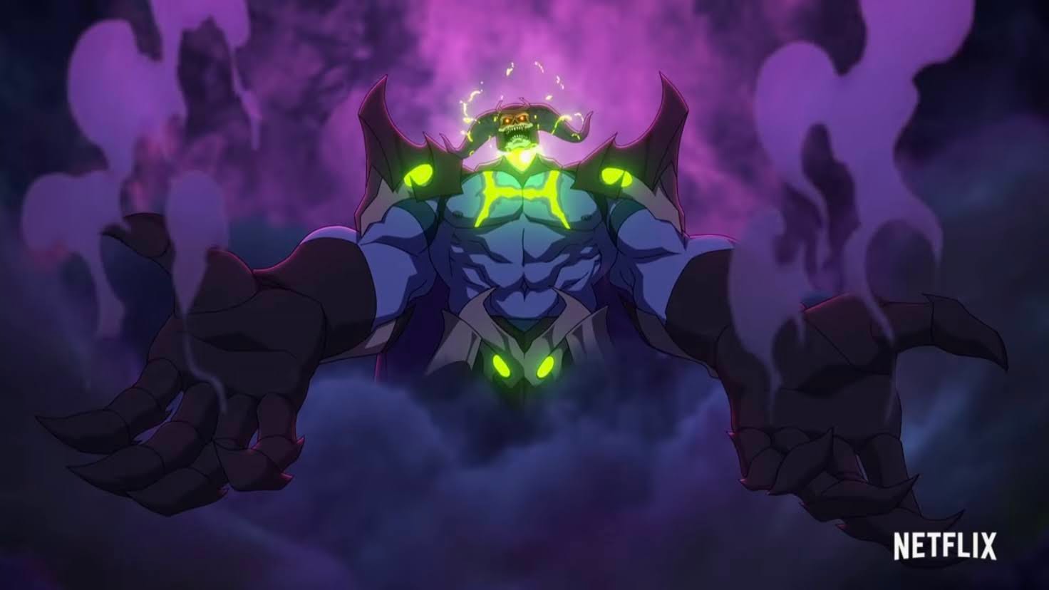
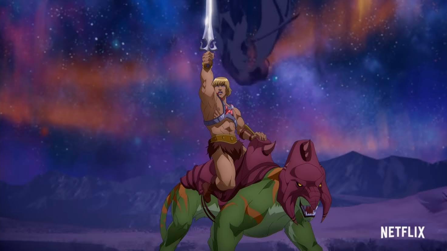
Part One of this inaugural season saw Skeletor (Mark Hamill) triumphant over He-Man (Chris Wood) for basically the first time and magic was removed from Eternia. After a period of time, the former Man-at-Arms for Eternia, Teela (Sarah Michelle Gellar), set out with a rag-tag gang of misfits to return magic to the world. And they basically succeed, but in doing so bring back Skeletor in the form of Skele-God as he now wields the power of Grayskull. And despite Teela and the sorceress Evil-Lyn (Lena Headey) seeming to bond throughout the events of the episodes, she quickly turns her back on the gang and rejoins her man, Skeletor. As for He-Man, he spent most of the five-parter dead only to abandon a Heaven of sorts to return to life only to get stabbed by the newly powered-up Skeletor.
Skeletor found himself in the unfamiliar role of victor at the end of Part One, is that a role he’s suited for? Probably not.
It was a downer of an ending, but knowing that a second batch of episodes was on the way certainly left room for optimism. Revelation Part Two is largely a contrast to Part One. It focuses the early bits on Prince Adam (spoiler, he didn’t die!) as his identity as He-Man has to be reconciled with those who never knew, while a lot of attention is put on the pairing of Evil-Lyn and Skeletor. In fact, I would say Evil-Lyn gets the most character development out of all the characters in the show. Her and Skeletor are presented very much like Joker and Harley Quinn (hardly a surprise with Kevin Smith at the helm) with the dominant personality of the pair being abusive and taking the submissive individual for granted. Skeletor’s absence for much of Part One means that Evil-Lyn has experienced life without her man and perhaps it is that which gives her the confidence to strike back. While audiences are probably rooting for her to knock Skeletor down and take up arms against him alongside the likes of He-Man, she actually doubles-down on the villainess aspect (she has the word “evil” in her name, after all) of her personality to pursue ultimate power. It’s a bit messy as the show wants to make her more sympathetic, but rather than make the audience frustrated with her out of a longing to see her reform, she mostly just stumbles around until we grow tired of her.
If Part One was the Teela show, then Part Two definitely feels like the Evil-Lyn show.
Pushed aside in all of this is Teela. She was the de-facto main character of the first chunk of episodes, but mostly hangs around on the sidelines for much of the second part only to resurface for a climactic battle in the end. Or it would be climactic if the show knew what to do with her during the other four episodes. She basically just plays audience surrogate as she learns secrets about her past and the nature of magic none of which is especially interesting. A lot of it feels like a shortcut to undo the audience’s perception of the magic in this world and basically ex machina some stuff for the end. It’s clumsy, and what should be a triumphant final battle ends up feeling unearned which is a shame because the first five episodes handled the character rather well.
Any project of Kevin Smith’s is going to feature some comedic moments.
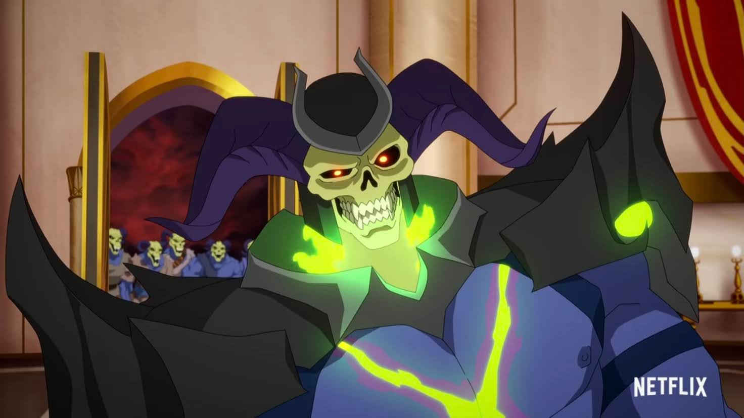
What the show does still do well is humor. It’s pretty important than even a mature take on Masters of the Universe be allowed to have some fun because a lot of it is absurd. The show gets quite a bit out of Skeletor who is often amusing, and sometimes menacing. Mark Hamill’s performance continues to be a bright spot and if I return for another batch of episodes it will largely be due to his presence. There’s also some good moments with Cringer and some of the villains, some of which I’d rather not get into for fear of spoilers, but if the trailers have convinced you this is some grim story then worry not, or be disappointed if that’s what you wanted.
Regardless of what you think of the plot, know that you are getting something that’s pretty damn fun to look at.
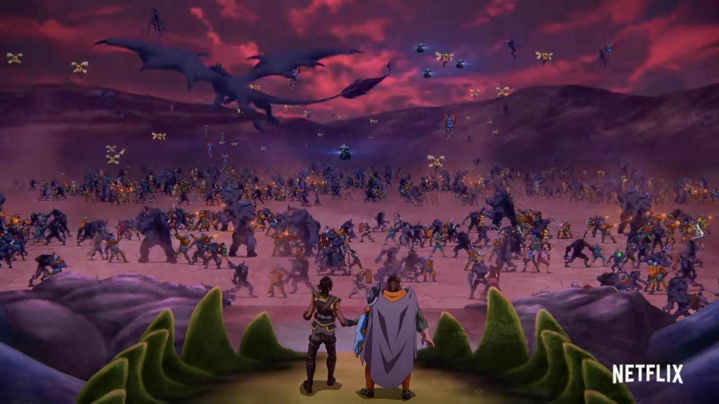
Animation is provided by Powerhouse Animation Studios while the soundtrack was done by Bear McCreary. The production values are the most consistent thing about this show whether we’re talking the look, sound, or voice acting performance – it’s all well done. This second batch of episodes provides the chance for it to show off a bit more and the show mostly rises to the occasion. There’s a massive battle taking place at one point with a lot of characters onscreen which is rather impressive. The only drawback is the backgrounds in that space are rather sparse, but some of that goes back to what Filmation presented. I suppose the show could have elected to do more, but Filmation gave them an “out” and I don’t blame them for taking it.
Don’t worry, this guy still gets to do plenty of hero shit.
Masters of the Universe: Revelation mostly achieves what it set out to do. It takes a bunch of characters from a bad, old, cartoon and gives them a new coat of paint for the kids of the 80s who are the middle-aged adults of today. And it does more than just make the show look better, it finds direction, motivation, and just more depth for the characters even if most still retain their awful, on-the-nose, names. As for both parts of the first season, I definitely found more to enjoy with the first part. The character development was better and the moments looking for an emotional pay-off largely landed. Part Two is more action-focused, which isn’t always a bad thing, but it’s moments of character development and exposition fall flat more often than land. I like some of what the show does with the Evil-Lyn character, but am left feeling like there was more to do there that the show just didn’t find. There’s some fan-servicey bits in here that’s fun for what it is, and for those who wanted more of that in Part One, they may find this one more enjoyable. It’s mostly fine, a decent binge that doesn’t require more than that. When it was over though I was more than ready for it and I probably don’t need to see anymore out of this series.
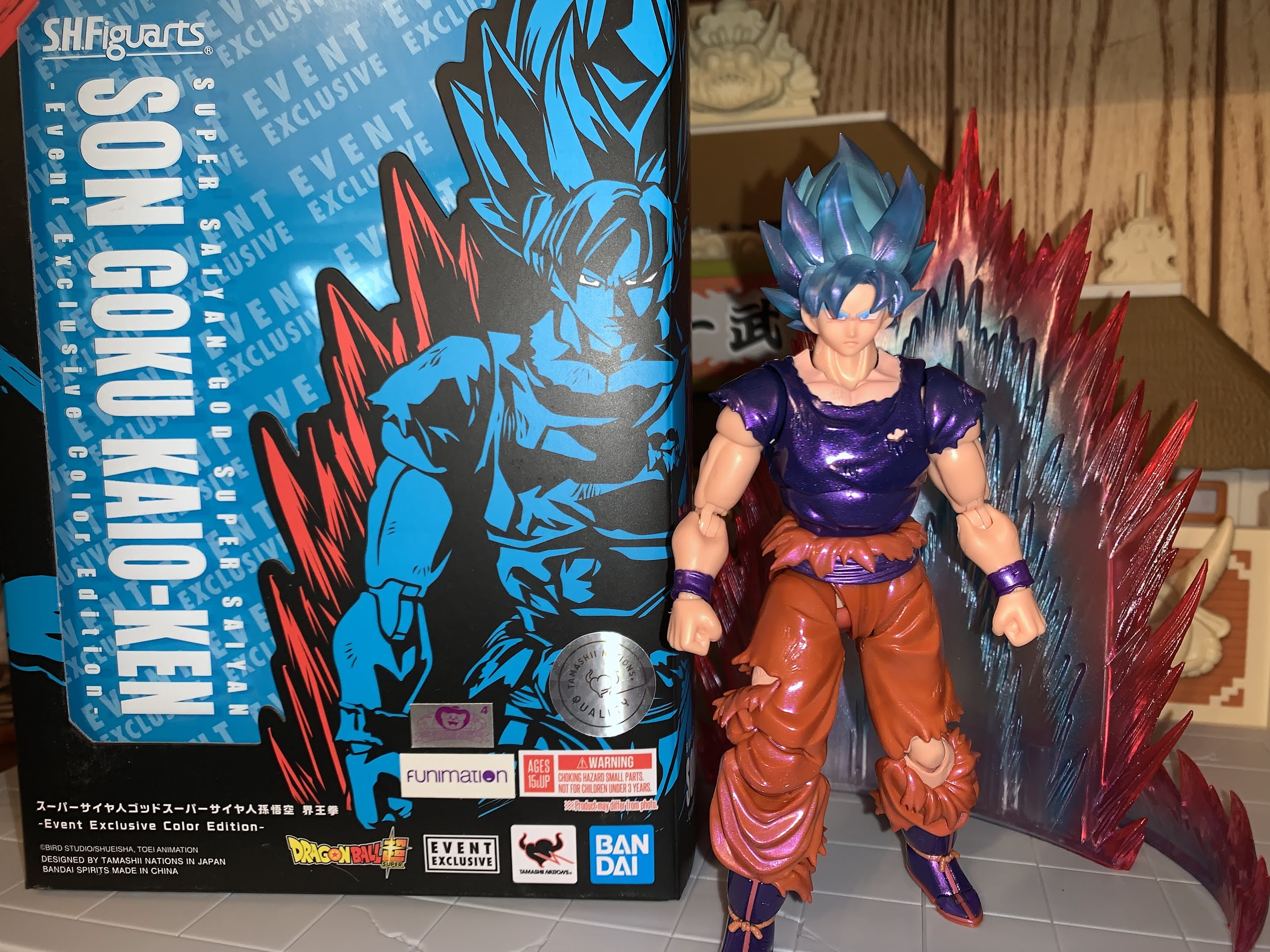
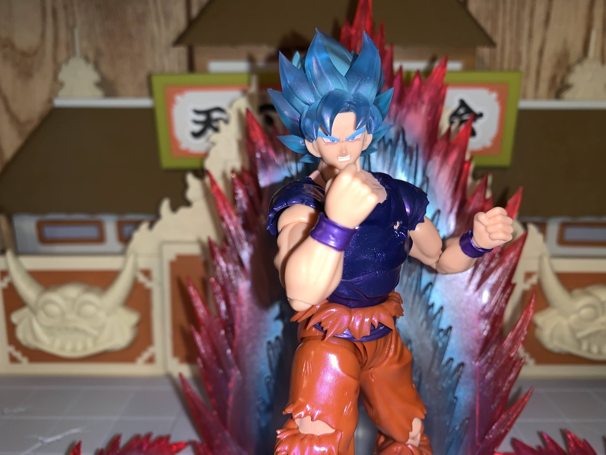
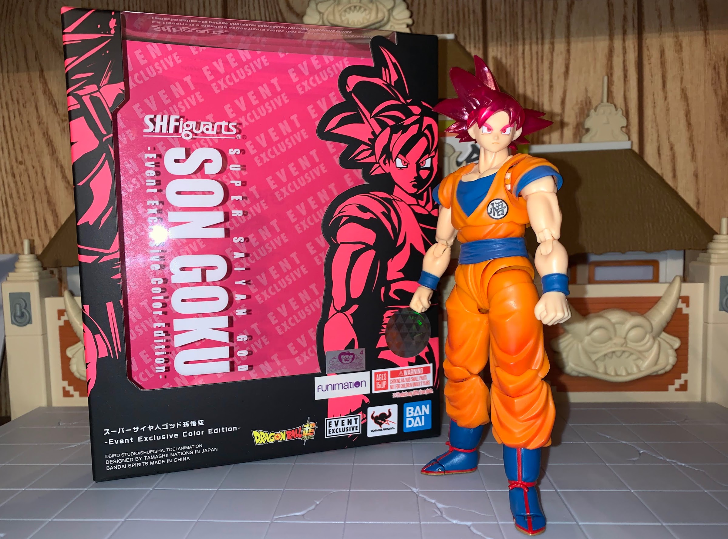
My isn’t that title a mouthful? This version of the classic character Goku comes to you from Bandai via New York Comic Con. If I were to simplify that title, I’d call it shiny Super Saiyan Blue Kaio-Ken Goku, which is still pretty wordy. I guess blame Dragon Ball creator Akira Toriyama for the obsession of stacking different power-ups in what I feel is an intentional bit of word play that he likely finds amusing. And I do too! At any rate, this is the last of the convention exclusives I ordered in 2021. All of the other ones, including other Dragon Ball related figures in Nappa, Goku, and Beerus, came from the world famous San Diego Comic Con. Well, that con didn’t actually happen in 2021 as it was virtual due to COVID once again. One of the few big cons to actually take place ended up being New York Comic Con, and while that one tends to be smaller than San Diego, some companies still like to issue event exclusives for it and that’s where this figure comes from. Bandai, in partnership with Bluefin Brands, made this version of Goku available at the event, but also made it available online for folks like me who weren’t going to journey to New York just to get a Goku. It meant a longer wait, but all things considered, this is one of the shorter waits I’ve have to endure in recent memory.
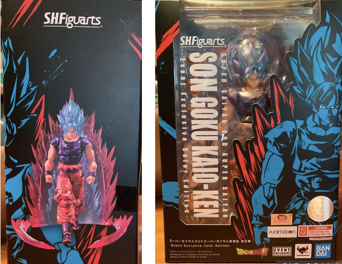
This box feels gigantic relative to other figures in the line, and with good reason.
This version of Goku hails from Dragon Ball Super and one of its first, major, arcs. The first two arcs of the show were adaptations of Dragon Ball Z movies, so this era is where Super really felt like its own thing to me. And it was just some tournament that was a bit of a friendly organized by two gods who happen to be brothers and share a rivalry. It introduced some new characters, most notably Hit, and it was during a fight with Hit that Goku dusted off his old Kaio-Ken technique. You remember that one, right? Kaio-Ken was all the rage for about five minutes when Goku took on Vegeta, but it was basically dropped after that. Yeah, technically, Goku used it against Frieza later on, but it was basically as a means to dismiss the technique which would essentially be replaced with the Super Saiyan transformation. It made Kaio-Ken one of those things fans had fun speculating on, “What would using Kaio-Ken as a Super Saiyan do for Goku?!” but the show was done with it.
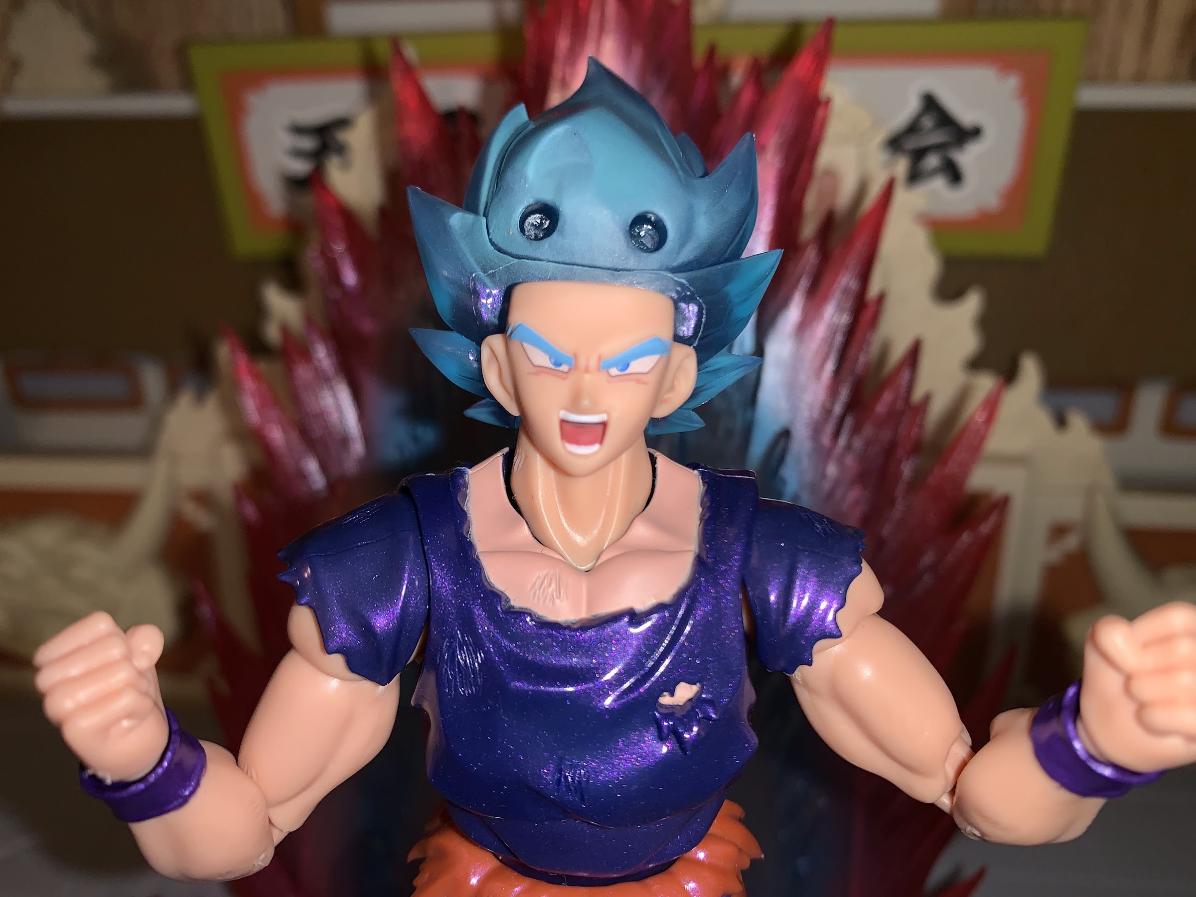
Pissed off Goku.
If you need a primer on the form, it’s basically a technique that temporarily heightens Goku’s speed and power as a multiplier. He did it multiples of 2 and 3 against Vegeta, but would go up to 10 later. In Super, Goku turns to it after his Super Saiyan Blue transformation as the ultimate showing of his power at that moment in the series, though it’s not referenced much after. It does look cool though as Kaio-Ken by itself has a red aura, and combine that with the Blue transformation and you get a blue-purple look. It certainly made sense to explore the mode in figure form, and that’s what Bandai and Tamashii Nations did. And this being an event exclusive, they added some shine as well.
I love that shade of blue used for the eyebrows, so much so that I’d like to see other versions of Super Saiyan Blue Goku (and Vegeta) just go with that for all of the hair.
This version of Goku is obviously similar to other versions of Goku in the SHF line. He stands at about 5.5″ to the top of his forehead and roughly 6.75″ to the top of the hair when at his tallest. He’s basically in-line with my Super Saiyan Blue Goku, but this is actually mostly a differently sculpt. I don’t have it, but if I had to guess, this figure shares most of its parts with the Ultra Instinct Sign Goku which depicted Goku from his battle with Jiren. His gi is rather tattered so it needed its own sculpt to capture that. The only pieces this figure can share with the other blue Goku is the head, neck, and arms, though even some of that needed modification. I don’t have either version of Ultra Instinct Goku so this figure has more of a “new” feeling to me than it would others. It was honestly something I hadn’t thought much about until I had the figure in-hand.
The paint is rather lively on this guy and you can see the almost glitter quality in the shirt here.
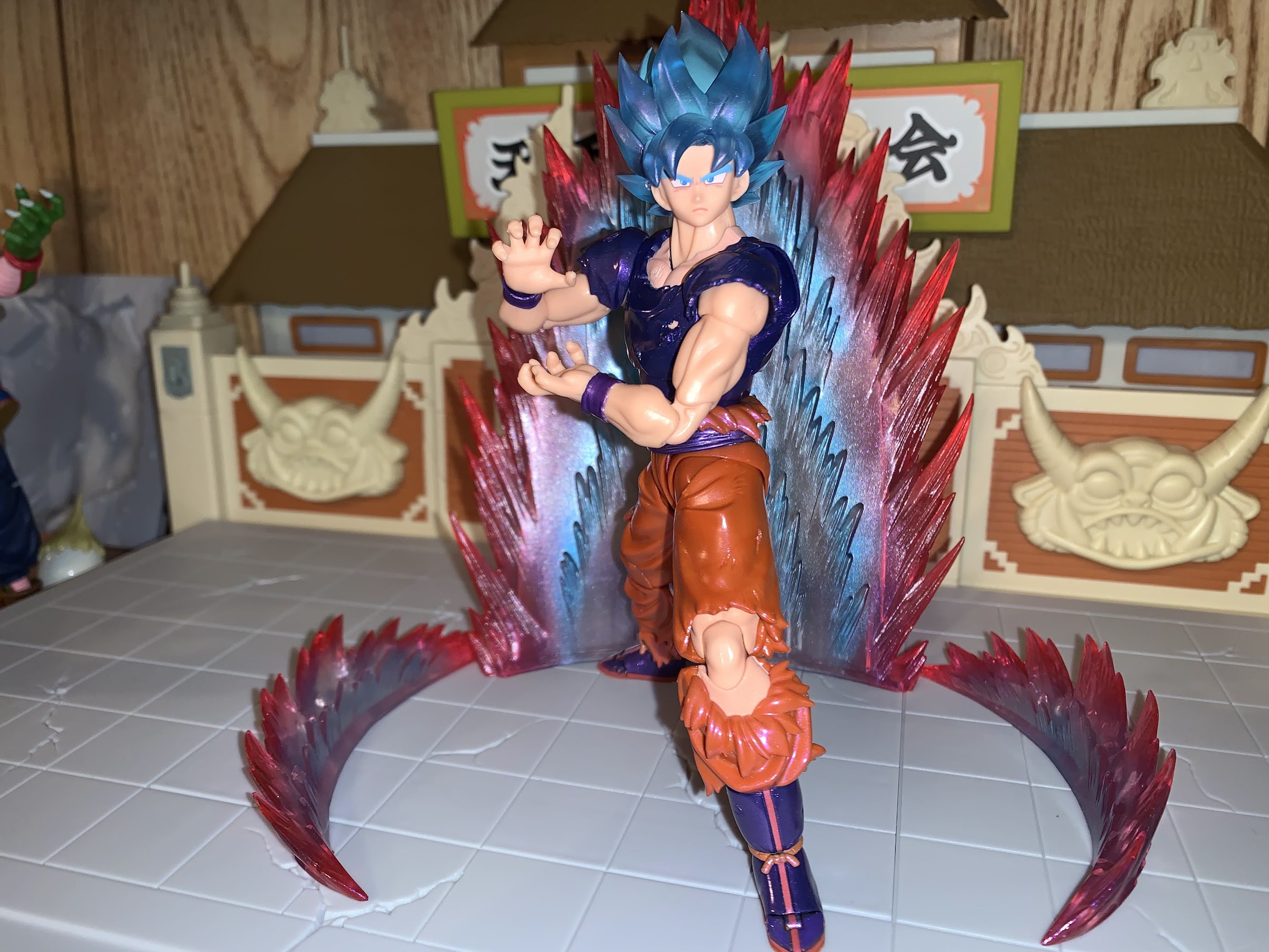
What’s going to sell this guy beyond the sculpt is the paint job. The sculpt is fairly nice and I like the rips in the pants and shirt. The finish on the paint is of a pearl quality. The navy shirt takes on a metallic purple as a result and it’s pretty cool to handle and see how the light plays on it. The hair is a semi-translucent plastic with a touch of purple air-brushing, by the looks of it, which gives it a nice effect. The flesh is more saturated than we’re used to seeing due to trying to emulate the Kaio-Ken red effect. Bandai did have to do a lot more color-matching than usual though because of all of the rips in the clothing. The results are a tad mixed. The exposed portion of the chest could stand to be a touch more saturated as I feel like some of the navy color is showing through. The left knee is colored plastic, but the upper and lower portions of the leg surrounding it are painted and it’s not a perfect match. It probably won’t bother most on a shelf, but in-hand it’s pretty noticeable especially when the knee is bent all the way. This finish is also very glossy and gives the figure almost an enamel finish. It also has a different feel than most figures in the line. The plastic feels thicker and since almost everything has this finish applied it has a slippery feeling. That’s not a criticism, just an observation. Aside from the color-matching issues, my only real criticism for the paint is that I wish there was something applied to the torn parts such as a darkening to the interior parts of his pants. I just think it would help that part “pop” a bit more.
I can’t really complain because we get the aura effect with this figure, but we’ll never have enough Kamehameha effects.
The sculpt for this guy is overall pretty good. I already mentioned how the torn pieces of the gi look nice, and we get the usual musculature for Goku that other figures have. This one changes things up with some battle damage in the form of scuffs sculpted into portions of the arms, legs, and chest. I’m torn on if I think Bandai should have added some black linework to those scuffs to bring them out more as they’re not going to show from the shelf. This figure is going for a glowing aura look, so perhaps it would not have made as much sense, though I feel like in those moments Goku’s battle damage becomes even more noticeable in the anime. I could be wrong, I haven’t watched any of these episodes in years. One thing that did surprise me a little is there’s more evidence of mold release on this figure than usual. That’s those rough portions of the figure where it was removed from the actual tools used to create it. There’s basically a full tab on the underside of my figure’s right shoulder that makes it look like it was from a model kit no one bothered to snip. This figure also has those sleeves that peg into the shoulder which I really don’t like. Almost every Goku has that so it’s nothing new, but I’ll continue to complain until they find a better solution. Another common complaint is Goku also could be beefier. From the front, he looks okay. I’d probably widen the chest a little, but it’s mostly a nitpick. From the side though he looks thin. His chest doesn’t push out at all. It’s odd and almost comical. It’s also more pronounced because he doesn’t have the vest to add a little bulk, but this is something all of the figures in this line could stand to improve on. Goku, especially a powered-up Goku, should be thick and buff.
My lingering piece of criticism for this line is that nearly every character could stand to have some added girth. Goku should have a more pronounced chest when viewing him from the side.
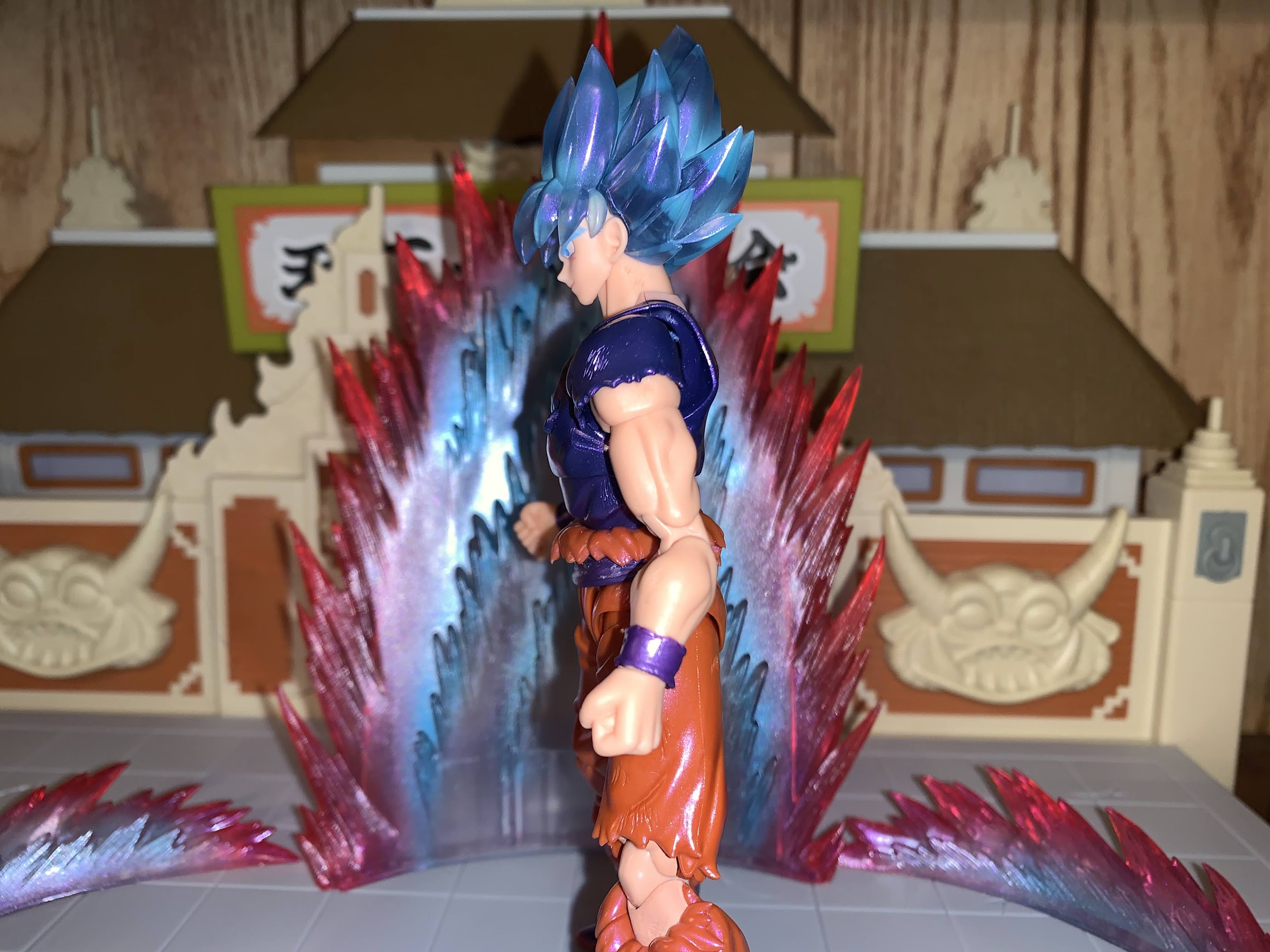
There was a lot of new for me to take-in with the sculpt and paint of this figure, but articulation? That’s pretty much standard. His head is on a tiny, double-ball peg with another ball in the base of the neck. Despite that, he can’t really look up, but can look down. His head feels a little loose, but it seems to be holding a pose all right. The shoulders are on the peg and hinge system with a butterfly joint. The butterfly is really limited, but they at least colored it properly so it’s not ugly, just not particularly functional. There’s a biceps swivel and double-jointed elbow which bends past 90 degrees. The hands are on the usual ball pegs. In the diaphragm, we have the ball-hinge system so you can pull up on the figure if need be. It doesn’t really do a lot though as the figure can’t really crunch forward no matter what you do with the hinge, but he can bend back a little. Mostly, this joint just gives you some swivel and a little tilt, but you have to be mindful of paint rub. At the waist, you can swivel and the belt and rags is a floating piece. At the hips, Goku can almost do a split, kick forward, and kick backwards because he doesn’t have sculpted buns. There’s a little twist there too, and then your usual double-jointed knees below. The knee on the right has a bit more range backwards because it’s a standard, clothed, joint while the exposed left knee has reduced range, but still goes beyond 90 degrees. The ankles are on ball pegs and have the usual range for Goku’s boot design. It goes forward a little, back a fair amount, decent ankle rocker, and a lousy toe hinge. All of the joints are fairly smooth and required no break-in period, so that is always appreciated.
I can see people being against translucent plastic for Super Saiyan hair, but I do think this figure draws attention to how bland the approach to the hair was for the standard release. Granted, the figure on the left retails for only 30 bucks.
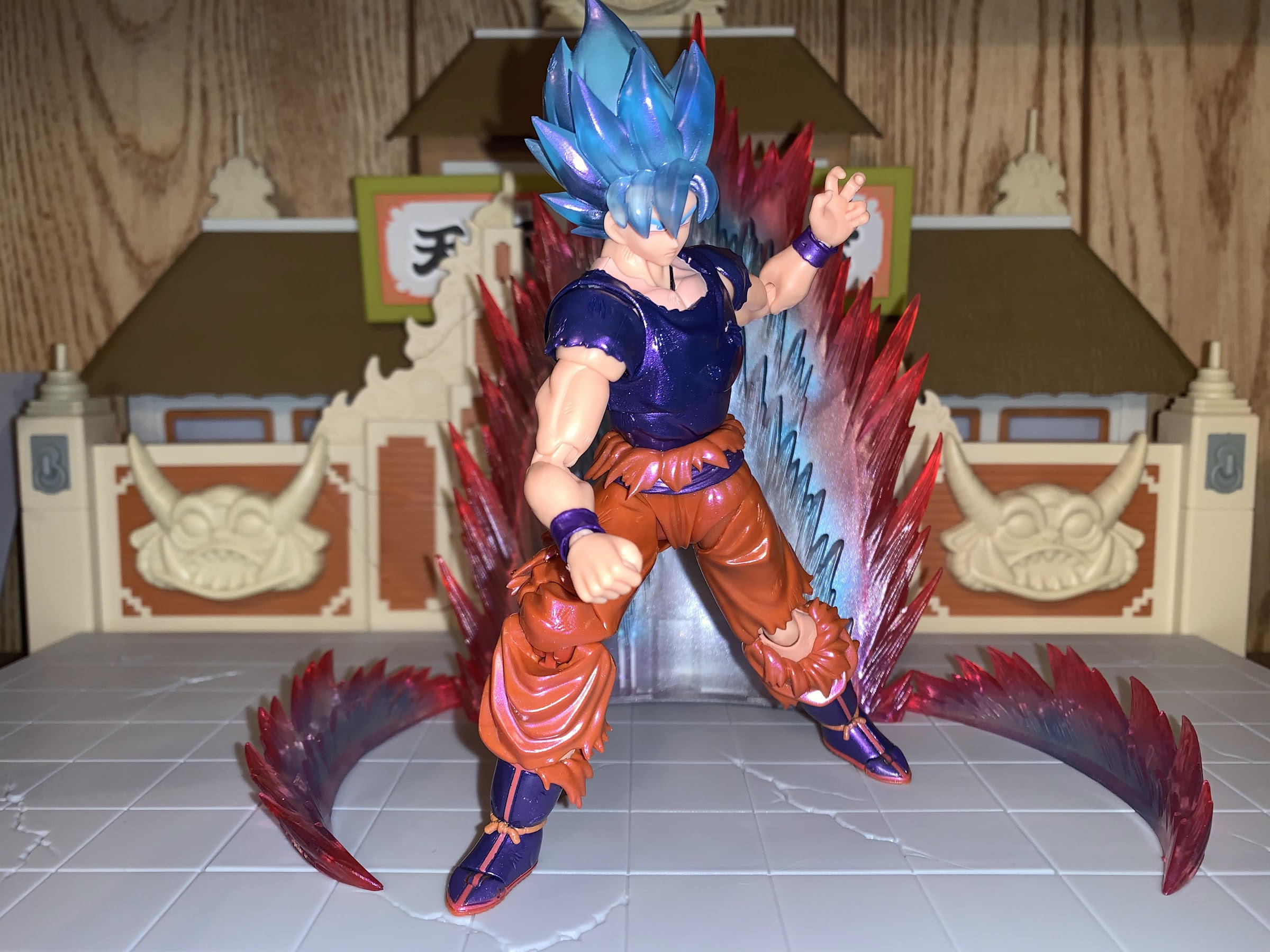
The other unique aspect to this release comes with the accessories and packaging. The optional hands and expressions are fairly standard. We get a stern look, scream, smirk, and a teeth-gritting expression. All of the faces are well painted and I love the shade of blue used for the eyebrows. I wish that was the standard shade of blue for this form of Goku. For hands, we get a set of fists, martial arts pose hands, Kamehameha hands, and wide open “Solar Flare” hands. For a box, he comes in this oversized standard box with the usual event exclusive coloring. It’s oversized because this Goku comes with an aura effect! That’s certainly unusual, and also why this guy cost $60 instead of $50, but it’s worth it. I love effect pieces and for this particular form it’s needed. It’s the standard aura piece, of which I have a yellow version already, and it comes in three pieces: a rear blast and two side pieces. It’s cast in translucent plastic with red at the edge and blue on the inside. The plastic is soft and and partially hollow. The only thing I don’t like is the translucent nature of the plastic means more of the seems are visible, especially towards the bottom of the center piece. It’ll get the job done though, and I hope it doesn’t get that sticky residue my other aura piece has acquired over the years.
If you like what you see then this figure is a worthy addition to the Super collection. If you’re someone who never cared about this version of Goku then you’ll probably be content to skip it.
This version of Goku is another good selection by Bandai when it comes to event exclusives. Not everyone needs a version of Goku so specific to one look from the show that doesn’t show up much, and the paint application is something that will appeal to some more than others. I thought this figure looked great in the promotional shots, so when Bandai made it available online I said “Why not?” The actual figure in hand pretty much lives up to my expectations. It’s eye-catching and fun and I love adding another aura, even if this one is really specific to this version of Goku. My guess is that most people who bought this are happy with it. I don’t think it’s good enough to win anybody over who didn’t see a spot for this in their collection, but those who want it should be content. Since it was an event exclusive, it’s currently sold out at MSRP so only secondary options are available. This strikes me as the type of release that might be high right now, but could come down in time as it is a bit niche. If you missed out and are having second thoughts, just keep an eye out. Who knows? Maybe a good deal will come around sooner or later.
When it comes to Mobile Suit Gundam I am a casual fan, at best. Like a lot of people my age, it wasn’t really something that was on my radar until Cartoon Network started airing Gundam Wing in the late 90s, and once it did, I would pretty much watch whatever Gundam series Cartoon Network chose to air. It was around the same time that Bandai started bringing some of its Gundam model kits state-side. I had my opinions on the shows, but I always loved the look of the mobile suits, and in particular, the ones featured in Wing. I would pick up a few 1/144 scale and 1/100 scale kits over the years, but mostly dropped off in the early 2000s. I only had so much room for toys, and money, and the kits were pushed aside in favor of other things.
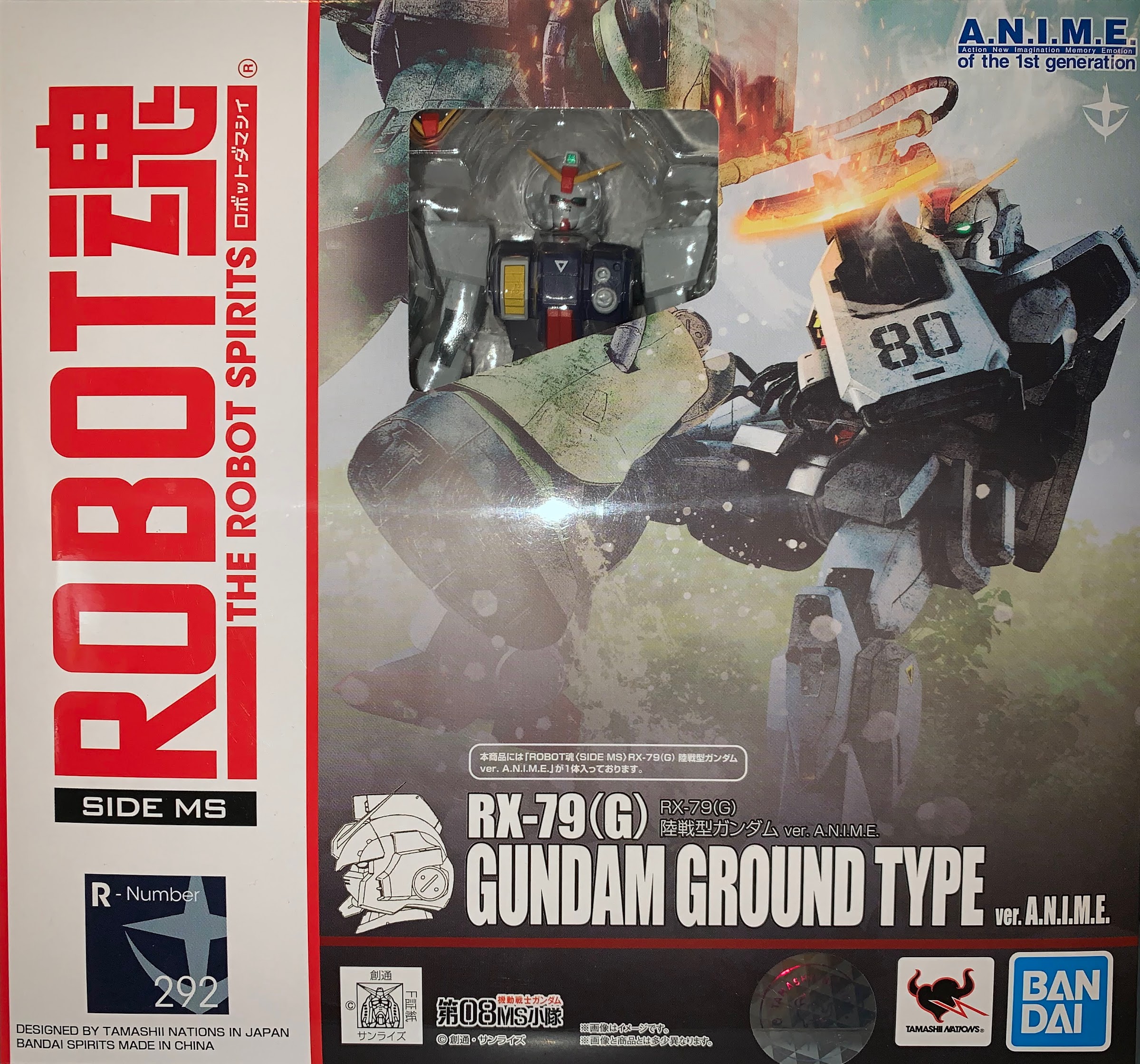
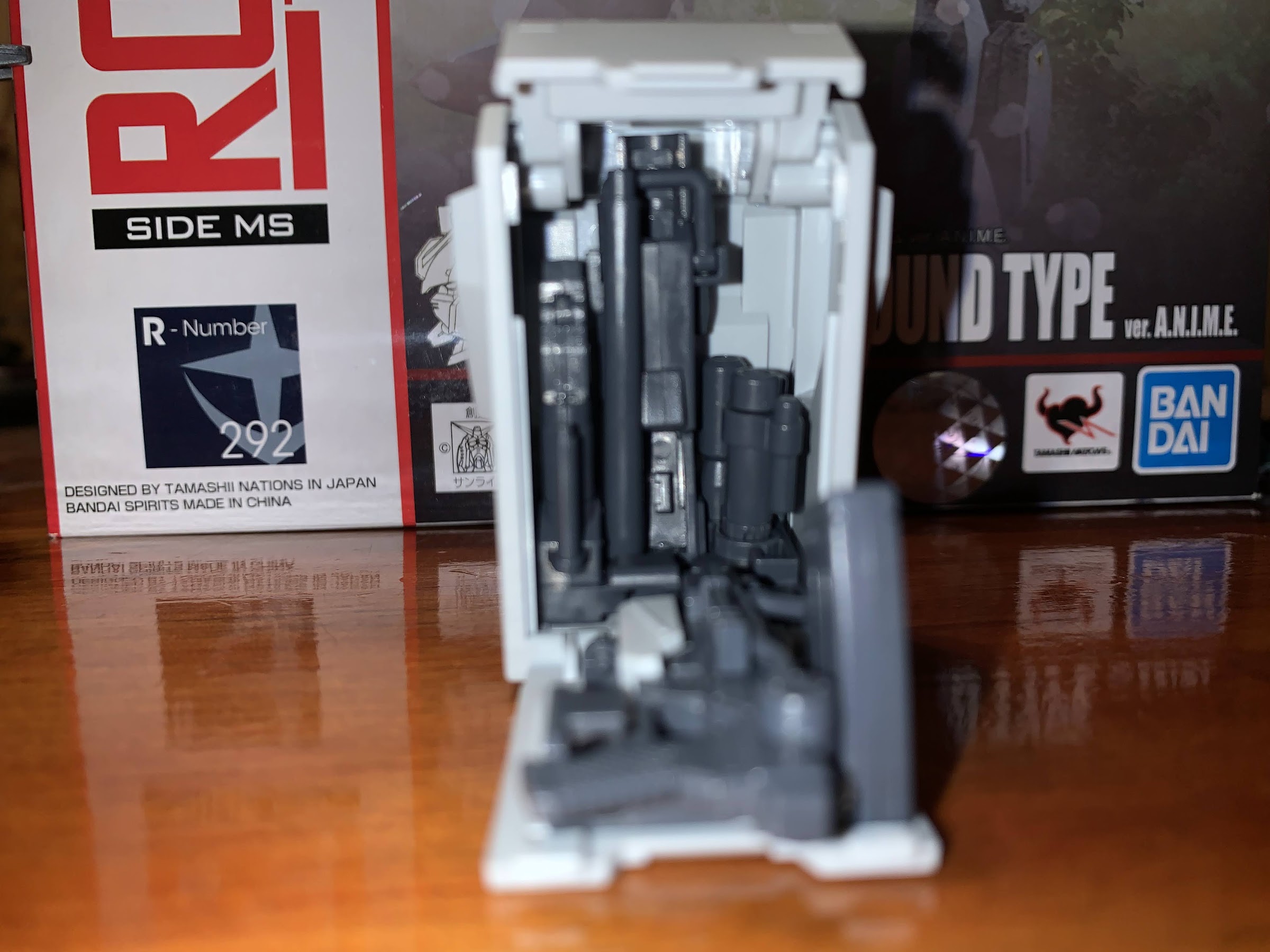
A standard box with a teeny, tiny, window.
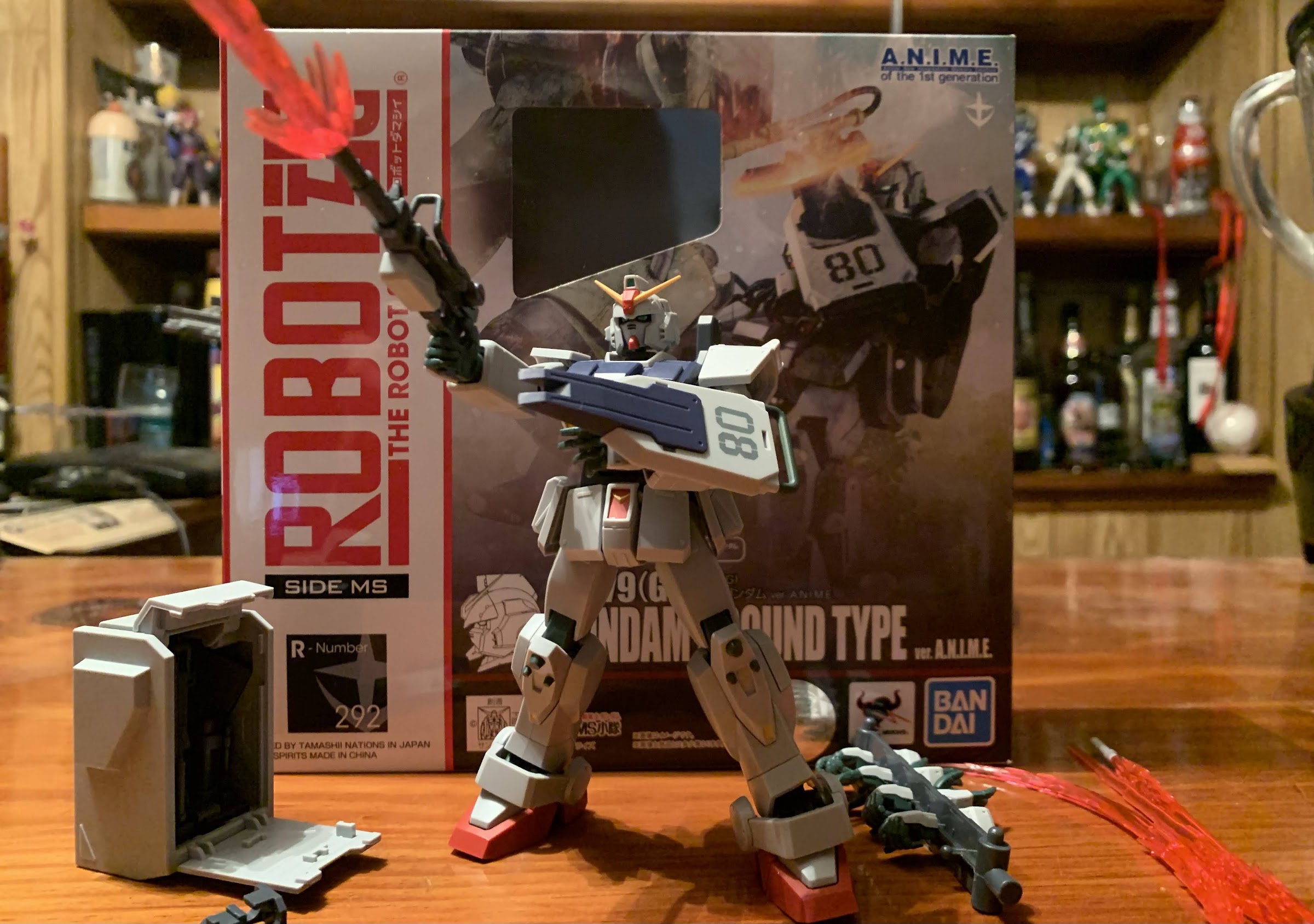
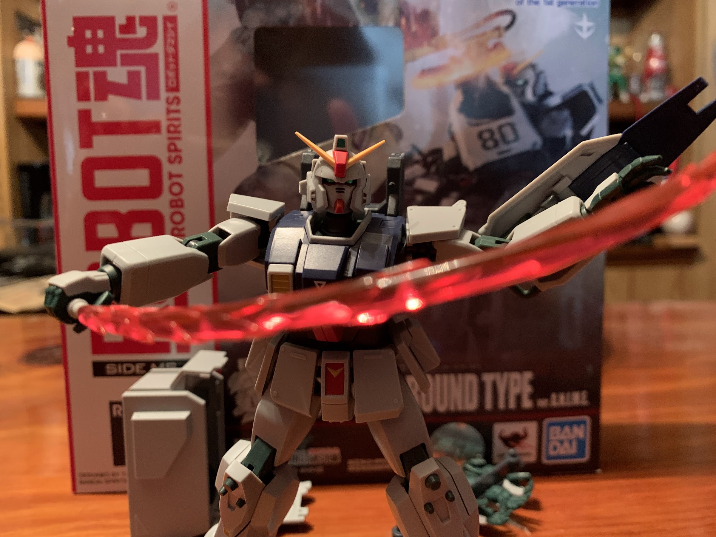
When it comes to the actual anime series, I am most definitely a fan of The 08th MS Team. It’s my favorite of the Gundam shows I’ve engaged with, so when I saw that the main Gundam from that series was slated for release this year, I decided to give The Robot Spirits a shot. The Robot Spirits strikes me as the mecha version of the Tamashii Nations S.H.Figuarts line of action figures that I am most definitely familiar with. Just like how Bandai has Dragon Stars and SHF for its Dragon Ball figures, there’s basically a Target version of Gundam and Robot Spirits with the Robot Spirits being more high end, and thus, more expensive. I had never seen nor held or even sought out information on the line and when I saw this version go up for pre-order I decided to keep myself in the dark and just react to it when it finally shipped.
Let’s rock!
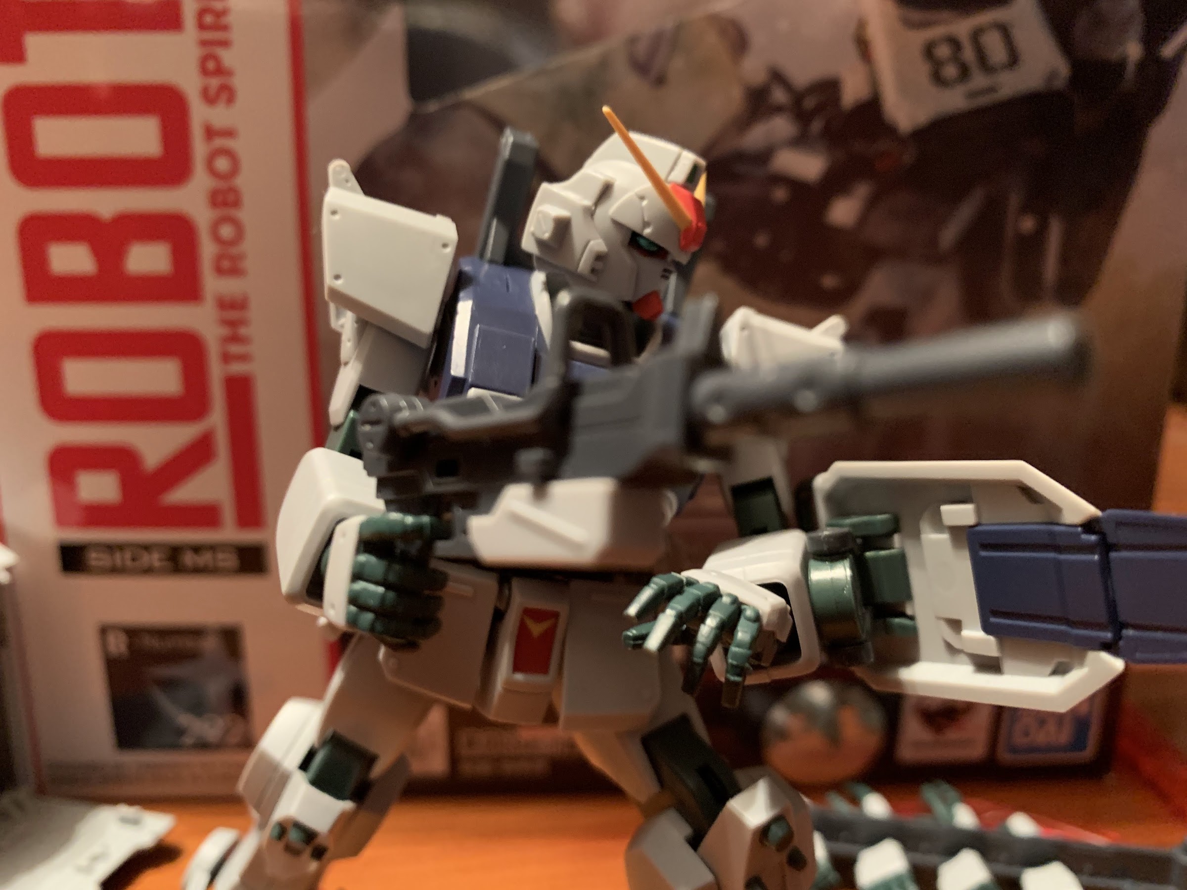
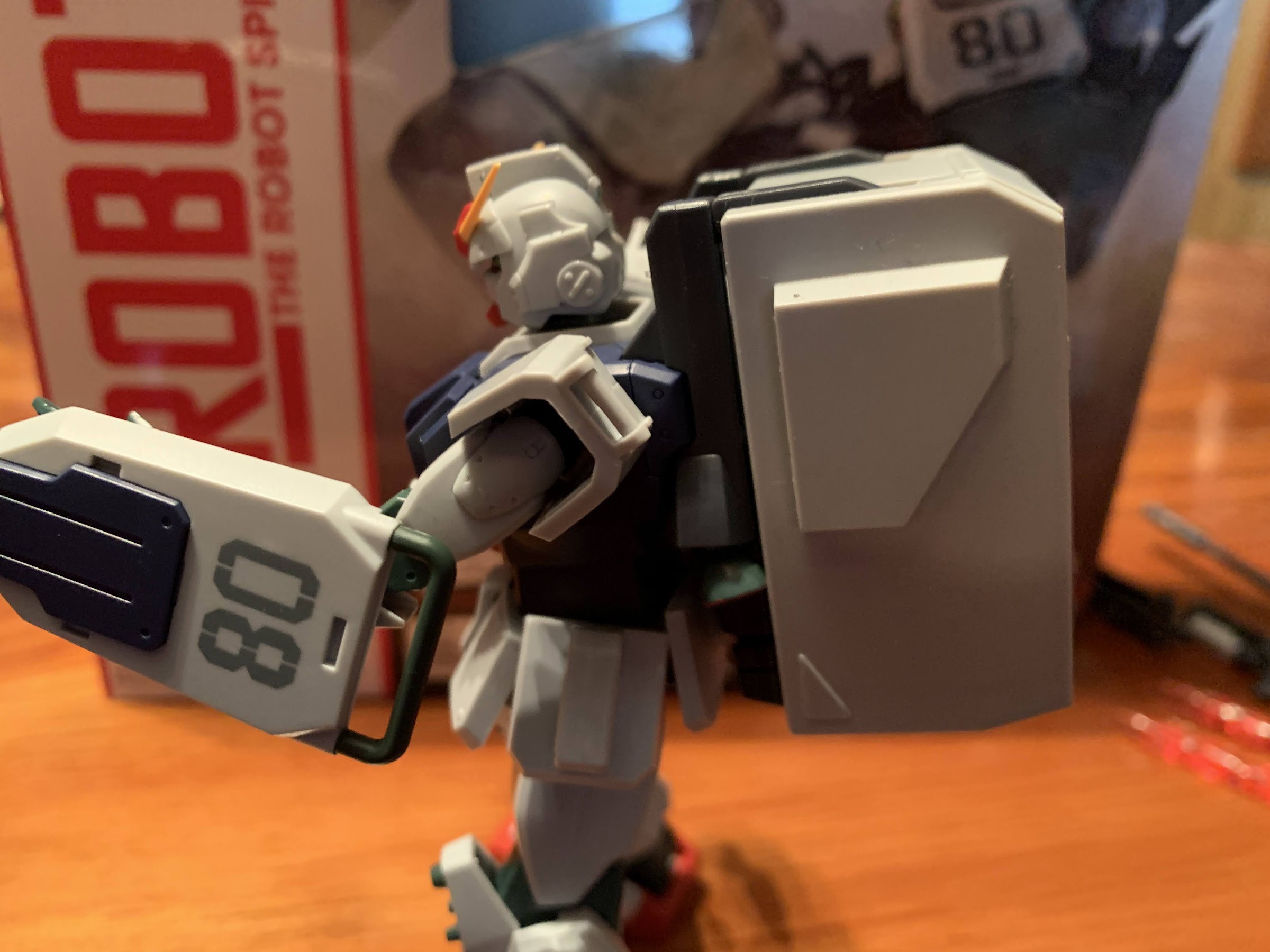
And obviously it has for I now have my figure in-hand after 6 or 8 months since I placed the pre-order. My first reaction upon getting this thing is, “Wow, this thing is small!” The box is larger than a SHF release, though it’s still a resealable cardboard box with a window and a blister inside. Only the window here is tiny so you basically can just see the head and a portion of the torso of the figure inside. As for the figure, it is indeed small. This mobile suit, which is hundreds of feet tall in the show, is a mere five inches and actually a tick under that officially. That’s not necessarily a bad thing on its own, but it did surprise me. I know a lot of Transformers fans were a bit surprised at how small the RED subline turned out, but my RED Soundwave looks like a giant beside this thing. Again, not really a bad thing assuming the line scales well from figure to figure, but I emphasize it because some people might be surprised and not in a good way. Me personally, I’ve always found smallish figures to be kind of charming, which is at odds with my also loving big, chunky, figures. I just see it as a quirk of a line and it’s fun, but that’s just me.
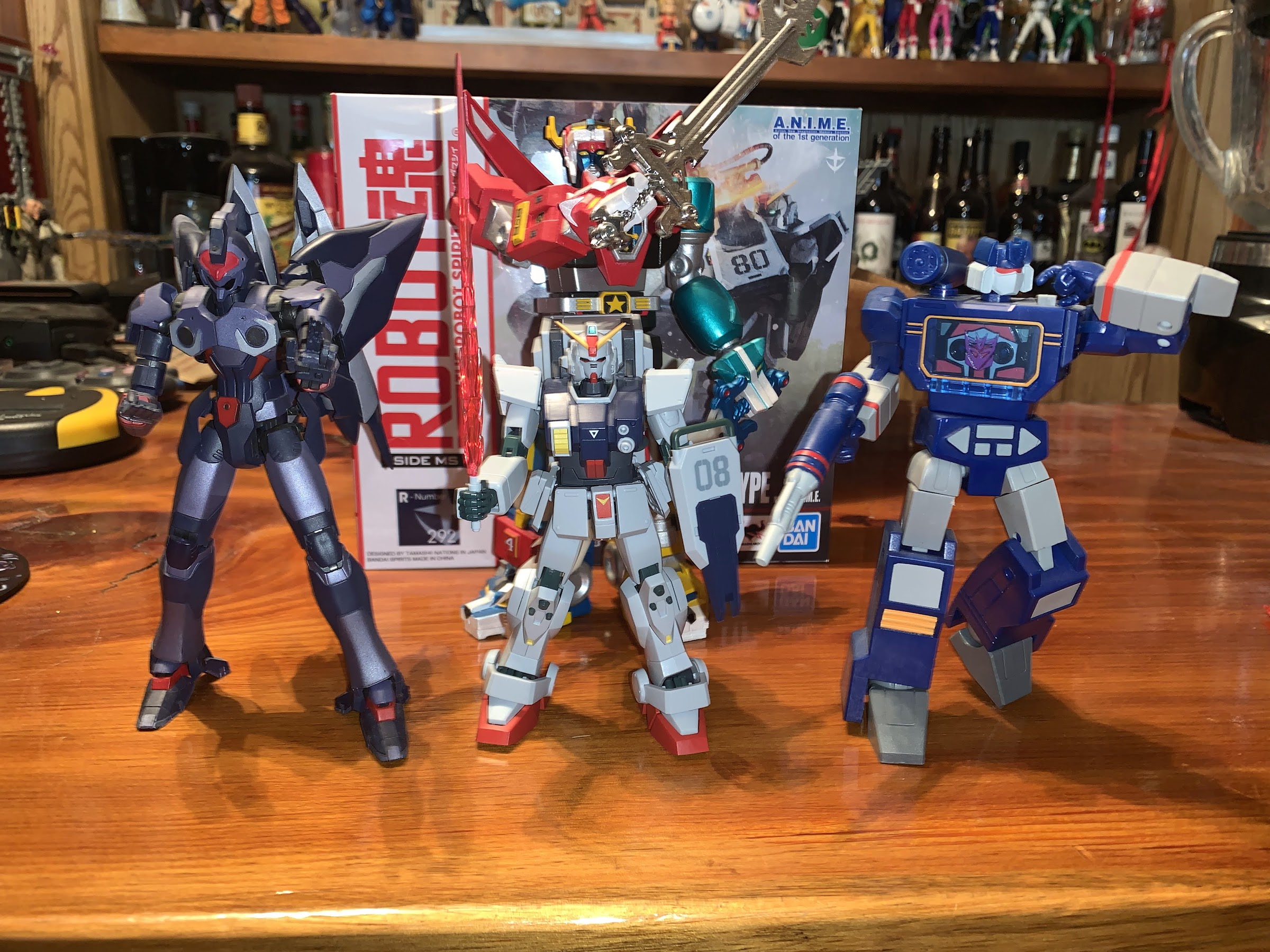
None of these figures are made by the same company so no expectation of scale exists, but this Gundam is quite the little guy. Left to right: Banpresto Weltall, Gundam Ground Type, Hasbro RED Soundwave. and Super 7 Voltron (rear).
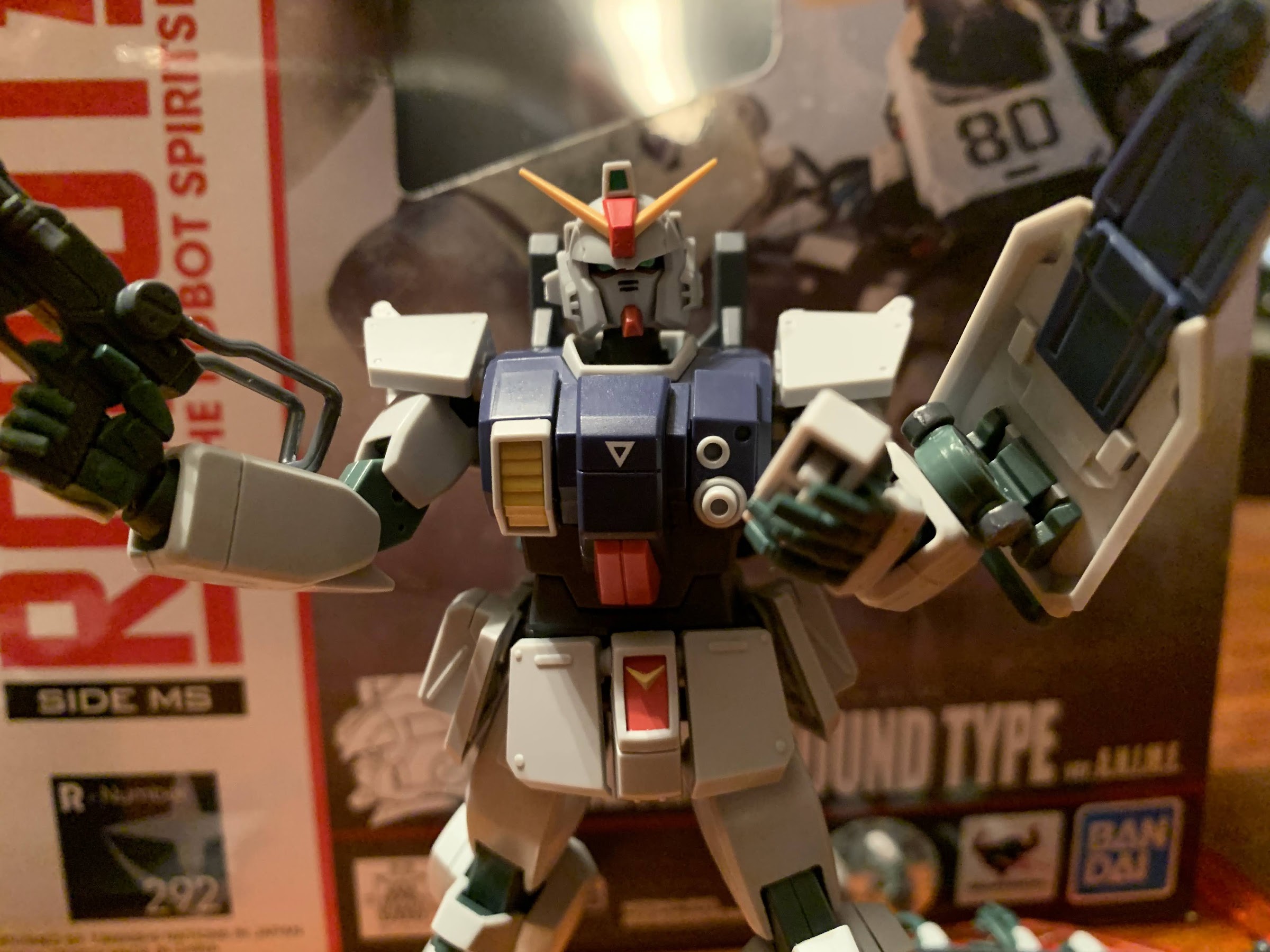
Size out of the way, the figure is largely as expected. It certainly feels similar to a SHF release. The plastic is fairly light and the figure is comprised of numerous small pieces. In that respect, it also reminds a lot of the old model kits that I used to assemble, only more durable and more refined. There’s lots of detail in the sculpt, especially on the head. I’ve always liked this unique shade of gray this suit is presented in and Bandai pretty much nailed that aspect. Also like SHF, there’s not a ton of paint to speak of, but there’s probably more here than on some of the Dragon Ball figures I have. There’s a metallic green applied to the eyes and a line of red beneath them that looks quite sharp. There’s some smaller details done in black and some red and yellow paint applied to certain areas. And what is there is remarkably clean. I don’t see one smudge or soft edge on any of the painted parts. It’s also possible some of the applications are decals, like the green at the top of the “crown,” which looks good too. I think the only criticism I could levy on the presentation of this figure is that it doesn’t look like something made of metal. And it’s not, but the suit in the anime is. That would take a more elaborate paint job to add cel-shading. They could have tried to give it a glossy finish, but I’m partial to matte when it comes to my figures so I won’t go that far. That’s a matter of taste though, what’s here is done quite well.
Does it make sense for a giant robot to sneak around like this? Probably not, but it looks cool!
Now that’s what I call a gun!
Aesthetics are one thing, but what a lot of people buy these high-end imports for is the articulation and a Gundam presents some challenges, and some opportunities, given it’s unique look. There’s definitely a lot here and I think Bandai did a pretty good job of balancing out the aesthetic and the articulation. The head sits on a ball peg and it has range up, down, tilt, and the usual swivel. There’s a fair amount of space carved out for the head too so while you always have to be mindful of parts rubbing, the head is fairly protected. The shoulders are on ball pegs and the shoulder pad, or pauldron, has some wiggle. There’s actually two butterfly joints, one in the shoulder and then another in the chest. Neither offers much range, but neither one also takes away from the sculpt so I suppose it’s fine. The shoulder can swivel on that ball peg, so it’s basically your biceps swivel, and the double-jointed elbow has terrific range. The hands are on ball joints and sit rather deep in the wrist and provide ample range in all directions.
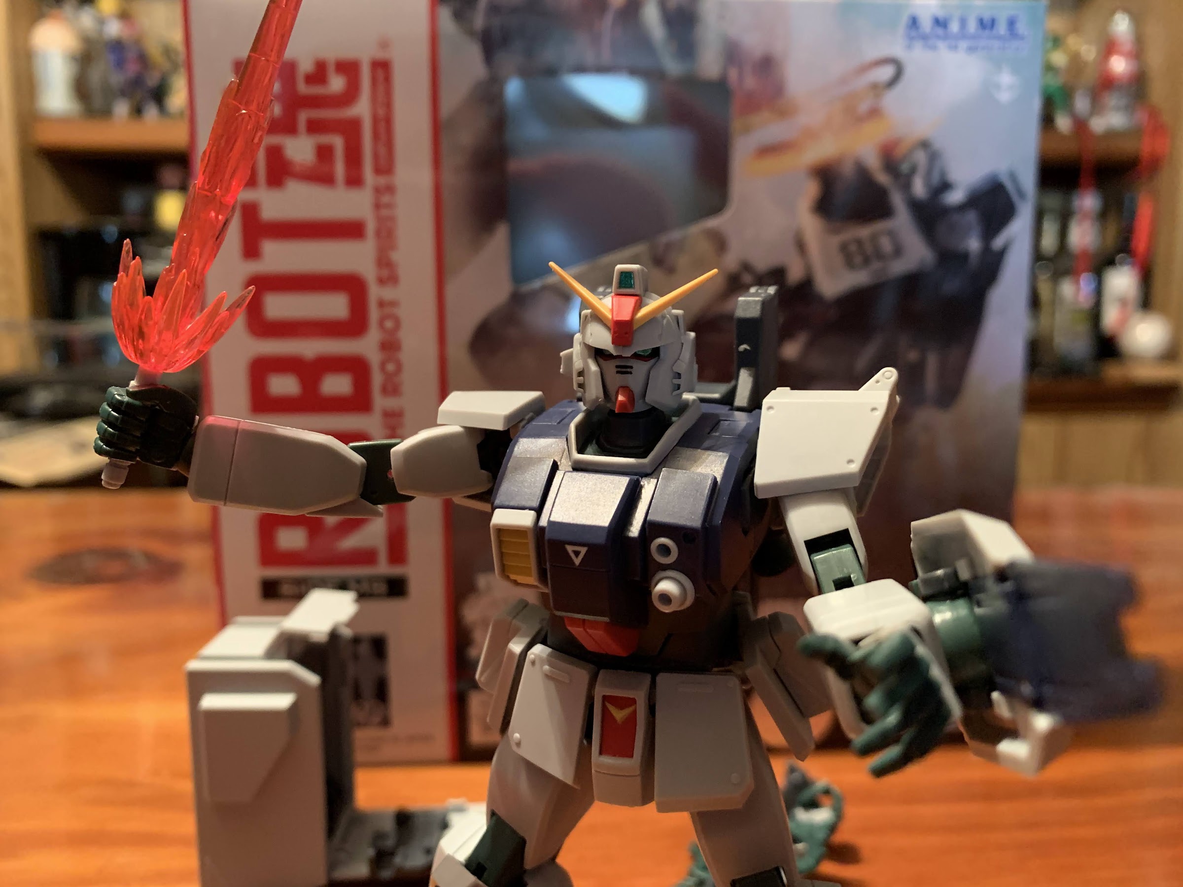
When guns won’t do, you reach for the beam saber.
There’s an optional “flash” piece for the base of the blade that I think is supposed to represent the blade being first fired-up.
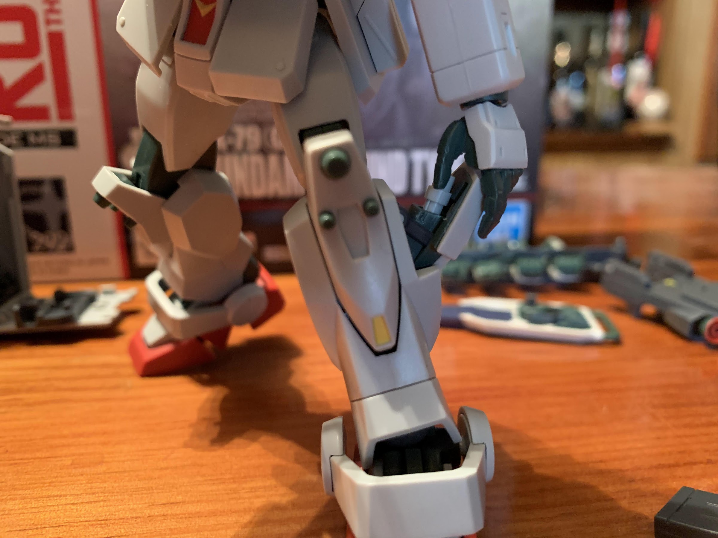
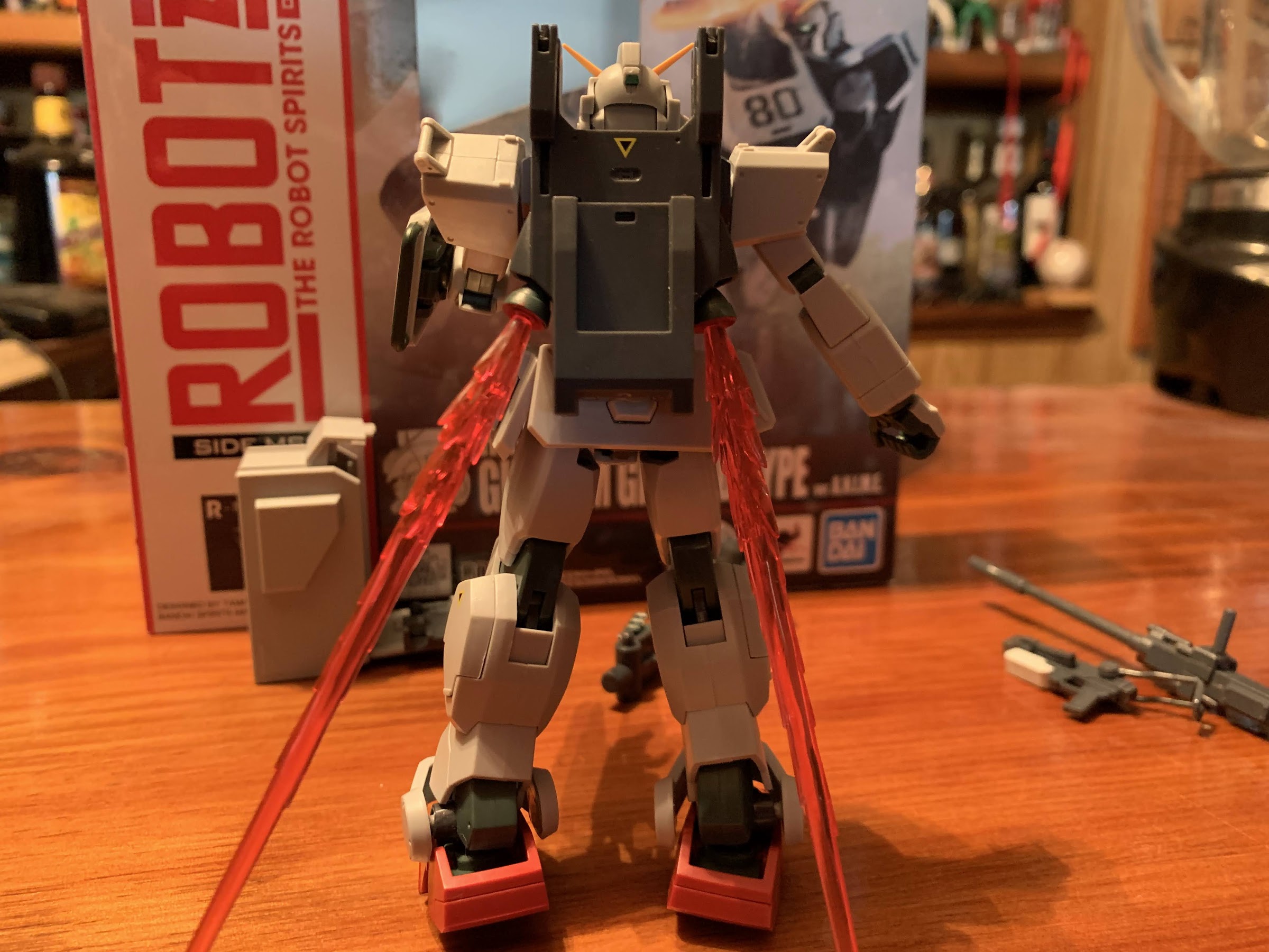
The torso is where Bandai can’t really do much. There is an ab crunch, but it just tilts forward a small amount. I was always terrible at geometry, but it looks like it’s maybe 30 degrees. There’s even less backwards. There is a swivel at the waist, but it’s more like a pivot as it doesn’t move much in either direction. That’s basically it for the bad articulation, as below the waist is fine. The hips are just ball joints, but the figure can kick as far forward as the “skirt” pieces will allow. Those are also on ball joints and can be manipulated or even popped off entirely, if you wish. The thigh twists, or pivots, at that ball joint and the knees are double-jointed and can be bent all the way back. The ankles are on more ball pegs and they’re a bit more limited than other spots, but you still get some forward and back as well as tilt. The piece going over the feet is attached to a ball peg on one side so it can be moved out of the way to a certain degree. The center piece of the foot is also articulated and can be bent forward, which just mostly gets it out of the way so that the toe hinge can be used. I say toe hinge, but the joint is basically in the middle of the foot. It’s a bit unusual, but it works to make the feet more dynamic and to get the figure into certain poses, like a kneel-down. And because the figure is pretty light and the feet large, it’s pretty easy to pose and position.
The “swoosh” blade is pretty damn fun.
If it’s your preference, the beam saber blades can be turned into thruster effects.
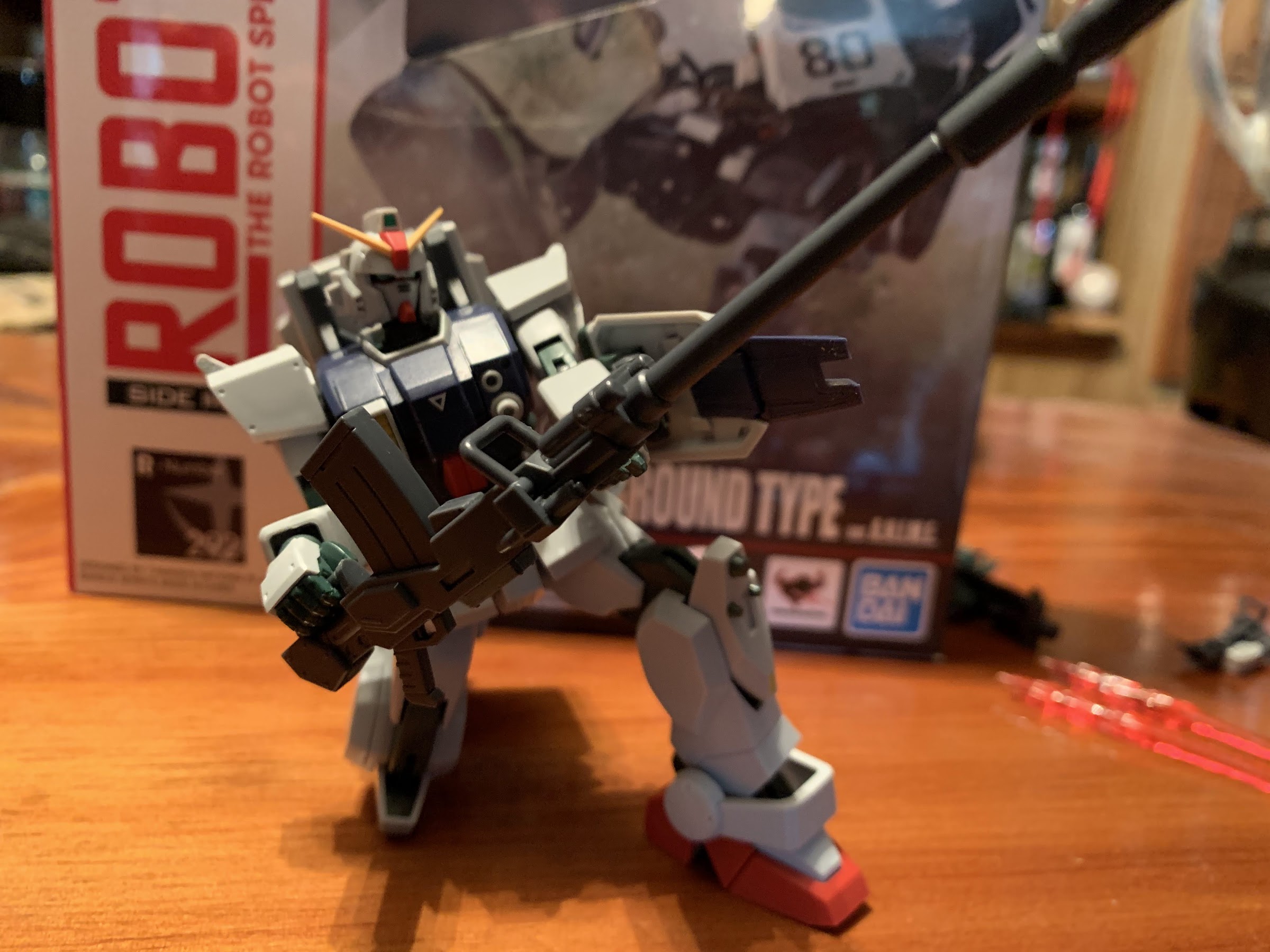
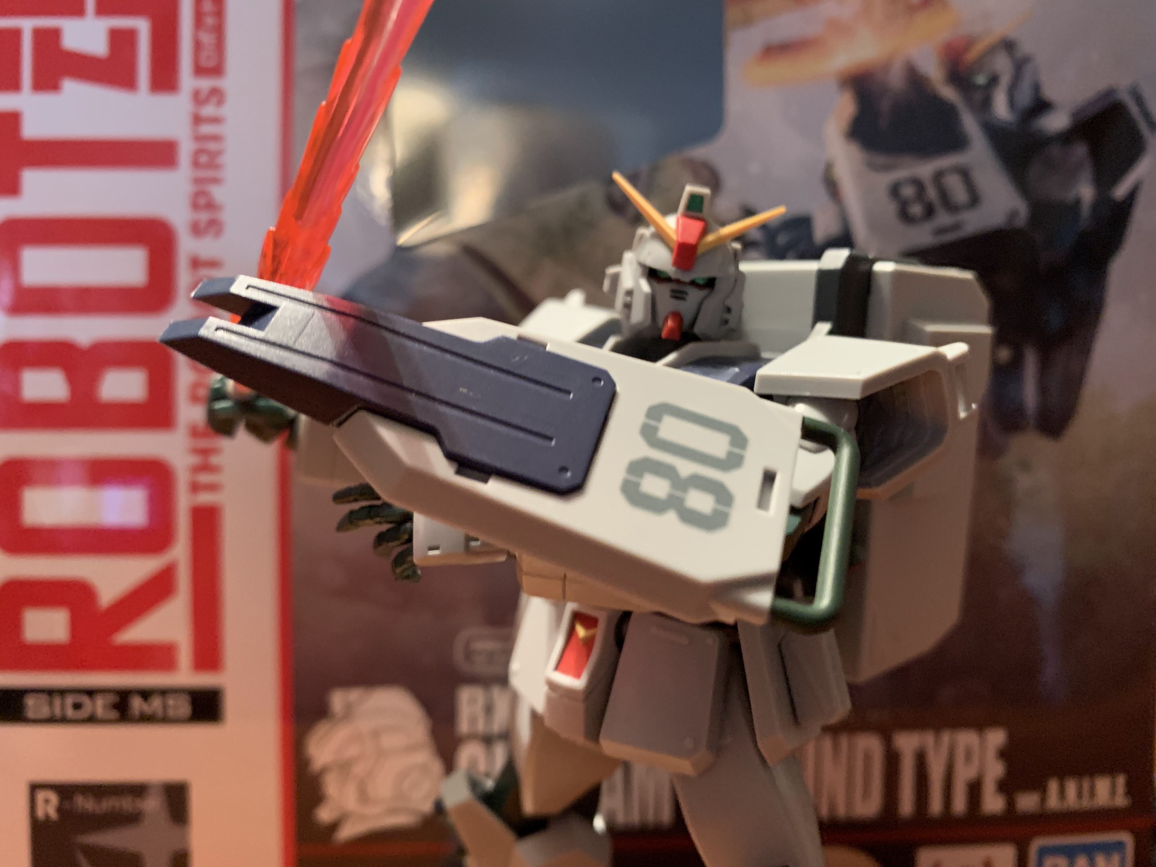
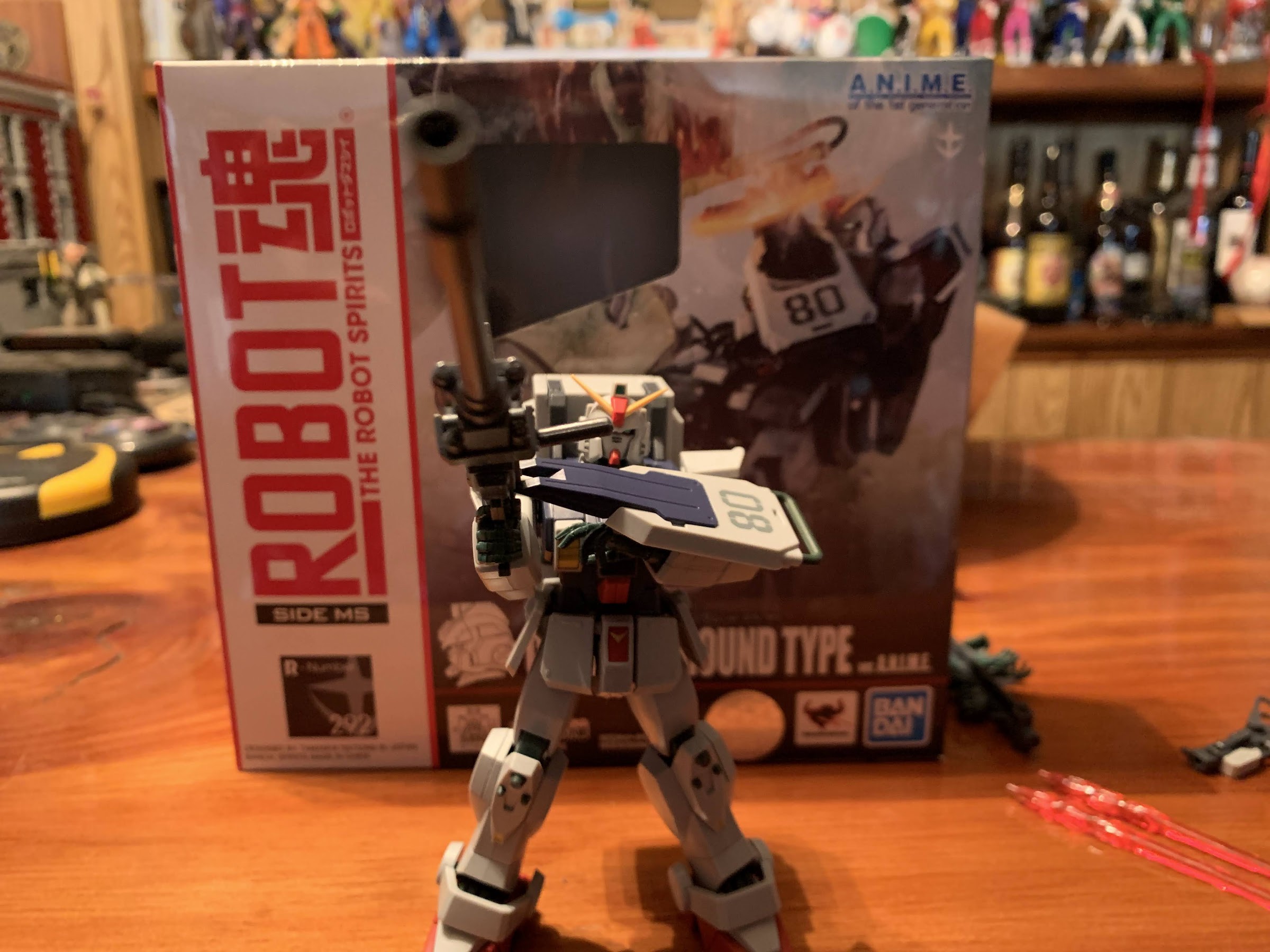
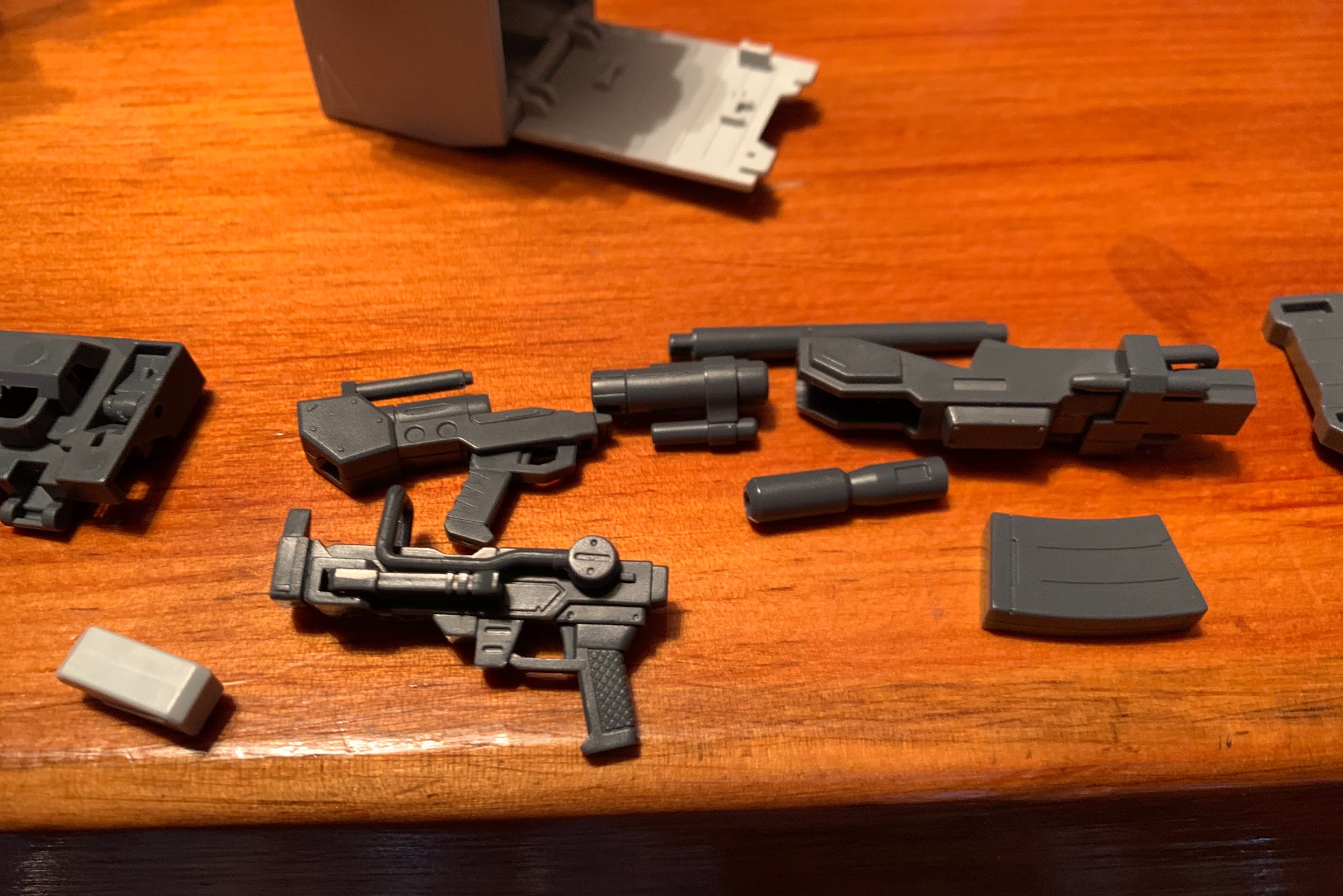
The articulation is rather good, bordering on great, which is nice because this figure also comes with a ton of stuff. For starters, there’s 5 sets of hands: Open, tight grip, looser grip, trigger, and a relaxed set. Bandai includes a plastic “tree” to store them on too, which is pretty cool. There’s also the classic 08 shield which pegs onto the left forearm. It’s on a double-hinged piece so it can sit flush to the arm or be raised out and in front. The figure comes with two beam sabers and there’s a compartment on each “calf” that can open for storage of the beam saber hilt. There’s also five, translucent, red, attachments for the beam sabers: a burst, two thin blades, one thicker blade, and a swoosh effect. The burst can be placed at the base of any of the blades to add to the illusion, or you can go without. They look great, though the swoosh and thick blade are a tad heavy and I find the hilt prone to spinning in the hand of the figure when trying to pose it. The figure basically needs to grip the upper portion of the hilt to keep it in place.
Check the shield, baby!
Even the Joker might find this gun excessive.
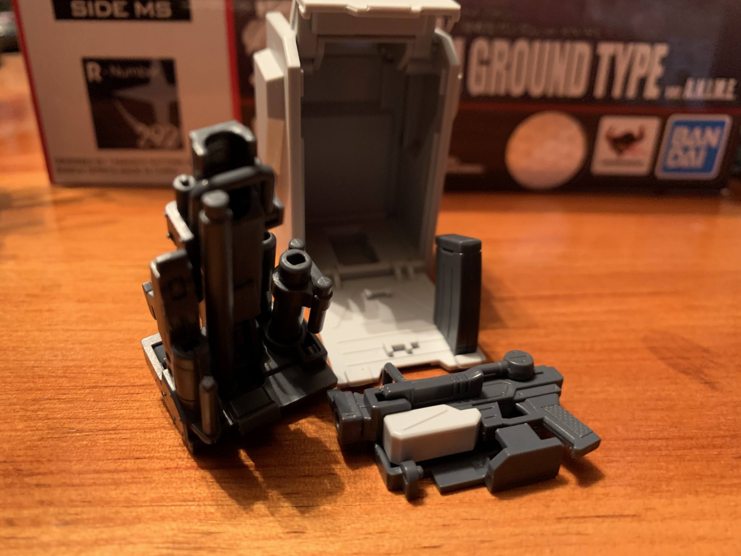
The rest of the accessories kind of work together. There’s a frame that attaches to the figure’s back via peg holes. Putting it on removes the rear ab crunch range entirely, but since there wasn’t much to begin with, it’s hardly a loss. There are prongs on the top and bottom that are on hinges and can be folded out or against the frame. There’s also two thrusters on ball joints, and if you wish, the skinny beam saber effects can be inserted into them to simulate the figure blasting off. The frame is mainly for the large, gray, backpack which exists to store the firearms. The figure comes with two guns, a small, 100mm, machinegun a really big, 180mm, one. The guns can be broken down and attached to additional frames that can then slide into the backpack for total weapon storage. The clips for the smaller gun are stored on the side of the figure’s hips while the banana clip of the larger weapon just goes into the backpack. I’ll likely refer to the instructions for awhile when trying to assemble and disassemble the guns, but the frame for the larger one does have different sized holes to make it somewhat idiot proof. The actual guns, when assembled, are just colored plastic and I do wish there was some paint. I also wish we didn’t have to buy the options accessory pack to get some muzzle flash effects. Just one would have been nice because that pack is 50 bucks and I’m not sure if I’ll bite on it. It’s possible to use a beam saber effect for the guns, but it looks kind of silly and adds more weight to the 180mm gun which is already a hefty weapon.
Packed everything except lunch.
The backpack itself just slides onto the frame when the prongs are open. It’s fairly light, but so is the figure so adding it to the figure will throw off the balance. It’s not impossible to work with though and I still found the figure easy enough to pose even with a full backpack. I do find the beam sabers to be a bit more fun to pose the figure with, but the guns are cool too. The larger one is cumbersome, but it’s supposed to be. Usually in the show, the suit would drop to one knee and aim off of the shield (something you can replicate with the accessory pack) while the smaller gun is more of a run and gun style of armament. The way the guns break down can also make them a bit of a chore to pose as they’ll come apart at times when you’re not trying to do that, but that can also help in posing, so it’s a good and bad feature. The 180mm gun also has multiple methods when it comes to holding it, so there’s a lot of variety available when it comes to posing. I love the overall concept of the weapon storage. My only nitpick is the compartment for the beam saber hilts is surprisingly tricky to open. Every time I do it I think I’m going to break something. Lastly, there is one other accessory and it’s a second yellow “crown” piece for the figure’s head. I’m pretty sure it’s only included because it’s a small, rigid, piece of thin plastic that could easily break so it’s a good piece of foresight for Bandai to just give everyone a replacement.
The large gun breaks down into several pieces, while the smaller one just has a removable clip (the grey piece) and the shoulder support articulates.
They then go onto two base pieces which I’m actually getting the hang of doing without referencing the instructions. It helps that each piece is a different shape so you basically can’t put something where it doesn’t belong.
It then all fits neatly into the backpack. It’s snug, but it works.
This figure is pretty damn impressive, but one thing we haven’t touched on is price. This guy did not come cheap. You will be hard pressed to find this priced below 60 bucks, and the places that have it that low probably have a fairly substantial shipping charge. Most places seem to price it at 70, which is what I paid at Big Bad Toy Store where it’s presently on backorder. That’s a lot of money for a figure that’s technically less than 5″ in height, and really it’s a lot of money for any figure. I was able to justify it because this is going to be the only Gundam line I collect and I presently have the desert variant ordered through Premium Bandai as well as the Zaku, Gouf custom Zaku, and the second option parts set which comes with the hover truck. I think once I have all of those together I’ll have myself a nice, tidy, display and I’ll be set on 08th MS Team figures. Basically, the only figure from the show I’m not interested in is the RGM mobile suit and I’m still on the fence when it comes to the option parts set (I wish they were like 30 bucks instead of 50). It’s great to see the 08th MS Team get some love from Bandai in this line and I’m certainly happy to dip my toe into it, even if I feel like I need to sell a kidney or something to get a full set.
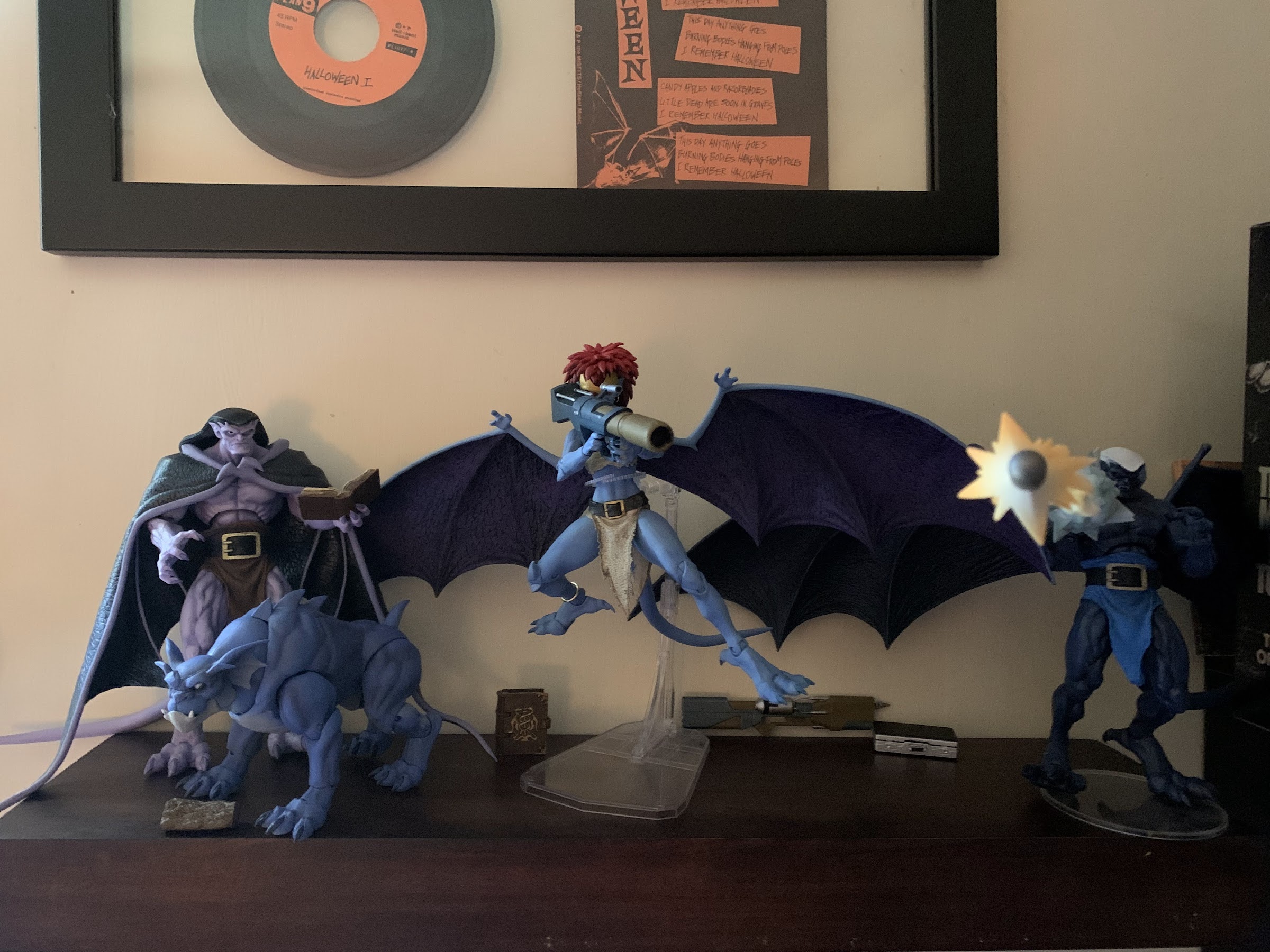
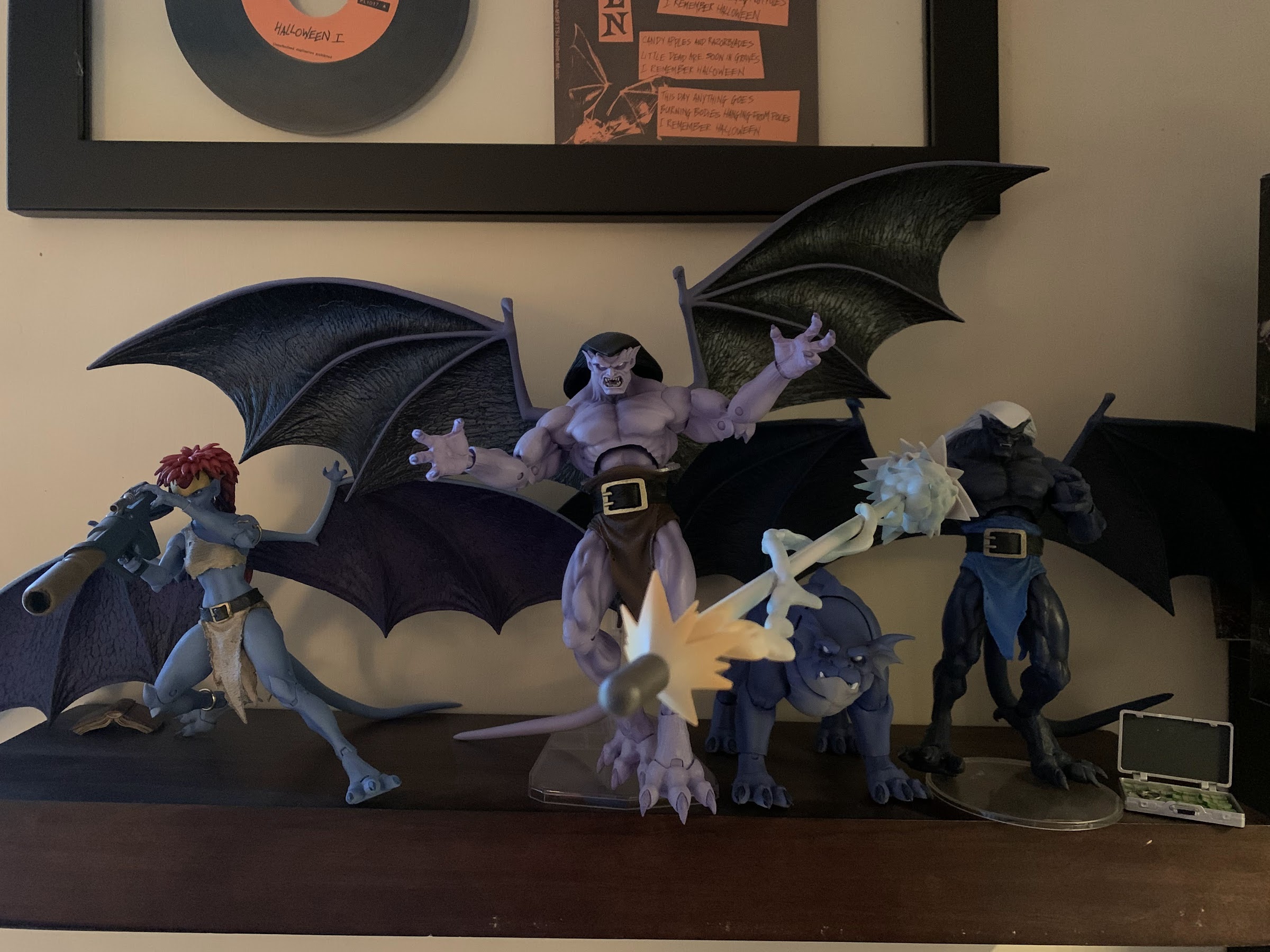
Well, here’s something different. Bronx, the good gargoyle dog, is NECA’s fourth entry in its relatively young line of action figures based on the beloved Disney Afternoon series Gargoyles. And not only is Bronx here all on his own, he’s also got something for his buddy Goliath that collectors of this line have been begging for. Unfortunately, he also arrives as part of NECA’s Haulathon event, a gimmicky collector event taking place at Target that should be over by now. Unlike his line-mate, Demona, Bronx appears to have shipped in rather large numbers. Also unlike Demona, he was never put up for order on Target’s website so those who want him have been forced to trek to the store in hopes of catching him on a shelf. Or, you get a friend like I did in @JoePoppingOn who came through for me again with a Bronx! That’s three figures he helped me acquire so a very, hearty, “Thanks” are in order for him. Give him a follow on Twitter, especially if you’re located in the US north east.
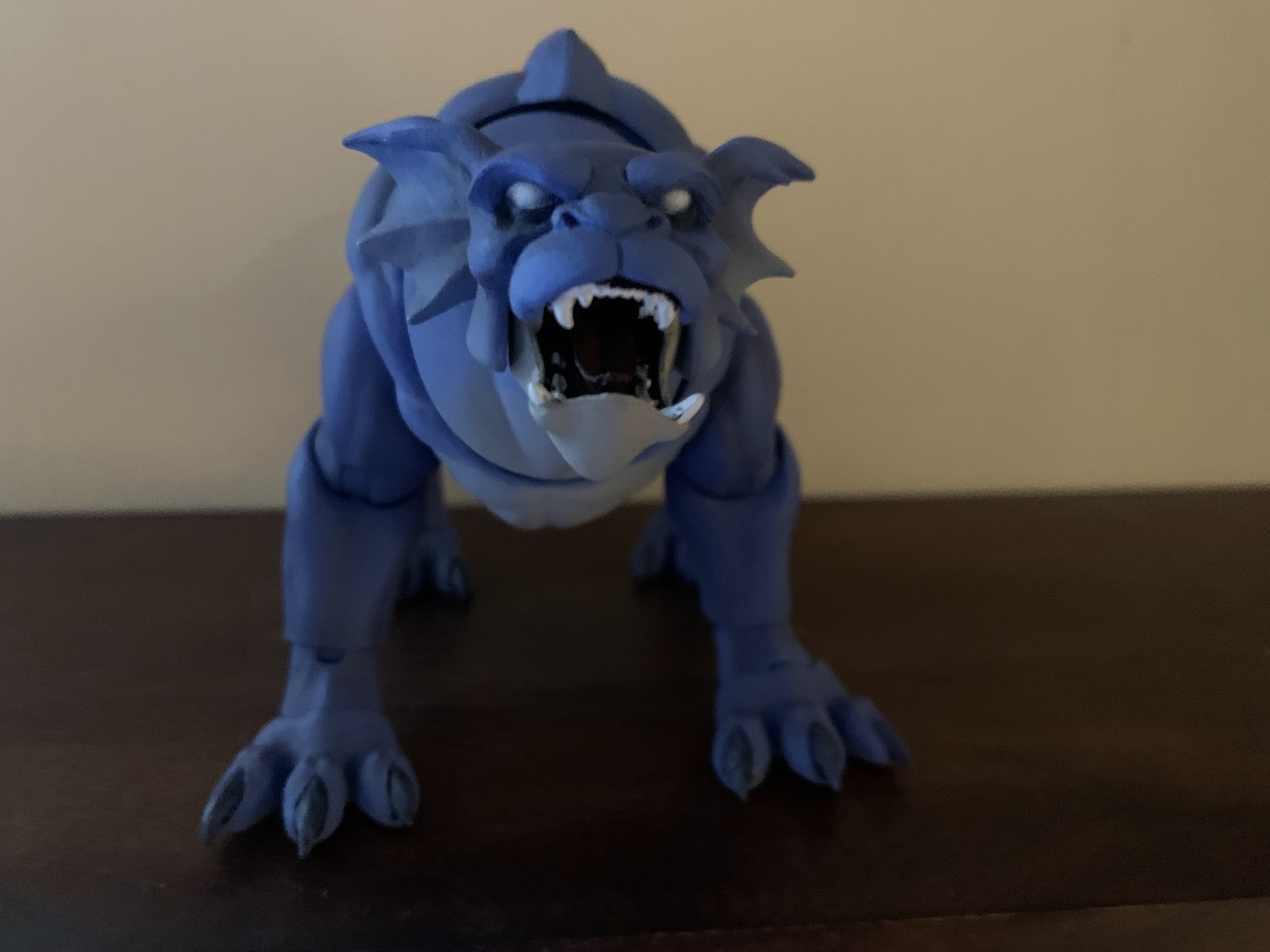
Articulated jaws are cool.
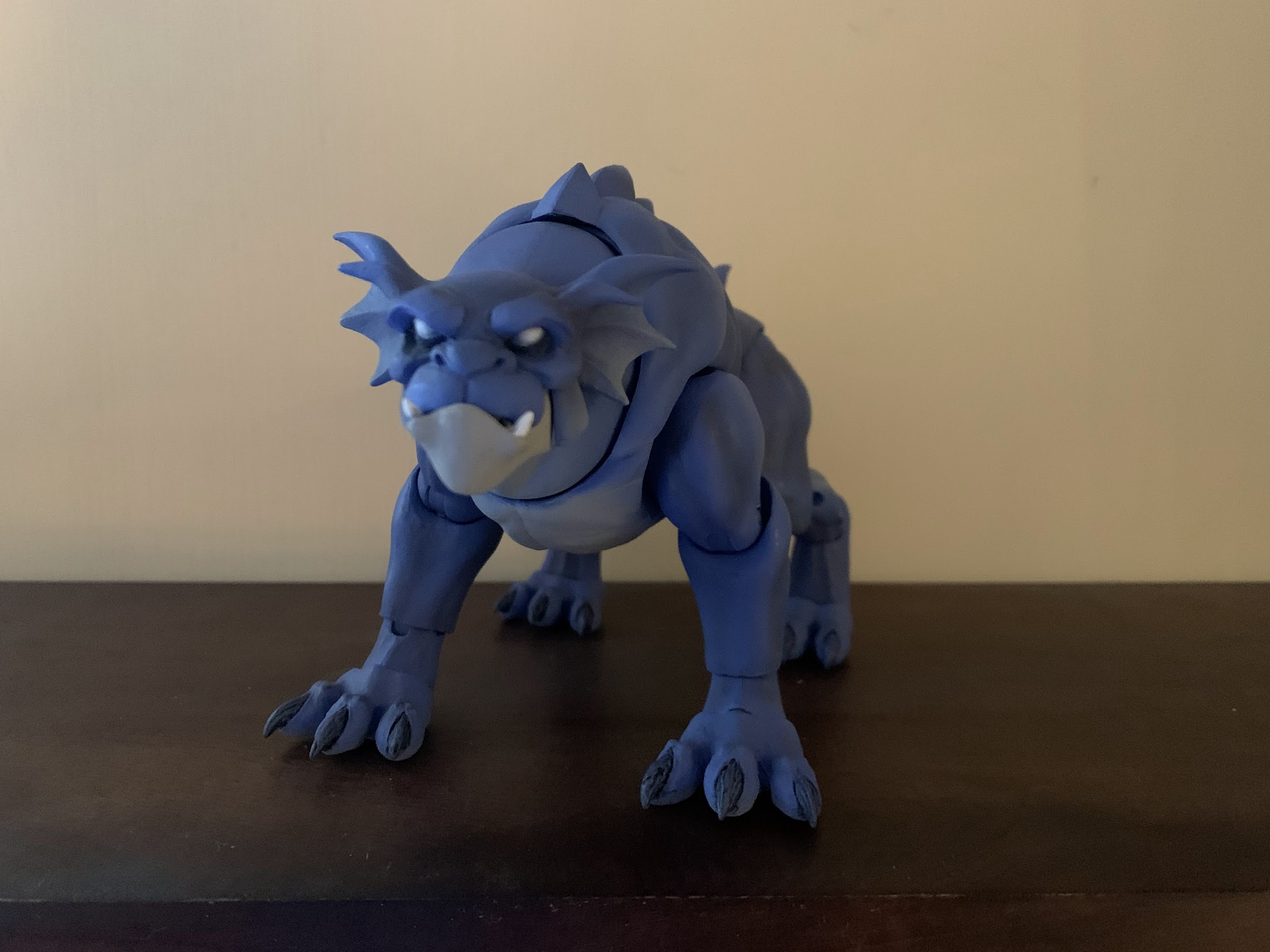
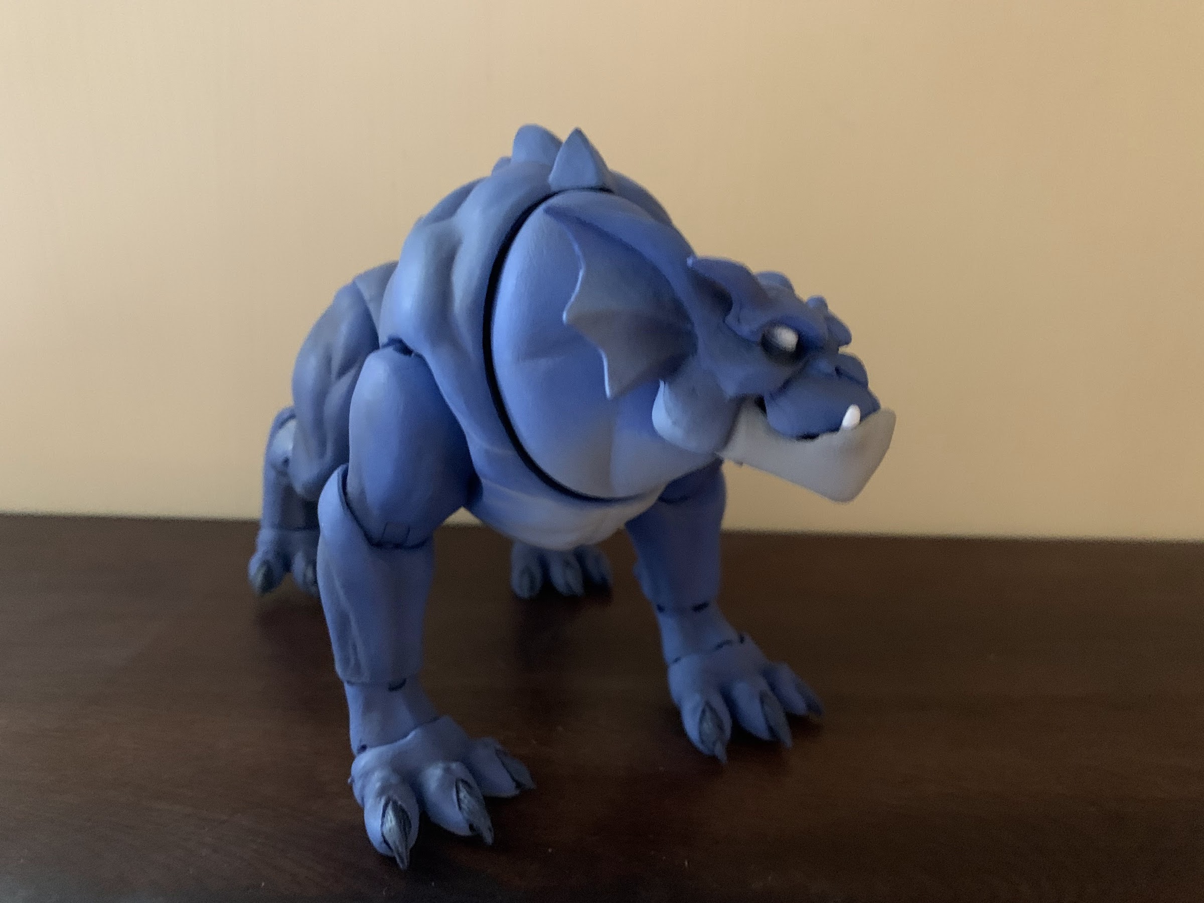
Bronx comes in NECA’s standard Ultimates styled packaging with artwork on the front and product shots throughout. The front flap opens to reveal the figure inside and showcase the accessories, with one accessory displayed about as prominently as the actual figure. We’ll get to that, but first we need to talk about Bronx. Bronx, being more like a dog than human, is a quadruped who gets around on all fours. He’s also wingless, so at last he’s a release in this line that’s relatively easy to fit onto a shelf. He scales well with Goliath and the others when placed beside them, and because his form doesn’t showcase giant pectorals, he’s probably the most on-model release when compared with the show. NECA is obviously not going for a true on-model look with this line, so for Bronx, it’s more like a bonus for those out there who wish the company was aiming to do just that.
Yup, that’s Bronx all right.
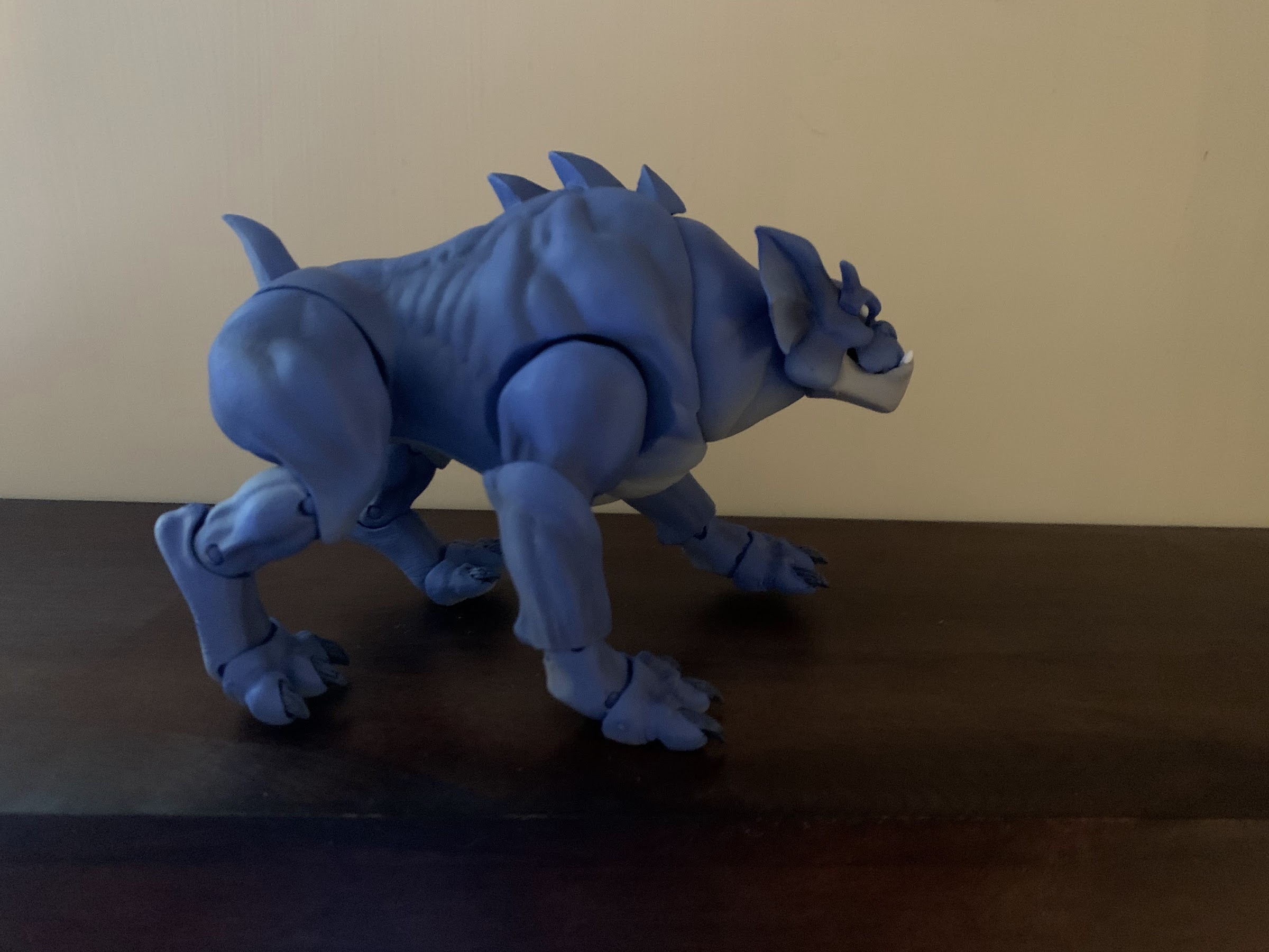
The sculpt for Bronx is essentially what one would expect of NECA where the character is concerned. He’s a lovely shade of blue with a pale gray on his underside reserved for his lower jaw and belly. His eyes are all white and always displayed in that fashion, unlike the other gargoyles who only go all-white when trying to intimidate others. I like how the paint is applied to give them an almost glowing appearance as the white is soft on the edges and more stark in the center. His body has the usual gargoyle anatomy with spikes here and there. Not only does Bronx lack wings, he also features a far shorter tail giving him a really compact appearance. He’s all front end too with a smaller backside. He looks awesome, and even though the Bronx design from the show was never a particular favorite of mine, I find myself really liking the look of this figure because NECA just plain nailed it.
He’s a big boy.
Even though Bronx stands on all fours, he’s articulated in a very similar manner to his line-mates in some ways, but he’s also different in others. For one, Bronx has articulation at the jaw so he can open and close his mouth and look a bit more fearsome, if need be. His head is on a double ball-peg and it’s reinforced with another ball peg at the base of his massive neck so he gets terrific range looking to the side as well as up and down. He also has plenty of tilt and he’s very expressive in that area. His front legs are joined to the body via ball-hinges and he has “elbow” joints, ankle joints, and toe joints. His legs can spread out wide and kick forward and back. The torso has a rubbery overlay, indicating that NECA intends to do more figures in this style down the road, which does kill whatever torso articulation is hidden underneath that. His rear legs are affixed via ball joints just like the other gargoyles and he has knee joints that move very little as they’re always intended to be bent. Past that, his feet are done in the same fashion as the front ones with ankle hinges, rockers, and toe hinge and rocker. Because of his design, Bronx isn’t going to be super dynamic, but I think NECA did a good job here of getting articulation into this figure without sacrificing really any of the aesthetic. And I wish they’d add neck articulation to the other figures.
Check out the range on that neck!
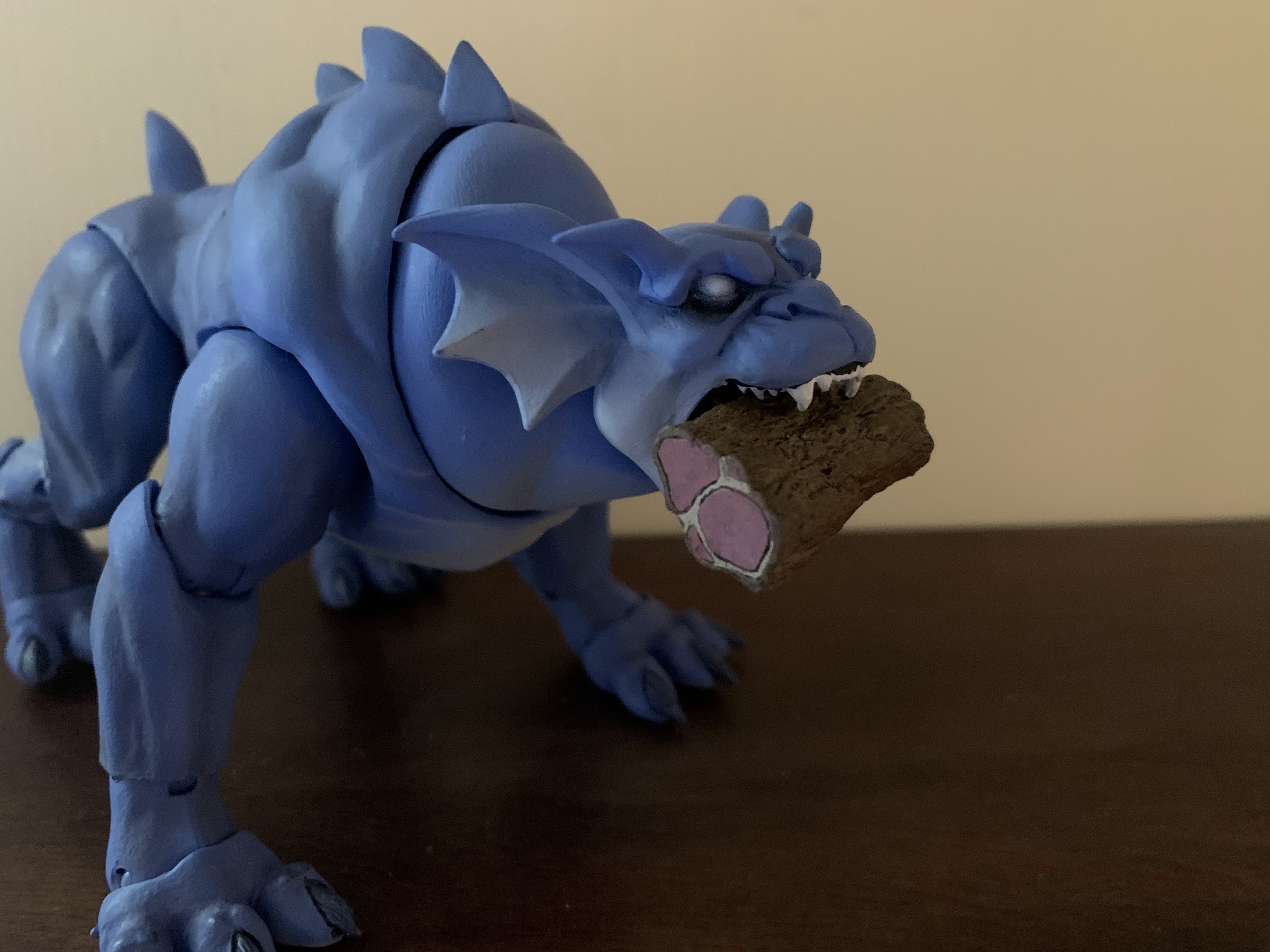
Bronx doesn’t fly, or use weapons, or even have hands, so he doesn’t have much in the way of accessories. For Bronx, there’s really just two: a second head and a hunk of meat. The second head features a wide open mouth and is a touch more fearsome looking than the standard one. It would still feel a bit unnecessary if not for the big slab of meat he also comes with. I don’t know that I’ll really incorporate it into my own display, but the meat can fit into the mouth of the second head so he can hold it, or it can be placed at his feet. The meat looks fine and it’s painted, but at the end of the day it’s just a piece of meat.
The alternate head features a jaw that’s sculpted open.
He deserves a treat.
What collectors are really intrigued by is the last accessory: Goliath’s closed wings. Also referred to as caped wings by the fandom, these are for the Goliath figure and are posed as the character often did in the show by hooking them below his chin like a cape. This is a casual, walking around, look for Goliath and has the bonus of reducing the amount of space he takes up on a shelf. To put them on, you need to pop off the head and wings from the Goliath figure and then just drape it over the shoulders. They’re a soft, flexible, material, but still feature the same paint and detailing as the open wings. There are two pegs on the rear to slot into the figure and these basically just keep things together. Once the head is replaced, the look is complete and it’s…okay. Goliath’s body was sculpted to be in attack mode, so his head isn’t really positioned in a casual manner making it look a bit awkward. If he had a joint at the base of the neck, this could be worked with, but alas he does not. The head is also even more locked-down than before as his hair keeps him from really being able to turn his head. He can look down a little, but that’s it. Still, now that the display is four figures, the extra room is welcomed so I’m probably going to stick with this look, but what I really want are just relaxed wings.
A more studious look for the clan leader.
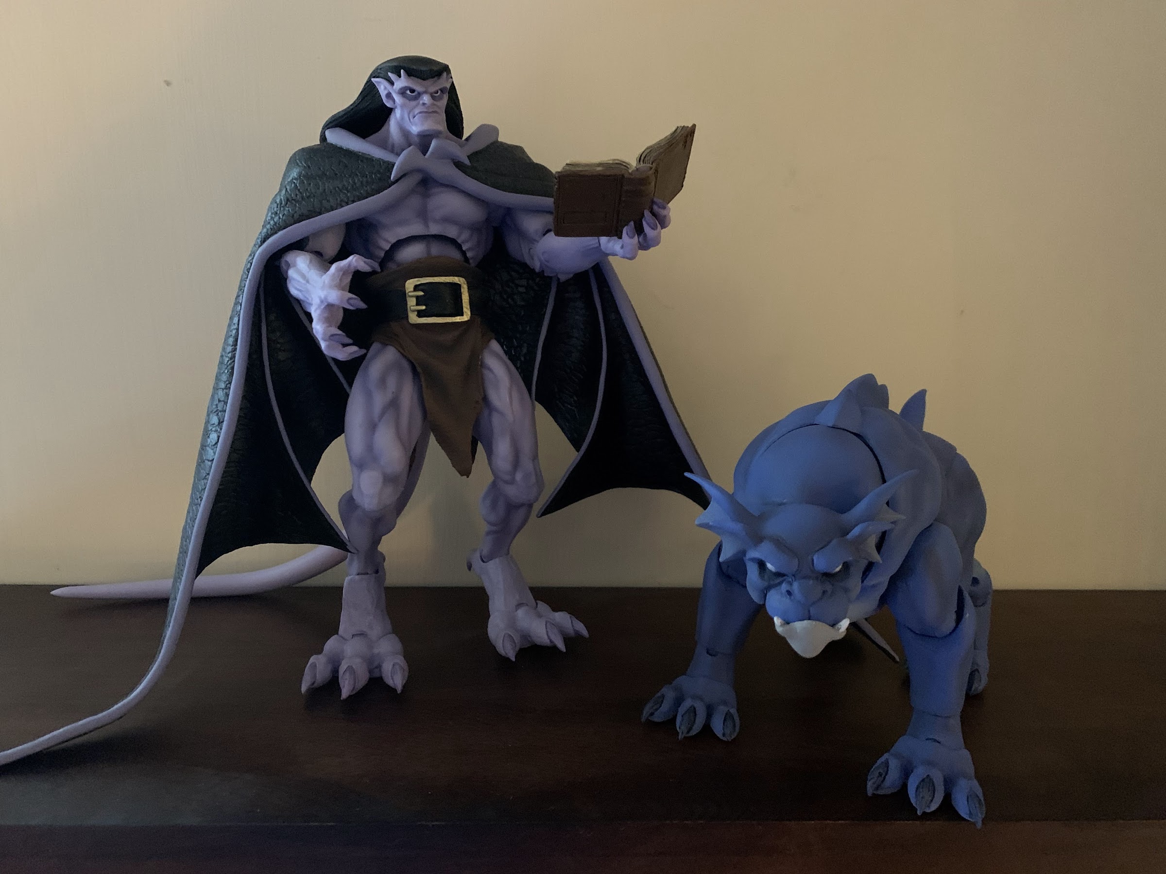
They do go well together.
Bronx is a terrific entry in this young line, and he might be my favorite. I’ve mentioned how the other figures are so cumbersome that they’re not very fun to mess around with, but Bronx doesn’t suffer from that at all. He’s a joy to play with and pose, and while his accessories do nothing for me, the actual figure is great. The caped wings for Goliath are certainly a welcomed addition, but I am lukewarm on the end result. It’s okay, and maybe I’ll like the look more with an Elisa to pair him with, but it seems clear to me that the figure wasn’t really sculpted with this look in mind. I think NECA is generally very good at balancing aesthetic with articulation and function, but with this line I don’t think they’ve been as successful. Hopefully we see some improvement going forward and that these extra wings which are sorely needed aren’t few and far between.
Even with Goliath’s new wings, I still feel this shelf is maxed out. Good thing the next release isn’t slated until the fall.
As mentioned before, Bronx was part of Haulathon at Target. He was up briefly on the Haulathon website, but I literally know of no one actually receiving the figure via that site as seemingly all, or most, of the orders ended up cancelled. He seems to still be shipping, so check your local stores if you’re after this one. He has since gone up for pre-order in the usual places with an expected June delivery, so while you may have to wait, you shouldn’t have to go to the secondary market to add to the clan.
Demona is here to prove Tuesday isn’t just for turtles.
When NECA launched it’s line of action figures based on Disney’s Gargoyles, it seemed to imply that Demona would be figure number 2. She was not. That honor went to Thailog, the Goliath clone, and that might have had something to do with the many factory delays and shipping woes that were impacting the entire industry. It’s a lot easier to pivot from Goliath to a figure like Thailog at the factory when almost all of the molds are the same. The other promise from NECA was that none of the Gargoyles figures were slated to be sold as exclusives. They were all general release and collectors could expect to be able to preorder them from their preferred retailer. Well, that went out the window with NECA’s Haulathon event which was split between a website for Halloween costumes and Target stores. And as you could probably have guessed at this point, Demona ended up falling into that event.
Sadly, flight stand not included.
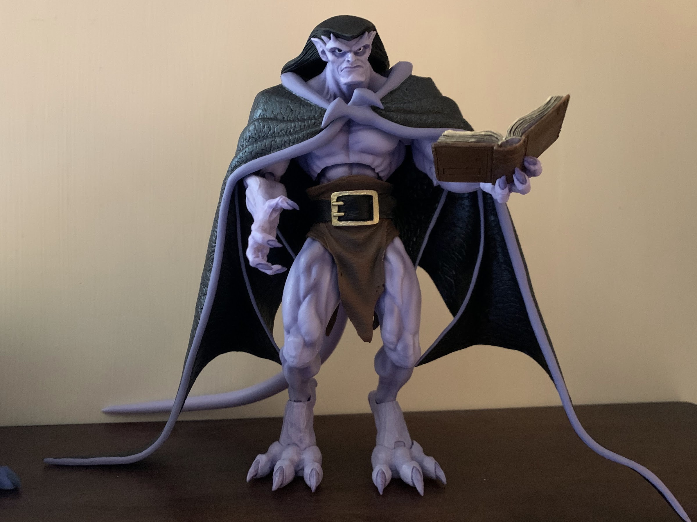
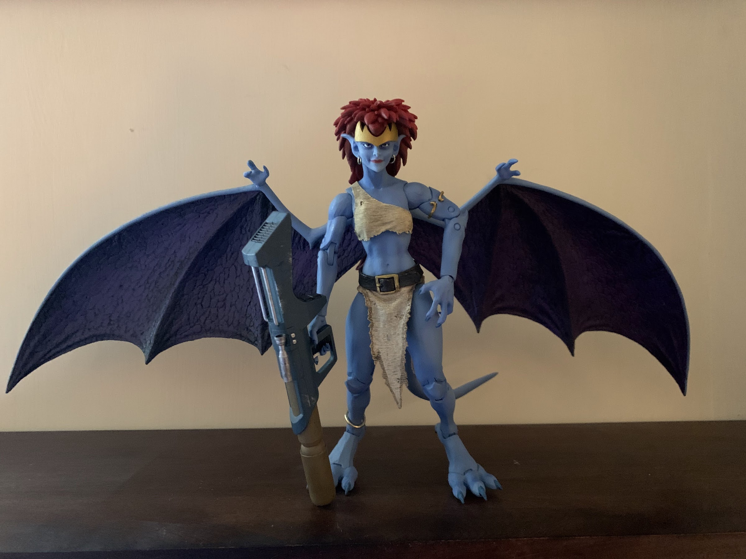
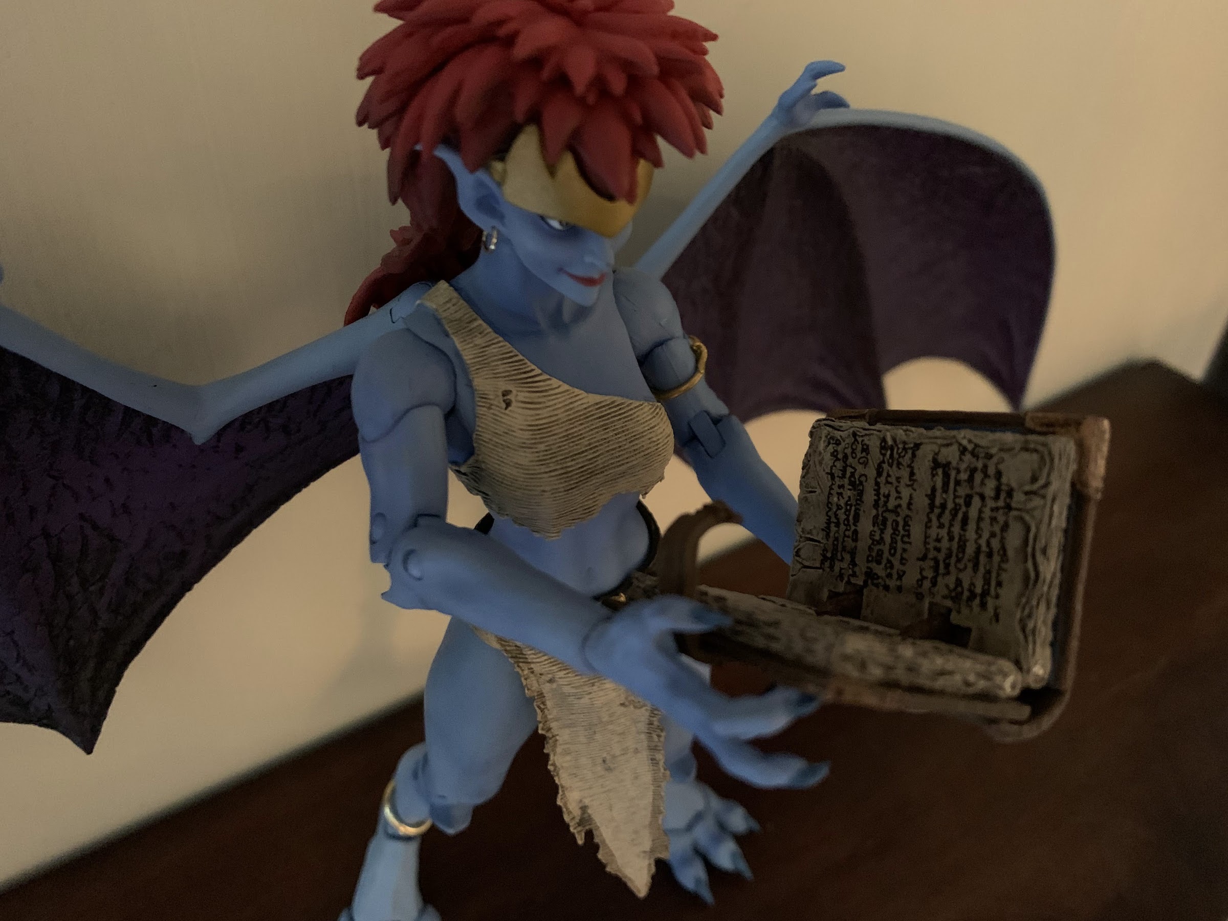
Demona is the rogue gargoyle from the show. Goliath’s former lover, she’s basically the Magneto of the series as she has a justifiable distrust of humans, but turns that mistrust into all-out hatred. She doesn’t want to live alongside humanity, she wants to crush it. Armed with advanced weaponry, magic, and a wealth of knowledge given her extreme lifespan, she’s a formidable foe for Goliath and company and a worthy third figure in the line. Since she’s not a Goliath repaint, she’s also just the second, unique, sculpt we get to experience. With Goliath and Thailog, I had some nitpicks, but was generally satisfied with the finished product. With Demona, that’s pretty much still true, but she does introduce a new problem that I really hope isn’t one going forward.
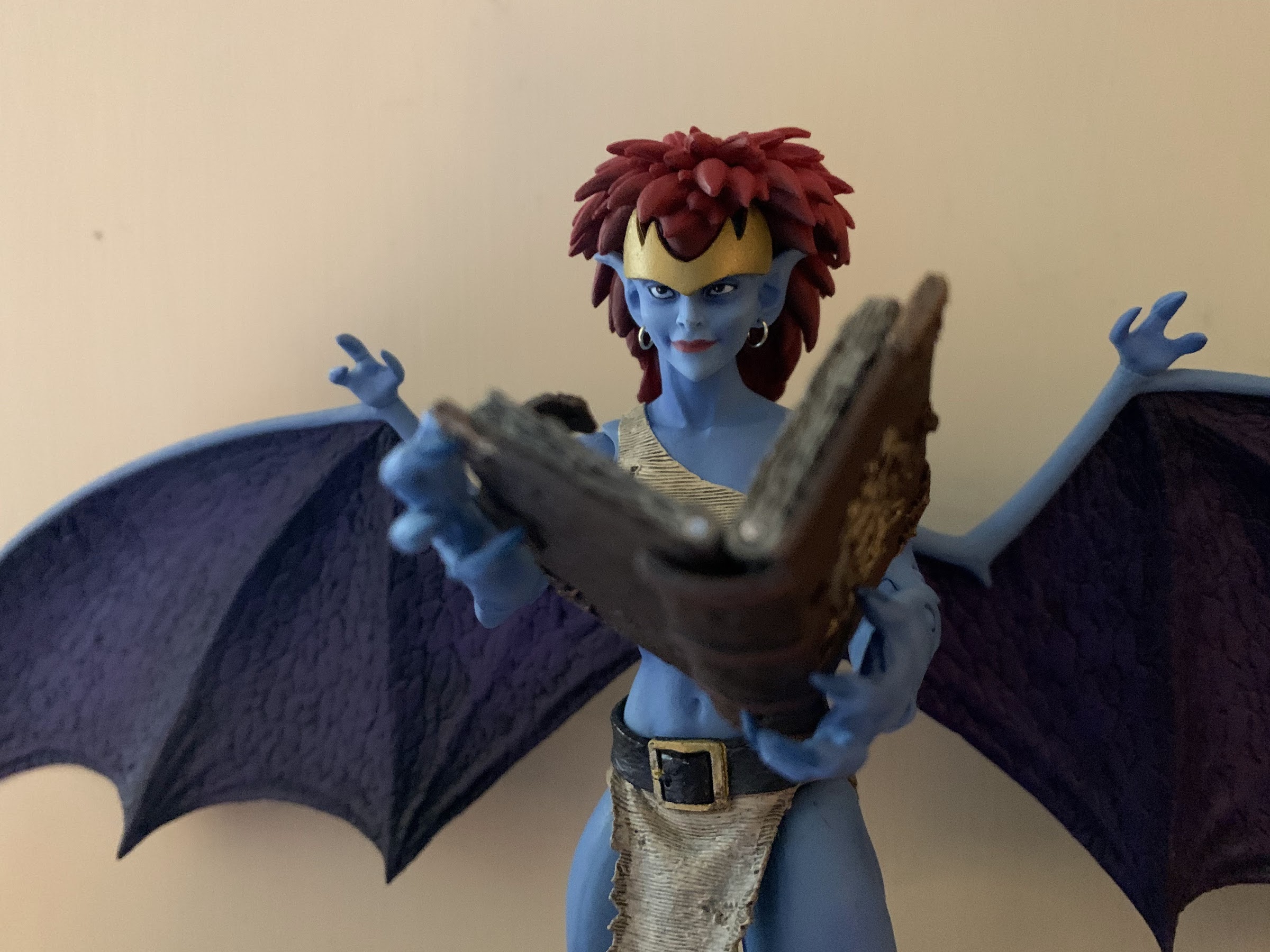
Like Goliath, she brought reading material. Unlike Goliath, her book can actually open and close.
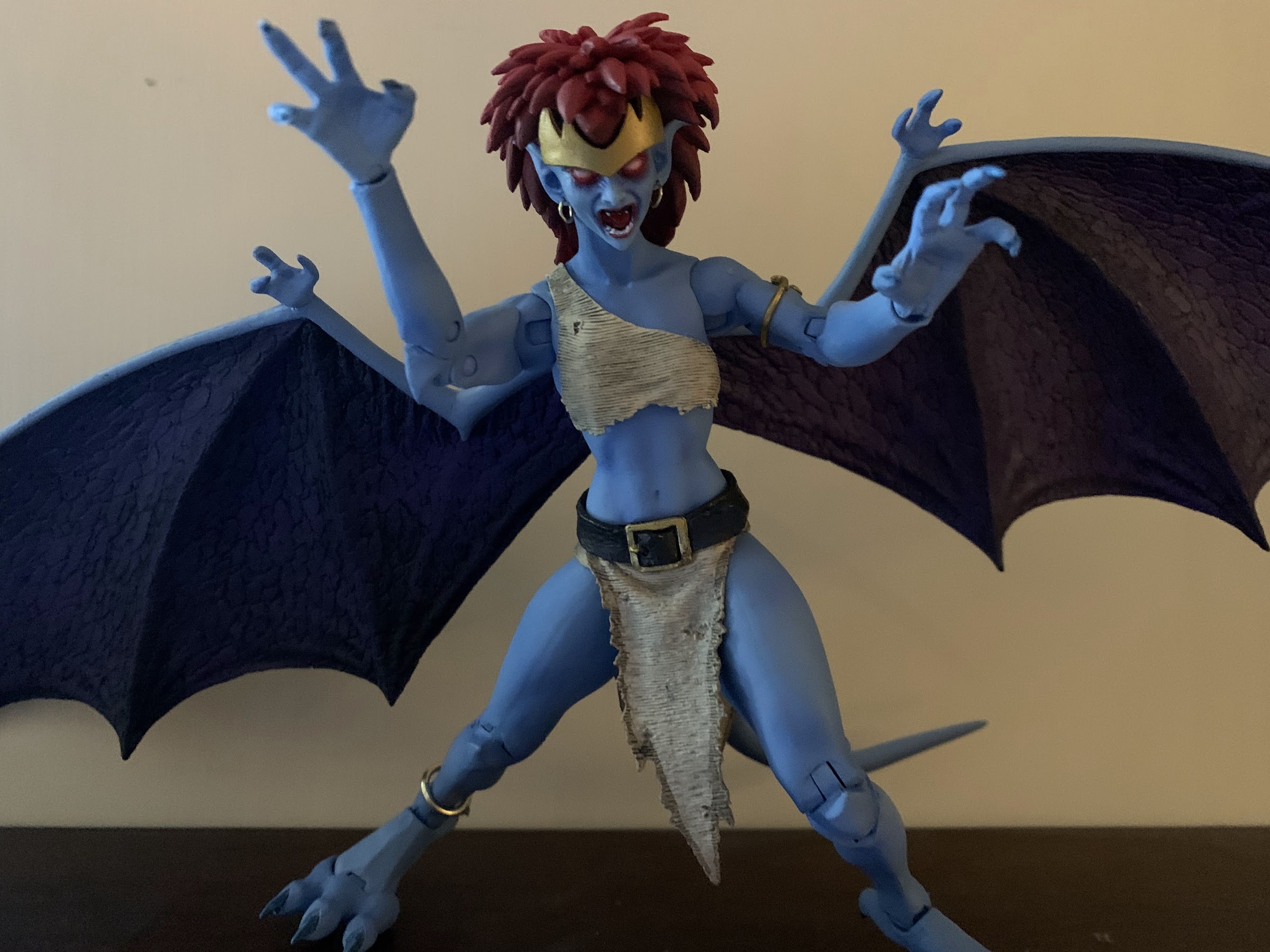
Demona is sold in the standard NECA Ultimates five-panel window box. It’s a bit smaller than Goliath’s since Demona is a smaller character. Not only is she shorter than her former beau, she’s more slender as she has a very feminine physique that mixes with the gargoyle anatomy. She has a big tuft of red hair that looks quite nice and the pale blue-gray of her skin lines up well with her appearance in the cartoon. Like Goliath, she’s inspired by the cartoon, but has added detail to make her look a bit more “alive.” It’s a bit less pronounced as she doesn’t need giant, rippling, muscles and it’s mostly seen in the texture added to her clothing. She basically just has a top and loincloth with the bottom piece being separate while the top appears to be part of the mold. Either that, or the torso is cut-out to fit it so it can be glued down. It’s interesting as I suspect NECA will want to reuse much of this mold for Angela at some point, but her top is different. Maybe Disney just didn’t want people sneaking a peek under Demona’s top? Which does raise the question: why do female gargoyles have breasts? They’re an egg-laying species, most of which don’t nurse their young, but they are fantastic beasts so I guess they can follow different rules.
Good luck deciphering that.
Demona has a very striking appearance, and one thing I rather like is that NECA used actual metal hoops for her earrings and her anklet. This could potentially make her more fragile, but they seem secure and fine. Her proportions look nice, and like Goliath, her wings are painted in a two-tone fashion with a purple shade used for the membrane. Also like Goliath, the wings are huge and made of ABS so there’s no give to them. They’re going to take up a lot space, and there’s nothing that can be done about it. Aside from that general complaint, my only other issue with her is that her face looks just a little off. I feel like her face should be longer and more narrow. Instead, it starts off rather wide and quickly comes to a point at her chin giving her a slightly scrunched appearance. It’s not terrible or anything, but I think she could look a little better.
Your kids probably won’t like this face.
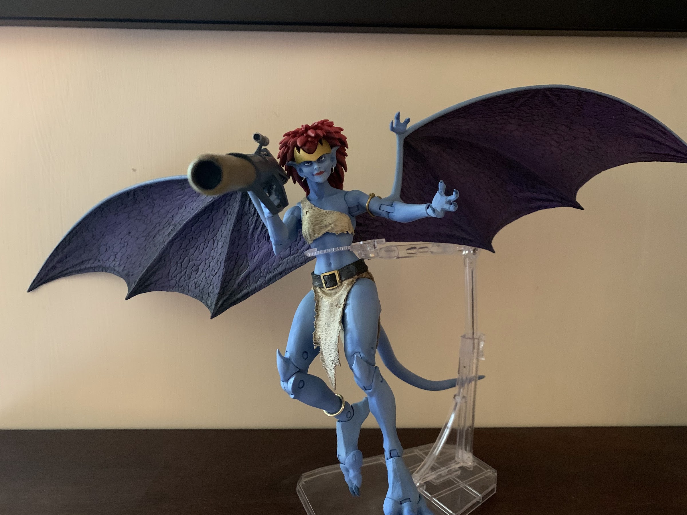
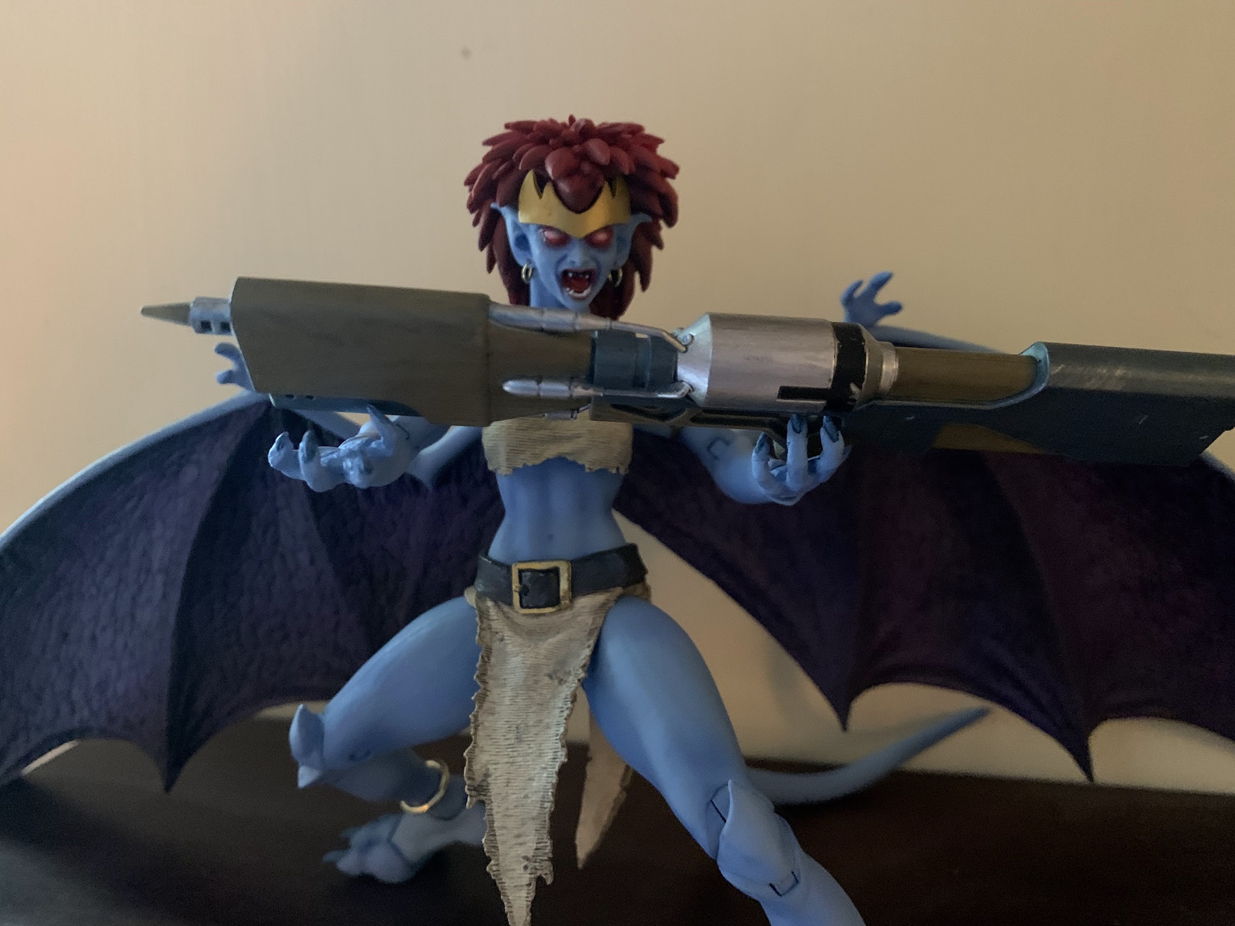
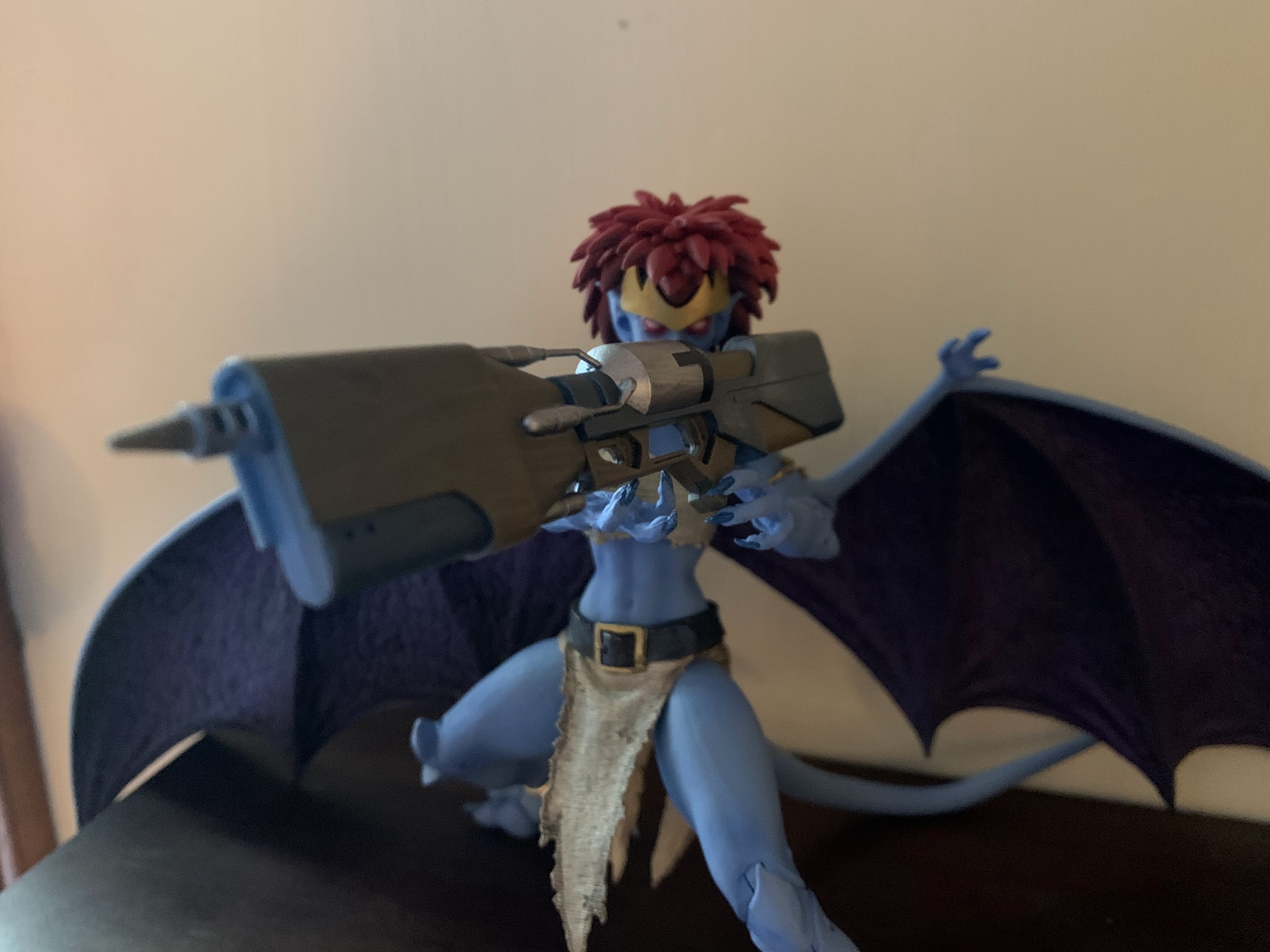
Demona comes with more stuff than we’re used to, and she even has a new feature that I wish Goliath had. And that feature is she uses faceplates instead of swapping an entire head. Bandai has been doing this for years with its figures, and I’m surprised it took NECA this long as it would have been easy to do with Goliath. Her face pops off easily and she has a screaming, red-eyed, face to go in its place. It’s appropriately unsettling, so much so that I almost don’t like looking at it, but it definitely works. Demona also has various hands including open, clawing hands, fists, a trigger-finger right hand, and a modified gripping left hand for her book or gun. She has two, giant, guns. One is a bazooka while the other is some kind of laser canon. The bazooka has a trigger and a more conventional design that’s easy to get the character to grip, while the other gun is more cumbersome with no actual trigger. I’m assuming it appeared that way in the show so I’m not faulting the toy here, just pointing it out for review. She also has her Grimorum Arcanorum which is really cool. It’s well-sculpted and the paint looks awesome as it has this distressed look to it and it can even open. It’s also sculpted to have a page torn out and that missing page will come with a future figure – a nice attention to detail.
The laser canon is a bit awkward with no actual trigger leaving Demona to wonder how she’s supposed to hold it?
The accessories are certainly appropriate, and the only thing missing is what’s missing from all of the figures so far and that’s a flight stand and additional wings. The wide open wings are essentially gliding wings so a flight stand is almost a necessity, but obviously would add cost to the figure. I’d happily take an increased cost if it meant alternate wings though. I know I sound like a broken record, but these things are too much to manage now that we have three figures.
That’s the best I could do.
Demona may be smaller than Goliath, but she essentially articulates the same. The head is on a double ball-peg, but her hair keeps her from being able to look up which is unfortunate for flying poses. NECA could have fixed that with either a second hairpiece or with a hinge in it, but chose not to. She can look down, tilt, and swivel. There’s no lower neck joint and her shoulders are ball-hinges. She can raise her arms out to the side without much trouble and has a biceps swivel, double elbows, and wrists that swivel and hinge. All of the hinges are horizontal, which is unfortunate for the trigger hand. Demona has a ball joint in the torso below her bust and a waist twist below that. Her hips are the standard ball joints and she can kick forward and back, since she doesn’t technically have an ass. There’s a twist there as well and she has single-jointed knees since the gargoyle anatomy only requires that much. The ankles are hinged and can rock a bit with another hinge at the toe that also has a rocker. The tail pegs into the rear of the figure and is bendy plus there’s a hinge at the peg. At the wings, she has hinges and they’re on pegs so they can rotate up and down and also swing out.
The rocket launcher, on the other hand, is quite easy to work with.
It’s with the wings that a new problem emerges for Demona. In many respects, I think she articulates better than Goliath as there’s less bulk to maneuver around, but what kills her is the tolerance of the wing joints. They are far too loose and are downright floppy. Her wings immediately slump to the table and posing them on their own is impossible. I’ve had to prop them up on Goliath and Thailog or just let them hit the shelf to pose her. She’s a challenge to stand, so I guess the wings help in that regard, but it’s a problem and it seems to be rather widespread. I’m going to have to try to remedy this somehow, either with super glue, tape, or something that can be added to that peg to tighten things up. It’s a problem that the figure really can’t have since the wings are so huge and it’s something NECA needs to tighten up now. I’ve refrained on trying to remedy it for the time being so that my images with this review are true to what the figure is out of the box.
I think three, winged, gargoyles is the most this shelf can handle.
Demona is a figure that is largely as expected. She looks the part well enough and has essentially the same articulation as Goliath, just with a new problem in the form of the wings. If not for that, I think I’d find her a little more entertaining than Goliath, but instead I find this figure to be rather frustrating as I try to pose it on my shelf. That’s also true of the other releases in this line as they’re so cumbersome that they’re really not a lot of fun to handle. They look pretty great when placed in a pose that looks nice, but they make you work to get there. NECA plans to include extra wings with the non-winged characters in the line, but that’s not going to do it. We really need options right out of the box, or else I think a lot of people will drop this line after a figure or two. Maybe I’m wrong, but despite this figure being overall a solid release, I’m finding my enthusiasm for this line waning which is hard to believe given how excited I was a year ago when the line was announced.
Demona was part of the Haulathon event and some stores are still receiving stock of her and she should set you back around $36. The distribution appeared poor to start, with some stores only getting one unit or none at all, but Target did make her available online so hopefully those who wanted her got her. I never found this figure in stores, so a special shout-out to @JoePoppingOn who helped me in tracking her down and the next figure in the line. The figure is also now up at various online retailers, some with a mark-up so it pays to shop around. Those figures are presently slated for a June release so hopefully that holds true and everyone who wants it can get one.
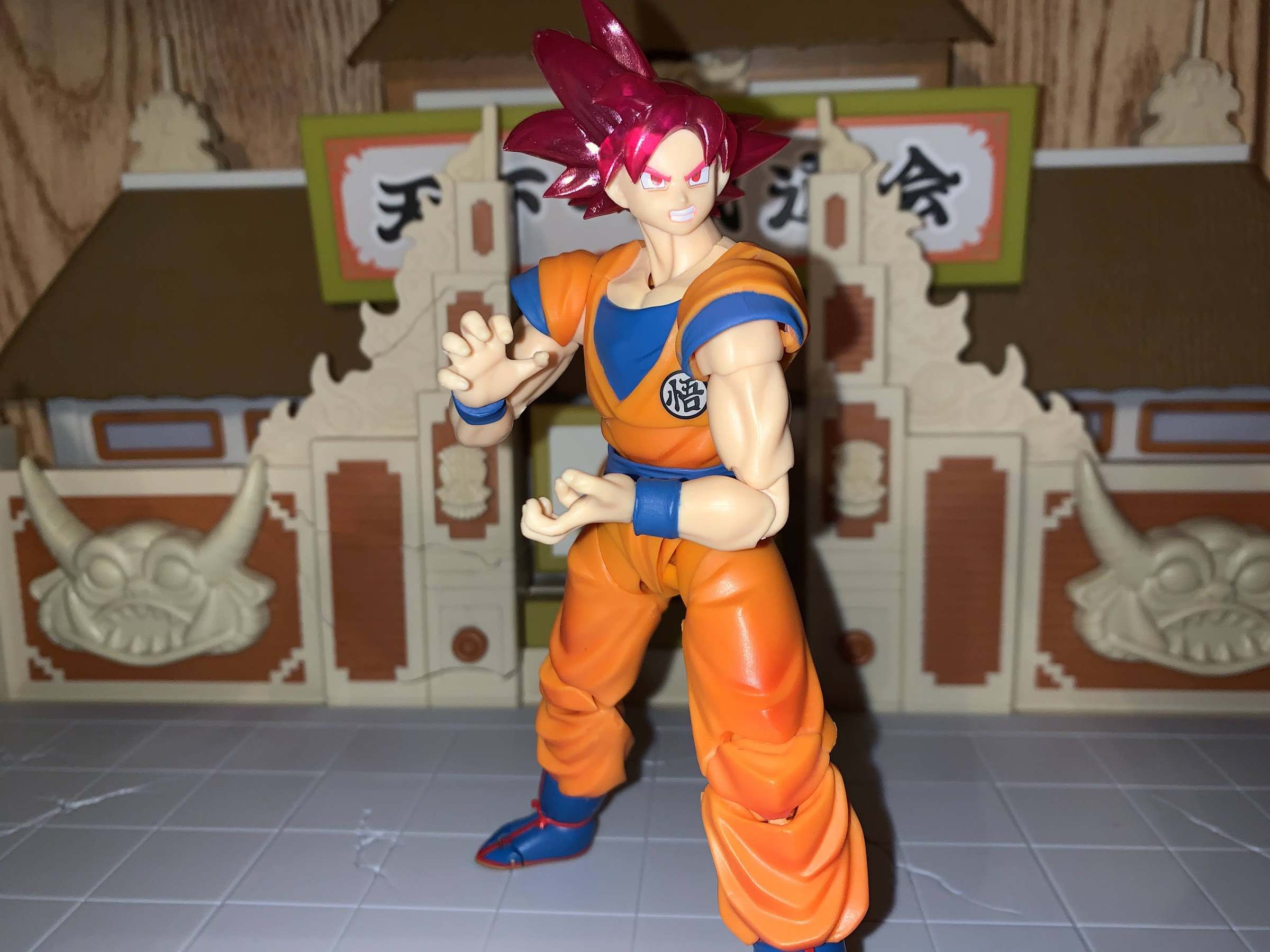
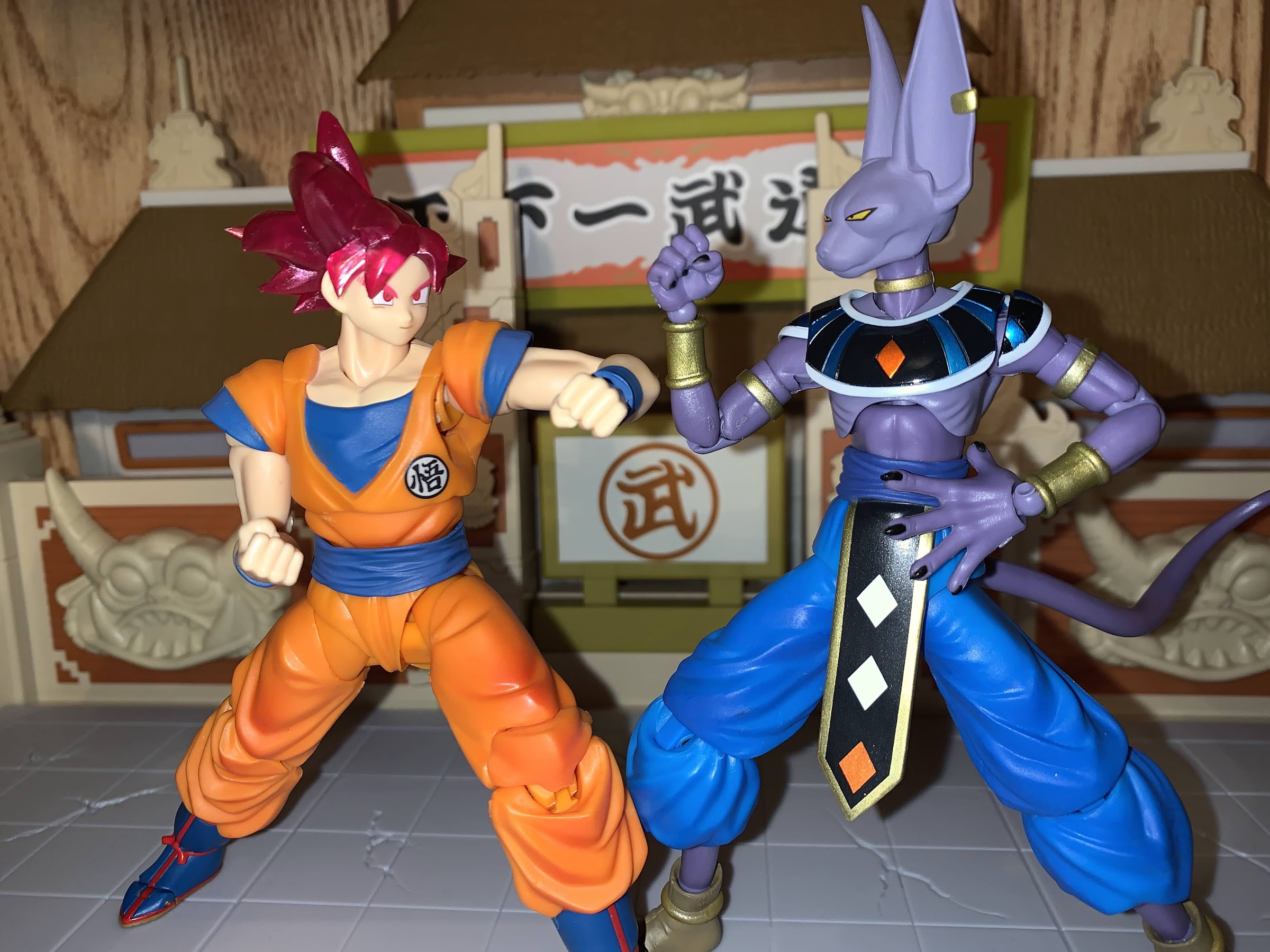
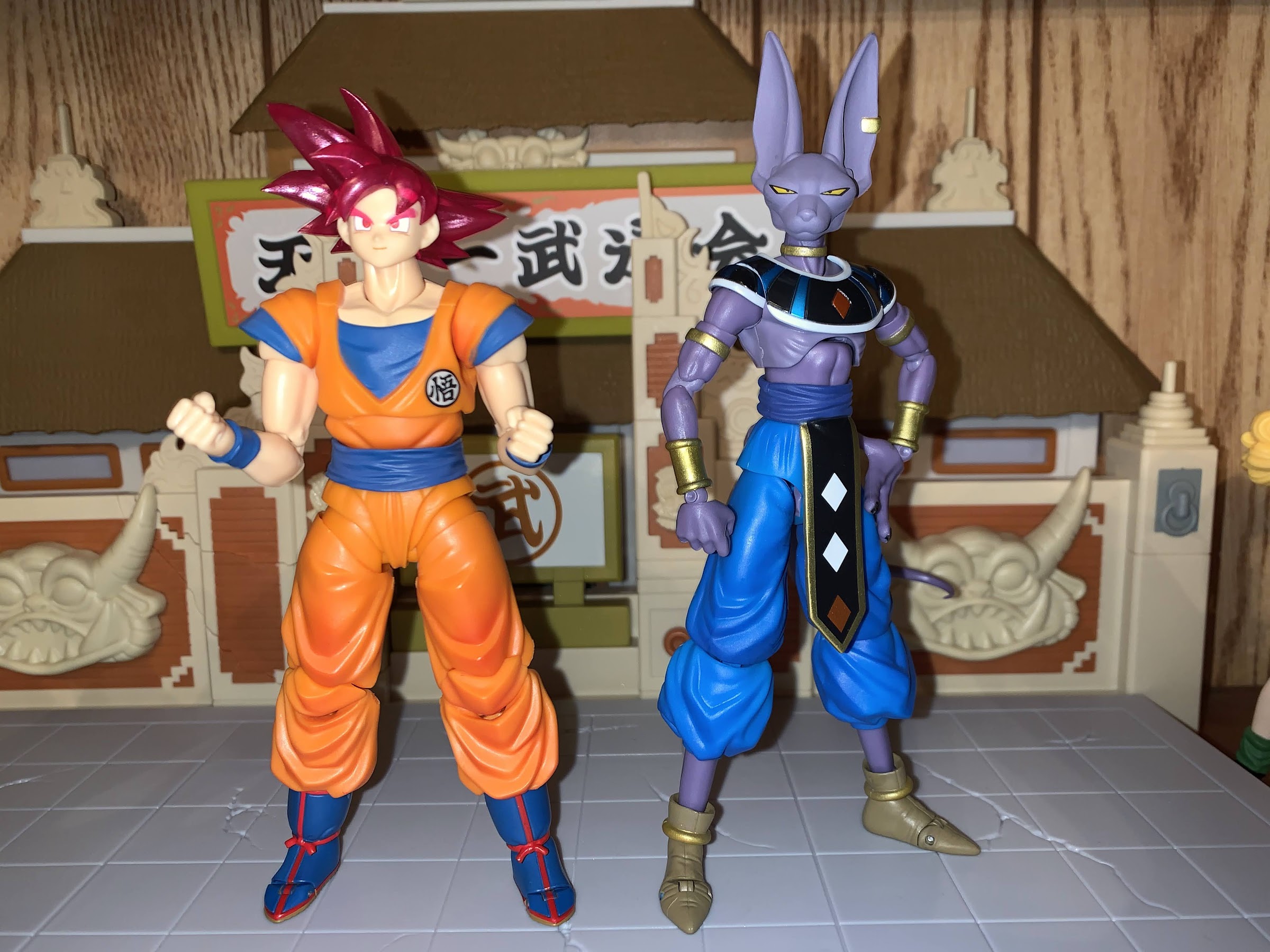
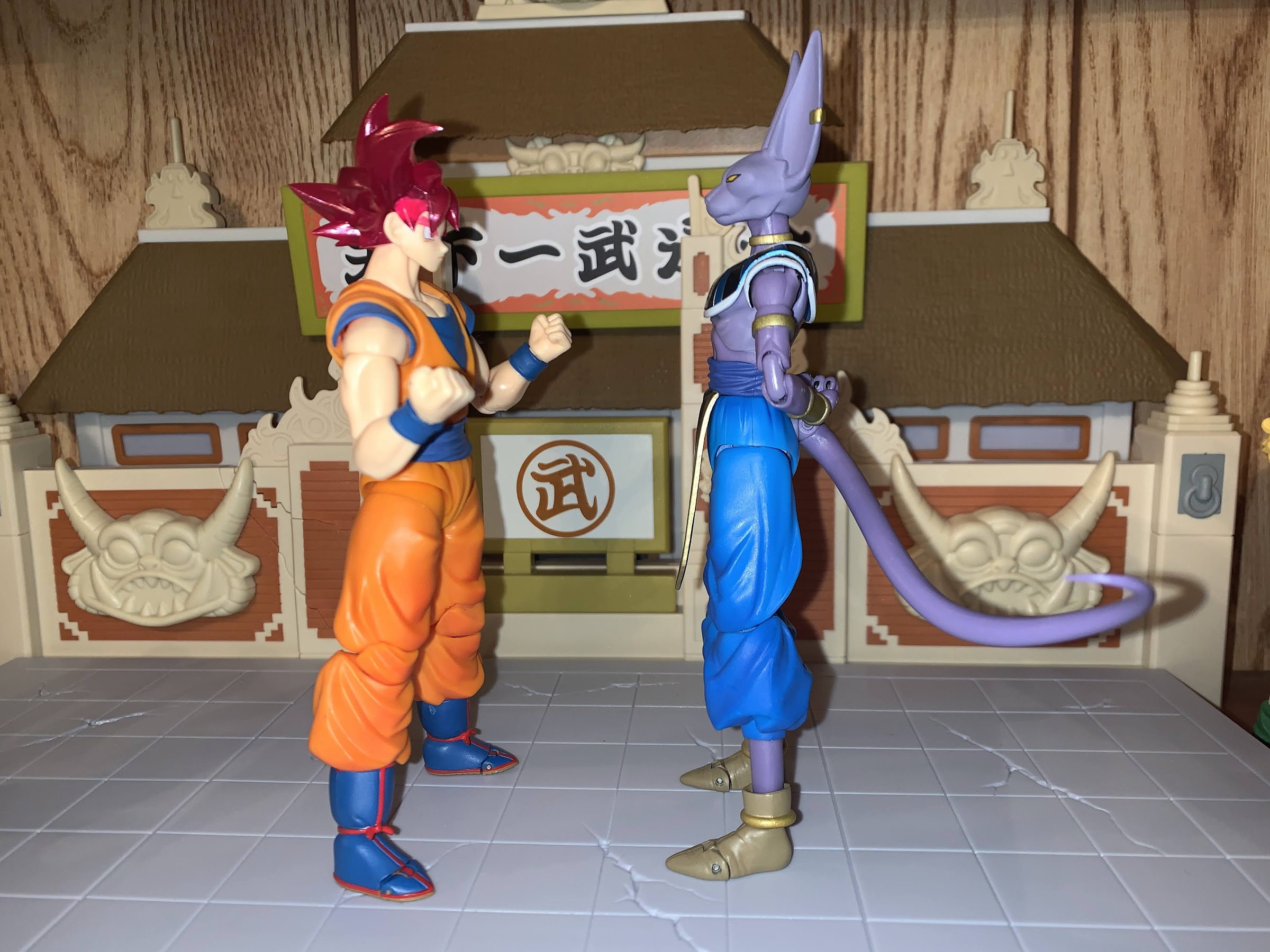
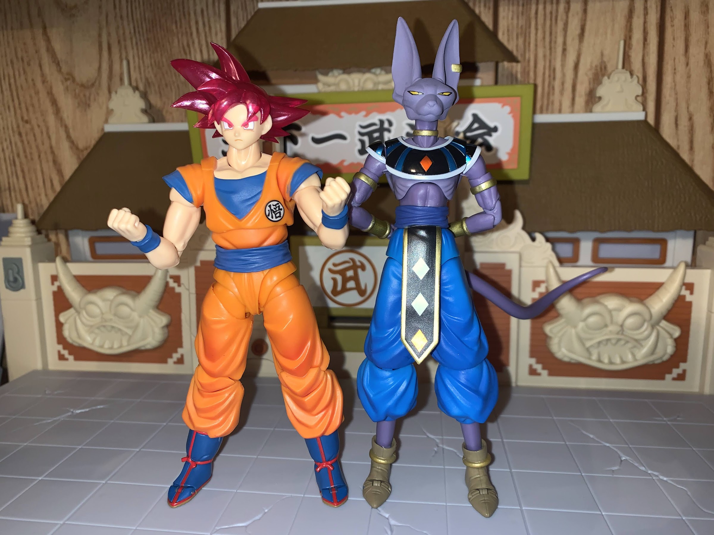
The last of my San Diego Comic Con 2021 exclusives has finally arrived and it’s the event exclusive version of the Bandai/Tamashii Nations Super Saiyan God Goku. Now, Dragon Ball fans might quibble with my title for this article as I called it Dragon Ball Super when this form technically debuted in a Dragon Ball Z film, Battle of Gods, which would then be adapted into the anime series Dragon Ball Super. I’m just going with what’s on the packaging, folks, but if I had to place a label on this version of Goku I would say it does feel more like a Dragon Ball Super thing. At any rate, it’s the same film that featured the debut of Lord Beerus, who we looked at last week and it was my desire to add Beerus to my collection that prompted me to just get Goku too. The two clash in that film, and this figure felt like a good one to pair with Beerus. I’m not actually too keen on the Super Saiyan God transformation, but maybe this figure will change my mind.
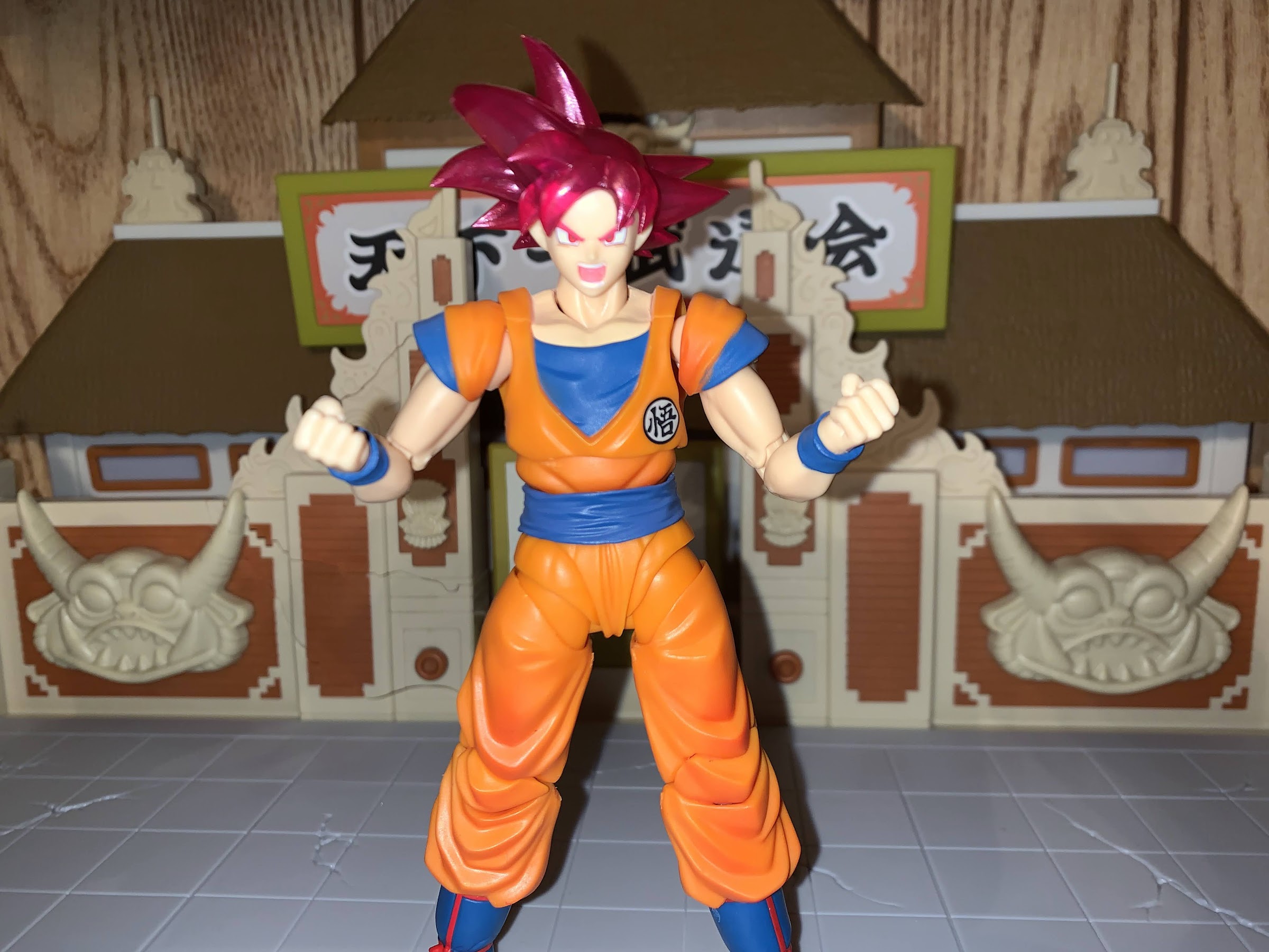
Super Saiyan God is characterized by Goku getting reddish-pink hair and remaining rather lean. Not quite early DBZ lean, but certainly leaner than Buu Saga Goku.
Super Saiyan God was the latest power-up introduced in Battle of Gods and it would be quickly eclipsed by the Super Saiyan version of that, the mouthful Super Saiyan God Super Saiyan. Or, Super Saiyan Blue for short. I don’t really understand the specifics of the whole thing, but basically, in order for a Saiyan to attain this form, he needs to have five other Saiyans lend them their energy which somehow becomes divine and leads to this transformation. The actual transformation gives the Saiyan a firey red aura, turns their hair a red-pink, and actually causes them to slim down as opposed to bulk up. Since the shape of the hair remains the same, they don’t necessarily look like a Super Saiyan, which is this form can then go Super Saiyan and become the blue version. How Goku (and later Vegeta) learn how to use this form without the added step of having other Saiyans lend them energy is either not explained or not explained well. Either way, it wouldn’t be Dragon Ball if there wasn’t some element of things being made up as they go along, would it?
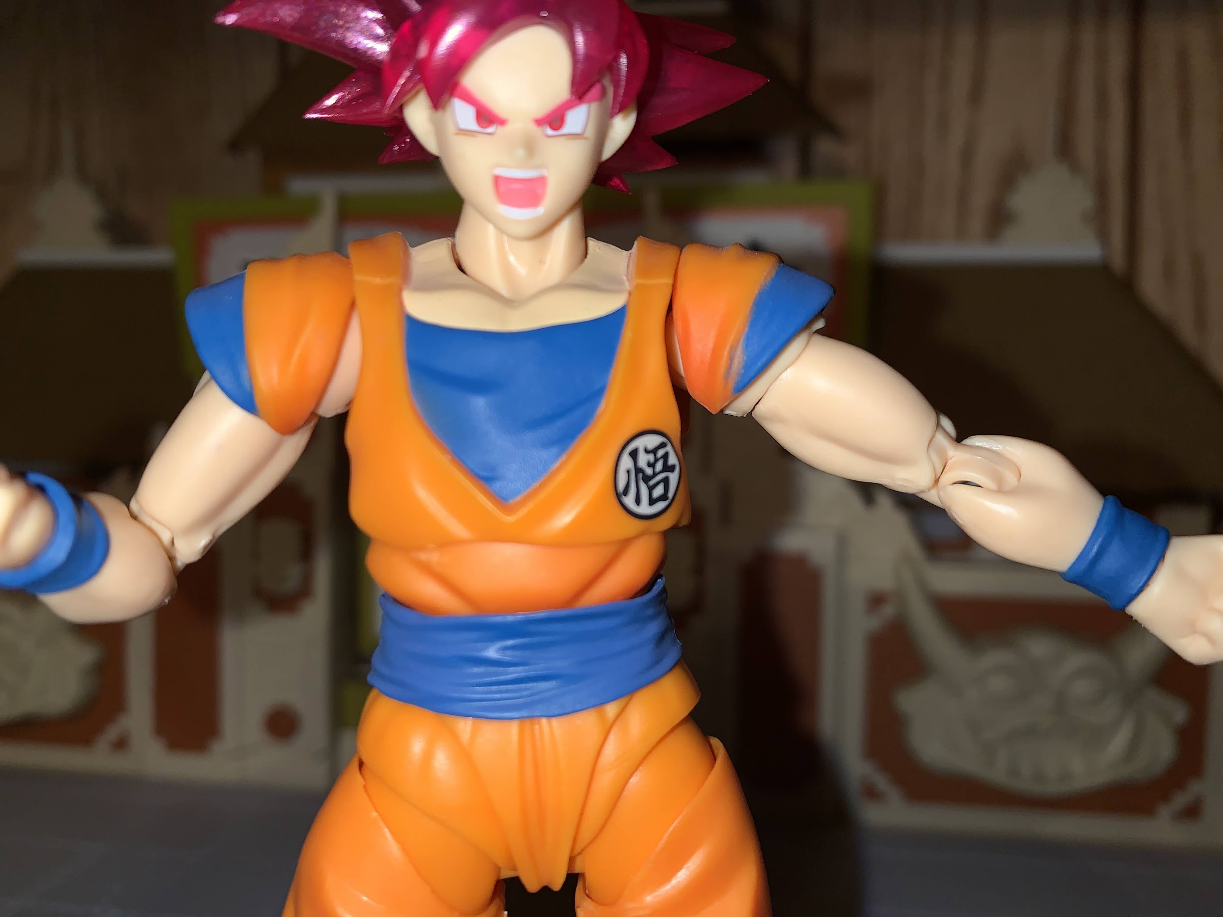
You do have to fiddly with angles and those damn sleeves to get the best look. Here I failed as you can see the flesh colored piece inside the joint, which should be orange.
This version of Goku should feel pretty familiar to anyone who has handled one of the many recent Goku figures that Bandai has released. It’s the same body as the Super Saiyan Blue Goku I’ve already reviewed and Bandai has been able to get a lot of use out of this buck. The only difference I can see with that figure is the arms are actually smaller and leaner, which is appropriate for this form. I’m not sure if they’re the same as the Saiyan Raised on Earth Son Goku figure, since I don’t have that one, but it is nice to see a subtle difference between the two godly Goku figures since it makes sense. Outside of the biceps and forearms, the other difference really is just in the paint job and belt. This figure has a lighter orange to the gi likely to account for the aura and because it’s the event exclusive color edition. The belt is the Cell Saga era belt too which doesn’t feature a knot and the boots are a much brighter shade of blue. The laces are also painted red like the piping as opposed to brown. The choice of colors, combined with the translucent, pink, hair, does really help to create the illusion that Goku is glowing. It’s neat, and I think it works well for this form.
The paint flaw on Goku’s left sleeve might seem like a minor thing to someone reading this, but for a figure with very little paint on it, it’s a bit ridiculous they can’t get it right. This is also the best pic for seeing how the vest and crotch are a different shade of orange.
Beyond those changes, a lot of the figure feels the same. There’s some shading on the front of the pants and abdomen, but that’s basically it. The other painted areas are the flesh color on the chest and the blue trim on the sleeves. Unfortunately, the left sleeve on mine was not painted particularly cleanly. The plastic on the face also doesn’t match the neck and chest as well as it could, otherwise, the painted details on the face look good. The plastic inside the butterfly joint is also cast in the proper color, orange, as opposed to flesh colored like my previous Goku figure so that’s a plus. There is no shading on the crotch area though, or on the upper torso, which will probably irritate some. I get their reluctance to shade the crotch because if it goes too heavy he might look like he pissed himself, but more shading would have been nice. It seems to be something the original release of this figure has over this one, as just looking up images of that reveals a more vibrant release.
He can assume the position, but the lack of energy parts is a bummer.
The figure also feels the same because the accessories are pretty much the same. You get four faces with this guy: stoic, smiling, teeth grit, and yelling. They all look fine, though I’m kind of partial to the stoic face for this form. As far as hands go, you get the fisted hands in the box plus flat palms, martial arts pose, Kamehameha, and wide open hands. Pretty much the only hand you don’t get is an instant transmission hand, but we have plenty of those in other sets so I don’t think it’s a loss. There’s no effects part though, which is always a bummer. Being an event exclusive, I wish Bandai had added an aura effect since this guy did retail for $50, but that’s how it goes.
Look! It’s the battle of the gods we were promised!
The articulation for Goku is, stop me if you heard me say it already, the same as past Goku releases. He has the floaty pieces in his hips to cover up the joint and the sleeves which peg into the shoulders that I’ve never really liked. He can look up and down no problem and the butterfly joints in the shoulders allow Goku to do his signature energy blast poses. His head is on the old ball-hinge the original release had, and not the updated ball peg which is much better. It works, but sometimes you have to fight it to get it to bend where you want it to. At least it works better on Goku than it did on Beerus since his entire head swaps and you can accidentally get that hinge facing in a direction you don’t want. The hips don’t go out very far to the side, but he can kick forward and back because has those floating pieces instead of a sculpted butt. The knees and elbows will get you better than 90 degrees while the ball-peg ankles are just okay. The toe hinge is bad. Most of the joints are nice and smooth, with the lone exception being the right thigh twist on my figure. This is a first for me, but that thing is stuck. I have never had this issue with a Figuarts release before, but one twist caused the leg to pop off. Thankfully, it’s just a ball and socket connection so no damage was done, but it is a bummer.
IS Beerus too tall or Goku too short? Considering one of these guys is the main character for the series from which all other figures should be compared to for scaling purposes, I’m going to say it’s the cat that is too tall.
Does this figure make me a fan of Super Saiyan God? Yes and no. I think the translucent effect with the hair and the brighter approach to the color palette work really well, and it’s essentially what you’re paying for if you get this exclusive. I think that approach to the hair is an improvement over the standard release from a few years back, but probably not enough of one to warrant an upgrade if you already have it. Otherwise, he’s a Figuarts Goku. It’s a good figure, I wish mine didn’t have that paint error on one sleeve, but aside from that it feels like a quality figure. I don’t regret my purchase, but I’m also not doing backflips. If you’re at all familiar with this line, then you should probably know if you want this figure or not. And if you do, and you have yet to purchase one, well you’re in trouble because the secondary market is essentially all that remains. The prices I’m seeing aren’t terrible, but they’re obviously more than the $50 it would have cost you last summer.
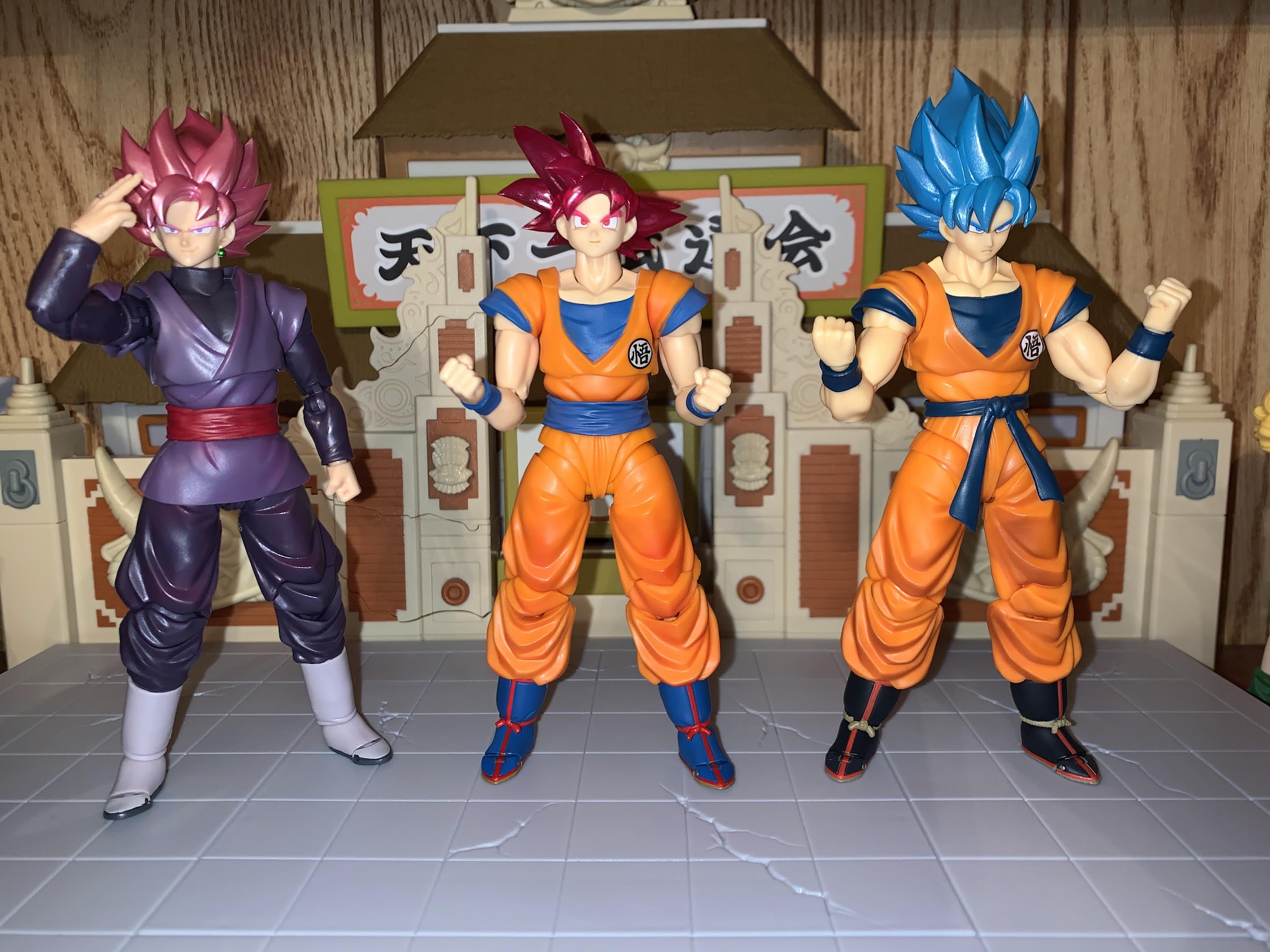
To close this out, will end with the gathering of the Gokus. You can see the different approach in color when comparing him to SSB Goku, and the leaner proportions. Goku Black is really an all-together different figure, but we’ll let him stand here anyway.
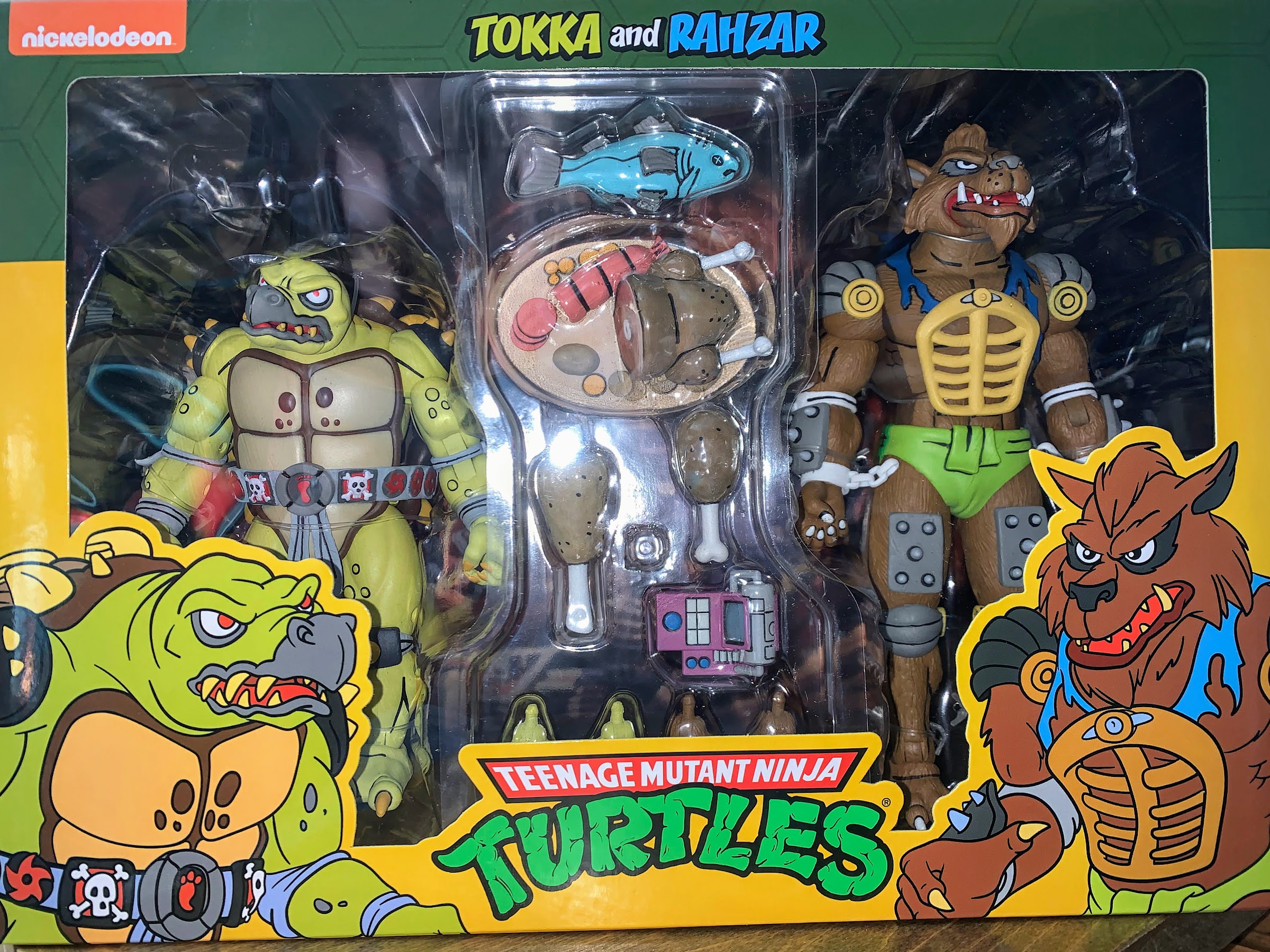
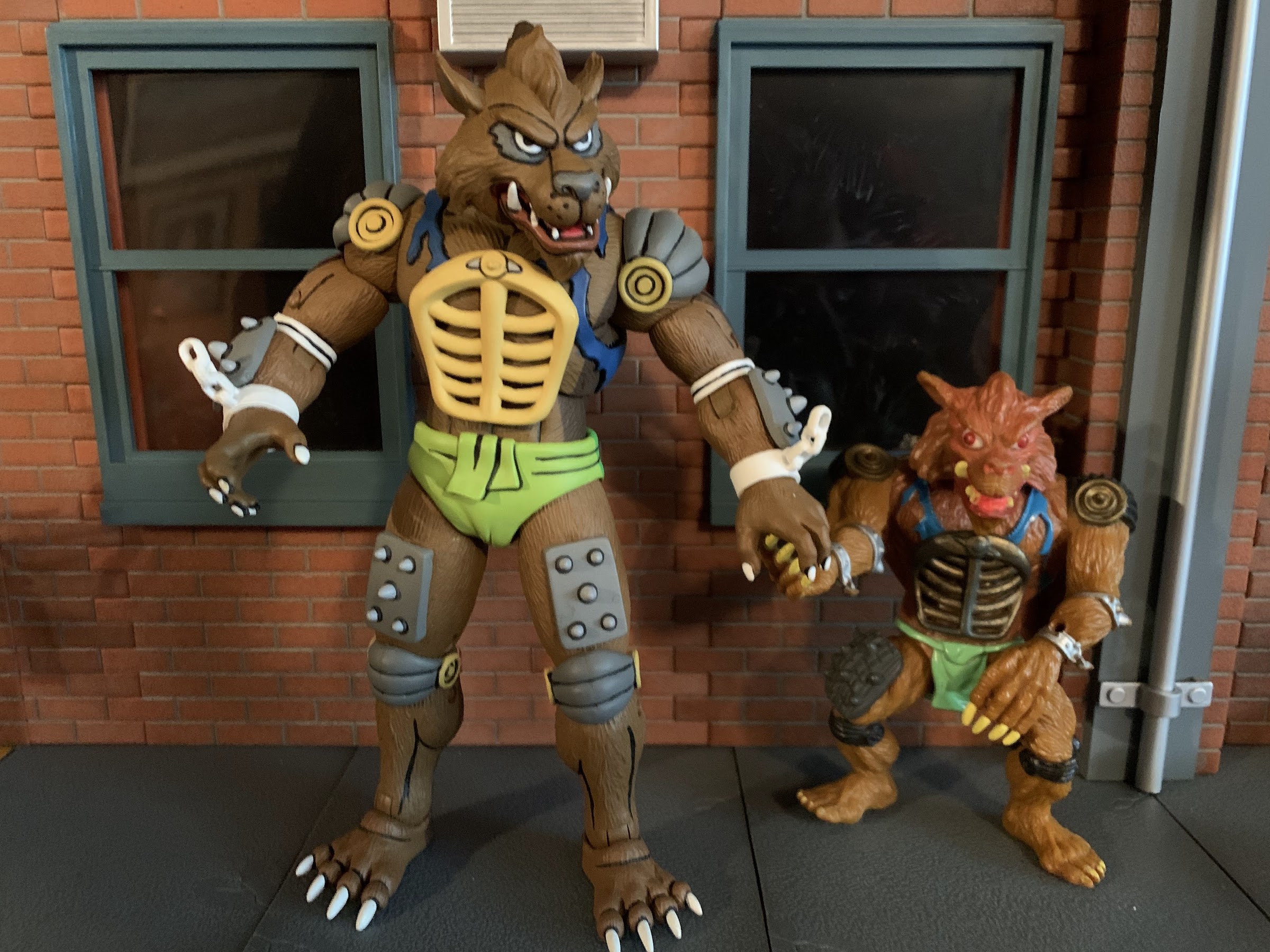
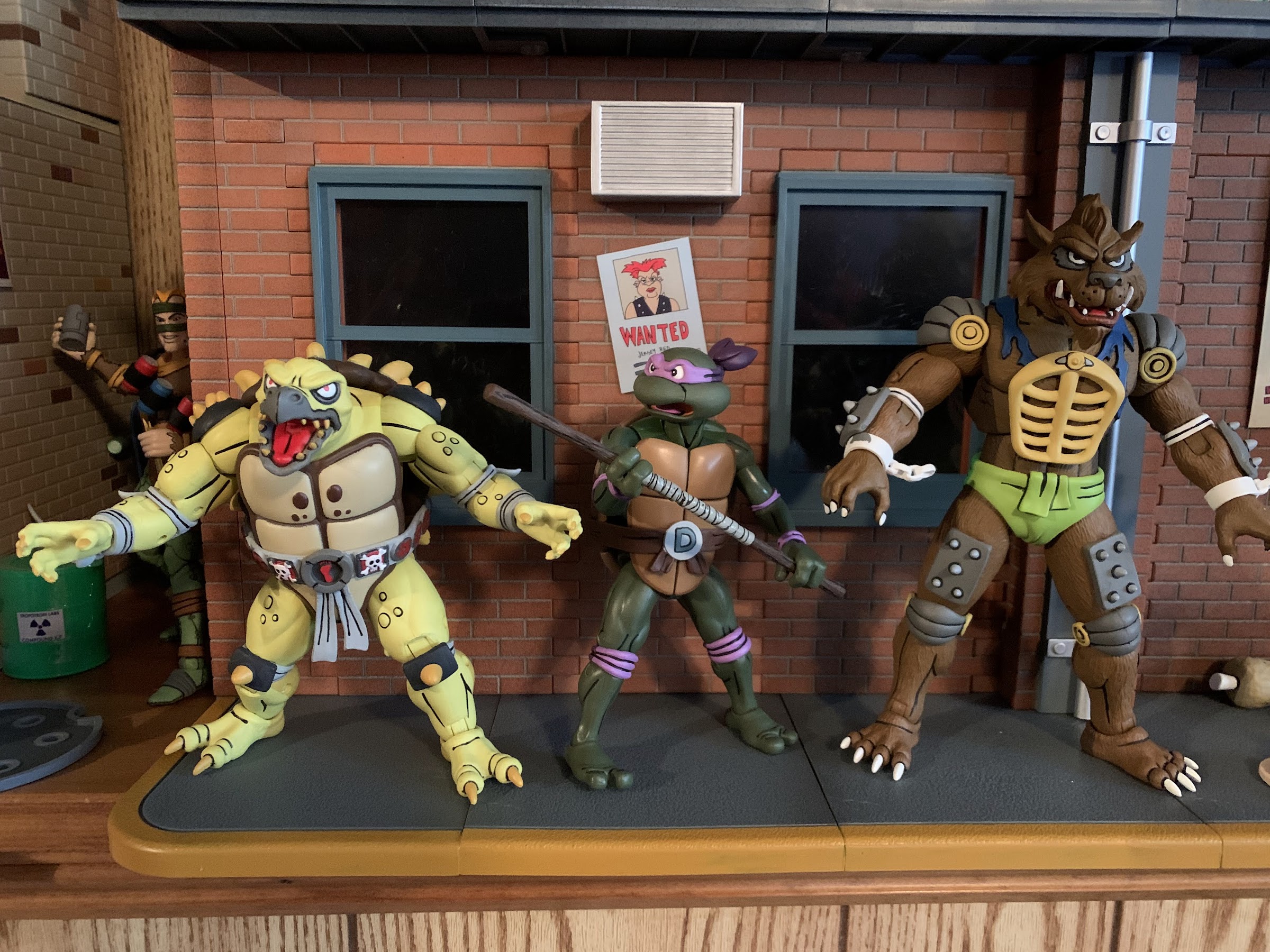
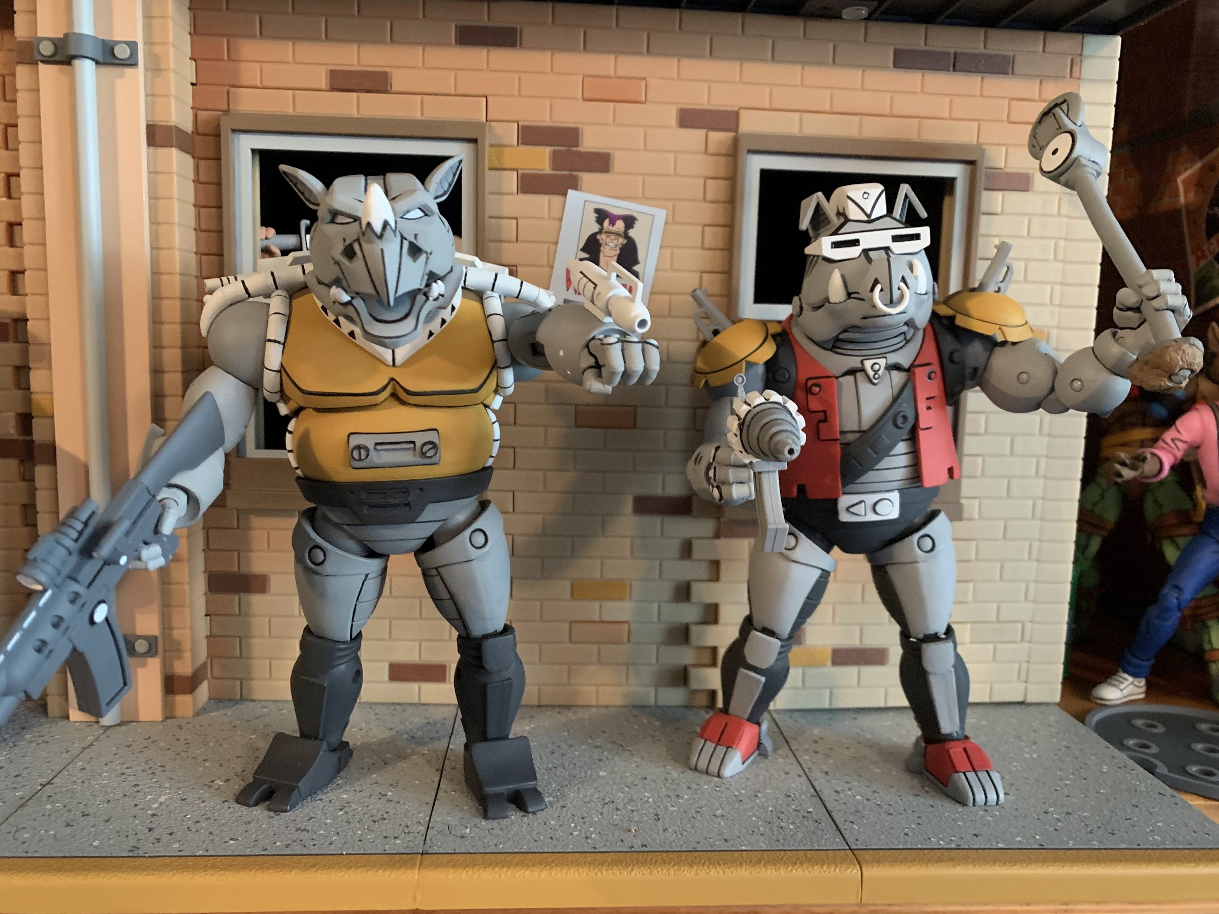
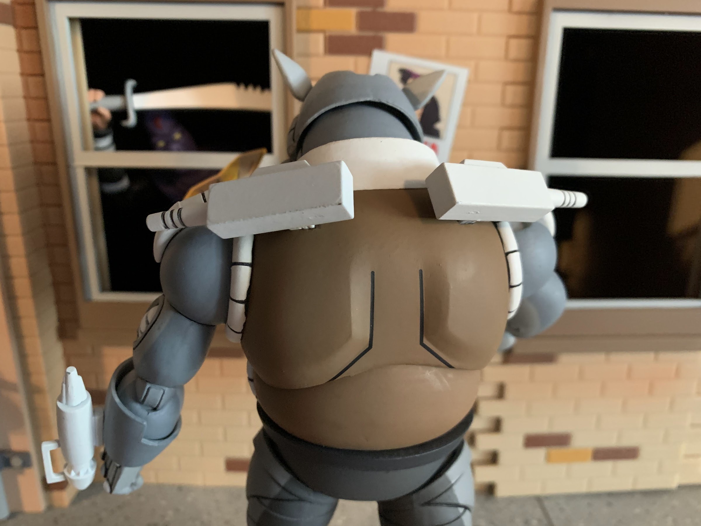
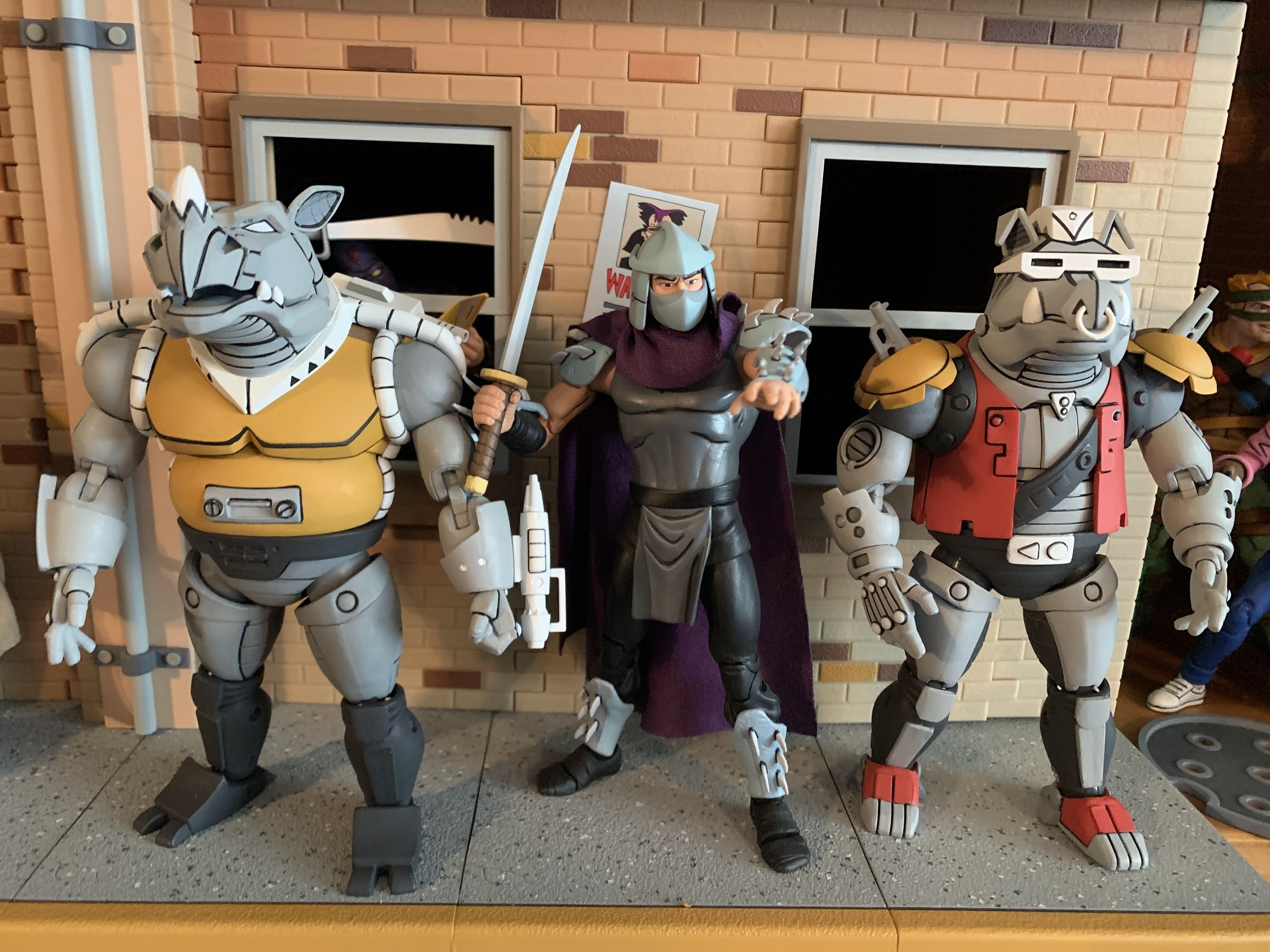
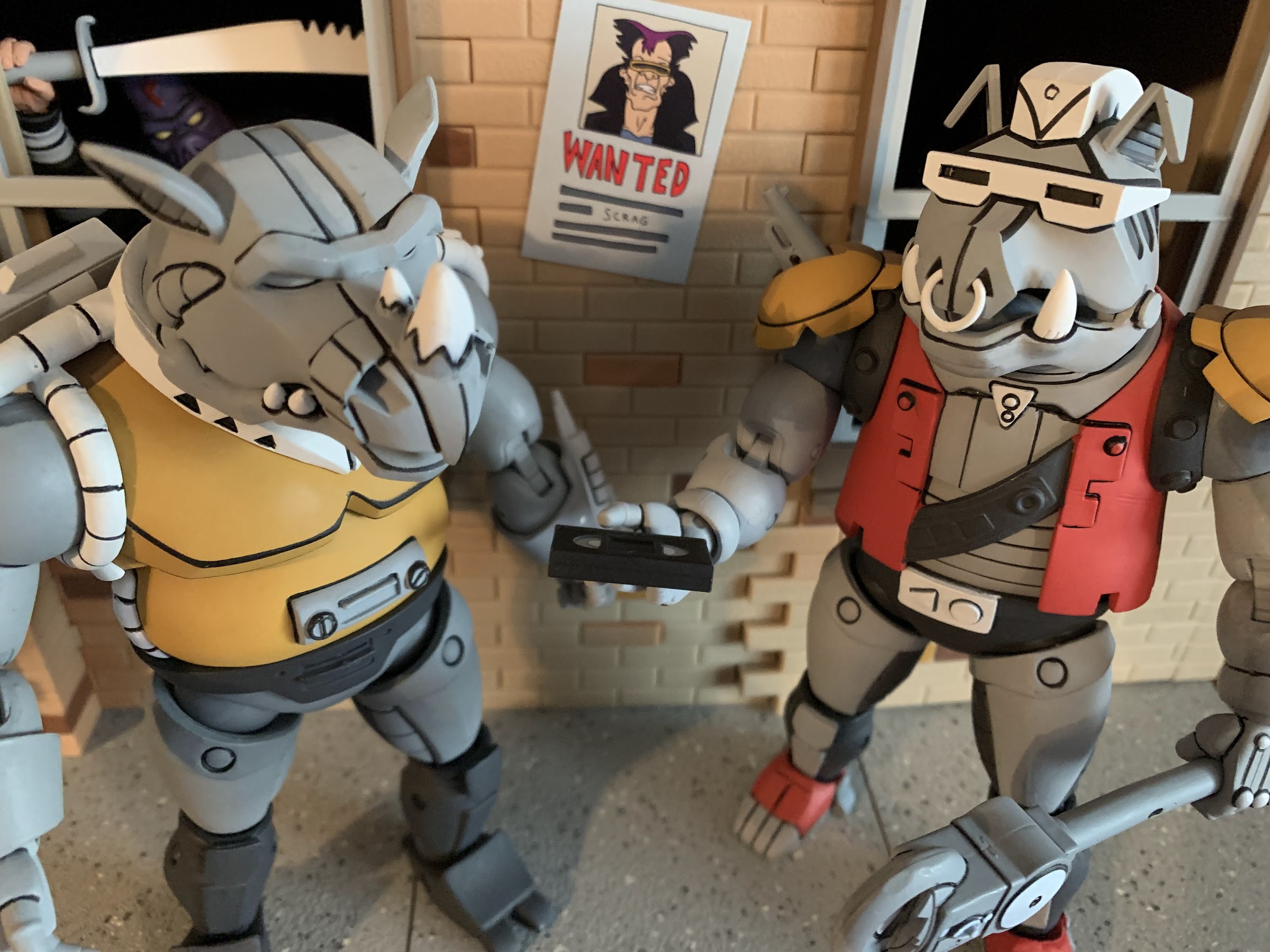
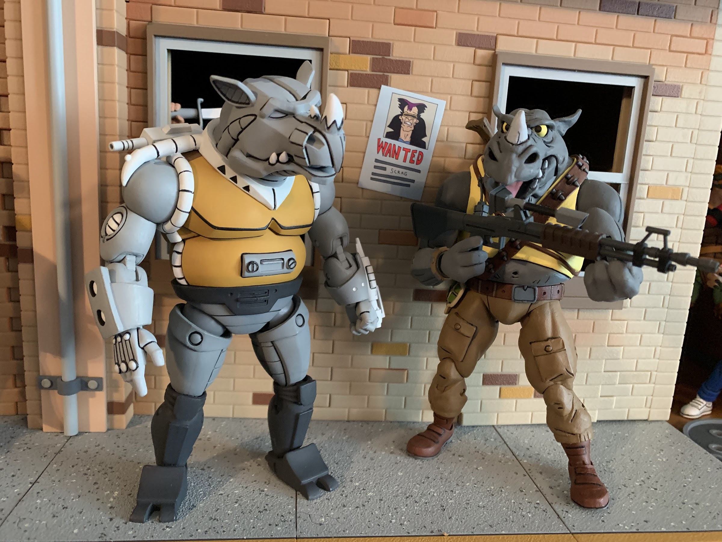
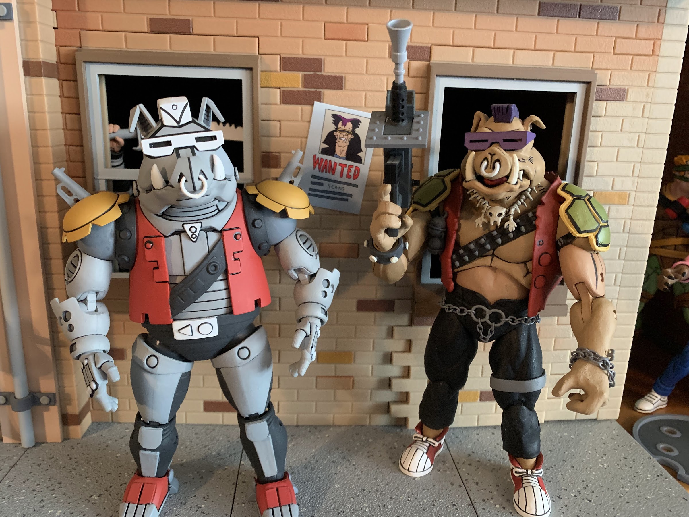
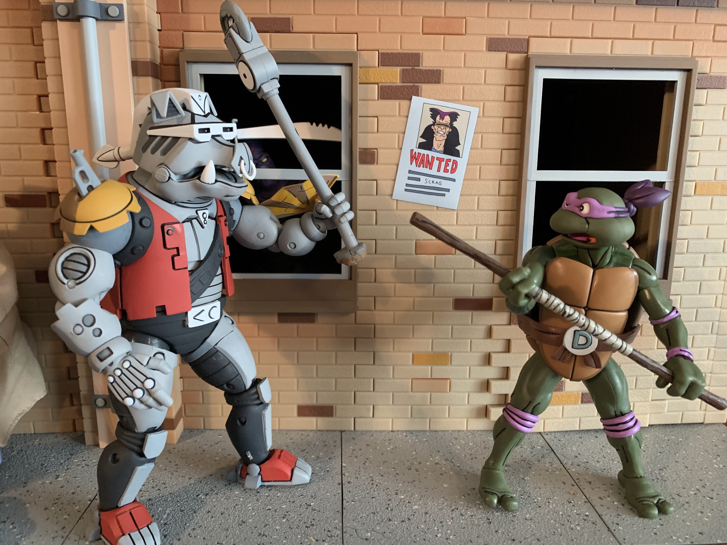
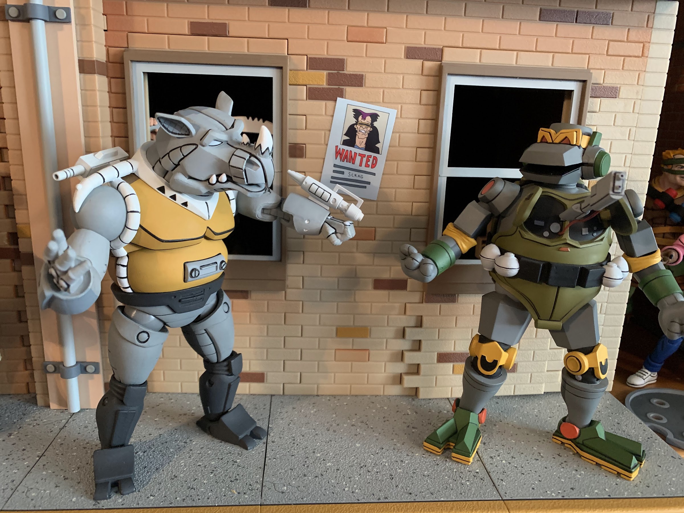
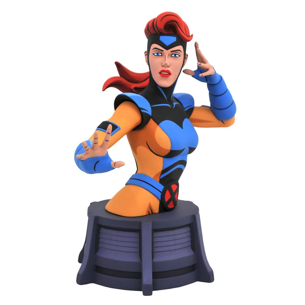
Memorable mutants from their not so memorable role.
There is certainly a lot of Teenage Mutant Ninja Turtles product flying around these days, but I would guess collectors and fans of the property are paying the most attention to two toy makers in particular: NECA and Super7. One search for “NECA” on this blog will reveal that the company has produced a ton of TMNT action figures based on various iterations of the characters be it movies, television, or comics. As for Super7, their output is much slower and more specific, though they still have released 16 figures thus far and a handful of variants and have three additional waves already solicited. Super7’s approach is to essentially reproduce what Playmates made 30 years ago at a new scale and with modern technology. Both NECA and Super7 basically received permission to go full tilt on TMNT at the same time, and both have said they basically sat down at Toy Fair, explained the direction they were each going in, and basically have a handshake agreement to not step on each other’s toes which has held up just fine.
Sometimes though, multiple iterations of the property intersect. Playmates very much did its own thing when it came to characters and designs, and for awhile, the cartoon did as well. As the show went on though, the writers, artists, and so on started to just lift more from existing sources probably because it gets hard to keep coming up with new ideas for a show that’s pretty formulaic and largely exists just to sell toys. And since it’s a glorified commercial, why not just include the toys in the show directly?
Stop me if you’ve heard this before about this line, but these guys look like they jumped right off of the screen.
When it came time to make a sequel to the Teenage Mutant Ninja Turtles 1990 film, the writers wanted to include some mutant henchmen for Shredder. When Kevin Eastman and Peter Laird balked at including the cartoony Bebop and Rocksteady, new mutants were created in Tokka and Rahzar. Playmates foolishly felt the first movie would be a massive flop and did not support it with toys, but after it was a success, they were ready for the sequel and produced figures on several characters including the newly created mutants. Playmates wasn’t going to match the look of the costumes in the film, and it’s likely things were being worked on simultaneously, so their take on Tokka and Rahzar turned out a little different from how they appeared in the film. The film was another hit and the characters proved popular, so to no one’s surprise, Tokka and Rahzar made the jump to television. And since it was likely far easier to model them on the toys, that’s what the show did. All of this is to say I feel a little bad for Super7 since NECA has essentially provided us a set of figures that are based on the cartoon, which was based on the toys. It’s basically the same deal as what we saw with Antrax and Scumbug earlier this year.
Let’s just jump right to the comparisons! Left to right: Playmates Tokka (first run), NECA toon, and NECA movie.
Tokka and Rahzar come in the standard window box packaging we’re all used to at this point. They were initially offered as part of NECA’s Haulathon event and in a confusing fashion as they were sold on costumes.com. Apparently, it would have cost too much to create a new website. That website was also supposed to be for international customers only, but no one configured the site to actually lock out US residents so it ended up being a free-for-all when everything went up on March 18th. This set was said to be open to all in some places, but it was all terribly communicated and a lot of confusion was out there. I placed an order on that site, and a set arrived less than 2 weeks later even though product wasn’t supposed to ship until April (I’m not complaining). These guys are going to Target, and maybe online too, and it’s possible by the time this post actually goes live that all of this has been sorted out. For now, it’s a mess, but I got some toys out of it.
And now for the wolf. Same arrangement as before. I think my vintage Rahzar is the first run which had red paint around the eyes in error. Later releases featured black like the toon version.
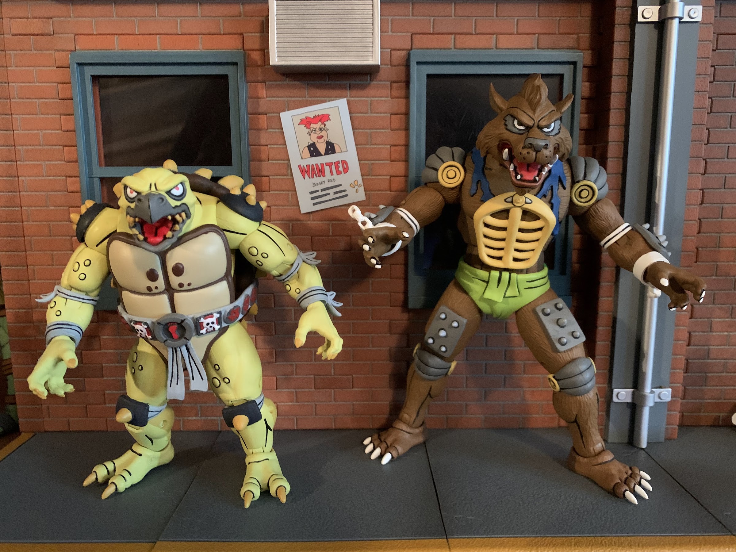
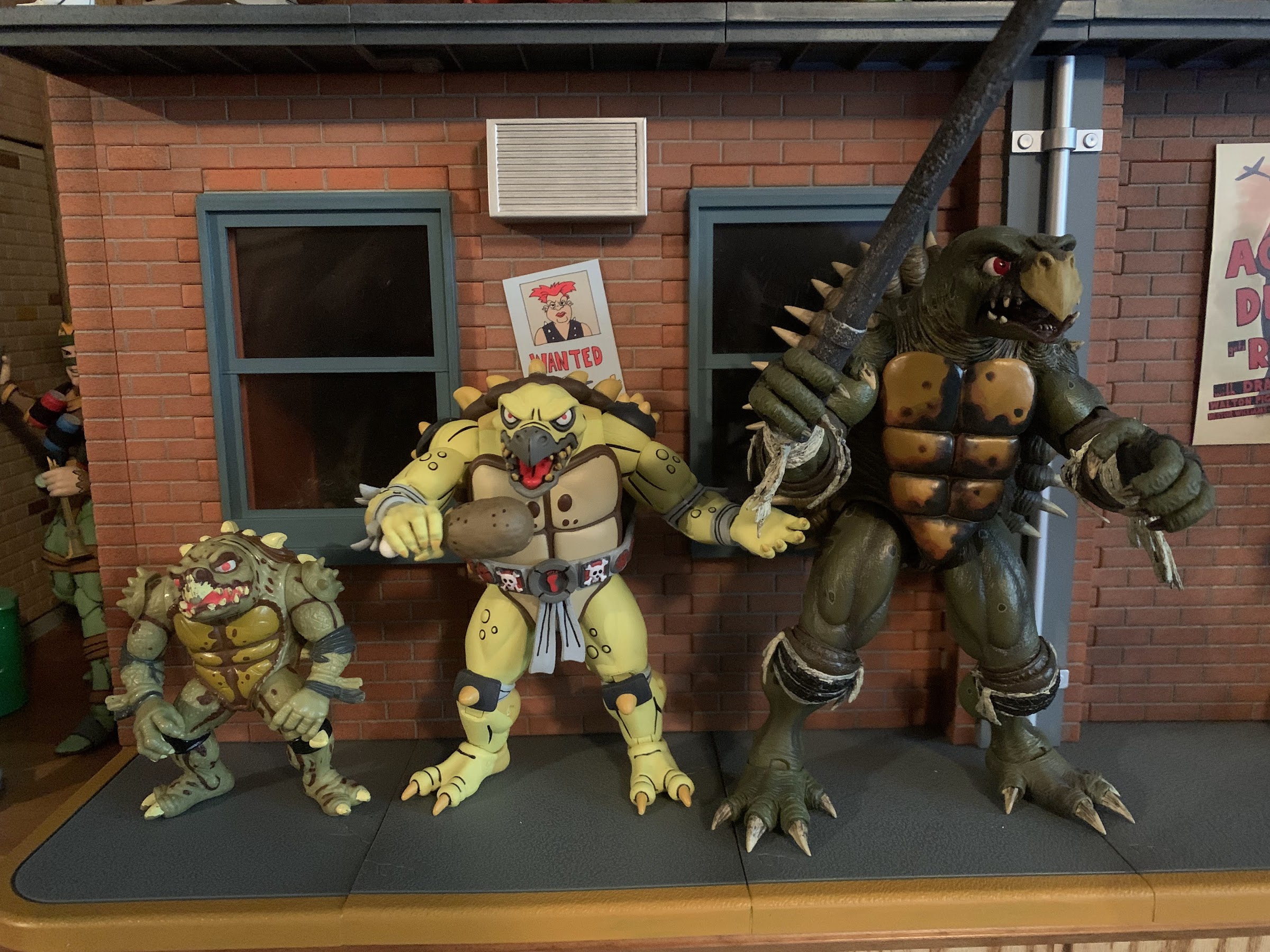
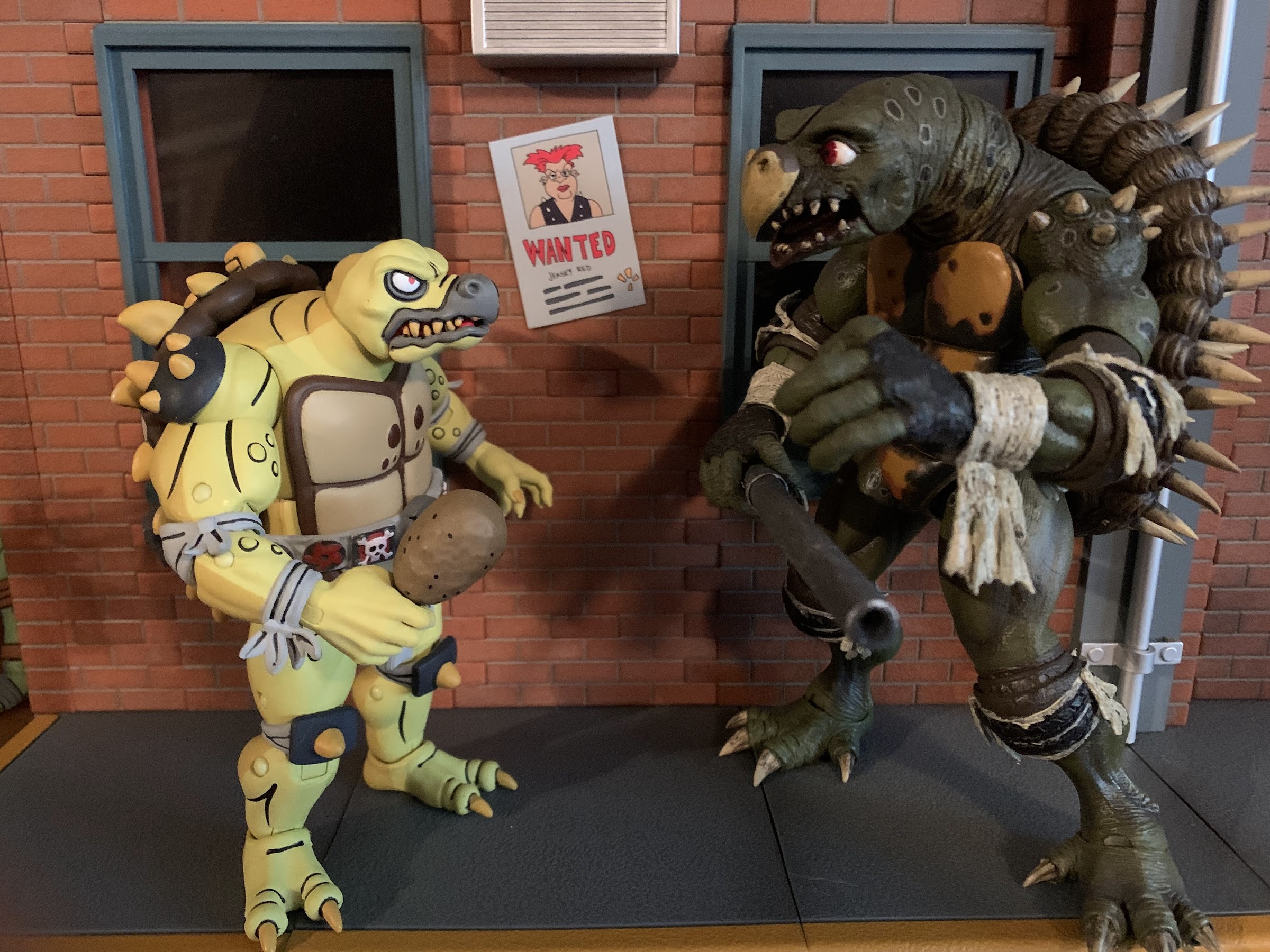
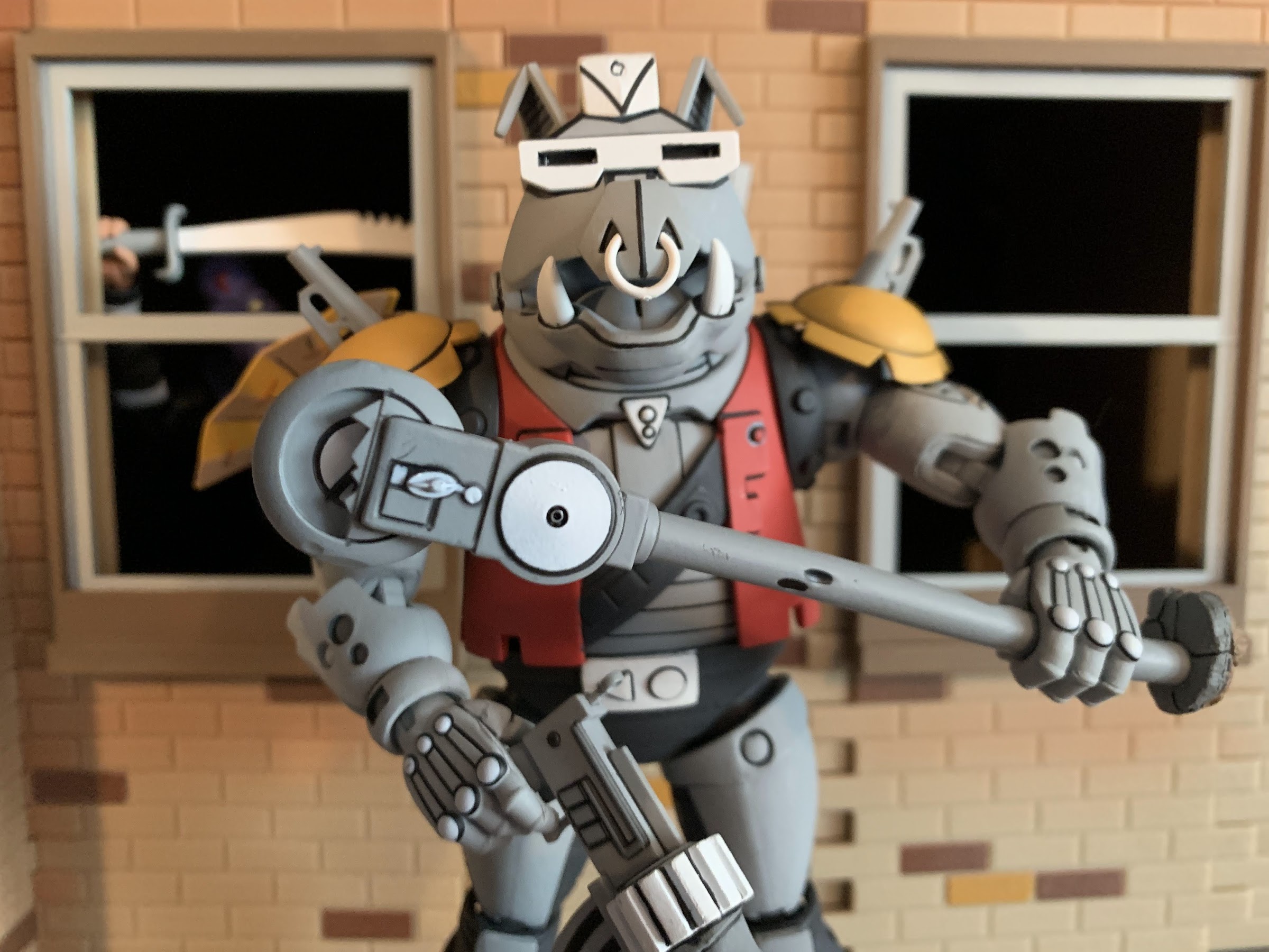
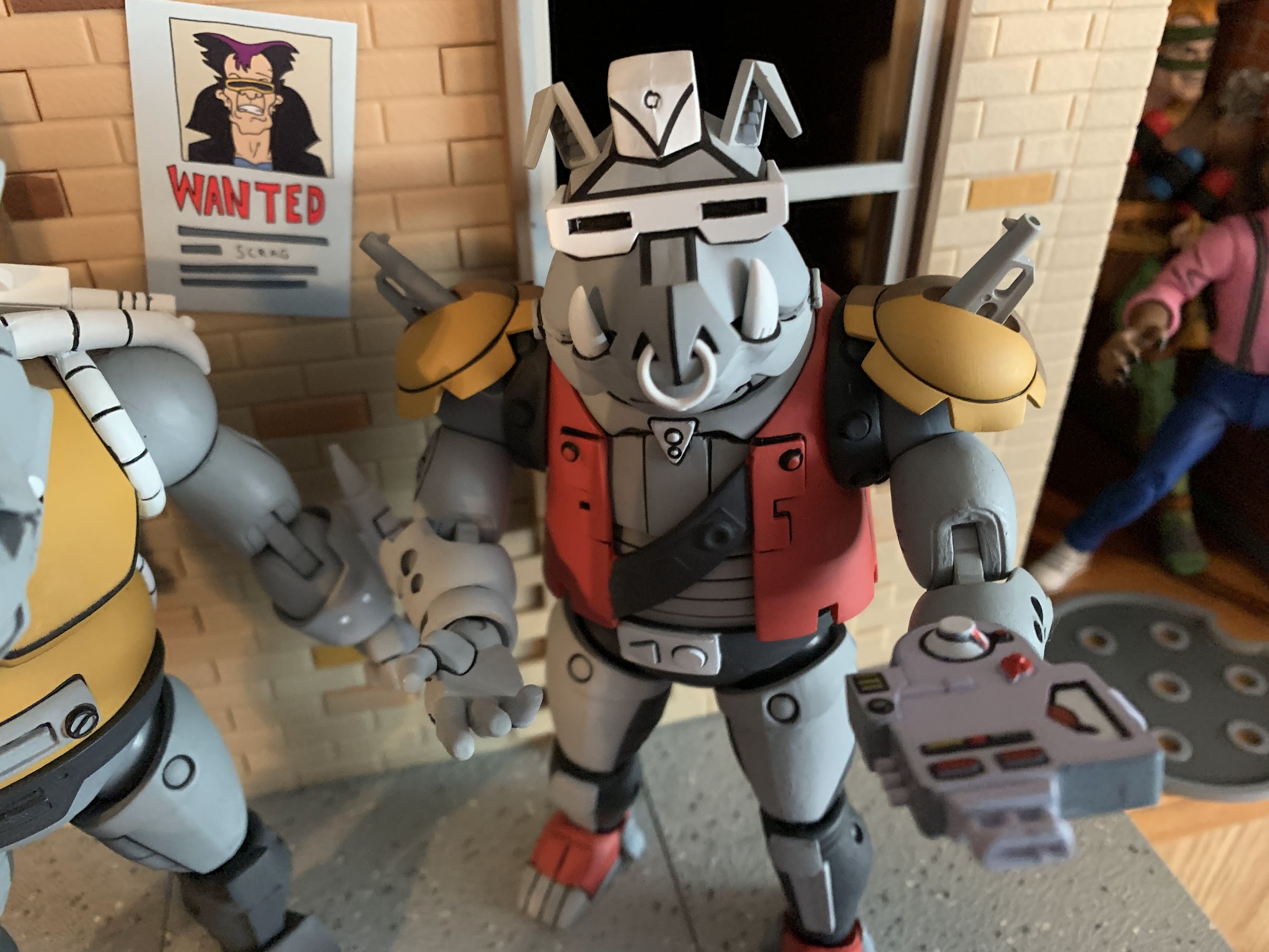
As mentioned before, Tokka and Rahzar are based on their appearance in the episode of Teenage Mutant Ninja Turtles “Dirk Savage: Mutant Hunter!” and the designs for the characters are clearly based on their action figure counterparts from Playmates. It came pretty late in the cartoon’s life, episode 166 out of 193, so several people collecting this line barely remember their appearance. I personally was still watching, but I’d drop off the following season when the “Red Sky” era began and the show underwent a soft reboot of sorts. I remember being quite surprised to see this pair show up though, and even more surprised when they were intelligent creatures. Aside from resembling the movie characters to a certain degree, the pair are pretty damn different. They’re a bit morally ambiguous and largely out to satisfy their stomachs. Rahzar makes it very clear to Tokka that he’s his only friend in the world, which is about the only character development they really get. Rahzar seems to dislike everyone, but Tokka, and he does make some comment about no one being able to stop them so I guess they’re villains? Tokka is mostly useless though as he’s easily subdued and just exists to make Rahzar mad when something unfortunate befalls him. He gets captured by the mutant racist Dirk Savage, leading to a showdown between Savage and Rahzar that’s just a set piece for the turtles to save Savage and have him realize the errors of his ways. That’s the cure for racism in Hollywood, you just need to have the party the individual is racist towards save them. Problem solved! Tokka and Rahzar’s story just sort of ends there and they never show up again.
“All right son, I’ll take you to the dog park.”
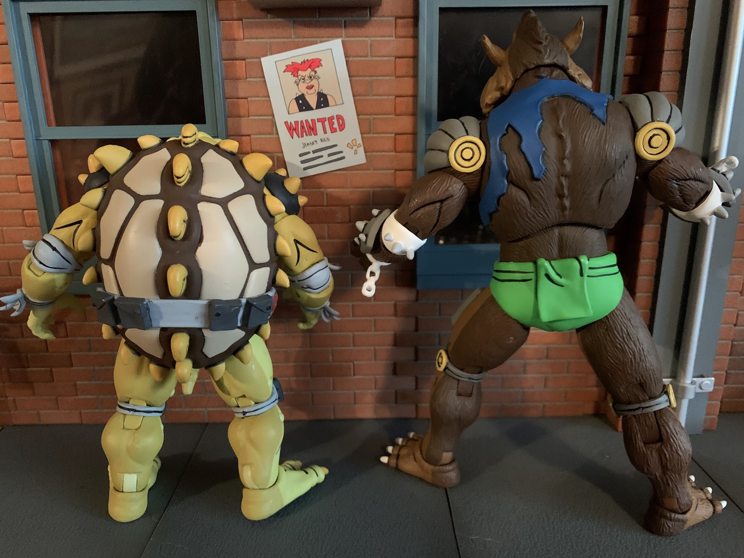
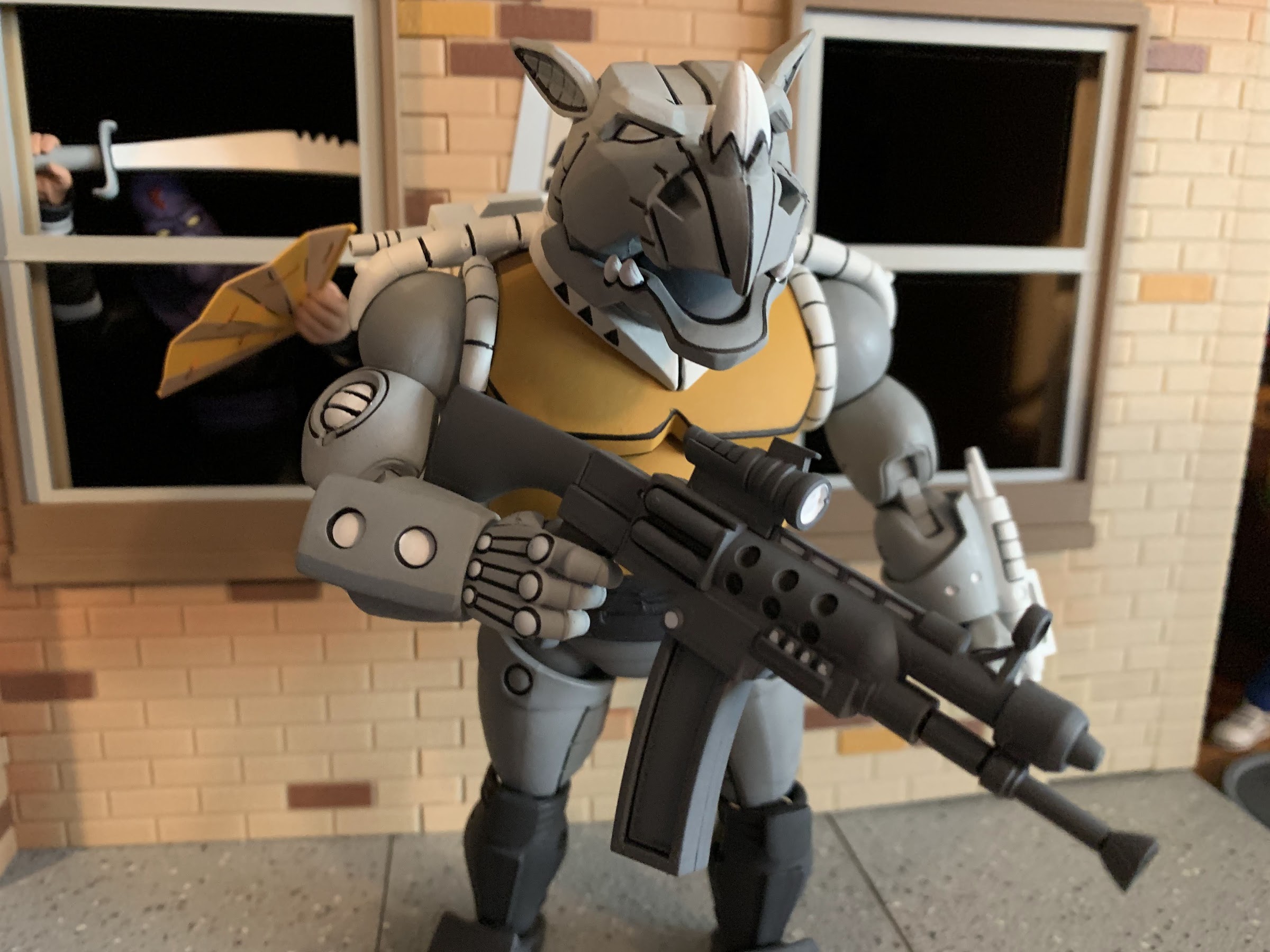
Rahzar is obviously the larger of the two standing at around 7.25″ to the top of his hair. Tokka, is much shorter and chunkier coming in at around 5.25″. Both were sculpted by Paul Harding who has already made a mark on this line with expressive sculpts of Dirtbag and Groundchuck and it looks like NECA was so pleased with Tokka that they’re prepping the figure for a re-release as an Archie Slash, which makes sense since the Playmates Slash was repurposed into Tokka! Both figures are impressively sculpted. Rahzar has a lot of extra parts added to him like the broken shackles, forearm and thigh pads, and that grill on his chest. Tokka has various warts and similar blemishes on his body to go with a spiked shell that’s a dead-ringer for the old toy. He has elbow and knee pads plus those spiked shoulder pauldrons. I love the detail on both and the paint is what is expected of this line. The black linework is clean and really causes the pair to “pop” and we get that bisected shading as well with light on the front and dark on the back. The only overlay in use here is the green “diaper” on Rahzar so it’s hard to say if NECA expects to get much reuse out of his mold. If not, I love to see the commitment on display here from NECA to make the best possible versions of these characters uncompromised by cost-cutting measures.
Tokka’s shell features the same arrangement as the old toy for the spikes. There’s even the same linework on the center nubs.
When it comes to shortcomings from a presentation perspective, there’s very little to complain about here. We’re basically down to nitpicks as the paint around the spikes on Tokka’s shell is a little sloppy around the edges, but it’s pretty minor. The shurikens on his belt also have a soft appearance in the paint department, but again, it’s a nitpick. The only real blemish on either figure is with Rahzar’s right shackle. There’s a sizable blob of gray paint on it from the forearm guard that’s a bit of a bummer. The shackle is a separate piece that can come right off once the hand is popped off so, if I want to, I could easily take it off and try to touch it up. It’s tough to paint white over a dark color though so I don’t know that I’ll bother, but that really is it as far as issues. This is a very clean set.
These guys just want to eat and hang out, and honestly, I can relate.
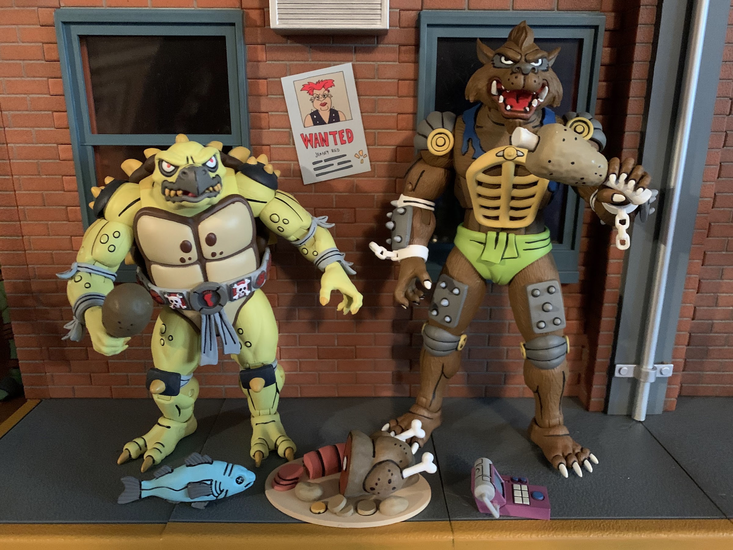
Since our boys here only showed up in one episode, they didn’t really get to do much aside from eat and get captured by Savage. Given that, NECA included a bunch of food! There’s a turkey platter with about half of a bird on it, some sliced potatoes, and a big slab of salami, I think. There’s also a turkey leg and some bone-in-meat plus a whole fish which was something actually used as a weapon against Rahzar. There’s also yet another handheld, control, device that looks like a fancy adding machine. It’s the controller to the control cuff that actually came with the Mondo Gecko figure so, little by little, we’re building the arsenal of Dirk Savage (the foot trap that came with the Punk Frogs also belongs to Savage). Each figure also comes with a set of gripping hands and a set of open hands. I’m a little surprised there are no fists, but I don’t know that I actually miss them. The accessories are all painted very nicely, and even though I’m not sure what I’ll do with a big turkey platter, I’m happy to have it.
“Hey, gimme a bit of that.” “No.”
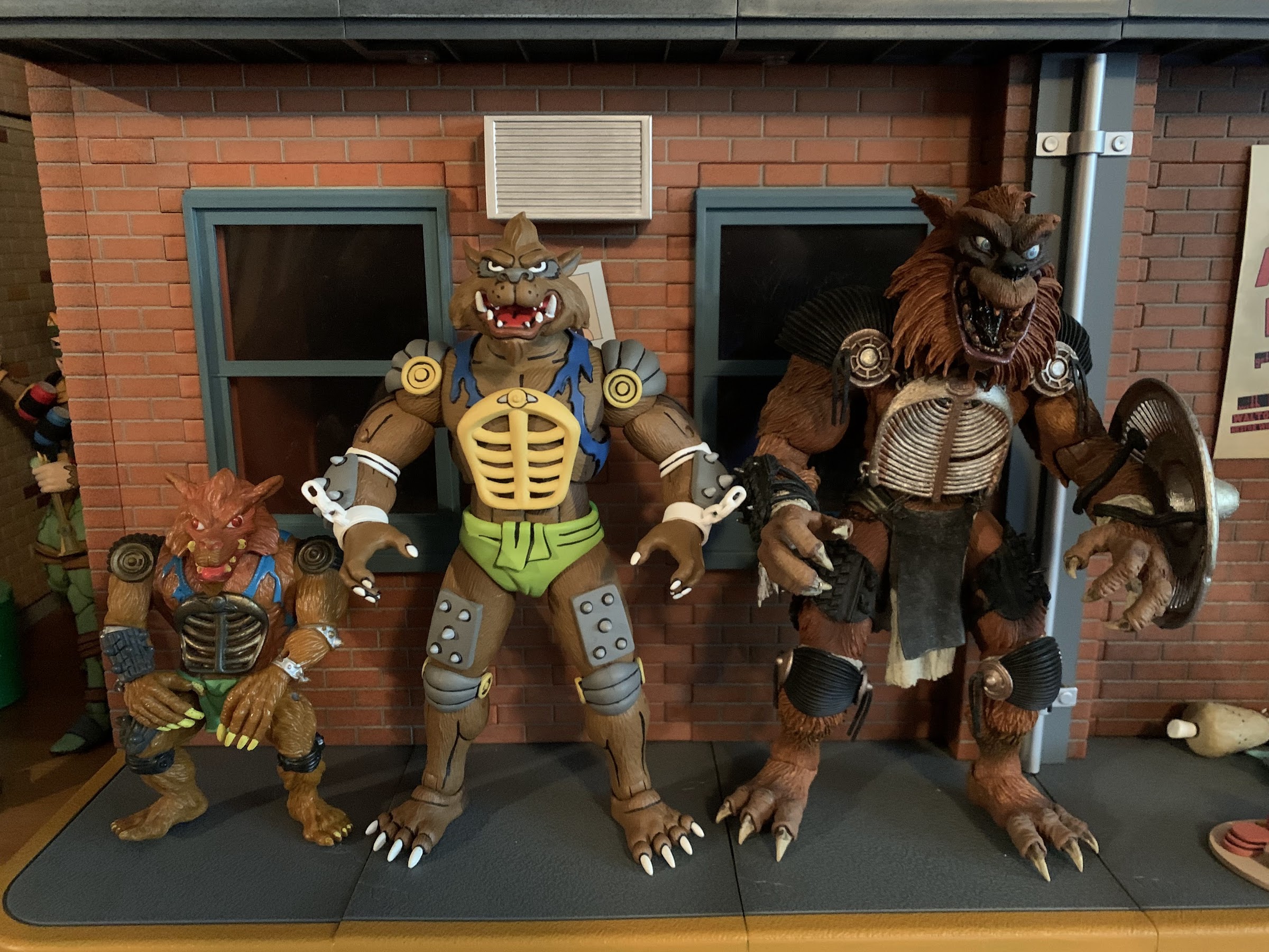
This line is certainly an appearance first, articulation second, sort of line, but these two boys move pretty well. We’ll start with Rahzar first who has a ball-jointed head. It feels like it might be a double-ball peg as he can look up very well, and bury his chin with rotation and tilt. There’s also a hinged jaw to add personality and it works very well. He’s most limited at the shoulders where traditional ball-hinges are hampered by the shoulder pads. The pads can slide a little, but he can’t really lift his arms out to the side much. He can rotate just fine though, and he has a biceps swivel, double-jointed elbows that get you 90 degrees or better, and wrist swivels with horizontal hinges. In the diaphragm is a ball joint that will mostly let the figure rotate, but you get some tilt and he can arch back and crunch forward a little bit. The hips are on ball-sockets and are nice and firm. You get a thigh twist there to go with double-jointed knees and the standard hinge and rocker combo at the ankles. All of those joints work quite well and I love that he has big feet because he’s easy to pose and stand. There were no stuck joints and they’re all cast in the most appropriate color of plastic too.
They seem to scale just fine with the turtles.
Tokka is similar, but being another turtle character, he has some limitations of his own. His head basically sits forward on the sculpt so he’s more limited in the up and down department, but he does have a really nice jaw hinge to make up for it. This dude can open wide! Like Rahzar, he has shoulder pads too that prevent him from bringing his arms out to the side, but he gets good range out of the double-elbows despite the elbow pads (why can’t we get these on the hero turtles?) and has a biceps swivel and standard wrist articulation. Like the turtles, he appears to have some joints in the torso, but unlike the turtles, it’s pretty useless. I can’t get any twist out of them, but braver folks than me might be more willing to really crank on that joint. The hips are ball and socket joints and he has the same thigh twist, double knees, and ankle articulation as Rahzar. Tokka’s feet are really impressive as he can bend each one back all the way so the foot lines up with the leg and he can bend it really far forward. It gives the figure a great base and I’ll definitely be happy to have a Slash with this kind of articulation later this year.
“Tokka, you and I are all we got!” “Have you been watching those Fast and Furious movies again?”
I feel like I’ve been saying this with a lot of the two-packs of late, but this set is another contender for best in the line. I’m partial to the bugs from a design standpoint, but I can’t imagine these two turning out any better than they did. These guys are picture perfect recreations of their animated look and the sculpt, paint, and articulation really comes together nicely. I suppose the accessories aren’t the most exciting we’ve seen, but it’s not as if there was much in the show associated with them. I guess we should be mad at the designers of the toon for not giving them some of their action figure accessories.
Tokka and Rahzar have started off as another Haulathon exclusive, but I suspect NECA will make every effort to get these figures into as many hands as possible so if you missed the initial drop keep your eyes open. Basically every set these days to hit Target brick and mortar has been relatively easy to get ahold of, excepting maybe the turtles themselves. I’m willing to bet Tokka and Rahzar will follow a similar pattern and hang around for a bit. Maybe I’m underestimating their popularity due to their appearance in The Secret of the Ooze, but that remains to be seen. If you can’t tell, I definitely give these guys a strong recommend so get out there and hunt these bad boys down like you’re Dirk Savage himself, just don’t be a racist!
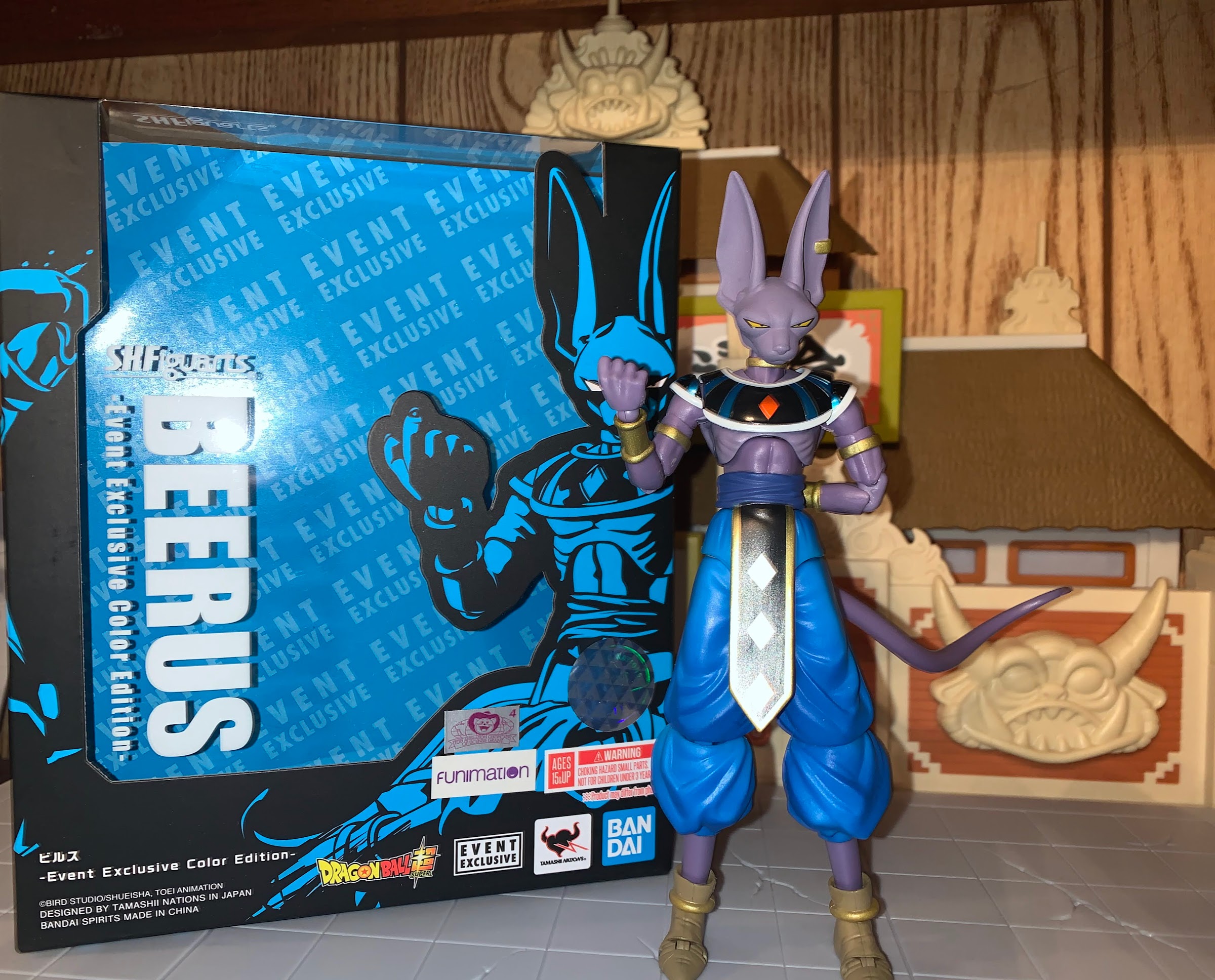
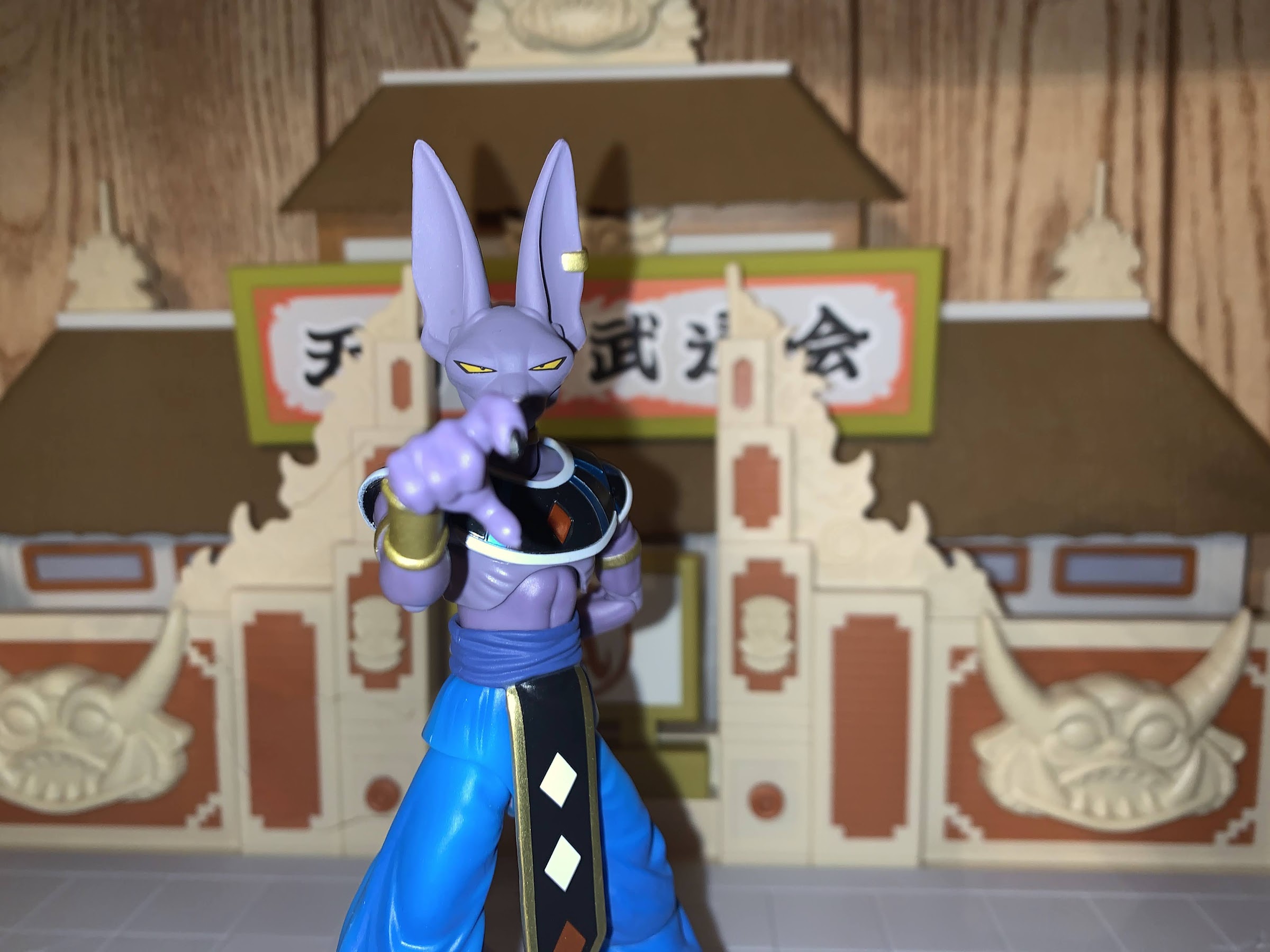
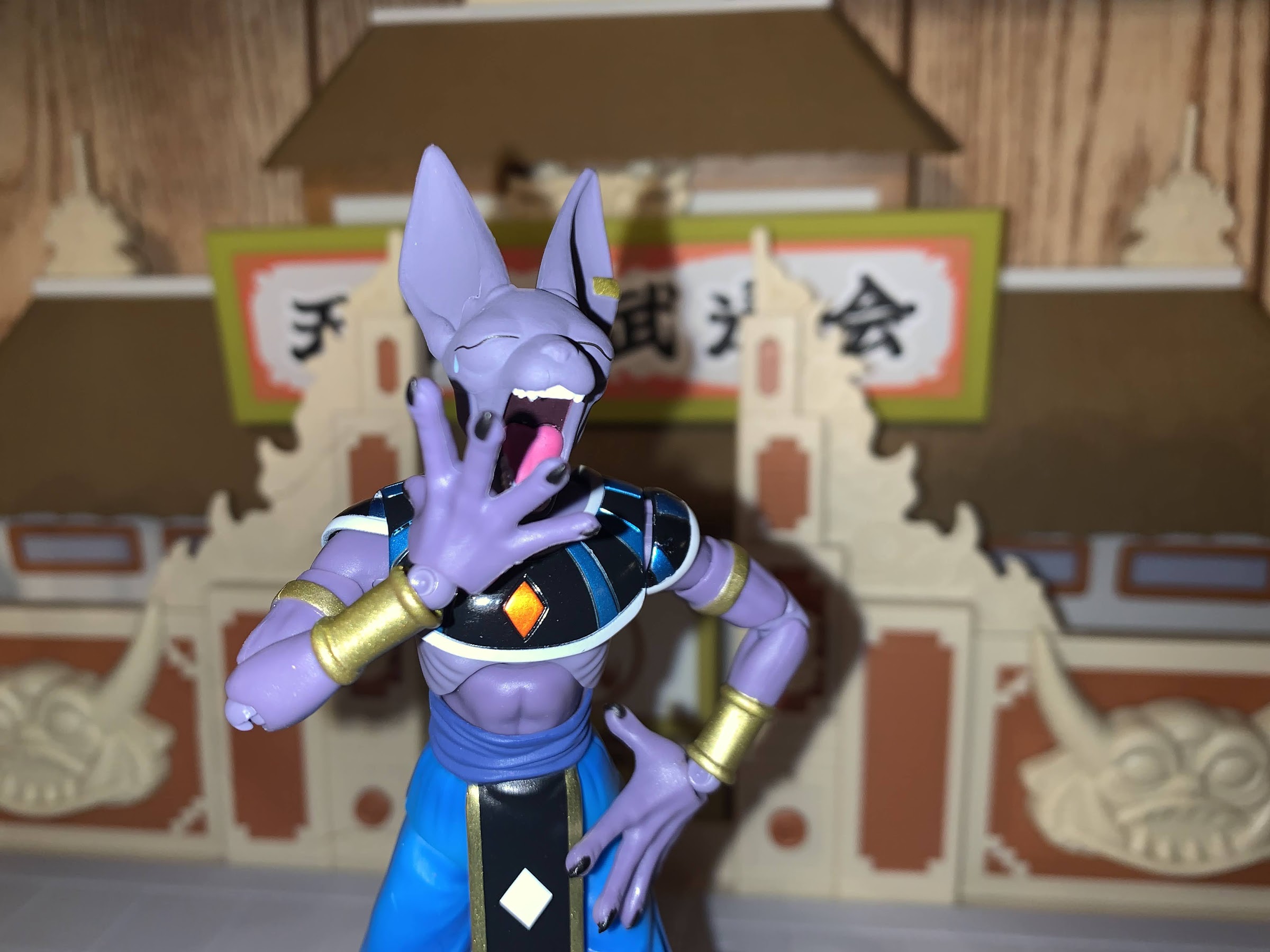
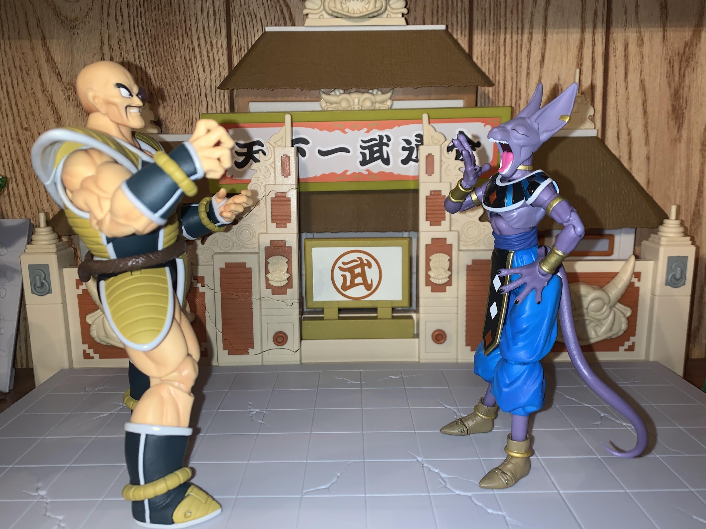
Let’s take a break from the Goku and Goku-adjacent figures and talk about a totally different character: Beerus. Or should I say Lord Beerus: God of Destruction! Beerus made his debut in the film Battle of Gods which essentially became the premiere of Dragon Ball Super. He’s some sort of cat creature who happens to be charged with destroying worlds within his assigned universe. Being a god, he’s only sort of a villain. I guess if he were a Dungeons & Dragons character he might be considered Chaotic Neutral, or maybe Lawful Evil? I honestly can’t remember if there’s a rhyme or reason to his destruction. When we’re introduced to him, he is seeking out the Super Saiyan God and has come to Earth in search of, who else, Goku. If Goku can’t impress him and show him the power of a Super Saiyan God, then he has no use for Earth and will destroy it, so I guess he’s lawful? Anyway, he’s one of the best new characters to come to the show so I’m happy to add this event exclusive edition to my collection.
Like many a Dragon Ball villain there’s a lot of power packed into a somewhat unassuming frame with Beerus.
Beerus embodies the power of a god and Dragon Ball villain, while also displaying the traits of a cat. He gets sleepy, can be petulant, impatient, and certainly carries himself in a regal manner. And like many characters in this universe, an easy way to please him is via his stomach. He loves food and it’s the food on planet Earth that initially spares the world from his destruction. He’s quite threatening, but easily slips into a comedic performance as the scene demands. He’s terrific. And this figure is actually an old one from 2016. It was part of Bandai’s San Diego Comic Con collection of exclusives from last year. Premium Bandai’s website basically couldn’t handle the volume of people interested when the item went up for sale, so they offered a make-up sale a couple of days later that was for a second batch. I really wanted the Nappa they released, so I just went for that because the site was so slow and buggy that trying to add multiple items to my cart felt like a risk I just couldn’t take. However, when the second sale went up I gave in and grabbed both Beerus and the Super Saiyan God version of Goku.
“Come at me, if you dare.”
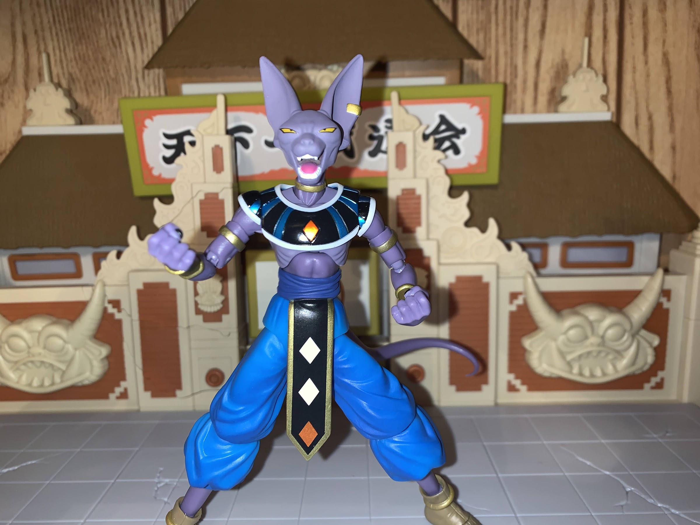
Unlike Nappa, this version of Beerus is a better use of an event exclusive. I loved that Nappa, but he was a re-release of a figure done in his proper animated colors. That’s something most fans probably wanted from the original release, and making him an event exclusive kind of sucks. Since it ended up being easy to get, I guess little harm was done other than some folks felt compelled to get two versions of the same figure. With Beerus, his change is subtle. I don’t have the original release, but from what I can tell, the main difference is just in the collar-like shirt he wears. I don’t know the proper name for the garment, but it’s the blue and black item he wears over his shoulders. The original was a standard matte look, while this one is done with a shiny, chrome-like, finish. It looks cools, and it’s the type of thing that owners of the previous figure probably don’t feel compelled to buy, while those looking to fill a hole in their collection aren’t settling for some glow-in-the-dark variant or something.
The dreaded Finger Poke of Doom!
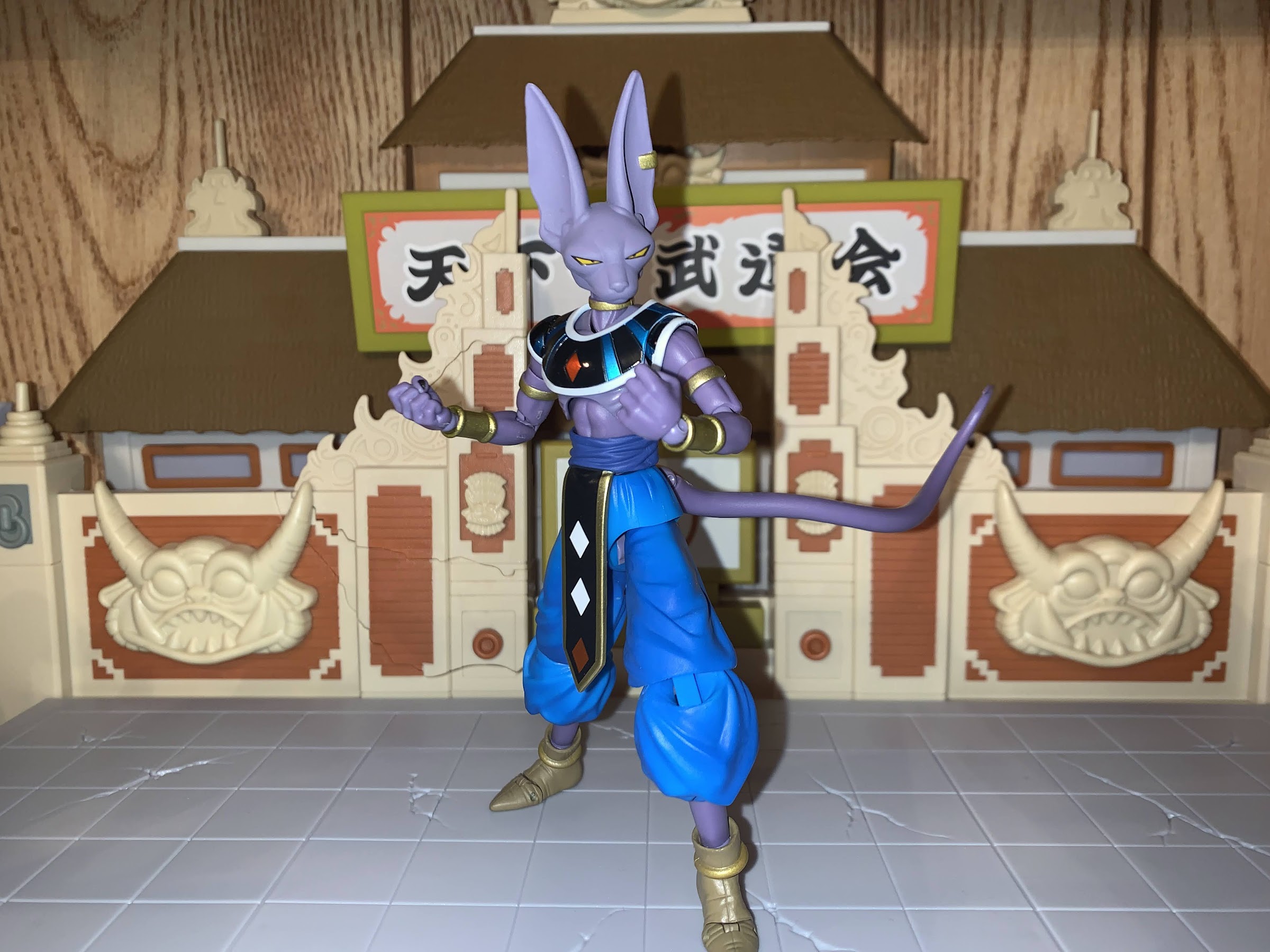
Being that Beerus is an older release, there’s going to be some dated things on him. Let’s start with the aesthetics. He looks like Beerus from the show/movie. His default, stoic, look captures that of the character and a cat as he appears content, but those narrow eyes have a menacing quality to him like his mood could change at the drop of a hat. His skin is a pale gray-violet which works well with the blues and blacks of his attire. The only shading on the figure is on the front of the pants while the other painted flourishes are rather clean. The sculpt is rather nice as it captures how thin the character is and Bandai did a great job at the hips which don’t jut out like the Goku Black I looked at recently.
These two literally do not see eye-to-eye.
As nice as Beerus looks, there are a few nitpicks to find. His neck gets a bit gappy where it meets the upper chest, and I wish his face had a wash or something on it as it looks rather plain. His nose should probably be darker than the rest and just some subtle paint touches on some of the lines, as we saw with the Super Saiyan 4 Goku, would really bring out the features. His feet appear to be cast in blue plastic, which is rather odd. I only know this because some blue is peaking out of the seems and at the pins in the toe. And lastly, he also seems a bit too tall. Beerus stands at about 5.75″ to the top of his head, 6.625″ to the top of his ears. Goku is about 5.625″ to the top of his head, so his eye level is lower than that of Beerus which doesn’t look right. It’s been a few years since I watched Dragon Ball Super and it wouldn’t surprise me if Beerus was drawn shorter in that than he was in his debut feature, sort of like how Vegeta was suddenly taller when he became more of a good guy, but I don’t think even this is accurate to Battle of Gods.
Yeah, that doesn’t look right.
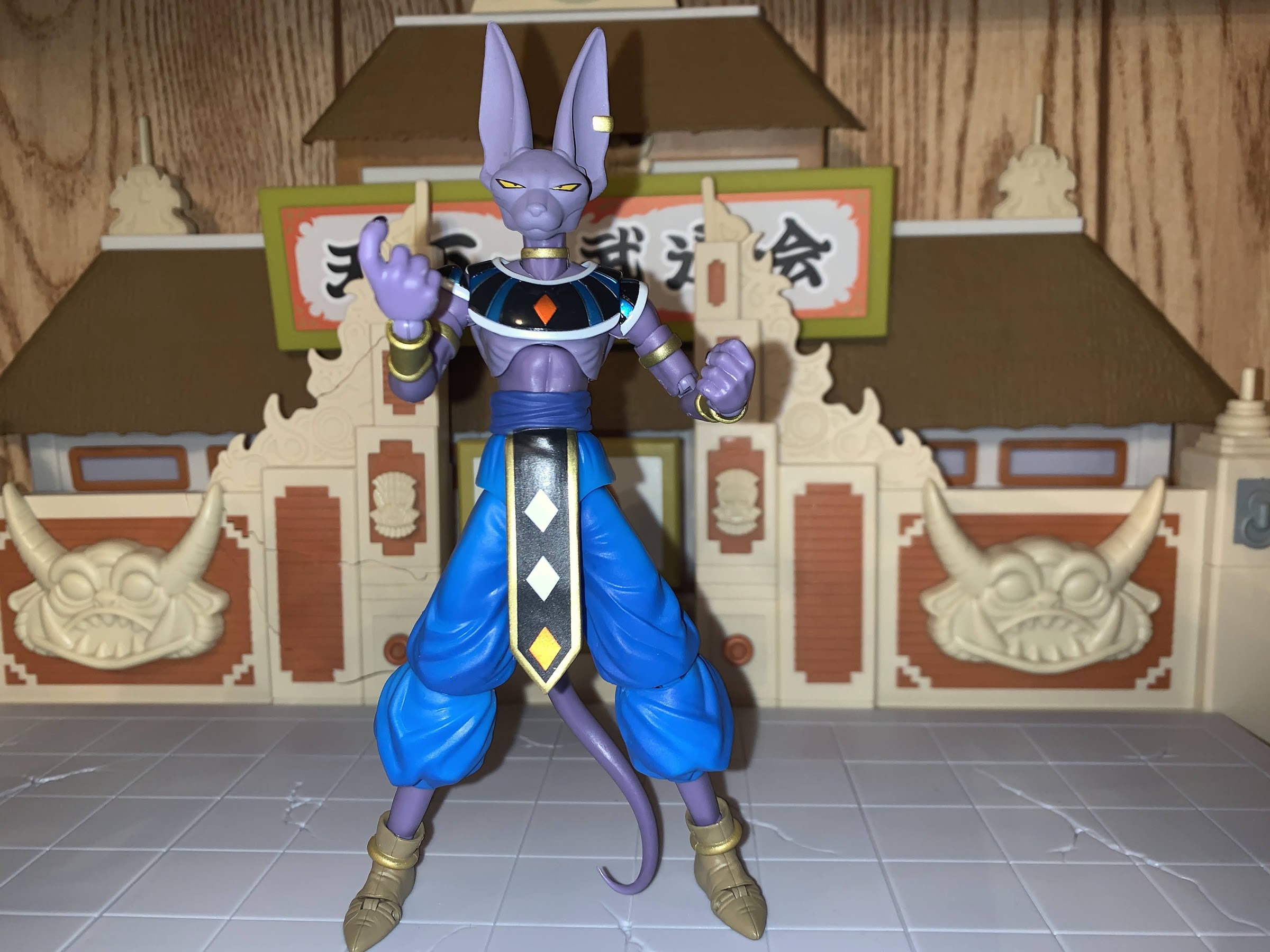
Aside from the paint, this release is the same as the older one so the accessories included are also the same. They’re just appearance accessories, so optional heads and hands. In addition to the neutral expression, Beerus also has a yell and a yawn. Both look terrific and I think all three portraits have worth in a display as the more comedic yawn is still a spot-on depiction of the character. With the hands, things are less interesting as Beerus comes packaged with fists and can swap to gripping hands, open hands, and he has a right, sort of clawing, hand. It’s a gesture he uses when firing some of his attacks and could also be used as a “Come here” gesture. What’s curious though are the gripping hands as he has nothing to grip. Was there a short-lived directive at Bandai to make sure all of their figures came with gripping hands? It’s bizarre, as Beerus doesn’t wield any weapons in the film or show so they really are useless. I would have preferred more style posed hands, or maybe one with chopsticks and a bowl of ramen or something. There are no effects parts either, which is always bummer. It does help that Beerus doesn’t really have a signature attack, but he could still have something.
Those knees aren’t pretty. On the plus side, these yawning head is great!
Where the figure really feels dated is with the articulation, which also factors into the appearance somewhat. The head is on a ball hinge, like what Bandai uses for the wrists. It’s okay, but once the head is on you don’t really know where the hinge is so it doesn’t function super well. Also like the hands, it’s something you have to battle with just to get those heads on. There’s a ball joint in the base of the neck so he can bury his chin and also look up a bit with the usual rotation and tilt. The shoulders have part of that collared garment pinned to them, like most of the Goku figures do with the his sleeves. It’s a bit unsightly, and you need to be careful with those pieces as they will slide under the chest part and could get scratched. It’s a ball hinge so the shoulder can move up and down a bit, but the butterfly joint is useless due to the chest piece getting in the way. There’s a biceps swivel and double-jointed elbows and a ball-hinge wrist. In the torso, there’s a diaphragm cut but it’s pretty tight. It feels like a ball-hinge so if you pull up on it you can get him to crunch back. Leave it low and the figure makes some uncomfortable noises when rotating there, and he doesn’t get much forward crunch either way. The ball-joint at the waist is a bit better and that’s where you’ll get rotation and a little tilt.
Note the single tear squirting out of his right eye.
At the hips, Beerus has hinged ball-joints that drop down. Leaving them in the up position results in a nice looking joint that is reasonably functional out to the side and kicking forward and back. Dropping the leg doesn’t add a ton, just a little extra clearance on the kick, which is probably why we don’t see this joint too much anymore. The knee is where things really get poor though as Beerus has just a single joint with no cap on the front. When you bend that knee, you just see the joint at the kneecap and it’s ugly. It’s unfortunate because that yawning expression would lend itself well to certain sitting, bent knee, posing that will expose this shortcoming. This is simply just an outdated joint, as some of the early SHF releases featured the same, and has been retired in favor of what we see on other poufy pants characters like Goku. It’s too bad they couldn’t fix that for this release. At the ankle, we also have the old ball-peg system. You get good movement back, little forward, and the rocker is just mediocre. There is a toe hinge, but I don’t have much use for toe hinges. Beerus, being a cat, also has a tail and that’s connected via a ball-hinge. You get some decent posing out of it, but the tail itself doesn’t articulate further. It’s soft and pliable, but does not have a wire in it so it’s fairly static. It’s a thin tail, though, so I’m fine with it not being segmented for articulation.
Beerus is right to yawn in Nappa’s direction.
Beerus is an old figure with a shiny coat of paint added to go along with a fancy box. The sculpt has aged well so he should still look the part on your shelf. I have some nitpicks with his size, but I largely think he looks good. He just shows his age primarily with those knees and it’s the one thing I would definitely change. This isn’t a budget release, after all, as he retailed for $50 so it would have been nice to see an upgrade made there. Even factoring that in, I still think he’s worth the price tag and I do find myself quite charmed by this release. He’s very much an essential character if you’re collecting Dragon Ball Super. Since this figure was an event exclusive, you’ll need to seek him out on the secondary market. Big Bad Toy Store is carrying this edition, but at a significant markup (more than 100%) so you might be better off on eBay or Mercari. I like the figure, but I don’t $100 like the figure so I guess it will come down to how important it is for you personally to add Beerus to your display.
The moronic duo gets an upgrade in every place except the one that matters most: the brain.
2021 introduced a lot of good things for collectors of NECA’s Teenage Mutant Ninja Turtles line of action figures based on the classic cartoon. The toy maker still kept the line a Target exclusive when it came to brick and mortar, but it also started selling a lot of it online to coincide with each new release. Sure, you still had some folks out there complaining about having to pay NECA’s $15 shipping charge, but to skip the aggravation of the hunt seemed like a worthwhile trade-off for me!
2022 has not started off that way. Well, it has and it hasn’t. The past few weeks have seen NECA post several products on their site as preorders to be delivered later this year, and some of those look pretty damn awesome. At the same time, they’ve also launched Haulathon – a “collector” event in coordination with Target that sees a lot of the first run of sought after items (as well as restocks of past items, so it’s not all bad) head to either Target’s stores, website, or both. And one of those exclusives is the two-pack of Super Bebop and Mighty Rocksteady. Or, is it Super Rocksteady and Mighty Bebop? The box and the episode title from which these two came say one thing, but Shredder and Krang say another in episode. I suppose it doesn’t matter as most just likely remember them as the robot versions of everyone’s favorite pair of dim-witted mutants.
Robot Rocksteady is packing a lot of heat.
Like a lot of characters from this era, Bebop and Rocksteady had toy versions that depicted them as robots, but they looked nothing like the characters from the show. For that reason, I consider these the first true depictions in classic for the robotic duo. They’ve been high on my own personal “Wants” list when it comes to this line for awhile, so I was thrilled to see the images leak online of the pair and even more thrilled to get them in-hand. Special thanks are reserved for a fellow local collector, @JoePoppingOn, who helped me in finding a set. Without his help, I’d still be on the hunt for these rad dudes.
These shoulder turrets are pretty cool, but sadly are non-articulated.
We’ve had three iterations of Bebop and Rocksteady from NECA at this point, but unlike those previous sets, these two are all new sculpts. There’s really nothing one can salvage from the other figures when trying to create the robot versions as they have an all-together different shape and the show made sure to put some kind of robot detailing on basically every surface. In addition to that, the two are pretty different from each other so NECA couldn’t even have them share too many parts. From what I can tell, the only parts shared between the two are the shoulders, biceps, hands, thighs, and lower leg. The forearms, torso, head, and feet are unique to each character and both feature extra additions like Rocksteady’s forearm mounted laser and Bebop’s shoulder guns. More importantly, they look just as they do in the show from the colors to the individual details. I love that Rocksteady appears to have a tape deck in his stomach while the Play and Stop buttons appear to be on Bebop’s belt. There’s little to no paint slop on my set and everything just looks terrific.
The parking meter will likely be the favorite accessory of many collectors who pick this set up.
These are big, chunky, boys that come in at around 6.5″ with Bebop’s mohawk and overall higher sitting head pushing him slightly beyond that. They basically articulate in the same manner as well. Both articulate at the head where they can swivel with some slight tilt. Rocksteady can look up pretty well, but Bebop not so well, and neither can really look down. Both have hinged jaws which work fine. At the shoulders are standard ball hinges, but both figures have stuff to maneuver around. For Bebop, it’s the shoulder pads which are connected to his vest. If you bring his arms up too quickly or forcefully you could risk popping them off so it’s best to be gentle. Rocksteady has these coils extending over his shoulders which creates a similar impediment, with more limitations on raising the arms out to the side. The biceps swivel and the double-jointed elbows work fine, as do the hands which swivel and feature a horizontal hinge. I’ll add that every joint is on these guys is tight, but not too tight, with none that I’d describe as loose. I did not have to heat up anything to get it working.
“What do you suppose this is for?” “I don’t know. Bowling?”
In the torso, we have the usual diaphragm joint. And as per usual with this line, it offers very little. With Bebop, he has a bandolier and a vest layered over it which makes it hard to get at. With Rocksteady, there’s really nothing in the way so you get good rotation there, but very little in terms of the ability to crunch forward and back. You also need to be mindful of the paint on his torso as I would hate to see anyone scratch it. Below the abdomen is a waist twist and below that is something we’ve all long been waiting for with a Bebop and Rocksteady set: ball-jointed hips! Yes, the old design which was a pin and ratchet combo is gone and these ball joints work great. They can’t do full splits, but the joint has solid tolerance and you get a thigh twist out of it too. The knees are double-jointed, and at the ankles we get a hinge and rocker which work great. The boxy design of their feet also makes standing these guys pretty painless, which is necessary because a lot of the accents on their sculpts (in particular Rocksteady) are made of hard plastic and likely wouldn’t handle a shelf dive too well. Overall, the pair don’t articulate all that well, but that’s par for the course with this line which prioritizes the aesthetics of the figure over pose-ability. I’d argue they have enough, but your mileage may vary.
More handheld gizmos to add to the collection.
In true NECA fashion we also get a generous assortment of “stuff” with this pair. There are two sets of the following styles of hands: fists, open hands, and gripping hands. For the gripping hands, the left hand is a standard “C” grip while the right hand has a trigger finger grip. A small nitpick for me is I wish we got a left and right trigger hand just to make the two look different, but it’s a minor complaint. We also get two new guns: a long rifle machine gun and a shorter machine gun with drill tip. They’re all new and are basically chunkier versions of the other guns we’ve seen for the duo. I love the sculpting on both of them, especially the long rifle, which has a scope and sight at the end. There’s also a busted parking meter for one to smash turtles with, and a pair of cartoon specific accessories to round things out. There’s the polarity deflector from “Return of the Technodrome”, and a cartoony, round, bomb with red and yellow wires sculpted on. Surprisingly, the bomb is here and not the Mezmerizer, which is a similar item from the episode they’re in, but I always enjoy a good bomb accessory. It’s from the episode “Mister Ogg Goes to Town,” Mister Ogg being one of the few characters I have zero interest in NECA tackling. The weapons are painted, and the hands pretty stiff, so you do need to take care when wedging the items in there because there probably will be some paint rub. The open hands are suitable for holding both the polarity thing and bomb, the latter of which has a flat, bottom, so it sits just fine on a surface. I personally wouldn’t try to get them to hold the polarity deflector with their gripping hands as I’m pretty sure that will lead to paint rub, but it’s your call. As always, if you’re nervous about it just run the hand under hot tap water for a few seconds and that should make them more pliable.
“At last! I have henchmen worthy of my stature!”
These guys are just great. They both look fine right out of the box as Rocksteady has his forearm blaster and a pair of guns on his shoulders as well. If I have a minor critique, it’s that those two guns on his back aren’t articulated at all as it would have been neat if they were on ball joints. Bebop also has his two “stock” guns in his shoulder pads, but they appear more decorative than anything as I can’t imagine it’s easy to aim a gun attached to the top of one’s shoulder. That’s what the accessories are for though and I’m torn on how to display them. I kind of wish I could just stick the parking meter into a slot on the street diorama, but sadly, there appears to be no way to do that.
“Hey, can you play this?”
These are good problems to have when it comes to toys, and this is a set that I hope all collectors have an easy time tracking down. Very few sets in this line have remained exclusive to Target stores, so once this Haulathon event is over there’s a reasonable chance that NECA makes them available directly through their store. It might be in the form of a preorder, so there would be a lengthy wait attached to it, but it’s better than not getting them. They were available on Target.com last Friday, but I assume by the time this goes live they will have sold out. The set retails for $60 too, which is becoming the standard for two-packs in this line that feature a lot of new sculpting that won’t likely translate to other figures. For now, we only have the hunt so keep an eye on your local Targets and coordinate with other collectors out there. Together, we can beat the scalpers!
Here’s a photo dump to end on:
“I don’t see what’s so great about this guy? He doesn’t even have a TV!”
As a kid, I was introduced to the X-Men without even knowing it. Spider-Man and His Amazing Friends was airing in my region and it was a show I watched when I could. That show featured Spider-Man (naturally) alongside Firestar, a new character created for the show, and Iceman. I had no idea Iceman was a member of the X-Men, or even what the X-Men were, and I wouldn’t for years after. I barely knew anyone from the Marvel Universe as outside of that show I basically saw Spider-Man PSAs and that Marvel Productions tag that would roll at the end of shows like Muppet Babies. Captain America? Wolverine? Iron Man? Totally off of my radar. Actually, the only other character I knew was the Hulk due to his television show.
In the early 90s that obviously changed. I was properly introduced to the X-Men via the inaugural line of action figures from Toy Biz. Despite not having a television show to cross-promote with, Toy Biz released the first wave of figures in 1991 complete with advertisements during the shows I watched. That’s how I learned who Wolverine and Cyclops were alongside Storm, Nightcrawler, Magneto and others. My friend from down the street loved the line, and at first that’s how I experienced the toys, but once the cartoon series launched in 1992 I too was hooked.
That show was X-Men and it was a ratings hit in 1993 when it was properly launched following “sneak peaks” in the fall of ’92. Once the show got its claws in me I was hooked and ready to turn aside the likes of Batman and the Teenage Mutant Ninja Turtles. X-Men became my life, and even though I also got comics and trading cards featuring my favorite mutants, it was always the cartoon series that was my first love and primary method of interacting with the brand (aside from the toys, of which I had many). As my passion for collecting action figures has reignited over the past five years or so, a dedicated line of toys based on that show has become my grail line, of sorts. It was on my mind so much that I had to get it out in this space, and despite not being an avid collector of Hasbro figures, I always kept tabs on the company and anytime a question was asked of the community about what they wanted next, I was always there to tell them.
Aside from the odd choice of shading the figure that gold or mustard color, Wolverine looks fine.
With 2022 marking the show’s 30th anniversary, it has long been in my sights as the most logical time for such a toy line to come around. And sure enough, last fall Hasbro confirmed it was indeed heading to the animated universe when it announced a new line of toys based on the show starting with Wolverine and Jubilee. Since then, we’ve seen reveals of Mr. Sinister, Storm, and Jean Grey with Wolverine and Sinister starting to make their way into the hands of collectors in the UK. Presumably, their arrival in the US is imminent, but before I even have these long sought toys in hand I’m feeling a bit letdown by this whole thing.
Hasbro is one of the biggest toy producers in the world. The company produces mass market toys sold all over the place and often at a fairly affordable price relative to other goods in that space. They have tremendous negotiating power with the likes of Target and Walmart and even own their own factories so they’re far more insulated against some of the challenges faced by smaller outfits dealing in the same type of goods. For awhile, their Marvel Legends and Star Wars: The Black Series have been consistently good at a relatively low price. While a figure from NECA might cost you 30 bucks, a figure from Hasbro would sit at $20. Over the last year though, things have changed and prices have gone up. Now that same NECA figure is around $37 while Hasbro’s is $25. And when it comes to the new X-Men line, we’re talking $28. And while the gap still remains around 10 bucks, the NECA figures continue to come with loads of accessories and are often uncompromised when it comes to necessary tooling, while Hasbro has gone in the other direction. Fewer accessories, fewer paint apps, and more reuse have made Marvel Legends no longer the value it once was.
Hasbro saw fit to sculpt new hair for Storm, but kept a face that doesn’t match the show.
With the animated X-Men line, Hasbro is targeting a rather specific audience. It’s one that experienced the show as a kid 30 years ago and is an adult collector now. In truth, almost every action figure line Hasbro produces is consumed by more adults than children, but with this line Hasbro can’t even pretend like it’s aiming to attract children. It’s being sold exclusively through Hasbro’s own online store, Hasbro Pulse, and will eventually be sold on Disney’s website and maybe at some of their physical stores. It’s simply a line meant to appeal to collectors, and since they’re promising figures based on the show, you would think accuracy would be important, no?
Apparently that’s a foolish assumption as it appears Hasbro is looking to cut corners wherever it can. When the line was announced, it became obvious right from the start that Hasbro would be re-releasing some older figures with cel-shading paint apps to mimic the show. The encouraging part though was some of the little details. Wolverine had two, newly sculpted heads that better reflected his appearance on the show. He also came with a little picture frame from the episode “Captive Hearts” that is quite popular in the online meme community. These figures may not be on the level of high grade imports, but at least the love was there (aww). Jubilee, on the other hand, looked almost nothing like her show counterpart aside from her gloves being color-corrected. She was coming with effects parts that looked nothing like her fireworks, but it was Jubilee, a character I’m not particularly fond of, so I could overlook it.
The face is wrong, the hair is wrong, and even that orange they used for her costume looks off. They literally just needed to give her a new head and match the cartoon colors, but weren’t willing to even go that far.
The reveals to follow have been uneven, at best. Sinister is an almost straight repaint of the previously released Marvel Legends figure. He looks fine, and Hasbro fixed his neck by making it bare instead of featuring the riveted costume, and applied a good paint job. He has zero accessories though, which is beyond cheap at this price point. Storm followed and, again, she’s mostly a repaint. She gets a new hair sculpt that looks okay in some stills, but her complexion is wrong, her costume is wrong, and she has a lighting effect, but no white-out eyes to pair with it. It’s just all wrong if it wants to be what it claims to be. Jean Grey is the latest reveal, and once again, Hasbro is just repackaging an older figure. For this one, they seemed to even instruct artist Dan Vessenmeyer to model the artwork on the inaccurate figure. Or, they gave him shots of the figure and he just went with it. Either way, her hair is wrong, the coloring on her costume looks off, and they’re including a second, non pony tail head when it doesn’t even make sense to do so in the context of the cartoon. Yes, she went without a pony tail for the series finale, but her costume was also more yellow than the usual tan. And you may be wondering why I would complain about a bonus accessory, but it sucks to get a useless accessory when a more appropriate one could have been included like a powers effect piece or a Cerebro helmet. All things that would make sense for the character.
What it comes down to, is that I look at these solicitations so far and I just get the sense that whoever is in charge of this line has no real attachment to the source. Or, they’re being so severely restricted by corporate that it’s completely stifled their attempts at making the best figures they could. And that’s Hasbro, in a nutshell: they’re not interested in delivering the best possible product. They want to deliver an acceptable product at as cheap a cost as possible. And I get it to some degree, the Marvel license is probably expensive, but so is Star Wars. Their Star Wars output looks a million times better and is far more accurate than what’s being done with the X-Men. Clearly, they value that line more, and I’m not saying they shouldn’t as Star Wars probably sells well. They’re going after a somewhat niche audience with this line, but I’d argue it’s not a tiny one. Literally millions of kids tuned into that show every Saturday, and I bet millions are still interested in it. What would it cost to do this line properly? If these figures had to be $35 to make that happen then so be it! I think collectors, generally speaking, will pay more if the product warrants it. We’ve seen prices go up this past year and spending habits don’t appear to be wildly affected by them. Everything has a limit, but Hasbro doesn’t appear interested in seeing what that is with this line.
Compare Hasbro’s Jean to what Diamond is doing and it becomes even more frustrating. I wish I could be happy with just collecting busts from this show.
It becomes even more frustrating when this X-Men line is compared to other lines based on 90s television properties. NECA’s Teenage Mutant Ninja Turtles line strives to match the cartoon as much as possible and it looks great. And the actual figures in that line cost similar to what Hasbro is doing here, and they often feature unique tooling that’s not likely to be reused. DC Direct did a Batman: The Animated Series line that, while imperfect in some respects, at least looked like the source material. Even Hasbro has done better as their Into the Spider-Verse action figures looked terrific! I pondered on more than one occasion picking those up despite not really feeling an impulse to collect figures from the film just because they looked so good. Mondo’s sixth scale Wolverine looks great, and Diamond Select has a line of busts based on this show that look fantastic. If Hasbro didn’t want to do this line right they should licensed it out to Diamond because they clearly seem to have someone onboard who values this show more than anyone at Hasbro does.
When this line became a reality, I knew it wouldn’t be exactly what I wanted. How could it? I knew there were going to be compromises, and in some respects it’s gone as well as I thought it would because my expectations weren’t terribly high to begin with. Still, I’m bothered by it as I’m preordering all of these figures out of obligation rather than a desire to actually have them in my possession. Perhaps my enthusiasm will rise when I have them together on a shelf, but voicing criticism now is really my only weapon as a consumer. Again, I was happy with the initial Wolverine reveal. I think he should have represented the standard for the line: some parts reuse, new toon accurate head, and one accessory clearly inspired by the show. That’s all! That’s a pretty low bar, it should have been manageable, but Hasbro is fucking it up. That Wolverine isn’t perfect, but it’s good enough, and I’m not sure I can say that about the other four. I hate to prejudge anything I have yet to experience, but it’s hard not to in this case. Will my opinions change when I’m actually reviewing these toys for this blog? It’s possible, but right now, it does not seem very likely. What was a dream line for me, has turned into a joyless obligation and that’s not something I anticipated happening. Do better, Hasbro.