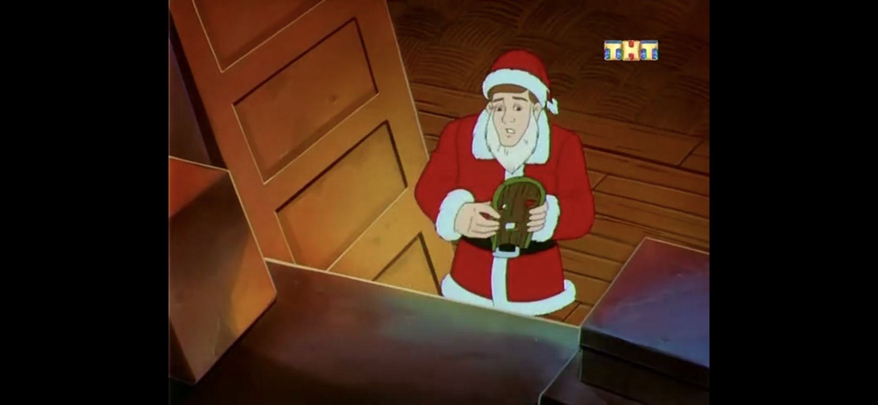
When the original Superman was conceived for a theatrical release, the producers on the project were ambitious. Convincing audiences that a man could fly sure seemed like enough ambition for one film, but not Superman. Alexander and Ilya Salkind decided it would be more prudent to shoot the film and its sequel at the same time. Producer Pierre Spengler was onboard and they were able to find a director in Richard Donner willing to undertake the difficult task. At the time it made some sense since the films would be closely tied together thematically and the mercurial Marlon Brando was onboard to play Superman’s biological father, Jor-El. Brando was hard to secure and the type only willing to attend as little days of shooting as possible so shooting his parts for both films at the same time was basically a necessity. The production could reuse sets, the actors wouldn’t visibly change much, and it also meant Warner Bros. would have a sequel practically at the ready in the event the first film was the success everyone hoped it would be.
Of course, you know what they say about the best laid plans. Tensions between the Salkinds and Donner arose during filming as much of the project could be kindly described as disorganized, at best. Production would have to be halted in order for the first film to be properly edited and released, and it sounds like everyone just grew to hate one another. With the film approximately 75% complete, Donner was relieved of his duties and replaced by Richard Lester. By then, the first film had been a success and Brando had started crowing about his share of the box office causing the Salkinds to drop him from the sequel. Lester inherited a mess and set out to re-shooting several scenes, and even changed the ending. Despite all of that, Superman II was warmly received by fans and critics and for a long time it was considered the pinnacle of super hero films with its status really only being called into question when films like Spider-Man 2, X2, and Batman Begins were released in the 2000s.
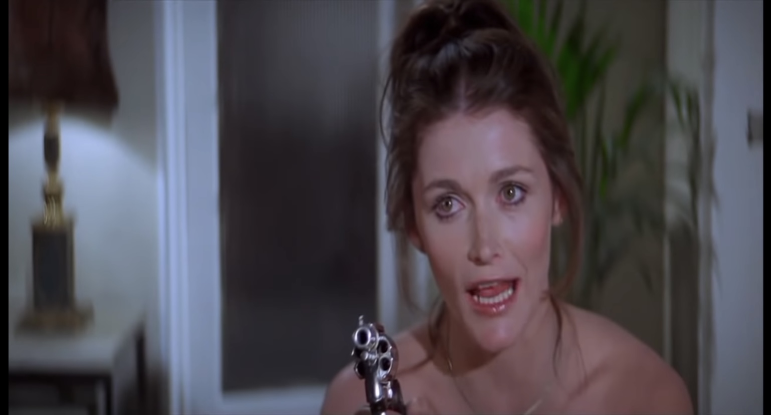
Lois demands that you hand over the Donner cut!
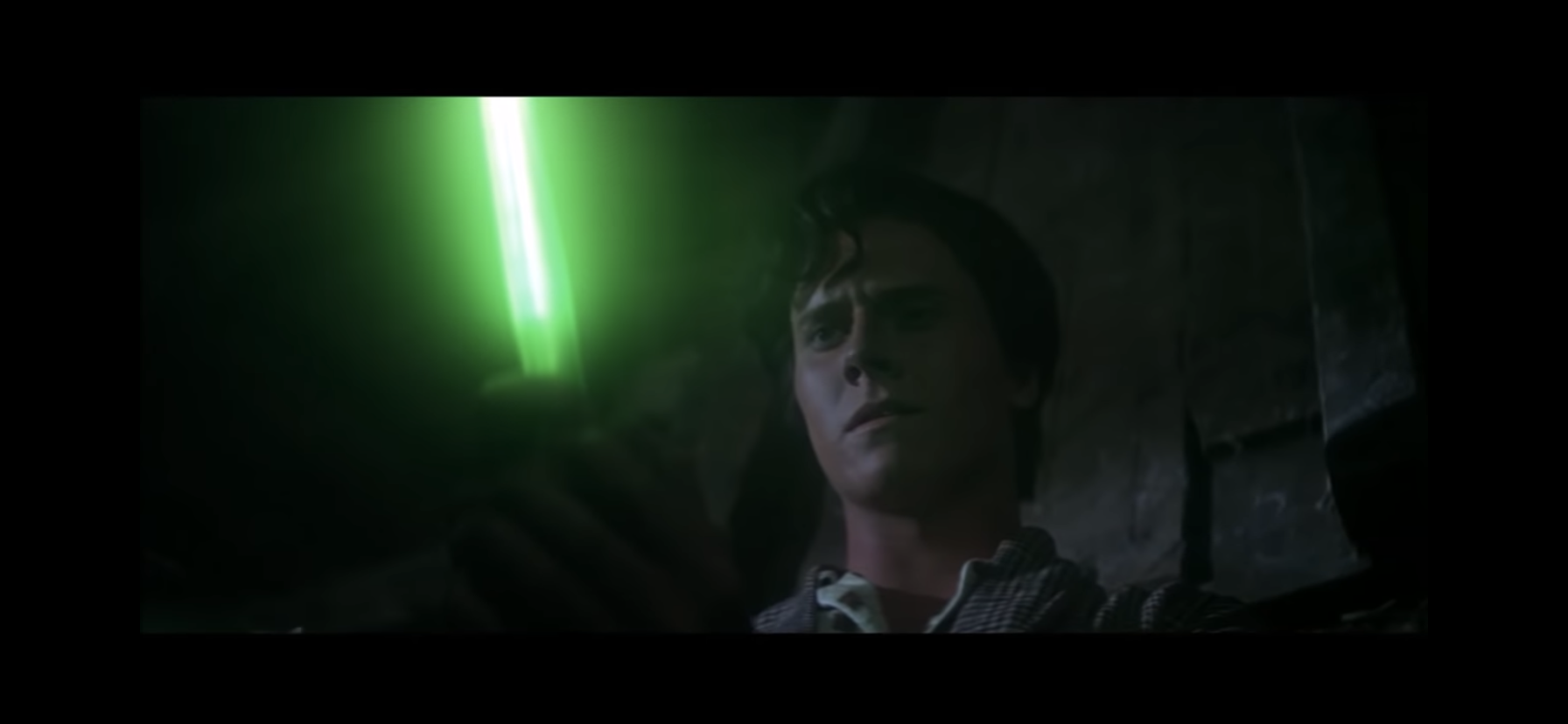
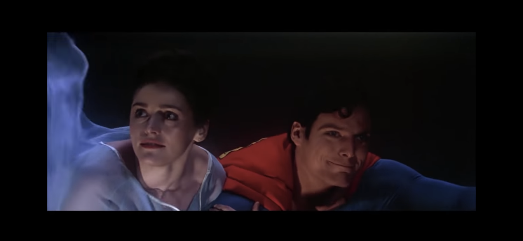
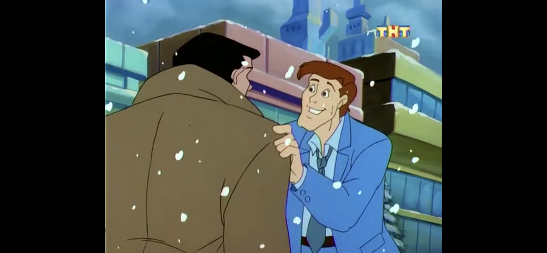
As a kid, I grew up watching the Superman movies mostly on cable and Superman II was probably my favorite, though I did enjoy the zaniness of Superman III and I don’t think I ever saw the much maligned Superman IV. I wasn’t at all aware of the controversy surrounding the first sequel though and only came to find out about that as an adult. It took me awhile, but I finally got around to viewing the Richard Donner cut of the film recently. Released in 2006, brought along partially by a settlement with Brando’s estate to use his likeness, Donner was brought onboard to recut the film using all of the footage he had overseen which had been discarded by Lester. Editor Michael Thau did a lot of the grunt work of putting the film back together, which Donner would basically give a “yay” or “nay” to finished pieces. This meant Brando’s character could be restored to communicate with Reeve’s Superman and the original ending could be seen for the first time. Every scene Lester had re-shot could also be tossed, with the only stuff kept being the scenes Donner never got to shoot (mostly featuring the villains rampaging through the Midwest). The only truly cumbersome piece is re-assembled from screen test footage and features a confrontation of sorts between Lois Lane (Margot Kidder) and Clark Kent in a hotel room. It’s fair to wonder if some of the more effects heavy shots would have turned out better in post production with a bigger budget than what was available for a restoration, but this is a fairly different film, but also a complete one despite the circumstances.
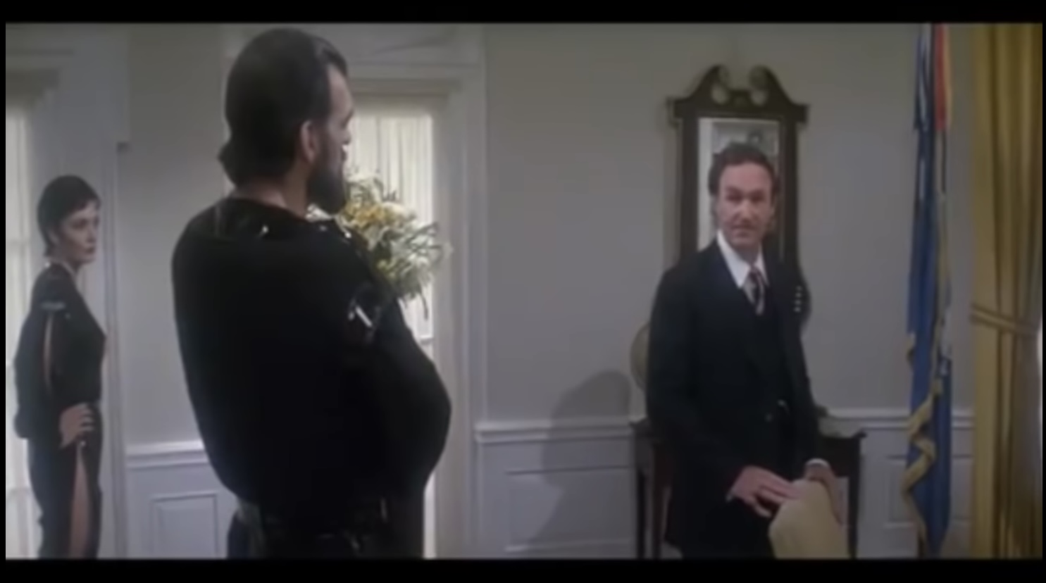
Hackman’s Lex Luthor is still here, but he’s been usurped by some guys in bad pajamas.
I have not seen the Lester cut in years, so I’m less interested in the comparisons with the Donner cut and more interested in how this holds up as a film. In my return to the original Superman, I found the film quite long and at times humorless. Superman is presented in a very earnest way which plays differently now than it did in 1978. A hero saying he fights for truth, justice, and the American way without a hint of cynicism is just a bit hokey today. If this Superman were featured in a modern film there would be a character snickering at how wholesome he is right after he says his line. These films seek to present Superman as an idealized hero, a myth made man, which might not be for everyone.
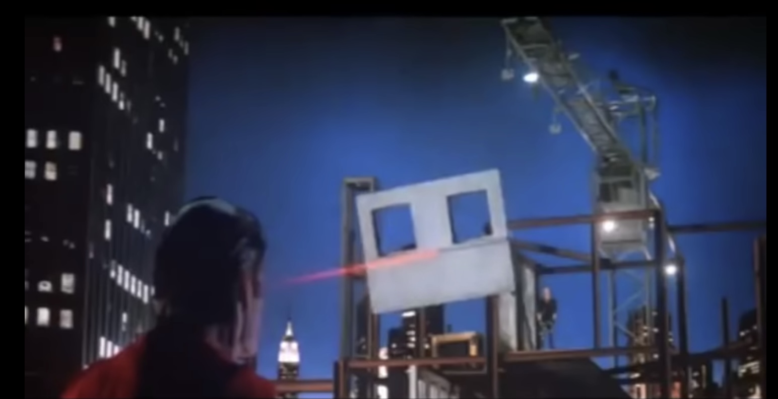
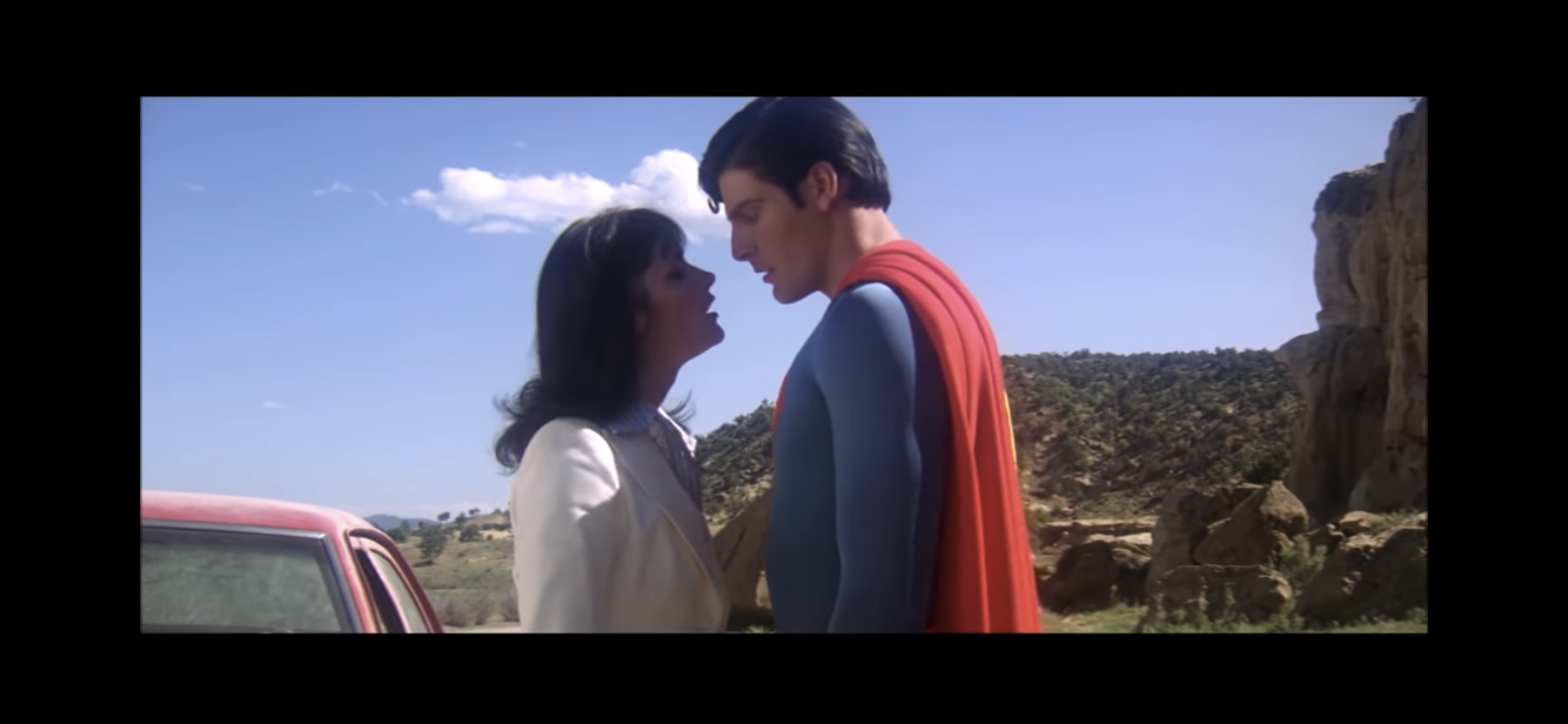
With Superman II, most of that earnestness is still preserved, but the film is more willing to explore Superman’s weakness. And I don’t mean Kryptonite. His weakness is Lois Lane and his infatuation with her which naturally leads to a yearning for a normal life. That is on display in this film with Superman literally giving up his powers, and starting a trend for super hero sequels, in order to live life as an ordinary citizen of Earth. His timing proves terrible though as three criminals cast out from Krypton at the beginning of the first film, General Zod (Terence Stamp), Ursa (Sarah Douglas), and Non (Jack O’Halloran), just so happen to find their way to Earth. Being fellow citizens of Krypton, they too are enhanced beyond normal men by Earth’s yellow sun and are essentially three supermen themselves. Three against one are daunting odds to begin with, but a powerless Superman obviously stands no match and apparently neither do the militaries of the world. Lex Luthor (Gene Hackman) is still a presence as he seeks to benefit from the chaos created by these new beings, but strangely he keeps the information about the effects of Kryptonite to himself never once attempting to use it against these new enemies.
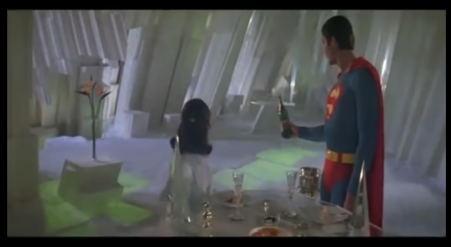
Here comes the romance!
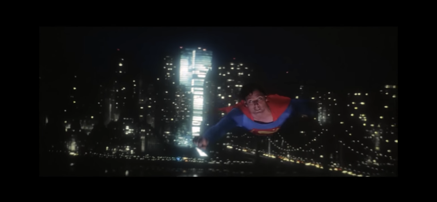
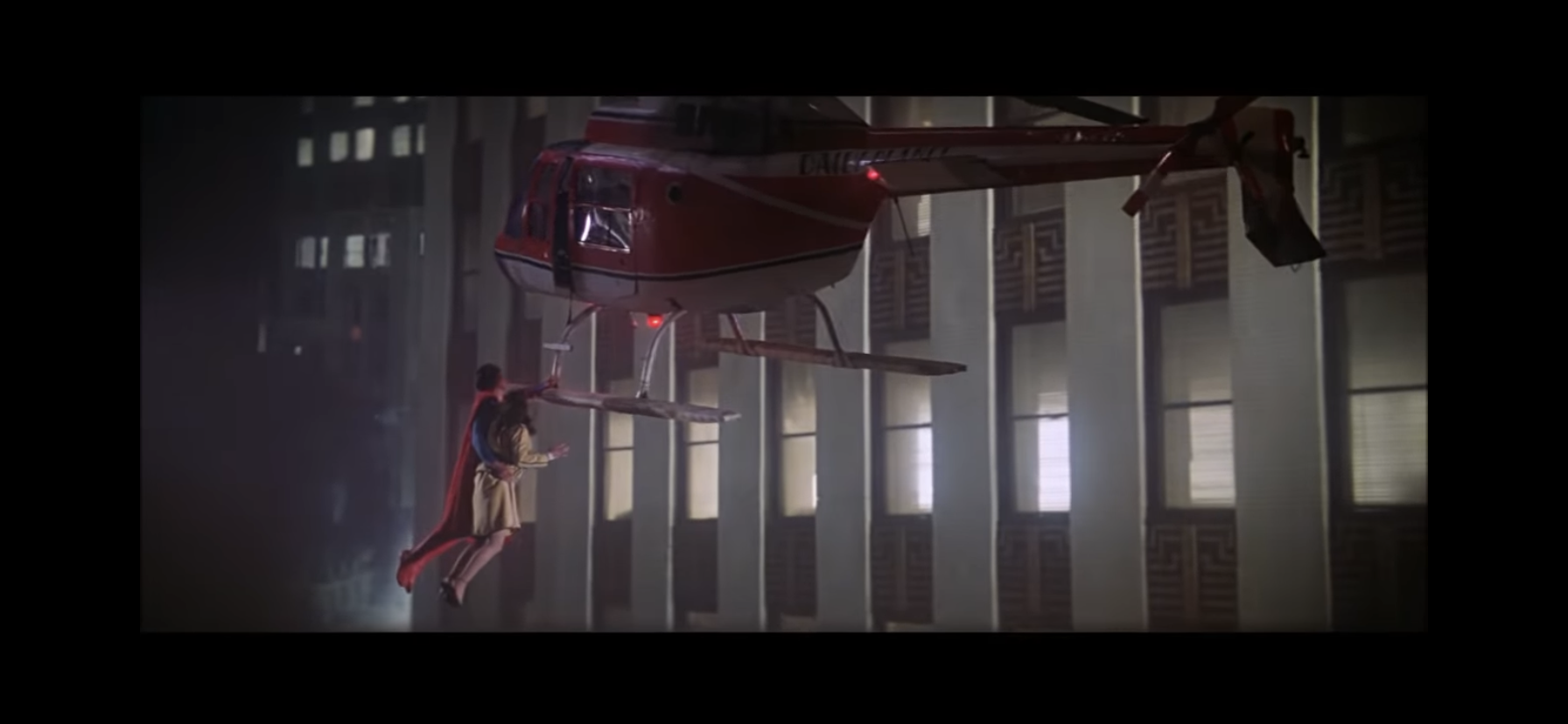
Superman II is a far brisker film since it doesn’t need to tell the origins of its hero and its villains are about as direct as villains get. It has a bit more action to it since Superman is pitted against villains that can actually match him blow for blow, and some of his powers were also held in reserve for the sequel. We get to see Superman utilize his laser eyes and his super breath in addition to his super speed and ability to fly. He doesn’t get to do anything as impressive as land an airplane, but there’s plenty of heroic feats for him to accomplish. The film is still at its best when Superman is doing more mundane things like saving a falling child while onlookers “oo” and “ahh.” The battle of Metropolis, which makes no attempts to disguise the fact that its New York, is not nearly as impressive to modern viewers as it would have been in 1980 which probably detracts from the spectacle some.
Fans of the eye beams had to wait until the sequel just to get a peek!
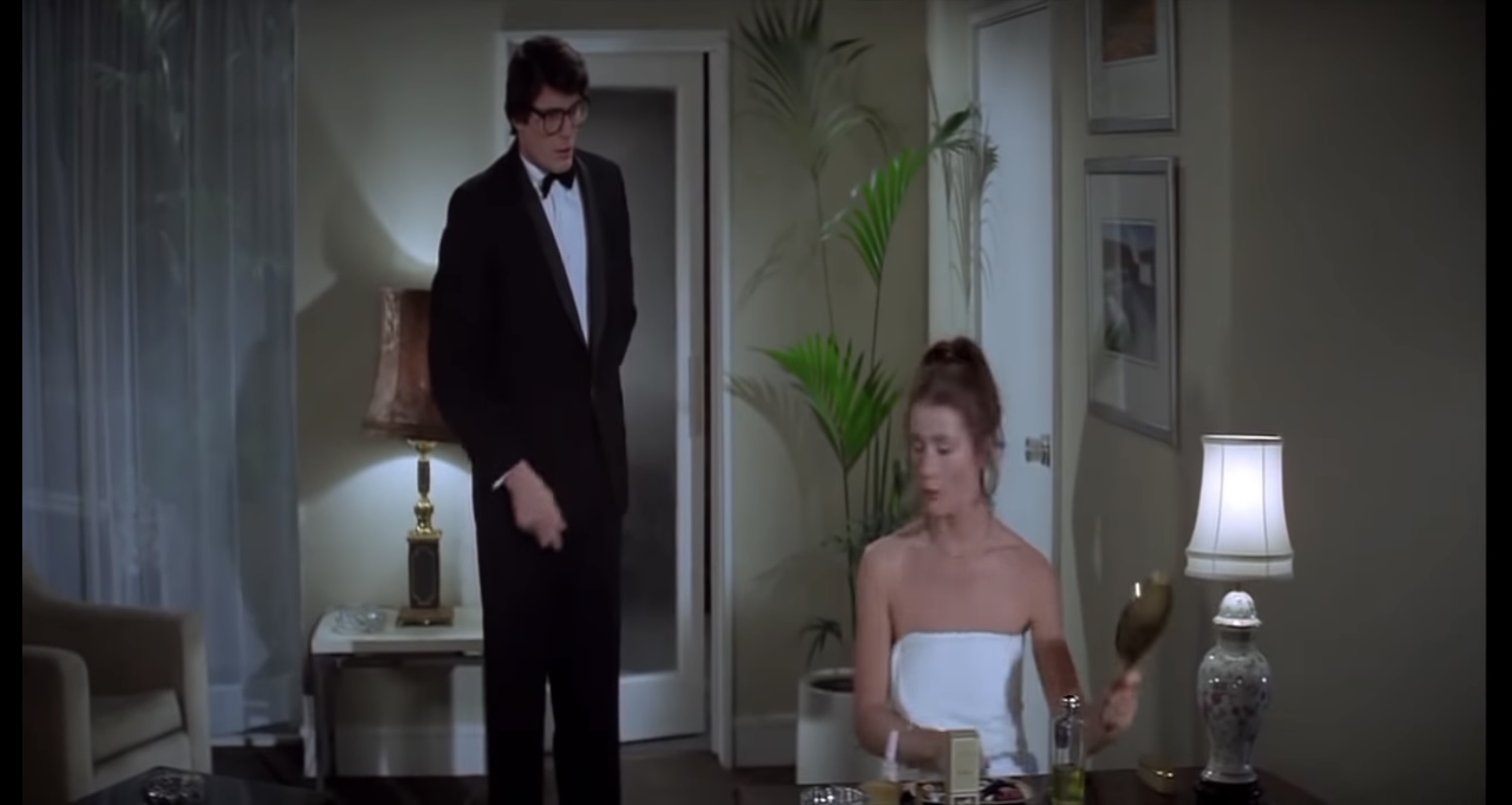
The film also spends a lot of time exploring just what it is that distinguishes Clark Kent from Superman. Some of the best comedy involves Lois trying to figure out if the two are one and the same and she goes to some incredible lengths to confirm her suspicions. Reeve and Kidder seem to possess better chemistry this time around though it can still be hard to see just what it is about Lois that makes Clark willing to give up everything just to be with her. There’s also no way to shake the feeling of deja vu the ending brings about, which was originally changed for that very reason. The ending Lester settled on was arguably dumber and was just different for the sake of being different. Both achieve the same end result, but neither is particularly satisfying.
Screen test footage had to be used to complete Richard Donner’s vision. It’s a little jarring, but not something that should impact one’s viewing pleasure.
One also cannot mention that with the loss of Donner originally came the loss of what was perhaps my favorite part of the first film: John Williams. His main Superman theme was present, but that’s all as creative differences with Richard Lester caused Williams to quit. Ken Thorne was brought on to score Superman II, but when Donner was asked to put his name on this new cut he wanted Williams back as well. Williams, unfortunately, was not able to score the film so Donner did the next best thing and simply reused much of the first film’s score and even some music that had not been used. Some of Thorne’s score is still present in the Richard Donner cut, but the presence of Williams really helps make the sequel feel like an extension of the first film.
He’s watching. Always watching…
The Richard Donner Cut of Superman II restores the sense of continuity the film shared with its predecessor. There’s no one who would watch these two films back to back and come away surprised they were mostly shot simultaneously. There’s a real, cohesive, feeling to both to the point where watching one and not the other almost feels silly. And yet, there’s no denying that Superman II is no longer a contender for the best super hero movie brought to cinema. While it’s probably still the best Superman film, I don’t find it as entertaining today as I once did. The villains are one-note and the film is quite eager to rely on the deus ex machina device to push its plot along. Superman has powers, then he doesn’t, then he does again despite being warned it was irreversible, and so on. Lex Luthor makes a proverbial deal with the devil, gets double-crossed by said devil, then makes yet another deal only to be double-crossed yet again! Some criminal genius. It’s a bit messy, but there are moments of fun and the more digestible run time means the film doesn’t overstay its welcome. Mostly, I’m left feeling happy for Richard Donner and fans of Superman that the original vision of the film was finally realized, even if it took more than 25 years for that to happen.
It might be hard to convince younger people today that superhero movies were once huge financial risks for production companies. It might further surprise them to learn that only one comic book company seemed to figure the whole thing out, and it wasn’t Marvel. While Marvel struggled to get Hollywood interested in its characters, Detective Comics did not. That’s because DC held what were easily the two most identifiable superheroes in existence: Superman and Batman. Both had successful runs in theaters as serials or theatrical animation. Both also made the jump to television and in the 1970s the most recent to find success on both the small and big screen was Batman by way of the Adam West starring show and film. That Batman, created in the 60s, was the definition of camp. It was pretty delightful, but come the 70s audiences seemed to want something else. The comics pivoted back more towards a serious tone, though it would take Hollywood awhile to do the same. In the 70s though, one hero was available to take comics to new heights on the big screen and his name was Superman.
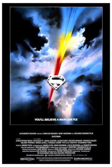
I don’t think it’s a great stretch to say Superman is the most recognizable superhero in the world. He’s the first thing that comes to mind for me when I hear the term “superhero” and he can do all of the things I think of when I hear the term “super.” He can fly, he’s incredibly strong, invulnerable, absurdly fast, and to top it all off he can do other things like shoot lasers from his eyes and has super…blowing…power. There’s no way to phrase that without sounding awkward. Throughout the years, Superman also has been known to possess what is basically a super constitution as he fights for truth, justice, and the American way all without ever telling a lie (except for those that protect his secret identity). He’s so pure a character, that it’s hard not to take a cynical approach sometimes when interacting with him. And depending on the current temperature of society, it can make the timing difficult. Maybe that’s why Superman has mostly spun his tires in the world of modern cinema, but apparently 1978 was the perfect moment for him to hit the big screen because the film, Superman, was a massive hit.
This is a long movie, partly because we apparently need to see every decision made before this baby was sent rocketing through space.
Directed by Richard Donner, Superman is a film that had a long development cycle. There were numerous script rewrites and it took a long time to develop the proper techniques to convince an audience that what they’re seeing was plausible. Making a man fly is almost ho-hum in this modern world full of computer-generated imagery, but in the 70s it had yet to be perfected. On a technical level, Superman was extremely ambitious, but apparently that wasn’t enough. The visionaries behind it, Alexander and Ilya Salkind, together with producer Pierre Spengler, decided it wasn’t enough to make one movie and settled on filming two at the same time. It was a laborious process that was always behind schedule and over budget leading to constant conflict between Donner and the Salkinds eventually leading to the director’s firing before the sequel could be completed.
Jeff East plays young Clark and they try to make him look like Reeve, but it’s not very convincing.
The film also assembled a pretty large cast of actors, some of which were heavy hitters and others were virtual unknowns. Christopher Reeve was cast in the lead role of adult Clark Kent and Superman after a lengthy search. Looking over the list of actors offered or asked to audition is pretty entertaining as Donner and the producers tried to find someone who could both act and look good in spandex. To give the film star power, the Salkinds brought in Marlon Brando to play Superman’s father, Jor-El, and paid him a princely sum to do so. Fellow Oscar winner Gene Hackman was cast as antagonist Lex Luthor while Margot Kidder played Lois Lane.
The film makes no attempt to hide the fact that Metropolis is just New York City.
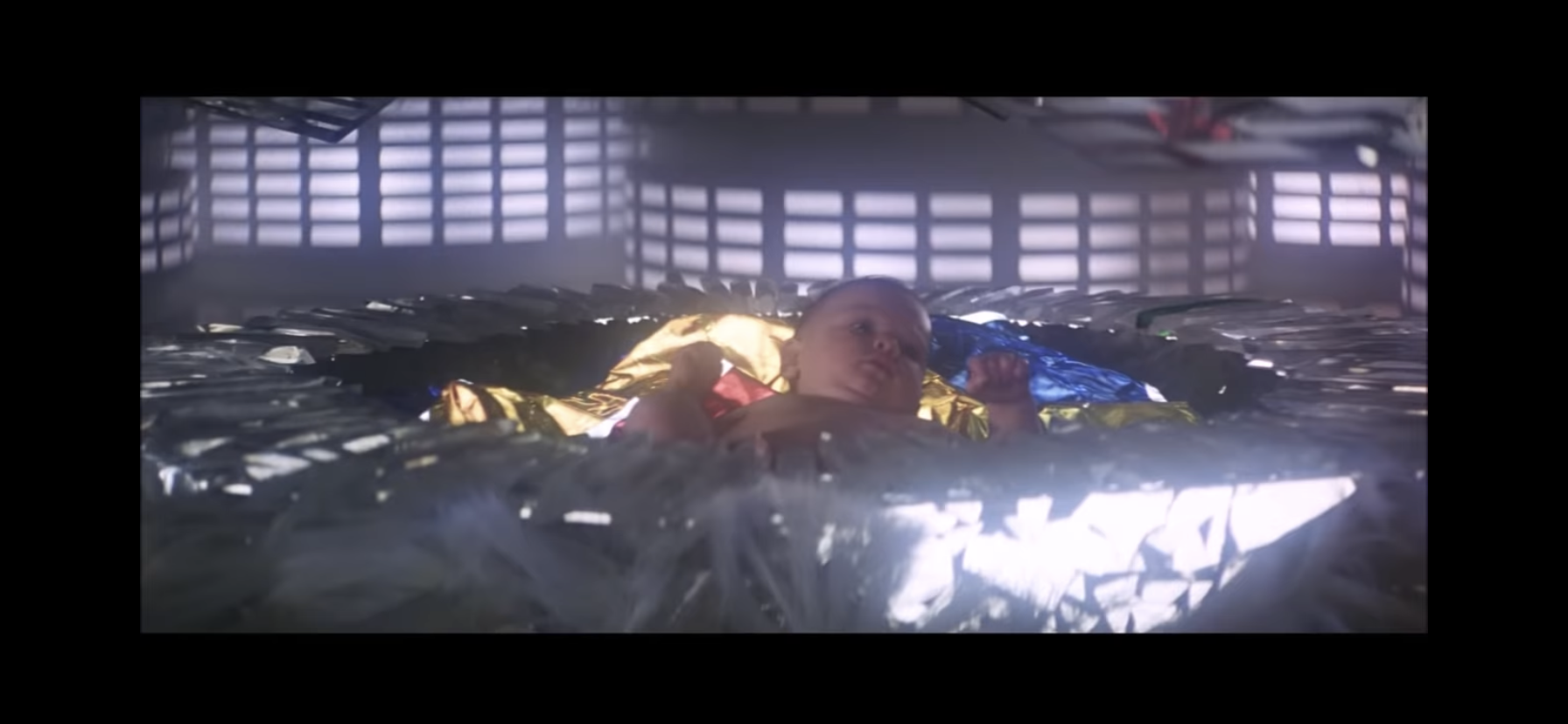
Superman as a film is designed to introduce the audience to the character as if it were the first time. This necessitates a rather laborious beginning where we see the events that lead to planet Krypton’s demise while Brando chews up screen time looking rather disinterested the whole time. Following that, the setting shifts to Earth where we need to see John and Martha Kent (Glenn Ford and Phyllis Thaxter) happen upon the young boy who spent years traveling to their planet in an odd-shaped pod. The film is forced to fast-forward to Clark’s teenaged years (where he’s awkwardly played by Jeff East with Reeve dubbed over) before we can finally get to Clark’s adult years when he officially dawns the cape and blue tights. It’s a long process to get to our hero, and it’s awkwardly paced. Donner clearly had some bullet points he wanted to hit, but the speed at which he hits them reduces their impact. When Clark’s adoptive father suffers a heart attack at the farm, we’ve only just met him and it’s hard for the actors to get the audience to feel the dread and fear of the moment the way their characters do.
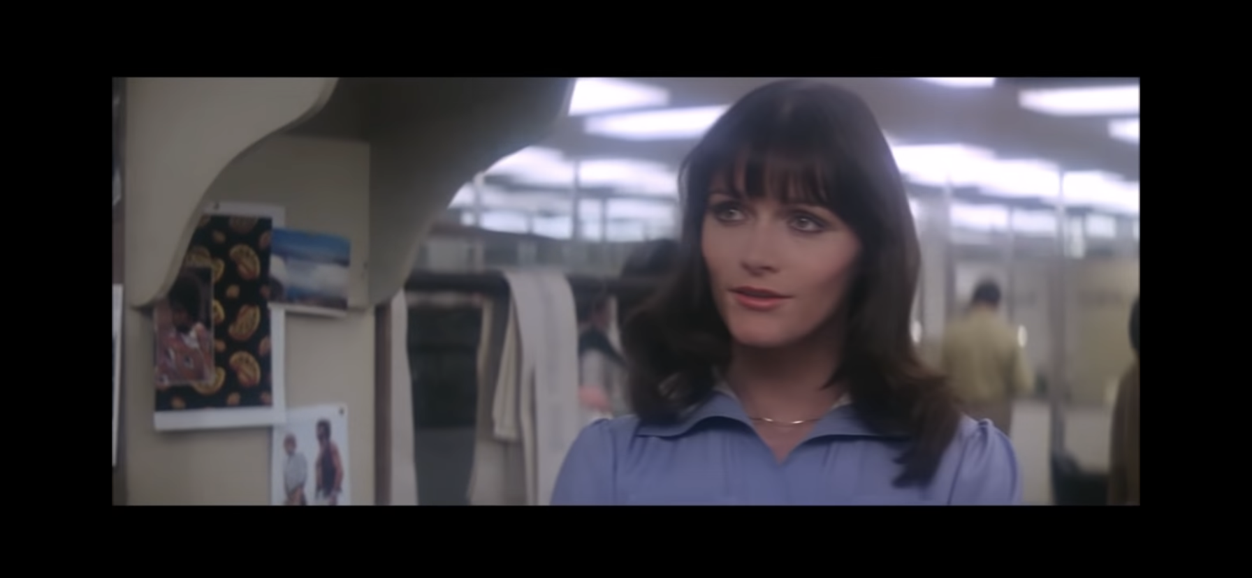
Kidder is a lot of fun as Lois Lane, especially when paired with Clark Kent, even though that pairing feels nonsensical at times.
At least when we finally get to Metropolis and the main meat of the film, it starts to soar. Kidder’s Lois Lane, who embodies a manic, hyper, persona as a go-go-reporter livens the film up and she plays off of Reeve’s bumbling Kent very well. Their first scenes together are movie magic and I wish we could spend more time with them, but the film is well over an hour at this point and needs to bring in its hero. Superman and Lane’s scenes together are far less interesting. There’s a romantic angle imbued into them that’s forced, and made painfully obvious during the infamous flying sequence where Lane recites a poem in her mind via voice over directed at her new super beau.
The Daily Planet just making it easy for Lex.
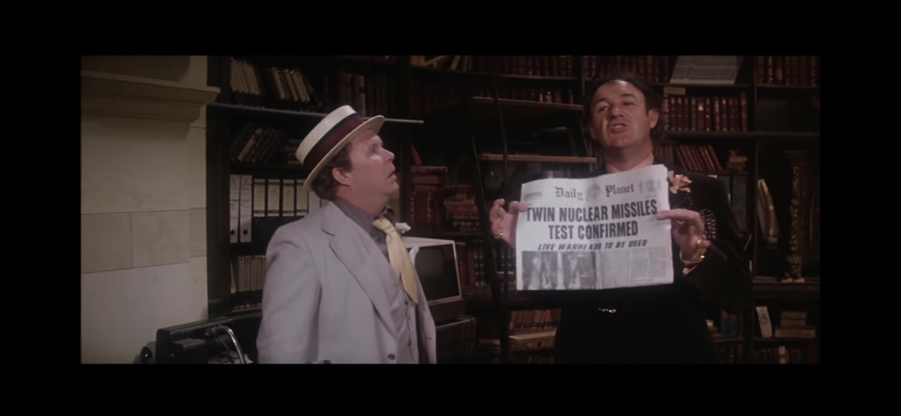
It’s also at this point the film’s main antagonist, Lex Luthor, is introduced. Hackman is charismatic in the role and he plays off of his bumbling sidekick Otis (Ned Beatty) and the dashing Eve Teschmacher (Valerie Perrine) in an entertaining fashion, but he doesn’t get enough time to convince us of his evil genius. The film just basically gives him kryptonite, and his scheme to create some expensive real estate for himself comes together quite rapidly. He’s at least wise enough, and I give the film credit for this, to know that Superman will be his enemy and that he needs to have a plan in place to deal with him before Superman is even aware of his existence. And his plan, at least as it pertains to Superman, is a good one. His overall plan though comes across as a bit camp, which is something this movie sort of struggles with. For much of the picture it plays things pretty straight, only slipping in a corny little line from the comics here and there, but Luthor’s plan feels like full camp to me. Some of Superman’s scenes are similar and it’s hard to know how the movie wants them to be interpreted. I think in most cases they’re playing it straight, but years of Superman parodies have left me damaged.
Kryptonite is not his only weakness.
I don’t want to spoil the ending of the film, even though it’s over 40 years old at this point, but it is a problem with the film. The only aspect of the ending that I like is it asks Superman to make a decision that is essentially the character choosing to take the advice of his adoptive father over that of his biological one. Brando’s Jor-El hangs over the film as he’s able to pass on knowledge to his son via some crystals he packed in his space pod. The two even appear to have actual conversations which is rather confusing and feels like an unnecessary cheat. It’s hard not to make a biblical connection here as well as Jor-El gifts his only son to humanity for he sees potential in mankind and that child is Superman. The only thing missing is a resurrection angle. At any rate, the ending is setup early via a quote from Jor-El to his son, but it still feels kind of cheap and like a deus ex machina.
Show off.
When Superman soars though, it’s pretty damn fun. The special effects have obviously aged quite a bit since 1978. You know you’re looking at an old movie when you watch it, but it’s not so aged that it takes the viewer out of the fantasy. The flying stuff looks fine, the only aspects of the effects that really stand out are the miniatures used for much of the climax. In fairness to them, no one ever envisioned these scenes being viewed in HD when they were shot and I suspect that’s a major part of the problem. Possibly the best part of the film occurs when Superman outs himself and is just soaring around Metropolis knocking off conventional crooks. There’s also a more extravagant scene where he saves Air Force One from a crash landing. It probably didn’t need the added drama of having the airplane be Air Force One, but it’s a great scene. It was so good that nearly 30 years later Superman Returns went back to that well to reintroduce the audience to Superman. The only issue with the film is it takes so long to get to that point, and it’s a relatively small portion of the film, but the moments are at least captivating enough to enrapture even the youngest viewer.
The score for this film is fantastic, except for maybe this scene. Though there it’s not really the score’s fault.
A part of the film that has not aged at all is the score. Composed by the renowned John Williams, Superman has what I consider a perfect score. There has never been a character or franchise more perfectly suited for its theme than Superman and the Williams composition. It’s triumphant, wonderous, and jubilant. Is it controversial to say this is the best main theme John Williams has come up with? I love the main theme from Star Wars, and Jaws is an all-timer, but Superman takes it to another level. I have to assume Williams had the old Superman theme, from the Fleischer cartoons, in the back of his head so a hat tip to those classics should be granted.
The film probably makes you wait too long to get to these moments, but at least when it does it pays off.
I had not seen Superman since I was a kid before re-watching it for this film. It was my choice for family movie night, and in that role is probably miscast. It was tough sledding for a five and a four-year-old to sit through for two and a half hours, even with an intermission. Thankfully, I didn’t go with the three hour cut. Yes, this film has multiple cuts at this point, but the original theatrical cut is probably still the best. The scenes Donner added back in years ago aren’t memorable and just increase the film’s already generous running time. The film also suffers for being shot with its sequel. There’s a sense one gets when viewing this that a lot is being intentionally held back to introduce in the sequel. It just feels like a setup for Superman II, a far more confident and direct film that many prefer to the original. It’s also a film I have not seen in decades so I’m not certain it’s the superior film, but I’m fairly certain it is.
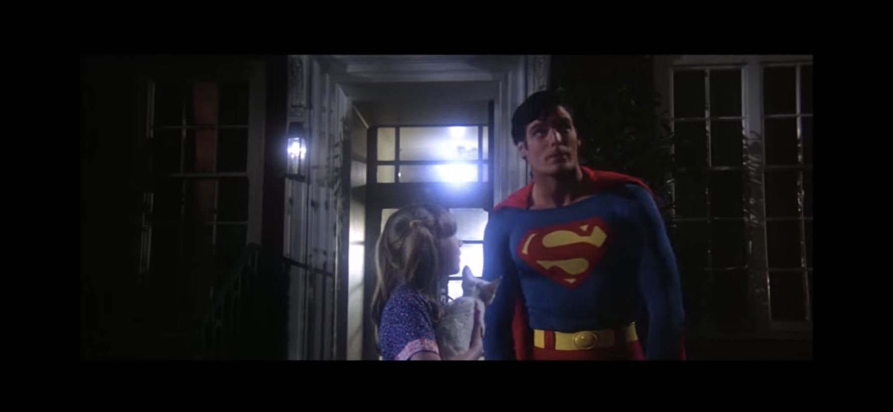
Superman is the type of hero who can save the world from a super villain like Lex Luthor, but also finds time to help a little girl get her cat out of a tree.
Superman is still a worthwhile watch in 2021 and it’s better than any of the films starring the hero to come since the year 2000. Superman is a pretty simple character with a simple premise, but modern filmmakers struggle with him when they become fearful of how powerful he is or fail to see the character’s appeal. To make a moody, timid, Superman is to totally miss what’s appealing about him. He’s the ultimate hero who is nearly infallible. He doesn’t have to be perfect, but he’s a character that is always striving to be perfect. And even though I was probably more let down by this re-watch than I was rewarded, whenever that familiar John Williams score kicked up and the character came into view, I was a kid again and I was completely enthralled in what was playing before my eyes.
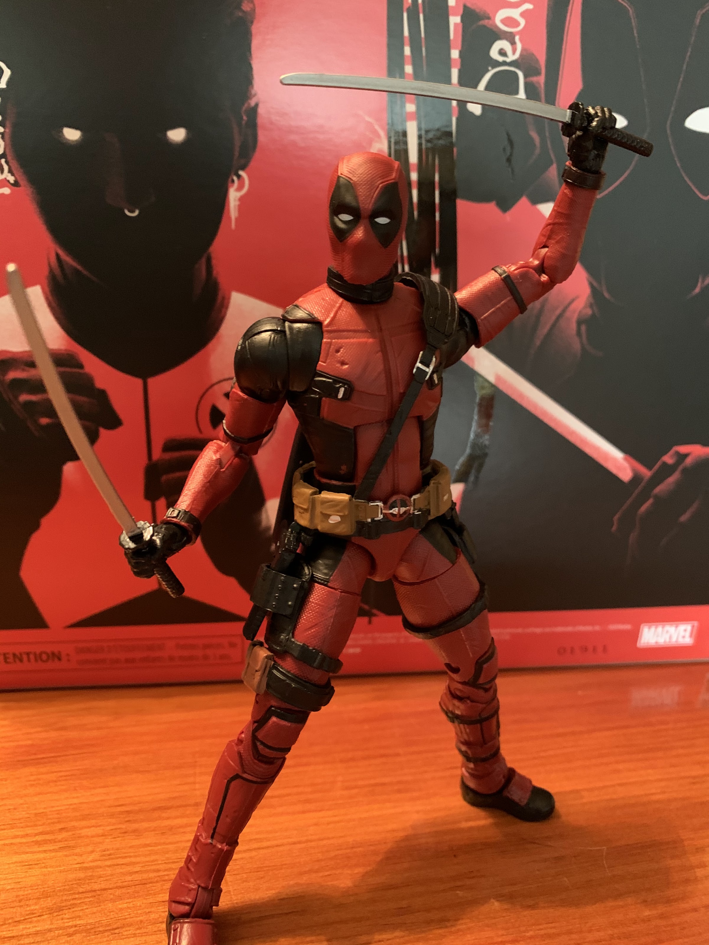
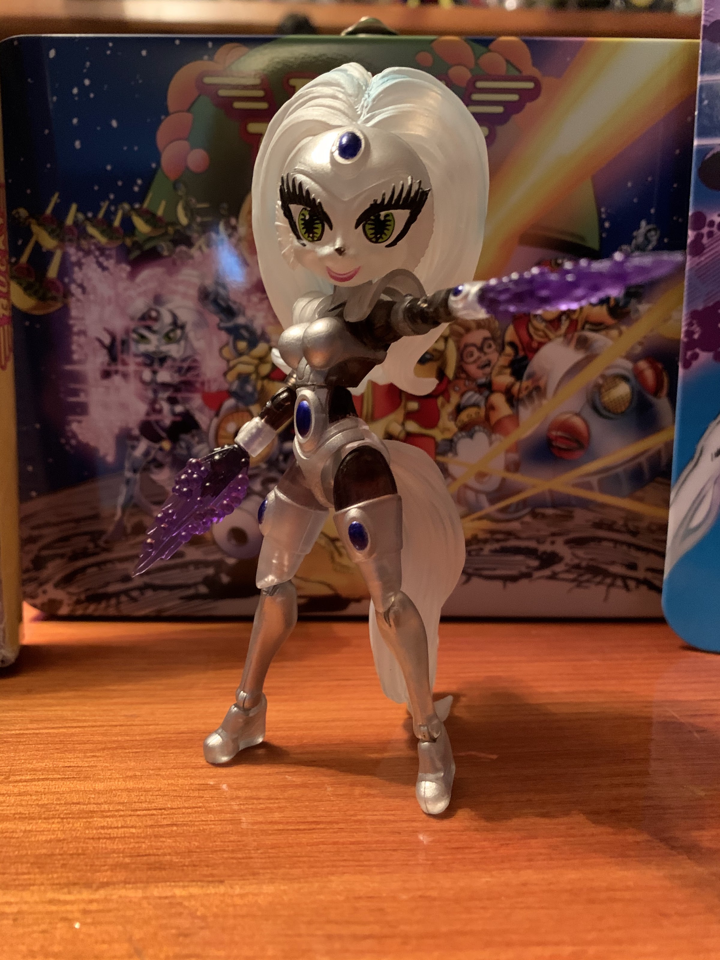
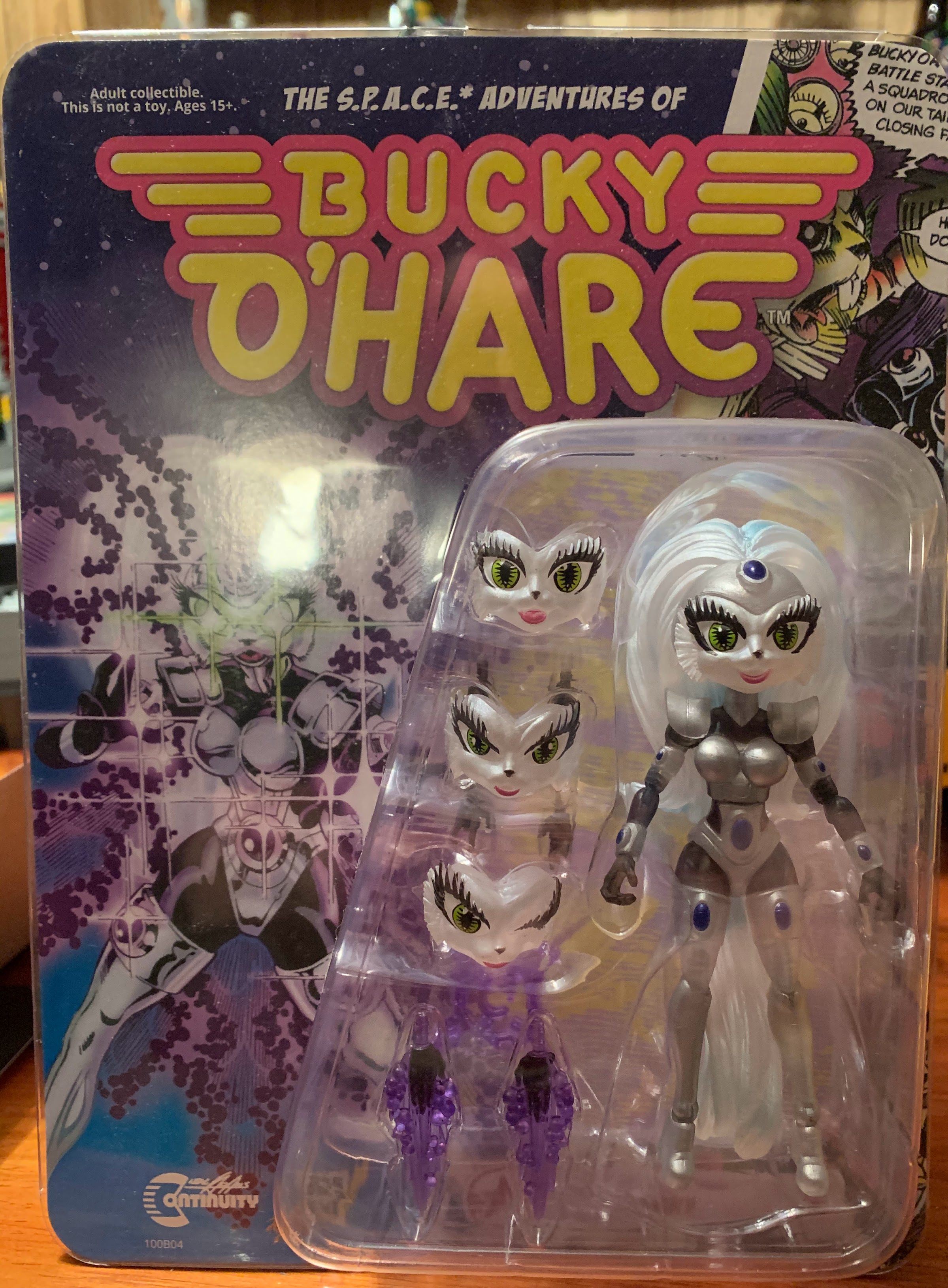
Sometimes a toy comes along that I just can’t ignore. There’s just something neat about it, or the aesthetic so on point, that I want to own it even if I have little or no attachment to the source material. Such is the case with the Boss Fight Studio release of Sam & Max. I am only aware of the existence of Steve Purcell’s Freelance Police duo. I mostly remember them from advertisements in video game magazines since their point and click adventures were fairly popular back in the day, at least, as popular as that genre ever could be. I’ve seen a little of the animated series that aired on Fox Kids and even covered the Christmas episode in 2019, but that’s the most in depth I’ve ever gone with the property. Still, I always found the duo pleasant to look at and I am drawn to the property as it certainly sounds like something I would enjoy (in particular the graphic novels), but I’ve just never taken the plunge.
When Boss Fight Studio started teasing these figures back in 2018 I mostly had no reaction. When the full reveal took place in February of 2019 I thought they looked nice, but was able to just file it away in the back of my mind. As time went by I’d get more and more looks at these guys and they just started to really captivate me. When they were finally released in late 2020 I was fully onboard and intrigued enough that I knew I wanted them, and I held out until Boss Fight Studio revealed their Christmas deals. Even though these guys weren’t on sale, I used the excuse of free shipping and the desire to add another Bucky O’Hare Storm Toad to grab a pair.
Sam & Max began life as a comic, but has since migrated to other forms of media.
It’s probably a good thing that I wasn’t hooked from the get-go, as you probably noticed in that last paragraph that there was a lengthy development cycle associated with this duo. I don’t know if there were any challenges that pushed things back on the development side. I would guess since these guys are very much their own thing it takes some time to get stuff together at the factory. Boss Fight may have elected to wait for the pre-orders to clear a certain amount before going into full production to ensure profitability. And then, of course, COVID eventually messed things up. In the US, we tend to think of COVID as a 2020 problem, but for toy makers it was a 2019 problem as well when factories in China shut down as the virus spread and didn’t restart for months. And when they did restart it was with skeleton crews that persist to this day. Even big toy producers were hit hard, so a smaller shop like Boss Fight was especially impacted. Patience is a virtue though, and as the old saying goes, good things come to those who wait. Sam and Max have arrived, and hopefully for fans of the property, the wait was worth it.
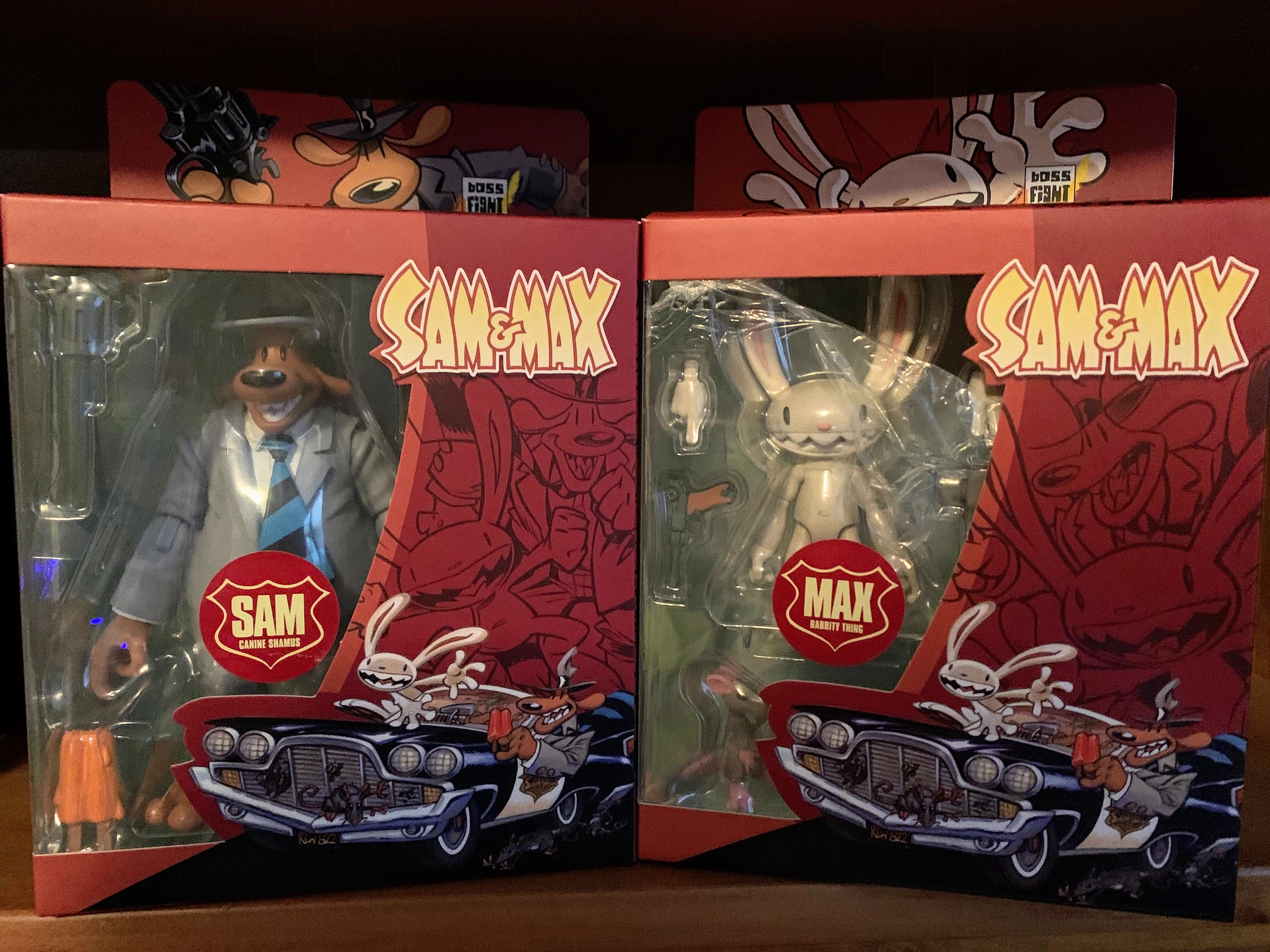
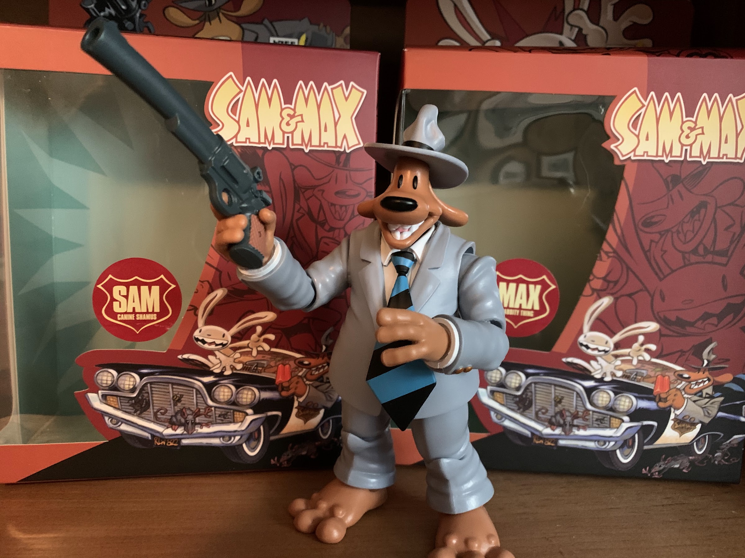
Both Sam and Max come packaged in a very attractive window box. It features new artwork from Steve Purcell with a comic strip printed on the back. There are some product shots as well as a summary of the items on one side. Max is labeled as 01 and Sam 02 and I do not know if there are any plans for more figures in this line. My guess would be some variants are probably under consideration so that Boss Fight can squeeze a little more value out of these molds, but even if it’s just a duo, it’s a nice little display piece for collectors. And the box is attractive and it’s easy to reseal should you desire to. I’m a big fan of the resealable blister Boss Fight has utilized with Bucky O’Hare, but this is pretty nice too!
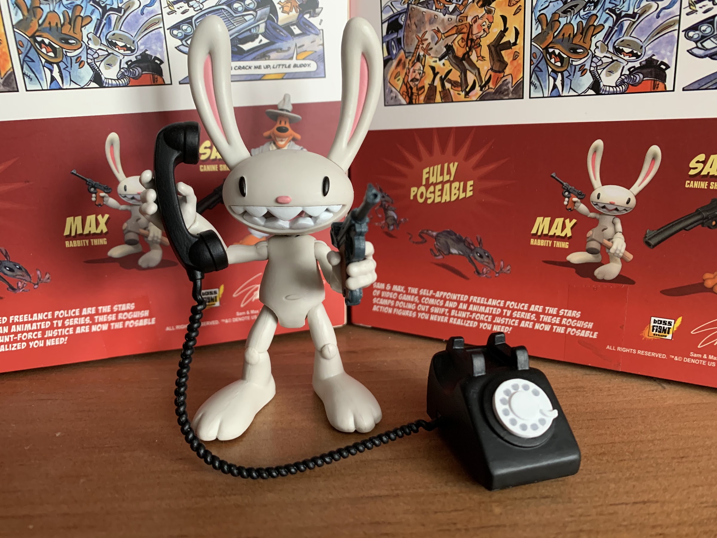
Max, resident “Rabbity Thing” and most of his stuff.
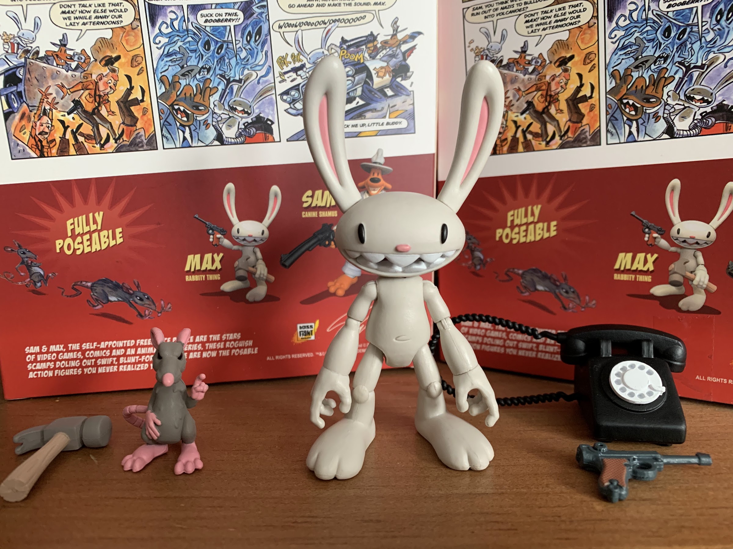
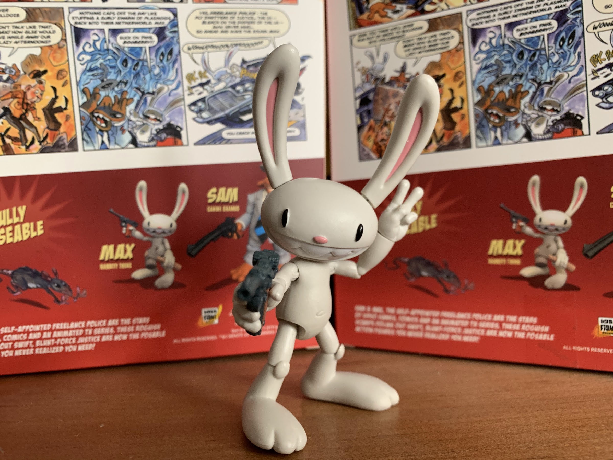
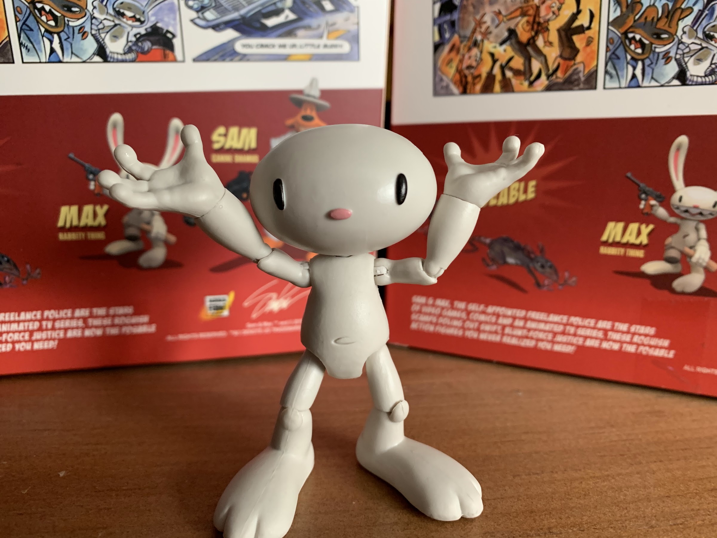
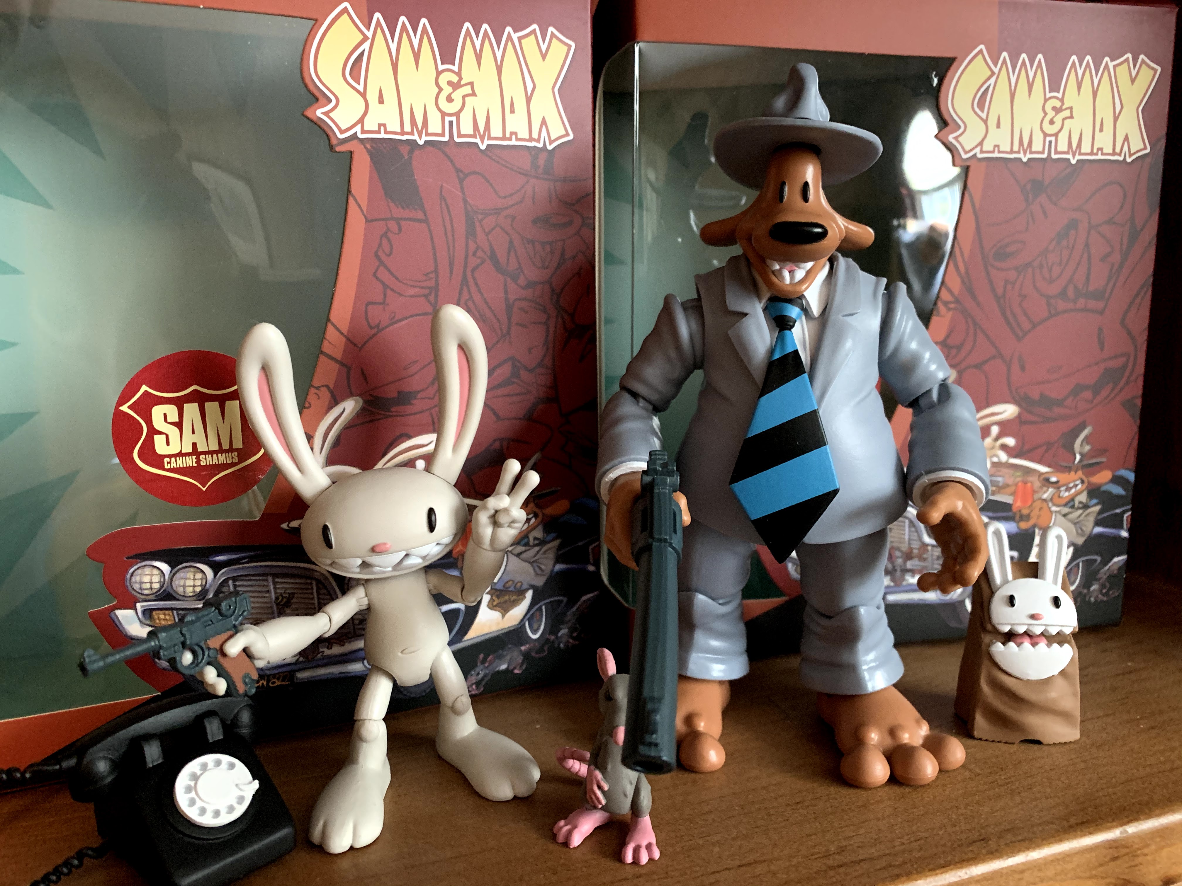
Since Max is considered the first figure in the wave, we’ll start with him. He’s rather diminutive and would be even in the smallish Bucky O’Hare line. He’s roughly about 3″ in height not including the ears. Since he’s essentially all white, or a slightly off-white, he has a really clean and simple appearance. The articulation is not overpowering so there’s very little that breaks up the sculpt. Even though the character is fairly simple in design, Boss Fight sculptor Daniel Rheaume should still be credited with nailing the expressions for Max. He comes packaged with an open mouthed, toothy, grin that imparts just a touch of Max’s somewhat maniacal nature. It’s never easy to go from 2D to 3D, but I suspect the video games aided in finding the right way to position the mouth, eyes, and nose on a spherical head.
I enjoy the juxtaposition of the rather violent gun display with the peace sign.
The articulation for Max is fairly basic. His head sits on a ball-joint and can rotate freely with a little bit of room to move up and down. His shoulders are in sockets with hinges and he rotates above the elbow which contains a single hinge. The hands are just pegged in and can rotate. There’s no articulation in the torso or at the waist. His legs are on ball-joints with single-hinged knees. While I like how clean the sculpt is, I do think there’s room for more articulation with this guy. Boss Fight did say they tried to do something with the ankles, but apparently it wasn’t working. It seems strange since we have Bucky O’Hare, a fellow rabbit-thing, to compare to and he has ankle and toe articulation, but maybe they just didn’t like how it looked with Max. The other aspect of the articulation that’s a bit odd concerns the knees. Max is drawn with pronounced kneecaps so I see why Boss Fight sculpted those on, but it does look a bit weird when he bends his knee as the kneecap is attached to the lower leg. This is where a double-joint actually would help the sculpt as the kneecap can kind of exist in-between, but Boss Fight stuck with a single-joint. I think it may have looked better to have the kneecap affixed to the upper leg instead, but it’s not a big deal.
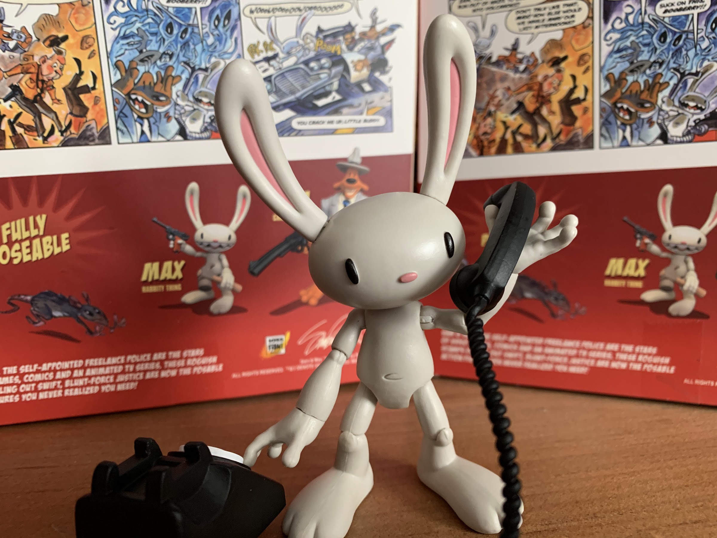
“Hello?! You’ll have to speak up, I’m dealing with a rat problem!”
Less elegant than the gun, but it makes a satisfying crunch!
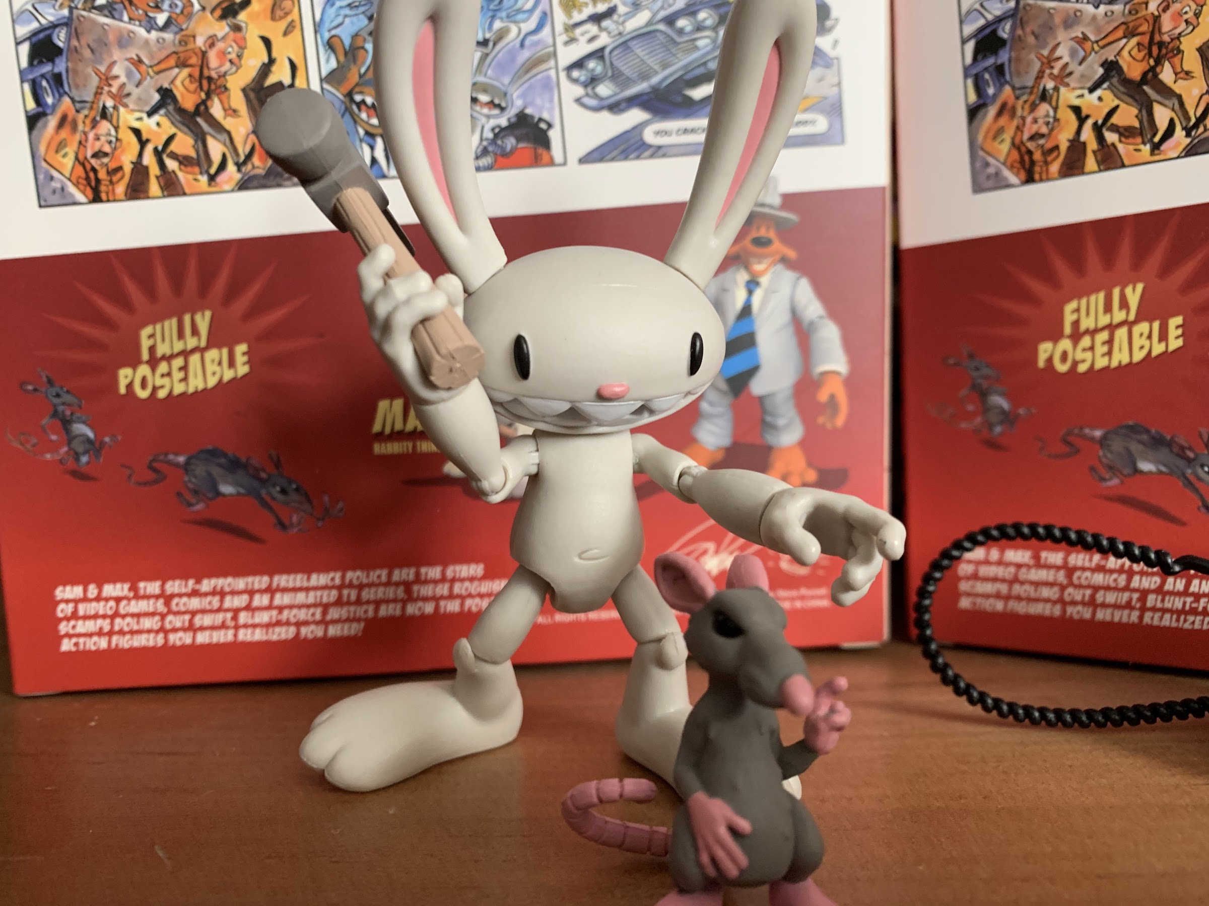
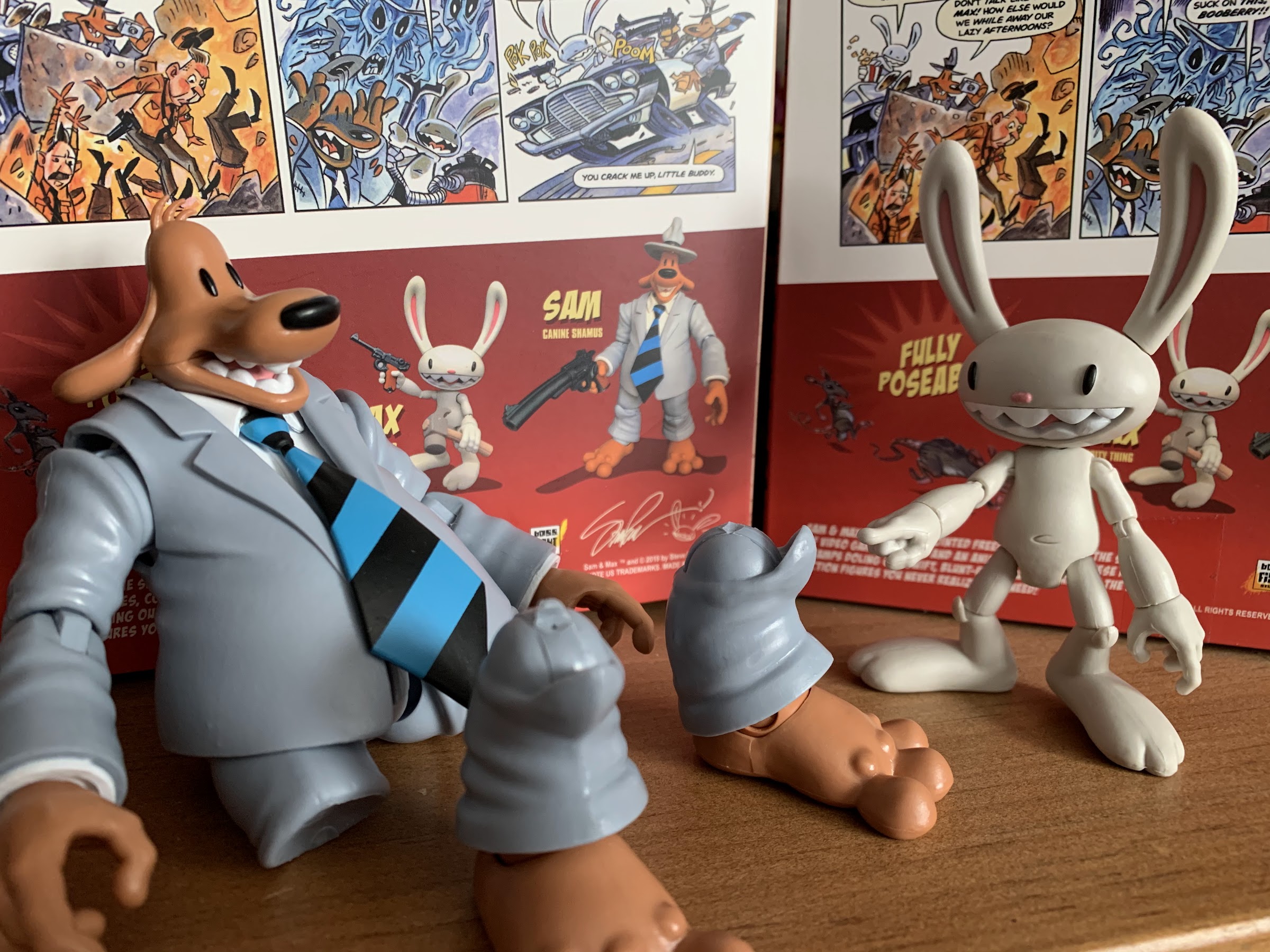
Max comes with an assortment of accessories to dress him up. Being that he is a mere 3″ and retails for $40, he kind of needs to justify his pricepoint with a lot of stuff and Boss Fight mostly delivers there. For starters, he comes with two extra heads. One has a huge grin and the other features no mouth at all. I will say, I love all 3 heads and choosing a display is tough. I actually like the no-mouth look for comedic reasons, though I can’t see myself going with that. Toy photographers will probably have a lot of fun with it though. Swapping heads is not exactly fun as his head is on there real tight. Heat it up and apply consistent force and you’ll get there. Getting the others on is also trying and requires both heat and patience. It’s a sturdy joint so the risk of breaking anything is probably minimal, but be careful. I did find that after swapping heads for the first time the joint appeared to be more loose. His head is rather heavy relative to the rest of the sculpt and it is just barely supported by the joint. One little touch on either side will cause it to bobble. The ears pop out and in easy enough though as they’re shared with all of the heads. Boss Fight also labeled them so you shouldn’t have any trouble remembering which is left and which is right. The hands are also quite tight and when removing them you will want to make sure you secure the figure’s forearm to prevent applying too much force to the elbow joint. If done incorrectly with a Bucky O’Hare figure, the peg above the elbow will usually just pop out and can be re-inserted, but I do not know if this figure is constructed in a similar manner. His arms are very thin so you definitely want to be as careful as you can. The good news is, switching hands will leave your own fingers a little sore and likely discourage you from putting too much stress on the figure over a short period of time.
The mouthless head works to convey a shocking phone call.
Also useful for when Max wakes up in the morning to find his ears missing.
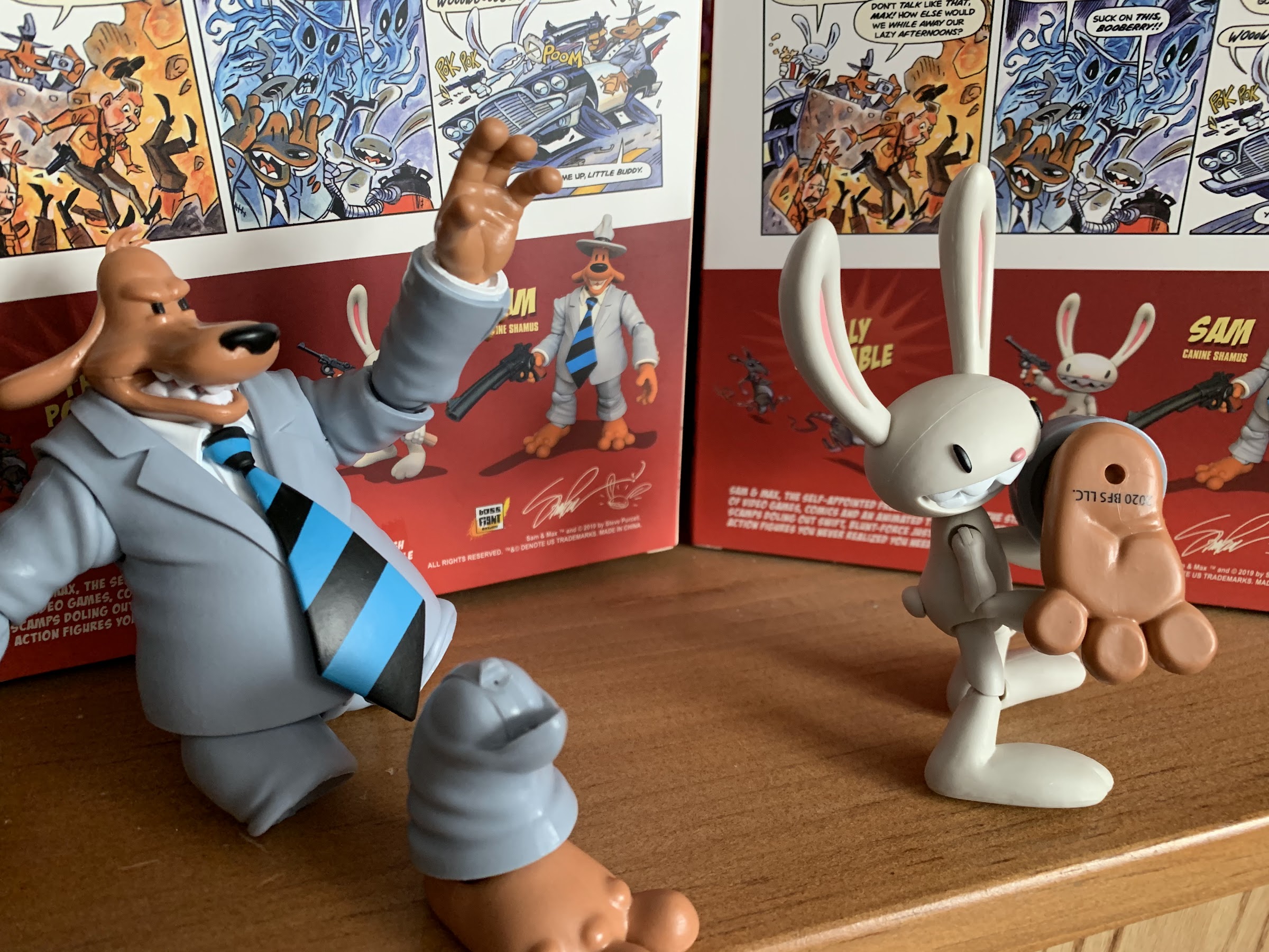
In addition to the extra heads, Max also features 6 extra hands. He comes packed with dueling trigger fingers, but also has a set of open hands, fists, and one pointing right hand and one “peace sign” left hand. He’s also got some stuff he can hold with those trigger hands like his trusty pistol of German origin and a hammer, because a hammer is always useful. He also has an old rotary phone and I absolutely adore it. It has a spiral chord on it that’s plenty pliable and Max can hold the receiver just fine with his trigger hands. If the actual dial could spin, I’d be doing backflips. I don’t know why, I just think it’s neat. Lastly, there’s a rat. He’s painted really well for a non-articulated little figure and he’s holding up a finger. I’m not sure if he’s supposed to be taunting Max or how the two are supposed to feel about each other, but he looks pretty nice. It’s enough stuff that it makes settling on a shelf pose rather challenging. I like the expression hands like the pointing finger and peace sign, but I also like the accessories he can hold. They’re pretty easy to work into the hands too, which is certainly a plus. I almost feel like the fists are wasted as I don’t see myself ever posing him with those, but it’s always nice to have extras!
Sam is very happy with the size of his gun.
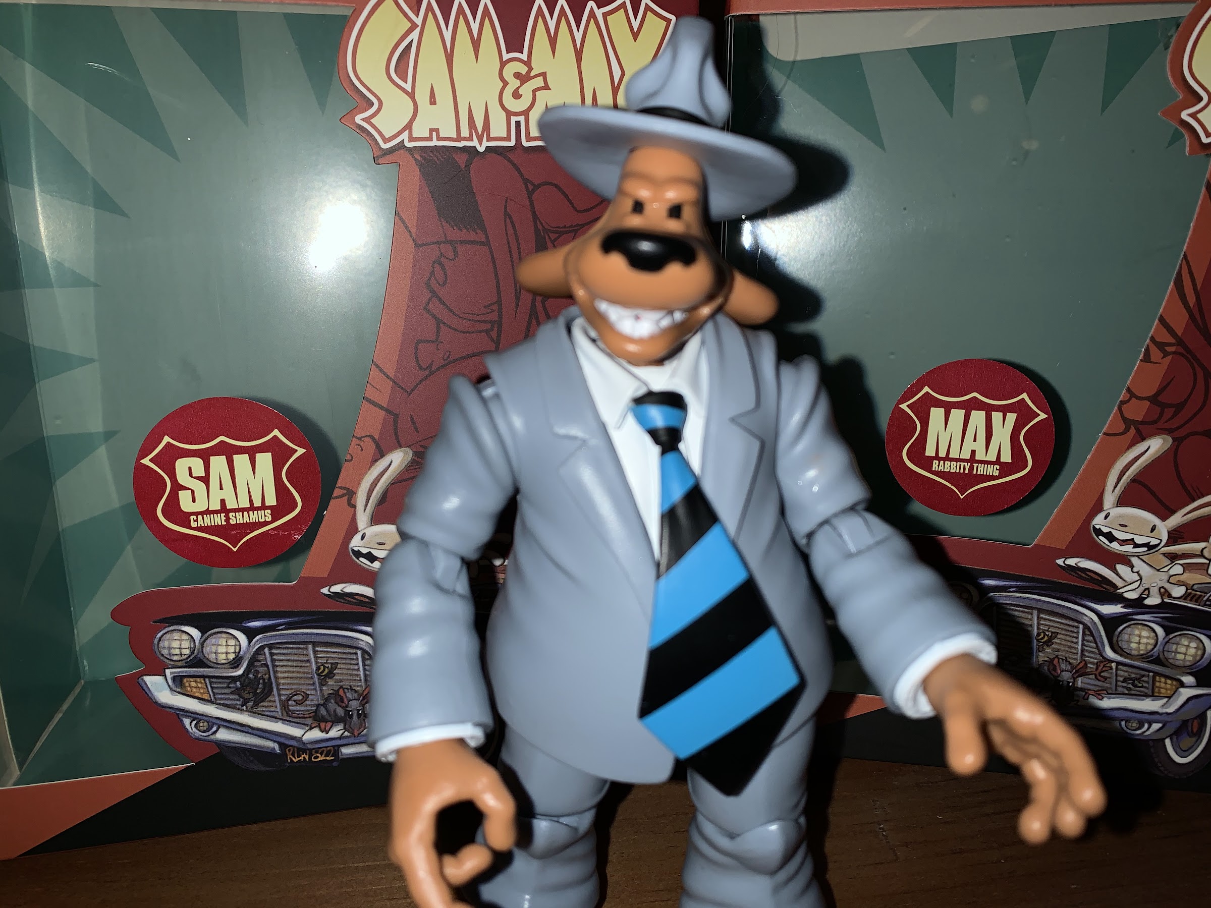
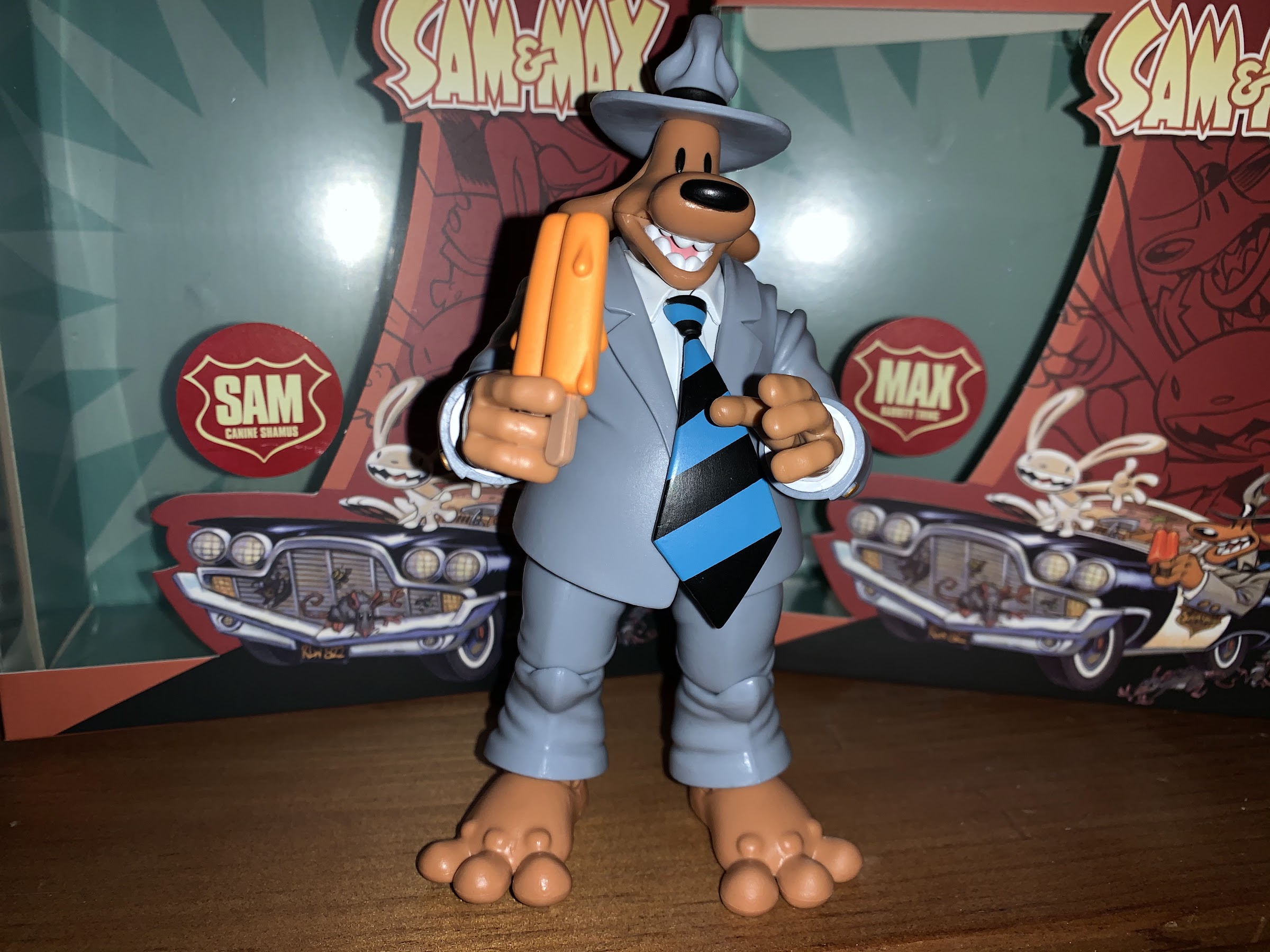
Figure number 2 is the canine shamus Sam! He is much bigger than his little buddy as he stands about 5 1/2″ without his hat. Popping him out of the box immediately feels a lot different than taking Max out. This is a chunky, dense, figure with a pretty intricate sculpt. He comes packaged with an open mouth happy face and he has three pieces of hair/fur sticking up on his head that the hat fits over. His torso is sculpted and painted all around it, even the parts hidden by his suit jacket, which is pretty impressive. No corners were cut here. His dress shirt looks so lifelike that it’s almost a shame to see it hidden under the coat. And the coat itself is soft plastic over his body with the sleeves part of the sculpt. This is a pretty common approach for jacketed characters and it works well here. The tie is soft plastic as well and can be moved and manipulated as needed since it’s attached to the collar which just slips over the ball-joint for his head. If you wanted your Sam to be more casual and ditch the tie you can just slip it off. He certainly looks the part and it’s hard not to be blown away by this sculpt.
He can get a bit angry if you take that gun away.
Sam is articulated a bit more extravagantly than his partner. His head sits on a ball peg that can move around which would typically allow for more up and down movement, though his collar and jacket limits him there. At the shoulders, it looks like his jacket should keep his arms from being able to come out and up at his sides, but it’s engineered really well and the sleeve will actually dip under the shoulder pad in his coat pretty easily. Maybe if you do this a lot there will be some rubbing damage, but you should be safe to pose him however you wish as long as you don’t go nuts. The arms can go all the way around too and there’s the usual single-hinge with a swivel at the elbow and the hands are once again just on pegs. He has a nice ball-joint at the waist so he can not only swivel all the way around, but also tilt forward and back and side-to-side. And the sculpting of the shirt works in tandem with the articulation here and slides easily behind his belt and over it. It’s really satisfying to mess around with. His legs are on a barbell joint and can come out to the side quite a bit, though not a full split. There’s a swivel at the knee and a single hinge. At the feet, he has a hinge and a generous bit of tilt so he can rock side-to-side and swivel. And what I love about both figures is that their feet are nice and big so they’re very easy to stand.
Poor Sam found himself injured. Max was fairly amused by it.
I did have one issue with Sam though, and it was a pretty big issue. His paint looked great and all of his joints were quite free and easy out of the package except for those knees. They just peg into the thigh with the hinge below the peg. I’m not a fan of this method of knee articulation, and it’s something I didn’t like about the Super7 Raphael back when I reviewed that. When I bent a knee on that figure, the peg popped right out without much warning. I wish that had happened with Sam, for when I went to bend his left knee it snapped. There was really no warning either, it was just a quick, clean, break. I then tried the right knee with a little heat from some hot water and a more delicate touch – snap! That one left a bit of the peg still on the lower leg and just for shits and giggles I tried heating that stub up and seeing if I could get that hinge to budge and I had zero success. I then went to YouTube to see if I could find some video reviews and see how people handled theirs on camera and noticed most of the reviewers received a letter with their set basically warning them about tight joints and to just go ahead and heat these guys up. It sounded like Boss Fight wanted them to not even attempt to work the joints at all without first applying heat. They did not include such a letter with my order. I wish they did, but also I have to say every other joint on both Sam and Max worked great right out of the box. It was only these knees that offered any resistance so maybe I’m just unlucky and got a bad Sam.
“Well, no sense letting this go to waste. Think I’ll try a stew.” “Hey!”
I reached out to Boss Fight via email and it took them a couple of days to get back to me. When they did, the rep from their store apologized and promised to get replacement parts out to me soon. It was nice to not have to deal with any condescension as I was half-expecting a lecture on proper action figure handling. Maybe they saw how many orders I’ve place with them over the years without any quality control issues and took me at my word that I know what I’m doing. While waiting for the new parts to arrive, I was able to have a little fun at poor Sam’s expense. Max, to his credit, found it all very amusing.
A week later, Sam’s new legs arrived at no additional cost to me. Each one was in a separate bag and the knee was bent on both probably to make sure the joint was fine. Getting the old stumps off of Sam was pretty easy and getting the new legs on was no trouble at all. All in all, a minor inconvenience that was remedied by the manufacturer and that’s all you can ask of toy makers.
After all of that trauma, Sam deserves a little treat.
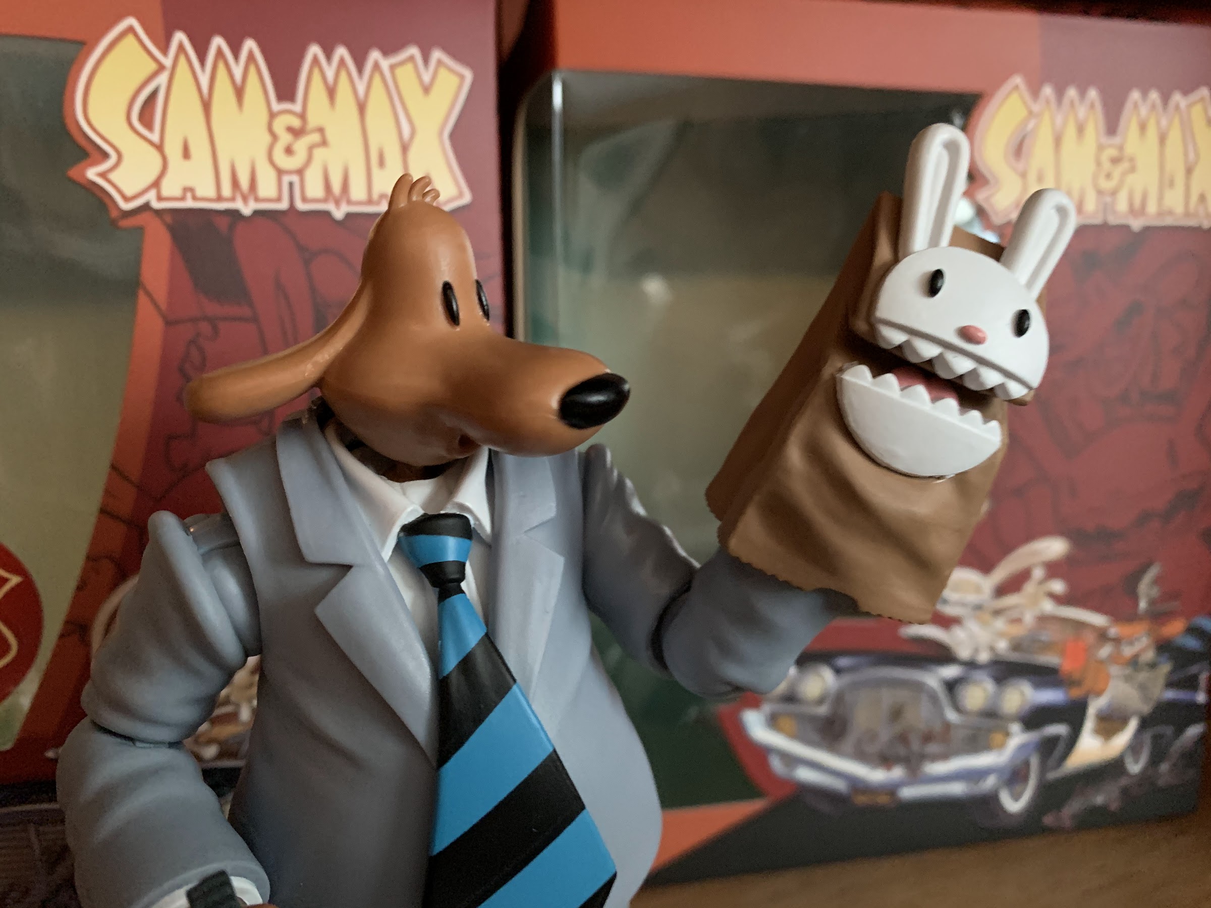
Sam comes packaged with a fair amount of accessories, as did Max. He comes packaged with gripping, trigger, hands and in the box are a set of open hands and a set of fists. Removing and swapping hands is easier than it is with Max, largely due to Sam just being a more generously proportioned creation. He also has a pseudo-extra hand in the form of a brown bag puppet with Max’s face on it. I believe this is from an episode of the cartoon, but the bag looks pretty great and has a peg inside of it so it can peg into Sam’s forearm. There’s also a set of orange, melty, popsicles that I take it Sam is a fan of. They’re pretty easy to position in his hand since the stick end is rather small. Lastly, Sam has his massive revolver. The barrel on it is curved slightly to really give it a toon quality and I absolutely love how it turned out. The handle on it is pretty substantial, so you’ll probably end up warming one of Sam’s hands up to fit it in properly. Once you do, chances are you won’t want to take it out.
The “Ooo” mouth works well with the Max puppet accessory.
Sam also comes with a pair of extra heads. His default look is an open-mouthed happy expression and Boss Fight chose to give him the same, but with angry eyes, as one option and another where he’s making an “O” mouth, as if he were talking or whistling. I don’t think of Sam as the angry type, so I’ll probably stick with the happy look. The whistling head is pretty tempting though as it’s quite cute. Popping Sam’s default head off is pretty easy and you’re likely to do it by accident when testing out the range of articulation at his neck. Getting the others on is definitely a struggle. Even just examining the different heads, the opening on the default head appears to be larger and there’s a gradual slope to the front of the opening that would appear to exist to facilitate swapping. The angry head has that as well, while the whistling one just has a hole. You will want to heat the heads up when swapping if you want any chance of getting them on properly. It was still a bit odd as they didn’t seem to “pop” into place even after heating, but just kind of slid on. It’s a real workout for the thumbs.
The Freelance Police stand ready for action!
Sam and Max are mostly what I expected. Swapping parts has never been the strong suit of the Bucky O’Hare line and it isn’t here either. It’s kind of a chore, but I’m still glad to have the extra parts as they do a lot to liven up a display. The issues I had with Sam’s legs was something I did not anticipate, but to Boss Fight’s credit, they rectified it at no cost to me and without hassle. As a wise man once said, no harm, no foul. As for the figures themselves, what we have here is a tremendous representation of the characters in plastic form. Sam is easily the star for me, even with the broken legs, as he looks great and is a lot of fun to mess around with. Max also looks good, but his very basic articulation is a bit of a bummer. He’s kind of pushing it at $40 too, considering he’s a three inch figure. Niche license and a small company often means a bit of sticker shock. I know I had it with Bucky, and Sam & Max fans probably felt it a bit here. I suspect the Sam & Max diehards (and most fans might fall into that category) are okay with the cost. I obviously bought a set and I’m a casual at best fan and the cost didn’t deter me. Other, more casual, fans may want to wait a bit and see if there’s ever a promotion at Boss Fight or one of the third party retailers who are stocking this set. One likely isn’t coming anytime soon, but they probably won’t retail for $80 forever. As for me, I like these figures and I’m further comforted by the fact that I’m supporting a small toy maker that is also local to me. I think Boss Fight Studio runs their business the right way, and I like to support them and I intend to continue supporting them in the future.
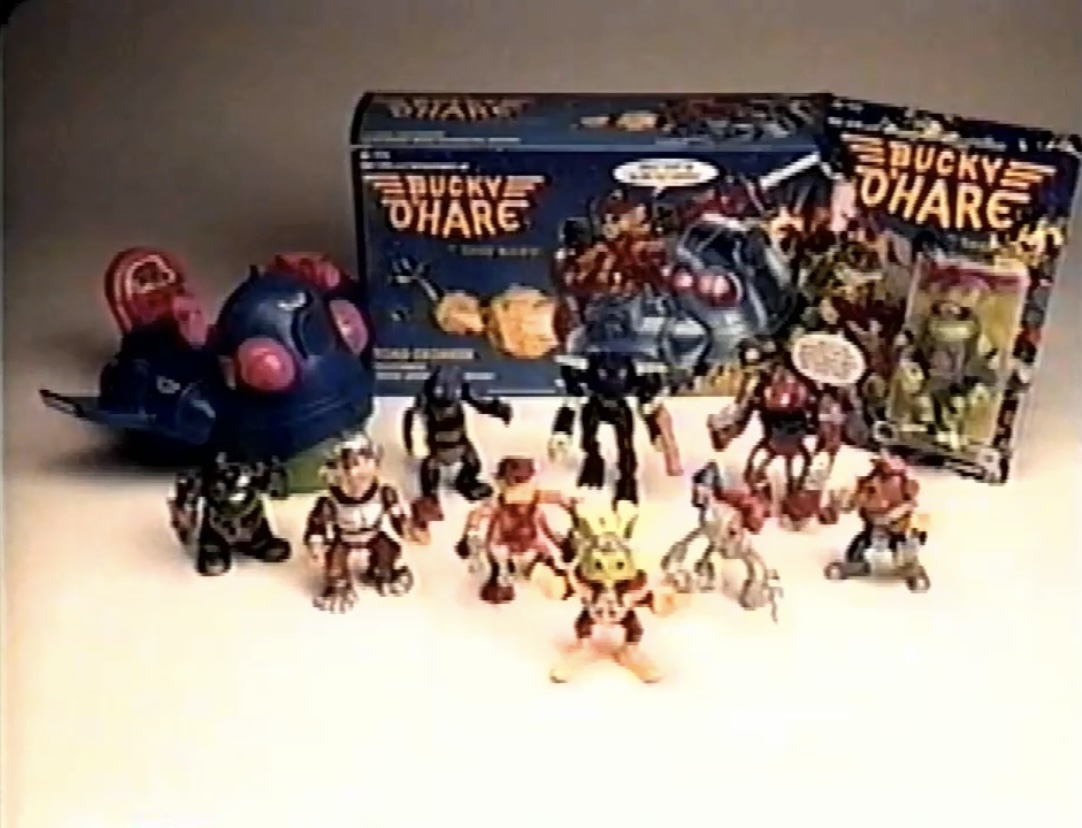
The New Year holiday is a time for both reflection and looking forward. Almost every publication, network, YouTuber, blogger, etc. does some sort of “Best of the Year” segment or just a feature that recalls the events of the past 365 days (or in the case of 2020, 366) because it can be both fun and it’s easy to fill time during a period when everyone is looking to take time off. Toy producer Boss Fight Studio is no different in that regard for it did a webcast on its Facebook account recalling the events of 2020 as it pertained to its line of toys. It featured the partners and some of the designers at the company and it gave them a chance to maybe spotlight something that fell through the cracks and also draw attention to what collectors could look forward to in 2021. As a rabid collector of Boss Fight Studio’s Bucky O’Hare line, I tuned in to see if there was any news on that front. Captain Mimi LaFloo was released at the end of 2020 and it was the first figure in the line to see release without an announced figure in the pipeline. It’s a bit of a cruel reality for toy designers that once a new figure is put out fans immediately turn to ask “What’s next?!” but that’s the way it is.
Needless to say, the update on the Bucky franchise was not what I would consider promising. To paraphrase, the update (which is archived on Facebook) was that there is no update! There are plenty of figures in stock and ready to order, but the company is not ready to announce another figure to follow. It was, of course, stressed that they love Bucky and have enjoyed their relationship with the license holder, Continuity Comics, but that doesn’t change the reality that there appear to be no plans for Bucky O’Hare at this point in time. Sure, things can change and maybe something gets announced in the future, but for an industry that works on lags of more than a year from conception, to announcement, to release it can certainly be inferred that there will be no new Bucky product in 2021, and if there isn’t an announcement of some kind before the end of the year then you can probably write-off 2022 as well.
2020 was not a good year for a lot of people and things, but for Bucky O’Hare it was a significant improvement over 2019. 2019 was the first year since the line launched that there was no new Bucky product released. Anything that might have released in 2019 was pushed to 2020 due to a variety of reasons, one of which was undoubtedly COVID. It was pretty fruitful though as Boss Fight released two new characters, Bruiser and Mimi, as well as a fun variant of the Storm Toad Trooper. I, of course, got all three and even in the case of the Storm Toad I got two. I am all-in on this line and that pretty much includes new sculpts and variants at this point.
Boss Fight Studio has given us a wonderful assortment of figures, something I never thought would happen with this property.
It should be noted that Bucky O’Hare was the first license Boss Fight Studio acquired. Since then, the company has added a bunch more and has released or is preparing to release action figures based on Sam & Max, Flash Gordon, Zorro, and more. It’s a small, Massachusetts-based, company that sells a lot of its product direct to consumers with a few internet outlets and comic shops also stocking product. Space is a real constraint for a company of Boss Fight Studio’s size and I took the comment from the Facebook Live event about having plenty of stock to mean there physically is not any more room for Bucky O’Hare figures in their warehouse. At least, the company does not want to devote more space to the line. Bucky O’Hare is, and I’ve said it many times, a niche license. The fanbase is small and has been given no reason to grow over the past few decades as pretty much the only new Bucky merch have been the toys of Boss Fight Studio. And being that this is a small company, it can be assumed the figures are being sold at a price that is as low as it can be, and at $35 a figure, it’s not priced to invite a casual fan that may have a fading memory of the old Hasbro line or Konami game. And the fact that they’re not in a lot of physical stores also means the company loses out on impulse buys. That’s all to say that Bucky O’Hare is dependent on its fanbase, and it’s a small, limited, fanbase.
If that sounds negative, I don’t intend for it to be. I think of it as a realist point of view. From what I understand in speaking with people who have some inside info on the line, it’s that it’s a pretty flat line in terms of sales. In some respects, that’s good as it implies that the fans have bought basically every character Boss Fight has put out in roughly equal numbers. They know what to expect, and since they’ve released 6 sculpts in the line they must not be losing money on it or else why keep putting figures out? Boss Fight Studio isn’t Hasbro or NECA where it can take on some pet projects that maybe just break even or actually come in at a loss, so the fact that the line has gone as long as it has tells me it’s not a loser. It just doesn’t appear to possess any growth potential, and when the company is launching new licenses that maybe have more active and excited fanbases, it’s easy to push Bucky aside. And it can also say to the company that if they do indeed come back to it they know what to expect sales-wise
The villains has found it tough sledding as far as getting action figures is concerned.
All of this is to say that I’ve had this line and Bucky on my mind in general for the past few weeks. I’ve been in a reflective mood when it comes to this toy line. When Boss Fight Studio announced this toy line back in 2017, I was both surprised and psyched. Up to that point, Bucky O’Hare had come to feel like a forgotten property not even worthy of a true DVD release in the United States. It’s legacy seemed destined to be constrained to the retro gaming circle where the old Nintendo game was both praised and a bit of a hard-to-come-by item. If someone had told me I could have a modern Bucky O’Hare action figure I would have taken it and happily paid probably a dumb amount of money for it at that. A whole line though was a dream come true. I was also guarded from the moment it was announced though. The only other Bucky announcements from the 2000s had ended in cancellation before anything was officially produced. As a result, I’ve always approached this line with the thought that whatever figure I get could be the last one. An announcement or prototype unveiling didn’t necessarily mean I’d ever get my hands on the product, and that has even been true of this line. Boss Fight showed off additional variants of both Bucky and Dead-Eye that have gone unreleased, alongside a line of mini figure and vehicle combos that are apparently cancelled at this point.
Even though I’ve always had reservations about this line’s survival, it didn’t stop me from compiling a wish list for where I wanted the line to go. And even as I made that, I mostly acknowledged that the chances of seeing every character on that list get made was remote. Now that we’re at what can best be called a pause in the line, it has me wondering what it would take to end this whole thing on a happy note? To bring it all home, so to speak.
For some collectors, recreating the old toy line is all they’ve wanted out of Boss Fight Studio.
For most collectors I know who have been into this line, they’ve largely wanted to see it re-make the characters Hasbro did and if they could have got to Commander Dogstar’s crew then all the better. For me, I have a lot of nostalgic attachment to the cartoon so I’ve always wanted to see that embraced more than the classic toy line or even comic. A character like Mimi was one that excited me, but appeared to disappoint others. That said, we have presently received the following figures: Bucky, Jenny, Dead-Eye, Bruiser, Mimi, and the Storm Toad. It’s a selection heavy on good guys and naturally my greatest wants are bad guys at this point. The lowly Storm Toad Troopers have no one to lead them, and they’re hardly formidable even with leadership so without they’re just laser fodder. As much as I would love a Toadborg or Al Negator, it pains me to admit they’re now low priority, because if we want to end the line with a sense of closure, and only have room for a figure or two, I think we need to focus on Bucky’s crew.
When both the comic and animated series begins, Bucky’s crew consists of the following: Jenny, Dead-Eye, Chief Engineer Bruce, and A.F.C. Blinky. Bruce is the brother of Bruiser and he gets killed off rather quickly and is essentially replaced by Bruiser in the cartoon’s second episode. Bruiser, being a marine, is not really equipped to take over for Bruce and Bucky is forced to turn to the displaced human, Willy DuWitt, to serve as his new engineer. I am not a huge fan of the Willy character, but I can’t deny he is a member of Bucky’s crew after that first episode and is pretty essential for a toy line based on the property. Hasbro already provided the blueprint for a successful Willy figure back in ’91 and that’s to put him in his space suit (a holdover from Bruce) and equip him with his silly squirt gun. For Boss Fight, this does mean a whole new sculpt which isn’t a new thing for this line as basically every character is entirely unique. He possibly could reuse Bruiser’s feet, but that’s it. And it would mean the standard roll out of accessories: alternate hands, head (masked and unmasked), and a gun. And seeing how the glasses of the old Hasbro toy always seemed to break or fall off, it would be really cool and appreciated if he came with a spare set.
Those damn glasses…
More important than Willy though, is that other character who was there from the start. Little Blinky was always a favorite of mine. He just has a nice, clean, and even cute design being that he’s a little robot with a giant eye for a head. The old Hasbro figure was not in-scale and he was the same size as everyone else when he should be noticeably shorter than Bucky and is absolutely dwarfed by the likes of Bruiser. I’ve wondered if the fact that he’s so small has turned off Boss Fight from doing him since he’d look so tiny beside the other figures, but would probably still need to retail for the standard MSRP. As we saw with their release of Max from Sam & Max (a review from me is coming, I promise), it seems like the solution there is to pack the figure with some more accessories, but with Blinky what do you give him? In the original comics and cartoon, he really doesn’t use anything. No guns, no signature items, and being that his head is just an eye he doesn’t really demand additional faceplates or heads. Sure, you can get creative and play with the size of the his pupil to illustrate surprise or even fear, but that’s all. Hasbro gave him a jetpack with a gun and I assume Boss Fight would just do the same, but what if they didn’t have to? He’s still a figure needing a unique sculpt, tooling, and production and being that I’m not an industry insider I don’t know how much cost accessories add to the package, but what if they could do a two-pack?
A final release in the line of just Willy and Blinky together as a two-pack would be a neat way to put a bow on the whole toy line. Could they price it closer to Bruiser’s retail? That I don’t know. Is there enough fandom to consider a made-to-order release? I suspect “no,” in that if Boss Fight solicited such a thing there might not be enough orders to satisfy a factory order at a tenable cost. And as neat as a two-pack would be, I don’t know that it makes any real financial sense since anyone who spends $35 on a Willy action figure will probably spend $35 on a Blinky. And honestly, if they could do a Blinky on the cheap compared with the other figures produced thus far I’d be totally fine with the company putting him out at the usual price-point to boost the profit margin on the line in hopes that it could help finance a Willy. Simply put, a two-pack makes sense only if Blinky has little or no accessories and if Boss Fight just wants to do one, last, release that completes the team.
Blinky has become my line in the sand. I would like a Willy, Toadborg, etc., but if Blinky fails to materialize it’s going to haunt me whenever I look at my collection.
As much as it would pain me to see this line come to an end, I’d feel a lot better about it if it ended with Bucky having his whole crew together. I think Boss Fight could do an awesome Toadborg, but I understand their reluctance considering he’d have to be another deluxe figure. If Bruiser underperformed relative to the other figures, it would make sense that the company would have little interest in doing another figure with a $55 price tag. Even though I personally think the fanbase would be more excited for Toadborg than it was Bruiser. If Toadborg can happen one day then I’ll jump for joy, but my focus is on the crew and I hope it’s a goal Boss Fight and Continuity has as well. We don’t know how the license works. It could have an expiration on it, it could expire if the company doesn’t release new product within a certain window of time, or it could be totally at-will with both parties able to cancel at anytime. It’s not like Continuity is fielding offers from other toy makers looking to get in on that Bucky “action.” My guess would be the license is Boss Fight’s until they no longer want it, but sometimes company’s can be unrealistic about the value of their property so who knows? Hopefully both parties have the same goal and can work towards that. For now, at least we have a great selection of characters that, in some respects, shouldn’t even exist! I’ll continue to hold out hope for more and if there’s any Bucky O’Hare news you’ll definitely be able to read about it here.
In the world of film, 1994 belonged to Jim Carrey. On television, 1995 belonged to TV shows based on those 94 movies. Well, not exactly, since all of the shows based on Jim Carrey movies made little impact, but like yesterday’s show I’d hesitate to call today’s subject a failure.
The Mask began life as a comic book by John Arcudi and was turned into a film of the same name. It then made the journey to the small screen for a cartoon also called The Mask. Like the Ace Ventura cartoon, this one was developed by Duane Capizzi and aired on the CBS network alongside Ace Ventura: Pet Detective. Unlike its network-mate, this show had a much more grounded visual style. Perhaps influenced by other superhero cartoons, most of the people in The Mask look like actual humans as opposed to oddly proportioned and exaggerated cartoon characters. Wang Film Productions Company handled the animated for this particular episode, but it looks like the show relied on multiple overseas studios for the animation.
The cartoon series of The Mask is basically an extension of the film. Stanley Ipkiss (Rob Paulsen) is a milquetoast bank teller frequently pushed around by his boss Charlie (Mark L. Taylor) and landlady Agnes (Tress MacNeille), but when he puts on the titular mask he morphs into a Tex Avery cartoon character come-to-life known as The Mask. Unlike the film, the cartoon series basically turns The Mask into a superhero who does battle with other super-powered individuals and freaks of nature. At his side is his trusty dog Milo (voiced by Frank Welker, as if there’s another choice for a cartoon canine) who also finds himself turned into The Mask on occasion, as he did in the film. All the while, The Mask is dogged by Lt. Mitch Kellaway (Neil Ross) who basically serves as the true foil for The Mask. He’s accompanied by the somewhat dimwitted Detective Doyle (Jim Cummings) who seems to have a positive impression of The Mask and does more harm than good as far as Kellaway is concerned.
The Mask aired from 1995-1997 over three seasons totaling 54 episodes, a bit more than Ace Ventura, but still short of the magic number of 65. Unlike Ace, it was a CBS show that never migrated to another network and the fact that it ended up with a few more episodes seems to jive well since I think of it as just a bit better than Ace Ventura. Even though the two shows clashed visually when compared side-by-side, it didn’t stop the two from having a crossover episode in each series. The series finale for The Mask was actually dedicated to the crossover, and oddly enough, Ace appears in this show as he does in his own, which is a truly bizarre sight to take-in. That is the third season though, and this Christmas episode actually takes us back to the first season.
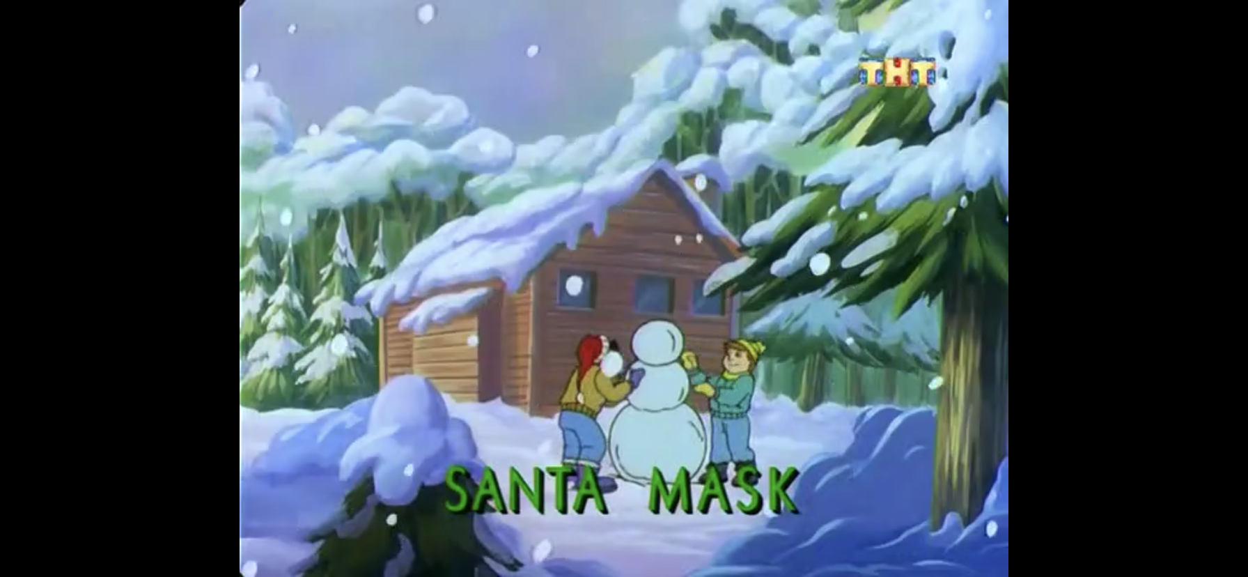
Poor Stanley, out in the cold.
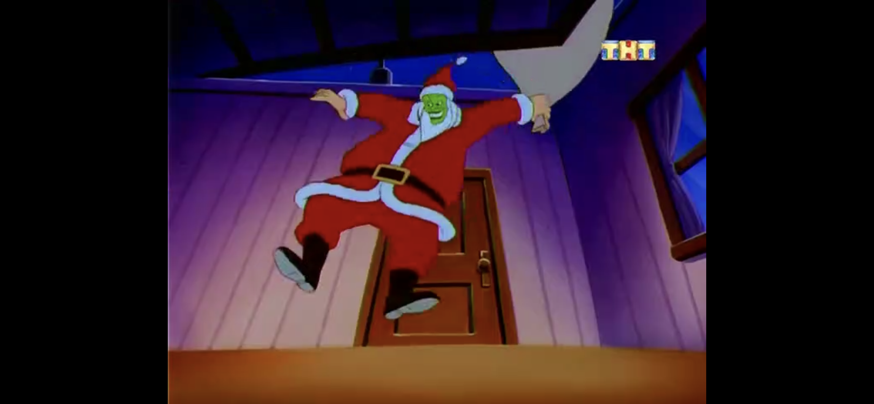
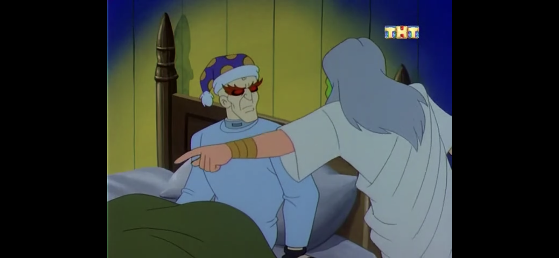
“Santa Mask” begins with Christmas descending upon Edge City. Stanley is being forced to dress as Santa and stand in the freezing cold outside of the bank he works at to attract customers. He badly wants to come in out of the cold, but his jerk boss, Charlie, has no time for complaints. He tries to make the best of things by calling out to a fellow Santa across the street, but unfortunately for Stanley he is no friend.
I don’t think he’s friendly.
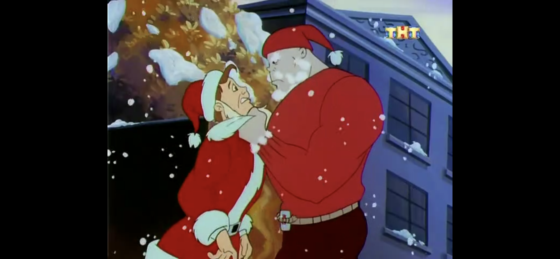
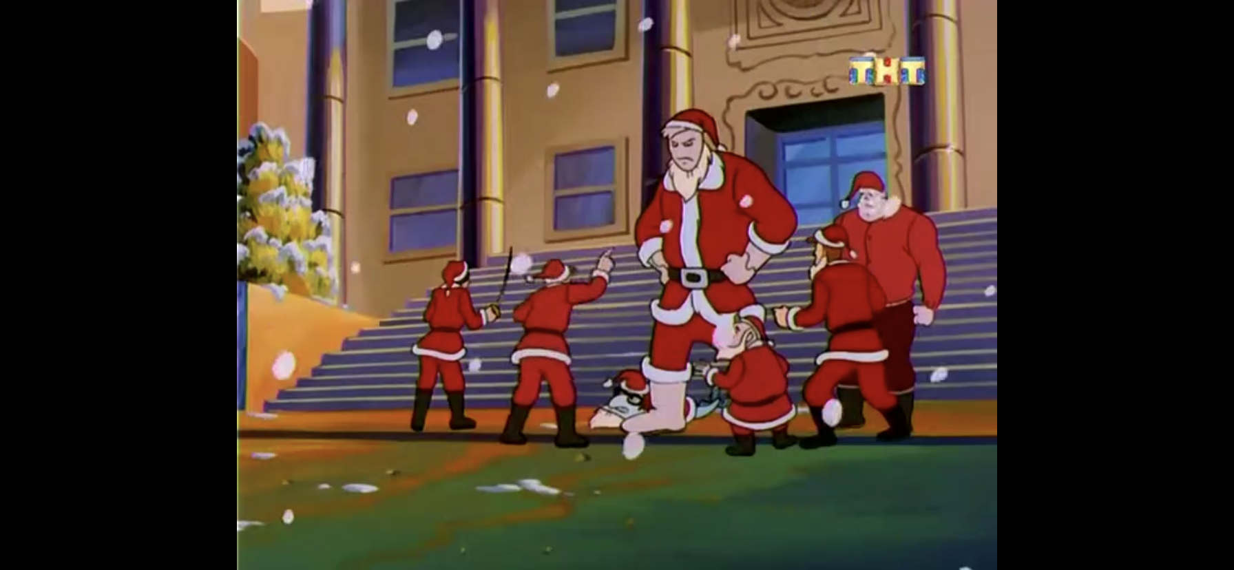
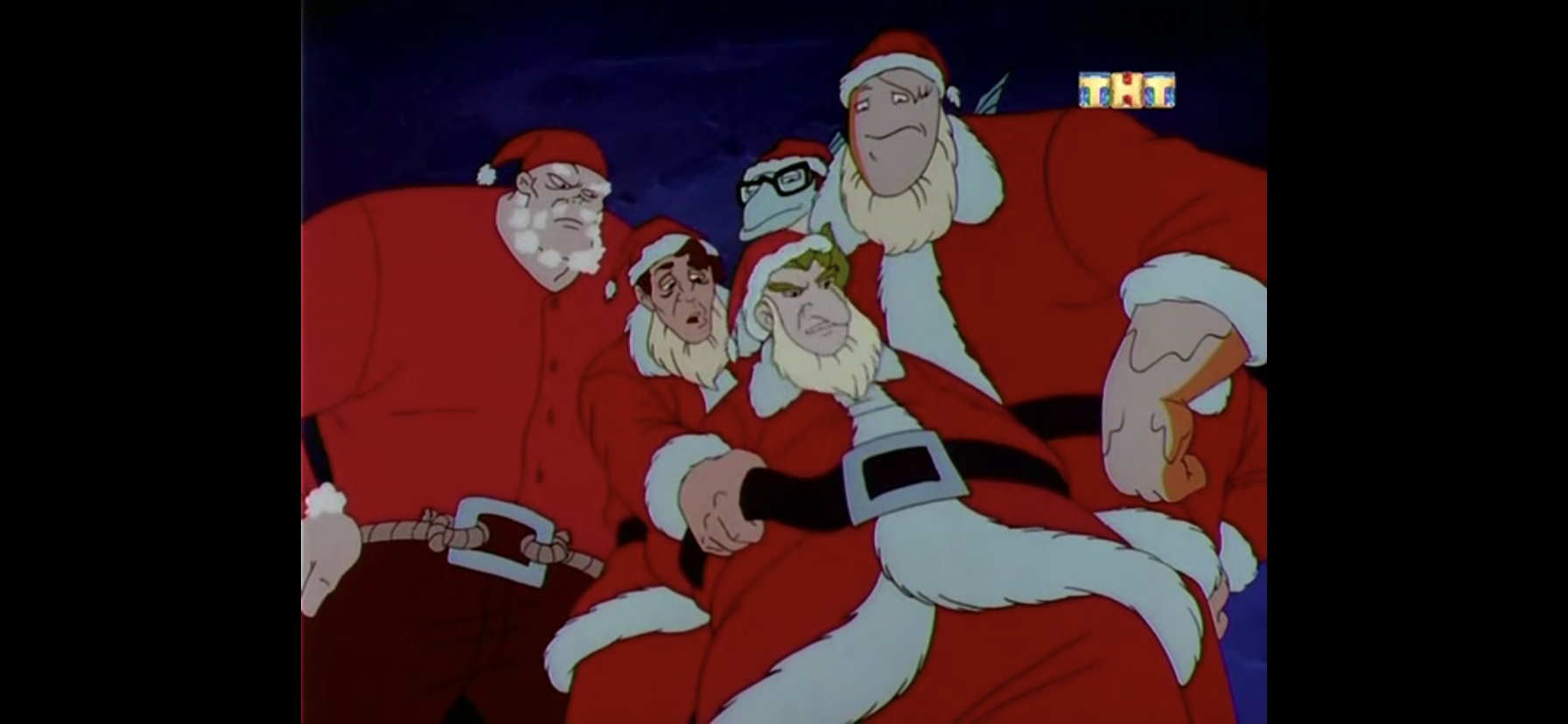
The other Santa is actually a villain in disguise. Walter, I believe, is the strong silent type who saunters over to Stanley with an evil look on his face. He was apparently in the midst of a robbery, and likely has his eyes set on the bank now. Before he can do Stanley any harm, another pair of Santas show up. Dak (Cam Clarke) and Eddy (Jeff Bennett), also known as Putty Thing and Fish Guy, are here to rip-off the town dressed as Santa. It’s such a good idea that fellow villain Kablamus (Jim Cummings, using a slightly altered version of his Winnie the Pooh voice) is about to do the same thing! The scene keeps getting more ridiculous as more villains dressed up as Santa emerge, including a Zorro knock-off and apparently Rocky?!
This is actually a common problem around these parts.
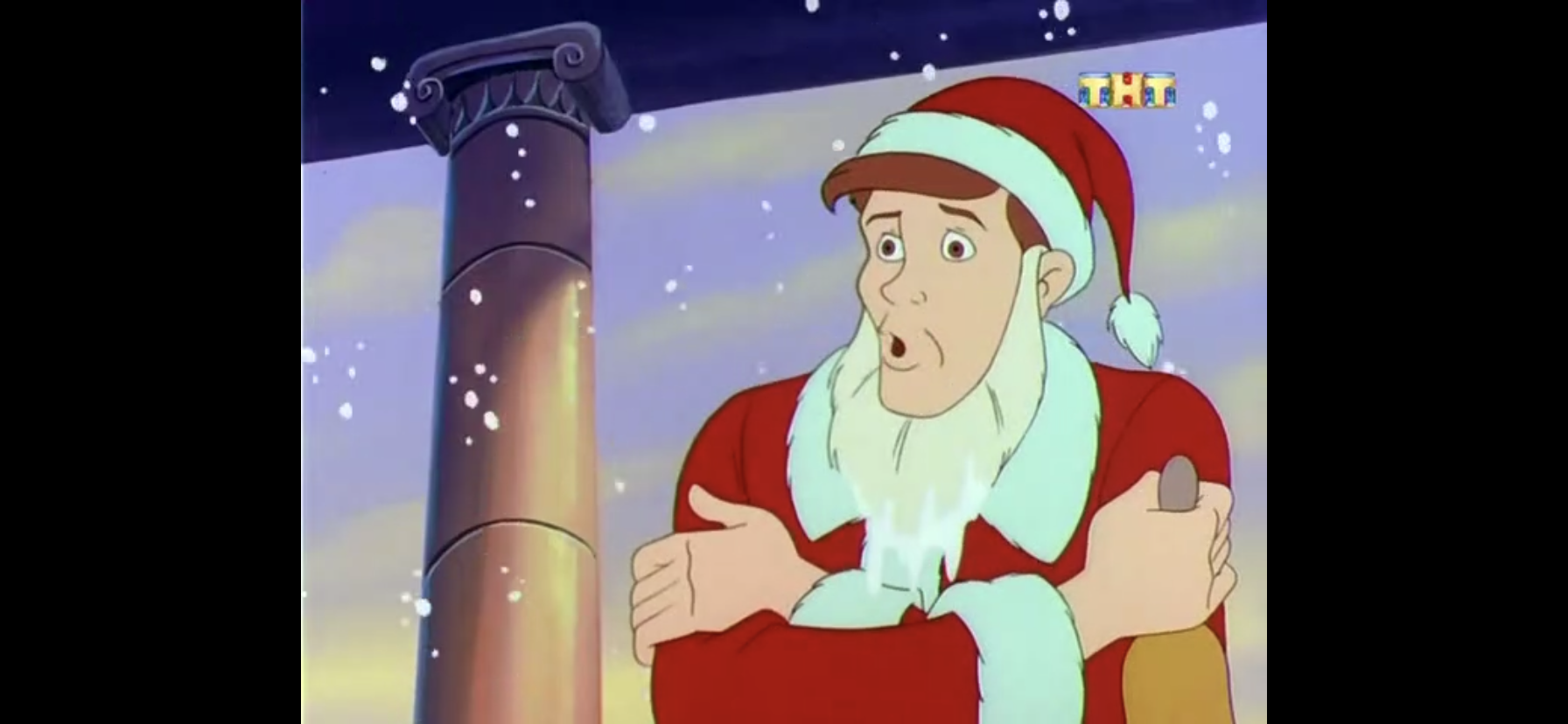
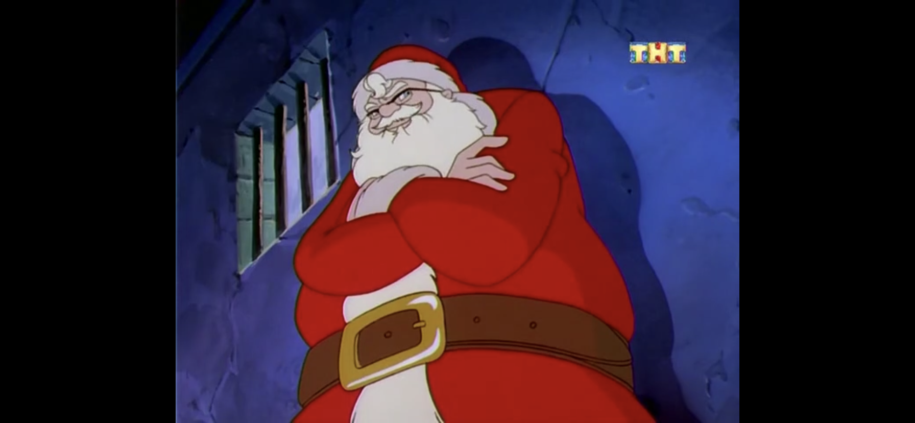
The whole episode causes Mayor Tilton (Kevin Michael Richardson) to declare that anyone dressed as Santa be arrested and jailed. Apparently this is a regular problem for Edge City around Christmas time as we see video of many phony Santas causing mayhem over the years. This lands Stanley in jail as this new ordinance must have been retroactive. He’s stuck in a holding cell with all of the Santas from earlier, and also a new one. This guy (Cummings) looks like the real deal though, and he is not happy about being locked-up on Christmas Eve. He has some harsh criticisms of Edge City’s criminal justice system and turns to Stanley as someone he can dump on. Stanley obviously doesn’t think he’s the real Santa, but this guy has some pretty convincing credentials including pictures of his elves and a North Pole sleigh-driver’s license (we also learn that parallel parking eight reindeer is quite a bitch).
If he’s the real deal, he’s the most intimidating Santa I can recall!
Stanley is soon set free as the police were finally able to figure out he meant no harm, but this Santa guy isn’t as lucky. Before Stanley can exit the cell, Santa pulls him aside to let him know that while he may not believe in Santa, millions of kids do and they’re all about to have a pretty crummy Christmas with Santa locked-up. He tells Stanley that he needs someone to fill-in for him, and unfortunately he’s the best he can do on short notice. Stanley still isn’t sure what to believe, and as he exits the cell he begs the guard to confirm for him that there is no Santa, but the guy just shrugs his shoulders.
It wouldn’t be much of an episode if he didn’t put it on.
On his way home Stanley encounters a father and son pair (both voiced by Clarke) with the kid mistaking Stanley for Santa at first. Stanley pulls up his beard and puts on a smile, but the kid sees right through it. At his apartment, Stanley is torn on what to do as he doesn’t want to be known as “the jerk who couldn’t save Christmas.” Feeling he has no other alternative, he turns to The Mask!
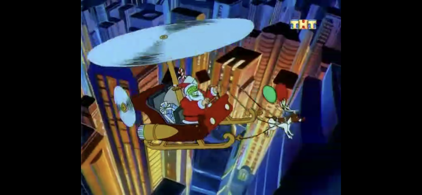
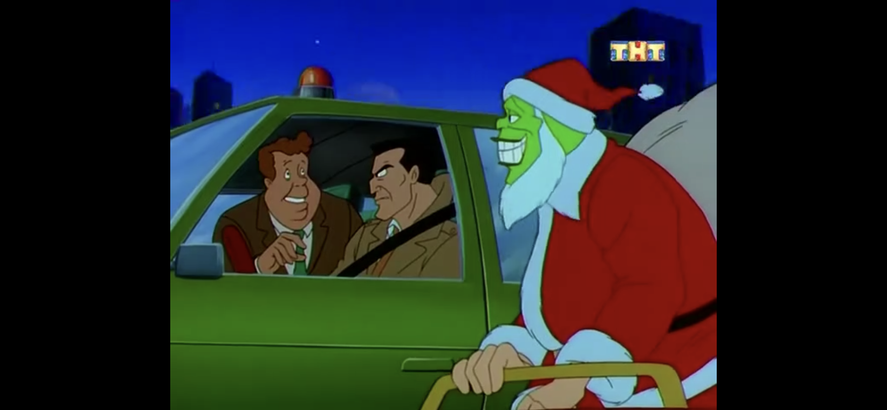
Well, I certainly wasn’t expecting a traditional sleigh.
The Mask (also voiced by Paulsen) takes to the Santa thing with open arms. He puts on the suit, complete with padding so he looks like a big, red, blob, and even comes up with a sleigh. How did he produce a sleigh? I don’t know, but this is a character who can seemingly pull a mallet out of his trousers with no regard for the rules of physics so I guess maybe he just did the same for a sleigh? It’s a rather slapstick looking affair as it has a whirling propeller over the top of it and one lone reindeer. That reindeer is, of course, Milo suspended by balloons with antlers and a red light bulb placed over his nose – poor little guy.
Chimneys are for chumps.
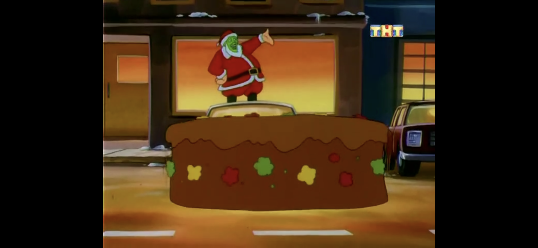
The duo heads to the first little house on the square, home to some little girl. Rather than go down the chimney, The Mask instead jacks up the roof and hops into the girl’s bedroom. She’s surprisingly not terrified to see this loud, green-faced, man enter her room, but she is looking forward to a Christmas present. She’s a bit frustrated with Mask Claus though as he doesn’t seem to know what she wants, even though she told “him” when she sat on his lap at the store. Eventually, she reminds him that she wanted a rocking horse, so The Mask one-ups her request and removes a real, live, racing horse from his rather massive sack. She’s pretty thrilled by this development, and The Mask hands her a stack of bills to wager on an upcoming race for him before exiting.
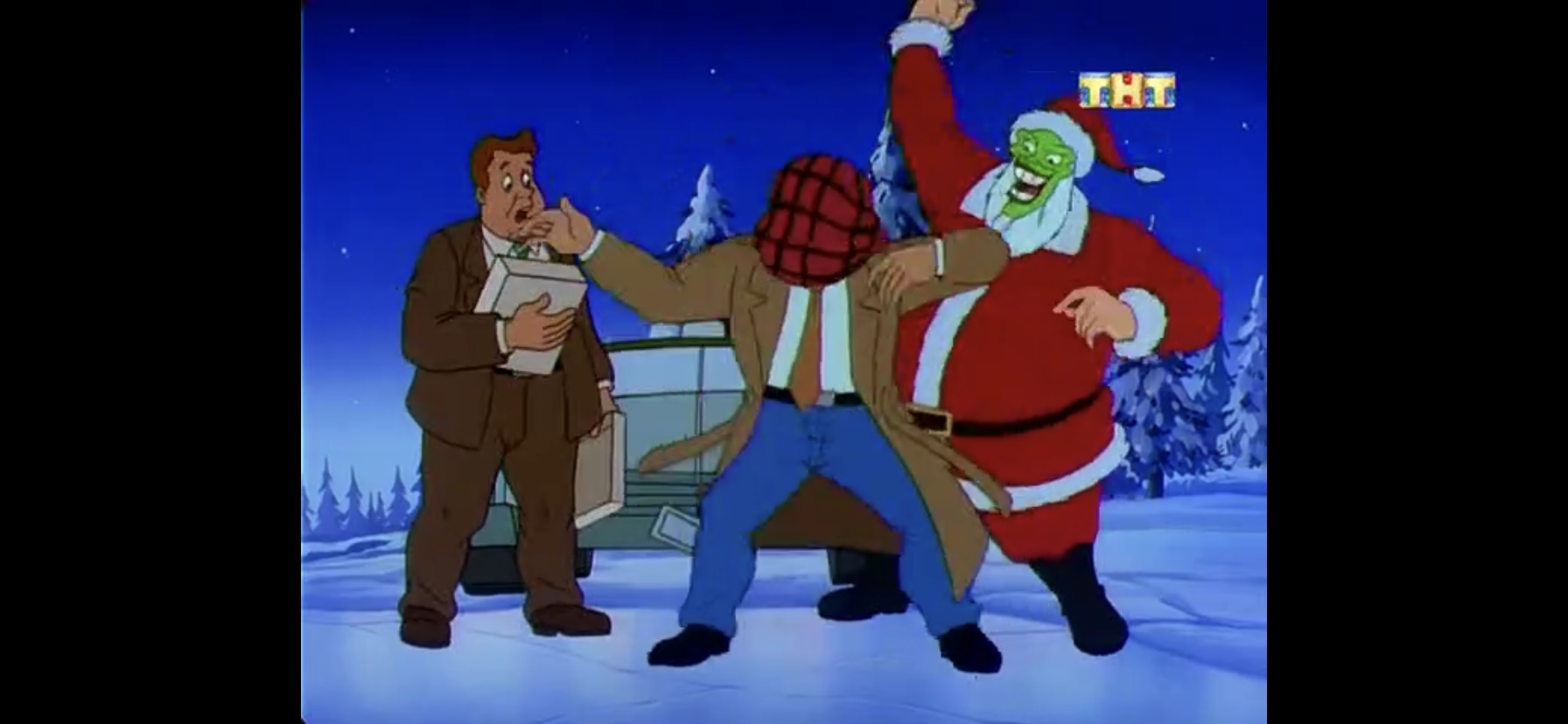
Elsewhere, Lt. Kellaway and Detective Doyle are out patrolling the streets for more renegade Santas. Doyle, being the “dumb” one, is rightfully concerned they may lock up the real Santa and mess up Christmas for a whole bunch of kids. Kellaway thinks he’s an idiot and tells him there is no Santa. His evidence? He never got some dumb train as a kid, so you can bet he’ll get it before the episode is over.
Well, at least he noticed his face was green. That makes him smarter than Cindy Lou Who.
The two soon run across The Mask as he was attempting to scale the next house on his list and Kellaway is eager for a chase. The Mask rides along beside their car and Doyle questions why Santa’s face is green. Kellaway breaks the news to him that it’s not Santa, but The Mask, and a chase is underway! It ends on a nearby pond that’s frozen over with the two officers exiting the car only to have The Mask ice skate over to them. The Mask gifts the pair a present each; a VCR for Doyle and a flannel shirt for Kellaway. The Mask informs him it matches his flannel underwear, which is when The Mask gives him a giant wedgie. The Mask laughs and skates a circle around the pair, and their car, and since he operates under the laws of cartoons you know this means he just cut a large hole in the ice. Kellaway and Doyle seem to be well-aware that the usual laws of nature do not apply here as they run from the car as a giant hole appears in the ice to swallow the vehicle up. The Mask leaves and Kellaway makes a call to the rest of the force requesting a helicopter and a very large crane to remove his car from the pond.
It’s wedgie time!
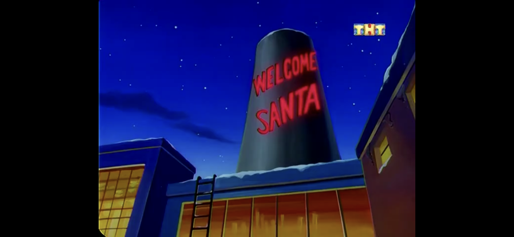
The Mask gleefully takes to the sky, but soon finds himself targeted by a rather odd looking police helicopter. Seriously, this thing looks more like a Transformer than any real world helicopter I’ve seen. The Mask instructs Milo to provide a diversion as he bails on the sleigh in favor of running across the rooftops. Fearing his city has become hostile towards Santa, he’s elated to see a smoke stack with neon lights welcoming Santa. He turns into a whirlwind and shoots up the smoke stack, leaving behind the word “No” added in lights to indicate that there are actually no Santas present inside.
Well that’s convenient.
The Mask disappears down the smoke stack only to find out it was all a trap! It would seem the villainous Doctor Septimus Pretorious (Tim Curry) has laid a trap with the intent to capture Santa Claus! This guy is a recurring villain who is some sort of robot with outlandish eyebrows and what looks like a cat sphincter in the middle of his forehead. Anyway, he wants to uncover the secrets of Santa’s magic sack since it can seemingly carry trillions of toys inside of it while looking mostly like an old pillow case. He’s eager to take a look and is apparently oblivious to the fact that he’s actually captured The Mask, and not Santa.
They just couldn’t leave Dickens out of this one.
The Mask rather effortlessly breaks free and then takes Pretorious on a Scrooge-like journey that wraps up in roughly a minute as opposed to the usual running-time such a thing entails. He changes wardrobes rapidly with the story, and when he needs Pretorious to do the same he simply rips his head off and shoves it where he needs it to be. Pretorious seems totally flabbergasted by the whole affair and basically just lets everything happen. When The Mask is done, or maybe just bored, he leaves, but not before he gives Pretorius his present: a bomb. As he exits the smokestack he also changes the lettering on it once again this time instructing the police to check there.
Admit it, you forgot about these guys. I know I sure did.
Outside, The Mask is unable to call for Milo, so he whips out a remote to summon him instead. The poor dog arrives out of breath and the two return to the sky with The Mask a bit dismayed to realize he’s only delivered one present this evening. Elsewhere, the other incarcerated Santas have devised a way to escape. Kablamus has let the others in on the fact that he’s a living bomb and the Rocky guy is rather impressed. For those who don’t watch the show, Kablamus is a supervillain who can make himself explode without harm. You would think the cops would have taken some precautions there. They blow the wall open and all of the Santas are free, including the real one.
I would really like to know who decided fruit cake was funny.
The Mask is then preparing to enter a home, but the sound of looting disturbs him. The Mask is forced once more to abandon his Santa duties to put a stop to these miscreants and does so by taking on the role of a drill sergeant to get their attention, then a Spanish singer to whip them into a frenzy. It’s basically all a performance to distract the crooks and group them all together (there’s a method to his madness) until they figure out they’re villains and shouldn’t be singing and dancing. The Mask then switches tactics and begins a speech about turning to some aspect of Christmas that is unloved, and the second it begins I catch myself saying aloud “not fruit cake!” Yes, it all builds to a dumb fruit cake joke. Actually, a joke basically utilized by another Paulsen show, Animaniacs, as a giant fruit cake magically falls from the sky to land on the villains. The Mask them wraps them up with a bow complete with a “Do Not Open till X-Mas” card, though I have to believe we’re past midnight at this point. Kellaway and Doyle then come upon the scene, driving a tow truck, and Doyle is predictably the only one to express affection for fruit cake.
Well, would you look at that?
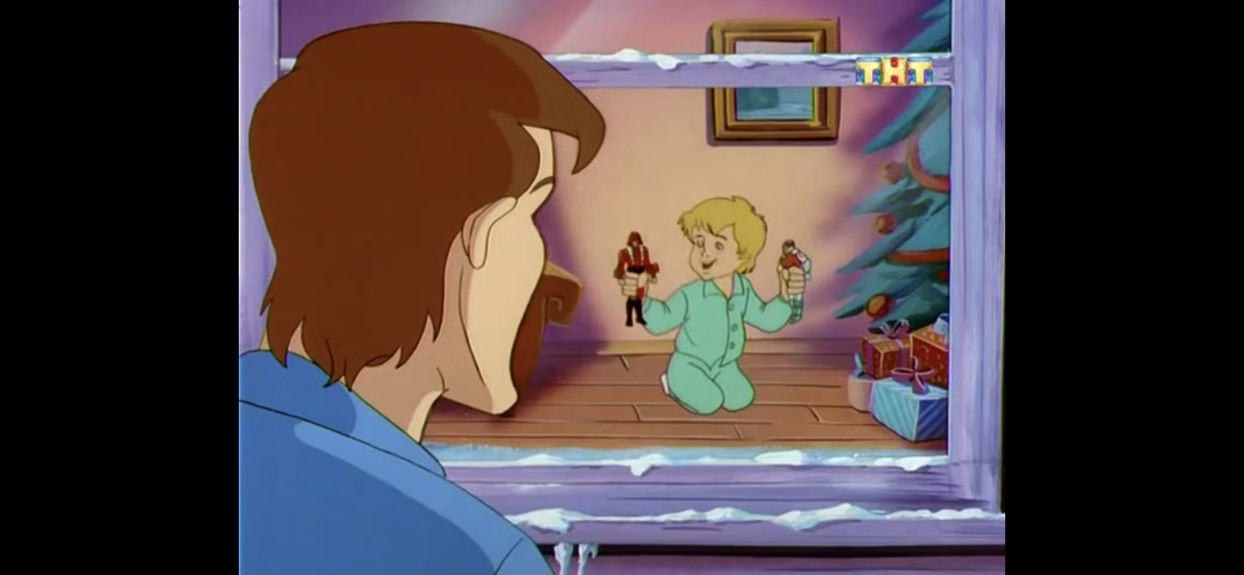
With that mess taken care of, The Mask is finally able to get to the next house on his list. The only problem is right after he lands the sleigh (on the lawn, for some reason) he realizes that it’s actually dawn. He pulls off his face and The Mask is once again just Stanley Ipkiss. He’s dismayed that he’s let down Santa and realized his destiny as “the jerk who couldn’t save Christmas,” but as he peers through the window of the house he was about to enter he sees the same kid he encountered on the street earlier. Only this kid is excited because Santa left him some new action figures that look a lot like G.I. Joes. Stanley is relieved to see this and at that moment realizes that Santa must have escaped with the other inmates and set everything right.
Honestly, Stanley is lucky the worst that happened to him was his faith in Christmas was crushed. You go around grabbing people like that in the city and you’re liable to get stabbed. Or worse.
Stanley returns to the city proper and is eager to share the news that Santa is real! Most people on the street regard him suspiciously, and he even runs into Kellaway outside the police station. Kellaway has no interest in entertaining Ipkiss. He’s not even content to let Stanley think what he wants and instead informs him that all of the Santas who escaped were recaptured and takes him into the precint to show him. Stanley flips through the mug shots and doesn’t see the real Santa and begins to doubt himself. He leaves and Kellaway enters his office smugly to retrieve his bowling ball as that’s how he’s spending Christmas. There he finds the dumb train he wanted as a kid sitting on his desk. With tears welling up in his eyes, he looks to the sky hopefully, and then dismisses the possibility of an actual Santa. We don’t have room for two miracles in this one.
That’s the toy that made him lose faith in Santa?! Even the weenie whistle is better than that!
A somewhat down Stanley is then shown walking home. His experience at the police station has left him thinking there really isn’t a Santa, and that’s just sad. A present then lands on the sidewalk in front of him and Stanley picks it up. We hear a Santa voice-over thanking Stanley for at least trying to help out. His true gratitude is apparently expressed on the tag as Kellaway has been crossed out and replaced with Stanley. Inside is the flannel shirt The Mask had gifted Kellaway and Stanley is happy to have it. He picks up Milo and tells him, “Yes, Milo, there is a Santa Claus!” As the camera zooms out and we see the snow falling, the little girl from earlier goes riding by on her new race horse and Stanley gives her a wave.
The part of Virginia will now be played by Milo.
For Christmas, writer Dean Stefan basically took The Santa Clause approach, or Flintstones approach if you prefer, for The Mask. It’s a solid premise as imagining The Mask in the role of St. Nick certainly seems like it has some comedic appeal. In spite of that, I really didn’t find much to laugh at. Maybe if I were 7 this would be funny, but most of the jokes were too familiar. I liked some of the inexplicable humor, like Rocky being a villain (he’s apparently named Dynamite Joe), but few actual jokes did much to move me. The fish guy seemed like he had potential, as he’s basically just a fish, and there were some jokes at his expense once the Santas were captured as he apparently does not possess a pleasant odor. The Mask as a character isn’t really that funny though. He reminds me of The Tick, only instead of aloof he’s self-aware. He’s certainly loud and the nature of the character means he can lend himself well to gags, but few were present here. The fruit cake joke was dumb and it’s a punchline relied upon way too much in cartoons. Same with The Mask calling out fake reindeer names at one point which included Nixon instead of Blitzen – I think that’s another gag we can retire.
That’s not to say I did not enjoy the performance of Rob Paulsen. He’s a voice acting legend and he’s certainly able to match the intensity of the film performance. The other performance I quite enjoyed belonged to Tim Curry, which isn’t much of a surprise since he tends to be terrific whenever he takes on a voice role. He really didn’t have many lines as Dr. Pretorius in this one, but the way he emphasized the word “sack” was one of the few moments I actually chuckled aloud. Some words are just inherently funny when spoken a certain way, and Curry certainly found that with “sack.”
Her parents must have been pissed.
Otherwise, this episode does at least make an attempt at some Christmas feels with its resolution. There’s some cynicism present though, and it’s even embodied by the show’s real Santa character. And re-inserting the horse girl into the end was a good touch. Even though I found this one a bit short on laughs, it is written competently and I liked how it kept coming back to the fact that The Mask was so awful at playing Santa he only delivered one present.
Even though I consider The Mask to be superior to Ace Ventura: Pet Detective, it’s a bit harder to come by. Only the first season was released on DVD, but at least this episode is a part of that. And because of that, it’s also available streaming. The good news is that there’s also less protection of it. If you look at the credits, there were a lot of different companies involved in this series and I’m guessing that’s why it’s not more readily available. There are just too many parties to compensate in order to make it worthwhile. Instead, no one cares about it and you can find this online streaming for free should you wish to spend Christmas with The Mask.
Can’t wait until tomorrow for more Christmas? Check out what we had to say on this day last year and beyond:
So it’s come to this. We’re doing Family Guy. I don’t mean to come across as a snob or some animation elitist (after all, we already did Robot Chicken), but I don’t care for most of Family Guy. That wasn’t always the case. When the show originally aired on Fox I actually liked it quite…
A show that felt like it was made for, Metalocalypse was an animated show on Adult Swim about a fictitious death metal band and their misadventures. And yet, it was a show I could never get into. It began in 2006 as I was exiting college and heading into “the real world” in which I…
On December 6, 1992, Tiny Toon Adventures aired its series finale, a Christmas special. After three seasons it was time to move on to spin-offs, additional specials, and new shows. It’s interesting because this episode deals with the show getting cancelled in a hypothetical way. It’s also a parody of It’s A Wonderful Life which…
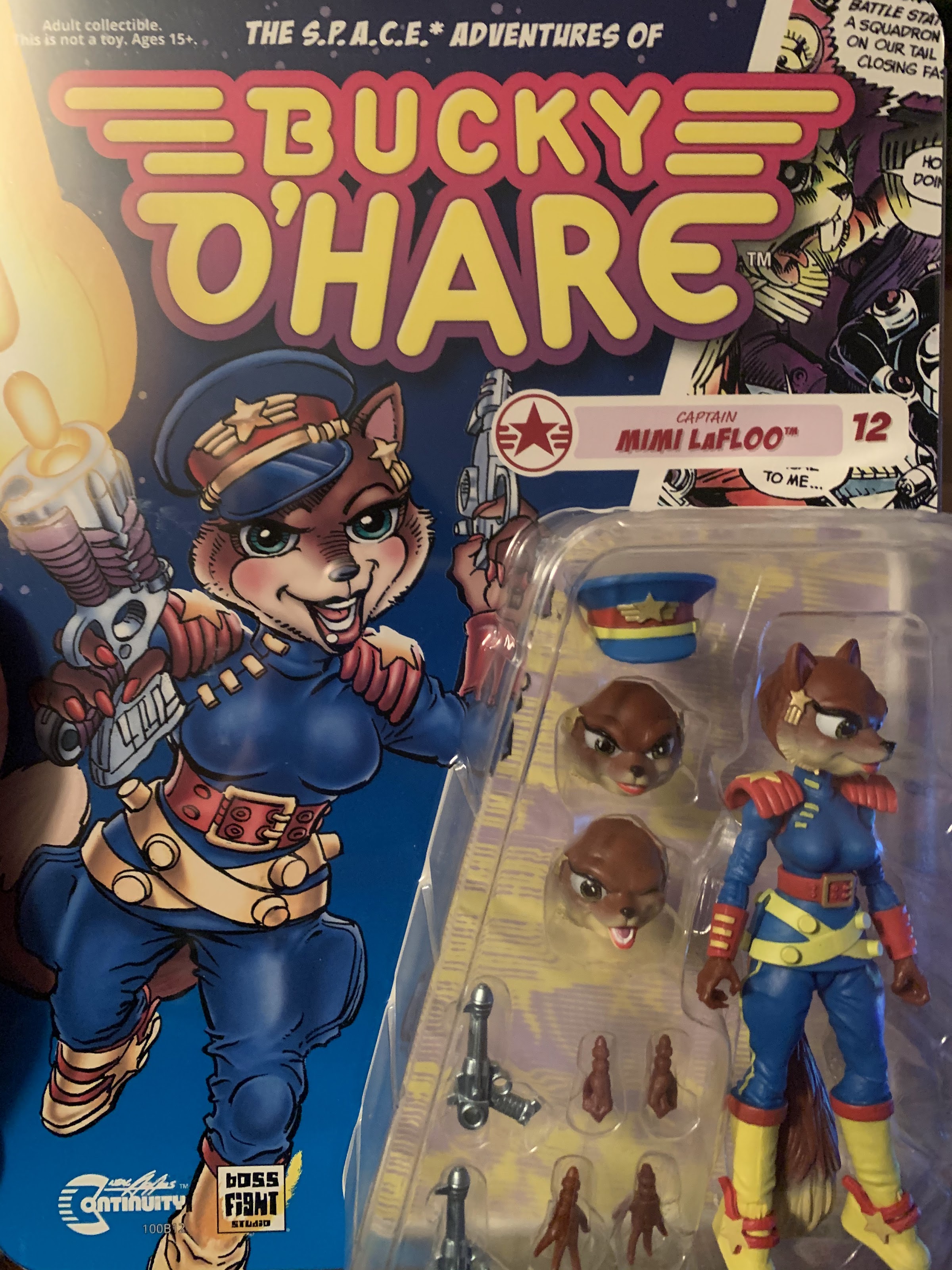
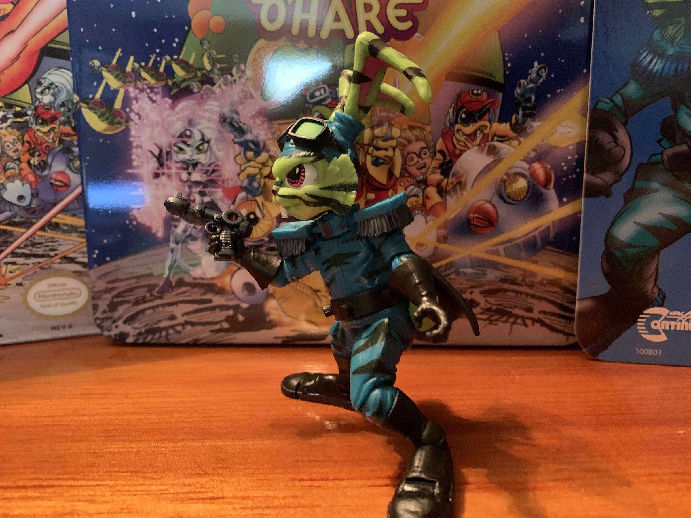
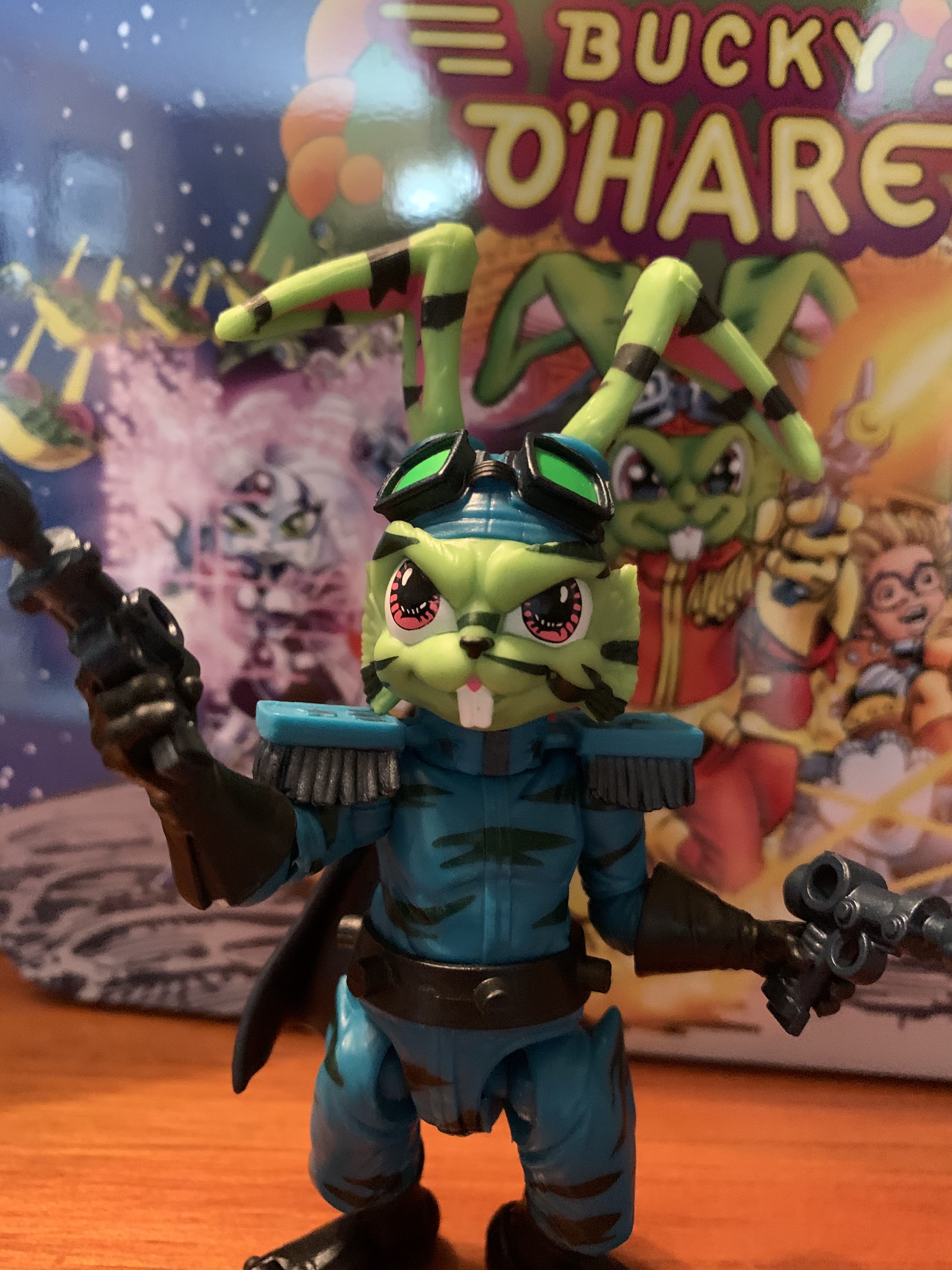
After a disappointing 2019 for Bucky O’Hare, 2020 has managed to be far more kind. No new figures were released last year, but this year has seen three new releases in the line including two new sculpts. I know 2020 has been a rather lackluster year, to say the least, so we need to take our wins where we can. Closing out the year for the Bucky O’Hare line is Captain Mimi LaFloo. She is just the second figure in the line to not be featured in the vintage Hasbro line of action figures from the early 90s. And unlike First Mate Jenny, she was never even planned for that line making her about as new a thing as any figure can get for this line.
I love the blister art on these things.
Fans of the cartoon series Bucky O’Hare and the Toad Wars should be familiar with Mimi. She debuted in the third episode of the series, “Home, Swampy, Home” which was my pick for best episode in the entire run. She returned in the “The Artificers of Aldebaran” as a full-fledged captain of her own ship, The Screaming Mimi, though she still had yet to hire a crew (funds are notoriously tight for the mammal frigates). Even though she originated with the cartoon, she is still depicted here in her Continuity Comics colors in her captain’s uniform. It’s not that drastic a change and really the outfit just features more color and detail when compared with her cartoon counterpart.
You may be wondering how Mimi is #12. Not pictured: Bruiser(#10), CC Dead-Eye (#6), Holiday Bucky(#8). That leaves the count one off (#9), which possibly refers to the unreleased Stealth Dead-Eye. There’s also an unreleased Aniverse Bucky.
When Mimi was announced as the next figure, a lot of chatter I saw online surrounding the announcement was surprise, with a tinge of disappointment. Sure, Mimi isn’t part of the main crew like Blinky and Willy, nor is she one of the heavy hitters on the villain’s side like Toadborg and Al Negator, but she really was one of the best characters to come out of that vintage cartoon. She’s a strong-willed fighter and takes orders from no one, and since she’s basically the only female other than Jenny to receive much air time it’s not that surprising a company like Boss Fight Studio, which strives for diversity with its toys, would be drawn to her. I actually had her fairly high on my wants list when I broached the subject a while back, so while I shared in the surprise that some of my fellow collectors exhibited, I was certainly not dismayed. Plus, I think it’s exciting to see Boss Fight step outside of the Hasbro comfort zone with this property.
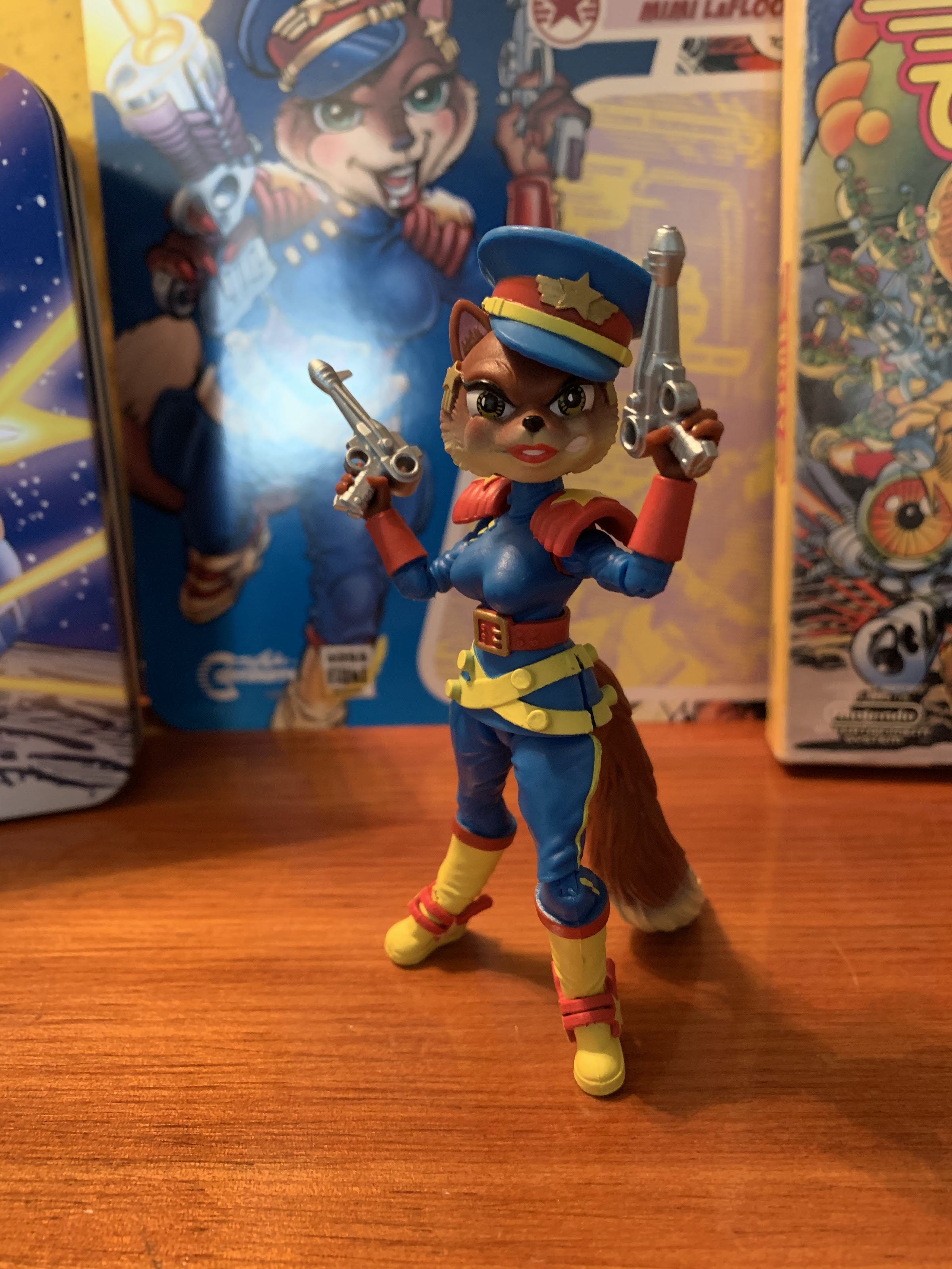
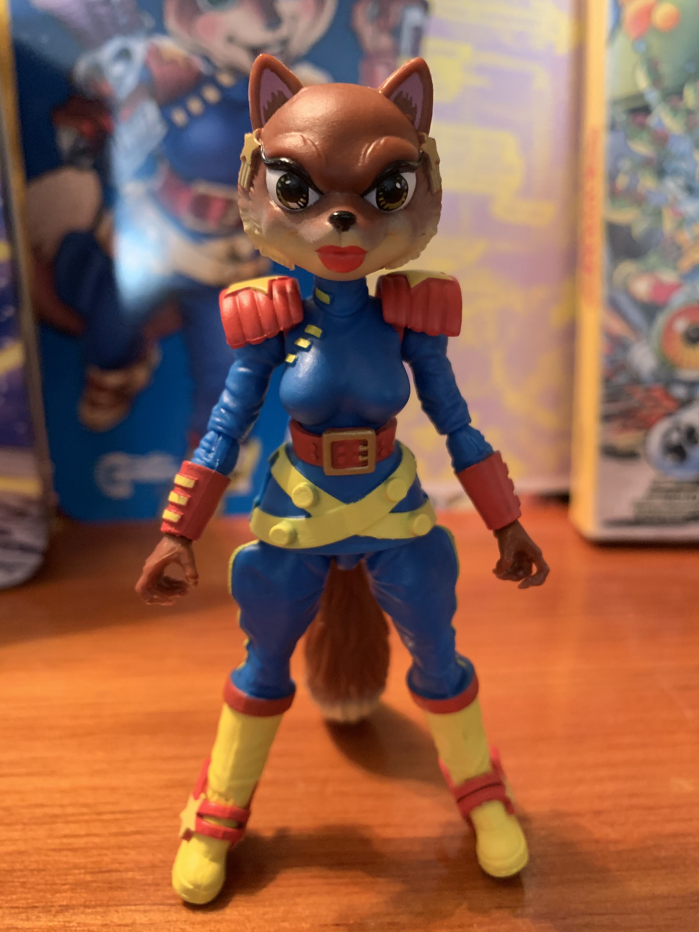
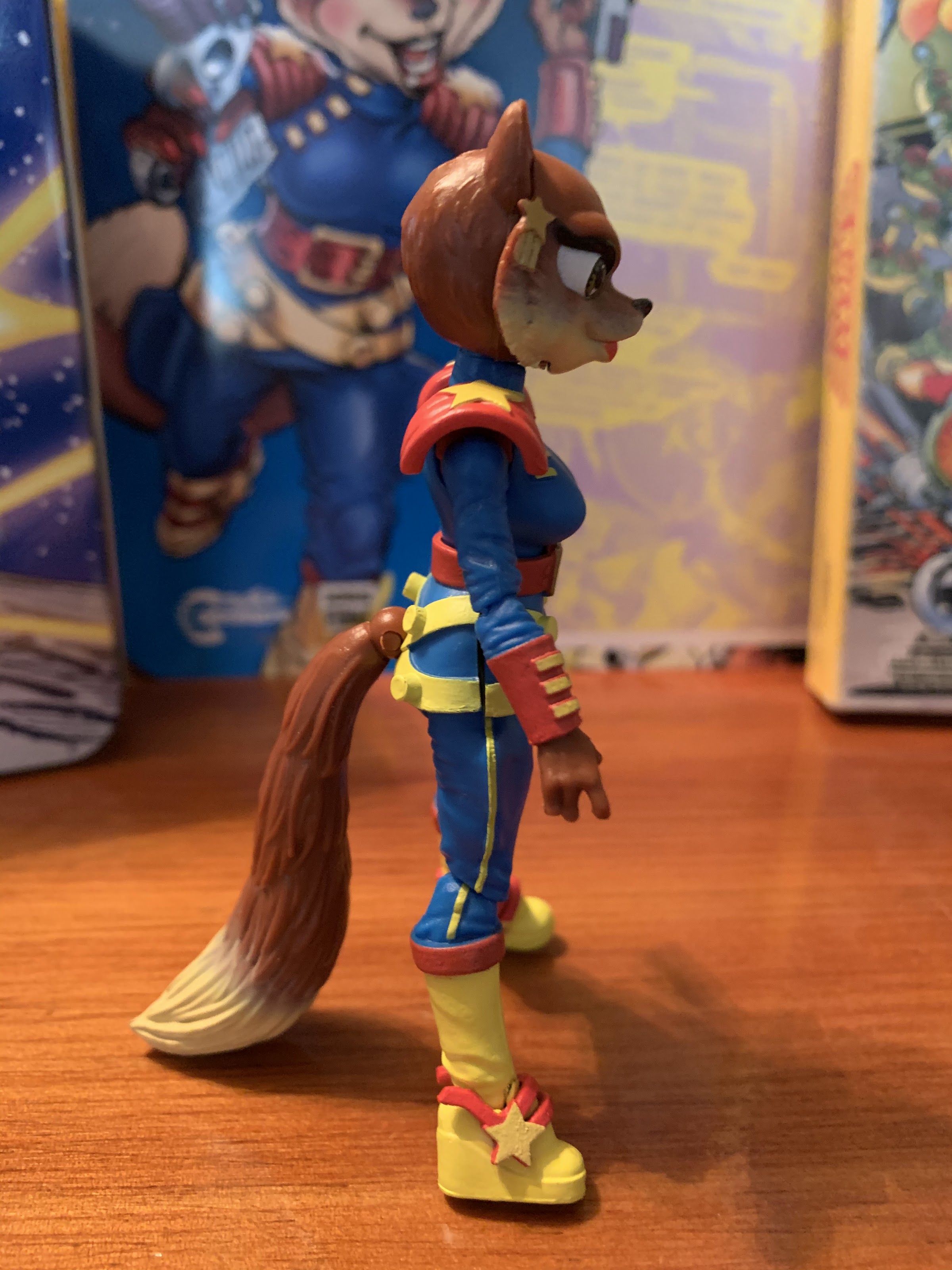
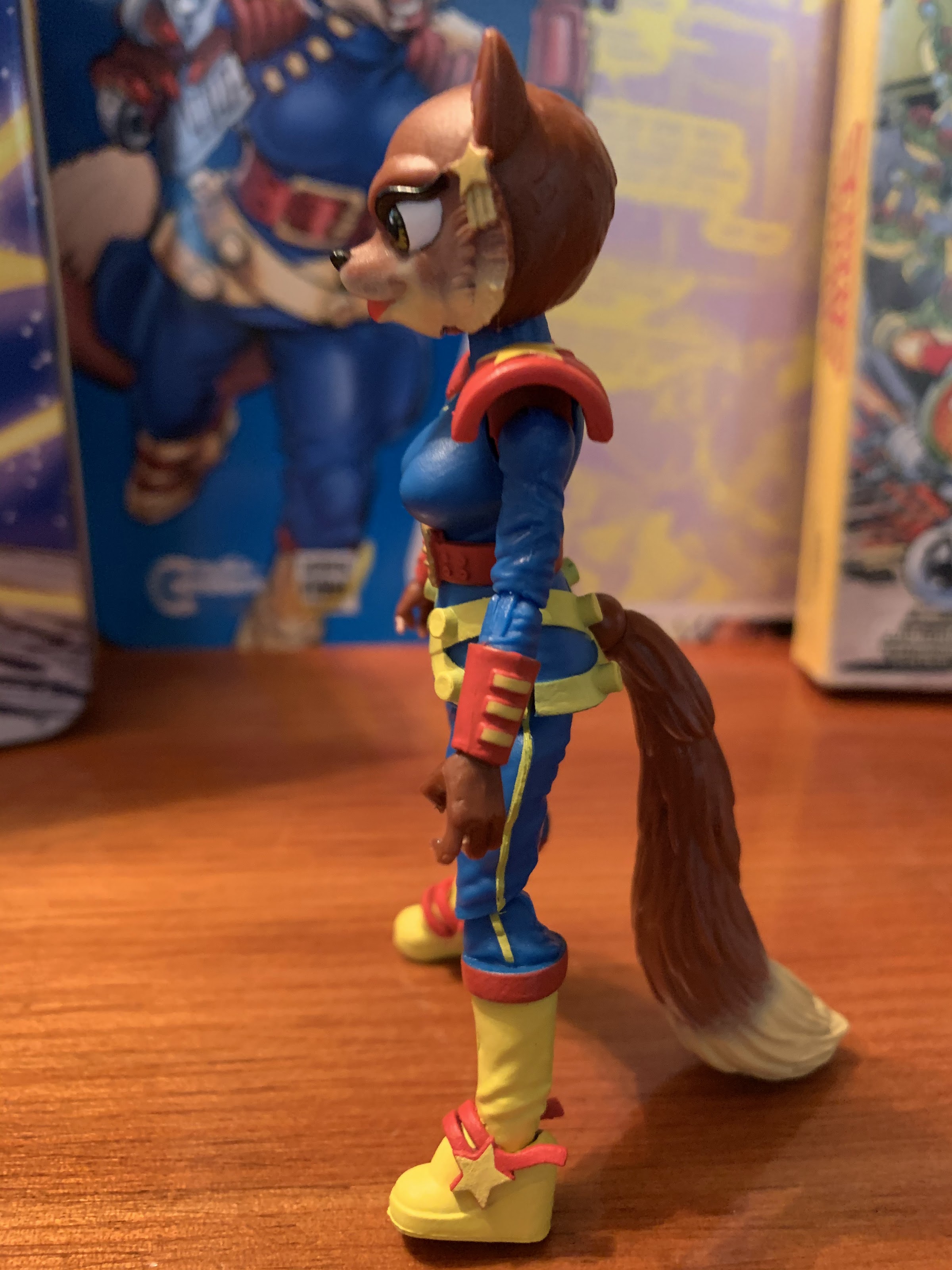
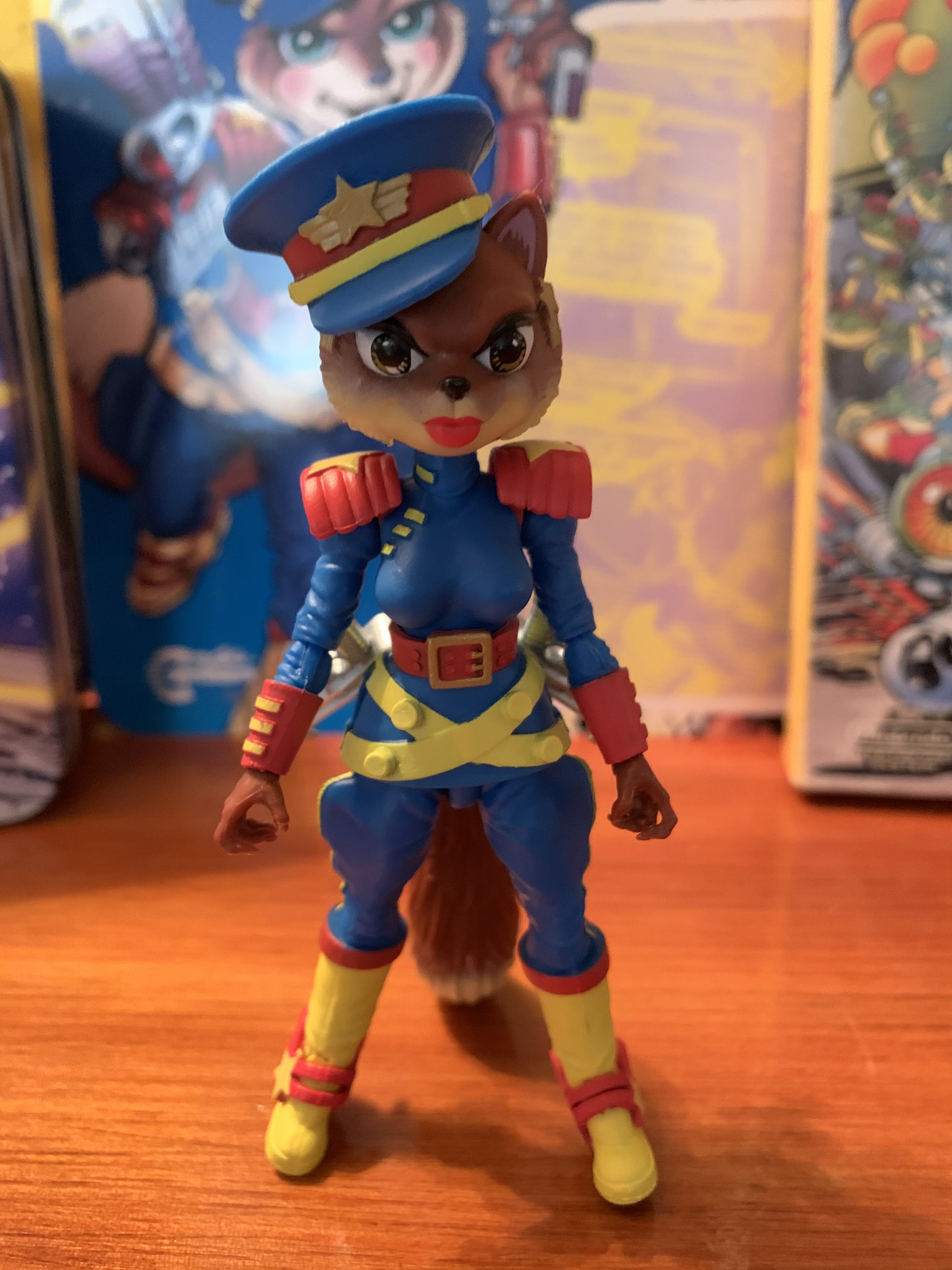
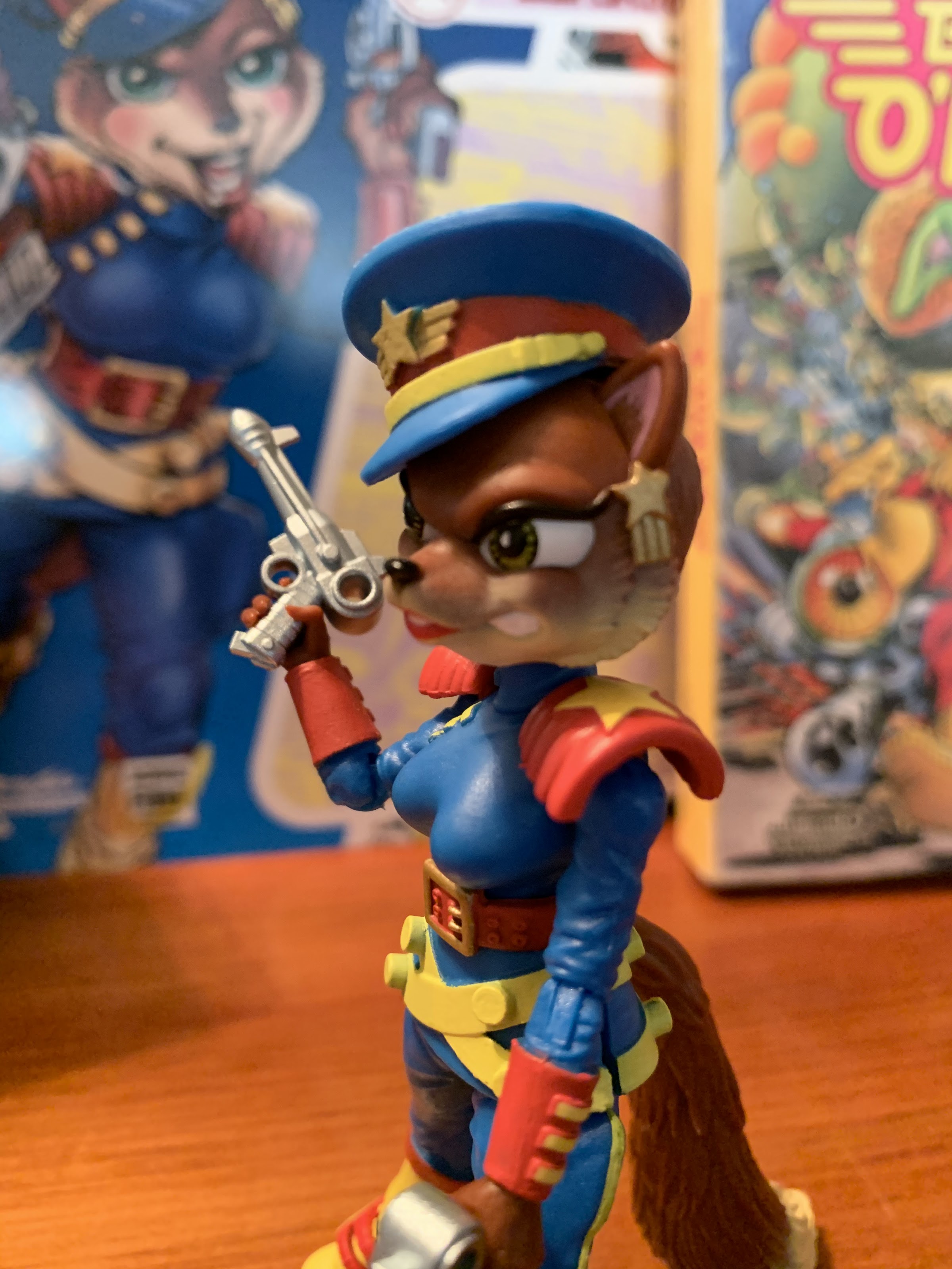
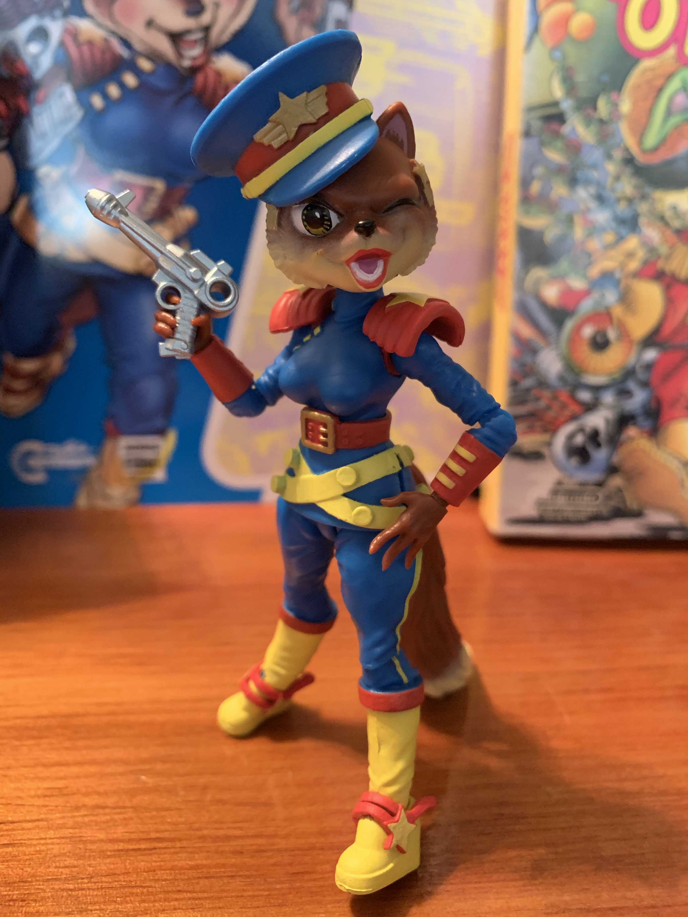
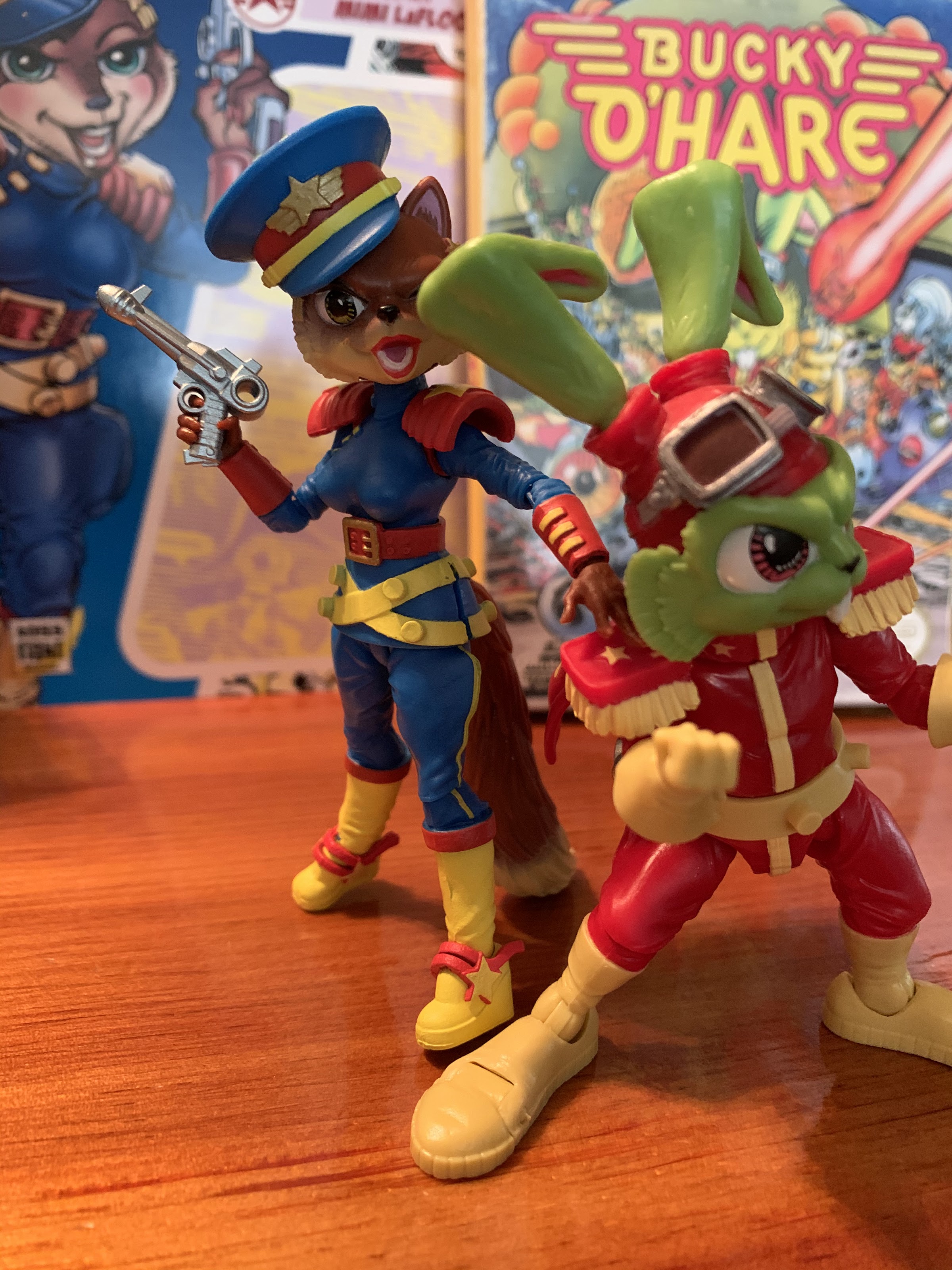
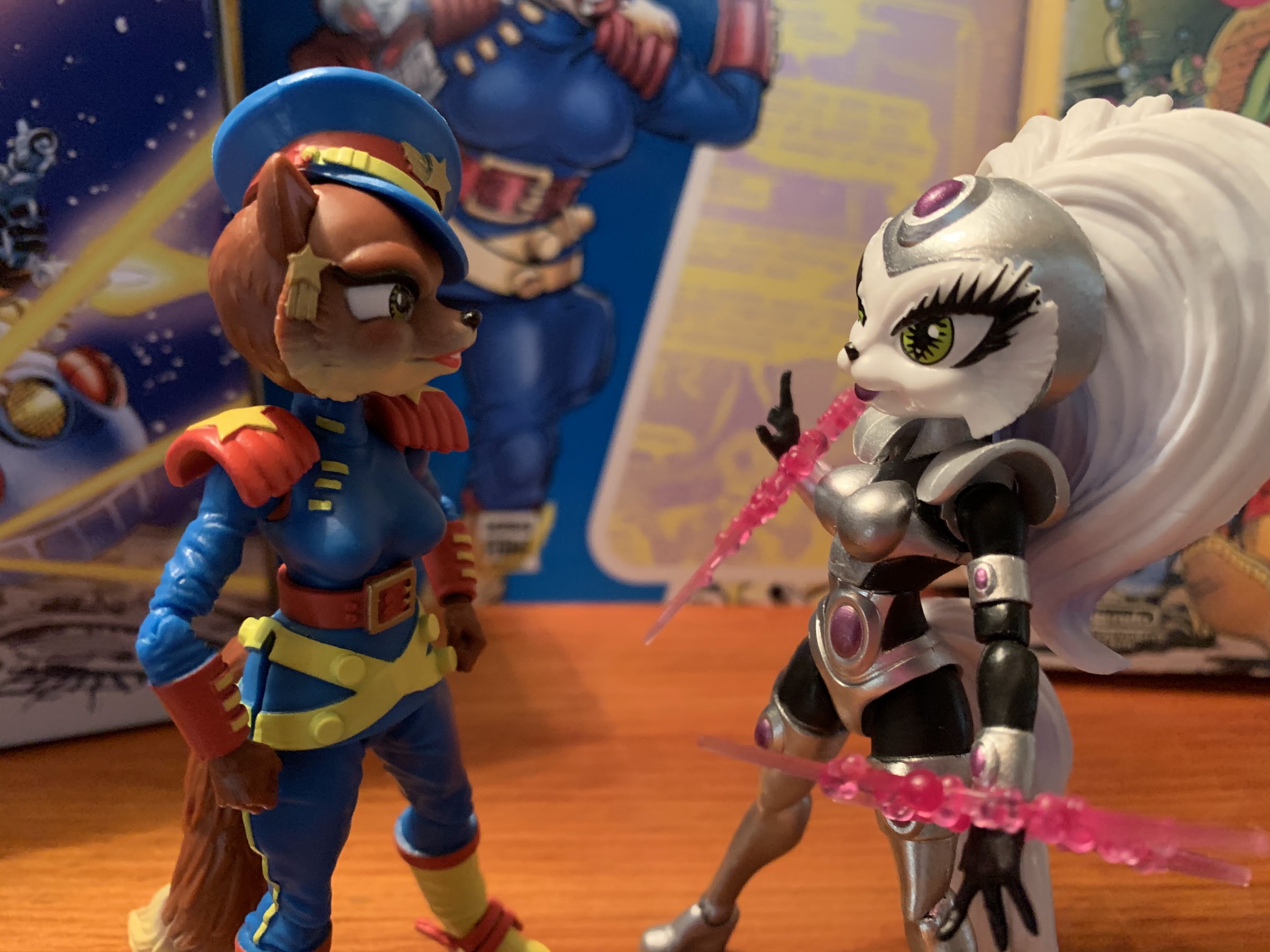
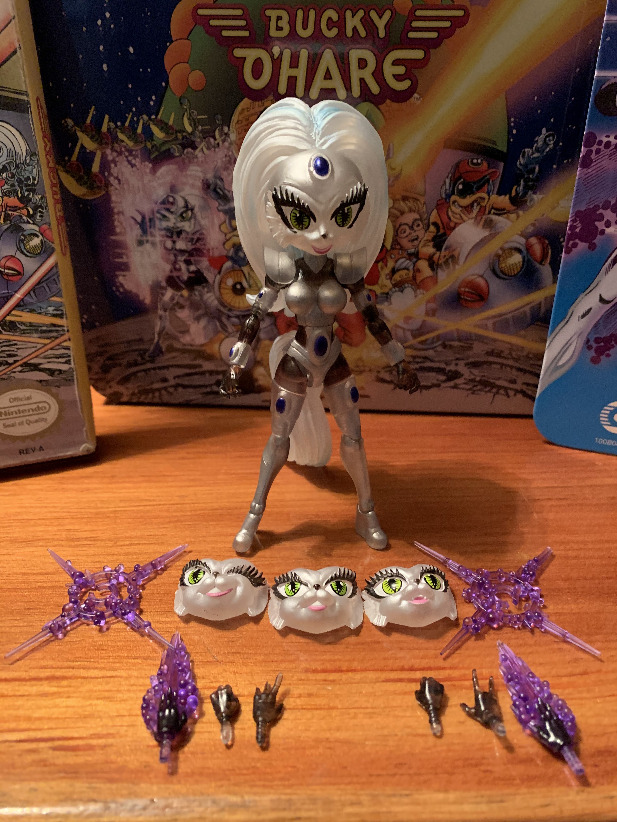
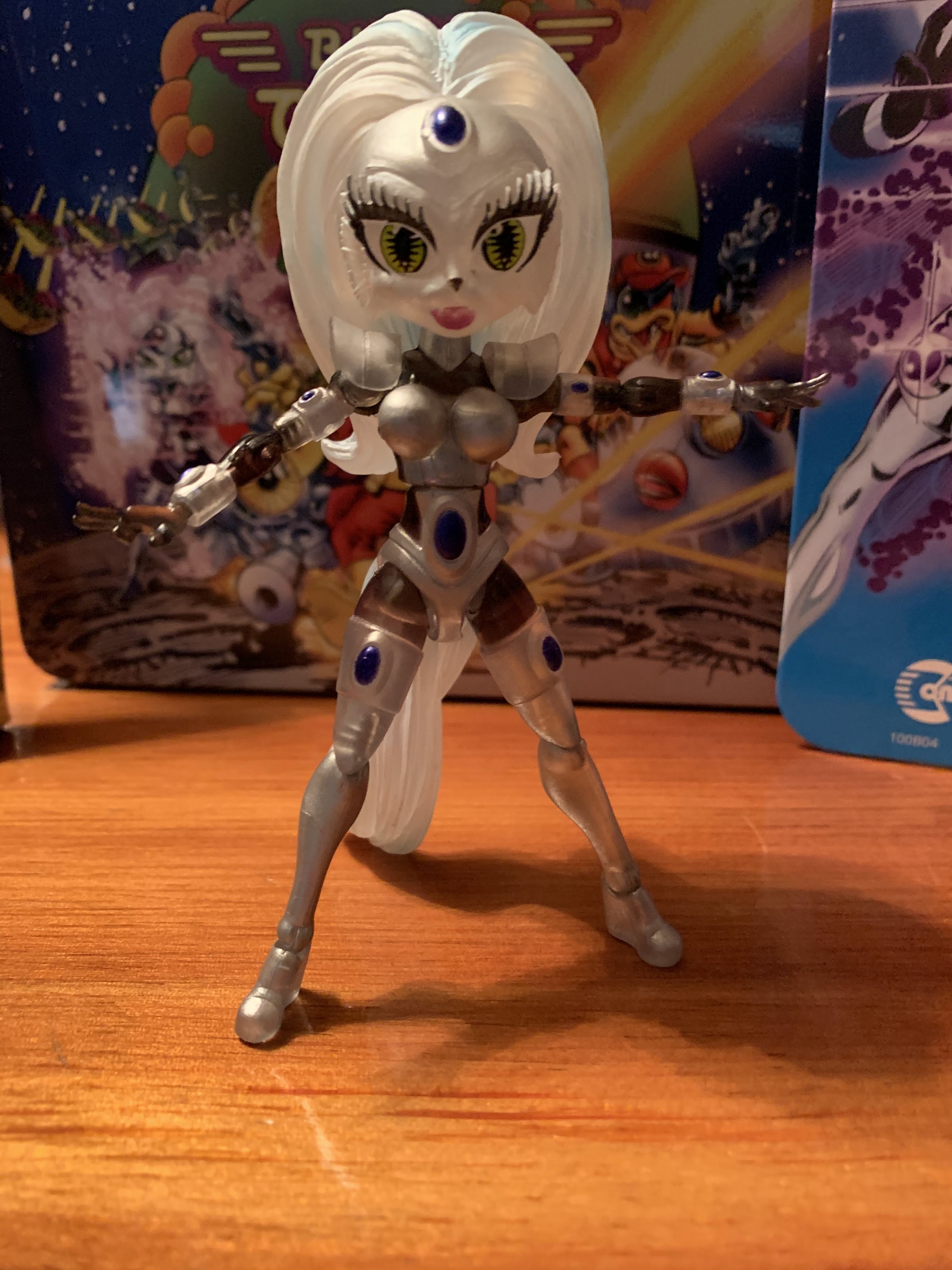
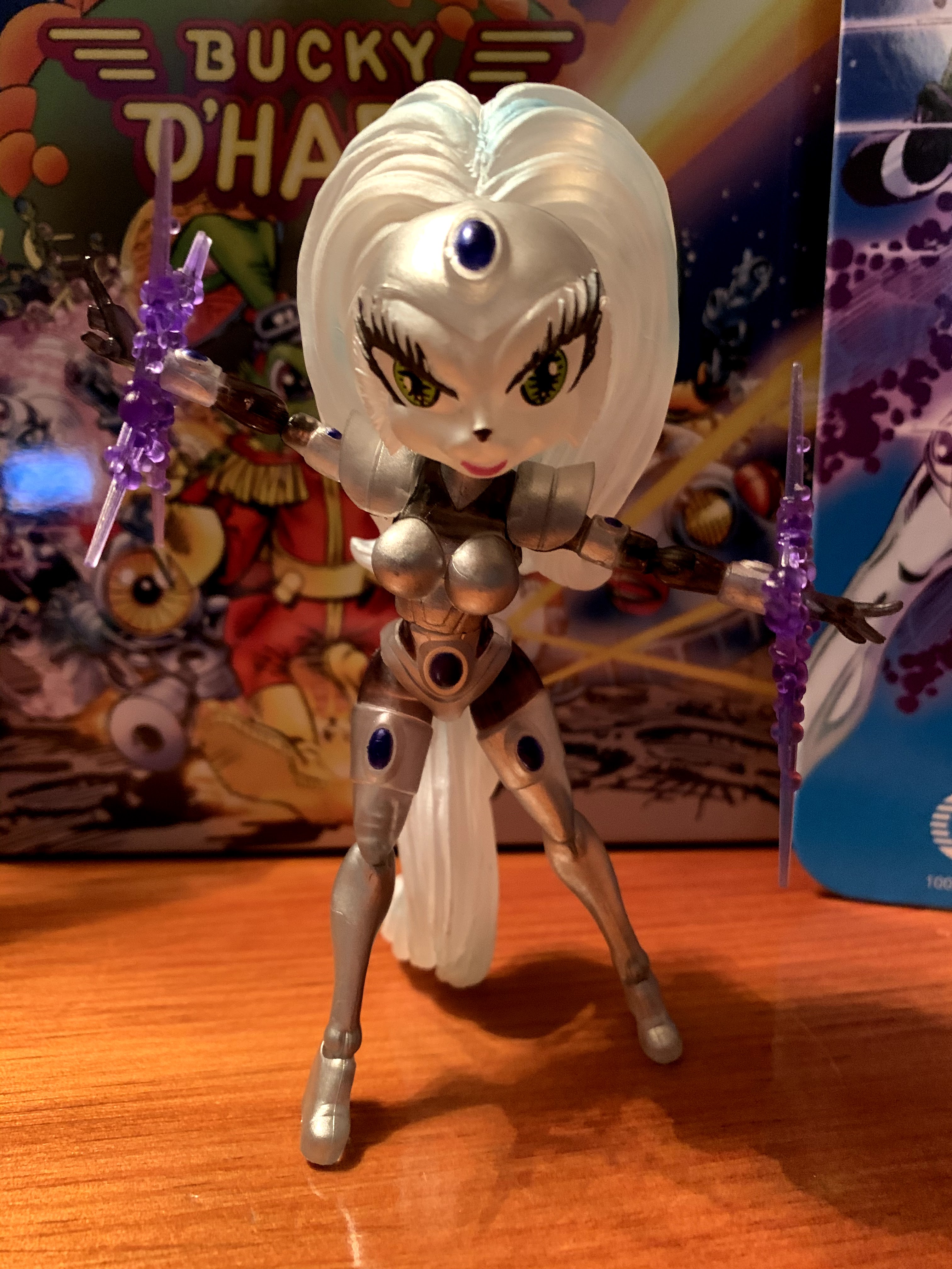
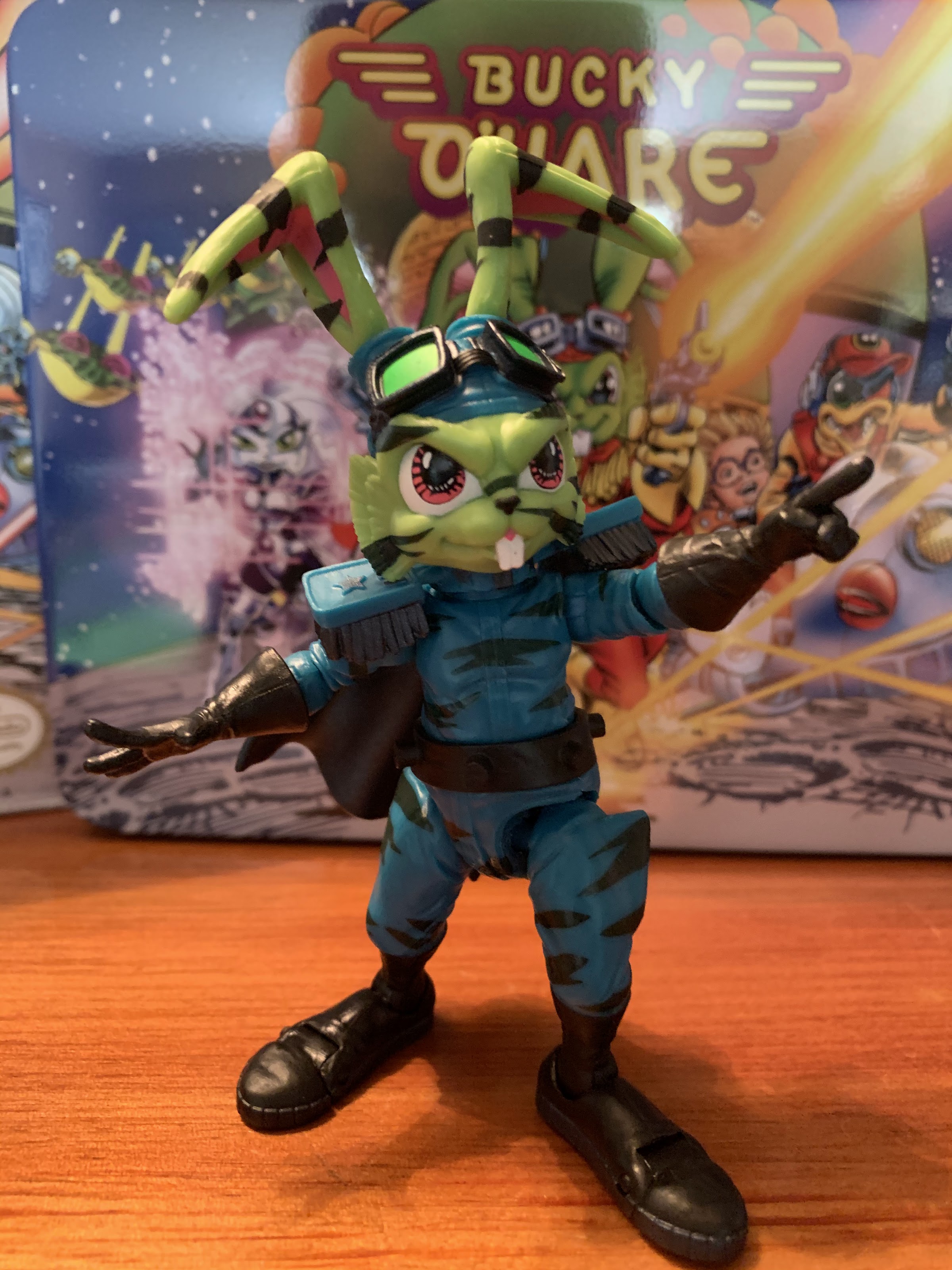
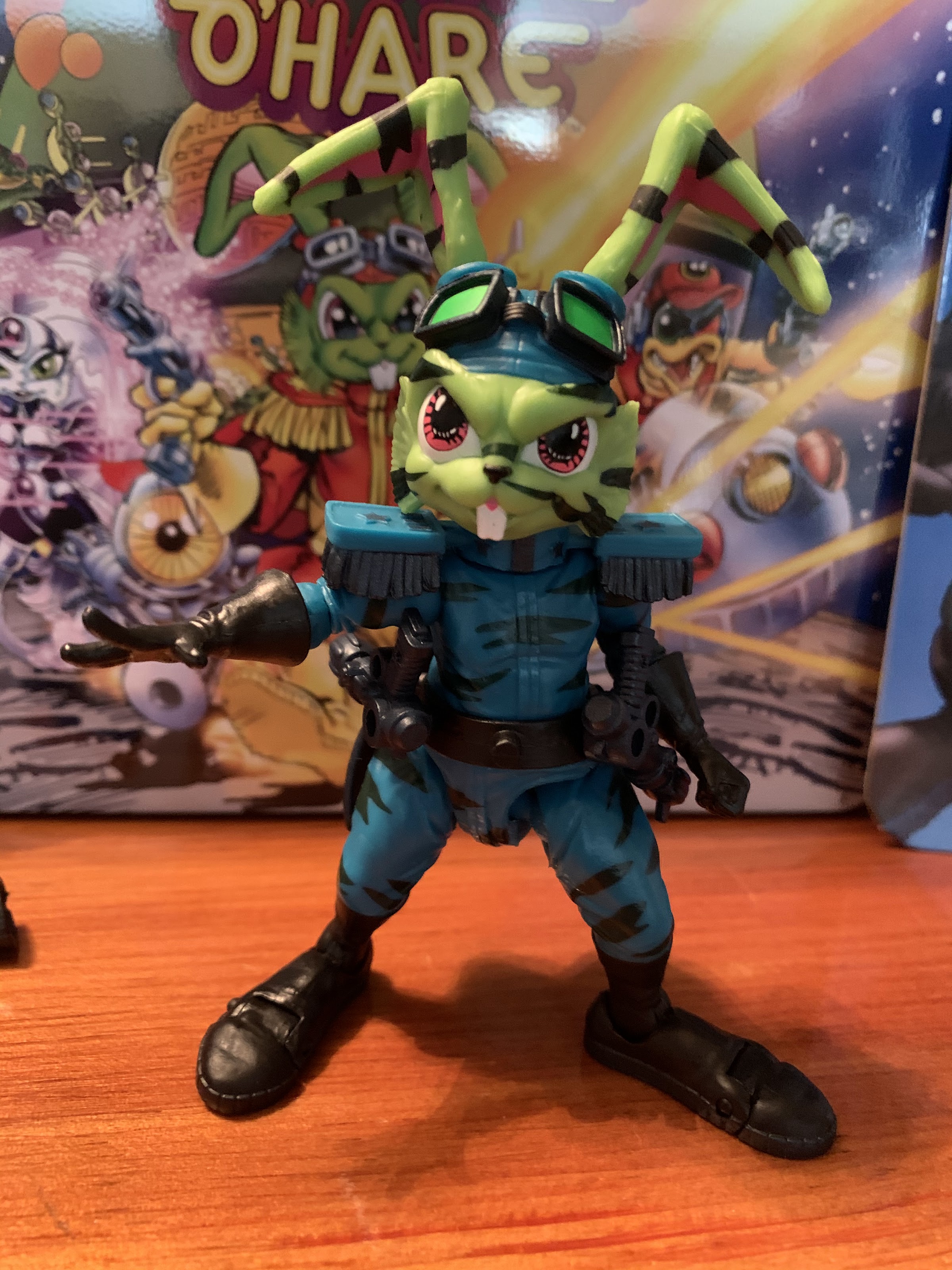
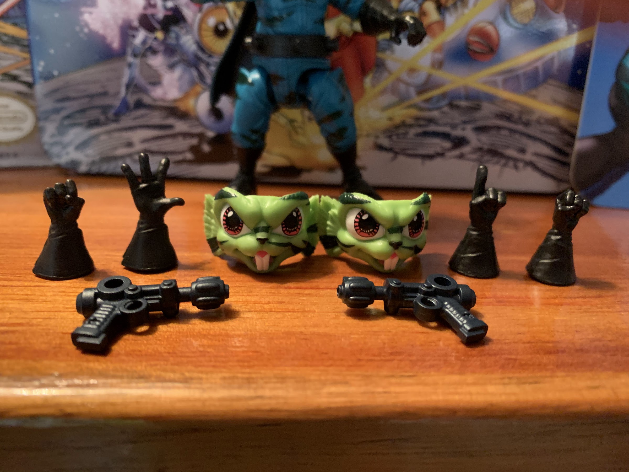
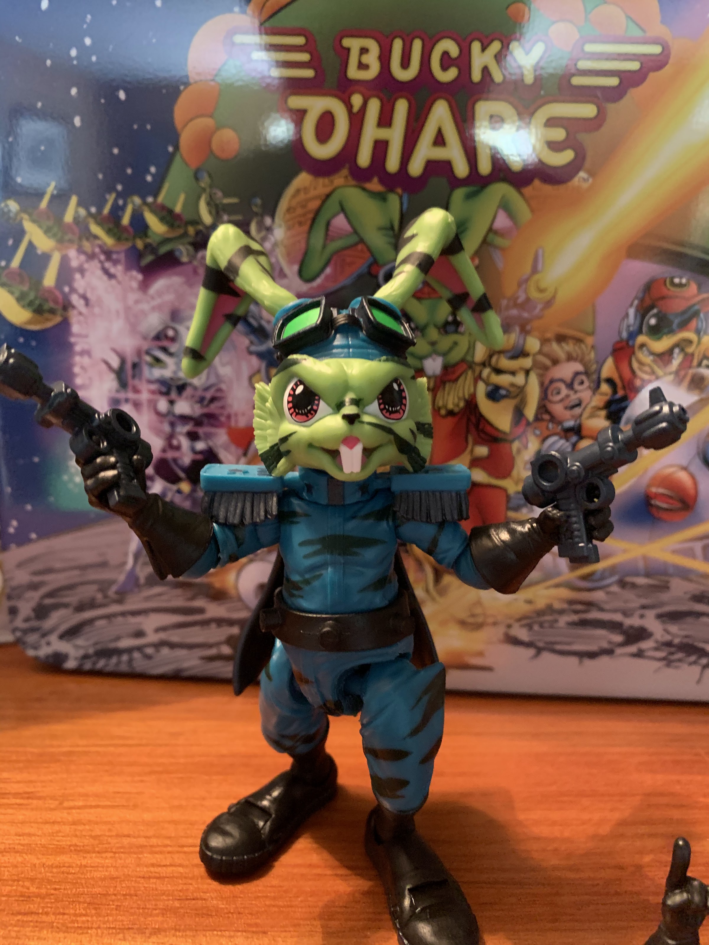
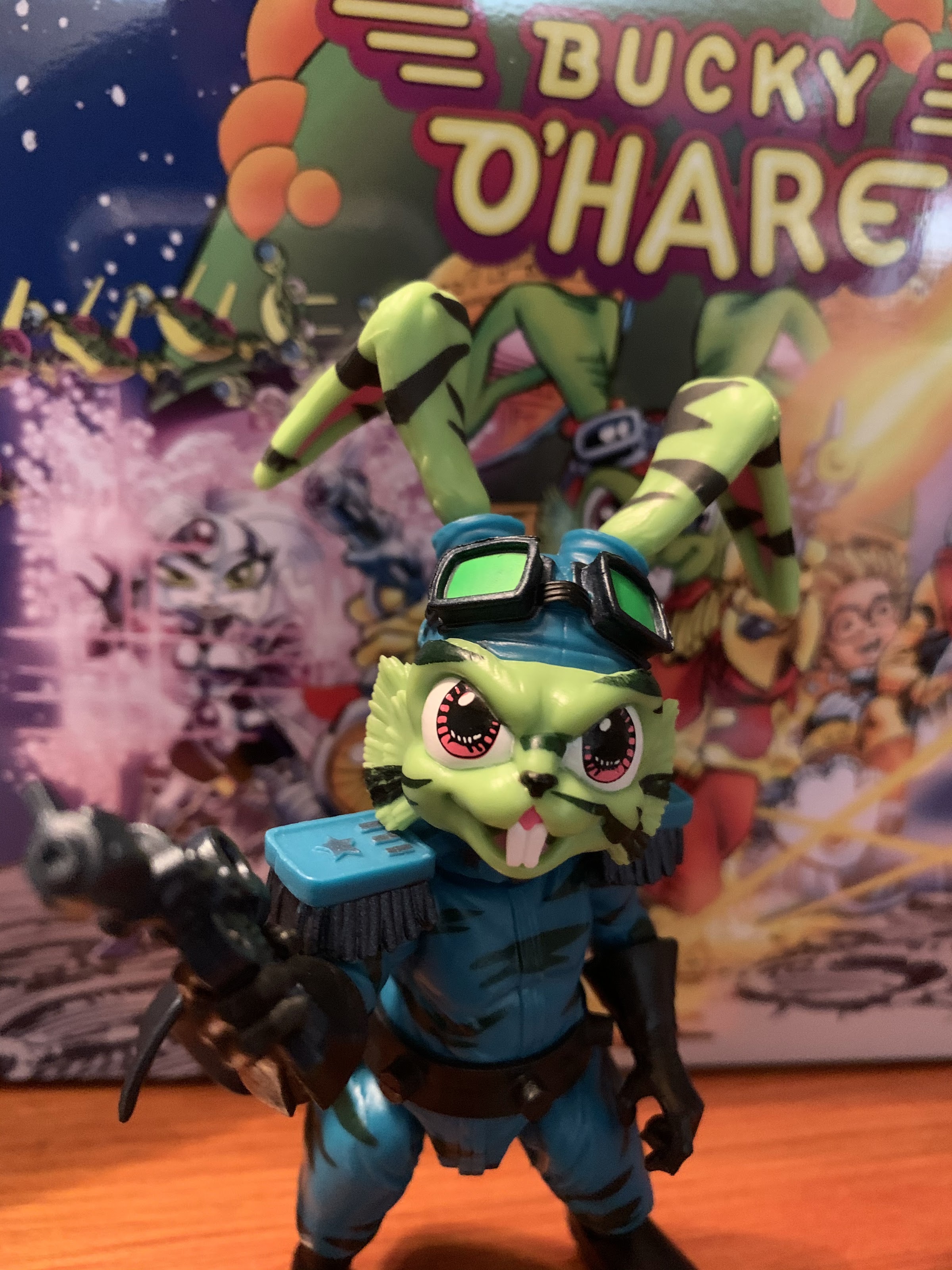
Mimi arrives on the standard, resealable, blister card Boss Fight is known for with artwork provided by Continuity Comics to go along with a character bio on the reverse. She stands a tick over the 4″ mark, nearly 4 1/2″ including the ears, and comes bundled with the usual assortment of accessories. She comes out of the package sporting a smile which can be swapped out in favor of one of two extra faceplates: an open mouthed winking expression and a smile with exposed teeth. She has two trigger finger hands to go along with two pistols featuring a sculpt unique to her as well as a set of fists and a set of open hands. The pistols are the same shiny, metallic, silver we’ve seen with the other figures and fit easily in her hands. Her card art seems to depict her with a pistol and a small shotgun-like blaster that is unfortunately not a part of the figure’s loadout. She also has little nubs on her belts to holster the weapons. Lastly, she has a removable hat that’s designed to sit at an angle over one ear. There’s molded plastic inside the hat to fit over an ear as opposed to just hanging or resting on her head. You can even adjust the positioning a bit to sit higher or lower, though you can’t fit the hat in between her ears if you wish her to look a bit more regal.
I prefer her with the hat.
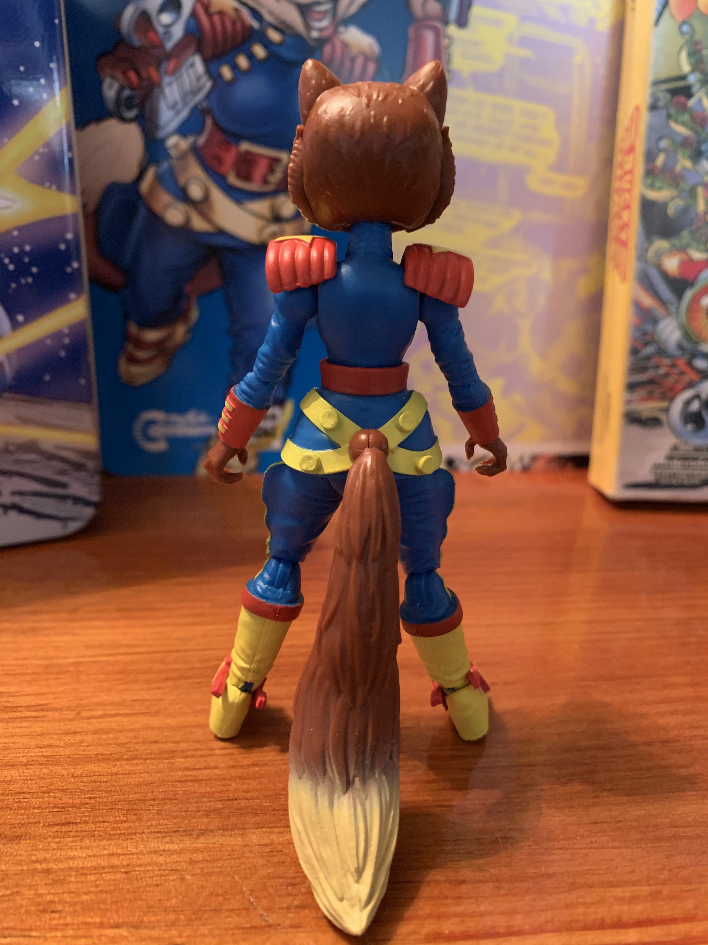
Where this line earns its keep is with the sculpt, and Mimi fits right in. She’s well-sculpted with lots of detail in the exposed fur on her person. Her uniform is a truly spectacular shade of blue with lots of bright yellow and red trim which is right at home in this line. The boots might be my favorite part of the sculpt as they have a really interesting look to them with straps and stars affixed over the top of the foot. Being a fox, she also sports a big, bushy, tail that not only looks great, but acts like a third leg making it relatively easy to position her on a shelf. The inclusion of the tail, and the fact that she’s a female, lends herself well to direct comparisons with Jenny. Both feature much slimmer arms than say Bucky, but they don’t feel fragile. Mimi has a bit more going on with her accents like the shoulder pads and the hem of her top, which hangs like a skirt.
“Don’t call me, Foxy.”
This line has become known for containing specific accessories like the faceplates. I do like the simple default look, but this figure might be the only one where I’m not sure which face I like best. I found the winking one a touch odd looking in promotional images with its combination of an open mouth and a wink, but in person I find it pretty eye-catching. It captures the character’s playful side well and adds a little “fun” to the display. The toothy smile is intended to be the more fierce or battle expression. It’s kind of odd because the smile on the front of her face looks like any old smile, but look closer and you’ll see gritting teeth on the character’s left side. It’s similar in approach to Dead-Eye’s teeth-gritting expressions, but it just looks odder on a fox to not see teeth the whole way down the side of her muzzle or at least a continuation of the lipstick. I would not be at all surprised though if this is a Continuity mandate and refers to how they draw her. And speaking of Continuity, I also feel I should point out that she does not have the tuft of blonde hair she featured in the cartoon. My guess is that was a show addition and not something reflected in the Continuity art, so I don’t consider it a shortcoming, but felt like I should acknowledge it.
Mimi seems to have a “thing” for Bucky. Considering she’s a fox and he a rabbit, he’s right to be wary.
When it comes to articulation, Mimi should feel rather familiar. This line has done a good job of getting as much articulation as it can into what are fairly small figures. Her head is on a ball-joint and can rotate quite freely. She has little restriction in her design and can look up and down as well as tilt her head side-to-side. The shoulders are ball-jointed with hinges that allow her arms to go out, but she does have those shoulder pads that prevent her from reaching straight up. She does not possess a bicep swivel, but does have a swivel at the elbow along with a standard hinge, and a wrist swivel. On her torso, there’s a waist swivel behind her belt and her legs are attached via ball-pegs. The skirt of her uniform does hinder her legs a bit, and Boss Fight did put slits in the side to loosen it somewhat, but functionally the range of motion is pretty good. Her legs can swivel at the top of the knee, and her knees are single-hinged. She does not have a boot cut or a toe hinge, since her feet are rather small, but there is a hinge hidden behind those boot straps. She also gets some rocker-motion at the ankle. Lastly, she has that tail which is on a ball joint and has a hinge for good measure. The only disappointment is that, like Jenny, her ankle hinge is susceptible to paint flaking. And underneath the yellow paint is blue plastic. My figure’s paint flaked off immediately out of the package exposing a blue eyesore. The boot straps can hide it a little, but not all the way. On the plus side, at least she has that tail for balance so I should be able to get her into a pose (if I wish) that does conceal the blemish. Her boot just probably won’t be flush with the shelf.
Oh captains, my captains!
All in all, Captain Mimi LaFloo is pretty great, as expected. She may not be the character a lot of fans were hoping to come next, but I can’t imagine any of them being upset once they have her in hand. Not only is her sculpt great and the paint app clean, but the engineering is probably the best yet. Her faceplates are super easy to swap as are the hands and her pistols can effortlessly be fit into her trigger hands properly. This is great as I’ve had difficulties with that aspect of pretty much every release in this line to some degree, though I’d say each subsequent figure has been an improvement. She scales well with the line and I am truly thrilled to finally have her in my collection after being introduced to the character nearly 30 years ago.
The only thing these two agree on is that we need more Bucky O’Hare figures!
The elephant in the room though, as they say, is “what’s next?” This is the first time I’ve reviewed a figure in this line and didn’t know what would be following it. On the cross-sell, there are no silhouettes to tease an upcoming figure and Boss Fight Studio has been silent on the matter. They did show unpainted prototypes of some mini figures with tiny vehicles akin to a Kid Robot blind box figure, but that was back in February. In the hobby world, no news is often bad news and I know the fear is that Mimi could be the last in the line. Since the first release, Boss Fight Studio has acquired numerous other licenses and it’s possible they’ve outperformed Bucky. There could be difficulties in renewing the license and my initial fear when I saw those mini figures was that maybe Boss Fight felt it needed a lower-priced option to make Bucky viable.
The complete line of Bucky O’Hare figures from Boss Fight Studio, for now?
There’s also the simple possibility that COVID, which has reeked havoc upon all of Boss Fight’s releases this year, has simply forced this property to the sideline for now. It took a long time for Bruiser to come out, and pre-orders for Mimi opened in August of 2019. I’d be understanding of Boss Fight if it didn’t want to unveil another figure that collectors would have to wait over a year for. Still, it’s never a good sign when a company won’t even pay lip service to something so fans are going to continue to fear the worst, but hope for the best. If this is the end, it’s a shame the line went out with a less popular character like Mimi LaFloo because there will be some fans who will blame the character for the line’s end, even though the character would probably share little or no blame. This is my favorite toy line going though, and I really hope it continues into 2021 and beyond because there are still many characters I’d love to have. If this is it though, at least I have a tremendous, modern, Bucky O’Hare display as-is which is something I didn’t think was possible just five years ago. Thank you, Boss Fight Studio!
A few years ago, I talked about my love of X-Men, the animated series, via a book review of Previously…on X-Men by Eric Lewald. That book chronicled the development of the 92 animated series that helped propel the Fox Kids Network to the top of the Saturday morning leaderboards through notes from the author and extensive interviews with the folks that helped bring that series to life. Now, Lewald is back with his wife Julia with a complementary piece all about the artists and artwork that went into creating that series, X-Men: The Art and Making of the Animated Series.
There are probably a few individuals out there who first wrinkled their nose at the thought of an art book based on the animated series starring the X-Men. That’s because the show was somewhat famously underserved by Saban Entertainment who had little interest in sinking much money into the art and animation that went into the show. It’s not that the show was abysmal to look at, it’s more that it was always going to be compared with Batman: The Animated Series. Both shows launched in 92 on Fox, though X-Men only in a sneak preview with the proper launch coming in January of 1993. Batman was on weekday afternoons, while X-Men was allowed to reign over Saturday morning. The other big difference though was Batman had the might of Warner Bros behind it which produced the series and just licensed it out to Fox. X-Men had the backing of Marvel, which wasn’t what it is today. Marvel was a bit touch and go for many years even when it was starting to take over the news stand with a lot of help from the mutants who starred in this series. Rather than self-finance though, Marvel licensed it out to Saban who partnered with Graz Entertainment. The budget was never going to be the same, nor was the confidence. X-Men was unproven outside of the comic book world, and thus received just a one season order initially, followed by a second, before eventually the big order came in.
X-Men on the front, bad guys on the rear. What does it say about me that I think I prefer this to the cover?
Despite all of that, and a legend who had no idea how the property should be presented (::cough:: Stan ::cough::), the show was a smashing success. It’s interesting to look back on because I think many consider Batman to be the superior show. And yet, X-Men was the ratings champ and my favorite of the two. And when it came to my friends, most liked Batman, all loved X-Men. I don’t know why that is, though I have some theories. Batman was a known property and the show reflected the Tim Burton films. Whenever something goes from the big screen to the small one (especially in the 90s), there’s a feeling that the TV version is inferior. The X-Men may have lacked the recognition of Batman, but it also lacked any sort of baggage. Batman was also quite great at being a moody, superhero, show with a lot of style. It was also mostly rooted in that, where as X-Men was an ensemble with more characters to lean on. Batman was almost devoid of personality as a character by choice, while basically every member of the X-Men (well, maybe not Cyclops) was rather colorful able to display a wide range of emotion and even drop a one-liner or two. Or maybe it was just the prestige of being on Saturday morning? Either way, it was a good time to be alive.
It’s an art book, so expect a lot of artwork!
Both shows were part of a gradual maturation taking place in children’s cartoons. We basically had left the wacky and cheap 80s in favor of something that actually had respect for its audience. Shows like The Pirates of Dark Water and my beloved Bucky O’Hare and the Toad Wars were quite different in tone from the likes of Thundercats and Teenage Mutant Ninja Turtles. Most of those shows still featured a character that could be turned to for comedic relief, and even Batman has the Joker. X-Men didn’t really feature that though. Morph could have been that character, but he was killed off rather quickly. It’s a drama starring people in bright spandex that captivated me as a kid. The serialized nature and some of the nuance of the show asked something of me, and I was willing to rise to the program as a mere 7 year-old. It’s no surprise to me that when I look back on my youth, X-Men is there and always will be as it was far and away my favorite program.
Perhaps the most rewarding aspect of the book is getting to read the descriptions that go along with each storyboard panel.
And despite what you may think, a lot of really talented and devoted artists contributed to this show. Knock the animation all you want, but I’ve always been rather insistent that the show looks pretty great in stills. Sure, pick through it and you’ll find some weird stuff or miss-colored limbs and costumes, that’s true of a lot of shows from that era. Where this book is able to shine is with the stuff not broadcast. All of the developmental art that went into the show; costume ideas, height charts, storyboards, are quite rewarding to look at. When Lewald and his team were handed this property, there were decades of material to cherry-pick for the show and a lot of ideas were cast aside. There’s also plenty of production art, like cels and such, that are quite interesting to look at. Especially some of the backgrounds, like the lair of Mr. Sinister, which featured several layers of artwork to make it right.
And it’s not just art! The books is broken out into six chapters, plus an intro and an afterword, with each containing a detailed breakdown of what went into each section. Some of this stuff is lifted from the prior book, so it will be a bit familiar for those who read it, and some of the details are new. Since this book is focused on the art of the series, you’ll hear additional nuggets about what went into a character’s look or a particular background. There’s a lot of ink spent on the various cameos that occurred throughout the series and some of the other details may surprise and amaze. One such nugget came from Director and Storyboard Artist/Supervisor Larry Houston who pointed out how difficult it was to animate a character like Mr. Sinister. His irregular cape basically forced Houston to storyboard the character with as little motion as possible. Basically, the camera was either directly in front or behind him and he was basically never allowed to rotate. It’s fun to go back and watch the series with such information in hand and it gives some newfound appreciation for all of the work Larry and his team had to do before sending an episode off to Korea for animation.
When the X-Men ruled the world!
There’s a lot to unpack in this book and I don’t want to reveal too much since a lot of the enjoyment I had was uncovering things I either didn’t know or really paid little attention to. There’s also some nice additions to this one like a collection of all of the episode logs and a picture to go along with it. Some time is spent on looking back at the X-Men craze, like the Pizza Hut promotion and the action figure line from ToyBiz, which might make you wish for a third book that covers all of that tie-in merch. The book itself is also quite lovely. It’s hardbound with new cover art from Houston, I think. There’s no explicit “Cover” credit, just a case credit to Houston with ink by Rick Hoberg and colors by Laura Martin. It’s a bit confusing as the inside of the front and back cover are storyboards which were definitely done by Houston, so the credit may be referring to that. Regardless, the cover, featuring the main team including Morph and Bishop, and the rear cover featuring the villains of the series look great. Pages are nice and thick and the whole thing totals 288 pages. Since it’s mostly artwork, it’s not a tremendously long read, but it’s hardly brief. I mostly read it while sipping a morning or afternoon coffee (first starting my read, appropriately enough, on a Saturday morning) over the course of a week. It was a wonderful, leisurely, trip back to the 90s and my youth that not only left me wanting more, but also with a desire to go back and revisit the show once again.
One of my favorite inclusions in the book is the visual episode guide with accompanying logs, a tremendous resource to have on-hand.
X-Men: The Art and Making of the Animated Series is a great companion to Previously…on X-Men. It’s a book intended to satiate fans of the show, but would also probably entertain casual fans as well. I had a great time engaging with the art from the property, and while I already had a pretty terrific appreciation of the art that went into the show, I think those who might not have that same level of appreciation will likely leave with a bit more. Eric and Julia Lewald do a great job of recounting their time with the show and the various artists and executives they speak with bring a lot to the table. It’s my assumption that anyone with a love for this old show will be delighted by this book and it’s something I plan to flip through again.
Look through my various toy reviews and you’ll probably notice that I’m not much of a Marvel guy. That wasn’t always the case for me though as I was huge into Marvel Legends once upon a time. I basically stopped around the time Hasbro was awarded the Marvel license. I felt there was a dip in quality and also the character assortment stopped appealing to me. I knew what I wanted from the line and had wanted for years, but it seemed the line refused to give me what I wanted. I moved on, and it wasn’t long after the line was actually suspended for quite a few years before it made a comeback. I’ve never gone back though and that’s largely just due to my fading interest in the Marvel Universe.
Pardon the stock boxed photo, I was so eager to check this set out I forgot to snap a pic.
One figure I did review though was the Marvel Legends Deadpool. That figure was from the sixth series released by Toy Biz. I reviewed it simply because it’s the only Marvel Legends figure on display in my house. All of the rest are in bins crammed in an attic and most of the choicest figures have been sold. I liked that Deadpool a lot though when it came out so I did a little post on it. Well, when I was walking through an aisle at my local Target I happened upon one of the latest two-packs released by Hasbro in the Marvel Legends line. And that two-pack is the Deadpool and Negasonic Teenage Warhead set from the film Deadpool 2. It’s an eye-catching window box as it’s done up in red with Deadpool “effects” added to it like marker crossing out the figure’s real names and a faux Deadpool sticker placed over the X-Men logo. Since I still have a Deadpool on display in my house, I was really intrigued in having an updated version of the character to go with it. It turned into an impulse buy, so here we are.
She looks the part.
First off, let’s talk about the other figure in this set: Negasonic Teenage Warhead, who will now be referred to simply as NTW. I have little to no interest in this figure, but if I wanted a new Deadpool I had to get her. She is depicted in her Deadpool 2 costume complete with the mohawk hairstyle. She stands a tick under five and half inches to the top of her forehead, and is a bit taller when you factor in the hair. She looks the part and the face is a good likeness for actress Brianna Hildebrand. The sculpt features some nice texture work on the yellow portion of the chest as well as the sleeves and shoulders. Strangely, the pants feature no such touches and are basically just plain, black, plastic with some yellow painted on at the thighs. It would be okay if this were a figure based on a comic, but not a film. The only other aspect of the sculpt I’m not high on is how her head sits on her neck. The cut just looks odd from the side as there’s quite a gap between the back of her head and neck. I suppose the counter here is how many people are going to pose her on a shelf at a side angle? Probably few.
I don’t like that gap on the back of her neck.
NTW does come packed with quite a bit of functional articulation. Her head may look odd on her neck, but it can roll around effortlessly and she has a solid range of motion when looking up and down. The shoulders are ball-jointed and she has a bicep swivel and double-jointed elbows allowing her to bend about 90 degrees. It looks like the bottom joint should allow for movement past 90, but my figure doesn’t seem to want to cooperate. She has hinges and swivels at the wrist and an upper torso joint. It works more to pivot her side to side as she has little to no movement forward and back. The legs attach via ball-joints and can swivel. She also has a thigh cut and double-jointed knees. There’s a boot cut and her feet possess hinges as well as the ability to rock side to side. Being she’s not the most acrobatic of superheroes, this strikes me as a perfectly acceptable amount of articulation for this figure. It’s all integrated well into the sculpt and should you want to get creative I don’t think you’ll be limited too much.
Hands open.
Hands closed.
When it comes to accessories, NTW is a bit lacking, but also there’s not a ton of room to really add much. She comes with two sets of hands: fists and open style pose hands. They pop off and on easily enough and both are suitable for posing with this figure. She also has a pair of energy effects that wrap around her forearms. They’re okay, a little too flimsy for my liking, but the translucent yellow-orange plastic is a good look. That’s it though, but like I said, I’m not really sure what else would make sense for her to have.
Oh you are one sexy superhero.
And the view from behind, because the audience demands it.
The real draw of this set, for me and probably most who pick it up, is Deadpool. And to Hasbro’s credit, the company seems to be well aware of that. He comes with a lot more stuff than his boxmate and a lot more care went into his sculpt as well. First of all, this is a Deadpool 2 version of the character’s costume, though he does come with two sets of all black gloves, reflecting his appearance from the first film. I think Hasbro intends for this to be a catch-all version of the character, though the shoulder strap is clearly based on the sequel. Regardless, it’s not that important since his costume was pretty similar from one film to the next and he very much looks like Deadpool.
Home Alone face!
Sometimes a hero just needs to chill.
Deadpool stands at around six and a quarter inches and scales well with NTW. I assume he scales well with the other figures in this wave, but I also don’t have them to confirm. The sculpt is pretty involved with this guy as he has lots of seams, straps, and buckles, all over the place. The entire costume is well textured and looks like it was pulled from the film and there’s some minor battle damage on his chest as well. The belt Hasbro put on him is floating, so it doesn’t hinder his articulation to the degree one would expect. It’s also painted and sculpted quite well, at least on the front. Hasbro went cheap on the rear of the figure as the pouches are not painted to the degree the ones on the front of the belt are. Like the head on NTW, it’s something that won’t really show on a shelf, but come on, Hasbro! That’s pretty cheap. There’s also some errors here and there when comparing this costume with the film. The sculpt seems to be all there, it’s just some parts (in particular, the boot area and the collar) are either unpainted or painted black when they should be red, or vice versa. My figure also has one paint chip on the black portion of his abdomen and I’m frustrated at myself for not noticing that in the package since I had my pick from around half a dozen sets at the store.
Let’s pose!
Gun fight? Knife fight? Deadpool is always prepared.
Deadpool, essentially being a superhero ninja, is pretty well stacked when it comes to articulation. His head appears to be on a dumbbell joint giving him movement at the head and base of the neck. The collar Hasbro has on him limits the movement a bit, but it’s fine. The shoulders are on butterfly joints that give him some inward motion without marring the chest portion of the sculpt. They’re also ball-jointed and his elbows double-jointed and he can bend well past 90 degrees as he can basically do a full curl. The hands are hinged and also able to rotate, as expected. He does have an ab crunch and the way his costume is designed makes it work well with the sculpt. The waist can swivel and you can slide his belt up a bit to make it work. He’s ball-jointed at the legs with rotation there to go along with a thigh cut below it. The knees are double-jointed and his feet are hinged with rocking action. I’m a little surprised at the lack of a boot-cut or swivel down there, but it’s fine.
Let’s get messy!
The articulation Hasbro packed into this figure is plenty enough to get him into various poses, which comes in handy since he has a lot of stuff to pose with. In terms of hands, Deadpool has two all black fists and a pair of all black open, style pose, hands. His gripping hands have the back of each painted silver and his set of trigger hands are the same reflecting his appearance in Deadpool 2. I’m still not sure if this was intentional, or if the all black hands just weren’t painted by mistake. He also has an assortment of weapons including two katanas which fit neatly into the scabbards affixed to his back and a pair of handguns he can wield. They look like action guns in that the bolt appears to be set back like it’s being fired, either that or they’re some weird, made-up, pistol. He also has a pair of holstered handguns that Hasbro, for some reason, glued in place. I’ve seen some people get these out and they’re completely separate pieces, but mine are well stuck. He also has a knife which can slot into the little holster on his left ankle. You’re unlikely to pose him with the knife in hand, but I like that it’s included. Lastly, he has his stuffed unicorn and it’s pretty adorable. I actually might have to pose him with that for the sake of comedy.
Deadpool really is just a fantastic figure. I have some nitpicks with the paint, but I think the sculpt is great and I love all of the articulation Hasbro was able to work into this figure. My biggest complaint with my old Deadpool figure was with how that sculpt prioritized articulation ahead of aesthetics and some of the joints, in particular the shoulders, are kind of ugly. I have no such complaints here and really my only other complaint is with those guns Hasbro glued in. I love that Deadpool comes with lots of stuff, so it drives me a little crazy that he can’t holster the guns he’s intended to grip because his holsters are occupied by more guns!
I’d say things have improved over the last 15 or so years.
NTW is a fine figure as well. I’m disappointed that Hasbro seemed to phone it in on her lower half sculpt, but she looks the part and has all of the articulation she needs. Let’s be realistic though, if I could have bought Deadpool solo I would have. I’m not collecting Marvel Legends and I don’t plan on adding to this Deadpool collection either. Maybe Hasbro will get me to grab Cable if I run into him since I already have these two, but probably not. It’s great to see the Deadpool franchise getting some love from Hasbro though since it’s presently in limbo as far as films go. It was very successful for 20th Century Fox, but in the hands of Disney it feels like it doesn’t have a home. We know the company likely has plans for the whole X-Men Universe. I hope Deadpool is a part of those plans, but who can say? This figure sure kicks ass though!
I found this set at Target, but it’s being sold elsewhere as well. You can even pre-order it at Best Buy right now, or find it at other various online retailers. The MSRP is $49.99 so happy hunting!
Sometimes it can be easy to lose sight of how good an action figure in a particular line is when it’s one of the first released. I’ve been really impressed with all of the figures in Boss Fight Studio’s Bucky O’Hare line, but recency bias certainly plays in a role in my favorites. And the most recent have been (in order of most recent) Bruiser, the Storm Toad Trooper, and the four-armed Dead-Eye Duck. It’s hard to top the sheer spectacle and massiveness of Bruiser, and any toy with extra arms is inherently fun, especially when it’s a pirate duck. Back in November 2017 though, I was pretty floored by First Mate Jenny and this variant I just purchased from Boss Fight Studio has quickly reminded me of that.
Just like with Stealth Mission Bucky, we get updated card art and a character bio from Neal Adams and Larry Hama, respectively.
Jenny had a long wait to reach the vast majority of Bucky O’Hare collectors. She was famously, or infamously, dropped from the vintage Hasbro line of figures back in 1991 because the company didn’t think boys wanted a girl, cat, action figure. This despite the fact that her toy was already complete and in production and despite the fact that she’s Bucky’s freakin’ first mate! She was going to see release in wave 2, but the line was cancelled and who knows how many fully-carded Jenny action figures were destroyed. Some were saved and have made it into the hands of collectors over the years, but the vast majority had to wait until Boss Fight came along and rectified the whole situation.
Astral Projection Jenny comes with the same stuff you remember from wave one, only now it’s clear and purple!
And that first figure is wonderful. I was really looking forward to both Bucky and Jenny when Boss Fight announced them, but I was more so looking forward to Bucky because he’s the star, after all. It was Jenny that basically stole the spotlight though with her clever engineering, terrific sculpt, and fun accessories. Like Stealth Mission Bucky though, I initially passed on the variant Boss Fight put out. And that variant is Astral Projection Jenny. Jenny, being part of a secret society of psychic cats, has the ability to astral project her consciousness leaving her physical body behind. She’s basically depicted as a ghost-like being when doing this who can’t be seen, nor can she interact with the physical world. It’s an interesting choice for a variant for obvious reasons, which we’ll get into. I was somewhat surprised that Boss Fight went in this direction instead of doing an “Aniverse” Jenny that matched the figure’s colors to the cartoon which is mostly a matte gray armor finish and pink hair as opposed to silver and white. I don’t know if I would have been more likely to pick that one up sooner, but it was something that surprised me.
Jenny is an 80s girl at heart so the hair has got to be big!
Astral Projection Jenny is essentially the wave one version of the character cast in translucent plastic with some mild paint variations. Her body is painted, clear, plastic which gives her an ethereal quality. The white of her fur is done with a pearl coat, while the black is largely the same as before. Actually, it appears the black portions may be mixed into the plastic to give it a smoky quality, and probably because black over clear plastic wouldn’t achieve the desired effect. The silver of her armor also has a pearl quality to it as opposed to the chrome of the original and the hot pink gems are now purple. The hair has been given a light brush of teal to impart that ghost-like quality of this form. The only other change is with the effects pieces which have had the pink swapped out in favor of purple.
Jenny has likely awakened a few furries in her time.
Aside from the change in color and choice of plastic, this version of Jenny is essentially the same figure as before. She has a lot of articulation for such a small, somewhat dainty, figure. Her massive poof of hair helps to make her the tallest, non Bruiser, figure in the line at right around 5″. She’s articulated at the neck, though her hair can limit her movement there. She has ball-joints at the shoulders with hinges and swivels at the elbow. Her hands are on pegs so there’s only swivel articulation there. She has a mid-torso swivel in place of a waist one with ball-joints at the thigh. The knee is on a single hinge with swivel articulation and she has a hinge and swivel combo at the ankle. Her tail is on a ball-joint and serves the added function of adding stability to the figure. Jenny’s frame is quite slim and her feet are tiny, so having that tail is most helpful for posing. I find she’s the most fun of all of the figures in this line to pose as a result, though that does come at a cost. At least with my original figure, I have a lot of paint-flake at the those ankle hinges where the chrome rubs off of the joint leaving behind black plastic. Boss Fight probably should have cast her feet in gray plastic to minimize this, but unfortunately didn’t have that foresight. I don’t think it will be as big of an issue with this version though since the plastic is transparent, but it’s something to look out for.
Jenny is also fun to pose because Boss Fight came up with some really fun effects pieces. For starters, her default hands are gripping hands which is odd since she doesn’t come with a gun. She also has fists and two styled hands, one that’s more open and one that looks like a heavy metal hand gesture or an “I love you” gesture. Two other hands are totally flat and surrounded with “psychic energy.” If you’re familiar with the Marvel Comics character Psylocke, these are essentially her psychic knives. They’re rather cool, though I actually prefer the other effects pieces which are these circular, star-burst, pieces that can be affixed to Jenny’s wrists before inserting one of the hands. They’re really fun and work exceptionally well with those styled hands, though fists work well too. It’s nice having two Jenny figures as now I can display one with the knives and one with the bursts.
With Wave 1 Jenny, and yo can see where the paint has flaked off on my Jenny’s ankle. It’s a minor tragedy.
Me trying to figure out an action shot of Jenny astral projecting.
Fun tip: a winking face from one side functions like an eyes-closed face!
In addition to all of that, Jenny also comes with four different faceplates, an improvement over Bucky’s three. Like with Bucky though, the range of expressions isn’t particularly diverse. Her default look is a smile and she also has an open-mouth version, a winking face, and another where the eyes are a bit narrowed with more of a wry smile. It’s a subtle difference from the default look. For most, the winking face is the clear winner since it’s very different from what the rest of the line features and certainly possesses a playful quality. I do like the more focused expression too, though I wish for this version that Boss Fight had re-painted the eyes to match the look of the card art, or just blank them out. I also wish we had a closed eyes face for the Wave 1 Jenny to make her appear to be astral projecting to work with this figure. Even making one of the face-plates that came with this figure the eyes closed one would have sufficed. That’s wishful thinking though. The important thing is I like these expressions and that it’s easy to swap from one to the other, unlike Bucky who is a bit of a pain.
Cheers!
Astral Projection Jenny is a fun spin on what was already a fantastic figure. My only gripe about the original release is the paint flaking issue, and I don’t see that being as big of an issue with this version due to the choice of plastic. Otherwise, she’s damn near perfect and getting this version was a great reminder that Jenny has a claim to the crown of best in the line. This is a hard line to pick a favorite though which is a great problem to have. If this is a figure that interests you, head on over to www.bossfightshop.com and grab one of your own. And if you want more Bucky reviews, check back soon for a review of the newest figure in the line, Bucky’s admirer and Jenny’s rival: Captain Mimi LaFloo.
He (quietly) goes where no ordinary rabbit would dare!
It’s been almost three years since toy maker Boss Fight Studio started shipping out it’s first figures in its Bucky O’Hare line of products. Ten figures have followed with an eleventh soon to be released and I’ve been an enthusiastic supporter of the line since day one. When the product first launched, my family had recently welcomed a new addition. We were in a new house and getting acclimated to our new life. At the time, I was pretty cautious with money and I set some limits on myself, especially when it came to a hobby like toy collecting. And when it came to Bucky specifically, I told myself I’d stay away from variants. Well, my restrictions have loosened over the years and a recent sale at Boss Fight Studio has allowed me to go back and grab some of those variants I had passed on initially, variants like the third release in the Bucky O’Hare line: Stealth Mission Bucky O’Hare.
It may be “just a repaint,” but Continuity Comics contributed new card art from Neal Adams plus a new bio on the rear from Larry Hama.
This variant is basically a straight re-paint or recasting of the inaugural Bucky O’Hare figure. It’s actually the second Bucky variant I’ve purchased as I couldn’t resist the Holiday Bucky that Boss Fight Studio released alongside Dead-Eye Duck. As you could probably guess from the naming convention of the figure, this is Bucky in a stealth suit, which is the same as his standard suit only it’s black and blue with a camo deco. This isn’t a look that appeared in the animated series nor did it appear in the comics. It’s a look dreamed up by the designers at Boss Fight Studio and approved by Continuity Comics. They even supplied some new Bucky artwork for the card back which features the new look.
Gettin’ sneaky.
Bucky O’Hare stands at about 3.75″ which stretches to about 4.5″ if you include highest point of the ears. Since this a repaint it includes all of the same accessories and articulation as before. What you’re paying for is the new aesthetic, and I must say I do enjoy this black and blue look. The blue is more like a deep turquoise while the black is almost a graphite color in places. Bright green are the lenses of Bucky’s goggles which contrasts well with the deeper colors of the costume. His fur is still that light green we’re used to, only now it has streaks of black across it to break-up his image. Even his guns are black though there’s a slight blue hue to the metallic coating on them. It’s a sharp look, and even though it’s one I initially passed on that was entirely due to cost, not look.
Bucky auditioning for the role of Fall-Out Boy.
For a small figure, Bucky’s articulation is rather robust. His head sits on a ball joint that mostly rotates as opposed to being able to look up and down. The ears swivel, as does his little tail and his cape fits into a peg hole on his back with a satisfying “pop” and stays in place. The shoulder tassels and belt are separate pieces of plastic and can be moved and repositioned as desired. Which is necessary at times to free up the articulation at the shoulders, which are ball-jointed. He has single-hinged elbows with a swivel there and at the wrist where the glove meets the arm. There’s a waist swivel and ball-joints at the legs with single-hinged knees and a swivel there as well in place of a true boot-cut. The ankles are on hinges and they can rock side-to-side. There’s a toe hinge as well to top it all off.
Not much differentiates the two extra faces.
Face #1
Face #2
Face #3
Bucky’s big feet make him easy to pose and stand. To add some variety to those poses he has some swappable parts. First off, he does have two pistols which are his primary weapon and accessory. He comes packaged with trigger-finger hands on both arms so he can dual wield, if you so desire. The pegs on his belt are to store the pistols when not in use and they clip on rather easily. You can put them on the front, back, or side, though doing so adds some bulk. If you want to change-up his hands he has two additional sets. One set are fists and the other contains an open palm and a pointing hand. To swap them, just give a firm tug on the figure and off it comes. It’s a little tricky because there isn’t much to grab onto between the wrist and elbow of the figure, but I’ve never feared breakage there. Bucky also has swap-able faceplates, and unfortunately they’re the weakest aspect of the figure. The default face is a frown with a closed mouth. The other faces both feature an open mouth and one has what I would call a relaxed frown and the other a deep frown. It’s the type of thing where the difference between the two isn’t obvious right away. I’ve also always had a hard time getting the optional faces to sit flush on the figure. It can be done, it just requires more effort than it’s worth, in my opinion.
The comparison shot you’ve been waiting for!
There’s not much more to say than that. This is a re-paint of what I already considered a great figure to begin with. I love Bucky O’Hare and I love the design of the character and Boss Fight Studio really nailed the likeness. I wish the optional faces worked better than they do, but I also like the default face that’s there and so it doesn’t bother me that I can’t go with something else, especially since there’s not much difference between the three. Even though I had passed on this figure for more than two years at this point, I still always wanted it and figured I would get it at some point. My plan was to actually buy it in-person with my Aniverse Storm Toad Trooper earlier this year at Boss Fight’s retail location, but COVID messed that up and since they have no plans to reopen I just figured I’d go the online route. He’s a fun figure and I hope there’s more to come. If you would like to secure one of your own, head on over to www.bossfightshop.com to find it and other figures in the series.