Author Archives: Joe

Rad Plastic

I think it was during the summer of 2020 while spending one of the many days of that year inside and isolated that I stumbled upon a Twitter post about an upcoming book titled Rad Plastic. I believe the tweet was from the account The Toys That Made Us, which is (was?) a Netflix series that chronicles the early days and success stories of toy lines from the 70s, 80s, and 90s. It was interesting the tweet came from that account as one of the disappointments of 2019 for me was the episode of that show concerning the Teenage Mutant Ninja Turtles.

The Toys That Made Us is the brainchild of comedian/director Brian Volk-Weiss. His background seems to be in television and comedy and it seems the approach to the series The Toys That Made Us is to select an important franchise and then find the story. It makes for an entertaining documentary, but Netflix constrains it to a mere 45 minutes or so per episode which just isn’t enough time to really dive deep into a subject that spanned years, or even decades. The unfortunate side effect of this approach is the series really doesn’t have much time to talk about what I want to hear about the most: the toys! And with the TMNT episode, it was able to talk a lot about the development of the property and its eventual acquisition and launch by Playmates, but then pivoted to a story about reuniting the co-creators of the franchise Kevin Eastman and Peter Laird. It was a nice a story, it just wasn’t a story about the toys, which is what I wanted to hear about most. When I found out about Rad Plastic, it seemed like it would be the thing to fill-in that missing information for me.

Ready to feel nostalgic?

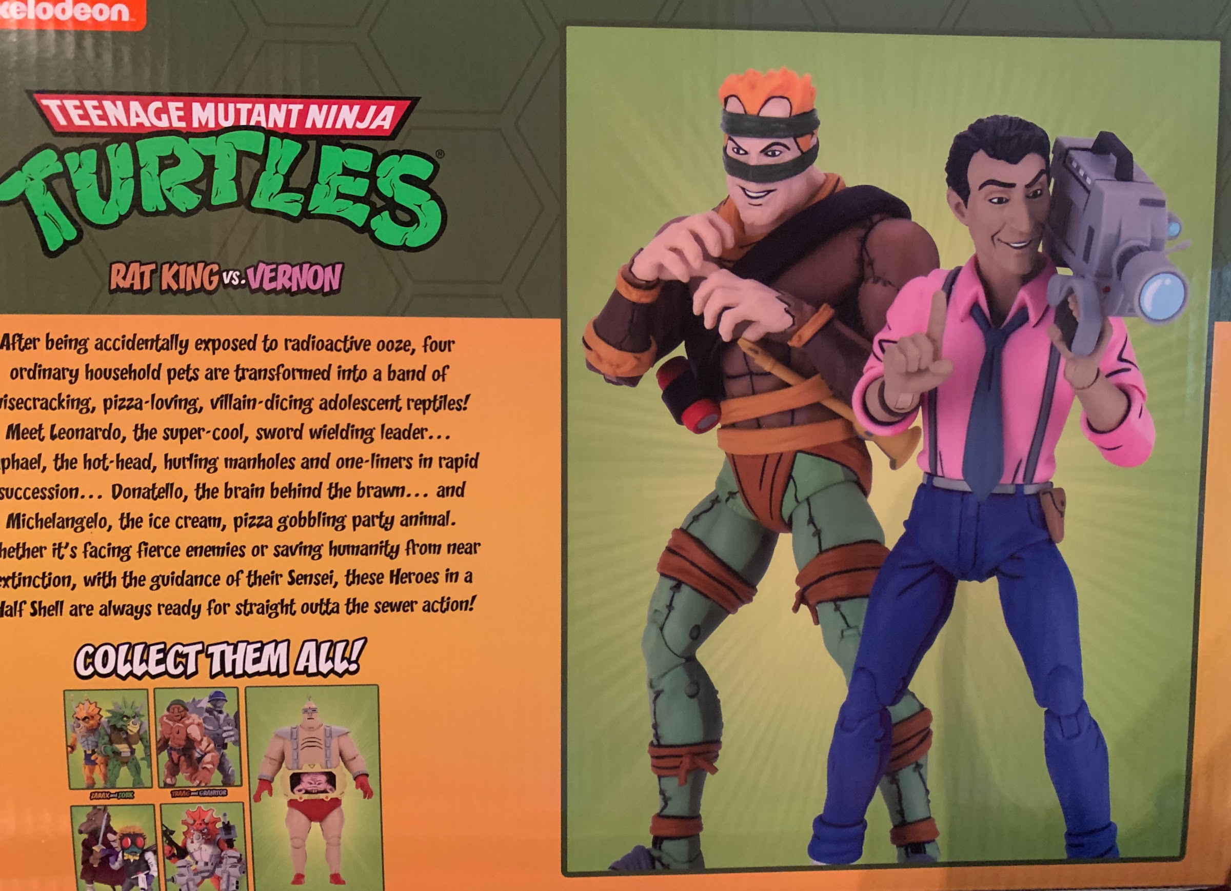
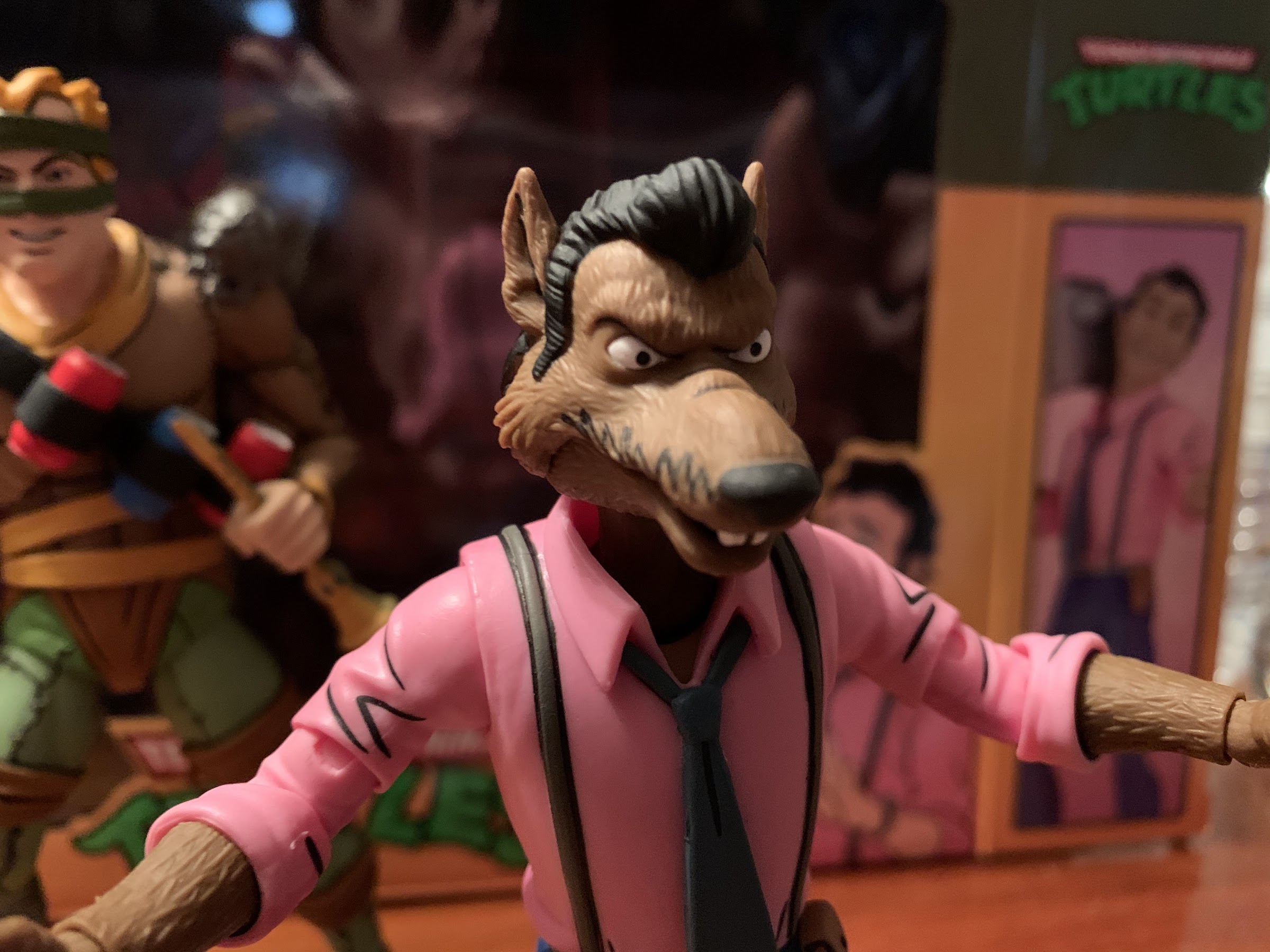
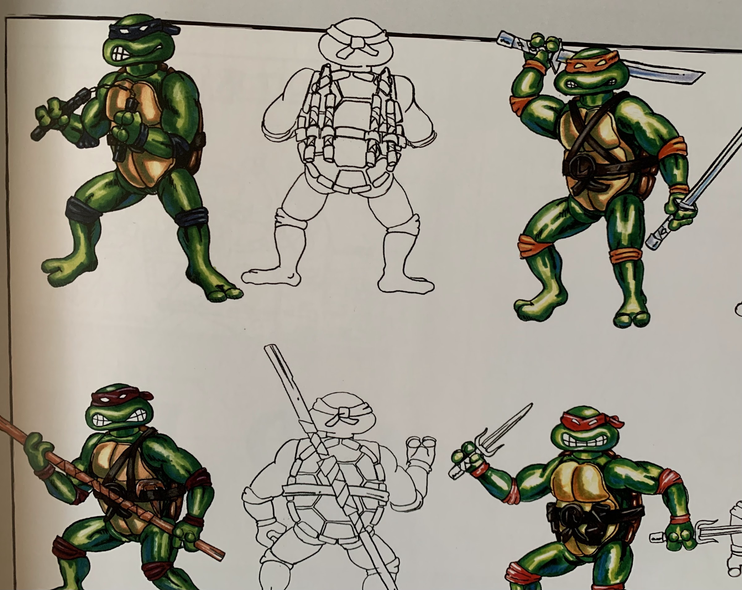
Rad Plastic is a book by Chris Fawcett and it’s all about the vintage Playmates toy line. Specifically, this is a book about the creation of an action figure. It goes into great detail spotlighting the incredible sculptors contracted by Playmates, most of which worked for either Varner Studios or Anaglyph. Fawcett confesses upfront he wasn’t big into TMNT and only really became interested in the toy line in 2017 when he stumbled upon some materials he felt really showed off how intricate these figures were. And while it’s easy to look back on that vintage toy line through the lens of a modern toy enthusiast and wonder what’s so special about it, those of us who grew up and owned those figures likely remember how wild and detailed those sculpts were. A character like Muckman was particularly incredible and much of the detail put into that figure by sculptor Alec McTurk went unpainted for the finished product and maybe was unnoticed by some. It’s not something that shows well in pictures online and it’s easy to overlook a figure from 30 years ago that’s been beat up and played with, but they really were something special.

After pre-ordering my copy over the summer, it was quite a long wait before the product arrived. Which is fine, as these things take time and COVID surely made its presence felt. The book is designed by Chance Sanderson to resemble the classic Party Wagon. Since this is an unofficial release, it doesn’t feature the classic logo or any of the turtles on the cover, but does feature their silhouette in the windshield and the book’s title is done as an homage to that logo. And I love that on the back of the book is a seemingly perfect recreation of the sticker that went on the back of the Party Wagon itself. The interior of the book is loaded with plenty of official artwork though and the pages are nice and thick. It’s also a heavy book as this is designed to go on your coffee table. It’s a hardcover and is approximately 11.25″ x 11.25″ and is about an inch thick.

This book will tell you how action figures are made.

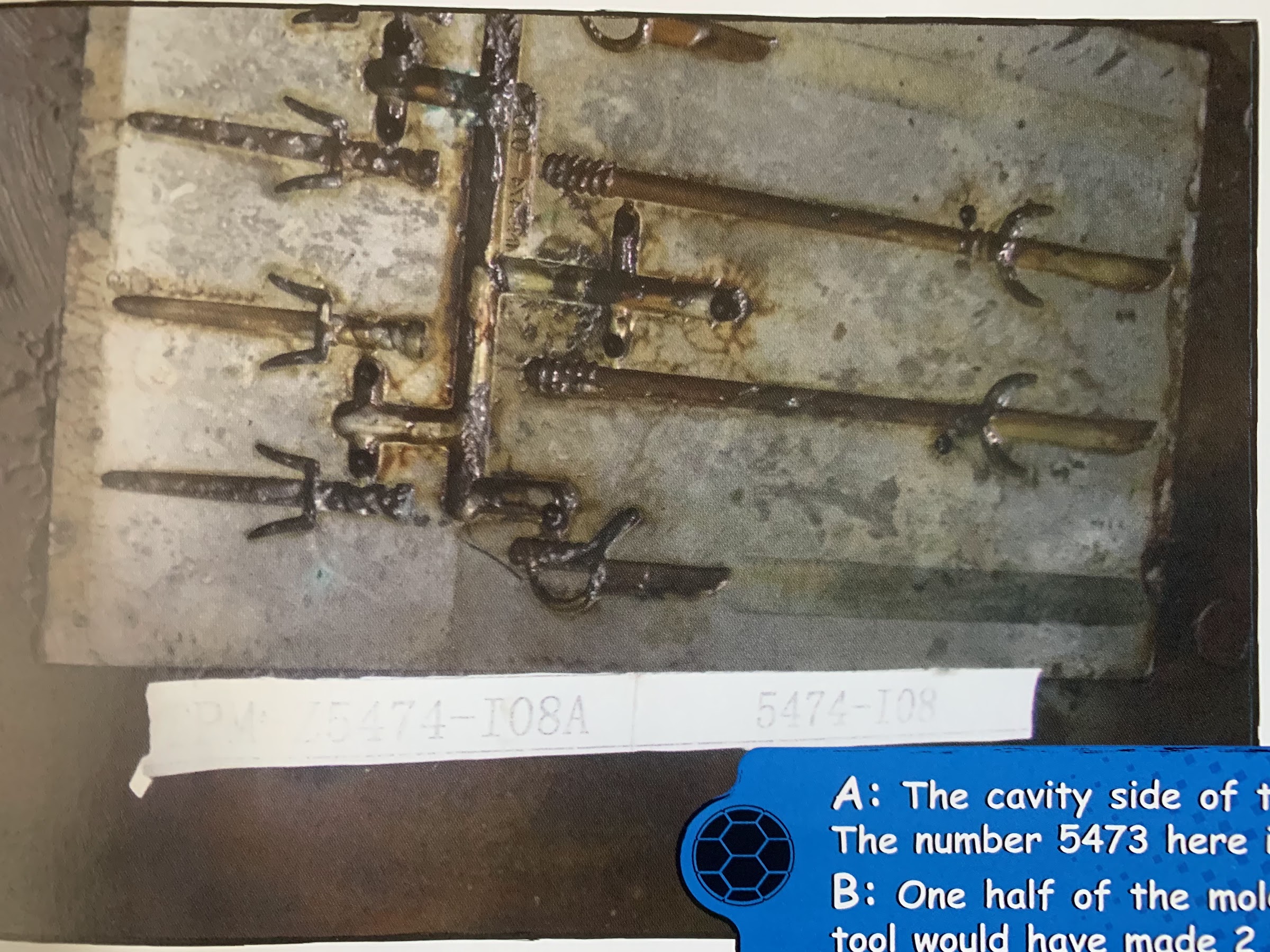
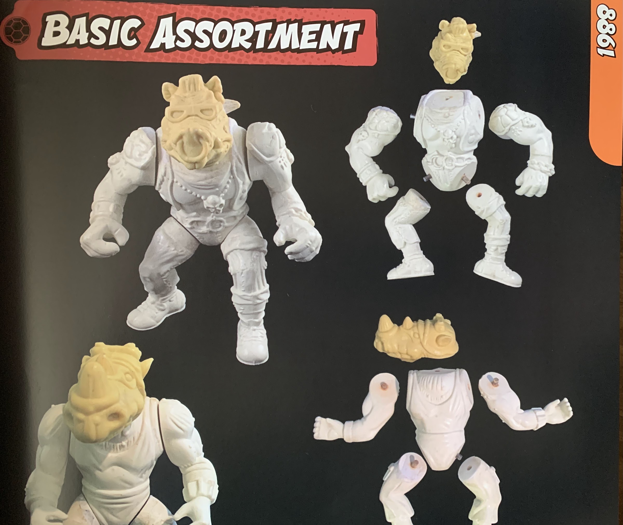
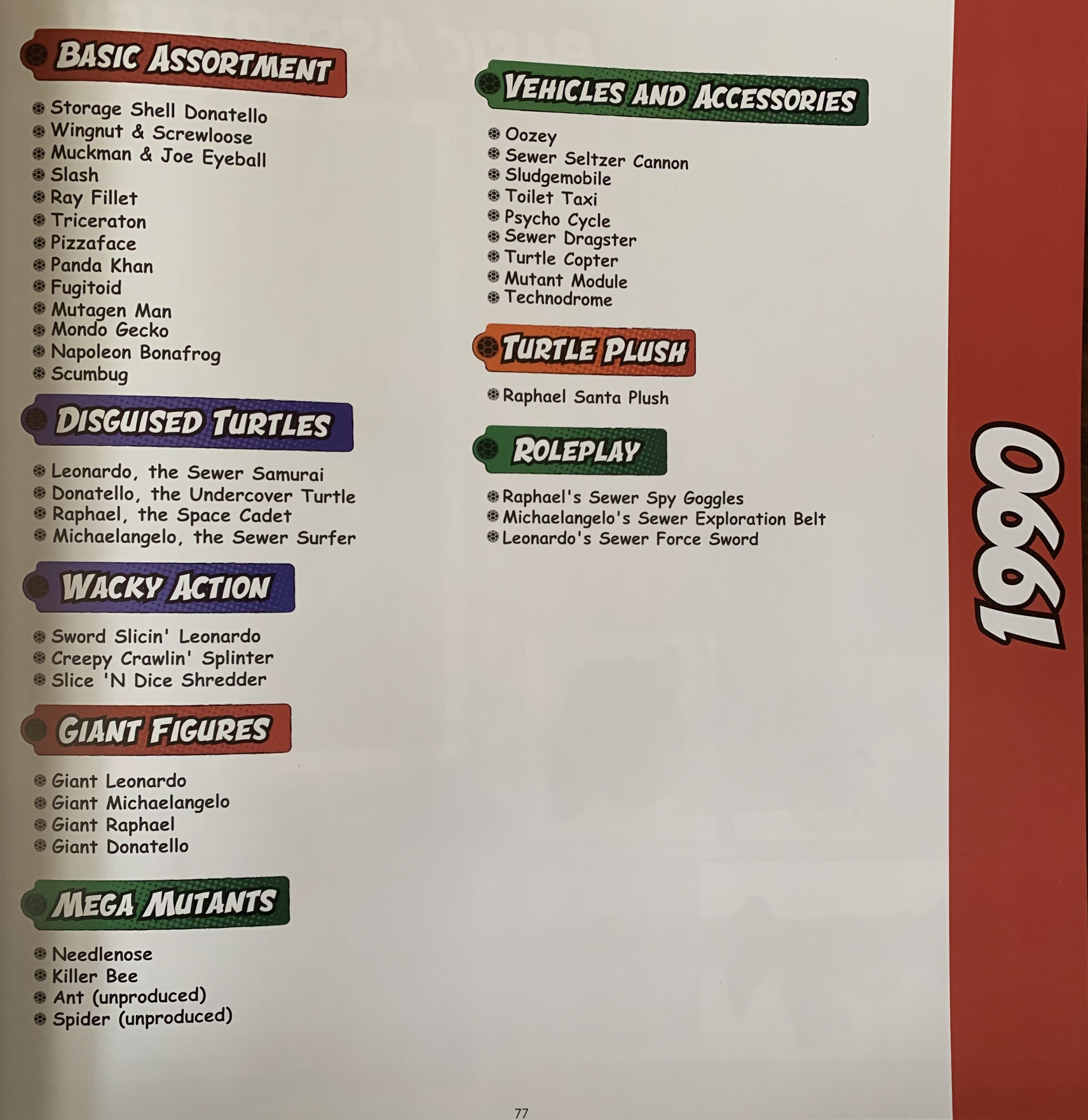
The first chunk of the book goes over the creation process for an action figure. It covers everything from the design phase, to concept art, sculpting, mold creation, and finally production. It’s not exhausting, so it isn’t a particularly long section. The entire book is rather breezy and even though it’s 400 pages many will probably finish it in one sitting. That’s because the main meat of the book is a walk-through year by year of the vintage line that unfolds mostly in pictures. A lot of the pictures are test shots and resin models of the figures before production and in some cases there are prototypes for unreleased figures. There are blurbs to go along with each page as well as a handy checklist of the product released (and cancelled, in some cases) for that year. It’s not a complete capture of the product for that year as Fawcett is basically limited to what has survived all these years so if a hardcopy or test shot of a figure no longer exists, it won’t be shown here. He also covers play sets, vehicles, and extensions to the line like the giant figures and plush dolls.

Mikey in blue?! Blasphemy!

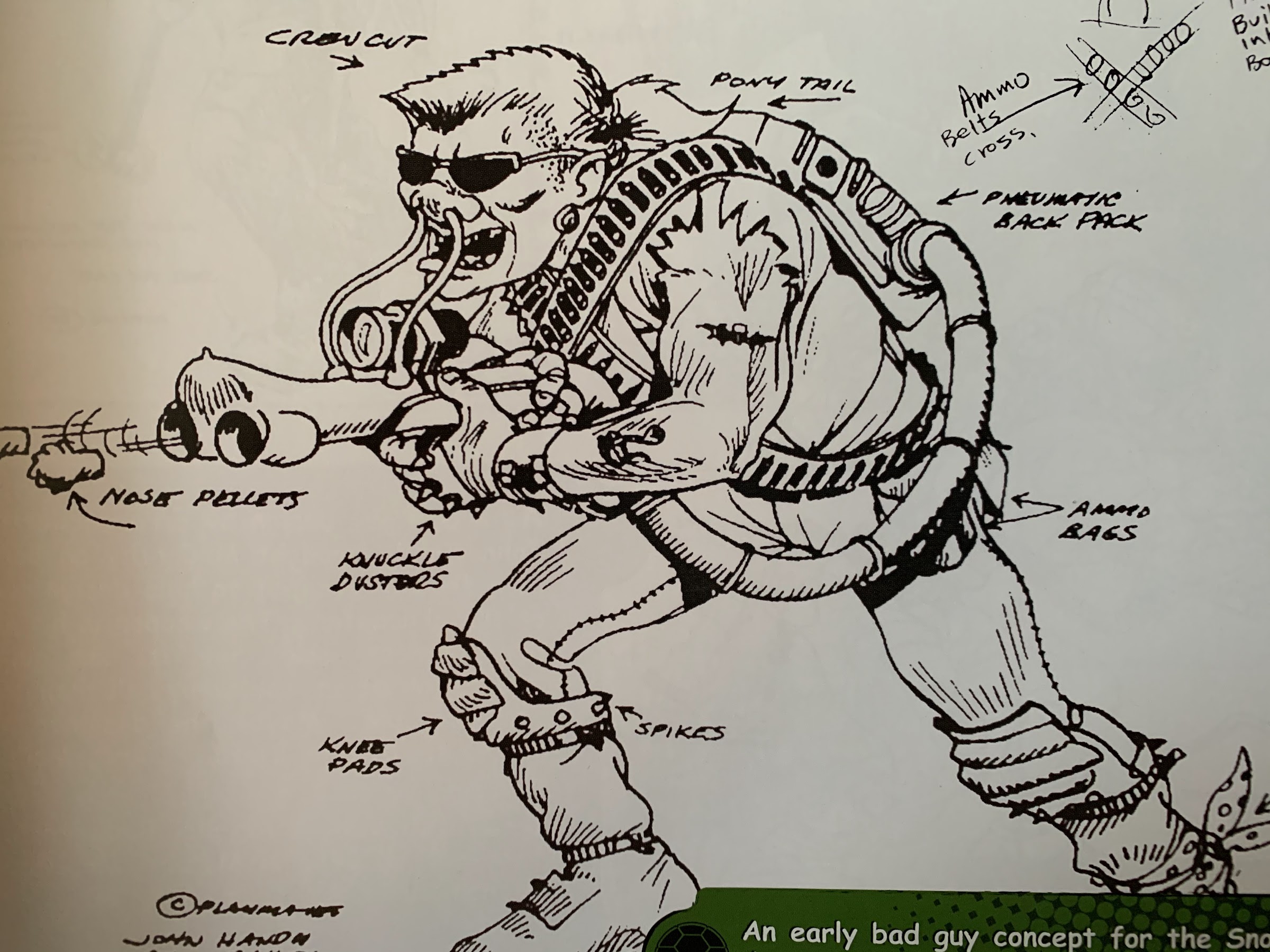
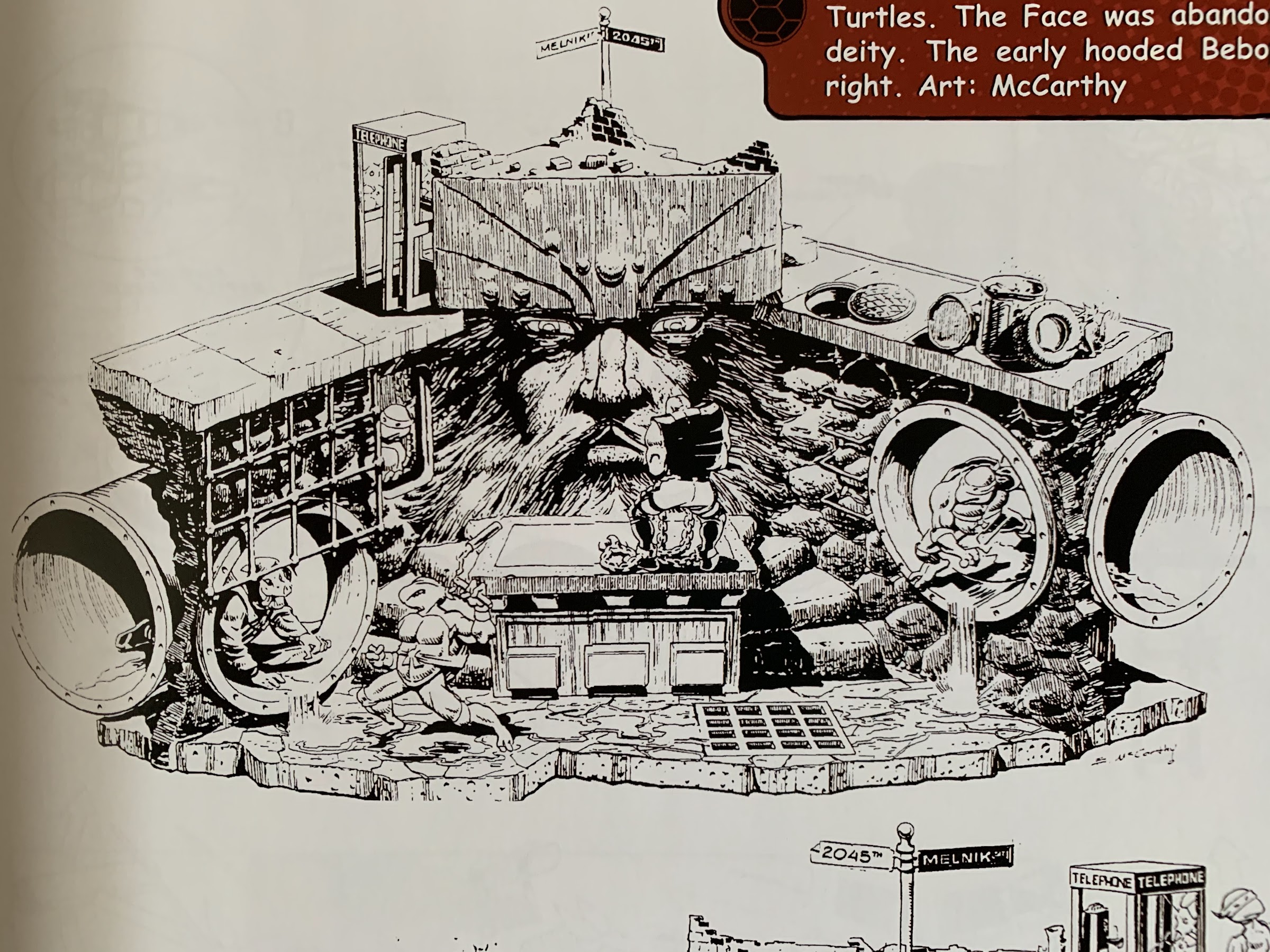
By far, the part of the book I enjoyed the most is the material concerning the inaugural wave of figures from 1988. That section contains a lot of the concept art that existed before the line was launched. This includes an interesting character sheet that shows Leonardo was originally going to wear orange and Michelangelo was going to sport blue. I found this amusing since, if you recall, the original title cards for the cartoon were miss-colored with Mikey as Leo wielding twin katana and Leo as Mikey getting ready to scarf down some pizza. There are several shots of the early villains in the line which were all going to be humans as well as shots of the original sewer lair which had some kind of god for a wall called The Face. Yeah, I’m happy that didn’t make it into the line or the show.

This guy was going to come with a gun that shot “snot” rockets. We really missed out.

The year-by-year stuff is all color-coded and the colors are visible when looking at the book from the side so it’s easy to jump to a section. Still, I find myself wishing there was an index in the back of the book so if I was looking for a picture of Sewer Samurai Leonardo, for example, I could quickly find it. And while the checklist is nice, I feel like this book would have greatly benefited from a visual guide as an appendix. Just a simple visual checklist that included a picture of each, finished, figure in its final packaging or loose, if that’s all that was available. Surely, there are collectors out there with an entire run of the Playmates line that would have been happy to show off and have their stuff make it into a book. I think even Peter Laird used to make sure he got copies of everything Playmates released, though I have no idea if he is still in possession of all of that material.

By contrast, I don’t think we’re missing out on anything when it comes to The Face.

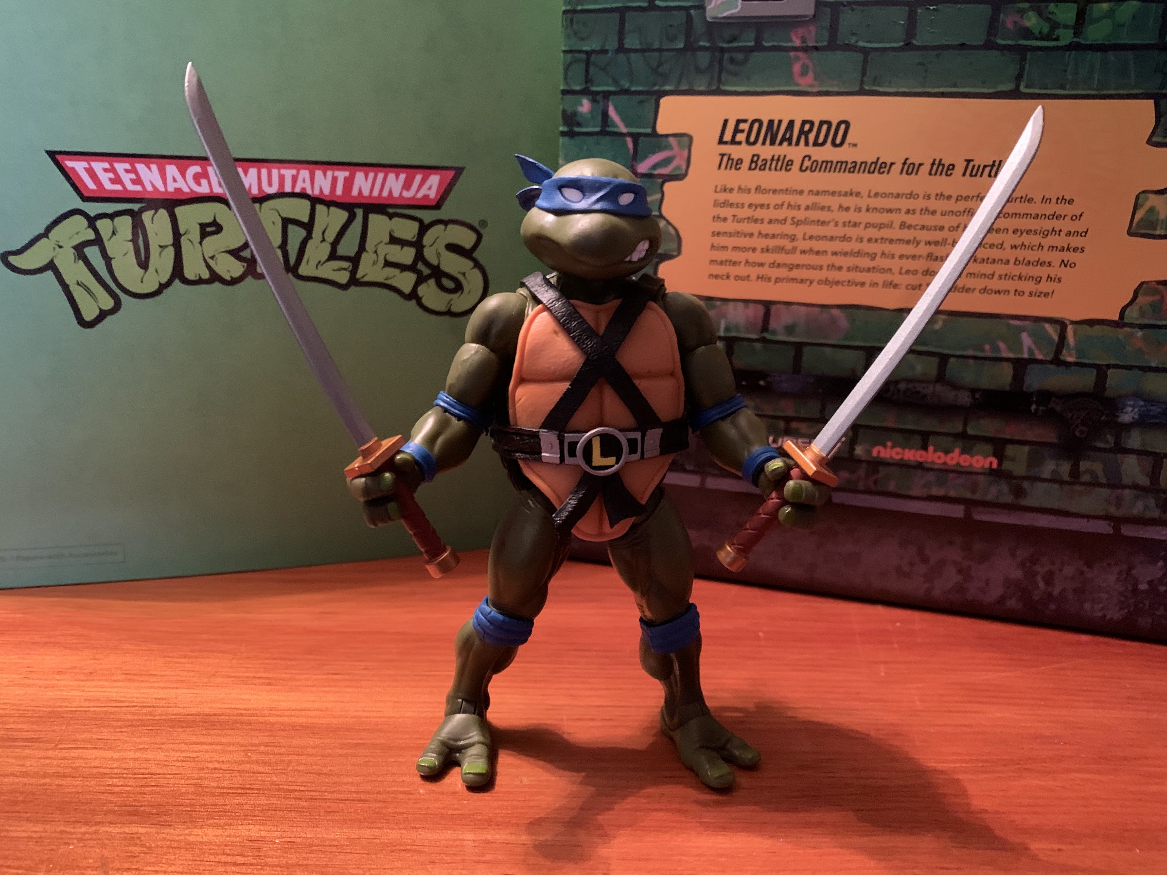
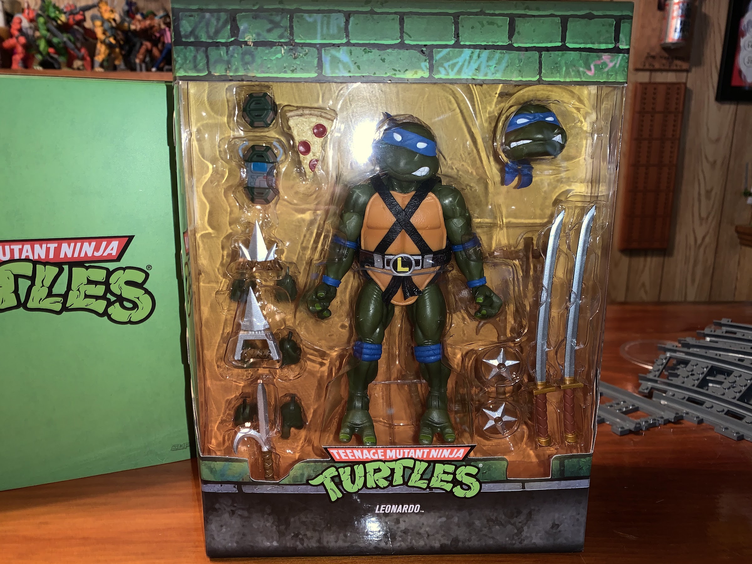
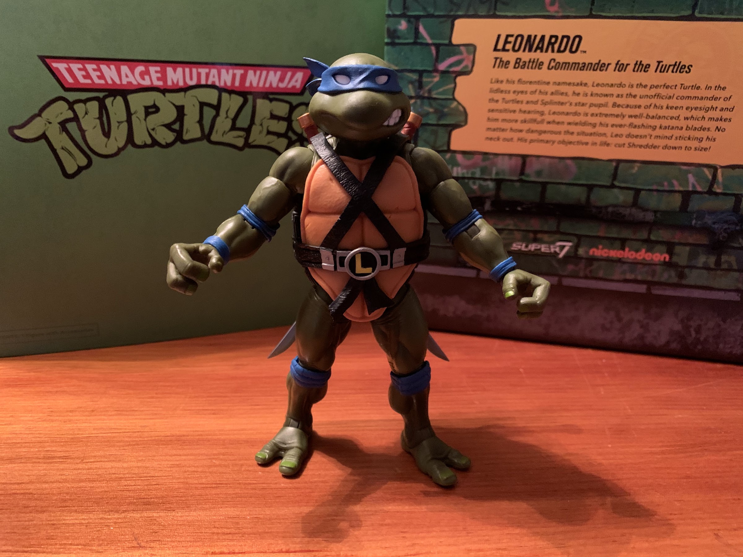
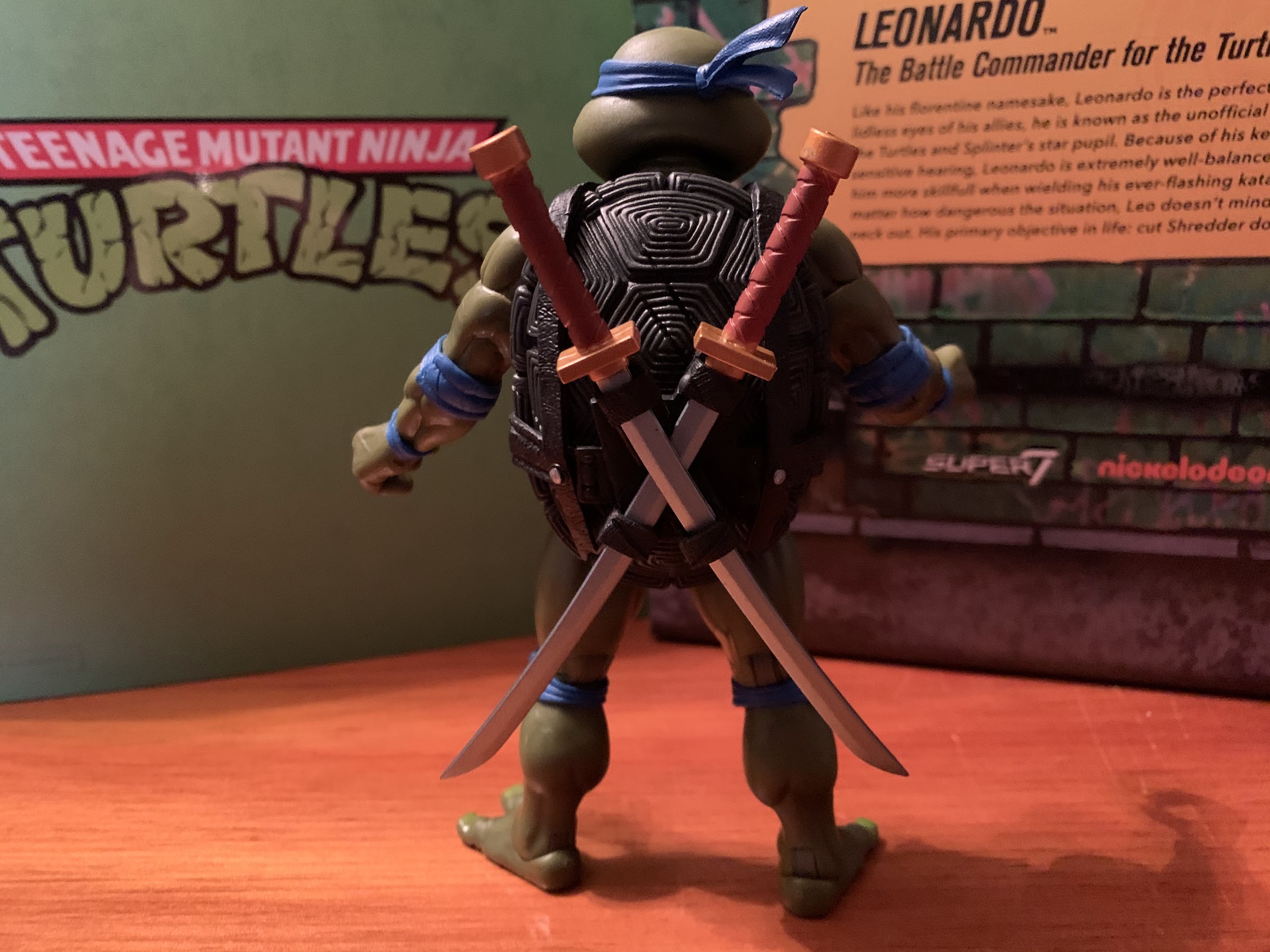
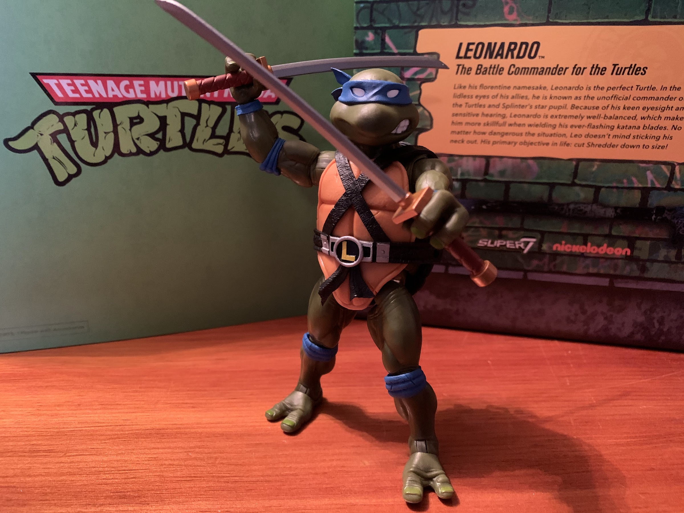
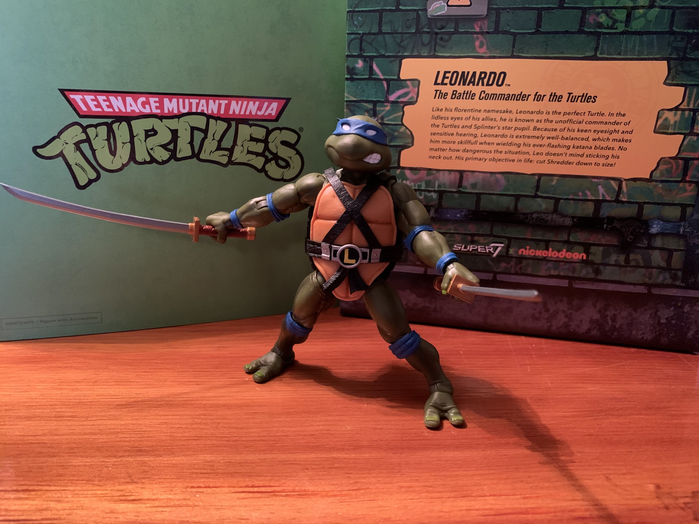
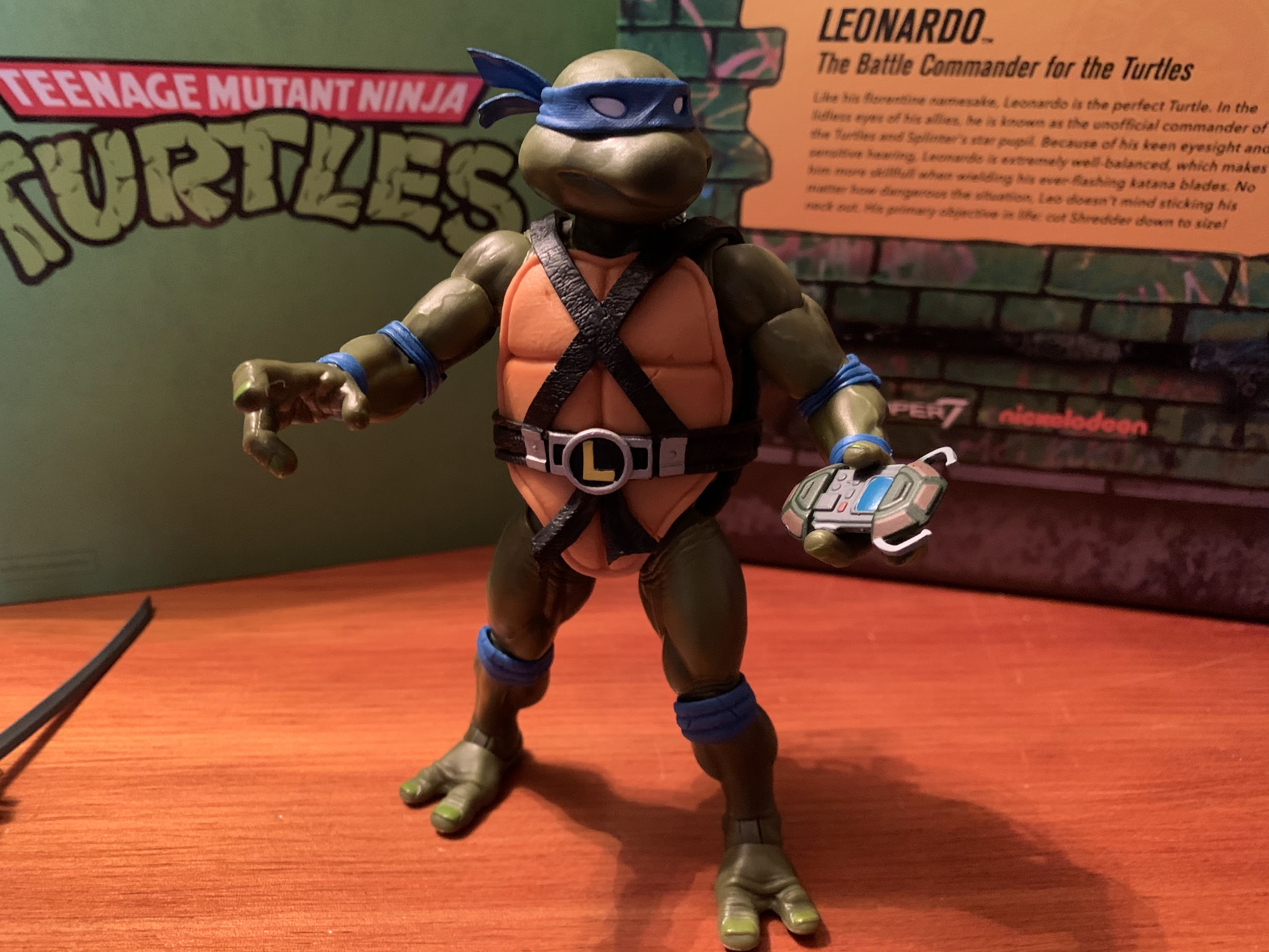
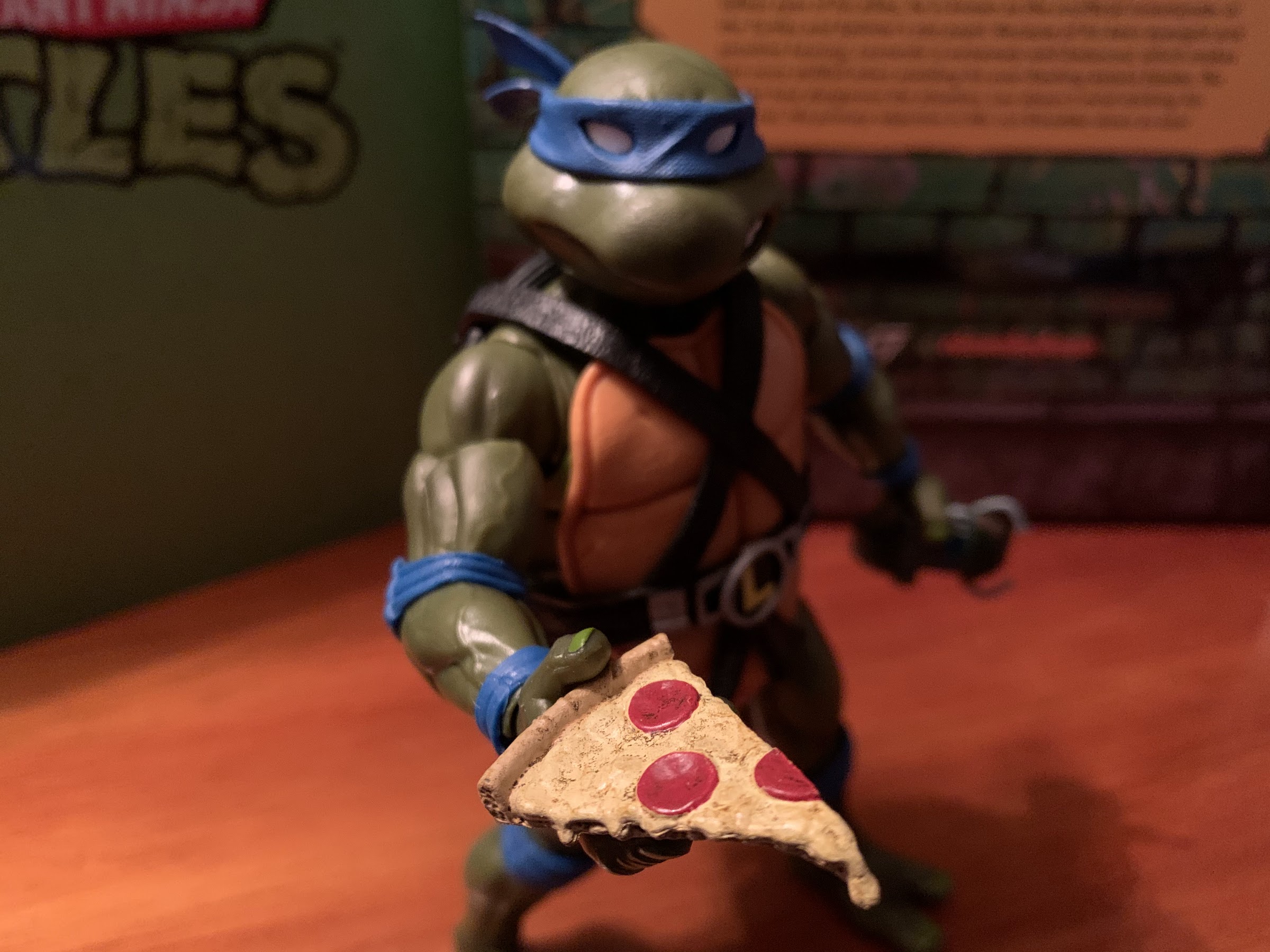
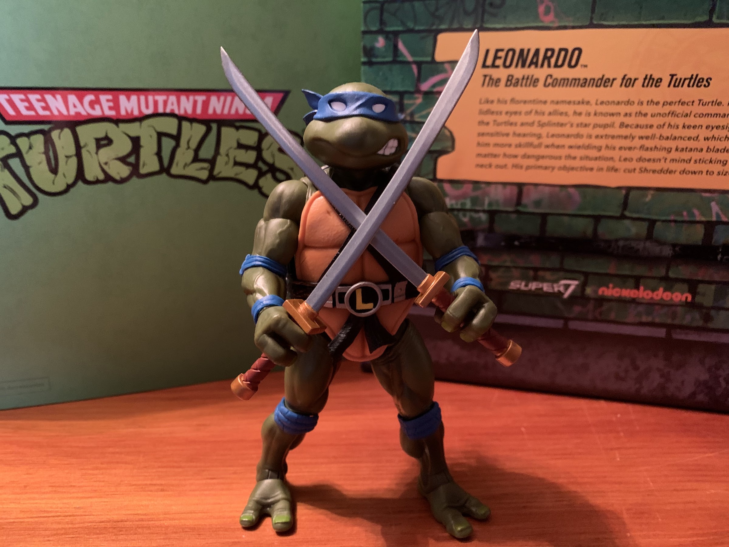
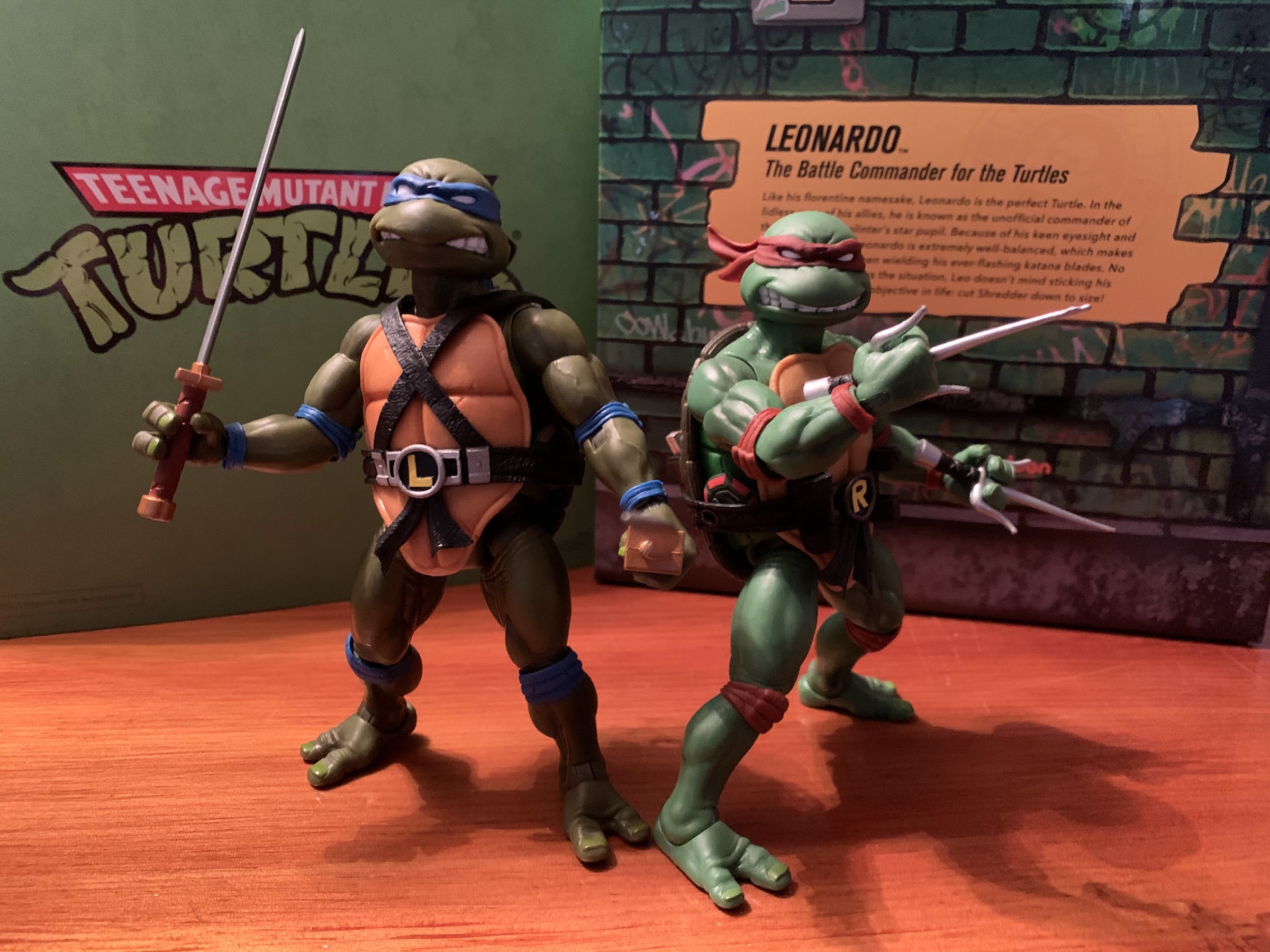
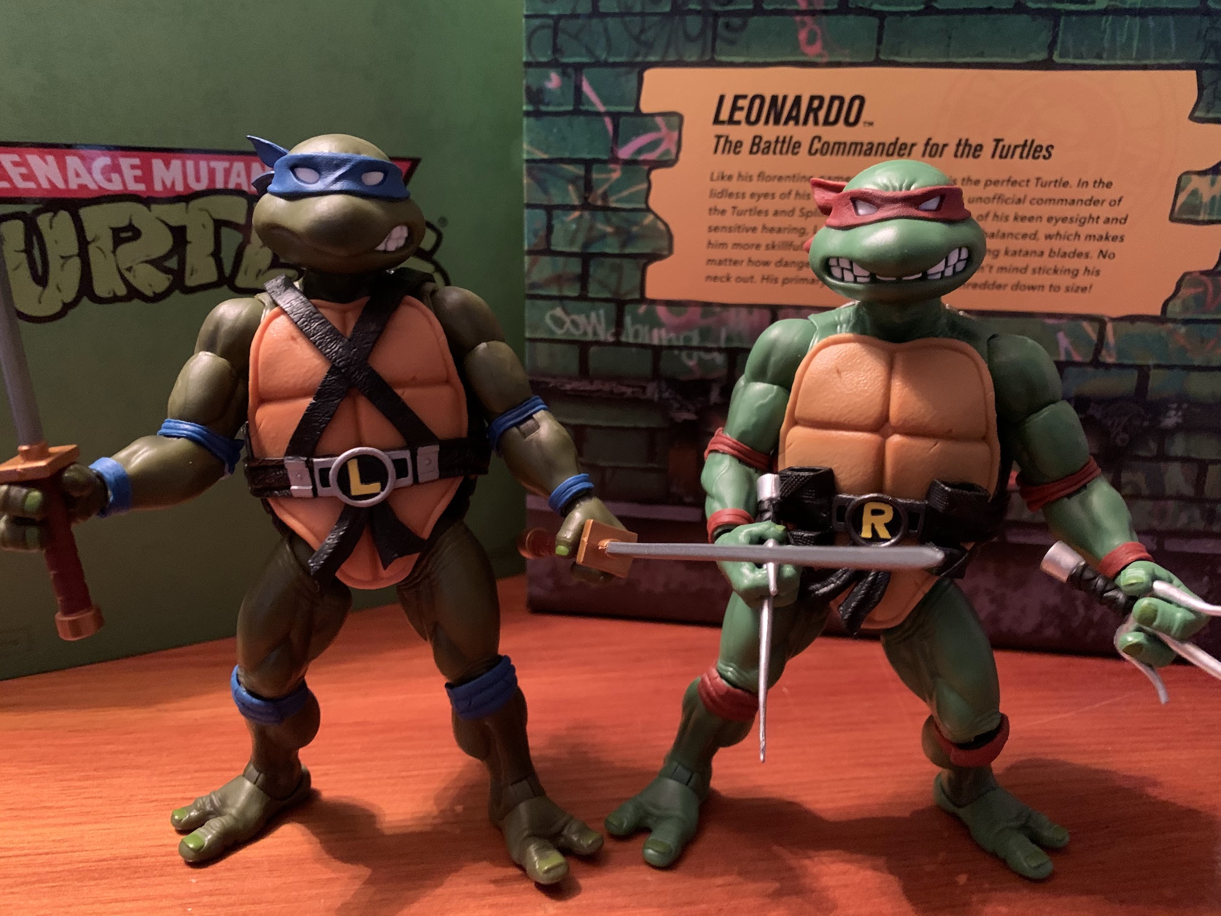
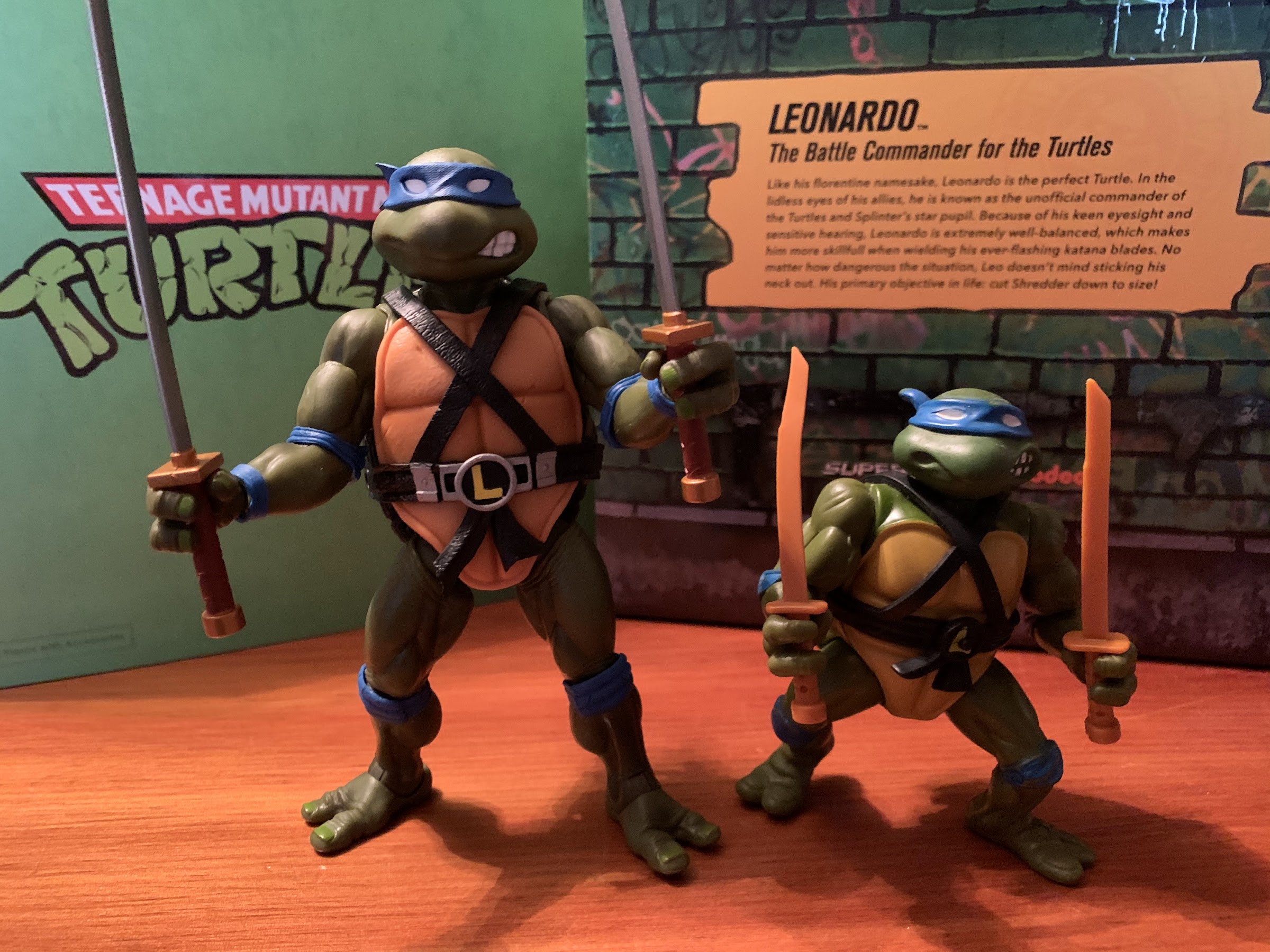
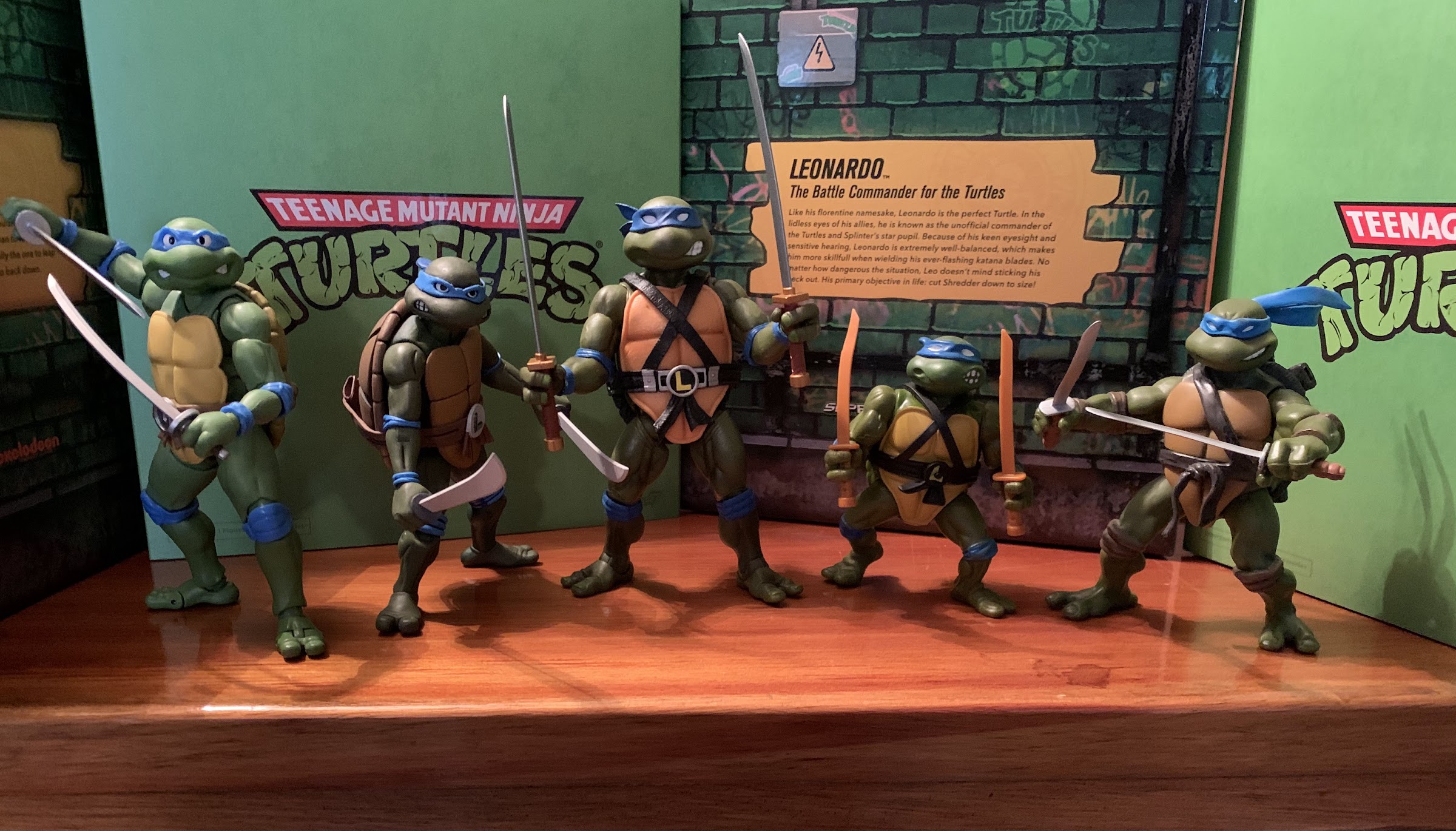
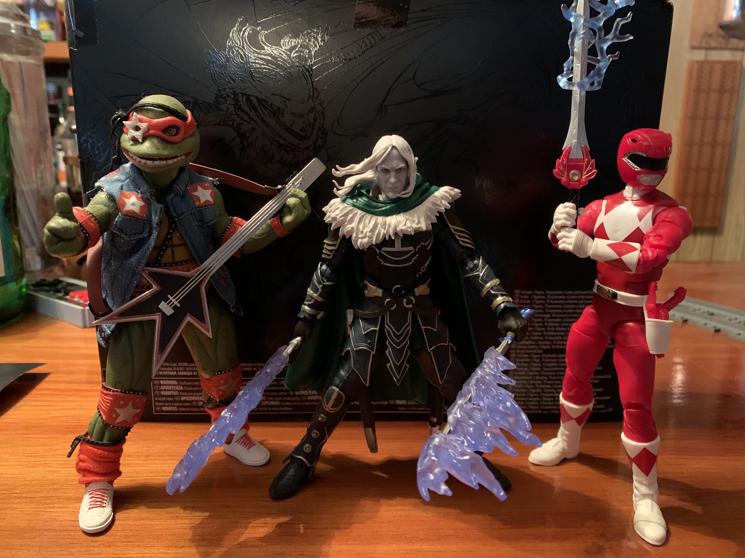
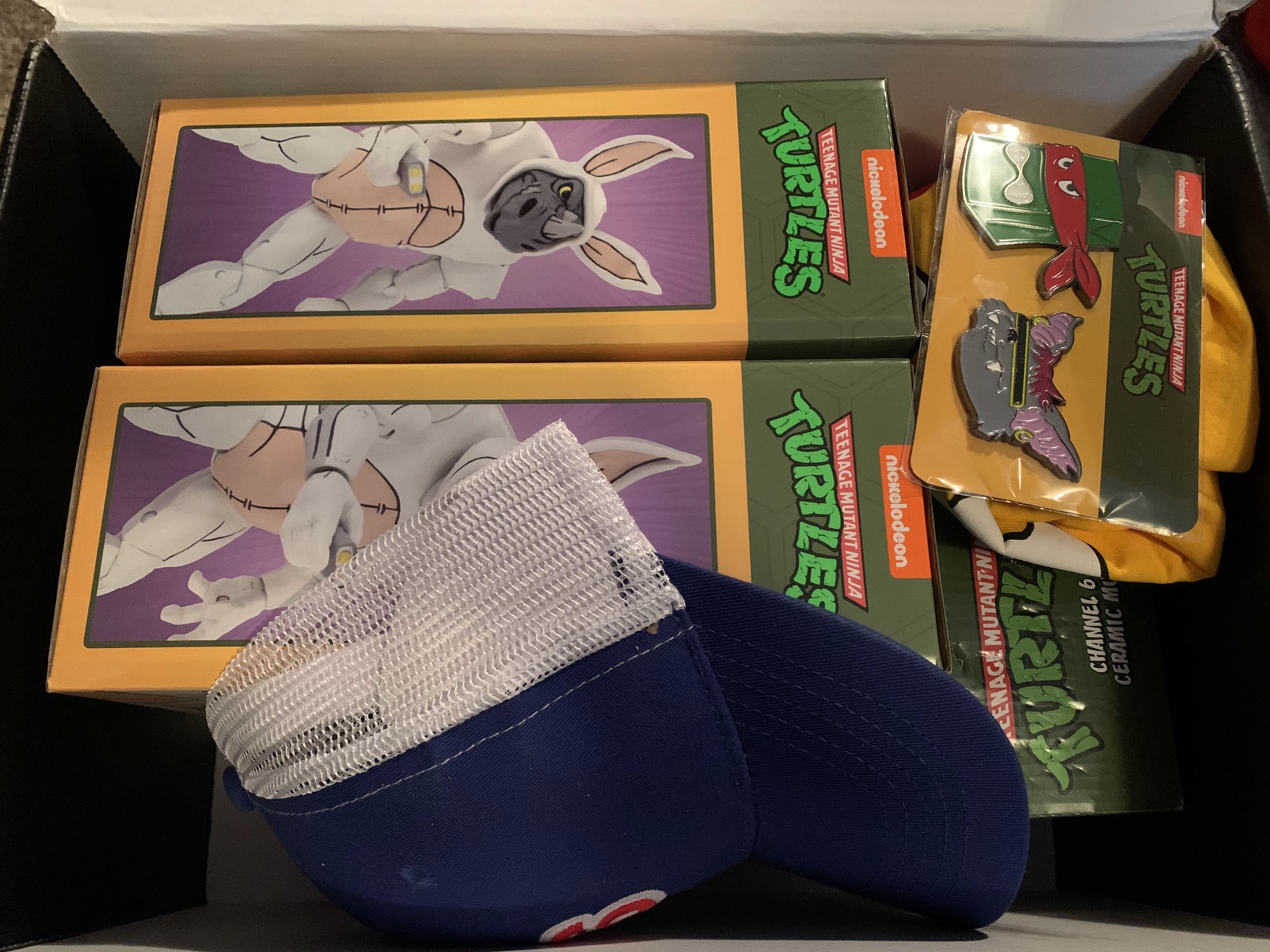
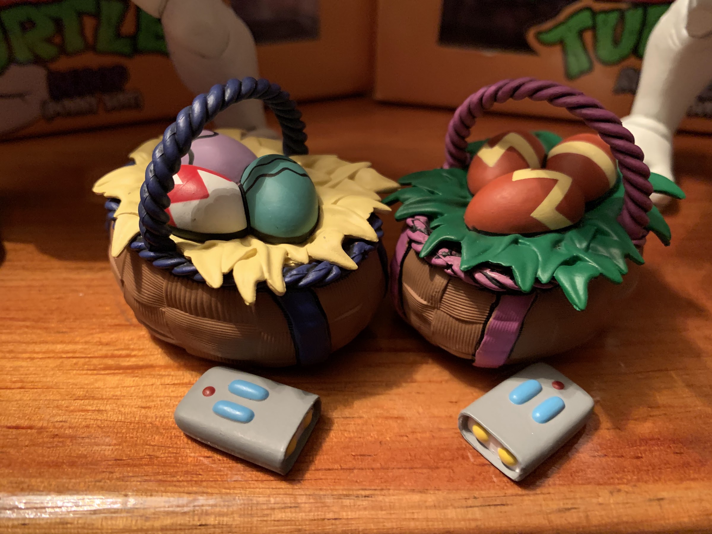
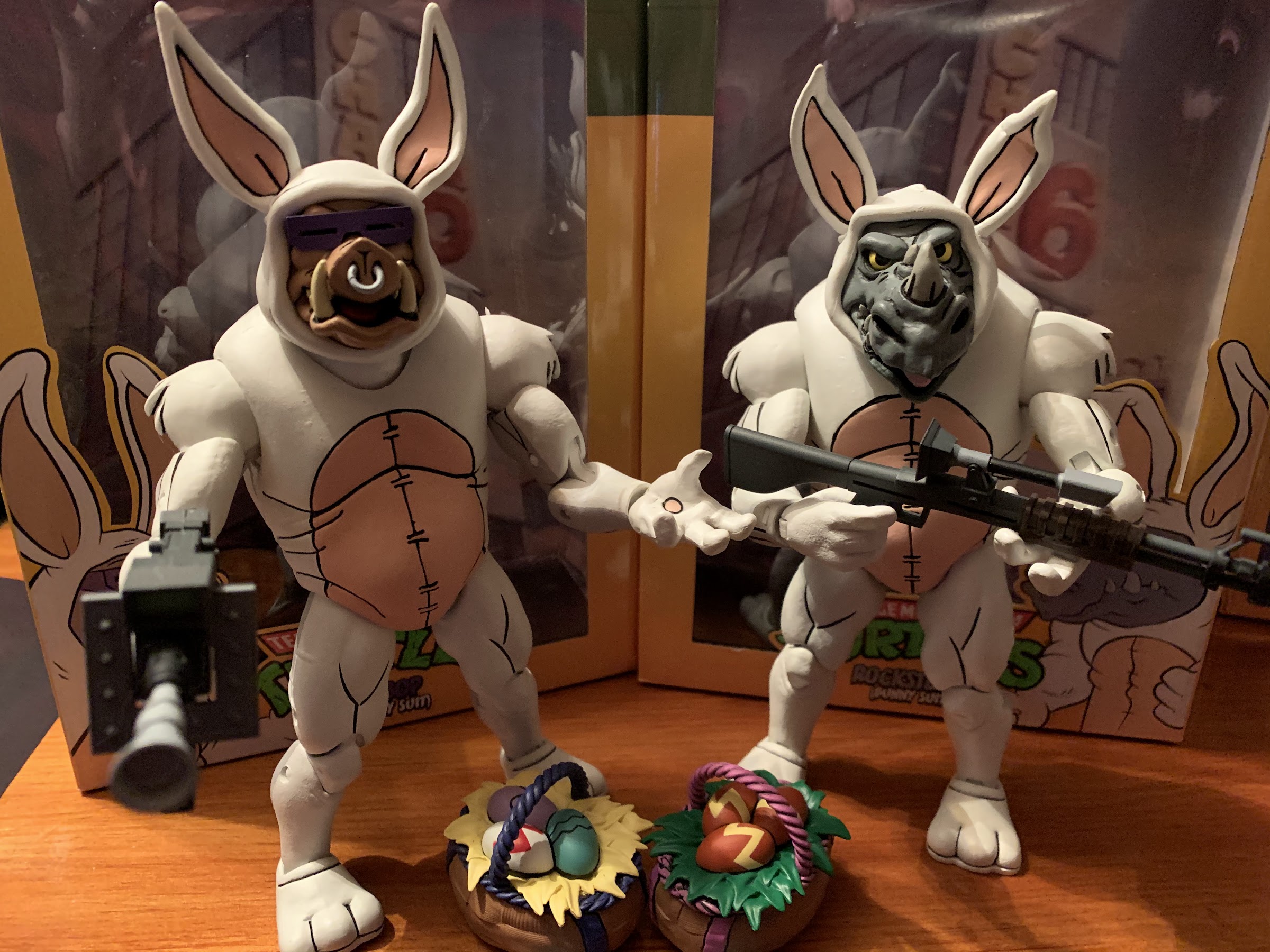
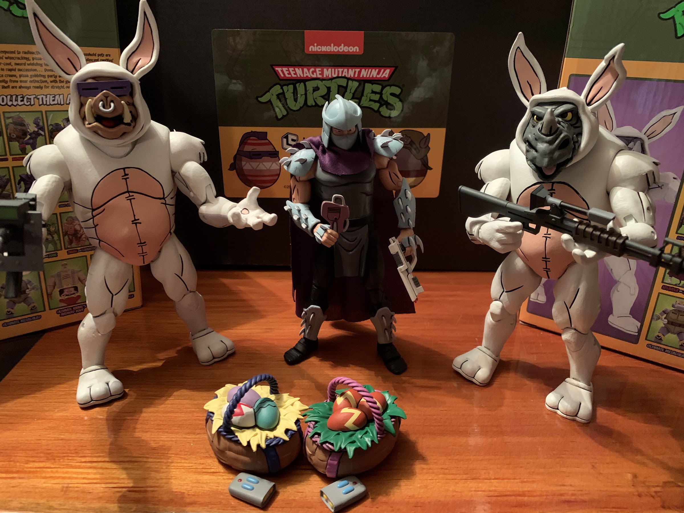
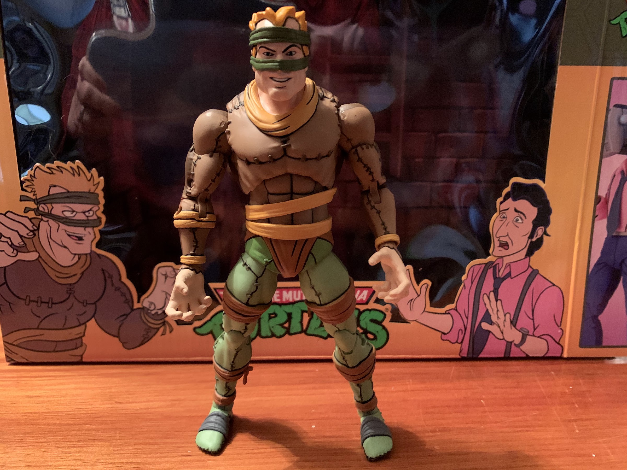
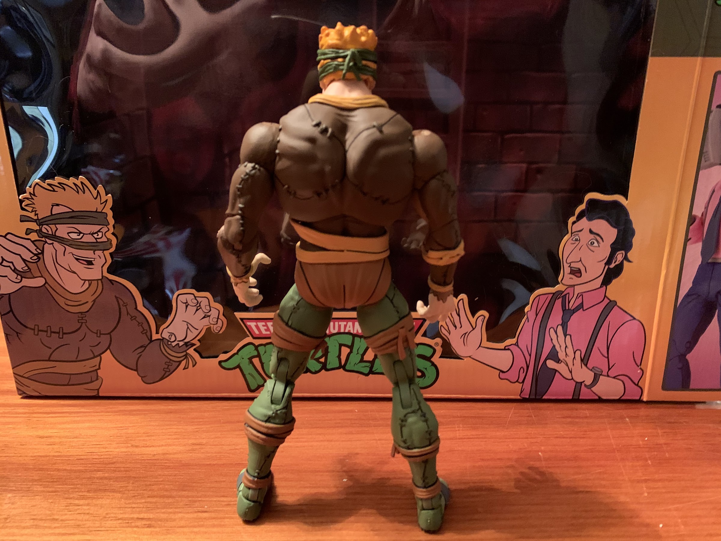
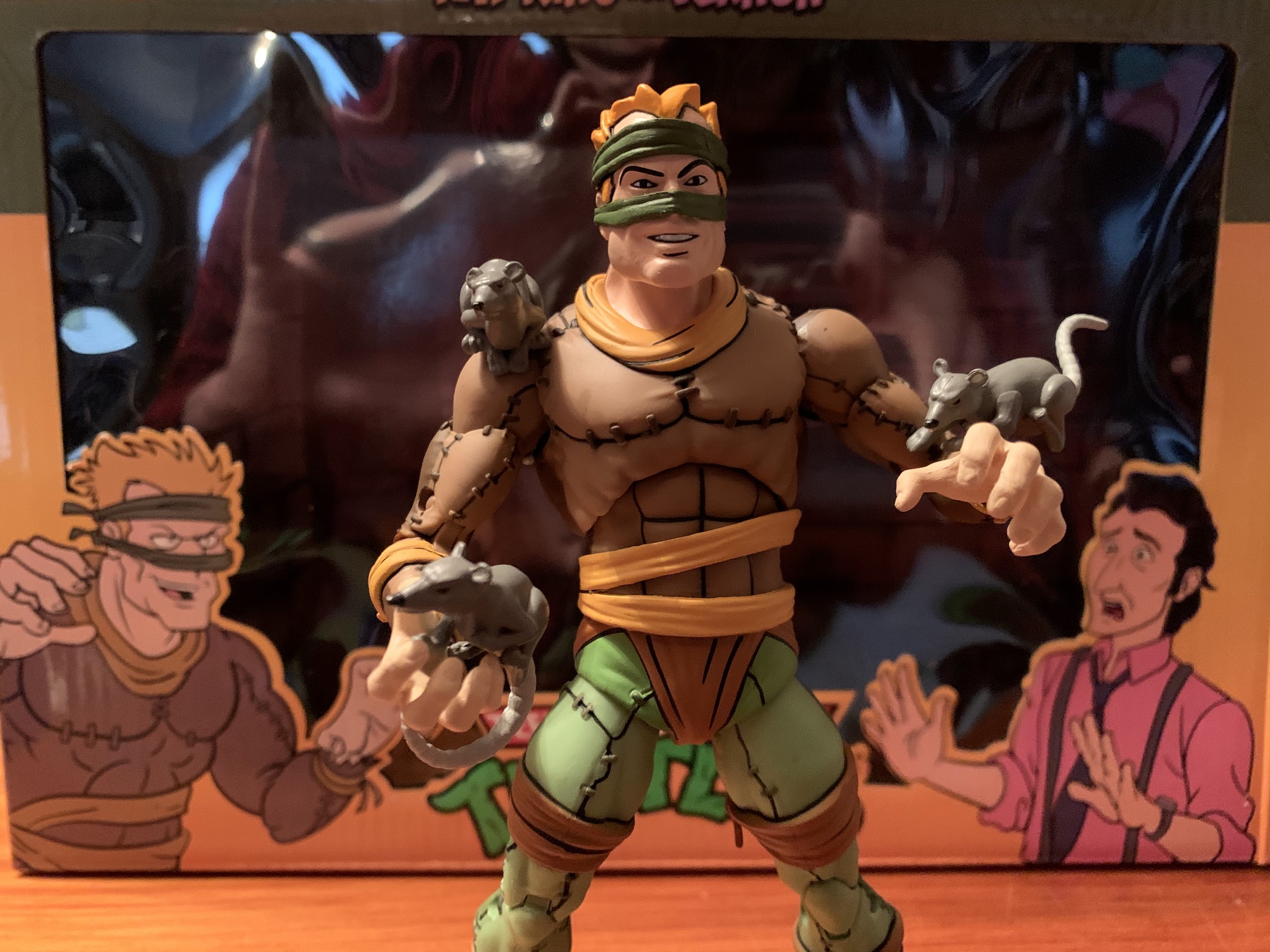
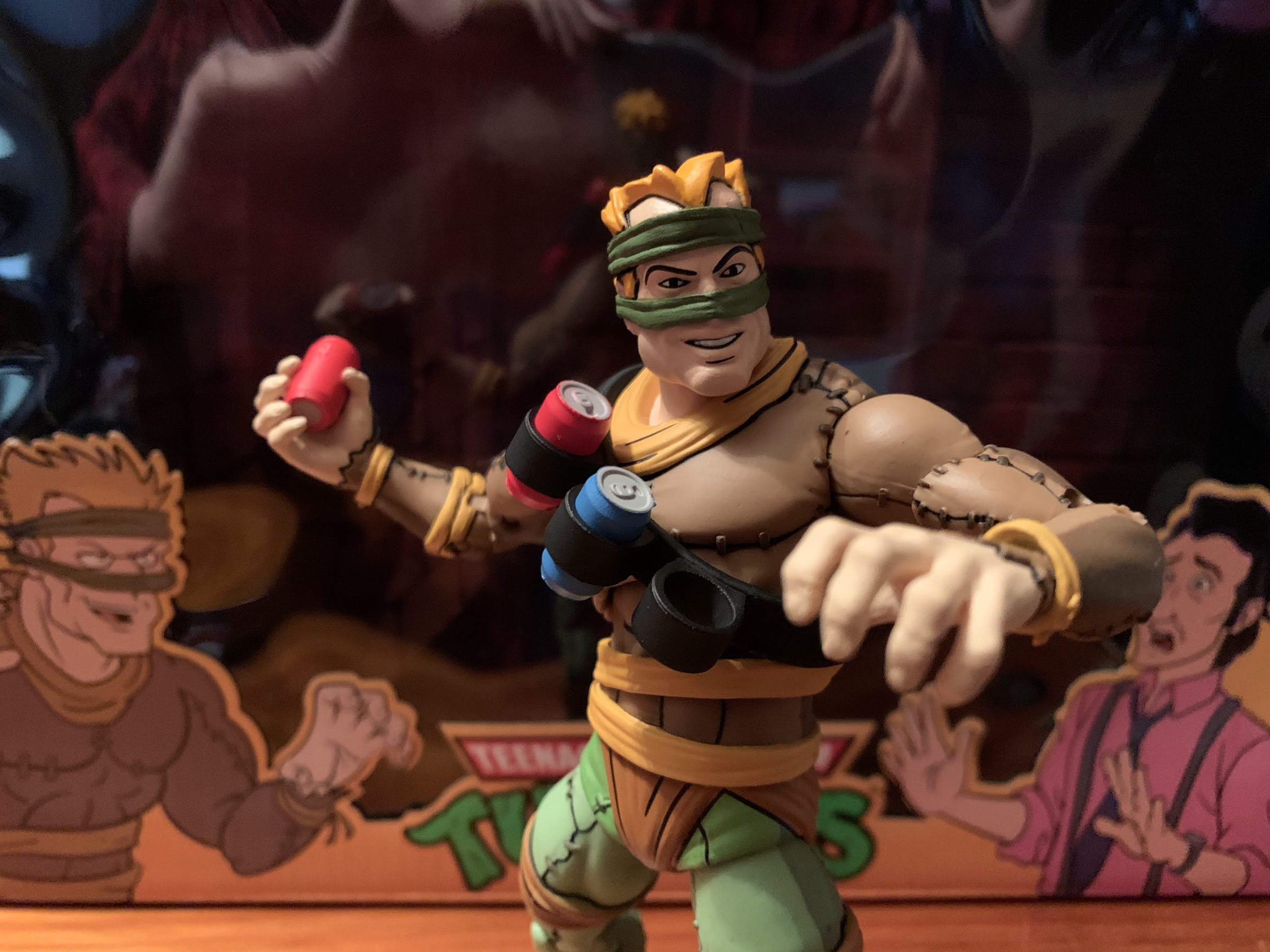
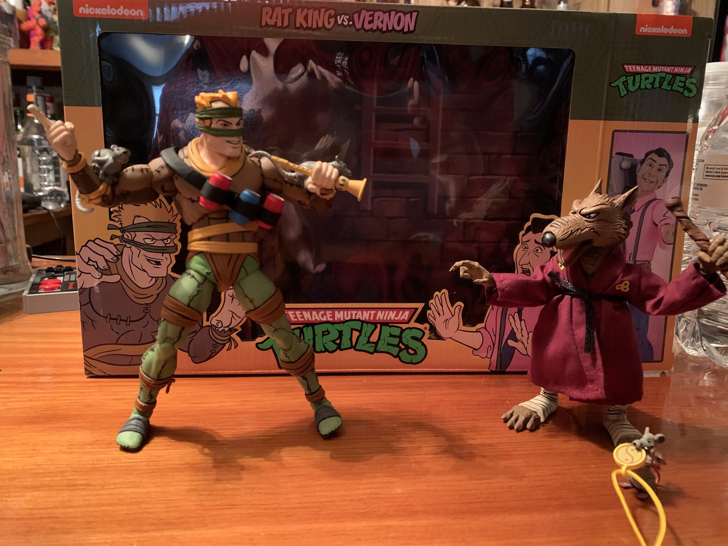
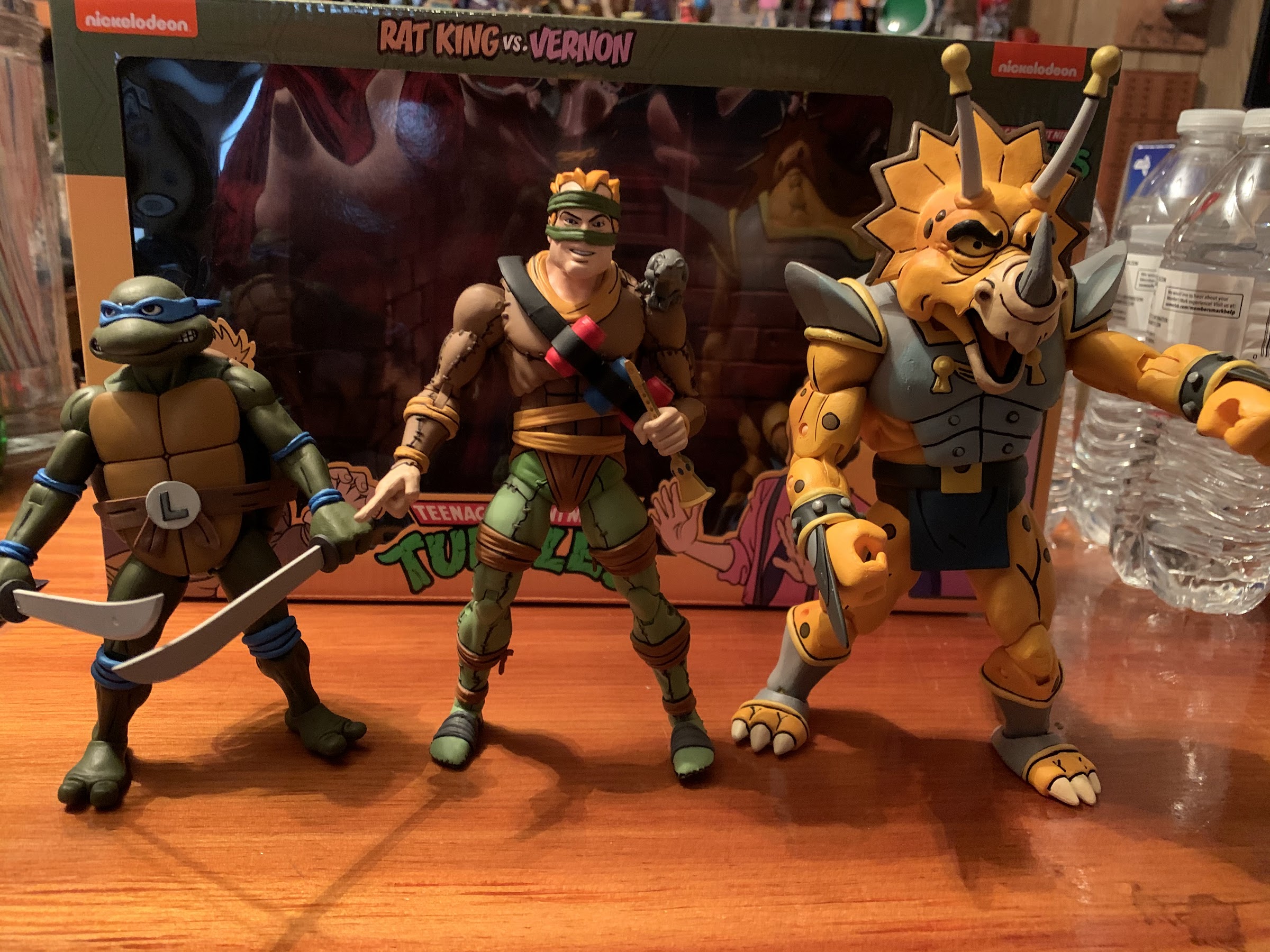
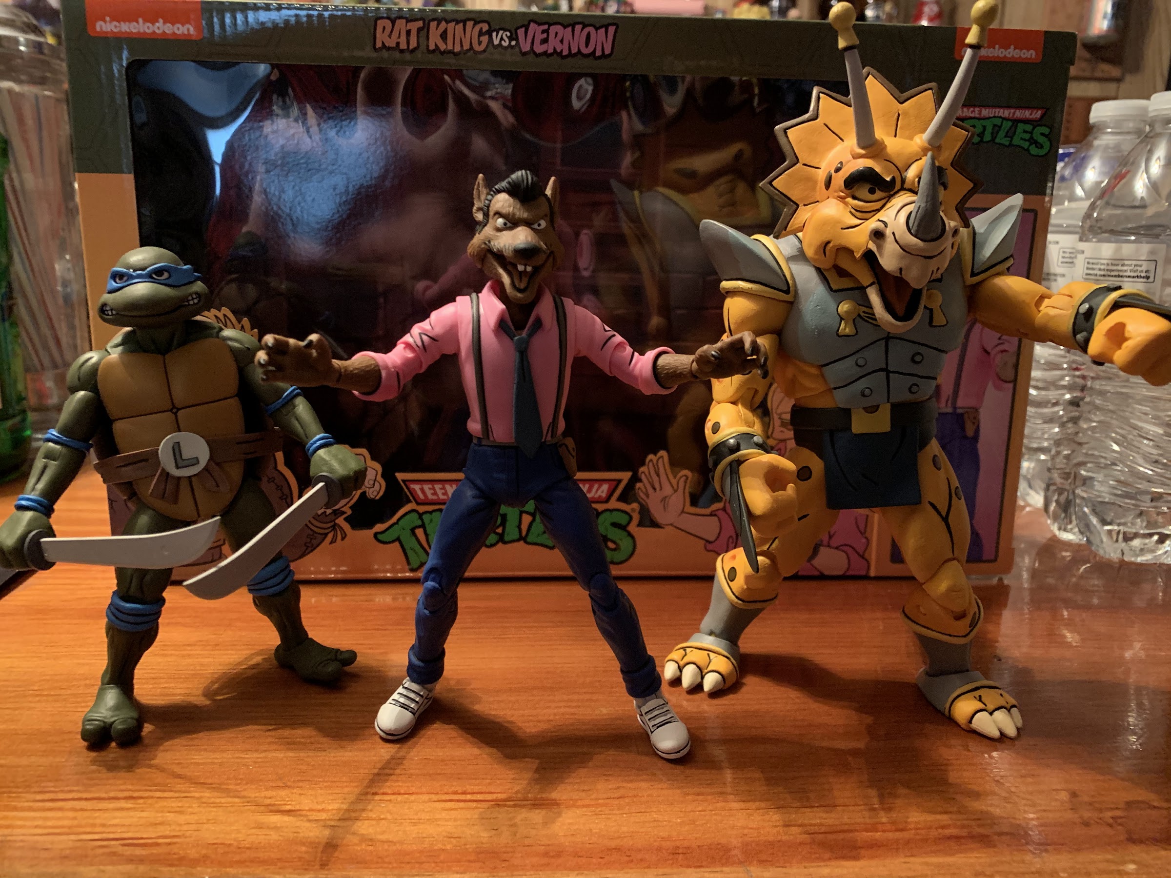
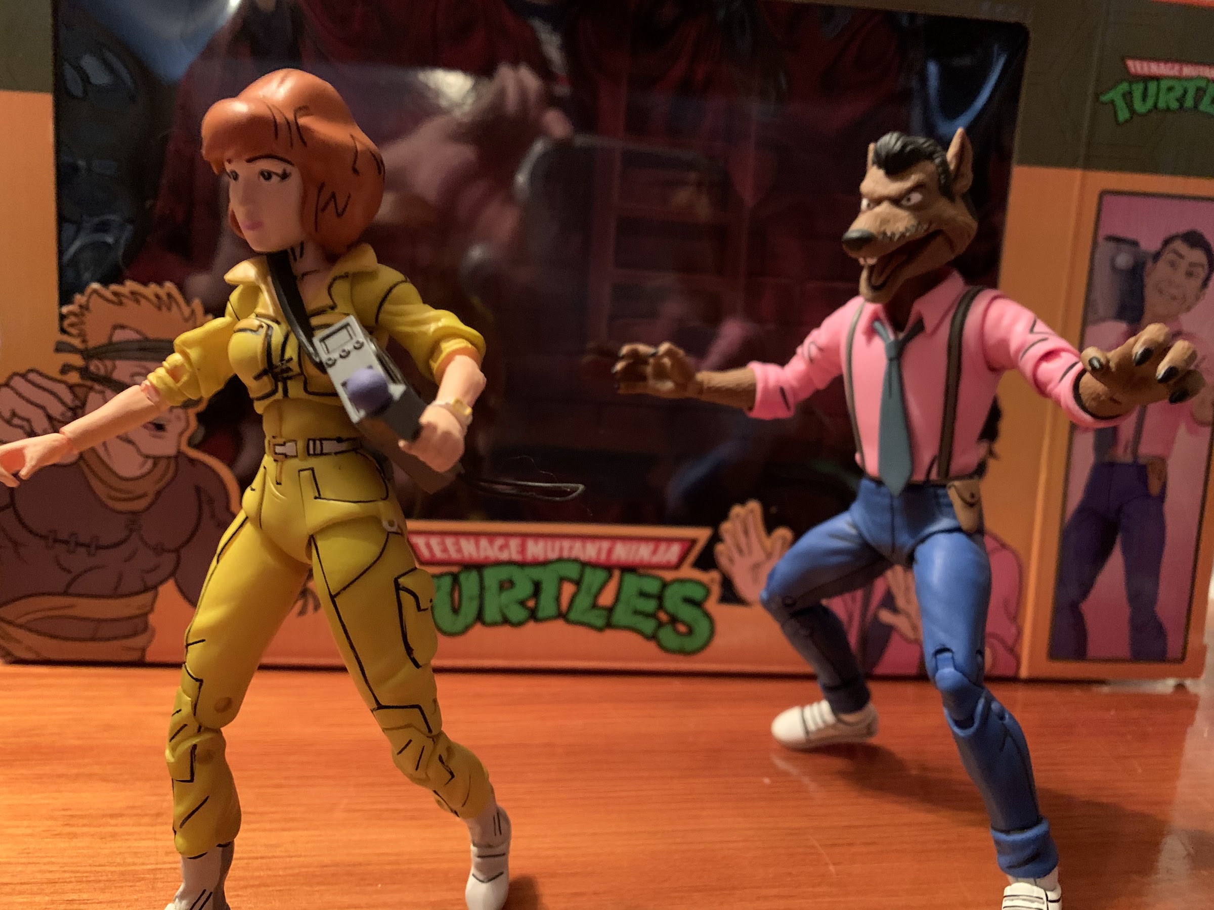
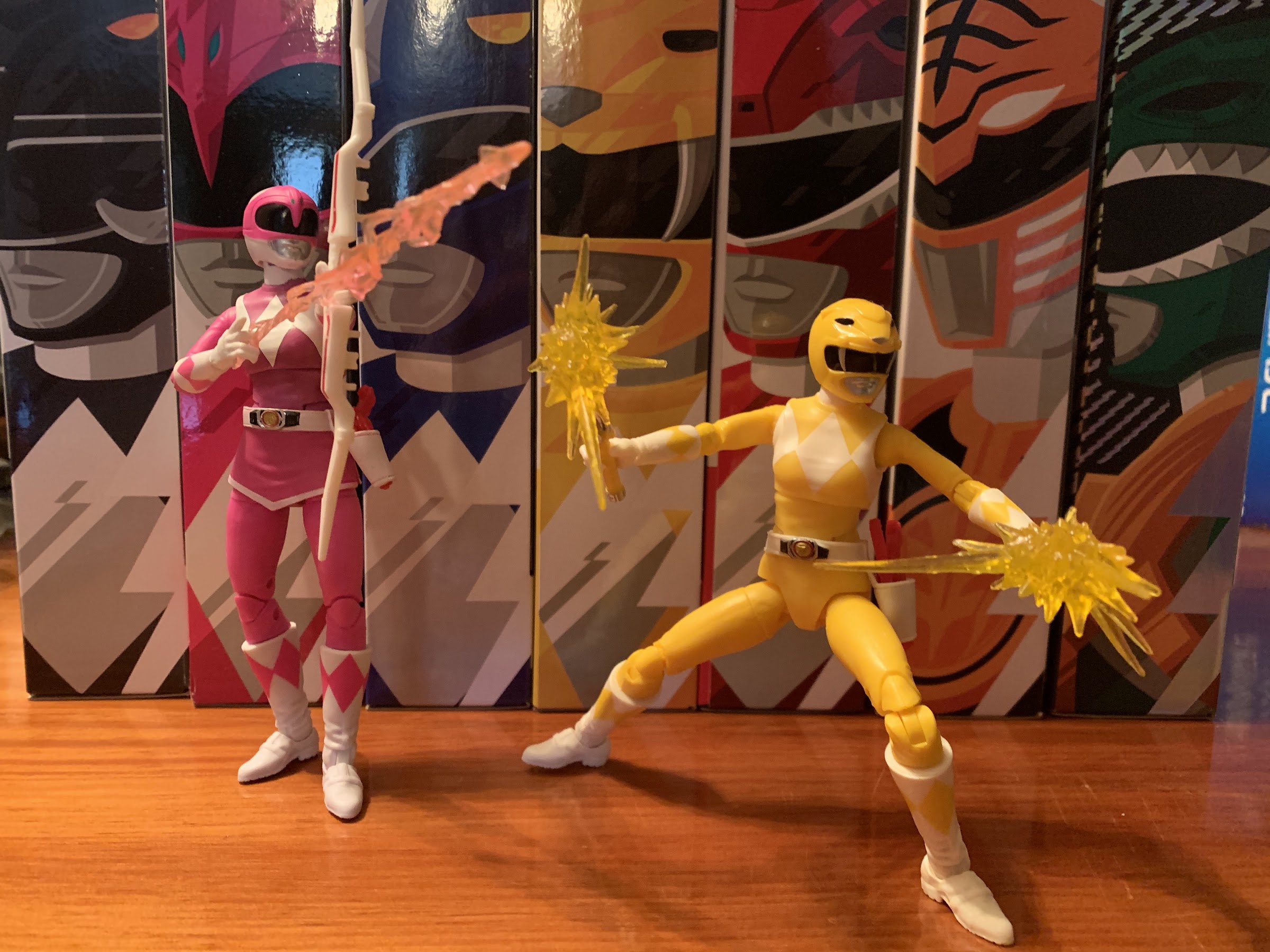
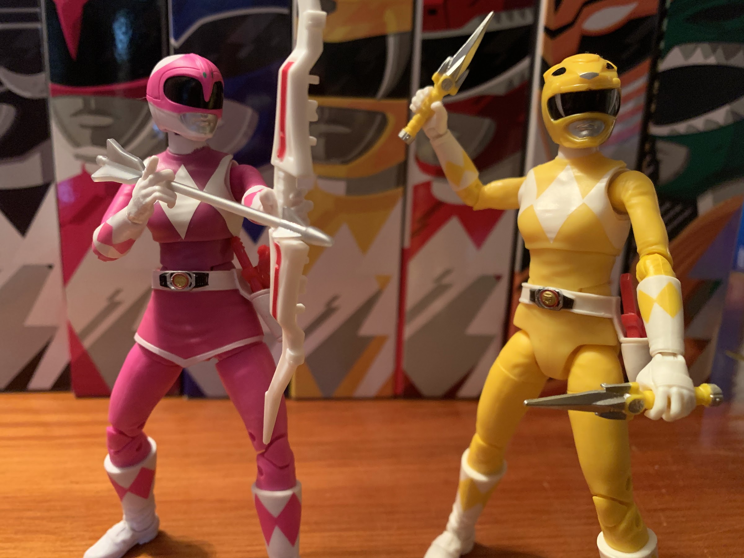
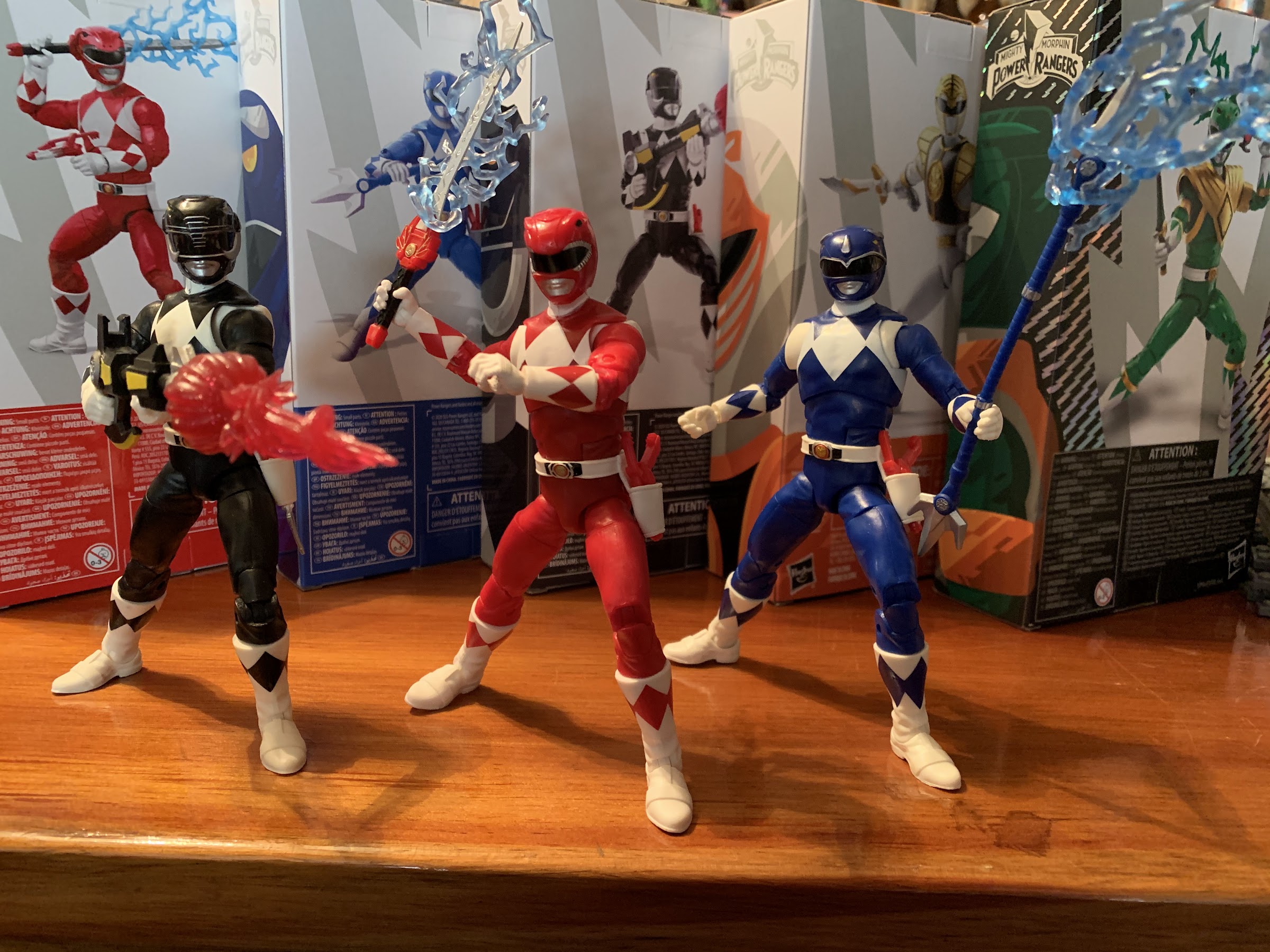
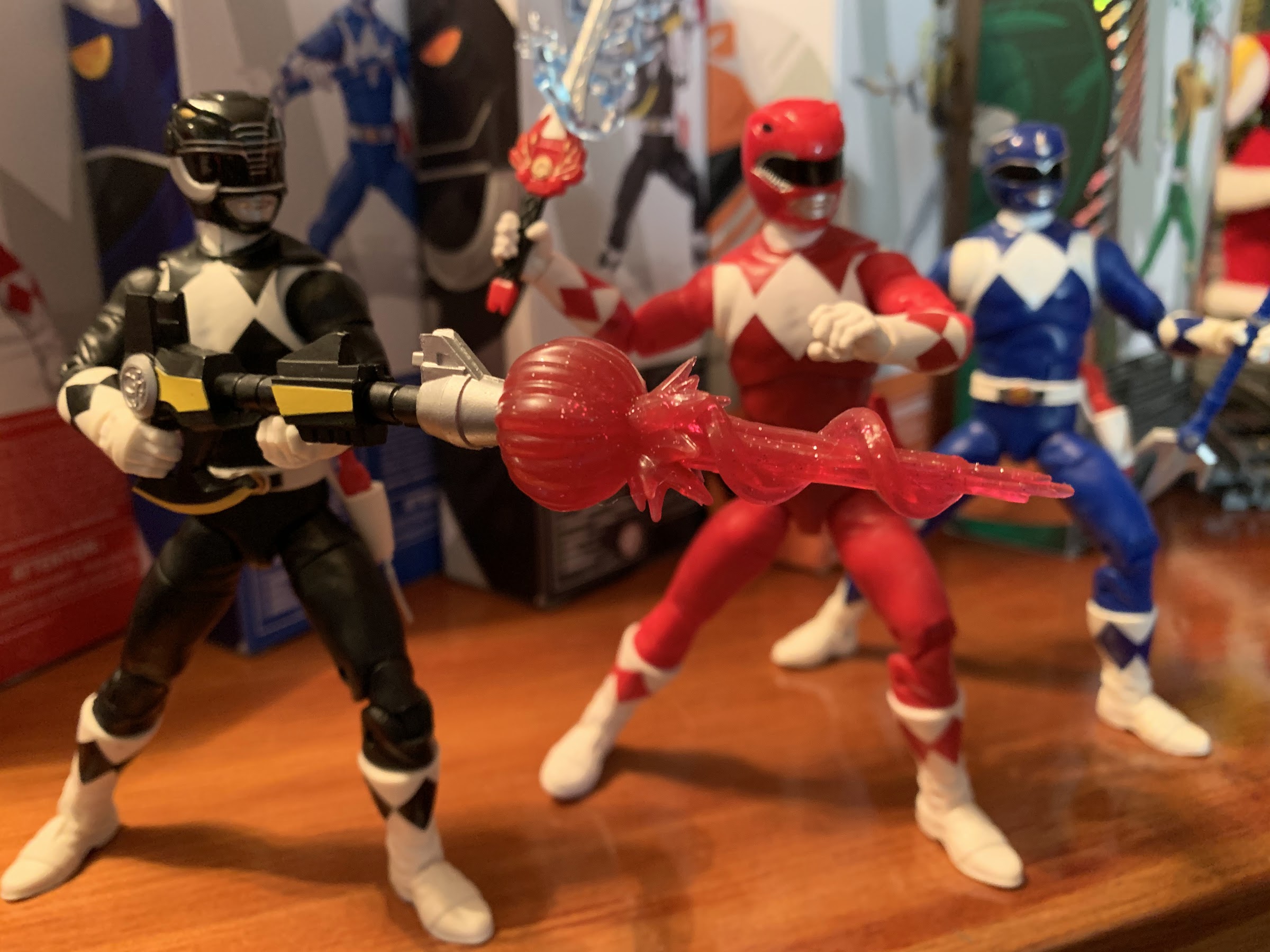
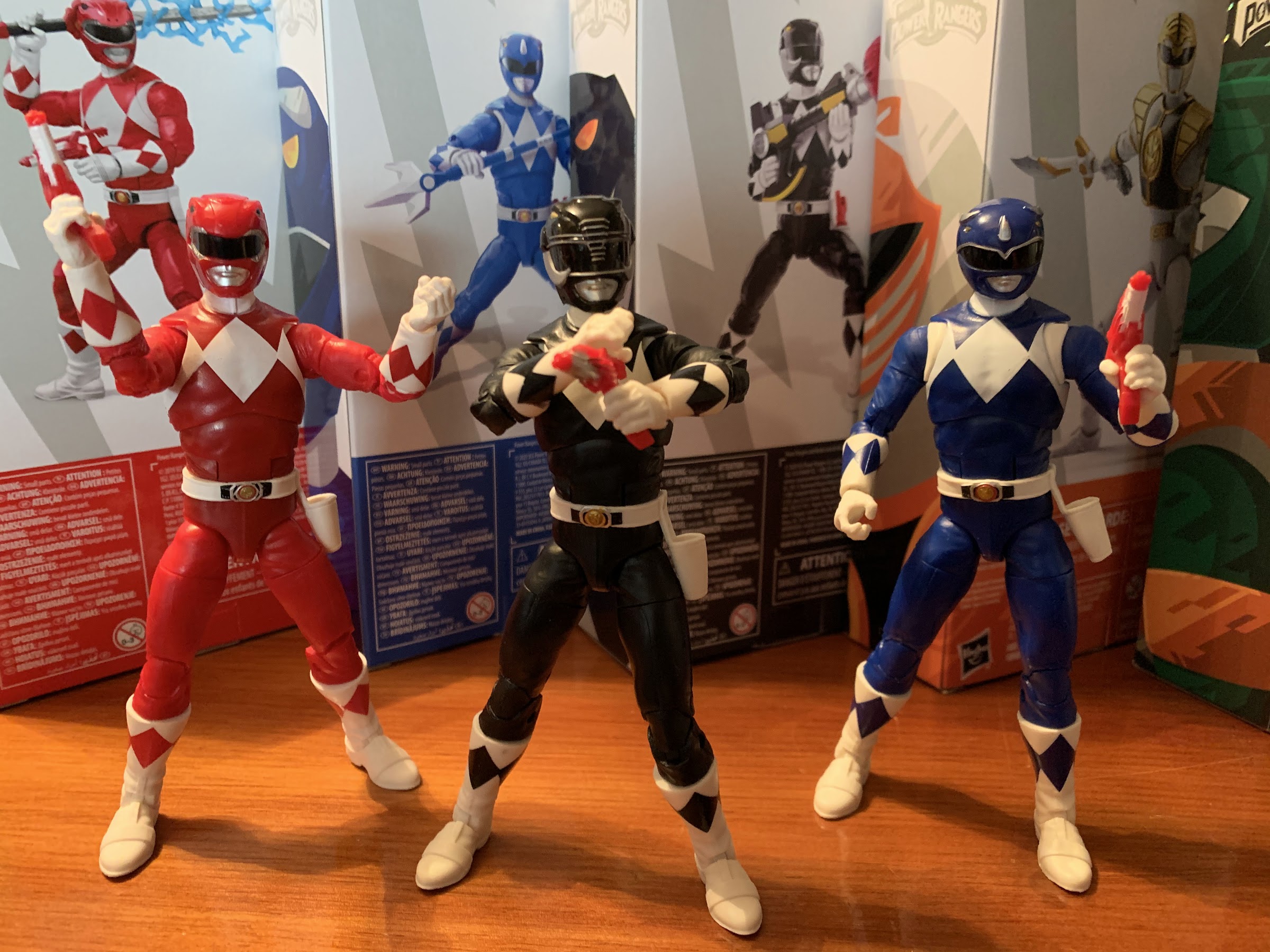
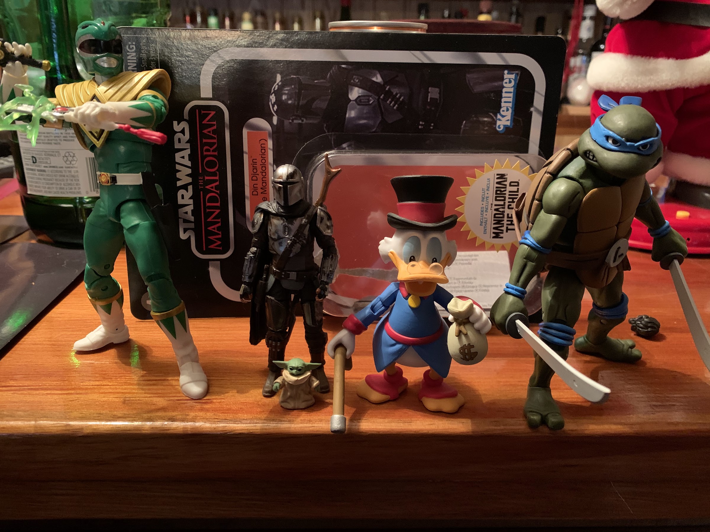
Since the book is right at 400 pages, my suspicion is adding even a single page would have upped the costs by a non immaterial amount, but it’s also possible that just wasn’t Fawcett’s goal with this book. This is not a guide for collectors nor does it contain much information on where these characters originated, outside of the ones in the first wave. I would have loved to hear who came up with Monty Moose or Walkabout and where the inspiration came from. It’s possible such information has been lost to time, or maybe it wasn’t particularly interesting to begin with. That would be a different book though. This one wants to highlight the sculptors and designers who worked on the line. And if you’re someone like me who enjoyed and collected that line growing up, it will probably satisfy your thirst for nostalgia. I know I couldn’t suppress my grin as I flipped through this book and remembered the figures I owned and the ones I coveted and even the ones that let me down (those talking turtles were trash). It wasn’t planned to work this way, but this was a welcomed tandem with the recently released Super7 action figures which celebrate the Playmates line in their own way.

The lists are nice, but a visual guide would have really cemented this book as a must have for TMNT fans.

If you’re a fan of the turtles and want to check this book out for yourself, copies are available at www.radplastic.com. I do not know if more printings will be done, so consider this a limited time released for now. If you want it, don’t wait, and if you do get it I have a feeling you’ll enjoy it quite a bit.


Super7 TMNT Ultimates! Leonardo

“Leonardo is the perfect turtle…” is the truest statement to ever appear on the back of a product box.

If you ask me what my most cherished childhood toy was I won’t hesitate to answer Leonardo. My original Playmates Leonardo was a figure I adored and played with for years. I would get other Leonardo action figures, but they were always a temporary joy. When I sat down to act out and play with my figures, it was the original Leo from 1988 that I reached for. And it’s one of the few figures from that line I can vividly remember getting since he (along with Donatello) was my first. I was so young that I was too short to even reach the pegs and my mom had to sift through the rows of figures for me to find that Leonardo.

When Super7 first debuted its Ultimates! line of Teenage Mutant Ninja Turtles I was noncommittal. It wasn’t until Leonardo and the rest of wave 2 was unveiled that I felt the pull. I could push aside the strings of nostalgia on that first wave, but it was Leo I could not resist. I then had to scramble to get Raph, and I was quick to pre-order the other turtles as they became available all eagerly awaiting the release of Leonardo.

Since Leo’s accessories are all the same as Raph’s, consider this your accessories pic.

Leo finally arrived in February after a lengthy wait. I pre-ordered him through bigbadtoystore.com which had pre-orders open for a long while beyond the usual Super7 window. It was certainly convenient, but it meant a long wait as, for whatever reason, BBTS seems to be the retailer who always receives Super7 releases last. While those who ordered direct from Super7 had their Leonardo in December, I was forced to wait nearly two months beyond that. BBTS did come through, and I was never in doubt about that part, and he’s largely as expected. Like all of the figures in Super7’s line of Ultimates!, he comes in a cardboard mailer with the product logo on it and the figure’s name. Open that and you get the actual box the figure comes in. It’s a three-dimensional, trapezoid, which probably has a proper name, but I was never into geometry. The green slipcase slides off and the figure is below in a nice window box. It’s the same packaging as the wave one figures and it’s great. One could argue lesser packaging would result in a cheaper price (the MSRP on Leo is $45), but at least it’s attractive and mint-in-box collectors are happy while openers have a reasonably easy to reseal packaging for moves and such.

It’s like seeing an old friend…who has had some cosmetic enhancements.
Are your swords hanging low? Well have we got a product for you!

Leonardo should be quite familiar to anyone who has Raphael. That’s because they’re the same figure. The only differences between the two are the head and belt. Even the little blemishes on the shell and creases of the skin are identical. Leonardo is designed to mimic the 1988 release so he’s an olive shade of green with a belt that features a crisscross design across the chest, white eyes, and a blue mask with blue pads. Super7 added a bit more embellishment to the buckle area of Leo’s belt seemingly swapping some of the gunmetal parts of Raph’s belt for a chrome color. I really liked the understated gun metal so this looks less neat to me and I even wonder if the extra chrome was a factory error that Super7 was forced to just roll with or if they just view it as a way to distinguish the turtles from each other. I guess we’ll see what the other figures feature down the road as the promotional shots of Leo, Mike, and Don feature a belt similar to Raph’s and not the final Leo belt. The shell is now a deep green color as opposed to the brown Raph had and the front of the shell is a deeper yellow, like a marigold, when compared with Raph. The headsculpt that Leo comes packaged with looks just like the Playmates Leo. He has that almost concerned look to him, but Super7 did adjust the angle of his eyes ever so slightly so it’s not as pronounced. I feel like I was always a little disappointed in Leo’s facial expression, and yet I find myself really loving this head for pure nostalgia reasons. There is a bit of shine on the head of my figure, under his right eye, that might not come across in the photos. I don’t know if they’re all like that, or if it’s just mine.

Imagine if he had swords like these in Turtles in Time.

Since Leo is the same figure as Raph, his articulation is the same. He’s got a ball-peg that his head sits on which allows for some up and down movement and side to side along with full rotation. I didn’t really touch upon it in my Raph review, but the only aesthetic with these figures I don’t care for is the gap between the head and neck as from some angles they look like amusement park actors in oversized costumes. From head-on, it looks fine though. The shoulders are standard ball-hinges with swivels at the biceps. The shoulders were really tight out of the box, but I didn’t need any heat to get them moving. Single-jointed elbows follow with wrist rotation and hinges, and he has hands with vertical hinges and horizontal, so that’s a major plus. There’s some rotation at the hips, which are still fairly loose, but not quite as bad as Raph’s, but the shell won’t allow for too much range of motion. The legs are on ball-pegs and can swivel and kick out forward and to the side just fine. The knees just peg into the lower leg with single-hinges and swivels below the kneepad while the feet feature a hinge and generous rocker. The ankle hinges were, by far, the tightest joints on my figure out of the box and I did run them under hot tap water to get them going. It’s a suitable level of articulation, though it doesn’t really rise above other brands and some would argue it doesn’t even meet them. The lack of double elbows and knees is unfortunate and I still don’t like how the knees are engineered. It feels like there’s a lot of stress on that peg holding them together every time I bend the knee. Since Leo and Raph are the same though, I suspect I’ll just have to accept what we have here is what we’ll get with Donatello and Michelangelo.

Even Leo is subjected to Zoom meetings these days.
I think he dropped it…

It’s great to receive updated articulation, but one of the major selling points of the Super7 Ultimates! brand is the wealth of accessories the figures come with. Leo has a plethora of hands at his disposal for holding his various weapons and accessories. He has vertically hinged gripping hands in the box, plus horizontal gripping hands and open style pose hands as well as a set of fists. They peg in and the peg is small and thin, but thus far I have not heard of any issues and haven’t experienced any myself. Leo also comes with the same slice of pizza as Raph and the same communicators: one open and one closed. The only difference there is the parts painted red on Raph’s are brown on Leo’s (why not blue?!). He also has the standard allotment of ninja weaponry including throwing stars, a small, triple, bladed knife, and that large, hooked, thing. It’s a lot of stuff, but plenty could argue a large chunk of the accessories are useless. Are you ever going to pose Leo with one of the other weapons or ninja stars? Not likely. And strangely, the paint app on the pizza slice is different from Raph’s. I don’t think it’s intentional, but it looks almost dirty.

Careful there, buddy.

Most importantly, Leo also has his trusty katana blades. This has been a minor point of contention in some of the collecting spheres I frequent as these swords are not accurate when compared with the vintage figure. There was some hope that Super7 would include two different sets of swords to appease collectors (as they did with Splinter’s robe including a plastic one and a cloth one), but apparently collectors didn’t make enough noise for that to happen. Leo’s old swords were basically fake katanas. They were referred to in all TMNT media as katanas, but looked nothing like an actual katana. Super7 decided to get authentic so Leo has two, long, curved, blades. It takes some getting used to, not so much because of the curved nature of the swords, but the length. Anyone fighting with two swords, especially two katana, looks ridiculous. Part of the nature of the brand though is to look ridiculous. These are giant, mutated, turtles after all. I do wish they were smaller though as it’s hard for me to suspend my sense of disbelief that this character could effectively wield these swords in this manner. I think I may opt for a one sword look for my more permanent display as a result. The actual swords though at least look great. The paint is nice and the handles are well done and they’re not warped and flimsy like Raphael’s sais. And they also fit in the holsters on the back of his shell fine, and despite their length, don’t look particularly silly.

The alternate head definitely has a different energy.
I wish his bandana tails had a bit more life to them. It’s very rare to have a turtles figure where the bandana knot and tails aren’t visible from the front.

Lastly, Leonardo comes with an alternate head. Like Raph’s, Leo’s alternate head is a brand new, stylized, headsculpt that’s an all new creation. It obeys the same rules of colored mask and blank eyes as the vintage toy, but has a more realistic expression and texture. There’s a warmth with the new one that creates the illusion of this character existing in the real world, as opposed to the cold, plastic, very toy nature of the original. The expression is similar, but clearly more angry, and I think I prefer it to the vintage look. It’s basically how I would envision a new Leonardo would look today if the line were just starting from scratch like the original Playmates line did once upon a time. And it’s a nice look, though I think Raph’s second head turned out a little better. It’s the straight bandana tails that change the head profile a bit for me and I would have preferred something more dramatic. Though if you like the vintage look, you have it with the default head and you even have a sprue of weapons and accessories in classic brown, though the swords are the updated, curved, ones. My affection for that old head would probably win out for my display if I didn’t like Raph’s alternate head so much. I want a uniform look and don’t want to mix vintage and alt heads, so for now, I’m going with this updated one.

If you prefer a more vintage look.

The Super7 Ultimates! Leonardo is basically the figure I thought it was going to be. And that’s good! As I expected to like this one. I do think there’s room for improvement, as there often is with anything, as the articulation is lacking, most of the accessories are useless, and the swords are too long. That sounds like a lot of negatives, but this is a $45 action figure so it should be held to a higher standard than a $20 one found at Target. Where it does succeed is just in the overall look and presentation of the figure. Even if a lot of the accessories are ho-hum, the extra head is great and the hands are what you want. He looks like Leonardo and really captures that Playmates look which was so obviously inspired by the art from the Mirage line of comics, but was also its own thing. He looks great with Raph and I have a feeling my display will only improve with the additions of Michelangelo (expected probably four months from now) and Donatello (hopefully before the end of the year). Leonardo is also yet another reminder of how awesome it is to be a TMNT collector right now. Turtle power, indeed!

You didn’t think I’d end this without a comparison shot, did you?
It’s a Leo convention! Left to right: S.H.Figuarts, NECA toon Leo, Super7, Playmates, Playmates ’03, which was really the first attempt at making over the classic ’88 figure and still kind of kicks ass today.


Hasbro Dungeons & Dragons Drizzt Do’Urden and Guenhwyvar

Just a man and his cat.

I was quite surprised when Hasbro unveiled a deluxe action figure set starring the Forgotten Realms hero, Drizzt Do’Urden. Drizzt was a character I was familiar with going back into my middle school days when I traded Star Wars novels for Dragonlance. Even though my nose was buried in stories about Raistlin Majere and Tanis Half-Elven, a lot of the other kids around me were reading the latest from R.A. Salvatore. Drizzt was an instant hit, a dark elf warrior exiled from his subterranean home turned good guy. He was armed with a pair of magic scimitars, had a magic panther as a sidekick, and was basically unbeatable in combat. When I had exhausted Dragonlance, a campaign setting for the game Dungeons & Dragons that saw its peak in the 80s, I finally checked out what was coming out of the Forgotten Realms setting and would eventually read several books starring the legendary drow.

That’s a fine looking piece of cardboard.

Hasbro has owned Dungeons & Dragons through subsidiary Wizards of the Coast for over two decades now, but few knew if the company really planned on doing action figures. Plenty of 80s kids have longed for stuff based on the old cartoon series, while folks like me who grew up with the novels published by TSR have wanted to see some of those characters captured in plastic. Drizzt kind of came out no where though and Hasbro elected to sell the set, which includes his panther, Guenhwyvar (who I am just going to call Guen from now on because that name is ridiculous), through its Pulse storefront. This generally means collectors could pre-order the figure and expect delivery months later. Hasbro was likely skittish about going straight to retail with the figure because it was an untested character at a premium price ($40), though there are plans to distribute it through other retailers in the future (I think).

I love the artwork on display here.

For me, I liked Drizzt well enough when I was reading the books decades ago. He’s cool, though his stories got very repetitive for me so I would never call him one of my favorite literary characters. I won’t deny though that he’s perfect for an action figure and his popularity makes him a great first choice for a figure. I saw it, and I thought it looked cool, and eventually placed a pre-order. My decision to buy this figure was one part enjoyment of the actual piece, and one part a desire to just support the brand in hopes of getting a Raistlin down the road. That property, Dragonlance, has some legal troubles though that will probably make it difficult for me to get what I want, but I can dream, can’t I?

There’s a lot of stuff in that box.

Drizzt arrived after a delay of about a month. All kinds of shipping problems in December threw things into disarray, but thankfully Drizzt wasn’t on that ship that lost a ton of cargo in a storm. The figure comes packaged in a very nice box with an unusual shape. The front is curved and embossed with a dynamic illustration of Drizzt and Guen. Sliding that off produces a window box with the figure itself and a nice, wintery, backdrop. It’s easy to reseal, which is always a plus with figures that come with a bunch of extra stuff, and would be attractive for mint-in-box collectors, though to display with or without the slipcover would be a tough call.

He’s free!
I think of his open hand as his kitty-patting hand.

Drizzt is a little tricky to extricate from the plastic bubble inside as he has this big cloak that slips through the plastic, plus his scabbards go through it as well. Once removed he’s a pretty sturdy figure with a fair amount of heft to him due to that cloak. He stands right at six inches and seems like the kind of figure that could slip into other displays fairly easily. His armor is incredibly detailed with lots of little paint flourishes through out. My figure is pretty much devoid of any signs of paint slop or quality control issues of any kind. His joints were all free and easy out of the box and there are no defects I can spot. This is a very well made figure, though also still pretty familiar to anyone who collects stuff from Hasbro. I really like the gray-purple of his flesh and you can see the purple in his eyes. He has an angry facial expression with windswept hair perfect for a battle pose. He has a pair of gripping hands with vertical hinges (finally, Hasbro!) that have just enough of an opening in them that it’s fairly easy to slip one of his two swords into each hand. He looks great, and this is a later version of Drizzt as opposed to a first appearance. It reminds me of the look the character sported in the artwork for The Hunter’s Blades Trilogy. There’s a lot of black, green, and gold and the leather portions of his armor have a touch of blue. It’s textured really well too and looks like worn leather, though the armor is so pristine that it doesn’t look like something he’s ever actually battled in. The fur lining on the cloak is well done and there’s a hood sculpted into the back of it that’s been pushed back. This is just really nice and it’s good to see Hasbro sink a little more money into this release than it would a mass market figure for Walmart or Target. As they should, since they’re charging a premium for it.

If you really want to see what this figure can do you have to ditch the cloak.

If you’ve had a Hasbro figure recently, then you should know what to expect in terms of articulation. Drizzt’s head sits on a ball peg so he can look around, but his cloak plus his hair will severely limit that head articulation. Of course, you can remove the cloak and get better articulation, if you wish. The base of the neck is also on a ball peg which aids him in looking up and down when the cloak is not an issue. The shoulders are ball-hinges with a slight butterfly joint as well. The pauldrons on his shoulders can be manipulated a bit to get them out of the way when posing. He has swivels at the shoulders, double-jointed elbows, wrist swivels, and the previously mentioned vertical hinges. In the torso he foregoes a diaphragm joint in favor of an ab crunch. I am on record as not caring for ab crunches, but this one at least looks fine. He can also twist at the waist and swivel at the thigh, which are ball-hinged. He has double-jointed knees and can swivel at the foot. He also has hinges at the ankle and a generous rocker. It’s a solid assortment of articulation and Hasbro did a good job of working with the intricate armor on this figure to get as much articulation into it without disrupting that sculpt. The skirt pieces of the armor are very flexible so they only interfere a bit. I would have preferred a diaphragm joint in place of the ab crunch, but it’s fine.

Kitty statue.
Extra stuff that will mostly entertain actual players of Dungeons & Dragons, something I haven’t done in over 20 years.

Drizzt comes packaged with quite the assortment of accessories and optional parts. He has two heads: an angry one and a smug one. I really like both, but I tend to prefer that cocky look to the yelling one. He also has two hairstyles which you can swap between the two heads. One is windswept and the other is static. I had a hard time getting the static hair to work in tandem with the cloak, but others may have better luck than me. The cloak can be removed by popping off the head, but be careful when doing do as sometimes his neck will release which is kind of a pain. Try to hold the neck in place as best you can. He also has an extra set of hands which include a fist and an open left hand. The fist is kind of useless and I would have preferred two style hands, but oh well. The open hand works with his little, black, kitty statue which is supposed to be Guen. That’s what the cat is when not in the material world. There’s also a D20 die done in a sparkly, black, green color that’s pretty neat for people who play D&D. Drizzt also has a necklace he can wear which features a little unicorn head. This is the symbol of the goddess he worships or identifies with. It fits over his head fine, but gets lost when the cloak is on too. It’s also too light to have a natural hang and I find I prefer the character without it, but it’s there if you like it. There are also monster cards hidden behind the cardboard insert in the box. I know some of them, like the beholder and ice dragon, but some I don’t know what they are. I wish they had a little bio or something on them instead of some fake language.

You probably don’t want to mess with this guy.
Let’s add a little magic to those blades!

Of course, Drizzt also comes with his prized, twin, scimitars: Twinkle and Icingdeath. They’re well sculpted and painted and look terrific whether in-hand or sheathed. I find they don’t necessarily match up with the descriptions given for each in the books, but there have been prop Drizzt swords made over the years and these seem to match those. I think it’s Twinkle that has this neat metallic, blue, finish on the pommel that’s especially nice looking. The vertical hinges of his hands help in wielding them properly and Drizzt just looks cool with a blade in each hand. He also has two effects pieces for the blades that looks like ice magic, or something. They slide onto the blade and lend themselves well to dynamic poses. The only drawback is they add considerable heft to the swords. If there is one issue I have, it’s that Drizzt’s arms are a little loose for his swords. I still was able to get him into some interesting poses, but I’m concerned if I leave him on a shelf with these things on the blades his shoulders may weaken until he can’t keep his arm up. In particular, the left arm is the one I have the most concern with. I suspect this may vary from unit to unit.

Say, “ahhhh”

Lastly, Drizzt is accompanied by his good pal, Guenwhyvar. I don’t know why Salvatore settled on such an obnoxious spelling, but he has a tendency to do that with a lot of stuff in his novels. The panther is about six inches long and quite sleek with a lustrous black coat with maybe a hint of purple in some places. There’s a lot of points of articulation on this cat too. There’s a ball-joint in the torso that provides some ability to pivot, a ball-joint at the base of the neck, and a ball-joint at the base of the head with a hinged jaw. The legs appear to be ball-jointed at the base, but can’t do much other than move forward and back a little. The rear, right, leg is pretty tight on mine too. Each knee can swivel and bend and there’s another hinge past that and a third hinge at the foot. That’s on the hind legs, the front legs have one less hinge. The feet can also rock side to side. The tail pegs into a ball joint and kind of just hangs out. It’s a lot, but it’s not all functional. I can’t, for instance, get the kitty to sit in a convincing fashion. She can get into a pounce position, but for the most part I think people will just pose her in a fairly neutral position looking a bit menacing with that mouth open.

“Just five more minutes then I’ll feed you.”
As much as it pains my wallet to admit, he would look cool with an orc to slice and dice.

That’s a lot of stuff for one figure release, and I think this is a great value at $40. Of course, since it is a mail away situation you’ll have to pay shipping to acquire Drizzt so his real cost is more like $50, but it’s still pretty good considering a Lightning Collection Power Ranger is about $20 and of lower quality. For your money, you get a really nice looking and functional action figure plus a fully realized panther figure. That’s not to say it doesn’t have a few shortcomings. I wish the engineering on the panther was a bit better, and I find myself really surprised that Drizzt didn’t come with one more hairpiece that included his hood. Maybe they couldn’t figure out a way to get a hood to fit over the existing hood and didn’t want to turn that into a separate, floating, piece like they have done with the masks on some of the Marvel Legends. Otherwise though, there’s nothing really missing or that I wish the figure came with. I mentioned wanting a second open hand in place of the fist, but I don’t know if I can resist posing him with both blades drawn anyway.

I figured I should probably toss-in a comparison shot with other lines since this is a new line for Hasbro.

If this is the start of Hasbro’s descent into the old TSR portfolio, then this a great way to kick off a line. I suspect Dungeons & Dragons will never be a huge part of the Hasbro figure lineup, but if they can get a couple figures out a year that would be better than what came before it. My hope is for them to head to Dragonlance, but I’d be pretty surprised if the company didn’t hang around Forgotten Realms for awhile and fill out Drizzt’s allies. They may also look to the iconic Monster Manual for some creature ideas in place of characters from the various novels. Unless this figure fails to sell, but I’m pretty optimistic that it will attract enough attention to warrant more figures. If you like what you see here and want Hasbro to do more, you can head over to their website now and order your own Drizzt. I think you’ll be pleased with what you receive.

It’s cold and lonely in the north: get a cat.

TMNT Loot Crate #3 – The Cartoon One!

It’s finally here!

When the second of 3 Teenage Mutant Ninja Turtles themed Loot Crates arrived in December it had me thinking that #3 was pretty far off. To my surprise though, the gap between #2 and #3 ended up being less than what was initially forecast had the release schedule held true. And that’s great because the third and final crate in this series was the one I was looking forward to the most because it’s the cartoon themed crate. Crate #1 had a Mirage Studios theme while #2 had a video game theme (there was also a one-off crate before the first one that was movie themed), but Loot Crate chose to save the most anticipated crate for last.

And it’s a big crate!

The cartoon crate, which is based on the original 1987 cartoon series, was probably always going to be the most popular because it’s the cartoon that folks seem to have the most attachment to from a nostalgia point of view. That doesn’t mean it was destined to be the best though. For me, it was my most anticipated because I was in love with the exclusive NECA figure included: Bunny Rocksteady. And if you prepaid for all three crates from the start, you got a bonus figure: Bunny Bebop. At the time, we actually only knew about Bebop who was teased with a silhouette image while we knew Rocksteady would be the figure in the actual crate. It made sense that it too was Rocksteady in an Easter Bunny costume as seen briefly in an episode of the cartoon. It’s just the sort of goofy variant that I enjoy. While a repaint of the Mirage Shredder for crate one was pretty bad ass, it was the bunny boys that sold me on the entire crate subscription.

My view upon opening the crate.

Since this is Loot Crate, the figures are not the only thing featured. We’ll save those for last, but first let’s talk about what else is included. These things, in my opinion, are largely just junk. The stuff isn’t cheaply made or anything, it’s just not practical, for the most part. There’s always a shirt, which is fine, but then an assortment of things like pins and keychains. If you like that stuff, great, I personally do not desire it. Still, Loot Crate has surprised a bit by including a decent tumbler in the first crate and by including the fun television accessory in the second crate, so what’s crate #3 have in store for us?

Oh boy, a coffee mug!

First of all, this crate is huge. It’s much bigger than the other two and I assume that’s mostly due to the fact that it has two figures in it instead of one. It has a sticker on it featuring Bebop and Rocksteady as Easter Eggs. For those who are only getting Rocksteady, I don’t know if they got a smaller crate with a different sticker or if they got the same. As mentioned before, it’s cartoon themed and also apparently Channel 6 themed as well. This is similar to the first crate where a lot of the stuff had a TCRI theme and that logo was repurposed throughout. For this one, Channel 6 appears in three places: in the window box for the bunnies, on a trucker hat, and on a mug. The mug comes in its own box which features the Chanel 6 logo and the same artwork of April we saw on the two-pack release of her figure. It’s kind of an ugly April, but the box for the mug has the same Turtle Van coloring the figures come in along with the Channel 6 blue, white, and red logo. My box was pretty beat up which is unfortunate because I want to display this in-box since my house is full of coffee mugs. The mug itself is your standard mug with the Channel 6 logo. It’s not bad, but I feel like every house has a surplus of mugs and there are better TMNT mugs out there anyway.

For anyone who wants to cosplay as a Channel 6 cameraman.

The Channel 6 trucker hat is pretty basic. It’s just a snapback with the Channel 6 logo on the front. The logo is clean and attractive, but like the mug, I have a ton of baseball hats so I’m probably never going to wear this. I’ve placed it on top of my glass cabinet which contains some of my action figure collection for the time being.

This mug is fine, but it has virtually no chance of unseating my Donald Duck mug pictured in the background.

We also get some pins (you can see them in the first pic of the open crate)! These have been in every crate and this one comes with two pins on the same backboard. One features the baghead of a Crooked Ninja Turtle gang member and it’s kind of funny. The other is the somewhat forgotten mutated form of one of Bebop and Rocksteady’s cohorts, Scrag. He’s the sunglasses wearing, mutant, bat, punk, from the second or third episode of the series. He and the other punks are only shown once on a monitor and never seen again.

A pretty cool Shredder, not consistent with the theme, but cool nonetheless.

Next up, we have a notebook and sticker sheet. The notebook seems pretty thin and small, but it does feature some cool artwork of Shredder on the cover by artist Freddie Williams III. It’s not a depiction of Shredder from the show, but his interpretation of the character. The sticker sheet features a bunch of wanted posters of various gangsters from the show: Don Turtelli, Big Louie, Mr. Big, Mad Dog McMutt, Jersey Red, and human Scrag. These might be fun to incorporate into the cartoon diorama whenever it releases, but at the end of the day, they’re just stickers.

Stickers…cool.
Arrived in time for the figure, so you can match!

Lastly, we have the shirt. I was kind of hoping for another long sleeve shirt, but we get a t-shirt. It’s a yellow Mondo Gecko shirt and it’s designed to just look like Mondo Gecko’s actual t-shirt from the show which was basically the same as the one worn by the vintage Playmates action figure. It’s cool, and I like that they didn’t just put some TMNT licensing art or whatever from the cartoon on a shirt and did something unique.

It’s been a long wait, but it’s finally over!

All right, let’s get to the bunnies! These guys arrived in the same crate, but packaged in their own window box which largely resembles the packaging for the two-packs sold at Target. The backdrop this time is an exterior shot of Channel 6 and there’s product shots on the sides. On the back is a huge cross-sell that would have been up-to-date had it dropped in November (as originally intended), but is now missing the recent Rat King vs Vernon set. Bebop and Rocksteady are essentially the same figure with a different head. This isn’t at all surprising given the costumes they’re sporting and also because their regular release in NECA’s cartoon line was essentially the same figure just with different stuff layered over it. For this release, NECA redid the shoulders to include that tuft of fur on each and also redid the feet so they have oversized, rabbit, feet. The legs are recycled from Leatherhead as he had a smoother sculpt compared with the original Bebop and Rocksteady. The grooves in the wrists where their bracelets were previously have also been filled with white plugs. It’s noticeable up close, but I wouldn’t call it an eyesore. The main torso has been outfitted with a soft, plastic, overlay to simulate the rabbit costume and a cowl has been attached to each head. You could probably get this cowl off if you wanted to, but it’s glued on and who knows what would be left behind. The back of the head has been painted to match the cowl and it’s even possible the sculpts were cut to better fit the cowl. I doubt, for example, Bebop has his mohawk and ponytail. Plus, there’s already an uncovered head with each of the regular figures so why bother?

I love that cross-sell. I wish they would do this on all of their releases rather than just include the four most recent releases.

If you saw my NECA rankings a few weeks ago, then you know I love the Bebop and Rocksteady figures that NECA put out. Much of that love is for the overall aesthetics of those figures because they look ripped from the cartoon. It’s not necessarily for the engineering. Unfortunately, these figures are the same in terms of engineering so prepare yourself for some stuck joints. It’s probably exacerbated by the face that it’s pretty damn cold out too so my boys arrived feeling quite frosty. Considering these are limited release figures, you will want to be extra cautious. If you can stand to do it, maybe even let them just hang out for a day at room temperature before opening. If any joint though is even the slightest bit stuck, take it to a heat source. Be it a heat gun, hairdryer, or simple hot water – it helps. And if you’re like me, you might just do that anyway before attempting to really move anything because cold plastic can snap with little warning. And if these guys snap or break in any way, there’s no guarantee that Loot Crate will be able to replace it. My Bebop also came with a partially broken nose ring. It’s cracked, but not quite all the way through, but cracked enough that there’s a gap. If I could match the paint I could possibly seal it with paint. It’s a bummer, but not a big enough issue for me to seek a replacement or anything, and I doubt one would be available if I did. As long as I don’t mess with it I think it will be fine, but it just makes me a little more nervous about falls so these guys are going on the bottom shelf of my cabinet, for now.

This makes me happy.
Look at those adorable little tails!

When you do get these guys all loosened up, you’ll find their articulation is okay, but maybe not great. The head is on a ball peg and can rotate a bit, but the cowl is going to impede movement. They can’t really look up or down much as a result, but they still have articulated jaws and Bebop’s eyeglasses can flip up to reveal the horror beneath. The shoulders are on ball-hinges and will probably be quite tight. The elbows are double-jointed and the hands just peg in so they rotate and have hinges. There is torso articulation in the diaphragm, at least I assume there is because there was with the original figures. It’s rendered moot because of the way NECA did the costume. They didn’t want to create a new torso, so they made a soft, plastic, shirt of sorts that covers the joint. The hips though are the worst part because these were strangely engineered from the start. They’re a mix of a peg and disc system with ratcheted edges. This makes them hard to work with and also really limited. The figures that came after these boys that used the same base switched to a double-barbell system and it’s bizarre to see that wasn’t carried forward here. The knees though are double-jointed and the feet might be on balls now, but they hinge and rock fairly well.

The busted nose ring makes me sad.
Ok, now I’m happy again!

What it comes down to, is we have two figures that aren’t particularly dynamic, but are certainly far from being statues. What’s important to me is the aesthetic of this ridiculous bunny costume which the articulation doesn’t interfere with. They’re meant to just sort of hang out and look silly, or maybe pose with a gun to emulate what was seen in the actual show. I do wish they used the updated hips and I also wish they had just re-painted the torso so we still had a functional diaphragm joint. That probably would have required at least one, new, sculpted piece if NECA wanted their bellies to protrude like they do here as the base abdomen was absent a potbelly. It’s obvious that the cost of one of these crate figures needs to be under the standard release, so it’s not a surprise, but I can still be a little disappointed by it. What they did do well was paint these guys and match the hinges to the proper base color. Rocksteady, in particular, seems to have denser line work on his face when compared with the first release and he really stands out. I should also note they’re a little bigger than before since they’re using Leatherhead’s legs. I have Bebop at close to seven and a half inches with Rocksteady at an even seven. Once you factor in the ears they creep over eight inches. And I love that their cowls are unique to each and Rocksteady has a bent ear like he did in the show. Both also have little, pink, bunny tails on the rear and overall NECA just nailed the look with hilarious results.

A close-up shot of the accessories.
I prefer guns to the remotes.

What’s an Easter Bunny without a basket? NECA certainly felt it was necessary to include such as each figure comes with a basket full of eggs. It’s the same accessory, but painted different to distinguish the two. I like Bebop’s a little more as his eggs are more colorful, but it’s a sharp, little, accessory. They also come with this remote-like device that Krang outfitted them with. I think it hypnotized people or something, but it basically just looks like an old school TV remote. It’s a tiny piece of plastic that likely didn’t cost much and it’s cool to have. They also come with the same array of hands as before. Each comes with fists in the box, plus a right trigger finger hand, a left gripping hand, and a set of open, stylized, hands. The open hands feature additional pink paint on the palms which is a nice touch. They can hold their baskets with either the open hands or the gripping hands and both gripping hands are suitable for the little remote. Chances are though, you have some extra rifles laying around you can outfit the pair with. I have them with the Triceraton guns for now, but I might switch them to the laser rifle which is a better match for what they were wielding in the cartoon.

Let’s bring in the old figures. You can really see the change in height here.

In the end, this Loot Crate is a lot like the others, which is to say it’s dependent on the action figures contained within. The shirt is something I will wear and I may have a use for the stickers since I did order a cartoon diorama for my display, but other than that I don’t expect to use anything in the crate. The figures though are awesome and the fact that the bonus figure was integrated into this crate makes it an easy pick for best crate in the series. I signed up for the Loot Crate subscription based on that one, single, silhouette, of bunny Bebop and I have not been let down. I very much enjoyed the Shredder as well, and the Shell Shock turtle is at least unique, even if it’s not something I probably would have bought at retail. These two I definitely would have purchased as a two-pack at Target or wherever. NECA’s approach with these figures is to make them fun, but not essential, but for me a goofy variant like this is damn near essential. It harkens back to the days of fun Playmates variants, only this pair actually appeared in the cartoon and wasn’t just made up to sell a toy or promote the invasion of Iraq, or something weird. Hopefully everyone who wanted these guys placed an order, because the after market is the only place to get them now and it’s going to cost you.

“Hey Boss, we brought you some colored eggs!” “I’m surrounded by idiots…”

This concludes the Loot Crate subscription for Teenage Mutant Ninja Turtles, but another is surely on the way. When will it be announced? Probably fairly soon. I think this one was announced in early spring 2020, so the next could come around then too. Based on an interview with NECA’s Trevor Zammit via the Fwooshcast on YouTube, it sounds like a batch of four with the same or similar theming is on the way so that means movie, comic, video game, and cartoon. It could change, but that seems like a safe bet. And my mind is already trying to imagine what figures will be included with those crates. It will likely be awhile before we know, but my overall experience with this series was a positive one so I will certainly sign-up again when the time comes.


NECA TMNT Cartoon Rat King vs Vernon

This might not be the mismatch you think it is.

When I last reviewed a NECA Teenage Mutant Ninja Turtles two-pack it was the Splinter vs Baxter Stockman set and I referred to it as potentially the last essential set for some. The key word there being “some” as I am not “some” and didn’t consider myself “some” when I wrote that, for there are more essential characters from the venerable cartoon as far as I am concerned. And the list of those remaining starts with the Rat King!

These two come packaged in the same window box we’re used to at this point. We’ve got character likenesses on the front which aren’t from the show, but are probably from the licensing art that Viacom has for the show. Rat King’s likeness looks pretty good though, and Vernon looks fine though it draws attention to the fact that he’s a cowardly sort, but his figure doesn’t depict that. NECA opted for something else which I think most will enjoy more, though. The rear features a cross-sell which just displays previously released figures so if you were hoping for a tease of what’s next you’ll be mistaken. And not to get ahead of myself, but I actually don’t know what’s next. It could be the deluxe Muckman, Mondo Gecko and Kerma, or our first punk frog two-pack. Time will tell.

Hey Vernon, the viewfinder is on the other side of the camera, buddy.

Rat King was cool, to put it simply. Some weird dude living in the sewer with a bunch of rats who has a unique look and speaks with this lethal sounding whisper. That patchwork costume, the double-wrapped face, he was creepy which made him a lot of fun on that old show because I was never creeped out by Shredder, Krang, or really any other villain. Most of that show was full of comic relief types, but Rat King had a different aura about him. He was a bit mysterious and his motives less defined than someone like Shredder. He wasn’t in a ton of episodes, but certainly enough to be memorable.

Look at that smug asshole.

And then we have Vernon. Oh, Vernon, the character you love to hate. Or maybe just hate – I don’t know. He was April’s co-worker and was sometimes behind the camera for on location shooting, but I feel like mostly he was just hanging around the Channel 6 headquarters acting like a dick. He was always telling April she was doing something wrong or going about something in the wrong way. At times he was portrayed like a rival, but mostly he was just a dick, and a cowardly one at that. Because he’s not a real villain or anyone that gets into fights on the regular, some may question the need for a Vernon. For me, he was a character that had a presence on the show, and he was in far more episodes than your garden variety villain. He is essential, for a different reason than someone like Rat King, but essential nonetheless. As is Irma, whom I suspect is not too far off.

Now Rat King vs Vernon? That does seem like a bizarre way to sell a two-pack of action figures on the surface. Mostly though, ignore the presence of the word “versus” and it starts to make sense and certainly the extra accessories for Vernon bring that home. There was an episode of the cartoon where both Irma and Vernon were exposed to mutagen via Rat King which caused the two to mutate. Vernon, a character who really only needs a camera and maybe some extra hands, in his mutated rat form is pretty interesting and since it was only his head and forearms that mutated, it was also really easy to work into this two pack.

“April!”
Get behind the camera, Vernon!

Vernon comes in right around the 6″ mark, actually a little over, and is featured in his classic attire of pink shirt, blue tie, and blue jeans. There’s even that little case on his belt which has an unknown purpose. Today, it makes me think of a cell phone case, but no cell phone in 1988 is going to fit in there. He sports a happy, yet cocky, expression that conveys his dickishness quite well. He comes packaged with gripping hands, but he also comes with these open, expressive, hands and a pointing, right, hand. His main accessory is a big ole Channel 6 camcorder with a big display on the rear. It’s much larger than the handheld that came with April as Vernon’s is the shoulder mounted style. The handle is articulated and can fold up so it looks appropriate when Vernon carries it by the top handle when he’s not shooting. You can kind of finagle it onto his shoulder too with his eye near enough the viewfinder and overall it’s a nice accessory.

“Oh please, sir, let me go!”
“No! What’s happening?!”

The best accessories though are definitely those were-rat pieces. Vernon’s arms detach at the forearm where they’re held on by pegs. His rolled up sleeves are a separate piece of plastic that fit over those pegs and can slide off if you’re not paying attention when prying the arms off, so be careful. Otherwise, they come off easy enough and the were-rat forearms pop right on with minimal fuss. Vernon’s head detaches at the base of the neck which is a little trickier to get off, but not as difficult as I was expecting. Be sure to grab the neck and not the head or else you might just pop the head off by mistake. I’m pretty sure it’s on a ball-peg, so you’re not likely to damage it or anything, but once the head pops off once it may pop off again with less effort which will only make it harder to get the neck off. Getting the rat head on is tougher and you should probably just heat it up before even trying. Once on though it looks great, and Vernon gains some articulation at the jaw too. It’s so fun that I’m torn on how I want to display this guy. I have a little bit more room where my villains are so he’s going there for now, but I see myself swapping back to regular Vernon and pairing him with April down the road.

If I’m being honest, he’s only slightly more intimidating like this.
He’s like Splinter with sideburns.

Articulation wise, Vernon is pretty familiar. He’s very much similar to April, even though I think he’s mostly all new parts. If he shares any parts with another figure in this line, it’s not obvious. His head is on a ball peg and so is the base of his neck so he’s got great range in that area. The shoulders are ball-hinges and he has the same double-jointed elbows as April which utilize a second ball joint above the elbow for a swivel. It’s kind of funky, but on figures with rolled-up sleeves like this it works pretty well. He has a swivel in the forearm thanks to the pegged in joint there plus the usual swivel and hinge at the wrist. His wristwatch is glued on, unlike April’s, so you don’t have to worry about it flying off when swapping hands. There’s probably some articulation in the torso, but his shirt is a soft plastic over a body and it steals any articulation that would be found there. And you really don’t want to mess with the diaphragm anyway since it would put stress on the shirt and possibly cause some cracking. He does have a waist twist and ball-jointed thighs that swivel. He has this rubber, “diaper”, over the crotch for his pants that restricts some of the leg movement, but it’s not too bad considering this is Vernon. He’s still capable of wide stances and such. His knees are double-jointed and you’ve got hinges and rockers at the ankles. Pretty typical, but technically a little more than we’re used to thanks to the forearm swivel. There’s certainly enough and I think he’s capable of plenty of expressive poses, which are aided by the extra parts.

There he is!
You can see a little of the brown paint smudges on the upper, inner, thigh

All right, let’s talk Rat King! I’m pretty impressed by Vernon, more so than I would have ever expected I would be for a Vernon action figure, but my focus is on Rat King. And he looks fantastic. This is the cartoon version of Rat King that I’ve wanted since I was a kid. I never had the Playmates Rat King, even though I wanted him, and I think that has made my desire to have this one all the more enhanced. He looks great though as NECA really nailed the likeness. He’s got this cocky grin with wild eyes and the patchwork nature of his shirt and pants just looks terrific. Again, this guy is mostly new parts because all of the stitching is sculpted in and there just aren’t many human males in this line. It’s basically these two guys, Casey Jones, and Shredder. He stands at about six and a half inches, which feels right for this line. Some characters have been either too short or too tall, but Rat King seems like he’s right on the money.

If you’re going to call yourself Rat King then you definitely need some rats.

The only area where Rat King could have been better is in regards to the paint. The actual paint job is pretty terrific. NECA also cast the hinges in the proper colors so when the paint flakes on those joints it doesn’t leave behind an eyesore. And it’s actually pretty clean, actually impressively so, considering all of the linework on this guy. It’s really just that diaper piece where things aren’t great. Before I even moved him out of the box I noticed paint rub on the back of his legs and inner thigh. It’s on the back of the figure so that’s obviously better than the front, but I have a feeling paint is going to rub off of that rubber crotch piece pretty easily so go easy on the thigh joints. I’ve also seen some people end up with cracking paint on that piece and when it flakes off it leaves behind a flesh color. Now Rat King basically wears rags so it’s probably not the eyesore it would be with another figure to see skin poking through, but I don’t know why they didn’t cast that piece in green to match the paint better. And it’s going to be an eyesore if you end up with a cracking crotch piece.

Bomb’s away!

We might as well talk articulation since it plays into that issue just discussed. Rat King’s head is hunched forward and on a ball-peg so it has the usual range of motion, but the hunch restricts it a touch. He’s got shoulder-hinges and biceps swivels and the stitching pattern goes all through both pieces so it still looks good in almost any position. He has double elbows and the hands rotate and have a hinge on them. He has a diaphragm cut that gives him some fun motion in the torso, though he has these straps going over his body which are a separate piece that you want to be mindful of. I don’t think he has a waist swivel. It didn’t turn and I don’t want to mess up those straps, so I’m going to assume it’s not there. His thighs are ball-jointed and, like I said, you’ll want to treat them gently. That diaper is going to limit how far his legs can move, even more so than Vernon because he’s thinner than Rat King, but my advice is only move him as far as that diaper wants you to and not beyond. There’s give there, and it will move, but you might not like the result. The knees are double-jointed and you’ve got hinges and rockers at the ankles. His articulation is fine. It could be better, and since they already had to sculpt so much new for this guy I wish they just sculpted a new crotch piece so they didn’t need that soft diaper, but he’s okay.

This has got to be Rat King’s ultimate fantasy right here.

For a figure with a lot of new sculpting, it’s actually surprising to see the amount of accessories that are included. For starters, Rat King comes with two, open, stylized hands in the box. He has a set of gripping hands he can swap to and a pointing, right, hand. He also has rats! He kind of needs them and he gets his own rather than sharing a rat with Splinter or something. They’re fun too as NECA gave two of them a curling tail so you can place them on the figure without the need to have peg holes. One fits very well on his shoulder, another can go around a bicep or leg and the third can go on his head or in his hand or something. If you place him on a shelf it’s then pretty easy to just place the rats right on him with little frustration. Rat King comes with his hypnotic flute that fits into his left gripping hand pretty well, less so the right one. He’s also got a bandolier that his soda can grenades fit into. He has two red ones and one blue one and it’s easy to slip over his head and the cans pop in and out easily. The cans also fit into his open hands well and look pretty cool. Lastly, he’s got the same gray cannister of mutagen the rock soldiers came with. He doesn’t need this, but I guess it’s good to have more? – EDIT: It’s actually not the same gray canister that came with Traag and Granitor, it just looks like it. This one can actually separate and there’s some pink ooze inside, so that’s pretty cool. And sneaky.

Here’s some size comparisons for you. Rat King with a turtle and one of the tallest figures in the line, Captain Zarax.
Here’s our dear rat boy with the same.

If it’s not obvious, I’m pretty much over the moon with this set. Both figures turned out well and they’re different from each other and from everything that’s come before so it just adds a little more excitement to the mix. They’re fun to pose with different characters. They can be with the Turtles, Splinter, April, or other bad guys. Vernon as a rat is really dynamic for posing opportunities and placement in a display. I really was tempted to buy two, and if Vernon had been packaged with Irma and she had rat parts too then I probably would have. I didn’t want or need two Rat Kings though, plus I don’t want to hog two sets for myself when they’re still hard to get. And that’s the last negative of the set, these are once again Target exclusives. We saw tremendous volume with Krang and the Splinter vs Baxter set because Target ordered direct from NECA to distribute on their own, rather than via NECA’s independent rep relationship. This set is back to that model so as a collector we’re back to stalking the stores when we know the local rep hits and hope for the best. I got lucky that someone on Twitter who follows me alerted me that the store near my house was just stocked late last Friday and I hauled ass to get there and get a set. If you don’t want to go to a store in the midst of a pandemic, I do not blame you one bit. An online drop at target.com is expected sometime this week which is why I’ve fast-tracked this review so I can get you that information! There is a placeholder page on Target’s website right now (search for NECA Rat King and make sure you select “include out of stock” in the filter to bring it up) and if you have the app you should go to it and turn on notifications. Sometimes those notifications work perfectly, sometimes they don’t, but it’s better than being left in the dark. Good luck out there and don’t feed the scalpers!

Run, girl!

Hasbro Lightning Collection Mighty Morphin Yellow and Pink Rangers

Today we complete a team.

Last week we took a look at the male members of the Mighty Morphin Power Rangers from Hasbro’s Lightning Collection. Back when the show was red hot in the early 90s, all of the action figures of the Rangers were the same figure with a different head and decal on the chest. That isn’t going to work for a figure line aimed at both collectors and adolescents and Hasbro obviously knows that. That’s why they did a male body and a female body for the line and that’s why the women are getting their own write-up as today I’m looking at the Pink and Yellow Rangers from Hasbro’s Lightning Collection.

I am still a fan of the window box Hasbro uses for this line, but what’s with that awful posing on Kimberly?

The Yellow and Pink Rangers sharing a body sculpt makes sense, though it also kind of doesn’t. The Yellow Ranger was sort of infamous from this era because Saban chose to cast the late Thuy Trang as Trini Kwan to portray the teenager under the mask. Of course, she was never really under the mask as none of the American actors were since that was footage taken from Japan where the Yellow Ranger was portrayed by a male actor. There are some pretty humorous images online too that really drive that fact home. Technically speaking, the action figure of the Yellow Ranger should probably utilize the male body type, but since American audiences associate Trang with the role it would be kind of weird to have a very masculine Yellow Ranger on our shelf. This figure is already not screen accurate because of this choice, and yet, I think it’s the right move and it’s not something I’m bothered by and I can’t imagine anyone is.

I wish I could get my Pink Ranger into that straight a stance.

Trini and Kimberly use entirely new parts when compared with their male counterparts. Despite that though, they’re still engineered the same way so the figures feel pretty familiar. They’re just more slight than the men with thinner limbs and smaller hands and feet. They obviously have unique headsculpts and Kimberly differs from her teammate in that she has an extra piece of plastic for her skirt piece as she was the only female Ranger in the Japanese version. They stand at about five and three quarters inches, which is roughly half an inch shorter than the males. They look pretty good in relation to the male figures, though I think you could argue Hasbro went a little too far in slimming these two down. Their limbs probably don’t need to be quite this slight as these are pretty athletic women, and the thinness of the limbs apparently necessitated a compromise when it comes to the articulation. Their proportions also look less appropriate than the men. I can’t decide if it’s the torso that is too long, or the legs. Something just doesn’t look quite right to me and I notice it more with Kimberly than Trini.

These women are packing heat, albeit in an unconventional fashion.

Like the men, these figures mix colored plastic with painted plastic. And like the men, it’s a problem. With Trini, she mostly looks okay. The yellow is quite bright with her torso being ever so slightly darker than the limbs. I have to be looking for it. Kimberly is another story. Her torso is quite a bit darker than her limbs to the point of being near purple. The pink on her helmet appears to be a completely different shade of pink, as does the skirt. She’s a mess, and to make things worse my figure was quite bow-legged out of the box as she comes packaged in a rather awkward position. I had to heat her legs up to try and straighten them out and they’re definitely better now, but not good enough. Trini is a lot more interesting to position and move. Her paint is fine and she might be the cleanest one I’ve received. It also helps that yellow paint slop just isn’t going to be as obvious as a darker color, but it’s good.

The articulation here is not as good as it is with the male figures, but you can still have some fun.

The articulation with these figures is nearly the same as the male ones, but it also works a little differently due to the sculpt. We’ve got a ball-peg at the head, hinged shoulders, elbow swivel, single-jointed elbows, and swivel and hinged hands. Shockingly, Kimberly has a vertical hinge on her right hand for her bow. I don’t know what it is about a bow that made Hasbro decide she needed this hinge, and the others didn’t, but at least they got one hand right out of 14 in this line. Trini, sadly, still has horizontal hinges to deal with. The women having single-jointed elbows instead of double-jointed ones is something I can only assume was brought on by the thinness of the arms. Hasbro used a hinged, ball, peg system so that’s why they have a swivel at the elbow instead of a biceps swivel. It’s a bit more awkward looking, but the figures can still curl their arms past 90 degrees so it’s not a huge downgrade. The diaphragm cut is where things get a little worse. It’s still a ball-joint, but it’s far less effective. There’s a lot of gapping when the figure arches back and the range of motion in general is poor. I attribute this to the lower portion of the torso not sitting further inside the upper piece. The ab crunch is also still here, but even more useless than with the men. The belt floats and can be adjusted and for Kimberly it’s attached to the skirt. The hips flare out, since these are women, and reduces the range of motion there. The men couldn’t really do a split, and the women are even worse which is a shame as I feel Kimberly’s signature move was the jump-split-kick. There’s a thigh swivel and double-jointed knees to go along with a boot cut and ankle hinges with rockers. The ankles are still the star of the show. Overall, the articulation is okay, but definitely worse than the men. Kimberly’s skirt also further reduces her range down there and her bow legs make just standing straight like the phony product shot on her packaging impossible and far less elegant than it could be.

Kimberly does have a regular arrow, if you prefer it to the pink, zappy, one.

Trini comes packed with a pair of gripping hands for wielding her Power Daggers. The little sai-like knives look fine and she has no trouble holding them, she just misses the proper hinges for her hands. Kimberly has her Power Bow with a gripping left hand to hold it and the specialized right hand for knocking an arrow. She also has a silver arrow she can hold, but it doesn’t work particularly well or look all that good. She also has an energy arrow which is far more accurate to the show and easier to wield. And it also looks a hell of a lot better than the silver arrow. It’s a translucent pink with the form of an arrow at the front and looks quite good. Trini has two, yellow, translucent, sparks for her daggers that make me think of pom-poms. They’re fine and it adds a little flair to her posing.

A more traditional form of “heat.”

Like the men, both women come with a second set of hands and a Blade Blaster. For Trini, she has another gripping right hand that is meant to be used in tandem with the Blade Blaster. She also has a style pose left hand that’s similar to a karate chop. Kimberly comes with a left fist and a style pose right hand in the same shape as Trini’s chop hand. This is pretty smart on Hasbro’s part as it gives the women a set of stylized hands to share, should you want to. And I seem to recall at least the Pink Ranger using such poses in the show. Neither woman comes with the collapsed Blade Blaster or the knife version, which is a bummer because the blaster version doesn’t fit Kimberly’s holster as well as it does the other Rangers. Curiously, Kimberly’s blaster is painted differently from all of the other ones opting for a metallic silver instead of white. I think this actually looks better, but it drives me a bit crazy that hers is different for no apparent reason. She also doesn’t have a proper trigger hand and neither default hand works particularly well with the gun.

Tommy, your girlfriend – woof!

Of course, both have a second, unmasked, head. Thuy Trang’s likeness is okay. I at least know it’s her, but it’s not as good as Jason or either Tommy head that came with his figures. Kimberly looks awful though. It does not look anything like Amy Jo Johnson to me. The hair looks fine, so I guess she’s not as bad as Zach since both his hair and his face looked terrible, but it doesn’t really matter if she’s as bad as Zach since she’s still bad. It’s a good thing I don’t value these optional heads because I’d be livid if I did. Their long hair also makes articulation much trickier than before. Trini is okay, but Kimberly kind of locks in place once seated so she basically can’t move her head in this form, but you’re not going to use it so who cares?

The various power weapons join forces to vanquish evil! Yes, I had to look at a reference image to remember where everything goes.
In case you prefer something akin to a side view. The bow gets a little cockeyed doing this.

Since these are the last of the Mighty Morphin figures I will review, it feels like a good time to talk about how the weapons work. Just like in the show, the weapons can combine to form a clunky looking mega blaster of sorts. The axe is the base and the bow clips into the front of it while the sliding action on the axe serves to hold it in place. The daggers and Billy’s twin, mini, tridents peg into the underside of the bow while the sword slots on top of the axe and bow. It’s easy to assemble, though a little tricky to get one of the figures to actually hold it properly. I was able to finagle the pose from the show with Billy and Zach grabbing one end of the bow apiece and the women basically just placing their hands on Jason, so it’s doable. There’s no screen accurate blast effect packaged with anyone though, but that probably would have made it far more difficult to pose with added weight on the front. This gun has always looked kind of silly, but I love crap like this. I love that the weapons combined on the show and I would have been irritated if the toys could not do the same.

Megazord? We don’t need no stinkin’ Megazord!

The female portion of the Mighty Morphin Power Rangers brought with it a mixed bag. Generally speaking, this sculpt does not function as well as the male figure and that’s disappointing because there’s no reason why it shouldn’t work just as well. Despite that though, I’ve actually enjoyed posing the Yellow Ranger. Her weapons are simple, but not restrictive, so she has a lot of freedom. I’m also happy with her paint as she turned out about as well as the White and Green Rangers. The Pink Ranger though is another story. Her articulation is slightly worse, but what bugs me more are her warped legs and mismatched colors. She’s definitely the worst of the bunch and what’s working against her is I never liked her helmet in the show very much. She looks like an alien or something. She’s not a good figure which sucks because she’s been the hardest to get. I had to pay over retail for her because Hasbro stopped shipping her, possibly because there’s a new version out done in a metallic paint with a different actress likeness. I’m curious if that one is any better, though the metallic paint made it a non-starter for me as she wouldn’t fit in with the rest of my display. And if I didn’t need her to complete that display, I wouldn’t have her. She’s the worst figure I’ve purchased in a long while.

Group shot! Yeah, I know, the presence of the White and Green Ranger makes little sense, but I don’t care!

But you need the whole team! And that’s where Hasbro gets you. They know they don’t have to hit a home run with each figure in this line because collectors are going to buy them no matter what since they want a full team of Power Rangers. And now that I have a full team plus the Green and White Rangers, how do I feel? Pretty good. This is a case where the end result is better than the sum of its parts. I have issues with these figures, some more than others, but I’d rather have a full team than just a lone Green Ranger. And even though the scale is obviously way off, I do like having these guys with my vintage Bandai Megazord which displays better with this set than it did the vintage sets. I suppose that would mean it’s “Mission Accomplished” on Hasbro’s end, and that’s how it is with mass market action figures. At least now, after almost 30 years, I finally have a set of Power Rangers toys!


Hasbro Lightning Collection Mighty Morphin Red, Black, and Blue Rangers

It’s morphin time!

If it wasn’t obvious after my White Ranger review, I have decided I need to assemble a team of Power Rangers on my shelf. Specifically, the Mighty Morphin era. I’ve already posted my thoughts on both the Green and White Rangers, devoting a write-up to each figure, but for today I’m going to do some combining. And that’s because I am basically going to just talk about three different versions of the same figure. The base Power Ranger male figure is the same for each one, at least for the Mighty Morphin figures. I assume the other teams are similar, but I don’t know that for sure because I don’t have any of them, nor do I intend to get any of them. These three though are the same, and they’re basically the same as the Green and White Rangers too, though those two had a few unique pieces due to the slight differences in costumes. Now I don’t intend for that revelation to be a knock on this line, toy companies reuse parts all of the time and when the characters are pretty similar there’s no need to re-sculpt everything just for the sake of doing so. The actors in the show who portrayed the “teenagers” who become Power Rangers were fairly distinct in terms of body shape, but the costumed Rangers really were not.

I like what Hasbro has been doing with their packaging. Simple, but elegant, window boxes.

The good news is, I generally liked what Hasbro did for the other Rangers I reviewed. If I didn’t then I probably wouldn’t have bought more. The molds aren’t cartoonishly bulky like the old Bandai ones and was more reflective of how these characters actually look on screen. You can still nitpick them here and there, but for the most part they look like what I recall seeing on television back in 93. The articulation is solid, the paint has been okay for a mass market retail figure, and each figure has come mostly with enough stuff. This time though we’re going into original five territory. These characters were even more uniform with really the only difference being the head and unique weapon. All of them, in the show, were also armed with what was called a Blade Blaster which was a little laser pistol that could turn into a bulky knife. These three should be pretty similar with some room for there to be a clear “best” and “worst,” but my expectation is if one is good then all three should be pretty good. And, of course, if one is bad then they will all probably be bad.

Though I wish they used actual product shots on the rear as opposed to renders. Good luck getting the Black Ranger into that exact pose.

All three Rangers come in the same attractive window box with some unique artwork on the front and side and product shot on the back. The box is also color themed to that specific Ranger and these would probably look just fine to a mint-in-box collector, and for you openers the packaging is fairly durable and can be resealed with minimal effort. Each figure stands a tick over 6″; we’ll call it six and a quarter. And each one is some combination of colored plastic and painted plastic. Since these figures are essentially just two-toned, Hasbro tries to get away with using as little paint as possible and it creates problems. The Black Ranger is the best of the three as black is pretty opaque and plastic painted black and molded black are going to look the same. The molded white and the painted white which shows up at the butterfly joint is a little off, but for the most part he looks good. There’s paint inconsistencies here and there, and one glove has an ugly smudge of black on it, but it’s something you kind of have to deal with as far as this line is concerned. Strangely, he doesn’t have a red ring on his morpher, something all four have, so this is clearly an error on Hasbro’s part. The helmet is at least clean and looks pretty sharp. It was always one of my favorite helmets in the show with the mastodon tusks curling under the visor and it’s recreated here pretty well.

I’m going to be humming the theme song as I drop images into this thing.

Unfortunately, the Red and Blue Rangers are not as good. On these two, the colored plastic and painted plastic is noticeably different. The torso on the Red Ranger in particular is way darker than his limbs to a distracting level. It’s readily apparent in box, and still when removed. When he’s posed on a shelf with his limbs in a more dynamic pose the effect is minimized a bit, but not removed. The same is true of Billy, our Blue Ranger, but it’s not as severe. Instead, he gets to introduce a separate issue and it’s with the white paint on his torso. It’s not nearly opaque enough and the blue plastic shows through it. It’s bizarre for this figure to have this problem when the black figure is fine. These figures were not all released at the same time so it would appear the factory just had a bad run when it came time to manufacture the Blue Ranger because he feels like the clear dud of this trio. He also has the worst helmet of the three too as there’s a paint chip on the center horn and the shape just looks a little off to me. It’s very round. There are some sculpted lines on it, but the plastic is so dark and glossy that they don’t show well. I wish Hasbro had added some paint to bring them out more like they did with the Black Ranger who has some added silver paint. He’s not awful, but this figure is definitely helped by the fact that I’ve always enjoyed the aesthetics of the Blue Ranger, but someone who doesn’t like blue as much as I do would probably have a harsher take here. The Red Ranger also would benefit from some more paint on his helmet to bring out the design.

Hopefully you can tell how dark Jason’s torso is vs his limbs and how thin the white paint on Billy’s diamonds are.

The paint on these guys is definitely a mixed bag, but at least they’re all the same when it comes to articulation. To run it down again, these guys have a ball peg at the head that gives them an acceptable range of motion. Up and down articulation is limited, but it’s fine. We’ve got a ball hinge at the shoulder with a butterfly joint behind it. The combination of molded white and painted white plastic with this joint is a little unsightly, but the range created by the joint is, for the most part, worth it. I have a bit of a love-hate relationship with butterfly joints. There’s a biceps swivel, double-jointed elbow, and the hands rotate and have horizontal hinges, which are bad for these figures. There’s a ball-joint in the diaphragm that provides some tilt forward and back as well as side-to-side. There is an ab crunch that’s mostly useless, and no waist swivel. I wish Hasbro would ditch the ab crunch and just go with a waist swivel. The legs are ball pegs and can kick forward, but not back. They also can’t do a true split, which kind of sucks for acrobatic characters. There’s a thigh swivel, double-jointed knees, a boot cut, and ankle hinges with rockers. The ankles are terrific and will be your best friend when it comes to posing these boys. It’s fine articulation on the whole with obvious room for improvement. Unfortunately, any improvement to it though will be a benefit to other iterations of the Power Rangers as I suspect Hasbro is not going to re-sculpt the Mighty Morphin figures anytime soon. Maybe when they do guys like Rocky and Adam they’ll retool some things, but it’s not something I’d count on. It also should be noted some are more stiff than others, though I can say no joints are loose. My Red Ranger’s elbows were also curved slightly which made working them a bit difficult. I ran them under hot water to try to bend the bow out and was mostly successful. His shoulder hinges are real tight though and he’s a bit more awkward to work with as a result.

The weapons turned out pretty well, at least.
This is the only blast effect among the five Rangers so if you want the combined blaster to fire this is your only option.

The accessories present the most obvious opportunity for these figures to separate themselves from each other as each Ranger had their own unique weapon. For Jason the Red Ranger, it’s the Power Sword. Zach the Black Ranger has the Power Axe, and Billy has the Power Lance. Very creative names, I know. Jason’s sword is just that, a sword. It’s fine, but the lack of vertical hinged hands makes wielding it properly more difficult than it needs to be. Hasbro also painted the handle black, so now I have black smudges on the inside of the hands. Definitely just heat those hands to make them soft when inserting this thing unless you want your figure to have dirty hands too. Zach’s axe suffers from the same hinge fate when wielded as an axe, but it also functions as a gun which the wrist hinges don’t impact much. And it’s pretty cool! It even has a sliding action on it so he can pump it like a shotgun. It’s probably my favorite weapon so far. Billy’s lance is fine, though it’s a bit flimsy so it will often have a slight curve to it. It’s blue plastic, so there’s less fear of rub with this one as the only paint is reserved for the silver trident tips and some minor details. Hasbro packed in separate handheld daggers for Billy as his lance could break in half. This was mostly for when they combine their weapons (which is something the figures can do if you buy all five Rangers), but he can wield these like sais if you wanted. It’s probably the smarter play than just having the lance separate as they would have had to have a separate middle piece that did nothing in order for the lance to be long enough. These weapons are good though, so no real complaints there. Each one also comes with an effects piece for their respective weapon. Jason and Billy have a lighting effect that is blue for both of them. Zach has a blasting effect for when his weapon is used in gun form. It’s a translucent red with sparkles and works pretty well, though it kind of looks like a pumpkin. It does add a lot of weight to the front of the axe so posing him can get challenging when it’s inserted, but not impossible.

Ready for a shoot out.
Zach is the only one who got the memo it was actually a knife fight they were supposed to show up for.

For the blasters, Hasbro continues to confuse. Each Ranger comes with a Blade Blaster in blaster form. It would have been pretty awesome if they could have made a transforming blaster (since the transformation was very simple), but that might have resulted in too fragile a piece so instead there are just regular blasters. The paint on them isn’t great, but the sculpt work at least looks nice. Zach also comes with a Blade Blaster in blade form. This is cool since it was something each Ranger had, though as a weapon it looked really stupid even to an eight year old, but it was in the show so I want the toy to have it. The blade though is permanently extended so it has basically one function. This sucks because in the show the Rangers would holster these weapons in blade form, but with the blade retracted (it was essentially an ugly switchblade). That means each Ranger can’t holster this weapon in a screen-accurate manner. I’m tempted to just snip off the blade, but that won’t solve the issue of the Red and Blue Rangers only having the pistol version. The pistol fits in the holster, but again, it’s not screen accurate and it bothers me. You can brush this aside by saying “Well, this is a line meant to appeal to kids too,” but kids care about that stuff! I was arguably more obsessed with things being screen accurate as a kid than I am now. At the very least, each figure should have come with this bladed version in addition to the gun, but Hasbro got cheap on us. It’s like they put it in with the Black Ranger just to wave it in our face that they could have done this the whole time, but chose not to.

Spare heads, if you want them. Though I can’t imagine anyone wants that Zach.
Yeah, I’m not going to use these.

Lastly, each figure comes with some optional parts. All have two sets of hands: gripping and fists. I appreciate the extras, but fists aren’t very exciting as optional hands. I’d have preferred maybe some chop hands or more style pose hands since these characters did a lot of that in the show. The other optional part is the unmasked head that comes with each. This is a good thing if that’s something that interests you, though I personally won’t ever use them. The likeness for each is based on their original actor so we have Austin St. John as Jason, Walter Jones as Zach, and David Yost as Billy. Of the three, Jason looks the best. It more or less looks like St. John. Billy’s head is okay. It’s a bit goofy and glasses are always hard to get right, but it’s okay. Zach though looks terrible. I don’t know what Hasbro was trying to do with this one. He had dreadlocks in Season Two and I guess that’s what they were going for with this one, but his hair just looks terrible and the face looks nothing like Jones to me. It’s bad. It’s probably a bummer for diehard collectors of Power Rangers who want to assemble a team of every actor who played these characters, at least for a casual fan like me it’s just an ugly lump of plastic that will stay in the box.

All right, it’s face-off time!
“Don’t worry, Tommy! I’ll save you by smashing in your face with my Power Sword!”

This collection of Mighty Morphin Power Rangers is okay. I definitely do not like these figures as much as I did the White and Green Rangers, but I’m not feeling any buyer’s remorse or anything. They get the job done when put on a shelf, it’s when placed under greater scrutiny that some things start to fall apart. I think the Black Ranger is fine, ignoring his ugly unmasked head, and I’m mostly happy with how he turned out. The paint issues on the Red and Blue Rangers are my biggest complaints. I can handwave the inaccurate Blade Blaster and lack of vertical hinges for the hands, but the paint is a bummer because that affects the aesthetics of the figure just as much as the sculpt. The Red Ranger’s elbows, in particular, are ugly because they’re basically a candy apple red and the Blue Ranger has those poorly painted white diamonds on his chest. The thing I keep coming back to is that these are mass market retail figures priced at 20 bucks or less, in most cases. I shouldn’t even expect NECA quality with these things, let alone high end collectibles. Even with that caveat, I still think they’re a little disappointing because this is Hasbro and we know what Hasbro is capable of. Whether it’s Ghostbusters, GI Joe, or Marvel we’ve seen them do much better with paint and certainly matching colored plastic to painted plastic. I can’t recall ever having that be as big an issue with another line as it is here.

Hasbro is able to get a lot of important stuff right with these guys like the overall sculpt and articulation. They also realize that Billy should have a separate set of weapons for when his lance is separated. Then they go and mess up the paint and fail to include holstered Blade Blasters and just do some weird stuff that keeps these from being great. It’s frustrating.

Ultimately, you are free to like or dislike these figures. I suspect most will have mixed feelings, as I do, but I also bet there are some extreme reactions too. For me, I like the aesthetics of these sculpts more than I have any other Power Rangers products, so they work well enough. I always hated the over-muscled look of some of the Bandai figures because these guys aren’t Jim Lee drawings, they were just actors who were probably gymnasts first. If I thought Hasbro was going to do better I might have held off, but I don’t think that will happen unless they do some running changes when they get to the other actors, assuming they do. And if they do, I hope they just cast everything in colored plastic save for the hands and I suppose the boots. And they can also keep the white butterfly joint, I guess, though I think they can do better in color-matching that too. And if that happens, maybe I’ll sell these and upgrade (the Red and Blue, anyways), but maybe I won’t? These get the job done for me, I just think Hasbro can do better and I don’t blame Power Rangers fans if they want to hold Hasbro to a higher standard by ignoring these.


Hasbro Lightning Collection Mighty Morphin White Ranger

Looks like I bought another Power Ranger…

A couple of months ago, I purchased a Green Ranger from Hasbro’s Power Rangers Lightning Collection line of figures. The intent was to sort of replace my vintage Bandai Green Ranger following an unfortunate encounter with my children. I never intended to assemble a full team of Rangers on my shelf, but I am a fool. I was mostly impressed with that Green Ranger figure, and after weeks of seeing him all by himself on my shelf I found myself getting the urge to find him some company. Soon enough, I found myself scrambling to assemble the entire team of Mighty Morphin Power Rangers, the only incarnation of the show I watched as a kid. And while I enjoyed the show, I lusted after the toys which were supremely difficult to track down and I never had a full team. I had a head-flipping Green Ranger and my sister had the Pink Ranger and I honestly can’t remember if we got anymore. Now some 30 years later I have the means to assemble a team and Hasbro is willing to throw this line out there for folks like me with arrested development.

No one wants to be lonely.

That original team of Power Rangers consisted of the following colors: red, blue, black, yellow, and pink. The Green Ranger was added shortly after the show started as a villain, who would soon become an ally. You’re probably aware at this point about the show’s unusual development. It’s a Japanese show called Super Sentai and what Saban, the production company with distribution rights outside of Japan, did was cast American actors to play the alter egos of the Power Rangers. They’d shoot that stuff in the US, and then just splice in footage of the rangers in action from the Japanese program and overdub the voices. Since all of the Power Rangers wore helmets, it was easy to dub. The problem with this format is that once you run out of footage you’re kind of screwed, and that’s basically what happened with the Green Ranger. To fix this, they wrote him out of the show by having him lose his powers. They then brought back the character of Tommy Oliver (played by Jason David Frank) as a new Power Ranger: the White Ranger! Only this was even weirder as the White Ranger was from a different iteration of Super Sentai so he looked quite different from the others and often found himself taking on the minions of Lord Zed by himself. This was all stuff I was not aware of as a kid or even noticed, but as an adult it’s kind of fun to go back and watch this stuff with that knowledge.

This is the standard packaging release. There’s also the slightly more fancy “spectrum” packaging sold at Target, but the contents are the same.

In order to assemble a team of Power Rangers on my shelf, you could argue I don’t need both the White and Green Ranger. Well, the White Ranger was one of the easiest to find on store shelves and I do like his design and I’m profoundly weak, so here we are! This figure is quite similar to the Green Ranger as they basically all use the same body as the base of the figure. Hasbro then gives each character a unique headsculpt and weapon while also modifying the sculpt where necessary. For the White Ranger, that means sculpting new forearms and boots as his gloves and boots feature gold cuffs that require new sculpting. He also has gold armbands that are different enough from the Green Ranger that he needs some new tooling there as well. The black and gold vest he wears is a soft plastic addition that just fits over the main body of the figure. He also has a distinct belt and scabbard for his sword making him the figure with probably the most unique tooling in the line as far as the Mighty Morphin brand is concerned.

Ready to throw down.

From a purely aesthetic point of view, Hasbro absolutely nailed this one. Even more so than they did the Green Ranger, who I felt looked pretty damn good as well. For starters, the helmet looks great. There’s a lot of fine detail on it and it would not have surprised me to find paint slop in this area, but it’s all really clean. It’s striking, and I like how his head sits on the body in tandem with the vest, or shield, or whatever that thing is. With the Green Ranger, I felt his head sat a bit too low and his torso looked a little too long, but I think that was caused by the presence of his shield and the White Ranger’s vest mitigates those problems. The sculpting and detail on the vest looks terrific as does the belt and other gold accents on the costume. The hands and boots both feature the same sculpting as the Green Ranger as do the other parts of the body so he has some folds and creases which really bring out that authentic look. The only visual flaw with my figure is the presence of a smudge or scuff on the lower, right, side of his vest that’s barely visible because it’s all black. I did see several of these figures at the store and not all of them were as clean looking as this one, so definitely try to pick him up in person if you want this thing rather than order online. Overall though, I’m quite pleased with how he turned out.

Can he stand on one foot? Hell yeah he can!

While the White Ranger’s sculpt may differ a bit from his green predecessor, his articulation does not. This figure features the same articulation as that figure, but I won’t make you go back and read that review to get a rundown. His head is on a ball-joint and he can look up, down, rotate, and tilt a little. The shoulders are ball-hinged and also possess a butterfly joint which the vest works really well to conceal. There’s a biceps swivel above that gold armband and double-jointed elbows. The hands swivel and have horizontal hinges, which we’ll talk about in a minute. There’s a ball-joint inside the torso that provides great tilt and range of motion and there’s an ab crunch below it if you really want this guy to lurch forward. There’s no waist swivel, but that diaphragm joint works pretty well and I don’t really miss it. You have ball-hinges at the thigh with a thigh swivel just below on each leg. The knees are double-jointed and you get a boot cut as well above the gold cuff. The ankles are hinged and also have terrific “rocker” action as they pivot easily from side-to-side. Really, the only thing I miss is a set of vertical hinged hands, or even just one hand, for proper sword wielding. That’s a fault with the entire line though and not something unique to the White Ranger.

The problem with a talking sword is you never know how to hold it.

The White Ranger comes with a few accessories, but a little less than what the Green Ranger came with. He has his trusty sword at his side, Saba, the weird, talking, tiger thing. It’s his signature accessory and really the only one he actually needs, but it might bug some purists when they find out that Hasbro took some liberties with it. The shape of it looks fine and is largely as I remember, but rather than have a white, tiger, face on the hilt Hasbro chose to paint it all silver. It’s cast in white plastic so maybe someone felt it looked too boring being in white, but it doesn’t really bother me. Again, I’m not a Power Rangers super fan or anything, so others may be bothered by it. The stripes are painted black and are relatively clean. One side of his face is gold, while the other is left silver. I think both sides should be gold and, but I don’t believe this is an error on mine as a quick search of other reviews seems to produce the same thing. I think it would have looked cool if they added a little red to his eyes. I think they would glow in the show, or maybe I just wanted them to. Overall though, it looks okay and it fits in his scabbard if you’re a monster and actually want to pose this guy without the sword in his hand.

He also has this thing for the end of his sword. Is it an energy effect that didn’t exist in the show or just supposed to mimic light shining off his blade? I don’t know.

Aside from Saba, the White Ranger just comes with some additional hands, head, and an effects piece. Out of the box he comes with a right gripping hand and a left karate chop hand. In the box you will find a set of fists. It’s weird that he doesn’t have a left gripping hand, but I guess Tommy was a righty. Since he needs to be able to hold his sword, I doubt most will make use of that right fist, but it’s there if you want it. And it’s good that I’m lukewarm on it because the right hand snapped out of the hinge joint when I tried to remove it. The break was clean and I was actually able to get the hand back into the the joint, but it was a bummer. The second head is an unmasked one, as is the case with all of the figures in this line. It’s Tommy, but with a pony tail which is appropriate for this era. I believe this head was also released with the first Green Ranger Hasbro did, but was then replaced with a more appropriate head in the single release from late last year. The likeness on it is fine, but I’ll never use it once this review is done. I also had trouble getting the helmeted head off of the figure, and after what transpired with the hand, I just cut my losses and let it be. This line is technically for ages 4 and up, so it’s probably cool for kids to have the second head as they play, provided they can actually get the other one off. Lastly, White Ranger has this blue effects piece. It’s very spiky and the plastic is translucent and it has a little slit in it so you can stick it on the end of the sword. I guess it’s supposed to be a shimmering effect? I think that’s what they were going for, but it doesn’t quite work.

Everyone does the pose with the unmasked Ranger holding their helmeted head, but how many do the opposite? This is the content you come here for.

The White Ranger is a pretty fine release. It’s a twenty dollar figure that has mostly great paint, solid articulation, an attractive sculpt, and enough accessories to make him feel like a complete release. If I’m being objective, this is probably a better release than the Green Ranger I reviewed last year, but I’m partial to that character so I don’t know that I enjoy this one more than the other. Basically, I think Hasbro could have done a little better with the hands and effects piece, but otherwise this figure checks all the right boxes. My only real complaint is a lack of a vertically hinged sword hand. I think that’s a problem for the entire line though, so for whatever reason, Hasbro just doesn’t like vertically hinged hands. And then of course the quality control issue I had with the hand is not ideal. The pegs connecting the hands to the forearm are almost needlessly long and in this case the hinge gave out before the peg could be freed. It surprised me because this guy had been out of his box for nearly a week before I really messed with him so he had plenty of time to warm up. I’m tempted to return this one for another, but the hand went back on fine and the hinge is functional so I’ll probably just keep it considering the paint app was solid. This guy is not exclusive to any retailer though and should be pretty easy to get ahold of if you’re looking for him, so get get him if Power Rangers are your thing.


Star Wars: The Vintage Collection – Din Djarin (The Mandalorian) and The Child

The wholesome content you come here for.

Today we are celebrating ten years of The Nostalgia Spot! It’s not ten years to the day, the actual anniversary was about a week ago, but it’s close enough. In those 10 years, there have been 750 posts here on a variety of subjects, pretty much all of which could be labeled as nostalgic to someone my age. One such topic though has never been broached, and it’s Star Wars. I have nothing against Star Wars and actually consider myself a fan. The first Star Wars film I ever saw was The Empire Strikes Back when my dad was watching a television broadcast of it in the early 90s and beckoned me to watch it with him. I enjoyed it, even though I thought Darth Vader looked like a rip-off of The Shredder, and my dad made sure to rent The Return of the Jedi for me shortly after our viewing. I don’t think I’d see the original film for a year or so though, and that inaugural viewing was a broadcast television airing too.

I thought Star Wars was pretty great though, and while it never really threatened Teenage Mutant Ninja Turtles for number one in my heart, I would eventually become a bigger fan later in the 90s. The special edition of the trilogy was heavily marketed as was the novel Shadows of the Empire. Kenner re-launched its Star Wars action figure line and I dabbled in it. I had versions of all of the main cast, as well as a few vehicles, some Micro Machines, and other assorted toys. I got into the Expanded Universe and read quite a few books during that time and also played the video games. I even unironically enjoyed Masters of Teräs Käsi for the PlayStation and sunk several hours into it. And when the prequel trilogy was announced, I was pretty pumped and my family and I made sure to see The Phantom Menace as soon as we could.

Hasbro knows nostalgia.

Ever since though, my fandom has certainly waned. The prequels turned out be rather poor, and when I moved on from toys I largely left Star Wars behind as well. I never stopped liking the original films, but the fandom certainly became exhausting and I’ve never been able to bring myself to care about the franchise in the way a self-described “fan boy” would. To me, it’s just a fun world and fun collection of movies. I have made no grand plans on how to introduce my own kids to it or anything, I’ll just show it to them when they finally show enough interest to care. And so far, they’re fine with not really interacting with it outside of the Disney Infinity game. On the subject of this blog though, I’ve just never felt like I had anything important to say about Star Wars that hasn’t been said somewhere else. It’s a huge topic with a lot of opinions and you can find Star Wars blogs and YouTube channels in astronomical numbers. Anything I post here would just wind up in an echo chamber. I haven’t been actively avoiding the subject, I just haven’t really found anything worthwhile to say on the subject.

If you don’t like the modern stuff, there’s a Luke to keep you happy.

In celebration of ten years blogging though, it felt fitting to finally tackle something related to Star Wars. And today, we’re looking at a toy! The Star Wars: Vintage Collection from Hasbro is a throwback line of action figures meant to remind collectors of the Kenner days. And since Hasbro owns Kenner now, they can even toss the logo right onto the package! The Kenner line was a 3.75″ scale line, though it might be more accurate to say that was really the height and not the scale as the characters did not scale well with each other. They were also articulated in a simple manner with just five points of articulation: head, shoulders, and legs. It was limited, but not in a manner that stood out for the era as a lot of lines offered little articulation. A Toy Biz X-Men figure, for example, often only had four more additional points of articulation at the elbows and knees. I think the line is actually more memorable for just having some amusing sculpts and oddball characters. The original Luke, based on his appearance in Star Wars, had a massive, barrel, chest on him that looked ridiculous. There were also numerous peg warmers of characters no one wanted as the line went on as long as it could often pulling background characters into the limelight. It was a flawed line of figures to be sure, but I had a lot of fun with it and even still have all of my figures to this day.

And with him, as always…

For The Vintage Collection, Hasbro wisely did not just emulate Kenner. These are not ReAction figures. This is a 3.75″ scale line of figures with modern articulation and a lot of the bells and whistles collectors today are used to. I do not collect anything Star Wars today, but it looks to me like this line works largely in tandem with Hasbro’s The Black Series, a 6″ scale line, with these figures just being scaled-down versions of figures from that line. I do not know if that’s true of every figure, but it certainly appears to be the case with Din Djarin, better known to most as The Mandalorian.

This is awesome.

The Mandalorian has been a big hit for Disney and its streaming service, Disney+, pretty much since day one. The second season just finished at the end of 2020 and a third season is expected later this year along with a spin-off series concerning Boba Fett. Like basically everyone with a Disney+ subscription, I have watched The Mandalorian and I’ve found it pretty damn enjoyable. It’s probably the best Stars Wars thing Disney has done and I think that’s due to it keeping things simple. Some of the episodes get a little too formulaic and feel like video game quests or missions, but for the most part the show is anchored by the relationship between its title character and The Child, a toddler of sorts who bares a strong resemblance to Yoda, hence why many just refer to him as Baby Yoda. The Child was given a name in Season Two, but I’ll refrain from including it here since it’s not printed on the package and because I don’t need to spoil it for anyone. This set features both characters and appears to be partly inspired by the final episode of the first season and is very similar to a set from The Black Series that also includes both. And because Hasbro needs to please all retailers, that Black Series set is exclusive to Target stores while this one comes from Walmart. I don’t know if any of these have actually made it to physical stores as it seems everyone who got one did so via Walmart’s online store where this set was made available as a pre-order (which Walmart cancelled many orders of). I did not get a preorder and was actually hooked-up by a fellow collector whom I met on Twitter via the #CollectorsHelpingCollectors group so a special shout-out and thanks go to Jay (@TMNT_MOTU_RGB)!

He’s got a spot for his rifle.

This set comes packaged on a retro-inspired blister card. The card itself is really attractive and features a shot from the series and a cross-sell on the rear. It looks so nice that I almost hate to open it as this is a classic blister and not something that can be resealed, but this wouldn’t be much of a review if I kept it mint-on-card. Once freed from his plastic confines, Mando stands almost right at that 3.75″ mark coming in a tick over. This makes sense as he appears to be a character of approximately average height for the setting. He’s in his beskar armor and he looks like he’s been in a fight as I think this is modeled on the Season One finale. There’s a nice graphite quality to the beskar with just a hint of a pearl finish on it. Black scuff marks and dirt smudges provide the distressed quality the figure is going for while the rest of the figure is mostly an earthy brown and gray-blue. He’s quite detailed for such a small figure and it’s incredibly rewarding to just sit an admire all of the little touches sculpted into the belt, armor, gloves, and boots. The amount of paint on him is rather impressive as there’s lots of little touches, especially on the belt or the shells strapped to his right calf. And it’s remarkably clean for the most part. The only areas I have some paint slop are the fingers and inside of the glove. The trigger finger of his right hand has some turquoise on it that I don’t think is supposed to be there, and it’s the only paint slop I’d consider an eyesore.

Or if you prefer, a jetpack!

Like the detail work on the sculpt, the articulation is rather impressive for such a small figure. His head is on a ball peg and has great range of motion. He can look up and down and tilt as well as rotate. The cape doesn’t really get in the way too, which is surprising. The shoulders are ball-hinged and he has single-jointed elbows with swivel right above the hinge. Even without a double joint at the elbow, he can still bend his arm a bit past 90 degrees. The wrists swivel and his left hand is a gripping hand while the right is in a trigger position. There’s a ball-joint in the torso with some nice range of motion that affords forward and back bends and plenty of twist and side-to-side action. The bandolier across his chest is loose enough that it doesn’t restrict the torso at all. His legs are on ball hinges which is certainly different. You can get him to kick forward and back as long as you line that hinge up the way you want it to go. This means he can swivel at the top of the thigh, plus he has a thigh cut just above his armor so you can finagle a kicking pose, for example, by spinning the top joint to orient the hinge properly and then twisting the thigh so his leg doesn’t look like it’s been contorted in an impossible fashion. I don’t know why they don’t just use a ball-joint, but this is okay. He has a single hinge in each knee and can swivel below the knee for an effective boot cut. The ankles are hinged and can rotate, but don’t appear to have an ankle rocker of any kind. And really, that’s probably the only thing I miss. An ankle rocker just adds stability for more spread out stances, but this guy stands pretty well and I am just impressed that Hasbro got as much articulation into this one as they did.

The best I could do with the rifle. Note how his jetpack can stand on its own though!
The ever important beskar.

Since this is Mando, he needs to come with some accessories. And obviously, important to him are his weapons and tools. He comes with a blaster holstered at his hip which fits snugly in there, but is also easy to remove. The sculpt on it is quite nice, but the paint is understandably simple. It’s just gray with a brown hilt, but there is a touch of pearl in the finish on the gun metal. He also has his rifle which he can either hold or have pegged into his back. The sculpt of the rifle is great and it’s painted or sculpted in that same graphite gray nearly matching his beskar armor. The stock of the rifle is more of a copper than brown and there’s some gold portions where the scope is fastened to the barrel. It looks rather nice, though there is a couple of spots of missing paint on the stock that I don’t believe I caused when trying to pose him with the rifle. His articulation means he can hold it in a ready position, but struggles to hold it in a firing position, but that’s common for six inch scale figures as well. He also comes with a container that probably has a special name, but I don’t know it. It opens at the front with a hinge and the top can also come off. It’s off-white with a little gray paint and looks like something from Star Wars. It’s mostly here to store his stash of beskar. He has a single brick he can hold in his left hand and a molded stack of bricks to put in this container. It might sound stupid, but even this little, plastic, brick is sculpted rather well as it even has the Galactic Empire insignia stamped into it. The finish is the same graphite color as his armor. He also comes with his jet pack, and it’s done in the same graphite color. I’m not sure if this is painted or just the plastic used, but it’s nice. It pegs into his back just fine too.

A canister, some space metal, and a kid.
“I love you, little buddy.”

Of course, there is one other accessory and it’s The Child, or Baby Yoda, whatever you refer to him as. He’s in scale with his much taller buddy meaning he stands at just three quarters of an inch. He is tiny, and yet somehow he’s just as cute as he is on television. The face is perfect and his eyes are a shiny black so they really capture the eyes of the actual character. There’s a little paint in his ears, but otherwise he’s kept pretty simple. His robe is two-toned and has some nice sculpted details in it. Best of all, he’s articulated which the Black Series two-pack can’t even boast. His head is on a ball-joint and it can rotate all around. He can look up and down slightly, but the way the robe is sculpted won’t allow much. That’s the only disappointment since he can’t really look up at Mando. The arms are ball-jointed too so he can raise his arms out to the side a bit and rotate forward and back. I don’t think his hands can move, but they look like they could be pegged in. Maybe they were strengthened with glue. He is beyond fantastic as far as I am concerned though. Somehow, Hasbro got more personality into this tiny chunk of plastic than some of the much larger versions of the character I’ve seen out there. The only downside is he lacks his little, floating, bubble (pram?) stroller of a device which would look nice beside Mando. He’s also so small that he basically can’t have his little steel shifter-top from the show.

What’s in the box?!
SHIT!

And one last thing! Mando also has an alternate head. If you prefer your Mandalorian unmasked you can pop the helmeted head off and replace it with this unmasked version. Once again, I am left floored by this figure as the likeness to actor Pedro Pascall on this tiny, piece of plastic is better than a lot of the larger scaled figures out there. It’s also a far better solution than the Black Series which made the helmet fit over the head thereby smooshing the nose of the actor and leading to a slightly imperfect fit. I can’t imagine ever displaying him with his unmasked head, but it’s nice to have the option. It’s also worth noting that this head features no battle damage as one may have expected given the rest of the figure. And I suppose now is as good a time as any to mention that his cape is removable. One you have popped off the head, simply slide it off, if you desire. It’s well positioned though so as not to interfere with the jetpack slot or the rifle slot so I doubt most will want to remove it. Plus, everyone looks cooler with cape!

He’s so small that it’s hard to get a camera to focus on his face.

If you can’t tell already, I am in love with this release. It’s the best Hasbro figure I’ve ever owned. It makes me want to check out more from the Vintage Collection, though presently I am not after any other characters. Instead, maybe I’ll just quietly hope my son or daughter falls in love with Star Wars and wants to start a collection of these or something. I definitely don’t feel the need to acquire other characters based on The Mandalorian, at least not the characters who originated in the show. I can think of one character from the Season Two finale that might tempt me, but otherwise I think I’m all set. We’ll see. Time has a tendency to make fools of us all. For now, I have this awesome set of figures that I’m really excited to find a home for in my house. I don’t know where they’ll be displayed, but it will be somewhere prominent, I suspect. This set is being sold by Walmart and is presently sold out, but considering how popular these characters are I expect a restock is underway. There may even be a reissue that omits the battle damage and is distributed to other retailers, so if you missed out don’t despair just yet. And if you’re not interested in The Child, there are single card editions of just The Mandalorian available. It also should go without saying though, if you’re a fan of the show or a Star Wars collector you absolutely do not want to miss this!

I feel like we should end this on a comparison shot, just in case I didn’t properly convey how small this figure is. Left to right: Lightning Collection Green Ranger, Mando, Funko Scrooge, NECA Leonardo

Superman (1978)

It might be hard to convince younger people today that superhero movies were once huge financial risks for production companies. It might further surprise them to learn that only one comic book company seemed to figure the whole thing out, and it wasn’t Marvel. While Marvel struggled to get Hollywood interested in its characters, Detective Comics did not. That’s because DC held what were easily the two most identifiable superheroes in existence: Superman and Batman. Both had successful runs in theaters as serials or theatrical animation. Both also made the jump to television and in the 1970s the most recent to find success on both the small and big screen was Batman by way of the Adam West starring show and film. That Batman, created in the 60s, was the definition of camp. It was pretty delightful, but come the 70s audiences seemed to want something else. The comics pivoted back more towards a serious tone, though it would take Hollywood awhile to do the same. In the 70s though, one hero was available to take comics to new heights on the big screen and his name was Superman.

I don’t think it’s a great stretch to say Superman is the most recognizable superhero in the world. He’s the first thing that comes to mind for me when I hear the term “superhero” and he can do all of the things I think of when I hear the term “super.” He can fly, he’s incredibly strong, invulnerable, absurdly fast, and to top it all off he can do other things like shoot lasers from his eyes and has super…blowing…power. There’s no way to phrase that without sounding awkward. Throughout the years, Superman also has been known to possess what is basically a super constitution as he fights for truth, justice, and the American way all without ever telling a lie (except for those that protect his secret identity). He’s so pure a character, that it’s hard not to take a cynical approach sometimes when interacting with him. And depending on the current temperature of society, it can make the timing difficult. Maybe that’s why Superman has mostly spun his tires in the world of modern cinema, but apparently 1978 was the perfect moment for him to hit the big screen because the film, Superman, was a massive hit.

This is a long movie, partly because we apparently need to see every decision made before this baby was sent rocketing through space.

Directed by Richard Donner, Superman is a film that had a long development cycle. There were numerous script rewrites and it took a long time to develop the proper techniques to convince an audience that what they’re seeing was plausible. Making a man fly is almost ho-hum in this modern world full of computer-generated imagery, but in the 70s it had yet to be perfected. On a technical level, Superman was extremely ambitious, but apparently that wasn’t enough. The visionaries behind it, Alexander and Ilya Salkind, together with producer Pierre Spengler, decided it wasn’t enough to make one movie and settled on filming two at the same time. It was a laborious process that was always behind schedule and over budget leading to constant conflict between Donner and the Salkinds eventually leading to the director’s firing before the sequel could be completed.

Jeff East plays young Clark and they try to make him look like Reeve, but it’s not very convincing.

The film also assembled a pretty large cast of actors, some of which were heavy hitters and others were virtual unknowns. Christopher Reeve was cast in the lead role of adult Clark Kent and Superman after a lengthy search. Looking over the list of actors offered or asked to audition is pretty entertaining as Donner and the producers tried to find someone who could both act and look good in spandex. To give the film star power, the Salkinds brought in Marlon Brando to play Superman’s father, Jor-El, and paid him a princely sum to do so. Fellow Oscar winner Gene Hackman was cast as antagonist Lex Luthor while Margot Kidder played Lois Lane.

The film makes no attempt to hide the fact that Metropolis is just New York City.

Superman as a film is designed to introduce the audience to the character as if it were the first time. This necessitates a rather laborious beginning where we see the events that lead to planet Krypton’s demise while Brando chews up screen time looking rather disinterested the whole time. Following that, the setting shifts to Earth where we need to see John and Martha Kent (Glenn Ford and Phyllis Thaxter) happen upon the young boy who spent years traveling to their planet in an odd-shaped pod. The film is forced to fast-forward to Clark’s teenaged years (where he’s awkwardly played by Jeff East with Reeve dubbed over) before we can finally get to Clark’s adult years when he officially dawns the cape and blue tights. It’s a long process to get to our hero, and it’s awkwardly paced. Donner clearly had some bullet points he wanted to hit, but the speed at which he hits them reduces their impact. When Clark’s adoptive father suffers a heart attack at the farm, we’ve only just met him and it’s hard for the actors to get the audience to feel the dread and fear of the moment the way their characters do.

Kidder is a lot of fun as Lois Lane, especially when paired with Clark Kent, even though that pairing feels nonsensical at times.

At least when we finally get to Metropolis and the main meat of the film, it starts to soar. Kidder’s Lois Lane, who embodies a manic, hyper, persona as a go-go-reporter livens the film up and she plays off of Reeve’s bumbling Kent very well. Their first scenes together are movie magic and I wish we could spend more time with them, but the film is well over an hour at this point and needs to bring in its hero. Superman and Lane’s scenes together are far less interesting. There’s a romantic angle imbued into them that’s forced, and made painfully obvious during the infamous flying sequence where Lane recites a poem in her mind via voice over directed at her new super beau.

The Daily Planet just making it easy for Lex.

It’s also at this point the film’s main antagonist, Lex Luthor, is introduced. Hackman is charismatic in the role and he plays off of his bumbling sidekick Otis (Ned Beatty) and the dashing Eve Teschmacher (Valerie Perrine) in an entertaining fashion, but he doesn’t get enough time to convince us of his evil genius. The film just basically gives him kryptonite, and his scheme to create some expensive real estate for himself comes together quite rapidly. He’s at least wise enough, and I give the film credit for this, to know that Superman will be his enemy and that he needs to have a plan in place to deal with him before Superman is even aware of his existence. And his plan, at least as it pertains to Superman, is a good one. His overall plan though comes across as a bit camp, which is something this movie sort of struggles with. For much of the picture it plays things pretty straight, only slipping in a corny little line from the comics here and there, but Luthor’s plan feels like full camp to me. Some of Superman’s scenes are similar and it’s hard to know how the movie wants them to be interpreted. I think in most cases they’re playing it straight, but years of Superman parodies have left me damaged.

Kryptonite is not his only weakness.

I don’t want to spoil the ending of the film, even though it’s over 40 years old at this point, but it is a problem with the film. The only aspect of the ending that I like is it asks Superman to make a decision that is essentially the character choosing to take the advice of his adoptive father over that of his biological one. Brando’s Jor-El hangs over the film as he’s able to pass on knowledge to his son via some crystals he packed in his space pod. The two even appear to have actual conversations which is rather confusing and feels like an unnecessary cheat. It’s hard not to make a biblical connection here as well as Jor-El gifts his only son to humanity for he sees potential in mankind and that child is Superman. The only thing missing is a resurrection angle. At any rate, the ending is setup early via a quote from Jor-El to his son, but it still feels kind of cheap and like a deus ex machina.

Show off.

When Superman soars though, it’s pretty damn fun. The special effects have obviously aged quite a bit since 1978. You know you’re looking at an old movie when you watch it, but it’s not so aged that it takes the viewer out of the fantasy. The flying stuff looks fine, the only aspects of the effects that really stand out are the miniatures used for much of the climax. In fairness to them, no one ever envisioned these scenes being viewed in HD when they were shot and I suspect that’s a major part of the problem. Possibly the best part of the film occurs when Superman outs himself and is just soaring around Metropolis knocking off conventional crooks. There’s also a more extravagant scene where he saves Air Force One from a crash landing. It probably didn’t need the added drama of having the airplane be Air Force One, but it’s a great scene. It was so good that nearly 30 years later Superman Returns went back to that well to reintroduce the audience to Superman. The only issue with the film is it takes so long to get to that point, and it’s a relatively small portion of the film, but the moments are at least captivating enough to enrapture even the youngest viewer.

The score for this film is fantastic, except for maybe this scene. Though there it’s not really the score’s fault.

A part of the film that has not aged at all is the score. Composed by the renowned John Williams, Superman has what I consider a perfect score. There has never been a character or franchise more perfectly suited for its theme than Superman and the Williams composition. It’s triumphant, wonderous, and jubilant. Is it controversial to say this is the best main theme John Williams has come up with? I love the main theme from Star Wars, and Jaws is an all-timer, but Superman takes it to another level. I have to assume Williams had the old Superman theme, from the Fleischer cartoons, in the back of his head so a hat tip to those classics should be granted.

The film probably makes you wait too long to get to these moments, but at least when it does it pays off.

I had not seen Superman since I was a kid before re-watching it for this film. It was my choice for family movie night, and in that role is probably miscast. It was tough sledding for a five and a four-year-old to sit through for two and a half hours, even with an intermission. Thankfully, I didn’t go with the three hour cut. Yes, this film has multiple cuts at this point, but the original theatrical cut is probably still the best. The scenes Donner added back in years ago aren’t memorable and just increase the film’s already generous running time. The film also suffers for being shot with its sequel. There’s a sense one gets when viewing this that a lot is being intentionally held back to introduce in the sequel. It just feels like a setup for Superman II, a far more confident and direct film that many prefer to the original. It’s also a film I have not seen in decades so I’m not certain it’s the superior film, but I’m fairly certain it is.

Superman is the type of hero who can save the world from a super villain like Lex Luthor, but also finds time to help a little girl get her cat out of a tree.

Superman is still a worthwhile watch in 2021 and it’s better than any of the films starring the hero to come since the year 2000. Superman is a pretty simple character with a simple premise, but modern filmmakers struggle with him when they become fearful of how powerful he is or fail to see the character’s appeal. To make a moody, timid, Superman is to totally miss what’s appealing about him. He’s the ultimate hero who is nearly infallible. He doesn’t have to be perfect, but he’s a character that is always striving to be perfect. And even though I was probably more let down by this re-watch than I was rewarded, whenever that familiar John Williams score kicked up and the character came into view, I was a kid again and I was completely enthralled in what was playing before my eyes.