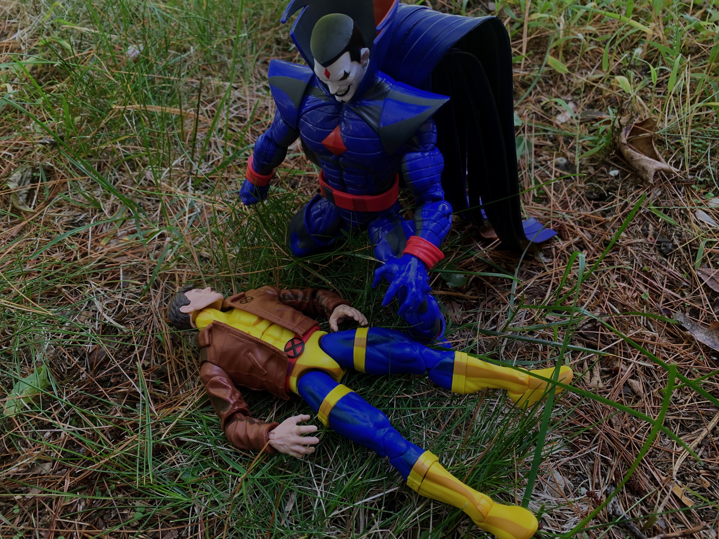
This is it! This is the big one! Back on Halloween of 1992 Fox premiered X-Men and we were introduced to a character named Morph. For comic readers, it was a bit of a re-introduction as Morph was based on the character Changeling, but for copywrite reasons, had to undergo a name change. Changeling wasn’t a popular character and was only briefly considered a member of the X-Men, but he was somewhat famous for basically one reason: he died. Comics, like soap operas, tend to feature death that is rarely permanent. Characters either die or appear to die, but often return and usually with some new threads! Changeling was a bit unique because he died and stayed dead and that’s what made him appealing to the writers of the show.
When the team headed up by writer Eric Lewald got settled in to write X-Men they really keyed in on the social commentary that was present in the story. A group of individuals are outcast due to no fault of their own while one of their chief villains is a survivor of the Holocaust. It was very easy to draw a straight line from the civil rights movement to what was going on in X-Men. Because of that, even though they were writing a TV show that would primarily be watched by children, they felt it needed to be grounded and also needed some real stakes. Taking a character and killing him off in the second episode was a way to create such stakes. In hindsight, the death of Morph should have been easy to see coming. He was modeled on a dead character from the books and he wasn’t even included in the show’s intro. We don’t learn anything about him during his brief stay on the show, he’s just there to be likable and make others laugh via his unique shape-shifting powers.
And yet, we loved him. When you present something to a child and then tell them they can’t have it, it tends to create even more desire for it. That was the case with Morph. He seemed fun enough, but had he been a character like any other it’s quite possible he would have been one of the least favorites on the show. Because he was killed though, it’s totally different. We may not have known him very well, but we did get to see how his death impacted those we would get to know which made it resonate even more. The network would go on to claim that he ended up being the stated favorite character of the majority of kids who chose to write-in and share their thoughts on the show. There was enough of such letters that the network convinced Lewald to bring him back, even though he had intended for Morph to die and stay dead. He eventually agreed, but on the condition that he come back as a villain. You can’t just have someone die and come back all sunshine and flowers, they’re going to be pretty affected by such a traumatic thing, which is how we got Evil Morph in Season Two.
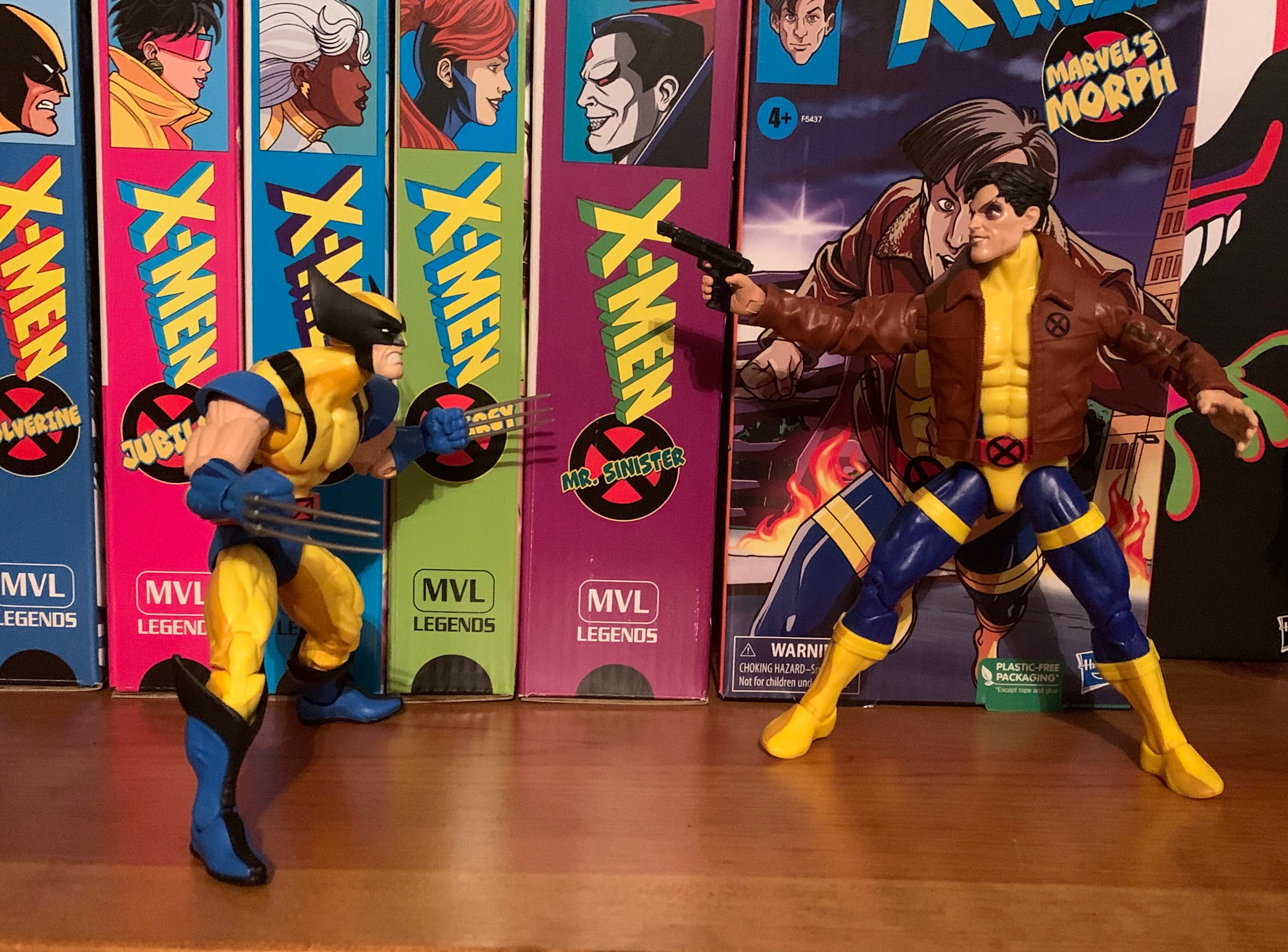
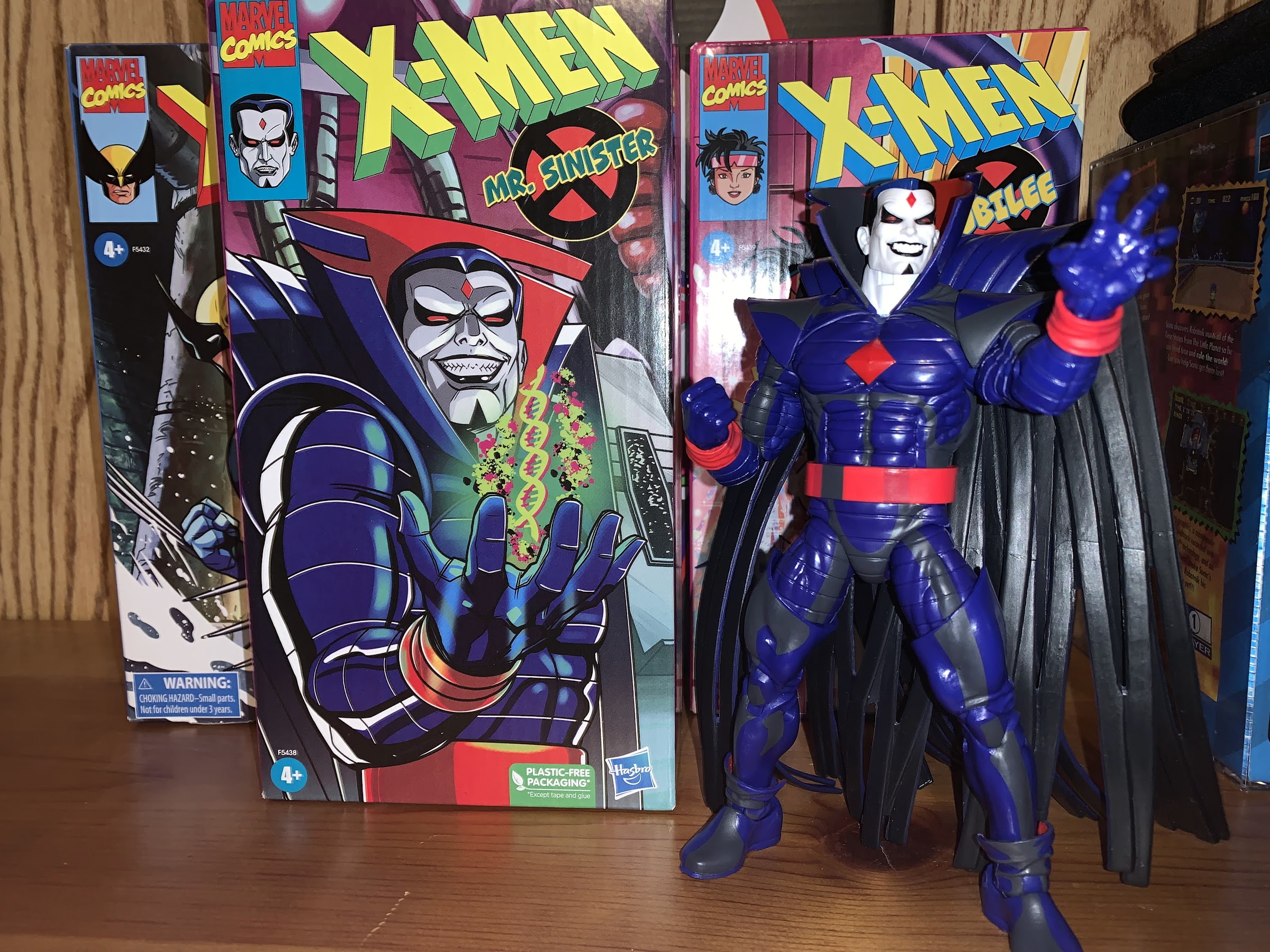
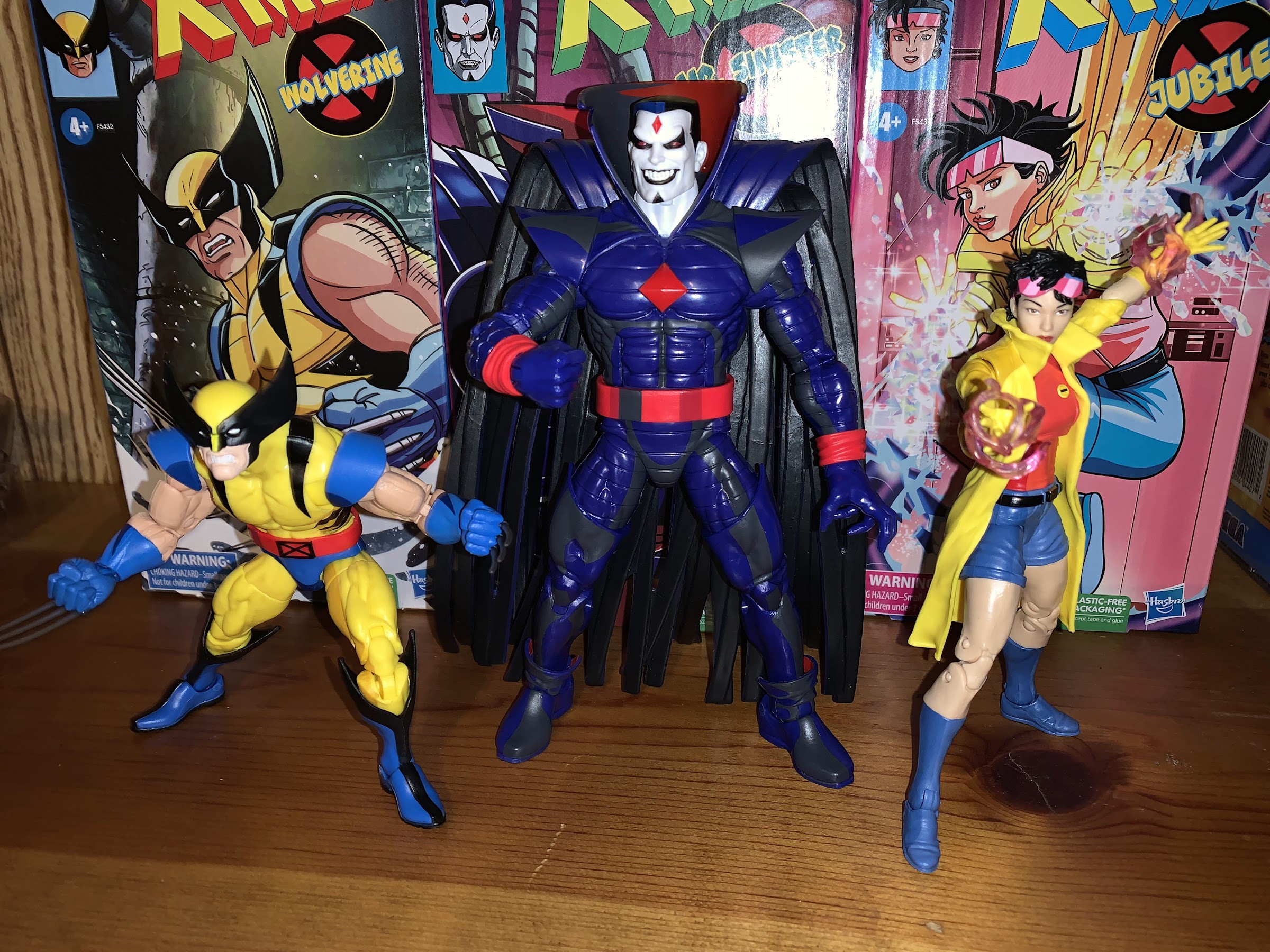
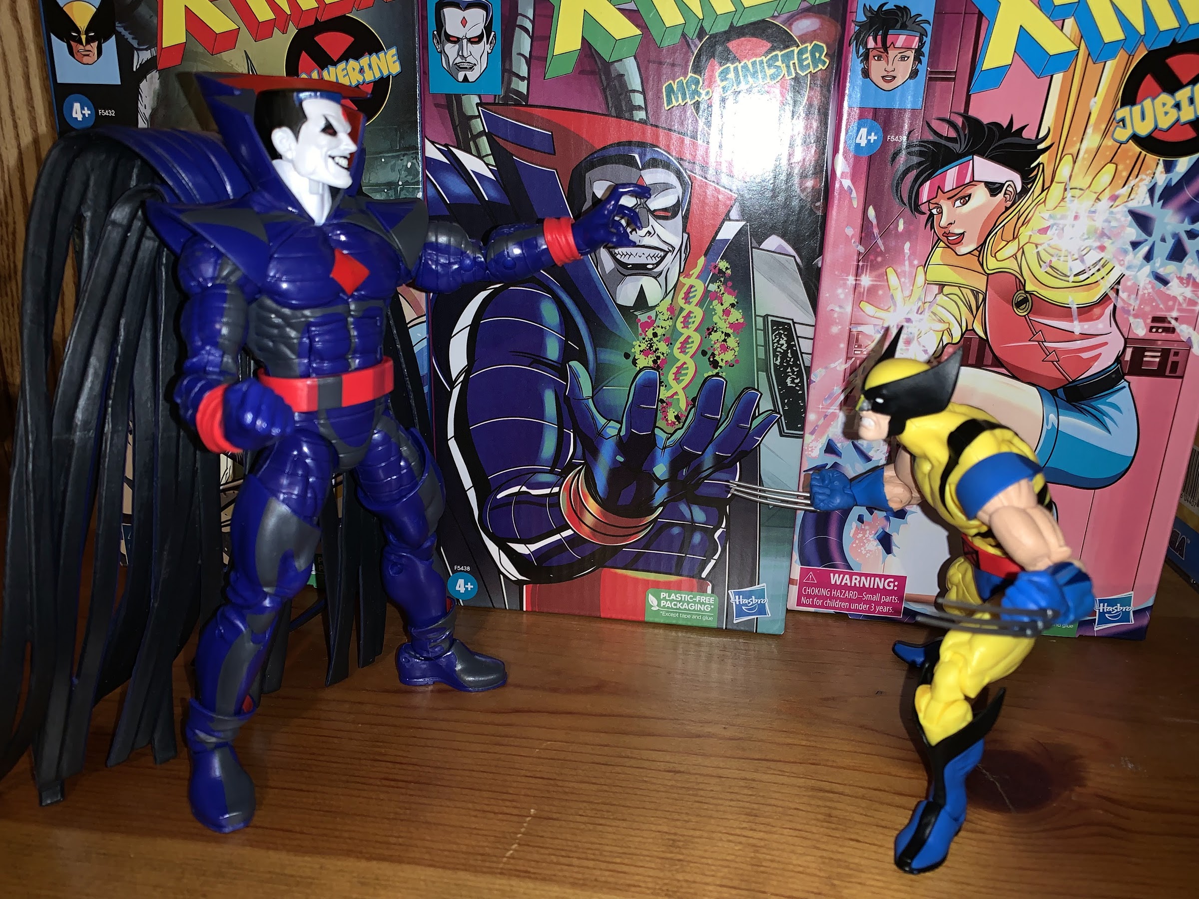
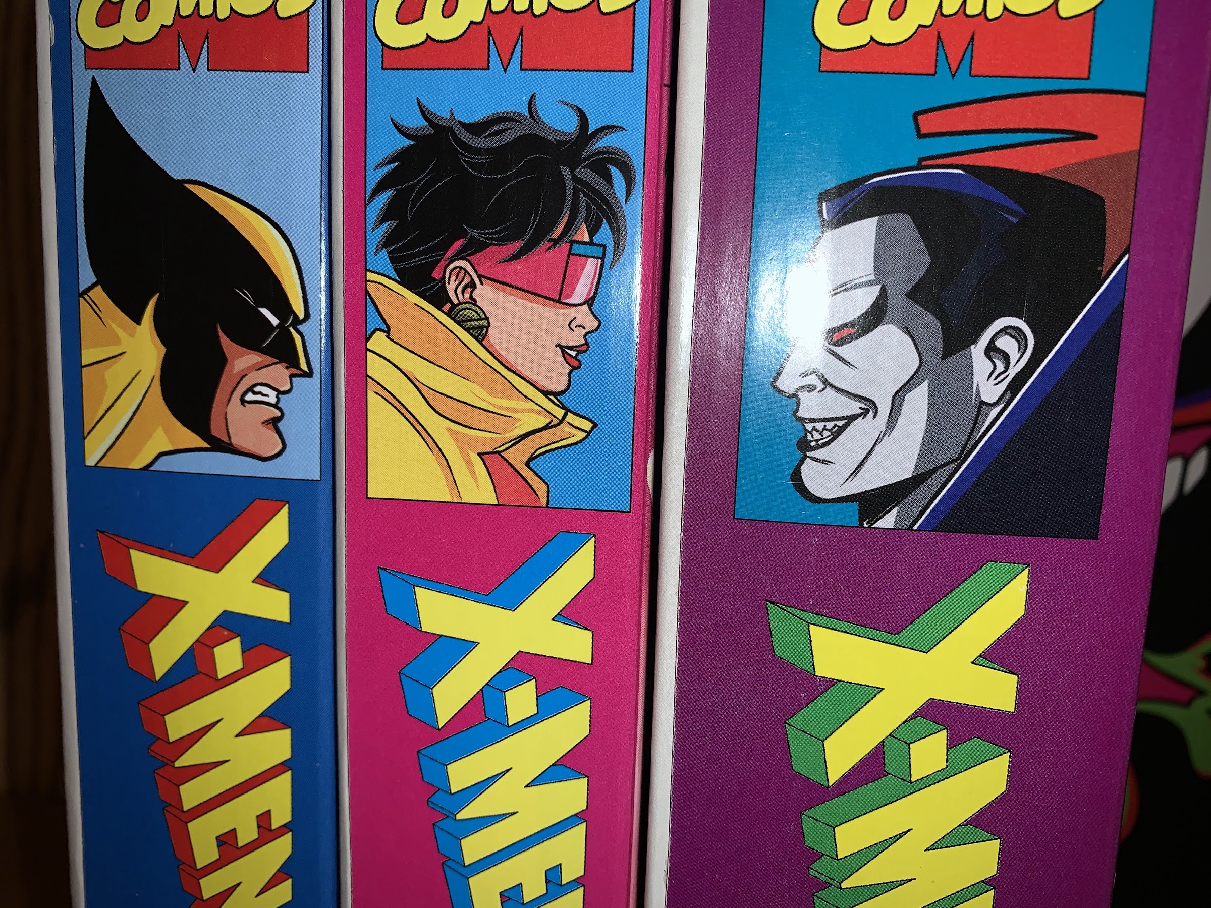
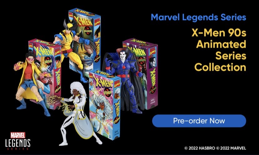
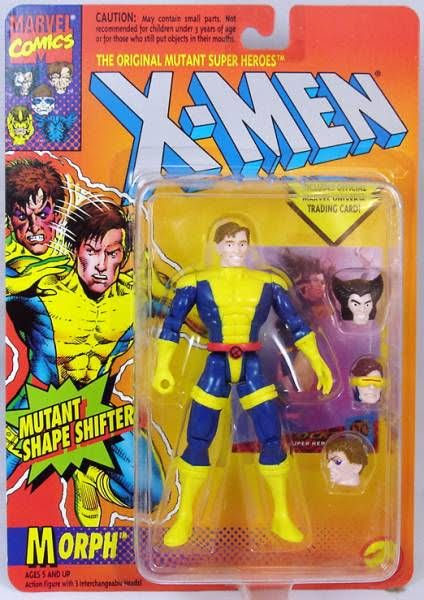
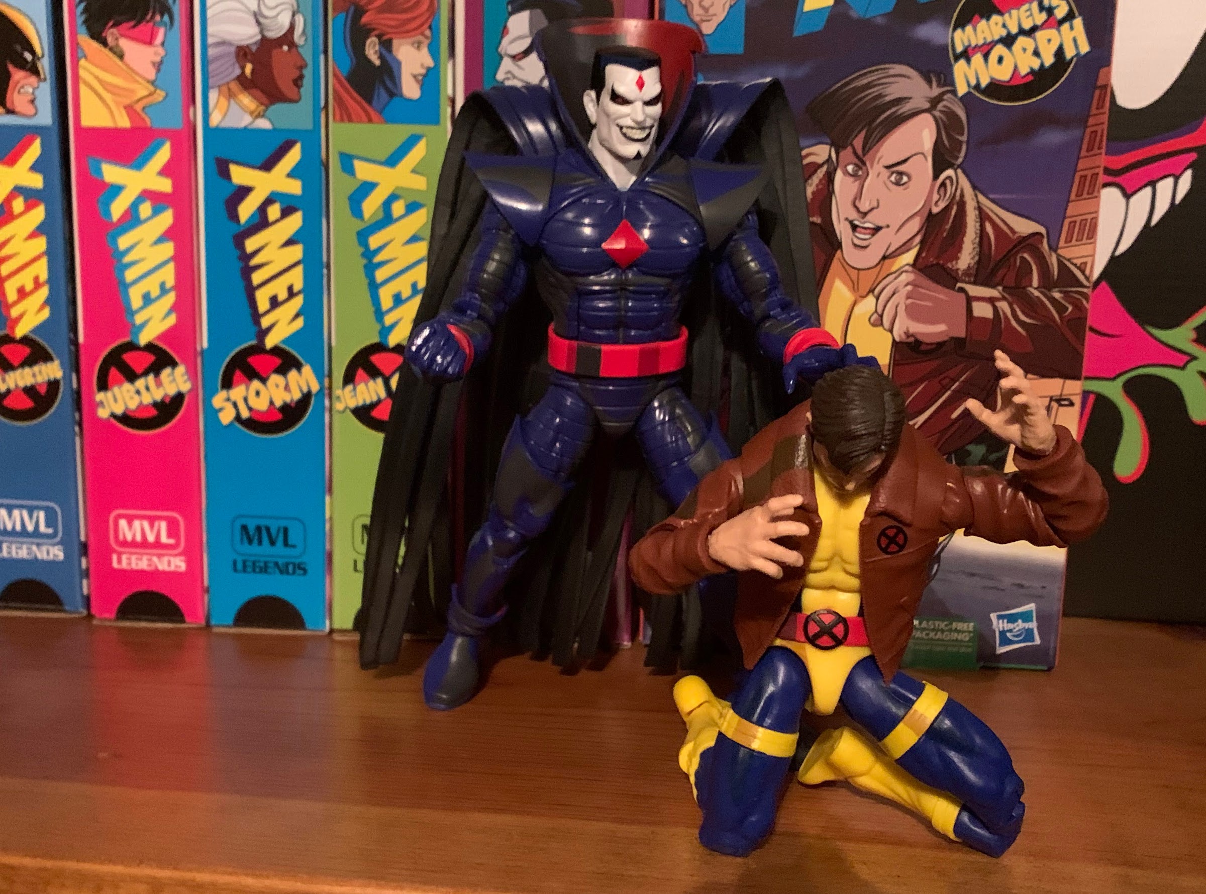
Because Morph is viewed as a unique creation for the show it was assumed that he would show up in this line of action figures from Hasbro eventually. And apparently some of those child letter writers from the 90s are still among us as there’s been a lot of support for a Morph figure based on his toon appearance for years. As a result, it was expected that this figure of Morph would have appeal outside of the line and those who aren’t interested in cel-shaded X-Men would cave for a Morph figure. Which is why it was hardly a surprise to see Morph unveiled as the line’s sixth release. We knew he was coming, it was just a matter of when. I thought maybe they would save him for a convention or maybe even as a tie-in for the show’s 30th anniversary, but he was just tossed out there in May and made available for pre-order shortly there-after. I have not been shy about my displeasure with the quality of this line and the shortcuts Hasbro has been willing to take. My hope has always been that the budget on some figures was lower than others so resources could be put towards a proper Morph because, perhaps more than any other, this figure needs to be good because this is THE character from the show and unlikely to see another release. And in some ways, my faith was rewarded, but in others not so much. Reader beware, I have a lot to say about this figure and it might come across as nit-picky so if you just want a fluff piece this won’t be it.
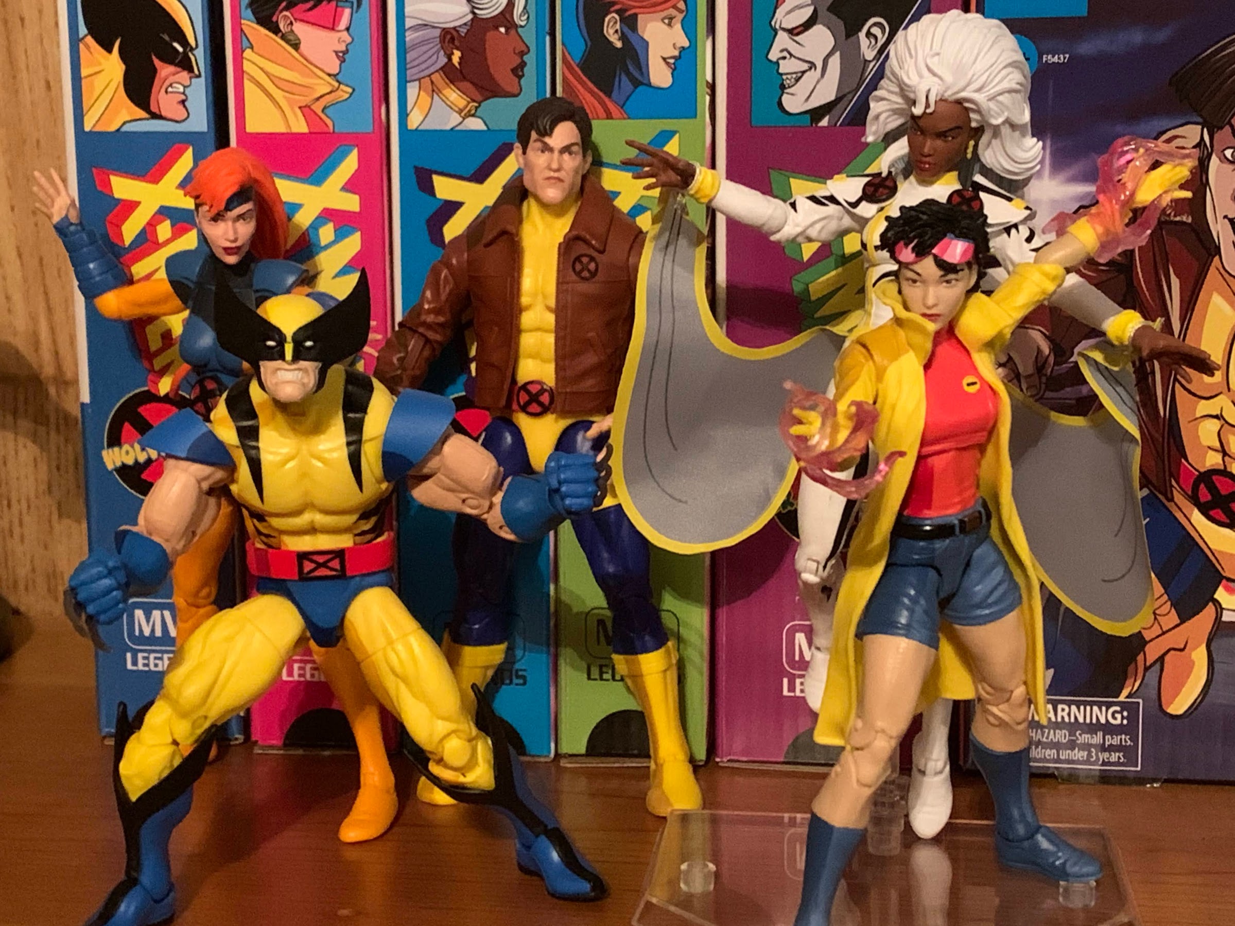
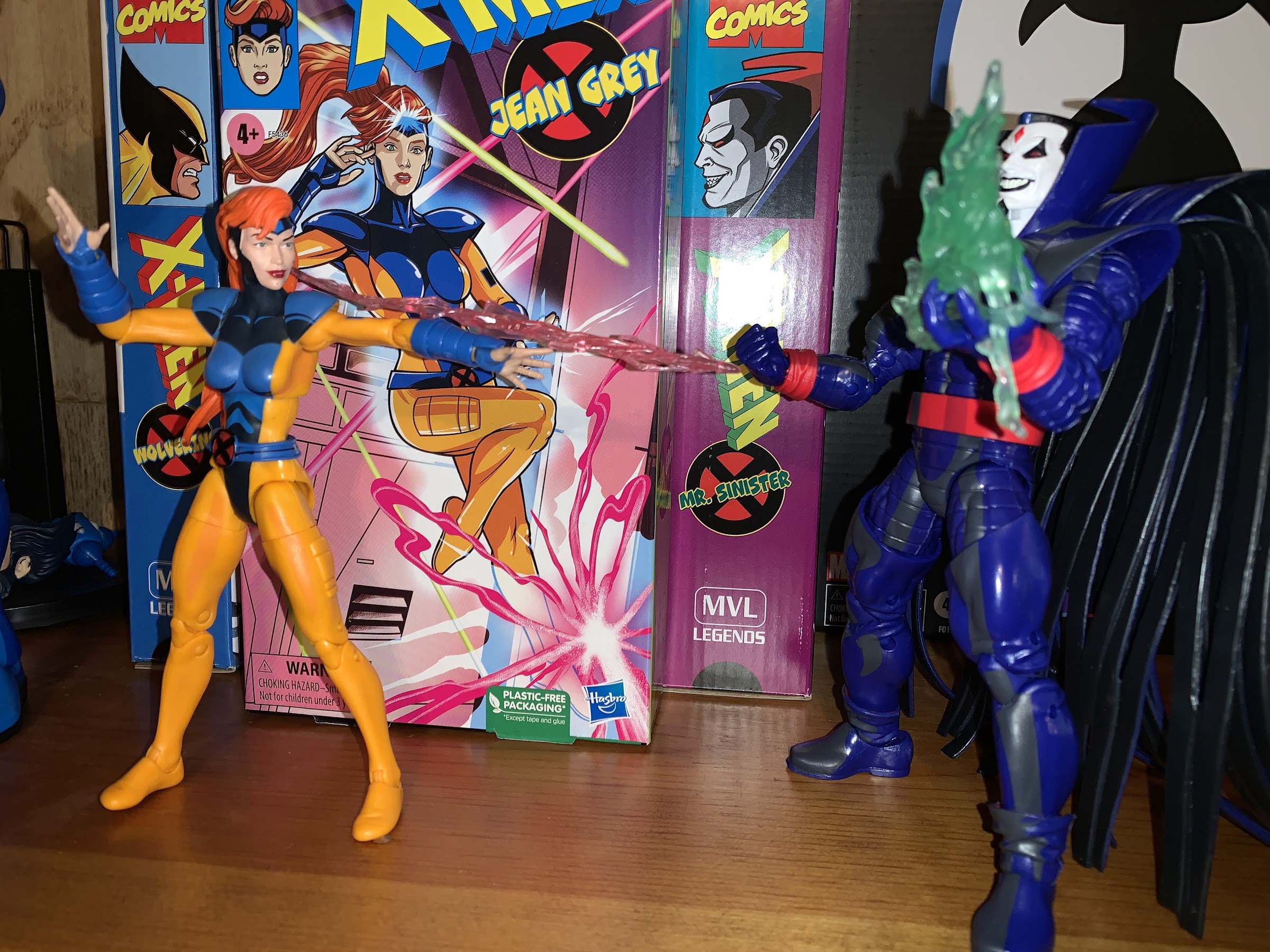
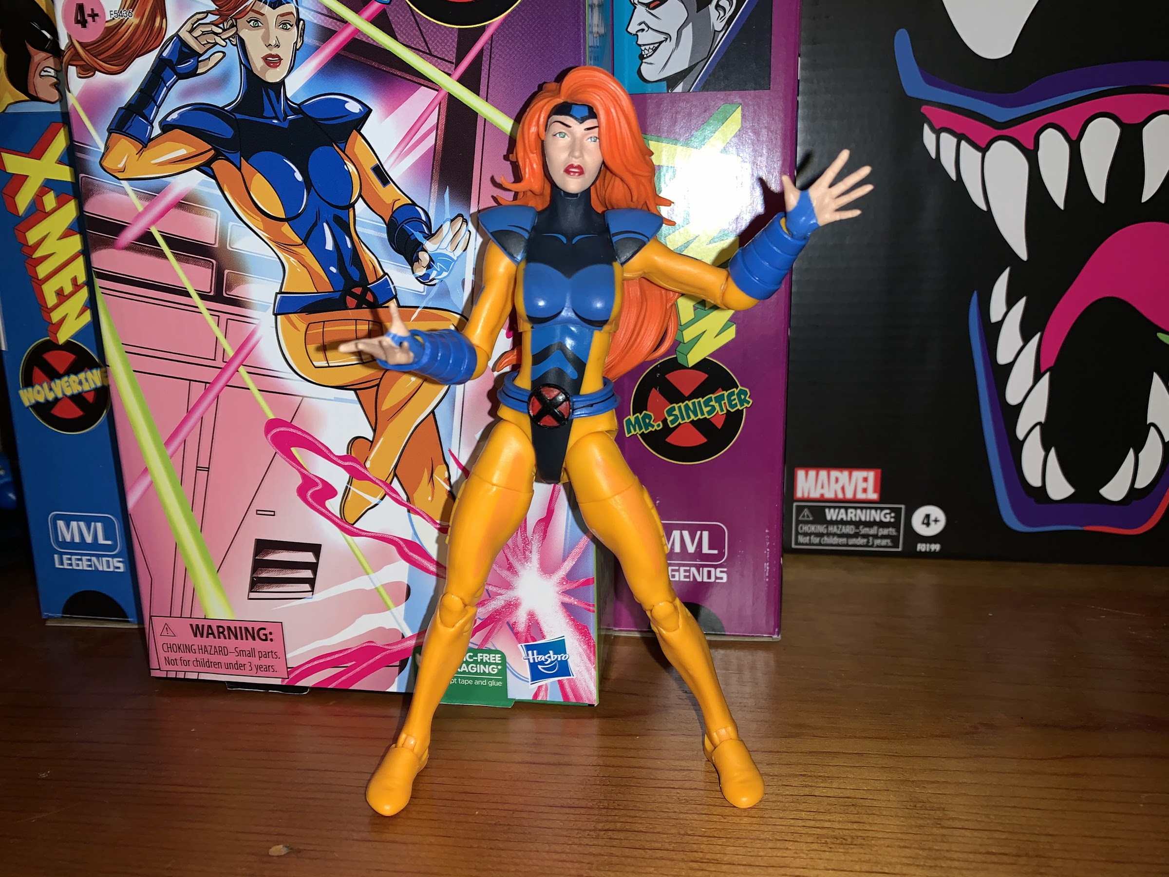
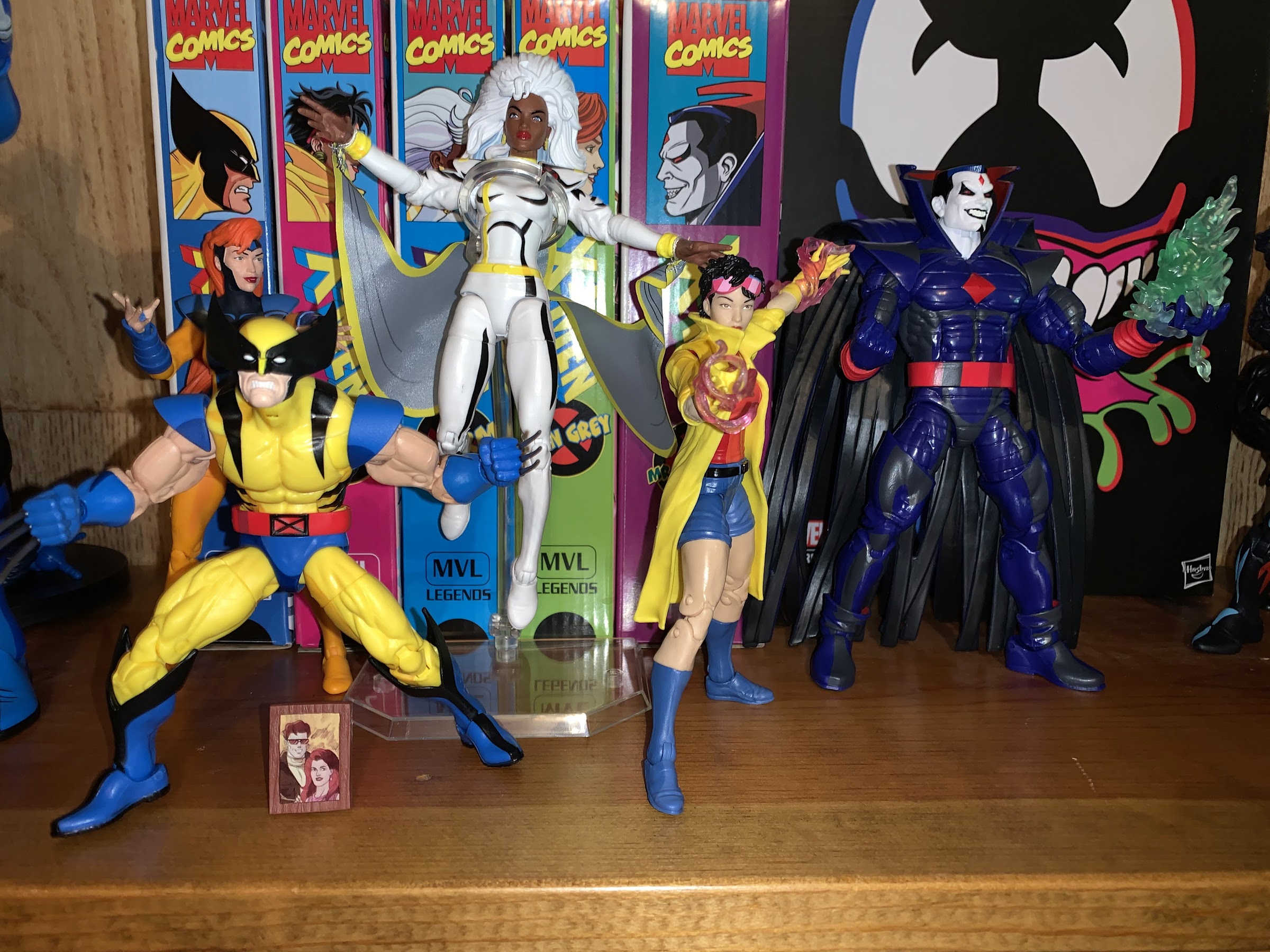
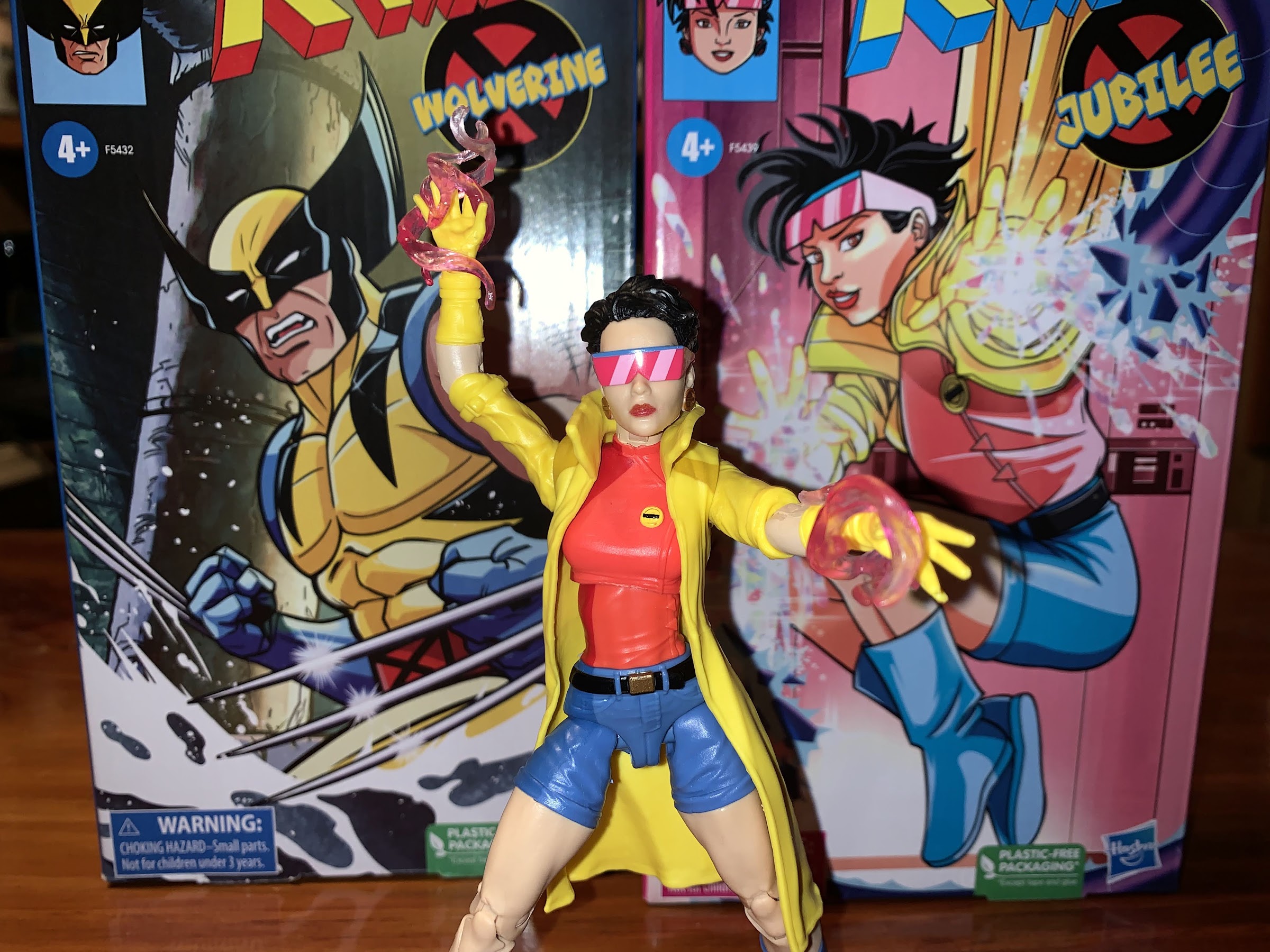
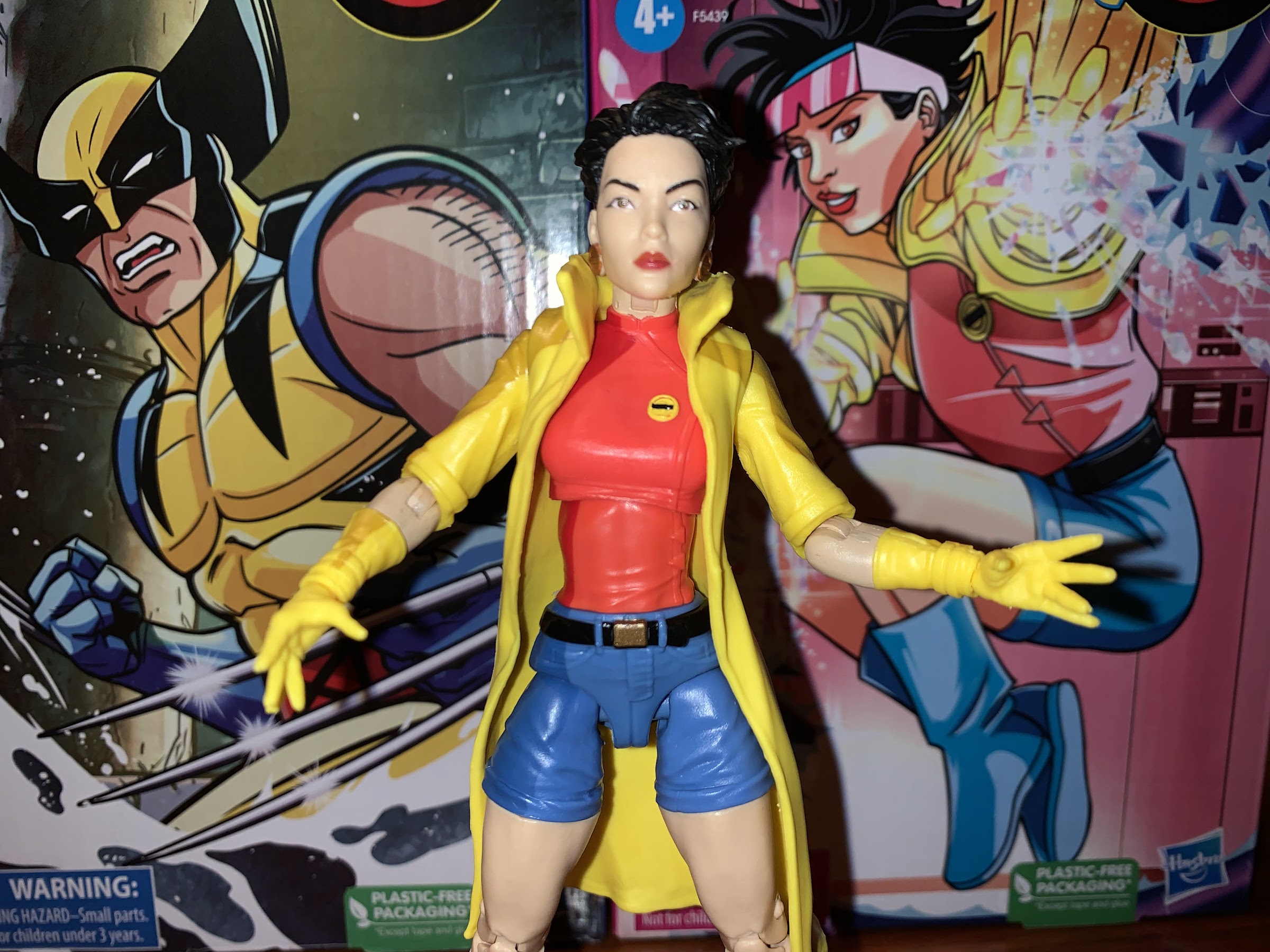
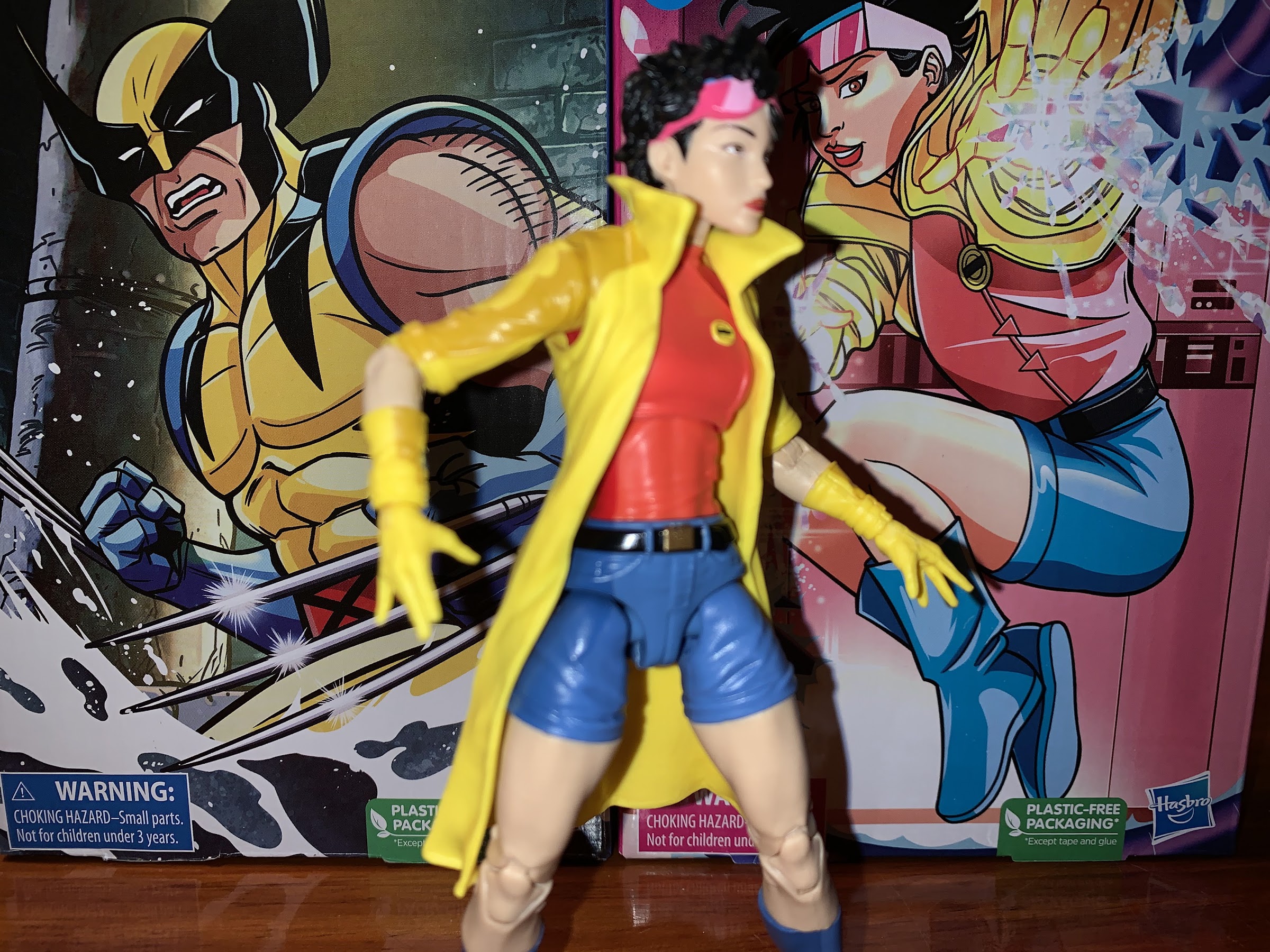
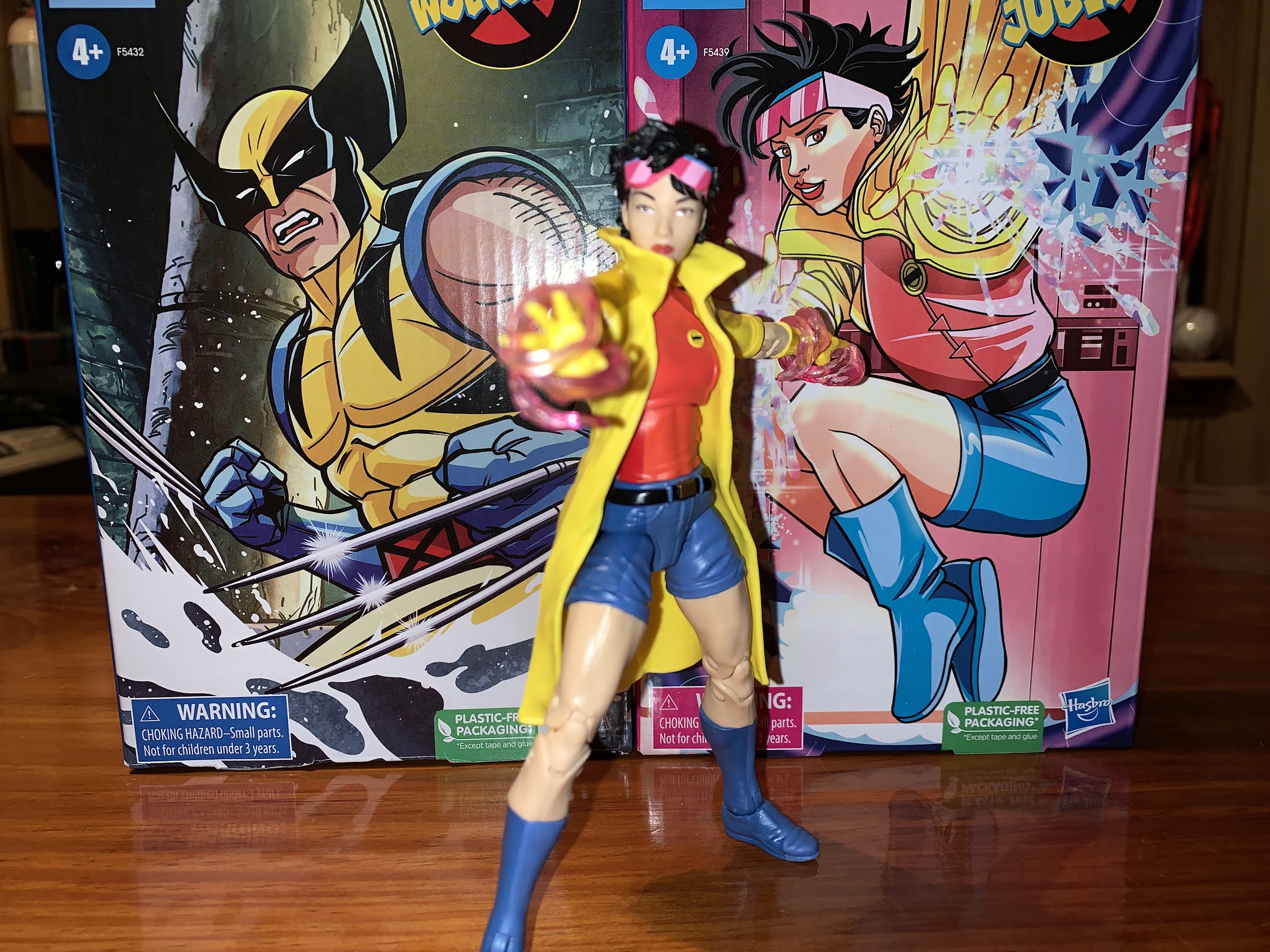
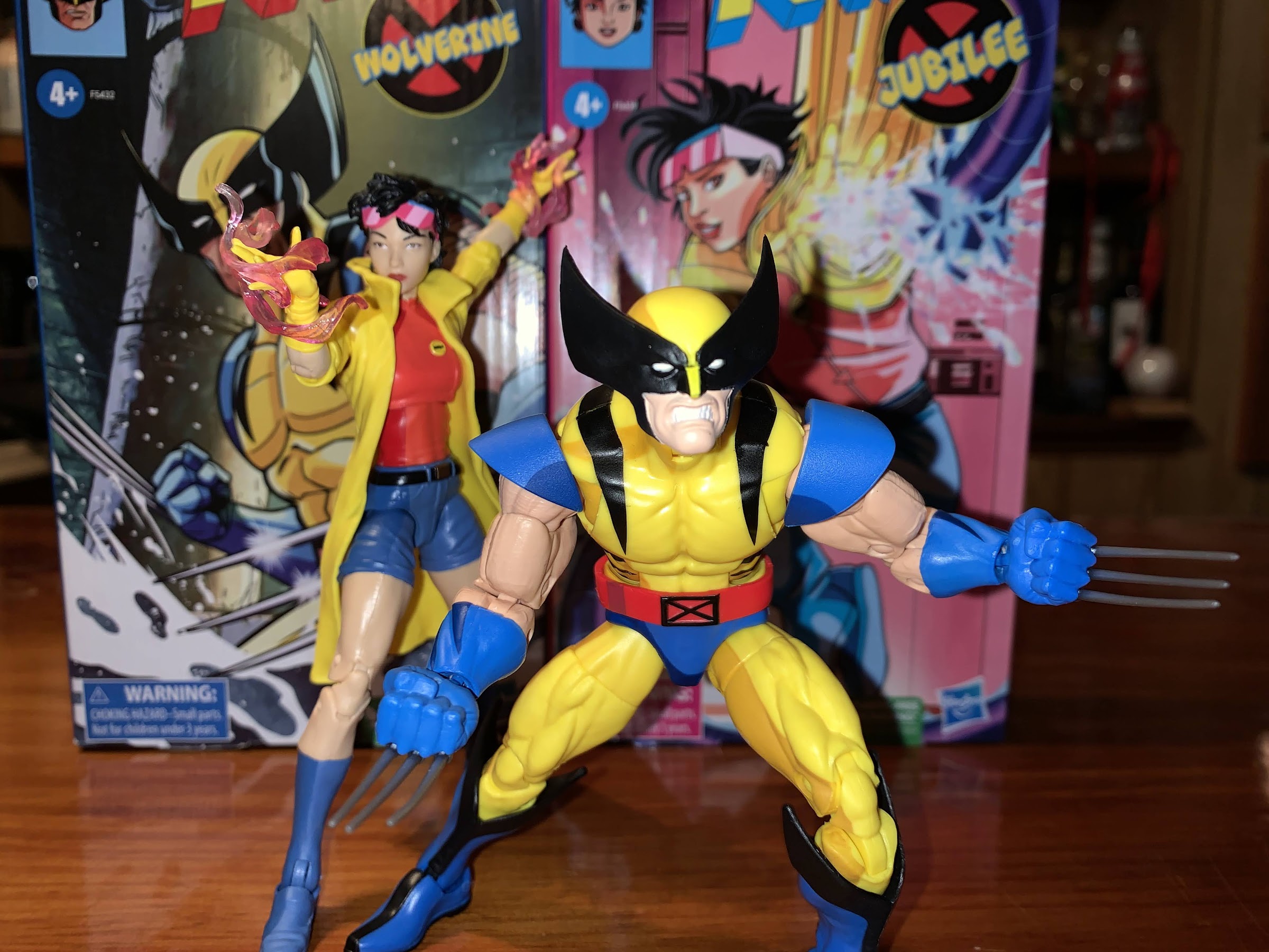
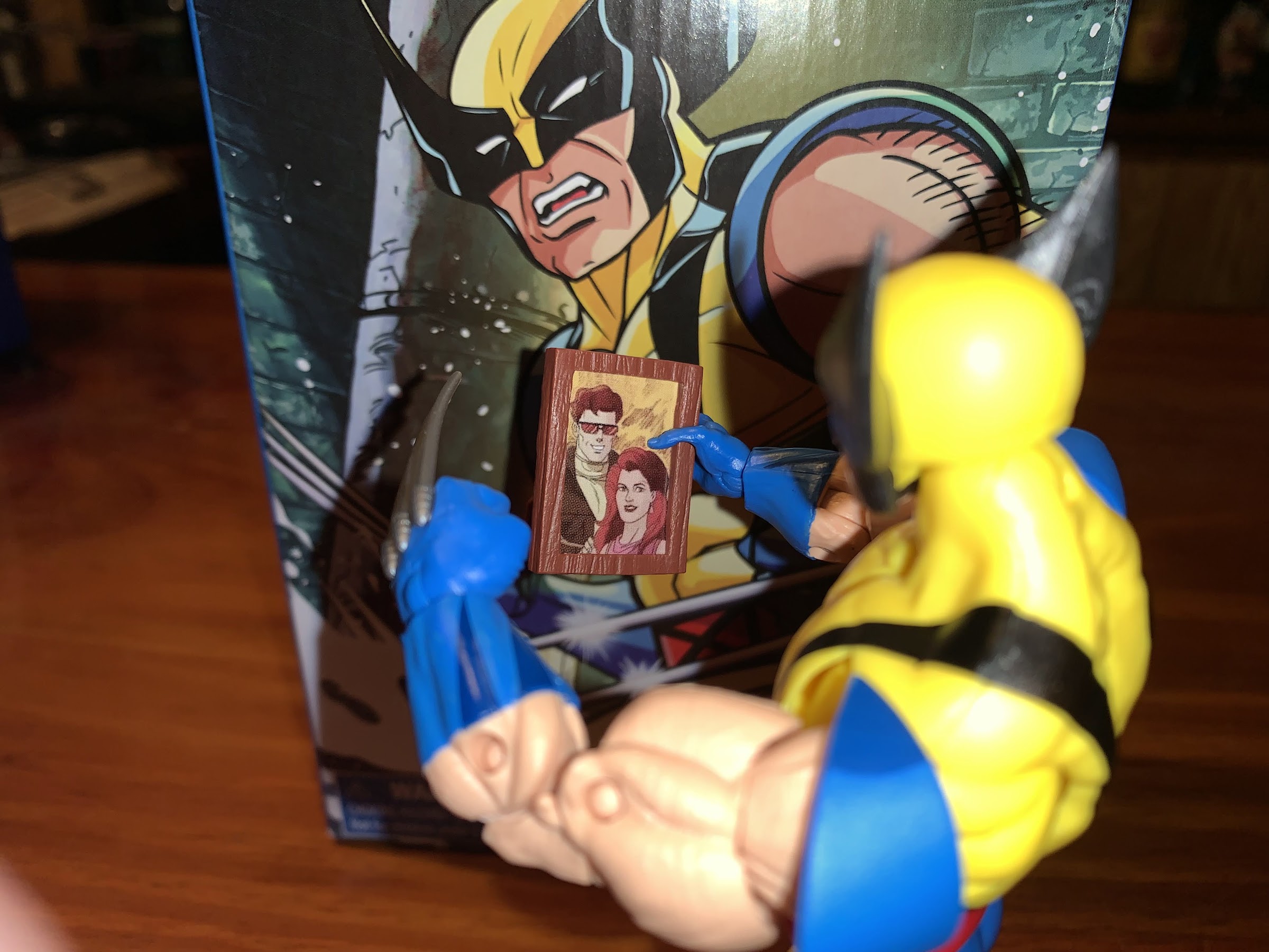
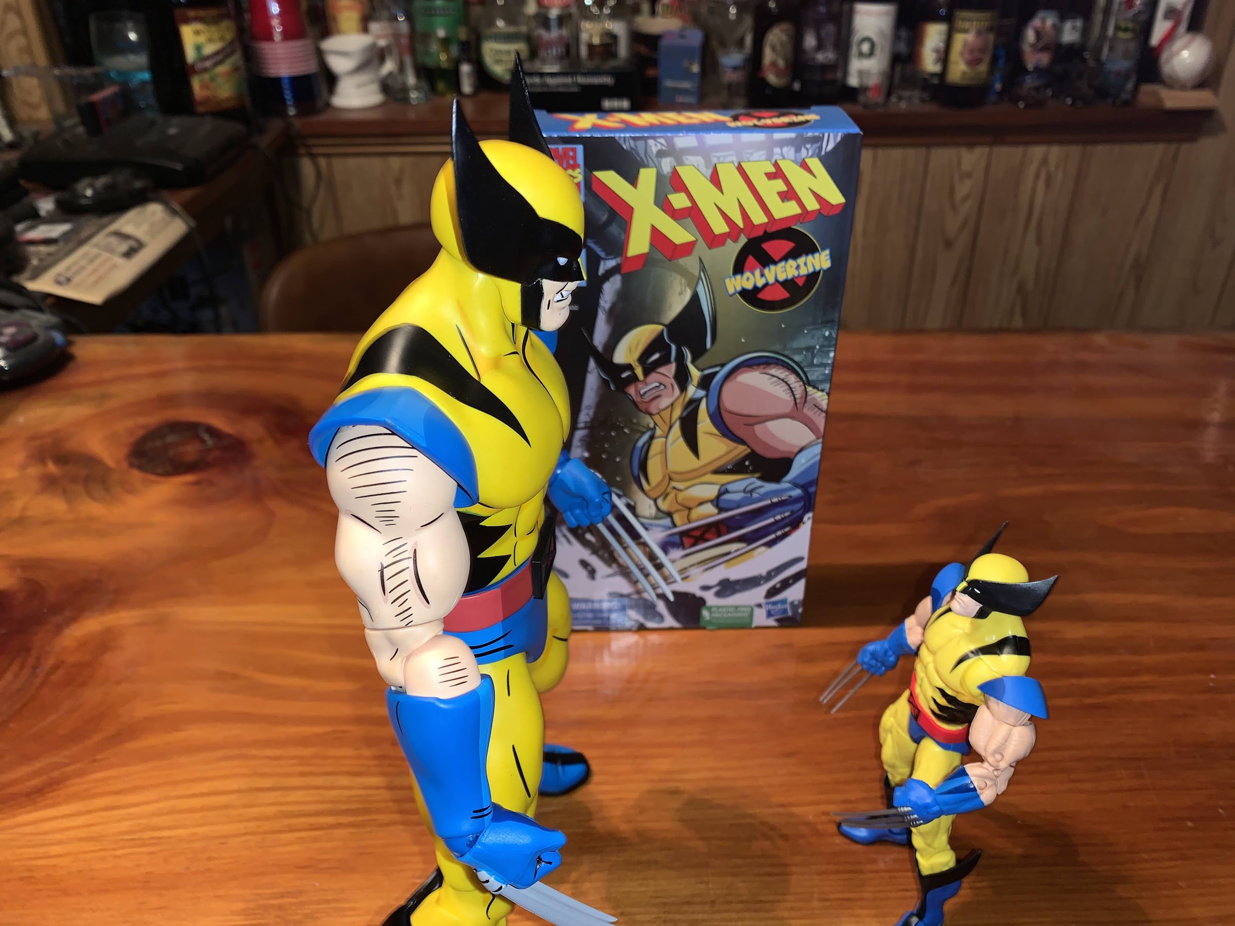
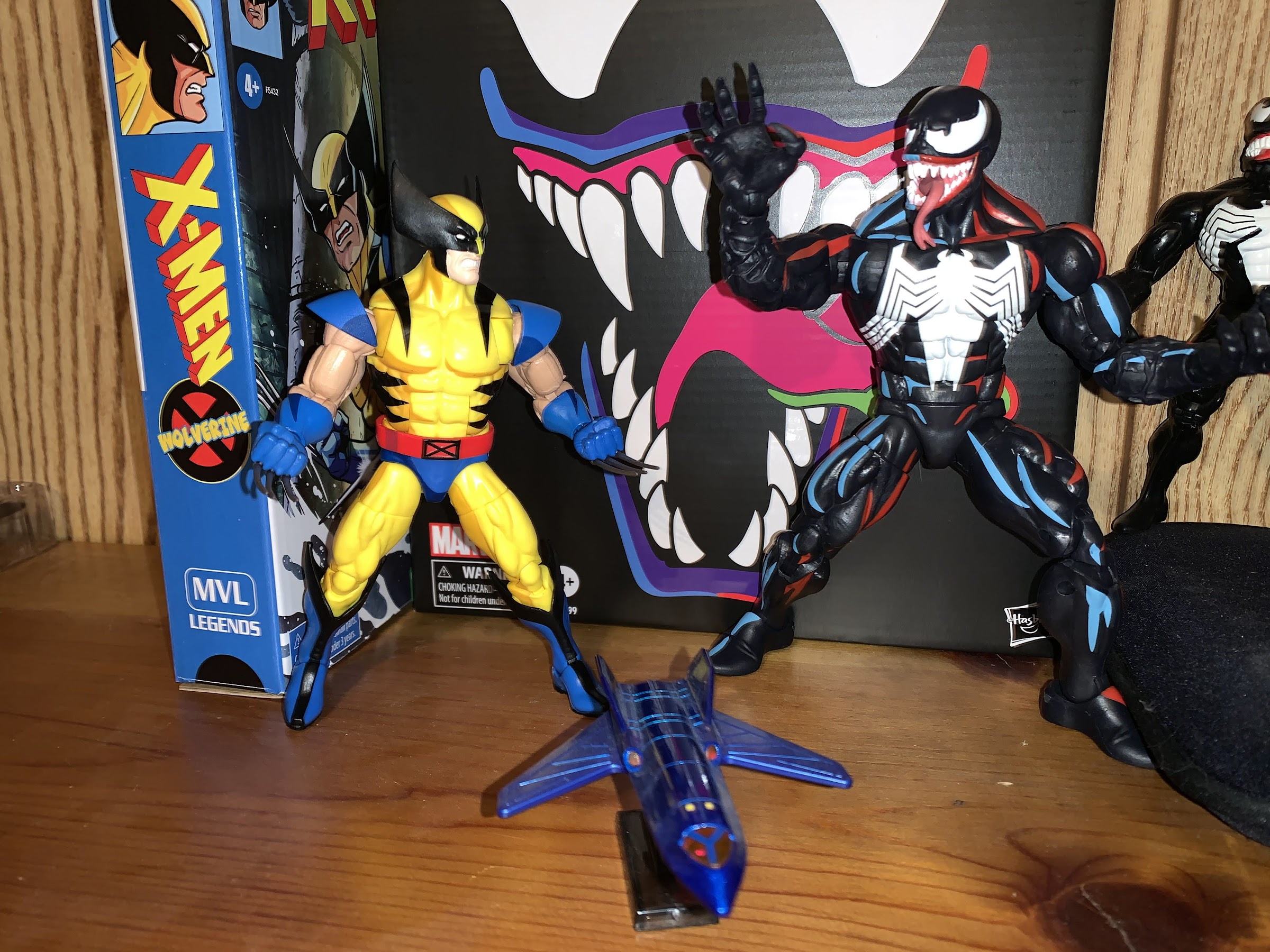
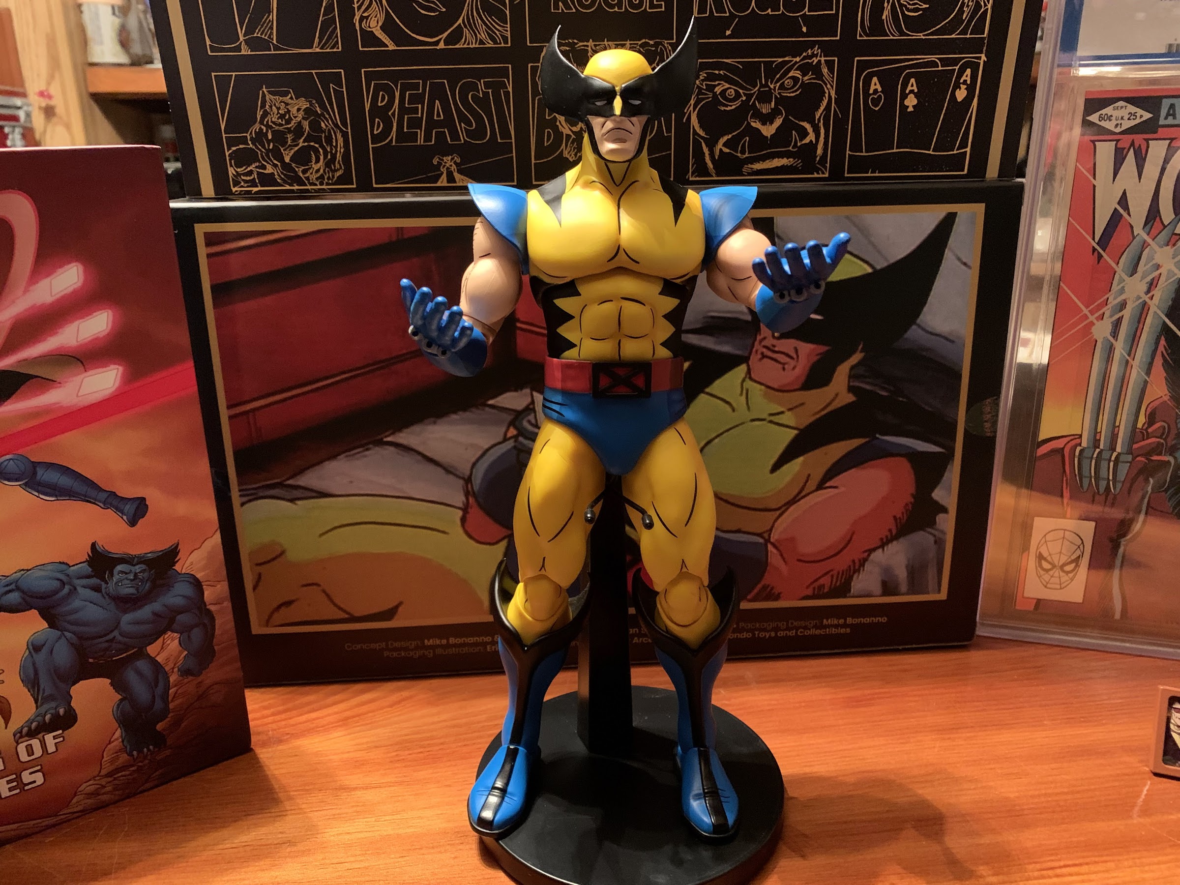
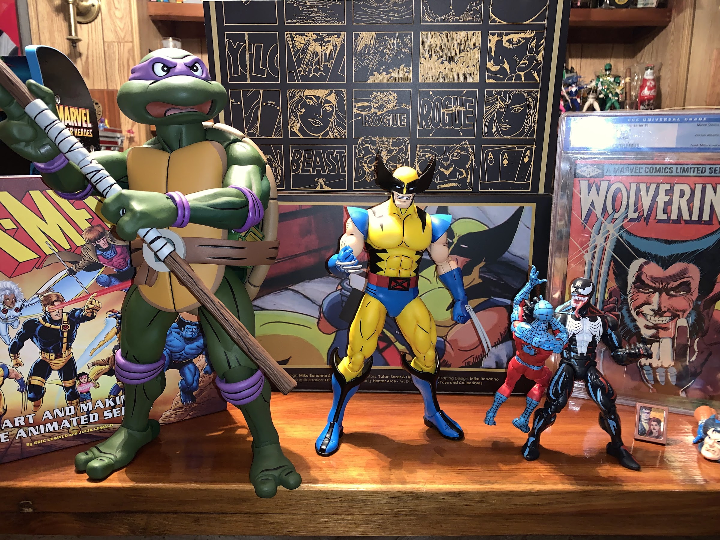
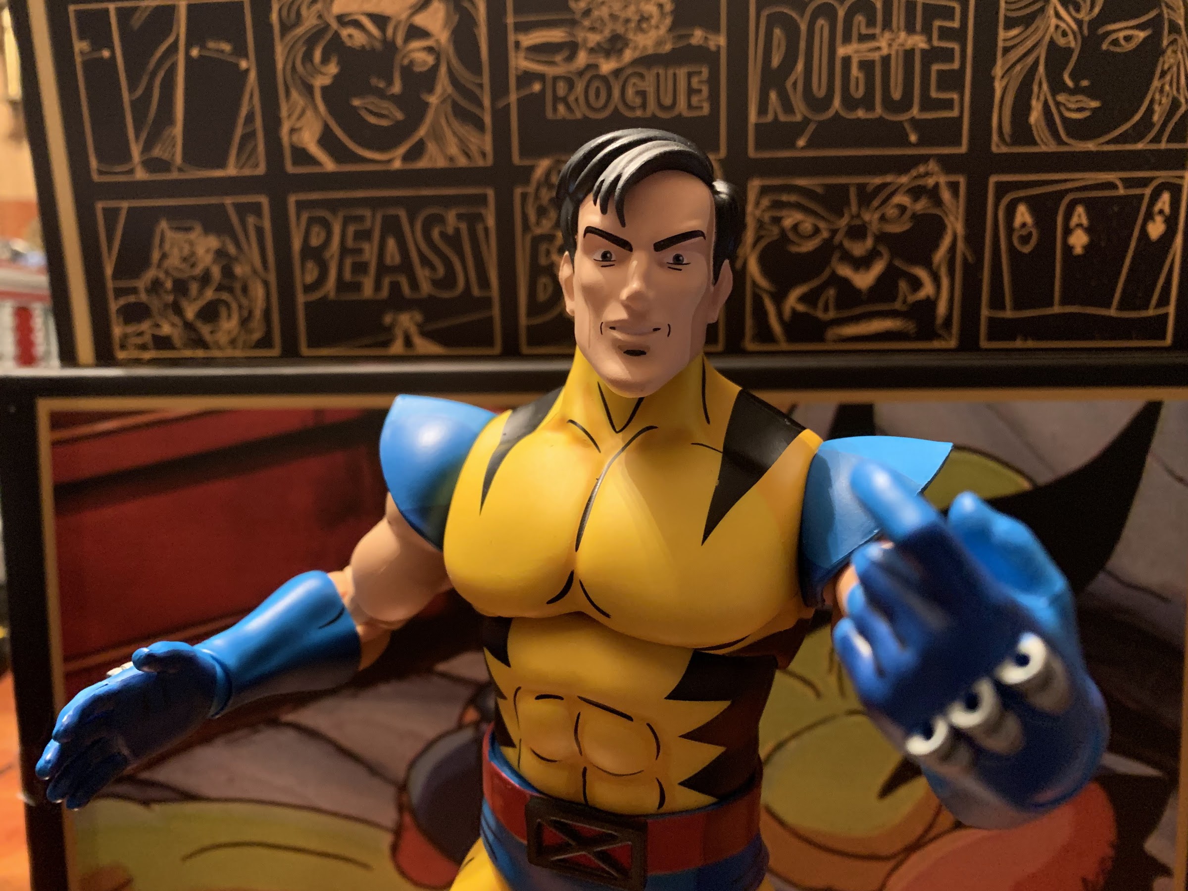
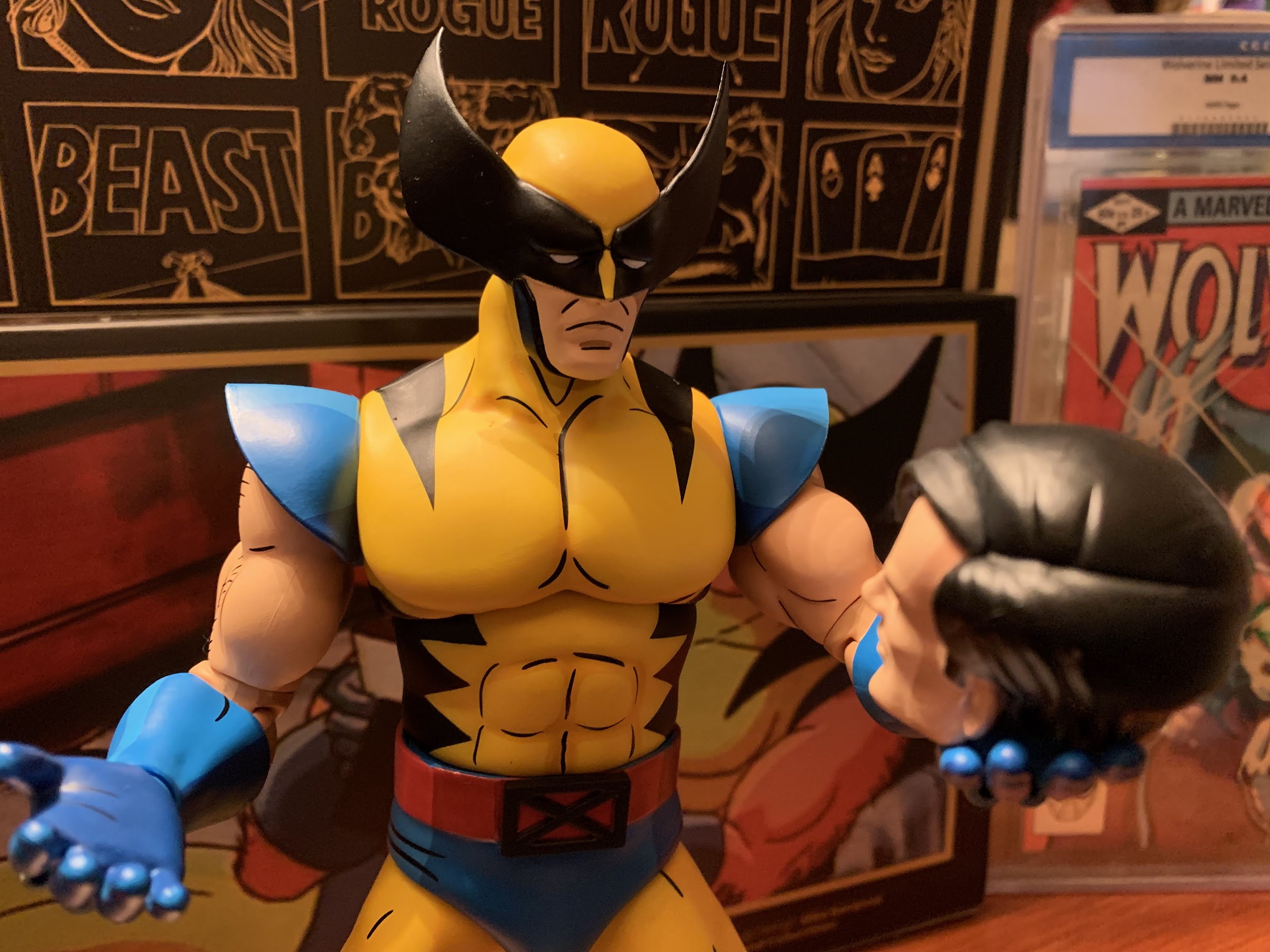
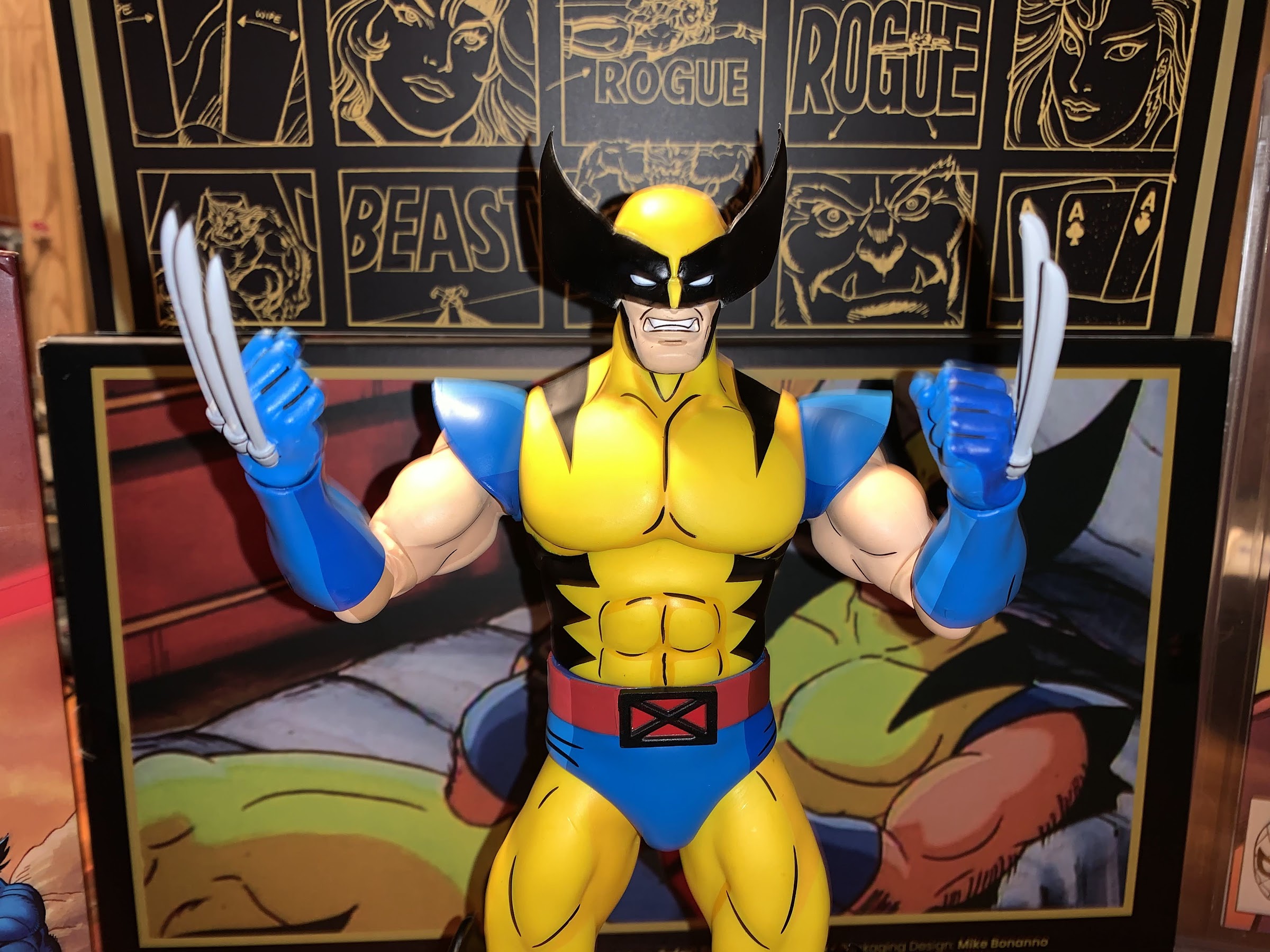
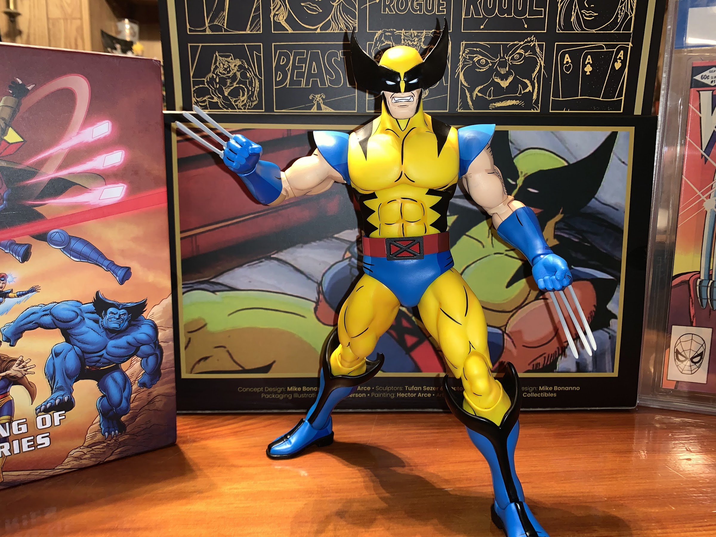
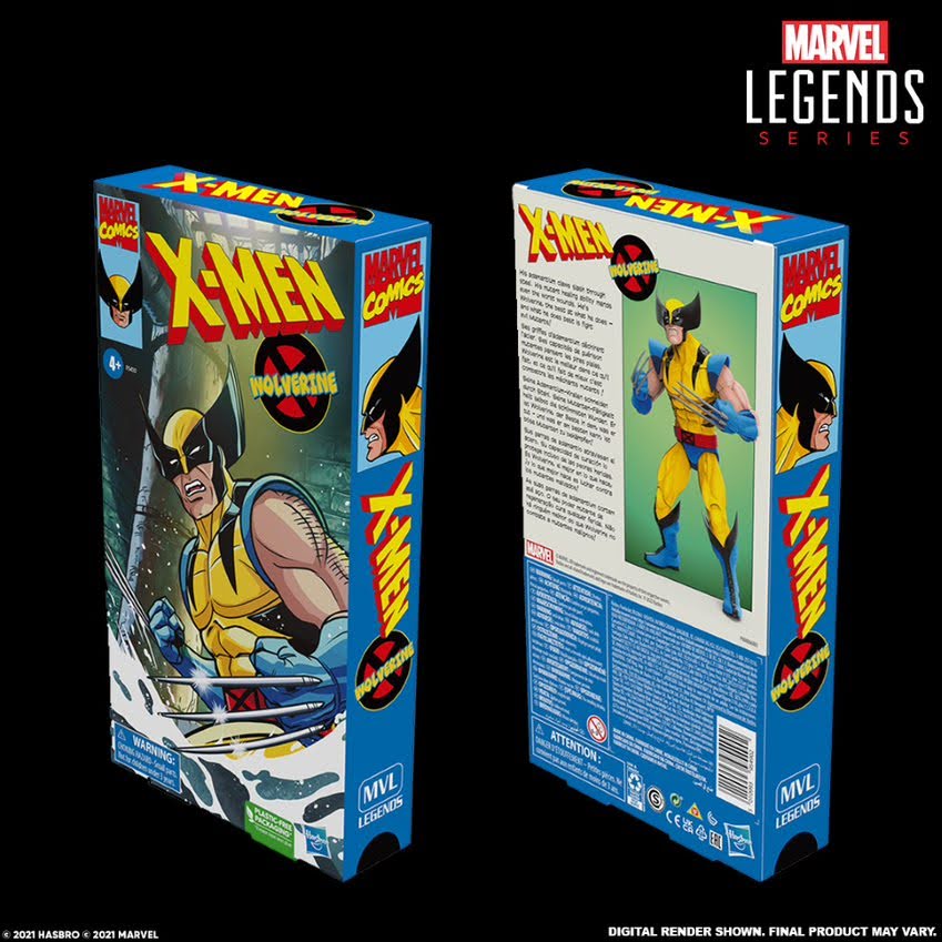
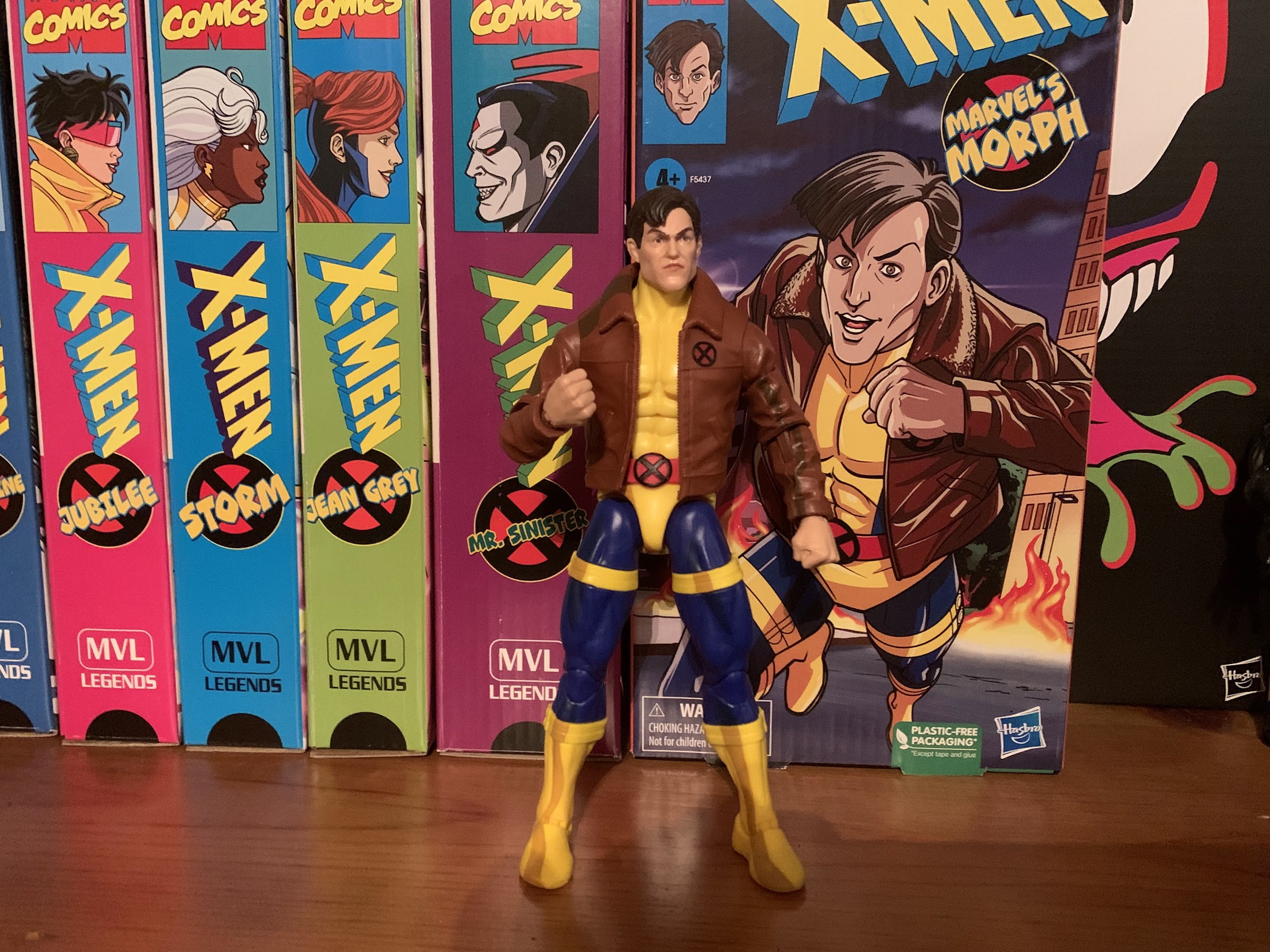
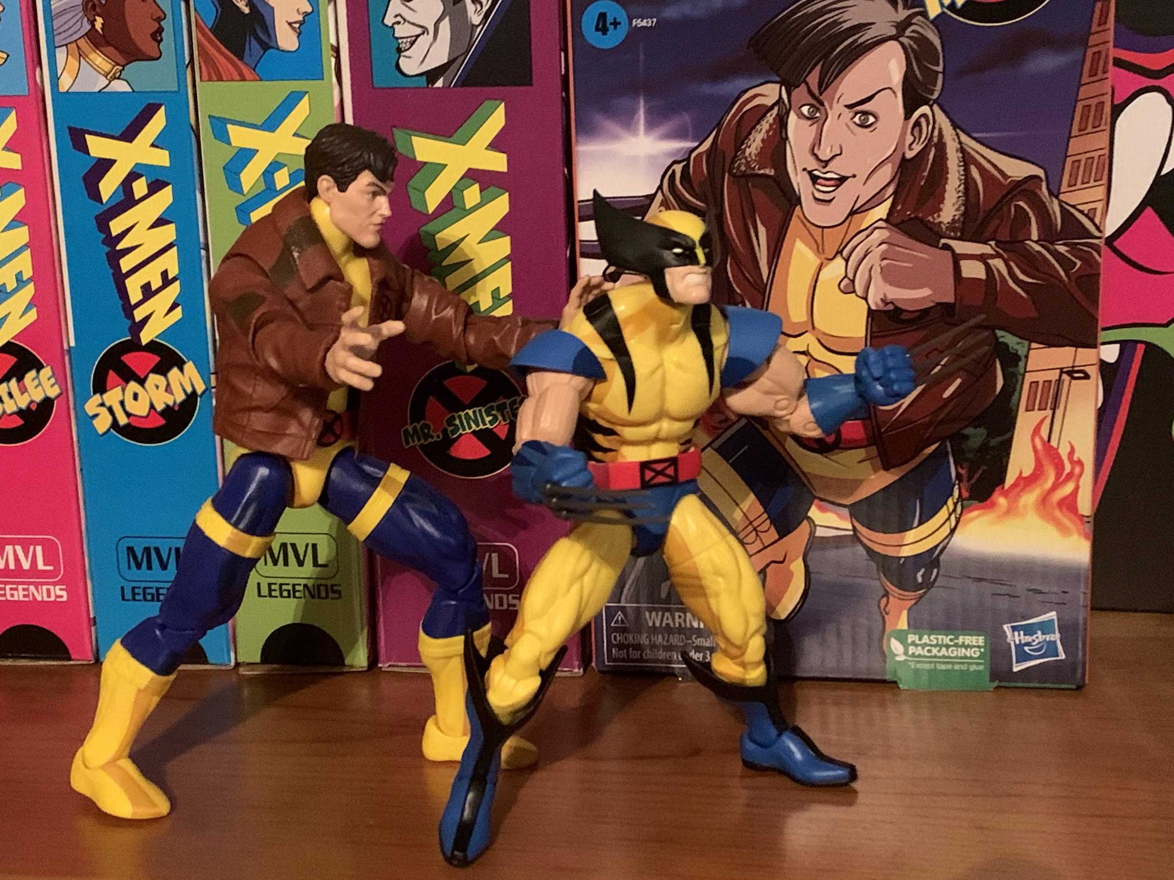
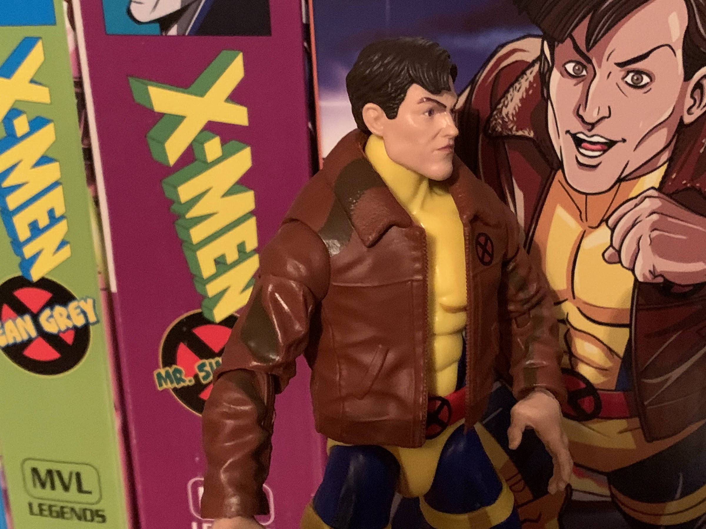
Morph comes in the same VHS styled packaging with art by Dan Veesenmeyer as the rest of the line. It looks nice and we have a joyful looking Morph running from the Mutant Control headquarters just as he did in the show before tragedy struck. The figure itself is contained within and comes in a little bag. Many collectors hate this approach, but I can’t say it’s really done any harm yet as all of the figures I’ve received have been fine. Once free, Morph stands around 6.5″ and is depicted in his blue and yellow costume with the flight jacket. Morph is a slightly tricky release because for a character with just a handful of appearances in the show, he did have some different looks. We saw him with the jacket and without as well as with yellow gloves and without. He also switched from black to brown hair in his later appearances which is what the old Toy Biz figure went with in the vintage line. He’s probably a bit oversized as represented here, but not egregiously so.
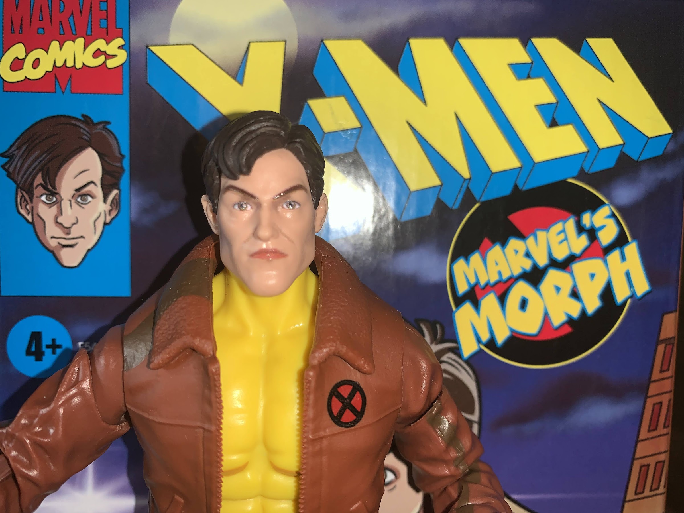
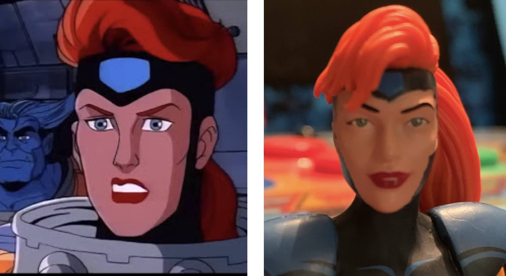
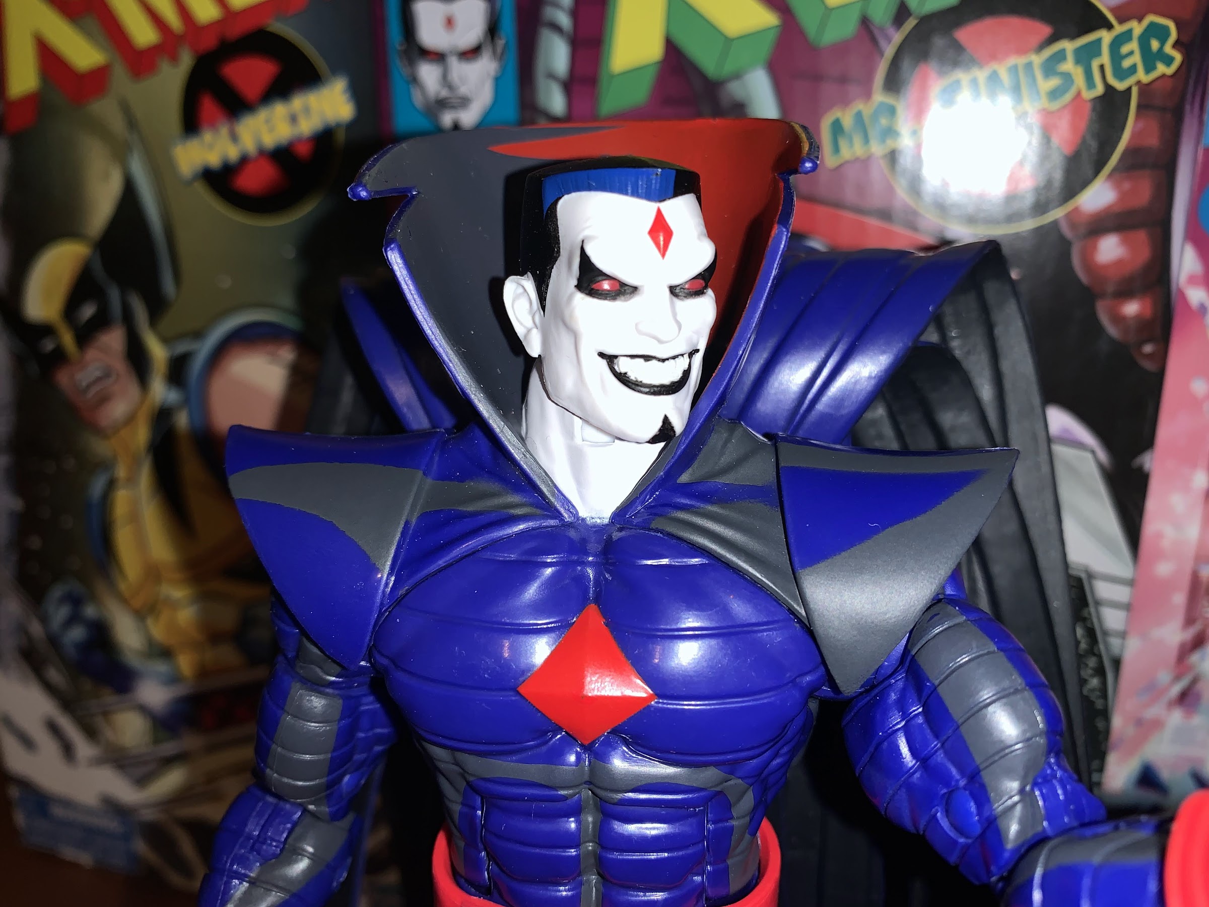
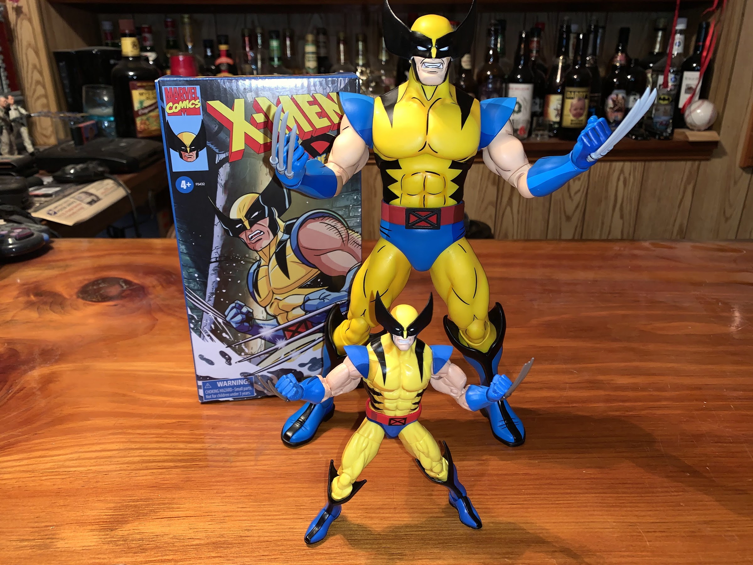
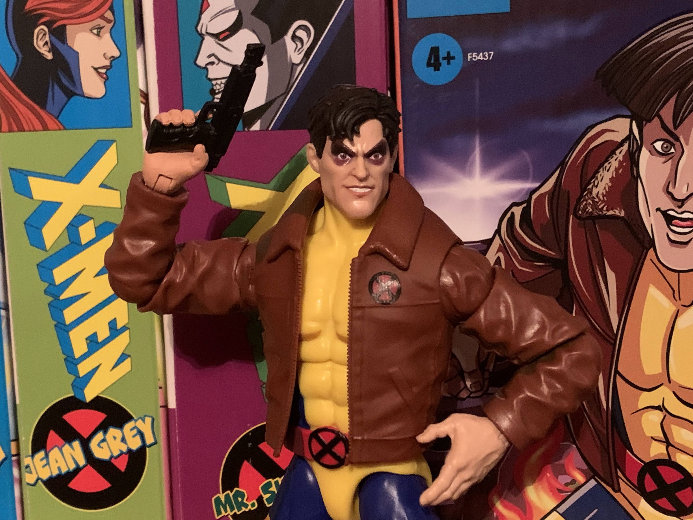
Let’s first talk about this head. Like most figures in the Marvel Legends line, we have a lot of reuse here, but the head is unique. For it, Hasbro tapped the excellent Paul Harding to sculpt it. Harding is one of the best out there and we’ve already looked at some of the stuff he’s done for NECA’s Teenage Mutant Ninja Turtles line. A sculptor can only do as directed though, and for this figure Harding was instructed to do Morph, but make him in the “Marvel Legends style.” That style is to take a character from a comic, or in this case cartoon, and up the realism. Make them look believable. Unfortunately, I strongly disagree with this approach. You’re making a line of toys based on a cartoon specifically to match that look. We have Wolverine, Storm, Jubilee, etc in these costumes already in Marvel Legends, why do animated versions of them if they’re going to just be in the same style? It’s pointless! And it’s confusing, because we already received Wolverine and Hasbro gave him a new head that looks like the cartoon. Hasbro has done figures based on properties like Into the Spider-Verse within Marvel Legends which took a screen accurate approach, why not here?
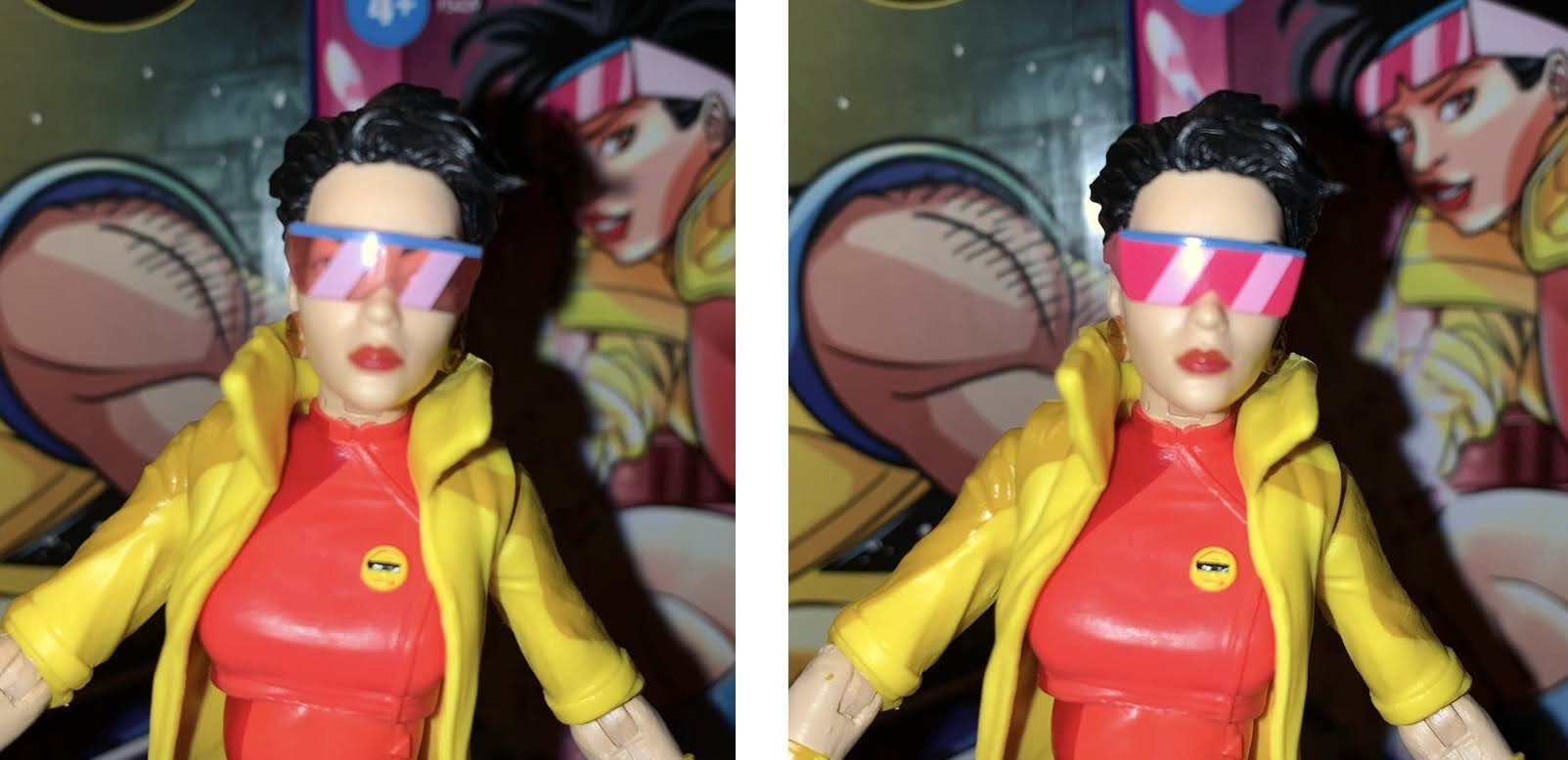
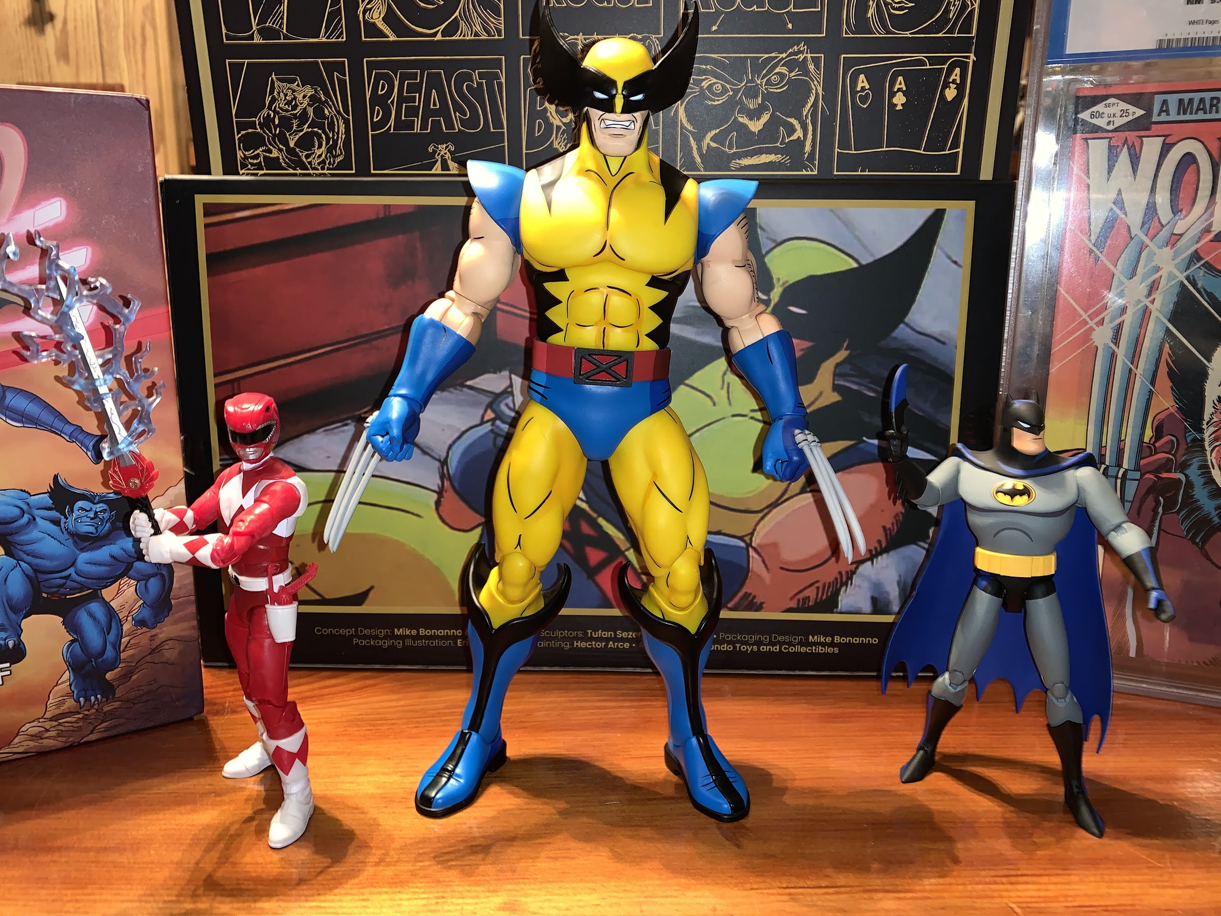
As a result, this head-sculpt that comes on Morph leaves a lot to be desired. He’s very square-jawed when the show Morph had a very pointed chin and sunken cheeks. The extra detail on the face and painted lips (again, something Hasbro didn’t do with the animated Wolverine) further take away from the animated aesthetic had it been allowed to exist. They also did his hair in a dark brown. It’s too light to be the black-haired Morph we saw in seasons one and two, but too dark to be the brown-haired version we saw in “Courage” and later appearances. His expression is also very bland. It’s stoic, when anyone who has seen the show thinks of Morph in the same way he’s presented on the box art: with a smile. He’s a goof, that’s his defining characteristic. Practically every line out of his in the first episode is intended to make someone laugh, and if no one is around, he’s trying to make himself laugh as we saw when he’s watching TV. This head is so inappropriate for this character and release that I find it almost completely useless.
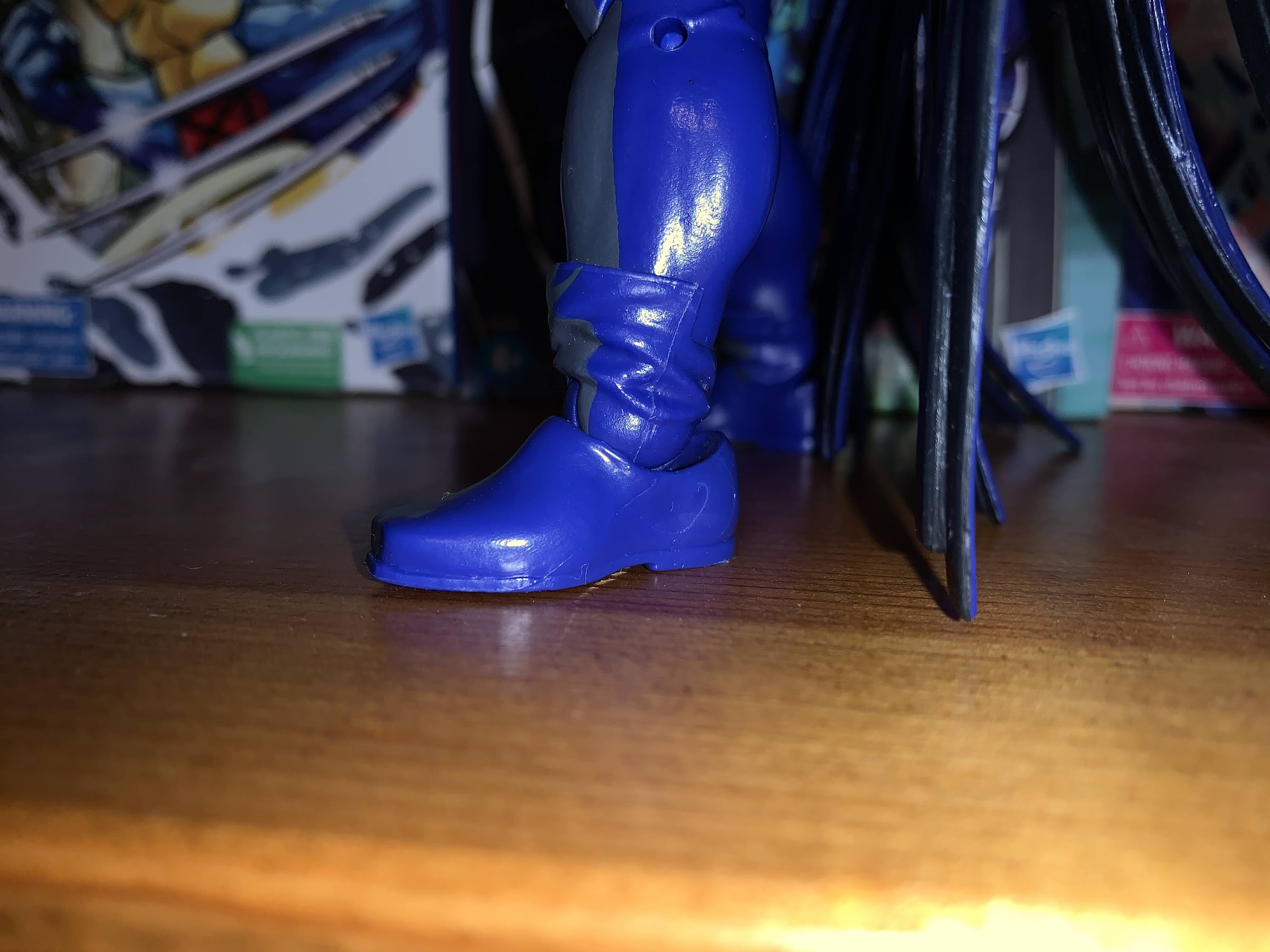
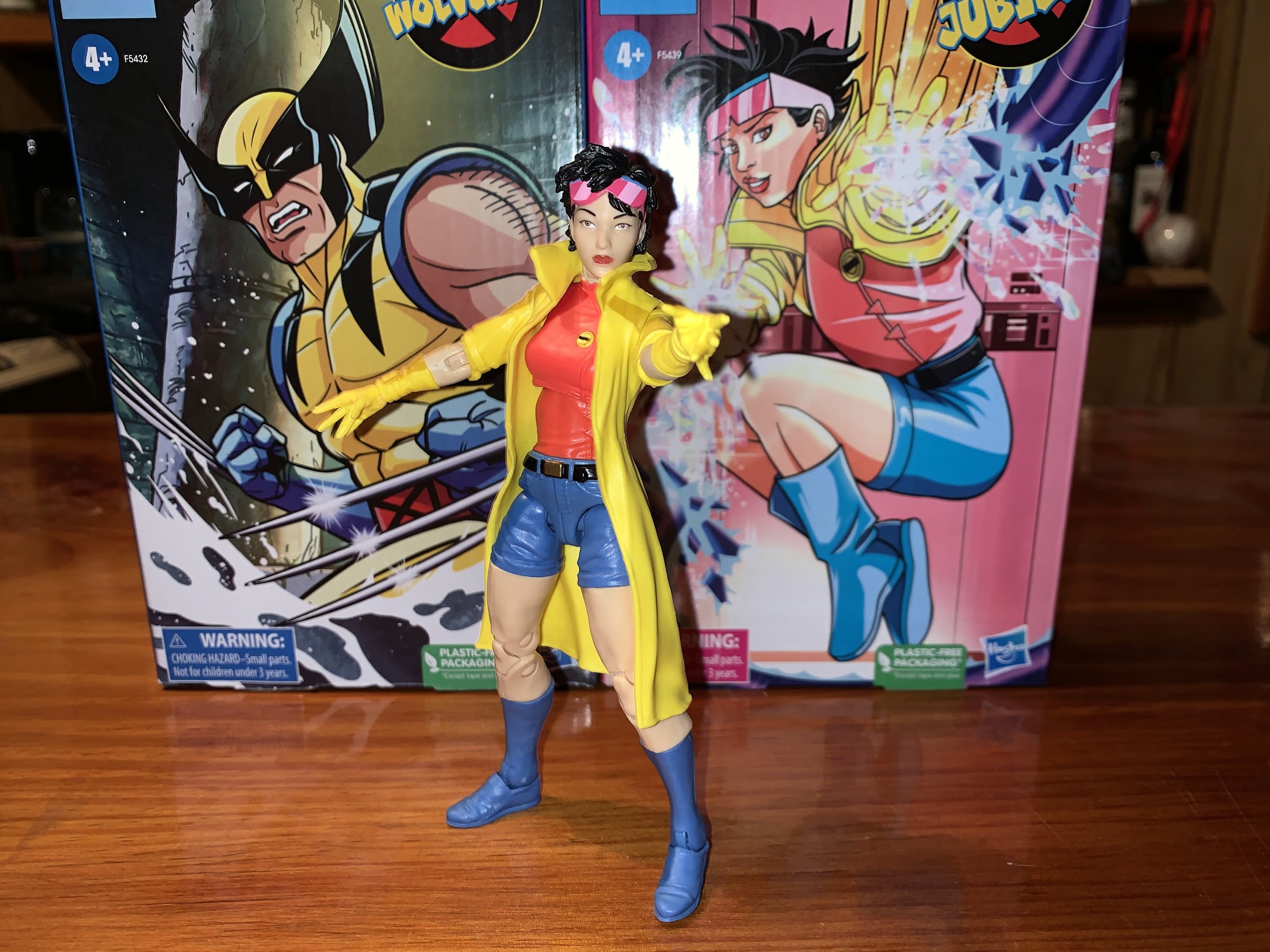
The rest of the figure is a mix of old and new. As far as I know, the entire upper body is recycled from a prior Cyclops release in a flight jacket. The main portion of the jacket is a soft plastic and features sculpted pockets and a zipper which looks fine, though the zipper is unpainted. The sleeves are molded, hard, plastic so the jacket is non-removable. The legs are new, and the floating X-Men belt might actually be new too. The legs are new so that they could make the thigh straps part of the sculpt which is a good move because they looked horrible on the old Cyclops figures. Some feel Hasbro placed them too high on the thigh, but I think they look fine and they’re obviously there to hide the thigh cut. And when I say “part of the sculpt,” I actually mean they sculpted out room for the straps on the legs as it still appears that the straps are a separate piece of plastic slid over the leg and glued in place. The knees are pin-less, and the straps above the boots are also sculpted in yellow plastic like the thigh straps. The body looks okay, maybe a little too thick for Morph, but not horribly out of place or anything. His hands do seem really large, but that’s a minor complaint. The neck is also inaccurate as there’s no end to Morph’s costume. Pretty much all of Morph’s neck is visible in the show, but here he has a turtleneck. Hasbro just had to paint the neck, but chose not to. And the paint in general is not great. The cel-shading is barely present on the jacket. There’s a swath of dark brown starting on the figure’s right collar going to the shoulder where it just stops for some reason, bypasses the biceps area, and then resumes at the elbow. On the figure’s left arm, it just starts at the biceps. There’s no shading on the front of the jacket at all and just a little under the pecs underneath. There’s a little hit of it on the belt which carries down to the trunks and one minor hit on each thigh and boot. Once again, Hasbro is using a mustard color to shade yellow which doesn’t look great, and for some reason the shading on his right boot is in a wavy line and mostly looks bad. Hasbro, if you’re going to do this bad of a job with cel-shading then why bother doing it at all?
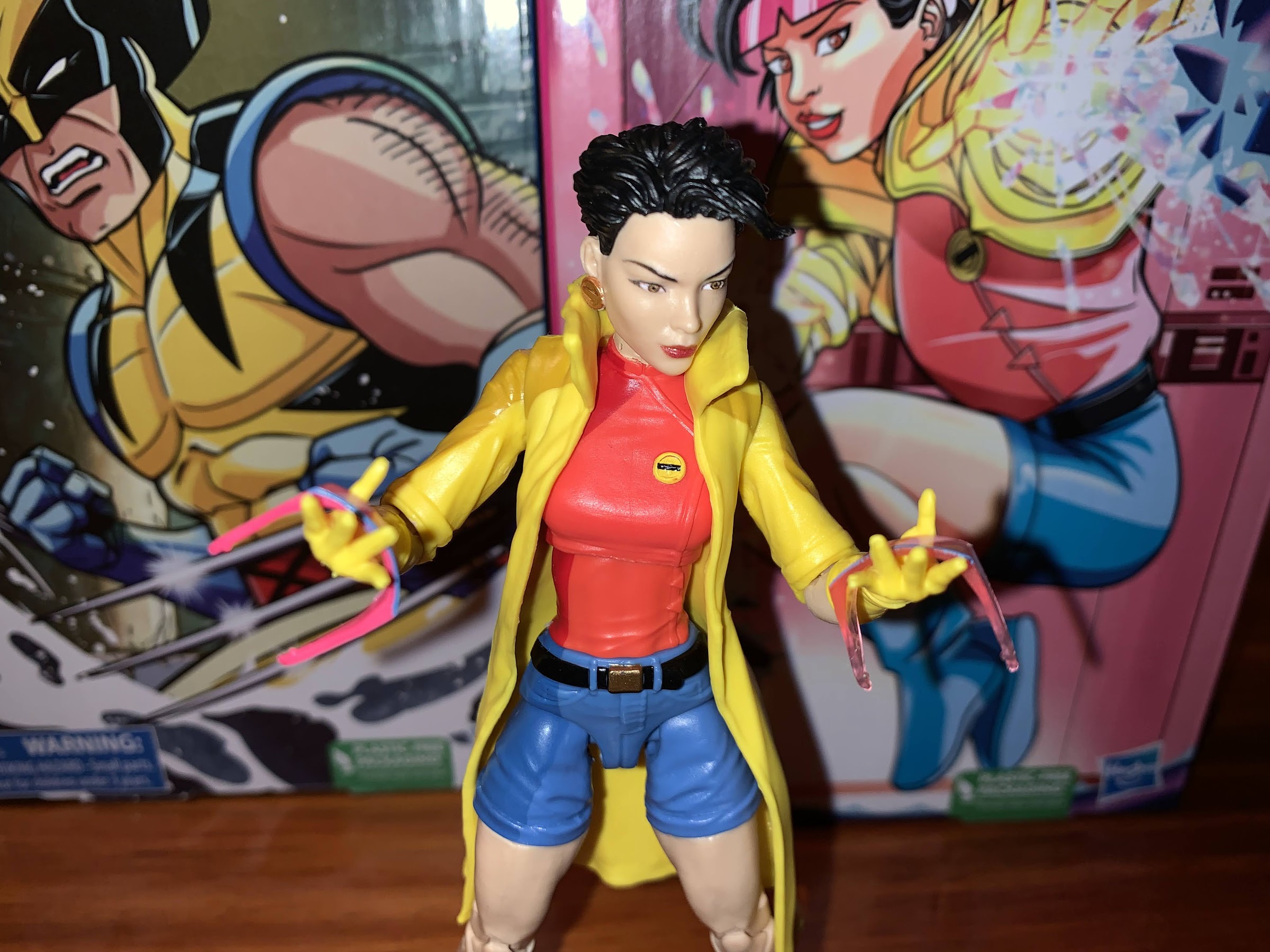
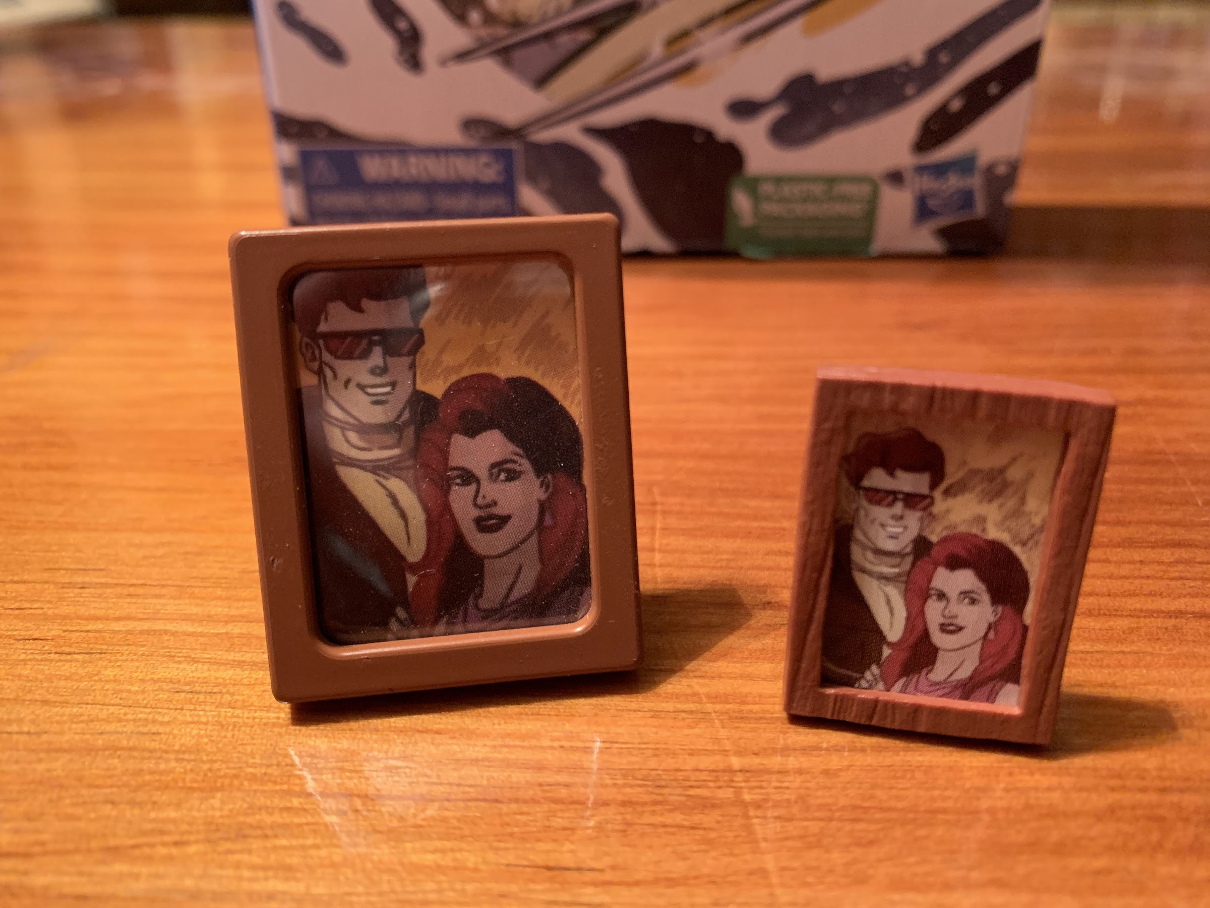
It was my hope that Hasbro would go all out with Morph and really make him feel like an “ultimate” version of the character because how likely are we to see future Morph figures? Hasbro could have done so with accessories, but Hasbro declined to do much in that area. Morph comes with two heads: standard and evil. The Evil Morph head turned out rather well. He has a more gaunt appearance and the hair is a little darker. It’s also a little messy and he has the dark shading around his eyes as he has a hit of purple under the eye and black over it. Technically, his skin should be paler with a touch of yellow, but I’m not surprised to see Hasbro ignore that since then they would have had to do good and evil versions of his hands. Even ignoring that inaccuracy, it’s so much more livelier and on-model when compared with the standard head that I suspect most are going to display him as Evil Morph. Aside from that though, we get just two sets of hands: fists and open. Why not do a third head so we can have a brown haired option and a black haired one for standard Morph? Or a “Wolverine! Fall back!” expression? Why not a set of gripping hands, or at least one, so he can wield a gun like he did in the show? And how about said gun?! I personally would have loved a second set of arms to do a coat on or off look, but I didn’t actually expect that. I did expect more though and it’s a shame this is all we received. I really wanted Hasbro to go all-out for Morph, even if it meant tacking on a higher cost to purchase him, but they barely did half-ass.

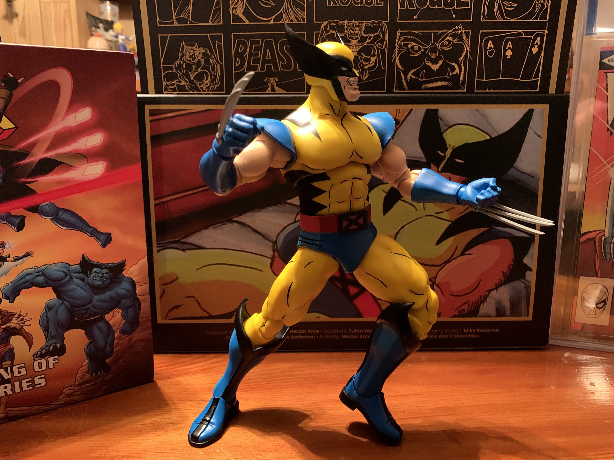
The articulation for Morph is basically what you expect out of Marvel Legends. He has the ball-hinged head that provides for good range, though looks “broken” from some angles. Even with the collar on the coat, he can still look up pretty well and range isn’t an issue. The ball-hinged shoulders let him get his arms out to the sides and rotate. There’s a biceps swivel, and single-hinged elbows that also swivel plus wrists that swivel and hinge. He does have a butterfly joint in the shoulders as well, but it’s functionally useless because of the jacket. The torso features an ab crunch that works fine though you have to work around the coat when bending backwards. The waist rotates and the hips go out to the side better than 45 degrees, but short of a full split. The legs kick forward to not quite horizontal and only kick back a touch since he has a sculpted bum. There’s a thigh swivel above the strap, so it’s well-hidden. The knees are double-jointed and work fine. There’s a boot cut below the straps and the ankles hinge and rock side-to-side and also work fine. It’s all pretty standard stuff and one of the things you can count on with Marvel Legends, be it the good parts or bad. I would like to see double-jointed elbows, but even without them his elbow can bend a little past 90 degrees and the aesthetic does at least look fine.
Morph is not the homerun I was hoping for, but he’s also not the dud that Jean was. The things holding him back are Hasbro’s direction and cheapness. I wish his standard portrait looked more like the show. I understand why it doesn’t, but I don’t agree with the approach. I don’t know who is responsible for the choice of expression on that head, but I also dislike that aspect of it. I also wish he had more stuff and that the cel-shading was better applied. One of those things is dictated by cost, the other by effort, and that’s a shame. No gripping hands is borderline unforgivable though. How much would that have cost? Twenty cents? Molds already exist for un-gloved gripping hands so it’s literally just the cost of plastic. If you don’t want to give us a gun, fine, but at least give us the hands so he can hold one from another figure. Mystique is on-deck, after all, and she has two guns! I could easily give one to Morph if he could only hold it. That’s less of an issue for those who are deep into Marvel Legends since they likely have some extra hands at their disposal, but I am not so lucky. If you’re collecting this line or have affection for the cartoon, you’re probably getting this figure no matter what I say. It’s an okay release, probably not worth the price Hasbro is charging these days, but most will be reasonably satisfied. It’s a shame that’s all we can seemingly hope for with this line, but it is what it is.