Tag Archives: teenage mutant ninja turtles

Hasbro MMPR x TMNT April O’Neil and Michelangelo

The end of the road…for now.

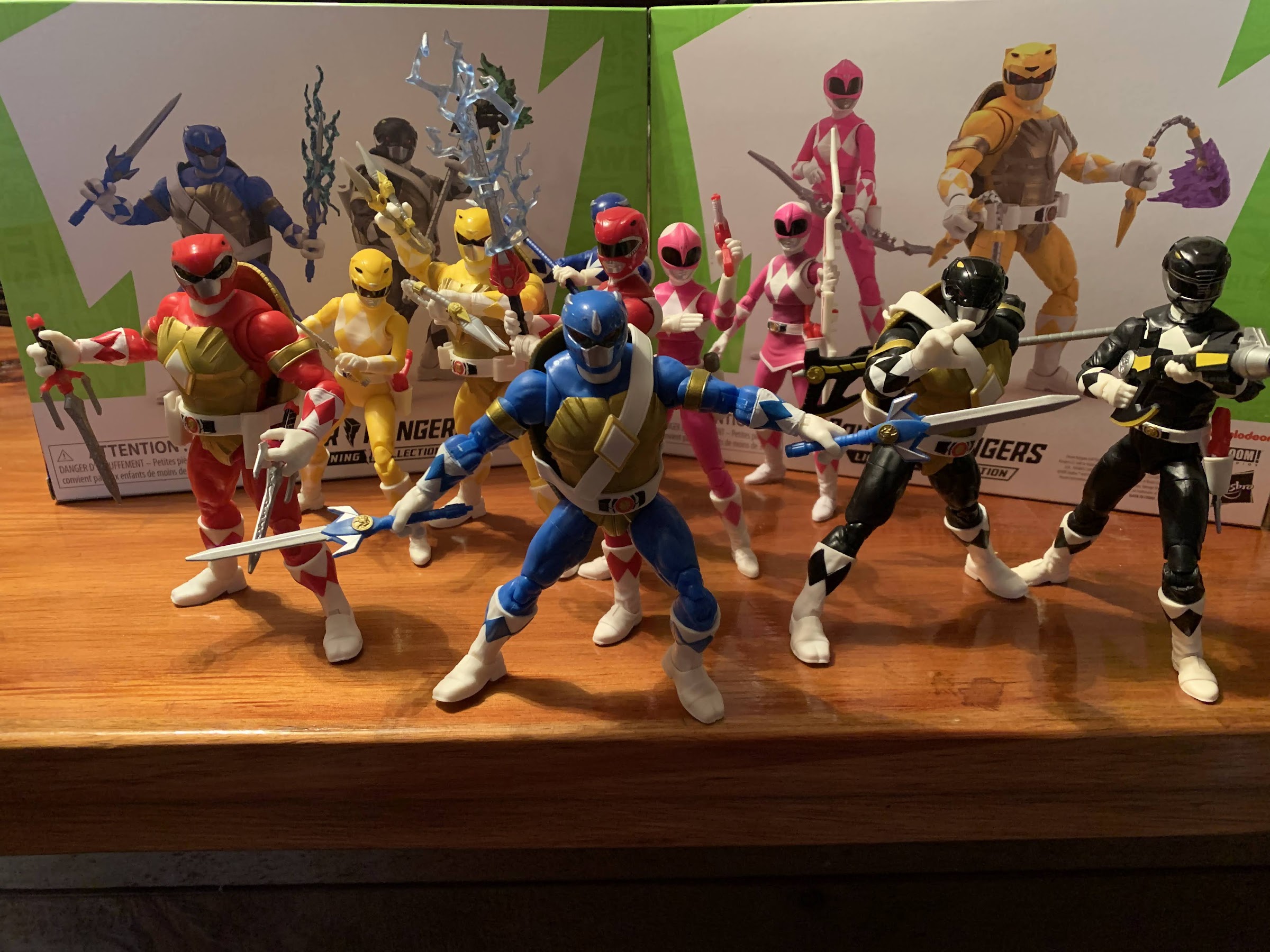
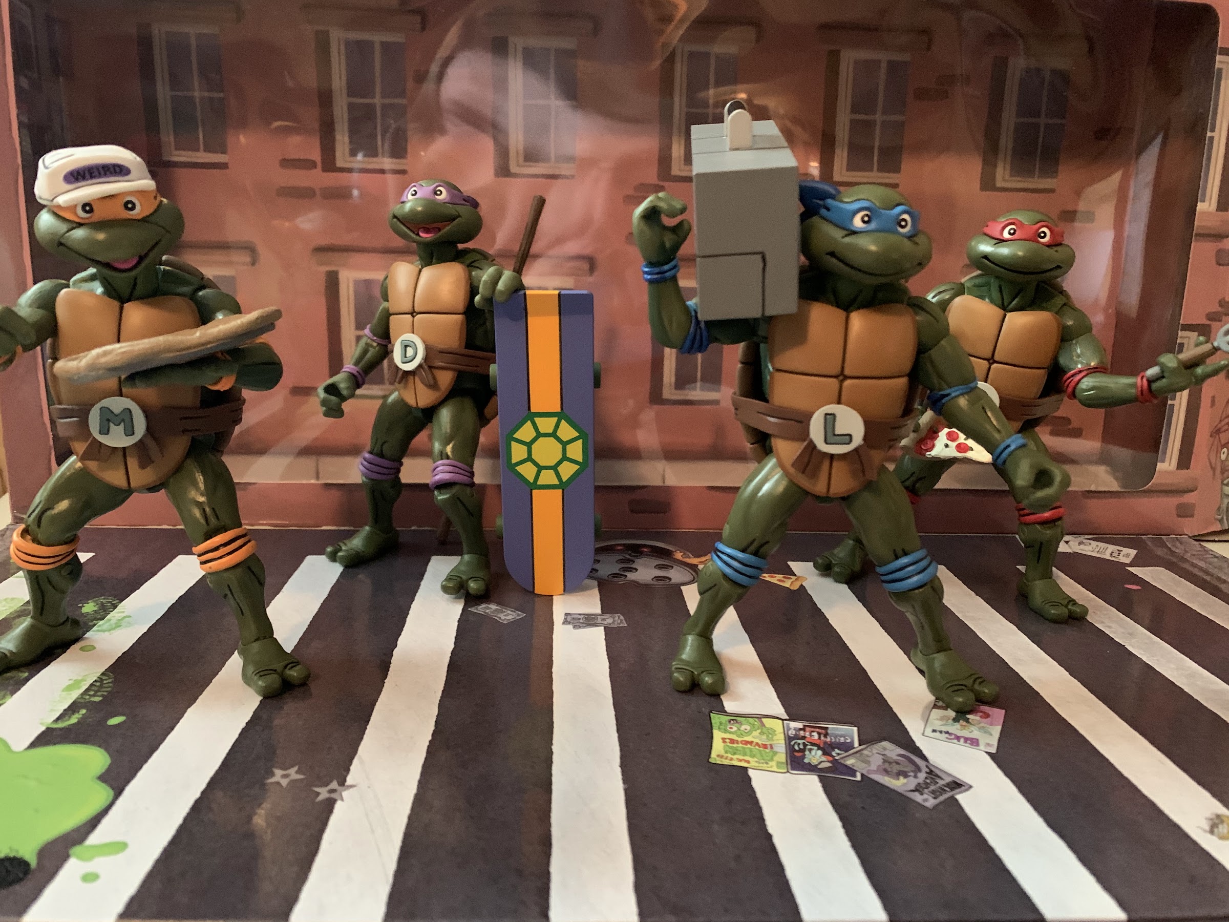
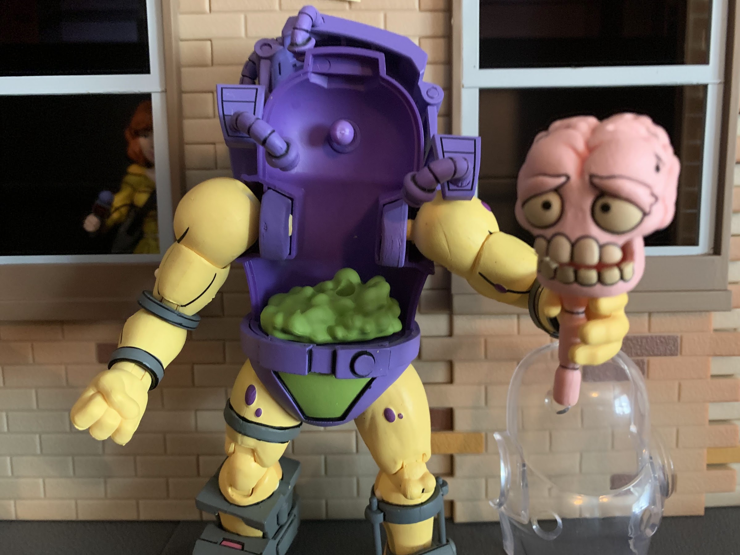
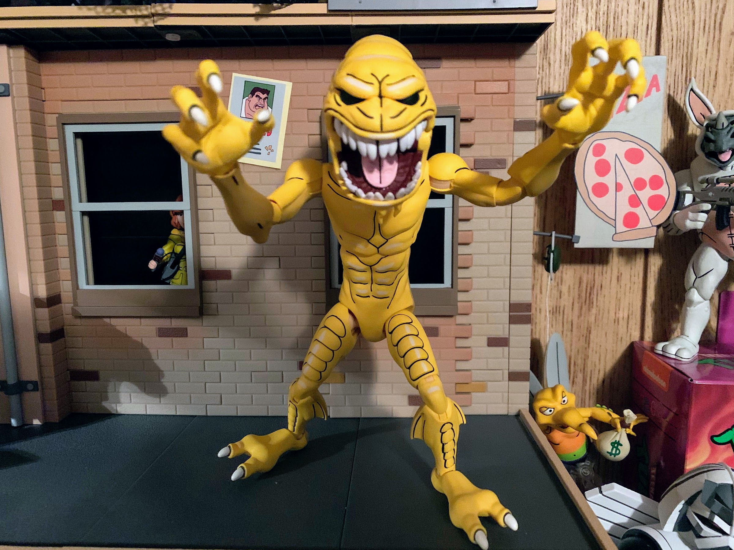
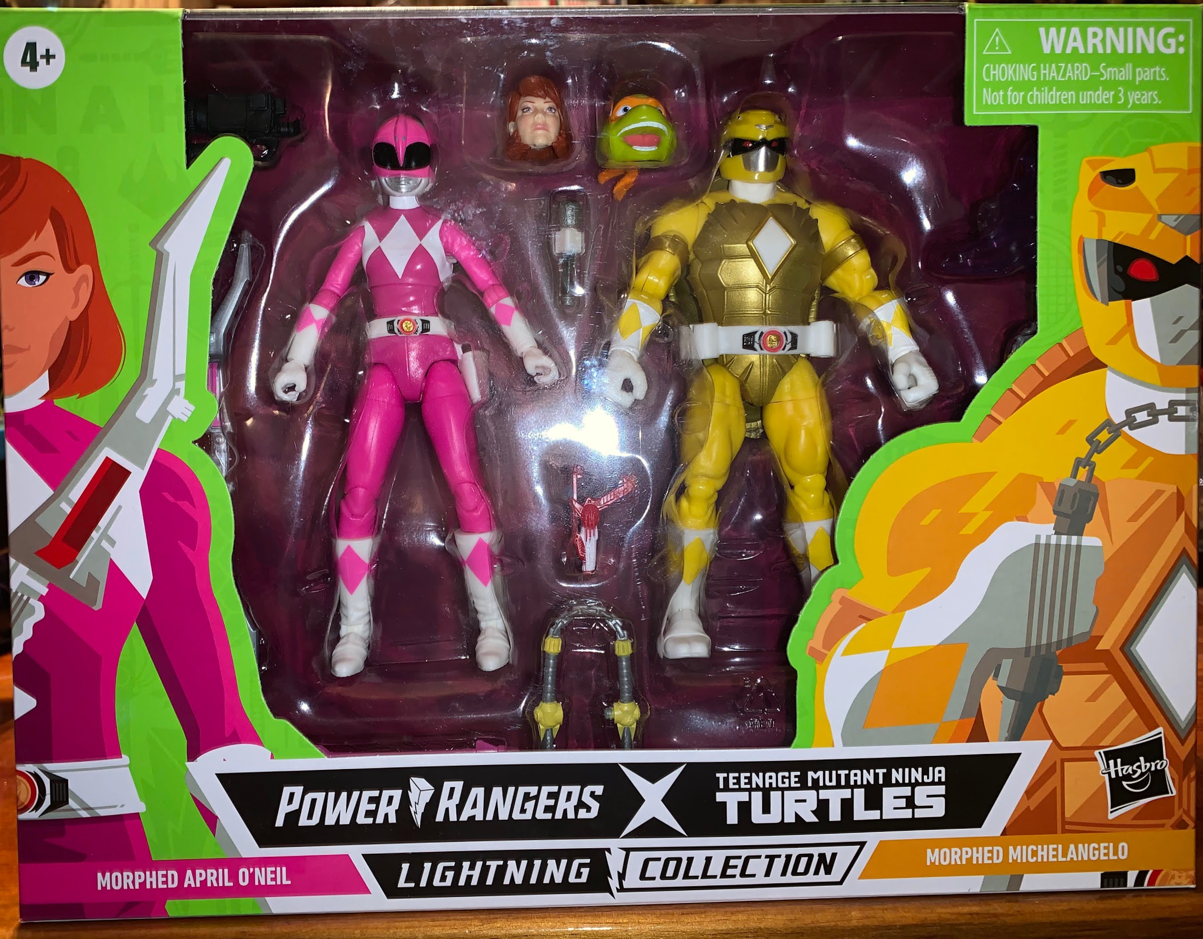
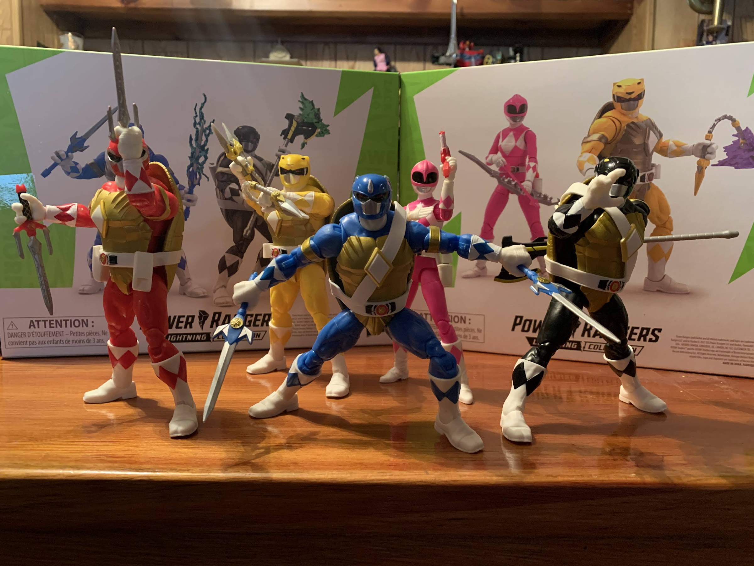
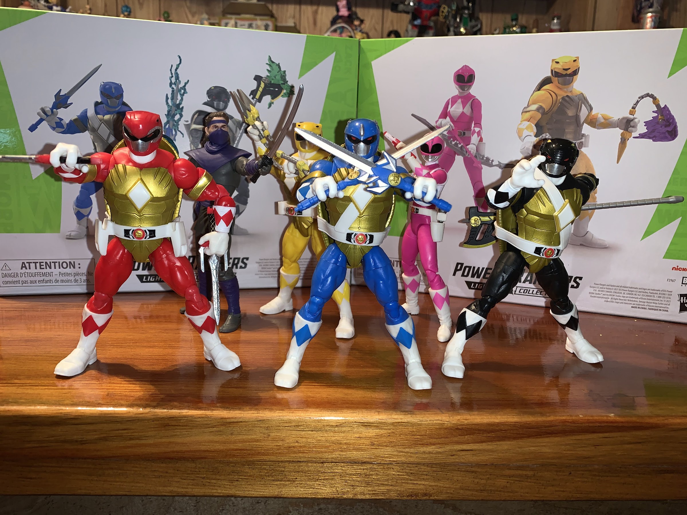
We have arrived at the last two-pack in the Mighty Morphin Power Rangers x Teenage Mutant Ninja Turtles line of action figures from Hasbro and it’s that bodacious dude, Michelangelo, along with the ravishing reporter April O’Neil. There’s not going to be a whole lot to say about these figures at this point as, if you read last week’s review of Leonardo and Donatello, then you know that the turtles in this line are all essentially the same figure. And when it comes to April, she’s basically just a standard Lightning Collection pink ranger with some minor differences.

The two best Starburst flavors.

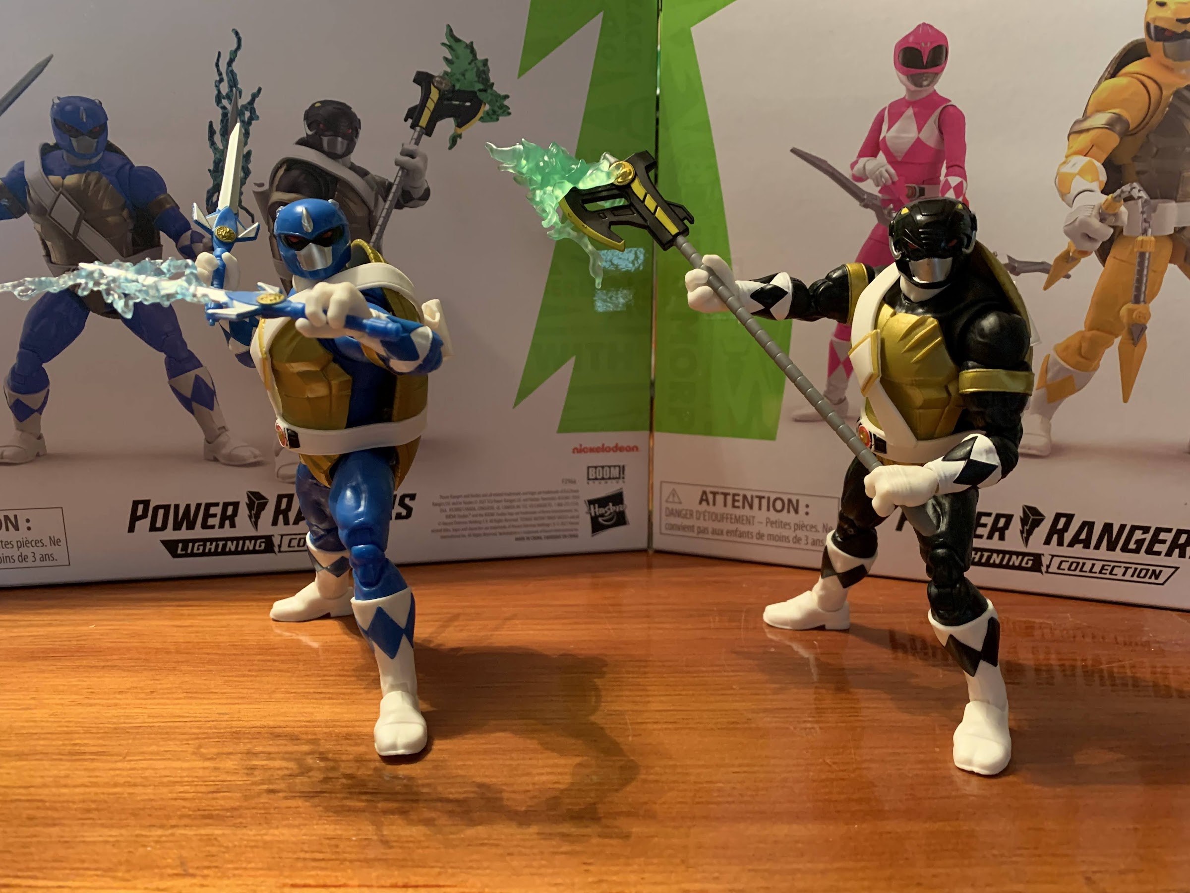
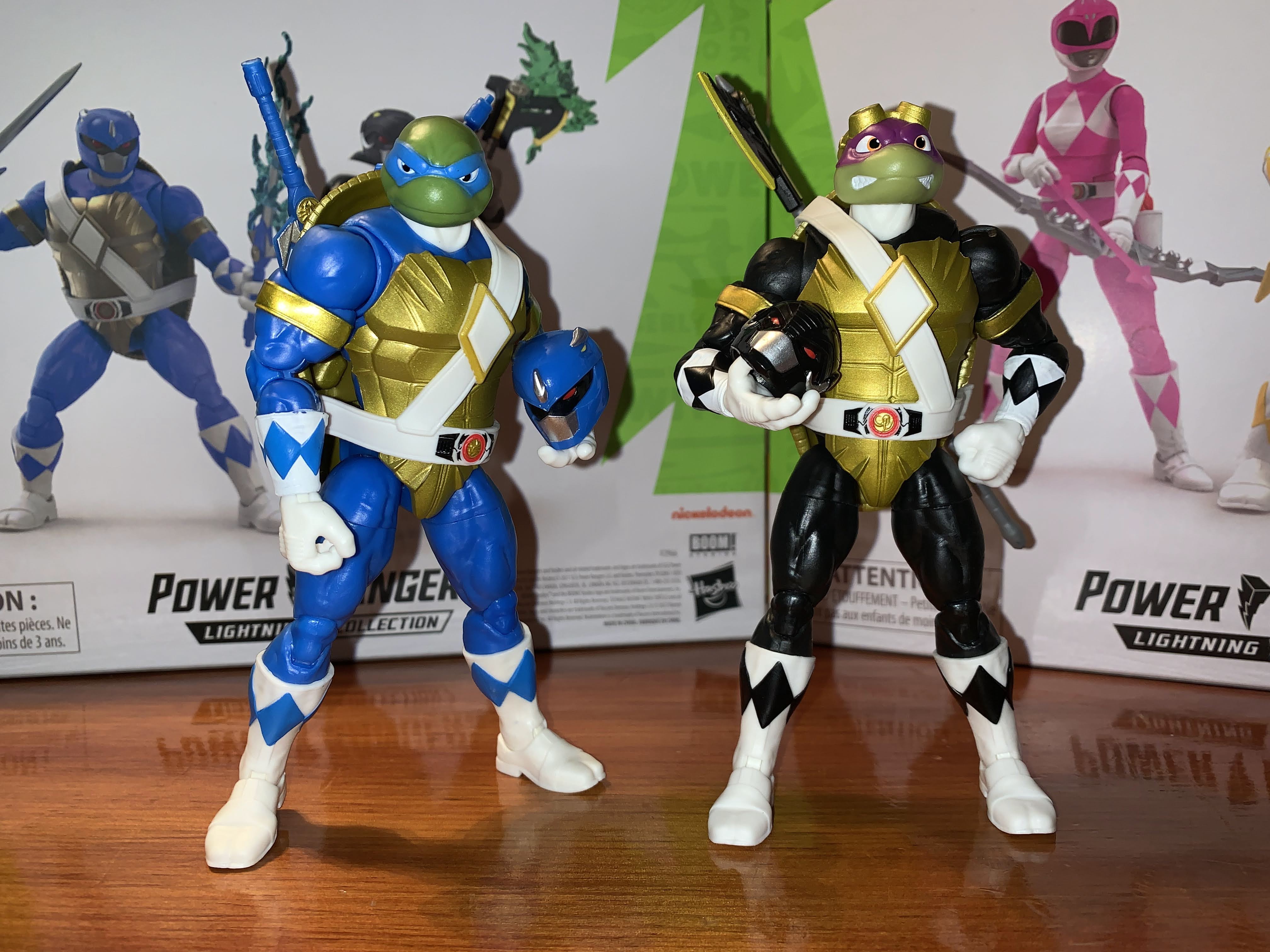
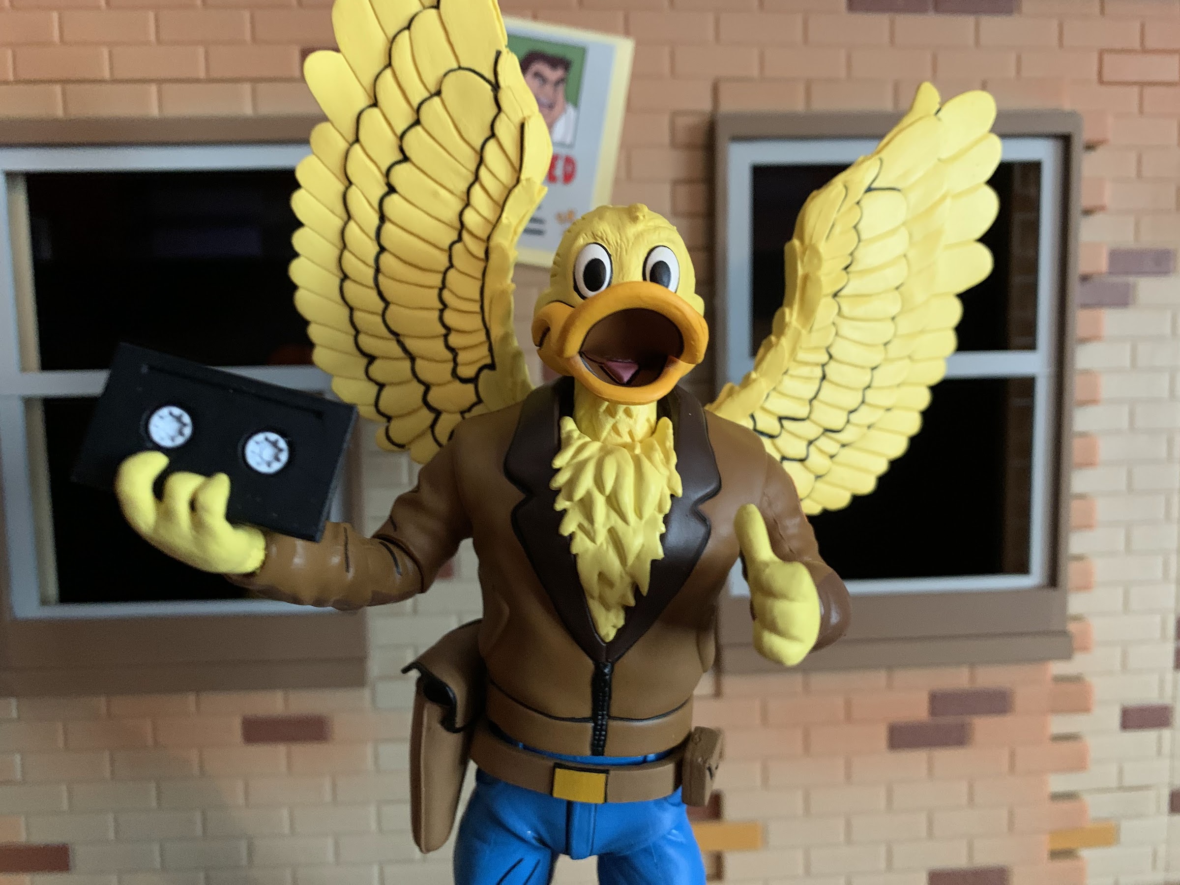
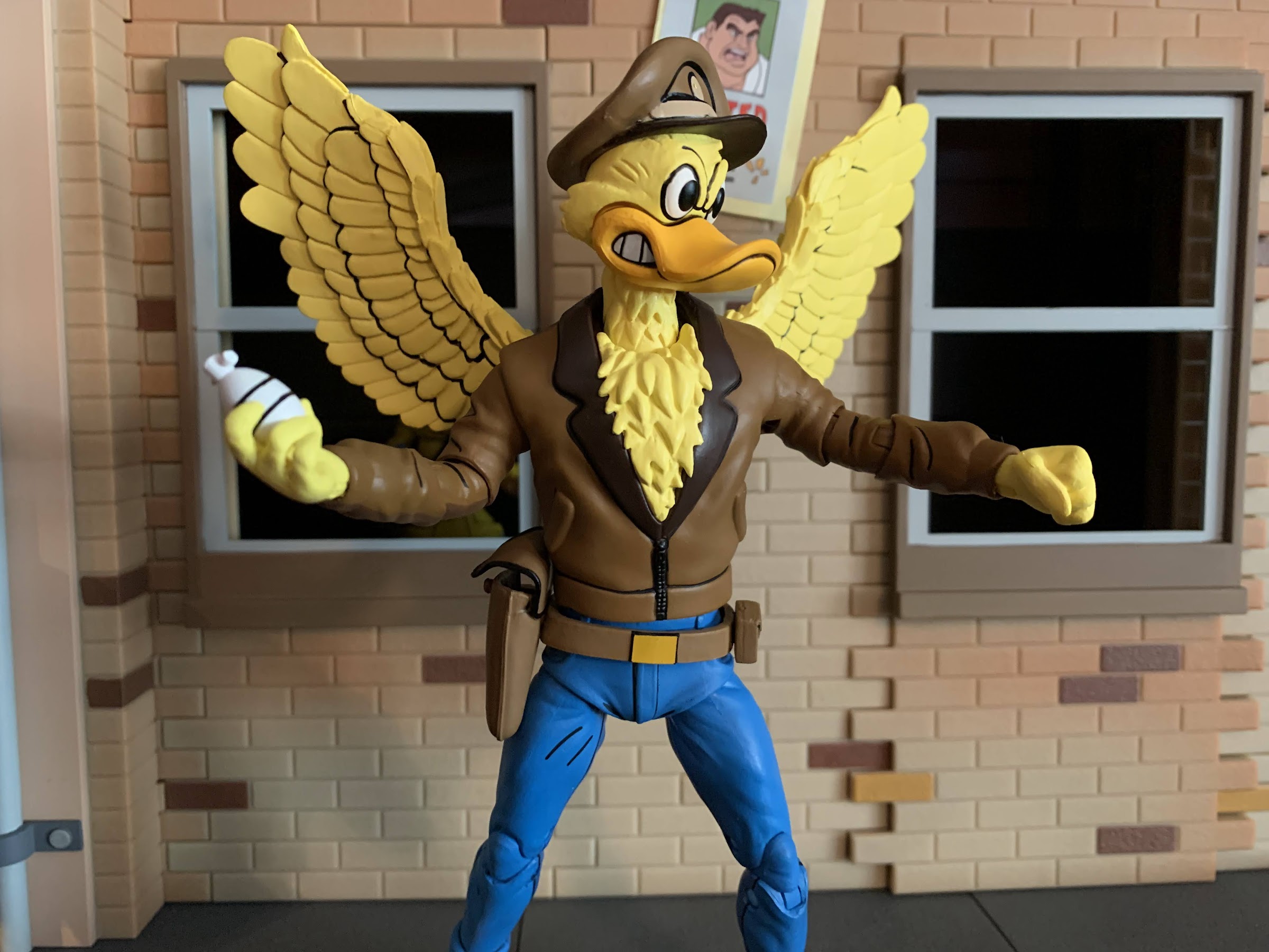
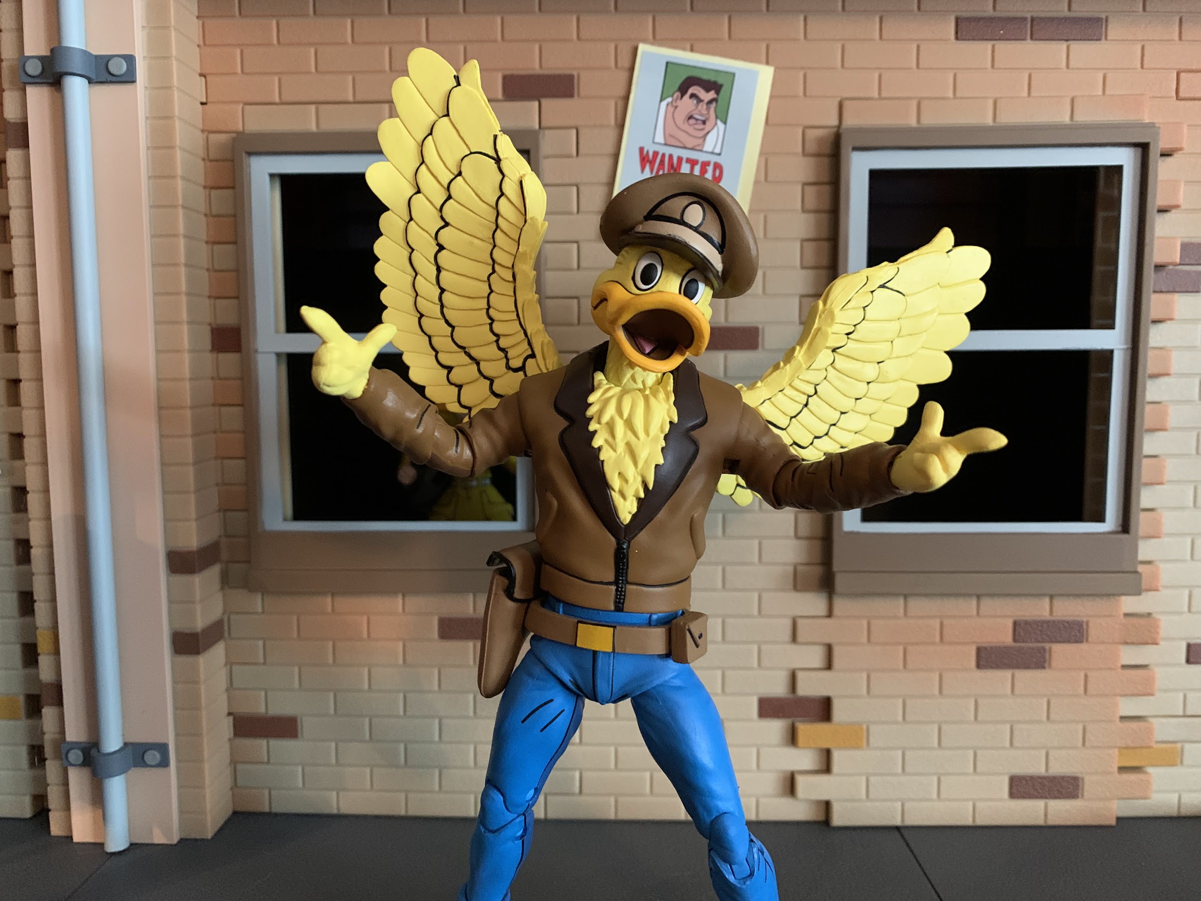
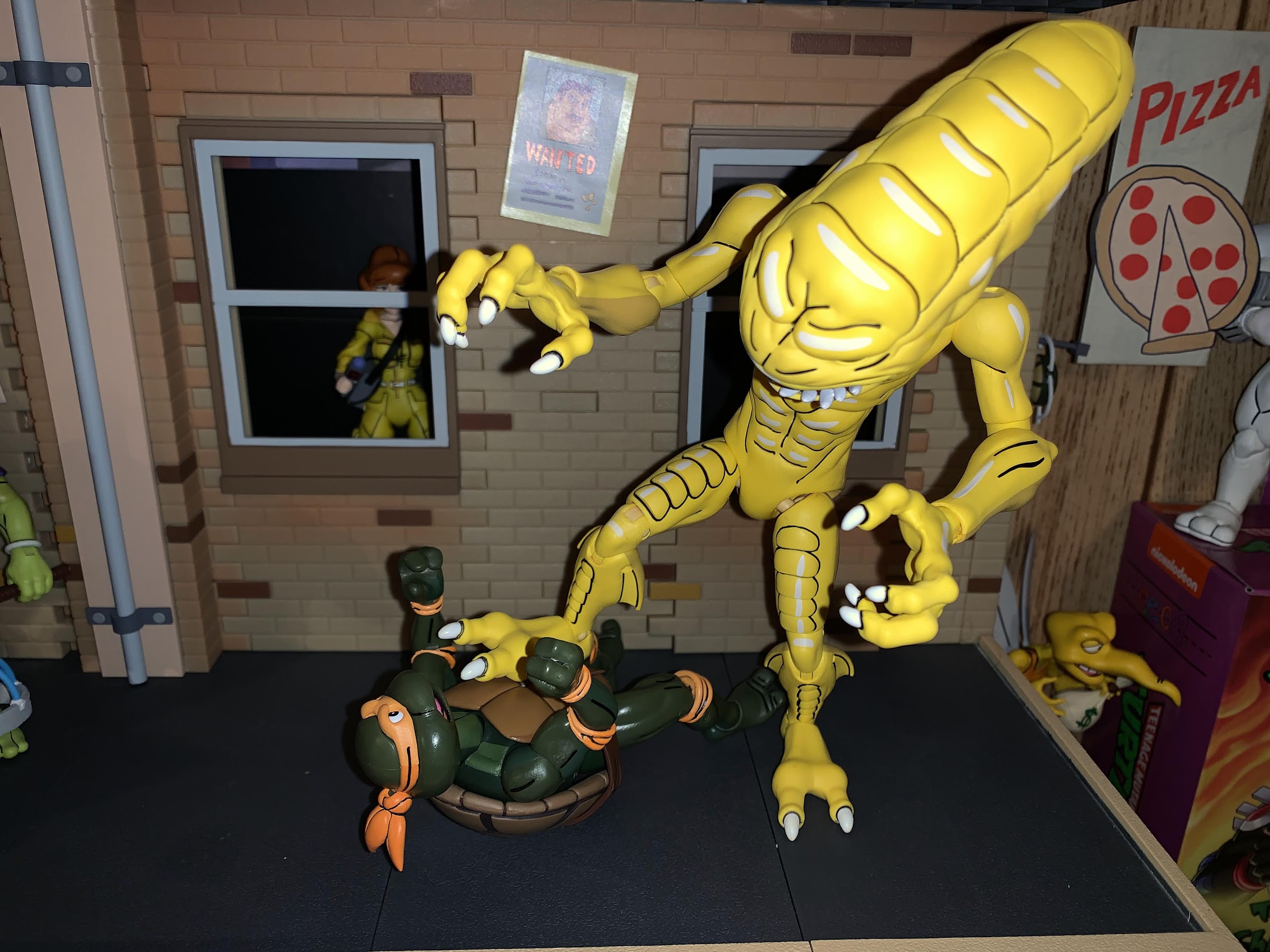
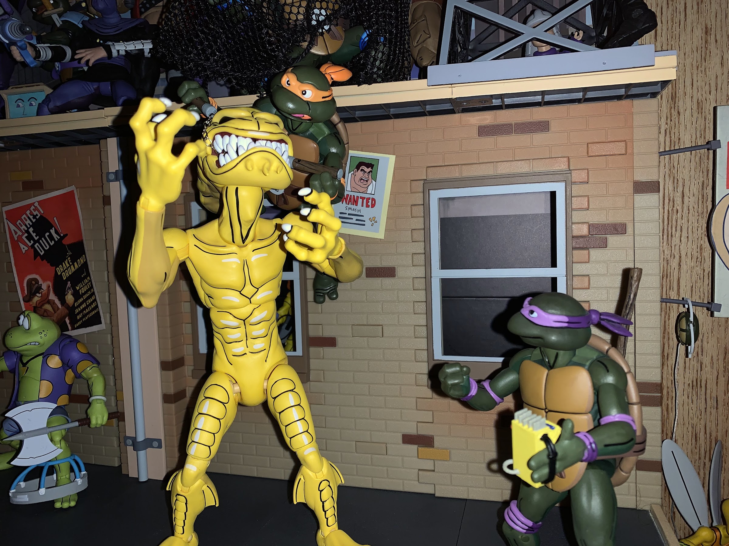
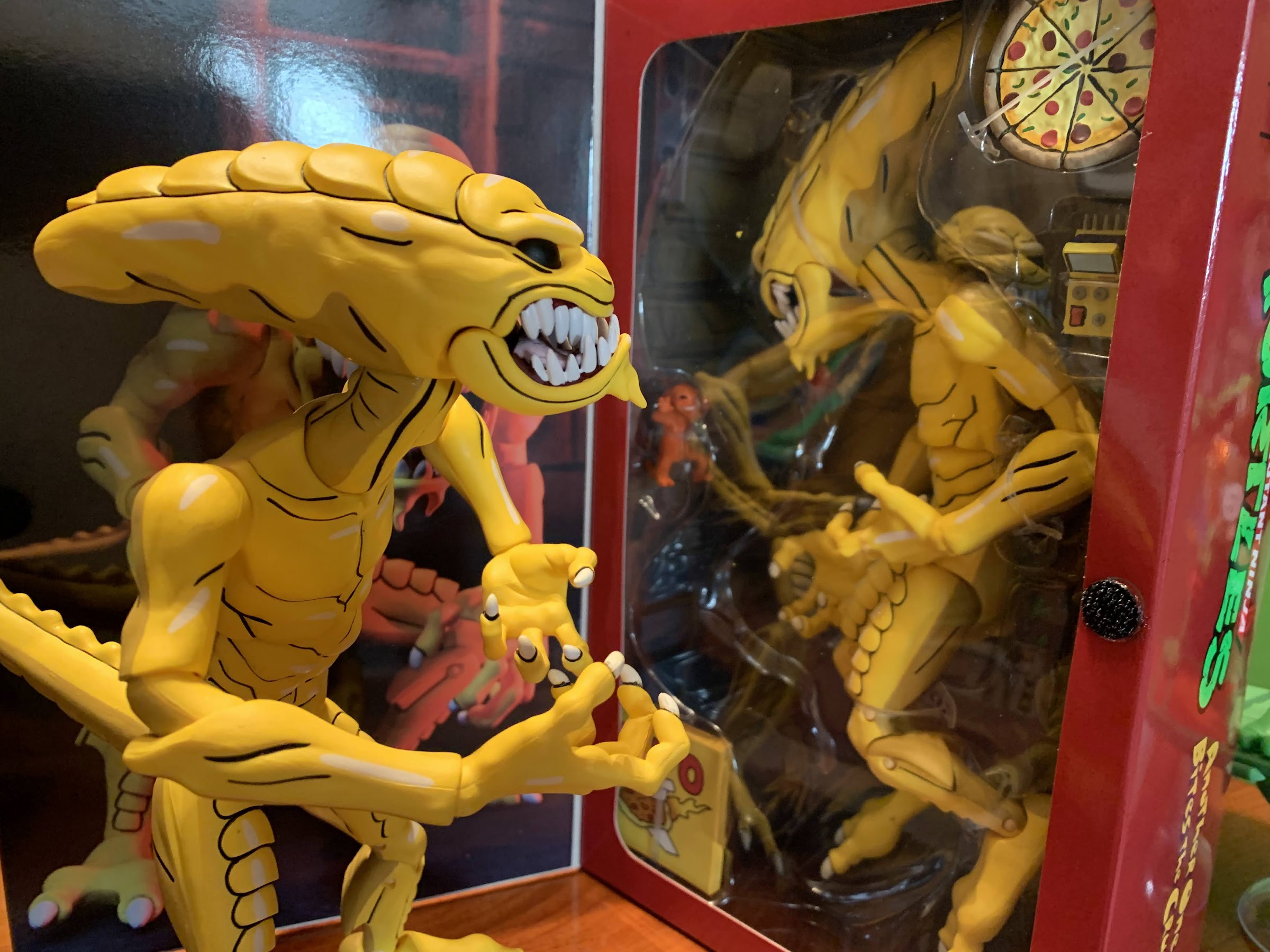
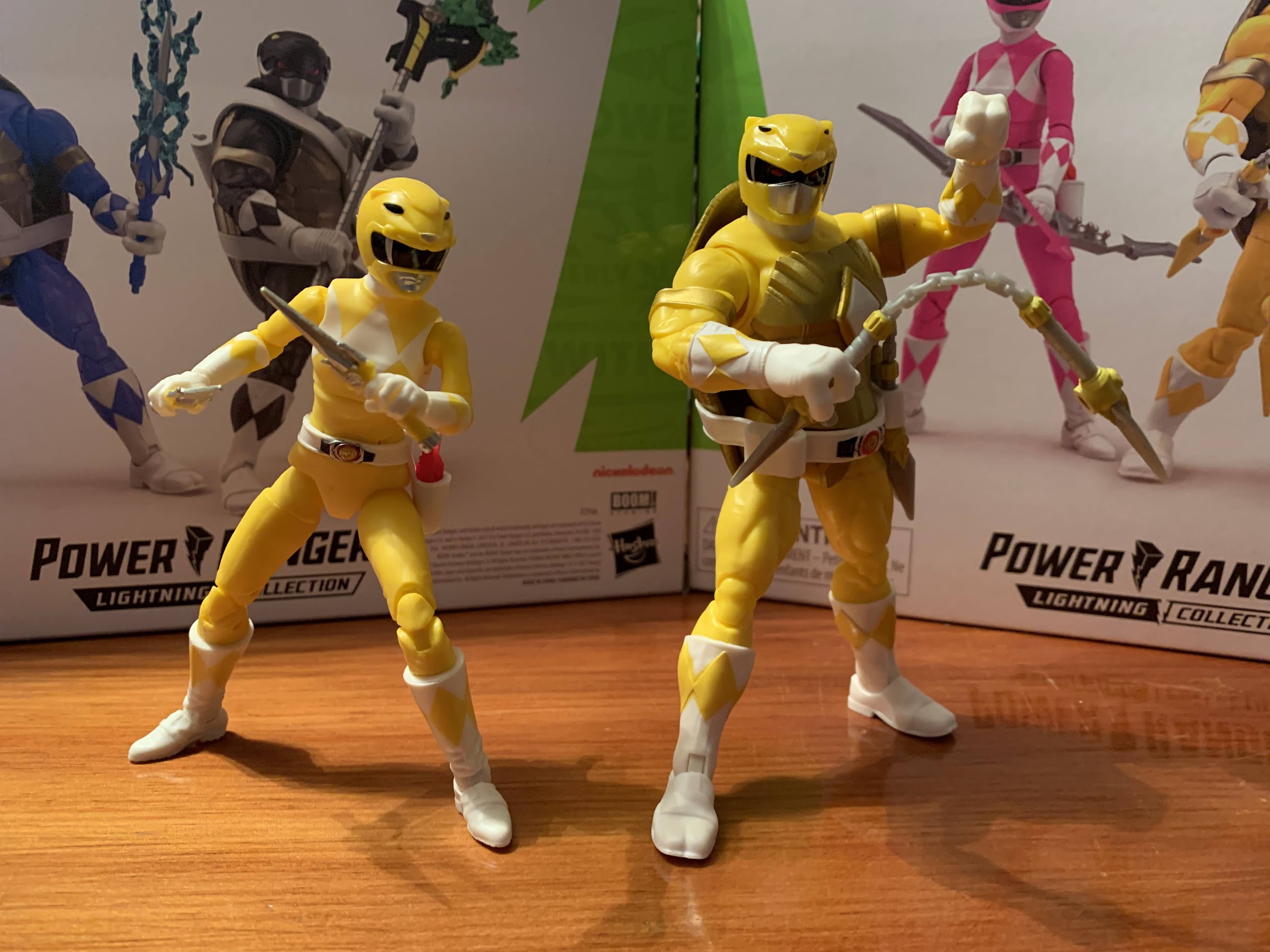
Michelangelo, like Donatello, has to assume a different preferred color and for him it’s yellow. This isn’t completely foreign to Mikey as the original arcade game had him as yellow instead of orange for some reason, and even the follow-up, Turtles in Time, kept the yellow buttons and joystick (though his character sprite was corrected to feature the orange pads and mask). Mikey is the standard turtle ranger body sharing more similarities with Raph due to both having a belt without a shoulder strap. His weapon slots on the belt are unique to him as is his helmet, which takes the form of the sabretooth tiger from MMPR. Mikey can actually claim to being the best looking ranger in this set since it’s very easy to paint white over yellow. He’s a very a bright yellow and the white paint on his gloves covers up the yellow plastic quite well. Unfortunately, the yellow diamonds on his boots are painted terribly because nothing can be perfect. He also has a red spec under the tiger nose on his helmet that I’ve been trying to scratch away. There’s also still a lack of paint, in particular with the helmet, but that’s par for the course with Hasbro. The lower part of the shell does stick out more with my figure. One could attribute that to Michelangelo’s almost exclusive all pizza diet, but it does look like the tab underneath the gold piece isn’t seated properly and it doesn’t seem to want to go in. It’s a minor imperfection, but an imperfection nonetheless. His articulation is exactly the same as his brothers, so I don’t feel a need to go over it a third time. It’s good though.

Not sure about that effect piece for Mikey.

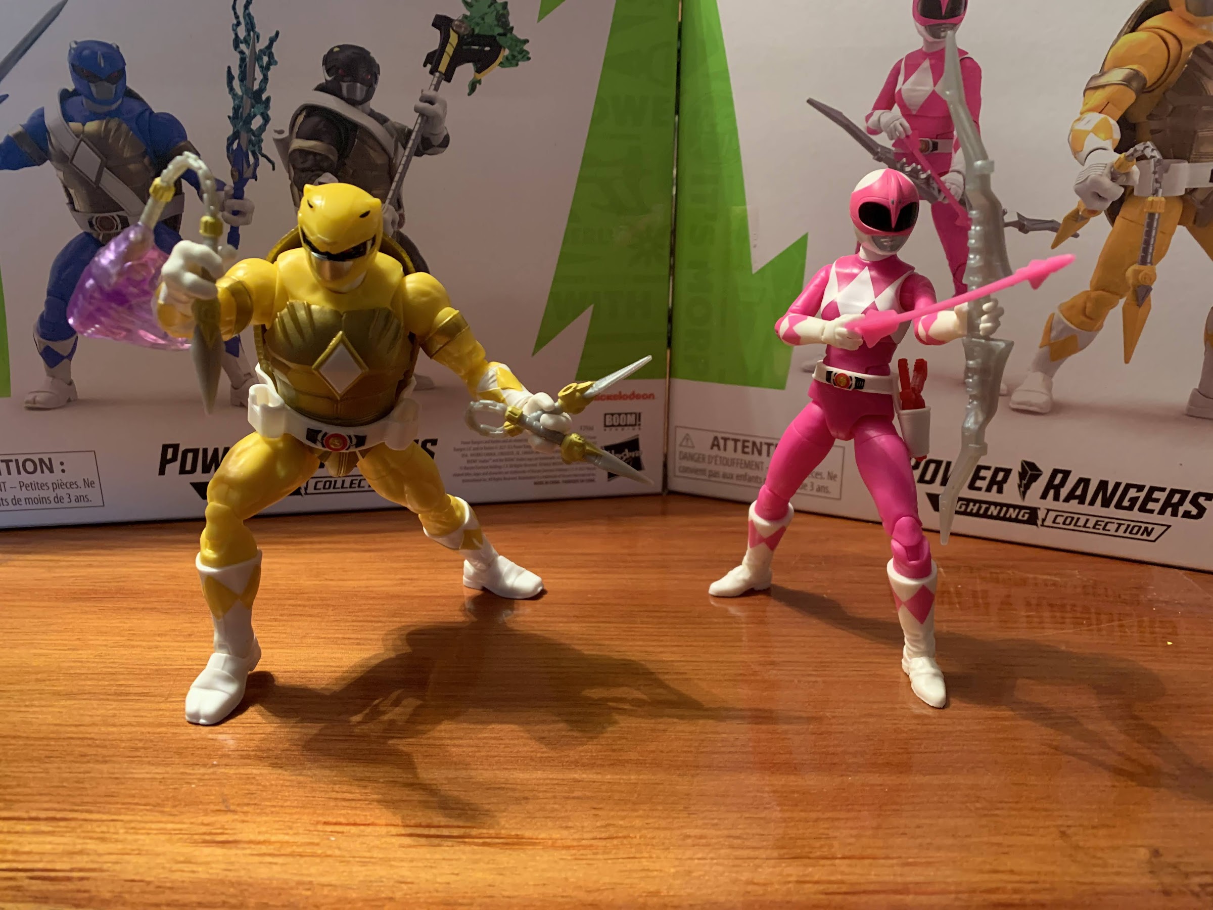
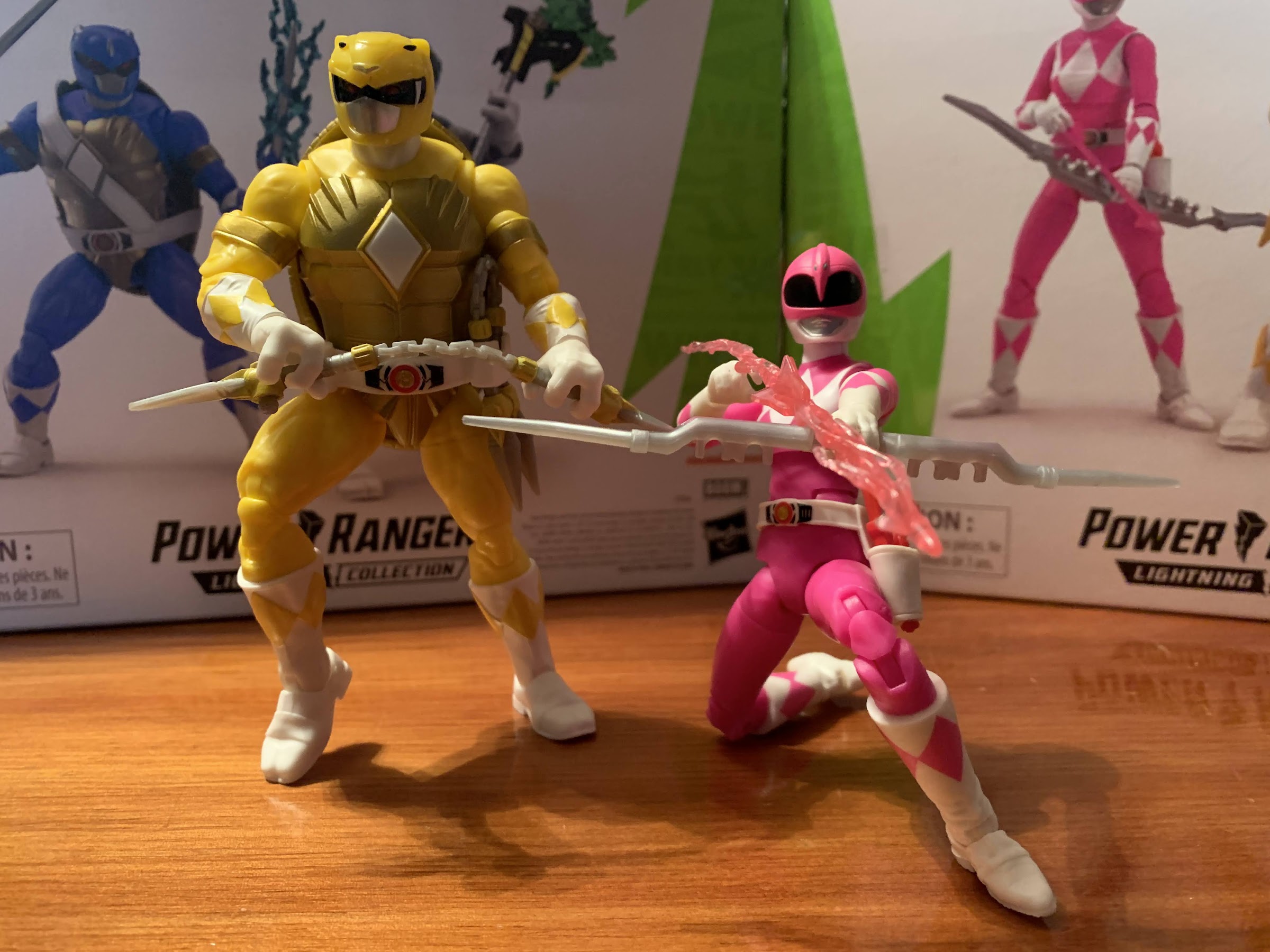
For April, she is essentially just the pink Power Ranger with one obvious difference: no skirt piece. I don’t know why that was eliminated, but it appears to be consistent with the comic. I don’t mind as the skirt is just a restrictive piece when it comes to articulation and doesn’t really add much to the look of the character. In comparing her with my Lightning Collection Kimberly, I do notice a new helmet design. This one is noticeably taller and not nearly as long when viewing it from the side. I don’t know if this was a running change for the pink ranger figures or if it’s just more accurate to the source material for this comic. I am surprised that Hasbro would re-sculpt it though and I do think it’s more pleasing to look at. Otherwise, her shade of pink is also noticeably brighter. Her torso is still a darker shade of pink than the rest of the figure, but it’s less noticeable here and at least the limbs, diamonds, and the pink portion of the helmet look to be a similar shade of pink. The prior figure was all over the place and my pick for worst in the line, so at least if Hasbro is making me rebuy it, it looks better. The only thing that looks worse is the morpher on the belt as Hasbro omitted the silver paint, as it did for the turtles as well. Her articulation is the same as the previously released yellow and pink ranger so if you want a complete rundown check out that review.

It’s so hard to get April into a good bow pose.

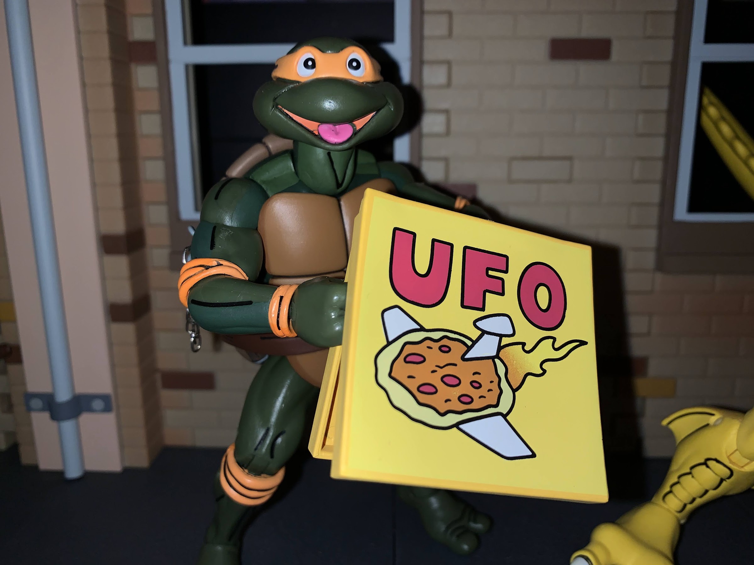
The accessory loadout is also quite familiar here as both figures come with extra hands, an alternate portrait, weapons, and an effect piece. Unlike the last set, we do have some extra stuff which I’ll get to. First though, let’s talk about Mikey who has fists, gripping hands, and open hands. These are the same hands released in the other sets, only Mikey can actually benefit from the wide-fingered sai grip hands as his weapon can fit between the fingers. And his weapon is a mash-up of the power dagger and nunchaku. Basically, he has four daggers instead of two and they’re joined by a chain. The chain is sculpted plastic, which I’m kind of torn on. I like the look of real chain, but that sucks for posing and would look terrible in the combined blaster (not that these look much better). The plastic chain here though is just boring gray with no paint applied to even simulate steel. They’re also not very long so most classic, Mikey, two-handed poses are unachievable. I also wish the chains were bendy to the point that they held their shape for better swinging poses. There’s a purple effects piece that doesn’t look great because it’s hard to come up with a convincing swinging pose. Even the box art just kind of gave up and depicts Mikey just standing there with the piece dangling. It’s a good concept for a weapon, it’s just the execution that’s cheap. The dagger portions of each ‘chuk also key together which looks better on the combined weapon and when inserting them into his holsters. His weapons are the toughest to holster, though rather, getting them in isn’t too hard, but getting them out can be a pain. I feel like I’m going to break them every time so I’ll probably refrain from doing it too much.

Go Team Yellow!
Hasbro at least improved the coloring on the pink ranger body.

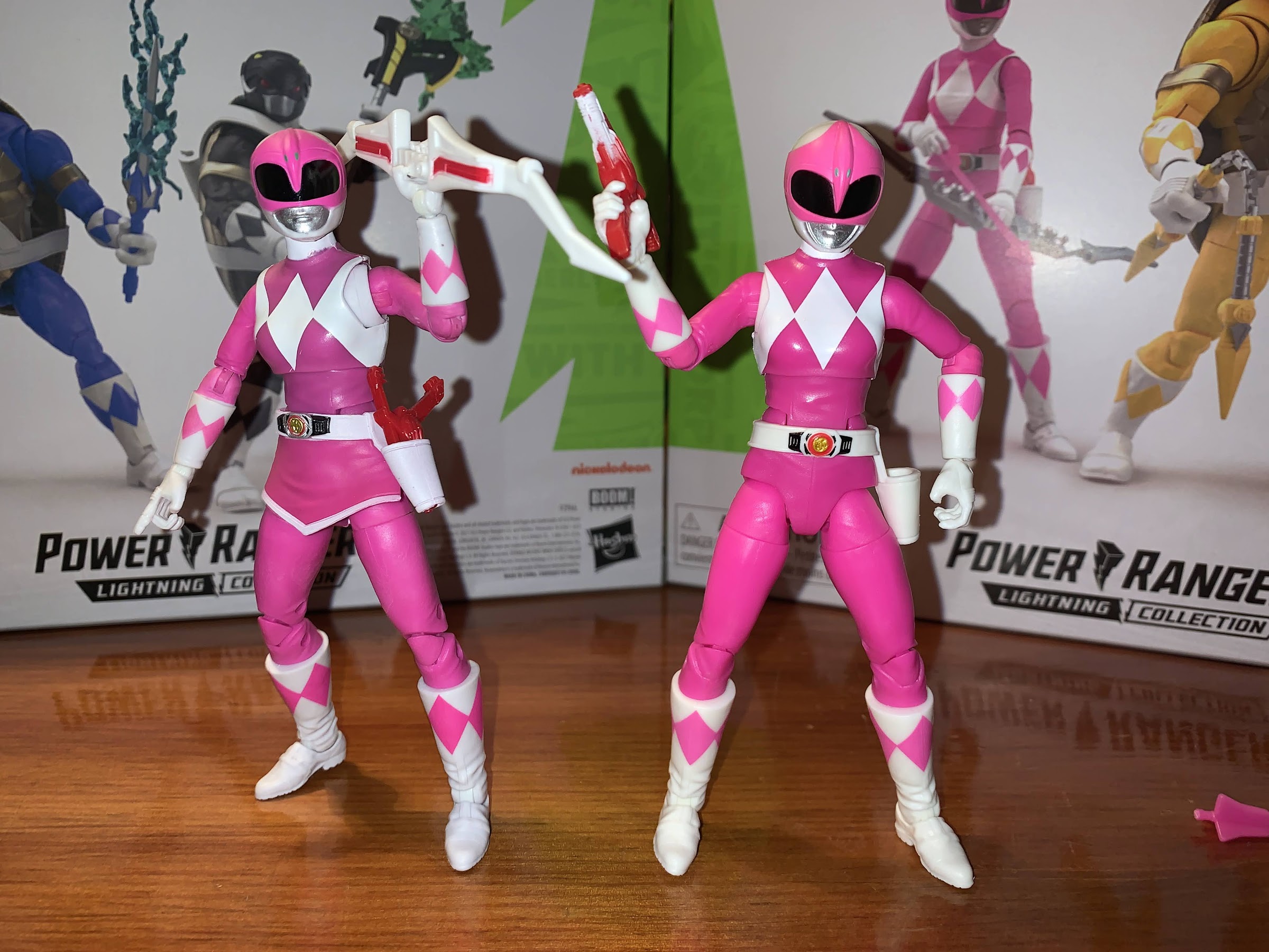
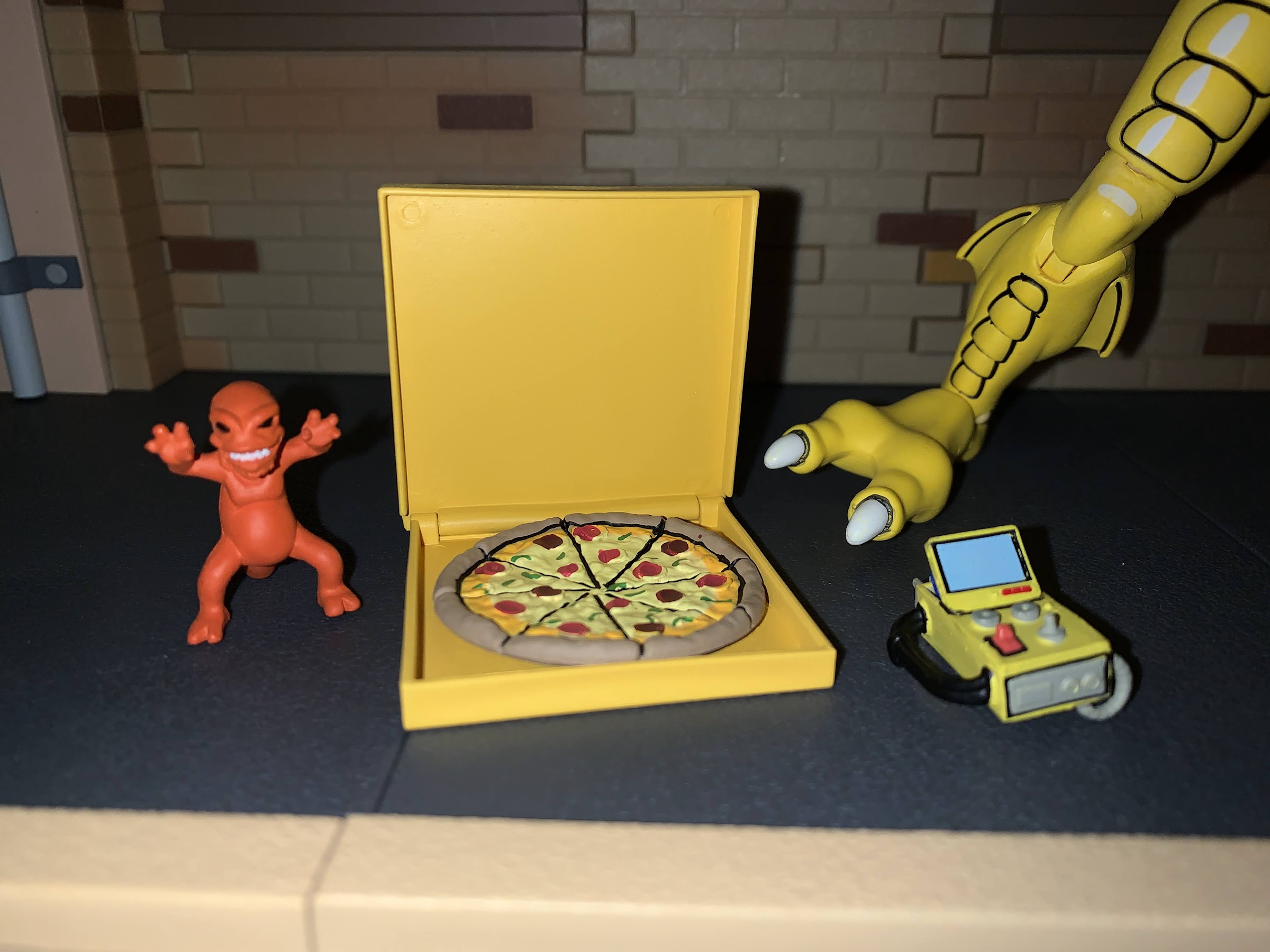
As for April, she comes with the weapons one would expect, plus some extra stuff. She has a pair of gripping hands out of the box, and strangely, Hasbro didn’t include Kimberly’s arrow nocking right hand which works much better with the included arrow than the standard gripping hand. She also has a left fist and right open, chop, hand. As for weapons, she has the same as Kimberly including the line’s only blade blaster. It has the white and red deco as opposed to the silver Kimberly’s came with, but is otherwise the same. The bow is now silver instead of white and the included arrow is a hot pink that basically matches her costume as opposed to Kimberly’s gray. She also has the translucent, pink, blast effect arrow that is slightly darker than Kimberly’s. Since this is April, to make her feel more like that character Hasbro included a stick microphone and camcorder. The mic has a white, triangular, box on it, but there’s no graphic for the station April works for so it looks kind of stupid. The camcorder is a shoulder-mounted design and it’s fine. It’s just black, molded, plastic and the only paint is on the lens. I get why she comes with this stuff, but I don’t know if I’ll actually use it. I’d definitely trade the microphone for a proper collapsed blade blaster she could holster, but that’s a criticism I have of the Lightning Collection as a whole.

That’s not an ugly portrait, but it doesn’t look like April.
This portrait, on the other hand…

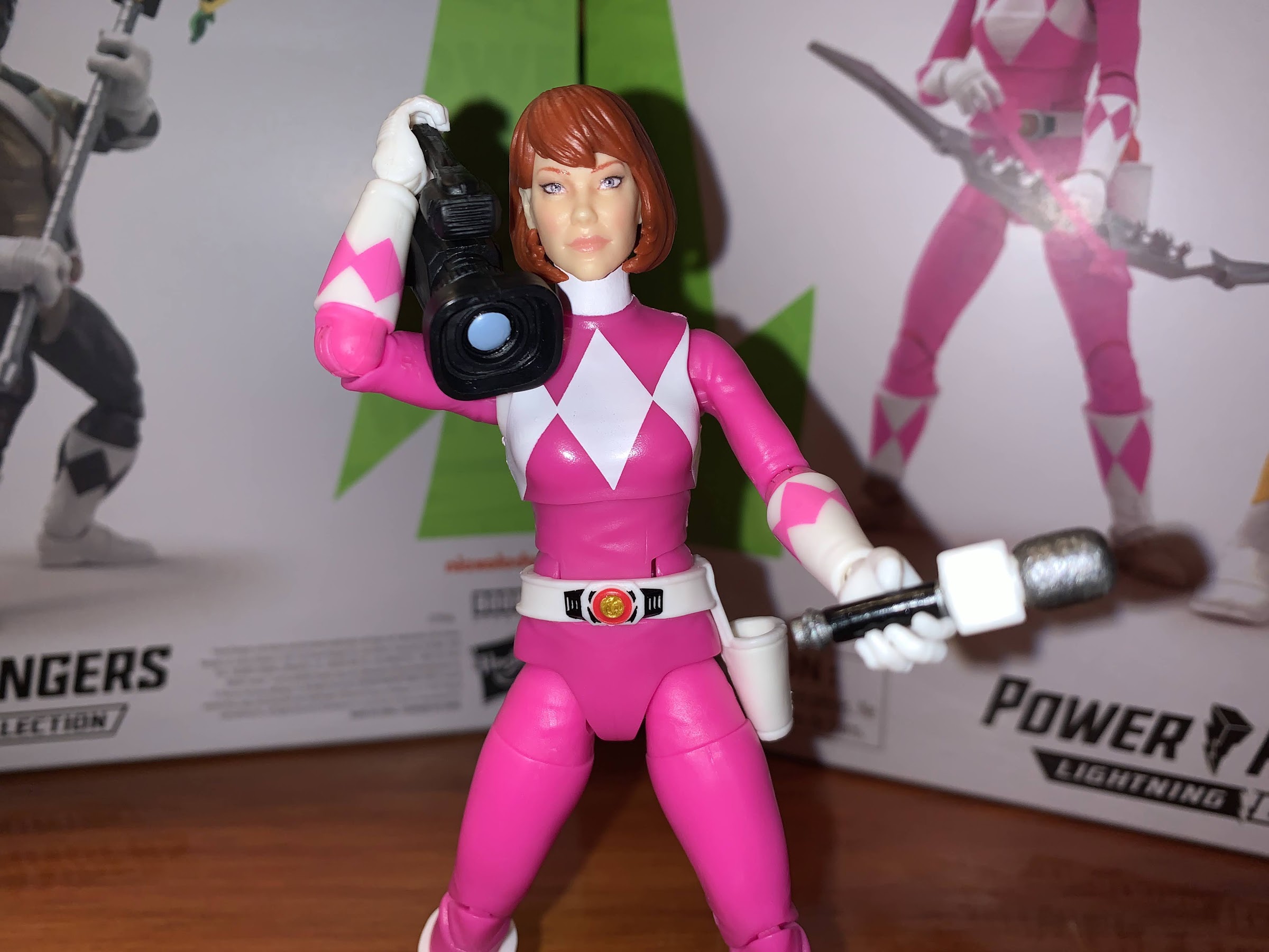
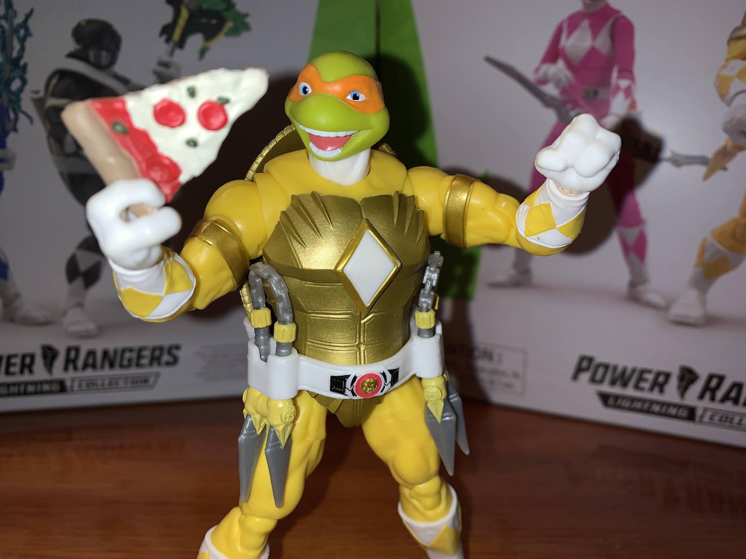
Like the other figures, these two come with an unmasked portrait. Michelangelo’s is a wild, open-mouthed, expression that’s befitting of the character, but could use more paint. Hasbro painted his tongue and teeth, but left the rest of his inner mouth green which is a bit odd. Maybe it’s the expression, but this one looks especially goofy on the turtle body. As for April, it looks like Hasbro recycled the Evangeline Lily head from its MCU line for her and stuck a different hair sculpt on it. It doesn’t look bad, but it also doesn’t look anything like the character from the comic so I suppose that does make it kind of bad. It at least looks better on April’s body given she’s better proportioned, but I doubt I’ll use it since I plan to keep the turtles with their helmets on.

Mikey’s daggers peg into each other to at least keep them tidy on here (or when holstered), but they still look goofy.

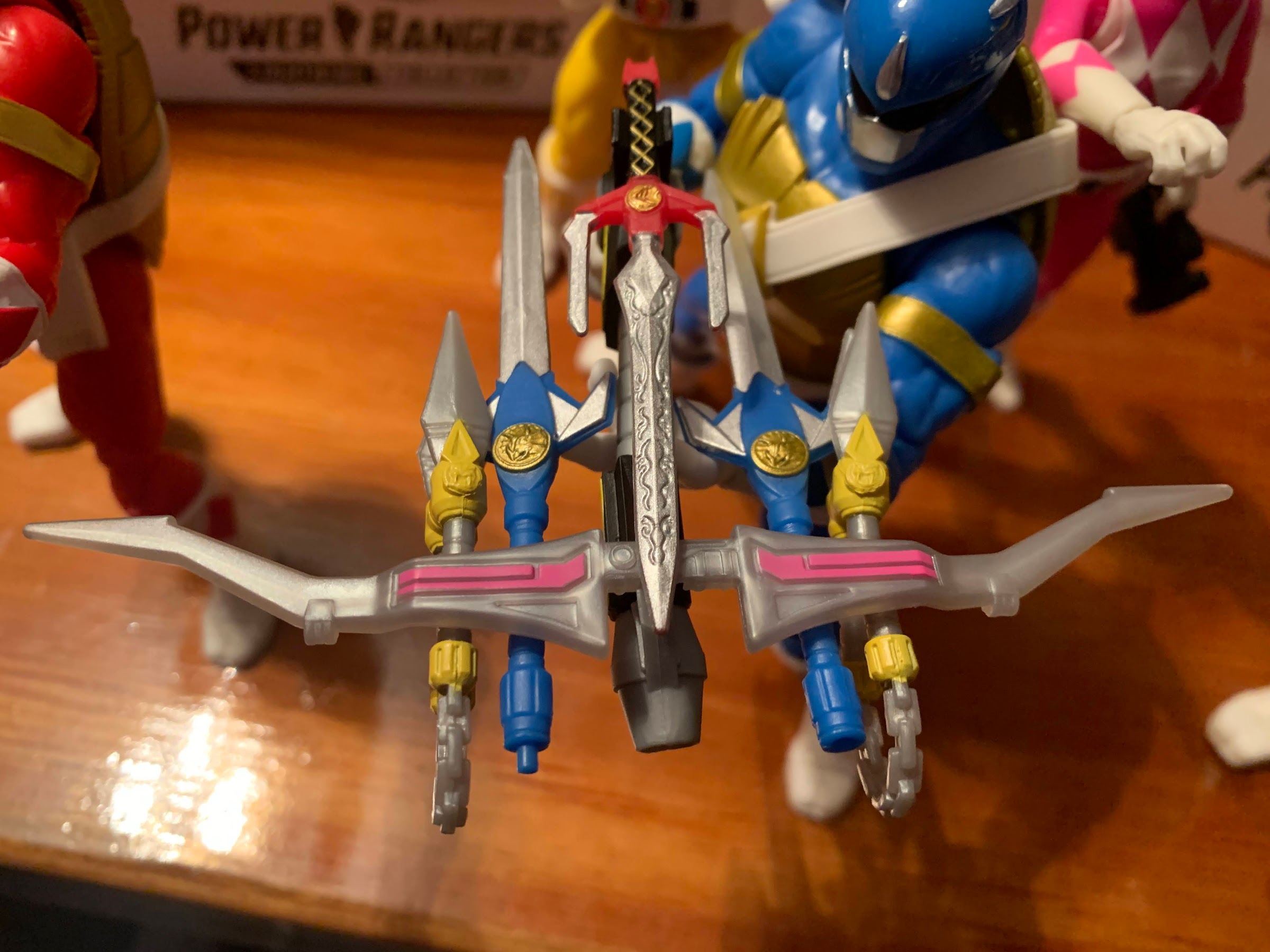
As promised, I will mention the combining effect that’s available to all who collect the entire line. Just like with the standard Lightning Collection releases, the weapons can combine to form the giant, blaster, the Power Rangers are fond of using. The turtle version is mostly the same, and yet not as fun. The bow and power axe are exactly the same so they combine in the same manner. One of Raph’s sais slots into the top where the power sword goes, but it’s not as long as said sword so it doesn’t look quite as neat. Leo’s swords and Mikey’s dagger-chuks clip underneath the bow and this is where it starts to look dumb. Because Leo’s swords tab together to form a lance, only one actually has a hole on the bottom to resemble a gun barrel with the other having a plastic tab. Mikey’s chuks apparently go in chain forward which just looks ridiculous. I mean, the whole thing is supposed to look ridiculous by nature, but this takes it further with the weapons appearing to not even be able to fire. If the chains could detach on at least one set of the ‘chuks that would be fine, but Hasbro didn’t want to go that route. This could also be comic accurate, for all I know, and if so then this is a criticism of the design and not the toy. It’s still a fun novelty, but it’s not as neat looking as the MMPR version.

Group shot!

That’s it though. Again, if you have enjoyed the prior two-packs then you’ll like this one. This might be my least favorite of the three though as Mikey’s weapons aren’t as fun to mess around with and April is just a basic Power Ranger, with an odd, unmasked, head sculpt. I’m at least relieved to see that Hasbro made some improvements to the Kimberly figure I was so down on, but it also could have been improved further given her torso is still an odd color. Hasbro also did a comic shaded variant of the pink ranger which might have made more sense for this line, though she would have clashed with the other releases so I get why they didn’t go that route.

Lets bring Tommy in.

This may be the last of the two-packs for this line, but it’s not the last release. That honor falls to Shredder as the green ranger. I haven’t been able to get my hands on that one yet, but rest assured, when I do I’ll be back to tell you all about it.

And now with the OG team. Billy’s back there, I swear.

Hasbro Power Rangers x TMNT Donatello and Leonardo

Donatello and Leonardo are here to join the team.

It’s been a minute, but we’re back with another two-pack from Hasbro’s Power Rangers x Teenage Mutant Ninja Turtles line of action figures. If you’re unfamiliar, this series is born from the Boom! comics crossover in which the Mighty Morphin Power Rangers meet the turtles and somehow their powers end up getting handed over to them. I haven’t read the story, so I don’t know why any of that took place, but it did lead to some cool character designs and that’s why we’re here.

The first set I received was the Raphael and Tommy Oliver two-pack which was my introduction to this morphed turtle character sculpt. Because of that, this set is pretty damn familiar because, like many TMNT toy lines, the sculpt for each turtle is essentially the same. The only differences separating the turtles in this line are the unique, unmasked, head sculpts and the belts and weapons. And the other major difference is just the color scheme. With this set, Leonardo is logically the blue ranger, but since there is no purple ranger, Donatello had to take the black. It might have been kind of fun if the black ranger simply became the purple ranger in the hands of Donatello, but this is fine and I don’t fault Boom! for sticking with the traditional colors for MMPR.

It’s morphin’ time…dudes!

If you read my review of Raph and Tommy, then you know that I generally like this ranger turtle sculpt. It’s chunky and embodies enough of what makes the turtles unique while also mixing it with the classic MMPR look. For turtle fans, the biggest change from what we’re accustomed to is in the scale and proportions. These guys are big when the turtles are traditionally on the shorter side. They make Tommy look like a chump as they’re about the same height (six inches), but far more muscular. April, who is in the other two-pack I haven’t reviewed, is a little shorter than the turtles this time. The other big change is in the proportions as it relates to the head. The turtles usually have pretty big domes relative to their body, but here they’re much smaller and closer to more human proportions. It’s not something that I really notice with the masked heads, but swap to the unmasked ones and the contrast becomes obvious. Hasbro has to go off of the art, but I do think they could have gone a little bigger. Aside from that, the sculpt is fine and captures the fun mash-up this crossover embodies.

Both turtles get alternate methods of utilizing their weapons. For Leo, that means his swords combine, but for Donnie he just has a separate, standard, power axe.

Leonardo and Donatello, as mentioned before, are the same as Raphael. The only difference is they feature the chest strap on their belt (just like the vintage toys) which contains the center diamond. On Raph, that diamond is glued into the chest, but on Leo and Don it just pegs in as part of the belt and can be pulled off. Leonardo’s belt crosses over his left shoulder while Donnie’s comes over his right. The insignia on the morpher is unique to each turtle: triceratops for Leo and mastodon for Don. The holster on the rear of the belt is also unique as it’s catered to the weapon of choice for each turtle. Donnie’s is interesting because we’re accustomed to companies making a tube on his back, but Hasbro chose to do the same, but with a slit through the side. Instead of jamming the staff portion of his weapon through one end and out the other, you can just push it in through the slit which is made of a soft plastic. It doesn’t look as neat, but it is easy and there would be less of a chance of paint rub with this design, though his weapon isn’t painted on the staff portion.

If you want, they can go mask-less, though I don’t know how many would want to do that.

The body of each turtle is essentially three colors: white, gold, and the primary color. Hasbro is able to engineer these guys in a way that allows them to use mostly colored, unpainted, plastic. The only paint appears to be the gold bands on the arms, the white on the forearms, and the diamonds on the gloves and boots. On Donatello, the white isn’t really opaque enough on the forearms so the black plastic shows through a bit. It contrasts with the white plastic hands which have a slight off-white hue. By contrast, the boots are quite clean, but that’s because Hasbro was able to do them in white plastic. Oddly, the knees and elbows are an ever so slightly different shade of black. Since they’re a joiner for the articulation it could be they’re a different type of plastic. It was more noticeable on Raph, but with Don it’s probably only apparent to me because I’m looking for it. On Leo, it’s slightly more uniform than Raph, with the exception of his left knee which looks darker than the rest. His forearms at least look a little better, but there’s more paint slop in general on him than Don as well as mold release imperfections on his limbs.

Weapon storage!

On the helmets, we have a little more going on. There we get some silver for the mouth guard and some of the features like the triceratops horns and mastodon tusks. Maybe it’s the shape of the turtle head, but Leo’s helmet comes across a little plain. He still has the black visor with red eyes inside as well as the yellow triceratops eyes on the side, but it feels like there could be a little more going on here. It could also be just the shiny, blue, plastic which gives off a cheap look. Donatello’s helmet is a bit better as the mastodon design has more linework. None of it is painted though so it’s not as striking as the black ranger figure from the Lightning Collection nor does it look like the art on the packaging. The silver paint on his mouth guard also isn’t as clean. Both come with an unmasked option which look okay. The design for these turtles is a bit more froggy than I personally like, and the heads look really small on the body. Leo gets a stoic expression while Don has a traditional turtle mouth and features goggles and a skull cap instead of the standard mask. I’ll probably never use these heads in my display, but I like that Hasbro gives collectors options.

There’s a very different approach to the shade of blue used when it comes to Leo vs Billy.

On the accessory front, we have weapons, effects, and hands. Like Raph, Leo and Don each come with a set of gripping hands, fists, and open hands. The gripping hands are the same from turtle to turtle so they have a vertical hinge and a wide gap between the fingers to accommodate Raph’s sai grip. That’s not really useful for the other turtles, and the grip isn’t perfect for Leo which is on the loose side. I love the vertical hinge, though I wish Hasbro had cut out a bit more room for it as there isn’t a ton of range there. For weapons, the blue ranger’s lance has been split into two, short, swords. They can connect like the lance to form basically a really dangerous looking weapon, but I suspect most will have Leo dual wield swords, per usual. Donatello gets two versions of the power axe. One is basically the standard axe, only the quality is less than what was released previously as it’s very soft and gummy and I had a hard time getting the “pump” action to work. Trying to move it just caused the entire barrel to bend, but some hot water freed it up, though it’s still not a smooth action. He also has a pole axe version which is what fits into his belt. It’s kind of neat, though the paint job on it isn’t terrific. The bulky turtle hands also don’t grip the standard axe very well in a firing pose. They also each get an effect part. Donatello has a green, flame, effect while Leonardo has a blue lightning effect that’s very similar to what the blue ranger came with. I don’t know if I’ll use either, but I’d rather have them than not. And there isn’t really anything missing, just shortcuts taken to keep costs down that harm the figures in a mild fashion. I’d rather have better gripping hands than what was packaged with Raph, but it’s more of a nitpick than a true criticism.

The power axe mold is unchanged from the black ranger release, just the paint and overall quality is different, which means the blast effect from the prior release works with this one as well.

The articulation for both turtles is the same as what we saw with Raph, which is mostly very good. The pin-less engineering on the double knees and elbows works very well as they look nice and the range is better than 90 degrees in both places. The range in the ankle pivots helps to make standing them fairly easy, though the shell does add weight to the rear of the figure making it a little tricky to do just a standard, vanilla, upright pose. They have articulation in the torso, but the shell limits it to basically just a waist twist. Hasbro did cut the bottom of the front of the shell in two to better facilitate this. The joints are all pretty tight, but not to the point where I needed to heat anything. The only joints that don’t really work are the butterfly joints in the shoulders. There’s just no clearance because of the shell on both sides, so I don’t know why it’s here. Even with that limitation, these are some of the most dynamic Teenage Mutant Ninja Turtles ever produced, probably surpassed only by the S.H.Figuarts versions. Obviously, the costume makes these almost a completely different animal in terms of aesthetics, but I can see why some people are interested in seeing what Hasbro would do with a proper line of TMNT figures.

For a ninja, balance is key.

Reviewing this set is pretty easy after having reviewed the Raph and Tommy set. If you liked what you saw there, then you’ll be pleased with what’s present here. Hasbro does skimp on the paint, but the sculpts are interesting and the figures are pretty well engineered. It all comes down to style: do you like this mashup of Mighty Morphin Power Rangers with Teenage Mutant Ninja Turtles? If so, then you’ll enjoy what Hasbro has put together. I think these make for a fun display whether you’re more of a MMPR fan or a TMNT one, and if you happen to like both, well then this was practically made for you. And I do like how Leo and Don turned out especially. The black and gold color scheme just works, while I’ve always been partial to Leonardo. I like the lance/katana cross more than Raph’s sai/power sword combo (it helps that Leo’s weapons are painted better) and I definitely like the versatility of both weapons here. Even though this two-pack is essentially the same figure times two, I think I like it a little more than the Raph and Tommy set. Sorry Tommy, you’re just not nearly as interesting as a turtle in a Power Rangers costume. Check back next week when we take a look at the final two-pack in this series: Michelangelo and April O’Neil.

Come back next week and I’ll tell you all about how the weapons combine!

Let’s Rank the NECA Cartoon TMNT Figures…Again!

My oh my how the collection has grown!

It’s the first Turtle Tuesday in a little while that I don’t have some new TMNT review to post. Given that, I think it’s time to revisit the rankings I did last year for NECA’s toon line of action figures. This has become NECA’s most popular line, and while it has cooled a bit since last year, that also could just be due to better distribution making it easier for collectors to get their hands on these things. NECA has done preorders and direct sales going back to April of last year and it’s made a world of difference. And it’s a great thing to be able to simply enjoy this line for what it is and not be frustrated with how hard it can be to get some of these.

Last year, I had 21 distinct rankings for this list and now a little more than a year later it’s doubled! The amount of figures has actually more than doubled as we’ve seen some variants come out and some figures I’ll rank together (like the frogs and various Foot Soldiers). It was a very busy year for the line and it’s pretty damn impressive how many new releases made it out given the ongoing global shipping and factory issues.

Forty-two is a lot of figures to rank so let’s not waste any more time. Where a figure is a repeat from last year, I’ll include the prior ranking. The order for those older releases is largely the same, but there were some changes here and there as certain figures have fallen out of favor a bit, or I’ve gained new appreciation for. There are no rules here aside from this is how I feel right now in this moment. Some of these are rather fluid, though I feel pretty good about my number 1, and about my number 42…

April O’Neil (21) – She’s still in last place because her sculpt just isn’t great. She’s also still hard to get, but NECA is prepping an update for 2022 so stay tuned.

Krang (Bubble Walker)(20) – Also still in second to last place, just not a fun release, and not really one that could be. It’s very much limited by the design, and the walker itself looks fine, but has a cheap feel. It could have used real knee joints and ball-joints where the legs meet the “bubble.”

“Hello, I’m Kerma. I’ll trade you this lizard if you’ll come with me to my home planet and save it. And if not, I’ll just blow you up with this bomb!”

Kerma – Figure or accessory? He’s just enough of his own thing that I gave him a ranking. He looks great, but he doesn’t articulate much because he was released as an accessory. I do draw a distinction between him and Joey Eyeball though, who won’t be ranked.

Turtles (Style Guide)(19) – The original turtles are a bit dated and these ones are colored to resemble licensing artwork. You either like them, or you don’t. Still the only release I entirely passed on in this line.

Roadkill Rodney (18) – This one’s fine, but there’s not much to him. A perfect example of how just because something is ranked near the bottom of this list doesn’t mean it isn’t worth owning.

Cat April – The good news is the body on the previously released April looks fine, it’s just too small. Cat April recycles that body and includes a new head that’s better proportioned for said body. It’s April mutated as a cat though, so it has limited appeal, hence why it was supposed to be a convention exclusive. She also doesn’t stand well and there’s just something missing here.

It’s sort of weird to feel excited about getting the receptionist from a 30 year old cartoon, but here we are.

Irma – Similar to the Roadkill Rodney, this is a figure that looks good, but is limited by the design. In this case, it’s Irma’s skirt which basically makes her a glorified statue as her leg articulation is useless. The optional rat parts are kind of fun though.

Foot Soldier (All versions) (17) – The Foot have been released in standard and two separate battle damaged variants as well as a deluxe option in 2021. The deluxe one is probably the best as it has updated lower leg articulation and a ton of accessories (including the ability to create a new character, the Alpha Foot), but it does suffer a bit from loose hips syndrome. It’s a good all-purpose army builder though and gets the job done.

Burne – April’s blowhard boss, Burne is an essential character to the show who doesn’t exactly translate well to the world of action figures because there’s just not much for Burne to do besides stand there and look pissed. Or smug, depending on your mood. As a short, squat, guy he doesn’t articulate very well, but we needed a Burne in the line and he’s solid.

Fly away, mutant mosquito! Or was it actually alien?

Screwloose – Screwloose was just an accessory in the Playmates line, but NECA made him his own thing. He looks pretty good, but he essentially comes with no accessories (aside from a flight stand) and has limited articulation when compared with other small fries Baxter and Splinter. Fine, but unremarkable.

Vernon/Vernon 1.1 – Vernon received not one, but two figures in 2021! Both are the same sculpt aside from the portrait, though the convention exclusive Vernon had slightly modified colors. That one came with my favorite expression for the character, scared, but the two-pack version came with the mutated rat parts so it’s hard to choose a favorite here. I’m just glad to have both because now I can display rat Vernon and normal Vernon.

The Punk Frogs – Finally, all four frogs have been released in figure form! The vintage line famously only did two, and one of them did not look a thing like the cartoon version. These four are definitely toon accurate, but they have the worst ball-socket hips in the line with some barely able to stand because of how loose they are. NECA also only did two different expressions so they’re a bit boring. A case where NECA did the minimum and did that well, but skimped on any extra bells and whistles to make them special.

Mutagen Man is not my favorite figure in this line, but he is the most unique.

Mutagen Man – He’s certainly one of the most unique characters from the show and toyline, he’s just not one of the most fun to actually handle. He’s pretty limited, and my version of the figure has a hose that won’t stay inserted in the tank which drives me crazy. The head-swap trick is pretty ingenious though and I definitely like having this guy in my display.

Triceraton Infantry (16) – This guy was pretty solid when he came out, and he’s still pretty solid more than a year later. A good representation of the character in toon form. My only complaint is the lack of a hinged jaw which the other Triceratons received, but the grunt did not.

First Edition Turtles (15) – The original four. NECA nailed the coloring, the head-sculpts were a little iffy, but acceptable. The articulation is dated though and there’s no reason for the company to revisit them now that we have the new four-pack.

Zarax (14) – The Triceraton leader, as far as we know. He looks cool and has unique, bladed, weapons. I liked him when I got him, and I feel the same way about him then as I do now.

Zork (13) – Same as above, minus the blades, and green!

Slash (12) – The controversial toon design of Slash. He actually received a running change in 2021 swapping out that mediocre hip connection for the new ball-peg design and the new ankles. It’s a change that’s for the better, though not enough to seek out if you have the first one. I have always liked the goofy toon Slash so I like this guy. I wish he used a different body from the turtles as he should be chunkier, but he’s good as-is.

He may not have been the best Muckman released in 2021, but he’s still damn good.

Muckman and Joe Eyeball – Our first, true, deluxe figure on the list, Muckman is plenty good. No, his toon design isn’t as fun and crazy as the old toy, but that’s animation for you. This guy is still cool and his sculpt is pretty damn impressive. The only downers with Muckman is he’s very light on accessories considering the gun he comes with isn’t even his. Joe Eyeball is cool though, but what he really needed was some muck effects parts to hold since that’s how he attacked in the show. His chunky design also isn’t fun to pose so he basically just stands there on my shelf.

Wingnut – The Batman parody turned out pretty fun, but similar to Muckman, he’s a chunky guy who doesn’t pose well. The sculpt though, especially the little wings inside the big ones, is terrific. The only negative really is he has those weird double-elbows and basically every figure of him I’ve seen has a crappy paint job when it comes to the fangs. Still a fun figure though.

Granitor (10) – I was a bit high on the rock soldiers last year, maybe too high. Granitor is a good figure, though his utilizing the same body as Traag means his proportions are not toon accurate. This set was also light on accessories so it’s basically you either love the sculpt, or you don’t. I very much like it, I just like others more.

Ace Duck – Ace Duck in figure form is about as good as he can be. His articulation is solid, he has plenty of accessories, and NECA was wise to make the beak removable so he has more variety than most in this line. He’s just Ace Duck who isn’t one of my favorite characters and he was barely in the show so my affection is limited.

Let’s shred!

Mondo Gecko – A character I had a tremendous amount of affection for as a kid is Mondo Gecko. The skateboarding lizard was designed to be cool, and he mostly is. NECA’s version is also just fine: good sculpt, has skateboard, solid accessories. The paint is a little iffy as NECA did that annoying thing where it painted the joints after not casting them in the right color plastic, but that’s pretty much the only negative wit this guy aside from the sort of steep cost ($40). He does come with Kerma, and apparently it was the board that knocked the costs out of whack, so it is what it is.

Shredder (9) – Shredder is a great sculpt that’s just becoming a bit dated at this point. The articulation is not terrific, and there are some little inaccuracies here and there when compared with the toon. Still, I’m not sure it’s dated enough that we need a new Shredder. Some torso articulation and better legs would certainly improve the figure, but I don’t know if it would be enough to get me to buy a new one. Maybe if they tossed in a wired cape?

Casey Jones (11) – I was a little hard on Casey last year. He’s not without some issues as he has the painted joints eyesore and there’s a gummy quality to the plastic on him that I don’t like. On the other hand, he looks terrific, has a bunch of weapons, and poses reasonably well. If he could stand a bit better and didn’t have the painted joints issue, he’d rank higher for me. And maybe NECA will fix those problems because he’s due for a re-release. He and April are basically the only characters not to be re-released at this point and there are a bunch of collectors who are missing out.

Traag (7) – Traag succeeds much better than Granitor at matching the source material. He’s still lacking in accessories, but if you got Muckman then at least you picked up a new gun for him.

A worthwhile update for the flagship line. We can’t have the turtles be upstaged by all of these rogues, can we?

Turtles in Disguise – A four-pack of the turtles with new head-sculpts that can separate at the bandana to create multiple expressions, plus they have better leg articulation and a ton of extra stuff. Want the turtles to go full disguise with those creepy masks? Go for it. I still think the heads need some tweaking, they’re very wide, but the expressions are more faithful to the cartoon than what we had previously which felt more like Playmates homages. The only downside is the glossy finish on the figures which really stands out as basically every other release in the line has a matte appearance. NECA reissued the set with a matte paint job on the head pieces, but the some of the bodies still appear glossy, while some don’t. And since they come wearing their disguises, you basically have no idea what you’re getting until you open the set making it hard to commit to a repurchase.

Bunny Bebop and Rocksteady – I had no idea where to rank these guys. The Loot Crate figures are essentially the same, only one has a Bebop head and one a Rocksteady head. They came with some extra hands, Easter baskets, and a little remote weapon. I love them. The engineering on the legs is unfortunately no different from the regular Bebop and Rocksteady, but otherwise these look terrific. And they make me smile. Your mileage may vary, but I am very much charmed by this duo.

Splinter (8) – What can I say? NECA nailed Splinter. He looks fantastic. He’s not exactly a blast to pose, but I don’t care, I wouldn’t change a thing.

Leatherhead (4) – Leatherhead is great, I’m just less forgiving of this body now than I was in 2021. He has terrible hips and ankles and I do wish his head had more range. Otherwise, he looks the part and he doesn’t need to pose much to be fun as a result.

This is one expressive figure.

Pizza Monster – The giant pizza monster is a terrific sculpt with some poor quality control when it comes to the ankles. Many a collector has broken them, and one of mine even arrived broken in the box. It’s enough of an issue that I basically just leave them alone. It makes him harder to stand, and those hips are too loose, but get him in a good pose and he’s a lot of fun to look at.

Rocksteady (3) – Same as Leatherhead. Rocksteady looks fantastic and I love how NECA was able to give him a paunch. I do wish he had a removable helmet, but that’s about it. This is mostly just a reaction to the lousy lower half and fragile hips. Mine has not broken, but I know many have. What’s disappointing is that NECA has re-released he and Bebop, but has yet to replace the leg system.

Dirtbag – One of the star two-packs of 2021, Dirtbag is the preferred figure in the set of many, but I lean Groundchuck. Dirtbag looks every bit as awesome, his design is just more conventional. He does have the added perk of being able to separate at the torso to simulate him emerging from the ground, but his articulation is a bit limited particularly in the head area. Obviously, it’s not enough to really damage the experience considering how high I have him ranked.

These guys are like a traditional, wrestling, stable.

Krang (Android) (5) – The mighty Krang is mighty impressive. Really, the only shortcomings with this figure is the pose-ability. What can you really do with this design? He’s a top-heavy dude with tiny feet. I do kind of wish the ball and chain weapon had plastic, pre-posed, chains as they just don’t look great on the shelf. I’ve basically gone with a standard hand and one gun hand ever since I got him. Also, his entire body is painted and prone to chipping which makes handling him a bit stressful. Still, I think he’s as good as can be and is an essential release in the line.

Baxter (2) – Was I a bit generous with Baxter a year ago? He was very new, so maybe a recency bias was in play, though really it just came down to him looking like he should. Baxter in his fly form looks terrific, and he came with a bunch of stuff and NECA jammed a ton of articulation into that little body. I have no bad things to say about this figure, and I also always loved the character’s design.

Antrax – The executioner! And one of the newest, and greatest, figures in this line. His negatives can be summed as a lack of vertical gripping hands and a lack of just extra hands. Maybe you can nitpick the posing too, but otherwise, the sculpt and paint are fantastic and he has a bunch of weapons. The character design is fun, and the figure equals that. A homerun for NECA.

Trying not to overload this post with pictures, so we’ll let Dirtbag get in here too.

Groundchuck – With this one, I maybe letting my affection for the vintage toy play too great a role in my ranking, but I don’t care. It’s my list and I’ll rank ’em accordingly. He’s a terrific figure though and that design; bright red-orange, metal bits here and there, it’s just cool. Or it was cool to me as a kid, and I’m sticking with it. He’s got the ridiculous, personalized, cattle gun too and I just have fun posing him and looking at him.

Bebop (1) – Formerly my number 1, Bebop is exactly what I want him to be from a likeness perspective. It’s just all in that old engineering that made me rethink my ranking of him. Plus, 3 of the last 4 on my list are all newer releases so I really only moved one figure ahead of him. Fix those damn legs and he’s back in contention for number 1.

Rat King is here to torture poor Vernon.

Rat King – The sewer dweller was part of the first set released after my last ranking post and the fact that I still think this highly of him more than a year later is testament to how good he is. In short, his sculpt is perfect and the paint on my figure is exquisite. I love all of the stuff he comes with and just the presence he has on the shelf. The only negative with this guy is that crotch overlay which is prone to flaking. Newer versions of the figure supposedly corrected that, but I have been unable to confirm that for myself. If you got a good one out of the box, as in one that didn’t already chip, and you knew of the issue, then your figure is probably fine. It only happens when really flexing that piece. It limits the posing to a degree, but not as much as you think.

With a name like Metalhead how can I not love him?

Metalhead (6) – I don’t know why I had Metalhead at six when I think he’s damn near perfect. He looks the part, he’s big, and chunky, and has some fun accessories. He was the first deluxe release, and he’s still one of the best. I love this guy!

Who would have predicted that two of the best figures in this line would be a pair of one-off bugs?

Scumbug – Yeah, the moment I saw the solicitation for this one I knew I was going to be over the moon with him. Scumbug looks like an updated version of the Playmates toy with some richer colors and a slightly more chunky appearance. He is awesome, but if you don’t like the character’s design then you probably aren’t as high on him as I am. I loved the old toy, so I think he’s terrific. And he has enough stuff and articulation to make him the second best figure in the line. Who would have thought that was possible a year ago?!

This guy is just the best.

Chrome Dome – The biggest figure in the line is also the best. Chrome Dome is impressive. He’s huge, he’s well-articulated, and his paint applications are exactly what I want from this line. And to my surprise, NECA loaded him up with a bunch of extra hands and accessories and still managed to keep the price tag at 40 bucks. He’s not only the best figure in the line, he’s the best value in the line! I just think about some of the figures I’ve spent 50, 60, 100 bucks on that aren’t as impressive as Chrome Dome. NECA has a way of putting out exceptional figures at crazy prices. Maybe no one wants to hear that in the current climate of rapidly rising prices, but it’s the truth. Don’t sleep on Chrome Dome because it’s hard to imagine anyone being let down by this guy.


NECA TMNT Cartoon Antrax and Scumbug

Two bugs I don’t want exterminated.

I’ve been looking forward to this one for awhile. Antrax and Scumbug only appeared in the cartoon series Teenage Mutant Ninja Turtles once, but like last week’s figure review, they were present in the toy line long before their animated debut. And these later period episodes, such as “Night of the Rogues,” tended to just stick with the Playmates look rather than do their own thing (Slash) probably because they just didn’t have the time to design their own characters. And for me, Scumbug is a very nostalgic character. I can still remember getting him from my grandmother along with Michelangelo. The character honestly freaked me out a little because he was so gross looking and downright creepy. And for awhile, he was just one of those villains that never appeared in the show and it was a bit of a surprise when he finally did since I had just assumed the show passed him over for some reason.

Have two hideous monsters ever looked more beautiful?

Since these characters were so closely aligned with the vintage toy, much is the same with the NECA version. I almost feel bad for Super7 since they have yet to get to doing these characters as some (like me) may now pass on their version because these turned out fantastic. Let’s just get it out of the way right now: this might be the best two-pack yet. It’s between this one, Bebop and Rocksteady, and Groundchuck and Dirtbag. I think what will ultimately separate all of those sets from each other is just nostalgia for the product. Those who never had the Playmates toys might not care that much about these guys because they were, after all, only in one episode. However, I do think one look at this set from anyone with even a hint of affection for this toyline might be enough to get them to pull the trigger because these bugs are just that cool to look at.

That axe suggests he’s hacked off his fair share of heads.

We might as well go in alphabetic order and start with Antrax. This is one big ant. He’s Krang’s executioner from Dimension X, if memory serves (come on NECA, lets put character bios on these boxes!), and he looks the part. He’s a big, black, ant with red veins on his body, a brown carapace, and a purple executioner’s hood. Maybe the purple is odd, but the red and black is not. And even though he’s a bug, he’s a big fella coming in at a tick under 7 inches to the top of his head. The antennae make him push past that if you want to factor them in. Basically, he’s not looking up to many guys in this line as I have him just a touch taller than characters like Zarax and Metalhead, and shorter than only Krang’s Android Body, the pizza monster, and Chrome Dome. And what stood out to me when I first picked up that rather large box these bugs come in was just the size of his head. This dude’s got one big dome and the really cartoony sculpt (Jon Matthews) is an attention grabber.

He’s a big ant, but he still has to look up to Chrome Dome.

The other thing that probably jumps out is the amount of limbs on this guy. He’s an ant, so he’s got to have six limbs which take the form of four arms and two legs. The designers of the old toys really loved going against symmetry as he and Scumbug both have a different design for their left foot and right. He’s got a purple boot on his right foot, and exposed toes and claws on the left. The arms are almost all the same though as they’re black with red veins and orange elbow pads. The upper right arm has the remnants of some handcuffs on the wrist while the other three just have orange-yellow bracelets that match the elbow and knee pads. He has shoulders for each arm too which is most noticeable from the rear of the figure which is kind of interesting. It’s like NECA took a standard figure, and in place of a head inserted another upper torso. There’s a shoulder strap that’s home to a knife sheath on the back of the figure and a belt around the waist that’s got a non-functioning pouch on it. Skulls are a theme with this guy as one shows up on his belt and more will feature into the accessories. He’s a really fun design and the paintwork is excellent. Since he’s mostly black, we don’t get much of that half-and-half shading, though it is present on the hood and boots, but he’s got some shading on the front of his carapace and the other paint accents are cleanly applied.

Double the arms means double the fun!

The articulation on this guy is both familiar and unique. We only have one, true, four-armed character in the line (I don’t count Baxter) in the form of Screwloose, but this guy has four, fully-articulated, arms to pulverize turtles with. Screwloose, if you recall, had single elbow joints and he’s a bit of a little guy for the line. Antrax has four legit arms and each one is connected to his body via a shoulder ball and hinge. He has double-jointed elbows with elbow pads thus proving that we should be able to get the same on the actual turtles. It works great too as he can bend past 90 degrees at each one. There’s a biceps swivel on each arm, but all four were stuck on mine and I still can’t get the upper right arm to work. There’s just too much play in the shoulder to get enough leverage even after heating it up. The wrists all swivel and hinge, but they all have horizontal hinges which is a real bummer. I don’t know why NECA did that, but all four should be vertical since he’s got a bunch of melee weapons. Or at least it should have been two and two.

I love me some weapon storage.

At the head, Antrax features what I think is just a single ball peg. It’s wicked smooth, if I may bust out some northeast slang, and it’s oddly satisfying to manipulate. He can’t look down much at all, but he can look all the way up and tilt his head. The antennae on top and the two pincers or whatever those things are on the snout can rotate. In the torso, he has a joint in the middle that lets him rotate and slide to the left or right. It’s kind of funky as you can basically purposefully miss-align the shoulders, if you wish, which looks odd. He can’t really crunch forward and back though, but not many figures in this line can. There doesn’t appear to be a waist twist, but past that he’s pretty conventional with ball-jointed hips, double-jointed knees, and ankles that hinge and rock side-to-side. His thorax, tail, whatever it’s called is connected via a ball-peg and can rotate all about on the figure’s rear. Aside from the biceps, I’ve had no issues with joints being stuck. Some of the wrists are more loose than I’d like, but otherwise everything else is great.

I love the weapon storage, but I also love the dagger. How can I keep it hidden behind the figure?!

As for accessories, an executioner needs tools for execution and Antrax comes pretty well loaded. I will say for starters, he has no extra parts, just four gripping hands. There’s a lot of unique tooling going on here so I’m not surprised by the lack of extras, but I do wish he had a couple of hands. I already said I wish he had vertical hinges, but just something to have instead of a gripping pose for any hands that aren’t holding a weapon because it looks awkward to have an empty gripping hand. He does at least have enough weapons to occupy each hand. Up first, is a dagger with a red handle and skull pommel. This one can slot into the sheath on his back or be held like a dagger normally is. He’s also got a much larger sword with a wicked spiked, handguard, suitable for hacking some bone. There’s a big, spiked, club with a red taped handle that’s quite pointy and also quite heavy. This one gives the figure the most trouble with the looseness of some of the hands since it possesses so much weight. The top is flat though if you just want to stand it beside the figure. Lastly, what would an executioner be without an axe? Antrax has a massive double-sided axe with a bunch of notches taken out of it and another skull for good measure. It looks terrific and it’s between this or the little dagger as for what my favorite is. I will say, getting the weapons into his hands is tough as they’re pretty firm and the handles are also pretty thick. Not wanting to risk getting red paint on the hands of my figure, I just went ahead and dipped them in hot water first. Even then, getting the axe in-hand is tricky because it’s so thick at the base.

Get a load of this maniac!

Antrax is pretty awesome, and he seems to be the preferred figure from this two-pack for many, but for me that honor is going to Scumbug. His sculpt and my nostalgic affection for the figure is what’s primarily winning him over for me. He stands much shorter than Antrax at approximately five and a half inches, six and a quarter to the top of his antennae, but he commands just as much attention. I owe that mostly to these wild eyes he possesses. They’re yellow and bloodshot with a purple iris and a black inner pupil. He pares that gaze with this big, maniacal, smile and I can’t help but smile back when I look at him. He’s another character with an exposed brain on top and his yellow antennae appear to be taped together like a topknot or something. I think he’s supposed to be a mutated exterminator and he’s sporting the tattered remains of a blue dress shirt and tie and gray slacks. His body though is in varying stages of mutation. Both arms feature spikes poking through the flesh, while the left hand has discarded his human flesh in favor of purple. His gut is also hanging out and it too is purple and lumpy while his left foot has apparently torn through his boot and the right is just starting to do the same. On the rear of the figure is his carapace and a backpack that contains who knows what. It connects to the figure’s chest via non-removable tubes and a third tube that connects to a handgun that looks like an exterminator’s sprayer.

Guns n’ bugs, baby!

This sculpt for Scumbug is just wild. A lot of that harkens back to the old toy, which I no longer have. It’s an insanely detailed and complicated character for animation, especially a somewhat cheaply produced cartoon like Teenage Mutant Ninja Turtles. And the paint application is phenomenal. We get the same style of shading on much of the figure as we’re accustomed to save for the head, which I think is wise since there’s enough going on there. There’s a lot of black lining on this guy around the various spikes, warts, and whatever that’s all applied very clean. There are so many places where things could have gone wrong, like the fleshy parts poking through the thighs of his pants, but it didn’t. It’s terrific and I’m in love with this hideous monster of a bug.

The backpack is non-removable and does unbalance the figure a bit, but that’s pretty much my only nitpick here.

Scumbug, being this kind of short and pudgy figure, looks like something that would not articulate well, but of course that’s not the case. He’s one of those characters who is hunched over a bit so his head more sticks out than up from the body. This means he can’t look up, but he can look down and side-to-side and the range on the side-to-side is great. There’s so much personality to it and it’s similar to the Super7 Muckman in terms of functionality. He also has an articulated jaw which just adds to the crazy when it’s opened and everything inside his mouth is well-painted and detailed. The shoulders are ball-hinged and his biceps swivel where the arm pegs into the sleeves. He has double-jointed elbows which bend past 90 and wrists that swivel and hinge horizontally. In the torso, he’s got a ball joint where the shirt meets the lower body that lets him rotate and tilt a bit and he also has a waist twist below that. The hips are the standard ball-joints and his knees are double-jointed with hinges and rockers at the ankle. It’s all surprisingly functional and really the only thing holding him back is that pack that happens to be on his back which throws off his balance. You’ll have to manage that while posing him, or use a stand, but I’ve been able to get him into some decent poses without the aid of such.

NECA won’t be content until every character in the line has a tracking device to hold onto.

Like Antrax, Scumbug does not come with extra hands or an alternate head. He definitely doesn’t need another head, but some style posed hands would have been nice in the event you don’t want him gripping something. His right hand, the more human-looking one, is in a trigger finger pose which is odd as he comes setup to wield his gun with his right hand. That one, the clawed one, is a gripping hand and if you don’t want him to hold the gun with that hand you simply unpeg the hose from the backpack and switch it to the other side. Whatever hand isn’t holding the gun can wield this little insect-shaped device which threw out some funky electric net in the cartoon. He also comes with a big, chunky, purple, handheld device that’s from a different episode, but NECA loves shoving these random tracking devices into sets. Lastly, there are three unmutated cockroaches to scatter across your display. They’re actually pretty well-painted with brown on top and yellow on the bottom.

The accessory count is plenty good as Scumbug has all that he needs. About the only thing I’m missing with this guy is somewhere to store the gun should I not want him holding it. I suppose I could just unhook it from the backpack, but I wish there was a holster somewhere for it. It’s not a big deal for me as I plan to display him always with gun in-hand.

I barely remember this thing, but it’s cool to have. Like the gun though, I do wish there was a place to store it when not being held.

This insect-themed two-pack is one of NECA’s best. Antrax and Scumbug both are fantastic sculpts with an exceptional paint job and a great batch of accessories. We’ve come a long way in that regard as thinking back to Bebop and Rocksteady those figures featured a lot of the same tooling, had duplicate hands and weapons, and not much that made the set unique. Here we have a ton of new tooling for both the figures and weapons and it’s all tooling that really won’t be of much (any?) benefit going forward. It does come at an added cost as this set was $65 instead of the now usual $55. It’s worth every penny though as these guys are awesome and I hope collectors don’t sleep on this set just because these characters weren’t in a dozen episodes.

Now comes the hard part: making room.

NECA made this set available for preorder back in April of 2021. It was the last of three new releases for the toon line that month and if you didn’t order it then you should get another shot when it hits Target. As of this writing, we have no idea when that might be. It seems NECA is just about done shipping all of those orders so it could be that we may see them ship to Target soon. Or, NECA pre-sold the entire order and collectors will have to wait for a second run at a later date. I don’t think so, but I suppose it’s possible. I think it’s more likely the company is just prioritizing the customers who already paid for their sets, since I had no problem exchanging my broken pizza monster for another leading me to believe they’re sitting on a bunch of inventory just waiting to be released. If you’re in the market, keep an eye out. They’ll probably hang around for a bit due to the price and the characters being unfamiliar to casual collectors, but then again, they are exceptional action figures so maybe they come and go pretty fast. If you are collecting this line though and have been on the fence with these guys, I say get off of it, because you’re missing out on two of NECA’s finest.


NECA TMNT Cartoon Ace Duck and Mutagen Man

Now there’s an odd couple if I ever did see one.

It was back in April of 2021 that NECA did a month of preorders. Each week, a new item (and some restocking older items) was added to NECA’s webstore and they would stay up for about 10 days and anyone who wanted one could order one to be delivered later in the year. The first one that went up was the Ultimate Pizza Monster and I eagerly jumped on it not realizing the format. The following week, Ace Duck and Mutagen Man were added and the Pizza Monster was still up. Frugal shoppers noted that you could order both in a single order and save on shipping (15 bucks an order, not an insignificant sum) so when that set went up I held off. It worked out, because next week Antrax and Scumbug were put up so I bundled the two-packs together, hit submit, and returned to my life not realizing that by doing so I would delay getting the Ace/Mutagen Man pack by a good six weeks while waiting for the bugs to come in stock.

Was it worth it to save 15 bucks? Realistically, yeah, but while other collectors were getting their toys I was definitely feeling left out and a little jealous. The wait is over though as my order with both two-packs has arrived and now we can talk about the duck and…guy? Both of these characters originated in the Playmates toyline. In some ways, Ace was like the original toy creation as he wasn’t from the comics and he wasn’t created for the show. I think his design even originates with Varner Studios, but I could be mistaken. At any rate, most know him from the old toy because his appearance in the toon was a very brief cameo. In that universe, Ace Duck is a movie star. I get the impression he’s an Indiana Jones type and I assume he’s played by an actor in a costume and isn’t an actual mutant, but I suppose it also doesn’t matter. He shows up for all five seconds and then never again, a real blink and you miss it moment. As for Mutagen Man, he too started off as a toy that was then brought into the cartoon for his own episode. He followed a similar arc to other characters as he’s tragically mutated and then taken advantage of by Shredder making him a villain at first, before the turtles set him straight.

Maybe not the most fearsome dudes on your shelf, but they try.

In terms of toys, one of these is quite conventional and one very much is not. Ace Duck is a humanoid character who just so happens to be a duck. He’s got sculpted feathers, large wings on his back, and a duck bill on his face. When I look at him I can’t help but think of the Howard the Duck movie from the 1980s. His engineering though is fairly familiar. I think a lot of what’s here is present on Vernon with the most obvious part being the hips and legs. As such, he’s basically right around the normal human height in the line at 6.5 inches. Ace is apparently a pilot with pale yellow feathers and a bomber jacket. The jacket is an overlay with the arms being fully sculpted. His default expression is in-line with the Playmates figure as it’s a bit neutral with exposed teeth on the sides. The hat is removable and just rests on his head as opposed to keying in to a slot. His belt is a separate piece that hangs loosely while his wings peg into his back in a manner similar to Baxter Stockman. They are removable, if that’s your preference, but he’ll obviously be left with a pair of holes in his back if you do so. Surprisingly, he doesn’t have a tail of any kind instead presenting a normal, human, butt.

Ready for action!

Ace basically looks as one would envision and he features a lot of the trademarks of this line. NECA uses lighter shades of paint on the front of the figure and darker ones on the back. They did not opt for any shading on the yellow portions of the figure so nothing on the wings or head. The wings do feature some black linework which helps them to pop, while the feathers on the chest and neck area do not. Basically every inch of this guy is painted so you will encounter some flaking and stuck parts. The only flaking I’m not a fan of is at the ankles where the orange feet were apparently sculpted in either a pale color or clear. Basically, I’m trying not to move them a ton and preserve as much of the paint as possible There is some nice linework on the belt and I like the bomb illustration on the back of the jacket. A series of feathers beneath it appears to represent Ace’s kill count. As mentioned before, the hat just sort of sits there, but it looks fine. It’s fully painted and really the only blemish on my figure is some paint slop just above the bill of the hat. The belt hangs a bit looser than I would like, but otherwise looks fine. It is removable with the tab being hidden by the ammo box. There are two loops on the back for Ace’s grenades and a holster on the right hip that best fits his revolver. There’s even a tabbed flap that can be secured over it. Wouldn’t want it to fall out during flight!

This is a duck that’s killed before.

Ace comes with a pretty loaded batch of accessories. There’s the previously mentioned revolver as well as a 9mm handgun. Both are grey with some black lining and look just fine. I definitely prefer the classic look of the revolver, but I also like having it holstered. It’s a conundrum. Ace also has a movie reel and a VHS tape perhaps simply owing to his nature in the toon as opposed to being direct callbacks to anything. I don’t know what I’ll do with either, but they definitely look terrific. Ace also has a pair of white grenades that kind of resemble the egg ones the vintage toy came with. They slot nicely into the belt or can be handled by the figure. There’s also another Ace Duck movie poster included like the ones that came with the street scene diorama. This is a new picture and it’s printed on a thicker cardstock so it should be more durable, but might be harder to adhere to the diorama as a result. I have a second diorama on order so I’m going reserve this for when that one arrives.

He’s got a fowl attitude.
Or maybe not?

Out of the box, Ace comes with a neutral expression and he has a second head with angry eyes and a yelling beak. The beaks actually can be removed and swapped so you really get 4 expressions out of this guy, which is pretty cool. It’s basically the same idea as the Boss Fight Studios Dead-Eye Duck from a few years back. Ace also comes with 8 different hands he can use. In the box, he has a trigger finger left hand with a vertical hinge and an open right hand with horizontal hinge. The extra hands include a right gripping hand with vertical hinge, set of fists, a set of “finger bang” hands, and a left thumb’s up hand. Only the gripping/trigger hands have the vertical hinge, which is acceptable. The right gripping hand has a slight trigger finger pose, but it’s not as severe as the left hand. He has enough to dual wield, if you like, while also having a fair amount of expressive options.

When a gun just won’t do.
Finger bang! Bang! Bang! Bang! Bang!

Ace is similar to Vernon in terms of some of the sculpt, but also when it comes to articulation. He’s basically the same concept as he has the ball-jointed head and independently articulated neck. The shoulders are ball-hinged and the elbows feature those odd looking NECA double-joints that seem to only look passable on figures with sleeves. The hands swivel and hinge, while the torso features a ball-joint at the waist. This allows him to rotate and tilt, but the overlay prevents any real forward and back. And like many figures in this line, he might have a joint in the diaphragm, but it’s functionally useless. The hips are the now standard ball-joints and they’re a little loose, but not unacceptably so as we’ve seen with some other figures. The thighs do swivel a bit and the knees are double-jointed. The ankles feature hinges and rockers and they work fine, just watch out for the paint. Lastly, he has the wings on his back which are just like Baxter’s as they can swivel and hinge.

“Hi, I’m Mutagen Man…”

Which brings us to Mutagen Man. He’s certainly the more interesting of the two because his design is just so unique. And what do you do with a unique design? You make a unique figure. Mutagen Man is essentially a tank with arms and legs. He’s a bit stubby, as a result, making him shorter than a lot of the line at roughly 5.5 inches. The tank has a purple frame to hold it in place and is translucent from the front. Inside is poor Seymour Guts who is basically just a brain and a spinal column and a collection of stomach acid or something. He doesn’t appear to be too pleased with his mutation as he sports a concerned look out of the box. His limbs are at least intact, though they’re spotted with purple splotches here and there and something horrible happened to his feet. One is encased in a steel boot while the other is framed-up for support and features three, clawed, toes. He’s definitely a bizarre one, though the animated take on this character is far less grotesque than the original toy. It is, however, more emotive and thus more sympathetic.

This whole contraption lifts off rather effortlessly, allowing one to pull out the transparent tank plastic to access the head.

Even with this guy being less detailed than the old figure, he’s still an attention grabber simply by virtue of how weird his design is. NECA did a great job of visualizing this guy as a toy, so my hat is off to the duo of Tony Cipriano and Josh Sutton, the credited sculptors for the set. The whole housing for this figure can come off. The hoses that peg into the front of the tank pop out and the shoulder harness is hinged and comes right off. This allows the user to pop off the front of the tank to manipulate, or swap out, the head inside. The green goop is all sculpted and the spinal column pegs into it and the head pegs into the back of the tank to hold it in place. You can move it a bit so that Seymour is looking left or right and the jaw can be manipulated too. You can also pull the whole thing out and swap it for an angry expression. It’s a little tricky to do the first time, but not scary. I will say, NECA probably should have included some instructions though as some might be left feeling confused about the whole setup (same with Ace’s swappable beaks). The only downside to this system is the left hose on my figure does not want to stay in the hole in the tank. The top hose and right one are fine, but the left constantly pops out and I don’t know if there’s anything I can do about it since glue is not an option.

Definitely a creative setup.

The torso is pretty unique, but the limbs are also a bit funky too. Both arms feature these bands at the elbows, and the left arm has some weird handle just sticking out of it. It’s part of the character’s design, but I kind of hate the thing because I’m afraid it’s going to snap. The same can be said with the unusual mechanism on the figure’s left ankle. He basically has a brace, and in order for the articulation to work, the sides of that brace needs to be able to move and slide around. They’re kind of like pistons, but it’s just another thing that looks like it could be prone to breaking. He’s also got this funky left knee that looks like a chin. I wonder if he was supposed to have exposed bone in the cartoon, but the animators decided not to paint it as such? He also has these purple spots here and there on his arms and legs, and part of me feels like NECA missed an opportunity by not casting the pegs in purple plastic to make them appear to be part of the figure’s aesthetic, but then that probably wouldn’t have been consistent with the show.

And now he can be angry! Note how the hose on the figure’s left refuses to stay in place. It’s already driving me nuts.

Since Mutagen Man is so bizarre a design, he definitely doesn’t have the most articulation in the line. The head can turn a little and the jaw opens a bit, but aside from that, you get nothing in the torso and head/neck. The shoulders rotate and are hinged and he does have a biceps swivel, which was super tight on my figure. I had to heat up the right biceps to get it to budge. The elbows are technically double-jointed, but those bands he wears will limit the range to about 90 degrees. The hands rotate and swivel and all of his hands feature a horizontal hinge. My one, consistent, complaint with this line is the lack of vertical hinges. Ace Duck is proof that NECA is aware that a vertical hinge works best for basically any weapon, but they often go with a horizontal hinge anyway. Mutagen Man’s legs are likely on a ball and socket system, but they sit pretty far into the crotch so the range is very limited. The knees are double-jointed, but again, you’ll be hard-pressed to do better than 90 there. That’s partly due to the bulky right boot, and the delicate left ankle brace. You do get your hinge and rocker, but be careful and go easy on that left one.

This ankle scares the crap out of me.
This gun is rather wacky, in a good way.

The actual points of articulation are okay on Mutagen Man, but functionally he’s more of a neutral pose character. That doesn’t mean NECA still didn’t include some accessories for this guy to play with. I already mentioned the other head, but he also has some hands he can swap. He comes with fisted hands in the box, but he also has a set of wide, C-grip, style hands, a right trigger finger hand, left open palm hand, and left standard gripping hand. The wide gripping hands are here for his tank accessory which in the show contained a solution that would basically keep him alive. The tank is nicely painted and snaps right into those hands rather effortlessly. The trigger hand is for this wild looking gun that is sort of intended for the figure, but as we saw with Muckman, this weapon is actually from a different episode. In that episode, Baxter wields it after I think he steals it from a fireman or something. It’s basically two tanks strapped together and it looks like it would either blast water or some kind of gas. The very D.I.Y. look of this weapon actually pairs well with Mutagen Man so I think I’ll display him with it. It is designed to be gripped with two hands though, and Mutagen Man just doesn’t have that kind of clearance in his arms to pull that off.

They seem to scale just fine with the rest of the line.

Ace Duck and Mutagen Man certainly are an unlikely duo, but they make for solid action figures. Ace is a testament to the consistency of the line. It knows what it wants to do and there’s an aesthetic this line is going for which Ace captures. The articulation is solid, the accessories numerous, and the overall package is quite good. It’s really the design of the character and the impact it had in the cartoon that holds it back from standing out more than it could. Mutagen Man does not suffer the same as his design is quite out there. It’s really fun seeing how NECA managed to work around the character’s design and create a figure worthy of the “action” description. It’s not a character that’s as fun to handle as some of the others in this line, or even Ace for that matter, but it’s certainly one that demands attention. The way in which the character’s expression can swap is ingenious, though I feel kind of bad because I’m unlikely to ever swap from that concerned look he comes packaged with. I would be surprised if either Ace Duck or Mutagen Man end up being anyone’s favorite in this line, but they’re hardly lacking and those who did purchase this set are probably pretty happy.

“Hey man, wanna swap beaks?”

NECA offered this two-pack up on its website in April of 2021 as a pre-order item. That opportunity has obviously come and gone at this point, but the set should still hit Target at some point so if you missed out you’re not out of luck just yet. When they will ship though is anyone’s guess. I haven’t heard of any sightings of this or any of the other preorders showing up at retail so it’s possible the presale was so successful that nothing was left. Possible, but maybe not likely. Keep your eyes open though as once it does hit I don’t think it will fly off of shelves just going by the recent side character releases and should be rather attainable. It’s definitely a worthwhile set for those who are all-in on the toon line or have a nostalgic attachment to the old toys.

“Hey, little fella, where’s your wings?” “Where’s your butt?!”

NECA Turtles in Time…Turtles!

Longtime readers of this blog might have noticed something in my review of the Turtles in Time Bebop and Rocksteady – they were paired up with the Turtles in Time Leonardo and Raphael. I’ve never reviewed those figures and they’ve been out for a long time. Well, I held off. Initially, I just wasn’t convinced I needed them. They’re straight repaints of figures I already have, but those figures feature some dated engineering. And initially, I wasn’t sure how deep I wanted to go on NECA’s video game line. I never got the original comic con exclusive sets, and I thought I might be happy with just select figures from this line. Eventually, the display widened. Another figure I added, but never reviewed, is Leatherhead simply because he was the only missing piece (aside from the Foot Soldier). What changed my mind on the turtles though was an exchange I had with NECA’s Randy Falk on Twitter. It had been noted that re-releases of Slash featured the updated articulation the company introduced with the Turtles in Disguise set so I asked if the current pre-orders for re-releases of the Turtles in Time turtles would feature the same. The answer was “Yes,” and that was enough to get me to pounce.

Leatherhead is the only figure in this line I haven’t reviewed, and I don’t plan to. He’s the same as the toon one, only the quality feels lesser. His joints are super tight and this is basically the only pose he will stand in. He’s mediocre, and I only bought him to complete the set (excluding the Foot Soldier). The pixel deco on his knife is probably the best use of the deco in the entire line though.

NECA’s Turtles in Time line of action figures are specialty shop exclusives that present some familiar figures in pixel-deco to simulate the look of the classic video game, Turtles in Time. The actual turtles are designs by NECA’s Trevor Zammit for the cartoon line, even though they were first released as figures based on the original arcade game. They’re unmistakably Teenage Mutant Ninja Turtles, but I’ve always wondered what the actual reference art was. Their head shapes and expressions strike me more as Playmates inspired, but they’re coloring and body proportions are definitely in-line with the toon. I’ve always liked them, never loved them. I think the Turtles in Disguise look better captures the spirit of the cartoon’s later years, though we could still use some true Season One, or opening credits, turtles.

Anyone who has played the game knows the best strategy vs Slash is to surround him.

Since these sculpts were intended to function as cartoon turtles, they’re basically being repurposed here for Turtles in Time. The look of that game is pretty close to the show as advances in sprite-based graphics since the original arcade game’s release had progressed quite well. The actual expressions worn by these figures though aren’t really representative of the game. Basically, all of the turtles look the same when walking in that game, a sort of neutral, concerned, look. The idle pose is likely what most fans, and certainly I, remember most from the game. Donatello, with his somewhat stoic expression, probably works the best and if you squint Mikey looks close too, though he should be sporting more of a smile. Leo has this weird look in the game where he’s got his head tilted at an angle, and admittedly, it probably wouldn’t translate well to a figure. Raph is practically off model in the game as he has this huge smile that he turns into a pointed “O” mouth expression. That’s the one I miss the most, maybe not so much the weird proportions, but the smirk. This Raph is instead rocking that toothy grimace.

It kind of looks like Donnie’s special move, right?

The headsculpts are not perfect for the source material, but the rest of the figure pretty much is. This is that same turtle body we’ve seen for years now and it still looks fine. On it, this time, is the pixel deco from the game. These figures are a bright green with dark green “pixels” painted on. The shell follows the same look with pixels down the middle of the chest and all over the rear shell. The presence of the deco means these figures present best when posed like they would be in the game: frontal view, posed like they’re moving from left to right. A lot of the dark green is on the back of the limbs and from some angles can look like too much. That perception is minimized when on a shelf. Like a Monet, these figures look better from a bit of a distance just like those sprites look better on a CRT television. In addition to the pixel deco, the colored masks and pads are slightly different from the toon release. Donnie, Leo, and Raph basically just have a brighter look, while Mikey is more muted. The original arcade game gave Mikey yellow accents, which was weird, while Turtles in Time corrected that to his traditional orange. The figure is barely orange though and he definitely would benefit from a more saturated look. The paint apps are mostly clean, with some slop here and there, but nothing out of the ordinary. My Donatello does have this odd blob on his inner thigh that looks like glue or something that’s unsightly, though not bad enough for me to try and seek a replacement.

Pay no mind to the use of the Dragon Ball stand.

In terms of accessories, these guys are pretty familiar with one obvious new addition. Each figure comes with their weapon of choice. For three of the turtles, the weapons are the same as the toon release. Mikey’s nunchaku and Donnie’s bo have a lighter paint job, but are otherwise the same. Mikey even retains the spinning ‘chuk effect piece which is always fun to have. Leo’s swords are the same, only painted all gray. Raphael, on the other hand, gets new sais. They’re painted gray with some pixel deco on them shaded in dark gray, but the sculpt is all new. They have a much harder look as opposed to the loopy toon ones. They remind me of classic Playmates sais and I think they look terrific, though not at all accurate to the game. Raph’s sais in the game are these awkward, wide, things where the center blade is barely longer than the other ones. I think the toon sais are a better representation of the game, but I prefer how these ones look, if I’m being honest, so I’m fine with the change. The other inclusions are a set of extra hands for each turtle. The default are gripping hands (Leo and Raph have vertical hinges, Mikey and Don have horizontal) and between the four you get two sets of pointing hands, one set of open hands, and one set of thumb’s up hands. The choices aren’t really reflective of the game, but I’m not really missing anything. Maybe one more set of open hand for a group high five? The only thing I feel we are missing is an effect part for Raph. His attack animation featured a twirling sai at the end and that would have been a neat inclusion. It would basically be the same idea as Mikey’s twirling ‘chuk effect, only pinned into an open hand.

It’s not a pixelized pizza monster, but it will have to do.

The big accessory though is the hoverboard included with each turtle. The board is from the third level in the game, Sewer Surfin’, and each includes a stand. The sculpt looks spot-on to the game and they color coordinate with each turtle. The stand is a simple, and effective, structure that’s just transparent plastic with a ball peg at the top. The board snaps on, and the ball design allows it to tilt in basically any direction. The board is relatively thin so the ball can only sit so far into it which limits the tilt to some degree, but overall I think you get a solid range here. Each board has one foot peg and it’s definitely on the snug side, but once on, the turtle is unlikely to fall. It’s pretty cool, and it’s going to be hard to resist just posing all four on their included board.

These figures definitely do not represent NECA’s finest work.

Lastly, we have the articulation to speak on. These guys articulate exactly the same as the Turtles in Disguise set. If you got the original release for these, then they articulate like the older Target two-packs and comic con releases. The difference is minor as above the waist everything is the same on both, it’s just the hips and ankles that have been altered. NECA swaps the old hips for the new ball and socket joint and it works great here. Nothing is too lose and the range is plenty adequate. The ankles are the new hinge and rocker joint and they too work just fine. My only articulation complaints with these four is just the tightness in the arms. The elbows are a bit scary to get moving and for some reason the right biceps doesn’t sit as flush as the left. It’s especially problematic on my Donatello and I keep having to push it in. Some of the pins in the legs aren’t perfectly aligned either and it’s a little bit of an eyesore in places. Raphael’s belt wasn’t seated properly in the cut-out behind the belt buckle before it was glues so he looks like he’s been stabbed. Worst of all though, is my Leonardo is a pain to stand. I couldn’t figure out why initially, since the others were okay and they’re all essentially the same figure, and then I finally noticed: he has two right feet! I bought these through Big Bad Toy Store and I reached out to them following my discovery. They didn’t have any spare parts, and didn’t offer to replace the figure, but did issue me a refund. That has left me to try and get a new foot/leg from NECA directly and they weren’t any help. They just referred me back to BBTS. In the end, I got a free Leonardo, but I would have preferred to pay full price for a non-defective one. I could put the refund towards a Raph or Michelangelo at BBTS, but they cost slightly more than I paid originally and I’d essentially be spending 28 bucks or so for a little, green, foot. Overall, excluding the foot issue, the articulation is good enough, but there is a part of me that wants to see NECA do a complete redo of the turtle engineering. At the same time though, there’s a reason why these are 25 bucks and not 35.

Yeah, I probably have to display them this way.

The NECA Turtles in Time edition of the famous heroes basically do enough to get the job done, on the surface. They’re not a perfect match to the game, but it’s also obvious what the company is aiming for by virtue of the deco and included hoverboards. They pose as well as any other 1/12 version of the turtles from NECA, but the quality control seems a little lax and that’s something I’ve noticed with this line as a whole. Again, they’re not priced like the company’s Ultimates line of figures so they are a cheaper product, but it’s a shame that shows in the quality as opposed to just a reduced accessory count or something. Three out of the four turtles had what I would consider quality control problems, enough so that I don’t think I’d recommend anyone buy these sight unseen. One thing working in this line’s favor is that these are pretty easy to get ahold of, though they may not be much longer as NECA pivots away from the Turtles in Time figures. They’re all sold separately, single-packed in the Turtles in Time themed box, and should be around 25-28 bucks from most places, though I’ve seen some local shops try to upcharge them more severely. And a few are only offering them in bundles. For this line, it pays to shop around.


NECA TMNT Quarter Scale Toon Donatello

Stop! Donnie time!

2022 has been a year of catch-up so far for me. A lot of stuff I preordered a year or more ago is finally coming due, and often without the actual preorder! The NECA quarter scale toon Donatello from the classic cartoon series Teenage Mutant Ninja Turtles is yet another preorder that just didn’t get fulfilled and was cancelled because I found another avenue. Though in this case, it was my buddy Mikey (@JehutyZero) who found this Donatello just hanging around a calendar store. And to make it sweeter, he was 50% off! Now, that was 50% off of an up-charged price to begin with, but I was still able to get him for well below the MSRP of $125. If waiting a few extra months saved me around 50 bucks every time then I’d be happy do it, so thanks again to Mike!

Where there was one, there is now two.

The quarter scale line was NECA’s reintroduction to the TMNT brand. That’s how we first got to experience the figures based on the 1990 movie and I loved those, and still do. I wasn’t sure about the cartoon line when it was announced, but the callback to the old Playmates Giant Size turtles and just how nice Raphael looked is what got me to bite. And If you get one, you kind of need all of them, right? When Raph dropped, he was our first taste of NECA’s retooled cartoon turtle with the mix and match expressions and updated articulation. Now, that’s old news since that’s been done in the smaller scale, but I’m still eager to see where this subline goes.

“It’s a little me!” “It’s a bigger me!”

Like all of NECA’s TMNT figures, this one is pretty familiar because Donatello is essentially the same figure as Raphael. The only difference is the choice in color for the various pads and such and the belt which features a holster for his bo staff on the back and the big “D” belt buckle. And that’s fine, because the turtles all looked the same in the show. And it’s also fine, because that Raph figure is great! These guys weigh around three and a half pounds and stand pretty close to 15″ tall. They are impressive and demand attention no matter where they’re placed in a room. The paint apps are sharp and NECA does a great job of hiding the articulation so they have a very clean appearance. It’s a challenge to settle on a display pose and expression because no matter how you pose them, they look great.

This is a picture I couldn’t do with Raph since he came out before the Turtles in Disguise set.

With Donatello being largely the same as Raphael, he really can only separate himself via his accessories. NECA is apparently going to include two slices of pizza with each turtle. They key-in to each other so eventually you’ll be able to form an entire pie if you so desire. And Donnie comes with the box to store it in. The Vinnie’s Pizza box is made of paper, but it’s laminated so it’s not pitifully durable, though it would have been cool if it was plastic. Then again, at this scale the paper goods box does look a bit more authentic than a plastic one would. Another paper good is Donatello’s issue of Genius Quarterly. It’s just a piece of glossy paper with a crease down the center. It’s fine, but it’s so thin that it doesn’t really look much like a magazine. Donatello also comes with the same Turtlecom as Raph, which really opens and closes and is a lot of fun to just mess around with. And for hands he has three sets: gripping, open, and pointing. Of note, the gripping hands are the same as Raph’s with the wider finger placement. All of the hinges are horizontal though, which is a bummer as some vertical ones would have been nice (I’m guessing Leo will at least have those). And then there’s the trusty bo, which just like the smaller version, can separate in the middle which can help make it easier to get in and out of the holster. It’s fully painted and looks about as good as a stick wrapped in tape can look.

Enjoy it before Mikey gets here, boys.

Donatello also gets to separate himself with his expressions. Like Raph, Donny has two sets of eyes: normal and angry. Unlike Raph, he comes with three mouth expressions to mix and match with: a smile, neutral, and yell. Donatello can look serious, grim, surprised, angry, and frightened. And these are all interchangeable so if you wish you can use any with Raph or use Raph’s open mouthed smile with Don. The act of mixing them up can be a shore as the fit is rather tight. I had to heat them up to get them together, but I suppose it’s better than the too loose issue I had with Raph. As I said earlier, it’s hard to pick a favorite expression. Right now I’m going with a battle pose and giving Donnie an angry yell, but I may switch it to something more light-hearted eventually, perhaps incorporating the pizza more.

He moves much better down there.

Being that Donatello is the same figure as Raphael, the articulation is also the same. Or is it?! Well, yeah, it is, but with Donatello it works a little better. In my review for Raph, I stated there wasn’t a thigh swivel, even though it looked like there was one. Other reviewers noted the same, but credit to YouTuber Anthony’s Customs for getting me to revisit the subject when he insisted there’s a thigh swivel, it’s just stuck. I was prepared to break out the hair dryer with Donatello, but I actually didn’t need to. It seems NECA applied some extra lubricant to the thigh area this go-around, and while there’s still some tightness, I can confirm that thigh does twist. I still haven’t accomplished the same with Raph, but I probably will apply some heat and see what happens. It definitely helps in getting him to stand to have as much flexibility in the legs as possible. Everything else works pretty well. A lot of the joints are tight, but that’s because the figure is so heavy. I also love the double-jointed elbows and I really wish NECA could get those to work at the smaller scale. You get a solid 90 degree bend and the elbow pad hides the joint nicely.

It’s a simple enough thing, but those facial expressions really bring these figures to life.

This is just a very aesthetically pleasing release from NECA. Donatello is large and commanding, despite that not really being his nature. I feel compelled to get all four turtles, but really, just one of these guys has enough presence to tie together any TMNT display or to just be a one-off. The only downside is it can be hard to find room for a toy this large and that MSRP of $125 isn’t insignificant. I do think the value is solid for what you get, and the extra stuff that comes with Donatello really helps in that regard. Up next in this line is Leonardo, the best turtle, but when he’s coming is anyone’s guess. I think COVID really hit this line hard as the goal was to release all four in 2021, but that clearly didn’t happen. Hopefully 2022 is the year, but I guess we’ll have to wait and see. I’m curious what else we’ll see for accessories. Leo, given that he has two swords and probably requires different hands, might not have any surprises, but will NECA do a quarter scale turtle hook with Michelangelo?! That could be a lot of fun. Until then, Donatello and Raphael will jut have to hold down the fort until their brothers arrive.

Donnie, I have a hard time believing that magazine is going to sustain you until Leo arrives.

Super7 TMNT Ultimates! Muckman & Joe Eyeball

Let’s muck stuff up!

Gross. That’s the word I hear all of the time associated with the vintage Playmates Teenage Mutant Ninja Turtles line of action figures. Back then, articulation was kept pretty simple and this allowed studios like Varner to go nuts with sculpting. They could include all kinds of details in their figures. Sure, much of it would go unpainted, but at least it was there. And for whatever reason, the aesthetic of the time was to be gross. Characters with boogers and slime were quite common, and the Teenage Mutant Ninja Turtles line soon embraced that. It wasn’t really from the start, but over time, characters that embodied an unpleasant aesthetic were introduced and none captured that more than Muckman.

The standard Super7 box, only probably 20% bigger.

Muckman is literally supposed to be mutated garbage. A walking trash pile with a little eyeball buddy paling around in a bucket jammed in his back. If action figures could smell, then surely Muckman would smell horrible. He, along with Mutagen Man, stand out in my mind as characters so gross that I almost didn’t like to look at them. I played with them, but if I spent too much time thinking about these guys I’d start to get sick to my stomach. Now, I reflect on that Muckman figure with renewed appreciation for those sculpted details. It was pretty incredible what the artists got into that guy, and all just for some 4 dollar lump of plastic kids were going to toss around, lose, and cover in legitimate muck.

Has something so gross ever looked so beautiful?

Super7’s line of Ultimates! based on that vintage line is perfectly suited for a figure like Muckman. The upscaled nature of the line, combined with modern paint apps, is designed to bring figures like Muckman to life. When it comes to this line, I find myself wanting Super7 to take what’s old and improve upon it, but with Muckman little improvement is needed. Just make him bigger and paint him up while adding in some modern articulation. And guess what? That’s exactly what Super7 did.

There’s so much going on with this guy.

Muckman and Joe Eyeball are exactly what I want from this line. Muckman is huge, standing around 7.25″ to the top of his head, and 7.75″ to the top of that banana peel he has on his head. He’s shorter than Bebop and Rocksteady, though he’s also designed to be stooped with his head practically in the middle of his chest. He’s substantially thicker though and quite a heavy beast. I suppose his upper body isn’t much thicker than Bebop’s, but it feels more substantial because of all of the stuff going on. Almost every spot on this guy is sculpted to resemble something. Some of them are basically nondescript tendrils of green yuck that resemble tentacles to a degree. There’s lots of lumpy green stuff, bugs, refuse, and the like. Just about everything is painted now which helps bring him to life. It’s also amazing how some of the stuff looks so familiar, like the frog on his left thigh. I haven’t held the original Muckman in 30 years or so, but it’s amazing how some of the details came roaring back the second I got this figure in-hand.

He grows his own mushrooms.

The sculpt is the real star with this figure, but the paint is a close second. So much of it is applied in a clean manner. Apple cores, fish bones, soda cans – it all looks awesome. There’s one fishbone on the back of the figure’s right calf that they were able to sculpt and paint across two textures, his frayed pants and this trash bucket that’s wrapped around his ankle. It looks spectacular and there’s a nice gradient for the green that dominates the figure’s “flesh.” The only blemish on my figure is on his “moustache” where there’s a little scuff, but that’s basically it. It’s an unfortunate spot to have your own imperfection, but it’s not enough to take away from the overall presentation. This is one well done figure.

One of Muckman’s ooze holes.
Like the vintage figure, the other ooze holes are found on the head.

Now, this big, heaping, lump of garbage isn’t exactly friendly when it comes to articulation, but Super7 managed pretty well. His head, being in the center of his chest, can’t do much up and down, but he can look to the side really well because his neck is surprisingly long. It seems like not much, but it adds a lot of personality. The shoulders are simple ball hinges that can rotate fine, but he can’t raise his arms out to the side much. The elbows are single joints with a swivel and they work well and he can just about bend his elbows at a 90 degree angle. The swivel on his left arm is a bit more limited though because he has some sculpted ooze that hangs over it. At the right wrist, is the typical Super7 swivel and hinge, but because the bones of his left wrist are exposed, they had to do a ball joint there that pegs into his left hand as opposed to the hand normally pegging into the wrist. It’s a smart solution and I kind of prefer that joint to the usual. He has a waist twist, though it rubs against the soft plastic “diaper” he’s outfitted with so you may want to be careful. The hips are the standard ball-hinges that peg in. Their appearance is the one thing I don’t love because too much of that ball is visible, but they work all right. The knees are single hinges with swivels and the ankles hinge and pivot very well. It’s pretty damn fun to pivot that big manhole cover left foot because it just looks so ridiculous.

And with him, as always, is Joe Eyeball.

Muckman is probably a very costly figure for Super7 given the amount of plastic in him as well as the paint. For that reason, it’s probably not a big surprise that his accessory count is small, but at the same time, it’s pretty substantial. His main accessory is Joe Eyeball. Joe was a little slug character in the vintage line that’s been brought to life. Super7 upscaled him and he now stands close to 2.75″ to the top of his head, but 3.75″ to the top of his tallest eyeball. Super7 painted his eyeballs, mouth, and teeth and even squeezed in some articulation. His head is probably on a ball-peg, but it’s pretty tight and mostly just allows for some swivel. His two arms also swivel. I wish his eyeballs could swivel as well, and I’m a little surprised they didn’t give him ball-hinges at the arms, but it’s nice to have a little something here. Joe rides in the trash bucket that snaps into Muckman’s back, which is painted to appear like it’s full of green goop and has some garbage stuck to it as well. Super7 didn’t include it, but if you have slime you can even fill the bucket like the old toy and it will ooze out of the figure’s chest. The top of his head also still comes off so you can pour slime through there and have it come out of his mouth.

If you need just a bit more muck out of Muckman you’ve got these extra hands.

Lastly, we have a couple of hands and Muckman’s trash-zooka. His default hands are gripping ones, with the left hand having more of a trigger finger quality to it. The alternate hands are just designed to make him even more gross. The left hand has a handful of goop, while the alternate right hand has some garbage membrane between the index finger and thumb. My one disappointment with this figure is that this alternate right hand didn’t turn out quite as well as the prototype, which made the membrane portion a lighter green. It’s still pretty awesome though and I’m definitely keeping that on. Muckman’s gun is, like him, assembled from garbage and like many of the figures in this line Super7 did skimp on the paint here. I wish they’d fully paint the weapons like they do the rest of the figure because this barrel is clearly composed of various bottles and cans and would look really nice if fully painted. There is some green goop on it and some chrome fasteners, but the rest is just gray.

Mikey just can’t help himself when he sees pizza laying around.

I was fully prepared to be impressed by Muckman, but I wasn’t prepared for him to become my new favorite figure in this line. He just turned out damn near perfect and I can’t put him down. He’s a joy to mess around with because nothing is too tight or too loose and I feel like I’m always noticing something in that sculpt that I didn’t before. He’s easily the star of Wave 4, and other than Donatello, he’s the only one I got from this wave or intend to get. And if you’re going to get just one, non-turtle, make it Muckman! This dude is going to be on many “Best of 2022” lists and the only lists that don’t include him won’t because they were able to get him in 2021. Even if you have the NECA Muckman, this one is still worth having because they’re two different animals. That Muckman had to have its “muck” deemphasized to accommodate animation while this one is free to just go nuts. And it’s the rare figure in this line that feels like a steal at $45. If you’re even the slightest bit curious about this figure, get him now because he may never get re-released again and he’s sure to go up in value on the secondary market. And if Super7 ever does do another run, it’ll probably cost more than $45. Go on and get mucked!

Sorry Bebop, you’ve been dethroned. Mikey, leave that pizza where you found it! You’re gonna get worms!

NECA Turtles in Time Bebop and Rocksteady

Rocksteady and Bebop are back – in pirate form!

When I reviewed the Super7 Donatello last month, I noted how it was one of the longest waits I’ve ever had between the time I ordered something and the time I received it. Well, it’s already been topped. NECA’s Turtles in Time series of action figures based on the Teenage Mutant Ninja Turtles video game is the less celebrated wing of the company’s TMNT figure lines. It’s a specialty shop exclusive that largely consists of repaints of figures that have already appeared in the company’s cartoon line. There are some exceptions, like the Baxter Stockman figure, but largely it’s the most niche line based on the popular IP. The Bebop and Rocksteady set, based on their appearance in the Super Nintendo version of the game, is sort of the capper to the line. It’s the line’s only two-pack and it features two popular characters in amusing pirate attire. It went up for preorder in October of 2020, the same month as Super7’s wave 4 of Teenage Mutant Ninja Turtles, and if I didn’t cancel my preorder and grab this set elsewhere I’d still be waiting. For whatever reason, the online retailer Big Bad Toy Store has been slow to get some NECA product. I’m still waiting for the quarter scale Donatello to come in stock despite that, like this set, being available months ago in other places. When someone pointed out to me that Amazon, of all places, had this set in stock I jumped on it. Sorry BBTS, I’ve waited long enough.

“Say your prayers, toitles!

Bebop and Rocksteady are a bit unique for this line. They’re not just repaints, but they’re also not too far removed from the figures we’ve seen in the cartoon line (which came out back in 2019). The actual figures are largely the same and what’s been changed are the soft, plastic, overlays, that NECA uses to differentiate characters. It’s how they can basically use the same molds for Bebop, Rocksteady, and Leatherhead without it being really obvious. Of the two, Rocksteady is the most different. NECA had to add his pirate hat so he actually has new ears. His overlay on his torso is vastly different from the tank top the other figure features as it’s a dashing, captain’s, shirt and coat with ruffled shoulder pads. The arms had to be changed to accommodate this look since he’s now wearing sleeves. Everything else is the same which is a good and bad thing. Good, because the older Rocksteady is one of the best looking figures in this line still. Bad, because that figure used the old hips which are prone to breaking and difficult to pose. This guy is hard to stand and I’m currently using two NECA disc stands to keep him upright.

It’s still pure horror underneath those glasses.

Bebop is also sporting a pirate look, but his look isn’t as drastic a departure as his buddy’s. It’s almost entirely limited to the overlays as he has a new bandana on his head in place of his hair and he’s wearing a striped shirt with a pink vest. The arms are the same, but NECA ditched the real chain-link bracelet in favor of sculpted ones on both wrists. The only real difference comes below the knee as Bebop’s pants end in tatters and his stylish high-tops have been replaced with what look like loafers with a big, yellow, buckle on each. He also doesn’t have a belt any longer, but still has his turtle shell shoulder pads and weird, skeletal, necklace. Unlike Rocksteady, Bebop is easier to stand as the new shoes actually work better than the old ones, though he too can still be a challenge as he’s very top heavy. I think with Rocksteady he’s just even more top heavy and his feet aren’t very large in relation to his body size. My only critique of this look is that Bebop’s shirt and glasses are more of a hot pink than the purple they appear to be in the game. You can also see his purple ponytail in the game, but NECA removed his hair to make room for the bandana on his head. And his eyes are still solid black under the glasses which is a bit of a bummer because his eyes become visible in the arcade game when hit and it would have been cool if we could simulate that as well.

The pixel deco isn’t too intrusive here and actually works pretty well from a distance.

Both figures feature NECA’s pixel deco and I think it looks okay here. With Rocksteady, the effect is played up rather well on his torso. I like how the gray and white on his vest turned out and there’s just enough on his arms and legs. His flesh is purple, which is in keeping with the game. His black hat is basically ignored when it comes to the pixel look which is accurate to the game as well. The paint is clean and sharp and if I have one criticism it’s that there should be some white near his eyes. As it stands, NECA basically painted them all black with a triangle of purple and it’s a bit freaky. Bebop is also well-painted, though his pixelization feels more understated. NECA could have done more with it on his chest, especially, but opted not to. If not for the gray patches on his legs he wouldn’t really appear pixelated at all when on a shelf. I suspect this bothers few though as, if anything, I see more people complaining about the pixel deco than praising it.

This isn’t the most dynamic pair of action figures around. Most will just set them and forget them.

As far as articulation is concerned, these guys are exactly the same as the previous releases. They’re nearly the same base too so they articulate the same, which is to say, not very well. They’re not statues, but the articulation has always been something I’ve had to overlook with these guys. The head is on a ball or ball-hinge and doesn’t offer much range. The jaw on both is articulated and it offers a fair deal of personality, though Bebop can’t really close his mouth all the way. There’s a ball hinge at the shoulder that’s super tight on both figures. The shoulder pads both sport make it difficult to rotate the arms, and with Bebop, it’s basically impossible. There’s a biceps swivel on both and double-jointed elbows. The wrists swivel and hinge though the hinge isn’t very functional with Rocksteady due to the cuffs on his sleeves. There’s probably a diaphragm joint on both, but the overlays render it useless. You get a waist twist with some tilt, but nothing really in the way of an ab crunch. The hips are the old peg system where the peg on the right leg goes through the crotch piece into a cylinder in the left leg to join them. You get a thigh twist at that joint, which is a ball hinge in the top of the leg, with double-jointed knees below that. The feet have a hinge with limited range on both figures and it does rock side to side a bit, but not a whole lot.

That upper peg isn’t doing it’s job and, as a result, a lot of the joiner in between the thigh and calf is visible on Rocksteady.

These guys are a bit of a stressful pair when first opened. A lot of the joints on mine were pretty tight or stuck. I plunged both into a hot water bath before doing much of anything with those hips. It’s basically the same old story where the joints are painted, which causes them to lock-up in shipping, but this old leg system would be tight even without the paint. And there’s a lot of paint on these guys and it looks rather thick in places. You definitely want to exercise caution when breaking them in. And even being careful, I still popped Rocksteady’s arm off at the biceps joint due to the shoulder hinge being so tight, which isn’t typically an area of great concern. It thankfully popped right back on, but it’s become a chronic issue where anytime I try to move a shoulder it will pop off if I’m not mindful of how easy it is to do. I also have an issue with Rocksteady’s left knee. The peg that holds the leg together above the knee looks like it went in at an angle and doesn’t go straight through. There’s more separation there as a result and might be contributing to some of my issues with standing the figure since I need to put the leg perfectly straight in order to hide some of the gap created above his kneecap. It’s not super obvious, but it is obvious enough that it bothers me and I do worry about the joint eventually falling apart.

Obviously, the rabbit one is the best one.

Since these guys are based on one boss battle in the SNES game, it’s probably not a huge surprise that they don’t come with much in the way of accessories. Both only used a single weapon each in the game: a sword for Rocksteady and a whip for Bebop. The sword looks fine. It’s a long, skinny, thing with some pixel deco applied. Rocksteady though doesn’t have the right hinge in his hand to properly wield it, though it’s likely his sleeve would have interfered anyway. Bebop’s whip is very similar to the one that came with the Punk Frog Napolean. It’s soft plastic with a wire inside so you can bend and position it as you see fit. Because of that it doesn’t have much in the way of a deco on it, it’s just brown with a black handle, but it’s fine. In addition to the weapons, both figures come with three sets of hands: fists, gripping, and open “style pose” hands. These are the same as the other releases with the only difference being the lack of a trigger finger hand, which is understandable given the weapons loadout here.

Doing these comparisons has given me new appreciation for those oversized rabbit feet.

The Turtles in Time version of Bebop and Rocksteady is an okay release. NECA largely handled the look and presentation fine, which is what I assume most collectors are interested in. Anyone hoping for an improvement over the past figures will be let down and I do think NECA missed an opportunity to do just that. This is a fun, silly, version of the characters and the encounter in the game was one of the more memorable ones. It’s a big reason why the SNES version is superior to the arcade one which did not feature the two. Where the figures do come up short is in the articulation and some of the dated engineering. They’re just not fun toys to pose as a result. I suppose it’s a good thing they’re from a video game as most will probably set them in a pose similar to their default sprite and let it be. I do think it’s silly that NECA didn’t at least update the hips. They already have the upper leg pieces from the Triceratons, but they might have needed to do a new crotch piece since that figure was equipped for a tail. Still, Bebop and Rocksteady figure to be among the most popular characters in the line and are a candidate for a re-release so why not re-configure the hips for such?

That’s a lot for the turtles to deal with, but there could always be more.

This two-pack figures to be the last release in the Turtles in Time line for at least a little while. NECA is still planning on releasing a color variation on the Foot Soldier, but no solicitation has been made available and I’m not sure if that release is from Turtles in Time or the original arcade game (chances are, it works for both). There’s also a two-pack (I think) planned based on the first arcade game featuring Traag and Granitor. It was shown long ago at Toy Fair, but it was during NECA’s negotiations with Viacom to bring a cartoon line to retail and once that was secured they basically abandoned the idea of doing the rock soldiers. Since they’ve done them for the toon line, it’s not a huge surprise they’re going back to them in 2022. Like the Foot though, no solicitation has gone out yet so who knows if they’ll actually be released in 2022 (NECA is planning on doing more Mirage Studios inspired figures which is effectively taking the place of the Turtles in Time subline) or if there’s any room on the release calendar. If this is it for Turtles in Time, NECA has definitely given collectors enough for a worthwhile display. They could always come back with Krang or the duo Bebop and Rocksteady took the place of in the SNES version of the game, Tokka and Rahzar, or even Metalhead. It’s easy money to just repaint existing figures with a video game look, so it definitely wouldn’t surprise me to see the line make a comeback some day.


NECA TMNT Cartoon “Another One Bites the Crust” Pizza Monster

The only pizza a ninja turtle wouldn’t want.

When NECA launched its line of Teenage Mutant Ninja Turtles action figures based on the classic cartoon series there was much rejoicing, followed by much consternation. The line was successful, some would say too successful. Product was hard to track down for collectors as only a handful of units were released to each store which meant collectors had to battle with each other and scalpers to secure the much coveted plastic. To combat this, or as a mea culpa of sorts, NECA released the much anticipated (and much celebrated) Tokka and Rahzar two-pack on its website as a made-to-order item. Collectors simply had to log on, pay up front, and then sit back and wait for NECA to deliver. The strategy must have worked well, because NECA came back in 2021 with more made-to-order items, and this time, they were for the toon line.

In the spring, NECA put up three sets of figures for pre-order. These weren’t technically made-to-order, but more like a traditional preorder. NECA let collectors pay upfront to have the company deliver later in the year, and the rest of the factory order would then go to Target like all of the other releases. Product was to be delivered in the fall, but 2021 being what it was, things got delayed. Still, two of the three solicitations made it to out in the calendar year so that isn’t too bad, and up first here is the very first solicitation from the batch: the Ultimate Pizza Monster!

I love the artwork created for this line. I hate that I’m being overrun with boxes I can’t bring myself to toss.

The Pizza Monster appeared in the season two episode “The Case of the Killer Pizzas.” It was a memorable episode for me, and I’m not particularly sure why. Maybe it was because the plot made plenty of sense: Shredder and his cohorts sneak attack the turtles via their biggest weakness – pizza. The monster eggs looked curiously like meatballs and could be smuggled on a pie with relative ease. Once exposed to enough heat, they would hatch into little, red, terrors that when further exposed to moisture would grow into titanic, yellow, Xenomorphs. Okay, not literally since that would require some licensing agreements, but these creatures look so much like the alien from Alien that NECA would one day release a yellow Xenomorph as an homage. The title, clearly B-movie inspired, stuck in my head and it was likely aided by the episode being released on VHS. No, I did not own it, but I definitely remember seeing it often at the rental store when browsing for a movie. I may have even rented it once or twice, though my memory isn’t quite that good. Also, being a part of season two meant it was airing when the episode count for the show was pretty low. This one was likely aired and re-aired several times in the run-up to season three when the show really exploded.

What a cutie!

Mostly though, the big, yellow, monstrosity was just a fun visual in the show and one that stuck with me over the years. When NECA’s toon line began to expand and included the larger figures in the deluxe, VHS, styled packaging I immediately began to wonder if the Pizza Monster would one day join the lineup. And sure enough, it has. Released in that same VHS box with artwork by the incredible Dan Elson, “Another One Bites the Crust” is a release I’ve been looking forward to all year.

Chrome Dome gets to hang onto his crown once again. I’m not sure anyone will knock him off the mountain when it comes to height in this line.

The Pizza Monster is an imposing creature. Standing around 9″ tall, he looks up to only Chrome Dome in this line. Being that he comes from an 80s cartoon that probably didn’t have a huge budget, NECA sculptor Jon Matthews did a fantastic job of nailing down a look for this guy. The presentation within the episode can be a bit erratic, but when I look at this sculpt I see the Pizza Monster as it was supposed to be presented in every frame. The creature is obviously Xenomorph inspired with its elongated head and slender frame. I have the figure at 9″, but it’s definitely designed to be hunched over. The arms and legs are quite long which are terrific for setting up a pose. I love the almost smile expression it sports which adds a sinister quality to what was basically a mindless, rampaging, beast in the show. There’s some nice texture as well giving this creature a bug quality with ridges on the thighs and bumps on the head.

When he’s not being paired up with Chrome Dome, the Pizza Monster is living large!

What really helps make the Pizza Monster stand out is the excellent paint job devised by the duo of Geoffrey Trapp and Mike Puzzo. Like most of the of the figures in the line, there’s a bisected quality to the paint with a bright yellow utilized as the dominant color on the front of the figure and more of a mustard on the back. That part works as well as it usually does, but what really makes this guy pop is the embellishments on the front. There’s the usual black line work to help bring out a lot of the details of the carapace and musculature, and NECA added swaths of white paint to the yellow. The inclusion of which, especially on the creature’s head, really brings out the “pizza” element of Pizza Monster. It’s not a connection I ever made with the source material, but the figure almost looks like it’s composed of melted cheese and it’s just a really neat approach. I don’t know if that’s what NECA was going for, but it’s my take-away.

The side of the head makes me think of melted cheese oozing over pizza crust.

The presentation of this figure is a homerun, where things are going to get a little dicey is in the articulation. First of all, this figure, despite being on the larger end, has all of the same points of articulation one would expect. It starts at the head, where the figure is on a ball peg with a second one at the base of the neck. This may be an odd thing to say, but this figure has the best head of any other figure in the line. It can look up, and way down which is crucial for a larger character, and he can swivel, tilt, and basically convey any emotion you want. The jaw is articulated so you can pose the creature screaming, biting, grinning, etc. I love it whenever NECA can get an articulated jaw into a figure and this is obviously one that benefits greatly from it. At the shoulders are the customary ball-hinges and past that are the unusual NECA double-jointed elbows with a swivel/hinge above and below the elbow and a long joiner in between. They’re very tight, but seem to work, and the unusual look of the joint works on a monster like this. At the wrists are the usual swivel and hinge combo and they too are tight. Painted joints obviously contribute to the tightness (and when the paint flakes off it leaves behind pale, yellow, plastic so that’s not an eyesore like it is with some other figures), but it also feels like they’re intentionally engineered to be tight considering this is a big figure. The diaphragm features a ball-joint that allows for some forward and back motion, but mostly works to give the character a swivel since there’s no waist twist.

The joints really aren’t strong enough for this pose to last on a shelf.

All of that is fine, where things go south is below the belt. First of all, we have a tail which, like many tailed figures in the line, comes unassembled in the box. Attaching the tail was fairly painless, and it’s probably the best tail we’ve seen in the line. It’s just a ball joint so the range isn’t tremendous, but NECA made the tail a wired one so you can bend it and position it as you deem fit. It’s much thicker than a rat tail or the whip accessory we saw with the Punk Frogs so there’s really no worry about the wire eventually breaking through. I wish Leatherhead had the same. At the hips are the now standard ball-joints we’ve been seeing for over a year now. These have a tendency to be loose on some figures, and on the Pizza Monster they’re okay. Not as bad as the frogs, but they could stand to be tighter as the figure can be a challenge to pose as the weight of it wants to force the figure to do a split. At the knee is a double-joint and it’s fine with appropriate tolerance.

At least he doesn’t need especially strong joints for this one.

The hips are a disappointment, but the real issue comes last: the ankles. These ankles have already acquired a bit of a reputation in collector circles. I know I’ve seen a few who broke the ankle on their figure trying to break the joint in. The joint itself is a hinge with ankle rocker or pivot. Twitter user Uncle J took the joint apart to have a look and see what was the issue if you’re interested, but what it boils down to is you have a painted joint, short peg, and there’s apparently a ratchet added as well. Ratchet joints are like regular joints, but with added grooves or teeth to improve tolerance. This is often used with large, heavy, figures so they can hold a pose without the weight of it dragging it down. The problem here is the ankle rocker is so tight that it’s not even obvious the figure has one. I personally sought out reviews, which I never do on a product I plan to review myself, to make sure the figure actually had them. And what I found is a lot of the same problems.

“Chew on this, dude!”

First of all, the hinge is fine. It’s tight, but I was able to get it moving without resorting to heat. For the rocker, I went to my standby which is hot water. The problem with heating a joint is it makes the plastic soft and malleable. With this particular joint, you can heat it up and move it, but you don’t know if you’re moving the joint as intended or just bending the plastic and it’s very easy to go too far and shear the peg off, with or without heat. I tried clamping down where the peg meets the ankle, but after a few attempts I only got the joint to work a little. I wasn’t willing to really push it because I don’t want a broken toy. Unfortunately, heating the feet up to get this amount of range had a drawback. With the joint loose, now the figure is even more likely to fall down. It starts with those hips, but now the ankles don’t make up for that at all as the hinge is looser than it was before. Prior to heating it up, I had a figure that stood easily, but just couldn’t do anything dynamic with the feet. Now I have a figure with more range, but the looseness in the legs limits how I can pose it. I could get a stand, and if you look at my pictures you may be able to tell I’m using the combination of the figure’s tail and the windows of the diorama to prop it up, but it’s a blemish on what was shaping up to be a contender for best figure in the line.

The stuff.

The Pizza Monster is an excellent looking figure let down by some flawed engineering. It’s also a figure that doesn’t really bring much to the table in terms of accessories. I suppose a monster doesn’t need much, but it’s a little uncharacteristic with these deluxe, or ultimate, releases to see so few accessories in the box. For starters, we have the hatching Pizza Monster which previously came with the April set. It’s small, red-orange, and looks fine. There’s very little paint on it and no articulation, but it doesn’t require much. It would have been fun to get a new pose, but NECA obviously had to factor in costs and the tooling on the figure itself probably has little or no reuse possibilities down the road. There’s also a pizza, because you can’t have a pizza monster without pizza! It’s a yellow, UFO, box and NECA finally added a hinge! This can actually open and close and the pizza inside is removable. It’s a fairly basic looking pizza so no peanut butter or jelly beans to be found. Lastly, we have some tracking device used by Donatello. NECA’s Trevor Zammit, who oversees this line, recently conducted an interview with The Fwoosh where he talked about how there are a million different such devices in the show and they basically try to squeeze them in whenever possible. I’m a bit surprised they went this route here, as Baxter uses a similar, handheld, device to control the Pizza Monsters which could have been included, but I definitely like how NECA tries to sneak Easter Eggs into their releases like this.

This is the line’s best pizza box to date, so I guess that’s worth something.

NECA’s take on the Pizza Monster is nearly a homerun. Call it a triple, I suppose. It looks awesome and is a lot of fun to mess around with (save for the scary ankles) and I definitely appreciate NECA making it so easy to obtain. There are issues though. It’s light on accessories (other than Kerma, I think this is the only figure without extra hands) and the ankles are a problem. They’re a big enough problem that some don’t even have the luxury of breaking out of the box. I actually ordered two of these figures, but you only see one in my pictures because the other one arrived with a foot already broken off in the package. I reached out to NECA and within a half hour I had a prepaid shipping label to send it back for an exchange. NECA received it on the 30th of December and I have yet to receive a shipping notice for the exchange. I’ll update this accordingly later on.

Irma never has good luck with men. Or bugs.

Even with the issues, I still think this is a figure worth owning, and if you’re really into screen accuracy I suppose you need two additional ones. I think I’ll be happy with two as it’s already challenging to find room for all of these releases. If you missed out on the preorder, the figure should be hitting Target in the coming weeks where I assume it won’t be a huge challenge to find given how the past few releases have gone. The price on NECA’s website was $35, but it’s possible it could retail a little above that as there have been price increases since April. Good luck to all who are on the hunt!

UPDATE: I received my replacement pizza monster, as promised, from NECA on the 13th of January, exactly 2 weeks after receiving the broken one. It took a little longer than promised, but it got here, and that’s all that matters. And to my surprise, it didn’t arrive alone. There must have been a mix-up at the warehouse, as rather than send me one replacement they re-sent my order of 2 so I got an extra pizza monster out of it. Now, I did alert NECA’s customer service to the error, but it’s been a week and they never responded so I guess I’m good to keep it. Now I’ll have a toon accurate trio of pizza monsters, so if all it took was an extra 2 week delay, then I’d say that’s more than a fair trade-off.

Two new babies to add to the display. Once I find the room!