A funny thing happened in 2025 where two companies revealed they were going to be making action figures based on the hit video game series Marvel vs Capcom only for neither company to actually mention the words Marvel vs Capcom. It would seem that neither Hasbro nor Bandai wanted to compensate the Capcom portion of that pairing so instead we’re getting “Gamerverse” figures based on “the popular video game series.” Yes, it was kind of amusing watching the people at Hasbro try to talk around that fact, but to the initiated these action figures are clearly based on that series of games which began way back in 1994 as X-Men: Children of the Atom before morphing into the tag team video game confrontation series it’s most known for today. To see Hasbro mine this franchise for characters was hardly a surprise. They had basically already begun as much with their release of a yellow and blue Cable in 2024 and the Iron Man with proton canon set that came before it. 2025 was just the year they leaned into it more heavily and it so far has produced some pretty nice results. As for Bandai, I’m not sure if anyone saw that coming. It makes more sense for the company since they have had the Street Fighter license in the past and seem to still do though their output has dwindled more recently (which probably has to do with that I.P. getting licensed out to several companies now). Making some Marvel characters to scale with those seems like a natural pivot, but I wasn’t sure if it was something they were allowed to do. Most of the Bandai figures I’ve seen are based on film franchises, but I guess someone at Disney felt that video games was a natural extension of that.
I’m not sure if either company had advance warning of what the other was up to, but it seemed to work out nicely for Bandai that their first ended up being the leader of the X-Men: Cyclops. Hasbro didn’t touch the character in their own Gamerverse line and even Bandai’s follow-up, Spider-Man, has so far not made an appearance for Hasbro (Wolverine follows who was the star of the Hasbro releases last year). The X-Men are pretty damn popular and it was their video game that got the ball rolling so it makes sense to turn to one of them first, though Cyclops can probably be thought of as a slight surprise. Wolverine will always be the expectation, but even someone like Gambit could have lead the way or even Rogue or Psylocke. Cyclops has been featured rather prominently in marketing materials though so it’s hardly an upset that Slim would get the coveted debut slot. And as a character who fires lasers out of his eyes, he tends to lend himself rather well to action figures. And then there’s the fact that Hasbro has kind of struggled with this design at times. I think most agree the figure based on his look in the animated series has been their best take, but that was a pretty bare bones release that was also a Pulse exclusive. He also has that controversial cel-shading much of the collector community seems to despise. The figure was essentially re-released to general retail as part of the X-Men ’97 wave of figures, but it had a new, and terrible, portrait. Many have taken to swapping the portraits between the ’92 and ’97 versions finding it’s much easier to remove the cel-shading on just a head as opposed to a whole figure.
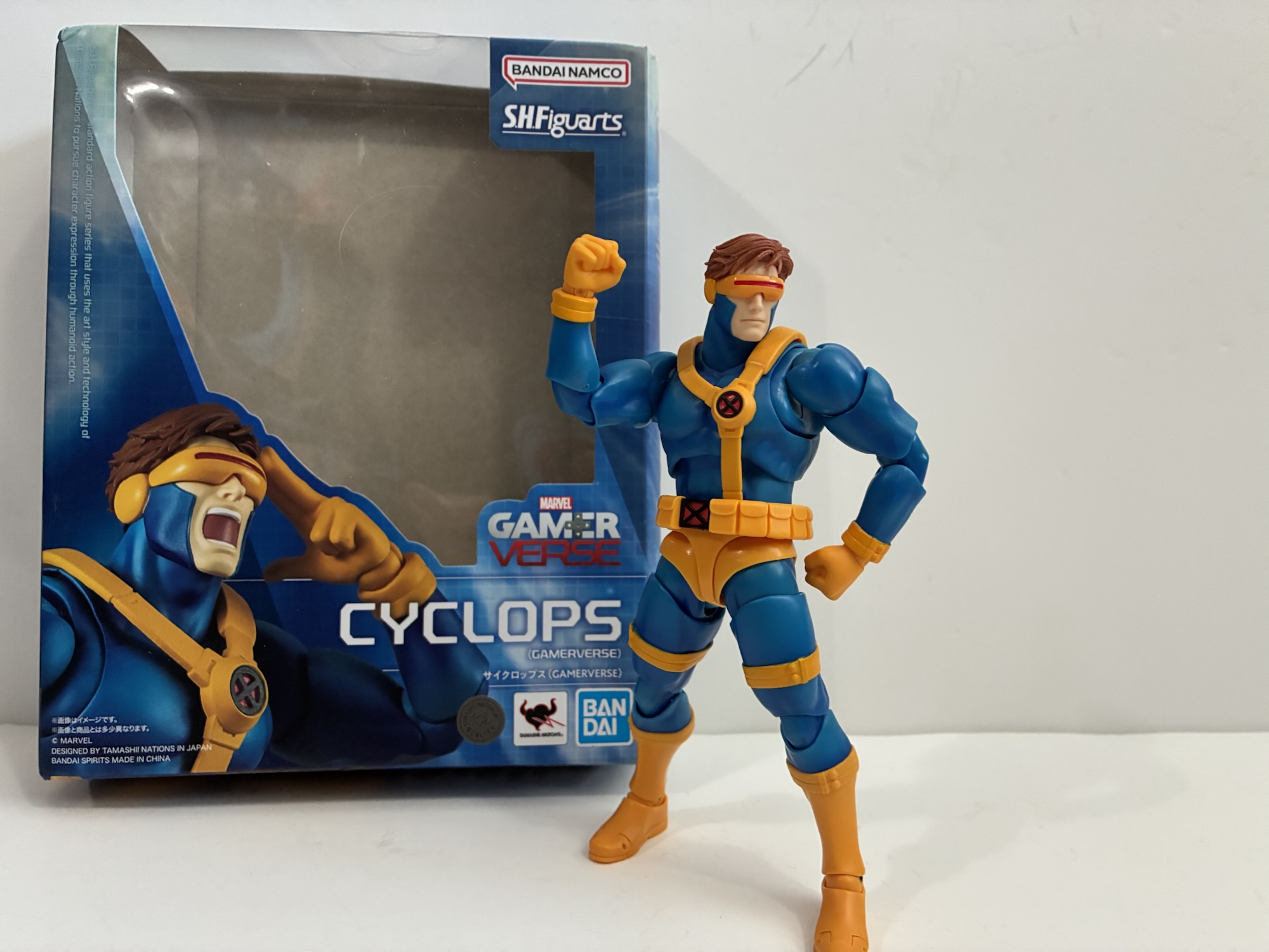
As for me, my goal with my X-Men collecting is always to assemble that ’92 animated team on my shelf in the most authentic way possible. The Hasbro figure is fine, but it does bother me he has no effect parts and the portrait is pretty off-model for the show. Not terrible, but certainly not perfect. This Gamerverse Cyclops isn’t really going to get me closer to my ideal take on the character, but it did look like a figure that was just a whole lot more fun. There are caveats though. For one, he retails for around $100 for North American buyers. That’s a big price, and even though I was able to get that mark down to $89 that’s still an expensive action figure in this scale. He’s also shorter and there’s a question of scale where the figure is concerned. It wasn’t enough to get me to bail, but now that he’s in-hand it’s time to figure out if this was money well spent.
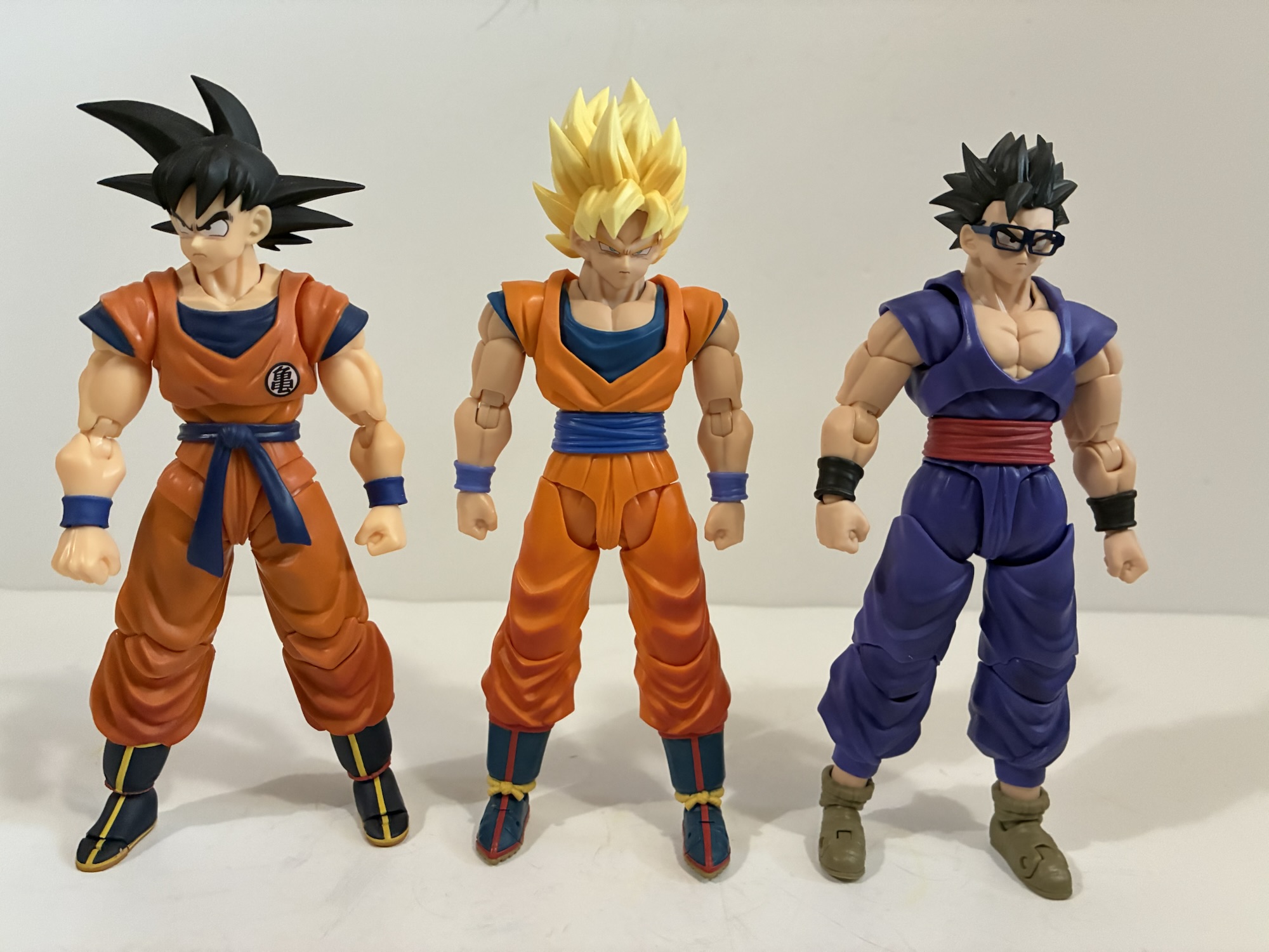
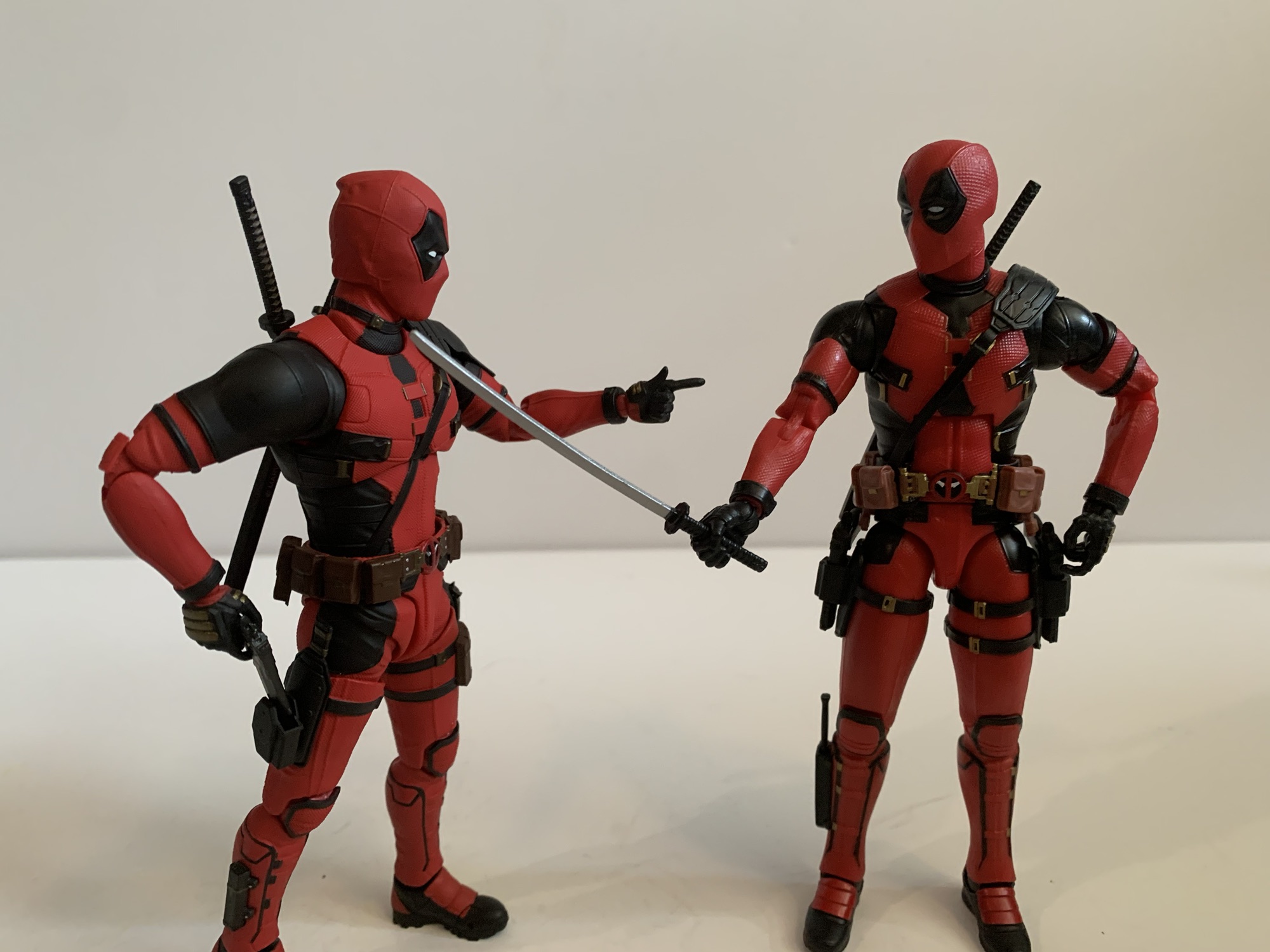
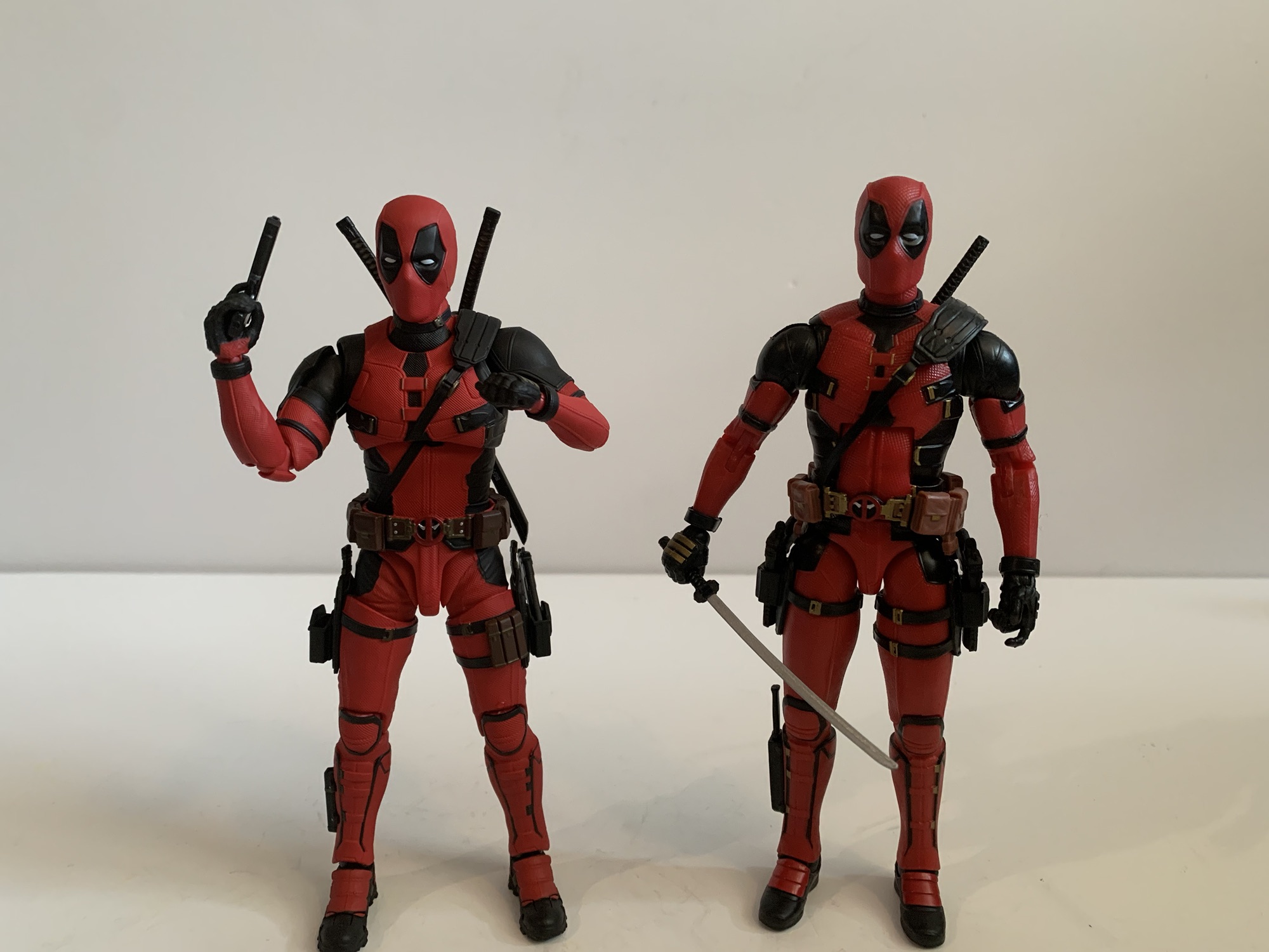
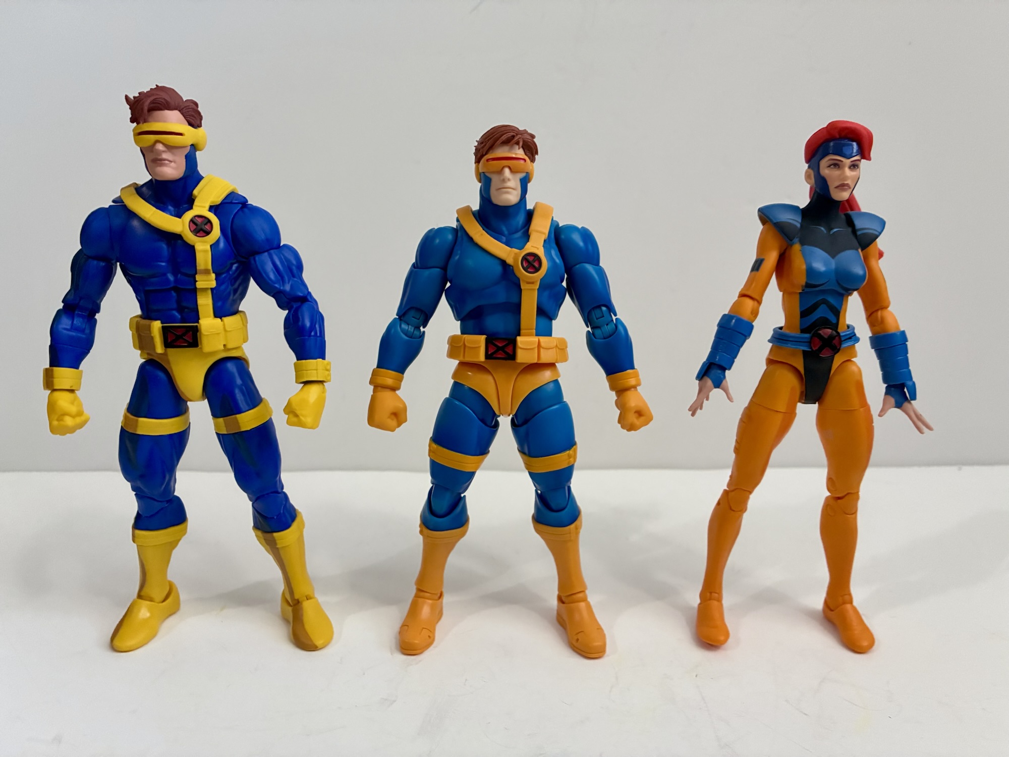
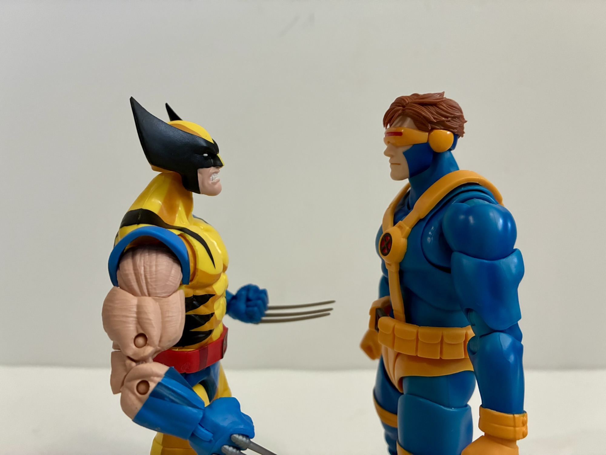
The Gamerverse packaging is pretty much like any other SHF release. My box got pretty well mangled in shipping since I got it through Amazon and they decided that $100 figures should just be placed in brown paper bags (meanwhile, my sub $10 manga gets the box treatment). They’re lucky I’m not an in-box collector. Out of the box, Cyclops stands at around 6.125″ to the top of his hair. If Bandai is going for true 1:12 scale then this might be okay. This is video game Cyclops, not comic or cartoon Cyclops. In the game, he’s pretty much average height and if they’re saying he’s a bit over 6′ tall then that seems to conform well enough. Where it will cause issues is for those who just want to slot him in with some Marvel Legends figures. Compared to the VHS series Cyclops referenced earlier, he is indeed shorter as I have that guy at about a quarter of an inch taller. Is that a meaningful distinction? That I can’t really answer as it’s going to be pretty subjective. He’s still taller than the ’92 Wolverine and ever so slightly taller than my ’92 Jean (with a ’97 head). That’s in just a straight up and down stance for all figures. Crouch Wolverine down or put some bend in the knees of Jean and he starts to look taller. For me though, the real thing that stands out is that this is a thick Cyclops. He has a big neck and something of a square head. Cyclops traditionally has a taller, slimmer, head in this costume, but with this design the head is more in-line with the neck. It’s an all-together different silhouette. His torso comes across as more compact, though in reality it’s the same size as the Hasbro figure if not a little taller. It’s the thickness and his unique belt that give off the appearance of a stockier torso. The legs are indeed shorter than usual though while his arms might be a touch longer than average or it’s just his big mitts that make it appear that way. This is the point where I mention that some folks who have this figure have purchased an aftermarket double ball peg for the inner torso that does make the figure taller. I think his issue, if there is one, rests with the legs though so I’m not too keen to fork over the $30 for a piece of plastic to see if I like it better, but it’s out there if that’s your thing.
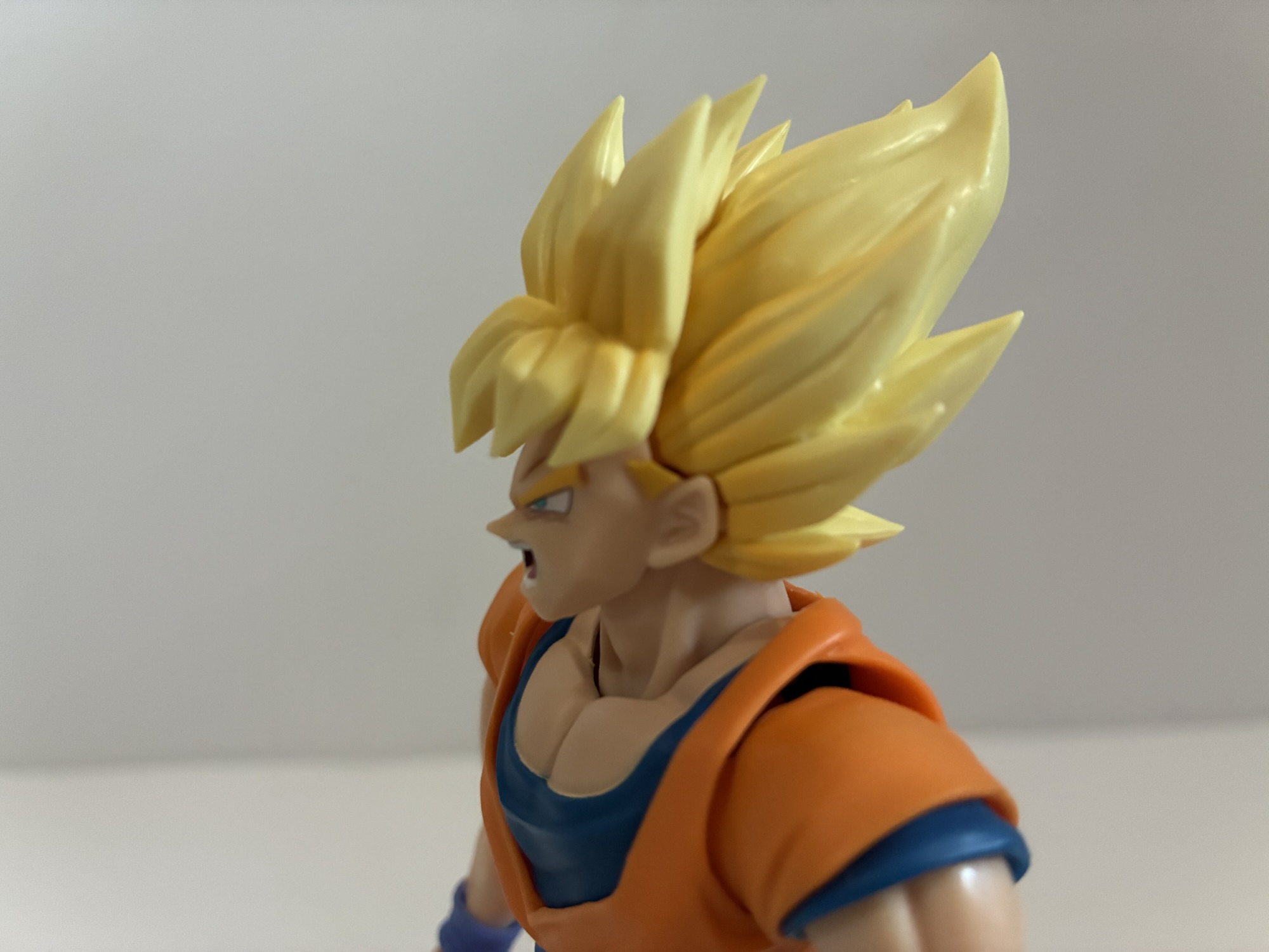
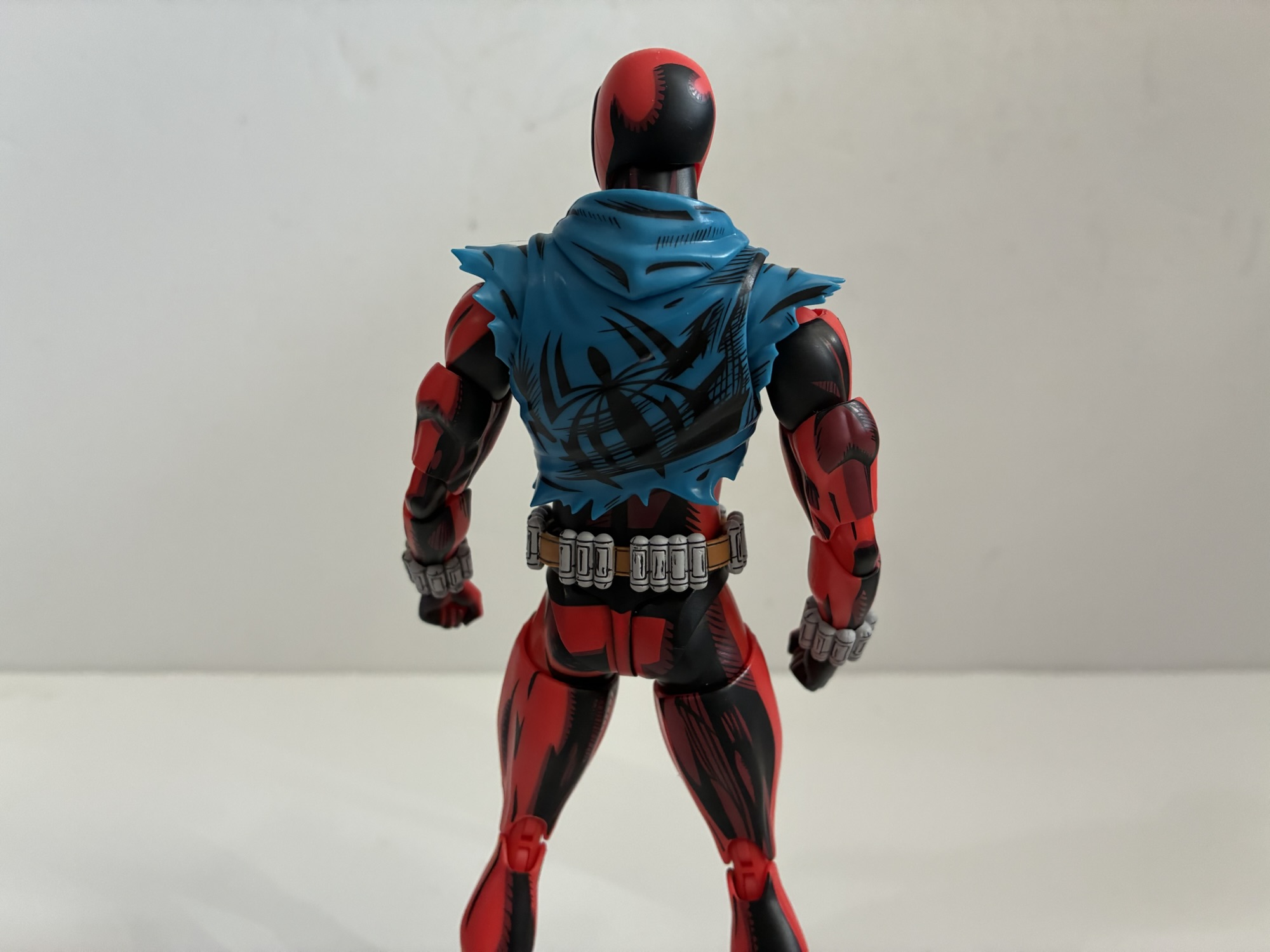
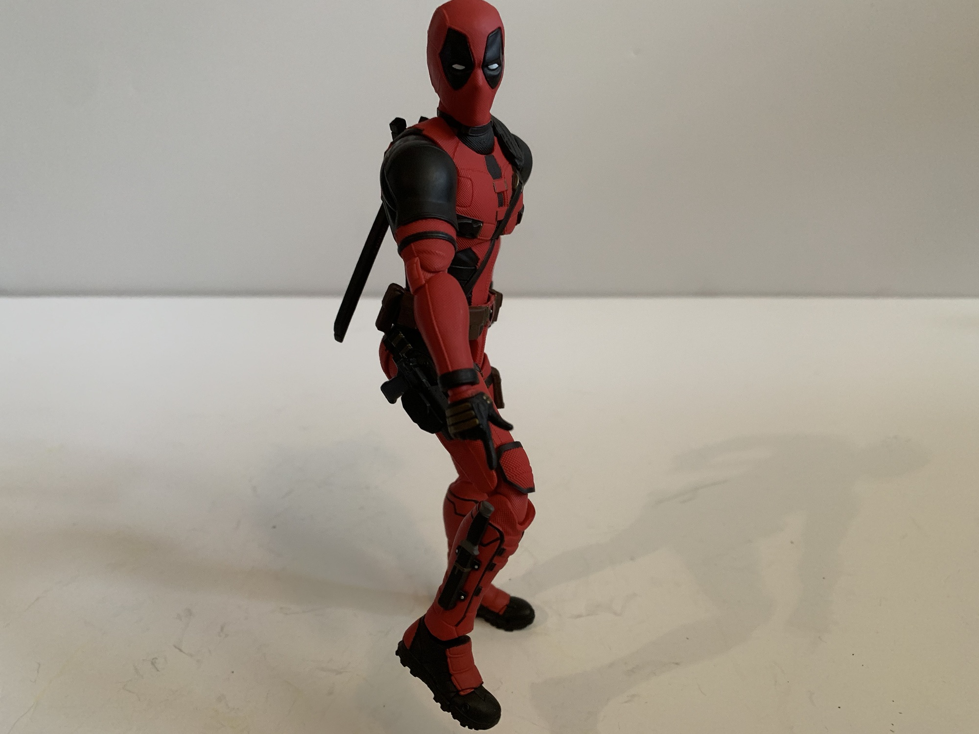
The other thing that stands out with this figure when grouped with your Legends is the shade of yellow in use. With Hasbro, recent editions of Cyclops have gone very yellow – a bright, lemony, shade. With this figure we’re back to that orange-yellow which Hasbro used to use for Cyclops. It wasn’t super obvious to me in the solicitation shots, but in-hand it most certainly is. I prefer this costume go more yellow as it plays off the darker blues better, but his bodysuit also isn’t the same shade of blue that Hasbro has been using. For that, we get a lighter blue with almost a metallic finish. It’s subtle, but there’s a purposeful shine to it. There’s also shading in the lines for the muscles and around the joints which does look nice in person. It’s just a shame the orange-yellow parts lack the same care. Those parts are basically all bare plastic and some take on a non-purposeful shine that looks cheap. In particular is the crotch area where Bandai is utilizing hard plastic caps to fill gaps like we used to see with the Dragon Ball line. The visor, unfortunately, suffers from the same. The painted yellow at the thighs and wrists looks better as it absorbs more light while the boots, unfortunately are colored plastic though they’re not the same material as those harder pieces. The skin tone is also extremely pale, almost a bone white. The hair is unpainted, but sculpted in a very convincing manner that’s almost too realistic, but otherwise looks nice. I should also point out that this design uses the non-traditional “A” shape for the rear of the harness that’s true to the game (and if you had the classic Toy Biz figure it was the same there) while most illustrations of this costume just have the rear mirror the front without the X logo.
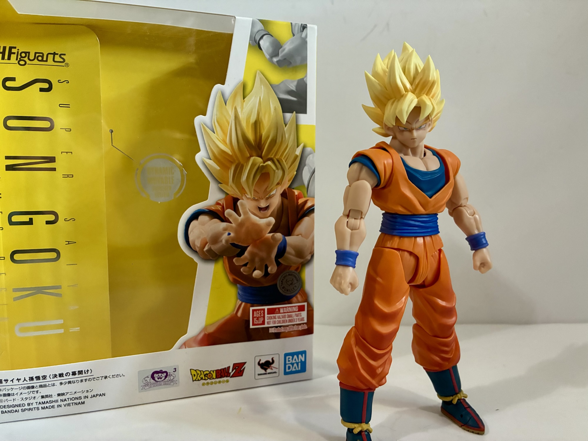
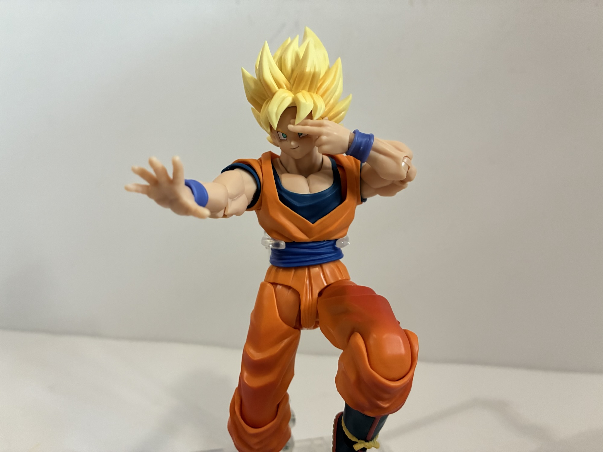
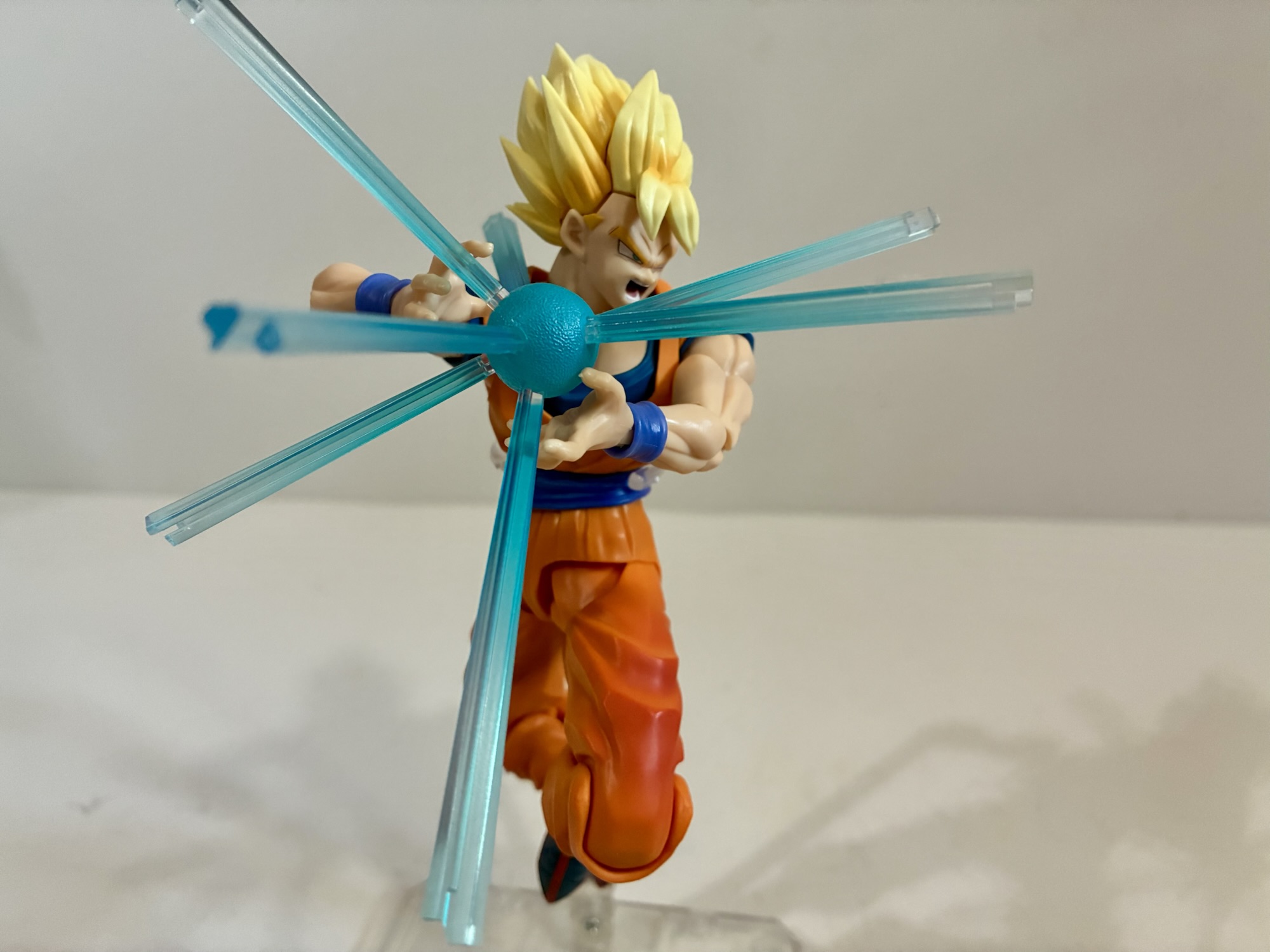
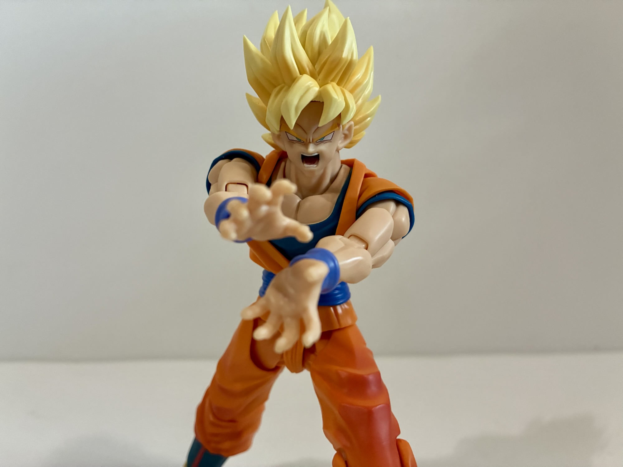
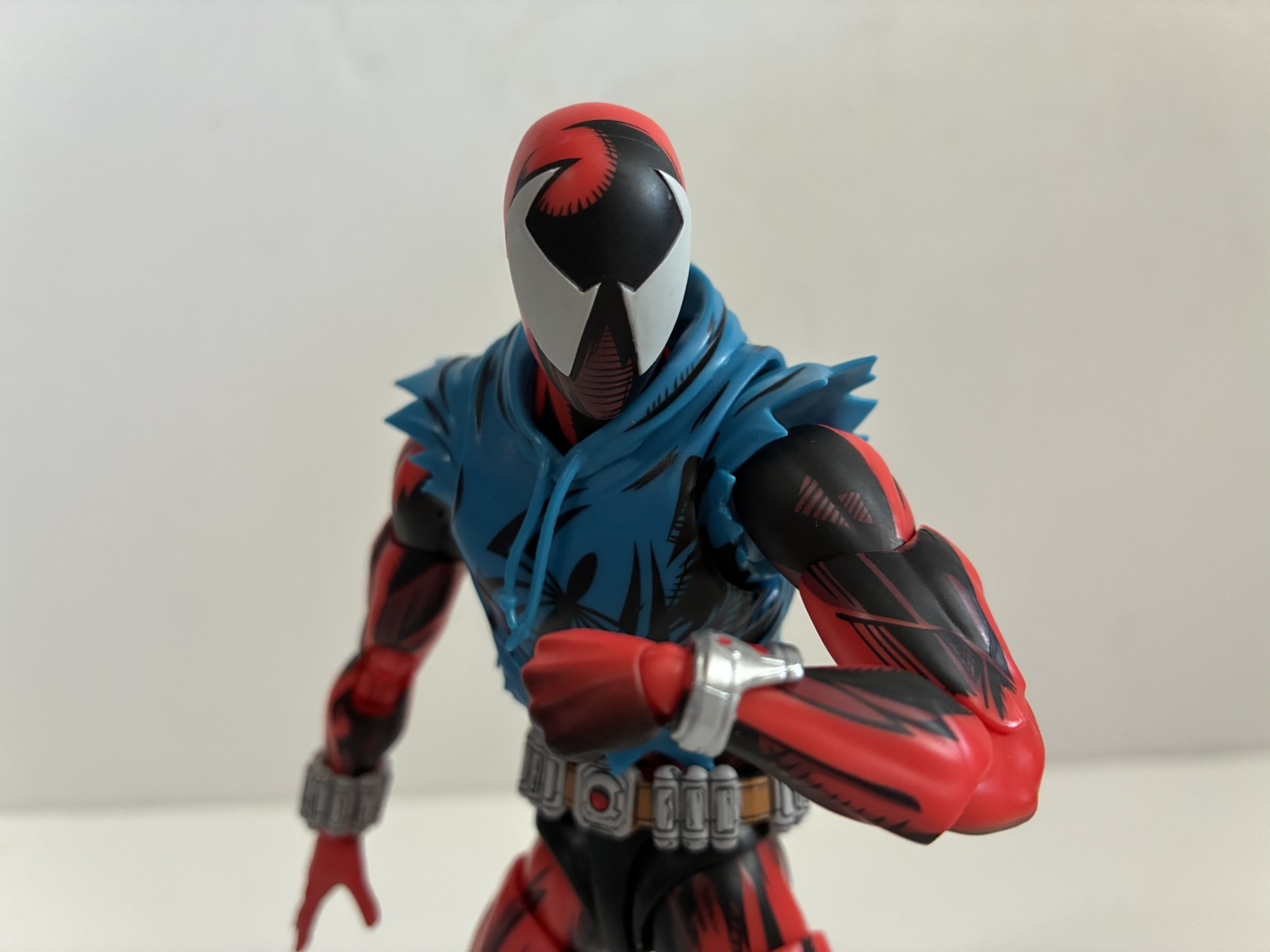
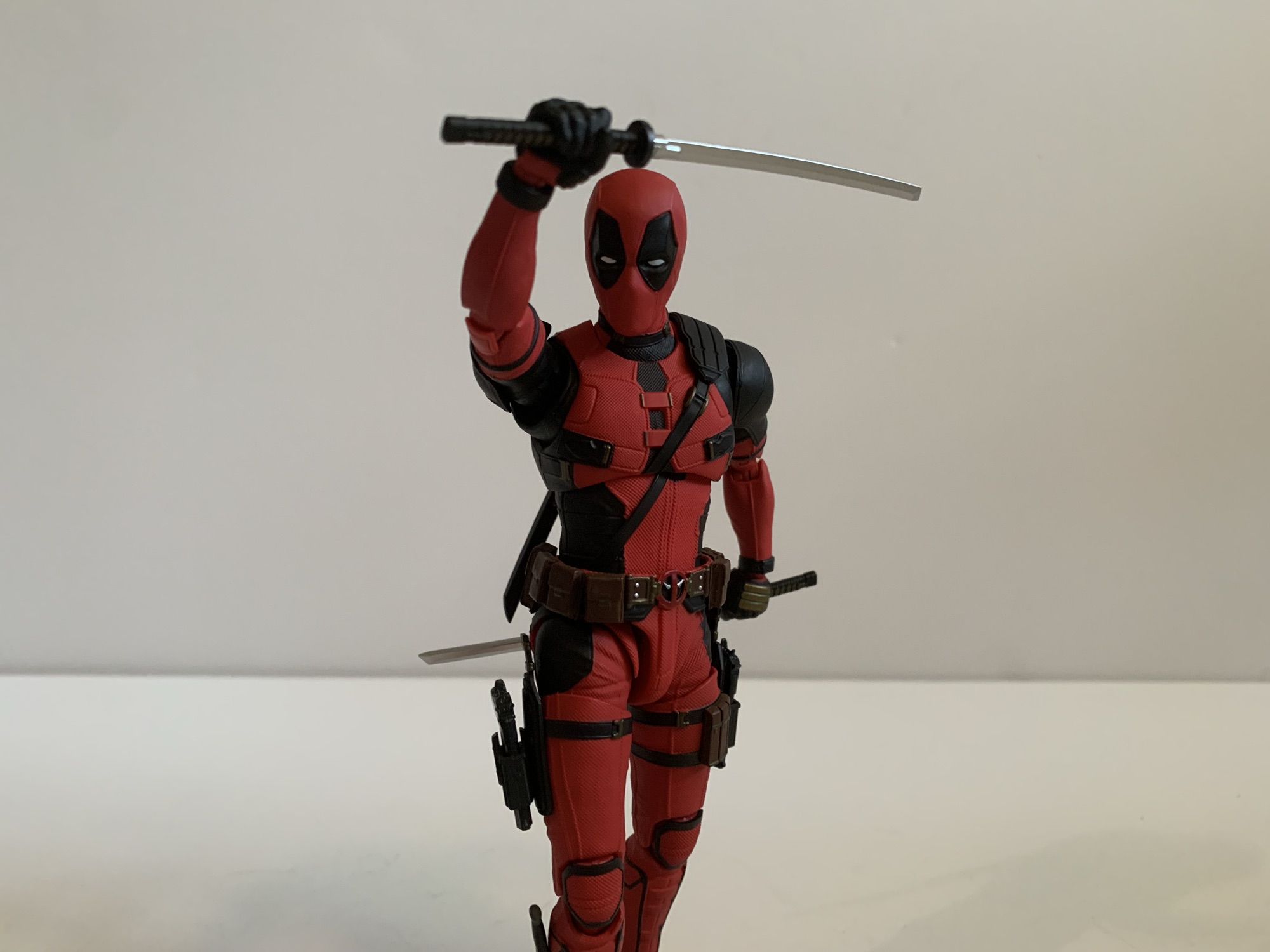
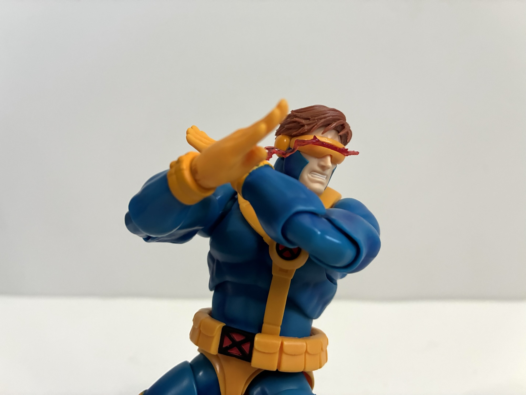
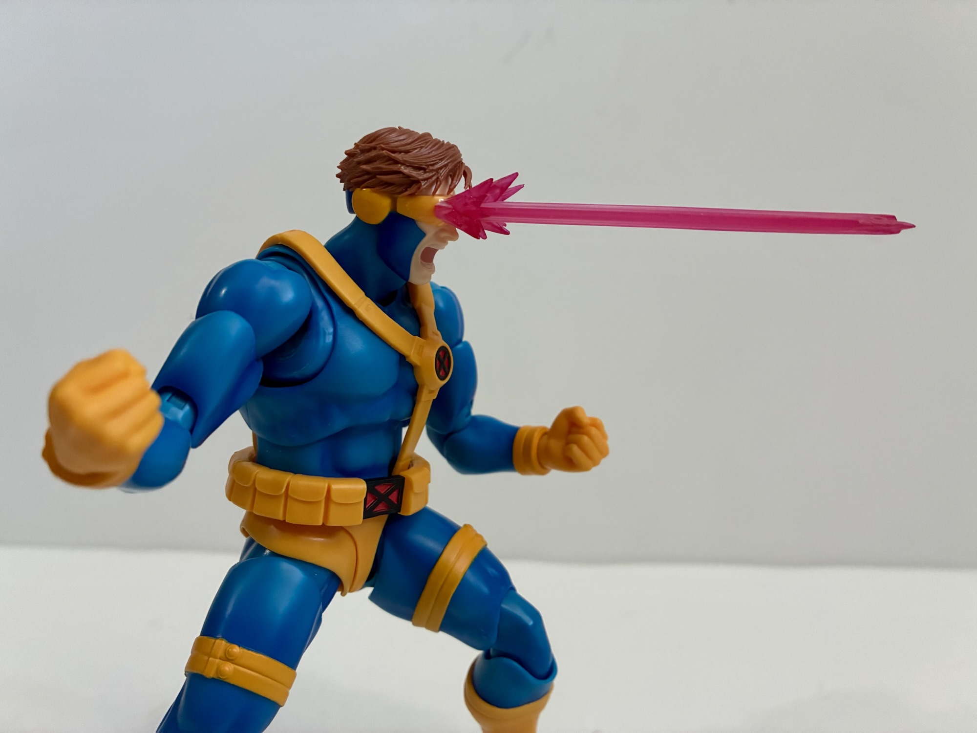
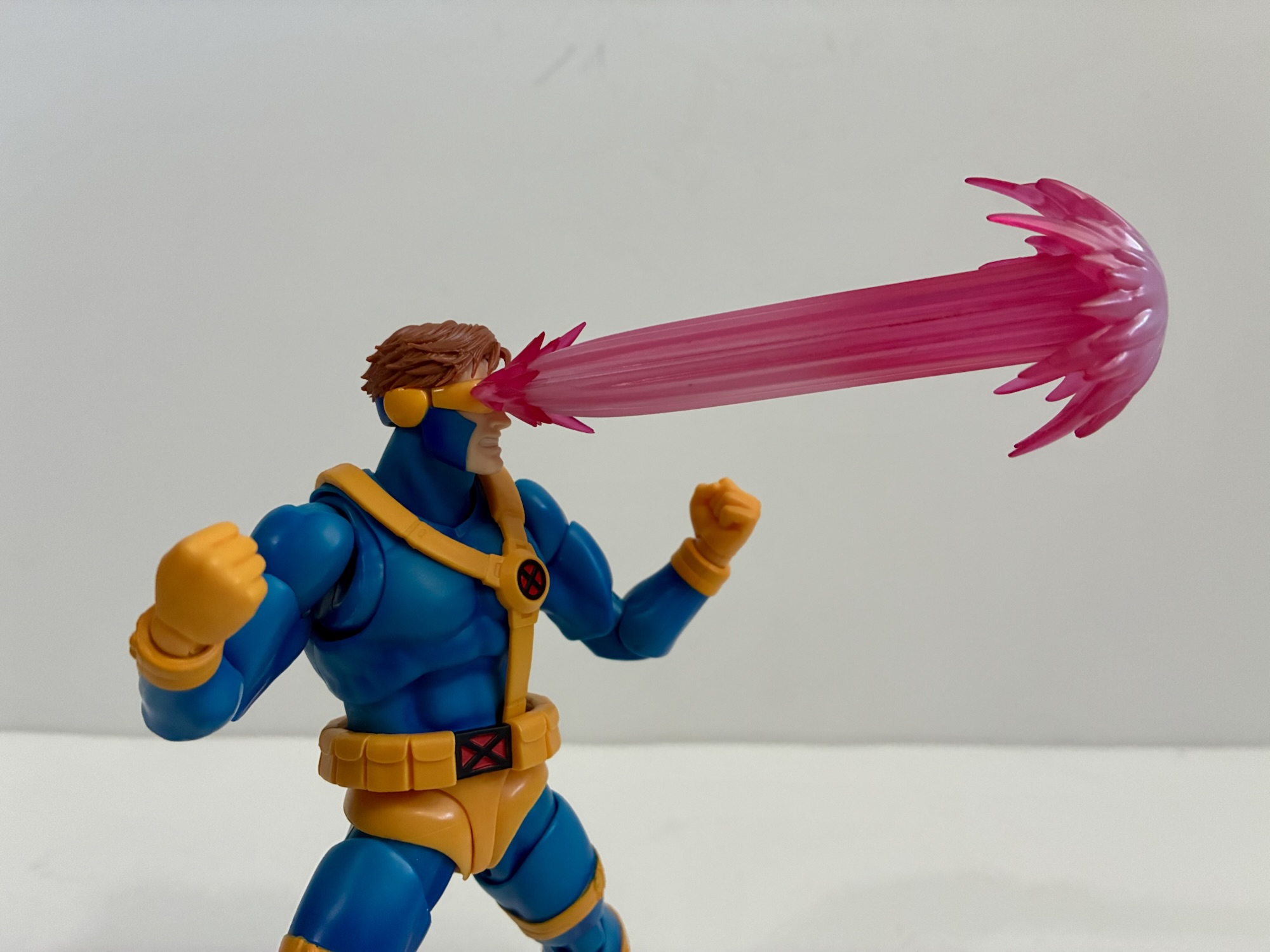
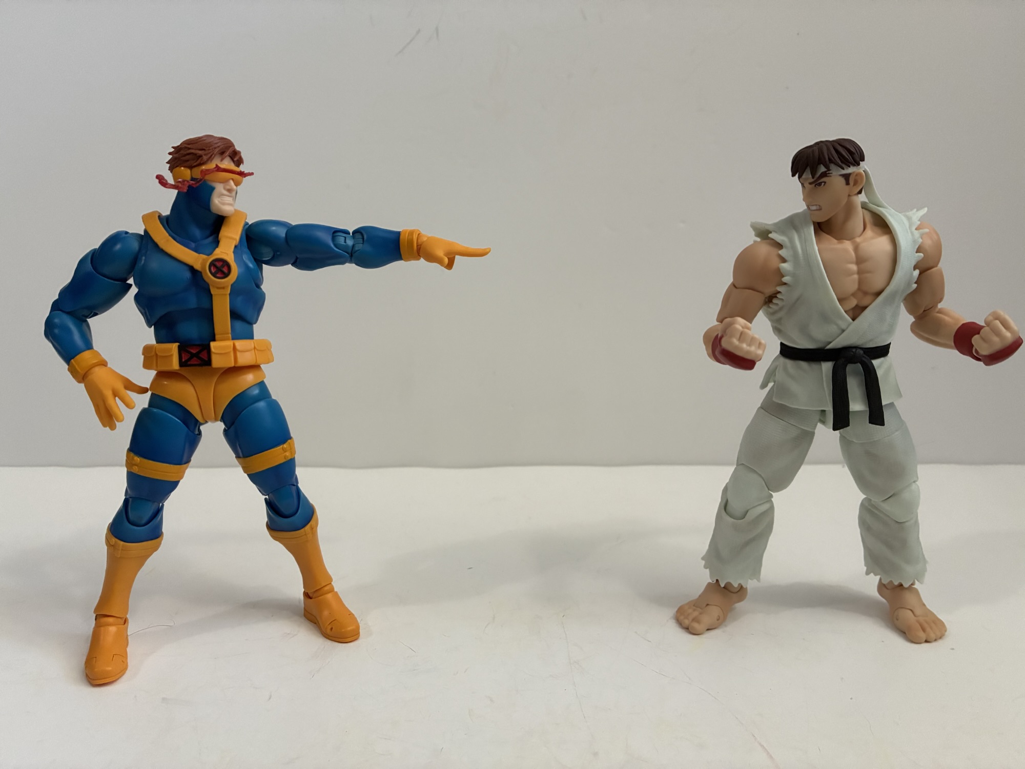
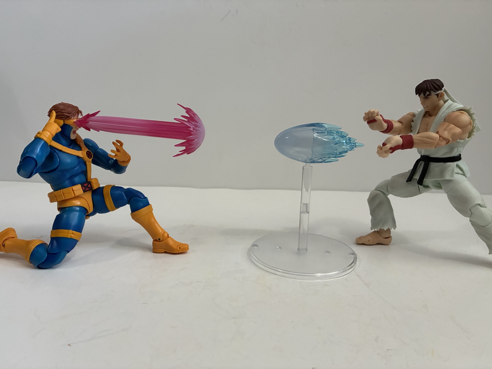
Those unsure of the overall look of the figure will likely need to be sold on the next two parts: accessories and articulation. At least in the accessory department, this figure is a clear upgrade over most others. Cyclops comes with five sets of hands: fists, two-finger pointing, open, clenching, and chop. The two-finger pose is for when he manually activates his optic blasts at the visor and also his pointing gesture for a victory pose in the games. The chop also comes from the games where he makes an X with his arms before unleashing his super. They’re all good choices, but more exciting are the effects. For optional expressions, we get a teeth-gritting and a yelling head to go with his default neutral expression. The hair swaps to all of the heads while the visors do as well. And for those we get a total of four: standard, power “leaking,” short blast, and long blast. The standard one is just that, it’s a shiny plastic piece with a red line painted on. The “leaking” one has a translucent, red, piece which mimics a lot of the game art for the character and is a pretty fun look for your self. That is, if you can resist using one of the blasting visors. The shorter one is more narrow and kind of like a blade while the longer one mushrooms at the end. Both are done with translucent red plastic sprayed with white for a nice look. Both are pretty great and shelf space may be the driving force over which one you prefer. Or how they fit since that’s a bit of an issue. The optional visors have a hard time sitting flush with the portraits and can leave a tiny gap near the ear. Heating the head you wish to use and softening the plastic can help, as can just plain old elbow grease. I haven’t had any issues getting them to stay on and I even placed Cyclops on my shelf with the heavier of the two blasts for a couple of weeks before getting to this review and his head never drooped and the part never fell out. Still, after my experience with the interchangeable face plats on the recently released Super Saiyan Goku, it’s a bummer to see a similar issue here albeit one that isn’t to the same degree.
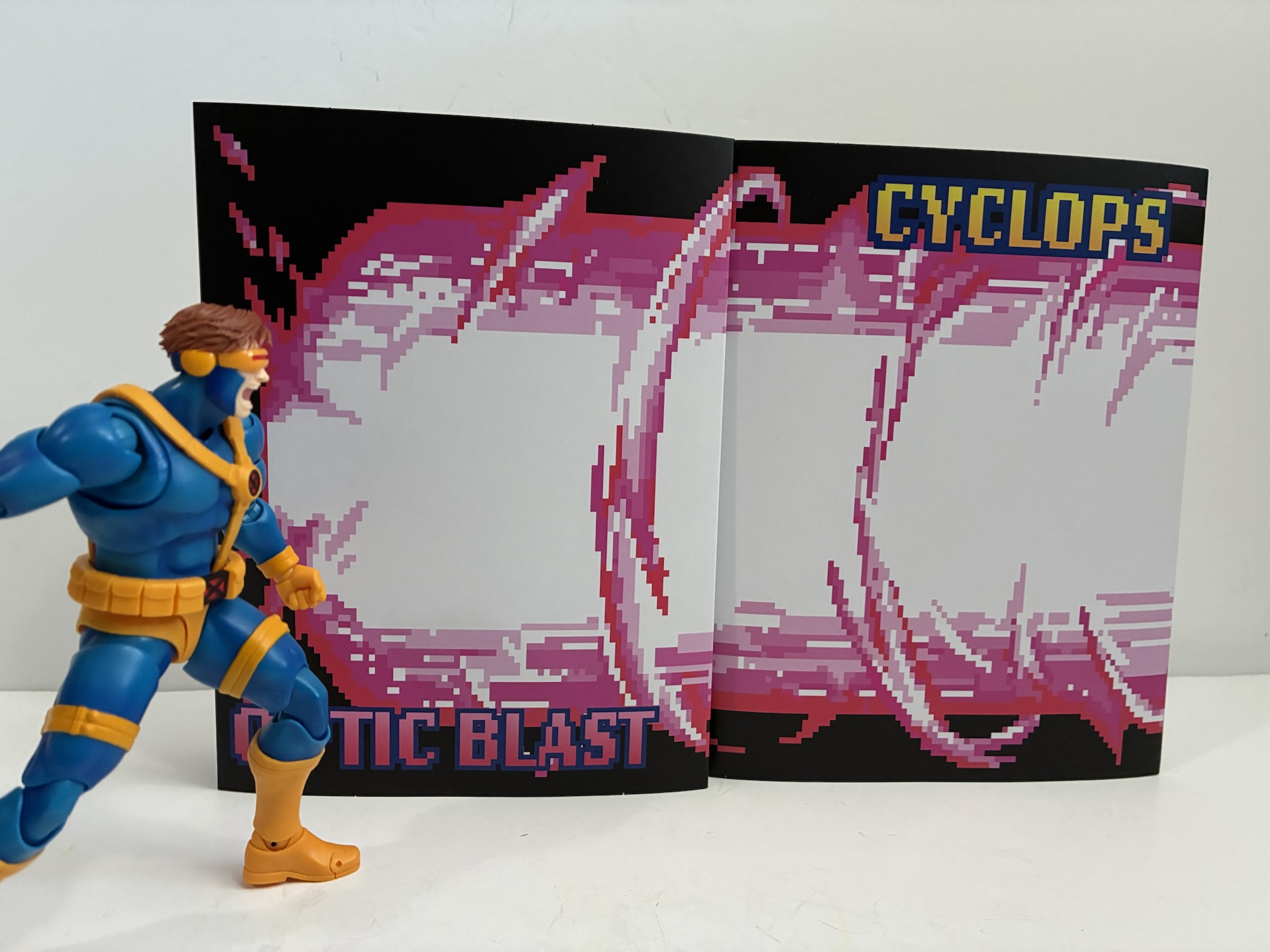
Rounding out the package is a cardboard standee of Cyclops’ massive optic blast from the game. It’s two pieces of cardstock and I guess it looks fine, but it’s a pretty cheap presentation no matter the quality of the print. I suppose it didn’t cost them much of anything to include, but I can’t see using this thing. Of more note are the optional neck parts. Of which there are two. They pop in and out very easily and the intent seems to be to provide a more stable base for the heavier effect parts. Both basically remove the ability for the neck to do much where it meats the torso while retaining the head articulation. One piece is more straight on while the other is angled up slightly. It’s a good thought and a bit of a fail safe in case the default neck proved to be too loose, but I haven’t experienced any issues with the standard one. For my two week experiment from before, I kept the standard neck in place just to see what would happen and it held up fine. Would it still after six months? A year? I don’t know, but it certainly doesn’t seem any looser. These extra parts can perhaps get a more natural looking curve to the neck for those blasting poses so they’re not worthless or anything, just interesting. And in case you were wondering, even the longer one doesn’t materially change the profile of the figure. It sits lower in the torso and I still have him at 6 and an eighth with the longest neck in place.
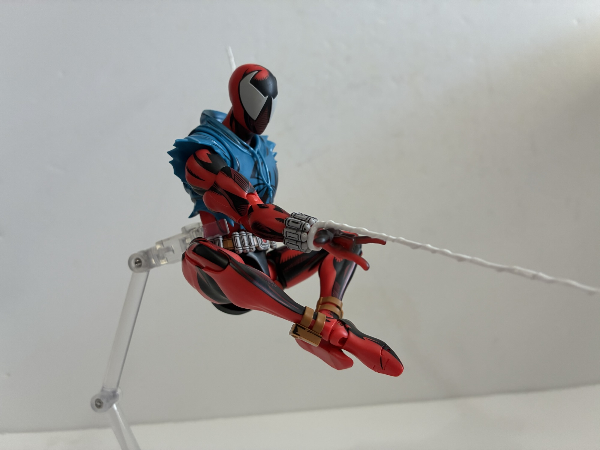
The other most likely area for this Cyclops to shine when compared with the cheaper alternatives is with the articulation. It’s what Tamashii Nations has staked its reputation on. With Cyclops, he seems to follow a lot of the same design philosophies as the recently released Scarlet Spider and that’s not exactly welcomed news for me. We do get a mostly typical load-out for a SHF release: double ball head, ball neck, shoulder hinges that peg in, butterfly, bicep, double elbows, wrist ball-hinge joints, diaphragm double ball joint, hips, thighs, double knees, ankle swivel, ankle rocker, ankle hinge, toe hinge. What’s missing? A damn waist joint. Why is Bandai omitting waist articulation from its Marvel figures lately? I don’t understand it. With Scarlet Spider, the culprit is a lower back piece that’s part of the waist sculpt and seems to only exist to prevent gaps from appearing at the waist. The joint itself is a simple ball peg, like most SHF releases, and it’s just this spacer that prevents rotation. With Cyclops, perhaps it has something to do with these straps that go over the shoulders. They connect underneath the abdomen and there’s actually some play here. You can pull them out and push them back in to provide for more articulation in the diaphragm. It’s a sound concept, but practically speaking offers little. That joint is pretty limited as it mostly tilts and barely rotates. There isn’t an obvious spacer like Scarlet Spider, but there is a blue piece that appears to be doing essentially the same thing and that is preventing the figure from rotating. The hips with the old cap system in place at least work well going forward and back as well as out to the side – certainly more than a Cyclops likely needs. I do like the more traditional thigh cut instead of that hideous thing they’ve been giving us in the Dragon Ball line and the ankles work well. There is an exposed, metal, ring on the hinge at the ankles which some may not like to see. They also did the same thing with the shoulders as we saw with Scarlet Spider where the inside of the shoulder is quite flat. If you put him in a standard T-pose he’ll look pretty weird, but I guess that’s a pose you’re probably not likely to do so does it matter? The butterfly joint is okay and doesn’t break up the sculpt much so we’ll call it a plus. Really, it’s just the torso that blows, but that is kind of a big deal since the torso is most of the figure. Nothing is stuck or floppy so the quality control where articulation is concerned is at least a positive.
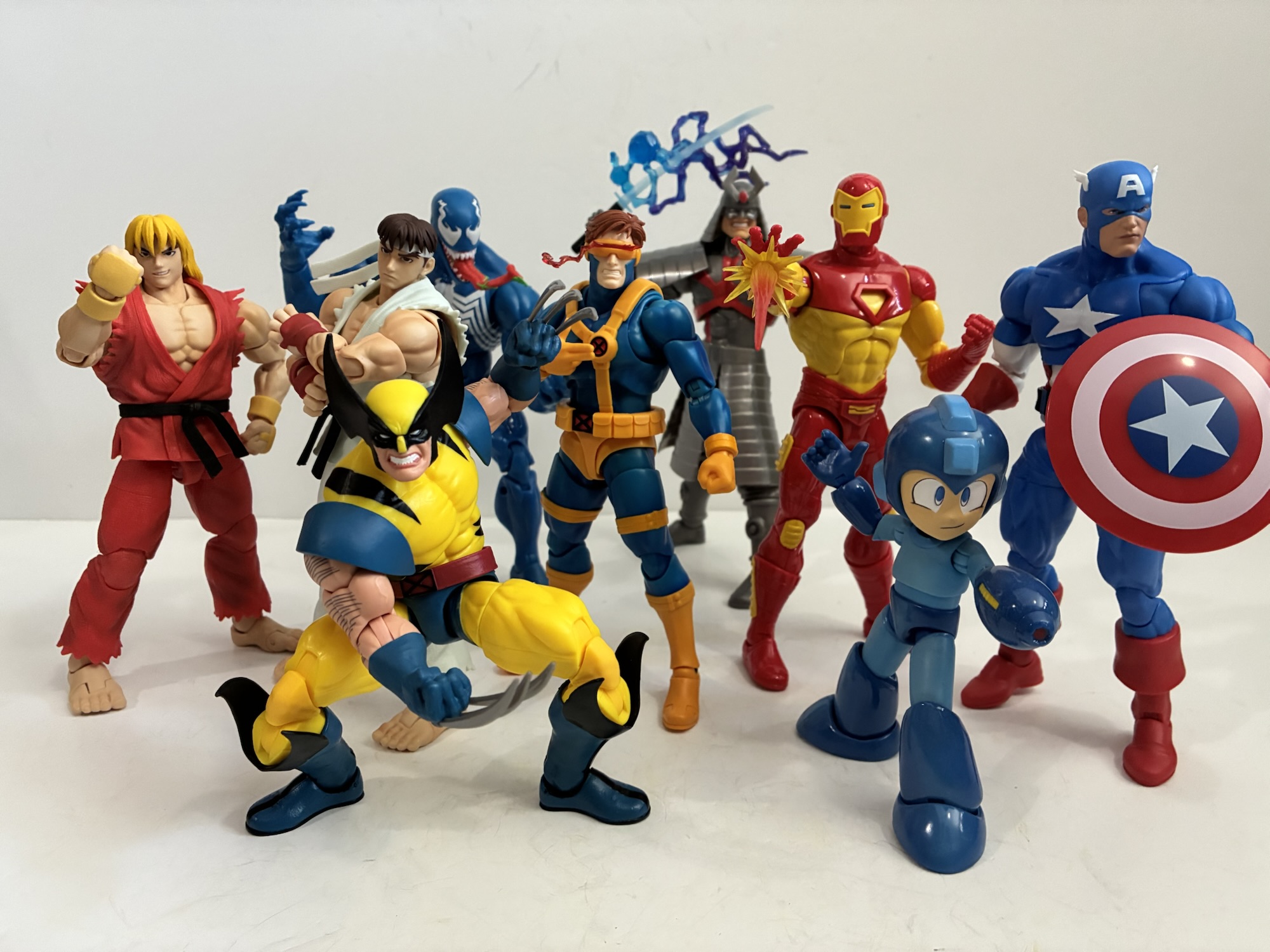
At the end of the day, I’m a little conflicted here. This isn’t my ideal interpretation of Cyclops, but I can’t really say it’s off compared with the game it’s drawing inspiration from so I don’t think it’s fair to knock it for that. If you want to get more into it, this figure more embodies the artwork associated with the Capcom games as opposed to the sprite and that’s potentially a conversation worth having for those building out a Marvel vs Capcom collection. His scale is certainly off with Marvel Legends, but again, that’s not really this figure’s problem. Sure, I would have personally preferred him to scale better with Legends, but it’s not an expectation I can put on it either. It needs to scale with the figures Bandai is releasing though in that regard it’s impossible to say since he’s the first. He does seem to scale fine with Storm Arena which may matter more in this case for those building out that MvC display. What truly irritates me though is the articulation in the torso and the lack of paint on the yellow parts. He looks a little too cheap to be a $100 figure. Bandai doesn’t typically occupy that price range save for their more limited offerings, but maybe the Marvel tax is a significant one. If he were more at that mid-tier SHF price point, say $65, I’d feel better about the lack of paint, but at $100 this doesn’t really cut it. I’m left with a figure that I’m happy to have in my collection, but I don’t think he’s really worth the ask. I would not be shocked if this line dies because Marvel is fairly oversaturated at this point and the price is pretty insane. There may be deals in the future. I’m also less inclined to continue down this path despite my positive reaction to the Spider-Man they showed off. I need to think on that one some more and see how he turns out before committing to purchasing it. The same is true for Wolverine and whatever follows. If this line is one that interests you I’d recommend seeking out multiple opinions and going from there. Yeah, this hobby is an expensive one these days and six months from now you probably won’t miss that $100 too much no matter how you feel about this thing, but we probably should expect more for our buck.
There’s a lot of stuff I could list here that is likely of interest, but I can only select three. Maybe check out my Toy Review Archive if you want to know more of my thoughts on all of the figures that could relate tot his one:

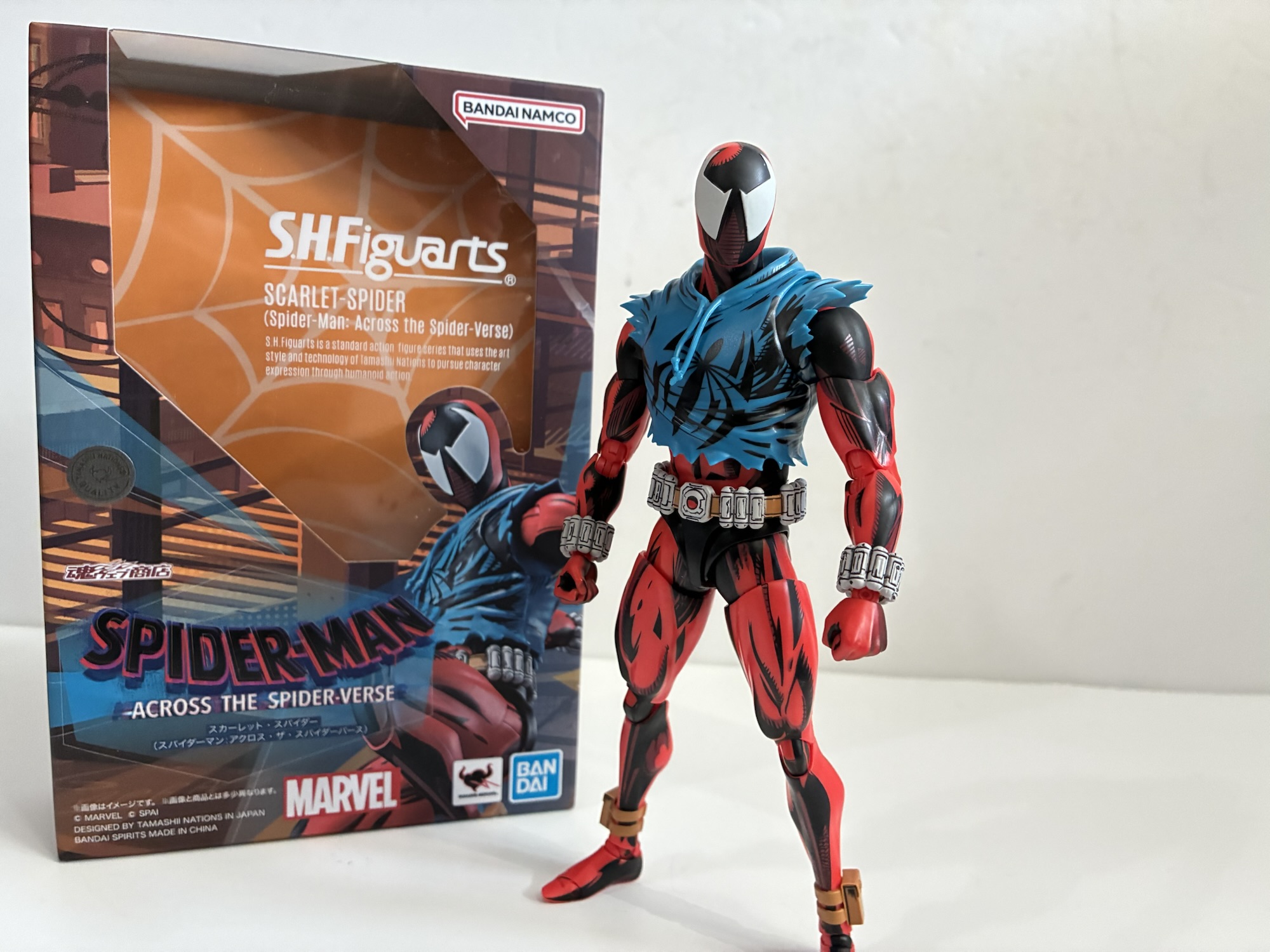
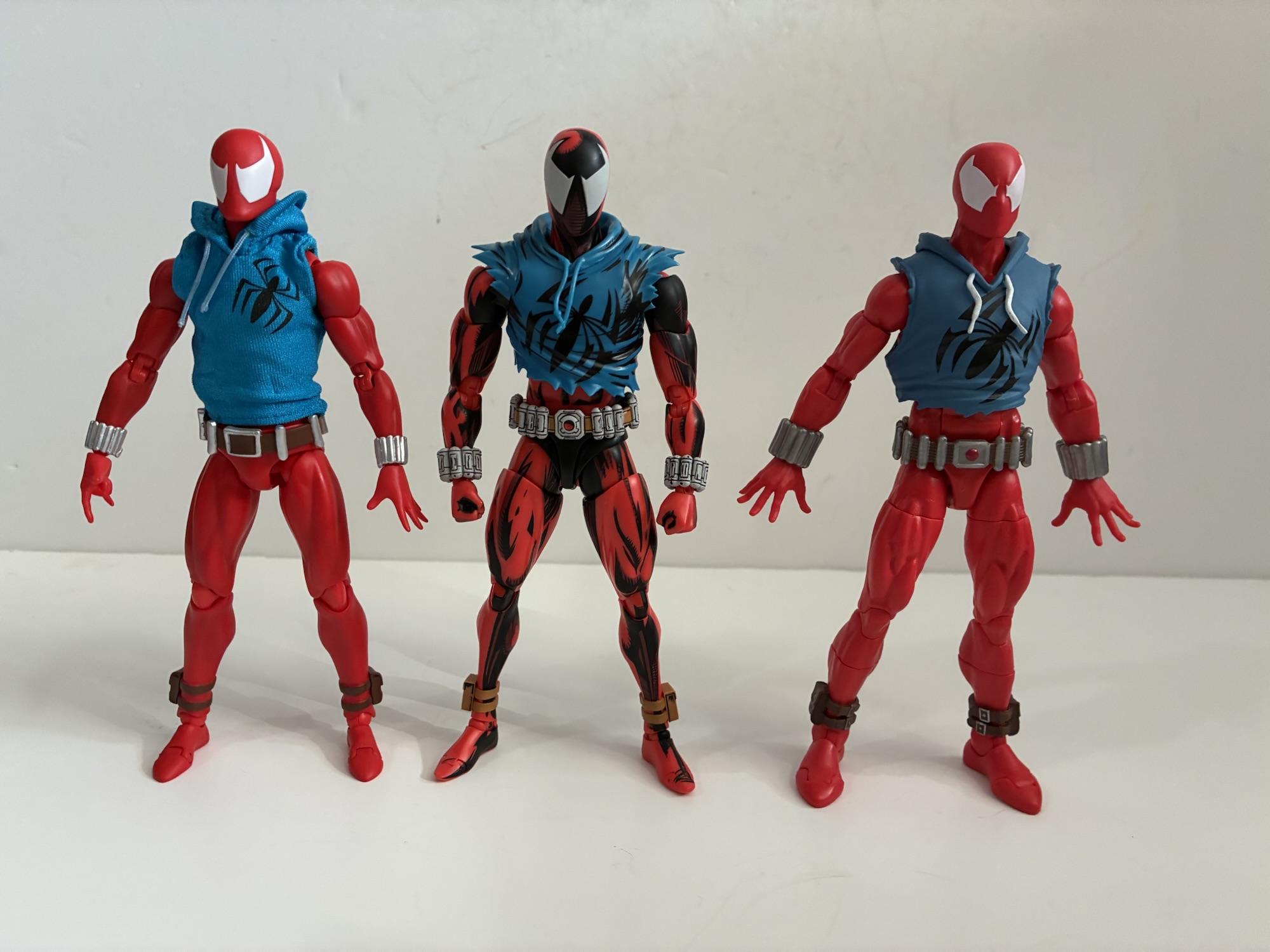
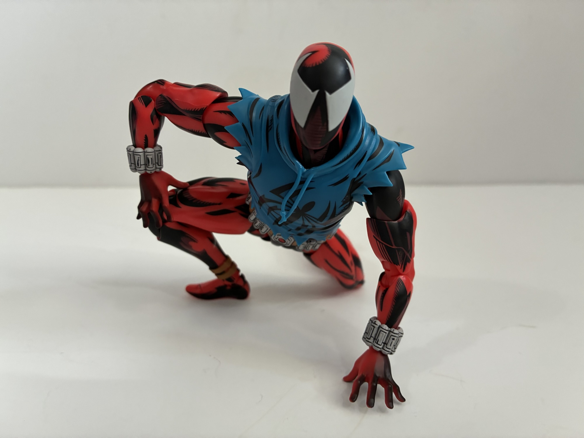
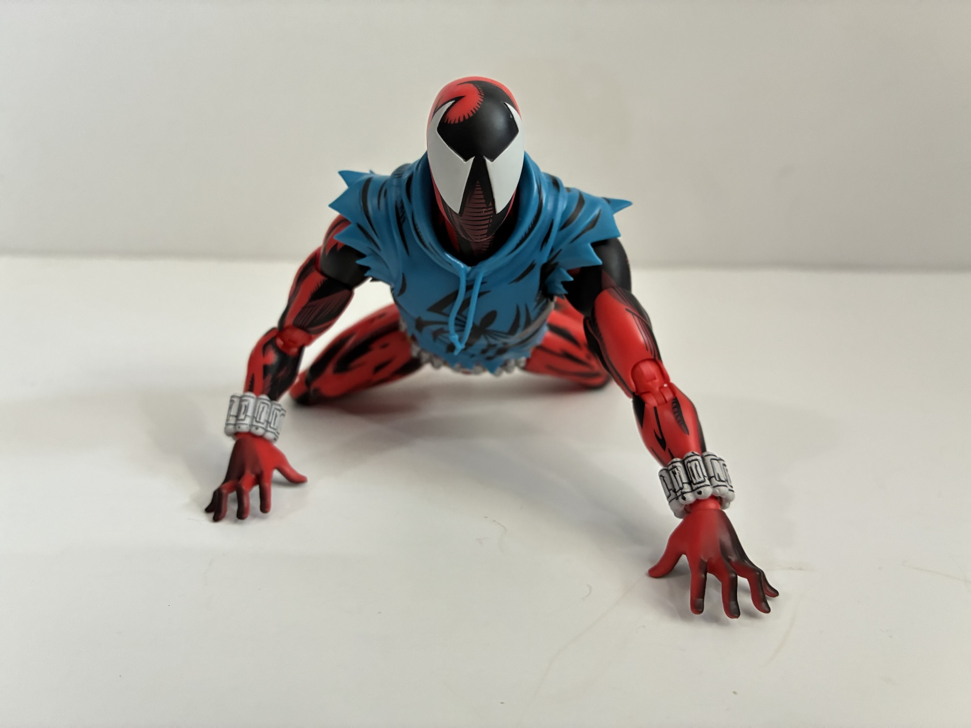
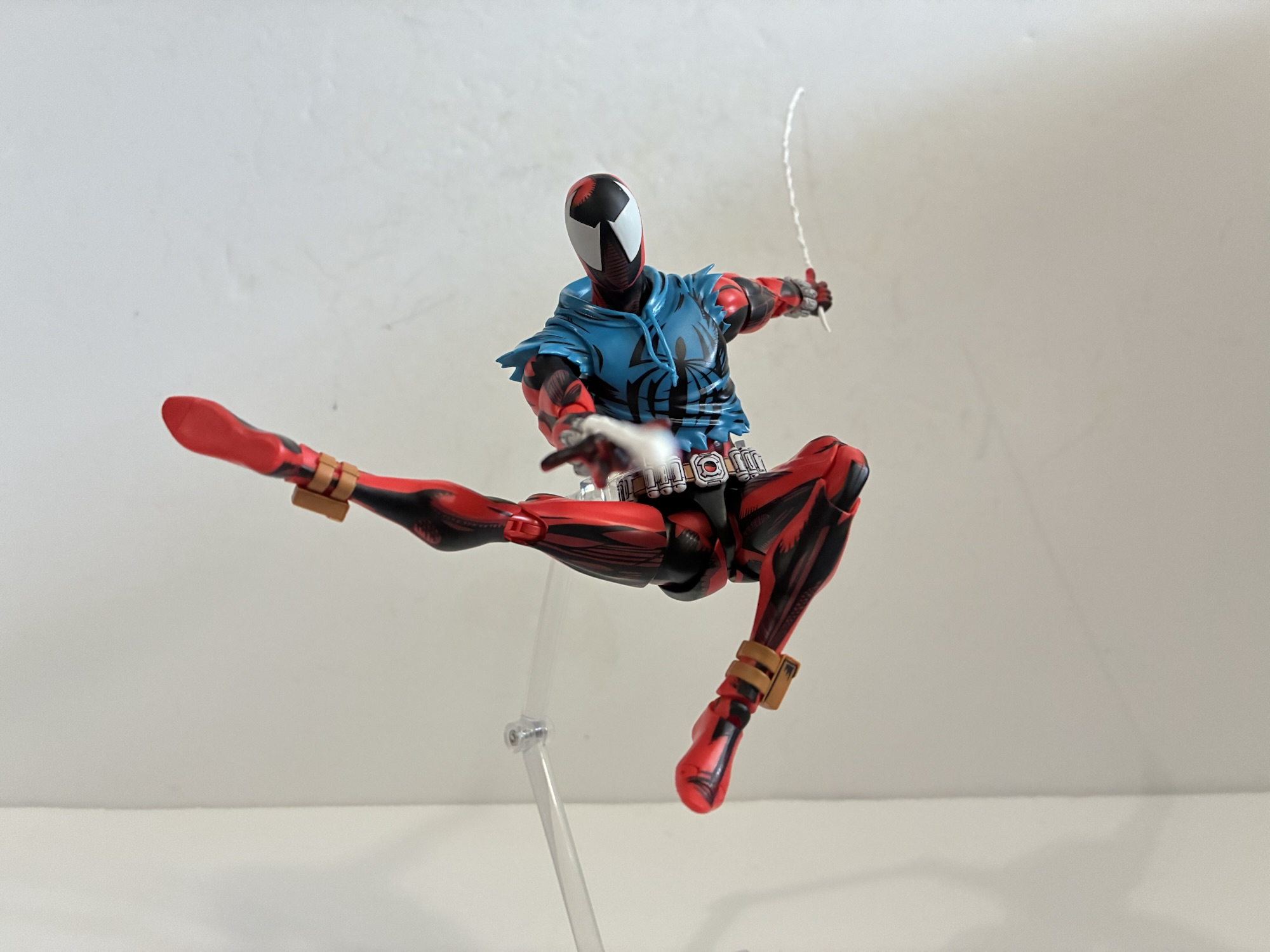
S.H.Figuarts Across the Spider-Verse Scarlet Spider
In the two reviews I did of Scarlet Spider action figures I shared the origins of my love for the character’s design. To make it short, I found the appearance of him on a cover of a Spider-Man comic intriguing, but more is as a young artist I much preferred to doodle him in my…
Keep reading
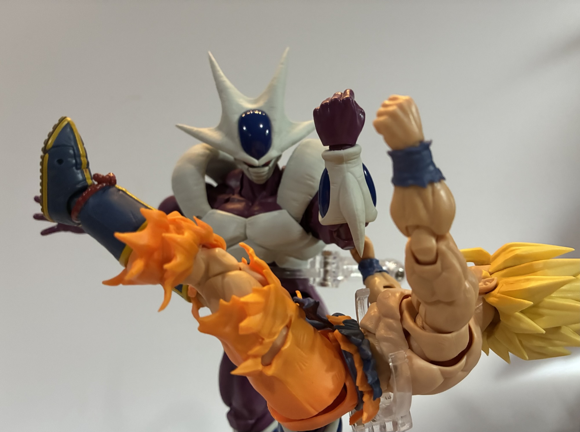
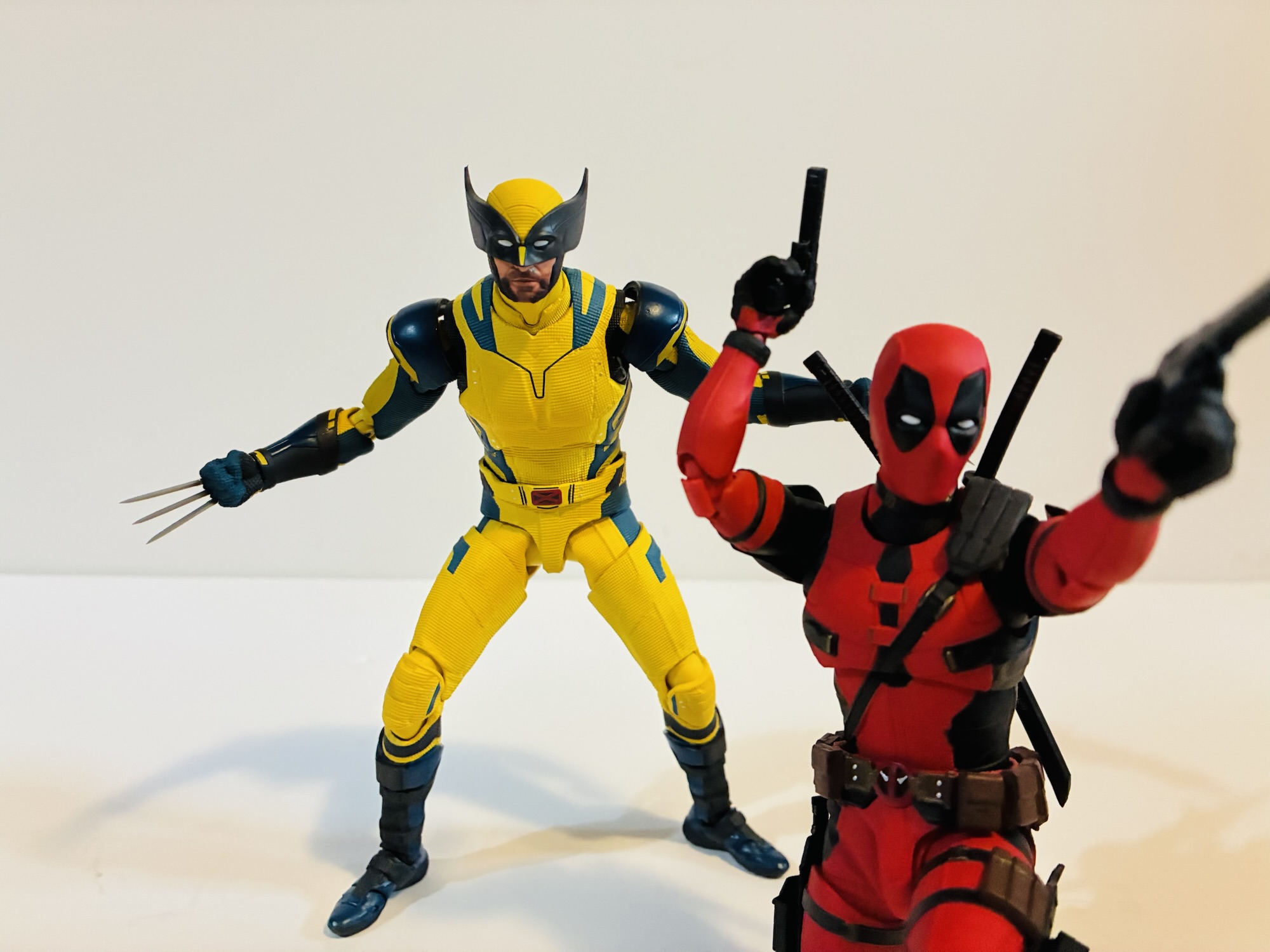
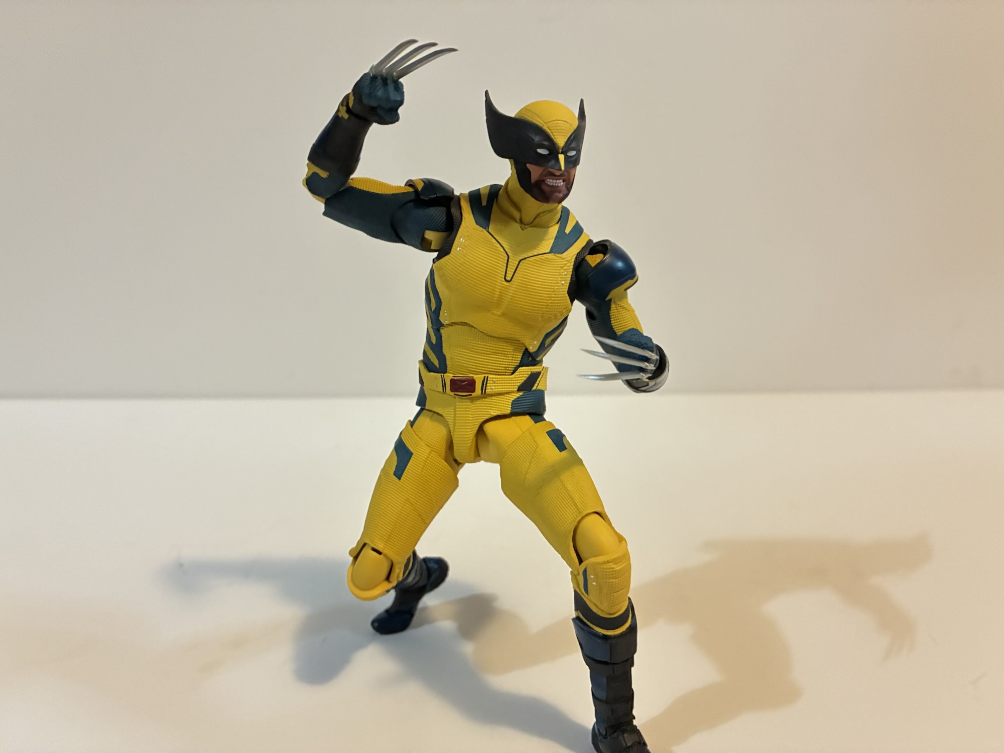
Marvel Legends Gamerverse Wolverine vs Silver Samurai
Video game inspired action figures are quite the hot ticket right now. I’m not entirely sure why that is, but maybe some of that is owed to Jada Toys and how well received their line of Ultra Street Fighter 2 action figures have been received. Hasbro, for their part, has had a “Gamerverse” subline of…
Keep reading
Storm Arena Street Fighter Alpha 3 Ken
One of my most anticipated releases of 2025 came out of no where. I was a kid during the early 90s and into video games so I know a thing or two about Street Fighter. Street Fighter II was everywhere and is pretty much the reason why the one-on-one fighting game became a huge genre…
Keep reading