Before Christmas and The Christmas Spot can begin, we have another Christmas toy to look at. This one comes courtesy of Super7 and its Super Size line. The Super Size line is a line of vinyl figures that stand around 17″ in height. These are big figures, and being that they’re vinyl, they’re not really articulated. They’re kind of like jumbo versions of their ReAction figures and some of them are basically direct adaptations of that line. They’re also really expensive and when you combine that with how much real estate they take up it makes it a hard line to truly collect.
This is what you came here for.
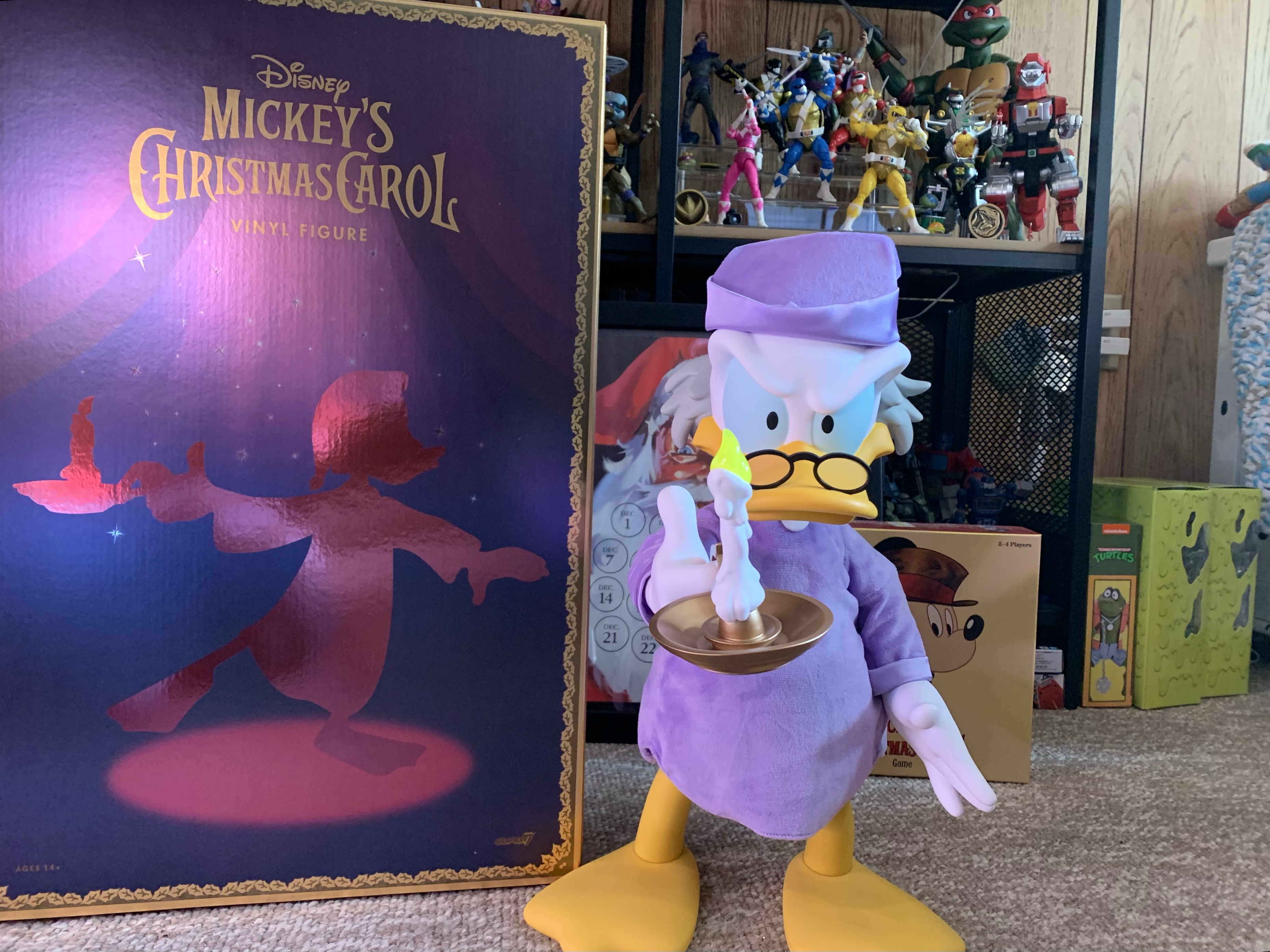
Last year, Super7 went after my heart by adding Scrooge McDuck to their line of Super Size offerings. And it wasn’t just Scrooge McDuck in his adventuring attire, it’s Scrooge as Ebenezer Scrooge from Mickey’s Christmas Carol, one of the greatest Christmas specials of all-time. How could I resist? Well, there were two-hundred and ninety-five reasons for me to resist that temptation. The MSRP basically made this one a nonstarter, even if I wanted it badly. I just couldn’t see myself spending three-hundred bucks on a vinyl statue. It just wasn’t going to happen. Lucky for me, waiting paid off. Recently, Amazon had a sale on this particular figure and it dropped to a tick over half-off. At under $150 bucks, now we’re talking. I even gave it some thought overnight, while also allowing the wife to maybe consider it as a Christmas gift, before pouncing. Now I have a new Christmas decoration for 2023 and, I have to say, I’m pretty pleased with my decision.
Not quite.
Scrooge arrived in a massive, brown, shipper. On it lists the product and it would appear this figure is one of 1,004. For a $300 vinyl toy of a cartoon duck, a thousand units is probably all that was made and it’s not really that surprising that some made it to the clearance section. Inside that brown shipper was a plain, white, box and inside that was the product’s box. It’s a glossy, deep, purple box with shiny gold trim. On the front and back is a silhouette of Scrooge from when he’s searching his room for spirits before going to bed and it’s done in a glossy rose gold. On the top is a simple Disney logo and on the sides it reads Mickey’s Christmas Carol. Actually, on one side it says that, on the other side it reads Alice in Wonderland Queen of Hearts. Whoops! I’m assuming all of the boxes feature this misprint and that mine isn’t unique. It’s definitely the type of goof few companies would spend money to fix.
Inside this box is the actual figure. Scrooge is in a blister bubble with one zip-tie at the right arm. Getting him out is rather painless, and once removed he stands with relative ease on a flat surface. Scrooge is depicted as he was before retiring for the evening so he has his purple cap and gown on. To the top of the feathers on his brow, he’s just a tick under 17″ and pretty dense so he has a nice weight to him. The cap and gown are done with soft goods and it’s a plush material so it brings in its own texture. It doesn’t really match the look of the animation as a result, but it does add a little more prestige to the presentation than just a flat material. The hat is removable and it just rests on his head. There is a stiff insert sewn into the front of it to help it maintain its shape and it sits on his head just fine. There’s no easy way to remove the gown if you would rather Scrooge be naked or if you wanted to dress him up in something else. You would have to attempt to disassemble the figure to get it off, or cut it.
It would have been nice if this doll were in-scale with Scrooge. Oh well.
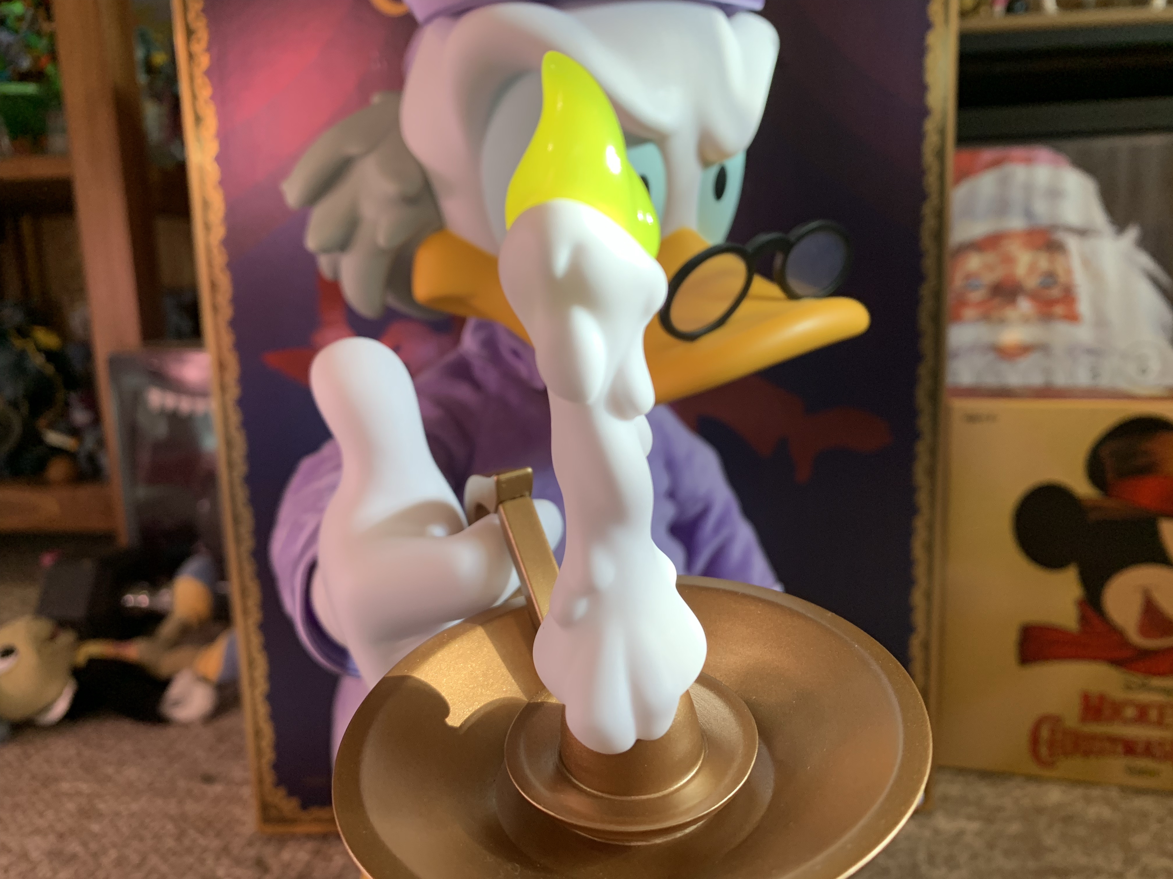
This is a vinyl figure, so the presentation is pretty simple as a result. Most of it is done with colored vinyl. The eyes might be the only area that’s actually painted. Even so, it looks really nice. There’s a softness to the finish which is customary with vinyl and since it’s a matte finish it works really well. Scrooge has a scowl on his face which is befitting the character and the hair on the back of his head is done in gray which is consistent with his presentation in the short. The glasses are glued in place and have clear, plastic, lenses and look great. The right hand is in a gripping pose while the left is open and flat. If I have any criticism to levy here, maybe I’d have shaped that left hand in a more natural, relaxed, position, but it’s fine. And he looks good with the hat on or off so take your pick.
Excepting the clothing, the only accessory here is a lit candlestick and holder. For what it is, it looks great. The flame is a translucent yellow and the holder is bronze in color. It fits over Scrooge’s index finger with relative ease and it’s not too heavy either. As for the articulation, if you’ve ever bought a vinyl figure before then you know there isn’t much to be found. Scrooge actually has more than I would have expected. Every joint is a simple swivel and he has one in the neck, shoulders, wrists, diaphragm, legs, and ankles. The diaphragm is actually surprising and nice to have. It’s the only spot that allows for some nuance as you can make Scrooge look like he’s peering around the corner or something. Rotating at the legs will pitch the figure forward or back if you want him more hunched or not. The ankles aren’t particularly useful though to the point that I’m surprised they bothered as it’s the one joint you can’t hide. The rest are either hidden by the clothing or just not plainly visible.
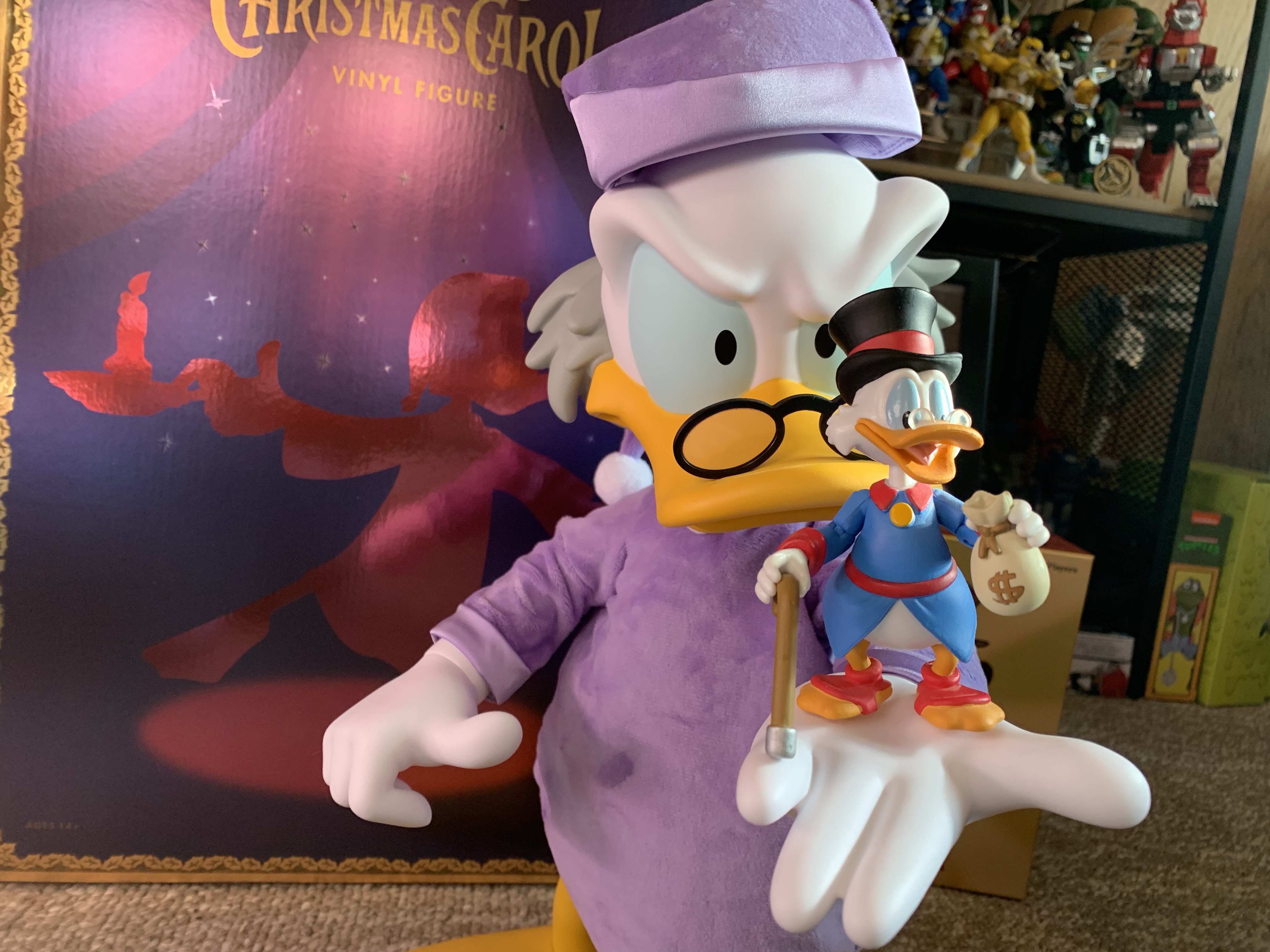
He’s definitely “Super Sized” compared with the Funko Scrooge McDuck.
This Super Size version of Scrooge is really one of those “what you see is what you get” type of releases. I will say, pictures don’t really do the figure’s size justice. It’s pretty damn big and feels big, even if it’s not much bigger than some quarter scale figures I have. Mostly, it just looks really nice. I love this thing. Would I have loved it at 300 bucks? Maybe, after the sting of paying for it subsided. The price I paid for it puts it in the range of a lot of quarter scale stuff. It’s even a lot less than the sixth scale Mondo figures I love. Those figures are true action figures with a lot of paint, accessories, and articulation. The comparison to a quarter scale figure, like a NECA TMNT release, feels more apt though. While those figures have more stuff and more articulation, they’re pretty heavy and I basically find a pose they can handle and leave them.
You’ll be able to tell when I took this thanks to the Christmas countdown.
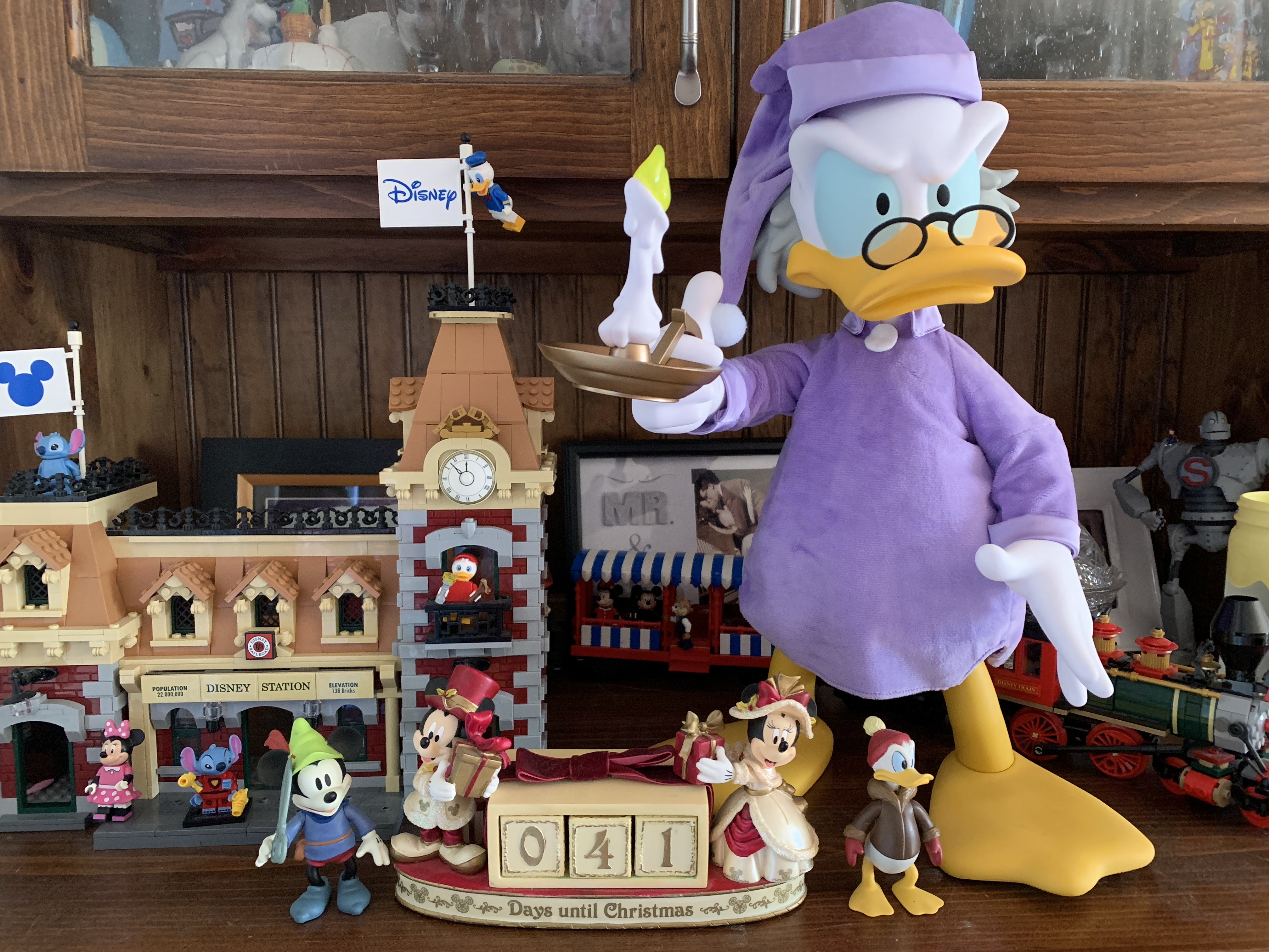
This is a figure that doesn’t need a whole lot of articulation. The vinyl toy approach is what works, and it turned out really well. It reminds me of the old store display characters, some which still exist in Disney World, that would be motorized where just their head rotates and an arm might go up and down or something. My mom even has one of Winnie the Pooh, somewhat ironically, in a nightshirt with a lit candle. I love that aesthetic and if I had more resources (and more space) I’d go after vintage items like that. I’d also probably have the Super Size Brave Little Tailor Mickey Mouse, but I truly have no where to put such a thing. With Scrooge, he’s a Christmas decoration so I can find somewhere to place him for a month out of the year, even if it’s a bit cumbersome. I basically do the same thing with a Christmas tree each year. If you’re like me and a have love for the cartoon this character is taken from then you’ll probably love this item. I can’t really recommend it at full price, but I definitely endorse it while it’s available for around the price I got it. Aye Super7, you drive a hard bargain.
Check out more from Mickey’s Christmas Carol and Scrooge McDuck:
We made it! Another year in the books, and another Christmas has come. Indulge in it. Bask in it, for it only comes once a year, and not to get too dramatic, but you never know how many you’re going to get. And we’re ending this year’s edition of The Christmas Spot with another throwback…
It’s been nearly a year since DuckTales returned to television airwaves. Scrooge McDuck, along with his nephews and surrogate niece Webby are back to solve mysteries and rewrite history. It’s a fun show that adheres more to the work of Carl Barks than to the series that ran in the 1980s while also doing its…
It’s that time of year once again! Every day goods are a little pricier, egg nog is invading the dairy case at every grocery store, and red and green versions of every candy in existence flourish in the seasonal section of department stores. Yes, it is Christmas time and it would be obnoxious if it…
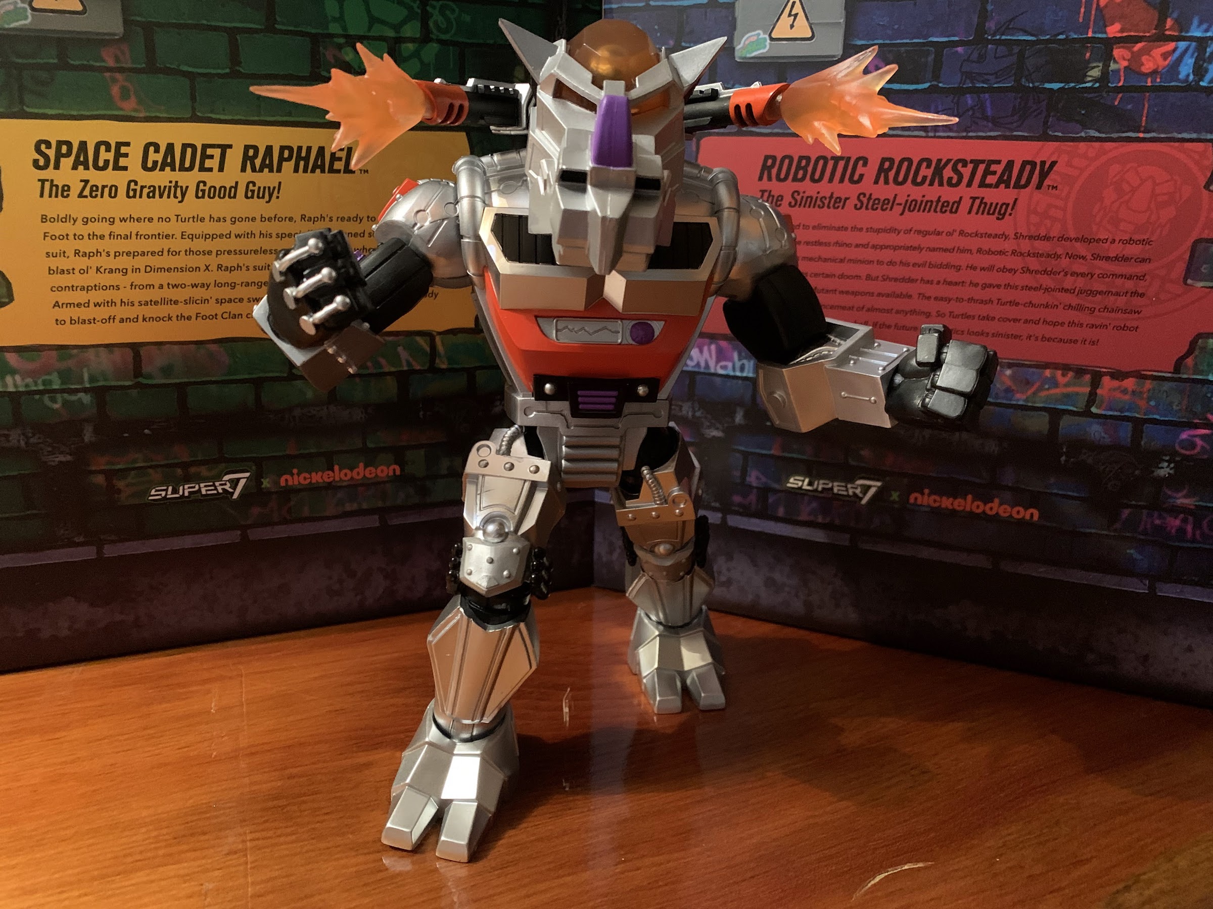
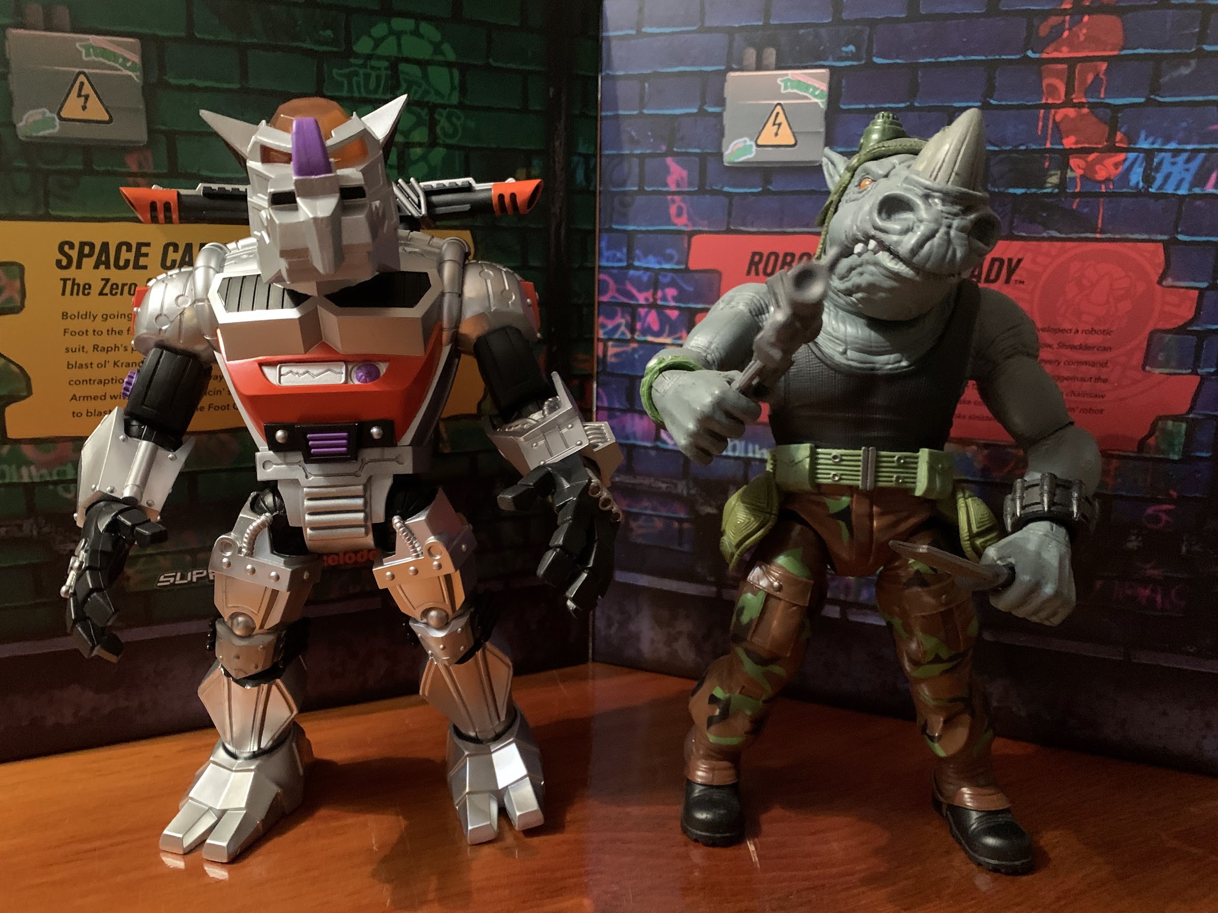
Last week, it was Space Cadet Raphael’s turn to be put through the ringer by me. Super7 didn’t really impress with that offering, but I did tease at the end of that lukewarm review that a more positive one was on the horizon. This is that more positive review. Robotic Rocksteady is the latest villain from Super7’s line of TMNT Ultimates!. It’s another figure that’s essentially a scaled-up reproduction of a toy originally released by Playmates Toys, but given a new coat of paint, a bunch of accessories, and some beefed up articulation. And, spoiler warning, it may be the best in the line.
The robotic version is roughly the same size as its biological counterpart.
Robotic Rocksteady was originally released in 1993 which was year 6 for the vintage toyline. By the time this figure arrived, I had moved on. 1992 saw the release of X-Men on Fox and by 1993 it had totally sunk its teeth into me. I think I bought only one TMNT action figure that year, Ninja Action Raphael, which was the last figure I purchased in the toyline I once loved as much as life itself. I did also get the TMNT Turtle Trolls, but they felt like a whole other line to me. Robotic Rocksteady was one I missed, though I do recall seeing it on the pegs. I remembered the character from the cartoon, which I was still watching on Saturday mornings, and because of that there was a desire to pick him up. I never did though, but now Super7 is giving me another chance at the figure I let pass me by.
They very nearly see eye-to-eye.
Even from the back he looks pretty nice.
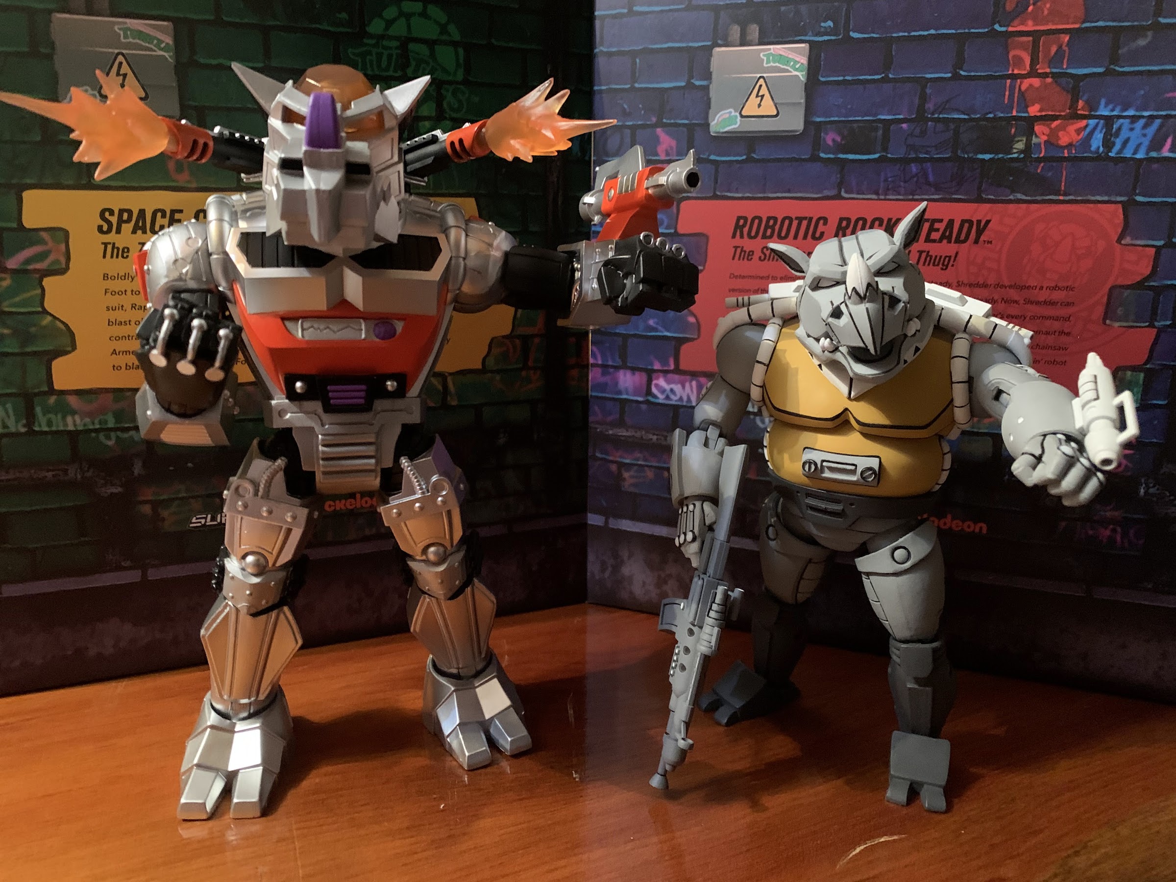
Rocksteady stands right at the 8″ mark to the top of his head. Being a robot, he’s predominantly a metallic silver with hits of black, red, and purple sprinkled throughout the sculpt. Just about every bit of this guy is textured to some degree. There’s wires and rivets to be found throughout and in true Playmates fashion there is some asymmetry at play. Surpsingly, not with the feet, but with the hands as the right hand has wires that arc over the back and onto the fingers while the left hand appears to have guns built into them. They look like the channels on Wolverine’s gloves and there’s even three of them. There’s definitely a heft to this guy that wasn’t present with Raph and he’s pretty similar to Bebop in that department. The top of the head and the eyes inside are handled with translucent, orange, plastic to give the figure a light piping feature similar to what we saw with Metalhead. The paint is handled well and pretty clean. It’s not some incredible, super-detailed, approach, but it feels appropriate for this subject matter.
The turtles, on the other hand, will be looking up to this guy.
Robotic Rocksteady is just a fun figure to look at. The size, sculpt, and colors really give it the shelf presence that I felt the Wave 3 Rocksteady lacked. That wasn’t really the fault of Super7 (though they could have taken some steps to mitigate that), but a reflection of what I always felt was a pretty bland character design. This figure is definitely not that and I really love how this guy turned out. When it comes to the actual sculpt and paint, the only thing I don’t like is the panel in the middle of his torso. It looks like it’s supposed to be a screen of some kind with a soundwave on it, but it’s entirely cast in silver like most of the body so it just looks kind of odd. It’s reminiscent of the many unpainted details that were found in the vintage line. It’s a minor quibble, but it is unfortunate that this one deficiency that I find with the figure is right, smack, dab, in the center where it can’t hide.
I do wish this canon could be rotated in a straight-away manner as opposed to off to the side.
NECA’s version of the character taken from the cartoon series can position its forearm canon the way I want this one to.
Super7 loaded Rocksteady up with a bunch of suitable accessories, most of which could be found with the vintage release. He has two, shoulder-mounted canons which are non-removable, but come with optional blast effects. They’re a cloudy, translucent, orange, plastic and they slide in and out easily and look pretty good. He also has his forearm canon intended for his left arm. It might not be clear to those who don’t recall the vintage figure because it doesn’t really snap on. It just fits over this coil piece that’s part of the sculpt. It’s not the most secure attachment, but it seems to stay on well enough. And since it doesn’t peg into anything really, the arm looks like it’s not missing anything if you opt not to display the figure with it. My one real grip with the accessory is that the fin on mine is warped. I don’t know if it’s supposed to be, I don’t think it is, but it looks off and I may try to straighten it out. The canon also can’t accept the blast effects that the shoulder canons make use of which feels like a missed opportunity. Or it could have just included its own – that would have been better.
Not all of the accessories are offensive in nature.
Rocksteady also has a pair of weapon attachments in place of hands and the usual assortment of extra hands as well. For said hands, we get fists, gripping, and open hands. They go on and off easy enough and look pretty good too. If you find traditional hands too boring, Rocksteady also has a chainsaw sword attachment. This is from the original figure (which I think held it) and it’s a rather nasty looking weapon. The main blade of the sword looks like a chainsaw and there are two circular saw blades on either side. They don’t spin, unfortunately, but it’s still fun looking. The other hand attachment is a fire, or beam sword which just pegs in (same with the chainsaw sword, neither has a hinge or anything) and is made of the same translucent orange plastic as the blast effects. It’s a cool thing to have, but I think I prefer it as an attachment to the forearm canon. It’s a tight fit which is why I don’t necessarily think it was intentional, but once inserted it makes that weapon look like a flamethrower. The final accessory is a defensive one and unique to Super7’s version. It’s a futuristic take on Rocksteady’s manhole cover shield. Like the wave 2 Rocksteady, the manhole cover has a reverse side that’s more like Bebop’s trashcan lid shield, but otherwise it’s a translucent, purple, device with some silver accents. He kind of grips it awkwardly since it has a full handle as opposed to being one he could strap to his forearm. It has a channel in the underside of the handle that you can fit his fingertips into which helps him to hold it in a more defensive position, though it also slides around. I find it’s easier to just use the open hands instead and slide them through the handle.
You’re in trouble now, toitle!
Articulation is never Super7’s strong suit and it’s probably not going to be for a chunky, robotic, rhinoceros. Even so, Rocksteady moves well enough. His head feels like it’s on a ball joint of some kind so there’s some tilt and rotation is fine. Like the original Rocksteady figure, his “neck” is positioned forward a bit so it limits the practical up and down range, but you get some. The hinged ball pegs for the shoulders work find and he can raise his arms out to the side and rotate. The biceps swivel isn’t great though due to how the arm is shaped. The bicep sits inside the outline of the shoulder so it butts against it and limits the range, which is unfortunate and avoidable. The elbows though bend a full 90 degrees, but the way the forearms are shaped limits the swivel there as well. It’s really only an issue because with the left arm he can’t position the canon as well as I’d like. It can never be perpendicular with the ground, it’s always at an angle due to the limitations of the swivels at the bicep and elbow. The wrists rotate fine and all of the hinges are horizontal. The shoulder canons also swivel.
Flame swords – ignite!
In the torso, we do have a waist twist. Because the black piece in the middle of the abdomen hangs over the waist, the range is limited. The crotch area is done with a softer overlay so there’s less worry about scratching the plastic when rotating at this joint. This hips are hinged ball pegs and this robot can essentially do a full split. He kicks forward better than 45 degrees. At that point, the sculpted wires start to hit the hips, but if you rotate at the thigh joint that’s there to clear it, he can raise his leg out a full 90 degrees. He kicks back a bit, and the knee joint is the typical Super7 single hinge with rotation. It bends just about 90 degrees, though like the biceps, the pointed kneecap limits the swivel. If you bend the knee first, you can swivel a bit more. At the ankle is a hinge which works pretty well forward and back and there is the usual ankle rocker. It’s a bit more limited than some, but you still get some usable range there.
I think I prefer the flame sword as a flame-thrower.
This action figure of Robotic Rocksteady is not exactly “super” articulated, but it works well enough for the character. I think it’s better than Space Cadet Raph in that department which is something I would not have guessed going in. It has limitations, but they’re limitations that can be worked around. If the left bicep could rotate far enough to better position the forearm canon, I’d be more than happy with what this figure can do. That’s really the only blemish for me when it comes to the articulation. The only way to get that canon as level and forward-facing as I’d like it to be is to basically pose him like he has a bird sitting on his forearm. That means the arm all the way out to the side and elbow bent 90 degrees. It’s not perfect, but at least he can indeed bend his elbows. None of the joints are loose and few were overly tight. No heat was needed to get every joint working.. The only other critique I have is I wish he had a hinged jaw. It’s sculpted like he has one, so why not go the extra mile? It would just make him a touch more expressive, which is my main critique of both Bebop and Rocksteady figures we’ve received thus far.
Your turtles will have their hands full with this foe.
Robotic Rocksteady might be my new favorite figure in this line. He looks awesome and he’s pretty damn fun to mess around with, something I can’t say for many figures in this line. All of his accessories have purpose and I like displaying him with everything. I even like how the hands look which makes it hard to decide if I want to use the chainsaw sword or something else. This is just a cool looking figure that I’m quite happy with and the only true negative is the $65 MSRP. Yeah, he’s even more expensive than usual which is a bummer. Robotic Bebop, who is part of Wave 7 which is somehow arriving after both Waves 8 and 9, was $55 and apparently that was an error or something they felt needed revision. At $55, this figure would be a no brainer for me and even at $65 it’s pretty close. Sixty-five bucks is just a lot for an action figure, even a good one. We’re basically at S.H.Figuarts prices here, but the quality of this figure is also pretty damn high. I think it’s the rare Super7 figure that earns it’s original price so I’m going to give it a recommend. The more savvy shoppers probably will benefit from being patient, but the early adopters will also get to enjoy a pretty cool figure while those ones wait it out.
There’s plenty more Super7 and Rocksteady content to be found on this blog if that’s your thing:
We saved the big boy for last! The lone villain of wave 3 of Super7’s Teenage Mutant Ninja Turtles Ultimates! line is the mutant rhino, Rocksteady. He follows in the footsteps of the monstrous Bebop who was released in wave 2 and is the crown jewel of the young line for many collectors so far.…
2021 introduced a lot of good things for collectors of NECA’s Teenage Mutant Ninja Turtles line of action figures based on the classic cartoon. The toy maker still kept the line a Target exclusive when it came to brick and mortar, but it also started selling a lot of it online to coincide with each…
This post marks number 800 for this blog! Now, when I hit a nice, round, number like that I usually try to find a special topic of some kind, but also one representative of the content on this blog. Well, we certainly look at a lot of toys on this space, and there have definitely…
It feels like it’s been awhile since we had a proper Turtle Tuesday around here, but today that streak ends. It also feels like a long time since we had a new wave TMNT Ultimates! from Super7 to talk about – and that’s because it has! Not including the glow-in-the-dark variant of Leonardo I looked at over the summer, the last figure in this line reviewed by me was posted on November 22, 2022. Who knows when I actually wrote that one, I’m guessing I had the figure in early November. At any rate, it’s now November 2023 so it’s been nearly a year. I don’t know why that is, or why we’re talking about a figure from Wave 8 while Wave 7 is scheduled to release in May of 2024, but it is what it is.
Looks like we’re just missing Donnie, but for some reason his disguise figure hasn’t even been solicited, but Punk Rock Don and Slam Dunkin’ Don have.
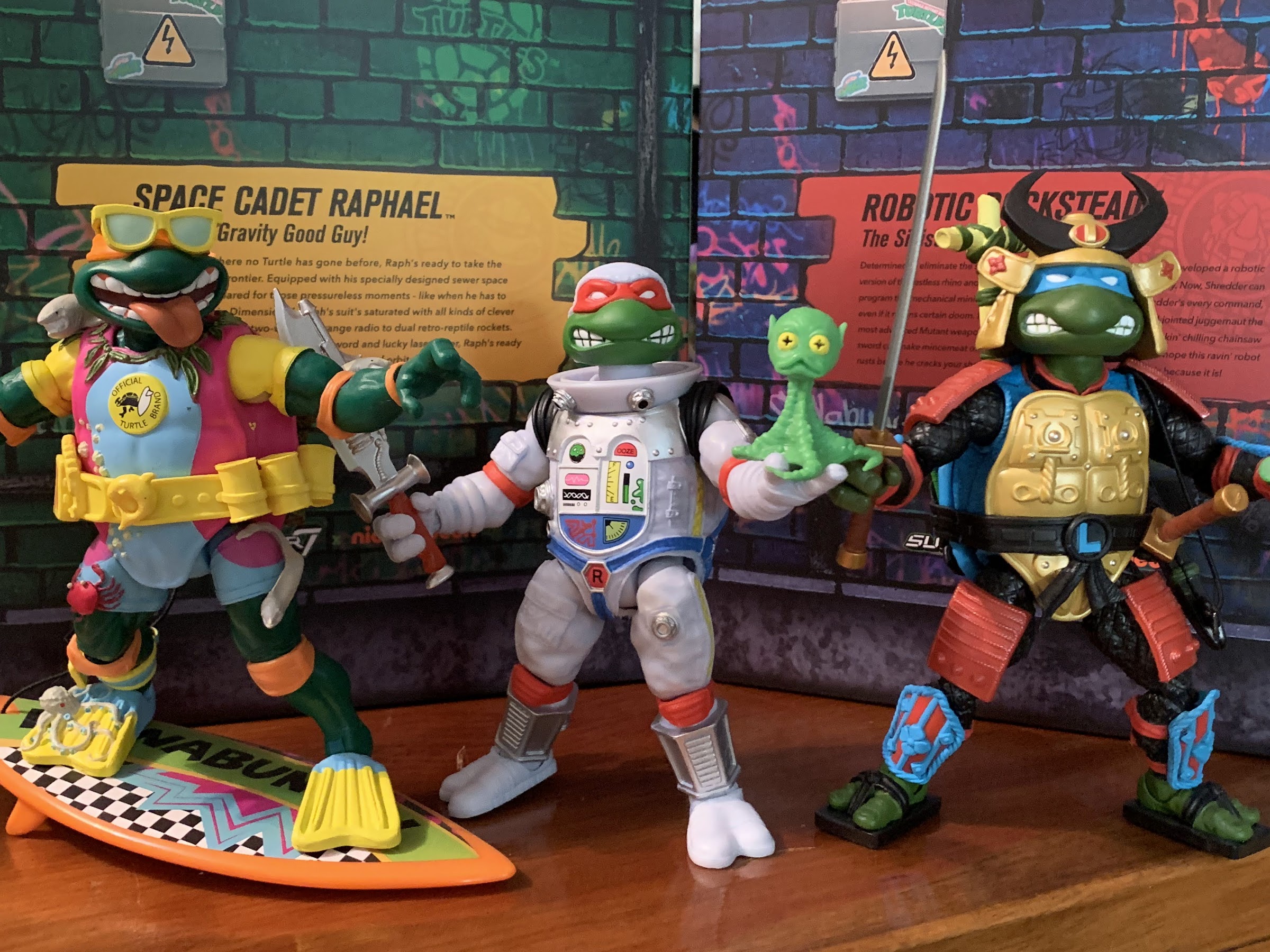
Space Cadet Raphael is the third Super7 reproduction of the 1990 Turtles in Disguise wave by Playmates Toys following in the footsteps of Sewer Samurai Leonardo and Michelangelo the Sewer Surfer. Raph is stepping out of the sewers and into the vastness of space as he’s apparently decided to become an astronaut. I’m not sure what about Raphael’s personality made him the most likely to do so (seems more like a Donatello thing), but I guess that’s not important. For me, the vintage version of this figure (which I sadly no longer possess) was one of my favorites. I don’t really know why, I just kind of liked how it was all put together. And I liked it even more after the release of Space Usagi because it meant Raph had a buddy to take with him on his expeditions. Because of my fondness for that figure, I was really looking forward to this update from Super7. Tempering my enthusiasm though was the fact that Wave 5 in this line was a mess. Wave 6 was better, but the repeated delays didn’t exactly add to my confidence – quite the opposite actually, so how did this one turn out? In many ways, I would say as expected, but that’s not exactly a good thing. Read on for more!
He’s in a bulky spacesuit, and yet he seems smaller than the other Raphs. That astronaut diet must be something.
Space Cadet Raphael stands at roughly 6″ in height. This puts him right in-line with the Wave 1 release of Raphael, which seems right, but then you factor in that this Raph is in a space suit and it makes less sense. Perhaps that’s a nitpick, but what’s not is that he has noticeably less mass than his naked counterpart. How does a bulky space suit make one smaller? It obviously doesn’t, but in the case of the figure I think it’s because most of what you see on the torso is an overlay. And underneath that overlay is just the basic “skeleton” of a Super7 figure, not a bulky turtle shell. Is it a big deal? I don’t know that it is. It’s likely something that will vary from person to person, but I personally liked how the previous Turtles in Disguise releases appeared slightly larger than the standard versions and I wish that were true of Raph.
I do like the almost quilted texture of the shell.
The sculpt on this figure is probably the thing people are likely to be most pleased with. The head is in-line with the vintage version, stylistically. The paint around the edges could be better, but it’s probably good enough. The suit has a lot of sculpted detail on it and most of those details are painted. The body is cast in a shade of white that has a slight blue tone to it. There’s blue air-brushing over it which I think helps to minimize that plastic look present on Deep Space Homer. There are yellow zippers along the side that are painted as well as a blue harness. The tanks on his back are a nice metallic silver with black straps painted on as well. The elbow and knee pads are red plastic and don’t quite match the finish of the painted parts so they stick out in a bad way. There’s also a couple of pouches sculpted on that aren’t painted either and they detract from the look of the figure. Super7 did add a wrist communicator though that’s a metallic silver and it flips open. Inside is a decal of Fugitoid so that’s pretty neat. The front of the torso is not a big sticker, but some kind of print. The flatness of it makes it look a little cheap, but it would look worse if it was a sticker.
“What’s up, Fugitoid?”
Raph’s got a new helmet this time around which some are referring to as a Storm Trooper helmet. I can see it, but I’m not convinced that was the intent.
Super7 usually goes big on accessories, and with this figure they went further than some. Raph comes with 4 sets of hands: open, fists, gripping, and trigger finger hands. They peg in pretty easily and come out almost too easily, but we’ll speak more on that when we go over the articulation. He has his standard head and the plastic dome to go over it. It’s a nice, clear, plastic or acrylic, but the way it was molded left this big, ugly, “nipple” in the middle of the top that sucks. Maybe the factory they used didn’t know how to do such a piece and do it right, but I have a Mr. Freeze figure with basically the same feature and his dome features no such imperfection. There’s also an alternate head and it’s basically Raph with a full astronaut helmet. It turned out pretty well. While I am loathe to go against the vintage original, I will say the new look is tempting.
Yuck. I don’t know what went wrong here.
For weapons, Raph has the same ones the vintage came with and then some. He has his laser pistol which is done in a metallic plastic and it includes a hose in the same color. It’s very flexible as there’s no wire inside and kind of feels like an old payphone chord. It plugs onto the handle of the gun and then connects to a port on the torso of the figure on the right side. The port on mine was barely open out of the box to the point where I couldn’t even tell it was a hole until I stuck something else in there. I had to widen it with a screw to get the hose to fit, but now it’s fine. Raph also has his “space sword” which has a design that appears to be close to the vintage figure’s, but also has a new, translucent, red, handle. It’s pretty cool, though I never think of Raph as a sword guy. Apparently Super7 doesn’t either as they also gave him a pair of sai. They’re sort of like the lightsaber equivalent of a sai as the bladed portion is in the same red, translucent, plastic that the sword’s handle features. Super7 must love this stuff because they also gave Raph some goggles made of the same plastic, though it also has a silver mouthpiece. Lastly, there’s a slice of pizza in a silver, vacuum, sealed pouch that looks pretty neat. The little green alien that was part of the vintage figure’s sculpt is also present, but now he’s a little buddy figure. He has an articulated head, but otherwise is just a slug figure, but a neat idea nonetheless.
I assume Raph never leaves home without his trusty sai, so it did seem odd that Playmates would send him into space without.
You won’t find me complaining about the accessories with Raph, but you will find me complaining about the articulation. Never the line’s strong suit, Raph is still disappointing even by those low standards. The head is on the usual double ball peg that’s really long. It works and works well as far as range of motion goes, but does leave a sizable gap where the neck meets that head. The shoulders are hinged ball pegs, but because Raph’s suit has these black cuffs at the shoulder, his arms only go out to the side about 45 degrees. They rotate fine, and the biceps swivel is acceptable as well, though a little tight. The elbows though are atrocious. I don’t think this figure even gets 45 degrees of bend there as the elbow pads are over the hinge. His elbows might be worse than Super7’s Optimus Prime – they’re that bad. It’s just a baffling design error. Why not just sculpt the elbow pad onto the figure? We know Super7 will never do a double joint for an elbow, even though they work best with characters like the turtles who have elbow pads, but doing it this way is unacceptable. It’s just dumb and it makes me question who approves this stuff over there. An action figure that can’t bend its elbows? It’s ludicrous. The wrists swivel and all of the hands have horizontal hinges, another mess-up that shouldn’t be as the trigger and gripping hands would be improved with vertical hinges. Super7 is usually good about that, but not here. The hands are also set too deep in the forearm so the hinge is almost useless. Try to bend the open hands into more of a cupping position (since you can’t get that our of the elbows) and they’ll just pop out. It almost feels like nothing is holding those hands in place and swapping weapons is a frustrating experience. Just take the hands out first and do it that way. Posing will also drive you crazy as if you go to bend the elbows or even rotate at the shoulder you’re liable to accidentally knock a hand out of place. This is not a well-thought out action figure.
This is as far as the elbows can bend.
Ranged or melee? He can do both.
In the torso is a waist twist, but because we’re dealing with a giant turtle here, it’s more like a pivot point. The legs connect via hinged ball pegs so Raph can just about do a full split as well as kick forward and back a decent amount. There’s rotation there as well so you get some thigh pivot, but it’s a bit tight. The knees, like the elbows, are single-hinged and feature kneepads to contend with. Raph can bend his knees better than he can his elbows, but still can’t do a full 90 degrees. The lower leg can also rotate on that joint. The feet have little range hinging forward and back. They basically behave like a ratcheted joint with only 3 positions. The ankle rocker works well though and is probably the most consistent joint from figure to figure in this line.
Can’t forget the pizza.
Like a lot of figures in this line, Space Cadet Raphael is a figure that looks reasonably good on a shelf, but isn’t that fun to handle. And it’s all a result of just bad design. It’s not cheap, it’s just incompetence. Why are things like the elbows getting worse as we go deeper into the line and not better? The original turtles can at least bend their elbows and the design is basically the same, but this one can’t. I also think the figure should be bulkier than it is since we are talking about a turtle in a spacesuit here. I didn’t mention it when going over the accessories, but a little more ingenuity with the sculpt to add some weapon storage also would have been appreciated. This figure comes with a lot, it’s the figure’s greatest strength, but he has no where to put any of it when he’s not holding onto it. A holster for the gun, some loops for the sai, anything would have been better than nothing. Again, this isn’t stuff that would have cost Super7 more money, it just requires more thought.
Raph, you’re gonna need a bigger gun.
“I can’t believe NASA put this guy on my crew.”
This figure is basically relying on nostalgia to sell you on it. And with me, it got me. I know preordering a Super7 figure is a risky proposition, but I did it anyway. I have more on preorder, but I’ve mostly stopped doing so until I can see the finished product. Had I known what I was getting going into with this one, would I have still bought it? Not at the MSRP of $55. This isn’t worth it. It’s not the trainwreck that Sewer Samurai Leonardo was and it looks better than April or Shredder, but it’s not exactly a strong addition to the line. I think on clearance this one has value, maybe at $35 or so, but it has too many problems to be a recommend at $55. I hope Super7 takes such criticism to heart as I certainly don’t want to dislike their products. I have liked many of them in the past and I will have some a review very soon at that. It’s just frustrating to see a company keep making stupid mistakes with a property that should be a homerun.
Want to see what I thought of the other Turtles in Disguise or maybe you’re curious about that Optimus Prime I mentioned:
Well, after looking at the Wave 6 Slash a couple of weeks ago we can now finally turn our attention to a Wave 5 release from Super7’s line of Teenage Mutant Ninja Turtles Ultimates! series of figures: Sewer Samurai Leonardo. The thing with TMNT is, you have the four good guys, a few core allies,…
We are back with one more look at Wave 6 of Super7’s Teenage Mutant Ninja Turtles line of Ultimates! action figures: Sewer Surfer Mike. This, like every figure in the line so far, is a recreation of a Playmates Toys figure from the vintage line of TMNT action figures, and in this case it’s of…
I think we’re over discussing the merits of non-transforming Transformers, right? It’s been done for a long time, but was really pushed to the forefront with the Hasbro RED series in 2020 and while there will always be a section of the fanbase that wants nothing to do with such a concept, it’s still an…
He’s a reaper and he’s a robot, hence the name Robot Reaper.
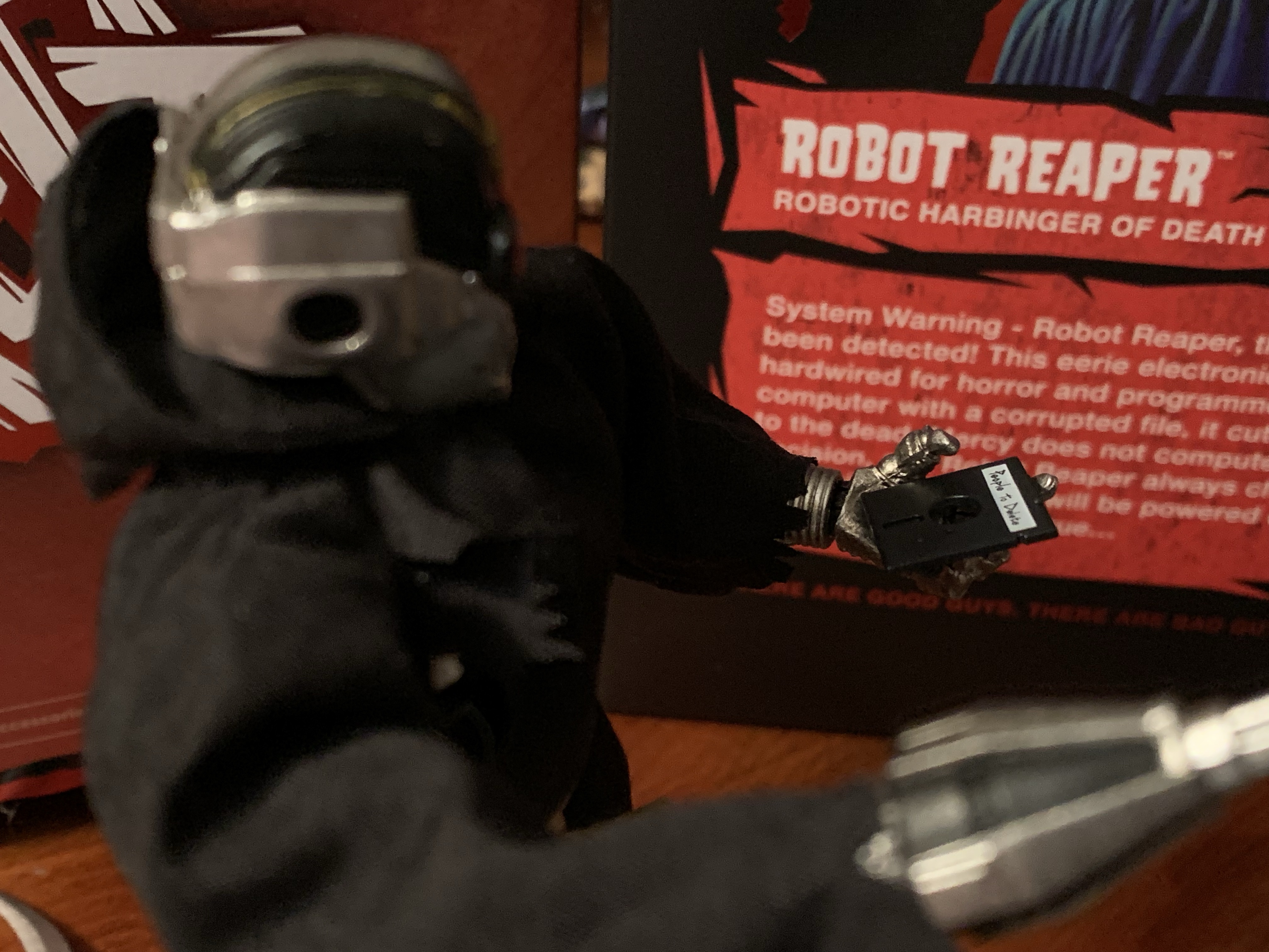
Happy Halloween, my fellow action figure enthusiasts! It’s a day for mischief, a day for candy, and a day to laugh at Death. Today, we’re laughing at a special kind of death, a robot death, and it comes courtesy of Super7’s in-house brand The Worst. The Worst is a line of action figures that’s basically self-explanatory. They’re a villainous sort and many of which follow a certain archetype, but with a twist, like a Dracula that’s more like a man-bat. As the box says, “There are good guys. There are bad guys. Then there are…The Worst!”
This looks like a cool group to go trick-or-treating with.
I’m not big on unlicensed action figures or in-house brands. It’s not because I have an aversion to such on principal or anything, but that I just spend enough of my income as-is on licensed figures that I just don’t have much room to stray. Every now and then though, a design comes along that I can’t ignore. The Robot Reaper was very much such a design. He is as described, a robotic version of the Grim Reaper, but he has this old school aesthetic about him that just makes it work. I never paid any attention to The Worst when it was just a ReAction brand, Super7’s 5 POA line of retro figures, but when I saw the solicitation for this figure I was hooked. I just wasn’t sure how it would turn out. I played the waiting game, and once some impressions had arrived after those who pre-ordered it got the figure in, I felt confident enough to grab one myself. Did I make the right call, or is this thing really just The Worst?
This guy has a lot of electronics, none of which appear to be new.
Robot Reaper comes in the usual Ultimates! packaging with a nice painting on the front and a write-up on the back. Out of the box, the figure stands pretty much right at the 7″ mark. It’s obviously a plastic action figure with the typical Super7 engineering, but it’s all clad in a soft goods robe affixed at the waist with a faux piece of hemp rope. The figure is sculpted in a shiny silver plastic with lots of painted detail, much of which you can’t even see because of the robe. He has this big, glowing, red eyes that reminds me of traffic lights and I think his mouth is supposed to be open. There’s some gold piping in places and he’s kind of a reverse C-3P0 in that he’s mostly silver, but has a gold, right, shin. The robe is held via a Velcro strip along the rear of it and that rope. I’d take it off completely, but I’m afraid I’ll never get that rope as perfect as it is right now. Plus, I have no intention of displaying him naked. Most of the body though is done in a paneled approach with large swaths of silver and black, but some areas (like the spine) are far more detailed. Super7 hit these areas with a paint wash and it looks really good. The robe itself is pretty basic, but doesn’t look cheap. He very much looks the part.
“Just five more minutes, five more minutes!”
What sold me on this guy is the 80s aesthetic to some of the electronics. He looks like he was created over 30 years ago and it’s fitting for a Grim Reaper character who is thought of as an ancient force. And 30 years or so in PC tech is an awful long time. From the front, he has a nice look, but from the back it gets real fun. The default head essentially has an old floppy, disk, drive in the back of its skull. I’m not talking the small, 3.5″, not-very-floppy disks that were still around well into the 90s, but those big, black, actually floppy disks that if you interacted with them may have contained games like Number Munchers, Odell Lake, and the legendary Oregon Trail. And yes, he does come with a floppy disk that fits in the slot. It’s labeled “People to Delete” and I love it. You probably don’t want to shove it all the way into the slot as it will be quite difficult to remove, but it’s such a fun design choice.
Ah yes, where would the Grim Reaper be without his People to Delete file?
That silly gimmick is what sold me on the concept, but the figure also has a bunch of other stuff that works well to add to the package. For hands, we get a set of fists, pointing hands, gripping hands, and open hands. If you’re not in love with the disk drive head there are two others. One looks like a powered down version of the default head with some circuitry ripped out. It’s more in-line with the classic Grim Reaper as a skeleton being as this head is more decrepit, more cold, and more lifeless. The other head is the opposite. It has a more futuristic flair to it. The face is all black with a sculpted-in jaw. It’s framed by steel to give it that skull visage and there’s a red button, or light, in the center of the brow. It’s cool, but I’ll never use.
This is just fantastic.
We also get some fun accessories to round this package out. First, is the big scythe which all Grim Reapers need. It can be held as a staff or by the handles for a swinging pose. The gripping hands don’t grip it as well as I’d like, and the texture of the wood is pretty bland, but it’s fine. If you want something a bit more unique, there’s a scythe attachment for his forearm that functions like an extra hand. It’s definitely more befitting of that futuristic head. The figure also comes with an hourglass that’s flat, pixelated, and looks exactly like the loading cursor from old computers. Lastly, there’s a Not-a-Game Boy for him to play. I don’t quite see how it fits the aesthetic here, but who is going to say “No” to a little Game Boy accessory? It’s purple with a gray screen and the only thing keeping it from being a Game Boy is that it has 3 buttons instead of 2. It also has one rounded corner, like the actual Game Boy, but it’s in a different spot. I wish he could hold it a little better, it’s more an issue of shoulder range, but it’s fun.
If you’re a weirdo who doesn’t like the disk drive head, there’s also this more decrepit one.
Articulation is pretty secondary for me with this figure, and it probably should be for this line, but Robot Reaper is actually pretty decent there. The head is on a double ball, and while it’s inserted way too far into the neck, there’s at least some okay range there looking up, down, and nuance. The shoulders are just ball-hinges, but he can raise his arm out to the side okay. There’s a biceps swivel, and the elbow moves about 90 degrees. The wrists swivel and all have horizontal hinges, though I would have preferred vertical hinges for the gripping hands, but it’s not a big deal here given the weapon load-out. There is a diaphragm joint that lets the figure tilt forward and back a little, plus rotate. There’s a waist twist below that and the hinged ball peg hips go out to the side for full splits. They don’t kick forward all the way, but do kick back almost as much as they do forward. There is a thigh pivot there and the knees bend back about 90 degrees and also bend forward, if you like, since he has no knee caps. The ankles are the only joints I don’t love as there isn’t much room for the ankle rocker to pivot. I think they should have done something there to remedy that, especially with this being a unique design.
And then there’s this head for an all-together different aesthetic.
By Super7 standards, this figure is well-articulated. The robe itself is going to hinder it some, but you could remove it if you really want to try to pose this guy up. the hem of the hood is wired too, so that’s like another point of articulation. He’s a reaper, so I don’t think this one needs to do much and it does what it needs to, and then some.
“Don’t you forget about your friend, Death.”
I love this figure and it’s 90% the design. I just think it’s fun, and if you look at it and see the same then I think you’ll like it too. The elephant in the room is, of course, the price. The MSRP on Robot Reaper is $55 and that’s just too much for some. One would have liked to see a lower price considering no license is needed, but at least the accessory count is solid and the quality control is about as good as it gets for this brand. Still, those willing to wait it out will probably be able to get this one on clearance eventually. I obviously thought it was worth buying at $55 as I wanted it for Halloween, but if I were stumbling on this in February then, yeah, I’d probably hold out for a better deal. There’s also a glow-in-the-dark version on the way, if you prefer. It’s a blue color, like a frozen version, and looks pretty cool, but I think this version is better.
Do you prefer your action figures be untethered from a major brand?
These days, the buzz word in the entertainment industry is “content.” Everyone wants content, especially streamers. It all goes back to the value of intellectual property. It’s costly and difficult to turn a new product into a popular one. It’s far easier, and less risky, to just throw money at an existing brand and create…
In 2020, Lone Coconut, a small company out of the Dominican Republic, launched a Kickstarter campaign for a line of original action figures called Plunderlings. They’re basically little imp-like creatures with a pirate motif that have a very charming design. From an engineering point of view, they made for a smart toyline because every figure…
Over the years, I’ve acquired quite a few action figures designed by the good people over at Four Horsemen LLC. They’ve been designing figures for companies for awhile now. My first exposure to the company was via NECA’s inaugural line of Teenage Mutant Ninja Turtles based on their appearance in the Mirage Studios comics. Lately,…
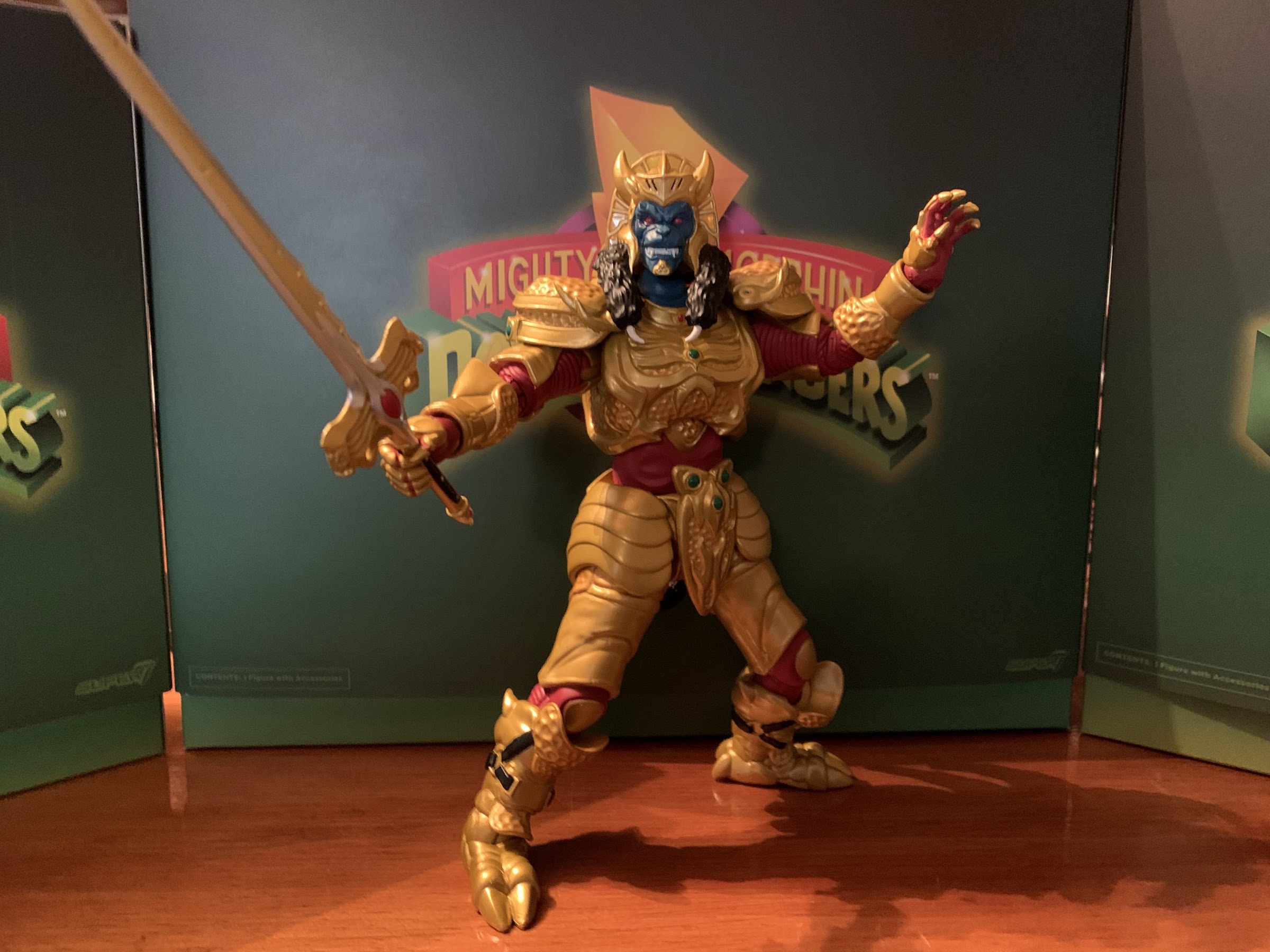
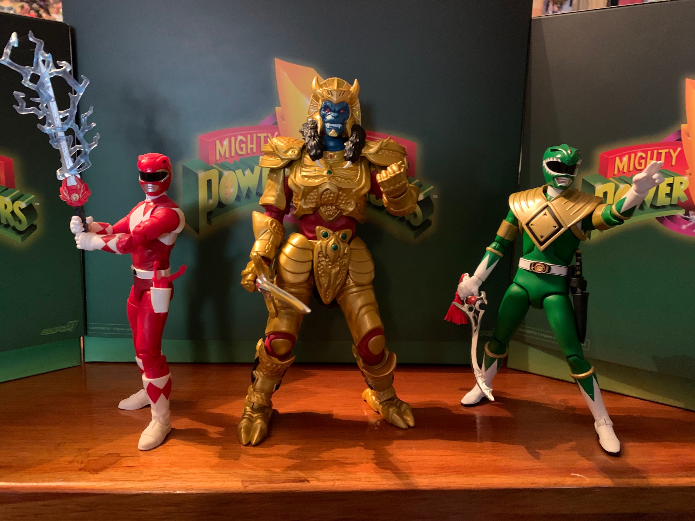
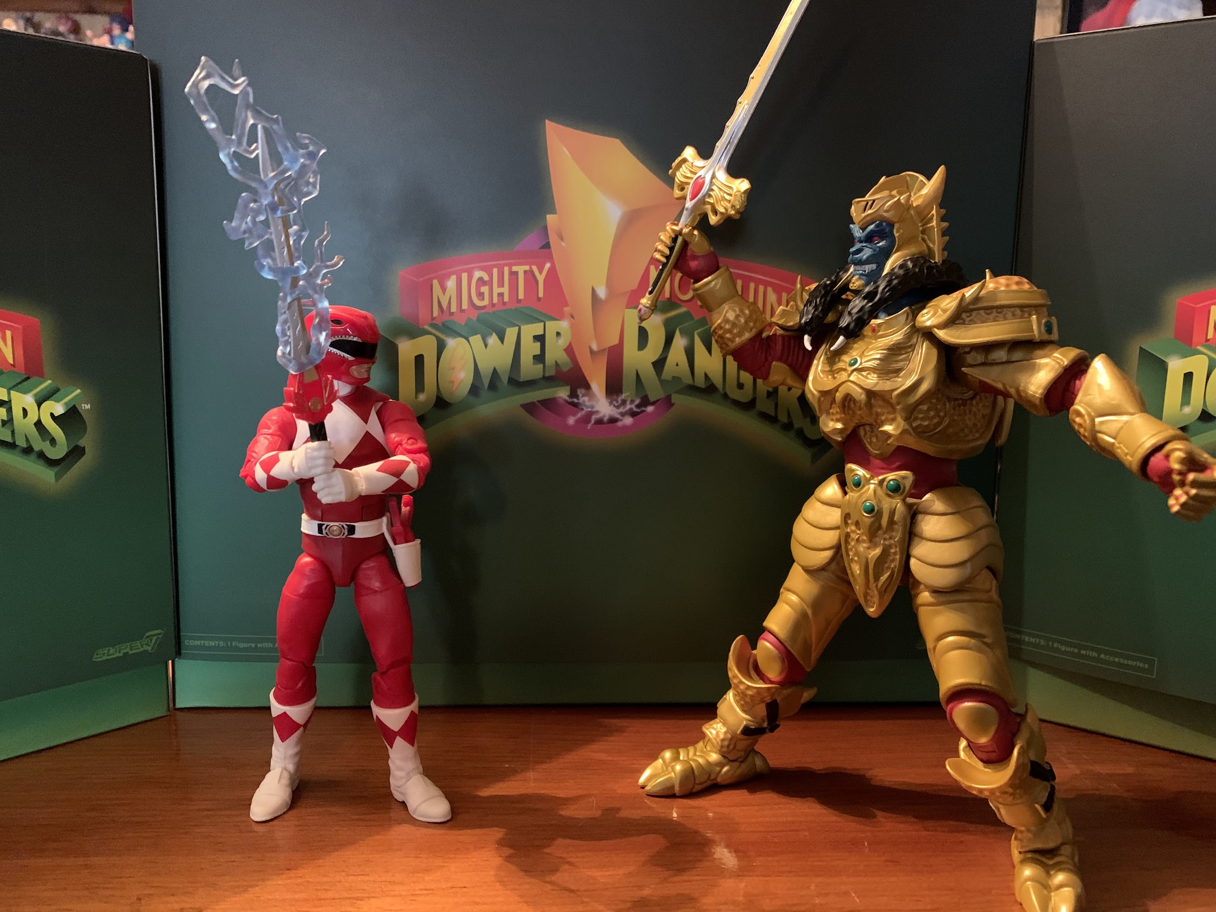
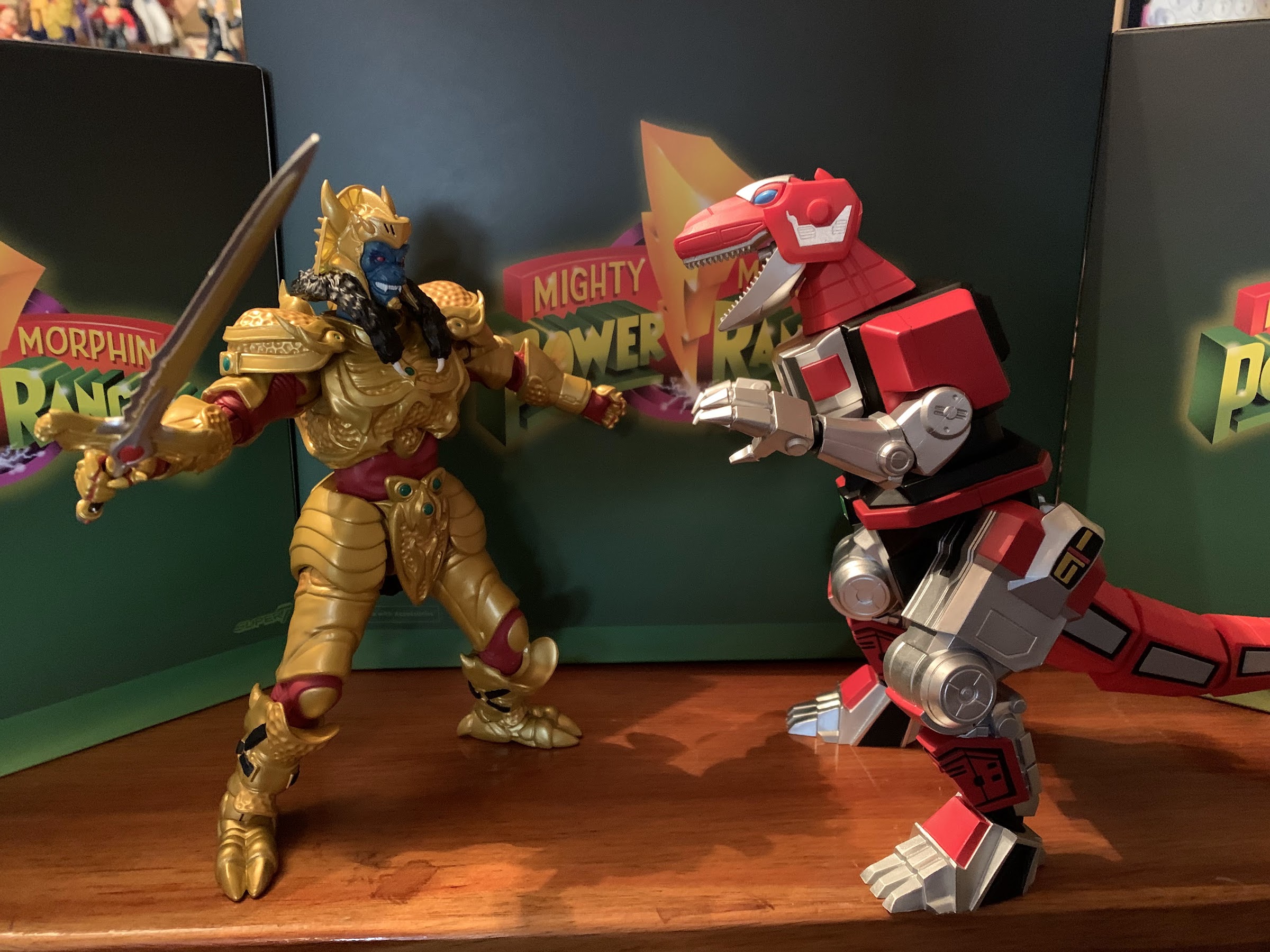
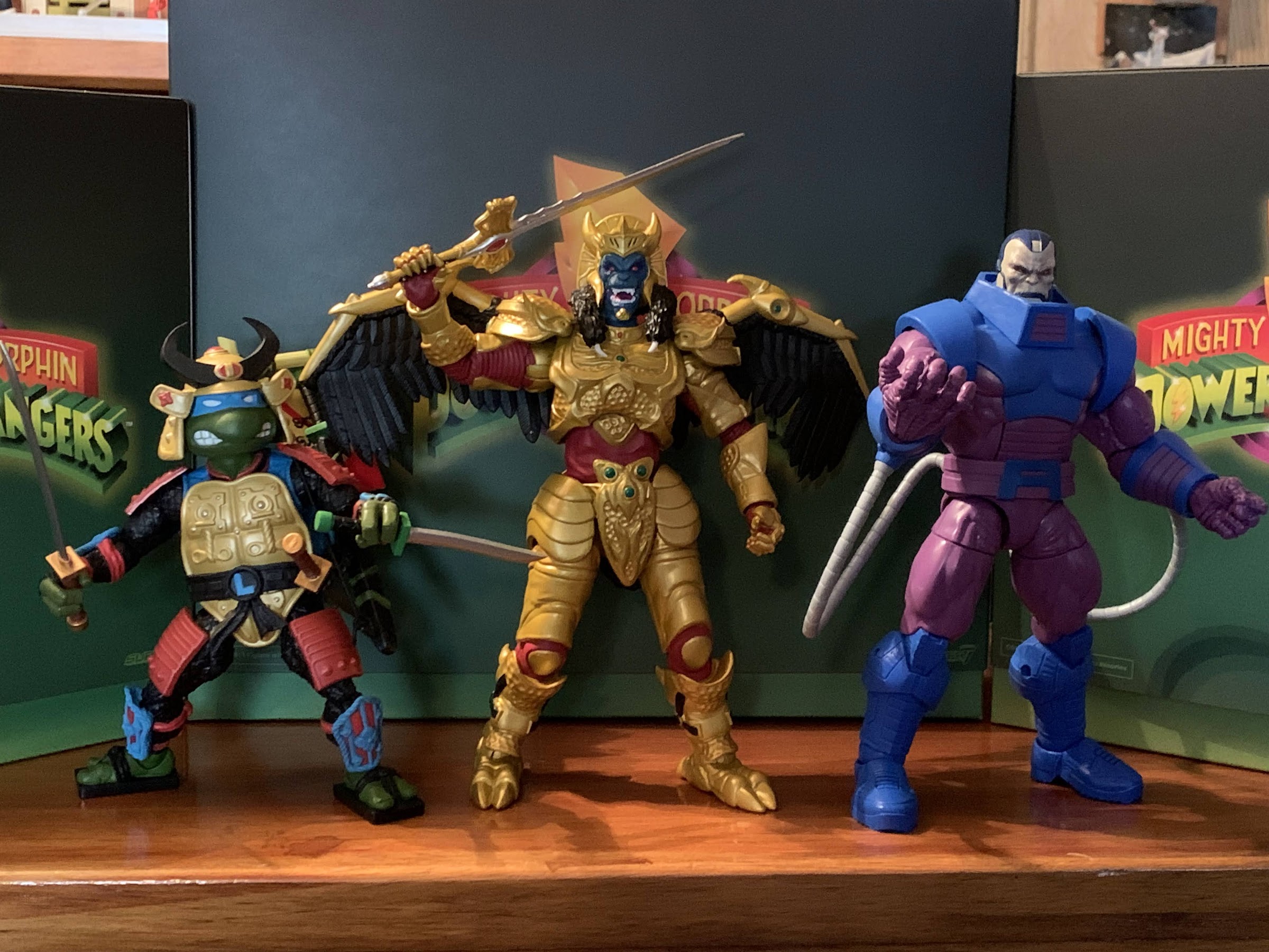
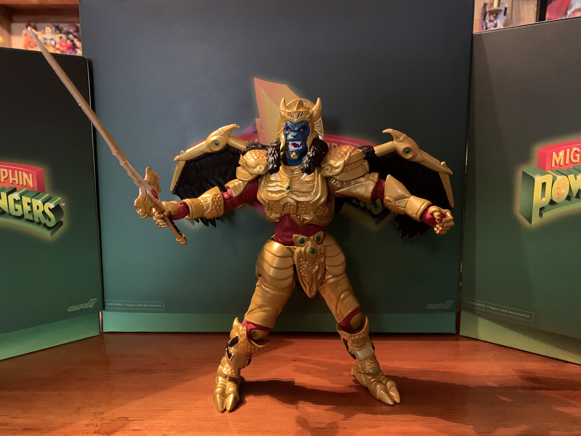
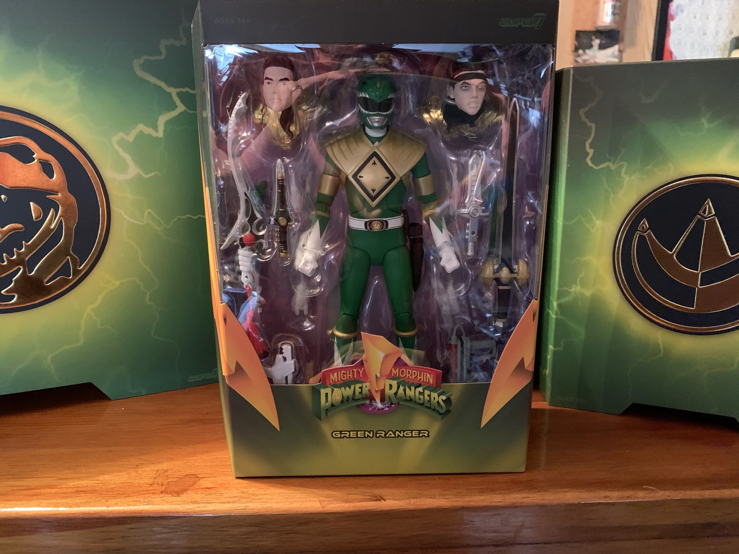
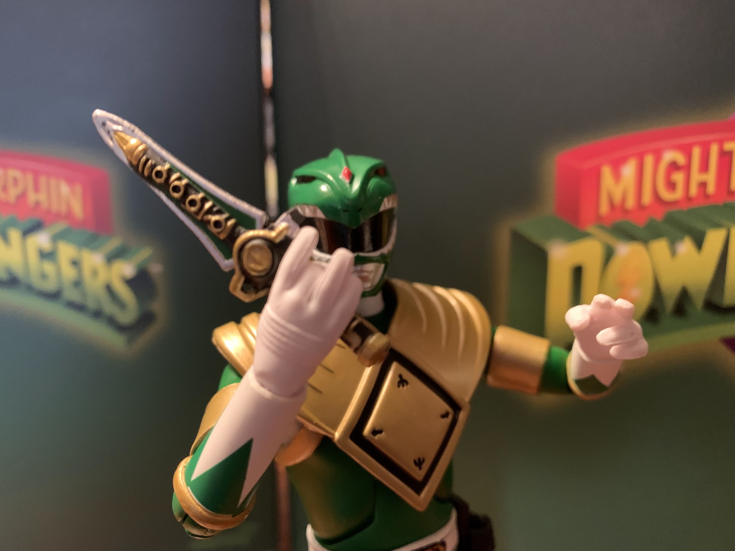
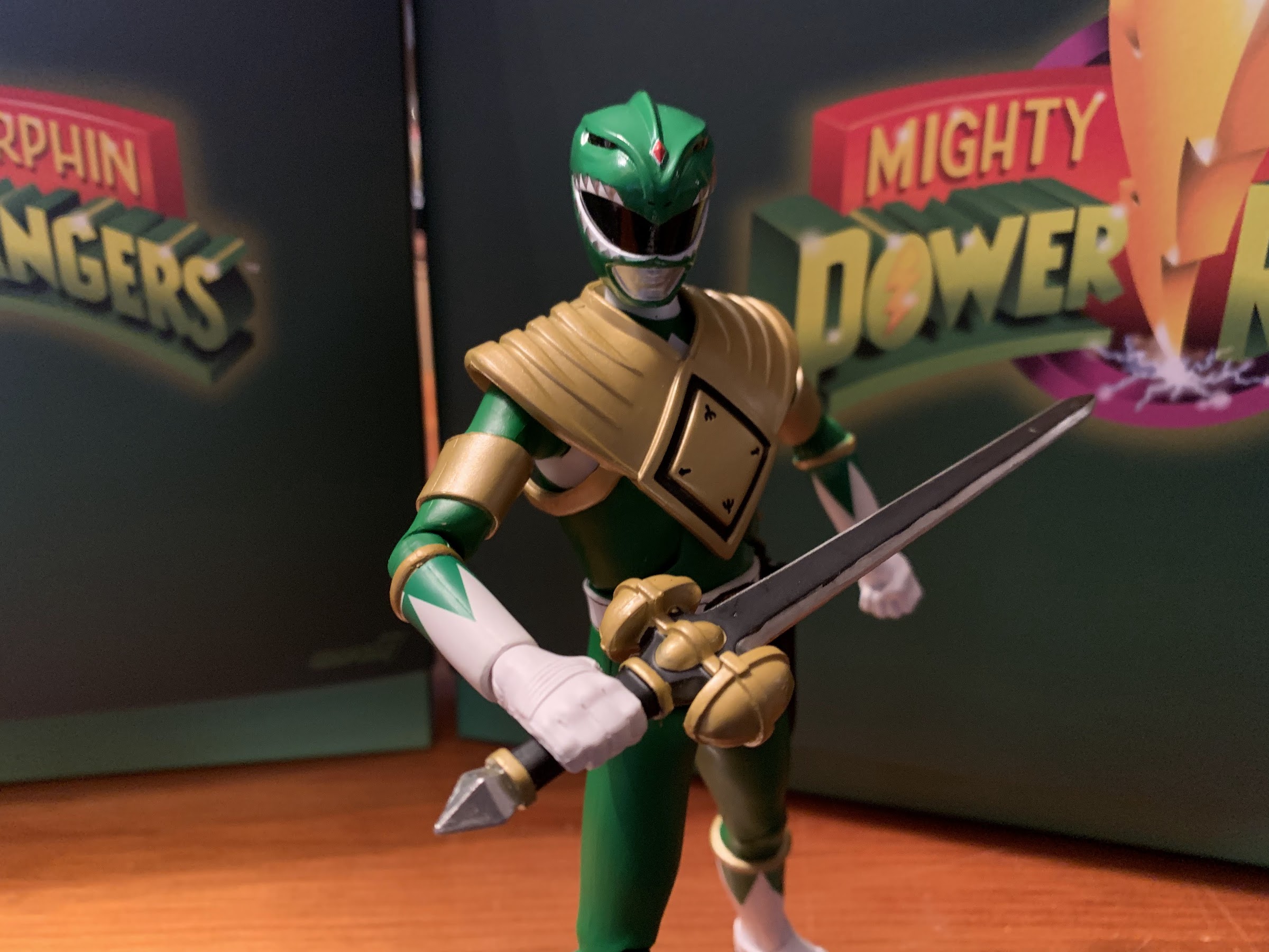
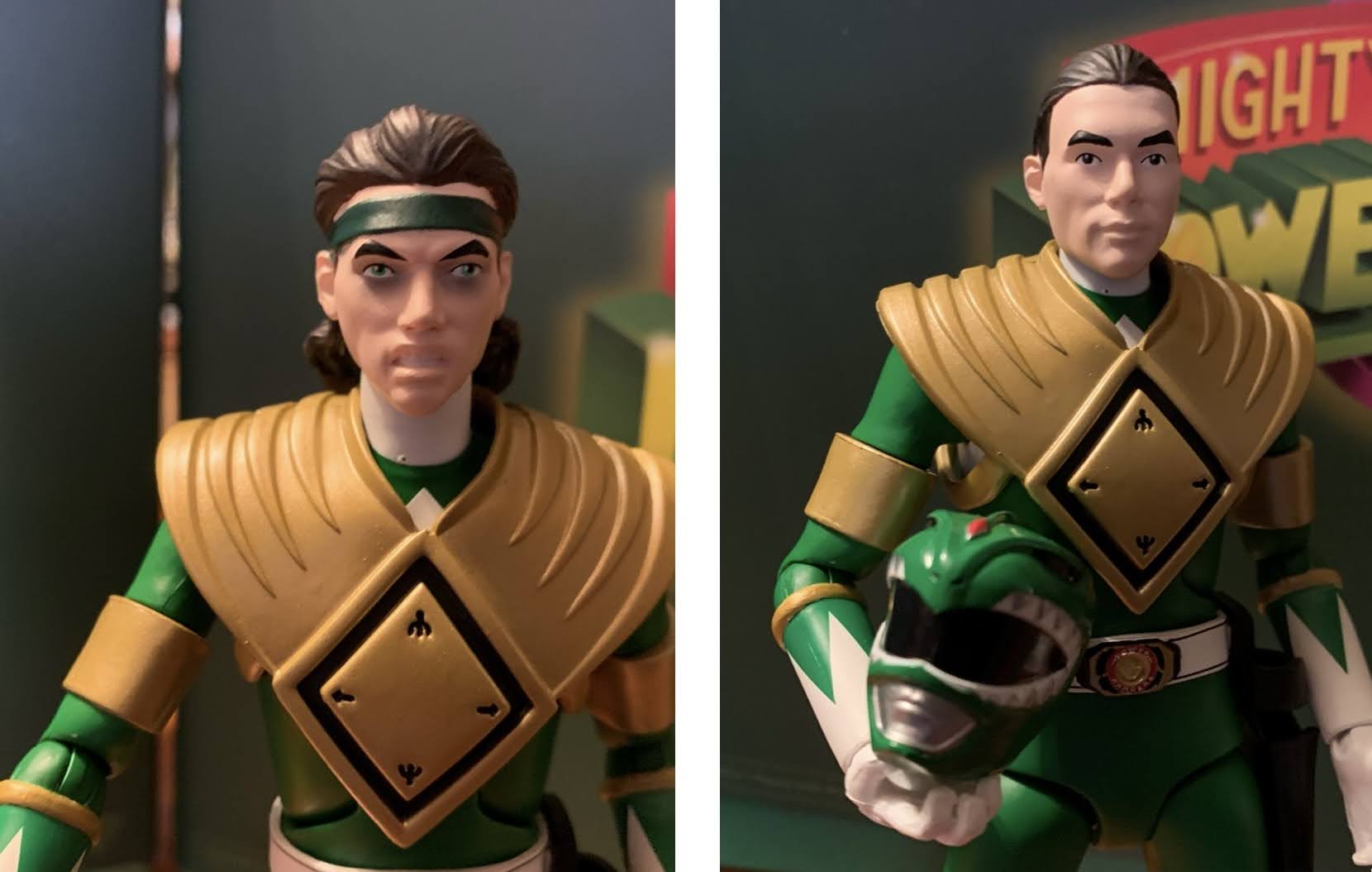
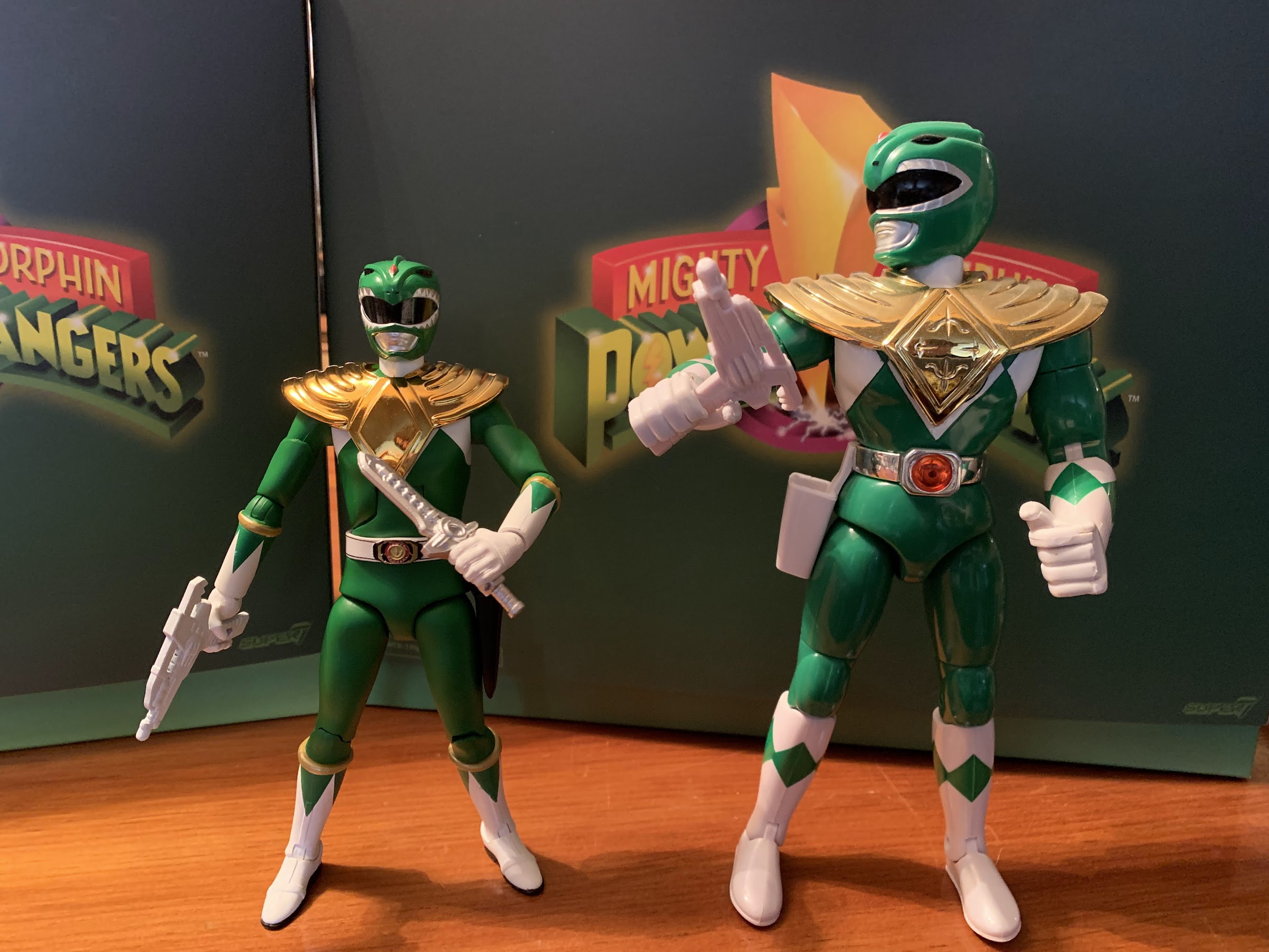
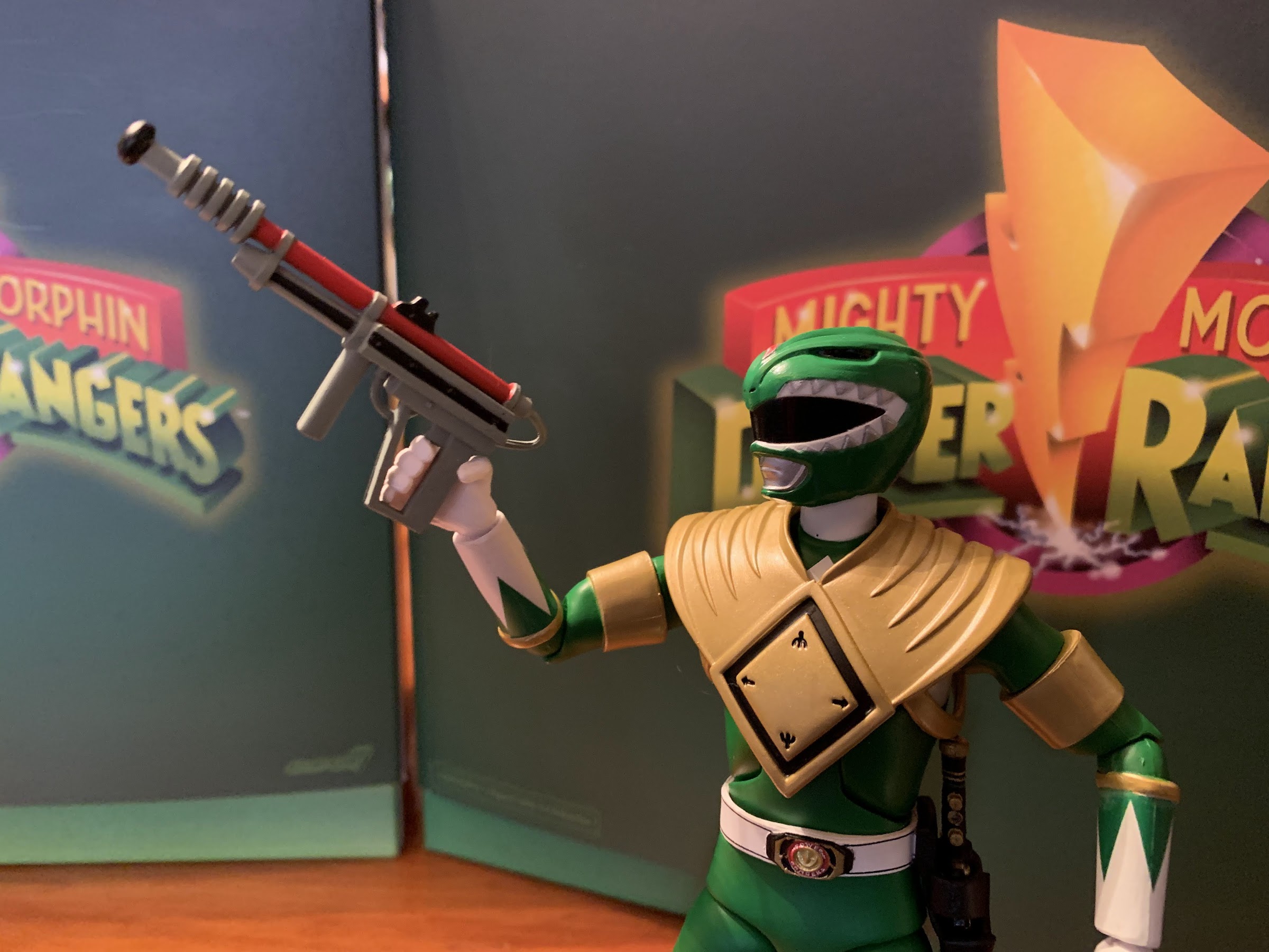
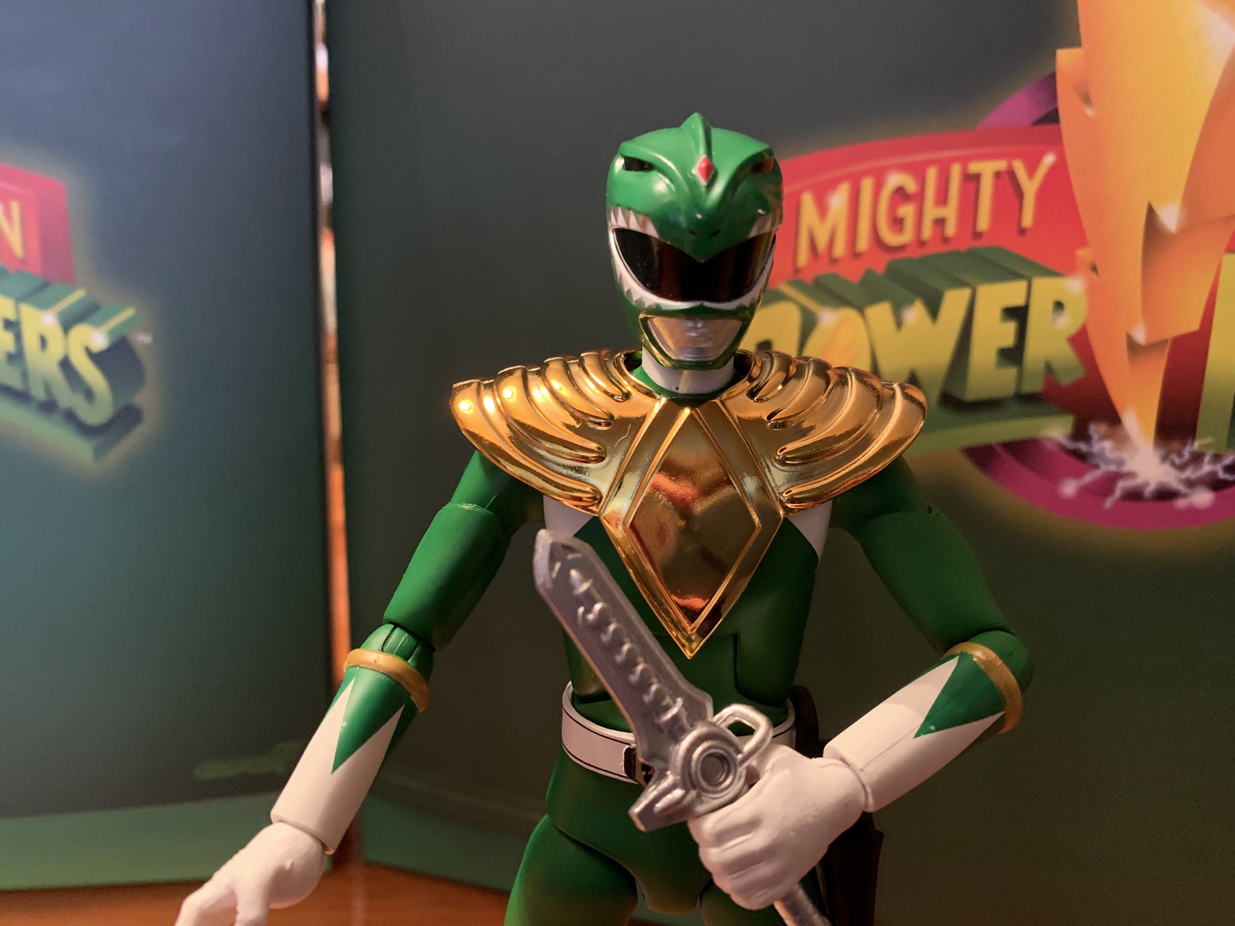
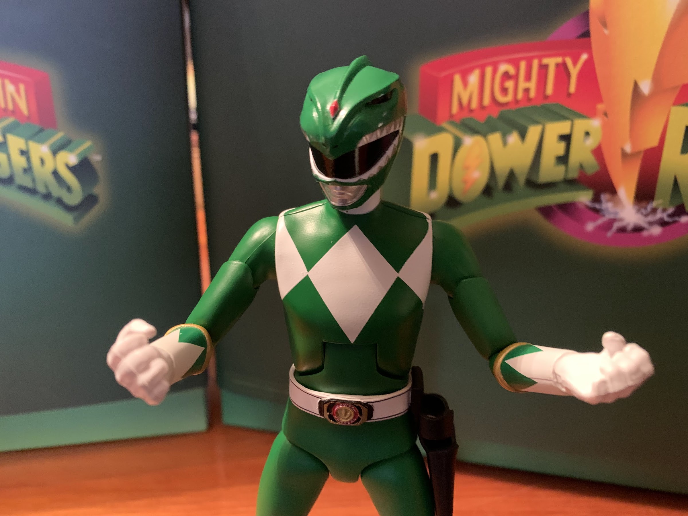
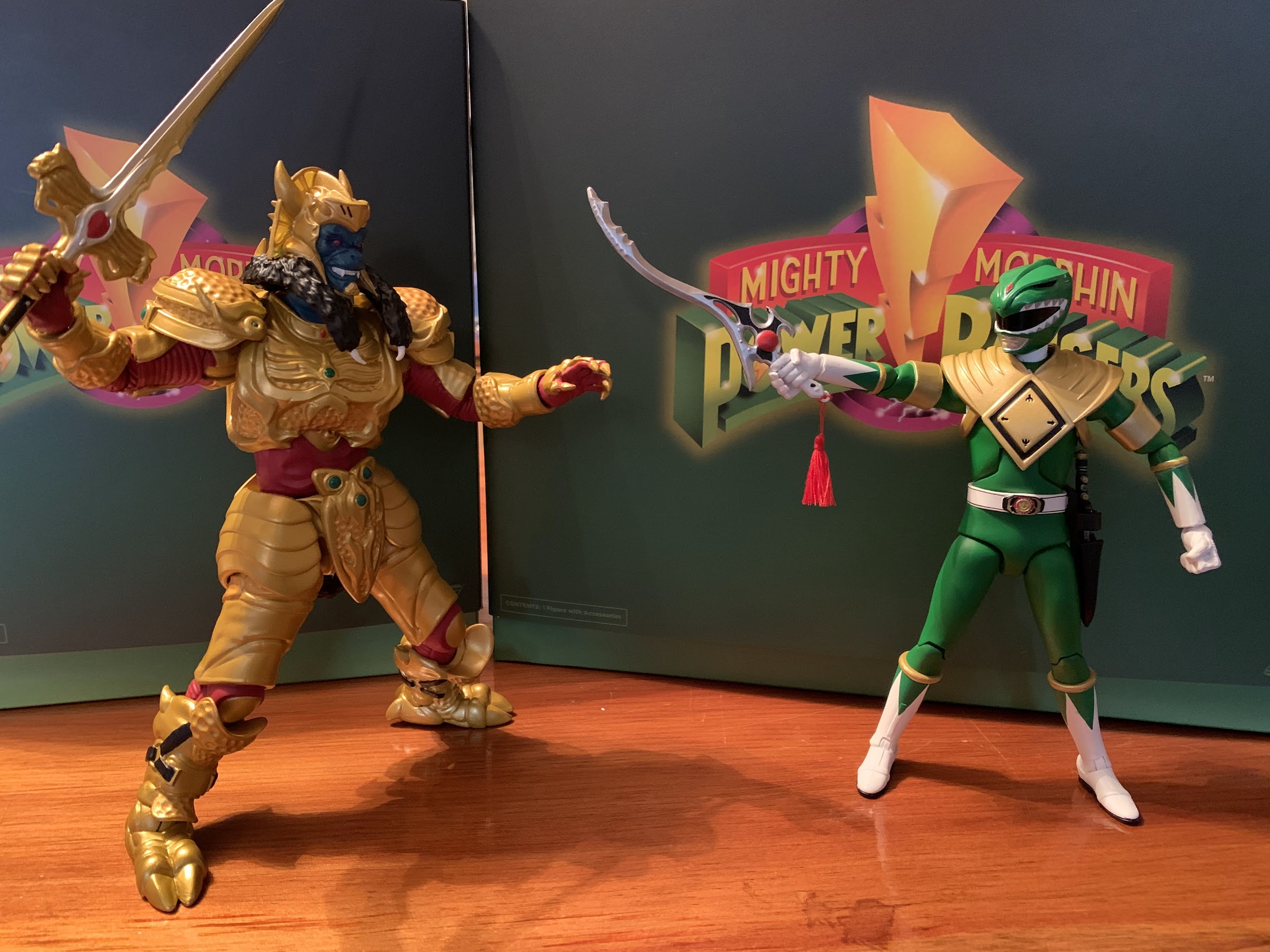
After a long delay, wave one of Super7’s Mighty Morphin Power Rangers line arrived earlier this year. And after a delay of basically just as long, wave two is now upon us. For the first wave, we took a look at three figures: Green Ranger, Goldar, and the Tyrannosaurus zord. For wave two, it’s just one: the Dragonzord. I’m not all-in on this line, clearly, because I’m a pretty casual fan of MMPR. I’m basically a Green Ranger guy, but where I see room to supplement the small collection I have, I’ll pounce. And being a Green Ranger guy, I had to get the Dragonzord.
You’re going to need a deep shelf for this guy as this is as far as the tail will bend.
He’s got fists, but no reach.
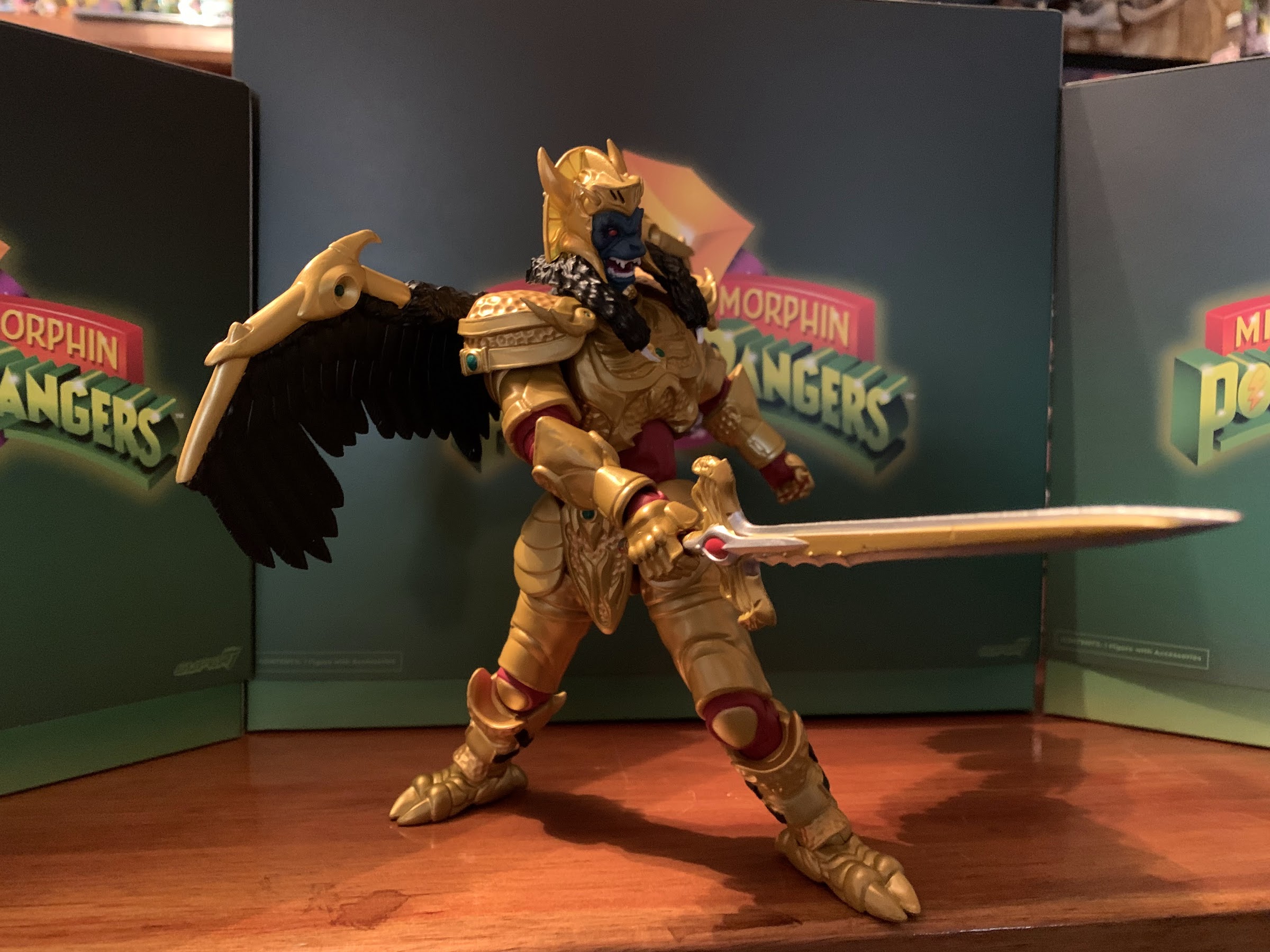
Super7’s take on the Dragonzord should feel pretty familiar to those who purchased the Tyrannosaurus zord. This is a line where the zords are non-combining so it’s strictly an action figure. Super7 seems to see this as an opportunity to make their figures look more like the actual suit costumes in the show. It’s a freeing approach and it allows Super7 to make these things big and chunky. No need for hollow plastic to hide parts or anything like that. The figure comes in a massive version of the Super7 Ultimates! box that’s probably close to the same size as the T-Rex zord’s box. I’d tell you how it compares, but I didn’t keep that box and I don’t plan on keeping this one either. Unlike that figure though, this one was made in China as opposed to Vietnam. I’m not opposed to figures being produced in Vietnam, but we’ve seen a lower quality product out of that factory compared with the stuff out of China.
I wish the head/neck better matched this image from the box.
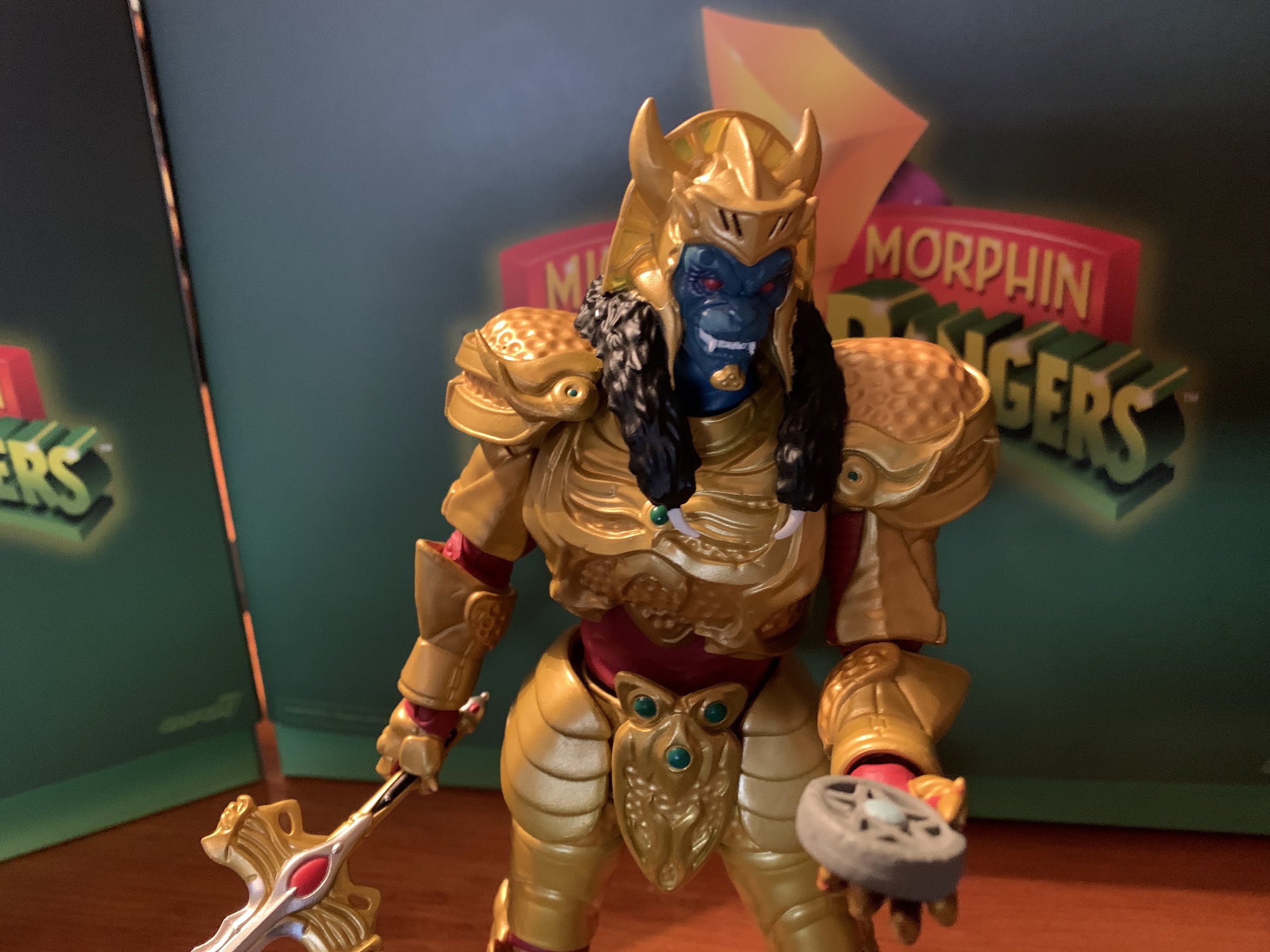
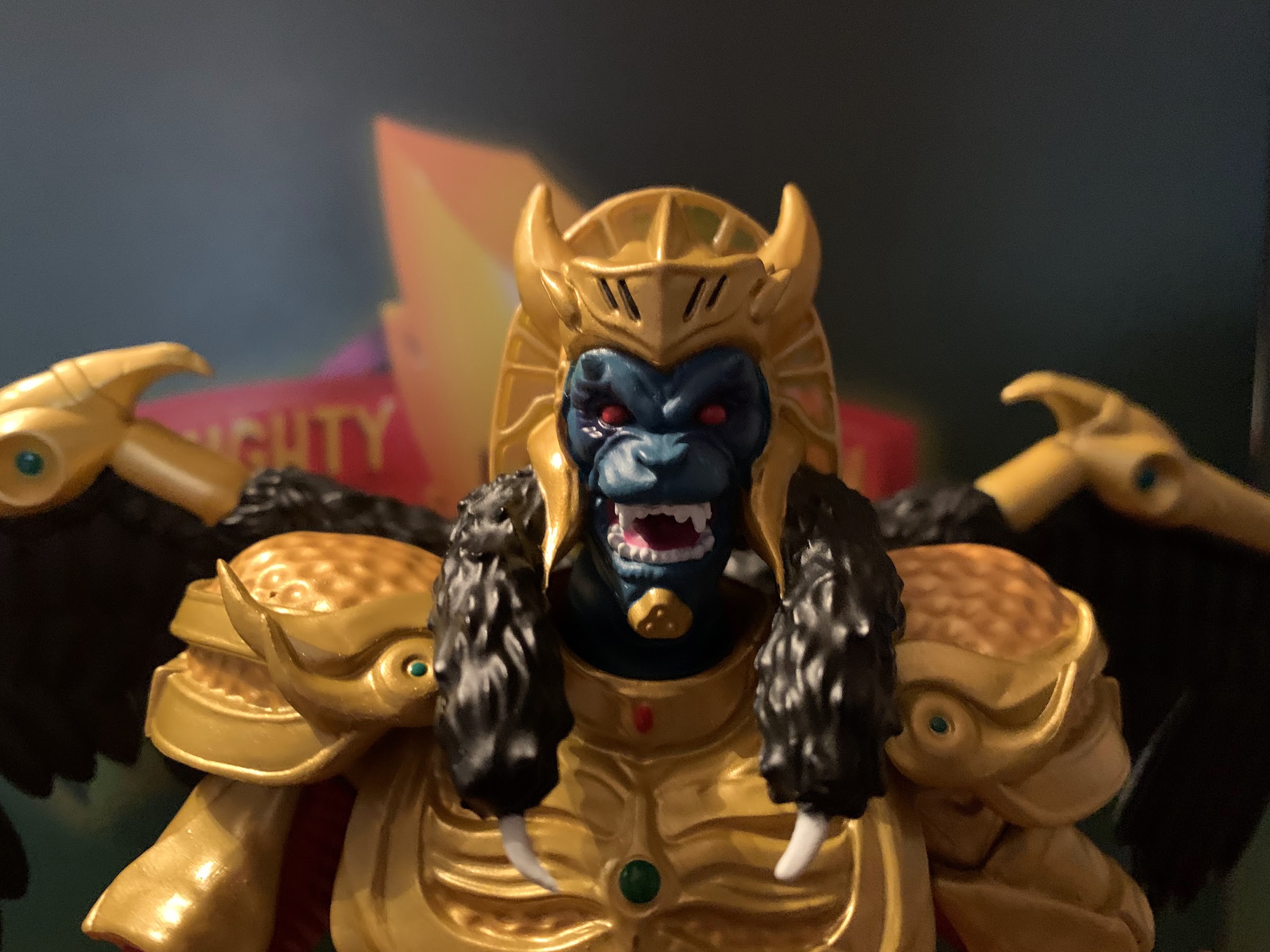
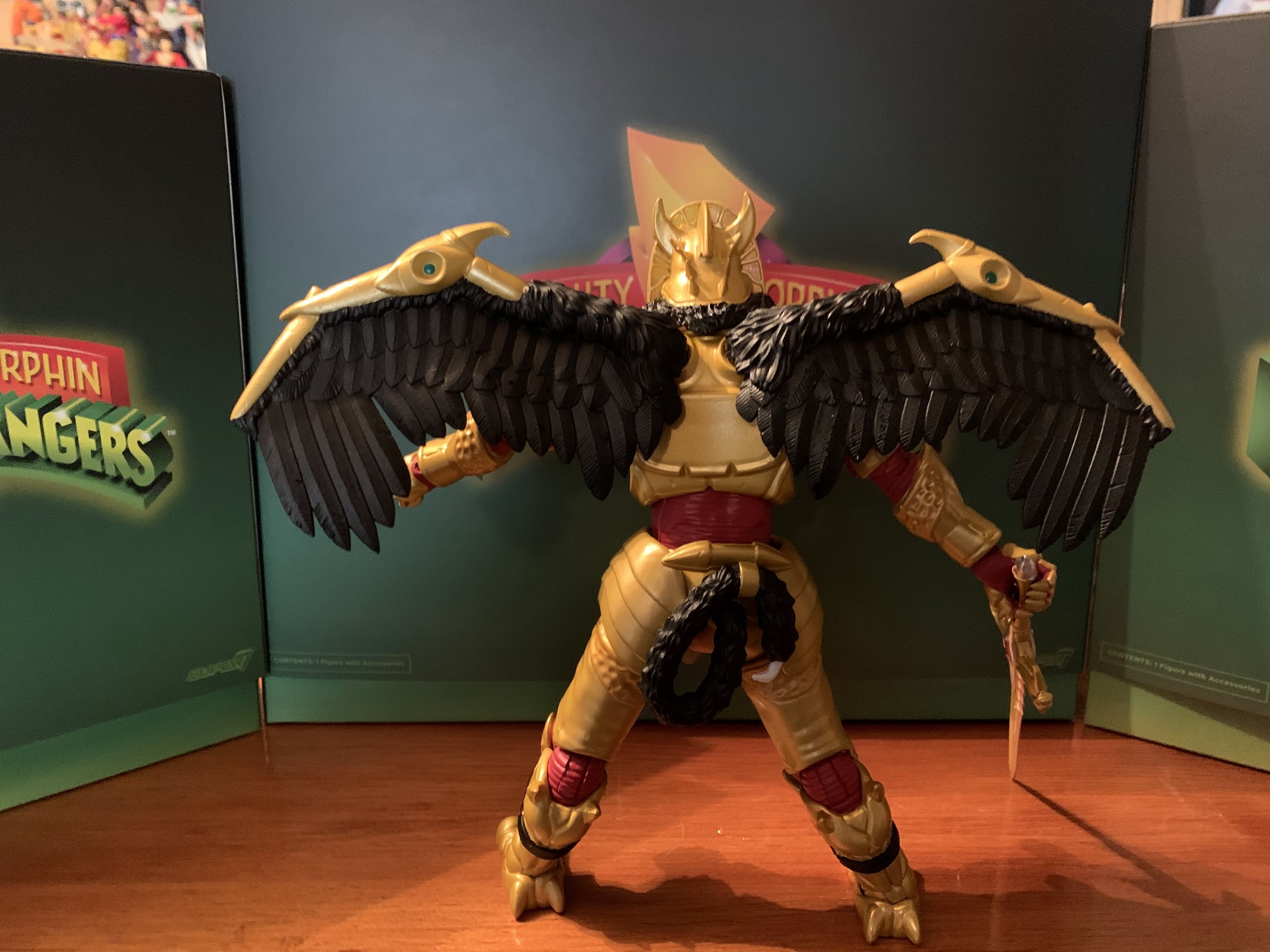
The Dragonzord stands at approximately 9″ in height. It’s a little fungible as this is one of those characters intended to stand with its legs bent, but 9″ is close enough. The tail is around the same length as the heigh of the figure so this guy takes up a lot of real estate on a shelf. In terms of likeness to the show, there’s good and bad here. There’s quite a bit of paint and the parts that should be shiny are, and the ones that should be more matte are as well. There are spots here and there where it could be better. The red lights on the chest are slightly off and there’s some scuff marks in various spots on my figure. They’re things only apparent when handling the figure and not the type of thing that will show on a shelf. The painted patterns on the figure match the show as opposed to the vintage Bandai figure which basically did its own thing when it came to decals. I like the big, chunky, feet on this guy and the segmented tail with drill tip. There aren’t any missing paint apps that I can see, which wasn’t the case with the Tyrannosaurus zord.
The new one is actually a little smaller than the vintage release.
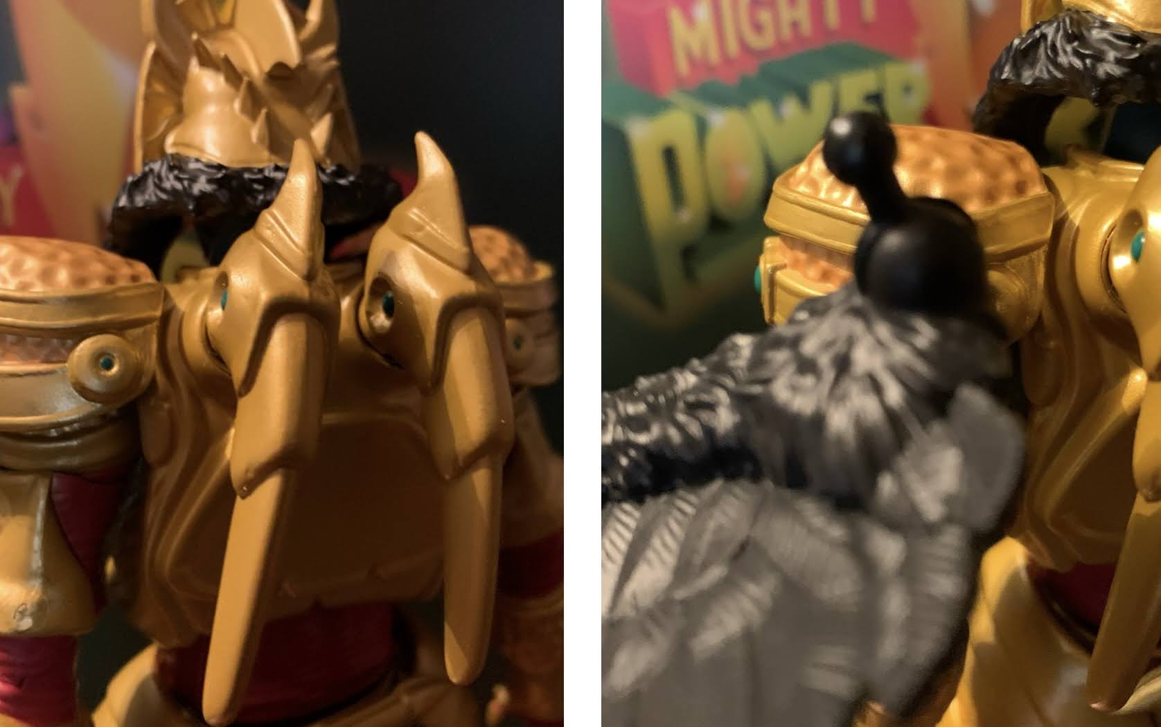
The big thing people are likely to note with this figure is the head. It’s just not accurate to the show. It’s much too wide and stocky with the black frame around the face too thick. The head should taper in towards the top, but here it’s more like a square. The brow also extends further down than it should basically touching the snout. And if you’re not sure how off it is, Super7 included a handy-dandy image of the actual Dragonzord on the back of the box for you to compare it to. Probably not the best idea. From the side, it looks fine, but it’s bizarre to see it look so obviously off when viewing the figure from the front. With this line, I sometimes get the feeling that Super7 is trying to match the show while also being an homage to the old toyline. If that’s the case, they still missed the mark as the original Bandai Dragonzord has a completely different head shape than this. Am I nitpicking? Perhaps, but it’s a pretty important detail and this isn’t a $25 figure, after all. Whether or not it matters to you is more subjective.
The old one may be taller, but it’s probably going to have some tail envy.
It’s important for this figure to nail the likeness because it’s not going to articulate well. I wasn’t expecting much out of it, because the suit from the show doesn’t offer a whole lot in that department, but even with those low expectations I was still let down a bit. The torso, which includes the head, neck, shoudlers, and diaphragm, is one solid piece. You get nothing except jaw articulation. The waist is on a ball peg so the figure can roll around on that part. You won’t get much forward and back, but you get plenty of rotation and tilt. The arms are essentially just forearms which attach to the torso via hinged ball pegs. They do next to nothing. You get maybe 45 degrees of up and down via that hinge, but rotation is basically nil. If you’ve seen the solicitation images for this figure, there’s one image where the Dragonzord’s arms are out to the side a bit firing missiles from its hands. This figure cannot do that which is a bummer because it should. At the hands, we get more hinged pegs. They rotate fine, but they’re recessed pretty far into the wrist area so the hinge is of little use. You can pull them out a bit though to get better range there.
Probably the comparison people are going to care about most. The two are about the same, though the Dragonzord should be taller.
Below the waist there isn’t a whole lot to speak of. The legs connect via big hinged ball pegs. They can kick out to the side a little bit, but there’s basically no forward and back range. The thigh twist there works okay though and below that is another hinged peg for the knee. The range on that hinge is maybe 25 degrees, it’s basically just enough to give the figure that crouched stance. You can rotate there, though it’s more like a pivot. The ankles work okay though as they hinge forward and back a reasonable amount and there is an ankle rocker. For the tail, we get a segmented approach just the like the Tyrannosaurus zord before it. I think it’s a bunch of hinged pegs so you get some play throughout. It’s not as robust as a bendy tail, but it at least looks good. It’s just not terribly functional. The drill tip at least rotates.
These two have a very similar feel, though I think the Dragonzord turned out just a tiny bit better as the black plastic just looks nicer than the red.
The figure is severely limited when it comes to articulation and that largely can be attributed to the design of the suit from the show. What’s more of a Super7 problem is the looseness. This is a heavy figure with heavy limbs and some of the joints just aren’t up to task. The waist and hips especially are pretty floppy. The heavy tail is constantly pulling back on the torso so it can be hard to get the figure in a forward hunch. The joint where the tail meets the body is also pretty loose further limiting how you can pose the tail. It’s a consistent problem with Super7, but the saving grace here is the big feet and that tail mean this figure is easy to stand. No shelf diving here unless you do something crazy, but it should be better.
Careful, it’s loaded!
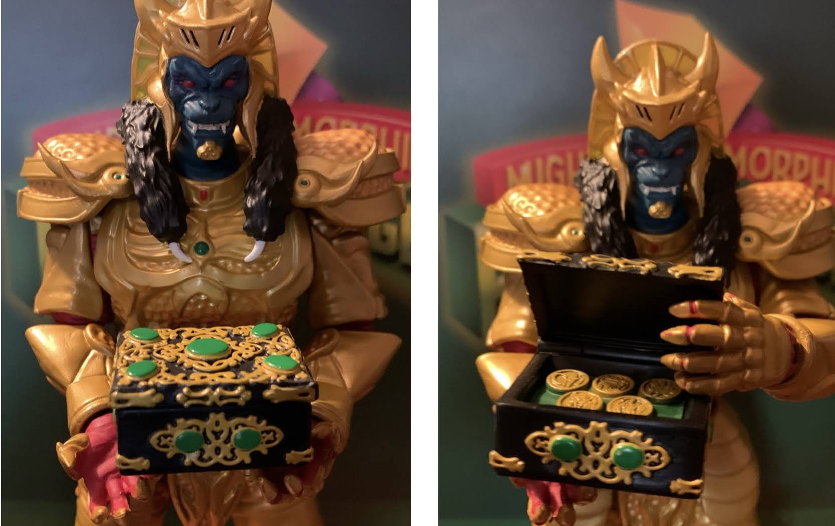
The clear best accessory in the box. And obviously I’m talking about the tiny Green Ranger on its shoulder.
The Dragonzord isn’t a character that really cries out for accessories, but it does come with a few. Mainly, they’re alternate hands. The figure comes with open hands, but it also has a set of fists, flat hands with the missiles poking out of the fingers, and the missile firing effect hands. The open hands are the only ones with horizontal hinges while the rest have vertical ones, which is fine. I’m not sure the fists needed vertical hinges, but I don’t think it really matters. The red tips on the missile-ready hands could be better, but they’re fine. The effect hands are probably the ones most are likely to use because they are pretty damn fun. It looks like the smoke trails are done with translucent, yellow, plastic that’s been airbrushed. The only other accessories is a tiny, in-scale, Green Ranger playing his flute and an actual power coin with the Dragonzord logo on one side and the zord symbol on the reverse. The little Green Ranger is okay, the painted shield makes it looks better than the Red Ranger that came with the Tyrannosaurus zord, but it’s nothing special. The coin is what it is. As far as novelty coins go, it’s well done, but I don’t know that it’s really necessary. On the other hand, we’re not missing anything. Maybe some arms that could swap in that are angled so it can fake some better range there?
There’s also a coin, if that’s something you value.
A less important comparison, but why not?
Super7’s take on the Dragonzord is not without its flaws, but it’s also pretty much as expected. This is a what you see is what you get, as long as you’re not looking at that image where the arms are going out to the side. It’s a chunky, solid, beast of an action figure. It won’t do much on your shelf, but it’s default look isn’t really lacking in shelf presence as it is. The effect hands really help sell the figure as it allows for something a bit more dynamic. Is it a package that’s worth $55 though? If you can overlook the inaccuracies with the head, I think so. The market has come towards Super7 making the price tag not as egregious as it was when this figure went up for preorder more than 2 years ago. If it were solicited today, I bet Super7 would have charged $65 for it like they did with the gold and black variant recently sold at San Diego Comic Con. I’m not saying that makes this one a bargain, but it’s definitely a better value than a lot of Super7 releases. If you’re all-in on this line, then you likely already have this. If you’re picking and choosing I think this is a solid addition to your zord shelf provided you have room. I’m curious to see if Super7 comes back and does a Battle Mode or Fighting Mode Dragonzord in the next wave (the White Tigerzord failed to get enough orders to go into production – ouch!). That one isn’t as fun looking as the standard version, but it would probably move better. They’d also get to recycle the Megazord legs so why not do it?
Suck it, Goldar!
Interested in reading about more Super7 offerings from the world of Power Rangers?
Today we are wrapping up our look at Wave 1 of Super7’s Mighty Morphin Power Rangers Ultimates! action figures with the lone zord of the wave: the Tyrannosaurus Dinozord. The T-Rex zord was the vehicle of the Red Power Ranger and main body of the Megazord. It was basically the only one of the original…
Last week, when we took a look at the first Power Ranger in Super7’s line of Ultimates! action figures based on Mighty Morphin Power Rangers I expressed some surprise that Hasbro would license out this brand since it competes with their own Lighting Collection. I do feel like the actual Rangers are pretty safe. People…
We continue to finally offload some long standing preorders this year and up next is Mighty Morphin Power Rangers from Super7. It was June 2021 when these figures were announced to the surprise of many. Why? Because Power Rangers are now owned by Hasbro, probably the biggest toy producer in the world who has its…
You probably heard, but Hollywood is essentially on strike right now. Two large unions are fighting for better pay, benefits, and assurances that they won’t be replaced by artificial intelligence while major studio heads like Bob Iger are tossing stones from their golden mansions. I am firmly on the side of labor when it comes to most strikes, but this isn’t a strike post. It’s a comic con one as the just recently wrapped San Diego Comic Con of 2023 had a decidedly different feel to it in light of the work stoppage. Unions frown upon any of their members even promoting their projects right now, and with good reason. Without the glitz of Hollywood, it meant Comic Con could go back to being about comics for at least one year. Though for me, every year is all about the toys!
I don’t know when it started, but Comic Con has become a huge spot for toy producers to show off what’s coming in the next few months to a year and 2023 was no exception. I sat glued to my phone once preview night started and fought with myself to put it down all weekend since I couldn’t be there in person. Now that it’s over, I’m going to tell you what I think because my opinions are very, very, important and the fate of the companies involved, nigh the entire industry, is dependent upon securing my approval.
NECA TMNT
That is one big ass Krang! Photo: Pixel Dan
Let’s start with the old standby – NECA and their many versions of Teenage Mutant Ninja Turtles. In some respects, this year’s display felt slightly subdued, but I think that’s because NECA has really branched out beyond just the cartoon and movies. They basically showed off a little bit of everything and undoubtedly they’ve held stuff back for the conventions to come. And that’s fine by me, I was kind of happy that I took one look at the new TMNT toon stuff and didn’t feel like I necessarily needed any of it. And some of that is tempered by the fact that I know I have a major expense in the sewer lair diorama to look forward to. On the toon side though, I’m definitely in for the street turtles. While I prefer the season one street looks to these, I’m still happy to have what they showed. That’s it though. I’m probably going to get more, and the giant Krang was certainly the show-stealer, but I’m definitely in more of a wait and see how I feel mode when some of this stuff starts becoming available.
These wrestling turtles so perfectly nail that Archie aesthetic I love. Photo: The Fwoosh
On the movie end, we just had some new Secret of the Ooze figures to look at. There was kick-boxing Keno, some new Foot, and two versions of Professor Jordan Perry. Is that too much of the professor? For me, yeah, and I can probably ignore all of these. Oh, and there was a pretty neat Shredder throne on display, but that’s another thing I don’t need. The comics end was far more exciting with a bunch of new figures based on The Last Ronin shown. They all look pretty damn good, but I may be out on that subline for the simple reason that I can’t buy, and display, everything TMNT from NECA. The Mirage line is getting some new figures as well, with the big one being Rat King who looked fantastic. That is definitely going on the “must buy” list. As for Archie, that may have stolen the show with a brand new Mondo Gecko unveiled and the much demanded Wrestling Turtles! Even if the models shown for the turtles were so early that they didn’t feature any articulation, I couldn’t have been more excited! I’ve wanted that black suit Raph ever since I was a kid and my dad bought me TMNT Adventures #10. I must have read that thing cover-to-cover at least a dozen times.
As for disappointments, there wasn’t much to be found. All of the new stuff looked good, so any disappointment was likely just the result of something not being shown. And the big one, for me, is Tempestra. I thought there was a very good chance we would see her from the toon line, especially after the profile boost given to the character thanks to Shredder’s Revenge, but she remains the elusive final member from the Night of the Rogues. I feel confident she’s coming though, so I’m not that broken up about it. I’d also like to see a new toon Shredder, or an Archie one, but again that’s probably coming, we just don’t know when. And hey, that Turtle Van is looking pretty sweet!
Super7
All right, when can I have them?! Photo: The Fwoosh
Super7 has cast such a wide net these days that maybe I should break their display up, but then again, there wasn’t a ton for me. The biggest though, by far, was the official unveiling of the new line of Misfits figures. These are being done in a retro, Masters of the Universe, style which is pretty cool. It means they won’t be as expensive as Ultimates, but definitely better than ReAction. I’ve felt for awhile that Super7 needed something in between those two lines, and maybe this is it. Would I like an Ultimate Glenn Danzig some day? Sure, as long as it’s good, and some of the figures Super7 has done of real people haven’t turned out so hot. This line, which features Skeleton Danzig, Jerry Only, The Fiend (aka Crimson Ghost), Samhain Danzig, and early 90s Danzig, already has hit on some great designs. We just need a Doyle to round things out. I’m also amused by how Super7 is basically just following the Medicom blueprint when it comes to Glenn Danzig.
On the disappointing side, well, there just wasn’t anything from the other lines I care about at Super7. Well, they did have TMNT Wave 8 on display and that’s looking fine, but there was nothing from the Disney or Simpsons Ultimates or even any new ReAction that I saw for either. Super7 usually doesn’t unveil new Ultimates at Comic Con, and they also don’t always go with a robust display. If they have something anticipated that they just got from the factory or something, they may bring that, but not always. I’m just concerned for both of those lines. The most recent Disney wave based on The Rescuers failed to secure enough preorders to go into production. Is the line in jeopardy? Sort of similar is that The Simpsons Wave 4 is still listed with an ambiguous “TBD” on the pre-order status page. It could be an oversight and they just haven’t updated it, or it could mean that no progress is being made and until it goes into production it should be considered as “in jeopardy,” as far as I’m concerned. It’s not exactly a star-studded wave and features two figures at $65 so nothing would surprise me.
Hasbro
Now that’s a figure worthy of the Master of Magnetism. Photo: The Fwoosh
I am certainly not the biggest Hasbro fan, but the company had my attention going into the convention because we knew that Marvel Legends based on the highly-anticipated X-Men ’97 were likely to be shown. And they were! Coming in Wave 1 is Wolverine, Rogue, Gambit, Storm, Bishop, and Magneto all with new sculpting to make them better resemble the upcoming show. For me, someone who collected the VHS line of X-Men based on the 1992 cartoon, I wanted to see if some of these could be fudged into that line. We have no assurances that Hasbro intends to come back and finish that team, so plucking Gambit and Rogue from this one might be our best option. And, for the most part, they look okay. Rogue has her green jacket and black headband and Gambit has a more “toon” appearance to his face. Neither face-sculpt looks truly like the ’92 show, but Hasbro was unlikely to give us that in the VHS line anyway. There is no cel-shading though, so that might throw off the display a bit, but given how half-assed Hasbro’s approach to that style was maybe it’s for the best? Wolverine is essentially the same as that release too, just now he has an unmasked portrait and pin-less limbs, so collectors waiting on a non-cel-shaded version of that figure should be happy. I personally don’t need it. And with Storm and Bishop featuring new hairstyles, I can pass on them as well. That Magneto though is a must have and I’m happy to see that Hasbro shaded his face. He could use some accessories, but this is Hasbro we’re talking about so that’s hardly a surprise.
I don’t know if I’m as happy as Pixel Dan is about this Crystar, but I’m definitely in “gimme gimme gimme” mode! Photo: Pixel Dan
Hasbro also gets credit for one of the biggest surprises as they showed off a figure of Crystar! Yes, Crystar The Crystal Warrior is coming to Marvel Legends and the figure looks pretty sweet. It’s all done in translucent plastic with a blue hue and he has his sword and shield to round things out. The comic he hails from is pretty forgettable, except for the fact that the iconic Danzig skull was lifted from the cover of issue 8. Naturally, this is one I need for the Danzig collection more than anything.
And that’s pretty much it for me. I did see other great stuff like Jada’s Mega Man line and NECA had some new Gargoyles to show, but the above stuff is what really stood out for me and got me excited. Mondo also unveiled an Omega Red in their sixth scale line based on the X-Men animated series and he looks unsurprisingly spectacular, I just wish they’d slow down a bit as that line is killing me financially. Special shout out to all of those working hard during the convention covering this stuff for people like me who can’t go. I’m talking about The Fwoosh,Pixel Dan, Toy Shiz, Toy Bro, and loads of others. The excitement is now over, we have lots to look forward to, and the next convention or show lurks on the horizon. This golden age of toy collecting appears to be going strong, weap for my wallet!
In the late 1980s the arcade scene in the US was still going strong. Classic style arcade games like Donkey Kong and Pac-Man were being overtaken by a new genre of quarter-munching pain: the brawler. Or the beat-em-up. If you’ve played one, then you can picture what I’m talking about. It was usually a one…
There’s been a hole in my Danzig collection for quite some time. It was a hole that was easy to fill and actually quite cheap considering most Danzig records fetch well over $100 these days, but an important piece was missing. And that piece is not what one would necessarily expect, but I would assume…
Wednesday, August 18th, ended up being quite an eventful little day in the world of toy collecting. There were some reveals from major toy companies, leaks, and even those long neglected Street Sharks fans got something to get excited about late in the day. Personally, it was a good day for me too as I…
If you’re into collecting action figures then you’re likely familiar with the concept of a variant. Tooling action figures, the process of cutting steel into molds in which plastic is inserted to create the figure, is the most expensive part of creating an action figure. That’s why it’s in the manufacturer’s best interest to get as much use out of those tools as possible. Many action figure lines are dependent upon sales of variants, usually identical action figures with minor differences, to help keep the costs down as a whole. Sometimes these variants are used to poor results. Anyone who walked into a Kay Bee Toys in the 90s may remember the X-Men and Marvel Comics exclusive figures which were just bad repaints. There was a savage Wolverine that was just a repainted Sabretooth, for instance. Those are bad variants, but a good variant can be plenty fun and when it comes to Super7 you can basically bank on the company having an assortment of color-changing and glow-in-the-dark variants ready to go at any moment.
For you in-box collectors, the packaging is pretty cool. And with the window box, I suppose you could make the figure glow without taking it out.
That’s what the Mutagen Ooze series is from Super7. It’s the four turtle figures they’ve already done, but cast in glow-in-the-dark plastic. They aren’t the first, nor are they the last, of Super7’s glow variants for TMNT. The first wave included a glow-in-the-dark Baxter Stockman as a convention exclusive and they have also done Mutagen Man, the Foot Soldier, Muckman, and have Slash on the way. Super7 loves glow-in-the-dark figures, and it’s easy to see why. They have their own, unique, aesthetic with the translucent plastic and often a different finish from a traditionally painted figure. And then, of course, there’s the glow which has been delighting kids and adults for decades. It’s silly, stupid, fun.
How do you prefer your Leonardo?
We probably shouldn’t forget about the samurai option.
Unfortunately, that fun comes with the downside of added cost. It wasn’t always the case as the first few glow variants were the same price as the non-glow options, but with the Mutagen Ooze series there came a hike. Where the turtles cost $45 a piece in their first run, the glow versions were $65 and exclusive to Super7’s webstore which meant payment upfront and no free shipping. I took a look at that solicitation and liked what I saw, but there was no way I was going to pony up that kind of dough for a fun, but also silly, gimmick. I considered getting just one, my favorite turtle Leonardo, but after shipping that was going to total over 80 bucks for one figure! Sorry, Super7, it just wasn’t worth it. The reason offered up by Super7 co-founder Brian Flynn was that the cost for the glow additive for the plastic had gone way up and so they had to up the price significantly. I’m not going to call the man a liar, I do believe what he said is true, but it’s still hard for me to wrap my head around how a figure that’s already been tooled can warrant such a markup just for the cost of materials. And if this glow situation was only temporary, maybe just don’t do it? Wait it out. See if the price comes down. Maybe the factory will want the business later on and be willing to negotiate. I don’t know, but at the end of the day it’s not my problem. As a consumer, we see the product and the price and have to decide on the subjective worth of it all and, for me, it just wasn’t working.
I love the use of blue with this figure.
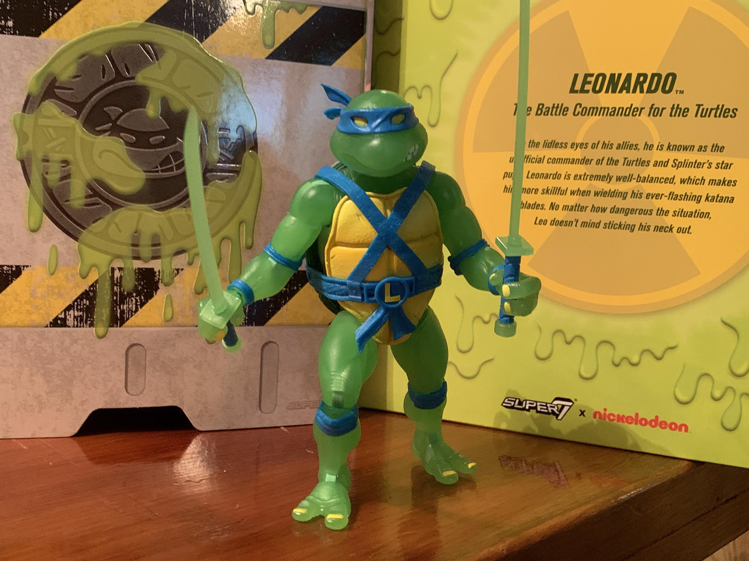
Obviously, something had to change or else this post wouldn’t even exist. And that something was a sale. Super7 ran a Father’s Day sale that, for some reason, included the Mutagen Ooze Leonardo. Maybe they wanted to feature a glow-in-the-dark figure from this line, but since they have yet to do Splinter, they figured Leonardo made the next most sense for such a sale? I don’t know, but I was happy to see him included and happy to see him discounted to a little over 50 bucks. Throw in shipping, and he was still under the $65 MSRP. Perhaps still more than I wanted to pay, but at least at this level I could talk myself into it. And I’m glad I did because this figure is wonderful! It’s a real shame the wave wasn’t more affordable as I wouldn’t mind adding the rest, but not at the current asking price.
“Uhh, Leonardo, are you feeling all right?”
If you have the original Wave 2 Leonardo then you essentially have this figure. The sculpt is exactly the same which is a Playmates inspired mold, but with a modern approach. The default portrait is an almost exact recreation of the vintage figure except for the angle of Leo’s eyes. Where he once had a look of concern on his face he now has something a bit more intimidating. The same hands and the same swords are present and all of the same engineering is still in place. I’ll link to the original review at the bottom of this, but I’ll add that this figure is better engineered. The joints aren’t as loose, but nothing is overly tight either. What little paint was needed is applied well, and anything your old Leo can do this one can as well. The only new issue this figure presented for me was that swapping the heads is way harder than it should be. I couldn’t get the secondary head onto my figure, and since I didn’t plan on displaying him that way anyway, I gave up. If you get this figure and want to make use of the alternate portrait then I suggest heating it up first.
And glow he does.
The obvious selling point here is the glow and the minor deco changes made to accommodate that. The entire figure is cast in a slightly translucent, green, plastic. Even without the “glow” in effect, the figure has an almost glow quality about it because the green is practically neon. Stick him under some lights and then move to a dark area and the glow works without issue. The plastron is painted yellow and it’s a bright yellow which accommodates the green well. The pads and belt are all in Leo’s signature blue and I love the choice to make the belt blue. It’s an homage, intentional or not, to the storage shell series from Playmates and I always liked that aspect of the line. The blue just looks so good and it’s probably my favorite aspect of the figure. The eyes and nails are painted yellow and I think it works since they play off of the plastron. The shell is still painted a fairly dark green, but the rim around it is painted in a lighter shade of green and I really like that contrast to the point where I wouldn’t mind seeing it in use on the standard figures. This is a really fun looking figure and if you like glow stuff then you’ll probably fall in love with it.
“Two heads! I got two heads here!”
The accessories are mostly rehash from the prior release, but with a couple of differences. Leo has the following sets of hands: gripping with vertical hinge, gripping with horizontal hinge, style posed open hands, and fists. There’s an open and closed communicator and the pizza slice also returns. He has his trusty katanas, and the handles are painted blue to match his belt which looks nice, though do be careful not to scratch the paint when inserting them into his hands. He also has the same alternate portrait which is a very similar expression to his default one, but done in a more realistic style. The new accessories are an unmutated turtle which is from the Splinter release and a leaking canister of ooze. All of the accessories are cast in the same glow-in-the-dark green plastic as the figure with little in the way of paint hits. You basically just have the eyes of the baby turtle, the caution stripes on the canister, and the screen and buttons of the open communicator for paint apps. All of the paint apps are done in yellow.
Aww, look at the cute, baby, irradiated turtle!
This is a short post because this figure is what it is: the same figure released before, only now it glows in the dark! For what it is, I love it. I also like the Super7 turtles in this line so it should go without saying that if you do not then you won’t like this release. It’s just a shame that the MSRP had to be so high since Super7 is essentially asking us to pay 20 bucks a figure to make it glow-in-the-dark. Is that gimmick worth 20 bucks to you? It sure isn’t for me, but with a discount it was for at least my favorite turtle. Even if I could get the other 3 for the approximately $52 a piece price this one cost, I’m not sure if I’d jump in. That’s still over $150 to complete the set. If I could get them for $45 each then, yeah, I’d probably do it, but I don’t know if we’ll see such a steep discount.
“Hi, Donnie? You there? It’s going to cost me 65 bucks to get you here?! Never mind.”
If you would like to add this Leonardo to your collection, or any of the other glow-in-the-dark turtles, then you can head on over to Super7’s website where they’re still available. Big Bad Toy Store also has them on-hand, but they’re asking for $70 a turtle and I cannot recommend them at this price. BBTS does offer $4 shipping so it’s possible, maybe even likely, that a set from them would cost less in the end than a set from Super7 direct, but both are bad deals. My advice is to wait it out because if this is something you absolutely had to have then you probably already bought them when they went up for sale last year.
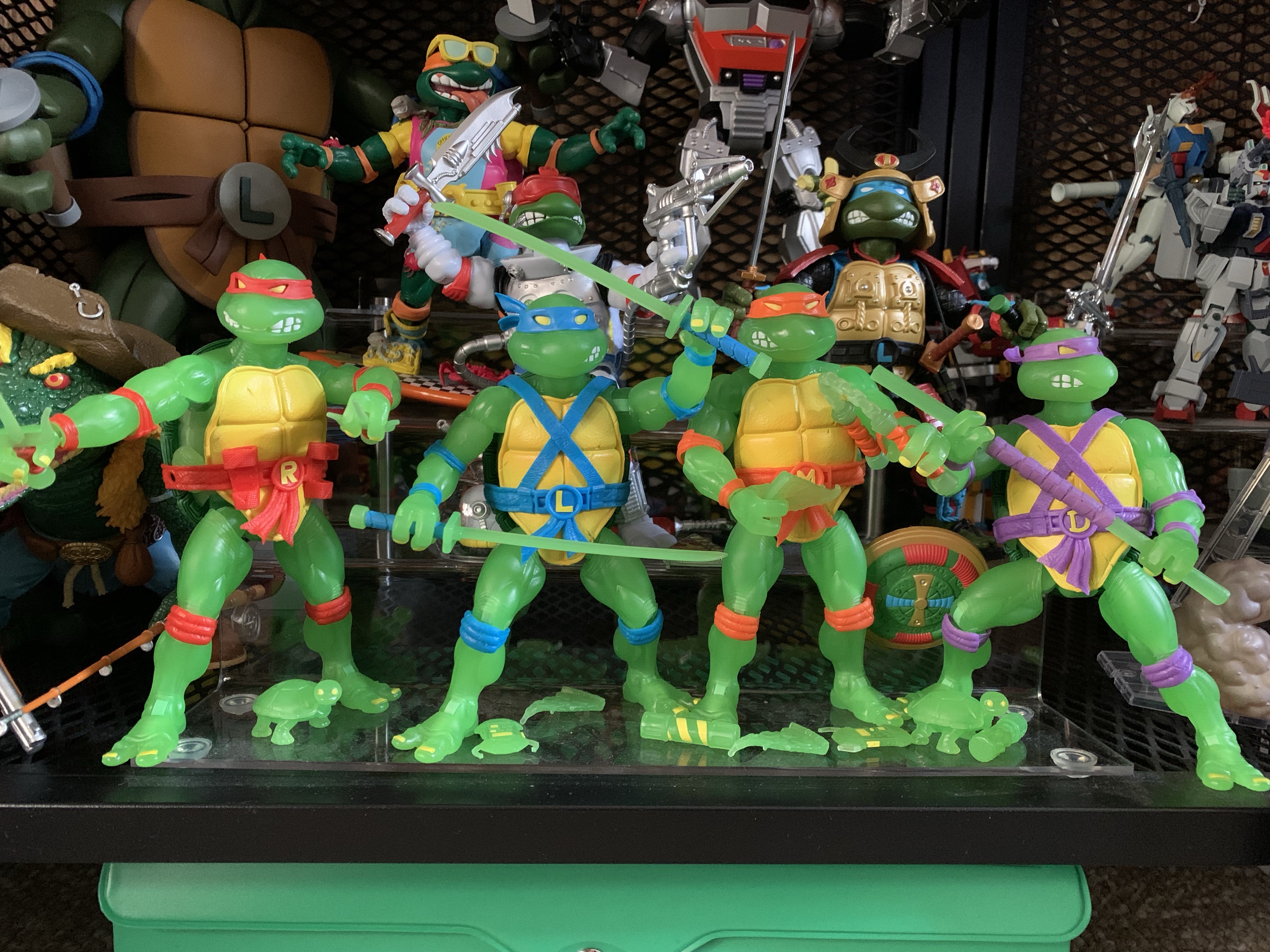
Four, glowing, brothers together at last!
UPDATE – Due to a combination of store credits and clearance events, I was able to complete my set of Mutagen Ooze Turtles by adding Donatello, Raphael, and Michelangelo. I considered doing a review for each, but since each figure is essentially the same (and is already just a variant of figures I already reviewed) I figured a simple update was warranted. In short, if you like one of these then you’ll like all four. They come with the same accessories and hands and the only thing separating the figures is the unique weapon, head sculpts, and colored belts and pads. Pretty standard stuff.
Let it glow!
Worth noting, all of my figures have tight heads and getting the secondary heads on will likely require heat. My Raphael has a stuck, left, knee joint as well which is interesting since my Wave 1 Raphael had the exact same issue. Michelangelo only comes with his plastic nunchaku, not the ones with real chain links, which I get, but is a bummer. Maybe they could have done a plastic chain in glow-in-the-dark plastic instead? The plastic ones are very rigid and don’t pose well. That’s really the only differences worth pointing out though. My only other gripe with these would be that Raph’s accents look more red-orange than red to me, but also see what they were going for with the shades used. At $75, these aren’t worth it, but absent the cost they do look pretty cool. If you can find some on-sale (I scored two of them at Macy’s, of all places) and you think they look cool then I say go for it. Big Bad Toy Store still has these and did not make them part of a huge clearance event in November 2023, but maybe that will happen eventually? Some other smaller shops (like ecollectibles) also were allowed to stock these and have them discounted so shop around, see what you can find, and grab ’em if you want ’em.
If you ask me what my most cherished childhood toy was I won’t hesitate to answer Leonardo. My original Playmates Leonardo was a figure I adored and played with for years. I would get other Leonardo action figures, but they were always a temporary joy. When I sat down to act out and play with…
Well, after looking at the Wave 6 Slash a couple of weeks ago we can now finally turn our attention to a Wave 5 release from Super7’s line of Teenage Mutant Ninja Turtles Ultimates! series of figures: Sewer Samurai Leonardo. The thing with TMNT is, you have the four good guys, a few core allies,…
It’s been over 9 months since I last reviewed a figure from Super7’s line of Teenage Mutant Ninja Turtles action figures. That figure was Muckman, and I actually waited on that one a little while because I ordered through Big Bad Toy Store and wanted my pile of loot to fill up a bit. Had…
Today we are wrapping up our look at Wave 1 of Super7’s Mighty Morphin Power Rangers Ultimates! action figures with the lone zord of the wave: the Tyrannosaurus Dinozord. The T-Rex zord was the vehicle of the Red Power Ranger and main body of the Megazord. It was basically the only one of the original five zords that could function on its own in a meaningful way. The other four rarely did anything, but on occasion, the T-Rex went into battle and took on some monsters in its dino form. As such, it made sense for Super7 to do a figure of this particular zord since it can standalone as an action figure while something like the mastodon or pterodactyl really would not. And it’s also because Super7 either isn’t allowed to produce, or has no desire to produce, zords that can combine into other zords like the famous Megazord.
Packaged for maximum width.
For me, a very casual Power Rangers fan, the appeal of this line is that Super7 can produce zords that are more accurate to the show. Whenever a company makes a combining one, they have to work within that framework. The zords in the show existed as both models, or puppets, and as actors in a suit. When the Megazord was formed, it then transitioned to a costume which could basically cheat the proportions. As a result, any figure that does the same isn’t going to resemble the one on TV. It does in a general way, but usually the proportions are off (especially the head) and any articulation the figure has needs to be able to be integrated without causing an issue for one of the individual components. When I look at my vintage Bandai Megazord, it almost feels like they prioritized the individual zords over the Megazord. Or, they simply determined that was the best way to go. The head is tiny, but since it needs to fit inside the head of the T-Rex that was something that couldn’t really be avoided. The shoulders are huge as well and the body is quite thick. There’s also the issue of the T-Rex tail which kind of just disappears. It’s still a tremendously fun toy, especially for 1993, but for collectors that want a screen accurate Megazord it’s not really going to cut it.
This is amusing to me.
For the T-Rex, the same is basically true as it needed to be more narrow to accommodate the transformation. The head also needs to fit in the chest and something has to be done with that tail. Ignoring that allows Super7 to just look at the character onscreen and let that dictate where the figure goes. It obviously can’t scale with the Power Rangers in the line so that part is essentially made up, but Super7 is a company that tends to feel bigger is better and that’s certainly the case with the T-Rex. The box alone is massive. I was pretty amused when I got my figures in the mail as I ordered just the Green Ranger, Goldar, and the T-Rex and each box was different in size. I knew this one would likely be the biggest, but I still wasn’t quite prepared. And that’s mostly due to Super7 packaging the figure from the side and leaving the tail fixed. They could have sent it out disassembled, but what’s the fun in that?
He can stand upright.
Or he can stand “Jurassic Park” style.
The Tyrannosaurus stands at roughly 8″ in height. I say roughly because this is a character that’s always going to have its knees bent to some degree so I’m basically selecting what I feel is a neutral position. Lengthwise, he’s going to need about 10.5″ of shelf space for that tail and that’s with a gentle curve in it. Not only is the figure pretty big, but it has some heft too. It’s solid which helps give it more of a premium feel over the other figures in the line and really over just about every other Super7 figure I own. And in terms of show accuracy, I’d say it’s pretty damn close. There’s a lot of paint on this figure and the metallic portions have a nice shine to them. There’s some black linework on the shins and around the silver portions of the tail. There’s lots of places that are just blocks of color consistent with the look of the show and most of the paint is cleanly applied. There’s a little slop on the linework on the left shin of mine and the right eye could have been better. It’s also missing linework on the top of the head which is disappointing (the paint is present on the promo images) as the head is one of the few places where there’s a plastic look to the figure. Basically everywhere on the body, Super7 decided to paint this guy, except for the head which is mostly red plastic. Normally, you would see the opposite as we did with The Simpsons since the eyes are naturally drawn to the head. I wish they had painted it, but it is what it is. The proportions also strike me as a touch imperfect when comparing it to the suit on the show. The head should probably be a little bigger and the hands boxier. The knees also should indent on the sides, but here they’re basically flush, and the red areas around the shoulders should be more rounded off. These are nitpicks, for the most part, and the only thing I really miss when comparing it to the screen is just more of that black linework., but I think most people will be happy with how this figure looks.
This one is probably not going to scale with any Power Rangers in your collection.
He’s sized well for battling Goldar.
There may be some temptation to display this guy with past iterations of the Dinozords. I only have one such era of releases, the 1993 and 94 stuff from Bandai. I did also get the Hasbro Megazord for my son, but that thing is pretty small and neither vintage nor collector grade. As for the old Bandai stuff, this figure isn’t that much bigger than the Tyrannosaurus released back then. He’s just a little taller, but way more bulky. The vintage one does have the proper linework on the head though so at least it has that going for it. The Dragonzord is another one some may want to place with this figure and, size wise, it more or less works. That Dragonzord is pretty damn chunky and not exactly screen accurate, but it’s a fun companion. If you want to go battle mode with your Dragonzord, then it suddenly dwarfs the T-Rex. That’s to be expected since the Megazord does the same to the Dragonzord. There was apparently just no way to get those forms right as a combining toy, and since it was for kids, it’s not like Bandai was that concerned about accuracy. This figure will presumably scale much better with future Super7 zords.
Meeting some old friends.
He’s big.
Naturally, a big, robot, dinosaur isn’t going to articulate particularly well. Super7 basically got most of the joints one would expect into this figure, it’s just not particularly functional. The head is on what feels like a double ball peg and can look up and down pretty well. The large panels on the side of the head prevent natural rotation in that the head will always want to turn to the side when trying to rotate, but it has a lot of room for nuance posing. The base of the neck is where you get your rotation and it’s on a ball hinge so you can get a little extra “up” range as well. For the arms, it’s the silver parts that move. The “shoulders” are on ball hinges and can move up and down and you get about 90 degrees of movement. Their range out to the side is very minimal. There are elbows that get you something less than 90 with a swivel as well and the wrists swivel and hinge and those are fine. There’s a basic twist in the waist area which begins where the silver portion of the chest ends. The hips are big ball hinges that go out the side a small amount and rotate a minimal amount. The knees are hinged joints that barely move and are rather useless and the joint is mostly going to be used for a swivel as the lower leg can rotate there a decent amount. The ankles are on hinges that don’t go back very far, but do go forward a decent amount. There is an ankle rocker but the range is pretty limited, but it’s enough to accommodate the range at the hips. The tail is on a series of ball joints. The first segment doesn’t move, but each one after that does so you get full rotation at each segment and a little up and down movement that allows the tail to be curled. If you have a heavy duty stand, you can even get this guy into his kicking attack pose where he stood on his tail in the show. Lastly, there’s also a hinged jaw and that works fine.
There’s 30 years of toy advancements staring right at you.
I’m actually surprised at how comparable they are in size.
The Tyrannosaurus isn’t going to do a whole lot on your shelf aside from stand there and look cool. I like the range at the head as it imparts some personality, even though I think the suit in the show didn’t allow for that. The hips are limited, but allow the stance to be widened which looks nice, or you can go for a more straight up and down pose. There’s also enough range going forward at the hips that the figure can be posed like one would pose an actual T-Rex which is more horizontal. It’s a pretty cool look, though not something you would have ever seen on television out of this character. It’s also easy to stand and there’s not much rub at the joints that will impact the paint as they mostly go as far as they’ll go and then stop. In the end, I think it’s fine as this isn’t supposed to do a whole lot and it’s technically more articulated than it is in the show.
Here’s some tiny Jasons for your dinosaur to play with.
If you like novelty coins, you get this too.
The accessories for this figure are also another area of limitation. What really can this thing even come with? Super7 decided we needed some hand options so we get a set of fists, open hands, and more neutral hands. I’m a little surprised they didn’t just make the hands articulate, but this is honestly probably better for us. There’s also a pair of mini, in-scale, Red Ranger figures. One is posed with the hands on the hips and the other is in a summoning pose. They’re very minimally painted as they’re just red, slug, figures with the white of the gloves, boots, and belts applied. I certainly wouldn’t expect a fully painted figure at this size, but I feel like those tiny, novelty, figures are better painted than this. Adding a white diamond to the chest would have helped to break it up a bit and some black for the visor. Without it, these look too cheap to really do much with. Lastly, we get a replica Power Coin that features the snarling T-Rex on one side and the zord symbol (I think that’s what it is) on the reverse. It’s a really heavy, chunk, of metal and it features some shading which looks nice. It’s neat, but not exactly practical and I have no idea what I’ll end up doing with it. I wasn’t expecting much, but I do think we could have used an effect piece for the mouth cannons. I honestly don’t know if it ever used them in the show, but who cares if it didn’t? Some little blast effects or something like a breath attack would have been pretty damn cool.
Making friends with the other dinosaurs. This guy will probably pair nicely with the upcoming Grimlock Ultimates! from the Transformers line.
“I gotta get me one of these!”
Ultimately, which is how I pretty much have to end a review of a Super7 Ultimates! release, I think this figure gets the job done. It’s supposed to be a more screen-accurate depiction of the Tyrannosaurus Dinozord from the TV show and it succeeds in that department probably better than any other release I’ve seen. There have been some really cool, and really expensive, Megazords over the years, but usually the T-Rex has to be compromised in some way to facilitate the transformation. Here, we don’t have to worry about that. Aside from some missing paint on the head, I’m really happy with how this figure turned out. It’s a chunky, hunk of plastic that moves about as well as can be expected and will look great in any Power Rangers collection. He doesn’t scale at all with the Rangers, which is to be expected, but will look fine battling someone like Goldar and I assume the monsters to come will follow suit. For me, this line is all about the zords and monsters so I’m generally pleased with what I’ve seen. I decided to pass on the Yellow Ranger and Putty, so this will be my final review of the first wave. I do plan on picking up the Dragonzord when it comes out and eventually I’ll have the Megazord as well. And like Goldar, this is a Super7 release that actually meets its asking price of $55. I’m actually surprised they didn’t try to get more for it as they will with the Megazord so I guess be happy for that. This is an easy recommend for me though.
Looking for more Power Rangers toy coverage? Well, look no further:
We continue to finally offload some long standing preorders this year and up next is Mighty Morphin Power Rangers from Super7. It was June 2021 when these figures were announced to the surprise of many. Why? Because Power Rangers are now owned by Hasbro, probably the biggest toy producer in the world who has its…
Last week, when we took a look at the first Power Ranger in Super7’s line of Ultimates! action figures based on Mighty Morphin Power Rangers I expressed some surprise that Hasbro would license out this brand since it competes with their own Lighting Collection. I do feel like the actual Rangers are pretty safe. People…
It was now a couple of weeks ago I posted about some toys I always wanted as a kid, but never got. Shortly after, I rectified some of those decades old injustices by purchasing the Dragonzord with Green Ranger from Bandai’s Mighty Morphin Power Rangers line of action figures from 1993. The Dragonzord was my…
Last week, when we took a look at the first Power Ranger in Super7’s line of Ultimates! action figures based on Mighty Morphin Power Rangers I expressed some surprise that Hasbro would license out this brand since it competes with their own Lighting Collection. I do feel like the actual Rangers are pretty safe. People who are into MMPR will buy a set of Rangers from both companies and be happy. When it comes to the monsters though then I think Hasbro could have an issue. In truth, the monsters have been a relatively small part of the Lightning Collection. The few that have been released have been of the deluxe variety with an increased cost relative to the Rangers. They’ve also been kind of terrible from what I’ve seen. A few look like they’re sculpted well enough, but Hasbro really cheaped out on the paint apps for most of them and they just look awful as a result. It’s surprising because MMPR is an in-house brand for Hasbro now. I may not like it, but I understand when a Marvel Legends figure or a Star Wars release has less money put into it because those have the additional burden of a licensing fee, but that’s not the cast with Power Rangers.
Goldar has some size on Tommy, and I’m happy to see he doesn’t completely dwarf a Lightning Collection release.
Since Hasbro has declined to make any monsters worth my money, I naturally saw Super7’s line as a potential replacement. I like having villains, especially monster types, that are bigger than the heroes so the larger scale of Super7’s figures didn’t seem like an obstacle to me, but really a potential benefit. Though so far I’ve only committed to buying one such figure, but if it’s any good I may change my mind. And that figure is Goldar. I don’t need or want a big MMPR collection, but Goldar always felt like a character worth having. He’s Rita Repulsa’s general and basically her right hand man…monster. Despite his inability to actually defeat the Power Rangers, he was kept in that position when Lord Zedd usurped Rita’s throne and attempted to take matters into his own hands. As an enemy, I think Goldar was the first monster the Rangers battled in their Megazord, though I also haven’t gone back to watch the show in years so I could be misremembering. I always liked him as a design. He’s some sort of armored wolf, and as the name implies, he seems to like gold. He looks scary, and even though he wasn’t exactly batting a thousand, I always felt like he was a threat to the Power Rangers and not the show’s version of a Bebop or Rocksteady.
It’s probably not screen accurate, but this works for me.
Super7 apparently felt like Goldar was rather important and he was chosen to be the main villain in the first wave of Ultimates! Like Tommy, he comes in the same Ultimates! styled box with a green slipcover over a window box inside. He does get his own “power coin” logo on the slipcover and there’s a bio and still from the show on the back of the inner box. Once removed, Goldar stands a mighty 8″ or so to the top of his head, a touch taller if you count the horns of his helm. He looks rather resplendent in his golden armor which appears to be fully painted. Like the Green Ranger, it looks like Super7 committed to giving us a nice finish by casting the figure in the appropriate color, but then painting over it with the same. It gives the figure a much more “premium” appearance which is a good thing considering he’s priced at $55. The inner parts of his suit are painted red in accordance with the character design and there are a few gems or something painted as well. The face looks really nice as it’s blue with shading around the eyes. The teeth are cleanly painted and the furry…things…that drape over his shoulders look fine too. The crown of his helm is done in a translucent, yellow, plastic that almost looks like stained glass. It’s an unexpected, but welcomed, embellishment. If I am to nitpick the paint I’d first go to the black strap on the calf area which do nothing to convey the illusion of an actual strap. They’re flatly painted and unconvincing. Some of the red could have also been applied cleaner. It’s pretty hazy around the kneepads and some of the hands are a bit messy. In Super7’s defense, the hands are hard to paint as there are gold plates over the digits with red underneath. Hasbro declined to attempt such a thing and I’ll say for the most part they look good enough. I also feel like the feet could have used some shading as they’re the only part that looks “plasticy” to me.
Goldar is also sized well to compete with zords. I’m curious how he’ll stack up against the upcoming Megazord.
I figured we should sneak in a comparison to another Super7 figure featuring some gold accents that a lot of people seemed to have issues with. And we might as well put him up against another big boy in Apocalypse.
As for the sculpt, well there’s really little to complain about. Super7 absolutely nailed the portrait with Goldar which is something I wasn’t sold on with the Lightning Collection release. This looks like the character to me and I feel like if he started talking on my shelf I wouldn’t even be surprised. Most of the body has a nice texture to it as the gold is dented like a golf ball in several parts. I am not an expert on the show, but it looks accurate enough to me. All of the details I associate with the character are present like the giant codpiece and the bundled up tail on his rear. Super7 has received numerous criticisms from me over the years, but rarely is sculpting an issue and this guy is no different. He might really be one of their best which is not faint praise.
This ornately designed chest looks pretty damn nice.
These things are less interesting, but you get five of them!
Goldar has a rather expensive look to him so I was expecting Super7 to skimp on the accessories, but he’s actually pretty robust. For heads, we have two options which are essentially mouth closed and mouth open. Both look great, though I think I like the open one just a little bit more. For hands, we get a whole bunch: fists, gripping with horizontal hinges, gripping with vertical hinges, and open hands. For those gripping hands he has his rather large sword which is painted very nicely with hits of silver and gold and the red gem in the center. He also has his little wing nubbins on the back which can be removed and replaced with open, black, wings that also look quite nice. They’re entirely sculpted in plastic and the feathers are nicely textured and the paint is clean. In addition to all of that, we get some episode specific stuff. There’s an elaborate chest that contains the power coins after they stole them or something. The chest has a hinged lid so it can open and close and the paint job is pretty damn spectacular. Goldar also has the five Badges of Darkness which I think he gave out to the Putties to create evil, clone, Power Rangers. They’re identical and they just resemble grey stones with a light blue gem in the center of a star carving. Nothing special, but those more interested in episode-specific trinkets will get more mileage out of them than I. His extra stuff at least feels more purposeful than most of the stuff the Green Ranger came with.
The alternate head is definitely a keeper.
“I will destroy those teenagers with attitude!”
Goldar is not a character that looks like he’ll move very well, but again, Super7 kind of surprised me here. For starters, his head is on a hinged-ball peg. I do not like that, but at least he looks up and down okay and can turn his head. He just doesn’t really get much in the way of more nuanced poses. His head sits high on the ball, so he gets more than the Green Ranger, but Super7, please just go back to using double ball pegs. The shoulders are the hinged ball joints that peg into the arm and he can lift his arms out to the side past horizontal. This really surprised me as he’s got some rather large shoulder pads, but they do a solid job of getting out of the way. Rotating the arms all around isn’t going to happen, but you get enough. He has a biceps swivel and a single-hinged elbow that can’t quite hit 90. You also get a rotation point at the elbow as well. The wrists rotate and he has the proper hinge for the gripping hands, so that’s a plus. They are a tad loose though and his heavy sword can be a touch finicky to pose, but it seems to hold in position well enough. In the diaphragm, we get what’s probably a ball joint of some kind that lets the figure rotate, but also tilt to the sides. He arches back a little, and crunches forward a little as well. In both cases, it’s more range than I expected. He does have a waist twist below that and some hinged ball joints at the hips. Goldar can just about hit a split before the armor at his hips gets in the way and he can kick forward to almost horizontal, though he can’t really kick back at all. You get some rotation at the thigh and the single-hinged knee can go about 90 degrees. It also rotates a little at the joint. The ankles feature the usual hinge and rocker, though the shape of the plating of the armor does restrict things a bit. The hinge goes back well enough, but you don’t get much forward. The rocker is also limited, but I think you’re going to get enough out of it to keep his feet flat even in some rather wide stances.
He’s not some super-articulated ninja figure, but he can look tough and swing a sword so that works for me.
I would say Goldar articulates pretty well for such a design. I admit, some of that opinion is colored by my low expectations going in which were influenced by both the look of the figure and my own experience with Super7. I think they did a good job though and I don’t really feel like other companies would do much better. Yeah, you could slip in some double joints at the elbows and knees and maybe get a little better than 90, but is that really going to up one’s enjoyment of the figure? I think the easiest point for criticism is the head as Super7 should ditch the hinged ball peg. I suppose a hinged joint in the diaphragm could get more ab crunch? That’s probably a little more expensive to implement though and presents gapping issues usually. He basically reminds me of a NECA figure and his range is pretty comparable to Warduke. And since he has a less restricting his torso, he probably moves better than that figure. That figure is probably a little visually more impressive, but it’s definitely more subjective than usual. At least Super7 is comparing well to something that’s much cheaper since usually they present worse and cost more, a true double whammy.
A lot of people have had a lot of issues with these parts so do be careful.
I think the wings are worth the hassle as they do look rather nice once applied.
One thing I do need to talk about though is the quality control issues people have been having with this figure in particular. I have seen and heard from lots of folks who had issues with the head and wings. I didn’t actually mention the wings in the articulation portion, but they do connect via a ball and socket joint on the figure’s back and they have a hinge as well. The left wing seems fine, but the right is a bit iffy. The socket feels like it’s off just a tiny amount, probably not enough to notice with the naked eye, but it’s noticeably tight. People have been snapping the peg when trying to rotate or use the hinge. I noticed before even inserting that wing that the hinge also stressed the plastic when pushed all the way. I guess naturally that means don’t push it all the way, but it still should not be. With the head, I’ve seen folks have a hard time getting the alternate head on and snapping the post as a result. One person I talked to snapped it just rotating the head after getting it on. I mentioned in the review that the heads seem to sit high on the ball and I think that’s by design to help clear the stuff around his neck. If so, it’s a bad design because every toy collector is going to think they need to seat that head all the way down and if that’s breaking things then Super7 deserves to have to eat some costs replacing them. Just elongate the post, or find another solution, this one feels half-assed. Out of an abundance of caution, I heated the little wing nubs on my figure before removing them and also heated the wings before inserting them. Once in, I’m just leaving them alone as I posed them via the hinge before inserting them. For the head, the default one came off without any issues and I heated the open mouth one before putting it on. It seems fine, but it doesn’t really want to rotate so I won’t force it. I prefer the look of the open wings with the open mouth so I would have been bummed if they had broke in some way. I technically didn’t have any issues with my figure, but I feel like a lot of others had to suffer broken Goldars in order for me to have such an experience. I guess tread lightly and make sure you purchase from a place with a good return policy if it comes to that.
“Buy my toy!”
Quality concerns aside, I think this is one of the best Super7 figures I own. It’s rare that they hit in all three phases for me: sculpt, paint, articulation. Usually they try to close the gap by tossing a bunch of junk into the box with their figures, but with Goldar that’s not needed. And better yet, most of his “junk” actually feels purposeful. While I liked the Green Ranger as a figure, I couldn’t help but feel like it was overpriced. With Goldar, I don’t really get that feeling. I think he’s actually pretty damn good and for $55 he’s the rare Super7 figure I can say is worth it. I have a lot of Super7 figures that I’m happy with, but objectively feel are overpriced. Goldar gets to be both objectively and subjectively a good figure. If you’re one of the folks who had a different experience with the head or wings then you might feel differently, but I’m reviewing both the figure and my experience with the figure and for me this is exactly what I wanted out of this character. He looks good with the other releases in the line, and extra menacing with the Lightning Collection Rangers. He can face off with Super7’s Green Ranger, and look good battling the T-Rex zord and he’s probably the star of this inaugural wave. If King Sphinx or Lord Zedd turns out this good then I may need to add some more bad guys to my collection in the future.
Interested in more Power Rangers action figures review? Gives these a shot:
We continue to finally offload some long standing preorders this year and up next is Mighty Morphin Power Rangers from Super7. It was June 2021 when these figures were announced to the surprise of many. Why? Because Power Rangers are now owned by Hasbro, probably the biggest toy producer in the world who has its…
If it wasn’t obvious after my White Ranger review, I have decided I need to assemble a team of Power Rangers on my shelf. Specifically, the Mighty Morphin era. I’ve already posted my thoughts on both the Green and White Rangers, devoting a write-up to each figure, but for today I’m going to do some…
Last week we took a look at the male members of the Mighty Morphin Power Rangers from Hasbro’s Lightning Collection. Back when the show was red hot in the early 90s, all of the action figures of the Rangers were the same figure with a different head and decal on the chest. That isn’t going…
We continue to finally offload some long standing preorders this year and up next is Mighty Morphin Power Rangers from Super7. It was June 2021 when these figures were announced to the surprise of many. Why? Because Power Rangers are now owned by Hasbro, probably the biggest toy producer in the world who has its own line of action figures to sell. This has become somewhat the norm though as Hasbro has licensed out both Transformers and G.I. Joe for action figure lines, both to Super7. Is Super7 just paying a tidy sum that Hasbro is happy to take? Or is it that Hasbro just doesn’t view anything that Super7 could produce as actual competition to what they’re doing? That’s probably likely as Super7 deals in a different MSRP from what Hasbro does and is going for a different aesthetic. Well, sort of. With Transformers, Super7 is doing figures based on the cartoon that don’t transform. Hasbro probably knows that Transformers fans aren’t going to stop buying Transformers that actually transform, so have at it, Super7! With G.I. Joe, Hasbro has the Classified line which is somewhat of a reimaging for the franchise. It’s also in the 20-25 dollar range and sold everywhere. Super7’s G.I. Joe figures are based on the cartoon, in a different scale, and cost roughly twice what Hasbro is putting out so it seems easy to see where the confidence is coming from. With Power Rangers though, that’s a bit more confusing. Super7 is, so far, just doing the Mighty Morphin era of the show, by far the most popular. The figures are 7″ scale and, like the comparison with G.I. Joe, basically double the price of Hasbro’s figures. Conceptually though, they’re not much different since both companies want to mimic the show. The larger scale, more paint, and more accessories also have a chance to make Super7’s offering look a lot better than what Hasbro is doing. About the only restriction it would seem placed on the Super7 version is there’s no combing zords. Or Super7 doesn’t have interest in doing those. Either way, out of all of the Hasbro properties Super7 has started making action figures for, this is the one that seems most likely to negatively impact Hasbro’s sales of its own line. As long as it’s good.
The Super7 packaging we all know…and love?
It took awhile, but Super7’s first wave of MMPR figures is here. When the line was first unveiled, I wasn’t sure where my money would go. During the great lockdown that was 2020, I started buying a lot more action figures. One line I dabbled in was the Lightning Collection. At first, I just wanted the Green Ranger as that was the character I liked the most. Toys for MMPR were insanely hard to track down in 93-94 and that toyline from Bandai is one of the black holes of my youth. Also not helping matters was the odd space the show occupied. As a 4th grader when it premiered, I wasn’t sure if I was too old for it. It debuted at the tail end of summer vacation where I lived, so kids like me got to decide if we liked it largely free of peer pressure before school started back up. At that point, it became clear the consensus was that MMPR was a baby show, you would be ridiculed for admitting you liked it, even though it was the highest rated children’s show on Fox so likely everyone was watching it and just lying about it. At any rate, the only figure I would ever own of a Power Ranger as a kid was the auto-morphing Green Ranger and I only got it because we happened upon a fresh case at the store. I was with my grandmother, who was usually good for a toy or something on an outing, but even she was excited by this as she had tried in vain to score Power Ranger toys for my sister and I with little success so she eagerly shoveled out the cash for a pair of figures for the two of us. Had one of my friends been there though when that happened, I may have had to pass out of peer pressure. It was such a conundrum and I hated the pressure to outgrow toys.
It is time for morphing.
I’m only sharing those details to enforce that I have a special attraction to the Green Ranger as a toy because of the scarcity and pressure to not even like the show as a kid. During 2020, I also finally acquired a vintage Bandai Green Ranger and Dragonzord and that was the gateway to get into Lightning Collection. I eventually added the entire MMPR team, but since then, I’ve been able to avoid adding more (not counting the TMNT crossover figures). The first wave from Super7 would contain the Green Ranger, Yellow Ranger, Goldar, Putty, and Tyranosaurus Zord. Goldar had some appeal as I didn’t care for the Hasbro offering, and the T-Rex looked cool, but did I need another set of Rangers? No, but I obviously gave in for my boy Tommy. There was some temptation to just wait it out as Super7 figures have mostly hit clearance at some point, but my will wasn’t strong enough to wait.
Nice knife.
The Green Ranger comes in the standard Ultimates! packaging. There’s a green slipcover, which is consistent across the line and not a Green Ranger thing, and once removed you get a nice window box and a bio on the back. The Green Ranger stands at 6.5″ and it’s likely all of the male Rangers to follow will be featured on this same mold. The body is of a lean man which is consistent with the in-suit performer of the show. The shade of green in use for the costume is a more olive green than the brighter color Hasbro used for its figure. There’s really no sculpted folds in the green and the presentation comes across as very clean, and maybe a touch minimalist. That’s not necessarily a bad thing. I suppose Super7 could have attempted to add that sheen the spandex suits seemed to possess, or even dirty up the boots and gloves, but simple was apparently the approach. The dragon shield is the Japanese version that the character was most often shown in as opposed to the frumpy, shiny, one used for the scenes shot in the US. The gold is a somewhat matte, yet metallic, finish and it’s a good approximation for how it looked on TV. There’s some black paint around the diamond and it’s cleanly applied. The helmet has a glossy appearance which also matches up with the show. The paint of the red diamond in the center and the teeth around the visor looks good.
Cool sword, but what is with that massive handle?
Other areas where the paint looks nice is the black trim of the belt and the morpher in the center. The words “Power Rangers” are even legible on the morpher which is impressive. Areas where the paint isn’t so great is the gold trim on the gloves and some of the green triangles on the gloves and boots as well. The right forearm on mine has one triangle that stopped short so there’s a gap of white between it and the gold band. On the left forearm, some of them just weren’t applied with enough opacity, or a residue of some kind got onto it after the fact. I left it in place for the images here, but after completing them I actually swapped the forearm on my left arm with the alternate left arm that comes in the box (we’ll get to that in the accessories). I’m tempted to do the same for the right arm, but my alternate right forearm doesn’t have great paint either. Aside from those issues, I do think he looks rather sharp. This shade of green just does something for me and it was the main driver of why I decided to get this figure. He does have his show accurate, black, holster for the Dragon Dagger on his left hip and all of the details of the gloves and boots are in place. There is one line missing from the helmet that should come out from the diamond and I’m torn on if I wish there was some black linework added there. Would it be too much, or would it add more pop to the presentation? It also looks like the red diamond should be outlined in gold and not the silver Super7 went with. One thing this figure does have over the Hasbro one though is that the white diamonds on the costume are painted on as opposed to ignored. Overall, I think I like the presentation of this figure vs the Lightning Collection offering, but concede it may fall short for those who want a more “stepped out of the TV” version of the character.
This sword is less impressive.
Because this is a Super7 Ultmates! release, we get a whole bunch of accessories. Tommy has a set of fist hands, gripping hands with a vertical hinge, gripping hands with a horizontal hinge, open/clenchy hands, a flute playing right hand, and a two-finger gesture left hand that I think is also intended for the flute. The Green Ranger’s signature weapon is his Dragon Dagger and Super7 included a damn fine representation of that weapon. The sculpt looks great and the paint is super impressive. I like that the center button on the handle is depressed so it slots into his special right hand very well. You could also have him wield it with his standard gripping hands too, but that’s not as fun. If you think the Green Ranger needs something more impressive to wield, he does come with the Sword of Darkness. It’s well-sculpted though the paint isn’t as crisp as it is on the dagger. I don’t like the very chunky handle which I’m assuming is show accurate, but maybe a little creative license could have helped here. It does have a real tassel tied to the end which is a nice touch and at least it isn’t warped and bent like the Hasbro version. If you don’t like it though, there’s also the Sword of Power. I don’t remember this thing, but it’s a big, black and gold sword that honestly I think looks stupid, but maybe I’m in the minority. He also has a gun which the internet tells me is the Mega Heater. I don’t remember it at all. It looks rather goofy, a very DIY type of thing made-up for the show, but if you like it you have it.
The figure comes with 3 different heads, but when two of them are this bad do they even count?
If you prefer your Rangers un-morphed and therefore unmighty, there’s a pair of unmasked heads. These are supposed to resemble the late Jason David Frank, but the likeness is terrible. Not helping things is that the paint is also poor. It’s not that it’s sloppy, it’s just unimaginative. The face is a solid color with no shading and the sculpt is too soft to create natural shading so it looks like a blob of nothing. One head features Tommy with a ponytail and the other he has the headband and a more tortured expression as it’s supposed to be Tommy from when he was under the control of Rite Repulsa. If you do happen to like these heads though, swapping them is pretty painless. You also get an activated morpher he can hold which is just as well-painted as the one on the belt. Sure, it makes no sense for him to be already in costume while in the process of morphing, but Super7 apparently felt like it had to include a morpher with each figure. The handle on it can slot onto either the gripping hands or even the clenching hands. It is pretty tiny though, so good luck in not losing it.
Shiny shields and one-color accessories, if that’s how you want to roll.
Lastly, we get some vintage toy inspired accessories. The Green Ranger comes with a shiny, vac-metal, dragon shield that can replace the show-accurate one he comes wearing. This shinier shield is a callback to the 8″ Bandai figure as well as the auto-morphing one and it snaps together in pretty much the same manner. To complete the look we also get a set of spare arms that lack the gold bands around the bicep. The old toys didn’t bother with that detail. They also didn’t have the gold trim on the boots and gloves or the green triangles instead of diamonds, but Super7 can only give you so much. Plus, the extra arms allow you to display your Green Ranger “naked” without the shield as he did pass it off to the Red Ranger on at least one occasion in the show (though I think the gold bands stayed on his arms when he did, but I could be wrong). I doubt many will want to display their figure in that way, but at least Super7 gives you the option. More likely is that some fans will want to buy doubles of the Red and Black Rangers to display with and without the shield. If Super7 had wanted to juice sales of this guy, they would have made the shield specific to him, but it looks like that’s not the case. Lastly, this figure also comes with two vintage style weapons in the form of a gray dragon dagger and a white blade blaster in gun mode. The dragon dagger is a replica of the one that came with the auto-morphing figure while the blade blaster came with the larger scale figure. It’s possible it came with the auto-morphing one too and I’m forgetting it. I don’t have that figure anymore though so I can’t comment on how well they nailed that weapon’s likeness, but the blade blaster is pretty spot-on to the one I have. I don’t know why anyone would ever use it, but it’s here.
I guess the gun is okay, but do we really need it?
The last thing we need to talk about with this figure is articulation. Being that this is a character from a martial arts-based show, he needs to move pretty well. Unfortunately, that has never been Super7’s strong suit. They openly dislike things like double-joints and seem loathe to break-up their sculpts in other ways. They did try something new with this figure, but in general, articulation is the one area where Hasbro’s Lightning Collection is always going to win out. One joint that it does have in common with that line though is the ball-hinged neck. I don’t know why Super7 went in this direction and away from double-ball pegs, but it is what it is. This figure looks up and down pretty well and you get full rotation, but there’s no nuance posing afforded by this design. The helmeted head doesn’t want to slide around on that ball at all. The shoulders are the usual ball-hinge design and they get full rotation while also being able to raise out to the side. The hinge feels tight, maybe due to how the arms had to be designed to be removable easily, while the rotation is pretty loose, but not so loose that he can’t hold a pose. Both style of arms feature a biceps swivel which looks better on the arms without the gold bands, but there’s not much Super7 could do there. The elbows are single-hinged and they do rotate at the joint as well while the wrists swivel and hinge and get plenty of range.
Maybe Super7 includes stuff like this to remind us of how far things have come?
In the torso, we get a joint I absolutely hate. Super7 felt the need to add an ab crunch to these figures and I think that’s fine. With the women Rangers, it’s a diaphragm joint that’s on a ball or double ball peg, but the males get this hinged ab crunch that looks awful. It’s basically an inverted design compared to what most companies will do where the hinge in the middle of the abdomen is the thin portion. Most companies will thicken that part to make it less noticeable and they also often have some chiseled abs to work around that this design wasn’t going to benefit from. Still, what Hasbro did looks much nicer while this looks awful. I continue to be shocked that a company that thinks a double-jointed elbow is too ugly to feature on one of their toys would okay this thing. Just do ball-pegs like the women! To add insult to injury, the joint doesn’t even work that well. The figure bends back a decent amount, but going forward is just so-so. Plus, this figure has the shield to contend with most of the time (though that also helps to hide the joint too) so the joint is largely just an eyesore and they would have been better off skipping it entirely. Below that is a waist twist, which is just a basic waist twist, so it’s fine.
“Oh man, I feel so naked!”
For the hips, Super7 is using a hinged-ball peg that goes into the crotch. Going out to the side, the figure can basically hit a split, or at least it would if the scabbard wasn’t in the way of the left leg. There is a thigh twist there, but it doesn’t have much range and might only get you about 45 degrees rotation going out away from the center of the figure. Kicking forward, the figure can basically do 90 degrees and it can kick back maybe half that, more if you want to really flex the diaper piece that is over the crotch. The knees are single-hinged and can bend back about 90 degrees. There’s a little shimmy to them, but I don’t think it’s truly intentional as the knees are cut in such a way as to prevent rotation. It’s not needed anyway as there’s a boot cut below that and the ankles are the traditional hinged and ankle rocker setup. They work fine as they go back pretty far and the rocker has generous range to help keep the figure’s feet flat on whatever surface you place it on.
You can sort of fake a playing pose with the dagger, but it’s a lie and you’ll always know it’s a lie.
In terms of posing, the figure is okay. He’s best suited to stand in a ready position with a weapon in-hand. He’s not going to be very good at kicking poses or sword-swinging ones either. The lack of butterfly joints also means he can’t do a proper morphing pose with the Power Morpher, but considering he’s not un-costumed I don’t think that’s a terrible loss. What is borderline unforgivable is that this guy can’t play the Dragon Dagger. With some forced perspective type shots, you could fake it for a photo, but that won’t do you much good for the shelf. Id you don’t need him actually squeezing the buttons then you can get the mouthpiece to the mask, but in order to do so I had to make the figure grip the very end of the dagger and it looks pretty silly. Limitations aside, the joints at least feel solid. The only loose ones are the shoulders, but they’re not giving me problems. The hinge in the head is also very loose, but again, it’s keeping the head where I want it so it’s not an issue at the moment. The figure does possess somewhat of a cheap feel to it, though it’s not awful. It’s mostly with the arms which again I think is a symptom of the removable design. The floppy hinge joint in the neck looks awful, but that’s only apparent when the figure has no head.
“Ha ha! Foolish Ranger! I am so much more ‘premium’ than you!”
The big question with this release, and it’s often the case with Super7, is the figure worth the $55 asking price? It’s a bit of a hard sell at that price and some of the other figures in the line aren’t really helping the cause. It’s a 6.5″ figure with okay paint for the most part, a decent sculpt, mediocre articulation, and a bunch of accessories. This is one of those Super7 figures that feels like it started with a price of $55 and then someone had to get the final product up from a much smaller cost to justify the price. And that’s apparent in the abundance of accessories that no one is really asking for. The vintage inspired stuff is cute, but how many people are actually going to use that stuff? The heat gun, the Sword of Power – these are all things I can do without and would actually prefer to not have around if it meant the price could come down. Super7 seems to have this thing where every figure in the line has to be $55, but other figures can certainly top that, but that $55 is a hard floor and in some cases it does the product no favors. More people would buy this if it were $40 and it wouldn’t look silly beside the likes of Goldar and the T-Rex zord. From Super7’s perspective, it makes people who buy the more impressive looking items feel better about that price, but I don’t know if it works that way. And it could be, and quite likely is, that Super7 would argue those other figures should be priced higher than what they are and maybe that’s true. All I know is, I’d like this figure a lot more at a cheaper price. I still willingly paid $55 for it and I don’t hate myself for it, but the pragmatist in me would advise others to wait for a sale. It’s the Green Ranger, he’s popular and not going out of stock anytime soon so there’s no harm in waiting. Where the price really hurts is that I’m only willing to get my favorite Power Ranger at $55 and he’s likely to be lonely on my shelf as a result. He’s just going to have to make due with being placed beside his Bandai and Hasbro counterparts.
Is Tommy Oliver your favorite Power Ranger too? Maybe you would like to check these out too:
In the early days of the ongoing Covid-19 Pandemic I found myself filling the social hole in my heart with toys. That has continued, but in the earliest days I went backwards. I grabbed some toys that I had wanted as a kid, but never got, and I talked about them here. One such toy…
So a week ago I did a post that I titled The Toys that Got Away. It was about toys that I had pined for as a child, but for one reason or another, was unable to ever acquire. It wasn’t intended to be a sympathy piece or anything, because I had an awesome childhood…
When Mighty Morphin Power Rangers arrived on Fox Kids in 1993 it quickly became a ratings juggernaut. It was the hottest property around aimed at kids and seemingly everything got knocked down a peg as a result. By contrast, Teenage Mutant Ninja Turtles was embarking on its downturn. The third film wasn’t nearly as successful…