Hailing from the planet…I don’t know. He’s a crystal guy.
Marvel Legends are still sold primarily at major retailers. This includes the likes of Target, Walmart, and even Best Buy which has been adding more toys to its portfolio over the years. And since they’re made by Hasbro, a company that has been selling toys to kids for generations, they still mostly operate on the same retail model. These things are in the toy aisle because that’s where parents go to buy their kids toys. Only, action figures (and Marvel Legends especially) haven’t really been kid’s toys for awhile now. I don’t have any hard data to support my conclusion, but I go to Target weekly and I have yet to see one single child so much as gaze at the Marvel Legends toys. I do see adults picking them over and maybe some are buying for a kid, but these things have been the domain of adult collectors for awhile now. The adults buying them today grew up playing with action figures in the 80s and 90s and still have an attachment to the form.
There it is. That’s the money shot.
And that is why a character like Crystar can get his own figure in Marvel Legends. The irony here is Crystar is not available in Target and never will be. This figure is part of the Void Build-A-Figure wave which is what Hasbro calls a Fan Channel release. That’s just branding for specialty retail and sometimes Amazon (and in this case, yes Amazon) as opposed to brick and mortar. Crystar is a character people under 40 probably have no experience with. And a great deal of the people who do know who Crystar is might only know of the character as a curiosity since Glenn Danzig ripped-off the cover of one of the Saga of Crystar issues for the iconic Danzig skull logo created by artist Michael Golden. Those who don’t know the character from that bit of trivia probably know it from the old Remco toyline. Following the success of Masters of the Universe, other companies were looking to create their own in-house toyline and make millions. Marvel teamed up with Remco to create Crystar and give him his own comic, The Saga of Crystar, which would release in step with the action figures. Didn’t work, but for those who did have the toys and enjoyed them seeing a new version was an unexpected jolt of nostalgia.
You can’t really tell, but he does have painted eyes.
I am one of those who know of Crystar via the Danzig connection. I’m not quite old enough to have interacted with the property when it was at retail, though in looking at the figures as an adult there’s some familiarity. I probably saw Crystar figures at yard sales or flea markets and maybe even in comic book stores as a youth, but I never did own any of them. I have been a pretty big Danzig fan since I was a pre-teen though, so I felt like I had to get this figure when it was first revealed last year at San Diego Comic Con. I have that famous 8th issue, so I might as well add the action figure as well.
He’s got gripping hands and one set of non-gripping hands, but I don’t know how likely it us that people will use them.
Crystar comes in the current Marvel Legends window box following a brief flirtation with plastic-free packaging. It is part of a Build-A-Figure wave, some crab-like creature called The Void, which kind of sucks since part of the money I paid for Crystar went towards a figure I’ll never assemble. I got my figure from Big Bad Toy Store where it cost me twenty-six bucks, a steep price for a Marvel Legends release, but one that is becoming normal. The box contains some vintage artwork of the character, but the toy is clearly an homage to the original action figure which was cast in translucent, blue, plastic and came with a sword and shield. This figure too is cast in translucent, blue, plastic and is a rather striking looking figure in-hand. Messing around with the transparency of a figure is certainly a little gimmicky, but hey, sometimes it works.
The elbows and knees are cloudy and ugly, but hey! Pinless!
Crystar, as far as I know, is mostly made-up of new parts. That’s because the body had to be sculpted to resemble a crystal so there are lots of flat panels coming together to form hard edges. There’s very little in the way of paint as a result. The helmet looks to be painted on and there’s a little white for the eyes, but the rest of the figure is just translucent plastic or red plastic for gloves, trunks, and boots. Considering what they were going for, this is acceptable. If this were an Iceman figure then I’d be bemoaning the lack of a frosted paint job, but for Crystar it’s appropriate. He stands a tick over 6″ which feels like the median for Marvel Legends. I have no idea how tall he’s supposed to be, but it seems fine.
There’s a little He-Man in that sword.
Where the visuals do take a hit is with the joints. Hasbro’s latest gimmick of the past few years is selling its customer base on the wonders of pin-less joints. For years, most Legends releases had double-jointed knees and elbows and holding those hinge joints in place were plastic pins slotted above and below the elbow. Maybe companies still use them while some don’t. In general, pins don’t bother me if they’re colored properly. They certainly create problems with a character like Spider-Man where the outside of the arm is a different color from the inside and a pin-less approach is superior. With Crystar, it sucks because the elbows and knees need to be a harder plastic apparently for the process to work. This leads to differences in color and for the elbows they’re more blue and less transparent. Blue pins would have looked pretty bad too so I guess if they couldn’t do transparent pins then it’s a pick your poison situation. It’s also an issue with the knees, but at least when they aren’t bent the boots hide them. Hasbro went with a hinged-ball joint for the head and the disc for the joint is also visible through the neck. Again, pick your poison as a double-ball peg wouldn’t have looked any better. This figure is the rare one where I’d have probably preferred the neck just end in a ball and socket joint to avoid the issue.
I’m guessing most will opt to equip Crystar with sword and shield.
Aside from the eyesores related to the articulation, the figure looks pretty damn cool for what it is. It also comes with what could be considered a robust array of accessories given the usual outlay for a Legends release these days. Crystar has a right fist, an open left hand, and a set of gripping hands. The gripping hands even have the proper hinge so that’s perfect because his other accessories are a sword and shield. Both are done in the same translucent plastic (actually, the shield is fully transparent with just a hint of blue coloring) as the figure itself and are again an homage to the old action figure release. The sword is pretty neat and well-stylized. I do get a bit of a He-Man vibe from it and Crystar looks good wielding it. The shield is plain by comparison, just a plastic circle with a little bit of sculpting, but there’s an elegance to its simplicity. Lastly, are the BAF parts: two sets of giant crab legs. They’ll look good in your trashcan.
If shields aren’t your thing he can pull-off some two-handed sword poses.
Articulation for Crystar is fairly basic by Legends standards. Given the visual issues with some of the joints, that’s probably for the best. We have that disc hinge at the head so he can rotate, look up, and down, with a little bit of tilt. The hinged-ball joints at the shoulders do what they’re supposed to, and we get a biceps swivel, double-jointed elbows, and wrists that rotate and hinge. There is an ab crunch that basically clicks forward and back one slot. The diamond on the belt will obstruct the range going forward, and while it does flex a little, I wouldn’t recommend leaving him crunched forward as that would probably warp the piece over time. There’s a waist twist below that and, once again, that diamond belt buckle will interfere with the range. The legs go out to the side for full splits and the usual thigh cut is. The double-jointed knees will bend past 90 degrees, but doing so exposes the ugly joint. The ankles hinge and the rocker is in place and works fine.
For you Legends collectors interested in scale, he’s pretty much average height for the line.
Pretty standard stuff and Crystar should be able to do enough to look interesting on your shelf. Not that he really needs to since the design of the character makes it rather interesting by itself. Two-hand swords poses are achievable though he can’t quite hit his pose from The Saga of Crystar #8. That’s all I cared about and as an oddball addition to my Danzig collection and the figure gets close enough to satisfy me there. As an action figure it’s also pretty good for what it is. This is probably the most satisfied I’ve been with a Hasbro release in quite some time as it doesn’t have any real problems and the presentation pretty much nailed it. I can do without the BAF crap, but that’s the nature of the BAF gimmick if you’re not interested in the end result. Hasbro doesn’t often do these obscure releases so I’ll give them credit for taking a shot with Crystar, especially since it’s a figure that probably required more new tooling than a lot of the stuff the company puts out. Hopefully it gives them confidence to do more and maybe they’ll finally start truly catering the line to adult collectors because that’s who is buying them.
And if you want to Crystar beside some other lines, here’s a Naughty or Nice Father Frost and a S.H.Figuarts Goku.
If you want to read more about the Danzig/Crystar connection look below. And here’s some other Hasbro stuff you may or may not care about:
There’s been a hole in my Danzig collection for quite some time. It was a hole that was easy to fill and actually quite cheap considering most Danzig records fetch well over $100 these days, but an important piece was missing. And that piece is not what one would necessarily expect, but I would assume…
I was quite surprised when Hasbro unveiled a deluxe action figure set starring the Forgotten Realms hero, Drizzt Do’Urden. Drizzt was a character I was familiar with going back into my middle school days when I traded Star Wars novels for Dragonlance. Even though my nose was buried in stories about Raistlin Majere and Tanis…
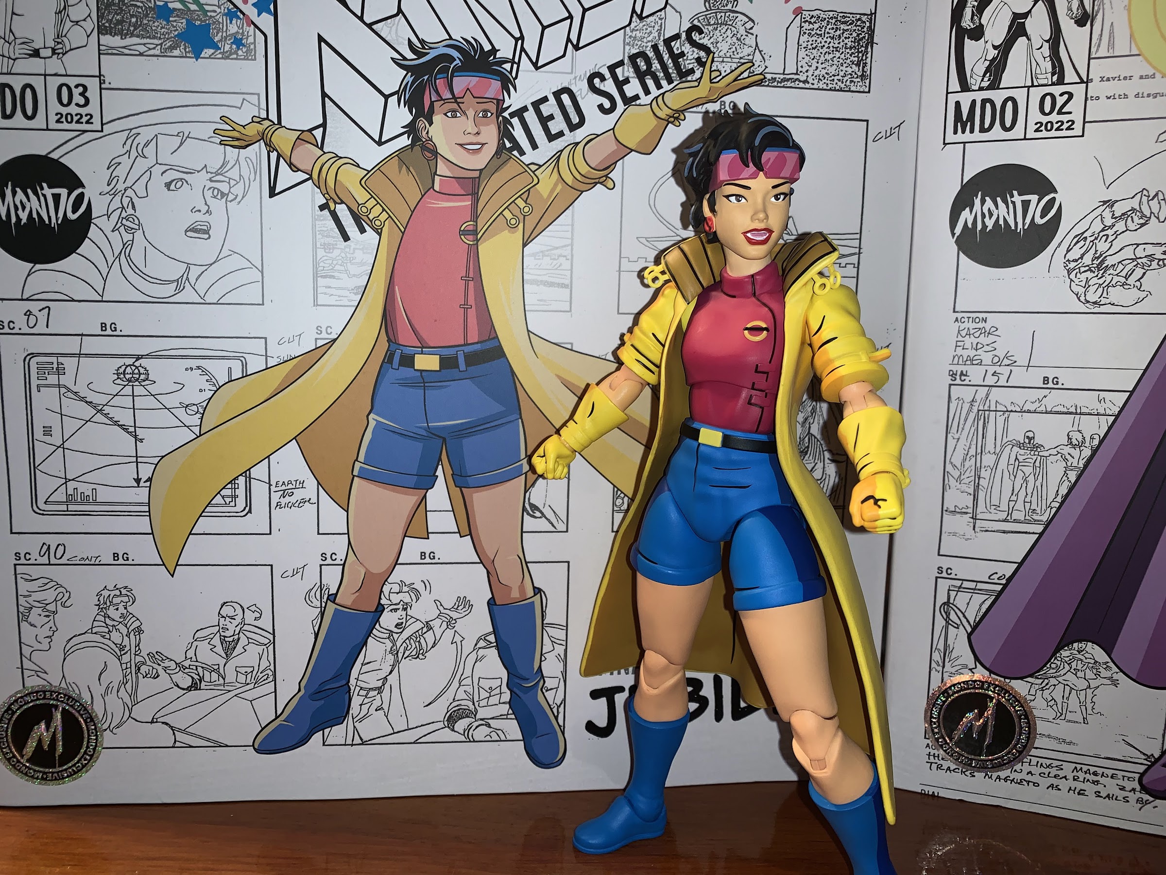
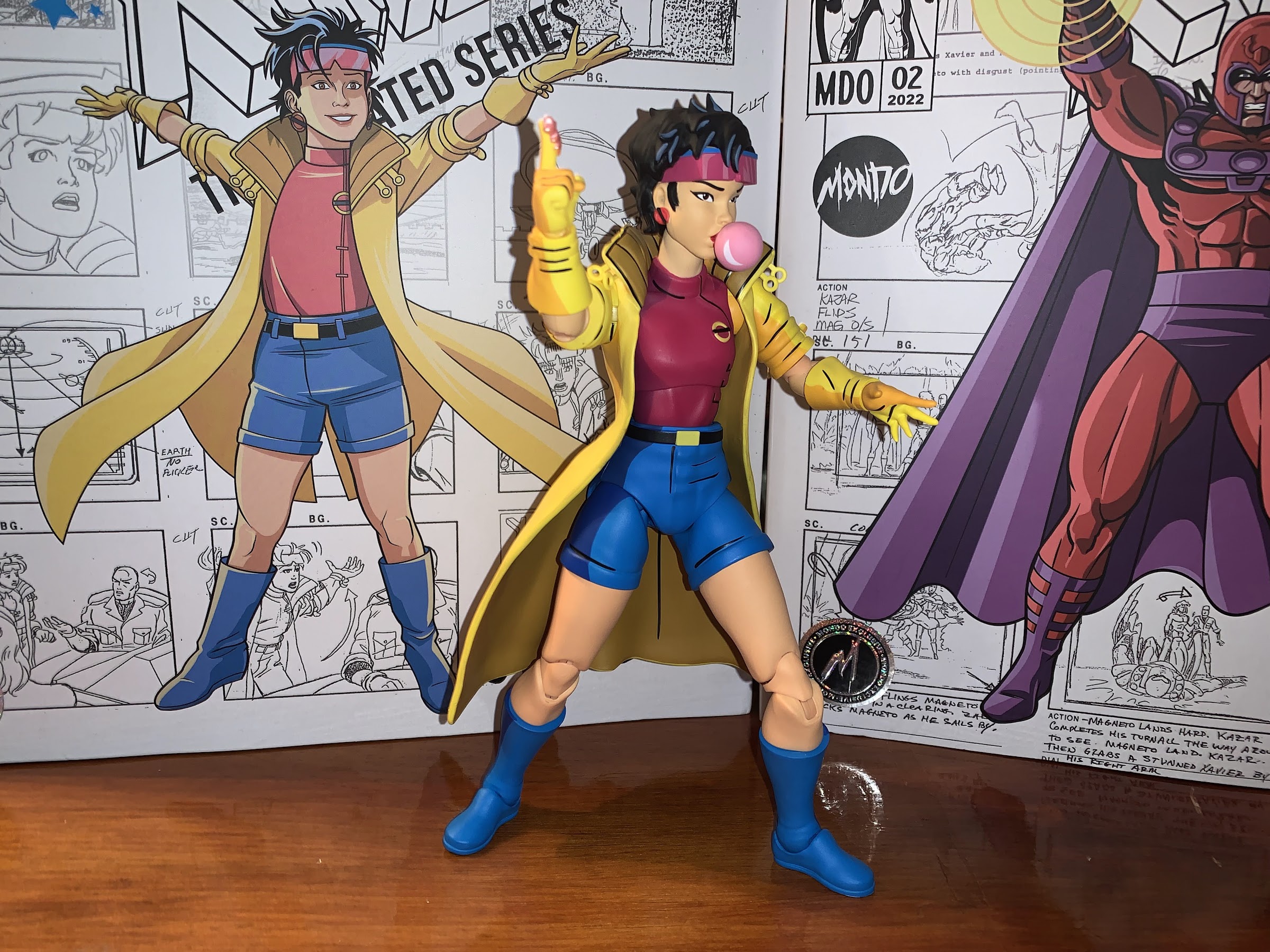
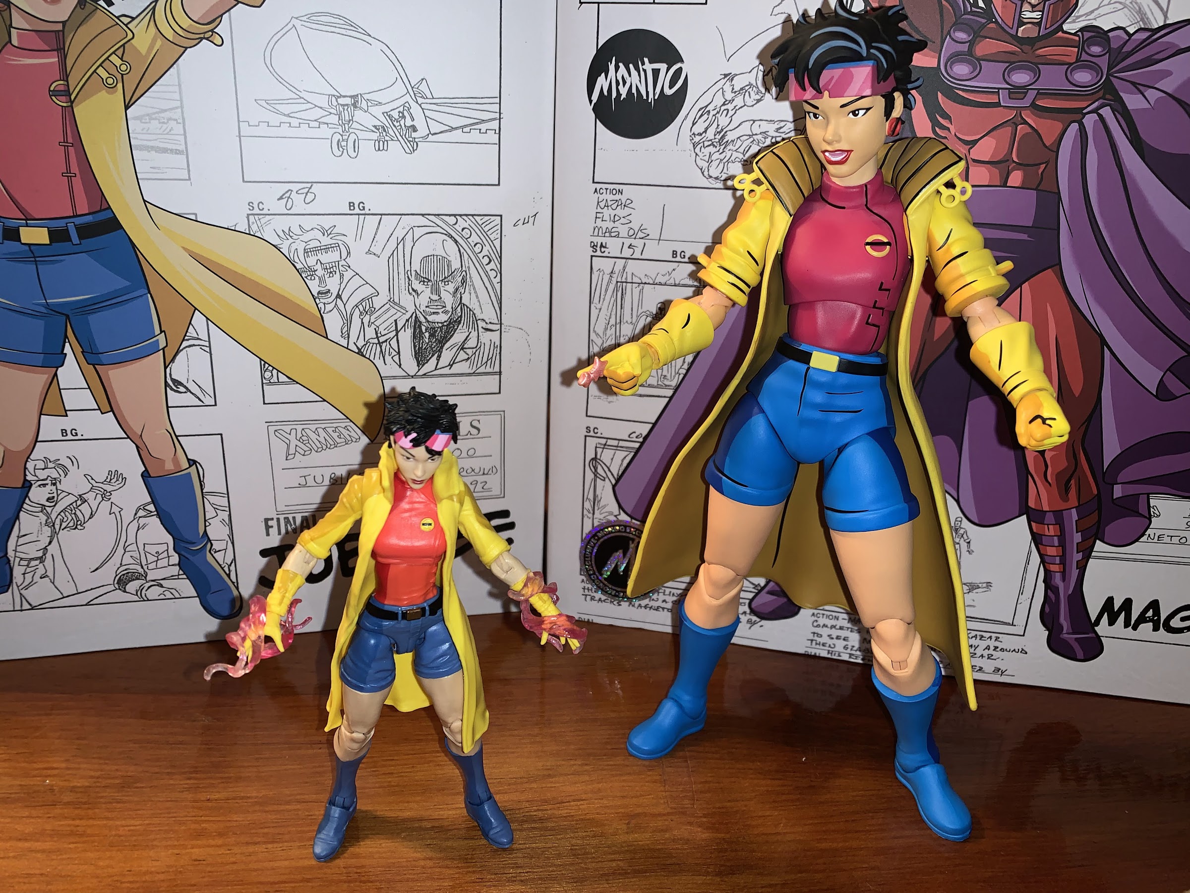
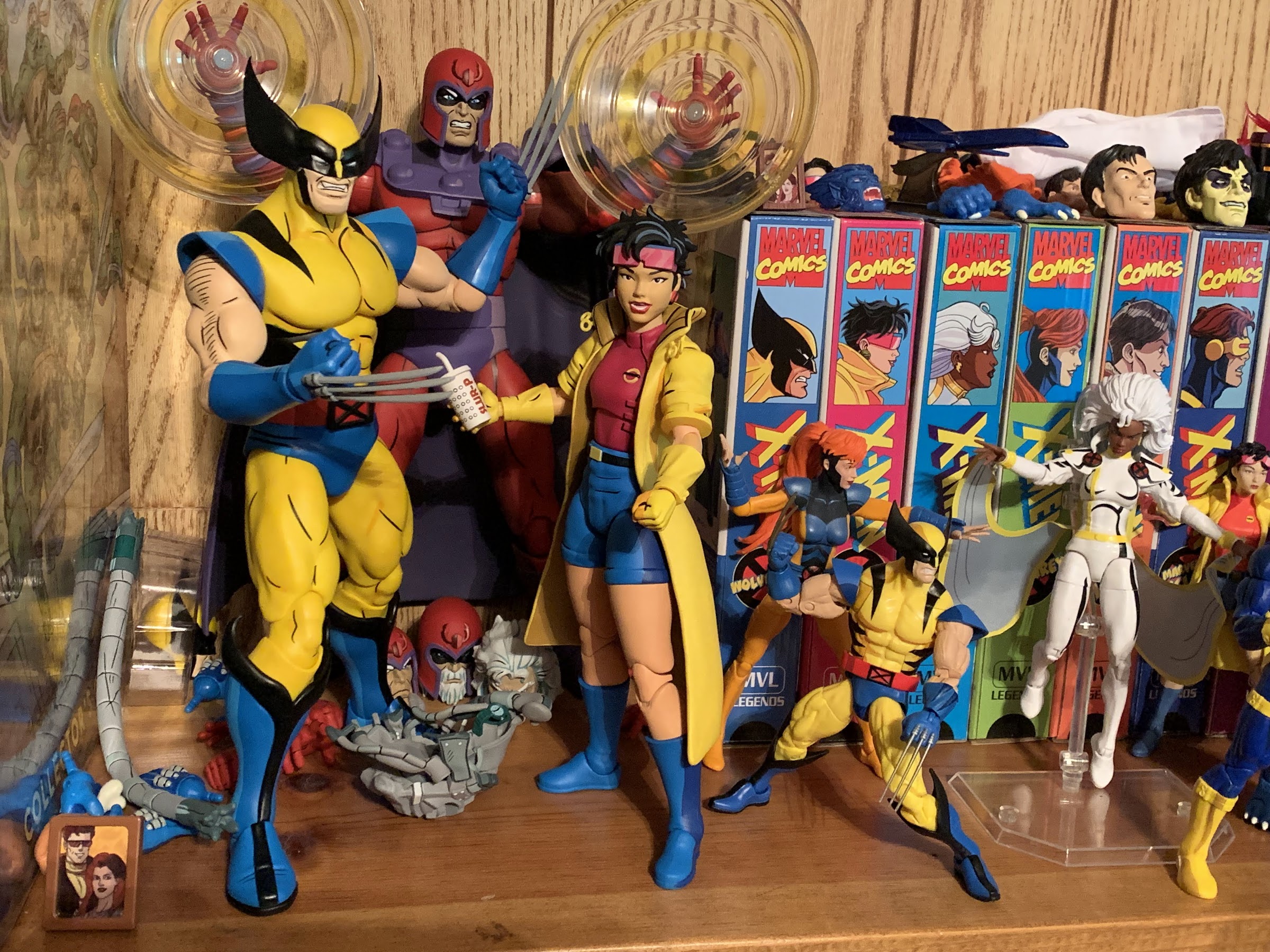
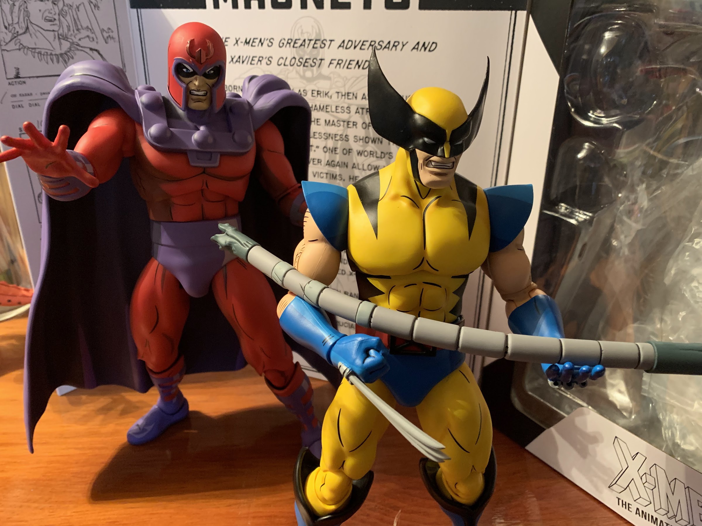
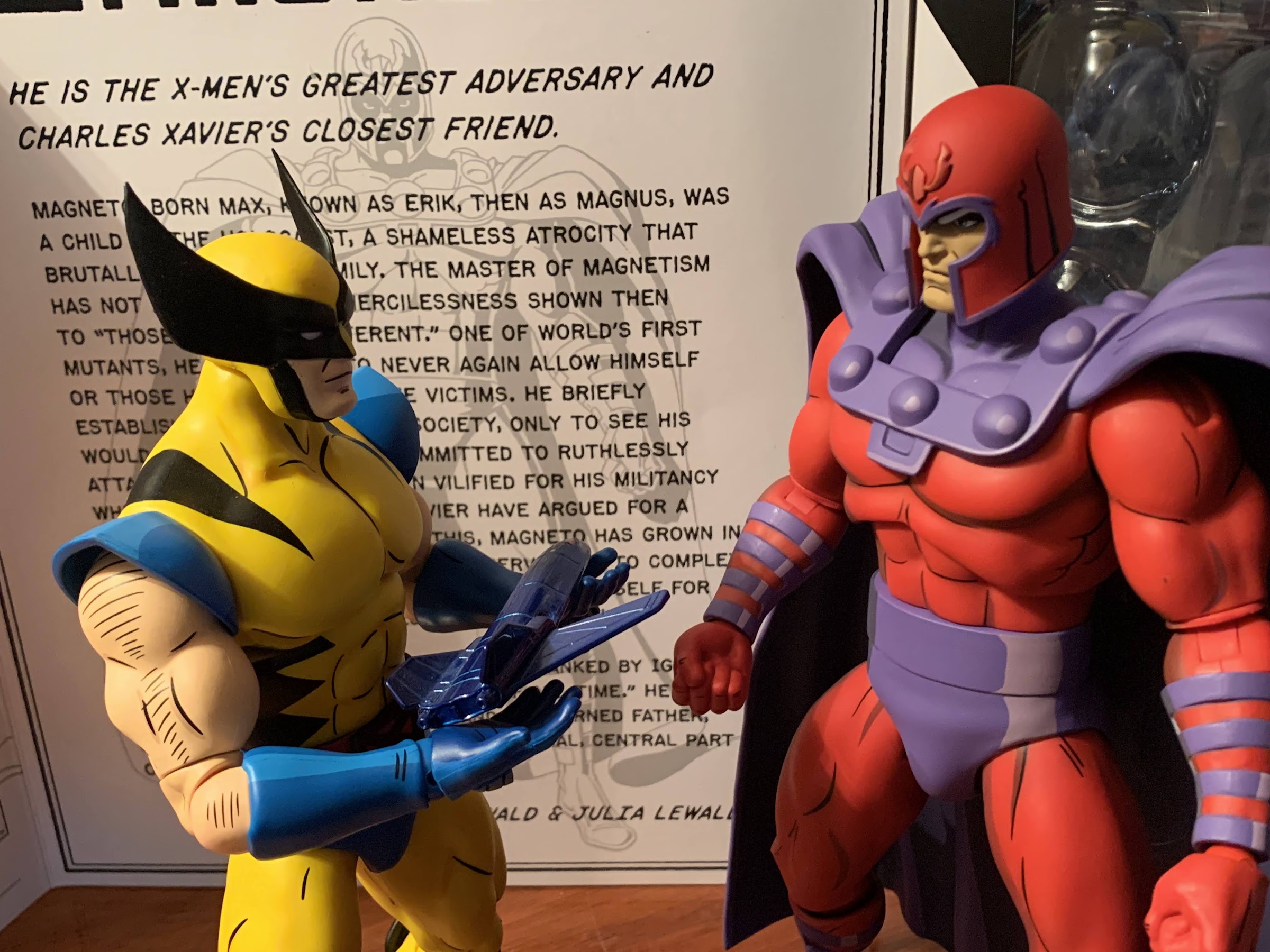
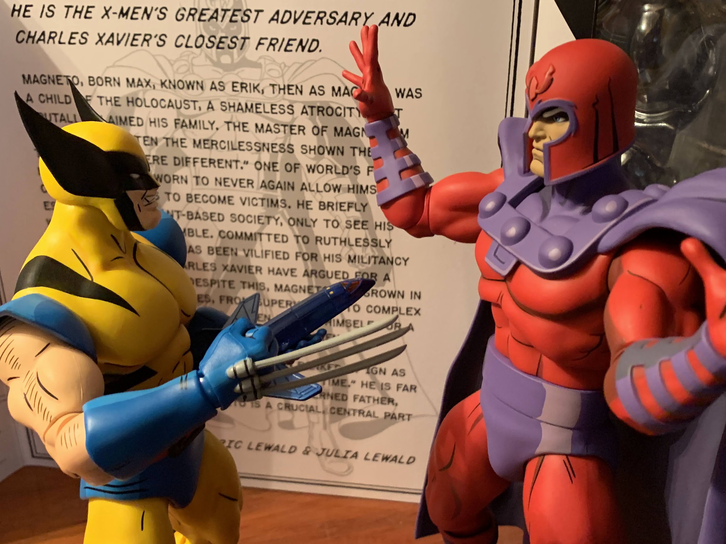
2022 was the year a dream toyline of mine was made a reality. Hasbro finally decided to do a line of Marvel Legends based on the animated series X-Men, which premiered 30 years prior on Halloween 1992. The line was staggered with a release coming every 6-8 weeks or so and ended up totaling 8…
“All right, bub, I’m going to show you how we dressed in the 90s.”
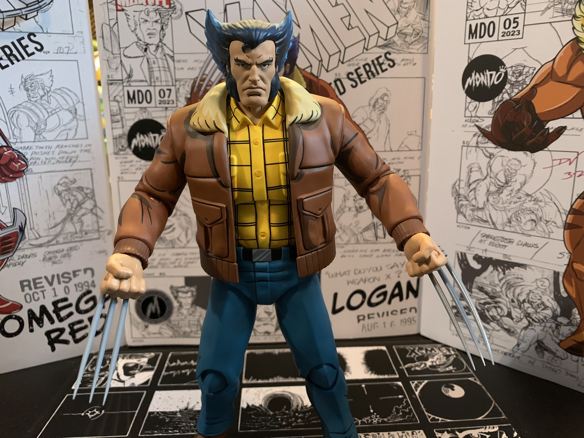
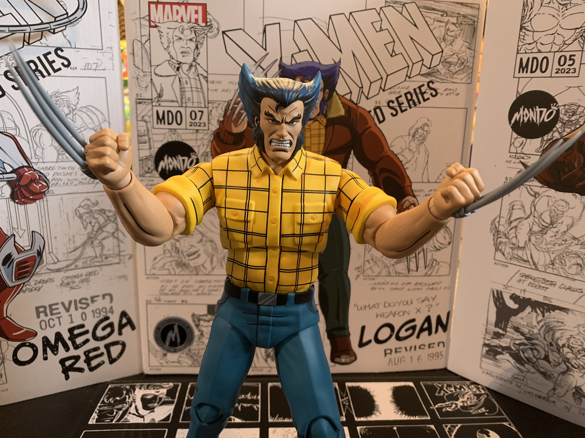
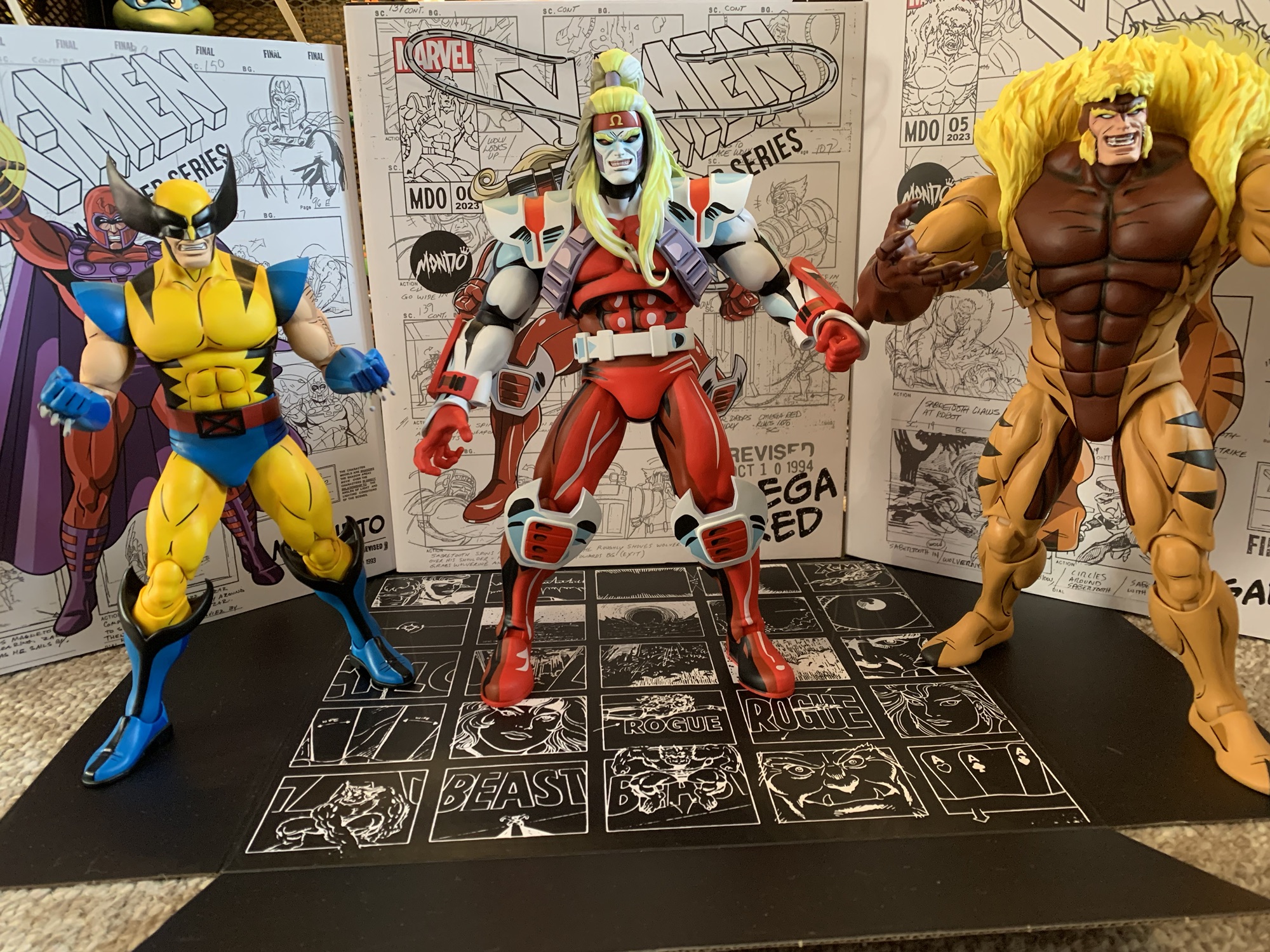
Mondo has been absolutely killing it with its sixth scale line of action figures based on the now classic animated series X-Men. The company also really ramped up production in 2023 on the line by soliciting five new figures during the year. At over 200 bucks a pop, it was quite the hit to the old wallet. It had me looking for reasons to bypass a release and maybe the San Diego Comic Con exclusive Logan was one figure I didn’t need to have. It was a variant on Wolverine, who was the inaugural release in the line, and when it comes to expensive lines to collect variants are often a spot where the wallet can breath. Then I saw the figure and I knew it just wasn’t going to happen. Logan looked too damn good and his plain clothes look from the show is almost as iconic as his costumed one. I was a day one buyer. The wait was a long one, but I now have Logan in my possession.
Just let the man play pool in peace, or else.
Costume on or off, Wolverine is still a bad ass.
Logan follows Omega Red and arrived in the same manner. The figure was shipped directly from the factory and delivered to my home via DHL. The figure comes in the usual packaging which features brand new artwork from Dan Veesenmeyer and production art adorns the background (mostly from the episode “Weapon X, Lies, and Video Tape”). The front flap is affixed via a magnet once again with a write-up on the inner flap from showrunner Erik Lewald and his wife Julia, who also wrote for the show. The window behind it isn’t very useful since the figure is covered in tissue paper and plastic, but that’s for a good reason. Logan was sculpted by Alex Brewer, who I believe has handled all of the sculpts in the line, with paint by Tom Rozejowski. Remember those names, because we’ll be singing their praises throughout this one.
Tell us how you really feel, Logan.
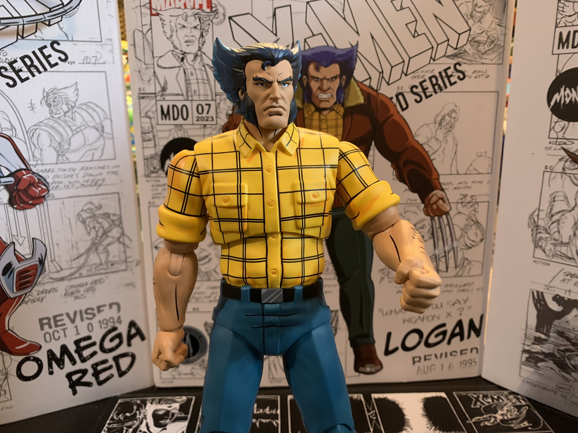
Logan is covered in tissue paper and plastic films to protect him in transit because he is loaded with paint apps. He stands a ticker under 11″ so he’s basically the same size as his costumed counterpart. The look is his classic season one civilian attire which includes a brown bomber jacket, yellow, checkered, shirt, blue slacks, and cowboy boots. The man certainly had style. He’s sporting the jacket in box and to get all of the extra stuff off you’ll probably have to dismantle the figure a bit. I removed the hands, arms, and coat (yes, it’s removable) so as to avoid ripping through the plastic and leaving little pieces behind. All of that extra stuff apparently did its job because the paint is pristine on my figure. Which is terrific because everything is painted here: hands, face, hair, I’m not sure if anything is bare plastic. This isn’t the flashiest paint job in the line due to the character design, but it turned out wonderful. There’s tons of black linework, the cel-shading is smartly applied, and the faces are clean. It’s more exceptional work from Mondo and their team of artists.
These new portraits are why better than this one that came with the first Wolverine release.
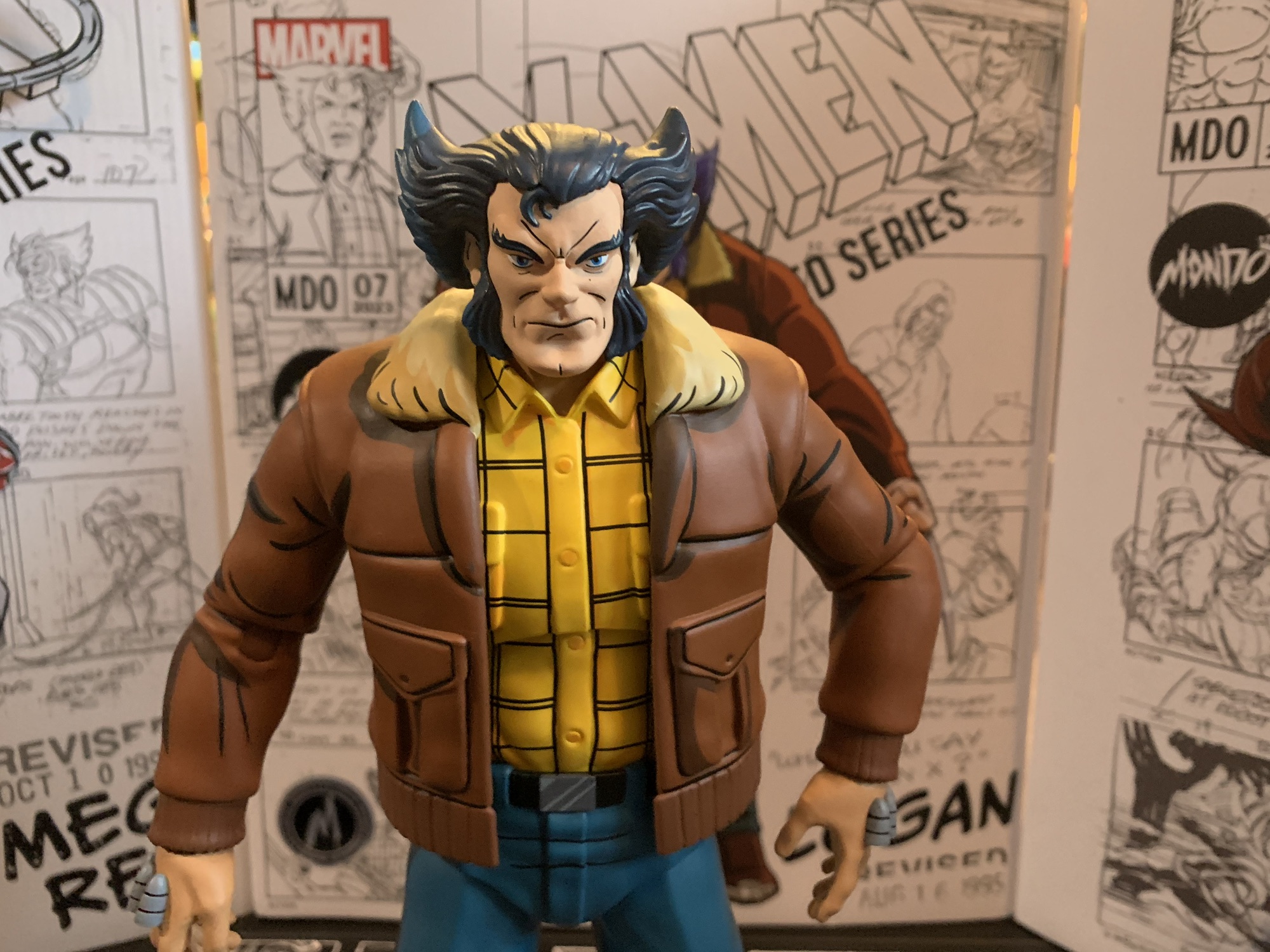
This figure looks so good that there’s very little room to critique it, but this is a review so we’re going to try. My first thought when I saw the figure was that his pants looked just a little bit off. After consulting the show, that seems to be the case as his pants usually had a touch more green to them than here. It’s easiest to see just by comparing the figure to the box art. It’s not a big deal to me and this approach makes him more like the old “Street Clothes” Wolverine action figure from Toy Biz clearly based on the show. Wolverine’s head without his mask is always a bit tough to get in three dimensions because of his unusual hairstyle. This one looks pretty damn good, though the hair might be just a bit too steep and pointed up. The first Wolverine figure came with an unmasked head and I think I like the hair shape on that one a little more, though the faces on the new figure are much improved. If I could get the hair halfway between the two that might be perfect. Lastly, Logan is still too tall for true sixth scale. They were kind of backed into a corner here because of the first figure. If this one was smaller it would look silly. He’ll look fine with Jubilee, but Sabretooth and Omega Red don’t quite tower over Logan like they should.
“Settle down, kid.”
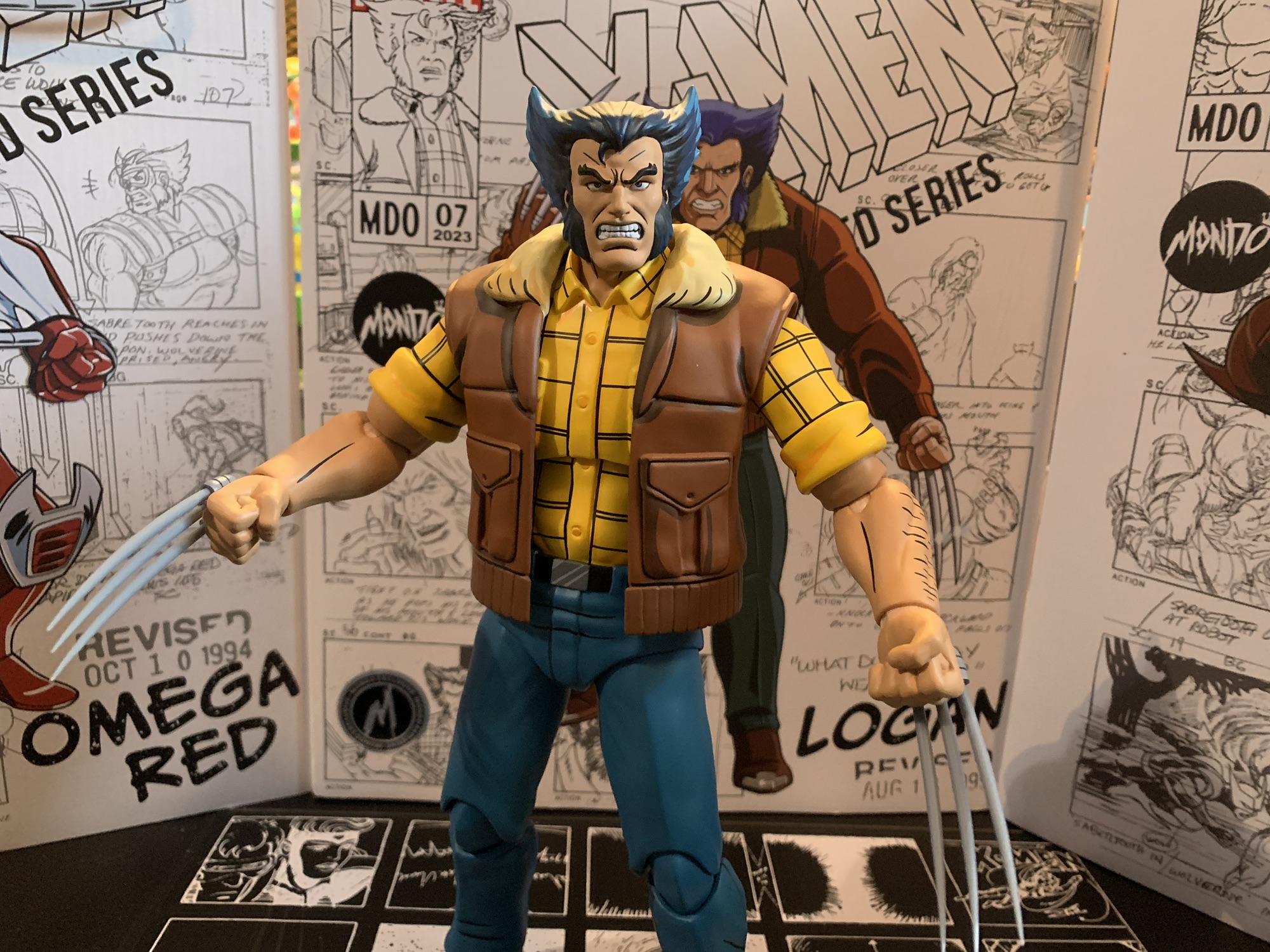
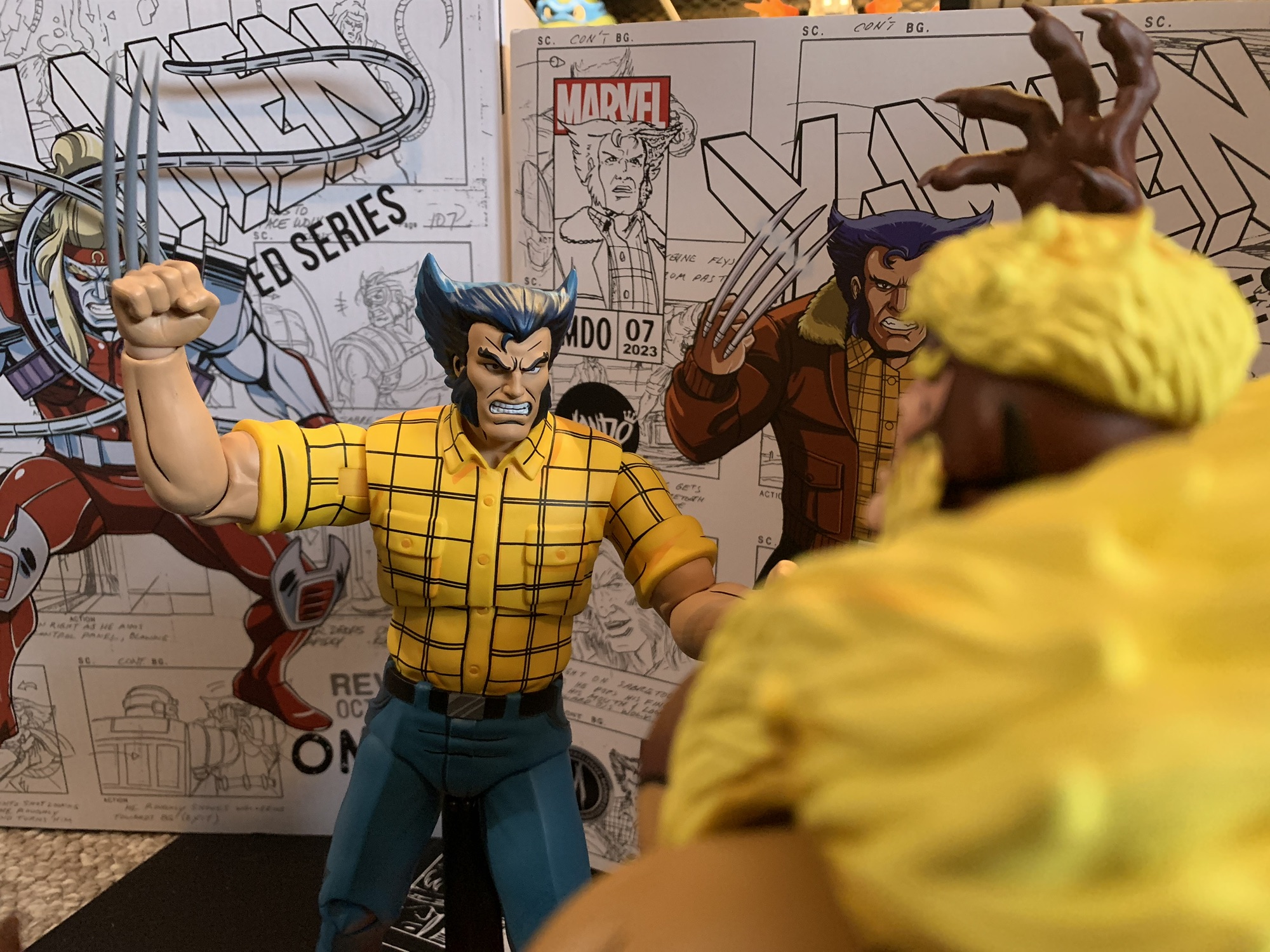
That’s a pretty short list of nitpicks and the rest of this review is going to be largely of the glowing variety. Logan doesn’t call for a ton of accessories, but that doesn’t mean he’s lacking. Logan comes with fists in the box, but he also has another five sets of hands to choose from. They are: fists with claw channels, open, trigger hand, gripping, and “Come here” gesture hands. All of the hands except the default fists feature the channels for his claws. I love this attention to detail since Season One Logan always had those on his hands even when un-gloved. This was corrected for Season Two so if you prefer that look you have the bare fists. For those many hands we have 8 claws. Yes, Mondo tossed in two extra in case you misplace any or break some. The approach is different from the first Wolverine as the plastic is much lighter and more pointed. They’re unpainted and there’s a little notch on the end of each one which helps them to lock into place. All of the hands I’ve tried have been able to accept the claws without fuss, which is cool. I love the removable claw feature and it’s what I always wanted out of my Wolverine figures as a kid. No need to go with straight arm poses to conceal a retractable claw gimmick. The only thing missing is a set of fists that could feature claws without the channels, but I probably would have never used them so I can’t really complain.
The painted stand adds a little flash to the display.
Because the coat is removable, you can even give your Logan a fashionable vest, if you like.
You may have noticed my advice to remove the coat when unboxing this guy and that’s because it’s removable. Mondo did the coat in a soft, pliable, plastic just like they did with Gambit while making the sleeves of the coat part of the sculpt. The arms pop out quite easily so you can slide the coat off and replace the arms with the extra set. They feature the sleeves of his shirt and there’s some painted arm hair on them so you can pull off a jacket-less look if you want. I love the option, though I can’t recall Wolverine sporting this look in the show. He had other plain clothes looks including a red flannel and a black t-shirt, but I don’t remember if he ever had just the yellow shirt. Looks like I need to go do another rewatch.
It’s a rugged dignity.
Logan also comes with two heads. He has what is probably a neutral expression for Logan by default, though it has a hint of a scowl which I think is just how Logan always looks. There’s also an angry, teeth-gritting, expression for when you want him going after Sabretooth. Both heads are easy to swap as it looks like Mondo has started using a soft, almost rubbery, plastic insert in the heads making this figure the easiest in the line to swap. It’s a great call because swapping heads on the other figures can be a little scary since it’s easy to wind up with unintended paint rub if you’re not careful. The last item in the box is the Mondo figure stand. This one is unique in that the base has the X-Men logo sculpted and painted onto it. I was surprised they weren’t doing this from the start and it does add a nice splash of color to the display. I suppose some will be bothered that Logan’s stand is different from the rest, but since it’s an improvement you won’t hear me complaining. Plus, I never use the damn things, but this one I almost feel like I have to.
Coat on or off, he looks pretty great.
Logan is like the other figures in the line in that he looks pretty awesome. He’s also like the rest in that he doesn’t articulate particularly well. It’s the trade-off we’re all accustomed to at this point. The head is on a double ball peg, though he doesn’t get as much range as I’d like. His hair kind of locks him down and it’s worse with the coat on. You get rotation and a little range down and a little tilt, but that’s about it. The shoulders are hinged ball pegs and the sleeved ones on mine were pretty stuck out of the box. That’s because they’re painted, but a little heat and some force got them moving fine (the alt arms were good to go from the start) and the peg is sturdy enough that you shouldn’t have much to worry about. They rotate and go out to the side all the way. The elbows are single-hinged with a swivel point and they’ll get you close to a 90 degree bend, but not all the way. The hands are on hinged ball-pegs and they’ll rotate just fine and you can align the hinge in whatever fashion you wish.
“All right you egg-sucking piece of gutter trash!”
In the torso, we have a diaphragm joint that doesn’t appear to do a whole lot. I can get a little rotation out of it, but it doesn’t tilt or crunch forward or back at all. I think the figure has a waist twist, but the shape of the sculpt is discouraging me from really trying to move it as there will definitely be some paint rub if I do. The legs are on big old ball sockets, but the crotch diaper piece is a large impediment to range. You can kick back a bit, and kick forward, but the leg wants to go out to the side. The legs will spread to close to 45 degrees or so and there is a thigh twist built into the socket joint. The knees are double jointed and will bend past 90 degrees. You also get a little swivel at the top and bottom of the knee joint if you want it. The ankles feature a hinge and there’s an ankle rocker. The range on both is acceptable and this figure isn’t a challenge to stand. He’s just not going to do anything truly dynamic, which was pretty true of the show, in fairness. I wish the diaphragm joint worked better than it does as the lack of rotation up there sucks.
The articulation isn’t impressive with these figures, but if you could find flight stands that could handle the weight you could do some pretty cool stuff with them.
As I said before, I can accept the articulation shortcomings because the figure looks too damn good. This Logan is precisely what I want from this line and I am immensely happy to add him to my collection. I had some nitpicks and I do miss the episode specific accessories the other figures came with (maybe a pool cue would have been fun, or his salami), but maybe the simpler approach here is the result of this one being a convention exclusive since the same was true of Omega Red. I love all of the hand options and that the claws seem to work really well across the board. The new head sculpts are a major upgrade over the first attempt and this depiction of Logan is simply iconic. There’s a reason why he got a figure in this outfit in the old Toy Biz line too. Am I interested in more variants? Probably not. Well, maybe a Beast in his Howard the Duck shirt, but we need a proper Beast before we can start thinking about variants. These arms are likely getting reused for Cyclops, who we have seen in render form as coming with a removable jacket like this figure. My hope is they get repurposed again for a proper Morph.
He looks damn fine with the rest.
“X-Men don’t cut and run!”
With this release, we have now hit the end of what has been solicited. These Mondo deliveries came fast and furious this past month, but it will likely be a bit of a wait until the next one. Rogue is expected to go up for sale in February so she has a chance to arrive this summer (I think Jubilee was solicited in January and she arrived in June) and we know Cyclops is coming too. Mondo is also dipping its toe into Spider-Man which might take-away somewhat from this line, but maybe not. I guess we’ll have to wait and see. We still need Jean, Beast, Storm, and Morph to make me happy. Xavier would be nice too, but I have no idea how to incorporate a sixth scale version of his hoverchair into my display. It also wouldn’t shock me to see another villain. Sinister seems most likely, but I could see Mystique interesting Mondo or maybe Lady Deathstrike. The future looks bright, and expensive, but so far it’s been more than worth it!
Think this figure is awesome? You should see what else Mondo has had to offer:
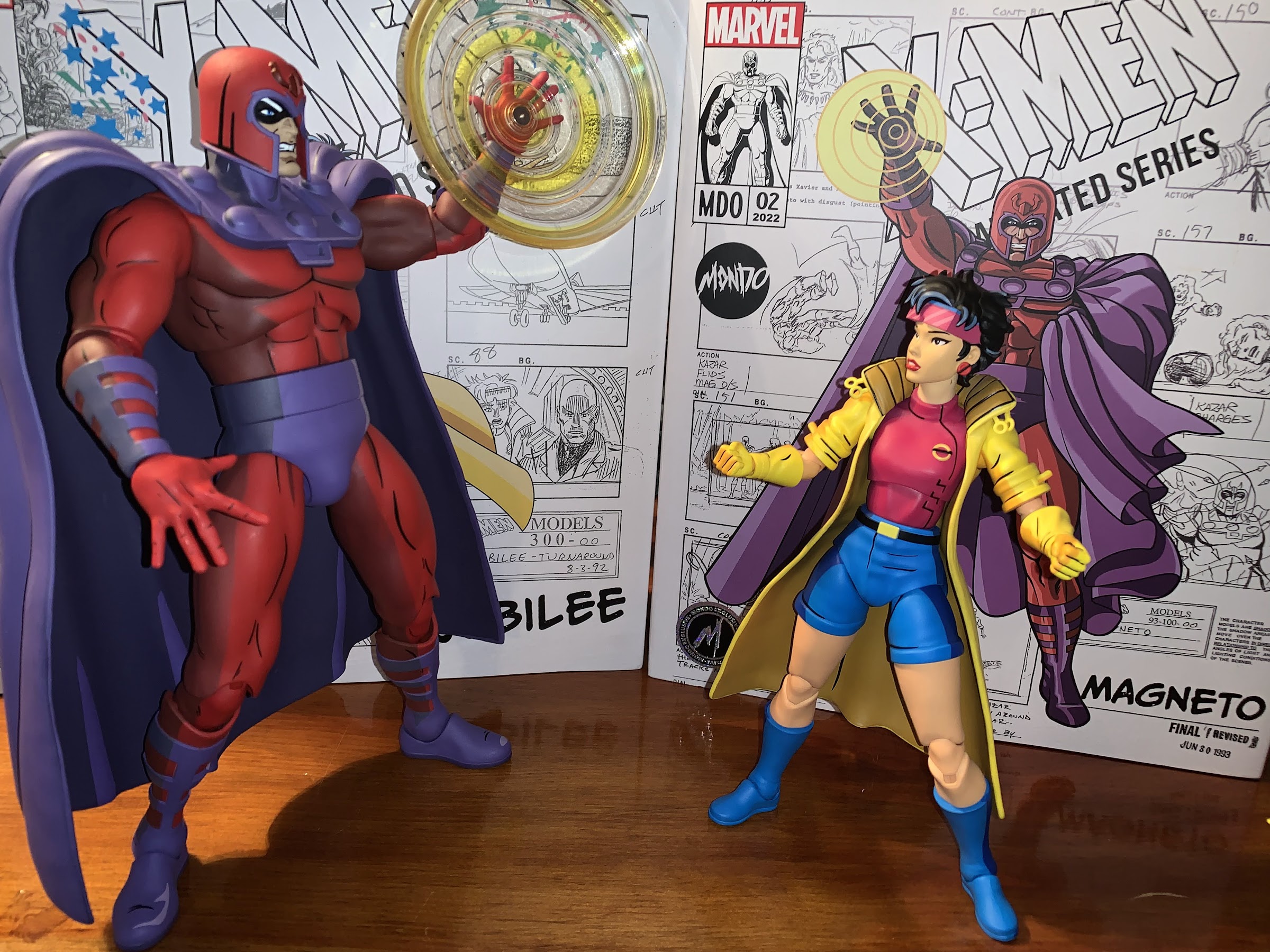
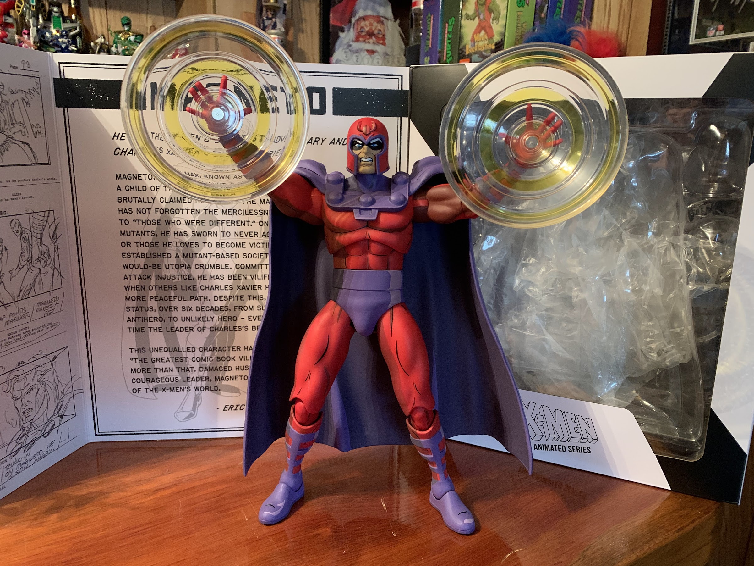
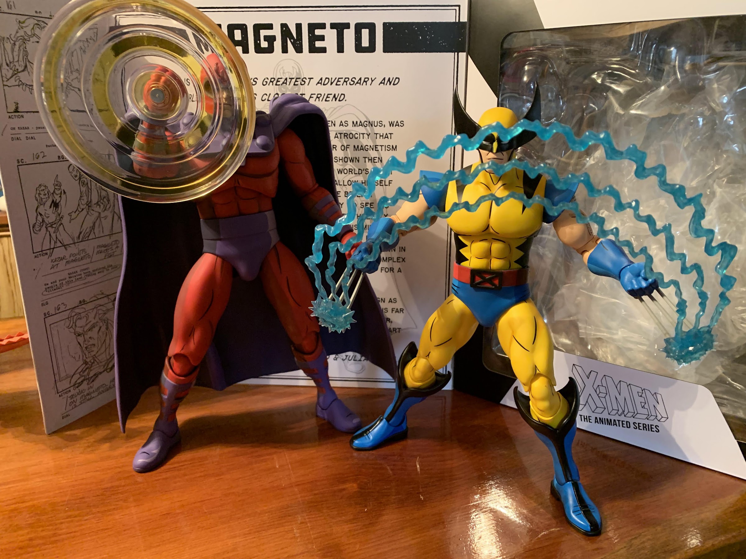
Last year, Mondo sold three different exclusives timed with popular conventions from its sixth scale line of action figures based on X-Men the animated series. One of them was a comic edition of Magneto which was sold at San Diego Comic Con. The other two were essentially preorders to be delivered at a later date.…
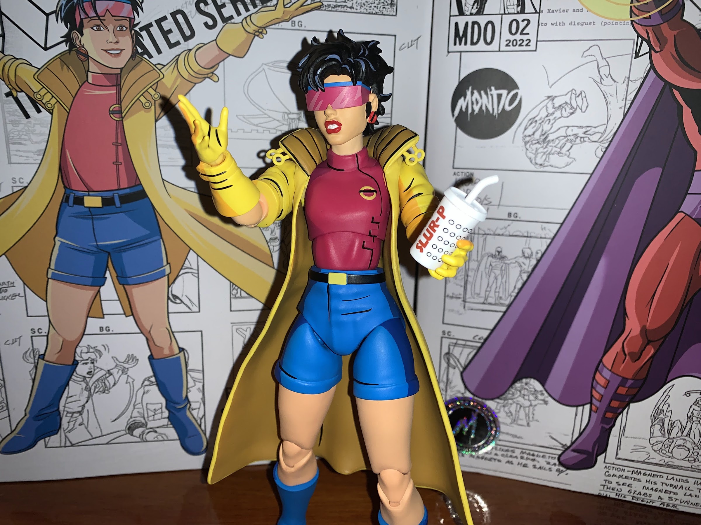
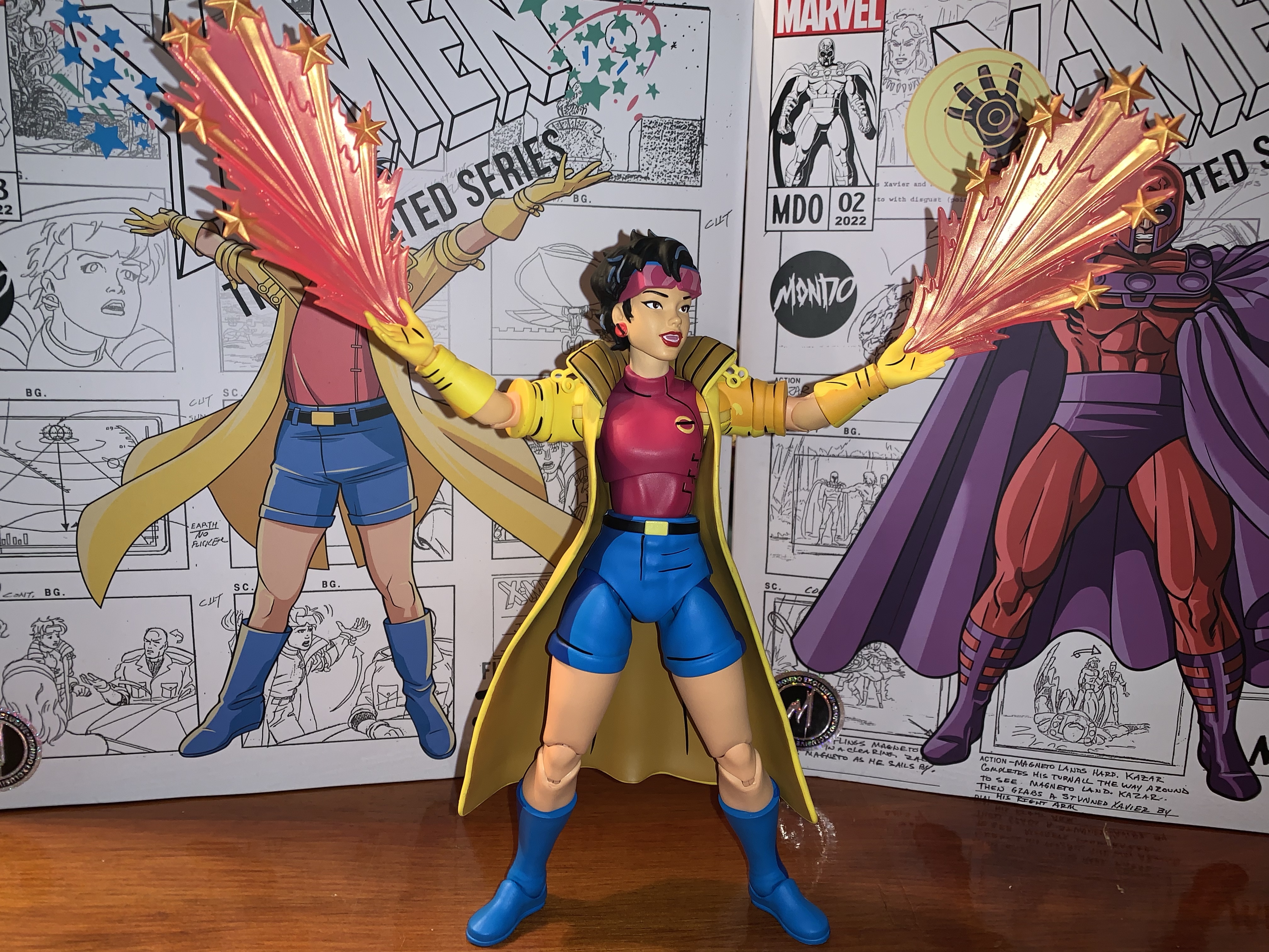
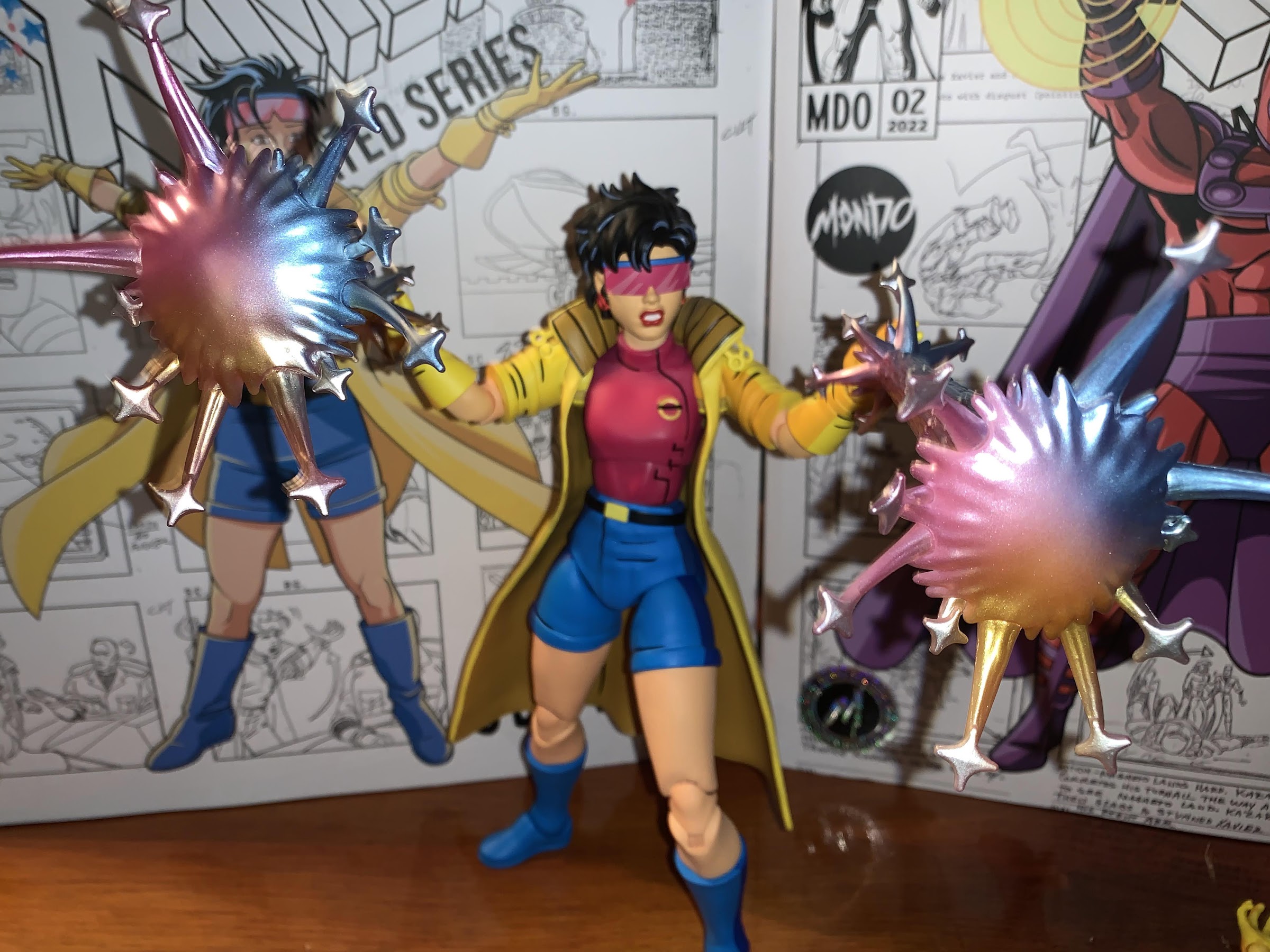
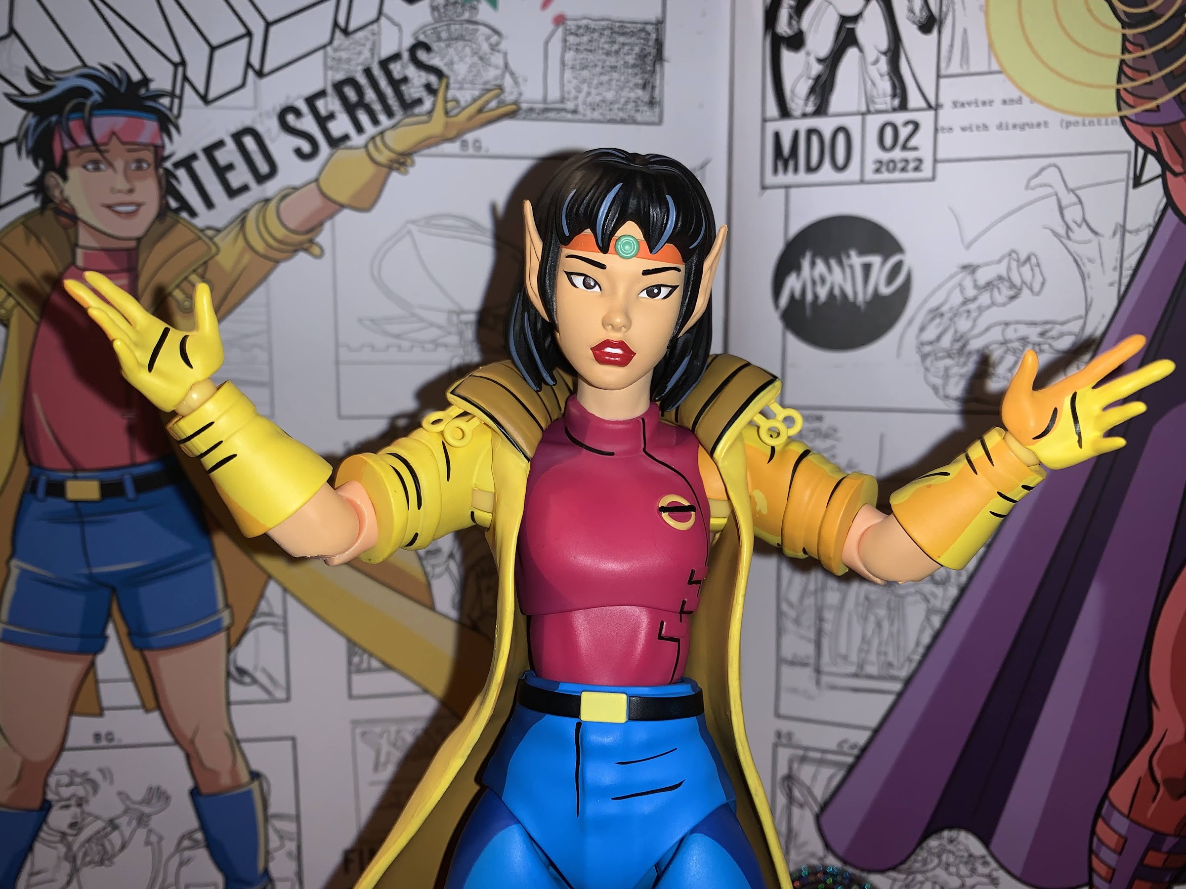
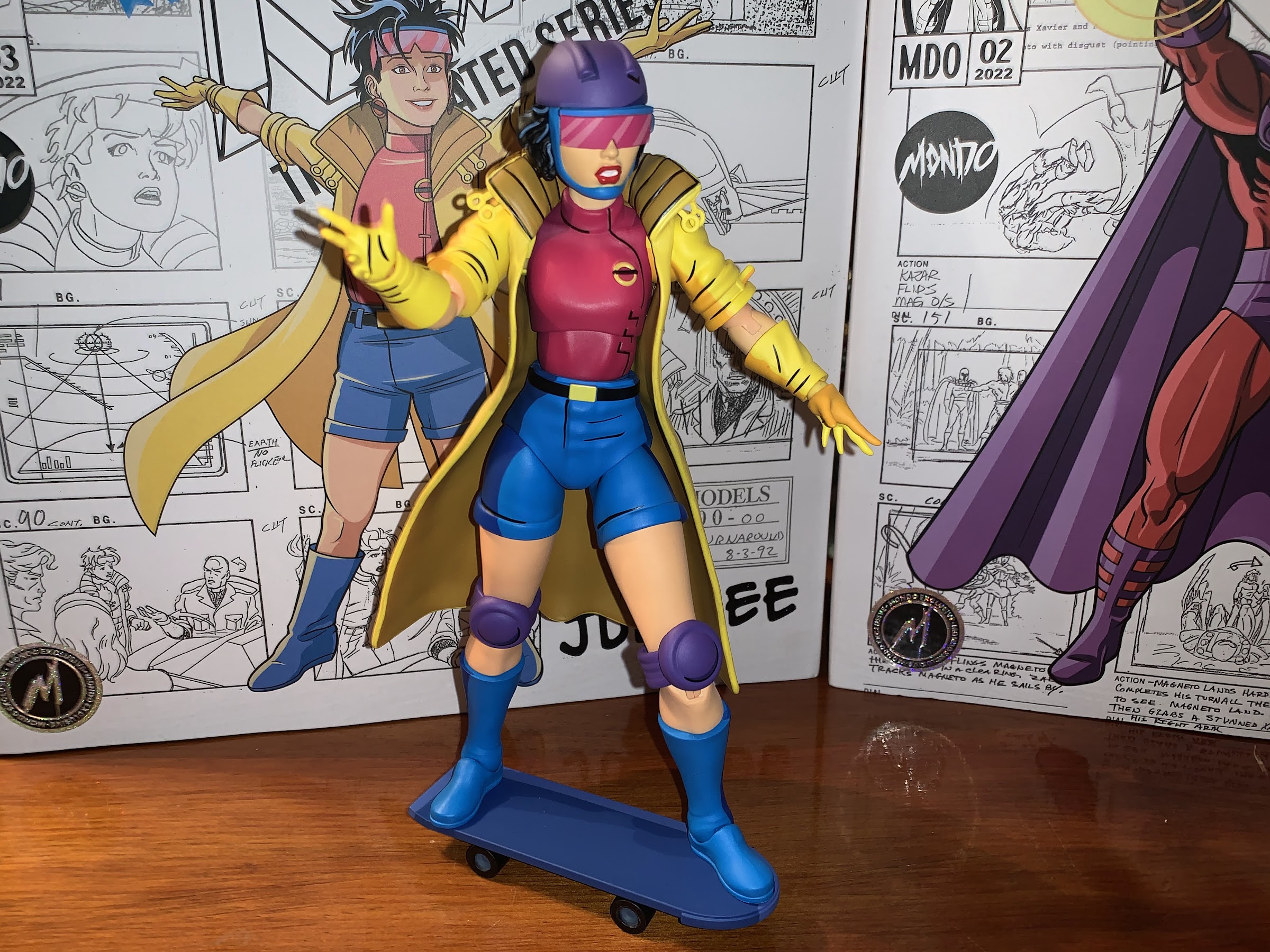
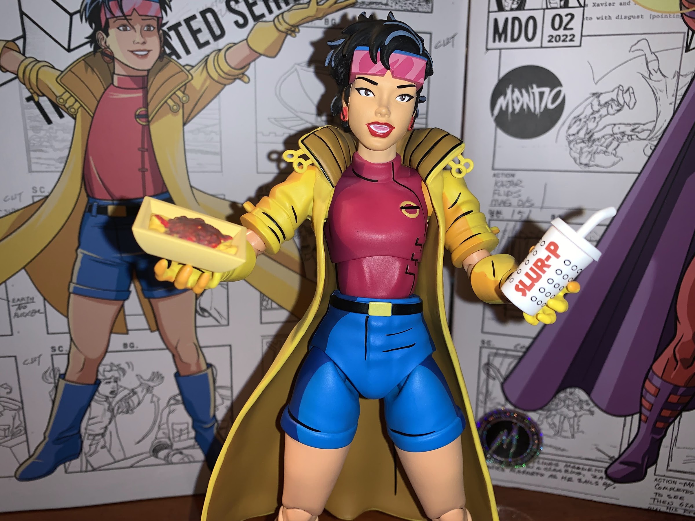
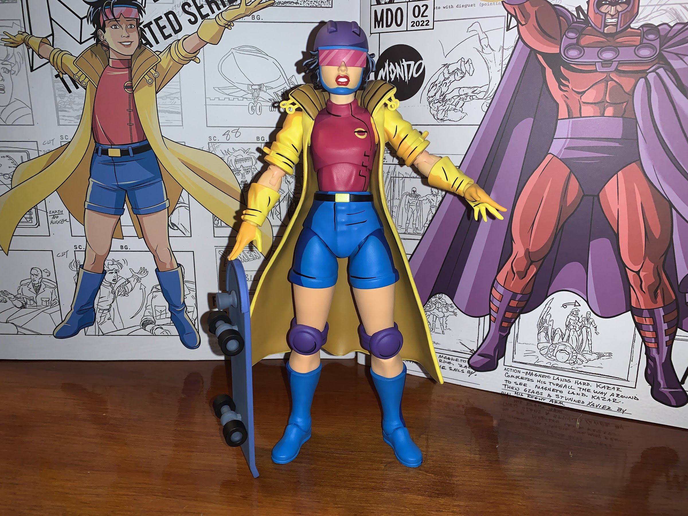
When one hears the phrase “mall babe” it implies a certain visual. Probably a short, young, girl with intentionally messy, short hair. There’s a certain confidence the phrase exudes so she has to have style. Maybe hot pink, bright blues, and certainly a long yellow coat with gloves to match! There has to be an…
It is my belief that when it comes to X-Men, the animated series which debuted in 1992, the breakout star of the show was Gambit. Wolverine was the closest thing we had to a household name going into the show and was the de-facto pick for favorite character of many. And while the whole roster…
The Soviet super soldier has joined the ranks of Mondo’s X-Men line!
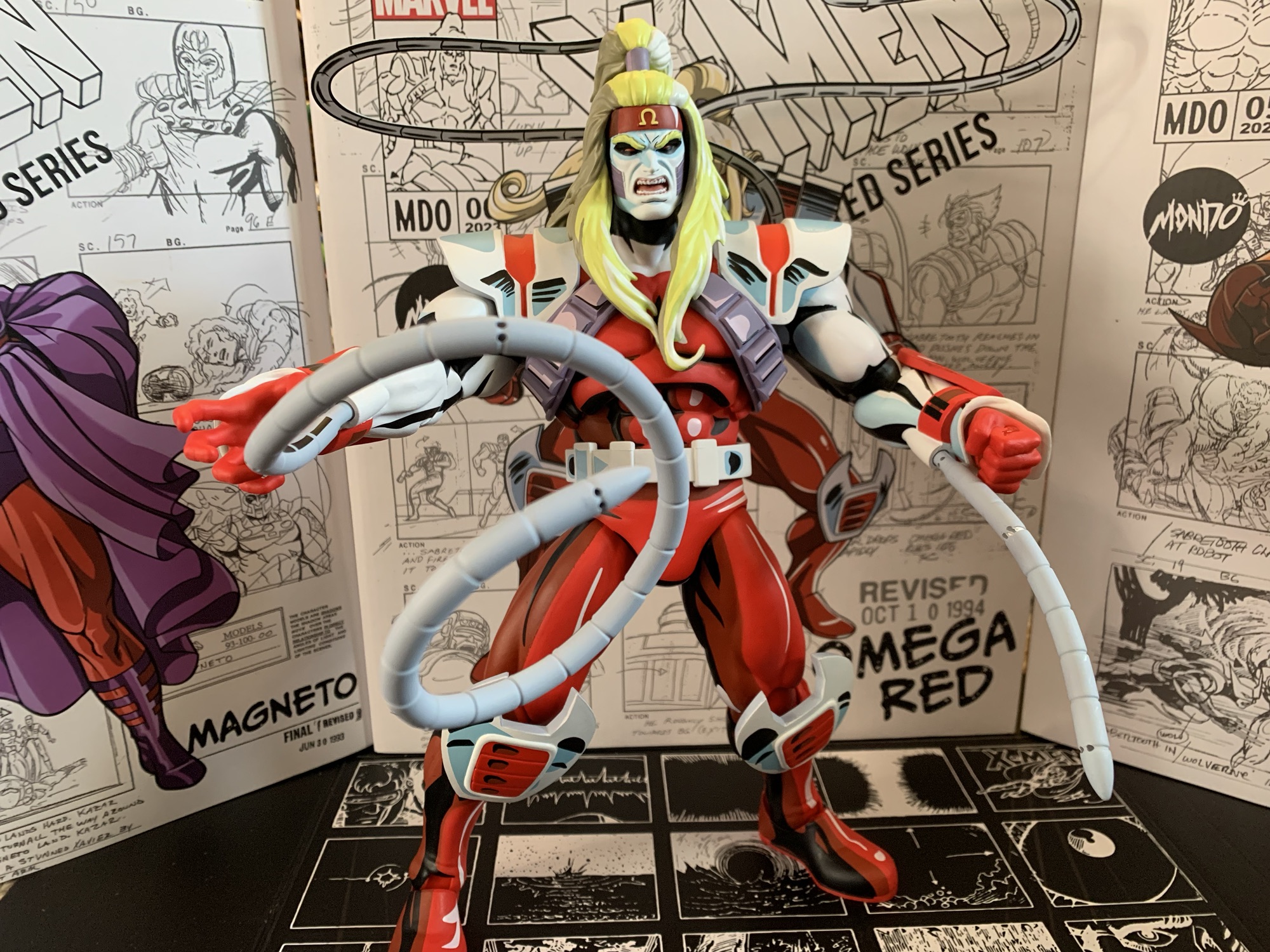
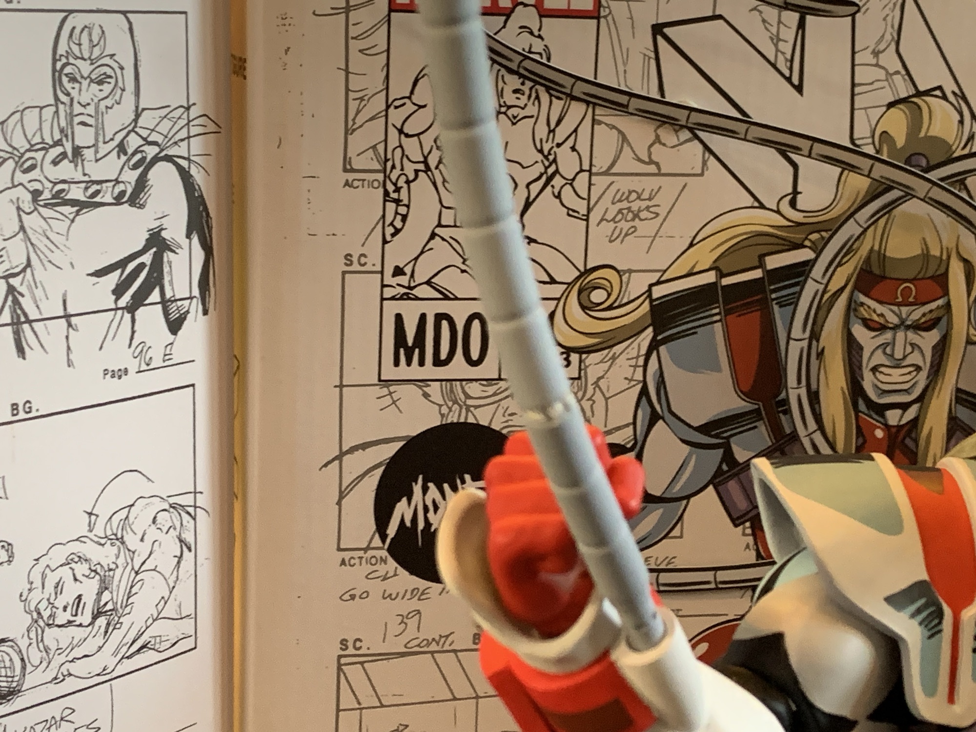
Last year, Mondo sold three different exclusives timed with popular conventions from its sixth scale line of action figures based on X-Men the animated series. One of them was a comic edition of Magneto which was sold at San Diego Comic Con. The other two were essentially preorders to be delivered at a later date. San Diego Comic Con brought Logan, a version of popular hero Wolverine in his civilian attire. New York Comic Con, which took place a couple of months later, featured Omega Red, the soviet super soldier who appeared in a pair of episodes. I don’t know how toy production works, but for whatever reason the exclusive sold most recently was the first to arrive at my residence so lets talk about Omega Red!
Omega Red comes in the standard box from Mondo with new artwork by series storyboard artist Dan Veesenmeyer and an assortment of production art as well. Omega Red has the added wrinkle of featuring raised elements on the box with his hands and coils being a separate piece of cardstock that’s been attached to the box. It’s a fun little embellishment I wasn’t expecting. The front flap is affixed via Velcro, which is different from the Gambit figure we just looked at which used magnets. The inner tray is a floating piece and is not affixed to the cardboard backdrop. I’m guessing the little variations in packaging are just due to them originating from different factories. Also of interest is that Omega Red shipped to me via DHL and it came straight from the factory rather than going to Mondo first in Texas and then being shipped via FedEx. This meant the figure required a signature, but it wasn’t an issue since I was home at the time of delivery. I’m curious if this will be how the figures are shipped going forward or if Omega Red was a special case.
There’s not a ton in the box this time, and for me, I’m even short a hand!
Omega Red is certainly an interesting choice for this line. We have three heroes and three villains so far and I bet if you asked fans of the show which villain would arrive third most would have guessed Mr. Sinister. Omega Red was only a featured player in two episodes and one of those episodes is considered among the worst in the series by showrunner Eric Lewald. And that was because he basically had to write it in a weekend since they were an episode short (I forget why, but it’s detailed in one or both of his books on the series). Omega Red was also a fairly new villain in the comics when the show began and he may have even appeared in the series because Marvel wanted to spotlight the new adversary of Wolverine and the X-Men. He’s basically the soviet equivalent of a Captain America or even the Weapon X project. He was created by artist Jim Lee and writer John Byrne and I would say he’s a case of 90s style over substance. Still, Omega Red was undeniably cool looking and his old Toy Biz figures was one of my favorites as a kid because of that. He’s a good enough foil for Wolverine, and strictly from a design perspective, I was happy to see that he was going to be included in this line.
Looks good! Except for that empty “bubble” in the plastic…
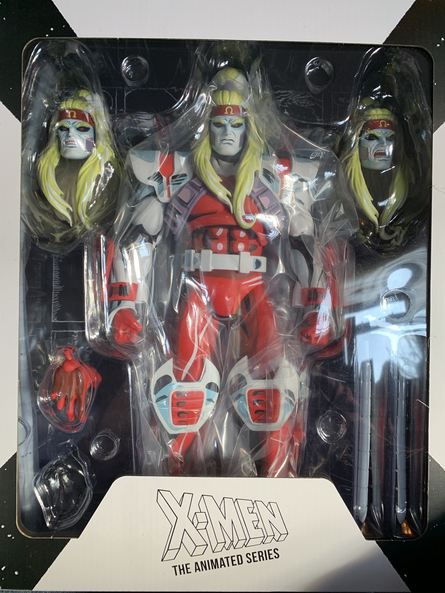
Unfortunately, I do have an issue right off the bat with my figure. When I opened the shipper box and took a look at the goods inside, I noticed right away that there was a spot in the bubble tray that was empty. It was supposed to contain an optional left hand for the figure. I was hoping it had just become dislodged during the shipping process, but upon opening the box there was no hand to be found. Bummer. It’s disappointing that this wasn’t caught by the factory since just a cursory inspection of the product would have revealed the missing item. I’ve reached out to Mondo to see if they can send me a hand or exchange the figure – whatever is needed to get the complete package. They got back to me after a few days to say a replacement hand is on the way and should ship by the end of the month. I’ll update this space accordingly when that happens. UPDATE: The missing hand arrived as promised maybe two weeks after I reached out. Perfect customer service!
Another issue to be mindful of is the plastic splitting on these short tentacles.
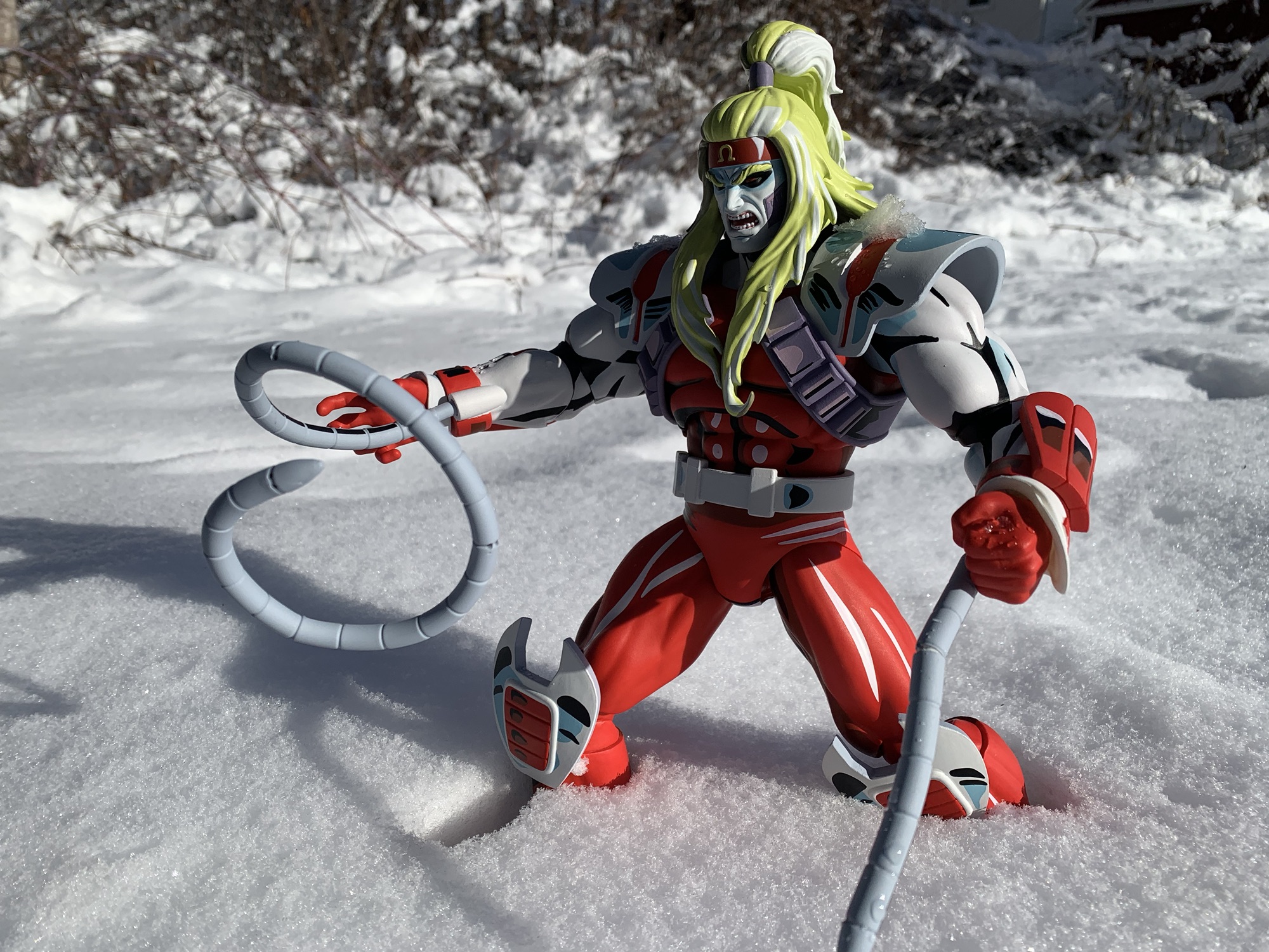
Omega Red stands at roughly 12.5″ to the base of his ponytail. This would put him at a bit over six feet, which seems reasonable for a sixth scale action figure. Omega Red is a very impressive looking figure. I’ve raved about the paint jobs in this line with every release, but Omega Red represents a new high bar. Alex Brewer is the sculptor for this figure, and he’s been the sculptor for all of them I believe, but handling the paint master this time around was Mark Bristow. Mark, you knocked this one out of the park! There are two primary shades of red in use, a bright red and a crimson, with black and white mixed in as well. The metallic portions of the suit are white with a gray-blue and some black linework and the same approach is taken for the white flesh of his arms and face. This figure is just covered in paint and it looks amazing. This is a figure that is going to draw eyes to it on your shelf. The sculpt is also very impressive as he has this massive upper body. He is just a joy to behold.
He’s not quite as big as Sabretooth, but Omega Red is still pretty large.
Of course, with a lot of paint comes a lot of room for error. For the most part, the paint job on Omega Red is very impressive and cleanly applied. Upon close inspection, there are a few blemishes here and there mostly in the form of a small scratch. Some of the white accents could be applied in a more opaque manner, especially the white on the forearms which ends up almost pink. There’s also a ton of paint around the elbow joints that’s a risk to flake off or get scratched with repeated use. I also think the black under his chin might be just a tad too heavy, but that’s more of a subjective critique. Overall, the presentation is the strength of this figure and I doubt any who picked this one up will be disappointed by it.
Poor Wolverine, he has to share the shelf with two of his mortal enemies and another guy who famously almost killed him.
What’s a little more surprising with this figure is the small assortment of accessories. There was only one edition of Omega Red so perhaps that’s why, but he’s comparatively lighter than the rest of the line. He comes with fisted hands in the box, but should have a set of open hands as well. The cuffs around his hands are removable and will pop off when you swap hands, but they’re pretty easy to work with and are just floating pieces. He also comes with three different portraits: neutral/scowl, smirk, angry yell. All three look appropriate for the character and all three use the same hair mold. It would have been nice if one had a more windswept hair piece instead, but I don’t think his hair changed much in the show either. They are a bitch to swap though. It took some force to get the default one off and I could not get it or any of the others to pop onto the ball joint without first heating it up. And even then, it still was a challenge. I’d recommend picking a favorite and just sticking with it, though admittedly that’s a hard choice because all three heads look terrific.
I’m having a hard time deciding what my preferred portrait is for this guy.
The only other accessories included with Omega Red are his carbonadium coils. He has two sets: long and short. The long ones are pretty damn long – about 14″. They’re done with soft plastic with a bendy wire inside that works reasonably well. You won’t be able to do anything too crazy, but they’ll pose. They’re done with gray plastic and there’s some black shading on them as well. I wish there was a little blue or white too, but they look fine. They plug into the ports on the underside of his forearms and that works fine. The shorter ones are about 4.5″ long and work the same way so you get a little variety, but that’s it. I did encounter some splitting of the plastic on one of the short tentacles, so beware if you intend to bend them a bunch. The only other thing in the box is the usual Mondo stand (and it’s the older version which lack the no-slip bottom). I’m a little surprised we didn’t get an effect part as the coils glow with green energy in the show whenever Omega Red sucks the lifeforce out of his victims. Some removable ice blocks to simulate his frozen state could have been cool too. I think the assortment is fine, I’m just a little surprised at the sparseness.
Omega Red won’t “wow” you with articulation. He’s meant to just stand there and look cool.
The articulation for this line has not been impressive and Omega Red may be the worst one yet. He is extremely locked-down for me so this figure is definitely a case of what you see is basically what you get. If you’re not impressed with how he looks, then you will definitely not be all that pleased with the product. The head is on the standard double-ball peg, but the hair means it can’t really do anything. He can basically look down a bit and that’s it. Try to even turn his head and you risk a lot of paint transfer. The shoulders are ball-hinged and pretty tight. I can only get about 45 degrees of range out to the side, and the big shoulder pads will also limit rotation quite a bit. There is a cut about the elbow for a swivel, but as I mentioned in the aesthetics portion, there’s a ton of paint here so you want to be careful moving it so as not to disturb any of that paint. The hinge in the elbow is very tight and maybe moves a little past 45 degrees. The hands rotate fine and the ball-hinge is pretty smooth. I still can’t get the hands to rotate on that ball, but at least they’re not as tight as Gambit’s.
We got some snow this past weekend so of course I had to take this figure outside for a photo shoot!
The diaphragm features a ball joint, but the fit is super tight. I can’t get that joint to do much of anything. There’s a waist twist, but it’s behind his belt so that’s super tight as well. I get a little pivot out of it, but not full rotation. The ball socket hips work about as well as they do on the other figures. He can widen his stance a bit and kick forward a bit, but nothing crazy. The thigh swivels on that joint and it works fine while the usual double-jointed knees are in place. My left knee works fine, the right is super tight and I don’t want to force it. The ankles hinge forward and back a little bit and the ankle rocker is suitable.
Omega Red barely poses as a result of all of that. He’s basically just going to stand there on your shelf and look cool. A more adventurous sort could probably get a little more out of this figure than I, but I don’t want to screw up the paint at all. The end result is I have a figure that I absolutely love to look at, but doesn’t bring me any joy to handle. Some would say that makes this a pretty poor release since it is, after all, an action figure and should be able to pose accordingly. I can’t bring myself to say that about it though because it does just look amazing. This is a figure for those who prioritize aesthetics over articulation and accessories. If you want a bad ass, foot tall, Omega Red in your collection then this figure is awesome. If you want something that can be posed in a dynamic fashion then this will let you down. If you know what you want out of this, then you should be able to make an informed decision. I personally love it, but it’s not for everyone.
This Mondo line has been pretty rad, check these out:
It is my belief that when it comes to X-Men, the animated series which debuted in 1992, the breakout star of the show was Gambit. Wolverine was the closest thing we had to a household name going into the show and was the de-facto pick for favorite character of many. And while the whole roster…
It’s Halloween 1992. You’re sitting in front of the television with a bowl of candy and your costume in pieces. Coming on is a prime time airing of Fox’s newest superhero cartoon: X-Men. You’ve seen the comics at the grocery store and in other places. You know Wolverine, you know there’s a guy who shoots…
When San Diego Comic Con was cancelled for 2021, many of the entities that would have sold exclusive merchandise at the event pivoted to web sales. And since the 2020 iteration of the famed event was also canceled due to the COVID-19 pandemic, many seemed to expect the same for 2021, or the massive delays…
It is my belief that when it comes to X-Men, the animated series which debuted in 1992, the breakout star of the show was Gambit. Wolverine was the closest thing we had to a household name going into the show and was the de-facto pick for favorite character of many. And while the whole roster certainly benefited from a raised profile following the show’s success, it sure seemed like Gambit became the favorite for many in my circle. I was just a kid in the 3rd grade when the show premiered and it was something to see X-Men infiltrate the school yard. It felt like we went right from Batman to the mighty mutants and even the seemingly unstoppable Teenage Mutant Ninja Turtles saw their star fade pretty quickly. The show also arrived around the same time the Toy Biz action figure line was expanding past the first wave of X-Men and in that second wave was Gambit. He wouldn’t linger on the pegs very long and getting that figure for your collection was more than a little challenging (as was the yellow and black Wolverine II figure).
Nice packaging, as usual, from Mondo.
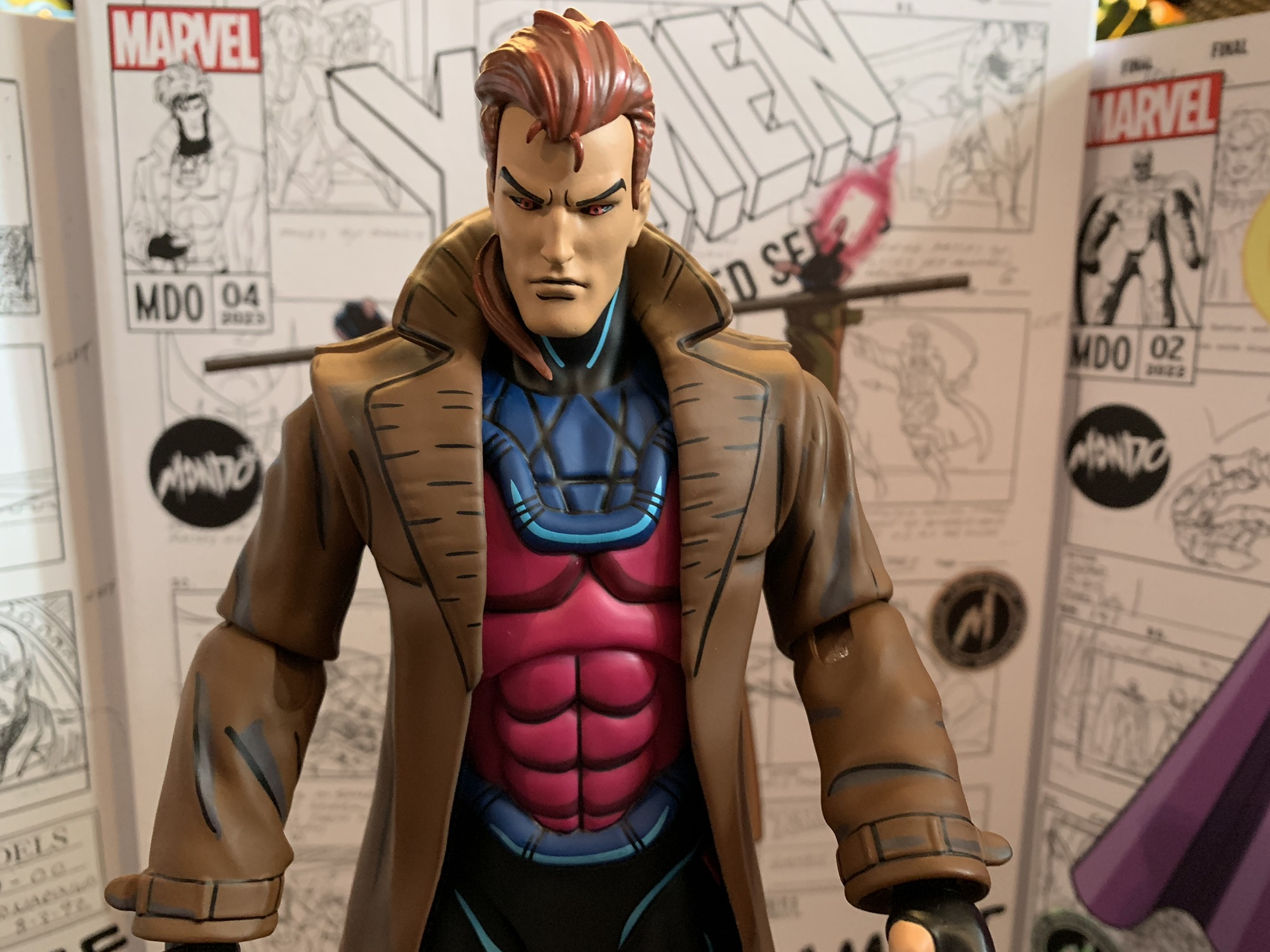
Gambit has often had a tough time making the jump to plastic. His design is tough to do in a satisfactory manner because of the trench coat. That original Toy Biz figure went with a pliable plastic that was more like paper than modern, rubbery, overlays. It was awful and prone to splitting at the seams. More modern figures always look a little “off” to me because I associate Gambit with this show more than anything. If he’s got a different head shape or his hair is more flat then it doesn’t look right. His unusual eyes can be tricky too since the sclera is black instead of white and the iris red. It’s an odd design, but Gambit is a pretty odd design all by himself. It’s like Jim Lee set out to make a character that just oozed “cool.” Usually, such characters turn out terribly, but for some reason it worked with Gambit. I couldn’t tell you why since everything about his design seems ridiculous to me in a vacuum. The hood with exposed face and ears, poofy hair, gloves with only certain fingers missing, the hot pink shirt, and of course the coat. His costume doesn’t really look like a costume and instead like someone with bad fashion sense. And there’s the fact that he actually has long hair, but somehow it’s all kept under wraps with that hood he wears. The back of his head and neck must just constantly be drenched in sweat.
The ranks are starting to fill out a bit.
Mondo has selected Gambit as its fifth release in its line of X-Men action figures. I’ve been really high on this line because it better than any other captures the look of the source material. I don’t think there’s another toy line that’s even comparable. Hasbro’s attempts at the same were trash and their figures based on Spider-Man aren’t any better. DC Direct (and now McFarlane via reissues of the same) did okay with the Batman: The Animated Series line, but those figures have their own problems. NECA’s Teenage Mutant Ninja Turtles line is probably the present gold standard, but even that can’t match the accuracy of the sculpts and paint we’re getting from Mondo. Of course, all of those lines are roughly 1:12 scale and a great deal cheaper. Mondo’s line is sixth scale which makes it a lot easier to go with robust paint apps and it also comes at a much higher cost. That price tag of over 200 bucks a figure has been the only real bummer here, but the quality of the finished product has at least reflected its price.
These shuffling card hands are pretty damn cool.
Gambit comes in a window box with a front flap that connects via magnets. It features new artwork from former X-Men storyboard artist Dan Veesenmeyer of Gambit in a fairly casual pose. I don’t think it’s Veesenmeyer’s best cover as it’s an off-model Gambit and the presence of actual storyboard art behind him draws attention to that fact. The figure is sculpted by Alex Brewer with the paint master handled by Tom Rozejowski. This is the timed edition of the figure which was limited to 1,000 units and comes with a few extra tidbits. A slightly cheaper version is (or will be) available that omits those extras, but comes in the same packaging. The interior packaging has been altered slightly from the past releases. The figure and some of the accessories are still in a tray, but the second tray with more accessories is now glued into the back of the cardboard insert. I don’t know what the reason for this change is, but it’s a bit annoying as you have to peel it off to get at the accessories underneath the bubble making this one essentially impossible to completely reseal if you want to have access to everything.
Gambit is about the same heigh as Magneto, a little shorter than Sabretooth.
Gambit stands right at the 12″ mark. This essentially makes him perfect for the scale as the show’s official height chart puts him right at the 6′ mark. I would argue he, and other characters, were drawn a bit bigger than 6′ in the show, but the height charts are the best information available and what Mondo should be basing its figures off of. This makes him scale well with Jubilee and Magneto, though Wolverine and Sabretooth practically occupy their own scale. Wolverine being too tall and Sabretooth too short. Gambit looks the part as his costume is accurate to the show and the portrait looks terrific. The head is the right shape and the hair has the part in the right spot. I think what makes Gambit look like Gambit is getting the size of the hair and face right and Mondo found the right ratio here.
He’s a cocky bastard.
Gambit’s coat is done all in plastic, so no soft goods here. The main body of the coat is a rather form-fitting overlay with the sleeves part of the sculpt of the arms. This is the best approach for this character and it’s consistent with what they did with Jubilee. The proportioning of the sculpt looks great and the paint features the same cel-shaded approach as the rest. Here, I think the shade of both the trench coat and the pink of the shirt are a little on the dull side. Less so the coat, but I would have personally liked to see the shirt a bit brighter to get more of that “pop” we get from the other figures. I’ve definitely seen production art that has this more muted approach, but I’d argue the finished product on screen turned out brighter. Aside from that, the application of the shading looks great. We get some hits of blue on the black pants which looks good and the interior of the coat is a darker brown to create the illusion of shadowing. The quality of the application of the paint is perhaps a touch behind the other figures. It’s mostly an issue for the hands which look a tad sloppy in places. Gambit is also the only figure in the line which needed to have its fingers painted so it’s a more challenging paint job, but it could have been better and arguably should be at this price.
For those who prefer their Gambit with a ponytail.
Nit picks aside, Gambit is going to look damn good on your shelf and with the other characters. The likeness is terrific and the many accessories are going to add some spice to your display options. The default portrait is a stern one, but Mondo also included three other options. My personal favorite is the smirk as I think of Gambit as a playful sort. This smile looks great and will likely be my chosen display option. We also get the unhooded portrait which features his hair in a ponytail that’s draped over his right shoulder. I think this look is taken from the Dark Phoenix Saga when Gambit and Cyclops go clubbing and meet Dazzler. It looks fine, but Gambit wasn’t one to appear in costume with his head uncovered so it’s a look that’s not likely to be popular. The fourth portrait is a gimmick one and it’s unique to this edition. It features Gambit with his stoic expression, but half of his head is transformed into Mystique. This is a reference to the Days of Future Past plot where Mystique impersonates Gambit to frame him for the assassination of Senator Kelly. It’s really well done, but the gimmicky nature of it means it’s not likely to be used by many for their display. The heads all pop on and off pretty easily, but this Mystique head is definitely one to be careful with as you could easily have some paint transfer from the hair to the neck/collar area.
This head is really well done, I just don’t see myself using it.
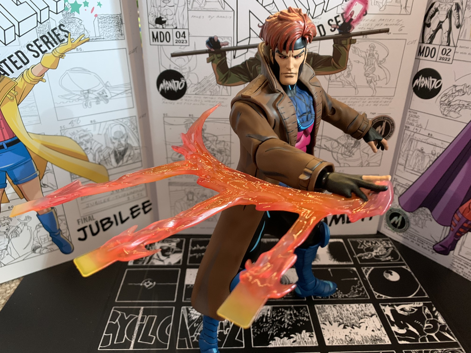
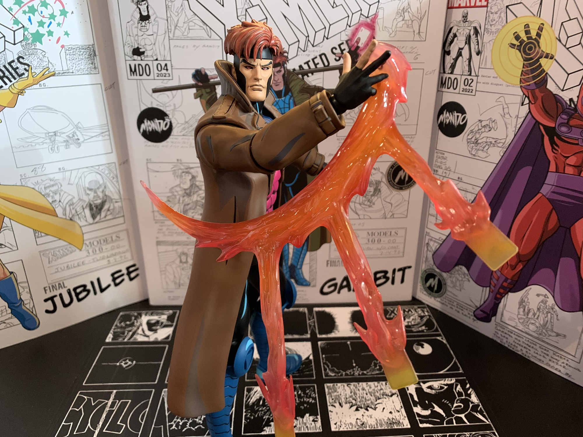
Gambit also comes with an assortment of hands for his other accessories. He comes with a pair of gripping hands in the box and also has a set of fists, open hands, and a trigger finger right hand. The trigger finger hand is likely included to be used with the pistol which is again from the assassination scene the Mystique head is based on. It also looks like the same gun Morph is seen with so it could potentially have some uses down the raid. It’s very thin with just a little hit of paint on the rear of it. It’s a snug fit in the hand and you may want to just heat the hand up first to avoid paint rub. This trigger hand also can work with Gambit’s cards. He has a hand of four aces and the back of the card makes them Mondo brand, which is kind of fun. There’s also a glowing, charged, card that’s done on translucent yellow plastic with some pink paint on the energy portions and is sure to be a favorite accessory of many. What’s missing though is Gambit’s classic two-finger gesture he often holds cards with. I’m genuinely perplexed at its omission to the point where it has me wondering if that was a gesture reserved more for the comics over the show? I don’t think so, but maybe?
This effect is pretty damn cool, just a little tough to “sell.”
We’re not done though as Gambit also has his trusty staff. It’s done in a blue-gray with some light gray shading and a little black linework. I’m honestly not sure how often his staff was shown with this color in the series. The opening title had it as green and I can recall it being brown at one point. I’m guessing it made an appearance in this color at some point, or maybe this was the color it was in the reference art? It fits rather snug in his gripping hands, and again, a little hot water might help to get it in there easier without paint transfer, though his bottom fingers have a tough time getting around the staff. We also get a set of card hands where the right hand is shuffling the cards and the left is catching them. I love how Mondo did the shuffling cards as they’re on transparent plastic to create the illusion of motion. I just wish his articulation made it easier to sell this effect, but we’ll get to that. There’s also another right hand that is connected to an effect part depicting the tossing of three, charged, cards. It looks pretty cool and doesn’t feature any reality-breaking inaccuracies like the Hasbro version of the same. Just like the shuffling hands, the figure has a hard time selling the illusion due to the articulation.
I can’t decide if it looks better with more of an arc to the toss.
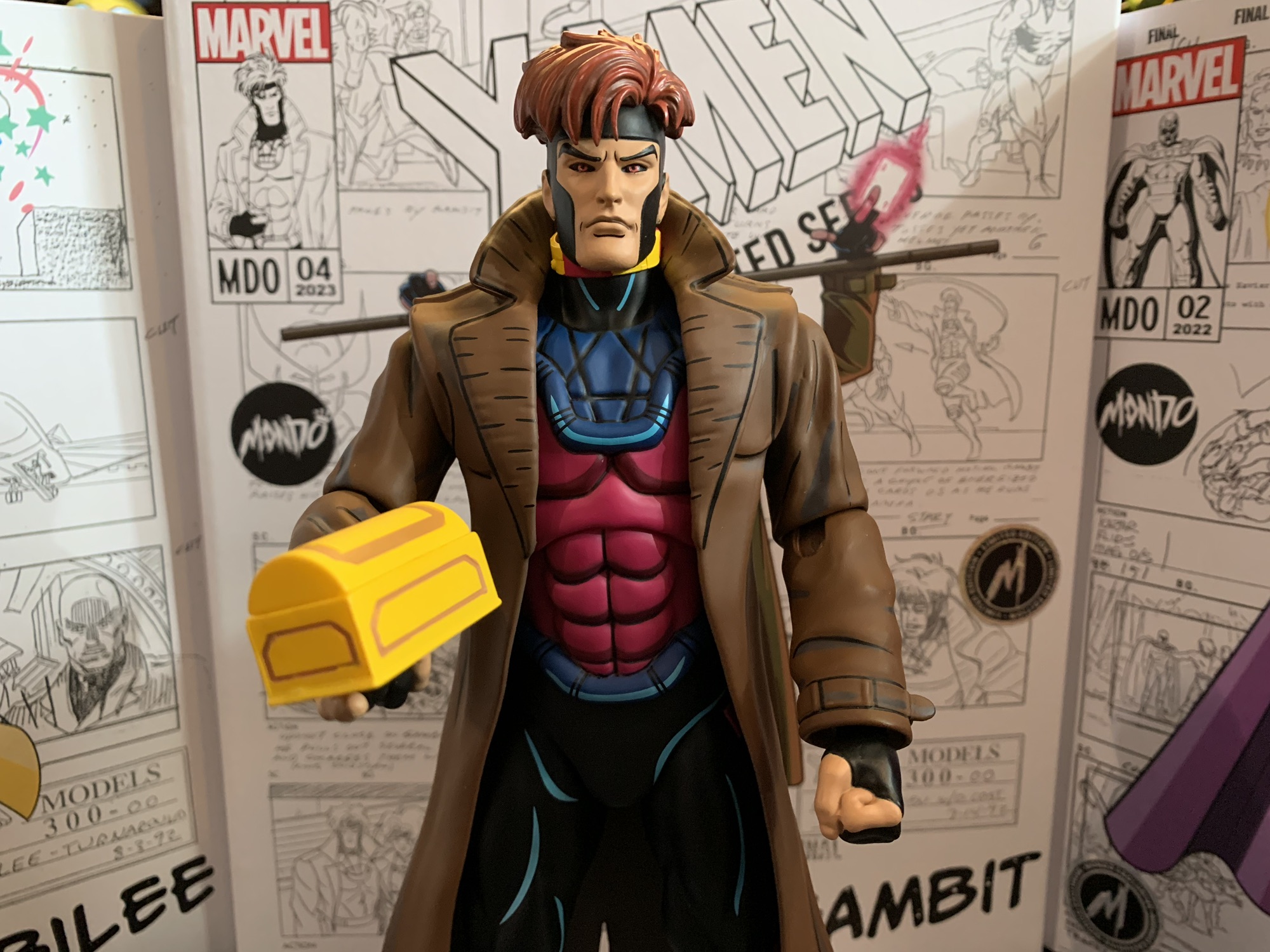
We’re still not done! Yes, Gambit has even more stuff to talk about and they’re episode specific. We get the tithe box from the episode “X-Ternally Yours.” I don’t like that episode, but it being the Gambit episode of Season Two I’m not surprised to see something from it included. The box looks okay, but the gold paint on it isn’t very well done. Also from that episode, but featured in multiple others, are the mutant power restricting collars. Gambit comes with two of them so I guess you can put one on Jubilee too. They’re done on a very soft, rubbery, yellow, plastic and the glowing portions are painted a magenta. I don’t know why they didn’t go with a bright red, but the collars just look so-so. There’s some nice details sculpted onto them, but they’re not accentuated with paint at all and I assume it’s because of the material. They definitely have a cheap look, which is uncharacteristic of this line. Gambit also has a charged chain to swing around. It’s a hard, translucent, yellow, plastic and it’s taken from the episode “Till Death Do Us Part.” It looks fine, though I kind of wish they went with a swinging, swooshing, sculpt since he swings it over his head in the episode. Lastly, we get the Mondo doll stand. It’s like the one that came with Sabretooth which has a slightly nicer and heftier base. It’s designed to go in-between the figure’s legs and it works, but it doesn’t allow for any dynamic posing or anything. It’s more for peace of mind if you’re worried about shelf dives.
I love the inclusion of episode specific accessories, even if I’m unlikely to ever really use them.
That’s a whole lot of stuff and collectors who pick Gambit up will have no shortage of display options. It’s partly what the line is known for. What it’s not known for is the articulation, and Gambit is no exception. Mondo prioritizes the look of its figures over function and this scale also limits what a figure can really do from a practical standpoint without having to worry about balancing issues. Gambit’s head is on a double-ball peg and it performs quite well. He gets plenty of rotation as well as enough range looking up and down and some tilt. The shoulders are ball-hinged and they’re quite tight. Some of that appears to be due to the fit of the coat, but regardless Gambit can’t raise his arms out to the side all the way. He can rotate fine, but going out is a problem. The elbows are single-hinged and they peg into the bicep. This gives them the ability to swivel there, but the range on the hinge is poor. Gambit can’t even achieve a 90 degree bend. The hands continue to be an issue as well for this line. The pegs are more of a straight peg with some ribbing at the end. Swapping is really easy as a result and the peg can rotate in the joint without fear of damage (unlike Magneto). There is a ball-hinge inside the hand, but the hands won’t spin on that joint so whatever the direction the hinge is positioned by default is where it will stay. The hinges are also quite clicky and lacking nuance. You basically just get 3 positions out of them and they’re quite tight. It’s definitely an area for improvement.
Gambit comes with two collars so you could use one with Jubilee, though it’s pretty roomy on her.
In the torso is a diaphragm joint. It’s likely a simple ball peg, possibly a double, and it mostly provides some rotation and tilt. You’re not really going to get an ab crunch out of it and the coat makes it a bit tough to mess around with. There is a waist twist while the legs are connected via ball and socket joints. Gambit won’t be able to kick all the way forward, but there’s enough posing there to at least put the figure in a wider stance. There is a thigh twist built into the joint and below that is the usual Mondo double-jointed knee. It can swivel above the knee and below it, if you want, though they’re pretty tight. The hinges will let the figure bend the knee past 90 degrees. The ankles are hinged and also feature an ankle rocker and they work fine. The hinge is either very tight or limited, but there’s enough nuance to keep the feet flat on a surface.
If you think cards are lame, Gambit has this handy, kinetically-charged, chain to wield as well.
Gambit’s articulation is mediocre at best. Most of the joints are there, they just don’t do much. My main gripe is with the elbows as they should be better. I also wish we had butterfly joints in the shoulders to help with the throwing accessories, but I couldn’t reasonably expect such. This means the figure is going to look best just standing on your shelf with the more static accessories. I think the shuffling cards are just barely usable with some finesse, but I’m having a hard time getting a good pose out of the throwing cards which really stinks as I want to use that effect part. I’ll probably end up sticking him with staff and charged single, but I do expect to change him up from time to time.
Gambit is largely as expected and could be considered more of the same from Mondo. That sounds like faint praise, but more of the same for this line is pretty damn good. He looks awesome and has a ton of accessories which create multiple display options. It’s just a figure held back by the subpar articulation, but it’s not so bad that it ruins the experience. If you like the rest, you’ll like Gambit. I don’t think he’s my favorite in the line, but he is right there with Magneto and Sabretooth when it comes to nailing the likeness. If you’re collecting this line, there’s definitely no reason to skip Gambit.
Check out some of these other figures from Mondo’s line of X-Men collectibles:
It’s Halloween 1992. You’re sitting in front of the television with a bowl of candy and your costume in pieces. Coming on is a prime time airing of Fox’s newest superhero cartoon: X-Men. You’ve seen the comics at the grocery store and in other places. You know Wolverine, you know there’s a guy who shoots…
When one hears the phrase “mall babe” it implies a certain visual. Probably a short, young, girl with intentionally messy, short hair. There’s a certain confidence the phrase exudes so she has to have style. Maybe hot pink, bright blues, and certainly a long yellow coat with gloves to match! There has to be an…
If you showed a random individual this blog and asked them what my favorite cartoon was as a kid I’m guessing they would go with Teenage Mutant Ninja Turtles. And they wouldn’t be wrong as that was my favorite for a time, but come 1992 I was starting to drift away from that show. Batman:…
I can’t seem to get enough X-Men merch based on the 90s cartoon series.
Halloween 1992 was when things really changed for the X-Men. A high-selling comic book was about to blow open and enter the mainstream with a hit new Saturday morning cartoon series. Spearheaded by Eric Lewald for Saban Entertainment, X-Men would become the highest rated children’s program on the Fox Network and the overall highest rated children’s program in 1993. At least, until a little show called Mighty Morphin Power Rangers came along. Even following that, the show remained a hit for the network and it’s likely that without the success of the cartoon we never would have had the film series that followed.
When Fox agreed to bring the spandex-clad mutants to network television it did so with Saban and Graz Entertainment who had their own ideas for the show. Lewald was the showrunner who oversaw a team of writers that crafted the inaugural season, most of whom were unfamiliar with the comic from which their characters were taken from. As a result, the first season was largely unique. It was not pulled from the comics with the exception of the “Days of Future Past” arc. Sure, the characters largely acted and behaved like their comic book counterparts, but the plots and character history were pretty much all new. I don’t think this necessarily played a huge role in what followed, but if the new show wasn’t just copying and pasting what the comic books had done then it made sense for a comic companion to tag along. Enter X-Men Adventures, a comic book adaptation of the animated series. Writer Ralph Macchio (no, not that Ralph Macchio) was handed the teleplays for the first season and was paired with varying teams of artists to bring the show to the pages. The first issue arrived in November 1993 and would run until March 1996 concluding with the “Dark Phoenix” arc. After that, the book split away from the cartoon series rather than adapt what was dubbed Season 4 and beyond, but up to that point, it had largely remained in lockstep with the show.
The two covers available for this collection.
As a kid, I didn’t bother with X-Men Adventures despite my love for the cartoon. In my mind, it felt redundant. Why buy a comic version of something I already saw on TV when I could get a comic book that told a whole, new, story? Now that I’m older and fond of reminiscing on things I enjoyed as a child, I’m more curious about something like X-Men Adventures. Surely, the comic would present opportunities to frame things differently. How would it handle something like the death of Morph? Would the characterizations be the same? Would some characters assume more of a spotlight or less of one? I probably could have answered such questions with relative ease and not much of an expense. Being a 90s comic, X-Men Adventures isn’t terribly hard to come by secondhand, especially if you’re one who is unconcerned with condition.
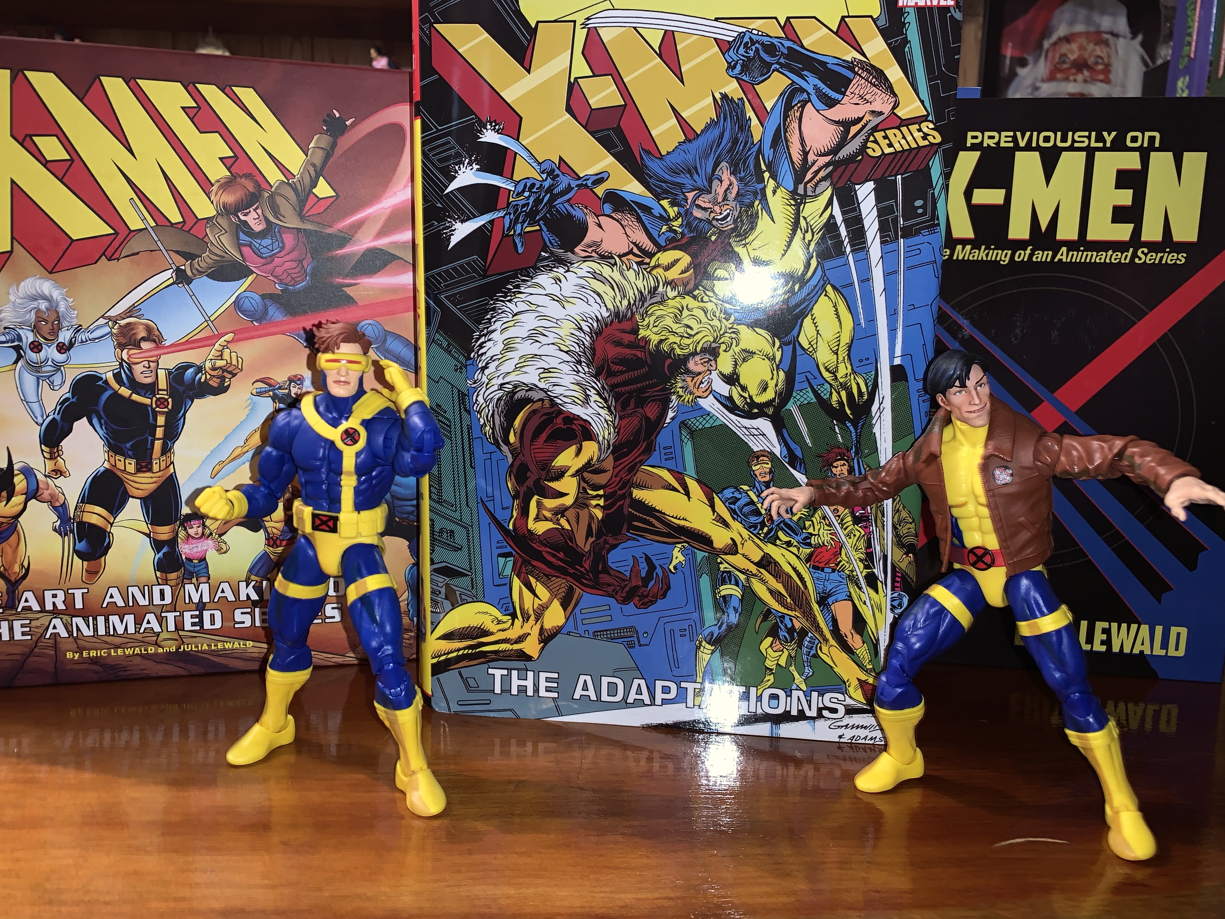
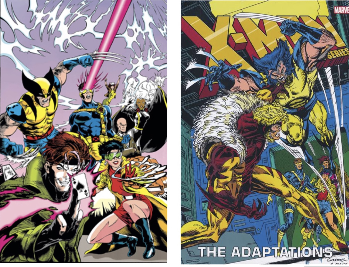
Rather than scour the back issues at a local comic shop, I turned to a new publication: X-Men: The Animated Series – The Adaptations. That mouthful of a title was released earlier this year. It’s a hardcover collection of X-Men Adventures totaling the first 41 issues, or said another way, all of the issues that mirrored the show. It’s a heavy, meaty, tome that’s nearly 1,000 pages with most of them devoted to the old issues. The paper is a nice white, though it has some transparency and isn’t as thick as it could be. The main cover illustration is the same as the very first issue of X-Men Adventures by Steve Lightle. The version I have is the variant cover which depicts Wolverine battling Sabretooth in the War Room and it’s done by Kerry Gammill and Greg Adams. The collection is expensive with an MSRP of $125. That was too rich for me so I played the waiting game eventually scoring one for less than $60 off of eBay. This one had bent corners that likely had been damaged during the shipping process. The eBay listing also had a typo in the title which may have helped to keep it on the site long enough for me to notice. Either way, I was willing to accept some cosmetic damage in exchange for a price that was more than half off. Now several weeks later, I’ve read this thing cover to cover and am ready to share my thoughts.
This one isn’t going to shy away from Morph’s death.
X-Men Adventures volume 1, which is thought of as the first season, spanned 15 issues which is longer than the show’s 13 episode first season. As such, the first season of books is more expansive than that season and also more expansive when compared with the seasons that followed. My guess would be that with the show being new, and being tinkered with practically right up until air date, there was a lot less that was nailed down and thus there was more room for Macchio’s own interpretation. It’s also interesting that the characterizations of the book’s characters are far more reliant on their comic history. This is seen most with Magneto who is very much a villain in these books as opposed to a friendly rival. He’s not going to team-up with these X-Men to take down the Sentinels and he’s far more willing to inflict pain upon them as well. The costumes for the characters also all mirror the comics. Jean is more yellow and blue with long hair, Apocalypse isn’t purple, and Sabretooth doesn’t have the massive physique of his animated counterpart. Fights, like Wolverine vs Sabretooth, can be more violent with actual blood spilled and our boy Wolverine is also free to smoke cigars and drink beer.
By far, the thing I was most interested in seeing was how the books handled the death of Morph. In the show, his death is essentially offscreen, though the characters deal with it in a pretty realistic manner. It wasn’t some Saturday morning “zapped to another dimension” sort of end for old Morph. In the books, it’s foreshadowed with a rather grizzly depiction of Morph with half of his face burned off. I’m not sure the character needed to have these visions, but it was an interesting way to go about it. When the time comes for him to actually die, it’s handled in a far more personal manner with Beast cradling Morph in his arms as he draws his dying breath. Of course, the character would be brought back in Season Two which was never the plan at the time. It does muddy things a bit since his death was so final in the books. Did the Mutant Control people haul Beast away and just leave Morph’s corpse behind for Sinister to come along and swipe? Apparently so, because no other explanation is offered.
Wolverine is allowed to fight like, well, Wolverine!
Morph’s death was one area where the books could go into more detail and be a bit more showy than the cartoon. It’s also pretty unique as the rest of the issues largely unfold in a more expedited fashion after the first season. The first 15 issues are far more dense and interesting as a result, while the rest are still enjoyable, but missing that extra component. Some stories, like the Omega Red confrontation or Wolverine’s parlay with Alpha Flight, end far too abruptly to feel satisfying. If you didn’t like how the X-Men defeated Omega Red in the show, then you really won’t like it here. And since comics always seem to operate with the idea that any issue could be someone’s first, there’s a lot of needless exposition from characters explaining their thoughts, motivations, powers, etc. too plainly. It feels demeaning to the reader and like a dumbing down of the material at times, something the show seems careful to avoid.
The other aspect of these stories that threw me the most was just the changing art styles. These books never seemed to have a single vision for very long when it came to the art. Andrew Wildman was the penciler for the first six issues. He had a slightly more realistic style than some, but it’s not bad. Chris Batista then takes over for two issues and he has a more streamlined approach which actually might suit the animated look a bit better, though I think I still prefer Wildman. Wildman would return for the 9th issue and hang around through issue 13 and then back again for the final issue of the first season. In between is an issue by Nick Napalitano. All three pencilers for that first season complement each other well, but later seasons have more divergent takes, some of which I like and some of which I don’t. By the end, Ben Herrera was handling a lot of the load and I’m just not into his style. It’s very reflective of what the 90s comics were producing at the time, and even then, it wasn’t a style I enjoyed. My least favorite issues were the ones done by Hector Collazo. He seemed to take to heart that this comic was an adaptation of a cartoon because his style could best be described as toony. I’d enjoy it on a Looney Tunes or Animaniacs book, but not an X-Men one.
The art style isn’t consistent for all 40+ issues so readers are likely to enjoy some more than others.
Reading through this book basically gave me what I was looking for: familiar stories told through a different lens. The only downside for me was how the second and third seasons were more streamlined with less room for freelancing, if you will. The first season was by far the most enjoyable part of the book, though I am curious about the issues not included. Following the third season, Macchio basically was allowed to continue writing stories for this version of the X-Men, but ones that didn’t follow the show. Those works are collected in another trade paperback that I should probably give some thought to acquiring. If you’re someone like me curious about what another interpretation of the beloved show could look like, this isn’t a bad experience. I don’t think it’s worth the asking price so I’d recommend getting it used or on sale. The actual quality of the book is pretty nice, though there are the occasional page that came out slightly blurry from the printer. It seems to be an issue that becomes more frequent further into the book. It may also be something that’s not consistent from copy to copy. Either way, it’s a tough ask at full price. A lot of places have it marked down to around 80 dollars, which is still a lot, but better than $125. I’m not sure I’d even recommend it at that price, but definitely consider a look if you ever find it closer to 50 bucks.
Interested in living in the world of X-Men as established by the animated series?
A lot of cartoons made an impact on me as a child. My first love was The Real Ghostbusters. Its goofy cast of characters and excitement were plenty of fun and there were interesting toys to supplement the series with, which was pretty much the goal of all cartoons in the 80s. The Teenage Mutant…
A few years ago, I talked about my love of X-Men, the animated series, via a book review of Previously…on X-Men by Eric Lewald. That book chronicled the development of the 92 animated series that helped propel the Fox Kids Network to the top of the Saturday morning leaderboards through notes from the author and…
Today, The Christmas Spot temporarily alters it’s name to The X-Mas Spot. As a sort-of celebration for the animated series X-Men turning 30 this past Halloween we’re going to look at the show’s lone holiday special – “Have Yourself a Morlock Little X-Mas.” The show X-Men was a pretty serious affair as far as kid…
It’s Halloween 1992. You’re sitting in front of the television with a bowl of candy and your costume in pieces. Coming on is a prime time airing of Fox’s newest superhero cartoon: X-Men. You’ve seen the comics at the grocery store and in other places. You know Wolverine, you know there’s a guy who shoots lasers out of his eyes and that the bad guy can stick to your refrigerator. Outside of that though, there’s still a lot to be discovered. The theme song kicks in composed by Ron Wasserman which gets your blood pumping. A dazzling array of colorful costumes and bright lights play before your eyes – it’s too much to take in with just a single viewing, but as the characters line up for a colossal battle they slam together and the logo “X-Men” overtakes them. The screen is then filled by the snarling, angry, face of someone you don’t know. He’s massive! And scary! And he sends a police car hurtling towards the screen!
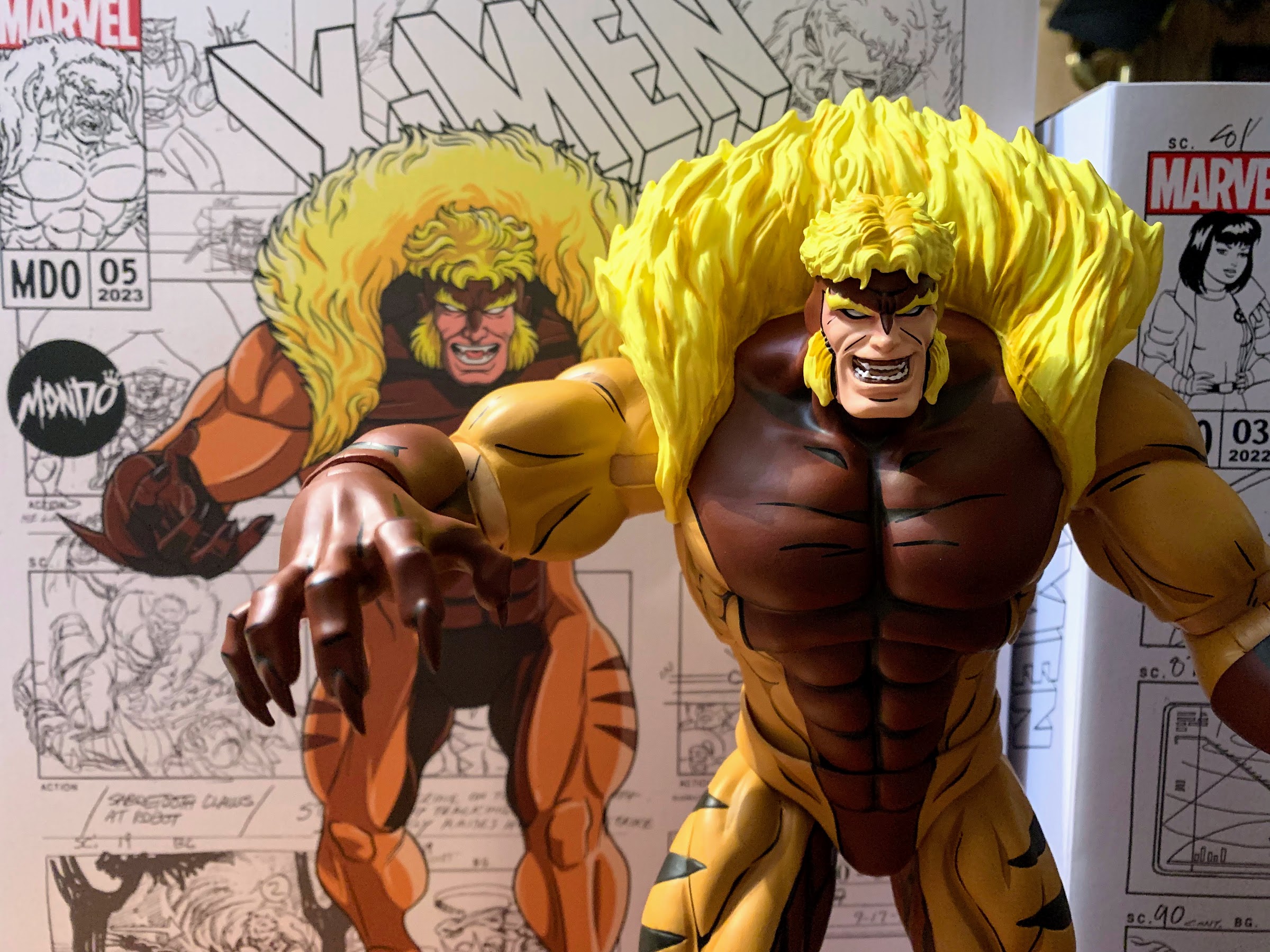
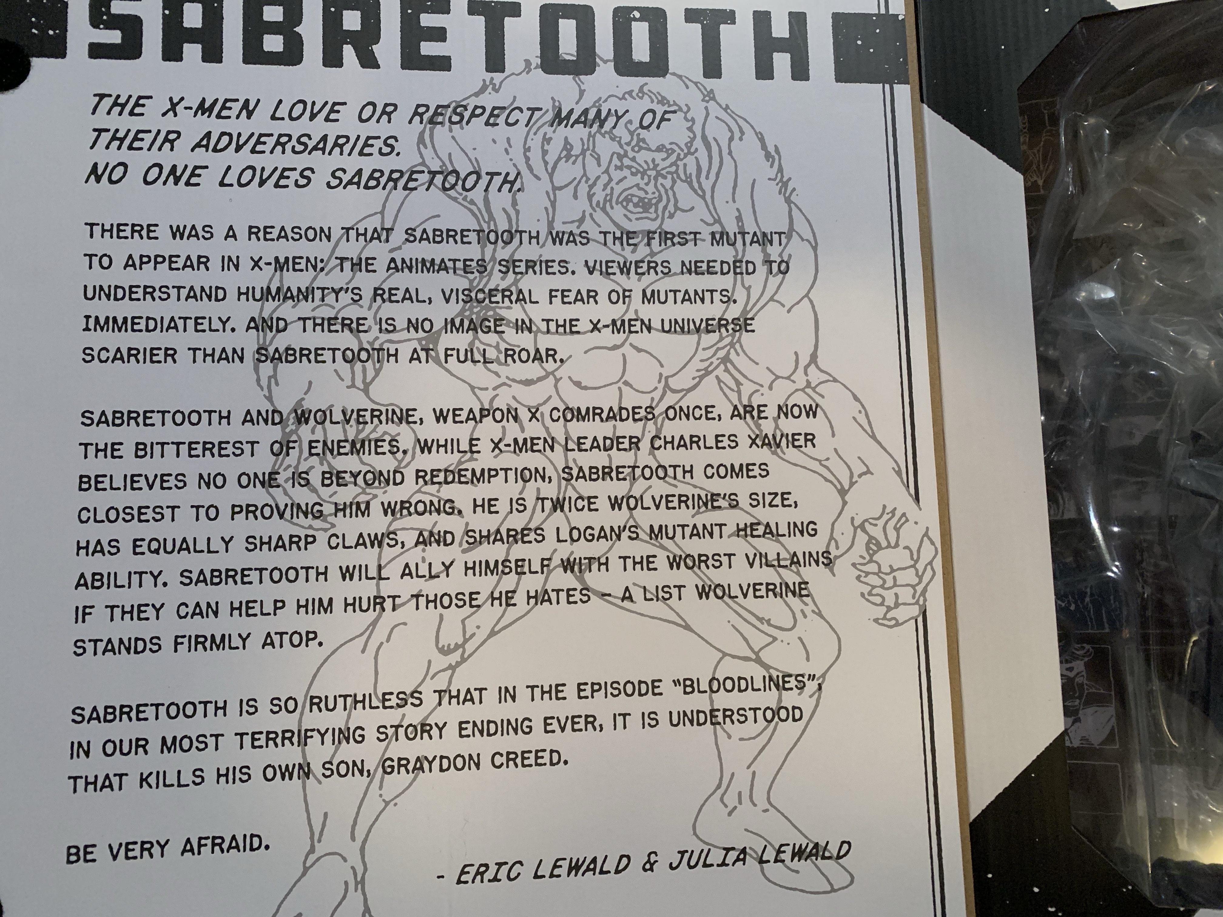
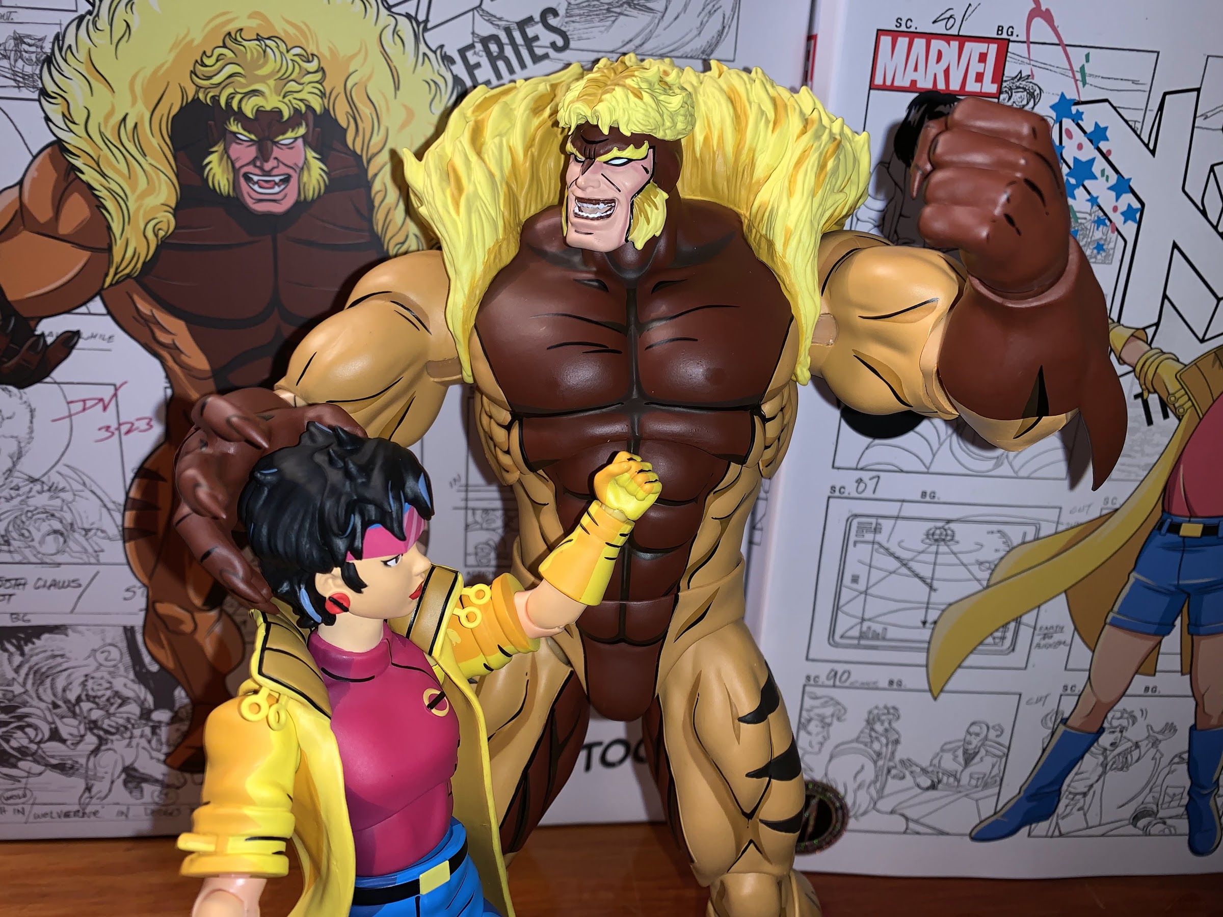
That character is Sabretooth and he has the honor of being the first character shown in an episode of X-Men. In less than a year, the X-Men will practically be household names. It will be the highest rated show on Saturday mornings and it will stay there through reruns all summer finally ceding the throne in the fall to a little show called Mighty Morphin Power Rangers. It’s kind of a big deal considering Fox was also airing Batman at the same time which was coasting off of Batman Returns and starred a character that had already been a household name for decades. As for Sabretooth, I had never given much thought to him being the first character we see in the show following the opening credits (which prominently displays all of the heroes and a bunch of the villains, including Sabretooth), but it was apparently by design. Sabretooth is the fourth release in Mondo’s line of sixth scale action figures based on X-Men, and on the inner flap of his box there’s a write-up for the character by the showrunner, Eric Lewald, and his wife and fellow writer Julia which explains why Sabretooth was chosen to essentially lead-off the series. And it’s because he’s big, intimidating, and scary. They wanted the viewer to understand why humanity would fear mutants. X-Men was not a show that was going to show its characters in stark black and white tones, and it was important to see how something like the Mutant Control Act could come about while also showing why it was fundamentally flawed in the episodes to come.
Sabretooth may be listed as figure 5 on the box, but he’s the fourth release.
It’s always fun to learn new details on decades old shows, but it’s also more fun to get a brand-spankin’ new action figure! As mentioned before, Sabretooth is figure number four in this line of action figures from Mondo, even though he was actually solicited fifth. Somehow, he leap-frogged over Gambit, but I’m not complaining. Spoiler alert, Sabretooth is probably the best year in the line and it’s a line that’s been trending in the right direction. Each release has been better than the last. While I subjectively prefer Magneto to Jubilee, I can’t argue that her figure is just a little bit better when it comes to function. Magneto had some ticks about him and his articulation is very limited due to his cape, but Jubilee remedied a lot of the little things. Sabretooth has an even cleaner sculpt and the quality control on the joints is superb. It’s not a perfect figure, but it is pretty damn close.
Poor Sabretooth…
Sabretooth comes in a massive box adorned with production artwork from the series and a new illustration by storyboard artist on the show, Dan Veesenmeyer. Sabretooth is the biggest figure in the line, so he gets the biggest box – makes sense. It has a front flap that opens up to reveal a window behind it, but Mondo packages their figures so well in plastic that the window isn’t very revealing for in-box collectors. It at least allows space for that write-up I mentioned which is both enlightening and pretty damn entertaining as it contains the line, “No one loves Sabretooth.” It also contains a reveal, of sorts, in that we the viewer are supposed to interpret that Sabretooth murders his son, Graydon Creed, at the end of the episode “Bloodlines.” The Friends of Humanity essentially leave their disgraced founder to suffer at the hands of Sabretooth and it’s hard to imagine the cold-hearted fiend taking it easy on the mutant racist just because they’re kin, but still a bit shocking to have his end confirmed.
He’s bigger than the others, but he could be bigger.
Out of the box, Sabretooth stands an impressive 12.5″ to the top of his head and around 13″ to the top of his mane. This makes him the tallest figure in the line, though he’s not much taller than Magneto. As was the case with past releases in this line, it’s likely that Sabretooth isn’t true sixth scale. The model sheet with height references from the show had him at 6.5′. You may think that’s too short and you would be correct as the model sheet has him with bent knees and hunched forward. I’m guessing that’s how he was supposed to be drawn more often than not, though in his early appearances we see him splayed out in a hospital bed which makes him look far bigger. Six and a half feet at sixth scale is exactly 13″, but this figure is 13″ when standing upright so it’s not exact. I personally get it as making this figure much bigger would make things a lot more difficult. Bigger equals more weight and that’s more of a burden on joints. It’s also added cost and this guy was already $240 as is. The figure can work at this size, and it’s actually more of a problem with Wolverine who came in much too tall. If he were the proper height the display would look better. As it stands, the only scale-related issue I have with Sabretooth is that he needed to be downsized not just in height, but all around, so his head size is small compared with the other figures in the line. Not egregiously so, but it noticeably and at this price point we have to get picky.
Who ya got? The egg-suckin’ piece of gutter trash or the runt?!
Issues of scale aside, the rest of the presentation on this figure is pretty damn fantastic. Once again, we’re dealing with a sculpt from Alex Brewer with the paint master being handled by Mark Bristow. This figure presents Sabretooth as he appeared in the show’s first season in which he made multiple appearances with most coming in the the show’s third and fourth episodes. This means he has the red-brown chest that continues all the way up to his cowl. Later appearances would have the red stop at his pecs. He also seemed to be drawn smaller in those later appearances, but we’re done dissecting his height. This edition of Sabretooth sports a costume design very similar to the Jim Lee redesign that was in the comics, but there are some subtle differences most notably being that the sleeves don’t feature any red on the back. Instead, they’re orange and the red begins at the gloves. Sabretooth’s costume always was a bit tricky to figure out as he looks almost nude, but his face is a different color implying it’s all a bodysuit. The episode “Weapon X, Lies, and Videotape” would toss us a curveball though in having Sabretooth remove a glove revealing his forearm and hand to be the same color as his apparent sleeve implying he’s just plain naked. I think it was an animation error, but then there’s also a scene where Sabretooth basically transforms from a relatively normal looking person into the costume we see today so I have no idea what was going on there.
Sabretooth called the head of Talos an ashtray on the show which is kind of surprising that the censors allowed any reference to smoking to sneak in.
This version of Sabretooth is known less for the costume and more for just being a hulking monster. He is way bigger than he often was drawn in the comics and it’s almost all in his upper body. His shoulders and chest are just plain massive. His abs were also ridiculous with some shots in the cartoon giving him a 12-pack as his abs basically continued into his crotch. His design is over-the-top and I am here for it. This is how I picture Sabretooth in my head and basically every action figure I ever owned of the character have left me unimpressed because he just wasn’t big enough. For me, this figure is a long time coming as he looks like he stepped out of my VCR and into my room. While Mondo didn’t go as crazy on the abs as the show sometimes did, he does have an 8-pack and that feels appropriate. His shoulders and biceps are appropriately large as is the chest. His body tapers in towards his waist as it did in the show and his legs are long. The claws on his fingers are pronounced just enough and rather pointy too. We talk about shelf presence a lot in the action figure world, but this is a figure that has shelf presence to spare.
Protect yourself and your pet: buy a muzzle.
And a lot of that is due to the excellent paint job. The sculpts have been good in this line, but it’s the paint that really makes them next level. Anyone who turns their nose up at cel-shading on action figures has never held one of these figures in their hands. It’s impressive, and Mondo selected the exact right tones to shade this figure. Even better, is all of the black linework around every muscle and feature on this sculpt that really gives it that pop. And even with all of this paint, it’s applied in a very clean manner. You have to go hunting with this guy to find imperfections. Some of this has to be hand-painted so there will be some variations from figure to figure, but on my copy at least there’s little to no paint slop to be found. There’s just little spots here and there along the black lines where it could have lined up with the sculpt a little better, but it’s by and large pretty damn good. The only thing I would categorize as an eyesore on this figure are the elbows, which are unpainted. They have black linework on then, but the joint is bare plastic and it’s not a perfect match for the painted parts. It can be hidden some by bending the elbows. It’s also going to show up more under harsher lighting, and in my photos which I utilized a flash for most it’s more visible than it is on my shelf as I type this.
He sure does love his explosives!
Sabretooth comes with a pretty substantial spread of accessories, though he’s a character that also doesn’t demand a whole lot. For heads, we get two to choose from: snarling/yelling and an open-mouth smile. I think both work very well and suit the character and it is hard to choose between the two. I’ll probably go with the smirk more often than the snarl, but I do enjoy both. For hands, we get three sets: fists, C-grip, and what Mondo describes as dramatic. They’re basically open, clawing, hands and what I think many will choose to pose him with. The gripping hands work with a pair of accessories. One, is the head of Talos (or ashtray) from “Weapon X, Lies, and Videotape.” It’s the head and the circuitry for the neck. Nothing articulates, but it’s painted very well and it’s a fun, episode-specific, inclusion. The other accessory he can grip is a handheld detonator and it goes with the explosives. This is from the episode “Cold Vengeance” where he and Wolverine battle in Alaska. Both aspects of the accessory are well-sculpted and well-painted and it’s another fun inclusion. I honestly can’t see myself ever displaying Sabretooth with the Talos head in hands, but I could with the explosives.
Does a mutant healing factor contribute to a healthy head of hair?
If you got the special timed edition of the figure from Mondo then you also got more stuff. For an extra 15 bucks, you get a third portrait of Sabretooth unmasked and sporting a smirk. This from the end of the episode “Bloodlines” referenced on the packaging flap. It looks great, but like the Fairy Tale Theater Jubilee head, it doesn’t match the rest of the figure as Sabretooth was out of costume for that scene. It’s still cool to get an unmasked head, but I’ll probably never use this and would have preferred a standard head with a new expression. Maybe unconscious? The timed edition also comes with the muzzle the X-Men put Sabretooth in when he was captured in “Beyond Good and Evil Part III.” You can basically slot it over either of the standard heads and then pop the head on to complete the effect and it looks pretty cool. It’s definitely a worthwhile inclusion. Lastly, we get a blaster and two trigger hands to hold it. The blaster is, once again, pulled from the episode “Weapon X, Lies, and Videotape” and it looks accurate to the show. This is an item I can see getting added to my display when I want to change things up because it looks pretty damn cool. The trigger hands also work well with the detonator, arguably better than gripping hands.
Sabretooth isn’t really a gun guy, but he pulls it off.
For the timed edition, I’d say that’s a pretty robust assortment of accessories. And if you wanted to save a bit of money and go the standard route, I don’t think you’re missing out on anything essential. Sabretooth is a brawler at heart, so really just the heads and hands are all he truly needs, but I’m always happy to have more. Where this line is typically not that impressive is the articulation. The characters really didn’t move all that well in the show so one could argue they don’t need to do much, but why be limited by the source material if you don’t have to be?
“Ya done nice, girly! And as a reward I’ll finish you off clean and fast!”
Sabretooth has a double-ball for the head that lets him look up and down a bit and rotate. There’s some nuance posing, and perhaps more important than the range, it’s easy to swap heads without scuffing anything. The shoulders are standard ball-hinges and he can get his arm up to about horizontal and rotate. There’s no biceps swivel, but he does have a swivel at the elbow which contains a single hinge that will bend about 90 degrees. The wrists are hinged ball-pegs so he can rotate and move the hand up and down or in and out depending on the direction of the hinge. And unlike Wolverine and Magneto, I had no issues getting the hands to rotate on the peg. In the diaphragm, there’s a big ball joint that lets the figure lean back a bit and forward a bit. It can rotate and tilt to the side as well. The waist is another ball joint, but it’s deep in there and the figure has one of those rubber diaper pieces so you won’t get much back and forth, but you will get rotation. The hips are big ball pegs that allow the legs to go out to the side past 45 degrees. He can kick forward as well, but not a full 90 with minimal range going back. The thighs do swivel, and the knees are double-jointed with swivels above and below the knee. The ankle hinges forward and back and have an ankle rocker. It’s the only joint that feels a tad stubborn, especially the right ankle, so the range isn’t quite what I’d like.
“Back off, dweeb!”
The articulation is basic, and the figure is quite heavy so there are limits to how it can pose. Aside from the ankle, nothing was stuck. The knees are a touch looser than I’d like and I’m sort of questioning if the double-joint makes sense here. Between the bending and the swiveling, the figure can sometimes want to kick out. I have had no issues getting him to stand, but I often don’t feel comfortable leaving him be in some poses. It does work better to have the figure in a crouch, which makes sense for the character, and I did leave him standing unsupported for days without falling. Mondo does include its usual stand and it’s actually slightly different. There’s more weight in the base so it probably works better than it typically does. And it’s actually usable with Sabretooth since he doesn’t have a cape or giant coat to get in the way. I’m not presently using it, but I did consider it this time around.
With each release, it gets harder to find space, but it’s a good problem to have.
Mondo is not trying to give collectors a super articulated line, just enough to create some distinct poses. What Mondo prioritizes is the aesthetic and it’s hard to imagine anyone making a better Sabretooth figure than what we have here. I love this figure. This is the Sabretooth I wanted when I was a kid. Maybe not at this size, but definitely these proportions. The sculpt is awesome, the paint incredible, and there’s plenty of stuff in the box. I am as pleased as I could be with this release. If Mondo were doing this line at 1:12 scale they wouldn’t be able to keep the stuff in stock. By doing sixth scale, it does shrink the market because this line needs a lot of space and it’s not cheap to collect, but it is so much more satisfying to behold than what some other companies have done with this property. If you’re in on this line and cherry-picking, this is a cherry to go after.
If this review has you wondering about the rest of the line, see below:
When one hears the phrase “mall babe” it implies a certain visual. Probably a short, young, girl with intentionally messy, short hair. There’s a certain confidence the phrase exudes so she has to have style. Maybe hot pink, bright blues, and certainly a long yellow coat with gloves to match! There has to be an…
If you showed a random individual this blog and asked them what my favorite cartoon was as a kid I’m guessing they would go with Teenage Mutant Ninja Turtles. And they wouldn’t be wrong as that was my favorite for a time, but come 1992 I was starting to drift away from that show. Batman:…
When San Diego Comic Con was cancelled for 2021, many of the entities that would have sold exclusive merchandise at the event pivoted to web sales. And since the 2020 iteration of the famed event was also canceled due to the COVID-19 pandemic, many seemed to expect the same for 2021, or the massive delays…
Wait! Why is Spider-Man wearing a hoodie? Answer: it was the 90s, baby!
When I was a kid, one of my favorite past times was drawing. Like most, I started really young with a box of crayons and coloring books. I’d eventually start keeping markers, colored pencils, and other instruments in a plastic McDonald’s case that came from a Happy Meal. It was blue and had a map of the United States on it, if you’re the curious type. As I got older I got into comic books and those characters became my inspiration for my drawing. I’d draw Marvel characters as well as my own, which usually looked an awful lot like an existing character because, hey, I was a kid!
One of my favorite subjects was Spider-Man. He’s a pretty popular guy and he certainly was with me. The problem with drawing Spider-Man is he has all of those web lines on his costume. Now, I’m not criticizing the man’s threads. That costume is iconic and one of, if not the, best superhero costumes of all-time. I just didn’t like to draw it because it was time consuming and definitely a little tedious. Enter the Scarlet Spider! Scarlet Spider debuted during the infamous Clone Saga in issue 52 of Spider-Man. I still remember seeing the cover to Web of Spider-Man #118 with Scarlet Spider on the cover. I took one look at that costume and said “Yeah, now that I can handle!” It was basically the same general idea as Spider-Man, only all red and no web lines. Easy! The clone of Peter Parker, Ben Reilly, had created his own persona and it had a bit of a D.I.Y. vibe to it with the exposed web shooters and blue hoodie, and it worked for me. The Clone Saga itself was a bit of a mess and probably ran too long. It also ended with the reveal that it was Reilly, and not Peter Parker, who was the REAL Peter Parker leading to Ben Reilly’s turn as Spider-Man that brought back the web lines and I personally didn’t know how to feel about it. Like Wolverine losing his adamantium, I wasn’t crazy about the guy I knew as Peter Parker being revealed to not be Peter Parker.
The figure comes with three different portraits, two of which I will never use.
Like most things in comics, eventually the status quo was restored. Ben Reilly was a clone after all, and then he died. Then he came back, because no one ever dies in comics. I honestly haven’t read much Spider-Man since the 90s so you’re better off heading to a wiki at this point if you want to know more, I’m just here for that costume. Scarlet Spider became a favorite of mine to draw and as a result I have a nostalgic attachment to the costume. The character was never done justice by Toy Biz back in day as his figures were always lame repaints. I had a 12″ version of the character with the hoodie painted on and some rubber overlays added to the wrists and ankles of what had previously been a Spider-Man figure. The inaugural line of Spider-Man Classics, the precursor line to Marvel Legends, also featured a Scarlet Spider repaint that I believe was exclusive to a retailer, possibly KB Toys. I never got it, or any other Scarlet Spider that followed. When I started getting Spider-Man figures here and there again starting with the Pulsecon exclusive Venom, my appetite for a Scarlet Spider came with it. Unfortunately, the Marvel Legends version (which actually looks pretty good from what I’ve seen) is a little old at this point and prohibitively expensive on the aftermarket. I’m not paying an inflated price for a Hasbro figure, but a Medicom one? Now that was intriguing.
I think the figure in the middle is unquestionably superior to the other two, but is it $70 better?
When Medicom unveiled their version of Scarlet Spider under their MAFEX branding, I decided to give it a go. The price is awful, as it was for the only other MAFEX figure I own, the Hush Batman, but I’d rather overpay for a boutique figure than something previously sold at Target. I had some nits to pick with that Batman figure and my overall attitude towards MAFEX is that it’s too expensive. The Marvel license probably doesn’t come cheap, but in general, I think Bandai makes better figures than Medicom and they’re usually at least in the $65 range. This figure will basically set you back about 100 bucks if you reside in the US, and I’ll tell you upfront it’s not a figure that justifies its price tag. That doesn’t mean it can’t be good as one could pay 50 bucks for a perfectly cooked steak and find it delicious, but overpriced compared with a chain restaurant’s $25 prime rib. It’s more a question of “Do you want to pay $75-$90 for a loose Marvel Legends figure, or $100 for a brand new MAFEX version of the character?”
Yeah, I wish the spider logo was bigger, but damn does he look cool or what?
Obviously, you know which option I chose and now I’m going to tell you how happy (or not) I am with that decision. Scarlet Spider comes in the MAFEX window box with artwork from the comic on the front and product shots of the figure on the sides and rear. This one is branded with The Amazing Spider-Man in the traditional font with the actual name of the character off to the side in a rather unglamorous and understated fashion. This isn’t the type of figure mothers at Toys R Us are going to be confused by, but it was somewhat amusing to me. Right off the bat though, Medicom is doing Medicom things which is namely using character art that doesn’t match the figure inside. The picture of Scarlet Spider on the top left looks to be from his early days. The red, or scarlet, of his costume is dark with lots of black shading and the hoodie has the big, spider, logo across the chest. The figure inside is a bright red, no shading, and has a small spider logo over the heart. It’s my understanding that this version is a later version of the character as he’s come and gone over the years. Why the person designing the packaging wouldn’t choose a better representation of the figure inside is beyond my understanding. And if Marvel dictated that this version of the character be featured on the box, why not make the figure match? It’s puzzling.
The hoodie is fine, certainly fine enough to not want to spend more money on a different one.
Right off the bat, we’re kind of off to a bad start. Not because the picture is wrong, but because the figure seems to be based on a version of Scarlet Spider that isn’t my favorite. And I don’t get the sense that I’m alone in that regard. Is it a deal breaker? Obviously not since I bought it anyway, but I wish he had the character’s original hoodie. The belt is also different with this one having a more traditional buckle instead of the red-buttoned belt. I’m honestly less irritated by that change, but felt it was worth pointing out. The shape of the eyes on the mask are also more of a traditional Spider-Man eye shape, but this is rendered moot by the inclusion of a head with more of a 1995 look to the eyes so I won’t count that as a knock. Still, I have encountered multiple collectors in the market for custom hoodies for their $100 figure to get the right logo on it. I can’t bring myself to drop another $30 on an already expensive figure in an attempt to improve it, but if it really bothers you there do appear to be some nice customs out there.
Is Scarlet Spider a little big or Venom a little small? Both things can be true. This looks okay to me though.
With that out of the way, let’s talk about the actual figure. Scarlet Spider stands at approximately 6.25″ tall making him a little oversized. The MAFEX line is a 1:12 scale line so that would make the character about 6’3″ which is on the tall side for a Spider-Man clone. At the same time, if you’re looking to fudge him into a Marvel Legends display this should work pretty well as most of those Spider-Man figures are around the same height, with a few exceptions. The figure is basically cast in all red plastic with very little paint. The paint is limited to the eyes, belt, and little pouches on his ankles. And at the ankles, it’s not as fine as it could be as the top of the straps wasn’t painted over leaving them red. A nitpick, perhaps, but this is a $100 figure, after all. I can’t tell if the web shooters are painted or not, but they’re a nice, lustrous, silver. They’re definitely separate pieces from the arms, but they may be painted over for added effect. On the body itself I’m not detecting any shading which is a bummer. I think some dark red over the bare plastic would have helped spruce this one up. Personally, I would have loved an ambitious paint job with a lot of black shading, but I’m not surprised we didn’t get that. Medicom did do a comic paint Spider-Man years ago so maybe we’ll get such a variant in the future (do I really want to be tempted by such), but for this release Medicom is definitely playing it safe. I also would have liked some outlining around the eyes, be it dark red or even black to add a little pop to the presentation. They are at least raised as part of the sculpt, which is better than nothing.
He’s got you now, Ben!
The overall sculpt is definitely going for a lean, but muscular, build suitable of Scarlet Spider. The soft goods hoodie is done well and I rather enjoy the almost metallic sheen it posseses. The logo is printed on, and despite being too small at least looks fine. There’s no logo on the back. The drawstrings are connected to the hood and don’t actually function, but respond a bit to posing despite lacking a wire. The hood itself is wired and the figure looks good with it on or off. I will say, the hoodie helps add a little extra bulk to the torso which is a good thing as without it I think he’d look too lean and shapeless. The torso doesn’t taper much from the chest to the abdomen so he would probably look stupid without the hoodie. Maybe that’s by design as we wouldn’t want him to look frumpy either, but if you’re someone with a lot of money looking to utilize this body for custom action figures you may be letdown. I do like that the hoodie fits tight enough that we can see some of the muscle definition showing through. If you did want to get a custom hoodie I’m not sure how difficult it would be to get this one off given its tightness, but the head is easily removed and he can raise his arms up to the heavens to it’s probably more than manageable.
The paint may be basic, but at least the figure makes up for it with a whole bunch of stuff.
The costume is a rather simple one, which is basically what drew me to it. Simple can be nice, and Medicom did a fine enough job capturing this particular version. I think his chest could be bulked out more and maybe even the abs to a degree. He looks fine from the front or back, but viewing the figure from the side makes him look rather thin. Aside from that, the proportioning looks good and while the paint doesn’t impress, what’s there at least isn’t sloppy. How much you enjoy the look of this figure will be determined by how much you like this particular version vs the original Scarlet Spider costume. Even if you’re someone who doesn’t like the over-articulated aesthetic of a MAFEX release, the hoodie, web shooters, and belt hide some of the seams on this guy and the only minor eyesore resulting from the articulation is that the knees and elbow pieces are an ever so slightly different shade of red from the rest of the figure. Under a white light, you’ll notice it more, but in natural lighting it blends fine.
This figure comes with too many web effects to make use of at once, which means your Hasbro offerings can finally get some decent webs!
For accessories, Medicom did what Hasbro don’t and loaded this guy up with plenty of hands and web effects. We do get three heads: standard eyes, wide eyes, and what I’ll call “classic” eyes. The classic eyes look more like the box art (even the image of the figure on the front of the box is using these ones) and those early first appearances of the character. The default eyes look like standard Spider-Man eyes to me and the third set are even larger and a bit more expressive without getting as stylized as some Spider-Man eyes tend to get. For hands, we get a set of fists, thwip, gripping, open, and relaxed hands. There’s also another set of open hands with magnets in the palms and a set of feet with magnets in the soles so he can scale a metal wall or refrigerator. All of the extra hands and feet come on little acrylic stands to I guess make sure the openings on them don’t warp in the package. The fists are what come on by default, and as such they slide off and on the easiest and actually won’t really fit on any of the little acrylic pieces when not in use. The extra hands, for their part, go on easily enough and at no point was I afraid of breaking anything. The heads require a bit more effort, but aren’t too bad either. I was a little apprehensive about the feet, but they too go on and off with little effort. Overall, a much better experience than the one I had with Batman.
He has magnetic hands and feet if you want him in a wall-crawling kind of pose provided you have some metal on your wall. It stayed in place for me, but I personally wouldn’t trust it longterm.
To go along with the extra bits are a whole bunch of web effects. We get two short “thwip” effects and two longer ones. These have a little loop on them and are meant to be slotted over the wrist peg and then the hand can be placed over them. It’s a simple, and effective effect made easier by the exposed web shooters this costume features. We also get two “L” shaped webs which basically feature handles for the gripping hands. I wish there was a little nuance to the handled part, but it works fine. We also get two additional “L” shaped webs where the handle portion is actually a spiral of web. There’s a loop where the long portion ends and the spiral begins that a hand can go through with the rest of the spiral portion riding up the forearm.
I really like these web lines that coil around the forearms, but I wish he could grip this figure 8 one better.
Lastly, we get another swinging web that basically ends in a figure eight. It has a lovely look, but the issue with this figure is that the gripping hands are lumps of plastic with a hole through them. The fingers are connected to the palms, so the only way for the figure to grip the webs is to start at one end and slide them through. I would like to have the figure grab an inner portion of the figure eight, but it’s essentially impossible without some modification to the figure or the accessory. You can try to use the relaxed hand instead like he’s in the process of letting go, but making the fingers flex on the gripping hands would have been the way to go. As for the effects themself, the web lines look the part. They’re just white plastic with some knots and such sculpted into them. I’m happy to have so many, as Hasbro is terrible about giving us web effects with its figures so the extra will be put to good use. Of course, Hasbro also doesn’t give us gripping hands so they’ll only go so far. Medicom also packs in a display stand so you can actually display your figure in mid-swing. It’s just a plain, acrylic, stand, but it gets the job done. It articulates at the base, the midway point, and at the “claw” where the figure slots in. There’s also a straight peg included and a second, narrower, claw that I believe is more for grabbing a thigh instead of a waist. There’s also yet another piece that’s basically a “J” shape with a peg above it. I don’t see how that peg plays a role in posing this figure, but the J piece acts like a seat if you want to try and balance the figure on it as opposed to having a claw piece grab it.
Some of these leg poses were tricky out of the box. I had to hit this one with some silicon spray to get them moving well enough that I wasn’t afraid of snapping anything.
Medicom’s major boast with its MAFEX line concerns articulation. This is a “super” articulated line that should blow away anything you’re likely to find at a brick and mortar retailer. With this guy, we get a double-ball peg setup at the head. Medicom likes to use this angled peg that I don’t think adds much, but combined with the ball-peg at the base of the neck means you get a figure that can look up, down, and packs some nuance as well. The shoulders are ball-hinges which peg into a socket inside the chest. You get some up and down play, and the arms raise out past a horizontal position. There’s a butterfly joint here as well which allows for some back and some forward range, but not a ton. At least with this figure, we’re not dealing with any aesthetic trade-off with the joint as the soft goods hide it. There’s a biceps swivel, double-jointed elbows that bend well past 90 degrees, and ball-hinged wrists. Either the hinges at the wrist are really tight, or the web shooter interfere with their range as I can’t get much out of them which is unfortunate.
Do I want to put this figure on a shelf or on the fridge? Shelf? Or fridge?
In the torso, we get ball joints in the diaphragm and the waist. This allows the figure to bend back rather far as well as crunch forward. There’s tilt and rotation at both joints and overall I would say this is a very well done torso. It also helps that we once again have the soft goods to hide any ugliness these joints might create. I’ve never been a big soft goods guy, but maybe this figure is winning me over? The hips are where I lose a little bit of my enthusiasm as Medicom loves the drop-down hinged joint with ball and sockets. They’re finicky, and they’re the only joints that scare me as sometimes I feel like they’re fighting me, especially the left hip which might actually be stuck. Kicking forward is a chore and he gets to about horizontal when you get everything in proper alignment. Drop the hip and you get just a little bit more range which is why I don’t really like the design. He can at least do splits and the thigh swivel at the socket works great. The double-jointed knees are fine and at the ankles we get more hinged ball pegs. They can bend forward and back plenty fine while the ankle rocker is a little more cumbersome, but functional. They’re also tight enough that the figure has no issues standing on its own.
Shelf, it is!
Aside from the hips, I mostly like what this figure does as far as articulation goes. I can’t quite get him into some of the deep crouches Spider-Man is known for, but part of that is the stuck left hip. I may try to hit it with oil to see if lubrication helps alleviate the issue. If it didn’t have the more delicate drop-down setup, I’d just pop the leg off and try to diagnose the issue that way. Or if it was 70 dollars cheaper, I’d be more aggressive with it. I can still basically get the figure into the poses I want, especially since I’m mostly interested in using the stand, but it’s never much fun to fear moving a part of an action figure like I do with the hips on this guy.
Is the MAFEX version of Scarlet Spider worth the $105 asking price some retailers have it listed for? Probably not, but what 1:12 figure could be? None really, this is an expensive commodity, but given the lack of alternatives I can’t say I blame anyone for just going for it. That’s what I did as I’m not a regular MAFEX buyer nor am I amassing a giant collection of Spider-Man stuff. I just get things here and there so for me I was able to rationalize the occasional splurge with this one. I certainly don’t blame those who can’t, and given the frequency of higher budget releases this year, one could easily argue that I should have passed on this one all-together since I don’t make any money off of this blog, so I’m collecting just for fun as opposed to content. At the same time, if you do grab this figure and can look past the price and the fact that it’s not based on first appearance Scarlet Spider, I think you’ll be plenty happy. There are things that could be better, but at the end of the day it has enough stuff to make sure it looks good on your shelf and it probably will get the attention of anyone who comes looking. And that’s definitely what you want from an expensive collectible.
Interested in more Spider-Man figures or maybe you’re curious about another MAFEX release?
When I was a kid, my dad took me to some local convention or trade show. I have no idea why because my dad wasn’t the type who would go to such an event. He liked car shows, but from what I can remember this was more of a hobby show. It was early in…
It was in 2021 that Hasbro released a PulseCon exclusive Venom figure on a Spider-Man retro card. The retro card series is meant to stir-up nostalgia for all of the adults who were buying toys and watching cartoons in the 90s as the retro card is a facsimile of the old cards Toy Biz used…
You may have been wondering why I decided to devote an entry earlier this week to a nearly twenty year old action figure of mediocre quality, and if so, now you know why. I wanted to take a look at the DC Direct Batman based on his appearance in the Jeph Loeb written, Jim Lee…
You probably heard, but Hollywood is essentially on strike right now. Two large unions are fighting for better pay, benefits, and assurances that they won’t be replaced by artificial intelligence while major studio heads like Bob Iger are tossing stones from their golden mansions. I am firmly on the side of labor when it comes to most strikes, but this isn’t a strike post. It’s a comic con one as the just recently wrapped San Diego Comic Con of 2023 had a decidedly different feel to it in light of the work stoppage. Unions frown upon any of their members even promoting their projects right now, and with good reason. Without the glitz of Hollywood, it meant Comic Con could go back to being about comics for at least one year. Though for me, every year is all about the toys!
I don’t know when it started, but Comic Con has become a huge spot for toy producers to show off what’s coming in the next few months to a year and 2023 was no exception. I sat glued to my phone once preview night started and fought with myself to put it down all weekend since I couldn’t be there in person. Now that it’s over, I’m going to tell you what I think because my opinions are very, very, important and the fate of the companies involved, nigh the entire industry, is dependent upon securing my approval.
NECA TMNT
That is one big ass Krang! Photo: Pixel Dan
Let’s start with the old standby – NECA and their many versions of Teenage Mutant Ninja Turtles. In some respects, this year’s display felt slightly subdued, but I think that’s because NECA has really branched out beyond just the cartoon and movies. They basically showed off a little bit of everything and undoubtedly they’ve held stuff back for the conventions to come. And that’s fine by me, I was kind of happy that I took one look at the new TMNT toon stuff and didn’t feel like I necessarily needed any of it. And some of that is tempered by the fact that I know I have a major expense in the sewer lair diorama to look forward to. On the toon side though, I’m definitely in for the street turtles. While I prefer the season one street looks to these, I’m still happy to have what they showed. That’s it though. I’m probably going to get more, and the giant Krang was certainly the show-stealer, but I’m definitely in more of a wait and see how I feel mode when some of this stuff starts becoming available.
These wrestling turtles so perfectly nail that Archie aesthetic I love. Photo: The Fwoosh
On the movie end, we just had some new Secret of the Ooze figures to look at. There was kick-boxing Keno, some new Foot, and two versions of Professor Jordan Perry. Is that too much of the professor? For me, yeah, and I can probably ignore all of these. Oh, and there was a pretty neat Shredder throne on display, but that’s another thing I don’t need. The comics end was far more exciting with a bunch of new figures based on The Last Ronin shown. They all look pretty damn good, but I may be out on that subline for the simple reason that I can’t buy, and display, everything TMNT from NECA. The Mirage line is getting some new figures as well, with the big one being Rat King who looked fantastic. That is definitely going on the “must buy” list. As for Archie, that may have stolen the show with a brand new Mondo Gecko unveiled and the much demanded Wrestling Turtles! Even if the models shown for the turtles were so early that they didn’t feature any articulation, I couldn’t have been more excited! I’ve wanted that black suit Raph ever since I was a kid and my dad bought me TMNT Adventures #10. I must have read that thing cover-to-cover at least a dozen times.
As for disappointments, there wasn’t much to be found. All of the new stuff looked good, so any disappointment was likely just the result of something not being shown. And the big one, for me, is Tempestra. I thought there was a very good chance we would see her from the toon line, especially after the profile boost given to the character thanks to Shredder’s Revenge, but she remains the elusive final member from the Night of the Rogues. I feel confident she’s coming though, so I’m not that broken up about it. I’d also like to see a new toon Shredder, or an Archie one, but again that’s probably coming, we just don’t know when. And hey, that Turtle Van is looking pretty sweet!
Super7
All right, when can I have them?! Photo: The Fwoosh
Super7 has cast such a wide net these days that maybe I should break their display up, but then again, there wasn’t a ton for me. The biggest though, by far, was the official unveiling of the new line of Misfits figures. These are being done in a retro, Masters of the Universe, style which is pretty cool. It means they won’t be as expensive as Ultimates, but definitely better than ReAction. I’ve felt for awhile that Super7 needed something in between those two lines, and maybe this is it. Would I like an Ultimate Glenn Danzig some day? Sure, as long as it’s good, and some of the figures Super7 has done of real people haven’t turned out so hot. This line, which features Skeleton Danzig, Jerry Only, The Fiend (aka Crimson Ghost), Samhain Danzig, and early 90s Danzig, already has hit on some great designs. We just need a Doyle to round things out. I’m also amused by how Super7 is basically just following the Medicom blueprint when it comes to Glenn Danzig.
On the disappointing side, well, there just wasn’t anything from the other lines I care about at Super7. Well, they did have TMNT Wave 8 on display and that’s looking fine, but there was nothing from the Disney or Simpsons Ultimates or even any new ReAction that I saw for either. Super7 usually doesn’t unveil new Ultimates at Comic Con, and they also don’t always go with a robust display. If they have something anticipated that they just got from the factory or something, they may bring that, but not always. I’m just concerned for both of those lines. The most recent Disney wave based on The Rescuers failed to secure enough preorders to go into production. Is the line in jeopardy? Sort of similar is that The Simpsons Wave 4 is still listed with an ambiguous “TBD” on the pre-order status page. It could be an oversight and they just haven’t updated it, or it could mean that no progress is being made and until it goes into production it should be considered as “in jeopardy,” as far as I’m concerned. It’s not exactly a star-studded wave and features two figures at $65 so nothing would surprise me.
Hasbro
Now that’s a figure worthy of the Master of Magnetism. Photo: The Fwoosh
I am certainly not the biggest Hasbro fan, but the company had my attention going into the convention because we knew that Marvel Legends based on the highly-anticipated X-Men ’97 were likely to be shown. And they were! Coming in Wave 1 is Wolverine, Rogue, Gambit, Storm, Bishop, and Magneto all with new sculpting to make them better resemble the upcoming show. For me, someone who collected the VHS line of X-Men based on the 1992 cartoon, I wanted to see if some of these could be fudged into that line. We have no assurances that Hasbro intends to come back and finish that team, so plucking Gambit and Rogue from this one might be our best option. And, for the most part, they look okay. Rogue has her green jacket and black headband and Gambit has a more “toon” appearance to his face. Neither face-sculpt looks truly like the ’92 show, but Hasbro was unlikely to give us that in the VHS line anyway. There is no cel-shading though, so that might throw off the display a bit, but given how half-assed Hasbro’s approach to that style was maybe it’s for the best? Wolverine is essentially the same as that release too, just now he has an unmasked portrait and pin-less limbs, so collectors waiting on a non-cel-shaded version of that figure should be happy. I personally don’t need it. And with Storm and Bishop featuring new hairstyles, I can pass on them as well. That Magneto though is a must have and I’m happy to see that Hasbro shaded his face. He could use some accessories, but this is Hasbro we’re talking about so that’s hardly a surprise.
I don’t know if I’m as happy as Pixel Dan is about this Crystar, but I’m definitely in “gimme gimme gimme” mode! Photo: Pixel Dan
Hasbro also gets credit for one of the biggest surprises as they showed off a figure of Crystar! Yes, Crystar The Crystal Warrior is coming to Marvel Legends and the figure looks pretty sweet. It’s all done in translucent plastic with a blue hue and he has his sword and shield to round things out. The comic he hails from is pretty forgettable, except for the fact that the iconic Danzig skull was lifted from the cover of issue 8. Naturally, this is one I need for the Danzig collection more than anything.
And that’s pretty much it for me. I did see other great stuff like Jada’s Mega Man line and NECA had some new Gargoyles to show, but the above stuff is what really stood out for me and got me excited. Mondo also unveiled an Omega Red in their sixth scale line based on the X-Men animated series and he looks unsurprisingly spectacular, I just wish they’d slow down a bit as that line is killing me financially. Special shout out to all of those working hard during the convention covering this stuff for people like me who can’t go. I’m talking about The Fwoosh,Pixel Dan, Toy Shiz, Toy Bro, and loads of others. The excitement is now over, we have lots to look forward to, and the next convention or show lurks on the horizon. This golden age of toy collecting appears to be going strong, weap for my wallet!
In the late 1980s the arcade scene in the US was still going strong. Classic style arcade games like Donkey Kong and Pac-Man were being overtaken by a new genre of quarter-munching pain: the brawler. Or the beat-em-up. If you’ve played one, then you can picture what I’m talking about. It was usually a one…
There’s been a hole in my Danzig collection for quite some time. It was a hole that was easy to fill and actually quite cheap considering most Danzig records fetch well over $100 these days, but an important piece was missing. And that piece is not what one would necessarily expect, but I would assume…
Wednesday, August 18th, ended up being quite an eventful little day in the world of toy collecting. There were some reveals from major toy companies, leaks, and even those long neglected Street Sharks fans got something to get excited about late in the day. Personally, it was a good day for me too as I…
Let’s welcome young Jubilation Lee to the world of sixth scale action figures!
When one hears the phrase “mall babe” it implies a certain visual. Probably a short, young, girl with intentionally messy, short hair. There’s a certain confidence the phrase exudes so she has to have style. Maybe hot pink, bright blues, and certainly a long yellow coat with gloves to match! There has to be an attitude present in anyone deigning to call themselves such a thing so shades are a must. Boxy, hot pink shades would do best and we might as well toss some bubblegum for added effect. And just what part of the mall does a self-proclaimed mall babe setup shop? The food court – where else?! Any mall babe worth her weight in quarters needs a steady supply of chili fries and soda to wash it down. It’s a staple of the mall babe’s diet.
If what I am describing does not meet your own personal definition of a mall babe then clearly you weren’t watching X-Men in 1992. That paragraph describes Jubilee, the self-proclaimed mall babe of the team who was our gateway to the world of Marvel’s most famous superhero team (well, before The Avengers became a household name). This role as the audience surrogate is perhaps what has made Jubilee so popular, or at least, why both Mondo and Hasbro perceive her as popular enough to introduce her relatively early in their respective action figure lines. Jubilee had the privilege of being the second figure and second member of the X-Men introduced in Hasbro’s line of Marvel Legends based on the animated series and Mondo has essentially bestowed upon her that same honor. The only difference is Mondo went to a villain for its second release where as Hasbro held off on the villains for a little longer. For me personally, I always found the kid characters in shows as more patronizing than anything. Jubilee didn’t offend me though, and it was a great choice to use her as a way to introduce the audience to the X-Men, but she was never a favorite of mine. And with the price of Mondo’s figures being north of $200, I thought Jubilee was going to be one for me to skip. Then I saw the full reveal of her and found myself sucked in, and you know what, I don’t regret it one bit!
In addition to being an expert at blowing stuff up, as she puts it, young Jubilee is also an accomplished bubble blower.
Jubilee arrives in the same style of packaging as Magneto before. Mondo partnered with storyboard artist for X-Men, Dan Veesenmeyer, to adorn the box with actual model sheets production art of Jubilee from the show plus a brand new illustration by Veesenmeyer to shine on the front. It’s a five-panel, window box design though Mondo packages their figures very carefully so opening the Velcro front flap basically just reveals a bunch of tissue paper concealing a figure behind it, but it’s still nice. On the inside of the flap is a profile of Jubilee from X-Men showrunner Eric Lewald and his wife and fellow writer Julia which just adds to the overall atmosphere that this figure is a labor of love by those involved, something the Hasbro releases most certainly don’t possess.
“Wow! You’re so small and sucky!”
Jubilee stands at approximately 9.25″ once removed from the packaging. She’s close to 9.5″ factoring in her hair and if I pull out the handy-dandy reference art from the show, I can see that Jubilee is supposed to be right at 5′ to the top of her hair making this figure a little small if we’re talking true sixth scale. It’s not a big deal on its own, but it is going to compound things a bit when she’s placed beside Wolverine who came out a little tall if we’re talking true sixth scale with him. My assumption is that Mondo isn’t taking a literal approach to the scale and it’s more subjective. It’s one of those things that I think most won’t care about that much, but I do have to point it out as part of a review.
Attitude to spare.
Jubilee is depicted in her traditional show attire: pink shirt, blue shorts, blue boots, yellow gloves, and that big, yellow, trench coat. It’s a style that could only come out of the 90s and I can honestly say I have never in my life, 90s or any other decade, seen a person sporting such a look. It’s always been something that’s amused me about Jubilee. The sculptor for this figure is Alex Brewer and I think he did a great job of nailing Jubilee’s proportions. Her sunglasses are part of the headsculpt which I think is the right call to preserve the look of the character as she appeared in the show. The coat has her sleeves rolled up and the strap on the back. She also has those little rings by the collar which really captures the details present in the show. The coat is all plastic, no soft goods, but it is soft and pliable. She also has her yellow gloves, instead of the blue she had in the comics, and it looks like Brewer took a bit of a creative license with her face as more of her Chinese ancestry is reflected in her eyes. Jubilee, as presented in the show, was mostly white-washed, though I don’t think it was for any nefarious reasons.
I love that Mondo seems committed to spotlighting the opening title of the show as much as possible.
As was the case with Magneto, what really stands out with Jubilee is the paint work. Credited to Tom Rozejowski, the cel-shaded paint job on Jubilee really makes the figure pop. I’ve admired Tom’s work as a customizer for years so it’s great getting to see him show off with an official release. It starts at the hair where streaks of gray-blue are added for shading, a common tactic for cartoons and comics when dealing with black hair. I love the light pink streaks on her glasses and the black linework all throughout the coat and rest of the clothing. Three shades were used for the coat as the primary shading color is orange with a more brownish yellow for the interior of the coat. The direction of the shading is with purpose and follows the curves of her body and the flow of her coat. It looks fantastic and the paintjob is very clean across throughout the figure. About the only nitpick I can offer is that the orange on her coat is perhaps too orange when the show used more of a marigold to shade her coat. It would also often use a very light yellow in places that was almost white. Yellow is a hard color when dealing with paint and I will say this looks much better than that mustard color Hasbro utilized.
All you need is a spark.
In keeping with the other releases in this line, Mondo saw fit to include plenty of extra parts and accessories with Jubilee. For hands, she gets a set of fists, open hands, and clenching hands. She also gets two sets of effect hands and a pointing right hand with a couple of sparks at the end of her index figure, probably a callback to breaking out of her restraints. The effect hands are terrific. The first set has her hands in an open pose with stars shooting out in a nod to her appearance in the show’s opening. The effects are attached to the hands and done with red, translucent, plastic with painted, gold, stars at the end. The other effect hands have her powers coming from her palms in a big, conical, blast with stars shooting off the ends. It has a metallic paint job that does a great job of capturing the color spectrum to mimic Jubilee’s powers as best as can be. These ones are a tad on the heavy side, but I was able to get Jubilee posed with her blasts going forward so they can be worked around.
And now you know why she has the shades.
Jubilee also comes with a variety of heads to choose from. I did get the deluxe version of the figure, so I will have some extra stuff the standard version does not come with. Her default portrait is a neutral expression that very much looks like Jubilee to me. She can swap to an open-mouthed smile that works for a Jubilee getting in a quip type of expression and it would be my guess that this one gets the most use out of those who buy this set. She also has a glasses-down head with teeth-gritting and her hair is a touch more wild, good for use with her blast effects. For something more fun, there’s a bubblegum blowing head where the bubble is sculpted and painted pink with a couple swashes of white.
This one is here if you want it. Only putting it on once resulted in a little scuff on the neck of my figure. Would not recommend.
The “deluxe” edition of Jubilee includes two additional heads and another accessory. The first is a head depicting Jubilee as she looked in the episode “Jubilee’s Fairytale Theater” from the show’s final season. That season featured a redesign for the characters that gave Jubilee long hair and ditched her sunglasses. For this particular episode, Jubilee tells some kids a fairytale where she puts herself and fellow X-Men into the roles of the heroes. Jubilee was some sort of elf Robin Hood, so the head features her with long hair, a headband, and oversized elf ears. It looks fine, but since she featured an entirely different costume during the story, it’s not a particularly useful addition and more like an in-joke. I would have preferred just a normal Season Five head with long hair, though admittedly I would not have been likely to use such for display purposes either so I guess it doesn’t matter.
A sidewalk surfer.
The other bonus head features Jubilee with her shades down and a skateboarding helmet on. This is from the episode “Red Dawn” where she’s briefly seen skateboarding. To complete the look, she also has a pair of purple kneepads which are made out of a very soft, rubbery, plastic and fasten over her knees pretty easily. A skateboarder obviously needs a skateboard and she has one of those as well. It’s all blue with some shading and it features sculpted wheels. I’ve seen some gripes out there that the skateboard doesn’t have real wheels, but I don’t need my $200 action figure to roll around and potentially fall. It does not have peg holes either so I am hesitant to actually display her standing on this thing without some support. She stands on it fine though, and overall this is a pretty fun look and one that I think will see some use from me.
Jubilee is never far from her chili fries and soda. That’s, like, her thing, right?
Lastly, Jubilee has a couple of “mall babe” accessories. One of her first scenes, and possibly her best, features her accidentally nuking an arcade machine and sarcastically responding with “Yeah, a quarter,” when the manager asks her how much she thinks that machine cost. She gets a cup, and it’s modeled after that scene and it says “SLUR-P” on it and has some bubbles or something. It looks really cool for what it is and there’s even a bubble on the top that’s been pushed in to indicate what flavor she selected. One of Jubilee’s other lines from the show was “Does a mall babe eat chili fries?” which she says in response to her foster parents asking her if she’ll come visit them now that she’s going to live with the X-Men. Jubilee does indeed consume chili fries and she has a tray of them and they too were featured on the arcade cabinet she demolished by accident. It’s a yellow fast food tray and the fries inside have a red-brown sauce slathered over them. It’s not super detailed, but it’s from a cartoon that couldn’t be super detailed itself so I think this works just fine and it’s a really fun inclusion. Between the heads, hands, effect parts, and accessories, it’s going to be a lot of fun switching up Jubilee on the shelf. She also comes with the standard Mondo action figure stand. I consider it pretty useless, but maybe others find some use with these.
“Me and Wolverine can take on anyone!”
Okay, last and maybe least, we should break down Jubilee’s articulation. The articulation for this line has been adequate. It’s not really a homerun, but the designs are also limited and the articulation can’t interfere as much with a sculpt at this scale, plus there’s paint to be considered. Jubilee, for her part, has basically all of the points of articulation one would expect, save perhaps one area. And I think she moves about as well as could be expected. It starts with a double ball peg for the head so she can move around quite well up there. She doesn’t look up really at all, but everything else is fine. She at least doesn’t rub the collar of her coat with most of her heads and it’s really only the elf head that introduces any paint rub concerns, but we already established that few are likely to do much with that accessory.
“Did you say ‘anyone,’ girl?!” “Gulp.”
At the shoulders, we get the standard ball-hinge setup. They’re very tight and getting Jubilee’s arms out to the side takes a little work. Her biceps swivel where the arm meets the cuff of the jacket and that works fine. The elbows are single-hinged and will get pretty close to a 90 degree bend, but it’s basically that one area I mentioned before where some may have been hoping for more via a double joint. The hands are on ball-joints and Jubilee’s work much better than Wolverine and Magneto’s. I had some QC issues with Magneto, but Jubilee’s hands have been free and easy out of the box. The peg goes in and out of the forearm very easily and the hands will spin on the ball to allow you to line her hands up however you wish. Some of the effect hands aren’t as easy to move, but I’ve mostly left them alone as I want them to be on the tight side considering the heft they present.
In the torso, Jubilee has a diaphragm joint that lets her tilt to the side a bit and grants some rotation. You have to work around the coat to do so, but it’s not too difficult. There’s a ball joint at the waist that provides for some forward and back and rotation. At the hips, we get some big ball and socket joints. They’re done at an angle, so it limits her ability to do splits by quite a bit limiting her to about 45 degrees out to the side. Kicking forward is only a little better as she can’t get her leg all the way up into a horizontal position. I’m also backing off as the “diaper” piece gets in the way and those willing to push it could probably scratch out a little more. There’s a little play on the ball joint at the hips in the form of a thigh twist, but it’s minor. I’m surprised they didn’t sneak a cut into the thigh itself where her shorts meet her legs. The knees are double-jointed and are very smooth. She bends past 90 degrees there without effort. There’s no boot cut that I can see, and at the ankles we get a hinge and an ankle rocker. The hinge is pretty tight and seems to only go back one “click” and doesn’t really go forward at all. The ankle rocker is not steep at all and is more for adjustment purposes. Lastly, the little rings coming off of the collar of her jacket do move. They’re pegged in so they can be positioned slightly. I think this was done to prevent them from snapping off accidentally when posing her arms and they’re not really intended for anything else.
This figure is just a lot of fun. I’m even going to make use of this silly look!
Jubilee’s articulation is basically as expected. She’s going to be able to hit plenty of Jubilee poses on your shelf and she has enough range to cooperate well with her accessories. I do wish she could do wider stances a bit better than she can, but even that’s fine and it’s more her feet won’t stay flush on the surface due to the limitations of the ankle rocket. I’m mostly happy that it seems a lot of care was taken to try to prevent paint rub as there’s plenty of clearance at the head for her to look around without fear of rubbing on the collar. The angled hip joints are a bit weird, but they also have the benefit of reducing rub at the joint so I don’t think it’s a bad trade-off. She probably moves as well, if not better, than Wolverine which is impressive considering she has the big coat to work around. Magneto has a similar handicap with his cape, but came out far more limited than Jubilee.
The animated series shelf didn’t even exist a little over a year ago. Now it’s looking mighty crowded and we need to make some room for Gambit!
At the end of the day, the only thing stopping more people from buying this figure of Jubilee is price and scale. Some people just don’t collect sixth scale figures and I get it – they take up a lot of real estate. Even Jubilee, who is small for a sixth scale figure, still takes up more space than a Marvel Legends Build-a-Figure and you do have to be more thoughtful about where to ultimately place her since shelf dives are likely to be far more destructive considering the amount of paint present. Excepting those two hurdles, it’s hard to imagine someone making a better figure of Jubilee from X-Men than what Mondo has produced. She just looks fantastic and has so many useful accessories and optional parts that just adds to the enjoyment. I loved the Magneto release, but even I have to admit I’m likely to never use most of the heads he came with while with Jubilee I’m having a hard time picking one. Which is why I have to remind myself that what she looks like on my shelf today doesn’t have to be what she looks like tomorrow. It goes without saying, this figure absolutely blows the Hasbro one out of the water and it should considering the price difference. At the same time, it’s easier to tell that Mondo set out to make the definitive Jubilee from the cartoon. The attention to detail is present in almost every facet of this release where as the Hasbro one always felt like a cheap cash grab. If you love X-Men and want the characters from that show on your self in the best way possible, then you’ll be pretty content with this Jubilee.
I purchased Jubilee direct from Mondo which included the extra parts. A dedicated retail version is expected to follow at other locations and is supposed to be priced at $195 (you can still preorder that version direct from Mondo right now). It’s pricey no matter what version you get, but in my opinion she’s worth it. And up next is sure to be another fan-favorite as the cajun himself, Gambit, is expected before summer’s end and I cannot wait to see how he turned out.
Interested in the rest of what Mondo has to offer for X-Men, or maybe you want to check out a smaller scale? I’ve got you covered:
When San Diego Comic Con was cancelled for 2021, many of the entities that would have sold exclusive merchandise at the event pivoted to web sales. And since the 2020 iteration of the famed event was also canceled due to the COVID-19 pandemic, many seemed to expect the same for 2021, or the massive delays…
If you showed a random individual this blog and asked them what my favorite cartoon was as a kid I’m guessing they would go with Teenage Mutant Ninja Turtles. And they wouldn’t be wrong as that was my favorite for a time, but come 1992 I was starting to drift away from that show. Batman:…
There’s a belief when it comes to children’s entertainment that the young audience needs a surrogate on screen, someone who they could believably place themselves in the role of. For the animated series X-Men, that character was Jubilee. The role was of such importance to the property that the earlier pilot, not affiliated with the…
If you showed a random individual this blog and asked them what my favorite cartoon was as a kid I’m guessing they would go with Teenage Mutant Ninja Turtles. And they wouldn’t be wrong as that was my favorite for a time, but come 1992 I was starting to drift away from that show. Batman: The Animated Series hit the airwaves and with it came a renewed interest in the caped crusader which really was coasting off of the recent success of Batman Returns. I don’t think I would have ever named that show my favorite though, but in looking back on it I can say it probably was the best cartoon series of the 90s. My favorite would soon follow in the form of X-Men, the unlikely hit for the Fox Kids Network that debuted on television sets on Halloween 1992. Because the show ran into some production snags, the show wouldn’t really get off and running until 1993, but before 1992 was over we would be introduced to the signature villain of the series: Magneto.
Magneto debuted on November 27th in the appropriately titled episode “Enter Magneto.” In it, we would be introduced to one of the most nuanced villains in superhero comics. Magneto, a victim of humanity’s most extreme form of cruelty as a Holocaust survivor, wants to exert dominance over all of humanity in the name of mutant supremacy. As his rival, Charles Xavier, described it, Magneto feels a war is brewing between humans and mutants and he intends to be ready. Xavier, for his part, believes there is a path to peace that doesn’t involve violence, but that’s partly because he didn’t have his sense of optimism crushed by the Nazis. When presented in that lens, Magneto may not seem right, but he’s definitely understandable and if he wasn’t opposite our beloved heroes then maybe we could even see ourselves rooting for him. The show was almost too good at making Magneto likable as he really wasn’t much of a villain following the next episode, “Deadly Reunions.” He wouldn’t show up again until the Season One finale where he teamed-up with the X-Men to take down the Sentinels. Season Two would see he and Xavier stranded in the Savage Land for the entirety of the season’s run essentially extending the team-up for another 13 episodes. Following that, he would mostly serve as an unlikely ally of sorts. The two-parter “Sanctuary” saw him try to separate himself and his followers from humanity, only to be undermined by one of his followers. He joined the ranks of the villains for the intended big finale “Beyond Good and Evil” which felt a bit forced. He’d also come back around to the side of the X-Men before the story’s conclusion and it looks like he’s going to be a member of the team when the show returns this fall in the form of X-Men ’97.
Artwork by Dan Veesenmeyer.
Maybe Magneto didn’t turn out to be the biggest villain of the show, but he was still quite memorable and damn likeable. It’s for that reason that I am left to assume that Magneto was given the honor of being the second release in Mondo’s line of X-Men action figures. It was in 2021 that Mondo revealed it had acquired the license for X-Men and did so by showing off Wolverine in its line of sixth scale action figures. I got my mitts on that figure in early 2022 and it was one of my favorite releases of the year. Mondo solicited Magneto in the fall and he has finally arrived. As the second figure in the line, Magneto does feel like a bold choice. Gambit, Cyclops, and other members of the team might have been safer, but this is a line that’s not after massive sales or casual fans. It’s a scale not a lot of folks collect and at a price point that’s certainly prohibitive (around $220). Still, if you want a representation of a character from the show then it’s hard to do better than Mondo. The only comparable is the mini busts released by Diamond which certainly look terrific, but aren’t action figures. Hasbro did its own line of figures last year, but they’re not even comparable given the difference in price, scale, and overall quality and dedication to the source material. And while I am not a sixth scale collector by nature, what Mondo is doing with this property is basically exactly what I want to see from a company tackling X-Men so I had to grab the Master of Magnetism.
And get this, the flap on the window box is secured by…a magnet!
Magneto comes in an impressive box. Perhaps not as flashy as Wolverine’s comic con exclusive packaging, but it is comparable to the non-exclusive version of Wolverine that followed. It’s a mostly white box adorned with production artwork from the show. There’s also a new image of Magneto by storyboard artist Dan Veesenmeyer, the same artist who handled Hasbro’s VHS packaging which is a nice bit of both synergy and authenticity. The art is great, though I do feel inclined to point out that it depicts Magneto from later in the series so the costume doesn’t match the figure in the box. There’s a nice write-up on Magneto inside the flap by showrunner Eric Lewald and contributing writer Julia Lewald. It is a window box and when pulled away you get a nice look at the figure in the plastic tray inside. It’s flashy, but I’m an opener so I felt no guilt when I cut into this to pull Magneto out.
“Better to die on our feet than live on our knees!” Magneto got all of the best lines.
Once removed, Magneto stands at approximately 12″ making him scale to about six feet. This has been a source of criticism for the line in the early going as Wolverine was around 10.75″. In looking at the model sheets for the show, Magneto was intended to be 6.5′ tall so the figure is a little small. Wolverine was a mere 5.3′ so his figure is too tall if we’re talking true sixth scale, but only by a quarter of an inch. Like a lot of action figure lines, my assumption is the scale isn’t true to life and Mondo is trying to bring the short characters up a little while bringing the tall ones down a little in the interest of keeping costs down. True sixth scale would have put Magneto at 13″ while Wolverine would be 10.5″. Does that matter? It’s one of those things that’s going to vary from person to person. I think a little more separation would have been nice, but I don’t care that much and I wouldn’t be surprised if Magneto was drawn closer to 6′ anyway in the show as Cyclops is intended to be right around that mark, but I swear he and Magneto stood around eye-to-eye.
They’re probably not true sixth scale, but at least Magneto is noticeably taller than Wolverine.
Collectors can fuss over the scale all they want, but what I think few would debate is that this figure is gorgeous. Magneto looks like he’s been ripped right from the show. The shade of red for this costume is perfect, the colors used to apply the cel-shading look correct, and the paint job is immaculate. His default head is a stoic one and I love the black shading just above the eyebrows and in between the eyes and brow. The cape is all plastic which is the right move if you want the figure to look like the source material as a soft goods one just won’t match what was painted on the cel. The inside of the cape is a dark purple while the outside is the softer lavender we’re accustomed to seeing. It sits high on the figure, which is also screen accurate for those early appearances as Magneto was often floating rather than standing. Magneto has his red gloves, which was how he was depicted in his first appearance, and the collar area is also filled-in with lavender. His later appearances would have red and sometimes he had purple gloves. The proportioning looks really nice and I like the true-to-the-source-material musculature on his chest and abdomen. About the only thing I’d consider even close to an eyesore on the figure is Mondo’s double-jointed knees. There is a noticeable gap between the end of the thigh and the joining knee piece. It doesn’t bother me, as this is an action figure and action figures have joints, but I’ve seen some express displeasure in how that turned out. I’ll get into it more when we get to articulation.
Both can manage their signature pose from the show’s iconic opening.
Magneto looks tremendous out of the box, but Mondo also included a bunch of stuff to really add some excitement to your display. Magneto comes with fist hands in the box, but he also has a set of wide open hands and a set of slightly clenched hands. The clenched hands evoke images of X-Men #1 in my mind, the Jim Lee one, and the image of Magneto on the cover with his hand out in front of him. The splayed hands are more in-line with how he demonstrated his powers in the show, and to do that Mondo also included some effect parts. We get two, conical, translucent pieces with yellow rings painted on them. To best show them off, we get another set of splayed hands with magnets at the center. The effect parts attach to those magnets effortlessly and look fantastic. There’s also a second, right, fist with a magnet on the back of it which seems like a direct call-out to Magneto’s pose during the opening credits of the show when the camera zooms in on his face before the good guys and bad guys clash. It’s a terrific idea and given that Wolverine has his sparking effect from the opening credits I wonder if recreating such scenes will be a priority going forward for Mondo?
Don’t piss him off Wolverine.
Magneto has even more stuff to help show off. He also comes with a tangled mess of shrapnel that also features a magnet in it. It’s sculpted really well and painted even better and it also features a little shout-out to the show by containing Xavier’s watch. There’s also a long, bendable, metal pipe, or cable, that I assume is intended to wrap around a foe. The bendable component isn’t quite good enough to pull that off without some finagling. It looks nice though, but isn’t as functional as it could be. We also have a stand and it’s the same stand included with all Mondo figures. For Wolverine, it wasn’t necessary and with Magneto it’s basically useless as it doesn’t fit between his body and cape. You could probably make it fit, but that’s more likely to scratch the paint on the inside of the cape than it is to provide actual stability. It’s also all black and not the least bit flashy so it’s an easy accessory to leave in the box.
Magneto doesn’t just have powers and extra hands to add some shelf presence, but extra heads as well. The stoic head is the one that comes on the figure, but he also has an angry, teeth-gritting, expression that is just fantastic. I love this head as Mondo painted black all around his eyes which is how the character is often drawn. I don’t ever want to see a helmeted Magneto figure not feature some black shading around the eyes and this head is proof of how awesome that can look. If you prefer your Magneto sans helmet, he has an unmasked head as well. It features his long, flowing, locks and the look is much better than the unmasked Wolverine head that came with that figure. The only thing I’m not crazy about is that Mondo used a lot of blue when shading the hair and I think they overdid it. It also would have been nice to get an empty helmet for him to hold when sporting this look, but if you position one of the helmeted heads just right, you can fake it. This first edition of Magneto also comes with two bonus heads that won’t be on the standard retail version currently up for preorder. First up, we have Magneto as The Leader from the episode “One Man’s Worth.” It’s basically Magneto with a beard and even longer hair, though he also looks a bit worse for ware. It’s pretty cool, though The Leader had a different costume so the look isn’t that convincing. Magneto did have a beard at times in the show so I suppose it works just as well for that. Like the unmasked head, there’s a bit too much blue for my liking in the beard and hair, but otherwise it’s pretty cool. Magneto also comes with the Evil Morph head. Wolverine had good guy Morph, and Magneto gets the evil version. It makes some sense since it was Morph who tricked Xavier into going to the Savage Land by impersonating Magneto, though he morphed his entire body to resemble Magneto and at no point was he presented as Magneto, but with his own head. It’s more of a gag inclusion, I suppose. The likeness on the Morph head looks awesome though and I do hope we get a full figure some day. Perhaps it will come with a different, evil, expression so as not to make this accessory redundant. The heads are all easy to swap, but you do have to be careful with the un-helmeted head and The Leader due to its long hair. There’s a tendency to want to pull the head back, but that will cause the hair to scrape against the neck and it will lead to paint rub. It will likely be hidden when another head is put on, but it’s something to be mindful of.
“We have to go help the others take down the Sentinels. Hop in, we’ll take the Blackbird!” “Umm, Logan, that’s…”
The articulation for Wolverine was what I would term basic, and with Magneto it’s more of the same, but less functional. The head is on a double ball peg so you can rotate it and have Magneto look down and he can look up slightly. With the no-helmet look, his ability to look up is further restricted by his hair. The shoulders are just ball hinges and he can raise his arms out to the side and rotate as far as the cape will let him. There’s no biceps swivel as instead there’s a swivel at the elbow which works fine. The single hinge grants just shy of 90 degrees of bend while the wrists swivel and hinge. The hands sit pretty deep on the bracers of his forearms though which restrict the ability to swivel. You will want to pull them out slightly to create more range before working at it (more on that to come). None of the hands seem to want to swivel on the ball hinge in the hands like I think they’re supposed to which would allow you to line the hinge up in whatever direction you want. Maybe I’m wrong though. There’s a ball joint in the diaphragm, but the cape isn’t going to let it do much. It basically just tilts to the side and bobbles forward a bit. It honestly could have been omitted entirely. There’s a waist twist below that which works fine and the hips are on some big old ball pegs. The diaper piece will restrict some motion, but he can kick pretty far, especially if you let the legs go out to the side a bit as they’ll want to do. He can almost do a split and there’s some thigh swivel at that point too. The double-jointed knees will let Magneto bend past 90 degrees and there’s basically a boot swivel at the base of the joint. It’s a bit awkward looking, but functional. Since the cape makes the ability to bend past 90 moot one could argue that Mondo could have simplified the joint and come away with something that looked better. As I said before, I don’t hate the look of the joint, but there’s some merit to that argument. Lastly, we have ankle hinges and rockers which work well. All of the joints are pretty smooth except for the diaphragm which is a bit loose. He holds his pose, but it could be tighter. More importantly, the lower half is plenty tight which creates a strong base which is important for a figure as back-heavy as this one. I haven’t had any shelf dives yet, but I’m definitely placing him near or against the wall on my shelf for peace of mind.
“I said ‘hop in!'”
Now for the part of the review that’s not as rosy, but does have a happy ending. I ran into some QC issues with my Magneto. The first was that I was missing a hand. My figure came with duplicate, splayed, right, hands and I was missing the one with the magnet in it. That was a bummer since I’d have much preferred to be missing the non-magnet hand, but at least I had the right fist with the magnet still so my figure could utilize multiple effect parts. The other issue was with the left fist right out of the box. When I want to rotate it the fist just came right off shearing at the post. The ease with which it happened tells me it was likely damaged before it ever got to me as the posts on all of the hands are cast in a very stiff plastic. I was able to drill the post out of the figure so I could still make use of the other left hands in the box, but I no longer had a left fist. If we were talking about a 20 dollar figure here I might have just let it go, but since this guy is rather pricey I figured I should reach out to Mondo to see if they had any spare parts. If they had suggested an exchange I might have taken that too, though I was so happy with the paint job on my figure it would have been tough. Instead, Mondo just apologized and told me a brand, new, figure was being shipped to me. I didn’t even have to return the other one. While it sucks to run into problems with any item purchased, with customer service like that it’s really of no concern since that’s about as good as it gets when it comes to taking care of the customer. And now my best friend gets a free Magneto that’s just missing a left fist and right, magnet, hand. Or at least, he would, if not for my experiencing the same issues with the second figure. I was able to remove the left fist from it no problem, but the right sheared off at the peg once again and I had to go into that one with a drill. I think part of the issue is that the hands should rotate on the peg inserted into them on the ball joint, with the peg in the forearm just providing stability. I tried heating all of the spare hands and I got some to actually move on the ball joint pretty well, but one of the clenchy hands actually snapped off of the peg in the ball so there’s another hand down. Both pegs, the one in the hand and the one in the forearm, are hexagonal and not smooth and round so they’re just not great at spinning. I’m guess Mondo does it this way to prevent looseness, but the fail right in my experience is too high with this setup. Again, if you buy from Mondo getting a replacement should be no problem so I don’t think it’s enough to scare away potential buyers, but definitely go easy and treat the hands delicately. And maybe be wary about buying this figure from other locations, especially eBay or other reseller places.
Soon comes the hard part: making room for Jubilee!
Mondo’s second entry in this line is a pretty damn fine one. Magneto looks incredible, and while the articulation isn’t likely to impress many, the number of heads and effect parts included make finding a dynamic pose rather effortless. The only downside is he’s so big and heavy that finding a proper flight stand poses a significant challenge. I’d love to find a way to display him levitating, but the included stand is rather useless when it comes to that task and finding another has yet to yield results. The combination of the large figure and the rigid cape poses quite the challenge there. Thankfully, the figure looks so damn good that it doesn’t take much for it to impress. The sculpt and paint alone mean this guy can’t possibly look boring even when placed in the most vanilla of poses. I think I even prefer him to last year’s Wolverine, which was my personal figure of the year, because Mondo just absolutely nailed the look of Magneto from the show. A special shout out to sculptor Alex Brewer for that and Mark Bristow for the paint. They really did an unbelievable job and I can’t wait to see what’s next for this line.
More from the world of X-Men: The Animated Series:
When San Diego Comic Con was cancelled for 2021, many of the entities that would have sold exclusive merchandise at the event pivoted to web sales. And since the 2020 iteration of the famed event was also canceled due to the COVID-19 pandemic, many seemed to expect the same for 2021, or the massive delays…
A lot of cartoons made an impact on me as a child. My first love was The Real Ghostbusters. Its goofy cast of characters and excitement were plenty of fun and there were interesting toys to supplement the series with, which was pretty much the goal of all cartoons in the 80s. The Teenage Mutant…
A few years ago, I talked about my love of X-Men, the animated series, via a book review of Previously…on X-Men by Eric Lewald. That book chronicled the development of the 92 animated series that helped propel the Fox Kids Network to the top of the Saturday morning leaderboards through notes from the author and…