DC Direct Hush Batman

Probably the best pose in this entry, it’s all downhill from here!

In the mid 90s the action figure underwent a rather substantial change. The gross, detailed, sculpted works of 80s and early 90s toy lines had started to fade away. In their place was the super hero from the likes of Toy Biz and Mattel which opted for simple sculpts, subtle paint, and a fairly standard roll out of articulation. Sure, there were some intentionally done “super articulated” editions of characters like Spider-Man, but largely the action figure had been distilled to the following joints: head, shoulder, elbow, leg, knee. All either swivel or hinges. Some might have a waist twist, or a wrist swivel, but most followed that general format.

Then came McFarlane. Founded in 1994 by comic book artist and writer Todd McFarlane, the new approach was a return to sculpting. McFarlane reasoned that the only thing holding figures back from being highly detailed was just a little bit of effort. A mold costs the same whether it’s intricate or plain, and mold creation is the biggest cost in producing action figures. Of course, it’s a little more nuanced than that since better molds require better artists spending more time than before and we all know time is money, but his point was made. McFarlane’s line of action figures, largely consisting of his Spawn character, blew away the competition when it came to sculpts. What they did for sculpting was felt in the toy world, especially by Toy Biz who was making action figures based on the various characters of Marvel Comics. Toy Biz started to produce collector grade figures as well, but this came at the downside of a reduction in articulation and a heightening of the scale. Kids and collectors who had been dying for a Jim Lee era Jean Grey finally got one in the Onslaught wave of figures marketed to specialty shops, but she was way out of scale with what had come before and awkwardly pre-posed.

He strikes an impressive pose. Too bad it’s his only pose.

While McFarlane continued to refine its sculpts, it did so at the cost of articulation. Many of the McFarlane figures of the late 90s and early 2000s were little more than mini statues. Some had basic articulation, but a lot of it wasn’t particularly functional as the figures were meant to assume one, specific, pose and that was it. Toy Biz was not content with that sort of approach as it released a new line of Spider-Man Classics. These were carried by major toy retailers making them easier to get ahold of than the previous Onslaught series, and best of all the figures were highly articulated while still retaining an impressive approach to sculpting. The Venom figure in particular was quite ambitious as it referenced a classic piece of artwork in which the alien costume is extending from the face of Eddie Brock. From the front, the figure looks like a Venom one, but with an elongated maw. From the side though, one can see the smiling visage of Brock underneath. It was a sculpt that rivaled what McFarlane was producing, to a degree, but the figure also retained an impressive array of articulation.

His proportions are arguably better from the side. Except the ears.

That line was the precursor to the now long-running Marvel Legends. Toy Biz would embark on a journey through the Marvel Universe that included impressive sculpt-work for its era combined with a great degree of articulation. Hasbro now has control of the line and has continued to release affordable action figures of popular characters at retail that combine quality sculpts with functional articulation. Some would probably argue that the line has become the greatest line of action figures of all time considering its longevity and overall quality. I don’t collect it any longer, but it is a remarkably consistent product.

Lets turn on the flash to bring out those cape folds. It’s a pretty fine cape, all things considered.

Naturally, Toy Biz’s success lead to rival DC trying its own hand at collector-grade action figures of its classic characters. The company launched DC Direct to differentiate its products from the more mass market stuff that was being handled by Mattel. Unfortunately, DC Direct was seemingly always behind the curve when it came to its toys, and its 2003 line of action figures based on the Batman story Hush by writer Jeph Loeb and renowned artist Jim Lee is a great example.

For those who prefer their Batman bathed in light.

Jim Lee became famous largely for his work on X-Men in the early 90s. By the middle part of the decade he had gone freelance and worked on other properties while creating his own super hero team in WildCats. He ended up being a pretty big get for DC when they brought him onboard to work on Batman. The Hush story was basically DC’s way of getting Lee to draw Batman and basically every character of importance in his sphere. It could have been a mess, but it was actually a pretty entertaining read. Lee’s Batman was also a pretty big hit which paved the way for the action figure line. At the time, I was a casual at best fan of Batman. I had enjoyed the films and the animated series, but I dabbled infrequently in the comics. I found myself quite taken by Lee’s interpretation of the caped crusader, which made the action figure very appealing.

The worst place for paint defects.

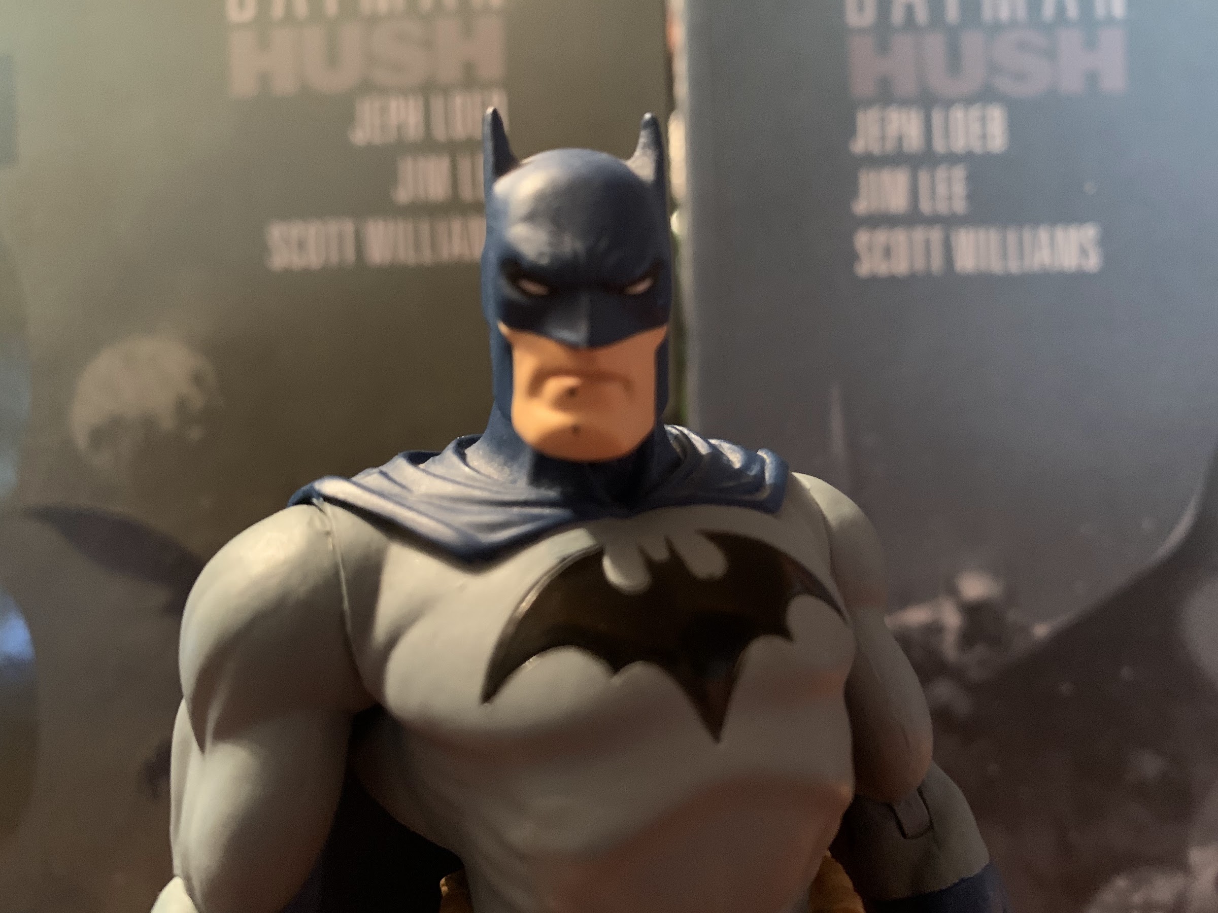
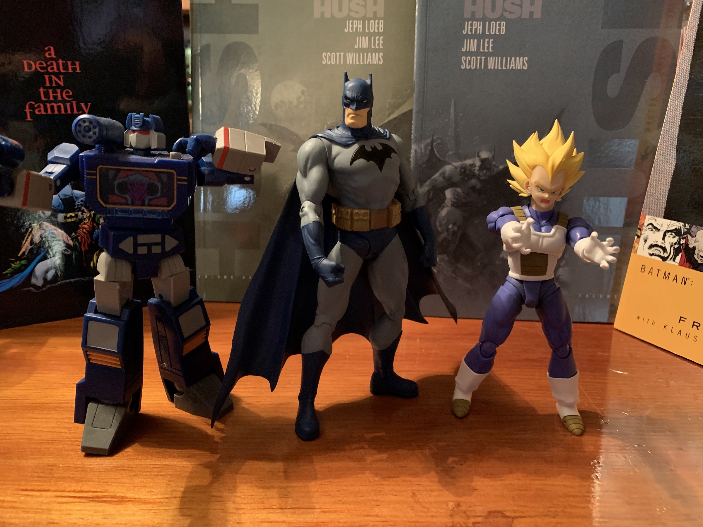
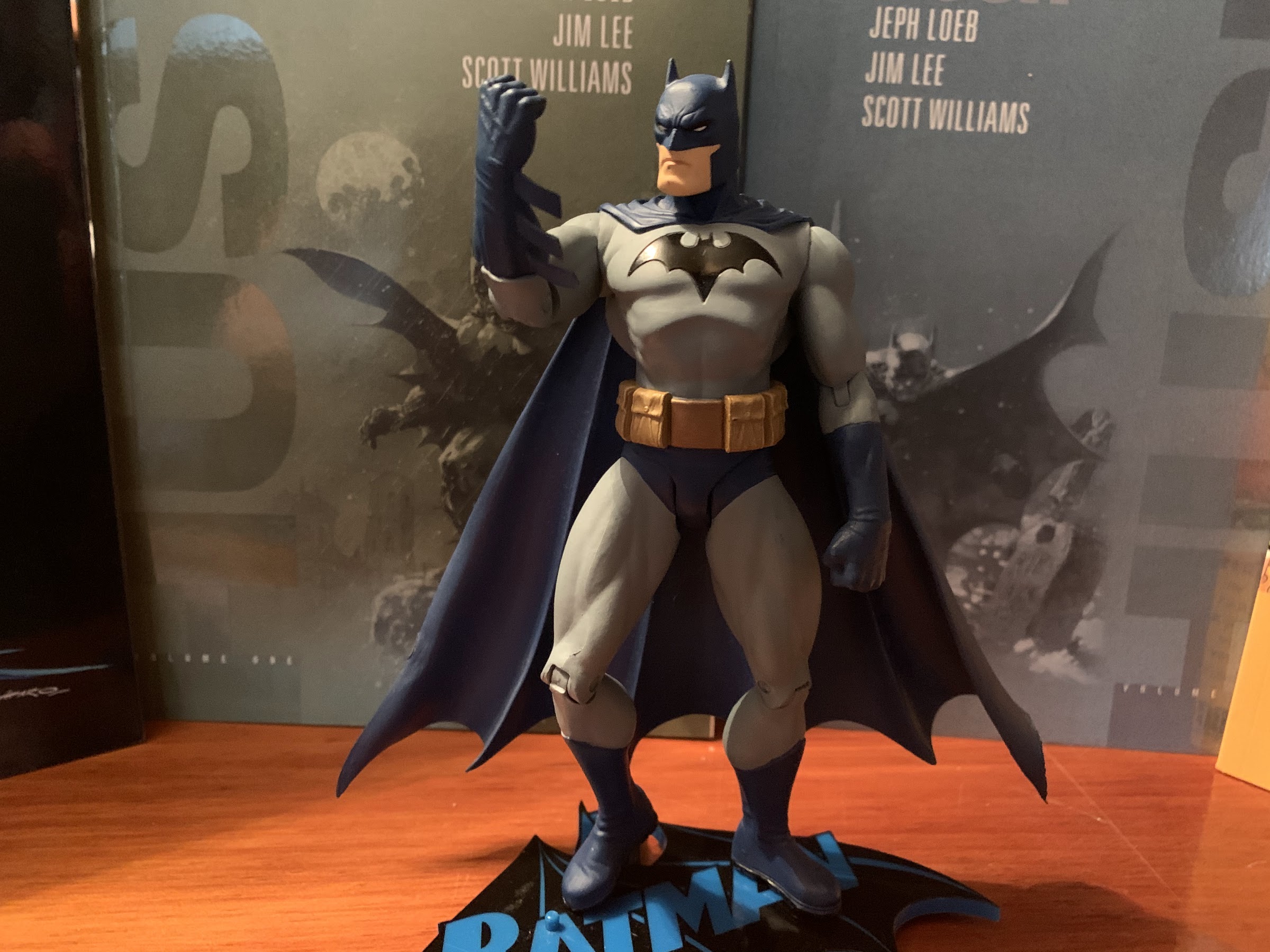
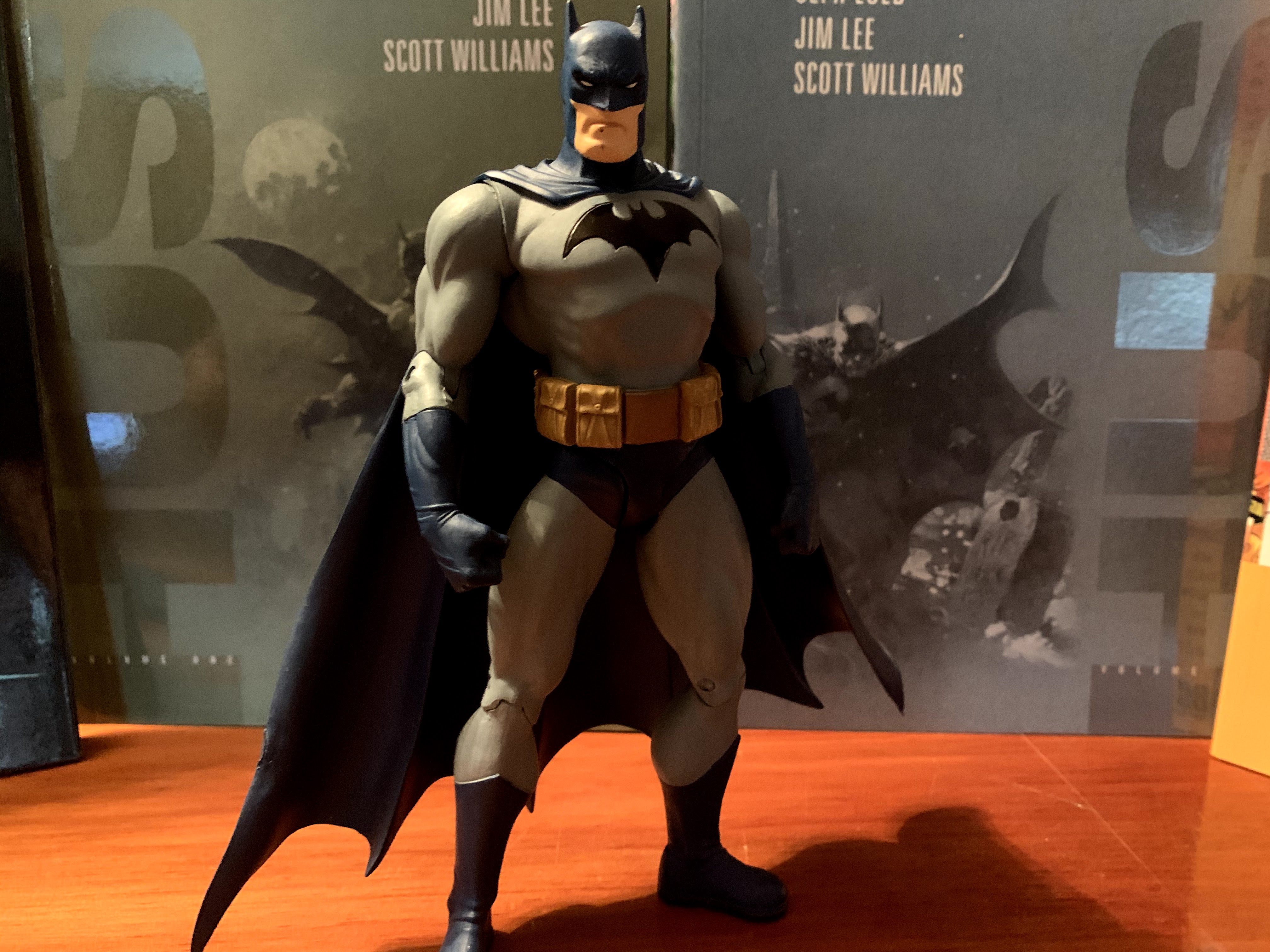
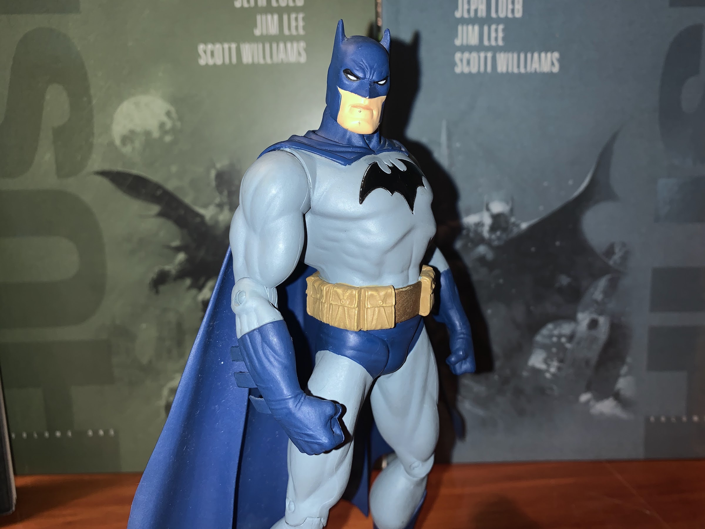
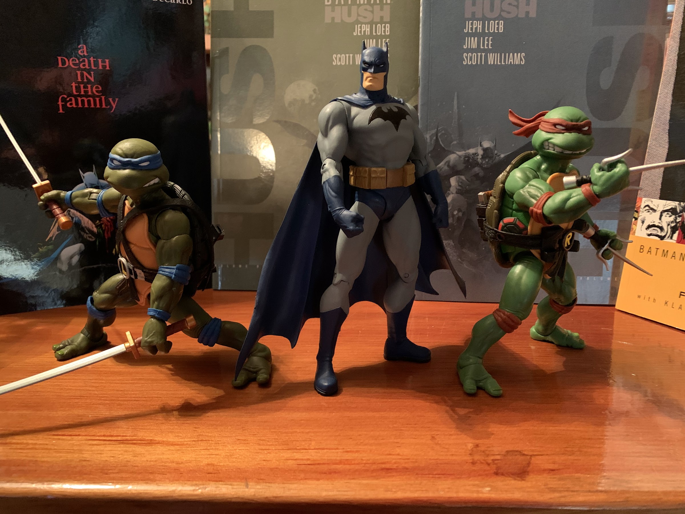
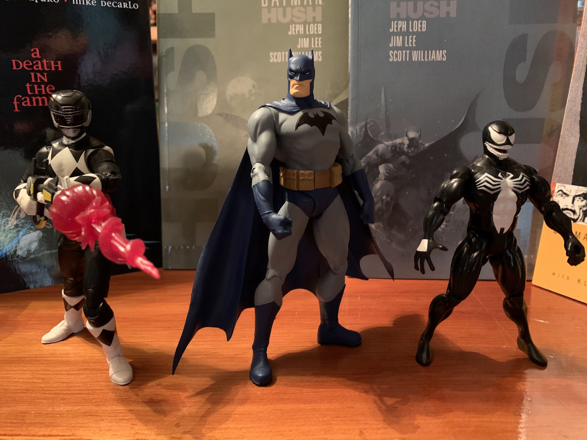
Lee’s Batman is a muscle-bound, brooding, guy in a cape. He’s marked by a square jaw and short ears on his costume. He reminds me a bit of a cross between the Bruce Timm Batman and, oddly enough, the Adam West Batman. It’s the squareness of the head combined with those short ears that evokes both of those styles for me, but it’s Lee’s unique talents that bring it together. He has a gray and blue color scheme with a black emblem on his chest. The blue is a pale blue, and something about the choice of saturation really works for the character. I’ve always felt it made more sense for Batman to dress in black, or at least a really dark blue, but illogical as this outfit may seem, it looks terrific. It quickly became my favorite interpretation of the character and remains so to this day.

The extent to which his right arm can be raised.

Because I liked the design so much, I felt drawn to the figure released in 2003 by DC Direct. Unfortunately, it wasn’t particularly cheap and the articulation was a real turn-off. I would see this figure on my many trips to GameStop or comic shops and I’d debate with myself if it was worth picking up. By today’s standards, I don’t think it was expensive, but I honestly can’t remember. I want to say it was over 10 bucks, but not as high as 20, and in a world where Marvel Legends were often 6-8 bucks that felt like a lot. I was also in college and money wasn’t abundant and my addiction to Legends meant I had only a little cash to consider spending on other lines. Eventually, I caved, probably sometime in 2004 and this edition of Batman has remained the last 6″ scale Batman I’ve purchased over the ensuing years. And he’s basically always occupied a prominent spot in my home, usually on a nightstand or dresser, so I guess money well spent.

You’ll have to pretend he’s holding a grapple gun, because I can’t get that hand off.

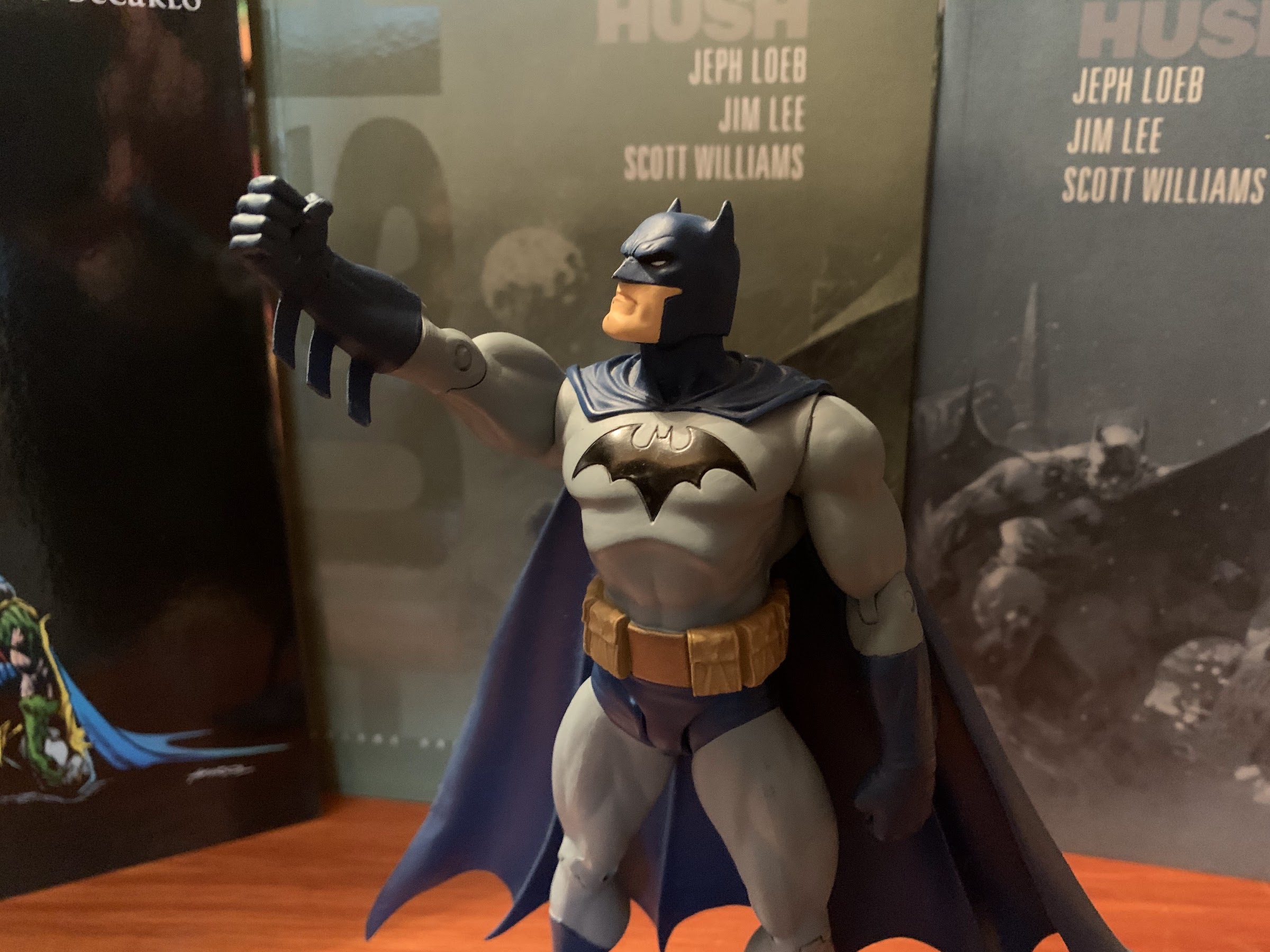
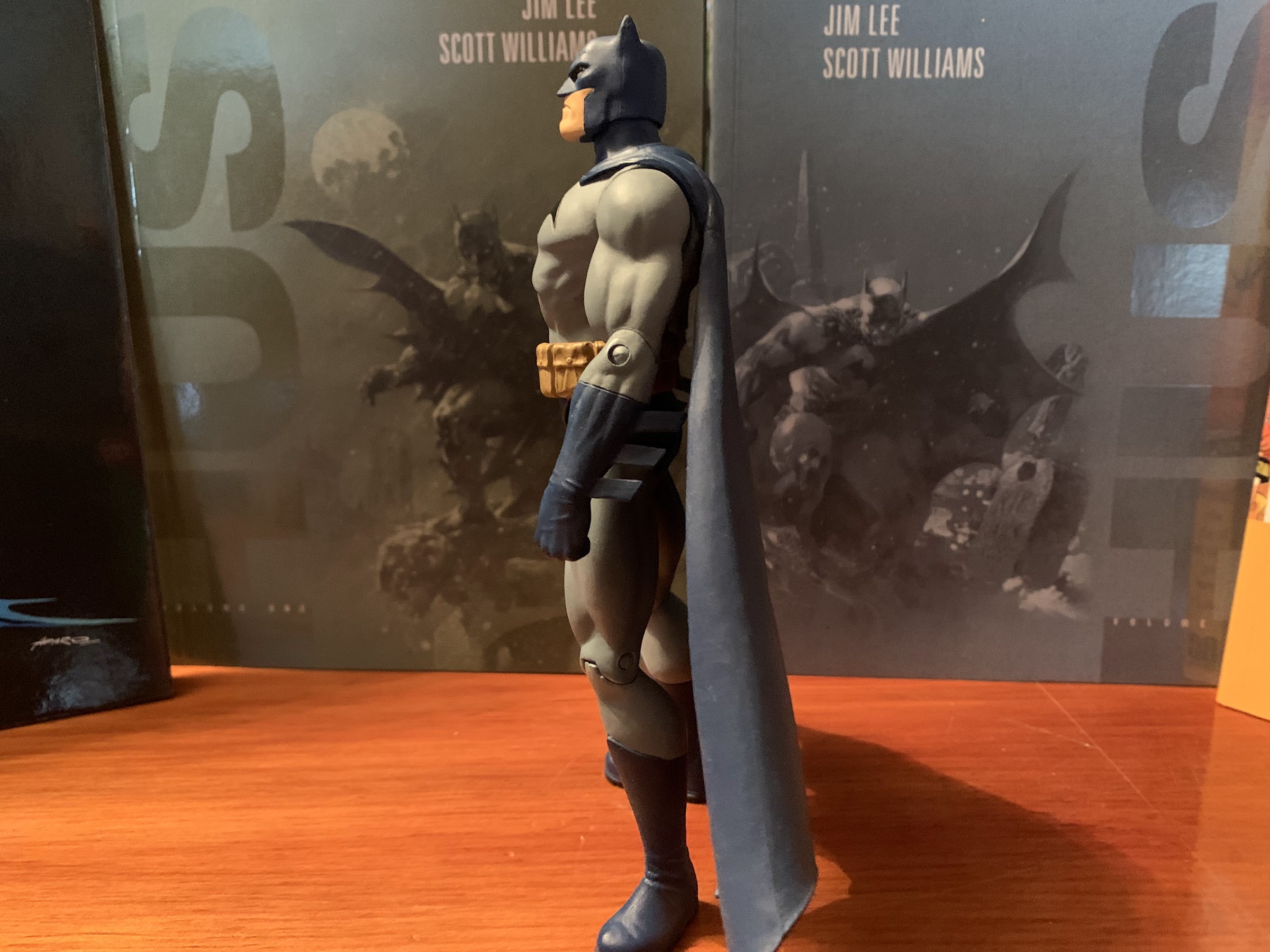
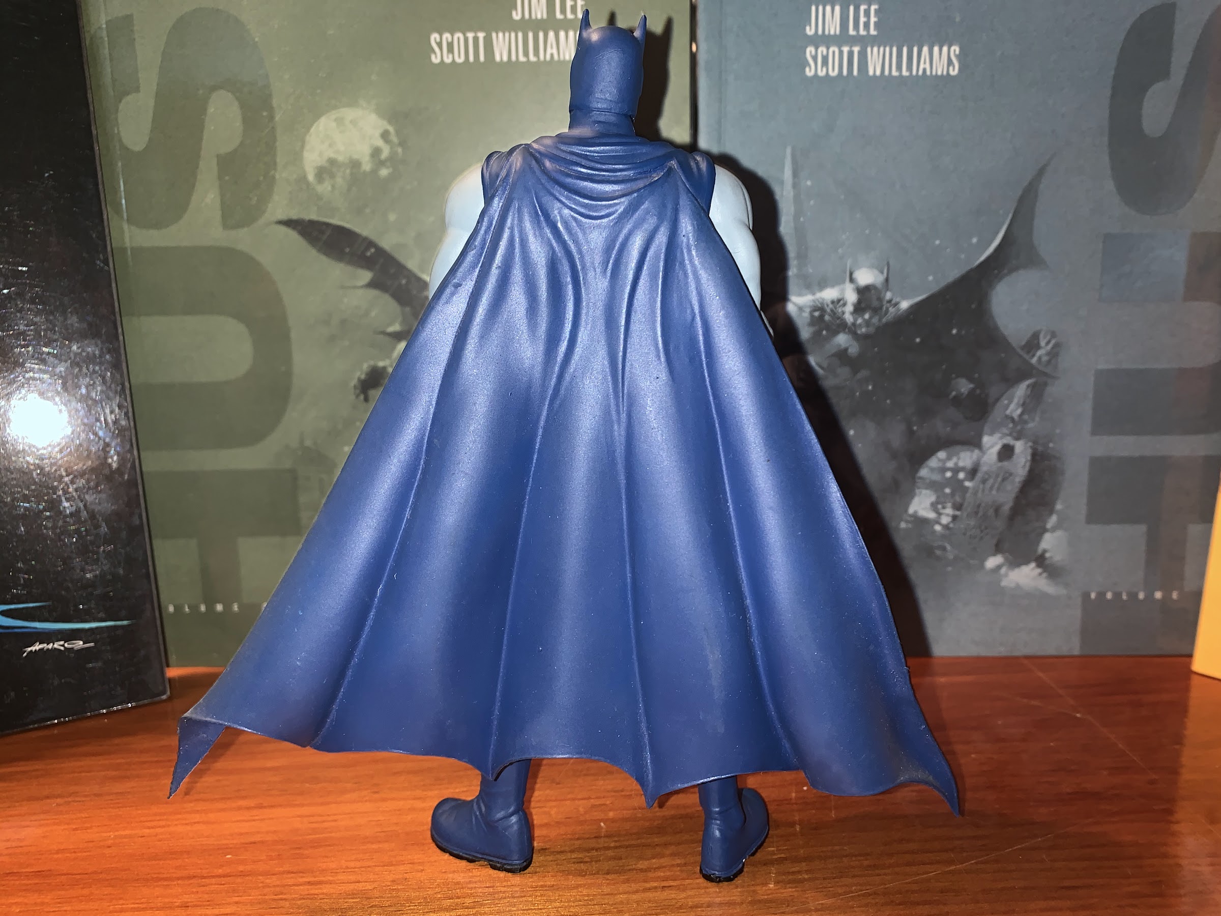
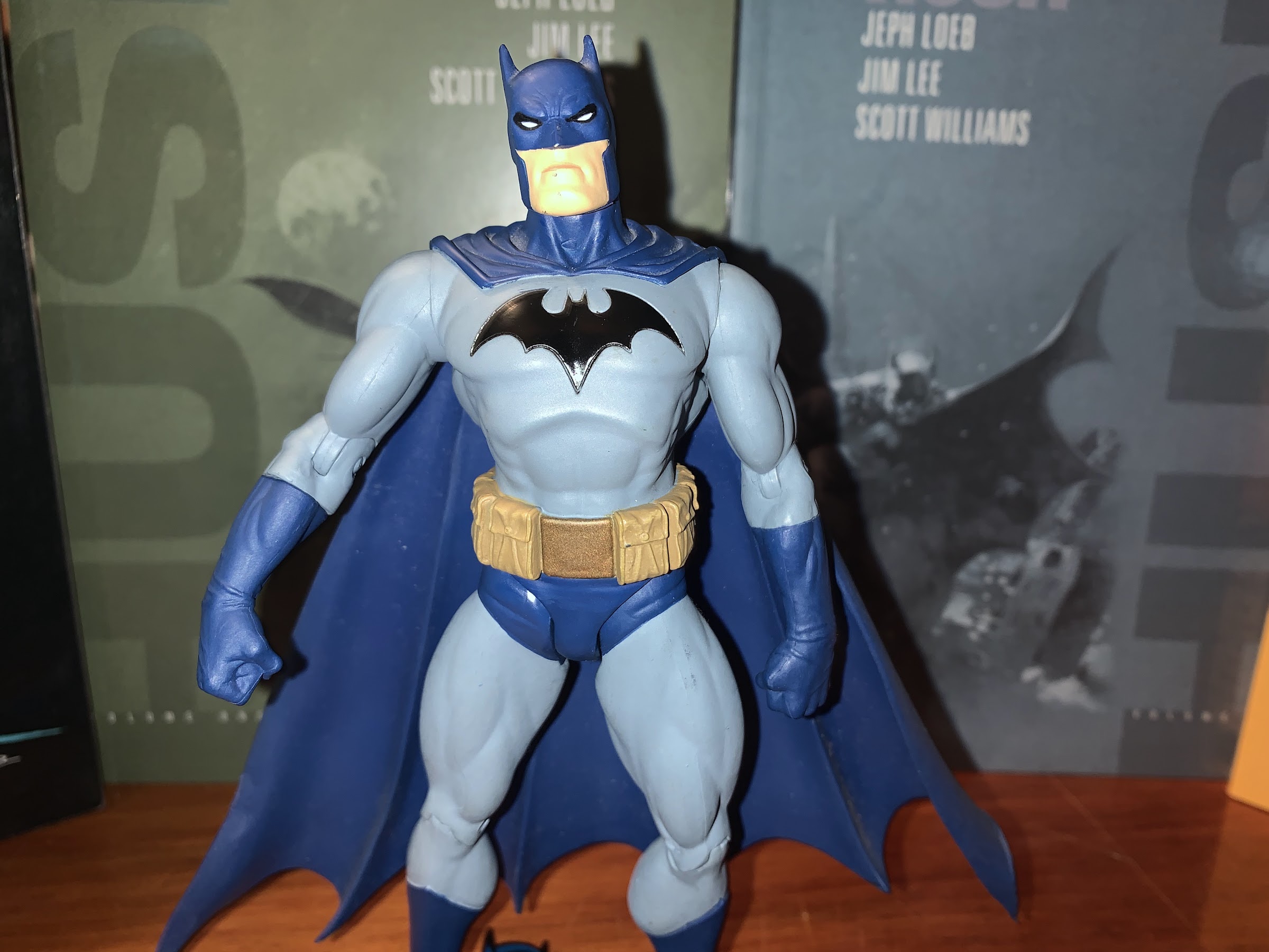
Once upon a time, this figure came in a window box with the Hush era logo emblazoned upon it, but I’ve long since disposed of that box. Once removed, Batman stands six and a half inches to the top of his “ears” and strikes quite the intimidating posture on a shelf. His square-jawed head is set in a bit of a scowl with a lot of linework around the all-white eyes that have been tightened into narrow slits. The area around his neck has been sculpted for his cape with is almost seamlessly glued into the sculpted folds. It’s a rubbery material that hangs off of the figure and fans out ending at about the ankles. It’s smaller than what is depicted in the comic, but definitely more wieldy. Batman’s chest is puffed out with impressive mass and the logo is sculpted into his chest and painted a glossy black which contrasts well with the otherwise matte approach of the other colors. It’s hard to tell if the body is molded in gray or painted gray, but there’s definitely a paint application to bring out the muscles in his torso and biceps. The gloves have some nice detailing on them and the “fins” that stick off are slightly bendy so there’s less of a chance of any snapping. The belt is painted and features a tremendous amount of pouches, which was the style at the time. A black or gray wash has been applied to give it a worn, grimy, appearance which is suitable for the source material. There’s a liberal amount of gray paint on the legs and the blue-painted boots are fairly clean. A wash has been applied to them to bring out the folds around the ankle and the soles of the boots are painted black. The paint is sufficiently clean everywhere on my figure except the face, which unfortunately has a trio of blue dots around the mouth and chin. It also looks like some of the flesh-colored paint wound up on the very tip of his nose. I’ve never been able to get that speck off, even though I’m pretty sure the head is sculpted in blue plastic.

The grapple gun hand. It’s fine.

Even more than 15 years later, the figure largely looks the part. This is a very muscled Batman, but not overly so. The only aspect of the sculpt I’ve ever been not completely sold on are the rather massive thighs this guy has. It just seems like either they should be a little smaller, or the shoulders a little wider to compensate. The head might also be just a wee bit too small, but it’s pretty negligible. This looks good and I doubt anyone was really complaining about the figure’s aesthetics when it came out in 2003.

I think I would have preferred a second head since his posing sucks anyway. And maybe that one would have had a better paint job.

What they were critiquing though is the articulation, or lack thereof. With this figure, what you see is what you get. He’s not exactly pre-posed, but how he stands when removed from the box is basically all he can do. The head is on a ball-peg and it’s easily the best part about the figure, articulation-wise. Batman can rotate all the way around as well as look up pretty far, and even look down. There’s also a little tilt for good measure and no gapping is present when positioning his head. It’s great. After that though, everything gets bad. His shoulders are on some kind of a ball-peg system. They can rotate all the way around, but there’s no hinge and very little outward movement. The right arm can come out maybe 30 degrees while the left barely moves. This is for a reason, I suspect, we’ll get to when we talk about the accessories. And for the same reason, only the right wrist swivels at the glove while both arms have a single, elbow, hinge. There is no torso or waist articulation of any kind, which is a real bummer as a waist twist would help this guy out. At the leg, the thighs peg into the crotch so they can only go forward and back. He can extend pretty far in both directions, but the crotch starts to get ugly and weird looking as you do it. Plus, there’s a lot of rubbing and I would worry that extensive movement would harm the paint. You may be thinking to yourself, “Well, this is an older figure and there’s no rubbing yet,” but I also basically set this guy and left him as-is for 18 years. Batman does have knee hinges, but no boot cut.

The stand is pretty cool, at least.

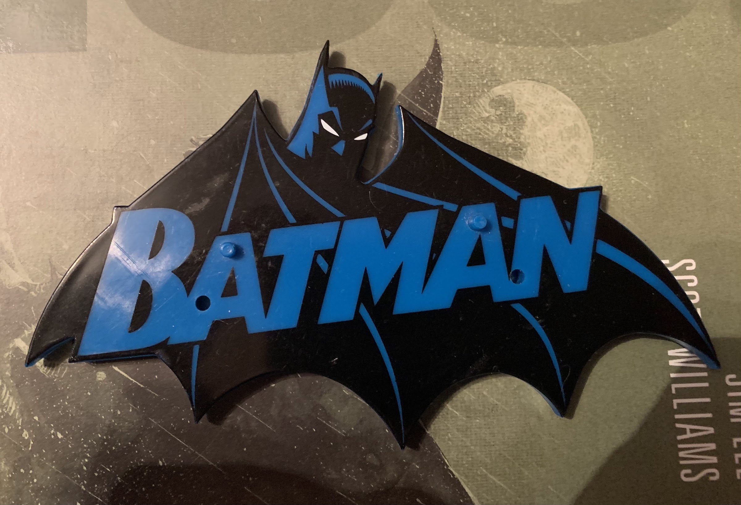
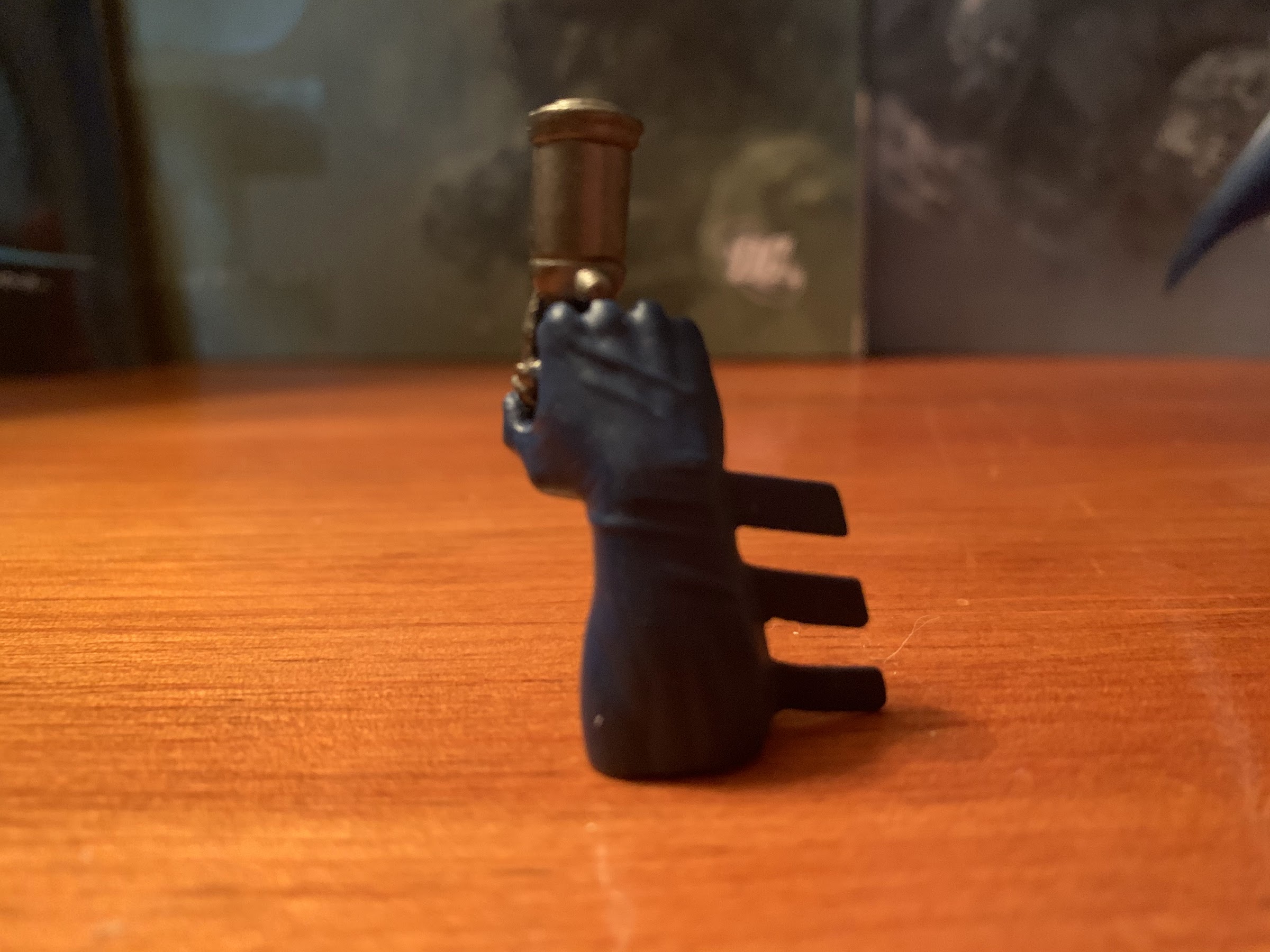
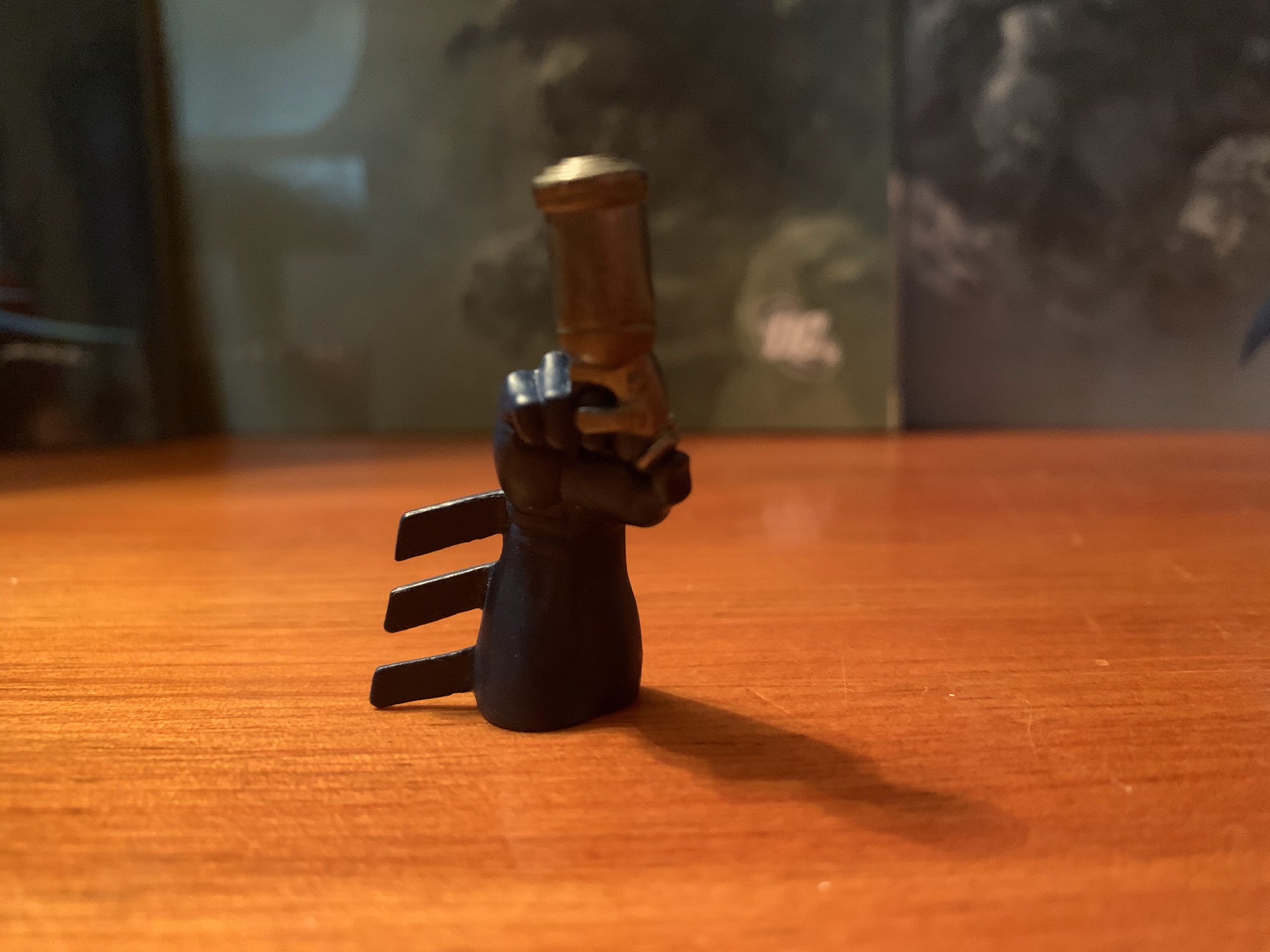
Because of the limited articulation, Batman is little more than a statue. You can pose him looking down from a high perch, looking straight-ahead, or looking up at a target, but that’s kind of it. The range on those elbow and knee hinges is terrible and his left hand is pre-posed at an awkward angle so he can’t even fake throwing a punch. His legs also come off of his body in such a wide stance that you basically can’t bend his knees at all and expect him to stand. A boot cut would have been nice as you could then move his feet and get him into a slight perch. One of the more iconic images from the Hush books is Batman on a ledge with one foot raised and placed on a gargoyle statue, a simple pose that this figure cannot hope to imitate. About the only thing he can do is aim his grapple gun because one of his two accessories is a swappable right hand with the grapple gun molded into it. I believe that is why his right arm has more range than the left so he can aim it in a semi-natural way, but it’s not that convincing. I also can’t get his hand to come off anymore to actually use it, but it’s not something most people likely chose to utilize in their display as it’s painted rather poorly and isn’t page accurate. The only other accessory is a display stand which is fine. It’s in the shape of the Batman logo of the era and it’s screen-printed rather well. There are two pegs on it, but curiously only one foot has a peg hole. The other has an indentation like one is supposed to be there, but nope. He stands fine without it, but the added stability is nice to have. Plus, the stand adds a little flair to the display which is welcomed considering this figure just can’t do much of anything.

So did you like that crossover with TMNT?
I didn’t have a Marvel Legends handy, so here’s a Hasbro Black Ranger and an old school Toy Biz Venom.

This is the type of figure that we had to deal with back in the early 2000s. Not everything was super-articulated, or even functionally articulated, and this Batman qualified. Now, obviously I’ve had this guy on display in my home as the lone Batman figure for years despite its shortcomings so clearly it got something right. It’s partly the result of a better figure just not coming along and capturing my attention, and the fact that I’m not a dedicated Batman collector has certainly helped to keep this guy around. This is a figure that is no longer available at retail, but the secondary market is plentiful enough for a figure almost 20 years old. And it’s a figure that really has not appreciated one bit. It’ll set you back only around 20 bucks if it’s something you want, and that’s for a figure in-box. If you’re shopping loose you might find a better deal. The sculpt is there, and the paint is solid, but the articulation is severely lacking so this is likely no one’s favorite depiction of Batman from this era. You can do better, though probably not cheaper if it’s a Hush Batman you’re after. I do like it, but it’s hard not to see a missed opportunity whenever I look at it.

We’ll end on a comparison with the RED Soundwave and the SHF Vegeta.

Hasbro MMPR Combining Dino Megazord

The only Megazord that matters.

I wasn’t going to do a post on this particular figure, but there probably is some curiosity about it and how it works with the Hasbro Power Rangers Lightning Collection, so here we are. Last year, I fulfilled an almost lifelong ambition and acquired a Bandai dino Megazord from 1993 based on its appearance in the Mighty Morphin Power Rangers television show. The toyline was white hot in the early 90s, and it was something I had to make due without as a kid (and for the record, I did just fine, so don’t weap for my childhood). It turns out, the kids of 2020 also enjoy Megazords from the 90s and my own children spent a fair amount of time playing with it, assembling it and disassembling it enough that I went to eBay and grabbed them some Power Rangers from the same era to play with. When Christmas came around, it made sense for my son to ask Santa for a Megazord he could call his own, and the big man delivered.

It was late last summer, or early fall, that Hasbro rolled out its own version of the classic Bandai toy. The zords were scattered across three blister pack releases that could be purchased at big box retailers and online at various toy and hobby websites. What was most attractive about the set was that it was really affordable. Each release retailed for $15 so kids, and collectors, could assemble a Megazord for a mere $45. I’m pretty sure it cost more in 1993 dollars to do the same. Of course, this meant the release was compromised compared with past iterations. The zords probably lost about 25-30% of their size and are primarily assembled with colored plastic with little or no paint. On the plus side, there were no stickers to place as the decals came on the toys, though they still appear to be as prone to peeling and such as stickers applied by the consumer.

The dino zords have never been particularly fearsome on their own.

As mentioned already, Hasbro chose to distribute these dino zords across three releases. The mastodon and pterodactyl come bundled together as do the triceratops and saber-toothed tiger. The tyrannosaurus, being the largest of the five zords, comes solo, but Hasbro did toss in the power sword so it wouldn’t feel so lonely. I’m not sure why Hasbro opted to do things this way rather than simply sell it as one, complete, set. They probably could have even jacked the price up another five dollars and sold it at 50 bucks. It’s just unlikely anyone would want just one set and not all three, because lets face it, most kids don’t want to play with the individual zords. All this does is make it a little harder to find everything you need. Thankfully, the zords weren’t terribly difficult to track down, but I know in my frequent trips to Target I rarely saw all three sets readily available, it was usually just one or two

Dinosaurs! Assemble!

These toys aren’t technically in the Lightning Collection, but are in that lesser line Hasbro mostly markets to kids. All that means is that these aren’t technically being marketed to collectors, though I’d wager most of the people buying stuff based on the Mighty Morphin era are folks my age. The engineering on all of the zords is very similar to the Bandai originals as Hasbro has largely preserved the transformation as it appeared on television. The sheer amount of plastic utilized though has been significantly scaled back. It can be seen in the tail of the T-Rex zord which has a lot of chunks just cut out of it and the rear of the mastodon which is fairly open. It’s definitely not a set as attractive as the old ones, though there are areas where things have been improved slightly. The T-Rex, for instance, has its mouth canons sculpted in now and they look pretty nice. Some of the joints are also tighter, specifically the tails of the triceratops and saber-toothed tiger, though I’m also comparing a relatively new toy to one almost 30 years old. Given time, maybe they’ll be just as loose.

Top: new sword, Bottom: old sword. It’s not great.
Paint is apparently expensive.

Where this set comes up short though is just in the details. The wheels on the saber-toothed tiger, for example, aren’t painted black and are just sculpted gray like the rest of the legs. The canon at the tip of the triceratops tail doesn’t articulate so it looks pretty lame, plus it doesn’t have actual wheels to roll on. I also miss the chrome details some of the old figures had, though I mostly miss it on the Megazord’s power sword. It’s just unpainted plastic with some of the design sculpted on just one side of the blade. It’s very bland and is the aspect of this release I see the most complaints about. Hasbro also utilized a new peg system for the legs of the Megazord which works fine, but it also means the T-Rex now has red pegs jutting out from its knees. I also dislike the head of the T-Rex and how it snaps in place with the Megazord head contained underneath. It doesn’t seem to want to actually snap and it just feels very cheap. The “horns” on the Megazord itself can slide all the way to one side and just seems junky, even though it does, in the end, get the job done.

The new one can’t articulate its canon, but at least it can hold its tail up unlike gramps here.
The pterodactyl zord didn’t have to make too many compromises, though I’ve always really loved that old decal on the front of the original so that’s a bummer.

Playing with the zords on their own doesn’t seem like a great experience, based on how my kids interact with it. Thankfully, combining them is fairly easy even for a kid. The legs take a bit of effort to seat properly, and the pterodactyl can be a bit finicky, but it goes together largely in the same manner as before. I actually like how securely the mastodon clips on with this release, though I hate how easily the legs of the mastodon pop off. The tail of the T-Rex also no longer has a joint towards the end of it so it sticks up more pronounced than before and isn’t particularly pleasing to the eye, but it’s not a big deal. You can also still do tank mode, but it’s just as janky as before and more of a novelty than a fun way to play.

The tyrannosaurus continues to be the only zord that’s any fun solo, though those new, red, knee, pegs are an eyesore.
The mastodon turned out kind of junky on its own and it differs most from the original as the head is now all black, but at least it functions very well as the arms of the Megazord.

Once together, the Megazord does very much look the part. Once again, we’re missing some of the details of past releases, but it’s certainly far from an ugly thing. The face is where some extra paint would have really been welcomed as that vintage Bandai release just looks sharp. And, of course, the sword sucks, but I already mentioned that. What is better than before though is the articulation. The classic Megazord can’t do much of anything, but this one at least has some joints. The arms can rotate and raise out to the side a bit and the Megazord now has elbows! It can bend them about 90 degrees and also swivel too. At the legs, it can kick forward and back still, but it also can fan its legs out slightly for a wider, more natural, stance. The legs also swivel there as well. There are no knee hinges, unfortunately, but you can swivel the lower legs at the knee pegs. The only thing missing that really should be here is a head swivel. It just seems like that would have been a very easy and cheap thing to include that would have really added some personality to the poses available because even a kid wants to put this somewhere prominent in his or her room when it isn’t being played with.

Tank Mode is still a thing, if you care.
I had to pull back so damn far to get that whole sword into the shot.

Obviously, this thing doesn’t scale at all with the figures in the Lightning Collection. Even the original doesn’t and in order to scale properly it would likely need to be six feet tall. It’s big enough at around 9″ tall though that I think it can be a reasonable centerpiece in your MMPR display. And if you’re ambitious, you could paint this thing up into something a bit more special. Hasbro sculpted most of the details one would expect, it just didn’t bother to paint them. As a toy, it seems pretty neat, to me. Admittedly though, my kids haven’t played with this much since Christmas and my daughter even told me she wants to play with my Megazord, not this one. Go figure. I think she just likes the sheer size of the original one, and as easy as it is to transform this one, it’s a bit easier for her to transform the original. Mostly I think it’s just a case of her being more familiar with that one and not wanting to take the time to get to know this new one.

The sculpt work is mostly there, it just needs a little love from a paint brush.
It’s a little smaller than the original, but also trimmer and less statue-esque.

If you’re a Lightning Collection fan that wants a Megazord, this is certainly an affordable option. It’s not a collector grade release though and that shows. Even with light play, some of the decals are already starting to peel on this one and that’s disappointing. It’s possible the same will happen for those who just set it on a shelf and forget it. The biggest thing this release has going for it is obviously the price and availability. A Bandai one from 93 will probably set you back a couple hundred dollars, while the Legacy Collection release is a bit cheaper, but also not as nice as the original and it suffers from a lot of the same shortcomings as this one. And then there’s the Soul of Chogokin Megazord which I think retailed for something like $350 and is no longer in production so it’s likely to cost even more than that now. This set is for kids and casual fans that need a Megazord, but don’t want to break the bank. I’ve seen this one getting dumped on a bit by collectors, but at $45, I think it’s pretty good. I definitely wouldn’t recommend displaying it in dino mode as the individual zords aren’t terrific looking, but who would do that anyway? As long as your expectations are reasonable, I think this will please most who buy it.

Definitely a more posable release.

If you are a collector looking to add a Megazord to your collection, you will soon have some more options. If you just want a posable Megazord, Super7 recently announced that it has gained the Power Rangers license. The company has already shown some vinyl, minimally, articulated Megazords, but it will be doing zords in its Ultimates! line and I can only assume a proper Megazord will arrive at some point. They’re doing the tyrannosaurs first though, and I don’t think they can do a combining Megazord so it figures to be a stand-alone zord. I could be wrong, but time will tell. Grabbing this Hasbro one at $45 doesn’t feel like a tremendous risk to me, but if you can wait, maybe hold out to see what’s coming.

Whether it’s a permanent part of your display or just a placeholder until something better comes along, the Hasbro Megazord is certainly an affordable option.

Jakks Pacific Classic Sonic the Hedgehog

Not way past cool, but cool.

Ever since I was introduced to the character Sonic the Hedgehog via the Genesis game of the same name I’ve found the character just very aesthetically pleasing. And that’s apparently intentional as Sega relied upon tried and true designs like Felix the Cat and Mickey Mouse when it instructed artist Naoto Ohshima to come up with a new mascot that could rival Nintendo’s Mario. Now of course, it’s not necessarily Mario’s design that made him a star, but it certainly can’t hurt. Sega needed to pull gamers away from their Nintendo system with something flashy, and Sonic apparently fit the bill. And like Mario, it turned out his game was pretty good too and a rivalry was born!

Back in the early 90s, there was no shortage of toys at retail. Action figures, which really took off in the 80s, were still going strong and brands like Teenage Mutant Ninja Turtles and Mighty Morphin Power Rangers were raking in revenue. Strangely, the mascot characters from the world of video games largely sat things out. While fighting games like Street Fighter and Mortal Kombat were able to force their way into toy stores, Sonic and Mario instead found themselves relegated to the Happy Meal. Maybe because neither character was really associated with action figure tropes like guns and other weapons their respective parent companies didn’t see a reason to seek out a toy deal that included action figures or maybe producers weren’t interested. There were some non-articulated PVC figurines and even plush options, but no true action figures that I can recall.

Not the usual collector grade packaging I look at.

Today, things have changed and both Sonic and Mario can be found occupying space at retail alongside the likes of Star Wars and He-Man. Interestingly, it’s Jakks Pacific that has the licensing rights for both Mario and Sonic when thirty years ago that might have seemed somehow wrong, though DiC did produce cartoons for both. Nevertheless, Sonic has had a toyline for awhile now and most of those have been focused on bringing the modern Sonic to toy form. When Sega launched the Dreamcast in 1999, it was released alongside a brand new Sonic game titled Sonic Adventure. For that title, Sonic received a slight redesign. He dropped the spherical torso he borrowed from Felix and replaced it with something longer and trimmer. His legs were also lengthened, his shoes were redone, and his eyes made green. It wasn’t particularly radical, but it was noticeable.

The cross-sell seems to contain two additional classic interpretations of characters and one that is definitely not classic.

Sonic’s new look was fine, as far as I was concerned, but I did miss the slightly more chunky iteration of the hedgehog I knew and loved from his days on the Genesis. And even though I’m supposed to have aged out of toys (hah!), my desire for a classic interpretation of Sonic has never fully gone away. Recently, when browsing the toy aisles at my local Target, I came upon the latest from Jakks Pacific: a classic Sonic complete with a bouncing spring. It’s a figure that adheres to my chosen aesthetic for the character, and considering it runs a mere 10 dollars, I decided to purchase it and take a look. Is this the Sonic I was desperate for as a child, but never had the opportunity to purchase? Or, is this just a cheap, piece of crap designed to sucker kids and their parents into making a foolish purchase?

Sonic and his trusty spring! That’s a thing, right?

Sonic comes packaged on a standard blister card. There’s a picture of the character in the top corner and he’s surrounded by a printed, gold, ring. The package affords a good look at the figure within, which is appreciated since it allows for some inspection before purchase. Freeing the hedgehog from his plastic confines is actually a bit tricky since he’s wedged in there pretty tight, but considering this isn’t meant to be resealable packaging one can muscle him out. Once placed on a surface, Sonic stands roughly 4″ tall, probably a tick under, and is mostly head. He’s a fairly light shade of blue, almost teal, and his eyes dominate his visage. He has his long, rounded, nose and trademarked red shoes. He has six spikes on the rear of his head and two more on the back of his spherical mid-section. His little tail pokes out like an extra spike, though curled in the opposite direction of his spikes. He seems to adhere to the design of classic Sonic as presented in the game Sonic Generations. That Sonic was meant to resemble the Genesis era Sonic, but he’s a lighter blue and has yellow buckles on his shoes. I think I would have preferred a slightly darker shade of blue and no buckles, but it’s not a big deal. It’s near enough though that I think the sculpt is fine.

Spikes! I’m going to give them the benefit of the doubt that they counted the amount of spikes present on the model in Sonic 2.
The side view gives you a good look at the iffy paint on the shoes.

Since he’s basically two colors, there isn’t a lot of paint to speak of with Sonic. All of the blue is molded plastic as are the arms in that peach color. The white of the eyes is quite sharp as is the belly, but the rest of the painted areas all feature some fuzzy linework. It bleeds a bit, especially on the mouth, which I don’t know if that’s been painted properly on this figure. It looks like there’s a sculpted line of teeth that I presume should be white, and is, with the rest of the mouth intended to be red? Instead, the white continues past the teeth and there’s just a line of red above it. Perhaps knowing this area would be the most problematic, Jakks declined to include any promo images on the rear of the box that feature the mouth prominently so it’s hard to say what should be going on here. It’s unfortunate since I don’t think an open mouth was even necessary. I always associate classic Sonic with a simple smirk. The white stripes and buckles on the shoes also aren’t terribly clean, but there’s at least no random splotches of paint. For a 10 dollar figure, the paint is fair and is better than some of the Hasbro Power Rangers I’ve purchased recently, so that’s a plus.

He can kind of run. It’s the lack of a head tilt that really hinders the posing.
It looks a little better when you turn the head, but what he really needs is just a plastic base that simulates his legs in motion.

Given the size and design of this figure, there isn’t a ton of opportunities for articulation. Jakks has largely kept things fairly basic in that area. Sonic’s head is on a swivel and can rotate. Since he doesn’t possess a neck, he can’t really do anything else. There’s a tiny bit of play that allows for him to ever so slightly look down, but I think that’s just the head moving on the ball peg that’s likely in there. Sonic’s arms are traditional ball-hinges that can rotate and raise out to the side just fine. His arms are permanently curved as he lacks elbows. The gloved hands can rotate and have some in-out as well as up-down play, though without the aid of hinges. His right hand is a fist, while the left is a gripping hand even though he has nothing to grip. There’s no articulation in the torso at all, which is expected of a character with Sonic’s anatomy, while his legs are on ball-hinges. They can swivel where they meet the torso and can kick forward and back pretty well. Since they’re ball-hinges, you can also rotate them to put Sonic into a split, if that’s your desire. Sonic does have knee hinges while his feet appear to be on ball pegs, like the hands, so they can rotate and have some play in all directions. It’s honestly better articulation than I expected and the only area I wish had more is the head. If he could look up that would have been terrific, but would have probably required a bit of clever engineering considering the lack of a neck. Even though he’s considerably top-heavy, he’s not too difficult to pose. I was able to get him to stand in a slight running pose and I suspect that’s what a lot of people want him to be able to do.

There’s a surprising amount of tension in the spring as the weight of the figure isn’t enough to push it down.

As far as accessories go, there isn’t much to talk about. Sonic comes with one spring platform that does at least have a spring action to it. It’s pretty boring looking though as it’s just a piece of red plastic for the top and gray for the base. A little black paint on the sculpted spring would have made this look a lot nicer, but wouldn’t really change a whole lot either. What’s missing is a power ring, which is made all the more obvious by the fact that he comes with a gripping hand perfectly suited to grasp such a ring. None of the figures in this wave appear to come with one which is bizarre, and it makes that gripping hand feel out of place. I’d much rather he have two fists for a true running pose. The gripping hand isn’t far removed from a fist so it’s not that big of a deal, but how much cost would a plastic, yellow, ring really add to this thing, Jakks? Even better would just be an extra hand with a ring molded into it, but swappable parts isn’t something I expect out of a 10 dollar figure. I also would have preferred a base to the spring. Just a piece of molded plastic for Sonic to stand in that resembles his running animation from the game would have solved some of the posing issues. Jakks could have even put it on wheels if they felt a play element was needed with the figure that would be lost by dropping the spring.

I think you’ll find he doesn’t really scale with much. He’d probably look fine beside one of the Mario figures though if you want to stage your own Mario vs Sonic at the Olympic games.

The Jakks Pacific Classic Sonic the Hedgehog is perfectly fine for what it is. It’s an inexpensive, simply painted, representation of the character’s classic look that does a good enough job with the sculpt to justify its existence. My complaints and criticisms with the figure are, at best, nitpicks and it’s important to remember what this figure is meant to be. It’s a kid’s toy first, collector item second, and that’s probably a distant second. And considering it does a good enough job with the aesthetic, I’d say I’m happy. Prior to getting this, I had been tempted by the Nendoroid Sonic release. That’s a figure modeled more on Sonic’s modern look, but the Nendoroid aesthetic means it works pretty well as a classic interpretation too. It’s also more than four times the price of this figure, so while I’m sure it’s superior, it’s probably not four times superior to this figure. This guy will look fine amongst my classic gaming artifacts and should one of my kids want to play with him, I can at least hand him off with no worries. Now lets see if I can suppress the urge to grab Tails and Knuckles as well.

This picture could really use a Mega Man.

Freaks and Geeks

The credited main cast of Freaks and Geeks (left to right): James Franco, Jason Segel, Linda Cardellini, Seth Rogan, John Francis Daley, Martin Starr, Samm Levine

I can remember hanging out with some of my friends at another friend’s house back when I was in high school. I think it was 2001, and we were just riffing on some music when one of my other friends entered the room and remarked that we reminded him of some characters from the show Freaks and Geeks. It was the first time I had ever heard of the show, and I can’t even recall which characters he referenced (probably the geeks). We then all watched Galaxy Quest and had a shared infatuation with Sigourney Weaver’s blond wig.

I never would seek out Freaks and Geeks, even though I valued the opinion of my friend when he said it was a good show. It was short-lived though, which implied that it wasn’t very good, and I was at an age where I was spending most of my time playing video games and not watching TV. If I was going to watch something, it was going to be something animated or maybe Jackass or a CKY video. Over the years though, I would hear more good things about Freaks and Geeks, especially as the cast started to find success in film. I don’t think I ever really talked about the show with anyone in-person and most of the chatter was just all online. I was quite curious about it, but by the time the DVD set came out I was less interested. It was also expensive since it included a lot of licensed music and I didn’t want to get invested in a show that was going to end after 18 episodes. I was late to the streaming platforms, and this was a show that I just never would make time for. Recently, Hulu added it and they got the broadcast cut with all of the licensed music in place (I believe some prior streaming options omitted it), and being that it’s winter and COVID is still a thing, I found myself with plenty of time to finally get to know the characters of Freaks and Geeks.

Lindsay is looking to make some new friends and Daniel is her gateway to just that.

Freaks and Geeks is a sitcom set in the school year of 1980-1981 that aired from 1999-2000. It was created by Paul Feig (Bridesmaids, The Heat, Ghostbusters (2016)) and executive-produced by Judd Apatow (The 40 Year Old Virgin, Knocked Up, Funny People). It was the success of Apatow directed films that really brought posthumous attention to Freaks and Geeks, for the show had a relatively short existence. It’s a show about teenagers and school life with a young, mostly unknown at the time, cast that found itself in primetime on a broadcast network. Network shows set in high school weren’t unheard of in the 90s, but they were usually relegated to the Fox Network which prided itself on being different from the big three of ABC, CBS, and NBC. That network’s hit teenaged show was Beverly Hills 90210, which was more of a soap opera than a sitcom and starred a bunch of beautiful people who looked way too old to be in high school. Freaks and Geeks was set in an unremarkable suburb of Detroit and featured quite young-looking actors (for the most part) in much more of a grounded, real world, setting. It also found itself on NBC and in the unusual position of being a primetime sitcom that was an hour long. I don’t know how Feig and Apatow were able to convince NBC to give them an hour on television in 1999, but they did it somehow. Unfortunately, there was a changing of the guard at NBC in between the show being picked-up and it going to air, and the new boss wasn’t a fan. The show was a critical darling, but it wasn’t a huge ratings hit in terms of 1999 numbers and it was cancelled after 12 episodes. Fans actually had to petition the network to get the remaining 6 of 18 episodes aired, which did happen over the summer in 2000, but on cable.

Since leaving the airwaves of NBC, it would seem Freaks and Geeks has garnered nothing but praise from both critics and viewers, alike. It’s young cast which would have quickly aged out of high school meant that the show was probably never destined for a long run, but it certainly deserved a second season and it would have been a treat to see where Feig and Apatow took things, especially considering that the show was really hitting its stride at the end of its lone season. I suspected that would be the case as I went into the show and it was one of the reasons I resisted it for so long as it always sucks to get into a show when there’s no hope of seeing what would have come next. It’s basically a slice of life type of show so there really was no way for it to ever have a truly satisfying conclusion, but it certainly would have been nice to at least see the cast graduate from high school or something.

Freaks and Geeks may have wound up on the radar of many a comedy fan thanks to Apatow, but it’s the cast that will keep viewers around for 18 episodes. It stars Linda Cardellini as Lindsay Weir who is a high school junior that has always been a gifted student. Academics come easy to her, but when the show begins we find out she recently lost her grandmother and it’s brought on a change in attitude. She has stopped socializing with some of her childhood friends and dropped off of the Mathletes program, a competitive math team. She’s also taken to wearing an old, olive, army jacket and has her sights set on making some new friends. She’s basically been living a life devoted to pleasing the adults in her sphere and setting herself up for the ideal future most parents want for their kids and is now likely having some regrets. She wants to have other experiences while she’s young, and she looks to the so-called “freaks” of her school for that kind of fulfillment.

Busy Philipps (front left) is not part of the opening credits but her character, Kim Kelly, is very much a major player on the show.

Cardellini has gone on to have a successful career in Hollywood, but it’s her co-stars that make up the freaks that have become household names. The freaks are basically just the slackers and kids who have no real academic ambition and just have their sights set on enjoying themselves and one day getting out of their small town. The first one we’re introduced to is Daniel Desario played by a young James Franco. Daniel is Lindsay’s gateway into his circle of friends, which all seem to at least know her from the start, but aren’t close with her. The most eager of Daniel’s friends to get to know Lindsay is Nick, played by Jason Segel. Nick is clearly attracted to Lindsay from the start and plays the nice guy routine. He’s an aspiring drummer and idolizes the likes of Jon Bonham and Neal Peart. Seth Rogan plays Ken, who is more of a sarcastic wallflower at the start of the series who gradually becomes more involved as the show progresses. Daniel’s girlfriend, Kim (Busy Philipps), is the only one who takes a combative posture towards Lindsay’s associating with their crowd. She presents a problem at first as she doesn’t understand why Lindsay suddenly wants to associate with them and finds the girl boring.

Much of the first several episodes are spent on Lindsay trying to fit in with her new group of friends while they try to figure out what she brings to the table. Other forces in Lindsay’s life try to pull her back towards academics or the Mathletes. She struggles to find her place as she’s rather open to discussion and being introspective while her new friends almost all avoid any form of conflict. The only one who doesn’t is Kim, but the others just seem to brush off anything she does or says while Lindsay can’t help but take things personally. As viewers, it’s hard to find much to like about Daniel and Kim early on. They seem eager to take advantage of Lindsay, who has had a more privileged upbringing and access to more of everything, while they come from troubled backgrounds and broken homes. Much of the Lindsay/Kim dynamic gets settled in the fourth episode “Kim Kelly is My Friend.” It begins a bit too familiar with Kim seemingly using Lindsay to her advantage as she wants her mother to see she has made a wholesome friend, or someone her mom will approve of. By the end of the episode they seem to find a new understanding and the title of the episode feels like a true a statement. Plenty of the remaining 14 episodes demonstrate a deepening of the relationship between Kim and Lindsay as Lindsay begins to find her own place. Other episodes, like the following “Tests and Breasts,” put the focus on Lindsay and her relationship with another member of her circle of friends, such as Daniel. Just about every character gets a spotlight of sorts early leaving the rest of the episodes to examine other aspects of school life, relationships, and the like.

Left to right: Bill, Sam, and Neal comprise the geeks portion of the show.

As the title of the show implies, there are two social groups the show focuses one. We’ve discussed the freaks, now lets talk about the geeks. The geeks are, as you probably could have guessed, a more nerdy group who are a bit outside the popular crowd like the freaks, but for different reasons. The group begins the series as a trio and includes Lindsay’s younger brother Sam (John Francis Daley), Neal (Samm Levine), and Bill (Martin Starr). All three are freshmen and in that awkward stage where their shared interests are being forced to compete with the onset of puberty. They’ve always been comfortable with who and what they are, but now are beginning to doubt themselves and all to a different degree. Sam is the most conflicted and confused by everything. He’s a sweet boy who likes the comedy of Steve Martin and Bill Murray and also enjoys Star Wars and playing Dungeons & Dragons. He’s also sweet on Cindy Sanders (Natasha Melnik), but she’s a cheerleader unlikely to ever view him as a romantic possibility. Sam questions if his enjoyment of the nerdier things in life are keeping him from attracting someone like Cindy, causing him to contemplate rejecting them. Meanwhile, Neal is the Jewish son of a dentist obsessed with comedy, but also is very much interested in women. Given his background, it’s not hard to imagine both Feig and Apatow seeing a bit of themselves in Neal and his uncompromising attitude towards finding what’s most funny about a situation or joke, He’s also probably overconfident in his ability to be a real Casanova. Even though he has no luck attracting women, he’s fairly certain that he’ll grow up into someone who is not challenged by such at all. Bill is the most secure in his nerdy ways. He’s not that interested in popularity, and while he likes girls, they’re definitely not a priority at this stage of his life.

The two cliques cross paths at times in the show, but for the most part their stories are self contained. Sam and his friends have their problems to deal with, while Lindsay and her friends have their own. They’re both able to be quite relatable, though this is coming from someone with a bit of a freak and geek background myself, so maybe this show plays differently for someone who was a jock in high school. There are a lot of ongoing plots that the show is willing to just let simmer in the background like Sam’s pursuit of Cindy and some problems at home for both Neal and Bill. For Lindsay, there’s a bit of a “will they or won’t they?” towards her relationship with Nick. She gets caught in a relationship quite quickly with him as a result of her feeling pity for him, but she keeps up appearances by convincing herself that since he’s a nice guy he’s worthy of being her boyfriend, and that’s never a healthy way to begin a relationship. It gets called off after a few episodes and tension is allowed to play out for the rest of the season. It’s definitely something that would have continued into a second season, though at the same time, it’s not exactly a Ross and Rachel situation as I don’t get a sense that the audience is rooting for things to go one way or not. Then again, I was never into Friends and I get the sense most people dislike Ross so maybe it is the same? Nick is at least likable, but it’s reasonable to doubt if he’s right for Lindsay.

I love Tom Wilson on this show. I would have been very interested in seeing how he was utilized in a second season.

The main cast of teens and young adults is great. They absolutely are capable of carrying the show, but thankfully they also don’t have to. Making up the rest of the cast is an assortment of utility players. Lindsay and Sam’s parents Jean (Becky Ann Baker) and Harold (Joe Flaherty) are excellent as parents that try to be supportive and keep their kids on the straight and narrow, but also stumble. Flaherty is particularly terrific in his portrayal as Lindsay’s father as he tends to get frustrated with trying to relate to his daughter quickly so he just makes demands that are only partially effective. He changes as much as the kids as the episodes roll along and anytime an episode lingers on him it’s for the better. It’s reasonable to wonder if he would have followed in the footsteps of other TV dads and taken on a bigger role had the show continued. Dave “Gruber” Allen is also perfectly cast in his role as counselor Mr. Ross. He spends a lot of time trying to keep Lindsay on the path she was on before the show began, but unlike some of his fellow teachers, he doesn’t exactly discourage her from hanging out with her new friends. He doesn’t consider them lost causes and tries his best to be a positive influence on their lives. He’s just a great character because most people can probably remember someone like him from their adolescence. Possibly my favorite member of the recurring characters is Tom Wilson’s Ben Fredericks, the coach and PE teacher the geeks tend to find conflict with. It’s just great to see Wilson outside of the Back to the Future franchise even if he’s playing a Biff-adjacent type of character as it’s not hard to imagine Biff becoming a hard-ass of a gym teacher. He gets a lot opportunity to show his range though leading to some really nice scenes with both Sam and Bill.

As I alluded to at the start of this post, the music licensed for the show plays a substantial role in evoking the spirit of 1980. Every episode begins with Joan Jett’s “Bad Reputation” as the main cast is shuffled quickly through a picture day setting at school. Over the course of the first 5 or 6 episodes we’re exposed to the entire self-titled Van Halen debut album, which must have been pricey on its own. There’s also numerous other cuts along the way, some that come as expected while others are a bit of a surprise. It’s mostly era appropriate too, though as a former punk rocker back in the day I feel obliged to point out that Daniel at one point ends up with a copy of Black Flag’s Damaged several months before it was actually released. Music plays a large role in the lives of the freaks as well since they start their own band playing mostly Cream covers. They all have an appreciation for Led Zeppelin and in the last episode Lindsay discovers The Grateful Dead. In an era where televisions only had a few channels and video games hadn’t quite taken over, music was a huge past time for kids and it’s great to see that reflected in the show.

There’s a lot of loose ends when the credits roll on season one, like where Lindsay and Nick’s relationship is heading, but sadly we’ll never get to see how that stuff would have resolved itself.

Freaks and Geeks consists of a simple premise, but one that is frequently hard to execute. It’s difficult to find kids and young adults who can actually act, and while few members of the cast were actually high school age at the time of shooting, they were all close enough. And they’re all really good! It’s not surprising so many have received bigger roles in the years since the show came to an end, some of which were roles from Apatow, but also many found their own way through the entertainment industry. The show is funny, but also captivating. It’s not afraid to be honest with its characters and it tackles some pretty interesting subjects. The only one that I felt stumbled a bit was the requisite drug episode when Lindsay is worried Nick is addicted to pot, which seems kind of ridiculous, but they are kids, I suppose. There are issues of parental infidelity as experienced by a kid and also the issue of one’s mother dating an adult her child is familiar with and not exactly a fan of. Like a lot of Apatow’s movies, the show is rather adept at putting its characters into uncomfortable and awkward situations, for both them and the audience, and we have to see how they untangle the knots. Mostly though, it’s just enjoyable to watch these characters, and the show, grow over its 18 episodes. Some of that growth is intentional and some of it is just the natural progression of a show discovering itself and coming to a greater understanding of what it is, who inhabits its world, and where everything is going. The show was cut down too soon, but the final episode does at least have a touch of finality to it, especially for what I consider the two main characters of Lindsay and Sam. I wish there was more, but I’m happy I finally took the time to watch what we have.


NECA Ultimate Flasher Gremlin

Here we go!

I’ve had NECA’s Ultimate Flasher Gremlin on my “want” list for awhile now. I grabbed the Ultimate Gizmo last summer, and while he’s fairly limited as an action figure, he is fun to have on display in my home. He has occupied a little section of my knick-knack shelf in the living room area of my house, a spot normally reserved for more “tasteful” decorations. I’ve changed his look up with the seasons and for Christmas he was joined by the Santa Stripe figure that came out last fall. When Christmas came and went though, so did Stripe leaving Gizmo all alone on the shelf. I wanted to pair him with another Gremlin, and it was the Flasher Gremlin that spoke to me the most. He’s ludicrous and comes with a bunch of stuff that makes posing plentiful, I was just hesitant to actually make the purchase. I figured, for once, I’d let it be known that I wanted this thing, but not actually buy it for myself. Christmas came and went, and so did Valentine’s Day, and when the wife decided not to indulge my passion for toys I finally caved. I added the Flasher Gremlin to my display one weekend in February, and I do not regret it one bit.

Both the figure and the packaging should be pretty familiar to collectors at this point.

The Ultimate Flasher Gremlin is based on the many background characters in the film Gremlins. He’s a gremlin in an oversized coat who wants to show the world what he’s packing (which isn’t much, so maybe he should be more bashful). For fans of NECA’s line of figures based on the film, he’s a very familiar release. He comes in the same five-panel window box all of NECA’s ultimate releases come packaged in complete with numerous product shots. All of NECA’s gremlins are basically re-releases of the same figure, but with new accessories. Perhaps that sounds cheap, but in the film most of the gremlins looked the same. There were a few unique ones, like Stripe, but the rest are indistinguishable. And to make the consumer feel like they’re getting their bang for their buck, NECA overloads each release with accessories. There’s basically more stuff here than could be handled by one gremlin, so the point is really to buy a bunch of figures to create your own gremlin horde. I don’t have the space to dedicate to a large Gremlins display, but I certainly see the appeal as this release is basically parts of a flasher, card player, and bar fly.

This guy comes with a lot of stuff.

The actual figure is basically the same as Stripe, but with the standard gremlin head. He’s a little over six inches tall and has plentiful, if not entirely functional, articulation. The sculpt is very impressive which is an especially good thing for a figure that gets re-released over and over. The texture, paint, and personality present in the face are just spot-on to the film. The paint is all clean and the darkness of the figure helps hide a lot of the articulation. The jaw is articulated, and yet you wouldn’t even know at first look because NECA engineered it so well. I’ve seen the prop replicas of the gremlin puppets from the film and honestly they don’t even look as good as what NECA has done. I have to hand it to sculptor Jason Frailey because this guy is awesome and it makes me want to buy more.

He’s so happy to be out of that box!

The gremlin is articulated just like Stripe, but I’ll give you a run-down here if you don’t want to read about the Christmas figure. The head is on a ball joint and can rotate, and independent articulation in the neck allows him to look up, down, and to the side. The ears and jaw are also articulated and it works well to have the ears articulated because it helps with positioning his hat. The shoulders are ball-hinged, but the way the shoulders are sculpted means he can’t lift his arms up all the way, but they rotate fine. There’s a swivel at the single-jointed elbow and rotation at the hands with a hinge. There’s a diaphragm joint that provides for tilt and an ab crunch. The legs have extra articulation to give the gremlin that insect like positioning. There’s a knee hinge, a hinge at the dewclaw, and a hinge at the ankle. Because he’s designed to be in a semi-crouch, it’s not terribly functional, but it looks good and that’s clearly what NECA prioritizes. The feet are rather small and the figure is top heavy given the size of the head and neck relative to the body, so he can be tricky to stand. There are peg holes on the bottoms of the feet if you want to use a simple stand, and there are more robust stands available from NECA and other companies if that’s your preference. I find the articulation does enough to allow the figure to mimic the actual puppets in the film. They were limited as well by the technology of the time and there’s a stiffness to their movements, especially with the excessively long arms.

Smoking is a terrible habit, but damn does he look cool.
Trench 4 life.

With the articulation out of the way, we can talk about what makes this guy fun: the stuff! He comes packaged in a trench coat and that’s the key piece here that makes him a flasher. The coat is similar to the one we saw released with Raphael in the Teenage Mutant Ninja Turtles movie line, but it’s not the same coat. This one lacks pockets and the liner inside the coat is quite glossy, a necessity for someone trying to get attention. It has an actual belt and if you want to complete the whole flasher gimmick you will need to pull the belt strap out of the buckle to free the beast, so to speak. It’s pretty cool to see every day engineering like a belted coat on such a small scale, though I’m left wishing NECA cheated and made it Velcro for ease of use. He also has a plastic fedora that’s intentionally oversized for his head and just rests on the top of his noggin. There are some grooves in the opening of the hat for his eyebrows and they do a good enough job of keeping the hat in place that you can tilt the head up or down in your pose.

He’s setup for a good night.

Joining the hat are some additional accessories that may or may not complete the look for you. He’s got some black sunglasses that I believe have been released with other Ultimate Gremlin releases. They slip onto his face quite easily and are pretty snug once in place. He also has four, little, cigarettes that you can either wedge between some fingers or stick between his teeth. They’re white, though one of mine is almost translucent and I don’t know if that’s intentional or not, with painted filters and a long bit of ash at the end. It would have been neat if one had less ash and a red tip, but I suppose it wouldn’t be hard to modify one if I wanted to. There’s something extra sleezy about the long tail of ash that suits the character. I am not a smoker, and I find the habit disgusting, but these little cigarettes are really entertaining to me just for the novelty factor and it has me wondering what other figures in my collection I could pair them with. How many figures come with such a thing? Even though this is an adult collectible, it’s still almost shocking in this day and age to find evidence of smoking in a toy. And if smoking wasn’t enough, he also has a mug of beer. The beer is removable and is just a piece of thin plastic filled with air. The foam on the top though is highly detailed to an impressive degree. The only downside to that is it draws attention to the fact that the actual beer is just a flat color as opposed to a translucent, bubbly, form. It’s another re-released accessory from, I want to say the Ultimate Gremlin, but it works well to have extra so you can have empty mugs and full mugs in a larger display.

This is what you cam here for, right?

Pivoting from the flasher persona, there’s also some extra stuff that allows you to create a gambling gremlin or dealer gremlin. There’s a red visor that, like the fedora, just kind of sits on the gremlin’s head. It doesn’t really hook on, that I can see, so it just sits there and looks okay. There’s a hand of playing cards he can hold and a pile of poker chips and cards to plop on a table or something. Intermingled with the chips and cards is popcorn, which naturally makes this guy pair well with any of the gremlins that come with popcorn. If you want your gremlin to be a little more classy there’s a bowtie. It’s a solid ring of black plastic with the tie on it so in order to put it on the figure you need to pop its head off and loop it around the neck. Mine didn’t seem to want to come off so I didn’t push the issue since I have no plans to utilize the bowtie. The neck is pretty substantial on this figure so I don’t think I’d break the figure if I was more determined, but I’ve had some bad luck with figures breaking lately so pardon my reluctance.

It’s his dream to be a world famous ventriloquist.

In the realm of the goofy, this guy also comes with a hand puppet. It appears to be of a bee and I recall it from the film as it’s almost painful to watch the gremlin playing with it amongst spilled beer and soda and the like. That poor puppet probably got all gross. The texture and paint work on it is way better than it needs to be and it really looks like a grimy plush some gremlin has been dragging around all night. To actually use it with the figure, just pop one of the hands off and the puppet pegs in. Also included is a giant mallet, because a mischievous gremlin can always use such a thing. To best utilize the mallet, there’s an extra, gripping, right hand included. I actually couldn’t get the hand to peg into my figure, but I suspect if I were to heat it up then I could get it to go. The hand does get a nice grip on it, so if you want your gremlin to be less flasher and more Itchy and Scratchy, there you go. The gripping hand also works well with the beer mug, though the more relaxed hands the figure comes with work fine too.

I guess Gizmo doesn’t like what he sees.
Or does he?!

That’s a lot of stuff, but ultimately, I’m amused by the flasher gimmick so that’s how he’s going on my shelf complete with hat, beer, sunglasses, and a cigarette dangling from his mouth. And the gimmick works all right. It’s tough to actually get him to grip the edges of his coat, but it can be finagled. Had NECA run a wire though the coat it might have worked a little better, or if belt loops could have been strategically placed to hook onto figure’s fingers. There’s at least enough substance to the coat that it will hang open all by itself, so I think it accomplishes what it set out to do well enough. I love how this guy looks with my Gizmo and he’s a fun figure to have around. I haven’t decided if he gets to occupy the shelf 11 months out of the year, or if I should make him my winter gremlin and swap him out with another for the summer, or whatever. That would require a new purchase though, and while some of the other Gremlins releases are intriguing, none have pushed me to purchase any just yet. For now, this is good enough.

The display, for now.

And now, lets end this review with a series of tasteless pictures featuring characters smoking that should not be!

He wants to be Keith Richards, but Richards wouldn’t be caught dead in ankle warmers.
Maybe not that off-brand for Max.
You’re looking a little green there, buddy. Might be time to cut back.
After a long day fighting monsters, Tommy just needs a minute to unwind.
The mutagen probably already did a number on his life expectancy, so how much can a cigarette really hurt?

Hero Cross HMF Donald Duck #006R

Oh boy, oh boy, oh boy!

I have coveted the Donald Duck figure from Hero Cross for a few years now. If you’re not familiar with the company, Hero Cross is a toy manufacturer based in Hong Kong that specializes in hybrid figures that utilize both plastic and metal. Their main line is called the Hybrid Metal Figuration series, or HMF for short. They have managed to accumulate a few different licenses for this line of figure, and one of those licenses happens to be Disney. For Disney, Hero Cross has mostly stuck with classic characters, but has also branched out to include Pixar. My main interest though lies in the ducks, and in particular, Donald.

Donald Duck, for as prolific a cartoon character as he is, doesn’t have a ton of action figures to turn to. The best ones are based on his appearance in Kingdom Hearts, but that’s not a franchise I have a ton of affection for. It’s fine, but my Donald is not a wizard. Phat Mojo did a Donald in its line of DuckTales action figures based on the relaunch of that series, but it was a short-lived line of figures and the company never got a chance to improve upon its initial offering. There is one in that Disney Infinity relic of a toyline that the Disney Store sells, but it’s not great. There was also a Donald action figures based on his appearance in Mickey’s Christmas Carol, but that was quite a long time ago now and that thing is lone gone. If you want a collector grade Donald Duck action figure right now, it’s basically Hero Cross or bust.

The size of the box relative to the size of the figure makes the toy seem huge!

Hero Cross first released a Donald Duck action figure in either 2016 or 2017. Being that it’s a Hong Kong import, a licensed product, and it includes metal components, it wasn’t cheap. I kind of found out about it late when my options were sketchy eBay listings or ordering direct from Hero Cross, but shipping was going to make the figure cost well over $100 at the time. I reluctantly passed, and that didn’t help matters as the figure was eventually retired from production and it only grew more expensive. Then last summer I was sitting on my couch watching TV late at night when a Twitter post from the podcast DuckTalks alerted me to the fact that Hero Cross was taking pre-orders for a new version of its Donald figure. Dubbed a V2.0, this Donald Duck was going to largely be the same as the one previously released, only now it was going to come with three unique heads and rather than sculpt his hat onto them, the hat would be removable and attach via a magnet. I kind of didn’t care about the changes, I was just psyched to have another chance at this figure and I pounced on it. The cost was around $60 for the figure, plus around $30 to ship it from Hong Kong, so it wasn’t much cheaper than what I had passed on previously, but this time I had buyer’s remorse. I had to pay upfront, and then wait.

The somewhat generic licensing art gets the most attention, but check out the comic art in the background!
The product shot on the side panel reveals a pose I’ll likely never achieve with my figure. Read on to find out why…

My Donald finally arrived in January of this year. The production cycle was a long one, but the shipping ended up being lightning quick since it was via FedEx Air. It left Hong Kong on a Thursday and was at my house in Massachusetts on the following Monday which is pretty incredible. Donald comes packaged in a simple, but effective, window box. It’s a royal blue with a Donald Duck logo done in orange. On the side of the packaging are product shots, one of which showcases Donald’s fancy new hat, and some licensing artwork on the back. It’s a no frills, but striking, box though it’s so small relative to the figure’s size that I don’t know how well it would display for a mint-in-box collector, but like most packaging these days, it’s pretty easy to reseal.

Check out the duck butt!

Donald Duck stands a little over 5 1/2″ tall. I was pretty surprised by how big he is. I kind of new how tall he was, but I also had avoided reviews and such because this line was completely new to me and I wanted the whole experience to reflect that. Not only is he a bit taller than I thought, he’s also just more substantial. I expected weight due to the metal, but he’s a thick duck. The metal parts appear to consist of the arms and legs. The head, hands, body, and feet are vinyl. It mixes pretty well, though the legs are definitely a lot shinier than the plastic feet. And with the metal there’s always a concern that paint will scratch or flake off and there is a tiny scratch in the knee joint on my figure’s left leg, but largely the paint looks pretty nice. Donald has a very round, smooth, head which is the biggest different from his initial release which featured an angry head that had some ruffled feathers. I obviously don’t have that figure, but based on images I’ve seen, that angry head is probably better than the rest so I kind of wish I had it, but it’s fine. This Donald does have an angry head too, but it’s smooth like the other two heads.

New for this version of Donald is a removable hat!

I think this Donald looks pretty nice, all things considered. I’m a little surprised with the sculpt of his shirt as the flap on the back of it is molded to the main part of the shirt. I would have expected it to be an actual flap and I think it would have looked better. Instead, it kind of reminds me of a Donald bath toy my kids used to have which was solid vinyl. He is depicted in the current licensing art colors, which as an old school Donald fan, is not my preference. That means he’s got a blue shirt and hat with gold buttons and trim and a red bowtie. I would have preferred a black bowtie, as that is what he usually wore in the classic shorts. I also would not have minded him in his comic black shirt. It’s not a big deal as this is definitely Donald Duck. The metal legs also do not hide the joints at all, so it is something you just have to get used to. It’s hard to argue with the end result though which is that this figure has a really strong base and he is not going to fall off of your shelf. The metal also gives him a high quality feel, which is necessary for a figure that retails for $60.

He can move, but can’t quite nail his classic hopping mad pose.

Being that Donald is a collector grade action figure, he features several points of articulation. Hero Cross totals it at 20 points, and it’s pretty substantial for a character with a unique body shape. Donald’s head sits on a simple ball pegs and it can move around quite well. He can look up, down, tilt, you name it. At least the default head (we’ll get to that). There is a joint at the base of the neck that provides a little more tilt, but it’s negligible. The shoulders are ball-jointed. He can raise his arms out to the side and rotate all around, but be aware of rub with the vinyl body. There’s a biceps swivel and a single hinge at the elbow allowing him to bend his arm 90 degrees. The hands are on pegs affixed to ball joints. There’s a hinge in there and they can rotate all around and tilt a bit in every direction. There’s a waist joint that appears to be a ball joint. It’s under the shirt and pretty generous, but again, I worry a little about the blue shirt rubbing the white vinyl lower body and leaving some smudges behind if manipulated a lot. The legs are a bit odd, since he is a duck, as they’re affixed via ball-joints, but they basically just swivel and tilt a little where the legs meet the body. There are single hinges and the feet are on ball-pegs so they can roll around all over the place. The metal gives him such a strong base that he can easily stand on one foot or simulate a walking pose as long as one foot is flat on a surface. He’s not terribly dynamic in his posing options, but that is more a limitation of the character’s shape than what Hero Cross did.

Donald can be happy, kind of mad, or very mad.

Donald comes with extra parts, but no real accessories aside form his hat. He has three heads: an open mouthed happy expression (default), a frowning expression, and a slight frown with his eyes looking left expression. Of the three, I definitely like the angry one the most as I think of Donald as just a grumpy, angry, character. Sadly, that head is the one that is the hardest to work with as the other two pop on and off with no issue, but the angry is super tight. Once on, it doesn’t really want to move much, but for a figure destined for a shelf it’s not a big deal. As for hands, Donald comes with a relaxed, open, left hand and a stiff, open, right hand (basically a hand wave). In the box are a pair of fists, a relaxed, open, right hand, and a pointing right hand. Missing is any kind of gripping hand, but in order to get those you had to get the box set release of Donald’s nephews. It’s a decent assortment that leaves room for improvement. A company like Bandai has taken to making the eyes swappable on its figures and that would be pretty neat with Donald. A more modular approach that allows eyes, bills, and such to swap is intriguing, but at least he doesn’t have any unsightly seams in his head. And Hero Cross is definitely going for as seamless an aesthetic as possible. The swappable hands make for some decent variety in the available poses, but there is a problem there that detracts from the figure.

Fuck.

And that’s they’re a pain to remove. And they’re such a pain, that mine broke not long after I opened it. I tried to remove the waving right hand he comes packaged with in favor of one of the others and it felt pretty snug. The head was easy to remove, and being that this just sits on a peg, I really wasn’t too concerned with breaking it. I applied consistent force, and tried wiggling it a little and the peg just came right off behind the ball joint of the wrist. The actual peg is really small as it’s basically a half-circle instead of a full one. My guess is they do it this way to make sure it doesn’t interfere with the the ball-joint in the wrist, but it’s pretty odd. Mostly though, I was super bummed, frustrated, angry, you name it, to finally get this figure only to have it break within a half hour. It feels like such a high quality item that it lulls you into a feeling like it couldn’t possibly break with normal interaction. Falling off a shelf is one thing, but trying to take advantage of a basic function? That surprised me. I honestly felt a little sick when it happened because I know how far this had to travel to get to me and how expensive it was just to ship it here, so I wasn’t expecting any help to come from Hero Cross. And if any did, I expected it to come at a cost.

Fuck! Fuck! FUCK!

Upon breaking, I reached out to Hero Cross via email and via a form on their website. No where could I find any information on quality control issues or refunds, so I wasn’t feeling too great about it. I reached out on Twitter and DuckTalks, the same podcast that brought this release to my attention, suggested messaging them on Facebook as that appears to be a place where they interact with their customers the most. Hero Cross did not respond to my initial email, but it did to the form I filled out online. After sending photos the correspondent told me they would check with the factory about a replacement arm. I didn’t hear anything for a couple of weeks and reached out again, and they basically said the same thing as before. Then a day later I got an email saying they had good news: there were spare parts available in the factory and they would send me a new arm! They confirmed which arm I needed, my address, and sent along instructions for swapping it out.

This was the only pose that felt appropriate for the past month.

About two weeks after that, my new arm arrived in the mail via USPS. The arm is connected to the figure at the shoulder and held in place by a screw. It’s an interesting setup, but an easy one to work with without fear of breaking anything. Upon removing the screw, the shoulder comes apart as it’s two pieces of molded, painted, plastic. Once apart, the bicep can pop out and I swapped in the new arm that Hero Cross provided, replaced the plastic piece, and screwed it back together. Hero Cross sent an extra upper arm piece, but it was for a left arm. Maybe they anticipate people scratching or ruining that bit of plastic during the removal process, but I had no issues reusing the same one. They did not send a new hand, so I had to take the old hand and get the peg removed somehow. I basically just grabbed the ball it sits on with some pliers and tugged away. It was in there pretty snug and it was a pain, but I got it off. It helped that I didn’t have to worry about damaging the ball any longer. With Donald reassembled, he basically looks as he’s supposed to. After the reattachment though I’m left with a pretty loose biceps swivel. The screw feels snug so I don’t want to risk stripping it, but it could just be a case of the factory getting that in better than I can. It kind of sucks, but better than a broken hand.

It’s an odd construction as you can see the peg sits way up inside the hand. Worse though, only half the diameter of the peg is fused to the ball joint and that piece is expected to withstand the force of removing the hands many times over. The rear of the ball joint is fused to the peg in the arm in the same fashion. There’s no need for the hands to be so snug on a collectible intended for adults.

With the peg finally extricated from the hand I finally got a look at the thing. It’s long and sits way up inside the hand. It’s honestly a surprise to me that these breaking isn’t a common occurrence, but then again, I don’t know anyone who owns this particular figure so maybe it does break a lot? Even putting another hand on this new peg is a struggle, and you can probably tell in my post surgery photos of the figure that it’s not quite seated all the way. I’m basically afraid that once I get the hand on it won’t come off without breaking again.

Back together, so a reason to smile!

Given all of that, I have had no appetite to test the left hand. Hero Cross was kind enough to replace one defective piece, I don’t really want to test my luck with a second. And it is a credit to them that they stand by their product and are willing to send replacement parts across the Pacific at no cost to the consumer. I was heart-broken when my figure broke, so I’m happy to have that remedied. It doesn’t necessarily fix my confidence in the figure though. If a figure is designed to have a certain feature, that feature should function without a risk of breaking the figure. After my experience with the product out of the box and seeing how this hand joint is constructed, I can’t say I have any confidence in the feature working properly. I am at least happy that the swappable heads work all right, as that is more important to me than the hands. It also helps that this figure does not need to hold anything so the hands do not serve a function other than to change the pose. And while I definitely would like to have the freedom to do so, I can at least accept what I have here.

I can’t quite get that right hand to fully peg-on, but it will stay on, at least. And I don’t know that I want to seat it all the way as then I may never get it off again.
“Come here!”

What my experience with this figure did do for me is make me less likely to purchase more figures in the line. When I ordered this one, I was toying with the idea of adding the nephews and taking advantage of the gripping hand they come with, but now I’m less interested. And playing a role in that are new offerings on the way from other toy companies. Since placing an order for this figure, Super7 has launched a Disney Ultimates! line of figures. Only the first wave has been shown and it includes Mickey Mouse, Prince John, and Pinocchio. Their interest is in underserved characters (as far as collector grade action figures go) from the company’s animated films, so Donald Duck may not be a high priority for them right now, but he’s also insanely popular and it wouldn’t surprise me at all if we get a Three Caballeros Donald or something. Beast Kingdom has also unveiled a Donald Duck figure in its Dynamic 8action Heroes line that looks rather promising. It features cloth goods instead of sculpted clothes and is something that is definitely on my radar. It doesn’t have a release date or a price, but the company is taking orders for a Sorcerer’s Apprentice Mickey and the MSRP is about $70, with a deluxe version at $100. Collecting Donald Duck figures isn’t going to get any cheaper any time soon, but it’s nice to have options.

“What are you smiling about?!”

Ultimately, I do not regret my purchase of the Hero Cross Donald Duck. The likeness is good and he certainly looks nice on a shelf. This figure probably won’t scale with any other lines, so that’s kind of a bummer, but also not a standard I think is fair to hold it to. I’m sure it scales fine with other Hero Cross HMF releases like Scrooge McDuck and the nephews. And there may come a day when I decide I do need to place him with some friends on a shelf, or maybe he’ll just be a featured piece in a more robust Donald Duck display (because, lets face it, I’m probably getting the Beast Kingdom figure and would definitely grab a Super7 one). This figure isn’t the ultimate Donald Duck figure that I wanted it to be, but it’s still worth having for a Donald Duck enthusiast like myself.

“I’ll get you, you little devil!”

Strong Bad Talking Plush

“Hey, what’s up? I’m Strong Bad. Pay no attention to the juice can propping me up.”

When it comes to anything post 2000, there isn’t a ton I have nostalgia for. One of the very few things though is Homestar Runner, and in particular, the character Strong Bad. Strong Bad was brought to my attention by my best friend when we were in college. He was not my roommate, officially, but he might as well have been as he was in my dorm all the time, save for when it was time to sleep. He somehow found out about http://www.homestarrunner.com and was playing catch-up with the Strong Bad email segment. The first one I can even remember watching was the infamous “Dragon” installment which spawned Trogdor: The Burninator. I talked about my affection for that segment when I reviewed the Trogdor board game over a year ago, but now I get to really talk about Strong Bad.

“Hey guys, it’s me, Strong Bad, back at the keys where you want me!”

Strong Bad is the villain of homerstarruner.com though he quickly supplanted the titular character as the most popular character featured on that website. Everyone loves Strong Bad, who is more rascal than dastardly. Created by The Brothers Chaps, Strong Bad speaks in a gravelly tone with a slight Spanish accent which matches his appearance of a Luchador with boxing gloves. The boxing gloves are an intentionally odd touch, but certainly a part of the character’s charm. The character has sibling characters in Strong Mad and Strong Sad, neither of which are as entertaining as Strong Bad. He also has a sidekick, or lackey, in the form of The Cheat who long ago received a plush doll all his own. Strong Bad did not, though there’s been Strong Bad merchandise over the years, but it was mostly stickers and apparel.

I love the floppy disk tag too much to remove it.

In 2020, Strong Bad got a brand new plush. Designed by artist Nina Matsumoto, this plush of the beloved web toon is adorable in its accuracy and pretty interesting in its construction. Sold exclusively through fangamer.com, Strong Bad sold out pretty quickly, but was re-stocked recently and I was able to grab one. Since this is a plush toy, there isn’t a ton to say about it other than what you see. Standing at 11″ tall, it absolutely nails the character aesthetic which is certainly aided by the fact that it’s a simple character design to begin with. The proportions are not exact to the web toon as if they were the head would probably be a little larger relative to the body, as would the boxing gloves. Instead, we have something that was perhaps designed to be more aesthetically pleasing all on its own and it definitely works for what it’s going for. The gloves are constructed of a faux leather material that is reminiscent of real boxing gloves and the mask features actual laces. It’s not removable, and the horror that would be underneath it if it were is too impossible to imagine, but it’s a nice detail to feature. The stitching seems clean, though I wish they didn’t need to put a seem right down his chest and abdomen. There’s a little bit of “fluff” protruding from the rear seem on the head and back of my doll, but the actual stitching doesn’t appear loose anywhere. He seems like he’s plenty durable, but the tag also says for ages 12 and up so don’t be surprised if your toddler wrecks him.

The “dukes” have been put up.

Even though this is a plush, it actually features some degree of articulation. There’s a wire frame of some kind running through the limbs of the doll. This allows for some posing in the arms and legs which was unexpected. No, you can’t really get him to stand on his own, but Strong Bad can kick his legs forward or raise his arms in a victory pose. It’s possible that over-working of these limbs could cause the skeleton inside to eventually protrude from the plush body, but so far I don’t get the sense there’s any undo stress being placed upon the doll by moving his arms and legs.

“Check out my cool laces!”

You can only cram so much majesty into a plush of Strong Bad without also jamming his actual personality into the doll, which is why this plush can talk. He has 15 voice clips built in that are activated by squeezing his face. It can be a little tricky finding the right spot, but it’s there. There’s no easy access to it should the battery run out, which all batteries do, but hopefully it lasts a long time. The phrases are pretty much what you would expect of a Strong Bad doll. There’s his mild brand of swearing (“What the crap?!”), a Trogdor sound, and some good attitude baked into this guy that should please any fan of the character. And even if you’re unfamiliar with Strong Bad, you still may enjoy listening to him if my kids are any indication.

What else is there to say? If you like Strong Bad, you’ll enjoy this talking plush. He retails for $36, and even though he’s presently sold out, Fangamer is planning a restock so head on over to their site if you’re interested and sign up for email notifications. He’s probably been a pretty nice seller for them and I suspect they’ll keep ordering more until they either lose the license or people stop buying. He’s been such a hit that I wonder if we can expect more characters to follow. I don’t know if I’d necessarily be interested in other characters from the Homestar Runner universe, but maybe a new Cheat to go with Strong Bad would be pretty cool.


Superman II (The Richard Donner Cut)

You’ll believe a man can fly…again.

When the original Superman was conceived for a theatrical release, the producers on the project were ambitious. Convincing audiences that a man could fly sure seemed like enough ambition for one film, but not Superman. Alexander and Ilya Salkind decided it would be more prudent to shoot the film and its sequel at the same time. Producer Pierre Spengler was onboard and they were able to find a director in Richard Donner willing to undertake the difficult task. At the time it made some sense since the films would be closely tied together thematically and the mercurial Marlon Brando was onboard to play Superman’s biological father, Jor-El. Brando was hard to secure and the type only willing to attend as little days of shooting as possible so shooting his parts for both films at the same time was basically a necessity. The production could reuse sets, the actors wouldn’t visibly change much, and it also meant Warner Bros. would have a sequel practically at the ready in the event the first film was the success everyone hoped it would be.

Of course, you know what they say about the best laid plans. Tensions between the Salkinds and Donner arose during filming as much of the project could be kindly described as disorganized, at best. Production would have to be halted in order for the first film to be properly edited and released, and it sounds like everyone just grew to hate one another. With the film approximately 75% complete, Donner was relieved of his duties and replaced by Richard Lester. By then, the first film had been a success and Brando had started crowing about his share of the box office causing the Salkinds to drop him from the sequel. Lester inherited a mess and set out to re-shooting several scenes, and even changed the ending. Despite all of that, Superman II was warmly received by fans and critics and for a long time it was considered the pinnacle of super hero films with its status really only being called into question when films like Spider-Man 2, X2, and Batman Begins were released in the 2000s.

Lois demands that you hand over the Donner cut!

As a kid, I grew up watching the Superman movies mostly on cable and Superman II was probably my favorite, though I did enjoy the zaniness of Superman III and I don’t think I ever saw the much maligned Superman IV. I wasn’t at all aware of the controversy surrounding the first sequel though and only came to find out about that as an adult. It took me awhile, but I finally got around to viewing the Richard Donner cut of the film recently. Released in 2006, brought along partially by a settlement with Brando’s estate to use his likeness, Donner was brought onboard to recut the film using all of the footage he had overseen which had been discarded by Lester. Editor Michael Thau did a lot of the grunt work of putting the film back together, which Donner would basically give a “yay” or “nay” to finished pieces. This meant Brando’s character could be restored to communicate with Reeve’s Superman and the original ending could be seen for the first time. Every scene Lester had re-shot could also be tossed, with the only stuff kept being the scenes Donner never got to shoot (mostly featuring the villains rampaging through the Midwest). The only truly cumbersome piece is re-assembled from screen test footage and features a confrontation of sorts between Lois Lane (Margot Kidder) and Clark Kent in a hotel room. It’s fair to wonder if some of the more effects heavy shots would have turned out better in post production with a bigger budget than what was available for a restoration, but this is a fairly different film, but also a complete one despite the circumstances.

Hackman’s Lex Luthor is still here, but he’s been usurped by some guys in bad pajamas.

I have not seen the Lester cut in years, so I’m less interested in the comparisons with the Donner cut and more interested in how this holds up as a film. In my return to the original Superman, I found the film quite long and at times humorless. Superman is presented in a very earnest way which plays differently now than it did in 1978. A hero saying he fights for truth, justice, and the American way without a hint of cynicism is just a bit hokey today. If this Superman were featured in a modern film there would be a character snickering at how wholesome he is right after he says his line. These films seek to present Superman as an idealized hero, a myth made man, which might not be for everyone.

With Superman II, most of that earnestness is still preserved, but the film is more willing to explore Superman’s weakness. And I don’t mean Kryptonite. His weakness is Lois Lane and his infatuation with her which naturally leads to a yearning for a normal life. That is on display in this film with Superman literally giving up his powers, and starting a trend for super hero sequels, in order to live life as an ordinary citizen of Earth. His timing proves terrible though as three criminals cast out from Krypton at the beginning of the first film, General Zod (Terence Stamp), Ursa (Sarah Douglas), and Non (Jack O’Halloran), just so happen to find their way to Earth. Being fellow citizens of Krypton, they too are enhanced beyond normal men by Earth’s yellow sun and are essentially three supermen themselves. Three against one are daunting odds to begin with, but a powerless Superman obviously stands no match and apparently neither do the militaries of the world. Lex Luthor (Gene Hackman) is still a presence as he seeks to benefit from the chaos created by these new beings, but strangely he keeps the information about the effects of Kryptonite to himself never once attempting to use it against these new enemies.

Here comes the romance!

Superman II is a far brisker film since it doesn’t need to tell the origins of its hero and its villains are about as direct as villains get. It has a bit more action to it since Superman is pitted against villains that can actually match him blow for blow, and some of his powers were also held in reserve for the sequel. We get to see Superman utilize his laser eyes and his super breath in addition to his super speed and ability to fly. He doesn’t get to do anything as impressive as land an airplane, but there’s plenty of heroic feats for him to accomplish. The film is still at its best when Superman is doing more mundane things like saving a falling child while onlookers “oo” and “ahh.” The battle of Metropolis, which makes no attempts to disguise the fact that its New York, is not nearly as impressive to modern viewers as it would have been in 1980 which probably detracts from the spectacle some.

Fans of the eye beams had to wait until the sequel just to get a peek!

The film also spends a lot of time exploring just what it is that distinguishes Clark Kent from Superman. Some of the best comedy involves Lois trying to figure out if the two are one and the same and she goes to some incredible lengths to confirm her suspicions. Reeve and Kidder seem to possess better chemistry this time around though it can still be hard to see just what it is about Lois that makes Clark willing to give up everything just to be with her. There’s also no way to shake the feeling of deja vu the ending brings about, which was originally changed for that very reason. The ending Lester settled on was arguably dumber and was just different for the sake of being different. Both achieve the same end result, but neither is particularly satisfying.

Screen test footage had to be used to complete Richard Donner’s vision. It’s a little jarring, but not something that should impact one’s viewing pleasure.

One also cannot mention that with the loss of Donner originally came the loss of what was perhaps my favorite part of the first film: John Williams. His main Superman theme was present, but that’s all as creative differences with Richard Lester caused Williams to quit. Ken Thorne was brought on to score Superman II, but when Donner was asked to put his name on this new cut he wanted Williams back as well. Williams, unfortunately, was not able to score the film so Donner did the next best thing and simply reused much of the first film’s score and even some music that had not been used. Some of Thorne’s score is still present in the Richard Donner cut, but the presence of Williams really helps make the sequel feel like an extension of the first film.

He’s watching. Always watching…

The Richard Donner Cut of Superman II restores the sense of continuity the film shared with its predecessor. There’s no one who would watch these two films back to back and come away surprised they were mostly shot simultaneously. There’s a real, cohesive, feeling to both to the point where watching one and not the other almost feels silly. And yet, there’s no denying that Superman II is no longer a contender for the best super hero movie brought to cinema. While it’s probably still the best Superman film, I don’t find it as entertaining today as I once did. The villains are one-note and the film is quite eager to rely on the deus ex machina device to push its plot along. Superman has powers, then he doesn’t, then he does again despite being warned it was irreversible, and so on. Lex Luthor makes a proverbial deal with the devil, gets double-crossed by said devil, then makes yet another deal only to be double-crossed yet again! Some criminal genius. It’s a bit messy, but there are moments of fun and the more digestible run time means the film doesn’t overstay its welcome. Mostly, I’m left feeling happy for Richard Donner and fans of Superman that the original vision of the film was finally realized, even if it took more than 25 years for that to happen.


S.H.Figuarts Bulma’s Motorcycle (Dragon Ball)

Looking around my basement office and thinking back on all of the various toy reviews I’ve done over the years has made me realize that I’ve never done a vehicle review. Vehicles are not all that common in the collector community, usually they’re more of a kid’s toyline occurrence. That doesn’t mean they aren’t fun when they do come along or that I’m not interested in them, they just need to convince me a bit more of their worth and work in a display. Oh, and they need to not cost an arm and a leg. And recently, the cost of vehicles is a hot topic in the collector community and it’s a topic that probably isn’t going away as NECA is expected to unveil a Turtle Van in its Teenage Mutant Ninja Turtles line at some point this year.

When it comes to Dragon Ball, there are a handful of vehicles that come to mind. Especially in Dragon Ball Z where Vegeta and the other Saiyans travel through space in those adorable little pods. There are a few other spaceships and the occasional car as well. In Dragon Ball, there were arguably more vehicles, though I don’t know that many are truly memorable. They were more of a necessity though as in that series few characters could fly so if they wanted to traverse the world they needed help. And the character usually able to aid the most in that regard was Bulma and her wonderful assortment of capsules. The famous Capsule Corp that her father founded created the technology to store vehicles, homes, food, you name it, in tiny capsules that could recall the product in seconds. It’s a fun concept for a television show and an especially convenient one if you don’t want to have to explain how the characters manage to carry so much stuff with them on their adventures.

Hooray for stuff!

One of the earliest capsules we see in the show is Bulma’s number 9 – her motorcycle. After Goku smashes up her car, Bulma is forced to turn to the bike to resume her journey for the seven Dragon Balls and Goku comes along for the ride which is essentially how the story begins. Bandai decided this moment was important enough to be immortalized in plastic and commissioned a version of the bike for its S.H.Figuarts line of products.

I hadn’t even thought of it until I got this set, but the capsule Bulma is holding is the #9 capsule so nice forward-thinking on the part of Bandai.

When Bandai first showed the bike I thought it looked great. When I saw the functionality that would be built into it and the accessories it came with, I was further convinced it would be a fantastic item to add to my Dragon Ball collection. When I saw the price, I was a little less enthusiastic. This bike retails for between $70 and $75, which is almost twice what the actual figure of Bulma costs. I knew I liked it, but did I like it enough to spend that kind of dough on it? Thankfully, a clearance sale at GameStop made it easier when I scored the set for 25% off. I had to wait a little while for it to arrive as apparently a lot of people were like-minded and the product actually sold out and my order was changed to backordered, but eventually GameStop came through.

She’s a beaut!
It’s almost a shame that the nicest part of the sculpt is arguably the tech around the handlebars, since that’s an area that doesn’t really show when displayed.

The bike comes in the same window box packaging we’re used to with this line. It has some nice product shots on the front and is using a white and teal color scheme. Once removed, the bike can either stand on its own via a working kickstand or be placed on an included stand. It’s about 7 inches long and scales well with the Adventure Begins Bulma figure that I reviewed last year. In fact, the bike is intended to work with her and even includes some new parts for that figure. The handlebars are functional and turning them will cause the front wheel to turn. The overall look of this bike is just fantastic. I love the rounded edges, the clean, white, finish, and the big, oversized, tires. The rear wheel is noticeably larger than the front wheel and we do have some diecast parts added in, such as the kickstand. There’s some nice sculpting down around the handlebars and the clear, curved, plastic, windshield removes easily to position a figure on the bike. There’s not a ton of paint on this thing, but since it’s basically white plastic I think it looks fine. There’s colored plastic for the turn signals and clear plastic for the non-working lights. The decals are all very cleanly applied and this is just a very pristine looking item.

Let’s go for a ride!
A frontal view of the happy teen.

The bike does roll on those tires which appear to be made of rubber, or a similar substance to rubber. They’re not as squishy or bouncy as some rubber tires, but it definitely isn’t a hard plastic. If play is your thing, you absolute can place a figure on this bike and have a good time. Since this is a collector line though, my guess is most will want to place this on a shelf. And if you do, the kickstand works fine. It’s quite tight, so tight that I doublechecked the included instructions to make sure it was meant to function before I really laid into it. The bike is probably too heavy to have a figure support the weight of it with one leg Akira style, but you can easily fudge that with the stand. The base of the display stand Bandai included is a simple plastic circle with the Capsule Corp logo printed on it. There are two inserts and there are three different stands to choose from that plug into the base. One stand is a simple straight up and down stand so the bike looks like it’s in motion. There’s an angled stand to make the bike look like it’s turning which is pretty neat and can be angled for either a right turn or a left one. And then there is a third stand that’s the wheelie stand which raises the front wheel higher off the ground than the rear. It’s a great variety of poses available and if there’s any room for complaint it’s that maybe the wheelie stand could have been more exaggerated, but at least as-is there are no stability concerns.

Left turn stand.
Wheelie!

In addition to the stands, we get some extra parts. There are two gripping hands for Bulma since she didn’t come with plain, old, gripping hands before. Interestingly, both hands are painted when normally the flesh-colored hand is just plastic. It’s strange because if ever you wanted to avoid having painted hands it’s with hands that will be gripping handlebars. The color looks a little off compared with her arm, but it’s not terribly noticeable. There’s also a new skirt piece for Bulma since her other skirt really wouldn’t allow for her to sit on a bike. This one has ridges in it for her knees to fit into to create a more natural sitting pose. Bulma simply separates at the waist to facilitate swapping the parts. It’s easy to get her apart, but a little frustrating getting her back together again as you need to contend with the skirt and her belt. There’s also a swappable rear seat on the bike which is easy to make use of. The extra set has a peg on it and it’s for our last accessory: a terrified kid Goku. This Goku, unlike the actual figure, is in-scale with Bulma so he’s pretty small. He’s a little painted guy with some very minor articulation at the head and tail. He’s meant to just be along for the ride and looks pretty great. I suspect many will pose the two on their shelf with Bulma sporting her terrified expression as the two pop an unexpected wheelie.

Goku seems to be enjoying himself.
It’s a bit crazy to see just how small Goku would have to be to be in scale with Bulma.

For a premium price you should expect a premium product, and Bandai delivered with this release. Not everyone is going to want a motorcycle in their Dragon Ball display, but any who do are likely to be very happy with this release. Especially if you’re able to get it on clearance like I did. It’s well made, high quality, and Bandai included basically everything it needed to. Whether you have Bulma sitting on it, or standing beside it, the big going to attract attention to your display. Maybe some will wish Bandai had gone even further and included some electronics, but I’m happy to not have had to pay for that since that’s something I’d rarely use. If you want Bulma to have a bike though, this is pretty awesome!

“Come on, kid, please put it down!”

Super7 TMNT Ultimates! Bebop

He don’t get mad, he gets stabby!

This is a big figure. That’s the take-away and the thing any reviewer has to mention when reviewing Super7’s take on the classic warthog from Playmates. Back in ’88, Bebop was bigger than the turtles, but he was also really hunched over to the point where it was like his neck was coming out of his chest. This made sure the figure would fit on the blister card and not break the mold of a line that was just starting out and probably needed to keep costs down as much as possible. With Super7’s line of Ultimates! based on the Teenage Mutant Ninja Turtles, no such compromise needed to be made. Bebop can be his big, beefy, self and it’s quite a sight to see.

I won’t make you wait for the big comparison shot with the turtles in this line.

The turtles in this line come in at 6″ in height. It’s a 7″ scale line so the turtles are a bit on the short side in this universe. Bebop is definitely the opposite as he comes in at 8″ at the top of his mohawk. More so than the height though is the fact that this guy is chunky! Just picking up the box after handling the Leonardo one drove the point home that there was a lot more plastic in this package than before. It’s a bit awe inspiring to behold this figure as it just so fundamentally changes how one views the character.

It only took the better part of 30 years, but Bebop finally has something he can call a logo all to himself.

Bebop comes packaged in the same window box style we’ve seen with the other releases. Even though he’s much larger than what’s been released so far, he still fits into the same sized box, though he certainly takes up more room in the window. The slipcover that goes over his box is purple, as all of the villains are, and features a Bebop face on a manhole cover on the front with drill bits on either side of his head. It’s a small thing, but I love how each character gets their own logo of sorts for this line.

That’s a tight fit.

This Bebop is, like the other figures in this line, a throwback to the old Playmates toy released in 1988. He’s very similar in terms of sculpting, even though he looks quite different at first glance. That’s due to that old figure having so many sculpted details that were left unpainted. Some may see the knee brace on this figure and struggle to remember if the vintage one had that. And it did, as it did the turtle skeletons and stich pattern pants. By far the biggest benefit to this new scale and approach is Bebop’s red, leather, vest. The texture and the saturation of the paint is just exquisite. It might sound ridiculous, but it was how this jacket looked in promotional shots that got me to buy into this figure. It’s a separate piece of soft plastic that fits over the torso which just adds nice depth to the figure. Especially considering a lot of the other effects are sculpted into the main body. The necklace, bracelets, belt – that’s all sculpted which is in contrast to the more recent NECA offering which went with chains for the belt and bracelet. It gives this figure a bit of a juxtaposition in terms of the presentation as the separate pieces (jacket, shoulder pads) really bring this guy to life while the sculpted-in parts preserve the toy aesthetic of the original.

I don’t know if it sounds stupid, but I’m obsessed with how good this jacket turned out.

The paint job on Bebop also walks that line a bit. There’s a lot of pink utilized on his snout and the underside of his neck. The original figure did feature a pink tint as well, though not to this extent. If it’s too much for you, Super7 did include a second head which is the same as the default one, but without the pink air -brushed on. The hair, shells, and shoes look terrific with their paint app, while the chain bracelet came out a bit chunky. We should probably see some of his flesh through the chains, but it’s just solid gray. The arms and the main body of the figure are just brown plastic and he does have a bit of a shine to him. He’s just so big that when you have something that’s low detail like his arms it really stands out. Maybe a wash or some fur sculpted into him would have improved this. His old, purple, mohawk is now more of a hot pink and it looks like they failed to paint the elastic at the end of his ponytail. It’s not a big deal, but again, with such a big figure everything stands out.

I think this drill gun showed up in the cartoon and it fired a laser, in case you thought it was just a power drill. That would explain why it has a scope on it.

In spite of those critiques, I will say the overall sculpt and look of Bebop is pretty fantastic. If you prefer your Bebop to look more like the old toy and less like the cartoon then this is going to make you happy. As a kid, I was the opposite as I wanted Bebop and especially Rocksteady to look like the characters I saw on TV every day. And yet, I am floored by this sculpt and am completely smitten. It’s just so demonstrably different from the NECA offering that I don’t even think they’re comparable. The NECA Bebop is my favorite figure in that line because they so perfectly nailed the aesthetic of that cartoon. And this one is terrific because he’s just not that character. This is a more monstrous Bebop. I assume if he were in a cartoon he wouldn’t be as dim as the one we got. He’d actually be something to fear rather than laugh at.

It’s a lot easier to put him in a “knife toss” pose than a conventional knife pose given how tight those gripping hands are.
The rare two-headed warthog.

A big figure like this presents some opportunity for articulation. Even though he’s a brute, he still needs to move. Bebop’s head is on a big ball peg. I was worried it would be hard to remove, but it actually pops off pretty easily. He can look up, down, tilt, and swivel. It’s a lot better than expected and also plenty sturdy. The shoulders are just ball-hinges and those big shoulder pads will limit how high his arms can come up. They’re also pretty tight, but that’s good for a big figure and the bonus of him being big is he at least feels less fragile. He has a hinge at the elbow and his arm also swivels there. The wrists swivel and have big, horizontal, hinges in them. Like the head, they’re surprisingly easy to pop on and off. There is a waist swivel, but it’s just a swivel and there’s no other torso articulation. The thighs are on ball-joints and they can swivel there. The knees are single-jointed and the right leg can swivel at the knee. The left cannot and that’s because he has that big knee brace and it’s pretty cool that Super7 respected that brace and didn’t just ignore it. He can also swivel above the ankle, below the cuffs of his pants, so the knee swivel isn’t missed. The ankles are hinged and can also rock side-to-side. Lastly, Bebop’s tail is now articulated. It’s just a swivel, but it’s cool to be able to position it a bit now.

The second head basically just omits the pink wash on the snout.
A close-up of the alt head.

Bebop’s articulation is just okay. The range of motion at the elbows and shoulders isn’t very good. You can argue it doesn’t need to be great, but it’s disappointing. More disappointing though is the lack of something in the torso. He really would benefit from a diaphragm joint that would allow him to twist a little and tilt. The articulation just makes him quite static. He really needs his size to command attention on your shelf because his posing just isn’t going to do it. What also works against him is his very neutral expression. It’s accurate to the vintage toy, but there’s just no personality there. Bebop relies on his attire and the fact that he’s a big, ugly, warthog to form an identity. It makes the second head feel like a wasted opportunity as since it’s just the same head, but with less paint, it took away a chance for Super7 to create something more expressive as it’s been able to do with Leo and Raph. Imagine a Bebop with a snarling mouth or even a hinged jaw, that really could have taken this one to another level.

As you can see, Bebop may have increased in size, but his accessories have not.

Somewhat playing into the nonchalent posing of Bebop are his accessories. He’s a lot of plastic and his tooling is unique. Maybe some of this will work for Rocksteady, but I am assuming Bebop is a high cost figure when compared with Leonardo. That probably plays a role in his accessories, which are limited. He comes with just one extra pair of hands and they’re fists. His standard gripping hands are so close to fists that these just feel like a waste. I would have much preferred a style posed hand in place of fists. Bebop also has his drill gun which is almost comically small in his massive hands. Super7 should have probably considered upscaling the gun to go with the figure, but instead, it’s actually a little smaller than the vintage one which makes no sense. The trash can lid is the exact same size and getting him to properly hold it is nearly impossible. His hands are super stiff and I had to heat them to get them to bend a little to try and force that handle into his hand. At best, I basically just got it to hook on his thumb. It’s so small though that it looks stupid. His knife is his best accessory. It’s a little tough getting it into those tight, gripping, hands of his, but once there it looks fine. It does make me wish they added a sheath for it on his belt though for storage. Or if he had an actual belt we could have slipped it behind that. Oh well. Like the turtles, there’s also a set of unpainted weapons on a sprue. Bebop’s are gray and I don’t know why you’d ever want them, but they’re there if you do.

The pink on the new figure is definitely a lot more pronounced than it was on the vintage figure.

Super7’s take on Bebop is both incredibly impressive and also a bit disappointing all at the same time. It averages out to a really good release though because what’s most important are the overall aesthetics of the figure, and that’s the part Super7 handled the best. The only reason to not like it is if you disliked the Playmates figure, and if that’s the case, why would you buy this? I suspect those who just want this line to match the vintage one piece for piece are very happy. I’m more of the type that wants Super7 to key in on the nostalgia, but also improve things where possible. I accept that they have a different philosophy when it comes to articulation too, as I know they dislike double elbows and probably aren’t fans of torso joints either. I’ll continue to call out where I think those joints make sense though, and maybe one day they’ll come around.

Here’s the one for folks who like to put Super7 against NECA. I love both of these figures for different reasons.

Bebop is a tremendously fun figure, and you still have a shot at getting him. Super7’s Ultimates! line is a made-to-order line, but retailers are free to order as many as they want and sell them and he’s still available in some places. The MSRP is $45, but you’ll probably have to pay a small markup at this point. And it’s small compared with what this figure will fetch going forward so if you want him, grab him. He’s the last of Wave 2 that I’ll be reviewing as I just wasn’t feeling Shredder or Mutagen Man, but when Wave 3 drops I’ll have at least 3 reviews coming your way so there’s something to look forward to!

Good luck, boys! This isn’t the moron you’re used to!