Dragon Ball Super: Super Hero

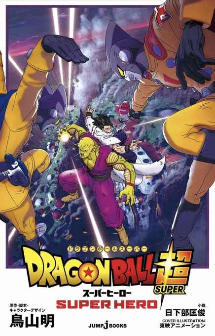
I’ve said it before, and I’ll say it again, that Dragon Ball Super has been the thing I’ve loved most that I never knew I wanted. I was done, or at least content, with Dragon Ball Z. Dragon Ball GT wasn’t good, but I didn’t need it so it wasn’t something that bothered me. Then Battle of Gods came out which ended up being the start of something new for Dragon Ball and here we are. Dragon Ball Super: Super Hero is the second Dragon Ball Super movie following 19 volumes of manga, 131 episodes of the anime, and the movie Dragon Ball Super: Broly. And really, the last two Dragon Ball Z films were basically Dragon Ball Super since they were adapted into the anime in a longer form. The original Dragon Ball anime will likely always be my favorite, but there’s something to be said for Super which is more self-aware and comes across as being very confident in how to depict these characters, some of whom have been around almost 40 years. It’s funny and willing to poke fun at itself without resorting to more meta humor or fourth wall breaking. And it’s still action-packed and contains all of the tropes of Dragon Ball Z that have somehow become more charming as the years go by, maybe because of the nostalgia. Probably because of the nostalgia.

Super Hero is written by series creator Akira Toriyama and it’s very much a film a designed to place the spotlight on the B-team. When Toriyama was writing and illustrating the Cell Saga for the manga, it was conceived as a passing of the torch, and even a finale, from Goku to Gohan. Obviously, that changed quickly as Toriyama was convinced to keep going and we got the Buu Saga which basically returned Goku to the top of the mountain while Gohan trended towards a more peaceful existence and characters like Piccolo, Krillin, etc. settled further and further into the background. When Super came around, it largely followed that with the only difference being Vegeta moved into an almost co-lead with Goku, but when the anime came to an end, Goku was firmly back at the top.

The Red Ribbon army is under new management.

Now, the anime ended a few years ago, but the manga has continued. We basically have two different canons going on now. While there was always some differences between the two, they were often subtle and inconsequential. Now we have Broly and this film while the manga has gone in a very different direction. This film even features a time-jump that I don’t think has taken place in the manga. I’d have to go back and look, but regardless, there will likely be debate on what is and is not canon and I think the simple answer is we simply have two timelines at this point until (if?) the anime comes back.

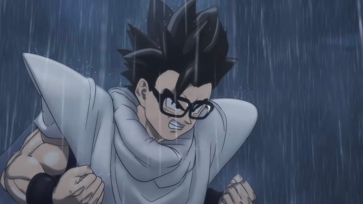
Needless to say, this one takes place after the events of Broly and Goku (Sean Schemmel), Vegeta (Christopher Sabat), and Broly (Johnny Yong Bosch) are now comrades. They train together on the planet belonging to Lord Beerus (Jason Douglas) and it’s implied that Broly still has a ways to go in order to get his temper under control. Elsewhere, Piccolo (Sabat) has taken to training Gohan’s daughter Pan (Jeannie Tirado) in martial arts, though the young girl is having some trouble learning to fly. Gohan (Kyle Hebert) has immersed himself in his work neglecting his training and even fatherhood, which it’s hard to say what irritates Piccolo more as he and wife Videl (Kara Edwards) have become more and more reliant on Piccolo as a babysitter of sorts.

Gamma 2 (left) and Gamma 1 are the latest in android technology.

Brewing in the background is the threat of danger. The Red Ribbon army has been re-assembled by its new leader, Magenta (Charles Martinet), who is dissatisfied with being a mere pharmaceuticals producer and longs to restart the androids program. In order to do so, he turns to the great grandson of Dr. Gero, Dr. Hedo (Zach Aguilar), a young prodigy in robotics who was recently incarcerated. Despite the fearsome origin, Hedo is a bit childish and enjoys cookies. He also doesn’t aspire to be a great villain like Magenta and would prefer to create stylish androids in the model of a super hero. Magenta is able to woo the young scientist to his side by claiming that the individuals who took down Cell years ago are aliens out to conquer Earth and Hedo is willing to go along with this since it means money for his research.

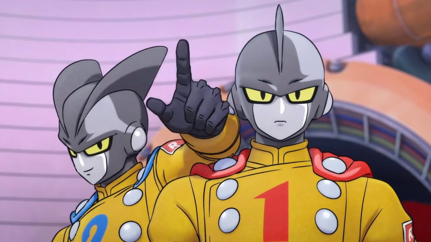
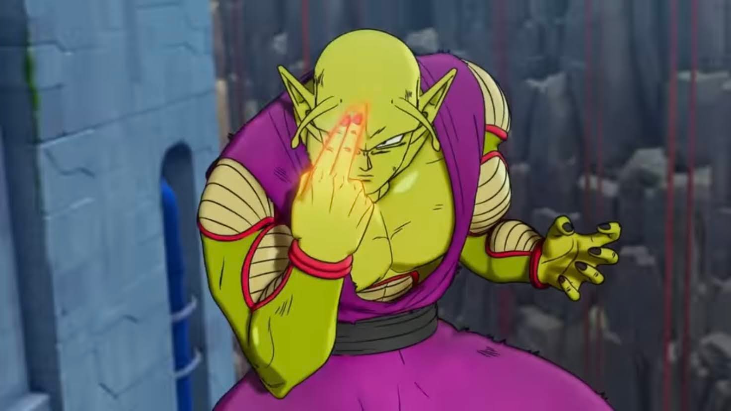
With Dr. Hedo onboard, the Red Ribbon army successfully restarts the androids program leading to the creation of the twins Gamma 1 (Aleks Le) and Gamma 2 (Zeno Robinson). It’s Gamma 2 that comes into contact with Piccolo, whom he confuses for King Piccolo (we get a running gag of people referring to Piccolo by one of his former aspects throughout), and picks a fight since he fancies himself a super hero. Gamma 2 makes the mistake of thinking Piccolo was defeated and inadvertently leads Piccolo to the Red Ribbon HQ where he makes a startling discovery. Unfortunately, Bulma (Monica Rial) is unable to get ahold of Goku and Vegeta so it will be up to Piccolo and a rusty Gohan to save the world this time.

Daddy’s not coming to save you this time, Gohan, time to power up!

And that’s basically what it feels like this film waned to do. Unlike other Dragon Ball films, Goku is not going to swoop in at the end to save the day. This is Gohan and Piccolo’s fight, and both are going to power-up to new, largely unexplained, heights. Do we care that these new forms are unexplained? No, because they’re both fun and expected. There’s a fair amount of fan service at play, especially with callbacks to some of the forgotten lore of Dragon Ball’s past, and the sort-of return of an old villain. That’s actually the one criticism I have with the fan service elements as the returning villain is more like a shell of its former self with no personality. It would have been fun to see that personality rekindled and its reaction to the current state of this universe, but oh well. The story is fun, and Piccolo’s infiltration mission he undertakes creates a surprising amount of plot for a Dragon Ball feature. Usually it’s just bad guy shows up, and a long fight ensues. This one actually has pacing and needs things to happen in order to get to the fight. And we’re also dealing with villains who think they’re the heroes, which adds a different twist. It might be less action-oriented as a result so some fans may dislike it, but I found it rather enjoyable and it definitely gave the film more of a Dragon Ball feel such as when Kid Goku basically did the same with the old Red Ribbon army.

The character and story are certainly familiar and a whole lot of fun, what’s different is the production. This is the first Dragon Ball film to be rendered in 3D. It’s a 3D that can look like 2D in some parts and it’s something the past film did in certain shots. This one, outside of 2D flashback sequences, sticks with the 3D throughout and the results are mostly fine, but there’s some ugly parts. For some reason, Goku seems to look the worst in this style and comes across far too much like a character from a video game. I guess it’s a good thing then that he’s not in a lot of this one. There are a few other shots and moments where it gets “video gamey” and it is distracting. And a lot of those shots happen early in the film which is unfortunate because the film begins with a 2D refresher that looks awesome and made me wish the entire film was animated in such a fashion. I would prefer this, and any future episodes of the anime, to look more like that, but I suspect this is the wave of the future for Dragon Ball so I better just get used to it. I do like the use of colors and light with this film going for a manga look. Scenes pop and some of the tracking shots and angles this film goes for are dynamic and really engaging. Director Tetsuro Kodama has done a fantastic job of presenting Dragon Ball as there’s a great energy to the animation and a real weight to the blows.

Piccolo is the film’s heart, and as a longtime Piccolo fan, I approve.

Another strength of the film rests with the audio. The voice performances are all as expected, which is pretty great, while the soundtrack is maybe the best Dragon Ball has ever had? There will always be plenty of fans that love the old stuff from the 80s, but this one has a terrific presence. Composer Naoki Satō really got the message across that this one should sound heroic. There’s a lot of super hero sounding compositions and the music is very dramatic. There were no odd moments, like chanting which was used in the last movie, that took me out of the moment at any time. Some might be disappointed with the lack of more familiar songs, but I for one really enjoyed this soundtrack and found it quite suitable for what the film wanted to present.

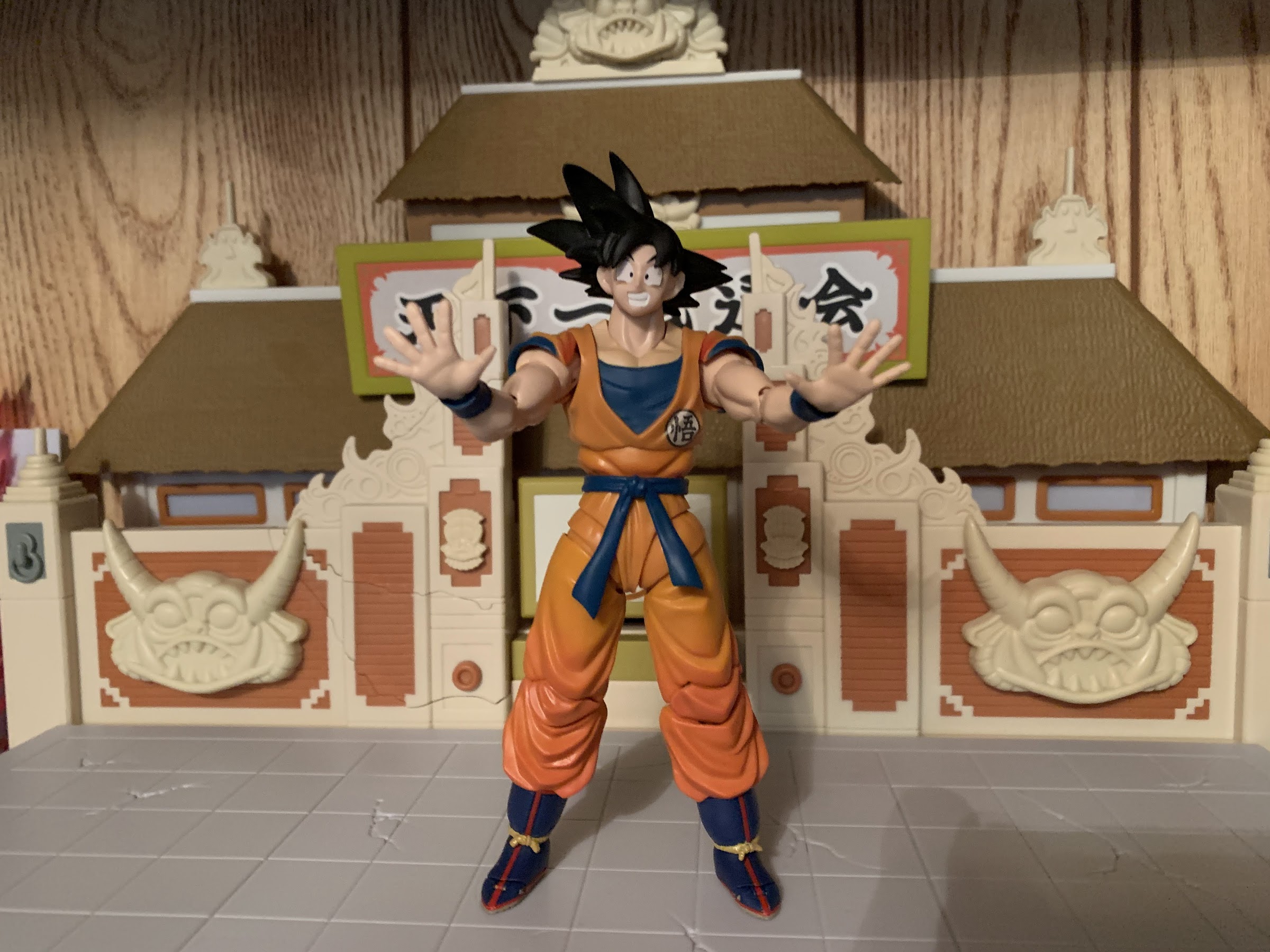
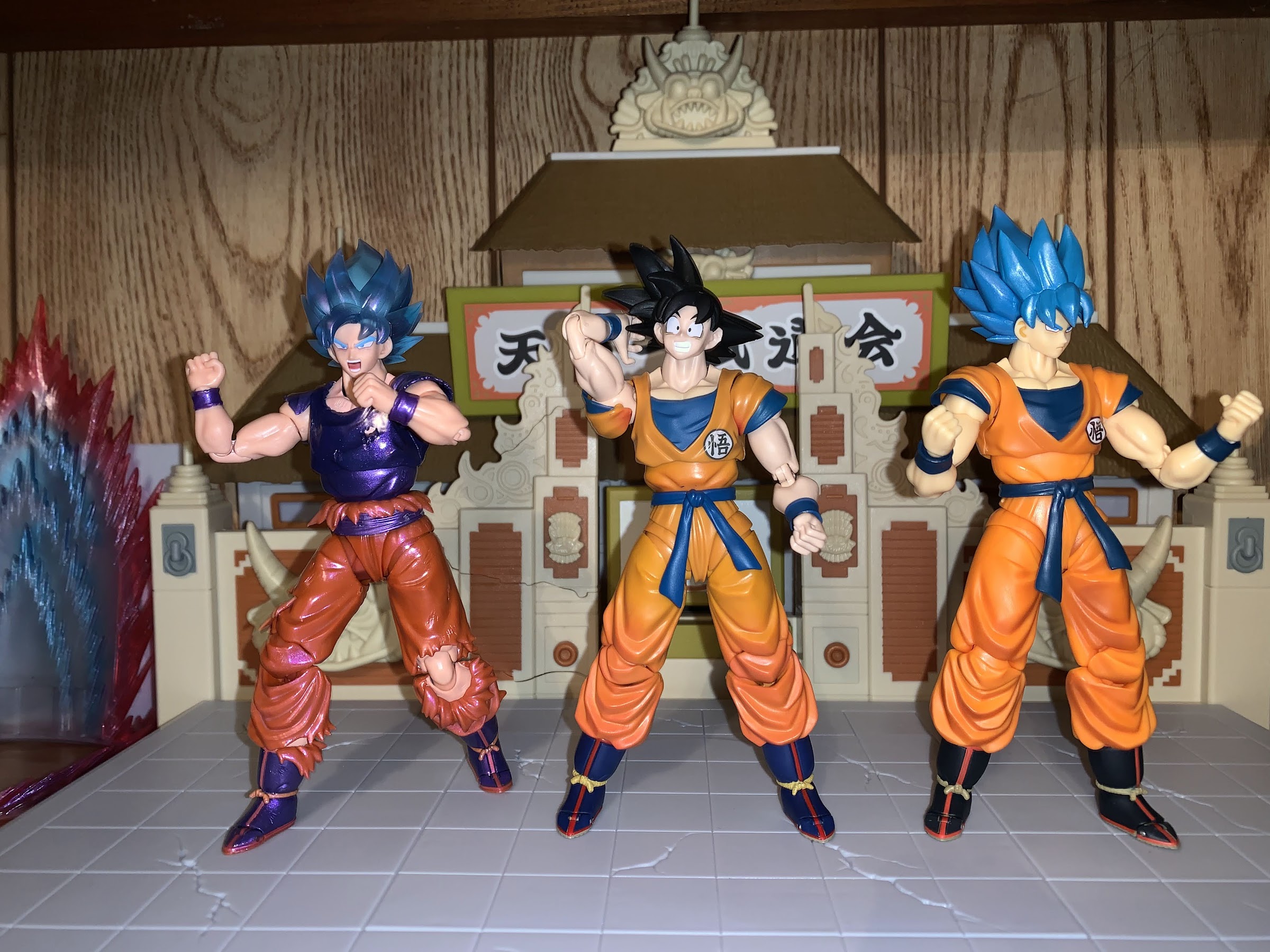
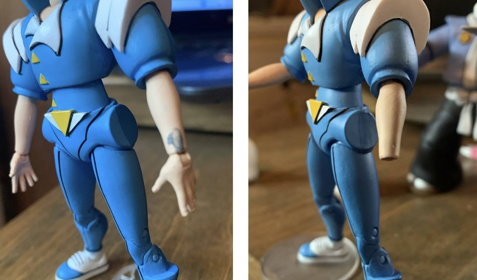
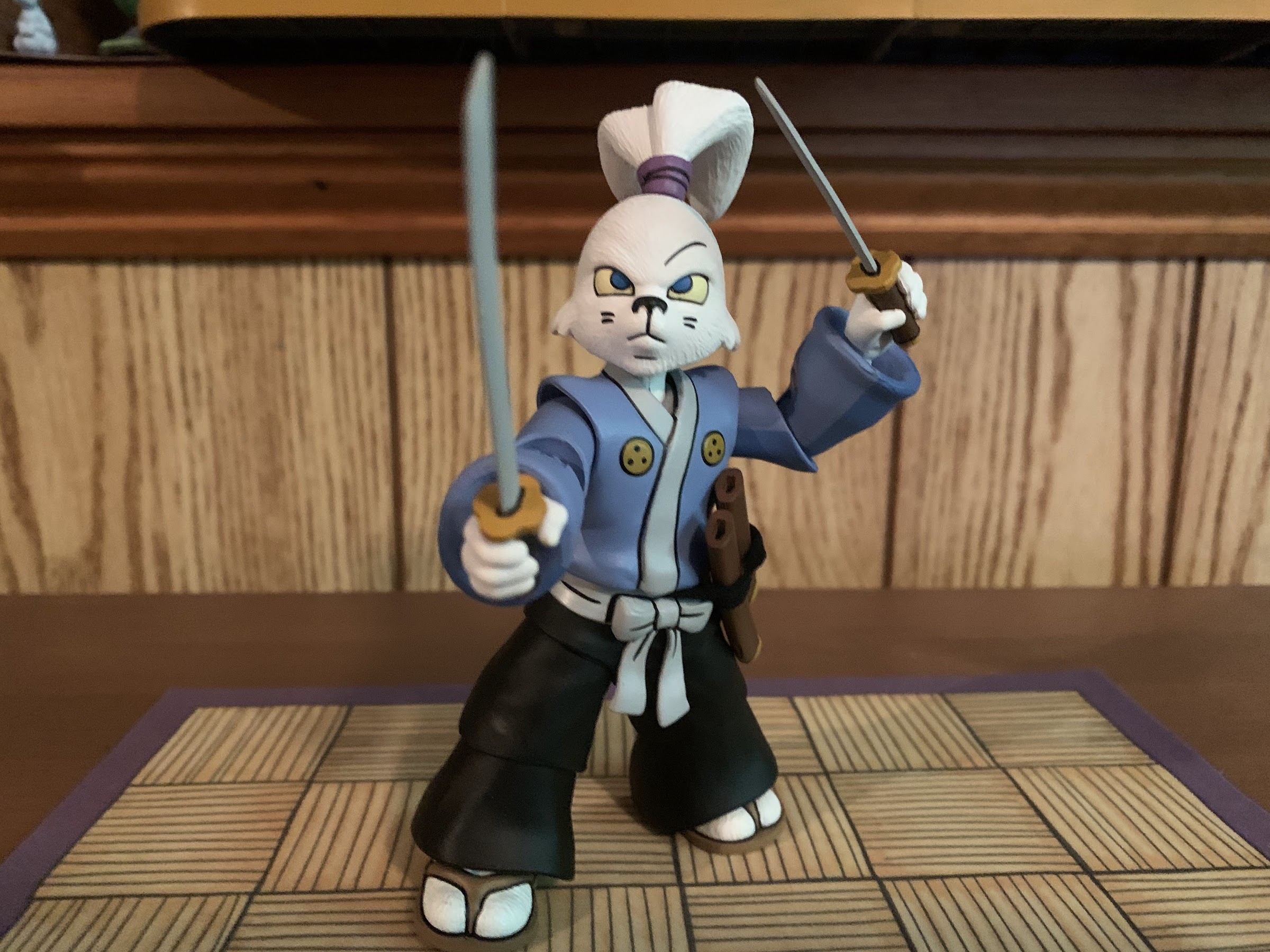
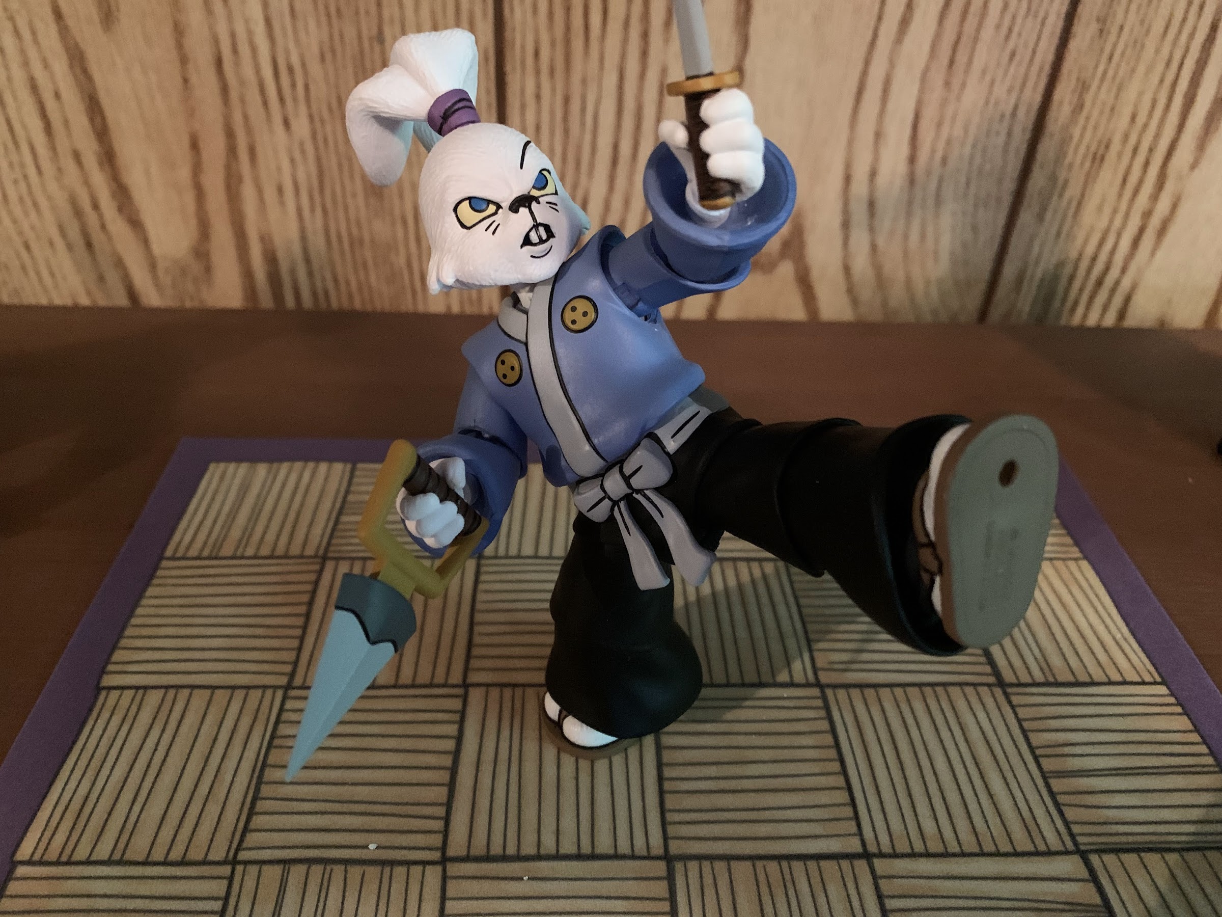
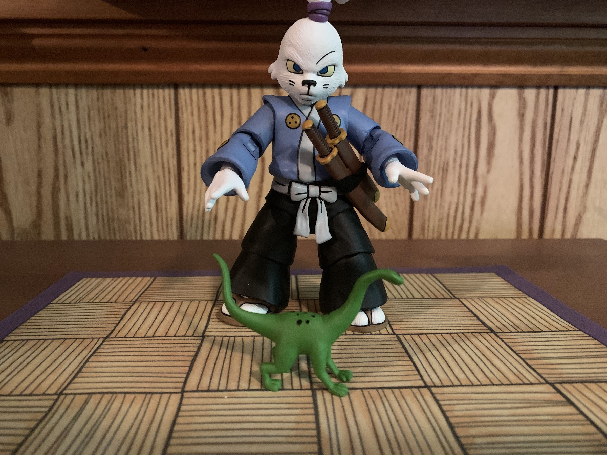
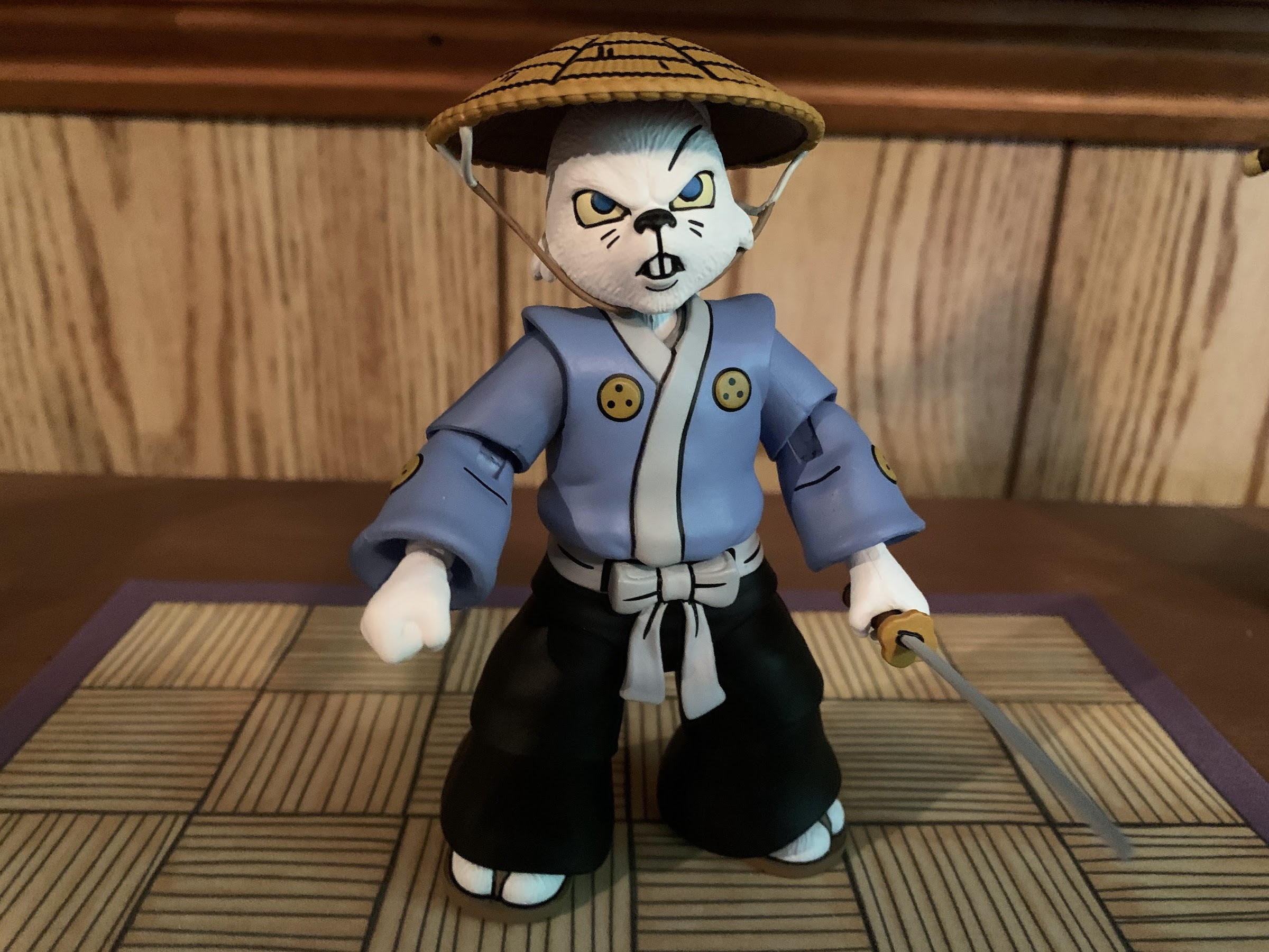
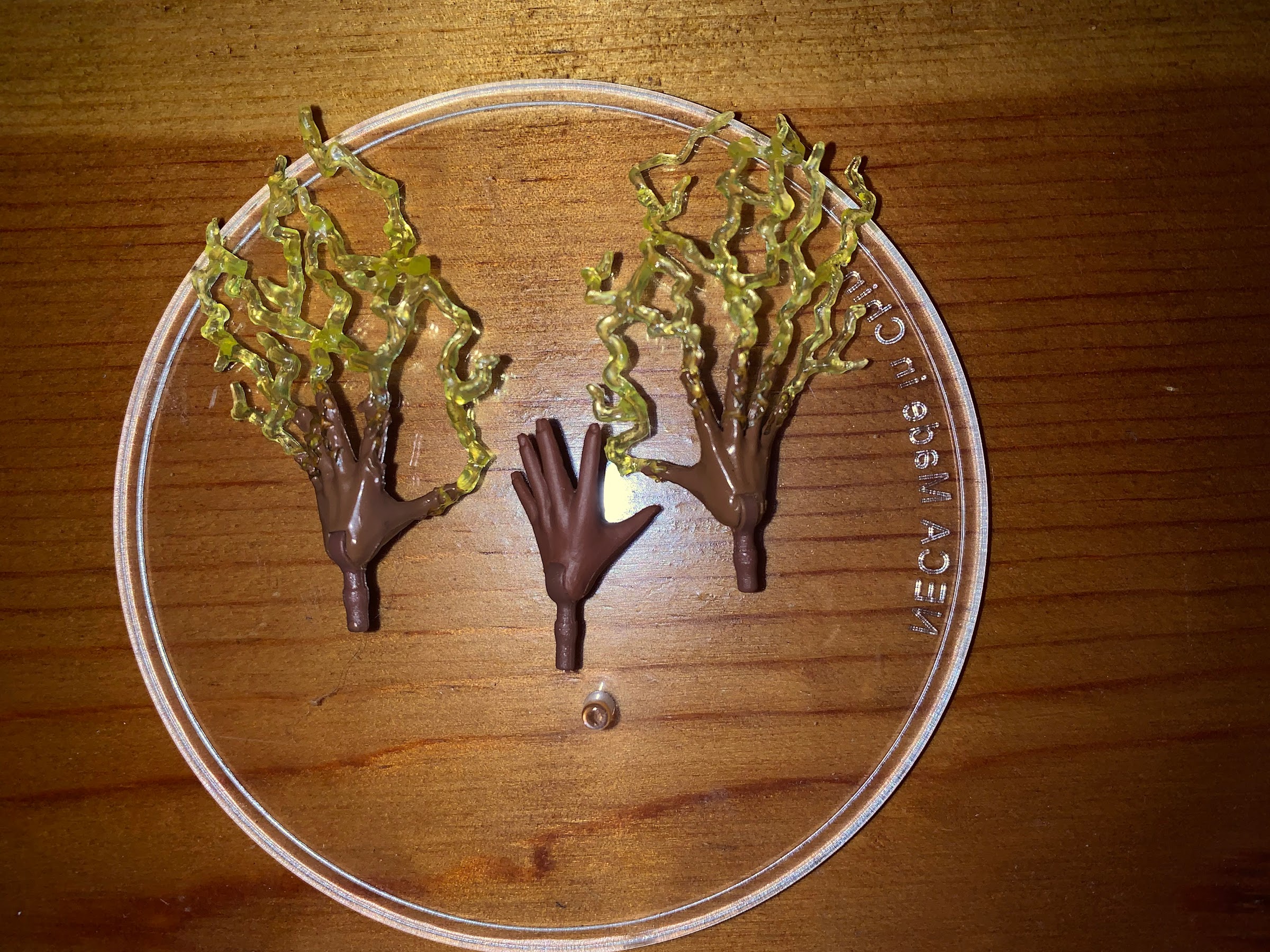
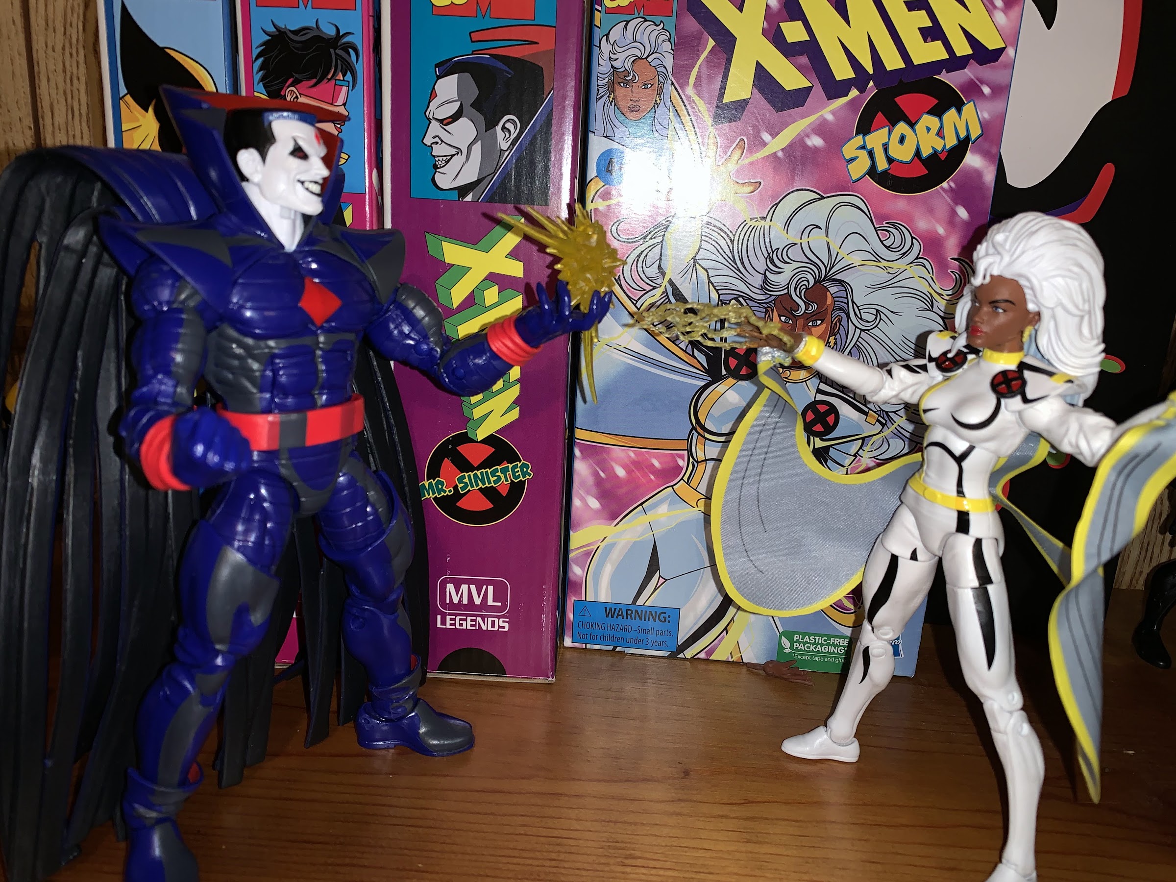
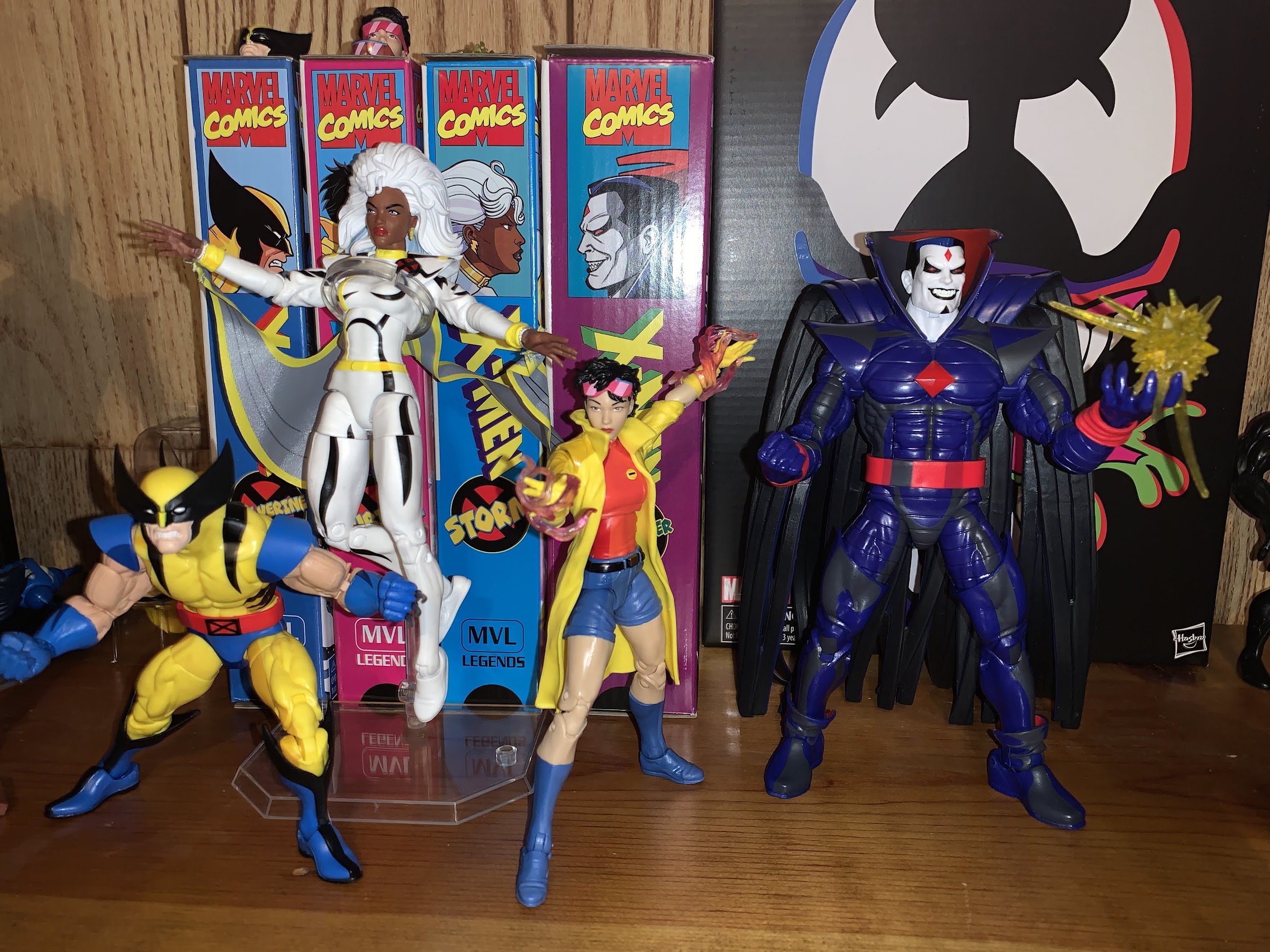
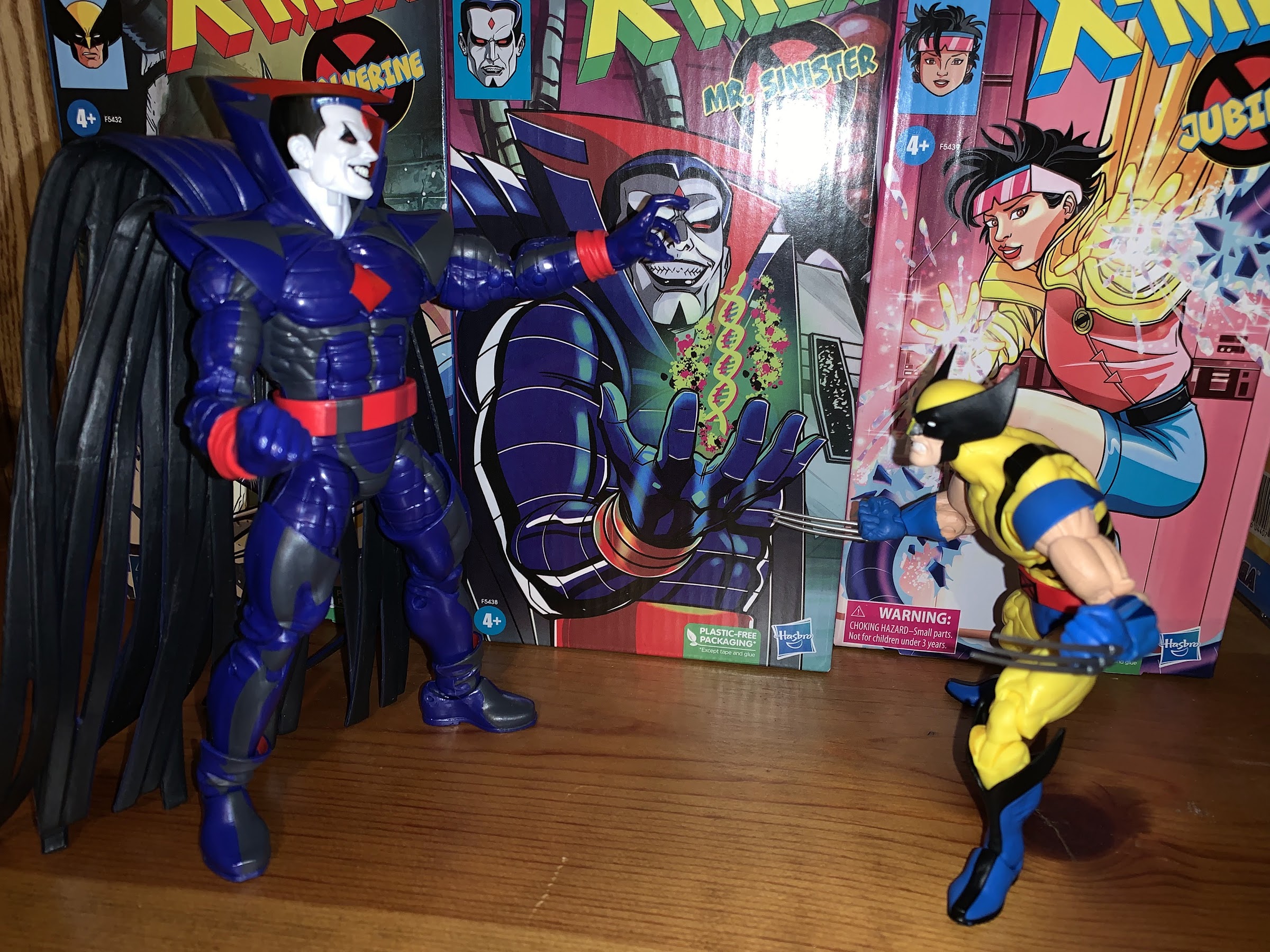
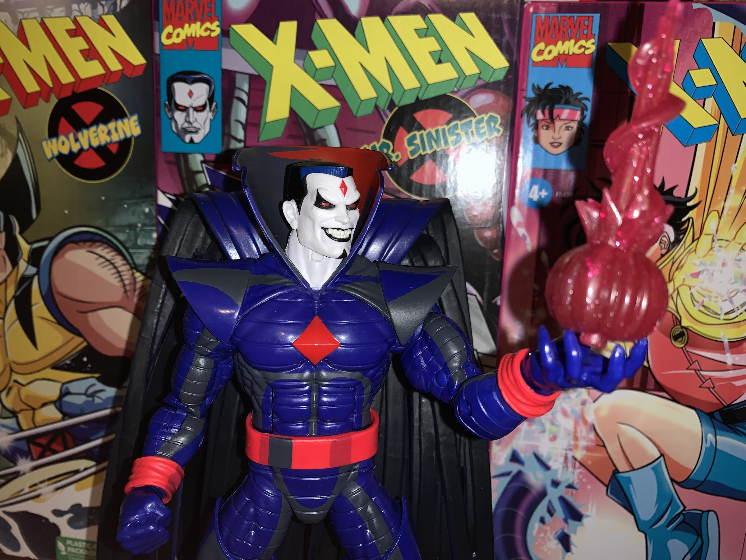
Dragon Ball Super – Super Hero is another great addition to the Dragon Ball universe. It continues this high quality return for the series which has really seen the film version of the franchise taken to new heights. Before, Dragon Ball Z films felt like filler. They were simple stories that basically were like the Cliff Notes version of the main series with placeholder villains standing in for the real thing. These last four have felt more like full-fledged movies and I suspect that’s because those involved in the creation of them wanted that to be the case. Dragon Ball has become this warm blanket for me that always shows up. It would have to be really bad to be a disappointing experience and this film is far from it. Because I seem to ask so little of the franchise to entertain me, it’s become harder to decide what’s best among these films, but easy to say that they’re all good. If you’ve ever liked Dragon Ball definitely check out Super Hero. Dragon Ball on the big screen is an experience in and of itself so this gets a strong recommend from me. And Bandai, if you’re reading, we need some more figures based on this one. You know what I’m talking about!


S.H.Figuarts Dragon Ball Super Son Goku Super Hero

Wait! Don’t go! I swear this is a Goku worth talking about!

Back in the early 2000s I was a collector of Irwin Toys’ Dragon Ball Z line of action figures. When I started collecting that line, I just focused on my favorite characters which were primarily Vegeta, Trunks, and Piccolo. Gradually, the collector impulse took over and I started buying entire waves as they came out even if I never would have imagined I’d buy a figure of Yakon or Yamcha in a yellow suit. Anyway, what happened is my collection was surprisingly light on DBZ’s main character: Goku. Irwin was also pretty bad at keeping popular figures in circulation, they basically made a wave of figures and then moved onto the next one so late adopters were pretty screwed (and maybe that’s partly why they went out of business during the line’s life). I would eventually get the Series 4 standard Goku, but only because I found it on clearance for 4 dollars at a KB Toys (it was a pretty bad likeness), but I never got a Super Saiyan Goku or others. I did get some of the later Goku figures that Irwin and Jakks Pacific (who bought the license from Irwin when it went bankrupt) released, but my collection was definitely light on the legendary Saiyan.

I lead-off with that nugget of info because I’m partly amused, and partly shocked, that Goku dominates my collection of S.H.Figuarts based on Dragon Ball. This latest release based on the new movie Dragon Ball Super – Super Hero brings my total of Goku figures to 5, which isn’t a ton, but it’s amusing to me because I have only 1 Vegeta, 1 Piccolo, and zero Trunks. I’m also not including in my total of Goku figures my Goku Black and the two Kid Goku figures. Perhaps more amusing to me, the only other characters I have multiples of are Krillin, Master Roshi (one as Jackie Chun), and Bulma(!). I’m pretty sure the me of the early 2000s would be quite surprised that I would have more Bulmas than Vegetas, but that’s where we are. This obviously wasn’t deliberate on my part to make up for my lack of Goku 20 years ago. It’s largely the result of me getting into this line very slowly. I initially only intended to collect the figures from Dragon Ball, but they’re so few and far between that I started branching out to Z and Super and event GT! There are figures of Vegeta and Trunks that I’d like to have, but they’re no longer in circulation and I’m just not willing to go secondhand on them. Maybe one day, but for now Goku gets to dominate.

I wouldn’t normally advocate for buying a figure just for a new face, but I might for this one.

So why am I adding another Goku to my collection? Well, I didn’t have a base Goku having passed on the Saiyan Raised on Earth release and when this particular figure went up for solicitation I just happened to like it. The color palette for the new movie is based on the manga and the promotional images just made this figure look nice. Rather than a red-orange gi, this Goku is sporting a much lighter shade of orange. The promo images did a good job of making the figure look like it had more of a matte finish, and the portraits looked really sharp. And since it was being solicited at the bargain price of $35 I figured “why not?” And I’m happy to say the figure is more or less as expected. This is a Goku after all and it’s on a body that we should all be plenty familiar with and those promotional images ended up being honest about some parts of the figure, and less so about others.

The yelling expression is also on point. Whatever Bandai did differently with this one, keep it up!

First of all, the portraits for this Goku look terrific. In comparing them with past releases, I’ve narrowed it down to a few things that seem to make them “pop” better than before. For one, Bandai painted all of the lines including the ones under the eyes. They also used black instead of that brown shade they often use on the faces which helps to better reflect the anime. The eyes also look to be larger and the eyebrows have a little more shape to them. That’s pretty much it, which isn’t much, but the end result looks so much better. These are the best portraits of any Goku I have and it’s also helped by the selection. There’s the usual smirky face, plus a side-eye smirk that’s a little redundant. Then we get a yelling face which looks great because they made sure to round off the eyes, as Goku is often depicted, and the paint is so sharp that it really feels like Goku is screaming at me when I look at the thing. The fourth portrait is more of a frightened or surprised look which we’ve seen out of Goku plenty of times, usually in more comedic moments. It’s my favorite of the bunch and since it’s so different from the other figures I have it’s likely I go with this look in my display.

I’ve expressed my displeasure with this butterfly joint in multiple reviews, but I don’t think I’ve ever photographed it.

Aside from the faces, this Goku is pretty much like all of the others. There are actually subtle differences among the Goku figures I had before this one. Super Saiyan God Goku has a slightly leaner mold in places while the absurdly long named Goku had a different torso due to some battle damage while Super Saiyan 4 Goku is very much its own thing. This figure though is exactly the same as the Super Saiyan Blue Goku I reviewed a while ago. That’s both a good and bad thing. On one hand, the figure is a solid representation of Goku from the anime. It looks pretty good, the proportions are okay, and it mostly moves well. It’s just getting long in the tooth. There are some things it doesn’t do well, like move at the hips out to the side or much at all in the torso. If you wanted this Goku to be positioned in a true flying pose where he’s parallel with the ground it wouldn’t work because he can’t bend his head back far enough. The butterfly joint also isn’t the greatest and this figure has the same problem as that prior Goku in that the inner portion of the butterfly joint was molded in a flesh color instead of orange so it looks like his shirt is ripping. He also has the old shoulders which seem to be getting phased out and they feature the sleeves pinned to them which I have never liked. The ankles are also still on ball-pegs and they’re not great either. That’s what it doesn’t do very well, but what it can do is allow for enough posing that someone with many Gokus on the shelf can still find variety here.

A sampling of Gokus. This figure and the one on the right (the figure’s left) are pretty much the same.

I don’t feel the need to dive into the articulation anymore than that given this is a reused figure covered before. The only other thing to talk about are the rest of the aesthetics and accessories. Given this is a $35 release, it’s probably no surprise that the accessories are limited to the face plates and hands. It’s always a bummer when we don’t get something extra, but thems the breaks. The hands are fairly standard: fists, open, martial arts pose, Kamehameha, and one right two-finger Instant Transmission posed hand. The gi is sculpted in that lighter orange and I like how it turned out. There’s still a bit of a glossiness to it, but it seems to be less severe than usual. The same can be said for the other parts of the figure like the flesh tones and blues. The painted bits are color-matched well and applied cleanly. The undershirt and sleeves are painted better than my other Goku figures and the boots are nicely done. There is some shading, but it’s limited to the lower parts of the legs. I’m not sure I quite understand what Bandai was going for here. Do they think it works best for an aura type effect? You basically have a darker orange at the shins that gradually blends into the light orange by the time it reaches the upper thigh with little shading anywhere else. There’s a hit of it on the orange part of the sleeves and maybe a tiny bit on the abdomen, but it’s so subtle that I’m not sure if my eyes are playing tricks on me or if it’s really there. Aside from that, the only other criticism I have for the paint is the opacity on the symbol on both the front and rear of the gi could have been increased. What looks very nice though is the hair which has a matte finish to it. I don’t know if they hit it with a clear finish or if the plastic is a little different as it feels softer than the black hair on Kid Goku. Whatever they did, keep it up because the hair turned out wonderful.

Goku is at least a character worthy of multiple releases. If you want a base Goku, this is the one to get.

The Super Hero version of Goku is likely a figure most fans will know if they want it or not the moment they see it. If you have a standard Goku already, it’s probably something that can be ignored. However, at $35 it’s quite cheap for a Figuarts release and that might get people to double-dip on base Gokus just for the new portraits. If you’re like me and don’t have a version of Goku like this, I think this is the superior release when compared with the Saiyan Raised on Earth version. That is largely a subjective opinion though as I prefer the more orange gi and I like the faces better. You may have the opposite opinion. At the end of the day, it’s certainly nice to have options.


Marvel Legends X-Men Animated Series Jean Grey

Another teammate has arrived for the animated X-Men.

For some reason, Jean Grey has never been treated well by toy makers. Back in the Toy Biz days, Jean had to wait several years to finally show up in the X-Men line of action figures, and once she did, it was in some gimmicky line in a costume that looked made-up. Her first, good, figure came in the Onslaught subline which was like a precursor to Marvel Legends. The scale was different, the sculpts were better, but preposed, and she was featured in her Jim Lee costume. By then, I had checked out and when Marvel Legends brought me back Jean was again left wanting. Seemingly, Toy Biz felt collectors only wanted a Jean Grey figure if she was in her Phoenix costume. Was it the gender bias working against her? Maybe, but then why did Storm, Psylocke, Rogue, etc. seem to have no trouble getting figures? Has Jean just historically been less popular by some metric with Marvel? I don’t know, but it bothered me when I was a kid that my team of X-Men was always missing a Jean and Phoenix just wasn’t a suitable replacement.

I haven’t been doing this with this line, but for this figure I feel like I have to. Here is Jean from the show. Note how she is NOT ORANGE!

Hasbro’s latest release in its line of action figures based on the animated series X-Men introduces a new hypothesis: maybe Jean is just hard to produce in plastic? I don’t really think that’s true, but it would be an understandable take for anyone who picks this figure up. Yes, we have yet another subpar release by Hasbro. When the line was announced, the fear on my part was that Hasbro would just grab a previously released figure, add a touch of cel-shading to the paint, and call it a day. With a figure like Mr. Sinister, that was the approach, but it worked because that old sculpt was suitable enough for the show version of the character and the paint job was pretty good. It was not without its problems and disappointments, but at the end of the day I felt like Sinister was a worthy addition to my shelf. With Jean, that’s not really the case.

She can’t even put her hands to her head for her traditional pose.

Hasbro finally did right by Jean and released her in her Jim Lee attire a few years ago. In a three-pack with Wolverine and Cyclops, that version of Jean came with two heads and four hands and had a decent enough sculpt at least. Perhaps to no one’s surprise, this release is exactly the same. That’s fine in some respects, and not in others. For one, Jean’s costume in the show and comic is basically the same excepting the colors. In the show, she had a tan and blue scheme instead of yellow and blue. I’m not sure why that change was made, maybe they just felt tan would look better on TV than yellow, but that’s a pretty easy thing to correct for. The other change is Jean went with a ponytail instead of wearing her hair down. This was likely just to differentiate her from Storm and Rogue and it’s basically her defining trait in the show.

“See the woman in this picture? You’re not her!”

So how did Hasbro screw this up? For one, she’s not blue and tan, she’s blue and orange. And when I say orange I mean very orange. Why couldn’t they cast her in the right shade? Beats me, but it looks terrible. Hasbro also chose not to retool her ponytail head from the previously released 3-pack. That head was meant to work with her long hair, except just tied back, only Jean in the show did not have a huge swath of hair that went all the way down her back. Her ponytail is huge and ridiculous looking, and I suppose just to annoy me a little more the part in her hair is off to the wrong side. Those inaccuracies are annoying, but to add to it her face just doesn’t look like Jean. The face might be re-tooled from that old release, or maybe just better painted, but either way it’s not good. She’s duck-mouthed with this weird smile and her eyes are really narrow. At least they’re green, but the paint job is also messy. It looks like they cast her head in blue and painted her face on and you can tell there’s a darker shade of plastic behind it. Usually the figure is cast in the lighter color and painted with the darker, but not here. The figure also has the same problems as the first release, and many of the Legends women, in that there’s little shape to the figure’s body. Yes, like most super hero women, she is pretty well endowed, but the silhouette is off. The body doesn’t taper much from the shoulders, to the bust, to the abdomen, and hips. She almost looks like a tube when viewed head-on. Hasbro is also seemingly afraid of letting their women have some muscle-tone in their arms and calves. These ladies are superheroes, sculpt them like superheroes!

No effect parts (big surprise) so I gave this Power Rangers one a shot. Meh.

Is anything done well? Aside from the box (and it looks like Hasbro supplied artist Dan Veesenmeyer with a sample or something to base his art on), the only compliment I can give this one is the cel-shading on the torso looks good. It’s probably the second best after Sinister. It’s easy to find reference art for how the black was applied and it works here. The shading on the legs is less successful as the orange paint is too close to the color of the plastic so it barely stands out. It’s limited to just two, thin, swashes on her thighs and doesn’t stand out on a shelf. I wish they did some around the textured portions on the sides of her legs or something, but someone must really like the Creamsicle look of these legs. The paint on her hands suffers from the same issue as the paint on her face, and the edges of the blue on the torso aren’t as crisp as they could be.

Why is this so hard?

Hasbro tends to short-change its female figures when it comes to articulation and Jean is no exception. She’s not going to do a whole lot and is very similar to Storm. Her head is on a ball-peg and it can look in most directions except up because her hair gets in the way. The ball-hinges at the shoulder work fine, though the shoulder pads are a hindrance going up. There’s no biceps swivel, just a swivel at the elbow which is a single hinge that only provides for about 90 degrees of bend. The hands rotate and hinge and need to work around the gauntlets. They should have sculpted the padding for the back of the hand to the hand itself, but chose not to. There’s a ball-joint in the diaphragm under the figure’s bust. It basically just lets her rotate with a little tilt. She can bend back a bit there, but not forward at all. There’s no waist twist and the legs only come out to the side about 45 degrees. There is a thigh cut, but like with every release in this line, it breaks up the shading so for me it’s kind of useless, but then again, the shading is barely visible so maybe it won’t bother me. The knees are double-jointed and really gummy, but they work. The ankles hinge and pivot and they’re the only joints I have no issues with. The others stuff is either too limited, gummy, or poorly engineered.

She can wear her down, if you wish. I don’t know why you would though.

Accessories have not been a strength for this line and that continues with Jean. We get open hands on the figure in the box and a set of fists since Jean is known for punching people. There’s also a second head and it’s recycled from the 3-pack and features her hair down. She has a neutral expression that I think is supposed to look mildly seductive, but it’s not working for me. It’s a totally useless addition though since Jean never looked like this in the show. The only time she had her hair down in costume was in the very last episode of the show when her costume was yellow and blue like the comics. Her hair was still not that massive and the figure isn’t colored properly for it to matter anyway. A completely wasted accessory. Why not junk that and toss in some effects parts instead? Or maybe spend a small amount of money to sculpt a Cerebro helmet for her to wear, since she was seen wearing that in the show on more the one occasion. It’s just as if the people working and designing this line don’t give a shit about the show or never watched it.

To the back with you, Jean!

Jean Grey is a phoned in release that Hasbro assumes you will buy because it vaguely looks like the character and you’re all-in anyway. And they might be right since I bought this despite it missing the mark by a wide margin. She might be the line’s new low point since it at least feels like some effort was put into that Jubilee figure, even if she doesn’t look like the character in the show and features an awful paint job. I only have this figure because I want to tell Hasbro there’s money in doing figures based on the cartoon, but if I wasn’t buying it for that reason there’s no way I would have bought this one. It’s not good, and I can’t recommend it especially at the price Hasbro is charging.


The Robot Spirits MS-06JC Zaku II Type JC ver. A.N.I.M.E.

Now you face the Zaku!

After talking about two different versions of the Gundam Ground Type from Mobile Suit Gundam – The 08th MS Team it’s about time we talk about the bad guys. That’s right, the Principality of Zeon has their own mobile suits, and in true bad guy fashion, they look pretty cool. Arguably cooler than the good guys and their Gundams. I say arguably because it’s definitely not as cut and dry as it was with say G.I. Joe in which Cobra always had the better looking vehicles and uniforms. The Gundams are mostly refined with a touch of elegance despite their rather beefy and cumbersome appearance. The Zeon and their Zaku are even bulkier with less flash, but they have a certain menace about them not present with the Gundam mobile suits. I think the distinction is captured rather well in the choice of melee weapon for each, the futuristic, Jedi-like beam sabers of the Gundam vs the violence of the axe-like Heathawk.

Weapon storage – the stuff that excites me.

Bandai has sunk its teeth into me with its Robot Spirits collection based on The 08th MS Team anime, so I basically had to get that show’s interpretation of the Zaku. The Zaku is, like the Gundam, featured in various series of Mobile Suit Gundam and it usually looks fairly recognizable to anyone familiar with the franchise. They’re usually green or olive drab and armed with that aforementioned axe, the Heathawk, and feature a single camera in the head that appears as a red, glowing, “eye” that makes the suit resemble a cyclops. They usually have some heavy artillery as well, maybe some spikes here and there, as well as tubes around the head or encircling the torso. They’re basically never not cool looking, and while I actually do prefer the look of the Gundam to it, that’s by no means a slight upon the Zaku.

This line runs small, but the scale from mobile suit to mobile suit is quite nice.

The Robot Spirits version of the Zaku from The 08th MS Team looks about as expected. It stands at approximately 5″ in height and is composed of mostly colored plastics of differing shades of green. There’s plenty of sculpted detailing on the body of the beast with a spiked shoulder pauldron on the left arm and a spiked shield on the right shoulder. This version of the Zaku appears to be based on the second episode of the series, and a spare part that comes in another set would only seem to confirm that since its a reference to a battle in that very episode. The main torso of the Zaku is a deep, forest, green while the limbs and head are a lighter shade of green. The hoses connecting the thigh and the lower leg as well as the head and torso are a gray, almost purple, color and in that head is the menacing red eye. Pop off the top part of the head and you can even spin that eye just like in the show to have the Zaku’s focus elsewhere.

Like the Ground Gundam, the Zaku is pretty beefy and tank-like, but it moves and poses well enough.

The Zaku, like the ground Gundam, is well-articulated for such a beefy design. The head is on a ball and hinge combo that lets it look way up as well as down a bit. It’s neat because as you force the head up the coil that is the neck becomes more exposed. There’s a butterfly-type joint in the sides of the torso that let the Zaku’s arms come forward a bit and an ab crunch that allows a generous amount of range forward, but little to none back. The shoulders are a bit limited, especially the left one, due to the presence of the pauldron and shield, respectively. The left arm can almost be raised to a horizontal position, while the right can achieve that and a touch more if you spin the shield around. There’s a biceps swivel and another swivel above the first elbow joint. You may want to make sure the upper elbow swivel is in the proper spot as mine was not out of the box and I thought it only had one elbow hinge. It does not, there are two, and the Zaku can bend its elbows well past 90 degrees. The wrists are the standard ball pegs and there is a waist twist, but it doesn’t seem to want to go very far to either direction so I’m not going to force the issue.

The last thing you see before you die.

At the hips we have the usual skirt armor and on the Zaku it blends really well when in a neutral pose. There’s something satisfying about kicking the legs forward and watching the skirt piece come apart. Anyway, the Zaku can kick out to the side at 45 degrees or better, and can kick forward a fair amount with almost nothing backwards. There is a thigh twist and the knee is double-jointed to bend past 90 degrees and it looks good. At the ankle, the feet can rock side to side a bit and the foot bends forward a surprisingly amount, but not back very far. There is a toe hinge that you have to pull out on first before it will bend back. It’s odd, but it works. All of the joints on this guy work very smooth and there’s a nice tolerance to them. He can wield his heavier weapons with little issue and overall I’m very happy with how the articulation turned out.

That’s a pretty big gun.

For the accessories, we have the usual load-out of hands plus a little “tree” to clip them onto. There’s gripping hands in the box, plus another set of tighter gripping hands, trigger hands, relaxed hands, and open hands. For weapons, this guy is pretty well stacked. There’s a collapsed Heathawk that can clip onto either hip plus a deployed Heathawk that’s longer and features a golden blade to simulate it heating up. He has his 120mm machine gun with circular magazine that can be held or stored on the rear of the figure with an adapter. He also has the Zaku bazooka which has an adapter for the rear of the figure and a second one for a shoulder mount meaning this guy can store all three of his main weapons without issue. The bazooka features a removable gravity-fed magazine that even has a little sculpted missile in it. Both weapons feature moving parts to help facilitate with posing, but feature little in the way of paint aside from the cameras on them. No effects parts are included for them either, but they can take them. The machine gun uses the same effect part as the ground Gundam’s machine gun while the bazooka uses a rocket effect that, as far as I know, has not been included in any 08th MS Team release. There’s also an interchangeable plate for the arm shield that replaces the spiked portion with a flat one as some Zaku in the show carried such a shield. Lastly, we have two effect parts for the Zaku’s rear thrusters, though these ones are not ball-jointed like the ground Gundam Desert type. The Zaku’s thrusters are on ball joints so you can at least adjust them there.

The figure holds this bazooka reasonably well, though the front handle is useless in a firing pose. Of course, with no included FX part it’s hard to say how well it truly works since those tend to add a lot of heft.

It’s a solid assortment of accessories, though as seems to always be the case with Tamashii Nations releases, I’m left wishing we got some more effect parts. This guy has spots on the figure where gunfire blasts can be affixed, like on the shield, to make it look like it’s under fire. And of course there’s both weapons that can use some. I really wish the bazooka came with a missile effect because the one included in the Options Set doesn’t fit. There is a part in that set though intended for the Zaku and it’s a battle damaged one. It’s basically a stump that can replace the figure’s left arm. It pops off and on pretty painlessly and it’s cool. It’s meant to allow for a recreation of the Shiro vs Norris fight in that second episode. The Zaku also has the usual peg hole for a Tamashii Nations stand, but does not come with one.

War. War never changes. Except when it does and includes light sabers and hot axes wielded by giant robots.

Overall, I’m really happy with this release from The Robot Spirits line. I might even like this Zaku more than the Gundam Ground Types I’ve reviewed as it’s real easy to work with. There’s plenty of options for a display right out of the box, and more if you have some additional accessory parts. It doesn’t feel as overwhelming as the two Gundams which almost have too many options that I can never settle on anything. And then when I do, I usually wind up feeling like my posing is way too vanilla for what they’re capable of. Nevertheless, that’s a “me” problem, and so is my desire to add another Zaku! If anything, I’m disappointed I only got one, but at around $70 via US retailers, it’s not really the type of release one should army build. Like the Gundam Ground Type, there is at least a variant of sorts on the way in the form of the Gouf Custom that I plan to get so I will have another Zeon unit to join this one. It’s just do I want to make it an even 3 on 3 some day? We’ll see.


NECA Cartoon TMNT The Neutrinos

Far out dude, a rare NECA three-pack!

Check it out, daddio! The totally frozen trio of Zak, Dask, and Kala have joined NECA’s line of action figures based on the cartoon Teenage Mutant Ninja Turtles! The Neutrinos come straight from Dimension X, having debuted during the original mini series of the show now referred to as season one, in the fourth episode overall: Hot Rodding Teenagers from Dimension X. Even though they share a dimension with Krang, these kids abhor war and prioritize having fun above all else, which is the antithesis of what Krang and Shredder stand for – so they must be eliminated!

The Neutrinos are a wacky premise in a fairly wacky cartoon. Perhaps created to give the kids watching at home an audience surrogate, they would return a few times after their debut and often with some wild antics taking place. Even though they’re supposed to appeal to kids of the1980s, they talk like beatniks with goofy 50s slang – maybe they just assumed kids were watching a lot of the Fonz on Happy Days? Because of their rather extreme personalities, the Neutrinos are something you either love or hate. I lean more towards the “love” side as they don’t particularly bother me and I’m pretty sure I was excited to see them return when I was a kid. Plus it doesn’t hurt that “Hot Rodding Teenagers from Dimension X” might be my favorite episode of the show. It’s the episode where Donnie invents the Turtle Van and we’re introduced to the rock soldiers Traag and Granitor. It’s also the episode most responsible for making Leonardo my favorite turtle who already had a head-start in that department by virtue of wearing my favorite color and my favorite weapon of the four.

The Neutrinos and their stuff. If you need a refresher on who’s who, left to right we have Zak, Kala, and Dask with the Grybyx and Baby Tribble in front.

Like Usagi, the Neutrinos were put up for preorder on NECA’s website back in March and both sets arrived at the same time, which is pretty cool and pretty fast in this day and age. They represent the first 3-pack (unless you count the Triceraton and Roadkill Rodney set as a 3-pack) in the line as they couldn’t be split up since they always appeared as a trio. Since they are a 3-pack they’re priced accordingly at $75, which I assume will be the MSRP on this set when it hits Target stores later this year. We’re essentially paying $25 for each one which is actually lower than the usual two-pack pricing. And if you think that’s because there’s a ton of parts reuse among the three well then you’d be wrong. To my surprise, these three are fairly unique so lets get to it.

“You dudes like pizza?!” “Yeah, but not that kind, daddio!”

First of all, the Neutrinos are comprised of Zak, Dask, and Kala. Zak has the blue outfit, Dask the yellow, and Kala is the lone female of the group. This is their first appearance in NECA’s line, but all three actually were featured in the vintage line from Playmates with Zak getting a release in the standard line followed by a repaint in the Toon subline where he was joined by Kala and Dask. I had all three as a kid, though I passed on the Zak repaint when he got re-released, and I remember them rather fondly. Too bad I don’t still have them for comparison’s sake, but I remember them being surprisingly accurate when compared with the show, especially Dask and Kala. I also liked how Playmates did Dask’s unusual hair with two shades of blue, light blue on the inside and dark blue on the outside.

At least the Neutrinos being on the small side works well with their primary antagonists, the rock soldiers Granitor and Traag.

These three are fairly show accurate. Zak is the tallest at about 5.5″ to the top of his hair while Dask is a little bit shorter at 5.25″, but he also doesn’t have a ton of hair sticking straight up preferring to have his going forward. To the top of their foreheads they’re basically the same height. Kala is the shortest, though to the tip of her hair she’s about 5.25″ as well. Some were a bit disappointed when these figures were shown off because their proportions appear to be more in-line with some of their later appearances in the show. All three have pretty large heads relative to their body and are a lot smaller than the turtles. It’s show accurate, but not to their debut episode where I personally think they looked their best (as the show basically looked its best during that initial 5 episode run). In that, their proportions were fairly normal for a human on the show and they basically stood eye-to-eye with the turtles. Of the three, I’d say Dask looks the most on-model when comparing him to that specific episode. Kala would be rather close if she had a longer neck (she basically looks neck-less from the front). Zak is a bit more “toonified” by virtue of his giant ears sticking way out. Their proportions here are probably more representative of their other appearances in the show, but I’m of the mind that NECA should rely on those first five episodes whenever possible so even if there are more episodes with them looking like this, the debut is still the best way to present them.

Even though it’s 3 against 1, I wouldn’t call this a fair fight.

All right, aside from my nitpicking of the proportions, the overall looks is pretty good. Paul Harding was the sculptor on this set and he captured all of the intricacies of each character’s outfit. Dask has the giant shoulder pads, Zak his massive popped collar, and Kala her skirt and rounded shoulder pads. The only places NECA could reuse parts are largely in joiner pieces like the lower torso, knees, and hips on Zak and Dask. Those two might share thighs as well as I can’t tell if the fins on Dask are glued on or part of the same mold. It must have drove NECA nuts that the characters of Zak and Dask are reveresed when it comes to the legs with Dask having the fins on his thighs and Zak on the calves. Both also feature different feet. All of the pieces are fairly hard-sculpted too with few, soft, rubbery, overlays. It’s basically just the “diaper” piece over the hips that’s soft.

My Zak had a paint flaw out of the box, but nothing a Magic Eraser couldn’t solve.

For the paint, we get the usual NECA toon shading with bright on the front and darker shades on the back. On Dask, there’s a paint chip right on his chest which is a bummer as well as some excess at the tip of his left ear. Some of the linework on his left sleeve is also inconsistent with the line being thinner in places. On Zak, we have a figure that’s pretty clean with the only issue I have being the white paint on his ankles showing as not quite opaque enough. Obviously, they were painted white over blue here and sometimes that happens. Zak also came out of the box with an ugly blob of black on his left wrist that sort of looked like a tattoo or something (I had to go to the source material to make sure it was a defect). It was very unsightly, but thankfully it came off with a magic eraser. With Kala, there’s a spot of dark green on her torso that’s a bummer because it’s in such a prominent place, but otherwise she’s mostly fine. NECA uses a ton of paint, so the small imperfections are going to happen. There’s at least no instances of wrong color hinges or anything like that so overall I’d consider the paint applications here to be acceptable. They’ll certainly pop on your shelf.

The tiny feet and big heads make these guys tricky to pose. They’re not going to be able to do too much on your shelf without some help.

Now if you’re looking at these outfits and thinking “That can’t be good for articulation,” well then you would be correct. All three figures feature the same points of articulation. They ball joints at the head, neck, abdomen, and hips which also swivel. The shoulders are ball-hinges, the elbows single-hinged with a swivel, the wrists swivel and hinge, the knees are double-jointed, and the ankles hinge and rock side-to-side. That’s pretty standard for the line with the only thing missing being a waist twist and double-joints at the elbows. What doesn’t work too well are the shoulders, especially on Zak because of his odd setup. He can’t really raise his arms out to the side unless you first rotate them 180 degrees. Once you do that you can raise them about 45 degrees and then rotate them back which allows the shoulder pads to slide under the softer plastic on his torso. I’d be cautious about doing so though as you’re rubbing painted white plastic on blue and that could go bad. Dask and Kala don’t have this problem, though Dask’s shoulder pads won’t allow his arms to stick straight up, but that’s not much of a loss. Dask is the most limited when it comes to kicking forward and back as his “diaper” is rather tight and constricting with Kala’s skirt being the least constricting and Zak sort of in the middle there. All three feature really tight, slightly gummy, knees and it’s probably due to all of the paint. Their limbs are very thin, especially at the forearm, so if your set feels stuck definitely air on the side of caution with them.

More often than not, this is the end result. Especially if you try to use those hoverboards.

The actual range of articulation is a bit mediocre by the standards of more, highly, articulated lines, but not a huge surprise for this particular line. What is less enjoyable is the looseness of some joints. These figures are all top heavy by virtue of their big heads and that torso joint. Zak’s torso is pretty floppy, while Dask is a touch loose and Kala is fine. All three also feature tiny feet and weak ankles which makes all three a chore to stand up. Zak seems to stand the best because he has the largest feet, but he’s still a pain to keep upright on a surface. Dask is by far the worst though because he has skinny feet and the ankles on mine are very weak. Kala’s are tighter, but her feet are the smallest of the three so she’s no better. NECA foresaw this issue and included a small, transparent, plastic, disc stand for each figure. The problem with that is it’s very light so there’s no weight holding them down and it does nothing to solve the issue of the weak ankles. About the only way they work is to position the figures with one foot forward to help better distribute the weight and leave the disc on the rear foot. This seems to work with Kala. Zak is almost better off without the disc as it makes his base uneven and it’s too small to put both feet on it. I can get Dask to stand if I pitch his head forward as if he’s looking at his toes, but that’s hardly a good look. In short, don’t position these three close to the edge of a shelf.

If you have the vintage Playmates versions of these characters then these boards should feel familiar.

Also included to perhaps help out with the standing issue and the lack of a hover car are three hoverboards. These were never in the show, but are a callback to the Playmates action figures. I assume Playmates included them since the Neutrinos are known for driving a hover car, but that would be big and expensive. Playmates actually did release a hover car, but as a vehicle for Shredder and his minions which was strange, but a fun toy nonetheless. NECA may one day do a car if there’s demand for it, but for now we have the boards. Each one is fully painted and unique to the rider and comes with a stand similar to the ones included with the Turtles in Time turtles. They’re cool and all, but have the same problems as the disc stands in that there isn’t enough weight to them to really help in getting these guys to stand. They look cool and all, but I have no confidence in the figures remaining on them when I walk away since they have yet to last 15 minutes on my shelf.

In addition to the hoverboards, we do have a handful of other accessories and two mini figures. Our first accessory is this little, chunky, gray, box that reminds me of portable televisions from the era. It’s a communicator that Donatello uses in the show to contact the Neutrinos all the way in Dimension X, if I’m not mistaken. There’s a handheld device that looks like Egon’s PK Meter from Ghostbusters that I think was called a spectral analyzer. There’s another handheld device that’s a tracking one used for another accessory in this set which I’ll get to it. There’s yet another one that looks like a mashup between a flashlight and a microphone and I have no idea what it does in the show. Lastly, there’s a ray gun or something that resembles a bullhorn. Sometimes NECA includes a list of the items in these sets, and sometimes they don’t, and this is one of the sets where they didn’t. We also get an assortment of hands. For the boys, there are two sets of gripping hands and fists, and one set of open hands and a loose open hand that almost looks like a devil horns gesture. Kala gets open hands, fists, a gripping right hand, and a right “Peace” sign hand. Kala’s hands are a little smaller than Zak and Dask’s, but she could use one of the boys’ hands if she wants and vice versa without it looking too ridiculous.

These two don’t do much, but they are pretty cute.

In addition to all of that are two mini figures. First up, is Princess Tribble from the episode “Four Turtles and a Baby.” For some reason, every show during this era needed to do an episode with a title that was a pun on Three Men and a Baby. The Neutrinos are not featured in that episode, but she is a Neutrino child so it makes sense to include her. She’s in a seated position and her head can rotate and her arms are on ball hinges. She’s also looking up given how her eyes are painted so she can resemble a baby with its arms up expressing a desire to be picked up by an adult. It’s cute. The other mini figure is the Grybyx, Kala’s pet which escapes from Dimension X and arrives on Earth in the episode “The Grybyx.” In that, he gets mutated as he’s basically the show’s version of a mogwai and becomes a rampaging beast, but here he’s in his much smaller and cuter form. He’s positioned in a crouch and his only articulation is a ball-jointed head, but he’s well painted and rather cute so it’s all good. The tracking device I mentioned earlier is from the same episode and was used to try and locate the Grybyx.

Mikey certainly looks happy to have his favorite gal join the party.

That’s all, and it’s a pretty solid collection of stuff. I don’t know what half of it is, but it’s not like the Neutrinos were associated with many accessories in the show aside from their kick ass rides. This set from NECA is yet another solid addition to the collection. My only gripes are that I wish these figures were based more on their appearance in the first season and that they weren’t such a pain to stand. It’s nice that NECA included the disc stands to try and help, but these three need something more substantial unfortunately. I have so far been able to get them to stand only for short durations, and that’s with and without the aid of the stand or hoverboard. I’d love to have Kala holding her pet, but that seems unlikely. In the meantime, I’ll keep them away from any edges and sort of on their own as I don’t need them taking anyone else out during one of their falls. If you want to add these guys to your display keep your eyes on Target as they should show up there eventually, possibly as part of a collector event scheduled for September. Yeah, I hate those things, but sometimes we have to deal with them. Also keep your eyes on costumes.com as NECA has been randomly dropping stuff on there lately including old exclusives and new ones like the Mousers. Hopefully everyone who wants this set can eventually get it.


NECA Cartoon TMNT The Tale of Usagi Yojimbo

The samurai rabbit joins NECA’s toon line!

The early issues of Teenage Mutant Ninja Turtles released by Mirage Studios include a few guest stars here and there. One of them comes from the pages of Usagi Yojimbo, the samurai rabbit by the name of Miyamoto Usagi. The pairing of samurai rabbit and ninja turtles was a big enough success that it migrated to television during the original run of Teenage Mutant Ninja Turtles. For some reason, the character Miyamoto Usagi was named Usagi Yojimbo in the show. I don’t know if it was deliberate or a mistranslation, but because of that a whole generation of kids grew up referring to the samurai rabbit character created by Stan Sakai as Usagi Yojimbo. To his credit, Sakai doesn’t seem bothered by this as he has let Usagi be utilized for pretty much every iteration of the turtles that followed. I’m sure he was compensated for that, but he seems totally willing to let this association continue and that’s why I’m here talking about NECA Toys’ latest deluxe release in its line of action figures based on Teenage Mutant Ninja Turtles: Usagi Yojimbo.

Usagi seems to pondering if we may have some turtle variants in our future.

Whatever you refer to him as, know that I’m just going to call him Usagi for the duration of this post. Usagi, as stated, is the latest deluxe release in NECA’s toyline which means he comes in that VHS style packaging with artwork by Dan Elson and Aaron Hazouri that is just so hard to throw away. It looks terrific and it’s loaded with product shots of the figure in action which is easily displayed by opening the front, fifth panel which is seated by a piece of Velcro. Usagi was put up for order on NECA’s website back in March as an open preorder and he’s just now making his way into the hands of eager collectors even faster than Storm, which I noted was the shortest wait between preorder and release I’ve had since 2019. This should be followed by a general release at Target stores across the US and other online outlets in international territories, but that could be a few months off given how long it took some past preorders to do the same. Target has a collector event planned for September so that’s a safe bet for when this figure (and others) may appear.

Yep, that’s Usagi all right.

Usagi stands about 4 5/8″ to the top of his head and 5.5″ to the top of his tallest ears. He’s depicted in his show accurate black and blue attire with a gray sash around the waist and purple wraps around the base of the ears. He even has those circular, brownish, emblems on his vest that always looked like chocolate chip cookies to me as a kid. He comes out of the box with a very serious expression on his face (he’s a rather serious character in the show) and he has some open hands. He also has a set of gripping hands and fists and overall he looks great. Usagi is easily one of the best in this line based on likeness which is a testament to his simple design and the quality of the sculpt from Paul Harding and the paint of Geoff Trapp and Mike Puzzo. There’s virtually no paint slop on my figure and the black linework this line is known for looks crisp and I really like the subtle fur texture sculpted into the exposed fur on the character.

He may not be particularly dynamic, but he does make up for that in stability.

Usagi looks terrific, though some sacrifices were meant to get there. His articulation is a bit impacted as a result. The head is on a double-ball-peg and is articulated at the base of the neck as well. He can look all over the place and there’s no complaints there. The ears can swivel too. The shoulders are ball hinged and he can get to about horizontal when lifting them out to the sides. The elbows are just single-hinged and feature a swivel, but the cut of the joint is at an angle and you’ll need to be mindful about paint rub. The hands swivel and are hinged horizontally, also known as the “wrong way,” and at the waist there’s a ball joint that basically just allows for a twist. At the hips he can pretty much do a full split, but he really doesn’t kick forward very far nor does his leg go back much at all. That seems due to the baggy pants which also only let the single knee bend go about 45 degrees. The ankles are seated deep in the cuff of the pants so they too don’t have much range. The rocker is okay, but the forward and back is negligible.

More figures should come with tiny dinosaurs.

For a samurai rabbit, it is a bummer to see the articulation so limited. Usagi basically can’t even do a two-handed sword grip, but his feet are big and sturdy enough that he can stand on one foot so it isn’t all bad. It’s obvious why he’s like this though so I have a hard time critiquing NECA too hard for the articulation when the aesthetic of the figure is so good. It’s just the trade-off collectors of this line have come to expect. The only improvement that would have made sense is double-jointed knees or a butterfly joint at the shoulder, but I don’t know if I own any NECA figures with such a joint so it’s not like I was expecting it.

He looks like a little kid being forced to dress-up against his will.

As far as accessories go, Usagi comes packing quite a bit. I already mentioned the hands, but Usagi also has a pair of swords at his disposal. One is a katana while the other is listed as a wakizashi. Basically, you have one long sword and one short one and there’s a set of scabbards for each to go into that’s molded together. The scabbard can be affixed to the figure via a black, elastic, sash that’s very similar to what we’ve seen in the movie line with Shredder and the Foot. Just slip it over the figure and stick it on his waist. It will mostly disappear in the waist joint, but it can hold the scabbards just fine. Mine did start to fall out after a day or so though either due to the elastic stretching or part of it getting hung-up on the ball joint at the waist. Usagi also has two additional weapons: a kunai and a katar, which is that fist-dagger that came with all of the Playmates turtles and fit into the rear holster on Raphael’s belt. They’re well-painted and nice to have. We also get a little dinosaur, the Tokage, which is from the Usagi Yojimbo comic. It’s a fun little thing to have, plus who doesn’t want a tiny dinosaur?

NECA didn’t provide much room to work with, but with a little hot water and some persistence, you can fix this if it happens to you. And if you’re looking for an IPA recommendation, Sip of Sunshine is my go-to.

We also have a second portrait that features some teeth and ears draped along the skull. The ears are swappable between the heads, but I have thus far encountered a lot of difficulty swapping the heads. The head is connected to the neck via a double-ball-peg and the bottom peg in the neck is the one that keeps popping out as opposed to the ball in the head. It’s so small that I can’t pull it out with with my fingers, so I had to resort to tweezers (I wasn’t sure my needle nose pliers would even get in there). With some advice and ecncouragement from Twitter user Uncle Jesse (@Mesademon149), I was able to dig the peg out with hot water and said tweezers. Even after lubricating the portion that inserts into the head, I still have been unable to get the peg to function properly so I’ve had to dig this thing out a few times so I need to pick a face and stick with it.

This cloak is pretty bad ass.
“My name is Usagi: Jedi Master.”

Lastly, we have some extra clothing. There’s a soft goods cloak that’s a dark gray with a wired hood. It’s easy to slip on and it looks terrific and there’s a black ribbon included to be utilized like a sash. I just wish there were belt loops on the cloak to better utilize the sash, or just another elastic band. I’m guessing it was a knotted robe in the show as I don’t remember, but I would take the trade-off. Usagi also has hit hat, a type of kasa or Jingasa, that most likely see and just think of as a samurai hat. It looks like it’s made of wood and is very well painted with a light brown on top and a dark brown inside. There’s a lot of nice linework on it as well. There’s a strap made of a thing plastic sculpted onto it to hold it on Usagi’s head and it works well with the flat ears. The strap is supposed to connect to the hat at four spots, but mine is only attached at two. Thankfully, it’s one on each side so it works, but it looks a little silly. I might try to glue those little strands in place, but then again, I’m not really planning on displaying him with the hat anyway. I thought I same promotional shots of the figure with the hat on his back, but I could be mistaken. If not though, it’s not something I would try as I don’t think those straps would hold up. They look quite fragile, so user beware.

“Rabbit, those turtles are your enemies! It’s they who trapped you here in this dimension!”
“Foul being! Your treachery shall not go unpunished!”

Overall, Usagi is a dynamite release form NECA that just has a couple of hiccups. The articulation doesn’t bother me much, it’s really just the inability to swap the heads easily that’s irritating me. The cloak is really good though and I’m torn on how to display my figure because of how much I like that thing. I wasn’t expecting to use it, but now I’m reconsidering. The weapons are great, and the other other critique I really have is the absence of vertical hinges on the gripping hands. He’s a samurai, NECA, give him the right hands! NECA is sometimes very good about that, and sometimes not, it makes it hard to know what to expect.

There’s certainly room for a samurai rabbit amongst ninja turtles, but what about an Easter Bunny? Hmm…

This figure was $35 when it went up for preorder in March and hopefully it stays that way at retail. NECA Ultimates have been trending toward $38 of late so it may come in a little more pricey. This guy features tons of unique tooling so the value is there and I honestly don’t know how NECA does it considering what some other companies are charging for repaints these days. Usagi Yojimbo is a memorable character from the show, so anyone who has been collecting this line is likely going to grab him and he’ll be money well spent.

“Hey dude, you ever have pizza?” “Pizza…?”

Marvel Legends X-Men Animated Series Storm

Storm is here to summon the full power of…a gentle breeze?

Despite featuring a gap of about 4 months between their solicitation dates, my figures for Mr. Sinister and Storm arrived the same day from Hasbro Pulse. Storm, from the new figure line based on X-Men the Animated Series, went up for sale in February and arrived at my door just recently. A five month turn-around from pre-order to delivery is something I haven’t really experienced since the pandemic broke out in 2020 so that is at least a step in the right direction. Hopefully, that’s indicative of the figure itself as this line has been all over the place through its first 3 figures. After looking at a figure in Mr. Sinister that was essentially just a straight repaint with nothing new added (unless you count his silky, smooth, neck), we have a figure in Storm that is a bit more like the first two figures in the line and more of what I expected out of the line. That’s both a good and a bad thing, and while Jubilee is still secure in her position as worst in the line, I don’t think Wolverine is feeling threatened by Storm for his crown of best, but we should probably just get into it.

The tallest shall lead.

Storm comes in at close to 6″ to the top of her forehead making her the tallest of the hero characters released thus far. If you factor in her voluminous hair then she’s closer to 6.5″. Like the other figures, there’s a lot of reuse here as a retro-carded Storm was clogging pegs at Target not that long ago. I’m fine with reuse when it makes sense, and for the most part, it makes sense here. Her costume is pretty show accurate as it’s sculpted mostly in white plastic with the yellow belt and stripe down the figure’s right side. The shoulder pads and excess material around the biceps is present along with the yellow stripes on said shoulder pads and the cuffs of her sleeves. The cape is done in a light gray with yellow trim and she even has her very fashionable lightning bolt earrings. Really, the only obvious miss here with the costume are the boots which are basically standard, soled, boots. That’s certainly the functional way to go, but the Storm of the cartoon series wore heels so that’s a disappointing omission (I doubt it’s an oversight) since there must be some heeled feet they could have swapped in, but Hasbro opted not to.

I appreciate the new tooling, but I wish she looked more like the box art as this just doesn’t look like Storm from the show.

Where this figure differs from the prior Storm is with the hair and the paint. Hasbro re-sculpted the hair to give Storm that lovely, 80s, look she had in the show. Storm, and many of the women, often had some big hair and this sculpt reflects that. When removed from the show, it does look absurd, but the shape is fairly accurate to a lot of scenes. I would have preferred they just go with the interpretation of her hair on her box art, which is still voluminous, but not to this degree. What would have made it work better is if it fit the head better. It looks a bit off and that might have to do with the sculpt itself or with Hasbro trying to just to fit it on the prior Storm head. There’s also no paint on the most visible portion of the hair, it’s just sculpted, white, plastic when a wash would have helped out a lot here and been consistent with the cel-shading Hasbro is going for. It may have also worked better with a new headsculpt, which is my biggest issue with the figure as this face just does not look like Storm from the show. Marvel Legends tends to take a character from the comics and add some realism to it, which doesn’t work well for this line in many cases. Storm’s complexion looks off as do the shape of her eyebrows and lips. I suspect this will be a complaint going forward with other figures. The more inhuman look of Sinister didn’t suffer, but unmasked characters are just going to look off because the show took Jim Lee’s already fairly simple face structure (especially for women who all seemed to look the same) and simplified it further for animation. And Hasbro wants these figures to look like Marvel Legends first, animated characters second, and that’s a philosophy I’m just going to disagree with them on for every release.

Note that in order to make the shading on the right leg line-up her toes need to point in. Also, I do really wish her costume looked more like that box art.

That said, Hasbro’s attempt at cel-shading with this figure looks okay. It’s not on par with Sinister, but the shading here at least looks logical. It’s even pretty easy to just image search Storm from the show and see how Hasbro came up with the shape for the shading for this figure. The issue here is it just doesn’t go far enough. Storm, whose costume has a bit of a shiny quality to it in the show, really demands a third color for the shading but Hasbro just went with black on white. A gray or gray-blue added to places would have really helped this figure pop. As it stands, the shading makes her look passable on a shelf, but in-hand and up close it’s far less impressive and feels half-assed. And even on the shelf, white just dominates for this figure. And it’s true that many sequences in the show featured Storm with a white costume that even matches her hair, but there was also a lot of shading on both the hair and the costume to lessen the impact. What really should have happened here is Hasbro should have sculpted the costume in a very light gray and then shading with black and white. Hasbro obviously doesn’t want to spend that much money on paint despite asking for a higher price on this figure and it’s a bummer. Hasbro did shade the portion of her hair behind her head a light blue, which is an odd choice for the color and it almost stands out more than it should. Again, a wash or just gray would have worked better and it should be applied to all of her hair. The end result is that, yes, the costume is sculpted accurate enough and the black linework looks good, but this just doesn’t look like Storm from the show.

Well, it’s the thought that counts.

Which brings us to Storm’s accessories. Maybe the paint isn’t impressive, but there’s still another way to justify the cost in the accessories. And with Storm, the accessories are just okay on their own, but bad in another sense. Hasbro included open hands on the figure and an extra set of lightning hands. They’re more spread open and the fingertips end in lightning bolts which are cast in translucent, yellow, plastic. The issue here though is that the whole piece had to be cast in that translucent plastic so the hand portions are painted brown. They look super shiny and the paint on the fingers is awful so some of the lightning is painted over making her fingers look like melting, Snickers, bars. The other problem is that whenever Storm uses her lightning power in the show her eyes always change to an all-white look, but our Storm features standard eyes with no alternate head to pair with it. Plus her expression is very generic to the point of looking bored. It basically renders the extra hands useless if that’s something you care about, and I’m guessing most collectors do. I suppose some might repaint her eyes, but that won’t make her look any less bored. I guess there was just no budget for an extra head with this one.

“Face me, evil doer!”

Which brings us back, once again, to the concept of value. Here we have a reused figure with the only new addition being the hair, accessories, and some black paint. On top of that, this figure tacked on an extra buck to the price moving from $27 to $28 before taxes and shipping. Where’s the extra money going? The VHS packaging is nice, but if that’s preventing us from getting a better face or heeled boots then I don’t want it. Again, this line is one I am happy to have, but I’m continually disappointed by the shortcuts these figures are taking and by the overall direction it seems to be taking. It’s not what I want, but I’m buying it because it’s the only product of its kind and I’m paying a tacked on premium at that when compared with a standard Marvel Legends release. It’s not a great feeling.

Ahh, damn.

All right, with that out of the way we do have to talk about the articulation. Storm has the usual ball-hinge head, but her giant hair locks her head down more than Sinister’s. She cannot look up at all and barely rotate, but she can look down a little. Her shoulders are ball-hinged and work fine, but the shoulder pads will get in the way for certain poses. Plus Hasbro designed them to peg into the front of the shoulder and they’re prone to popping out as a result when just moving that peg to the rear of the figure would have prevented this. The elbows are single joints with swivels in place of a true biceps swivel, but it works okay as she can get a little better than 90 degrees on a curl. The hands swivel and feature horizontal hinges. In the torso, she has a ball-joint just below her bust. She can bend back a little there, but it’s mostly for rotation and tilt and she gets really no “crunch” forward at that spot. The waist twists and she has standard joints at the hips that give her a decent spread. There’s a thigh swivel, but the shading goes over it so it looks ridiculous when not aligned. The knees are double-jointed and the range is good, but the quality is terrible as she feels really gummy. The lower right leg even appears warped so if I want to line up the shading I need to point her toe in, though it matters little since this figure stands like crap because of the hair. The ankles feature the usual hinge and rocker combo and work okay, but again, super gummy feeling.

A flight stand is probably the way to go with this one, though I need to find one that fits Storm better than this MAFEX one.

This figure is just not fun. The hair is too outlandish and the facial likeness is terrible. Combine that with the gummy legs and this one is a pain to stand. I suspect most will go with a flight stand of some kind, or just toss it somewhere. This is the first figure in the line where I’m tempted to just buy the retro card release and take a marker to it for the shading. It’s just such a bummer that Hasbro re-sculpted the hair, but not the face, to make this look more like Storm. If they at least nailed the likeness I could be more forgiving of the other stuff. Instead, the only thing they got right is the basic look of the costume (excepting the feet) and the black lines for the shading. Otherwise, the accessories suck, the cape feels cheap, and the quality of the figure feels suspect despite being the most expensive in the line so far. I still dislike Jubilee more than this one, because her likeness is just so bad, but it’s hardly a compliment to say this Storm is less bad than that one.

Well, at least I like half of the figures in this shot.

If you read all of that and still want to add this to your collection, then your only option right now is via Hasbro Pulse. This figure will likely show up at Shop Disney’s website eventually, but it could be awhile. Both Jubilee and Sinister showed up on that site first, while Wolverine lagged pretty far behind the Pulse release. Maybe Storm will be the same? I don’t know. Up next for this line is Jean Grey and I’m more dreading that than excited for it because the promotional shots are not good, but I’ll withhold judgement until then. Maybe she can at least do better than Storm? Here’s hoping.


Marvel Legends X-Men Animated Series Mr. Sinister

“My name is Sinister, Mr. Sinister.”

This week, the long wait for an in-person San Diego Comic Con comes to an end. For the first time since 2019, attendees, creators, and the like will be invited back into the city of San Diego for a celebration of all things comics, movies, and general “nerd” culture. One of the many panels this week will even focus on the 30th anniversary of X-Men, the animated series that capitalized on the rising popularity of a comic book and helped make a generation of kids lifelong X-Men fans. Because of that, the timing could not be better for the delivery of some new toys in Hasbro’s Marvel Legends subline of figures based on X-Men. And today, we have the first villain of the line: Mr. Sinister.

A lot of fans were probably a little surprised that the first villain in this line went to Sinister. I’m guessing most expected that honor to go to Magneto, who has always been thought of as the X-Men’s main villain. He even has the honor of being the true, first, mutant adversary introduced in the show with the third episode, “Enter Magneto.” Perhaps Hasbro is holding him back for something a little more special, and if you’re going to go to a number two villain it’s hard to do worse than Mr. Sinister. Sinister was the main villain of season two of the show. He’s teased at the end of the first season, something that was added in after the show’s late renewal, and has a presence all throughout that second season as he resurrects Morph, strands Xavier and Magneto in the Savage Land, encourages Mystique to go after Rogue, and the like. He’s just a general pain in the ass for the X-Men during that time, and while he does basically drift away following that, he did show up here and there following that season. As such, his original action figure and the show were how I, and I assume many others, were first introduced to the character and I always associate him with the cartoon.

He sure is a happy guy.

The obvious other reason why Hasbro went with Sinister in this spot is because he has a fairly recent action figure that can be reused and repainted for this line. If you read my reviews of Wolverine and Jubilee, then you know I’ve had a very mixed reaction to this line. Wolverine is largely fine, there are some errors and shortcuts that are inexcusable with him, but overall I like the figure well enough. The Jubilee figure was one I was far more harsh on that resulted in me going off on the concept of “value” when it comes to an action figure line. And a lot of those value criticisms I had with Jubilee will apply to Sinister, even more so. This figure is a bit of an odd thing to review as I’ll tell you right up front that I like this figure, but it’s also a terrible value.

This probably comes as no surprise, but Sinister is the tallest in the line so far.

Mr. Sinister stands at around 7″ to the top of his head and is depicted in his show accurate blue and red costume. The body has sculpted lines, or grooves, on it as the character is often featured with such a detail and he’s sporting a rather wicked grin. Sinister’s cape is basically impossible to do100% accurately given its unusual design, but Hasbro did a decent enough job with it here. It’s a very dark blue on the back and black on the inside. There’s an effort made to make it appear that all of the strands of the cape originate from around the collar, with some going straight up from there and cresting well over the figure’s head with others curling more at chin level. Some of the strands are molded together, which is odd, but maybe they were concerned about the durability. It’s a weird cape, so whatever, it’s fine. The only exposed skin on the character is on the head and neck and it’s bone white. He has the red diamond on his chest with red around the wrists and waist via the belt. His legs are a bit odd as he almost looks like he’s wearing thigh-high boots, but he also has boot cuffs down around the ankles, but that’s not a shortcoming with the figure as that’s how the character looks.

We really need a Cyclops to pair Sinister with, but Wolverine will have to do for now.

Sinister has a pretty wacky design that must have been a chore to bring to animation, especially with the budget X-Men had. The figure is fairly accurate to the source material, but it does differ in places. There’s a sculpting bit around the neck area where the cape is intended to “attach” to the costume proper. It adds a bit of realism to the look, but is something that isn’t captured in the animation. The thigh seams, or parts that looked like thigh-high boot cuffs, are angled when in the show they just cut straight across the thigh and were kept fairly simple. Sometimes they were given more of a diamond shape, but it was inconsistent as the character was a nightmare to animate. The figure also just plain looks chunkier than the character in the show. Sinister isn’t what I’d call skinny in the show, but he basically had typical super hero/villain proportions while this figure looks like it’s a bit beyond that. I’ll be interested to see how the figure scales with a future Cyclops as comparing it to Wolverine and Jubilee doesn’t really tell me much since those characters are among the shortest in the show.

The spine on the boxes can be arranged in such a fashion that it looks like the good guys are staring down the bad guys. Also of note, Sinister’s box is way chunkier than either Wolverine or Jubilee.

This being the animated line, the thing that’s going to stand out the most is the paint. To Sinister’s credit, this is the best paint job in the line so far. Sinister is fairly easy to shade as he’s just dark blue and black and Hasbro did a solid job of following the rules of the source material when applying the shading to this figure. It’s even fairly easy to find images from the show that appeared to give them a guide as to how to shade with the dark parts. The only odd part is that Hasbro opted not to use black, but a dark, almost slate, gray. It looks okay, but in some pictures and in certain lighting it gives the character a washed out look, like a poor quality digital image that didn’t capture the fullness of the colors. It’s weird, but does look better in person than in pictures. Like Wolverine and Jubilee, there’s no shading on the skin which is a bummer, but at least this character has paint details on the face in the form of the black around the eyes and on the chin, though the chin looks off-center on mine. There’s also some shading on the belt and inside the collar and it’s pretty striking. Hasbro even painted the inside of the boot cuff which I wasn’t expecting since it’s only noticeable from the rear. And speaking of the rear, there’s no shading on the back of the figure nor is there on any joints so you do get instances where blue plastic is poking through a shaded area like the ankle hinge. And that blue plastic is quite shiny, which normally is turn-off for me, but it’s not really bothering me much here. Maybe because I just like this shade of blue? This guy looks rather nice on the shelf and hopefully the figures that follow can match this paint job because I think few will complain about it.

This foot is ugly. There’s so much empty space between the heel and ankle. Yeah, it does let the foot pivot backwards very far, but why would Sinister ever need that much range in his ankle joint?

The thing I haven’t touched on yet is where this figure comes from. If you’re a Legends collector you may even be screaming at me because this figure is 100% reused from an earlier Mr. Sinister figure released about 3 years ago. Everything is the same except the neck. On the first release of this figure, the costume went all the way up the neck and even featured the same linework so Hasbro had to ditch that and replace it with a neck they could cast in white. That’s it though, that’s the only new piece and I doubt they had to actually re-tool a neck for this guy, they probably could source that from somewhere else. That first figure came with zero accessories and this figure does too. That means no extra head, no extra hands, and no effects parts even though the box art features him creating an energy DNA strand of some kind that would have been awesome to have. You’re basically paying a premium price for the VHS box and some extra paint. This is where I bring up the concept of value again as this figure is objectively a pretty terrible value, especially if you already have the old figure. A figure that is 100% reuse should have some room in the budget for at least some extra hands or a fireball. Even Jubilee, another 100% reuse character, got an extra head and some additional accessories, you mean to tell me there wasn’t some blast effect hanging around that couldn’t be tossed into the box? That’s the type of thing that literally adds pennies to the cost as opposed to whole dollars. I can only assume this line has a budget, not the individual figure, and the Legends team is forced to take from some figures to fund others, but that’s still not the problem of the consumer. If we’re being asked to pay more for this figure versus a standard Legends release, we need to see that reflected in the product and it’s just not here.

What do you do with a character that lacks accessories? Steal them from another figure! This is from a Lightning Collection Yellow Power Ranger.

Okay, rant over, so let’s talk about articulation. Again, if you have that old Sinister you’ve been here before. If you’re like me and you do not, then this is pretty new, but it’s also pretty familiar as Sinister doesn’t do anything other Legends don’t do. He’s got the same hinged ball joint on the head that lets him look up, down, and rotate, but it’s going to feel more locked down because of the collar. The shoulders are hinged and can go out to the side while the shoulder pads affect his ability to rotate all the way around, but it can be worked around and they are soft. There’s a biceps swivel, double-jointed elbows, and the hands rotate and feature horizontal hinges. One is a closed fist and one is open. The torso features an ab crunch that works okay. There doesn’t appear to be much parts rub so I don’t have any fears about the paint and the figure can crunch forward and back an acceptable amount. The waist features a twist and the hips allow for the character to spread its legs beyond what a Mr. Sinister figure really needs. There’s a thigh twist hidden by the way the legs are sculpted and the knees are double-jointed and work fine. There’s a boot cut above ankles which appear to be attached via ball pegs. They can rock side-to-side and bend very far forward and back and that’s because there’s a ton of plastic cut out on the back of the feet. It’s great for range, but the feet basically look like they’ve been mis-matched and don’t fit the figure when viewing it from the side. It’s pretty ugly and I would even go so far as to call it inexcusable. There’s nothing impressive going on here with the articulation, but there’s really nothing to complain about as this is a guy who doesn’t really do much in the show beside stand around and occasionally raises its arms to fire off some energy blasts.

Or if you prefer, the Black Ranger’s blast effect which kind of looks like an exploding pumpkin.

Mr. Sinister is one of those figures that I like, but I can’t fully recommend because the value is so terrible. If you’re collecting this line then you’re probably getting the figure since he did play a significant role in the show, but if you have that old Sinister you’ll probably feel a bit conflicted. They didn’t even fix the feet which were an apparent issue with the old figure. I at least do not have that original release so this figure is all new to me. Even ignoring that, it’s still absurd to see a Marvel Legends figure at this price point come packaged without any accessories at all. It would be one thing if Sinister was a figure that didn’t call for any, but even the box art depicts an energy effect. And if Hasbro wanted to do a show specific accessory (and I really wish they would make that a priority for every release) they could have given Sinister his Morph controller or that weird, little, robot bug he stuck in Morph’s head. I’d still rather a simple blast effect to those, and some alternative hands (I’m guessing the fist and open hand are a nod to the old Toy Biz figure, but a fist on Sinister is kind of useless), but I also would have appreciated little details like those. The VHS boxes are cool, but Hasbro seems to think they’re all the fan service this line needs and the result is that this line feels less like a celebration of the TV show and more like a cash grab.

If you want to add Mr. Sinister to your collection, he’s currently available at both Hasbro Pulse and Shop Disney. If you time it right, you may be able to get the figure with free shipping from the Disney website, or if you’re ordering the figure alongside 50 bucks in other Disney merch (free shipping can be triggered at $75). Shipping is free on the Pulse storefront only with a Pulse Premium membership. Those are your only options though.


The Robot Spirits Gundam The 08th MS Team RX-79(G) Gundam Ground Type (Desert Specification) Ver. A.N.I.M.E. P-Bandai Exclusive

It’s a good day to rock a tan suit.

It was close to two months ago that I posted a review for the Robot Spirits Gundam The 08th MS Team RX-79…you get it. These names are insanely long, but the short of it is, it’s the mobile suit from The 08th MS Team anime series, my favorite of the Gundam stories so far. And the figure was my introduction to Bandai’s Robot Spirits line, which I described as the S.H.Figuarts for mech-type characters. And I liked it, which is a good thing because in 2021 Bandai, through its Premium Bandai website, made a variant of that figure available for a limited time which required payment upfront. Had I disliked that previous figure it certainly would have killed my enthusiasm for the P-Bandai exclusive, but thankfully that wasn’t the case.

Two guns are better than one.

In The 08th MS Team, the story follows a small battalion consisting of just three mobile suits and all happen to be the RX-79. Naturally, fans of the show would want two if collecting action figures from the show, but when the original figure went up for preorder some vendors were limiting them to one per customer. I considered putting in orders at multiple outlets, but my unfamiliarity with this line and the significant price tag it carries gave me pause. When P-Bandai later showed off the desert variant it seemed like a perfect opportunity to add another Gundam without buying the exact same thing multiple times. They’re basically the same figure, but the desert variant has a different coloration to the white portions and it also comes with different accessories. For some, it might drive them crazy to have one Gundam in its standard colors and the other in a desert camo, but for me it won’t cause issue. Especially once I add some foes for them to tangle with.

There’s not much separating these two outside of the obvious color difference, but there are some, subtle, changes.

Given all of that, this review should be one of my shorter ones because this figure is almost the exact same as the previous one I reviewed. This variation of the RX-79 is taken from the episode “Battle Line on the Burning Sand” which was basically the midpoint of the series. As far as the base figure, the major difference is this one has a slight tan color to what is normally white, or blueish-white. I have not re-watched the series in quite some time, so I don’t even remember if this coloration was a deliberate attempt to blend the mobile suits in with the desert backdrop or if it was just the light reflecting off of the sand that gave them this appearance. I suppose it doesn’t matter since this is how the mobile suits looked during that moment of the show. And I like how Bandai did it here as the tan is rather subtle. There’s also a change to the feet which have a gray top to them instead of white, as demonstrated in the show, the top of the foot was just covered with a tarp-like material when in the desert. The only other sculpted differences are in some of the joiner pieces which have some sculpted linework and a change to the chest. That’s the only one that really stands out as the yellow vent on the right side of the figure’s chest has been removed and replaced with what looks like a “No Smoking” emblem (it’s obviously not that). Otherwise, it’s very much the same and still rather terrific. The blocky nature of the figure works really well with the articulation to make this look like a tiny robot. It’s mostly colored plastic, but it doesn’t come across as glossy like some of the SHF releases I have. What little paint and decal work is present is applied consistently and cleanly leaving little for me to complain about.

He is the defender on the book shelf!

In terms of articulation, there’s a lot to unpack here so I don’t really want to do it again. Suffice to say, the tiny, minor, differences in the sculpt do not impact articulation in the slightest so everything that was good about the previous figure applies to this one, as well as anything that was not so good, which really wasn’t much. I will say that on the whole the joints of this figure feel a little tighter, and that’s a good thing. The wrists in particular on my previous figure are rather loose and some of the heavier accessories droop in the hands of the figure, but that doesn’t apply to this one. Everything is smooth and silky making this one a great deal of fun to mess around with.

Blast effects are always welcomed.

Probably to no one’s surprise, a lot of the accessories for this guy are the same as the past figure, but we also get some new stuff. In terms of returning accessories, we get the same allotment of hands and the little “tree” to store them on: gripping, tighter gripping, trigger hands, open hands, relaxed hands. The figure also returns the backpack frame as well as the 08th MS Team forearm shield, two beam saber hilts, two beam saber blades, one blade burst effect, one thick blade, and one slashing blade. The figure also comes with the same 100mm machine gun only with a clip that matches the color of this mobile suit and the shade of gray used for the gun matches the mobile suit. It also has the two spare clips that attach to the figure’s “skirt” pieces on either side. Bandai also included an extra crown piece in case the one on the figure’s head breaks or is lost.

The net gun, for those who prefer non-lethal combat.

That’s what is old, what is new are some additional weapons and accessories. This guy comes with the net gun which resembles a large rocket launcher and is meant to be supported by the figure’s shoulder. The net portion can pop out, though it’s plastic so it doesn’t actually open into a net, but you can kind of make it look like it’s firing (and maybe future effects parts will be added to that). The top and side handles on it rotate which really helps to make it easy to adjust in the figure’s hands to achieve an ideal pose. There’s also a beam rifle included which has a nice, gray, deco to it and honestly would probably look better in the hands of that standard release RX-79. There’s a yellow blast effect for the machine gun, which is something I really wanted to see come with the previous figure, and two, blue, blast effects intended for the thrusters on the backpack frame. Since the other gun is a beam rifle which fires red beams in the show, the red blade effects can be used as blast effects for the gun. There is no backpack included with this figure, but there is a new attachment for the frame that allows for the forearm shield to be switched to the back of the figure. It’s a neat feature and the shield still retains its articulating arm so you can adjust the angle of it if your figure is displayed with the thrusters activated. The only thing missing here is a stand to really take advantage of the posing possibilities with those thrusters. And I do wish it had the same weapon storage capabilities of the previous figure, but since it doesn’t have a backpack it’s understandable.

I like the included thruster effects, I just wish there was a stand as well to take better advantage of them.

Ultimately, this is an easy review because if you liked the standard release for this figure then you’ll like this one. Bandai did a good job of switching up the accessories and effects parts a bit to allow for more display options and it’s all stuff that’s usable with the other figure too. It’s still the same, excellent, base figure so for me this is an easy recommend. Or at least it would be if it were not a P-Bandai exclusive. This release was made-to-order so it’s sold out via P-Bandai. Other retailers were free to order it though so it’s available elsewhere, but at a pretty significant markup. Right now, it’s $125 on Big Bad Toy Store and I cannot recommend grabbing this figure at such an inflated price. The standard release is $70 and that’s a much better value so if you’re like me and you just want two RX-79s then just grab another one of those. If you absolutely must have this desert variant, then I would recommend trying to wait it out. BBTS might not drop the price anytime soon, but I would guess other sellers on the secondary market won’t be as patient. It may never drop to the retail price of $70, but I would like to think it will fall below $100 at some point.

Now we just need some foes…

NECA TMNT Secret of the Ooze Ultimate Shredder

“There is only one thing next…”

For the first time in a long time we went a week without a blog entry here. That’s because I took a much needed vacation and didn’t schedule anything. I’ll probably be backing off a little bit as we dig deeper into 2022 since there’s a certain holiday I need to get crackin’ on if I don’t want to be chained to this blog in December. I’m still committed to reviewing all of the fun toys I buy and today we’re going full Turtle Tuesday with a look at the latest from NECA Toys: The Secret of the Ooze Ultimate Shredder!

NECA’s Teenage Mutant Ninja Turtles family of products has expanded exponentially over the past few years, but the movie line has been far more steady. The company has pretty much exhausted product for the first film which means it’s time to dig a little deeper into the 1991 sequel The Secret of the Ooze. The Secret of the Ooze is definitely one of those films many loved as children, but upon a revisit in adulthood it doesn’t hold up particularly well. That’s largely due to the shift in direction to pivot away from the gritty format of the comic book and more into the Wacky Town antics of the cartoon that really launched the TMNT franchise into the stratosphere. Many parental groups took issue with the violence of the first film and supposedly actress Judith Hoag wasn’t really onboard for it either nor was Jim Henson whose Creature Shop provided the sophisticated costumes to bring the turtles to life. Golden Harvest and New Line Cinema were able to convince Henson to return for the sequel (he would unfortunately pass away before the film’s release) while Hoag was replaced with actress Paige Turco and the sequel was fast-tracked for a 1991 release to capture on the fad before it burned out.

Considering we never see his face in the film, NECA really didn’t have to go after the likeness of actor François Chau, but it did and as usual completely knocked it out of the park.

A less obvious recast for the sequel was actor James Saito in favor of François Chau. I don’t think there was any real reason for such a decision beyond the sequel being put together quickly and some actors likely having other commitments. Like Saito, Chau is just asked to put on a costume and emote while the voice of the character was actually dubbed later. I guess neither was able to do a menacing Shredder voice. As a kid, it was not a surprise to see Shredder return for a sequel since he was the big bad guy in the cartoon, but when viewing the film franchise on its own it’s a bit surprising to see him back since his defeat at the conclusion of the first film seemed pretty final. The guy fell off of a building into the back of a garbage truck. Maybe the fall didn’t kill him, but Casey Jones (who also didn’t return because some felt his character was too violent) activating the crushing function of the truck surely would have! No matter, this is a story about mutated turtles after all, so Shredder is back and he’s got a new look to show off as well, hence why we need a proper action figure.

There’s a lot of old with this figure, but also some new including something I would not have expected.

Ultimate Shredder is the fourth “Ultimate” release in NECA’s movie line and just the second release for The Secret of the Ooze at retail, not counting the Super Shredder variants. Tokka and Rahzar were released as a web exclusive while the actual Secret of the Ooze turtles were put up for preorder earlier this year and are not expected to arrive until early 2023. Considering how turtle-heavy so many lines associated with TMNT have been, it’s pretty cool to see Shredder be the first one out of the gate here and not just once, but twice! This Shredder follows the release of the same character from the first film and utilizes quite a few parts from that figure. And even though Shredder just basically storms around a garbage dump screaming about babies for most of the film, NECA still crammed the box full of accessories to make this a worthwhile release.

Of course, the biggest change is in the design of the helmet.

Shredder comes in the standard five-panel window box packaging that’s largely adorned by photographs of the figure itself. He stands right around 7″ to the top of the head and beyond that if you factor in the entirety of the helmet. Shredder is depicted in his film-accurate costume which featured a purple suit and swanky new helmet. Like the first Shredder, the paint job on the costume has a slight shimmer to it which bounces light very nicely. The black belt returns with the fabric strip over it to make it sort of functional if you want to stash a weapon or accessory in it. The arms and legs are reused from the first Shredder release as are the bladed bits on the forearms, shoulders, and shins. What’s new is obviously the head as this Shredder helmet featured serrated blades while the helmet portion has gold-tinted panels affixed to it (I think this was supposed to make the helmet look repaired in the film). The faceguard is the same, but underneath that is Chau’s likeness and it’s far more beat up than previous. NECA did a fantastic job with the painting of the face and for trying to piece together what Shredder’s face was supposed to look like now given that we never see it, we just see hints of the damage in the few closeups we get. Also new is the torso which is a bit of a surprise. I’m not sure why they felt the need to sculpt a new one, but I’m not complaining.

Shredder and his super form(s).

Shredder looks good placed among the few other Secret of the Ooze releases we have. He’s well-sized and the appearance of the figure looks very screen accurate. There isn’t much to find fault with from an aesthetic point-of-view, but I can find something. The blades on the helmet look like they could be angled down a bit more to better match the film and the box cover image. The only other very minor criticism I can levy at this one is that when viewing the figure from the side it’s clear there’s flesh-colored plastic in use inside the torso, which should be purple. The shoulder pads basically hide this when posing the figure and it’s only something one notices when inspecting the shoulder articulation, but this is a review and it’s something I noticed. Otherwise, I am quite satisfied with how this guy looks.

“Mama!”

And it’s good that I’m happy with the visuals here because they do come at a cost. NECA always prioritizes the aesthetics of the figures in this line when it comes to adding articulation. The company usually includes a lot of joints, but it’s loathe to cut into the sculpt in some places if it will result in the figure looking “off.” And since this Shredder is very similar to the past one (and the Foot Soldier), it has the same limitations. The head is pretty locked-down because of the cumbersome helmet, but he can look down and gets some side-to-side rotation, but he doesn’t really look up much or feature much tilt. The shoulders are able to come out to the side fine, but the shoulder pads have to be worked around when rotating them. The elbows are the same, funky, double elbows NECA uses from time-to-time that few seem to like. As is always the case with these, they looks passable for sleeved characters and Shredder’s loose fitting attire works even better than some others. The joint features two hinges with a swivel point at each one so he can bend past 90 degrees. The wrist also swivels and all of the included hands have a horizontal hinge, a bummer when it comes to gripping hands and melee weapons. The waist just features a twist with nothing in the torso, the biggest shortcoming this figure has. The legs are the old-model ball-hinge that pegs into the crotch. They feel surprisingly loose on my figure and he can nearly do a full split. There’s a thigh twist there that’s rather tight with double-jointed knees below that. On both legs, the lower hinge is pretty tight, but I got both to move with just force. The ankles are hinged and can pivot, though the feet are pretty small so he doesn’t always stand as well as I’d like him to in more dynamic poses, but that’s what stands are for.

Remember Shredder, stupid babies need the most attention.

The articulation is passable and this particular Shredder really doesn’t need to do much. As mentioned before, he doesn’t really do anything in the second film. He doesn’t fight the turtles or even handle a weapon. Still, if you prefer to do something more dynamic with the figure it’s certainly possible it’s just not great at doing sword-swinging poses or two-handed poses beyond just holding a staff in front. It was something more frustrating with the first Shredder as I tried to recreate certain shots from the first film from the rooftop scene, but with this figure I’m left feeling more content and satisfied and I’m glad that NECA didn’t cut a diaphragm joint into this guy.

This version of Shredder doesn’t call for many accessories, so of course he’s going to get this flower.

Even though Shredder has little to do in the film, NECA still stuffed the box full of accessories. For starters, Shredder’s faceguard can be removed and it just snaps into place. It’s a little tight and tricky to get in there, but once seated it looks great and it’s not going to move on you. The figure also has a removable cape which comes attached in the box. It has that wonderfully, ludicrous, swirly pattern from the film and it affixes to the figure via a wire that just wraps around the shoulder pauldrons. It’s a clever way to do it and less messy and bulky than the first film Shredder though I fear that I won’t be able to get it back on as neatly as the factory so I have yet to actually take it off (just watch one of the many video reviews likely floating around if you’re curious). Plus, I like how the figure looks while wearing it. In addition to those attachments, Shredder has three sets of hands: fists, open, and gripping. As stated previously, they all feature a horizontal hinge which is a bummer for the gripping hands.

This is the only accessory he truly needs, though unfortunately, his grip isn’t very tight on it.

NECA made sure to include some fun accessories as well giving Shredder all that he needs, and even some stuff he does not. Shredder comes with a TGRI canister of ooze, the same canister we’ve seen come with all of the Secret of the Ooze releases up to this point. I guess it didn’t cost much to include again, so I now have a bunch of these things. He also comes with arguably the only accessory the figure needs: the last vial of ooze. This is from the scene in the night club when he pulls out a little test tube of ooze to threaten some woman with. This is the ooze he eventually consumes to becomes Super Shredder. It can be stored neatly in the fabric belt or held in a gripping hand. A word of caution though, I placed one of the larger gripping accessories in the figure’s hands overnight which stretch them out a bit and now the vial doesn’t fit well as the grip is too loose. The hand might return to its tighter shape with time, but if you want to display Shredder holding this, maybe keep one hand reserved for it. In addition to that he comes with two weapons. These may not even exist in the film, and if they do, they were held by other members of the Foot or seen in the background. The first one is a short sword that fits into a sheath. The sheath could be wedged into Shredder’s belt, but it’s pretty bulky and would probably look dumb. The sword is the same one that was included in the Shadow Warriors pack making it a katana, per Splinter’s flashback, though it doesn’t really look like one. The second weapon is a large spear. It’s different from both the Super Shredder release and first film Shredder. It looks fine, but again, the character never used this so I don’t plan to display him with it. Lastly, we get the mutated dandelion that Freddy delivers to Shredder as proof of the existence of ooze. It’s fun and appropriate, though I can’t see myself displaying Shredder holding a massive flower.

NECA’s Ultimate Shredder from Teenage Mutant Ninja Turtles II: The Secret of the Ooze is an excellent release in what is arguably the best subline from NECA. Just about every release in the movie line has been a knockout and Shredder is no exception. Considering the company is running out of character’s to do, this one feels like an essential figure for the collection for those collecting the figures from The Secret of the Ooze. And we know it won’t be the last as we have the turtles to look forward to and Keno has been confirmed as well with a full reveal expected soon (probably at San Diego Comic Con). I was able to import my figure for this review from a seller on AliExpress as it showed up in China first, but it’s also currently shipping out to Walmart stores in the US with some already finding it. Like Ultimate Casey Jones, it appears to be shipping in frustratingly low numbers for now, but hopefully that changes or NECA just makes it available on its website for those who can’t find it (the company has yet to do that for Ultimate Casey Jones). Even with shipping factored in, the total I paid to import the figure was less than what I would have paid if I had purchased it from NECA’s webstore, so if you want it and don’t want to stalk Walmart, keep your eye out. You’ll have to wait a few weeks for delivery in the US, but it is convenient. The price has likely climbed though and so far the secondary market is rather high here in the US making Walmart potentially the preferred option. It’s a pain, but hopefully everyone that wants this figure is able to find it for retail. Resist the scalpers and good luck!